Amy Sherald’s Second Chance

This site is Free & Ad-Free!
If you find this piece worthwhile, please donate via PayPal to support it & independent Art writing.
Other ways to support it at the end. Thank you!
 

Written & Photographed by Kenn Sava (*- unless otherwise credited).

Preface-
In honor of those who saved my life 19 years ago on February 7th, 2007, as one way of giving Thanks, this piece honors another survivor (of a different ailment): the Painter Amy Sherald. Amy’s remarkable story is told here better than I could tell it. My look at her Art follows.

Shows seen:
Amy Sherald: the heart of the matter…, Hauser & Wirth, October, 2019, and
Amy Sherald: American Sublime, Whitney Museum, Summer, 2025

The Whitney & MoMA went toe-to-toe with dueling summer blockbusters in 2025, with each institution mounting two. I began this series with a look at Hilma af Klint: What Stands Behind the Flowers at MoMA, where Jack Whitten: The Messenger was installed on 6. All the while, 40 blocks south, Amy Sherald: American Sublime was up at the same time as Christine Sun Kim’s landmark All Day All Night, comprising the Whitney share of the four must-see Summer shows.

Hauser & Wirth, October 15, 2019.

I first saw Amy Sherald’s work at her NYC debut show, “the heart of the matter…,”  at Hauser & Wirth in October, 2019, a show that contained 8 Paintings.

The select content allowed for more space around each that worked extremely well in my view. Handsome, 2019, Oil on canvas, 54 x 43 inches, was also shown in American Sublime. Seen at Hauser & Wirth, October 15, 2019.

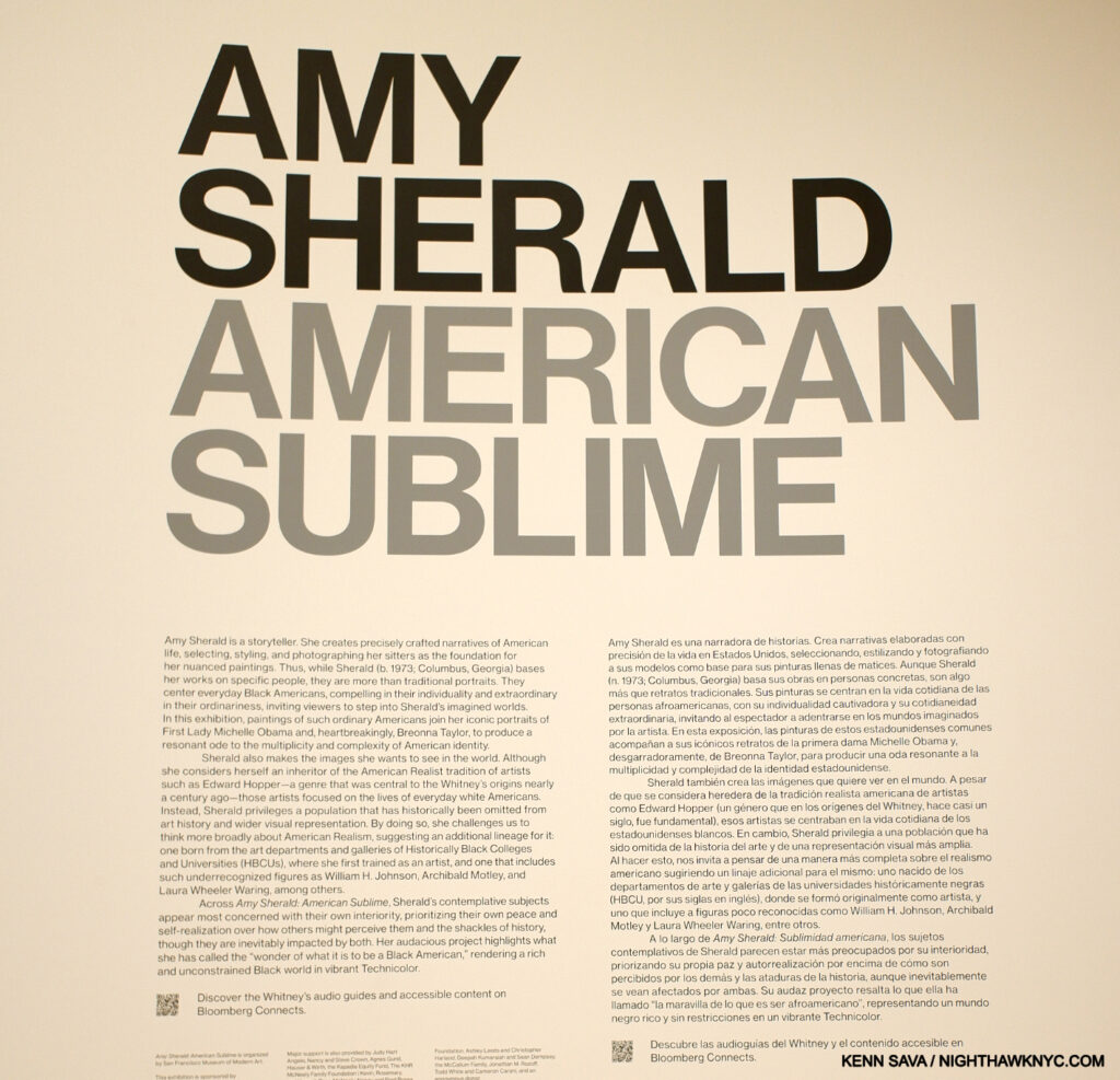
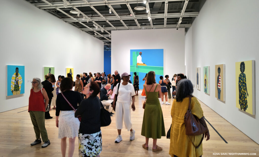
Fast forward to April 9, 2025, American Sublime contains 44 Paintings, the earliest dating from 2007- just 18 years prior! In those last two sentences hides the remarkable fact that Ms. Sherald (B. 1973) went from NYC debut show to an NYC early mid-career major museum Retrospective in a little more than five years! There aren’t a lot of Artists I can say that about.

Whitney Museum, July 25, 2025

Installation view. July 25, 2025.

What’s more remarkable is that just seven years before her Hauser show, on December 18, 2012, Amy Sherald underwent a heart transplant at age 39! That concluded a harrowing 10 years she spent after being diagnosed with congestive heart failure at age 30, and a two-month wait in the hospital for a donated heart (as is recounted in the piece I linked up top). Today, Amy Sherald is yet another fine Painter who burst on the scene this past decade and has wasted no time solidifying a place in museums around the world.

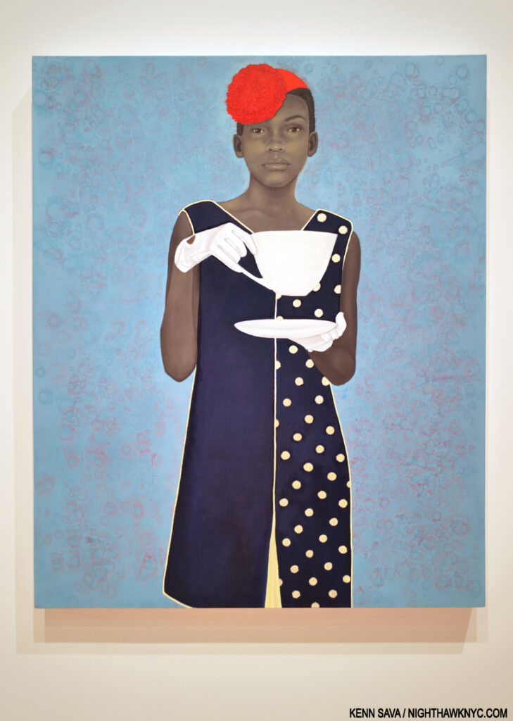
Miss Everything (Unsuppressed Deliverance), 2014. Oil on canvas. The Painting that brought Amy Sherald to national attention was inspired by Alice in Wonderland.

And, “burst on the scene…” she did as her 2019  NYC debut show came just three years after Amy won the 2016 National Portrait Gallery’s Outwin Boochever Portrait Competition with Miss Everything (Unsuppressed Deliverance), becoming both the first woman and the first African-American woman to win it.

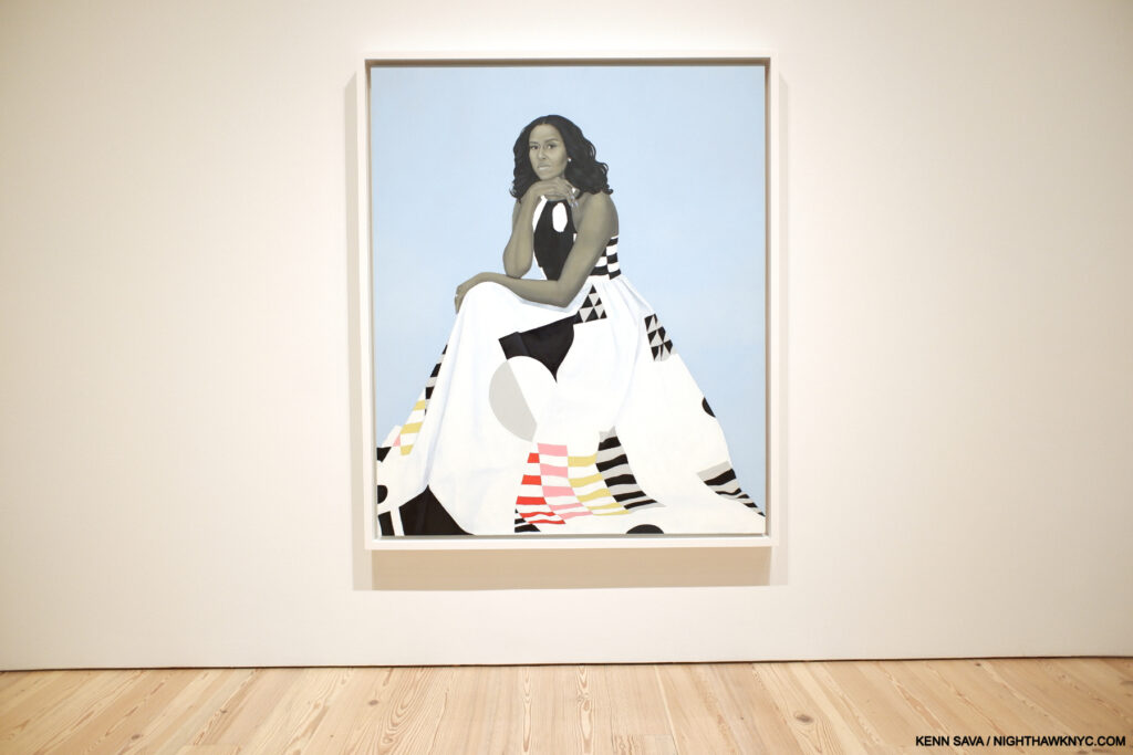
Michelle LaVaughn Robinson Obama aka First Lady Michelle Obama, 2018, Oil on linen. (The first title was on the wall card.) After being personally selected by Mrs. Obama to Paint her official Portrait, a prescient choice at the time. Amy Sherald’s stature has only continued to grow. The former First Lady selected the Michelle Smith Milly label dress she is wearing that channels Piet Mondrian through Gee’s Bends Quilt Making, blending the modern with the historic. Gee’s Bend is a remote Black Alabama community of the descendants of former slaves.

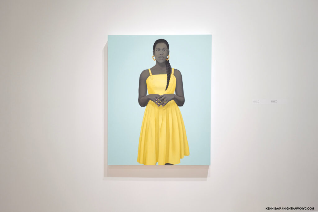
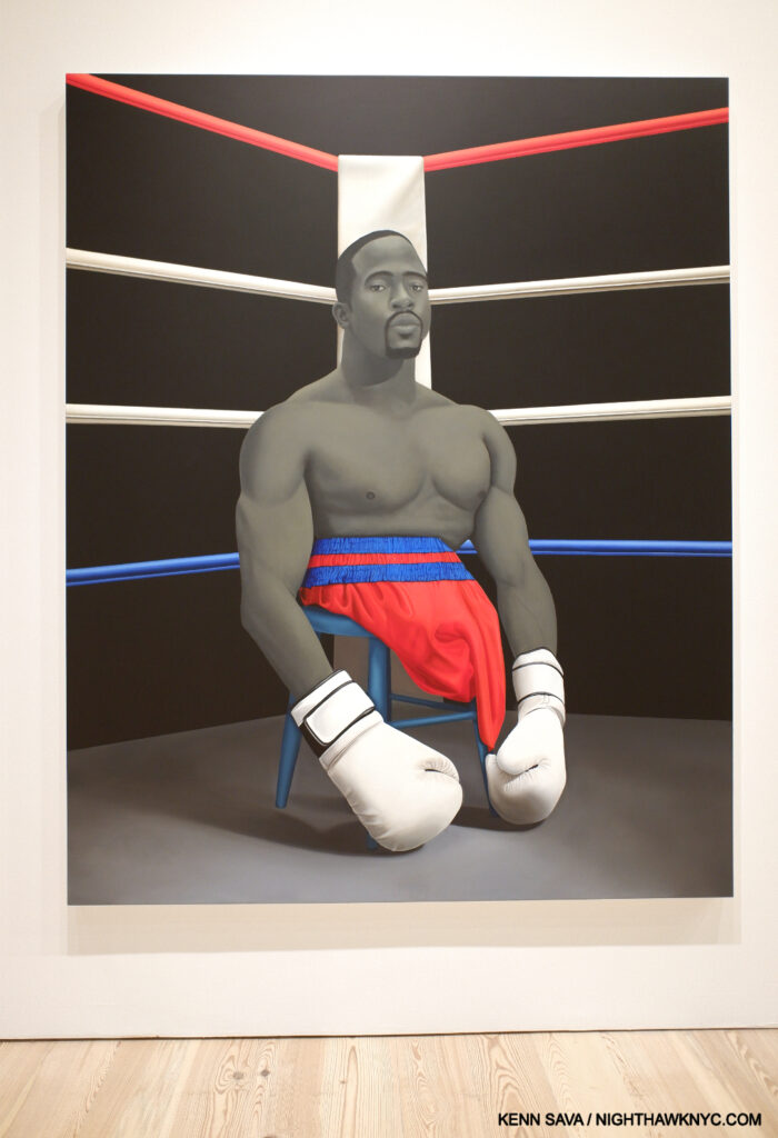
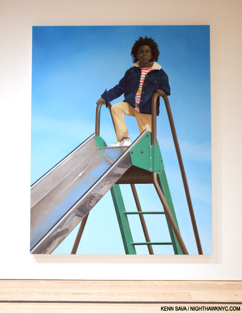
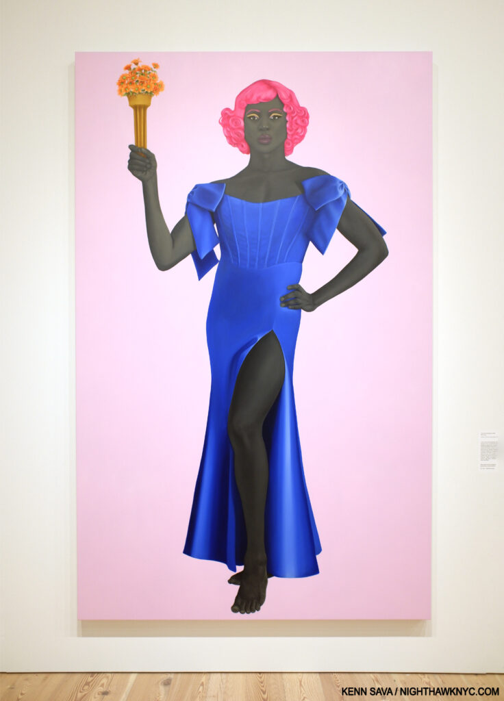
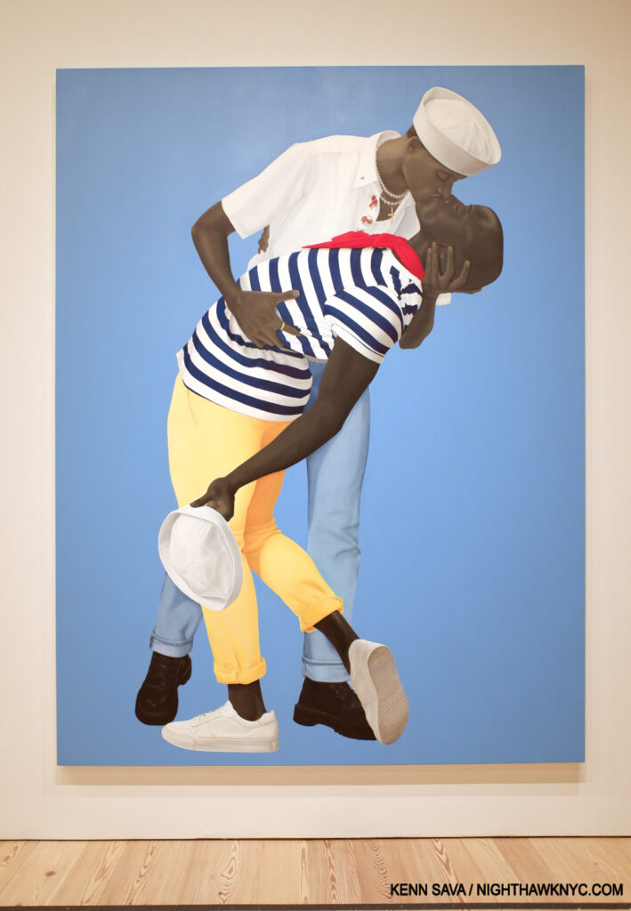
Most well-known today, perhaps, for her Portraits of Michelle Obama and Breonna Taylor, Amy Sherald: American Sublime revealed the depth of her accomplishment (already) in works that are almost always forthright, with subjects usually facing the viewer head-on, while steeped in a subtlety that rewards extended and repeated looking. Adding a unique twist is that the faces, hands, arms, legs of each of her subjects are gorgeously rendered in grisaille(!), something I’ve never seen done in a color Painting before, and something that has become her trademark. She uses grisaille as a way of “challenging the concept of color as race1.”

Untitled (Opal), 2019, Oil on linen. Standing in front of Opal, I found myself wondering why I’d never seen a Painting like this before. It seems so incredibly straight-forward, yet only Amy Sherald could have Painted it and made it as unique as it is. From the grisaille, to the position of her hands & fingers, to her expression and the choice of colors, which Wes Anderson might admire, it’s a remarkable blend of a Portrait of Opal through the eyes of an Artist with a vision.

In the late 1990s and early 2000s I spent much time wondering what new developments would come to Portraiture after the work of great 20th Century Artists, like Francis Bacon, Lucian Freud, Frank Auerbach, Alice Neel, Marlene Dumas, Picasso, and others. 25+ years in, the genre is continually being reinvented, yet again, by a number of Artists who have come to prominence this decade- including Amy Sherald, Nathaniel Mary Quinn, and Frank Auerbach (who passed away in 2024).

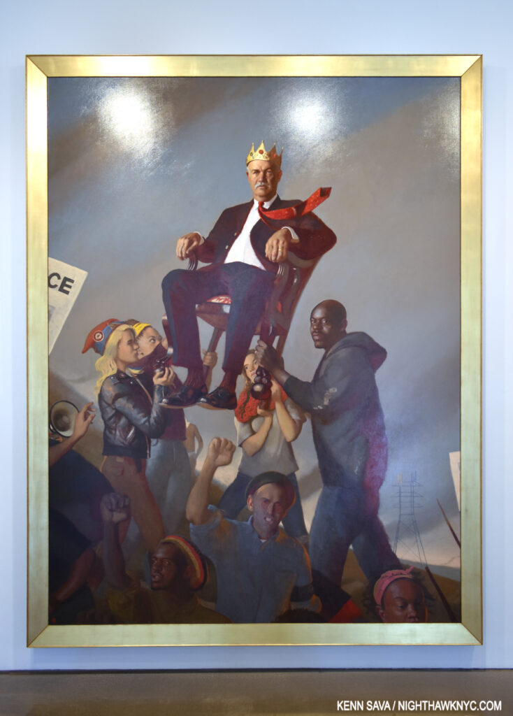
Bo Bartlett, Oligarchy, 2016, Oil on linen. See at Ameringer McEnery Yohe, August 12, 2016.

Interestingly, Amy credits the Painter Bo Bartlett with showing her the possibilities. Others have posited that Ms. Sherald’s use of grisaille goes back to old black & white Photos of Black subjects, and not Painting or Painted Portraiture. However, on 19th Century Photographs Ms. Sherald said-

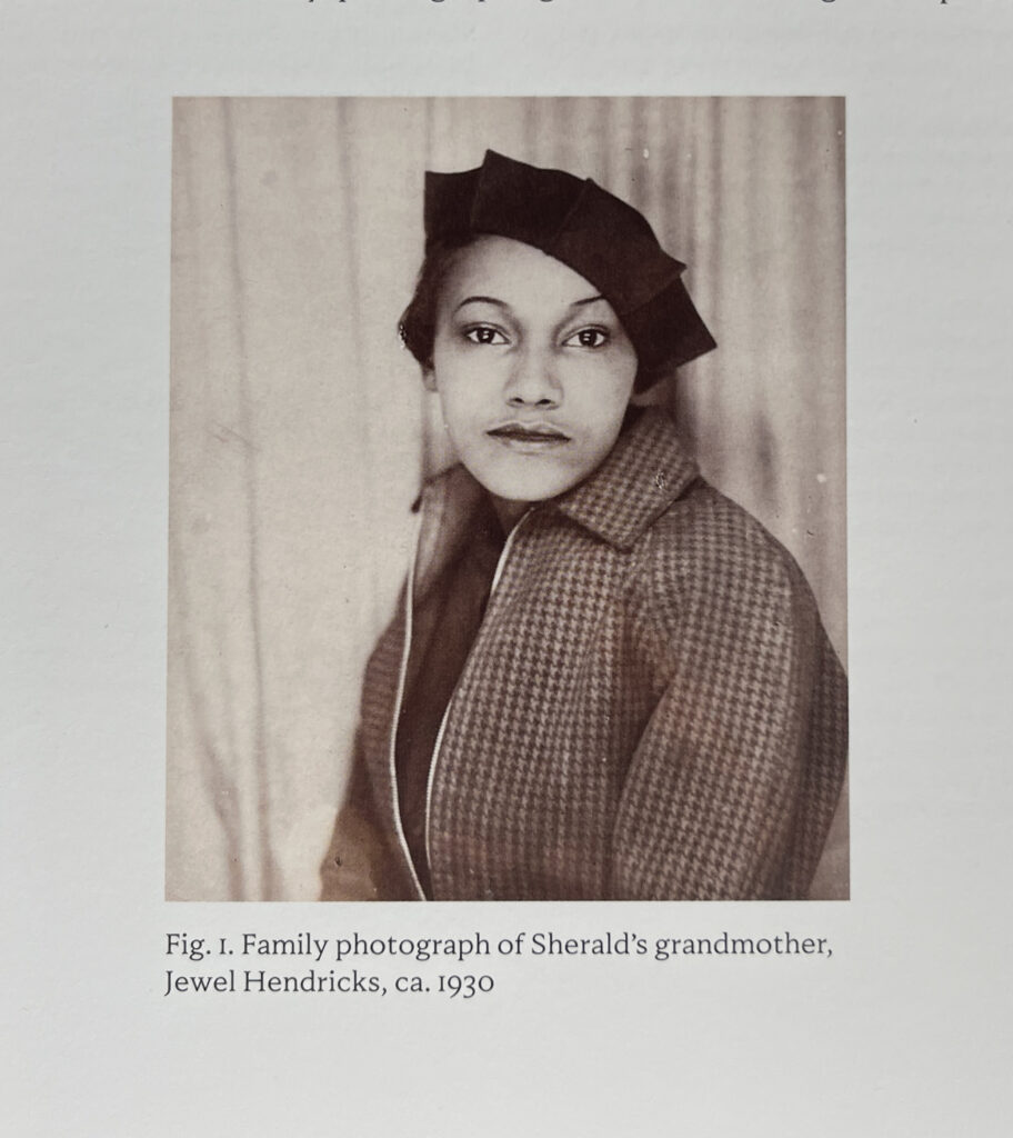
“It wasn’t what inspired my work, but it’s what affirmed my journey with it, and it’s where I was finally able to find these representations of black Americans that spoke to me in the same way that I wanted my work to speak to the world. They were family photographs, similar to the image of my grandmother that I oftentimes mention, where she had her picture taken.”

The Artist’s grandmother, Jewel Hendricks, as seen on page 28 of the excellent American Sublime catalog.

“Looking at how they represented themselves— they’re quiet, regal, graceful. It was an outward action that had inward meaning. They don’t smile, but there’s something there-this is what I look for in people— the feeling that you get when you look at those old photographs. When you look into their eyes, you are being told a story. It’s almost as if they’re standing in front of you, and they have a living and breathing kind of energy. There is something so captivating about that. And it’s not frivolous. It’s a very serious, deliberate kind of thing, having your picture taken, especially then2.”

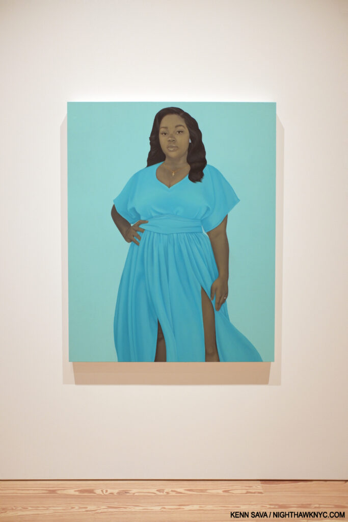
Breonna Taylor, 2020 Oil on linen.

In work after work, American Sublime reveals that Amy Sherald is a master of Portrait story telling. Her Portrait of Michelle Obama, Michelle LaVaughn Robinson Obama, is a classic case in point that manages to subtly weave multiple threads. Crossing cultural boundaries by dialoguing Mondrian-like elements and Gee’s Bends Quilt Making is artistically ground-breaking, topped off with a natural and wonderfully relaxed pose, enhanced by the background pale blue, that is just stunning.

This is what Amy Sherald does.

Commissioned to Paint the late Breonna Taylor, her first posthumous Portrait, Ms. Sherald visited her family and spent time with her mother, Tamika Palmer, who spoke of Breonna’s interest in fashion. Amy commissioned a dress for the Portrait, and also added an engagement ring on her finger “to represent the love between Taylor and her partner, Kenneth Walker… Sherald incorporated the ring to give him solace and to suggest a brighter future3.” Of the finished Painting she said, “I don’t think I thought much about the viewer so much as I thought about her family when I was making this portrait….but when you’re speaking about violence against women and police brutality, she’s become the face for that movement,” she said4.

The intro for the Audio Guide for her 2019 Painting, The Girl Next Door says, “The artist discusses how she transforms the historical function of portraiture…” That’s a lot to have accomplished in 18 years already. Along the way, she renders a wide range of subjects that encompass an equally wide range of Black Americans, including more than a few who are new to museum walls showing the scope of her vision.

American Grit, 2024 Oil on linen.

As soon as she was able to, she sought out the family of the woman, Kristen, whose heart she now has. Amy was 39 when she received Kristin’s heart. Kristin died at 38. Amy calls it “a perfect match.”

Kingdom, 2022 Oil on linen

“What kind of person was she? What kind of things did she like. Who did she love? I romantically believe in muscle memory, heart memory. It means a lot for me to be able to just kind of get to know her family a little bit. When I met her father he made me feel her heart beat. … I still call it Kristen’s heart.”

Trans Forming Liberty, 2024 Oil on canvas

“I live without fear. I work without fear. I wake up and produce these ideas without thinking so much about painting something stupid or people not liking it. I’m living this moment: I wake up every day, and I have to make sure that my work continues to speak to generations. I need to make things that are going to resonate in that way.” 

For Love, and for Country, 2022 Oil on linen.

She continues, “But I also truly believe in who I am as a human. I believe in my power. I believe in timing. I believe that this is my “now,” and that nothing can go wrong now. I understand that as a fact. I’ve been through the worst of the worst, and it was still okay. I wake up, and I keep it moving every day for Kristin and my brother Michael. You don’t waste second chances5.”

A God Blessed Land (Empire of Dirt), 2022 Oil on linen.

*- Soundtrack for this piece is “I Can See Clearly Now,” written & performed by Johnny Nash from the 1972 album of the same name, which he performs here the following year-

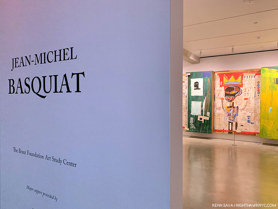
For those who kept me here, and for Lisa, who gave this total stranger her extra ticket to the sold-out Basquiat show at the Brant Foundation in Spring, 2019, enabling me to see it and share it with the world. As she was leaving she told me she was looking forward to seeing Amy Sherald: the heart of the matter….

NighthawkNYC.com has been entirely self-funded & ad-free since 2015! If you’ve found it worthwhile, PLEASE donate securely by PayPal below to allow me to continue. Thank you, Kenn.

You can also support it by buying Art, Art books & Music from my collection!
Art & Books may be found here. Music here and here.

Written & photographed by Kenn Sava for nighthawknyc.com unless otherwise credited. To send comments, thoughts, feedback or propositions click here. Click the white box on the upper right for the archives or to search them. Subscribe to be notified of new Posts below. Your information will be used for no other purpose.

  1. https://nmwa.org/art/artists/amy-sherald/
  2. “Amy Sherald in Conversation with Ta-Nehisi Coates” in Amy Sherald: The World We Make, P.184
  3. https://nmaahc.si.edu/object/nmaahc_2021.117
  4. ibid.
  5. ibid. P.186

Hilma af Klint in the 21st Century: The Spirit vs. The Machine

This site is Free & Ad-Free!
If you find this piece worthwhile, please donate via PayPal to support it & independent Art writing.
Other ways to support it at the end. Thank you!
 

Written & Photographed by Kenn Sava (*- unless otherwise credited).

Shows seen: Hilma af Klint: Paintings for the Future, Guggenheim Museum, 2018-19.
Georgia O’Keeffe: To See Takes Time, MoMA, 2023, and
Hilma af Klint: What Stands Behind the Flowers, MoMA, 2025

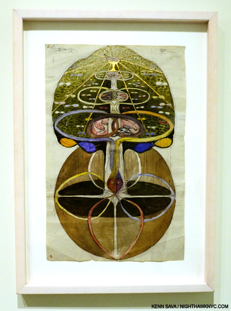
Hilma af Klint, Tree of Knowledge, No. 1,  from The W Series, 1913, Watercolor, gouache, graphite, metallic paint, and ink on paper, Guggenheim Museum, December 31, 2018..

Succinctly put, Hilma af Klint is one of the most remarkable and unique Artists I’ve encountered.

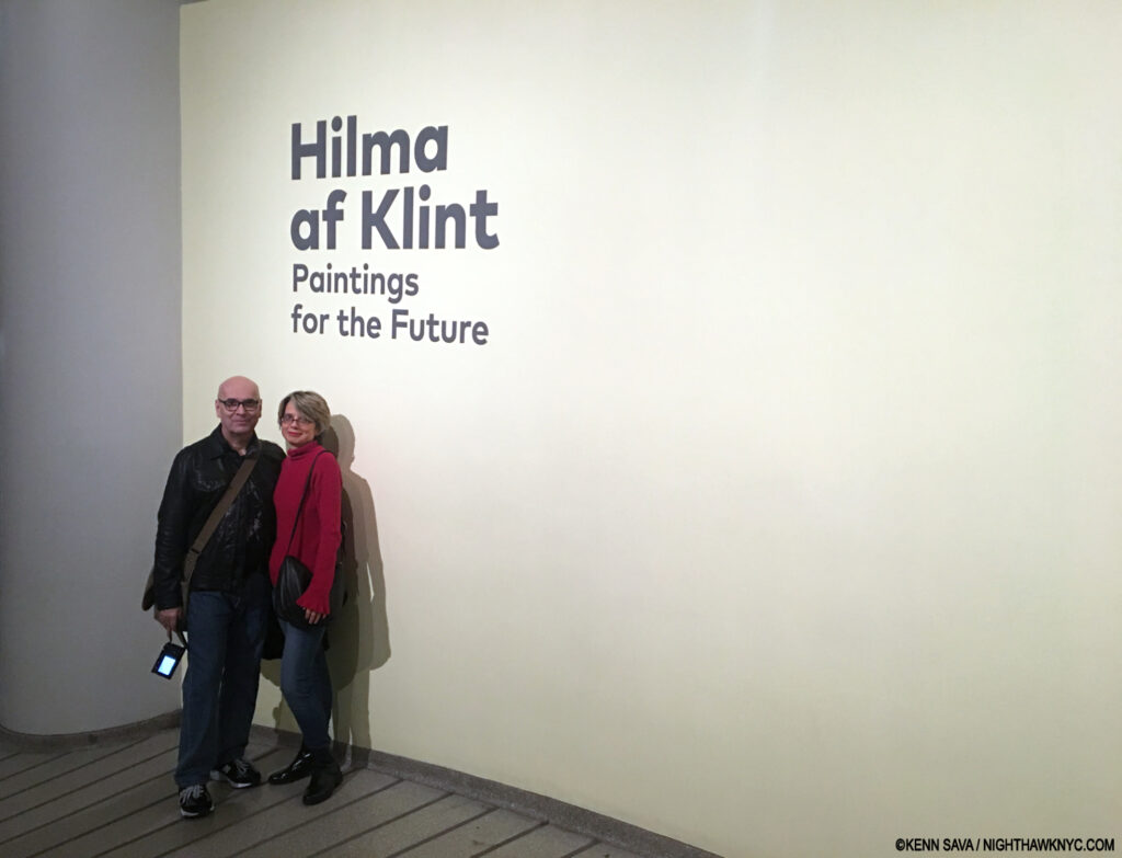
Of the thousands of Art shows I’ve seen in my life, I consider about 10 to be truly monumental. Hilma af Klint: Paintings for the Future is one of them. I’m so grateful I got to experience it with Lana Hattan1, and her Photos are included in this piece. Guggenheim Museum, New Year’s Eve, December 31, 2018. Enduring Thanks to the woman who took this.

Having seen two shows of her work, and most of the books published on it, Hilma’s work continually surprises me. Much of her oeuvre features that rarest of all qualities in Art: it’s unprecedented. I saw Paintings for the Future exactly seven years ago as I write this yet I haven’t written about it to this point for two reasons- 1) I’m still thinking about it and researching Hilma (as my featured entry on Hilma books in my “NoteWorthy Art Books of the 21st Century” piece earlier this year attests). 2) I’ve come to see that boxing Hilma as an “abstract Artist,” as the Art machine has labelled her, does her an immense disservice. I find it at odds with the very nature of her work.

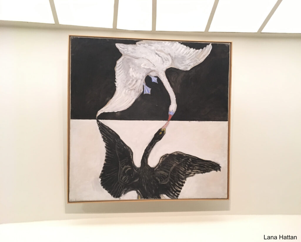
Group IX/SUW, The Swan, No. 1 from The SUW/UW Series, 1915, Oil on canvas. Reaching for the light. Of all the Painting shows I’ve seen at the Guggenheim Museum, the installation of Hilma af Klint: Paintings for the Future was transcendent. More on this later. *- Photo by Lana Hattan, Guggenheim Museum, December 31, 2018. I’m pleased to be able to present this show through her eyes, too.

Beyond all of that, recent developments may make her work “Basquiat hard” (my term for an Artist’s work that is mostly out of pubic view) to see going forward.
That’s a lot to cover. I’ll try to in what follows.

It begins with the flower…

“If your heart is in them flowers, bring ’em on,” Tanya Tucker-*

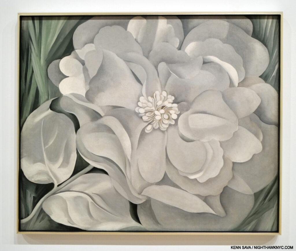
Georgia O’Keeffe, The White Calico Flower, 1931, Oil on canvas, as seen at the Whitney Museum, June 30, 2023

Flower Art was a niche thing, largely reserved for Illustration, until Artists like Georgia O’Keeffe (1887-1986) made viewers sit up and take notice of them. Of course, Vincent van Gogh, and the 17-century Dutch Masters a century before him, among countless others, had Painted wonderful Still-Life bouquets for many years prior, but individual flowers had not received much attention. Earlier last century, that began to change.

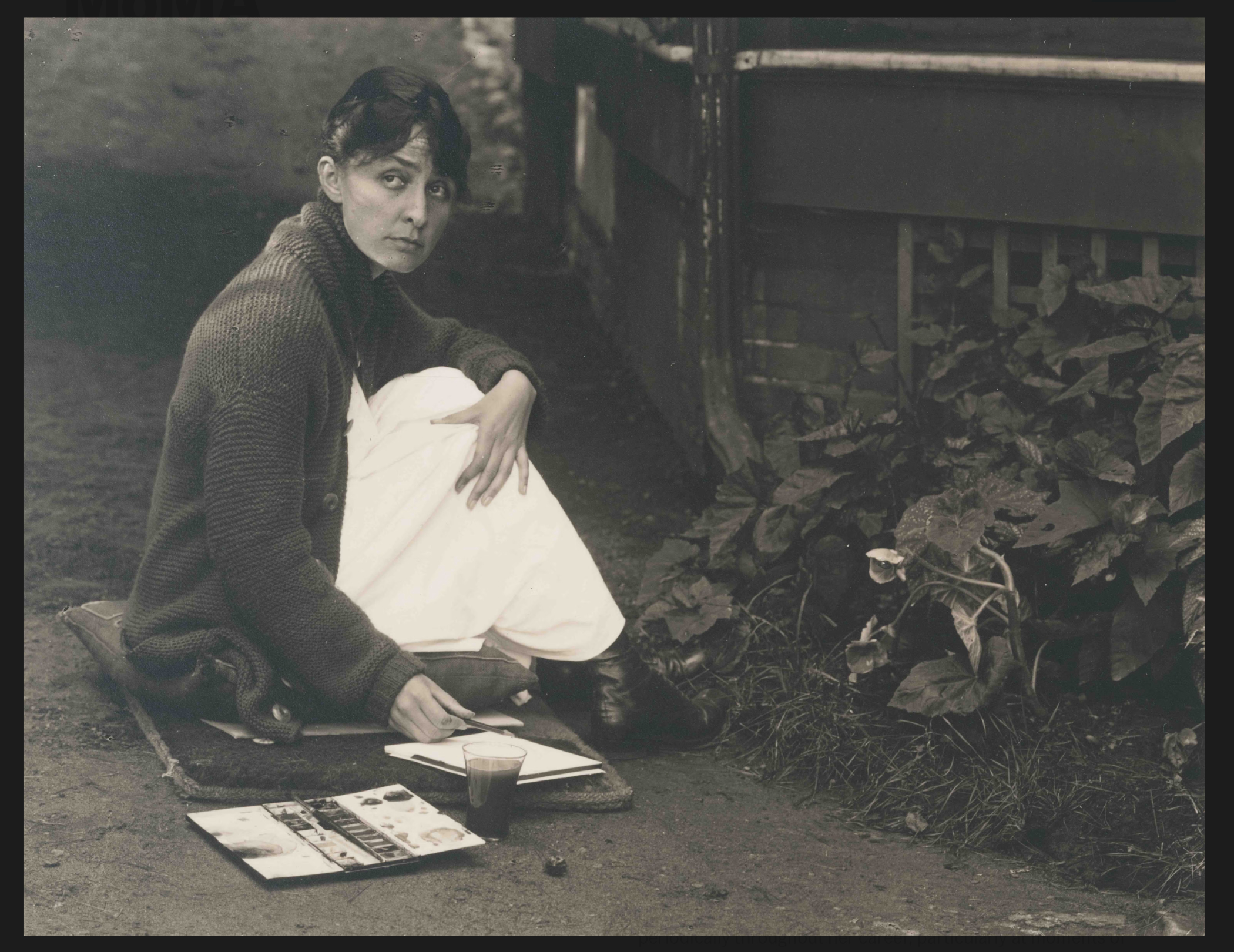
Alfred Stieglitz, Georgia O’Keeffe, 1918. Gelatin silver print. It’s hard to believe Georgia could Draw & Paint flowers like this, and it looks like Mr. Stieglitz found it remarkable, too. Note the year this was taken. *- Georgia O’Keeffe Museum Photo.

“Nobody sees a flower really; it is so small. We haven’t time, and to see takes time- like to have a friend takes time,” Georgia O’Keeffe, paraphrased by MoMA for the title of their 2023 show, Georgia O’Keeffe: To See Takes Time.

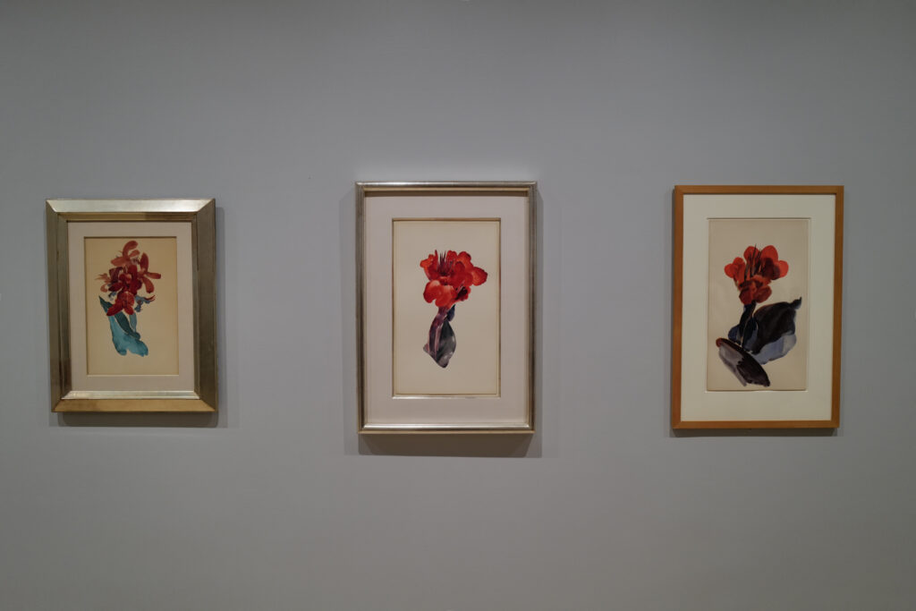
Georgia O’Keeffe, Canna Lily, 1918-20 Watercolor on paper, seen at Georgia O’Keeffe: To See Takes Time., MoMA, July 4 2023. Exactly 2 years later these same gallery walls would display Flower Watercolors by Hilma af Klint Painted at about the same time. (Lights lowered to protect the Art.) MoMA, June 9, 2023.

She continued: “So I said to myself- I’ll paint what I see- what the flower is to me but I’ll paint it big and they will be surprised into taking the time to look at it- I will make even busy New Yorkers take time to see what I see of flowers.” She would eventually give us 200 Paintings of them, a number of which are now iconic. So, it was fitting that MoMA’s Georgia O’Keeffe: To See Takes Time  contained some of her Flowers, including three early Calla Lilies watercolors from 1918-20, right as she was transitioning from Painting in watercolors to oils2.

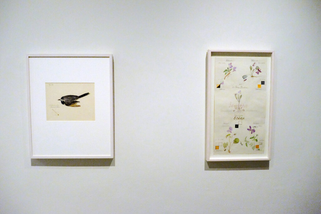
Hilma af Klint, Motacilla Alba: Wagtail with Guidelines, left, Violet Blossoms with Guidelines, both from Series I, 1919, Watercolor, graphite, and metallic paint on paper, right. Tucked away in Paintings for the Future this Flower Watercolor, right, looks like a page from Hilma af Klint’s Nature Studies Portfolio that would become the focus of the next major NYC Museum show of her work seven years later. An interesting realistic(!) harbinger, it’s not part of that Portfolio. Seen at the Guggenheim Museum, December 31, 2018, this sheet was also included in MoMA’s What Stands Behind the Flowers in 2025. MoMA’s wallcard for it speculates that Hilma may have removed it from Nature Studies.

Meanwhile at the same time Georgia was creating her Calla Lilies, across the ocean in Sweden, an almost completely unknown Artist named Hilma af Klint (i.e. HaK, born 25 years before Georgia in 1862) began rendering over 100 Flowers in Watercolors in a Portfolio she titled Nature Studies, 1919. As far as I know, they didn’t know each other (though I wonder if Art astute Hilma came to know of Georgia as the American rose to fame). As far as I can tell, the set remained hidden from public display until May 11, 2025, when MoMA opened Hilma af Klint: What Stands Behind the Flowers, coincidentally in the same galleries that had held Georgia O’Keeffe: To See Takes Time two year before

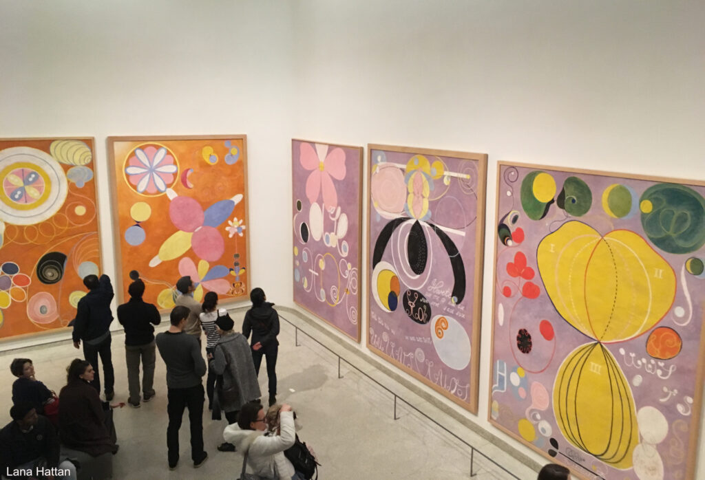
Five of Hilma af Klint’s The Ten Largest, a series devoted to the human lifespan, part of her now-famous Paintings for the Temple series. Note the shapes that seem organic or “flower-like.” Guggenheim Museum, December 31, 2018. *- Photo by Lana Hattan, Guggenheim Museum, December 31, 2018.

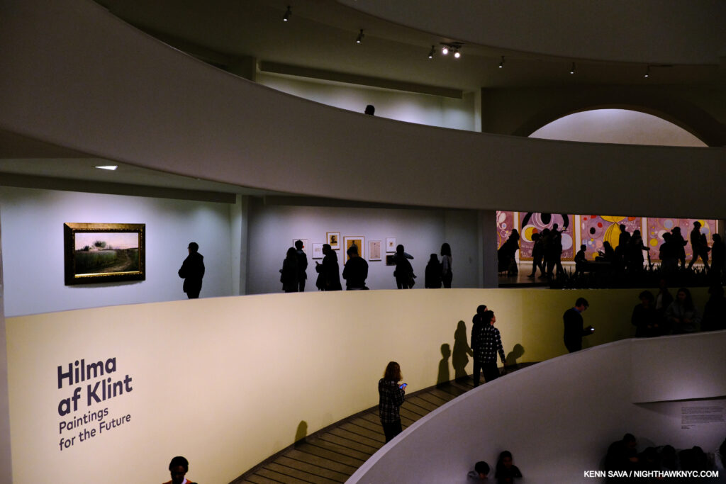
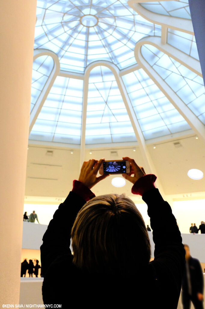
When her Art was last seen in an NYC museum in 2018-19, Hilma af Klint: Paintings for the Future drew a Guggenheim Museum all-time record 600,000 other viewers to Frank Lloyd Wright’s Museum Rotunda. I always walk down the ramp after taking the unique semi-circular elevator to the top of the Guggenheim as Frank Lloyd Wright wanted visitors to do which means I saw Paintings for the Future in reverse chronological order. Preceding it, R.H. Quaytman: +x, Chapter 34, occupied the 6th, or top Ramp. While this might seem incongruous to some, a deep dive into Hilma af Klint’s sparse NYC history reveals that R.H. Quaytman has a long history of championing Hilma af Klint that includes curating the first HaK show in an NYC museum, The Secret Pictures by Hilma af Klint at MoMA PS1 in early 19893. +x, Chapter 34 worked seamlessly with Paintings for the Future in my view.

Herein lies a problem (among others) with branding HaK an “abstract Artist.”  To the left, above the sign, on Ramp 1 is Summer Landscape, 1888, Oil on canvas, juxtaposed by parts of three of The Ten Largest, all 10 from 1907, far right, from her landmark Paintings for the Temple series, partially shown in the prior picture, in a completely different style. December 31, 2018.

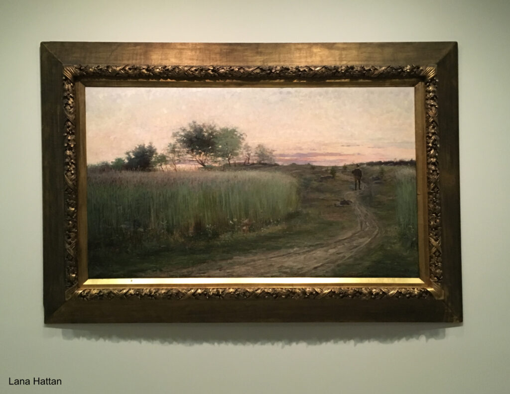
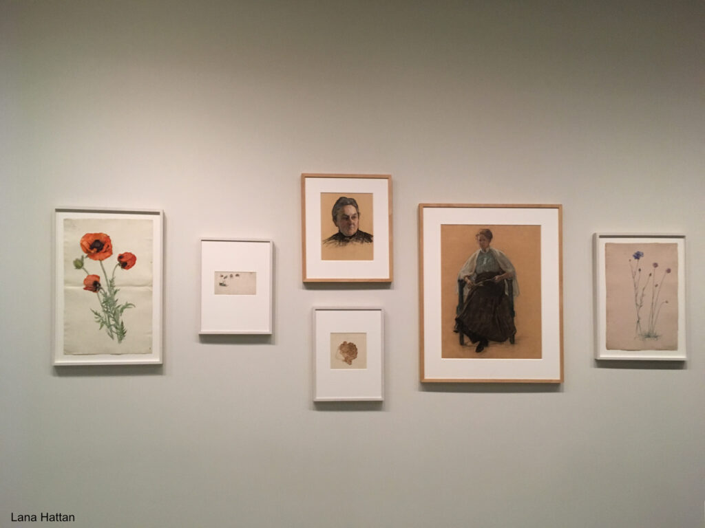
As we got to Ramp 1 (the lowest ramp), there were two bays containing work that looked pretty representational to me that featured Summer Landscape, 1888, above, left, and 2 Flower Watercolors from the 1890s, center, between the  visitors above, all shown closer below-

Summer Landscape, 1888, Oil on canvas. Hilma was about 26 when she Painted this in the year she graduated from the Royal Academy of Fine Arts.*- Photo by Lana Hattan, Guggenheim Museum, December 31, 2018.

Poppy, 1890s, Watercolor, ink, and graphite on paper, left, Portrait study of the head of a woman, center, and Portrait study of a sitting woman to its right,  both Charcoal, crayon and graphite on paper, both c.1918. Distortion of the frames due to the curved wall. *-Photo by Lana Hattan, Guggenheim Museum, December 31, 2018.

Though early in her career, before the more well-known Paintings they call “abstract,” these revealed an accomplished technique in both oils and watercolors, honed over 6 years at the Royal Academy of Fine Arts in Stockholm (1882-88), where Hilma was one of its first female students. At that moment, I realized there was much more to Hilma af Klint than the Art machine’s limiting marketing hype would have us believe.

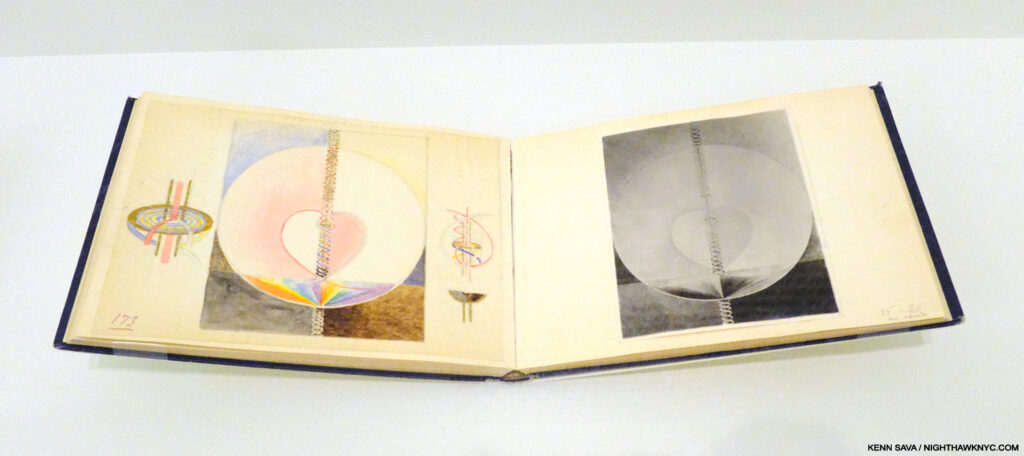
“Blue Book” Vol. 10. Hilma painstakingly recreated every one of her Paintings for the Temple (Painted, again, by hand) in a series of blue books on the left-hand page accompanied by a black & white Photo of the piece on the right-hand page, probably because color photography wasn’t yet practical. Guggenheim Museum, December 31, 2018.

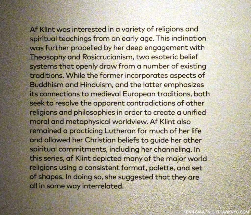
Hilma, a devoted, life-long spiritualist,t who attended seances (and believed her “most important work” was the 192-canvas series The Paintings for the Temple, 1906-15, partially shown earlier, which were guided by other beings), came to feel that her time wasn’t THE time for her Art to be seen. Since the entire Temple series is so numerous, and includes 10 very large Paintings, Hilma fastidiously recreated the entire series in 10 remarkable smaller “Blue books,” as they are known, a “portable museum,” which she carried with her to show Rudolf Steiner (in 1920), and others, in hopes of having the originals shown in a spiritual context. That’s how important it was to her.

This makes me wonder- How many “abstract” Artists would be able to exactly recreate 192 of their Paintings? An impressive technical achievement, that she could do it tells me that her compositions were no accident, something I think is important to bear in mind.

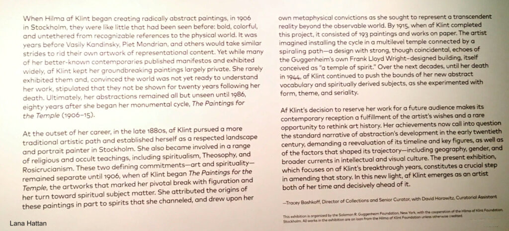
Is THIS the time Hilma envisioned for her work? The introductory wall card for Paintings for the Future on the Guggenheim’s curved wall outlines how the curators saw Hilma’s Art in 2018. I disagree with parts of this. For example, they mention HaK being “a respected landscape and portrait painter,” acknowledging she Painted in other styles, yet they ignore the fact that she returned to Painting representationally in 1919 with Nature Studies, as I show further on. They state her work was “untethered from recognizable references to the physical world.” What about the flowers and other natural elements that appear frequently, as shown in The Ten Largest picture earlier, and in Group VII (further on) and other pieces later on? *- Photo by Lana Hattan, Guggenheim Museum, December 31, 2018. Click for full size.

Failing to achieve this, in 1932, she decreed that none of her Paintings or Drawings should be shown until twenty years after her death in hopes of finding a more accepting time. Her work wound up being out of sight for 45 years. After she was tragically struck by a street car in 1944 and died from her injuries, her will left her entire creative estate to her nephew, Erik. Her work was stored in an attic for two decades before Erik had the Paintings unrolled and Photographed. Those 1,300 Paintings and 26,000 pages of text forms the basis of what is now the Hilma af Klint Foundation, which was created in 19724. The Foundation made a major effort to organize the work and prepare it for public display. Eleven of her Paintings were finally shown in The Spiritual in Art: Abstract Painting 1890-1985 in Los Angeles in 1986, but it wasn’t until 2013 that she finally received a full retrospective (in Europe), in a show titled Hilma af Klint: Pioneer of Abstraction (the catalog for which is also on my list).

Georgiana Houghon, The Love of God, August 3, 1864, Watercolor and gouache on paper, 23.7 x 32.6 cm, An Automatic Painting, Hilma af Klint was about 2 when Georgiana Painted it. *-Victorian Spiritualists’ Union, Melbourne Photo.

That show rode on the hype about Hillma being “the first abstract Artist,” (says the Tate, no less) before Kandinsky, Mondrian, et al., and a woman. The truth is Hilma was not even the first woman in her spiritualist circle to create what they call abstract work- Georgiana Houghton (1814-1884), 48 years Hilma’s senior, who proceeded her in creating Automatic Paintings & Drawings, may be a better candidate for that title. But, boxing HaK as such helped the powers that be draw huge crowds to the 2013 show of a complete unknown. Paintings for the Future (one of the two most important NYC Painting shows I saw in the prior decade, along with this one) took things to an entirely different level. Six years later comes MoMA’s Hilma af Klint: What Stands Behind the Flowers, her first NYC museum show since the Guggenheim blockbuster. Hilma’s work doesn’t need any hype to “sell” it now. The world knows who she is. All the “abstraction” talk has kept people from looking at her work, in my view. It’s time to look at the Art for what it is.

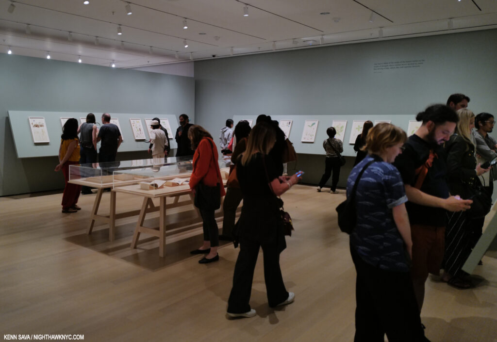
Installation view of the 2nd gallery of Hilma af Klint: What Stands Behind the Flowers at MoMA, which contained the first part of Nature Studies on the walls and a selection of her writings, and books by others on flower studies, in the center vitrine. Opening week, May 18, 2025.

What Stands Behind reveals that AFTER she completed the Paintings for the Temple in 1915, Hilma went back to working “representationally!” I guess no one bothered to tell her she was supposed to be an “abstract” Artist in the future. The more likely case is that HaK was a very talented and creative woman, an Artist more than capable of creating in whatever style she needed to work in for what she was trying to accomplish. It seems to me that THAT is a MORE impressive thing than sticking her in any one limiting box!

“One has to think of the realm of the nature spirits as the realm of thought; these entities hover around us, some like driving winds, others like soft summer breezes,” Hilma af Klint, MoMA wall card.

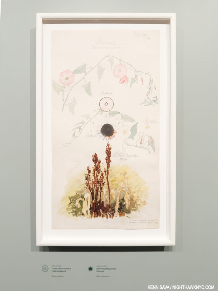
Convolvulus arvensis (Field Bindweed), Monotropa hypopitys (Pinesap). Sheet 20 from the portfolio Nature Studies July 11–24, 1919, Watercolor, pencil, ink, and metallic paint on paper. One of the 46 sheets in watercolor, pencil, ink, gouache and metallic paint on paper included in Nature Studies. Being 19 11/16 by 10 5/8 inches, these sheets would seem too large for Hilma to work on in situ. But that’s purely my conjecture. Unlike Georgia O’Keeffe, HaK didn’t confine herself to one specimen per sheet. Over 100 are included on the Nature Studies! Underneath, the curators translate HaK’s notations of the species name and its character as perceived by the Artist: “Determination” for the Field Blindweed, top, and “One-sidedness” for the Pinesap, bottom. MoMA, September 26, 2025.

She also continued to work on creating a “language” (see Group 2, further below) that included letters, words and diagrams. These are seen in almost all of the series she created in her life (including Nature Studies).

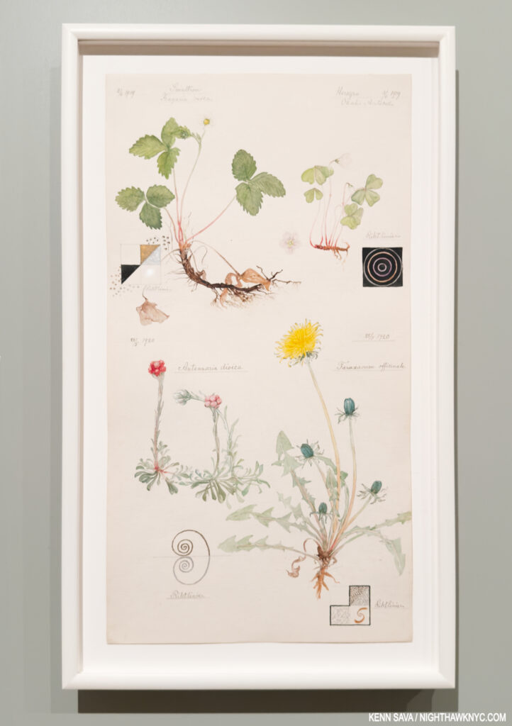
Woodland Strawberry, Hilma’s notation- “Liberator. Longing to produce balance within the blood syntem by expelling either white or red biood cells.” European wood sorrel- “Fragility-submissiveness shyness-humility fear -respect self-loathing-obedience.” Catsfoot– “Peace and harmony.” and Dandelion- “Beginning.”

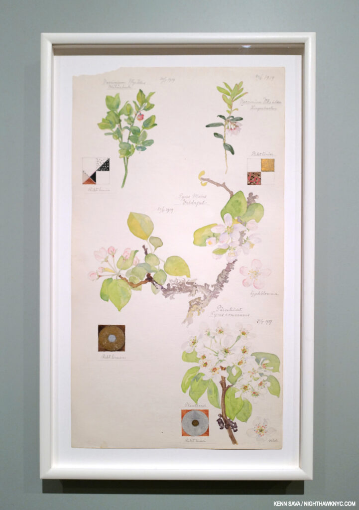
Bilberry, Apple, Common Pear, Lingonberry

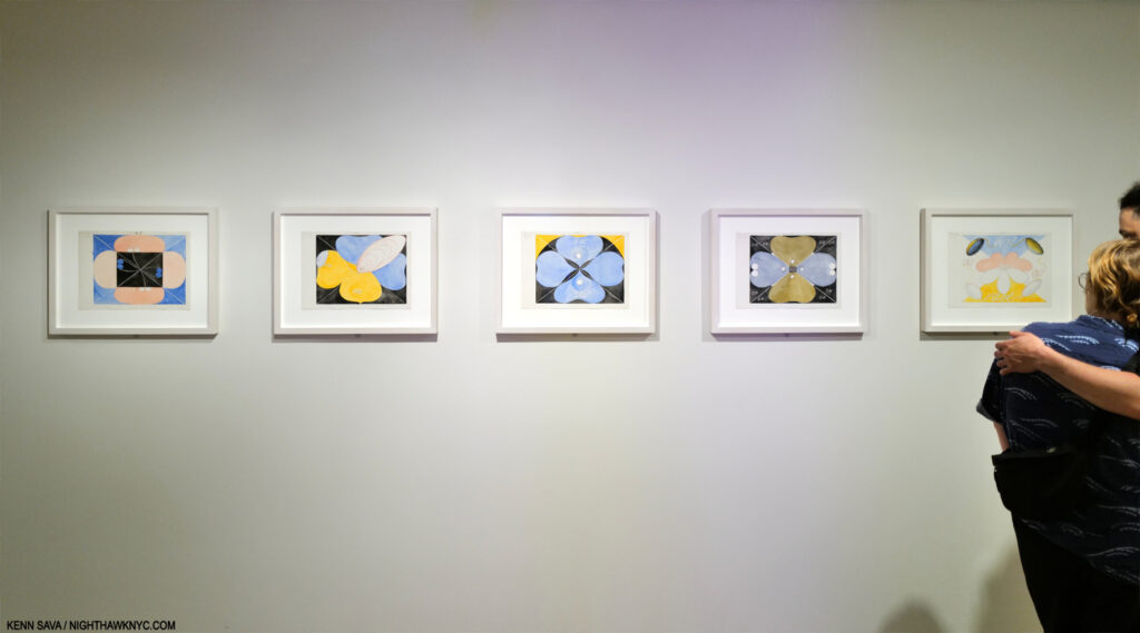
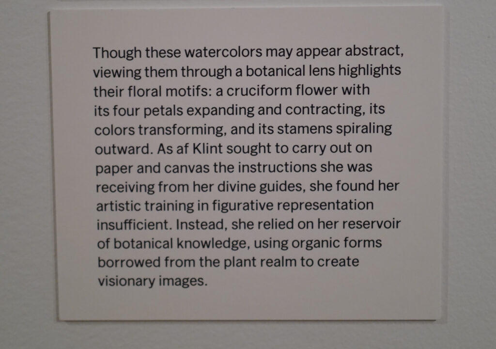
Looking at Hilma’s Art is different than looking at the Art of any other Artist I know of. Quite a few of her Paintings for the Temple (as seen in the picture earlier) and other “abstract” works included at MoMA (below) have elements that look organic, including flower shapes. In some of her Temple series, lines of dots connect figures, reminiscent of the af Klint family’s heritage as noted cartographers & mapmakers. Then, any number of her pieces, including almost all her Nature Studies, include diagrams that contain basic geometric shapes- circles, squares, cones, etc. The viewer needs to decide what to make of them, or look to the Hilma’s Notebooks for insights. Finally, there’s the “language” the Artist developed, abetted by her use of letter “codes,” as Julia Voss outlines in her Biography. As a result, it seems to me there is still a long way to go in coming to fully understand Hilma af Klint’s work. Lumping it all into ANY one-word catchphrase box only takes us further away from that point of truly understanding it-if that’s possible.

Group VII, No 1-5, from the US Series, 1908, Watercolor and pencil on paper. 11 years. before the Nature Studies portfolio, what seems to be flower-like shapes abound. Seen at the beginning of  MoMA’s show.

The wall card for Group VII. Installed at the show’s entrance, is a relatively rare instance of the Art world looking beyond Hilma the “abstract Artist” thus far, or hedging their bets on their use of that box. Here, the organic shapes are accompanied by letters that are parts of the “code” Hilma used. See next.

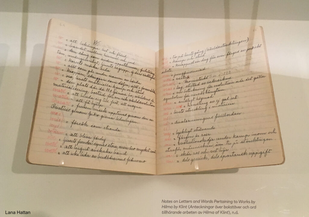
Another piece of the puzzle. Hilma’s original Notebook containing her Key to the mysterious words and omnipresent letter “codes” she used throughout her oeuvre. It’s an essential part of “decyphering” her work. Hilma’s code is detailed in English in the book Hilma af Klint: Notes and Methods. *- Photo by Lana Hattan, Guggenheim Museum, December 31, 2018.

ALL this talk about Hilma’s style misses the point! Hilma was not out to win any “style wars.” All of her work was about something entirely different, and that difference was substance over style.

Apple, no date, Watercolor on paper. Virtually every Art or Drawing class begins with rendering, coloring & shading basic shapes, like the sphere (often an apple, orange or lemon). Here HaK takes it to an entirely different level, and we get to marvel at her powers of observation, especially in the incredibly subtle variance of the local color. It’s also fascinating to me how minimal the shadows are, something you never see taught in how-to books which glory in the different kinds of shadows. In most of her Nature Studies, except the previous one, Hilma leaves out the ground, as she does here, too. In this case, doing so gives her the chance to show more of the bottom detail, again something I can’t say I’ve seen done often.

On the opposite end of that spectrum from the 21st century hype around it, there is something else at the beating heart of her work, something her “abstract” Paintings for the Temple and her representational Nature Studies have in common, and something that is at the core of the recent debate regarding continuing to publicly display her work. Hilma af Klint’s work is centered on the spirit. She created her work for fellow spiritual seekers. The Paintings for the Temple are devoted to the human spirit (with the aid of spirits who have moved on to another level). After completing them in 1915, never one to think small, the Artist turned her attention to an even bigger subject- the spirit of the natural world, commencing with the atom, in works that filled three quarters of the first gallery at MoMA, before moving on to the spirit in nature, beginning with flowers (in Nature Studies), which filled most of the succeeding two large galleries. These were supplemented by her late Flower Watercolors, which reminded me of some of Georgia OKeeffe’s Watercolors that were shown in these galleries at MoMA in 2023. The bottom line is that Spiritual Art is still outré to the Art machine, whatever type it is. They can’t sell it, and Art without monetization does not keep the Art machine going.

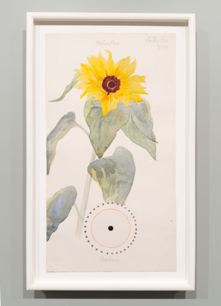
Common Sunflower. To Hilma- “Love is the greatest of all.”

Meanwhile, throughout What Lies Behind, part of the sheer joy in looking at her work, her marvelous technique shines in piece after piece. It’s surprising to me that Hilma has gotten so little credit for it. She came upon it the hard way, through continual hard work and 6 years at the Royal Academy of Fine Arts. This was followed by work as an Illustrator, including illustrating a book on horse surgery by the director of the Veterinary Institute, Stockholm, who kept Hilma’s Drawings for the rest of his life.

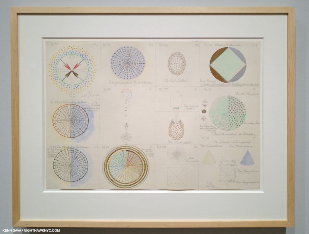
From Group 2 February 12-19, 1919 Watercolor, pencil, and metallic paint on paper. This was one of numerous examples of her technique I could site. Here, we see the Artist working on ideas for herself in a series of sheets titled Group 1, Group 2, Group 3. No matter for public display or her own purposes, Hilma was always meticulous in her execution. Of the Groups, MoMA says- “Together, the drawings form narratives that allude to pollination, reproduction, and evolution. By April 19, 1919, after more than three months of progress, af Klint had established a vast and diverse diagrammatic language. The very next day, she began her Nature Studies portfolio.”

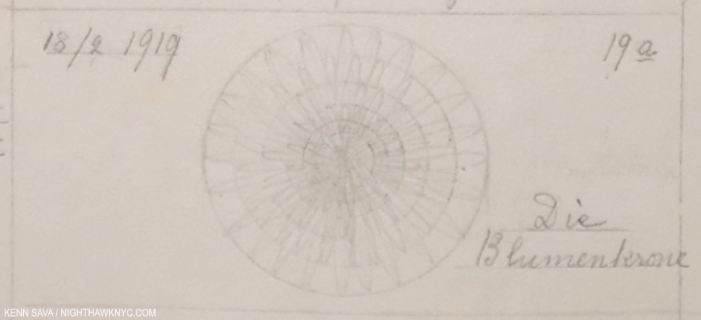
This enlarged detail of the lower center of the previous image perhaps measures 3 or 4 inches wide by an inch and change high (the bounding rectangle). Easy to miss because it’s in pencil and the actual Drawing part seems to have faded,  it’s noteworthy for two reasons. First, its meticulousness, and second for the title- Die Blumenkrone means “The Flower Crown.” Even in the dead of wnter (i.e February 18th as the date reads), Hilma had flowers on her mind.

What Stands Behind also makes the case in spades or her accomplishment as a Watercolorist- both in her Flowers and in the later Flower work (not part of the Nature Studies series) shown in the final gallery, in a different style again, as seen below.

Ear of Grain, 1922, Watercolor on paper, from the series, On the Viewing of Flowers, with a apparetnly relevant section of the wall card, left. MoMA, September 26, 2025.

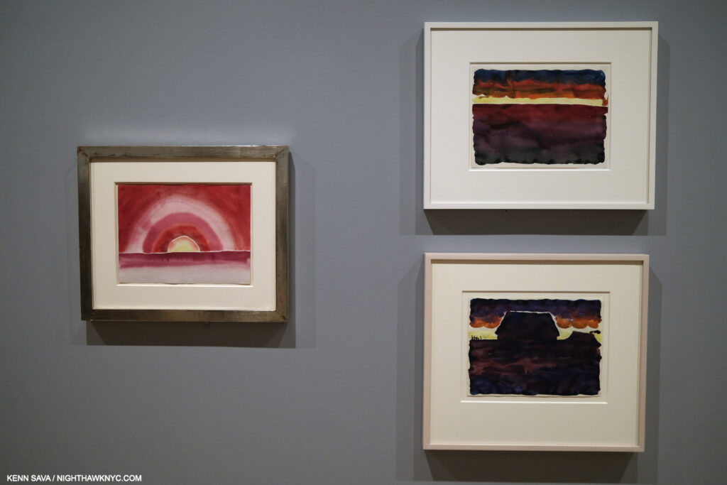
Georgia O’Keeffe, Morning Sky, left, and Morning Sky, and Morning Sky with Houses, right, 1916, Watercolors on paper. MoMA, September 9, 2023.

I might be the only one to draw parallels between Georgia O’Keeffe & Hilma af Klint, but when I saw the wall of 1922 Watercolors by Hilma in the last gallery, including Ear of Grain, above, I couldn’t help but recall Georgia’s Watercolors that had been hung in these galleries two years previously. It’s fascinating to think about their commonalities, as extraordinary, ground-breaking Artists, and as extraordinary women, at much the same time, on almost opposite sides of the globe. What Stands Behind The Flowers begins some of the heavy lifting on the road to assessing Hilma af Klint’s full accomplishment. In spite of that, I’m not sure THIS is the ideal time Hilma envisioned for her Art to be shown.

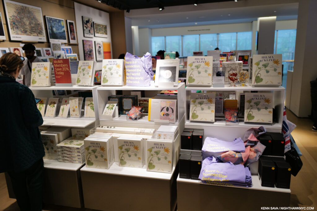
MoMA Gift Shop display for the show. More items behind me and to the left. While I’ll reserve comment on the other items, MoMA’s Exhibition Catalogue for the show is highly recommended. May 18, 2025.

In too many (most?) cases today a work of Art is mentioned followed by its price as if that’s the most important thing about it! Then, the rush is on to plaster it on everything from umbrellas to baby onesies. Hilma’s spiritualist Art stands directly at odds with that. She opposed materialism in Art. To this point, it’s largely escaped it (though MoMA, who has come to own Nature Studies, produced a $500.00 Limited Edition of it, as far as I can tell, the first Hilma af Klint Limited Edition, in addition to putting the series on refrigerator magnets, postcards and a poster)5.

Rebel. With a cause.

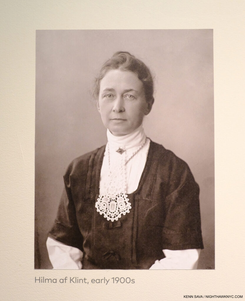
Trapped in the future. But, is this THE future she envisioned for her Art? One of the few Photographs of Hilma af Klint. This one was affixed to a wall at the Guggenheims’s landmark Paintings for the Future in 2018.

Perhaps this experience sounded a warning bell. Earlier this year a struggle broke out inside the Hilma af Klint Foundation about whether or not her work should continue to be exhibited. The Foundation’s chairman of the board, af Klint’s great-grandnephew, who, like his great-grandfather, is also named Erik af Klint, is against it feeling that Hilma wanted her work to be seen in a spiritual context by fellow seekers, i.e. to “keep the work available to those who seek spiritual knowledge or who can contribute to fulfilling the mission that Hilma af Klint’s spiritual principles intended.”

On Hilma’s spiritualism. Guggenheim Museum, December 31, 2018..

Therefore, I think there is a strong case to be made for ending public displays of her work at this point. Perhaps a future time will be more ready to accept, and see her work as she intended it to be seen, and provide the Artist’s full accomplishment with the respect it deserves..

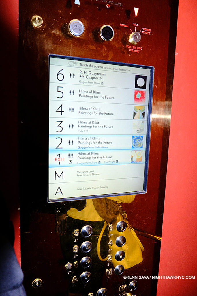
“Beam me up, Frank!” The control panel on Frank Lloyd Wright’s semi-circular Elevator at the Guggenheim. December 31, 2018.

Experiencing Paintings for the Future at Frank Lloyd Wright’s Guggenheim brought home another problematic aspect of experiencing Hilma af Klint’s work today.

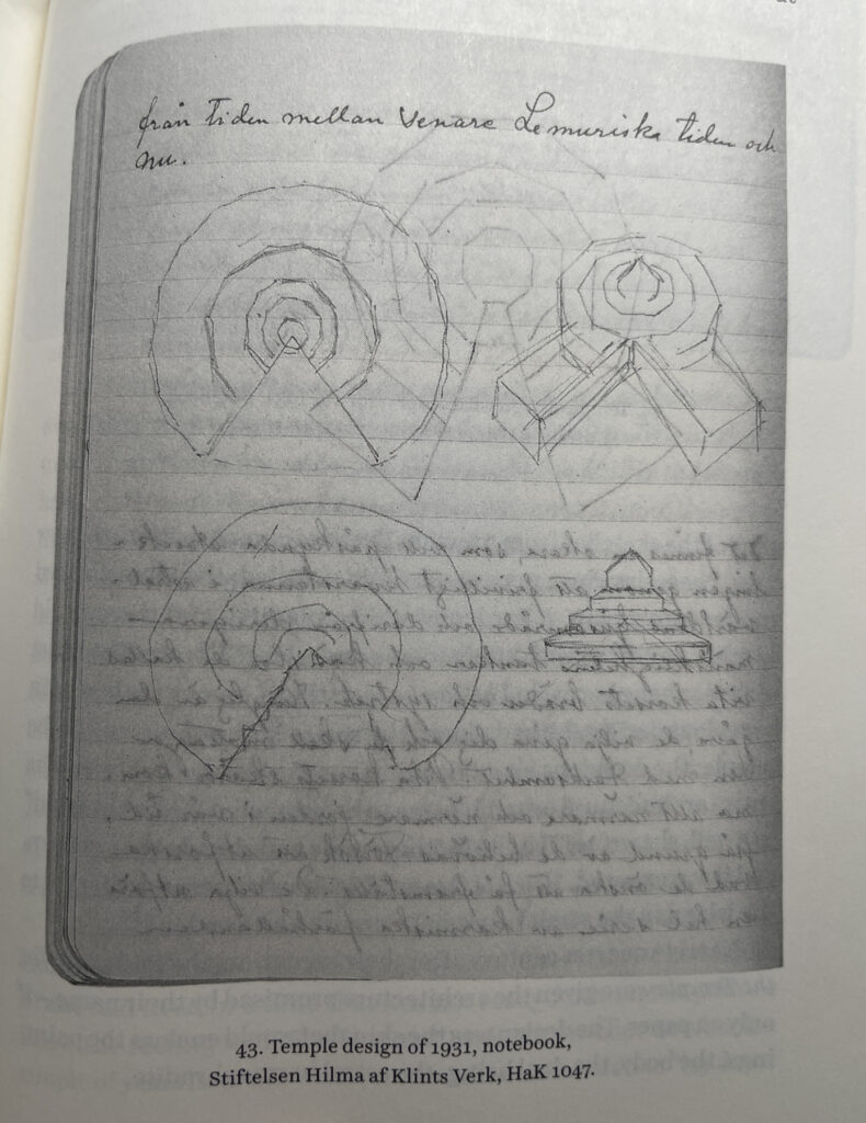
Temple Design, 1931, Notebook in the Hilma af Klint Foundation Collection (*) as seen in Julia Voss, Hilma af Klint.

It turns out that Hilma had not only envisioned that “ideal space” for the display of her work, i.e. a “Temple” as she called it (as in her Paintings for the Temple series), she put some of her ideas for it down on paper.

Lana Hattan immediately upon exiting the elevator on the 6th Floor, in both of our favorite buildings, in one of my favorite pictures of her. I thank her for her generosity in allowing me to publish some of the Photos she took that day. December 31, 2018.

Her sketches for it have quite a bit in common with Wright’s masterpiece on 5th Avenue. Both feature circular floors or ramps that rise to a top that opens up to the sky. Also coincidentally, Hilla Rebay, director of the Museum Non-Objective Painting which  preceded the Guggenheim Museum, said she envisioned “people communing with the work in Solomon R. Guggenheim’s collection in a a ‘temple of spirit.6,'” in commissioning Wright to design it.

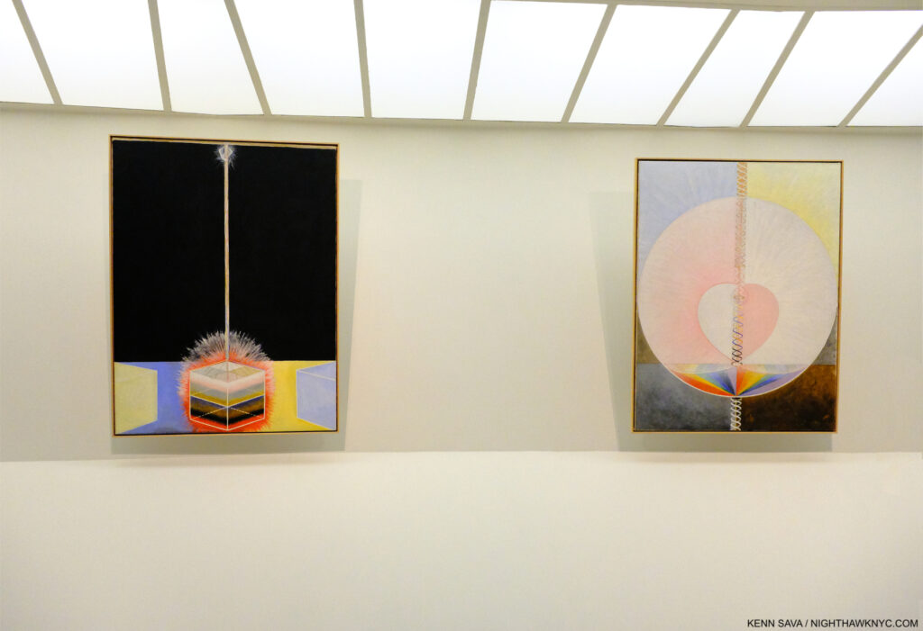
Group IX/UW, The Dove, No. 3, left, Group IX/UW, The Dove, No. 1, right, both from The SUW/UW Series, 1915, Oil on canvas.The work on the right is the original of the work she reproduced by hand in the Blue Book picture shown earlier. Guggenheim Museum, December 31, 2018..

I didn’t know about her Temple, or her Drawings for it, when I saw the Guggenheim show, yet I came away feeling the Architecture added exponentially to the experience of it. At this point, it leaves me feeling her dream should be realized, though that’s not part of the current discussion (as far as I know). Failing to realize the Temple she had envisioned to hold at least part of her work, it remains in a sort of limbo without it.

Of course, today’s Art machine is adamantly opposed to Hilma shows ending, seeing a potentially huge marketing opportunity vanish. Her art being for spiritual seekers, is diametrically different than how the Art world sees it now. Spiritual seeking vs dollar signs- I’ll be interested in seeing which way this one turns out, but I’ll be hoping Mr. af Klint succeeds. (Digression for full disclosure- In case anything I write here makes you wonder, I’m not a religious person. I’ll leave it at that and end the digression.) I’ve always believed the Artist’s intentions for her (or his) work should be respected above all else. As for all those who will bemoan not being able to see her work, consider that for most of the past 30 years Jean-Michel Basquiat has been THE most popular Contemporary Artist in the world, and almost none of his work is in the hands of museums or public collections resulting in a paucity of shows, as I discussed here7. Somehow his popularity has continued to increase without direct access to his work.

Hilma af Klint books for sale in the window at the Rudolf Steiner Bookstore in Manhattan. A long-time admirer of Mr. Steiner, I think she’d be ok with this. December 11, 2025.

Hilma’s work can be seen by everyone in the excellent seven-volume Catalogue Raisonne her Foundation has published (which I collectively named a NoteWorthy Art Book of the 21st Century), and a number of other books. For those who want to know more about Hilma, Julia Voss’s excellent Hilma af Klint Biography is the current go-to source and a must-read. It reveals an extremely private woman who was solely focused on her spiritual development and her Art to the extent that she wrote virtually NOTHING about herself and her private life in those 26,000 pages she left! But, she did make crystal clear what she was about and what she wanted for her Art.

If Hilma were alive today would she be enamored with the Art world and its machine, an Art world that seems to have no clue how to handle “spiritual Art?” I have my doubts. That future she envisioned in the 1930s still feels like a dream. So, it just might be a good thing if Hilma af Klint shows stop. Some further point in the future may be a better time for her work to be seen & fully appreciated- one without  an Art world in such a hurry to judge it, box it, and associate it solely by the dollar signs it hangs on it.

Wake me up when we get there.

*- Soundtrack for this piece is “Bring My Flowers Now,” by Tanya Tucker, the de facto title track from her 2019 album, While I’m Livin’, which she performs here-

“I know we’re gonna ride again someday…”

NighthawkNYC.com has been entirely self-funded & ad-free since 2015! If you’ve found it worthwhile, PLEASE donate securely by PayPal below to allow me to continue. Thank you, Kenn.

You can also support it by buying Art, Art books & Music from my collection!
Art & Books may be found here. Music here and here.

Written & photographed by Kenn Sava for nighthawknyc.com unless otherwise credited. To send comments, thoughts, feedback or propositions click here. Click the white box on the upper right for the archives or to search them. Subscribe to be notified of new Posts below. Your information will be used for no other purpose.

  1. The last show we’ve been able to see together.
  2. She would begin Painting flowers in earnest in the mid-1920s.
  3. Ms. Quaytman’s book Spine and her new book, Book, 2025, are on my list of NoteWorthy Art Books of this century.
  4. Julia Voss, Hilma af Klint: A Biography, PP..1,2 & 4. After mentioning I was in the middle of reading it at the time I published my NoteWorthy Art Books of the Century piece, I’ve added A Biography to the list. A marvelous accomplishment with a terrific translation from the original German, it’s essential reading for anyone interested in HaK.
  5. I’m still a bit puzzled by Nature Studies’ Provenance. MoMA’s site says they bought it, but from whom and how that owner came to own it is unspecified. How it didn’t wind up in, or being acquired by, her Foundation puzzles me. I tried to find out, but received no answers.
  6. Here.
  7. By the way, I have managed to cover almost every single NYC Basquiat show these past 10 years, so you can see a good deal of his work here.

The Met Breuer: Hail, and Farewell

This site is Free & Ad-Free!
If you find this piece worthwhile, please donate via PayPal to support it & independent Art writing.
Other ways to support it at the end. Thank you!

Written & Photographed by Kenn Sava.

Part Two of a series.

2,197 days.

I’m about to enter it for what I didn’t know would turn out to be the last time, on what would turn out to be its very last day. I’ll miss it.

That’s how long The Met Breuer (TMB) was open. March 8, 2016 (Member’s preview) through March 12, 2020, when it “temporarily closed” for the pandemic shutdown1. With the calendar turning to July, The Met’s time in the Breuer Building has ended, as I outlined in Part 1, making March 12th the final day it was open to the public. I was there on both its first and last day, and some in between. Though I regretfully missed some of TMB’s shows, I saw the major shows and a good many of the others. 

The Met Breuer, March 12, 2020.

My interest in The Met Breuer was born in curiosity. In May, 2011, they announced they would be taking over the Breuer building at 945 Madison Avenue.

“With this new space, we can expand the story that the Met tells, exploring modern and contemporary art in a global context that reflects the breadth of our encyclopedic collections. This will be an initiative that involves curators across the Museum, stressing historical connections between objects and looking at our holdings with a fresh eye and new perspective. This project does not mean that we are taking modern and contemporary art out of the Met’s main building, but it does open up the possibility of having space to exhibit these collections in the event that we decide to rebuild the Lila Acheson Wallace Wing where they are currently shown…” Met Director, Thomas P. Campbell, in The Met’s press release May 11, 2011. 

Going up. The elevator doors open onto Jack Whitten: Odyssey in October, 2018, one of the true blockbuster shows mounted at TMB.

After decades of being in denial about Modern & Contemporary Art’s worthiness of being in The Met, this marked a gigantic turn. Of course, it came 40 years too late to acquire most of the major works (or ANY of the major works) of some of the most important Artists of the past 40 years. Truth be told, I for one, was in agreement with The Museum about M&C Art from 1980 until about 2014, when I felt enough time had passed to begin to assess what had been done. A LOT of money had been invested in renovations to, and an 8 year lease on, the building Marcel Breuer had designed at 945 Madison Avenue at East 75th Street fo the Whitney Museum (see Part 1 for more on the history). The pressure was on. The Met, under then Director Thomas Campbell, had decided to make its mark in Modern & Contemporary Art, and brought Sheena Wagstaff on board from the Tate Modern, London, in January, 2012, as Chairman of the Department. What approach would Ms. Wagstaff (who’s shows at the Tate ranged from Edward Hopper to Jeff Wall), her staff and The Met take to M&C Art and how would it hold up against shows up at the Guggenheim, MoMA, The New Museum, The Whitney and the Brooklyn Museums?

Home is a Foreign Place, one of the 3 shows that closed TMB, drawn from recent additions to the Permanent Collection showed how far The Met’s collection of M&C has come.

Going into the opening, the press was all about how The Met was “hopelessly behind” NYC’s other Big Five museums, let alone those elsewhere in the country, in Contemporary Art. 2,197 days later, The Met Breuer has done the remarkable- It’s put The Met on that map. It did so by mounting a number of the most important shows of the past four years. From Nasreen Mohamedi and Unfinished: Thoughts Left Visible, which opened TMB, to Gerhard Richter: Painting After All, which closed it. In between, Kerry James Marshall: Mastry, will remain it’s peak moment in my mind, though there were others. And there were a surprising number of revelations along the way.

Sol LeWitt was an Artist I never paid much attention to until I saw this work, 13/3, 1981, Painted balsa wood, in the Breuer in December, 2017. Ever since, his work continues to fascinate me

Originally scheduled to be open as TMB until July 5th, it still would have closed with the Gerhard Richter and Home Is A Foreign Place: Recent Acquisitions In Context and From Gericault To Rockburne: Selections From The Michael & Juliet Rubenstein Gift, the final three shows on its 2020 schedule. While the legacy is complete, in terms of the shows mounted, the influence was cut short as countless thousands more would have gotten to see these shows over the approximately four months longer they would have remained open. 

For now, I look back at some Highlights from The Met Breuer. The name of each show, listed in no particular order, is linked to the piece I wrote about it at the time-

Approaching this work, I thought “What is a piece of textile doing here?” “Untitled, 1970s, Graphite and ink on paper,” the wall card read. Wait. What? This is a DRAWING? Then, all of a sudden, a loud click when off in my mind, and Art was never the same for me again.

Nasreen Mohamedi Revelations. That might be the word that lingers with me with I think about TMB. They began on Day 1…The first show I saw that first day at TMB remains my personal favorite of all the shows I saw there. I had no idea who Nasreen Mohamedi was when I got off the elevator that day on 2. But Sheena Wagstaff sure did.

Incomparable is the word I now use to describe Nasreen Mohamedi, who lived in obscurity for 53 years and gave away her Art as gifts. Seen here in one of the handful of existing Photos of her, this one has lingered in my mind from the first moment I saw it, here in a slide show in the final gallery in March, 2016.

The show included Photos taken by Ms. Wagstaff of the area of Nasreen’s unmarked grave well off the beaten path in Kihim, Mumbai, India. THAT’S passion. THAT’S dedication. At that moment I saw them, I knew TMB would be one of NYCs most important cultural institutions. 

Unfinished, Member’s Preview. The first look at one of the most memorable shows to appear at The Met Breuer, March 8, 2016. Work by Titian, left.

Unfinished: Thoughts Left Visible. In the hundreds of years Art shows have been mounted, someone must have mounted one around this concept, right? I haven’t heard of it. If there was one, I doubt it was mounted as incredibly well and included rarely seen works by Michelangelo, Leonardo (the twin Kings of the unfinished work in the Renaisaance), Jan van Eyck, JMW Turner, and countless others. TMB’s first major blockbuster, and the other inaugural show in March, 2016, along with Nasreen Mohamedi. It belied The Met’s stated “mission” with TMB as “an outpost for Modern & Contemporary Art,” filling two floors, while the Nasreen got one. Given all the riches included, I have yet to hear anyone complain. Overall, over time, TMB was what The Museum said it would be.

Diane Arbus: In The Beginning was a revelation, as well, as much for the work as for the amazing way the show was installed- each of the over 100 pieces got its own wall- another thing I’ve never seen before. It also included a portrait of a departed friend of mine, Stormé DeLarverie, who told me more than once that it was she whose scuffle with police had incited the Stonewall uprising (she disagreed with the use of the term “riot.”), and that she had posed for Diane Arbus in 1961. At the time, I took both claims with grains of salt. Now, the world knows that both are facts, and in her gorgeous portrait by Ms. Arbus, which I snuck a shot of and show in my piece, Stormé will forever live on in The Met. In In The Beginning, she, fittingly, got a wall to herself.

The beginning of Kerry James Marshall: Mastry.

Kerry James Marshall: Mastry. As great a Painting show as I’ve seen in years. Maybe decades. 

Edvard Munch: Between the Clock and the Bed. A welcome reminder of the enduring accomplishment of this wonderful Artist who’s rarely seen in a show here. Between showed Mr. Munch is one of the very few Artists to successfully use techniques, styles and colors in realms that had only been used by Vincent van Gogh, who he was only 10 years younger than, and who he outlived by 54 years. 

Lichnos, 2008, at the entrance. 100 feet into this show my jaw was on the ground. It stayed there throughout.

Odyssey: Jack Whitten Sculpture, 1963-2017. Quick. Who’s the other Artist who is a Master of one medium, and who kept his mastery of another from public view his entire career? One stunning revelation after another that never let up. More remarkable for such a large show.

As I said in my piece on the show- “TWO whole museum floors of about 100 Paintings? My idea of heaven…” Having five floors at The Breuer added different dimensions to any number of shows, allowing a good number of shows to fill two whole floors- the kind of space that would be VERY hard to have at 1000 Fifth Avenue. The space between works at Gerhard Richter: Painting After All was one of its most memorable features and gave it an entirely different feel, allowing each work “space to breathe,” rare in big shows, and something I’ll miss very much.

Gerhard Richter: Painting After All. Exquisitely selected and hung, somehow managing to condense almost 6 decades of work into a selection that while not a “greatest hits” included enough of them, along with a good many surprises, and a chance to see the monumental Birkenau works. Unfortunately, it was open for all of NINE DAYS! It turns out that I saw it on its final day, at considerable risk. 

Along with other memorable shows-

Marsden Hartley’s Maine Marsden Hartley was unique and an Artist, though steeped in what the Europeans had and were doing, found his own ways. This was a show that served to open the mind, even in 2017, to the possibilities of Painting seen through a very free eye and mind in often daring fashion. A real breath of fresh air.

Marsden Hartley, Mont Sainte-Victoire, c.1927. Pretty daring to go to Aix-en-Provence and go toe-to-toe with the Master, Cezanne, in the land he made iconic. This work, in a show about Marsden Hartley’s work in Maine, this work set the stage for his bold brushwork and use of color in what would come.

Lygia Pape:A Multitude of Forms  No one medium could hold Lygia Pape’s vision, so the visitor to A Multitude of Forms was met with an ever-changing presentation that delighted the eye as much as it captured the mind.

Lygia Pape, Tetia 1, C, 1976-2004, Golden thread, nails, wood, lighting, a work that wonderfully characterized the ephemeral nature of Ms. Pape’s work in a show remembered for its endless variety and surprise. Seen at Lygia Pape: A Multitude of Forms, her first major show in a US museum in June, 2017.

Everything is Connected: Art and Conspiracy-

Rachel Harrison, Snake in the Grass, 1997. A work inspired by the Artist’s trip to Dealey Plaza, sight of JFK’s Assassination. While I was captivated by it, NHNYC Researcher Kitty said this work reminded her of being in her father’s garage.

And shows consisting of work from The Met’s Permanent Collection including-

Obsession: Nudes by Klimt, Schiele and Picasso From the Schofield Thayer Collection. With only 9 by Klimt and the majority by Shiele- no complaints here.

Provocations: Anselm Kiefer At The Met Breuer-

Anselm Kiefer, Iconoclastic Controversy, 1980, Gouache and ink on photograph, the wall card reads in part, “Rooted in the Second Commandment’s prohibition of graven images, the medieval debate involved the persecution of the artist-monks and the destruction of icons. Here he restaged the conflict in his studio with miniature versions of WWII tanks (one has destroyed a piece of clay in the shape of an artist’s palette)…The image links the iconoclastic battle to the Nazi’s attack on 
“degenerate art” in the late 1930s, which led to the destruction of hundreds of works of modern art.”

and Home Is A Foreign Place: Recent Acquisitions in Context. (Installation view of its lobby shown earlier)-

Mark Bradford, Crack Between the Floorboards, 2014. Can an Art writer have personal favorites? If he/she is a human being, it’s pretty hard not to. Mark Bradford is one of mine. So, I will long remember that this piece was the third to last work I saw on what turned out to be the closing day of The Met Breuer in the show Home Is A Foreign Place. The penultimate piece was Untitled, 1970, by Nasreen Mohamedi.

It’s fitting to end this piece with this show. Here, one could see just how far The Met’s Permanent Collection has come. Yes, there is a long way to go. Museums elsewhere in the US have built a lead in Contemporary Art that is, perhaps, insurmountable. But, The Met now has enough work in its own collection to mount fascinating shows like this. I was most impressed by the steps they’ve taken thus far as I looked at the acquisition dates on the items in Home Is A Foreign Place.

The very last work I saw at The Met Breuer is this piece from a series by Walid Raad, from 2014-5 in Home Is A Foreign Place. The wall card spoke about the Artist’s interest in the shadows these objects cast and how they enhance and expand the form. A bit like the shadow a museum visit casts…

And then, there were the shows I missed, like Vija Clemins. Phew…ALL of this in exactly 4 years! I think that’s a track record that can hang with what any of NYC’s other big museums- including The Met, 1000 Fifth Avenue.

Yes, there were a lot of very good, even great, shows at The Met Breuer during its four year run. You probably have your own list of favorites. Regardless of which show we’re talking about, the Breuer Building gave all of its shows the added dimension of space- often a whole floor, even two. There’s a lot to be said for that, and it will be very difficult to mount such shows at 1000 Fifth Avenue2. I’ll miss the place as The Met Breuer. I already cherish the days I got to spend there.

This is the Second part of my look back at The Met Breuer. Part 1 is here. Some thoughts on the “bigger picture” are coming.  

*- Soundtrack for this post is “Hail & Farewell” by Big Country. “Hail and farewell, Life begins again…”

You can now follow @nighthawk_nyc on Instagram.

NighthawkNYC.com has been entirely self-funded & ad-free since 2015! If you’ve found it worthwhile, PLEASE donate securely by PayPal below to allow me to continue. Thank you, Kenn.

You can also support it by buying Art, Art books & Music from my collection!
Art & Books may be found here. Music here and here.

Written & photographed by Kenn Sava for nighthawknyc.com unless otherwise credited. To send comments, thoughts, feedback or propositions click here. Click the white box on the upper right for the archives or to search them. Subscribe to be notified of new Posts below. Your information will be used for no other purpose.

  1. By my count. Subtract 10 days if you want to count from its official opening on March 18th.
  2. The huge China: Through the Looking Glass Fashion show in 2015 was mounted in different parts of The Met, which probably remains the only way to do it.

A Look Back At The Met Breuer

This site is Free & Ad-Free!
If you find this piece worthwhile, please donate via PayPal to support it & independent Art writing.
Other ways to support it at the end. Thank you!

Written & Photographed by Kenn Sava (*- unless otherwise credited)

First part of a series. 

I was there when it opened (to Members) March 8, 2016, and now I find I was there when it closed on March 12, 2020.

First look. Approaching The Met Breuer for Member’s Preview, March 8, 2016.

With the calendar turning to July, what had been a “temporary” closing due to the pandemic has become permanent with the turning over of The Met’s lease on the building Marcel Breuer designed at 945 Madison Avenue at East 75th Street to The Frick Collection. Originally commissioned by The Whitney Museum, who occupied it for almost 50 years after it opened in September, 1966, The Met (TM, henceforth) rechristened it “The Met Breuer,” (I promptly christened it TMB). The Frick Collection will now move in.

There was no press release or official announcement when The Met’s (TM) turned the Breuer building over to The Frick Collection, effective July. There was a mention on TM’s Instagram page, and now only this on the Visitors page on TM’s website.

In mid-July, the status of Gerhard Richter: Painting After All, which was had been open for just 9 days, and which I saw March 12th, its last day, was clarified when its listing along with those of the two other shows that were open at the time of the “temporary” closing, were moved to the “Past Exhibitions” section of The Met’s website.

After checking every day since March, the show appeared on the “Past Exhibitions” page on July 17th. I’ve enlarged the date section for legibility and added the red text to their listing.

So, with the status of its final chapters finally clarified, the book is now closed on The Met Breuer. It’s time to begin to assess it and its legacy. In Part 1 of my look back, I’ll look at the beginning and the end of TMB. Part 2 will look at some of the highlights of the intervening four years. Part 3 will include some thoughts on the “bigger picture” and what it may “mean.”

Back to the future. March 7, 2015

After trying to get approval for a remodeling of the Breuer Building failed1, the Whitney then decided to build a new building downtown in the Meatpacking District, and so moved out of the Breuer Building in October, 2014. It’s seen here empty in March, 2015, almost exactly a year before The Met Breuer would open here.

The Met announced it would take over the Breuer Building as it’s “outpost” for Modern & Contemporary Art in 2011. Seen here on December 18, 2015. I was told that the silver circles on the windows were meant to echo the ceiling lighting of the lobby inside shown further below.

Looking down at the lower level, December 18, 2015. See the next picture.

The same window. March 8, 2016, Member’s Preview Opening Day. The white wall on the lower level is in front of a bar that had not been completed. The circular ceiling lights are partially seen upstairs.

Member’s Preview, March 8, 2016. Close-up of the sign to the right follows.

On the sign are the two inaugural shows that are both now legendary in my book- Nasreen Mohamedi and Unfinished: Thoughts Left Visible both unseen when I took this shot before going in.

The original Marcel Breuer lobby lighting seen in October, 2018.

The building remained largely unchanged by The Met, except for extensive renovations to the lower level, where they installed the Flora Bar and Cafe. Over the years, I’ve warmed up a bit to the design of this building, which is generally described in unattractive terms, including “brutalist.” I’ve always wondered how Marcel Breuer felt about this term being applied to his work. I characterize the building as “overly cold.” To me, now, it feels like it’s keeping a secret close to its vest, one that even an exploration of all its floors does not reveal. There are some details of the design I’m quite fond of- the windows, particularly the large front facing window, and the lobby ceiling lighting. Both of which strike me as “warm” touches in the midst of the unrelenting cold stone inside and out. Even the seating is stone.

“Wake Up over there on the right!” It’s MacArthur “genius” grant recipient, Vijay Iyer, in the shadows, left, on piano, performing with his Trio for Members during their preview in the first floor Gallery, March 8, 2016.

Being in this space, listening to Vijay Iyer’s Trio, reminded me that my very first exposure to the work of the great Joseph Cornell was the Joseph Cornell: Cosmic Travels show, 1995-96 I saw in this space when it was the Whitney2. I’ve been a big fan ever since.

A rare shot of Tatsuo Miyajima’s Arrow of Time, on view in TMB’s first floor gallery seen in 2016. The only show to take place there before it became the gift shop.

The same space seen in October, 2018, soon after it became the Store, as it would remain.

After various attempts at showing Art in this space, it became the gift shop.

Nasreen Mohamedi, lobby installation view.

The first two shows got TMB off to an “auspicious” start, as I called my piece on Unfinished: Thoughts Left Visible. I had no idea the impact Nasreen Mohamedi would have on me, creating an open and closed case for her place among the great Artists of the 20th century. I returned to see it thirteen times, and I still walk around it in my mind.

Chairs in the final room of Nasreen Mohamedi with one of Marcel Breuer’s unique windows.

Unfinished: Thoughts Left Visible, installation view that first day.

Scenes from The Last Day of The Met Breuer…

Back for what turned out to be the last time, March 12, 2020.

The Met 150th Anniversary banners flying on the corner on what would turn out to be the last day of The Met Breuer strike me as being quite ironic. Unfortunately, they have not had much to celebrate this year. The Met Breuer was closed on the 150th Anniversary of The Met’s founding, April 13th, and then permanently when the calendar turned to July. Losing a branch is a memorable event, but (considerable financial savings aside) not something to celebrate. What it was, is, in my view.

Last call. The sign on the final day lists three very good shows, the other two open for a bit longer than the scant 9 days Gerhard Richter: Painting After All was.

Three very good shows were up that final day, including Gerhard Richter: Painting After All, which will be remembered among all the Artist’s many shows, I believe. I saw all three that day. My look at the Gerhard Richter show that final day is here. At the time, NYC had little idea about the virus that would soon devastate us, how it was spread and what precautions to take. I wasn’t wearing a mask, March 12th. I didn’t have one. A number of the guards were. I didn’t realize then how big a risk I was taking going to The Met Breuer that day, or seeing the other shows I ran around to see just before the March 13 shutdown.

Gerhard Richter, 4,900 Colors, 2007, Enamel paint on aluminum.

A number of pieces I saw that day also spoke to the conditions looming in the City, and the world. Looking at Mr. Richter’s 4,900 Colors it was hard not to feel that the future was fuzzy and out of focus. It still is.

A final look at the lobby counter before leaving for the last time.

I stood outside for a few minutes as the clock approached the 6pm closing, just taking in the scene. When would TMB reopen? There were no thoughts, then, that it wouldn’t, though of course I had TM’s announcement of the summer hand off to The Frick in the distant back of my mind. Summer was a long way off in late winter. As I was leaving, I overheard two staff members say to each other “See you June 1st,” and I wondered if they knew something I didn’t. June 1st? Wow. They’ll be closed for TWO AND A HALF MONTHS! It would turn out to be four and a half months, and never reopen. The Met announced in early July “tentative plans” to reopen at 1000 Fifth Avenue on August 29th. By then, it will be five and a half months.

Last look. It’s 5:50pm, March 12, 2020, as I’m leaving. The Met Breuer is “temporarily closing” in 10 minutes, yet this intrepid staff member is busy cleaning the front doors. It would never reopen to the public, and so this remains my last memory of it.

I’m left with the feeling that when The Met Breuer’s doors closed March 12th, something else may have closed with them. I’ll address that in Part 3. Next, I’ll look at what I saw between March 8, 2016 and March 12, 2020.

*- Soundtrack for this post is “Soundwalk 9:09” by John Luther Adams, commissioned by The Met for The Met Breuer’s opening, that takes its title from the amount of time it takes to walk from 1000 Fifth Avenue to The Met Breuer, in two parts. “Uptown” for listening while walking from TMB uptown to TM, and “Downtown” for the reverse. Both pieces may be heard here.

NighthawkNYC.com has been entirely self-funded & ad-free since 2015! If you’ve found it worthwhile, PLEASE donate securely by PayPal below to allow me to continue. Thank you, Kenn.

You can also support it by buying Art, Art books & Music from my collection!
Art & Books may be found here. Music here and here.

Written & photographed by Kenn Sava for nighthawknyc.com unless otherwise credited. To send comments, thoughts, feedback or propositions click here. Click the white box on the upper right for the archives or to search them. Subscribe to be notified of new Posts below. Your information will be used for no other purpose.

  1. I was active in trying to get it, and the proposed Guggenheim Museum expansion at the time, stopped, with mixed results, as I recounted here.
  2. For some reason the Whitney doesn’t list this show on their site. Though I don’t have pictures of it, I know it was there- I still have the exhibition brochure, and so do these folks.

A Year of Art: 2019

This site is Free & Ad-Free!
If you find this piece worthwhile, please donate via PayPal to support it & independent Art writing.
Other ways to support it at the end. Thank you!

Written & Photographed by Kenn Sava.

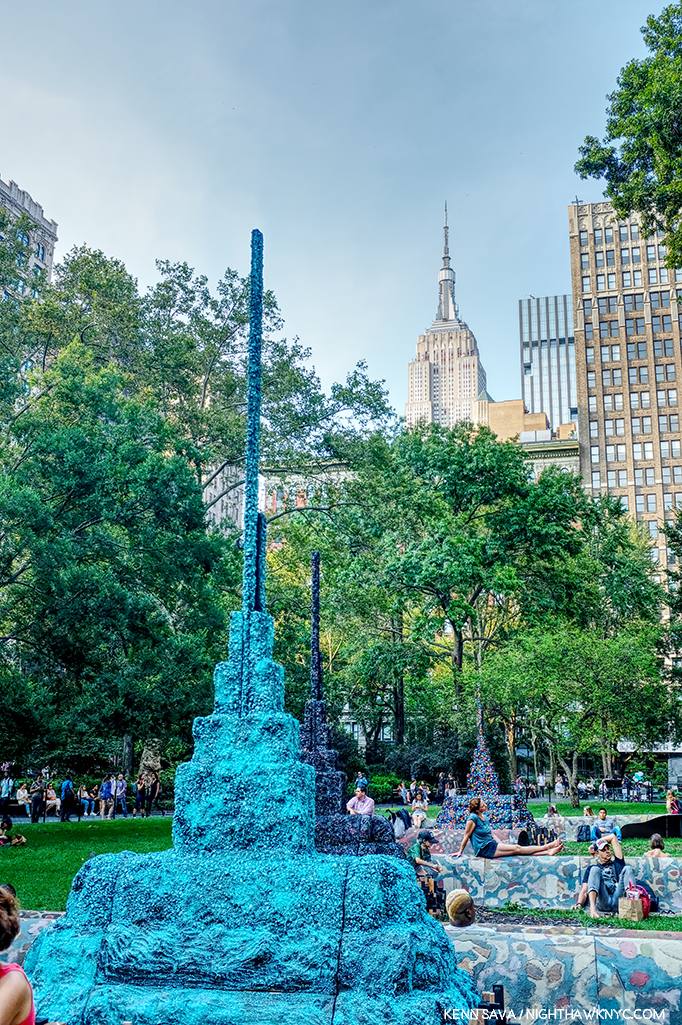
Detail of Leonardo Drew’s Public Art project, City in the Grass, 2019, seen in August in Madison Square Park, where it was on view from June through December. In conversation, Mr. Drew spoke of the influence of Indian Stupas, though the Empire State Building 10 blocks behind, might be one as well.

A strange year in Art in NYC ended a few weeks ago. A year that saw one of Manhattan’s “Big 5” museums (MoMA) close for four months, including the entire summer, while it remodeled, then reopen to mixed reviews (mine among them), while another one (The Whitney) faced an Artist revolt mid-Biennial, another (The Met) had what seemed to me to be a fairly “quiet” year on the show front as it adapted to the first full year under its new Director, Max Hollein, while the other two, the New Museum and particularly the Guggenheim, chugged along presenting top notch show after top notch show. Meanwhile, no less than 5 shows of the work of Jean-Michel Basquiat were mounted around town, and though I wrote a series of pieces on them I still don’t know “Why now?” While I’ve written about a number of other shows I found particularly NoteWorthy in 2019, already, there were some other excellent shows that linger in my mind, in the space freed up by the plenty of others that do not. If I were to sum of the year in Art seen, I will remember it as a year where Sculpture, long a very overlooked medium, though not here, struck back and broke through.

NoteWorthy Sculpture Shows-

Lingering closest to the front of my mind is the incredible Sarah Sze at Tanya Bonakdar Gallery, which I just wrote about, along with Jean-Michel Basquiat at The Brant Foundation, the most unforgettable shows I saw in 2019.

Leonardo Drew poses in front of Number 217, 2019, Wood, plaster and paint, on the last day of his show at Galerie Lelong, August 2, 2019

Leonardo Drew at Galerie Lelong and City in the Grass at Madison Square Park. Mr. Drew has achieved substantial success around the world, with work in the Permanent Collections of any number of museums, including The Met’s, yet he still seems to be something of a “well-kept secret” to the larger Art public. One of the most original, interesting and visionary Sculptors working today, I thought his show at Galerie Lelong was close to perfect.

Number 215, 2019, Wood, paint and sand.

As with Sarah Sze, the show marked the introduction of Painting by the Artist, though not in the “traditional” sense. The Artist told me Number 215 began as a Painting (his), which he then deconstructed as if it had exploded.

Detail. The show also introduced color into Leonardo Drew’s work.

One monumental work in the large gallery accompanied by five others in the remaining space, each one selected with supreme taste to provide a wonderful group. While his show was up, Mr. Drew also debuted his first Public Art piece, a work commissioned for Madison Square Park.

City in the Grass seen on a day when the lawn was closed to be rested from the non-stop traffic it had been receiving. At the base of each of the three “Stupa”-like structures were wooden “cities” rendered in Mr. Drew’s typically extensive detail to the point that, up close, you could literally spend hours moving through them with your eyes.

In all my years of living in the City, and living here with Public Art, I’ve never seen a piece that was so quickly adopted by the public. Kids endlessly climbed all over it while their parents and other adults languished on other parts of the gigantic piece, as can be seen in the first picture above. Mr. Drew appeared in the Park at least twice to speak about the work and proved to be an extremely thoughtful speaker.

Such was the public acceptance of City in the Grass that even one of the Park’s permanent residents came by to hear the Artist speak about it in a public talk, with renowned writer (and Miles Davis Autobiography co-author) Quincy Troupe, right, on September 11, 2019.

In terms of precedents or influences, Thornton Dial and Jack Whitten (who rented space to Mr. Drew early on the Artist told me) come to mind, but not really. Leonardo Drew is an original. Before he’s done, many decades hence, I believe his work is going to wind up in as many museum as just about any other Sculptor of his generation. 

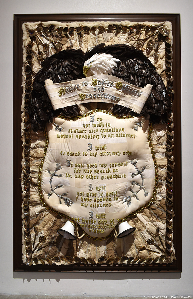
Nari Ward, Homeland Sweet Homeland, 2012, Cloth, plastic, megaphones, razor wire, feathers, chains and silver spoons, 96 x 60 inches. Along with everything else going on in this, the detail is incredible.

Nari Ward: We The People at the New Museum- Since the 1990s Nari Ward has been repurposing a very wide range of mundane, even humble, materials, often in staggering amounts, in new, surprising and exciting ways. We The People was another long overdue retrospective of the work of this exceedingly creative Artist.

Installation view of part of one of the three floors the show filled.

Occupying multiple floors of the building each work was strong, different from the one before, and shared an uncommon ability to linger in the mind. Another blockbuster show mounted by the terrific team of Massimiliano Gioni and Gary Carrion-Murayari for the New Museum, which continues to rise in stature in my eyes.

Installation view of the 2nd of 3 galleries.

John Chamberlain: Baby Tycoons (with Eva Hesse Drawings) at Hauser & Wirth, East 69th Street- Lesser known work by two ground breaking, unique Artists/Sculptors, both no longer with us were paired in a beautifully installed show at Hauser & Wirth’s uptown outpost. While Ms. Hesse’s Drawings provided a fascinating insight into her career and process, Mr. Chamberlain’s gorgeous small works completely enthralled me.

While his classic larger pieces can look completely “accidental,” his smaller work shows the incredible attention to detail that he brought to bear in all of them. 

Wangechi Mutu, The NewOnes, will free Us, The Facade Commission outside The Met, 5th Avenue- The 5th Avenue Richard Morris Hunt Facade has long been a sore point for me. We’ve been living with it as it is for so many of its 117 years that most visitors fail to realize it remains unfinished! Being Landmarked, having neighbors and being in Central Park has kept TM from finishing what was started back 150 years ago and reached this form in 1902. I pray that one day they’ll be allowed to. It’s not like sticking a brand new pyramid in front of it! It’s just completing the existing facade. So, this year I was pleasantly shocked to see they found an extremely creative and Artful partial workaround. The Facade Commission as they call it bring us 4 terrific bronze Sculptures by Wangechi Mutu titled The NewOnes, will free Us that look superb in the heretofore empty niches outside facing 5th Avenue. On view 24/7 through this June 8th, don’t miss them on your next visit. 

As the year ended, all of this left me wondering- Are we in a “Golden Age of Contemporary Sculpture”?

Elsewhere, among the shows I haven’t written about-

NoteWorthy Painting Shows-

Lorna Simpson, Darkening, 2018, Ink and screen print on gessoed wood, 108 x 96 inches.

Lorna Simpson: Darkening at Hauser & Wirth, West 22nd Street- To this point I’ve been familiar with Ms. Simpson’s Photographs, works on paper and collages, but these Paintings came as a shock. Innovative, fresh, haunting, beautiful, the show felt like it came out of the blue, but I’m sure it didn’t. It struck me as a breakthrough. I returned to see it a few times and when it was over I was surprised it hadn’t received more attention than it got, and left me very much looking forward to see where she’s taking this next.

Jasper Johns, After Larry Burrows, 2014, India ink and water-soluble encaustic on plastic, 32 x 24 inches, one of a series of terrific works by the Artist based on this Photograph.

Jasper Johns: Recent Paintings & Works on Paper at Matthew Marks- Though he turns 90 in May, and a Retrospective is on the Whitney calendar, don’t begin to think Jasper Johns is done. One of the last Artists left to us (along with Susan Weil) from his group that included Robert Rauschenberg, Cy Twombly, Merce Cunningham, John Cage, Willem deKooning, et al, I didn’t know what to expect when I walked into Matthew Marks to see this show of recent works. I left determined to return as often as I could before it closed. I’ll admit that I haven’t followed Mr. Johns career as closely as I followed his one time close associate Robert Rauschenberg, who has had a major influence on the way I see the world, but it sure seems his work has continued to evolve and I, for one, found new surprises in this remarkable show. Too old to be drafted for the Vietnam War he was nonetheless deeply effected by it, as everyone living in this country at the time couldn’t help but be. A number of the works Mr. Johns showed were based on an extraordinary Photograph taken by Larry Burrows in Vietnam, a war that tragically produced too many indelible images, called Farley Breaks Down. Among countless others, Larry Burrows, also, lost his life in the war in 1971. While Photography has been the basis of countless Paintings, in these it was most subtle, almost like a memory, complete with the “haze” of camouflage-like coloring, yet its power was undiminished. Seeing these brought to my mind that one of the things that brought Mr. Johns wide attention early on were his Flag Paintings in the late 1950s.

Henry Taylor’s Mural at Blum & Poe, September 24th- before he modified it.

Henry Taylor: NIECE COUSIN KIN LOOK WHO LONG IT’S BEEN at Blum & Poe- It’s been 2 years since Mr. Taylor’s “New York Moment,” as I called it, when his mural debuted on the High Line concurrently with his being one of the “stars” of the 2017 Whitney Biennial, given both his prominent placement with a large work in the lobby on the 6th floor and an entire gallery he shared with his friend, Deana Lawson. His first solo show since showed that not even hip trouble, which sounded serious, could keep the Artist from traveling and continuing to work.

Henry Taylor uses my pen to modify his Mural seen above, September 24, 2019.

The opening was highlighted, for me, by meeting Mr. Taylor, who proceeded to borrow my pen to modify the largest works in the show right in front of my eyes, and later proceeded to inscribe a message on the wall in the garden. Mr. Taylor seemed in fine form, not showing any lingering effects of his ailment and the work on view was classic Henry Taylor. A number of visitors approached Mr. Taylor asking for him to sign his recent monograph. I couldn’t help notice that he seemed to Draw in each book, something that indicated to me he’s another Artist who can’t stop Drawing. Of course, in my copy, he appended a sketch of my pen.

The social revolution… Installation view.

Meleko Mokgosi The social revolution of our time cannot take its poetry from the past but only from the poetry of the future and Pan-African Pulp at Jack Shainman Gallery, West 20th, West 24th Street, and The School, Kinderhook, NY- The now Brooklyn-based Artist is so prolific his latest work occupies no less than THREE of Jack Shainman’s spaces, including the entirety of The School in Kinderhook, NY, out of reach for this writer.

Pan-African Pulp installation view. In this series, Mr. Mokgosi uses source images from the 1960s South African photo-novel Lance Spearman “to examine the history of pan-Africanism.”

The two Chelsea shows I was able to see are marked by remarkable, continued, growth leading me to feel that Mr. Mokgosi is yet another Jack Shainman Artist, like Kerry James Marshall before him, on his way to museum collections. 

Lucian Freud: Monumental at Acquavella Gallery and Francis Bacon’s Women at Ordovas- Two shows that barely made the cut, with both ending in early January, served as a reminder that I didn’t really need of the fact that both Painters, one time friends, are towering figures in 20th century Art who’s influence remains strong. I couldn’t help wonder how the Freud show benefitted by the presence of legendary former Metropolitan Museum Director, Philippe de Montebello, now a Director of Acquavella Gallery, right across the street from his former and long-time 1000 Fifth Avenue home.

The show featured Mr. Freud’s nudes, emphasizing his extraordinary way of Painting flesh, the aspect of his work that has long fascinated me as much as any other. Here, the only clothed figure in the show.

Regardless, it was an exemplary, concise, museum quality gallery show of the work of an Artist who hasn’t had a show here in too long.

Among many other things, Francis Bacon reintroduced the Triptych to Painting.

Nearby, Bacon’s Women, a subject I can’t say I’ve ever heard broached before, was a revelation. The surprising concept was beautifully executed and mounted in Ordovas’ classic East 77th Street townhouse. Francis Bacon has proved to be an Artist who’s accomplishment has only grown more and more interesting and relevant as time has passed, and so, the rare chance to see some of his lesser seen work was not to be missed.

NoteWorthy Drawings Shows-

Installation view.

William Kentridge: Second-hand Reading at Marian Goodman- The legendary South African Artist returned to NYC with what seemed to me to be more innovations in his unique and powerful Drawings, along with a selection of his equally unique Sculpture, and Film, shown in the room behind his Projector Sculpture, above.

Installation view of 3 of the 7 monumental charcoal Drawings, yes Drawings, in the show by a contemporary master of the medium. Mr. Longo  told me it took 6 months to create the one on the right, 8 months for the one on the left.

Robert Longo: Fugitive Images at Metro Pictures- During his Artist’s talk in the gallery on January 11th, Mr. Longo broke down discussing one of his pieces with Nancy Spector, Artistic Director of the Guggenheim Museum. I came away even more impressed with the Artist, who’s work I already hold in high esteem.

Robert Longo in conversation with Nancy Spector, Artistic Director of the Guggenheim Museum in front of a Drawing of North Korean soldiers.

Not one to miss a perfect segue…If I had to single out one person who had a great year in NYC Art in 2019, it would be Nancy Spector, who, along with her team, produced a steady string of very good shows at the Guggenheim, continuing their run these past few years, a number of which I’ve written about.

NoteWorthy Photography Show

Vik Muniz: Surfaces Installation View. These are called multimedia. A close look reveals the numerous layers of each work in which Mr. Muniz reinterprets 20th century abstract Paintings to fascinating effect. Garden Design, after Roberto Burle Marx, Pierrot, after Willys de Castro, Composition/Space, after Cicero Dias, Surfaces, 2019, Multimedia, left to right.

Vik Muniz: Surfaces and Museum of Ashes at Sikkema Jenkins & Co- Looking through the two volume Vik Muniz Catalogue Raisonne, the first thing that strikes me is that it’s arranged in sections according to the technique he used, something I can’t say I’ve seen before, and something even more remarkable when you consider that a good number of these techniques he invented. Along the way, he’s already created a substantial body of memorable pieces, which have gained him worldwide recognition.

Detail of the layers of Garden Design, after Roberto Burle Marx. As a result, each piece is unique.

He was at it, again, adding yet two more innovations, in his remarkable two part show at Sikkema Jenkins & Co. Beyond his endless inventiveness, technique being a means to an end, the results have continued to resound. No mean feat when you consider that one part of his show was based on famous masterpieces of Painting, above, in the Surfaces section of the show, the other based on “resurrecting” Art works lost in a fire, turning their very ashes into recreations, in the Museum of Ashes section. Surfaces was based on Paintings by Arthur Dove, Hans Hoffman, Stuart Davis, Carmen Herrera, Ellsworth Kelly, Marsden Hartley and Romare Bearden, among others, adding a new dimension to the perception of each of these works. Daring!

Vik Muniz recreated works from the Museu Nacional from their very ashes! Here he recreates its facade. Museu Nacional, Museum of Ashes, 2019, Archival inkjet print.

On September 2, 2018, the entire Museu Nacional in Rio de Janeiro burned to the ground, including all its collections amassed over the past 200 years. The museum was Muniz’ favorite cultural institution in the city, a place he visited often with his children. On the wall card to this section, Mr. Muniz said, “I cried upon learning of the fire as if I had lost something personal, some kind of string that held the insanity of my present together.”  The Artist proceeded to work with the archeologists sifting the ashes of the building and its contents and was provided with ashes and the exact location they were found.

Beetle, Museum of Ashes, 2019, Archival inset print.

He proceeded to reconstruct some of the objects that had been lost- in ash, which he then Photographed. The results speak for themself, and, amazingly, echo what has been lost.

As 2020 gets underway, there would seem to be a bit more stability on the horizon, but not entirely. Change, after all, is the only constant in the universe. The protests at the Whitney resulted in board resignations, and MoMA plans to be open for the full year, as far as I know now. Art in NYC, 2020, however, will already be remembered for two memorable events. The Met marks the 150th Anniversary of the opening of its iconic 5th Avenue location this year- with a closing. 2020 will also be remembered as the year the short-lived Met Breuer closed.

*- Soundtrack for this Post is “Restless Farewell” by Bob Dylan from the timeless The Times They Are A-changin’, 1964.

NighthawkNYC.com has been entirely self-funded & ad-free since 2015! If you’ve found it worthwhile, PLEASE donate securely by PayPal below to allow me to continue. Thank you, Kenn.

You can also support it by buying Art, Art books & Music from my collection!
Art & Books may be found here. Music here and here.

Written & photographed by Kenn Sava for nighthawknyc.com unless otherwise credited. To send comments, thoughts, feedback or propositions click here. Click the white box on the upper right for the archives or to search them. Subscribe to be notified of new Posts below. Your information will be used for no other purpose.

Sarah Sze: Creativity, Unbounded

This site is Free & Ad-Free!
If you find this piece worthwhile, please donate via PayPal to support it & independent Art writing.
Other ways to support it at the end. Thank you!

Written & Photographed by Kenn Sava.

“I bring together the materials I find around me. I gather them to try and create immersive experiences that occupy rooms, that occupy walls, landscapes, buildings, but ultimately I want them to occupy memory.” Sarah Sze, TED Talk.

Crescent (Timekeeper), 2019, Mixed media

In the 4 1/2 years of NHNYC I’ve never yet called a Contemporary Artist a genius. Until now. [Drum roll]

Sarah Sze is a genius in my opinion.

As I take stock of the Art I saw in 2019, along with Jean-Michel Basquiat at The Brant Foundation (which I looked at here), the most unforgettable show I saw this past year was Sarah Sze at Tanya Bonakdar Gallery. As I write this three months after it closed, it’s at the front of my memory of everything I saw last year.

Overflowing. Sarah Sze began on the outside(!) of the gallery’s doors and windows.

Detail of part of Images in Refraction (West) on the western part of the facade of Tanya Bonakdar Gallery (to the left in the previous picture) reveals the multimedia nature of what’s on view inside, and the multi-dimensional talent of the Artist. Painting, Sculpture, Collage, Engineering & Architecture, Photography, Film, Installation- you name it. You get it. And then some.

I’ve seen her gallery shows over the past decade, and each time, I left shaking my head. Part sculpture, part installation, part construction project, part hardware store free-for-all, they were always impossible to fully take in at one look. You saw their shape from a distance and admired the overall composition, and then learned the devil was in the detail, and the detail, and the seemingly endless detail. Still, I wasn’t prepared for her expansion into multi-media, including the debut of her Paintings, she presented on West 21st Street this fall where not even two floors, the reception area, the ancillary walls, both sides of the galleries windows, doors, or the space under the stairs were enough to contain her seemingly boundless creativity.


Looking out at the view seen previously of Images in Refraction (West), with installation on the wall, right, leading to the first gallery.

Not to mention 4 galleries filled with her trademark seemingly infinite detail.

Detail of the ever-changing projection that filled the walls surrounding Crescent/Timekeeper.

After the lead-in provided by entering the gallery and passing through the prelude in the reception area, Crescent (Timekeeper), 2019, turned the large gallery into a fully immersive experience from the moment you entered the space and tried to take it all in from about 25 feet away, as may be seen in the very first image above, like some alien craft in a pre-2001:A Space Odyssey 1960s sci-fi movie. “Yes. Something landed…and…it’s glowing! Moving in for a closer look. Tell Lana I love her…” Situated near one far corner allowed embedded rotating projectors to have much of the surrounding walls to themselves engulfing you as you enter the space.

Close up/Details of the center section of Crescent (Timekeeper). Stepladders are a recurring motif in Sarah Sze’s work. As she’s said, “Everything you need to make the piece is in the piece.”

As you approach between two “arms” extending out on the floor, you realize that the center section contains about 50 screens of varying size. Standing there for a few moments reveals each one of those screens contains projected images moving independently of each other. Yet, tracing them back, you find only a few overhead projectors. ? On one visit the work struck me as an almost nostalgic look at life on earth. Suffice it to say, you need to experience it for yourself.

To the stars…Gazing at the top of the “superstructure” of Crescent (Timekeeper), 2019, Mixed media.

With so much to see in just this work, I was somewhat shocked when I realized Crescent (Timekeeper) wasn’t the only “monumental” work on view!

Detail, part of one of 4 walls that makes up After Studio, 2019, with the work Surround Sound (After Studio), 2019, Oil paint, acrylic paint, acrylic polymers, ink, aluminum, archival paper, disband and wood, 103 1/4 x 130 inches, center. No Photo can begin to covey what it was like to be in this work, which is what visitors to this space were, but looking at the piece on the wall, center, the first “Painting” by Sarah Sze I’ve seen, might begin to.

In a smaller, rear, gallery on the first floor, I encountered one of the most amazing things I’ve ever seen in an Art show- what looked to be a complete (re)construction of one of her studios down to the last detail. A work titled After Studio, 2019. It appeared to me to center around a series of Paintings by Sarah Sze, the first I’ve ever seen, though they are as much Collage as Painting. ”In the age of the image, a painting is a sculpture,” Sarah Sze said in 2019.

Details of details from the right of center section of Surround Sound (After Studio) seen above.

That sentiment puts her in the direct line of Picasso & Braque’s Cubism, Marcel Duchamp, Joseph Cornell, Robert Rauschenberg, Jasper Johns, Jack Whitten, Frank Stella and, more recently, Mark Bradford and Julie Mehertu. With everything Sarah Sze includes in her Paintings, two things struck me as particularly interesting- her use of Photography (apparently her own), and her “use” of words. They’re there, if you look closely, but they almost exclusively appear to be “notes to self” rather than to others on “post-it” like notes. I was told that the Artist went back and replaced each one with archival equivalents as she completed the work. Yes Surround Sound (After Studio) is complete, and some very astute museum bought it.

The corner of the opposite and adjacent walls. Remind yourself- You’re in a gallery.

I returned to experience After Studio again and again and it felt to me like I was walking around in the Artist’s mind. Often when I see Art, especially landscapes, I close my eyes to feel the presence of place in the piece in my mind’s eye. Here was one “landscape,” I couldn’t keep my eyes open long enough to drink in. Nary a foot of After Studio, save for the center space to move around it, lacked vision or wonder. When I left if for the last time on October 17th, I was fully in awe1.

Another detail, this one interesting for showing some of the Photographs the Artist may, or may not, use, along with what may happen to them on the way.

On the 2nd floor, the large back gallery contained more Paintings, and a Painted floor. All told, nine Paintings were in the show. I guess I shouldn’t be surprised by the appearance of her Paintings, after all Sarah Sze studied to be a Painter for a decade before turning her attention to “make meaning of the things around us through materials2.” For me, as amazing as the installations are, the Paintings linger with me every bit as much. No small feat.

I am thrilled to see her interest in Painting return in stunning works like this. 12 Landscapes (After Object), 2019, Oil paint, acrylic paint, acrylic polymers, ink, aluminum, archival paper, disband and wood (triptych), 73 1/2 x 110 1/4 inches.

Detail of 12 Landscapes (After Object).

I was told the show took 2 1/2 weeks to install- for a show that only ran for 6 weeks!

Images in Translation, 2019, Mixed media.

Finally, upstairs in the Project Room, Images in Translation, 2019, was installed in the dark, making it very hard to get a shot of that comes close to doing it justice.

Detail.

Time to head downstairs and back outside.

Looking down from 2 flights above at Images in Refraction(East) under the stairs.

I then immediately started scrambling down West 21st Street to find the pieces of my exploded mind that had wound up on the ground. On September 21st, the opening day of the “New” MoMA, two days after Sarah Sze ended, I discovered this installed on the 6th floor-

Sarah Size, Triple Point (Pendulum), 2013, seen at MoMA, Opening day, September 21, 2019

Sarah Sze’s Triple Point (Pendulum), a work that was originally shown at the 2013 Venice Biennale when the Artist represented the USA, was on display, front and center, in the exhibition Surrounds: 11 Installations.

The immersive experience Sarah Sze gives us in Blueprint for a Landscape in the 96th Street 2nd Avenue Station is based on a fantasy of the construction of Hudson Yards, which is no where near it.

Though that show, too, has now ended, New Yorkers are able to see Sarah Sze’s work anytime- 24/7/365. Ms. Sze created the Art in the 96th Street Subway Station on the new 2nd Avenue line, which opened in 2017, making her one of a handful of Artists who’s work was installed during the creation of the brand new Subway Station it will be seen in permanently. I’ve lauded before the taste of those charged with selecting Art for the Subway, and here’s yet another instance of brilliant vision, in my opinion. Here’s a look for readers without a MetroCard. I can’t help thinking that in 100 years, people will treasure this remarkable video of both the construction of the Station and the Artist actually there, giving a walkthrough-

Sarah Sze is moving between Sculpture, Painting, Photography, Film, Installation and collage in new ways, creating results that have never been seen before. Her work is like the city, like the forest, like a home, and filled with elements, reminders, and the detritus of each. And, in a work like Crescent (Timekeeper), it’s full of what will be memories and associations in the form of images. To what end? As in all great Art, that’s left to each viewer to decide.

More details of After Studio

In my view, though the show marks something of a new “period” in her work, it’s seamless with what’s come before. Already a world famous Artist, could it be that she’s only scratched the surface of her talent? A year ago I’d be shocked to have said that about her work. Now? I’m ready to bet on it.

I have no idea how she conceives her pieces, but in each one of Sarah‘s shows- literally, never more than in her most recent show, I felt like I was walking around inside of her brain.

Ah…so this is what it’s like to be a genius…

*Soundtrack for this Post is “Aurora” by Bjork from Vespertine.

NighthawkNYC.com has been entirely self-funded & ad-free since 2015! If you’ve found it worthwhile, PLEASE donate securely by PayPal below to allow me to continue. Thank you, Kenn.

You can also support it by buying Art, Art books & Music from my collection!
Art & Books may be found here. Music here and here.

Written & photographed by Kenn Sava for nighthawknyc.com unless otherwise credited. To send comments, thoughts, feedback or propositions click here. Click the white box on the upper right for the archives or to search them. Subscribe to be notified of new Posts below. Your information will be used for no other purpose.

  1. I returned on October 19th, the show’s closing day, but there was a line to get into After Studio. I passed and left feeling fortunate to have spent a few hours in it by myself over the run of the show.
  2. Ted Talk

Jean-Michel Basquiat, At 59

This site is Free & Ad-Free!
If you find this piece worthwhile, please donate via PayPal to support it & independent Art writing.
Other ways to support it at the end. Thank you!

Written & Photographed by Kenn Sava (*- unless otherwise credited)

Part 3 of a series…

In January, 1983, Henry Geldzahler asked Jean-Michel Basquiat- “Is there anger in your work now?
He replied, “It’s about 80% anger1.”

Jean-Michel Basquiat, at about age 20, walks with his clarinet at the intersection of East 88th Street and 5th Avenue across from the Guggenheim Museum, circa 1980-81 in a (*-) screenshot from the movie, Downtown ’81, directed by Edo Bertoglio and written by Glenn O’Brien. 39 years later the Guggenheim has mounted a show of work the Artist would create over the next few years.

The Brant Foundation’s Jean-Michel Basquiat was the largest show of the five going on in NYC this year featuring the work of Jean-Michel Basquiat (J-MB, henceforth), or about him. Though it provided a rare opportunity to see a broad range of his Paintings through most of his career, there was no context to the show, beyond it being an exceptional, diverse, collection of his Paintings. My impression was the attention paid to presenting groups of work by theme consisted of a group of portraits in the rear gallery on the 4th floor, a room half full of Paintings of Boxers and a wall of Paintings with unusual stretchers, both on the second floor. The lack of a theme or themes is mitigated by the fact that in many of his works there are multiple themes present allowing viewers to piece together their own narratives in, and between, pieces. Yet, as time goes on, and the focus of J-MB studies turns away from the well-worn biography and more and more to the “less discovered land,” i.e. his work, some of the themes lying just beneath the surface are starting to finally get the attention they deserve.

In that same interview with Henry Geldzahler, J-MB said that “royalty, heroism and the streets” were his favorite subjects. Over on the sixth floor of the Guggenheim Museum, in Basquiat’s Defacement: The Untold Story, the only museum show of the five J-MB and J-MB related shows going on in NYC this year, all three of those themes were featured, with “the streets” perhaps most front and center. The show’s overriding focus was the death of Michael Stewart, a 26 year old Artist who died of injuries he received “on the streets,” after being arrested by the Port Authority Police on September 25th, 1983, for allegedly drawing or writing in the 14th Street L subway station two weeks earlier on September 15th.

The scene of a crime. The 1st Avenue Brooklyn bound L Subway Station, currently under construction. It’s a narrow platform as subway platforms go with nothing obstructing the view from one end to the other. The only entrance/exit, the one Michael Stewart must have entered and been removed through, is just to my right rear. Seen in October, 2019.

A public outcry and numerous protests ensued. The effect was immediate, deep and lasting, as the show reminds us, bringing us right back to the moment. The downtown community of Artists that Michael Stewart, J-MB, Keith Haring, and many others, were a part of, also responded with their creativity. In his “Chronology” in the Whitney Retrospective catalog, Franklin Sirmans writes, “Basquiat always conscious of racial realities is deeply effected by the death of Michael Stewart on September 15th…Basquiat, perhaps in fear, practices a form of denial. He consciously distances himself from the situation. No matter what his art world status might have been, incidents such as this were a constant part of his life2.” He continues, quoting Keith Haring, “One thing that affected Jean-Michel greatly was the Michael Stewart story…He was completely freaked out. It was like it could have been him. It showed him how vulnerable he was.” He then quotes J-MB as saying, “It could have been me. It could have been me3.” Michael Stewart died 8 months or so after J-MB said his work is “about 80% anger.”

Keith Haring’s Cable Building studio after Defacement was cut from the wall to the right of center, where he created it, 1985. *- Keith Haring Foundation Photo.

The show’s centerpiece is a work that has come to be called Defacement (The Death of Michael Stewart), 1983, that J-MB created on a wall of Keith Haring’s Cable Building studio at some point between September 29th and October 5th, 19834.

Keith Haring’s Bedroom, Greenwich Village, 1989. *- Photo by Nancy Elizabeth Hill, Keith Haring Foundation.

When he moved out of the Cable Building, Mr. Haring had it cut out of the wall and framed. In an indication of how he felt about the work, it hung over his bed, where it remained, apparently, until he died, in February, 1990, almost exactly a year and a half after J-MB.

Along with it, in the first gallery were 6 other Paintings and two limited edition prints by J-MB. In the second gallery, the rest of the show recounts the tragic story highlighted by vintage posters announcing protests, newspaper articles and ephemera, accompanied by Art by Keith Haring, David Hammons, George Condo, Lyle Ashton Harris and Andy Warhol. A moving highlight of the show is the inclusion of very rare examples of Michael Stewart’s work, which I have never seen before, from his family’s collection. At the time of his death, Mr. Stewart was planning his first show. Seeing these works now, the sense of lost possibilities remains undimmed 36 years later. Of him, Fred Brathwaite (aka Fab5Freddy) says- “Michael Stewart was a new artist making moves on the scene and one of the few people of color in the mix downtown at that time. He came from an intellectual educated family and wanted to find a place where he could express himself in a cool way around like-minded people….When he was killed and the police claimed he was writing his name on the wall in the subway-which was surprising and seemed unlikely to us- the media jumped all over the idea that he was a graffiti artist. …It was like a chill going through you, realizing that it could be me- it could be any of a number of people I knew. Even though we all knew that Michael Stewart was not the graffiti artist they were portraying him to be, it could clearly have been any person of color, particularly myself and the numerous others I knew who were making art and would occasionally tag a wall, or had that background. That was frightening5.”

Andy Warhol, Daily News (Gimbels Anniversary Sale), ca. 1983, Synthetic polymer paint on canvas, 24 x 16 inches.

Mr. Brathwaite’s testimonial is excerpted from an interview he gave for the show’s exceptional catalog, which deserves special mention. Informative new essays by curators are followed by almost 60 pages of recollections by Artists, journalists, and other figures were were part of this period in NYC history, each based on new interviews conducted by curator Chaédria LaBouvier in 2018 and 2019 that were edited into concise statements for this publication- an amazing list that includes Mr. Brathwaite (Fab5Freddy), Dianne Brill, Michelle Shocked, Kenny Scharf, Eric Drooker, Lyle Ashton Harris, Jeffrey Deitch, Annina Nosei, George Condo, Tony Shafrazi, ABC-TV reporter Lou Young (who did over 60 pieces on the Michael Stewart story), Ronald Fields (a member of the first grand jury in 1983) and Carrie Stewart, mother of Michael Stewart. Their contributions bring the reader, as the show does, right back to the place and time in the kind of detailed recollections only those who lived it on the front lines could relate. When I’ve spoken in Parts 1 & 2 about the need for those who knew the Artist to step up and speak, this is a shining example of what those with first hand knowledge to bring to the table. Anyone interested in Jean-Michel Basquiat, Michael Stewart and/or his tragic end should find their way to the catalog before it goes out of print. Many exhibition catalogs have a notoriously short shelf life after shows end.

Defacement (The Death of Michael Stewart), 1983, Acrylic and marker on plasterboard, 25 x 30 1/2 inches.

In the first gallery, a long, rectangular space leading to Defacement (The Death of Michael Stewart), 1983, as the work is now known, due to the fact the Artist has written “¿Defacement©? ” in the upper center, are other works by J-MB that revolve around the themes of the police, royalty and the death of kings. Defacement feels like a dream, or nightmare, due to the presence of “clouds” of blue, pinkish and black paint. Painted on a white background, the blue figures, with pink/red skin, of the police frame and tower over the central black figure, apparently seen from the back. There are parts of what appears to be two circles in black around the head of the center figure, who’s hands and feet are not visible. Apparently, some of the marks on the work may have been added by others, like the letters on the right side that appear to be (“ZERLOL”), but it appears these circles are under the blue paint and so may have been done by J-MB. One of the policemen appear to be looking out at the viewer.

Francisco Goya, The Third of May, 1808, Oil on canvas, *- Prado Museum Photo.

One thing that stands out to me is the composition in context of Art History, particularly, in works of Goya and Picasso. In Goya’s legendary The Third of May, 1808, the soldiers stand decidedly to the right- the same side as the viewer.

Picasso, Massacre in Korea, 1951, Oil on canvas, *- Picasso Museum, Paris, Photo.

In Picasso’s Massacre in Korea, 1951, the viewer is placed right in the center, with the soldiers on the right, and the victims on the left, one or two of who look out at the viewer. In Defacement, J-MB has also placed the viewer in the center, between the policemen, and directly behind the black figure/Michael Stewart, who appears without hands or feet. The effect made me feel like being in line to run the gauntlet- like you’re next in line, in line with his reported feeling “It could have been me. It could have been me.” It’s hard not to take the Painted “¿Defacement©?” as a double entendre. Did Michael Stewart really deface the subway station? And, why are the police “defacing” him, removing his face from the world?

La Hara, 1981, Irony of a Negro Policeman, 1981, both Acrylic and oilstick on wood panel, both 72 x 48 inches, Untitled (Sheriff), 1981, Acrylic and oilstick on canvas, 51 1/2 x 74 inches, from left to right.

On the right hand wall are three Paintings featuring policemen. All three are different. One has a white officer, one a black officer, one a grey officer (the two in Defacement appear to be pink-ish red). Two have white backgrounds, one red. All three are extremely nebulous (at least to me), even in the nebulous work of J-MB. All three are terrifying, and so perfectly set the stage for, and compliment Defacement.

The prints Back of the Neck, 1983, 50 1/4 x 102 inches, which I saw 14 years ago at the Brooklyn Museum (See Part 1Part 1), who is is on loan from, and Tuxedo (1982-3), 102 1/4 x 60 inches, both prints are editions of 10.

On a wall facing it are the limited edition print, Back of the Neck, also from 1983, my old friend from the 2005 Brooklyn Museum Retrospective on loan from the museum, and another print, Tuxedo, 1982-3, a work that references kings. As others have pointed out, Back of the Neck could be a reference to the injuries sustained by Mr. Stewart.

CPRKR, 1982, Acrylic, oil stick, and paper collage on canvas, mounted on tied-wood support, 60 x 40 inches, Self-Portrait, 1983, Oil, acrylic and oil stick on two wood doors and wood panel, with graphite and ink on paper, 96 3/4 x 63 3/4 inches, and Charles the First, 1982, Acrylic and oil stick on canvas, three panels, 78 x 65 inches, left to right.

On the 4th wall are a stunning trio centered around the Self-Portrait, 1983, and two works that pay homage to another of J-MB’s “Kings,” Charlie Parker. Both of those relate to (his) death, and the death of kings. To the left is, perhaps, the most poignant work the Artist did referencing Bird, CPRKR. In it, he memorializes his death, listing the place and date, under a crown, with the moniker, “Charles The First” written below. And so, it fits with Defacement. Right next to it is the Self-Portrait, 1983, which in this show is impossible to think about without considering the year it was Painted, particularly since on its right-hand panel, the words “To Repel Ghosts” are Painted. To the right of these is Charles the First, 1982, with it’s equally haunting words “Most Young Kings Get Their Heads Cut Off” written along the bottom. Of the “young kings” referenced in this room, Michael Stewart died at 26, J-MB at 27 and Bird at 34. Charlie Parker turns 100 on August 29, 2020. Michael Stewart would be 61 today. As I pointed out in Part 2, J-MB should be 59 years old RIGHT NOW, in mid-career as the museums call it. Both should be living, vibrant, forces. Not ghosts.

Jean-Michel Basquiat, Untitled, 1987, Andy Warhol, Daly News (Gimbels Anniversary Sale), 1983, Keith Haring, Michael Stewart- USA for Africa, 1985, left to right.

Not mentioned anywhere that I’ve seen, this is the only time Jean-Michel Basquiat, Andy Warhol and Keith Haring, the three figureheads of the Art of their time in NYC ever addressed the same event, (as far as I know). I’m not saying Untitled, 1987, shown in the group above, seen in the second gallery, is a reference to Michael Stewart- I don’t know, but Defacement is. Describing the amazing Keith Haring work, the defunct website basquiatdefacement.com said, “It depicts a black man being strangled while handcuffed to a skeleton holding a key. People from all nations drown in a river of blood below, while others shield their eyes from the scene, and the green hand of big money oversees the scene6.”

Michael Stewart poses for Dianne Brill Menswear, 1983, from the show’s catalog. “Michael was buried in a suit I designed,” Dianne Brill writes in her piece in the catalog (P.107).*

Basquiat’s Defacement: The Untold Story is one of the most powerful, smaller shows I’ve seen in years. Though it depicts events that took place 36 years ago, its relevance was, I’m sure, not lost on a good number of its viewers.

Alexis Adler, Jean-Michel Basquiat (the exact title is unknown to me).

Two other shows, the last two I saw in the group of five7, document little seen sides of J-MB. In The 12th Street Experiment: Photographs of Jean-Michel Basquiat, the Photographs in question are by embryologist and former J-MB girlfriend and roommate, Alexis Adler, who lived with the Artist from 1979-80.

Alexis Adler speaks about Jean-Michel Basquiat and her Photographs of the Artist at The Bishop on Bedford Gallery, Brooklyn, May 18, 2019.

A veritable Portrait of the Artist as a Young Man, this was a show that, along with the items in Ms. Adler’s archive J-MB left behind in, and on, her apartment (on tour in museums shows elsewhere at the time, most recently at the Cranbrook Museum, The Museum of Contemporary Art, Denver and in Europe), form an important and unique collection. In my research, I’ve come to see that J-MB’s formative period after he left home for good has gone largely overlooked and understudied. Alexis Adler has stepped forward, sharing her experiences and her knowledge, in books, essays and traveling around the world speaking about her time with Jean-Michel Basquiat from 1979-80 and his Art, in addition to sharing her collection in the shows I mentioned. As she walked me through the show of her Photographs at The Bishop Gallery on Bedford, Brooklyn, I was amazed at both the J-MB work that Alexis has documented in Photographs and the range of experimentation the young Artist was undertaking- extending down to his continually evolving hairstyles! Lacking funds, he worked with whatever he found, whatever was at hand- including the doors, walls, and floor of the apartment, and whatever he found on the street, making him part of the line that includes Duchamp, Rauschenberg and Jasper Johns, among others.

A Performance piece that involved installing a television set in a refrigerator. J-MB wears one of his hand Painted helmets here in one of a series of Photographs documenting the performance.

There is an element of performance in a number of these Photographs and in the work, which took place at the time he was performing with his band, Grey (and he is seen practicing his clarinet). Personally, I find this work fascinating and remarkable- on its own and for what it anticipates. A good deal of it might surprise many only familiar with his Paintings and Drawings.  This period seems to me to be more than only “early experimentation,” as it contains the roots and beginnings of much that came after, including his Painting. That he was Painting on everything he could find (out of a lack of funds for traditional Art materials, no doubt), presages his later Paintings executed on doors, like Self-Portrait, 1983 in the Guggenheim show, to fence slats, like Gold Griot, seen at The Brant in Part 2, among others.

Alexis Adler, Basquiat in the apartment, 1981. Note the work by Bacon right behind his head. In another of Alexis Adler’s Photos, Burroughs’ Naked Lunch is seen attached to the wall. More evidence of J-MB’s Beat connection I mentioned in Part 1.

In addition, Ms. Adler said that J-MB studied her Art textbooks from the classes she was taking at the time. I found fascinating evidence of this in this Photo of hers, where a work by Francis Bacon is mounted on the wall. I wondered in Part 2 what Francis Bacon would think of J-MB’s Untitled, 1981. Here is the proof that J-MB knew of Francis Bacon’s work that very year.

Alexis Adler, Painted television in the apartment, c.-1979–1980. It’s amazing this Photo of the work exists, but I would love to see it in color because there’s nothing else like this in his subsequent Paintings!

Ms. Adler, who spoke about having her ear to the ground and priding herself on being aware of what was coming next, said she “knew” J-MB was an important Artist almost immediately. “He said he would. I was definitely the first one to believe him. Everyone else was like, ‘Sure Jean.’ He was brilliant. I could tell. His spirit — everything about him. He was an amazing person, a very deep-thinking individual.” It’s only because she acted on that feeling and bought a camera that we have a record of these works which would otherwise be lost to history.

Alexis Adler, Refrigerator in the apartment, ca. 1979-80, Untitled (Famous Negro Athletes), 1980-81, left to right.

Seeing the show, I came to feel that this early period of J-MB should be appreciated as a “period” of his work every bit as much as his later work has been broken down into periods. It stands apart. While it’s formative and precocious and different from what he’s “famous” for, it’s a part of the whole. It has the same spirit of freedom, of experimentation, the unexpected, of seeing new possibilities that characterize all his work.

Lee Jaffe was a Musician at the time who had just recorded and performed with Bob Marley when he met J-MB. The two struck up a friendship and traveled extensively together. In the fifth and last show I saw, Lee Jaffe’s Photographs of J-MB at Eva Presenhuber Gallery, show him in relaxed settings, where the Artist is just being himself. He’s seen as just another tourist, mugging with other tourists, and looking extremely at ease.

Lee Jaffe, Jean-Michel Painting in St. Moritz, 1983-2019, Dye sublimation on aluminum, 60 x 209 inches.

The highlight of Mr. Jaffe’s show for me was this fascinating montage showing J-MB creating a work in St. Moritz, virtually from start to finish, something I don’t recall seeing anywhere else.

Four Untitled works, 1985, far left, with three black & white works from 1984-2019. J-MB, as a real person. About two hundred feet behind that wall on the right, Jean-Michel Basquiat lived from 1983, until he died, on August 12th, 1988.

Somehow, these images felt jarring to me after reading so much drama-soaked biography and anecdote. Compounding this “reality,” ironically, the show was installed at 39 Great Jones Street, just a few doors west of 57 Great Jones Street, where J-MB lived, and died, which I showed at the very beginning of Part 1 of this series, bringing this five-month journey full circle.

Coincidentally, right around the corner from The Brant, on B and East 10th Street, is Charlie Parker Place, where Bird lived from 1950 to 1954, in the building to the right with the woman in white on the stairs. May, 2019.

A few weeks after seeing The Brant show, I took a trip to “Charlie Parker Place,” on Avenue B where Bird lived from 1950 to 1954. Taking stock of everything I’d seen, I sat across the street in Tompkins Square Park and listened to Bird, trying to hear him through J-MB’s ears. The soaring, unexpected majesty, the spontaneous “flights” of imagination, the beauty (much of it created in the sordid world of 1940s nightclubs, rife with drugs, crime and of course alcohol), the daring, the guts to be different, to be yourself…to be free, inside yourself, and then outside. I was sitting a mere 4 blocks from The Brant Foundation, and around the corner from where J-MB lived with Alexis Adler. As such, ironically, I was at a sort of center of this whole journey I’d been on, right across the street from Bird’s former residence, a man who’s been a part of my evolution, too.

I kept thinking back to the fact that J-MB lost his spleen, his (blood) filter, when he was hit by a car at age 6. That’s what his work looks like. It includes everything, everything around him, at the time, or in his experience. So much is going on in modern life, how else can you really depict it? The only “filter” in the work of Jean-Michel Basquiat is that of his unique eye and sensibility.

The Artist @OR1EL poses with his work which includes what appears to be a Portrait of Jean-Michel Basquiat next to his left knee. I note a J-MB Crown on his left shoe. Seen at the 8th Avenue L Station- 4 stations west of the L station Michael Stewart was arrested in, May 28, 2019.

Alas, Jean-Michel Basquiat isn’t 59 right now. He’s a ghost, a spirit. His Art is only 31 to 40 years old. It remains very much alive- speaking to, and moving, an extraordinary number of people. In the 31 years since his own tragic end his influence seems to still be increasing.

Charlie Parker Place, June 7, 2019.

As I left Charlie Parker Place that June day, I was startled to see what someone had written on a newspaper box right on the corner. Downtown 81 is the film that J-MB starred in made in 1980-81, a still from which I showed at the beginning of this piece. In the same style as the Film’s logo, someone had appended “DOWNTOWN 18.” Jean-Michel Basquiat learned from those who came before him, and today others are learning from him.

Portraits of Jean-Michel Basquiat and his associates Keith Haring and Andy Warhol flank Frida Kahlo at 22nd Street & 10th Avenue in Chelsea, looming over the Chelsea Art galleries behind me.

Art history is a continuum. Pass it on.

To answer that question I asked in Part 1– Over these past five months, five shows, all the books, and now three long pieces on his Art, I have come to side with the believers. I’ve come to believe that Jean-Michel Basquiat was, perhaps, the most important Painter known to me to emerge in the 1980s. His work is here to stay.

Postscript-
It turns out I’m not the only one who’s come around to the Art of Jean-Michel Basquiat. Tonight, I went the Preview for the “New MoMA.” And, lo and behold in one of the very first galleries on the 2nd floor, I saw this-

Well? They borrowed it from a “Private Collection.” But, that it’s here is a big statement, and possibly a reversal of their assessment I wrote about way back in Part 1. Now? It appears they feel it’s not only “worth the storage space,” his work is worth giving pride of place to, too. By the way? It’s clear that MoMA’s researchers need to take heed from J-MB’s own words that he was “not a graffiti artist,” which I quoted in Part 1. They also left out that Glenn O’Brien wrote the screenplay for Downtown ’81, which I showed a still from up top. He cast him in the Film after featuring J-MB regularly on his cable access show…which brings this piece full circle, too.

– Soundtrack for this Post is “Donna Lee’ by Charlie Parker as performed by the Charlie Parker All Stars featuring the legendary Bud Powell on piano and that other immortal of Music, Miles Davis, on trumpet. Miles was 21(!) when this recording was made, live, on August 5, 1947. In 1976, when I was coming up as a bassist, another genius, Jaco Pastorius, (to my mind, the “Jimi Hendrix of the bass), blew everyone’s minds by beginning his debut solo album with a performance of “Donna Lee” on his bass. Jaco, who I met and spoke with over the years, was tragically killed in September, 1987 at at 35, less than a year before J-MB’s death. Both performances are pillars of the Art of Music. Here’s Bird & Miles-

*My thanks to to Alexis Adler, May Yeung of the Guggenheim Museum, and to Lisa for pulling my coat to Alexis Adler’s talk.

This is Part 3 of my series on the five Jean-Michel Basquiat and related shows going on in NYC this year. Parts 1 & 2 are under this one, or here and here

NighthawkNYC.com has been entirely self-funded & ad-free since 2015! If you’ve found it worthwhile, PLEASE donate securely by PayPal below to allow me to continue. Thank you, Kenn.

You can also support it by buying Art, Art books & Music from my collection!
Art & Books may be found here. Music here and here.

Written & photographed by Kenn Sava for nighthawknyc.com unless otherwise credited. To send comments, thoughts, feedback or propositions click here. Click the white box on the upper right for the archives or to search them. Subscribe to be notified of new Posts below. Your information will be used for no other purpose.

  1. Henry Geldzahler was the former Curator for American Art at The Met, later Commissioner of Cultural Affairs for NYC. He interviewed J-MB in January 1983, for Andy Warhol’s Interview Magazine, as reprinted in Jean-Michel Basquiat, published by Charta, 1999, P.LIX,
  2. Whitney Retrospective Catalog, P.243
  3. from an interview with Suzanne Mallouk.
  4. Defacement Exhibition catalog, P.19
  5. Defacement Exhibition catalog, P.104
  6. Here, footnote 22.
  7. I wasn’t able to get to the sixth show, Basquiat x Warhol, which was 3 hours outside of NYC.

Jean-Michel Basquiat At The Brant Foundation

This site is Free & Ad-Free!
If you find this piece worthwhile, please donate via PayPal to support it & independent Art writing.
Other ways to support it at the end. Thank you!

Written & Photographed by Kenn Sava.

This is Part 2 of my series on the five Jean-Michel Basquiat related shows going on in NYC in 2019. Part 1 is below, or here.

Show seen: Jean-Michel Basquiat at the Brant Foundation, 2019

Outside looking in. The most important show in NYC known to me thus far this year was a show I would be extremely fortunate to see.

Jean-Michel Basquiat, the first exhibition at The Brant Foundation’s new East Village location is a NoteWorthy show because it is a major, museum-quality show mounted at a private institution of the work of a single major Artist with more Paintings on view than all the major NYC institutions, combined, could mount- multiplied twelve-fold. This led me to wonder- What other major Artist-Contemporary, Modern, or Old Master- has so much of their work, and so many of their major pieces in private hands?

The East Village, NYC, May 13, 2019. Looking towards the Empire State Building (rear, left of center). Bad weather, no ticket for the show, no sleep, no umbrella. It was going to take more than that to keep me from seeing this show, AND something close to a miracle to allow me to do so.

It’s easy to have mixed feelings about this. I’ve read some complain that it’s another case of the 1% at its worst; that this show is a case of the very rich showing off. On the other hand, it seems to me that there is a stronger case to be made admiring the vision, and the guts, of the collectors who stepped up and bought much of the work of Jean-Michel Basquiat (J-MB henceforth) when he needed it most, not to mention go through the trouble of sharing it with the public, who, in the case of Jean-Michel Basquiat’s Art, are largely dependent on them doing so to be able to see it. Showing off? Yeah. I guess.

Almost every Artist in the early stages of their career needs the support of buyers and collectors to survive and to continue to create. Yet, it’s also easy to forget that most of these  collectors possibly also bought Art by Artists that have long since been forgotten, (which is one reason I strongly believe in only buying Art you love– if it becomes worth less- even substantially less- than you paid for it? You can always display it and enjoy it.) And? As I wrote in part 1 of this series, the NYC museums, except the Whitney, collectively passed on his work at the time- and continue to do so. The only way they’re likely to fix that now is by gift or donation. The affordability train has long ago left the station for anyone else besides that 1%. The Big 41 had their chance. In the case of some institutions- chanceS, as I outlined.

Unnamed on the exterior, in classic East Village cool, The Brant Foundation, 421 East 6th Street, 10am, Monday, May 13, 2019. If I’m up at 10am, and not STILL up, you know there’s a special reason why. That cab exiting right is leaving with my umbrella, which I will sorely miss over the next hour. See ya!

At The Brant Foundation, a show of 70 Paintings and 1 Sculpture was on view, making it the largest show of Basquiat’s Paintings in NYC since the Brooklyn Museum’s Basquiat Retrospective in 2005, which I saw. Combined with the Basquiat work in the other five 2019 shows, the total approximately equals how many were shown in Brooklyn in 2005. The Brant show largely includes work in the collections of Stephanie and Peter Brant, alongside pieces on loan from the Broad Museum, (a private museum of the collection of another early collector, Eli Broad, who own at least of 13 of J-MB’s Paintings), among other significant loans. Since so much of his work is in private hands who knows how long it will be before we see a bigger or similar number of J-MB’s work here again. So, the six Jean-Michel Basquiat related shows in NYC and vicinity this year (counting the Warhol x Basquiat show going on in Kinderhook, NY, which proved too far for me to get to) might be the best chance I’m going to get to reassess and reconsider his work that it’s barely been 40 years since he began creating it.

The first order of business was getting in to The Brant show and actually seeing it. After all my efforts to get a ticket failed, I resorted to drastic measures. I took the unprecedented step of getting up with 3 hours sleep at 9am and going down to The Brant on May 13th, the last day the show was open, or the day before it closed- I’m still not sure. As I got there at 10am, right as it opened and visitors for the the first timed slots were arriving, I quickly realized this was going to take an act of fate. Compounding things, it was raining and I’d left my umbrella in the cab. I decided to take a Zen approach and stand off to the side, where that tree is to the left, above, and see what happened.

About 30 minutes later, Jessie, the on-top of everything Brant staff person manning the entrance, who knew I was casting my lot to fate, called me over from the door. A lady had arrived and told him she had an extra ticket. Really? A real-life Angel of Providence had appeared when I SERIOUSLY needed one. I walked over and met Lisa, and yes, she had an extra ticket that she was willing to let me use. Miracles really do happen. The fact this piece exists is solely due to her generosity. Seeing it over the 3 and a half hours I spent in it allowed me to flesh out the portrait of Jean-Michel Basquiat’s accomplishment that began for me at Xerox, adding the best look at his most important work I’m likely to get. Any assessment of J-MB’s work and achievement begins with his Paintings. I’d seen 100 works in 2005 at the Brooklyn Retrospective, but I hadn’t prepared to see them. Now IS the time. Lisa’s generosity not only enabled me to create this piece, it also permits me to create the multi-part series on 5 of the 6 Basquiat-related shows I wanted to do, now that she made it possible for me to see the “centerpiece” show of the group. I’m also grateful to Jessie for thinking of me. Due to both of their kindness and consideration, I am thrilled to be able to share what I saw with you.

For a while, it looked like I wasn’t going to get to see this. Standing at the entrance to the show- the lobby of the 4th floor, just after exiting the elevator 90 degrees to the right.  You can see the variance in the lighting in the main gallery from here. Outside, to the right of center is Untitled (Self-Portrait), 1982.

The elevator took us to the 4th floor, where everyone starts and then walks down to the floors below, the show being installed on all 4 floors. It should be said that the group of new visitors getting off the elevator each time on 4 was surprisingly small. The galleries were pretty sparsely filled- incredibly so for a major show on either it’s last day or next to last day. Well, there was well over 1 billion dollars of Art on display, so they opted to keep the crowd manageable.

Untitled (Self-Portrait), 1982, Oilstick and ink on paper, 30 x 22 inches. The first work in the show.

Though the urge might have been to hurry into the large, main gallery shown above, I was stopped in my tracks by the work hanging to the right just outside. There was Untitled (Self-Portrait), 1982, one of the most unique Self Portraits I’ve ever seen. I wondered what Picasso would have thought of it. The colors, and then particularly the black background fascinates me as I ponder at what stage J-MB added it. And then I wondered what Clyfford Still would think of it. Like a number of J-MB’s “heads” from 1981-2, he flattens everything to the picture plane, something not seen all that often in Art. 4 floors of J-MB still to go. What an auspicious start!

A real-life Angel of Providence. Lisa studying Self-Portrait with Suzanne, 1982, in the main gallery on 4.

It turns out that Lisa is a school teacher and an Art lover with superb, wide-ranging, taste that runs from Brancusi through Morton Feldman as I found out as we chatted while going in.

Self-Portrait with Suzanne, 1982. The compelling work Lisa studies above shows the artist with Suzanne Mallouk, the subject of Widow Basquiat, in 2010. It’s the only work known to me created by J-MB showing the Artist with one of his lovers. Beyond this, it’s fascinating to study the way he’s rendered himself here compared with the other “heads” and Self-Portraits from 1981-2.

Before I get too far into the show, I’ll say the building looked brand new, the restoration of the former Con Ed Substation being first class from top to bottom. I have mixed feeling about it’s suitability for the display of Art, but honestly, I get some of those feelings almost everywhere I see Art. In my experience, the #1 problem in seeing art is lighting, combined with the scarcity of truly non-glare glass or acrylic. As my friend, Corinne, co-owner of NYC’s legendary City Frame, tells me- currently, it’s expensive. Then again, not all Painting is glazed. Increasingly, Artists, including Raymond Pettibon and Kara Walker, and Photographers, including Gregory Halpern, have shown their work without frames, often just tacking it to the walls at the corners. Still, glazed or not, lighting- artificial or natural, is a problem that rears its head in almost every show I see. The same was the case at The Brant.

I don’t care how rich I was, I don’t think I’d install a pool over irreplaceable Art.

The fourth floor is the top floor and features a skylight, apparently, filled with water- unless this had collected from the rain? I don’t know. They must either have Lloyd’s of London insurance, 8 million tons of confidence in whoever installed it, or both, to hang a few hundred million dollars worth of one of a kind Art underneath it, including more than one of J-MB’s greatest works, in my opinion. But, beyond this, being a cloudy, rainy, day, the large skylight wasn’t letting in as much light as it might have at other times.

Hanging a few feet from the skylight/pool (as you can see in the installation view earlier) is Untitled, 1981, acrylic and oil stick on canvas, 81 x 69 1/4 inches, from The Broad, L.A., the upper half of which was in a shadow during my visit.

Typical of all the works on view in this room, the upper half of Untitled, 1981, on loan from The Broad in LA was in a shadow. Still, the power of seeing this work in person was staggering. I took all of it in from a distance when I first saw it, then walked over to see the other works in the room. Finally, I walked back over to look closely at it at length.

Detail of Untitled, 1981.

The difference in the experiences is remarkable, as you can see. But, no matter how closely I looked, minding the security rope you can see at the very bottom of the picture above, it was still drawing me closer. Like a Rembrandt, or Van Gogh, where I’d like to study each brushstroke for it’s content, here I was being drawn in to look at each detail. The feeling I got was that each small part of it was a world unto itself, yet irrevocably part of the whole. What, exactly, are we seeing? It’s not a skull because there are eyes and there is hair, at least part of a beard, and some teeth, though others are missing. And there are what appear to be stitches and possibly some letters over all of it- a cryptic message, like the figure, in a language no one had ever seen before. (Compare this to the work on view in Xerox that I looked at in the first Part! There, the details were, largely, words.) This is 1981- a year after the first show the work of J-MB appeared in. It’s a work from near the beginning of his post-SAMO© career as an Artist. And, it’s one of the most remarkable shots across the bow in Art history, possibly since Picasso’s Les Damoiselles or Duchamp’s Bride Stripped Bare. When I’ve seen it in books, I haven’t been able to stop looking at it. Seeing it in person it felt like I’d never really seen it. But, even saying that? There’s literally nothing like this in Western Art history to 1981. In his book, The Art of J-MB, Fred Hoffman makes a case for this being among J-MB’s “key” works. I don’t have a list, but I won’t argue with that. I just keep wondering if Francis Bacon, who outlived J-MB, passing away in 1992, saw it and what he thought, or would think, of it.

Per Capita, 1981

Across from Untitled was the incredible Per Capita, also from 1981, with it’s central figure in Everlast boxing trunks, a halo over his head and his outstretched left arm holding a torch that sure looks to me like that of the Statue of Liberty. Over the halo are the words, “E PLURIBUS…,” or, “out of many,” leaving out the equally famous, “UNUM,” or “one.” The title (which may or may not be the Artist’s title- I simply don’t know), “Per Capita,” means, “per unit of population; per person,” in one definition, per American Heritage Dictionary, and “equally to each individual,” in another. Along the left side appears to be the beginning of an alphabetical list of states with the per capita income of its citizen next to them. Even on a partial list, that manages to include states in 3 of the 4 corners of the country, the variance is striking. Fred Hoffman wrote at length about this piece in his essay in the catalog for the 2005 Brooklyn Museum Retrospective, where he also listed it among J-MB’s key works, where he says the central figure is Cassius Clay, as Muhammad Ali was known when he won the gold medal at the 1960 Olympics (The Art of J-MB, P.129.), which could also make that an Olympic torch.

As I looked at this fascinating work, I couldn’t help wonder if the “UNUM,” or “one” E PLURIBUS was seeking with its … was the solitary figure, as in “Out of many, THIS one.” J-MB’s love of boxers is well known and was to be seen in most of an entire gallery on the 2nd floor, as well as in his portrait (in which he wears Everlast boxing trunks) in the famous Warhol*Basquiat poster for their joint show a few years later in 1985 at Tony Shafrazi Gallery, which could also make this a Self-Portrait.

It’s hard to write about this show and not include every work in it- many are major, many others important for any one of a number of reasons, and they all deserve mention.

Untitled (Car Crash), 1980, Acrylic and lipstick on canvas with exposed wood supports. So much of J-MB’s story and his Painting begins in this work where he recreates the accident where he was hit by a car at age 6 that hospitalized him for a month and caused the loss of his spleen. Seen in the small rear gallery on 4.

On 4, there was also a small rear gallery along the rear of the building. Here, too, lighting was a question. The far wall was lined with a floor to ceiling window, which, you guessed it, let in a lot of light- even on this dreary day. I have no idea if they cover it/partially cover it in full sun.

Untitled, 1981, Oilstick on paper. Seen in the small, gallery in the back of the 4th floor. There’s so much that’s revolutionary in this extraordinary work, and at the same time it gives us another take on the two Untitled (Head) Paintings in the show, this time the “head” is seen from the front and not from an angle and has been flattened, like the picture plane. The right side is almost Cubist.

Down on 3, the lighting was better.

3rd floor. Installation view.

The main source of natural light being another picture window, but this time it was at the end of a large rectangular space and didn’t interfere with the most of the large works on view, including this one-

Untitled, 1982, now in the collection of Yusaku Maezawa, while on loan to the Jean-Michel Basquiat exhibition at The Brant Foundation, May 13, 2019.

In May, 2017, this Painting, Untitled, 1982, by Jean-Michel Basquiat sold at Sotheby’s for 110.5 million dollars. As someone who prefers to consider Art for what it is without the shadow of dollars, as much as possible, this fact gives even me pause for thought. Here it was, on a corner wall of the third floor, appearing as another work in the show as opposed to something “special.” I applaud this decision.

Do I think it’s “worth” 110.5 million dollars? Anything is worth only what someone is willing to pay for it (And, there were multiple bidders for it). Given that the question of whether something is, or isn’t “Art” won’t be settled during any of our lifetimes, only hundreds of years hence if the work continues to speak to people, the question of commerce- supply and demand, is what is rearing its head in Contemporary Art auctions, in my view. Jean-Michel Basquiat’s public career as an Artist only lasted a few months over 8 years, from June, 1980 to his death on August 12, 1988. Though he was extraordinarily prolific during that time, creating 1,000 Paintings and 2,000 Drawings2, included in it are only so many major works (a number that I personally feel is larger than some others seem to think), and Untitled, 1982, happens to be one, in my view. Looking at the lists of the highest prices paid at auction for Art reveals that many, if not most, of them are the best works available as most of the major work by established Artists of, say, Picasso’s time or earlier (considering he passed away in 1973), are in museums which are not likely to part with them. The works auctioned are certainly not the most important works by any of the Artists on the list, as I’m sure most would agree (perhaps not the purchasers), though it’s subjective. The $110.5 million for Basquiat’s Untitled, 1982, is for a major Basquiat, in my opinion.

But, the more astonishing thing for me to realize (Hey? It’s not my money) is that at the time of the auction, in May, 2017, Jean-Michel Basquiat would have been 56 years old! Untitled, 1982, is a work he Painted when he was 21 or 22 years old. People talk about this sale marking the highest price ever paid for a work by an African-American Artist. Others mention the highest price ever paid for a work by any American Artist.

They never mention that this sale makes Jean-Michel Basquiat the YOUNGEST Artist in HISTORY to have a work sell for over 100 million dollars- either by age at the time of the sale (56), or age when he created the work(21-22)!

At 56 in 2017, he would be considered to be in “mid-career” as the museums call it. At 58, right now(!), he should still be every bit the vibrant, revolutionary force in Art he was for the 8 short years of his career. That he already feels like such a part of history is indicative of it being already thirty-one years, this August 12th, since his passing.

Museum Security (Broadway Meltdown), 1983, left, Big Shoes, 1983, Hollywood Africans, 1983, right, a work on loan from the Whitney Museum. The two to the left are in private collections. In 1983, after they were created, these three works hung on the same wall (with other works) at Larry Gagosian Gallery, LA, as is shown in the Whitney Retrospective catalog, P.251

Also on 3 was this striking group of three works, each from 1982, which included a work from an NYC museum!- Hollywood Africans, from the Whitney. These were fascinating contrasts to the collaged work on view at Xerox, Museum Security and Hollywood Africans both featuring words more than image, but were done exclusively in paint, as far as I could tell.

Gold Griot, 1984, Acrylic and oilstick on wood, 117 x 73 inches. You can get a sense of how big it is in the installation view, above.

The somewhat monumental Gold Griot is a very well known work and is memorably recalled in Fred Hoffman’s The Art of J-MB (P.63) as having originated from slat fencing (possibly that referred to in Phoebe Hoban’s book, P.140, that his assistant Matt Dike had acquired from a fence behind Larry Gagosian’s LA house). Mr. Hoffman’s book includes a picture of J-MB creating the work where we see the Painted head looks to be about 8 times larger than his own. Mr. Hoffman references Andy Warhol’s Gold Marilyn, 1962, in speaking of the work’s “pop” influence, with the figure isolated from the gold background, before saying, “The figure is as much a divine apparition as a living human being. With its ethereal gold background surface, the figure of Gold Griot pays homage to sculptural representations of the divine in various sub-Saharan African cultures.3.”

Detail of Gold Griot, 1984.

Looking closer, it’s fascinating to see how J-MB’s depiction of the head has evolved in 2 or 3 years. Gold Griot reminds me of the innovations of Robert Rauschenberg and Jasper Johns, when it comes to Painting surfaces, though it’s resolutely its own work.

2nd floor. Installation view. The work on the immediate left is See Plate 3, 1982, Sculpture in two parts, Acrylic and oilstick on wood, canvas, mounted on wood, the only Sculpture displayed in the show.

The second floor is a bit of a strange space for displaying Paintings. A very tall space, which at first it seems more conducive to the work of monumental Sculptures, like Richard Serra’s, and lined with brick walls. The curators made it work, choosing to install the Paintings in a single row on the two side walls, then salon style on the third wall. While this made seeing the works in the top two rows challenging, it did allow for the maximum number of Paintings to be shown. As a result, I learned to live with it. In hindsight, I’d say they made the best use of the available space throughout the building, though I feel the building was less than ideal for this show because of the uneven lighting and the very high walls on the 2nd floor.

Untitled (Yellow Tar & Feathers), 1982, Pork, 1981, Discography II, 1983, left to right.

Along the sides, important works like Untitled (Yellow Tar & Feathers), 1982, were joined by others not as well known. Discography II contains a list of the details of a Miles Davis Allstars recording session which is historically noteworthy because Charlie Parker performed as a sideman for Miles for one of the only times in his career. To that point, Miles was exclusively a sideman for Bird.

Now’s The Time, 1985, Oilstick and acrylic on plywood, 92 1/2 inches in diameter.

While on the opposite wall, the work referencing Jazz continued with the very cool Now’s The Time, 1985, an homage to the 1945 Charlie Parker record hangs. It also compliments the work on the large wall hung salon style, being they all have unique, experimental stretchers holding their canvases.

On the salon style wall, one thing each of its 16 works share are the unusual stretchers. One thing about J-MB’s Paintings that you don’t hear much about today are his unusual mounts. Constructed for J-MB by his assistants, including Stephen Torton and Matt Dike, there were other examples on the upper floors, and they are another thing that makes his work unique.

Jean-Michel Basquiat, Dos Cabezas, 1982, a portrait of Andy Warhol and a Self-Portrait that presaged the Warhol- Basquiat collaborations in 1985.

The 2nd floor also included a rear gallery, which featured 4 portraits of boxers and 3 other very power portraits.

Rear gallery on the 2nd floor installation view.

J-MB had a deep fascination with boxers, and they appear both as Self-Portraits and as homages. Sometimes both. Sometimes it’s hard to tell which.

St. Joe Louis Surrounded by Snakes showed the boxer, one of Basquiat’s heroes, encircled by sharkish white managers. ‘That was Jean-Michel,’ said Suzanne Mallouk.” Phoebe Hoban. Basquiat, P.113. Early on, Paul Simon attempted to buy it for $8,000., but was thwarted by Rene Ricard. According to the iPad next to it, seen in the installation view, which served in lieu of wall cards, it now belongs to the Brants. (ibid, P.114).

Muhammad Ali changed his name from Cassius Clay in 1964. As Cassius Clay, he won the gold medal at the 1960 Olympics, becoming a hero to many, including J-MB, who references it, here, by using his name at the time, in this work from 1982.

Untitled (Boxer), 1982, Acrylic and oilstick on canvas, 76 x 94 inches. Fred Hoffman calls this immensely powerful work, “… the expression of the black man’s physical and spiritual attributes.” (The Art of J-MB, P.133)

I almost missed the works installed on the first floor. Luckily, I spotted the small sign pointing to them right as I was beginning to look for the exit. Thank goodness I didn’t as it included some of his largest and at least one of his most important works.

Unbreakable, 1987, Acrylic on canvas, 98 x 111 3/4 inches.

I’d never seen a J-MB work like Unbreakable prior to seeing it. Given it’s dated 1987, perhaps this is a glimpse into where his work was heading. In it, he synthesizes everything he’s been using- images, words, and color.

Grillo, 1984, Acrylic, oil, paper collage, oilstick and nails on wood, 96 x 211 1/2 inches- close to 20 feet by 8 feet!

What a powerful, stunning, incredible work Grillo is! It’s taken Robert Rauschenberg’s Combine Paintings in an entirely new direction. I love the juxtaposition of the two panels with figures (one left, one right of center) with the panels immediately to each of their right. I do wonder if this piece was meant to sit on the floor or be raised a foot as it is here.

Detail of the right of center panel.

As I looked closer at Grillo, I noticed a good many color Xeroxes collaged on. Yet, the two figures hold the key to it, I think. On the left is a figure holding a torch. Over his head there’s a pice of wood with nails sticking out of it. That sure could be interpreted as a “crown of thorns.” Around him are various repeated words, including- “Soap,” “Oil,””Butter,” Carbon,” and “Stretch,” along with at least two Bebop song titles- “Well You Needn’t,” by Thelonious Monk and “Half-Nelson,” recorded by Bird. What this figure represents I don’t know, but there are elements of the martyr and the heroic included. The other figure, apparently a king, wears a large crown, accompanied by small attendants to its right, and has his hands raised, like the boxers seen upstairs. He appears to be looking towards the left side figure, and both figures have their internal organs shown, perhaps yet another reference to Gray’s Anatomy.

And, there’s this- The left hand figure, how has a board with nails over his/her head, possibly a crown of thorns?, holds a torch…

The work speaks volumes about how J-MB’s Art has evolved in 7 short years, and the unlimited potential the future held for it, and for him.

…which reminds me of the one seen 3 floors up in Per Capita, 1981.

A few days later, Lisa shared her thoughts on the show. “I thought the Basquiat show was quite spectacular. There were so many works that I had never seen before. In particular, I was struck by the great thick black oil slicks. There is something about this sheen, like shoe polish, that you can’t truly appreciate unless you see the paintings in person. They give the works a lot of dimension and texture. They also remind me of Franz Kline – totally dynamic and emotive in gesture. The oil slicks are bold and grimy, like New York. His compositions tend to mimic graffiti on the street – throw ups, wheatpaste posters, and tags on a wall/single canvas.”

There was a bit of the feel that the show was something of an afterthought to the just completed Louis Vuitton show. A “Hey, we’ve got all this work assembled, why don’t we just put it up in NYC?,” kind of thing. I quickly moved past it, the lighting and other questions with the space I’ve mentioned. Nothing dulled the effect of seeing so much work that STILL looks fresh, vital, and contemporary, in spite of countless imitators, commercial “appropriations” of his symbols and the passage of over 30 years since he left. What I saw at The Brant was the work that has defined the legacy of J-MB- in quite a few of his more well known Paintings, works characterized by his characters, in which his words take much more of a back seat than they did over at Xerox. Thinking about J-MB at The Brant four months later, the show has become more monumental in my eyes.

While Peter Brant may represent what many call “the 1%,” so does Jean-Michel Basquiat. For me, J-MB represents that extraordinary, and extraordinarily rare, group of people who are able to overcome unfathomable difficulties- racially, socially, financially, educationally and, apparently, familial, and some difficulties that appear on the outside to have been self-inflicted (though quite possibly resulting from the others- I’m not a doctor or a therapist), then somehow surmount ALL of that and go on to rewrite Art history in about a decade. How many people can this be said of?

How ever many you choose to include? I’m not sure it would even equal 1%.

This Post is dedicated to Lisa, with my undying thanks. My gratitude is due to Jessie for his consideration. Anyone reading this owes them their thanks as well.

*- Soundtrack for this piece is “Bold As Love,” by another brilliant Artist who died at just 27, Jimi Hendrix, which concludes the timeless Axis: Bold As Love.

“Anger he smiles towering in shiny metallic purple armor…
My red is so confident that he flashes
Trophies of war and ribbons of euphoria
Orange is young, full of daring
But very unsteady for the first go around
My yellow in this case is not so mellow
In fact I’m trying to say it’s frightened like me
And all these emotions of mine keep holding me from
Giving my life to a rainbow like you
[Chorus]
But they’re all bold as love
Yeah, they’re all bold as love”

In lieu of the immortal Hendrix original recording here’s a cover to inspire you to seek out the original-

This is Part 2 of my series on the five Jean-Michel Basquiat related shows going on in NYC in 2019. Part 1 is below, or here.
My prior pieces on Painting are here

NighthawkNYC.com has been entirely self-funded & ad-free since 2015! If you’ve found it worthwhile, PLEASE donate securely by PayPal below to allow me to continue. Thank you, Kenn.

You can also support it by buying Art, Art books & Music from my collection!
Art & Books may be found here. Music here and here.

Written & photographed by Kenn Sava for nighthawknyc.com unless otherwise credited. To send comments, thoughts, feedback or propositions click here. Click the white box on the upper right for the archives or to search them. Subscribe to be notified of new Posts below. Your information will be used for no other purpose.

  1. I’m speaking of Manhattan’s museums, only, here and leaving off The New Museum who have no permanent collection.
  2. according to the Brant Foundation.
  3. ibid P.65

Jean-Michel Basquiat: Now’s The Time

This site is Free & Ad-Free!
If you find this piece worthwhile, please donate via PayPal to support it & independent Art writing.
Other ways to support it at the end. Thank you!

Written & Photographed by Kenn Sava (*- unless otherwise credited)

Part 1 of a series.

It’s hard to believe that not even 40 years have passed since Jean-Michel Basquiat burst upon the Art scene, (after his career as part of the legendary graffiti duo SAMO©), when the month long The Times Square Show opened 39 years ago on June 1, 1980 at 201 West 41st Street. Just eight years, one month and eleven days later, on August 12, 1988, he would be found dead from a heroin overdose at the infamous age of 27 at his home and studio at 57 Great Jones Street.
What appears to be an anonymously applied silhouette of the late Artist looms large here at the one time stable at 57 Great Jones Street, NYC, seen in May, 2019. Back in the day, it was owned by Andy Warhol who rented it to Jean-Michel Basquiat, who lived here from 1983 until he died here on August 12, 1988. His studio was on the ground floor, his living quarters upstairs. By the way? In an interview with Becky Johnston and Tamra Davis, Jean-Michel Basquiat said, “I don’t really consider myself to be a graffiti artist, you know?1” That might surprise those attempting to cover every square inch of the building now.

He didn’t live to see the Art market crash (unrelatedly) the following year, from which it has since recovered and grown many, many fold larger than it was during the bubble of his day, nor did he live to see the end of the controversy around him and his Art. It’s never subsided-
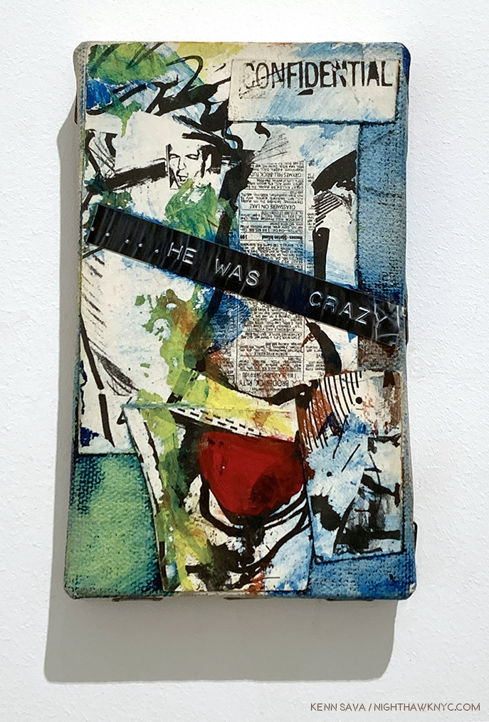
He Was Crazy, 1979, Mixed media on canvas, all of 5 x 3 inches, the earliest and smallest work on view at Jean-Michel Basquiat / Xerox.

-Robert Hughes titled his obituary “Requiem for a Featherweight.”

-“He was essentially a talentless hustler…,” according to Hilton Kramer in a piece titled,  “He had everything but talent” in 1997.

-“Come on…Basquiat? Really? Sort of an art hoax. Just the incoherent rantings of a tortured soul obsessed with drugs and a deluded quest for acknowledgment, which he did achieve. Doesn’t make it good.” A direct quote from the comments more recently here.

Yes, there are still plenty of haters hating on the work on Jean-Michel Basquiat.
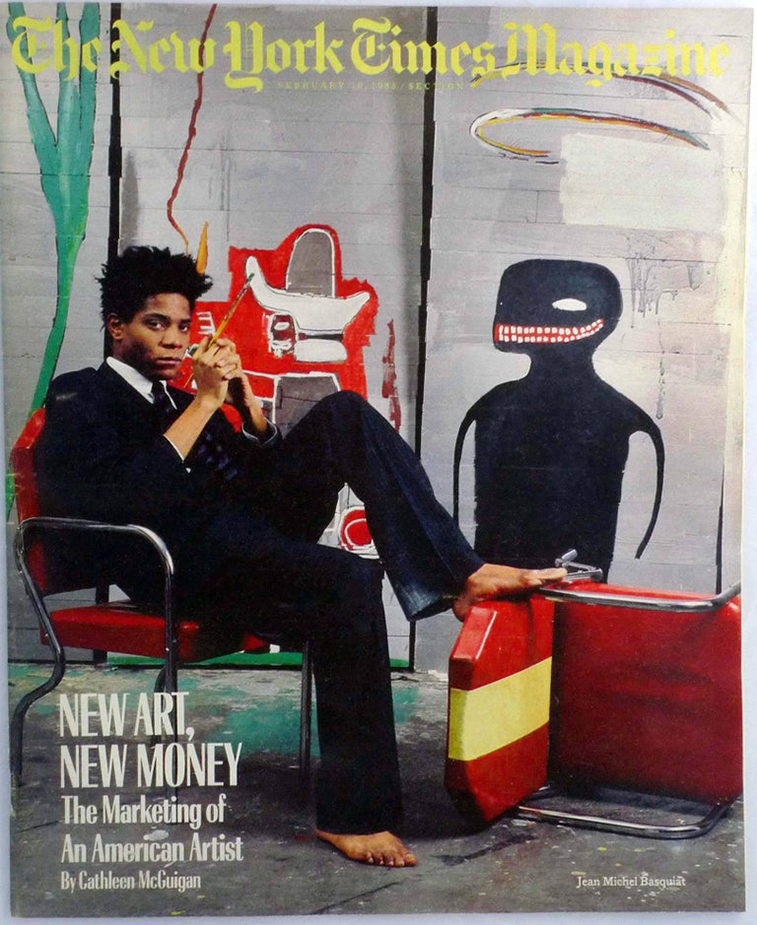
The now infamous cover of The New York Times Magazine from February 10, 1985 by Lizzie Himmel shows the Artist in his studio. The article, by Cathleen McGuigan, included a look at the Artist that seems surprisingly balanced today given all the controversy surrounding him at the time.”The extent of Basquiat’s success would no doubt be impossible for an artist of lesser gifts,” she wrote.

On the other hand, there are the countless other members of the Art viewing public for who Jean-Michel Basquiat’s work has continued to speak since he started making it, and Painting that speaks to people over time is what comes to be accepted as “Art” a few centuries on it seems to me. Yet, the Art viewing public is not the only group divided on the work of Mr. Basquiat. On page 44 of the book, The Art of Jean-Michel Basquiat. Fred Hoffman, one of the curators of the 2005 Brooklyn Museum Basquiat Retrospective and a man who produced prints with Jean-Michel Basquiat (J-MB henceforth) for 2 years, writes, “Herbert and Leonore Schorr offered the Museum of Modern Art the opportunity to choose a painting from their collection as a gift. The museum replied that having a painting by Jean-Michel Basquiat was not even worth the cost of the storage.” On May 26, 2017, this quote appears in the New York Times, “‘It’s an artist who we missed,’ said Ann Temkin, the chief curator of paintings and sculpture at the Museum of Modern Art, which does not own a single Basquiat work2. ‘We didn’t bring his paintings into the collection during his life or thereafter3.’”

6 year old Jean-Michel Basquiat’s membership card to the Brooklyn Museum. It’s not well known that J-MB was an avid museum goer, attending the Brooklyn Museum and later, frequenting The Met with his friend Fab5Freddy. Credit 2015 The Estate of Jean-Michel Basquiat/ADAGP, Paris, via ARS, New York; Hiroko Masuike, via The New York Times.

In fact, as I write this? Of NYC’s “Big five” museums, only the Whitney owns a Basquiat Painting- they own 3, according to their online collection catalogue (none are currently on view as of my last visit, this past month. Also, I should note that among the 5 Manhattan museums The New Museum has no permanent collection. By the way, The Brooklyn Museum owns one print, seen below, and a Drawing.)

None of those feelings were mine though I wasn’t a “fan” of the work of Jean-Michel Basquiat. Then, as now, I was focused on Artists I felt were overlooked. My feeling in the 1980s was that too much money was being spent on, and too much attention given to, Contemporary Artists with no track record. Artists whose work hadn’t stood the test of time, hadn’t stood up to critical, and historical, assessment, whose work wasn’t in major museums, and on and on. By default, though not in particular, that included the work of J-MB. Still, I’ve always kept an open mind. There are very very few Artists or Musicians who’s work I will never, ever love- no matter what. But, there are some. Hitler was a painter- lowercase “p” for once- remember?

May 12, 2005. The only picture I was able to get (quickly) just outside the Basquiat Retrospective at the Brooklyn Museum, since pictures were not permitted inside. Back of the Neck, 1983, Screenprint, right, seen in the lobby and the show’s poster to the left. Glare was a problem in 2005, too. You can see the show in official shots, here.

So, on May 12, 2005, I went to that Brooklyn Museum Basquiat Retrospective that Mr. Hoffman was a curator of. When I got home, I wrote, “His work still doesn’t speak to me, beyond the fact that I so admire his freedom. The show was very well done.” I also came away struck by his love of Jazz. Anyone who loves classic Jazz is OK with me. I also remember being surprised at how prolific he was in such a short time, which reminded me of Van Gogh, who’s Painting career lasted only about a year or so longer. Looking back on it now? My head was elsewhere. I was drawing on a daily basis in a representational style, and so I was lost studying Ingres, Hopper, Richard Estes and Rembrandt, who I had recently gone to Chicago to see a show of. But? Having bought one at the show, I began wearing T-shirts with Jean-Michel Basquiat’s Art on them. His work just fits walking around NYC.
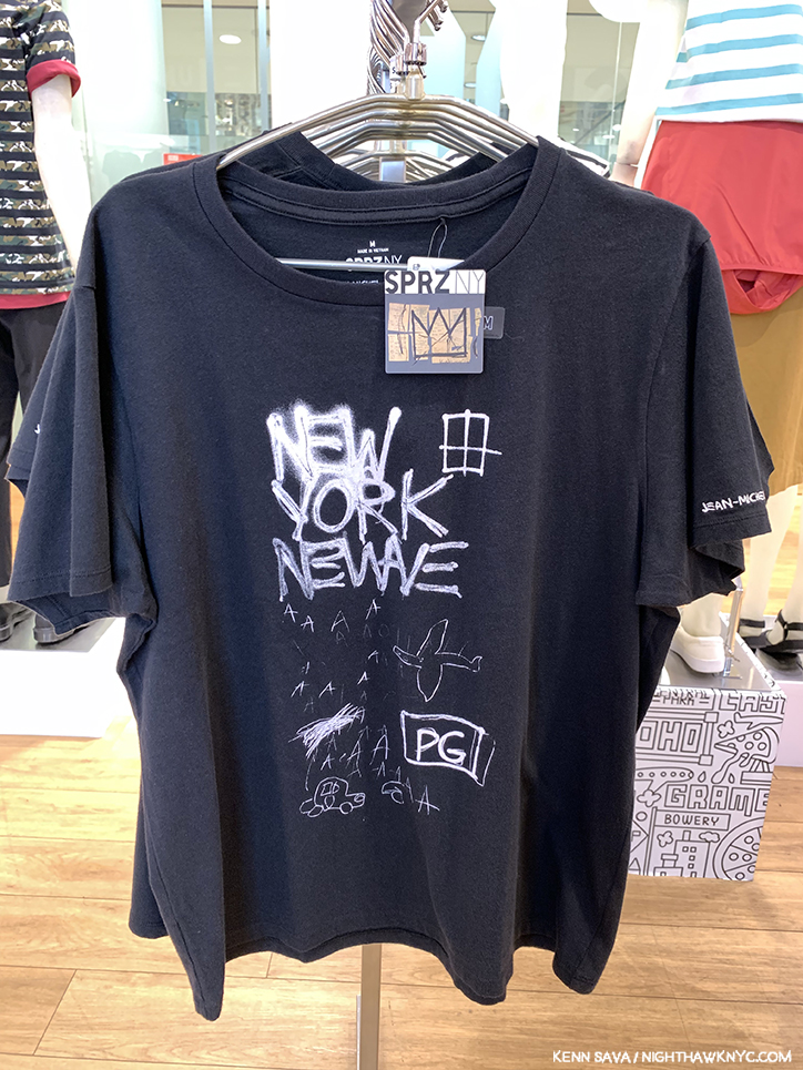
Untitled, 1980, the white on yellow original of which is in the Whitney Museum’s collection, is a work that was shown at New York/New Wave in 1981 at MoMA PS1, now appears on a Uniqlo SPRZ NY Women’s T, seen in June, 2019.

Slight digression- I’m not for giving a free ad here, but I must give props to Uniqlo for putting the Art and cover Art of so many great Artists and Musicians4 on their SPRZ NY line of T shirts. Some of the Art line is co-sponsored by MoMA. In turn, Uniqlo pays for the free Friday nights at the MoMA, which countless thousands attend each week. Uniqlo has continually featured J-MB’s work on their clothes, in spite of the problematic history of Basquiat and MoMA. Fred Hoffman in The Art of J-MB (P.175, footnote 2) relates this story about Untitled, 1983, a limited edition print of 10 copies he did with J-MB- “Untitled was given to the Museum of Modern Art in 1984. After it was in the catalogue for the MoMA 1984 exhibition An International Survey of Painting and Sculpture, the work was completely overlooked by the museum, and excluded when the museum first put its collection online. It was not exhibited in the galleries until 2015. Only with the collaboration between MoMA and Uniqlo beginning in 2014, when a cropped image of Untitled was used as the signature image for the marketing of the ‘SPRZ’ collection of iconic artist images applied to clothes, did the museum finally recognize the work as part of its collection.” 2015! To this day? I still wear Uniqlo J-MB T’s, even though I wasn’t a “fan.” End digression.

Jean-Michel Basquiat appears to be admiring  Nick’s Basquiat tattoo in one of Alexis Adler’s Photos of him at Bishop Gallery. Nick is an Art Teacher.

Ok. So, who’s “right?” The haters, the non-believers, and the NYC museums, who, unanimously, minus one, passed on acquiring his Paintings? Or, the incalculable number of members of the Art loving public to who the Art of J-MB speaks, perhaps, like that of few other Artists today, judging by how often I see others wearing his Art and icons, along with the innumerable Artists who’ve been influenced by his work, and those few collectors who bought up the bulk of his best work shortly after he created it?

All I can show you- pictures were not allowed in the show.

Fast forward. On May 7th, 2019, I went to see Picasso’s Women at Gagosian on Madison. It’s one of those shows that, though small, reminds you, as if you need to be, why Picasso was one of the towering creative geniuses of 20th Century Art, in my view. Each and every work is in a different style, and most were masterpieces. Yet, it’s a show that will only live on in the memory of those who saw it as no photos were permitted. I walked out through the building’s lobby, my head spinning. Just before I exited, next to the front door, I spotted this-

Minutes after I saw this poster my mind began to change.

Jean-Michel Basquiat / Xerox. I asked the guard where it was. “On 3,” he replied. Still recovering from Picasso, I pondered if I could clear my head enough for about 5 seconds, then I went back in and went up to Nahmad Contemporary on 3.

3 hours later, I left, realizing I’d never really seen the work of Jean-Michel Basquiat before. I had missed it. In Xerox, the term “Painter,” all of a sudden feels too small, even for an Artist notorious for getting paint everywhere- including on his multi-thousand dollar Armani suits, as can be seen in the infamous cover of The New York Times Magazine shown earlier.

But, this is a show that features his under-known multimedia works that include photocopies- color Xeroxes being one of his favorite tools, one he loved so much, he bought his own color Xerox machine. (I’m sure there are many others, but right now? I can’t think of many Artists who made color Xeroxes as big a part of their work- particularly Painters.) As a result, here images recur- his own images, exclusively, which is down right refreshing in this age of copious “reappropriation.” Drawings or Paintings that the Artist has Xeroxed and pasted onto canvas which he then proceeded to add to and modify in any number of ways, including Paint on.

Installation view. I was completely unprepared for the depth and endless detail in this body of work I had previously not known.

As a result, in Jean-Michel Basquiat / Xerox, we see J-MB the collagist as much as we do the writer, or the Painter. Suddenly, his work looks different. The figures recede, words come to the fore. Many, many words.

Odours of Punt, 1983, Acrylic, oilstick and Xerox collage on canvas, 40 x 83 inches

Odours of Punt, 1983, was one of the first works in Xerox and it was one of the first works to get to me. A “non-fan” up to that moment, something clicked in me when I saw this. In it, J-MB borrows Painting techniques from all over Art History on his way to making something…else. The history of Painting from 1947, on, was staring me in the face, to the left, while something entirely new and different was vying for my attention on the right. On the left, I felt Clyfford Still being channeled underneath Cy Twombly and Jean Dubuffet yet what he created is something distinctly his own- a remarkable thing in itself. And extremely abstract, at least to my eyes. While its right side felt like it was coming from another world, made up of fragmentary images. Neither side would seem to “go” with the other at first glance, yet, somehow, as my eye and brain moved between the two “worlds” of the work, they manage to hold together almost miraculously well. This is something I’ve felt in the presence of the greatest works of Abstraction, including those by, say, Kandinsky, Jackson Pollock from 1947 to 52, Mark Rothko, Jack Whitten, and Mark Bradford today. It’s incredibly hard to do, which is evidenced by the fact that almost none of them (who’s careers have completed), except for Kandinsky, (who was 77 when he passed away, and Painting abstractly for about 35 years), were seemingly able to do it indefinitely. Jackson Pollock seemed “to lose his fastball” in his last few years and his style began to change, and Mark Rothko lost…his life (I’m not saying that’s related to his Art). Perhaps these are only coincidences. J-MB didn’t make it to 30 years of age.

Detail of the upper center.

On the right, equally abstract to me was what seemed to be a new creative language. “BIRD OF GOD,” “VENUS VII,” “COSTOXIPHOID,””BLUE RIBBON,” and on and on, accompanied by innumerable drawings and diagrams. Man, there’s A LOT to see in this! Even now, almost 4 months later? I feel like I’ve only begun to look at it. For only one example- Costoxiphoid is a ligament that connects the ribs. At age 6, J-MB was injured in a car accident. While he was hospitalized (his spleen, i.e. his “filter,” was removed), his mother brought him a copy of Gray’s Anatomy. It would be a sourcebook for his Art for the rest of his life, and possibly here for “1. Cranial Cavity, 2. Facial,…” to the left of center. The title (assuming this is the Artist’s title- many of his works were “named” by others) is also an enigma. “Odours” referring to “any property detected by the olfactory system,” per Merriam-Webster, and “punt” have multiple meanings, including “an open flat bottom boat with squared ends.”

Untitled, left, and Peter and the Wolf, both Acrylic, lipstick and Xerox collage on canvas, both 1985, both 110 x 114 inches, seen from about 15 feet away, the figures in these pieces are almost entirely swallowed up by everything else.

Walking through Xerox, it was impossible not to begin to understand that J-MB‘s work is deep. Deeper than just about anyone has even written about so far. These works contain a staggering, almost obsessive, amount of detail, and details that swallow up the figures, one of the things the Artist is most famous for. Figuring out what’s going on in all of this detail is going to take 2 things- #1, an expert, most likely one who knew the Artist, or #2- A long time.

Not having known Jean-Michel Basquiat, I, like those born after August 12, 1988, can only look at his work and see what it says to me. In a short time, my looking thus far has given rise to some threads that I am going to continue to study.

First among them is Jazz. Being a former Musician, who produced Jazz records and wrote for a national Jazz magazine for 4 years, perhaps I am pre-disposed to spotting them. Fair enough. While many people talk about J-MB and Hip-hop, looking at the work in this show, I failed to see even one reference to it. This struck me, particularly because one thing that stood out to me at Xerox to the point that I couldn’t overlook it was the CONTINUAL, and extraordinary number of, references to Jazz- be it Jazz Musicians, records or song titles. In fact, they were so prevailing, you’d have to look hard to find even one work here without a Jazz reference somewhere in it (which I may, or may not, have).

Untitled, 1985, Xerox collage mounted on panels, 48 x 85 inches.

In Untitled, 1985, a collection of color Xeroxes mounted on panels, the Jazz references are almost overflowing.

Almost right in the middle of Untitled is this portrait of Miles Davis, playing, or holding, his horn.

Fittingly, smack dab in the middle of it is this portrait of trumpeter and bandleader Miles Davis. Which reminds me of this still from a Miles Davis video from the late 1950s-

Miles Davis performing “So What” in a 1958 film called The Sound of Miles Davis in a group that also included the great John Coltrane.

And then there’s the work shown in the Xerox poster, King of the Zulus, 1984-5. “King of the Zulus” is, also, the name of a Louis Armstrong and his Hot Five record from 1926.

The work from the poster seen in the flesh. King of the Zulus, 1984-5, Acrylic, oilstick and xerox collage on paper mounted on canvas, 86 x 68 inches.

Detail of the lower left corner of King of the Zulus. This gives a little idea of the depth of what’s going on in this work.

The lower left corner of King of the Zulus includes a drawing of another Louis Armstrong record, “Potato Head Blues,” which some feel is at the top of the list of his finest recordings (those are some mighty brave folks. Miles Davis once said that Louis played everything you can possibly play on the trumpet. He would know. I’d never dare a guess at “greatest.” It doesn’t exist.). In his 1979 movie Manhattan, Woody Allen (who is also a Jazz Musician) has his character say that “Potato Head Blues” is “one of the reasons that life is worth living.”

Red Joy, 1984, Oilstick and Xerox collage on canvas, 86 x 68 inches.

Later, I came across the transcription of an interview with J-MB by Becky Johnston and Tamra Davis in which Becky Johnston asks him-

“BJ: What music do you like?

J-MB: Bebop’s I guess my favourite music. But I don’t listen to it all the time; I listen to everything. But I have to say bebop’s my favourite.”

Detail of the lower right corner of Red Joy. That’s a portrait of the great saxophonist and composer Charlie “Bird” Parker, with a musical quote from his composition “Red Cross” on the top.

“Bebop” was a revolutionary, new, style of Jazz that Bird, Dizzy Gillespie, Thelonious Monk and Charlie Christian developed in the late 1930s and early 1940s. Louis Armstrong predated and outlived Bebop (which peaked in the 1940s), so it’s obvious that J-MB listened to Jazz from other periods as well as Bebop. Regarding the work that might omit a Jazz reference? Interestingly, look as I might, I didn’t find any Jazz references in Odours of Punt, seen earlier, rare among the works in Xerox. Unless the repeated “BIRD OF GOD,” near the upper left is a reference to Charlie “Bird” Parker. What else could it mean? My guess is that it is- until an expert comes forward. When he died, it’s reported in Pheobe Hoban’s biography that crates of Jazz records belonging to the Artist were thrown out, along with a carton of copies of Ross Russell’s 1973 Parker bio, Bird Lives!5.

Jean-Michel Basquiat holding a copy of The Subterraneans by Jack Kerouac. He was reported seen carrying one around in Pheobe Hoban’s biography of the Artist. *- Photographer unknown.

As for the second thread, the proliferation of words in the works included in Jean-Michel Basquiat / Xerox got me to look closer than I ever did before. Then, in my research, I discovered something interesting. Jean-Michel Basquiat had a love of the Beats. At various points he is reported to be continually reading William Burroughs Naked Lunch (a picture of him with a copy of it was taken by Alexis Adler was shown earlier- the picture with Nick’s tattoo, in which Naked Lunch is shown mounted on the wall behind J-MB) and Junky, as is reported in Pheobe Hoban’s Basquiat: A Quick Killing In Art, (eBook P.75). Later on, he is reported to be carrying around Jack Kerouac’s The Subterraneans, as is seen above. These struck me. Then, I discovered something more. J-MB knew both William Burroughs and Allen Ginsberg, and can be seen with both here! He was also Photographed by Allen Ginsberg, a terrific and still somewhat overlooked Photographer in his own right. While others make cases for J-MB being a member of this or that “group,” how crazy is it to make a case for J-MB as a descendant of the Beats? There’s more direct evidence for it than there is for some of the claims I’ve seen. Some have made the case for J-MB the Poet. From his SAMO© days to what we see in his Notebooks, he does have one of the most unique ways with the English language of any writer known to me.

Detail of the lower left section of Untitled, 1987, Acrylic, oil stick, and Xerox collage on canvas, 100 x 114 inches, reveals lists of song titles, under two semi-circular Drawings of record labels.

It’s become apparent to me that the cult of personality surrounding the Artist, and his fame (which, he longed for while he was homeless early on, and chased later, which makes him, at least partially responsible for) has, also, served to delay the serious critical assessment of his work. I’m not saying there isn’t any. There is. There are some very fine essays in the catalogues for the shows done so far, beginning with Richard Marshall’s excellent piece, “Repelling Ghosts,” in the catalogue for the very first J-MB Retrospective, at the Whitney Museum in 1992, and, as I said, Fred Hoffman has done a yeoman’s job of pointing the way to where Basquiat scholarship may be finally going, but the need for this is most urgent in my opinion, before the work is left to those who did not personally know the Artist. From what I’ve read thus far, Jean-Michel Basquiat’s Art was best “understood” by those who knew him. Some of them have already passed away, taking with them whatever they didn’t write down or share in interviews about the Artist and his work. Since the real critical assessment of his work has taken so long to get underway, there is, it seems to me, a real danger that if this continues to happen, J-MB‘s Art will remain an eternal mystery, like say, Vermeer’s, is to us today. Part of this is due to the fact that museums have been slow accepting J-MB‘s work, or even borrowing it to mount shows of it. Museum shows generally result in new scholarship published in the accompanying catalogs. The pace of museum shows has picked up over the past decade, both in the US and in Europe, but, in my opinion, when it comes to actually studying the work, the scholarship has been spotty so far. So? Anyone delving into the work of J-MB for the first time, as I am, is left with a lot of biography and a little Art criticism to fall back on- no matter how many books you see. As a result? I was largely left to make of it what I can- like viewers who weren’t alive in J-MB‘s time are.

Untitled, 1985-6, in front of Embittered, 1986, Graphite, paint and Xerox collage on wood.

Also apparent from some of the pieces written thus far that people fall all over themselves trying to “claim” J-MB for this school or that, from so-called “primitivism” to so-called “expressionism” to so-called “neo-expressionism,” to (more recently) so-called “conceptualism”- none of which J-MB, himself, used for his work, which is the only thing that matters, in my opinion, to hip-hop.

Jay Z, who did not know him, said this in his autobiography, Decoded, published in 2010, on page 95-“…People always wanted to stick B in some camp or another, to past on some label that would be stable and make it easy to treat him like a commodity. But he was elusive. His eye was always on a bigger picture, not on whatever corner people tried to frame him in. But mostly his was probably on himself, on using his art to get what he wanted, to say what he wanted, to communicate his truth. B shook any easy definition. He wasn’t afraid of wanting to succeed to get right, to be famous…”

The visual evidence in the work itself shows me, at least, something different from all the claims I mentioned before Jay Z. Jean-Michel Basquiat belongs in one “box,” and one “box” only- the “Jean-Michel Basquiat box.” Though he definitely belongs to the continuum of Art History, as Richard Marshall lays out in detail in his excellent essay in the Whitney Retrospective Catalogue, which probably surprises many, Jean-Michel Basquiat is unique unto himself. Period.

Kokosolo, 1983, Acrylic, oilstick, and Xerox on canvas, 43.3 x 82.6 inches.

Meanwhile, back at Xerox, I love the use of paint here. Jean-Michel Basquiat’s work is about layers and here it’s hard to know what’s on top and what’s on the bottom layer. J-MB spoke many times about his use of crowding out words and letters and said one of the reasons he did it was to make the viewer look closer. I can’t help wonder if he’s doing the same with the yellow here- making us look closer at what’s under the yellow. 

Galileo Galilei, 1983, Acrylic, oilstick, and Xerox on canvas, 78.75 x 51 inches.

In Galileo Galilei, 1983, I was struck by a number of things, first, from a distance, the circles, ostensibly the outline of the moon. But the circle is quartered, which is not like the moon. It’s something done in graphs and in Drawing. That reminded me- Drawing a circle is something that has a long and legendary history in Art. The great ancient Greek Painter, Apelles, and later the Renaissance master, Giotto, both used their ability to draw perfect circles freehand as calling cards.

Rembrandt, Self Portrait with Two Circles, c.1665, *- Kenwood House, London Photo.

I am one of those who believes Rembrandt followed suit, leaving his own “calling card” as their heir in his Self-Portrait with Two Circles.

Detail, or rather, Details. Note the multiple lines that make up the circles and the repeated list. I recognize these part words as being a list of songs from Charlie Parker’s Savoy recordings because I have these records. “Koko Take 1,” and so on. As for everything else going on in this work? I’m hoping someone who knew J-MB will come forward and discuss it.

Here, we happen to have two, or parts of three, drawn circles. Was J-MB aware of the Apelles/Rembrandt circles? 

This body of work is an example of one of the last vestiges of reproduction in Art before the digital age took hold. Seeing this now does really make it feel like more than 35 years have passed, yet, they don’t look dated. Nor do the beginnings of this work, the “(Anti) Product Postcards” he created, many with Jennifer Stein, who speaks about them here.

Early on, J-MB created Postcards, including these, many hand labelled “(Anti) Product” on the verso, which he sold for $1 each. Andy Warhol bought one when J-MB first met him while he was eating at a restaurant with Henry Geldzahler. They are among the earliest examples I’ve seen of J-MB’s collage. Some of these were collaborations with Jennifer Stein.

I returned to see Jean-Michel Basquiat / Xerox twice more since it proved to be a “personal rosetta stone” into the Art of J-MB. It was an extraordinary gallery show in many ways. The 33 works on view that ranged from He Was Crazy from 1979, shown earlier, through 1987, covering all but the final year of his Painting career and his life. Alas, even in three visits, I can only hope to scratch the surface layer of all that lies in these work by Jean-Michel Basquiat. But, there was something else. Alone with the security guard in the show for most of the 7 or 8 hours I spent there over 3 visits, I was struck by something else.

Silence.

A silence that was singing in a way that would bring a smile to John Cage’s face. If there’s been too much of any one thing around the work of Jean-Michel Basquiat to this point, it’s noise. A byproduct of his tragic death far too young is there are no more “Page 6” scandals, no more gossip, no more rumors. Only the work remains, hanging silently in these rooms. That silence said it’s time to let that Art speak for itself. And it’s time that those who knew and/or worked with the Artist to share what they know, and provide whatever insights they have before those, too, are lost forever.

Current and older books on Jean-Michel Basquiat and his work. Of these, the catalogs for the J-MB Retrospectives at the Brooklyn Museum (first, upper left) and the Whitney Museum, 2nd from left, front, were the two I referred to most often. The Unseen Notebooks (4th from the right, top) is also excellent. Fred Hoffman’s books are available for download from his website and are recommended. While it contains images of the most works available in print, I found the new Taschen XL, far right, problematic. A catalog for Alexis Adler’s traveling show, seen bottom left, of her collection is a revelation.

After I left Xerox for the last time, I, too felt the clock ticking. I immediately launched a deep dive into Basquiat monographs, in and out of print, and read everything I could get my hands on. As my research began, I quickly came upon a startling fact- Jean-Michel Basquiat: Xerox (which ran from March 12 through June 1st) is one of no less than SIX shows of Jean-Michel Basquiat’s work, or pertaining to the Artist, going on in the NYC vicinity in 2019!

The other five are-
Jean-Michel Basquiat at The Brant Foundation, March 6 – May 14th
The 12th Street Experiment: Photography of Jean-Michel Basquiat By Alexis Adler at Bishop on Bedford, Brooklyn, May 3 – June 13th
Lee Jaffe: Jean-Michel Basquiat at Eva Presenhuber, June 28th – July 28th
Basquiat x Warhol at The School/Jack Shainman Gallery, Kinderhook, NY, June 1 – September 7th
Basquiat’s Defacement: The Untold Story at the Guggenheim Museum, June 21st – November 6th
and…two Paintings from the collaboration of Jean-Michel Basquiat and Andy Warhol, along with ephemera from their collaboration, were on view in Andy Warhol at the Whitney Museum earlier this year, which I wrote about, here.

First? I wondered- Why six shows now?

Jean-Michel Basquiat was born on December 22, 1960 and died 31 years ago on August 12, 1988. 2020 will be a double anniversary for J-MB- 60 years since he was born, 40 years since The Times Square Show launched his career. 2019? No special significance, as far as I know, four months into my research. The Brant show shares the same curator (and many of the 120 works) with the Jean-Michel Basquiat show at the Foundation Louis Vuitton, Paris, which ended on January 14, 2019. The Brant’s opened on March 6th. So, beyond commemorating a “Basquiat anniversary,” the timing of that show may just have been fortuitous and practical, as in “we’ve got all these works together, why don’t we also show them in the new space in NYC?” As for the timing of the others? I have no idea.

Nola Darling lying on Jean-Michel Basquiat’s grave in She’s Gotta Have It.*

Between these six shows, the total number of works by Basquiat (counting those in collaboration with Andy Warhol) should total slightly more than the 120 shown in that Foundation Louis Vuitton, Paris, show, in addition to Photographs of J-MB by early roommate, Alexis Adler, and Musician and friend, Lee Jaffe. As such, these shows present the opportunity to see the most works by the Artist since the 160 pages from his Notebooks along with other works and some Paintings were shown in the Jean-Michel Basquiat: Unknown Notebooks show at the Brooklyn Museum in 2015, and the most Paintings by the Artist in NYC since that 2005 Basquiat Brooklyn Museum Retrospective. Unlike the “Summer of Rauschenberg,” which I covered extensively in 2017, where the satellite shows “revolved” around MoMA’s Robert Rauschenberg: Among Friends Retrospective, this time, the only museum show in the bunch, Basquiat’s Defacement at the Guggenheim, is a satellite show to the blockbuster Brant Foundation’s (a private organization) first public exhibition- Jean-Michel Basquiat, which included a whopping 70 Paintings and 1 Sculpture, the main act. Given that the vast majority of J-MB‘s best work resides in private collections, this brings home the fact that going forward, unlike with most Artists, the public is going to depend on the generosity of collectors displaying their work to see them, and researchers are going to depend on them to study it.

As a result, I quickly realized after that it might be now or never if I wanted to see a large body of Basquiat’s work and reassess it, and see WHO is “right”- the haters or the believers. With 39 years elapsing since J-MB‘s debut at the Times Square Show, enough time has elapsed to get a bit of perspective. So?

Detail of Now’s The Time, a Painting that looks like the classic 1945 Charlie Parker record of the same name, with “PRKR,” J-MB’s “shorthand” for Bird’s last name.

Now…is INDEED the time. It’s the time for the real assessment of Jean-Michel Basquiat’s Art to take over from the sensational biography. For me? Who knows when I’ll have the opportunity to see this much of his work in NYC again. It might be now, or never. NOW is my time, too.

My thoughts immediately turned to the Brant Foundation’s inaugural show in their new East Village location, Jean-Michel Basquiat, which was up and running and the clock was ticking on its run. NHNYC researcher Kitty, a Basquiat fan since she saw him in person back in the day at the Mudd Clubb, had seen it and gave a glowing report. I began scrambling to get a ticket. No luck online. The show had been completely sold out (though tickets were free) since it opened. Hmmm…HOW to see the most publicized and talked about show in NYC in early 2019? Or, would my glimpse at Xerox of what I had missed remain a lingering tease?

To be continued…

This piece is dedicated to my former friend, grae, who knew J-MB, and to Kitty, who was in the same room with him in the clubs back in the day, and who has patiently accepted his work not speaking to me all these years. My thanks to Nick. 

This is Part 1 of my series on the five Jean-Michel Basquiat shows going on in NYC this year. Part 2 may be found under this one, or here. Part 3 is here

*-Soundtrack for this piece is what else? “Xerox” by Julian Casablancas + The Voidz. If  you’re a Strokes fan, check this out, if you haven’t. Also, it doesn’t sound all that distant from J-MB‘s own band, Grey. Maybe they were an influence.?

NighthawkNYC.com has been entirely self-funded & ad-free since 2015! If you’ve found it worthwhile, PLEASE donate securely by PayPal below to allow me to continue. Thank you, Kenn.

You can also support it by buying Art, Art books & Music from my collection!
Art & Books may be found here. Music here and here.

Written & photographed by Kenn Sava for nighthawknyc.com unless otherwise credited. To send comments, thoughts, feedback or propositions click here. Click the white box on the upper right for the archives or to search them. Subscribe to be notified of new Posts below. Your information will be used for no other purpose.
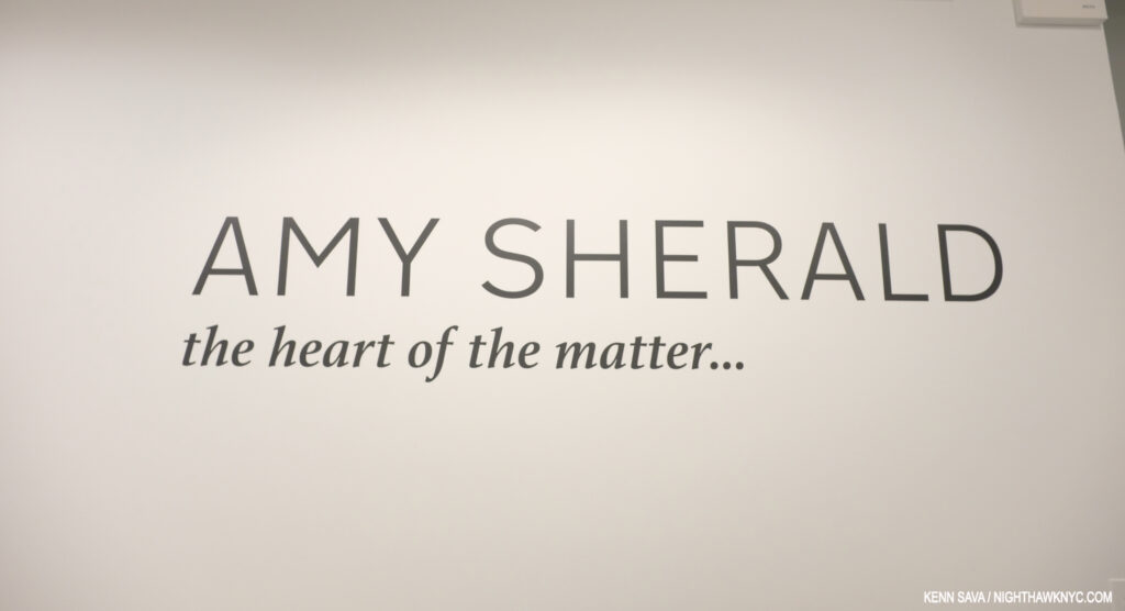
  1. Here. He repeated this elsewhere as well.
  2. By “work,” I believe they mean a Painting. According to its site, MoMA owns 12 prints and Drawings by Jean-Michel Basquiat. No Paintings.
  3. //www.nytimes.com/1985/02/10/magazine/new-art-new-money.html?searchResultPosition=1
  4. They were the only company in the world to acknowledge the 100th Anniversary of the 1st Jazz record in 2017, though the record in question is not what I call “Jazz,” and featured an astounding array of classic under-known Blue Note Record covers on T shirts.
  5. Both, Pheobe Hoban’s Basquiat: A Quick Killing In Art, eBook P.19

Studio K.O.S. Carries On After Tim Rollins

This site is Free & Ad-Free!
If you find this piece worthwhile, please donate via PayPal to support it & independent Art writing.
Other ways to support it at the end. Thank you!

Written & Photographed by Kenn Sava.

I’ll always miss my late friend Tim Rollins who left us at just 62 years of age in January of last year1, but I can’t imagine how his “Kids” feel.

Tim Rollins & K.O.S.: A History. Published in 2009 to accompany the traveling retrospective of 25 years of their work. I’ll never forget seeing Tim with the phone book sized “draft” of this book in 2009, which he let me thumb through, in awe, while it was in preparation.

His Kids, better known as “Kids of Survival,” or K.O.S., a group of at-risk public school students, some barely in their teens, (as you can see in the Photo taken of them, above, by Lisa Kahane in the 1980s that appears on the cover of the retrospective on them), that Tim taught Art to that became the group “Kids of Survival” in 1984. When they began, he told them, “Today, we’re going to make art. We’re also going to make history.” With work in over 87 museums and public institutions (and counting)2, they’ve succeeded on both counts. In 2010, a terrific documentary film on Tim and K.O.S. was released entitled Kids of Survival: The Art and Life of Tim Rollins and K.O.S., which details the unprecedented journey both Tim and the members of K.O.S. took as they forged their own way into Art history. “History” is a word that keeps coming up in discussing Tim and K.O.S. in 2019, which is fitting because this year marks the 35th Anniversary of the founding of K.O.S..

Boys to men. Together, they made history. Tim Rollins & K.O.S. in 2016. Steven Vega, Ricardo Savinon, Robert Branch, Tim Rollins, and brothers Angel & Jorge Abreu, left to right, at Lehmann Maupin Gallery, West 22nd Street. *- Lehmann Maupin Photo

“To dare to make history when you are young, when you are a minority, when you are working, or nonworking class, when you are voiceless in society, takes courage. Where we came from, just surviving is ‘making history.’
So many others, in the same situations, have not survived, physically, psychologically, spiritually, or socially. We were making our own history. We weren’t going to accept history as something given to us.” Tim Rollins.

Tim even added “and K.O.S.” to his signature. Angel Abreu signed under it. From my collection.

While he taught them Art in school, with the goal of having them get into college, he also began naming everything he and the they created as being by “Tim Rollins & K.O.S.” Giving the students/apprentices equal status with the Artist as collaborators was unprecedented in the history of visual Art, as far as I know, as so much of what he did was unprecedented in Art education. Now, a year after Tim’s passing, K.O.S. have announced that they are going to continue as Studio K.O.S.. “History” becomes “living history.”

Curator Ian Berry, “Thinking about the increasingly important role of what Tim and K.O.S. did together over 30 plus years is so important for us to see now.” Installation view of Tim Rollins and K.O.S.: Workshop at Lehmann Maupin in May.

The past, the present and the future were the subjects of the show Tim Rollins and K.O.S.: Workshop at Lehmann Maupin in May and June, the first by Studio K.O.S. It included a “mini-retrospective” of their work curated by Ian Berry, who said of his selection, “The show’s called Workshop. I was thinking of works that really exemplified the idea of a group of artists sitting together around a table making work together. Sharing ideas. Thinking, reading, talking, seeing together. So each of the works is a very overt example of their hands and the imagery of the individual members on each of the works.”

Amerika (For Karl), 1989, Watercolor on paper mounted on canvas, 97 x 132 inches

He continued, “And then, I’m thinking about the guys being in Studio K.O.S. without Tim, and I’m thinking about the crazy politics that we’re living in, and thinking about the increasingly important role of what Tim and K.O.S. did together over 30 plus years is so important for us to see now. I really value the idea of this show now. It’s so important to see education leading to justice. It’s so important seeing different versions of identity and self-empowerment and speech, that is so needed now. It’s great seeing these images of Pinocchio logs potentially waiting for birth. It’s great to see this really intense room of all black works, which I hope moves you to be engaged, and be active in thinking about what’s going on around you. It’s a history, but it’s also a workshop that we’re all hopefully invited to join in.”

“It’s great to see this really intense room of all black works…” Two works from I see the promised land (after the Rev. Dr. Martin Luther King, Jr.), both 2008, Matte acrylic and book pages on canvas, 108 x 72 inches each.

Walking through the show with as unbiased eyes as I could possibly muster, given my personal connection, I found myself in complete agreement with Mr. Berry when he spoke of “the increasingly important role of what Tim and K.O.S. did together over 30 plus years.” When I’ve seen their work over the years, it’s generally been a piece here or there, as in MoMA’s 2007 show What is Painting: Contemporary Art from the Collection, where the group’s Amerika VIII, 1986-7, was on view.

Installation view of MoMA’s 2007 show, What is Painting: Contemporary Art from the Collection, with Amerika VIII, 1985-6, left. MoMA Photo.

I remember standing in front of it and feeling overcome with joy- the joy of a beautiful work and my sense of all that had gone into, and all that had been overcome, achieving it- let alone having it wind up in the Permanent Collection of the Museum of Modern Art (An aside- To this day, MoMA owns NO Paintings by Jean-Michel Basquiat. That’s another story). Then, I walked over to the label you can barely see to the right of the work in the Photo. My jaw hit the floor. Here’s exactly what it said-

If you know of another Artist in Art history who included the names of his students or apprentices on his work, let me know. MoMA Photo.

I remembered standing there thinking- “Can you imagine being them, having overcome all they did, then seeing not just your work, but YOUR NAME on the wall at the Museum of Modern Art?” Angel Abreu was about 12 years old(!), Ricardo Savinon was about 15(!) when this was made.

Seeing a wonderfully chosen selection of their work today, it looks remarkably prescient. Beyond it being a landmark collaboration that marks fresh paths for Art education, their work doesn’t feel one bit dated, and, even more? I think it’s going to hold up; it’s going to continue to speak indefinitely to viewers, regardless of age. My recommendation is that the other museums & institutions not included in the current list of 87 above step up and acquire a work while they can.

The “Kids” are adults now who have forged their own successful careers in Art, and Tim lived to see it happen, something I’m sure gave him as much joy as anything else he experienced in his life. You can see just that on his face in the Photo of he and K.O.S. from 2016 I showed earlier. While each now has a successful career of their own, the legacy they embody and share is still every bit a vital part of their lives, and it sounds like it will continue to be going forward. There remains much to be done.

The legacy continues. Ricardo Savinon, Robert Branch, Jorge and Angel Abreu, members of Studio K.O.S., joined by curator Ian Berry, from left to right. Lehmann-Maupin Gallery, West 22nd Street, May 3, 2019.

During the run of the show, a panel discussion was held on May 3rd in which Ian Berry was joined by four long standing members of K.O.S.- Ricardo Savinon, Robert Branch, and brothers Angel & Jorge Abreu, men that were very young men when they first met Tim and became members of K.O.S.. Surrounded by Art they created with Tim, each proceeded to tell his story- how he came to be part of the group and the journey they’ve taken over the years, that I’m sure felt like they passed way too quickly. Over the course of 90 minutes, the stories were powerful and joyful, each one a remarkable tale of perseverance and single-minded dedication on the part of students and teacher. Nary a tear was shed, instead laughter was free flowing throughout.

Ricardo Savinon is someone I’ve known for well over a decade. During that time, he was the person I saw most often with Tim. They struck me as having a closeness that truly was on that fine line between family members and close friends along with a very strong level of mutual respect. Rick, as he’s known, was extremely ill, hospitalized, and was reportedly near death himself, when Tim passed away. Thankfully, he recovered, but when I last saw Rick, at Tim’s Public Memorial Service last April, he looked very thin and gaunt. So, I was extremely relieved to see him now back to his usual full of life self, with his ever present sharp wit and even sharper mind in full effect. Rick joined K.O.S. in 1985 at about 14. He went on to study at the School of Visual Arts before becoming the interior designer, Art installer and curator he is today. Angel Abreu, who is about 3 years younger than Rick, met Tim and joined K.O.S. in 1986. He has worked on every major K.O.S. project and exhibition since he joined. Today, he’s a Painter and is on the faculty of the School of Visual Arts, where Tim, himself, studied between 1975 and 1977 and more recently was an SVA faculty member when he passed. His brother, Jorge, joined K.O.S. at age 12 about 1991, as he related in an unforgettable story I relay below. Today, he’s working on a poetry collection around growing up in the golden age of hip-hop. Robert Branch joined Tim and K.O.S. at 16, circa 1993. Today, he holds a BFA from Cooper Union and a masters from Teacher’s College, Columbia University. I had met both Angel and Robert in passing with Tim over the years.

Angel Abreu speaking about participating in a show at Saatchi Gallery in London at age 13, rubbing elbows with Ashley Bickerton and Jeff Koons.

Angel Abreu- “What I’d like to say before we get into this, is that if you can imagine, at 12, 13, 14, or 15 years old, we really didn’t know what was going on. But what we did know, at least I can speak for myself, is that I could not stay away. This was before cellphones, right. And there were many moments when we had, and again, Tim would tell us, ‘There’s no greater motivator than a deadline.’ We are so thankful that we had so many amazing deadlines.”

By any means necessary (Trapped/Caught), 1985-7, Black gesso on book pages mounted on canvas, 21 x 28 inches. From The Autobiography of Malcolm X.

“But we had no idea. It wasn’t really until later until I think we got into high school and into college where we realized how extraordinary this was that we were doing. But, really it was the day to day we’d go into the studio. And he’d say, ‘Ok, by the way, we just got included in the next Whitney Biennial.’ Alright, that’s cool, Tim. I have no idea what that is. Yeah, that’s good.”

Ricardo Savinon, “Tim was Professor X…”

Rick Savinon- “Also, I want to chime in. How impactful that us being part of the group and realizing that we were kind of outsiders with our families joining an outsider group. So, it was almost like the X Men where Tim was Professor X and he got together this group of mutants who didn’t know how to hone in their skills.”

X-Men/Malcolm X (after Marvel Comics and Malcolm X), 1997, Comic book covers on rag board. 1 of 12 parts.

“But in the studio he taught us how. But, in doing so, we impacted so many people, Our peers, our families, our friends. I mean I remember probably after 15 years of being in the group, I have a friend of mine who was walking down the street and said, ‘I was taking Art History class and I saw a picture of you. What the hell’s going on? What are you up to?’ I just said well very calmly, ‘I’m glad that you’re pursuing art. I’m part of this art group for the past 20 years, and this is what we’ve been doing. And he was so proud because we managed to come from a situation where there’s a lot of poverty, violence and we together, we decided to do what was necessary for ourselves. And a lot of others, our peers, our friends that are still friends of mine. I’m very modest. ‘What are you doing right now?’ I’ll say ‘Well, I’m an artist.’ ‘Well, what kind of art, maybe graffiti?’ ‘No, no…’ And so, they’ve always been proud, my family’s been proud. That’s part of the reason my niece is studying engineering at this point because I’ve influenced her. In some subtle way, in the things that I’ve done. Not sitting her down and lecturing her. But just because she’s acknowledging what I’ve been doing. I’m sure that Angel and Jorge and Robert their family does the same…their kids.”

Jorge Abreu, “So, this was a tragedy for my family…”

Jorge Abreu- “Alright, so I’ve got a story to tell. So, just imagine seeing your older brother he’s going off to London (at age 12) and doing all these great things, and you’re home playing Nintendo 64, except it wasn’t Nintendo 64. No. We still had the Commodore. So, obviously this was ground breaking. The way I sort of came into the group was sort of an S.O.S. kind of thing. We had a summer vacation with my dad down to the D.R. We had a terrible car accident, the day before we were supposed to fly back to New York. I was unconscious for 2 weeks. Woke up. Before then I was a kind of straight A student. But, I woke up. Lost my memory. Didn’t recognize who my family was. Ended up staying in the Dominican Republic for a couple months after that rehabbing and recuperating.”

“So, this was a tragedy for my family. We lost my dad at that point, through the accident. Finally get back to New York. I couldn’t walk. One day I woke up. Had to do a whole lot of rehab. My memory was shot. So I went back to school. I believe it was the sixth grade. Really lost. Really intimidated. Really insecure. My mom had some concerns. But, I’d always been a writer as a younger child. I don’t know what happened, sort of a transformation. Now, I wanted to draw. I started drawing and doodling. Obviously my mom was a little concerned for me, so she sort of approached Tim. ‘He’s starting to draw. try to get him involved in the group.'”

Amerika, The Hotel Occidental, 2006, Acrylic and graphite on book pages on canvas, 72 x 59 inches.

“I remember the first day. I had known of Tim. When I went into the studio, I had my portfolio. Alright. And this portfolio consisted of many MLB team logos. Right? So, top notch stuff. So, Tim sort of laughed it off but he gave me a shot. I’m a true believer that this you can take from one of Tim’s great quotes from Amerika when Karl joined the utopian group that took him in right before he was going to leave America. That everyone is an artist. This skill can be developed. If you stick with it. It’s all about just doing it. So, I’m pretty sure Tim was kinda like, ‘This kid’s alright, but he’s not the best.’ But, I continued to come and kept coming and kept coming. I earned my spot. I’m definitely thankful for that. I didn’t know what I was joining. But hey, if it took this guy to London (indicating Angel), I want to be part of it. Next time I want to go, too. “

Robert Branch, “This was my one opportunity and I wasn’t going to let it go.”

Robert Branch- “So, I joined the group later on, I was 16 years old, I was at a High School in the Bronx. JFK. That doesn’t stand for ‘jail for kids.’ The only reason I was going to school was that I had these Dominican working parents. Listen, you either go to school or you get a job or dad’s going to kick your ass. My dad’s bigger than me, so…I was real lucky in that there was a dean who was real tough and he wouldn’t let me skip class.  I really wanted to be a comic book artist. Waiting to be the right age where I could bring my portfolio down to Stan Lee. Luckily, the Art teacher would make sure I attended school, he would call my dad. So, I had this kinda thing where they were really on me and they didn’t want me to fail.”

A Midsummer Night’s Dream (After Shakespeare and Mendelssohn), 2014

“I was really fortunate that the Art teacher brought me to the studio on a trip, walked past the Pinocchio on a freezing cold day, I come all the way down there to the Bronx and I’m like, ‘This is it.’ I’m coming to study here. I’m going to ask as many questions as I can. This is my one shot to figure out what it’s like to be an artist. Because, up to that point, I had not been able to take an art class until my junior year in high school. Think about that. New York City, one of the wealthiest cities in the world, and it had no opportunities to take art classes, and I was in a high school that had some resources, so you know I made the most of it. I was in the studio and I was like ‘What’s this? What do you do with this?’ I asked at least a dozen questions and Tim said, ‘Oh my god, he’s either really into art, or he’s going to come back and rob me.'”

In each work a seed is included- somewhere. In, this detail of A Midsummer Night’s Dream (After Shakespeare and Mendelssohn), as seen above, it’s a a mustard seed visible right in the center of this picture. A beautiful and fitting metaphor.

“So, it was just a wonderful experience because this was my one opportunity and I wasn’t going to let it go. Tim was deeply intuitive and he knew that I had this interest in making art. And that was the beginning of a journey that took me from…my dad…I ended up going to college and I would never have crossed that threshold  if it weren’t for the support and mentorship that Tim gave me. And you know what a college experience can mean to a person’s life. I wouldn’t have gone down that path.”

“Tim wasn’t just my friend, my first white friend, he was an authority figure. I remember dropping something off at his apartment. I had my nephew in the back. My dad drove us. I’m a real city kid- I don’t drive. So, my nephew asks, ‘Who’s that guy?’ My dad said, ‘Well, next to me, that’s the most important man in Robert’s life.’ And that’s the gift that Tim gave me with his friendship and consummate mentorship.”

Believe it or not, out of everything Tim & K.O.S. created thus far, this work, what appears to be simple logs laying on a gallery floor, speaks to me, personally, as much as anything they’ve created.

“Recognize the creative glimmer in others,” Tim said.

When you look closer…Detail of Pinocchio (after Carlo Collodi), as seen above, 1991, Wood, plastic, wax, tung oil, 43 x 6 x 6 inches.

As their work, Pinocchio shows, brilliantly in my opinion, locked inside each of us are whole untapped worlds of possibilities. Tim Rollins even saw mine.

*My thanks to Rick Savinon, Studio K.O.S., and Twice Sold Tales, Seattle, WA. 


BookMarks-

Tim Rollins and K.O.S.: A History by the aforementioned Ian Berry is the standard reference on the group’s work and history, as I mentioned published to accompany the traveling 25th Anniversary Retrospective. 220 pages, full of illustrations, stories and an interview with Tim. Highly recommended to anyone interested in exploring their amazing accomplishments and the even more amazing story of how it all came to be.

Kids of Survival: The Art and Life of Tim Rollins + K.O.S.. is an unforgettable documentary on Tim and the group, a must see for everyone- Art lover or not, in my view. It’s, also, an invaluable look at teaching Art today. Having known Tim and a few members around the time of it’s release, it gave me a “you are there” look at their incredible backstory, into them before I knew them, and even much, much younger. It’s somewhat miraculous that this story exists on film as much as it does, and it leaves me praying that there will be an updated version, given this was released in 2010.

*- Soundtrack for this Post is the X-Men Theme from the 1996 Television show.

NighthawkNYC.com has been entirely self-funded & ad-free since 2015! If you’ve found it worthwhile, PLEASE donate securely by PayPal below to allow me to continue. Thank you, Kenn.

You can also support it by buying Art, Art books & Music from my collection!
Art & Books may be found here. Music here and here.

Written & photographed by Kenn Sava for nighthawknyc.com unless otherwise credited. To send comments, thoughts, feedback or propositions click here. Click the white box on the upper right for the archives or to search them. Subscribe to be notified of new Posts below. Your information will be used for no other purpose.
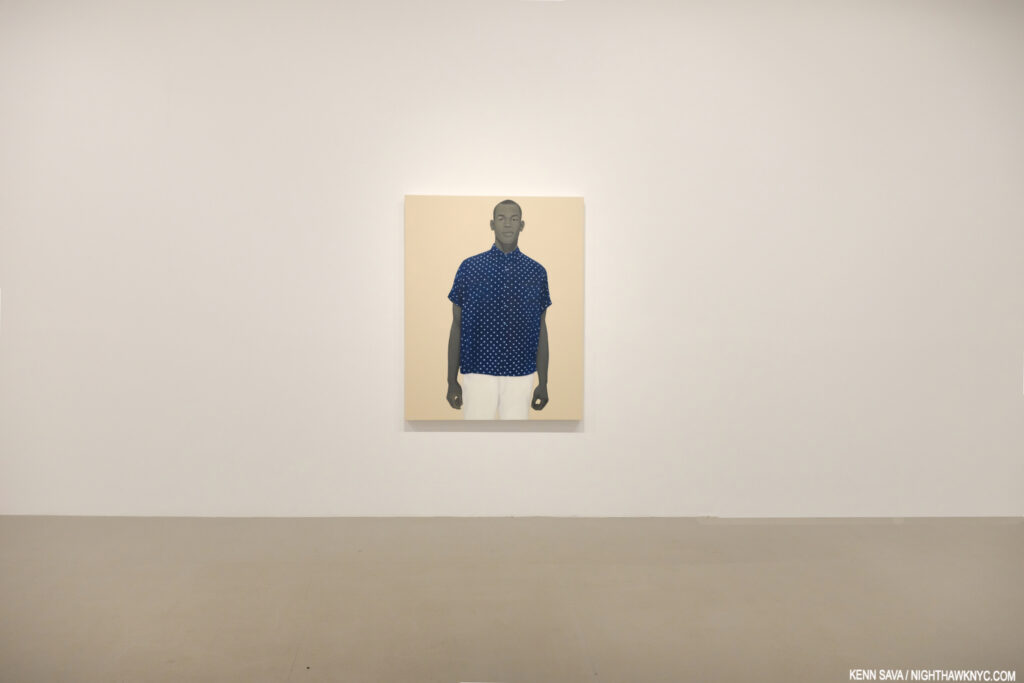
  1. My Remembrance of Tim Rollins is here.
  2. Per the list, here.