This site is Free & Ad-Free!
If you find this piece worthwhile, please donate via PayPal to support it & independent Art writing.
Other ways to support it at the end. Thank you!
Written & Photographed by Kenn Sava (*- unless otherwise credited).
Shows seen: Hilma af Klint: Paintings for the Future, Guggenheim Museum, 2018-19.
Georgia O’Keeffe: To See Takes Time, MoMA, 2023, and
Hilma af Klint: What Stands Behind the Flowers, MoMA, 2025
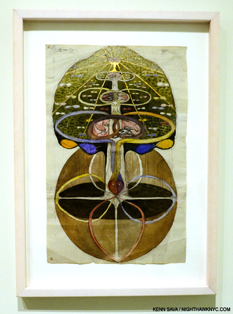
Hilma af Klint, Tree of Knowledge, No. 1, from The W Series, 1913, Watercolor, gouache, graphite, metallic paint, and ink on paper, Guggenheim Museum, December 31, 2018..
Succinctly put, Hilma af Klint is one of the most remarkable and unique Artists I’ve encountered.
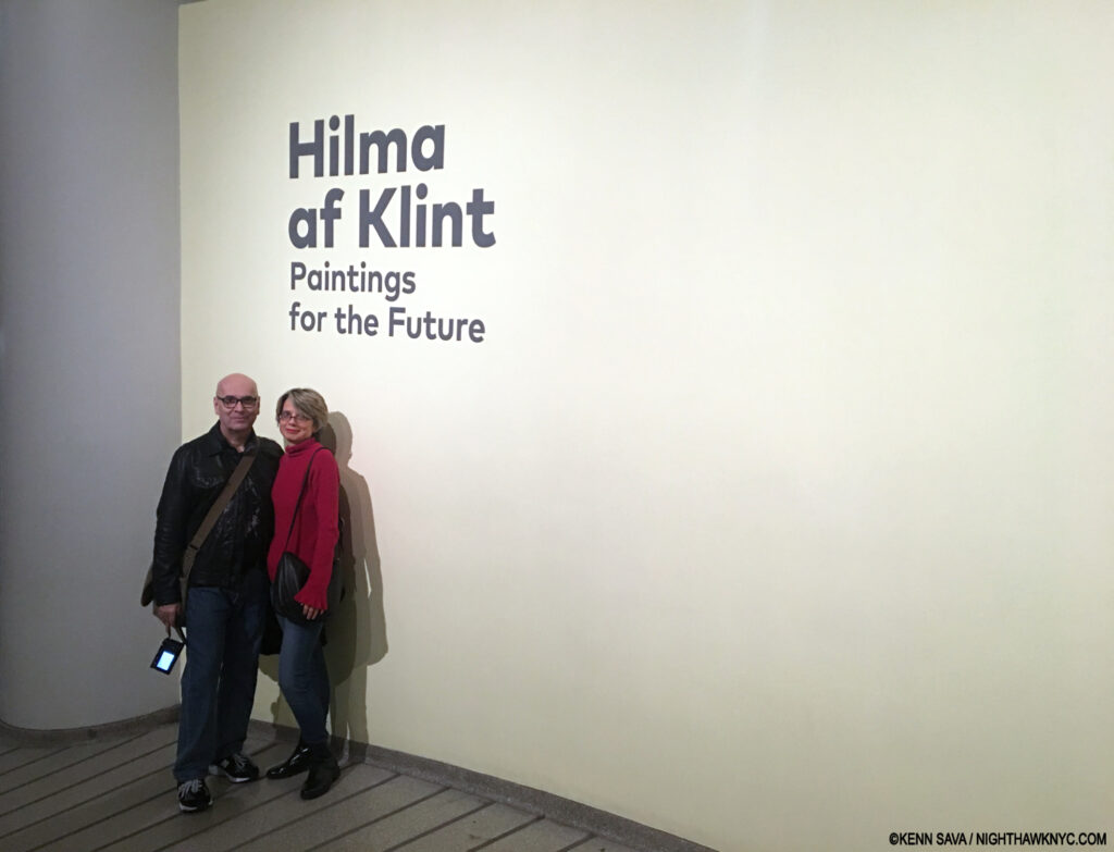
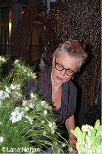
Of the thousands of Art shows I’ve seen in my life, I consider about 10 to be truly monumental. Hilma af Klint: Paintings for the Future is one of them. I’m so grateful I got to experience it with Lana Hattan, and her Photos are included in this piece. Guggenheim Museum, New Year’s Eve, December 31, 2018. Enduring Thanks to the woman who took this.
Having seen two shows of her work, and most of the books published on it, Hilma’s work continually surprises me. Much of her oeuvre features that rarest of all qualities in Art: it’s unprecedented. I saw
Paintings for the Future exactly seven years ago as I write this yet I haven’t written about it to this point for two reasons- 1) I’m still thinking about it and researching Hilma (as my featured entry on Hilma books in my “
NoteWorthy Art Books of the 21st Century” piece earlier this year attests). 2) I’ve come to see that
boxing Hilma as an “abstract Artist,” as the Art machine has labelled her, does her an immense disservice. I find it at odds with the very nature of her work.
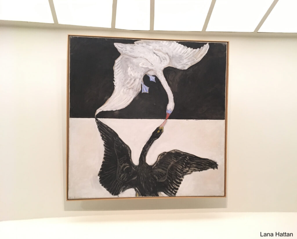
Group IX/SUW, The Swan, No. 1 from The SUW/UW Series, 1915, Oil on canvas. Reaching for the light. Of all the Painting shows I’ve seen at the Guggenheim Museum, the installation of Hilma af Klint: Paintings for the Future was transcendent. More on this later. *- Photo by Lana Hattan, Guggenheim Museum, December 31, 2018. I’m pleased to be able to present this show through her eyes, too.
Beyond all of that, recent developments may make her work “Basquiat hard” (my term for an Artist’s work that is mostly out of pubic view) to see going forward.
That’s a lot to cover. I’ll try to in what follows.
It begins with the flower…
“If your heart is in them flowers, bring ’em on,” Tanya Tucker-*
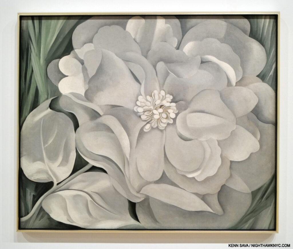
Georgia O’Keeffe, The White Calico Flower, 1931, Oil on canvas, as seen at the Whitney Museum, June 30, 2023
Flower Art was a niche thing, largely reserved for Illustration, until Artists like Georgia O’Keeffe (1887-1986) made viewers sit up and take notice of them. Of course, Vincent van Gogh, and the 17-century Dutch Masters a century before him, among countless others, had Painted wonderful Still-Life bouquets for many years prior, but individual flowers had not received much attention. Earlier last century, that began to change.
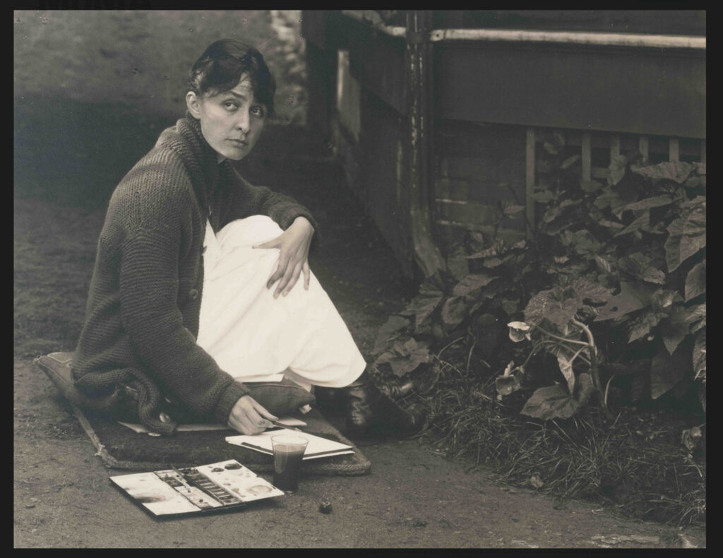
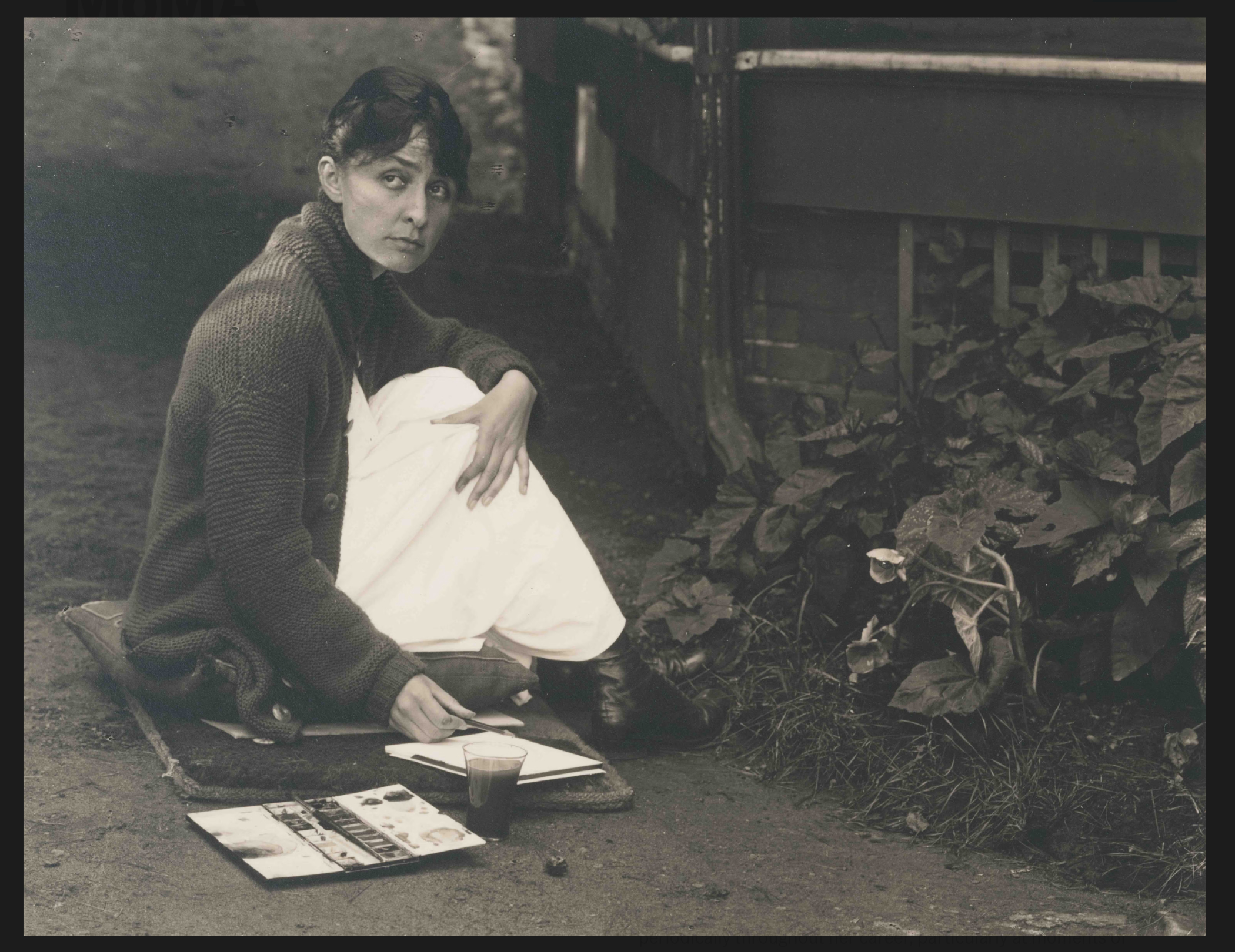
Alfred Stieglitz, Georgia O’Keeffe, 1918. Gelatin silver print. It’s hard to believe Georgia could Draw & Paint flowers like this, and it looks like Mr. Stieglitz found it remarkable, too. Note the year this was taken. *- Georgia O’Keeffe Museum Photo.
“Nobody sees a flower really; it is so small. We haven’t time, and to see takes time- like to have a friend takes time,” Georgia O’Keeffe, paraphrased by MoMA for the title of their 2023 show, Georgia O’Keeffe: To See Takes Time.
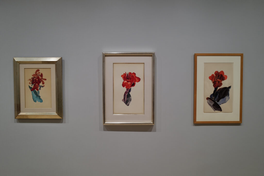
Georgia O’Keeffe, Canna Lily, 1918-20 Watercolor on paper, seen at Georgia O’Keeffe: To See Takes Time., MoMA, July 4 2023. Exactly 2 years later these same gallery walls would display Flower Watercolors by Hilma af Klint Painted at about the same time. (Lights lowered to protect the Art.) MoMA, June 9, 2023.
She continued: “So I said to myself- I’ll paint what I see- what the flower is to me but I’ll paint it big and they will be surprised into taking the time to look at it- I will make even busy New Yorkers take time to see what I see of flowers.” She would eventually give us 200 Paintings of them, a number of which are now iconic. So, it was fitting that MoMA’s Georgia O’Keeffe: To See Takes Time contained some of her Flowers, including three early Calla Lilies watercolors from 1918-20, right as she was transitioning from Painting in watercolors to oils.
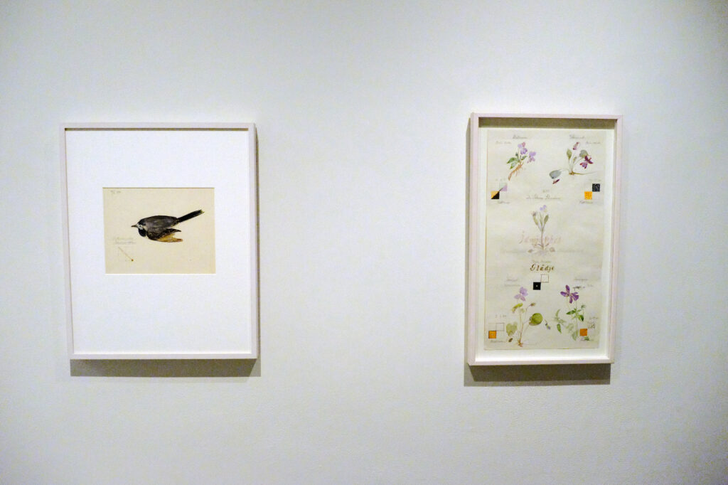
Hilma af Klint, Motacilla Alba: Wagtail with Guidelines, left, Violet Blossoms with Guidelines, both from Series I, 1919, Watercolor, graphite, and metallic paint on paper, right. Tucked away in Paintings for the Future this Flower Watercolor, right, looks like a page from Hilma af Klint’s Nature Studies Portfolio that would become the focus of the next major NYC Museum show of her work seven years later. An interesting realistic(!) harbinger, it’s not part of that Portfolio. Seen at the Guggenheim Museum, December 31, 2018, this sheet was also included in MoMA’s What Stands Behind the Flowers in 2025. MoMA’s wallcard for it speculates that Hilma may have removed it from Nature Studies.
Meanwhile at the same time Georgia was creating her Calla Lilies, across the ocean in Sweden, an almost completely unknown Artist named Hilma af Klint (i.e. HaK, born 25 years before Georgia in 1862) began rendering over 100 Flowers in Watercolors in a Portfolio she titled Nature Studies, 1919. As far as I know, they didn’t know each other (though I wonder if Art astute Hilma came to know of Georgia as the American rose to fame). As far as I can tell, the set remained hidden from public display until May 11, 2025, when MoMA opened Hilma af Klint: What Stands Behind the Flowers, coincidentally in the same galleries that had held Georgia O’Keeffe: To See Takes Time two year before.
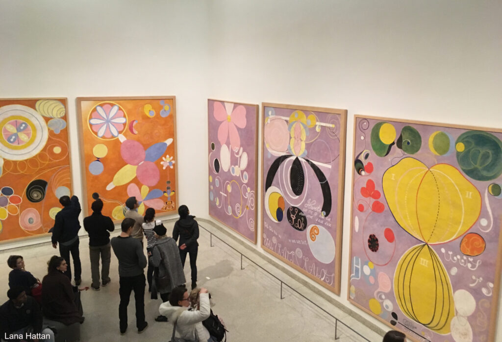
Five of Hilma af Klint’s The Ten Largest, a series devoted to the human lifespan, part of her now-famous Paintings for the Temple series. Note the shapes that seem organic or “flower-like.” Guggenheim Museum, December 31, 2018. *- Photo by Lana Hattan, Guggenheim Museum, December 31, 2018.
When her Art was last seen in an NYC museum in 2018-19, Hilma af Klint: Paintings for the Future drew a Guggenheim Museum all-time record 600,000 other viewers to Frank Lloyd Wright’s Museum Rotunda. I always walk down the ramp after taking the unique semi-circular elevator to the top of the Guggenheim as Frank Lloyd Wright wanted visitors to do which means I saw Paintings for the Future in reverse chronological order. Preceding it, R.H. Quaytman: +x, Chapter 34, occupied the 6th, or top Ramp. While this might seem incongruous to some, a deep dive into Hilma af Klint’s sparse NYC history reveals that R.H. Quaytman has a long history of championing Hilma af Klint that includes curating the first HaK show in an NYC museum, The Secret Pictures by Hilma af Klint at MoMA PS1 in early 1989. +x, Chapter 34 worked seamlessly with Paintings for the Future in my view.
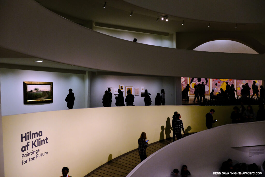
Herein lies a problem (among others) with branding HaK an “abstract Artist.” To the left, above the sign, on Ramp 1 is Summer Landscape, 1888, Oil on canvas, juxtaposed by parts of three of The Ten Largest, all 10 from 1907, far right, from her landmark Paintings for the Temple series, partially shown in the prior picture, in a completely different style. December 31, 2018.
As we got to Ramp 1 (the lowest ramp), there were two bays containing work that looked pretty representational to me that featured Summer Landscape, 1888, above, left, and 2 Flower Watercolors from the 1890s, center, between the visitors above, all shown closer below-
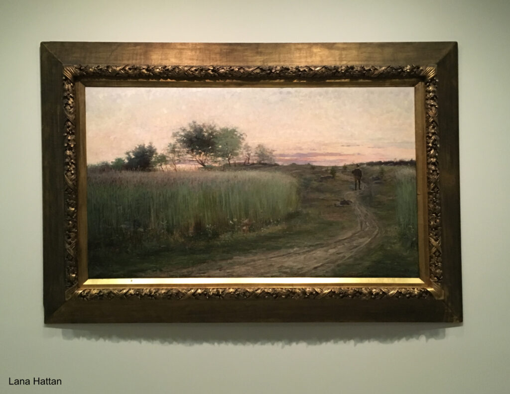
Summer Landscape, 1888, Oil on canvas. Hilma was about 26 when she Painted this in the year she graduated from the Royal Academy of Fine Arts.*- Photo by Lana Hattan, Guggenheim Museum, December 31, 2018.
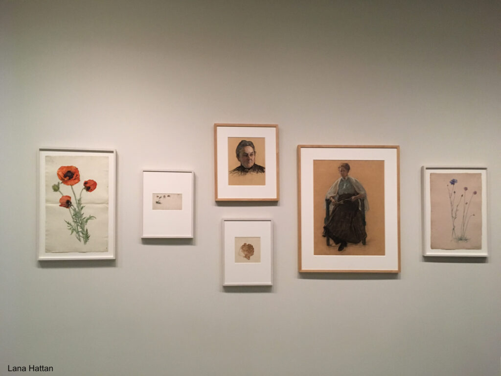
Poppy, 1890s, Watercolor, ink, and graphite on paper, left, Portrait study of the head of a woman, center, and Portrait study of a sitting woman to its right, both Charcoal, crayon and graphite on paper, both c.1918. Distortion of the frames due to the curved wall. *-Photo by Lana Hattan, Guggenheim Museum, December 31, 2018.
Though early in her career, before the more well-known Paintings they call “abstract,” these revealed an accomplished technique in both oils and watercolors, honed over 6 years at the Royal Academy of Fine Arts in Stockholm (1882-88), where Hilma was one of its first female students. At that moment, I realized there was much more to Hilma af Klint than the Art machine’s limiting marketing hype would have us believe.
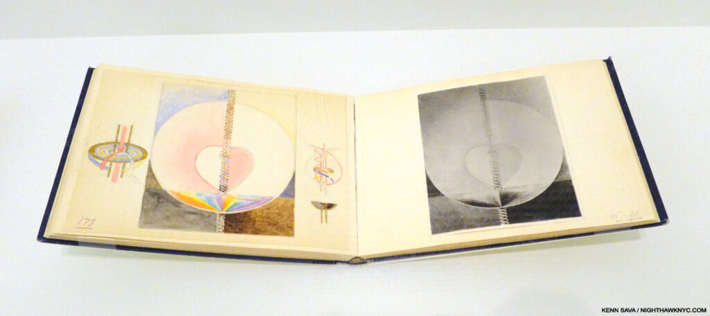
“Blue Book” Vol. 10. Hilma painstakingly recreated every one of her Paintings for the Temple (Painted, again, by hand) in a series of blue books on the left-hand page accompanied by a black & white Photo of the piece on the right-hand page, probably because color photography wasn’t yet practical. Guggenheim Museum, December 31, 2018.
Hilma, a devoted, life-long spiritualist,t who attended seances (and believed her “most important work” was the 192-canvas series The Paintings for the Temple, 1906-15, partially shown earlier, which were guided by other beings), came to feel that her time wasn’t THE time for her Art to be seen. Since the entire Temple series is so numerous, and includes 10 very large Paintings, Hilma fastidiously recreated the entire series in 10 remarkable smaller “Blue books,” as they are known, a “portable museum,” which she carried with her to show Rudolf Steiner (in 1920), and others, in hopes of having the originals shown in a spiritual context. That’s how important it was to her.
This makes me wonder- How many “abstract” Artists would be able to exactly recreate 192 of their Paintings? An impressive technical achievement, that she could do it tells me that her compositions were no accident, something I think is important to bear in mind.
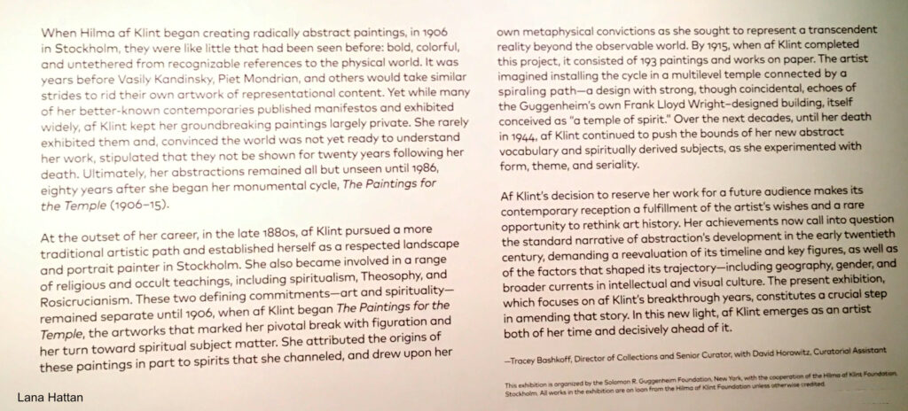
Is THIS the time Hilma envisioned for her work? The introductory wall card for Paintings for the Future on the Guggenheim’s curved wall outlines how the curators saw Hilma’s Art in 2018. I disagree with parts of this. For example, they mention HaK being “a respected landscape and portrait painter,” acknowledging she Painted in other styles, yet they ignore the fact that she returned to Painting representationally in 1919 with Nature Studies, as I show further on. They state her work was “untethered from recognizable references to the physical world.” What about the flowers and other natural elements that appear frequently, as shown in The Ten Largest picture earlier, and in Group VII (further on) and other pieces later on? *- Photo by Lana Hattan, Guggenheim Museum, December 31, 2018. Click for full size.
Failing to achieve this, in 1932, she decreed that none of her Paintings or Drawings should be shown until twenty years after her death in hopes of finding a more accepting time. Her work wound up being out of sight for 45 years. After she was tragically struck by a street car in 1944 and died from her injuries, her will left her entire creative estate to her nephew, Erik. Her work was stored in an attic for two decades before Erik had the Paintings unrolled and Photographed. Those 1,300 Paintings and 26,000 pages of text forms the basis of what is now the Hilma af Klint Foundation, which was created in 1972. The Foundation made a major effort to organize the work and prepare it for public display. Eleven of her Paintings were finally shown in The Spiritual in Art: Abstract Painting 1890-1985 in Los Angeles in 1986, but it wasn’t until 2013 that she finally received a full retrospective (in Europe), in a show titled Hilma af Klint: Pioneer of Abstraction (the catalog for which is also on my list).
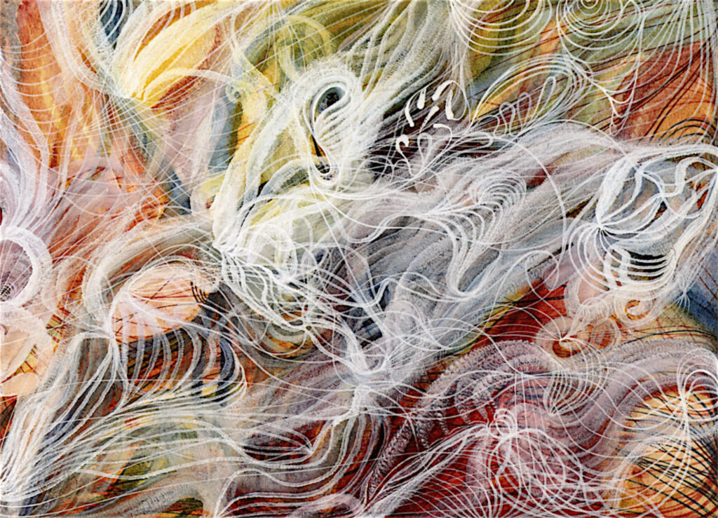
Georgiana Houghon, The Love of God, August 3, 1864, Watercolor and gouache on paper, 23.7 x 32.6 cm, An Automatic Painting, Hilma af Klint was about 2 when Georgiana Painted it. *-Victorian Spiritualists’ Union, Melbourne Photo.
That show rode on the hype about Hillma being “the first abstract Artist,” (says the Tate, no less) before Kandinsky, Mondrian, et al., and a woman. The truth is Hilma was not even the first woman in her spiritualist circle to create what they call abstract work- Georgiana Houghton (1814-1884), 48 years Hilma’s senior, who proceeded her in creating Automatic Paintings & Drawings, may be a better candidate for that title. But, boxing HaK as such helped the powers that be draw huge crowds to the 2013 show of a complete unknown. Paintings for the Future (one of the two most important NYC Painting shows I saw in the prior decade, along with this one) took things to an entirely different level. Six years later comes MoMA’s Hilma af Klint: What Stands Behind the Flowers, her first NYC museum show since the Guggenheim blockbuster. Hilma’s work doesn’t need any hype to “sell” it now. The world knows who she is. All the “abstraction” talk has kept people from looking at her work, in my view. It’s time to look at the Art for what it is.
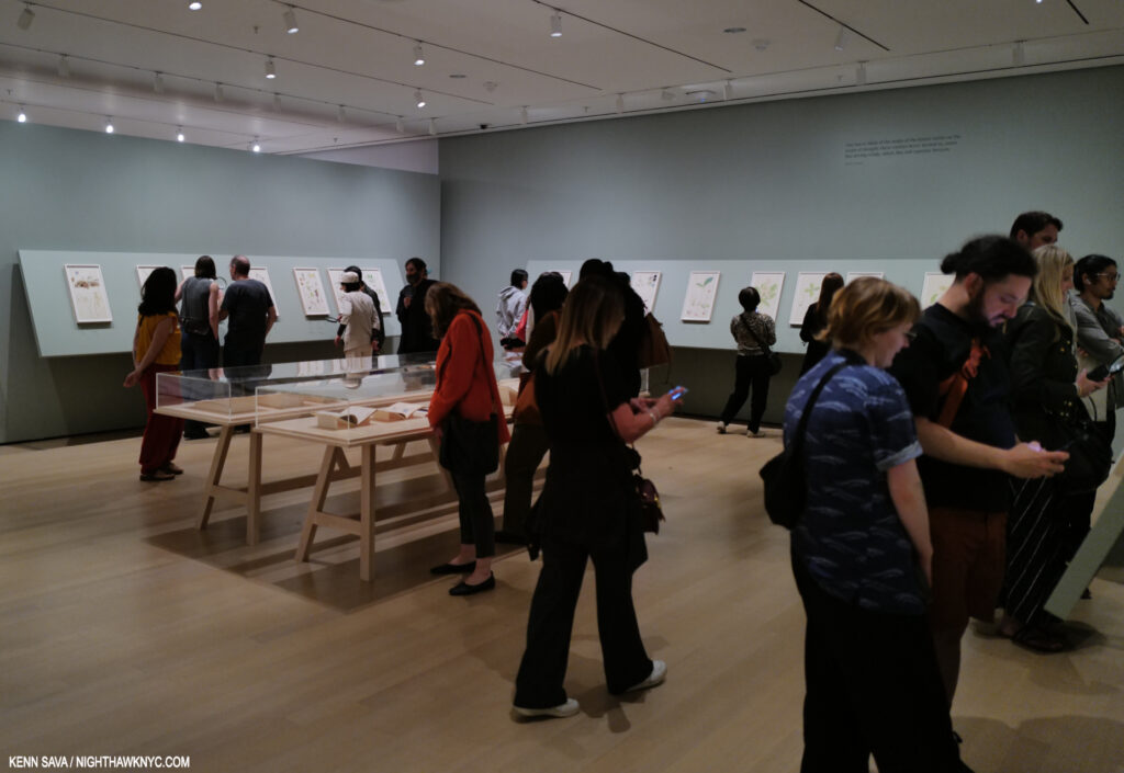
Installation view of the 2nd gallery of Hilma af Klint: What Stands Behind the Flowers at MoMA, which contained the first part of Nature Studies on the walls and a selection of her writings, and books by others on flower studies, in the center vitrine. Opening week, May 18, 2025.
What Stands Behind reveals that AFTER she completed the Paintings for the Temple in 1915, Hilma went back to working “representationally!” I guess no one bothered to tell her she was supposed to be an “abstract” Artist in the future. The more likely case is that HaK was a very talented and creative woman, an Artist more than capable of creating in whatever style she needed to work in for what she was trying to accomplish. It seems to me that THAT is a MORE impressive thing than sticking her in any one limiting box!
“One has to think of the realm of the nature spirits as the realm of thought; these entities hover around us, some like driving winds, others like soft summer breezes,” Hilma af Klint, MoMA wall card.
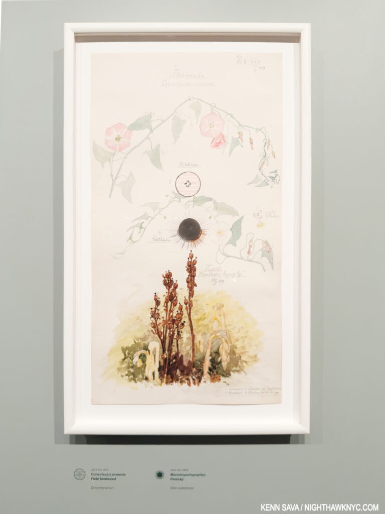
Convolvulus arvensis (Field Bindweed), Monotropa hypopitys (Pinesap). Sheet 20 from the portfolio Nature Studies July 11–24, 1919, Watercolor, pencil, ink, and metallic paint on paper. One of the 46 sheets in watercolor, pencil, ink, gouache and metallic paint on paper included in Nature Studies. Being 19 11/16 by 10 5/8 inches, these sheets would seem too large for Hilma to work on in situ. But that’s purely my conjecture. Unlike Georgia O’Keeffe, HaK didn’t confine herself to one specimen per sheet. Over 100 are included on the Nature Studies! Underneath, the curators translate HaK’s notations of the species name and its character as perceived by the Artist: “Determination” for the Field Blindweed, top, and “One-sidedness” for the Pinesap, bottom. MoMA, September 26, 2025.
She also continued to work on creating a “language” (see Group 2, further below) that included letters, words and diagrams. These are seen in almost all of the series she created in her life (including Nature Studies).
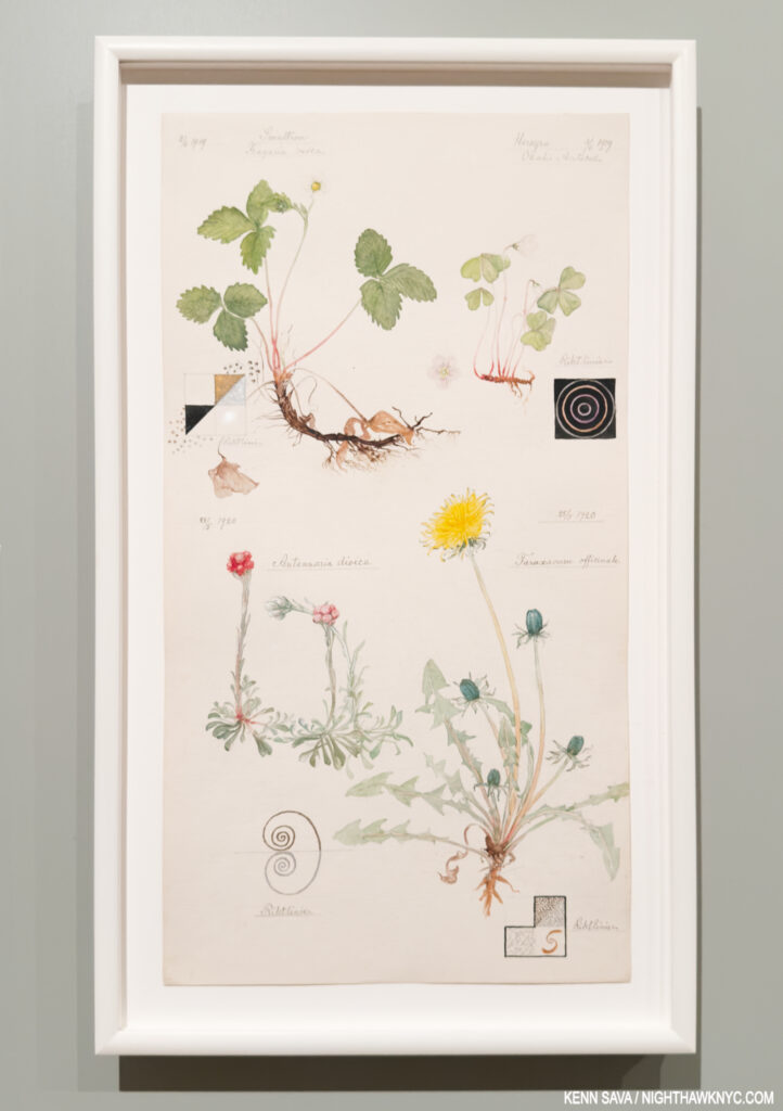
Woodland Strawberry, Hilma’s notation- “Liberator. Longing to produce balance within the blood syntem by expelling either white or red biood cells.” European wood sorrel- “Fragility-submissiveness shyness-humility fear -respect self-loathing-obedience.” Catsfoot– “Peace and harmony.” and Dandelion- “Beginning.”
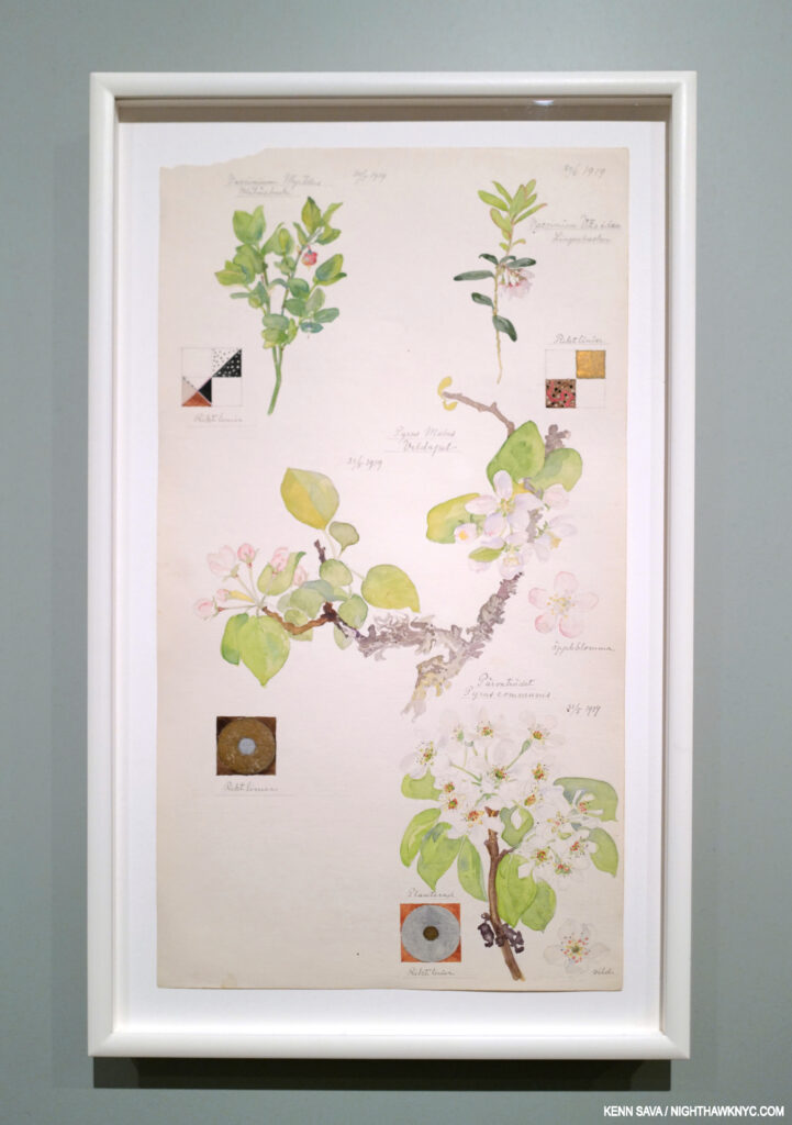
Bilberry, Apple, Common Pear, Lingonberry
Looking at Hilma’s Art is different than looking at the Art of any other Artist I know of. Quite a few of her Paintings for the Temple (as seen in the picture earlier) and other “abstract” works included at MoMA (below) have elements that look organic, including flower shapes. In some of her Temple series, lines of dots connect figures, reminiscent of the af Klint family’s heritage as noted cartographers & mapmakers. Then, any number of her pieces, including almost all her Nature Studies, include diagrams that contain basic geometric shapes- circles, squares, cones, etc. The viewer needs to decide what to make of them, or look to the Hilma’s Notebooks for insights. Finally, there’s the “language” the Artist developed, abetted by her use of letter “codes,” as Julia Voss outlines in her Biography. As a result, it seems to me there is still a long way to go in coming to fully understand Hilma af Klint’s work. Lumping it all into ANY one-word catchphrase box only takes us further away from that point of truly understanding it-if that’s possible.
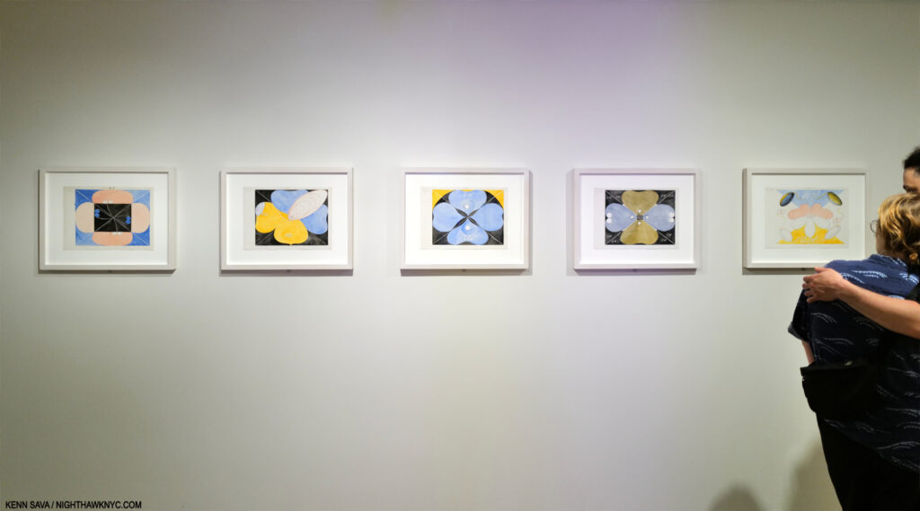
Group VII, No 1-5, from the US Series, 1908, Watercolor and pencil on paper. 11 years. before the Nature Studies portfolio, what seems to be flower-like shapes abound. Seen at the beginning of MoMA’s show.
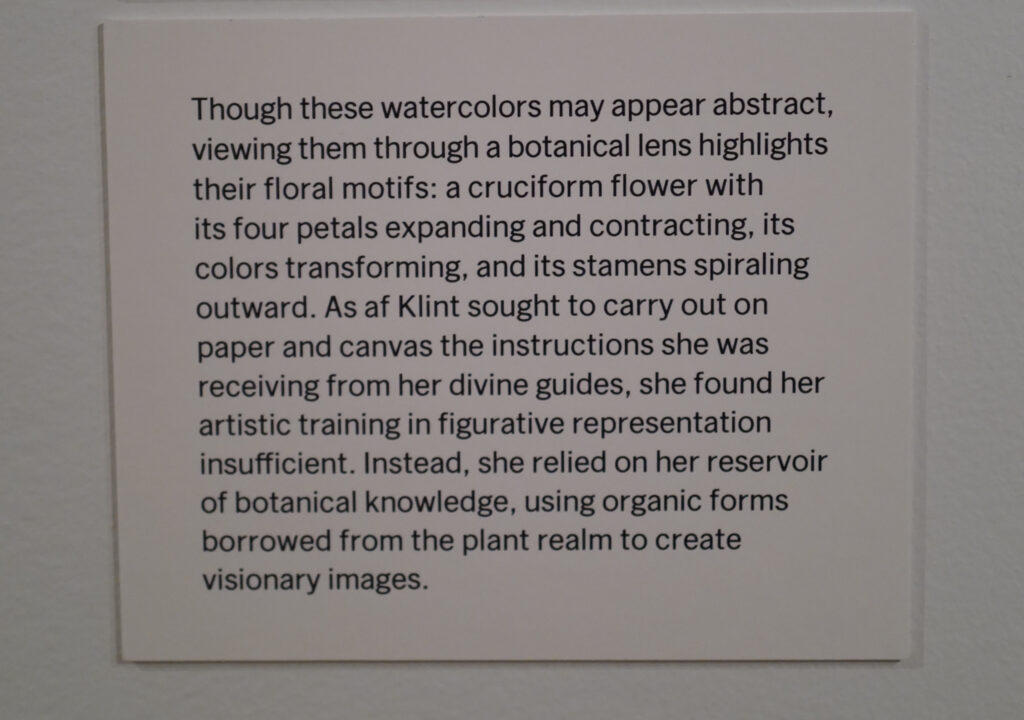
The wall card for Group VII. Installed at the show’s entrance, is a relatively rare instance of the Art world looking beyond Hilma the “abstract Artist” thus far, or hedging their bets on their use of that box. Here, the organic shapes are accompanied by letters that are parts of the “code” Hilma used. See next.
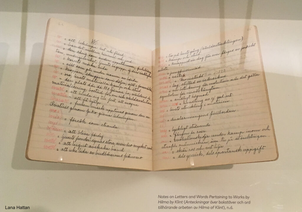
Another piece of the puzzle. Hilma’s original Notebook containing her Key to the mysterious words and omnipresent letter “codes” she used throughout her oeuvre. It’s an essential part of “decyphering” her work. Hilma’s code is detailed in English in the book Hilma af Klint: Notes and Methods. *- Photo by Lana Hattan, Guggenheim Museum, December 31, 2018.
ALL this talk about Hilma’s style misses the point! Hilma was not out to win any “style wars.” All of her work was about something entirely different, and that difference was substance over style.

Apple, no date, Watercolor on paper. Virtually every Art or Drawing class begins with rendering, coloring & shading basic shapes, like the sphere (often an apple, orange or lemon). Here HaK takes it to an entirely different level, and we get to marvel at her powers of observation, especially in the incredibly subtle variance of the local color. It’s also fascinating to me how minimal the shadows are, something you never see taught in how-to books which glory in the different kinds of shadows. In most of her Nature Studies, except the previous one, Hilma leaves out the ground, as she does here, too. In this case, doing so gives her the chance to show more of the bottom detail, again something I can’t say I’ve seen done often.
On the opposite end of that spectrum from the 21st century hype around it, there is something else at the beating heart of her work, something her “abstract” Paintings for the Temple and her representational Nature Studies have in common, and something that is at the core of the recent debate regarding continuing to publicly display her work. Hilma af Klint’s work is centered on the spirit. She created her work for fellow spiritual seekers. The Paintings for the Temple are devoted to the human spirit (with the aid of spirits who have moved on to another level). After completing them in 1915, never one to think small, the Artist turned her attention to an even bigger subject- the spirit of the natural world, commencing with the atom, in works that filled three quarters of the first gallery at MoMA, before moving on to the spirit in nature, beginning with flowers (in Nature Studies), which filled most of the succeeding two large galleries. These were supplemented by her late Flower Watercolors, which reminded me of some of Georgia OKeeffe’s Watercolors that were shown in these galleries at MoMA in 2023. The bottom line is that Spiritual Art is still outré to the Art machine, whatever type it is. They can’t sell it, and Art without monetization does not keep the Art machine going.
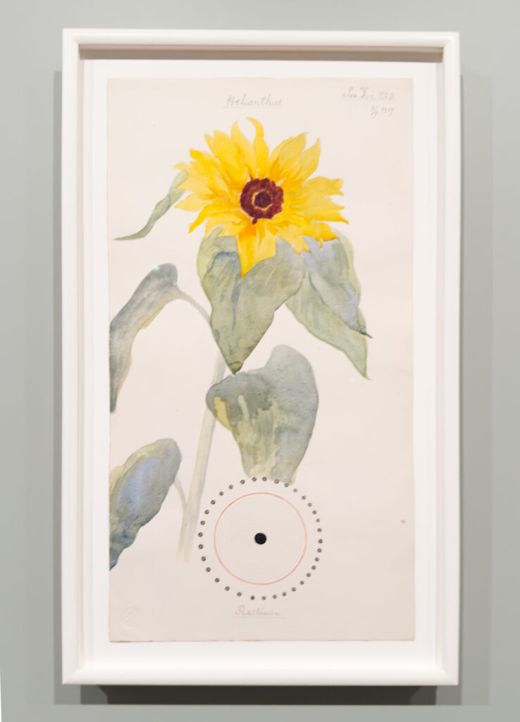
Common Sunflower. To Hilma- “Love is the greatest of all.”
Meanwhile, throughout What Lies Behind, part of the sheer joy in looking at her work, her marvelous technique shines in piece after piece. It’s surprising to me that Hilma has gotten so little credit for it. She came upon it the hard way, through continual hard work and 6 years at the Royal Academy of Fine Arts. This was followed by work as an Illustrator, including illustrating a book on horse surgery by the director of the Veterinary Institute, Stockholm, who kept Hilma’s Drawings for the rest of his life.
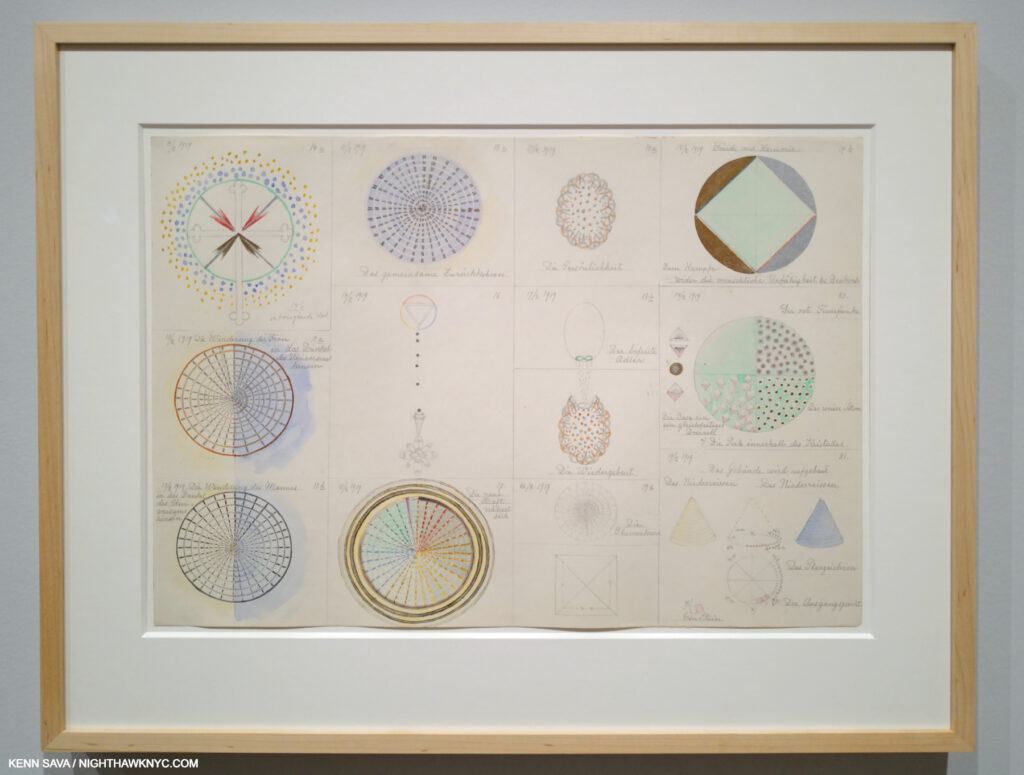
From Group 2 February 12-19, 1919 Watercolor, pencil, and metallic paint on paper. This was one of numerous examples of her technique I could site. Here, we see the Artist working on ideas for herself in a series of sheets titled Group 1, Group 2, Group 3. No matter for public display or her own purposes, Hilma was always meticulous in her execution. Of the Groups, MoMA says- “Together, the drawings form narratives that allude to pollination, reproduction, and evolution. By April 19, 1919, after more than three months of progress, af Klint had established a vast and diverse diagrammatic language. The very next day, she began her Nature Studies portfolio.”
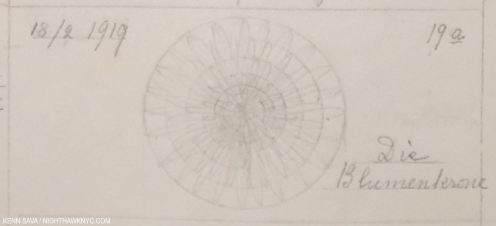
This enlarged detail of the lower center of the previous image perhaps measures 3 or 4 inches wide by an inch and change high (the bounding rectangle). Easy to miss because it’s in pencil and the actual Drawing part seems to have faded, it’s noteworthy for two reasons. First, its meticulousness, and second for the title- Die Blumenkrone means “The Flower Crown.” Even in the dead of wnter (i.e February 18th as the date reads), Hilma had flowers on her mind.
What Stands Behind also makes the case in spades or her accomplishment as a Watercolorist- both in her Flowers and in the later Flower work (not part of the Nature Studies series) shown in the final gallery, in a different style again, as seen below.

Ear of Grain, 1922, Watercolor on paper, from the series, On the Viewing of Flowers, with a apparetnly relevant section of the wall card, left. MoMA, September 26, 2025.
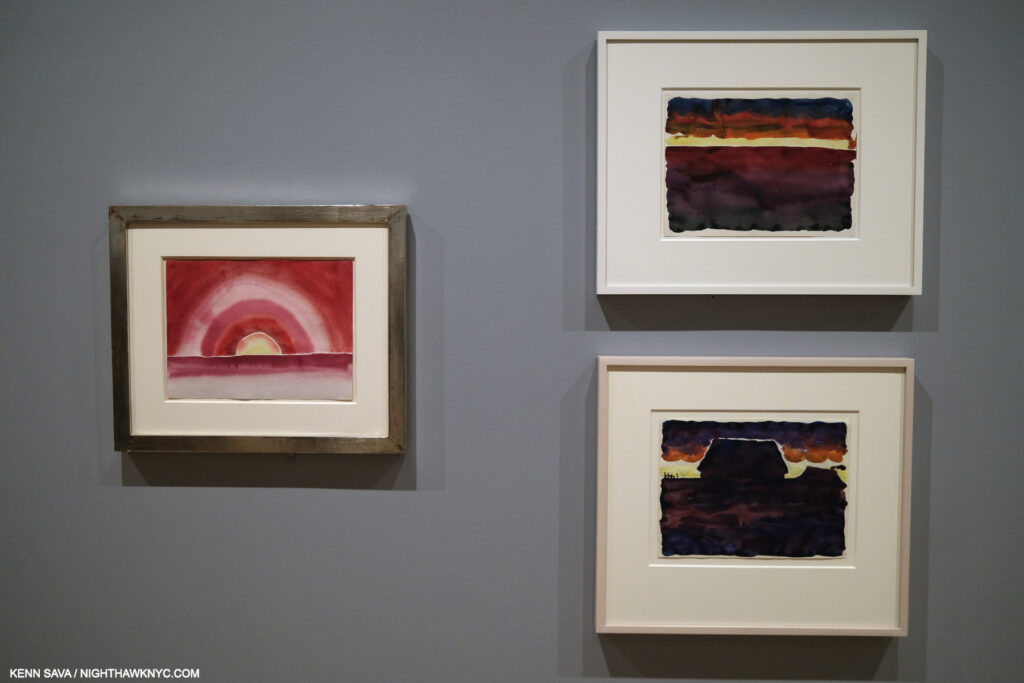
Georgia O’Keeffe, Morning Sky, left, and Morning Sky, and Morning Sky with Houses, right, 1916, Watercolors on paper. MoMA, September 9, 2023.
I might be the only one to draw parallels between Georgia O’Keeffe & Hilma af Klint, but when I saw the wall of 1922 Watercolors by Hilma in the last gallery, including Ear of Grain, above, I couldn’t help but recall Georgia’s Watercolors that had been hung in these galleries two years previously. It’s fascinating to think about their commonalities, as extraordinary, ground-breaking Artists, and as extraordinary women, at much the same time, on almost opposite sides of the globe. What Stands Behind The Flowers begins some of the heavy lifting on the road to assessing Hilma af Klint’s full accomplishment. In spite of that, I’m not sure THIS is the ideal time Hilma envisioned for her Art to be shown.
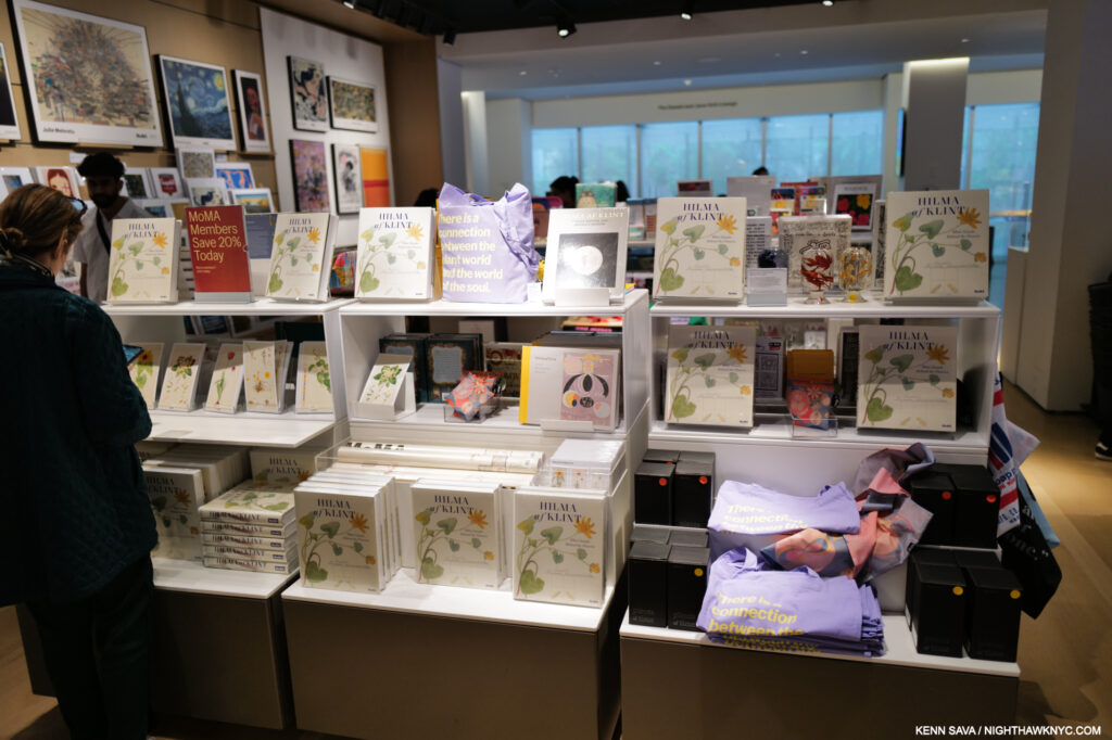
MoMA Gift Shop display for the show. More items behind me and to the left. While I’ll reserve comment on the other items, MoMA’s Exhibition Catalogue for the show is highly recommended. May 18, 2025.
In too many (most?) cases today a work of Art is mentioned followed by its price as if that’s the most important thing about it! Then, the rush is on to plaster it on everything from umbrellas to baby onesies. Hilma’s spiritualist Art stands directly at odds with that. She opposed materialism in Art. To this point, it’s largely escaped it (though MoMA, who has come to own Nature Studies, produced a $500.00 Limited Edition of it, as far as I can tell, the first Hilma af Klint Limited Edition, in addition to putting the series on refrigerator magnets, postcards and a poster).
Rebel. With a cause.
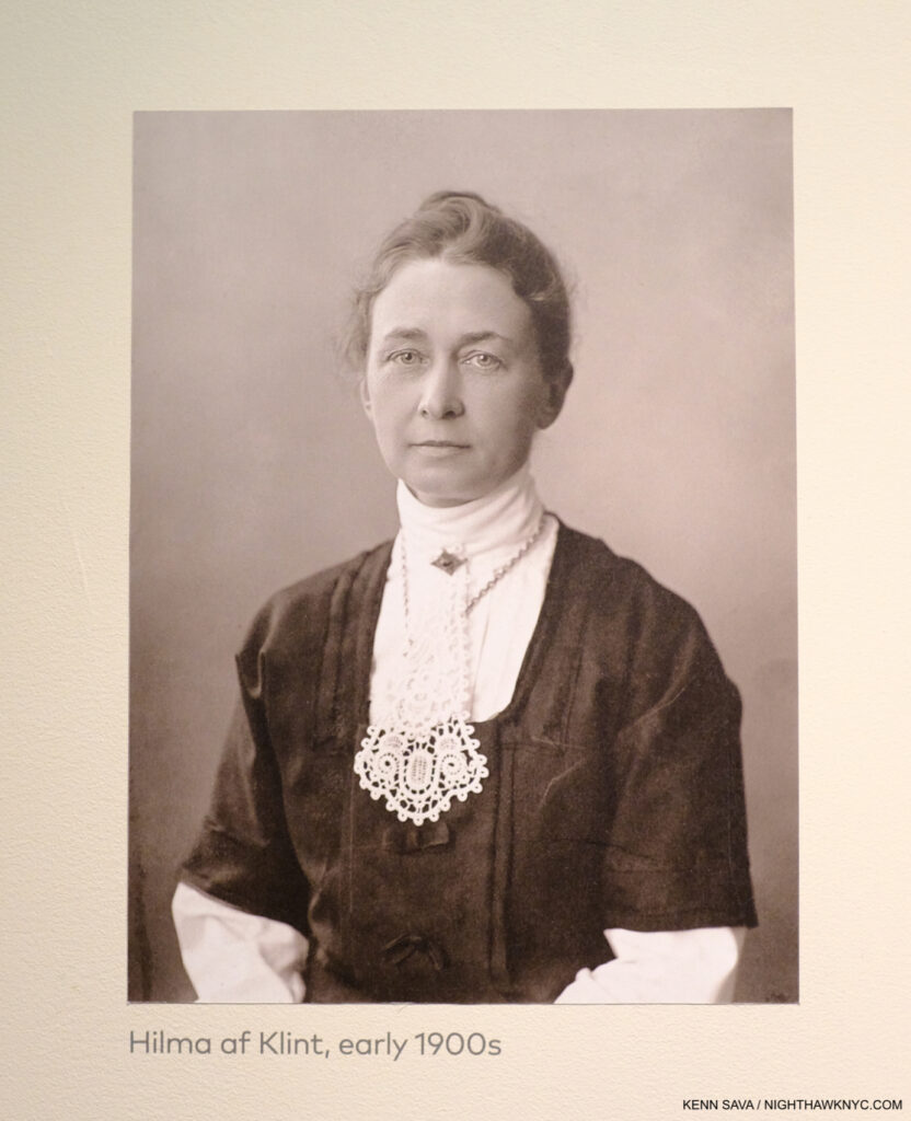
Trapped in the future. But, is this THE future she envisioned for her Art? One of the few Photographs of Hilma af Klint. This one was affixed to a wall at the Guggenheims’s landmark Paintings for the Future in 2018.
Perhaps this experience sounded a warning bell. Earlier this year a struggle broke out inside the Hilma af Klint Foundation about whether or not her work should continue to be exhibited. The Foundation’s chairman of the board, af Klint’s great-grandnephew, who, like his great-grandfather, is also named Erik af Klint, is against it feeling that Hilma wanted her work to be seen in a spiritual context by fellow seekers, i.e. to “keep the work available to those who seek spiritual knowledge or who can contribute to fulfilling the mission that Hilma af Klint’s spiritual principles intended.”
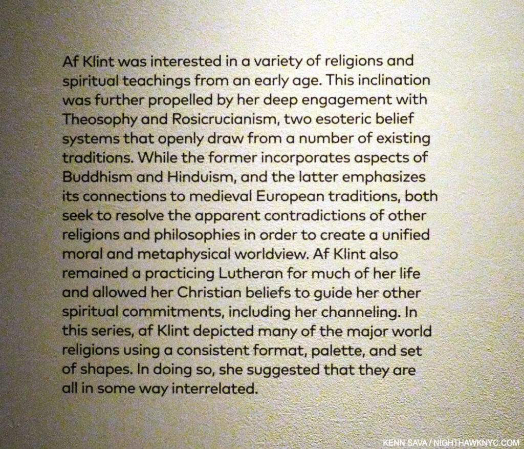
On Hilma’s spiritualism. Guggenheim Museum, December 31, 2018..
Therefore, I think there is a strong case to be made for ending public displays of her work at this point. Perhaps a future time will be more ready to accept, and see her work as she intended it to be seen, and provide the Artist’s full accomplishment with the respect it deserves..
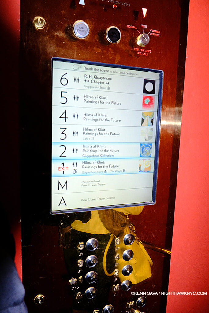
“Beam me up, Frank!” The control panel on Frank Lloyd Wright’s semi-circular Elevator at the Guggenheim. December 31, 2018.
Experiencing Paintings for the Future at Frank Lloyd Wright’s Guggenheim brought home another problematic aspect of experiencing Hilma af Klint’s work today.
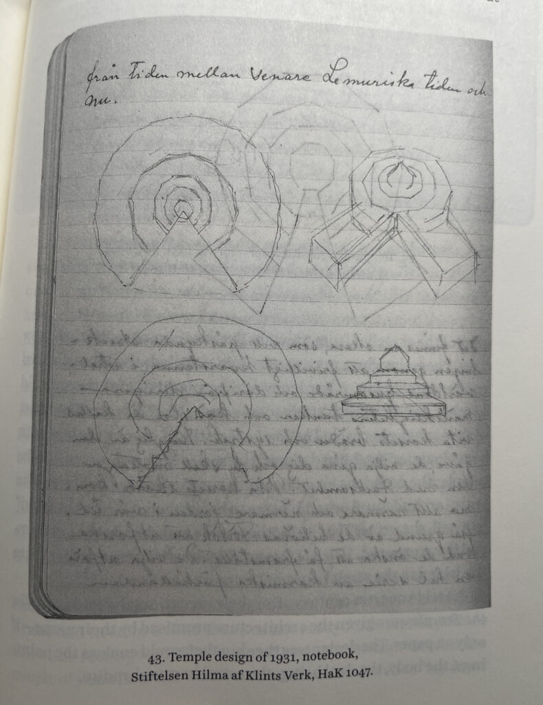
Temple Design, 1931, Notebook in the Hilma af Klint Foundation Collection (*) as seen in Julia Voss, Hilma af Klint.
It turns out that Hilma had not only envisioned that “ideal space” for the display of her work, i.e. a “Temple” as she called it (as in her Paintings for the Temple series), she put some of her ideas for it down on paper.
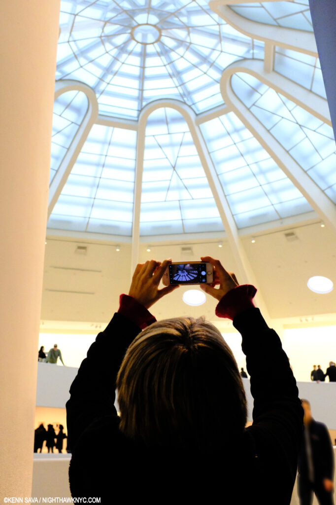
Lana Hattan immediately upon exiting the elevator on the 6th Floor, in both of our favorite buildings, in one of my favorite pictures of her. I thank her for her generosity in allowing me to publish some of the Photos she took that day. December 31, 2018.
Her sketches for it have quite a bit in common with Wright’s masterpiece on 5th Avenue. Both feature circular floors or ramps that rise to a top that opens up to the sky. Also coincidentally, Hilla Rebay, director of the Museum Non-Objective Painting which preceded the Guggenheim Museum, said she envisioned “people communing with the work in Solomon R. Guggenheim’s collection in a a ‘temple of spirit.,'” in commissioning Wright to design it.
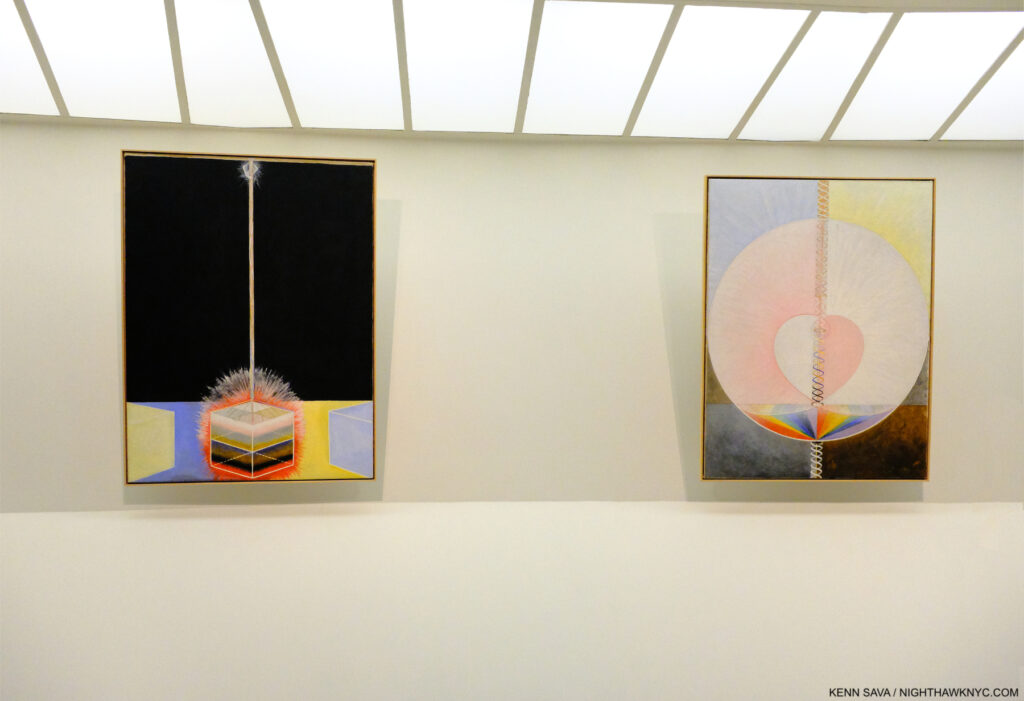
Group IX/UW, The Dove, No. 3, left, Group IX/UW, The Dove, No. 1, right, both from The SUW/UW Series, 1915, Oil on canvas.The work on the right is the original of the work she reproduced by hand in the Blue Book picture shown earlier. Guggenheim Museum, December 31, 2018..
I didn’t know about her Temple, or her Drawings for it, when I saw the Guggenheim show, yet I came away feeling the Architecture added exponentially to the experience of it. At this point, it leaves me feeling her dream should be realized, though that’s not part of the current discussion (as far as I know). Failing to realize the Temple she had envisioned to hold at least part of her work, it remains in a sort of limbo without it.
Of course, today’s Art machine is adamantly opposed to Hilma shows ending, seeing a potentially huge marketing opportunity vanish. Her art being for spiritual seekers, is diametrically different than how the Art world sees it now. Spiritual seeking vs dollar signs- I’ll be interested in seeing which way this one turns out, but I’ll be hoping Mr. af Klint succeeds. (Digression for full disclosure- In case anything I write here makes you wonder, I’m not a religious person. I’ll leave it at that and end the digression.) I’ve always believed the Artist’s intentions for her (or his) work should be respected above all else. As for all those who will bemoan not being able to see her work, consider that for most of the past 30 years Jean-Michel Basquiat has been THE most popular Contemporary Artist in the world, and almost none of his work is in the hands of museums or public collections resulting in a paucity of shows, as I discussed here. Somehow his popularity has continued to increase without direct access to his work.

Hilma af Klint books for sale in the window at the Rudolf Steiner Bookstore in Manhattan. A long-time admirer of Mr. Steiner, I think she’d be ok with this. December 11, 2025.
Hilma’s work can be seen by everyone in the excellent seven-volume Catalogue Raisonne her Foundation has published (which I collectively named a NoteWorthy Art Book of the 21st Century), and a number of other books. For those who want to know more about Hilma, Julia Voss’s excellent Hilma af Klint Biography is the current go-to source and a must-read. It reveals an extremely private woman who was solely focused on her spiritual development and her Art to the extent that she wrote virtually NOTHING about herself and her private life in those 26,000 pages she left! But, she did make crystal clear what she was about and what she wanted for her Art.
If Hilma were alive today would she be enamored with the Art world and its machine, an Art world that seems to have no clue how to handle “spiritual Art?” I have my doubts. That future she envisioned in the 1930s still feels like a dream. So, it just might be a good thing if Hilma af Klint shows stop. Some further point in the future may be a better time for her work to be seen & fully appreciated- one without an Art world in such a hurry to judge it, box it, and associate it solely by the dollar signs it hangs on it.
Wake me up when we get there.
*- Soundtrack for this piece is “Bring My Flowers Now,” by Tanya Tucker, the de facto title track from her 2019 album, While I’m Livin’, which she performs here-
“I know we’re gonna ride again someday…”
NighthawkNYC.com has been entirely self-funded & ad-free since 2015! If you’ve found it worthwhile, PLEASE donate securely by PayPal below to allow me to continue. Thank you, Kenn.
You can also support it by buying Art, Art books & Music from my collection!
Art & Books may be found here. Music here and here.
Written & photographed by Kenn Sava for nighthawknyc.com unless otherwise credited. To send comments, thoughts, feedback or propositions click here. Click the white box on the upper right for the archives or to search them. Subscribe to be notified of new Posts below. Your information will be used for no other purpose.