Richard Estes’ Dayhawks At The “Corner Cafe” (Revised)

This site is Free & Ad-Free!
If you find this piece worthwhile, please donate via PayPal to support it & independent Art writing.
Other ways to support it at the end. Thank you!

Written & Photographed by Kenn Sava (*- unless otherwise credited).

Update- 5/14/2022- In an interview with the Artist in the just-released book Richard Estes: Voyages, Mr. Estes says that he is now destroying his reference Photos because he does not want people to compare them with the finished Painting. As a result, and to respect his wishes, I have revised this piece to remove the Mr. Estes’s reference Photos I originally showed. It must be said that he included them in his Richard Estes: Painting New York City Museum of Art & Design show in 2015 . I cannot unsee what I saw in the show, but I have decided to remove them so that others won’t be influenced by them. The text of this piece remains unchanged. It is, simply, what I see. As always, I encourage everyone to look for themselves and let the Art speak to them. 

Appearing at the very end of the excellent Richard Estes: Painting New York City show at the Museum of Art & Design, which I looked at in my look at NYC Art Shows in 2015, the first-ever Estes show in an NYC  Museum, was a work depicting one of those all too common places to be found all over New York, and indeed much of the world, making it easy to overlook, to look through, or to see-but-not-really-see. Mr. Estes titled it Corner Cafe. It’s dated “2014-15.” Given that the Artist was born on May 14, 1932, that means that he was 82 or 83 years old depending on when he actually finished it. Situated as the show’s conclusion, Corner Cafe could be a make or break work for the entire show.

How VERY Daring.

Richard Estes, Corner Cafe, 2014-15. Oil on Canvas. I only hope I can still get out of bed when I’m 83.

To end a show that covers over 40 years of work with a piece created at 83 is certainly making a statement. Especially a show that is, among other things, a showcase of his amazing craft & technique and how it has evolved over time. In fact, his craft is such that this was the first ever solo show by a Painter at the Museum of Art & Design, who specialize in “craft.” A very close look reveals he has signed and dated it right under the very small Statue of Liberty near the lower right corner. An appropriate conclusion for a show entitled “Painting New York City.”

To my eyes, it’s every bit as good as anything he’s ever done- In this show or not. Technically, it’s flawless. Mr. Estes remains at the peak of his considerable powers in his 80’s. Remarkable! Compositionally it’s subtly fascinating,

In spite of the fact that the show was a first chance for me to see paintings by Mr. Estes that I’ve loved for 30 years and never seen in person before, since I first saw Corner Cafe at the show’s opening in March, 2015, I haven’t been able to get it out of my head.

Here’s what the “Real” Corner Cafe looked like in December, 2015. Mr. Estes hasn’t eaten here1, so why did he choose to paint it?

I’ve actually made a number of trips to the corner of West 94th Street and Broadway to ponder the “real” Cafe in situ, both to experience it for myself (I did not go in), to see if it screams out “PAINT ME!” and to see what, exactly Mr. Estes has altered, even though no less than 3 of his Reference Photographs hung very close by in the show. These Photos should serve once and for all to clear up many of the myths and fallacies about Mr. Estes work. Like-

He does not project Photographs onto his canvas and then Draw or Paint them2.

He does not paint his reference Photographs verbatim (as the evidence in the show proves).

He does not, apparently, even rely on a single Photograph when he feels it doesn’t contain all he wants.

This brings up my biggest pet peeve about the perception of Richard Estes work. That he is ENDLESSLY called a “photorealist” or “hyperrealist.” “Photorealism” is a term popularized by an Art dealer as a means of selling the work of a group of his artists, and then perpetuated in a series of now 4 books, each including Estes work. I’ve never heard what Mr. Estes, himself, feels about this term. As I’ve said, I believe that labelling artists by a one word term that is supposed to enable viewers or readers to pigeonhole them and their work for easy consumption is something that must end. Artists are unique beings. If their work looks like that of someone else (like Picasso’s Cubism did Braque’s Cubism), it’s by their choice, but it’s not necessarily indicative of the sum of their Artistic being. In Picasso’s case he went on to another style as soon as his last one was “named.” In the end? He is simply, “Picasso.” Artists, like Chuck Close, also included in the book series, have made no secret of not wanting to be considered a “photorealist.”

“The reason I never liked the word “realist” or “new realist” or “photorealist” was I was always as interested in the artificial as I was the real.  I’m as interested in the distribution of color on a flat surface as I am in the image it ends up making.  So it’s that tension as it works back and forth between marks on a flat surface and the image that it’s making that has always interested me.” Chuck Close

And, for the most part, he hasn’t been since. This wanting to put Artists in a box is something that only serves to provide a “crutch” that may serve to make viewers feel they already “know” what a given Artist does and so they don’t need to actually look at their work for themselves. I feel it’s better to forget what anyone (besides the Artist) calls it, and just look at the work.

As I began to do that with Corner Cafe, I was quickly faced with two overriding questions-

Why This Scene?

What is this “about?”

First, I will say that what follows is entirely my opinion based on the feelings I get looking at it. That’s all. While the endless details Mr. Estes has so incredibly faithfully recorded are delicious to enjoy on their own- the reflections in the metal framing, the sample meals in the window, the latticework of the furniture, the surrounding buildings, the inside of the cafe and on and on. As wonderful as it is to enjoy these details (as it is in almost any of his work), as time has gone on, I’ve found myself considering it as a whole. Visiting the actual site a few times, something most viewers may not be able to do, one thing strikes me- Mr. Estes has chosen to leave out what is, perhaps, the most noticeable thing about the real Corner Cafe- its sign. Why? Many (most?) other Artists Painting this site would no doubt include it. But, whatever his reason is, it puts the focus of his Painting elsewhere. I think he did it because he didn’t want viewers to be distracted by it.

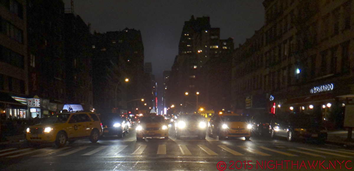
Over and over again, in thinking about the feeling I get from Corner Cafe, I was inescapably drawn back to something very familiar. And familiar to anyone reading this site. Look up above. That’s right. I’m reminded of Edward Hopper’s Nighthawks.

There are two people visible through the large front window (and parts of others inside on the left), and a woman in a red jacket disappearing stage left around the corner onto 94th Street. There’s a woman who appears to be a customer, a counter man, an employee of the cafe, and between them sits a white bag, its handles pointing up. Interestingly, these two appear quite a bit brighter in the Painting than in the Reference Photo, especially the female customer, who has gone from being completely in the shadows to being completely sunlit. They’re not looking at each other, though their mouths may both be open. Perhaps they’re speaking to each other. The woman is looking slightly to her right, whereas in the Photo she looks almost straight ahead. The woman in red walking down 94th Street appears in a different reference photo than the one with two people inside.

The real thing in December, 2015.

Mr. Estes has said that he consciously chose to omit people early on in his career to avoid the narrative element that comes with them. That is, no doubt, why most of his work feature people who are,  at best, “incidental.” Sometimes, however, my attention has been drawn to these “bystanders,” and I find it hard to believe that that is not intentional. The customer in line in Lunch Specials who gives us a look over his shoulder, for example, as if seeing what is going on when most others (ourselves?) do not. And, there are the guys on the payphone outside. A metaphor for talking to people who are not there, while those who are there stand in line not talking to each other? He’s right. It’s hard not to read into them when people are present.

What we’re seeing here is one of the countless, brief encounters we all have every day, encounters that are the hallmark of the modern world. A world that is clad is shiny surfaces, with neon signs and images and examples of what is to be found inside. (Things that have changed since the 1942 world of Nighthawks, which is almost distraction free, somewhere, possibly imaginary, possibly real, in the Flatiron or the West Village neighborhoods. My search for the real Nighthawks cafe is here.) Tables and chairs fill the right foreground, in case you want to bring what’s inside out, but no one has. Yes, it’s winter, given the snow seen on the left, but it’s a sunny day.

Like the woman in red disappearing3, these two will, most likely, probably end their encounter very soon, and move on with the rest of their days.

Am I making too much out of the “similarities” with Nighthawks? Maybe, maybe not. I’m responding to what I see. To quote Frank Stella in his recent Whitney Museum Retrospective, “What you see is what you see.”

Detail of the Painting.

I’m not saying that Mr. Estes was thinking of  Nighthawks when he painted Corner Cafe. I’m saying that I was reminded of it as I’ve looked at it. There is the same isolation. The same counter person-customer interaction. The same other random (single) person included. And both feature cafes that are located on a corner. For Mr. Estes, this scene may be reminiscent of everyday scenes of Venice rendered by Canaletto.

Interestingly, one detail Mr. Estes has omitted might seem to reinforce that Nighthawks connection- on top of the awning is a sort of logo that has the words “corner” and “cafe” at right angles to each other (which does appear, smaller, on the divider in front between the Brooklyn Bidge and NYC Skyline. My guess is the one over the awning was too large to not be “read,” or it would appear as a meaningless distorted mess given the angle of the scene), not all that much different from the somewhat sharper angles of Nighthawks cafe. Unlike the Hopper, the door is obvious and central. Are we being invited inside? It’s hard to say. There’s a tall, evergreen like plant (since replaced) “guarding” the front door, with an ATM machine looming right inside. It almost looks like the way into a different business. But, we known better. The overhead awning tells us it’s all the same place.

Inside, given too much choice, perhaps the customer is having trouble deciding on something else. Her eyes (which in the Reference Photo that she appears in- the only one of the 3- I almost thought she was wearing sunglasses), appear to be looking down at the items on the counter.

Mr. Estes has omitted the large “Corner Cafe” sign, with its preceding coffee cup, above the awning, which serves to focus our attention on the windows. We can barely see the bottom of the cup over the “2518” sign. Puzzlingly, he has added what appears to be a drop shadow for this sign above the rest of the awning, much larger than I saw it in real life.

Scrunched into the phone booth seen further below to take it all in on August 21, 2015. With the umbrellas open, it’s not nearly as interesting.

Almost everything else is there! The level of detail makes my head spin. You can get easily lost in it. When people talk about “pure Painting,” THIS is what I think they mean. Yet, every single detail has meaning and purpose here. They are all the means to an end.

The chairs are different now. They have square backs and don’t have that marvelous lattice work he masterfully shows. The signs in front of them are different, too. Gone are the NYC sights, two of which, the Brooklyn Bridge and the Lower Manhattan skyline, happen to be subjects of large, earlier Estes.

It just screams “Paint Me,” right? It took a bit of work to find a place to stand to even shoot it, Here, I’m standing in the middle of Broadway! August 21, 2015.

Also interesting, the apparent spot where Mr. Estes likely stood to capture this view of the cafe is a bit hard to get to. Now, there are 3 large circular recycling cans on the spot. I had to stand on the curb to shoot it. There is also a large telephone booth (remember them?) immediately to the right. So, even getting the photos he wanted may not have been exactly easy. The outdoor seating is closer to the front wall and neatly squared thanks to an additional divider on the left, and he’s cropped the lower part of the image to the very base of the outdoor divider.

The sun is high enough in the sky to the south to pass through all the intervening buildings along Broadway. There is only the woman exiting to be seen, along with the two large evergreen plants as outdoor signs of life.

Perhaps that is the point.

Unless you are “stuck” there, like the employee or the two potted plants, everyone is destined to come and go, like those who presumably once sat outdoors have already done, the woman in red is doing, and the female customer appears about to do.

Life, itself, is an endless series of comings and goings, too, with encounters of varying lengths in between.

Until it ends.

“Stop the rush and relax,” reads the sign below.

*-Soundtrack for this piece is “Hello/Goodbye” by The Beatles and written by Lennon & McCartney, from their album Magical Mystery Tour.

NighthawkNYC.com has been entirely self-funded & ad-free since 2015! If you’ve found it worthwhile, PLEASE donate securely by PayPal below to allow me to continue. Thank you, Kenn.

You can also support it by buying Art, Art books & Music from my collection!
Art & Books may be found here. Music here and here.

Written & photographed by Kenn Sava for nighthawknyc.com unless otherwise credited. To send comments, thoughts, feedback or propositions click here. Click the white box on the upper right for the archives or to search them. Subscribe to be notified of new pieces below. Your information will be used for no other purpose.

  1. As was stated on the description card for the painting. ↩
  2. As I heard him say in the interview he gave at the MAD opening. ↩
  3. She may be there to distract the eye with her blonde hair and red coat, or to emphasize the “corner” element of the title, or as a means of visually breaking up the reflection to her right with the street scene to the left ↩
Art Shows, 2015 – Who Keeps Your Flame?

This site is Free & Ad-Free!
If you find this piece worthwhile, please donate via PayPal to support it & independent Art writing.
Other ways to support it at the end. Thank you!

Written & Photographed by Kenn Sava (*- unless otherwise credited).

“But when you’re gone,
Who remembers your name?
Who keeps your flame?”*

IMG_7838PNH

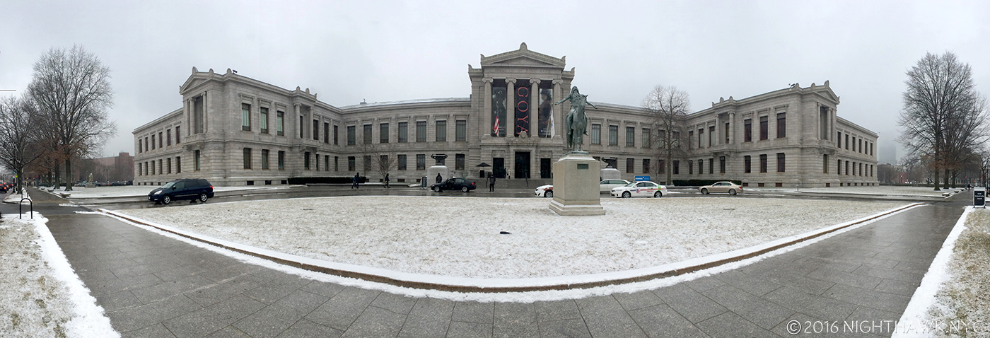
January, 2015. Goya: Order and Disorder @The Museum of Fine Arts, Boston. Neither snow, nor 5 hours on a train kept the Nighthawk from the Front Door of Great Art.

Since I don’t believe in comparing creative work or creative people, AND I believe that “awards” for “Best” whatever among the Arts (and sports) are absurd 1, I thought I’d do a “List In No Particular Order” of 2015 Art Shows I saw (some opened in 2014) that may or may not have closed for good, but still continue to open doors in my mind, and that’s more important than any award I could bestow.

“Oh can I show you what I’m proudest of?”*

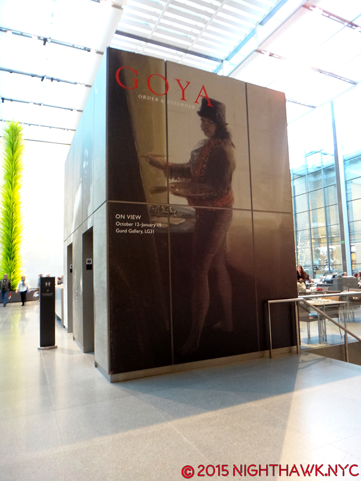
Goya: Order and Disorder (Museum of Fine Arts, Boston, MA. No photos permitted.) AND Goya:Los Caprichos (National Arts Club, Gramercy Park, NYC)- Two concurrent, excellent shows, 250 miles apart, one huge, the other “small” showing two views of  Goya- one all encompassing, filling the whole lower level of the MFA, one narrowly focused on a rare, complete set of his landmark 80 print, Los Caprichos,(once owned by Robert Henri, who reappears below) combined to show the enduring power, importance, relevance and eternal influence of the Spanish Master. Many saw the former, far fewer saw the latter, tucked away in a dining? lecture? room on the second floor of the NAC (Behind hundreds of chairs on one of my visits!). An artist of nightmares, both surreal and all-too-real, the likes of which perhaps only Bosch can equal, who can then turn around and paint with the utmost lyricism, Goya was all about what it is to be human. Take your pick- portraits, historical pieces, landscapes, the otherworldly or the underworldly, children, tapestries, or his graphic works that hold their own with dare-I-say-Rembrandt, he’ll blow your mind.

DSC07316PNH

Goya/MFA on the show’s elevator entrance, overlooking Dale Chihuly’s Tree.

Remember My Name. Goya’s Self Portrait casts his all-seeing eye on us 215 years later.

The Sleep of Reason Produces Monsters from The Caprichos” So? Stay up!

DSC07711PNH

Neither blizzard, nor the furniture(!), kept the Nighthawk from seeing all of Goya’s incredible Los Caprichos at the National Arts Club, but I think they tried to.

Richard Pousette-Dart (Pace 510 West 25th, Chelsea)- I walked in and was completely captivated by “abstract” Art the way I haven’t been since the Mark Rothko Show at the “Old” Whitney in 1998, which was one of the greatest shows I’ve ever seen. (That’s not comparing.) Don’t be fooled by the apparent geometric simplicity, there is an astounding subtlety to these works that at once feel microscopically considered, often freely rendered, yet globally cohesive. Pousette-Dart had a number of styles, and this show represented one, geometric style, from the 1970’s in both large oils and smaller drawings. For any of those who think that Abstract Expressionism is “easy” to do, go ahead and try creating one of these, the largest is almost 8 foot square, and then see if it has the “Presence” of Dart’s. The amount of work that went into each piece belies their seemingly “simple” composition, is matched by an extraordinary primacy of order, and second only to their transcendent impact. Here, we see Richard Pousette-Dart as the great, “under known” abstract artist. While Pollock & Rothko have grown larger in stature, Pousette -Dart’s name deserves to be right there with theirs. There is only one word to describe this show’s effect- Magical.

Then? There’s never a chair around when you want one. Pousette-Dart @Pace- Presence, Circle of Night, 1975-6, center, Black Circle Time, 1980, left and White Circle Time, 1980, 90″ square each.

Imploding Black, 1975, six feet square. Transcendent,

Detail.

Cerchio di Dante, 1986, six foot square

Detail of the left side.

“Let me tell you what I wish I’d known
When I was young and dreamed of glory
You have no control
Who lives
Who dies
Who tells your story?”*

Richard Estes: Painting New York City (Museum of Art & Design, NYC)- My favorite contemporary artist, and one of the greatest living realists, FINALLY gets an NYC Museum show, and it was worth the wait. A virtual time capsule of NYC from the mid 1960’s to 2015’s astounding Corner Cafe, showing the 83 year old Master is still at the height of his considerable power. Oh…Do NOT call him a “photorealist” in my presence! Estes shows us the world we live in as we do not see it, (more on this soon) and so follows in the footsteps of Edward Hopper and Charles Sheeler in advancing American realism while, perhaps, being the first to include the abstraction that is also a part of the real world. A misunderstood painter, in my eyes, who is only just beginning to be really seen, finally.

Horn & Hardart Automat, 1967. Not since Hopper has a work spoken to me of life in the City like this does.

Columbus Circle, Maine Monument, 1989. 500 years ago, or 100, they came by ship. Now? They come by bus. Frozen in time, side by side.

Times Square, 2004. Nothing captures the experience of the place better than this, though Robert Rauschenberg is capable of giving me a similar feeling (See below).

“I try to make sense of your thousands of pages of writings
You really do write like you’re running out of time.”*

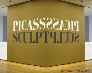
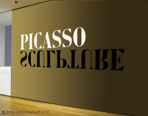
Picasso: Sculpture (MoMA)- If he had never done anything besides paint, Picasso would be considered among the all time Masters. But, noooooooooooo… Picasso was, perhaps, the most unique genius in (known) art history in that his genius was among the most restless. He almost never stopped creating, and he never stopped seeking new outlets for his creative vision. Consider- PICASSO HAD NO TRAINING AS A SCULPTOR! NONE. Yet, that didn’t stop him from becoming, perhaps, THE most revolutionary sculptor up to his time. There is so much great work to see in this show, I don’t even know where to start talking about it. “Picasso: Sculpture” shows us the naked face of endlessly creative genius the like the world has never seen. I’ll sum it up by saying virtually all of it is wonderfully selected, though some of the Cubist works here don’t stand up to his paintings, in my opinion, and wonder- When will we see his like, again? The “other” takeaway, for me, is- Oh…MoMA. I miss you. About as much as I miss your “old” building.

Standing Figure in Wire, 1928. Unprecedented. Astounding.

Sylvette, 1954. “I see you slightly folded…in steel, my dear.” Picasso must have said.

America Is Hard To See (Whitney Museum)- I’m saving my thoughts on the “New Whitney” Building (UPDATE- They may be seen here.), but the opening show in the new place was a wonderful “Welcome Back” to one of the first 3 of NYC”s Big Four Museums and a reminder of its world class (and first anywhere) collection of American Art. My personal highlight? The first floor gallery featuring a selection of Hopper Drawings done at the Whitney Studio which predated the Museum, and the absolutely mesmerizing portrait of Museum founder, the indomitable Mrs. Gertrude V. Whitney (also an overlooked sculptor) that looked out at Gansevoort Street, and for my money? SHOULD HAVE BEEN LEFT RIGHT THERE- PERMANENTLY! It wasn’t.

IMG_0992PNH

Frozen in time. Mrs Gertrude Vanderbilt Whitney looks out on the new home of the collection she started.

Mrs. Gertrude Vanderbilt Whitney by Robert Henri, 1917, with her Study for the Head of her Titanic Memorial from 1922, right. Yes. She was a sculptor, too.

Before the First Whitney Museum opened in 1931, there was the Whitney Studio Club, where artists came to draw from the model. See that guy to the left of center rear with the light shining on his bald head? That’s Edward Hopper, a regular. That’s why his estate was left to The Whitney. Litho by Mabel Dwight, 1931.

America is hard to change. Excellent, rarely seen, works by Grant Wood, Study for Breaking the Prairie, 1939,…

…And Kara Walker, A Means To An End, 1995, struck me as serendipitous.

IMG_0967PNH

America: Seen everywhere. Inside- Rothko’s Four Darks in Red, 1958, Pollock’s Number 27, 1950, Chamberlain, Jim, 1962 & Guston’s Dial, 1956…

IMG_0940PNH

…And, Outside- sculpture from one of the countless roof decks.

“And I’m still not trough I ask myself,
what would you do if you had more time
The Lord, in his kindness
He gives me what you always wanted
He gives me more time.”*

I end this section honoring two endlessly creative American “painters,” featured in very very good shows. Like Richard Estes, these two artists also put that “more” time of a long life to superb use. Yes, despite evidence to the contrary, they both consider themselves to be painters. To me, the “lessons” of their lives, how they were able to survive following their star in this country for so long, may prove to be as important as their considerable artistic legacies.

Robert Rauschenberg- Anagrams, Arcadian Retreats, Anagrams:A Pun (Pace 534 West 25th, Chelsea)- Presaging Photoshop, the late, great Mr. Rauchenberg continues to speak to our times though he, unfortunately, left us almost 7 years ago. Light years ahead of his times, throughout his life,  Anagrams…, a show of Mr. Rauschenberg’s final development, shows that once again, his work will look “contemporary” for years to come, and more amazingly, I think it will be as relevant as what anyone else is doing at the moment! As I just said, he represents something of an American miracle- an artist who was able to spend virtually his entire life creating EXACTLY what he wanted to, answering to no one but himself. That sure must seem miraculous to today’s American artists. Interestingly, like Mr. Estes, the works here are based on Mr. Rauschenberg’s own photography, to very different results. Unlike Mr. Estes, Mr. Rauschenberg’s are directly transferred to the piece, though with such skill and subtlety they have the effect of melting into the others they’re surrounded by. A surprisingly fresh, visually rich, often beautiful show who’s spell will call me a few more times before it ends on January 16. And then, I will miss it, but it will have changed the way I see the world, like Richard Estes has.

Rauschenberg @ PACE. I just loved this show.

Frank Stella (Whitney)- An art mover’s nightmare of a show, the Artist’s helpful hand notated directional markings seen on some of the pieces notwithstanding, it must have been hard for Mr Stella, himself, to narrow his 50-some year career down to one floor at the New Whitney, handsomely displayed in the still-new space. With only one Moby Dick piece in sight, the take away for me is that here is a Triumphant overview of another rare American artist who continues to explore and evolve, fickle times and the “harpoons” of even more fickle critics & collectors be damned. Mr. Stella has devoted his career to the eternal pursuit of finding new possibilities, “new spacial complexities” 2, for the Art Form of painting. Some of these sure look like sculpture, but I’ll bow to what he says on one of the show’s signs- “Q- You still call these paintings? A- Yes. They are, in fact, paintings.” Remarkably, as he closes in on 80 this May 12, Mr. Stella continues to “start over,” as Richard Meier says on the audio guide, eternally following his muse, breaking painting out of 2 dimensions, to lord-only-knows-where-next. In this show’s case? The Journey IS The Destination. Mr. Stella strikes me as a master conceptualist with an endless font of making the unlikely, and especially the unthought-of, real. Forget this show’s afterthought of a catalog, for me, his value, “message” and influence lie in the sheer physical experience of his work- they simply must be seen, and often, walked around like sculpture to be fully appreciated. Who else “paints” like this? If you go, and you should, check out the great quotes from Mr. Stella on the wall signage- “What you see is what you see.” And then some. What I saw was a show to fire your creativity, and inspire you to see new possibilities in anything, if there ever was one. You still have a few days left to see it before it closes after February 7. Then, the art movers get to pack it up and move it out. I would pay to watch that.

IMG_7838PNH

50+ years of “starting over.”

“Toto, We’re Not On Canvas, Anymore.” Stella Busts Painting Out.

“Um..A Little Higher On The Right?”

And lest I forget…

Cubism (The Met No photos permitted.)- TM is on a mission to shore up its Modern & Contemporary Art holdings, as we will soon see at The Met, Breuer, but this show featuring works of a promised gift goes a very long way to solidifying TM’s Cubists holdings, and then some. So many strong works by the Masters of Cubism, Picasso, Braque, the underrated Juan Gris, and Leger abound, they made me wonder where TM is going to install them all when they finally get them!

Madame Cezanne (TM No photos permitted.)- Portraits are not the first thing most think of when they think of Cezanne. Many think of his groundbreaking landscapes and genius with color, but this show of his, no doubt long-suffering wife, says as much about this under known muse as it does about Cezanne. The hours she spent posing for him reminds me of The Man in The Blue Shirt, by Martin Gayford about sitting for Lucian Freud. The show is a striking look at another side of this master of impressionism, and gives us rare opportunities to see 4 versions of a painting reunited, and Cezanne’s actual sketchbooks. A rare treat for the lover of Impressionism, portraiture and great Art.

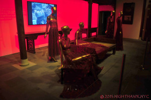
China Through The Looking Glass (TM)- Except for Picasso: Sculpture and Goya’s Los Caprichos, the above shows are painting shows, my true love, but CTTLG is in a category all its own. ANY show that can get TM to stay open till Midnight has to make the Nighthawk’s list. After setting the bar high with Alexander McQueen: Savage Beauty, TM’s Costume Institute topped themselves with a spectacle that the 800,000 who saw it will remember almost as long, and which will prove quite a challenge for 2016’s manus x machina, or MxM, as I’m calling it to equal, let alone top. I predicted 1 Million will attend it, so GO EARLY (or don’t say I didn’t warn you) & Stay tuned!

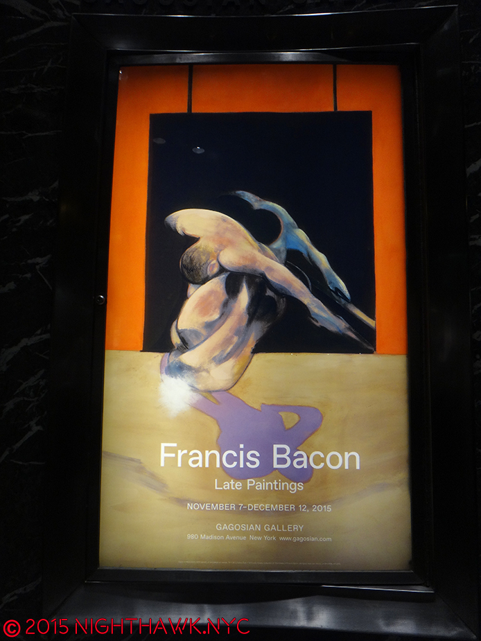
Francis Bacon- Late Paintings – (Gagosian No photos permitted.) – with one work, a triptych selling for 142 million, I can’t fathom how much 28 are worth, but here was a chance to see that many in one show, focused on the seemingly contemplative, other-worldly “late” Bacon,

DSC07520PNHespecially after seeing the following (Rembrandt show) on the same day, which brought to mind subtle, fascinating convergences- self-portraits, multiple views, or states, for Rembrandt, diptychs & triptychs for Bacon, among them.

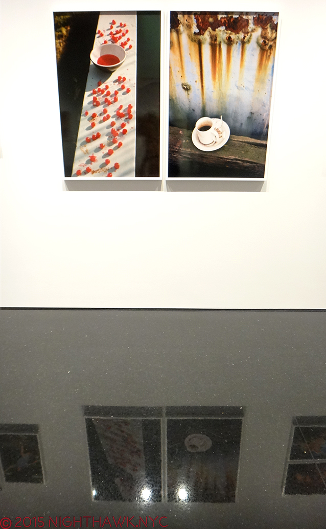
Rembrandt’s Changing Impressions (Columbia U.)- In lieu of the “big one” I missed (see below), this was a closer-to-home chance to see 50 or so prints by the Master and a rare chance to see various “states” (versions) of works side by side. A bit light on the most well known of Rembrandt’s etchings, but very worth 4 visits none the less.

Not a triptych. Rembrandt creates 3 masterpieces from one composition.

Chuck Close Recent Paintings (Pace 534, Chelsea)- I met Mr. Close, briefly, but in spite of the fact that he is one of the greatest portraitists of the 2nd half of the 20th Century+, I know he won’t remember my face. He has Prosopagnosia. He’s ALSO paralyzed and in a wheel chair. I never cease to be absolutely astounded at what he achieves and what new ground he breaks. Already a Master before his brain aneurysm, which would have stopped 99.5% of anyone not named Chuck Close, he’s gone on to create ever new works that continue his life long exploration of his famous “grid technique.” These works add even new elements- new palettes, a new approach to focus and depth of field, and more.

Linda & Mary McCartney (Gagosian Books)- If they had taken down all the title cards, removed the iconic shots among Linda’s, and you walked in without knowing which work was by who- Linda McCartney, or her and Paul’s daughter, Mary, you’d never know. That’s how amazingly symbiotic the eyes of the two photographers are. They see as one. Walking out, and I say this with nothing but respect, it really felt like Linda had never passed away. That her work continues. I’ve never seen anything quite like it.

DSC07609PNH

The daughter reflects well on her famous mother.

George Caleb Bingham (TM)- The year’s “sleeper” pick. I don’t know if he ever met Mark Twain, but if Mr. T. ever wanted an artist to illustrate “Huck” or “Tom Sawyer?” G.C.B. would get my vote. His work captured what it was to live on the River the way only Twain, himself, has, and makes a contribution to laying the ground work towards defining a truly “American” style of painting, and by the Mid-Nineteenth Century? It was about time! TM’s show reveals him to be something of a predecessor for that other great American 19th C. portraitist, Thomas Eakins, but with a style and a power of his own that still holds up.

Araki (Anton Kern, NYC)- He lost his wife…he gets prostate cancer…he says he no longer has sex…Nothing stops the indefatigable, legendary Araki. Don’t let the “casual” taping of the photos to the wall fool you- I found this show striking, poignant, meditative and moving. The images flowed one to the next, sometimes in harmony, sometimes in dissonance, but all of them speak with that sense that only Araki has. Some will say he’s a misogynist. I’m not a woman but I disagree. I see beauty and poetry in his shots of women. Reading some of the press materials on hand, I was struck by his comment that he had sex with most of his models. I couldn’t help wonder- Does that include Bjork? Live long, and much health, Araki.

Also lingering in my mind, tormenting me with what I missed, are the ones that got away-

Late Rembrandt (Rikjsmuseum, Amsterdam)- I agonized about going. For months. Like I agonize about Frank Gehry at LACMA right now! (Hello, Sponsorship?)

Björk (Moma)- Sold out when I went. Bad reviews be damned, I love Björk.

Overall, it was a good, but not great year. Still, these 17 shows had real staying power and lasting influence. I’m grateful that in NYC, we still have so much to see. As I said a few pieces back, I live in mortal fear of missing a great show- Like all those I missed this year because I never knew about them, and still don’t.

As I look back on 2015, the Idea of great Art is what lingers in the mind, inspires, even instructs. The experience, talent and creativity of a great Artist speaks to the highest & best of mankind, in ways the rest of us can, perhaps, relate to, learn from, and even aspire to. As Mr. Pousette-Dart cosmically said-

In these times of so much senseless hatred, violence and the worst of human kind on display, we need this more than ever.

*Soundtrack for this piece is “Who Lives, Who Dies, Who Tells  Your Story?” from the 2015 album I listened to the most, “Hamilton– Original Broadway Cast Recording, by Lin-Manuel Miranda.

NighthawkNYC.com has been entirely self-funded & ad-free since 2015! If you’ve found it worthwhile, PLEASE donate securely by PayPal below to allow me to continue. Thank you, Kenn.

You can also support it by buying Art, Art books & Music from my collection!
Art & Books may be found here. Music here and here.

Written & photographed by Kenn Sava for nighthawknyc.com unless otherwise credited. To send comments, thoughts, feedback or propositions click here. Click the white box on the upper right for the archives or to search them. Subscribe to be notified of new pieces below. Your information will be used for no other purpose.

  1. Remember- Charlie Chaplin, Hitchcock, Fellini, Orson Welles, Akira Kurosawa, Ingmar Bergman or Stanley Kubrick, among others, never won an Oscar for Best Director! I rest my case. ↩
  2. as is said on the audio tour, #508 ↩

Yoko Ono & Linda McCartney- Out Of The Long And Winding Shadows

This site is Free & Ad-Free!
If you find this piece worthwhile, please donate via PayPal to support it & independent Art writing.
Other ways to support it at the end. Thank you!

Written & Photographed by Kenn Sava (*- unless otherwise credited).

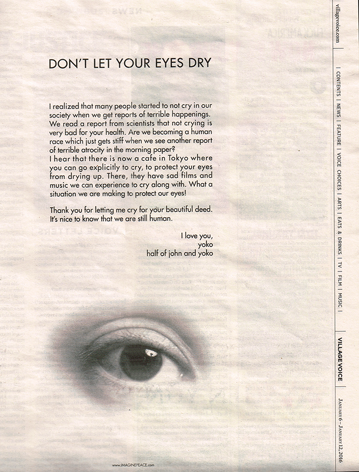
In NYC there are so many shows going on at any given moment, it’s often possible to find strange, not so strange, and/or enlightening connections among the completely randomly scheduled Art Show bedfellows, and I love exploring them! Recently, there were shows of the Art of two of the Beatles spouses up at the same time- with a show of the work of Linda McCartney, and her and Paul’s daughter, Mary McCartney’s photographs Uptown at the Gagosian Bookstore Gallery, and a double show of 3 new works by Yoko Ono in Chelsea (the same 3 pieces were on view in 2 galleries). To boot, she also took out a full page ad in the Village Voice this past week…about crying.

CCI16012016_6PNH

Village Voice, January 6, 2016

When I was a kid Asian women, not named Anna May Wong, were seen as quiet, demure, even submissive by most people in the West.

Then along came Yoko Ono on the arm of John Lennon.

“Every man has a woman who loves him
In rain or shine or life or death
If he finds her in this lifetime
He will know when he presses his ear to her breast”*

At first, she seemed quiet, too. She was omnipresent. She appeared to be John’s shadow. But that was mostly because we weren’t familiar with her Art. Most people still aren’t. They took one listen to her music and that was as far as they went.

Art has long been the Beatles “dirty little secret.” People forget, (or would like to), that Paul McCartney Paints, John Lennon Drew, and had attended the Liverpool College of Art, and both of their famous spouses, among others not famous, are established Artists in their own right. People seemingly didn’t want to know about anything other than the Beatle’s music. Yet, even a casually close look at the Beatles accomplishment shows they were eternally trying to push the envelope creatively. They aspired to “more” than pop music. Just listen to “I Wanna Hold Your Hand,” and “Strawberry Fields Forever” back to back. They aspired to be Artists, and they succeeded more than any other “popular music” group in history, though not in everyone’s mind. Their more “chancier” creations, like the film Magical Mystery Tour, which was years ahead of it’s time, got mixed, even bad reviews. Many didn’t get George’s interest in Indian music, and on and on. It was almost like people were saying “shut up and play yer guitar,” to quote Frank Zappa.

Yet all the while, these two Beatles women kept at their craft and followed their own creative voices. Think it’s an accident two Beatles married them? Think again.

In the case of Yoko- She received a lot of  denigration, and worse, from a public who have virtually no experience with the kind of Art she makes, on top of the abuse she received for being “the reason” the Beatles broke up (as absurd as that was). It often seemed like John was one of the few who appreciated her creativity during his lifetime,

“Every woman has a man who loves her
Rise or fall of her life and in death
If she finds him in this life time
She will know when she looks into his eyes”*

It’s already 35 years since John tragically left us way too soon. Still, Yoko has not only survived that horrid death, and all the rest I just mentioned, and carried on, continuously, with her art, her music, her messages, and being her indomitable self.

Artists gonna Art, I say. Her stature continues to rise.

I think she’s one of the most courageous Artists, and women, of our time. Sure, having money no doubt helps, but I bet she still would have kept on keeping on and made her own way, as she was doing before she met John. I bet John would agree and that’s part of why there was “John & Yoko” to begin with.

Linda’s work is well known, well respected and rightly so. Along with Annie Liebovitz, she was one of the first important female rock photo-journalists, even before she became Mrs. Paul McCartney. Oh, yeah…She got a fair bit of grief about that, too. Then, he put her in Wings! HA! (Sing it with me now- “Every woman has a man who loves her…”, above.) Some of her most well-known photos are on display, and available for purchase at prices up to 10,000.00. Right along side are her & Paul’s daughter, Mary’s photos, which are entirely unknown to me. If they had taken down all the title cards, removed the iconic shots among Linda’s, and you walked in without knowing which work was by who- Linda’s or Mary’s, you’d never know. That’s how amazingly symbiotic the eyes of the two photographers are. They see as one.


Linda & Mary & Brian & Keith & Kate & Paul

Walking out, and I say this with nothing but respect, it really felt like Linda had never passed away. That her work continues. I’ve never seen anything quite like it.

In Chelsea, Yoko’s 3 works (Stone Piece, Line Piece, Mend Piece), with the overall title The Riverbed, are beautifully conceived, and largely left to the viewing public to realize. Yes, that’s right- you get to help Yoko realize her Artwork. How cool is that? Her notes say-“RIVERBED is over the river in-between life and death…” I’ve reproduced the rest-

IMG_3372P

Line Piece.

Entrance to “Mend Piece,” with work table and display shelves inside.

It reads- “Someone, somewhere in the world loves you”…”It’s me.”

Parts of the Earth, Mended, with Love.

I watched people lose themselves interacting and creating with the materials provided- string, nails, hammers, scissors and rock in one room at each show, and a pile of broken china, glue, tape, markers on a table with chairs in another room at each location. The participants were of all ages, sexes and races. The shelves for “Mend Piece” in both galleries were stocked full of “reconstructions.” The string “webs” of “Line Piece” were so intricate that they required careful stooping and straddling to navigate the rooms. I came away feeling that Yoko is leaving a legacy among the young, like the Beatles did. This is in addition to the legacy she is creating as an Artist, a female Artist at that, and as a person.

Also, in these shows, she’s breaking down the walls of “What is Art?” and letting everyone in. Art lies in the idea. The Artist is the person realizing it. As such we are all capable of being Artists. And? Art can heal- yourself, even the world!

How beautiful is that?

John Lennon is STILL proud of her. Hopefully now, finally, the rest of us know how right he was about her.

Since she signs everything “I love you,” which is always nice to hear, I’ll reciprocate, since she probably likes hearing it, too-

I love you, too, Yoko.

There…a little piece of the Earth mended. With Love…and Art. Imagine…

*-Soundtrack for this piece is “Every Man Has A Woman Who Loves Him” by Yoko Ono, from Double Fantasy and published by Sony/ATV Music Publishing Co.

NighthawkNYC.com has been entirely self-funded & ad-free since 2015! If you’ve found it worthwhile, PLEASE donate securely by PayPal below to allow me to continue. Thank you, Kenn.

You can also support it by buying Art, Art books & Music from my collection!
Art & Books may be found here. Music here and here.

Written & photographed by Kenn Sava for nighthawknyc.com unless otherwise credited. To send comments, thoughts, feedback or propositions click here. Click the white box on the upper right for the archives or to search them. Subscribe to be notified of new pieces below. Your information will be used for no other purpose.

Robert Rauschenberg: Anagrams (A Pun)- But No Joke

This site is Free & Ad-Free!
If you find this piece worthwhile, please donate via PayPal to support it & independent Art writing.
Other ways to support it at the end. Thank you!

Written & Photographed by Kenn Sava.

11 days after being here for the final day of the Chuck Close: Recent Works, I returned to Pace’s 534 West 25th Street Gallery to see Robert Rauschenberg: Anagrams, Arcadian Retreats, Anagrams (A Pun), on view until January 16, 2016. Up a few steps to the back office area where the show continues, a short video of Rauschenberg at work in on view. As the camera looks down from slightly above, I noticed that surrounding him all over his studio were numerous works consisting of seemingly chaotic collages of images. I couldn’t help wondering about the effect on a visitor’s brain of spending 8 hours in that studio, and what it would  feel like to then walk outside. I wondered what they said about the images playing inside of Rauschenberg’s mind all the time. Day in. Day out, for the 82 years he lived. It might be why there’s so much to see in even one of his works. This new show makes clear that it may be a long time yet until everything that brain, and he, created in his professional life from the 1950’s until he passed in 2008 is seen, fully appreciated and assimilated.

These works are dated 1996 and 97. Visually, his work presaged the visual chaos of the internet age, and the graphic print style of David Carson and others. Seen in 2015 it fits right in with the everyday chaos of NYC, both on the physical level, where pedestrians have to face a never ending life, death or injury battle with bikes, cars, buses, trucks and lord knows whatever else, simply to get from point A to point B, while being bombarded with every square inch plastered with ads, images or graffiti on the visual level.

The modern world makes me try to make sense out of its visual chaos- like Rauschenberg did so masterfully.

Anagrams, Arcadian Retreats, Anagrams (A Pun) is a bit different from any Rauschenberg show I’ve yet seen. It’s concise yet catholic, coherent and sharply focused on these three series of works, which share working methods, making it very hard to tell which work is from which series. As such, it’s a rare opportunity to see a selection of late works. Pace’s release states the images are from Rauschenberg’s own photos, which continues a trend in recent shows of artists using, or basing their work on their own photographs (Richard Estes, Chuck Close). Rauschenberg appears to have been at the forefront of image manipulation, made possible by software like Photoshop, while adding “painterly elements.” Regarding exactly what these pieces are and how they were made, Pace’s press release says- to create these works, “he developed and perfected a powerful new technique combing dye transfer with novel supports including plaster, large-scale paper and polylaminate panels…The process produced an aqueous and fluid appearance, blurring the crisp edges of his photographs…The inkjet dye process also liberated Rauschenberg from the mechanical production of printing screens, allowing him to produce sheets exclusively from his own photography on an in-studio printer. In addition to a more painterly effect, these works reflect a more nimble and freer approach to image-making than earlier works which were bound by the limitations of the mechanical process.”


It’s tempting to “read into” the resulting images, some of which are repeated verbatim in other works, and take them as a visual language, to be deciphered for “messages,” even hidden meanings. That will take a lot of looking to compile. Though “anagram” is a word about words, I don’t think I’ll be taking it that literally. I prefer to let the images speak, and this show is an orgy for the eye.

The works range from very large to large and a few of medium size. Two, including the largest, (one, I felt to be the most impactful piece in the show), are owned by the Whitney. Most of the others are not titled, detailed or described. Many feature images from different cultures around the world from the Sphinx and the Pyramids to traditional costumes, apparently from trips he had taken shortly before, which are juxtaposed with images from the western world, like construction equipment, firefighters, store fronts, junked cars, bicycles and soda bottles. Despite being combined, layered, even processed, the results don’t look like images produced in Photoshop. They look more like paintings, which I find somewhat remarkable, probably because I am so used to seeing Photoshopped Photographs. While he anticipated digital image processing and manipulation in works gong back to the late 1950’s, he continued doing things entirely his own way, and only selectively using technology when it suited his aims.

I previously saw some works from these series in the 1977 Guggenheim Rauschenberg Retrospective, but these were new to me. Seeing only works from these series brought home how wonderful they are. They’re different from what he had done earlier in his career, yet they have that undeniable “Rauschenberg” feel. In spite of being Photo based, they retain a “painterly” look, which I think is remarkable, and one of the things that sets his work apart from all those doing these types of works today. For me, Rauschenberg is kind of an American Picasso of the 2nd half of the 20th Century- his creativity and inventiveness knew no bounds. Like Picasso, he never stopped innovating and trying new things and techniques. Even 7 years after his passing, we continue to discover new facets of this work, which seems as fresh and contemporary as anything else around today. That will, no doubt, continue at the first full scale retrospective of his work since the Guggenheim’s 1997 blockbuster to be held next year at the Tate Modern, London.

These are wonderful works that reward repeated looks from a period of the Artist’s career that strikes me as being under appreciated. They seem so of the moment, it’s hard to think they’re going on 20 years old. In that sense, like their creator, they are ahead of their time, even now. I’m continuing to try and get the modern world to look like a Rauschenberg to me, to make that kind of sense, possibly even find the “Art” in it…that is when I’m not dodging bikes, cars, and the rest to actually feel safe enough in it to look around. That danger is what’s missing in these Rauschenbergs. Probably because he seems to be focused on the bigger picture, the dangers of the modern world to ancient cultures and ancient creatures. Including man.

On a bigger scale, like that bike I don’t see coming the wrong way on a one way street, the modern world is obliterating all that came before.

DSC02584PNH

*-Soundtrack for this piece is “Crosstown Traffic,” by Jimi Hendrix.

NighthawkNYC.com has been entirely self-funded & ad-free since 2015! If you’ve found it worthwhile, PLEASE donate securely by PayPal below to allow me to continue. Thank you, Kenn.

You can also support it by buying Art, Art books & Music from my collection!
Art & Books may be found here. Music here and here.

Written & photographed by Kenn Sava for nighthawknyc.com unless otherwise credited. To send comments, thoughts, feedback or propositions click here. Click the white box on the upper right for the archives or to search them. Subscribe to be notified of new pieces below. Your information will be used for no other purpose.

Picasso Sculpts The Next Dimension

This site is Free & Ad-Free!
If you find this piece worthwhile, please donate via PayPal to support it & independent Art writing.
Other ways to support it at the end. Thank you!

Written & Photographed by Kenn Sava (*- unless otherwise credited).

In the summer of 1980 I made 2 trips to New York specifically to see the Picasso Retrospective at Moma. Consisting of over 350 works (including the masterpiece Guernica in its farewell before being returned to Spain as Picasso requested in his will), it filled the entire building. I remember walking around the show in a daze. After the first floor, my brain had glossed over the way it does during mind-blowing sex. I staggered back out into the sunlight utterly overwhelmed…

Here it ALL was. ALL of what “Modern Art” was, and is. What else did you need to see?

Being a working musician (small “m” in my case) at the time, I didn’t give any thought to what it must have been like to have been an Artist seeing it. It must have felt like I did the first time I heard Jaco Pastorius a few years before. As a bassist, I almost threw my Rickenbacker 4001 electric bass into Miami’s Biscayne Bay that night (for real)- there was almost nothing left to play on it. I sold my Rick and started playing the upright bass (double bass or bass violin as it’s variously known). Can you imagine being an Artist and seeing this show? You must have left it feeling like I did after hearing Jaco-

“Now what? What’s left to do that he didn’t do?”

I was reminded of all of this while attending another Picasso blockbuster show at Moma today, 35 years after that one- Picasso Sculpture.

IMG_2666PNH

“Do not attempt to adjust the horizontal…the vertical…” or, your Absinthe Spoon.

Like many Artists in all realms of the Arts, and many “other” people (I’ll be in there, too), Picasso may not be high on the list awaiting canonization as a saint. Yet, as an Artist, his legacy is likely to astound and influence Artists and Art lovers alike for centuries to come. Had he “only” been a Sculptor people would be talking about him being among the greatest, both in terms of his work and how many unique styles he invented or co-invented.

Hmmm…kinda like that Spanish Painter. What’s his name? Oh yeah. Picasso.

It’s the name that stands like the gigantic monolith in “2001” in the middle of the road to the future of art, where everything that is or will be is built on the shoulders of what was.

IMG_2666P2NH

“Open the Pod Bay Doors, Pablo Ruiz.”

I feel for the Artists of today, or tomorrow, who’s life and work lie along that road. What’s left? Indeed.

Even only viewing his work in one medium (if you can call it one)- sculpture, his achievement is almost beyond comparison. Amazingly, though his dad was an Artist (a Painter) AND an Art teacher, Picasso had no training in Sculpture. Perhaps this is why, after he found his footing in it, his work quickly achieved a freedom that had never been seen before. He had nothing to “unlearn.”

Then, he began his journey towards freeing his vision. That is what we see here.

Whether working in “traditional” materials (especially bronze- more on that in a moment), or using things that had never been used in sculpture before, what’s now called “found” materials, his endless creativity, often in this show in interpreting the human form, astounds. In spite of the fact that there may be more monographs on Picasso than any other artist of the 20th Century much of what’s on view was new to my eye. Unlike any art monograph yet published (Coco Rocha’s app Study of Pose possibly excepted), you can get a full 360 degree view by walking around almost all of the pieces on display on Moma’s 5th Floor. As much as anything else it is, sculpture is a 360 degree medium.

Scale makes no difference to the impact these works have, either. Some are a few inches tall, moquettes (models) for what became very large/monumental public sculptures, like the one in the Daley Center, Chicago. Thought startlingly tiny for those who have seen the monumental versions, they have a different effect, yet one that is every bit as compelling. They reminded me of the amazing show of Bernini’s original small clay models of many of his monumental masterpieces at TM a couple years ago. Like architects creating architectural models (and there happens to be an interesting show of them on the 2nd Floor in the drawings galleries), Picasso, also, proves to be a master of scale.

What would Michelangelo think?

The first thing Picasso changed was the definition of the word “Sculpture” in Art. Truth be told, a number of these pieces are not “Sculpture,” in the traditional sense. Some are Collages (an art form he co-invented), multi-media works, a few are constructions, plastic arts, and yes, some are traditional Sculptures. But, as they are 3 dimensional works, they are being called Sculpture under a broader than traditional definition.

IMG_2666PNH3

Click, to enter another dimension.

The second thing he changed was the materials that could be used (including every day things like gloves, sand, upholstery fringe, absinthe spoons, nails, tin plate, and wire – all by 1930).

Most compelling for me among the traditional materials were the bronzes Picasso made while living in Paris during the Nazi occupation. They constricted bronze to military use only, but Picasso brazenly managed to get enough of it to  continue to work in it during the occupation. He, and his collaborators, no doubt risked death making these works in, of course, a style of art the Nazis had already branded “degenerate.” For me, the examples displayed are among the highlights of the show. (Since my pieces to this point have been about shows that have ended, or were about to, and this one recently opened and runs until February 7, 2016, I’m not including pics of the work to allow you to see it for yourself, which you should. Photos are allowed, and I’ll probably show some later.)

But, of course, the changes Picasso made didn’t end there. His creativity knew no bounds, and no one “style” could hold him for long.

IMG_2666PNH4

Cubism, which he co-founded, the style of painting that plays with dimensional perception, in 2 dimensions, has to rely on different techniques as sculpture. This may be why this section of the show is more interesting than it is filled with his best work. In the case of the work on view, it’s more an appendage to the paintings.

As we move to the next chronological gallery, it seems that as Picasso moved ahead from Cubism, he moved past dimension to dismantling the human body in ways no one- not even the surrealists had considered. In these works, starting with his wire figures, a whole nother world suddenly opens.

It’s as if Picasso had finally achieved the goal he was after when he (Braque, Gris and Leger) started Cubism- to achieve an entirely new way of seeing that existed beyond the 3 dimensions he was “bending” with Cubism, one that existed only in the dimension of his imagination.

After this breakthrough, Picasso was finally free. He then proceeded to dip in and out of the styles he had created, or elements of them, as parts of the larger language he had compiled over all these years by the time of his oft misunderstood later works, and often in the service of depicting his current muse in ways that only he could see her.

And then? We could, too.

IMG_2666P5

Soundtrack for this piece- “Kind Of Blue” by Miles Davis- the whole album, released in August, 1959. I’ve often called Miles “the Picasso of Jazz.” The similarities in their careers, personalities, bodies of work are fascinating and compelling.

NighthawkNYC.com has been entirely self-funded & ad-free since 2015! If you’ve found it worthwhile, PLEASE donate securely by PayPal below to allow me to continue. Thank you, Kenn.

You can also support it by buying Art, Art books & Music from my collection!
Art & Books may be found here. Music here and here.

Written & photographed by Kenn Sava for nighthawknyc.com unless otherwise credited. To send comments, thoughts, feedback or propositions click here. Click the white box on the upper right for the archives or to search them. Subscribe to be notified of new pieces below. Your information will be used for no other purpose.

China: Through The Looking Glass…That Looks Back

This site is Free & Ad-Free!
If you find this piece worthwhile, please donate via PayPal to support it & independent Art writing.
Other ways to support it at the end. Thank you!

Written & Photographed by Kenn Sava.

China: Through The Looking Glass is finally over, and now I can look back on it. Extended an additional 3 weeks through Labor Day, it went out with a bang like those heard on Chinese New Year. Like New Year’s Eve, The Met was open until Midnight on Friday and Saturday, September 4 & 5. Of course, the Nighthawk was there. Of course, he had to mention to staff members what a great idea being open to Midnight was, one that should immediately be adopted 7/365! Yeah. In my dreams. A bit to my surprise the show was quite crowded even late Saturday night. Maybe those visitors agree.

Chairman Mao & Chairman Andy


Yes, It’s a “hat.” Tie your shoes BEFORE putting it on! Extraordinary, and not by Stephen Jones.

The Perfume Gallery featured 2 unsynchronized video screens, behind a selection of antique bottles. that evoked the visual essence of fragrance.

What would Buddha think?

Wandering the galleries for the fifth and final time, I started to focus on the “other” big question, besides midnight hours for The Met- China: Through The Looking Glass drew about 814,000 visitors 1. The hugely popular Alexander McQueen: Savage Beauty drew 661,500 2. This show drew over 150,000 more!!! As I said, I’m not going to compare them. The McQueen had a shorter run, and The Met was only open 6 days a week back then.

The one and only Alexander McQueen back at The Met.

Still, no matter how you slice it, the turnout was was astounding and unexpected-

How to explain the overwhelming success of this show?

Before getting to that, since I am replacing my previous brief post about the show with this one, some overall thoughts. China: Through The Looking Glass (or, C:TTLG) was a winner on every count, one of the best big shows in NYC in 2015 (I’m not going to say, “the best.” Comparing Artists, Art, shows, Films, Music or anything creative, or athletes for that matter, serves no purpose.) C:TTLG was that rare spectacle that illuminates.

It casts light on how the west fantasizes China, Chinese fashion, and Chinese culture and Art (how it fantasizes Chinese women, briefly touched on through Anna May Wong, is too complex for this show, or any other), while showing us the difference between how western designers have mirrored Chinese fashion, out of context & tradition, of course, to suit their own purposes, and the possible influences of particular antique items, superbly selected and displayed, often side-by-side, using mirrors in differing ways as the show moves along.

“These Foolish Things (Remind Me Of You)…” plays as Anna May Wong looks down on the very gown she’s immortalizing.

On both sides of the mirror the colors will pop your eyes right out of your skull, a miraculous thing for very old garments, which hold every bit of their own no matter what they are shown with, even Alexander McQueen (represented by at least 4 ensembles I saw, and a pair of Chopines), and this impact was spectacularly enhanced by yet another ground breaking Costume Institute installation (something I’ve admired about every one of their shows I’ve seen) and every element of it- the mirrors, the “mood lighting,” the extensive use of music and video.

A close up of one of the countless mirrors on display, this one used to frame a brilliantly colored antique garment.

It seems they pulled out the stops this year, bringing no less than an internationally renown film maker in as Artistic director and bringing in the brilliant milliner Stephen Jones to created hundreds(?) of “hats,” which somehow managed to almost steal the show, an incredible achievement.

My hat is off to the endlessly creative Milliner Stephen Jones.

Though I am very queasy when it comes to “big names” from the world of commerce being on view in The Met, and there are many “big names” represented, just about everything on display deserved to be included. Well, it’s The Met. They have the best curators in the world, in my opinion. I expect nothing less.

I could have, however, done without the section on the development of the perfume “Opium,” which, yes, was also on sale in the gift shop for 92.00…dollars.

C:TTLG was the first collaboration between the Costume Institute and the Department of Asian Art, which celebrates its 100th Anniversary this year. Beyond the combination of both world-class collections, the pairing was most fortuitous for visitors to this largest show in Met history as even though it was spread out over 3 floors, the galleries happen to be located right on top of each other, making them easily accessible by centrally located stairs and elevators, something that was a problem for Costume Institute shows in the past.

Ok…so, about getting over 800,000 visitors….?

People want an experience these days, and C:TTLG was that. Walking into this show was a bit like going to a movie- most of the galleries are dark or darkened, which gives a “theater-like” experience. This was enhanced through the use of video screens playing excepts from films in many galleries (acclaimed Hong Kong filmmaker Wong Kar Wai, who I’m a big fan of, known for his “unique, highly stylized, emotionally resonant work” 3 was the show’s artistic director), the use of mirrors, and curated music set the mood in every gallery. The Costume Institute has been at the forefront of creating “experiences’ with their installations- unforgettably for “Alexander McQueen: Savage Beauty” and no less than “recreating” CBGB’s infamous bathroom for their “Punk” show. (Ok, they omitted the filth, but it’s something I STILL can’t believe I saw at The Met! I’ll always wonder what CB’s owner Hilly Krystal would have thought…)

_DSC9842PNH

“The Red Boudoir” as I call it.

Yet, there was almost no “sex appeal” to the antique garments on display. It made me wonder how China ever became the most populous country in history! In fact, the “Red Boudoir” as I came to call Gallery 218, featuring Valentino’s 2013 evening wear, (which he debuted in Beijing, and which was kept quite dark so as to play down the fact that the clothes are see-through), was the only instance of “sexy” even among the western pieces, save for a lone mini dress, by someone unknown- their name, on the outside of the case had worn off (something that needs to be fixed going forward, as does the fact that many of these glass case labels were almost impossible to read in the dark.) There was no Lady GaGa-type figure (who had been famously wearing McQueen’s now immortal “Armadillo” Shoes at the MTV VMA’s before AMcQ:SB, which took place only a year after his tragic death. There was no seeming cultural “tie in” at all to push the box office to record heights. Yes, it’s The Met. Yes, there is the more-famous-every-year Met Fashion Gala that kicks off the show each year, but that’s been going on for a long time now. Yes, there are more Chinese than anybody else, and there are many Chinese tourists here and many Chinese living in NYC. Yet, I think the result, in this case, was more than the sum of those parts.

Also, unlike most special exhibitions at The Met, and though the signs read to the contrary, photography WAS permitted! I think this was a very shrewd idea as it allowed for something perhaps better than word of mouth- “Word of Sight,” as I call it. This show is very hard to describe (as you can tell by reading this!), but easy to “get” by seeing a picture (hopefully), which equals 1,000 words as they say.

It also seems to me it’s the same forces at work that make a movie hugely successful. There are the initial batch of folks who go and have a look see after it opens. My guess is that many of them reacted like I did- “OMG! You HAVE to see this.” And so, others go, and it feeds on itself from there. The show was so big that many went back time and time again to see the rest of it, or to see parts of it again. I think the press, which was very positive as far as I heard (I don’t read reviews until I’ve made up my own mind), play a relatively minor role in drawing a crowd like this, especially after a show has been open for a while. The press reminds that it’s still open, but nothing more is generally written about it after their initial review. It also seemed that this show drew women in huge numbers, above and beyond what the “fashion” oriented shows I’ve seen at The Met or F.I.T’s Museum. I can’t remember seeing so many single women at a show. I also saw a lot of women with a male partner who looked hopelessly “Please, Dear God…Get me through this.” lost. And yes, there were tons of tourists. Overall, while though there were many, though not a predominance of, Asians, the crowd was extremely diverse in my visits, though lacking the very young. Interestingly, there was no fashion on display for babies or children, which is actually consistent with every Costume Institute show I’ve seen.

In the final analysis, since I knew nothing of “real” Chinese fashion going in, I was careful to be mindful of whether I was seeing something old or new. Though there weren’t as many antique Chinese pieces as I hoped, I came away having seen another concept of femininity. The shapes of the garments, especially, stood out to me and I was continually reminded of Scholars’ Rocks, (a few of which were on display in the Astor Court where John Galliano’s Chinese Opera pieces were on view in a section entitled “”Moon In The Water”), and sculpture. The effect of the design is almost architectural, ala Frank Gehry, who has been on my mind since the new Whitney Museum opened. (Perhaps you can guess why. If not, I’ll come clean soon.) Beyond shape and its effect on style, the colors of both the antique and modern clothes, both in numbers of and combinations of, were absolutely exhilarating, especially in the dark. The west has a problem with color, something that can be seen taken to its furthest extreme here in NYC. Color is so powerful that wearing it tends to make one stand out in a bad way here. People wonder what you’re about. But if EVERYONE is wearing color the effect must be completely different, unimaginable to my eyes- I’ve never seen it. Of course the antique clothes on display at C:TTLG were exclusively garments of the upper class, so it remains unknown to me what the “common” person wore, and if there was THAT much color in those garments. Probably not. But, I’m going to hold on to my fantasy about everyone wearing color regardless.

It also made me think about western painting, where only briefly has anything like this amount of color been seen. Van Gogh may be first to mind. Though he was so incredibly prolific- about 900 paintings, it’s often forgotten that he only painted for NINE YEARS (1881-1890), and his early years were characterized by dark brown earth tone works influenced by Millet. Seurat, who I consider a genius of color, died at 31, leaving, perhaps, Matisse and Monet as the longest standing masters of color in western art. Though surely all of the Impressionists were influenced by Asian art, it was primarily Japanese art, which was more known in the west at the time, Monet even building a “Japanese” style bridge in his incomparable Giverny garden. I digress.) The point is that the color will linger in my mind as much as the shapes.

Not sure why Mr. Jones chose the rabbit, but I love it.

I should also mention that the catalog for the show is an experience in itself. It’s exceptionally well done, even for The Met, and features stylized photos of the clothes by Platon as well as quite informative essays from the curators. Since these shows take so long to install, a feat unto itself in an open 7 days a week Museum like The Met, the clothes are photographed in a studio setting and not as they appear in the show. This is good, and not so good. The good is you get to see things like the back of Anna May Wong’s amazing Dragon dress (depicted above) in the book, one of the few dresses without a mirror allowing that view in the show, though you may miss the view of a piece you liked as it is in the show.

Alexander McQueen, again, and Stephen Jones, bid us farewell…until next time.

So, yes, the show does beg the inevitable big question- “Ok, Mr. Bolton (newly minted Head of the Costume Institute)…What’s NEXT?” My mind pondered something never mentioned anywhere in this show- what was worn UNDER? There was no “underwear.” No Stockings. No gloves, even. Then I thought- Perhaps THIS will be addressed in a future, no doubt, blockbuster show, “Underwear- Exposed!” You heard it here, first. Finally, at 11:45pm Saturday,  I started to wonder if C:TTLG begins a “worldwide fashion tour.” After all, The Met is, possibly, the world’s greatest repository of art from all cultures and all times- what would be more appropriate? Perhaps Africa is next, a subject that might very well draw as many, or maybe even more fashionistas to The Met.

?

In the meantime, if you were one of the 800 thousand, I wonder if it will effect your personal style, or, if you missed it, visit The Met’s website for the show, and stay tuned to see what’s next.

Oh, and, in the meantime, don’t use too much opium.

Soundtrack for this piece is “These Foolish Things (Remind Me Of You)” written for Anna May Wong by Eric Maschwitz, who was in love with her, and as performed by Billie Holiday.

NighthawkNYC.com has been entirely self-funded & ad-free since 2015! If you’ve found it worthwhile, PLEASE donate securely by PayPal below to allow me to continue. Thank you, Kenn.

You can also support it by buying Art, Art books & Music from my collection!
Art & Books may be found here. Music here and here.

Written & photographed by Kenn Sava for nighthawknyc.com unless otherwise credited. To send comments, thoughts, feedback or propositions click here. Click the white box on the upper right for the archives or to search them. Subscribe to be notified of new pieces below. Your information will be used for no other purpose.

  1. http://www.nytimes.com/2015/09/09/arts/design/andrew-bolton-chosen-to-lead-the-mets-costume-institute.html?_r=1 ↩
  2. http://www.nytimes.com/2015/08/30/fashion/nyc-museum-met-exhibition-china-and-fashion-proves-golden.html?_r=2 ↩
  3. imdb.com ↩

Hold The Flowers- Ai Weiwei Gets His Passport Back…FINALLY! Then Uses It.

This site is Free & Ad-Free!
If you find this piece worthwhile, please donate via PayPal to support it & independent Art writing.
Other ways to support it at the end. Thank you!

Written & Photographed by Kenn Sava.

Each day for the past 600+ days flowers have been left in the basket of the bicycle outside of No. 258 Coachangdi, Beijing, China, the address of Ai Weiwei’s studio, by his fans and followers in solidarity with the great Chinese ArtistArtist & Activist until his passport, which was confiscated during his April 3, 2011 arrest on charges of “tax evasion,” is returned to him. Ai spent the next 81 days in prison (more on that coming up) until finally being released on bail on June 22, 2011, after he agreed not to leave Beijing for a year. Year up, he continued to be forbidden to travel to other countries…until…

Late last month Ai posted a pic on Instagram announcing the return of his passport, a great shot too long in coming, it can be seen, along with more details here.

At last…He doesn’t look particularly happy, though he looks well. I’d say he looks hopeful. Ai then quickly took a trip to Germany to rejoin his family, sparking rumors of his accepting a university post there.

Still, it’s Wonderful news that’s also a sad reminder that during the past 4(!) years Ai missed the many shows of his work held outside of China, the 2014 Brooklyn Museum Show Ai Weiwei: According to What? among them. Would what we experienced have been changed, modified or altered simply by his larger than life presence? We’ll never know, and we are all undoubtedly poorer for the lack of him. For me, though, it was still a rare chance to explore the many sides of Ai’s boundless creative spirit. Here are some pics I took of the show, in case you, like Ai, missed it.
Stacked 2014. The card refers to the minimalist approach to the bike- no handlebars or seat, suggests “that in China the individual is often undervalued and seen only as part of the whole.”

Map of China

I’ve been to bars that look like this at 3:45am. Grapes, Qing Dynasty Stools

It featured a selection of his work from the past 20 years, above, and a central gallery that included 2 monumental works, the 73 ton Straight, and Sichuan Name List Ai created in the aftermath of the 2008 Sichuan earthquake which killed over 69,000 and left another 18,000 missing 1.

Ai’s Straight (on the floor) and Sichuan Name List (on the wall, left) are works about the 2008 Sichuan Earthquake that may have killed 90,000.

For me, the “showstopper” was the 2013 work S.A.C.R.E.D. (S-supper, A-accusers, C-cleaning, R-ritual, E-entropy, and D-doubt) which consists of six 2 and a half ton iron boxes, each one shoulder height and measuring 5 feet wide and 12 feet long, one for each of the title’s letters. As you approach one, you notice a door near one exterior corner, then you notice slits in the iron that allow a glimpse of what’s inside. Yes, each box contains a diorama of a scene from his life during his 81 day incarceration after that 2011 arrest, while he was awaiting trial(!). Inside, we see TWO guards watching him sleep in one, eat in another, shower in another, and do his business in yet another(!)(not pictured)…It’s a chilling, unforgettable and shocking experience that gives the rest of us a little insight into the risks Ai takes every day, with every new work, and in just “being Ai.” It also reminds that many, many people, some of them Artists, take incalculable risks every day in the name of freedom, and Artistic freedom, or in just living their lives. Many admire athletes, and other so-called “role models.” I admire Ai Weiwei, and those like him.

Thinking about it on the F Train home, I couldn’t recall a more powerful recent work on this topic. My mind seeking an Art historical reference, of which there are, unfortunately, too many, kept turning to Goya. First, for the absurdity depicted in his Caprichos, and then of the power and oppression of the state shown in his The Third of May. In the end, the lesson may be that, in spite of hundreds of millions of deaths in the intervening almost exactly 200 years, tragically, not much has changed in the world .

For more info on and other’s pics of  S.A.C.R.E.D. go here and here. An interview with Ai about it is here.

I consider Ai a New Yorker since he lived here for 10 years. Here’s hoping he comes and visits us, again, soon…and often!


For Ai’s story, I highly recommend the 2012 documentary Never Sorry, which has appeared on PBS.

*-Soundtrack for this piece- “Freedom” by Paul McCartney published by Sony/ATV Music Publishing, LLC, Universal Music Publishing Group

“I will fight, for the right
To live in freedom.”*

NighthawkNYC.com has been entirely self-funded & ad-free since 2015! If you’ve found it worthwhile, PLEASE donate securely by PayPal below to allow me to continue. Thank you, Kenn.

You can also support it by buying Art, Art books & Music from my collection!
Art & Books may be found here. Music here and here.

Written & photographed by Kenn Sava for nighthawknyc.com unless otherwise credited. To send comments, thoughts, feedback or propositions click here. Click the white box on the upper right for the archives or to search them. Subscribe to be notified of new pieces below. Your information will be used for no other purpose.