Caslon Bevington’s Counterfeit Weather

This site is Free & Ad-Free!
If you find this piece worthwhile, please donate via PayPal to support it & independent Art writing.
Other ways to support it at the end. Thank you!

Written & Photographed by Kenn Sava (*- unless otherwise credited)
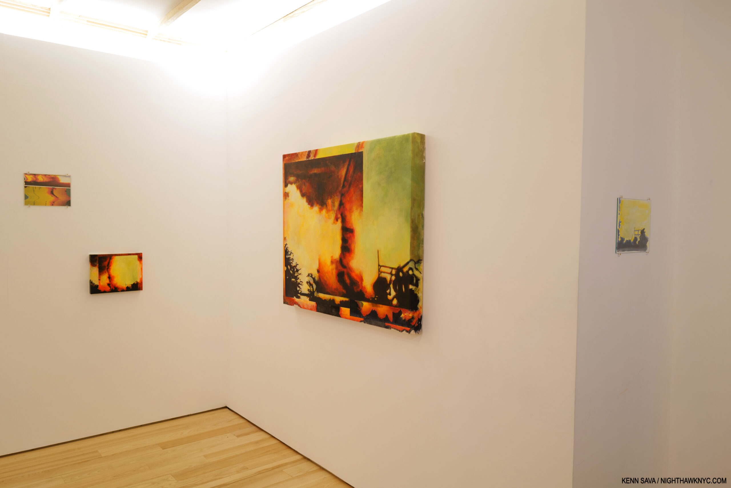
Installation view, Caslon Bevington: Duping False Landscapes, Ki Smith Gallery, East 4th Street section.

“I can hear the nation cry
You will set the world babe
You will set the world on fire
You will set it on fire”*
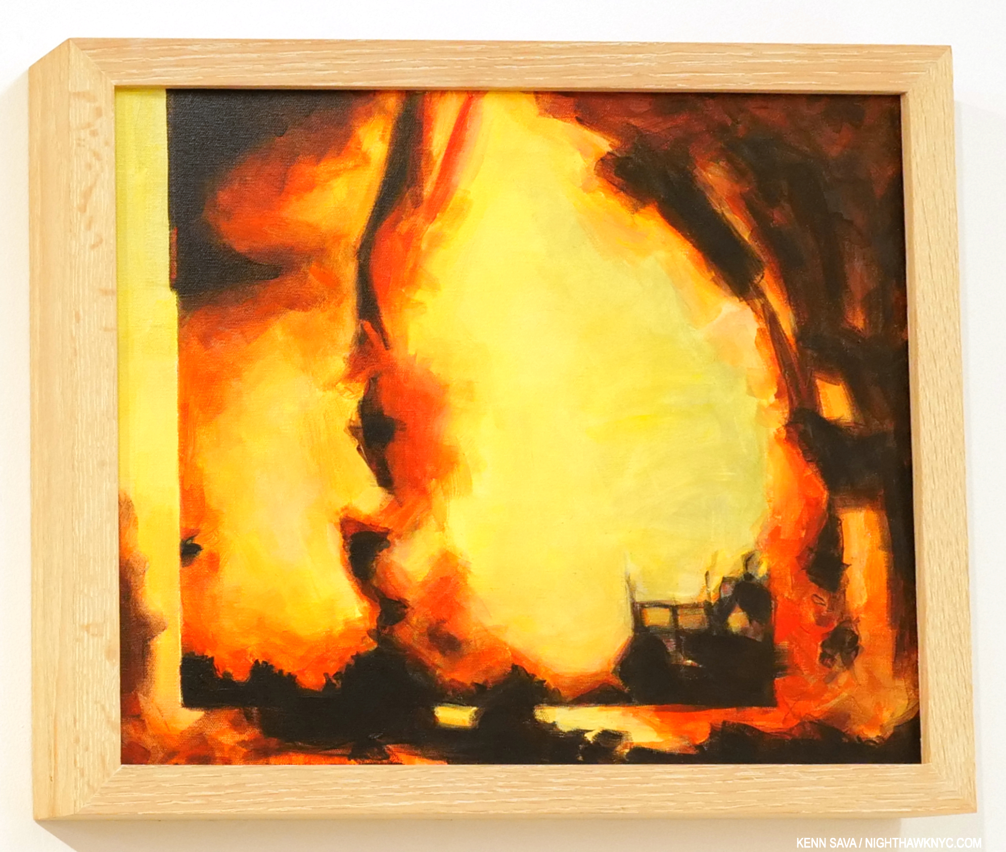
Sunstorm II, 2022, Acrylic on canvas, 16 by 20 inches.

The late David Bowie was, along with everything else he was, a passionate Art collector. As far as I know, he never got to see the work of Caslon Bevington, so I am willfully borrowing his words in speaking about her Art, and her startling new show, Caslon Bevington: Duping False Landscapes, at both of Ki Smith Gallery’s new East Village locations. In it, she has set the world on fire. More about that in a bit.

Flashback: Installation view of Caslon’s 2017 show at Mana Contemporary. 4 pieces from her Translations series.  *Photo by Roman Dean.

I, however, am not a stranger to Caslon’s Art. Having met her earlier in 2017 at a Raymond Pettibon show, that September 20th, I actually left Manhattan to see her show at Mana Contemporary in Jersey City. Finding my way out there, I was stunned by what I saw, and proceeded to write about it here. It’s a show that has stayed with me; in these intervening five years, my appreciation of it has continued to grow. At that point in early Fall, 2017, eternally a “Painting guy,” I was 2 months away from beginning my “deep dive” into Modern & Contemporary Photography (i.e. the period from the publication of Robert Frank’s The Americans in 1958-59, to date) which has continued to the present moment. When I saw what Caslon was doing with her Photo-based pieces, I was coming at it from Painting and Print making. Now, I also see it through the lens of the past 5 years, the x-thousand PhotoBooks and hundreds of Photo shows that have passed in front of my eyes, and what those Photographers have been doing these past 60+ years. (Of course, there is some overlap: many Painters are/were, also, Photographers, and vice versa.) As I wrote, I believed she was on the edge of what Artists were doing with Photography, or Photo-based work. Five years later, I can’t say I’ve seen anyone else doing quite what she was doing then especially with her small, rectangular back & whiteTranslations series. Caslon was making what struck me as ground-breaking work.

Think about that for a moment.

Caslon Bevington seen with Translations #10, 11, 12, 13 and 14, 2017, left to right, at Apostrophe NYC’s gallery at Mana Contemporary, Jersey City, September 20, 2017.

In 2017, Caslon Bevington was about 25 years old! I just referenced “60+ years” of the history of Photography, and after seeing all those books and all those shows- a number of which I have written about in these epages, before saying “I can’t say I’ve seen anyone else doing quite what she was doing then.” That’s pretty remarkable.

Yet, does that make it Art with a capital “A,” as I write it with when speaking about great Artists? No. It doesn’t. And Art, for me, is all that matters. I want to see, and write about, Art with a capital “A;” the stuff that has a chance to hang on museum walls one day. The stuff with staying power, that keeps people looking at it again and again, finding something new in it each time, or having it “say” something different to them each time they look at it.

But, it’s made her an Artist to keep an eye on. Since that day in 2017, I’ve done just that. Now, here I am five years later, driven to write about her work, again…
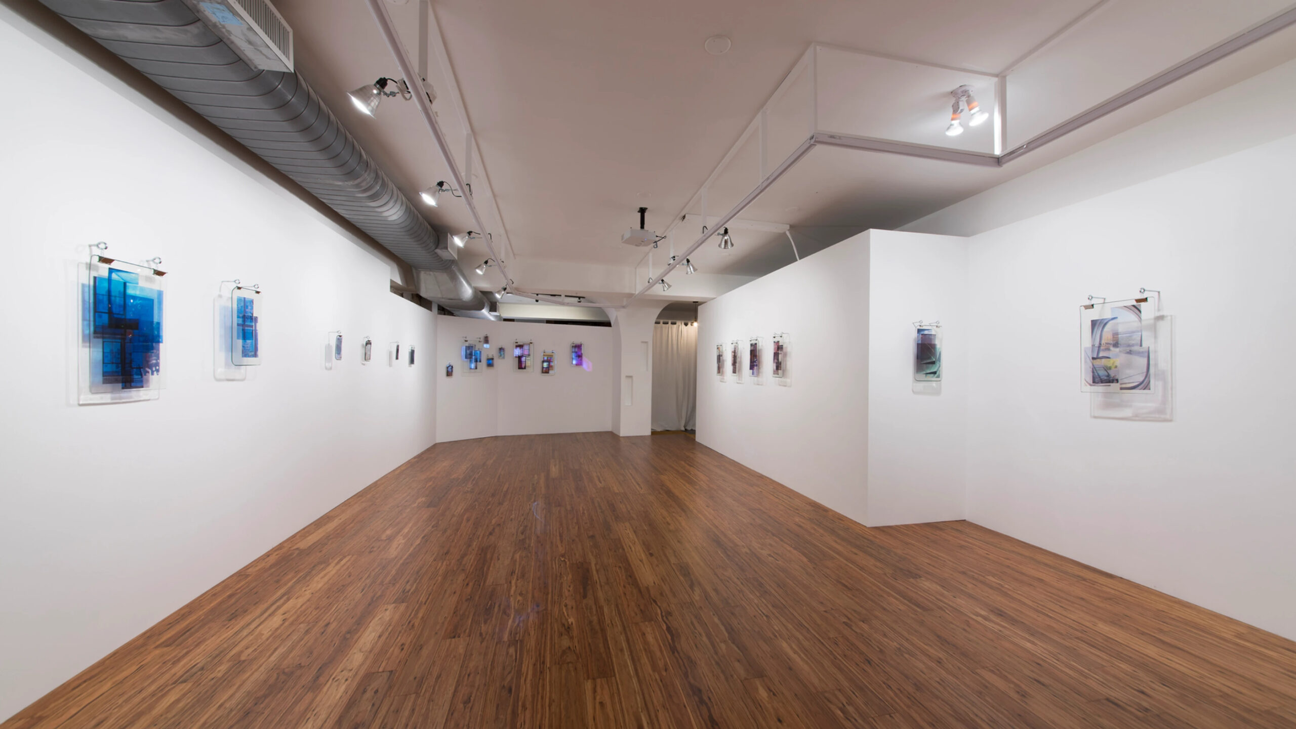
Installation view of Caslon’s 2019 show, unused, undone, ect., perhaps, at Ki Smith Gallery, 2019. *-Photo by Roman Dean for Ki Smith Gallery.

It turns out I missed her 2019 show, Caslon Bevington: unused, undone, ect., perhaps, her first for Ki Smith Gallery, and my impressions of it comes from a few installation shots and one or two pieces I’ve seen first-hand. My impression was that she took one of digital media’s essential innovations, the layer, and brought it into the analog world of matter using one of the natural world’s most essential agents: light. From what I’ve seen, the results were wonderfully effective. It’s perhaps due to the difficulty involved in making these pieces that few, if any, other Artists have tried to make them.

She crafted hanging Photo-based polyurethane objects that were varying degrees of transparent, translucent and opaque that created luminous experiences, somewhat akin to 21st century analog/digital stained glass windows, that transported the viewer through a portal into another realm. In their press materials, the gallery revealed that one collector ingeniously installed a group of them leading up a stairway to wonderful effect.
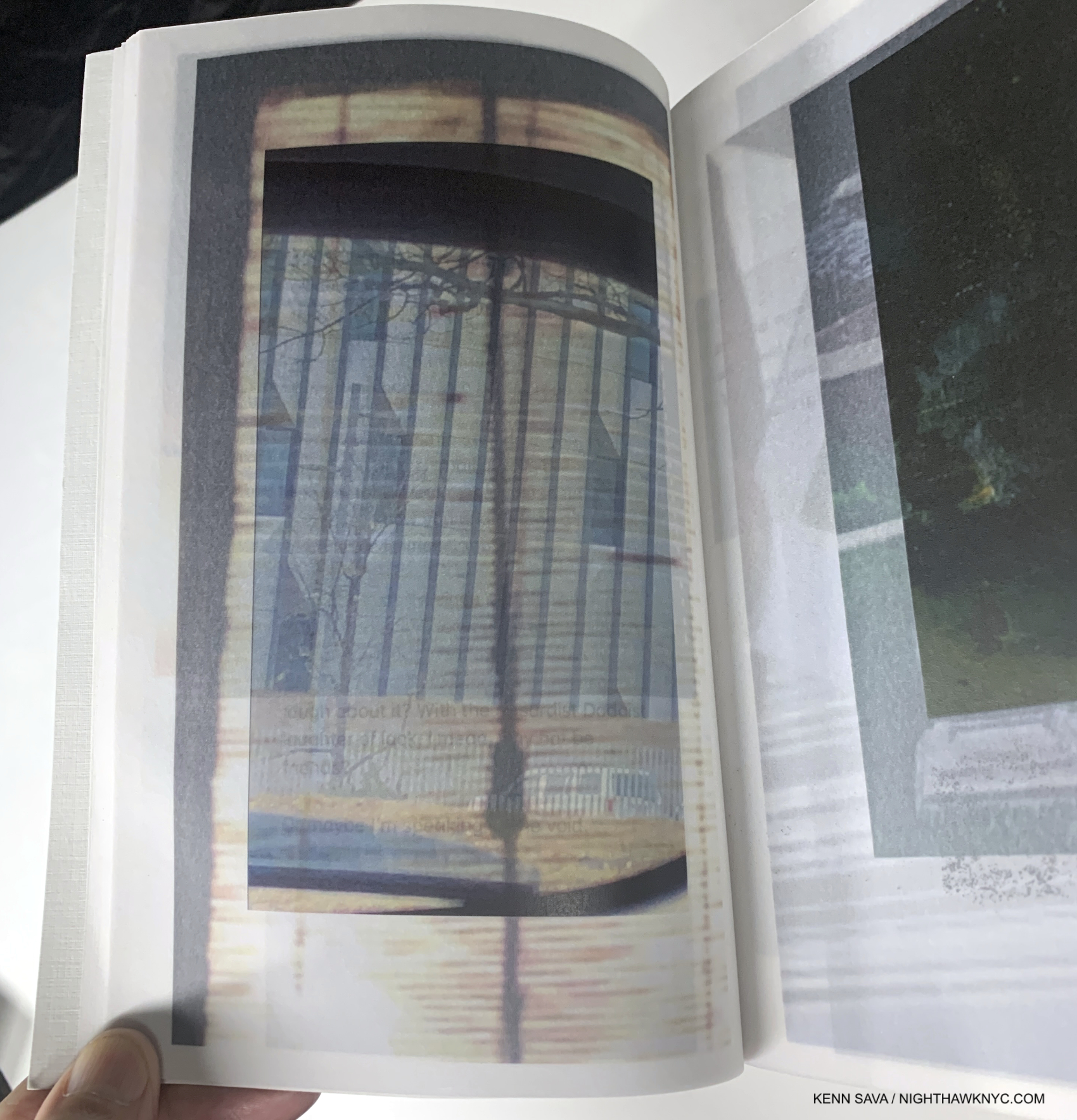
A page from her extraordinary book, unused, undone, ect., perhaps, which collects her Photo archive, published by Ki Smith Gallery in 2019 in conjunction with with Handle With Care Books in an edition of just 25 copies.

Sorry I missed the show since hearing about it after it was over, I was very fortunate to get a copy of the book Caslon published with Ki Smith Gallery for the show that collected the Artist’s Photo archive that evoked a bit of what these pieces must be like. When I saw the book, in the vacuum of having missed the show, I was so captivated by it, I told the Artist and Mr. Smith that if I had seen the book in 2019 it would have been my NoteWorthy PhotoBook of the Year! Remarkable when you consider that Caslon does not call herself a Photographer.

Three years on, it still would have been.

As I’ve seen in so much of her work, and one of its defining characteristics, the book speaks to the Artist’s ability to take digital artifacts (pictures and texts) and translate them into “the analog world” in a wide range other hands-on mediums, including books. Published in an edition of just 25 copies, it’s virtually impossible to find now, which is a shame. I believe that had it been more widely seen, it’s a book that would have made Caslon much better known.

Duping False Landscapes, Ki Smith Gallery, East 4th Street, Installation view.

Fast forward to April Fool’s Day, 2022,  her new show, Duping False Landscapes, is installed at both Ki Smith Gallery East Village locations. Stopping in to their East 4th Street space first, Ki Smith mentioned to me that Caslon was a Painter when he met her circa 2015, before moving away from it to explore other mediums! Being a “Painting guy,” I was pleasantly shocked to hear this. Only one Painting was shown across both her 2017 and 2019 shows (shown in my 2017 piece on her), and the number of works in other mediums would give a different impression. It struck me that here I was already taken with her work, having written about her 2017 show, and I’d only seen one of her Paintings!

That revelation also gave me a new appreciation for her 2019 pieces. Now I see them as quite daring explorations that look quite successful to my eyes. I digressed…

Her new show proved a deja-vu experience all over again. The wall facing the front door was lined with 8 striking image or Photo-based prints, seen to the right above, that brought me right back to her 2017 show. Robert Rauschenberg, Wade Guyton, Jeff Elrod, Nico Krijno, Chris Dorland, and others crossed my mind, but I immediately stopped myself when I realized these were an evolution from what I saw in her own work in 2017, now in color, and in a single image, each. (The 2017 show featured a few pairs of images in one piece as you can see earlier.)

These were new, fresh, exciting pieces, that seemed to me to be downright “painterly,” vibrantly colored & printed. I stopped caring how the images were manipulated and just enjoyed looking at them. Most of all, they are just beautiful- a word seldomly, if ever, applied to such work. Some look like snap shots in a family album that has been thumbed through so often the prints have faded from light and time, but it all just works and holds together remarkably as a group (though they are not a series). These new prints provided me with a bit of continuity with what I had seen in 2017, and they set the stage for the rest of the show.

Sunset from Moving Cars (Revisited), n.d., Acrylic on canvas, 70 by 53 inches.

On the left wall was the show stopper of both shows. The endlessly mysterious “Sunset from Moving Cars (Revisited),” 70 by 53 inches, Acrylic on canvas, with about another 6 inches of Painted canvas exposed on the sides. It turned out to be a bit of a harbinger of what I would see in Part 2 of the show on East 3rd Street. The Artist seems to be drawn to fleeting images taken on the fly, like from a moving car, here. By title, it was also the first “weather-related” and the first sun-related piece in the show.

Between the two new installations, I counted 15 Paintings ranging in size from 4 by 6 inches, to 70 by 53 inches that mark her return to Painting in a big way! There are also about a dozen prints and 2 works on Terracotta also on view that continued her exploration of mediums. (In 2017, she gave me a tour of her studio at Mana and showed me a large work made out of a king-size box spring (shown in my 2017 piece)!)
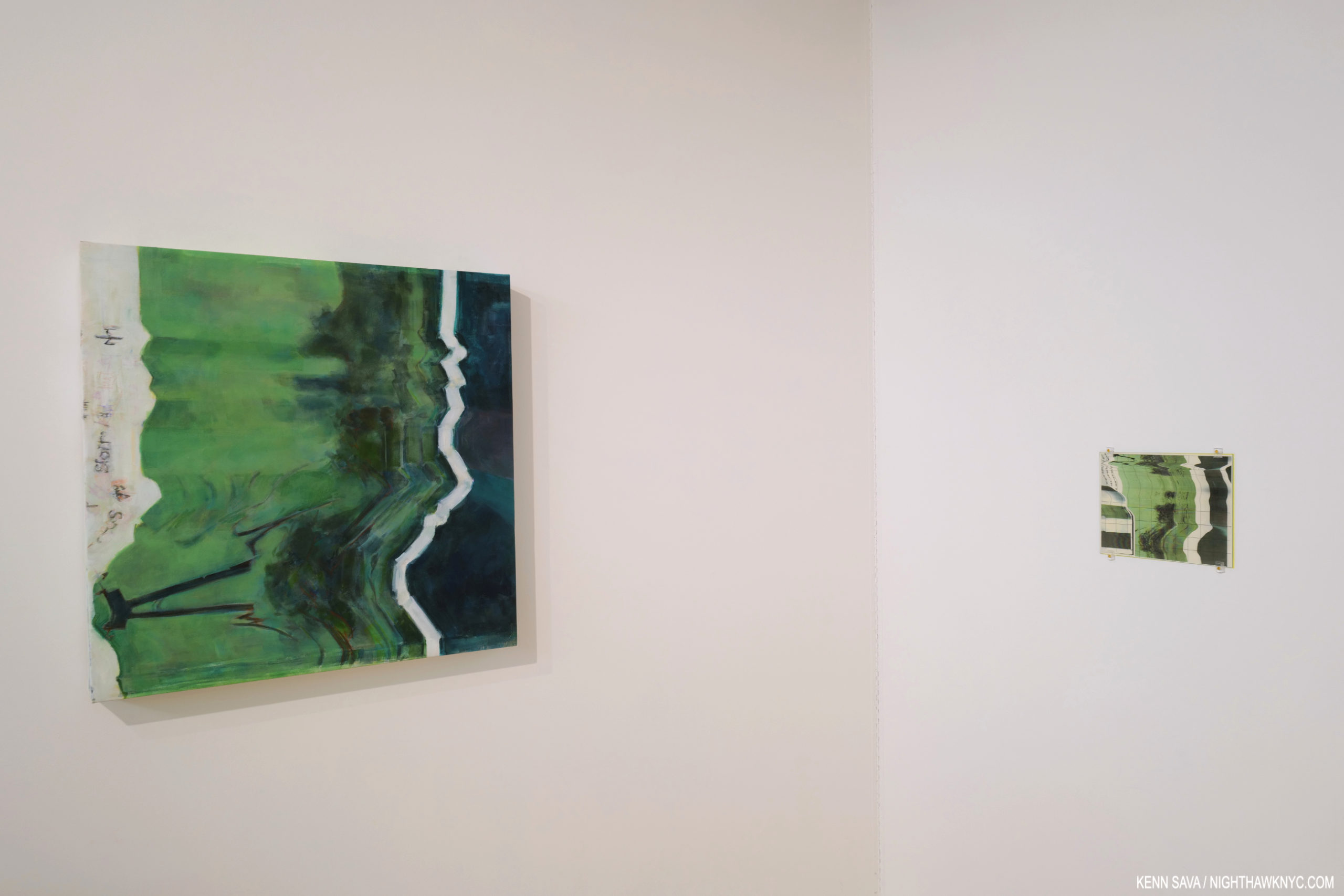
Counterfeit Weather, 2022, Acrylic on canvas, 29.5 inches square, left, and Untitled, 2022, Inkjet on archival vellum, 8.5 by 11 inches, right.

Moving over to the East 3rd Street space, there were more Prints on view, to the same effect. However, at the far end of south wall was something else. On the corner wall was a large Painting, Counterfeit Weather, 2022, that was seemingly influenced by the Print, Untitled, 2022, Inkjet on archival vellum, hanging just to its right. Here was a Painting that may be inspired or based on  a work in another medium. It’s utterly fascinating to contemplate the one and then the other; and their genesis. Paintings have been translated into Prints going back to the invention of printing in an effort to get them more widely seen. It’s rarer to see a Print translated into a Painting- if that is indeed the case here. In fact, I can’t recall one.

Three Untitled pieces, each from 2022, each Acrylic on canvas, seen in the windows of Ki Smith Gallery’s East 3rd Street location.

As I moved through both shows, one thing that became apparent to me is that Caslon has an exceptionally unique eye, and when all is said and done, I realized THAT is what has drawn me to her work since 2017- even before seeing her Paintings.

A sub-theme of Duping False Landscapes is the Artist revealing the Art in source images that most people would discard; images that are distorted, (intentionally or not), so small as to make detail almost impossible to make out, or of inferior quality born of, what is considered now, “low-tech” devices. Three prime examples of this are featured hanging in the East 3rd Street Gallery’s windows, and that may be why they are there. In them, the Artist has taken 3 blurred photos and renders them in paint! The net effect is the viewer ifs finally forced to stop and consider these images they would, and probably have, ignored. Thinking back through the history of Painting for precedents, Kerry James Marshall’s 7am Sunday Morning, 2003 (as seen in my 2017 piece on Kerry James Marshall: Mastry at The Met Breuer) and Georgia O’Keeffe’s The Shelton with Sonspots, 1926, came to mind. In his, Mr. Marshall has devoted almost half the 120 by 216 inch canvas to depicting the lens flare from his camera pointed at the morning Sun. Georgia confines hers mostly to the upper right quadrant. Still, I can’t really think of another instance where an Artist has done this, and certainly not one where the Artist has made it the subject of an entire piece, in this case at least the 3 pieces seen above.

Sunstorm II, 2022, Acrylic on panel, Frictions (Variation B), 2022, Acrylic on Panel and Frictions (Variation A), 2022, Acrylic on panel, left to right, seen during a tea party held at the gallery on April 9th.

There. I said it again. Meanwhile, David Bowie returns.

There are those who believe that Mr. Bowie may have been referring to the great singer Odetta (1930-2008) in his song, “You Will Set the World on Fire.” We’ll never know. Over on the far walls of Ki Smith’s 3rd Street Gallery, Caslon proceeds to set the world on fire. In paint. A series of four Sunstorm Paintings, each dated 2022, and two that appear to be somewhat related, titled Frictions, seem to literally burn up their panels, canvasses and the walls around them. Apparently, they are based on an old, small Photo, which doesn’t lend itself to enlargement, and hence allows the imagination (her, then ours) to complete their details.

Sunstorm (Expanded), 2022, Acrylic on canvas, 39 x 49 inches, the largest of the series. There is so much in this that stands out: The surreal way the “fence,” or whatever it is on the right, and the trees on the left, are Painted. The whole bottom edge seems to take us into another dimension, creating an  effect like wearing two pairs of glasses, until you realize the whole composition consists of layers! Layers in Painting goes back to Cubism, Kandinsky, and Hilma af Klnt. Still, I can’t say I’ve seen them used like they are in Caslon’s Sunstorm series, and in other works of hers. Also, consider perspective in this, or any of her Paintings in this series. Just when you think you see a vanishing point by following the “fence,” you have to consider the fact that this section of the work is just one layer! Instead of giving us one vanishing point, the Artist makes our eyes move all over the canvas, as much of David Hockney’s work this century does. Making all of this hang together, and hang together so well, is impressive in my book.

“A good painting has real ambiguities which you never get to grips with, and that’s what is so tantalizing.” David Hockney1.

Exactly what is going on in these works is a mystery. I, for one, don’t want to know much more about them lest it evaporates. Anchored by the ground, and the “fence” in a few, almost all of the rest of each work consists of a huge ball of flame, ostensibly, given the titles, from a sun looming all too large in the sky, at once fascinating and horrifying.

Sunstorm, 2022, Acrylic on canvas. 11 by 14.5 inches. Here, the trees and the “fence” are rendered in a somewhat  different way but achieve the same mystery we see in Sunstorm (Expanded), above. Here, the work seems to consist of fewer layers, but again, the question of perspective is, indeed, a question. What might have started out as a distorted or “lesser” quality source image has become something entirely different, and in my view, stunning.

This series adds an ominous atmosphere for the first time (that I’ve seen) in her work. In the two Sunstorms, above, the storms appear to be tornadic. Then she adds something else. Something “more.” What really stands out for me are the multiple layers each Painting features. Multiple Paintings, or part-Paintings, superimposed on the one picture plane. This is a continuation and expansion of the idea the work in her 2019 show presented, and at least one earlier Painting, and again (stop me if you’ve heard this one before) is something I can’t recall seeing in Paintings before (Frank Stella used layers to marvelous effect in Paintings that were collage-like and the layers extended from the surface, imposing on what had been the viewer’s space previously). It’s also remarkable that these and so many other pieces on view date from 2022, a year that was exactly 3 months old when they were hung here.

On the gallery’s right hand wall, shown earlier during a tea party held at the gallery, elements of the striking  Frictions series remind me of Clyfford Still, as in Frictions (Variations A), below. Still (sorry), as I’ve learned, looking for influences and precedents in Caslon’s work is both missing the point, and pointless. If there are any influences, she has more than made them her own.

Frictions (Variations A), 2022, Acrylic on panel, 16 x 20 inches. Some might look at this and think “Clyfford Still.”

On a personal level, the fire she depicts has come to represent the passion and energy I see in so much of what Caslon does, both qualities I find lacking in much of the Contemporary Art I see. It’s something that characterizes her work to this point, and along with her eye, is another thing that sets it apart.

Having created further innovations that blur the lines between, and show new possibilities of, the image/the Photograph, the relationship between Photography & Painting, and Painting itself,  she’s already broken quite a bit of new ground in her work- something very few Artists, of any age, can say. In 2017, I left her show believing that she was on to something. In 2022, it’s apparent to me that Caslon is now on her way to establishing herself as one of the more interesting Artists working today.

*-Soundtrack for this Post is “(You Will) Set the World on Fire,” by David Bowie, from his 2015 album The Next Day.

NighthawkNYC.com has been entirely self-funded & ad-free since 2015! If you’ve found it worthwhile, PLEASE donate securely by PayPal below to allow me to continue. Thank you, Kenn.

You can also support it by buying Art, Art books & Music from my collection!
Art & Books may be found here. Music here and here.

Written & photographed by Kenn Sava for nighthawknyc.com unless otherwise credited. To send comments, thoughts, feedback or propositions click here. Click the white box on the upper right for the archives or to search them. Subscribe to be notified of new Posts below. Your information will be used for no other purpose.

  1. Hockney on Photography, P. 18 ↩

On The Frontiers of Photography: Trevor Paglen, Willa Nasatir, Caslon Bevington

This site is Free & Ad-Free!
If you find this piece worthwhile, please donate via PayPal to support it & independent Art writing.
Other ways to support it at the end. Thank you!

Written & Photographed by Kenn Sava (*- unless otherwise credited)

While I’ve spent much of this year exploring the world of Photography, my focus has largely been on the period beginning with Robert Frank’s universally revered book The Americans, 1958. Most of those I’ve encountered work in fairly “traditional” realms- “Find a subject and shoot it.” Ah…the good old days. Of course, the world isn’t going to stand still for me while I look back, thank goodness, a point brought home by 3 concurrent shows this fall.

Unprecedented times call for extlraordinary means. Trevor Paglen at work on a prior project using equipment originally designed to see distant galaxies. *- Photo from his website.

Trevor Paglen (B. 1974), who holds both an MFA from the Art Institute of Chicago’s School and a PhD in geography from Berkley is, perhaps, best known for his Photos of “black sites”- classified defense department/CIA/NSA installations. Those pictures are usually murky, because of the haze from the extreme distances he has to work from because of security, and legal, restrictions to shoot many of these places. He prefers them that way, usually foregoing clearer images because, as he told The New Yorker in 2012, his “aim is not to expose and edify so much as to confound and interest1.” In the same piece, he said that a clearer image would say “a little less, really,” adding “that blurriness serves both an aesthetic and an ‘allegorical’ function2.” “It makes his images more arresting while providing a metaphor for the difficulty of uncovering the truth in an era when so much government activity is covert,” writer Jonah Weiner concluded3. As a result, some of his more “atmospheric” work have been compared to Painters, including J.M.W. Turner and Gerhard Richter, by some.

So, I was somewhat surprised when I walked into his new show, A Study of Invisible Images, at Metro Pictures. Robert Longo’s The Destroyer Cycle had recently been up on these walls, featuring huge charcoal drawings deep with socio-political imagery. I was expecting more of the same from Mr. Paglen given his books of “black site” Photos.

That’s not quite what we get.

Installation view, with a still from his video, Behold These Glorious Times, 2017. Click any image for full size.

It’s about something different, though not entirely unrelated. It turns out that Mr. Paglen has, also, been deeply involved in studying computer learning, specifically, how computers see the world. As he explains in the “Artist’s Notes” for the show-

 “Over the past decade or so, something dramatic has happened to the world of images: they have become detached from human eyes. Our machines have learned to see. Without us.”

He goes on to talk about how smart airports, smart homes, even smart cities are becoming ubiquitous, with self-driving cars possibly on the way, before adding, “Most images these days are made by machines for other machines, with humans rarely in the loop. I call this world of machine-machine image making ‘invisible images,’ because it’s a form of vision that’s inherently inaccessible to human eyes. This exhibition is a study of various kinds of these invisible images.” They break down to three groups- “machine readable landscapes (landscape images overlaid with marks that show how they’re being interpreted by machines), training images (made by humans for machine eyes), and things that we might call ‘ghosts.'”

It Began as a Military Experiment, 2017, ten pigment prints

While the new iPhone X uses facial recognition technology instead of passwords or fingerprints, this technology is nothing new. The military wanted it developed back in the mid-1990’s, so the Defense Advanced Research Projects Agency (DARPA) began funding research. They quickly realized they needed to create a gigantic database of facial images and these folks, above, mostly military employees, were among the first of tens of thousands of photos it took and compiled into what was called the FERET database. Mr. Paglen then combed this database to arrive at this selection of faces. He then ran them through an algorithm to locate the key features of their faces. “One of the ways I think about these portraits is as a kind of super-structuralism in the sense that they are images not made for human eyes. They are meant for machine eyes. What’s more, these photos represent the original faces of human facial recognition- the ‘Adam and Eves’ that nearly all subsequent facial recognition research has been built upon,” he says in the Artist’s Notes.

Closeup of the fifth Portrait, shows the key points on his face.

Recognizing one face out of this gigantic database first requires a “faceprint,” made out of all of the faces of a particular subject, aligned so their eyes and mouths are in the same place. Once you “average” them, you subtract the average image of all the other people in the database from the average of your subject. You’ll end up with a faceprint of your subject showing what distinguishes him form everyone else in the group. This portrait translates the faceprint of philosopher Frantz Fanon into an image that looks like a face to human eyes.

We’ve gone from the images seen just above- images that humans would recognize as people and faces, to this, an image constructed from computer to computer images so humans can recognize it as a face. Fanon (Even the Dead Are Not Safe) Eigenface, 2017, Dye sublimation metal print. The Afro-Carribbean psychiatrist Frantz Fanon is the subject.

It gets stickier from there. The Artist’s Notes continue, “A.I.s (artificial intelligences) are taught how to recognize objects by giving them training sets….(which may) consist of thousands or even millions of images organized into pre-sorted classes that correspond to each of the kind of objects that the A.I. will eventually be able to distinguish. For example, if you want to train an A.I. to recognize all the objects in a kitchen, you might give it a thousand pictures of a fork, a spoon, a knife, a countertop, etc…Once that A.I. is trained, you can give it a picture of a fork it has never seen before and it should be able to recognize it as a fork. ” After mentioning that “every image posted to Facebook or other social media sites undergoes powerful artificial intelligence algorithms that can recognize the identities of people, the objects, the products, and even the place depicted in those images,” Mr. Paglen created his own “massive” training sets, “based on literature, philosophy, folk-wisdom, history, and other ‘irrational’ things, and taught the A.I. to recognize things from those ‘corpuses.'” The last half of the show consists of the results of these experiments, which are much more ethereal and evocative than literal, at least to this human’s eyes.

A Man (Corpus: The Humans) Adversarially Evolved Hallucinations, 2017, Dye sublimation print.

Mr. Paglen has groups this part under the broad heading of Hallucinations, or Adversarilly Evolved Hallucinations. These further break down into the subcategories, or Corpuses, which includes-
Corpus: Eye Machines (Fittingly)
Corpus: American Predators (The Artist’s notes include Mark Zuckerberg, who he lists as a “predatory machine,” reminding viewers that computers mine every image loaded to his site and are capable of reading a tremendous amount of information from them.)
Corpus: The Humans (As seen in the image above. Porn was included in the training sets, and another image depicts it as seen by a computer…or so the title says.)
Corpus: Omens and Portents
Corpus: Interpretations of Dreams (Examples of both are seen below.)

Rainbow (Corpus: Omens and Portents), left, False Teeth (Corpus: Interpretation of Dreams) both from Adversarially Evolved Hallucinations, 2017, Dye sublimation prints.

Trevor Paglen seems to like to push the boundaries of our perception while avoiding the sharp detail most Photographers live by, which, indeed, ventures into the domain of Painting. Now, he has gone beyond what humans can perceive, and into the realm of what is only “seen” by computers to create Art for humans. I wonder how long it will be before computers get around to doing that for us on their own.

Installation view, with another still from his video, Behold These Glorious Times, 2017.

These images are haunting, nightmarish, and beautiful, at the same time. In his Art Basel Conversation with Jenny Holzer, Mr. Paglen said the basis of his work can be summed up as- “How do you see the historical moment that you live in?” This show certainly provides answers to part of that question, though it raises others. Mr. Paglen’s new work is no less unsettling than his “black sites” and drone Photos. Perhaps most unsettling is not what’s in these images. It’s what they portend for the future.

Willa Nasatir,R.V., The Green Room, Bird, Blue Girl, Sunbather, Conductor, 2017, Chromongenic print mounted on wood, from left to right. Installation view, Whitney Museum.

Unlike the other Artists featured in this piece, Willa  Nasatir (B. 1990) doesn’t use digital techniques to create her Photographs. That might be hard to believe after seeing her work. Her analog process involves creating props, often from found objects, shooting them, and then reshooting the resulting Photographs, which has sometimes been modified by fire, water, and any number of other things. The results, as seen in her revelatory Whitney Museum show, Willa Nasatir, achieve something of a 3D effect in a 2D work. Fresh from a show at the Knox-Albright Art Gallery, Buffalo, who owns one of her most stunning images, Ms. Nasatir shows herself to be at once a throwback, and a visionary.

The Red Room, 2017, Chromongenic print mounted on wood. The-Albright-Knox Art Gallery owns this one. They chose well.

Ms. Nasatir created the 6-part work, shown first in this section, especially for the Whitney’s long gallery wall, the unifying feature of which seems to be the color grey with green or blue. All of the works on view are dated 2017 and show a remarkably consistent unity of style and vision, and a somewhat daring use of color.  As for what’s going on in these, or any of her work? You’re on your own. The Whitney’s introduction to the show says, in part, “The resulting works are hand-manipulated images that become psychologically charged and difficult to discern; the viewer is left to parse out unresolved narratives that the image only implies.”

The Green Room, 2017. When I look at this, with it’s mirror reflection, even some of it’s props, I can’t help but recall Samara Golden’s work in this year’s Whitney Biennial.

Hmmm…Where have I heard that recently? Her style shares some similar props and some of the effect of Samara Golden’s work, particularly The Meat Grinder’s Iron Clothes, 2017, which I felt was the show-stopper of this year’s Whitney Biennial. Ms. Golden’s work can look like “sets” that Willa Nasatir might base one of her Photographs on. Whereas I called Ms Golden’s astounding work in this year’s Whitney Biennial “unphotographable,” (as a whole), Ms. Nasatir’s Photographs are often impossible to locate in the real world. Both Artist’s works features elements of the “known world,” but place them in contexts which are unknown, mysterious, ominous.

Samara Golden’s The Meat Grinder’s Iron Clothes, (detail), 2017, at the Whitney Biennial earlier this year.

In thinking about precedents for Ms. Nasatir’s work, Man Ray once again comes to mind. Ray, of course, didn’t use digital techniques, either. He pre-dated them. The Dadaists, Marcel Duchamp, the German Expressionist filmmakers also come to mind, as do Robert Rauschenberg’s found objects. But, as with Samara Golden, it’s what these image stir in the mind, and the mind’s eye, that overcomes any attempt at reference- in the real world, or the historical one.

Willa Nasatir, Street Sweeper, right, Half Heart, Bus Depot, both 2017, Gelatin silver prints.

It all fades away as you ponder “What happened here?” Or, “What is about to happen?,” and then feel resonances in your mind and life. Oh, and by the way, there’s the beauty of her work, which I say as almost an afterthought, though it’s not, to their main impact- mystery.

Butterfly, 2017, Chromongenic print mounted on wood.

With two museums shows to her name by her mid-20’s, Willa Nasatir is an Artist who’s stock is rising pretty quickly. It will be interesting to see how her work evolves from here.

Caslon Bevington (B. 1992) is an up and coming NYC Artist I met during the run of the Raymond Pettibon show at David Zwirner. Her reaction to that show struck me, so I became interested in seeing her work. To this point, I had only seen what’s on view on her gallery’s, Apostrophe NYC’s, website.

One of the earlier pieces by Caslon Bevington I saw on Apostrophe NYC’s site. When I saw it in person, I guesstimated it at 12 feet tall. Photo courtesy of the Artist & Apostrophe NYC

My shock was palpable when I walked into her show, A Home for Formless Creatures: The Charisma of Fragmentation, at Apostrophe NYC’s studio & gallery space at Mana Contemporary in Jersey City, NJ. (Yes…I went to N.J.) to find she had spent the summer creating a new body of work that, at first look seemed quite different from what had come before. When I looked at the show of new work one word summed up the experience.

Qucksilver…

Installation view of Caslon Bevington’s show A Home for Formless Creatures: The Charisma of Fragmentation, shows her new, Translation, series, 2017. *- Photo by Roman Dean, courtesy of the Artist and ApostropheNYC

As fast as lightning, her work had altogether changed and, low and behold, there was an entire show of new work that was largely unlike any of her work I’d seen thus far. The show centered on a series of 10 works in which the Artist takes found and original images and processes them using more software programs than she could list for me, including some involving sound waves. The results were outputted to paper and then mounted on wood blocks with resin to create a series of black and white works titled “Translation” that are quite mezmerizing.

Caslon Bevington, Translation #8,, 2017. *- Photo by Roman Dean, courtesy of the Artist and Apostrophe NYC

They have the glossy surface of gelatin prints, but the images are mounted on blocks that extend 2 and a half inches out from the wall, jutting into the viewer’s space. Their rectangular shape and size (7 x 11 inches) is different from the usual sizes of Photographs, making them feel like something else. In them, images are juxtaposed- sometimes recognizable images (like fire escapes), with unrecognizable images, or repeating lines or waves, or abstract patterns or circles, leaving the viewer somewhere between reality and…?

Translation #10, 2017. *- Photo by Roman Dean, courtesy of the Artist and Apostrophe NYC.

They have a presence as a group, like a visit to another world that exists in multiple visual dimensions. Images explode out of some, interrupt others, or dialogue with each other, or mirror each other, while sharing not quite half of the work. There’s an elegance, an other-worldliness, and a haunting presence to these new works, especially, when seen in a group of them.

As for Quicksilver…What are the processes in an Artist’s mind that leads to such radical changes in their direction? Changes that seem “quick” to outsiders?

The Artist’s Statement in the lovely catalog she produced, in conjunction with Apostrophe NYC, for the show.

Later, she gave me a tour of her studio, and we looked at, and discussed, her earlier work. I was very surprised at the journey her work has taken. Having studied at the Art Student’s League and Parsons, the drawings she showed me were by no means academic. They explored geometric possibilities of color in abstraction. Later works all around were often complex weaves (literally) of painted cut strips of fabrics and canvas, in a square or rectangular grid. She then explored the possibilities of rope in patterns that freed the composition from the grid, and made the picture plane transparent, including one fascinating and intricate rope work of many layers on a large rectangular frame that looked to me to be about 12 feet tall (shown earlier). Ms. Bevington has also worked in metals bending strips of them onto a frame, delicately weaving each piece, and in fashion, creating a very cool T Shirt for the show.

Flying Saucer Archive, 2017, Photo Transfer on Linen. *- Photo by Roman Dean, courtesy of the Artist and Apostrophe NYC.

Along with these works, were some works, that also involved Photographs, on woven grids, that seem to bridge the woven grids seen in some of her prior work. One features found images of UFO’s, or what might be UFO’s. Two others featured images of sunsets shot from moving vehicles.

Photos of Sunsets Taken From Moving Cars #1 & 2, 2017, left to right. *- Photo by Roman Dean, courtesy of the Artist and Apostrophe NYC.

Whereas earlier she took abstract painted canvas cut into strips and imposed “order” on them by subjecting them to being woven into a rectangular or square grid, now she does the same thing using images. Along with these, also on view was an Artist’s Book she created from found images using all kinds of search algorithms- closeups of fabrics, rugs, and she only knows what else. Caslon tried to explain the process of finding and selecting it’s images to me, but I was lost looking at the pages go by as she turned them. Besides, knowing too much often steals some of the mystery. This beautiful object was produced in an edition of 9, while the other works shown were unique.

Yes, there was Painting, too. Static Painting, 2017, Oil on Wood. *- Photo by Roman Dean, courtesy of the Artist and Apostrophe NYC.

The Translation pieces struck me, among other things,  as creating successful, new, compositions out of the juxtaposition of existing images. Thinking about her new and earlier work, while she makes something “else” out of unexpected combinations (of materials or images), for this viewer, they share the common thread of having a “new order” brought to them.

Caslon Bevington seen with Translations #10, 11, 12, 13 and 14, 2017, left to right, at Apostrophe NYC’s gallery at Mana Contemporary, Jersey City.

Caslon Bevington is part of “Base 12,” “an experimental project…(that) groups together 12 emerging artists in a quasi-collective,” represented by Apostrophe NYC, which is run by the brothers Sei and Ki Smith, and has been in residency at Mana Contemporary. Given how rapidly Caslon’s work is evolving, seemingly like quicksilver, she’s an Artist who will be fascinating to watch. It will be interesting to see what she does next, and if she continues to explore this new realm of her work, or moves to another new frontier.

Bonus Show- Lucas Samaras (B. 1936) may be as familiar to many Art lovers as a subject for Chuck Close (like this one) as he is for his own work. At his new show, New York City, No-Name, Re-Do, Seductions, at Pace, 510 West 25th Street, all the works on view were digitally modified Photographs. The show  concluded with a large gallery of what he calls Kastorian Inveiglements, works that began as Photographs that depict “every day objects” subsequently manipulated in Photoshop into symmetrical abstractions.

Lucas Samaras, NO NAME (Kastorian Inveiglements), 2017, Pure pigment on paper mounted on Dibond

Detail of lower left quadrant.

Having seen other Artists experiment with these, though not to this level of complexity or accomplishment, I decided to try one myself to gain an understanding of the process. Here is my first experiment-

Kenn Sava, Symmetrical Abstraction 1, 2017, based on one of my Photos.

It shows that I’ve got a ways to go to match Mr. Samaras, as I do in getting up to speed on the frontiers of Photography, and Photo-based Art. Before it moves, again.

“Willa Nasatir” is my NoteWorthy show for October, though it ended on October 1.
*- Sundtrack for this piece is “X-Ray Visions,” by Clutch, from the appropriately titled album Psychic Warfare.

NighthawkNYC.com has been entirely self-funded & ad-free since 2015! If you’ve found it worthwhile, PLEASE donate securely by PayPal below to allow me to continue. Thank you, Kenn.

You can also support it by buying Art, Art books & Music from my collection!
Art & Books may be found here. Music here and here.

Written & photographed by Kenn Sava for nighthawknyc.com unless otherwise credited. To send comments, thoughts, feedback or propositions click here. Click the white box on the upper right for the archives or to search them. Subscribe to be notified of new pieces below. Your information will be used for no other purpose.

  1. The New Yorker, October 22, 2012, P.56 ↩
  2. ibid P.57 ↩
  3. ibid P.56-57 ↩

Raymond Pettibon: Artist Americanus

This site is Free & Ad-Free!
If you find this piece worthwhile, please donate via PayPal to support it & independent Art writing.
Other ways to support it at the end. Thank you!

Written & Photographed by Kenn Sava (*- unless otherwise credited)

Gumby had magical powers.

Gumby! You made quiet a mess on the floor of David Zwirner Gallery!

Using them, he was able to walk into books and become part of the story inside, usually solving whatever the problem was.

And, the walls, too! What? Raymond Pettibon did this? Oh. O.K.

Well, his “super human” powers really shouldn’t surprise anyone. He wasn’t human! He was 100% clay. Most people who remember Gumby remember him as a character in a kid’s TV show from the 1950’s that was reincarnated a few times over the succeeding decades. Most recently, he’s also had a reincarnation as the alter ego of Artist Raymond Pettibon1. In this “life,” he doesn’t have to walk through the walls David Zwirner to be inside the story, he’s been welcomed in as part of Pettibon’s latest show, TH’ EXPLOSIYV SHOYRT T,  as we shall see. Ok…ok…that’s my Gumby, above, that’s been a sidekick of mine going back to the 1990’s. But, Gumby, I mean Raymond Pettibon, really did create those paint splatters while he was creating many of the works in the show. Renown for the hand drawn & painted elements he creates for each show ranging from texts to wall drawings to murals, these splatters and drops provide mute testament to his creative process that recently occurred in this very space, possibly including this-

No Title (It sounds powerful…), 60.5 x 101 inches, 2017, Ink, acrylic, and collage on paper.

Fresh off the unabashed success of his blockbuster retrospective at the New Museum, “Raymond Pettibon: A Pen of All Work” (which I wrote about here), his first show at a major NYC Museum, some 40 years in the making, with EIGHT HUNDRED works dating back to the 1960’s filling three full floors, barely had my thoughts about it had time to begin to congeal, when along came word of a show of new works by Pettibon at David Zwirner, 519 West 19th Street, where the Artist had been holed up since January, I was told, creating many of them.

Down the rabbit hole I go, again. No Title (Dear Master V…), 2017, “V” for Vavoom, the old cartoon sidekick, capable of only screaming his own name, is the other Pettibon alter-ego, along with my friend, Gumby. Pencil, ink, watercolor, goucache, acrylic and collage on paper.

Lo and behold, when the doors opened on Saturday evening, April 29, there they were, 99 new works, only 2 of which I saw at “A Pen…,” where they were tacked up as part of the lobby Mural, as if giving us a taste of what was to come. Talk about prolific. What’s another 100 after having just seen 800? It, also, provides an all too rare opportunity to get the “rest of the story,” from his beginnings as seen in “A Pen…” right up to the present moment.

David Zwirner Gallery, 519 West 19th Street. In its case, the doors roll up. Special Art note- That’s Artist Caslon Bevington walking across the floor. I first met her at this show, found out she was an Artist, and have been so taken with her work that, so far, I’ve written about it twice.

Meanwhile, A Pen of All Work, has now oped at the Bonnefantenmuseum, Masstricht, The Netherlands, where it will remain open until October 29, complete with its own brand new, hand painted, circular wall mural, in 4 parts, which may be glimpsed here. Look now while you can. Like his other murals, it will be history when the show is. But, here & now, in West Chelsea, the paint was barely dry on the walls, and the floor, too, of 519.

What was to come, as far as the new work goes, was a continuation of what we saw in Raymond Pettibon: A Pen of All Work– in almost every way, most importantly including quality. Also continuing are most of the themes Pettibon is known for. Well? There was only one work related to Music, perhaps surprising to those who still think of Pettibon as a “punk” Artist, even though that period was 35 years ago. On the other hand, of all things, wrestling appears to be on the ascent among his themes.

A week before the end of the show, “O.G.” Pettibon returned to graffiti his own sign.

But, before we get too far into it, let’s start outside. Above the door, in lieu of one of his usual wall drawings or murals Raymond Pettibon has simply written the show’s title. Keyword: “simply”-

Wow. He wrote this, and even I can read iyt!

Well? “The Explosive Short-T” is one version of the show’s title. On the David Zwirner website, the show is referred to as TH’ EXPLOSIYV SHOYRT T. That’s easy for Raymond Pettibon to say, in his unique “way with words,” something I am quite fond of doing, myself. Two titles? What gives? I was told the latter is the “official title.” Fair enough. But? What does it meayn? My research led me to the 1963 Football coaching guide by Homer Rice, a coach at the University of Oklahoma, called The Explosive Short-T. It’s back cover bills it as “A complete guide to building a winning football offense with the newest and most powerful variation of the T-formation.” And, compared to the massive “A Pen…” it is short-er.

The cover of Home Rice’s rare 1963 book. I don’t think he suspected his title would also be that of an NYC Art show 54 years later!

I know what you’re thinking- “Of course!” Further adding to the intrigue of the title, among the works inside pinned, (yes, Art, some of which was priced at $150,000.00 per, was all pinned to the walls), Raymond Pettibon, sports aficionado, has depicted the following sports (and in parenthesis how many times each in this show). For those of you keeping score at home, my count by sport is-

-Baseball (4)

-Wrestling (3. One could be boxing, but I think it’s wresting.)

-Surfing & Waves (2. 1 of waves, 1 of surfers changing their clothes)

-Football (None)

No title (The false thread…,)”,…is easily found, it concludes. All works are by 2017, Ink and acrylic on paper, unless noted.

Ok, so if the show’s title is a Football reference and there’s no football to be seen, what does it have to do with the 99 Art works on display? Unless it’s a “false thread?” I don’t claim to have any “answers” when it comes to the work of Raymond Pettibon. I just enjoy pondering what his work says to me each time I look. Not willing to give up on this “thread” so quickly, I chose to take the “formation” part literally, and see what the groups (the formations) the work is arranged in might offer.

I decided to focus on this group of 11 works.

The first thing that struck me about the curating of this show was a major difference with the New Museum Retrospective, which was arranged by themes throughout it’s 3 floors. This show is not, as far as I can tell. I asked who was responsible for the arrangement and the answer I got from the staff was Pettibon and David Zwirner. I’ll go with that. It’s hard for me to imagine the Artist didn’t have a hand in it. Afterall, he had been in this space working, and he did paint the title over the door, and? The grouping is as interesting to consider as the individual works they consist of. But, I must bear in mind what Pettibon said in 1999-

“When I hang a show, for the most part, it’s usually just as well to put up the drawings randomly, because that’s the nature of the work. There are dissociations and attachments and the mind will fill in the blanks. Beyond that, it becomes overly fussy and contrived. So just about any way the work is hung, really, it’ll work.”

Yes, my mind couldn’t help but to “fill in the blanks,” helping to see the combinations as “explosive.” Take the group, above, for example. Right smack dab in the upper middle is a work, who’s upper thought bubble says-

Detail of No Title (Was there any…), Ink and acrylic on paper. It could be my mantra.

But then, the “kicker.” Under a pile of black lines, the words “Was there any going back on that? It seem’d ready to unravel.” What do they refer to? Slightly higher, on the left, is a skull, with a thought bubble that reads Little Cloud That Cares. Two brains, one in a skull, connoting a “dead” brain, and one, of an apparently “live” brain, without a skull, both with thought bubbles. On the left side, directly under the Cloud That Cares is a drawing of 2 Baseball players. Bo Billinsky and Dean Chance. During the opening, on April 29, Raymond Pettibon told me that his son, Bo, who was in attendance, was named after Bo Belinsky. Bo Belinsky, was a 6′ 2 left-handed starting pitcher for the L.A. Angels, from 1962-64, when his record was 21 wins and 28 loses. An interesting choice, to say the least.

Pettibon’s son’s namesake, alongside his own favorite player. No Title (And then other…), Pencil, ink, watercolor, gouache and acrylic on paper.

He also told me that Dean Chance was his favorite player, so (my interpretation) their dual portrait is a way of putting himself and his son into a work. (The Artist also has a dog named Boo.) Bo Pettibon announced to all who would listen that he wanted to become an Artist. In an interview with Dan Redding, Raymond Pettibon said that he looked forward to collaborating with Bo. So? This piece may also be a harbinger of Raymond Pettibon’s future work. It appears to me, though, this this is a rare work that may have some personal relevance to Raymond Pettibon. It’s fascinating to me how very few of his works that I’ve seen seem do. It seems to me his work is more about “self,” not about “him self.”

Surrounding these 3 works are pieces that speak of luck- good (below, center, a skier apparently narrowly misses a tree), bad (upper right- a bomber on fire, seemingly about to crash), faith (a bible, or bibles, seemingly falling),  fate (a naturalist monitors the progress of his disease in a piece that seems to equate the progression of a disease to a pen that finally produces ink). Beneath it is a most interesting image. Gumby/Pettibon and Shakespeare are joined by a quintet of 4 men and a woman. The man in the center holds what appears to be a frame. The text reads, “As withouyt the advantage of educatioyn or acquaintance among them.” The man holding the frames looks like he could be Churchill, a passionate painter throughout his life, to me. The man to his left (the far right) could be Stalin. The man “Churchill” shows what’s in the frame to (F.D.R.?) appears to be startled by it, as does the man looking over his shoulder at it. Gumby, “represents me as an alter ego,” he said on PBS’ Art21. Yet, both he, and Shakespeare have blank expressions, appearing as witnesses, and either the piece in the frame is blank, if it’s facing us, or hidden, if it’s not. Either way? No matter how long we look at it, it will never become clear.

No Title (Rereading Pettibon)

Fascinatingly, to it’s immediate right is an image of what might be a demon, with a red tooth, who is busy Rereading Pettibon, something many viewers to his New Museum Retrospective had just been busy doing, revisiting his work going back decades.

No Title (Whipper paused a…), Ink, watercolor and acrylic on paper.

The final piece in this section’s bottom left features a pitcher nicknamed Whipper, who, it says, won 19 games in 1960. The only major leaguer to win 19 games in 1960 was Lew Burdette, but he lost 13 games, not 8 as it says on the drawing, and his lifetime record was 203 wins and 144 loses (not 161-127). So? Whipper may be fictional, or a non-major leaguer. Still, I find it, another, compelling Baseball work. While so much ink is devoted to Raymond Pettibon- “punk Artist,” very little is devoted to Raymond Pettibon- extraordinary “Baseball Artist.” Which leads me to ponder- Who is the OTHER great Baseball Artist?

So, the right half of this wall is dark with war, death, disease, demons, and trying to maintain your sense of self during this. In the middle might be luck- at writing one good thought or narrowly escaping serious injury/death. On the left side is an image of the Washington Monument with text reading “There is no other that in comparison with it stands,” but it mirrors the narrowly missed tree to it’s immediate right, and above everything else on this wall is a skull, a symbol of death, that somehow manages to produce a thought bubble “Little cloud that cares.” Clouds care? The dead have thoughts? I’m deeply inside the rabbit hole now. I make no claim to “understand” any of them. But? I just can’t stop looking at them, and thinking about them.

This is only one section of the show- 11 works. It leaves 88 others to consider! Don’t worry. Every now and then I remind myself that this isn’t a Book, so I’m not going to go through all the rest. But, I will show a few others.

Installation view of ALL of Raymond Pettibon: TH’ EXPLOSIYV SHOYRT T at David Zwirner. The wall I was speaking about is just to the right of the left corner.

Of the other noteworthy works here is, of course, the huge Wave piece shown earlier, which, though 4 of his 5 highest selling works at auction to date have been large Surfer/Wave pieces (one sold for 1.5 million dollars), this one is mounted all the way in the back corner, high on the wall. So high, it’s very hard read the small text fragments among the collaged waves. Of course, it was sold early in the show’s run (if not before it opened), and most likely was the most expensive piece in the show. Well? It’s safer high up. It also does give the effect of looking up at a huge wave.

The intriguing rear wall and right corner of the show. A show of power- natural, and man made.

In his oeuvre, Pettibon’s surf pieces are like the “golden section” in a piece of Music-they live at the center of his universe. He’s said he enjoys Drawing waves more than anything else. It shows. This one is displayed above leftover paint splatters, and the portraits of two tyrants- Stalin, looking like he was the target of a paint gun war, and to his right, J. Edgar Hoover, cornered. For a change. Around the corner, on a wall by himself, hangs the only Self Portrait of the Artist, looking “cautiously” out on all he has wrought. Well, he not only can’t see Stalin or J. Edgar from there- he has his “back” to them.

No title (I glance cautiously around the room…), And…

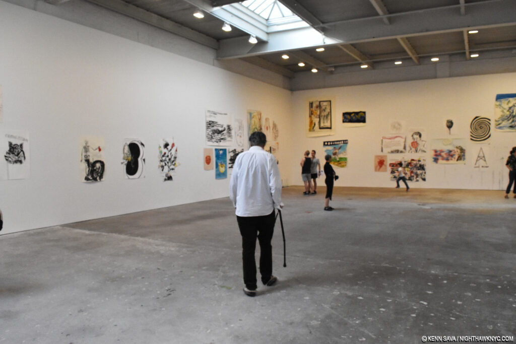
Moving cautiously around it, too. Raymond Pettibon enters his show at the opening, April 29, with a cane. That small figure running in the distance is his son, Bo.

Hobbled by what he said was a bout of gout, the Artist, himself, nonetheless persevered and arrived to surprise visitors to the opening, including yours truly, with his presence, and I had the privilege to meet him and speak with him.

We spoke about a range of things after I remarked that since he is associated with many things California, I was still getting used to him being a New Yorker, which he has been for six years already. We then touched on the Biennial, Owls (which appear fairly often in his work. He then proceeded to sketch this one-),

Baseball (as I mentioned, above), and some of the books about his work. His son, Bo, came by and drew in a fan’s book his father was signing, and announced to all present his intention to become an Artist. Pettibon has spoken about looking forward to collaborating with Bo, so Craig? Hang on to that drawing! Bare chested, Bo then proceeded to run out to the sidewalk and take startled passersby by the arm to try and get them to come and “see Daddy’s show.” As I commented to the staff, you can’t buy that kind of marketing!

If you thought the first group of 11 was “complex,” 42 works line the very long eastern wall in one group. At the far left is a work about the beginning of life (shown below), at the far right, one about death (JFK’s). Smack in the middle is a large cathedral piece, with a UFO work over it, and one, perhaps, about suicide, and the luck of dice to their right.

The piece on the far left side, above. No Title (Think What It Took…), Ink and acrylic on paper.

Detail of the text. If I had the money, I might buy this one.

It’s too early to calculate Raymond Pettibon’s influence because it’s still in the process of spreading, something which no doubt surprises many who only know him as a “punk Artist.” His has become a world-wide presence, with shows going on in Moscow, and A Pen of All Work reinstalled in the Netherlands as I write this. Over the past 40 years, he’s gone from being a shadowy background figure, creating fliers, record covers, zines and Artist’s Books, to being an established Artist in the world of “Fine Art,” who’s work is now being shown, more and more, in Museums. Around the world, in press releases, he’s invariably referred to as an “American Artist.” “Artist Americanus” is my play on “Homo Americanus,” the title of a large traveling European show of his work last year (which I take to mean “American Male”). When I think of that term in a “classic” sense, it means thinking for yourself, making up your own mind, and expressing yourself in your Art.

Regardless of whatever “meaning” you take from one of his works, Pettibon is an Artist who has maintained a remarkably consistent creative path since, at least, the mid- 1970’s. He’s said in interviews that he’s worked like this (putting words to drawn images) since he was a small child. Right now, 40 years on, Pettibon’s influence can already be seen even beyond his work, itself. The “alternative means” he used to get (fliers, zines, record covers, Artist’s Books, et al) his work seen2 is being followed by countless others, as can be seen at New York’s Printed Matter.

New York’s renowned Printed Matter, where the work of some Artists following in Pettibon’s footsteps is available, has over 15,000 titles in stock.

I, too, have been inspired by his example with this site, and I thanked Pettibon for the “inspiration,” when we parted. I’m not sure he knew what I meant. Beyond this, his other great influence is helping Drawing to be reborn in Modern & Contemporary Art. Artist (and Pettibon collaborator), Marcel Dzama credits Pettibon for being the Artist who put Drawing on the map in Contemporary Art3, and getting it taken “as seriously” as “finished works of Art,” and not as preliminary works for a Painting. That, too, seems like it’s already ancient history.

Inside Printed Matter, a table features recent Drawing books. A few years back, you’d look long and hard to see books of Contemporary Drawing.

 Some 900 works in to exploring his work and career Raymond Pettibon remains a fascinating mystery for me as he probably is for almost anyone else interested in his work. Much of his Art seemingly defies (easy) “understanding.” Regarding the “crypticness” of his work, in an interview, he said, “I think if I brought you through the work you’d see what I was trying to get at. You can say it’s open-minded, whatever, but it’s never a random association between the language and the image. There’s always a reason.” I keep looking for it, and more importantly, thinking about it, and whatever the topic(s) he’s addressing. That a good many of his topics relate to either current events, American History (previously drawn from a distance of time, because history tends to repeat, as he has said, and more recently including almost current events), or social & cultural history, give them an ongoing relevance, and importance that is rare in Art seen in Museums these days.  It’s taken him almost 40 years to get there. Fittingly, Raymond Pettibon turned 60 today, June 17, as I write this. Happy Birthday!

Sorry. Gumby insisted on a selfie.

When “A Pen…” opened at the New Museum, it was February 8th. 900 works later, when the Zwirner show ended, it was June 24! Most of 5 straight months of Raymond Pettibon! Still? I was already thinking- When’s the next show? It turns out I didn’t have to wait long. On June 27th, David Zwirner opened the Thread Benefit Exhibition, featuring 26 works donated by gallery Artists, a few doors west at 533 West 19th Street.  It includes this piece by Raymond Pettibon,

No title (I luyv y’all…), 2014, You Don’t Love me?, Ink, graphite, and acrylic on paper. Seen at the June 27th opening of Thread.

which speaks for itself. Or? Does it. I’ve been “trained” to look twice. Thus far, it strikes me as a terrific culmination to this remarkable “half year of Pettibon, NYC.”

The Artist didn’t appear, at least while I was there, that night. Leaving, I passed by 519, where TH’ EXPLOSIV… had ended 3 days before. I looked in and saw the wall he hand painted had already been painted over in preparation for whatever is going in there next. I turned the corner onto 10th Avenue, and a few hundred feet down, I saw this, propped up against the wall…

Unknown Artist, I Love You. Dated June 27, 2017 along the bottom, Unknown medium, seen on 10th Avenue, June 27, 2017,

What? The show had been open all of one hour, and already someone had copied Pettibon and had it up for sale on the street! WHOA. I was reminded of this quote of his- “I’ve never really thought of it in this way, but it is kind of cool to be the Gucci of my kind of work. I mean that in the way that Gucci and all those type of trademarks can be cheaply copied and reproduced like my comic books or flyers. I don’t get any royalties from that. I haven’t got a cent from SST ever, and I don’t get any royalties from the tattoo trade. The tattoos are when it becomes an even more substantial brand because it’s stuck on someone permanently. And if someone wants it off, then the mother has to go through even more pain to have it taken off than he did to put it on,” he said here.

I’m not the only one who owes Raymond Pettibon a “Thank you,” at least, for the inspiration.

Raymond Pettibon: TH’ EXPLOSIYV SHOYRT T is my NoteWorthy Show for June, 2017.
My thanks to Craig, Anisa & Caslon of David Zwirner for their assistance, and forbearance, during my dozen or so visits. 

*-Soundtrack for this piece is “Don’t Believe The Hype,” by Public Enemy, for all those who hear that Pettibon is a “punk Artist.” And, because Pettibon loves hip-hop, some East Coast.

NighthawkNYC.com has been entirely self-funded & ad-free since 2015! If you’ve found it worthwhile, PLEASE donate securely by PayPal below to allow me to continue. Thank you, Kenn.

You can also support it by buying Art, Art books & Music from my collection!
Art & Books may be found here. Music here and here.

Written & photographed by Kenn Sava for nighthawknyc.com unless otherwise credited. To send comments, thoughts, feedback or propositions click here. Click the white box on the upper right for the archives or to search them. Subscribe to be notified of new pieces below. Your information will be used for no other purpose.

  1. “Gumby represents an alter ego for my work as an artist. He represents me as an alter ego. There’s actually a lot more to that figure than just ninety-eight ounces of clay or whatever. Art Clokey was into Zen Buddhism and into a lot of pretty deep stuff for Saturday morning cartoons. Clokey was a pretty hip figure in Los Angeles and in the counterculture of the ’60s and the ’50s—the beatniks and the hippies. I have a lot of respect and affection for him, and for Pokey as well, and Goo, Prickle, and even the Blockheads. One other thing that I’ve never thought of—that Gumby does for me in some of his cartoons—is he goes into a biography or historical book and he interacts with real figures from the past: George Washington or whatever. And I tend to do that in my work and in my videos, as well.” From Art21. ↩
  2. Not always successfully. He’s said repeatedly he wound up giving away or destroying most of the copies of his self published early books, making them very rare today. ↩
  3. Along with William Kentridge, R. Crumb, Robert Longo, and a few others. ↩