Highlights From Rauschenberg At MoMA

This site is Free & Ad-Free!
If you find this piece worthwhile, please donate via PayPal to support it & independent Art writing.
Other ways to support it at the end. Thank you!

Written & Photographed by Kenn Sava (*- unless otherwise credited)

They flew in from all over for this one.

With upwards of 300 works by Robert Rauschenberg on view over 4 shows of his work, and a show of work by early collaborator and ex-wife, Susan Weil, there was too much that lingers in the mind to fit into one piece. My overview of MoMA’s Among Friends is above (here). Part 3, below (or here), looks at the 4 “satellite” shows going on around town. This piecewill feature some works that struck me as important, both in terms ofArt, and in terms of Rauschenberg’s Art, at Robert Rauschenberg: Among Friends, at MoMA.

“Helado Negro,” with Roberto Carlos Lange, and…? outside in MoMA’s Sculpture Garden on August 31 are hoping there’s no lightning. No, Rauschenberg didn’t design those costumes. I headed upstairs to see what he did create after taking this.

Even on my 17th trip to the show, as with most great Art, I saw something new, and wondered how I missed it before. I’ll explain below. Apparently, I’m not the only one this happens to. In 1961, John Cage wrote this about looking at Rauschenberg. “Over and over again I’ve found it impossible to memorize Rauschenberg’s paintings. I keep asking, “Have you changed it?’ And then noticing while I’m looking it changes1.” His friend, Marcel Duchamp, once said about Paintings- “A painting had an active life of about 30 years; after that it died- visually, emotionally and spiritually2.” Try as I might, I don’t see that at all in Rauschenberg’s work. While I do see an evolution of styles, over the years,  a good deal of it looks like it could have been made this past month. Also, Mr. Rauschenberg’s career not only lasted over 60 years, he was one of the most prolific Artists of our time. Not having seen everything he did, it’s a given that some/many works I previously hadn’t known will seem revelatory. I can’t remember ever feeling, “That’s dated.” Discovery was the joy of these 5 shows for me (and, in looking at Art, in general). And, it was also a very rare chance to see works housed in distant collections, galleries and museums. Still, it was very hard to narrow down the works to those in this piece.

Sue, ca.1950, with Susan Weil, Exposed blueprint paper.

Sue, ca.1950, with Susan Weil, the first work in the show, continuously captivated viewers, as it has for over 65 years. Created with his first collaborator, later his wife and mother of his son, Christopher, and eventually his ex-wife. Early on, they used blueprint paper to create one of a kind works, where the subject would lie on the paper, while the Artist moved over them with a lamp exposing the paper and recording the image. The pair then moved to the bathroom they shared with others to fix the image in the shower. Unique and beautiful, it’s an early example of Rauschenberg’s love of found objects, as they got the paper for free because it came from rolls that had been partially exposed. The works quickly found an audience, being the subject of a 1951 Life magazine photo spread detailing their process, and even resulting in their inclusion in a 1951 MoMA show called Abstraction in Photography. Rauschenberg went on to passionately explore Photography, and Painting, before deciding to be a Painter. Susan Weil is still creating and her show at Sundaram Tagore Gallery this summer will be part of the next piece.

Monogram, 1955-59, Multi-media. Fascinating. From any angle.

Monogram, 1955-59, seen at MoMA, from the Moderna Museet, Stockholm. Ok. It’s famous. Everyone’s seen Photos of it. Seeing it in person is an entirely different animal. An animal that’s rarely seen on this side of the pond. It was last seen here 12 years ago at The Met’s excellent 2005 Rauschenberg Combines show. What made it even more special was it being displayed at MoMA near two survivors of the earlier “states” of the work, as Rauschenberg tried to find the ideal composition in which to incorporate the Angora goat he bought from a second hand store for 35 dollars. He put 15 dollars down on it, and according to Calvin Tomkins, intended “to go back and pay the balance, one day3.” The chance to imagine Rhyme, 1956, and the central panel of Summerstorm, 1959, as part of the work shows he made the right choice, though both are interesting on their own- particularly the inclusion of an image of animals at pasture near the top of that center panel of Summerstorm.

Rhyme, 1956, Combine Painting. In the first state of Monogram,”the goat was mounted right above the red circle. At that point, there was another part of it that extended higher from there.

Summerstorm, 1959. Originally, in the second state of Monogram, its center panel stood in back of the Goat. Later, it was reworked and became a part of this. Yes, that’s a zipper in the middle of the right side.

On my 17th visit I finally noticed this! Near the top of Summerstorm’s central panel, there’s a small image of animals grazing. Rauschenberg went from grazing animals in the second state of Monogram, to his Angora goat “grazing” on Art in the final work.

Then, I used this rare opportunity to study the Combine Painting the goat is mounted on, which is hard to do from photos of it in most books. Each angle of the base reveals new details- the sleeve of a white shirt, to the left of the Goat’s head, a heel from a shoe, part of signs that just can’t quite be pieced together into a word, images of a man looking up, astronauts (a new thing in the world beyond science fiction in 1959), and three small human footprints.

So, how does it feel to be an icon of Modern & Contemporary Art? Rauschenberg added the paint on the face to cover damage.

Rolling down his sleeves and walking the high wire of Art. The view of the left front corner as seen from the left side.

View of the center back. Interesting placement of that tennis ball, right under the rump of the Goat, where it can be “read” as leaving a comment on Art. Also notice the two helmeted figures to the right that could possibly be astronauts.

Another thing about seeing Monogram in MoMA- It’s hard not to wonder about the possible influence Picasso’s famous She-Goat may have had on it. Created in 1950, out of found materials, it appeared in the May, 1953 Magazine of Art, which makes it possible Rauschenberg could have seen it. Also coincidentally, one of the two bronze casts Picasso subsequently made of it were acquired by MoMA in 1959, the year Rauschenberg decided to mount his on top of the Combine Painting it rests on to this day.

Pregnant with possibilities. Picasso’s (expectant) She-Goat, 1950, cast 1952 as seen outside in MoMA’s Sculpture Garden. Picasso’s original, coincidentally, was made of found objects, and now grazes in the Musee Picasso.

Ok. What does it “mean?” The goat was worshipped by the Ancient Egyptians, where the horns represented Gods & Goddesses, while also symbolizing fertility. In mythology the he-goat was Pan. The goat became the symbol of satanism. Take your pick there. “Animal energy” people say that the goat represents independence, stubbornness, a wild nature, and sexuality4. This last resonates with me. While I don’t know what was on Rauschenberg’s mind when he created it, reading what I have about his personality, journey and perseverance, the “independence” and “stubbornness” parts fit. The “wild nature” fits Rauschenberg’s work to this point as he broke every law of Painting, Sculpture, and Art he could. Beyond that, the best comments on Monogram I’ve seen thus far comes from critic Jerry Saltz who said, “Allegorically, Rauschenberg is a bull in the china shop of art history, a satyr squeezing through the eye of an esthetic/erotic needle. In early Christian art goats symbolized the damned. This is exactly what Rauschenberg was as a gay/bisexual man and an artist, at the time. “Monogram” is Rauschenberg’s credo, a line drawn in the psychic sands of American sexual and cultural values. It is a love letter, a death threat, and a ransom note. It is Rauschenberg carving his monogram into art history5.” As for that “eye of the needle,” the famous tire, Mary Lynn Kotz, a Rauschenberg biographer, points out that the tire is made of rubber, which is made from crude oil, which Port Arthur, Texas, where Rauschenberg was born and raised, was known for6. (If you’re wondering about Rauschenberg’s use of taxidermied animals in his work, he speaks about it here.) Finally, on page 17 of Rauschenberg’s book Photos In +  Out City Limits New York C. there’s a photo of what could be an East Village, or Lower East Side bar (given the beer sign in the window). Gina Guy of the Rauschenberg Foundation told me that “Bob didn’t title Photographs, he simply located them,” so this one is “titled”  New York City, and was taken in 1981. Intriguingly, it includes a fire hydrant with a tire wrapped around it.

New York City, 1981

34 Illustrations for Dante’s Inferno, 1958-60, seen at MoMA. For me, these are the key works in his Artistic evolution. Besides the new ground they break on their own, I believe it’s possible to see in them much of what came after in his work. Though Dante’s “Divine Comedy” has been illustrated by many Artists down through the centuries (including William Blake, Gustave Dore, Botticelli and Salvador Dali), Rauschenberg was the first to stage the 14th century classic in modern times. Here, he begins to incorporate Photographs culled from magazines and newspapers, not in collage, but by using the “Transfer Drawing” technique he had developed a few years earlier on a trip to Cuba. It’s a technique where an image is soaked with lighter fluid, placed face down on a piece of Strathmore 14.5 x 11.5 inch Drawing paper, and then rubbed with an empty ballpoint pen, which enabled him to get a shadowy copy of the Photo on to his paper, that he then enhanced using a variety of techniques. Rauschenberg described the end results as “Combine Drawings7.”He created them because he was feeling “increasingly troubled by those who saw his work as a joke8.” “The problem when I started the Dante illustrations was to see if I was working abstractly (previously) because I couldn’t work any other way or whether I was doing it by choice,” the artist explained to Dorothy Gees Seckler. “So I insisted on the challenge of being restricted by a particular subject where it meant that I’ve have to be involved in symbolism… Well, I spent 2 1/2 years deciding that, yes, I could do that9.”

Rauschenberg’s 34 Illustrations for Dante’s Inferno, 1958-60, Transfer drawing on paper, foreshadow much of what was to come. They are rarely seen as a group.

What he created was a way of bringing Dante’s tale of a man “midway in the journey of our life,” into the 20th century, using images he found in newspapers and magazines. They include contemporary figures, (including JFK and Adlai Stevenson), current events, and possibly, gay love. Rauschenberg cloistered himself for the better part of 3 years studying John Ciardi’s “Inferno” translation, communing with the muse, and crafting his remarkable, unique “Illustrations.” The entire set being on view was a highlight of Among Friends10. In the gallery where they were displayed, as I showed in the last piece, they were accompanied by other works with mythological references, including Canyon.

The narrator, Dante himself, is represented by a man with just a towel wrapped around his waist, which Rauschenberg found in an ad in Sports Illustrated for golf clubs. The narrator was 35. Rauschenberg turned 35 on October 22, 1960.

34 Illustrations for Dante’s Inferno, Canto II: The Descent, 1958, Transfer drawing on paper. Our hero, Dante, is at the top, slightly to the right, with a towel around his waist. Interestingly, many of the Illustrations are done in three sections, giving a feeling of being on a journey, and a reminder of the three levels of the afterlife, each given a volume in Dante’s Divine Comedy, The Inferno, being Volume 1..

Halfway through, he began to struggle with certain aspects of Dante’s narration. He decided he needed to work away from the distractions of NYC in the isolation he found in a storage room on Treasure Island, Florida, where he spent 6 months completing the set. “I was so irritated by his morality-the self-righteousness, the self-appointed conscience imposing guilt on old friends. He was the hero and the author….I wanted to show Dante the character in the story, and that forced me into isolation11.” Particularly troublesome for the Artist was reading Cantos XIV and XV, where Dante and his guide, the ancient Roman poet Virgil, encounter the Sodomites in Hell. Among them was an old teacher of Virgil. Virgil responds by taking it personally. “His (Dante’s) morality I treat objectively- the self-righteousness, the self appointed conscience imposing guilt on old friends. He was the author, the hero, and the man who made the world described. He ran into his teacher, and couldn’t imagine what he was doing in hell: It might not have bothered Dante, but it bothered me12.” Rauschenberg found a powerful way of expressing his feelings about this in his Illustration for Canto XIV.

34 Illustrations for Dante’s Inferno, Canto XIV That’s Rauschenberg’s foot traced in red, possibly indicating solidarity with the Sodomites who are condemned to wander hell eternally on burning sands.

In December, 1960, the set debuted at Leo Castelli Gallery, and their reaction served to, finally, establish Rauschenberg’s reputation as a serious Artist. Subsequently, Alfred Barr steered their acquisition by MoMA through an “anonymous” donation, that Calvin Tomkins says came from an architect undergoing a divorce in 1963. Seeing them now, their effect is akin to looking at glimpses of events unfolding through a misty glass, which perfectly fits the distance of 600+ years from the original. Rauschenberg makes the story contemporary, and it’s hard not to think that he might have identified with the central character being “midway in the journey of our life,” though the search for “autobiographical references” in it would be, it seems to me, largely conjecture. Subsequently, he continued to search for new and better ways to get these Photographs, and then his own Photographs, on to canvas, beginning with his Silkscreen Paintings in 1962, and through much of his subsequent career, eventually leading to his use of digital processing of images with computers in his series, Anagrams, through his final works.

Ace, 1962, Combine Painting. There are some objects attached to the painting, but, unlike in the Combines, they don’t dominate it.

Ace, 1962, Combine painting. After doing Combines for 8 years, Rauschenberg, not surprisingly, felt the urge to move on. As Calvin Tomkins put it, “his methods had become too familiar to him13.” On loan from Albright-Knox Gallery in Buffalo, Ace may be his Painted masterpiece. It’s certainly his most painterly work in the show, it also stands apart, first, for its size (108 x 240 inches, or 20 feet long), and because it was done right before the Silkscreen Paintings took him in a completely different direction. It, apparently, relates to the dancer Steve Paxton, his partner at the time, Ace being Mr. Paxton’s nickname. Though, it also includes some collaged elements, most notably cardboard, here he largely leaves the elements of Combine Painting behind.

The far left panel feels all about motion, told with Abstract Expressionistic/action brushstrokes and drips. That “R” on the bottom is a long way from the “auschenberg,” the rest of his signature, in the far right panel.

Still, almost all of the left-hand 4 panels have the feel of motion, yes, like a dancer in any one of a variety of movements, before we reach the 5th and right hand panel, which seems entirely without motion. Interestingly, it does feature a torso-like cardboard box, a material that would become more prominent in his work. That’s one interpretation. Take from it, as with everything else he created, what you will. In spite of the fact that as Roy Lichtenstein said, “the Combines marked the end of Abstract Expressionism and the return to the subject14,” Rauschenberg continued to use AbEx techniques throughout his career, consistent with his physical, “action” based manner of working.

Mirthday Man, (Anagram, A Pun), 1997, features an x-ray of Rauschenberg done 30 years before, which he called a “self-portrait of inner man.”

“I was the ‘charlatan’ of the art world. Then, when I had enough work amassed,
I became a ‘satirist’ – a tricky word – of the art world, then ‘fine artist’,
but who could live with it? And now, ‘We like your old things better’.”  Robert Rauschenberg, 197215

Not me.

Mirthday Man, (Anagram, A Pun), 1997, Inkjet dye and pigment transfer on polylaminate. (There’s that “transfer” word, again.) Rauschenberg’s later works are the most overlooked part of his career, in my opinion. Maybe it’s because he was so prolific (Calvin Tomkins estimated he had created 6,000 works by 2005, not including multiples16), or maybe it’s because some critics seemed to feel he ran out of ideas earlier on and stopped paying attention. Whatever the reason, the feeling seems to reach into Museums. In New York, it’s rare to see a later Rauschenberg on view in a museum. I think this will all change. To my eyes, his later works are among his most beautiful. While he still loves to finesse an image, and modify it in countless ways, he’s finally perfected getting Photographs into his works in excellent color & resolution-when he wants them that way. He began using Apple Macintosh computers circa 1991 or 1992, back in the day when they were still called “Macintosh.” He was an early adaptor of using digital technology with photographs, though the results of his earlier processes shows that he was getting some of the same layering and modification effects that many Artists now achieve in Photoshop, etc. back in the late 1950’s. In fact, what many Artists do today in Photoshop, etc. looks to me like what Rauschenberg was doing years before digital Photo manipulation. It’s interesting that in his very late work (like the series Scenarios,(an example from which I showed last time, and Runts, 2005-08) the photos are left entirely on their own to dialogue with each other. Mirthday Man, from his Anagram, A Pun series, (which I wrote about here), is a masterpiece of his later period. Created on a single day, the Artist’s 72 birthday in 1997, its images occupy their own spaces and are not layered. While he “modifies” them, the clarity of the base image still shines through. Because they seem scraped or cut up and used in sections, they have a collaged look. Slightly to the left of center is a full x-ray of Rauschenberg’s body from 30 years earlier. (It’s the common denominator with Booster, 1967, which hangs adjacent to it in the large later works gallery.) The images seem impossibly random, and white space is also beginning to come in. The front of an NYC Firetruck (taken near his studio on Lafayette Street), a spoked wheel and an umbrellas (images he’s used frequently), sports jerseys (with a lot of 9’s, 2’s, and 1’s. I looked long and hard, but I couldn’t make out his birthday out of these numbers- 10/22), Botticelli’s Birth of Venus (near the upper right corner. Strangely faded here, it’s an image he also used in Rebus, 1955. The Botticelli is as close as I got to a “birth day” reference…so far! Since most of them are Photographs he took, perhaps the work is a bit of a personal scrapbook, looking back on an extraordinarily eventful & productive 71 years in a way that looks like the way memory often works- in fragments. Whereas he called the x-ray a “self-portrait of inner man,” the rest of the composition is something akin to a portrait of where that man has been, seen in seemingly random moments in dream-like fragments.

He would still have 10 more birthdays to show us the inner man, and everything he saw outside of himself.

*- Soundtrack for this piece is “I’m Looking Through You,” by John Lennon & Paul McCartney of The Beatles.

Thanks to Gina Guy & David White, of the Robert Rauschenberg Foundation, for their assistance.

Oh! One final work…by request. It was in the show, but it’s not by Rauschenberg…

Bob Rauschenberg in Birdo, 1973, by Oyvind Fahlstrom. Per MoMA- “In this work, Fahlstrom affectionately reimagined Rauschenberg’s name in “Birdo,” a language he invented based on American bird sounds….”

I wonder who could have requested it…

On the Fence #11, The Among (Feathered) Friends Edition

This is Part 2 of my 3 Part series on the shows in this “Summer of Rauschenberg.” Part 1 is above this Part (or here). Part 3, which looks at the 4 “satellite” shows going on around town is below this one, here. 

NighthawkNYC.com has been entirely self-funded & ad-free since 2015! If you’ve found it worthwhile, PLEASE donate securely by PayPal below to allow me to continue. Thank you, Kenn.

You can also support it by buying Art, Art books & Music from my collection!
Art & Books may be found here. Music here and here.

Written & photographed by Kenn Sava for nighthawknyc.com unless otherwise credited. To send comments, thoughts, feedback or propositions click here. Click the white box on the upper right for the archives or to search them. Subscribe to be notified of new pieces below. Your information will be used for no other purpose.

  1. John Cage, “On Robert Rauschenberg,” in Silence. You can hear him read it here. ↩
  2. Calvin Tomkins Off The Wall, P. 116 ↩
  3. Calvin Tomkins Off the Wall, P.124 ↩
  4. http://wildspeak.com/animalenergies/goat.html ↩
  5. http://www.artnet.com/magazineus/features/saltz/saltz1-11-06.asp ↩
  6.  https://www.nga.gov/content/ngaweb/audio-video/audio/rausch-ritch2.html ↩
  7. Glenn Lowry in Robert Rauschenberg: 34 Illustrations for Dante’s Inferno, MoMA P.7 ↩
  8. Off the Wall, P.143 ↩
  9. Quoted in Robert Rauschenberg: 34 Illustrations for Dante’s Inferno, MoMA, P.9 ↩
  10. It’s, apparently, a big deal even to MoMA, itself, who released a limited edition complete set of prints of them in 500 copies for as many dollars, in honor. Unfortunately, as nice as the limited edition is, comparing its prints to the real thing reveals the extremely subtle colors of the originals to be slightly off in the prints to my eyes. ↩
  11. Off the Wall, P.146 ↩
  12. Calvin Tomkins Archives at MoMA. ↩
  13. Off the Wall, P. 181 ↩
  14. https://www.villagevoice.com/2006/01/03/still-rabble-rousing/ ↩
  15. Independent Obituary, 5/14/2008. ↩
  16. “Off the Wall,” P.283 ↩

Rauschenberg Around Town: Found Objects

This site is Free & Ad-Free!
If you find this piece worthwhile, please donate via PayPal to support it & independent Art writing.
Other ways to support it at the end. Thank you!

Written & Photographed by Kenn Sava (*- unless otherwise credited)

This is the third, and final, part of my series on the “Summer of Rauschenberg”- 5 shows related to Robert Rauschenberg from May though September 30.

Being New York, of course 250 pieces by Robert Rauschenberg on view at MoMA’s “Among Friends” (which I wrote about in Part 1 and Part 2) wasn’t going to be enough for many. Guilty. To the rescue came 4 satellite shows that provided a chance to see more, and even explore lesser known genres of the Artist’s prolific output. With “Among Friends,” they combined to create a fuller, if still not complete, picture of Rauschenberg’s accomplishment. The shows were (in no particular order)-

–Robert Rauschenberg: Rookery Mounds, and Selected Series from the 60s & 70s, at Gemini G.E.L. at Joni Moisant Weyl Gallery,
–Robert Rauschenberg: Early Networks at Alden Projects,
–Robert Rauschenberg: Outside the Box, at Jim Kempner Fine Art, and
–Susan Weil: Now and Then at Sundaram Tagore Gallery (Susan Weill was Rauschenberg’s first collaborator, and later his wife & mother of their son, Christopher. Divorced a few years later, she has continued her Art career to this day.)

Among these, too, highlights were plentiful. At Chelsea’s Gemini G.E.L. at Joni Moisant Weyl, it was more like a revelation.

Rauschenberg at Gemini G.E.L. at Joni Moisant Weyl.

As I’ve said in Part 1, I’ve been obsessed with Rauschenberg’s Photography, and was a bit disappointed it wasn’t given a more thorough assessment at Moma’s Among Friends, and so I continued to explore it’s progression as part of his work in the other shows. Rookery Mounds, a series from 1979, turned out to be as close as I got to a breakthrough.

5 of the 11 lithographs comprising Rauschenberg’s Rookery Mounds series, 1979. This was the first time the complete set has been on view since their debut at Leo Castelli Gallery in 1979

Rauschenberg finally started using his own Photographs, exclusively, in his collaboration with Trisha Brown, Glacial Decoy, 1979,  (which was on view at MoMA’s Among Friends, as I mentioned, and showed in Part 1 of this series. In that work, 620 Rauschenberg Photographs were displayed by themselves as the background for the dancers in a constantly changing series of 4 Photos). He subsequently used Photographs from the body of them he created for Glacial Decoy in the series Glacial Decoy Series Etchings and Glacial Decoy Series Lithographs. He also used them in the series Rookery Mounds, 1979, a gorgeous and very important series of 11 prints. These 3 series have a completely different look and feel, to me, from all that has come before. The Photos are shown pretty much on their own in groups, with minimal layering, and, apparently, no surface scraping, washes or other modifications, (besides tinting), and no painting over. They beg the question- “WHY didn’t he do this before?” It took a lawsuit for “borrowing” a Photograph by someone else, without permission, to get Rauschenberg, one of the most under-rated Photographers I can think of, to FINALLY feature his own Photographs in his work.

Hallejulah!

In Rookery Mounds, they are displayed in the most wonderful combination of wildly disparate images, that somehow…magically work together.

Level, left, Steel Arbor, right. Both, 1979, Lithographs from Rookery Mounds.

After looking at so much of his earlier work, the difference is immediately apparent, and startling. In these three series there is a new “clarity” that is different from most of what’s come before, and strikes me as (the beginning of) a new plateau where his Photographs, in higher resolution than ever,  allow him unprecedented image clarity, when he wants it (as here, and in the Scenarios, 2002-06, and Runts, 2007, series, at the end of his career), and, with layering, painting, and other modifications in the Anagrams, 1995-97, Anagrams (A Pun), 1997, and Arcadian Retreats, 1996, series, which I wrote about in 2015. Other series, like the Waterworks, 1992-95, straddle the line between modified/unmodified images. After watching his use of images progress from his Black Mountain Photographs in the late 1940’s, to the Blueprints and the mid-1950’s Combines and Combine Paintings, to the Dante Illustration transfer drawings through the Silkscreen Paintings, it feels like he finally found what he had been seeking all along. Am I saying these are “better” than works containing the Photos of others? No. I don’t believe in those kinds of comparisons. I’m saying that it feels the Glacial Decoy graphic works represent a new style of presentation in his work that is different from what came before, which usually used (more) layering, and I find it to be equally as valid, and to my eyes, perhaps even more beautiful. Those who feel that Rauschenberg ran out of ideas at some point may want to take a look at these.

“Rookery Mounds-Crystal, left and Rookery Mounds-Masthead, right. Both, 1979, Lithographs from Rookery Mounds.

Given recent events, one of them, Level, shown above, struck me as ironically prescient…38 years later.

This could have been a real front page a few weeks ago. Detail of Level. It’s ironic that Rauschenberg put this image of water engulfing wood poles on the cover of the Fort Meyers News-Press, as Hurricane Irma, unfortunately, put much of the area under water. Rauschenberg’s studio & home complex on nearby Captiva Island, managed to escape major damage, I’m told.

Why at least one of these weren’t at MoMA in Among Friends, is a question I can’t answer. For the rest of his career he would use his own Photographs, until a stroke denied him the use of his right (Photographing & Painting) arm in the early 2000’s, requiring him to have others take Photos for him. Rookery Mounds is a shining example of why I feel his later work, AND his Photography, are under-appreciated. Rauschenberg was not only the master of the found object in the 2nd half of the century, he was also a master of capturing what I call the “found moment” in his Photographs. Most importantly, the Glacial Decoy project rekindled Rauschenberg’s love of Photography. In the late 1940’s he had agonized about whether to be a Painter of a Photographer. He chose to be a Painter. Now? He’d never look back. His “found moments,” and “found objects” would be central to his work for the rest of his career.

Rookery Mounds- Gray Garden, left, and Rookery Mounds-Night Tork, both 1979, right.

Along with Rookery Mounds, two other rooms featured other works from the 60’s and 70’s, and the discoveries continued. These include a number of Rauschenberg’s work in corrugated cardboard in a series he called Cardbirds, 1971, along side a series of pieces that LOOK every bit like cardboard but are, in fact, made of clay- the Tampa Clay Pieces 1-4, 1972-3.

No, this is not made of cardboard . Tampa Clay Piece 1, 1972-3, Fired clay with screen printed decal and soil patina.

Then there was a set of lithographs- supplementary plates for the deluxe edition of the 34 Illustrations for Dante’s Inferno from 1964. Completely entrhalled by the Dante set, as I wrote about in both prior installments of this series, seeing these darker, black & white works, added new dimensions to them. They share so much with both the Dante pieces, and also with his Screenprint Paintings, also from 1964. JFK appears here as well, among a number of contemporaries, which serves to really act as a bridge between two major series in Rauschenberg’s career.

Ark, from the deluxe edition of 34 Illustrations for Dante’s Inferno, 1964,

And, there was this-

Bellini, #4, 1988, Intaglio in 7 colors on Arches paper. Giovanni Bellini’s Allegory of Vanitas, c.1490 completely restaged.

Down in SoHo, a gem of a show featured rarely seen pieces in a well known but little studied genre of Rauschenberg’s work- Show Posters. Todd Alden and Alden Projects presented a fascinating array of Posters by Rauschenberg, and Artists in his “Early Network,” including Jasper Johns and Cy Twombly, in a show of the same title. The Posters include both unique designs and designs adopted from existing works, or Photographs. Little known is that Rauschenberg created show Posters, continuously, for most of his career. A very nice selection of them from 1959-72, along with an incredible selection of ephemera from the “9 Evenings” theatrical collaboration between Artists and Bell Labs engineers in 1966 was on view. Shows of Rauschenberg’s Posters haven’t happened often after they were included in the 1977 Rauschenberg show that Walter Hopps curated for the National Collection of Fine Arts, which travelled to MoMA.

Robert Rauschenberg: Early Networks at Alden Projects. Installation view. Left are Posters for shows by Jasper Johns and Rauschenberg from the early 1960’s.

Especially memorable were two wonderful Posters by Rauschenberg for his 2nd week of November, 1961 show at Leo Castelli and his first retrospective in 1963 at the Jewish Museum, curated by Alan Solomon. Both are revelations. The 1961 Castelli Poster is particularly brilliant.- wonderfully making sly reference to Rauschenberg’s love of the found object.

Poster for Leo Castelli’s November, 1961 show, showing folds which was the way it came. *Photo courtesy of Alden Projects.

What could be more Rauschenberg then to see the announcement for the show, and it’s title, among a pile of debris, where they, too, become “found objects”- like his materials? Not to mention it’s also a great Photograph, and appears as such in the book, Robert Rauschenberg: Photographs 1949-62 1, though it was, no doubt, taken with the intention of being used for show publicity.

The Jewish Museum piece is both historically important, being for the first ever Rauschenberg Retrospective (the Artist was all of 37), a major event being the first such show at the museum. It was followed by a similar show for Jasper Johns, who also created a wonderful “Flag” Poster which is included in the show, the next year.

Rauschenberg’s rare Poster for his now legendary Retrospective at the Jewish Museum in 1963 features a work unique to this Poster, and the accompanying lithograph..

An audacious work. Rauschenberg was in the middle of his Silkscreen Paintings period, yet this work seems to me to have even more rawness than they do. His handwriting has an edgy look, too. Speaking of “edgy,” stylistically, it presages “punk” rock posters by 13 years.  The lettering of his name on the top reminds me a bit of the “game” he played with his name in signing Ace, 1962, with the R separated from the “auschenberg” by 3 entire panels (see Part 2). Here he moves the “G,” and mirrors the first “R,” leaving “auschenber” looking a bit stranded. The mirroring of the “R” could be seen as mimicking his fondness for including mirrors of various kinds in his works. Given the historical importance of this show- the first retrospective of his work, in 1963, only 10 years after the Arno River incident I led off Part 1 of this series about, and the first retrospective presented at the Jewish Museum, it’s a remarkable piece all around. The only familiar image from the Silkscreen series Rauchenberg brought with him to this Poster appears to be the partially filled glass of water, which could be a reference to the fact that at the time, the Artist was only 37 and had been creating for about 13-15 years. He would go on to create for another 45 years. The glass of his career was barely 1/3 full by that point.

Prophetic. Rauschenberg “Art & Technology” Letterhead, from around the time of “9 Evenings” (1966), an epic series of theatrical collaborations between Artists & Bell Lab engineers at the 26th Street Armory. Rauschenberg’s piece was the infamous “Open Score” tennis match, used technologically enhanced rackets that controlled the lights in the Armory. One of the two players was Artist Frank Stella. “Open Score” may be seen here. *Photo courtesy of Alden Projects.

Over at Rauschenberg: Outside the Box, at Jim Kempner Fine Art in Chelsea, this large work served to be another example of Rauschenberg bringing the viewer into his work, something he does often, as I pointed out in Part 1. In this case, not only is there a chair as there is in Pilgrim, 1960, which I wrote about in Part 1, by 1990, Rauschenberg has become fascinated with reflective/shiny metallic surfaces, which, as seen below, reflect (mirror) whatever is in front of them, bringing the room, and the viewer into the work (and making Photographing it challenging).

Pegasits, from ROCI USA (Wax Fire Works), 1990, Screenprint, wax, polished steel with painted wood chair. 8 feet by 6 feet.

Susan Weil: Now and Then at Sundaram Tagore Gallery. The first collaborator of Robert Rauschenberg, as was beautifully shown at MoMA’s Among Friends, where Susan Weil is Rauschenberg’s collaborator, and subject, of their large blueprint piece, Sue, ca. 1950, (which I showed near the beginning of Part 2 of this series), married Rauschenberg in the summer of 1950. They had a child, Christopher, now the head of the Rauschenberg Foundation, but separated almost a year later, and divorced in 1953, though they remained close after separating. Sharing much of the same Art education background with Rauschenberg, including both going to Black Mountain College beginning in 1948, her Art career had a solid foundation. So, it’s no surprise that she has continued creating, now, for almost 60 years. Their romantic relationship now looks like a small part of her long career.

So, what has she been up to since? A selection of her work from 1972 to date was on view at Sundaram Tagore Gallery this past June, into July, though it was heavily slanted to newer work, with 12 of the 24 pieces on view being from 2016-17.

Susan Weil: Now and Then at Sundaram Tagore Gallery Installation view.

A number of recurring themes were included. Hands- seen in Leftovers, below, which extrapolates the hands from da Vinci’s Last Supper, and Percept Prespect, shows three views of a cupped hand in the shape of  triangles, with each succeeding one receding into space/getting closer to the wall. The effect is akin to falling into the open palm, complete with a sense of space within the work. Trees were, also, the subject of a few works. Her work often has a sculptural element to it, as if it is coming out from the wall to meet the viewer. Many of the works reveal a fondness for using unusual materials and taking images apart. Also on view was a vitrine containing a selection from her journals, which she has been keeping all along.

Susan Weil, Percept Prespect, 2015-16, Inkjet print mounted on paper mounted on Dibond, Each shape is set at different receding distances from the wall, large to small.

Susan Weil, Leftovers, 2015, Digital printing on acrylic sheeting and painted aluminum.

Coming full circle. As she had begun doing with Rauschenberg in the late 1940’s Susan Weil has continued making Blueprints. Here, Penumbrella, 2009, Blueprint. Umbrellas, also, appear frequently in Rauschenberg.

It might be tempting to look for Rauschenberg in her work, but that would be doing both of them a disservice. Susan Weil was “there at the beginning,” and they collaborated for a good many of both of their formative Artistic years. Personally, though there may be some “intriguing echoes” in her work, I don’t see anything more to it than that. She has continually stood on her own and followed her own path, and it was a rare pleasure to see such an interesting overview of her accomplishments.

In thinking about the “sum” effect (sorry) of these 5 shows, the name Man Ray came to mind. They have quite a few things in common. They both worked in an extremely wide range of mediums and broke boundaries in every one. Both had Artistic friends who were associated with various Art “movements,” yet they, themselves, remained beyond category. Both have areas of their achievement that is under-known. Yet, in all the research I did Ray’s name never came up as an influence, or, in fact, was never mentioned in the Rauschenberg interviews I’ve seen, though Man Ray only died in 1976. Of course, some have compared Rauschenberg to Picasso, also because of that wide range of mediums, and because of how innovative both were. While Rauschenberg saw Picasso’s work early on in Paris, and wanted to meet him, I don’t know if he ever did. Rauschenberg strikes me as an Artist who, primarily, especially early on, was living in the moment, perhaps as influenced by his creative friends (including older friends/acquaintances who were Abstract Expressionists) as by Art history (some of his works from the mid-1950’s on feature pieces of masterpieces from the past, like “Bellini #4, 1988, shown earlier, though there is more visual evidence to say that more recent Art history may have been an influence on him- as something to break away from, while he adapted some of it’s techniques). Though Man Ray worked in many mediums, and is, perhaps, best known for his Photographs, he, like Rauschenberg, considered himself a Painter. In 1961, Ray said this about Photography and Painting- “I paint what cannot be photographed, that which comes from the imagination or from dreams, or from an unconscious drive. I photograph the things that I do not wish to paint, the things which already have an existence2.” It’s hard not to see Rauschenberg in that, too..

Mind the gap. Say “Goodbye” to “the Summer of Rauschenberg.”

“Now I’m standing in a doorway with my overcoat on
It really feels like summer’s gone”*

Making 25 trips to these shows from June 1, though their closing on September 30th, these pieces could well be titled “What I Did This Summer.” Taken as a whole, I think these 5 shows could be summed up in one word- “Surprise.” One of the magical things about looking at a Rauschenberg is that you never really see all of it. Certain parts of it speak to you one time, something else the next. It looks different…new to you, each time you see it. Then, there are the works you’ve never seen, since he was so prolific for so long, that surprise you for being unfamiliar. On my first visit, and on my 25th visit there were surprises- new details that altered my thinking about a work, new connections with other works, recent or past, and, new possibilities from them for the future.

I’m not alone in seeing those “new possibilities.” Right now? I can’t think of another Artist who is more influential on other Artists based on what I see in shows these days than Robert Rauschenberg. Not even Picasso.

As the elevator doors closed on my final visit to a Rauschenberg related show this summer, as shown above, I was reminded of his quote from the 1959 MoMA catalog for the show 16 Americans, “Painting relates to both art and life. Neither can be made (I try to act in the gap between the two).” In that “gap” is where I spent my summer.

*-Soundtrack for this piece is “Summer’s Gone,” as recorded by The Kinks. Words & Music by Ray Davies, publisher unknown. R.I.P.-Tom Petty.

Thanks to Gina Guy & David White, of the Robert Rauschenberg Foundation, for their assistance

On the Fence,” #12, The Mind the Canyon Edition. (The Postscript to this episode follows, below.)

NighthawkNYC.com has been entirely self-funded & ad-free since 2015! If you’ve found it worthwhile, PLEASE donate securely by PayPal below to allow me to continue. Thank you, Kenn.

You can also support it by buying Art, Art books & Music from my collection!
Art & Books may be found here. Music here and here.

Written & photographed by Kenn Sava for nighthawknyc.com unless otherwise credited. To send comments, thoughts, feedback or propositions click here. Click the white box on the upper right for the archives or to search them. Subscribe to be notified of new pieces below. Your information will be used for no other purpose.

  1. as item 109 on Page 217 ↩
  2. Undated interview, circa 1970s; published in Man Ray: Photographer, 1981. ↩

Rauschenbird Postscript

On The Fence, #13, The Sail on Silverbirds Edition. *-  Continued from On The Fence, #12, here (scroll to the bottom). (In response to queries…Yes. The fence’s railing was recently painted silver. )

*- “Sail on silver bird…” is a paraphrase of “Sail on silver girl” from the Soundtrack for this piece- “Bridge Over Troubled Water” by Paul Simon.

NighthawkNYC.com has been entirely self-funded & ad-free since 2015! If you’ve found it worthwhile, PLEASE donate securely by PayPal below to allow me to continue. Thank you, Kenn.

You can also support it by buying Art, Art books & Music from my collection!
Art & Books may be found here. Music here and here.

Written & photographed by Kenn Sava for nighthawknyc.com unless otherwise credited. To send comments, thoughts, feedback or propositions click here. Click the white box on the upper right for the archives or to search them. Subscribe to be notified of new pieces below. Your information will be used for no other purpose.

Chris Ware’s “Hurricane Harvey”

This site is Free & Ad-Free!
If you find this piece worthwhile, please donate via PayPal to support it & independent Art writing.
Other ways to support it at the end. Thank you!

Written & Photographed by Kenn Sava.

The latest issue of The New Yorker, ironically dated September 11th, features this timely, sad, and poignant cover by Chris Ware, titled Hurricane Harvey.

Mr. Ware went to school in Austin, as his long time readers know, and spoke about those days recently, here.

My thoughts are with readers, and everyone effected, or about to be, by Hurricanes Harvey & Irma. As I write this, Irma may be about to hit. I hope it makes a drastic last minute turn and heads out to the Atlantic Ocean. If not? Stay safe.

NighthawkNYC.com has been entirely self-funded & ad-free since 2015! If you’ve found it worthwhile, PLEASE donate securely by PayPal below to allow me to continue. Thank you, Kenn.

You can also support it by buying Art, Art books & Music from my collection!
Art & Books may be found here. Music here and here.

Written & photographed by Kenn Sava for nighthawknyc.com unless otherwise credited. To send comments, thoughts, feedback or propositions click here. Click the white box on the upper right for the archives or to search them. Subscribe to be notified of new pieces below. Your information will be used for no other purpose.

NoteWorthy Shows- June & July, 2017

This site is Free & Ad-Free!
If you find this piece worthwhile, please donate via PayPal to support it & independent Art writing.
Other ways to support it at the end. Thank you!

Written & Photographed by Kenn Sava (*- unless otherwise credited)

“Hot town, summer in the city
Back of my neck getting dirty and gritty
Been down, isn’t it a pity
Doesn’t seem to be a shadow in the city.”*

Summer in the City brings temperatures in the 90’s and short schedules in the galleries. Still, this summer has brought with it a surprisingly high number of very good shows. While the blockbusters Robert Rauschenberg: Among Friends, and Frank Lloyd Wright at 150, both at MoMA, have captivated me, they haven’t kept me from seeing the rest. Here are some I found especially NoteWorthy.

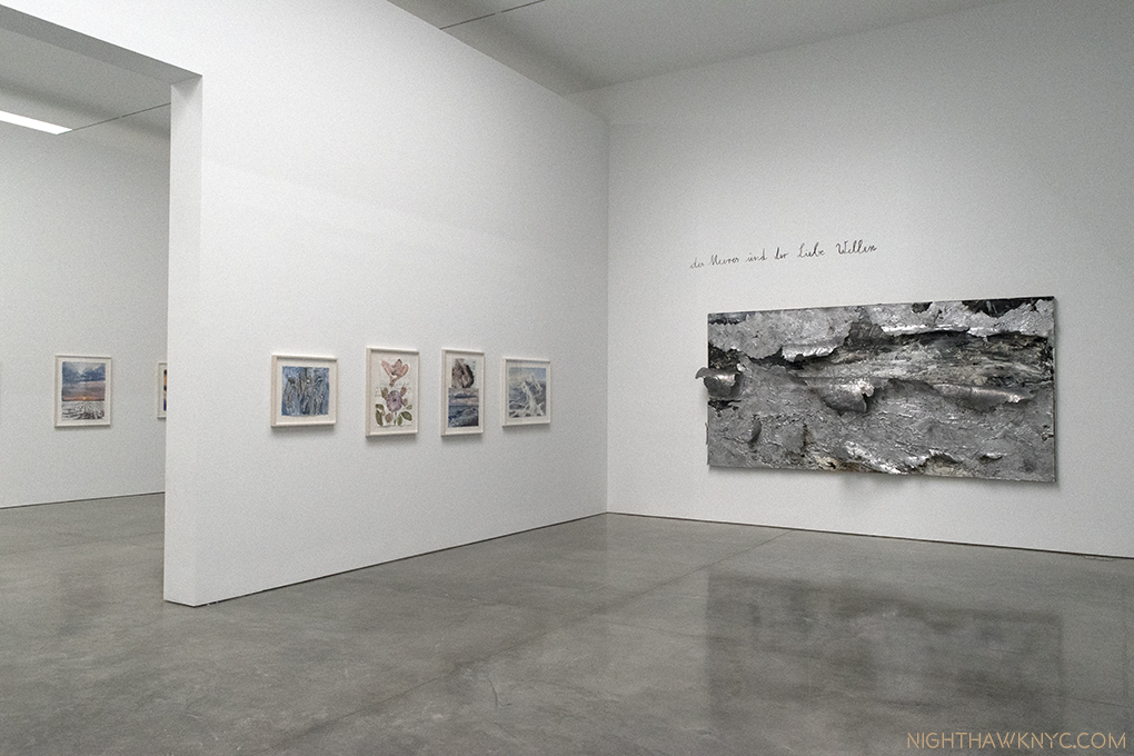
Installation View of Room 3, and part of 2, left. On the right, The Waves of Sea and Love, 2017, Oil, emulsion, acrylic and lead on canvas. The other works are watercolor on paper. .

Anselm Kiefer: Transition From Cool To Warm (at Gagosian, West 21st Street)- Hold the Apocalypse. Though there were moments recently where it seemed imminent some respite was to be found at Gagosian on West 21st Street this summer in a large show of lyrical works by renowned German Artist Anselm Kiefer. Yes, Anselm Kiefer- the same Artist who sees civilization as a  shining moment between dark ages. It’s been getting harder to argue with him.

The Evening of All Days, The Day of All Evenings, 2014, Watercolor on paper.

Maybe Mr. Kiefer’s crystal ball also told him there would be a need for a “brighter” moment this summer. Whatever the inspiration for it, it’s certainly a bit shocking that this ray of light would come from this Artist after the dark shows that he’s had recently, like this one in London this past winter. You’ll look long and hard (as I did) for signs of it at Gogosian, where female nudes, many, apparently, under the spell of Eros, lush waters and copious flora abound instead creating a plethora of beauty that lingers in the mind, while we await whatever is coming next. And I mean plethora. Over 100 pieces, probably upwards of 300 individual works.  A “transition from cool to warm,” a term used to describe color temperatures by watercolorists, in more ways than one.

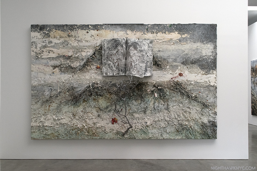
For Segatini: The Bad Mothers, 2011-12, Oil, emulsion, acrylic, shellac, wood, metal, lead and sediment of an electrolysis on canvas. The book in the top half, and the tree branch in the bottom half, are mounted on, and extend from, the canvas. It’s hard to capture how thickly the paint is applied. All the other books in this show contain watercolors.

It’s rare, in my experience, to see a show this large that is, primarily, watercolors. Interspersed with them are some large landscapes in oils that are spread on thick and heavy, some combined with elements that include tree branches, lead and sediment of an electrolysis, like For Segatini: The Bad Mothers, above, which served as an echo for me me of Robert Rauschenberg’s groundbreaking Combines, from 60 years earlier, on view 30 blocks north at MoMA.

Installation view of the central gallery, Klingsor’s Garden, displaying 38 Artist’s Books, each one containing 8-12 watercolors.

Anyone who has tried watercolors quickly learns that this tricky medium tends to have a mind of its own. Kiefer long ago mastered them, as he demonstrated in 1977 in a book of them of the same name as this show. He’s been hard at work since creating a number of individual watercolors and about 48 unique Artists Books (the other 9 are in the final room) filled with them on view here. In this age of Artist’s Books, you’ll look long and hard to find even one that can match these (or their prices), each page of which contains a finished watercolor, many of the books containing 10.

Two books of Watercolors in a vitrine, each bearing the same title as room, Klingsor’s Garden. Watercolor and pencil on plaster on paper, executed in 2016-17.

His watercolor nudes bear a passing similarity to Gustav Klimt’s and Rodin’s famous nude watercolors, but Mr. Kiefer (who says he didn’t know Rodin’s watercolors until after he had started doing his own) makes them seem as something of a jumping off point for his own striking poses, done from models, that seem to float on the gesso he uses to create an imitation marble “ground,” intertwined with snakes, or accompanied by other elements, typically water and flowers in the standalone work, which feature sunsets (as seen in the first photo), somewhat barren landscapes, with muddy roads, or seascapes.

The partially opened books lead the mind to construct whole images out of halves of different pages, as seen here. Mr Kiefer says books “are more than half of what I make…the pictures come and go away, and then a new one comes. So it is always the picture between two pages. You turn the page, you still have the other one, but you already have the new one. I like this very much because it’s not a fixed picture, it’s a transition, it’s an action.” (Interview with Gagosian, 2017)

In many of them Keifer alludes to a wide range of literature, from the bible to poetry, a good many of them being fairly obscure, with handwritten notations on the works. The central room, containing most of the vitrines of Artist’s Books filled with (mostly) nudes, is named Klingsor’s Garden, seen above, which I take as a reference to Wagner’s Parsifal where the magician Klingsor has a garden full of beautiful flower-maidens under his power.

An element of darkness creeping in? Aurora, 2015-17, Oil, emulsion, acrylic, shellac, and sediment of an electrolysis on canvas, seen adjacent to 6 watercolors.

This is the first show I’ve seen of Mr. Kiefer’s, who has had a large work continuously on view in The Met’s 5th Avenue Modern & Contemporary galleries, in the same spot, for over 20 years. Having given up looking for a “darker message” in these works, I succumbed to the beauty and preferred to simply study the technique in the large oils, and enjoy the chance to see so many unique watercolors in one place. It will be interesting to see what his next show is like. While the world and universe will end one day- sooner or later (the jury being still out on civilization’s longevity), its the fleeting moments of beauty, and Art, that make this temporal experience special.

Ellsworth Kelly: Last Paintings, Ellsworth Kelly: Plant Drawings & Ray Johnson (all at Matthew Marks Gallery)- Each of these memorable shows deserves its own writeup. Both Ray Johnson and Ellsworth Kelly are Artists whose importance seems to be increasing as time goes by.

In Ray Johnson at Matthew Marks, West 24th Street, Untitled (David Bowie), 1979-94 is one of a group of “silhouettes” on display, perhaps  the most complex. Ink and collage on board. The multiple dates of Mr. Johnson’s work reflect the fact that he often rethought a work many times.

In Ray Johnson’s case, substitute “being taken more seriously as time goes by.” It’s about time. Mr. Johnson studied at Black Mountain College with Artist, and legendary teacher, Josef Albers, and Robert Motherwell, while Rauschenberg, John Cage, and others, were there in the late 1940’s heyday of that legendary institution. After burning his early paintings, possibly to get out from under the cloud of his illustrious teachers, he became something of a “shadow figure” in the Art world, though he seemed to know almost everyone in it. He started the Mail Art movement, and the New York Correspondence (or “dance”) School, and worked, mostly secretly, on collages. After his tragic and mysterious death, a suicide (or “Rayocide,” as Mark Bloch called it, which many considered to be his final “performance,” in a life that had been full of performances, like his “Nothings” earlier on), a wonderful 2002 documentary, How To Draw A Bunny, seems to have begun a reassessment/fuller appreciation of Mr. Johnson’s work that is, finally, seeing it loom larger than his large, unique/endlessly quirky personality. This show consists of an excellent cross section of those collages, some doing double duty as Mail Art, and two other works that defy easy description, one seen below, the other further down.

Installation View of the second gallery (with gallery #3 and 4 ahead), showing the Candy Darling Cast, 1970- of her face, complete with fabulous eyelashes, in its clear carry bag, center.

1

Untitled (Self Portrait/Dance Diagram), 1992, Collage on board (double sided). The shoes are reminiscent of the ears on the Bunnies with long squishy noses that are Mr. Johnson’s “trademark.”

Ray Johnson was a unique Artist who was a Master of graphic design in my eyes, and still ahead of his time. He was a vital part of the NYC Artist community, until he opted to drop out of it, and NYC, moving to Long Island, and finally to Locust Valley, NY, where he lived as a recluse, like his friend, Joseph Cornell. He stopped showing, or selling, his work, other than continuing to mail some of it. Some see him as a precursor of “Pop art,” because of his use of celebrity portraits before Warhol (who he met in 1956), and benday dots before Roy Lichtenstein. He was also fond on including his own portrait in his work, and these are the works I find among his most engrossing given his reclusiveness. Every time I saw someone posing for a selfie in front of one of them, I couldn’t help wonder what Mr. Johnson would make of it. email and instant messages don’t have the charm of actual mail, or its creative possibilities. It’s a shame that it’s now unlikely another “Mail Artist” will come along to further what Ray Johnson started in this “medium.” It may have ended with him (or, “Post-Secret.”)

In this “Summer of Rauschenberg” in NYC, as I saw one writer aptly call it, Ray Johnson is not forgotten. In 1955, Rauschenberg was invited to participate in the Stable Gallery Annual. Artists had been allowed to propose new artists for the following years’ exhibition, but they changed the rule. To circumvent this, Rauschenberg asked Jasper Johns, his former wife/Artist Sue Weill and Johnson to each create a piece that he would install inside of his piece, thereby getting them in the show. Johnson’s contribution didn’t reach Rauschenberg in time to be included. Short Circuit, Rauschenberg’s resulting piece, and its circuitous story, are included in the MoMA Rauschenberg show. In Calvin Tomkins’ Rauschenberg biography, Off The Wall, Tomkins says that in 1955, he asked his friend Johnson to contribute to it in because he was “another young Artist who was unjustly neglected[P. 121].” 62 years later, the world is still catching up.

Untitled (Dali/Courbet/Dear Marilyn Monroe), 1975-94, Ink and collage on board. One of a group of collages that are variations on Dali’s Crucifixion.

A Shoe (John Cage Shoes), 1977. Mixed media. Johnson met composer John Cage at Black Mountain College, and later lived in the same building with him in NYC. Both were parts of the Artist circle that included Jasper Johns, Cy Twombly, Morton Feldman, Merce Cunningham and Rauschenberg. What any of this has to do with these shoes? I have no idea.

John Cage, appears again, next to Picasso, across from Rene Magritte on top of the bottom half of a Photo Photo Portrait of Ray Johnson and the inscription “DONALD TRU” under. Could this be another piece referencing Donald Trump from years ago (this one, 1972), like Raymond Pettibon’s piece seen earlier this year in A Pen of All Work at The New Museum? Untitled (Cage, Picasso, Magritte, Donald Tru), 1972-90, Ink and collage on board.

At Matthew Marks on West 22nd, Ellsworth Kelly’s 9 Last Paintings, and a selection of 16 of his beautiful Plant Drawings spanning almost 60 years, occupied adjacent galleries. Kelly, seemed to be on a lifelong mission to “free shape from its ground, and then to work the shape so that it has a definite relationship to the space around it, so that it has a clarity and measure within itself of its part (angles, curves, edges and mass), and so that, with color and tonality, the shape finds its own space and always demands its freedom and separateness.” as he said. Included in the seminal 1959MoMA show, Sixteen Americans, along with Jasper Johns, Louise Nevelson, Jay De Feo, Frank Stella, and Robert Rauschenberg, his career lasted a long time. As a result, it’s sometimes easy to overlook his work, and that would be our loss, especially in these wonderful last works.

Ellsworth Kelly: Last Paintings. This work is Spectrum IX, 2014, Acrylic on canvas, twelve joined panels, 107 x 96 inches

Installation view of White Diagonal Curve, 2015, Oil on canvas, 52 x 120 inches

Installation view of Diptych: Green Blue, 2015, Oil on canvas, two panels, 80 x 114 inches.

Installation view of White Form Over Black, 2015, Oil on canvas, two joined panels, 75 x 87 inches.

One look at his marvelous Flower Drawings, and I was transported back to my first encounter of them in a mesmerizing show at The Met in 2012. They still leave me wondering “Why hadn’t I seen anyone do this before?” And, I still haven’t. They are true to the statement quoted earlier, though they are more easily “seen” to be based on real objects, though real-life observations were at the heart of his abstractions, as well. As such, these two side-by-side shows provided a rare chance to compare two, seemingly quite different aspects of his work, and find the commonality. They share that zen-like essence, this time of line, rather than shape and color, like the last Paintings. Both, in relation to space.

Next door to Last Paintings, the entrance to Plant Drawings

From the  catalog for this show.

Installation view.

Peony, 1982, Graphite on paper, 30 x 40 inches.

Each shows is accompanied by its own wonderful catalog, adding to the line of excellent publications Matthew Marks Gallery has produced. The Last Works catalog includes photos by Jack Shear showing Mr. Kelly’s studio as he left it, complete with some of these very works. Touching and profound. Of course, seeing them in Matthew Marks beautiful, spacious Gallery is more akin to where these works will most likely be seen henceforth- on Museum walls.

“And babe, don’t you know it’s a pity
That the days can’t be like the nights
In the summer, in the city
In the summer, in the city”*

*- Soundtrack for this piece is “Summer In the City,” by Steve Boone, Mark & John Sebastian of the Lovin’ Spoonful, published by Sony/ATV Music Publishing LLC, Carlin America Inc, BMG Rights Management, US, LLC.

NighthawkNYC.com has been entirely self-funded & ad-free since 2015! If you’ve found it worthwhile, PLEASE donate securely by PayPal below to allow me to continue. Thank you, Kenn.

You can also support it by buying Art, Art books & Music from my collection!
Art & Books may be found here. Music here and here.

Written & photographed by Kenn Sava for nighthawknyc.com unless otherwise credited. To send comments, thoughts, feedback or propositions click here. Click the white box on the upper right for the archives or to search them. Subscribe to be notified of new pieces below. Your information will be used for no other purpose.

Words To Live By From Man Ray, #3

This site is Free & Ad-Free!
If you find this piece worthwhile, please donate via PayPal to support it & independent Art writing.
Other ways to support it at the end. Thank you!

Written & Photographed by Kenn Sava (*- unless otherwise credited)

Man Ray, Lampshade, 1919/1964, top, with By Itself II, 1918/1966 seen in Man Ray at Francis Naumann Gallery, in 2016, that I wrote about, here.

“No. 89, DREAM

(A) My object is to realize my dreams, not simply record them.

(B) But when you write down your dreams or paint a picture representing the images that occurred in the dream, provided you are being faithful to these images, aren’t you simply recording the dream?

(A) Not at all, neither in the writing nor in the painting do I refer to the subject as a dream. In this way it becomes a part of my waking life, just as for every one else who is ignorant of the source of my inspiration, my work is accepted as a product of my own peculiar brand of reality. In this way are my dreams realized.”

Man Ray, “The Hollywood Album” from Writings on Art,” P. 204, Edited by Jennifer Mundy, Published by Getty Research Institute, 2016.

The first two installments of this series are here (scroll down).

*- Soundtrack for this piece is, what else? “Man Ray,” by the Futureheads from their 2004 self-titled album.

NighthawkNYC.com has been entirely self-funded & ad-free since 2015! If you’ve found it worthwhile, PLEASE donate securely by PayPal below to allow me to continue. Thank you, Kenn.

You can also support it by buying Art, Art books & Music from my collection!
Art & Books may be found here. Music here and here.

Written & photographed by Kenn Sava for nighthawknyc.com unless otherwise credited. To send comments, thoughts, feedback or propositions click here. Click the white box on the upper right for the archives or to search them. Subscribe to be notified of new pieces below. Your information will be used for no other purpose.

Rod Penner’s Neighborhood

This site is Free & Ad-Free!
If you find this piece worthwhile, please donate via PayPal to support it & independent Art writing.
Other ways to support it at the end. Thank you!

Written & Photographed by Kenn Sava (*- unless otherwise credited)

“It’s a beautiful day in this neighborhood,
A beautiful day for a neighbor,
Would you be mine?
Could you be mine?”*

In 1927, the Painter & Photographer Charles Steeler spent six weeks Photographing the 2,000 acre Ford Rouge plant in Detroit on assignment for an ad agency1. So taken by what he had seen there, over the next 9 years, he produced a series of Paintings of the plant based on the Photos he took. While both his Photos and his Paintings are now seen as classics, that’s perhaps the closest an ArtistArtist has come to creating a series of Paintings of a small neighborhood as seen at the same time. Now, the Artist Rod Penner tells me he has completed one such series. “Mr. Penner’s Neighborhood” (with apologies to Fred “Mr.” Rogers) of choice for his series of 2015-17 Paintings is San Saba, Texas, a town of about 3,000, an hour north of Austin, as seen in the source material he collected in various mediums (plural- they consist of more than Photographs he told me), during a trip he took there early one winter Saturday morning. To date, they had numbered 10 Paintings, 9 of which were shown at Rod Penner, at Ameringer McEnery Yohe Gallery, NYC in May2, (which I wrote about here and here. My follow-up “Q & A” with Rod Penner is here.)

San Saba Butane, 2015, 10 x 15 inches.  All works shown are Acrylic on canvas. The first work in Rod Penner’s San Saba Series, and was not in the AMY show. Comparing this to the smaller work with the same title, I wrote about here, is endlessly fascinating. Photo courtesy Rod Penner and Ameringer McEnery & Yohe.

The tenth, (actually, the first to be completed in 2015), above, gives us a view of San Saba Butane seen from the side, which contrasts with the smaller painting of the same title that captivated me at the show where San Saba Butane is seen from the front. This perspective makes it part of a neighborhood, and not seem to be an island. A neighborhood where the other buildings seem to be in better condition, and most likely still in use. Here, it still looks like a relic, just a relic that is part of a large community, something we don’t often think of relics being. Interestingly for me, the lone car is stopped at a light, the only time this occurs in the San Saba series, as if symbolizing time standing still here.

The new 11th, and final, painting in his series is, interestingly, entitled Welcome to San Saba. I quickly moved past the irony of ending a series with a work that would seem to indicate it was the first work in the series to look at this photo of it.

The 11th and final work in Rod Penner’s San Saba Series, Welcome to San Saba, 2017, 10 x 15 inches. Photo by Rod Penner, courtesy of the Artist and Ameringer McEnery Yohe.

Ah…G & R Grocery (cut off on the right), The Station (dead ahead, left of center)…some familiar sights from their own works in the show…the familiar damp streets… Yet? Much was new to me.  Take the mural on the yellowish wall seen facing us to the right of center, for instance. During the run of the show, I looked long and hard at the miniature version of that mural alongside the G & R in its 5 x 7 1/2 inch painting at AMY, below, where it is seen at a sharp angle, trying, in vain, to see what it depicted.

Flashback. G & R Grocery, 2016, 5 x 7 1/2 inches, as seen in the AMY show in May.

Seeing it now, face on, is “another part of the puzzle.” It’s a picture in a picture that adds a surreal element to this work, especially because we can’t really see all of the storefronts along the side of Welcome to San Saba, and so it seems to ask the question “Is THIS San Saba? Or, is what’s in the mural San Saba?” Well, I hear that hunting is second only to pecans as a business in San Saba, so? They both are. Maybe that’s why the deer in the mural has that “in the headlights” look, which mimics the distant car with its headlights on coming down the street. While we’re busy pondering all of that, one thing’s for sure, besides that car, there’s not a heck of a lot going on.

The perspective giving us this view strikes me as brilliantly subtle. We’re not exactly in the street, or on the curb. We’re not looking exactly straight down the sidewalk, or really, right down the street. Only the mural is seen whole, balanced by the facade of The Station, across the street in the distance. The pavement is masterfully done, as usual. It’s astounding, really. Right down to the varying degrees of wetness, and that horizontal crack breaking things up. While we’re admiring Mr. Penner’s technique, other visual pleasures include what can be seen of the facades of the stores seen in perspective, the peeling paint on the mural wall, and of course, the “Penneresque” skies, as I call them, this one different from some of the rest because it lacks any hint of the sun breaking through, or being covered up, as in the larger SS Butane. The bare tree on the left marvelously balances the piece, and is, like everything else, wonderfully done.

Flashback #2. View of San Saba, 2017, 5 x 7 1/2 inches. Looking down the same street as Welcome to San Saba, which takes place halfway up the road on the right, as seen at Ameringer in May.

Finally, there are the many festive lights, including those that run along the top of all the buildings, reinforcing that it’s the holiday season, which adds more poignancy for the viewer. The lack of people and cars, except for the distant one approaching makes this feel more haunting to me than View of San Saba, above, possibly because we’re not in the middle of the street now, and we’re right among the buildings. Odd for that time of year, there’s almost no activity, no one is shopping, doing errands, etc., save for the headlights of the car approaching in the distance.

It’s more than a terrific Painting. It’s a worthy end to a compelling, unique series.

As importantly, the more I looked at it, the more I realized it was effecting some of my thoughts about the rest of the series, and making me see “more” in them. As I mentioned last time, this series presents different views of much of the same small neighborhood in each succeeding work, with each angle presenting new information, and giving a new perspective. A subtly engrossing concept that adds another layer to the already meditative nature of his work, which takes us from pondering individual scenes to assessing the larger community, seen in the first, and last two works in the series. Assessing them, I’m reminded that I paid so little mention to the “Holiday” aspects I just mentioned that, also, recur in some of these works- Yard Inflatables, and The Station, as seen at Ameringer, (a pic of The Station I Posted previously). This combined with the universal absence of people, the often darkening skies lends a sense of isolation, even lonelieness that feels (to me, at least) akin to that in Hopper. But, that is the real joy of looking, and seeing what they say to you. Your results may differ.

It’s the holidays in the neighborhood. Yard Inflatables, 2016, 6 x 6 inches, seen at AMY.

Yard Inflatables is, also, a charming example of Mr. Penner’s subtle humor. Something that also appears, in somewhat subtler form, in Welcome to San Saba, possibly in the title, itself. Mr. Penner, who describes himself as “an avid hunter, big on wildlife management and conservation,” also had to tell  me (because I’d never have guessed) the mural is a bit of a jab at some of his  some of his anti-hunting friends, and sent this photo of the actual mural along. I’m sure most residents disagree, but I like his version of it much better.

Welcome to San Saba Mural. Photo by, and courtesy of, Rod Penner. Interestingly different perspective than seen in the Painting.

The photo of the mural also puts yet another nail in the coffin of what’s called “photorealism,” something that has less and less to do with Mr. Penner’s work the more I see of it. Just compare it to the mural in the painting. So, if Rod Penner is not a “photorealist,” what is he? He’s an Artist. It’s becoming apparent to me that he is directly in the line of “American Realists”3 that goes all the way back to Gilbert Stuart (1755-1828), and extends up through George Caleb Bingham (1811-1879), the Hudson River School (including Thomas Cole 1801-1848 and Sanford Gifford 1823-1880),  Thomas Eakins (1844-1916), Reginald Marsh (1898-1954), Edward Hopper (1882-1967), and yes, Charles Sheeler (1883-1965) (Thomas Hart Benton, Grant Wood are among others included by many). Not a bad “neighborhood” to be in. Speaking of those “neighbors,” I find myself wishing the whole series had gone to a museum, like the Whitney, where it would look wonderful along side their Hoppers and Sheelers, while showing that tradition is alive and well in 2017.

Rod Penner’s San Saba Series, strikes me as walking that line between intimacy and distance. Standing in front of someone’s house, especially at Christmas, has an intimacy to it that it probably wouldn’t have seen at any other time of the year. The owners are “letting us in” a little bit into who they are through their decorations. So is the town with its “public” holiday decorations, seen in the streets of The Station and Welcome to San Saba. Yet, there is an undeniable distance and an almost foreboding sense of isolation that’s reinforced by the ever-present, slightly ominous “Penneresque” skies. Works like the smaller San Saba Butane are not at all welcoming. Even if you were to venture inside the crumbling building, you wouldn’t really “be” anywhere. View of San Saba, above, the next to last work Mr. Penner completed, is also not welcoming. We may be risking our lives standing in the middle of that street for long with our backs turned. In Welcome to San Saba, some lights are on, but nobody’s out. It’s a bit reminiscent of those old western movies when the bad guys come to town and everyone’s hunkered down indoors.

As the 9 Paintings at Ameringer McEnery Yohe sold, I now feel lucky to have been able to see that many of them in one place, since their “interaction” adds so much, as I’ve tried to show, and since who knows when that might happen again. Walking through these 11 Paintings, in my mind now, “Mr. Penner’s Neighborhood” still fascinates me and still makes me look deeper. I guess I’ve become a neighbor.

*-Soundtrack for this Post is “Won’t You Be My Neighbor?,” by Fred M. (“Mr.”) Rogers.

My previous pieces on Rod Penner-
“Q&A With Master Painter Rod Penner,” June 14, 2017.
“Rod Penner: Brilliance, Under Cloudy Skies,” June 10, 2017.
“The Vermeer of Marble Falls,” April 28, 2017.

On The Fence, #9, The Sitting Ducks Edition

NighthawkNYC.com has been entirely self-funded & ad-free since 2015! If you’ve found it worthwhile, PLEASE donate securely by PayPal below to allow me to continue. Thank you, Kenn.

You can also support it by buying Art, Art books & Music from my collection!
Art & Books may be found here. Music here and here.

Written & photographed by Kenn Sava for nighthawknyc.com unless otherwise credited. To send comments, thoughts, feedback or propositions click here. Click the white box on the upper right for the archives or to search them. Subscribe to be notified of new pieces below. Your information will be used for no other purpose.

  1. Some may be seen here. ↩
  2. The show’s site is here. ↩
  3. With all due respect to great Realists the world over. ↩

Raymond Pettibon: Artist Americanus

This site is Free & Ad-Free!
If you find this piece worthwhile, please donate via PayPal to support it & independent Art writing.
Other ways to support it at the end. Thank you!

Written & Photographed by Kenn Sava (*- unless otherwise credited)

Gumby had magical powers.

Gumby! You made quiet a mess on the floor of David Zwirner Gallery!

Using them, he was able to walk into books and become part of the story inside, usually solving whatever the problem was.

And, the walls, too! What? Raymond Pettibon did this? Oh. O.K.

Well, his “super human” powers really shouldn’t surprise anyone. He wasn’t human! He was 100% clay. Most people who remember Gumby remember him as a character in a kid’s TV show from the 1950’s that was reincarnated a few times over the succeeding decades. Most recently, he’s also had a reincarnation as the alter ego of Artist Raymond Pettibon1. In this “life,” he doesn’t have to walk through the walls David Zwirner to be inside the story, he’s been welcomed in as part of Pettibon’s latest show, TH’ EXPLOSIYV SHOYRT T,  as we shall see. Ok…ok…that’s my Gumby, above, that’s been a sidekick of mine going back to the 1990’s. But, Gumby, I mean Raymond Pettibon, really did create those paint splatters while he was creating many of the works in the show. Renown for the hand drawn & painted elements he creates for each show ranging from texts to wall drawings to murals, these splatters and drops provide mute testament to his creative process that recently occurred in this very space, possibly including this-

No Title (It sounds powerful…), 60.5 x 101 inches, 2017, Ink, acrylic, and collage on paper.

Fresh off the unabashed success of his blockbuster retrospective at the New Museum, “Raymond Pettibon: A Pen of All Work” (which I wrote about here), his first show at a major NYC Museum, some 40 years in the making, with EIGHT HUNDRED works dating back to the 1960’s filling three full floors, barely had my thoughts about it had time to begin to congeal, when along came word of a show of new works by Pettibon at David Zwirner, 519 West 19th Street, where the Artist had been holed up since January, I was told, creating many of them.

Down the rabbit hole I go, again. No Title (Dear Master V…), 2017, “V” for Vavoom, the old cartoon sidekick, capable of only screaming his own name, is the other Pettibon alter-ego, along with my friend, Gumby. Pencil, ink, watercolor, goucache, acrylic and collage on paper.

Lo and behold, when the doors opened on Saturday evening, April 29, there they were, 99 new works, only 2 of which I saw at “A Pen…,” where they were tacked up as part of the lobby Mural, as if giving us a taste of what was to come. Talk about prolific. What’s another 100 after having just seen 800? It, also, provides an all too rare opportunity to get the “rest of the story,” from his beginnings as seen in “A Pen…” right up to the present moment.

David Zwirner Gallery, 519 West 19th Street. In its case, the doors roll up. Special Art note- That’s Artist Caslon Bevington walking across the floor. I first met her at this show, found out she was an Artist, and have been so taken with her work that, so far, I’ve written about it twice.

Meanwhile, A Pen of All Work, has now oped at the Bonnefantenmuseum, Masstricht, The Netherlands, where it will remain open until October 29, complete with its own brand new, hand painted, circular wall mural, in 4 parts, which may be glimpsed here. Look now while you can. Like his other murals, it will be history when the show is. But, here & now, in West Chelsea, the paint was barely dry on the walls, and the floor, too, of 519.

What was to come, as far as the new work goes, was a continuation of what we saw in Raymond Pettibon: A Pen of All Work– in almost every way, most importantly including quality. Also continuing are most of the themes Pettibon is known for. Well? There was only one work related to Music, perhaps surprising to those who still think of Pettibon as a “punk” Artist, even though that period was 35 years ago. On the other hand, of all things, wrestling appears to be on the ascent among his themes.

A week before the end of the show, “O.G.” Pettibon returned to graffiti his own sign.

But, before we get too far into it, let’s start outside. Above the door, in lieu of one of his usual wall drawings or murals Raymond Pettibon has simply written the show’s title. Keyword: “simply”-

Wow. He wrote this, and even I can read iyt!

Well? “The Explosive Short-T” is one version of the show’s title. On the David Zwirner website, the show is referred to as TH’ EXPLOSIYV SHOYRT T. That’s easy for Raymond Pettibon to say, in his unique “way with words,” something I am quite fond of doing, myself. Two titles? What gives? I was told the latter is the “official title.” Fair enough. But? What does it meayn? My research led me to the 1963 Football coaching guide by Homer Rice, a coach at the University of Oklahoma, called The Explosive Short-T. It’s back cover bills it as “A complete guide to building a winning football offense with the newest and most powerful variation of the T-formation.” And, compared to the massive “A Pen…” it is short-er.

The cover of Home Rice’s rare 1963 book. I don’t think he suspected his title would also be that of an NYC Art show 54 years later!

I know what you’re thinking- “Of course!” Further adding to the intrigue of the title, among the works inside pinned, (yes, Art, some of which was priced at $150,000.00 per, was all pinned to the walls), Raymond Pettibon, sports aficionado, has depicted the following sports (and in parenthesis how many times each in this show). For those of you keeping score at home, my count by sport is-

-Baseball (4)

-Wrestling (3. One could be boxing, but I think it’s wresting.)

-Surfing & Waves (2. 1 of waves, 1 of surfers changing their clothes)

-Football (None)

No title (The false thread…,)”,…is easily found, it concludes. All works are by 2017, Ink and acrylic on paper, unless noted.

Ok, so if the show’s title is a Football reference and there’s no football to be seen, what does it have to do with the 99 Art works on display? Unless it’s a “false thread?” I don’t claim to have any “answers” when it comes to the work of Raymond Pettibon. I just enjoy pondering what his work says to me each time I look. Not willing to give up on this “thread” so quickly, I chose to take the “formation” part literally, and see what the groups (the formations) the work is arranged in might offer.

I decided to focus on this group of 11 works.

The first thing that struck me about the curating of this show was a major difference with the New Museum Retrospective, which was arranged by themes throughout it’s 3 floors. This show is not, as far as I can tell. I asked who was responsible for the arrangement and the answer I got from the staff was Pettibon and David Zwirner. I’ll go with that. It’s hard for me to imagine the Artist didn’t have a hand in it. Afterall, he had been in this space working, and he did paint the title over the door, and? The grouping is as interesting to consider as the individual works they consist of. But, I must bear in mind what Pettibon said in 1999-

“When I hang a show, for the most part, it’s usually just as well to put up the drawings randomly, because that’s the nature of the work. There are dissociations and attachments and the mind will fill in the blanks. Beyond that, it becomes overly fussy and contrived. So just about any way the work is hung, really, it’ll work.”

Yes, my mind couldn’t help but to “fill in the blanks,” helping to see the combinations as “explosive.” Take the group, above, for example. Right smack dab in the upper middle is a work, who’s upper thought bubble says-

Detail of No Title (Was there any…), Ink and acrylic on paper. It could be my mantra.

But then, the “kicker.” Under a pile of black lines, the words “Was there any going back on that? It seem’d ready to unravel.” What do they refer to? Slightly higher, on the left, is a skull, with a thought bubble that reads Little Cloud That Cares. Two brains, one in a skull, connoting a “dead” brain, and one, of an apparently “live” brain, without a skull, both with thought bubbles. On the left side, directly under the Cloud That Cares is a drawing of 2 Baseball players. Bo Billinsky and Dean Chance. During the opening, on April 29, Raymond Pettibon told me that his son, Bo, who was in attendance, was named after Bo Belinsky. Bo Belinsky, was a 6′ 2 left-handed starting pitcher for the L.A. Angels, from 1962-64, when his record was 21 wins and 28 loses. An interesting choice, to say the least.

Pettibon’s son’s namesake, alongside his own favorite player. No Title (And then other…), Pencil, ink, watercolor, gouache and acrylic on paper.

He also told me that Dean Chance was his favorite player, so (my interpretation) their dual portrait is a way of putting himself and his son into a work. (The Artist also has a dog named Boo.) Bo Pettibon announced to all who would listen that he wanted to become an Artist. In an interview with Dan Redding, Raymond Pettibon said that he looked forward to collaborating with Bo. So? This piece may also be a harbinger of Raymond Pettibon’s future work. It appears to me, though, this this is a rare work that may have some personal relevance to Raymond Pettibon. It’s fascinating to me how very few of his works that I’ve seen seem do. It seems to me his work is more about “self,” not about “him self.”

Surrounding these 3 works are pieces that speak of luck- good (below, center, a skier apparently narrowly misses a tree), bad (upper right- a bomber on fire, seemingly about to crash), faith (a bible, or bibles, seemingly falling),  fate (a naturalist monitors the progress of his disease in a piece that seems to equate the progression of a disease to a pen that finally produces ink). Beneath it is a most interesting image. Gumby/Pettibon and Shakespeare are joined by a quintet of 4 men and a woman. The man in the center holds what appears to be a frame. The text reads, “As withouyt the advantage of educatioyn or acquaintance among them.” The man holding the frames looks like he could be Churchill, a passionate painter throughout his life, to me. The man to his left (the far right) could be Stalin. The man “Churchill” shows what’s in the frame to (F.D.R.?) appears to be startled by it, as does the man looking over his shoulder at it. Gumby, “represents me as an alter ego,” he said on PBS’ Art21. Yet, both he, and Shakespeare have blank expressions, appearing as witnesses, and either the piece in the frame is blank, if it’s facing us, or hidden, if it’s not. Either way? No matter how long we look at it, it will never become clear.

No Title (Rereading Pettibon)

Fascinatingly, to it’s immediate right is an image of what might be a demon, with a red tooth, who is busy Rereading Pettibon, something many viewers to his New Museum Retrospective had just been busy doing, revisiting his work going back decades.

No Title (Whipper paused a…), Ink, watercolor and acrylic on paper.

The final piece in this section’s bottom left features a pitcher nicknamed Whipper, who, it says, won 19 games in 1960. The only major leaguer to win 19 games in 1960 was Lew Burdette, but he lost 13 games, not 8 as it says on the drawing, and his lifetime record was 203 wins and 144 loses (not 161-127). So? Whipper may be fictional, or a non-major leaguer. Still, I find it, another, compelling Baseball work. While so much ink is devoted to Raymond Pettibon- “punk Artist,” very little is devoted to Raymond Pettibon- extraordinary “Baseball Artist.” Which leads me to ponder- Who is the OTHER great Baseball Artist?

So, the right half of this wall is dark with war, death, disease, demons, and trying to maintain your sense of self during this. In the middle might be luck- at writing one good thought or narrowly escaping serious injury/death. On the left side is an image of the Washington Monument with text reading “There is no other that in comparison with it stands,” but it mirrors the narrowly missed tree to it’s immediate right, and above everything else on this wall is a skull, a symbol of death, that somehow manages to produce a thought bubble “Little cloud that cares.” Clouds care? The dead have thoughts? I’m deeply inside the rabbit hole now. I make no claim to “understand” any of them. But? I just can’t stop looking at them, and thinking about them.

This is only one section of the show- 11 works. It leaves 88 others to consider! Don’t worry. Every now and then I remind myself that this isn’t a Book, so I’m not going to go through all the rest. But, I will show a few others.

Installation view of ALL of Raymond Pettibon: TH’ EXPLOSIYV SHOYRT T at David Zwirner. The wall I was speaking about is just to the right of the left corner.

Of the other noteworthy works here is, of course, the huge Wave piece shown earlier, which, though 4 of his 5 highest selling works at auction to date have been large Surfer/Wave pieces (one sold for 1.5 million dollars), this one is mounted all the way in the back corner, high on the wall. So high, it’s very hard read the small text fragments among the collaged waves. Of course, it was sold early in the show’s run (if not before it opened), and most likely was the most expensive piece in the show. Well? It’s safer high up. It also does give the effect of looking up at a huge wave.

The intriguing rear wall and right corner of the show. A show of power- natural, and man made.

In his oeuvre, Pettibon’s surf pieces are like the “golden section” in a piece of Music-they live at the center of his universe. He’s said he enjoys Drawing waves more than anything else. It shows. This one is displayed above leftover paint splatters, and the portraits of two tyrants- Stalin, looking like he was the target of a paint gun war, and to his right, J. Edgar Hoover, cornered. For a change. Around the corner, on a wall by himself, hangs the only Self Portrait of the Artist, looking “cautiously” out on all he has wrought. Well, he not only can’t see Stalin or J. Edgar from there- he has his “back” to them.

No title (I glance cautiously around the room…), And…

Moving cautiously around it, too. Raymond Pettibon enters his show at the opening, April 29, with a cane. That small figure running in the distance is his son, Bo.

Hobbled by what he said was a bout of gout, the Artist, himself, nonetheless persevered and arrived to surprise visitors to the opening, including yours truly, with his presence, and I had the privilege to meet him and speak with him.

We spoke about a range of things after I remarked that since he is associated with many things California, I was still getting used to him being a New Yorker, which he has been for six years already. We then touched on the Biennial, Owls (which appear fairly often in his work. He then proceeded to sketch this one-),

Baseball (as I mentioned, above), and some of the books about his work. His son, Bo, came by and drew in a fan’s book his father was signing, and announced to all present his intention to become an Artist. Pettibon has spoken about looking forward to collaborating with Bo, so Craig? Hang on to that drawing! Bare chested, Bo then proceeded to run out to the sidewalk and take startled passersby by the arm to try and get them to come and “see Daddy’s show.” As I commented to the staff, you can’t buy that kind of marketing!

If you thought the first group of 11 was “complex,” 42 works line the very long eastern wall in one group. At the far left is a work about the beginning of life (shown below), at the far right, one about death (JFK’s). Smack in the middle is a large cathedral piece, with a UFO work over it, and one, perhaps, about suicide, and the luck of dice to their right.

The piece on the far left side, above. No Title (Think What It Took…), Ink and acrylic on paper.

Detail of the text. If I had the money, I might buy this one.

It’s too early to calculate Raymond Pettibon’s influence because it’s still in the process of spreading, something which no doubt surprises many who only know him as a “punk Artist.” His has become a world-wide presence, with shows going on in Moscow, and A Pen of All Work reinstalled in the Netherlands as I write this. Over the past 40 years, he’s gone from being a shadowy background figure, creating fliers, record covers, zines and Artist’s Books, to being an established Artist in the world of “Fine Art,” who’s work is now being shown, more and more, in Museums. Around the world, in press releases, he’s invariably referred to as an “American Artist.” “Artist Americanus” is my play on “Homo Americanus,” the title of a large traveling European show of his work last year (which I take to mean “American Male”). When I think of that term in a “classic” sense, it means thinking for yourself, making up your own mind, and expressing yourself in your Art.

Regardless of whatever “meaning” you take from one of his works, Pettibon is an Artist who has maintained a remarkably consistent creative path since, at least, the mid- 1970’s. He’s said in interviews that he’s worked like this (putting words to drawn images) since he was a small child. Right now, 40 years on, Pettibon’s influence can already be seen even beyond his work, itself. The “alternative means” he used to get (fliers, zines, record covers, Artist’s Books, et al) his work seen2 is being followed by countless others, as can be seen at New York’s Printed Matter.

New York’s renowned Printed Matter, where the work of some Artists following in Pettibon’s footsteps is available, has over 15,000 titles in stock.

I, too, have been inspired by his example with this site, and I thanked Pettibon for the “inspiration,” when we parted. I’m not sure he knew what I meant. Beyond this, his other great influence is helping Drawing to be reborn in Modern & Contemporary Art. Artist (and Pettibon collaborator), Marcel Dzama credits Pettibon for being the Artist who put Drawing on the map in Contemporary Art3, and getting it taken “as seriously” as “finished works of Art,” and not as preliminary works for a Painting. That, too, seems like it’s already ancient history.

Inside Printed Matter, a table features recent Drawing books. A few years back, you’d look long and hard to see books of Contemporary Drawing.

 Some 900 works in to exploring his work and career Raymond Pettibon remains a fascinating mystery for me as he probably is for almost anyone else interested in his work. Much of his Art seemingly defies (easy) “understanding.” Regarding the “crypticness” of his work, in an interview, he said, “I think if I brought you through the work you’d see what I was trying to get at. You can say it’s open-minded, whatever, but it’s never a random association between the language and the image. There’s always a reason.” I keep looking for it, and more importantly, thinking about it, and whatever the topic(s) he’s addressing. That a good many of his topics relate to either current events, American History (previously drawn from a distance of time, because history tends to repeat, as he has said, and more recently including almost current events), or social & cultural history, give them an ongoing relevance, and importance that is rare in Art seen in Museums these days.  It’s taken him almost 40 years to get there. Fittingly, Raymond Pettibon turned 60 today, June 17, as I write this. Happy Birthday!

Sorry. Gumby insisted on a selfie.

When “A Pen…” opened at the New Museum, it was February 8th. 900 works later, when the Zwirner show ended, it was June 24! Most of 5 straight months of Raymond Pettibon! Still? I was already thinking- When’s the next show? It turns out I didn’t have to wait long. On June 27th, David Zwirner opened the Thread Benefit Exhibition, featuring 26 works donated by gallery Artists, a few doors west at 533 West 19th Street.  It includes this piece by Raymond Pettibon,

No title (I luyv y’all…), 2014, You Don’t Love me?, Ink, graphite, and acrylic on paper. Seen at the June 27th opening of Thread.

which speaks for itself. Or? Does it. I’ve been “trained” to look twice. Thus far, it strikes me as a terrific culmination to this remarkable “half year of Pettibon, NYC.”

The Artist didn’t appear, at least while I was there, that night. Leaving, I passed by 519, where TH’ EXPLOSIV… had ended 3 days before. I looked in and saw the wall he hand painted had already been painted over in preparation for whatever is going in there next. I turned the corner onto 10th Avenue, and a few hundred feet down, I saw this, propped up against the wall…

Unknown Artist, I Love You. Dated June 27, 2017 along the bottom, Unknown medium, seen on 10th Avenue, June 27, 2017,

What? The show had been open all of one hour, and already someone had copied Pettibon and had it up for sale on the street! WHOA. I was reminded of this quote of his- “I’ve never really thought of it in this way, but it is kind of cool to be the Gucci of my kind of work. I mean that in the way that Gucci and all those type of trademarks can be cheaply copied and reproduced like my comic books or flyers. I don’t get any royalties from that. I haven’t got a cent from SST ever, and I don’t get any royalties from the tattoo trade. The tattoos are when it becomes an even more substantial brand because it’s stuck on someone permanently. And if someone wants it off, then the mother has to go through even more pain to have it taken off than he did to put it on,” he said here.

I’m not the only one who owes Raymond Pettibon a “Thank you,” at least, for the inspiration.

Raymond Pettibon: TH’ EXPLOSIYV SHOYRT T is my NoteWorthy Show for June, 2017.
My thanks to Craig, Anisa & Caslon of David Zwirner for their assistance, and forbearance, during my dozen or so visits. 

*-Soundtrack for this piece is “Don’t Believe The Hype,” by Public Enemy, for all those who hear that Pettibon is a “punk Artist.” And, because Pettibon loves hip-hop, some East Coast.

NighthawkNYC.com has been entirely self-funded & ad-free since 2015! If you’ve found it worthwhile, PLEASE donate securely by PayPal below to allow me to continue. Thank you, Kenn.

You can also support it by buying Art, Art books & Music from my collection!
Art & Books may be found here. Music here and here.

Written & photographed by Kenn Sava for nighthawknyc.com unless otherwise credited. To send comments, thoughts, feedback or propositions click here. Click the white box on the upper right for the archives or to search them. Subscribe to be notified of new pieces below. Your information will be used for no other purpose.

  1. “Gumby represents an alter ego for my work as an artist. He represents me as an alter ego. There’s actually a lot more to that figure than just ninety-eight ounces of clay or whatever. Art Clokey was into Zen Buddhism and into a lot of pretty deep stuff for Saturday morning cartoons. Clokey was a pretty hip figure in Los Angeles and in the counterculture of the ’60s and the ’50s—the beatniks and the hippies. I have a lot of respect and affection for him, and for Pokey as well, and Goo, Prickle, and even the Blockheads. One other thing that I’ve never thought of—that Gumby does for me in some of his cartoons—is he goes into a biography or historical book and he interacts with real figures from the past: George Washington or whatever. And I tend to do that in my work and in my videos, as well.” From Art21. ↩
  2. Not always successfully. He’s said repeatedly he wound up giving away or destroying most of the copies of his self published early books, making them very rare today. ↩
  3. Along with William Kentridge, R. Crumb, Robert Longo, and a few others. ↩

On Buying Art

This site is Free & Ad-Free!
If you find this piece worthwhile, please donate via PayPal to support it & independent Art writing.
Other ways to support it at the end. Thank you!

Written & Photographed by Kenn Sava (*- unless otherwise credited)

For NighthawkNYC’s 2nd Anniversary, I decided to share some thoughts based on my experiences buying Art over 3+ decades. I hope they’re useful. My Thank Yous for year 2 appear at the end.

Everyone should have something that speaks to them on their walls or in their space.

It could be something personal, something from your past, or, it could be a piece of Art. If you find both lacking in your space(s), I hope you’ll think about changing that and seeing what it adds to your life. If you choose something personal? You’re on your own. If you would like to try a piece of Art? I’d like to share my experiences and thoughts about it with you, for whatever they’re worth.

Todd Hido Untitled #7910, from House Hunting, 2012, seen at AIPAD, as I mentioned, here. It only took me 2 trips to see it to buy it. It’s me, right?

Of course, you could make something yourself. Most people take photos, so it might be worthwhile to get them all together and go through them and see if you have one you’d like to print and display. Or, you could create something from scratch- a Drawing, a Painting, a Sculpture, or…? While almost no one is a brilliant Artist right away, if you’re determined to create something that speaks to you and you feel proud enough of to display? With a bit of work, you might surprise yourself with the results. But, if you decide to buy something, there are some things to consider. Since I don’t know how much readers might be looking to spend on Art, I’m going to take the big picture view of it, to include as many cases as possible. If you haven’t bought Art before, it’s probably something you don’t want to rush right in to. While there could be a virtually endless amount to learn if you want to do this on a “serious” level, there are some essential things to keep in mind when you’re starting out that I think also apply to those with experience buying Art.

Of course, setting an amount you’re comfortable spending of your budget is essential. It’s too easy to spend over your means on Art and that might well mean having to sell it quickly, usually at a loss. I’ll call this budgeted amount “$X” since it varies by person. Once that amount has been determined, over many years, there’s one thing I’ve learned that, as far as I’m concerned, comes closest to being THE #1 “Rule” for buying Art-

ONLY BUY WHAT YOU LOVE.

Buying only what you love establishes your philosophical approach to buying Art. There’s a number of reasons I recommend this approach, most importantly the long term satisfaction with your purchase. If you love something, you’re going to enjoy it more than something you don’t, right?

Should I buy it? Umm…What is it? Is it Art? I think it’s actually an air vent for the 8th Ave Subway under it until some clever fellow decided to try to sell it for a cool 1.2 million. Maybe he was kidding? Well? I’ve been known to laugh at asking prices, too.

Of course, any time you spend more than a few hundred dollars on something, the investment aspect of it comes into play. Before you buy, look at comparable examples of the Artist’s work and see what they have sold for and when. After you buy the work, you should continue to do this- how often is up to you. But, in terms of buying Art purely because of what its value may be in the future? That’s an unknown. NO ONE knows what’s going to happen to Art prices in 5 years, or 50 years, or 200 years. Therefore, this can’t be your main reason for buying Art. Plain and simply, buying Art primarily for investment purposes is nothing but a crap shoot. The Art market has gone up and down during my lifetime, something that those who have only been in it for the past decade of rising prices can’t imagine. IF, heavens forbid, the Art market tanks, again…No. Not “IF.” WHEN the Art market tanks, again, and the piece you own becomes worth less than you paid for it, you can still get real value from it by enjoying it, IF you love it.

“Cos I don’t care too much for money
Money can’t buy me love.”*

They’re a bit more “bullish” on the “Art market” than I am.

I say “When the Art market tanks, again,” because the historical data shows that it’s VERY likely to happen. Sooner, rather than later. NOTHING goes up for ever- not even NYC real estate. Across the board, Art prices are as high right now as they’ve ever been. I look long, hard and generally fruitlessly to find any Artist who is “undervalued” today, and that includes many Artists who are not even in major museum collections yet. Is this sustainable? Very possibly not. Will prices go higher? Maybe. Will they go A LOT higher? I’m not convinced. I’ll put it this way- Right now, in my opinion, in general, there is far more risk that prices will go down than there is the chance they will go a lot higher (an increase of 40%, or more).

As strange as this might sound to say, I also believe that the Art market going through a substantial downturn might not be a bad thing all the way around. Yes, there will be a ton of pain. Many Art galleries and some institutions will no longer be with us, and many jobs will be lost. Many Artists will turn to other fields of endeavors. I may not have anything left to write about. None of these things are good, and I don’t want any of them to happen. Yet, it might also return some semblance of sanity to the Art market. If the investors are out of Art, only Art lovers will be left.

Ok. So now that I’ve gotten the negativity out of the way (i.e. the risk), let’s get back to why you want to buy Art- because you love Art. In the end? I think that people will always love Art. Some/many/most of them will want to have some in their spaces. Those are the people I’m talking to here. If you buy Art you love? Your risk is less than someone who buys it as an investment. As an Art lover, the good news is that even now you don’t have to spend a fortune to buy Art. There is Art for sale at every price imaginable. Set a budget and you’re good to go.

Whether you should, or shouldn’t buy something will rarely be this easy to know.

If you’re buying Art today, or in the future, here are a few things to keep in mind-

First, educate yourself as much as you can about the Artist, the piece, the medium it’s created in (Is it a Painting? A Drawing? A Limited Edition Print? Or…what?). Does it appear in any book on the Artist? If so, what does the author say about it (description, dimensions, year created, size, etc.). Does all of this match the piece you’re considering? If so, this is good, but it may not completely close the question of authenticity, forgery, or being “right” I’ll get to in a moment. The second part is to educate yourself on the Artist’s “market”- what is their work selling for. Selling for. Not what people are asking for it. What are people actually paying for it. People are free to ask whatever they want for it (like our friend with the air vent, above). But? ANYthing is ONLY worth what someone is willing to pay for it. How do you find all of this, and more, out? You have to dig.

Going up to dig. Once a week I climb these stairs to The Strand’s Art Book Dept on the 2nd floor. More often if I’m really stumped.

Second, is it genuine? This is a very sticky question that, unfortunately, rears its head in almost every Art transaction- or, it should. I will say that it seems to me that forgers seem to focus on Artists who have a certain status, and a well-paying market, but you never know. Pieces that are “not right” in some meaningful way (they’re damaged, repaired, mis-identified, stolen, “sketchy” is some other way, etc.) are more common in my experience, but it varies by Artist. You want to know you’re getting what you paid for. What does the Artist’s genuine signature look like? What are the telltale signs of his or her style, and on and on. Is it an original (one of a kind) piece, or is it a limited edition? If it’s a one of a kind- is it signed, dated or titled? Does it appear in the Artist’s Catalogue Raisonne, or other authoritative guide? If so, does it match the work in the picture of it? If it’s a Limited Edition- How many copies are in the edition, how many “Artist’s Proofs” are there, and what was the Artist’s involvement in making the print, are some of what I’d need to know. You may never get to be expert enough to replace the opinion of a real expert but it’s your money and you should know as much as you can about what you’re buying. I stay away from pieces that are not signed by the Artist. Why? Though they are, generally, (much) cheaper, I want to have that connection, and it means less chance of a forgery or an unauthorized edition. I also stay away from prints that are “open editions,” because, in theory, additional prints can be created indefinitely, and the larger number there is of anything out there, the less valuable it generally is1.

I KNOW this Raymond Pettibon Owl sketch & signature are genuine because he drew them right in front of me. “Obtained directly from the Artist,” is, also, the best provenance there is, though the hardest to get.

Third- What condition is it in? You may need an expert’s opinion on this, and you should get one if the work is over 50 years old or you’re spending substantial money on it, but you should look it, and whatever supporting documentation the seller has for it, over carefully yourself. If he doesn’t have it? That’s likely a deal breaker. I think you want to get in the habit of getting complete documentation for the Art you buy which may include a receipt, the provenance, a letter of authenticity from an expert or someone personally involved with the Artist, a condition report, and an appraisal for insurance purposes. Learning the terms of, and some of the ins and outs of the various mediums (Oil Painting, Acrylic Painting, Watercolor Painting, Drawing, etc) will help you and help you understand what the experts tell you. Old paintings may have been subject to restoration, cleaning, or even additional painting added to it by others, and these are very sticky waters for any Art buyer- even museums2. If you’re buying a piece that is already framed, it is possible the frame is hiding damage that could materially effect the value. At some price level, it becomes imperative the work be examined unframed, and the seller may, or may not, be willing to do this.

Pettibon, again. Very rare among Artists, his work is pretty easy to examine unframed at his shows, but any buyer of it should immediately take it to a framer. A view of part of the final room of A Pen of All Works, at the New Museum, includes work he created right on the wall itself!

Fourth- Who am I buying this from? What is their background and area of specialty & expertise, and is this Artist in that area? What is their connection to this piece, and to the Artist? Do they represent the Artist, or their estate? What is the provenance of the piece? I will not buy a piece without a known provenance, and ask it be spelled out in writing by the seller. Why? Whoever buys this piece from you will ask you for it, and it helps assure me the work is not stolen, and lessens the chance it’s a forgery (even knowledgable and reputable dealers, as well as museums, have been duped by forgers). How knowledgable is the seller about this specific work, and its condition? Anyone who knowingly withholds information about damage or something “not right” with a piece is not ethical, and shouldn’t be in business. But? They’re out there. It’s happened to me. They’ll claim they “missed it,” so? Buyer beware. What’s the return policy if something turns out to not be “right?” Ideally. you want to buy from someone who stands behind what they’re selling and what they’re saying about it. There are an unlimited number of people and places selling Art these days. I’m not going to recommend any one. (Oh, and for the record, no one sponsors me). However, I will say that I think if you’re buying Art for the first time, go and look at it in person. Buying Art online that you’ve never seen in person is hard for an experienced Art buyer, very hard for an inexperienced one, and something I highly recommend you avoid. For one thing you can’t get the full effect of the piece, in my opinion, from a photo, and you can’t assess things like condition and damage anywhere near properly enough from one. Terms vary by seller. Look over them closely before you commit to buying anything from anyone. Learn to develop your own terms- what you require and what you won’t accept regarding payment, paperwork, returns & refunds, authenticity, condition, etc. If you see something that doesn’t sound reasonable, or is against your terms, walk away. Keep in mind that where limited edition prints are concerned there’s a chance you can find the same item being sold by someone else, especially if it’s less than 10-15 years old.

Almost every window in this Photo is of an Art gallery on West 26th Street, which is full of them from 10th to 11th Avenues, as are many of the adjoining Chelsea streets.

It’s vital to get out there and look. Books and the internet can provide information, but there’s still no substitute for seeing Art in person, as I said, especially when you are forming your tates. Even if nothing is being offered for sale (as in a museum show), you’ll learn something every time you look. See what’s being shown and how your feel about it. Gradually, your tastes will come into focus. Wait until you get “that feeling.” You know- like when you fell in love. If you don’t? Keep looking, enjoy what you see, and learn about it. Another thing that’s become apparent to me is that I like Art that says something different to me every time I look at it (as I’ve mentioned in prior Posts). This has become an essential element I need to have in anything I actually buy because I’m going to be looking at it a lot for, hopefully, a long time. While I have never bought a piece I didn’t love, as in other types of “love,” I find it’s the piece you can’t live without that may be the piece to buy. Keyword- may be. Obviously, many other things are more important to life than Art- Shelter, food, health, and those things effecting survival come way before one gets to the point of considering buying Art. Art adds to and enhances life. But, no one ever died from not having Art, as far as I know. (Though, some people who live without Art may not be living!) So? Wait until you find a work that gets inside of you and won’t let go.

Looking is hard work. Quick- What do you see? A rabbit facing right, or a duck facing left? From Wittgenstein’s “Philosophical Investigations,” as reprinted in Errol Morris‘ superb Believing Is Seeing, which I recommend to everyone who looks at Art.

Fifth- What other expenses am I going to incur buying this piece? Tax, shipping, framing and insurance are the most usual ones. Packing and appraisal (which you may need for insurance if the value rises above what you paid) may be others.

Professional Art handlers and movers may be needed to handle large, heavy, delicate or unusually sized pieces, like these seen here during an installation earlier this year at Metro Pictures. Doing it yourself may risk damaging it. Damage= lower value.

Deinstalling Richard Serra’s For John Cage series at Gagosian last year. Hopefully your needs won’t be this involved.

Also, once you buy a work, you are then responsible for “curating” it- keeping it in as good condition as you bought it to maintain its value. If you are considering having a work framed? Go to an established pro who regularly does work for museum and gallery shows. I only use City Frame, in NYC. I have used many other framers and since I don’t believe in being negative here, I’ll simply say, call Corinne Takasaki at City Frame if you want something framed. They’re the best I’ve found. No. I don’t get a cut from them for saying that. If you’re buying a work on paper that is from before the days of acid-free paper be aware that you’re going to have yellowing to deal with over time going forward. Consult an expert about what this might entail before buying it.

The first stage of framing at City Frame. A photo about to be measured.

Sixth- So, if you’ve bought what you love? Hang it and enjoy looking at it each time it comes into your view. If, after time has passed, you’ve decided to part with it? Selling is a subject for a whole other Post (or 10). I will say this, though- In general, it takes time to sell Art for what it’s worth. I mention it now because it’s something to keep in mind. BEFORE you buy something. You should ask yourself- IF, and when I decide to sell this, what are my options? One thing many people fail to realize is that new & largely unknown Artists have one market- the dealer who represents them. Most likely, you are buying their work from them. When it’s time to sell it? They may well be your only option. They know the Artist’s market and his/her existing collectors. They’re going to take a piece of the sale price to do so. How much varies by dealer, but it’s something to keep in mind. Auction houses may not accept the work of Artists who don’t have a proven track record of sales. You can search for this online and it’s something you should do before you buy a work that costs more than $X (unless you’re prepared to lose this money). I applaud people who buy the work of “under-known” Artists because they love their work. You are helping that Artist survive, and make more Art. I’ve been able to actually buy Art directly from the Artist, which you might be able to do before they sign with a gallery to represent them and handle their sales. It adds a personal element that’s hard to forget, and hard to equal.

Christie’s, Rockefeller Center. The big auction houses rarely sell the work of Artists who aren’t “established.” On the other hand, living Artists don’t get a percentage of re-sales of their work at auction (though most auction houses get paid by both the buyer and the seller). Look! They have their own flag (center)!

ALL of this being said, you don’t need to spend a fortune on a piece of Art! Art is available at almost any price you can mention. Just remember everything I’ve said above still applies, and that buying even relatively inexpensive Art may require some of the additional expenses I mentioned earlier, or others I didn’t. Everything I’ve said is based on my own experiences over the past 30 some years. I make no “warranty.” This is by no means meant to be “advice” or a “complete guide.” In my opinion, there is no such thing.

It’s a good thing I don’t have one of those stencils.

Another thing I’ve learned from looking at a lot of Art is that I will never own 99.99% of all the Art out there in the world. I’ve come to terms with that. Sure, I want to take Hopper’s “Nighthawks” home and hang it here, though that’s incredibly selfish. Yes, I see things every time I look that I think about buying (with varying degrees of seriousness). But? That’s ok. I’ve learned to use shows as another room in my home. It’s like if I go to a show often it’s a bit like living with the work on display, which is kind of fun-and? It’s as close as I’ll ever get to really doing that.

I still walk around this show in my mind. Nasreen Mohamedi at The Met Breuer, 2016

25 visits was easier than getting one of these home. Ai Weiwei at Lisson Gallery, 2016

Another important consideration in buying Art that you love is timing. As I’ve mentioned, I believe the Art Market is (at, or) near a peak in value. As a result it becomes extremely hard to find Art that is “undervalued.” Far more Art is “overvalued,” in my opinion. Of course, there is no way for anyone to really know what Art is going to speak to, and be valued by, future generations. We can only make assumptions. One of those is- “If it’s spoken to people for x hundred years, why won’t it continue to do so?” Another is, “They’re not making any more Vermeer’s.” So, yes, supply and demand is always the key element. And that brings me to a final point. While “Contemporary Art” has a certain “sex appeal” that comes with being new, as I touched on earlier, most new Artists don’t have an established market. This is very, very risky, in my opinion for anyone buying their work for more than $X, which, apparently, many people are doing. It seems to me that most people, especially those new to buying Art, would be better off buying the work of Artists with (long) track records, which also allow a wider ranger of selling avenues, if/when the need arrises.

Henry Taylor & Deana Lawson shown together at this year’s Whitney Biennial, where they were among the “stars.” Being included, means it’s too late now to “get in at the bottom,” on either, but it’s still no guarantee either will “make it,” and their prices will rise substantially the next 20 years, since both are still in “mid-career.” Therein lies the rub, and the risk, in buying the work of good Artists who are beginning to “make it.” Are you now paying for the quality of their work, or its future price potential? At least the Artists get paid.

Going back to the Master of Delft, it’s hard for us to realize that Vermeer lived in obscurity after his death for many, many decades (like Van Gogh lived during his entire life).

Yes, that really is Van Gogh’s The Starry Night at MoMA, or as close as I could get to it. I often wonder what Vincent would have made of his incredible popularity now.

It’s quite possible “another Vermeer” is out there waiting to be discovered right now. Carmen Herrera, who’s now 102 years young(!), had only one major show (in 1984) before being given a solo show at the Whitney Museum LAST YEAR (2016)!

Carmen Herrera: Lines of Sight at the Whitney Museum, January, 2016.

With all the Art that’s been created in just the past, say, 300 years, I think it’s a virtual certainty that someone major has gone over looked. So? If you get good at this, you go to see enough Art, know what to look for, and you have your eyes open? Who knows what you might find!

But? Don’t buy it if you don’t love it.

*- Soundtrack for this piece is “Can’t Buy Me Love,” by John Lennon & Paul McCartney, of The Beatles, published by Sony/ATV Music Publishing LLC.

Two Years! This piece marks the Second Anniversary of NighthawkNYC.com. I can’t let it pass without saying “Thanks!,” first to Sv for pushing me to start it, to Kitty for research assistance above and beyond the beyond this past year, to all the fine people I’ve met who work in the galleries and museums I haunt who have answered questions, shared insights, helped, and especially for putting up with “him, again,” to all the Artists who have spoken with me this year, and everyone who has taken the time to check out the 150 Posts I’ve done so far. Thank you! Oh! And I almost forgot- to my two fine feathered friends, aka “The Birdies” of On The Fence. For those who have wondered “What the heck?”  They represent the random voices I hear commenting at shows, though, unfortunately, only I am to blame for what comes out of their mouths. Don’t worry- No actual Birdies were harmed in the making of that series. But? Their Photo has sure taken a beating!

NighthawkNYC.com has been entirely self-funded & ad-free since 2015! If you’ve found it worthwhile, PLEASE donate securely by PayPal below to allow me to continue. Thank you, Kenn.

You can also support it by buying Art, Art books & Music from my collection!
Art & Books may be found here. Music here and here.

Written & photographed by Kenn Sava for nighthawknyc.com unless otherwise credited. To send comments, thoughts, feedback or propositions click here. Click the white box on the upper right for the archives or to search them. Subscribe to be notified of new pieces below. Your information will be used for no other purpose.

  1. I’m not speaking further about buying Photographs in this Post. From what I’ve seen, and learned, this year, that is a whole other topic. ↩
  2. If you want to get an idea of HOW sticky it can get, or you want to see how world-class experts work, check out the Rembrandt Research Project’s controversial findings on all of the Master’s Paintings, here. Well, the ones they accept as being by the Master, himself. ↩

About My Art Show Posts…

This site is Free & Ad-Free!
If you find this piece worthwhile, please donate via PayPal to support it & independent Art writing.
Other ways to support it at the end. Thank you!

Written & Photographed by Kenn Sava.

There are so many writers who write about shows immediately as they open, and that’s great. It gives people an idea if they want to see them or not. As you may have noticed by now- I’m not one of them. Many (most) of my Posts on ArtArt shows appear after the show closes.

Why?

If a show is large, there’s too much to see in one visit for me to do it justice. I only scratch the surface of it the first time I see it. If it’s over 100 pieces, I’ll typically do a walkthrough to get “the lay of the land,” so I can strategize how to approach seeing it in full, based on how long it’ll be there. I prefer to see larger shows in sections.

Just keep moving towards the light. April Gornik @ Danese Corey

I find it takes me time to see Art. To see 100, 200, or 800 pieces? That takes me A LOT of time, and visits. In such cases, I’ll go and see it as many times as I can. While many shows have some works that may be familiar from books or photos, no matter how much Art you’ve seen, most of the work on display in any given show are pieces that are either not famous, rarely seen, unseen, or new. Also, great curators hang shows in unique ways and combinations that need to be appreciated and pondered on their own. Beyond all of this, really good Art rarely reveals all its secrets in one viewing. I find that Art I especially admire says something new, or something different, to me each time I see it. Given the high prices of Art these days, there is no other way to see these works, unless they are publicly displayed. Therefore, making multiple visits is as close to “living with the Art” as I’ll ever get. Often, while I start writing about a show while it’s up, the real work begins once I can no longer see it and I have time to let the dust settle, and see what remains.

Outside Alexi Torres‘ excellent show @ UNIX Gallery in 2016.

On the other hand? If I don’t like a show? You’re not going to read about it here. The same applies to music. This has always been my policy, even when I was writing for a national music magazine. There’s too many great things around to waste time and space writing about things I don’t like. Besides, I also believe that “Someone who loves something may know more about it than someone who doesn’t.” So? I prefer to revisit whatever it is I don’t like on another day. Maybe I’ll “get it” then. (But? Yes. There are things I can’t stand that I know I will never come around about!)

Outside Jeff Elrod @ Luhring Augustine. I walked through that door quite a few times while it was up.

It further seems to me that once a show is over, it’s gone. It only continues to live on in the show’s catalog (if there was one), and whatever was written about it or posted online. Therefore, my aim is to Post something as substantial as I can about the shows I write about, to that end. Most people don’t live in or near NYC, and so, will have missed much of what goes on here. Hopefully, these will provide a bit of a sense of what the show was like.

The Skylight @ Matthew Marks Gallery

This is the approach I’m taking in this Blog. So be warned- My Posts aren’t meant to be the “This just opened,” type.

A Skylight @ The Met. At night, when I’m usually there.

Sorry, Jeff!

The bottom line is that while some shows may still be up by the time I get my Post about them up. Increasingly? They are not. Even a long running show like “Unfinished,” which opened on March 8, 2016 (to members), and only closed on September 4, 2016 ended TEN DAYS before my Post was finished! I find that I’ve been spending months doing additional research about the shows, and Artists, I’m working on writing about, but I never read what anyone else has said about something I’m going to write about. I research the Artist, what they’ve said, or written about the work, and what was going on before and during the period they were creating the work being displayed. And this is taking more time than I expected it to. Even with Artists I have been looking at for a long time- like Robert Rauschenberg & Frank Lloyd Wright, who I’m currently working on.

February, 2015. It’s good to be Home. 1,500 visits to The Met later I’ve spent more time there than I have at all but 2 places I’ve ever lived in.

Most of what’s out there doesn’t speak to me. Much of it is decorative, which is fine, but it’s not for me.

“It has to go with my wallpaper.” Yes. I’ve actually heard prospective buyers say this in Art galleries.

With so much going on, I’m lucky if I can keep from missing something great, which, unfortunately still happens no matter how hard I try to keep it from happening.

The fliers for old and new things going on are probably inches thick on this wall. No one can see everything going on in NYC.

These Posts are more meant to be- “This was here, and here’s a bit of what it was like, and what remains with me.” So, buyer beware!

Until the next time I darken your gallery doorway, again.

Thanx for your understanding.

Have a great night,
Kenn.

On The Fence #10, Him, again, Edition

*-Soundtrack for this piece is “I’ll Remember You,” by Bob Dylan.

NighthawkNYC.com has been entirely self-funded & ad-free since 2015! If you’ve found it worthwhile, PLEASE donate securely by PayPal below to allow me to continue. Thank you, Kenn.

You can also support it by buying Art, Art books & Music from my collection!
Art & Books may be found here. Music here and here.

Written & photographed by Kenn Sava for nighthawknyc.com unless otherwise credited. To send comments, thoughts, feedback or propositions click here. Click the white box on the upper right for the archives or to search them. Subscribe to be notified of new pieces below. Your information will be used for no other purpose.