Edward Hopper’s Impressions of New York

This site is Free & Ad-Free!
If you find this piece worthwhile, please donate via PayPal to support it & independent Art writing.
Other ways to support it at the end. Thank you!

Written & Photographed by Kenn Sava (*- unless otherwise credited).

Show Seen: Edward Hopper’s New York @ The Whitney Museum
Part 1 of 3 Parts.

Introduction
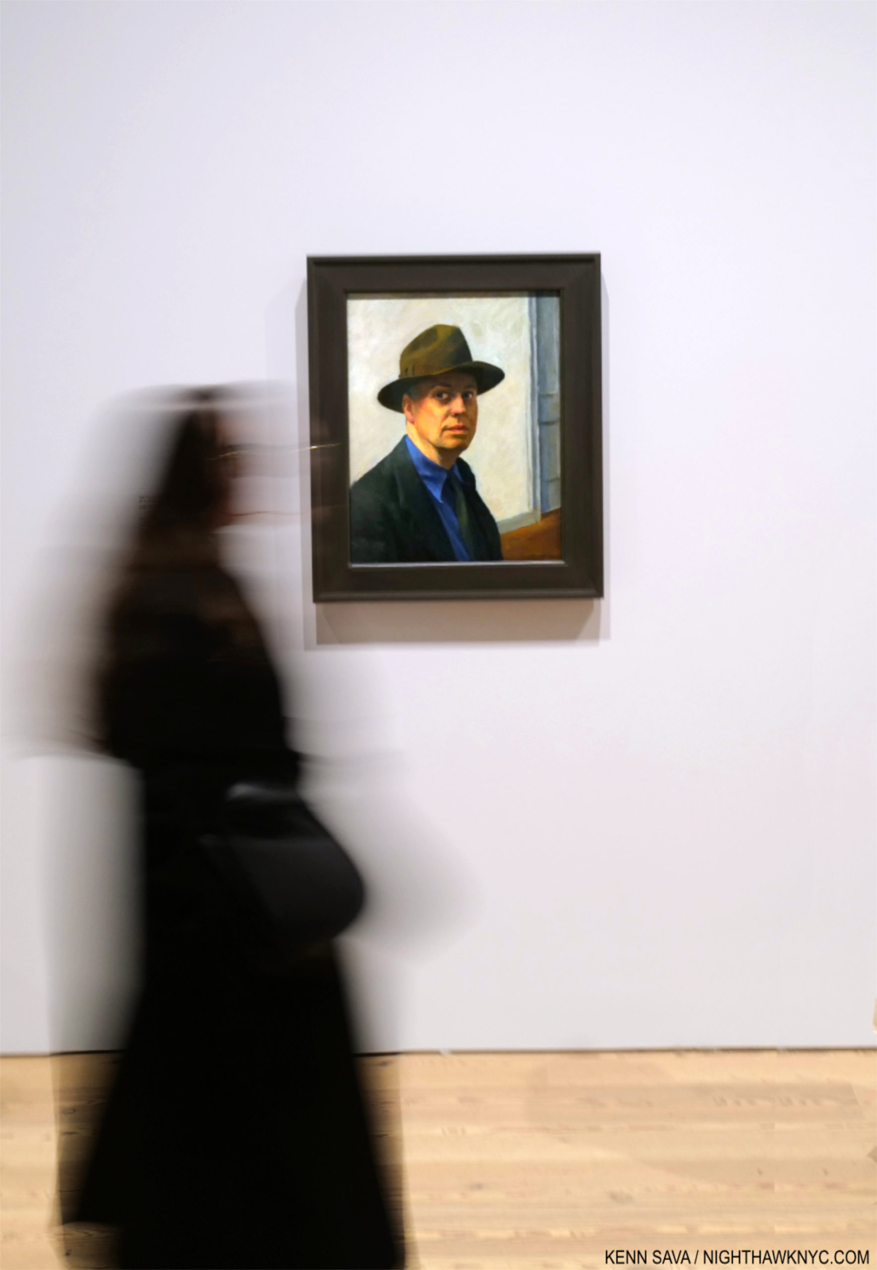
Smack dab in the heart of Edward Hopper’s New York, the Artist stares out at us in one of hs few Self-Portraits, one he began 98 years ago (1925-30). What would Edward Hopper make of his New York now?.

Edward Hopper. What more can I say about his Art? In 2015, I named this site after his masterpiece, Nighthawks, because of that figure with his back to us that no one ever talks about. I relate to him more than I do any other figure I’ve ever seen in a Painting because I’ve been that guy, alone in a bar, cafe or restaurant in Edward Hopper’s New York too many times to count.
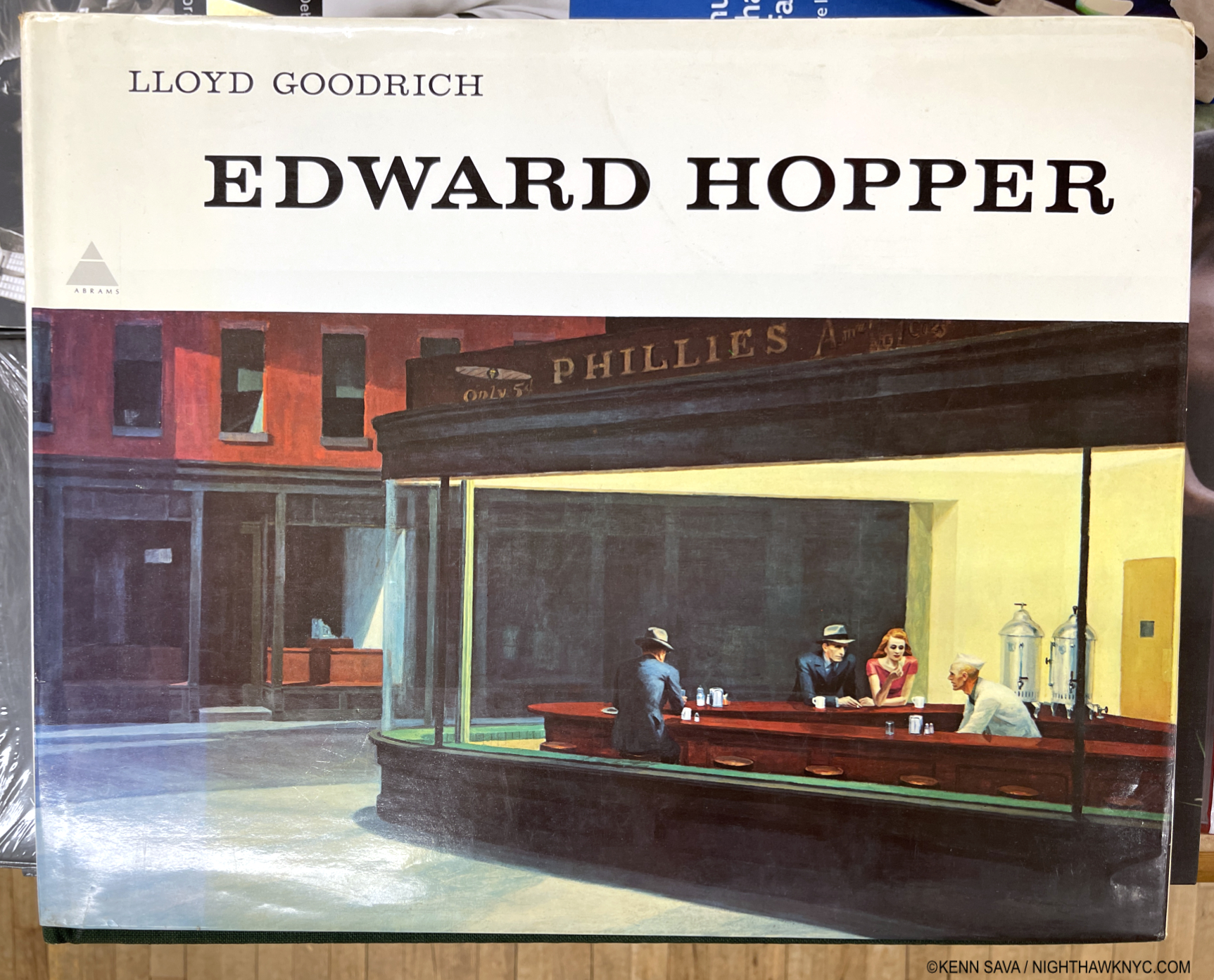
The first time I ever saw Edward Hopper’s work was in the late 1970s in a friend’s parent’s copy of this massive 10-pound, 16 by 13 1/2 inch, monograph by Lloyd Goodrich 1 published by Abrams in 1978, with 306 pages and 246 illustrations, but only 88 in color, unfortunately. One or other of his Paintings has been lingering somewhere on my mind since. My banner has been a continual homage to Nighthawks for the past 7+ years2.

Mister Hopper’s Neighborhood

The heart of Edward Hopper’s New York for over 50 years: 3 Washington Square (center). Between them, he &  his wife Jo, lived on the top floor from 1913 to 19683. Beginning in 1947, they had to fight NYU, who took over the building in 1946, to stay. Today, the Hopper Studio has been preserved though the rest of the building is in active use by NYU, as it was when I shot this, November 16, 2022. Nighthawks, among countless other Hoppers, was Painted here4.

At this point, I have lived in what was his extended neighborhood for over 3 decades. I have sat in the Park right in front of his long-time home and wondered if he sat on this very spot. I’ve walked by numerous actual sites he Painted, and I spent a night in the Provincetown, Massachusetts  rooming house he Painted in Rooms for Tourists, 1945, while I was in Cape Cod fruitlessly trying to find his Truro summer house and drinking in the atmosphere of another area he Painted. Today, any number of times I’m reminded I’m literally walking in his footsteps on streets he is known to have walked. Living in his footsteps is probably more accurate.

Early Sunday Afternoon, March 26, 2023. Does this scream “Edward Hopper Painting?” 93 years later, it’s hard to see Early Sunday Morning, 1930 (which I discuss in Part 2), in this scene in my neighborhood, but this is where it was on 7th Avenue between West 16 & 17th Streets. Only the building partly shown on the right is in the Painting. I had to wait for the sun to go behind the center building (to the west) to take this shot, its glare still bleaches out the wall of the building on the right, proving the direction the Sun shines in the Painting was “Artistic license.”

A bit of my passion for his Art comes from this “shared experience” of this part of Manhattan at different times, but most of it lies in the endless mystery at the heart of his Art. Mystery that no amount of looking seems to solve. Until I saw Edward Hopper’s New York, that is. 300 pieces in here on NighthawkNYC.com since July, 2015, except for a bit at tail end of “My Search for Edward Hopper’s Nighthawks Diner,” this is the first time I’ve written about his Art.

Setting the Stage

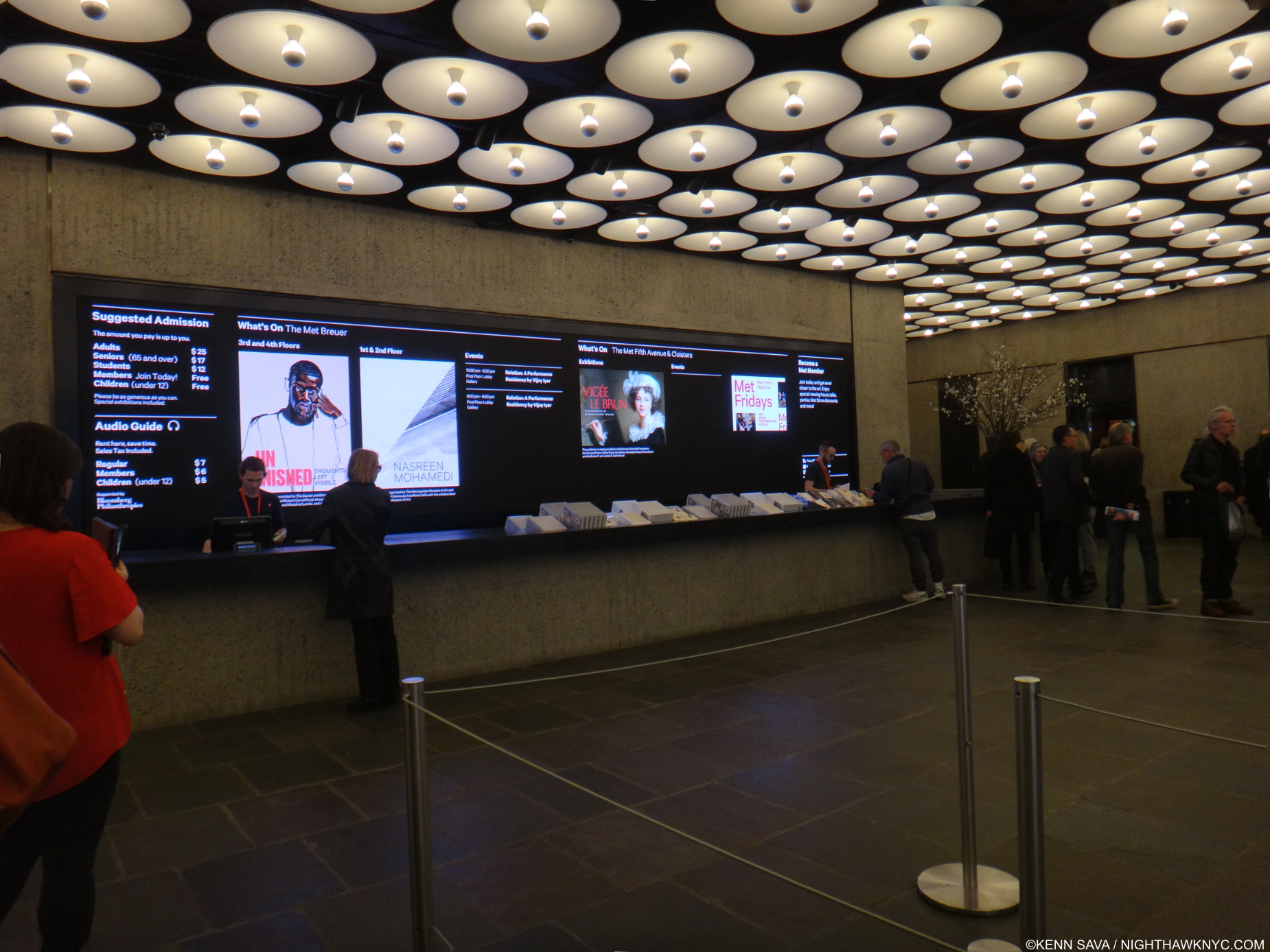
Before the crush. Edward Hopper’s New York Member’s Preview Opening Day, October 13, 2022. A wall of early work, including Self-Portrait, Oil on canvas (as all works featured are, unless specified), right, introduces the show. For Hopper, 1906 marks the beginning of his life as an Artist, the year he graduated from Art school, then embarked on his first trip to Paris. He would return twice before 1910, then return to NYC to get his Art career started.

While not a career retrospective (there has not been an Edward Hopper Retrospective in the U.S. since Edward Hopper: The Art & the Artist in 1980-81 5), Edward Hopper’s New York is a career-long look at what is, perhaps, his most famous subject- New York City, where he lived & worked for almost 60 years. I took the chance to see its 58 Oil or Watercolor Paintings6 by Hopper, among the 200 works and items of ephemera on view, 14 times between its opening day, above, and its closing day, below.
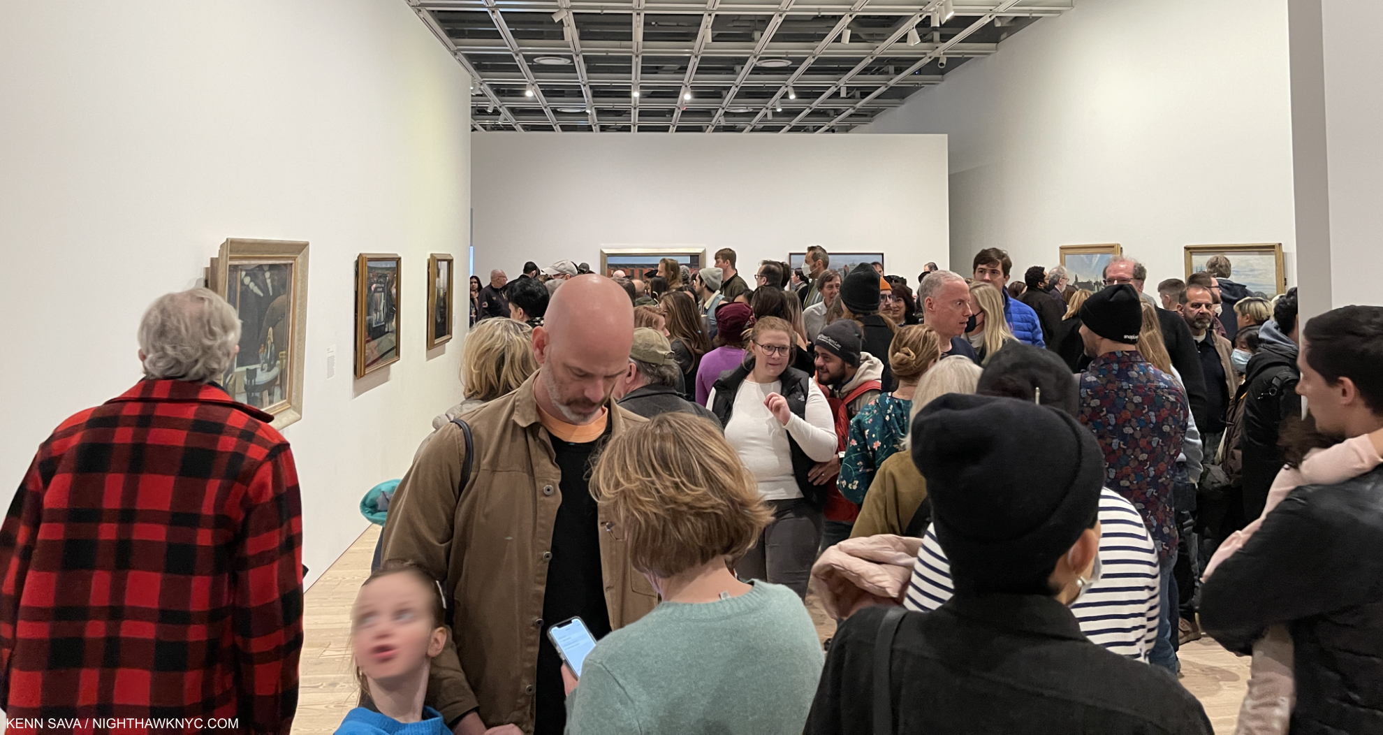
Now. Or never. This is about as crowded as an NYC Art show gets. 5pm, March 5, 2023. One hour to go on its final day. The final weekend was sold out.

Edward Hopper’s New York was the very first time  I’ve seen so many Edward Hopper Paintings in one place. I went 14 times because who knows when I’ll get another chance.
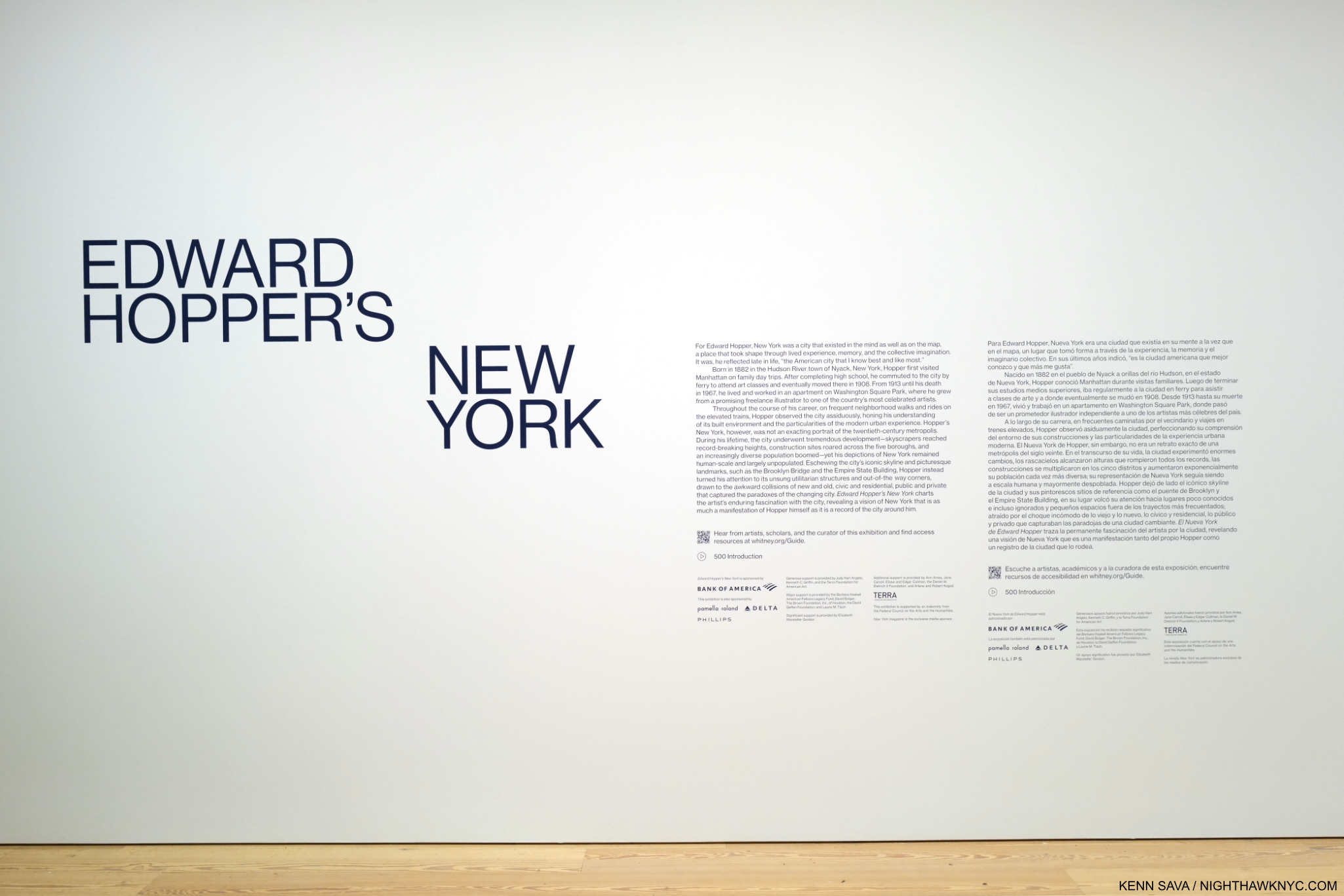
There’s how Hopper Painted, then there’s what he Painted. I’m going to attempt to look at both. In this part, I take a look at how he Painted, i.e. his style, and how, and if, it evolved. In Part 2, I look at what he Painted in a piece that is a personal reaction to what I see when I look at Edward Hopper now. Having the chance to see and study this many Hopper Paintings from early through late in his career Edward Hopper’s New York completely changed how I see his work. This is shocking to me because I’ve been looking at his work almost as long as I have anyone else’s- well over 40 years. To this point, I saw his work as one of the ultimate (and perhaps unsurpassed) expressions of modern loneliness and isolation of the century. Now, I see that as ancillary to other themes, themes that occur even when there are no human subjects. Themes that occur in his work in and outside of NYC.

One great thing about Art is that it’s there for everyone to see and make up their own minds what it says to them. I’m sharing here what it says to me. I hope everyone will look at Edward Hopper, and all Art, for themselves. 

In a Restaurant, 1916-25, Charcoal on paper. For those who’ve criticized Hopper’s technique. He came by it honestly. 6 years in Art schools under esteemed Artist teachers. How they felt about his skill is evident in the fact that he was assigned to teach life Drawing, one of the hardest types of Drawing, before he graduated.

“In every artist’s development the germ of the later work is always found in the earlier. The nucleus around which the artist’s intellect builds his work is himself; the central ego, personality, or whatever it may be called. and this changes little from birth to death. What he was once, he always is, with slight modification. Changing fashions in methods or subject matter alter him little or not at all.” Edward Hopper7

Edward Hopper was born on July 22, 1882 in Nyack, NY, some 80 miles as the Owl majestically flies from the City. He visited the City as a child with his parents, then came here on a daily basis while attending Art school from 1899-19068. Towards the end of that time, he took up residence on West 14th Street, before taking three trips to Paris from 1906-10. After returning to the City, he lived at 53 East 59th Street9 before moving to 3 Washington Square in 191310.

Untitled (Study of Man Sketching in Front of a House), c. 1900, Opaque watercolor, fabricated chalk and graphite pencil on paper (recto); Graphite pencil, pen and ink and opaque watercolor (verso). *-Whitney Museum Photo. Not in the show.

Seeing that introductory wall, shown earlier, sent me delving deeper into Edward Hopper’s Artistic beginnings (1895, at about age 15, to 1913, when he moved into 3 Washington Square at about 31) for the first time, looking to see when his themes began, how his style and technique changed over that time, and what they could tell me about his familiar later work. Most of Hopper’s early work is in the Whitney’s Permanent Collection, thanks largely to the 1970 Jo Hopper Bequest. It is, unfortunately, too rarely seen, and in my view, under-considered.

From the beginning, one thing that stands out to me is that Edward Hopper was a “traditional” Painter. That is, he relied on his preliminary Drawings & Studies as the basis of his Paintings, as Painters had been doing for as long as there had been Painters. Though Photography was making steady inroads into all aspects of life, and being used by an ever-increasing number of Artists & Painters during his lifetime, Edward Hopper never used Photographs as the basis of his work11. Untitled (Study of Man Sketching in Front of a House), from the year his Art school studies began, may be of a fellow student or be a de-facto Self-Portrait. In either case, it shows something I imagine Edward Hopper did regularly for the rest of his career. In addition to relying on long-standing traditional methods, Edward Hopper steadfastly remained true to his vision. He not only resisted Abstraction, but he uncharacteristically fought against it in print, in a publication titled Reality, which he contributed to.

Le Pont des Arts, 1907. Edward Hopper Painted this outdoors near where he was staying on his first trip to Paris. So, it’s strange to see early on in a show devoted to his NYC work. Nonethelessless, it’s interesting for its style and for its content (see Part 2).

While in Paris, Edward Hopper saw shows of the work of the so-called “impressionists,” (a box I don’t subscribe to, so I will use “earlier French Painters” instead) but, apparently did not see the work of Picasso. It’s hard not to see their influence in this, but, at least for me, not that of any one Artist in particular stylistically. Under their spell, he seems to be doing his own take on it.

The question for me became- How far did this influence go, and how long did it last?

“It took me ten yers to get over Europe,” he said.12. Ten years after Europe would be 1920. Looking at the show, a case could be made it lasted much longer.

New York Corner (Corner Saloon), 1913 became a touchstone for me over my 14 visits. If it wasn’t for the familiar lamp post and the smoke stacks in the rear, you might think this is a corner in Paris. A charming and unique early New York work, it was in MoMA’s collection until at least 1981. At some point after, they sold it! A shortsighted mistake in my view.

After returning from Paris, the 28-year-old Artist set about surviving as one. To this end, his work as an Illustrator from 1917 to 1925 provided him with income until his work began to sell. His first show, at the Whitney Studio Club in 1920 (the predecessor to the Whitney Museum), with 16 Oils, produced no sales. In 1923, his Watercolors began to sell after they were shown at the Brooklyn Museum. Then, in 1925, The Met bought 15 Hopper Etchings. Later that year, he sold Apartment Houses to the Pennsylvania Academy, his first museum Painting sale. As his Paintings finally began to sell (mirroring the experience of Winslow Homer, to whom his Watercolors were compared, whose Watercolors also sold before his Oils began to13), in September, 1925, he was able to give up illustration14. Among his early Paintings, the wonderful New York Corner, 1913, caught my eye. It’s interesting to contrast it with this work by John Sloan, one of his teachers, Sixth Avenue and Thirtieth Street, 1907.
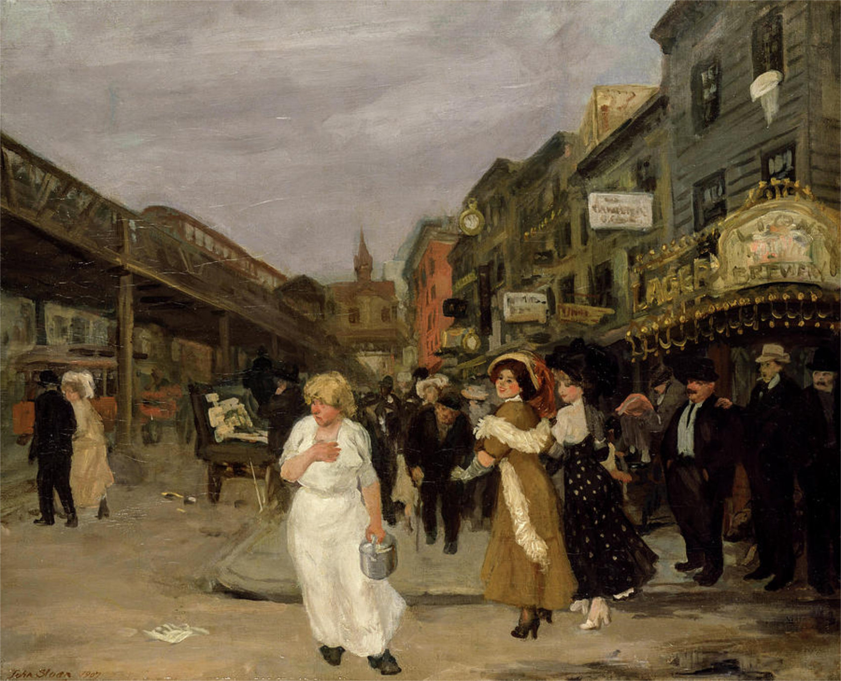
John Sloan, Sixth Avenue and Thirtieth Street, 1907. The Sixth Avenue elevated train, which Hopper frequented, runs to the left. The gold sign on the right reads “LION BEWERY,” which was the 6th largest brewery in the US in 189515. I believe this view may be looking downtown, if that’s the Jefferson Market Courthouse in the background. *-Photographer unknown.

New York Corner currently resides in the collection of the Canter Center, Stanford University. Upon acquiring it, their press release says, “New York Corner, created when the artist was 31 and considered the first work made in his representational style.” Wait. What?

“representational-noun 1. showing things as they are normally seen” Cambridge Dictionary

What’s “representational” about it?

In December, 1913, Edward Hopper moved into 3 Washington Square on the Park, where he would live for the rest of his life, so this may have been executed based on a scene near his East 59th Street home just before or just after his move (unless this is a scene on East 14th Street. There’s nothing like the background anywhere else in what would be his West Greenwich Village neighborhood.). When I look at New York Corner, I see an Artist who’s in transition. It seems to me Hopper is wrestling with the influence of his teachers Robert Henri & John Sloan, and what he’d seen in Paris. The top half (i.e. the building) is slightly more “representational,” slightly more resolved (especially in comparison to work he did in Pars, like River Boat or Le Pont Royal, both 1909, and American Village, 1912,), while the bottom half is entirely out of focus. The figures are more like shadows, the indistinct but distinctive gold signage is striking, and stands in stark contrast to the sign in the Sloan. It only adds more mystery to the feel of the whole piece. The upper two floors of the building feature windows that are not much different from those seen on the upper floor of Early Sunday Morning (which are more defined) or across the street from the diner in Nighthawks (ditto). He’s starting to get there.
New York Interior, 1921. Seen through a window, this wonderful piece is one of a number of Hoppers that reminds me of Degas. See Night Windows, below. Notice the clutter on the mantel. Then compare this with Room in New York, seen further below.

As I’ve said, I don’t subscribe to most of the “-isms” that proliferate in Art, and the world, and that applies to putting Edward Hopper in anything other than the “Edward Hopper box.” As time goes on, putting him in the “realism” box he’s usually stuck in seems increasingly problematic. To wit- In Gail Levin’s massive 780-page Expanded Edition of her Intimate Biography of the Hoppers I couldn’t find one instance of Edward Hopper referring to his Art as “realism.”

“realism-noun 1: corcern for fact or reality and rejection of the impractical and visionary” Merriam-Webster

Richard Estes, Times Square, 2004, Paintings don’t come much more technically astounding than this. Unless, they’re by Jan van Eyck. Having stood on this spot before, during and after 2004, I can certainly verify the overwhelming visual noise that still is Times Square, something that has never been more faithfully realized than it is here.

I’m sorry, but when I look at his Art, it doesn’t fit that definition. For another thing, “realism” in Art is a term that began seeing heavy use in the 19th century, though I’ve seen the term applied to Artists like Caravaggio, 1571-1610. In all that time, things have changed. In 1966, the year before Edward Hopper died, Richard Estes began Painting New York in ways that redefined what had been called “realism,” making everything stuck in that box previously look, well, “different.” While Edward Hopper often Painted scenes looking through windows, Mr. Estes took the art of rendering their reflections to an entirely new level, while often Painting at the hyperfocal distance, which added new depth to his depictions of the world. Suddenly, the eye was free to go anywhere on the canvas and it was all rendered “democratically” (i.e. with apparent equal weight) and in focus. Others, including Rod Penner, followed, pushing the envelope of what had been done, all the while in the service of Art. There was suddenly more than one kind of “realism!” Since none of them have put their Art in a box in their interviews, I certainly don’t subscribe to the terms others ascribe to their Art. Therefore, Messers Hopper, Estes and Penner reside in only one “box” each: the one with their name on it. “Realism” has been used for over 125 years! it’s past time to retire it. It’s outlived its supposed meaning.

Night Windows, 1928. Among the earlier French Painters, Edgar Degas is someone I see in numerous Edward Hopper compositions. Perhaps more than I see any other Artist. Hopper seemed to share Degas’s voyeuristic streak. Many of both of their Paintings show women being observed apparently without their knowledge.

It’s pretty plain to see that these recent developments are at odds with Edward Hopper’s style. Then again, I don’t think he was ever out to win the realism race. Hopper authority Gail Levin said his work has “the suggestion of reality16.”

Finally, there’s this for all those who box Hopper as a “realist”-

“I think I’m still an impressionist…” Edward Hopper.

Edward Hopper didn’t say that in 1913 after Painting New York Corner. He said it in 1962, a mere five years before he died! He said it in an interview published in Katherine Kuh’s book The Artist’s Voice: Talks With Seventeen Artists, in 196217. That Edward Hopper, who never minced words, or used them without careful consideration (like the careful consideration he gave every detail of his compositions) especially in the very few interviews he did, would say this so late in his life and career HAS to be taken seriously. So far, it hasn’t been. The “realism” noise surrounding his work remains deafening. I came upon the “impressionist” quote after already being convinced by the visual evidence in Edward Hopper’s New York that he took what he learned from the earlier French Artists and used it in his own way. He was one of the Artists who forged what some call an “American style,” an important goal at the time. Yet, his influences remained in his work throughout his life to the extent he chose to use them, in varying degrees, to suit his purposes in each particular work.

GeorgiaO’Keeffe quoted on the back cover of the catalog for her 2021 show at Museo Nacional Thyssen-Bornemisza.

Part of that influence, I believe, was that as time went on, Edward Hopper began removing unnecessary objects from his Paintings. It seems to me his work lives on its mystery. Isn’t too much information an enemy of mystery? He also stopped using “real” settings, creating his own, possibly based on actual places combined with his imagination. In spite of my decades of looking for the “real” Nighthawks diner, this may well be what he really did: he based it on a place he saw then modified it in his imagination to suit his purposes (and he said as much). And that is the key: everything superfluous went out of his Art. That’s one thing that makes Nighthawks such a brilliant, timeless, nebulous work.

The result? For me, many of Edward Hopper’s New York Paintings are “impressions.”

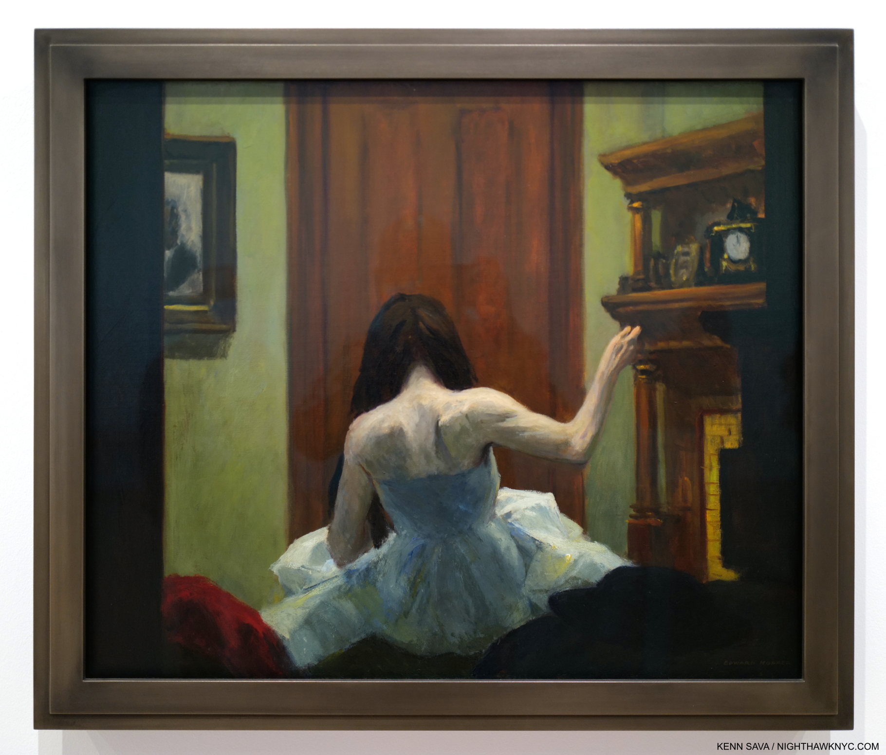
Room in New York, 1932.

I rest my case with Room in New York, from 1932. One of his masterpieces, in my view, it defies every single box Edward Hopper has been put in. It’s one of his many scenes looking into a window. Perhaps something he saw in a fleeting moment while riding the Sixth Avenue elevated train, or in passing as he walked, or maybe it’s a scene he imagined, possibly filtered through his own relationship experience. If, and it’s a huge “if,” this is (at least partially) filtered through his marriage, this may be as frankly as he ever depicted it. Look closer-

Edward Hopper’s “realism?” Bah humbug. A classic example of why I ignore boxes and just look at the work for myself!

Look! The faces have no details! This is by intent, of course. He obviously considered facial details to be unnecessary to what he was trying to express, or distracting from it. Is this what he meant when he said, “I think I’m still an impressionist…?” Isn’t this closer to the work of the earlier French Painters than anything else? No so-called “realist” Painted like this! Only George Seurat, among those earlier French Painters, Painted like this- on occasion (not all the time). In most Paintings that include humans, their faces and expressions carry the weight of the work. Not here in this scene that includes a woman and a man and not much else. How utterly daring! Without them, what’s a viewer to focus on? For me, all that’s left is the body language. And that red dress. “All dressed up with no where to go?” The woman in Nighthawks is also wearing a red dress. Could it be a pendant to Room in New York?

When people talk about the”genius” of Edward Hopper, for me, it’s on view in Room in New York, 1932. He had evolved through his education, his time overseas, his influences & experiences, and had arrived at the place of knowing, then executed it using his time-tested, traditional, methods. He knew what he wanted to say here, and had developed the confidence to leave out the non-essential (perhaps, inspired by seeing the earlier French Painters do it), including “minor details” like facial features! He created an impression of a scene, in my view, real or imagined, that mimics the fleeting moment that may have inspired it and somehow works perfectly, just as it is, without them.

Two on the Aisle, 1927.

In Two on the Aisle, from 1927, five years before Room in New York, the faces are “incomplete,” but more “defined” than the two in Room in New York. Perhaps he became emboldened to go further after works like this. 

The Sheridan Theater, 1937.

In Sheridan Theater, nothing is in sharp focus.

Then, in Morning Sun, 1952, the woman’s face (Jo was his model) is Painted so expertly (in my opinion) as to leave her expression ambiguous, making the work open to endless contemplation. These are just a few of the works that have “selective details,” i.e. details the Artist chose to include, or omit. In my view, this is always done to forward what he’s trying to express.

Boxes confine an Artist to one style. If the Artist says my work is in this box? So be it. It’s when other people put an Artist in a box that’s wrong in my view; for the Artist, and for not giving the viewer the chance to see the Art for themselves. Artists, being people, are free to change their minds, evolve, even move into other styles over time. Boxes don’t allow for this. Edward Hopper used his technique and the wide range of his skill as he saw fit in each work. A good number of them (i.e. many) strike me as “impressions,” and it’s their nebulosity that adds so much richness to considering them. There is enough detail in these to ring true with viewers, and enough vagueness to allow them to return to the work again and again. In other works, like Office at Night,1940, he chose to sharpen things up, but still managed to keep the mystery and the drama due to the brilliance of his composition and the realization it.

“Great art is the outward expression of an inner life in the artist, and this inner life will result in his personal vision of the world,” Edward Hopper18.

On the surface, these works may be “impressions” to my eyes. They are also transcriptions of the Artist’s “personal vision of the world.” Whatever you call them, they are as close as Edward Hopper got to making his inner world, “reality.”

*-Soundtrack for this piece is “An American in Paris” by George Gershwin, 1898-1937, a contemporary of Edward Hopper. Born 16 years after Hopper, he died, tragically of an undiagnosed brain tumor, 30 years before the Painter would. Hopper’s taste (if any) in Music is unknown to me, however as Edward Hopper’s New York points out in a room dedicated to it, he was an avid theater and movie-goer. As such, the name George Gershwin could not have been unknown to him. Gershwin, like Hopper, helped define what some call an “American style” of Music, as some say Hopper did for Art. Gershwin, who also Painted, was born in the City and spent most of his life here. Here “An American in Paris,” in homage to Hopper’s time there, is performed on a piano roll by George Gershwin, himself-

In Part 2, here, I take a look at what Edward Hopper’s Art says to me now, after immersing myself in Edward Hopper’s New York. Part 3 looks at some current issues surrounding Edward Hopper’s Art. 

NighthawkNYC.com has been entirely self-funded & ad-free since 2015! If you’ve found it worthwhile, PLEASE donate securely by PayPal below to allow me to continue. Thank you, Kenn.

You can also support it by buying Art, Art books & Music from my collection!
Art & Books may be found here. Music here and here.

Written & photographed by Kenn Sava for nighthawknyc.com unless otherwise credited. To send comments, thoughts, feedback or propositions click here. Click the white box on the upper right for the archives or to search them. Subscribe to be notified of new Posts below. Your information will be used for no other purpose.

  1. The first Hopper authority, outside of his wife, the Artist Josephine Nivison Hopper aka Jo, and curator behind the 1950 Edward Hopper Retrospective and the 1964 Edward Hopper show. ↩
  2. In saying all of the above I am not saying that Edward Hopper is my favorite Artist, or I think he’s “the best.” I don’t believe in qualitatively comparing creative beings or works. ↩
  3. Edward passed in 1967. Jo, the Artist Josephine Nivison Hopper, continued to live there in failing health until she died in 1968. ↩
  4. Hopper worked on Nighthawks during the beginning of World War II for the U.S., having started it around the time of Pearl Harbor. In the Logbook of Hopper’s work, Jo recorded it being completed on January 21, 1942, as I show here. Jo worried German bombs would be falling through their skylight. Edward was too busy working to seem to care, or maybe he was escaping into work (Gail Levin, Edward Hopper: An Intimate Biography Expanded Edition, P.348.) ↩
  5. on 2 floors of the old Whitney, who have mounted smaller shows juxtaposing Hopper with other Artists, since, as well as the floor they gave him in their Full House show in 2005, and the Hopper Drawing show, which I saw in 2013, which had over 200 Drawings and some Paintings, including Nighthawks, on loan, as I partially showed in my very first piece in 2015. ↩
  6. which does not include about 30 Illustrations whose media were not listed but many appear to include watercolor. ↩
  7. from a letter from Hopper dated 1935 quoted in Gail Levin, Edward Hopper As Illustrator, P.1. ↩
  8. Twice the length of time his teacher Robert Henri recommended. ↩
  9. Gail Levin, Intimate Biography, P.84 ↩
  10. While spending summers in Maine and then in Truro, MA. ↩
  11. The lone exceptions I’m aware of are his 2 Civil War-related Paintings which may have been based on Photographs he saw in a published collection of Civil War Photographs. ↩
  12. Gail Levin, Edward Hopper: The Art & the Artist, P.126 ↩
  13. Gail Levin, Intimate Biography Expanded, P.171 ↩
  14. https://archive.artic.edu/hopper/chronology/ ↩
  15. https://en.wikipedia.org/wiki/Lion_Brewery,_Inc. ↩
  16. Gail Levin, Intimate Biography Expanded, P. 441. ↩
  17. P.135, as quoted in Sheena Wagstaff, “The Elation of Sunlight,” in Edward Hopper Tate Exhibition Catalog, 2005, P.25. ↩
  18. Statement in Reality #1 as seen in the show. ↩
Antoine de Saint-Exupéry: Artist

This site is Free & Ad-Free!
If you find this piece worthwhile, please donate via PayPal to support it & independent Art writing.
Other ways to support it at the end. Thank you!

Written & Photographed by Kenn Sava (*- unless otherwise credited).

The next lines are- “But my drawing is certainly very much less charming than its model. That, however, is not my fault. The grown-ups discouraged me in my painter’s career when I was six years old, and I never learned to draw anything, except boas from the outside and boas from the inside1.”

On April 6, 1943, the story broke that an alien being had descended to Earth; not in Roswell, New Mexico, but on the other side of the world from it as the owl flies in the Sahara Desert. This small being appeared to the pilot of a crashed plane, who was suffering from severe dehydration, over what turned out to be the last week of the visitor’s one-year stay on the Earth; just one of the planets he visited on a desperate mission to secure the protection of his beloved rose on his home asteroid (a world so small he once watched 44 sunsets on a single day), and rid it of a baobab infestation.

After a week, he suddenly disappeared.

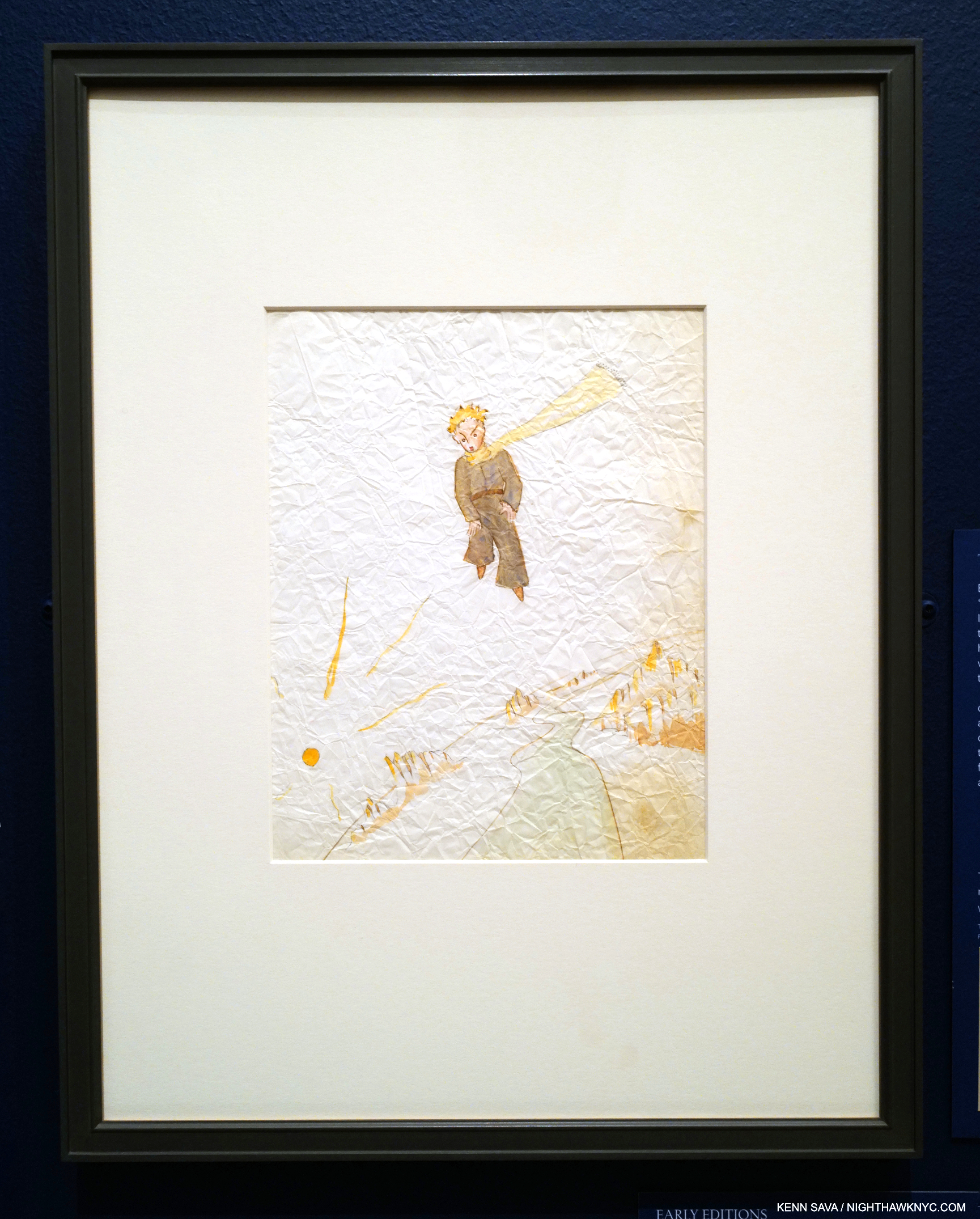
The pilot lying at the foot of a cliff with his plane in the distance, 1942, Watercolor and ink on tracing paper. Not published in the final book, in which he chose to leave out any representation of the pilot. It’s damaged condition ironically echoes that of the plane.

On or about July 31, 1944, that pilot, the only person to witness & record the event and what transpired during that week, also suddenly disappeared with nary a trace at just 44 years of age. He left behind the story and renderings of their encounter.

The world has never been the same since.

Publishing history. 1943 1st Edition, 1st Printing copies of Le Petit Prince, in the original French it was written in, right, and The Little Prince, in the original English translation by Katherine Woods, left, both published in the USA by Reynal & Hitchcock who had asked Saint-Exupéry for a children’s book. This marked the first time the author had created Art for his books and/or their covers. It wouldn’t be until after the war that the book would be published in France.

April 6, 2023 marks the 80th Anniversary of the publication of The Little Prince by the remarkable Author, aviator, and resolute French patriot Antoine de Saint-Exupéry (aka Saint-Ex). Charged with writing a “children’s book” by his publishers, the result is a book that defies categorization that is now 80 years in on its way to timeless.

You’re looking at a remarkable and historic Photograph. Antoine de Saint-Exupéry after his crash in the Sahara desert, 1935. *-per Alexandre Tanase of the Succession Saint Exupéry-d’Agay, Paris; “Saint Exupéry next to his Caudron Simoun C630 F-ANRY. It was not taken right after the accident (and, consequently, not by Saint Exupéry himself or Prévot). This picture and others (there is a full series of them) were taken a few days after Saint Exupéry and Prévot were found, when they came back with others, especially Suzanne and Emile Raccaud, the couple that hosted Saint Exupéry after he was rescued. It is either Emile or Suzanne who took the picture.”

“For I do not want any one to read my book carelessly. I have suffered too much grief in setting down these memories. Six years have already passed since my friend went away from me, with his sheep. If I try to describe him here, it is to make sure that I shall not forget him. To forget a friend is sad. Not every one has had a friend2“

The book is apparently set at the scene of Saint-Ex’s 1935 Sahara Desert plane crash which he survived only to almost perish of dehydration in the days after before he and his navigator/mechanic, André Prévot, were rescued by a passing Bedouin. The story was recounted in his memoir, Wind, Sand and Stars, 1939, before he used it, again, as the setting of The Little Prince, the last book he would finish. Earlier this year, The Morgan Library presented The Little Prince: Taking Flight, which provided a fascinating look at Saint-Exupéry’s original Art for The Little Prince, as well as text and Art that he decided not to include in the final book. As a prior Morgan show, 2014’s The Little Prince: A New York Story, reminded us, he created the book in NYC while he was in exile after the fall of France in World War II.

1st edition/1st printing copy of Wartime Writings, 1982, with a foreword by Anne Morrow Lindbergh, from my collection.

“He was… against the armistice and ‘stole’ a transport plane in Bordeaux to convey forty young pilots to North Africa in a vain attempt to continue the war there. When he discovered that the armistice extended to North Africa as well as France, he was at an impasse…. Without being consulted, Saint-Exupéry found himself nominated for a position on the Vichy National Council, an offer he immediately refused. He did not, however, feel he could join the ‘Free French’ group behind General de Gaulle. (‘I should have followed him with joy against the Germans, but could not follow him against Frenchmen.’) …With enormous difficulty he obtained a passport for the United States…In December, 1940 he sailed from Lisbon to America. Once established in New York, he was depressed by the isolationist reaction of American citizens to war and shocked by the conflicts between exiled French groups (some of who harassed Saint-Ex over the Vichy Council nomination).” Anne Morrow Lindbergh, author and wife of Charles Lindbergh3.

It was in these circumstances that he wrote, and created the Art for, The Little Prince. On April 2nd, 1943, a few days before its publication on April 6,, at the age of 42, he boarded a troop transport with 50,000 soldiers and returned to France to return to combat.

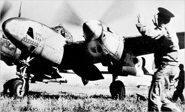
No one or nothing could stop him, though I can’t tell if the soldier on the right is trying to. A die-hard patriot, Saint-Ex is seen piloting a reconnaissance plane in 1944, shortly before his death, in a scene eerily similar to what his departure on his last flight may have looked like. He crashed for the 5th time on one such flight around the time of this Photo. Yet, he managed to get permission to go back up. *-Photo by John Philips, from The New York Times, April 11, 2008.

By July, 1944, at 44, he was overage for a flier (38 was the cutoff), overweight, and suffering from the aftereffects of FIVE crashes4. He was unable to put his flight suit on by himself, or to turn his head to the left to spot enemy planes. Still, due to his prestige, contacts, non-stop politicking (he volunteered for every mission), and indomitable desire to fight, nothing would stop him. “I have no taste for war, but I cannot remain behind the lines.” he said5. After training in a P-38 Lightning, he flew 8 reconnaissance missions, one ending in his fifth crash.

The Little Prince: Taking Flight, Installation view, February 4, 2023.

Still, the powers that be somehow let him back in the cockpit for his ninth and what was supposed to be his last flight. While flying from Borgo, Corsica, headed for the Grenoble region of southern France, he suddenly disappeared, eerily like his most famous creation. Some facts are known, but there’s still no real evidence as to what happened to him6. In 2004, Stacy Schiff, author of a biography of Saint-Ex, wrote in The New York Times, “His was a noble death, made in the name of the greater good to which all of his literature returns. As his widow noted, the exit was custom-made, a meteoric fall at the end of a star-chasing life7.”

To date, The Little Prince (or Le Petit Prince, as Saint-Ex wrote it in his native French), has sold TWO HUNDRED MILLION copies8 and has appeared in 536 languages & dialects9. It continues to sell 1.8 MILLION copies a year10. 

Already, within one month of its U.S. publication there was discussion about just who The Little Prince was for. John Chamberlain wrote a glowing New York Times review of it within days of its publication, calling it “A fascinating fable for grown-ups.” Ad from The New York Times Book Review, May 9, 1943.

200 million copies sold, and I missed it. HOW is that possible? (Not that I am generally a fan of the very popular.) It was never assigned to me as a kid in school, and never found its way to me outside of it in my Art book-obsessed life. It was only after I met my Muse, Lana, who has been under its spell as her favorite book since she was 11, that I read it. Of its effects on her, she told me, “I looked at the sky and imagined the planet where the prince lives…I had many dreams about the little prince.” Coming to it later in life, it seems to me to be a book that one can read at any age (I do wonder how it would have hit me as a child). Saint-Ex was asked to write a children’s book by his publisher, but what he handed in is something that’s not quite a children’s book, nor purely a book for grown-ups. Which ever end of that telescope you look at it through, there are things that feel out of place.

The Little Prince opens with this image, ostensibly a “copy of the drawing” the narrator says he saw in a book. No doubt by Saint-Ex. Seen in my copy.

To wit, the very first image on the very first page of the book does make me wonder about the book’s intended audience. It’s surely something never seen in a “children’s book” before, or probably since, let alone right in the beginning of one. We are shown a Drawing of a boa constrictor wrapped around its prey, baring its teeth with the helpless, captured animal, looking straight into the jaws of death. Terrifying, even for this adult! Saint-Ex doesn’t stop there: the first THREE images in the book are of boa constrictors! “Toto, we’re not in Roswell anymore.” Such is the charm of the book, that I have yet to see anyone talk about this.

Looks harmless enough. The manuscript of the first page of the book showing Saint-Ex’s Drawing Number One, upper center, and Number Two, lower center. The Manuscript is written with graphite on “cheap, dime store tracing paper,” one Morgan staff member told me. Notice how the first image in the book, shown before, is in a different style than his Drawing Numbers One and Two. As I stood looking at this page I was struck by this question- How many billions of pieces of paper contain words and Art work on them? How many of them turned out to be the first page of an immortal book?

Saint-Ex “softens” their impact in Page 1 of his text by discussing his early Artistic life, not snakes. We are shown his Drawing Number One (a boa) and his Drawing Number Two (also a boa) and then are told that the grown-ups he showed them to thought they were Drawings of a hat. Creatively frustrated, we are told that “That is why at the age of six I gave up what might have been a magnificent career as a painter.” (The Little Prince, P.2) At that moment, I was stopped by one question-

Is this true? 

10th Avenue, Chelsea, NYC, October, 2018.

In biographies of the Artist I could find no detail about his Artistic beginnings. A wall card in the show says “From a young age, Saint-Ex had a passion for art and literature, composing verse as early as six years old and illustrating his adolescent writings with doodles and caricatures.” In her biography of Saint-Ex, Stacy Schiff says, “His mother vouched for the accuracy of his many reports…11.” Those indirect words are all I’ve found. The earliest Art of his I’ve found is in the terrific complete collection of Saint-Ex’s Art titled Antoine de Saint-Exupéry:Dessins: Aquarelles, plumes, pastels et crayons (English title: Drawings: Watercolors, feathers, pastels and pencils) published in France in 2008.

The Complete Artwork. Antoine de Saint-Exupéry:Dessins: Aquarelles, plumes, pastels et crayons, published by Gallimard, France, 2008. Notice how Saint-Ex drew this figure’s head and face, and his unique way with hatching.

It begins with Drawings Saint-Ex did for “skits” accompanying his plots, which the wall card might be referring to, to be put on by he and his siblings for their mother at about 13. Nothing earlier is shown, so I was unable to verify his beginnings from age 6. From then on, he seemed to Draw incessantly evidenced by the fact the book totals 328 pages.

“It is for that purpose, again, that I have bought a box of paints and some pencils. It is hard to take up drawing again at my age, when I have never made any pictures except those of the boa constrictor from the outside and the boa constrictor from the inside, since I was six. I shall certainly try to make my portraits as true to life as possible. But I am not at all sure of success12“

Though he had never included his Art in his books before The Little Prince, Drawing was by no means a new endeavor for him. In fact, the Art of The Little Prince shows this. The Drawings are executed with skill, invention and imagination. They show a sublime economy. Not one line is superfluous, and the coloring is done with subtlety and terrific taste.

The little prince on the planet invaded by a baobab, 1942, Watercolor and ink. At the time he Drew this, France had fallen to the Nazis, who had taken over all of Europe except for Great Britain. It’s hard for me not to see the baobabs in The Little Prince, which were taking over the little prince’s entire planet, as symbolizing the Nazis. The little prince struggles daily to rid his planet of baobabs, eventually leaving his planet/asteroid in search of better ways to.

It’s up for discussion how much of The Little Prince is cloaked autobiography and how much is a fairy tale. Certainly the plane crash in the desert and the pilot as the narrator line up on the side of ringing truth. Did he hallucinate the little prince while suffering extreme dehydration in the days after the crash? Saint-Ex was far from home when he wrote The Little Prince, and in need of friends. His little prince is too. When asked by the fox if he is looking for chickens, he replies,”I am looking for friends13.” The baobabs standing in for the Nazis, then engulfing his homeland and most of Europe, would be a plausible metaphor.

As published. “Perhaps you will ask me, “Why are there no other drawing in this book as magnificent and impressive as this drawing of the baobabs? The reply is simple. I have tried. But with the others I have not been successful. When I made the drawing of the baobabs I was carried beyond myself by the inspiring force of urgent necessity14.” It’s easy to see everything that was at stake for him at that moment in those words, and in this Drawing of the baobabs devouring his planet. Things that would cost him his life.

So would the little prince’s beloved rose being a characterization of Saint-Ex’s wife, Consuelo de Saint-Exupéry, according to quite a few.

Unknown Photographer, Portrait of Consuelo de Saint-Exupéry, ca. 1940-43. Consuelo was also an Artist & writer, who wrote a memoir of the couple’s relationship titled The Tale of the Rose.

The Morgan would seem to be one of them, and they included a beautiful portrait of her in the show next to a card reading “CONSUELO, THE ROSE.”

1st Edition/1st Printing copy of Night Flight, 1932, minus the dust jacket. From my collection.

Antoine de Saint-Exupéry is no one-hit wonder. The Little Prince was not his first rodeo. An early novel, Night Flight, was made into a 1933 Hollywood feature film of the same name starring Clark Gable, John Barrymore, Helen Hayes, Robert Montgomery and Myrna Loy. His memoir, Wind, Sand and Stars, 1939, won the prestigious (U.S.) National Book Award, and is still #3 on National Geographic’s list of 100 Greatest Adventure Books. Yet, I seriously doubt any of his many readers were prepared for what he gave them when The Little Prince was published here 80 years ago, and posthumously in France after the Liberation. For one thing, its prose is dramatically of a different style than that of Night Flight or Wind, Sand and Stars. It’s stripped down, almost zen-like, which enhances the open-ended nature of his words. This is immeasurably furthered by his Art, which often includes details not to be found in the text.

The entrance foyer for The Little Prince: A New York Story, at the Morgan Library, 2014. Photos were not permitted inside, so the photos of the Art shown here are from the Morgan’s The Little Prince: Taking Flight, 2023.

In 2014, Lana’s passion for the book convinced me to read it for the first time, just in time to see the landmark show, The Little Prince: A New York Story at the Morgan Library, an amazing, and fortuitous, coincidence. The Morgan relates the genesis of their involvement with The Little Prince thus-

“As he prepared to leave the city to rejoin the war effort as a reconnaissance pilot, Saint-Exupéry appeared at his friend Silvia Hamilton’s door wearing his military uniform. “I’d like to give you something splendid,” he said, “but this is all I have.” He tossed a rumpled paper bag onto her entryway table. Inside were the manuscript and drawings for The Little Prince, which the Morgan acquired from her in 196815.”

The entrance for the one-gallery The Little Prince: Taking Flight, Morgan Library, February 4, 2023.

I returned to The Morgan in January, 2023, to see the compact The Little Prince: Taking Flight16. Size didn’t matter; both shows were endlessly intriguing. A New York Story featured more of the manuscript, alongside a new translation of unpublished sections, than Taking Flight does. The latter is more focused on his Art- both published and unpublished. Of course, over both shows it was the Art that struck me, but I didn’t really appreciate it in my initial exposure to it in 2014 until later.

Over my three visits, The Little Prince: Taking Flight was never less crowded than this. January, 13, 2023, with another 3+ weeks left to run.

After seeing both shows, as I began looking into the long history of The Little Prince, I discovered that quite a few others have taken their shot at relating the story visually- in Art, Film, on the stage, in Opera, and you name it. I started exploring this realm, but was stopped almost immediately in each case. Why? For me, in each instance, whatever I looked at only served to send me running back to Saint-Ex’s version- i.e. his Art. 

Wait a minute. No one I’ve read has referred to Saint-Ex an “Artist.”

Installation view, The Little Prince: Taking Flight, January 23, 2023.

The “simple” Art he created for The Little Prince has held up against anyone else’s visual interpretation of it thus far. Here, for me, was the first, and the most important, “proof” that indeed he was an Artist, and an under-rated one at that. Then, the more I delved deeper into his Art, the more impressed by it I became. In The Little Prince, his work is beautifully subtle. In his Art (the original Drawings for which were rendered in the delicacy of pencil or ink and watercolor), we get the essence of his words, but often extra details that add even more layers to the text, and in a sense create a dialogue with it, while being essential and an irreplaceable part of the the whole experience that only the author, who was also the Artist, could create.

The little prince standing on the edge of a cliff, c.1942-3, Brown ink on paper. Everything about this is interesting: from the hatching on the lines, to the unique flowers (possibly roses), to the way Saint Ex carries the composition off without a single excess line.

Of course it is beloved by those who love the book, but why hasn’t his Art received more attention and acclaim as “Art?”

For one thing, I believe Saint-Ex purposely set a trap with the way he presents his Art. On the first page (showed earlier), he shows us his Drawings Number One and Two, which appear to be “simple” line drawings colored with watercolor (though he says he used colored pencil as a child). These are the traps. Having lowered our “Artistic expectations” about as low as possible right from the start (which also takes the pressure off of himself as the Illustrator of the book), he then proceeds to present much more finished Art as the book progresses.

Taking flight. The little prince flying over a planet with mountains and a river, 1942, Watercolor and ink.

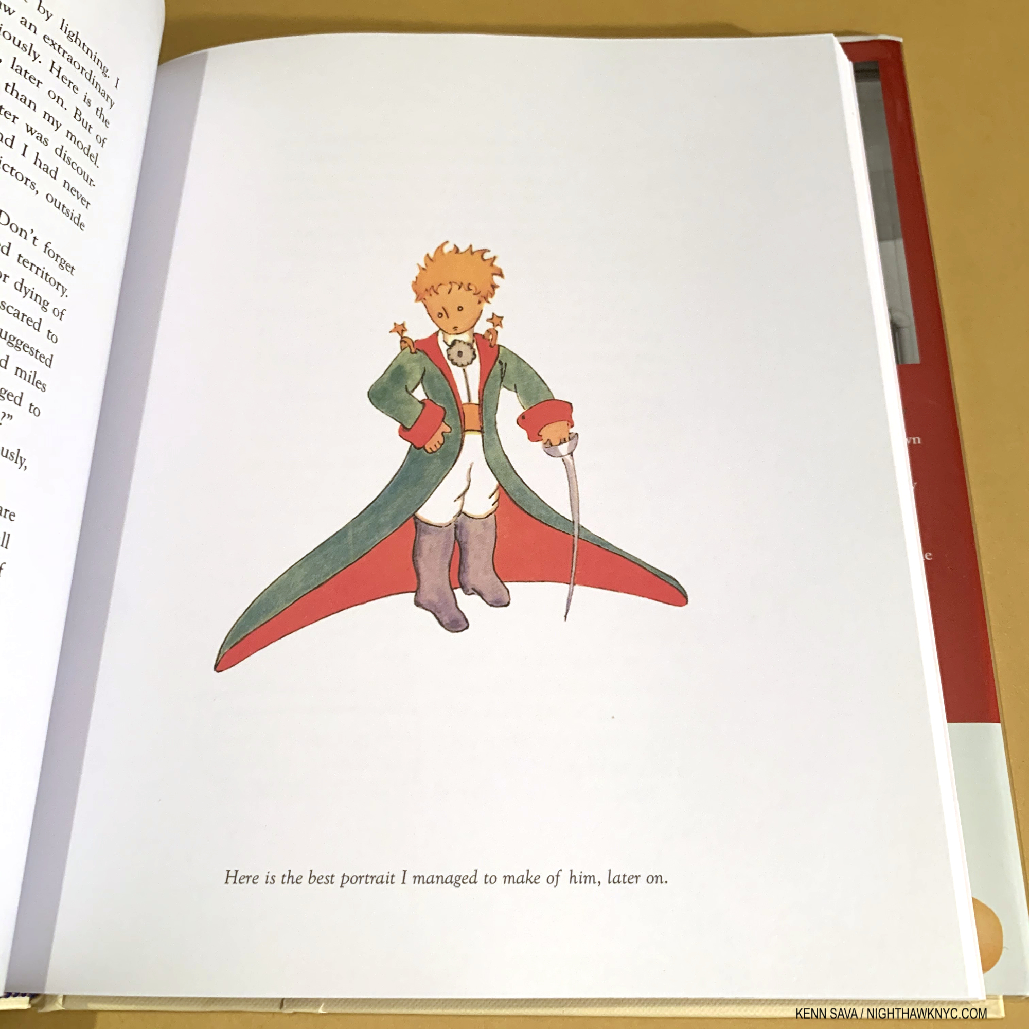
Herein lies the second phenomenon: Only the Artist who happens to also be the author knows more than he or she’s said in the text. The little prince’s outfit, shown in the first image in this piece above, is a perfect example of what I mean. It is not described in anything near this detail we see in the Painting in the text! It seems to me that this is why the interpretations of others haven’t spoken to me. Saint-Ex has this unfair advantage over them that leaves them guessing.

“The flower that you love is not in danger. I will draw you a muzzle for your sheep. I will draw you a railing to put around your flower. I will–” (The Little Prince, P.28)

A major takeaway from The Little Prince for me, something I continue to think about, and one that I have not heard others address, is that over and over the narrator attempts to use Art to solve the little prince’s problems. First, by repeatedly Drawing him a sheep until he hits on one (that is quite abstract, zen-like, and reminds me of something the great Marcel Duchamp, a fellow French contemporary who was living in Greenwich Village in 1942, would come up with. As far as I know, they never met.) that satisfies him. Then, in the quote, above, and again, during his final encounter with the little prince the narrator feels Art is a key to solving a dilemma. Therein lies the sprit of a true Artist. In fact, more than one renowned Artist has told me they hoped their work “would change the world.”

The little prince looking at a mountain range, 1942, Watercolor and ink.

Over time, much of his Art (as seen in Dessins) shows a propensity for portraits and figures. Most of them are not “finished” to the degree we see in The Little Prince. I particularly find his faces to be unique. They’re drawn economically, with what appears to be quick lines, selectively minimalistic, and some daring details including a rakish lines forming a kind of “unibrow” in a number of them. It’s hard to tell the gender of a number of his Portrait and Figure Drawings, something that continues in some of The Little Prince Drawings. A number of his portraits are striking. Some appear to be quick sketches, others are more finished and more like “traditional” studies or portraits. But it is those that are “sketch-like” that stand out for me. Looking through the book, we see early echoes of what we would see in The Little Prince. Figures stand alone in fields, some sharing body or vague facial similarities to the little prince.

Unknown Photographer(s), Antoine de Saint-Exupéry, (Per Alexandre Tanase of the Succession Saint Exupéry-d’Agay, Paris) “taken in 1937  or 1938, in the apartment he was renting at the time, 15 Place Vauban in Paris.”

There are some who feel his books have, largely, the same “message.” Perhaps, it’s not surprising, then, that, as Dessins shows, was, also, a continual evolution of figures leading up to what stands as his final & ultimate realization. But, he was only 44 when he died. As different as The Little Prince is from Wind, Sand and Stars, which preceded it, all bets were off for where he would have taken his work had he lived. He remains, tragically, another great Artist taken from us all too soon by the war, along with Anne Frank and Charlotte Salomon, among too many others.

Am I saying that no one else should try to visually interpret The Little Prince? That’s up to them. I’m sure there are many who enjoy what has been created based on The Little Prince, and probably will with future interpretations. 

For itself, under the scrutiny of 2 museum shows, Saint-Ex’s Art surprises- as the book has countless readers. His Art comes across as ephemeral as its subject. For one thing, he created much of the Art for his timeless book on cheap dime store tracing paper: much of it bearing the visible watermark of Fidelity Onion Skin, a paper that clocks in at all of a 10 pound weight17!. Some of his pencil lines are fading. There is a cigarette burn hole right in the middle of one Drawing. Another has been crumpled up as if it were thrown out, then rescued. Others show signs of coarse handling. Through it all, his art has held up for 80 years. 

I was staggered when I saw this. Saint-Ex’s identity bracelet that he wore on his final flight found in a fishing net in 1998. Seen at the entrance of The Little Prince: A New York Story  at the Morgan Library in 2014.

Among the countless other things it is, The Little Prince is a lesson in what really matters in the face of the temporality of all things, the overwhelming noise that surrounds them, and all the things that don’t really matter we waste our lives on. Of invisible connections, of love, loss and longing in the aftermath of the little prince’s sudden disappearance (uncannily mimicked by the sudden, mysterious disappearance of its creator, himself, a year after its publication). One of my reasons for writing this piece was because The Little Prince reminds me of what I learned in my journey through cancer in 2007. In my February, 2017 10th Anniversary of treatment piece, “Cancer Saved My Life,” I wrote that I learned love and being loved were all that mattered in life, echoing the Fox’s lesson in The Little Prince valuing invisible connections over all. This February, as I mark 16 years free of cancer, I would add something I believed at the time but did not say: Art also matters. Art is one way to live on after death.

“All I had was a common rose…,” the wall card for this Drawing was titled. The little prince lying on his stomach, 1942, Watercolor and ink.

Francis Bacon said it took 75 to 100 years for art to be considered Art. I’ve always felt it took longer. Antoine de Saint-Exupéry has been living on for almost 80 years after his death through his work. With almost 2 million copies continuing to be sold each year, The Little Prince shows no sign of passing into obscurity. Will future generations of kids or adults be immune to its charms? It seems to me it will take something radical to happen to human beings to make them immune to it. My bet is by that point Saint-Ex will also have finally received due recognition as an Artist. 

…maybe they both did.


-For Lana, who sees with her heart, Happy Birthday!


*- Soundtrack for this piece is “It’s No Good” by Depeche Mode from their album Ultra, 1997.

“Don’t say you’re happy
Out there without me
I know you can’t be
‘Cause it’s no good…”

My sincere thanks to Alexandre Tanase of the Succession Saint Exupéry-d’Agay, Paris for his insights & expertise. 

NighthawkNYC.com has been entirely self-funded & ad-free since 2015! If you’ve found it worthwhile, PLEASE donate securely by PayPal below to allow me to continue. Thank you, Kenn.

You can also support it by buying Art, Art books & Music from my collection!
Art & Books may be found here. Music here and here.

Written & photographed by Kenn Sava for nighthawknyc.com unless otherwise credited. To send comments, thoughts, feedback or propositions click here. Click the white box on the upper right for the archives or to search them. Subscribe to be notified of new Posts below. Your information will be used for no other purpose.

  1. The Little Prince, P.10-11 ↩
  2. The Little Prince, P.18. ↩
  3. from her Introduction to Antoine de Saint-Exupéry, Wartime Writings 1939-44, P.xiv. ↩
  4. These include a 1923 crash outside of Paris that left him with a fractured skull. The infamous, near-fatal, December, 1935 Sahara desert crash recounted in Wind, Sand and Stars and The Little Prince. A 1938 crash in Guatemala which left him with injuries that never healed, and a crash on a reconaissance mission just prior to his disappearance. ↩
  5. Quoted by Anne Morrow Lindberg, ibid, P.xvi ↩
  6. Sources for this paragraph are here, here, and here. ↩
  7. Per. ↩
  8. Per ↩
  9. Per ↩
  10. Per ↩
  11. Stacy Schiff, Saint-Exupéry, P.101 ↩
  12. The Little Prince, P.19. ↩
  13. The Little Prince, P.66 ↩
  14. The Little Prince, P.24. ↩
  15. https://www.themorgan.org/exhibitions/little-prince ↩
  16. From Alexandre Tanase of the Succession Saint Exupéry-d’Agay: “…this second Morgan exhibit was created following A la rencontre du petit prince (Meet the little prince), a unique retrospective presented in the Musée des Arts Décoratifs in Paris, from February to June 2022, for which the Morgan framed and lent some sheets of the Little Prince manuscript, that was shown in France for the first time. This exhibit had more than 600 items, and was noteworthy especially for the artwork shown: many drawings presented for the first time (notably some Little Prince watercolors from the Consuelo Collection), and many that were discovered after the publication of the Album you mention in your article (which is from 2006, not 2008). For instance, the now famous Lettres à une inconnue. The links to this exhibition website: https://madparis.fr/A-la-rencontre-du-petit-prince-2120 and https://madparis.fr/A-la-rencontre-du-petit-prince). If I mention this, it is because you may then be interested in the catalog that was published for this event (by the same editor, Alban Cerisier, who worked on the 2006 book, Dessins). This second book is a reference concerning Saint Exupéry’s artwork.” ↩
  17. Fidelity Onion Skin is STILL in production! One vendor characterizes it as- “Our best option for onion skin paper is Fidelity Onion Skin. This thin yet surprisingly strong paper is constructed from a true 10 lb. 100 percent wood fiber, giving you all of the most desirable onion skin qualities. This specific line is beloved by crafters in need of paper that offers easy folding, great acceptance of inks and optimal strength. Fidelity’s version is chlorine-free and features a smooth, uncoated finish. Popular choices include 25 x 38 and 8.5 x 11 onion paper.” ↩

Jane Dickson: The Artist Laureate of Times Square

This site is Free & Ad-Free!
If you find this piece worthwhile, please donate via PayPal to support it & independent Art writing.
Other ways to support it at the end. Thank you!

Written & Photographed by Kenn Sava (*- unless otherwise credited)

“They say the neon lights are bright on Broadway
They say there’s always magic in the air.”*

Perhaps the most “famous” of the Times Square porn theater signs, the infamous Peepland sign stood on 7th Avenue (i.e. Broadway), between 47th & 48th Streets. Big Peep Eye, 2021, Oil stick on linen, 62 x 76 inches. Seen at Jane Dickson: 99c Dreams at James Fuentes, April 7, 2022.

It takes a poet to turn the lurid den of iniquity that was Times Square in the 1980s into Art. Jane Dickson has spent a good part of her career doing just that. Now, times have changed. Visitors to the place today have to look long and hard to get a sense of what it was like 30 or 40 years ago. But, has it been change for the “better?” Earlier this year I asked Jane Dickson which she liked better- the “new” Times Square, or the “old?”

“They’re equally bad,” she replied without even taking a moment to think about it.

Her answer may surprise many who don’t live here, but New Yorkers know and largely agree. I’ve lived through both, so I wanted to get her take on it since she actually lived in the middle of it in it’s most notorious heyday, while I was always ensconced at least a mile away- close enough to walk there easily, passing through it often enough, and leave when I wanted. Meanwhile she stayed in her loft on 8th Avenue near 43rd Street, right in the heart of all of it, watching it all go down from her window, or on the street.

99c Dreams Felt, 2022, Acrylic on felt, 62 x 84 inches. The titular piece from her spring, 2022 James Fuentes solo show.

The place had a look all its own. While you were looking, keeping your eyes open in “old” Times Square, best known to most from Martin Scorsese’s Taxi Driver, was key to surviving it. Still, I was mugged once on “the Deuce” as 42nd Street was called. Keeping your eyes open in “new” Times Square is also key to surviving it, for different reasons. Now, you’re not as likely to get mugged as you are to get hit by a bike. Looking at the Art of Jane Dickson, it seems that she never closes her eyes. Her work is full of fleeting moments that may not be the “decisive moments” Henri Cartier-Bresson immortalized. They’re more like “What just happened?” moments, where the pitch black night is “stabbed by the flash of a neon light,” as Paul Simon wrote in “The Sound of Silence.”

Big Terror, 2020, Acrylic on linen. What appears to be the strip of theaters on West 42nd Street between 7th & 8th Avenues back in the day. All the marquees are gone now.

While Taxi Driver definitely captured the look and feel of the place, Travis Bickle traveled mostly by car. You can’t really get the sense of what the place was like unless you were walking it. And walking it was risky, as I said. Times Square back in the day was seedy and dirty- in most of the definitions of that word in standard usage, both of those terms ran neck and neck with each other on a daily basis to see which one would win.

Reader Advisor, 2021, Oil stick on linen, 22 x 32 inches.

It wound up a toss up, at least in my book.

Halloween Wigs, 2021, Oil stick on linen, 32 x 22 inches.

“They say the women treat you right on Broadway
But looking at them just gives me the blues
‘Cause how you gonna make some time
When all you got is one thin dime
And one thin dime won’t even shine your shoes”*

What may, or may not be, the same place, seen on 8th Avenue & West 35th Street, November 22, 2022.

So, it’s a very strange thing to say that “cleaning up,” or “disneyfying” Times Square, in honor of its most famous new anchor tenant1, wasn’t an improvement. But, it wasn’t. Times Square went from being the City’s capital of porn to being the City’s capital of tacky chain commerce porn. For my part, I’m still waiting for signs of life IN new Times Square. Though, yes, there are some good shows, like this one, on the side streets off the actual Square. 

Traffic Cop Port Authority, 2020, Oil stick on linen, 34 x 20 inches. If you’re coming to NYC, crossing the street is, perhaps, THE most dangerous thing you’ll have to do. It’s not only cars, trucks, busses. Now the bigger problem are all the bikes, e-bikes, scooters, motorcycles that obey no laws or rules that are deadly. A man was hit by a bike on my corner in August. He died of his injuries. The cyclist got up and left. I’ve spoken to many cops about this problem. They’re at just as much risk! Right now, no one cares. My advice? Have eyes installed in the back of your head before you get here, and use them!

All the while, Jane Dickson has built a considerable career out of observing life in old Times Square. Her Paintings, Photos, Mosaics, Videos, works on paper, et al, show the Times Square where life happens in the living definition of a “New York Minute”- a nano-second.

Fascination Sign 1, 2020

“I chose to be a witness to my time, not to document its grand moments but to capture the small telling ones, the overlooked everyday things that define a time and place,” she said.

Her work features two recurring elements- the deepest black of the dead of night, punctuated by the glow of lightbulbs, neon tubes, or both, rendered in paint on such surfaces as Astroturf, felt, sandpaper, or carpet. A number of her subjects are faceless or indistinct. They literally could be anyone. While many others have created work in Times Square, (including Richard Estes, who has made some stunning Urban Landscapes there), no other Artist or Photographer has devoted more than 50% of their body of work to it.

Late Show Cop, 2020, 32 x 22 inches, left, and Open, 2021, 34 x 24 inches, right. Both Oil stick on linen.

Little by little, Ms. Dickson is starting to get the recognition she deserves.  In 2007, her Mosaics, The Revelers, depicting Times Square New Year’s Eve celebrants, were installed in the IRT 42nd Street/Times Square Subway Station- permanently.

You’ve made your mark when your Art is rendered in the permanence of mosaics, publicly. Jane Dickson’s The Revelers partially seen here installed in the NYC Subway, fittingly right under Times Square where the titular celebrants gather each year on New Year’s Eve to…revel. Seen on July 2, 2022, when most New Yorkers look like they could use some revelry.

I’ve lauded MTA Arts previously, and once again, their selection of this Artist for this location is spot on. The Revelers is installed right under the place where the event takes place each year- New Year’s Eve in Times Square. Walking through the long corridor the piece is installed in on a summer day, I was stopped by a number of the figures.

Yes, the “confetti” around the figures is recreated in glass mosaic and embedded into the tiles surrounding the figures.

The real thing. Leftover confetti from the New Year’s Eve celebration in Times Square on West 42nd Street at 7th Avenue directly beneath where the Ball was dropped. January 4, 2022.

Many of them ARE reveling. Some are hugging and kissing. Many carry or play horns. Joy & happiness abounds. Not things you see every day in the Subway. I tried to put myself in the place of those people and remember what they were feeling. New Year’s Eve isn’t a big deal to me. I haven’t celebrated any holiday in years. The pandemic sealed that. Still, it is a good thing to see here, it’s good to have a reminder of happiness & joy, which many will see almost every single day on their commute.

Installation view.

As I think about the piece, having made a few trips just to see it, I’m struck that it provides the only vestige of the feeling the holidays bring for some all year long, anywhere in the City.

Installation view of Jane Dickson in the 2022 Whitney Biennial, seen on March 31, 2022.

The first large monograph on her work, the stunning Jane Dickson in Times Square, was released in late 2018. This year, to my eyes (along with Matt Connors who I wrote about here), she was a “star” of this year’s Whitney Biennial. Concurrent with the Biennial, Ms. Dickson also showed new work in a solo show Jane Dickson: 99c Dreams at James Fuentes from April 7th through May 8th in Soho. Both shows reveal she has lost none of her power, and her eyes remain wide open.

Living the dream…Jane Dickson at the opening of Jane Dickson: 99c Dreams at James Fuentes, April 7, 2022, while her work was also starring across town in The Whitney Biennial.

“They say I won’t last too long on Broadway
I’ll catch a Greyhound bus for home, they all say
But they’re dead wrong, I know they are
‘Cause I can play this here guitar
And I won’t quit ’til I’m a star on Broadway”*

Jane Dickson is yet another example of a wonderful Artist who has been making very good work for a long time (over 4 decades) finally beginning to get the recognition her work deserves. She captured the feel and the experience of Times Square (and beyond) as  no one else has. In doing so, she’s done something remarkable: she not only survived it, she created something lasting out of it all.

For me, Jane Dickson is the “Artist Laureate of Times Square,” by definition 3 of this definition of “poet laureate” from the American Heritage Dictionary:

poet laureate
noun
  1. A poet appointed for life by a British monarch as a member of the royal household and expected to write poems celebrating occasions of national importance and honoring the royal family.
  2. A poet appointed to a similar honorary position or honored for artistic excellence.
  3. A poet acclaimed as the most excellent or most representative of a locality or group2. <–Bingo.

*- Soundtrack for this piece is “On Broadway,” by Mann, Weill, Lieber & Stoller as performed by George Benson in 1978. 

NighthawkNYC.com has been entirely self-funded & ad-free since 2015! If you’ve found it worthwhile, PLEASE donate securely by PayPal below to allow me to continue. Thank you, Kenn.

You can also support it by buying Art, Art books & Music from my collection!
Art & Books may be found here. Music here and here.

Written & photographed by Kenn Sava for nighthawknyc.com unless otherwise credited. To send comments, thoughts, feedback or propositions click here. Click the white box on the upper right for the archives or to search them. Subscribe to be notified of new Posts below. Your information will be used for no other purpose.

  1. Are they still there? Like most New Yorkers, when I find myself in Times Square, I don’t stick around long enough to see the sites, so I don’t even know. ↩
  2. The American Heritage® Dictionary of the English Language, 5th Edition. ↩

Jordan Casteel: Surviving The Buzz

This site is Free & Ad-Free!
If you find this piece worthwhile, please donate via PayPal to support it & independent Art writing.
Other ways to support it at the end. Thank you!

Written & Photographed by Kenn Sava.

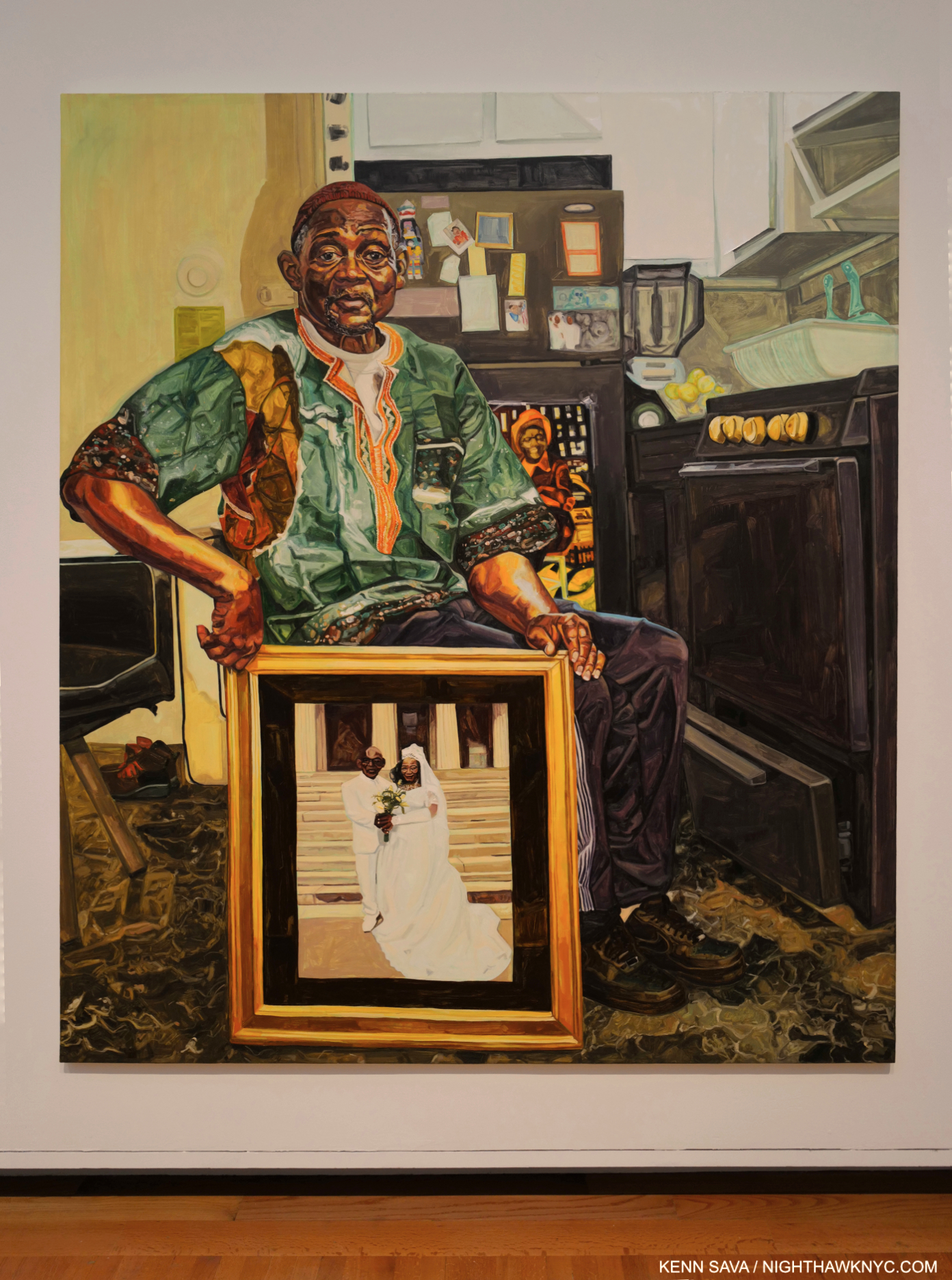
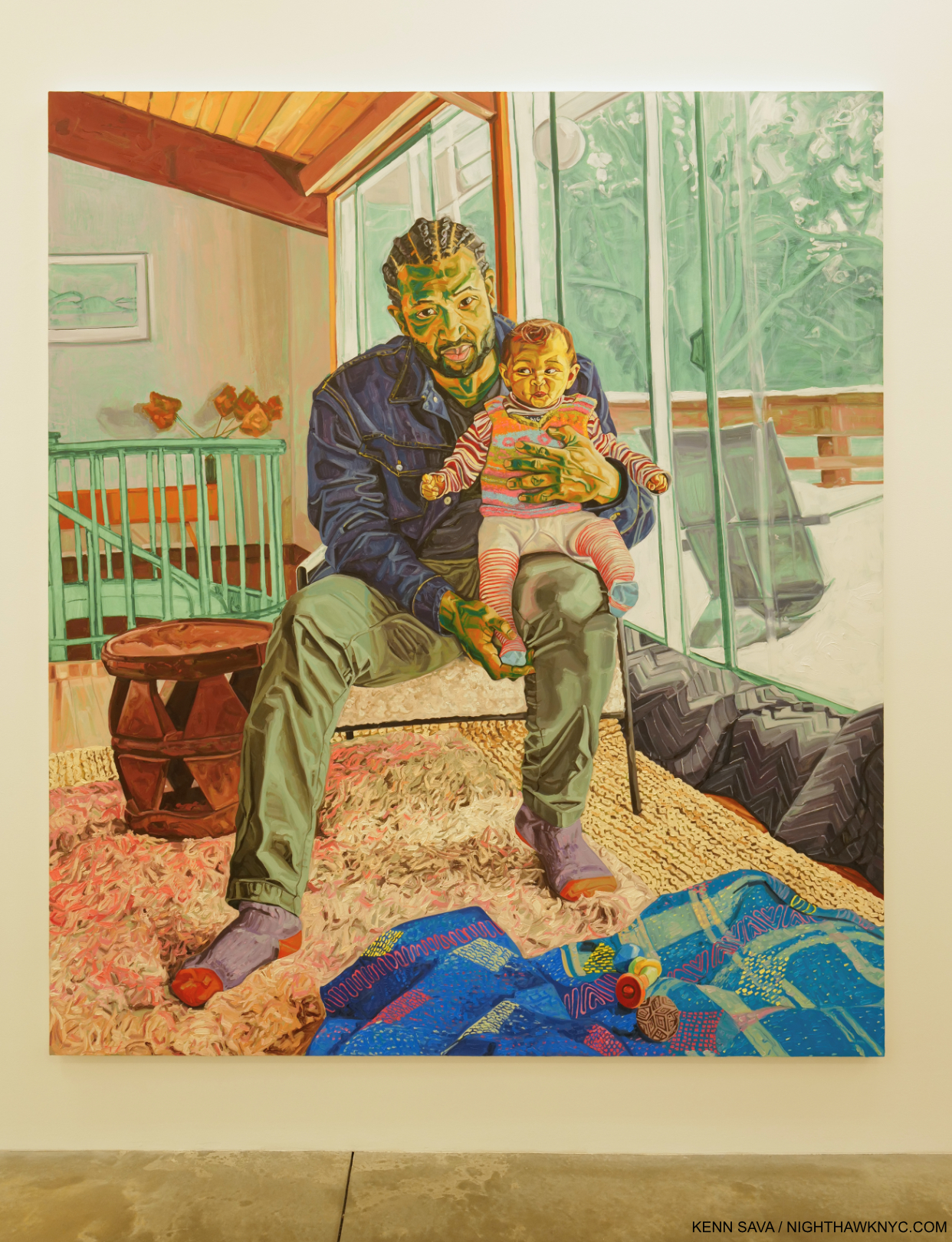
Jordan Casteel, Yvonne and James II, 2021, Oil on canvas, 90 x 78 inches. Seen at The Met, June 18, 2022.

You’re a Painter. You’re 32. Your Yvonne and James II was bought by The Metropolitan Museum of Art. It’s now hanging directly opposite Kerry James Marshall’s Untitled (Studio), 2014, one of the show-stoppers in the blockbuster Kerry James Marshall: Mastry in 2017, in The Met’s largest Modern & Contemporary Art Gallery, #915. If that’s not a “Wow!,” what is?

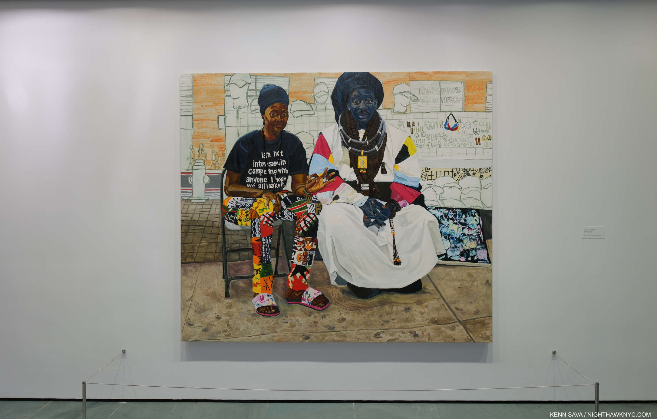
The Baayfalls, 2017, Oil on canvas, 6’6 x 7′ 6, seen at MoMA, August 27, 2022.

Not enough? Your Painting, The Baayfalls, 2017, Oil on canvas, 6’6 x 7′ 6, Painted at about age 27, has a wall to itself on the 2nd floor lobby at MoMA, where it is part of their permanent collection.

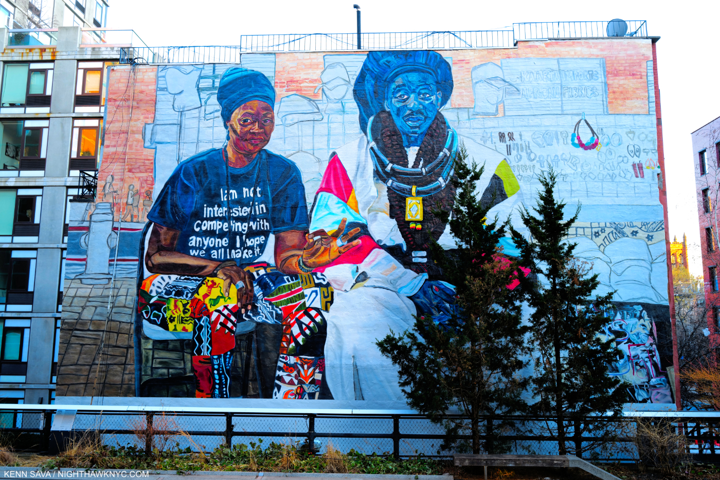
The Baayfalls, Paint on wall, the High Line Mural for 2019-20. Yes, the trees have gotten bigger since I showed them in my Barbara Kruger piece. I LOVE trees, but move them, please.

Then, there’s this- in 2019, The Baayfalls became the High Line Mural. Ed Ruscha, Kerry James Marshall, Henry Taylor and Barbara Kruger have had Murals up on this wall before Ms. Casteel, who was all of 30 at the time. Originally scheduled to be up for a year, due to covid, it’s still there as I write.

A very rare copy of the sold out catalog for Jordan Casteel: Within Reach is now impossible to find in any condition for less than $300.00.

A year after her Mural went up, her New Museum “Retrospective” (I’m not sure you can call a show of work by a 30 year old living Artist a Retrospective, but ok), Jordan Casteel: Within Reach took NYC by storm, although not many actually got to see it because it was closed for much of its run while the pandemic devastated the City and the world. Be it through the show’s terrific catalog or its online presence, viewers got the point. The word was out.

Can you say, PHEW!? Not since the day of Jean-Michel Basquiat has a young Painter risen so far so fast. And, Jean-Michel never had a Painting of his acquired by The Met or MoMA (let alone both) during his lifetime before he died at 27. Ms. Casteel’s work was acquired by both when she was about 31.

Jennifer Packer, Jordan, 2014, Oil on canvas, 36 by 48 inches. Seen in Jennifer Packer: The Eye Is Not Satisfied With Seeing at the Whitney Museum, December, 2021.

Hold on- I’m not done with her C.V. yet! Buzz builds upon buzz. International shows followed. Last year, Jordan Casteel appeared in a Portrait of her done by her friend, Jennifer Packer, in one of the shows of the year, the Whitney Museum’s Jennifer Packer: The Eye Is Not Satisfied With Seeing. Ms. Packer Painted Jordan in her studio while they were both students at Yale in 2014. Then late last year, Jordan Casteel was named a MacArthur Fellow. She received what is called a “genius grant.”

I’m not sure anyone can imagine what experiencing ALL of this has been like for her. It’s unprecedented. Luckily, Ms. Casteel seems to have a great head on her shoulders. She decided to assess ALL of this then reassess her life and her direction. Horror of horrors, she decided to leave NYC and move to rural New York. NYC is such a big part of the Denver-born Artist’s Portraits, it’s helped her to already create one of the strongest bodies of them since Alice Neel. Like Ms. Neel, many of her subjects were found on the streets of Harlem. I wondered what direction they would now take.

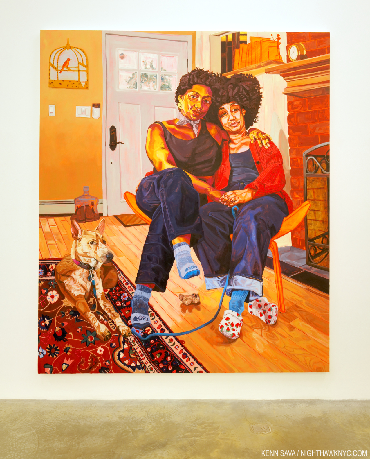
Marisa, Isabel and Sage, 2022, Oil on canvas, 94 x 80 inches.

At Casey Kaplan on September 8th, I found out. In Jordan Casteel: In bloom, Ms. Casteel unveiled 9 new Paintings, each dated 2022 and each created since she relocated from NYC to “rural New York,” as the press release says. 

Morgan, 2022, Oil on canvas, 90 x 78 inches.

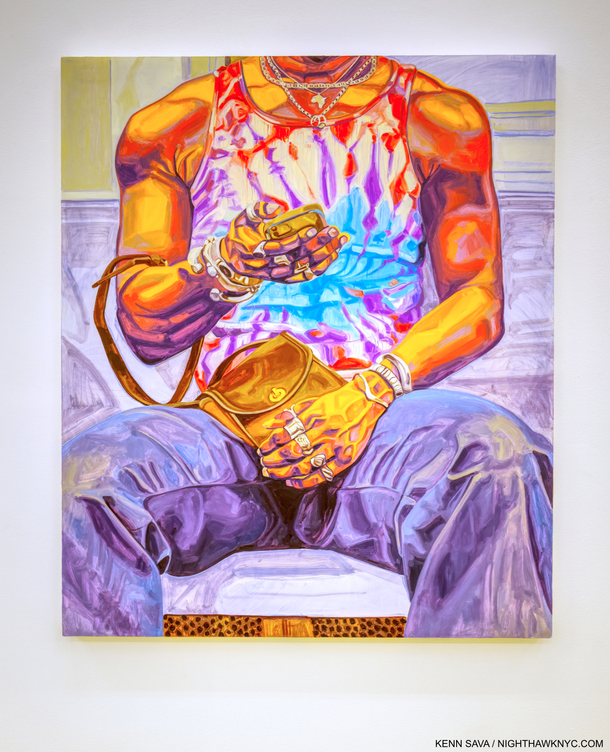
The group consists of some Portraits, the genre she’s, perhaps, most associated with (Within Reach was exclusively portraits), and adds some Still Lifes and Landscapes to her range. Through them all, Ms. Casteel’s work is characterized by strength. Her line, her brushstrokes, and the character of her subjects, all exude strength. I continue to be captivated by the way she renders skin.

Sunset, 2022, Oil on canvas, 50 x 40 inches

Charles White, who had a way of making his figures larger than life- monumental, comes to mind. While Ms. Casteel’s figures often have a “monumental” quality to them, she has developed entirely her own way with rendering.skin.  All the while, rendering the Black men she Paints non-sexually.

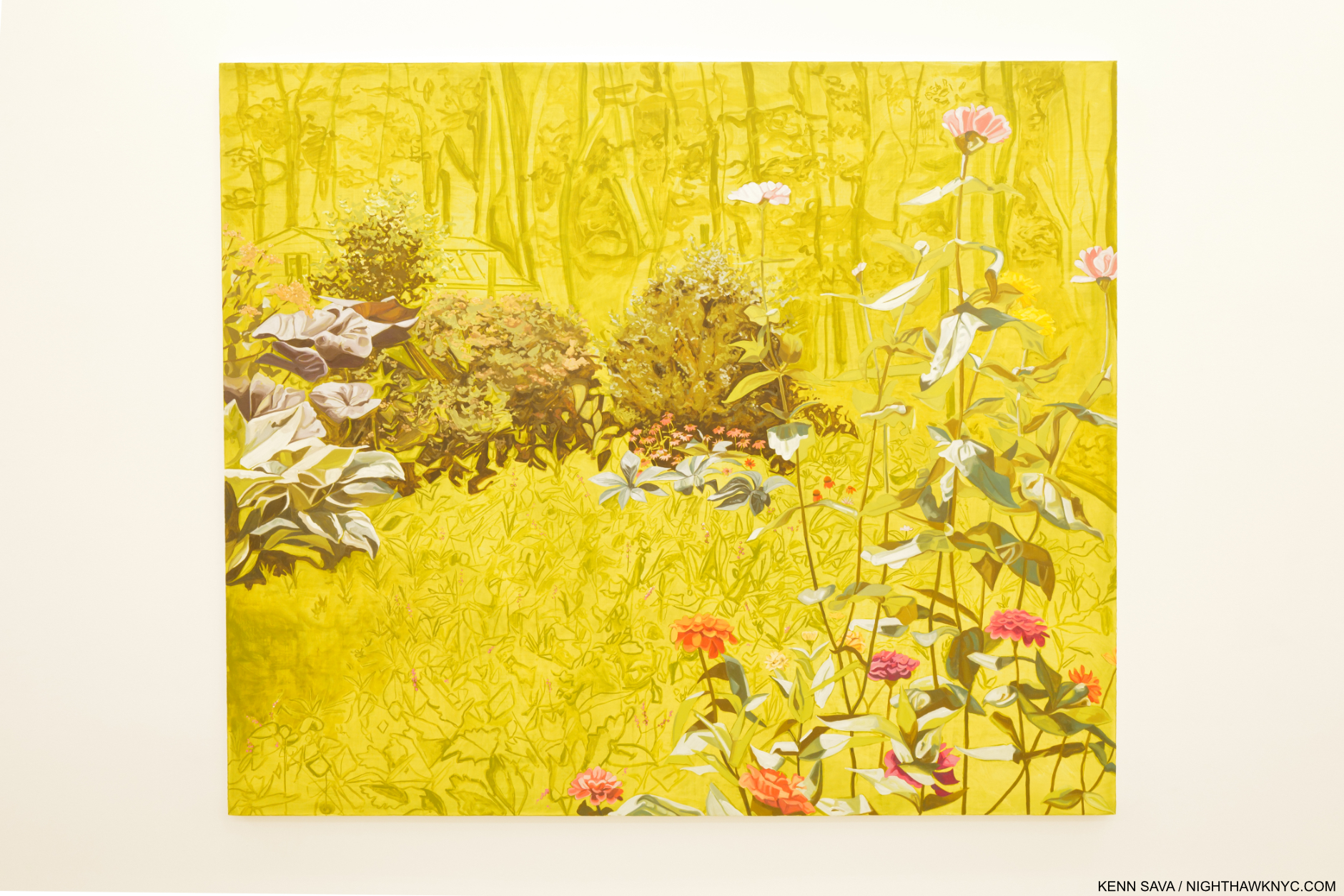
In bloom, 2022, Oil on canvas, 78 x 90 1/4 inches.

There’s also a “there/not-there” element in her work, how she leaves certain parts outlined and not detailed, going back to The Baayfalls, seen above. It takes some adjustment of the eyes on the part of the viewer to see the scene the way the Artist does, and it’s not something I can say I’ve seen many other Artists do regularly. Jennifer Packer uses it, too. Sometimes it occurs in Ms. Casteel’s backgrounds. In the landscape in bloom, above, it’s also seen in the middle ground.

Greg Tate said Jordan Casteel captures the soul of her subject. When I look at her work I see Painting that is “old beyond its years,” and I don’t mean “early maturity.” The Artist is able to recognize subjects who make compelling Portraits, then uses her skills to reflect the appearance they present to the world and the essence, the strength, of their inner selves. The end result is pretty remarkable. Even her domestic scenes have a quiet power and self-assuredness. It’s a testament, I feel, to her subjects, and herself. At Casey Jordan, the 9 Paintings on view don’t seem to miss the City at all.

Damani and Shola, 2022, Oil on canvas, 90 x 78 inches. I haven’t measured, but the large size Ms. Casteel favors in her Portraits make her subjects pretty near life-size.

It’s waaayyyy too early in Jordan Casteel’s life and career to make predictions as to where she, or her Art, are going. So far, her work has struck a nerve with the Art-going public and an ever-increasing number of curators, which will lead, I believe, to her work finding a home in most of the major museums around the world that show Contemporary Art in short order. The bigger picture is only just starting to come into focus. Over and over, the name of Alice Need comes to mind when I think about Ms. Casteel’s Portraits. The first part of her post-graduate career saw her following Ms. Neel’s footsteps in a way in Harlem creating Portraits that feel ripped from life. Now, the Artist has moved on, perhaps wanting to separate herself from those comparisons? She’s her own woman and her own Artist, as her Casey Kaplan show reminds us. It will be utterly fascinating to see how she handles the attention, the pressure, the expectations and the demand for her work going forward.

Field Balm, 2022, Oil on canvas, 36 x 30 inches.

I don’t see any of that ending any time soon.

*- Soundtrack for this piece is “Hold On” by Alabama Shakes, the debut single from Boys & Girls, 2012.

NighthawkNYC.com has been entirely self-funded & ad-free since 2015! If you’ve found it worthwhile, PLEASE donate securely by PayPal below to allow me to continue. Thank you, Kenn.

You can also support it by buying Art, Art books & Music from my collection!
Art & Books may be found here. Music here and here.

Written & photographed by Kenn Sava for nighthawknyc.com unless otherwise credited. To send comments, thoughts, feedback or propositions click here. Click the white box on the upper right for the archives or to search them. Subscribe to be notified of new Posts below. Your information will be used for no other purpose.

Louise Bourgeois’s Guarantee of Sanity

This site is Free & Ad-Free!
If you find this piece worthwhile, please donate via PayPal to support it & independent Art writing.
Other ways to support it at the end. Thank you!

Written & Photographed by Kenn Sava.

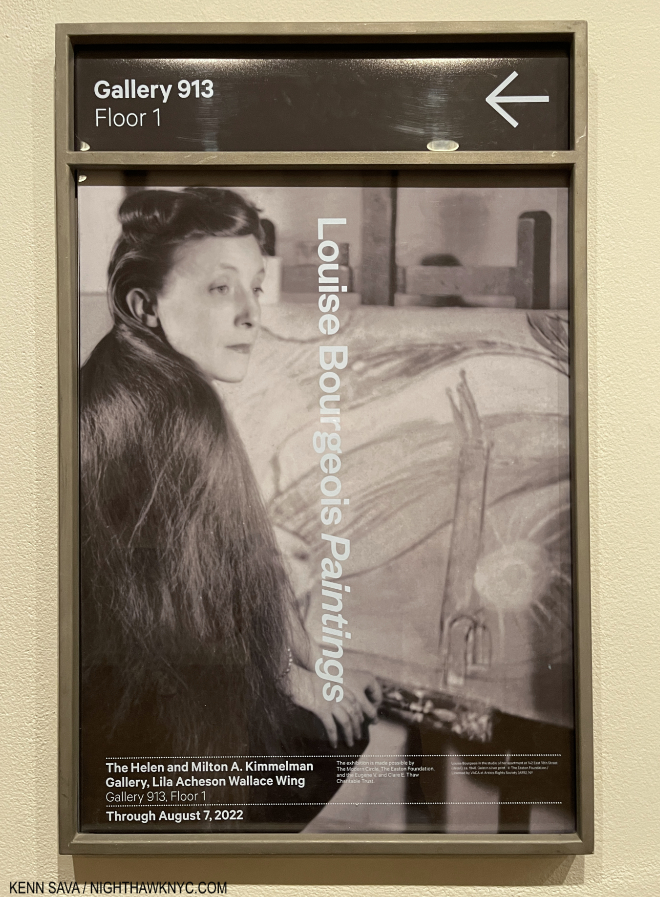
Show Seen: Louise Bourgeois: Paintings at The Metropolitan Museum of Art

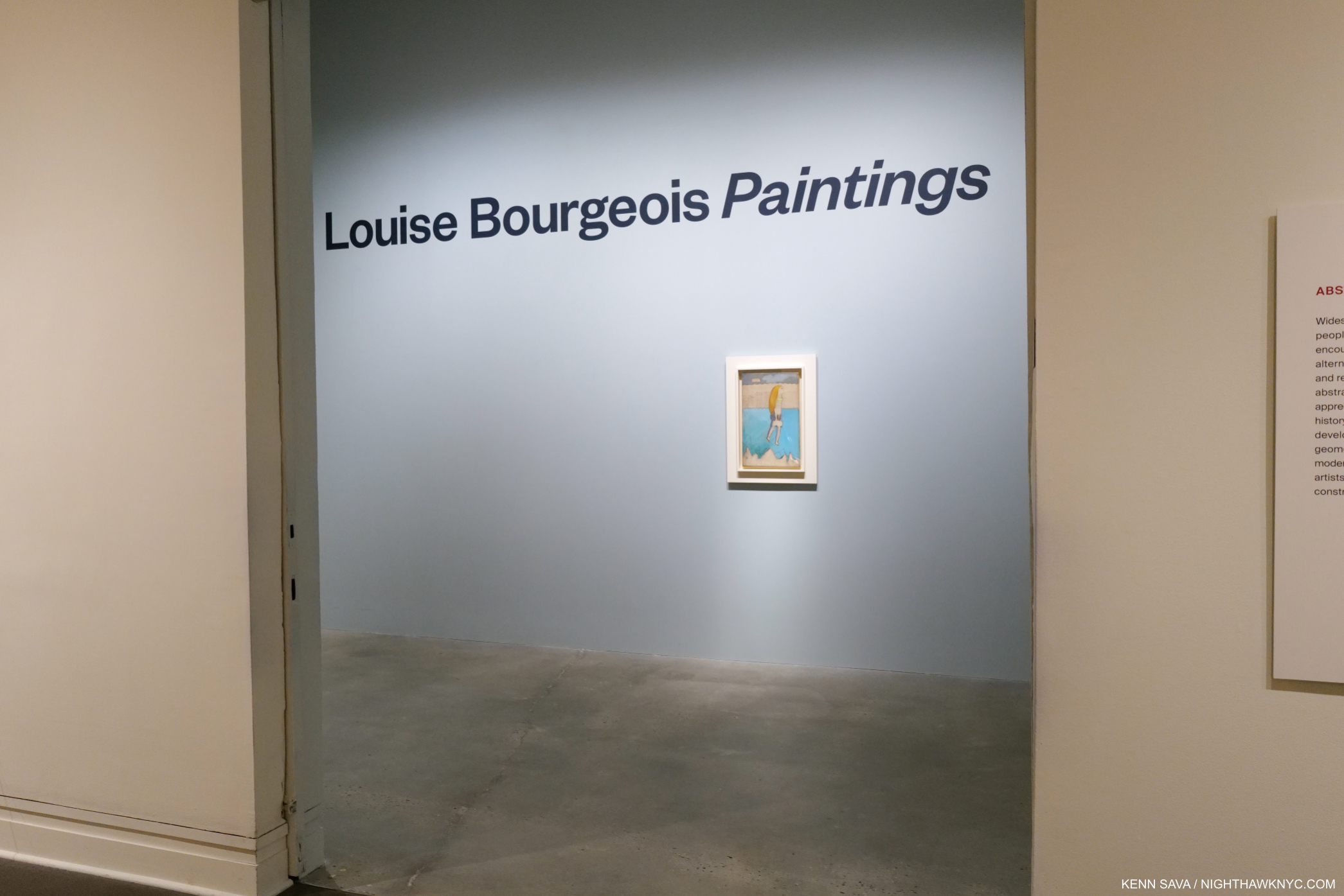
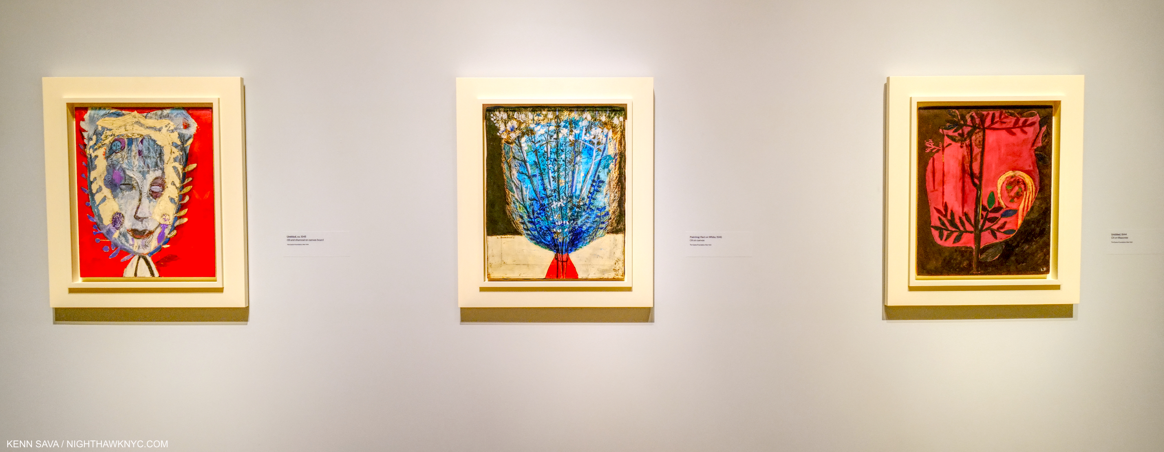
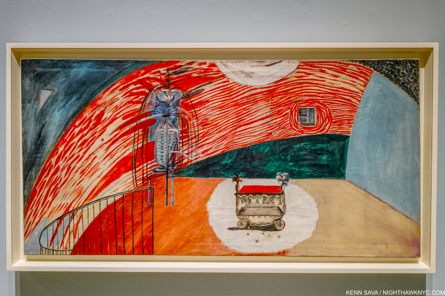
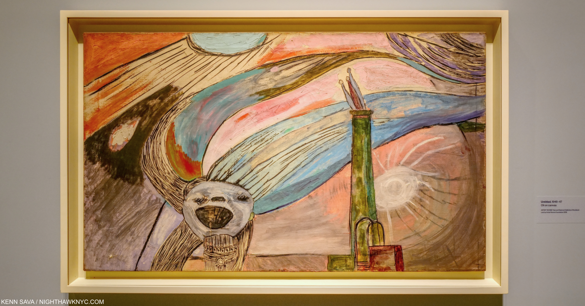
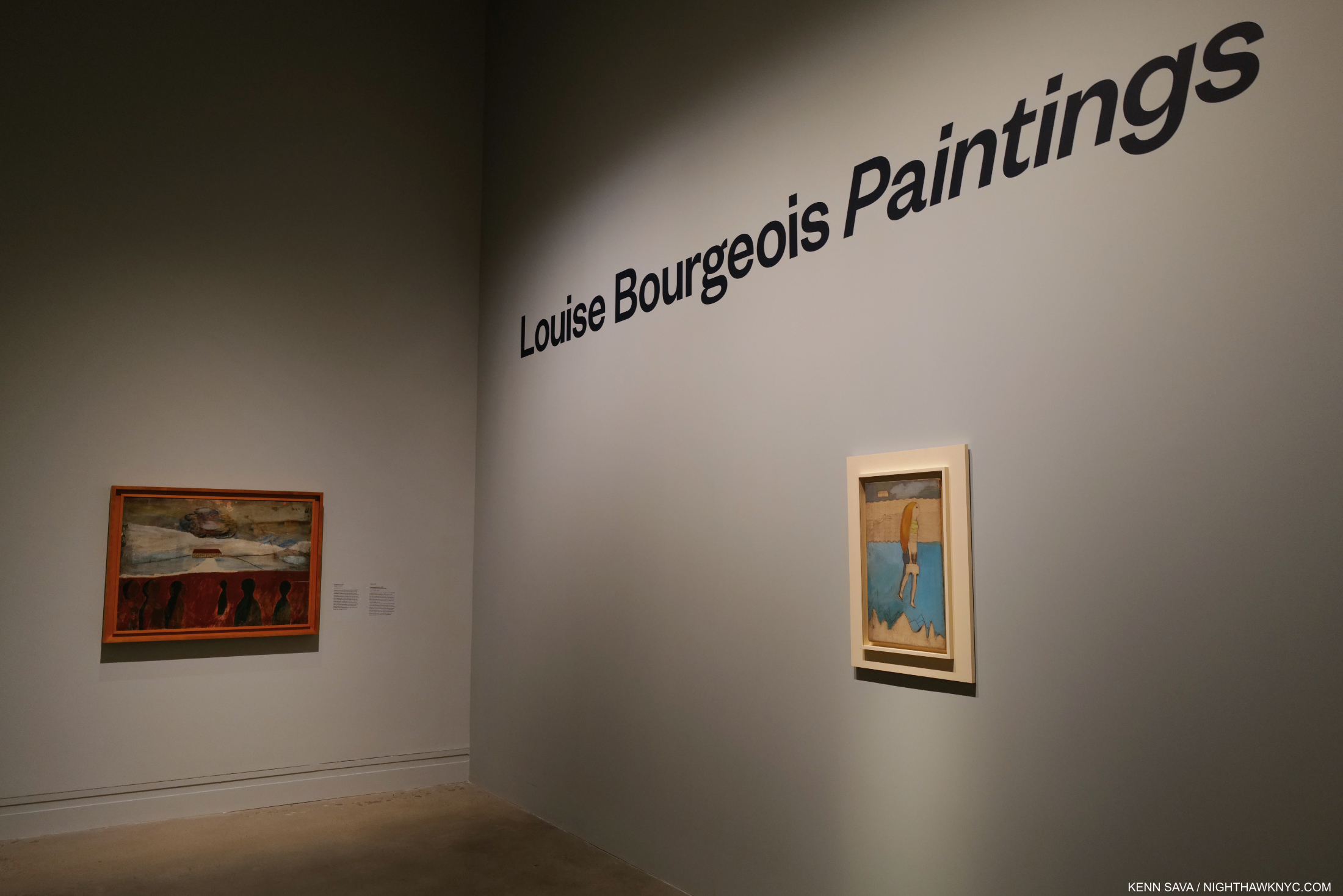
In spite of having seen at least two prior shows of her work, until the moment I walked in through the entrance, above, I had no idea that Louise Bourgeois was also a Painter. This wonderfully concise show proved a revelation. Her Paintings, which predate her well-known Sculpture, turn out to be every bit as unique, personal, and captivating as her free-standing pieces.

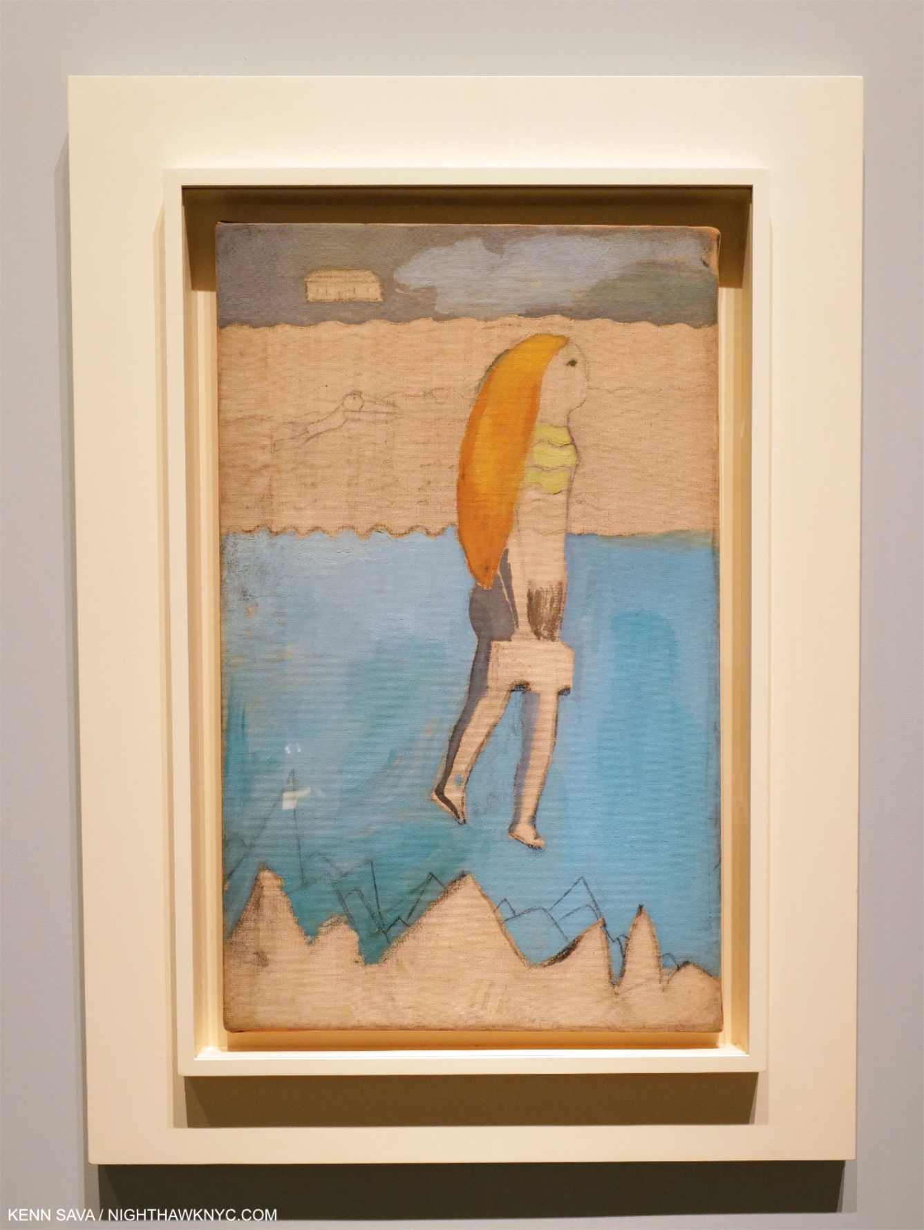
The Runaway Girl, 1938, Oil, charcoal and pencil on canvas. After marrying in Paris, Louise moved to NYC. She came to feel guilt about her sudden departure. Here, she shows herself, with long hair as usual, suitcase in hand, with symbolic references to what she left behind in the background as she floats over jagged rocks, implying a difficult path.

“The Runaway Girl who never grew up…
I do not need a safety net,
Breakfast, big lunch or afternoon snack
I do not need any visitors, telephone
Calls or small mash notes…
I don’t need anything, I don’t confuse anything.
I can wait, I am not afraid. I am grown up.
Nothing is missing.”
Louise Bourgeois1

They’re also as open-ended, and each is autobiographical, beginning with The Runaway Girl, 1938, at the entrance. Beyond her guilt at running away was the pain she suffered discovering her father’s affair with Louise’s nanny- a dual betrayal. “Fear and pain were her main subjects,” her friend, the Art historian Robert Storr said2.

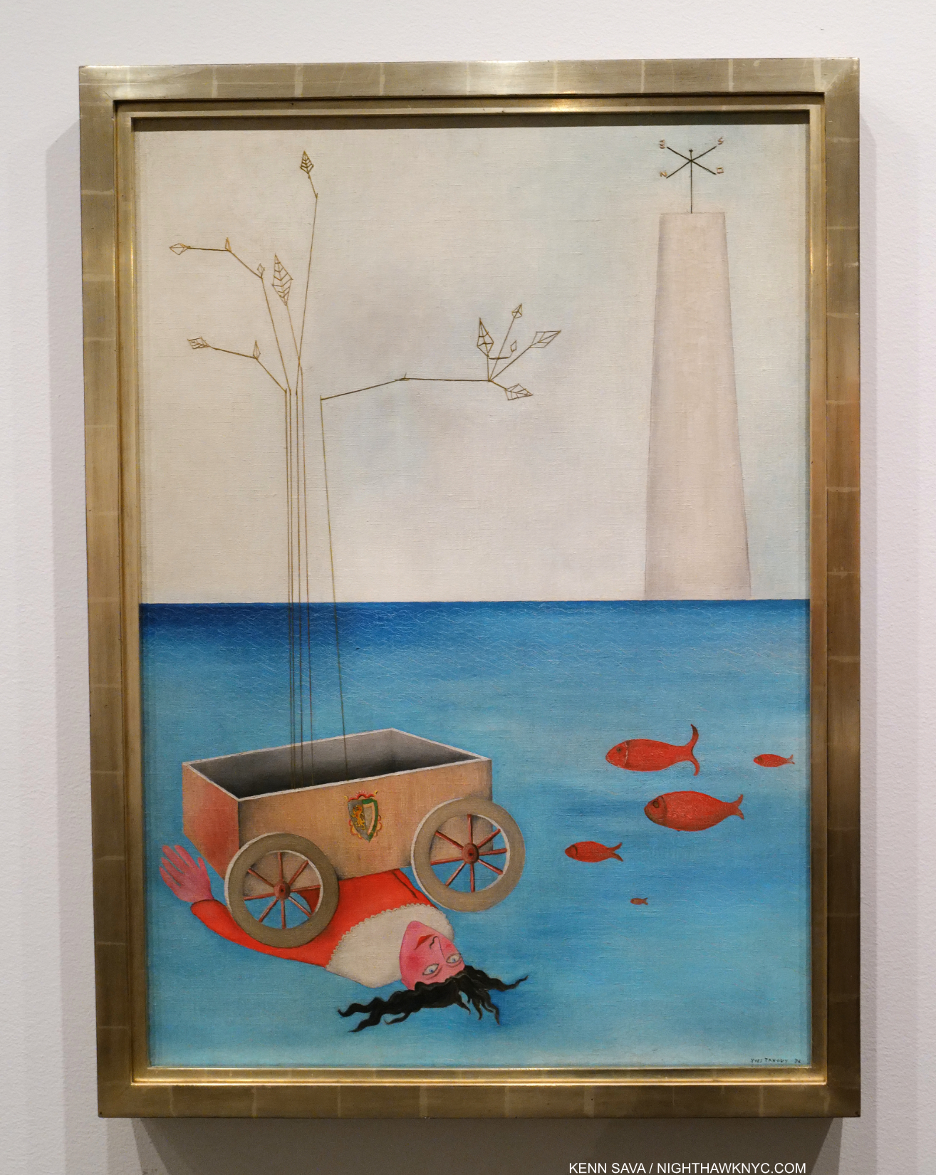
Yves Tanguy, Title Unknown, 1926, Oil on canvas with string and collage. This is about as close as I’ve come in looking for a predecessor to Louise Bourgeois’ Paintings. Seen at The Met. Not in the show.

Some Art historians mention Surrealism as a possible influence on Ms. Bourgeois’s Paintings. Personally, I don’t see it. The Surrealists largely Painted fantasies, dreams and nightmares. Ms. Bourgeois works from her life and her own experiences, even when they take imaginary forms. I don’t consider this Surrealism. The same was said about Chagall, who also worked largely from his own life experiences. Frankly, like Chagall’s, her Paintings don’t remind me of anyone else’s. The great Charlotte Salomon Painted her life, too, at the same moment Louise Bourgeois was (until Ms. Solomon was murdered by the Nazis in 1943). Ms Salomon’s work seems closer to Chagall’s, stylistically, than to Louise Bourgeois’s Paintings to me. Given all that went on in Art just in the first half of the 20th century, creating a unique style is pretty remarkable, and, along with the stellar quality of the work, begin the list of things she should be given more credit for. A good number of these pieces linger in my mind weeks after the show closed- like a person you encounter who has much on his or her mind and much to say, but didn’t say it out loud at the time.

Untitled, 1945, left, Painting: Red on White, 1945, center and Untitled, 1944, right

Louise was born on Christmas, 1911, left France for NYC in 1938, and lived many of her final years until her passing in 2010 around the corner from where I live now, unbeknownst to me.

For much of the last part of her life, Louise lived and worked in the two buildings to the immediate left of the red brick. They now are home to her Foundation. Late in her life Louise moved her bedroom to the first floor, behind one of the two windows, because the stairs were too difficult.

I might have passed her on the street. After she passed away, her home became the HQ of her Easton Foundation, which owns most of the work on display. (Take a look inside here.) Walking by it now, except for some intricate grating on the front door and windows (which was there when she was), it looks just like every other townhouse on the street. Given how unique all her Art is, this is somewhat incongruous.

Themes recur in Louise Bourgeois’s work. One is buildings as seen in each of these pieces. Her series of 4 canvases titled Femme Maison, 1946-7, Oil and ink on linen, center, will be addressed next. Later, buildings appear without human parts (as in both works to the far left), and they are stand-ins for humans. One building stands for a lonely person. Two separate buildings stands for an estranged couple. Three buildings is a triangle. These would seem to be influenced and inspired by life in the tall building jungle that was, and is, Manhattan, home of “Manhattanhenge” as Neil deGrasse Tyson calls it.

Louise Bourgeois’s Art was largely motivated by “her emotional struggles,” as former MoMA curator and Louise Bourgeois researcher Deborah Wye says, “This was something that plagued her for her whole life. And she said by making a work of art she could make these emotions tangible. Try to understand them. Try to cope with them. Try to hack away at them. And she actually called her art ‘her guarantee of sanity3.’” 

Femme Maison, 1946-7, Oil and ink on linen, occupy the central position in the show, as I show in the prior picture. Femme Maison translates as “woman house,” or “housewife.” In each, a woman is confined within a building, which references a part of the Artist’s past, as her role in society confined her. All 4 figures are naked from the waist down, exposing them to the viewer’s gaze. Her trademark long hair is seen in two. A stunning and singular expression, times 4, of a woman trapped in her role in Art history, at least that known to me.

In what appears to me to be one of the final shows, and perhaps the final gallery show, mounted under Sheena Wagstaff’s tenure as Chair of The Met’s Modern & Contemporary Department, Louise Bourgeois: Paintings is quietly spectacular. The feeling of discovering something “new,”exciting, and previously unknown, when you walk in is quickly reinforced by the variety, and similarities, in her work. Themes emerge. The mystery remains.

“1932,” 1947, Oil on canvas. 1932 was the year Louise’s mother passed away after a long illness. They had been very close, with Louise often serving as her mother’s nurse. Her passing precipitated the first of the Artist’s two suicide attempts, and recurring bouts of depression. According to the wall card, the figure to the left was a “more realistically rendered self-portrait in earlier stages.” Its closed room, its railing, the “anguished(?)” lone figure, and central spotlight, remind me of the settings of many of Francis Bacon’s Paintings that would coincidentally begin at this very moment.

I missed what looks to have been a terrific show at the Jewish Museum, Louise Bourgeois, Freud’s Daughter, due to the pandemic, but did see Louise Bourgeois: Holograms show at Cheim & Read and MoMA’s Louise Bourgeois: An Unfolding Portrait excellent show of her Prints and book work, both in 2017. The variety of the work on view in these four shows (thanks to the Freud’s Daughter catalog) is extraordinary, and all of it is compelling.

Her Paintings were done in the FIRST decade of the SEVEN she eventually spent here. In the end, Louise Bourgeois lived, and worked, in New York City for an unheard of 72 years! In my book, she is what I call an “Ultimate New Yorker,” i.e. someone who has defined both what it is to be a New Yorker and who helped shape NYC in the Arts in my opinion, along with Patti Smith, Miles Davis, and others. Though she professes that these Paintings are “American, from New York,” in the quote above, I don’t sense much of the City in them beyond those that depict apartment buildings that look like those found here. They are more about a person living in the City. Buildings, though, are a metaphor for persons, as I said.

Reparation, 1945, Oil on canvas. Though the Artist shows herself as a girl bringing flowers to her family’s cemetery plot, there is no name on the sparsely Painted stone. So it could reference her mother’s or grandmother’s passing, or in a larger sense, mourn those she left behind.

In each of these de facto “Self-Portraits,” the Artist lays herself and her feelings daringly bare. While her Art didn’t “solve” her problems, it helped. Seeing them now, these Paintings may prove to be a touchstone for viewers, now and in the future, as I expect them to continue to rise in stature. Stylistically, they blend abstraction and realism selectively, often in the same piece. Finally, they also provide fascinating background material for pondering her Sculpture and Prints that followed for the rest of her career.

Untitled, 1946-7, Oil on canvas. World War II, guilt, and here, fear, are subtexts in many of her Paintings. I should say I see fear in this piece, which is one of a few pieces that depict this building in the show, the others having an unstated dread and menace to them as well, perhaps part of her agoraphobia.

Thinking about this show, I couldn’t help but recall the case of Jack Whitten, who had a long career as an important Painter, only to leave a comparably important,  large body of unknown Sculpture behind when he passed in 2018. Louise Bourgeois’ Paintings were shown and known, but it was early in her career, before she attained the status her Sculpture brought her. Both bodies of unknown and lesser known work were shown by Sheena Wagstaff in two of the more fascinating and memorable shows under her remarkable tenure. I imagine that this show may have been originally planned to be installed at The Met Breuer before its sudden closing.

Untitled, Oil on canvas, left, Untitled, Oil and chalk on canvas, right, both 1946. During one visit, another visitor asked me if the work on the left was a guillotine.

In the Press Release announcing the show, Sheena Wagstaff said about it, “To date, it is not widely known that Bourgeois was active as a painter in New York for ten years, a period when the city became a vital international hub amidst critical debates around painting. This exhibition reveals the foundational DNA of the artist’s development of themes that would subsequently burgeon into three dimensions, and preoccupy her for the remainder of her long career.”

All of this was “just” preliminary to her long career as a Sculptor, and work in other mediums. Her late Paintings, like these two, begin to look like her Sculpture. Sculpture, she said, enabled her to see what she was feeling in three dimensions. Deborah Wye said, “She said there was no rivalry between the mediums for her in which she worked. She said she just said the same thing but in different ways4”

And so, “Painting” as painting was over for Ms. Bourgeois.

Moving from Painting to Sculpture. Femme Volage, 1951 left, and Dagger Child, 1947-9, both Painted wood and stainless steel. Woman in the Process of Placing a Beam in her Bag, 1949, Oil on canvas, far left.

Being a self-professed and long-standing Paintings guy I really wish Louise had kept on Painting in addition to Sculpting, but her Muse carried her to 3 dimensions. Some Prints on view in An Unfolding Portrait involve brush work, continuing the thread in a sense. She made Prints for the rest of her life. Her Prints were first the subject of a 1995 MoMA show and their 2017 Unfolding Portrait show, which lives on in its wonderful catalog. Deborah Wye, then a MoMA curator who devoted a large part of her career to studying Louise Bourgeois’s output, curated both Print shows as well the Louise Bourgeois Retrospective at MoMA in 1982, the very first show of its kind given to a woman Artist at MoMA5. She has also created a website of Ms. Bourgeios’s complete prints, which may be seen here.

Fallen Woman (Femme Maison), 1946-7, Oil on canvas. As in almost all of her Paintings, her past and present experiences and the resulting guilt, angst and duality are transformed into wonderfully succinct compositions. “The woman depicted here, visually cut in two by a dark building, embodies the rejection, fragmentation, and abandonment that the artist experienced and feared…,” per the wall card.

“Why have there been no great female Artists?,” is the title of a book, and a question I’ve heard many times over the years. There are, and have been. MANY of them.

Untitled, 1946-7, Oil on canvas. Bacon, de Chirico, Miro, Chagall come to mind when I see this, but none of them combined these elements into one piece before Louise Bourgeois did here in what may be her most iconic Painting, which, again, features her long hair.

The history of Art has been largely written by men, museum collections largely curated by men, to this point. It’s only been this century that that has begun to change. It’s really only since the opening of the global Art market in the late 1980s and the accompanying relentless search for Art of value- anywhere by anyone, that more women Artist have begun to get the attention so many have stood up and demanded for so long. There’s still a long road ahead.

Beyond her iconic Sculpture, her Prints that I saw at MoMA in 2017, her Holograms that I saw the same year, and her Installations, Louise Bourgeois created an important body of Paintings, one that deserves a special place of import among those created by women Artists in the 20th century, as well as by Artists, period. I believe that as time goes on, more and more people, who know her name, but not much about what she did beyond her Spiders, Louise Bourgeois will be an Artist who moves more and more into the mainstream. Her work is so diverse, extending across mediums, techniques and time, that it actually reminds me a bit of one of her contemporaries- Pablo Picasso. That’s said not as a comparison, but to mention the similarities and variety in their work. I would not be one bit surprised to see a Bourgeois/Picasso show one of these days. Maybe MoMA’s next Bourgeois-related show6 show ?

Louise Bourgeois, with her long hair, with Untitled, 1946-7,  on her easel, circa 1946. It’s fascinating to compare what we can see of it in this Photo with the Painting we have, above.

Louise Bourgeois channeled her problems through unending creativity into an extraordinary and extraordinarily varied body of work. In spite of two suicide attempts7 earlier in her life, she overcame everything she lived through and felt about it to survive to be 98! There is much in that, as well as in her work, to inspire others. Jerry Gorovoy, her assistant and friend for 30 years, wrote in late 2010 after Louise’s death-

“Though her work was raw self-expression, it was also her way of understanding herself. It has a timeless dynamic that goes way beyond the visual: a profound capacity to awaken in others a heightened consciousness of what it is to be alive.”

Her ceaseless multi-dimensional creativity is up there with Picasso’s, Joan Miro’s, Marcel Duchamp’s and Robert Rauschenberg’s- the giants of endless invention in the 20th century. Add her name to that list if you haven’t. For her own creativity, as well as the quality and timelessness of her Art, it belongs there. 

*- Soundtrack for this Piece is “Cherry-Coloured Funk” by Cocteau Twins from Heaven or Las Vegas, 1990.

NighthawkNYC.com has been entirely self-funded & ad-free since 2015! If you’ve found it worthwhile, PLEASE donate securely by PayPal below to allow me to continue. Thank you, Kenn.

You can also support it by buying Art, Art books & Music from my collection!
Art & Books may be found here. Music here and here.

Written & photographed by Kenn Sava for nighthawknyc.com unless otherwise credited. To send comments, thoughts, feedback or propositions click here. Click the white box on the upper right for the archives or to search them. Subscribe to be notified of new Posts below. Your information will be used for no other purpose.

  1. Quoted in Louise Bourgeois, Askew and d’Offay, 2013, p.42. ↩
  2.  Robert Storr, Ted Talks, 5/11/18 ↩
  3. Deborah Wye, MoMA Talk, 9/17/2017. ↩
  4. Deborah Wye, MoMA Talk, 9/17/2017. ↩
  5. In 2018, I published my own list of these in my Yoko Ono piece, since there is no “official” list- still! I wonder why. ↩
  6. Update 9/2/22- Since writing those words I’ve discovered a gallery show, Louise Bourgeois – Pablo Picasso: Anatomies of Desire, was held at Hauser & Wirth, Zurich, in 2019. From seeing the catalog, it sure looks like it’s not only an idea who’s time has come, but there is more to mine in it. ↩
  7. per The Met’s wall card for “1932.” I can find no other reference to more than one attempt. ↩

Not Your Father’s Winslow Homer

Winslow Homer: Crosscurrents is now over. If you missed it, one of the few places you can still see a bit of it is here! If you appreciate that, please donate via PayPal to support it & independent Art writing.
Other ways to support it at the end. Thank you!

Written & Photographed by Kenn Sava (*- unless otherwise credited)

Ahhh….The summer blockbuster. What would Art life be without one? In spite of covid, we’ve been blessed here in NYC with big and memorable shows the past two summers, though of course, remaining careful is the only way to see one. So, I donned my double masks and went to see this year’s summer-fest, Winslow Homer: Crosscurrents, at The Met.

Winslow & chill…Detail of Lady of Santiago (Girl With a Fan), 1885, Watercolor on paper. Less than one quarter of the whole 8 7/8 by 11 1/2 inch piece is shown. How this is Painted is just stunning. Look at her face! Look at those Palm tree leaves! Not bad for not having any lessons, right? His mother was an accomplished Artist and gave Winslow some help early on, later he took a few lessons in Oils, beyond that, he was self-taught.

Interestingly, and probably purely coincidentally, Winslow Homer turns out to be almost an exact contemporary of the Artist who enthralled me last summer, Paul Cézanne, he of Cézanne Drawing at MoMA: Cézanne, 1839-1906; Homer, 1836-1910! Cézanne was, and remains, one of the most influential Artists of his time. Winslow Homer, though continually popular since he began creating, has not enjoyed the same reputation as a ground-breaker as the French master. To this point.

You’d need a telescope to see The Gulf Stream, center, from the show’s entrance, which announces it as the centerpiece for the entire show. There are a lot of very good Paintings before and after you get to it.

That sound you heard might be the tides beginning to turn after Winslow Homer: Crosscurrents.

The Surgeon at Work at the Rear During an Engagement, from Harper’s Weekly, July 12, 1862, Wood engraving on paper. A number of Homer’s War pieces compile different scenes he may have witnessed on one of his trips to the front of the Civil War into one composition. I wonder if this is the case here. Homer was about 26 at the time he created this Drawing which was sent back, and then engraved by someone else. (* Not included in Crosscurrents. Smithsonian Museum of American Art Photo)

After early work as a free-lance illustrator covering the genteel life around him, Winslow Homer moved to NYC in 1859, where he took a few lessons in Oil Painting at the National Academy of Design with Frederic Rondel. He took a job as an illustrator for Harper’s Weekly right after the Civil War started in April, 1861, and much to his surprise, quickly found himself at the front in Virginia! It was there that he would come into his own, creating a body of War Illustrations that was important, historic, and ground-breaking, becoming, along with renowned Photographers Matthew Brady and Alexander Gardner, America’s first visual War reporters.

Crosscurrents begins at this point, in 1863. With 88 Oils and Watercolors, covering the full range of subjects the Artist rendered after he found himself and his direction during the War, and tracing the rest of his long career, the show is centered around The Met’s masterpiece, The Gulf Stream, 1900,1906. Work after work shows the lie to the out-dated standing perception and in its stead reveals how shockingly contemporary Winslow Homer is, 112 years after his death. The feeling one leaves the show with is akin to “How could we have missed so much in Winslow Homer?”

The Veteran in a New Field, 1865, Oil on canvas. As time went on, he felt he needed a different medium to express the depth of what he wanted to communicate. So, in 1863, he turned to Oil Painting, a medium he had only briefly studied. The soldier’s jacket lies to the right in this powerful image from the end of the War and the beginning of the Reconstruction. Originally, the scythe’s blade was even longer.

Part of the reason opinions on Winslow Homer haven’t changed is there’s been a lack of big Homer shows, and even Crosscurrents isn’t a full blown retrospective. The Met and National Gallery of Art in Washington had a Homer Retrospective in 1959, which the catalog shows to have had around 130 works. The Whitney had a Homer show in 1974 that had 200 works (per its catalog). For perspective, Winslow Homer created 300 Oil Paintings and 685 Watercolors, plus Prints and Drawings over the course of his career1. 2022 is proving to be a fortuitous time to see 88 Homers. 

Prisoners from the Front, 1866, Oil on canvas. The work that made Winslow Homer’s name, reputation and career. It was then quickly acquired by the young Metropolitan Museum.

Before the War ended, Winslow wound up making multiple trips to the Virginia front. Of one, his mother wrote-

“Winslow went to the war front of Yorktown and camped out about two months. He suffered much, was without food 3 days at a time & all in camp either died or were carried away with typhoid fever- plug tobacco & coffee was the staples…He came home so changed that his best friends did not know him, but is well & all right now2.”

The War forever changed Homer, and his Art. The genteel subjects were gone. To go deeper, he finally turned to Oil Painting in 1863 at the age of 27, fairly old to begin.

Sharpshooter, 1863, Oil on canvas. Not bad for a first Oil Painting, right?

“He was painting by eye, not by tradition; painting what he saw, not what he had been taught to see.” Lloyd Goodrich3

Sharpshooters were, perhaps, the most deadly branch of the Army in the Civil War. The series The Civil War: Brothers Divided, credits sharpshooters with winning the Battle of Gettysburg, and by extension the Civil War4. In Sharpshooter, we see one taking aim. In 1896, Homer recalled-

“I looked through one of their rifles once when they were in a peach orchard in front of Yorktown in April, 1862. The impression struck me as being as near murder as anything I ever think of in connection with the army & I always had a horror of that branch of the service5.“ He included this sketch in his letter-

His very first Oil Painting, Sharpshooter, 1863, opens the show in attention- grabbing fashion. When I look at it, I feel for whoever may be on the other end of the telescope. After seeing the Drawing, I believe that’s what Homer intended.

There it is: right from the very first work, and then time and again, as I walked through the 40+ years of his career covered in Crosscurrents, what stands out for me is his empathy. This is what makes Winslow Homer special in his time, and timely today.

His strikes me as being on the level of the empathy I see in Rembrandt, Vincent Van Gogh, and especially in Goya. All his life he traveled, and many of his pieces reflect things he actually witnessed (some were based on newspaper reports). This combination of observation with his inherent empathy brings an uncanny “realism” to his work, even allowing that some pieces are based on the accounts of others, and some are compilations of events. And so, taking his Paintings as “documentary” is a bit problematic. I prefer to focus on the empathy.

Defiance: Inviting a Shot before Petersburg, 1864, Oil on panel. A Confederate soldier about to get what he’s asking for- two small puffs of smoke are seen at the middle left would seem to indicate the dare accepted, the shots on their way. And so, this is the flip-side of Sharpshooter.

On an adjacent wall, the very next Painting would seem to indicate the Artist may have been thinking similarly. Perhaps, he felt he wanted to be clearer about his intentions, and create a “more direct” work? Here, he shows us the opposite viewpoint. Brilliantly paired in the show. Defiance is utterly remarkable. It’s not like the sharpshooters needed a lot of help.

A Visit from the Old Mistress, 1876, Oil on canvas. Seeing this work from 11 years after the end of the War and the middle of the Reconstruction made me wonder if I’ve seen a more powerful 19th century American Painting. Who else Painted anything like this before 1900?

Then, in the period after the War, the Reconstruction, Winslow Homer did something no other Artist I know of did- He made Paintings showing the life of the newly freed Black men and women, and in the process created a unique record of part of their experience, and race relations in the country, at the time. This is another thing that makes him a ground-breaking Artist and gives hm much relevance, today. In A Visit From the Old Mistress, 1876, volumes are said in the eyes and body language. Early on, the Mistress held a red flower in her right hand, which the Artist Painted over after changing his mind. Over time, a hint of the red has become visible near her shoulder. Given that much (but not all) of what he shows us are scenes he witnessed, I’m left to wonder if he saw this scene and the one below. If not, how could he have Painted them so convincingly? His empathy powerfully comes through, yet as strong as it is, here and in all his work, he never hits the viewer over the head with it, and it is his subtlety that I believe has caused the appreciation of his empathy, power and brilliance to be somewhat under-appreciated for so long.

Dressing for the Carnival, 1877, Oil on canvas. A tour de force in so many ways beginning with color and ending up in a timeless meditation on so many things. Who else Painted anything like this?

In 1873, Winslow Homer produced his first Watercolor (at about 37 years of age!). They would become both rightly revered for their virtuosity among any done during his lifetime and extremely popular, helping the Artist survive. No small thing since after Prisoners from the Front, he struggled to regain the same level of success with his Oils, which continually disturbed him, no matter how popular his Watercolors became. Along the way, his focus changed. He turned to the sea. First, in Cullercoats, England, than in New England, and finally in the Gulf Stream- the Bahamas, Bermuda, Cuba and Florida. Based in Prouts Neck, Maine, he regularly traveled south to avoid the harsh northern winters. That might  be why there was only one Winslow Homer snow scene in the show!

Eight Bells, 1886, Oil on canvas, struck me as endemic of Homer’s work on man & the sea. Here, two sailors take measurements. Man trying to understand the sea.

Of course, Winslow Homer is rightly revered for his sea pictures. Along with the intense, timeless drama in many of these pieces, what has always stood out for me is his mastery of rendering the sea itself. Crosscurrents includes quite a few highlights, including some daring sea rescues Homer witnessed or read about. Regarded so at the time, Winslow Homer remains one of the real masters of sea Paintings. No mean feat in a country about 100 years old at the time in view of the long history of sea Art in many other countries.

Oranges on a Branch, 1885, Watercolor on paper. Hypnotically beautiful, during one visit, another visitor nearby railed against the inclusion of the building on the lower right in this rare Homer Still Life. Oranges were something of a delicacy at the time, and a treat as a staple at meals in the Bahamas, they would seem exotic to many contemporary American viewers.

As darkly hued as many of his Oil Paintings are, as a result of his yearly winter trips south, all of a sudden come his Watercolors that just explode with light and color.

Native Hut at Nassau, 1885, Watercolor on paper. During his trips, Homer kept a close eye on the local population and had a gift for capturing their lives in extraordinary works like this, a scene he may have seen on a walk from his luxury hotel. While picturesque elements of the piece would appeal to American viewers, the condition of the local’s lives is front and center. Again, something not many were doing in 1885.

Homer’s Watercolors were extremely popular with collectors, and even he seemed to get caught up in it. He’s quoted in the show saying-

“You will see, in the future I will live by my watercolors.”

At The Met, they indeed glisten with the beautiful light he found in the Bahamas and elsewhere on the Gulf Stream. But, for me, it’s his Oils that are the revelation, and which largely serve to rewrite our perception of him. Homer followed sales of his Oils closely, and took the results personally, particularly when they were misunderstood. His Watercolors cast his subjects in a different light, no pun intended, and seem to me to be more meditative, while his Oils bring the power.

A Garden in Nassau, 1885, Watercolor on paper. Another poignant example shows a child outside a walled private garden. A small detail- Homer’s watercolor palm leaves are always amazing, and offset the sparseness of the wall.

Still, a number of those on view, like these two above, get to the same power, empathy and subtlety, seen in his Oils.

Shark Fishing, 1885, Watercolor on paper. Ummm…I think they’re going to need a bigger boat. The shark is similar to one seen in The Gulf Stream, 15 years later.

In 1885, while in the Gulf Stream, Winslow Homer may have seen and recorded a boat in distress in a sketchbook. The sketch was in the show, as were a number of fascinating Watercolors that seem to reveal something of the development of The Gulf Stream Oil Painting over the next 21 years. Not all of the pieces I’m showing here were in the show’s Gulf Stream section. I’m including Shark Fishing, above, (which is not a disaster work like the others), due to the similarities between the shark in The Gulf Stream. It also includes two Black sailors.

Sharks (The Derelict), 1885, Watercolor on paper. It would seem that this was a work that informed The Gulf Stream, with many of its familiar compositional elements, minus the sailor.

The Gulf Stream Oil was displayed in 1900, then Homer reworked it in 1906. (Possibly in response to criticism?) The Met quickly acquired it the same year.

The Gulf Stream, c.1889, Watercolor on paper. What would be the final composition is taking shape.

In this version, there is no sign of rescue, which is closer to the Oil as it was originally displayed. No water spout to the right. The sailor looks down in the direction of the sharks.

The Gulf Stream, 1900, 1906, Oil on canvas. It was praised and condemned early on. From The Met’s Audio Guide- “When the Worchester Art Museum was considering its purchase, two women Trustees objected to the unpleasantness of the subject. Homer wrote to his agent- “The boat and sharks are of very little consequence. You can tell these ladies that the unfortunate negro who is by now so dazed and parboiled will be rescued and return to his friends and home and ever after live happily.” In 1906 he added the ship on the upper left horizon. 

Not many images exist of The Gulf Stream before his 1906 modifications of it, most noticeably adding the ship on the horizon in the upper left in 1906. A print displayed nearby shows the work as it originally was displayed in 1900 without it. Was it added in response to the worry for the lone sailor expressed to him by viewers? In a letter to his dealer the Artist vehemently expressed that “the subject of this piece is its title.” It’s hard for me to see one subject in it. I’m puzzled by how the man is Painted, and why he is looking off to our right. Perhaps, Homer felt that looking straight ahead, as he does in the Watercolor above, was too obvious. Some see the Painting as being inspired by the recent death of Homer’s father. Yet, he had produced Watercolors of this subject 15 years before. Whatever the case is, it again features a Black man. Perhaps the most iconic American Painting to do so from its time, or earlier. Or, from substantially later, for that matter.

Natural Bridge, Bermuda, 1901, Watercolor on paper. It’s hard for me to look at this and not think of Cézanne’s rock formations I showed in my Cézanne Drawing piece his last year that were done at almost the same time.

“If a man wants to be an artist, he should never look at pictures.” Winslow Homer quoted in Lloyd Goodrich’s Winslow Homer, P.21.

Winslow Homer kept to himself. His life is in his work. He refused to cooperate with his biographer and so very little is known about his possible influences. Writers and critics have been left to wonder about them, and I do, too. He spent 10 months living in Paris when much was going on in the Art world there. Yet, almost nothing is known about how he felt about what he saw. I see bits of Manet, Monet, Cézanne and Goya in his work. Is it coincidental?

Near Andersonville, 1865-66, Oil on canvas. The wall card speaks of the “Black woman emerging from a darkened interior, standing on a threshold and contemplating an uncertain future” near Andersonville, the site of an horrific Confederate prison.

Strong women are also featured in Homer’s work. The Black woman in the stunning early Oil, Near Andersonville, above, and women he encountered in the seaside communities he lived in in Cullercoats, England, and New England, like this one-

The Gale, 1883-93, Oil on canvas.

Again, something not many other Artists were doing at the time.

Right and Left, 1909, Oil on canvas. Homer’s next to last Oil Painting.

Late in his life, he turned his attention to mortality and the struggle of life and death, animal versus animal and man versus animal, as here, and of course earlier, he had depicted the struggle of man versus man, in the Civil War, and man versus the sea. It takes an effort to find the hunters in the piece, since the work is designed to show us the scene from the victim’s viewpoint, like Defiance, shown earlier. This is something unique in my experience to Homer in Art.

As if ALL of that isn’t enough, Winslow Homer’s compositions continually surprise me with their originality. Right and Left being one classic example among many. Something he is not generally appreciated for.

Winslow Homer with The Gulf Stream and his palette in his Prouts Neck, Maine Studio, c. 1899-1900

Francis Bacon said whether something was art or not wouldn’t be known for 75 to 100 years. I’ve always felt it took longer. Still, at about 100 years since his passing, it seems to me that Winslow Homer’s stock is beginning to rise to about mark twain (2 fathoms, or 12 feet, the depth the river must be for a riverboat to pass safely), also the pen name of almost an EXACT contemporary of Winslow Homer- Samuel Langhorne Clemens, 1835-1910, being 1 year older, and passing in the same year! Like Mark Twain is, for many among American Novelists, in my book, Winslow Homer is just about at the top of innovative and important 19th century American Painters, for his Paintings, his mastery of Watercolor, and his illustrations.

Regardless of how the future looks at him, it seem to me that he’s certainly an Artist with a lot to say to us today. His technique catches the eye, then his subtlety and empathy hold the mind, and the heart.

*- Soundtrack for this Piece is- (“I ain’t gonna work on) Maggie’s Farm (no more),” by Bob Dylan from Bringing it All Back Home, 1965.

This Piece is dedicated to Amy Harding (who made a long trip to see this show, particularly admiring Dressing for the Carnival), for her help in getting this piece published and her long-time support!

NighthawkNYC.com has been entirely self-funded & ad-free since 2015! If you’ve found it worthwhile, PLEASE donate securely by PayPal below to allow me to continue. Thank you, Kenn.

You can also support it by buying Art, Art books & Music from my collection!
Art & Books may be found here. Music here and here.

Written & photographed by Kenn Sava for nighthawknyc.com unless otherwise credited. To send comments, thoughts, feedback or propositions click here. Click the white box on the upper right for the archives or to search them. Subscribe to be notified of new Posts below. Your information will be used for no other purpose.

  1. According to Helen A. Cooper, Winslow Homer Watercolors, P.16 ↩
  2. Winslow Homer: The Nature of Observation, P.34 ↩
  3. Lloyd Goodrich, Winslow Homer, 1973, P.17 ↩
  4. https://www.imdb.com/title/tt5427912/ ↩
  5. https://americanart.si.edu/artwork/army-potomac-sharp-shooter-picket-duty-10711 ↩

Thank You, Sheena Wagstaff

Written & Photographed by Kenn Sava.

I was saddened to hear that Sheena Wagstaff stepped down as Leonard A. Lauder Chair of Modern & Contemporary Art at The Met (TM) last week. At least it was, apparently, by her choice, after a battle with long covid1.

Among many highlights I list below, perhaps this was THE highlight of Sheena Wagstaff’s tenure at The Met- The Met Breuer’s lobby seen on the day it opened, Met Member’s Preview, March 8, 2016, 10 days before it opened to the public, with banners for the now legendary shows it opened with.

There is no other person I have singled out for praise in the NYC Art world over the 7 years of NHNYC.com more than I have Sheena Wagstaff. Appointed January 10, 2012, in 2016, I called her the “Person of the Year” in NYC Art. Over her decade at the helm of M & C, she mounted quite a few memorable shows, a number of important shows, and some that are now legendary, at The Met Breuer, and at the 1000 Fifth Avenue Mothership. 

As it turns out, I was there on The Met Breuer’s Opening Day in March, 2016 and it’s closing day in March, 2020, and wrote about both.

The Met Breuer was established to be The Met’s “Modern &. Contemporary outpost” while the M & C wing at 1000 Fifth Avenue was undergoing renovations. Due to the economic situation the renovation was cancelled. The Met Breuer went on for 4 years, about half the originally announced duration, until The Met made a deal with The Frick to take over their Breuer Building lease. After TMB, Sheena Wagstaff continued mounting shows at 1000 Fifth Avenue, including more major & memorable shows. As I write this, two of her shows are up, and maybe there will be more that have already been in the works to come.

In her honor, I revisit some of the memorable shows I’ve seen with links to those I’ve written about, mounted during Sheena Wagstaff’s tenure at The Met-

Opening The Met Breuer–

The Artist seen on an iPad at the show.

Nasreen Mohamedi and here. To this day, the only show I’ve written about twice.

“Welcome to the future,” I captioned this Photo in the piece. Unfinished on Opening Day of The Met Breuer. Member’s Preview, March 8, 2016

Unfinished: Thoughts Left Visible – Along with Nasreen Mohamedi, the two shows that opened The Met Breuer, March, 2016.

diane arbus in the beginning, 2016 – A brilliant installation of Ms. Arbus’s little known early work, included a Portrait of my late friend, Storme DeLaverie, that she told me Ms. Arbus took, but I’d never seen.

Lygia Pape, Tetia 1, C, 1976-2004, Golden thread, nails, wood, lighting, a work that wonderfully characterized the ephemeral nature of Ms. Pape’s work in a show remembered for its endless variety and surprise. Seen at Lygia Pape: A Multitude of Forms, her first major show in a US museum in June, 2017.

Lygia Pape: A Multitude of Forms, 2017

Having one of the biggest jobs in the entire Art world, I can’t begin to imagine how busy Sheena Wagstaff was. But, here she is looking at a very large work by Ursula von Rydingsvard at Galerie Lelong & Co., April, 2018. She still took the time to make the rounds of the galleries and see shows, as I came across her doing, as I was, here.

NYC Art Shows, 2016: Sheena Wagstaff Rules The Waves – My look at Art in NYC in 2016.

The opening galley of Mastry.

Kerry James Marshall: Mastry , 2017- Perhaps the most important show mounted during the run of the The Met Breuer.

Marsden Hartley, Smelt Brook Falls, 1937

Marsden Hartley”s Maine, 2017– A somewhat mythical Artist got an overdue close look.

Installation view of the first gallery.

Jack Whitten: Odyssey, 2018 – Jack Whitten lived, worked and died without anyone knowing he had ALSO created a large body of Sculpture. And, it was every bit as compelling as his wonderful Painting.

Delirious: Art At The Limit Of Reason, 2017

Edvard Munch: Between the Clock & the Bed 2017 – In my view, though not large, a brilliant show.

Everything is Connected: Art and Conspiracy, 2018

The crowd in the packed first galley struggling to see the blockbuster David Hockney show 2 days before it closed, February 23, 2018.

David Hockney, 2018. Back over at 1000 Fifth Avenue, it still boggles my mind that it was only one of FIVE major shows up at The Met at the same time. Four of them within feet of each other with the once-in-a-lifetime Michelangelo: Divine Designer & Draftsman right behind that rear wall seen above.

The under-known Thornton Dial, 1928-2016, had a few pieces in it, including History Refused to Die, 2004, center.

History Refused to Die: Hightlights from the Souls Grown Deep Foundation Gift, 2018, at 1000 Fifth Avenue. What a great, small, show this was!

Very, very few got to see this. Seen here on its very last day, March 12, 2020. Installation view of the lobby on the 4th floor.

Gerhard Richter: Painting After All, 2020- A brilliantly selected, concise, overview of his long and productive career, which I saw on its last day, the final day The Met Breuer was open.

Home is a Foreign Place, one of the 3 shows that closed TMB, drawn from recent additions to the Permanent Collection showed how far The Met’s collection of M&C has come. Seen on its final day- March 12, 2020.

Home Is A Foreign Place, 2020. The last show I saw at The Met Breuer, which I saw after seeing the Richter show.

The Met Breuer closed, permanently as it turned out, right after I left the Richter show. My look back at it is here and here.

Standing in the covid line, keeping my distance, waiting to be allowed in. Still, it was just so great to be back home again, and it was well worth the inconveniences.

Alice Neel: People Come First, 2021- The first Met blockbuster after it reopened, I saw it as The Met’s love letter to the people of NYC.Epic Abstraction, 2018- Date – A show that’s been up for quite a while and has evolved over its run. Still as compelling in 2022 as it was when it opened.

Louise Bourgeois: Paintings, 2022 – Absolutely terrific. Nothing short of a revelation.

And there were the Roof Garden Commissions by-

Alex Da Corte 2021

Hector Zamora 2020

Alicja Kwade 2019

Huma Bhabha 2018

Adrian Villar Rojas 2017

Cornelia Parker 2016

Pierre Huyghe 2015

Imran Qureshi 2013

Dan Graham 2014

And the Facade Commissions-

Carol Bove 2021

Wangechi Mutu 2020

Before she came to The Met, Sheena Wagstaff was chief curator of the Tate, London. During her time there she mounted a wonderful Edward Hopper show that’s only known to us on this side of the pond through the fine catalog she edited for the show. I hoped she would give us a Hopper show, which didn’t happen. But, when she reinstalled The Met’s M&C galleries she gave Hopper’s The Lighthouse at Two Lights, 1929, pride of place. This was a marvelous choice, in my view, serving as a reminder of a work that has been a bit forgotten after becoming iconic and appearing on a US Postage Stamp in 1970,  Seen in 2018. The galleries have been rehung since.

Along with ALL of this, Sheena Wagstaff oversaw the reinstallation of the M & C galleries at 1000 Fifth Avenue, next to the installation of two galleries devoted to Thomas Hart Benton’s America Today murals and associated works (to the right of the Hopper in the Photo above) which The Met received as a gift shortly after Sheena came on board.

The late Sam Giliiam, 1933-2022, gifted this work, Carousel State, 1968, to The Met in 2018. He was honored by The Museum in 2017. Seen in Epic Abstraction in its current inkcaratnion, July, 2, 2022.

Currently, there are  two shows up as I write this Ms. Wagstaff was involved with- Epic Abstraction and Louise Bourgeois: Paintings. Both are excellent, the Bourgeois, a revelation. There may be more coming along that she was involved with, in addition to the Hew Locke: Gilt Facade Commission scheduled to open in September. 

Sheena Wagstaff before she spoke at the Nasreen Mohamedi Symposium at The Met in 2016. Right after she did, she happened to sit next to me.

I met Ms. Wagstaff, once, when she happened to sit down next to me at the Nasreen Mohamedi Symposium at The Met in 2016. Such was her passion for Nasreen, I learned in the show, that she traveled to India and visited places where Nasreen lived and sought out the site of her unmarked grave. After the symposium ended, I introduced myself to her and thanked her for the Nasreen Mohamedi show. I told her what a powerful impact discovering Nasreen in her show had on me (to this day, the only show I’ve devoted two pieces to). She responded asking me about one word I had chosen in expressing that, and immediately suggested a clarification. I came away feeling I had just spoken to one of the smartest people I’d ever met.

Sheena Wagstaff breaks through. Chelsea, April, 2018.

In 2018, I accidentally ran across her when we were both out seeing shows in Chelsea. The Whitestone Gallery had installed a piece over the entrance to their Gutai Art Association show that appeared as it it had been broken through, requiring visitors to walk through it to enter. I stood in the lobby watching visitors navigating this and snapping photos as they tried to “break through to the other side.” When I got home, I realized that one of those visitors was Sheena Wagstaff! I didn’t recognize her from the back. Now, this Photo speaks to me of her breaking through barriers while she was at The Met. Her shows were about inclusion, and breaking barriers, if nothing else.

Thank you, Sheena, so very much- for all of it.

Julie Mehretu, Conversion (S.M. del Popolo/After C.), 2019-20, just one of the countless pieces to enter The Met’s permanent collection of M & C Art during Sheena Wagstaff’s tenure, one of the last pieces in the most recent incarnation of her Epic Abstraction show, seen on July 2, 2022, the week before she left.

Her Met legacy will live on both in the shows she’s facilitated and the Art she has helped bring into the collection. In my opinion, her’s will be a tough act to follow at The Met. The Museum has been compared to an aircraft carrier. Given its four-city-block size, it’s bigger than one. Turning this ship is a MASSIVE undertaking, which is why I used the sea-faring analogy in my 2016 Sheena Wagstaff “Rules The Waves” piece. She has managed to turn the Met’s M & C exhibitions, and more importantly, its permanent collection, in the direction of inclusion. Whoever comes next is a very critical choice given that AND that the M & C wing is about to undertake is long-awaited remodeling. 

Though The Met is probably casting a very wide net for that person, here in NYC, it seems to me that now might be the time to see if Massimilliano Gioni might be interested in the position. He’s done a terrific job as Artistic Director at the New Museum. I’m saying nothing against them in suggesting him. 

*-Soundtrack for this Post is “Thank U” by Alanis Morissette from Supposed Former Infatuation Junkie, 1998, about which Alanis said, “Basically, I had never stopped in my whole life, hadn’t taken a long breath, and I took a year and a half off and basically learned how to do that…” I hope Ms. Wagstaff is now able to take a long breath. Somehow, I doubt she will.

NighthawkNYC.com has been entirely self-funded and ad-free for over 7 years, during which over 250 full length pieces have been published. As I face high expenses to keep it going, if you’ve found it worthwhile, please donate to keep it up & ad-free below. Thank you!

Written & photographed by Kenn Sava for nighthawknyc.com unless otherwise credited.
To send comments, thoughts, feedback or propositions click here.
Click the white box on the upper right for the archives or to search them.
For “short takes” and additional pictures, follow @nighthawk_nyc on Instagram.

Subscribe to be notified of new Posts below. Your information will be used for no other purpose.

Highlights of the 2022 Whitney Biennial: Matt Connors

This site is Free & Ad-Free!
If you find this piece worthwhile, please donate via PayPal to support it & independent Art writing.
Other ways to support it at the end. Thank you!

Written & Photographed by Kenn Sava (*- unless otherwise credited)

There I was, wandering the 5th Floor of the Whitney Museum on my first visit to the 2022 Biennial edition, filled with my usual trepidation, when about 10 minutes in I discovered Matt Connors. I was immediately captivated.

Ahhh…That rarest of rare things: Great Painting on view in the Whitney Biennial. Six works by the amazing Matt Connors line one of two walls given to him on the 5th floor of the Whitney Biennial. After Scriabin (Red), 2020, Untitled, 2021, Body Forth, 2021, I / Fell / Off (After M.S.), 2021, Number Covered, 2021, Fourth Body Study, 2021, left to right.

He was generously given parts of 2 walls and I came away feeling that every one of his works displayed was strong. A feeling I only had one other time on the floor- that for the Paintings on view by Jane Dickson. Ms. Dickson has been working somewhat under the radar of many documenting a time and place in Paintings & Photographs, that no one else has- the Times Square area, before its Disneyfication (which makes it as loathed by locals today as the area was before. No small feat!). When I left, I stopped into the bookstore, as I usually do on my way out, and discovered this huge Matt Connors monograph with the cryptic title, GUI(L)D E. (Hmmmm…If the means the “L” is silent, it becomes GUID E.?) I looked through it to see if my intrigue would grow into more, and I couldn’t put it down. But I had to when they closed.

Body Forth, 2021, Oil and acrylic on canvas

That night, I did some research and discovered that Mr. Connors is not new by any means, but he’s not even in mid-career yet. In fact, his most recent show just closed days before the Biennial opened. Drat! I would have loved to have seen it.
Not only is he not new, he is, apparently, exceptionally prolific. GUI(L)D E is, apparently, part 2 of a retrospective of his work to date, following 2012’s A Bell Is Not A Cup, reprinted in 2016. GUI(L)D E covers his work since in almost 500 pages! His auction prices put him in the “established” category. 30 to 50 grand, or more, for his Paintings were the prices I saw. Even considering what I’m about to say next, my feeling is those prices are likely to hold for the time being. Being so prolific might work against him in this regard. Fewer, of anything, equals more expensive.

Though his work to date is abstract, these two works only hint at Matt Connors’s range. First Fixed, 2021, and How I Made Certain of My Paintings, 2021, left to right. I stood in front of How I Made for quite a while, getting increasingly drawn in to the composition’s unique geometry…

I have seen enough to call Matt Connors one of the “stars” of this Biennial. 

Let’s get lost. About to dig into my copy of Matt Connors GUI(L)D E, published by Karma in 2019, for the first time…

Not being able to get it, or his work off my mind, I went back to the Whitney just to buy GUI(L)D E the following night. After its 464 pages, plus the dozen works I saw the day before, my intrigue solidified into love, as in: “I love his work!” What? So fast? Why? First, I am extremely impressed with his color sense. In my view, Matt Connors is a true master of color. His choices are just gorgeous, rich, ripe, and work together brilliantly (not meant as a pun, but I’ll take it). Proof of this can be found in the Special Edition of GUI(L)D E, which comes with a Limited Edition print that seems to be based on his 2019 Painting Bird Through a Tunnel, or After Scriabin (Red), 2020 (seen in the first image in this piece) in any one of TWENTY-FOUR color ways! I’ve spent hours arguing with myself over which one I like best! Then, his compositions are unique and run the gamut from, apparently, completely free, perhaps improvised, to based on more representational scenarios. Then, there’s the way he manages, and reimagines, shapes. Fond of basic shapes, and multiples of them, “perfect” geometry is not always what he aims for, and that helps to leave his pieces fresh, in my view. His work continually surprises. At times I think he’s another Mondrian, on the next page another Matisse. All the while, he is as prolific as Jasper Johns, and as creative with paint as Paul Klee, as his work shape shifts from one to the next. Though some, many, all, or none, may be influences, he resolutely follows his own sense. In the end, that’s what I admire most, along with there being real variety in his strokes and mark making that is stunning.

Good luck(!) to those “isms” lovers trying to “box” Matt Connors! His work proves the folly in that. Why bother? Just sit back and enjoy looking for a change.

I / Fell / Off (after M.S.), 2021

Though he works in what most would call “abstraction,” his work strikes me as being accessible to virtually anyone. Accessible, perhaps. Understandable is another matter. His work is (almost) fiendishly inventive, leaving the viewer to ponder “what it all means,” while his color sense, which can be breathtaking, is going to seduce many an eye and surprise even those who think they’ve seen every palette an Artist ever invented.

One Wants to Insist Very Strongly, 2020

It’s nice to see Matt Connors, and Jane Dickson (along with what may still lie ahead on the 4th floor, yet unseen), like Jennifer Packer in the 2019 Biennial, holding the Painting flag high in these two Biennials, which have far too much video and installation work for my taste (not meant to disrespect these mediums or the Artists who work in them- I’m forever a Painting guy, who also has a passion for Modern & Contemporary Photography), and way too little Painting and Photography. Painting (especially Painting by Americans) has made a grand resurgence this century, but you wouldn’t know it from looking at the past few Biennials. You’d have to go up to the 8th floor to see the landmark Jennifer Packer: The Eye Isn’t Satisfied With Seeing (until April 17th) for living proof of that. And, hey wait- Isn’t Photography now the most popular medium in the world? WHY are there so few Photographers represented, again, at a time when virtually EVERYone is a Photographer? A good number of those I see are doing excellent, even ground-breaking, work.

First Fixed, 2021

A terrific, and large, Biennial could be mounted just from these overlooked American Painters and Photographers. Someone should do one! Message me if you want my suggestions.

As with Jennifer Packer, I’m sorry I missed the boat on Matt Connors’s work when I may have been able to afford it. Those days are likely gone forever. So, I will continue to explore & enjoy his work on the printed page, and just be happy I got a copy of GUI(L)D E before it went out of print and sells for $500.00 per, like the 2012 edition of A Bell Is Not A Cup does.

*-Soundtrack for this post is “Sister I’m a Poet,” by Morrissey from Beethoven Was Deaf and My Early Burglary Years.

NighthawkNYC.com has been entirely self-funded & ad-free since 2015! If you’ve found it worthwhile, PLEASE donate securely by PayPal below to allow me to continue. Thank you, Kenn.

You can also support it by buying Art, Art books & Music from my collection!
Art & Books may be found here. Music here and here.

Written & photographed by Kenn Sava for nighthawknyc.com unless otherwise credited. To send comments, thoughts, feedback or propositions click here. Click the white box on the upper right for the archives or to search them. Subscribe to be notified of new Posts below. Your information will be used for no other purpose.

Jennifer Packer Arrives

This site is Free & Ad-Free!
If you find this piece worthwhile, please donate via PayPal to support it & independent Art writing.
Other ways to support it at the end. Thank you!

Written & Photographed by Kenn Sava.

Art in NYC, 2021, Part 2-

David Hammons, Day’s End, 2021, a permanent installation, which opened in May, 2021 on the Hudson River on the former site of Pier 52, which the great de-constructivist Artist Gordon Matta-Clark once “modified” into a work also called Days End in 1975. Appropriately seen here at day’s end, December 23, 2021.

In spite of everything that happened in 2021, particularly the “return to normal” that wasn’t, there were some extremely good shows up here last year. I’ve written about a number of them- Alice Neel: People Come First, Goya’s Graphic Imagination, Cezanne Drawing, and shows of Tyler Mitchell, John Chamberlain, and some others. Having just featured the monumental NYC half of Jasper Johns: Mind/Mirror in Part 1 of this look at Art in NYC, 2021, there was another NoteWorthy show of 2021 going on at the Whitney at the same time.

Of all the shows I saw last year, Jennifer Packer: The Eye Is Not Satisfied With Seeing, was the biggest revelation.

Jennifer Packer gets top billing. That might be reflective of the fact her show is on 8 while Jasper Johns is on the 5th floor?, or her name is longer? 7 years later, I still haven’t warmed up to the architecture of the new Whitney, the east end of it seen here from the High Line. But the shows have dramatically improved, in my opinion. That’s the High Line Admin building to the lower foreground, also designed by Renzo Piano, who designed the Whitney.

The Johns and Jennifer Packer shows are a fitting cap to 2021 for the Whitney Museum, which has had a steady string of excellent shows beginning with Vida Americana in 2020 (which I wrote about here) that continued throughout 2021. The stellar Julie Mehretru and overdue Dawoud Bey shows up from spring through the summer, 2021, continued Vida’s momentum, with Jasper Johns and Jennifer Packer now setting the stage for the next Whitney Biennial in the spring. The Whitney also collaborated with Hudson River Park (which lies across the West Side Highway to its west) on legendary Artist David Hammon’s Day’s End, which opened in May, 2021 directly opposite the Museum. A permanent installation right next to the site of a large public park (to the right in the picture up top) currently under construction (where the Department of Sanitation complex was when I looked at the “new” Whitney Museum Building, here, in 2016). It’s something of a major coup in my view, that with the new park when it opens and the Little Island a few blocks away should bring more people to the area and the Whitney. As hard as I was on them during their early years on Gansevoort Street, in spite of everything, the Whitney had a great year in 2021, and they deserve a lot of credit for it.

Flashback- May 25, 2019. Two of the four works by Jennifer Packer in the 2019 Whitney Biennial, each in a different size that ranged from letter size (right), to small mural size.

On October 29th, after my 4th visit to Jasper Johns: Mind/Mirror at the Whitney, I headed up to the 8th floor to see the member’s preview of Jennifer Packer: The Eye Is Not Satisfied With Seeing. I had seen 4 of Ms. Packer’s Paintings in the 2019 Whitney Biennial, where they gave me pause. Painting has increasingly become a minor medium in each succeeding Biennial, much to my dismay, and this was true, again, in 2019, so I opted not to write about it, after having written about the 2017 edition. Whereas 2017’s installment was memorable for the marvelous “dialogue” between Henry Taylor, who was already quite established, and Deana Lawson, who was just making her name, it was hard to get a full sense of what Jennifer Packer was about from this selection. I filed her name and the impression. Before that, she had been Artist-in-Residence at the Studio Museum from 2012-13, with a show there, her work was then shown at Sikkema Jenkins in Breathing Room in 2015 and Quality of Life, 2018, the Renaissance Society in Chicago in 2017 in a show titled Tenderheaded. But, it was the debut of Jennifer Packer: The Eye Is Not Satisfied With Seeing at its first stop at the Serpentine Gallery, London, in May through August, 2021, that began the buzz that’s now taking on a life of its own at the Whitney. Simultaneously, there is Jennifer Packer: Every Shut Eye Ain’t Sleep at MOCA, L.A., her first West Coast show. 

The opening gallery during the early days of the show’s run. Blessed Are Those Who Mourn (Breonna! Breonna!), 2020, Oil on canvas, 118 by 172 inches, her largest Painting to date.

Still, it turns out I had no idea what I was in for when I stepped off that elevator in late October. An hour and a half later, I left awestruck.

Mourning is a central theme of this stunning, meditative, work, and others in the show. Here, in a work that also includes 3 fans, the 2020 violent death of Breonna Taylor is echoed in this reminder that the mourning continues as does the search for justice. I don’t know if Ms. Packer knew Ms. Taylor or not, but the sense of loss here fits right in with the intimacy of her Portraits of her friends and those she does know.

I can’t remember the last time I was in a show of work by an Artist largely unknown to me that left me with the undeniable feeling that I was in the presence of true greatness.

Fire Next Time, 2012, Oil on canvas, 72 x 156 inches. The presence of fans (2), a recurring motif, doesn’t keep this  remarkable large work from literally burning off the canvas. The stairs offering the only way out for the figure slumped to the left.

I did not writing that last sentence lightly. I’ve spent two months thinking about it and letting the dust begin to settle before writing this piece. I started going to Art shows in 1980. The very first show I saw was the 1980 Picasso Retrospective at MoMA. I was on the road with a band and flew back to NYC, twice, just to see it. I could have stopped looking at Art right then. I’ve never seen anything like it- still. In the intervening 41 years I’ve seen thousands of shows, hundreds each year, and I count 1,700+ visits to The Metropolitan Museum among them. I’ve been thinking back trying to recall having had this feeling before… When I first saw a Sarah Sze show in the 1990s that had a similar effect, though, given the large size of the work, there were only a few pieces in the show. Most of the great shows I’ve seen have been of work by Artists very well known to me. It takes years, decades, for an Artist to create a body of truly great work. Jennifer Packer has managed to put together an extremely impressive, even revolutionary, body of work at at the ripe old age of about 37. It’s even more remarkable to consider that some of the major pieces in this show are 10 years old (Fire Next Time, 2012 or Lost In Translation, 2013), or close to it!

Lost In Translation, 2013, Oil on canvas. One of the most remarkable Paintings I’ve seen in years. One of Ms. Packer’s “trademarks” is the there/not-thereness of her Portrait subjects. Here, in this double Portrait, things get taken to an entirely different level. I under exposed this shot to try to show the gorgeous, subtle, range of tones that are easily lost under bright light.

Revolutionary? How?

In the space of 35 works, Ms. Packer manages to “reinvent,” in a sense, both the Portrait and the Still Life. Portraits have been around for thousands of years, going at least as far back as the Ancient Egyptians. Yet, I can’t recall ever seeing anything like Lost In Translation before. The figures melt into each other in a way that Abstraction overplays and Representational Painting doesn’t attempt. Here, we have something “in between,” leaving it up to the viewers to try and decipher. Well, yes, Picasso managed to reinvent the Portrait any number of times (no comparison of the two Artists is intended). He was about 26 when he Painted Les Demoiselles d’Avignon in 1907, perhaps the beginning of his continual reinvention of the Portrait (though in a group ). Jennifer Packer was about 27 when she Painted Lost In Translation.

The renowned Painter Jordan Casteel sits in her studio at Yale where Jennifer Painted her in 2014. Jordan, 2014, Oil on canvas, 36 by 48 inches.

More Art in NYC, in 2021. The same Jordan Casteel was commissioned to Paint this Mural, The Baayfalls,  on the High Line. It should be up until March.

She favors friends, loved ones and those in her circle as subjects, so this there/not-thereness of her subjects in her Paintings is partially a way of “protecting” them she has said. This is achieved through a very wide range of mark-making that magically coalesce into images that are remarkable for both their “thereness” and their nebulosity.

Her use of color is another bombshell. When was the last time you saw a Portrait done in red as she does here (in the face not the hoodie)? The Body Has Memory, 2018, Oil on canvas, 60 x 48 inches, a Portrait of the Artist’s friend Eric N. Mack, a fellow-2019 Whitney Biennal Artist.

The power in her work, for me, lies in her uncanny way of combining opposites- intimacy and nebulosity, presence and absence, color and emptiness, created and enhanced with that extremely wide range of mark making techniques I mentioned that all flow together magically. I haven’t seen anything like her intimacy and nebulosity since Francis Bacon, while other elements, like her settings, echo Kerry James Marshall for me. Jennifer Packer seems to prefer to place her subjects in their surroundings, reminiscent of Mr. Marshall’s marvelous, and intimate, home settings. Her poses have an amazing “comfortable in their own skin”-ness that are a hallmark of Alice Neel’s Portraits. In the end, all of this leaves much for the viewer to ponder for his or herself, and, at least in my case, brings me back again and again to look further.

A wall of her Still Lifes in the third gallery.

How has she revolutionized the Still Life?

Say Her Name, 2017, Oil on canvas. Ms. Packer memorialized Sandra Bland, two years after her death in police custody at age 28.

Those on view at the Whitney are freed from their usual setting in a vase or a bowl on a table. In Jennifer Packer’s, the plants seem to float in thin air. Have you ever seen any like them1? Doing this allows her to control the context. All of a sudden, these pieces are not “about” place. They are about something else. They are about what the Artist has on her mind while she’s Painting them, and that’s what the viewer is left to ponder.

Oh, and to those obsessed with putting Artists in boxes, for reasons that continue to escape me (besides laziness), Good Luck boxing Jennifer Packer in anything besides the Jennifer Packer “box!”

In case you’re wondering, she Draws as uniquely as she Paints.

The Mind Is Its Own Place, 2020, Charcoal and pastel on paper.

The Mind Is Its Own Place strikes me as something of a counterpart to Lost In Translation from seven years before, retaining much of the power of the earlier Painting. Her lines carry much of the weight of the color in her Paintings. The Drawings on view here are every bit as mysterious and nebulous as her Paintings, though in different ways, particularly without the colors. And every bit as stunning, which is no mean feat.

The word is out. The crowds are beginning to show up, the catalog is sold out. December 28, 2021. By the time this show ends in April, I expect there to be a line to see it. And not only because of the virus.

After six visits, two and a half months in as I write this, it astounds me to write that I’m left with the inexorable feeling that we are watching the arrival of an important, major Artist. That’s “major” as in the major Artists who line the galleries of our greatest museums.

Important how?

First, reinventing the Portrait and the Still Life puts her in that discussion. That’s more than a lot of all Painters living or dead have done. Second, as she’s said, “My inclination to paint, especially from life, is a completely political one. We belong here. We deserve to be seen and acknowledged in real time. We deserve to be heard and to be imaged with shameless generosity and accuracy.” Looking at her work, though, one thing that strikes me hard is that in her efforts to imagine “with shameless generosity and accuracy,” many, if not most, of her Portraits have an other world quality that is fresh and haunting. She brings “negative space” into the physical body! Parts of her subject’s bodies are left blank in a different way they are in Egon Schiele’s work, or anyone else’s. It’s almost like she doesn’t want to reveal, or share, too much of the sitter, who are often those close to her. For me, at least, that feels endearing and heightens their intimacy. Those are the qualities I respond to. She accomplishes this using an extremely wide range of mark making. Not since so-called Abstract Expressionism have I seen a Painter who is so free in her technique, but it always just works. It always looks “right.” When I look at her Portraits, they  look to me exactly like what it really is- A sitter who might have been there (i.e. sitting in front of Ms. Packer) once. A temporary state. “It’s not figures, not bodies, but humans I am painting,” she said.

Equally astounding for me is to say that, all of one show in, Jennifer Packer’s name is at the top of my list of important Painters to arrive in the 21st century. Yes, I know. I’m the guy who doesn’t believe “best” exists in the Arts. It doesn’t. Let’s just say that if the conversation turned to “Who are the important Painters to arrive in the 21st century?” She’d be the first one I’d name. It’s a symptom of how much her work is on my mind.

Besides, someone has to be first. ; )

BookMarks-

Going…going…gone….

The catalog accompanying the London & Whitney installations of Jennifer Packer: The Eye Is Not Satisfied with Seeing: Serpentine Gallery, London is exceptionally well-done. One of the most beautiful Painting books I’ve seen, it carries over Ms. Packer’s unique color sense to varying colored paper for the text sections. It was easily one of my NoteWorthy Art Books of 2021 among most highly recommended Art Books I saw last year. 

*Soundtrack for this Post is “Hidden Place” by Björk, the first track on her album Verpertine, 2001, performed here (at 23:04) in 2001 in her extraordinary concert at Riverside Church.

NighthawkNYC.com has been entirely self-funded & ad-free since 2015! If you’ve found it worthwhile, PLEASE donate securely by PayPal below to allow me to continue. Thank you, Kenn.

You can also support it by buying Art, Art books & Music from my collection!
Art & Books may be found here. Music here and here.

Written & photographed by Kenn Sava for nighthawknyc.com unless otherwise credited. To send comments, thoughts, feedback or propositions click here. Click the white box on the upper right for the archives or to search them. Subscribe to be notified of new Posts below. Your information will be used for no other purpose.

  1. There have been isolated instances, like Fantin-Latour’s White Lilies, 1877, but I have not seen a body of them, and certainly not with Mr. Packer’s intent. ↩

Jasper Johns: Contemporary Art Begins Here

This site is Free & Ad-Free!
If you find this piece worthwhile, please donate via PayPal to support it & independent Art writing.
Other ways to support it at the end. Thank you!

Written & Photographed by Kenn Sava (*- unless otherwise credited)

Art in NYC, 2021, Part 1-

Show seen: Jasper Johns: Mind/Mirror at the Whiten Museum

Robert Rauschenberg and Jasper Johns. Or is it Jasper Johns and Robert Rauschenberg? Who came first? Mr. Johns said, Mr. Rauschenberg “was the first person I knew who was a real artist (i.e. a working artist)1.” At the time, Jasper Johns was working at the Marlboro Bookstore.

Contemporary Art starts here. Jasper Johns seen in his Pearl Street studio in 1955, with two of the most important early works in Contemporary Art- the first Flag Painting, 1954-55, and Target with Four Faces, 1955. At the time, Robert Rauschenberg had an apartment/studio upstairs. *Photo by George Moffet from the MoMA Jasper Johns: A Retrospective catalog, p.125.

Still, it was Jasper Johns who came to acclaim first when in 1957, Leo Castelli visited his Pearl Street studio, seen above, saw his work and offered him a solo show the following January. The rest is history. In 1959, Time Magazine said-

“Jasper Johns, 29, is the brand-new darling of the art world’s bright, brittle avant-garde. A year ago he was practically unknown; since then he has had a sellout show in Manhattan, has exhibited in Paris and Milan, was the only American to win a painting prize at the Carnegie International, and has seen three of his paintings brought for Manhattan’s Museum of Modern Art.” 2.

For my part, I was so taken with Robert Rauschenberg’s work that I was slow in getting to Jasper Johns. Over the years, his work has spoken to me more and more, to the point of shouting to me now. Messers Johns & Rauschenberg eventually became romantically involved only to have it end in 1961. At this point, almost 70 years since the Photo above was taken, all that really matters for the rest of us is that both have created two of the most important bodies of work of our time.

Happy Birthday, Jasper Johns! The Artist cutting an Ale Can Birthday Cake on his 90th birthday, May 15, 2020. *Unknown Photographer.

Jasper Johns: Mind/Mirror is an early candidate for the show of the decade. With around 500 pieces, it’s so vast it’s split between two major museums simultaneously- the Whitney Museum of American Art, and the Philadelphia Museum of Art. Scheduled to coincide with the Artist’s 90th birthday on May 15, 2020, its opening was unfortunately delayed due to covid until September 29, 2021. Still, it’s a stellar 90th Birthday present. Having visited the Whitney half about 10 times, in my opinion, it ranks with the finest shows yet mounted in their new building- Frank Stella, Vida Americana, and Julie Mehretu. It’s brilliantly conceived & laid out and very thoughtfully & intelligently installed.

Roll up! It just so happens this bus, the M14, will take you to the show, among other places…

There have been some important, major, Jasper Johns shows to this point including the 1996 Jasper Johns: A Retrospective at MoMA, Jasper Johns: Something Resembling Truth, at the Royal Academy, London in 2017, and previous large shows at the Whitney & Philadelphia Museum of Art. Yet, given the long-standing relationships Mr. Johns has had with both of those institutions, and the large holdings of his work they each have, I wonder if there will EVER be a more comprehensive look at the work & career of this now legendary Artist, especially with his involvement. As a result, Jasper Johns: Mind/Mirror is something of a perfect storm in an imperfect time of a show. Though I have only seen the Whitney half (and the rest in the fine Jasper Johns: Mind/Mirror catalog, the only place where you can see the entire show) , it still ranks among the great shows I’ve seen in the past decade including Michelangelo: Divine Draftsman & Designer and Kerry James Marshall: Mastry. Also, consider this- Imagine being the curator of the largest Jasper Johns show ever, then being told you only get to mount half of it in your institution! HOW do you divide an Artist’s career in half, and make it cohesive particularly to a discerning Art audience like NYC, while not shorting the equally discerning Philadelphia Art audience?– or vice versa?

Off and running. The exhibition’s lobby contains 39 Paintings, Drawings & Prints that range over his entire career arranged chronologically, and includes a number of very well-known works.

From the evidence I have right now, having seen the NYC half and the Mind/Mirror catalog , they’ve done an extraordinary job. Both halves are full of important pieces and rarely seen supporting works. The show is broken down into themes, which follow the chronological arc of the Artist’s career, which are then divided in half between the two locations and arranged into rooms by theme. Somehow, a visit to one doesn’t leave you with an overriding feeling of missing too much. Yes, if you have followed Mr. Johns career and you go to the Whitney you’ll find yourself looking for his first Flag, 1954-5, or Untitled, 1972, both of which are on view in Philly, but what IS here more than makes up for it. Time and again I found myself surprised that such and such a work WAS here. Not only that, more often than not, it is so thoughtfully displayed that there’s very likely supporting pieces nearby which shed completely new light on it. A good example of this is the wonderful gallery devoted to one of his most fascinating pieces, According to What?, 1964, which was surrounded with three walls of related work that reveal how much each detail in According to What? means to the Artist and how much thought and planning went into it. 

According to What?, 1964, Oil and objects on canvas. This is one of his works that can be seen as a “summing” up of where he was at that point, coming on the heels of Retrospectives at the Jewish Museum, NYC, and the Whitechapel Gallery, London (which would happen, again, after his MoMA Retrospective in 1996. It’s full of objects that he would reference in other works, which surround it in this gallery. It’s also a “tribute” to Marcel Duchamp, with a copy of his Self-Portrait hanging down on the left on the panel that is usually closed when this piece is seen.

Having said all of that, there is a somewhat basic conundrum to consider. Seeing ONE work by Jasper Johns leaves the exact same feeling as seeing, approximately, 250 in each half of this show, or all 500 for that matter: What’s going on? What is it “about?”

Installation view of parts of two of the surrounding and supporting walls. The series of Prints on the left isolate elements of the Painting, which brings the viewer back to study each in the larger work. There is another half of this gallery behind me.

Looking at a few or a few hundred begins to shed light. At the age of 24, in the fall 1954, Jasper Johns destroyed all of his work in his possession 3. He wiped the slate clean (something he would do again, non-destructively, after the MoMA Retrospective in 1996). Right from the earliest work he then created using “things the mind already knows,” he said of the flags, targets, numbers, etc. he featured resulted in pieces the viewing public immediately had a way “in to” at a time of densely personal Abstraction that often lacked one. He created multiple pieces with each object around the same time, then suddenly, one would return years, even decades, later. They became parts of his own language. Symbols. Stand ins. Of what? That’s up to Mr. Johns and each viewer to decide. Thus far, that’s kept viewers and the Art world busy for over 6 decades.

Three Flags, 1958, Encaustic on canvas.

“Jasper Johns is an American painter, sculptor and printmaker whose work is associated with abstract expressionism, Neo-Dada and pop art.” Wikipedia.

There, in one sentence spotted on a search result page is why I avoid Wikipedia. Mr. Johns’s early work is the antithesis of Abstract Expressionism! He and Robert Rauschenberg set out to do their own thing in the face of the all-encompassing tide of AbEx that was at its zenith when they began. To this end, Mr. Rauschenberg even famously erased a Drawing by Willem de Kooning, one of the most prominent of the first wave of AbEx Painters. Jasper Johns’s stated creed was “When I could observe what others did, I tried to remove that from my work. My work became a constant negation of impulses.4” “I was anxious to clarify for myself and others what I was5.” As for “Neo-Dada,” he, like countless others, was influenced by Marcel Duchamp AFTER he saw his work in 1957 and then met him circa 1958-9. But, people “associated” his work with Duchamp’s beginning in 1957, when he had never seen it!

White Flag, 1955, Encaustic, oil, newsprint, and charcoal on canvas. His second and largest flag, on loan from The Met.

Yes, his post-1954 early work center around familiar objects that he has turned into Paintings or Sculpture, his “vocabulary” of elements “the mind already knows” famously include the American Flag, targets, numerals, words, ale cans, Savorin cans and string. yet I don’t see them as “pop,” and I don’t consider Mr. Johns (or Robert Rauschenberg or James Rosenquist for the matter), “pop” Artists, though I know some do. Flags, targets and numbers are not soup cans or Brillo boxes. (His Ale Can Sculpture resulted from a dare, so I read it somewhat tongue in cheek.) His Savorin can Sculpture and Prints are based on the can and brushes in his studio. The wall card makes the case that the Savorin can and paint brushes are “stand-ins” for the Artist. Again, not “pop.” This is interesting because his “object” based work of the 1950s allowed him to remain detached. “I don’t want my work to be an exposure of my feelings,” he said around 1977 6. Over time that has seemed to change, but looking for specifics gets tricky.

A gallery full of his Savorin can Sculpture, 1960, and Monotypes from the 1970s and 80s he made of the object on the 4 surrounding walls. He used a Savorin can as a paint brush holder in his studio. Not sure that makes it “pop.”

As you walk through the show you’ll see expressive passages in Paintings that are a hallmark of AbEx (as in According to What?), but rarely entire Paintings (there are a few), and these were done after the heyday of the first wave Abstract Expressionist Painters. These passages don’t define him or any of his work, in my view, especially given his early work stood diametrically opposed to theirs. It’s really one technique among the very many Mr. Johns uses. As time has gone on, Jasper Johns has shown more interest in Art history, and numerous Artists, like Picasso, Leonardo, Duchamp and Edvard Munch, have “appeared” in his work. As I mentioned in my piece on MoMA’s Cézanne Drawing show, which included a dozen works from Mr. Johns’s collection, he has amassed a world-class Art collection, demonstrating impeccable taste in his acquisitions, that is fascinating in its breadth. Whatever his initial influences were, from the beginning with Flag, 1954-55, Jasper Johns’s work has looked like no one else’s. In my view, that Wikipedia page should read- Jasper Johns’s work is associated with Japer Johns.

One of the most extraordinary works of the 1950s. Target with Four Faces, 1955, Encaustic on newspaper and cloth over canvas surrounded by four tinted-plaster faces in wood box with hinged front.

Another fascinating early work is Target with Four Faces, 1955, which contains 4 heads cut off at just below the eye. They all appear to be male. The piece has a door that can be lowered blocking the faces from view. And, there it was, on loan from MoMA, appropriately on the first wall in the first gallery. A shot over the bow of the Art world in 1955, and today. I came away believing that if Jasper Johns had never made another work after it, Target with Four Faces was enough to seal his stature.

Detail. I was told by a Whitney staffer that the heads were cast from four people in his studio. Note the hinged door above them, which when closed, gives the work an entirely different effect. Also notice the amount of work that went into placing the heads just so. Standing to the side reveals that the tip of the noses must be right up against that door when it’s closed.

Either way, they can’t see what is going on in front of them. Are they present while someone is being targeted, but unseeing? Or, are they the ones with the target on them? It’s easy to read things into them, including Mr. Johns’s fellow gay men being targets, or the public being blind to the “targeting” of others. What about the prominence of their noses, or their closed mouths? Or…..? It’ll say something else the next time I look at it.

One of my favorite elements of Jasper Johns’s early collages are when the underlying material, often newspapers, comes through- either intentionally or through age. In this marvelous very small Flag from 1965, Encaustic and collage on canvas, 7 3/4 by 11 1/4 inches, it’s hard to tell which is the case, particularly with the row of faces to the right. Included in a stunning gallery at the heart of the show of small works from throughout his career.

But, fortunately for the world, he has continued to create. For 68 more years, so far! His Flags raise similar wonder. Does that they were Painted by a gay man in the 1950s living in a country with harsh stereotypes against him and his kind enter into it? A yearning for a Flag that stood for all? For me, anyway, it’s hard to see either of these pieces and not wonder about these things. Of course, as you move through the show one thing becomes quickly apparent. In the Art of Jasper Johns virtually nothing is THAT simple. 

Untitled, 1992-5, Oil on canvas, 78 by 118 inches.

After these early “objects” and object based works, in the early 1960s, Mr. Johns’s work becomes something of a “non abstract form of abstraction,” as the late Kirk Varnedoe, curator of the MoMA Johns Retrospective called it7, where objects and symbols become elements and not the sole subject. Was this done to subvert attempts at “reading” his Art?

The Seasons, 1989-90, Acrylic over intaglio on paper. That figure is reputed to be the Artist’s. On the terrific installation of this show- While this might seem a small detail, I can’t recall ever being in a show where virtually NONE of the pieces suffered terribly from glare. Here, I’m standing directly in front of  The Seasons and there is no reflection. Oh, if only other museums (and galleries) would see what a huge difference it makes it might help persuade them to pay the considerable current cost for glare-free acrylic glazing on pieces with glazing.

In the 1960s his work turned to more private imagery and symbols as opposed to the well-known objects, like Flags and targets. In works like According to What? his use of them reaches a crescendo, and these continued for some years until he wiped the slate clean, again, and began his Cross-hatched period. Things seem to build to another crescendo, like The Seasons, above or Untitled, 1992-94, which led up to his MoMA Retrospective, which would change everything.

Catenary (I Call to the Grave), 1998, Encaustic on canvas with wood and string. After the MoMA Retrospective, Mr. Johns stripped his canvases bare and began to address aging and death in the Catenary series, which numbers 19 Paintings, of which this one never fails to stir me, 55 Drawings and 6 Prints.

The MoMA Retrospective in 1996 caused the Artist to take stock of where he was and led to him drastically changing course. He wiped the slate clean, again. By that time, his work had grown very complex, but now his work emptied. His focus turned to the eventuality of death. This resulted in his extraordinary Catenary series, 1998, and has continued to be (one of) the overriding themes of his work to this day. 

The remarkable Farley Breaks Down 2014, Ink and water-soluble encaustic on plastic. I was stunned when I first saw this in 2019. A work without precedent in Jasper Johns’ enormous output created at 84. The Whitney wisely acquired it.

In 2019 I happened in to Jasper Johns: Recent Paintings & Works on Paper at Matthew Marks Gallery and was frankly overwhelmed when I saw a series of works titled Farley Breaks Down. I’d never seen anything like them, typical of Jasper Johns, yes, but even in his long and productive career they stand alone. I wrote about the show here. Just prior to these there are works in ink and water-soluble encaustic on plastic, but with this subject, Mr. Johns has reached an entirely new level. In 1965, LIFE Magazine Photographer Larry Burrows created a series of Photographs following a helicopter crew, Yankee Papa 13, on a mission in the Vietnam War. During it, one crew member was killed and another wounded. The last Photograph in the series shows Cpl. Farley back at the base breaking down. A few years later Larry Burrows was killed in another of these helicopter missions. It is this image that Jasper Johns chose to interpret. Jasper Johns did 2 years in the Army during the Korean War based in South Carolina and Japan. Still, exactly why he chose to create this series of works in his 80s is up for conjecture.

Detail of “Farley.”

Is it coincidence that over the years, Mr. Johns has lost his entire circle of fellow Artists- Robert Rauschenberg, Merce Cunningham, Morton Feldman and John Cage among them? The series is remarkable both for its incredible power and melancholy (which is not new to his work), as well as it’s stunningly beautiful flowing technique. It’s almost like these pieces are created with colored tears. Yet here, loss is the subject, and for the first time in his work, it’s presented almost nakedly.

A half gallery of dark works created after the breakup with Rauschenberg in 1961 (except for the work on the far left and the sculpture in the middle, including Liar, in the facing left corner.

There is also the pain of another kind of loss. The loss of romantic love. While I have no idea what Jasper Johns’s romantic life has been like, the second part of the first gallery is devoted to the searing works Mr. Johns created after his relationship with Robert Rauschenberg ended in 1961. The visual evidence is overwhelming that it had a devastating effect on him. After these, there is silence in his work where romance might be concerned. He shows deep affection for friends and those he admires, but there is never an expression of romantic love. This, also, is rare in Art8.

Recent Jasper Johns. Untitled, 2020, Intaglio on Magnani Insisioni paper. This piece was on view in both the Matthew Marks & Whitney shows.

As if the Whitney & Philadelphia Museum of Art shows weren’t enough Jasper Johns there was also a remarkable show of his most recent work coinciding with the opening of JJ:M/M, Jasper Johns: New Works on Paper at Matthew Marks Gallery!

Untitled, 2021, Acrylic and graphic over etching on paper. Different, as ever, these works emphasized the cosmology theme which has appeared in some earlier works. The detail in these is both subtle and remarkable. The show consisted of a wall of these, facing a wall of Drawing based works like Untitled, 2020, above with stick figures.

Having seen upwards of 300 of his pieces between the two NYC shows two things stand out for me are- first, Mr. Johns incredible intellect. As you walk through the show you begin to notice that Jasper Johns does nothing- including speak, without very carefully considering what’s going to come out. At first glance some of his pieces look improvised, until you see a carefully crafted Drawing or other supporting pieces in which every detail has been carefully rendered, belying the careful consideration and the large amount of work that went into them. And this is continued over a seemingly endless body of work over 65 years of continually doing something different.

Diver, 1962-3, Charcoal, pastel and paint on two sheets of paper mounted on two adjoining canvas supports, 7 FEET 2 1/2 by 71 3/4 inches!

Second, I haven’t realized how much the anguish of loss is a central theme of his work. This includes the thought of facing one’s own aging and death. For such a private man who’s work is often so dense as to defy understanding, he has repeatedly found his own unique ways of expressing it powerfully. Though each section (of both the NYC & Philly halves ) of Jasper Johns: Mind/Mirror is titled, loss and death are not among them. They are the unstated central themes of a good deal of his work, which continues through his latest work shown at Matthew Marks this past fall.

In the final gallery, along side 4 pieces from the remarkable Farley Breaks Down series, is this Painting, similar to the pieces lining the west wall of the Matthew Marks show, like Untitled, 2021, shown above.

Slice, 2020, Oil on canvas. A close look at this large piece reveals amazing detail and depth, the background reminiscent of End Paper, 1976 and Céline, 1978.

As the wall card says, “…ungraspable…”

Picasso outlived, and outworked, all of the boxes his work was put in- the so-called “Blue Period,” the “Rose Period,” Cubism, etc., etc. He did this by simply being himself. His Art changed as he changed. Jasper Johns, who has outlived all his contemporaries, was, perhaps, the first Artist to be lumped into the “Contemporary Art” box in 1958. Still going strong at 91 in 2022 as the Art world is morphs into whatever is coming next, Mr. Johns career has been one long continuous model for Artists- “When I could observe what others did, I tried to remove that from my work,” which has led to 68+ years of fresh ideas that point the way to the future.

Flag Above White With Collage, 1955, Encaustic and collage on canvas. Mr. Johns has used encaustic (a mixture of hot wax and paint) continuously throughout his career, one of the very few to use it so frequently, if not the only one, among major Artists. It is used in most of the works in the show.

It turns out that Jasper Johns: Mind/Mirror is not the only great and important show currently up in the Whitney this fall/winter! Since I sub-titled this piece “Art in NYC, 2021, Part 1,” Part 2 will look at it.

*-Soundtrack for this Post is “I Don’t Want to Be Your Shadow,” by the Psychedelic Furs, from Forever Now, 1982, or “My Life is a Succession of People Saying Goodbye,” by Morrissey from You Are The Quarry, Extended Edition.

BookMarks-

With a career spanning a whopping 68 years(!), and counting, among the longest in Art history, you’d expect there have been a LOT of books published on Jasper Johns, and you’re right. There are. I see books I”ve never seen before each time I look. The latest being a catalog for a show on Jasper Johns and Edvard Munch (the book with the orange spine, above)! Among them, a few that I’ve seen are particularly recommended-

Jasper Johns: Mind/Mirror, Philadelphia Museum of Art/Whitney Museum/Yale-  Though it’s close to 4 pounds, it’s wonderfully succinct and the best place to get an overview of Jasper Johns’s work over his amazingly long career up to 2020. The text accompanying each chronological section is also concise, remarkably distilling voluminous information down to a few pages, though I found the essays hit or miss. The book is the only way to see the whole show besides traveling to both museums (where it is only up until February 13, 2022). Highest recommendation for those seeking one Jasper Johns book with the most and broadest range of his Art in color.

Jasper Johns: A Retrospective, Museum of Modern Art- The catalog for the landmark Johns show in late, 1996 to early 1997 with a fine essay by curator Kirk Varnedoe, is a thorough look at his work up to 1996. In my opinion, it remains the finest reference on Jasper Johns due to its comprehensive 250 page Chronology and Plates section which goes up to the end of 1995. It’s also of ongoing importance in the history of the Artist when you consider that having this Retrospective had such an impact on the Artist that it caused his work to drastically change after and since. The immediate result was the extraordinary Catenary series, though all of his work since bear the hallmarks of that change. Here is a terrific record of his work up to that point that includes many illustrations. A model exhibition catalog that Mr. Johns designed the endpapers for. Essential for the Jasper Johns fan.

Jasper Johns: Redo an Eye, Wildenstein- A 300+ page look at the work of Jasper Johns that provides a comprehensive look at the Artist’s Art over his entire career up to about 2018, and one of the few to cover his later work. Author Roberta Bernstein says she has spent much time with Mr. Johns over the past 50 years, in addition to focusing on studying his Art. As a result, the book provides numerous insights. The most comprehensive overview currently available, it’s also available as Volume 1 of the Jasper Johns: Catalogue Raisonné of Painting and Sculpture, listed further below. Includes many illustrations, though in smaller sizes then the MoMA Retrospective, above, or the Whitney book, which are meant to illuminate the text since it originally served as the introduction to the Catalogue Raisonné, which has the large size reproductions. Recommended for those who want to dive deeper into Jasper Johns.

Jasper Johns: Catenary, Matthew Marks Gallery- (The book with the blue spine in the bookshelf pic with the string appropriately hanging down from it.) Matthew Marks Gallery has shown the Artist for many years, and has often published very well done and beautiful catalogs for their shows. Each is worth seeking out. Among them, I’ll highlight two here. Published to accompany the show of the same name in 2005, this was the only opportunity to date to survey this exceptional body of 80 later works which was the result of the Artist’s reaction to the aforementioned MoMA Jasper Johns: A Retrospective. They center around aging and death, each of which is illustrated in color here. It includes a fine essay by Scott Rothkopf, the co-curator of Jasper Johns: Mind/Mirror. It’s also beautifully published by Steidl. Out of print but not expensive.

Jasper Johns: Recent Paintings and Works on Paper, Matthew Marks Gallery- Published to accompany the unforgettable show of the same name in 2019, a NoteWorthy Show, which shows yet another new side of the Artist’s work. Featuring the extraordinary Farley Breaks Down series along with a number of other compelling recent works, with over 60 illustrated here. I was stunned when I saw the Farley pieces. They seemed to be without precedent- both in Johns’s work or that of any other. Both books are highly recommended to those interested in John later & current work.

For serious study & research, there is the Jasper Johns: Catalogue Raisonné of Painting and Sculpture, a 5 volume set that currently trade at big discounts from its $1,500.00 list price. I can’t help but wonder if this is because they are already out of date since Mr. Johns has continued to create prolifically since it was published. It only goes to 2014. Then there is the Jasper Johns Catalogue Raisonné of Drawing set published in 2018 and the Jasper Johns: Catalogue Raisonné of Monotypes, collecting his unique prints to about 2018 (like the Savorin can Prints seen above).

NighthawkNYC.com has been entirely self-funded & ad-free since 2015! If you’ve found it worthwhile, PLEASE donate securely by PayPal below to allow me to continue. Thank you, Kenn.

You can also support it by buying Art, Art books & Music from my collection!
Art & Books may be found here. Music here and here.

Written & photographed by Kenn Sava for nighthawknyc.com unless otherwise credited. To send comments, thoughts, feedback or propositions click here. Click the white box on the upper right for the archives or to search them. Subscribe to be notified of new Posts below. Your information will be used for no other purpose.

  1. Jasper Johns: A Retrospective MoMA Catalog, p.124 ↩
  2.  “His Heart Belongs to Dada,” Time, May 4, 1959 ↩
  3. Jasper Johns, Mind/Matter, p.29 ↩
  4. Quoted in Michael Crichton, Jasper Johns, 1977 Whitney Catalog, p.27. Roberta Bernstein, Jasper Johns: Redo An Eye, p.20, says “While Johns respected many of the Abstract Expressionists, he was committed to establishing a new direction that embraced a more literal subject matter and engaged viewers in a way that was independent of the artist’s personality. ↩
  5. Roberta Bernstein, Jasper Johns: Redo An Eye, p.20 ↩
  6. Michael Crichton, Jasper Johns Whitney 1977 exhibition catalog,  p.20 ↩
  7. MoMA Retrospective Catalog, p.15 ↩
  8. Robert Rauschenberg is, coincidentally or not, another Artist who’s work appears not to reference his romantic life. ↩