A Conversation With Photographer Harry Gruyaert

Written by Kenn Sava. Photographs by Harry Gruyaert.

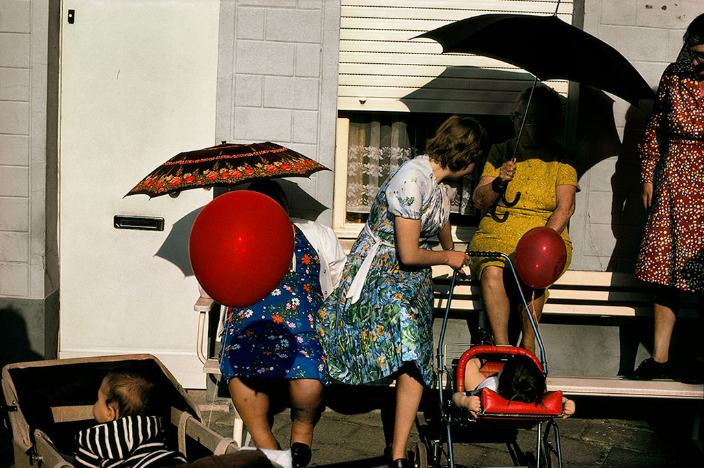
Harry Gruyaert is a mystery to me.

I wonder…HOW does he get such miraculous, beautifully atmospheric Photographs, over and over, again? It doesn’t matter what time of day,
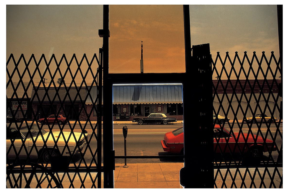
Los Angeles, California, USA, 1981. Photo by Harry Gruyaert/Magnum Photos. I came across a print of this work in June and realized that I hadn’t done a deep dive into Harry Gruyaert’s work. Well? It’s summer. Into the pool!  Three months later, I’m still immersed in the sheer joy of looking. Click any Photo for full size.

or night it is.

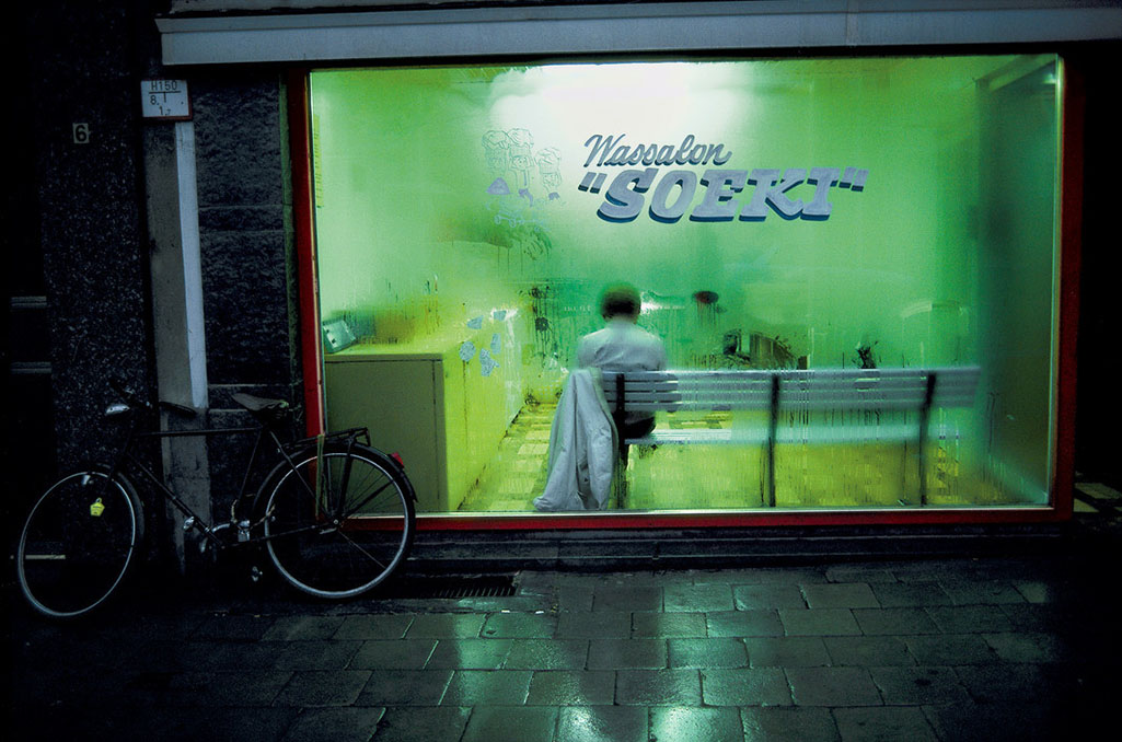
Launderette. Town of Antwerp, Flanders Region, Belgium 1988. Photo by Harry Gruyaert/Magnum Photos.

What the weather is,

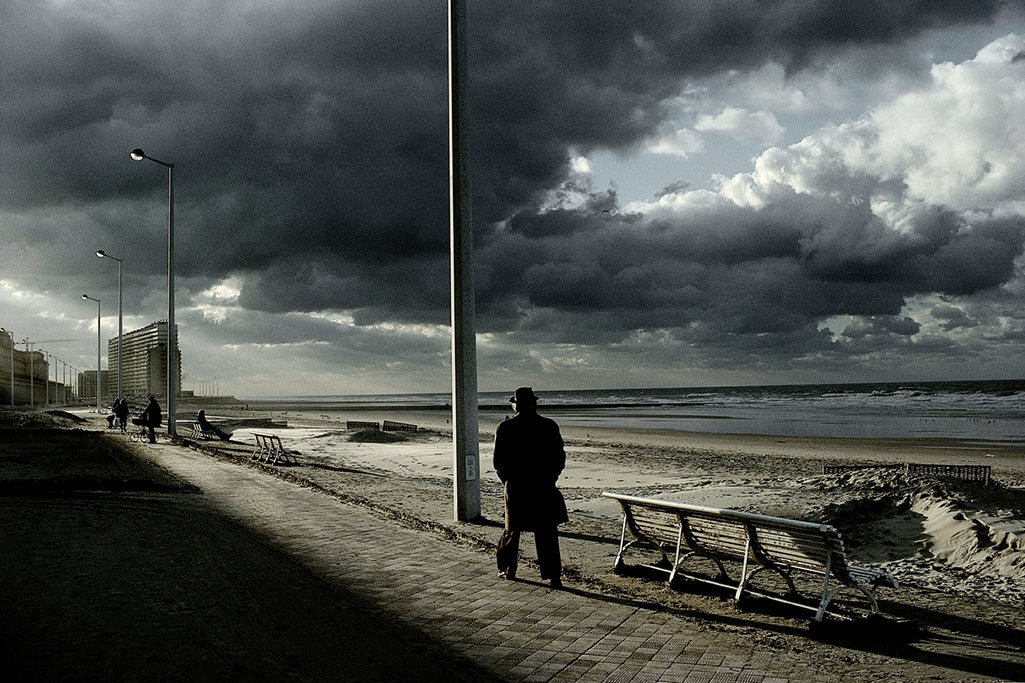
Ostende, Belgium, 1988. Photo by Harry Gruyaert/Magnum Photos.

or even what’s going on.

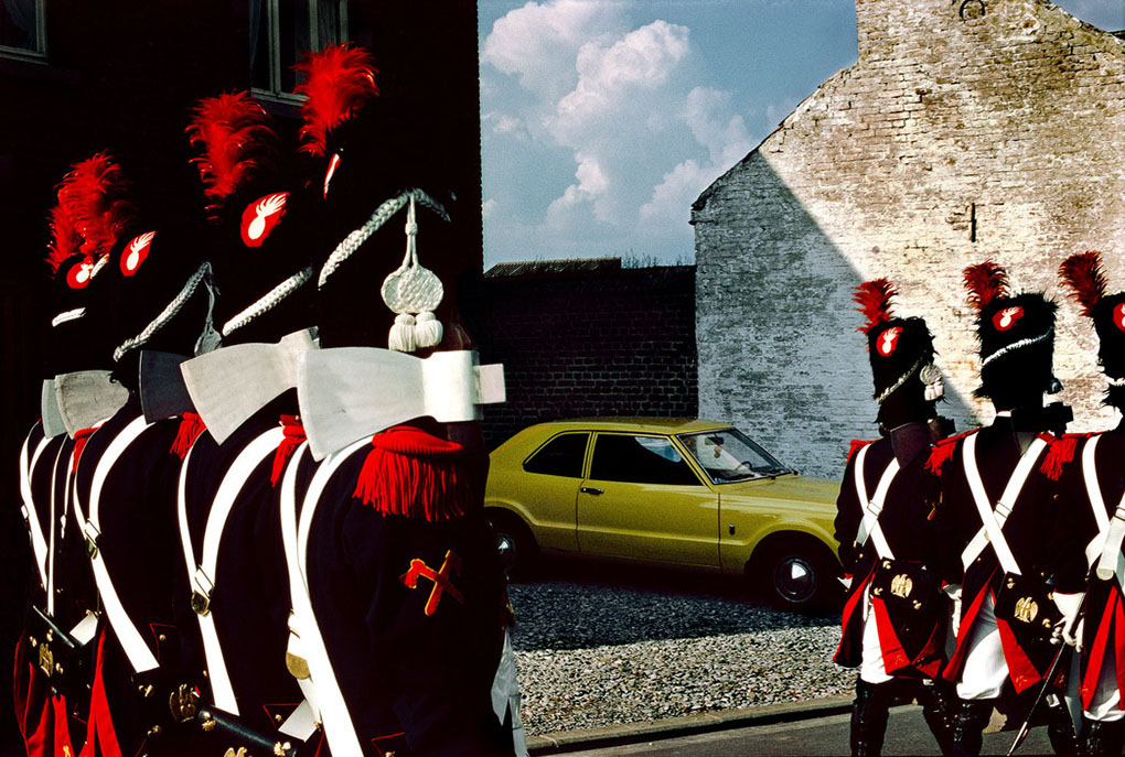
Commemoration of the Battle of Waterloo, 1981, Village in the Province of Brabant, Belgium. Photo By Harry Gruyaert/Magnum Photos.

And, he’s been doing it for going on 50 years now.

His Photographs will make you stop and wonder- What’s going on here?

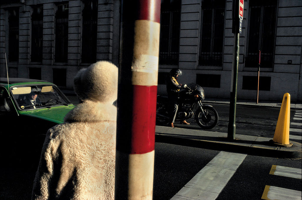
Rue Royale, 1981. Brussels, Belgium. Photo by Harry Gruyaert/Magnum Photos.

Or, marvel at the almost magical combination of elements coming together in a split second of time,

Parade, 1988.Flanders region, Province of Brabant, Belgium. Photo by Harry Gruyaert/Magnum Photos.

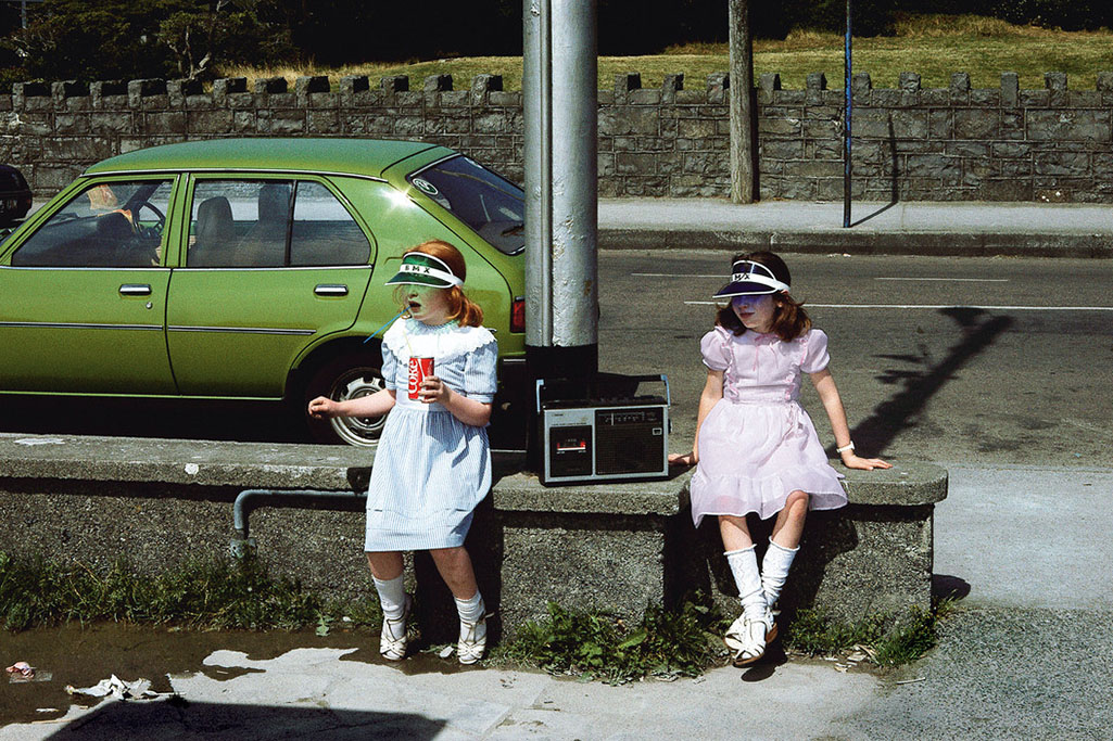
any time,

Galway, Ireland, 1988. Photo by Harry Gruyaert/Magnum Photos.

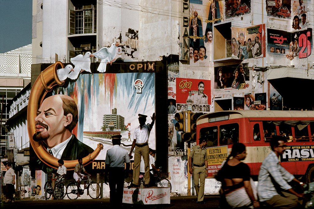
any where.

National Communist party congress, Trivandrum, India, 1989. Photo by Harry Gruyaert/Magnum Photos.

But, the biggest mystery of all, for me, is WHY is he still so relatively little known in the USA?

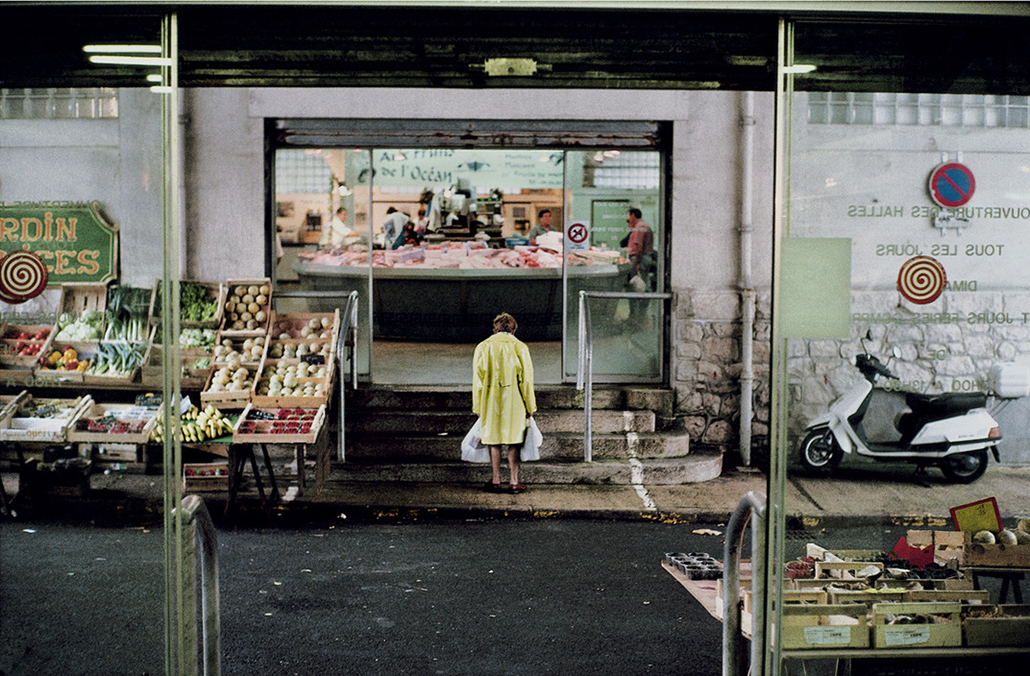
His name is heard nowhere nearly as often as his fellow contemporary Masters of color Photography- William Eggleston, Saul Leiter, Stephen Shore, and the rest. As I write this, there are only TWO books of his work in print here (see BookMarks at the end). Yet, I find, his work has a richness and subtlety, those gorgeous colors he’s legendary for, all in the service of a mystery, like an untitled still from a movie (sorry, Cindy), that brings me back to have another look, again and again. His work can stand right alongside that of his peers, and it will hold its own alongside any of them. Even beyond contemporary Photography, Harry Gruyaert’s work, also, speaks to the lover of Painting in me. His is that rarest of work that touches some of the same nerves that Edward Hopper is, perhaps, most renowned for- the insular loneliness that defines modern life.

Covered market, Bairritz, France, 2000. Photo by Harry Gruyaert/Magnum Photos.

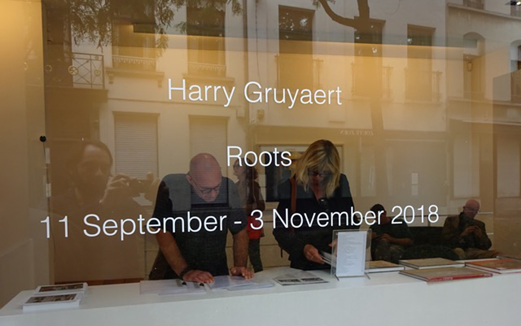
Born in Antwerp, Belgium in 1941, he joined Magnum Photos in 1981, as admittedly, and somewhat controversially, the first and only, non-PhotoJournalist in the legendary group. 37 years later, he’s still a member, and is it only a coincidence that the current roster may be the most diverse in its 71 year history? Still going strong, 2018 is turning out to be a big year for Harry. First, the Harry Gruyaert – Retrospective at FOMU Foto Museum in Antwerp, Belgium, from March 9th to June 9th, 2018, while the feature length documentary, Harry Gruyaert Photographer, premiered this summer. Meanwhile, this past Saturday, September 8th, saw the opening of his new show at Antwerp’s renowned Gallery Fifty One. The show is titled Roots, and features work Mr. Gruyaert created in his native Belgium, where his “roots” are.

I’m thrilled to say I had the privilege of speaking with Mr. Gruyaert in France after he just returned home from attending the opening of Roots, and in a far ranging interview, I was fortunate to ask him every question I could think of that I have yet to see asked of him thus far. What follows is not a blow by blow biography. It’s meant to fill in the gaps in what’s been written about Harry Gruyaert thus far. And so, it’s meant to intrigue, to inspire you to delve further into his long and rich career. I quickly discovered that he is not one to mince words. Hold on to your seats, and prepare to meet a living legend, who’s bursting with passion in his mid-70s. Ladies and gentlemen, my conversation with Harry Gruyaert on September 11th, 2018…

Before I could get a word out, he said…

Harry Gruyaert- I liked what you did on Saul Leiter, so…

Kenn Sava- Oh, you did? Thank you very much. It’s interesting…I notice there’s a couple of things you seem to have in common with Saul. Early on, his father, also, was adamantly against his becoming a Photographer, and eventually disinherited him. He was also really loved Pierre Bonnard, as I mentioned. I note that you are as well. Saul who was known for his color work, did most of his intimate work in black & white, as you have.

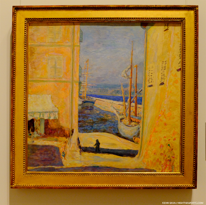
Pierre Bonnard, View of the Old Port, Saint-Tropez, 1911, oil on canvas, seen at The Met.

Pierre Bonnard is not somebody who comes up all that often, I’ve had him come up twice with such great Photographers recently. What is it about Bonnard that particularly speaks to you?

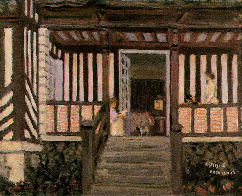
Pierre Bonnard, The House of Misia Sert, 1906, Oil on canvas.

HG- It’s extremely sensual, you know. It’s amazing. His cropping is really amazing. I really like so much the feeling he has towards his life, and his wife. It’s quite amazing.
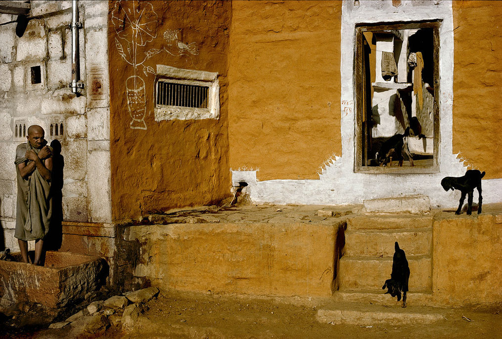
Town of Jaisalmer, State of Rajasthan, India, 1976. Photo by Harry Gruyaert/Magnum Photos. I couldn’t resist pairing this with Bonnard’s House above, without any input from Mr. Gruyaert. The more I look at them, the more I find coincidentally in common. Down to the animals just inside each door.

A funny thing about Saul Leiter. When I arrived in Paris in April, 1962, I went to Elle Magazine, which is a fashion magazine, and I showed my work to the art director, Peter Knapp, and he said, “Oh, you are the little Saul Leiter. “ I had no idea who Saul Leiter was. It took me 40 years to realize who was Saul Leiter, and strangely enough in the last Paris Photo, my work was hanging next to his in the booth of Gallery Fifty One, run by Roger Szmulewicz, and  believe it or not, who walks by as I was standing in the booth ? Peter Knapp ! It’s amazing. So I asked him, “Why did you tell me that all those years ago?” He said, “It’s because of the way you work with color, obviously.” I really find it exciting  when things like that happen. 

KS- So, his work had no influence on you. You weren’t aware of it.

HG- No. No. I found out much later when his first Steidl book came out and when I saw his show at the Foundation Cartier-Bresson in Paris, which was only a couple of years ago.

KS- This has been a big year for you with the FOMU Retrospective, the Documentary Harry Gruyaert Photographer, and now the Gallery Fifty One show, Roots, I wanted to congratulate you on all of that.
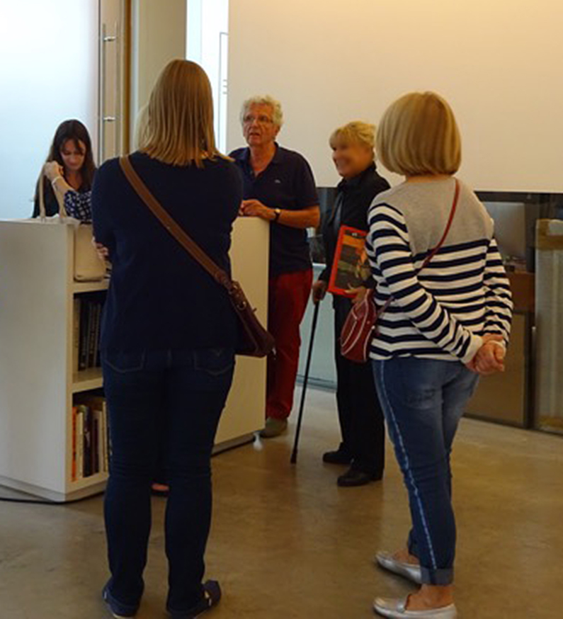
Harry Gruyaert, in the red slacks facing the camera, at the opening for his new show, Harry Gruyaert: Roots, September 8th. Photo by Gallery Fifty One..

HG- Thank you. 

KS- I came across your work in the Magnum Square Print sale and realized I hadn’t done a deep dive into your career. Part of the reason is there aren’t a lot of books of your work in print here. The Retrospective, with the red cover, and East/West being two. It seems that you’re slowly reissuing your books, right?

HG- Sure. You know I accumulated so much work. And the good thing about making books now, is that you have much more control than before. The quality of printing is much better and my new books look better than the ones I published before.
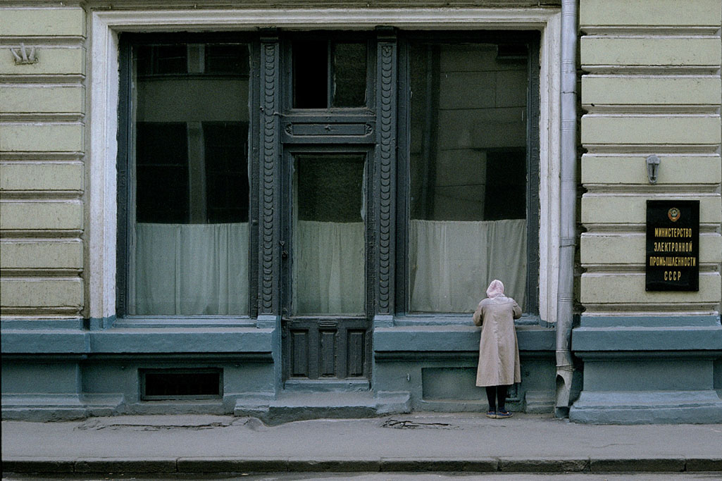
Moscow, Russia, USSR, 1989. From East in the 2 volume set, East/West. Photo by Harry Gruyaert/Magnum Photos.

KS- East/West is a fascinating book in that regard. I’m interested in why you chose to group the two books together. I know you’ve said many times you’re not a journalist, but looking at this work now from so many years later, it almost has a journalistic feel to it- A commentary about the materialism in America and the fall of the USSR at the time you were taking the pictures. Was that any part of the intention in issuing them together now in a slipcase? 
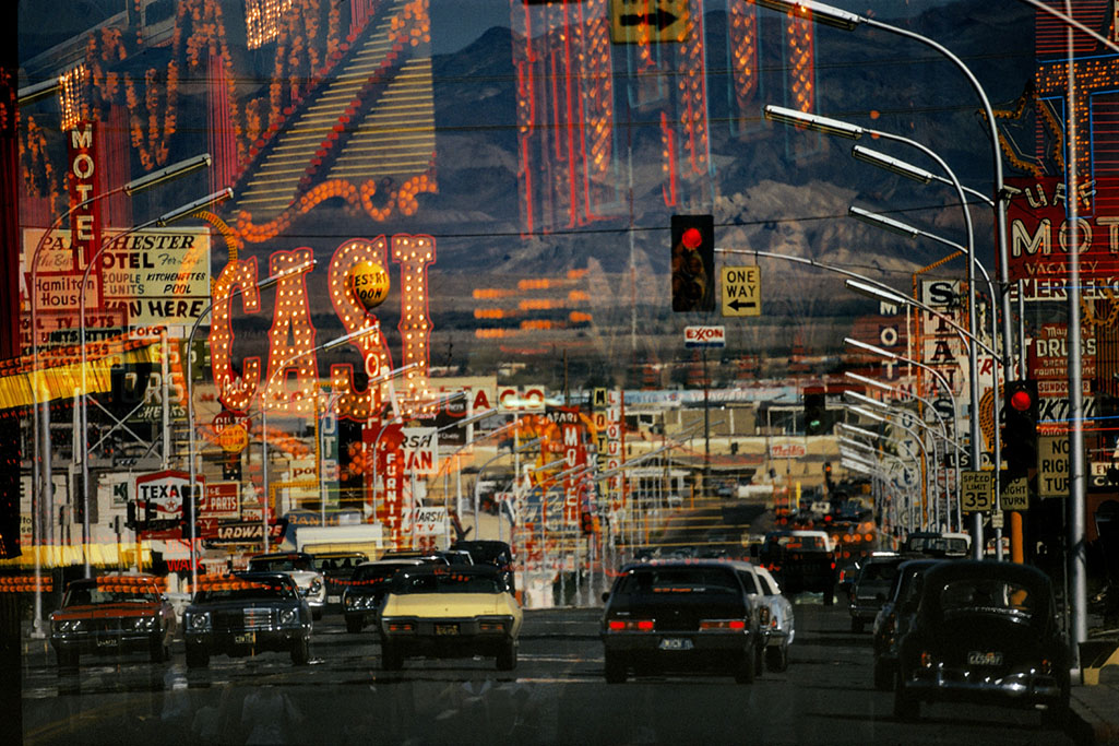
Freemont Street. Las Vegas, Nevada, USA, 1982. From West in East/West. Photo by Harry Gruyaert/Magnum Photos.

HG- Yes, that was part of the idea of publishing these two series of pictures together. Don’t forget, I’m a documentary Photographer, and in that sense I feel quite close to somebody like Cartier Bresson whose work is always about a particular place at a particular time. We have both travelled a lot and taken pictures in many different countries and share that same openness to different world and different cultures. Though I am a great admirer of american photographers, I sometimes feel that the work they have done in the states is more interesting than their work in other countries. I don’t know why that is. 

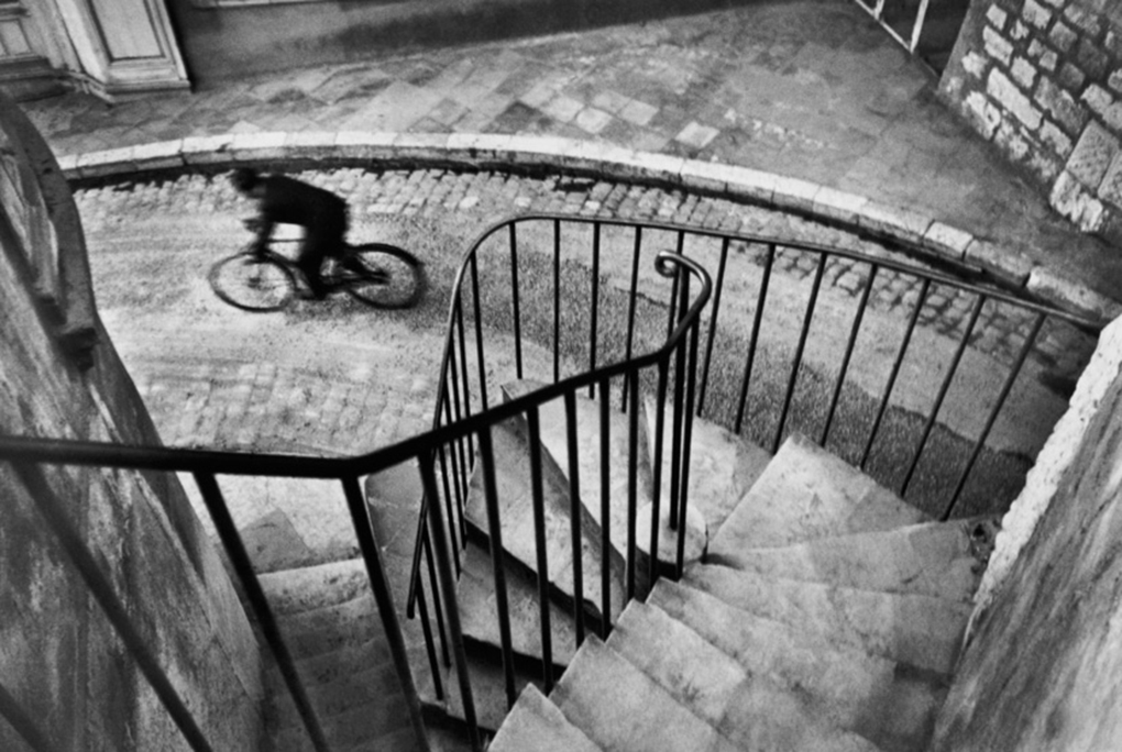
KS- You were involved with Henri Cartier-Bresson and I read the story of him asking you to color his prints. For everyone who wasn’t able to know him, what would you like them to know about him? Is there any one thing that particularly stands out?

Henri Cartier-Bresson, Hyeres, France, 1932

HG- (Laughs)…Oh boy. I was very lucky to have known him. He was very provocative. He was full of energy. Very provocative, and at the same time, he wanted to be a zen buddhist. (Laughs) Very interesting person. Complex. It’s such a lesson that he gave up Photography and went back to his old passion, Painting and Drawing, when he felt he had nothing more to say through photography. It was not on the level of what he did before, but it’s such a lesson. Then, he’d come and ask you, “What do you think of my Painting or Drawing?” He started all over again, questionning himself instead of relying on his reputation.
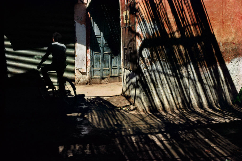
Shaded streets of the medina (old district), Near “Jemma el Fna” square, Marrakech, Morocco, 1986. Photo by Harry Gruyaert/Magnum Photos.

KS- That’s quite a compliment to you that he’d ask you to Paint his prints. 

HG- It all started when he came to see my first show about Morocco at the Delpire Galerie in Paris. My C. prints were far from perfect and he started making comments. He took bits of paper or little objects and put them on my prints to explain to me what he meant.Amazing. Then he sent me his book about Andre Lhote, who was his teacher in Painting and  called me up two weeks later, and said «  I have a suggestion to make.I will send a couple of my prints and I will send you a big box of pastels and you can try and color them.” I said, “Henri, it’s nice to think about it, but I’m not a Painter. I can’t even make a drawing.”

He had a problem with color photography. He felt it was only used for commercial reasons and was not really interested. And I think he really didn’t like the fact that many Magnum Photographers moved to color because that’s what magazines were asking for when they were better doing black & white. But some became very good magazine photographers and were very successful. 
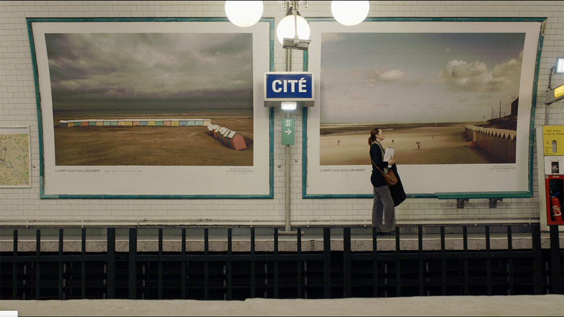
In 2017, 174 Harry Gruyaert Photographs were on view in 11 stations of the Paris Metro at the invitation of RATP, the Paris public transport operator. Seen here are two images from his beach series, “Rivages,” (shores, or “Edges” as it’s called here), images that speak of the insignificance of man in the scope of nature, the Artist has said, while at the same time, showing a sense of humor, particularly on the left. Seen here in a still from the Harry Gruyaert Photographer Documentary.

KS- Was there a single moment or an event that got you first interested in Photography?

HG-Different things…I wanted to travel. I went to an exhibition in ’58 at the World’s Fair in Brussels. I saw the different pavilions : America, Russia, Japan, India… I was looking at the globe which I had at home. And I thought, I want to go to all these places. And I was also interested in fashion. I loved  Fashion magazines which were much better at the time, like Harper’s Bazar and Vogue, and photographers like Avedon and Irving Penn. And there were all these beautiful girls…

KS- So, it came out of your desire to travel.

Still from Harry Gruyaert Photographer.

HG- To travel, to discover things…I was always interested in Paintings. I always went to Museums. 

I never even thought about doing anything else. I was Director of Photography for a couple of television Film. I had a big admiration for the directors of photography who worked with  Italians film directors like Antonioni, I through they were really fantastic. I could have made a profession out of that, but I wanted to do my own stuff, my own Films and it meant working with a large crew of people and you needed a lot of money. The good thing about photography is that you can work on your own. If the digital small cameras of the quality we have now had existed at the time, things might have been different.

KS- When I look at your work I see elements of both- they seem like stills from a movie but then when it comes to printing, it’s some of the same techniques that come to bear that Painters would use, so you’ve almost married the two. Do you see it that way at all?

HG- Yeah, sure. The funny thing is that the directors I know in Paris, I’m friendly with some of them, have told me they’ve been inspired by some of my photographs…So it’s wonderful that it works both ways. 

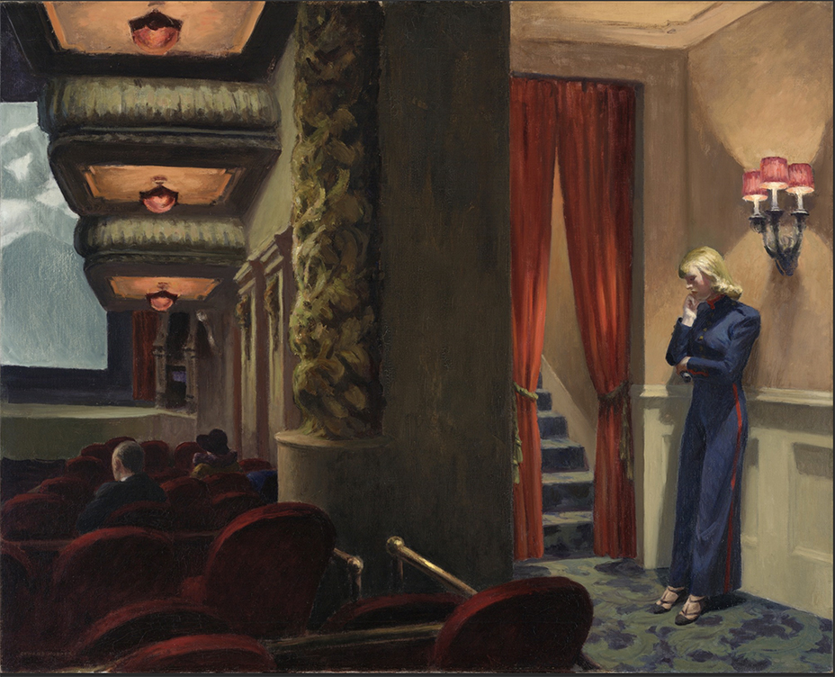
Edward Hopper, New York Movie, 1939, Oil on canvas.

KS- I’ve read a couple of your interviews over time talking about Edward Hopper. I think in one interview you said you didn’t really look at his work early on, but you can kind of see what people say when they talk about the similarities in the loneliness and isolation in your work. Since it didn’t come from Hopper, that sense that is in some of your work, where do you think that came from? Those isolated figures, that sense of loneliness and isolation that occurs in your work? 

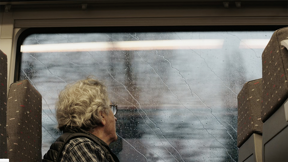
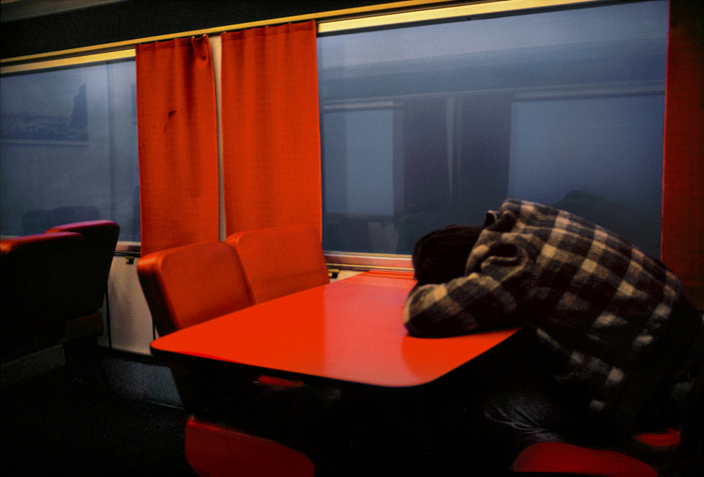
Trans-Europe-Express, 1981. Belgium. Photo by Harry Gruyaert/Magnum Photos.

HG- I don’t really know. It’s not the person that interests me most. It’s the person in its environment. To me, all the elements are important. I don’t have any particular intention. It’s just what I see.
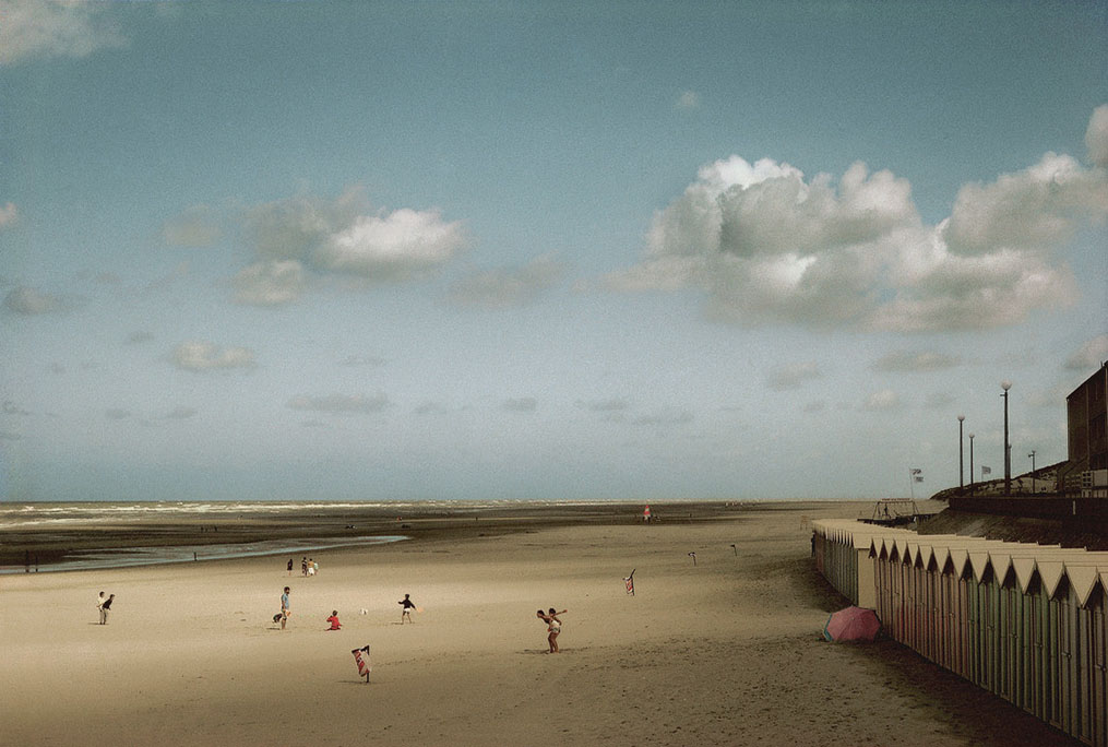
Bay of the Somme River in the town of Fort Mahon, Picardie, France, 1991. Photo by Harry Gruyaert/Magnum Photos.

I think humans have such a great idea about ourselves but nature is so much more powerful.

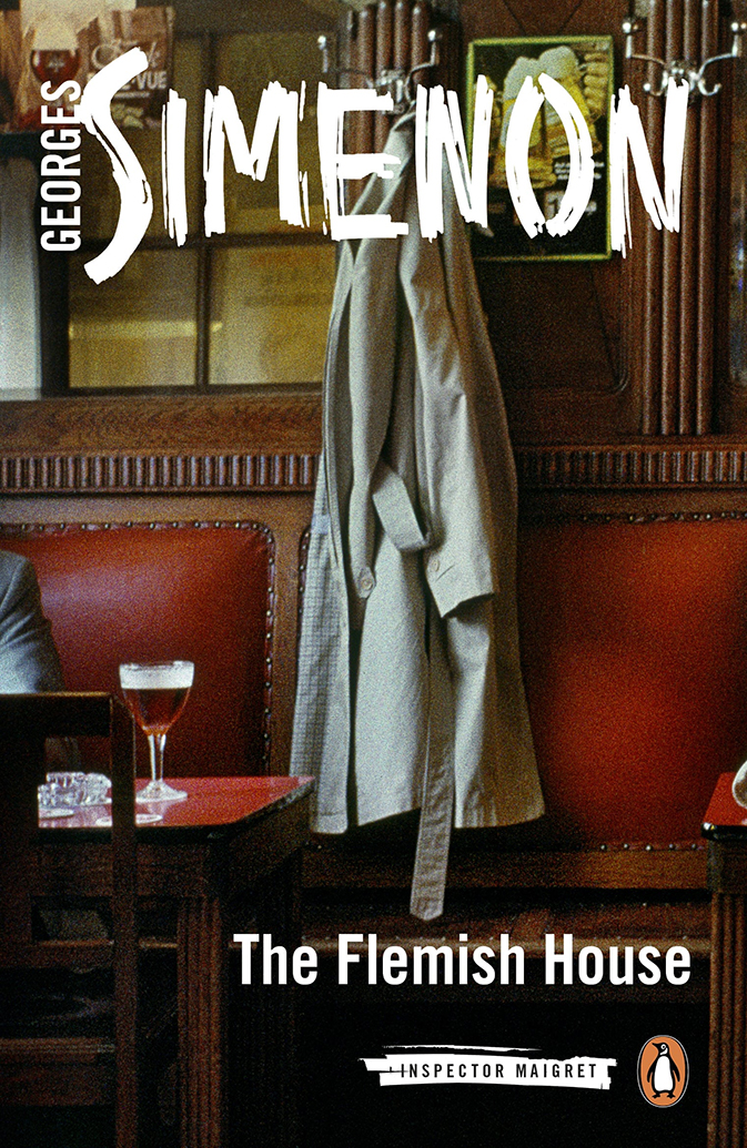
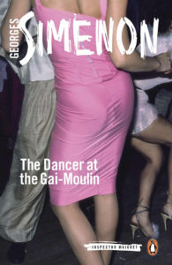
The Flemish House, by George Simenon. Cover Photo by Harry Gruyaert/Magnum Photos.

Talking about loneliness in the city…A funny thing that came up. Do you know (Georges) Simenon, the Belgian Writer of detective stories ? Inspector Maigret is the name of the detective. They translated them into english and they had trouble finding covers for them. Peter Galassi said to them, “Look at Harry’s work. I think you can find something there.” So, the guy from the publishing company sent me some lay-outs and I didn’t think it could work because the cover is vertical and 90% of my work is horizontal. But, the way he cropped it, it was really quite interesting and I asked him to print the full frame image on the back cover. 
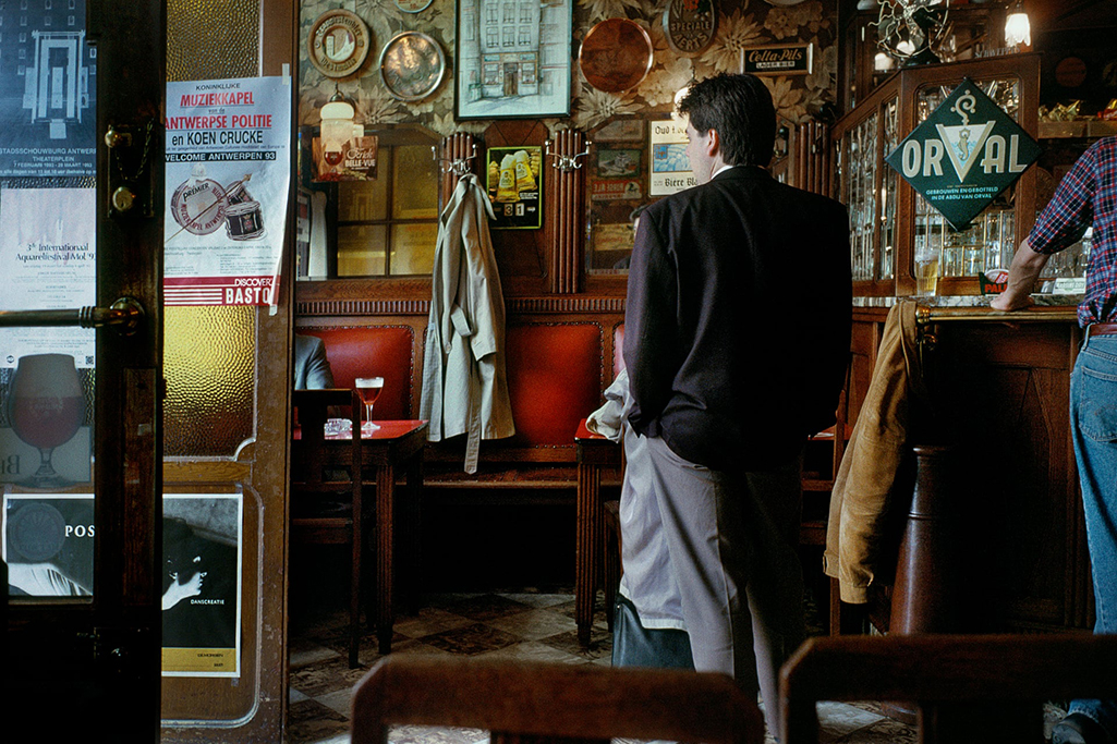
The full frame source Photo for the cover. Bar, Antwerp, Belgium. Photo by Harry Gruyaert/Magnum Photos.

Then, Penguin Books in London picked it up. Believe it or not, we’ve done 65 covers.

KS- You’ve done 65 covers for them?

HG- Yes. Just from my archive. My archives are not only Magnum, only a small percentage is Magnum. So, she comes to Paris and looks through mainly my old work. When I did my show at FOMU at Antwerp, there was a big wall with all the covers of the books and small pictures of the full frame.

The strange thing is Simenon is Belgian. He’s from Liege. I’m from Antwerp. I met his son and he showed me some Photographs that Simenon did himself, and you find this kind of thing of a small figure in an urban landscape. With a certain lonelieness. Which you find often in my work. It’s really quite funny.

KS- You’ve spoken about a number of the places you’ve worked- Moscow, Belgium, California & the American West. How do you feel about New York?
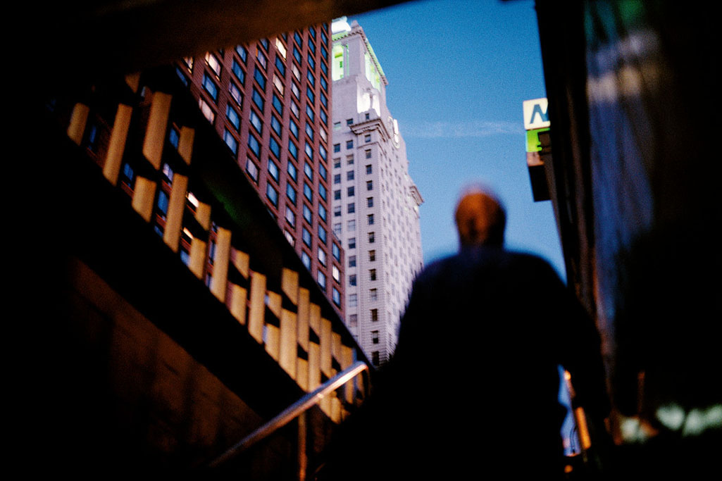
It’s a small world. New York City. USA, 1996. The 23rd Street Subway station, across from the Met Life Building. It’s immediately recognizable to me because it’s in my neighborhood. Photo by Harry Gruyaert/Magnum Photos.

HG- Extremely exciting. I’ve done lots of work in New York. The first time I came to New York was in ’68. I was friends with people like Gordon Matta-Clark. All those Artists were important to me, in terms of the energy, in terms of what they were doing. 

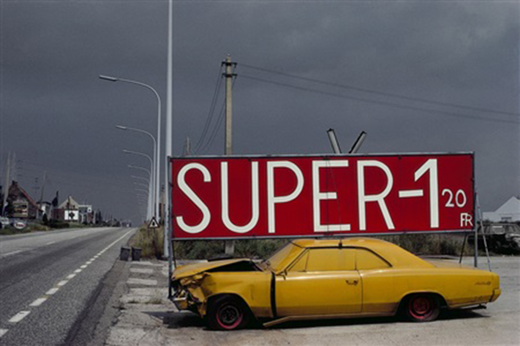
National Road 1,near Mechelen, Antwerp Province, Belgium, 1988

Pop Art taught me to look at a certain banality with interest, a visual interest and a certain sense of humor.That changed the nature of the work I was doing in Belgium at the time.  In the beginning it was only in black & white. For two years, I didn’t see any color there. But Pop Art taught me to look at things in a different way and then I started to work in color.

So for two years there I only shot black & white.

Near Bruges, Belgium, 1975. Photo by Harry Gruyaert/Magnum Photos.

KS- I don’t really consider Robert Rauschenberg a Pop Artist but he was obviously very important at that time, and since. Has he had any influence on you at all?
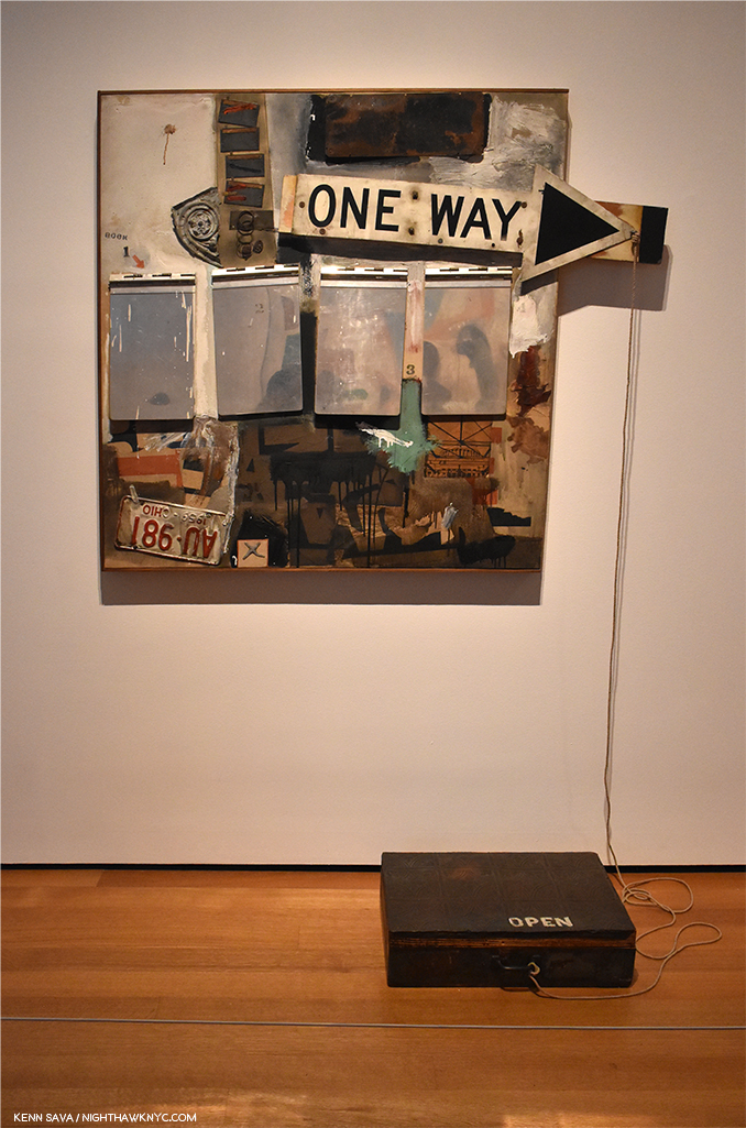
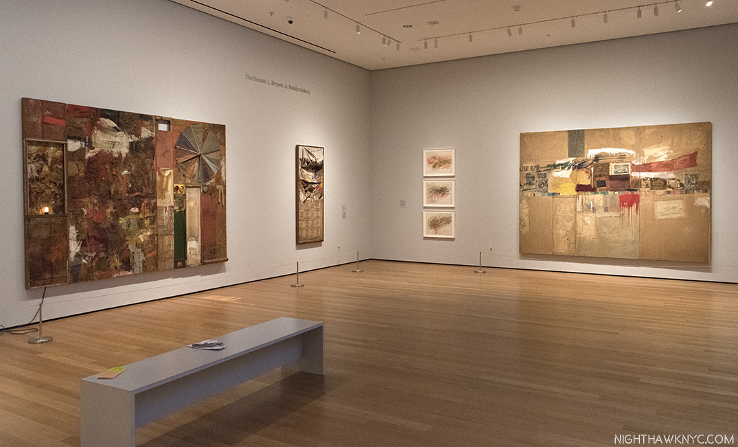
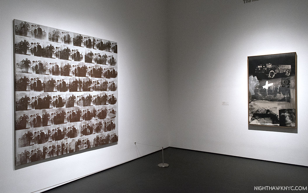
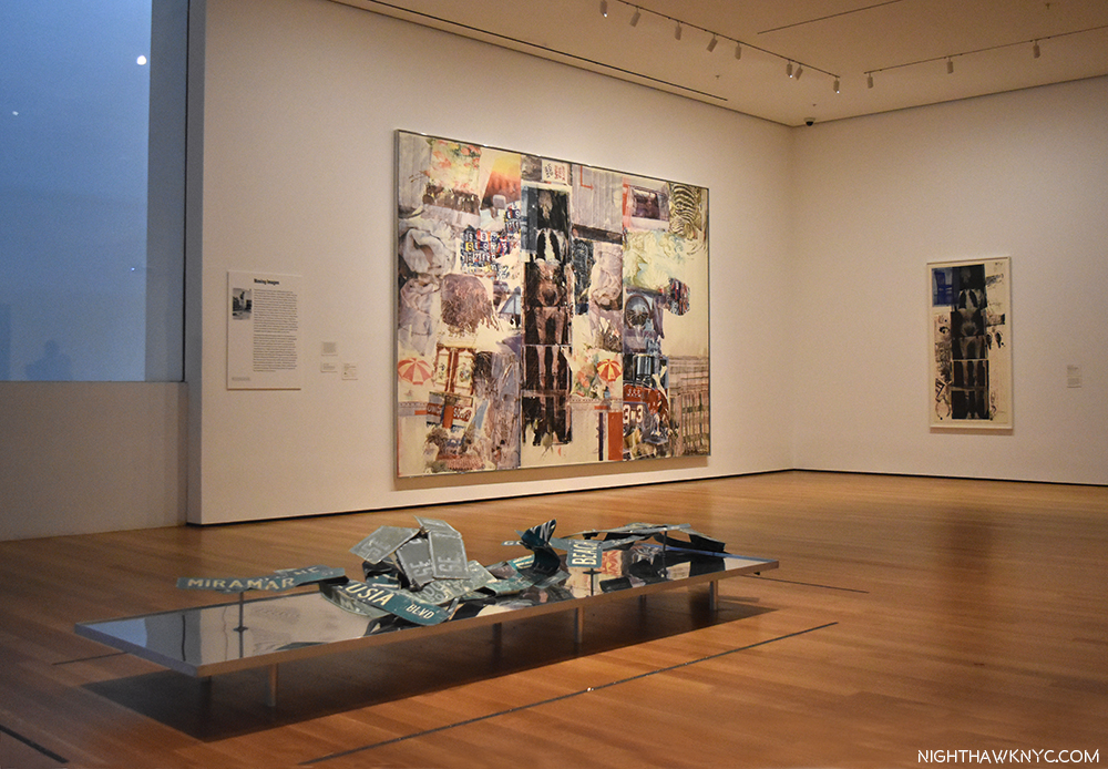
Robert Rauschenberg, Black Market, 1961, seen at MoMA’s Robert Rauschenberg: Among Friends show, 2017.

HG- Oh, I love his work. I mean the personality… the openness, trying other things. There’s more sensuality in Rauschenberg. It’s more fun as well. 

KS- In looking at someone like Robert Rauschenberg, and there’s others, too, who were Painters, but also were Photographers, it seems to me that their Photography doesn’t get any attention at all. Have you seen Rauschenberg’s Photography, and if so, what do you think of it?
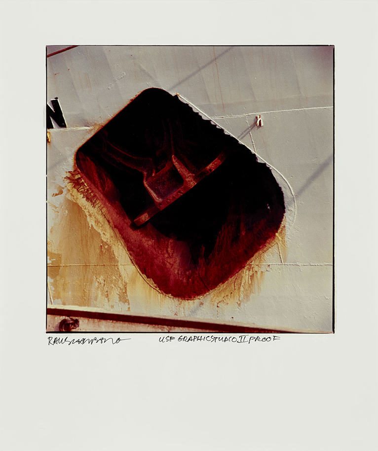
Robert Rauschenberg, Anchor, from Studies for Chinese Summerhall, China, 1983. Photo by Graphicstudio, USF.

HG- Oh, sure. It’s interesting. Sometimes it takes time to discover things. So many Photographers are being discovered…look at Saul Leiter.
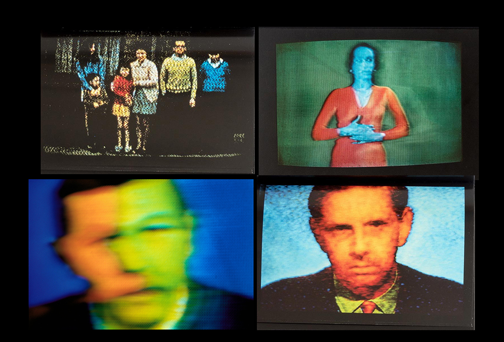
Excerpts from T.V. Shots, Photos taken between 1969 and the early 1970s. From the publisher- “Gruyaert’s break from television wasn’t all peaceful, though: his first serious body of work contained photographs of distorted TV images. By following events such as the 1972 Munich Olympics from home, he created a distressed parody of the current-affairs photo-story. The work caused controversy, both for its disrespectful assault on the culture of television and for its radical challenge (both formally and in terms of content) to the conventions of press photography. Gruyaert views it as the closest thing to journalistic photography he has ever made.” Photos by Harry Gruyaert/Magnum Photos, as seen in the 2007 Steidl book of the same name.
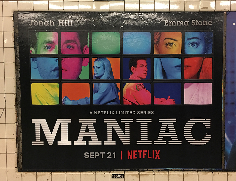
Imitation is the sincerest form of flattery, someone said. This is NOT by Harry Gruyaert. NYC Subway ad for Maniac, September, 2018

KS- Speaking of that…another Photographer who is also a Painter, is William Eggleston. You were able to see the legendary 1976 show at MoMA, Photographs by William Eggleston, and you spoke about being impressed with his dye-transfer prints. I’m wondering- What did you think of his work when you first saw it?

HG- It was amazing to see that, especially the quality of the printing. The first book is one of his best and one of my favorites. 

KS- So you think William Eggleston’s Guide would be among his best work?

HG- Sure. Yes. Definitely. There are other good things too. But the problem now is that publishers want to publish too many books. Some are good, some are not so good. Banality can be interesting, but sometimes, it’s just banal!

KS- In the Gallery Fifty One show you have 41 works in black & white and 19 works in color, though they are large. I notice there seems to be more surrealism in the black & white works, where it’s more subtle in the color work. Does that seem to be the case for you?
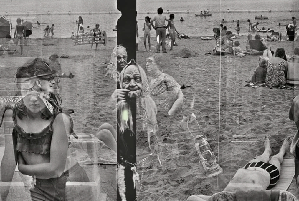
Belgium, Hofstade, Carnival (Superimposition), 1975, is included in the Gallery Fifty One show. Photo by Harry Gruyaert/Magnum

HG- Black and white and color are two different approaches. I took pictures of my daughters in black & white because I felt I got closer to them. Shooting in black and white I feel less preoccupied by the way people dress, the background or things that could distract me. I concentrate on the human quality of the person. Color is more complex. With color, the color really has to be the main thing…the most important thing…
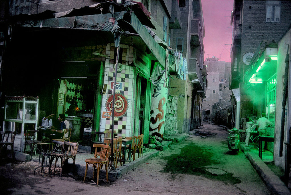
A normally very busy street deserted by citizens for the first meal of the day. During the Ramadan. Cairo. Egypt, 1987. Photo by Harry Gruyaert/Magnum Photos.

KS- It’s said that Roots was, at one point, basically a “farewell” to Beligum, after your difficulties with your father…

HG- That was not so much the problem as the lack of a cultural environment.
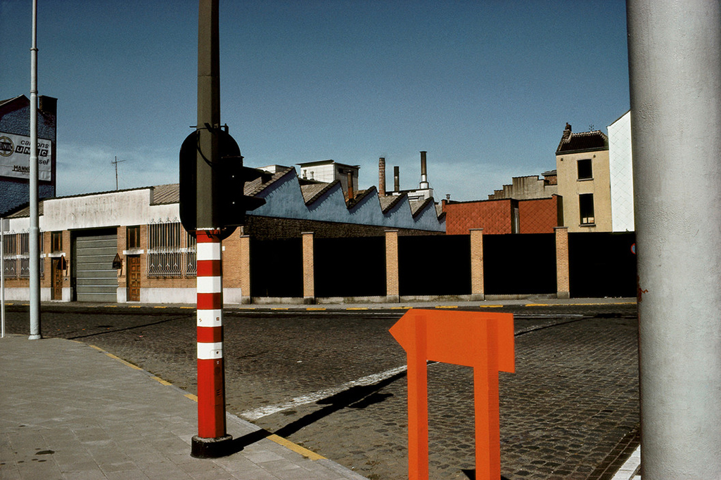
“Midi” train station district, Brussels, Belgium, 1981, is included in the Gallery Fifty One show. Photo by Harry Gruyaert/Magnum Photos.

KS- But, it seems that you’ve made peace with Belgium. Have you done work in Belgium since Roots? 

HG- I do all the time. At the show I gave Roger (Gallery Fifty One’s Director) about 15 prints I did very recently, to show whoever’s interested that things change. Nothing stays the same. The colors are different now. The mentality’s different. Belgium is more like the rest of Europe, I guess…the same clothing…the same advertisements. It’s actually much more colorful, but in a more capitalistic driven way. It’s more fashionable somehow, and It’s more alike. Before, in Holland and Belgium, which are very near to each other, things were very different in the color aspect and all that. And now, things have become much more the same, like in the States.

KS- So you were saying that some of the American Photographers influenced you more than the Europeans. Who were those American Photographers who influenced you?

HG- (Lee) Friedlander, definitely. (Irving) Penn, (Richard) Avedon. Helen Levitt is wonderful, sure, Bruce Davidson and others…
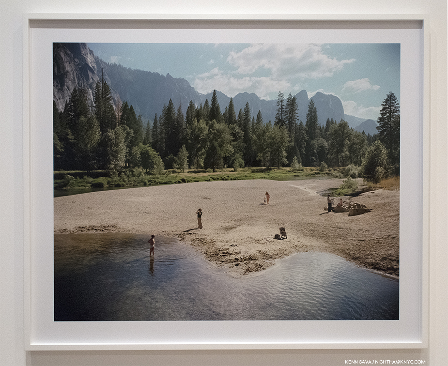
Stephen Shore, Merced River, Yosemite Park, CA, 1974, Seen at the Stephen Shore Retrospective at MoMA, 2018

When I look at Stephen Shore’s work, I have the feeling that I am traveling with him. It’s really important in Photography to get to the person and have the feeling of being with him. That’s really important. Stephen Shore, but other Photographers as well. It’s physical. It’s the experience they have that appeals to me. It’s a physical thing. That’s why I don’t care much for conceptual work. It comes from the brain. For me, it has to come more from the stomach. It’s physical. It’s experience, which someone has at a given time, and through the experience I get contact with the person who did it.

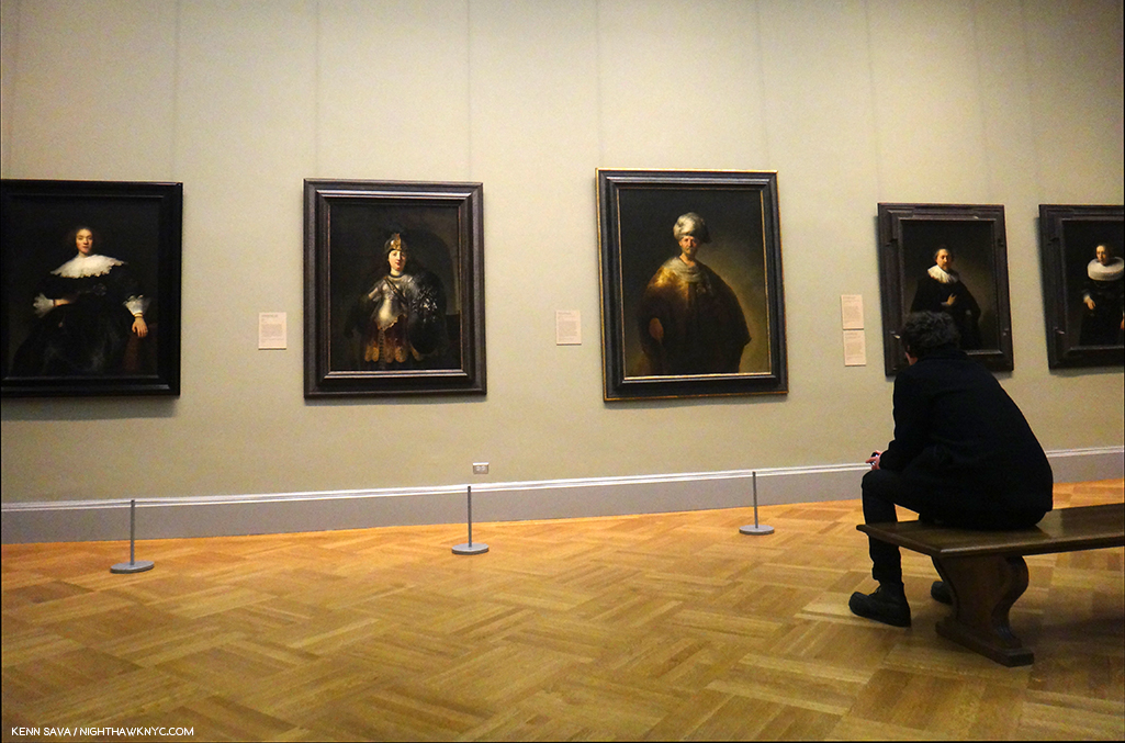
A visitor spends quality time with Rembrandt(s). At The Met, February, 2015.

To me, Art is…When I look at Rembrandt, I’m with Rembrandt. When I look at Bonnard, I’m with Bonnard. When I look at conceptual work, I’m with the brain of somebody. If they have to write a lot of stuff before we’re able to understand what it’s all about, I’m not interested in the exhibition. I have to first look at the work and it should mean something. It has to appeal to me visually. 

KS- Have there been any Directors or Painters that have spoken to you more recently?  Anyone that’s come along since Antonioni, Magritte? Anything that’s more contemporary? Anything that you’ve really been impressed with?

HG- Recently? I’m a movie fan. I go to movies all the time. In the past I went to the cinema every day. I learned more from movies than anywhere else…movies and paintings…

About Antonioni. What’s really interesting…In 2009, 10 Magnum Photographers had a show at the Cinematheque Francaise in Paris, exploring  the relationship between still Photography and Film. My part was to show how much I was inspired by Film, and mainly, by Antonioni. So, I did a projection, which lasts about 25 minutes, with extracts of his movies – l’Avventura, The Eclipse and the Red Desert –  and some of my Photographs next to them.
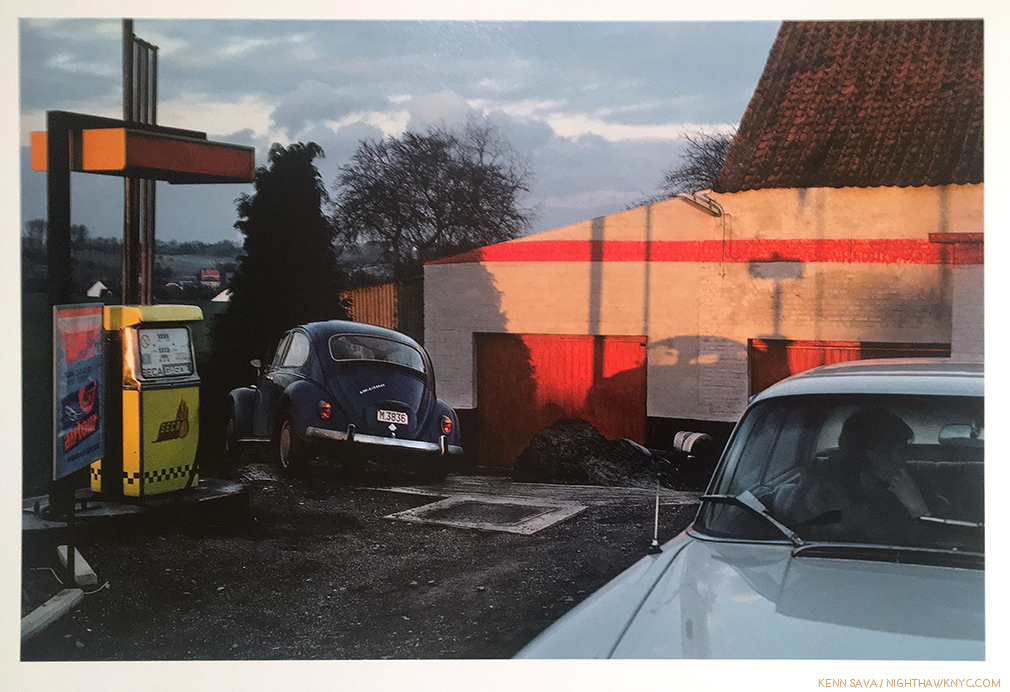
Province de Brabant, Belgium, 1981. One of my personal favorite Harry Gruyaert Photos reminds me of the scene in Antonioni’s La Notte when Jeanne Moreau sits in the car in the rain. Photo by Harry Gruyaert/Magnum Photos.

There are three Antonioni Films I was limited to1. So, I was able to use certain things. …. But, when they saw the thing produced, the review were very happy about it.

KS- I would love to see that. You have a new book, Rivages about to come out, (to be released in the USA as Edges later this year). I’ve read that you’ve been enjoying using today’s technology to make better prints. Are you also involved with the selecting of the images for the books and the way they are sequenced, or does somebody else do that?

HG- Completely. It’s team work. I’m the first person, obviously. I’ve been working with the same people the past 4 or 5 books. It’s like teamwork. 

The English edition of Rivages (Edges) is coming out at the end of September. The French edition is earlier. I’m very happy with them. The printing and everything. 

KS- So, you’re selecting the images for the books. 

HG- Sure. There’s some discussions, obviously…yeah, teamwork.

KS- Are you working on another version of Morocco?

HG- No plans for the moment, but everything is sold out. 

I want to do a book about street photography in the different cities I’ve been to. You know like New York, Brussels, or whatever And also a book on India and Egypt, a book about my industrial work, about airport, about my daughters… So many things… I also want to redo It’s not about cars, which was first published with  Roger Smulewicz of Gallery 512, but in a larger and more complete version. 

KS- Was Luigi Ghirri an influence?

HG- I discovered him later. I like some of his work…I think lots of his …He’s more of an intellectual. He has a real concept, I think. And I’m kind of… I think more in terms of color and I don’t think that’s his main interest. We have a very different approach

KS- There’s a couple of images that kind of remind me of yours. The shot of Versailles from the distance…

HG- Those are the ones I prefer. 
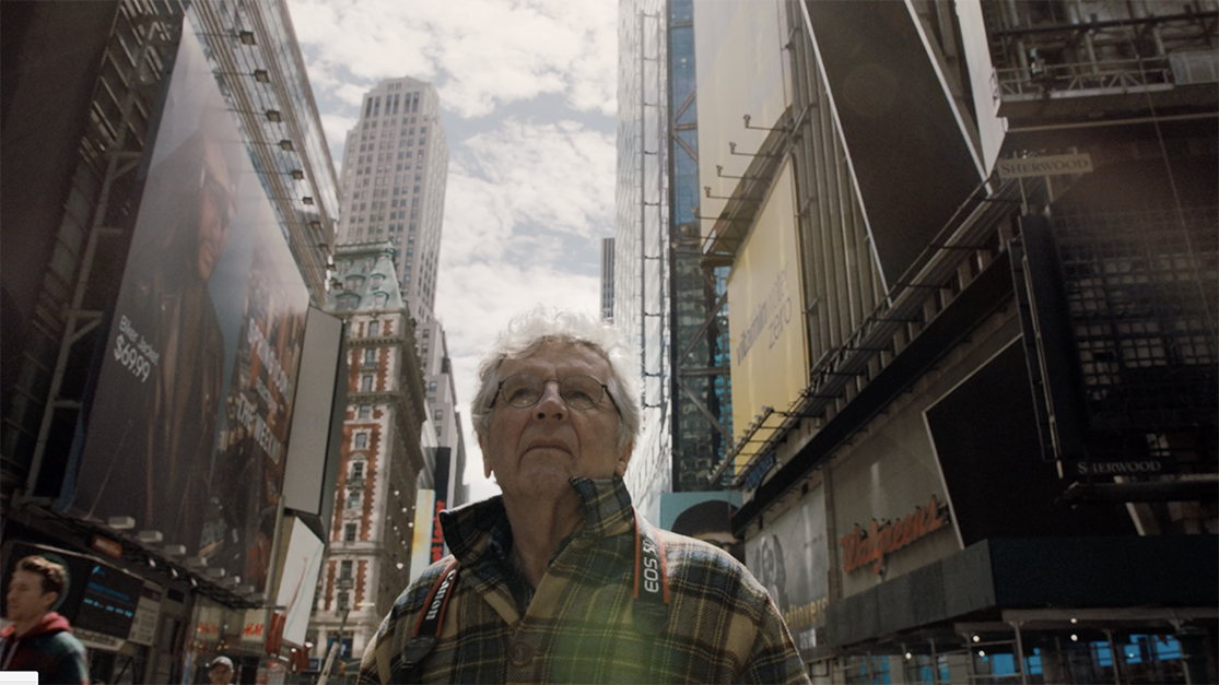
Still from the Harry Gruyaert Photographer Documentary showing the Artist on the corner of West 42nd Street and 7th Avenue.

KS- What did you think of the final documentary, Harry Gruyert Photographer? Did you have a chance to see it?

HG- Sure.

KS- What was your reaction? Were you pleased with it?

HG- I’m pleased with it. It’s not my Film. Well, it’s the Film of the director. It became very personal. You know, the thing is my father had about 25 hours of family films. The director knew that and he used a lot of that in the Film, comparing what my father did and what I did, and talking about my upbringing, so it became a very family kind of Film, which is fine, I think it’s a bit over done…it’s his Film.
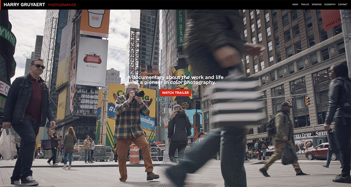
Harry Gruyaert in action in Times Square, NYC. He has spoken about how taking Photos is like a “dance” for him, which is obvious, here, in this shot from the Harry Gruyaert Photographer Documentary website. While other Photographers bring full Hollywood movie making gear to bear in making their Photos look “cinematic.” Mr. Gruyaert does it the old fashioned way, as you can see.

KS- Are there any plans to release it in America? Are we going to get to see it over here?

HG- Who knows. It’s just the beginning. 

Gallery Fifty One, Antwerp, Belgium.

KS- You just returned form Gallery Fifty One and the opening of your show in Antwerp. How did you feel about the show? How did the installation look to you?

HG- We tried something I had never done before. We set two screens, one on top of the other, very close. On one we showed black and white photographs and on the other color photographs.
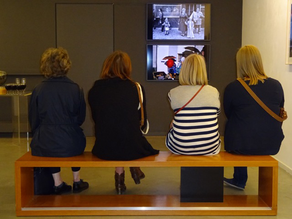
Installation view of Roots at Gallery Fifty One showing dual video monitors. Photo by Gallery Fifty One.

Sometimes the relationship between them worked, sometimes it did not. But it was an an interesting experience. There’s much more black and white stuff (included in the show) than I have ever showed. The color photographs are the ones published in the new edition of Roots.
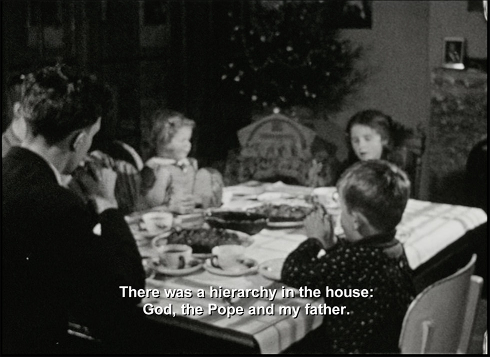
The Gruyaert family at dinner in a peaceful moment. Harry’s father, left, worked for the AGFA Film Company. His feelings about his son becoming a Photographer have been written about elsewhere. Still from Harry Gruyaert Photographer.

KS- Did your father ever come to accept you being a Photographer? Did he come to appreciate your work at all?

HG- Oh yes. He became very proud. (laughs) Once I was vice-president of Magnum, that was it for him. I think it was more about my position at Magnum than about my work.. 

KS- No one’s ever mentioned that anywhere. They always talk about how adamant he was against your becoming a Photographer. They never mention that he did finally come to accept it. Unlike Saul Leiter, who’s father disinherited him. So, at least, that’s good to hear.

HG- No, no no. My father was very proud at the end. He was. Whenever he would tell others how great his son was, it was special for him.

Our conversation ended there. A few days later in an email, Harry added this-

“I am just a photographer. If people look at my work and think it’s art, I am happy about it. But it is not for me to decide.”

Count me in that group of “people.”

While the mystery in Harry Gruyaert’s work will enthrall me for years to come, I hope the mystery surrounding his lack of recognition here will be history in the near future. After all, I’d rather leave the mystery writing to Simenon.


BookMarksMorocco is Harry Gruyaert’s most renowned book, winning the 1975 Kodak Prize. As he said, it’s been out of print since the last French edition, Maroc, published by Textuel in 2013. At the moment, two books are in print in the USA, Harry Gruyaert, with a red cover, a retrospective, published by Thames & Hudson in 2015, is likely to remain the most comprehensive overview of his work for the foreseeable future, particularly because, as he said, it has the Artist’s direct involvement.
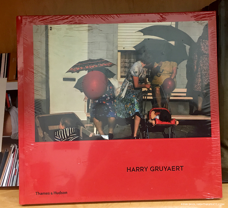
It’s gorgeous, in my view, and the place to start exploring Harry Gruyaert’s work and achievement among books currently in print in the USA.

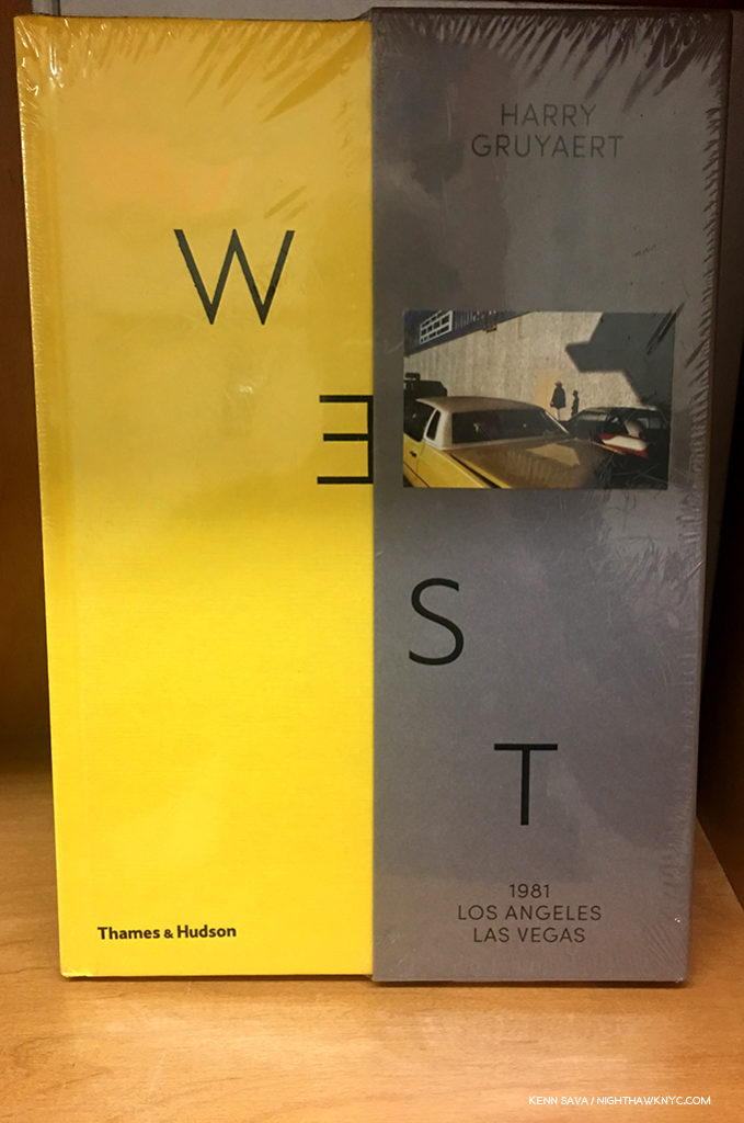
Harry Gruyaert: East/West, a two volume set in a slipcase, contains East, Photos taken in Moscow near the very end of the USSR in 1989, and West, Photos taken in the American West (including Los Angeles and Las Vegas) in 1981, was published in 2017 by Thames & Hudson. It’s a fascinating look at both places decades ago, and intentionally, or not, provides a powerful visual contrast between capitalism and communism.

East/West

Equally compelling is how much Mr. Gruyaert’s color palette changes between the two bodies of work.

Just released by Editions Xavier Barral this past May (2018) is the new edition of Harry Gruyaert – Roots, a book “about” the Artist’s relationship with his native country, Belgium. It adds over 20 additional Photos to the 2012 edition, which quickly went out of print. As the Artist said in the conversation, he finds today’s printing far superior to what he was able to achieve in the past, making this the edition to get.

Coming soon will be Edges (or Rivages in French), another new edition of an out of print beautiful collection. In visual poetry, Mr. Gruyaert explores the relationship of man to nature, the land to the sea, and the earth to the sky in 144 pages. Soon to be published by Thames & Hudson.

While I recommend starting with the red Retrospective, all of these books are excellent and recommended.

Cover image cropped from an original by Harry Gruyaert/Magnum Photos.

And, for lovers of detective novels, Harry’s images appear as covers on 65 Simenon novels published by, and available in the USA through, Penguin Books.

*- Soundtrack for this Post is “I Should Watch T.V.” by David Byrne & St. Vincent from “Love This Giant.” Lyrics, here. Video, here-

My thanks to Harry Gruyaert and Gallery Fifty One.

My prior Posts on Photography may be found here.

NighthawkNYC.com has been entirely self-funded and ad-free for over 6 years, during which over 250 full length pieces have been published. If you’ve found it worthwhile, you can donate to keep it going & ad-free below. Thank you!

Written & photographed by Kenn Sava for nighthawknyc.com unless otherwise credited.
To send comments, thoughts, feedback or propositions click here.
Click the white box on the upper right for the archives or to search them.
For “short takes” and additional pictures, follow @nighthawk_nyc on Instagram.

Subscribe to be notified of new Posts below. Your information will be used for no other purpose.


  1. In 2009 the Cinematheque Francaise presented Images to Come, an exhibition exploring Magnum photographer’s take on the relationship between cinema and photograhy. The works are displayed alongside still from L’Avventura, The Eclipse and the Red Desert.
  2. Harry Gruyaert: It’s Not About Cars, published by Gallery Fifty One in 2017.

This Summer In “The Era of Rauschenberg”

Everyone thought it was a joke, the gallery owner included, at his first show’s debut in Rome. Then, the respected reviewer of a show of work by a 28 year old Artist at its second stop at the Galleria d’Arte Contemporanea in Florence, Italy, called it a “psychological mess.” But, he wasn’t done. After continuing in biting terms, the reviewer concluded that the work should be “thrown into the Arno (River).” Shortly thereafter, the Artist sent the reviewer a note that read, “I took your advice.” Saving five or six works to bring home to NYC, he threw the rest, discreetly, into the Arno, finding a spot where he wouldn’t be caught in the act, and doing so in a manner to prevent their re-surfacing1.

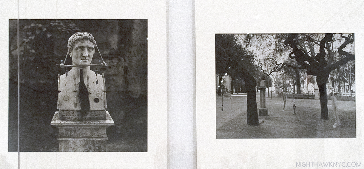
The Artist’s photos of his hanging works called Feticci personal, or Personal fetishes, displayed in his shows in Rome & Florence. One, left, shown hung on a bust. 9 of them shown hanging in a park, right. They seem to have disappeared since. Click any photo to view it full size.

His story continued…as the esteemed Calvin Tomkins tells it…

So branded an “Enfant Terrible,” “he had come back with two wicker trunks and five dollars in cash, and for a while that spring and summer he lived on the far edge of poverty. He found a loft on Fulton Street, near the fish market, a big attic space with twenty-foot ceilings but no heat or running water; the rent was fifteen dollars a month, but he talked the landlord into letting him have it for ten. A hose and bucket in the backyard served as his basin, and he bathed at friend’s apartments, sometimes surreptitiously, asking to use the bathroom and taking a lightning shower at the same time. His food budget was 15 cents a day, usually spent at Riker’s cafeteria, and supplemented by bananas he picked up on the United Fruit Company’s docks. Living that far downtown, he saw few other artists. Most of the New York artists lived in Greenwich Village then, or further uptown, and he could rarely afford the subway fare (still only a dime) to socialize.2” Shortly after, his NYC Dealer was not overly enthused about his latest paintings, so she dropped him.

So…You say you wanna be an Artist? Somehow, as bad as things got, he persevered when few would have.

44 years later, in 1997, his work filled Frank Lloyd Wright’s Guggenheim Museum Building, spilled over to fill the Guggenheim Soho (its final show ever), the Ace Gallery downtown, and numerous other satellite shows in galleries around town simultaneously, in what was to my eyes at the time, and my mind since, a monumental and utterly overwhelming Retrospective, an effect not unlike seeing the incomparable Picasso Retrospective, which filled all of  MoMA in 1980, or the Rothko show at the Whitney in 1998. 64 years A.A. (After Arno), as I type, his work fills MoMA’s 4th floor (until September 17). No less than Frank Lloyd’s Wright’s just happens to fill the 3rd floor. Be careful walking by MoMA. With that much American creativity on view, the building might just levitate.

The entrance on MoMA’s 4th Floor.

Speaking about his achievement, Artist, and former partner, Jasper Johns once said he “was the man who in this century had invented the most since Picasso3.” In the Catalog for that Guggenheim Retrospective, Charles F. Stuckey wrote-

“Globally speaking artists and their audiences have been living since around 1950 in what might well be called the Rauschenberg Era (his cap). As we look toward the culture of the next millennium, our vantage is from atop his shoulders4.”

Wait. Stop the march of time for one second. WHO has an “Era?”

Michelangelo and Leonardo share the Renaissance, with Raphael, Titian and a host of other “Old Masters.” Rembrandt & Vermeer are part of the Dutch Golden Age of the 17th Century that includes literally hundreds of Artists still fondly considered almost 400 years on. The Impressionists were a group. So were the Surrealists and the first generation Abstract Expressionists (though Rothko had his own name for it). Perhaps Picasso (who, early on, shared Cubism with Braque and Juan Gris) comes closest, especially in recent times. Well, Picasso is Picasso.

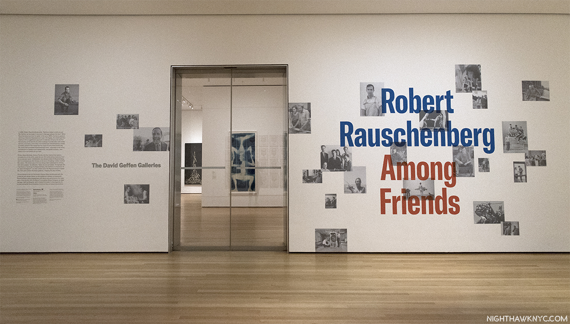
How did Robert Rauschenberg get from being told to throw his work into the Arno, to having an “Era” that’s lasted 50 years (to 2000), and may well still be going on, even though he passed away in 2008? This, and other questions, were foremost on my mind, during the first of 17 visits to MoMA’s 250 work retrospective, Robert Rauschenberg: Among Friends, and half as many to the 4 satellite shows around town, in this “Summer of Rauschenberg,” as I saw a writer call it. The other questions included- Does the show finally make the “case” for his later work? Does it finally make one for him as a major Photographer? First, putting off a look at the other shows, let’s take a look at Robert Rauschenberg: Among Friends. Outside, on the entrance wall, Photos of Rauschenberg & his friends, seen above, reinforce the message that the show features his interactions, mutual influence and collaboration with his friends, many of who happened to be brilliantly talented Artists, themselves. This is the view immediately inside those Star Trekian automatic sliding glass doors. Beam me up, Bobby.

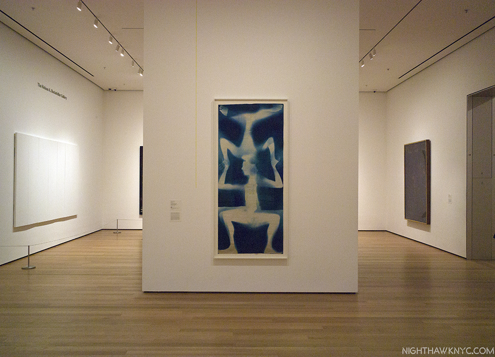
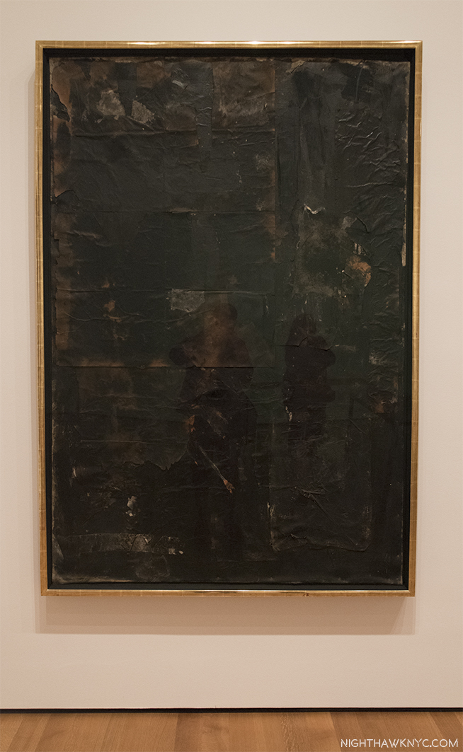
Partial installation view of the first gallery.Untitled (Double Rauschenberg), c.1950, Monoprint; Exposed blueprint paper, a collaboration with Sue Weil, center, White Painting (Seven Panel), 1951, left and Untitled (Black Painting), 1952-3, right, examples of the two bodies of work that were to come shortly after, once Rauschenberg had decided to become a Painter, not a Photographer. The White Paintings would inspire John Cage. Of the Black Paintings, which had newspaper collaged on them, painted over with black paint, he said- “I was interested in getting complexity without their revealing much. In the fact that there is much to see but not much showing. I wanted to show that a painting could have the dignity of not calling attention to itself, that it could only be seen if you really looked at it5.”

Untitled (Black Painting), 1952-3, Oil and newspaper on canvas, affixed to screen door.

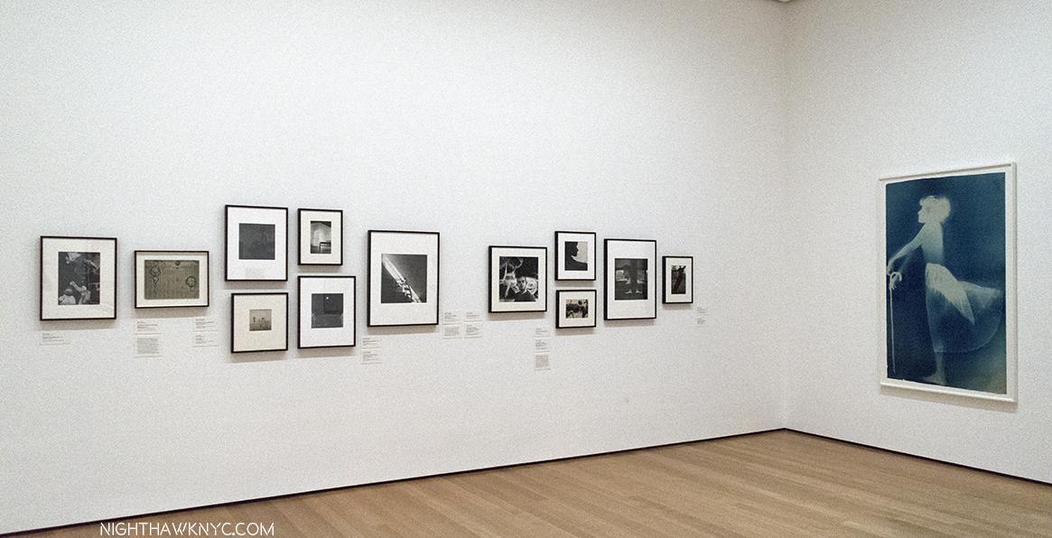
The first room contains his earliest work (unlike the 1977 Rauschenberg Retrospective, which came to MoMA, and started with his newest work). On either side of the door, and facing it, are 3 of the Blueprint images he created with Artist, and future ex-wife, Sue Weil in 1950 & 51. They were as attention getting then as they are now, garnering the couple a 3 page spread in Life Magazine in April, 1951, in which they demonstrated their process. To the right, a wall of his early Photographs are collected, mostly done in his days at Black Mountain College, including two that were the first works by Rauschenberg to be acquired by MoMA, in 1952, six years before it would acquire anything else by the Artist.

To the right of the door, a wall of early Photographs, and the Blueprint, Sue, c.1950, make it easy to see why he had a hard time deciding whether to be a Photographer or a Painter. I’m not entirely sure he ever truly chose one.

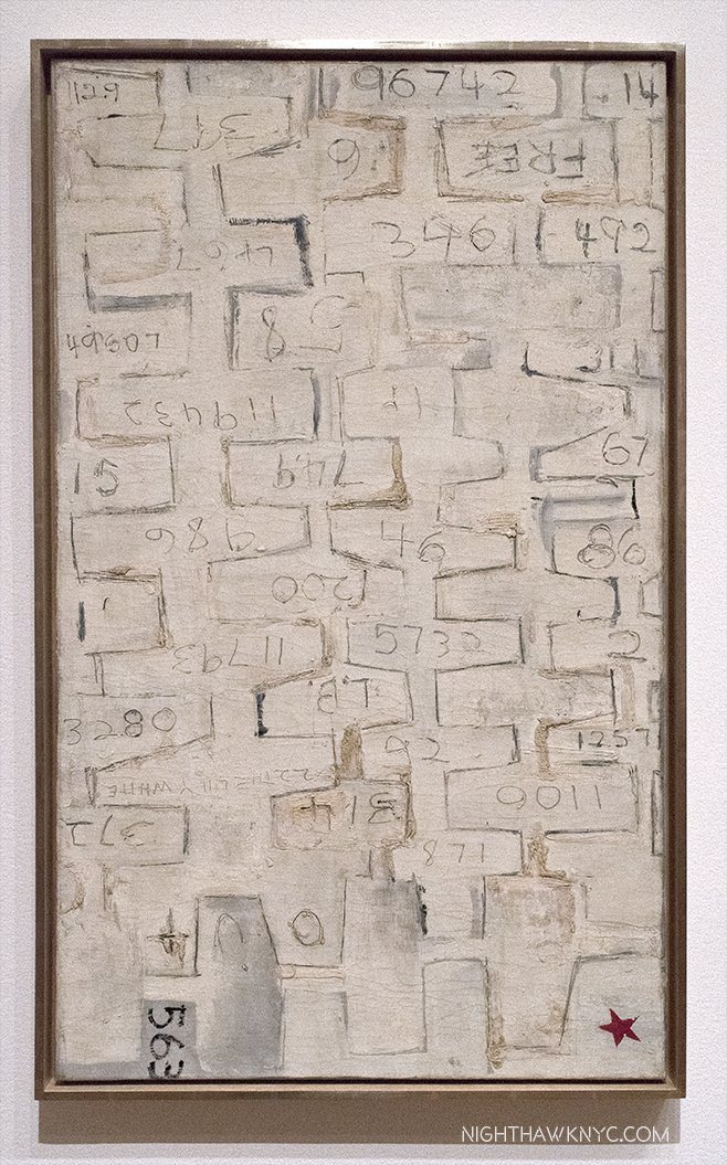
To the left are his earliest non-photographic works, including his earliest surviving painting, 22 The Lily White, c.1950, one of very few survivors from his very first show at Betty Parsons Gallery in May, 1951.

22 The Lily White, c.1950, Oil and graphite on canvas. The earliest surviving Rauschenberg Painting. The red star mimics those galleries put near sold items. This one didn’t sell. Perhaps viewers thought it had already been sold.

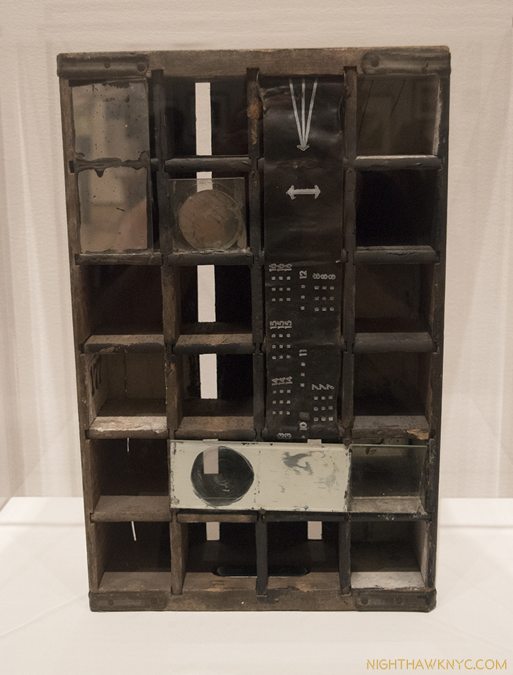
Untitled, 1952, Mirrors and objects in Coca-Cola box. The shape of things to come..Perhaps his first effort at blurring the lines between Painting & Sculpture he would revisit in his “Combines.” Believe it or not, at this point, he had not seen the boxes of Joseph Cornell.

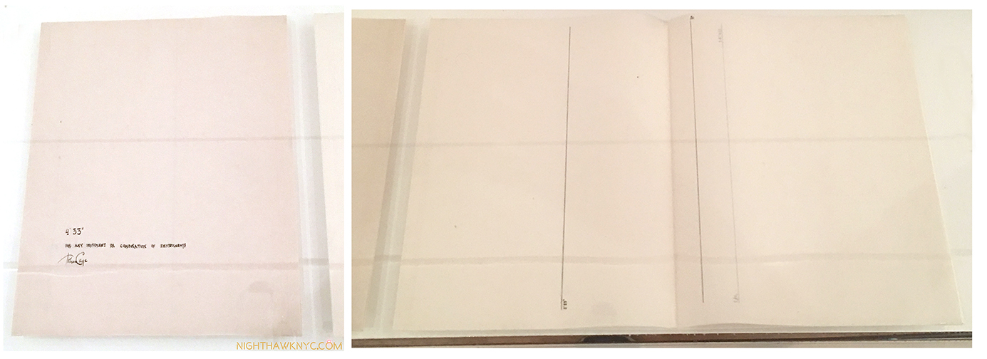
Behind the pillar displaying Double Rauschenberg, is a Seven Panel White Painting, left, and 3 of the Black Paintings, one shown above, which came next. In the center of the space is a vitrine containing, among other artifacts, the original “score” for John Cage’s infamous 4’33, which the “White Paintings,” which Cage was a vocal, and poetic, admirer of, were one of the inspirations for.

The most avant-garde piece of “music” ever “written”. The manuscript John Cage’s 4’33 1952-53,, partly inspired by Rauschenberg’s White Paintings. The cover is seen, left, and the actual “score,” right. Go ahead. Try it at home.

The first “performance” of Cage’s 4’33 consisted of pianist David Tudor walking on stage and sitting at the piano for 4 minutes and 33 seconds. Then, he got up and walked off. It’s hard to imagine a more “avant-garde” piece of “music.” Rauschenberg’s exploration of the possibilities of materials, beyond painting, now took center stage in his work. “He thought of his work as a collaboration with materials, as he put it. He was not interested in expressing his own personality through art- ‘I feel it ought to be be much better than that,6‘”

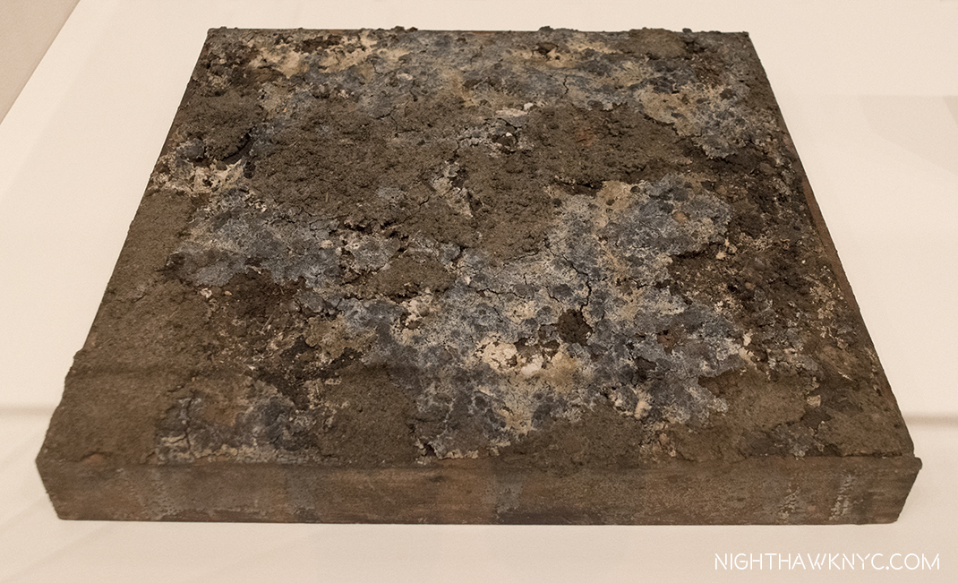
Dirt Painting (For John Cage), 1953, Dirt and mold in wood box. “Painting” doesn’t get more avant-garde than this (or, his White Paintings.). More on this subject later.

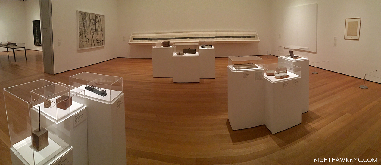
More of the second gallery showing “Elemental Sculptures,” Scatole Personali 0r Personal Boxes, both on pedestals, the Erased de Kooning Drawing, right, another White PaintingTiznit, 1953, Oil on canvas, by Cy Twombly, left corner, and the Automobile Tire Print, with John Cage, 1953, in the back.

At this point, he went to Italy with Cy Twombly, culminating with the shows mentioned at the beginning, after which he returned to NYC. He decided to commence a series of Paintings using red, because white, and then black “impressed  a lot of people as aggressive, ugly, and full of the anger of negation. So, Rauschenberg “thought he had better find out whether there was any truth to these charges. He would test his own motives by turning from black and white to red, for him almost aggressive, the most difficult, the least austere color in the spectrum. [7, “Off the Wall,” P.78]” These are featured in the 3rd gallery, which includes some of his most well-known and influential works.

Charlene, 1954, a “Combine Painting,” and the last Red PaintingBed, and Rebus, both 1955, left to right, with a column of 3 Untitled Drawings, 1954 by Cy Twombly in between.

On the facing wall is Minutiae, 1954, a Combine, created as a set for the Merce Cunningham Dance Company, which Rauschenberg served as set, costume and lighting designer for at the time.

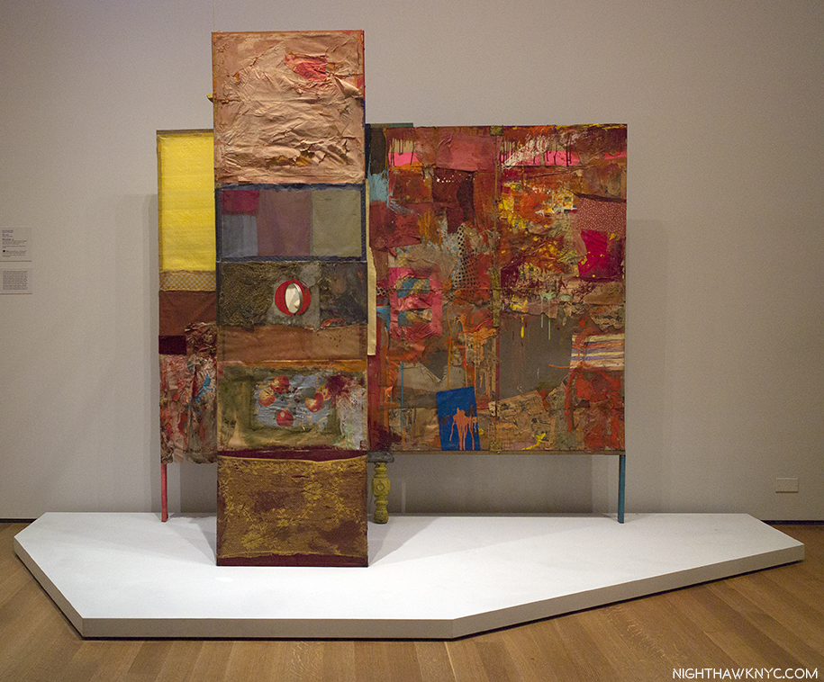
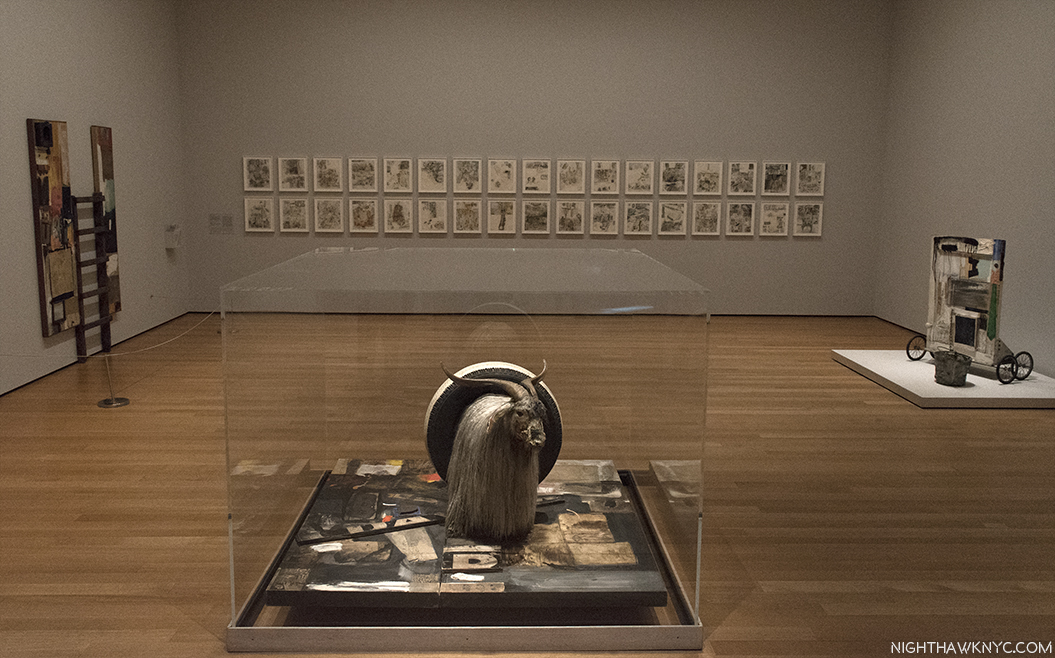
Something happened to Robert Rauschenberg in 1954. A number of writers have tried to explain exactly what it was. I’m not sure I understand. Whatever it was, it led to a breakthrough. He started adding more to his collages, anything was game, he said, as in Bed, 1955, which uses an old comforter since he had run out of canvas. Then, Red went out and was replaced with the the more neutral tones seen in Rebus, 1955. He had been including newspapers in his works going back to the Black Paintings, in 1951-2. At some point, around this time, he also began including photographs- found images from magazines and newspapers, etc.7 As time went on, however, he started incorporating large found objects, including an Angora goat and a Bald eagle, which, of course, grab your attention before you get to any of the details the works also include. Among Friends, is a very rare chance to see the two famous works that feature them, Monogram and Canyon, together. 8

Reinventing Painting, Sculpture & Drawing. Monogram, 1955/59 on loan from the Moderna Museet, Stockholm, front, with Gift for Apollo, 1959, right, Winter Pool, left, both 1959, and 34 Illustrations for Dante’s Inferno, 1958-60, on the far wall. Some of the most revolutionary Art of the past 60 years.

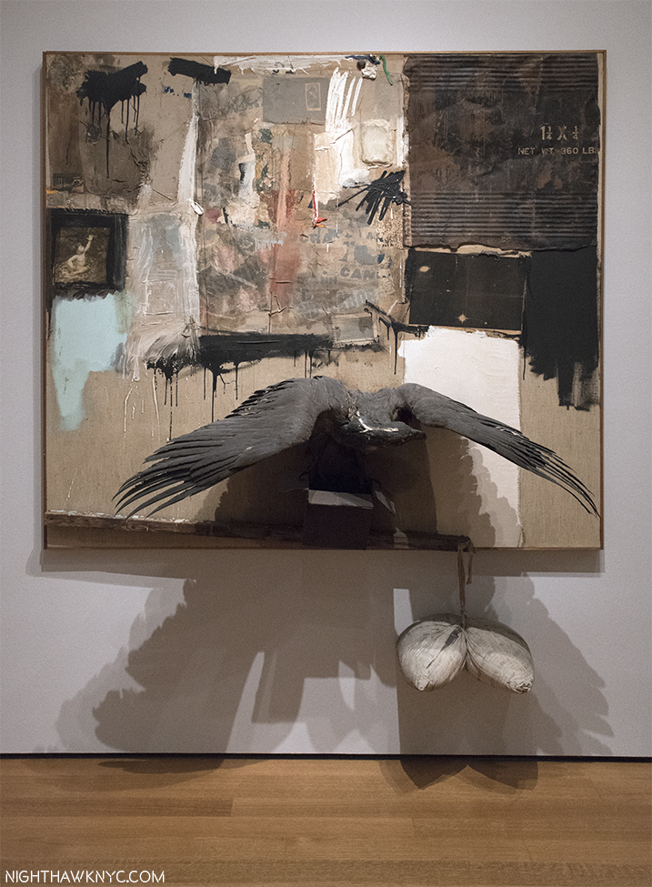
Canyon, 1959, Combine. One of the masterpieces of post WW2 Art. Rauschenberg on the Ganymede myth, with a Bald Eagle standing in for Jupiter’s Eagle, and fascinating to compare with Rembrandt’s Abduction of Ganymede, 1635, down to the inclusion of Rauschenberg’s Photograph of his son Christopher, on the left.

Canyon, 1959, is my personal favorite among his Combines (the word denotes a work that is a “Combination” of Painting and Sculpture, or as Jasper Johns said, “It’s painting playing the game of sculpture9.”) The controversial American Bald eagle’s very strange “pose,” standing on the sides of an open cardboard box, notwithstanding. It audaciously revisits the Ganymede myth, as he was doing in the Dante Illustrations (bringing a contemporary interpretation to an ancient tale) and, creating something of his own mythology, enhanced by the presence of a Rauschenberg Photo of his young son, Christopher (now a Photographer and head of the Rauschenberg Foundation), and including the cardboard box, which would become a staple Rauschenberg material (from the days before acid-free papers, adding to the conservator’s nightmare this works is). It takes the concept he realized in his 34 Illustrations for Dante’s Inferno one step further, into a 3-D Combine. 58 years later, it’s still a thrilling, unique experience, that’s every bit as audacious as it must have been in 1959.

As they hadn’t in Italy in 1953, a sizable amount of the viewing public still didn’t take Rauschenberg seriously by the late 1950’s, and the Combines actually served to reinforce that. Standing near Monogram for 15 minutes on 3 different occasions, I noted the immediate reaction of at least 75% of viewers were smiles, or outright laughs. I don’t know what they wound up thinking of it after taking a closer look. Increasingly “troubled10”  by this reaction 60 years ago, in 1958, he decided to illustrate Dante’s Inferno. To do so would require nearly 3 years. The resulting series of “34 Illustrations,” displayed at the Leo Castelli Gallery in December, 1960, finally served to alter the public, and critical, perception of Rauschenberg. The complete series lines the back wall of this gallery, where they loom as something of a “spiritual center.” For me, their Artistic importance in his entire oeuvre cannot be overstated- so much of what was to follow can be seen in them. Including his use of Photographs, now as independent elements, standing in for many of the characters in the Inferno, in Rauschenberg’s unique, contemporary imaging of the story. I take a closer look at them in the “Highlights” Post, following.

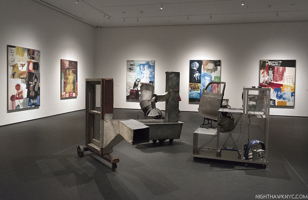
The Combines and Combine Paintings lead us to a “central” gallery containing his classic Silkscreen Paintings of 1962-64, and Oracle, a five-part found object assemblage integrated with technology that he created with engineer Billy Klüver and 4 others between 1962-5. Rauschenberg discovered silkscreening during a 1962 visit to the studio of Andy Warhol, who had been working with the technique since 1961. Silkscreening provided the answer he had long sought- how to transfer images to canvas in good resolution. His Transfer drawing technique only taking him part of the way (though he would continue to use it when he felt it was needed through the years).

Oracle, 1962-65,a five-part assemblage, with wireless microphone system, concealed radios & speakers, washtub with running water, surrounded by 10 of his groundbreaking Silkscreen Paintings, 1962-64

His silkscreens look nothing like Warhol’s, as can be seen below. Especially early on, Warhol took a single image and replicates it and/or varies it, using a grid. While Rauschenberg may repeat the same image up to 4 times in a work (usually varying it), he never allows it to become the central “point” of the work.

Warhol’s Let Us Now Praise Famous Men (Rauschenberg Family), 1962, Silkscreen on canvas, along side Rauschenberg’s early Silkscreen Painting, Crocus, 1962

Rauschenberg’s insatiable creativity led him to move forward, so the period he made these Silkscreen Paintings lasted only from 1962-64. Though he used Abstract Expressionist techniques (his work is characterized by his use of everything & all techniques), they complete his moving beyond the style of Abstract Expressionism, something he began working towards doing in the early 1950’s, to Painting wholly in his own style, and along the way, freeing Art to move on. While these works include some of his own Photographs, the featured images are, primarily still found images. As such, as great as they are, they are another step, an important one, to what his work would eventually become.

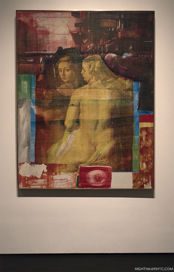
Persimmon, 1964, Oil and silkscreen on canvas. There’s much to say about this revolutionary work, but notice the mirror in Ruben’s Venus, which I’ll get to. Interestingly, Ruben’s Venus appears in a number of the silkscreen paintings, and curator Roni Feinstein noted they seem to be a female counterpart to JFK, who appears many times.

After becoming the first American to ever win the grand prize in Painting at the 1964 Venice Biennale, he would soon largely stop painting and turn his focus to performances, and the marrying of Art & Technology.

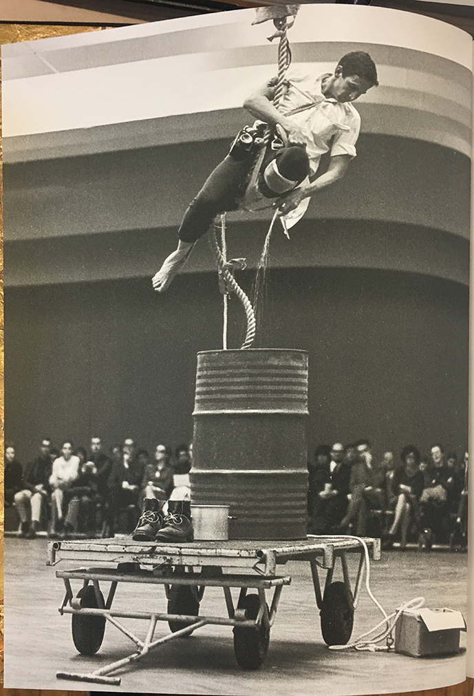
Scaling the heights of Art. Rauschenberg performing in his Elgin Tie, in 1964 in Stockholm. From the Hardcover edition of the show’s excellent catalog.

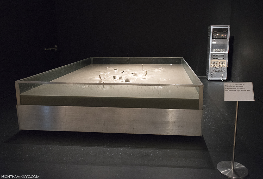
The latter took place in both stand alone works, and in performances, particularly “9 Evenings,” which is marvelously explored here11, and includes Rauschenberg’s contribution, Open Score. (See my look at Early Networks in Part 3 of this series, here.) The massive Mud Muse, which I’ve seen described as an experience akin to a visit to Yellowstone, is one stand alone work that is certainly popular with younger viewers. A monumental feat of installation considering the work holds 8,000 pounds of “listening” Bentonite mud,  with embedded sensors that cause the mud to react with the music being played on the control unit nearby. On loan from the Moderna Museet, Sweden, it’s one of the most ambitious and technologically complex works Rauschenberg ever made, and is making its first NYC appearance since Rauschenberg completed it here in 1971.

Now, I’ve seen everything. Mud Muse, 1968-71, 8,000 pounds of Bentonite mixed with water, in action.

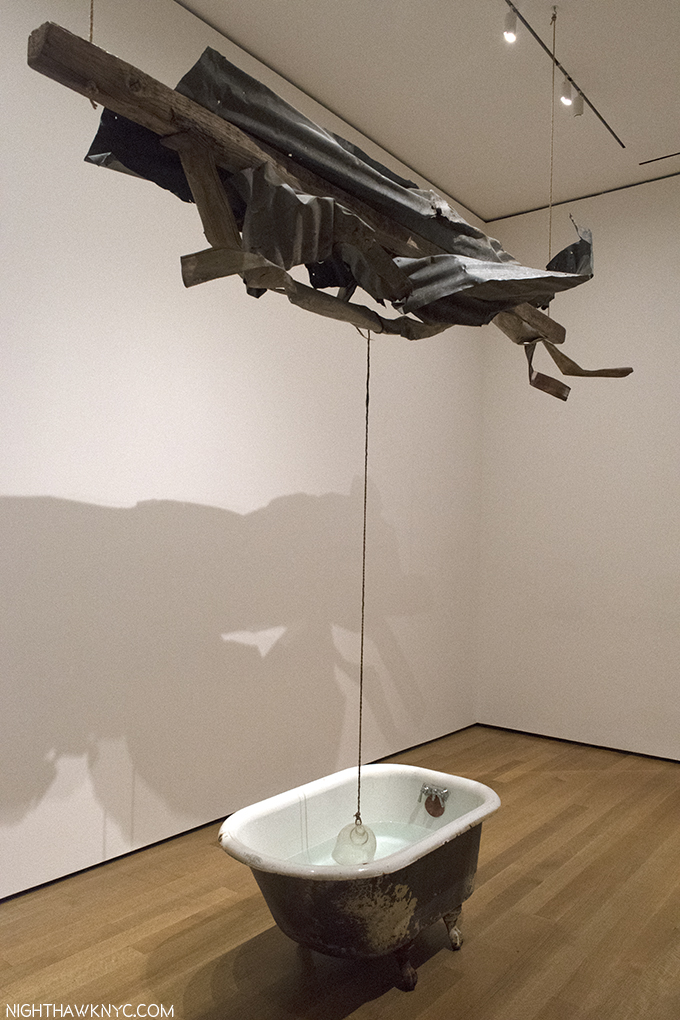
From there, the show moves through his Cardboards (sculptures made from found cardboard boxes), the famous Son Aqua (Venetian), 1973, with its water filled bathtub, and works inspired by trips to India, before getting to the penultimate, large gallery of later works.

Sor Aqua (Venetian), 1973, Water-filled bathtub, rope, metal, wood and glass jug. Rauschenberg continued to use found objects, like these, his entire career, even after he could afford traditional supplies. “Gifts from the Street,” he called them. After a while of looking at this, it hit me- There’s no drain in the bathtub. Maybe that’s why its owner threw it out, to become a Rauschenberg found object. A guard told me he called the metal on wood structure above, “The Angel.”

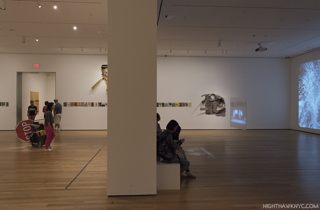
The large gallery of later works includes Hiccups, 1978, the horizontal rows, left & right, joined by zippers,Glacial Decoy, the collaboration with Trisha Brown (black and white photos, left), Triathlon, 2005, from Scenarios, the color painting, left of center, the latest work here, and For A Friend And Crazy Kat (Spread), 1976, along with a few examples from his Gluts series of found metal objects & signs. I will long wonder about what was omitted from this gallery.

The large gallery of later work, above, includes a very wide range of pieces that attest to some of the incredibly wide range of materials and styles Rauschenberg worked in. It highlights the fact that he continued to use found materials even when he could well afford art store materials. This was one of his ways of bringing “life” into his work, which he felt was essential in Art. Though not nearly as well known as the earlier periods of his work, there are a number of major works on view here, too. To my eyes, Mirthday Man, from his Anagrams series, Inkjet dye and pigment transfer on polylaminate (center, on the wall in the photo below), created on the Artist’s 72nd Birthday, in 1997, is one. Booster, a print from 1967, to its right, is as well.

Urban Katydid, (Glut), 1987, Riveted street signs on stainless steel,, front, Mirthday Man, 1997, Inkjet dye & pigment transfer created on his 72nd Birthday, center, and Booster, 1967, Lithograph & screen print, right, end the gallery of late works. The latter two feature almost life size X-rays of Rauschenberg. Both are among his major works in my opinion.

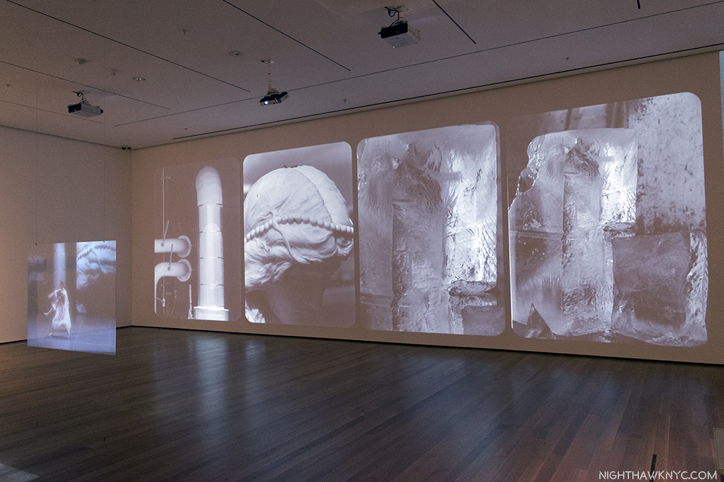
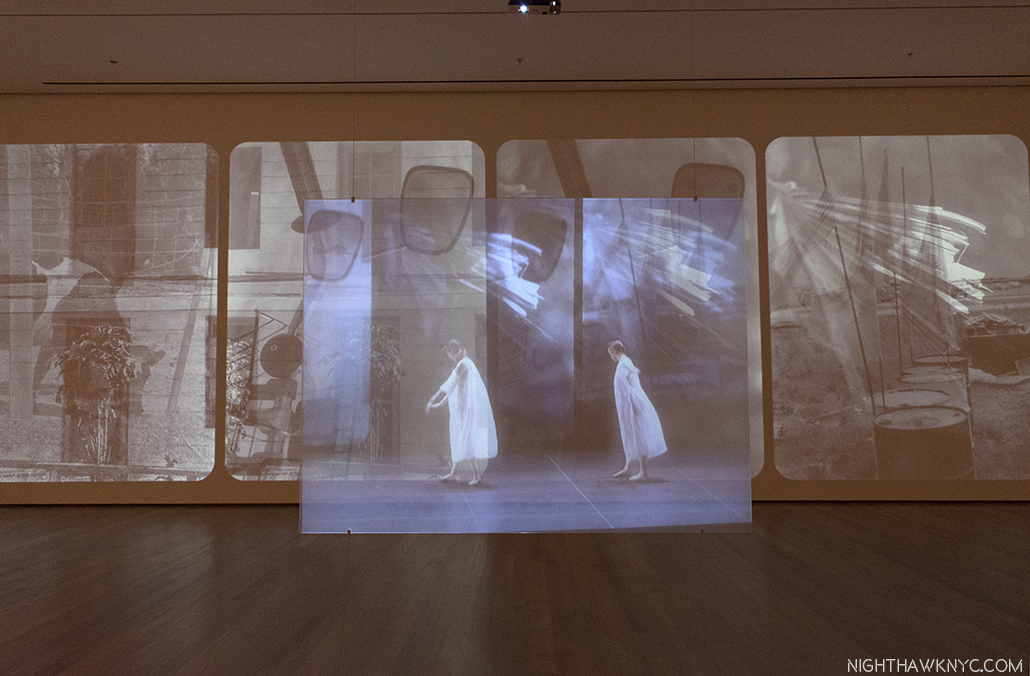
Partially seen in the last gallery photo, on the back wall to the left, and below, are black & white photos that form the backdrop for Rauschenberg’s collaboration with the late Trisha Brown called Glacial Decoy, 1979, in an installation by Charles Atlas, who worked with Rauschenberg. The piece comes closest to showing Rauschenberg’s later Photography, cleverly getting 620 examples of it in the show, though the images move one space from left to right every 4 seconds. The smaller color screen hanging in front shows video of a performance of the work from 2009 at BAM. All the way around, this is a terrific work, though if you want to focus on the Photos, you have 16 seconds to ponder each one before it disappears. The performance is, also, amazing. The installation? I’m not so sure. Sitting directly in front of the transparent hanging color screen, it’s a bit hard to make out everything that’s going on onstage since the large black and white photos on the back wall shine through. Though they are in the same sequence as they  are in the background of the performance, they’re in a different scale and so it serves to make it hard to see the screen. The resulting effect is somewhat strange. I found it better to see, standing quite a bit off to the side, as below.

Glacial Decoy, 1979, with 620 Photographs that scroll from left to right in 4 second segments & costumes by Rauschenberg, choreography by Trisha Brown. Interestingly installed by Charles Atlas, who worked with Rauschenberg.

The view directly in front of Glacial Decoy. The background of the on-screen performance is synched to the large Photos on the back wall, but they’re in a different scale, and they are both moving to the right every 4 seconds.

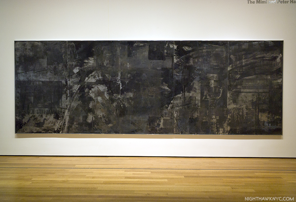
As with his fondness for found objects and Photography, Rauschenberg continued to refine and develop his techniques from the beginning to the end, as we see in Holiday Ruse (Night Shade), 1991, a captivating work, which has a look that seems to harken back to his “Black Paintings” (like Untitled (Black Painting), 1952-3, shown near the beginning), bringing them full-circle, with black images layered under black paint requiring a very close look to make them out.

Holiday Ruse (Night Shade), 1991, Screenprint chemical-resistant varnish, water and Aluma-Black

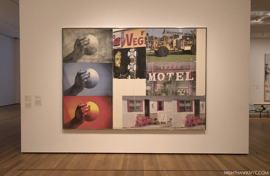
Also noteworthy, among the Gluts, works made of found street signs and other metal objects, Mercury Zero Summer (Glut), 1987, an electric fan with metal “wing,” an ecology-themed work, stood out. Finally, Triathlon (Scenario) 2005, Inkjet pigment transfer on polylaminate, from one of his final series, Scenarios, immediately “looks different,” than all that’s come before, with each of its Photos given their own place, and not being layered as earlier, with added prominence intriguingly given to white space, the overall effect is striking. Finally, Photos, in stunning clarity, stand to speak on their own as “characters” in the whole. The three images of the hand with the sphere, left, remind me of the repeated/slightly altered birds in Overdrive, and other Silkscreen Paintings, and masterfully unify the composition horizontally. Interestingly, since his right (Painting & Photographing) hand had been paralyzed in a stroke a few years earlier, and he could no longer take Photos, he had to, again, use the Photos of others (possibly under his direction at times), as he had done when he first started to use Photos, in the 1950’s.

Triathlon (Scenario), 2005, from 3 years before his passing is the latest work in the show.

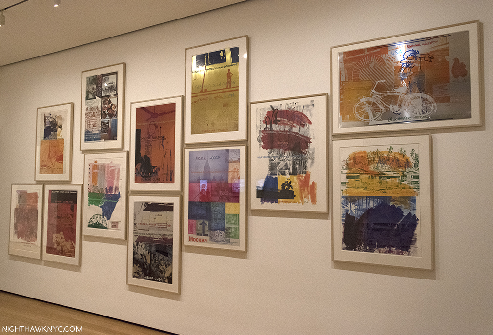
The show concludes with a room dedicated to R.O.C.I., the Rauschenberg Overseas Culture Interchange, “a tangible expression of Rauschenberg’s long-term commitment to human rights and to the freedom of artistic expression,12,” a self-funded collaboration with Artists in 10 countries that Rauschenberg was extremely dedicated to, even mortgaging his homes, and selling his vaunted Art collection to fund. Rauschenberg took the term “action painting,” first coined to describe the technique of abstract expressionists Jackson Pollock, and others, literally. For him, it meant ethical action, as well. Thist took many forms during his career. As Barbara Rose said about him, he was “among the last artists to believe that art can change the world.13

The final gallery contains 12 Posters for R.O.C.I.- the Rauschenberg Overseas Culture Interchange, 1985-91, along with 3 videos shot in Mexico, Cuba and China. 10 countries are represented here.

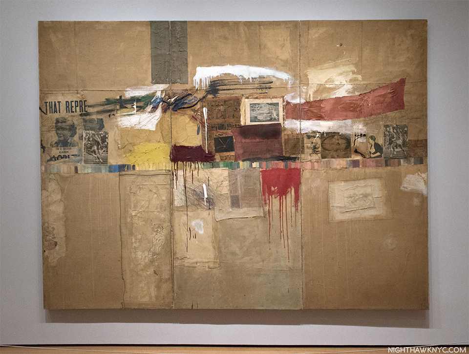
Though work by Rauschenberg has been in 152 shows at the Museum, only ONCE before has MoMA presented a retrospective of his work- FORTY years ago, in 1977. That show originated at the National Collection of Fine Arts (associated with the Smithsonian) and was curated by its Walter Hopps. Among Friends, is co-produced by MoMA and the Tate Modern, London, where it appeared under the title Robert Rauschenberg. So, this is the FIRST large show devoted to Rauschenberg that MoMA has been credited with creating. In fact, of those 152 shows I mentioned, only 4 had his name in the title- this is number five14. For someone so important and influential, I find this most puzzling. In fact, it’s only been fairly recently that MoMA has begun to fill in some of the substantial gaps in their Rauschenberg holdings, acquiring Rebus, one of his most important Combine Paintings, Canyon, in 2012, one of the most important Combines, and the now classic Silkscreen Painting, Overdrive, 1963, (seen in far left in the photo of the Silkscreen Paintings with Oracle, above) in 2013.

Rebus, 1955, Combine painting. The info label says its a “promised gift,” but Calvin Tomkins says MoMA paid 30 million dollars for it. (Off the Wall, P.282) This would be most interesting as MoMA’s Alfred Barr was offered Rebus in 1963 but he declined. (ibid.).

My reaction to Among Friends was tinged with a bit of disappointment- Though the early galleries, up through the Mud Muse/’9 Evenings,” 1965, are extraordinary. Stories abounded of curators bringing in “people who were there” to recreate how works had been originally displayed, complimenting major loans, like Charlene, Monogram, among many more. After 1965, I felt the show “thinned out.” The huge, penultimate gallery of his late works (a period I believe is very under-appreciated), left me wondering why it had so much empty space. In fact, I can’t quite recall seeing anything like it in a major show. Part of the reason is Among Friends attempts to integrate larger videos of performances right in the show, as opposed to having separate rooms for them (as MoMA did with Bruce Conner: It’s All True, last year). The spot chosen for Glacial Decoy’s installation left a large corner completely dark and empty. As nice as it is to see all of Hiccups, 1978, a beautiful work consisting of 97 solvent transfers (an “update of his “Transfer Technique”) on paper panels held together by zippers, so it can be endlessly rearranged. (Rauschenberg may have employed his mother, Dora, to attach the zippers, David White told me.) Taking up the better part of 2 long walls, I was left feeling that space could have been put to better use, and Hiccups displayed in another manner, as it has been in the past.

Another view of the later works gallery shows a lot of open floor space, and on the middle right, behind Charles Atlas hanging video screen for Glacial Decoy, which is in the center of the room, a dark, empty corner. An interesting installation, I’m not sure was entirely successful, but should it have been mounted elsewhere?

Rauschenberg, perhaps more than any other Artist, established what it was to be an American Artist around the world, continually going seemingly everywhere, beginning in the early 1950’s, but his travel during his later years is not mentioned in the later works gallery, including his trip to China in 1982, where he collaborated with local paper makers, and others, the trip resulting in a typically large creative output, entirely absent here. That’s one example. The travel thread is picked up in the next, and final, R.O.C.I. gallery.

Whereas the show to this point had been chronological, this room is a bit all over the map, with works ranging from 1967-2005 on view. With the only large placard, the show uses to give context, next to Mirthday Man, one of the last works in the show all the way on the other side of the gallery, visitors here were left a bit hanging about what was going on in Rauschenberg’s Art and the path its development was taking, which its non-chronological display didn’t help. It’s a bit of a shame. While what’s included in this gallery may serve to pique the interest of viewers to investigate it further, the overall result, I feel, is a “sketch” of what the Artist created, achieved and accomplished in this period. The result is the show feels like it progressively winds down in the later galleries, and ends on somewhat “quiet” notes. A chance to shine new light on Rauschenberg’s late period was, I feel, missed. It should be noted that, not unlike Picasso, Rauschenberg’s later works have been largely overlooked by the Art world to this point, save for a few gallery shows (including this one I wrote about in 2015)15. (Though, they have not been overlooked by Artists.) So, the other possibility is, of course, that the show’s curators do not feel the rest of his later work is important enough to be here.

With the catalog for the 1997 Guggenheim Retrospective, one of the greatest shows I’ve ever seen, listing 480 items, almost double the amount here, I prefer to think of this show as an “overview,” being as it wonderfully selects key works from key periods through 1965. With an Artist as prolific as Rauschenberg was (Calvin Tomkins says he created over 6,000 works by 2005, not counting multiples), it’s probably not likely a full retrospective is even possible. But? I would LOVE for someone to try!

Still, Among Friends is, caveats aside, important in its own right because it does include so many works created at key moments in his career, and because it shines a light on the importance to his work, and accomplishment, of collaboration- with other Artists, Engineers & Performers, and with the materials he was working with16 It also allows a very rare chance to see, and experience, rarely seen works involving technology (collaborations with engineers), putting OracleMud Muse, and “9 Evenings” front and center, each one a major feat of museum installation. Alas, it, also leaves, until another day, a complete assessment of both his late period and his Photography (i.e. the body of Photographs he created). Regardless of what isn’t here, a careful examination of what does comprise the 250 works in Among Friends reveals there is no doubt whatsoever that this is an important show, a major event in Rauschenberg scholarship and appreciation, and one of the best shows of 2017.

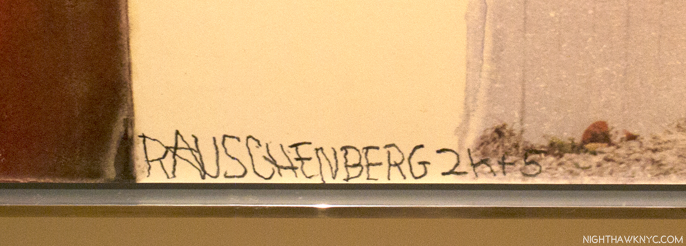
In the early 2000’s, Rauschenberg suffered a stroke which paralyzed his right (Painting & Photography) arm. Nonetheless, he continued creating, having others take the photos, and signing his works, with difficulty, with his left hand, as here, on Triathlon, 2005, from Scenarios, one of his last series.

Speaking of friends and collaborators, another question lingers with me- As Among Friends beautifully details, Rauschenberg was friends early on with John Cage, Merce Cunningham, Morton Feldman, among others, who were among the most avant-garde creators of the 20th Century. HOW was it possible that Robert Rauschenberg, alone among them, escaped the “avant-garde ghetto” to achieve both fame and fortune, while holding on to his integrity? I well remember when avant-garde composer Pierre Boulez was named Musical Director of the New York Philharmonic, succeeding no less than Leonard Bernstein, and how audiences voted with their feet and voices in displeasure when he performed a modern & contemporary work, as you can plainly hear on recordings of the Philharmonic broadcasts at the time. Rauschenberg, as I mentioned earlier, was actually an inspiration for the most avant-garde work of music ever “written”- John Cage’s 4’33,” 65 years later, Cage is highly respected, but, still his music is sparsely performed. Among his other friends, Morton Feldman (a major composer who remains under-known, and who Rauschenberg gave his first public performance at one of his early shows), is a cult figure who shows signs of becoming more. Even Pierre Boulez, who passed last year, is, mostly, remembered for creating the most “definitive” body of recordings of 20th Century music we have thus far, while his own music is still sparsely performed. Meanwhile…during all of this, Robert Rauschenberg had, or has, an “Era,” and had a long career that was marked with a good deal of success, however you’d care to define it, including financial. Given the “edginess” of much of his work, a fair percentage of its components coming from the trash, and not art supply stores, I find it absolutely remarkable.

How was Rauschenberg able to avoid the “Avant-garde ghetto?” Walking through the show, I think it is possible to “experience” the answer. As Among Friends highlights, collaboration may well have been key to his success. Beyond collaborating with so many gifted Artists, across realms, and collaborating with his materials, as Calvin Tomkins said- “All his work, Rauschenberg increasingly felt, was a form of collaboration with materials. He wanted to work with them, rather than to have them work for him17.”

There is more. One of his most famous quotes is “Painting relates to both art and life. Neither can be made (I try to act in the gap between the two)18.” That gap also includes life being lived now…i.e. the viewer’s experience.

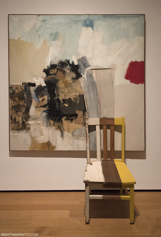
Have a seat. (No, Don’t!) Rauschenberg understood that his ultimate collaboration was with his viewers. He continually strove to bring them in to his works. Pilgrim, 1960, Combine Painting.

Rauschenberg’s most important collaboration may be with his viewers. He never forgot the experience of the viewer, something, it seems to me, most other avant-gardists of the period seemed to ignore, if not take a polar opposite approach to. Therein may lie the key. As one of them, John Cage, himself, wrote in Silence, “The real purpose of art was not the creation of masterpieces for the delectation of an elite class, but rather a perpetual process of discovery, which everyone could participate19.” It seems to me that this, as much as anything else, was at the heart of Rauschenberg’s approach during his entire career. As he said, “I don’t want a painting to be just an expression of my personality. I feel it ought to be much better than that20.” What’s “better than that?” He said that he wanted to create a situation  “in which there was as much room for the viewer as for the artist21.” This collaboration  takes an exceedingly wide range of forms. The “White Paintings” were intended to allow the shadows of viewers, and the atmosphere of the room to be “reflected” on their surfaces. Numerous other works, from  Charlene, in 1954, right through the late “Gluts” have reflective mirrors or surfaces that reflect whatever is in front to it, even the viewer themselves. This goes way back to the mirrors in the upper left corner of Untitled, 1952, pictured early on. And, in Persimmon, Ruben’s Venus holds a mirror so she can look out at us, though her back is turned.  Once you look for ways that Rauschenberg includes the viewer in his work, you’ll see it more and more- throughout his career. Like that welcoming chair in Pilgrim, 1960, above. But, don’t really sit in it. You know…

Another thing that becomes apparent- The more work of Robert Rauschenberg’s I look at, one thing strikes me above all others- While I loathe comparisons of anyone creative, I don’t think I’ve ever seen any Artist with a better “eye” than Robert Rauschenberg. “I have a peculiar kind of focus,” he once told an interviewer. “I tend to see everything in sight22.” He was, also, one of the most creative people I’ve ever come across. He broke all the rules, and used that eye to create his own world out of ours.

Collaboration with his viewers, itself, led to more. Some of those viewers became Artists, themselves. From what I see in the shows I attend, and have attended, particularly over the past 15 years, I would say we are still in the “Rauschenberg Era.” His influence is all around. “Bob is the wind, blowing through the art world for almost a century now, pollinating everything,” Arne Glimcher, founder of Pace Gallery said in the BBC Documentary “Robert Rauschenberg: Pop Art Pioneer.”

Regardless whether you think we are still in the “Rauschenberg Era,” or not, one thing strikes me as undeniable- Nearly 10 years after his 2008 passing, the full assessment of the achievement of Robert Rauschenberg is no where near finished. Among Friends is another piece, one that will be long rememeberd, towards that end.

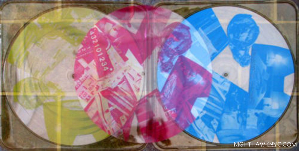
*- The soundtrack for this Post is “Moon Rocks,” by Talking Heads, from Speaking in Tongues, 1983, which Robert Rauschenberg did the artwork for the limited edition release of, seen below. Another classic collaboration. NASA invited Rauschenberg to witness the launch of Apollo 11, in July, 1969.

Robert Rauschenberg’s Cover for the limited edition of Talking Heads’ Speaking in Tongues. No, it wasn’t in Among Friends, but it is in my collection.

“Robert Rauschenberg: Among Friends” is my NoteWorthy Show for August. 

A second Post, which follows below, looks at highlights from Among Friends. Between the satellite shows- Robert Rauschenberg: Rookery Mounds, and Selected Series from the 60s & 70s, at Gemini G.E.L. at Joni Moisant Weyl Gallery, Robert Rauschenberg: Early Networks at Alden Projects, Robert Rauschenberg: Outside the Box, at Jim Kempner Fine Art, and Susan Weil at Sundaram Tagore Gallery, there were, also, many highlights. The third Post, further below, focuses on them. 

January 8, 2018-All three Posts are dedicated to the memory of my friend, the late Artist Tim Rollins. Tim and I spoke about and compared notes on these shows both of the last two times I saw him. He told me that he knew Rauschenberg, and he agreed to give me a quote about Rauschenberg for this series. But, I never got around to getting one from him. R.I.P., my friend. I hope you like them.

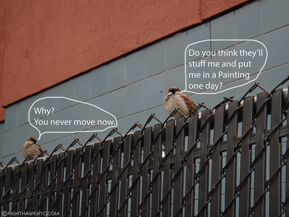
“On The Fence, #10, The Rausch-and-Bird Edition.” (Sorry, Bob.)

NighthawkNYC.com has been entirely self-funded and ad-free for over 6 years, during which over 250 full length pieces have been published. If you’ve found it worthwhile, you can donate to keep it going & ad-free below. Thank you!

Written & photographed by Kenn Sava for nighthawknyc.com unless otherwise credited.
To send comments, thoughts, feedback or propositions click here.
Click the white box on the upper right for the archives or to search them.
For “short takes” and additional pictures, follow @nighthawk_nyc on Instagram.

Subscribe to be notified of new Posts below. Your information will be used for no other purpose.


  1. The story in this section is excerpted and paraphrased from Robert Rauschenberg’s work, Autobiography, and from Calvin Tomkins’ excellent biography of Robert Rauschenberg, Off The Wall, 2005, P. 72-4.
  2. “Off the Wall,” P.76
  3. Paul Schimmel Robert Rauschenberg: Combines, P.9
  4. Charles F. Stuckey in Robert Rauschenberg: A Retrospective, Guggenheim Museum, 1997, P. 31
  5. Tomkins Off The Wall, P.65
  6. Calvin Tomkins- “Master of Invention,” The New Yorker, Oct 13, 1997 P.92
  7. the Combine, Untitled, ca.1954, not in the show is the earliest work I’ve seen this in so far.
  8. MoMA had a chance to acquire Monogram early on, but Alfred Barr passed, fearing it might harbor vermin, among other reasons. Off the Wall, P. 282.
  9.  Everything In Sight,” Calvin Tomkins, The New Yorker, May 23, 2005
  10. Off the Wall, P.143
  11. and it’s also wonderfully displayed in Robert Rauschenberg: Early Networks at Alden Projects
  12. raushcenbergfoundation.org
  13. Barbara Rose, Rauschenberg, P.4
  14. Two of the those featured the 34 Illustrations for Dante’s Inferno as a set, in 1966 and 1988, the other featured his work Soundings, in 1969.
  15. To this point, the best overview of the later period works I’ve seen is in the Guggenheim Retrospective Catalog, one of the greatest exhibition catalogs- for any show, ever produced. The caveat to that is that when it was published in 1997, he would still work for a further 11 years.
  16. Guggenheim Retrospective Catalog, P.36-7.
  17. Tomkins in Off The Wall, P.79
  18. Rauschenberg’s statement in 16 Americans, MoMA Exhibition Catalog, 1959
  19. Off The Wall, P.62
  20. Off The Wall, P.66
  21. Off The Wall, P.xv
  22. “Dore Ashton, Art News, Summer, 1958, quoted in “Off The Wall,” P.8