This site is Free & Ad-Free! If you find this piece worthwhile, please donate via PayPal to support it & independent Art writing. You can also support it by buying Art & books! Details at the end. Thank you.
Written & Photographed by Kenn Sava (*- unless otherwise credited)
Update- 5/14/2022- In an interview with the Artist in the just-released book Richard Estes: Voyages, Mr. Estes says that he is now destroying his reference Photos because he does not want people to compare them with the finished Painting. As a result, and to respect his wishes, I have revised this piece to remove the Mr. Estes’s reference Photos I originally showed. It must be said that he included them in his Richard Estes: Painting New York City Museum of Art & Design show in 2015 . I cannot unsee what I saw in the show, but I have decided to remove them so that others won’t be influenced by them. The text of this piece remains unchanged. It is, simply, what I see. As always, I encourage everyone to look for themselves and let the Art speak to them.
Appearing at the very end of the excellent Richard Estes: Painting New York City show at the Museum of Art & Design, which I looked at in my look at NYC Art Shows in 2015, the first-ever Estes show in an NYC Museum, was a work depicting one of those all too common places to be found all over New York, and indeed much of the world, making it easy to overlook, to look through, or to see-but-not-really-see. Mr. Estes titled it Corner Cafe. It’s dated “2014-15.” Given that the Artist was born on May 14, 1932, that means that he was 82 or 83 years old depending on when he actually finished it. Situated as the show’s conclusion, Corner Cafe could be a make or break work for the entire show.
How VERY Daring.
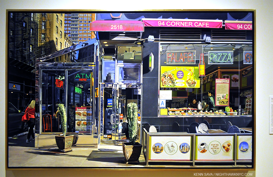
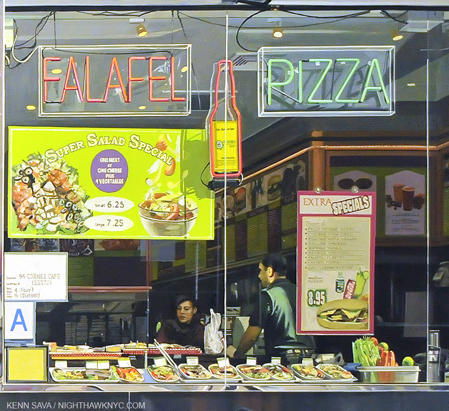
Richard Estes, Corner Cafe, 2014-15. Oil on Canvas. I only hope I can still get out of bed when I’m 83.
To end a show that covers over 40 years of work with a piece created at 83 is certainly making a statement. Especially a show that is, among other things, a showcase of his amazing craft & technique and how it has evolved over time. In fact, his craft is such that this was the first ever solo show by a Painter at the Museum of Art & Design, who specialize in “craft.” A very close look reveals he has signed and dated it right under the very small Statue of Liberty near the lower right corner. An appropriate conclusion for a show entitled “Painting New York City.”
To my eyes, it’s every bit as good as anything he’s ever done- In this show or not. Technically, it’s flawless. Mr. Estes remains at the peak of his considerable powers in his 80’s. Remarkable! Compositionally it’s subtly fascinating,
In spite of the fact that the show was a first chance for me to see paintings by Mr. Estes that I’ve loved for 30 years and never seen in person before, since I first saw Corner Cafe at the show’s opening in March, 2015, I haven’t been able to get it out of my head.
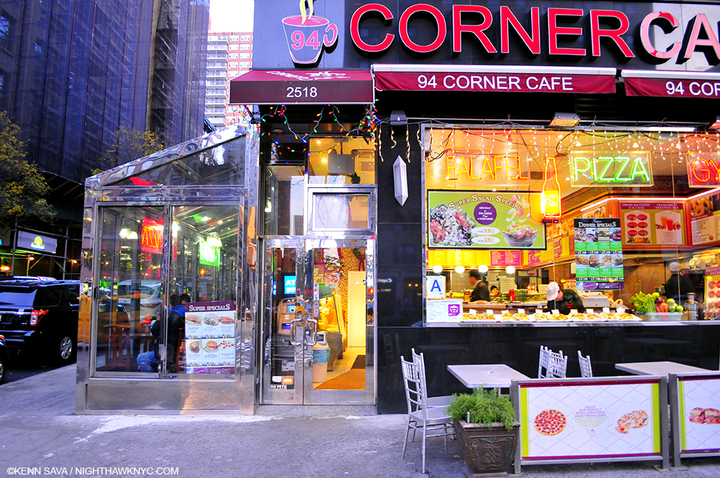
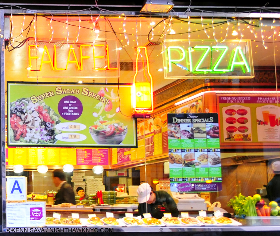
Here’s what the “Real” Corner Cafe looked like in December, 2015. Mr. Estes hasn’t eaten here1, so why did he choose to paint it?
He does not project Photographs onto his canvas and then Draw or Paint them2.
He does not paint his reference Photographs verbatim (as the evidence in the show proves).
He does not, apparently, even rely on a single Photograph when he feels it doesn’t contain all he wants.
This brings up my biggest pet peeve about the perception of Richard Estes work. That he is ENDLESSLY called a “photorealist” or “hyperrealist.” “Photorealism” is a term popularized by an Art dealer as a means of selling the work of a group of his artists, and then perpetuated in a series of now 4 books, each including Estes work. I’ve never heard what Mr. Estes, himself, feels about this term. As I’ve said, I believe that labelling artists by a one word term that is supposed to enable viewers or readers to pigeonhole them and their work for easy consumption is something that must end. Artists are unique beings. If their work looks like that of someone else (like Picasso’s Cubism did Braque’s Cubism), it’s by their choice, but it’s not necessarily indicative of the sum of their Artistic being. In Picasso’s case he went on to another style as soon as his last one was “named.” In the end? He is simply, “Picasso.” Artists, like Chuck Close, also included in the book series, have made no secret of not wanting to be considered a “photorealist.”
“The reason I never liked the word “realist” or “new realist” or “photorealist” was I was always as interested in the artificial as I was the real. I’m as interested in the distribution of color on a flat surface as I am in the image it ends up making. So it’s that tension as it works back and forth between marks on a flat surface and the image that it’s making that has always interested me.” Chuck Close
And, for the most part, he haven’t been since. This wanting to put Artists in a box is something that only serves to provide a “crutch” that may serve to make viewers feel they already “know” what a given Artist does and so they don’t need to actually look at their work for themselves. I feel it’s better to forget what anyone (besides the Artist) calls it, and just look at the work.
As I began to do that with Corner Cafe, I was quickly faced with two overriding questions-
Why This Scene?
What is this “about?”
First, I will say that what follows is entirely my opinion based on the feelings I get looking at it. That’s all. While the endless details Mr. Estes has so incredibly faithfully recorded are delicious to enjoy on their own- the reflections in the metal framing, the sample meals in the window, the latticework of the furniture, the surrounding buildings, the inside of the cafe and on and on. As wonderful as it is to enjoy these details (as it is in almost any of his work), as time has gone on, I’ve found myself considering it as a whole. Visiting the actual site a few times, something most viewers may not be able to do, one thing strikes me- Mr. Estes has chosen to leave out what is, perhaps, the most noticeable thing about the real Corner Cafe- its sign. Why? Many (most?) other Artists Painting this site would no doubt include it. But, whatever his reason is, it puts the focus of his Painting elsewhere. I think he did it because he didn’t want viewers to be distracted by it.
Over and over again, in thinking about the feeling I get from Corner Cafe, I was inescapably drawn back to something very familiar. And familiar to anyone reading this site. Look up above. That’s right. I’m reminded of Edward Hopper’s Nighthawks.
There are two people visible through the large front window (and parts of others inside on the left), and a woman in a red jacket disappearing stage left around the corner onto 94th Street. There’s a woman who appears to be a customer, a counter man, an employee of the cafe, and between them sits a white bag, its handles pointing up. Interestingly, these two appear quite a bit brighter in the Painting than in the Reference Photo, especially the female customer, who has gone from being completely in the shadows to being completely sunlit. They’re not looking at each other, though their mouths may both be open. Perhaps they’re speaking to each other. The woman is looking slightly to her right, whereas in the Photo she looks almost straight ahead. The woman in red walking down 94th Street appears in a different reference photo than the one with two people inside.
Mr. Estes has said that he consciously chose to omit people early on in his career to avoid the narrative element that comes with them. That is, no doubt, why most of his work feature people who are, at best, “incidental.” Sometimes, however, my attention has been drawn to these “bystanders,” and I find it hard to believe that that is not intentional. The customer in line in Lunch Specials who gives us a look over his shoulder, for example, as if seeing what is going on when most others (ourselves?) do not. And, there are the guys on the payphone outside. A metaphor for talking to people who are not there, while those who are there stand in line not talking to each other? He’s right. It’s hard not to read into them when people are present.
What we’re seeing here is one of the countless, brief encounters we all have every day, encounters that are the hallmark of the modern world. A world that is clad is shiny surfaces, with neon signs and images and examples of what is to be found inside. (Things that have changed since the 1942 world of Nighthawks, which is almost distraction free, somewhere, possibly imaginary, possibly real, in the Flatiron or the West Village neighborhoods. My search for the real Nighthawks cafe is here.) Tables and chairs fill the right foreground, in case you want to bring what’s inside out, but no one has. Yes, it’s winter, given the snow seen on the left, but it’s a sunny day.
Like the woman in red disappearing3, these two will, most likely, probably end their encounter very soon, and move on with the rest of their days.
Am I making too much out of the “similarities” with Nighthawks? Maybe, maybe not. I’m responding to what I see. To quote Frank Stella in his recent Whitney Museum Retrospective, “What you see is what you see.”
I’m not saying that Mr. Estes was thinking of Nighthawks when he painted Corner Cafe. I’m saying that I was reminded of it as I’ve looked at it. There is the same isolation. The same counter person-customer interaction. The same other random (single) person included. And both feature cafes that are located on a corner. For Mr. Estes, this scene may be reminiscent of everyday scenes of Venice rendered by Canaletto.
Interestingly, one detail Mr. Estes has omitted might seem to reinforce that Nighthawks connection- on top of the awning is a sort of logo that has the words “corner” and “cafe” at right angles to each other (which does appear, smaller, on the divider in front between the Brooklyn Bidge and NYC Skyline. My guess is the one over the awning was too large to not be “read,” or it would appear as a meaningless distorted mess given the angle of the scene), not all that much different from the somewhat sharper angles of Nighthawks cafe. Unlike the Hopper, the door is obvious and central. Are we being invited inside? It’s hard to say. There’s a tall, evergreen like plant (since replaced) “guarding” the front door, with an ATM machine looming right inside. It almost looks like the way into a different business. But, we known better. The overhead awning tells us it’s all the same place.
Inside, given too much choice, perhaps the customer is having trouble deciding on something else. Her eyes (which in the Reference Photo that she appears in- the only one of the 3- I almost thought she was wearing sunglasses), appear to be looking down at the items on the counter.
Mr. Estes has omitted the large “Corner Cafe” sign, with its preceding coffee cup, above the awning, which serves to focus our attention on the windows. We can barely see the bottom of the cup over the “2518” sign. Puzzlingly, he has added what appears to be a drop shadow for this sign above the rest of the awning, much larger than I saw it in real life.
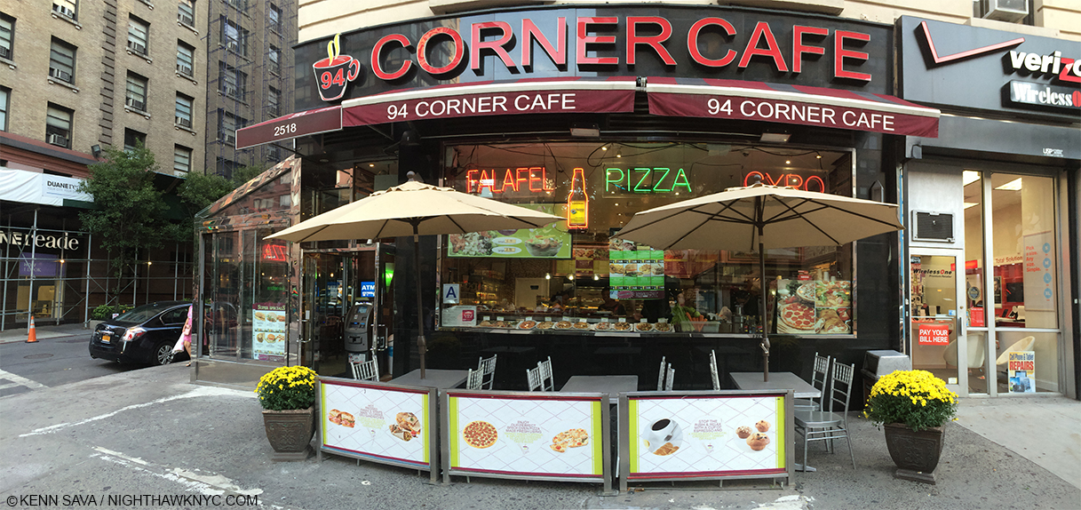
Scrunched into the phone booth seen further below to take it all in on August 21, 2015. With the umbrellas open, it’s not nearly as interesting.
Almost everything else is there! The level of detail makes my head spin. You can get easily lost in it. When people talk about “pure Painting,” THIS is what I think they mean. Yet, every single detail has meaning and purpose here. They are all the means to an end.
The chairs are different now. They have square backs and don’t have that marvelous lattice work he masterfully shows. The signs in front of them are different, too. Gone are the NYC sights, two of which, the Brooklyn Bridge and the Lower Manhattan skyline, happen to be subjects of large, earlier Estes.
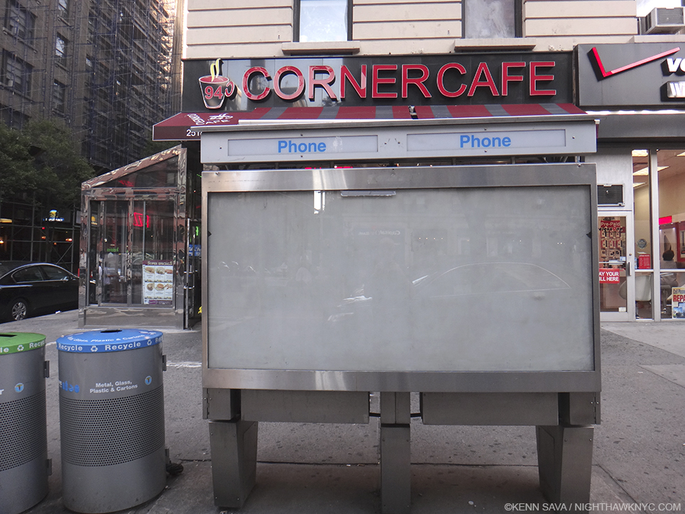
It just screams “Paint Me,” right? It took a bit of work to find a place to stand to even shoot it, Here, I’m standing in the middle of Broadway! August 21, 2015.
Also interesting, the apparent spot where Mr. Estes likely stood to capture this view of the cafe is a bit hard to get to. Now, there are 3 large circular recycling cans on the spot. I had to stand on the curb to shoot it. There is also a large telephone booth (remember them?) immediately to the right. So, even getting the photos he wanted may not have been exactly easy. The outdoor seating is closer to the front wall and neatly squared thanks to an additional divider on the left, and he’s cropped the lower part of the image to the very base of the outdoor divider.
The sun is high enough in the sky to the south to pass through all the intervening buildings along Broadway. There is only the woman exiting to be seen, along with the two large evergreen plants as outdoor signs of life.
Perhaps that is the point.
Unless you are “stuck” there, like the employee or the two potted plants, everyone is destined to come and go, like those who presumably once sat outdoors have already done, the woman in red is doing, and the female customer appears about to do.
Life, itself, is an endless series of comings and goings, too, with encounters of varying lengths in between.
Until it ends.
“Stop the rush and relax,” reads the sign below.
*-Soundtrack for this post is “Hello/Goodbye” by The Beatles and written by Lennon & McCartney, from their album “Magical Mystery Tour.”
NighthawkNYC.com has been entirely self-funded & ad-free for over 8 years, during which 300 full-length pieces have been published! If you’ve found it worthwhile, PLEASE donate to allow me to continue below. Thank you, Kenn.
You can also support it by buying Art, Art & Photography books, and Music from my collection! Art & Books may be found here. Music here and here.
Written & photographed by Kenn Sava for nighthawknyc.com unless otherwise credited. To send comments, thoughts, feedback or propositions click here. Click the white box on the upper right for the archives or to search them. Subscribe to be notified of new Posts below. Your information will be used for no other purpose.
- As was stated on the description card for the painting. ↩
- As I heard him say in the interview he gave at the MAD opening. ↩
- She may be there to distract the eye with her blonde hair and red coat, or to emphasize the “corner” element of the title, or as a means of visually breaking up the reflection to her right with the street scene to the left ↩

