Having It Out With Philip Guston

This site is Free & Ad-Free! If you find this piece worthwhile, please donate via PayPal to support it & independent Art writing. You can also support it by buying Art & books! Details at the end. Thank you.

Written & Photographed by Kenn Sava (*- unless otherwise credited)

I had mixed feelings when I heard about “Philip Guston Painter 1957-67,” on view from April 29 to July 29 at Hauser & Wirth’s temporary Gallery in the former Roxy Nightclub space. On the one hand, large Guston shows are a rarity, on the other hand, I have long struggled with his works of this period. So, it was with a desire to have it out with them in a battle to the death, over the very generous 3 months it was up, and either, finally, “get” them, or not that I climbed their candy-cane striped stairs to enter a space I had known in it’s previous incarnation.
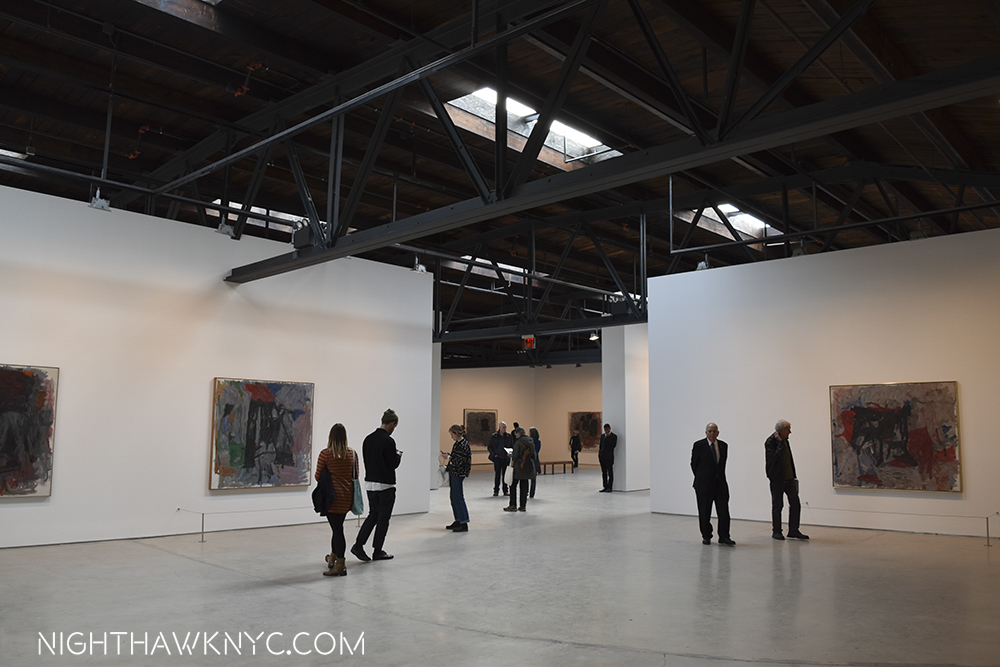
dsc_0434pnh

This space had a “colorful” past, in a different way. One that involved roller skates.

I am happy to report that July 30th dawned to find me still among the living.

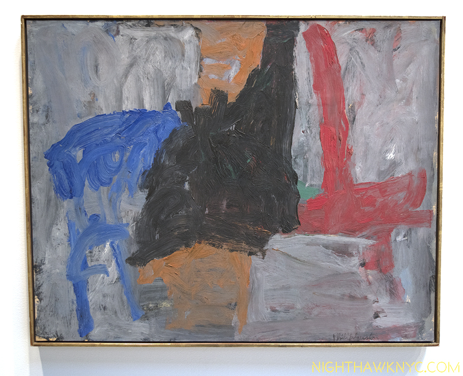
The show is focused on paintings from 1957-1965, 8 of Guston’s most “abstract” years , and drawings dated from 1967-69, at the beginning of his return to “figurative” work.  The 1957-65 period of Guston’s paintings is, perhaps, his least known, possibly least loved, (according to one owner- Guston’s daughter, Musa Mayer’s, experiences when guests have seen it) 1, and least seen works by this Artist, who Hauser & Wirth calls “the preeminent 20th century American Artist” in their press release.

Really? I am very interested in his work, and have a lot of respect for him, but “the preeminent?” Hmmm…Comparing Artists qualitatively is against my religion, though some other candidates are here2. Still, a group of 35 of these is unheard of, and seems unlikely to be repeated any time soon.

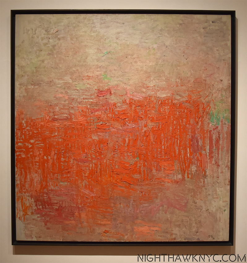
While his early abstractions from 1950-55 are seen regularly and much admired, the works of his next period are very different. Gone were the luminous colors and shimmering qualities of the earlier works replaced by a darkness that feels to be continually encroaching as these 8 years progress.

What came before... "Painting," 1954, on view at Moma

What came before… “Painting,” 1954, on view at Moma

“What shall I paint but the enigma?”

A revealing quote from Philip Guston in 19693? Possibly. Guston, apparently, mis-translates, or misquotes a translation of the inscription on a “Self Portrait,” from 1911, by Giorgio de Chirico, a major lifelong influence, who he was speaking about when he uttered it. It’s de Chirico’s motto. The original reads- “Et quid amabo nisi quod aenigma est?” Most of the translations I’ve seen of it are- ‘What shall I love if not the enigma?’ Maybe it’s Guston’s interpretation of it?

It would, also, seem to be a fitting motto for this show.

This show begins. "Fable II," 1957,

The show begins… “Fable II,” 1957,

Guston came to abstraction very gradually, the end result of a period of consternation over his direction during which his work was gradually leaving figuration behind. In late 1948 he took a break from painting and armed with a Prix de Rome and a grant from the American Academy of Art and Letters, made a trip to Italy to see the works of his early Reinassance heroes, Piero della Francesca and Masaccio. To that point, the dissolution of the figure in his work can be traced through “If This Be Not I,” 1945 (perhaps my favorite work of his), to “The Porch I & II,” 1947, and especially in “The Tormentors,” 1947-48, his last work his trip to Italy. Upon his return, his “Red Painting,”1950, and “White Painting,” 1951, begin his “non-figurative” periods, from which the works on view eventually followed. He said,“The 1950-55 paintings, (see “Painting,” 1954, above), in general, were very diffuse lyrical pictures. About 1956 I began to become very dissatisfied. I began to feel a need for a more solid painting. I began to look at my earliest work with a kind of renewed interest, the solidity of that. I found it a terrific challenging problem, in my own terms, to create forms.” 4

"Traveler III," 1959-60

“Traveler III,” 1959-60

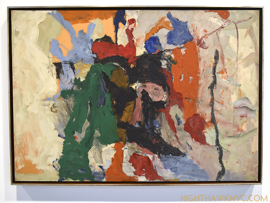
Then, in 1956, right on the cusp of the period in question, he told writer and friend, Dore Ashton, “I’m in love with painting.5” Looking around this show, that was the first thing that struck me- how painterly these paintings are. Guston’s brushwork has never been so nakedly at the forefront, even in the abstractions from 1950-55, as they are in every work here. It feels like it would be possible to follow each and every one in some of these works.

dsc_0432pnh

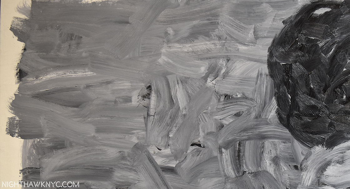
“Position 1,” 1965, Detail.

They have a freedom, a rawness, an energy that strikes me as being completely opposite from his earlier abstractions, someone dubbed “abstract impressionism,” a term he hated, works that are calm, subtle, delicate.These seem almost defiantly, perhaps reactionarily, different. They all contain shapes. At first, a mass of them, later individual shapes, and finally one shape, on a murky grey/blue with pink background. After all the depth of field has gone out, which began in his mid 1940’s work, completed from 1950, after the variety of color has gone out. The enigma remains.

"Turn," 1959

“Turn,” 1959

“There can be no adequate understanding of Guston’s life work unless we are prepared to go back over the whole road,” Dore Ashton wrote in 1990 6. In the earlier work, the enigma was different. It came with, and in the guise of persons, places and things. Guston’s work begins, as far as public collections go, in 1930. And? Talk about starting with a bang!

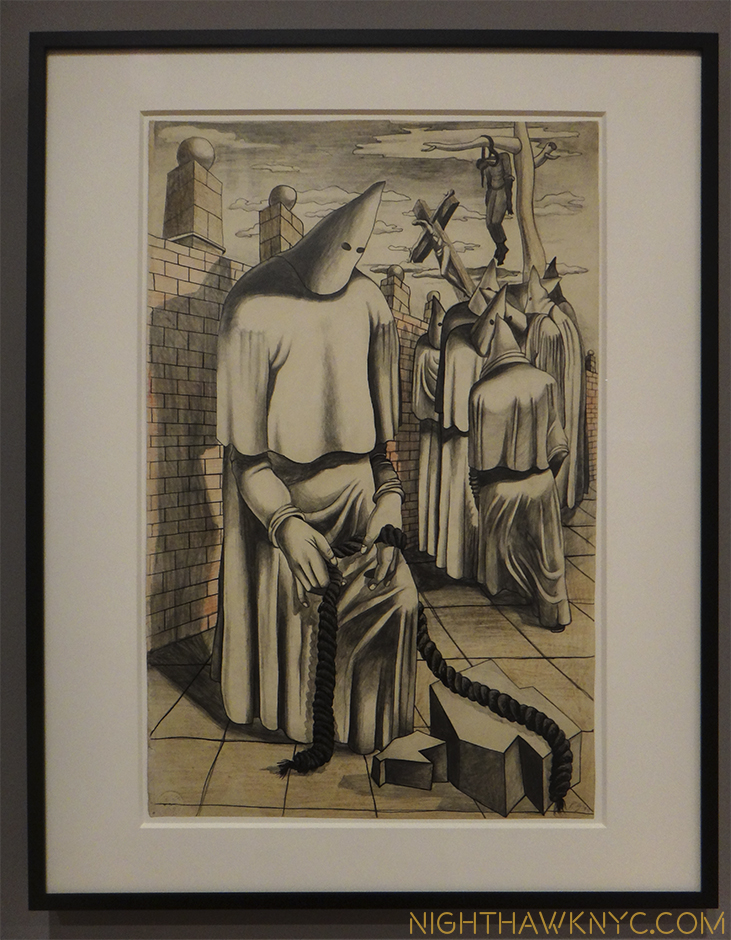
Guston was a lifelong creature of habit. Some of those, possibly, led to his early death at 66 in 1980. As a child, he retreated from the world to his closet, where he would read, and even paint, by the light of a single light bulb. He painted hooded KKK guys7, who he actually saw break up strikes. At age 13 he discovered his father, hanging, having committed suicide.(!) At age SEVENTEEN, he created this-

"Drawing for Conspirators," 1930, Whitney Museum

Drawing for “Conspirators,” 1930, at the Whitney Museum

There’s so much going on in this. First, note the figure hanging in the background. Then, the figure in the foreground handling rope. In the 1970’s when these hooded figures8 returned to his work, he said they were self-portraits9 Is this Guston pondering guilt over his father? Look at the abstraction of space- everything is enclosed in a very narrow area, which would reappear in the 1940’s, and again in the late work. The faceless head shapes, the narrow stage, and the brick wall are reminiscent of de Chirico. The angled cross from Piero della Francesca. Many of these elements, along with the single light bulb, his fascination with shoes, as well as many of the lessons he had picked up from his beloved early Renaissance Masters and, de Chirico, we see in the late work of the 1970’s. Also seen in the late work is Guston’s early love of comics. He reacted strongly when someone mentioned this to him, yet, I think it’s undeniable. As I wrote, I wonder what influence R. Crumb may have had on him. Though most of these are not readily apparent in the work in this show, they set me wondering how far away he ever got from them. After returning from Italy, his work shows an ever gradual reduction of elements, especially in his work from 1956-65, until he even stopped painting. Such was the effects of the admitted despair he was in, again, in 1966, as he was stuck before his next direction, which led to the outpouring of his final decade.

"Accord I," 1962

“Accord I,” 1962

Meanwhile, I was in the middle of my struggle with these works. It was on my 3rd visit, sitting in the nicely cavernous space that a key question hit me-

“Exactly HOW ‘abstract’ are these works?”

Look at the titles. “Painter,” “Actor,” “Alchemist,” “Vessel,” and “Portrait I,” among them. Guston commented that the titles were added after the piece had been completed. It’s rare for abstract works of the “New York School” Artists of this period to have such blatantly suggestive titles such as these. They make it impossible to give one’s imagination the completely free reign the usual “Untitled” does. In fact, they force one to attempt to “see” what the title “means” in the work. This brings you back to the way you experience figurative painting. Once this happened to me, I was never able to go back to seeing them as completely abstract again. I began to “suspect” the other works. More titles- “Rite,” “Traveler III,” “Turnabout,” “”The Room,” “Garden of M.” and “Inhabiter.” Without trying very hard, that’s 11 titles of the 36 paintings. Hmmm…


"Inhabiter," 1965

“Inhabiter,” 1965

“I think a painter has two choices: he paints the world or himself. And I think the best painting that’s done here is when he paints himself, and by himself I mean himself in this environment, in this total situation.’– Guston said in 1960.

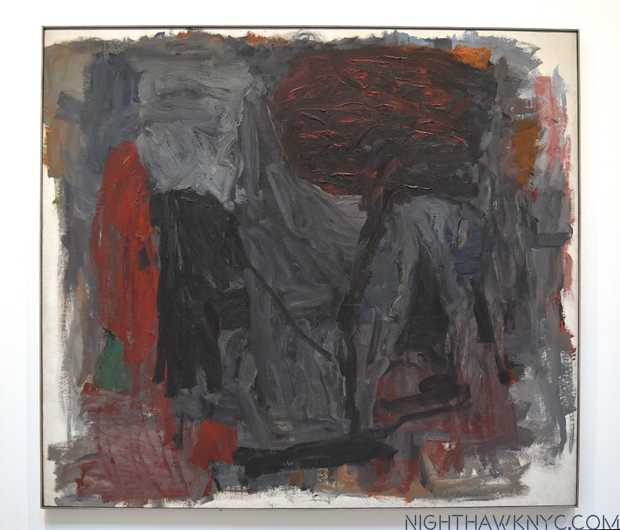
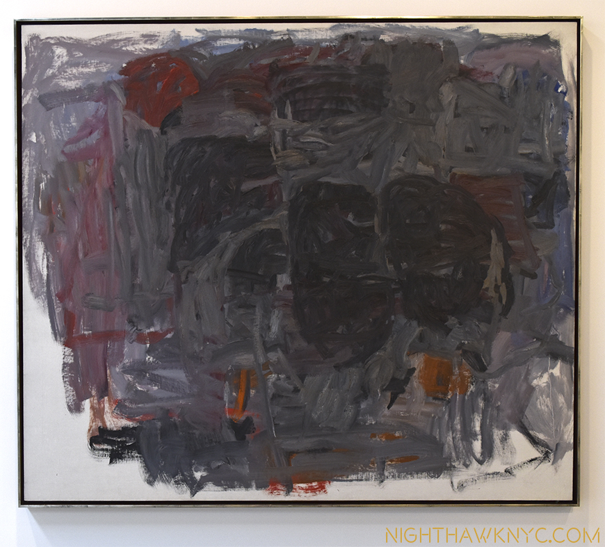
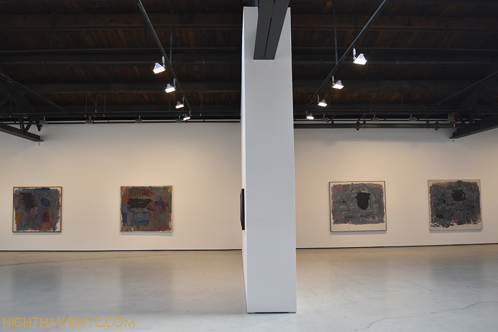
The evolution during this period can be seen in this next photo. Note the differences between the works on the left, and those on the right. Color has largely gone out, forms have been reduced. The overall feeling becomes one of darkness and isolation.

Left- 2 works from 1960. Right- one from 1964, one from 1965

Left- 2 works from 1960. Right- two from 1965

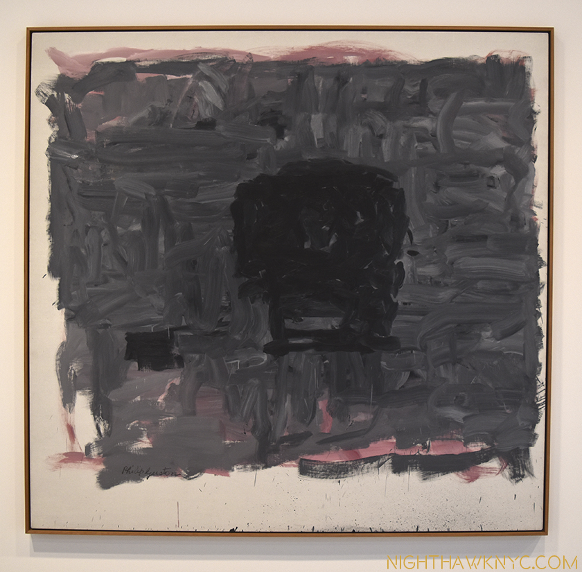
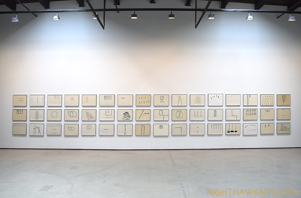
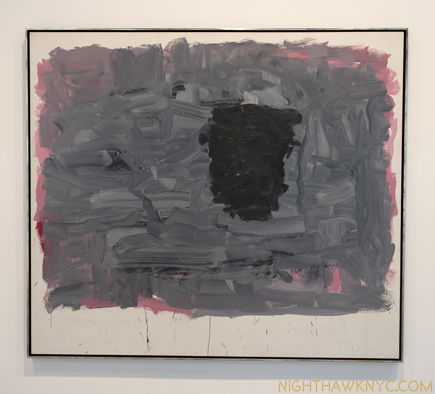
This reduction would continue through 1965, until he was left with one dark form against a murky blue/grey over pink background, with (see “Portrait I,” 1965, below), now, the white of the naked canvas encroaches. After these, painting itself, went out. In 1967, he would start all over by drawing. But, he’d quickly come to see that this new direction offered insufficient room to grow. These zen-like drawings (see the 3 photos following “Cabal,” below) were their own end game. Shortly after, he would make yet another new start. Now, pieces of his past were everywhere to be plainly seen.  This would see him create his long misunderstood, now quite popular and influential final works, like “Cabal,” below.

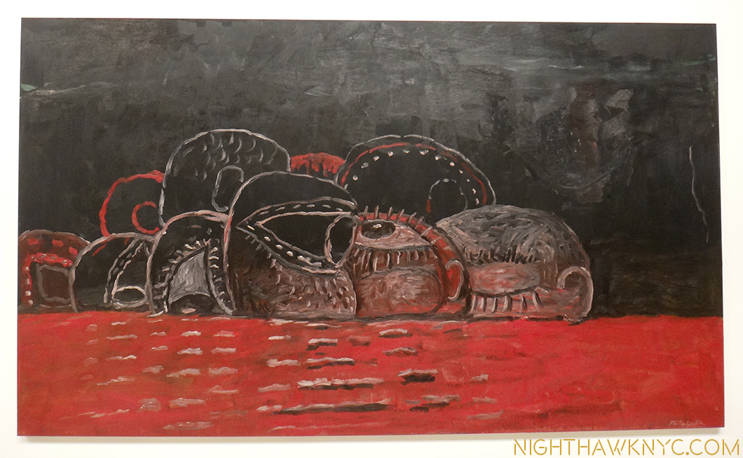
"Cabal," 1977, The Met

“Cabal,” 1977, at The Met

While the “figure” went out of his work from 1950-1965 in works that are called “abstract” (a term he loathed), there is much in his work before, and after that is, also, “abstract”- even in his late work, where people and objects return. After all, isn’t this late work, which is called “figurative,” really “abstract?”

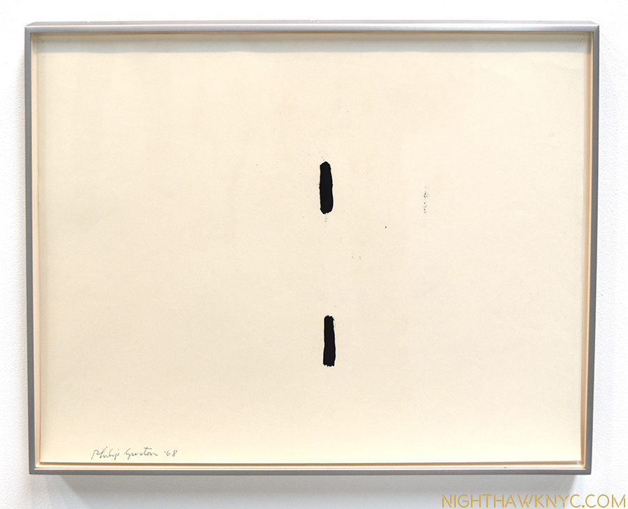
When you look closer at this hooded head in the foreground of “Conspirators,” above, with it’s two black eye holes in the white bedsheet, which somehow manage to be quite expressive. I couldn’t help but think about that when I saw this, “Untitled” drawing among those on the final wall at Hauser & Wirth.

"Untitled," 1968. Drawing.

“Untitled,” 1968. Drawing.

Then, again? With an “Untitled” work, the mind is free to go where it may, right?

Revisiting his subsequent later work while looking at the show of the Small Oils Guston did from 1969-73, that was up at the McKee Gallery in 2009, and you can see here, in addition to the hoods, shoes, single light bulb and other elements from his past, cigarettes, books, the modern city, and his wife, Musa, from his present, I suddenly see other connections (hindsight being 20/20). The same murky grey over pink backgrounds appear in a number of his smaller oils (“Cabal” has a dark background, too.). Some of these also have strange forms alone against this background. All of a sudden they don’t look like they were created by an entirely different Artist than the one who created the works in this show. Well, Philip Guston was a different Artist than the one he was in 1957-65, but he’s still Philip Guston. Since there is much that is common between his early and his late works, it makes me wonder about all of his work. That was my initial question before seeing this show- Would what came before, and after be evident here? Using hindsight you can see connections. How he didn’t completely forget this period. Parts of it remained in his work until the end of his life.
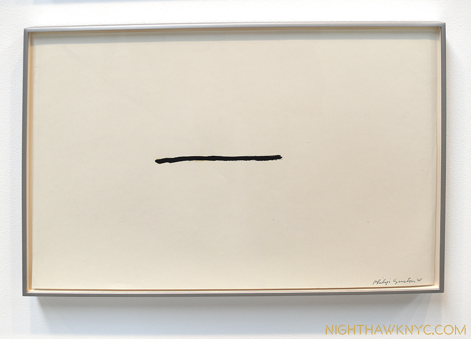
"Untitled," 1968 Drawing

Starting over, again, from the beginning. Abstract or figurative? A pencil? A line? A tightly sealed mouth? “Untitled,” 1968 Drawing

Guston was not considered a founding member of the Abstract Expressionists, nor does he appear in the famous “Irascibles” photo which defined the movement’s members for many. The Met now lists him among the 14 Artists they group in the first group, along with Lee Krasner (the circle is now complete)! I think that part of the reason he wasn’t initially considered part of the group was that he was moving in that direction slowly from 1945 to 1950 which made him miss the first round of fanfare these works received, and which subsequently “grouped” them as “Abstract Expressionists,” a term Guston loathed10. Rothko, himself had called it “their enterprise 11.” Philip Guston, eternally, followed his own star. Though Jackson Pollock was his closest childhood acquaintance and the two were expelled from Manual Artis High School12 together for calling out the fact that more money was being spent on sports than on the “Arts,” and someone who remained in his life until his death in 1956, Guston was his own man, who’s Art owed more to the early Italian Renaissance and Giorgio de Chirico than it did to Pollock, or Rothko, who he was on friendly terms with.

Zen Master. 48 "Untitled" Drawings, 1967-69.

Zen Master. 48 “Untitled” Drawings, 1967-69.

Philip Guston was never a painter of “realism.” It now appears to me that though the end results look different as his style changed and evolved, he was continually bluring the lines between figuration and abstraction all through his career, in the service of painting images that expressed himself as he evolved in his times and in his environment. It’s obvious that he never forgot his past, or the past masters who’s work he loved. The more I look at his work, from all periods, the more I see the impact of, perhaps, his biggest influence, Piero della Francesca, in it. Piero’s figures have the most inscrutable, almost deadpan expressions. Their faces, often, reveal little to nothing of what they are feeling. They take that crutch of reading a whole image from the face away from us. That feeling stays in my mind when I approach a work of Guston’s now, no matter if there are “figures” or objects in the work or not. (Many, even most, of his figures are hooded, or masked, anyway). “Reading” a Guston is a little like to trying to “read” a Piero (or de Chirico). It’s not the expression on the face, it’s the whole thing- the figure in it’s environment, to paraphrase Guston’s quote, above (in Piero’s case, each one is placed with utmost mathematical precision as part of the whole). Guston’s masks are akin to Piero’s inscrutables. We can’t read the expressions or the feelings of these figures. This makes them “abstract,” in another sense, too. I wonder about them. Since they are hooded, or masked, or a black form in his “Portrait I,” 1965, we’ll never know what they are feeling- like in Piero.

"Portrait I," 1965

“Portrait I,” 1965. As if hooded(?), in his environment.

It’s not only his 1957-65 paintings that mystify us.

“You see, I look at my paintings, speculate about them. They baffle me, too. That’s all I’m painting for.” “Philip Guston Talking” 1978, two years before he passed away.

Yet, he has left clues, along with the enigma.

(This is the third, and final, installment in my cycle of Posts on the recent, concurrent shows of Jackson Pollock, Lee Kranser & Guston- three Artists who’s lives are eternally intertwined, personally, and Artistically.)
*-Soundtrack for this Post is “For Philip Guston,” by his close friend, the brilliant composer Morton Feldman. If you have 4 hours to spare, check this out.

NighthawkNYC.com has been entirely self-funded & ad-free for over 8 years, during which 300 full length pieces have been published! If you’ve found it worthwhile, PLEASE donate to allow me to continue below. Thank you, Kenn.

You can also support it by buying Art, Art & Photography books, and Music from my collection! Art & Books may be found here. Music here and here

Written & photographed by Kenn Sava for nighthawknyc.com unless otherwise credited. To send comments, thoughts, feedback or propositions click here. Click the white box on the upper right for the archives or to search them. Subscribe to be notified of new Posts below. Your information will be used for no other purpose.

  1. Musa Mayer, “Night Studio,” Da Capo Press, P.102
  2. Hopper, Stuart Davis, Pollock, Rothko, William de Kooning, Georgia O’Keeffe, Charles Sheeler, Rauschenberg, Frank Stella, Chuck Close, Richard Estes, insert your own.
  3. Guston, “Collected Writings,” University of California Press, P.125
  4. Schimmel, Exhibition Catalog for this show, P.15
  5. Dore Ashton, “Philip Guston,” Grove Press, Inc.,1960 P.49
  6. Ashton, “A Critical Study of Philip Guston,” University of California Press, 1990,  P.9
  7. Ashton points out “At the time Guston was working on this painting it was estimated that there were more than 4.5 million members of the Klan in the United States, a great many of them residing right in Los Angeles, where they burned crosses and raised hell all during Guston’s childhood and youth.” Ashton, “A Critical Study,” P.7
  8. Ashton points out that hooded figures “not only recalling the Ku Kluxers of his early paintings but also the artists in the scriptoria of the medieval plague years who donned hooded gowns in the vain hope of avoiding the plague Ashton, A Critical Study, 1990, P.156
  9. Guston- “They are self-portraits. I perceive myself being behind a hood. In the new series of “hoods,” my intention is not really to illustrate, to do pictures of the KKK as I had done earlier. The idea of evil fascinated me… Guston, “Collected Writings,” P.282
  10. Schimmel, Show catalog, P.9
  11. Ashton, “Critical Study,” P.79
  12. Mayer, “Night Studio,” P.13

If You Ever Missed A Show At Moma? You’ve Just Been Reborn!

This site is Free & Ad-Free! If you find this piece worthwhile, please donate via PayPal to support it & independent Art writing. You can also support it by buying Art & books! Details at the end. Thank you.

Written & Photographed by Kenn Sava (*- unless otherwise credited)

dsc_6336nefpnh

“If I had my life to live over
I’d do the same things again
I’d still want to roam
Near the place we called home
Where my happiness would never end”*

This, today, from MoMA-

“THE MUSEUM OF MODERN ART LAUNCHES A COMPREHENSIVE ONLINE EXHIBITION HISTORY BEGINNING WITH ITS FOUNDING IN 1929

Installation Photographs, Archival Documents, and Catalogues of Exhibitions Now Available to Students, Researchers, Artists, Curators, and the Public

NEW YORK, September 15, 2016—The Museum of Modern Art announces the release of an extensive digital archive accessible to historians, students, artists, and anyone concerned with modern and contemporary art: a comprehensive account of the Museum’s exhibitions from its founding, in 1929, to today. This new digital archive, which will continue to grow as materials become available, is now accessible on MoMA’s website, at moma.org/history.

Providing an unparalleled history of the Museum’s presentation of modern and contemporary art on a widely available platform, the project features over 3,500 exhibitions, illustrated by primary documents such as installation photographs, press releases, checklists, and catalogues, as well as lists of included artists. By making these unique resources available at no charge, the exhibition history digital archive directly aligns with the Museum’s mission of encouraging an ever-deeper understanding of modern and contemporary art and fostering scholarship.

“The Museum of Modern Art has played a crucial role in the development of an audience for modern and contemporary art for nearly 90 years,” said MoMA Director Glenn D. Lowry. “In making these materials freely available, we hope not only to foster and enable scholarship, but also to encourage a wider interest in this important chapter of art history that the Museum represents.”

The exhibition history project was initiated and overseen by Michelle Elligott, Chief of Archives, and Fiona Romeo, Director of Digital Content and Strategy, The Museum of Modern Art. Over the course of the last two-and-a-half years, three MoMA archivists integrated over 22,000 folders of exhibition records dating from 1929 to 1989 from its registrar and curatorial departments, performed preservation measures, vetted the contents, and created detailed descriptions of the records for each exhibition.

The digital archive can be freely searched, or browsed in a more structured way by time period or exhibition type. Each entry includes a list of all known artists featured in the exhibition. Artist pages likewise list all of the exhibitions that have included that artist, along with any of their works in MoMA’s collection online. The index of artists participating in Museum exhibitions now includes more than 20,000 unique names.”


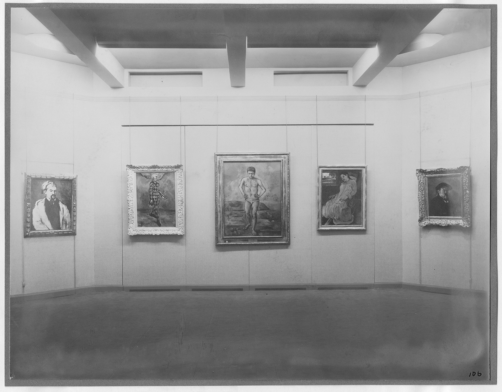
I almost fell over when I saw this. Now? You can revisit every show in the history of MoMA. Unprecedented! I’ve lost my day looking through this site. It’s absolutely unbelievable! Having the chance to FINALLY “see” shows I missed and only heard about, and shows I saw (like the 1980 Picasso Retrospective, possibly the greatest Art show ever), again, is just a dream come true! Here’s a sample, from Moma’s very first show titled “Cezanne, Gaugin, Seurat, Van Gogh,” in 1929!

Mom'a First Show! Installation view of the exhibition Cézanne, Gauguin, Seurat, Van Gogh, on view November 7, 1929 through December 7, 1929 at The Museum of Modern Art, New York. The Museum of Modern Art Archives, New York. Photographer: Peter Juley

MoMA’s First Show! Installation view of the exhibition Cézanne, Gauguin, Seurat, Van Gogh, on view November 7, 1929 through December 7, 1929 at The Museum of Modern Art, New York. The Museum of Modern Art Archives, New York. *Photographer: Peter Juley

To this point, Art shows have only lived on, after their closing, through exhibition catalogs and what’s been written or posted about them.

No more!

Here’s a chance to see how the show was hung, what works were grouped together or hung next to each other. Just Wow!

And? You can download catalogs, too!

Now? Of course I’m hoping The Met shocks me with something similar, and every other Museum in the world follows Moma’s groundbreaking example!

Don’t wait. Do not pass “Go.” Go here, now!

*-Soundtrack for this Post is “If I Had My LIfe to Live Over,” by Larry Vincent, Moe Jaffe and Henry H. Tobias, and performed by Doris Day.

NighthawkNYC.com has been entirely self-funded & ad-free for over 8 years, during which 300 full length pieces have been published! If you’ve found it worthwhile, PLEASE donate to allow me to continue below. Thank you, Kenn.

You can also support it by buying Art, Art & Photography books, and Music from my collection! Art & Books may be found here. Music here and here

Written & photographed by Kenn Sava for nighthawknyc.com unless otherwise credited. To send comments, thoughts, feedback or propositions click here. Click the white box on the upper right for the archives or to search them. Subscribe to be notified of new Posts below. Your information will be used for no other purpose.

Unfinished. Auspicious.

Written & photographed by Kenn Sava

“Well, let me tell you ’bout the way she looked
The way she acts and the color of her hair
Her voice was soft and cool, her eyes were clear and bright
But, she’s not there.”*

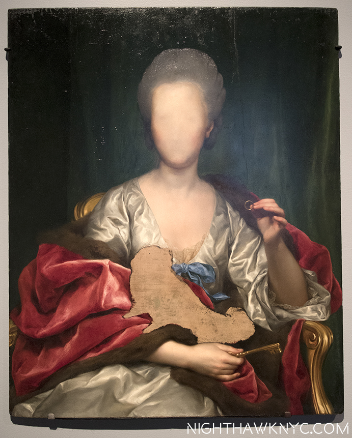
"Portrait of Mariana de Silva y Sarmiento," 1794, by Mengs

“Portrait of Mariana de Silva y Sarmiento,” 1794, by Mengs

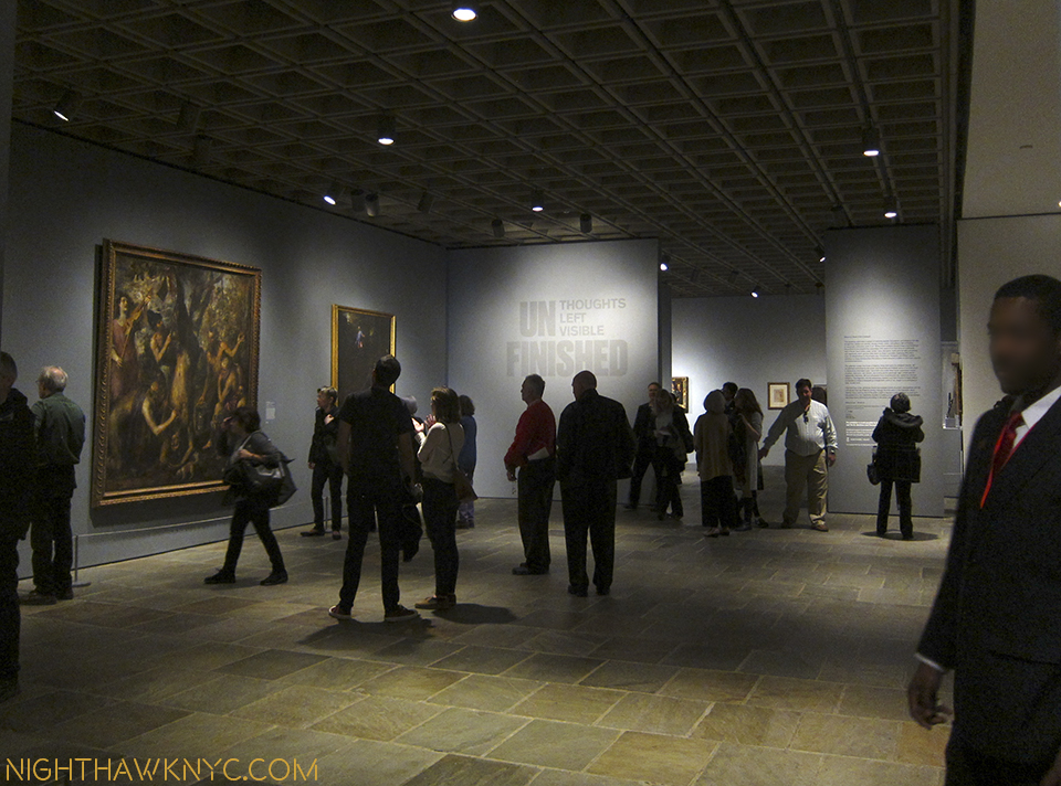
Leonardo da Vinci, Michelangelo, Titian, Van Eyck, Durer, Rembrandt, Velazquez, Manet, Monet, Degas, Van Gogh, Cezanne, Picasso, Pollock, Warhol, Mondrian, Basquiat, Whistler, Alice Neel, Lucian Freud, Klimt, Munch, Whistler, Robert Smithson, Cy Twombly, Gerhard Richter, and on and on. “Unfinished” is a mimi-Museum unto itself that probably rivals quite a few entire Museums. “Unfinished,” along with the “Nasreen Mohamedi” Retrospective, were the inaugural exhibitions at The Met Breuer (TMB), the first shows of two new eras- The Met’s new 8 year Breuer Building Lease (at a reported $17 million a year 1), and Sheena Wagstaff’s tenure as Chairwoman of The Met’s Modern & Contemporary (M&C) Department. No pressure there. It’s a show that leaves you wondering “Why didn’t anyone think of this before,” before you’ve even gotten to it’s second floor.

Opening Day of The Met Breuer. Member's Preview, March 8, 2016

Welcome to the future! Opening Day of The Met Breuer. Member’s Preview, March 8, 2016

Well, for one thing, though many of the works here come from other sources, not a lot of places have the resources The Met has, so yes, a part of this is “showing off.” They’ve chosen to install this in a brand new branch that previously held the entirety of one of the other “Big Three” Manhattan Museums, before the Guggenheim made it the “Big Four.”

If that’s not showing off? I don’t know what is.

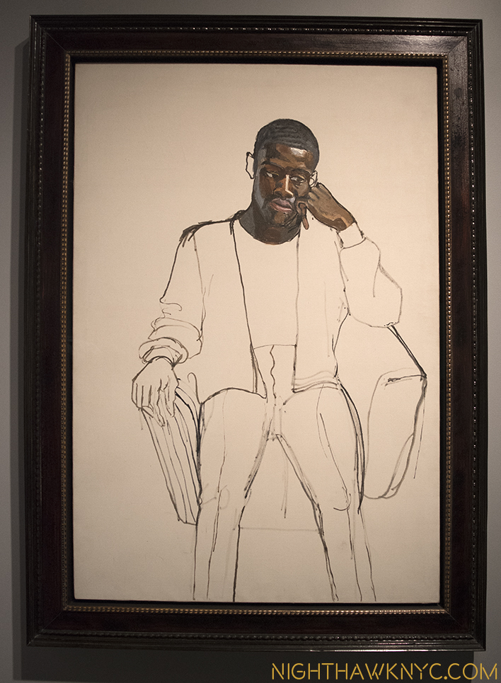
The rest is the pure joy of discovery, of seeing a curtain lifted and getting an all too rare chance to see some of what goes into making a masterpiece, a work of Art. And? The hits just keep on coming. The big names, that is, if not the most well-known work by any of those names. 197 works in all filling the 3rd & 4th Floors. While nothing here is “famous,” even in their, supposedly, incomplete state (either left unfinished on purpose, or not, in the case of Lucian Freud’s “Portrait of the Hound,” which was left as we see it on his easel when he died), these works hold up just as they are, making this a show jam packed with excellent, even important pieces. Yes, curating a show of “unfinished” work THIS well is also showing off The Met’s superb staff. Along with the pleasure of looking, they also provide fascinating, voyeuristic, even unique, insights into the Artist’s process- both working and thought. Some, as in Alice Neel’s “James Hunter Black Draftee’, 1965, are, perhaps, more evocative than it might have been had it been “finished.” Mr. Hunter never returned for additional sittings. We are left to wonder why not.

"James Hunter Black Draftee," 1965, by Alice Neel

“James Hunter Black Draftee,” 1965, by Alice Neel

The whole question of “When is a work of Art, finished?” comes front and center here as well, and no less than Rembrandt chimes in on it.

dsc_7639pnh

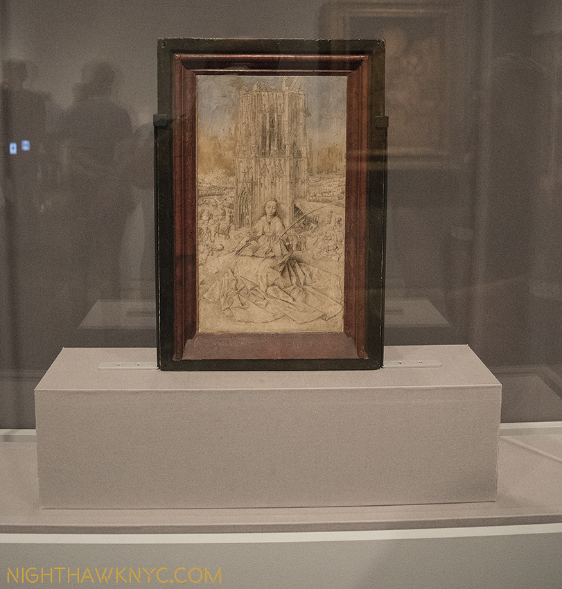
Highlights? I’ll list those that come to mind quickly because there are so many. For me, Jan Van Eyck was the very first Artist who truly captivated me as a kid. Shortly after getting my driver’s license, I drove the almost 6 hours each way just to see his “Annunciation” in Washington’s National Gallery, then drove right back. Seeing his underdrawing for his unfinished St. Barbara was just breathtaking. It’s truly unbelievable to think that something like this lies underneath his finished masterpieces, like The Ghent Altarpiece! While he is legendary for the extraordinary and exquisite detail of his painting, which has held me in disbelief for all these decades, apparently, he could also draw every bit as well2

Small wonder. "Saint Barbara," 1437, Jan Van Eyck. Barely 12 inches tall.

Small wonder. “Saint Barbara,” 1437, Jan Van Eyck. Barely 12 inches tall.

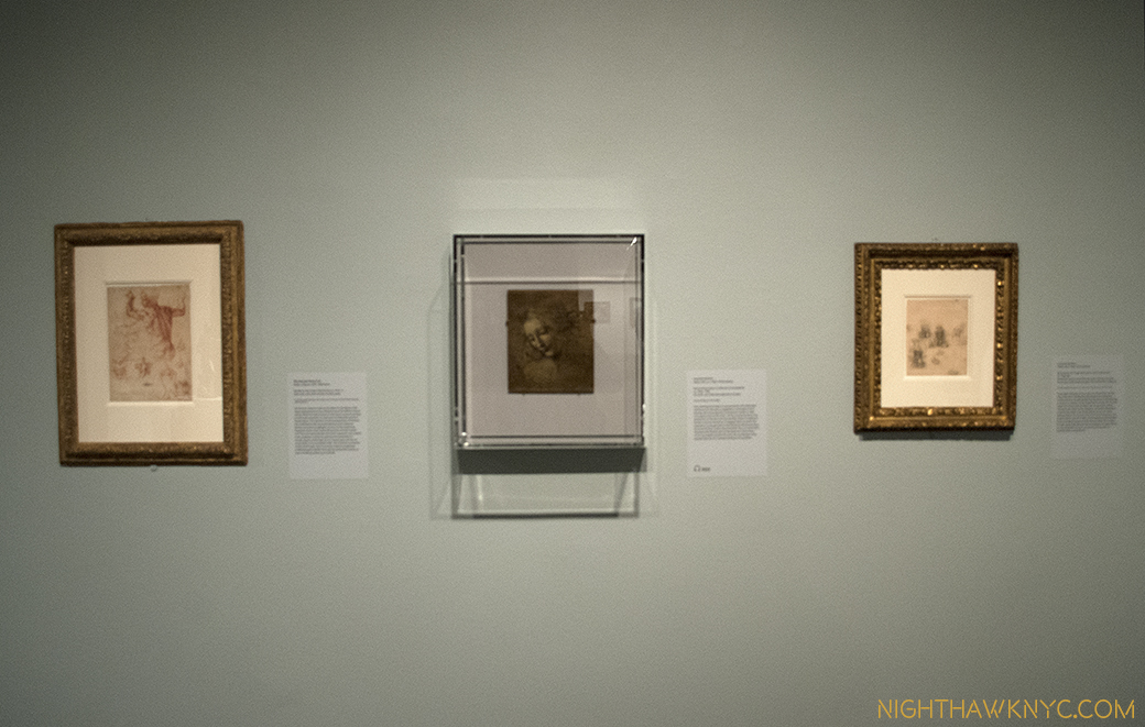
Just astounding. Oh, and sitting a few feet away was a da Vinci portrait profile that was positively otherworldly. When the show opened (along with the Met Breuer) in March, it was flanked by Leonardo’s “Sketches for the Virgin Adoring the Christ Child” and Michelangelo’s “Study for the Libyan Sibyl.” Since “Unfinished” was up for a very generous four and a half months, the later two were replaced after a while, no doubt due to their fragility. It seemed to me they may have been there in honor of TMB’s opening. Both works are in TM’s permanent collection. More showing off? (Slight smile)

Blink, and you missed it. Briefly on view, Leonardo, center and left, Michelangelo, right.

For a New York Minute, the two greatest figures in Western Art were on view together. Leonardo, center and right. Michelangelo, left. Has so much hunan genius ever been side by side than when work of these two are shown together? March 8, 2016.

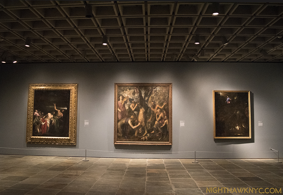
Oh, all of this is in the 2nd room. In the first room, upon getting off the elevator on the 3rd Floor, at the show’s beginning, you’re immediately faced with 2 large, powerful Titians that are guaranteed to stop you for a good long while, and a Jacopo Bassano.

This view once the elevator doors opened on 3 is one I'll long remember.

The opening salvo. This is the first thing many visitors to TMB saw after the elevator deposited them on 3. Bassano, left, with 2 Titians.

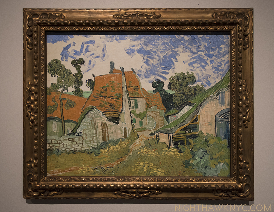
Rembrandt’s St. Bartholomew, a whole room of Turners, a beautifully selected print gallery, a very “different” Degas of a horse race, a Van Gogh who’s color filled the entire room, a stunning Munch self portrait…all on the 3rd floor, wowed me.

"Street in Auvers-sur-Oise," 1890. In the year he died, no dark clouds in this sky.

Life affirming. “Street in Auvers-sur-Oise,” 1890. The year he died, no dark clouds in this sky. I am among those who believe Van Gogh did not commit suicide.

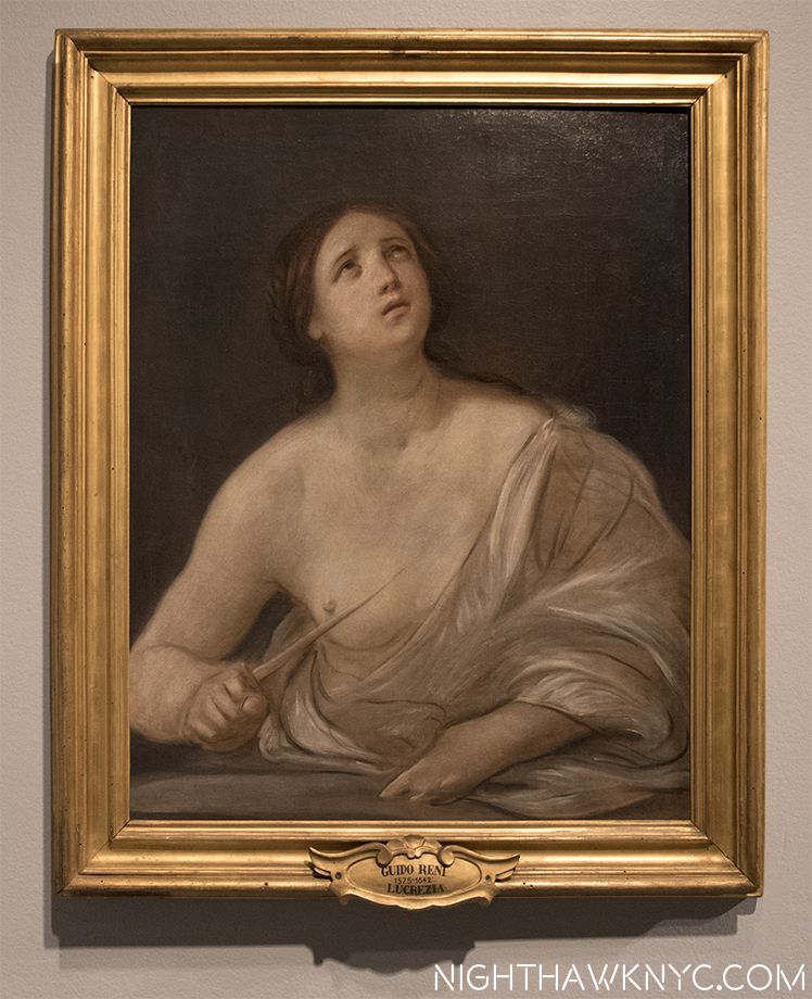
Finished, or Un? "Lucretia," 1642, by Guido Reni. Magnificent.

Finished, or Un? “Lucretia,” 1642, by Guido Reni. Magnificent.

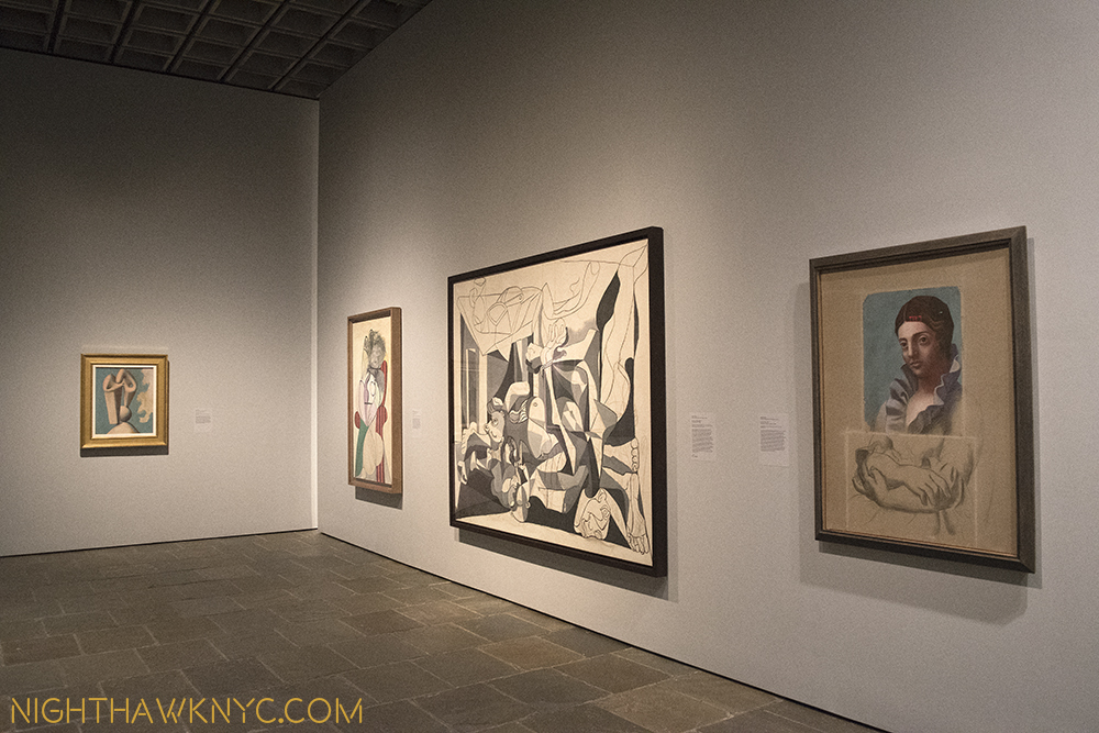
On the 4th Floor, getting off the elevator was no less dramatic. No less than 4 amazing Picassos greet you, one of which is “the Charnel House,” the work which bookends (with “Guernica”) his WW2 years. While “Guernica,” rightfully, is seen as one of the landmarks of 20th Century Art (and one I’m eternally thankful I got to see in person at Moma’s Picasso Retrospective in 1980 before it was moved to Spain as Picasso’s will required), here is a work that I think deserves more attention. It’s surrounded by 3 other pieces, in 3 other styles (in addition to 2 others in the next gallery, and a few more on the 3rd floor), that show Picasso in the process of thinking through the problems inherent in each work- each one in a different style. After the 1921 “Portrait of Olga,” right, below, he was inventing each of these styles. It’s akin to inventing a new language. There was no one else to help him or guide him. Some artists, like Jackson Pollock, have done this once. Picasso? There’s three in this one gallery, and it doesn’t even include Cubism.

Pick a style-any style. 4th Floor Lobby/Galley 1. Picasso 1921, '29, '31, '45.

Pick a style-any style. 4th Floor Lobby/Galley 1. Picasso 1921, ’29, ’31, ’45.

There was quite a bit of fanfare paid to The Met’s announcement of The Met Breuer as a “Contemporary Outpost,” especially during the years when the 5th Avenue Modern & Contemporary Galleries were to be undergoing the reconstruction they had also announced. Yet, in this co-inaugural show, we get quite a bit of what The Met is famous for, along with about two thirds of the 4th floor of more recent works. The size of many of these newer works seems to cut down on the number of pieces, however, making the show feel skewed towards older Artists. Of the 197 works in the show, I counted 74 works by Artists born after 1900, 12 by Artists born after 1950. (The youngest Artist represented is Urs Fischer, who was born in 1973, and who’s mysterious cast bronze “2,” from 2014 is also the newest work here by my reckoning.)

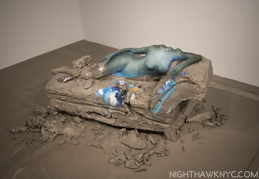
The day after at the NighhawkNYC offices? No. "2," 2014, by Urs Fischer.

The day after at the NighthawkNYC offices? I’ll never tell. Actually, this is “2,” 2014, by Urs Fischer.

“But it’s too late to say you’re sorry
How would I know, why should I care?
Please don’t bother trying to find her
She’s not there”*

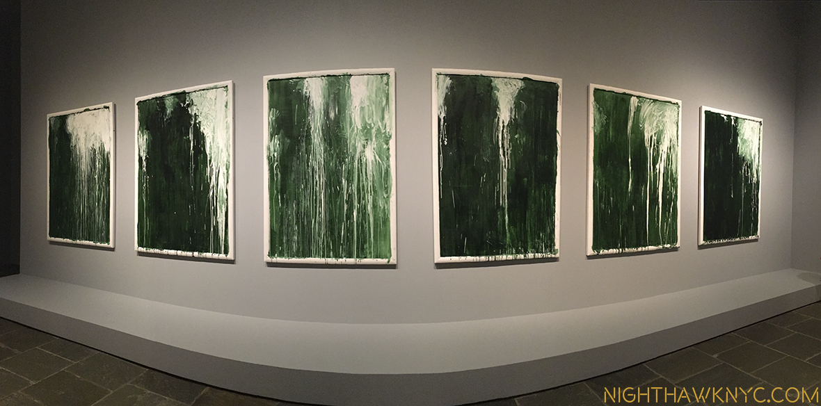
Yet, even among the M&C pieces here on the 4th floor, there are memorable pieces. In additon to Urs Fischer’s “2”, the unfinished Mondrian struck me as a revelation. Yayoi Kusama’s genre defying paintings of consecutive numbers gave pause for thought, as did Sol LeWitt’s amazing tour de force  “Incomplete Open Cubes” nearby  and, Kerry James Marshal’s “Untitled,” 2009, was a nice appetizer for his much anticipated “Mastry” show opening at TMB October 25. The show concludes with a wonderful selection of sculpture, including haunting works by Louise Bourgeois, “Untitled (No.2), 1996, and Alina Szapocznikow’s work about her own battle with breast cancer, “Turmors Personified,” 1971, in dialogue alongside 3 Rodins. The final gallery consisted of only one work- a series of 6 pieces by Cy Twombly, entitled “Untitled I-VI (Green Paintings), 1986, which provided a meditative, cleansing experience I found especially memorable.

The Cy Twombly Gallery closes the show seen in panorama.

Water works? It’s hard not to feel a sense of water in movement in this gallery of 6 Cy Twomblys, which closes the show, seen in panorama.

Overall, what I took from this show as a whole was a possible template for what The Met plans to do going forward, the kinds of Artists they may include in their “new initiative.” It’s something I plan to watch closely as it unfurls. I should say that I have been in the minority regarding The Met and M&C Art. I liked that they were taking their time and allowing time to give some perspective on Contemporary Art before jumping in. It’s always been an honor to be in The Met- they have the best of the the best across all cultures and all times. Yet, given the unprecedented popularity of M&C Art today, they have opted to move more fully into it. Ms. Wagstaff, who I met in June, seems to have a great sense for all of this, and if anything, “Unfinished,” is a show that consists of work across at least a few Met Departments. Being able to work, apparently, so well with the other Met Departments augers well for the future. After all, The Met has 2,000,000 items in it’s collection. Showing M&C Art along side of selected objects in their collection is something I am all for.

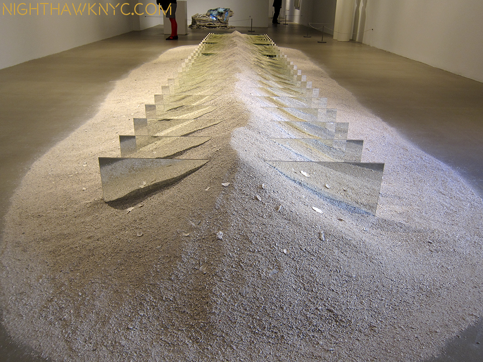
Floor beach. As close as I got to a real beach this summer.

Floor beach. “Mirrors and Shelly Sand,” 1970, by Robert Smithson. As close as I got to a real beach this summer. I shot this wearing shades.

For me? That’s what this show says- Here are (unfinished) works by many of the greats. This is where we are starting from. Let’s see how other work that may, or may not, have been influenced by them, looks alongside these. The show may be seen as a number of conversations between Artists they are displayed alongside- Leonardo with Michelangelo. Van Eyck and Durer, Rembrandt with Velazquez(!). Degas and Manet. Van Gogh and Whistler(!). Picasso and Cezanne. Pollock and Kusama. Smithson and Fischer. Marshall and Warhol. Szapocznikow and Rodin. Rauschenberg and Mondrian. And, Picasso, also…with himself, among them. I say bring it on!

Still, there’s no denying that The Met Breuer is a HUGE gamble. Who knows how long Contemporary Art will stay as “hot” as it is? For that matter, who knows how much longer record number of viewers will go to see Art, as they have these past few years? The Met is locked into this for 8 years, and they have already announced a budget deficit that caused them to put off the previously announced reconstruction of the Modern & Contemporary Galleries, and, more sadly, even forced an unknown number of lay offs.

When they return to better times, IF they decide to move forward with those reconstruction plans, they will, most likely, need additional space for the temporary display of their Modern & Contemporary holdings, and Special Exhibitions. What will they do? Extending the lease on the Breuer will be VERY expensive. So far? I have yet to see it’s galleries very crowded. The “Diane Arbus; In The Beginning” Show, which recently opened on the 2nd floor, seems to be drawing pretty well, and “Unfinished” was fairly crowded during it’s last weeks. Yet? They’ve already closed the 5th Floor Cafe & Bookstore and remodeled it as additional Gallery space, which indicates that they want to have more going on there for visitors to see, and their basement restaurant is scheduled to open in about a month, which will be open during some hours The Museum is not. Obviously, this is all new, and still in flux. The Met seems to be reacting fairly quickly, which is a good sign. They did away with late Thursday nights, which I seemed to be among the very few that went to, and changed to late Friday & Saturday nights, like TM, 5th Avenue.

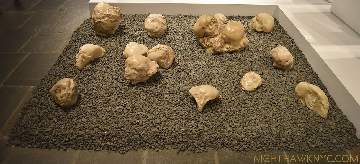
"Tumors Personified," 1971, by ALina Szapocznikow.

Survivor. “Tumors Personified,” 1971, by Alina Szapocznikow.

So far, on very little evidence, I like the direction TM is going at TMB, and with M&C Art. “Nasreen Mohamedi” was a revelation that struck me as the “perfect choice” to be the first M&C Show. “Unfinished” was an unexpected blockbuster the likes of which has never been seen before, which is somewhat startling given how long there have been painting shows. The Diane Arbus show is fascinating and features a ground breaking installation. Also, not to be lost is the reconfiguration of the M&C Galleries at TM on 5th Avenue- I love what they’ve done. The Art has been imaginatively rehung in fascinating new combinations, with some pieces given new prominence, like Edward Hopper’s majestic “The Lighthouse at Two Lights,”1929, and other pieces shown that have long been in storage. Along with this, Thomas Hart Benton’s “America Today” Mural appears to have now been permanently housed, at the center of supporting works and works that enter into interesting dialogue with it nearby. Other galleries are arranged by theme, instead of chronology.

So? There’s been a lot of action coming from new M&C Chairwoman Sheena Wagstaff and her Department. There’s a long way to go, but so far? It’s hard for me to give her less than an “A” for what she and they have accomplished.

Haunting, and then some.

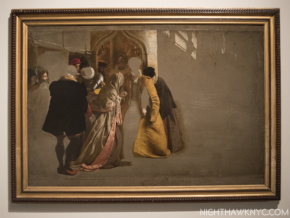
Haunting, and then some. “The Return of Mary Queen of Scots to Edniburgh,” 1870, James Drummond.

Most of the Artists in “Unfinished” won’t get the chance to finish what they started. The Met will.

Stay tuned.

*-Soundtrack for this post is “She’s Not There,” by Rod Argent, recorded by The Zombies, and published by Marquis Songs, USA.

NighthawkNYC.com has been entirely self-funded and ad-free for over 7 years, during which over 250 full length pieces have been published. As I face high expenses to keep it going, if you’ve found it worthwhile, please donate to keep it up & ad-free below. Thank you!

Written & photographed by Kenn Sava for nighthawknyc.com unless otherwise credited.
To send comments, thoughts, feedback or propositions click here.
Click the white box on the upper right for the archives or to search them.
For “short takes” and additional pictures, follow @nighthawk_nyc on Instagram.

Subscribe to be notified of new Posts below. Your information will be used for no other purpose.

  1. http://www.nytimes.com/2016/03/05/arts/design/breuer-building-expands-the-imagination-and-the-budget-of-the-met.html?_r=1
  2. Yes, I saw “A New Look at a Van Eyck Masterpiece” at TM proper, which featured a drawing of the Crucifixion from Rotterdam that may, or may not be, by Van Eyck. I came away VERY impressed by it to be sure, but remaining to be entirely convinced.

752,995 Attend The Met’s Manus x Machina

This site is Free & Ad-Free! If you find this piece worthwhile, please donate via PayPal to support it & independent Art writing. You can also support it by buying Art & books! Details at the end. Thank you.

Written & Photographed by Kenn Sava.

From The Met today-

“(New York, September 6, 2016) – The Metropolitan Museum of Art announced today that Manus x Machina: Fashion in an Age of Technology, which closed yesterday, attracted 752,995 visitors during its run from May 5 to September 5, putting it in seventh place among the Museum’s most visited exhibitions, joining blockbusters such as Treasures of Tutankhamun (1978), Mona Lisa (1963), and Painters in Paris, 1895-1950 (2000).  The show also becomes the second most visited Costume Institute exhibition, surpassing Alexander McQueen: Savage Beauty (2011), which had 661,509 visitors.  China: Through the Looking Glass (2015) remains the department’s most popular show with 815,992 visitors and The Met’s fifth most visited.   All three exhibitions were curated by Andrew Bolton, Curator in Charge of The Costume Institute.

“We are thrilled that so many people from around the world experienced this exploration of the artistry of fashion,” said Thomas P. Campbell, Director and CEO of The Met.  “The exhibition required the transformation of the Robert Lehman Wing into a domed cathedral-like space that invited people to slow down and contemplate the process and craft of the objects.”

The exhibition, originally set to close on August 14, was extended by three weeks, and hours were added on September 2 and 3, when it stayed open until midnight, three hours past the usual 9:00 p.m. closing time on Friday and Saturday nights.

Manus x Machina explored how designers reconcile the handmade and the machine-made in the creation of haute couture and avant-garde ready-to-wear. It addressed the distinction between the hand (manus) and the machine (machina) as discordant tools in the creative process, and questioned the changing delineation between the haute couture and ready-to-wear.” (End.)

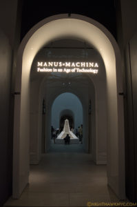
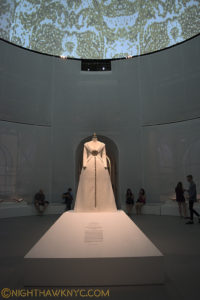
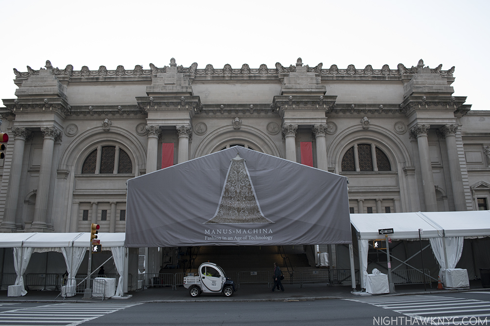
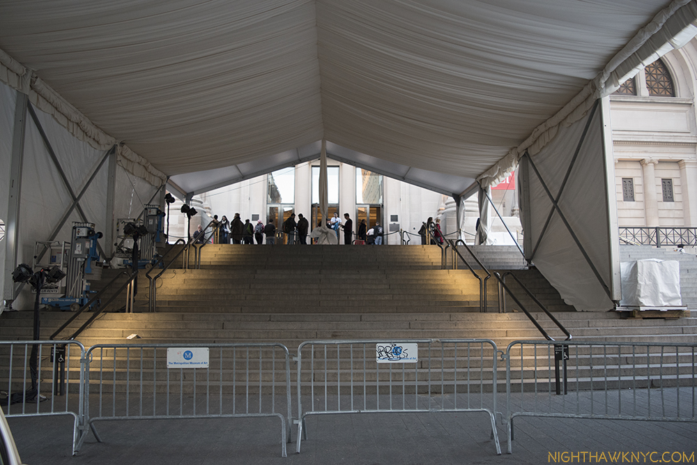
Worshipping at the Altar of Fashion. The entrance.

Worshipping at the Altar of Fashion. The entrance.

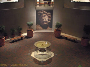
Ok, so I was 250,000 short on my ambitious guess of a million. I am surprised it topped the unforgettable McQueen Show, which felt more crowded during my 8 visits, but I haven’t checked to see how many days each show was open. I saw Manus about 10 times, and was blown away by the trnsfiguration of the Robert Lehman Wing into the “cathedral” Mr. Campbell describes in The Met’s press release, above. While, they’ve gone above and beyond every year with their fashion show installations, this was was over the top. If you’ve been to the Lehman Wing before this show,  you have an idea of the scope of what they did. Here’s how it looked when I visited it in 2013-

Robert Lehman Wing Courtyard, January, 2013, during "Bernini: Sculpting in Clay"

Robert Lehman Wing Courtyard, January, 2013, during “Bernini: Sculpting in Clay”

And during Manus x Machina-

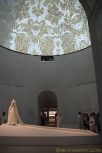
Yes, they built an entire floor over above the courtyard! Ground in this pic is at the same level as the top of the Bernini Bust in the pic, above.

Yes, they built an entire floor over the courtyard seen above! The floor in this pic is at the same level as the top of the Bernini Bust in the pic, above. Side view- Chanel Wedding Ensemble by Karl Lagerfeld, Autumn/winter 2014/15, also seen in Pic 1.

Back view. Chanel Wedding ensemble, Autumn/winter 2014/15

Front view. Chanel Wedding ensemble. Projected on the dome, above, is a blow up of the train, based on Lagerfeld’s drawing.

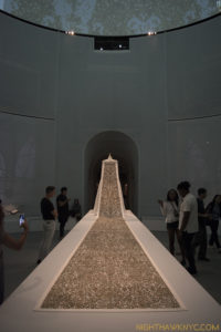
Back view. Probably the most popular view.

Back view. Probably the most popular vantage point.

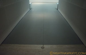
The grey area in front is the amazing temporary floor.

The grey area in front begins the amazing temporary floor.If you didn’t know it was temporary, you’d never suspect it.

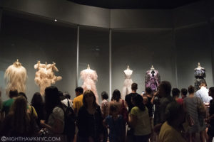
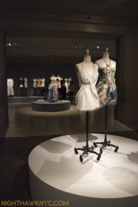
The show was focused on the craft of fashion, with each gallery turned into a section for various crafts like Embroidery, Artificial Flower Making, Leatherwork, Featherwork, Pleating, Lacework and Tailoring. Some of the more adventurous pieces follow-

A Featherwork Gallery

A Featherwork Gallery

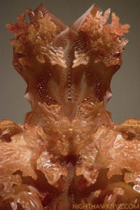
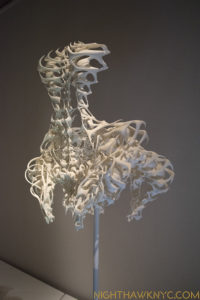
Lacework.? Iris van Herpen, Autumn 2012, 3D Printed dark orange epoxy.

Lacework.? Iris van Herpen, Autumn 2012, 3D Printed dark orange epoxy.

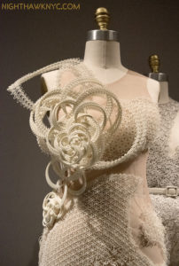
Threeasfour, "Interdimensional" Dress, 2016. Machine sewn white neoprene, hand-applique 3D ivory resin.

Threeasfour, “Interdimensional” Dress, 2016. Machine sewn white neoprene, hand-applique 3D ivory resin.

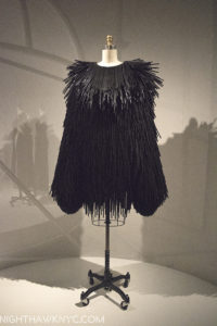
Gareth Pugh, Dress, 2015. Individually hand-cut drinking straws.

Gareth Pugh, Dress, 2015. Individually hand-cut drinking straws.

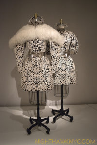
It wouldn't be a Met fashion show without McQueen. Here, Sarah Burton's 2012 White pony skin on black leather ensembles.

It wouldn’t be a Met fashion show without McQueen. Here, Sarah Burton’s 2012 White pony skin on black leather ensembles.

"My dear, your tailbone is showing." Iris van Herpen, Dress, 2011-12, 3D printed white polyamide.

“My dear, your tailbone is showing.” Iris van Herpen, Dress, 2011-12, 3D printed white polyamide.

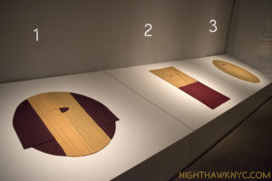
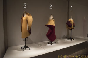
Shapeshifter. Issey Miyake, Master of the Pleat, the same designs, seen first as flats, here, and...

Shapeshifter. Issey Miyake, Master of the Pleat, the same designs, seen first as flats, here, and…

Opened. Ii.e. "Not flat"

Opened, i.e. “Not flat,” with my numbers added. “1” flat becomes “1” opened…

Tailoring & Dressmaking Gallery

Tailoring & Dressmaking Gallery

To see more of the show, I highly recommend TM’s Manus x Machina website, where you can see Overviews of each gallery and additional images of displayed items.

“I work all day at the factory
I’m building a machine that’s not for me
There must be a reason that I can’t see
You’ve got to humanize yourself.”*

Some shots of the installation-

DSC_7248PNH

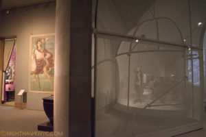
Meanwhile, in the part of the Lehman Wing still displaying Robert Lehman’s collection, left, St. John seems to be striking an auditon pose to get into MxM, right, where you can see some of the temporary structural work done to create the “cathedral,” seen through the outer mesh.

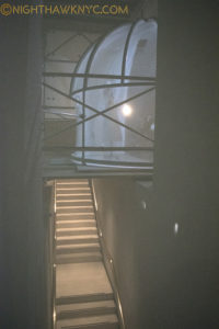
Even the stairwells to the lower floor of MxM were imaginatively used, again, seen through the mesh.

Even the stairwells to the lower floor of MxM were imaginatively used, again, seen through the mesh.

This show didn’t have a “hook” into the psyche of the moment as “Alexander McQueen: Savage Beauty” did with Lady Gaga wearing his amazing “Armadillo Shoes” on the cover of Rolling Stone, and with McQueen’s recent tragic passing still fresh in the mind, yet for those with an interest in the craft of fashion, it was an excellent overview. While a few designers, especially Iris van Herpen and Issey Miyake, received major attention in the form of (too?) many pieces, the show wasn’t too big and was beautifully laid out. As very, very good as the fashion was? I’ll never forget the unbelievable and incredibly creative job they did installing this show.


A very popular Irish Wedding dress circa 1870 on the left.

A very popular Irish Wedding dress circa 1870 on the left.

This show came during the news of TM’s budget shortfall, which put on hold the rebuilding of the Modern & Contemporary Galleries. After seeing the Lehman Wing transformed, I wonder if the Lehman Wing will be the next area of TM to be rebuilt, after the M&C Galleries are done…whenever that is.

*-Soundtrack for this Post is “Rehumanize Yourself,” by Sting & Stewart Copeland, from The Police’s album, “The Ghost In The Machine,” and Published by Sony/ATV Music Publishing, LLC.

NighthawkNYC.com has been entirely self-funded & ad-free for over 8 years, during which 300 full length pieces have been published! If you’ve found it worthwhile, PLEASE donate to allow me to continue below. Thank you, Kenn.

You can also support it by buying Art, Art & Photography books, and Music from my collection! Art & Books may be found here. Music here and here

Written & photographed by Kenn Sava for nighthawknyc.com unless otherwise credited. To send comments, thoughts, feedback or propositions click here. Click the white box on the upper right for the archives or to search them. Subscribe to be notified of new Posts below. Your information will be used for no other purpose.

To- Whoever Owned This Book Before Me

This site is Free & Ad-Free! If you find this piece worthwhile, please donate via PayPal to support it & independent Art writing. You can also support it by buying Art & books! Details at the end. Thank you.

Written & Photographed by Kenn Sava (*- unless otherwise credited)

I don’t know who you are, but this Post is for you.

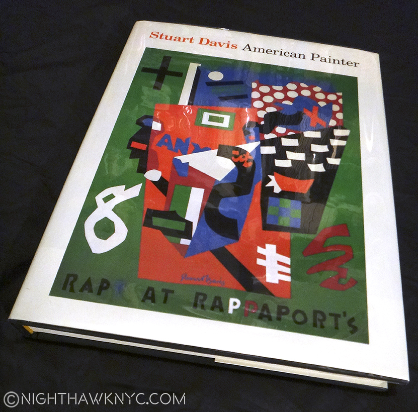
“This book” is an out of print exhibition catalog from the Stuart Davis show at The Metropolitan Museum in 1991. Another of the shows I missed and will forever be sorry I did. Thank goodness it lived on in this superb catalog. Show catalogs are an interesting thing. Widely available while the show is on, they soon go out of print and then become sought after by Artists, specialists and die-hard fans as time passes.  Though The Met said they were going to make all their older publications available as .pdf files online, some, like this one, have been skipped no doubt because it was co-published by a big commercial publishing house, who has a say in that, in this case Abrams.

12 years ago I bought a used paperback copy of it at the now defunct Academy Books and had worn it out. I’ve had my eye out for another copy, one in good condition at a reasonable price for a while. I need it now because I’m in the middle of a Post on the “Stuart Davis: In Full Swing” Show at the new Whitney Museum. My go-to (often) bookstore, The Strand, had one recently, but it wasn’t much better than the one I had, so I passed. A few days later, it was gone. So, I was driven to look online, and finally found this copy.

The Book. The catalog for The Met's 1991 Stuart Davis show, long out of print. Notice the cover Art.

The Book. The catalog for The Met’s 1991 Stuart Davis show, long out of print. Notice the cover Art.

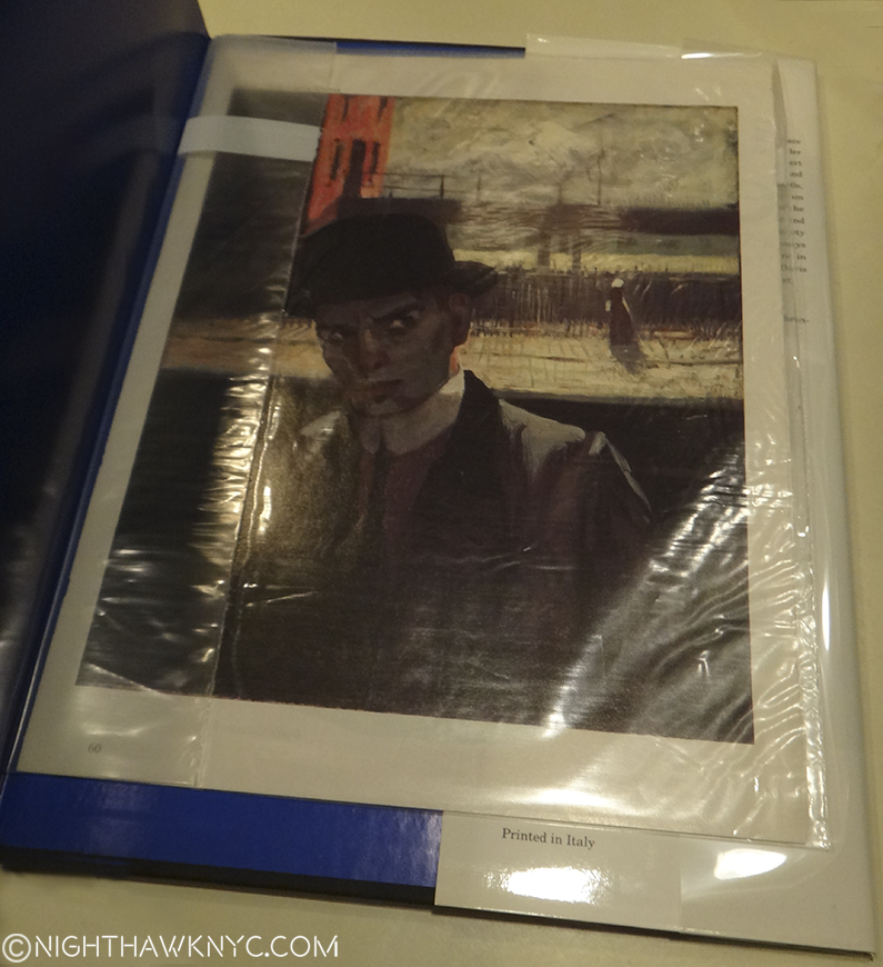
I bought it online from a bookstore. When it arrived, unlike some of my recent experiences buying books online, I found it to be in better condition than I had hoped. People seem to want to upsell the condition of books, which is so shortsighted. Most buyers are going to notice an obvious flaw in something so why try and get over on someone and have it sent back to you and probably get some, deservedly, bad feedback in the process? To help keep it this way, I decided to put a book jacket on it. I’ve been looking through it, but I hadn’t looked inside the back cover. When I removed the dust jacket to wrap it, I did. I found Stuart Davis, himself, looking out at me from a 1912 Self Portrait he painted, apparently in New York, given the background, while he was living in Hoboken, NJ, at age 20. It was in an archival envelope. I opened it up to discover it was the first page of an article about Davis and the 1991 Met Show, carefully removed from an unknown magazine (circa 1991-2) and placed in this envelope to protect it, and so it wouldn’t discolor the book.

Stuart Davis, in his 1912 Self Portrait, looks out at us, 104 years later.

Haunting our City. Stuart Davis, age 20, in his 1912 Self Portrait (with NYC’s old Elevated Subway in the background) looks out at us, 104 years later, from inside the back cover. The original painting is here.

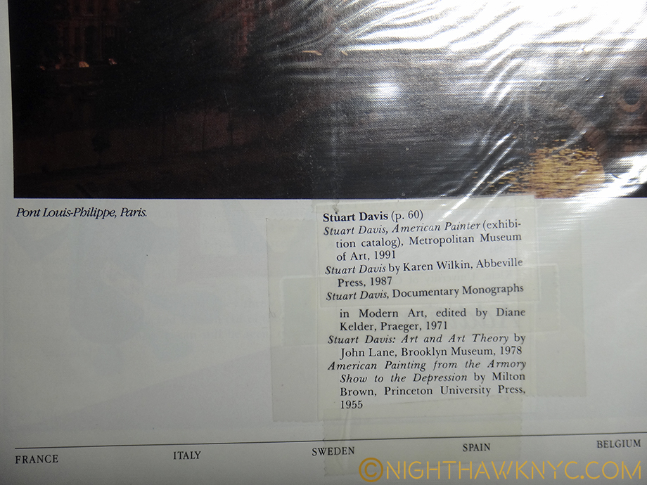
On the back of the last page of the article, someone had cut out and carefully taped the bibliography for the article. Impressive!

DSC00537PNH

This was something similar to what I’ve done for many years, myself. If you have eclectic taste and/or like Artists or Musicians that aren’t very popular it may be a long time before you find something in print about them. When I did? I’d read it over a few times, then cut it out and save it. I’d stick it inside a book about them (if there was one), inside a record jacket, or later, a CD jewel case.

I buy used books often, since many books I’m interested in are now out of print. Sometimes, the unpleasant aroma of old cigarette smoke hits you, making you wonder if that finally led to this book being here. They don’t make the cut. Sometimes, they come with a previous owner’s name written inside. I usually don’t like anything written in a book. But this one time? I wish the owner had written their name in it.

One day all too soon, physical Art Books will be a thing of the past, as soon as image quality in eBooks catches up with their printed counterpart in a reasonable file size. That might be a while yet. For me? It would be a mixed blessing. Mostly? I have too many large books, as I’m often reminded, so freeing up some space would make a big difference in my life. Beyond that, though, there is something beautiful about a physical Art Book, something that hooked me since I bought my first one, on Rembrandt by Bob Haak as a teenager, and still does. I suspect they will then trade among collectors, like Lp’s do now. No one will ever open an eBook and have this happen to them.

Finding this today? Here was a kindred spirit- someone like me. Someone I’ll never know who feels about Stuart Davis’ work the way I do. Though he didn’t write his name in it, it was personalized in a non-destructive way. Making it one’s own, but not like tattooing it with writing. There’s no need for that in this case- I get it.

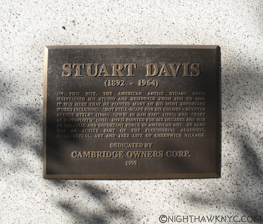
That same afternoon, I went back to to see “Stuart Davis: In Full Swing” yet again, as my work continues. I had an errand to do first, so I wound up walking over to the Whitney a different way than I usually do. As I neared the corner of 7th Avenue on West 13th Street, I was stopped in my tracks, when I saw this on the wall.

DSC_7025P2NH

“…it was here that he painted many of his most important works including…”

What? Wow!

I have lived in and around NYC almost all of my life, and been in this neighborhood countless times. Yet, I’d never known he lived here! Around the corner is the Village Vanguard, for my money the world’s greatest Jazz Club, where it occupies the same basement it has since 1935. Being a lifelong Jazz lover, I bet he spent quite a few evenings there, as I have, as well. The original Whitney Museum was a short walk away on 8th Street, when he lived here (from 1934-54), as the new one is now in a different direction.

Reading the plaque, I could still feel Stuart Davis’s “Self Portrait” from inside the back cover of the book looking at me. Inside in the lobby hung a large, beautifully framed Stuart Davis Poster. Impressive considering he died 52 years ago, and it’s 62 since he lived here. Looking at the building, it looks like thousands of other buildings in New York, and, probably, the rest of the world. I stood outside pondering it. It wasn’t like the old Bowery that reeked of cheap booze and romantic Artist’s loft studio spaces, the long time homes of Allen Ginsberg, John Cage and othes from the same period, Keith Haring, Joey Ramone, among others, after. It was a nice, modern, kinda faceless apartment building. Nothing about it said that one of the greatest American Artists who has yet lived lived here, except it’s smack-dab in the middle of The Village location.

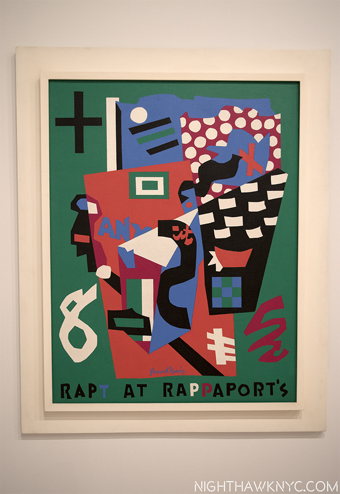
Then, I continued on, completing the short walk to the Whitney. Inside the show, I lingered in front of “Rapt At Rappaport’s,” from 1952, in it’s interesting frame.

Davis' "Rapt At Rappaport's," 1952, on view at The Whitney, now in the Smithsonian

Look familiar? Davis’ REAL “Rapt At Rappaport’s,” 1952, now on view at The Whitney, from the collection of the Smithsonian.

Davis painted it in the building I had just walked past, as the plaque confirms by name! I never knew that. I’ve seen it before, but now? I’m seeing it anew. It doesn’t depict the neighborhood (Greenwich Village) per se, in fact, it’s an “homage” to “Rappaport’s Toy Bazar,” a store his parents used to take him to as a child many years earlier. The store used polka-dotted paper to wrap gifts, hence, the polka-dots in the upper right, and the work’s title is also a pun on “wrapped.” But, on a different level, now everything about this says “Greenwich Village in the 1950’s.” The child became a man, and that man was an Artist. It drips of the Jazz he heard all around as The Village headed into it’s Jazz & Beat Glory Days. Even the title (using “Rapt” in place of “Wrapped,” for the wrapping paper) is a “Jazz-pun,” as in raptly listening. In addition to being a “souvenir” of his childhood, it’s also a little reminder, a little piece, of that more recent time, and place, The Village- from his then home there on 13th & 7th.

It also happens to be the painting chosen to be the cover Art for my new/old book.

Is this all a bunch of strange coincidences, neatly “Rapt” together with a bow on top? Covering (“wrapping”) the Davis book and being startled to see him looking out at me unexpectedly, as the prior owner had left him, lovingly curated…then accidentally discovering (uncovering?) the very place he painted it’s cover Art… and finally, seeing the original painting shown on the book’s cover. Hmmm…It feels like someone is sending me a message.

Now? Someone else lives in that apartment. Someone else owns this book.

Still? Parts of both live on from before. Very good parts.

Thank you.

*-Soundtrack for this Post is “You Can’t Judge A Book By It’s Cover,” written by Stevie Wonder, Sylvia Moy and Henry Cosby, and preformed by Bo Diddley.

NighthawkNYC.com has been entirely self-funded & ad-free for over 8 years, during which 300 full-length pieces have been published! If you’ve found it worthwhile, PLEASE donate to allow me to continue below. Thank you, Kenn.

You can also support it by buying Art, Art & Photography books, and Music from my collection! Art & Books may be found here. Music here and here.

Written & photographed by Kenn Sava for nighthawknyc.com unless otherwise credited. To send comments, thoughts, feedback or propositions click here. Click the white box on the upper right for the archives or to search them. Subscribe to be notified of new Posts below. Your information will be used for no other purpose.

The New Whitney Museum- The Roofdeck of American Art

This site is Free & Ad-Free! If you find this piece worthwhile, please donate via PayPal to support it & independent Art writing. You can also support it by buying Art & books! Details at the end. Thank you.

Written & Photographed by Kenn Sava (*- unless otherwise credited)

DSC_3074PNH

“American Tune”
“We come on the ship they call the Mayflower
We come on the ship that sailed the moon
We come in the age’s most uncertain hour
and sing an American tune”*

Looking west on the 6th Floor Roof deck, Spring, 2016.

Looking west on the 6th Floor Roof deck, Spring, 2016.

Part 1- The New Whitney Museum…And I

We actually go way back…

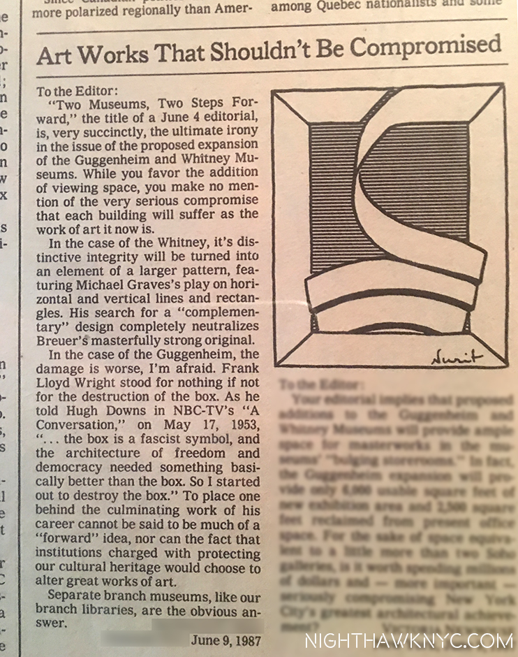
All the way back to June, 1987 when I had a letter published in the New York Times in opposition to the proposed expansion plans of the Guggenheim & Whitney Museums, after it was announced that both Museums wanted to modify & expand their existing buildings. I was outraged. How could you change these two singular masterworks without ruining them? I closed saying that “branch museums were the obvious answer” to modifying these Artworks of Architecture, in the Guggenheim’s case, Frank Lloyd Wright’s masterpiece was, perhaps, the greatest work of Art it owns. I went to the Community Board Meetings, but wasn’t directly involved beyond this letter. Mine was apparently chosen over the head of the opposition committee’s letter, much to his displeasure, I heard.

My letter in the NY Times Op-Ed page opposing the & Guggenheim & Whitney modifications, June, 1987. I love the very fitting drawing they added.

Almost 30 years later (wow…really?), how did “we” do?

Well, BOTH Museums took my “advice” and opened branch museums. The Whitney had a few around town, one across from Grand Central, another in Soho, while the Guggenheim opened what is, perhaps, the greatest Museum building since Wright’s enduring 5th Avenue masterpiece…by Frank Gehry in Bilbao, Spain of all places. It’s a “place” now, a true destination for culture vultures. They showed a model of another Gehry masterpiece they wanted to build downtown in the East River at the Guggenheim Gehry Retrospective in 2000. I bought a poster of it but, after 9/11, it was never mentioned again. ? They went ahead and remodeled Wright’s masterpiece, anyway, which I will never accept, AND continue to open branch Museums around the world as we speak. The Whitney, on the other hand, did not renovate Breuer’s unique original. Instead, we got something I never saw coming- They moved out and built an entirely new Museum.

Wow!

So? On my scorecard? I am one and a half out of 2.

The New Whitney opened in May, 2015 in the Meatpacking District, right at the southern end of the High Line. I’ve made frequent trips there so far studying the building from every angle I could, at night, and yes, even in day light. (Oh, the sacrifices I will make in the pursuit of Art.) The inaugural, and as I’ve said very good, show, in the new Renzo Piano building, “American Is Hard To See,” came and went. I also wrote about both the Frank Stella Retrospective and a show by filmmaker Laura Poitras that came and went, too, along with quite a few smaller shows. So, a few months after the 1 year Anniversary, I think I’ve finally had enough time and experience with the new place, over 45 visits, to have some thoughts coalesce. As always, I have not read any reviews of either the building or the shows mentioned.

Part 2- Renzo Piano’s Whitney Museum Building

U.S.S. Indianapolis. US Navy Photo

The U.S.S. Indianapolis, Why is this picture here? Stay tuned. (U.S. Navy Photo.)

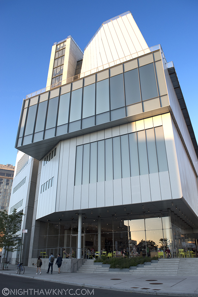
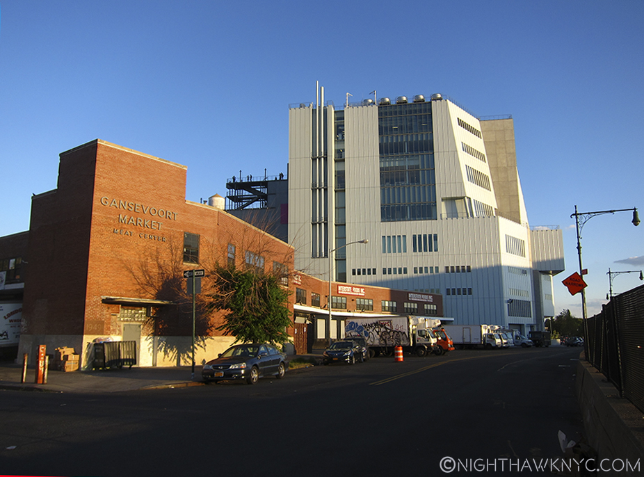
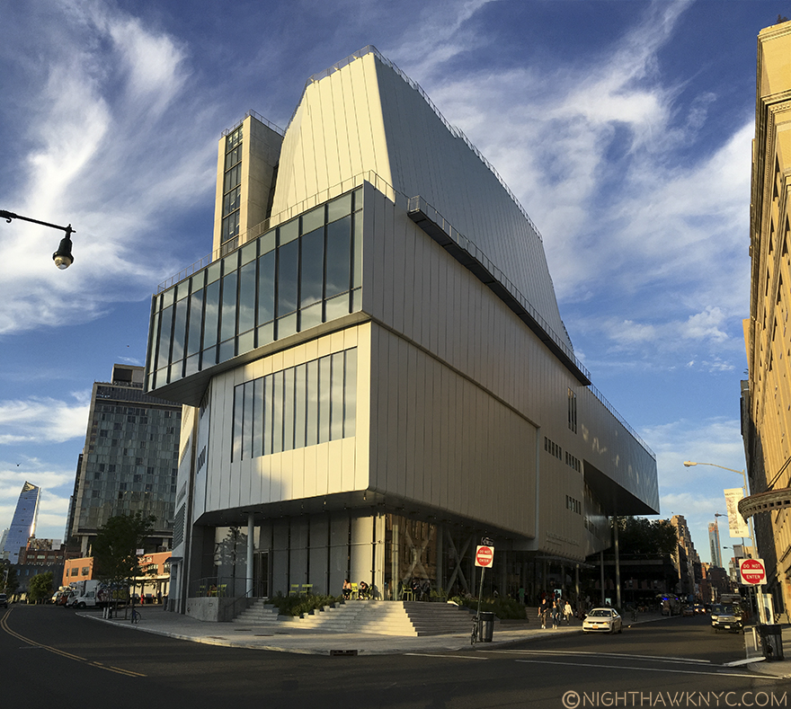
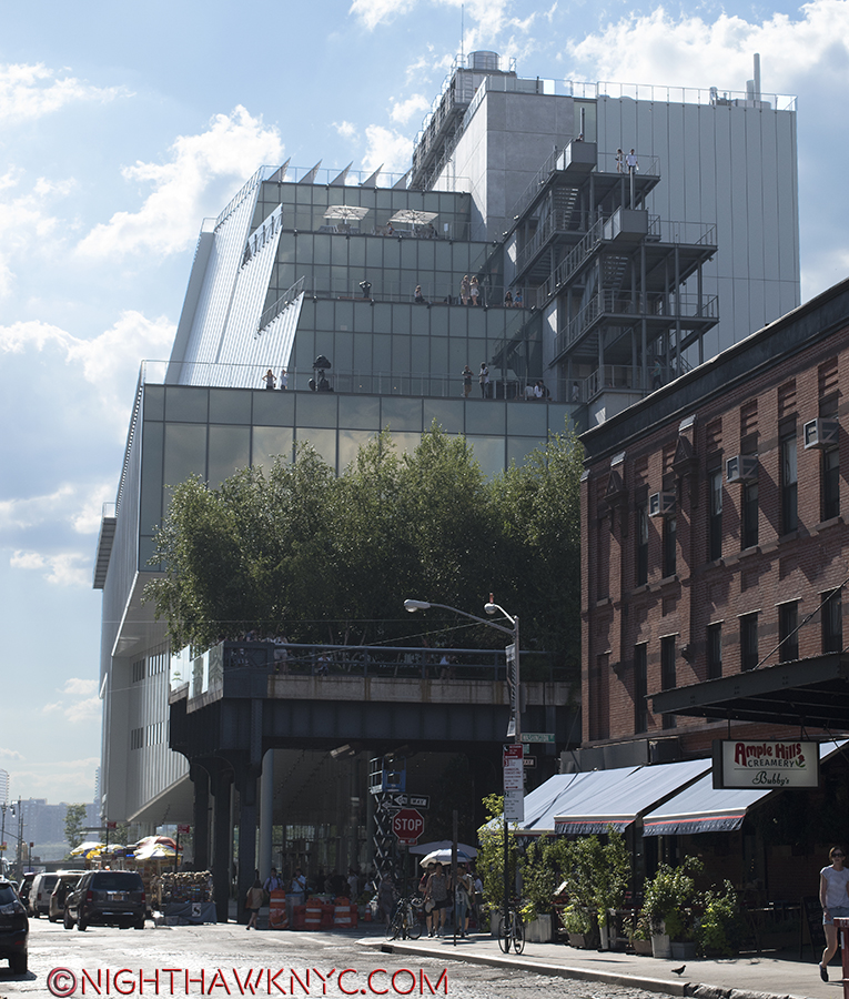
It’s only a year or so old, but I don’t think many will fall in love with the exterior of the building. I must say that in all my trips there so far, I have yet to see anyone else take a picture of it. Maybe (more) time will tell. In this City where location isn’t everything, it’s the ONLY thing, the new Whitney sits on a rather unique lot. How many places in Manhattan can you think of that have BOTH a River view AND a Park view? Situated directly across the West Side Highway from the Hudson River, to the west, and the southern end of the High Line to the immediate east, the Museum hit on a very rare Daily Double. Unfortunately for long time Whitney architect Piano, who came on board during the Museum’s “expansion” days, this lot has 4 sides. To the north, the rest of the block is occupied by one of the few remaining Meat Packing businesses that actually pack meat in what really was The Meatpacking District.1 Yes, trucks of raw meat park within inches of the Museum’s north wall every weekday.

Yes, meat is still packed in the "Meatpacking District." Whitney's north side seen from West Street.

Yes, meat is still packed in the “Meatpacking District.” Whitney’s north side seen from West Street.

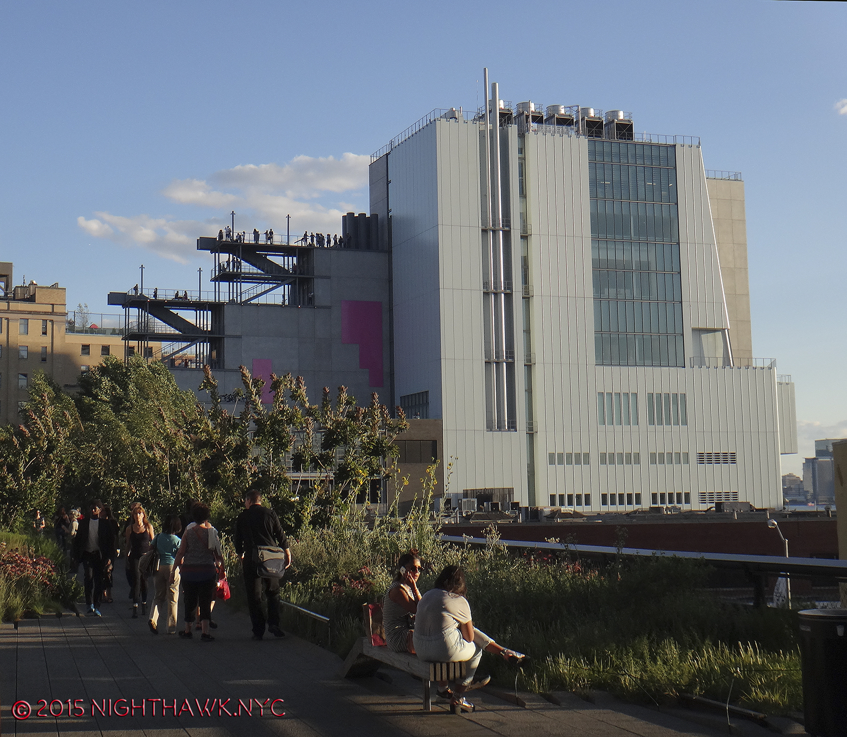
And, seen from the High Line.

And, seen from the High Line.

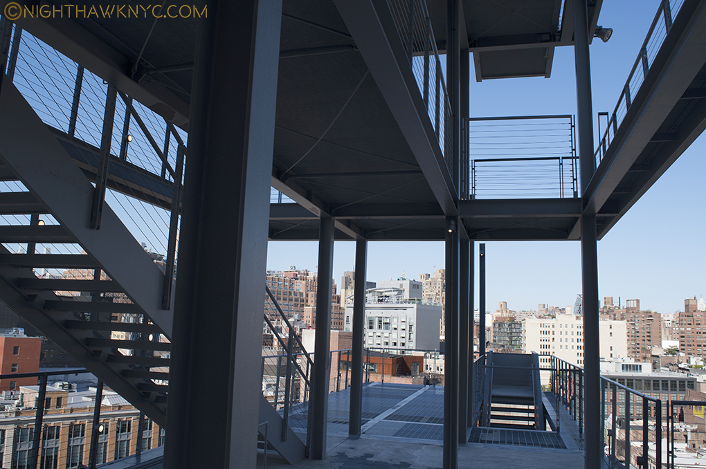
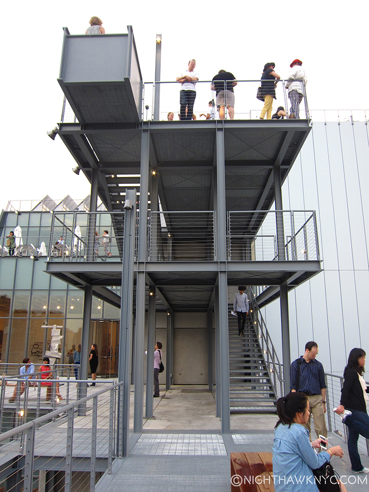
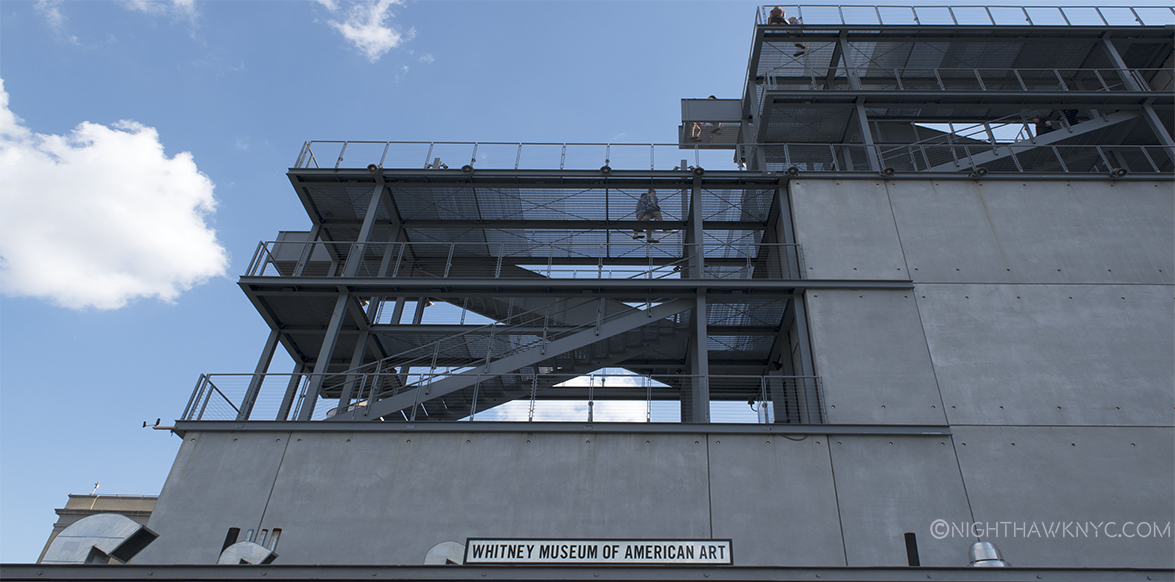
The two story meat complex provides a nearly unobstructed view of most of the north face of the Museum, from West Street or the High Line. I wonder what people who don’t know it’s the Museum think it is. I wonder how many of them will look at it and say, “Ah. A Museum.” My guess is not many. Maybe it’s an office building with not enough windows and a couple of long smoke stacks? A prison? It’s pretty non-descrip, making the stair cases that protrude from the rear of the building seem, well, odd. For myself, and probably countless others approaching the New Whit from the north, this is the first view they’ll get of it. The one defining feature of this side of the building is the exterior staircases. A cascade of them.

DSC_2948P2NH

Outdoor stairs as seen on the 7th Floor

To the south, across Gansevoort Street is a large, renovated apartment building, that also has Hudson River views on it’s western side. To put it mildly, this is a classic “high rent” district. Facing Gansevoort Street, the Museum presents visitors with an almost unbroken face of grey steel. Upon closer inspection, it also includes the Museum’s almost hidden entrance, which, until a sign was added recently, was only marked “Whitney Museum” on a glass window. Still, I can’t help wonder how the residents of that building across Gansevoort feel about paying those very high rents to look out their windows and see-

This, is their view.

This, is their view.

In fact, seen from the south, the building is so large that none of my cameras were able to get the whole thing in a shot from Gansevoort, including using an iPhone in Panorama mode. I had to go out into West Street to get one, which I don’t advise doing due to traffic coming randomly from 3 directions, not to mention my back being literally on the flimsy chain link fence bordering the West Side Highway with cars & trucks zipping around the bend at 60mph. Not a smart place to be standing with a camera. But this points out something interesting- there is no place where one can easily stand to get a good shot of the Museum- except, possibly, from a substantial distance. In fact, most of the shots of the building on the Whitney www site were taken from the rooftops of adjacent buildings. Maybe this is why no one takes pictures of it. Or? Maybe they don’t like it. ?

The closest I've come do death this year. The West Side Highway is inches behind me.

NOT to die for. I risked my life getting this shot. Southwest corner.

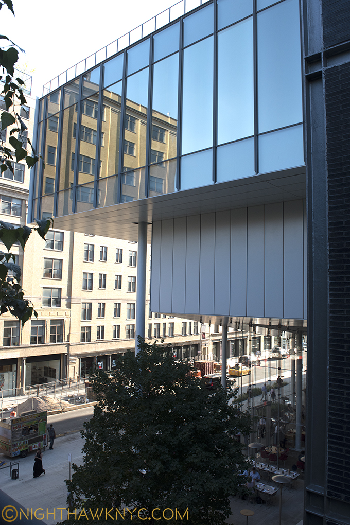
As we move to the western facade, with the large windows seen above (which reminds me of Zaha Hadid’s Library in Vienna), the upper one juts out at an angle seen from the north that vaguely reminds of the Breuer building’s Madison Avenue upper window.

DSC_5300PNH

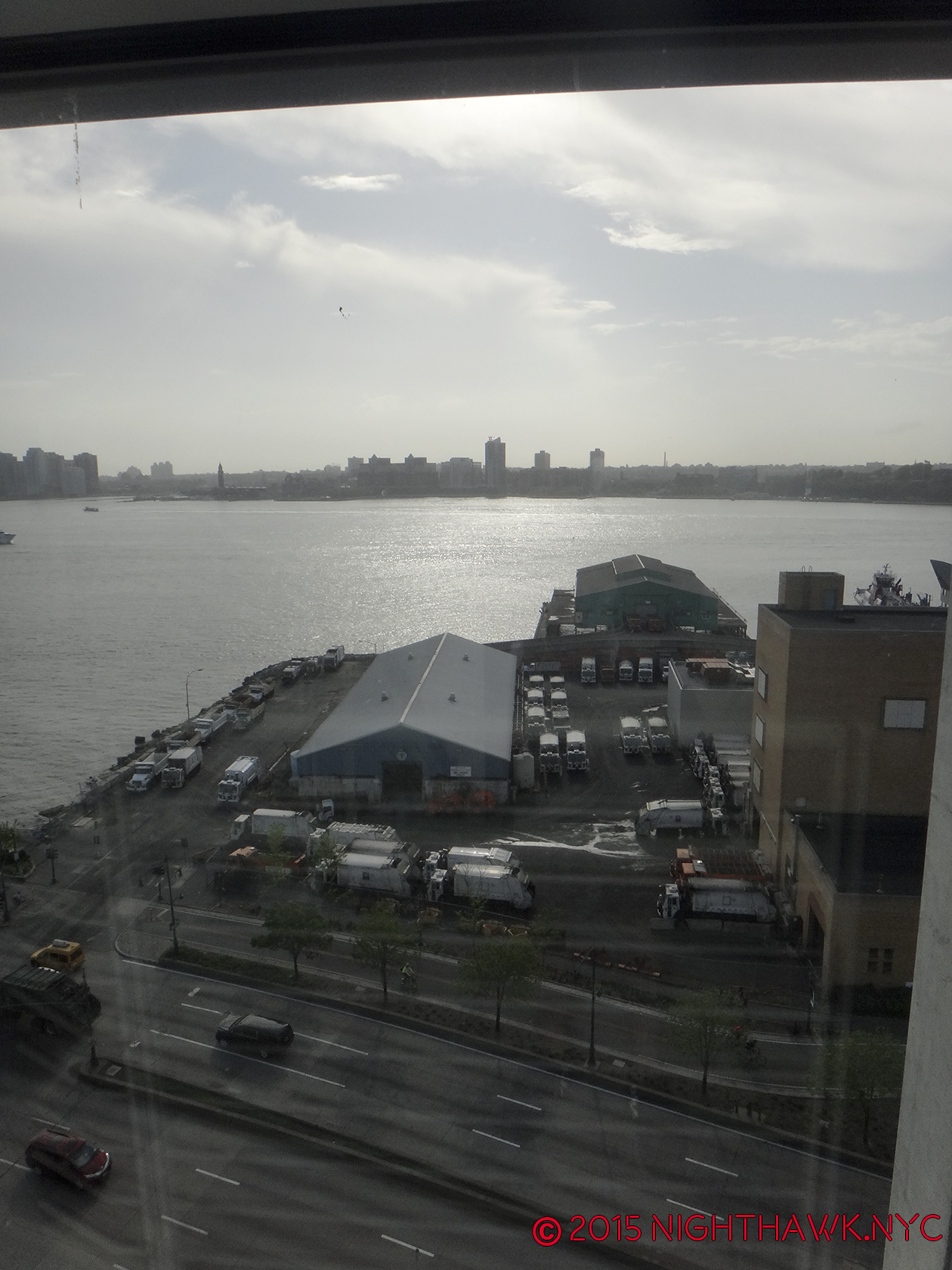
But more problematically, is a large Department of Sanitation complex smack dab right in front of it! “Holy Refuse Pile, Artman!” Garbage trucks coming and going all day and evening are not exactly what gives a “Riv View” it’s cache. (Feel free to insert your own wry joke about contemporary art here. I’ll wait…)

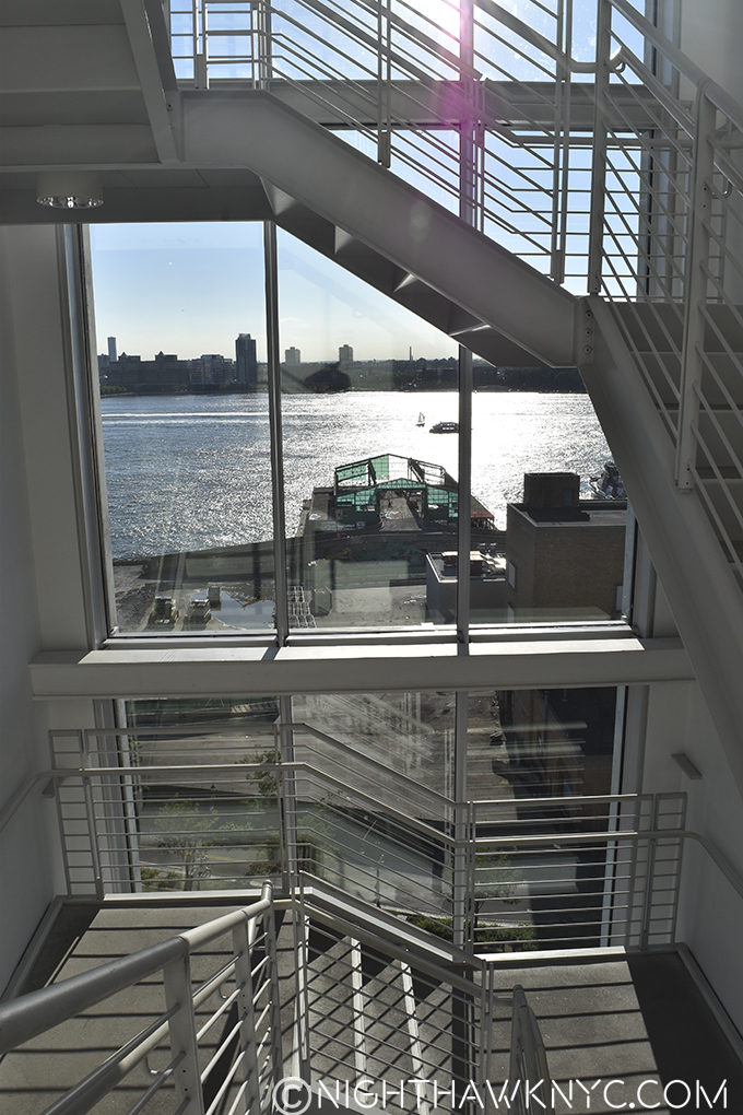
View of the Department of Sanitation from the 7th Floor stairs, 2015.

Riv View. Looking out at the Department of Sanitation from the 7th Floor stairs, 2015.

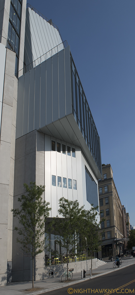
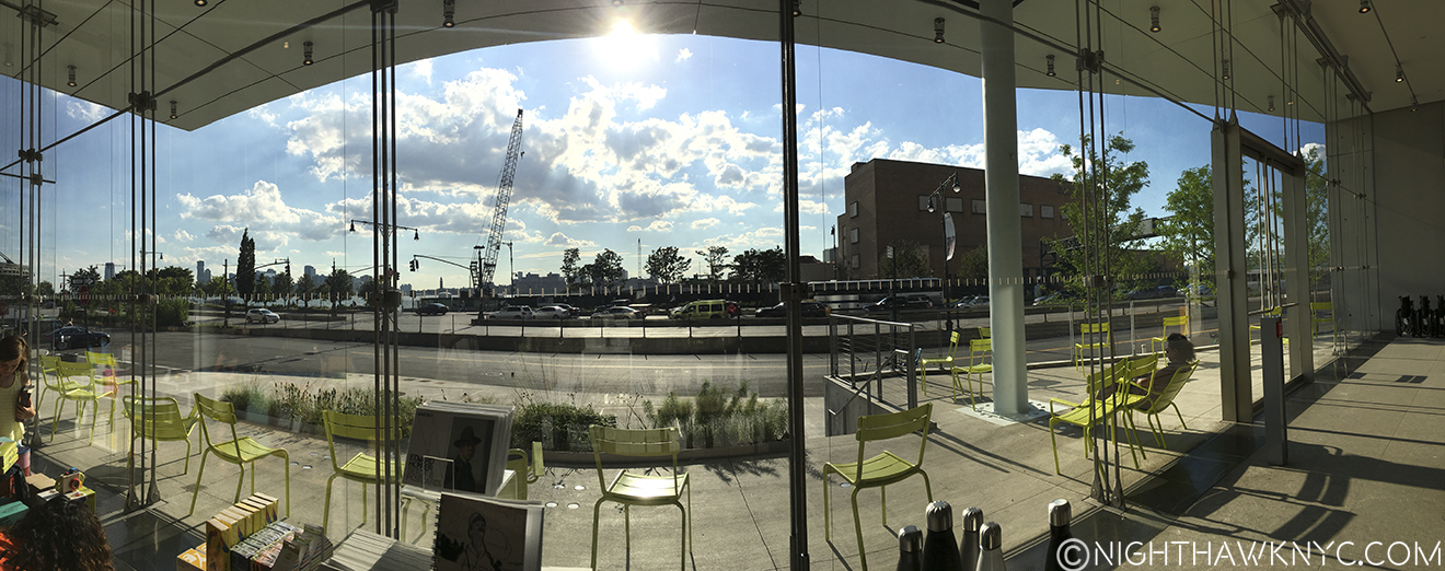
Mr. Piano has done his best to “minimize” the damage from the “offending” Department of Sanitation, and eternally busy West Side Highway, by opting to minimize the exposure of the western facade leaving a very narrow patio where, typically, only a few chairs usually are to be seen. It sits a few scant feet from the West Side Highway, after all, so it’s hard to imagine many people wanting to sit there for long. 3 trees have been planted along the curb in hope that one day they will provide some camouflage.

View from in front of the western facade, July, 2015, Being a tree in NYC is one helluva hard job.

View from in front of the western facade, July, 2016, Being a tree in NYC is one helluva hard job.

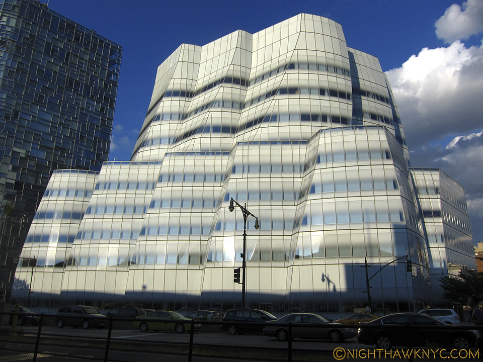
Regardless of the difficulties in seeing the building close up, it can be seen, for many blocks, both, to the north and south along the West Side Highway, and from across the Hudson River in New Jersey. Thanks(?) to the High Line there has been a boon in building in the area, with some very big name Starchitects (including, as I’ve written, the late Zaha Hadid’s only NYC Building going up at 520 West 28th Street, among many others) having new or recent projects in the area- some successful, some eyesores already. No less than Frank Gehry, the greatest architect of his time, in my book, himself, has a fairly new building about 6 blocks to the north of the New Whitney along the Highway, the gorgeous IAC Headquarters at 18th Street.

Like a sailboat on the Hudson, Frank Gehry's IAC Building is a gorgeous vision.

Like a sailboat on the Hudson it faces, Frank Gehry’s IAC Building is a shining example of the visionary architecture NYC needs more of, IMHO.

But, say what you want about this new Museum (don’t worry…I will), one thing that must be said is that the building isn’t obsessed with competing with it’s spectacular neighbor. Well? Not that spectacular neighbor, anyway. If anything, it sure feels to me like it’s competing with it’s OTHER “spectacular neighbor”- the High Line.

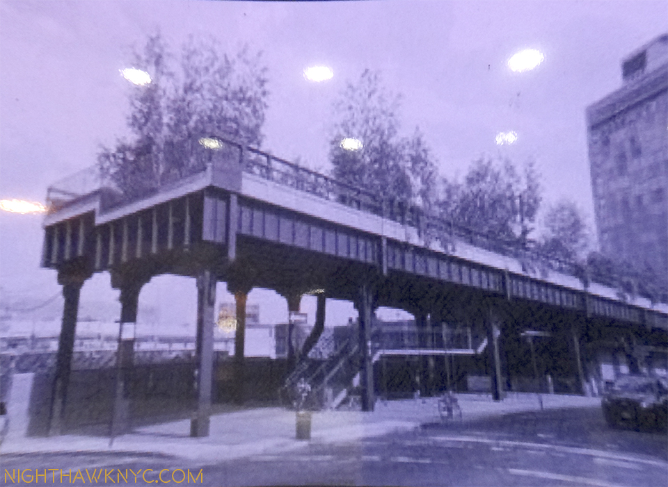
Southern terminus of the High Line, circa 2009. The new Whitney now occupies the space directly behind the left side.

Southern terminus of the High Line, circa 2010, early in the construction of the new Whitney directly behind on the left side. And today, and tonite…

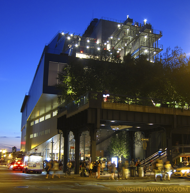
DSC_6042PNH


IMG_1130P2NH

That brings us to the east side of the building, the side that abuts the High Line. Renzo Piano also designed the High Line Maintenance & Operations Building,

IMG_0782PNH

High Line Maintenance & Operations Building on the lot’s northeast corner.

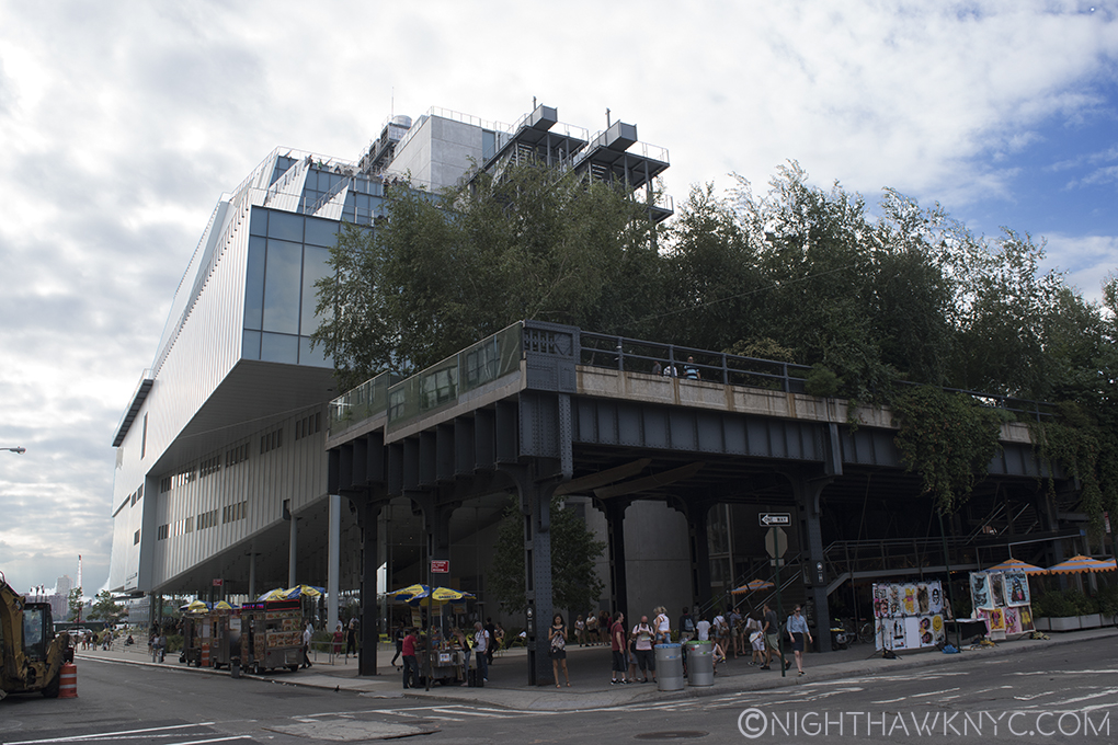
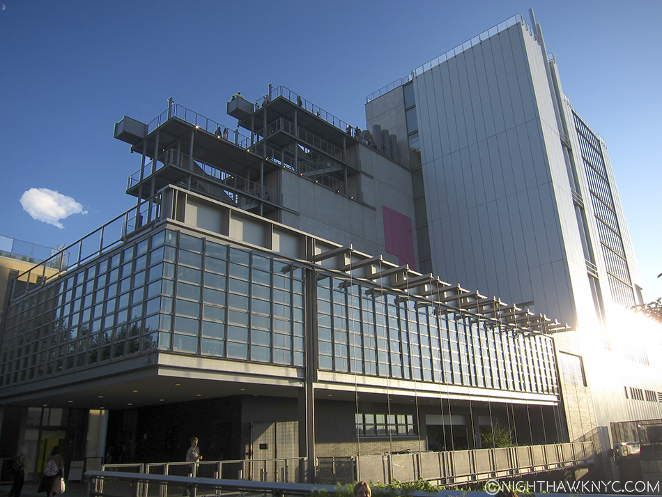
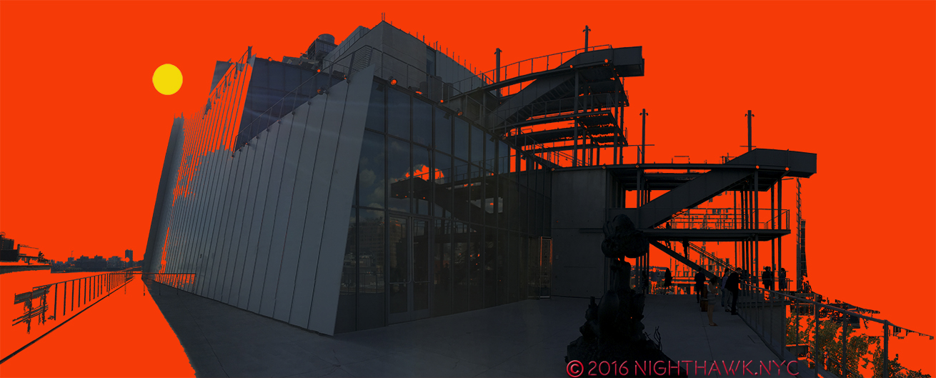
which looks like it’s part of the Whitney, occupying the north eastern corner of the lot. Next to that are a rectangular bank of windows of the 5th Floor Galleries. The lowest rectangle is cleverly cantilevered over the lower floors in a way that vaguely reminds of Wright’s Fallingwater. Above it are more rectangular rows of windows on the other gallery floors, which are accompanied by roof decks and outdoor stairs between floors.

Eastern face with 1st floor restaurant seen from the High Line.

Cantilevered lower eastern face with 1st floor restaurant seen from the High Line.

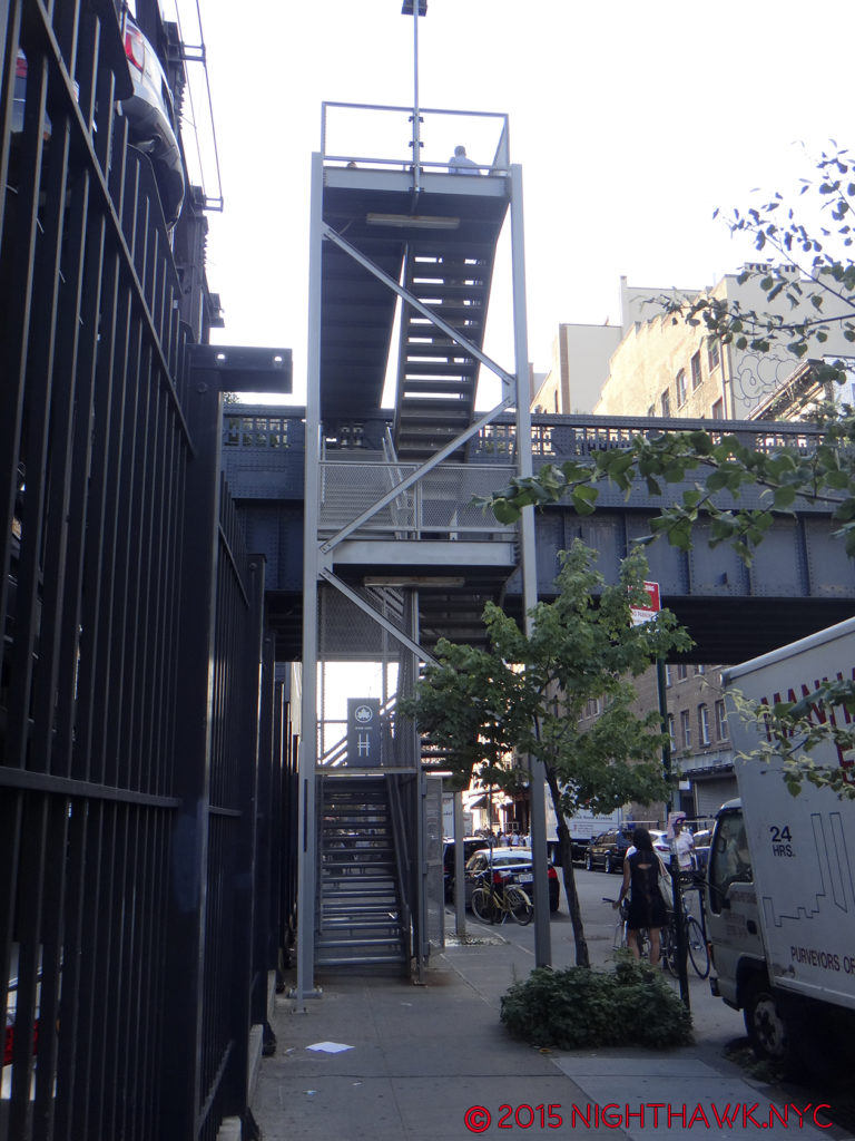
And, these are what raise my suspicion about purpose. So much outdoor space, and outdoor stairs in a place with the climate of Manhattan could be seen as highly questionable design. They are going to be unusable a good part of the year, so why do them? Aesthetically, to my eyes, the stairs look uncannily similar to the High Line’s access stairs. I wondered- Is this a case of “art snobbery” by an expensive to build, expensive to enter Museum trying to “upstage” a free & public park- a poorly thought out game of oneupmanship? An attempt to “blend in” with the High Line? Or?

Whitney Museum Eastern Facade Exterior Stairs close up

High Line Stairs at West 20th Street

High Line Stairs at West 20th Street

Other questions festered. Back along the south face. I spent a long time trying to think of what the shape of this building reminded me of. Hmmmm…Then one day, it hit me- From the south it looks like one of the US Navy’s newest ships- the USS Independence. From this side, it looks like it’s ready to go out to sea, well, out to the Hudson River. This feeling is hard to shake when you are looking at the few windows that look a bit like portholes, the “military—like” grey coloring, and the slightly sloping (i.e. “stealthy”) look of the upper floors. Add the rear decks and stairs to the Independence and the effect is so similar, it’s down right eerie.

Ok, flip the cantilever to the rear, and...? Eerily uncanny, no?

U.S.S. Indianapolis, again, with my highlighting. Ok, flip the cantilever to the rear, and…? Eerily uncanny, no?

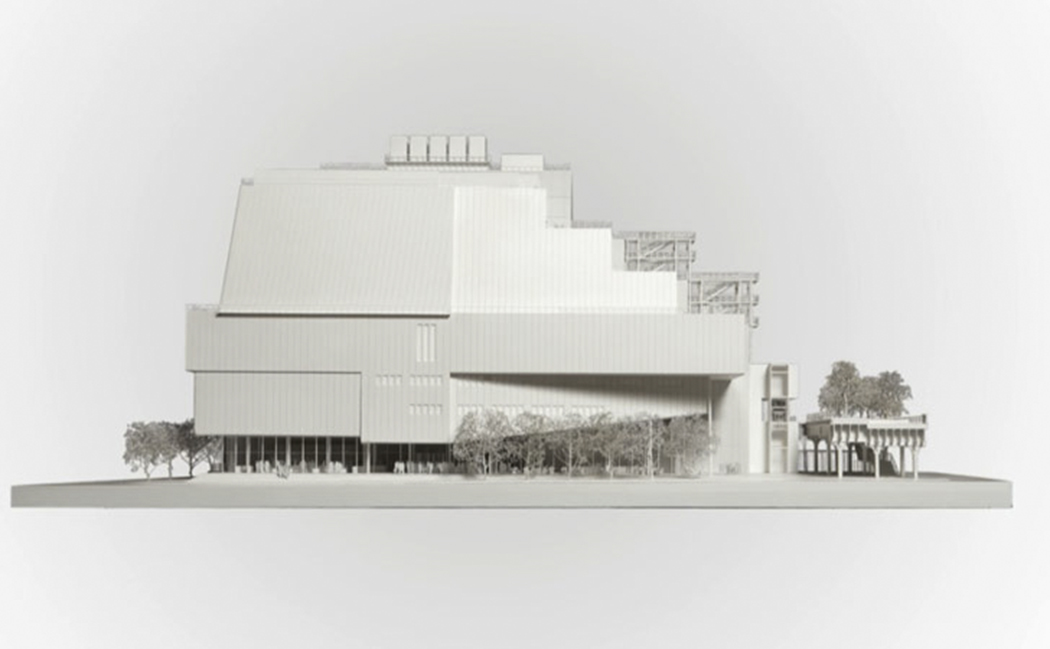
Photo from Renzo Piano Building Workshop website.

Photo from Renzo Piano Building Workshop website. Note that all of the “neighbors” have been removed, except for the High Line.

Part 3- The Roofdeck of American Art

Bring sunscreen.

Want a tan with your art? 6th Floor deck, Spring, 2016.

Yes, that is what I’m calling the New Whitney- “The Roofdeck of American Art.” I think the decks are what people will remember most about the building. I only hope it’s not what they remember most about their visit. That will be up to the Museum’s curators and staff. But? As I will get to, I think other forces are at work, too.

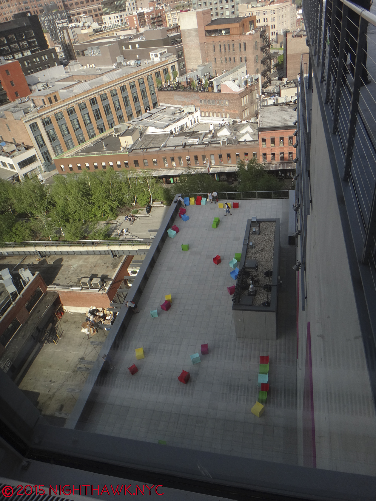
With 4 roof decks, I bet some will come only to enjoy the view and get some sun. The Museum turns the face the vast majority of visitors will experience most to it’s “rear,” to it’s east side facing the High Line. Doing so gives Mr. Piano a very convenient out of his Sanitation Department dilemma, “Riv View” notwithstanding, and allows a wonderful panorama of Manhattan, from Chelsea Piers to the north, the Empire State in the center and the Statue of Liberty, distantly, to the south. The decks allow space for dining (8th floor), sculpture (5th floor and the others), seating, and that 21st Century phenomenon- selfie sticks.

IMG_4907PNH

8th Floor Deck.

It’s very nice. You’ll like it. Bring sunscreen.

IMG_4848PNH

I promise that top ramp won’t be bent when you visit the 7th Floor Deck.

Part 4- Inside. “Hey look! They have art here…too!”

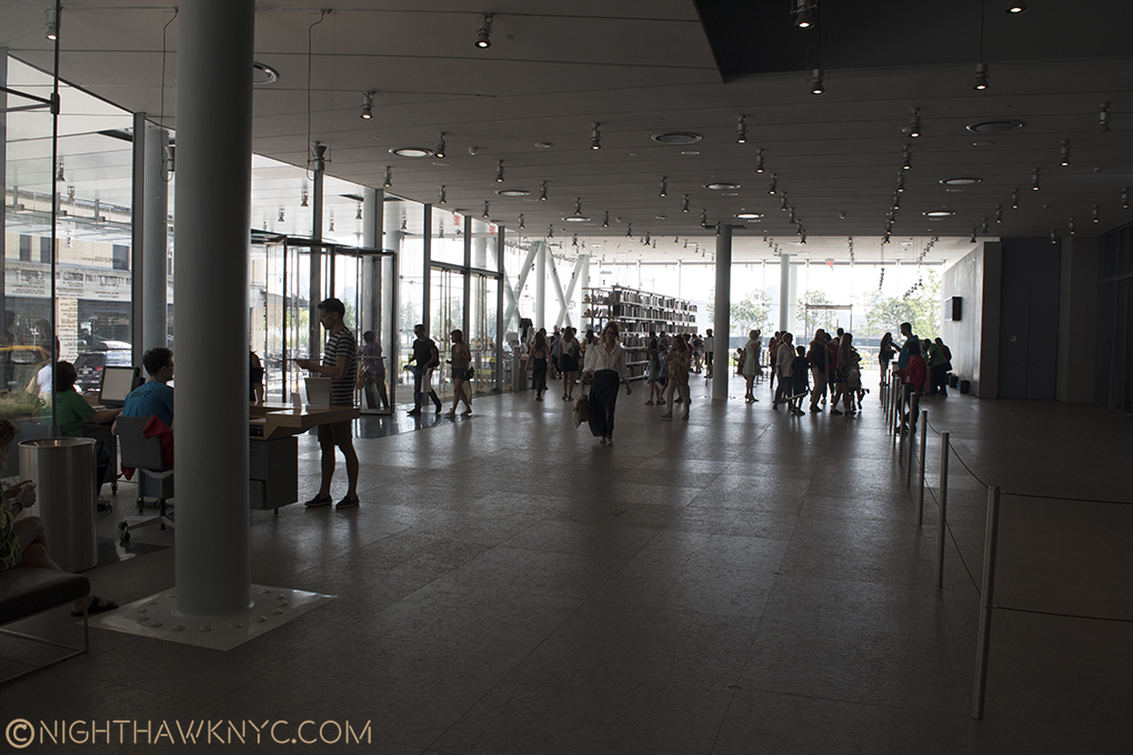
Inside, the first floor is the lobby, the most unsuccessful part of the entire interior- it’s an open space. The message here is “keep moving.” It’s about as unwelcoming a space as Moma’s lobby. (Actually, ALL of Moma, which for me stands for what it feels like- the “Mall of Modern Art,” feels unwelcoming!)

Welcome? No one will ever mistake the lobby for the Great Hall at The Met. Front door is opposite, where the black mat is.

Welcome? No one will ever mistake the lobby for the Great Hall at The Met. Front door is to the right of the nearest exposed column. Engineering made visible abounds. The free 1st floor gallery is to the immediate right, outside of the rope fence, which denotes you are in the Museum.

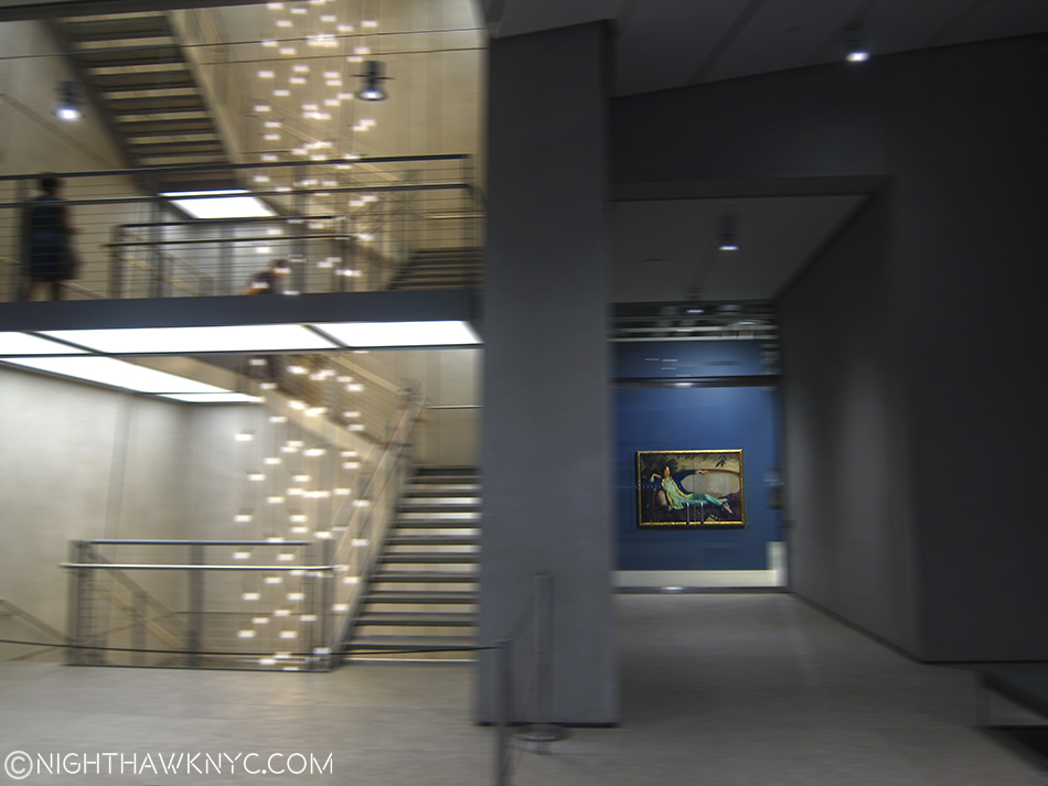
Once inside, here’s the routine I’ve settled upon, which probably sounds confusing- After entering as quickly as possible to minimize the time spent in the “lobby,” a short trip downstairs (don’t take the elevators- the wait is too long) brings you to the coatroom and the rest rooms (there are others restrooms on 3, 5, 7 and 8). The feeling here is 180 degrees from the lobby. This is completely designed. It makes you wonder what the hell happened upstairs. Take the stairs back to 1 and walk out past the rope line (keep your admission ticket handy) and visit the first floor gallery, which is free all the time. (Or, yes, you could visit the 1st floor gallery before paying to get in. I prefer to get my admission ticket first, which means I have to show it twice.) After that, show your ticket and get back in the Museum proper then take an elevator to the whatever floor you wish to see first- 3 (where the theater is for concerts, dance performances, etc), 5,6,7 or 8 (where the galleries are). Bear in mind there is no 2nd or 4th floor- they didn’t pay enough money to get those. No, at 422 million dollars, they did, but those floors are reserved for Museum staff and functions, so they’ve disappeared from the public elevator buttons.

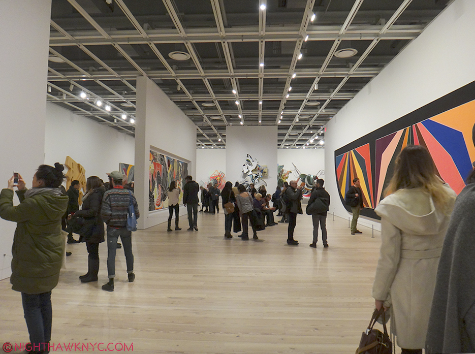
5th Floor seen during the Frank Stella Retrospective, Feb, 2016. The smaller walls can be moved to provide countless configuration possibilities.

5th Floor seen during the Frank Stella Retrospective, Feb, 2016. The smaller walls can be moved to provide countless configuration possibilities.

Inside, the building is very sharp, clean and neat with natural wood floors and new, white walls all around. As the rectangular shape belies, form mostly follows function, and 4 of the floors are given over to large, rectangular galleries. The open space allows for movable walls can be easily repositioned to allow an extremely wide range of configurations. Each floor is very well lit, (something that is continually a problem at The Met). With 3 sets of stair cases, there are plenty of stairs . None go all the way from 1-8, however. On the western wall, as seen below, stairs go from the 3rd floor to the 8th. To the east of the elevators, stairs run from 5 to the 1st floor. And, there are the exterior stairs on 6,7 and 8. The stairs are good to familiarize yourself with, since there is almost always a wait, the elevators are best used for going from 1 to 8 or from 5 to 1. The entire building, inside and out, is wheelchair accessible.

Western stairs, Spring, 2016. They seem to be dismantling the Sanitation complex. The Whit might be hoping a tower doesn’t go up in it’s stead.

Renzo Piano strikes me as a Master Engineer more than as a brilliant Architect. I got that feeling when I first saw the Pompidou Centre in Paris, with it’s engineering on the outside, and again with his New York Times Building (which he inherited from Gehry). Yes, he has done some beautiful buildings, but I repeatedly get the feeling of Piano, the Engineer, when I look at his work, and that shouldn’t be the primary feeling I’m left with. There is quite a bit of engineering being shown off, here too, much of it on the first floor, some in the exposed gallery ceilings, and some on the roof decks.

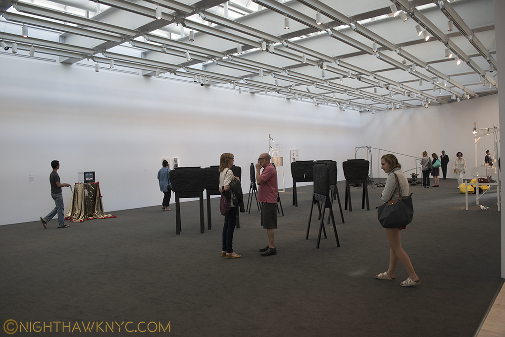
The 8th floor gallery lets in ambient sky light.

The 8th floor gallery lets in ambient sky light.

Now for the “nitty gritty.”

Given the luxury of having over a year to assess it, I’ve begun to wonder about the adequacy of the 50,000 square feet of indoor exhibition space, as nice as it is. “America Is Hard To See,” fit the whole Museum well, and showed it off to fine effect. Then, while the Frank Stella Retrospective was excellent, it only included 5 of his prints, and only 1 of his “Moby Dick” works. Was this because of hard decisions due to a prolific, 50+ year career, or due to a lack of space on the 5th floor? Currently, the otherwise excellent “Stuart Davis: In Full Swing” show feels unmistakably truncated. It shares the 5th floor with the “Danny Lyon: Message To The Future” show, (which may be overambitious). By comparison, The Met’s Stuart Davis show in 1991-92 had almost twice as many works, including over 30 that dated before the earliest work in the Whit’s show, like some from his “Van Gogh” period. While these have been going on indoors, I’ve been underwhelmed by what’s been installed thus far on the outdoor 5th Floor exhibition space. As time goes on, I’m starting to feel the 5th Floor may turn out to be a design mistake. Part of it is cut off to allow an entrance and exit corridor for the outdoor space, which is generally in shadow, and results in leaving a small indoor gallery on the other side of the outdoor gallery access corridor, which feels lost, and most importantly cuts down the size of the congruent 5th floor space. The other floors with outdoor decks run right up to the door leading outside with no corridor, etc.

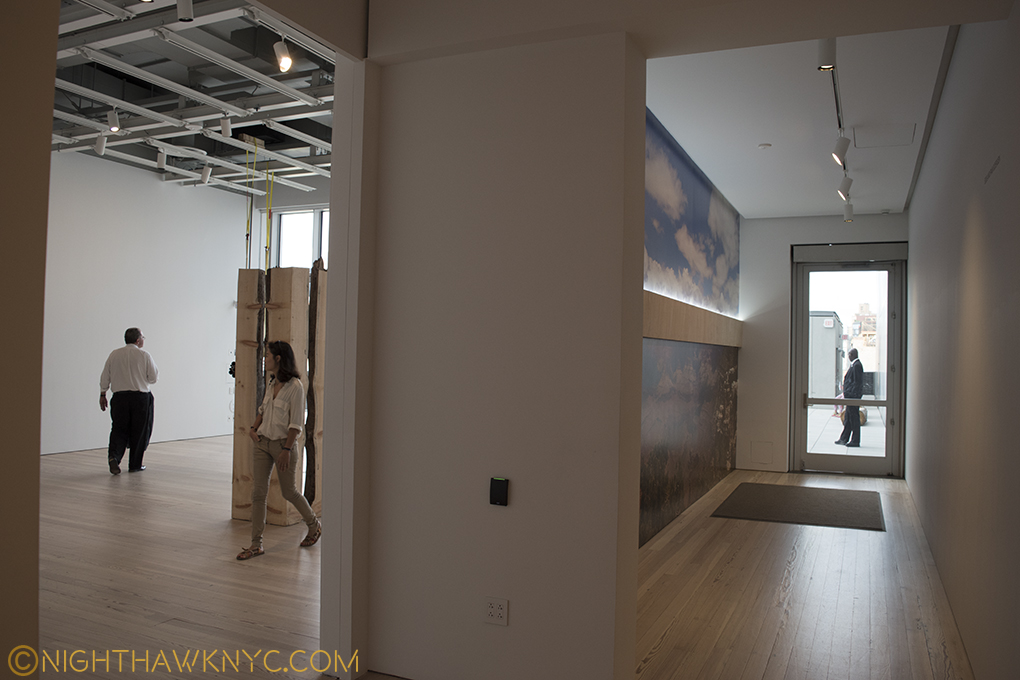
The 5th Floor is cut to allow this exit corridor to the Roof Deck Gallery, leaving a small gallery to the left that feels lost.

The eastern end of the 5th Floor gallery is cut to allow this exit corridor to the Roof Deck, which leaves the small gallery to the left that feels lost.

The Whitney says there is 13,000 square feet of outdoor space, over 25% of the amount of indoor space. I’m left to ask the age old question…”Did they create enough INDOOR space to display Art?,” the prime purpose of a Museum. Time will tell, BUT? If they didn’t? This will be a disaster reminiscent of Moma’s inexcusably horrible current/new building, where they somehow managed to create a massive multistory hole right in the middle of some of THE most expensive real estate on Earth, then claim they “need more space,” 10 years later!

You can’t make this stuff up!!!

5th Floor Deck.

5th Floor Deck with installation. Yes, the colored seats are the Art work.

If the Whit needs more indoor space, well, the roof decks seem easy to enclose, and voila, 13,000 square feet more gallery space.

Or? PLEASE don’t tell me they’d have to expand this new building north, or up. I’m done writing letters. Besides, as much as I admire and respect Mrs. Gertrude V. Whitney and the collection built on hers, I have no attachment to this building.

And that brings me to this- Through it all, one thought stayed on my mind more than any other. I wonder what she would have thought of the place…

Part 5 – Gertrude Vanderbilt Whitney

“And I dreamed I was flying
And high up above my eyes could clearly see
The Statue of Liberty
Sailing away to sea
And I dreamed I was flying”*

Portrait of Gertrude V. Whitney, 1917 by Robert Henri. Study for a Head for the Titanic Memorial by Mrs. Gertrude V. Whitney, in the background from "America Is Hard To See," 2015

Portrait of Gertrude V. Whitney, 1917 by Robert Henri. Study for a Head for the Titanic Memorial by Mrs. Gertrude V. Whitney, in the right background from “America Is Hard To See,” 2015

The founder of the Whitney Museum, as was beautifully demonstrated, remembered and honored in the first floor free to enter at all times gallery, where “America Is Hard To See” began was, also, a very accomplished sculptor2, in addition to being the greatest champion of American Art, perhaps ever. Immediately upon entering the first floor gallery, the first thing you saw was, fittingly, the wonderful portrait of her by Robert Henri that was perfectly placed facing the door, which also enabled it to be seen from outside the building, the only artwork that was. I wish it had been left right there. It wasn’t. As I write this, it’s upstairs as part of the “Human Interest: Portraits from the Whitney’s Collection” show. One of my pet peeves in Museum re-designs is how often they fail to answer this, seemingly basic, question- “Where are we going to put such and such major masterpiece?” Moma failed this miserably- How many times have they moved Monet’s “Waterlillies”, or Van Gogh’s “Starry Night”, in a vain attempt to find the right spot for each? This is unforgivable. While the Whitney has found a great spot for Calder’s Circus,

Calder's ingenious "Circus." When you go, be sure to see the accompanying video!

Home… at last. Calder’s ingenious “Circus.” When you go, be sure to see the accompanying video.

which was lost in the Breuer Building’s mezzanine, I’m left to wonder about Mrs. Whitney’s Portrait. Will it become their Waterlillies?

One of the very greatest figures in American Art History looks out on her domain, Portrait by Robert Henri, 1917. 1st Floor Gallery, seen from outside the building during "America is Hard to See," 2015. After? They should have left it right there.

One of the greatest figures in American Art History looks out on her domain. 1st Floor Gallery, during “America is Hard to See,” 2015. After? They should have left it right there.

Beyond her portrait’s place in the Museum, I wonder what she’d think of it. It’s still “her” Museum. They even, recently, put the name “Whitney Museum of American Art” on the southern facade. The new place is located a stone’s throw from the site of the first Whitney Museum that she opened in 1931 at 8 West 8th Street, and equally close to where Edward Hopper lived and worked on Washington Square. Edward & Josephine Hopper left their artistic estate to the Whitney, in honor of their long relationship with Mrs. Whitney. When the new Museum opened, there was a selection of Edward Hopper drawings from 1925 that he did at the Whitney Studio Club, which preceded the founding of the Museum, in the first floor gallery, adjacent to Henri’s Portrait of Mrs. Whitney, seen above. As time goes on, I think this gift will be seen as one of the greatest Art gifts of the 20th Century, even though it didn’t consist of many of Edward’s paintings. That’s when I try and forget the fact that the Whitney, tragically and unforgivably, discarded almost all of Josephine Hopper’s work that was included with it!

While we’ll never know what Mrs. Whitney would think of the new home of her collection, I know what I think.

DSC_5259P2NH

Oneupsmanship? “Hey you down there on the High Line- You think you’re high up? Ha!”

DSC_3674PNH

I’ve spent a year wondering- Why put 13,000 square feet of outdoor space in a building in a place with a climate like NYC?

5th Floor roof deck with a Frank Stella Sculpture & reflection, Feb, 2016

5th Floor roof deck with a Frank Stella Sculpture & reflection, in the snow, Feb, 2016

Part 6- 5,000,000 Reasons

As I said, real estate in NYC is all about location. That applies to the Art world, too. The Met & The Guggenheim are in, or near, Central Park, and there is now talk of The Met creating a Central Park entrance as part of their Contemporary Art Galleries reconstruction3. Moma has the heart of midtown, and now the Whitney has the High Line. In my opinion, the location was selected, and the New Whitney is designed, to be a destination for High Line visitors- It’s roof decks are meant to beckon High Liners with an even better view since they are higher. That’s one explanation for the stair designs looking similar- imitation that’s designed to make High Liners feel the Museum is part of the High Line. And so? Location also pays off by providing a potential mass audience delivered right to your door. How much is that worth to a Museum? Given that the High Line currently draws over 5,000,000 visitors a year, it’s hard not to see this as a conscious decision designed to attract visitors for an even better view, and oh yeah, some Art. Once inside? I’ve already come to feel that the gallery size is limiting. As the collection grows (do Museum collections ever shrink?), I am left to wonder how quickly they’re going to wish they had some of that 13,000 square feet that’s sitting outside, inside.

But? If I’m correct about their motivation, the outdoors stairs & decks exist to beckon people from the High Line, which, is open year round, come rain, snow, or shine.

DSC09546PNH

“We come on the ship they call the Mayflower
We come on the ship that sailed the moon
We come in the age’s most uncertain hour
and sing an American tune
But it’s all right, it’s all right
You can’t be forever blessed”*

Overall? I’m displeased by the outward appearance of the new Whitney. Over a  year of trying to warm to it, of giving it yet another chance to speak to me later, I still find it downright strange. As an Art Museum, the inside is nice, with the above caveats. As far as the Art is concerned? I’m glad to have the Whitney’s pre-eminient collection of American Art back, and “America Is Hard To See” was a wonderful “Welcome Back” celebration of it’s return after the move Downtown. The Whitney is, also, to be congratulated for the guts they’e displayed in the choices of their early shows- giving Laura Poitras her first Museum show, featuring the great Cecil Taylor for a week, and having the retrospectives of modern master Frank Stella and the vastly underrated Stuart Davis (who Mrs. Whitney, herself, believed in and financially supported early on), among others, all have made the first year of the New Whitney Museum’s exhibitions quite memorable, and yes, very Artistically successful.

Yet? How long will the waters stay calm for the U.S.S. New Whitney Museum? The big question of long term success and long term viability remain to be answered.

Epilogue – The Whitney’s 422 Million Dollar Gamble

DSC09557PNH

The Whitney’s move downtown isn’t about moving nearer the “New” Art neighborhood of Chelsea or the “Older” Art neighborhood of Soho. It strikes me as being a a case of seeing an opportunity and taking it. They found a lot at one of the 2 ends of the High Line and saw their opportunity to move to a potential audience- the 5,000,000 current visitors to the High Line, and they took it. I believe that’s why their stairs look like the High Line’s, as I said.

For the Whitney, this is a $430,000,000.00 (the cost of the new building) gamble that the High Line is not a flash in the pan and it’s popularity is here to stay. If the High Line fails? Well? The City was about to tear it down anyway before it was turned into a Park.

But, if the High Line does fail (which seems unlikely at the moment), or visitors come in substantially lower numbers (much more likely), the Whitney may find themselves stranded, with an out of the way Museum that is not easily accessible by either bus or subway in a neighborhood that has a history of being “the wild west,” home to meat packing, prostitution, cutting edge music, and sex clubs (Madonna’s notorious book “Sex” was photographed almost 25 years ago at one 3 blocks away) not all that long ago, that has been remade with extra glitz and top of the market rents. And what about that neighborhood? What if the new glitz doesn’t stick? What if it all turns out to be wishful thinking on the part of landlords looking to make a killing after years of squalor? Walking around the past few months, the area seems to be having a bit of trouble supporting many of it’s ritzy new tenants at these prices. And? This is over a year after the Whitney added even more oomph to the now completed High Line being here.

Empty storefronts on Gansevoort, one block east of the Whitney, August, 2016

Empty storefronts on Gansevoort fill 3/4 of the block, one block east of the Whitney, August, 2016

Is the “Meatpacking District” a fad destination that is about to fade? If so, what effect will this have on the new Whitney? Can it survive in a “not so fab” neighborhood?

La Perla joins Alexander McQueen & Stella McCartney as former tenants of the Meatpacking District

Is the buzz over? La Perla joins Alexander McQueen & Stella McCartney as former tenants of the Meatpacking District who have moved elsewhere.

While collectors and investors throw unheard of sums at Contemporary Art these days (which strike me as “bets” given the largely unproven nature of the Art itself), here is a case of one of NYC’s “Big 4 Museums” placing an even bigger bet on a Park, that while it certainly is Contemporary Urban Art, hasn’t even been fully opened for TWO YEARS yet,. The Whitney placed their bet when the High Line was in it’s first of 3 phases. Phase 3, the final part, of the now completed High Line opened on September 20, 2014. This is not to mention that they bought in at the top of the market in a real estate market that (like the Art market) hasn’t seen a correction in over 25 years. Both will see corrections one of these days.

But when? This, is the 422 million dollar question.

“Still, tomorrow’s going to be another working day
And I’m trying to get some rest
That’s all I’m trying to get some rest”*

Around the corner on Washington Street, 4 now empty storefronts, one of which was the famous Hogs & Heifers Saloon (corner). August, 2016

In the Whitney’s shadow. Around the corner on Washington Street, 4 now empty storefronts in a row, one of which was the notorious Hogs & Heifers Saloon (where the white sign hangs). August, 2016

Well? If all of this goes south? They still stand a very good chance of being able to move back uptown in 8 years when The Met’s lease of the Breuer, their former home, is up. Given The Met’s own problems, it seems highly unlikely they’ll be extending that lease.

If the Whitney then wants to renovate it? It’ll be someone else’s problem.

*-Soundtrack for this Post is “American Tune” by Paul Simon. Published by Universal Music Publishing Group.

NighthawkNYC.com has been entirely self-funded & ad-free for over 8 years, during which 300 full-length pieces have been published! If you’ve found it worthwhile, PLEASE donate to allow me to continue below. Thank you, Kenn.

You can also support it by buying Art, Art & Photography books, and Music from my collection! Art & Books may be found here. Music here and here.

Written & photographed by Kenn Sava for nighthawknyc.com unless otherwise credited. To send comments, thoughts, feedback or propositions click here. Click the white box on the upper right for the archives or to search them. Subscribe to be notified of new Posts below. Your information will be used for no other purpose.

  1. In fact, the new Whit, itself, sits where one was.
  2. When will they have a show of HER work?
  3. Speaking of his vision in January, Met Director Thomas Campbell told the LA Times that “We are looking at an entrance, at terraces, at the roof garden.” Sounds like he’s visited the New Whitney.

Edgar Degas: Beauty & Anarchy

“I saw you standing there
I saw your long, saw your long hair
Opened up my eyes, baby
You made me realize all I want to do now
Is look at you”*

Edgar Degas (1834-1917) didn’t see the world as you or I do. Many of us can’t see beyond the phones in our face to really see most of what is right in front of us (watch out for that bike), and remember even less of it. Not Degas.

I see you. Self Portrait, Etching and drypoint, 1857, aged 23.

Edgar Degas, seemingly, saw everything. Especially when it came to women. He even saw things that I’m not sure were intended to be seen let alone depicted. For that reason, I’ve considered him the “king of the hidden moment.” Some of those moments he chose to remember, and immortalize, were scandalous when he first exhibited them. 125 year later, they may still give us pause. He was a voyeur in the original sense of the word. meaning “one who looks,” but I am sometimes left to wonder if he was in the contemporary sense, as well- a “peeping tom.” Yet, he does it in ways that we can’t take our own eyes off of, “blinding us with science”- his talent and genius.

I see you, too.

I see you, too. Perhaps, only Degas would think of immortalizing this awkward moment. But, why? (Pastels applied to a Monotype, the core medium of MoMA’s show.)

He, thereby, makes us complicit after the fact in his voyeurism. Before the fact, the question is there to be asked- Why this moment? While I choose to respect the privacy he long sought and stay away from looking into the reasons he felt “the artist must live alone” (which he was his whole life) for insights to his work, I have come to blame it on that eye that never closes, and that sees all. While we admire his work, rightly among the greats, there are times when I wonder if having that switch in his brain that said, “Um? No.” might have been a good thing- once in a while.

It’s too late now. No one who owns one of those “questionable subjects” Degas depicted is relegating it to the trash bin. Most of them are in museums, or most likely will be one day. At the moment, 120 of Degas’s works are on view in Degas: A Different Beauty, the summer blockbuster at MoMA though July 24, a show centered around his rarely seen Monotypes, which are usually tucked away because many are too light sensitive for permanent display. Still they are Degas, and the more Degas I see, regardless of the medium he’s using, the more I’m struck by the moments he chooses. Of course, beyond “why?” there’s the “what does the work mean” question.

But, let’s back up. First…what’s a Monotype?

It’s a medium that combines drawing and printmaking that results in a one-of-a-kind work, hence “mono.” It’s created either by adding ink to a copper plate with a brush, or almost anything else, which is called the “Light Field” kind of Monotype, or selectively removing ink from the plate covered with it, again using a brush, etc., which is called the “Dark Field” kind of Monotype. The plate is sandwiched with a sheet a paper and then run through a press resulting in a print. Degas, of course, did both kinds, but as the show wonderfully shows us, he didn’t stop there.

One of Degas' first Monotypes- Dark Field.

One of Degass’s first Monotypes- The Ballet Master, Dark Field Monotype, 1876.

In addition to this  never closing eye, Degas had an incessantly exploratory nature and they combined in an eternally restless Artist, one who was, also, constantly searching for new outlets for his creativity. That led him to the Monotype, an infrequently seen medium in Art, at the suggestion of his friend, the Artist and Monotypist Ludovic Napoleon Lepic in the mid 1870’s. Later, it would lead him to Photography (1895). Degas threw himself into the Monotype with typical intensity. He learned the basics, and then pushed them. Soon, he was doing things like making a second print from the plate, which would naturally be faded as the image degrades after most of the ink had been spent on that first impression, to which he’d add Pastels on top of the black and white image creating shockingly “different” works from the two tone original. Some of these colored images are beautifully displayed side by side with the black & white first image, the pair are called “Cognates.”

Cognates

Cognates. “Woman in a Bathtub Sponging Her Leg” 1880-85. Monotype, and with pastels (right).

But, be warned- this isn’t “Degas 101,” or “Degas’s Greatest Hits.” It’s not even “Degas’s B-Sides”. It’s borderline “The Unknown Degas” (for the casual Degas lover), but that certainly doesn’t mean it’s “bottom of the barrel” Degas (whatever that is. If it exists, I’ll take it!). It means there is so much great Degas that little known works like his Monotypes can hold their own front and center in a big show, even without support from the inclusion of some much more famous paintings 1 But let’s not let the medium be the message here. For me, at least, it’s “still” Degas. What one sees in his paintings, pastels, sculptures and etchings, is also to be seen in his Monotypes. All his “big themes” are here, showing they never were far from his mind, regardless of medium, and giving the casual Degas fan plenty to enjoy, while they see something new. They include-

Beauty. In ANY sense of the word.

Beauty. In ANY sense of the word. Pastel over Monotype.

Ballet Dancers

Bathers

Portraits, and even a Self Portrait or two

Family life

Night Life and City Scenes

Yes. This is a Landscape by Degas, Pastel over Monotype in Oil, 1890

Yes. This is a Landscape by Degas. Pastel over Monotype in Oil, 1890

And? There are also landscapes, something that most Degasians may not be as familiar with2. A whole room of them that Degas called “imaginary landscapes,” inspired by a trip through Burgundy in 1890. They are shockingly different for Degas, who, much like me, preferred the City and found no end of inspiration therein, anticipating the edgy, quasi-abstract late work of Monet (i.e. the Waterlilies, etc) some 20 years later, and the Abstractionists over the rest of the 20th Century.

Oh.

I left out the Brothel Scenes. Well? That’s what the section card says they are. They sure don’t look like scenes from any brothel I’ve ever heard about. (Sorry. I cant’ say I’ve actually been in one, so I’m speaking third-hand.) Of all of these, the Brothel Scenes strike me as being the most intimate, especially because the Bathers are almost uniformly very dark works, where much is hidden in shadow or under water. The Bather rising from her tub, above, is in the Brothel section, and is typical of how well lit these scenes are. Which is good because it also serves to highlight some of the questionable scenes in this section, like the image of a woman either about to use a bidet or rising from one. ?

Then again, it also means there are those priceless moments of ballet dancers and ballet students caught unawares in beautiful, unique poses. Families doing the most mundane of things line one wall, while “everyday scenes” of a different nature abut them in an adjoining wall of brothel scenes. The bathers get the privacy of a room to themselves, as do the landscapes, and the dancers are pretty much everywhere else. Along the way, we see two Self Portraits (one, above), a series of Rembrandtian etching “states” and a somewhat odd scene of smoke stacks, looking somewhat lost, on a wall by itself, heightening it’s “out of place here” feeling.

The “Greatest Hits” collection of Degas themes notwithstanding, there is much to see here, and much that requires close scrutiny. The gorgeous strokes of pastels that seem to have been applied at once both spontaneously and effortlessly, all the while, sublimely, particularly struck me. It’s also fascinating to see how he’ll take a black and white monotype and colorize it. Having the very rare opportunity to see both, side by side is, for me, one of the highlights of this show- The effect is not like seeing a colorized black and white movie. Degas makes it something completely else. As a result, I was quite surprised to see him quoted on a sign to the effect that if it were up to him, he’d work only in black and white, but the public wants color. I, for one, am thankful we have both. While I would never dare to argue his preferences, I also have to say- What a loss to the world it would have been had he never worked in color! I came away with a new appreciation of Degas, the colorist, both in how he applies color to a given composition, (which can be quite bold, like a lightning bolt, as in the dancer, above, but also for his palette. If you get to see this show, or the very good catalog for it, be sure to look for these instances where you can see the Cognates, so you can make up your own mind. Here is one-

Bather. Monotype. First impression.

Bather. Monotype. First impression. A closer view of the Cognates, above.

Bather. Pastel over Monotype. (Second impression)

Bather. Pastel over Monotype. (Second impression)

Then there’s the question of meaning…

“…what is fermenting in that head is frightening.” Rene Degas (his brother), in a letter, April, 1864.3

Degas does not surrender his secrets easily. Anyone who has seen his early masterpiece, Interior, 1868-9, can attest to the mystery his works hold. Some see a rape in it, others see the depiction of a scene in Zola’s then recently published Madeleine Ferat. Personally? Having seen it in Philadelphia first hand, I see different things in it each time I see it, even now in pictures. Beyond its “meaning,” more importantly, right now, I see it as a precursor of Edward Hopper. It’s a classic example of what Jean Sutherland Boggs, in the catalog for a much earlier show at The Met, succinctly says- “The longer one reflects on the work of Edgar Degas, the more elusive it seems.” She continues, however, throwing us a lifeline of insight “…some key to the work, if not necessarily to the man, may be found in his fascination with equilibrium[ 4. Degas 1834-1917, Metropolitan Museum, 1988,  p. 23].” And, yes, beyond the voyeurism, which may take some time to see past, we do see that in the bathing piece above. Though it’s not to be seen in the physical sense in all his work (though it may be on the psychologoclgical sense) it becomes fascinating to look for- The dancers on one foot or bent over, or at the barre, and on and on. Degas is fascinated by man’s relationship to the ground, the earth, and with equilibrium.

DSC_2564PNH

The Met's Degas Sculpture Room. Notice that every single work depicts balance & equilibrium.

To research this further, I went to The Met’s Degas Sculpture Room. Notice how every single work depicts balance & equilibrium.

“Degas is an anarchist. But, in Art.” Camille Pissarro (Artist/Anarchist/Friend of Degas), in a letter.

This show is risky. Degas was exploring in his monotypes. The “beauty” on hand is sometimes “different,” in the sense that it’s, at times, not the beauty Degas is most revered for and that the masses of Art lovers, myself included, associate him with.

One of the most puzzling and "different" Degas I've yet seen. Monotype.

One of the most haunting, and “different,” Degas I’ve yet seen. Monotype.

It seems to me that when “looking for meaning” or trying to reconcile all of this, it pays to look back at Degas’s past. Degas didn’t start out a revolutionary. His early work showed “the classical beginnings, without any gesture of revolt4”  It was in the 1860’s that this would change. His anarchy lies in subverting the past/his past while he reinvents it, and seeks to add to or change his own working processes. Degas spent long hours copying in the Louvre and then in Italy for 3 years. Among the works he copied were an etching after a Michelangelo original of a man scrambling over a riverbank, i.e. climbing out of the water. Once you look for it, this image of a nude entering, or leaving, the water is one that reappears in his work- there’s a gorgeous pastel of one at The Met, here. Therefore, I think the image of the Bather Exiting the Bathtub, way up above, is, partially, another example of that interest, partially due to his interest in “equilibrium,” and partly sensual/erotic. It’s taking the classical idea of Michelangelo and turning it on its head, as an anarchist would be expected to do.

Anarchist Degas then shocked society in 1888 when he showed his nude drawings in an exhibition arranged by no less than Theo van Gogh, Vincent van Gogh’s brother. Vincent van Gogh was quite taken with Degas and was one of the few Artists around capable of understanding, and admiring, his isolation and celibacy. His comments on Degas & women in his Art are fascinating. Up until Degas, the nude was something drawn from models, who were aware of what was taking place and were party to it, even if they were depicted at their “toilette”, which goes back to the 1500’s in Art. With Degas you often have the feeling that neither of these “norms” were true, leaving us with that sense of looking through a door that has been cracked open. I haven’t been able to find out what the subjects thought of these works. Voyeur? Rule breaking visual anarchist? Though he, apparently, lived a sexless life, Degas created his fantasies in his Art (for what purpose I know not), and a number of them are on view here. He created them for himself, only showing the 9 he allowed Theo to exhibit in 1888 during his lifetime, and he kept them until he died. Why? I don’t know and I don’t think it matters. They subsequently came into Museums and private collections when his estate was sold after his death in 1918.

It speaks volume that he was so willing to continue to explore when he had discovered things, like the paintings of dancers, he could have continued to do forever and receive endless acclaim for. It takes a little bit of that same faith to follow him on his exploratory path to get to the gems that are not often seen due to their fragility. They are here, though the show includes works that are not. Some may be characterized as experiments, while others are byproducts of Degas’s refining his process. They are all Degas, though, and as such are precious, edifying and definitely worth seeing. MoMA is to be congratulated for taking the chance of going against the grain of what people know and expect from a Degas show, and for doing it without the “crutch” of including a number of their own very familiar paintings. Here we have Degas the artist who was restlessly exploring new mediums and new techniques, while adding his own steps to the processes he had been taught by others. In that sense, Degas: A Different Beauty is a fascinating insight into the mind of one of the greatest Artists of the past 150 years.

“When it happened
Something snapped inside
Made me want to hide
All alone on my own
All alone on my own”*

For me, this makes Degas a prototypical “Modern Artist” in every sense of the term, as much as anyone working today. Degas would be right at home in our time, with the expanded capabilities Artists have, pushing the possibilities of Photoshop, the iPad, video, or you name it, as he would have been at home, most likely, at ANY time in history. In that sense, like his great influence and forbearer, Rembrandt, and a great Artist he influenced, Picasso, Edgar Degas was an eternally “Modern Artist.”

*- Soundtrack for this Post is “Looking At You” by the MC5, written by Tom Robinson from their Lp Back In the USA. Published by Sony/ATV Music Publishing and Warner Chappell Music Inc. Degas’s brother lived “back in the USA” and Degas actually spent fruitful time in New Orleans in 1872.

NighthawkNYC.com has been entirely self-funded & ad-free for over 8 years, during which 300 full-length pieces have been published! If you’ve found it worthwhile, PLEASE donate to allow me to continue below. Thank you, Kenn.

You can also support it by buying Art, Art & Photography books, and Music from my collection! Art & Books may be found here. Music here and here.

Written & photographed by Kenn Sava for nighthawknyc.com unless otherwise credited. To send comments, thoughts, feedback or propositions click here. Click the white box on the upper right for the archives or to search them. Subscribe to be notified of new Posts below. Your information will be used for no other purpose.

  1. There are 7 Oil on canvas Paintings and 1 Oil on paper mounted on canvas, mostly in the show’s final room, but none are among his famous works.
  2. The Met had a show of Degas’s Landscapes in 1993.
  3. “Degas 1834-1917,” Metropolitan Museum, 1988, p.41
  4. Degas 1834-1917, Metropolitan Museum, 1988, p. 34

“The Goddess of Line” (For Nasreen Mohamedi)

The Line is True

Perfect

Without Beginning

Without End

It sings the song of Essence

It Frees the Mind

To go where it might

Without Boundaries

Or constraint.

Whether One

Or Many

They Journey

Through their lives

Freed from Time

Freed from Place

Perusuing the Purity of Your Intention

They are all that remain.

The Brush has been set down

The Color has been sent away.

The Pen paints Black

Lines

On White.

The basic form

That doesn’t exist in Nature

Like yours Do,

Oh, Goddess of Line.

Bold

Subtle

Sure

Ordered

Singular

Or In Concert

They Flowed

From your Mind’s Eye

Through Your Hand

From Your Pen

To the Infinite

To That Place where…

We live without form

Or Any constraints.

The Truth Lives without time

or confinement

Free…To Be

What it is.

© April 28, 2016.

Detail from "Untitled" ca. 1980 by Nasreen Mohamedi (Graphite on Paper)

A Detail from “Untitled” ca. 1980 by Nasreen Mohamedi (Graphite on Paper)

This is Part Two of my Post on Nasreen Mohamedi. Part One is here.

NighthawkNYC.com has been entirely self-funded and ad-free for over 6 years, during which over 250 full length pieces have been published. As I face high expenses to keep it going, if you’ve found it worthwhile, please donate to keep it up & ad-free below. Thank you!

Written & photographed by Kenn Sava for nighthawknyc.com unless otherwise credited.
To send comments, thoughts, feedback or propositions click here.
Click the white box on the upper right for the archives or to search them.
For “short takes” and additional pictures, follow @nighthawk_nyc on Instagram.

Subscribe to be notified of new Posts below. Your information will be used for no other purpose.

…And Here’s How It Looked Monday Evening

NighthawkNYC.com has been entirely self-funded & ad-free for over 8 years, during which 300 full-length pieces have been published! If you’ve found it worthwhile, PLEASE donate to allow me to continue below. Thank you, Kenn.

You can also support it by buying Art, Art & Photography books, and Music from my collection! Art & Books may be found here. Music here and here.

Written & photographed by Kenn Sava for nighthawknyc.com unless otherwise credited. To send comments, thoughts, feedback or propositions click here. Click the white box on the upper right for the archives or to search them. Subscribe to be notified of new Posts below. Your information will be used for no other purpose.

The Day Before “The First Monday In May,” 2016

This site is Free & Ad-Free! If you find this piece worthwhile, please donate via PayPal to support it & independent Art writing. You can also support it by buying Art & books! Details at the end. Thank you.

Written & Photographed by Kenn Sava

“We know what you’all been thinking nude is the brand new yawn
Everybody’s just drinking inhibitions just gone
You don’t need to be rude
You don’t need to be wild
Whatever you do: don’t compromise and done with style
The gold standard crazy amazing
Upper echelon of groove
The gold standard crazy amazing
Turn it up let you body move”*

Here’s how the world famous 5th Avenue facade of The Met (TM) looks right now in preparation for it’s big close up- Monday’s “Manus X Machina” Metropolitan Museum Costume Institute Gala Benefit, perhaps fashion’s biggest night of the year in this country when a who’s who of “stars” and “big names” will be walking through these tents and up the landmark stairs dressed to (hopefully) impress.

T-Manus and counting…It feels like the night before the Space Shuttle was about to blast off, here at The “Cape.”

Even though I’ve written about TM more than just about anything else this past year, and been there 3 times this week alone, of course, I’m not invited, so this is as close as I’m gonna get. Come Monday night? I’d never be able to get even THIS close.

The view behind the grey awning, and under the canopy going up to the front door. Remember celebrities- No sitting is permitted on the stairs between those banisters! Oh, and have your bags ready to speed the security bag check.

Someone’s gonna be busy over the next 24 hours! (If you want to see how busy they were, click here!) Inside the Great Hall, no signs of the impending festivities, yet. Yes, the flower arrangements are always beautiful.

I predicted in this Blog that 1,000,000 visitors would attend “Manus X Machina.” 2015’s “China: Through The Looking Glass” drew 817,000. Apple is sponsoring the show. Taylor Swift is involved. 1M would be great for TM. They took on a large expense with the new (and so far superb) Met Breuer, so I really hope it happens. I’ll be more interested in how good the show is. Andrew Bolton and the Met’s Costume Institute are “The Gold Standard” for fashion shows now, and they’ve raised the bar pretty high.

I’m excited for another chance to answer the eternal question- “Is Fashion Art?” Though I believe the female form is, I haven’t decided about Fashion. I do know that I really love looking at it and trying to decide.

Stay tuned.

In the meantime, it’s time for this year’s “First Monday In May,” If you’re wondering what it’s all about, here’s a peak at what went into it last year-

Ok. It’s time for me to grab my Armani Exchange Tuxedo, It’s time to party!

“24 carrot hashtag, put Ur phone in Ur bag, ain’t nobody got 2
tell U put Ur hands in the air, say “Ow!
The gold standard, crazy amazing, upper echelon groove
The gold standard, crazy amazing, turn it up, let Ur body move””*

*-Soundtrack for this Post is “The Gold Standard” By Prince from his excellent 2014 album, “Art Official Age,” published by Universal Music Publishing Group.

NighthawkNYC.com has been entirely self-funded & ad-free for over 8 years, during which 300 full-length pieces have been published! If you’ve found it worthwhile, PLEASE donate to allow me to continue below. Thank you, Kenn.

You can also support it by buying Art, Art & Photography books, and Music from my collection! Art & Books may be found here. Music here and here.

Written & photographed by Kenn Sava for nighthawknyc.com unless otherwise credited. To send comments, thoughts, feedback or propositions click here. Click the white box on the upper right for the archives or to search them. Subscribe to be notified of new Posts below. Your information will be used for no other purpose.