William Klein- A Thousand Times YES

This site is Free & Ad-Free! If you find this piece worthwhile, please donate to support it & independent Art writing. Thank you. 

Written & Photographed by Kenn Sava

Show Seen- William Klein: YES @ ICP
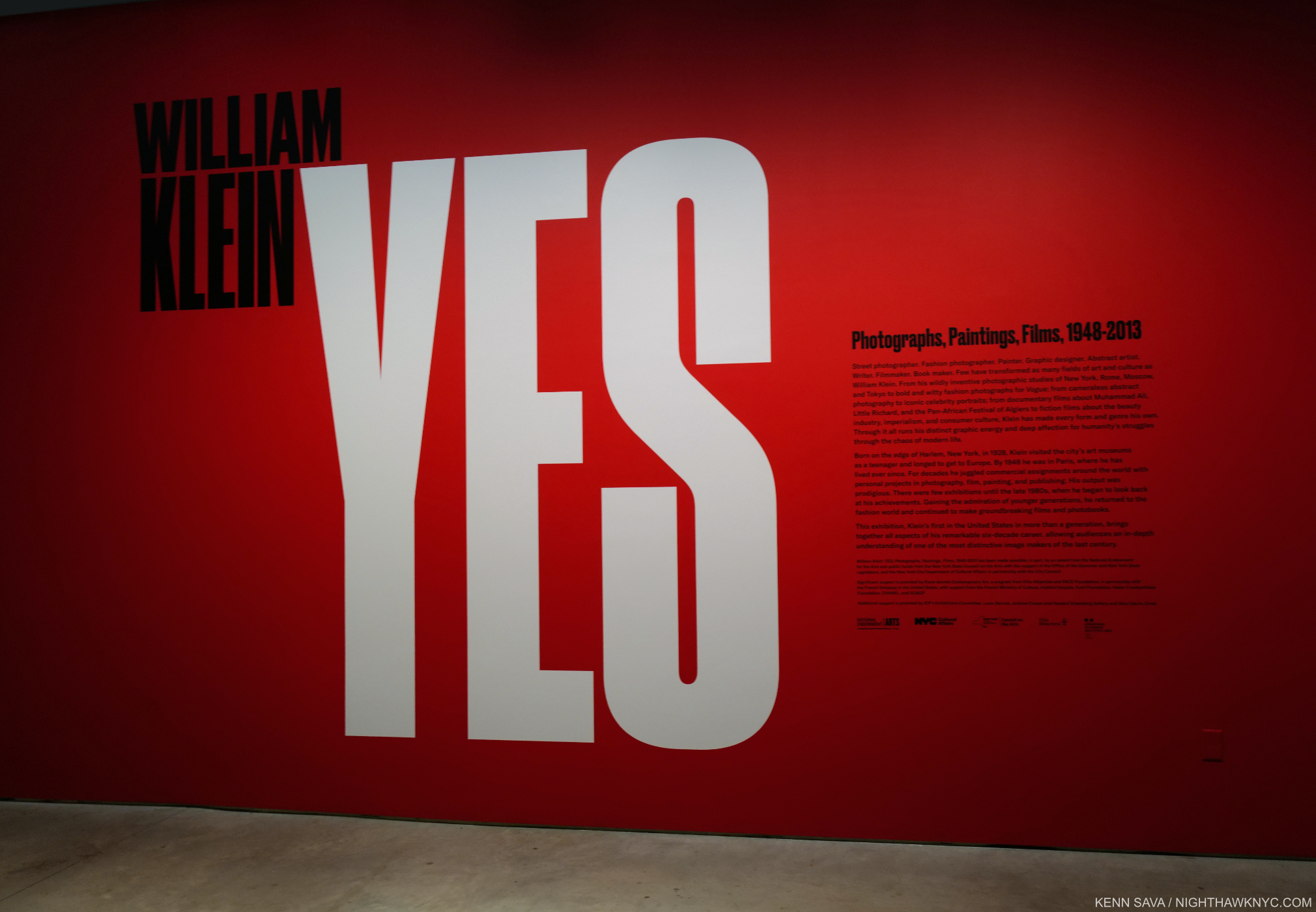
William Klein, who passed away at 94 on September 10th, was a big name for so long, creating legendary and hugely influential PhotoBooks, Films, Fashion Photography, Paintings, Photograms, and on and on, that it seemed to me he was somewhat taken for granted over what turned out to be the last decade of his life. Case in point- I can’t remember the last big William Klein show in NYC. So, the International Center of Photography’s career retrospective, William Klein: YES, June 3rd to September 15th, was not to be missed. Due to circumstances out of my control (i.e. my new life), I managed to see it on its closing night, day 5 after the Artist passed.
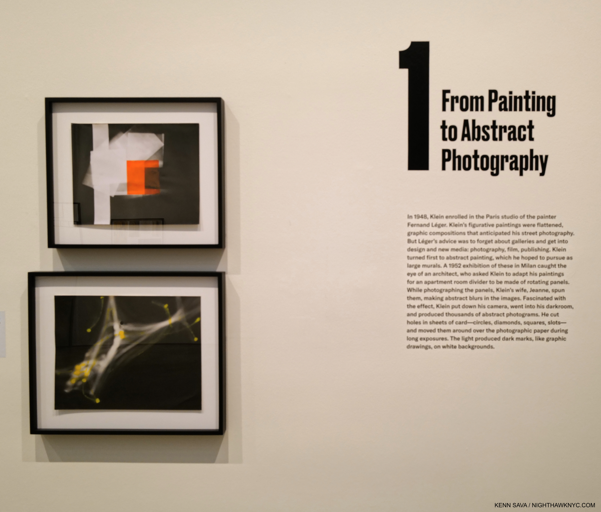
Untitled (Blurred White Squares on Black and Orange Gel Sheet), c. 1952, Gelatin silver print with transparent orange filter, top, and Untitled (White and Yellow Moving Lines), c. 1952, Gelatin silver print with yellow paint.

Paintings, Collage, Photograms, bodies of b&w Street Photographs in NYC, Paris, Rome, Moscow and Tokyo, Fashion Photography, Film, color Photography, Painted contact sheets filled both gallery floors of the International Center of Photography’s fairly new Essex Street building. The show felt like it was the work of 6 or 7 Artists. Perhaps that’s why they named the show William Klein: YES Photographs, Paintings, Films, 1948-2013- as a reminder that ALL of this sprang from one unique Artist.
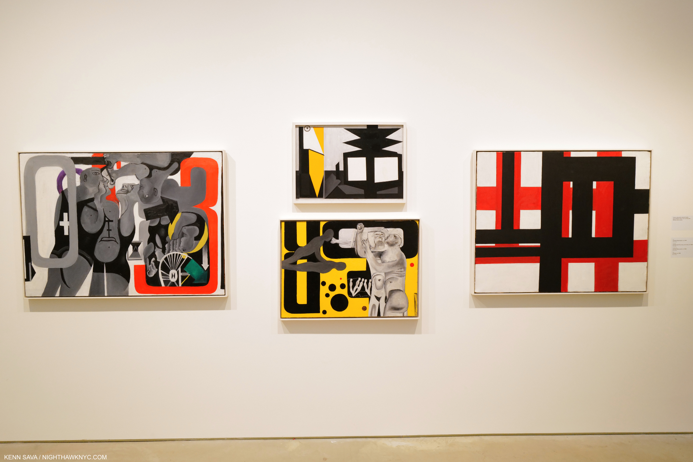
The earliest works on view. Untitled (Gymnasts), c. 1949, Untitled (Still life, lamp, and vase), c. 1949, Oil on wood- the others are all oil on canvas, Untitled (Gymnasts), c. 1949, and Untitled c. 1952, from left to right.

After studies with Fernand Léger, William Klein temporarily ignored his advice to get into Photography, Film and publishing, instead embarking on a career as an Abstract Painter during the height of the first wave of Abstract Expressionists. He managed to carve out a style that had elements of Mondrian but also showed an affinity for multi-layered compositions that would also be seen in his later Photography. It’s interesting that the two Gymnast Paintings, above, feature monochrome figures, also presaging his b&w Street Photography.
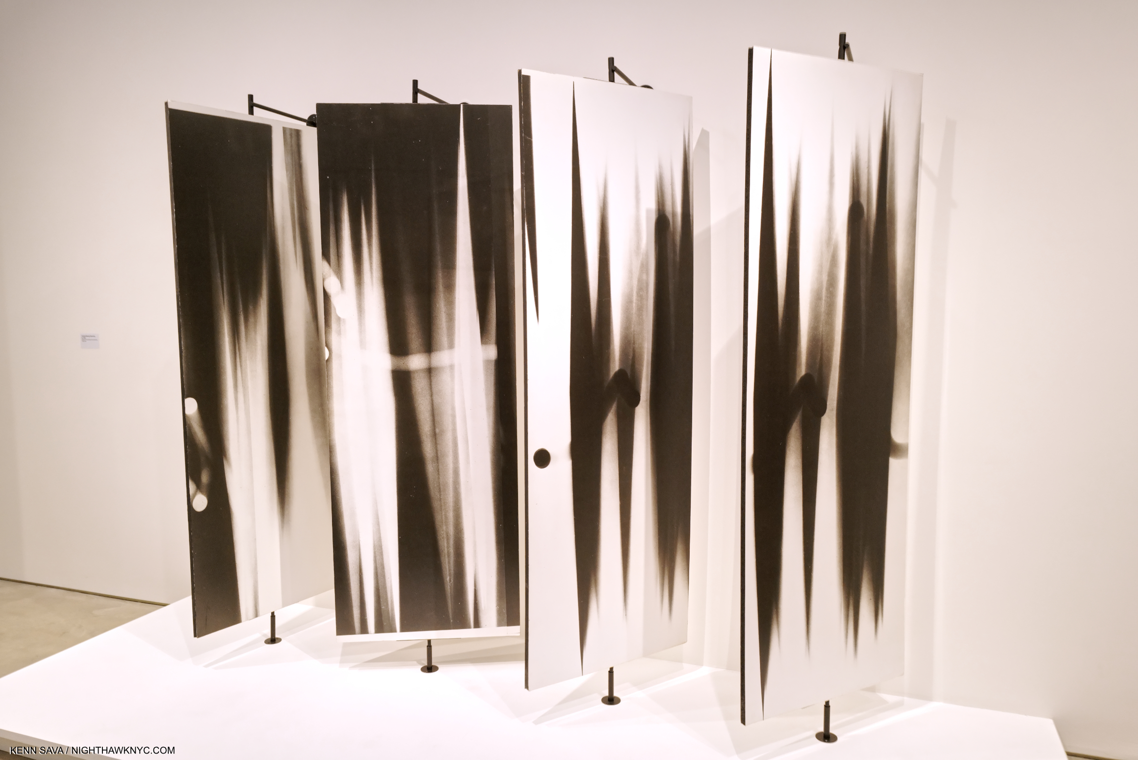
In 1952, an architect saw William Klein’s Paintings and asked him to adapt them to a room divider made of rotating panels. While Photographing the panels, Klein’s wife spun them. Fascinated with the effect, hep down his camera,  went into the darkroom and began experimenting with Photograms, like Man Ray before him, holding cards with cut out shapes over photo paper during long exposures.

While Photographing a piece he’d been asked to paint, William Klein was inspired to put his camera down and experiment in the darkroom with light on photo paper using long exposures. Man Ray had been among the first to explore Photograms, and Robert Rauschenberg would a few years later, but neither’s look like Mr. Klein’s. They found admirers among graphic designers, who featured them on magazine covers and record covers.
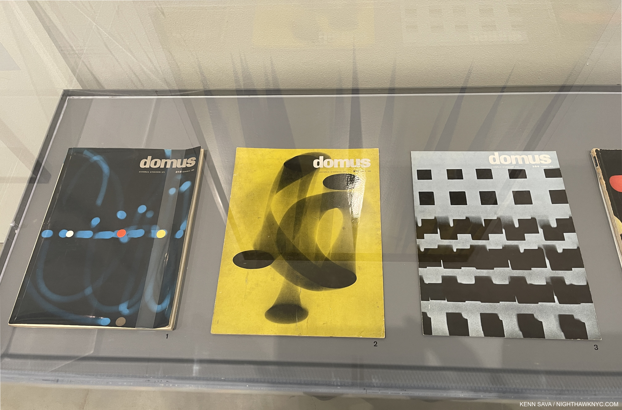
William Klein’s Photograms on the covers of Domus Magazine from 1955, 1959, and 1952, left to right.

His Painting turned out to open a door to his future when Alexander Lieberman, art director of Vogue saw a show of them in Paris and, impressed with his strong vision, saw a Fashion Photographer in him. William Klein, who was born in NYC before moving to Paris in 1946 to become a Painter came back to the City to work for Vogue. Along the way William Klein became Klein, and he broke as many rules shooting fashion as he did in his Art. He took models out of the studio and on to the streets and collaborated with them on shoots. Possibly as a result of this, Mr. Lieberman also funded William Klein’s desire to shoot the streets of NYC. The body of work that became Life is Good came into being, as did the Photographer being christened, “the angry young man of photography1.”
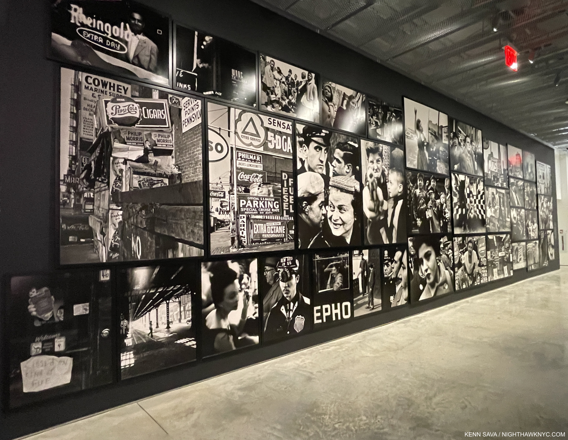
A wall of prints from the classic Life is Good & Good for You in New York, 1956, taken between 1954 and 1956. Almost all of the work in the show was from the William Klein Studio, and the prints were spectacular.

Filling two floors, almost all of the work on view was provided by the Artist, himself, most likely marking the final time he would be directly involved in a show of his work. The quality of the prints on view, many “printed later,” were of the highest order. The black & white prints were unforgettable- black could never be blacker, and many of the color Fashion Photos were printed at a large, even huge size, which made them even more stunning.
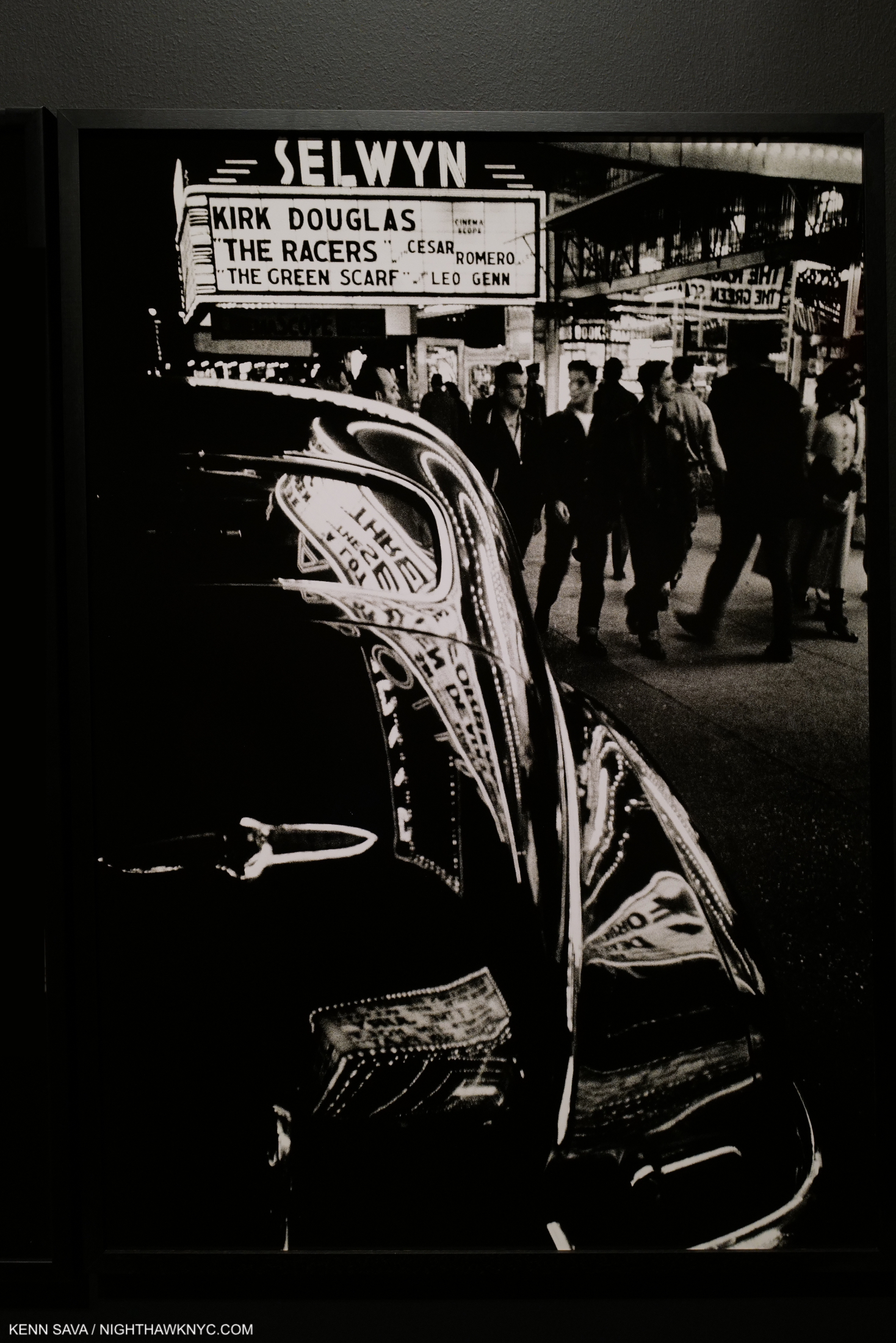
A timeless image of NYC, Selwyn, 42nd Street, New York, 1955 (printed 2016), Gelatin silver print. The play of light and shade in this incredible print is a subject all its own. I’m not sure black can be blacker than this.

The late Robert Frank is, possibly, the most influential Photographer of the past 60 years, but a very strong case can be made that William Klein is in that discussion. His Life is Good & Good for You in New York: Trance Witness Reveals, was published in 1956, 2 years BEFORE Mr. Frank’s seminal The Americans. Seen alongside the Frank book, Life is Good is a fascinating counterpoint, showing a different America than that seen in The Americans. Mr. Frank got a lot of grief for showing America as he saw it. Mr. Klein’s Life is Good shows gritty NYC as the melting pot it has long been where anything could happen at any moment. But it is his style and technique that ruffled many feathers. Rough, raw, out of focus, as dark as night, off kilter, lacking coherent compositions, grainy…were among the criticisms of those who were perhaps thinking that Henri Cartier-Bresson had discovered the only “true way” to take Street Photographs. But, there was method to his madness, and his methods resounded with many viewers right up to today.
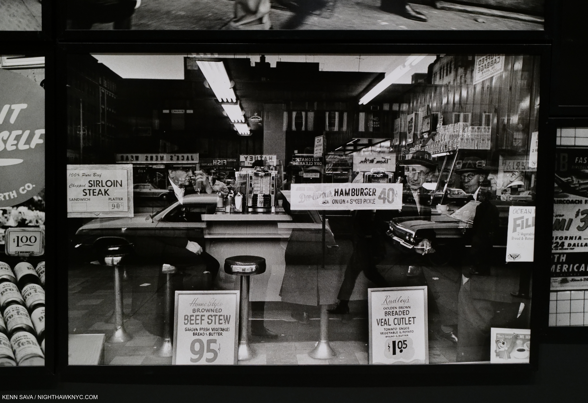
The avant-garde William Klein. Another multi-layered composition. Atget, then Walker Evans took Photos of similar scenes before William Klein, and Richard Estes has spent a good deal of his career Painting them, as I showed a few months back.

Looking through Life is Good is always surprising, even when you’ve seen it before. Quite a few people smile, indicating life was, indeed, good for them, in spite of the rough and tumble settings. A number of others (upwards of 50% of his subjects?) look at the camera and many of those seem to be in cahoots with the Photographer. Many images work in multiple layers from foreground to back. Many show fleeting moments that in Mr. Klein’s hands become intriguing, if not “decisive.” There is a section of urban landscapes in the middle that show a bit of the influence of Walker Evans, but mostly serve to give the book a decidedly avant-garde feel that it retains today. His Photographs down through the years from the b&w shots of NYC of the mid-1950s up to his color work in Brooklyn in 2013 show the universality of modern human existence. Whereas Mr. Frank observes masterfully, Klein often interacts.
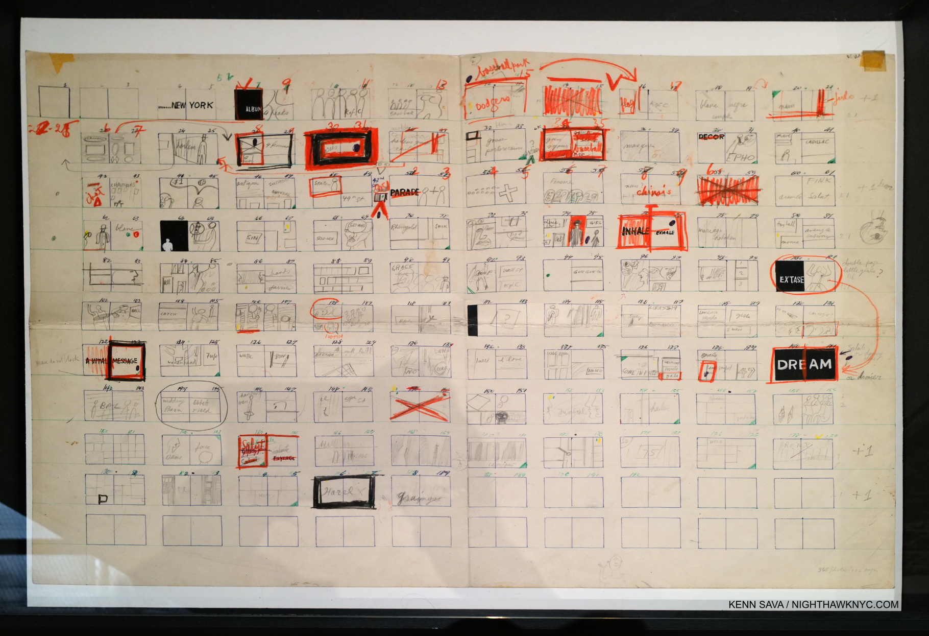
Flat Plan for Life is Good & Good for You in New York, 1955, Ink, pencil and colored pencil on paper.

Whereas The Americans remains hugely influential here in the US, and perhaps not as much in the rest of the world, Life is Good & Good for You in New York: Trance Witness Reveals, has been hugely influential around the world. It singlehandedly rewrote the possibilities of Street Photography. Perhaps its influence was felt nowhere more than it was in Japan. Daido Moriyama, a great Street Photographer in his own right, has created an important career exploring some of the ideas & techniques William Klein used in Life is Good, which served as an influence and a catalyst2particularly his high contrast, motion blur and unusual angles. So have any number of other important Japanese Photographers from the late 1950s, on, not to mention numerous others everywhere else. Nakahara Takuma, with Mr. Moriyama one of the Photographers who produced the legendary Provoke Magazine beginning in 1968, wrote a lengthy article on William Klein in 1967. In it, he said about the reaction to Life is Good, “…its impact was unprecedented. The reaction could even be called panic.” And, “…(a number of) photographers…thought of Klein’s photography as an ‘impudent ‘ amateur game, as mere technical experiment. Immediately after New York was published, critical opinion was polarized; rather than photography, it was advocates for the other related genres, such as painting and film, who supported it most positively3.” A case could be made that a good deal of Japanese Photography since its publication bears its influence. “It is not so surprising, therefore, that his photography, as something so new, became extremely popular, especially among the young,” Nakahara Takuma said in the same piece. Pretty remarkable for the first PhotoBook by an untrained Photographer. 
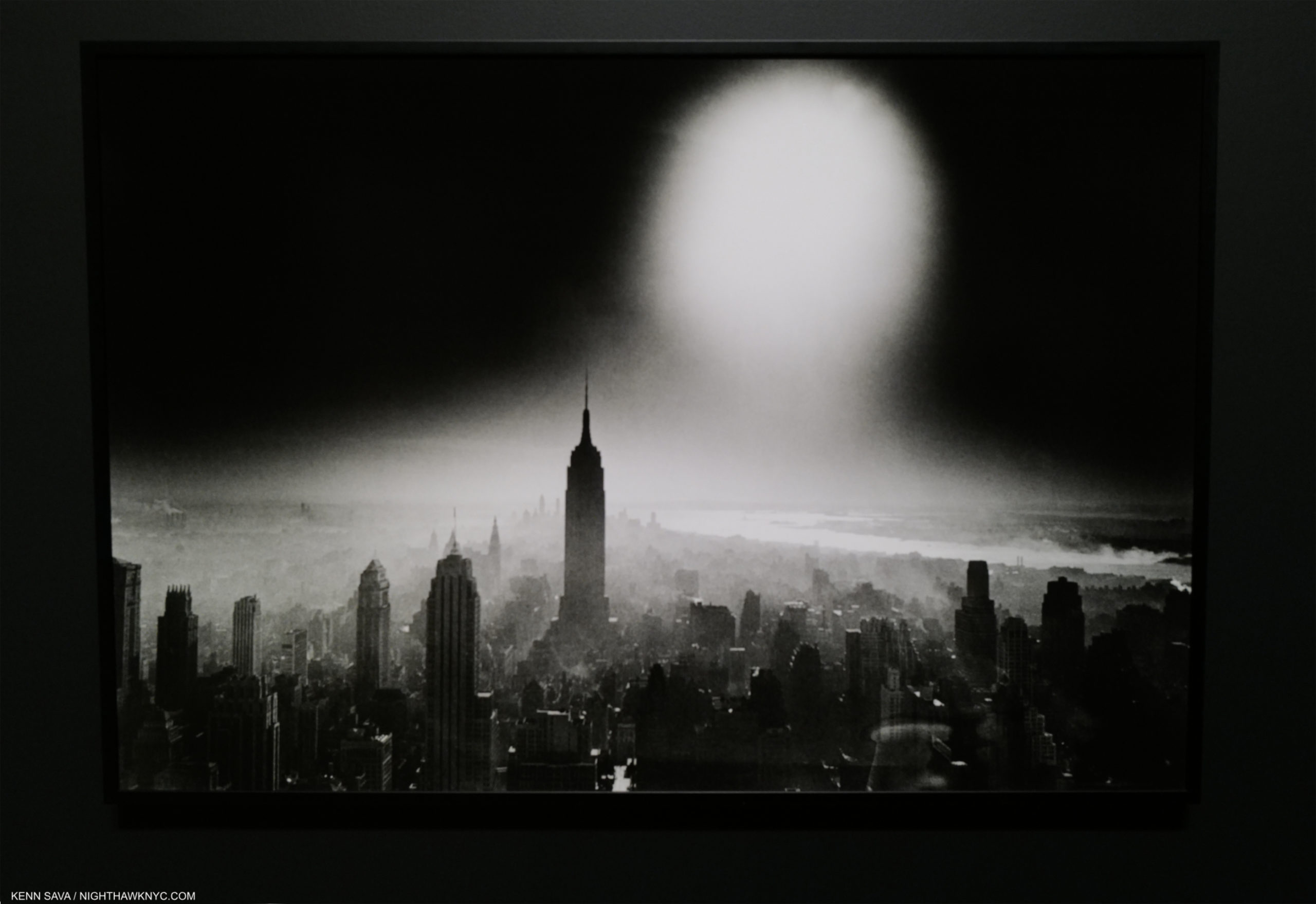
Atomic Bomb Sky, New York, 1955 (printed 2012), Gelatin silver print. Of the millions of images I’ve seen of NYC in my life, I’ve never seen one like this.

It should also be noted that Life is Good & Good for You in New York: Trance Witness Reveals has never been published in the USA4! Early on, every publisher rejected it. The first edition was published by Editions du Seuil in Paris in 1956. William Klein followed Life is Good with books on Paris (2002), Rome (1959), Moscow (1964) & Tokyo (1964. It was reported that Klein took 50,000 Photos for it5.), each of which got a section in the show, each of which remains out of print and highly sought after. 
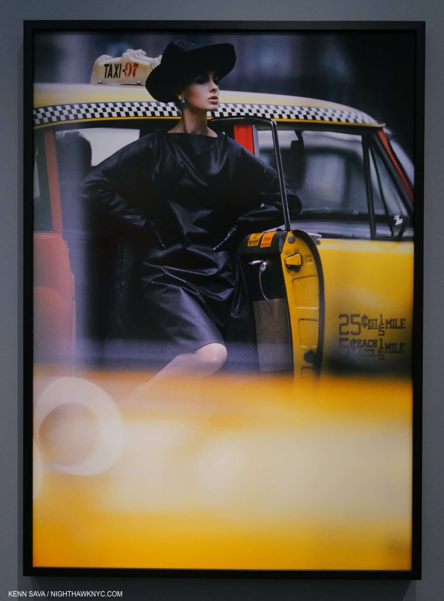
Antonia and Yellow Taxi, New York, 1962 (printed 2016), from Vogue, Pigment print. When I saw this shot at AIPAD in 2017, I realized I needed to do a deep dive into William Klein. I’m still exploring his huge oeuvre. A bit reminicient of Saul Leiter, perhaps?

Meanwhile, Klein had become a top Fashion Photographer.
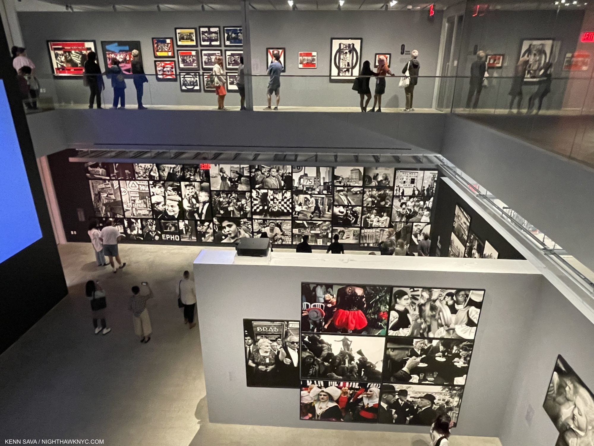
Installation view. Paris, 1964-83, in the lower foreground and to the right, Life is Good/NYC behind, Painted Contact Sheets above, and a sliver of the large video projection screen, left. I remain no fan of “holes” in museums, including this one which spans the width of the entire floor, except for 2 narrow walkways on the sides. For me they are just expensive wasted exhibition space. I’m not sure they add anything to the show-going experience. In William Klein’s case, quite a bit more work could have been shown.

The second floor was largely devoted to Mr. Klein’s Film work, which is equally revered and important.

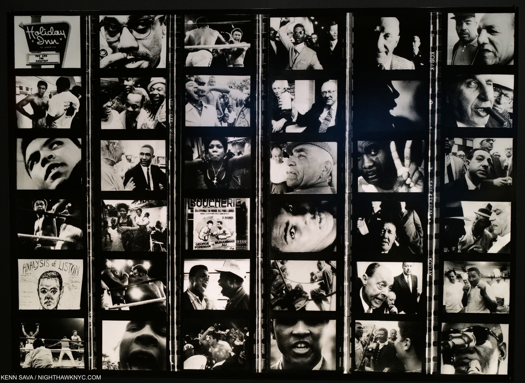
Filmstrip montage from Muhammad Ali: The Greatest, 1964-74, Directed by William Klein.

I will leave that for others who have studied it closer than I have to cover. One thing about them that stands out is that Klein repeatedly focused on important Black figures of the time- Little Richard, Muhammad Ali and Eldridge Cleaver among them. 
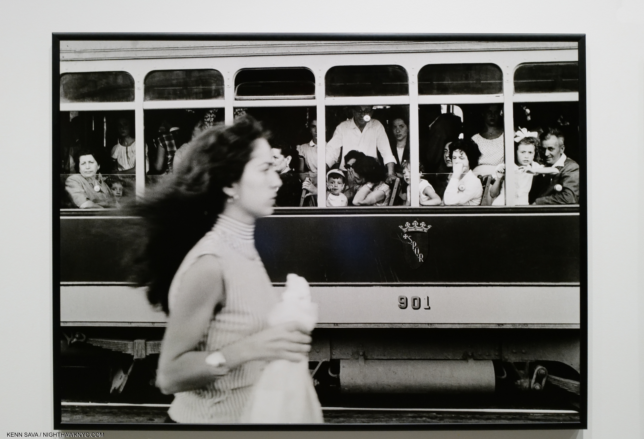
Tramway, Capellona, Rome, 1956, (printed 2013), Gelatin silver print. It’s just me, but my mind juxtaposes this with Robert Frank’s Trolley-New Orleans, 1955, when I see this work.

In the end, William Klein proves impossible to pin down. Each time I look through Life is Good, I pick up on a different thread and see things I didn’t notice previously. That’s true of much of his work.

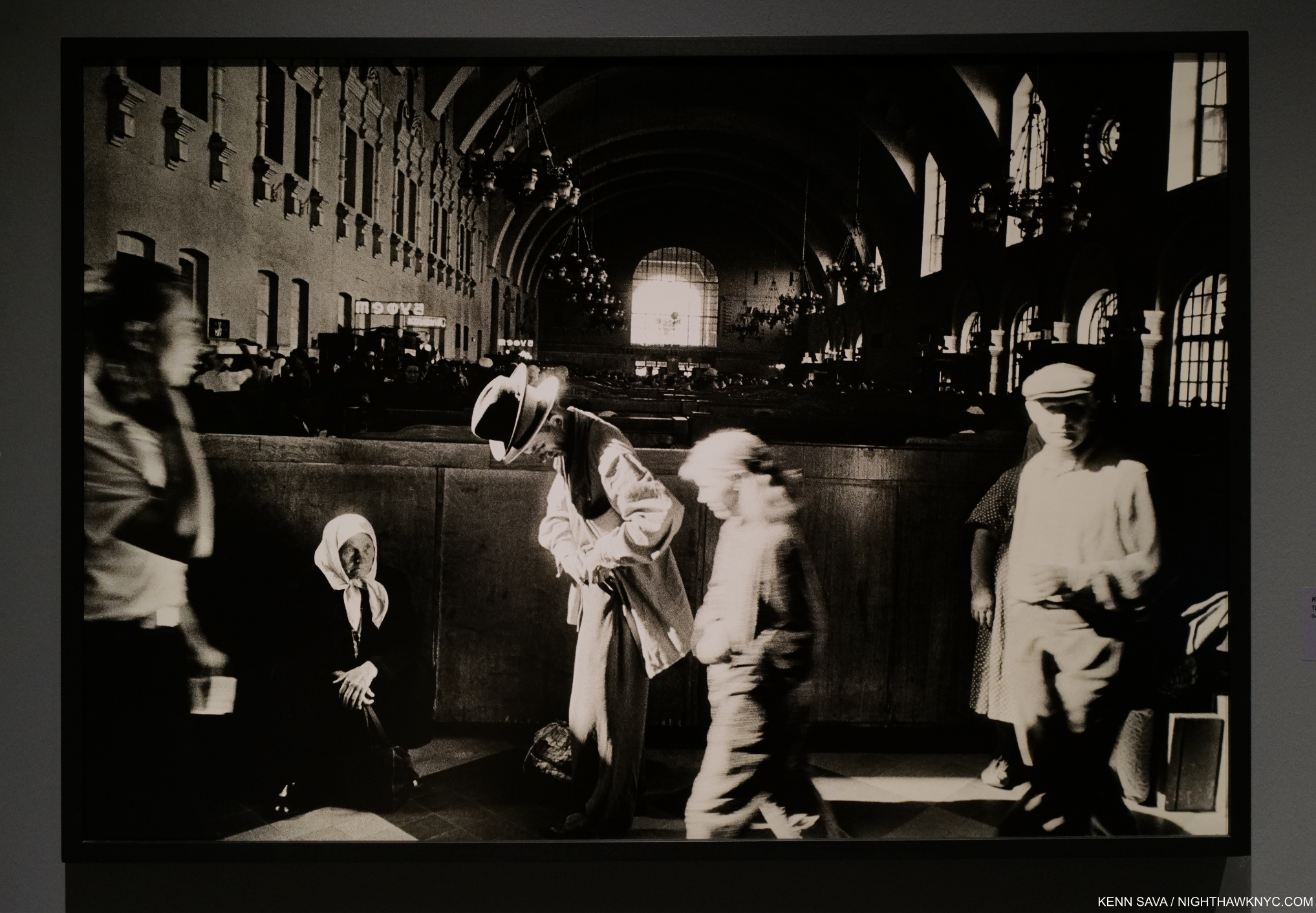
Kiev Railroad Station, Moscow, 1959 (printed 1997), Gelatin silver print.

Breaking the rules was easier for him because he didn’t know all of them. William Klein shows that, even without training, an Artist’s creativity and vision can be enough to create important, lasting and influential Art.
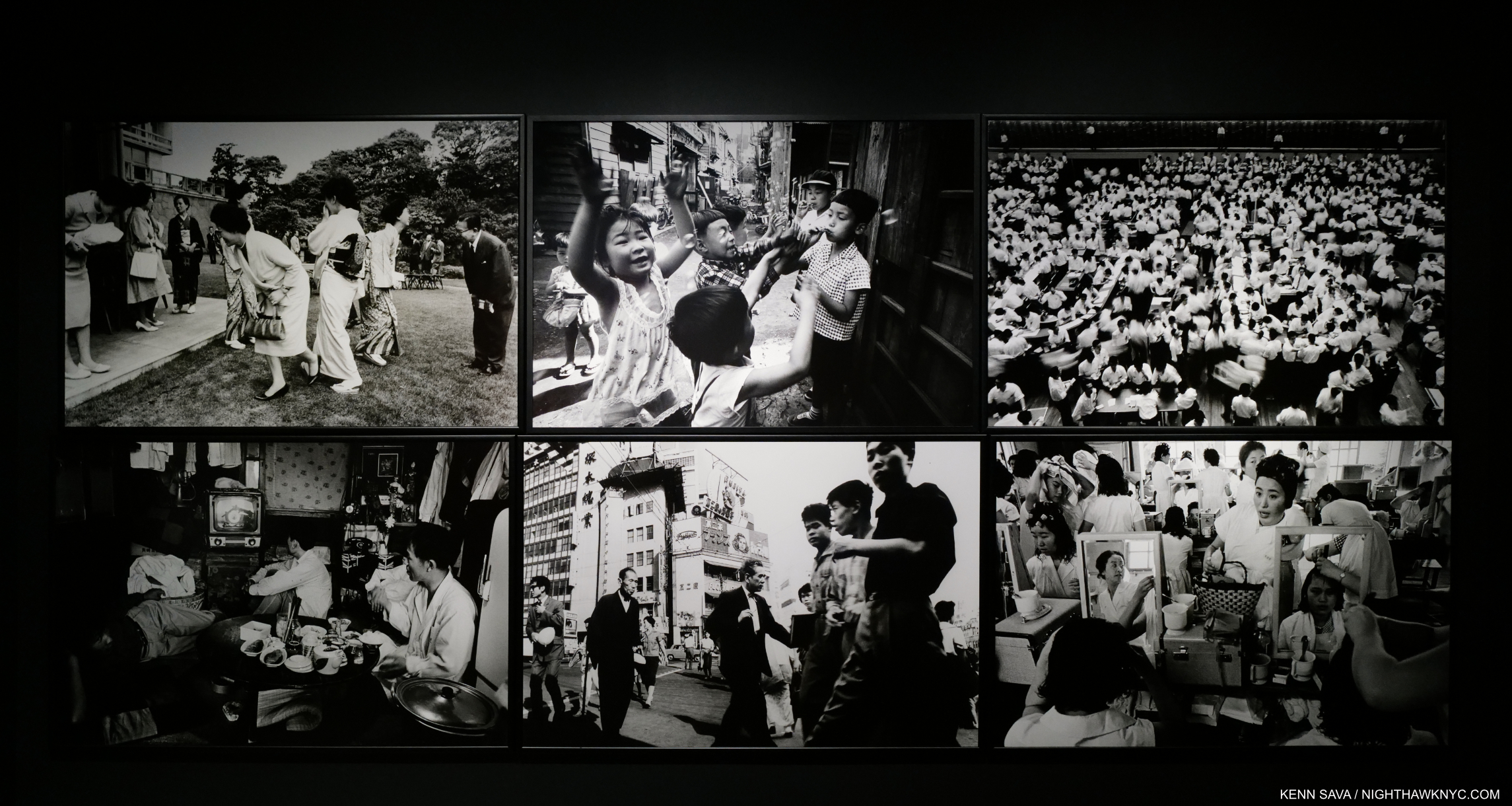
6 Gelatin silver prints from Tokyo, 1961, including Tokyo Stock Market and Yoyogi Hairdressing School, Tokyo, upper far right and lower far right, printed later.

WK:YES will serve as a testament to his accomplishment over his sixty-five year career and a benchmark for all future William Klein shows. Most likely its soon-to-be-published 400 page catalog will serve as a beacon to influence still more people and aspiring Artists, adding to the incalculable number Klein already has. 

R.I.P.

*-Soundtrack for this piece is “All Blues” by the Miles Davis Sextet from Miles’ immortal Kind of Blue, 1959

NighthawkNYC.com has been entirely self-funded & ad-free for over 7 years, during which over 275 full length pieces have been published!
I can no longer fund it myself. More on why here.
If you’ve found it worthwhile, PLEASE donate to keep it online & ad-free below.
Thank you!

Written & photographed by Kenn Sava for nighthawknyc.com unless otherwise credited.
To send comments, thoughts, feedback or propositions click here.
Click the white box on the upper right for the archives or to search them.
Subscribe to be notified of new Posts below. Your information will be used for no other purpose.

  1. Gernsheim, A Concise History of Photography, 1986, p.131
  2. https://time.com/3792413/william-klein-daido-moriyama-double-feature/
  3. Nakahara Takuma, “William Klein,” 1967, reprinted in Provoke, Art Institute of Chicago, 2016, p.362
  4. A facsimile version with every page Photographically reproduced, some reduced, in a smaller size book was published by Errata Editions, NYC in 2010. When I bought a signed copy of it, the seller reported that Mr. Klein looked at it curiously before signing it having not seen it previously. An indication that it was not an “official” edition of Life is Good.
  5. Nakahara Takuma, “William Klein,” 1967, reprinted in Provoke, Art Institute of Chicago, 2016.

China: Through The Looking Glass…That Looks Back

This site is Free & Ad-Free! If you find this piece worthwhile, please donate via PayPal to support it & independent Art writing. You can also support it by buying Art & books! Details at the end. Thank you.

Written & Photographed by Kenn Sava

China: Through The Looking Glass is finally over, and now I can look back on it. Extended an additional 3 weeks through Labor Day, it went out with a bang like those heard on Chinese New Year. Like New Year’s Eve, The Met was open until Midnight on Friday and Saturday, September 4 & 5. Of course, the Nighthawk was there. Of course, he had to mention to staff members what a great idea being open to Midnight was, one that should immediately be adopted 7/365! A bit to my surprise the show was quite crowded even late Saturday night. Maybe those visitors agree.

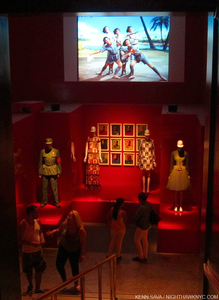
Chairman Mao & Chairman Andy


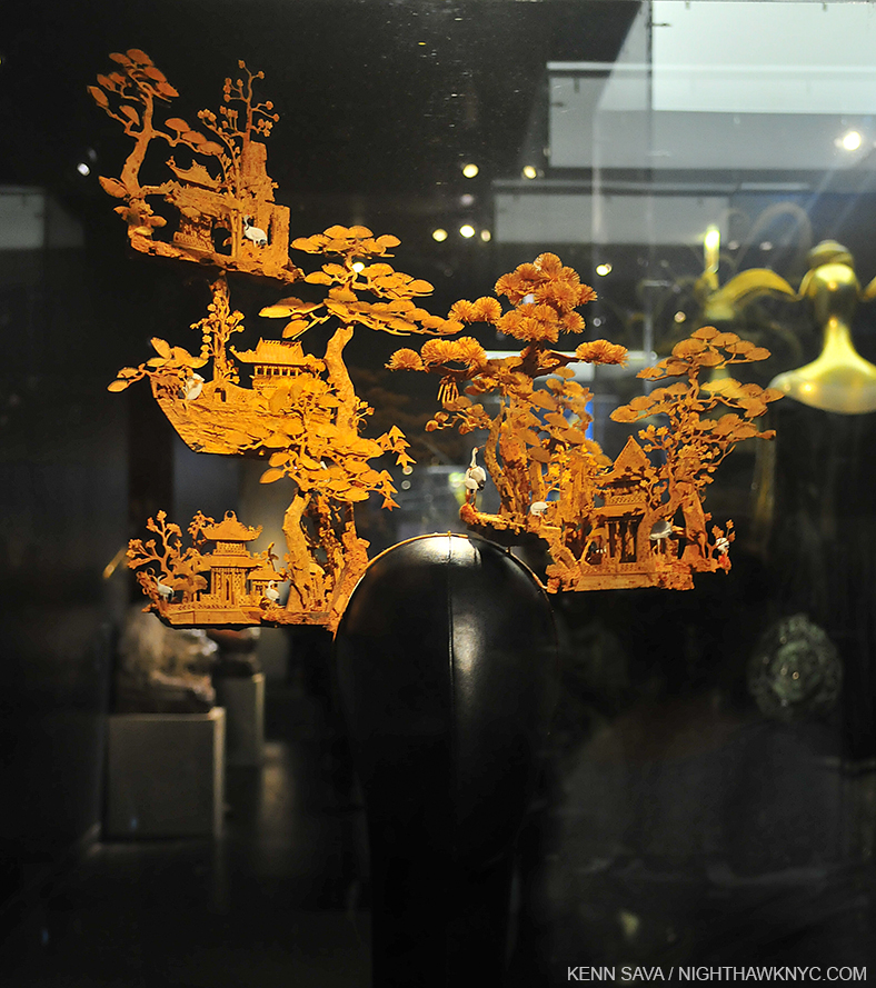
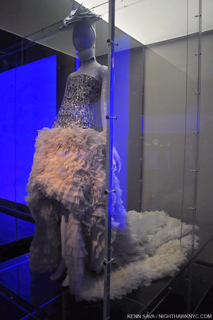
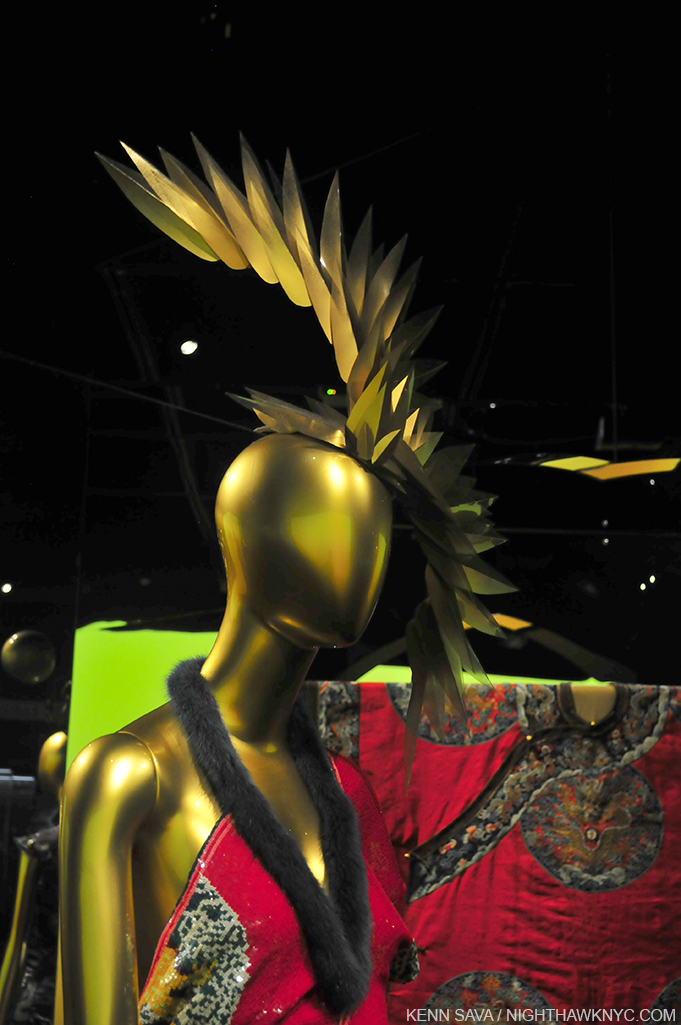
Yes, It’s a “hat.” Tie your shoes BEFORE putting it on! Extraordinary, and not by Stephen Jones.

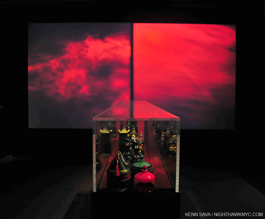
The Perfume Gallery featured 2 unsynchronized video screens, behind a selection of antique bottles. that evoked the visual essence of fragrance.

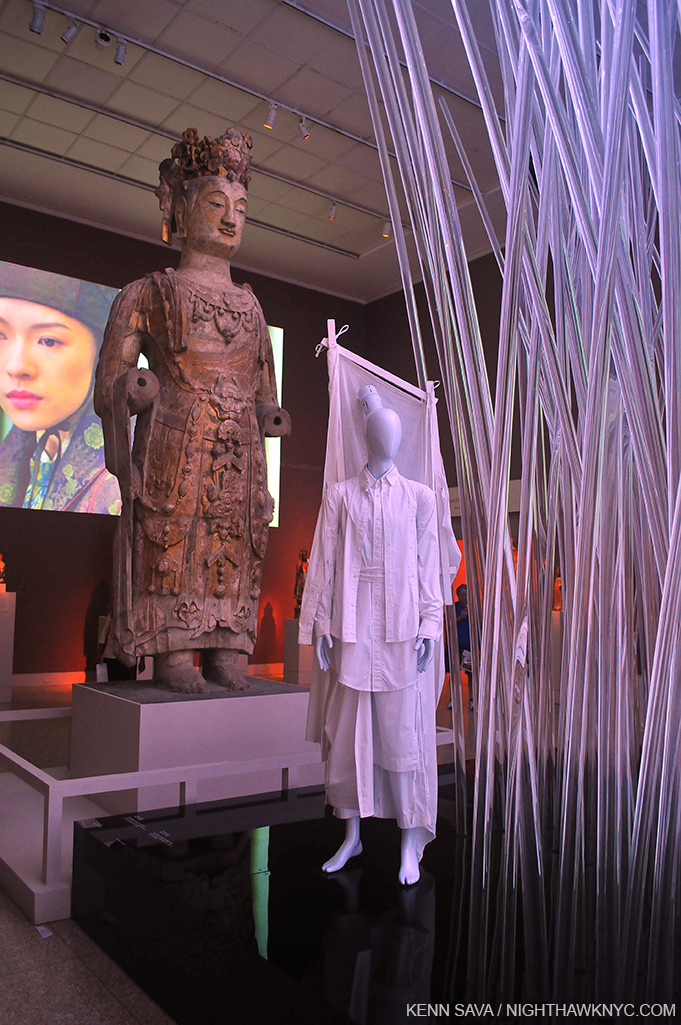
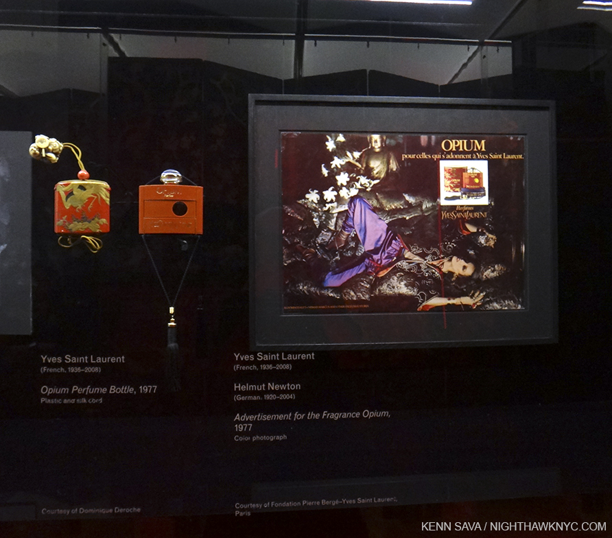
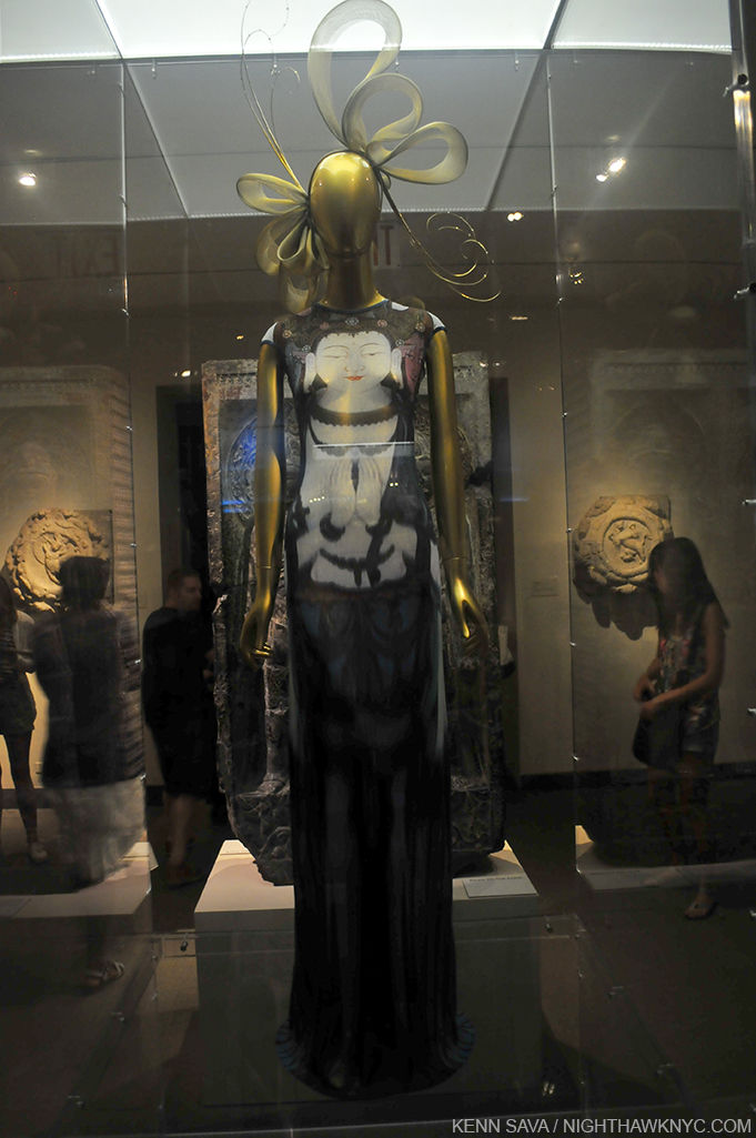
What would Buddha think?

Wandering the galleries for the fifth and final time, I started to focus on the “other” big question, besides midnight hours for The Met- China: Through The Looking Glass drew about 814,000 visitors 1. The hugely popular Alexander McQueen: Savage Beauty drew 661,500 2. This show drew over 150,000 more!!! As I said, I’m not going to compare them. The McQueen had a shorter run, and The Met was only open 6 days a week back then.

The one and only Alexander McQueen back at The Met.

Still, no matter how you slice it, the turnout was was astounding and unexpected-

How to explain the overwhelming success of this show?

Before getting to that, since I am replacing my previous brief post about the show with this one, some overall thoughts. China: Through The Looking Glass (or, C:TTLG) was a winner on every count, one of the best big shows in NYC in 2015 (I’m not going to say, “the best.” Comparing Artists, Art, shows, Films, Music or anything creative, or athletes for that matter, serves no purpose.) C:TTLG was that rare spectacle that illuminates.


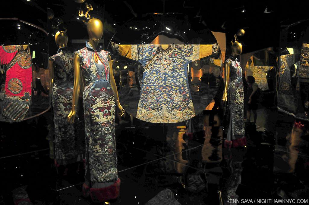
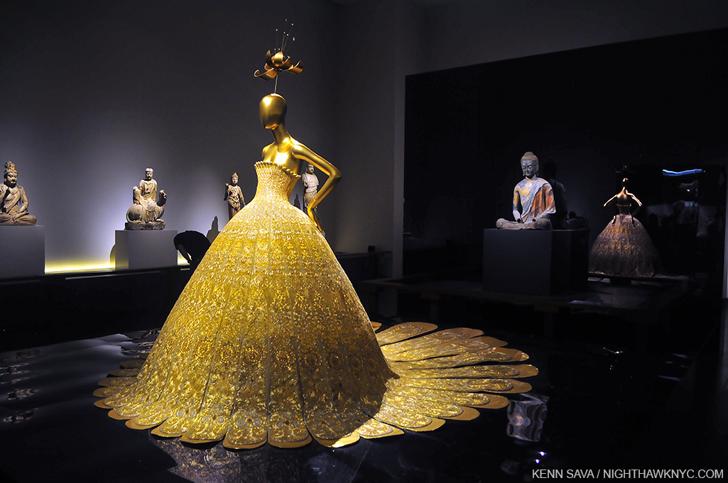
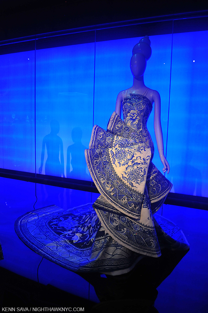
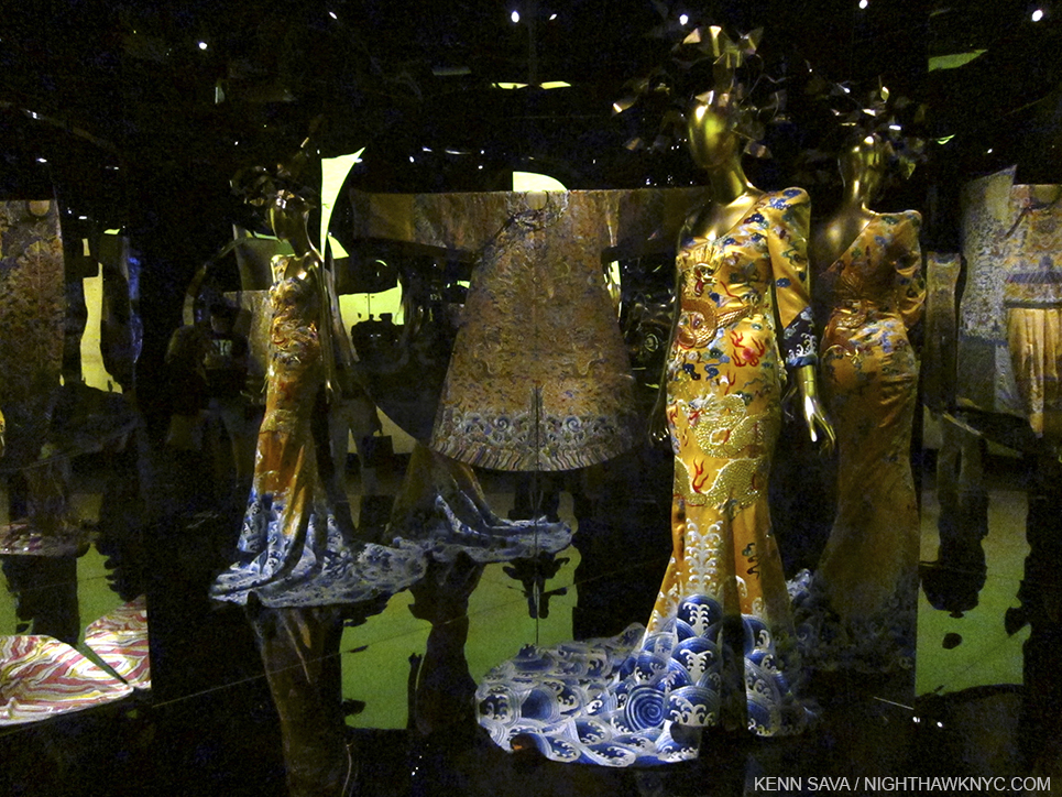
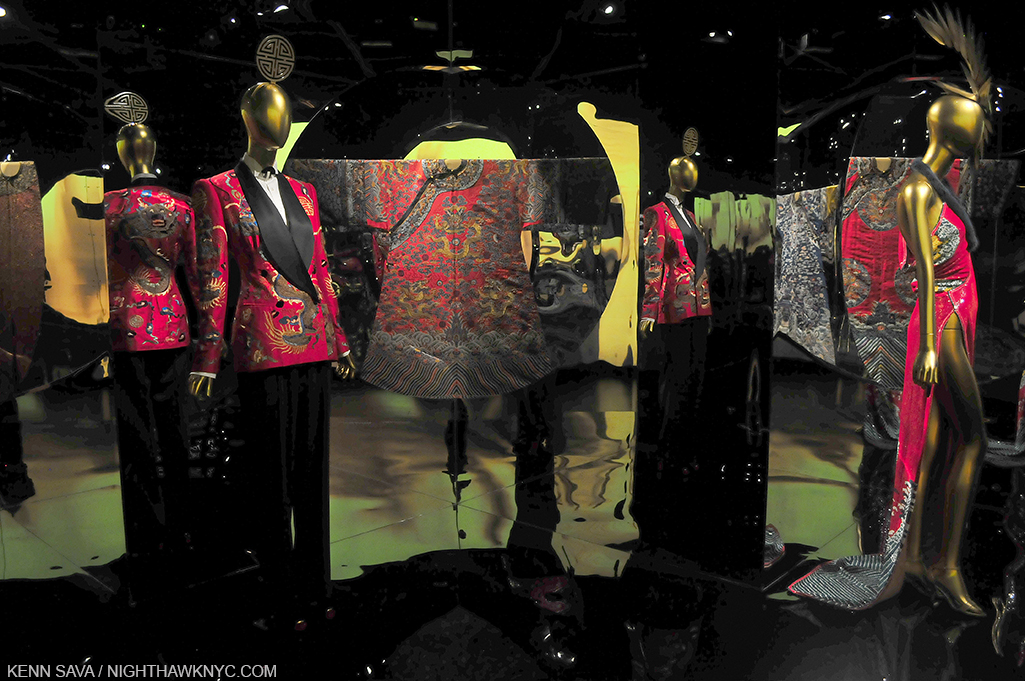
It casts light on how the west fantasizes China, Chinese fashion, and Chinese culture and Art (how it fantasizes Chinese women, briefly touched on through Anna May Wong, is too complex for this show, or any other), while showing us the difference between how western designers have mirrored Chinese fashion, out of context & tradition, of course, to suit their own purposes, and the possible influences of particular antique items, superbly selected and displayed, often side-by-side, using mirrors in differing ways as the show moves along.

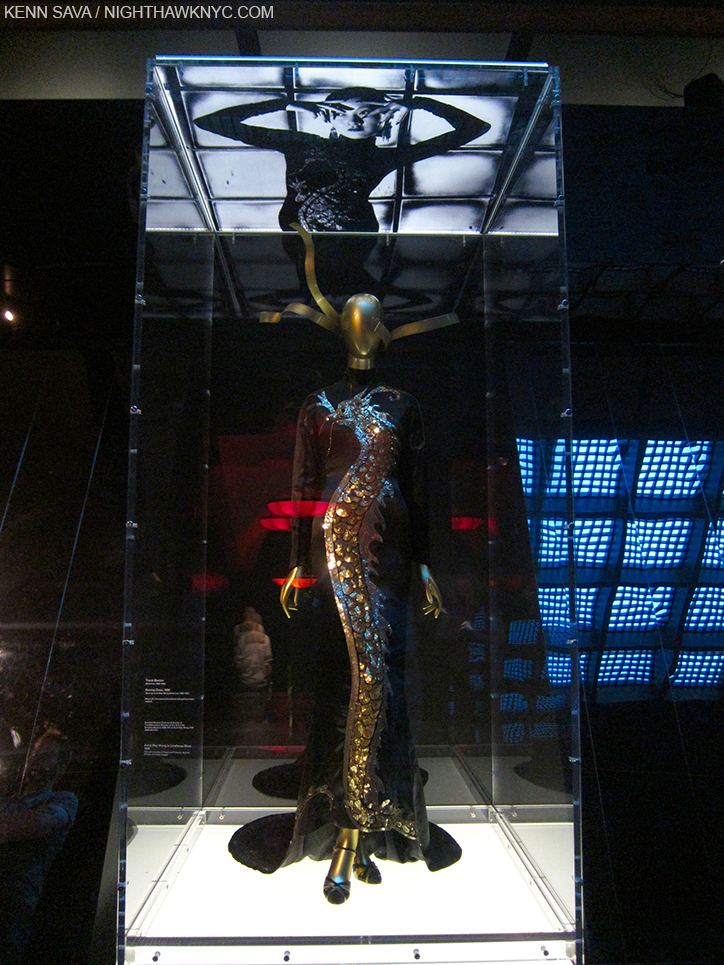
“These Foolish Things (Remind Me Of You)…” plays as Anna May Wong looks down on the very gown she’s immortalizing.

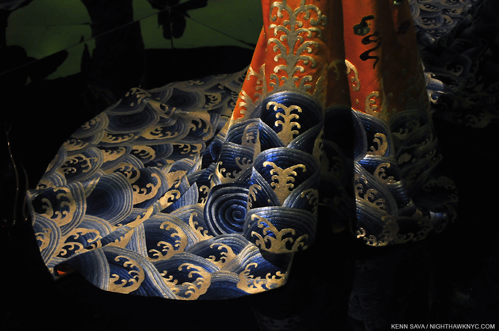
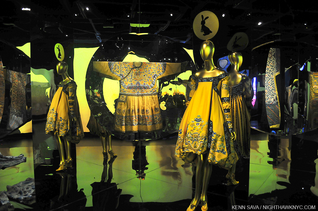
On both sides of the mirror the colors will pop your eyes right out of your skull, a miraculous thing for very old garments, which hold every bit of their own no matter what they are shown with, even Alexander McQueen (represented by at least 4 ensembles I saw, and a pair of Chopines), and this impact was spectacularly enhanced by yet another ground breaking Costume Institute installation (something I’ve admired about every one of their shows I’ve seen) and every element of it- the mirrors, the “mood lighting,” the extensive use of music and video.

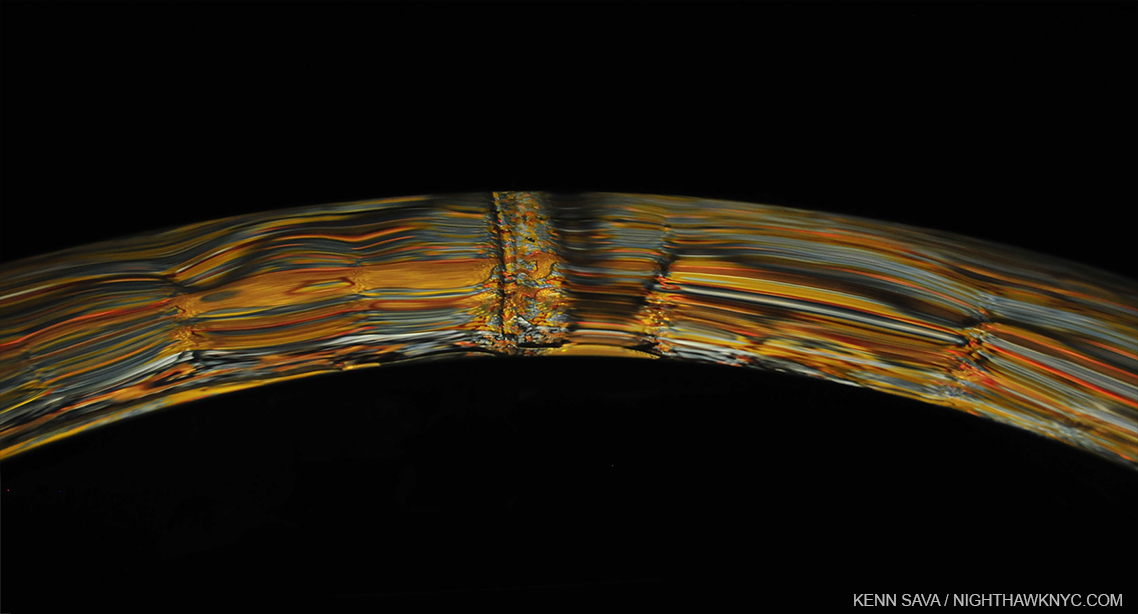
A close up of one of the countless mirrors on display, this one used to frame a brilliantly colored antique garment.

It seems they pulled out the stops this year, bringing no less than an internationally renown film maker in as Artistic director and bringing in the brilliant milliner Stephen Jones to created hundreds(?) of “hats,” which somehow managed to almost steal the show, an incredible achievement.

My hat is off to the endlessly creative Milliner Stephen Jones.

Though I am very queasy when it comes to “big names” from the world of commerce being on view in The Met, and there are many “big names” represented, just about everything on display deserved to be included. Well, it’s The Met. They have the best curators in the world, in my opinion. I expect nothing less.

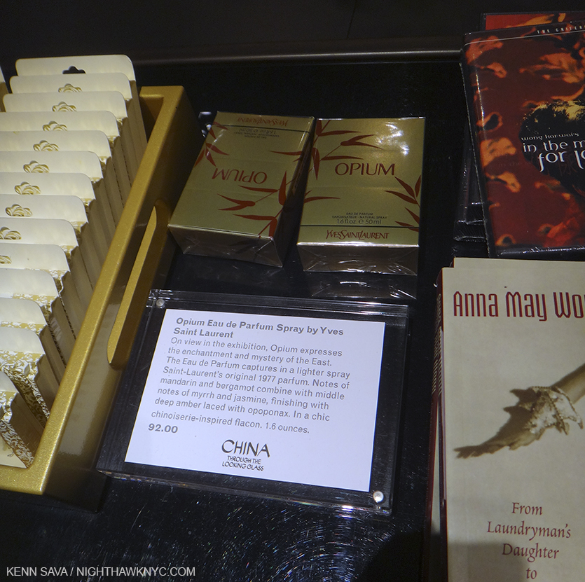
I could have, however, done without the section on the development of the perfume “Opium,” which, yes, was also on sale in the gift shop for 92.00…dollars.

C:TTLG was the first collaboration between the Costume Institute and the Department of Asian Art, which celebrates it’s 100th Anniversary this year. Beyond the combination of both world-class collections, the pairing was most fortuitous for visitors to this largest show in Met history as even though it was spread out over 3 floors, the galleries happen to be located right on top of each other, making them easily accessible by centrally located stairs and elevators, something that was a problem for Costume Institute shows in the past.

Ok…so, about getting over 800,000 visitors….?

People want an experience these days, and C:TTLG was that. Walking into this show was a bit like going to a movie- most of the galleries are dark or darkened, which gives a “theater-like” experience. This was enhanced through the use of video screens playing excepts from films in many galleries (acclaimed Hong Kong filmmaker Wong Kar Wai, who I’m a big fan of, known for his “unique, highly stylized, emotionally resonant work” 3 was the show’s artistic director), the use of mirrors, and curated music set the mood in every gallery. The Costume Institute has been at the forefront of creating “experiences’ with their installations- unforgettably for “Alexander McQueen: Savage Beauty” and no less than “recreating” CBGB’s infamous bathroom for their “Punk” show. (Ok, they omitted the filth, but it’s something I STILL can’t believe I saw at The Met! I’ll always wonder what CB’s owner Hilly Krystal would have thought…)

_DSC9842PNH

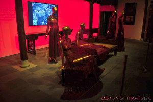
“The Red Boudoir” as I call it.

Yet, there was almost no “sex appeal” to the antique garments on display. It made me wonder how China ever became the most populous country in history! In fact, the “Red Boudoir” as I came to call Gallery 218, featuring Valentino’s 2013 evening wear, (which he debuted in Beijing, and which was kept quite dark so as to play down the fact that the clothes are see-through), was the only instance of “sexy” even among the western pieces, save for a lone mini dress, by someone unknown- their name, on the outside of the case had worn off (something that needs to be fixed going forward, as does the fact that many of these glass case labels were almost impossible to read in the dark.) There was no Lady GaGa-type figure (who had been famously wearing McQueen’s now immortal “Armadillo” Shoes at the MTV VMA’s before AMcQ:SB, which took place only a year after his tragic death. There was no seeming cultural “tie in” at all to push the box office to record heights. Yes, it’s The Met. Yes, there is the more-famous-every-year Met Fashion Gala that kicks off the show each year, but that’s been going on for a long time now. Yes, there are more Chinese than anybody else, and there are many Chinese tourists here and many Chinese living in NYC. Yet, I think the result, in this case, was more than the sum of those parts.

Also, unlike most special exhibitions at The Met, and though the signs read to the contrary, photography WAS permitted! I think this was a very shrewd idea as it allowed for something perhaps better than word of mouth- “Word of Sight,” as I call it. This show is very hard to describe (as you can tell by reading this!), but easy to “get” by seeing a picture (hopefully), which equals 1,000 words as they say.

It also seems to me it’s the same forces at work that make a movie hugely successful. There are the initial batch of folks who go and have a look see after it opens. My guess is that many of them reacted like I did- “OMG! You HAVE to see this.” And so, others go, and it feeds on itself from there. The show was so big that many went back time and time again to see the rest of it, or to see parts of it again. I think the press, which was very positive as far as I heard (I don’t read reviews until I’ve made up my own mind), play a relatively minor role in drawing a crowd like this, especially after a show has been open for a while. The press reminds that it’s still open, but nothing more is generally written about it after their initial review. It also seemed that this show drew women in huge numbers, above and beyond what the “fashion” oriented shows I’ve seen at The Met or F.I.T’s Museum. I can’t remember seeing so many single women at a show. I also saw a lot of women with a male partner who looked hopelessly “Please, Dear God…Get me through this.” lost. And yes, there were tons of tourists. Overall, while though there were many, though not a predominance of, Asians, the crowd was extremely diverse in my visits, though lacking the very young. Interestingly, there was no fashion on display for babies or children, which is actually consistent with every Costume Institute show I’ve seen.

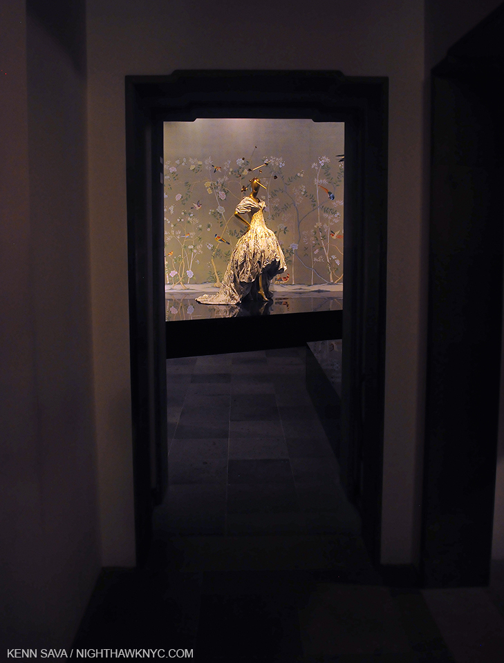
In the final analysis, since I knew nothing of “real” Chinese fashion going in, I was careful to be mindful of whether I was seeing something old or new. Though there weren’t as many antique Chinese pieces as I hoped, I came away having seen another concept of femininity. The shapes of the garments, especially, stood out to me and I was continually reminded of Scholars’ Rocks, (a few of which were on display in the Astor Court where John Galliano’s Chinese Opera pieces were on view in a section entitled “”Moon In The Water”), and sculpture. The effect of the design is almost architectural, ala Frank Gehry, who has been on my mind since the new Whitney Museum opened. (Perhaps you can guess why. If not, I’ll come clean soon.) Beyond shape and it’s effect on style, the colors of both the antique and modern clothes, both in numbers of and combinations of, were absolutely exhilarating, especially in the dark. The west has a problem with color, something that can be seen taken to it’s furthest extreme here in NYC. Color is so powerful that wearing it tends to make one stand out in a bad way here. People wonder what you’re about. But if EVERYONE is wearing color the effect must be completely different, unimaginable to my eyes- I’ve never seen it. Of course the antique clothes on display at C:TTLG were exclusively garments of the upper class, so it remains unknown to me what the “common” person wore, and if there was THAT much color in those garments. Probably not. But, I’m going to hold on to my fantasy about everyone wearing color regardless.

It also made me think about western painting, where only briefly has anything like this amount of color been seen. Van Gogh may be first to mind. Though he was so incredibly prolific- about 900 paintings, it’s often forgotten that he only painted for NINE YEARS (1881-1890), and his early years were characterized by dark brown earth tone works influenced by Millet. Seurat, who I consider a genius of color, died at 31, leaving, perhaps, Matisse and Monet as the longest standing masters of color in western art. Though surely all of the Impressionists were influenced by Asian art, it was primarily Japanese art, which was more known in the west at the time, Monet even building a “Japanese” style bridge in his incomparable Giverny garden. I digress.) The point is that the color will linger in my mind as much as the shapes.

Not sure why Mr. Jones chose the rabbit, but I love it.

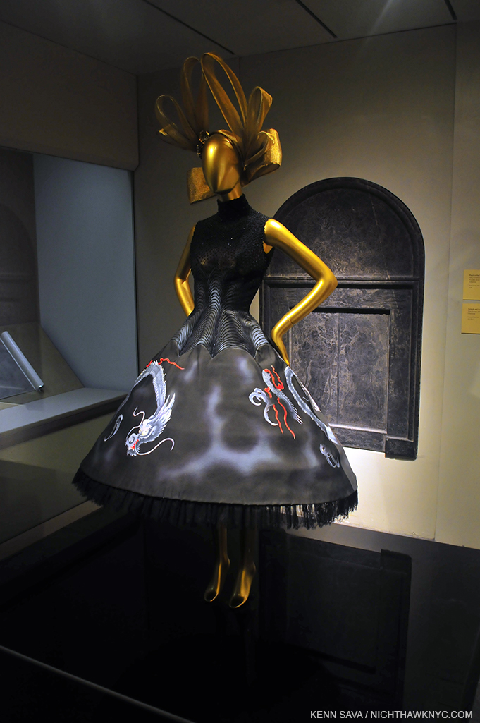
I should also mention that the catalog for the show is an experience in itself. It’s exceptionally well done, even for The Met, and features stylized photos of the clothes by Platon as well as quite informative essays from the curators. Since these shows take so long to install, a feat unto itself in an open 7 days a week Museum like The Met, the clothes are photographed in a studio setting and not as they appear in the show. This is good, and not so good. The good is you get to see things like the back of Anna May Wong’s amazing Dragon dress (depicted above) in the book, one of the few dresses without a mirror allowing that view in the show, though you may miss the view of a piece you liked as it is in the show.

Alexander McQueen, again, and Stephen Jones, bid us farewell…until next time.

So, yes, the show does beg the inevitable big question- “Ok, Mr. Bolton (newly minted Head of the Costume Institute)…What’s NEXT?” My mind pondered something never mentioned anywhere in this show- what was worn UNDER? There was no “underwear.” No Stockings. No gloves, even. Then I thought- Perhaps THIS will be addressed in a future, no doubt, blockbuster show, “Underwear- Exposed!” You heard it here, first. Finally, at 11:45pm Saturday,  I started to wonder if C:TTLG begins a “worldwide fashion tour.” After all, The Met is, possibly, the world’s greatest repository of art from all cultures and all times- what would be more appropriate? Perhaps Africa is next, a subject that might very well draw as many, or maybe even more fashionistas to The Met.

?

In the meantime, if you were one of the 800 thousand, I wonder if it will effect your personal style, or, if you missed it, visit The Met’s website for the show, and stay tuned to see what’s next.

Oh, and, in the meantime, don’t use too much opium.

Soundtrack for this post- “These Foolish Things (Remind Me Of You)” written for Anna May Wong by Eric Maschwitz, who was in love with her, and as performed by Billie Holiday.

NighthawkNYC.com has been entirely self-funded & ad-free for over 8 years, during which 300 full-length pieces have been published! If you’ve found it worthwhile, PLEASE donate to allow me to continue below. Thank you, Kenn.

You can also support it by buying Art, Art & Photography books, and Music from my collection! Art & Books may be found here. Music here and here.

Written & photographed by Kenn Sava for nighthawknyc.com unless otherwise credited. To send comments, thoughts, feedback or propositions click here. Click the white box on the upper right for the archives or to search them. Subscribe to be notified of new Posts below. Your information will be used for no other purpose.

  1. http://www.nytimes.com/2015/09/09/arts/design/andrew-bolton-chosen-to-lead-the-mets-costume-institute.html?_r=1
  2. http://www.nytimes.com/2015/08/30/fashion/nyc-museum-met-exhibition-china-and-fashion-proves-golden.html?_r=2
  3. imdb.com