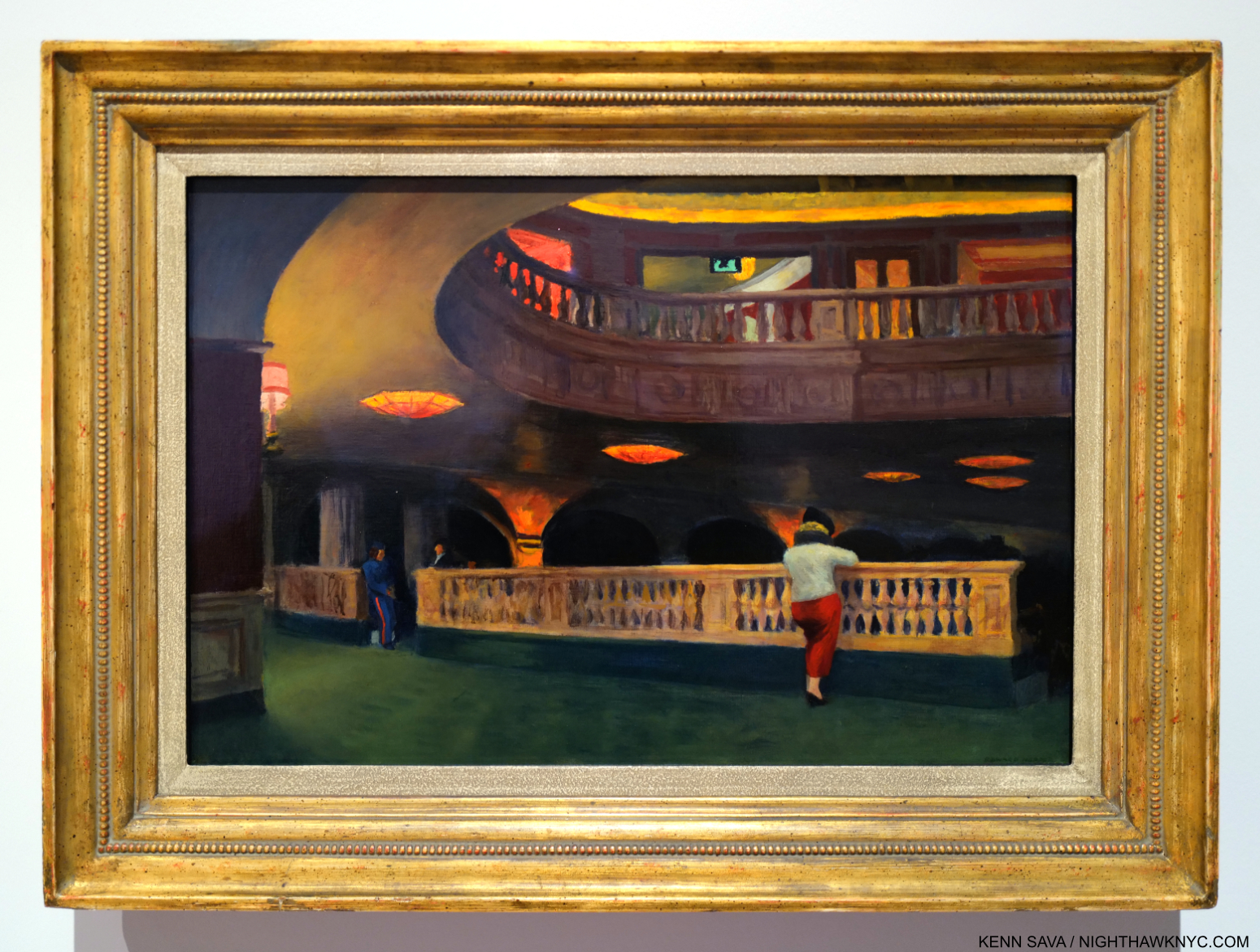
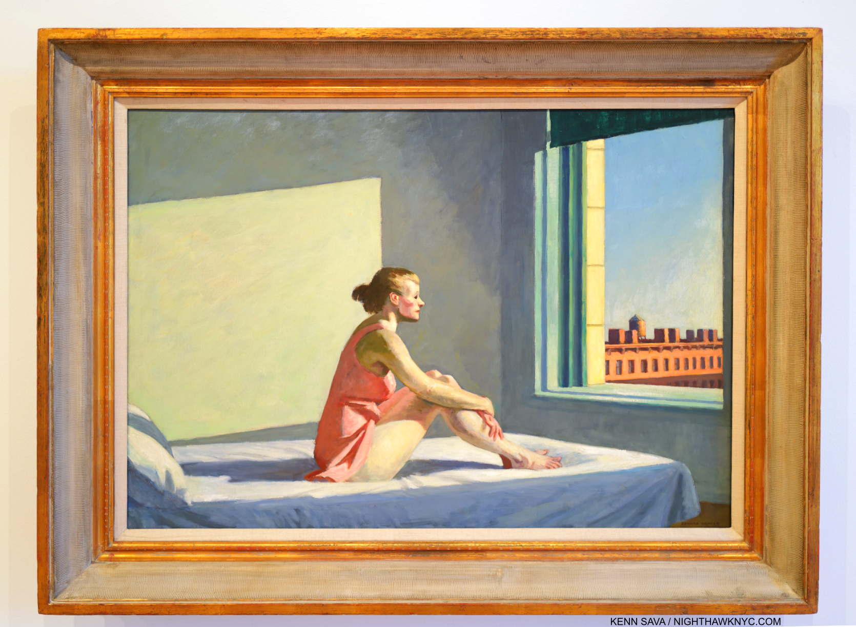
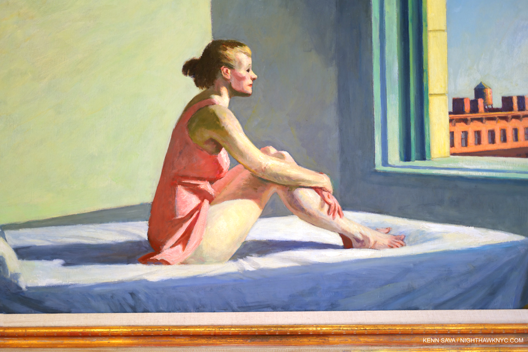
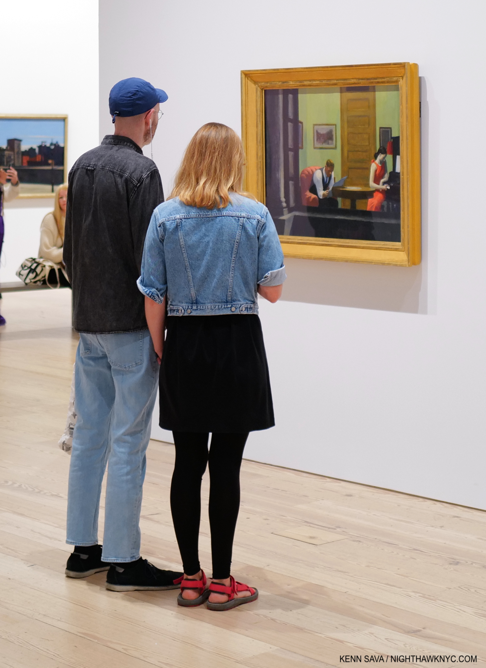
Stepping Into “Edward Hopper’s Nighthawks”

This site is Free & Ad-Free! If you find this piece worthwhile, please donate via PayPal to support it & independent Art writing. You can also support it by buying Art & books! Details at the end. Thank you.

Written & Photographed by Kenn Sava.

The numeric convergence begins. August 28, 2013, eleven years ago next month- – The last time I stood in front of the real thing- Edward Hopper, Nighthawks, 1942, at Hopper Drawings at the old Whitney Museum. A moment later, a friend snapped a picture of me standing next to it. Would I ever get closer to it? Pictures in this piece are thumbnails. Click any for full size.

The Edward Hopper/NighthawkNYC Convergence, 1-

July 15, 2015, nine years ago this month, in my very first piece, “Welcome to the Night,” I mentioned I’ve always related to that figure sitting by himself with his back to the viewer in Edward Hopper’s Nighthawks, 1942. The one that no one ever talks about. Why is he even in the Painting?  Well, he’s really only half in it; his left side completely blends into the black background. So, what’s his deal? Did his date go bad? Is he worried about the recent outbreak of World War II? Is he waiting for the lady in red to lose her guy? (The couple are likely Edward & Jo Hopper stand-ins.1).  Well, he’s there and I’m glad he is. He’s also a witness to everything going on inside, close enough to the other subjects to hear their conversations. In Nighthawks, he has THE ideal seat to see and hear everything that’s really going on, that the rest of us can only imagine.

I’ve been that guy too many times to count, out on my own late at night in Hopper’s Greenwich Village neighborhood. I relate to that “witness” aspect of him, too. After all, isn’t that what I’m doing here; being a witness to the Art, Photography, Music  books I’ve experienced?. So, I named this site NighthawkNYC after him. Hopper’s Painting is titled “Nighthawks.”

But, what would it be like to be him?

Triple self-portrait, August 28, 2013. “That shape is my shade, there where I used to stand,” as I quoted Steely Dan’s “Deacon Blues” in my very first piece, “Welcome to the Night,” on July 15, 2015.

Convergence 2-

On July 29, 2019, five years ago this week, I published “My Search For Edward Hopper’s Nighthawks Diner,” chronicling my decades-long quest to find the iconic eatery/drinkery. It’s turned out to be my most popular piece thus far.

This past Sunday, July 21st, I finally found it!

It happened to be on a triangular corner- Check.
It happened to be in the West Village, not all that far from 3 Washington Square, where Edward & Jo Hopper lived for half a century- both key criteria the real deal has to fit- Check.
But, it was not where I’d looked for it as I wrote in the piece. It was out in the open! Without a roof!?

I let that slide. After all, in the Painting we really can’t see the ceiling, just the light coming down, and it’s a one-story building shown at night. Maybe there was no roof? Imagine that. “Maybe. Maybe not,” I hear you saying.

The famous “Only 5c Phillies America’s No. 1 Cigar” sign was up top- Check.
The outside was painted in that familiar green- Check.

Everything looked like it was supposed to. Am I dreaming? Then, a nice gent named Nilo beckoned me inside!

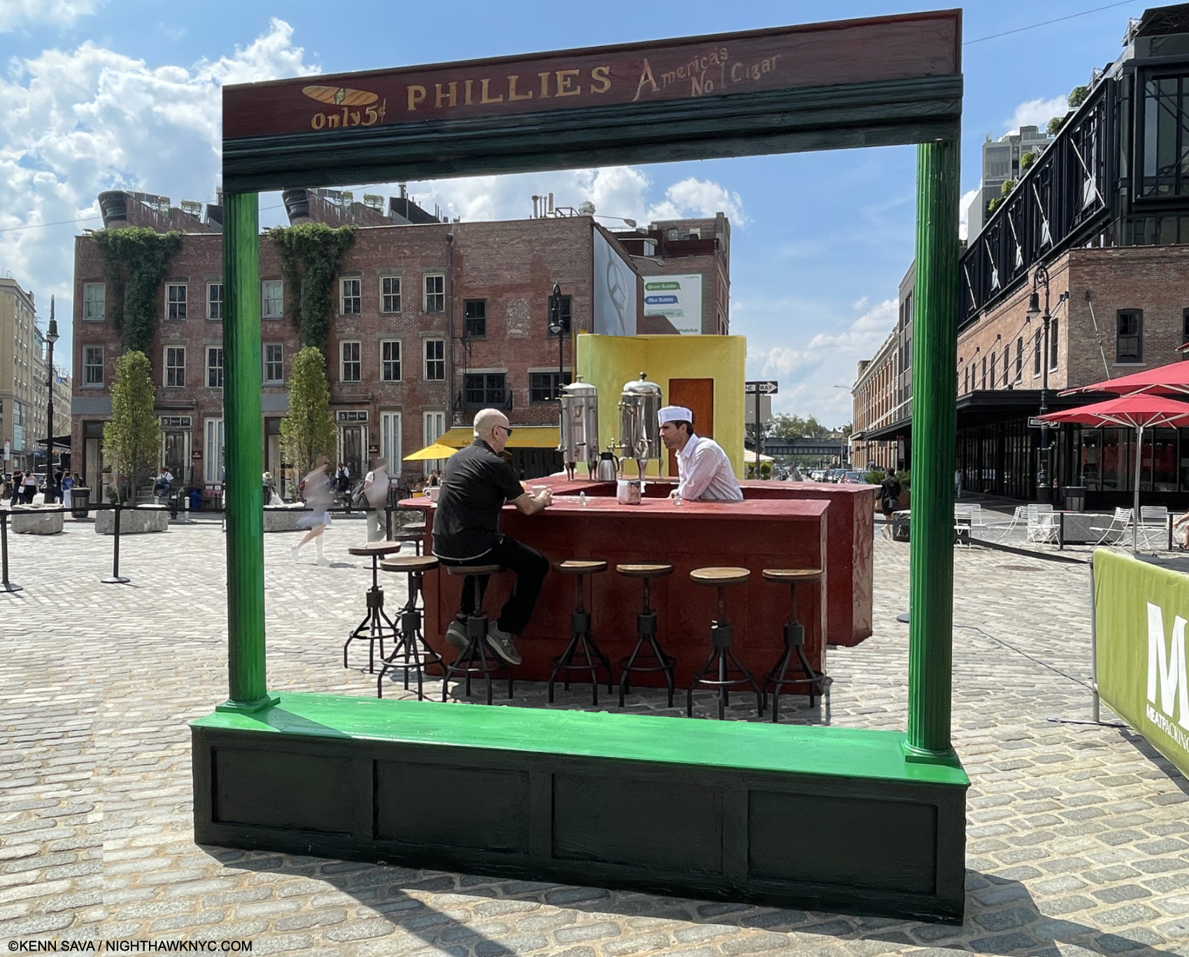
As I approached the counter, about to take “my”place- the only seat I was interested in taking,  all the details long engrained in my memory were right in front of me.

It was empty. Wow. Perfect! I could look around and drink it all in without feeling self-conscious. Wait!…AM I conscious? A coffee will wake me up. I’m in the right place.

Living a dream…Kenn Sava, left, Lucas, right. July 21, 2024, Meatpacking District, NYC. Photo by Nilo for NighthawkNYC.com.

I could take the seat of my alter ego in peace, without that pesky couple, she in the flame-red dress, with her male companion, who for the past 82 years have gotten all the attention, in the room. I was free to finally chat with the counterman. His name was Lucas and I told him how long I’ve been looking for the place- and even wrote about just that, the nice weather, what else was going on this weekend. You know, small talk; the kind of stuff strangers talk about when they’re suddenly thrust together. But, we weren’t total strangers in the classic sense. We both knew why we were here. As he went back and forth to his duties, I just kept looking around, drinking it all in. Wow. I’m sitting inside of Nighthawks!

There’s the famous two large coffee urns.
There’s the yellow wall with that mysterious door.
The bar was the familiar brown.
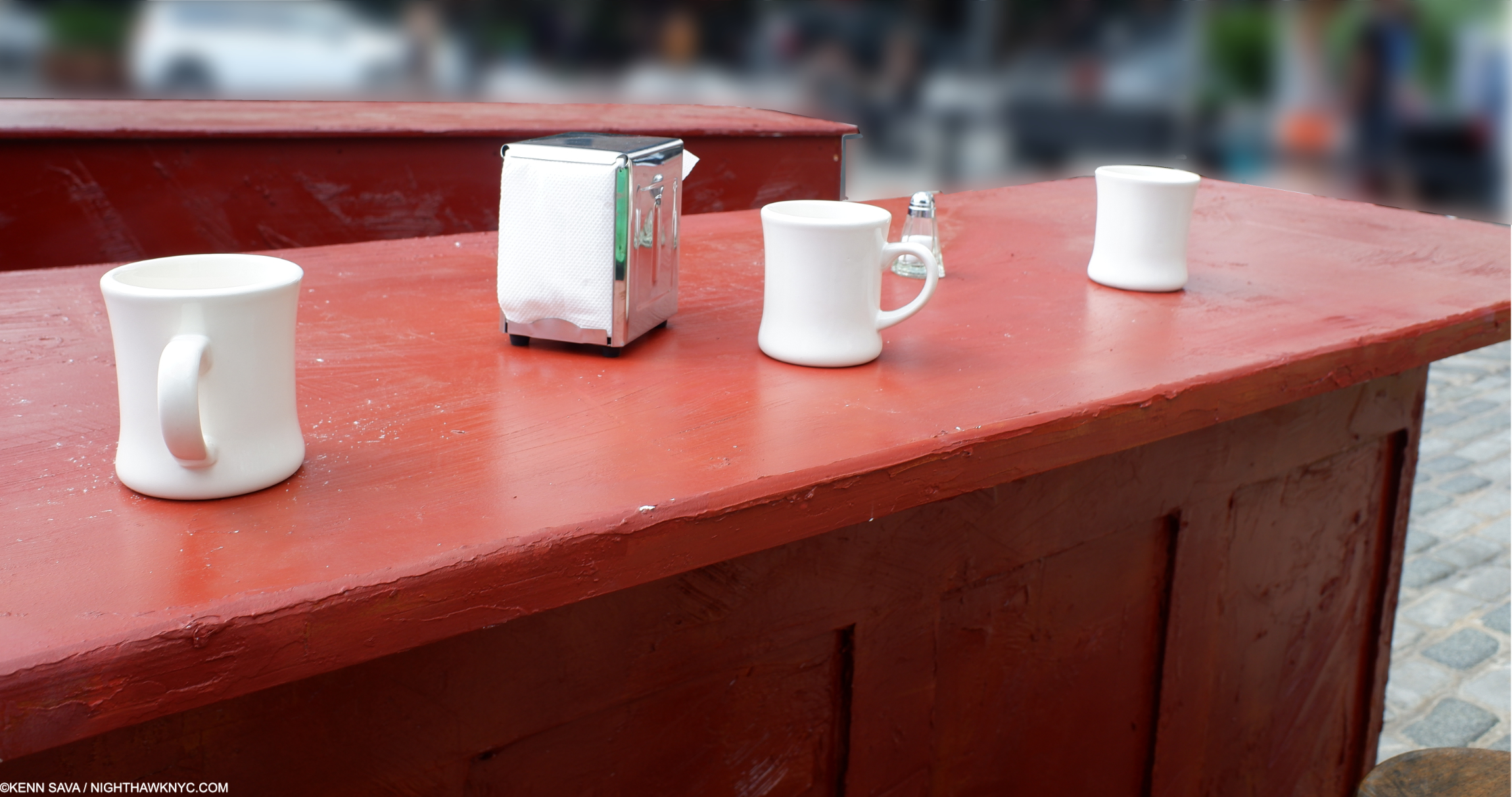
The classic white ceramic coffee cups, glass salt & peppers, and napkin dispensers were all around giving me a feeling of familiarity and “home.” I guess that’s what happens when you’ve been looking at them for so long in Painted form.

So real, you could reach out and touch them. Of course, I did…

And, I got to experience it from THE seat, to see what “he” saw and ponder him anew. Maybe “he” was me in a prior life. If so, how many people have gotten to relive a moment from a prior life?

This MUST be the place! FINALLY! I can’t wait to rush home and tell readers I found it! What a scoop!

A close call with a bike running a Walk sign on the walk home snapped me out of it and back to reality. As I reviewed my pictures to make sure my phone was OK, it turns out I had come upon something called “Step Into Hopper. 

Convergence 3-

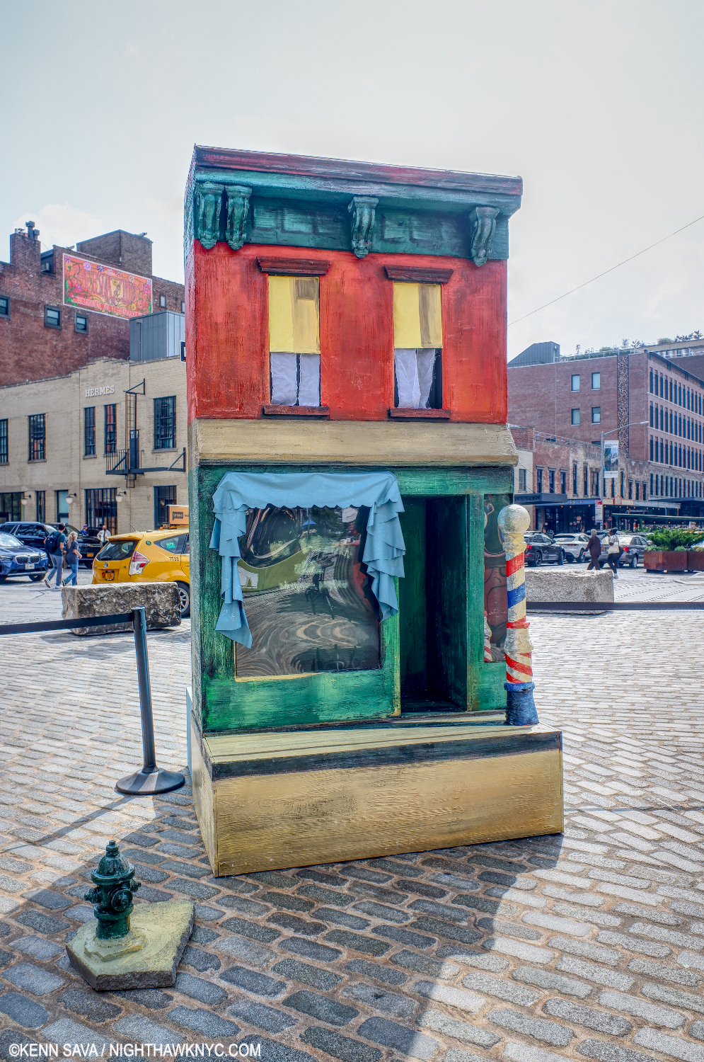
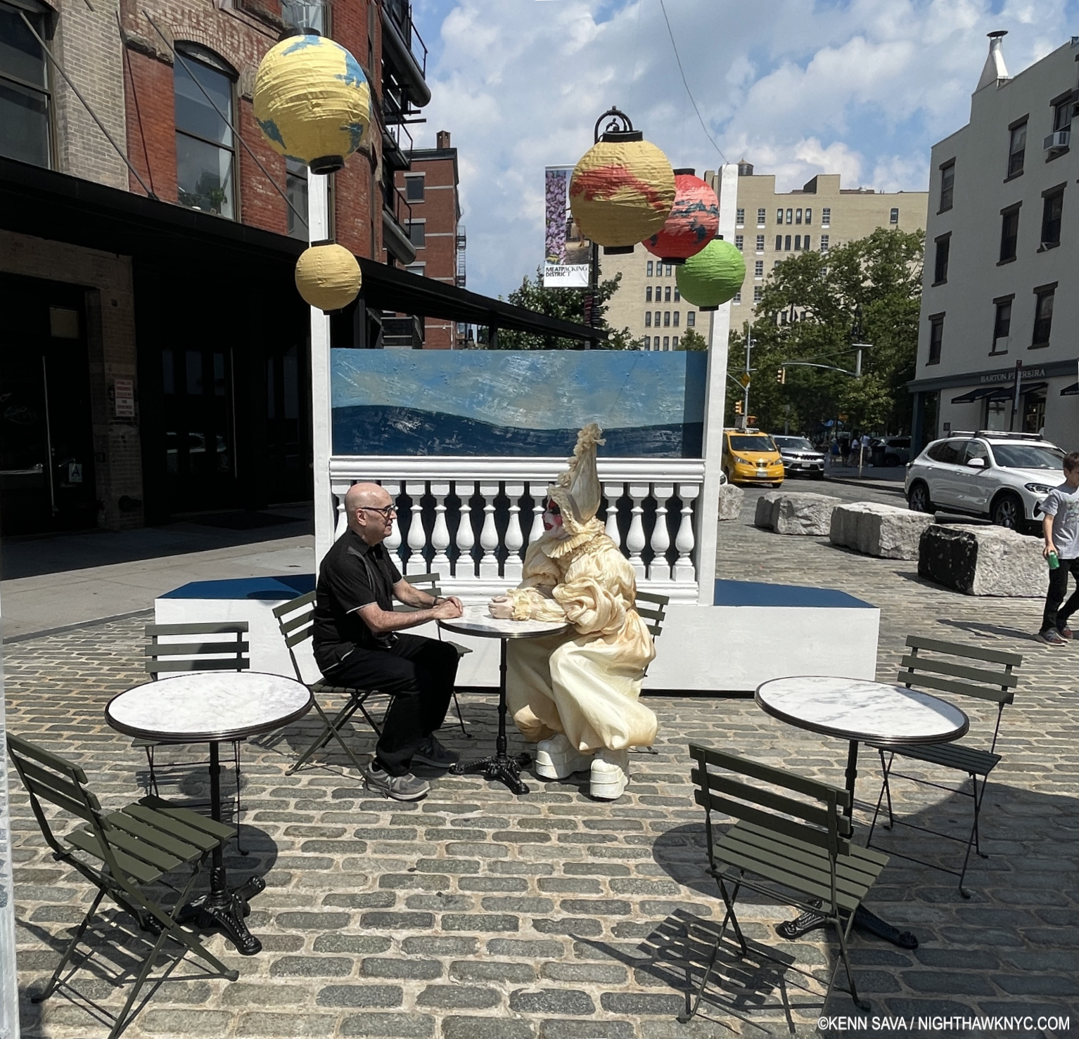
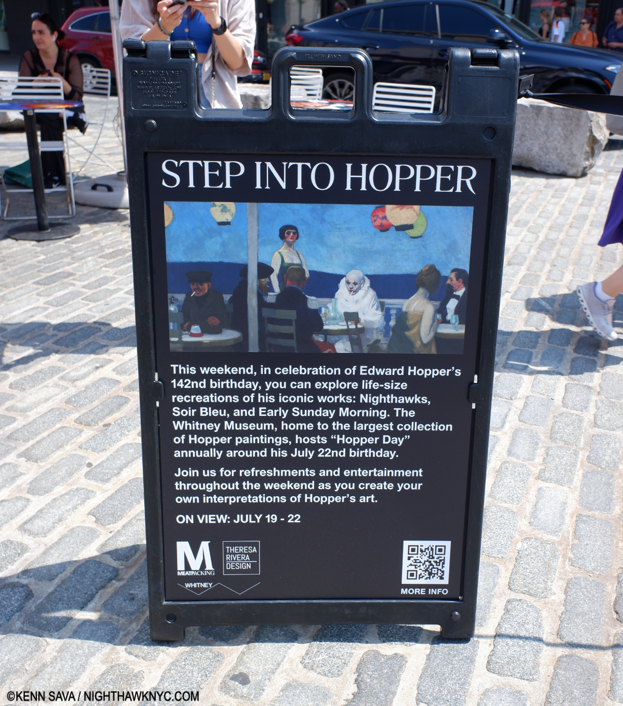
After nine years of “riffing” on Nighthawks in my Banner, it finally came to life! The Whitney Museum & the Meatpacking District got together to mount “Step Into Hopper,” along with fabrication by Theresa Rivera Design and an exceptional, welcoming, staff, to “recreate” Nighthawks, 1942, Early Sunday Morning, 1930, and his eternally mysterious Soir Bleu, 1914within one mile or so of the original sites of two of them2.

“Early Sunday Morning,” a take-off on Hopper’s 1930 timeless masterpiece of a street in my neighborhood, a few blocks away, on Seventh Avenue between West 15th & 16th Streets. Notice the shadow from the barber pole goes the “wrong way,” as it does in the Painting. People who live there know the sun never shines in that direction on 7th & 15/16th!

Convergence 4-

It truly was a moment frozen in time. Something out of a dream… I ended “My Search For Edward Hopper’s Nighthawks Diner”  with a quote from the song I chose as the Soundtrack for the piece, “I Saw You In A Dream” by Japanese House….

“I saw you in a dream
You had stayed the same
You were beckoning me
Said that I had changed”

How prescient.

Before I “changed.” Take away the side addition, and the former Rivera Cafe on 7th Avenue was my “Oh my gosh!” moment, as I wrote in “My Search…” Seen on July 23, 2018- convegently, six years ago this week.

In reading the mail that continues to come in on the piece, it seems that many people share my dream of unexpectedly coming across the Nighthawks Diner and having an “Oh my gosh!” moment of discovery.

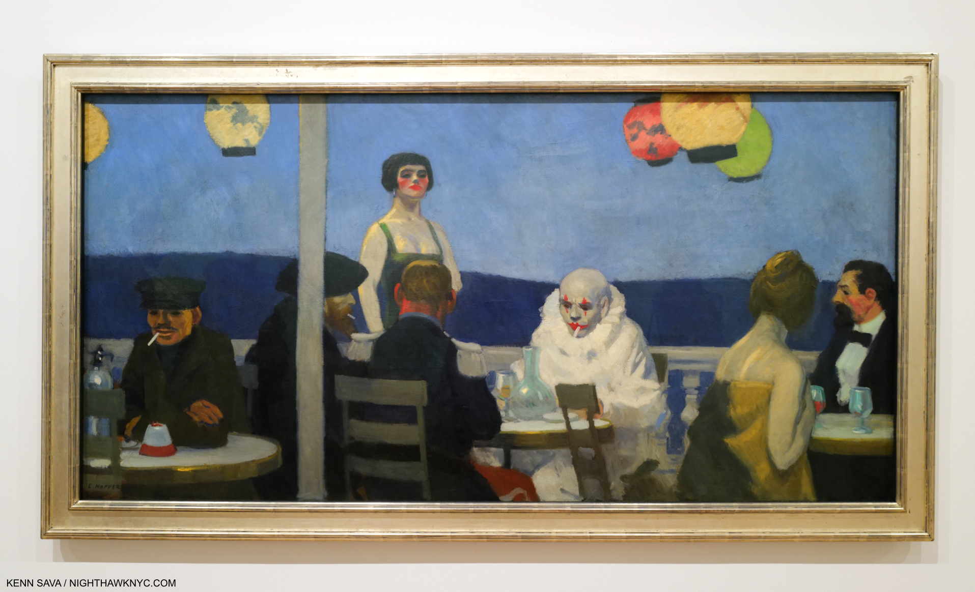
Kenn Sava “inside” “Soir Bleu” (the Painting seen on the sandwich sign above) with the wonderful Tillie the Clown proving every bit as mysterious and stunning as the figure in the 1914 Painting done in Paris. Photo by Gregory for NighthawkNYC.com

A lot of folks seem to want to step inside, sit down at the counter for a bit, and just live in the Painting; experience it from the inside  even for a few moments. As if that might help solve its mystery…On Sunday, I came as close as I’m likely going to to having my “Nighthawks” moment.

A few moments after the Photo of me and Lucas inside “Nighthawks” was taken, I looked around for him and couldn’t find him. Lucas disappeared.

Of course he did.

Convergence 142-

Today, as I write this on July 22nd is Edward Hopper’s 142nd Birthday. Happy Birthday, big guy (Hopper was 6’5″). Thanks for saving me a seat in Art heaven. A short visit is probably the best I can hope for.

*- As it was for “Welcome to the Night” 9 years ago, the Soundtrack for this piece is  “Deacon Blues,” by Steely Dan (my “Forgotten Songs I Will Love Forever #2″, which remains the Anthem of NighthawkNYC.com, from their immortal album Aja, 1977. (I have no idea why the guy who made tihis video shows their album Gaucho. Ignore that- it’s Track 3 on Aja.)

“Sharing the things we know and love
With those of my kind
Libations, sensations
That stagger the mind.”

If the Nighthawks Diner had a jukebox, I like to think “Deacon Blues” would be on it.

Undying thanks to Kevin Callahan for the tip, the iconic Lucas for the coffee & the convo, Tillie the Clown for the Tillie Experience, Milo, Wendy, Alisa and Gregory for the Photos, their consideration and kindness in creating an experience I’ll never forget. A tip of the Fedora to the Meatpacking District, the Whitney Museum & Theresa Rivera Design for mounting Step Into Hopper. Push by Lana Hattan (9 years of NighthawkNYC.com– it’s ALL her fault!)

Be sure to see my 3-part series on the 2022-23 blockbuster Edward Hopper’s New York which begins here.

NighthawkNYC.com has been entirely self-funded & ad-free for 9 years, during which 330 full-length pieces have been published! If you’ve found it worthwhile, PLEASE donate by PayPal below to allow me to continue. Thank you, Kenn.

You can also support it by buying Art, Art & Photography books, and Music from my collection! Art & Books may be found here. Music here and here.

Written & photographed by Kenn Sava for nighthawknyc.com unless otherwise credited. To send comments, thoughts, feedback or propositions click here. Click the white box on the upper right for the archives or to search them. Subscribe to be notified of new Posts below. Your information will be used for no other purpose.

For “short takes,” my ongoing “Visual Diary” series, and outtakes from my pieces, be sure to follow @nighthawk_nyc on Instagram!

  1. Cone to think of it, why are both guys wearing their Fedoras inside? Preparing for quick exits?
  2. The original site of Nighthawks remains up for discussion, as I wrote about, but most likely was inspired by locations in the nearby West Village.

Edward Hopper At The Whitney: Troubling Choices

This site is Free & Ad-Free! If you find this piece worthwhile, please donate via PayPal to support it & independent Art writing. You can also support it by buying Art & books! Details at the end. Thank you.

This is the Postscript to my series on Edward Hopper’s New York at the Whitney Museum, which may be found here-

 Part 1: Edward Hopper’s Impressions of New York

Part 2: Edward Hopper: The Last Traditionalist Faces Change

The Postscript follows-

Written & Photographed by Kenn Sava (*-unless otherwise credited)

Postscript

“Train wheels running through the back of my memory
When I ran on the hilltop following a pack of wild geese
Someday, everything is going to be smooth like a rhapsody
When I paint my masterpiece.”*

After ALL I said in Parts 1 & 2 about Edward Hopper’s Art & Edward Hopper’s New York at the Whitney, all is not sunshine in the world of Edward Hopper’s Art in 2022-3 in spite of the show’s resounding popularity.

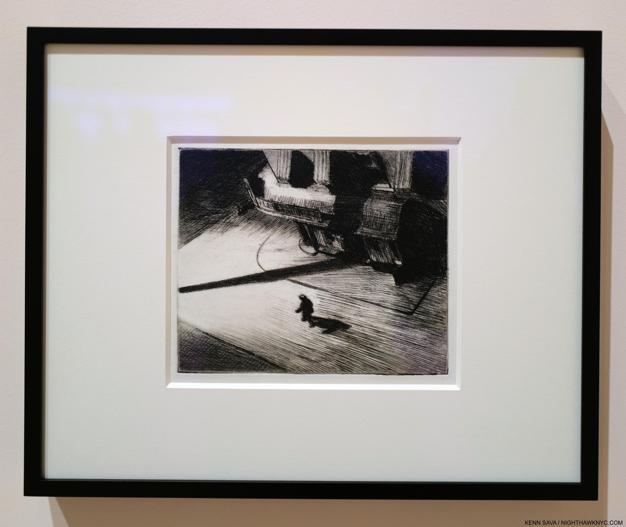
Edward Hopper, Night Shadows, 1921, Etching. One of the first pieces by Hopper to speak to me. Looking at it, I wonder- who is the lonelier? The man walking on the street, or the observer? A similar experience is to be had with Nighthawks. Seen at Edward Hopper’s New York. I chose this piece because it mimics the shadows I see surrounding the Art of Edward Hopper in 2022-23. Click any picture for full size.

While Edward Hopper might not have been a fan of some of the changes he saw going on around him, as I showed in Part 2, those who are admirers of his work may not approve of some of the choices being made involving his Art by the Whitney Museum, the  holders of the largest collection of Edward Hopper’s Art in the world. Their holdings, built up over the prior 40 years, ballooned to extraordinary size when they became the beneficiary of the Jo Hopper Bequest in 1970, which gifted them Edward & his wife Jo’s estates (including both of their Art; Jo was an Artist, too), an unprecedented gift from an American Painter to an American museum. Edward Hopper chose the Whitney as his beneficiary due to Gertrude Vanderbilt Whitney having been an early supporter of his Art. In 1920, Mrs. Whitney’s manager, Juliana Force, gave him his first one-man show at the Whitney Studio Club, the predecessor of the Whitney Museum. After he passed in 1967, Jo Hopper was too ill to change his wishes- which she may well have done had she been in better health1.

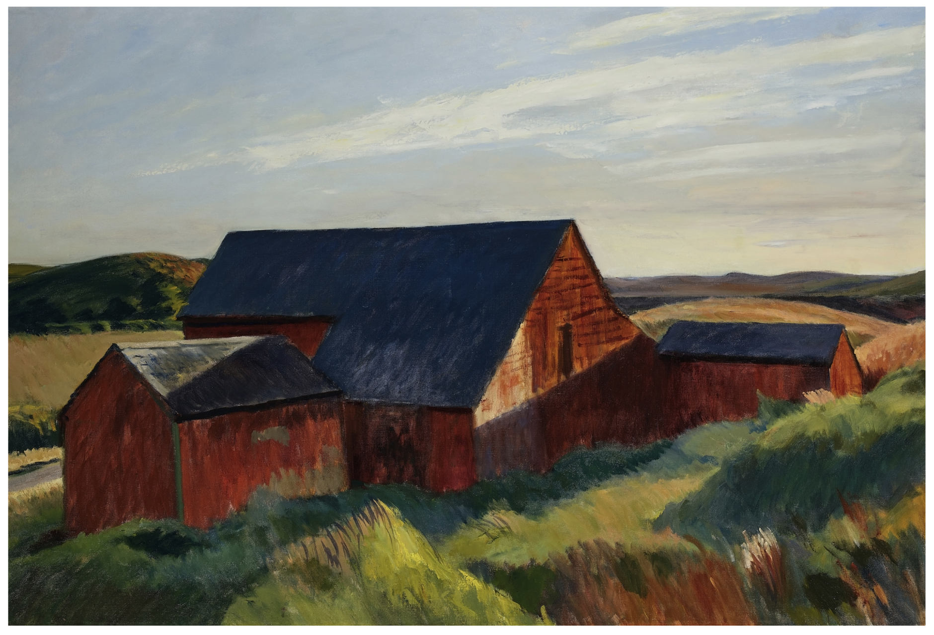
Going…going…SOLD! Cobb’s Barns, South Truro, 1930-3, Oil on canvas. I spent two days in Truro, MA, where the Hoppers spent their summers, back in the 1980s, drinking in the air, the light and the atmosphere Hopper loved for most of his life. *- Whitney Museum Photo. Not in the show.

In May, the Whitney sold (at least) one Edward Hopper Painting, Cobb’s Barns, South Truro, 1930-3 from the 1970 Bequest. I find that quite worrisome (Wait. No. There is no strike-through button in WordPress- make that “I’m sickened by this”) for any number of reasons. For one thing, from what I saw over 14 visits to Edward Hopper’s New York, it looks to me that Hopper’s popularity is, and has been, steadily increasing, world-wide to the point that he is now among the most popular American Artists world-wide, if he is not now the most popular. Is the Whitney “selling at the top” in parting with his work now? Or, is their selling short-sighted?

Of course, no one can foresee the future, and though the Art market has done nothing but go higher since the late 1980s, no bull market lasts forever. As a result, I would have chosen something else to sell while the market is high. With all due respect to the other Artists in their collection, something else not by Hopper. In spite of all that’s already been written about his work these past 100 years, it seems to me it’s still early in the assessment of Edward Hopper’s Art & accomplishment. His work with human subjects has received so much attention that his landscapes, for example, are still to be fully assessed & fully appreciated, I believe, as I said in Part 2. They have begun to receive more attention this past decade, but there is still much to learn from them. Therefore, the Whitney’s decision to sell one of his Landscapes (a man-altered landscape, as I characterized these in Part 2) comes with the risk of being premature. I believe they will be worth more as time goes on. Apparently, so does the buyer.

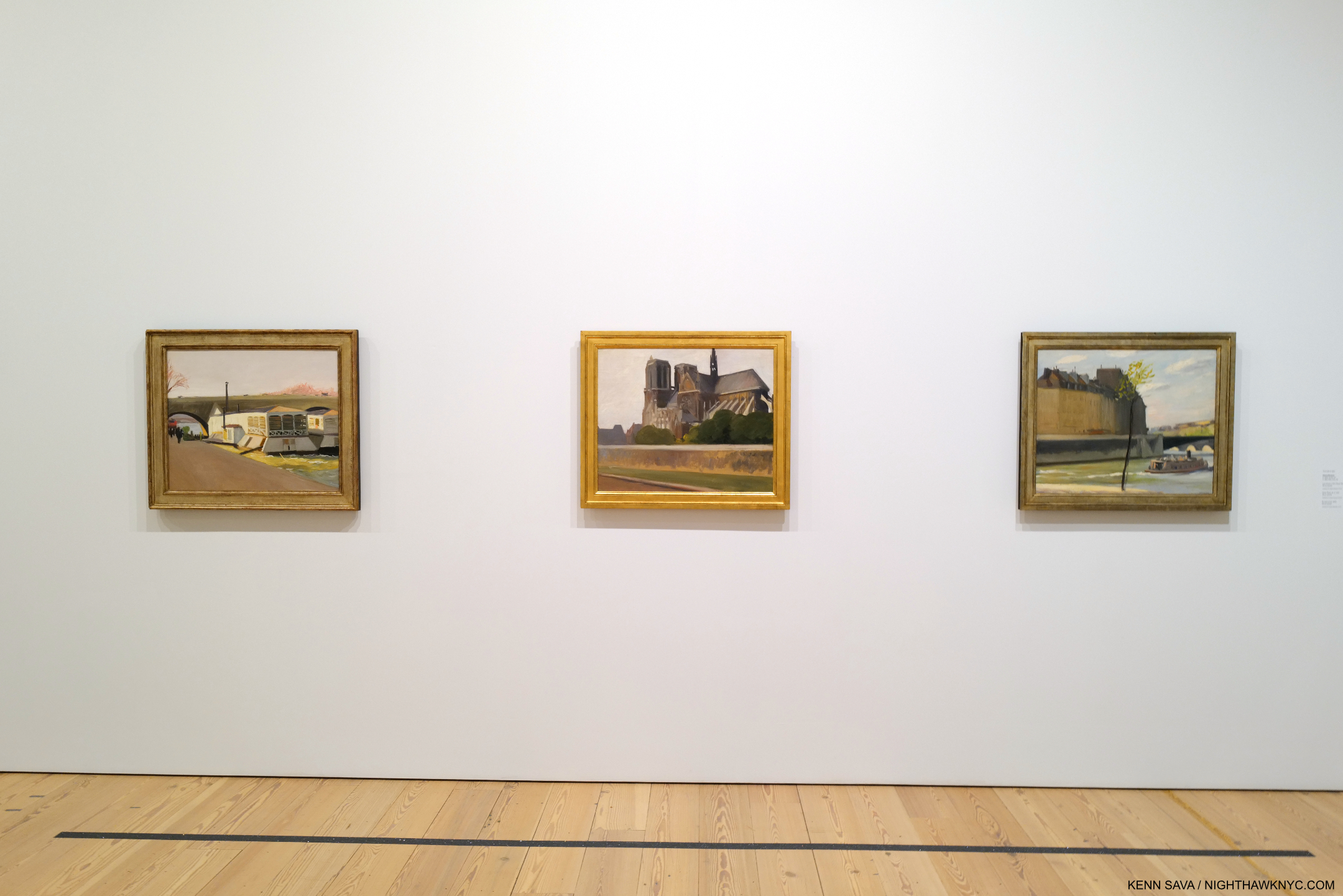
Unbeknownst to most visitors to Edward Hopper’s New York on the 5th Floor, upstairs on 7, the Whitney has been rotating Edward Hopper works in half a gallery. Seen in January, 2023, these three are from his trips to Paris, 1906-10, and so not appropriate for inclusion in the New York show. Like his Landscapes, they have been overlooked to this point.

Besides his Landscapes, his early work (to 1922) also remains under-appreciated and considered it seems to me.

“In every artist’s development the germ of the later work is always found in the earlier. The nucleus around which the artist’s intellect builds his work is himself; the central ego, personality, or whatever it may be called. and this changes little from birth to death. What he was once, he always is, with slight modification. Changing fashions in methods or subject matter alter him little or not at all.” Edward Hopper2

There has not as yet been a full assessment done of them. In light of the powerful work that came later it’s easy to pass these by, but in them I see the germs of much of what was to come. It may be that this early work and his landscapes turn out to not be as popular as his later work. That doesn’t mean they’re not important for other reasons.

Soir Bleu, 1914. A work that has puzzled viewers for almost 110 years also seen on the Whitney’s 7th floor Permanent Collection galleries in January, 2023, while Edward Hopper’s New York was up on the 5th.

One of the most notorious pieces of his early work, Soir Bleu, 1914, is a unique outlier in Edward Hopper’s oeuvre. A work depicting a scene ostensibly in Paris but Painted in NYC after he returned, it doesn’t quite fit with what came before, or after. Exactly what is going on here has mystified many. It’s another example of how far Hopper studies have to go.

Earlier this year I looked at the state of Jean-Michel Basquiat’s Art and concluded that there may not be enough in his family’s collection to open a museum. Jean-Michel sold much of his Art as he created it, so much of it had long been dispersed when he died in 1988. His estate went to his family who retain was was left (which formed the basis for the show Jean-Michel Basquiat: King Pleasure, which I wrote about here). The Whitney, on the other hand, currently shows over 3,000 pieces by Edward Hopper from their collection online. They just might have enough to open something of a substantial, permanent, rotating, Edward Hopper exhibition, if not an outright museum! (They have been running a small rotating selection of his work in part of a gallery on the 7th floor where they display work from the Permanent Collection for a while, part of which, seen in January, 2023, I show above.)

Can you imagine what a big deal an Edward Hopper Museum in NYC would be? No other Artist has one here…yet. I can only begin to imagine how much it would enhance the value of their collection. Should they? Obviously, the finances would need to be considered, and I have no idea how that would shake out. It’s just one possible avenue the Whitney can explore. Have they? No one knows.

The selling of Hopper’s Art at this point makes me wonder what the long-term plan is for their Hopper holdings. It’s a question I think more people should be asking. My opinion is that at this point (June, 2023), I would not only hold on to everything they have, I would be adding to it.

The Whitney’s history of managing the extraordinary 1970 Jo Hopper Bequest has already proved littered with questionable decisions, this sale being only the latest. They sold some of it early on until the public outcry caused them to stop. I can’t help but wonder how The Met would have handled the Hopper gift. They have received extraordinary gifts from the estates of Diane Arbus and Walker Evans (among others), both of which they have handled masterfully, in my view.

Unfortunately, there’s more…

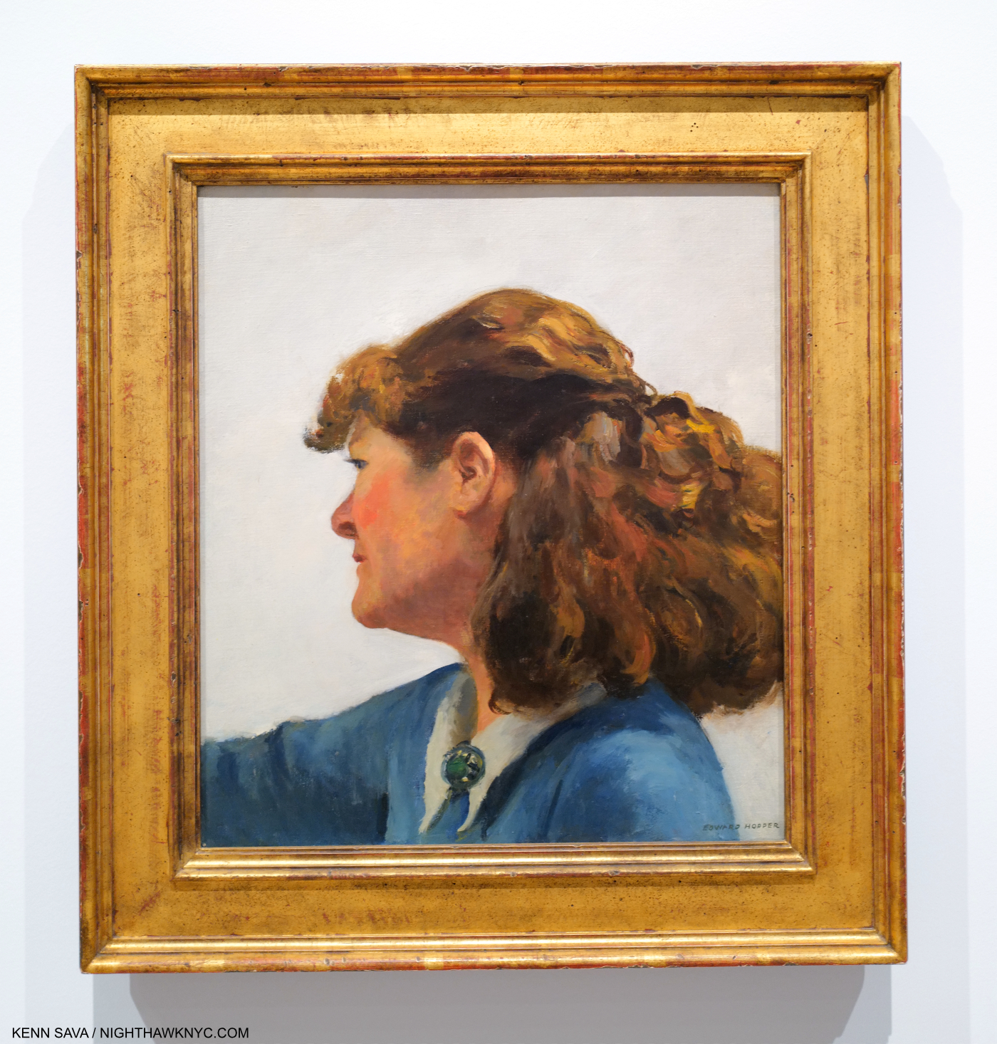
Jo Painting, 1936, Oil on canvas. Jo Hopper doing what she loved doing most. Though he met her when they were both Art students of Robert Henri, Edward was not a fan, or supporter, of her Art. Seen in Edward Hopper’s New York.

You may have noticed that I said the Whitney  are “the  holders of the largest collection of Edward Hopper’s Art in the world,” though I mentioned the Jo Hopper Bequest gifted his and Jo’s Art to the museum. The reason I didn’t mention hers is that they no longer have it. The Whitney allegedly disposed of most of Jo Hopper’s work that was included in her 1970 gift with her husband’s work, as hard as that is to imagine.

Regarding the woman, herself. Gail Levin, the Whitney’s first Edward Hopper curator and author of the definitive Hopper biography, Edward Hopper: An Intimate Biography, based on decades of research into Edward, Jo, and their relationship, writes at length about his wife of 43 years, Josephine Nivison (“Jo”) Hopper. Based on her feelings as expressed in the unpublished Diaries she kept for about 30 years, and interviews, the resulting picture is not a pretty one for those who look at Edward with admiration. At her husband’s death, everything passed to Jo, who was ill, and then blind, the final year of her life. She was in no condition to change her husband’s intentions and gift their estates to another institution. After the Bequest went to the Whitney, they then hired Gail Levin to curate it. She recounts what she discovered when she looked for Jo’s Art-

“In going through the Hopper collection, I expected to see Jo’s art as well as Edward’s. I had read James Mellow’s article in the Times, describing canvases by Jo in the bequest as “generally pleasant, lightweight works: flowers, sweet-faced children, gaily colored scenic views.” But I found nothing. Dealing with the bequest, (Whitney Director John) Baur naturally looked for advice to (Lloyd) Goodrich, his immediate predecessor as director and Hopper’s recognized interpreter and friend. Together Baur and Goodrich rejected Jo’s work as unworthy of the museum. They arranged for some of her paintings to be given away; they simply discarded the rest. They saw no need to invest even in archival photographs. Ironically, the only paintings from this group that can now be traced are four that went to New York University, which had troubled the Hoppers for years with efforts to evict them from their home.

In all, only three works by Jo were added to the Whitney’s permanent collection. None was ever exhibited. All three had disappeared by the time I began work in 1976. None has ever turned up 3.”

Ms. Levin also states that “From what remains of Jo’s paintings, it is clear that she was not the major talent that her husband was4,” Still, her importance, as a witness, a model, a partner & wife, and for what she went through during their 43-year marriage is only going to grow as time goes on, I believe, especially if her Diaries are ever published. The importance of her work will also rise, as a result- above and beyond whatever judgement is placed on its quality. The result is that history has been forever denied everything her work would tell us. Another reason to be angry at the way the Bequest has been handled.

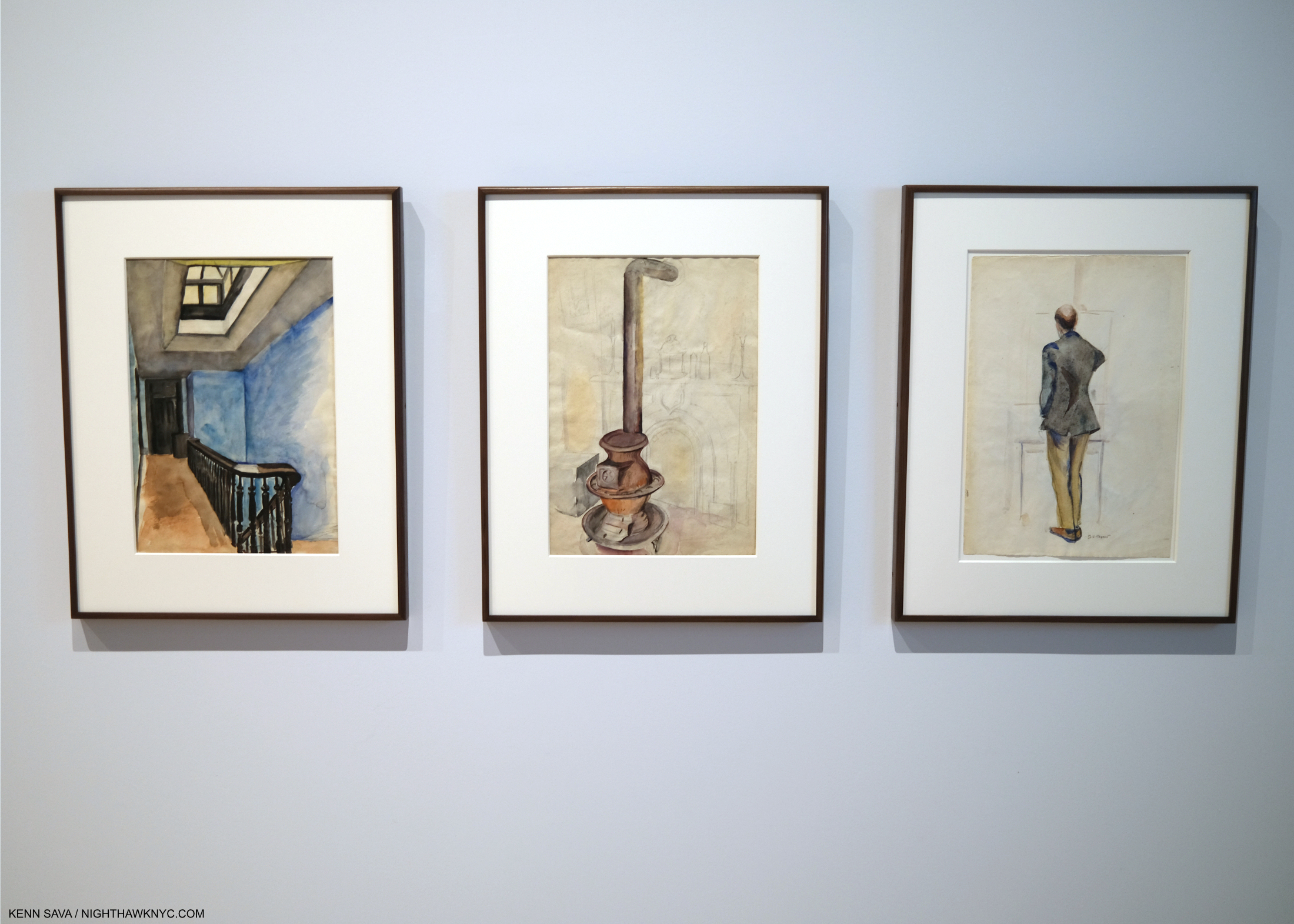
3 works by Jo Hopper seen in Edward Hopper’s New York. Left to right- 74 Stairs to Studio at Three Washington Square, 1932, Stove and Fireplace, Three Washington Square, 1932, Back of E. Hopper, 1930, Each Watercolor and graphite on paper.

Edward Hopper’s New York honored his wife and the Jo Hopper Bequest, which made up the vast majority of the work on view, by including 3 of her Watercolors. 2 were on loan.

Unfortunately, there’s still more…

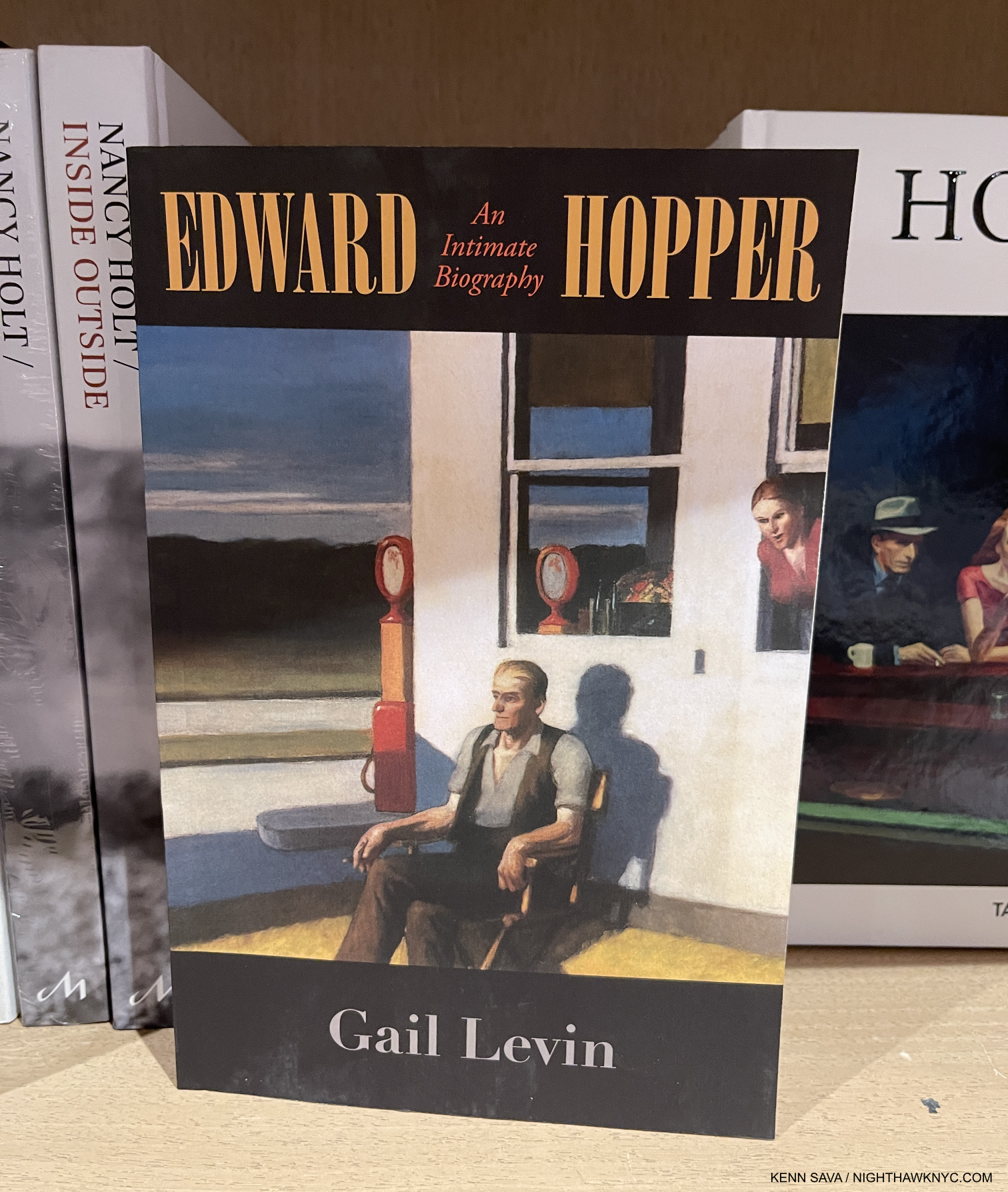
Essential for researchers and anyone interested in Hopper’s Art, or the man and his wife, Edward Hopper: An Intimate Biography, by Gail Levin, out of print for a while has just been reprinted again. At 700+ pages, it’ll fill all your summer reading needs.

As if selling Edward Hopper’s work and discarding Jo’s is not enough to diminish the Whitney’s Hopper holdings, they may have been further diminished by theft of Hopper’s Art from his estate! Gail Levin has called out the man behind a donation recently made to the Whitney, part of which was included in Edward Hopper’s New York (none of which I showed- purposely), with a mysterious (to put it politely) provenance. According to her, this man (who I will not name here) may have stolen quite a bit of Art & ephemera from the Hopper estate while he had access to their properties when he was serving as a caretaker- all of which should have gone to the Whitney under the terms of Jo Hopper’s will, as Edward’s survivor. This person kept what he took, sold some of it, and has donated some to the Whitney. About 1,000 pieces may still be in the hands of his heirs. If ALL of it had gone to the Whitney, as the Hoppers intended, the world would be that much closer to gaining a full appreciation of the Hopper’s Art & accomplishment. And, the Whitney would be that much closer to a Hopper Museum.

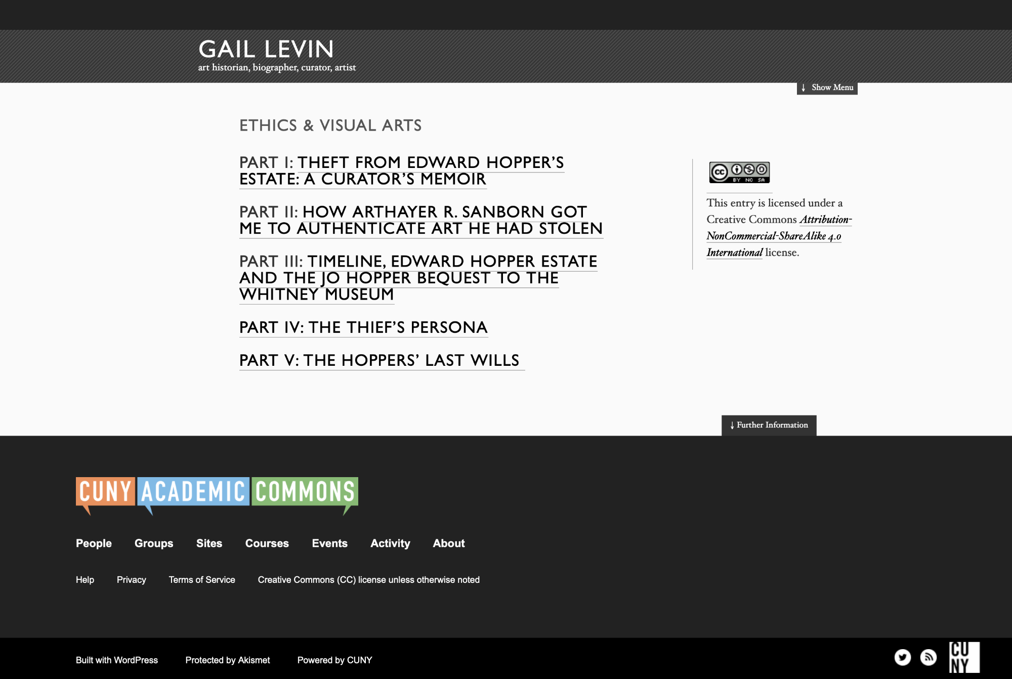
Screenshot of the homepage of Gail Levin’s “Ethics & Visual Arts” site. I so admire her courage & dedication.

Ms. Levin brought the subject of this alleged theft to public light in 2012 around the time of the Whitney’s Hopper Drawing show. Earlier, after she discovered it, she brought it to the attention of the Whitney, who subsequently fired her as a result, she says. Wait. Weren’t they outraged when they heard about this? What did they do about it, besides fire Gail Levin? The controversy was rekindled when Edward Hopper’s New York opened in October including some of these questionable pieces. She has revealed the full story in a series she calls “Ethics and the Visual Arts.”  I feel it’s important that anyone who cares about Hopper’s Art read what she has to say about what happened, here. (She also did a video interview earlier this year about all of this which may be seen here.)

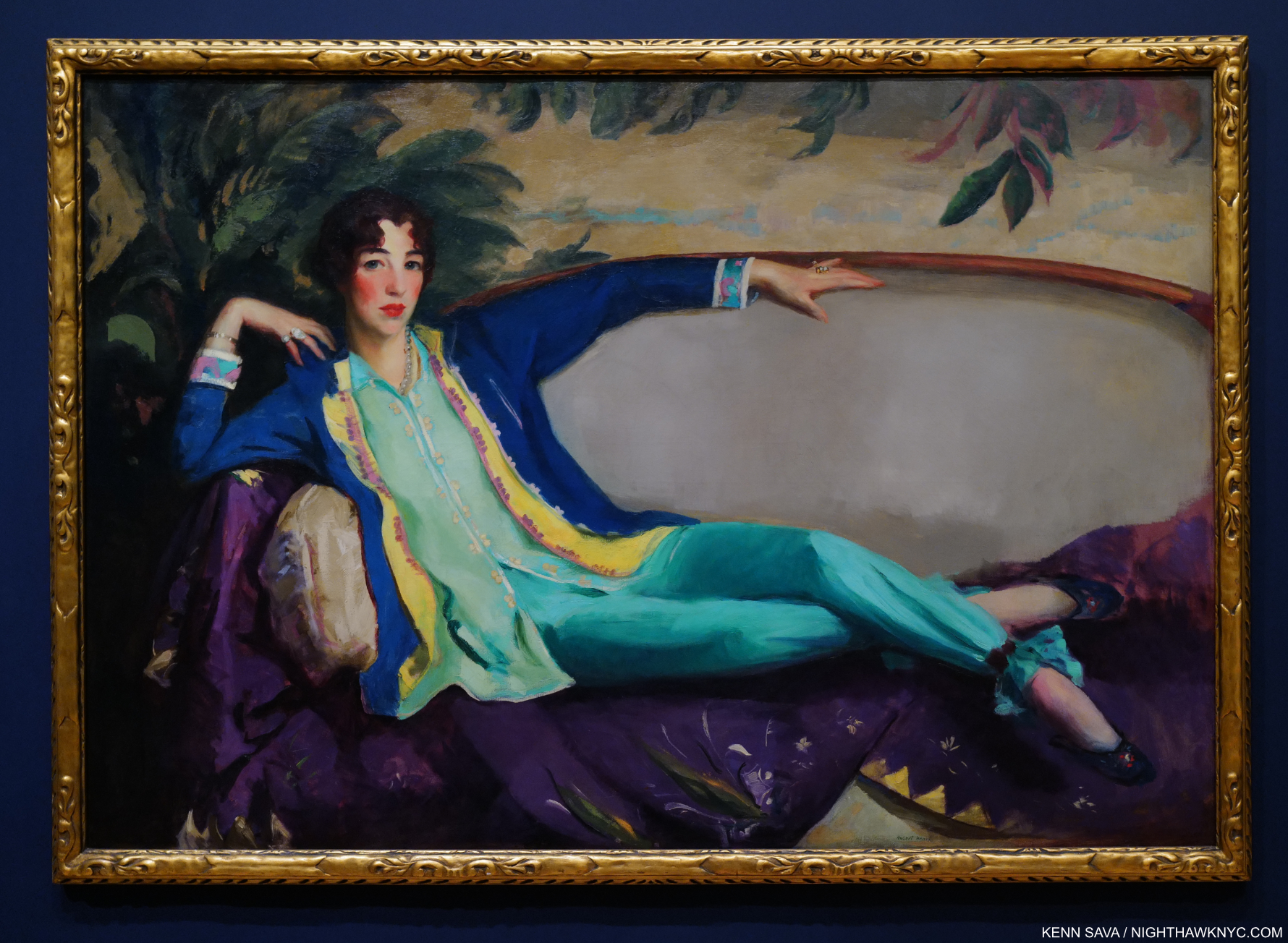
Robert Henri, Gertrude Vanderbilt Whitney, 1916. I wonder what Gertrude Vanderbilt Whitney, whose collection of American Art became the basis of the  Whitney Museum, would make of how the Jo Hopper Bequest has been handled. Mrs. Whitney was also an under-appreciated Sculptor. Seen on the 7th Floor while Edward Hopper’s New York hung on the 5th, January, 2023. Robert Henri taught both Edward & Jo Hopper a decade earlier, and Painted a Portrait of Jo.

It’s hard not to feel outraged and violated by all of this. So, I do!

It’s my hope a thorough investigation will take place into all of this- including the Whitney’s mysterious involvement in it, according to Ms. Levin, and if it is determined the pieces were gained illicitly by this man steps are taken to rectify it as soon as possible. As extremely concerning as this all is on Hopper’s Art, it seems to me it also serves as a warning to living Artists to learn from this and safeguard their own estates and intentions.

This extremely troubling episode Gail Levin has brought to the public’s attention cast a shadow on what was otherwise an excellent and important show. I hope it will be the last Hopper show it hangs over.

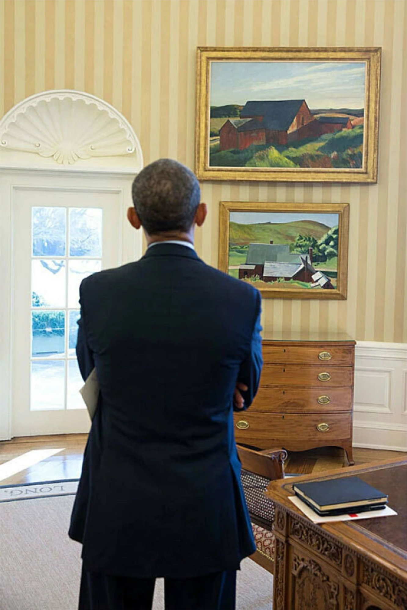
Cobb’s Barns, South Truro hanging in the Oval Office of the White House where President Obama is admiring it. February 7, 2014. *-Photo by Chuck Kennedy.

Between the Jo Hopper Bequest and the Hopper they have in their Permanent Collection, what amounts to the Edward Hopper Archives at the Whitney is very likely their most important holding at this point. They have a huge responsibility to the public, now and in the future, to protect and preserve it. It’s past time Art lovers speak up about what’s been going on with it and get some concrete answers.

“Everyone was there to greet me when I stepped inside
Newspapermen eating candy
Had to be held down by big police
Someday, everything is going to be different
When I paint my masterpiece”*

*- Soundtrack for this Post is “When I paint my masterpiece,” by Bob Dylan from Bob Dylan’s Greatest Hits Vol. II, 1971-

NighthawkNYC.com has been entirely self-funded & ad-free for over 8 years, during which 300 full length pieces have been published! If you’ve found it worthwhile, PLEASE donate to allow me to continue below. Thank you, Kenn.

You can also support it by buying Art, Art & Photography books, and Music from my collection! Art & Books may be found here. Music here and here.

Written & photographed by Kenn Sava for nighthawknyc.com unless otherwise credited. To send comments, thoughts, feedback or propositions click here. Click the white box on the upper right for the archives or to search them. Subscribe to be notified of new Posts below. Your information will be used for no other purpose.

  1. Source for all of this information is Gail Levin, Edward Hopper: An Intimate Biography, Expanded Edition, 2007, Introduction & P.128
  2. from a letter from Hopper dated 1935 quoted in Gail Levin, Edward Hopper As Illustrator, P.1.
  3. Gail Levin, Edward Hopper: An Intimate Biography, Expanded Edition, P. xvi
  4. Gail Levin, Edward Hopper: An Intimate Biography, Expanded Edition, P.723

Edward Hopper: The Last Traditionalist Faces Change

This site is Free & Ad-Free! If you find this piece worthwhile, please donate via PayPal to support it & independent Art writing. You can also support it by buying Art & books! Details at the end. Thank you.

Written & Photographed by Kenn Sava (*-unless otherwise credited)

Show seen: Edward Hopper’s New York @ The Whitney Museum, Part 2. (Part 1 is here.)

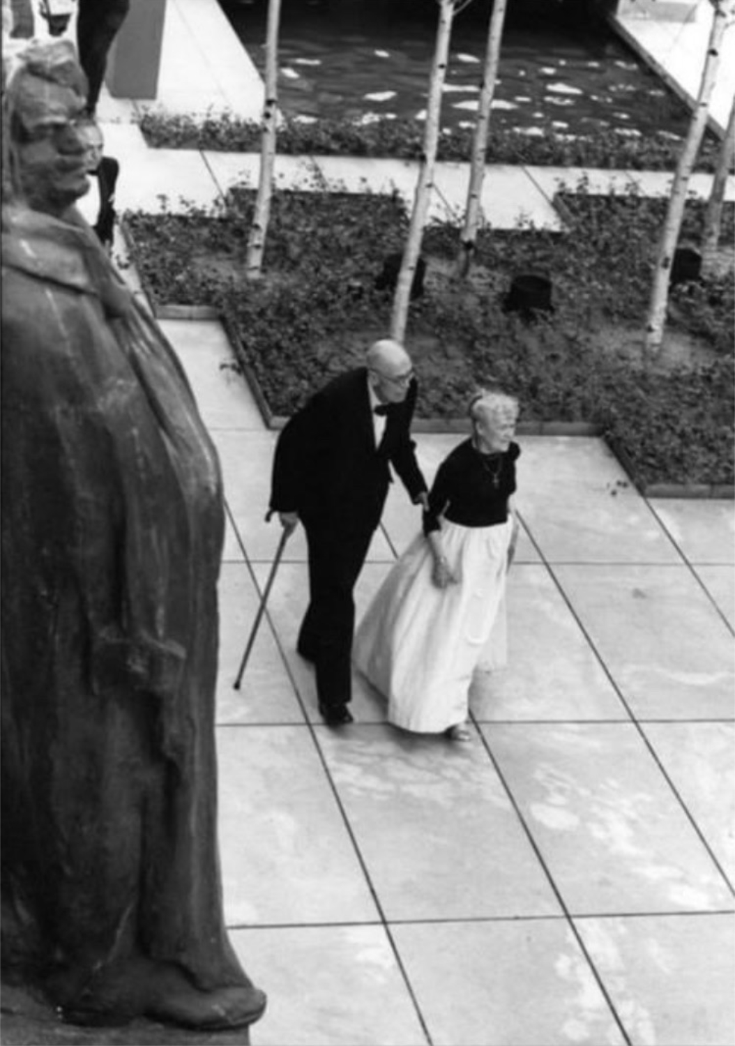
Edward Hopper in his New York. With his wife, Jo, strolling the Museum of Modern Art’s Sculpture Garden in 1964. In this Photo, by Eve Arnold, Edward is glimpsed unawares like a good number of his subjects were. *-Photo by Eve Arnold, Magnum Photos. Thanks to Lana for finding it. Click any picture for full size.

Change is the only constant in the universe. For those, like me, for who New York City IS the universe, every day brings change. During Edward Hopper’s time here (1900-67), the City of continual change metamorphosized more than it ever had.

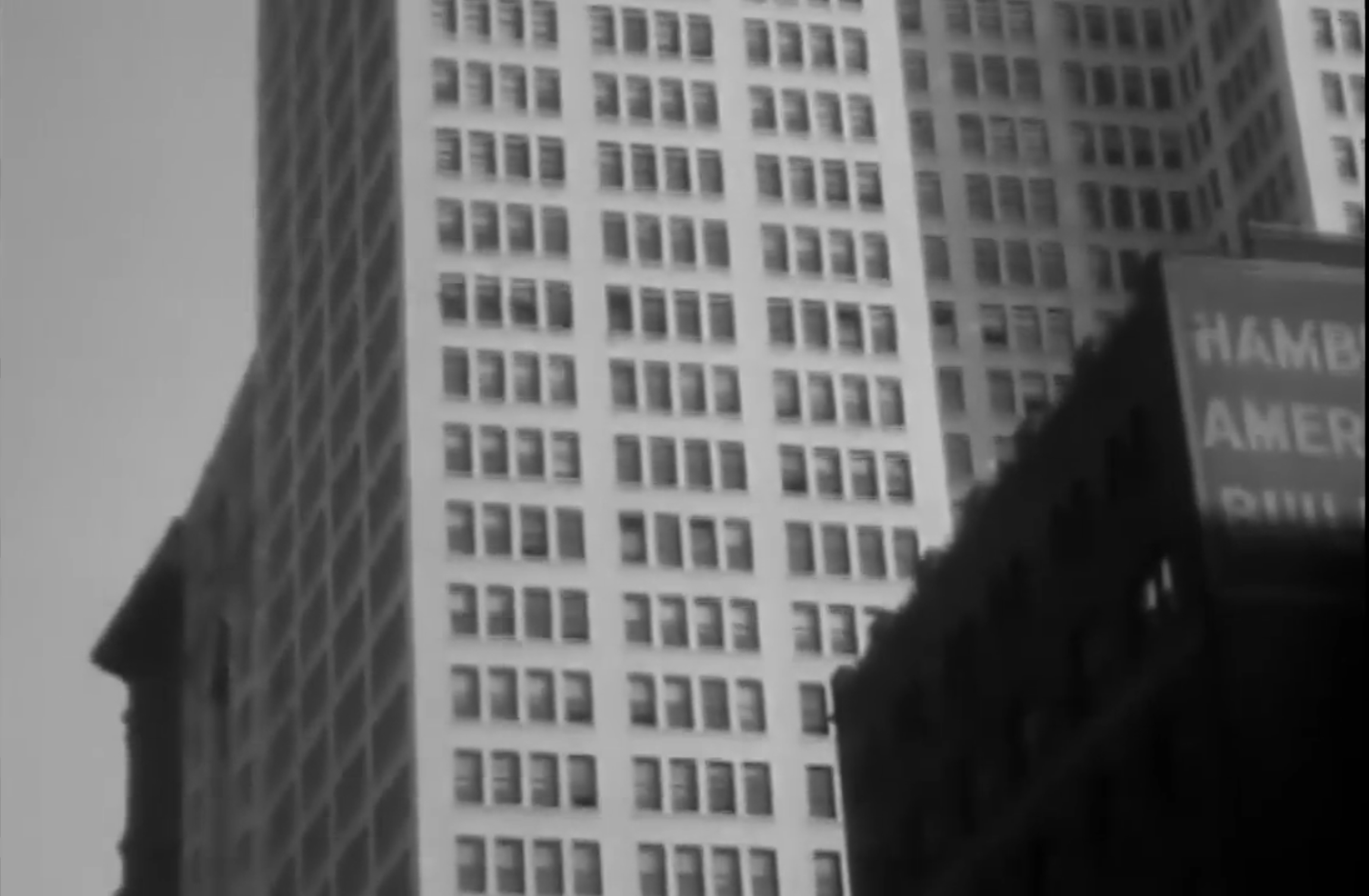
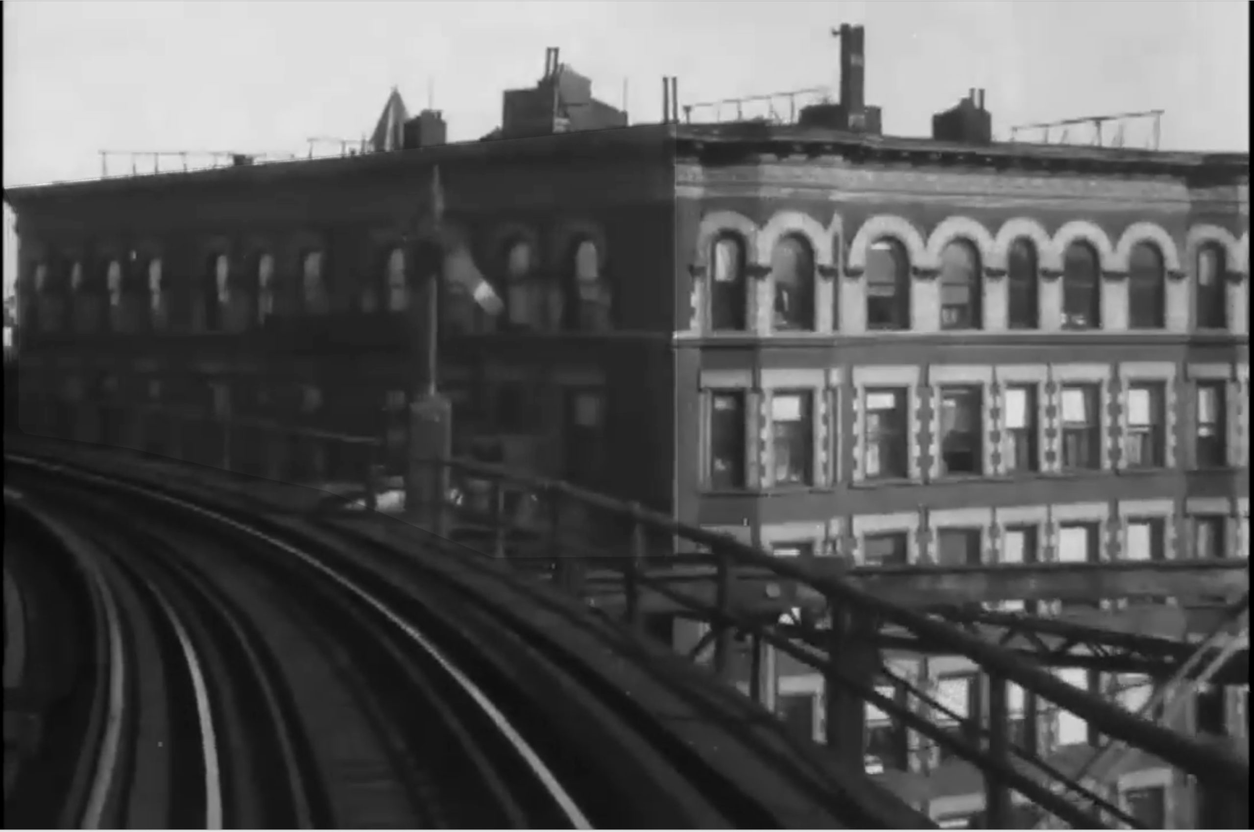
Screencap from the short Film, A Ride on the 6th Ave El, 1916. Edward Hopper frequently rode NYC’s elevated trains, and he was located closest to the 6th Avenue el, which he no doubt rode before, during and after 1916. He glimpsed more than one scene he turned into a Painting while riding one. *-Ford Motor Company video.

The advent of the tall building & skyscrapers (facilitated by the development of elevators with safety brakes), first in Chicago and then here, along with the ongoing spate of bridge building (Brooklyn Bridge, then Manhattan Bridge and others), the advent of the elevated train, the subway, electric lights, movies, and the rest, ushered in with them what we know as modern urban life. All of these inventions & developments brought side effects. Edward Hopper’s New York reveals that the Artist may not have been a fan of some of these changes.

Edward Hopper’s Art: What I See

As I said in Part 1, having the chance to see 58 Hopper Paintings from early through late in his career 14 times, Edward Hopper’s New York completely changed how I see his work. This is shocking to me because I’ve been looking at his work almost as long as I have anyone else’s- well over 40 years. To this point, I saw his work as one of the ultimate (and perhaps unsurpassed) expressions of modern loneliness and isolation in the Art of the 20thy century. But, this is a theme that requires human subjects (like the vast majority of his NYC work has, though he Painted these scenes with people elsewhere as well). What about the rest of his oeuvre; all the other scenes he Painted that don’t include people? These include landscapes he Painted in Maine, Cape Cod, and elsewhere in the U.S., and Paintings he made on, or inspired by, trips to Europe and Mexico. Some of the non-peopled landscapes include houses, buildings, bridges or other man-made structures. Some of them are pure landscapes. (An overview of the range of his work can be seen in any comprehensive book on Hopper. I particularly recommend seeking out Edward Hopper: The Art & The Artist, by Gail Levin, the catalog of the last U.S. Hopper Retrospective, at the Whitney in 1981.)

As a result of considering the whole, I’ve come to believe there are two primary threads, intentional, or not. that run through almost all of Edward Hopper’s work.

First, the “man-altered landscape,” i.e. what man has done with and to nature.

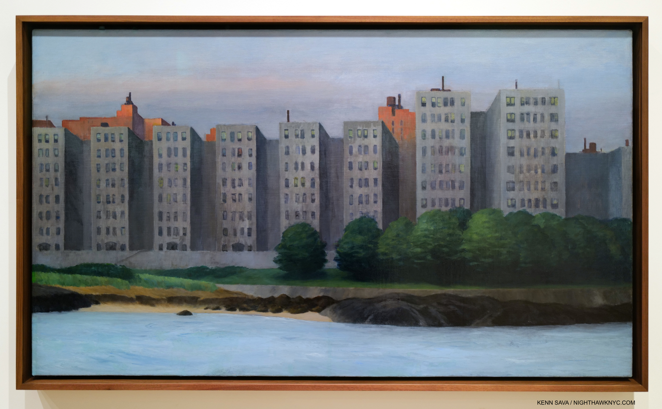
The man-altered landscape. Apartment Houses, East River, 1930. It seems fairly obvious what Edward Hopper thought of this waterfront development. All works are Oil on canvas, unless specified.

In Photography circles, this is what is called “New Topographics” in honor of the legendary Photo show of the same name at the Eastman House, Rochester, in 1975-6, eight years after Edward Hopper’s passing. The subtitle of the show was “Photographs of a Man-Altered Landscape.” What man has done to and with nature, as in Apartment Houses, East River, is a theme I now see in more of Edward Hopper’s work than I see any other theme.

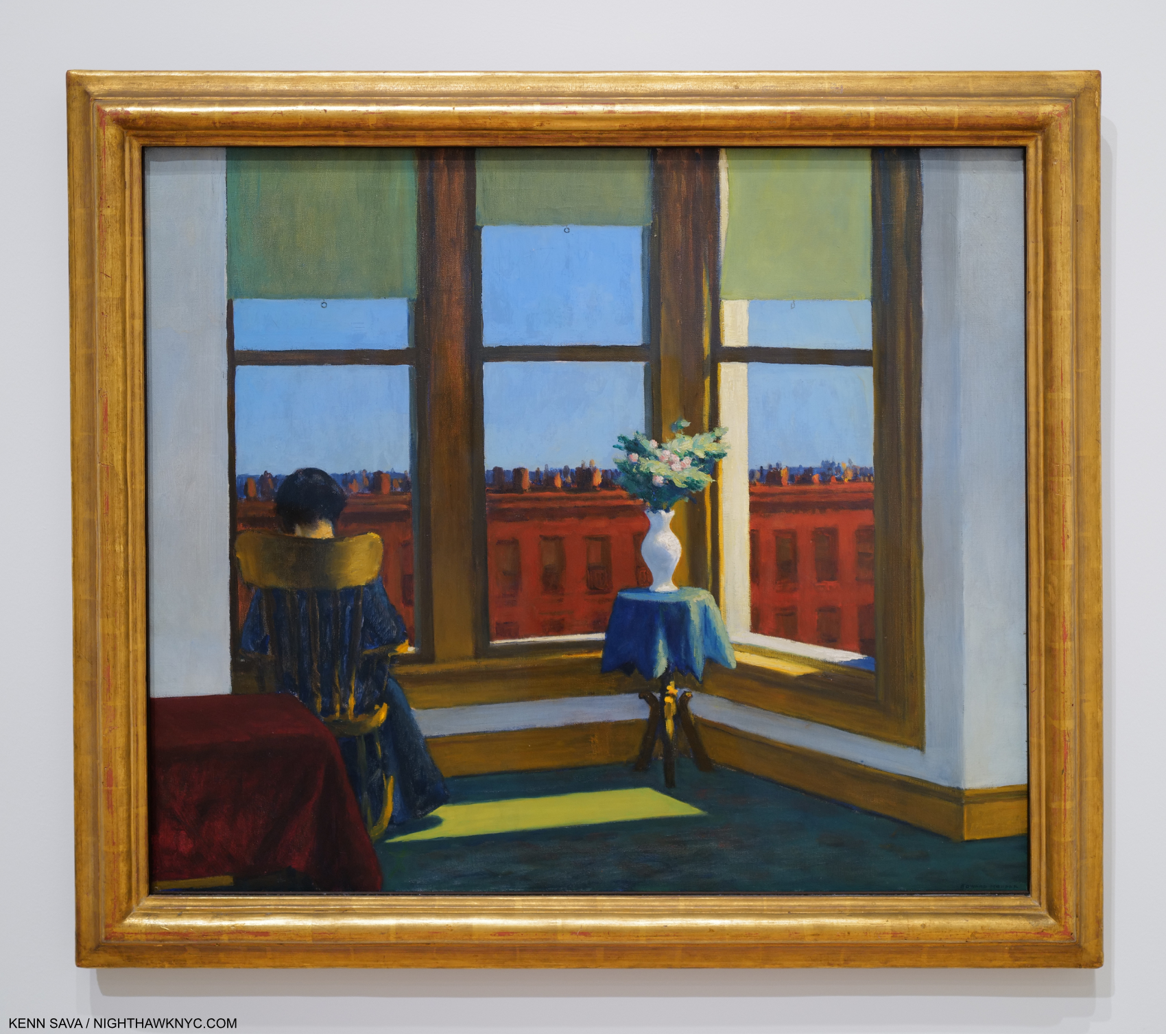
Room in Brooklyn, 1932

Yes, I even see the “what man has done with and to nature” theme in works like the sedately charming Room in Brooklyn, where “nature” is reduced to flowers in a vase. It’s interesting that Hopper’s flowers are higher than the background buildings.

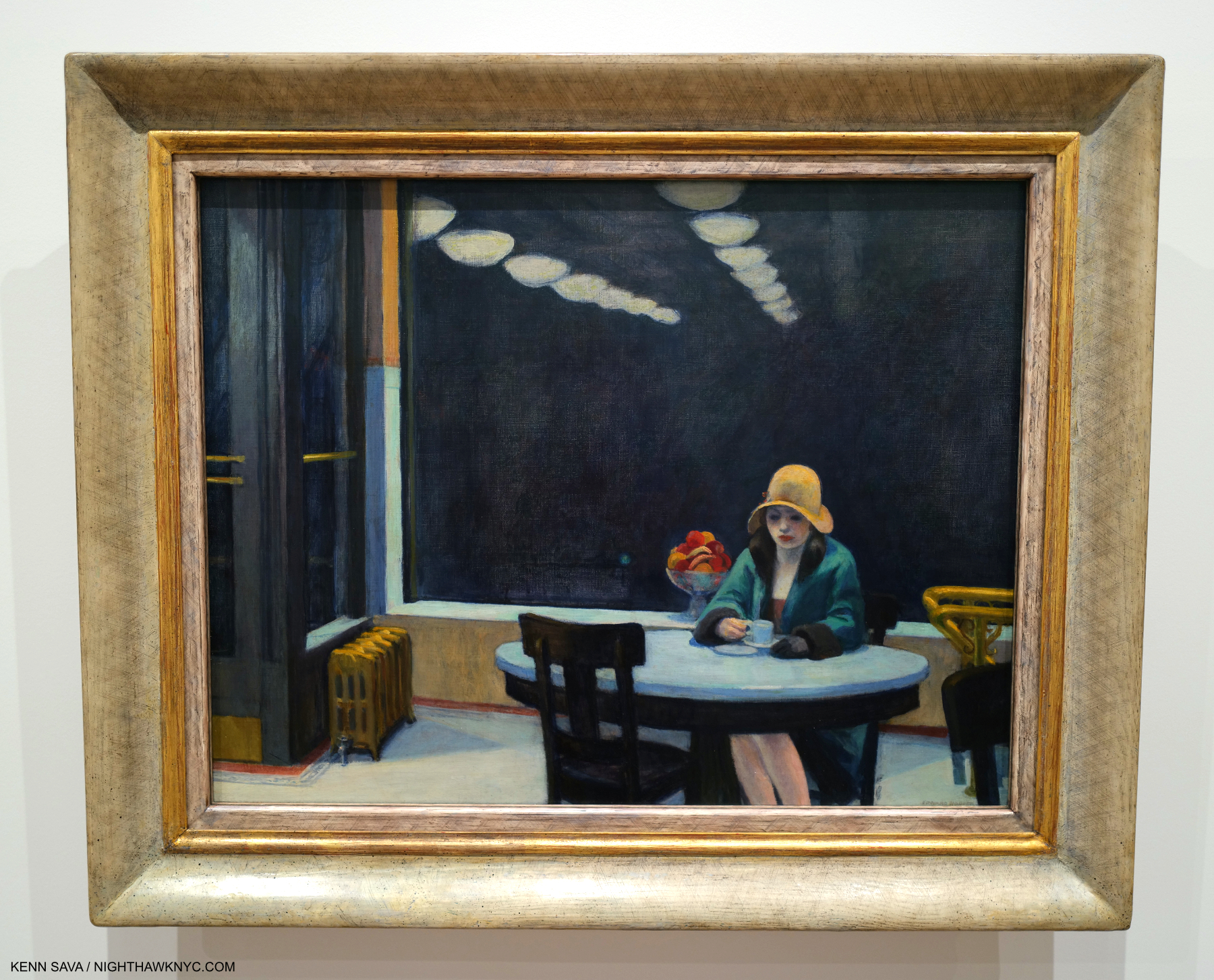
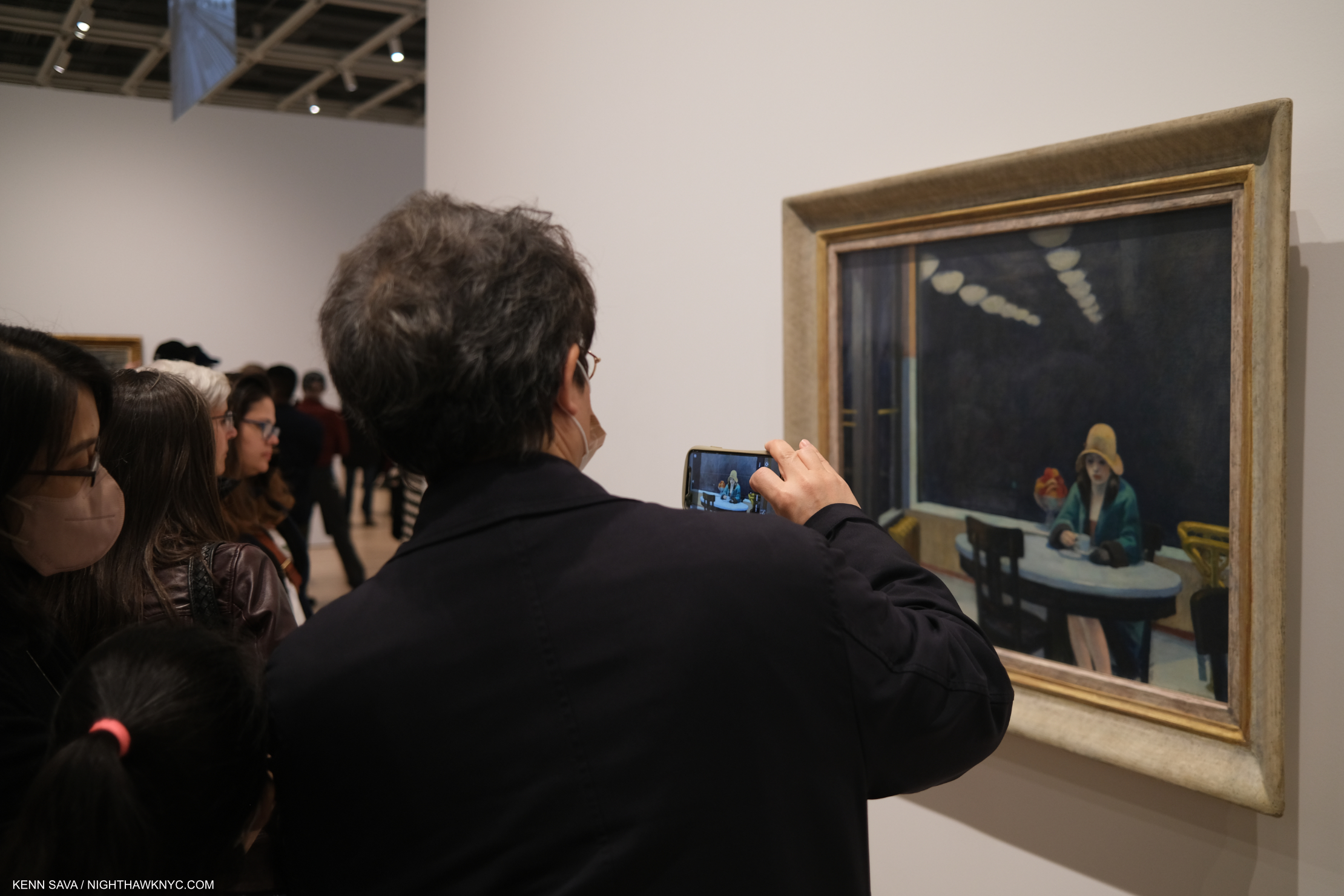
Automat, 1927. Edward Hopper spent a lot of time in Horn & Hardart’s extremely popular Automat Restaurants in the 1920’s, so much that Jo worried he was drinking too much 5-cent coffee. It was worth it because he produced this, another of his show stoppers. Jo chided him for not being able to Paint beautiful women, but Automat certainly puts the lie to that. Its stripped-down composition is a masterpiece of including only the essential. I still wonder about that fruit bowl in the back, though. Is this an instance of “what man has done with nature,” along the lines of Room in Brooklyn?  The reflected receding lights are a master stroke.

A byproduct of what man has done with nature in cities, in Hopper’s time and everywhere since, which some call “progress,” is the effect of what man has built on those who live and work in these places. So, I now include all of Edward Hopper’s work that includes human subjects under this man-altered landscape theme, including his New York work (though not all of them include people- like Apartment Houses, East River, shown earlier).

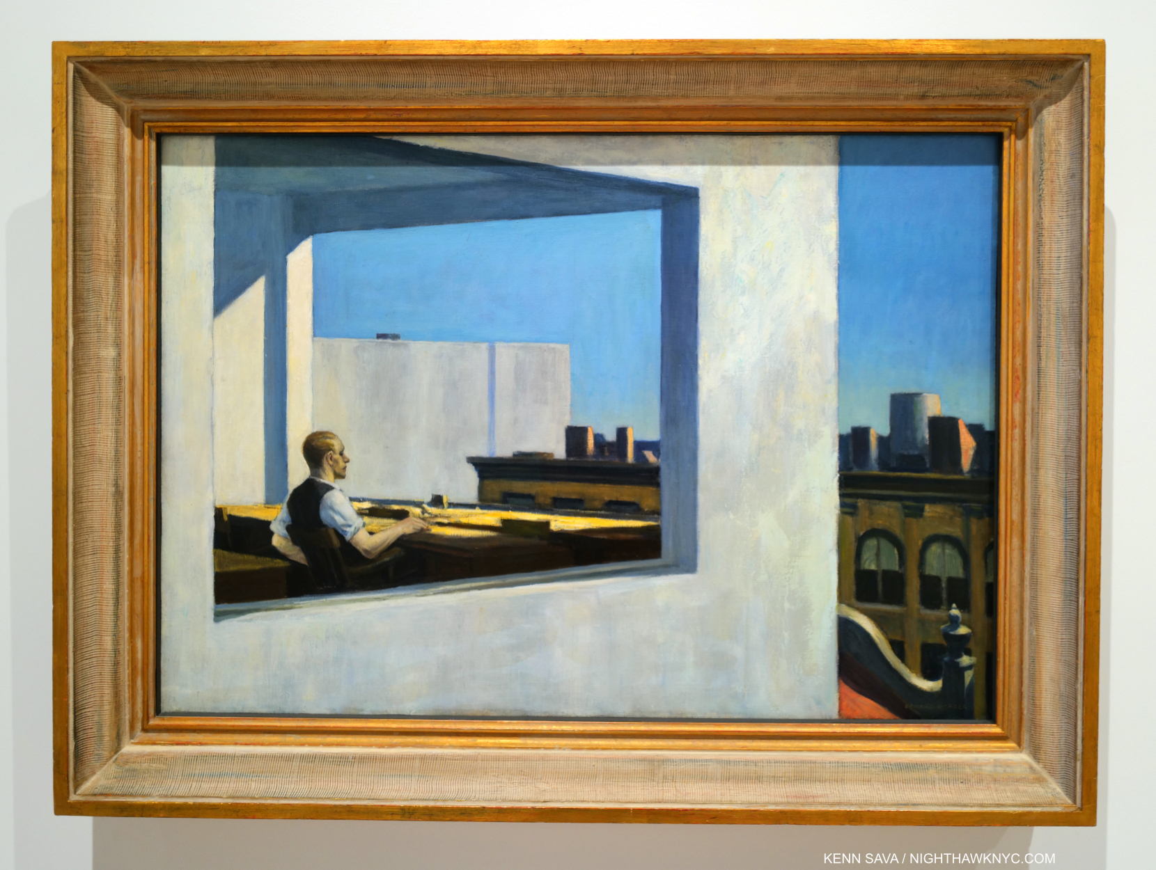
Office in a Small City, 1953. Life in the cube. An example of what I call the “Hopper fish bowl.”

Many may see Edward Hopper as the “king” of depicting the isolation and loneliness that was endemic in 20th century modern life, and feels increasingly so in the 21st century, but after seeing it as his primary theme for so long, myself, I now believe he is depicting side-effects of this new modern urban life in the man-altered landscape to “turn up the volume” on his feelings about these changes. Therefore, when he depicts it, in my view, he’s also “commenting” on what man has wrought on his fellow man through altering the world so. All of this also makes me wonder about the melancholy that permeates his Art. Is it indicative of “the inner state of the Artist” (as I quoted Hopper saying in Part 1), or is it solely being used to depict the state of his subjects in the man-altered environment? Gail Levin’s Edward Hopper: An Intimate Biography certainly provides fodder for the former-

“Raphael Soyer, for whom Hopper posed for a portrait…observed: ‘There is a loneliness about him, a habitual moroseness, a sadness to the point of anger1.'”

That makes me wonder if the effects of this new, modern world ON HIM is a good deal of what we’re seeing in his work/or, that he’s recognizing in people he sees.

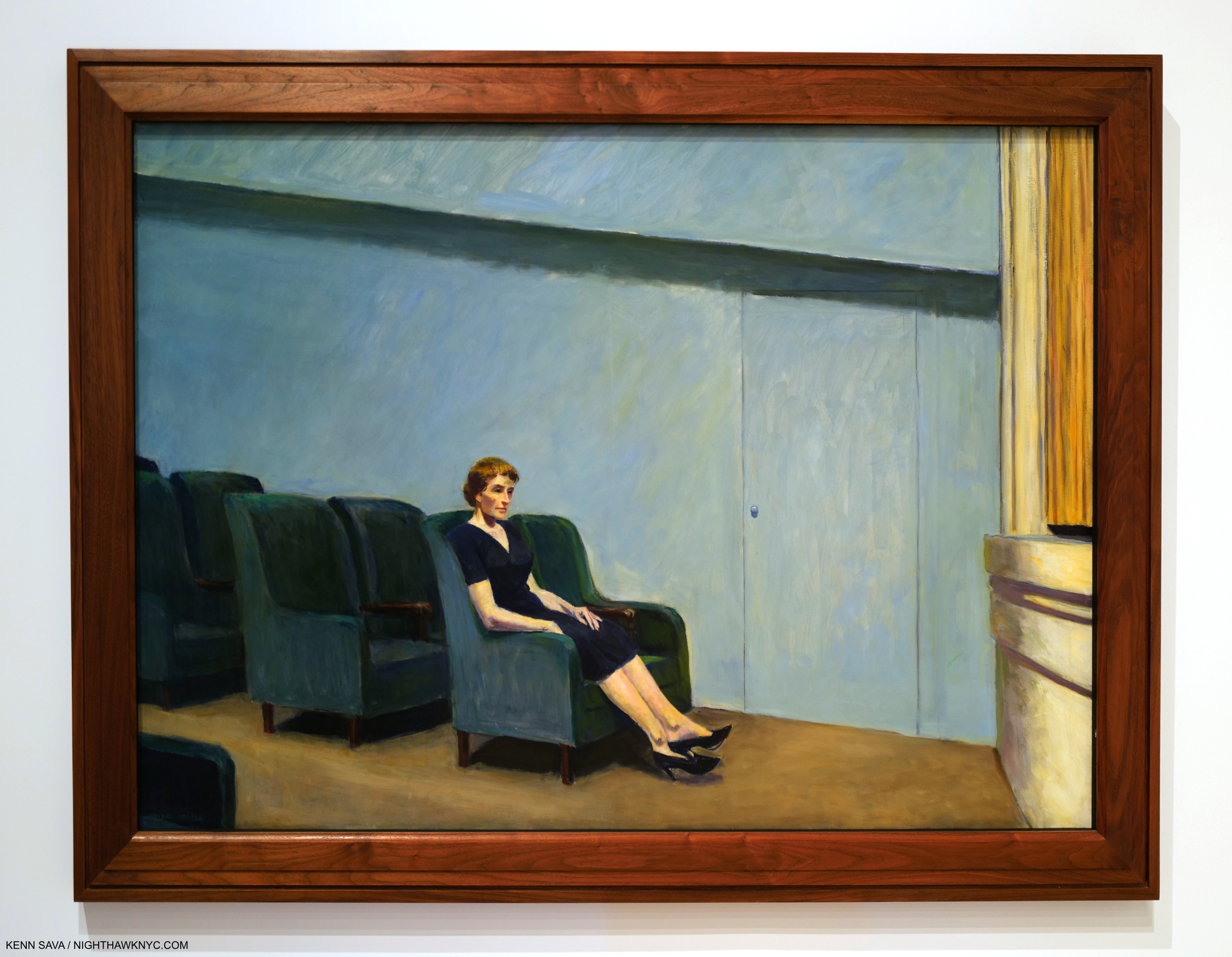
Intermission, 1963. Edward & Jo Hopper were avid movie & theater goers, and Edward Hopper’s New York dedicated a gallery to his movie/theater work making interesting observations of how some theater sets and Films may have influenced the settings of some of his Paintings. Others, like this, are set in these venues. Intermission presents a “basic” idea in a theater environment, yet it makes me wonder- People have been going to concerts and theaters for many hundreds of years. Why haven’t I seen it done like this before?

The man-altered world’s effects on the population, then and now, run deep. So deeply, in fact, I’d been living with these symptoms for 40 years myself before I realized that they are what I was seeing them in Hopper’s work! ”

Was mankind meant to live this way?” may be another question his Art asks.

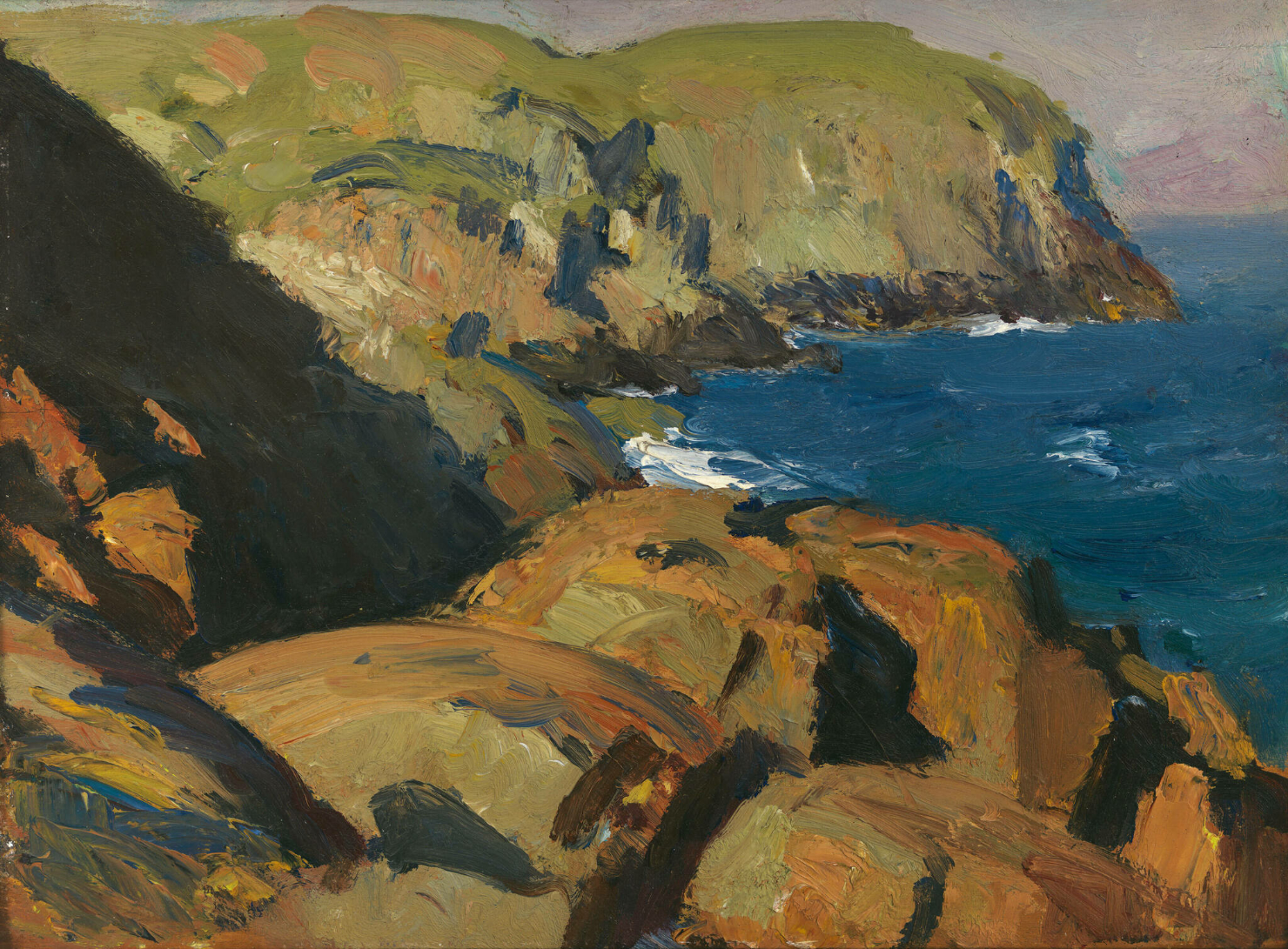
Nature. In all its natural glory. Blackhead, Monhegan, 1916–19. Edward Hopper in Maine. *-Whitney Museum Photo. Not in the show.

The second theme that I see in his Art is the unaltered natural landscape. These exclusively depict locations outside of NYC.

  “If you look at landscape painting from that time in America, there isn’t anyone close to him (Edward Hopper) in technique.” Alex Katz, Artist, and designer of the installation of Edward Hopper’s Maine at the Bowdoin College Museum of Art in 2011 on Hopper’s landscapes.

I’ve come to believe his unaltered natural landscapes, like Blackhead, Monhegan, remain very under-appreciated. Though they are beyond the scope of this piece, I will say that it’s fascinating to me to consider that this one was done after Cézanne & Monet’s innovations; two of the “earlier French Artists” I referenced in Part 1. I don’t see their direct influence, though indirectly, his unaltered natural landscapes, like this, also strike me as “impressions,” as I called his New York Paintings there.

“There is a sort of elation about sunlight on the upper part of the house. You know, there are many thoughts, many impulses, that go into a picture … I was more interested in the sunlight on the buildings and on the figures than in any symbolism.” Edward Hopper2.

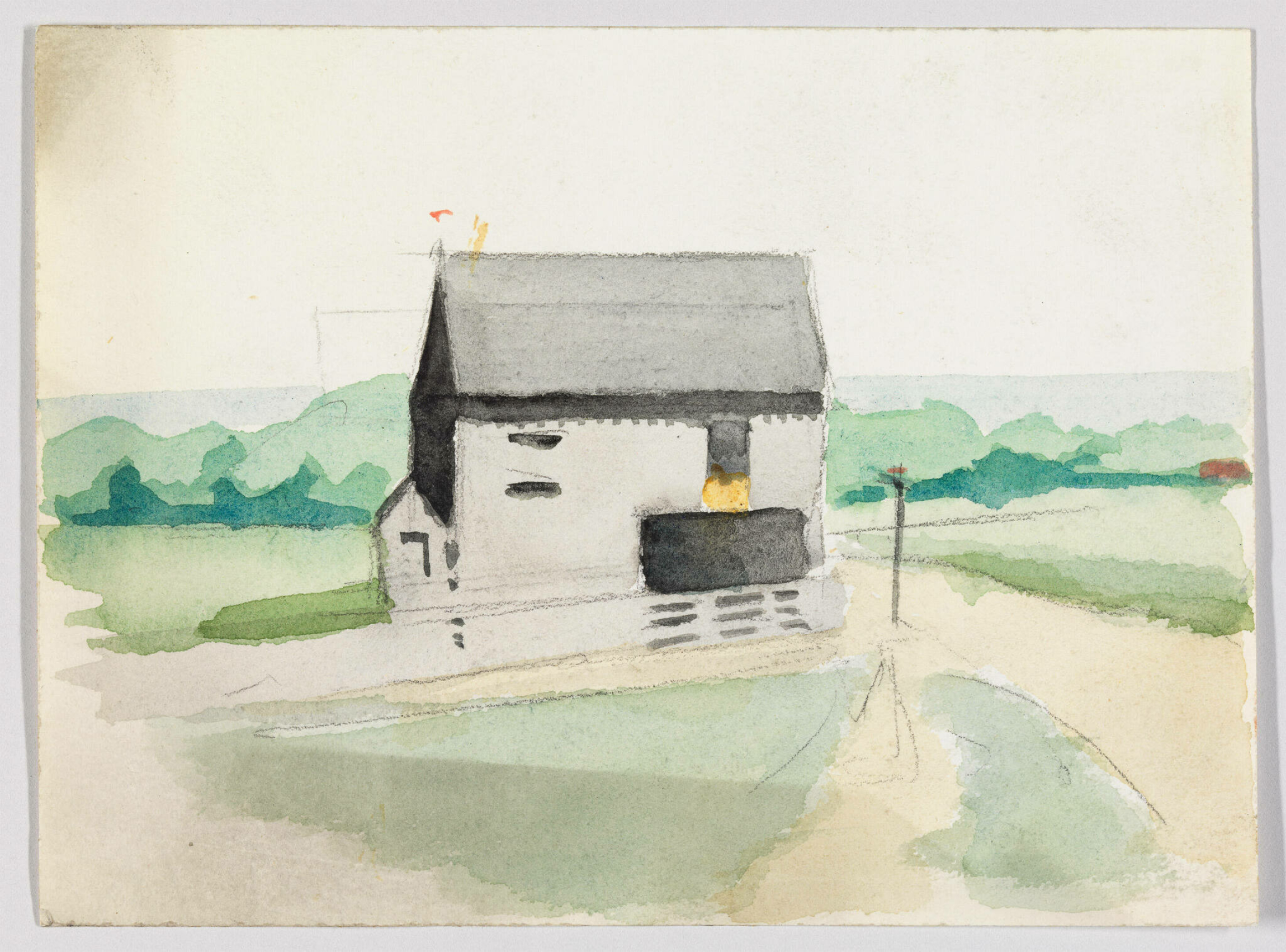
Landscape with Building, c.1900, Watercolor and graphite pencil on paper. *-Whitney Museum Photo. Not in the show.

As I mentioned in Part 1,  Edward Hopper’s New York sent me back to the beginning of his Art looking to see how his themes began and evolved. This non-NYC work from the year he started Art school strikes me as an early example of the man-altered landscape theme. At various points in his life, Hopper professed an interest in rendering “sunlight on buildings,” and he had a love of Architecture. You can say he’s expressing both here. But the building, rendered in a predominance of grey, certainly doesn’t look to be basking in the sunlight. It’s almost like he’s using the grey wash  (instead of simply leaving the paper a bare white) to downplay the effects of the sunlight. What strikes me is how forlorn and seemingly out of place the building looks in the peaceful landscape. 30 years later, Hopper Painted East River Apartments, shown earlier, again rendering the buildings in grey. The only sunlight in that Painting is playing on the buildings in the back. If he is not showing his love of “sunlight on the buildings,” in these, what is he showing us? Is he being Edward Hopper: Architectural critic? The encroachment of man into nature seems plausible to me. The unspoken question he may be asking is “What do you think of this?” A question I feel being asked in any number of his man-altered landscapes. Given what he said about no “symbolism,” is what I see a coincidence? A coincidence that runs through most of his work is most likely not a coincidence.

Remember how this looked on opening day in Part 1? Here’s the opening section on closing day, March 5, 2023.

What we call modern city life now only existed in Chicago, the birthplace of the tall building, and New York when Edward Hopper began to Paint here in the first third of the 20th century. Since, of course, it has spread everywhere, all around the world. There are countless millions more people living in these environments now than when he began rendering these places. In some ways, Edward Hopper was reporting from the front lines on the change that was happening around him in NYC. Change that was soon to happen in those countless other places around the world.

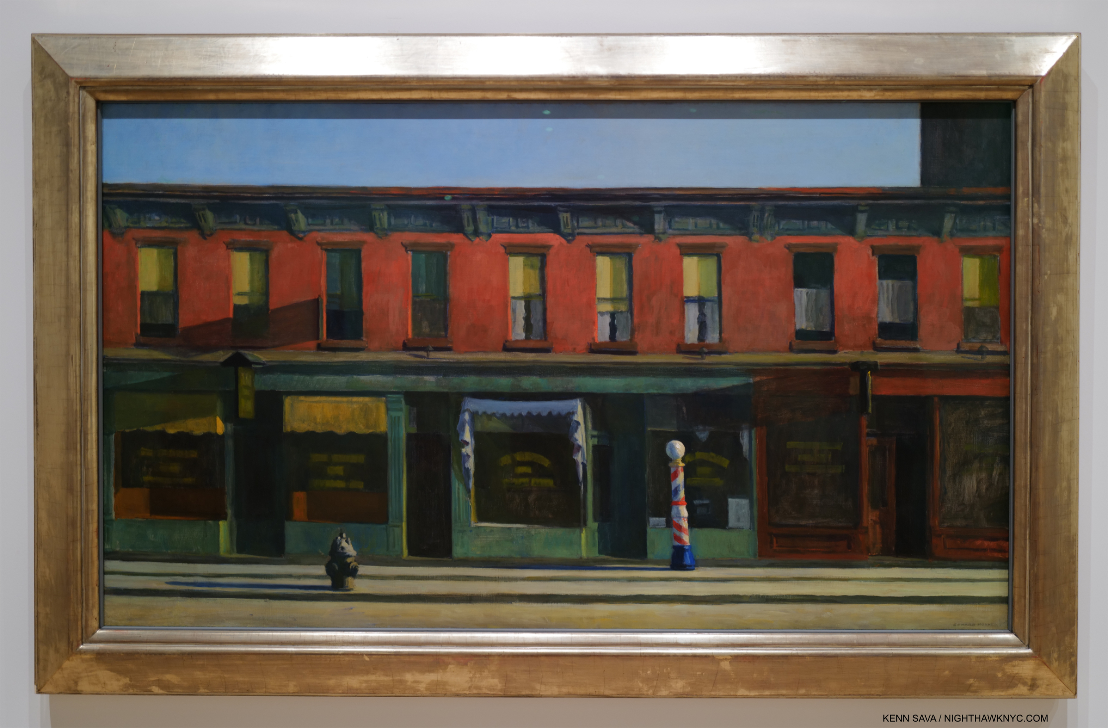
Early Sunday Morning, 1930. Edward Hopper is not going to hit you over the head with it. Instead, his subtlety is front and center here, in my view. The Whitney paid $3,000. for it in 1931, then featured it when the Whitney Museum opened to the public for the first time in November, 1931. 91 years later, it’s featured again.

For a long time I looked at Hopper’s famous Early Sunday Morning, 1930 as a charming Manhattan street view, one that depicts a block in my neighborhood 93 years ago. Now, I see it as something more ominous. I can attest that as 7th Avenue, shown here, runs North/South, the Sun, which rises directly behind the viewer, has never shone as Mr. H. has depicted it here- see the Photo of the site now in Part 1. Why did he do so? For me, the long shadows mimic the subtle dark rectangle extending off the canvas to the upper right. That’s part of the newer, tall building you can see in my recent Photo of this scene in Part 1, which was just going up when he Painted it. It’s the only building in this Painting that is still standing. The charm of the old human-scale neighborhood is evidenced by the barber pole, shown in full sunshine just to the right of the center of the composition, which emphasizes the human scale of the buildings. This is about to be lost as it is already being ominously encroached upon (if not engulfed) by “progress” (i.e. new tall buildings) while the City sleeps, i.e. while the public was helpless to stop it. This scene is about to be lost, which it was, as I showed. This idyllic, peace hides the loss of a world the Artist knew and loved, and the helplessness to do anything about it.

For me,  Early Sunday Morning is a work that encapsulates Edward Hopper’s melancholy as he was about to lose the City he loved, and a  “wake-up call” to those “sleeping” through what was happening around them. Now, it’s a reminder that there are always things happening most people aren’t all that aware of that will change their lives. Is he saying here, “Wake up, before it’s too late”?

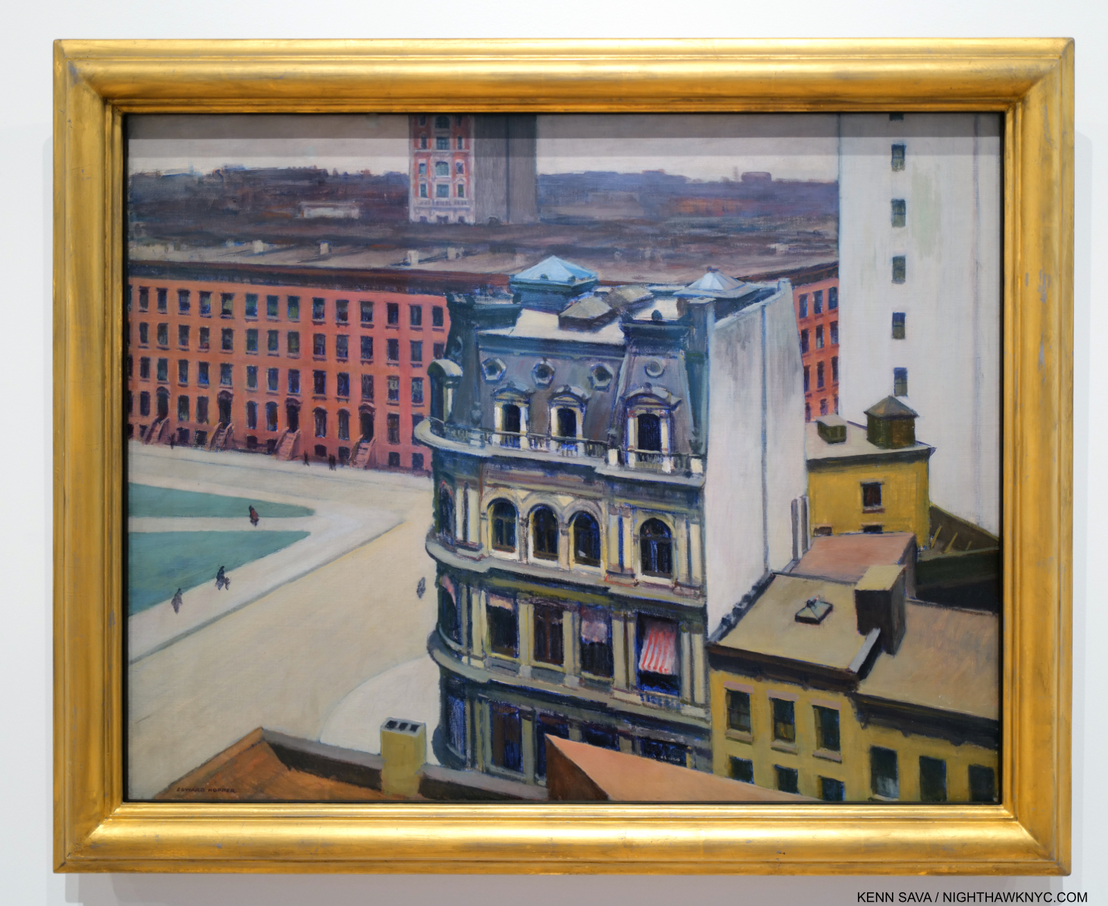
The City, 1927. Change comes to Edward Hopper’s front door.

In The City, Hopper’s home, 3 Washington Square (see my picture of it from November, 2022 in Part 1), is seen in the row of buildings in the mid-distance. For me, everything about this screams distaste. This is Edward Hopper’s neighborhood; the block he lived on, on Washington Square Park in Greenwich Village. From the vantage point of a new taller building to the east, the people now look like ants. Two, new, taller buildings are unceremoniously chopped off. Edward Hopper Painted, virtually exclusively, in the landscape format. I take this as another instance of holding on to his values and refusing to compromise by Painting tall buildings in the portrait format. Eventually, change would come up and knock right on his apartment door. In 1946, NYU, which was in the act of swallowing up much of the area, bought 3 Washington Square and proceeded to try to evict its residents. The Hoppers publicly fought NYU for a few years before winning permission to stay. They would both live out their lives here.

The show made me think about the locations he Painted, and those he didn’t Paint. The latter is easier- it’s interesting that in spite of living and working here for so long, he never Painted NYC’s most iconic landmarks- Brooklyn Bridge, the Empire State, the Chrysler Building, The Metropolitan Museum (or ANY New York museum), and on and on. Instead, he found his meat in “second-tier landmarks” and everyday locations. Still, in each work, it seems to me that the notoriety of the building or bridge included isn’t his point. He down plays it or presents it as an element in a man-altered landscape composition, again asking, I believe, “What do you think of what man has done here?” Again and again, the takeaway for me was it was all about change: rapid change, or change over time.

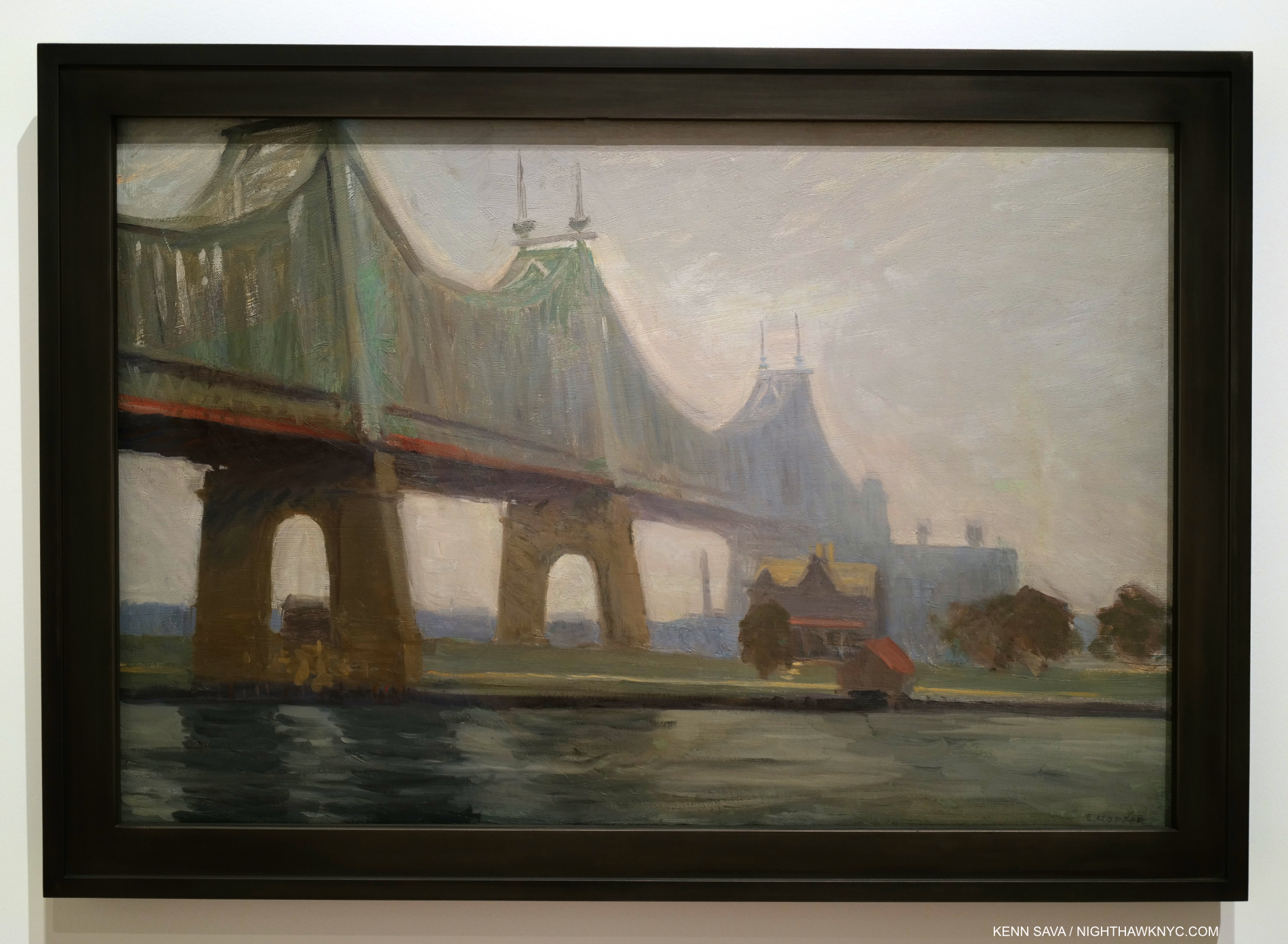
Queensborough Bridge, 1913. All of Hopper’s bridge Paintings (including Macomb’s Dam Bridge, 1935, which has much in common with Queensborough Bridge) strike me as man-altered landscape works.

Bridges were a favorite subject for Edward Hopper going back to his time in Paris (I showed Le Pont des Arts, which he Painted there in 1907, in Part 1). Back in NYC, he Painted Queensborough Bridge in 1913, just 4 years after it opened in 1909! It has a few things in common with most of his other bridge Paintings. Most of them show the bridge from underneath, reminding us of human scale, and giving the viewer the sense he must have felt at the time of suddenly being VERY small. In this one, the first tower is chopped off by the top of the canvas- like he does with the new tall buildings. A sign of distaste? Also typical, the structure is cropped oddly and ends suddenly just past the right of center. This gives me the feeling that it’s not the sole focus of the composition. We also see East River and what is now Roosevelt Island with a colonial style (i.e. older) house. The house is in a bit shaper focus and is just to the right of center. The bridge draws the eye along until it suddenly trails off right over the house. Human scaled, it looks puny next to the huge bridge. The juxtaposition of size between these two man-made objects is jarring. Given the water in the foreground, which with the strip of land, represent nature, I see this as both an example of the man-altered landscape and how man changed it, first with the colonial style house, and again later with the bridge. The island looks fairly deserted, but it wouldn’t be for much longer as “progress” marched on inexorably.

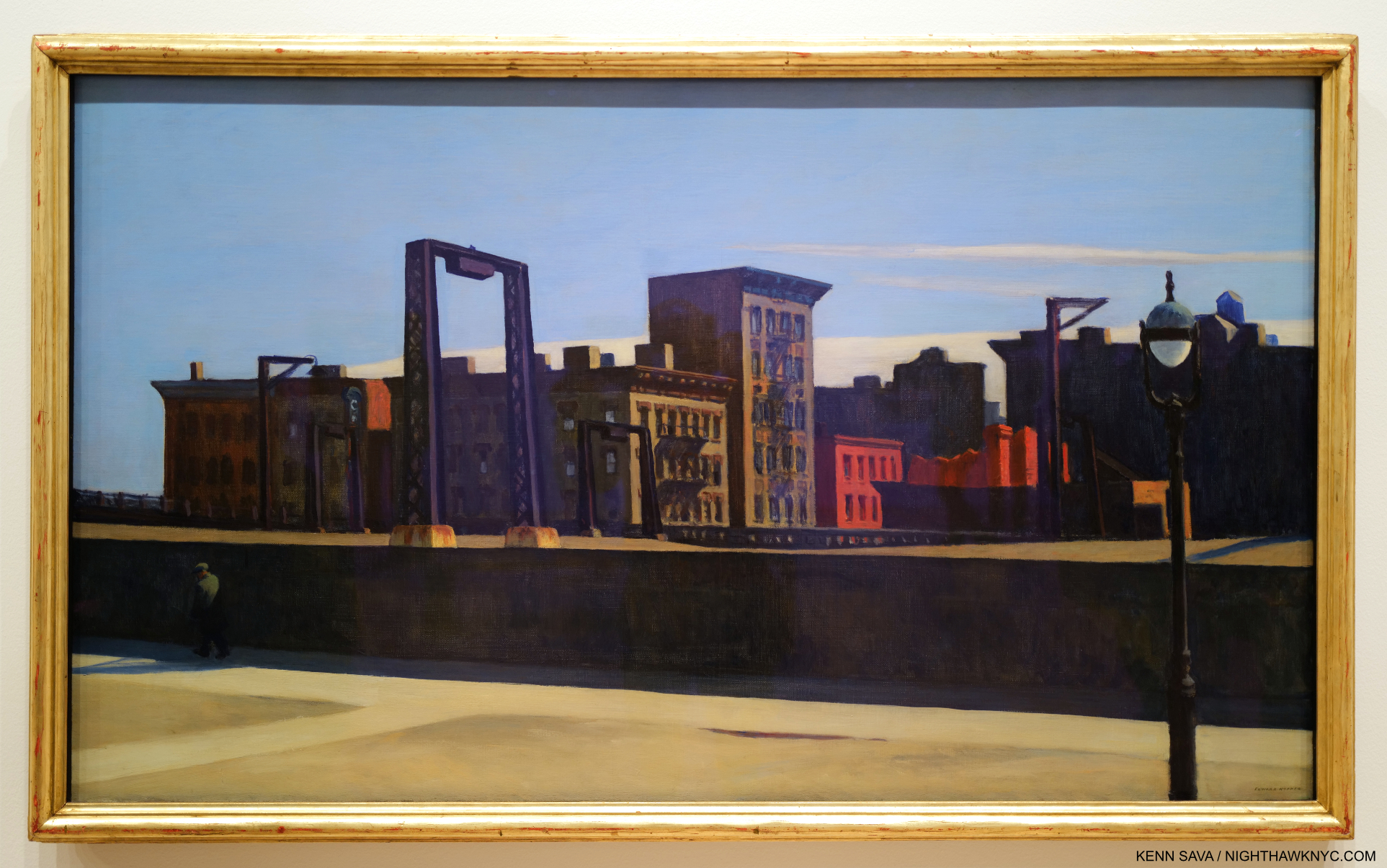
Manhattan Bridge Loop, 1928. The lone figure, dwarfed by a wall in the Loop part of the Bridge, who adds so much, might have been a late addition to the composition. He does not appear in the Drawn Study on view in another gallery. Perhaps my favorite Painting in the show.

In the wonderful Manhattan Bridge Loop we aren’t seeing the bridge from underneath as he usually shows. We’re on a little known and now lost part of the Manhattan Bridge that was called the “Loop.” Built in 1906, Manhattan Bridge, which connects Lower Manhattan at Chinatown with Brooklyn across the East River, was another bringer of change to the City. It’s hard for us to imagine this now, but for several years after it opened in 1883, Brooklyn Bridge at 272 feet tall, remained the tallest structure in the Western hemisphere for a few years3! Walking across it, when you reach the middle of the Bridge, you suddenly find yourself out in the open, its structure having magically disappeared due to the genius of its design. Every time I stand there I try and imagine what it must have felt like to those who stood here in 1883 when, as far as the eye could see, nothing was higher than you were. What a feeling that must have been! It still is. At 336 feet in height, Manhattan Bridge was even taller. These tall bridges presaged the era of tall buildings, and the effect of these immense structures that dwarfed human scale must have had a profound effect on the populace. I get that feeling looking at Queensborough Bridge, in particular, the newness of suddenly feeling so very small in the presence of the new bridge. Perhaps this is also Edward Hopper’s motif for Manhattan Bridge Loop- with a twist Behind the wall the man walks in front of, which dwarfs him, and under the gantry, which mimics a bridge tower, is a trolley that ran on a loop from one side of the bridge to the other giving the work its title. In  Manhattan Bridge Loop, Edward Hopper finds a new way to express the size of the bridge versus the human scale world he knew. And guess what would happen to those buildings along the back.

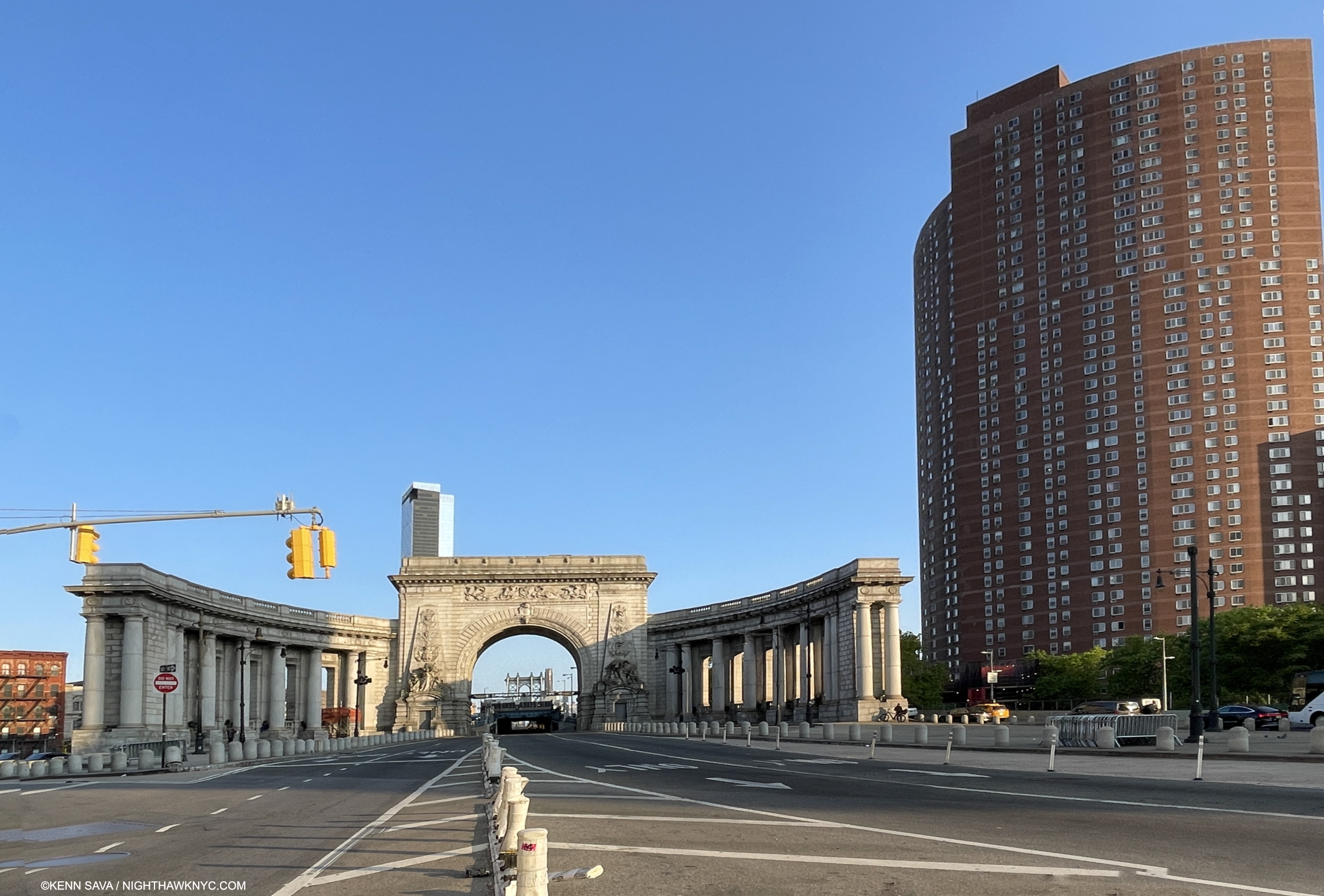
Change continued after Hopper. The approach to the Manhattan Bridge (seen in the far distance under the arch) on May 18, 2023. That’s the Confucius Plaza complex on the right. The Loop Hopper Painted was located to the right behind the arch. The only way to access it now is to walk around the center arch on the Bridge roadway(!) and hope it happens to be as deserted as it is here, which it almost never is. No, thank you.

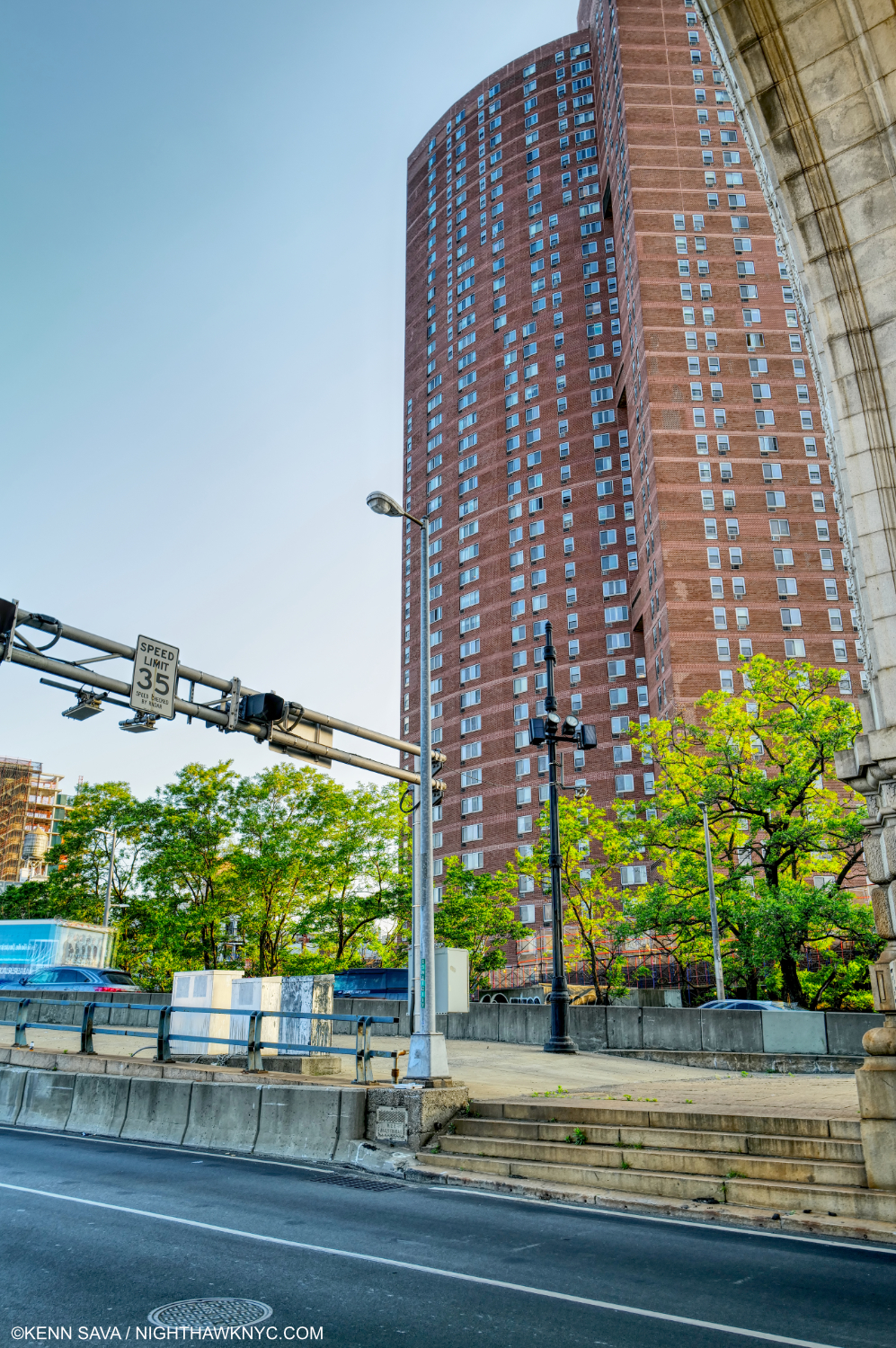
Not willing to risk life and limb as I did further below, I shot this from in front of the arch (part of which is seen at the upper right across the busy two-way roadway on May 18, 2023. This is approximately the scene of Manhattan Bridge Loop . Human scale was lost in a big way. Unlike Hopper, I’m using the portrait format to show just how tall the Confucius Plaza complex, which is where the buildings in the Hopper stood, is.

As in Early Sunday Morning, as time progressed, the beginnings of the loss of human scale in Manhattan Bridge Loop would only dramatically increase as time went on.

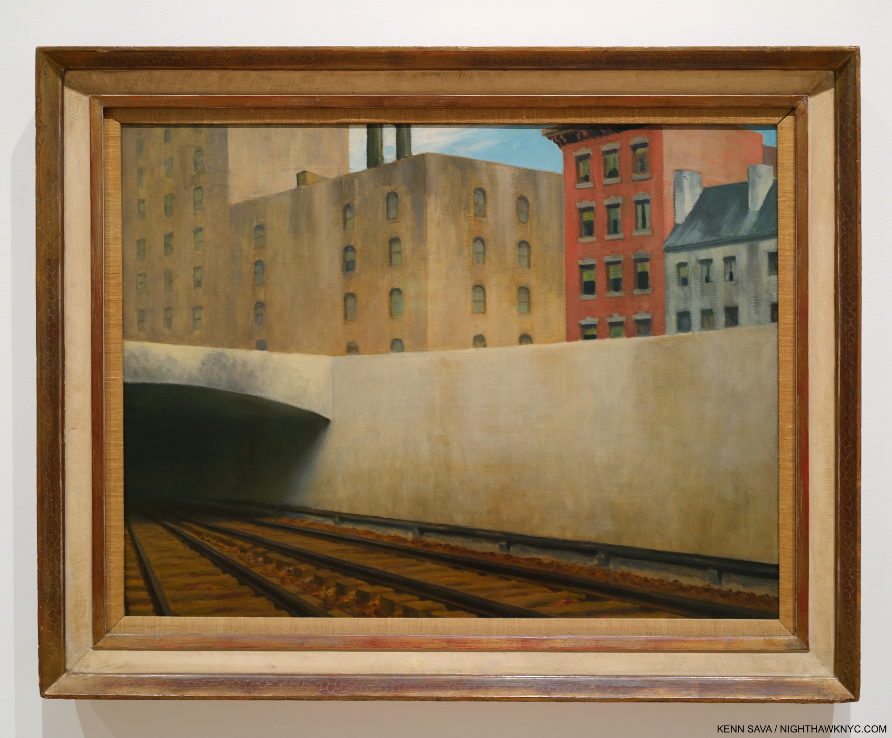
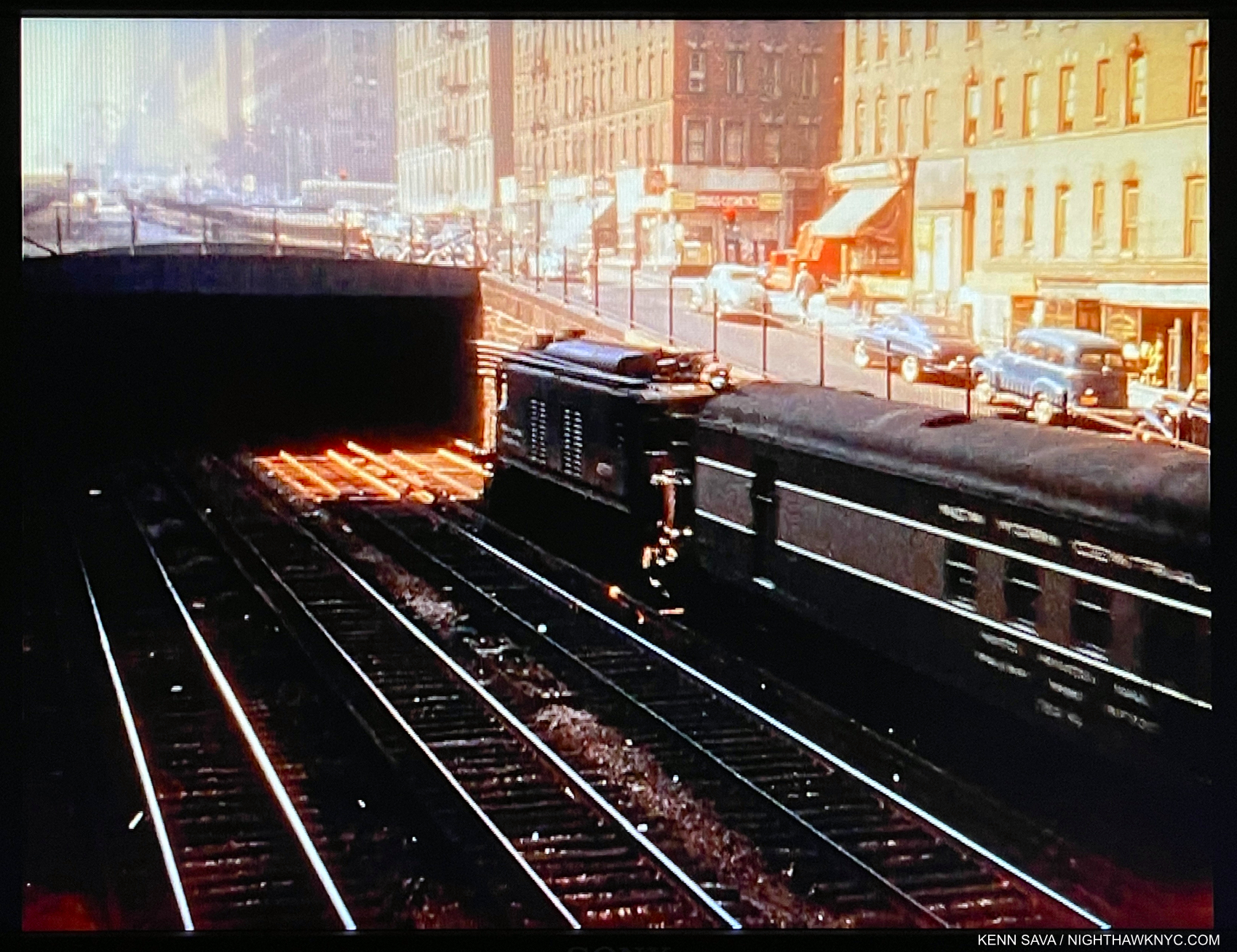
Approaching a City, 1946. Perhaps not one of NYC’s more scenic locations. The Artist visited the site, at Park Avenue at East 97th Street, the point where above ground trains become underground trains (and vice versa) going to and from Grand Central Terminal 55 blocks south, multiple times in 1945 to Draw it. Interestingly, the first work in Edward Hopper’s New York, my research reveals it was the last work shown in the Whitney’s 1950 Edward Hopper Retrospective catalog. I’ve been unable to find out if that means it closed the show. 

After the introductory wall of early works I showed in Part 1, Approaching a City, 1946, showing another bridge, is the first work in Edward Hopper’s New York, proper after the introductory wall. I was surprised by this choice, but the more I studied it, I’ve come to see it as a commentary on change in the City over time. First, I was interested that Hopper chose this site, given how far it is from his apartment (and mine). As a result, it’s a bit of an outlier among all the subjects of his NYC Paintings. That made me wonder if this, too, was another scene he initially glimpsed while a passenger on a train, particularly given its low vantage point, and then decided to go back and Draw it. I was so puzzled by the Painting and why he chose this location that I visited the site to see what the real thing would reveal.

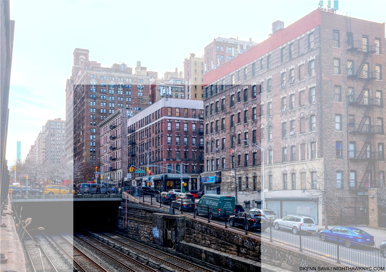
Park Avenue & East 97th Street, February 15, 2023 with the area shown in the Painting centered. What strikes me is that factory Hopper shows in the center & left of the Painting. Was it really there in 1946, right across East 97th Street from an apartment building? I didn’t crop this picture to the area showing in the Painting to show that the entire surrounding neighborhood is residential, and these building look to me to be 100 years old, if not older.

Today, it’s not possible to get down low enough to recreate the angle he shows- unless you’re on a train coming or going from Grand Central Terminal, 55 blocks to the south. Standing above, I took considerable risk taking this photo, my back danger close to the traffic zipping by on Park Avenue behind me. Vintage Photos in the City’s archive from the early 1940s show there was no factory where Hopper Painted it. The neighborhood was, and is, residential, and I believe the buildings I saw there now were there then.

I spotted this fleeting scene in the Film, The Band Wagon, 1953, showing the scene Hopper Painted just 7 years after he did! It’s highly unlikely the buildings in the background had changed that much.

Instead, Hopper chose to show a range of Architectural styles from Colonial, far right, to brownstone, to its left, to the modern factory, center, which could be taken as a comment, or a lament, on change in the City over time (a bit like Queensborough Bridge, and Early Sunday Morning do for me). The evidence would seem to show that he modified the background buildings to suit his purposes. So, what does modifying an actual place in a Painting mean? It means the Artist is using “Artistic license,” and putting it at the service of his or her intentions. (So much for so-called “realism.”) He or she may also want to remove the distraction of the place from the “point” they are trying to make. In the case of Approaching A City, Edward Hopper replaced a residential building with a factory and placed it among other residential buildings. He also changed the Architectural styles of the other buildings. It’s up to the viewer to read this as he or she will. For me, it shows that if he did so once, he would do so again. And he did.

Therefore, when I look at the places he shows, whether or not they are actual places is now a secondary consideration, said the guy who spent decades looking for the “actual site” of Nighthawks. I was driven by the fact that Hopper had Painted actual sites. But, as time went on, he moved away from doing so because it no longer served his purposes, or he modified them as he did here. (For those interested in knowing more about the actual sites Hopper did Paint, and comparing them with his Paintings, Hopper authority, Gail Levin, the Whitney’s first Hopper curator, and author of both the Hopper Catalogue Raisonne and the definitive biography, has published a book of Photographs she took traveling in NYC, the rest of the U.S. and Europe of places Hopper Painted appropriately titled, Hopper’s Places.) Finally, the darkness inside the tunnel I find interesting. Is it a comment on where things are heading? Into the unknown4?

The Hopper Fish Bowl

A frame from the 1916 short Film, A Ride on the Sixth Avenue Elevated shows the train approaching a row of windows, which might have provided Edward Hopper, a regular rider, with ample opportunity for fleeting inspiration…

Life in NYC offers little privacy. New Yorkers are forced to adapt, but somewhere in the back of their mind lives the thought that “someone’s always watching.” That was born in the days long before video cameras, helicopter & drone surveillance! That Edward Hopper had his eyes open is seen by the number of his Paintings that look into a window. These strike me as new in Art. Some of these may have been inspired by fleeting, passing moments witnessed while a passenger on a train, others while on one of his walks around town. In any number of his Paintings we see one or more people behind glass. As I said in the caption for Office in a Small City, earlier, I call this the “Hopper fish bowl.” These include the “looking into a window” works, like Night Windows, 1928, which I showed in Part 1, and Nighthawks, which includes 4 figures behind glass.

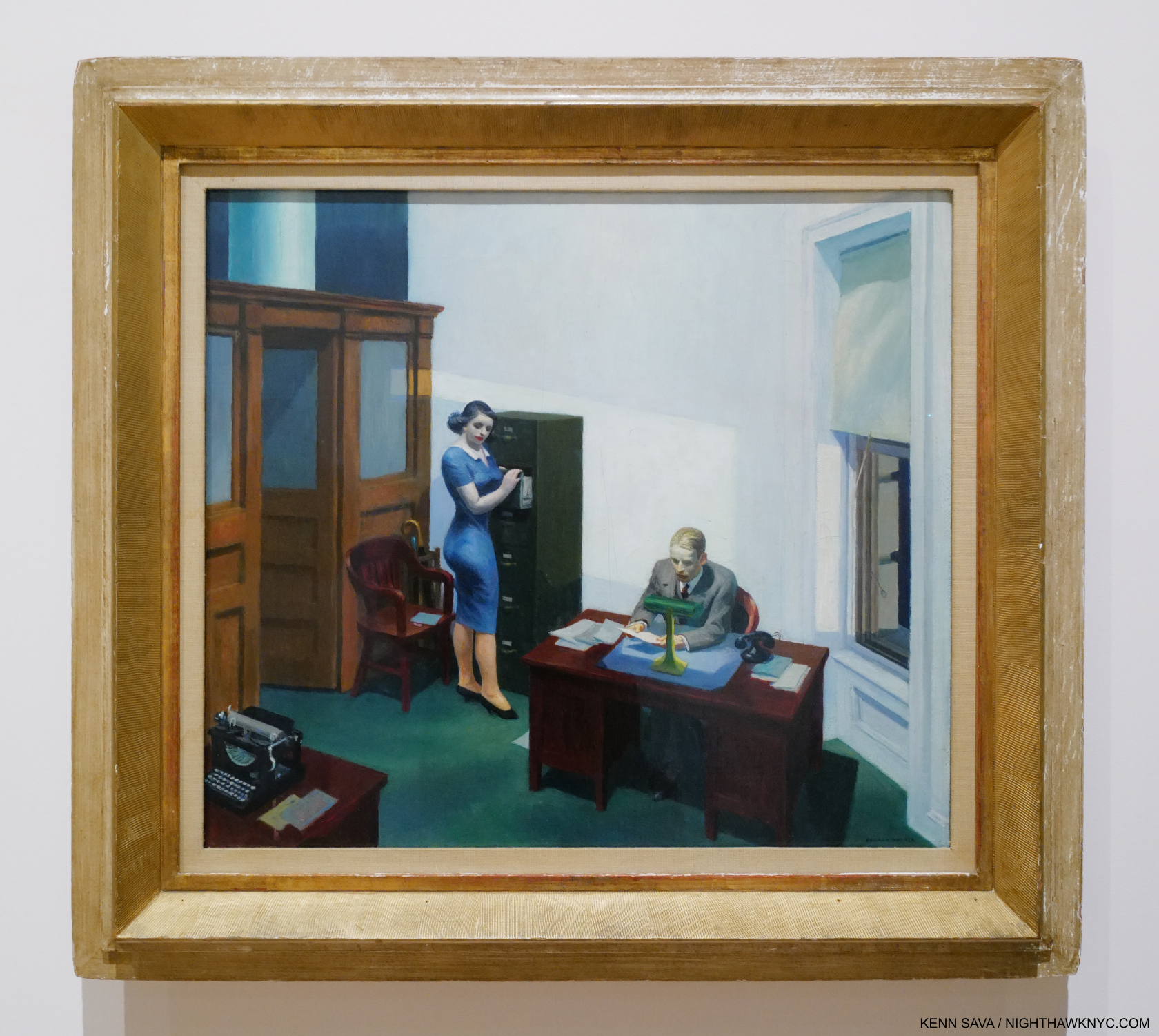
Office at Night, 1940. A work that has haunted me for over 40 years. I saw it here for only the second time in person.

Office at Night, 1940, is another scene apparently glimpsed through a window. Or is it? In The Art & The Artist, P.60, Gail Levin quotes Hopper saying there are three sources of light for this picture- the overhead light, the desk light and the window. If it was a scene glimpsed while on a passing train there would need to be 4- with another window in the front. I think people who have seen many Hoppers will immediately assume this is another “glimpsed in passing” scene, as I have until I read that. Who else Painted something like this before 1940? I grew up being forced to work in an old office that looked a bit like this one as a child, so it always gives me the chills to see it. The quiet drama at work here speaks volumes, and says everything about what has become “life in the cube.” It seems to me that Edward Hopper owns the genre of Painting office interiors (including Office in a Small City, shown earlier), and the next one, all showing the effects of the man-altered landscape on those who live in these places.

 Edward Hopper’s New York, Now

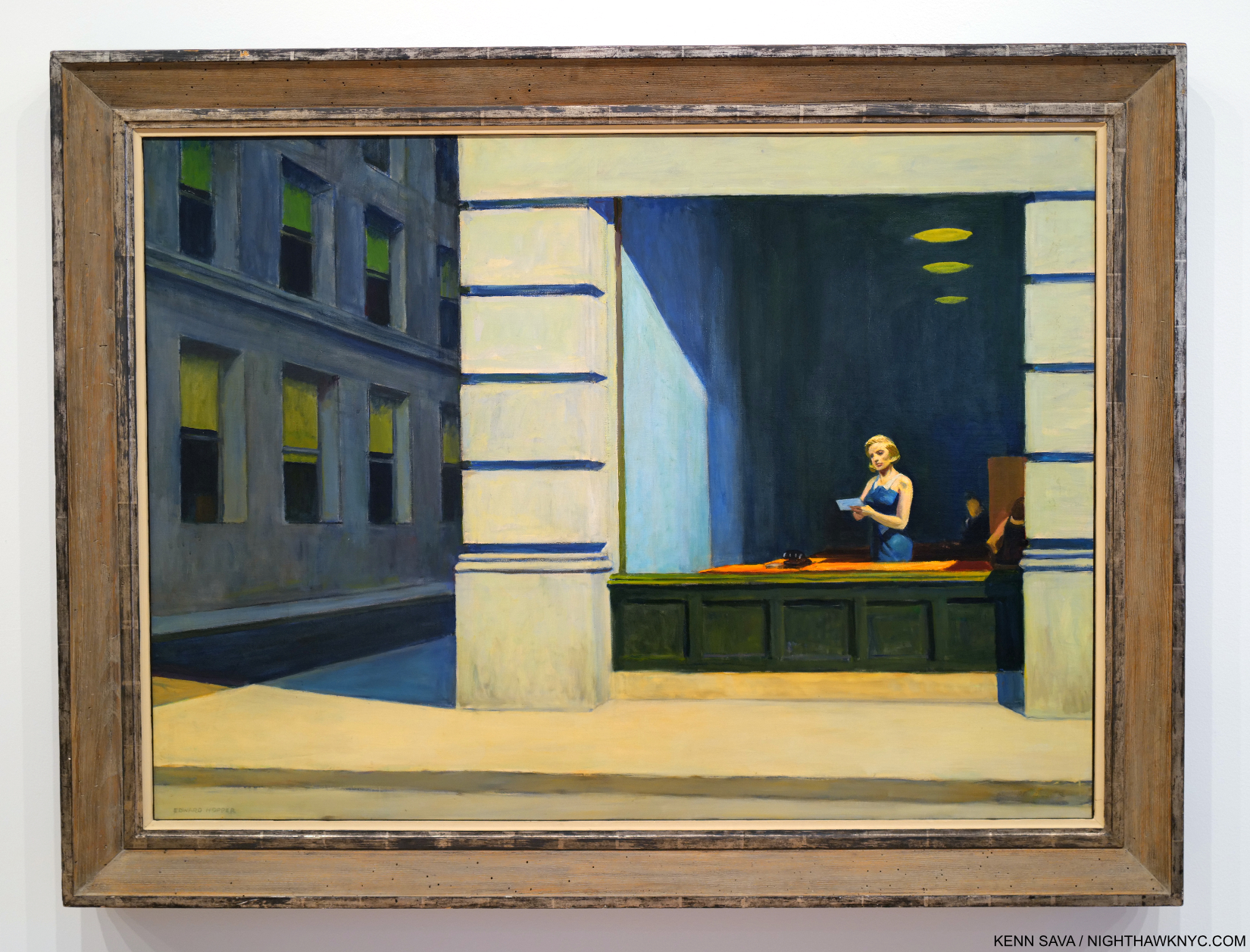
New York Office, 1962. With a change in telecommunication equipment, this could be now in Downtown, NYC. In 500 years, if people make it that far, it’s hard for me to imagine this won’t still be speaking to them. Hopefully, it will have a better frame by then.

Beyond changing my thinking about his work, Edward Hopper’s New York made me realize that sooner or later, everyone who lives in NYC (and perhaps most other cities) for a period of time winds up lamenting the loss of what it “used to be.” Early Sunday Morning is, perhaps, the epitome of this, but I think it’s there in many of his works. I miss the NYC of the 1970s and the 1990s. The pandemic has changed the City dramatically, too. It’s still hard for me to believe that 45, 215 irreplaceable people have died in NYC from covid as of June 1, 20235. Building and renovation (i.e. “progress”) continues as robustly as ever- for better or for worse. Rarely has there been an Artist who documented change in the City as Edward Hopper did. In spite of all these changes, he never changed. He kept working in the landscape format until the end. There were only a handful portrait formatted Paintings in Edward Hopper’s New York, notably his Self-Portraits and his Portrait of Jo, and a few in the square format, like Office at Night. It’s easy for me to relate to his angst at losing part of what he loved. It’s obvious how much he cared. As we venture into this new time of change, Edward Hopper’s New York can also be seen as lessons to us now- before, during and after change.

What I’m saying here is what Edward Hopper’s Art says to me. As with all Art, it’s up to each of his viewers to take from it what they will.

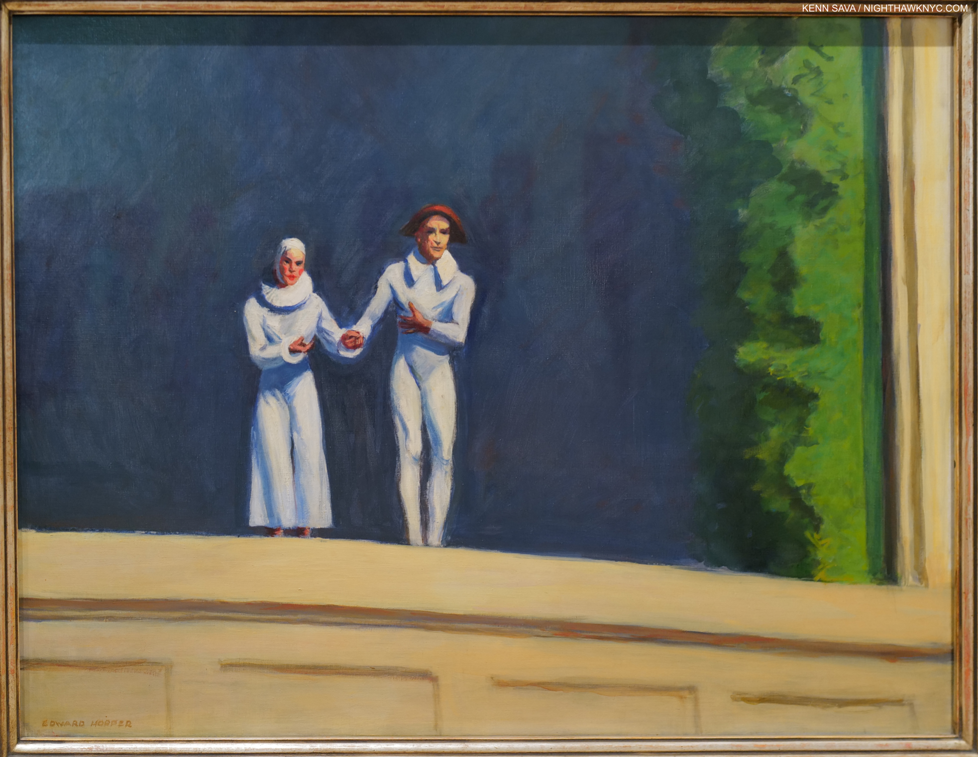
Edward Hopper’s final Painting, Two Comedians, 1965. He and Jo taking a bow in front of a dark blue sky(?) background with a landscape prop to the right. At first glance, it seems a straight-ahead Painting. I now also see it as showing a man-made setting (the backdrop and prop) depicting the “natural world,” thus “flipping the narrative” from what man has done with and to nature in his final work. Or, is it a reminder that everything he’s shown us was created by by him, assisted by Jo, in paint?

Back at home, Edward Hopper always struck me as being somewhat out of place in Greenwich Village. It became the home of the beatniks and then the hippies as his life came to a close. He died on May 15, 1967- right at the dawn of the “Summer of Love.” Throughout his 84 years, Edward Hopper held on to his traditional values and way, as I discussed in Part 1. He never went with fads, changing styles, or trends. At times this made him seem “old-fashioned,” particularly in the face of Abstract Expressionism and then Pop, but he’s having the last laugh now. The crowds that flock to see his work wherever it’s displayed around the world are proof positive that his Art is speaking to more people right now than it ever has before. People everywhere have seen the modern, man-altered world that was new in his time in New York up close and personal where they live and have been effected by it- for better, for worse, or some of both.


Last look at Automat. Closing day, March 5,2023.

Another big take away from Edward Hopper’s New York came from observing my fellow show-goers. It struck me that that for many others, as it does for me, it serves as a confirmation of what they’re feeling wherever they’re living. That makes me wonder- was Edward Hopper a visionary, too? Did he foresee that what was going on around him in NYC between 1910 and 1950 would become a world-wide phenomenon? I tend to think he was NYC-centric, like I am. He was worried about what he saw going on around him in a place he loved and loved living in. He noticed the effects these changes had on his friends and neighbors and on total strangers he happened to glimpse for a fleeting moment as he moved around town. He froze those moments in oil paint where they have become frozen in many of our minds. That front line moved further and further until it covered much of the world in the following 100 years since he started.

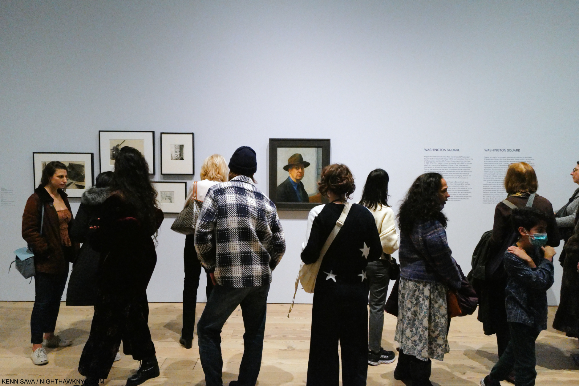
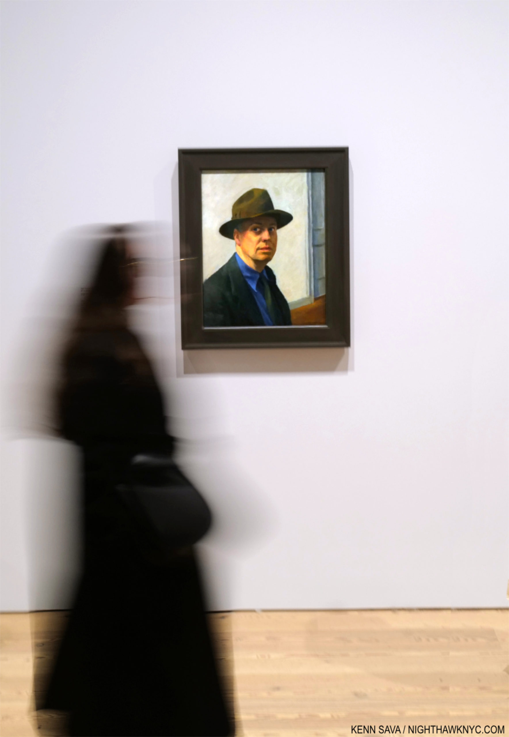
Ending this series with the same piece I began Part 1 with: Edward Hopper’s Self-Portrait, 1925-30, begun 98 years ago. Seen on March 1, 2023. In 2022, I also featured it here, where you can see it close up.

“I saw the Edward Hopper exhibition at the Whitney Museum in the fall of 1995 and I was amazed at the number of people there and how they reacted to the paintings….Hopper seems to reach more people than any other American artist.” Alex Katz, Looking at Art with Alex Katz, P.88-9.

Since that show Alex Katz refers to in 1995, Edward Hopper’s star has continued to rise- both here and especially around the world, If Edward Hopper isn’t THE most popular American Painter world-wide right now (and he may be), the inexorable rise in popularity his work has seen these past 100 years tells me he will be just that one day soon.

Closing Day, March 5, 2023

For me, in the end, the very good thing about that would be that his popularity is not due to a fad, sex appeal, a glamorous lifestyle, or the trappings of celebrity. It’s solely due to his Art speaking to people! In this modern day & age, with all the trappings of 21st century life that Edward Hopper couldn’t begin to dream of…imagine that.

A Postscript that looks at some serious issues involving & surrounding the Art of Edward Hopper at the Whitney Museum is here

*- Soundtrack for this piece is “Rhapsody in Blue” by George Gershwin, who returns from Part 1. Feeling “blue” may be a symptom of the man-altered environment. Gershwin was the ultimate interpreter of his own Music, of course. After his early death, the charge of performing Gershwin authentically fell on his friend, the extraordinary Oscar Levant. Best known as a somewhat sarcastic actor in An American in Paris, and other Films, lesser known is as one of the great pianists of the 20th century he was the highest paid concert artist for quite a while. (If you want to be blown away, check out this segment from the Film, which may be the first Music video.) Here, he powerfully performs “Rhapsody in Blue” with Eugene Ormandy conducting. It is posterity’s eternal loss that the record companies never sat Mr. Levant down in front of state-of-the-art studio recording equipment and had him record every note George Gershwin wrote that included a piano part. I cherish what we have.

<

NighthawkNYC.com has been entirely self-funded & ad-free for over 8 years, during which 300 full length pieces have been published! If you’ve found it worthwhile, PLEASE donate to allow me to continue below. Thank you, Kenn.

You can also support it by buying Art, Art & Photography books, and Music from my collection! Art & Books may be found here. Music here and here.

Written & photographed by Kenn Sava for nighthawknyc.com unless otherwise credited. To send comments, thoughts, feedback or propositions click here. Click the white box on the upper right for the archives or to search them. Subscribe to be notified of new Posts below. Your information will be used for no other purpose.

  1. Gail Levin’s Edward Hopper: An Intimate Biography, Expanded Edition, P. 722.
  2. Quoted in Sheena Wagstaff, “The Elation of Sunlight,” in Edward Hopper, Tate Exhibition Catalog, 2004, P.12
  3. https://www.history.com/topics/landmarks/brooklyn-bridge
  4. Compare it with this from 1906.
  5. Source and updated total, here.

Edward Hopper’s Impressions of New York

This site is Free & Ad-Free! If you find this piece worthwhile, please donate via PayPal to support it & independent Art writing. You can also support it by buying Art & books! Details at the end. Thank you.

Written & Photographed by Kenn Sava (*-unless otherwise credited)

Show Seen: Edward Hopper’s New York @ The Whitney Museum
Part 1 of 3 Parts.

Introduction

Smack dab in the heart of Edward Hopper’s New York, the Artist stares out at us in one of hs few Self-Portraits, one he began 98 years ago (1925-30). What would Edward Hopper make of his New York now? Click any picture for full size.

Edward Hopper. What more can I say about his Art? In 2015, I named this site after his masterpiece, Nighthawks, because of that figure with his back to us that no one ever talks about. I relate to him more than I do any other figure I’ve ever seen in a Painting because I’ve been that guy, alone in a bar, cafe or restaurant in Edward Hopper’s New York too many times to count.

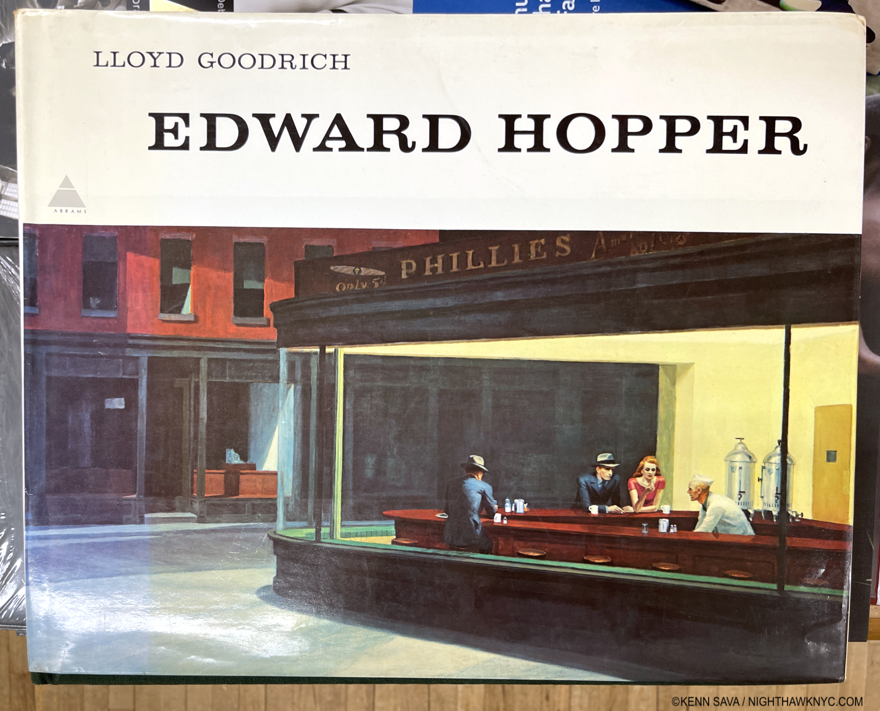
The first time I ever saw Edward Hopper’s work was in the late 1970s in a friend’s parent’s copy of this massive 10-pound, 16 by 13 1/2 inch, monograph by Lloyd Goodrich 1 published by Abrams in 1978, with 306 pages and 246 illustrations, but only 88 in color, unfortunately. One or other of his Paintings has been lingering somewhere on my mind since. My banner has been a continual homage to Nighthawks for the past 7+ years2.

Mister Hopper’s Neighborhood

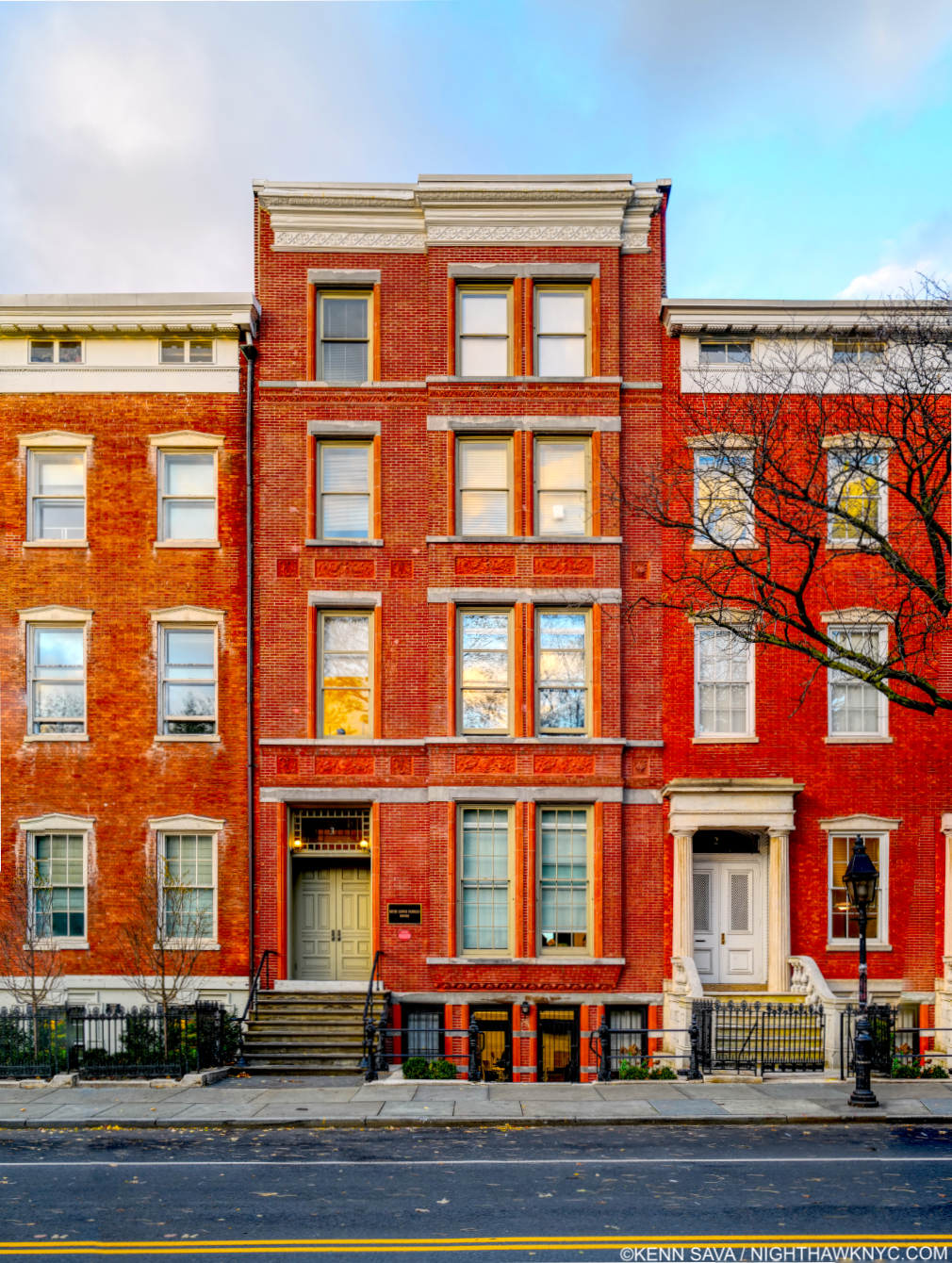
The heart of Edward Hopper’s New York for over 50 years: 3 Washington Square (center). Between them, he &  his wife Jo, lived on the top floor from 1913 to 19683. Beginning in 1947, they had to fight NYU, who took over the building in 1946, to stay. Today, the Hopper Studio has been preserved though the rest of the building is in active use by NYU, as it was when I shot this, November 16, 2022. Nighthawks, among countless other Hoppers, was Painted here4.

At this point, I have lived in what was his extended neighborhood for over 3 decades. I have sat in the Park right in front of his long-time home and wondered if he sat on this very spot. I’ve walked by numerous actual sites he Painted, and I spent a night in the Provincetown, Massachusetts  rooming house he Painted in Rooms for Tourists, 1945, while I was in Cape Cod fruitlessly trying to find his Truro summer house and drinking in the atmosphere of another area he Painted. Today, any number of times I’m reminded I’m literally walking in his footsteps on streets he is known to have walked. Living in his footsteps is probably more accurate.

Early Sunday Afternoon, March 26, 2023. Does this scream “Edward Hopper Painting?” 93 years later, it’s hard to see Early Sunday Morning, 1930 (which I discuss in Part 2), in this scene in my neighborhood, but this is where it was on 7th Avenue between West 16 & 17th Streets. Only the building partly shown on the right is in the Painting. I had to wait for the sun to go behind the center building (to the west) to take this shot, its glare still bleaches out the wall of the building on the right, proving the direction the Sun shines in the Painting was “Artistic license.”

A bit of my passion for his Art comes from this “shared experience” of this part of Manhattan at different times, but most of it lies in the endless mystery at the heart of his Art. Mystery that no amount of looking seems to solve. Until I saw Edward Hopper’s New York, that is. 300 pieces in here on NighthawkNYC.com since July, 2015, except for a bit at tail end of “My Search for Edward Hopper’s Nighthawks Diner,” this is the first time I’ve written about his Art.

Setting the Stage

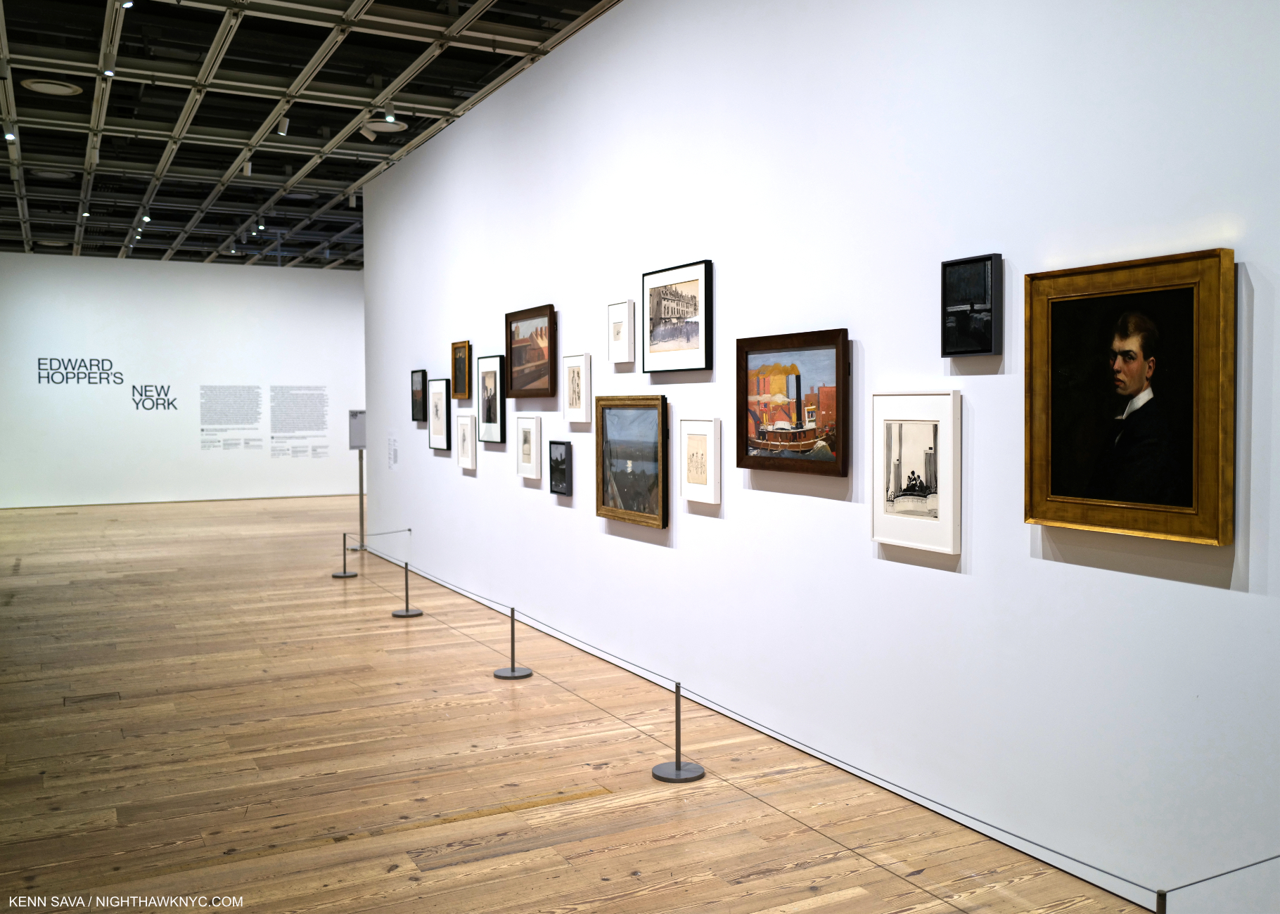
Before the crush. Edward Hopper’s New York Member’s Preview Opening Day, October 13, 2022. A wall of early work, including Self-Portrait, Oil on canvas (as all works featured are, unless specified), right, introduces the show. For Hopper, 1906 marks the beginning of his life as an Artist, the year he graduated from Art school, then embarked on his first trip to Paris. He would return twice before 1910, then return to NYC to get his Art career started.

While not a career retrospective (there has not been an Edward Hopper Retrospective in the U.S. since Edward Hopper: The Art & the Artist in 1980-81 5), Edward Hopper’s New York is a career-long look at what is, perhaps, his most famous subject- New York City, where he lived & worked for almost 60 years. I took the chance to see its 58 Oil or Watercolor Paintings6 by Hopper, among the 200 works and items of ephemera on view, 14 times between its opening day, above, and its closing day, below.

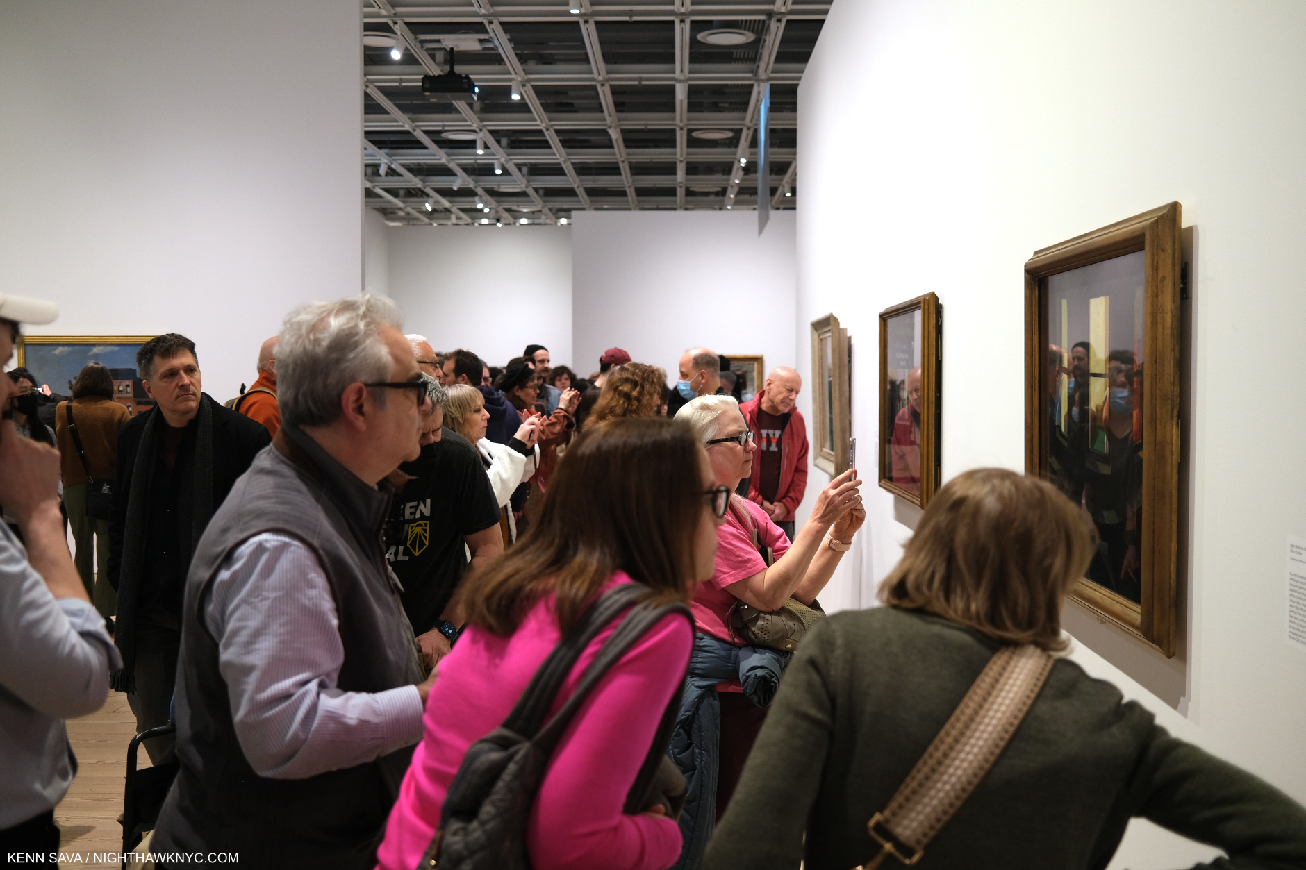
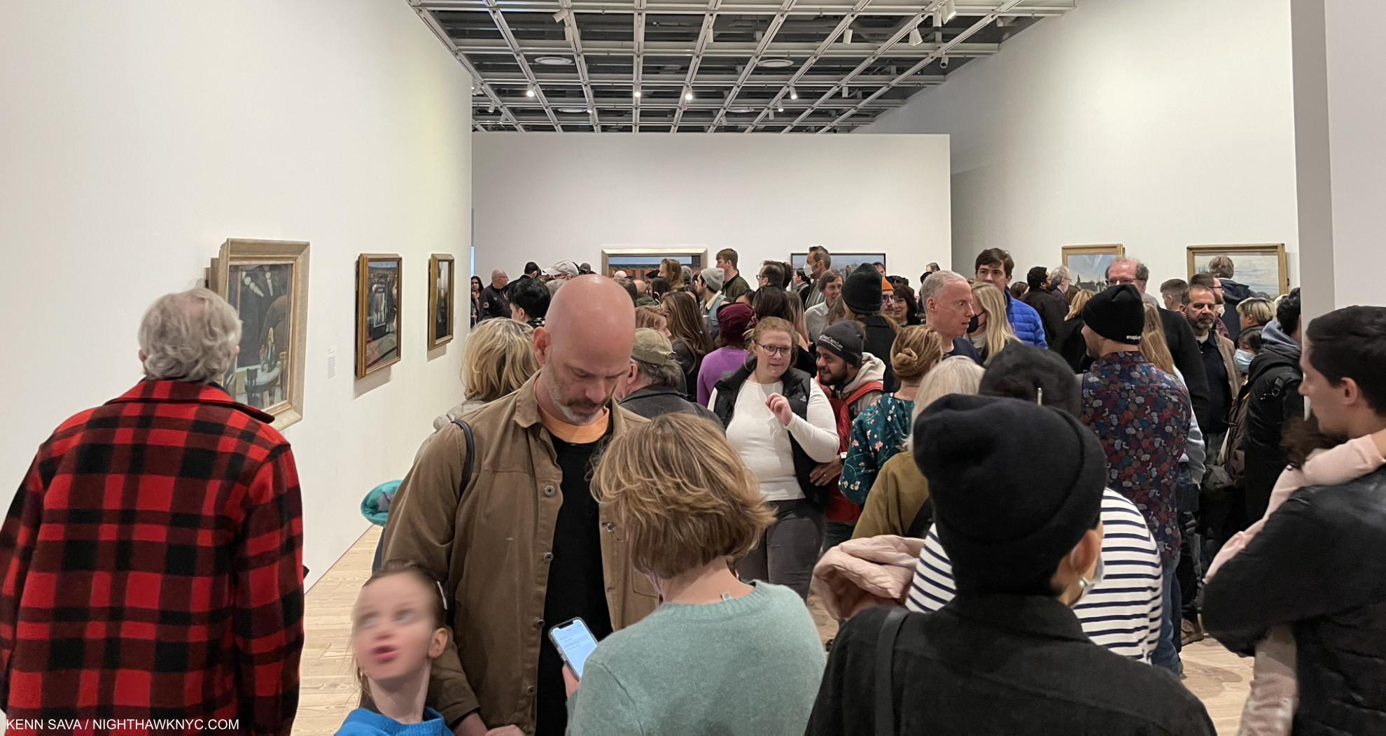
Now. Or never. This is about as crowded as an NYC Art show gets. 5pm, March 5, 2023. One hour to go on its final day. The final weekend was sold out.

Edward Hopper’s New York was the very first time  I’ve seen so many Edward Hopper Paintings in one place. I went 14 times because who knows when I’ll get another chance.

There’s how Hopper Painted, then there’s what he Painted. I’m going to attempt to look at both. In this part, I take a look at how he Painted, i.e. his style, and how, and if, it evolved. In Part 2, I look at what he Painted in a piece that is a personal reaction to what I see when I look at Edward Hopper now. Having the chance to see and study this many Hopper Paintings from early through late in his career Edward Hopper’s New York completely changed how I see his work. This is shocking to me because I’ve been looking at his work almost as long as I have anyone else’s- well over 40 years. To this point, I saw his work as one of the ultimate (and perhaps unsurpassed) expressions of modern loneliness and isolation of the century. Now, I see that as ancillary to other themes, themes that occur even when there are no human subjects. Themes that occur in his work in and outside of NYC.

One great thing about Art is that it’s there for everyone to see and make up their own minds what it says to them. I’m sharing here what it says to me. I hope everyone will look at Edward Hopper, and all Art, for themselves. 

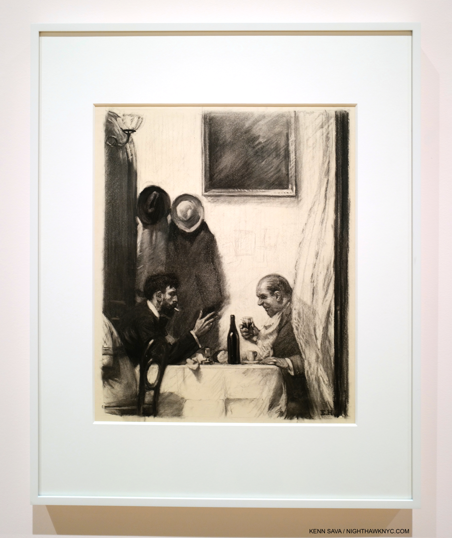
In a Restaurant, 1916-25, Charcoal on paper. For those who’ve criticized Hopper’s technique. He came by it honestly. 6 years in Art schools under esteemed Artist teachers. How they felt about his skill is evident in the fact that he was assigned to teach life Drawing, one of the hardest types of Drawing, before he graduated.

“In every artist’s development the germ of the later work is always found in the earlier. The nucleus around which the artist’s intellect builds his work is himself; the central ego, personality, or whatever it may be called. and this changes little from birth to death. What he was once, he always is, with slight modification. Changing fashions in methods or subject matter alter him little or not at all.” Edward Hopper7

Edward Hopper was born on July 22, 1882 in Nyack, NY, some 80 miles as the Owl majestically flies from the City. He visited the City as a child with his parents, then came here on a daily basis while attending Art school from 1899-19068. Towards the end of that time, he took up residence on West 14th Street, before taking three trips to Paris from 1906-10. After returning to the City, he lived at 53 East 59th Street9 before moving to 3 Washington Square in 191310.

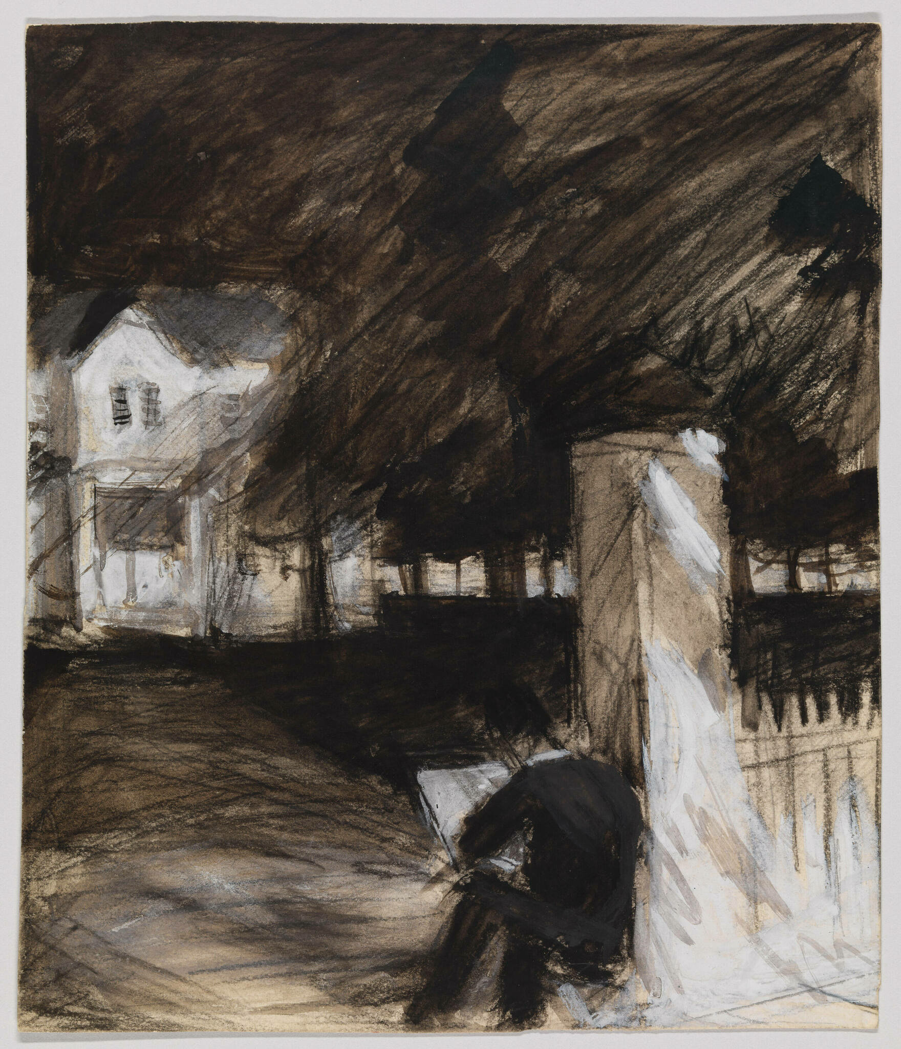
Untitled (Study of Man Sketching in Front of a House), c. 1900, Opaque watercolor, fabricated chalk and graphite pencil on paper (recto); Graphite pencil, pen and ink and opaque watercolor (verso). *-Whitney Museum Photo. Not in the show.

Seeing that introductory wall, shown earlier, sent me delving deeper into Edward Hopper’s Artistic beginnings (1895, at about age 15, to 1913, when he moved into 3 Washington Square at about 31) for the first time, looking to see when his themes began, how his style and technique changed over that time, and what they could tell me about his familiar later work. Most of Hopper’s early work is in the Whitney’s Permanent Collection, thanks largely to the 1970 Jo Hopper Bequest. It is, unfortunately, too rarely seen, and in my view, under-considered.

From the beginning, one thing that stands out to me is that Edward Hopper was a “traditional” Painter. That is, he relied on his preliminary Drawings & Studies as the basis of his Paintings, as Painters had been doing for as long as there had been Painters. Though Photography was making steady inroads into all aspects of life, and being used by an ever-increasing number of Artists & Painters during his lifetime, Edward Hopper never used Photographs as the basis of his work11. Untitled (Study of Man Sketching in Front of a House), from the year his Art school studies began, may be of a fellow student or be a de-facto Self-Portrait. In either case, it shows something I imagine Edward Hopper did regularly for the rest of his career. In addition to relying on long-standing traditional methods, Edward Hopper steadfastly remained true to his vision. He not only resisted Abstraction, but he uncharacteristically fought against it in print, in a publication titled Reality, which he contributed to.

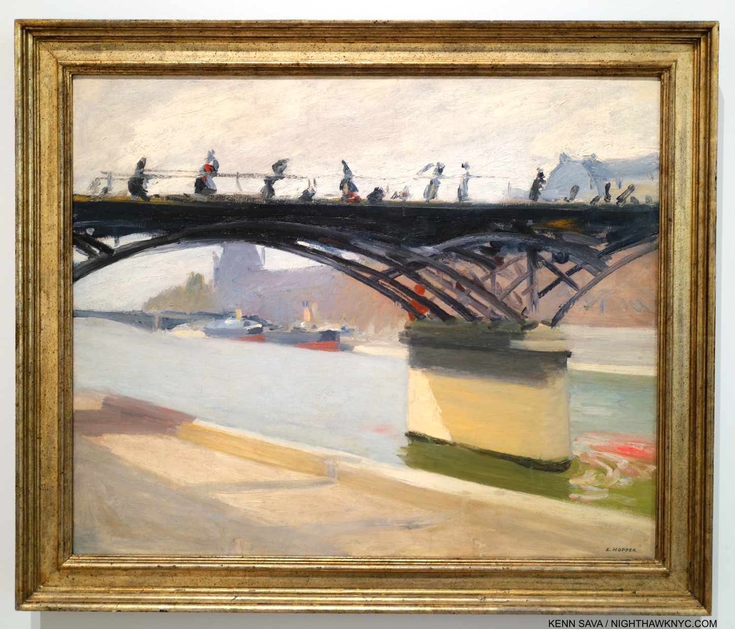
Le Pont des Arts, 1907. Edward Hopper Painted this outdoors near where he was staying on his first trip to Paris. So, it’s strange to see early on in a show devoted to his NYC work. Nonethelessless, it’s interesting for its style and for its content (see Part 2).

While in Paris, Edward Hopper saw shows of the work of the so-called “impressionists,” (a box I don’t subscribe to, so I will use “earlier French Painters” instead) but, apparently did not see the work of Picasso. It’s hard not to see their influence in this, but, at least for me, not that of any one Artist in particular stylistically. Under their spell, he seems to be doing his own take on it.

The question for me became- How far did this influence go, and how long did it last?

“It took me ten yers to get over Europe,he said.12. Ten years after Europe would be 1920. Looking at the show, a case could be made it lasted much longer.

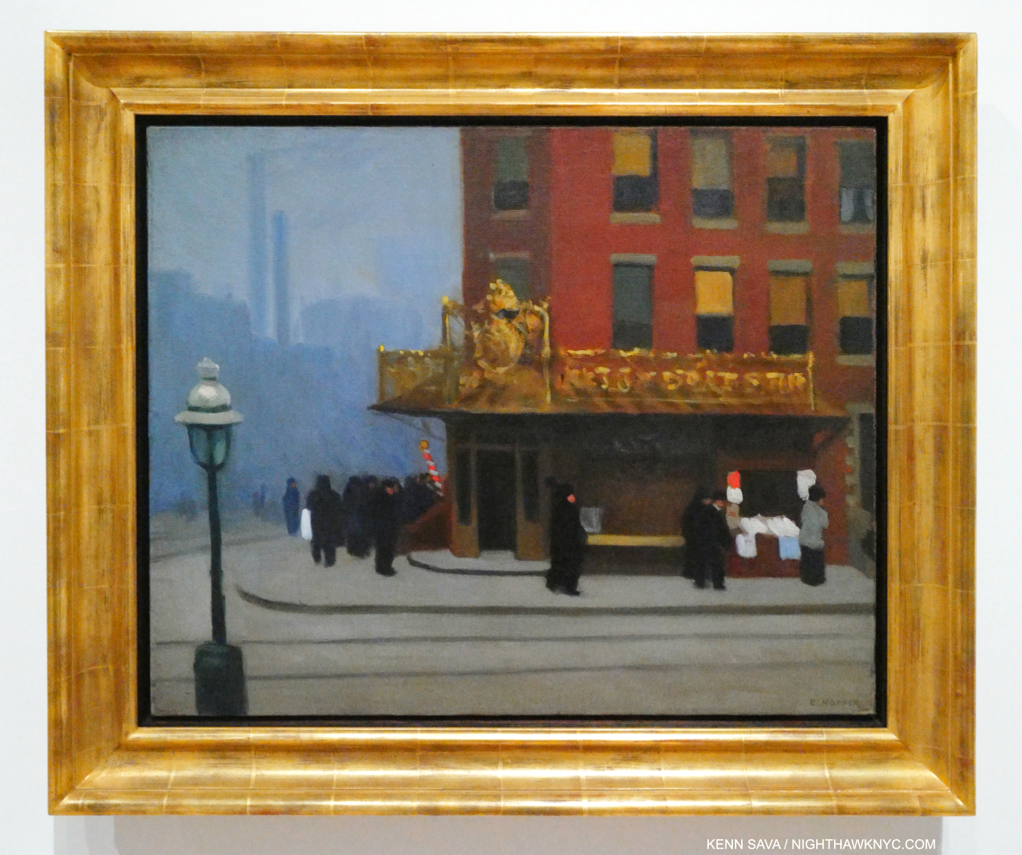
New York Corner (Corner Saloon), 1913 became a touchstone for me over my 14 visits. If it wasn’t for the familiar lamp post and the smoke stacks in the rear, you might think this is a corner in Paris. A charming and unique early New York work, it was in MoMA’s collection until at least 1981. At some point after, they sold it! A shortsighted mistake in my view.

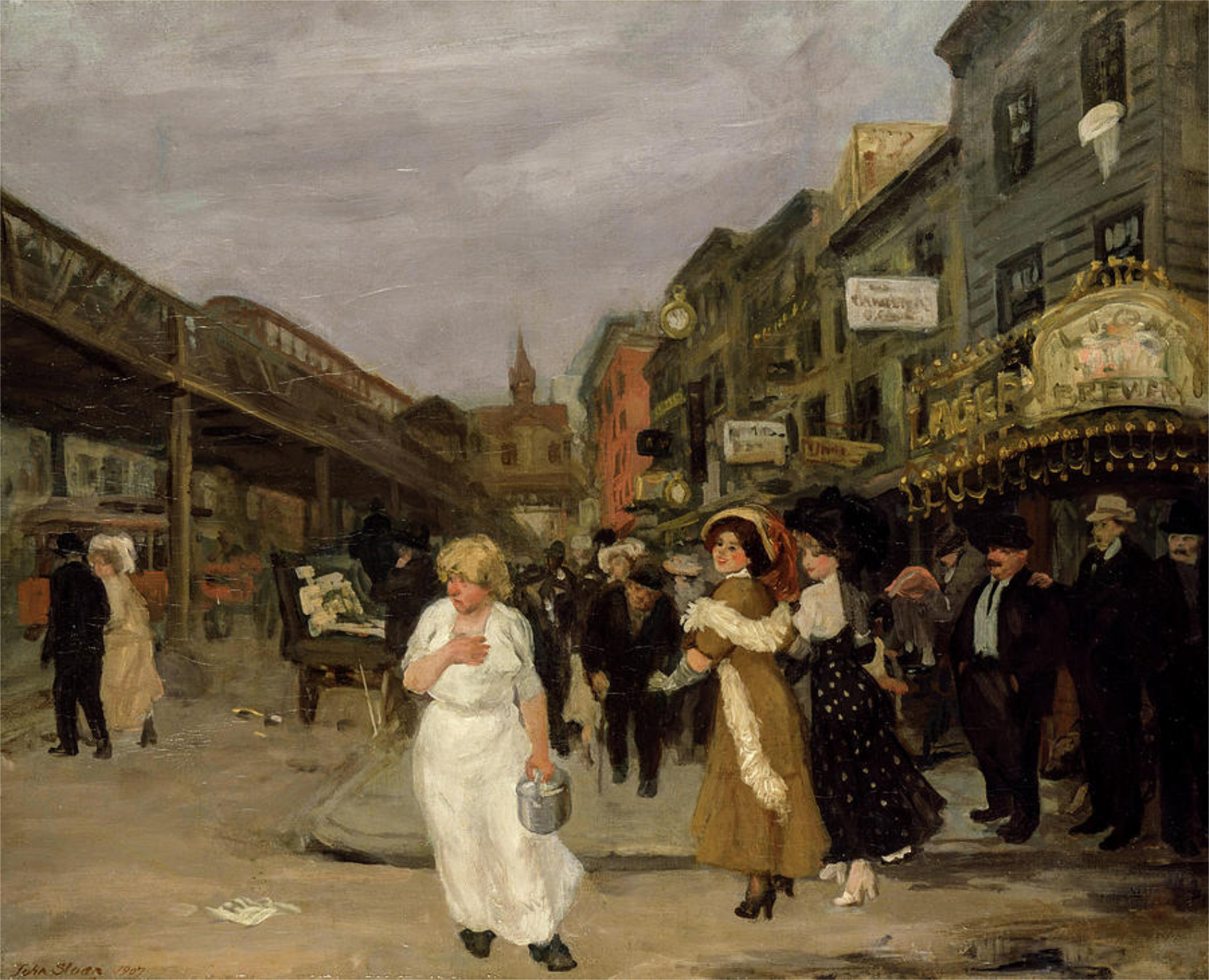
After returning from Paris, the 28-year-old Artist set about surviving as one. To this end, his work as an Illustrator from 1917 to 1925 provided him with income until his work began to sell. His first show, at the Whitney Studio Club in 1920 (the predecessor to the Whitney Museum), with 16 Oils, produced no sales. In 1923, his Watercolors began to sell after they were shown at the Brooklyn Museum. Then, in 1925, The Met bought 15 Hopper Etchings. Later that year, he sold Apartment Houses to the Pennsylvania Academy, his first museum Painting sale. As his Paintings finally began to sell (mirroring the experience of Winslow Homer, to whom his Watercolors were compared, whose Watercolors also sold before his Oils began to13), in September, 1925, he was able to give up illustration14. Among his early Paintings, the wonderful New York Corner, 1913, caught my eye. It’s interesting to contrast it with this work by John Sloan, one of his teachers, Sixth Avenue and Thirtieth Street, 1907.

John Sloan, Sixth Avenue and Thirtieth Street, 1907. The Sixth Avenue elevated train, which Hopper frequented, runs to the left. The gold sign on the right reads “LION BEWERY,” which was the 6th largest brewery in the US in 189515. I believe this view may be looking downtown, if that’s the Jefferson Market Courthouse in the background. *-Photographer unknown.

New York Corner currently resides in the collection of the Canter Center, Stanford University. Upon acquiring it, their press release says, “New York Corner, created when the artist was 31 and considered the first work made in his representational style.” Wait. What?

“representational-noun 1. showing things as they are normally seen” Cambridge Dictionary

What’s “representational” about it?

In December, 1913, Edward Hopper moved into 3 Washington Square on the Park, where he would live for the rest of his life, so this may have been executed based on a scene near his East 59th Street home just before or just after his move (unless this is a scene on East 14th Street. There’s nothing like the background anywhere else in what would be his West Greenwich Village neighborhood.). When I look at New York Corner, I see an Artist who’s in transition. It seems to me Hopper is wrestling with the influence of his teachers Robert Henri & John Sloan, and what he’d seen in Paris. The top half (i.e. the building) is slightly more “representational,” slightly more resolved (especially in comparison to work he did in Pars, like River Boat or Le Pont Royal, both 1909, and American Village, 1912,), while the bottom half is entirely out of focus. The figures are more like shadows, the indistinct but distinctive gold signage is striking, and stands in stark contrast to the sign in the Sloan. It only adds more mystery to the feel of the whole piece. The upper two floors of the building feature windows that are not much different from those seen on the upper floor of Early Sunday Morning (which are more defined) or across the street from the diner in Nighthawks (ditto). He’s starting to get there.

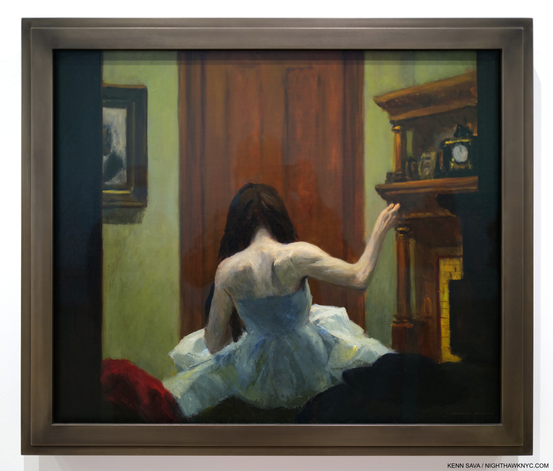
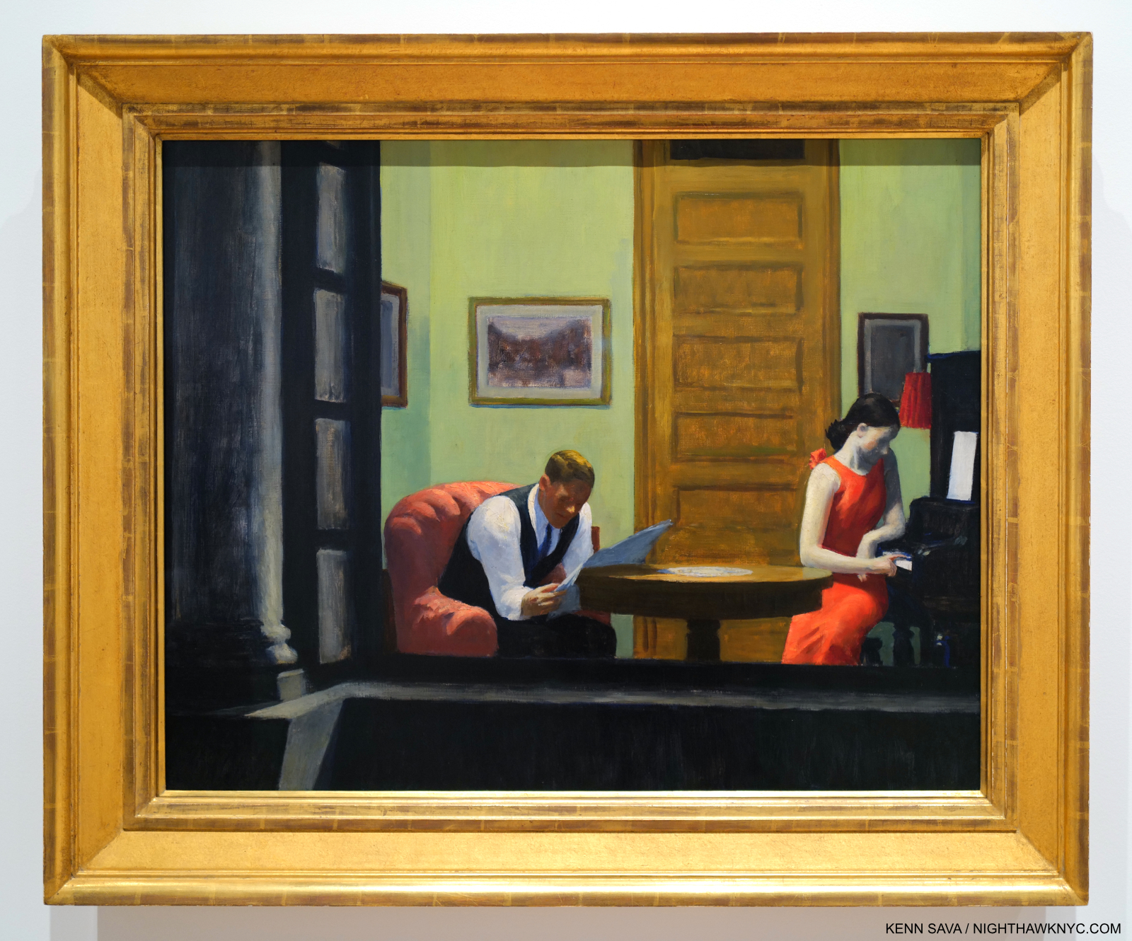
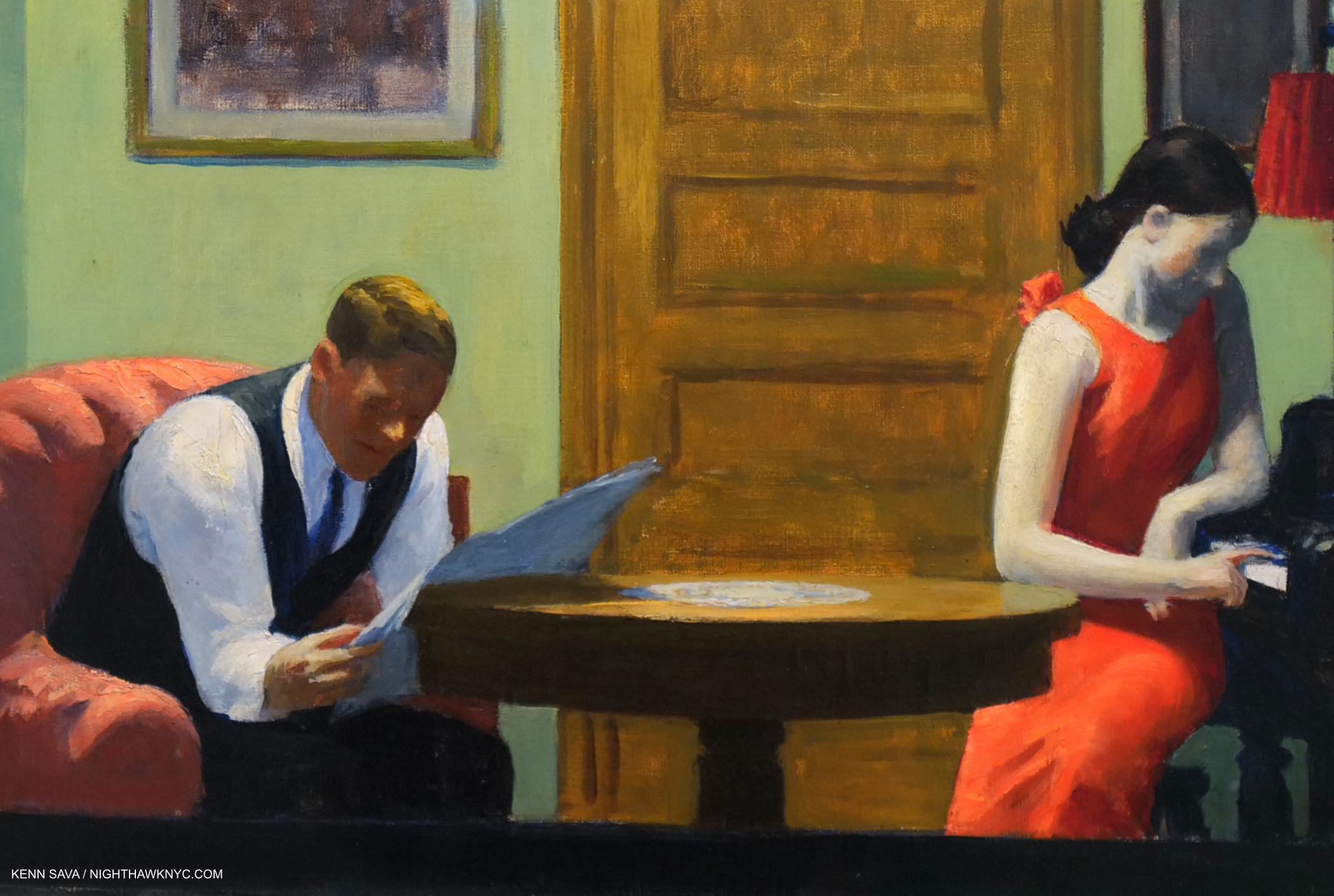
New York Interior, 1921. Seen through a window, this wonderful piece is one of a number of Hoppers that reminds me of Degas. See Night Windows, below. Notice the clutter on the mantel. Then compare this with Room in New York, seen further below.

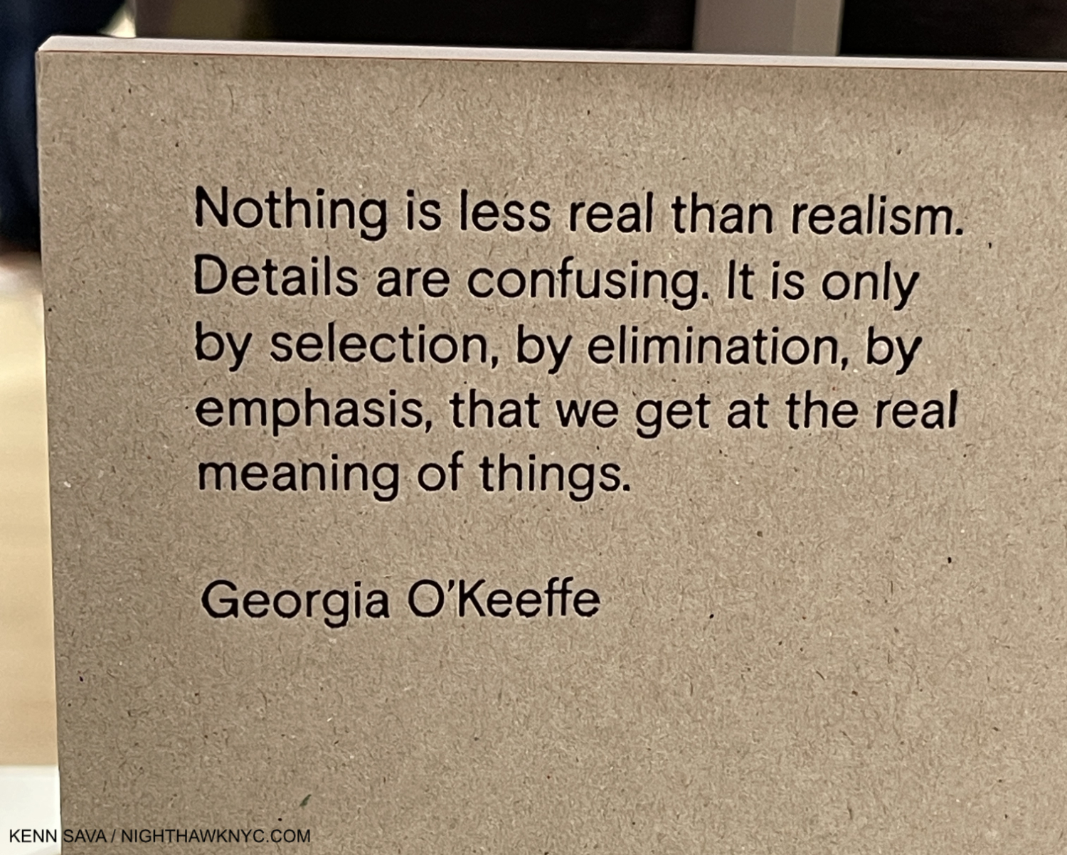
As I’ve said, I don’t subscribe to most of the “-isms” that proliferate in Art, and the world, and that applies to putting Edward Hopper in anything other than the “Edward Hopper box.” As time goes on, putting him in the “realism” box he’s usually stuck in seems increasingly problematic. To wit- In Gail Levin’s massive 780-page Expanded Edition of her Intimate Biography of the Hoppers I couldn’t find one instance of Edward Hopper referring to his Art as “realism.”

“realism-noun 1: corcern for fact or reality and rejection of the impractical and visionary” Merriam-Webster

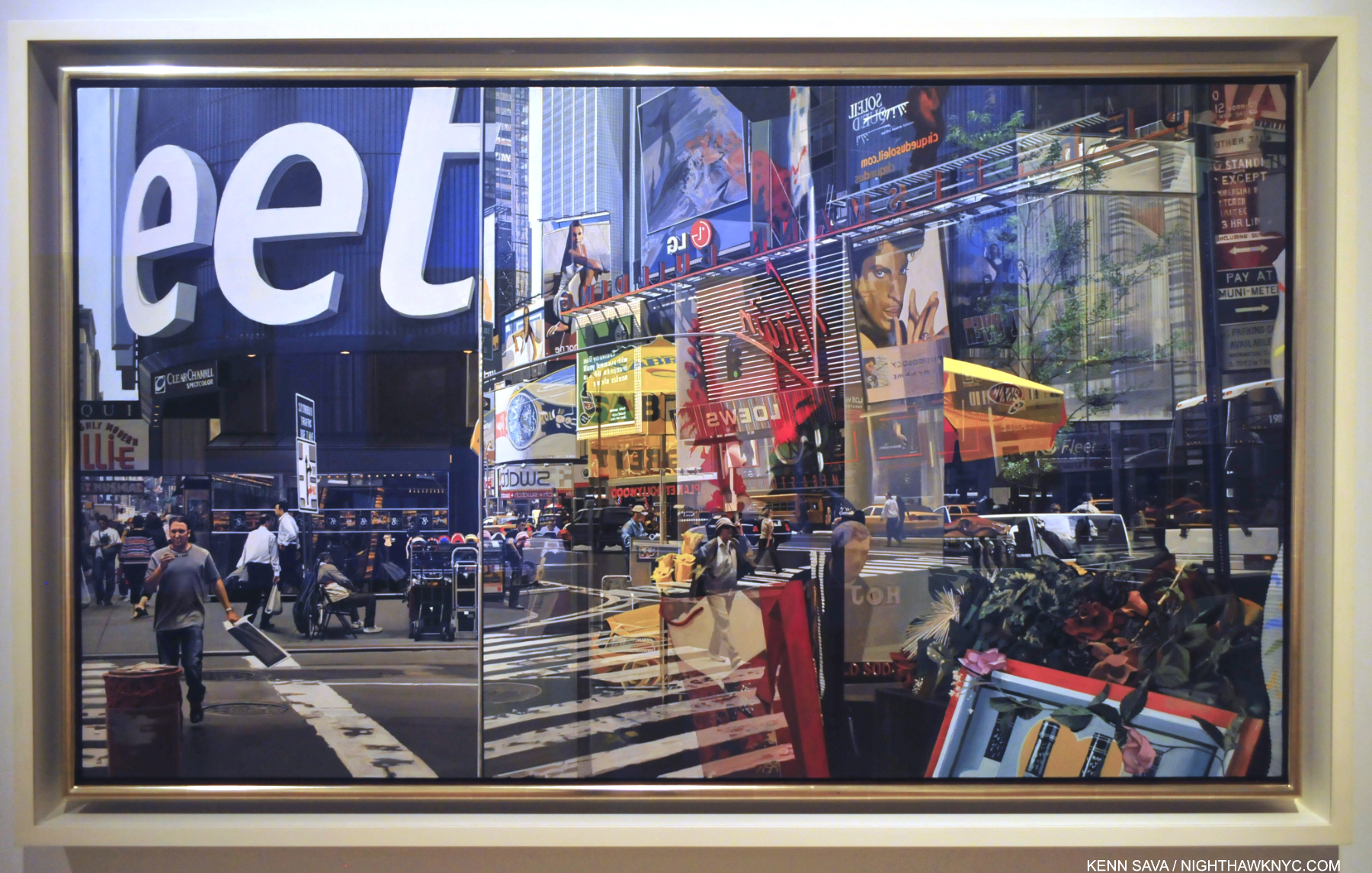
Richard Estes, Times Square, 2004, Paintings don’t come much more technically astounding than this. Unless, they’re by Jan van Eyck. Having stood on this spot before, during and after 2004, I can certainly verify the overwhelming visual noise that still is Times Square, something that has never been more faithfully realized than it is here.

I’m sorry, but when I look at his Art, it doesn’t fit that definition. For another thing, “realism” in Art is a term that began seeing heavy use in the 19th century, though I’ve seen the term applied to Artists like Caravaggio, 1571-1610. In all that time, things have changed. In 1966, the year before Edward Hopper died, Richard Estes began Painting New York in ways that redefined what had been called “realism,” making everything stuck in that box previously look, well, “different.” While Edward Hopper often Painted scenes looking through windows, Mr. Estes took the art of rendering their reflections to an entirely new level, while often Painting at the hyperfocal distance, which added new depth to his depictions of the world. Suddenly, the eye was free to go anywhere on the canvas and it was all rendered “democratically” (i.e. with apparent equal weight) and in focus. Others, including Rod Penner, followed, pushing the envelope of what had been done, all the while in the service of Art. There was suddenly more than one kind of “realism!” Since none of them have put their Art in a box in their interviews, I certainly don’t subscribe to the terms others ascribe to their Art. Therefore, Messers Hopper, Estes and Penner reside in only one “box” each: the one with their name on it. “Realism” has been used for over 125 years! it’s past time to retire it. It’s outlived its supposed meaning.

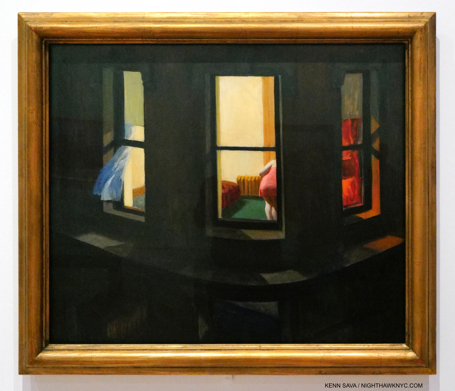
Night Windows, 1928. Among the earlier French Painters, Edgar Degas is someone I see in numerous Edward Hopper compositions. Perhaps more than I see any other Artist. Hopper seemed to share Degas’s voyeuristic streak. Many of both of their Paintings show women being observed apparently without their knowledge.

It’s pretty plain to see that these recent developments are at odds with Edward Hopper’s style. Then again, I don’t think he was ever out to win the realism race. Hopper authority Gail Levin said his work has “the suggestion of reality16.”

Finally, there’s this for all those who box Hopper as a “realist”-

“I think I’m still an impressionist…” Edward Hopper.

Edward Hopper didn’t say that in 1913 after Painting New York Corner. He said it in 1962, a mere five years before he died! He said it in an interview published in Katherine Kuh’s book The Artist’s Voice: Talks With Seventeen Artists, in 196217. That Edward Hopper, who never minced words, or used them without careful consideration (like the careful consideration he gave every detail of his compositions) especially in the very few interviews he did, would say this so late in his life and career HAS to be taken seriously. So far, it hasn’t been. The “realism” noise surrounding his work remains deafening. I came upon the “impressionist” quote after already being convinced by the visual evidence in Edward Hopper’s New York that he took what he learned from the earlier French Artists and used it in his own way. He was one of the Artists who forged what some call an “American style,” an important goal at the time. Yet, his influences remained in his work throughout his life to the extent he chose to use them, in varying degrees, to suit his purposes in each particular work.

GeorgiaO’Keeffe quoted on the back cover of the catalog for her 2021 show at Museo Nacional Thyssen-Bornemisza.

Part of that influence, I believe, was that as time went on, Edward Hopper began removing unnecessary objects from his Paintings. It seems to me his work lives on its mystery. Isn’t too much information an enemy of mystery? He also stopped using “real” settings, creating his own, possibly based on actual places combined with his imagination. In spite of my decades of looking for the “real” Nighthawks diner, this may well be what he really did: he based it on a place he saw then modified it in his imagination to suit his purposes (and he said as much). And that is the key: everything superfluous went out of his Art. That’s one thing that makes Nighthawks such a brilliant, timeless, nebulous work.

The result? For me, many of Edward Hopper’s New York Paintings are “impressions.”

Room in New York, 1932.

I rest my case with Room in New York, from 1932. One of his masterpieces, in my view, it defies every single box Edward Hopper has been put in. It’s one of his many scenes looking into a window. Perhaps something he saw in a fleeting moment while riding the Sixth Avenue elevated train, or in passing as he walked, or maybe it’s a scene he imagined, possibly filtered through his own relationship experience. If, and it’s a huge “if,” this is (at least partially) filtered through his marriage, this may be as frankly as he ever depicted it. Look closer-

Edward Hopper’s “realism?” Bah humbug. A classic example of why I ignore boxes and just look at the work for myself!

Look! The faces have no details! This is by intent, of course. He obviously considered facial details to be unnecessary to what he was trying to express, or distracting from it. Is this what he meant when he said, “I think I’m still an impressionist…?” Isn’t this closer to the work of the earlier French Painters than anything else? No so-called “realist” Painted like this! Only George Seurat, among those earlier French Painters, Painted like this- on occasion (not all the time). In most Paintings that include humans, their faces and expressions carry the weight of the work. Not here in this scene that includes a woman and a man and not much else. How utterly daring! Without them, what’s a viewer to focus on? For me, all that’s left is the body language. And that red dress. “All dressed up with no where to go?” The woman in Nighthawks is also wearing a red dress. Could it be a pendant to Room in New York?

When people talk about the”genius” of Edward Hopper, for me, it’s on view in Room in New York, 1932. He had evolved through his education, his time overseas, his influences & experiences, and had arrived at the place of knowing, then executed it using his time-tested, traditional, methods. He knew what he wanted to say here, and had developed the confidence to leave out the non-essential (perhaps, inspired by seeing the earlier French Painters do it), including “minor details” like facial features! He created an impression of a scene, in my view, real or imagined, that mimics the fleeting moment that may have inspired it and somehow works perfectly, just as it is, without them.

Two on the Aisle, 1927.

In Two on the Aisle, from 1927, five years before Room in New York, the faces are “incomplete,” but more “defined” than the two in Room in New York. Perhaps he became emboldened to go further after works like this. 

The Sheridan Theater, 1937.

In Sheridan Theater, nothing is in sharp focus.

Then, in Morning Sun, 1952, the woman’s face (Jo was his model) is Painted so expertly (in my opinion) as to leave her expression ambiguous, making the work open to endless contemplation. These are just a few of the works that have “selective details,” i.e. details the Artist chose to include, or omit. In my view, this is always done to forward what he’s trying to express.

Boxes confine an Artist to one style. If the Artist says my work is in this box? So be it. It’s when other people put an Artist in a box that’s wrong in my view; for the Artist, and for not giving the viewer the chance to see the Art for themselves. Artists, being people, are free to change their minds, evolve, even move into other styles over time. Boxes don’t allow for this. Edward Hopper used his technique and the wide range of his skill as he saw fit in each work. A good number of them (i.e. many) strike me as “impressions,” and it’s their nebulosity that adds so much richness to considering them. There is enough detail in these to ring true with viewers, and enough vagueness to allow them to return to the work again and again. In other works, like Office at Night,1940, he chose to sharpen things up, but still managed to keep the mystery and the drama due to the brilliance of his composition and the realization it.

“Great art is the outward expression of an inner life in the artist, and this inner life will result in his personal vision of the world,” Edward Hopper18.

On the surface, these works may be “impressions” to my eyes. They are also transcriptions of the Artist’s “personal vision of the world.” Whatever you call them, they are as close as Edward Hopper got to making his inner world, “reality.”

*-Soundtrack for this piece is “An American in Paris” by George Gershwin, 1898-1937, a contemporary of Edward Hopper. Born 16 years after Hopper, he died, tragically of an undiagnosed brain tumor, 30 years before the Painter would. Hopper’s taste (if any) in Music is unknown to me, however as Edward Hopper’s New York points out in a room dedicated to it, he was an avid theater and movie-goer. As such, the name George Gershwin could not have been unknown to him. Gershwin, like Hopper, helped define what some call an “American style” of Music, as some say Hopper did for Art. Gershwin, who also Painted, was born in the City and spent most of his life here. Here “An American in Paris,” in homage to Hopper’s time there, is performed on a piano roll by George Gershwin, himself-

In Part 2, here, I take a look at what Edward Hopper’s Art says to me now, after immersing myself in Edward Hopper’s New York. Part 3 looks at some current issues surrounding Edward Hopper’s Art. 

NighthawkNYC.com has been entirely self-funded & ad-free for over 8 years, during which 300 full length pieces have been published! If you’ve found it worthwhile, PLEASE donate to allow me to continue below. Thank you, Kenn.

You can also support it by buying Art, Art & Photography books, and Music from my collection! Art & Books may be found here. Music here and here.

Written & photographed by Kenn Sava for nighthawknyc.com unless otherwise credited. To send comments, thoughts, feedback or propositions click here. Click the white box on the upper right for the archives or to search them. Subscribe to be notified of new Posts below. Your information will be used for no other purpose.

  1. The first Hopper authority, outside of his wife, the Artist Josephine Nivison Hopper aka Jo, and curator behind the 1950 Edward Hopper Retrospective and the 1964 Edward Hopper show.
  2. In saying all of the above I am not saying that Edward Hopper is my favorite Artist, or I think he’s “the best.” I don’t believe in qualitatively comparing creative beings or works.
  3. Edward passed in 1967. Jo, the Artist Josephine Nivison Hopper, continued to live there in failing health until she died in 1968.
  4. Hopper worked on Nighthawks during the beginning of World War II for the U.S., having started it around the time of Pearl Harbor. In the Logbook of Hopper’s work, Jo recorded it being completed on January 21, 1942, as I show here. Jo worried German bombs would be falling through their skylight. Edward was too busy working to seem to care, or maybe he was escaping into work (Gail Levin, Edward Hopper: An Intimate Biography Expanded Edition, P.348.)
  5. on 2 floors of the old Whitney, who have mounted smaller shows juxtaposing Hopper with other Artists, since, as well as the floor they gave him in their Full House show in 2005, and the Hopper Drawing show, which I saw in 2013, which had over 200 Drawings and some Paintings, including Nighthawks, on loan, as I partially showed in my very first piece in 2015.
  6. which does not include about 30 Illustrations whose media were not listed but many appear to include watercolor.
  7. from a letter from Hopper dated 1935 quoted in Gail Levin, Edward Hopper As Illustrator, P.1.
  8. Twice the length of time his teacher Robert Henri recommended.
  9. Gail Levin, Intimate Biography, P.84
  10. While spending summers in Maine and then in Truro, MA.
  11. The lone exceptions I’m aware of are his 2 Civil War-related Paintings which may have been based on Photographs he saw in a published collection of Civil War Photographs.
  12. Gail Levin, Edward Hopper: The Art & the Artist, P.126
  13. Gail Levin, Intimate Biography Expanded, P.171
  14. https://archive.artic.edu/hopper/chronology/
  15. https://en.wikipedia.org/wiki/Lion_Brewery,_Inc.
  16. Gail Levin, Intimate Biography Expanded, P. 441.
  17. P.135, as quoted in Sheena Wagstaff, “The Elation of Sunlight,” in Edward Hopper Tate Exhibition Catalog, 2005, P.25.
  18. Statement in Reality #1 as seen in the show.

My Search For Edward Hopper’s Nighthawks Diner

Written & Photographed by Kenn Sava (*unless otherwise credited).
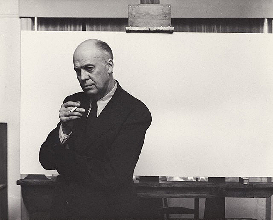
Arnold Newman, Edward Hopper in his New York studio, November 1, 1941, Gelatin silver print, *Arnold Newman Collection/Getty Images.

You’re looking at Art history.

After the fact, this may be one of the most historic Photographs in American Art. I’m not only talking about it being a wonderful portrait of Edward Hopper. It’s much more. The date is November 1, 1941. On January 21, 1942, the Artist’s wife, Jo Hopper, would record the completion of the work her husband created on that blank canvas he is posing in front of in the Artist’s Ledger of his work.

A section of Edward Hopper’s Ledger page for Nighthawks, from the book, Edward Hopper: Paintings and Ledger Book Drawings. It wound up in the Art Institute of Chicago almost immediately. Its sale netted Edward Hopper about $1,700.00.

In the intervening 81 days, Edward Hopper Painted the incomparable Nighthawks on that very canvas. We don’t know if Arnold Newman had any clue as to what Edward Hopper’s intentions were for that canvas. But we know now. The odds are that he had finished his preliminary work- the inspiration, the sketches, the reference Drawings, the sizing calculations he usually did, and ordered the stretcher and canvas we see behind him on his famous easel. Most likely? At this very moment, this masterpiece was all in his mind, and possibly on it, as Arnold Newman pressed his shutter release.

Click.

For the following 77 1/2 years (exactly, as I write this), and counting, the world has been fascinated by Nighthawks like they have few other Paintings created in the 20th Century. Some of us, including myself, are borderline obsessed by it.
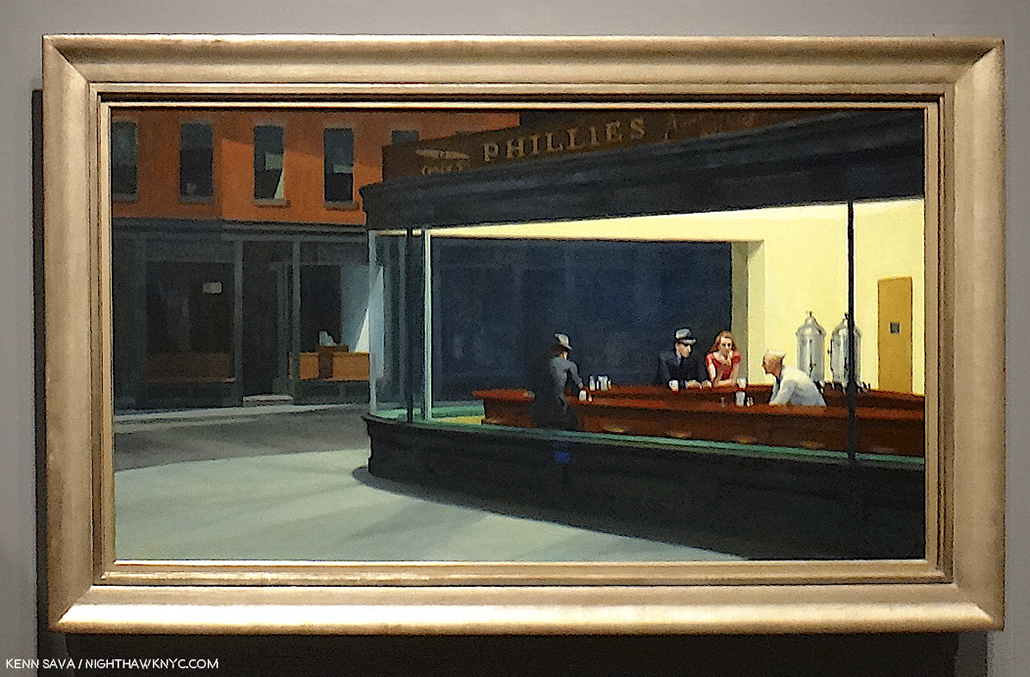
Written on my soul. The last time I stood in front of Nighthawks. August 28, 2013, at Hopper Drawing at the old Whitney Museum.

I’ve stood in front of it twice in my life. The first time at The Art Institute of Chicago in 2005, the second at the old Whitney Museum in 2013. In July, 2015, I named this site after it and wrote about why in the very first piece I Posted here, “Welcome To The Night,” To commemorate the 4th anniversary of NighthawkNYC.com, I present My Search for the Nighthawks Diner.
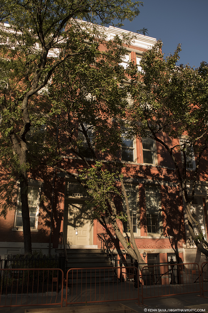
Edward Hopper posed for Arnold Newman, and Painted Nighthawks here, on the top floor of 3 Washington Square North, just east of the Arch in Washington Square Park, in Greenwich Village, that it looks out on, where the Hoppers lived for over 50 years, from 1913 until the Artist’s death in 1967. This is a key point for a variety of reasons, and an intriguing one because Edward Hopper was the furthest thing from “bohemian” one could imagine. Yet, living here he, like most New Yorkers, walked regularly, probably daily, and so the areas he was able to walk to may have become the sites of, or the inspirations for, his Paintings. And so, for almost all of the past 77 years viewers have been asking the question-

“WHERE is the diner Edward Hopper Painted in Nighthawks?”

I’ve been trying to find it for the better part of my life. Having lived in the area for 28 years and having frequented it before I lived here, the Village is an area I’m as familiar with as I am any anywhere. During that time, as during the Hopper’s time here, change has been the only constant. Change has also been a constant enemy in the attempts to locate, for once and for all, the diner we see in Nighthawks. My search has been carried out using only a few tools. First, the extensive Hopper literature. Though very little of it is directly relevant to this search, much of it is indirectly relevant, providing a framework for how, when and where he created his extensive oeuvre of Paintings, Watercolors and Drawings. The books by Gail Levin, (the Hopper’s biographer and the author of numerous other books on the Artist and his work, including the 4 volume Catalog Raisonne), particularly her Hopper’s Places, Second edition and the catalog for the 2013 Whitney Hopper Drawing show have been the most referred to for this quest. Outside of this, I have relied on my own two feet, my cameras and, yes, my gut.

Once that “Could this be IT?” bell goes off, I research the possibility, beginning with “What did this place look like around 1940?” Is any of that here to be seen now (i.e. when I was standing there)? What does common sense tell me? In the case of Edward Hopper, “common sense” comes from studying his work. Hopper’s Places provides part of the basis for some of that “common sense.” In it, Ms. Levin shows us contemporary Photographs she, herself, has taken at various sites Edward Hopper Painted around the world- though not Nighthawks, “…to show how he both recorded and transformed” these places, she says in her “Preface to the Second Edition,” P.vii. On P. x, she adds, “Research for the biography also revealed that in his later years Hopper relied upon observing specific sites more often than anyone had previously realized.” Even though much has changed over time, I still get a bit of a sense of Hopper’s approaches to rendering actual places. Much is, also, to be learned by looking at and studying historic and contemporary pictures of places under consideration. In the case of Nighthawks, I used all of these tools in my search.
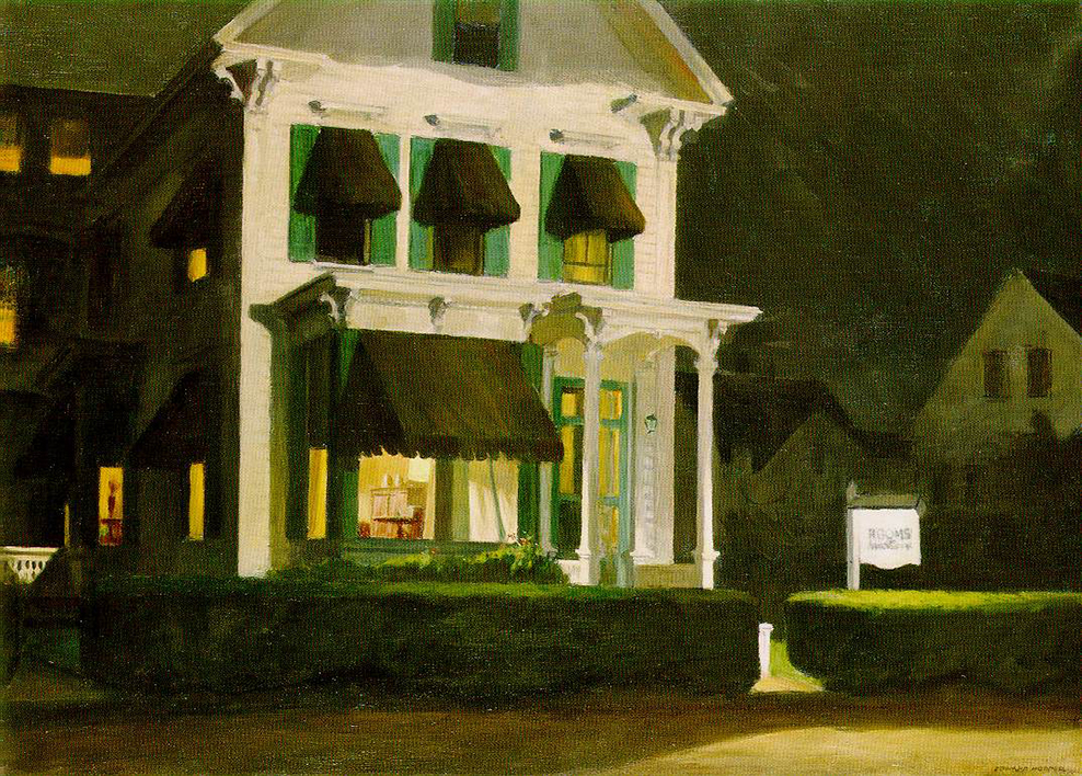
Rooms for Tourists, 1945. About 40 years later, I found this actual Rooming House this Painting is based on in Cape Cod, Mass., and stayed there. *Photographer unknown.

My gut has already helped me find one of “Hopper’s Places.” In the 1980s, I was traveling through Cape Cod and looking for a place to stay in Provincetown, Mass. I came upon a small Rooming House and instantly recognized it from the Hopper Painting, Rooms for Tourists, and so I just had to stay there. Part of my belief that Edward Hopper based Nighthawks on a real diner was finding that actual Rooming House in the 1980s when I visited Cape Cod.

I’ve spent most of my time searching in the West Village. For two primary reasons. First, this was the neighborhood Edward Hopper lived in and walked through regularly and most often. Second, as soon as one walks south of West 14th Street (the Village’s northern border) on 7th Avenue South, you’re faced with this-

Standing in 7th Avenue South at the intersection of Greenwich Avenue and West 11th Street, facing south, July, 2019. It HAS to be somewhere in this picture, right? No. There are countless triangular corners in the West Village, but this view is the most likely to contain it, I think. Click for full size.

As I stood in the middle of 7th Avenue South (NOT recommended) there were no fewer than TWELVE triangular corners around me! Those familiar with Manhattan know that almost all of it north of 14th Street is a grid made up almost exclusively of rectangles. Below 14th Street, “old Manhattan” streets wind seemingly with minds of their own, interrupted here and there with a semblance of uptown’s rectangular regularity. The triangular corners we see in Nighthawks are everywhere. WHERE to begin?
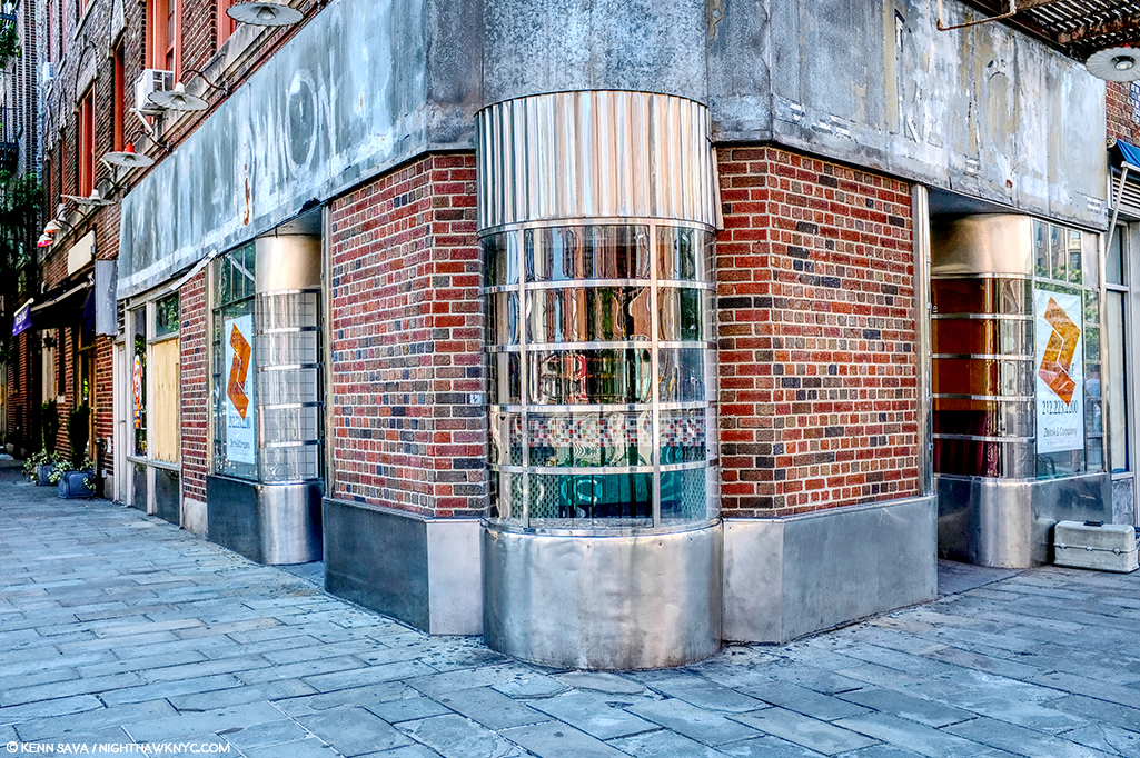
The former Two Boots Pizzeria, #11 in the picture above, is from the right period, but its building goes straight up, so I ruled it out quickly. Nothing feels “right” to me about it.
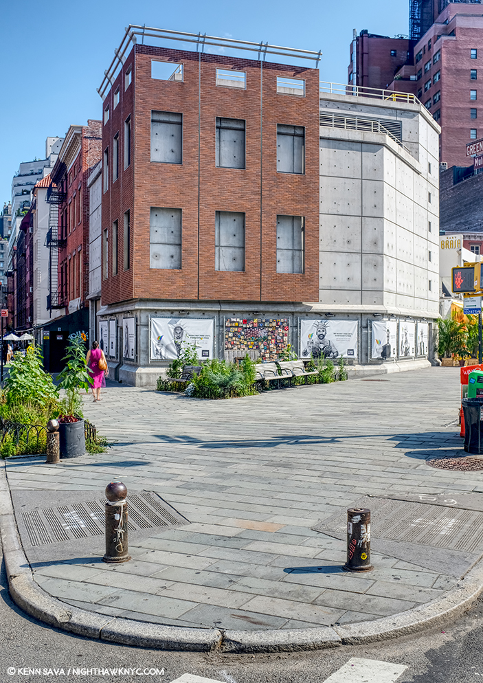
Mulry Square (in the foreground), #3 in the picture.

Perhaps no site has gotten more “hype” about it over time in regards to Nighthawks than Mulry Square, #3 in the picture. In spite of what many have said, I have seen nothing to indicate to me that this was the site of the Nighthawks Diner.
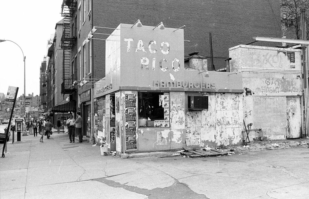
I would guess this would be  the early 1980s from the Rita Marley ads and Miles Davis ads, on the remnants of the hamburger place, which may be the remnants of the actual hamburger place that stood here in the 1940’s, which I show later on. Miles Davis came out of retirement in 1981. Is that a covered window along the left side? I haven’t been able to find out. *Photographer unknown.

The historical archives show a gas station with a small burger place at the time, but it looks more like a White Castle precursor to me than anything resembling the Painting’s diner. If anything, it may have been an inspiration for the “fishbowl effect”- where we are looking in through the glass at the customers. More on this later.
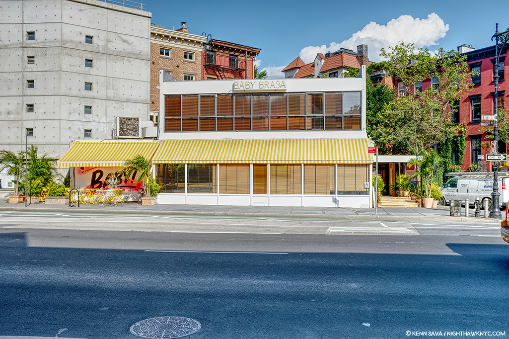
This is seen on the other end of Mulry Square, #4 in the picture, on another triangular corner, today. No viable candidates have been reported on this, also triangular, side of the Square, which is occupied by this too modern edifice today. I’ve also ruled it out.
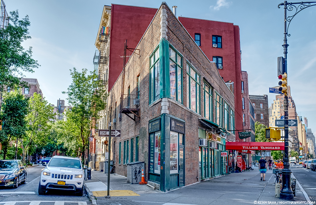
#9. Max Gordon Corner, named in honor of the long time owner of the Village Vanguard.

Directly across the street from #4 is this building, #9 in the picture, which has been home to the world’s greatest Music club, in my opinion, the Village Vanguard since 1927. There is a pizza place on the corner and the windows go through to the back street, but at 2 stories, I’ve long ago ruled it out. However, Art history will remember this spot because another great Painter, Richard Estes, wonderfully Painted it. (Which reminds me- In 2016, I visited the known site of one of Richard Estes’ latest Paintings in a piece I ironically called “Richard Estes’ Dayhawks At The Corner Cafe.”)
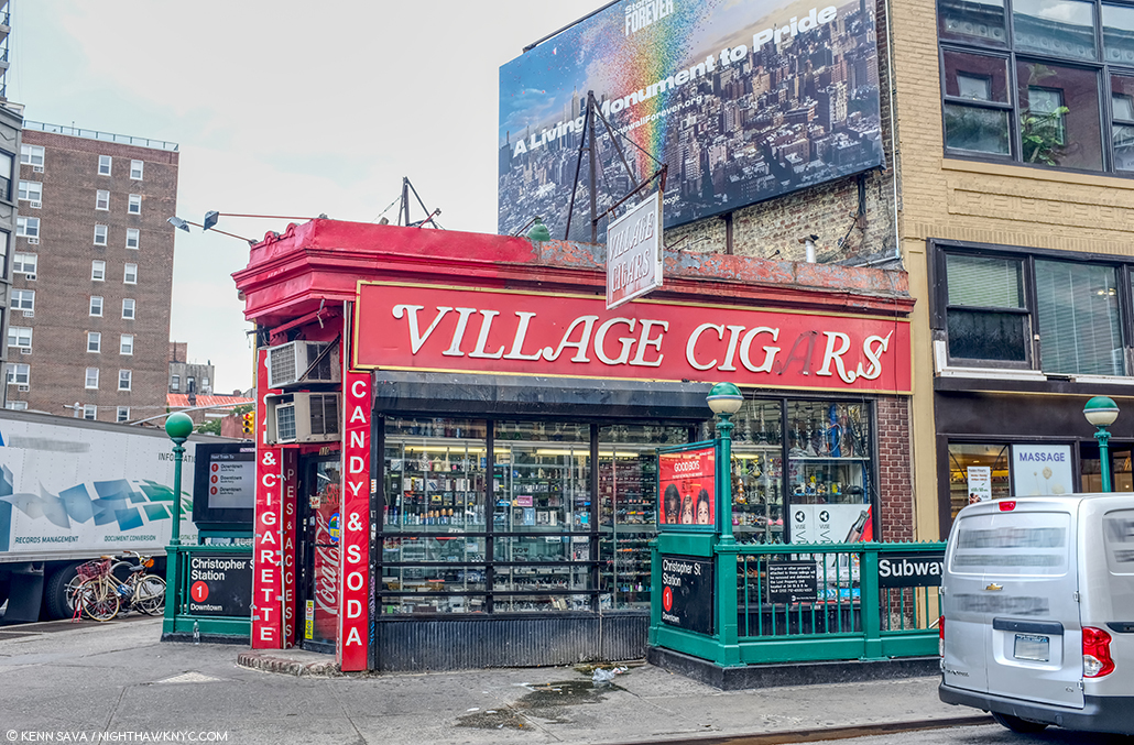
Village Cigars, 7th Avenue South and Christopher Street, Greenwich Village, NYC, June, 2019.

The site of Village Cigars is not numbered in the picture, being further down 7th Avenue on the right past #8. It’s garnered surprisingly little to no attention in the Nighthawks searches I’ve seen to this point. It has some things going for it- the shape and the cigar sign (Nighthawks has a Phillies cigar ad over the diner) but in speaking with the manager, I was told it’s been here for over 100 years, but it’s been a cigar store the whole time. Also, it doesn’t have the curved front window, those dual subway entrances were most likely also there in 1940 and are not in the Painting, and the buildings behind it are too far away. I’ve ruled it out. The Stonewall Inn is a few hundred feet to the left.
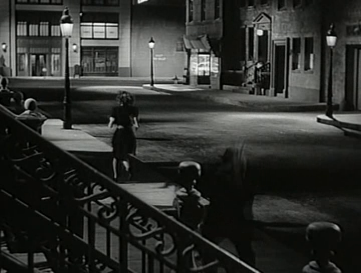
Some believe the inspiration lay in movies of the period, like this one, Stranger on the Third Floor, 1940. The suggested diner down the street on the right looks nothing like it, in my opinion. Possibly another “fishbowl effect” inspiration.

I remain completely unconvinced by any and all suggestions of movies I’ve seen. Yes, Edward Hopper was taken by a short story, “The Killers,” written by Ernest Hemingway in 1929, but I, for one, have not seen the evidence of that in the setting in the Painting. In the figures and the mood? Much more likely. “The Killers” was also made into a film, but, in 1946, too late to be considered. Maybe the Painting influenced it, as it has countless movies since.

That leaves the contenders. Speaking of movies, Edward Hopper reportedly frequented the Lowe’s Sheridan Movie Theater (which stood where #12 is in the picture earlier, and is seen further below), and based a Painting inside of it. His walk to and from it is interesting to me and it has been suggested that a few locations along this route are candidates for the Nighthawks diner. I looked closely at these.
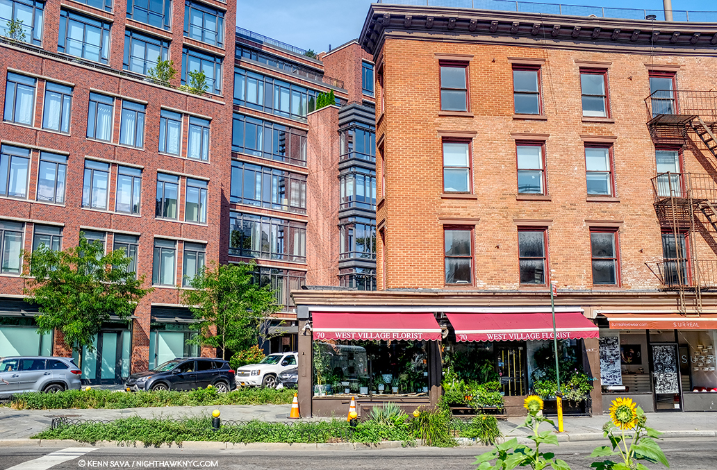
Yes, West Village Florist at 70 Greenwich Avenue is sort of triangular. The picture above was taken standing on the northern edge of Mulry Square, seen earlier. Yes, it was along one of Edward Hopper’s possible routes from his apartment to the Lowe’s Sheridan Theater, which was directly across 7th Avenue to the left of the picture.
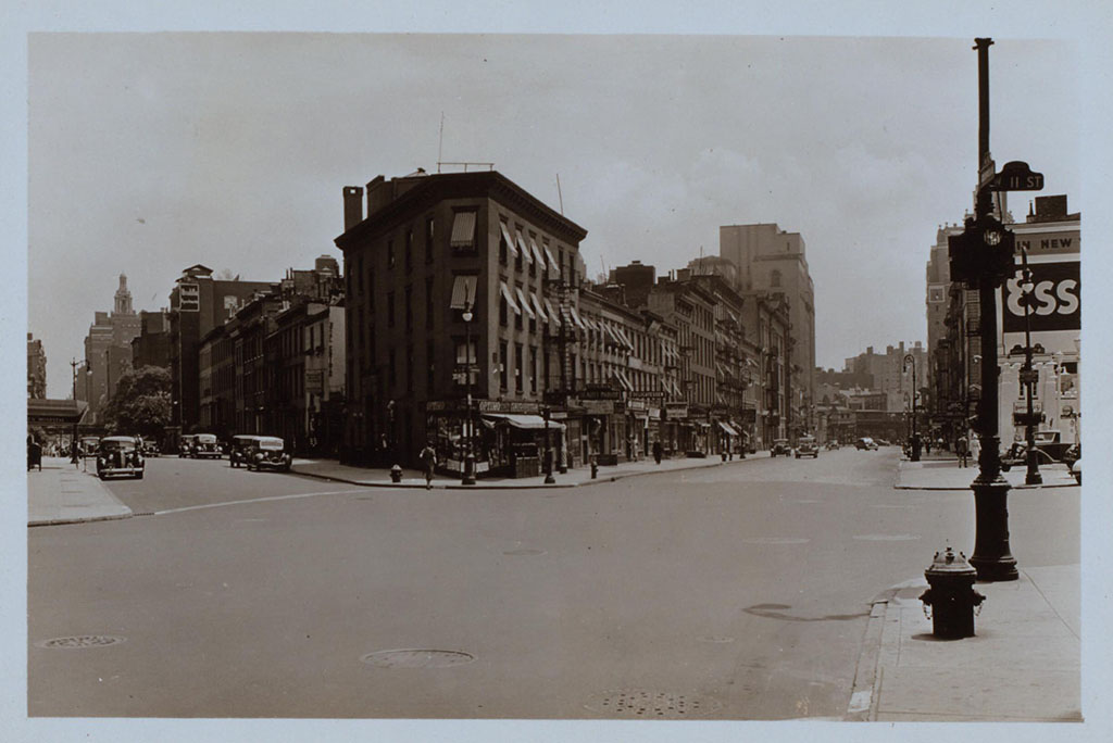
This picture came to me dated 1938 and that would appear correct. Looking toward Mulry Square on the right shows the side of the White Castle-ish hamburger place seen earlier under the Esso sign. The place on the triangular corner, center, at the intersection of 7th Avenue South, Greenwich Avenue and West 11th Street, is now West Village Florist, shown here when it was a cigar/cigarette store. Whoever told this picture is standing on the curb outside of what was Too Boots Pizza, #11 in the panorama posted earlier, with the Lowe’s Sheridan Movie Theater directly to his or her left. Photographer unknown to me.

Yes, it housed a deli 20 years ago before becoming a flower shop the manager told me, and my research added a cleaner/tailor shop circa 1914, and a cigar store in the period of Nighthawks as seen in historical pictures (including in 1938, above), but it’s too small inside, the prow is also too small, and the corner lot too big in my reading of the Painting. Nowhere have I seen reference to it being a diner or coffee shop at any point. The buildings in the background are wrong now, and were wrong then, according to historical pictures.

Inside West Village Florist, standing just inside the door. I had room to stretch my arms out, with maybe an extra foot on each side, but the space quickly narrows, as you can see. It’s just too small. Stop by and see what you think. They are very nice people who have a beautiful assortment of plants and flowers.

There is little doubt he saw it, but as I showed earlier, there are countless triangular corners in the area that could have been a partial inspiration. At best, that’s all this is, and I doubt it was a big influence. I’ve ruled it out.
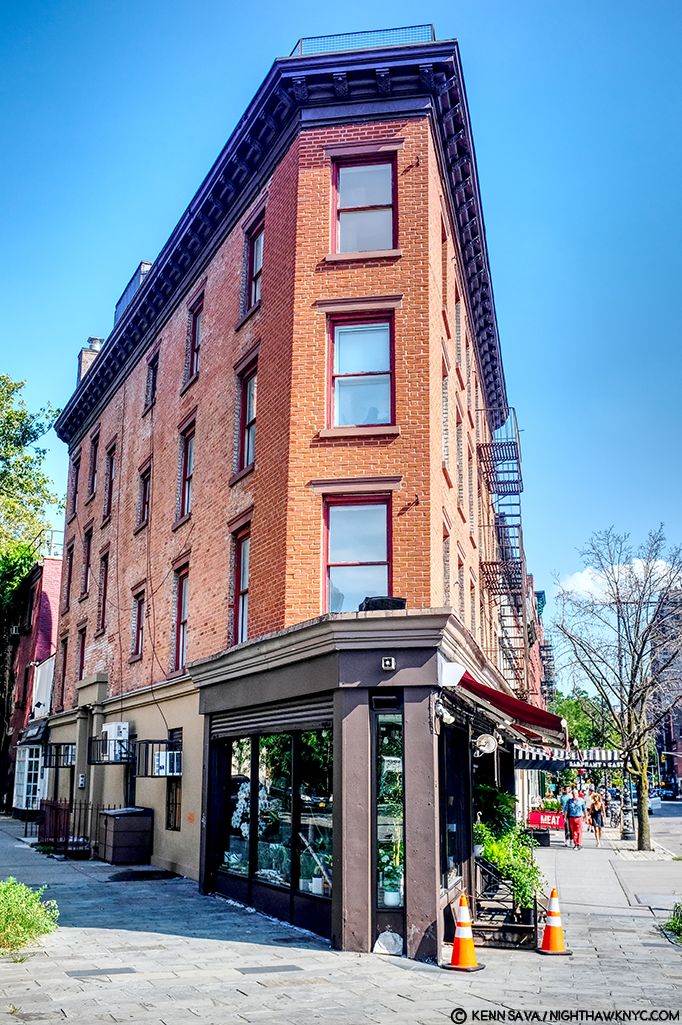
West Village Florist’s building has this unique, strange, angled shape to it seen from head on, July, 2019.

The serious contenders.
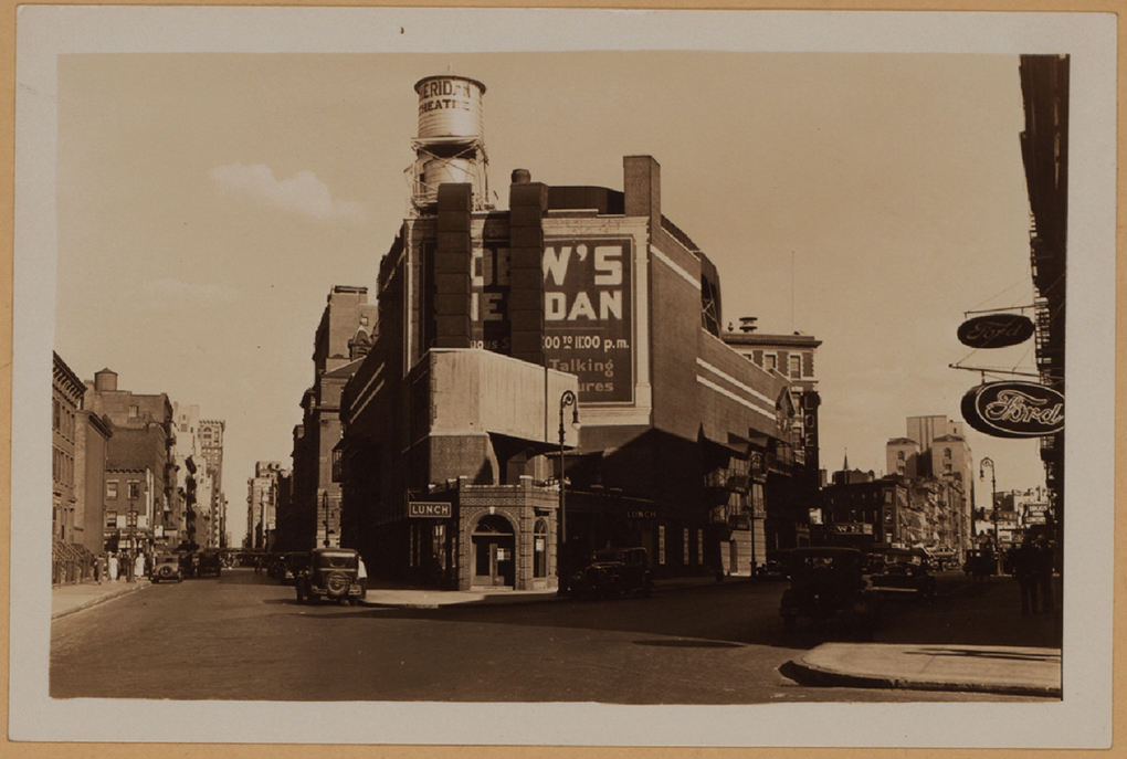
The intersections of Greenwich Avenue and West 12th Street with the Loew’s Sheridan Square Movie Theater, rear. Photograph by Percy Loomis Sperr (1890-1964), Manhattan: 12th Street – Greenwich Avenue, 1932, *NYPL Digital Archives.

In this 1932 picture of the intersection of Greenwich Avenue and West 12th Street, the low, triangular shaped building in front of the west side (the back) of the Lowe’s Sheridan Movie Theater is Crawford Lunch. There are historic pictures taken from Greenwich (on the right) that show customers in Crawford Lunch with West 12th Street seen behind them- which I reproduce further below. I think it is entirely plausible that Edward Hopper saw this, too, and this inspired his conception of a sort of “fishbowl” like setting. Here was an actual working diner/restaurant of the time. Today’s West Village Florist building is about 3/4 of the way down to the right of this picture.
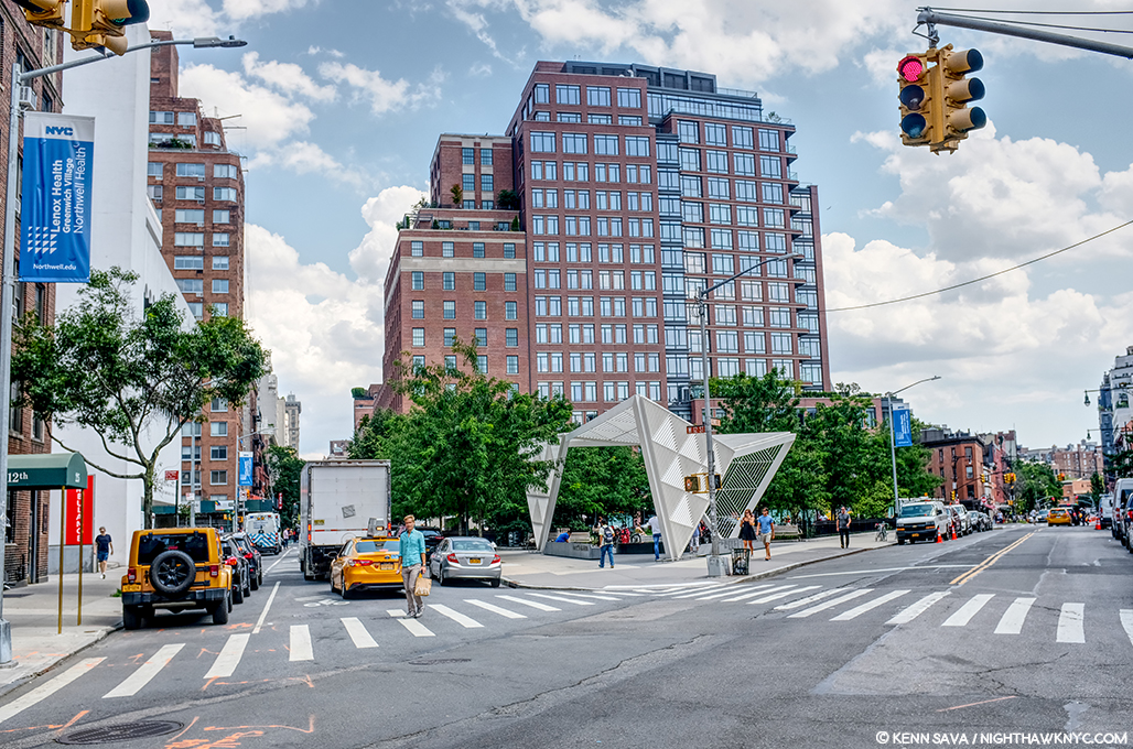
Change is the only constant in New York. The same scene, today! I stood as close as I could to the spot the 1932 picture above was taken to take this in July, 2019- 87 years later!

It’s so different, 87 years later, as to defy anyone to guess this site had anything to do with Nighthawks. Therein lies a good deal of the problem finding its sources. It’s now The NYC AIDS Memorial Park at St. Vincent’s Triangle. Note- the brown building on the very far left. It does not look like what’s in the background of the Painting. More on this follows. The Whitney’s Hopper Drawing catalog suggests that Edward Hopper may have looked through Crawford Lunch and seen the “fishbowl effect” we see in the Painting.
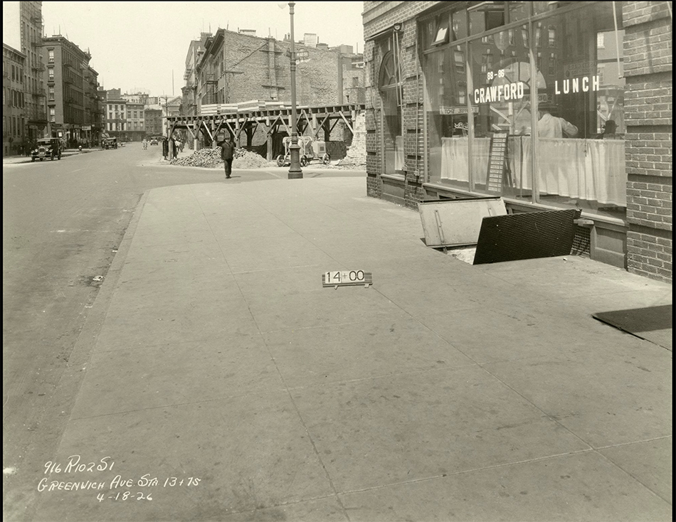
Subway construction photograph of 88-86 Greenwich Avenue and West 12th Street, New York City, April 18, 1926. Identifier- 86446d_GreenwichAve_SubConst958. *Collection of the New York Historical Society.

Here, we see a revealing example of this “fishbowl effect” seen at Crawford Lunch in a picture taken on April 18, 1926. Notice how you can see into and through the restaurant, on the right, to West 12th Street behind the man in the dark hat under the word LUNCH on the window. The brown apartment building seen in the far left in the prior picture is about to be built seen straight ahead just across the 12th Street past Crawford. Note, also, the word “LUNCH” on the window for later. I believe this is the possible source of the effect given how close it is to the Lowe’s Sheridan Theater (next door). However, it could have as easily been something he saw somewhere else on his walks, in a place they, or anyone else I’ve come across has not considered. But, unlike most of the locations suggested to date, Crawford Lunch was an actual restaurant at the right time and in the, possibly, right place.
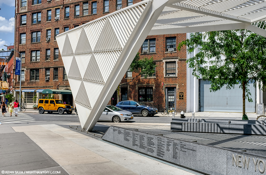
The almost identical view in the previous picture today at the former site of Crawford Lunch also approximates the view seen in Nighthawks. That brown brick apartment building, seen early in its construction above, has been here since the late 1920s, and hence, at the time of Nighthawks, making it wrong for the Painting. Seen in July, 2019.

That Crawford Lunch was an influence would seem to be confirmed by this-
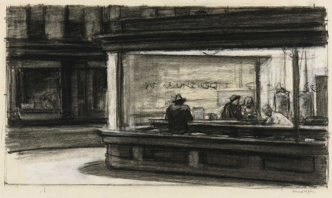
Study for Nighthawks, 1941 or 1942. Fabricated chalk and charcoal on paper; 11 1/8 × 15 in. Given he finished Nighthawks on January 21, 1942, I doubt this was done in 1942. It seems he was still finalizing his ideas when this was done. *Whitney Museum collection & photo.

I can barely make out the word “LUNCH” on the widow above the man with his back to us in this study for the Painting. As we know, Edward Hopper did not include this in the final Painting, among other changes he made to what we see in this incredible and endlessly fascinating Drawing. It sure reminds me of the Crawford Lunch window and may be a give away of its source and, possibly, the source, once and for all, of this “fishbowl effect.”

Edward Hopper said little about the inspiration for Nighthawks and, frankly, I don’t know what to make of what he is reported to have said. In Katherine Kuh’s The Artist’s Voice, P.134, he says, the Painting “was suggested by a restaurant on Greenwich Avenue where two streets meet.” He adds, “I simplified the scene a great deal, and made the restaurant bigger.” Um, Ed? Could you be a bit more obtuse? “Greenwich Avenue where two street meet,” is said to mean West 12th Street & 7th Avenue South by Gail Levin (Hopper’s Places). Couldn’t “two streets meet” mean Greenwich & West 12th Street, where Crawford Lunch was? If it means Greenwich and two other streets, it has to be the triangles where West Village Florist and Mulry Square are. In any event, “…suggested…” I believe means a scene he saw at one of these places, the “fishbowl effect,” which I think he saw at Crawford Lunch, a confirmed restaurant at the time. But, Crawford Lunch doesn’t look like the diner in the Painting- even if he “…made the restaurant bigger.” Neither does the hamburger place on Mulry Square or West Village Florist. And that comment doesn’t specify it’s the same restaurant he mentions on Greenwich Avenue. It could mean “the restaurant we see in the Painting.” Intensely frustrated by this, I finally decided to continue on my own path. This meant looking a little further afield from the Greenwich Avenue vicinity. It turns out I didn’t have far to look.

Further down 7th Avenue South, not as far as Village Cigars, and still well within Edward Hopper’s walking neighborhood, I came across this-
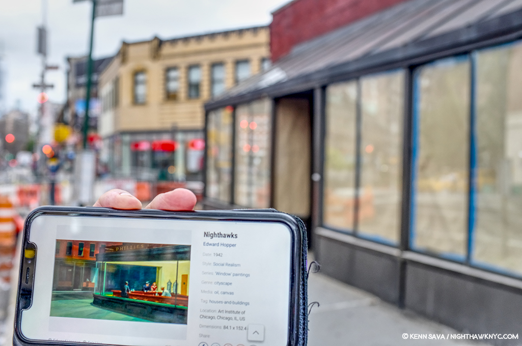
“Oh. My. Gosh.”

The site of the now sadly defunct Riviera Cafe, which was open here for 48 years, from 1969 until August 31, 2017.
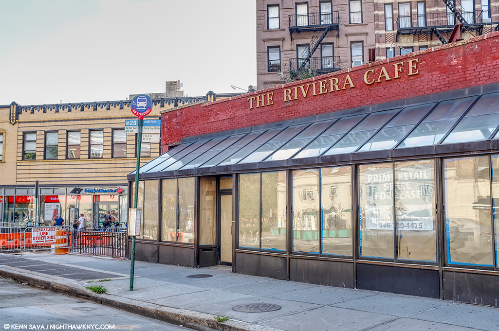
The former Riviera Cafe at 225 West 4th Street at 7th Avenue South.

When I came across this site, I had an “Oh. My. Gosh.” moment. Picture it without the modern “greenhouse” addition and it becomes much more like the diner in Nighthawks. Back in the day, I spent a few nights in this place, as I’m sure many reading this have, too, since it was centrally located right at the heart of the West Village. The building behind it to the left, while not exactly what we see in the Painting (I believe they are the same buildings that were standing on this site in 1940), at two stories, which fits all we can see in the Painting (they may go higher in Nighthawks, or they may be cut at two- we can’t tell), and they’re the right distance, though at a slightly different angle, from what we see in the Painting. If this is the location Edward Hopper used, why didn’t he use the buildings we see in the background? I believe it was because of the color. That long building which takes up a good portion of the back is too brightly colored to fit the mood he wanted in Nighthawks. So, possibly, he replaced them. More on this in a minute. I measured the depth of the greenhouse at 90 inches- 7.5 feet. If it were not there, it would have allowed me to stand closer to the building taking this shot. Thinking back to my visits here, there was a bar along the back wall then, and I believe there were tables behind the seats/stools facing the bar, approximately under where that brick wall would come down with the greenhouse gone. Would a horseshoe counter have fit here?

As I looked closer, I discovered this-
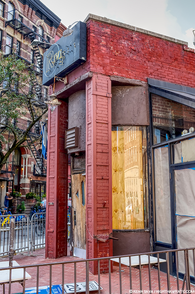
The front of The Riviera Cafe facing West 4th Street and giving it its address, 225 West 4th Street.

Lo and behold, there was something none of the other candidates I’ve discussed thus far have- a curved front window! And, it’s the same on both sides of that door! But, that door. Was it always there, or was the curve complete at one point, which would make The Riviera, minus the modern greenhouse addition, an almost perfect match for Nighthawks Diner?
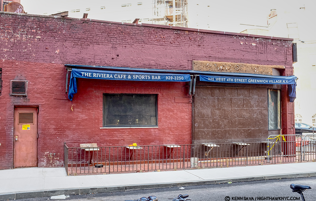
The back of The Riviera Cafe on West 4th Street.

Stepping around to the back of The Riviera- more intrigue. What’s up with the right half of the wall, and what was there before they replaced it? A window? Also, that door to the left looks earily similar to the door in the Painting on the inside of the Nighthaks Diner. As I said, when I was here, I remember a long bar inside that wall and along it, meaning you’d probably be able to see the necks of liquor bottles in that rectangular window that’s still there, center. But, that’s now/more recently. What about in the past?

Intrigued, to say the least, searching further, I uncovered this-
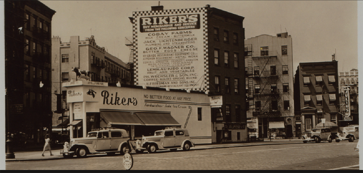
1941! The year Nighthawks was Painted. Percy Loomis Sperr (1890-1964), Manhattan: 7th Avenue South – 4th Street (West), 1941, *NYPL Digital Archives.

In 1941, The Riviera was called Riker’s and it was a restaurant! It looks pretty new and shiny, too. Some encouraging things in this picture- there are retractable awnings instead of the permanent greenhouse, for one, but that troublesome front door is still there to the left, and it looks to be the same structure, with the curved windows on either side of it.

The Riviera Cafe occupies the biggest triangular space in this part of the West Village. It’s very accessible to the Hopper’s apartment (a few blocks to the east). Why has it never been properly considered as a candidate?

In 2013, during the Hopper Drawing show, the Whitney Museum came out and said the following-
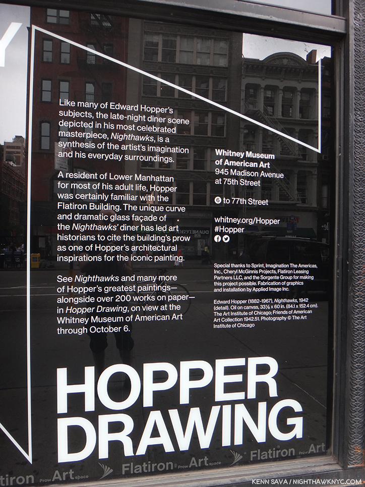
“…has led art historians to cite the building’s prow as one of the influences…” What are the others? Seen in 2013.

They’re talking about the Flatiron Building, which is on West 23rd Street at the intersections of Broadway and 5th Avenue- no where near Greenwich Avenue, where that quote has caused most to look, and it’s not even in Greenwich Village! So, the museum has taken the same approach I did in this sense. Also, in the Hopper Drawing catalog they fail to publish the Kuh Hopper quote (above), only footnoting the page in her book it’s on (P.118, footnote 2)! Perhaps, they, too, find it as frustrating as I do? (I realized this only this past week, after my quest had been completed.) They state the Flatiron was “one of the influences,” but fails to name any others!?? “One of” means “more than one.” Well? I’m naming names here.
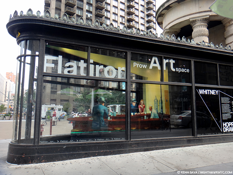
An installation of “Nighthawks” in the prow of the Flatiron Building by the Whitney Museum in 2013. The installation is 2D and only a few inches deep, as I show below. I shot it at this angle to show the problematic lining up of the buildings in the back on Broadway, across the plaza, which is not at all like what we see in the Painting. Seen on September 1, 2013.

Assessing the Flatiron’s candidacy, I discovered that at one point it was a cigar store (again, the Painting has a Phillies cigar ad on the top of the diner), but I did not find evidence of it having been a diner. Looking closer at the interior space, I discovered it ostensibly measures 10 feet wide, at its widest, to the right in the picture above, by 30 feet long. I’m no restauranteur, but that seems pretty narrow to me to get a horseshoe shaped counter inside, room for seating around it, room to navigate around those seats and room for the counterperson to work. Glare notwithstanding, here’s what the space looks like pressed against the front curved window-
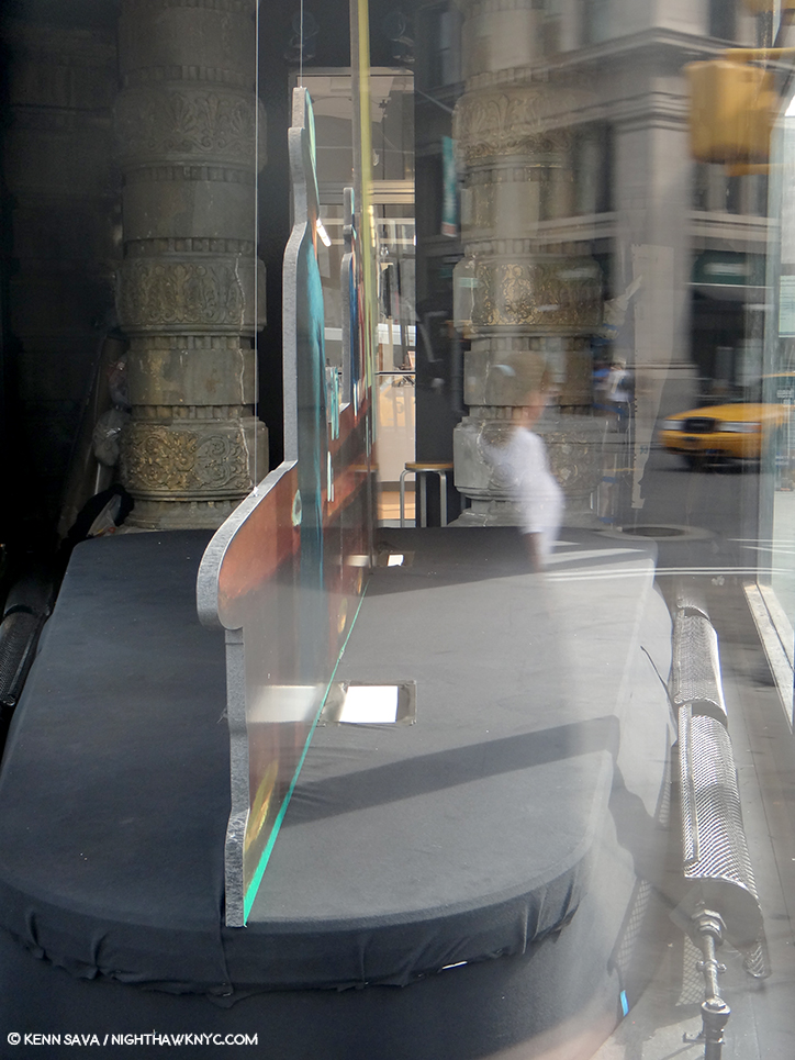
A look at the installation of “Nighthawks” in the prow of the Flatiron Building on September 1, 2013.

Notice the radiator on the right, and how far it is from the window. There’s another one on the left which is hard to see in this picture. Both, and the room around them they require for safety and comfort, considerably cut into the amount of usable space here. Also notice the large column to the left rear of the photo, which serve to partially support the gigantic mass of the building above them, which also has a counterpart that’s hard to see because of the glare on the right side (see the picture of the whole prow, above it). The opening between them appears to be tight. How are people supposed to come and go here?

Then, there’s the site itself. It doesn’t feel to me like what we see in the Painting.

A panorama shows the distance between what would be the far side of the prow in the Painting and the buildings across the plaza and Broadway.

The buildings that would be in the background of the Painting are too far away and angled incorrectly- 23rd Street angles to the south east relative to the Flatiron at this point making the buildings begin too far back to be seen as they are in Nighthawks, in addition to being not at all like those seen in the Painting in the many existing historical pictures. Therefore, I believe the Flatiron’s prow isn’t what we see as the diner in the Painting, and this wasn’t the scene shown in the Painting. Of course, any Artist is completely free to do whatever they want, to make anything into anything else, whether it would fit in the “real” place, or not. (There is no such thing as “photorealism” in Painting, in my opinion, but that’s a battle for another day.) Edward Hopper, as per that quote, could have made West Village Florist or the Fatiron’s prow bigger, but their settings are still wrong, in my opinion, so I don’t believe he used either. However, like the Whitney, I believe the Flatiron’s prow was an influence.
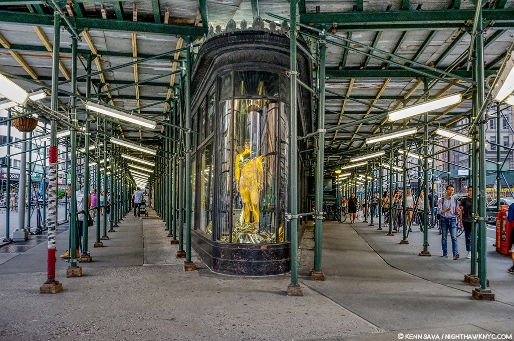
Currently under renovation? Cleaning? Diner installation? Maybe I should wait and see what emerges before reaching a conclusion. (Just kidding.) July, 2019.

Looking at the Painting, one thing is undeniable- that curved window Edward Hopper includes. I’ve found it nowhere else besides on the Flatiron- either on existing buildings or in historical pictures. And, some of the ribs we see on the window in the Painting are present on the Flatiron’s prow today. In 1939, Edward Hopper exhibited at the World’s Fair1, and so he may have seen the Fair, but was certainly aware of it.
“Fishbowl effect” indeed. The history of glass making through the ages seen in glass bubbles at the Glass Incorporated Pavilion at 1939 World’s Fair, Queens, New York, New York, USA. Coincidence? Or influence? *Image by Peter Campbell/CORBIS

It was an Art Deco marvel. The Nighthawks diner has a decidedly Deco/Streamlined/Moderne feel to it. Though the Flatiron is a Beaux Arts building, the curved window of the prow has a decidedly Art Deco, streamlined, feel to it.
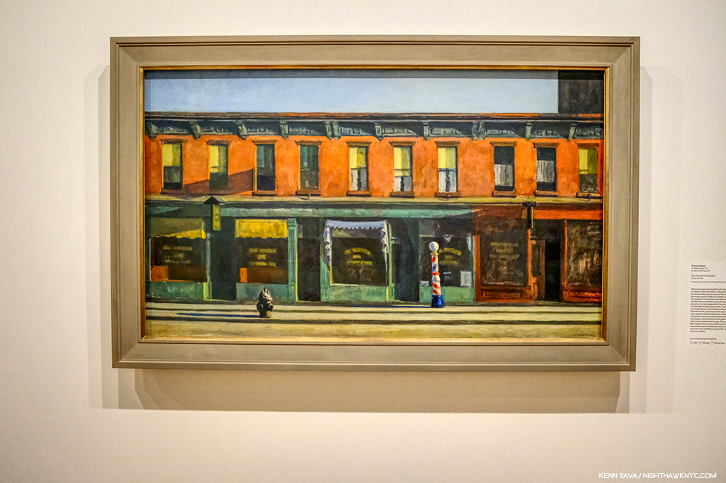
Early Sunday Morning, 1930, seen at the Whitney Museum, July, 2019. This looks uncannily similar to the background of Nighthawks to me.

Yet, what he depicts in the background of Nighthawks looks curiously not dissimilar to his Early Sunday Morning, 1930. It’s almost like he dropped those buildings into the background. But, 10 years after the earlier work a good many of those buildings were no doubt still everywhere around town, so they may as easily be generic. Whatever their origin, in this way he juxtaposes the old New York with the new world just seen in the 1939 World’s Fair, which showcased “modern” streamlining and the new flourescent lighting.

Early Sunday Morning is something of a “pendant” to Nighthawks as Carter E. Foster points out in the Hopper Drawing catalog (P.99). It’s the same size and shape and the two are bookends in some ways.
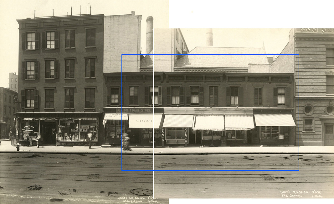
7th Avenue between Fifteenth and Sixteenth Streets, June 10, 1914. I’ve indicated the scene depicted in Early Sunday Morning, with a blue bounding line centering around 88 7th Avenue, seen in these two photos taken on June 10, 1914- 16 years before the Painting. The shutters on the windows are gone in 1930, so are the awnings, and there was only one barber pole. The hydrant was either to the left, or around the corner to the left. The center white line are the borders of the two photographs shown. All the buildings in these pictures have long ago been replaced. Subway Construction Photos modified from the Whitney Hopper Drawing website.

Interestingly, the inspiration for Early Sunday Morning were shops on 7th Avenue, but not in Greenwich Village. They have been located as being between 15th and 16th Streets in Chelsea, just north of the Village. Comparing the Painting to period pictures is fascinating. While it’s unlikely that Edward Hopper stood with a sketchbook and drew the scene, he did capture any number of correct details. But, he changed others- most notably the sunlight. The sun never shines on 7th Avenue at the angle he Paints it shining!
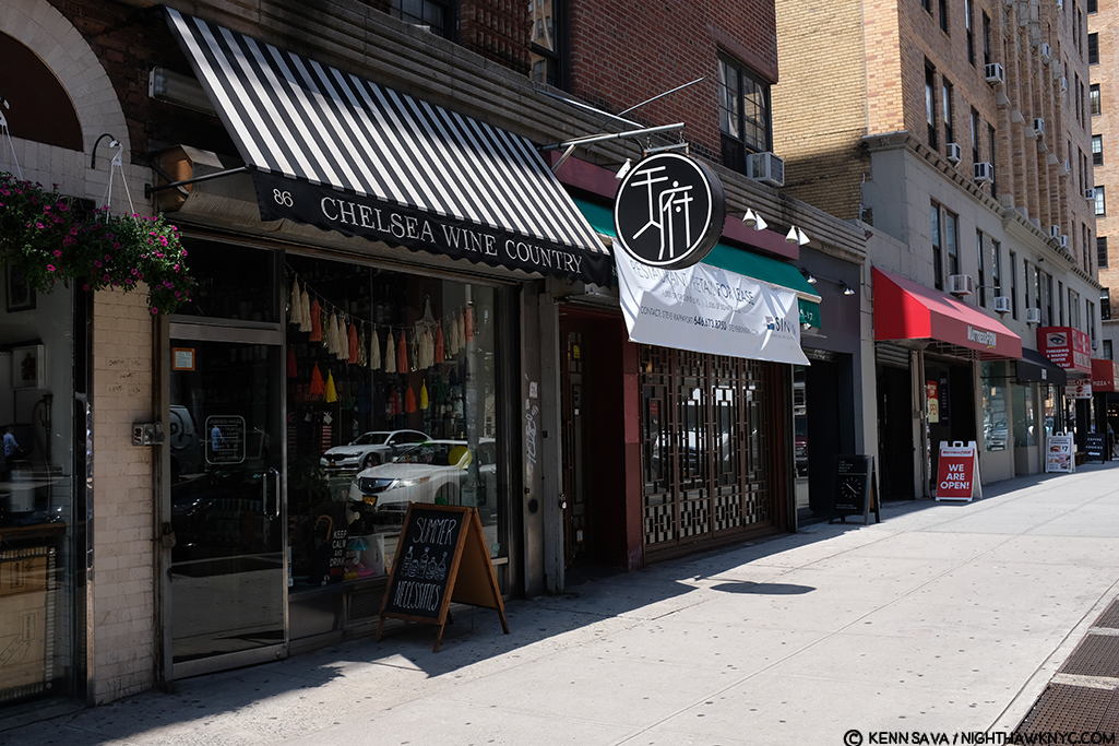
Mid-Sunday Afternoon. The site of Early Sunday Morning, seen in July, 2019. The original buildings have long ago been replaced. Notice how the shadows go in the opposite direction of those in the Painting.

7th Avenue runs North/South, not East/West, like the sun. In reality, the sun would be directly behind the viewer! So? Here’s a case of a found actual site and how Edward Hopper used creative license to mould it to his vision- even if that meant changing nature! What’s moving a curved window 20 blocks south compared to moving the sun?

My Conclusion-
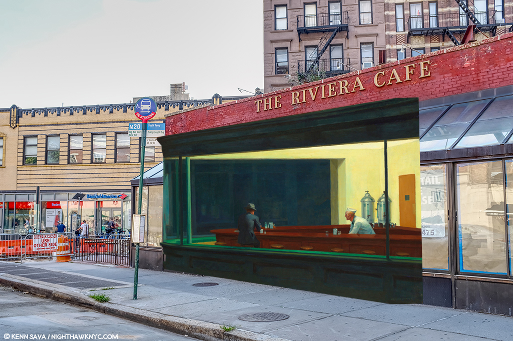
I currently believe that Edward Hopper saw Riker’s about 1941 and those 2 curved windows in its front. I believe he, too, may have been frustrated by that front door and decided to “remodel” it. With a a paintbrush. So, he morphed the Flatiron’s prow’s curved window onto it and then created his own (though somewhat similar to the real) background on West 4th Street in the Painting.

Unless and until I find better candidates, THIS is what I believe Edward Hopper did.

Yes, I’ve used the original, 2015, NighthawkNYC.com banner, which removed the famous couple, leaving that figure I relate to in honor of NHNYC’s 4th Anniversary. On the same page she dated Nighthawks on in the Hopper Ledger, Jo Hopper refers to him as “sinister.” I love her, anyway. Before she died the year following Edward, she bestowed one of the greatest American Artistic Estates to the Whitney Museum (who promptly “rewarded” her incredible generosity by throwing out virtually all of her work, thereby denying Art historians and Art lovers a chance to assess her work on its own- forever2). And I used the banner because, yes- I once sat at The Riviera Cafe’s bar by myself, too.

But, beyond ALL of this, for me? Nighthawks is the first truly modern American Painting. It marks the beginning of all that came after. It captures the essence, the FEELING of living in a City- here, in New York, or anywhere, but even more, it captures the feeling of modern life, which has become more and more about isolation, and fleeting moments of connection- or not, since January, 1942. I always try and remember that Nighthawks, like many of Edward Hopper’s other works, is a voyeuristic moment seen by a pedestrian, who more than likely kept moving on, past this fleeting moment and this scene, wherever it was, and didn’t pause to ponder it indefinitely, like so many have since.

Moments exist as flashes of time.

Click.

Here right now, gone forever. Unless, you’re one of the great geniuses in American Art history, who has the vision, the power and the talent to make it last, and speak to us, indefinitely.

But, for me, at least, Nighthawks isn’t about capturing a fleeting moment magically, though it does.

The other reality that common sense dictates be mentioned is that 78 years later, a better explanation than mine, or a better real life candidate for the Nighthawks Diner may never be found. It may have existed only in his imagination, with a few pieces of real life thrown in- like the Flatiron prow’s window. And that, too, may be part of his point. Nighthawks, in one reading, may not be about place as much as it is the psychological, the inter-personal, and? 

Loneliness.  
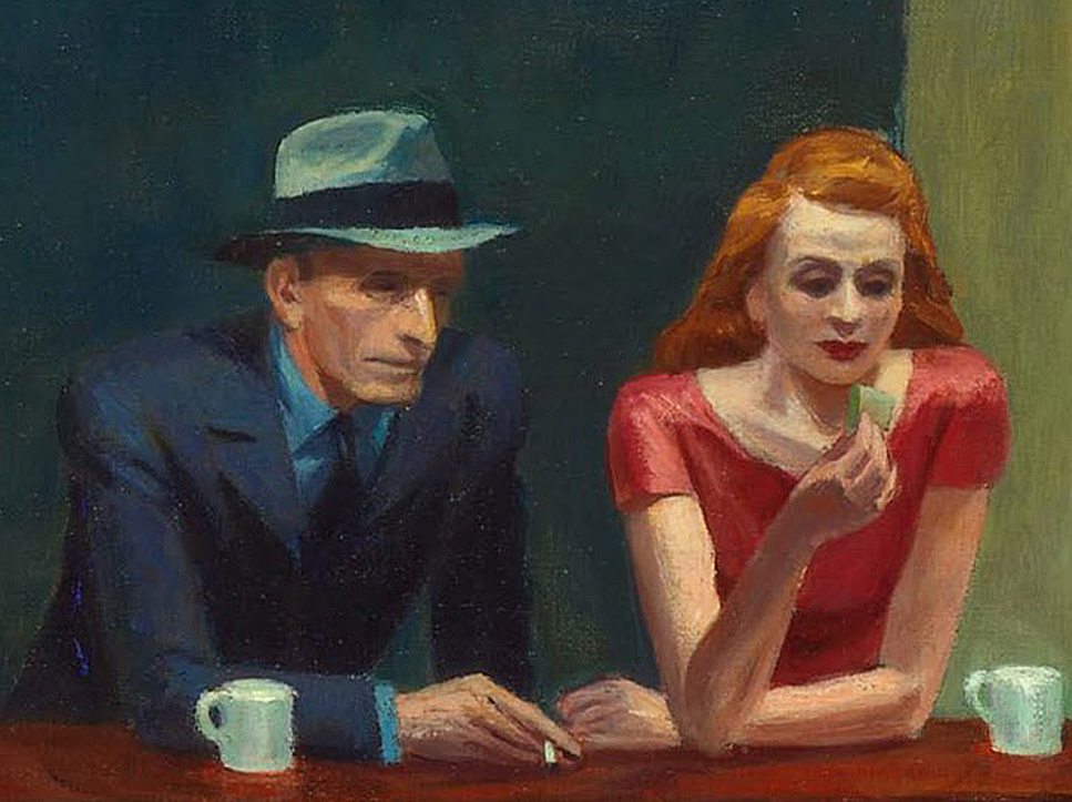
Have two people in Art ever been closer together, yet further apart?

The woman in red is all dressed up to go HERE?, I can hear her mentally screaming. Her “companion” sits physically next to her, close to her, but, in my reading of it, their hands don’t quite seem to touch. Maybe you see it differently. For me? I can’t look at this and not think of God and Adam in Michelangelo’s Sistine Chapel Ceiling. There is no life giving, or love giving touch here. He has a cigarette in his hand- not her (left) hand, which remains empty. There is a distance that belies how close together they sit. All of this is, somewhat humorously, mimicked by the twin silver coffee urns to the right of them, that are, also, immobilized and frozen in time. At least they’re together for a common purpose! The same can’t be said of the immortal duo sitting at the counter. 

The gent, who’s nose Jo Hopper called a “Night Hawk” after the beak of the bird seems to be in a conversation with the counterman. About what? Here, he has this lady dressed to kill next to him and he’s ignoring her? Every time I’ve seen this happen in a bar or nightclub, instantly my antennae went up. Something’s not right here. If she’s not getting attention? Something’s wrong. But this is December, 1941. Pearl Harbor happened right in the middle of work on this Painting! 36 days after Arnold Newman took that Photo of Edward Hopper up top. It’s very hard not to think about that when looking at it, though it’s probably easier for many now that World War II was over 75 years ago. Are they discussing the War? Being drafted? Enlisting? A friend who has already been killed? Possibly another denizen of the diner? There are all those empty stools at the counter, after all. “Where is he?” “Oh. You haven’t heard?…” 

The War brought many things. It also brought separation, life without love, life without women, for men, and without men for women, or partners for the LGBT communities. 
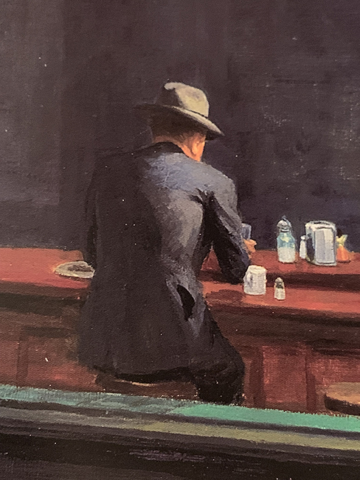
Then? There’s my alter-ego. Frozen in paint. Immobilized. Alone forever. Perhaps the most isolated figure in Western Art. What appears to be a rolled up newspaper is under his left elbow. No doubt he knows the score. At least he’s possibly not leaving anyone behind. 

But, for a moment? Let’s forget World War II is getting off to a raging start around the world at this very moment, if we can. Edward Hopper probably conceived this work before Pearl Harbor. What’s striking to me is that of all the loneliness I’ve just mentioned, there’s still more of it I haven’t. 

Let me ask you this- Who is more lonely in the scene in this Painting? 

Any of those 4 people in the diner?
Or?
The person viewing this scene from outside the diner?

For me? Nighthawks remains the ultimate parable of loneliness.  

Maybe then, I shouldn’t be on such a mission to find the “real” place it depicts. Maybe then, it doesn’t need a real place to inhabit. It exists as a permanent condition of being alive inside each one of us, as it did inside of Edward Hopper. Maybe I look for it in the hope of finding the end of it.

*- Soundtrack for this Post is “I Saw You In A Dream” by Japanese House….

“I saw you in a dream
You had stayed the same
You were beckoning me
Said that I had changed”

NighthawkNYC.com has been entirely self-funded & ad-free for 9 years, during which 330 full-length pieces have been published! If you’ve found it worthwhile, PLEASE donate by PayPal below to allow me to continue. Thank you, Kenn.

You can also support it by buying Art, Art & Photography books, and Music from my collection! Art & Books may be found here. Music here and here.

Written & photographed by Kenn Sava for nighthawknyc.com unless otherwise credited. To send comments, thoughts, feedback or propositions click here. Click the white box on the upper right for the archives or to search them. Subscribe to be notified of new Posts below. Your information will be used for no other purpose.

For “short takes,” my ongoing “Visual Diary” series, and outtakes from my pieces, be sure to follow @nighthawk_nyc on Instagram!

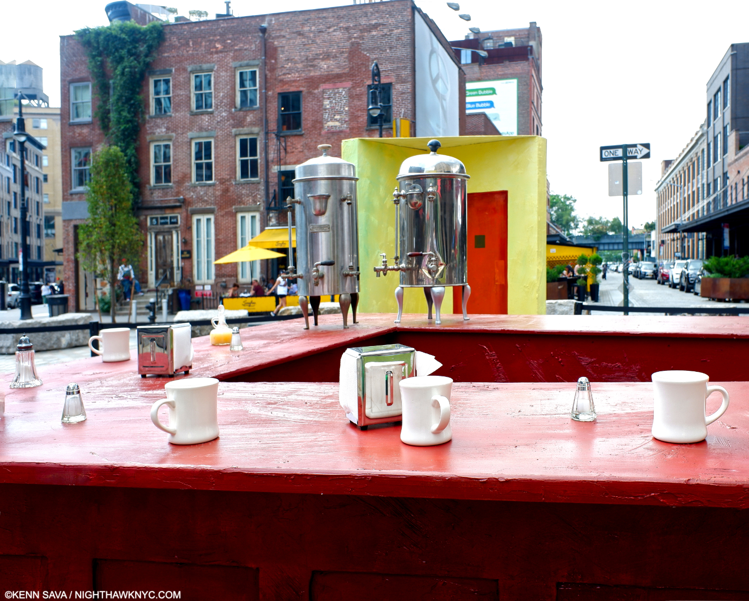
  1. Hopper Drawing footnote 33, P.119
  2. Gail Levin, Edward Hopper: An Intimate Biography, P. xv-xvii