Jean-Michel Basquiat: Now’s The Time

Written & Photographed by Kenn Sava (except *)

Part 1 of a series.

It’s hard to believe that not even 40 years have passed since Jean-Michel Basquiat burst upon the Art scene, (after his career as part of the legendary graffiti duo SAMO©), when the month long The Times Square Show opened 39 years ago on June 1, 1980 at 201 West 41st Street. Just eight years, one month and eleven days later, on August 12, 1988, he would be found dead from a heroin overdose at the infamous age of 27 at his home and studio at 57 Great Jones Street.
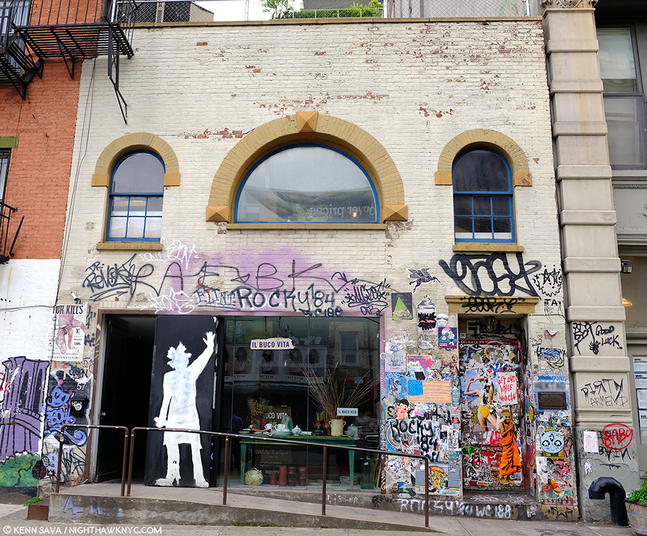
What appears to be an anonymously applied silhouette of the late Artist looms large here at the one time stable at 57 Great Jones Street, NYC, seen in May, 2019. Back in the day, it was owned by Andy Warhol who rented it to Jean-Michel Basquiat, who lived here from 1983 until he died here on August 12, 1988. His studio was on the ground floor, his living quarters upstairs. By the way? In an interview with Becky Johnston and Tamra Davis, Jean-Michel Basquiat said, “I don’t really consider myself to be a graffiti artist, you know?1” That might surprise those attempting to cover every square inch of the building now.
He didn’t live to see the Art market crash (unrelatedly) the following year, from which it has since recovered and grown many, many fold larger than it was during the bubble of his day, nor did he live to see the end of the controversy around him and his Art. It’s never subsided-

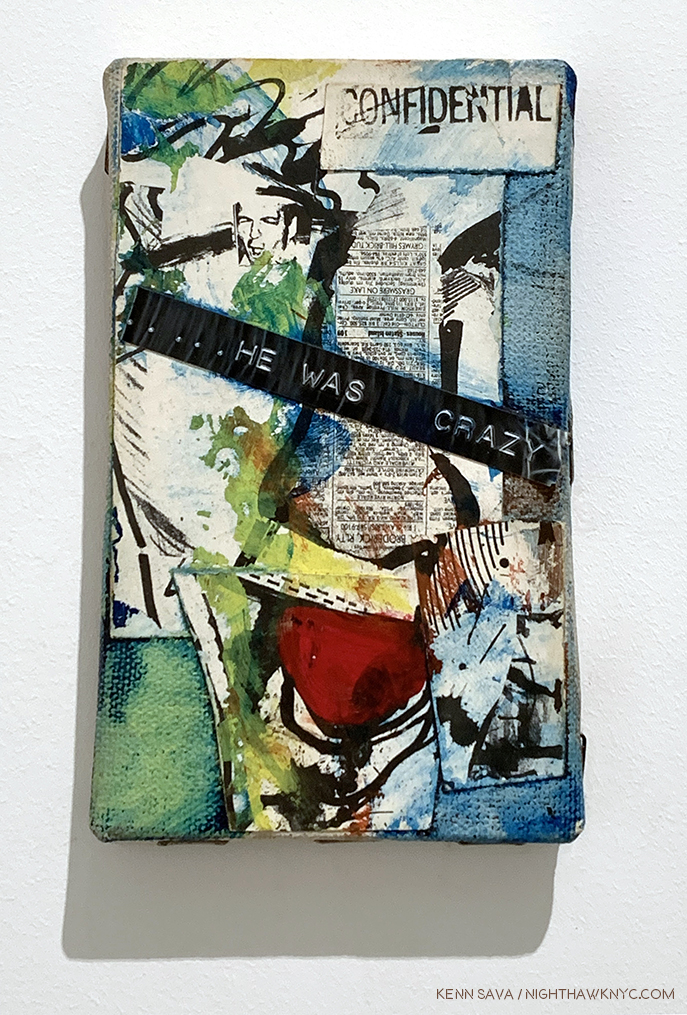
He Was Crazy, 1979, Mixed media on canvas, all of 5 x 3 inches, the earliest and smallest work on view at Jean-Michel Basquiat / Xerox.

-Robert Hughes titled his obituary “Requiem for a Featherweight.”

-“He was essentially a talentless hustler…,” according to Hilton Kramer in a piece titled,  “He had everything but talent” in 1997.

-“Come on…Basquiat? Really? Sort of an art hoax. Just the incoherent rantings of a tortured soul obsessed with drugs and a deluded quest for acknowledgment, which he did achieve. Doesn’t make it good.” A direct quote from the comments more recently here.

Yes, there are still plenty of haters hating on the work on Jean-Michel Basquiat.
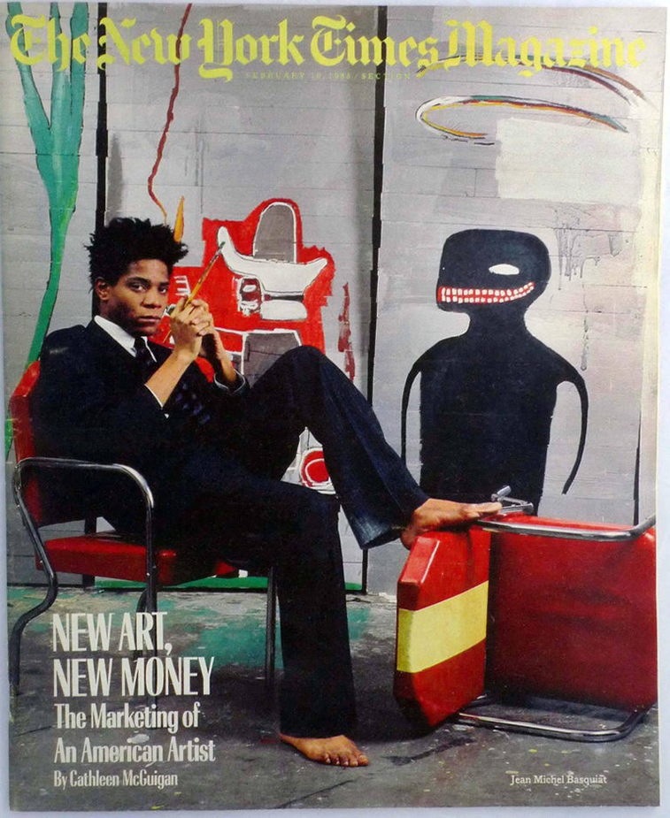
The now infamous cover of The New York Times Magazine from February 10, 1985 by Lizzie Himmel shows the Artist in his studio. The article, by Cathleen McGuigan, included a look at the Artist that seems surprisingly balanced today given all the controversy surrounding him at the time.”The extent of Basquiat’s success would no doubt be impossible for an artist of lesser gifts,” she wrote.
On the other hand, there are the countless other members of the Art viewing public for who Jean-Michel Basquiat’s work has continued to speak since he started making it, and Painting that speaks to people over time is what comes to be accepted as “Art” a few centuries on it seems to me. Yet, the Art viewing public is not the only group divided on the work of Mr. Basquiat. On page 44 of the book, The Art of Jean-Michel Basquiat. Fred Hoffman, one of the curators of the 2005 Brooklyn Museum Basquiat Retrospective and a man who produced prints with Jean-Michel Basquiat (J-MB henceforth) for 2 years, writes, “Herbert and Leonore Schorr offered the Museum of Modern Art the opportunity to choose a painting from their collection as a gift. The museum replied that having a painting by Jean-Michel Basquiat was not even worth the cost of the storage.” On May 26, 2017, this quote appears in the New York Times, “‘It’s an artist who we missed,’ said Ann Temkin, the chief curator of paintings and sculpture at the Museum of Modern Art, which does not own a single Basquiat work2. ‘We didn’t bring his paintings into the collection during his life or thereafter3.’”

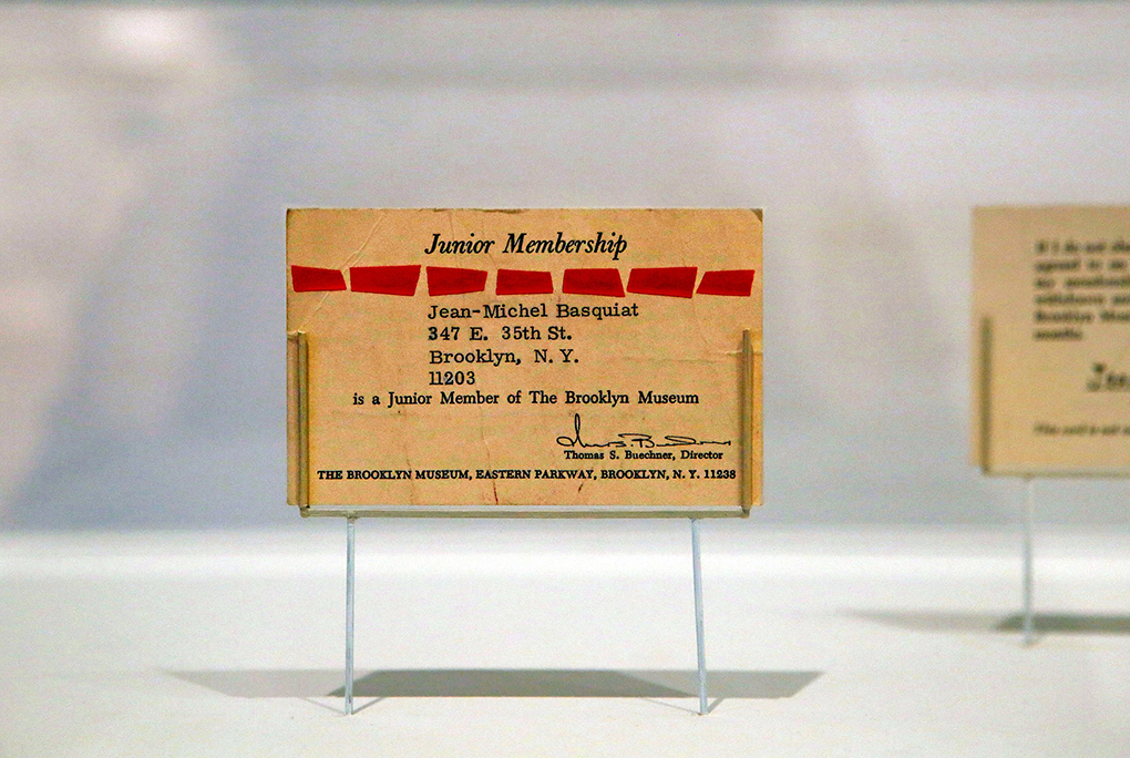
6 year old Jean-Michel Basquiat’s membership card to the Brooklyn Museum. It’s not well known that J-MB was an avid museum goer, attending the Brooklyn Museum and later, frequenting The Met with his friend Fab5Freddy. Credit 2015 The Estate of Jean-Michel Basquiat/ADAGP, Paris, via ARS, New York; Hiroko Masuike, via The New York Times.

In fact, as I write this? Of NYC’s “Big five” museums, only the Whitney owns a Basquiat Painting- they own 3, according to their online collection catalogue (none are currently on view as of my last visit, this past month. Also, I should note that among the 5 Manhattan museums The New Museum has no permanent collection. By the way, The Brooklyn Museum owns one print, seen below, and a Drawing.)

None of those feelings were mine though I wasn’t a “fan” of the work of Jean-Michel Basquiat. Then, as now, I was focused on Artists I felt were overlooked. My feeling in the 1980s was that too much money was being spent on, and too much attention given to, Contemporary Artists with no track record. Artists whose work hadn’t stood the test of time, hadn’t stood up to critical, and historical, assessment, whose work wasn’t in major museums, and on and on. By default, though not in particular, that included the work of J-MB. Still, I’ve always kept an open mind. There are very very few Artists or Musicians who’s work I will never, ever love- no matter what. But, there are some. Hitler was a painter- lowercase “p” for once- remember?
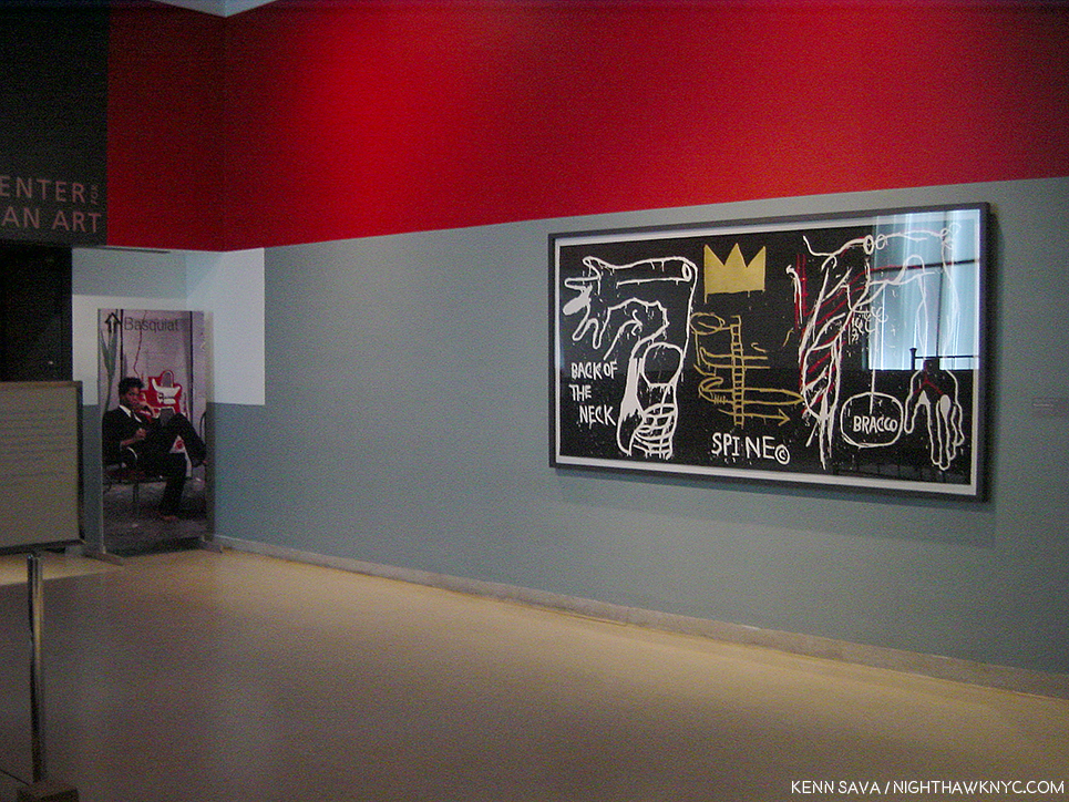
May 12, 2005. The only picture I was able to get (quickly) just outside the Basquiat Retrospective at the Brooklyn Museum, since pictures were not permitted inside. Back of the Neck, 1983, Screenprint, right, seen in the lobby and the show’s poster to the left. Glare was a problem in 2005, too. You can see the show in official shots, here.

So, on May 12, 2005, I went to that Brooklyn Museum Basquiat Retrospective that Mr. Hoffman was a curator of. When I got home, I wrote, “His work still doesn’t speak to me, beyond the fact that I so admire his freedom. The show was very well done.” I also came away struck by his love of Jazz. Anyone who loves classic Jazz is OK with me. I also remember being surprised at how prolific he was in such a short time, which reminded me of Van Gogh, who’s Painting career lasted only about a year or so longer. Looking back on it now? My head was elsewhere. I was drawing on a daily basis in a representational style, and so I was lost studying Ingres, Hopper, Richard Estes and Rembrandt, who I had recently gone to Chicago to see a show of. But? Having bought one at the show, I began wearing T-shirts with Jean-Michel Basquiat’s Art on them. His work just fits walking around NYC.
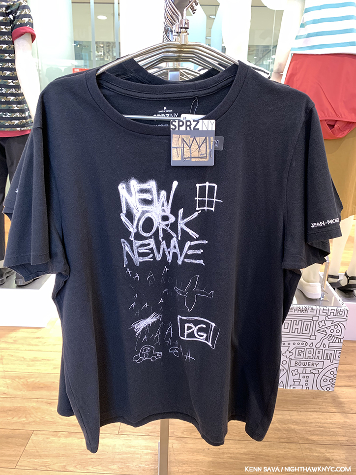
Untitled, 1980, the white on yellow original of which is in the Whitney Museum’s collection, is a work that was shown at New York/New Wave in 1981 at MoMA PS1, now appears on a Uniqlo SPRZ NY Women’s T, seen in June, 2019.

Slight digression- I’m not for giving a free ad here, but I must give props to Uniqlo for putting the Art and cover Art of so many great Artists and Musicians4 on their SPRZ NY line of T shirts. Some of the Art line is co-sponsored by MoMA. In turn, Uniqlo pays for the free Friday nights at the MoMA, which countless thousands attend each week. Uniqlo has continually featured J-MB’s work on their clothes, in spite of the problematic history of Basquiat and MoMA. Fred Hoffman in The Art of J-MB (P.175, footnote 2) relates this story about Untitled, 1983, a limited edition print of 10 copies he did with J-MB- “Untitled was given to the Museum of Modern Art in 1984. After it was in the catalogue for the MoMA 1984 exhibition An International Survey of Painting and Sculpture, the work was completely overlooked by the museum, and excluded when the museum first put its collection online. It was not exhibited in the galleries until 2015. Only with the collaboration between MoMA and Uniqlo beginning in 2014, when a cropped image of Untitled was used as the signature image for the marketing of the ‘SPRZ’ collection of iconic artist images applied to clothes, did the museum finally recognize the work as part of its collection.” 2015! To this day? I still wear Uniqlo J-MB T’s, even though I wasn’t a “fan.” End digression.
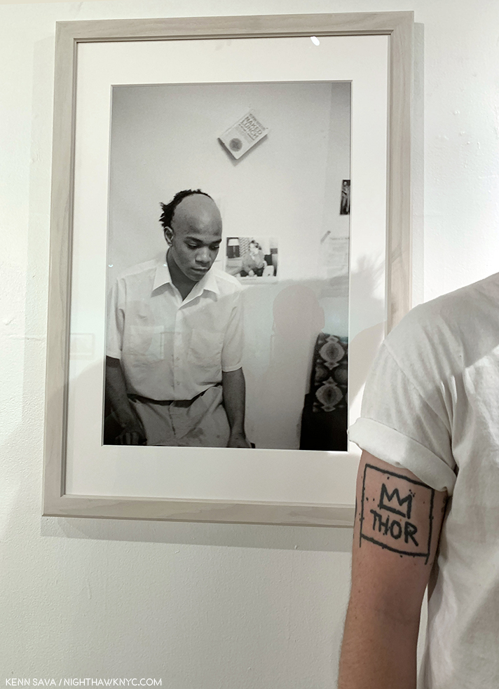
Jean-Michel Basquiat appears to be admiring  Nick’s Basquiat tattoo in one of Alexis Adler’s Photos of him at Bishop Gallery. Nick is an Art Teacher.

Ok. So, who’s “right?” The haters, the non-believers, and the NYC museums, who, unanimously, minus one, passed on acquiring his Paintings? Or, the incalculable number of members of the Art loving public to who the Art of J-MB speaks, perhaps, like that of few other Artists today, judging by how often I see others wearing his Art and icons, along with the innumerable Artists who’ve been influenced by his work, and those few collectors who bought up the bulk of his best work shortly after he created it?

All I can show you- pictures were not allowed in the show.

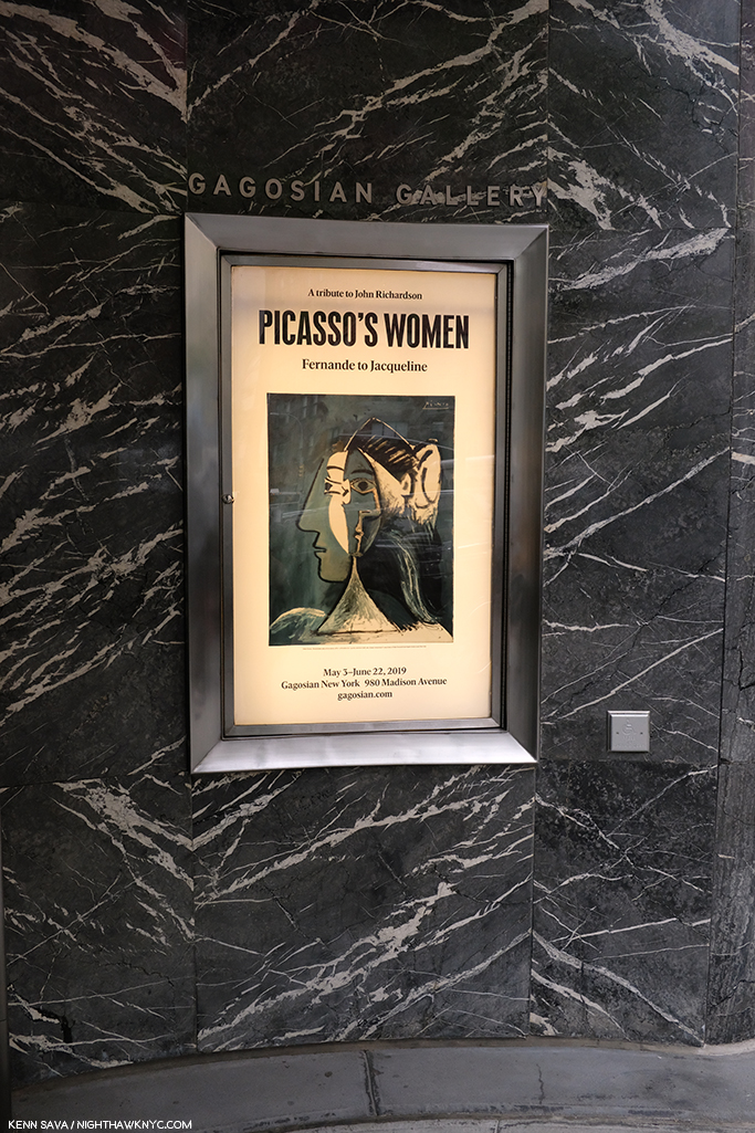
Fast forward. On May 7th, 2019, I went to see Picasso’s Women at Gagosian on Madison. It’s one of those shows that, though small, reminds you, as if you need to be, why Picasso was one of the towering creative geniuses of 20th Century Art, in my view. Each and every work is in a different style, and most were masterpieces. Yet, it’s a show that will only live on in the memory of those who saw it as no photos were permitted. I walked out through the building’s lobby, my head spinning. Just before I exited, next to the front door, I spotted this-

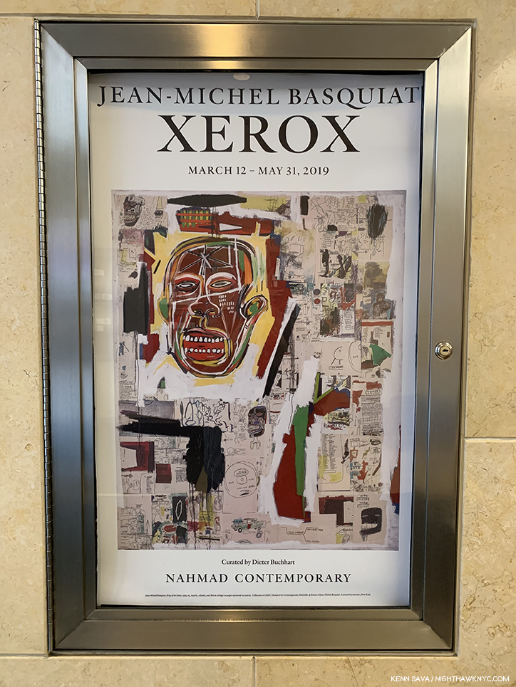
Minutes after I saw this poster my mind began to change.

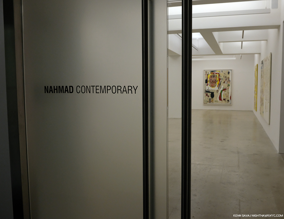
Jean-Michel Basquiat / Xerox. I asked the guard where it was. “On 3,” he replied. Still recovering from Picasso, I pondered if I could clear my head enough for about 5 seconds, then I went back in and went up to Nahmad Contemporary on 3.

3 hours later, I left, realizing I’d never really seen the work of Jean-Michel Basquiat before. I had missed it. In Xerox, the term “Painter,” all of a sudden feels too small, even for an Artist notorious for getting paint everywhere- including on his multi-thousand dollar Armani suits, as can be seen in the infamous cover of The New York Times Magazine shown earlier.

But, this is a show that features his under-known multimedia works that include photocopies- color Xeroxes being one of his favorite tools, one he loved so much, he bought his own color Xerox machine. (I’m sure there are many others, but right now? I can’t think of many Artists who made color Xeroxes as big a part of their work- particularly Painters.) As a result, here images recur- his own images, exclusively, which is down right refreshing in this age of copious “reappropriation.” Drawings or Paintings that the Artist has Xeroxed and pasted onto canvas which he then proceeded to add to and modify in any number of ways, including Paint on.
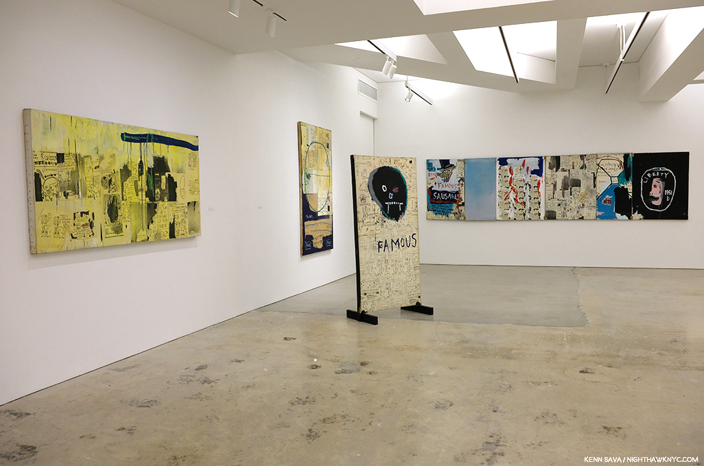
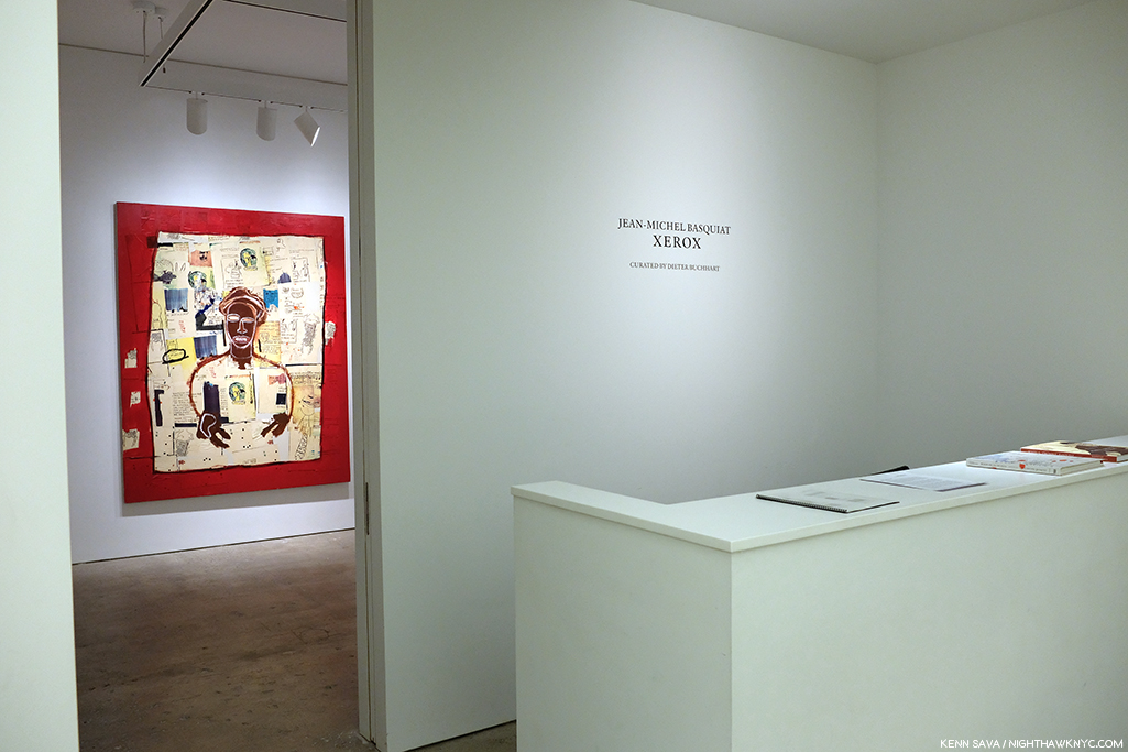
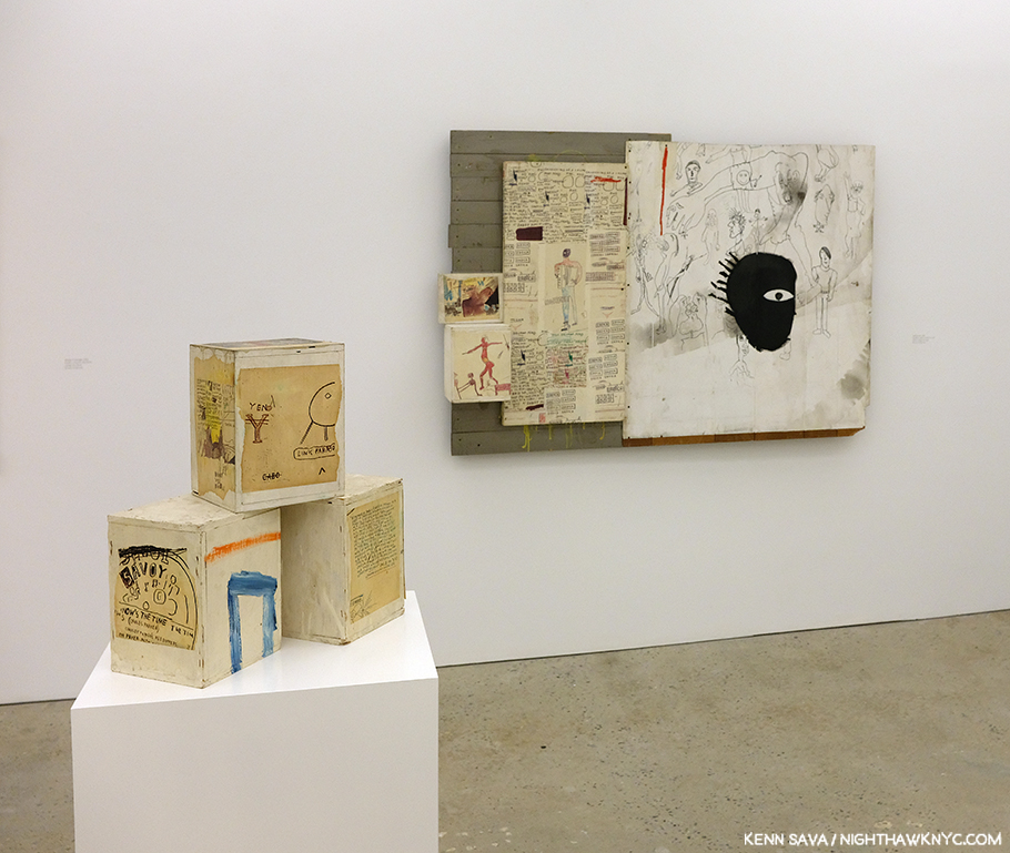
Installation view. I was completely unprepared for the depth and endless detail in this body of work I had previously not known.

As a result, in Jean-Michel Basquiat / Xerox, we see J-MB the collagist as much as we do the writer, or the Painter. Suddenly, his work looks different. The figures recede, words come to the fore. Many, many words.

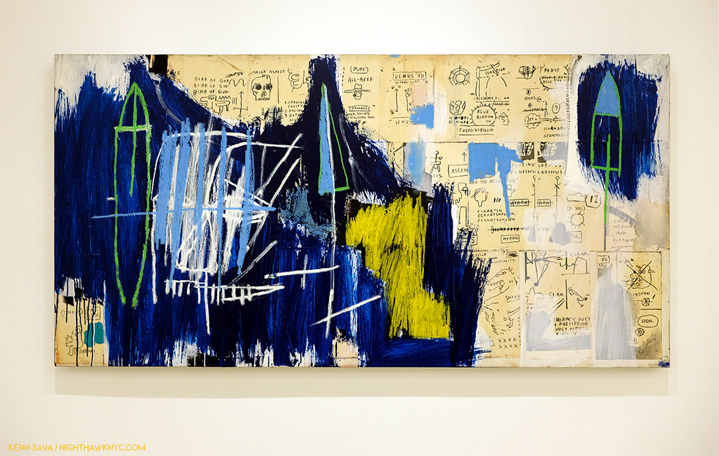
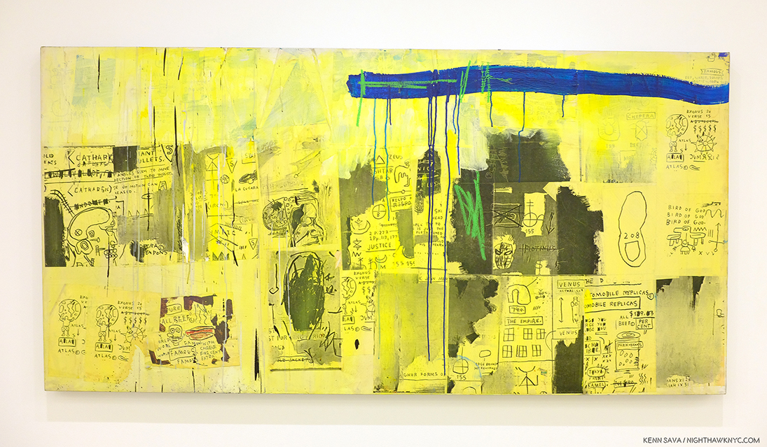
Odours of Punt, 1983, Acrylic, oilstick and Xerox collage on canvas, 40 x 83 inches

Odours of Punt, 1983, was one of the first works in Xerox and it was one of the first works to get to me. A “non-fan” up to that moment, something clicked in me when I saw this. In it, J-MB borrows Painting techniques from all over Art History on his way to making something…else. The history of Painting from 1947, on, was staring me in the face, to the left, while something entirely new and different was vying for my attention on the right. On the left, I felt Clyfford Still being channeled underneath Cy Twombly and Jean Dubuffet yet what he created is something distinctly his own- a remarkable thing in itself. And extremely abstract, at least to my eyes. While its right side felt like it was coming from another world, made up of fragmentary images. Neither side would seem to “go” with the other at first glance, yet, somehow, as my eye and brain moved between the two “worlds” of the work, they manage to hold together almost miraculously well. This is something I’ve felt in the presence of the greatest works of Abstraction, including those by, say, Kandinsky, Jackson Pollock from 1947 to 52, Mark Rothko, Jack Whitten, and Mark Bradford today. It’s incredibly hard to do, which is evidenced by the fact that almost none of them (who’s careers have completed), except for Kandinsky, (who was 77 when he passed away, and Painting abstractly for about 35 years), were seemingly able to do it indefinitely. Jackson Pollock seemed “to lose his fastball” in his last few years and his style began to change, and Mark Rothko lost…his life (I’m not saying that’s related to his Art). Perhaps these are only coincidences. J-MB didn’t make it to 30 years of age.

Detail of the upper center.

On the right, equally abstract to me was what seemed to be a new creative language. “BIRD OF GOD,” “VENUS VII,” “COSTOXIPHOID,””BLUE RIBBON,” and on and on, accompanied by innumerable drawings and diagrams. Man, there’s A LOT to see in this! Even now, almost 4 months later? I feel like I’ve only begun to look at it. For only one example- Costoxiphoid is a ligament that connects the ribs. At age 6, J-MB was injured in a car accident. While he was hospitalized (his spleen, i.e. his “filter,” was removed), his mother brought him a copy of Gray’s Anatomy. It would be a sourcebook for his Art for the rest of his life, and possibly here for “1. Cranial Cavity, 2. Facial,…” to the left of center. The title (assuming this is the Artist’s title- many of his works were “named” by others) is also an enigma. “Odours” referring to “any property detected by the olfactory system,” per Merriam-Webster, and “punt” have multiple meanings, including “an open flat bottom boat with squared ends.”
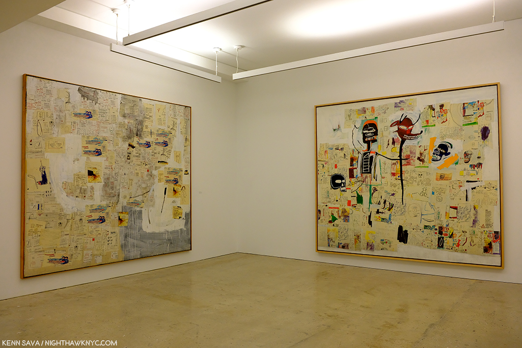
Untitled, left, and Peter and the Wolf, both Acrylic, lipstick and Xerox collage on canvas, both 1985, both 110 x 114 inches, seen from about 15 feet away, the figures in these pieces are almost entirely swallowed up by everything else.

Walking through Xerox, it was impossible not to begin to understand that J-MB‘s work is deep. Deeper than just about anyone has even written about so far. These works contain a staggering, almost obsessive, amount of detail, and details that swallow up the figures, one of the things the Artist is most famous for. Figuring out what’s going on in all of this detail is going to take 2 things- #1, an expert, most likely one who knew the Artist, or #2- A long time.

Not having known Jean-Michel Basquiat, I, like those born after August 12, 1988, can only look at his work and see what it says to me. In a short time, my looking thus far has given rise to some threads that I am going to continue to study.

First among them is Jazz. Being a former Musician, who produced Jazz records and wrote for a national Jazz magazine for 4 years, perhaps I am pre-disposed to spotting them. Fair enough. While many people talk about J-MB and Hip-hop, looking at the work in this show, I failed to see even one reference to it. This struck me, particularly because one thing that stood out to me at Xerox to the point that I couldn’t overlook it was the CONTINUAL, and extraordinary number of, references to Jazz- be it Jazz Musicians, records or song titles. In fact, they were so prevailing, you’d have to look hard to find even one work here without a Jazz reference somewhere in it (which I may, or may not, have).

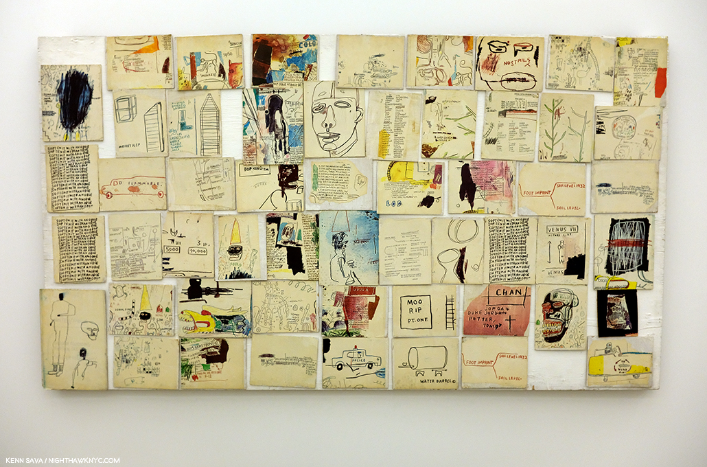
Untitled, 1985, Xerox collage mounted on panels, 48 x 85 inches.

In Untitled, 1985, a collection of color Xeroxes mounted on panels, the Jazz references are almost overflowing.
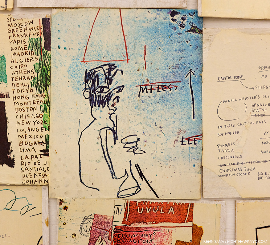
Almost right in the middle of Untitled is this portrait of Miles Davis, playing, or holding, his horn.

Fittingly, smack dab in the middle of it is this portrait of trumpeter and bandleader Miles Davis. Which reminds me of this still from a Miles Davis video from the late 1950s-
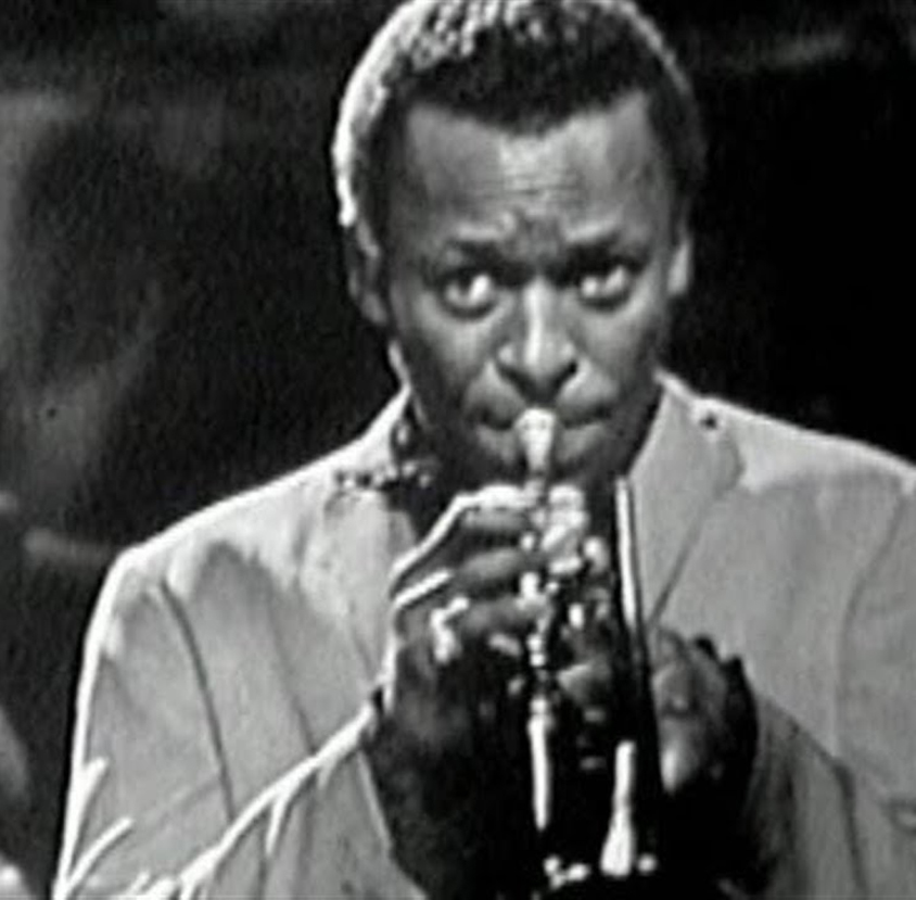
Miles Davis performing “So What” in a 1958 film called The Sound of Miles Davis in a group that also included the great John Coltrane.

And then there’s the work shown in the Xerox poster, King of the Zulus, 1984-5. “King of the Zulus” is, also, the name of a Louis Armstrong and his Hot Five record from 1926.
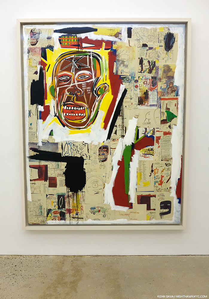
The work from the poster seen in the flesh. King of the Zulus, 1984-5, Acrylic, oilstick and xerox collage on paper mounted on canvas, 86 x 68 inches.
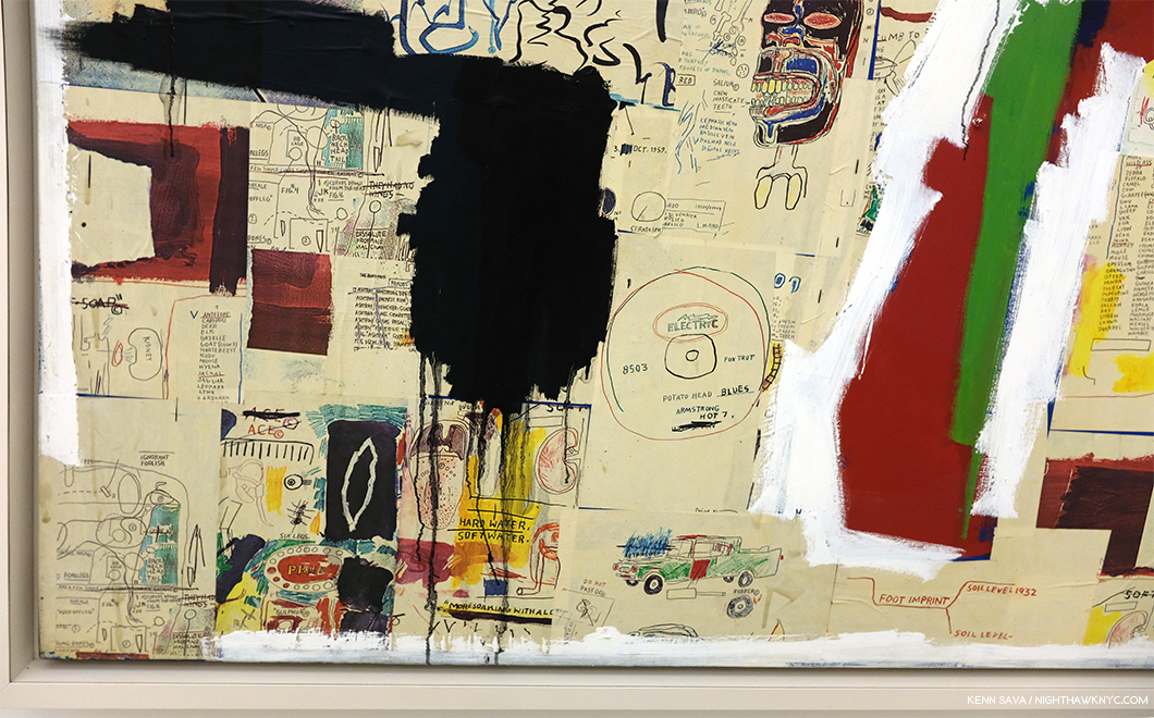
Detail of the lower left corner of King of the Zulus. This gives a little idea of the depth of what’s going on in this work.

The lower left corner of King of the Zulus includes a drawing of another Louis Armstrong record, “Potato Head Blues,” which some feel is at the top of the list of his finest recordings (those are some mighty brave folks. Miles Davis once said that Louis played everything you can possibly play on the trumpet. He would know. I’d never dare a guess at “greatest.” It doesn’t exist.). In his 1979 movie Manhattan, Woody Allen (who is also a Jazz Musician) has his character say that “Potato Head Blues” is “one of the reasons that life is worth living.”

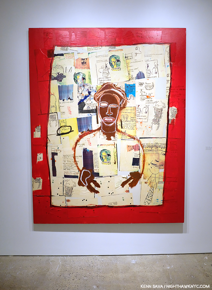
Red Joy, 1984, Oilstick and Xerox collage on canvas, 86 x 68 inches.

Later, I came across the transcription of an interview with J-MB by Becky Johnston and Tamra Davis in which Becky Johnston asks him-

“BJ: What music do you like?

J-MB: Bebop’s I guess my favourite music. But I don’t listen to it all the time; I listen to everything. But I have to say bebop’s my favourite.”
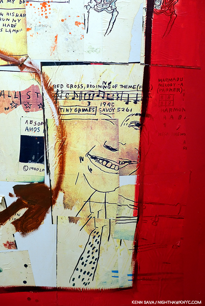
Detail of the lower right corner of Red Joy. That’s a portrait of the great saxophonist and composer Charlie “Bird” Parker, with a musical quote from his composition “Red Cross” on the top.

“Bebop” was a revolutionary, new, style of Jazz that Bird, Dizzy Gillespie, Thelonious Monk and Charlie Christian developed in the late 1930s and early 1940s. Louis Armstrong predated and outlived Bebop (which peaked in the 1940s), so it’s obvious that J-MB listened to Jazz from other periods as well as Bebop. Regarding the work that might omit a Jazz reference? Interestingly, look as I might, I didn’t find any Jazz references in Odours of Punt, seen earlier, rare among the works in Xerox. Unless the repeated “BIRD OF GOD,” near the upper left is a reference to Charlie “Bird” Parker. What else could it mean? My guess is that it is- until an expert comes forward. When he died, it’s reported in Pheobe Hoban’s biography that crates of Jazz records belonging to the Artist were thrown out, along with a carton of copies of Ross Russell’s 1973 Parker bio, Bird Lives!5.

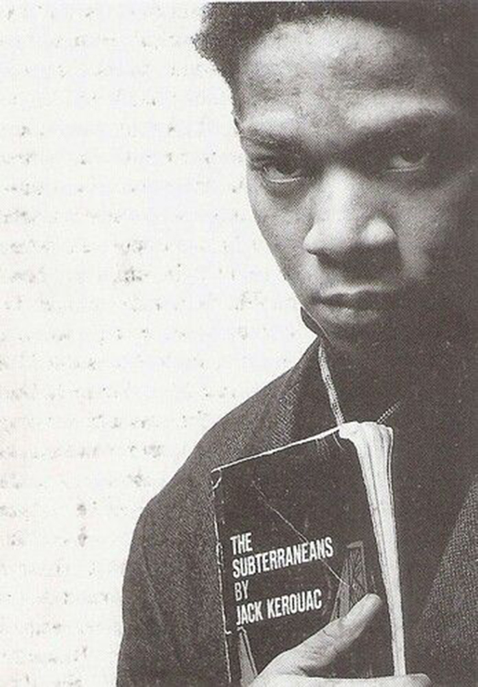
Jean-Michel Basquiat holding a copy of The Subterraneans by Jack Kerouac. He was reported seen carrying one around in Pheobe Hoban’s biography of the Artist. *Photographer unknown.

As for the second thread, the proliferation of words in the works included in Jean-Michel Basquiat / Xerox got me to look closer than I ever did before. Then, in my research, I discovered something interesting. Jean-Michel Basquiat had a love of the Beats. At various points he is reported to be continually reading William Burroughs Naked Lunch (a picture of him with a copy of it was taken by Alexis Adler was shown earlier- the picture with Nick’s tattoo, in which Naked Lunch is shown mounted on the wall behind J-MB) and Junky, as is reported in Pheobe Hoban’s Basquiat: A Quick Killing In Art, (eBook P.75). Later on, he is reported to be carrying around Jack Kerouac’s The Subterraneans, as is seen above. These struck me. Then, I discovered something more. J-MB knew both William Burroughs and Allen Ginsberg, and can be seen with both here! He was also Photographed by Allen Ginsberg, a terrific and still somewhat overlooked Photographer in his own right. While others make cases for J-MB being a member of this or that “group,” how crazy is it to make a case for J-MB as a descendant of the Beats? There’s more direct evidence for it than there is for some of the claims I’ve seen. Some have made the case for J-MB the Poet. From his SAMO© days to what we see in his Notebooks, he does have one of the most unique ways with the English language of any writer known to me.
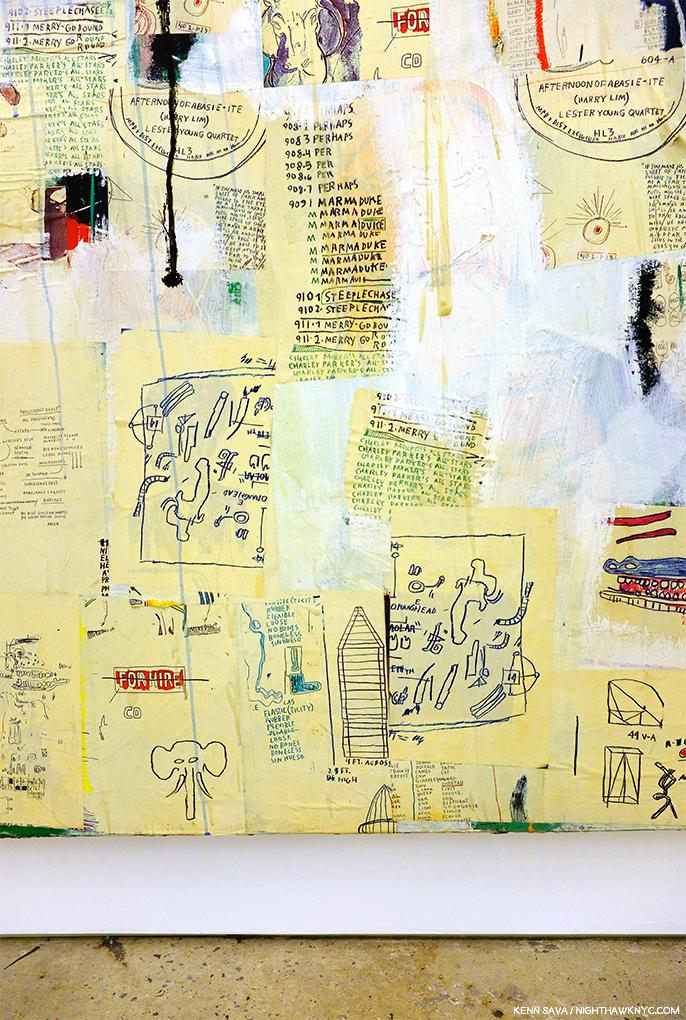
Detail of the lower left section of Untitled, 1987, Acrylic, oil stick, and Xerox collage on canvas, 100 x 114 inches, reveals lists of song titles, under two semi-circular Drawings of record labels.

It’s become apparent to me that the cult of personality surrounding the Artist, and his fame (which, he longed for while he was homeless early on, and chased later, which makes him, at least partially responsible for) has, also, served to delay the serious critical assessment of his work. I’m not saying there isn’t any. There is. There are some very fine essays in the catalogues for the shows done so far, beginning with Richard Marshall’s excellent piece, “Repelling Ghosts,” in the catalogue for the very first J-MB Retrospective, at the Whitney Museum in 1992, and, as I said, Fred Hoffman has done a yeoman’s job of pointing the way to where Basquiat scholarship may be finally going, but the need for this is most urgent in my opinion, before the work is left to those who did not personally know the Artist. From what I’ve read thus far, Jean-Michel Basquiat’s Art was best “understood” by those who knew him. Some of them have already passed away, taking with them whatever they didn’t write down or share in interviews about the Artist and his work. Since the real critical assessment of his work has taken so long to get underway, there is, it seems to me, a real danger that if this continues to happen, J-MB‘s Art will remain an eternal mystery, like say, Vermeer’s, is to us today. Part of this is due to the fact that museums have been slow accepting J-MB‘s work, or even borrowing it to mount shows of it. Museum shows generally result in new scholarship published in the accompanying catalogs. The pace of museum shows has picked up over the past decade, both in the US and in Europe, but, in my opinion, when it comes to actually studying the work, the scholarship has been spotty so far. So? Anyone delving into the work of J-MB for the first time, as I am, is left with a lot of biography and a little Art criticism to fall back on- no matter how many books you see. As a result? I was largely left to make of it what I can- like viewers who weren’t alive in J-MB‘s time are.

Untitled, 1985-6, in front of Embittered, 1986, Graphite, paint and Xerox collage on wood.

Also apparent from some of the pieces written thus far that people fall all over themselves trying to “claim” J-MB for this school or that, from so-called “primitivism” to so-called “expressionism” to so-called “neo-expressionism,” to (more recently) so-called “conceptualism”- none of which J-MB, himself, used for his work, which is the only thing that matters, in my opinion, to hip-hop.

Jay Z, who did not know him, said this in his autobiography, Decoded, published in 2010, on page 95-“…People always wanted to stick B in some camp or another, to past on some label that would be stable and make it easy to treat him like a commodity. But he was elusive. His eye was always on a bigger picture, not on whatever corner people tried to frame him in. But mostly his was probably on himself, on using his art to get what he wanted, to say what he wanted, to communicate his truth. B shook any easy definition. He wasn’t afraid of wanting to succeed to get right, to be famous…”

The visual evidence in the work itself shows me, at least, something different from all the claims I mentioned before Jay Z. Jean-Michel Basquiat belongs in one “box,” and one “box” only- the “Jean-Michel Basquiat box.” Though he definitely belongs to the continuum of Art History, as Richard Marshall lays out in detail in his excellent essay in the Whitney Retrospective Catalogue, which probably surprises many, Jean-Michel Basquiat is unique unto himself. Period.

Kokosolo, 1983, Acrylic, oilstick, and Xerox on canvas, 43.3 x 82.6 inches.

Meanwhile, back at Xerox, I love the use of paint here. Jean-Michel Basquiat’s work is about layers and here it’s hard to know what’s on top and what’s on the bottom layer. J-MB spoke many times about his use of crowding out words and letters and said one of the reasons he did it was to make the viewer look closer. I can’t help wonder if he’s doing the same with the yellow here- making us look closer at what’s under the yellow. 

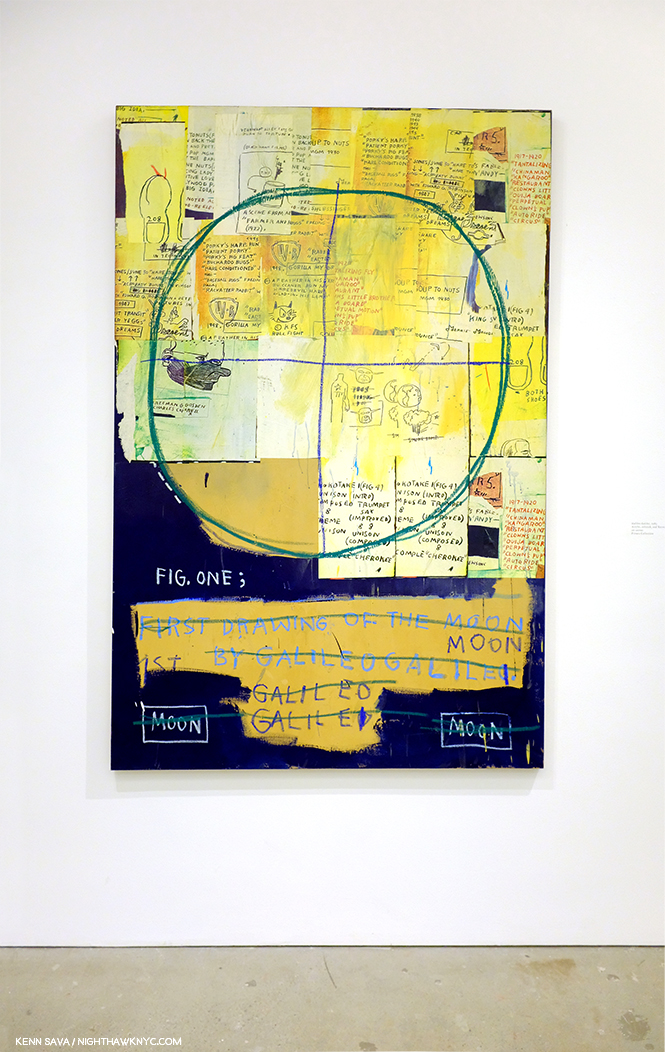
Galileo Galilei, 1983, Acrylic, oilstick, and Xerox on canvas, 78.75 x 51 inches.

In Galileo Galilei, 1983, I was struck by a number of things, first, from a distance, the circles, ostensibly the outline of the moon. But the circle is quartered, which is not like the moon. It’s something done in graphs and in Drawing. That reminded me- Drawing a circle is something that has a long and legendary history in Art. The great ancient Greek Painter, Apelles, and later the Renaissance master, Giotto, both used their ability to draw perfect circles freehand as calling cards.

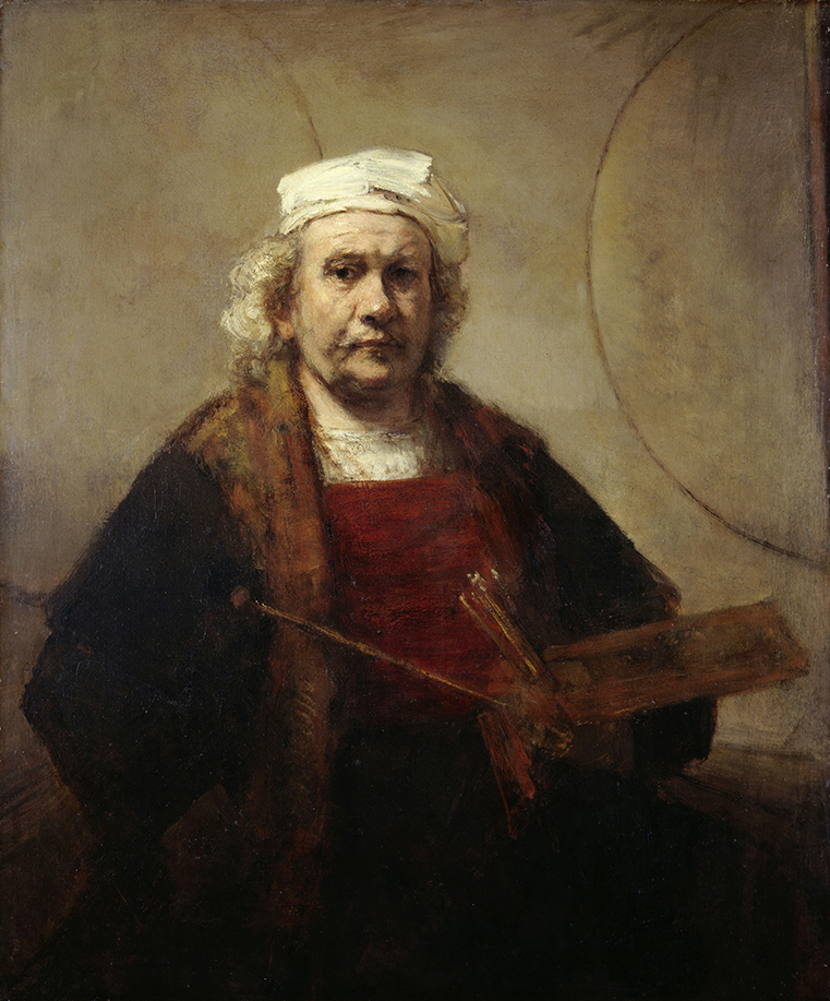
Rembrandt, Self Portrait with Two Circles, c.1665, *Kenwood House, London.

I am one of those who believes Rembrandt followed suit, leaving his own “calling card” as their heir in his Self-Portrait with Two Circles.
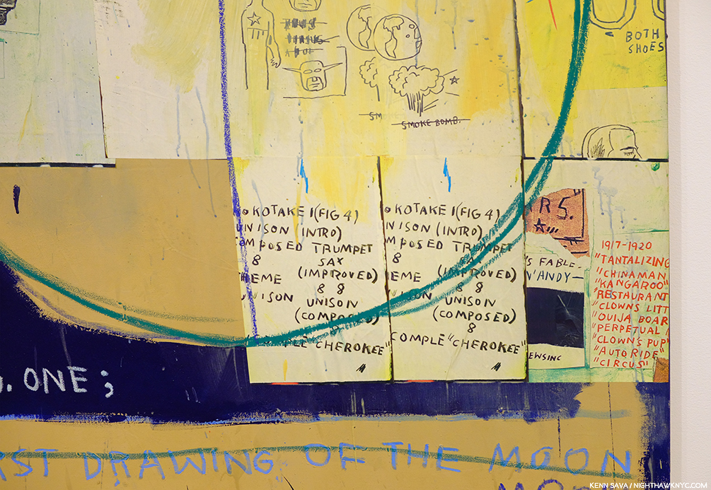
Detail, or rather, Details. Note the multiple lines that make up the circles and the repeated list. I recognize these part words as being a list of songs from Charlie Parker’s Savoy recordings because I have these records. “Koko Take 1,” and so on. As for everything else going on in this work? I’m hoping someone who knew J-MB will come forward and discuss it.

Here, we happen to have two, or parts of three, drawn circles. Was J-MB aware of the Apelles/Rembrandt circles? 

This body of work is an example of one of the last vestiges of reproduction in Art before the digital age took hold. Seeing this now does really make it feel like more than 35 years have passed, yet, they don’t look dated. Nor do the beginnings of this work, the “(Anti) Product Postcards” he created, many with Jennifer Stein, who speaks about them here.
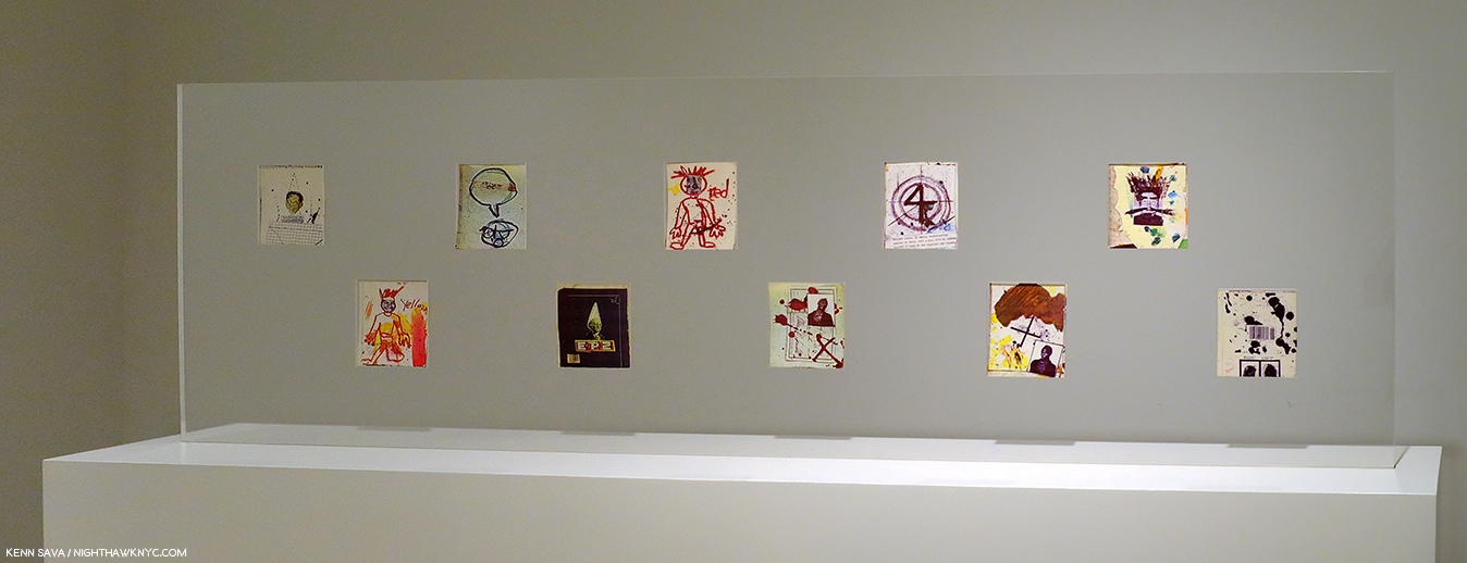
Early on, J-MB created Postcards, including these, many hand labelled “(Anti) Product” on the verso, which he sold for $1 each. Andy Warhol bought one when J-MB first met him while he was eating at a restaurant with Henry Geldzahler. They are among the earliest examples I’ve seen of J-MB’s collage. Some of these were collaborations with Jennifer Stein.

I returned to see Jean-Michel Basquiat / Xerox twice more since it proved to be a “personal rosetta stone” into the Art of J-MB. It was an extraordinary gallery show in many ways. The 33 works on view that ranged from He Was Crazy from 1979, shown earlier, through 1987, covering all but the final year of his Painting career and his life. Alas, even in three visits, I can only hope to scratch the surface layer of all that lies in these work by Jean-Michel Basquiat. But, there was something else. Alone with the security guard in the show for most of the 7 or 8 hours I spent there over 3 visits, I was struck by something else.

Silence.

A silence that was singing in a way that would bring a smile to John Cage’s face. If there’s been too much of any one thing around the work of Jean-Michel Basquiat to this point, it’s noise. A byproduct of his tragic death far too young is there are no more “Page 6” scandals, no more gossip, no more rumors. Only the work remains, hanging silently in these rooms. That silence said it’s time to let that Art speak for itself. And it’s time that those who knew and/or worked with the Artist to share what they know, and provide whatever insights they have before those, too, are lost forever.
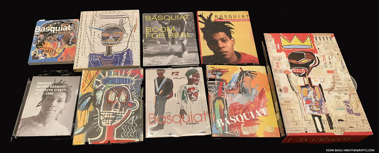
Current and older books on Jean-Michel Basquiat and his work. Of these, the catalogs for the J-MB Retrospectives at the Brooklyn Museum (first, upper left) and the Whitney Museum, 2nd from left, front, were the two I referred to most often. The Unseen Notebooks (4th from the right, top) is also excellent. Fred Hoffman’s books are available for download from his website and are recommended. While it contains images of the most works available in print, I found the new Taschen XL, far right, problematic. A catalog for Alexis Adler’s traveling show, seen bottom left, of her collection is a revelation.

After I left Xerox for the last time, I, too felt the clock ticking. I immediately launched a deep dive into Basquiat monographs, in and out of print, and read everything I could get my hands on. As my research began, I quickly came upon a startling fact- Jean-Michel Basquiat: Xerox (which ran from March 12 through June 1st) is one of no less than SIX shows of Jean-Michel Basquiat’s work, or pertaining to the Artist, going on in the NYC vicinity in 2019!

The other five are-
Jean-Michel Basquiat at The Brant Foundation, March 6 – May 14th
The 12th Street Experiment: Photography of Jean-Michel Basquiat By Alexis Adler at Bishop on Bedford, Brooklyn, May 3 – June 13th
Lee Jaffe: Jean-Michel Basquiat at Eva Presenhuber, June 28th – July 28th
Basquiat x Warhol at The School/Jack Shainman Gallery, Kinderhook, NY, June 1 – September 7th
Basquiat’s Defacement: The Untold Story at the Guggenheim Museum, June 21st – November 6th
and…two Paintings from the collaboration of Jean-Michel Basquiat and Andy Warhol, along with ephemera from their collaboration, were on view in Andy Warhol at the Whitney Museum earlier this year, which I wrote about, here.

First? I wondered- Why six shows now?

Jean-Michel Basquiat was born on December 22, 1960 and died 31 years ago on August 12, 1988. 2020 will be a double anniversary for J-MB- 60 years since he was born, 40 years since The Times Square Show launched his career. 2019? No special significance, as far as I know, four months into my research. The Brant show shares the same curator (and many of the 120 works) with the Jean-Michel Basquiat show at the Foundation Louis Vuitton, Paris, which ended on January 14, 2019. The Brant’s opened on March 6th. So, beyond commemorating a “Basquiat anniversary,” the timing of that show may just have been fortuitous and practical, as in “we’ve got all these works together, why don’t we also show them in the new space in NYC?” As for the timing of the others? I have no idea.

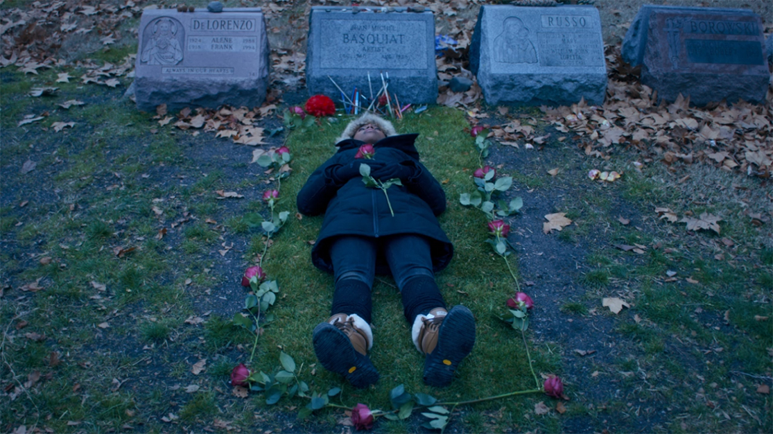
Nola Darling lying on Jean-Michel Basquiat’s grave in She’s Gotta Have It.*

Between these six shows, the total number of works by Basquiat (counting those in collaboration with Andy Warhol) should total slightly more than the 120 shown in that Foundation Louis Vuitton, Paris, show, in addition to Photographs of J-MB by early roommate, Alexis Adler, and Musician and friend, Lee Jaffe. As such, these shows present the opportunity to see the most works by the Artist since the 160 pages from his Notebooks along with other works and some Paintings were shown in the Jean-Michel Basquiat: Unknown Notebooks show at the Brooklyn Museum in 2015, and the most Paintings by the Artist in NYC since that 2005 Basquiat Brooklyn Museum Retrospective. Unlike the “Summer of Rauschenberg,” which I covered extensively in 2017, where the satellite shows “revolved” around MoMA’s Robert Rauschenberg: Among Friends Retrospective, this time, the only museum show in the bunch, Basquiat’s Defacement at the Guggenheim, is a satellite show to the blockbuster Brant Foundation’s (a private organization) first public exhibition- Jean-Michel Basquiat, which included a whopping 70 Paintings and 1 Sculpture, the main act. Given that the vast majority of J-MB‘s best work resides in private collections, this brings home the fact that going forward, unlike with most Artists, the public is going to depend on the generosity of collectors displaying their work to see them, and researchers are going to depend on them to study it.

As a result, I quickly realized after that it might be now or never if I wanted to see a large body of Basquiat’s work and reassess it, and see WHO is “right”- the haters or the believers. With 39 years elapsing since J-MB‘s debut at the Times Square Show, enough time has elapsed to get a bit of perspective. So?
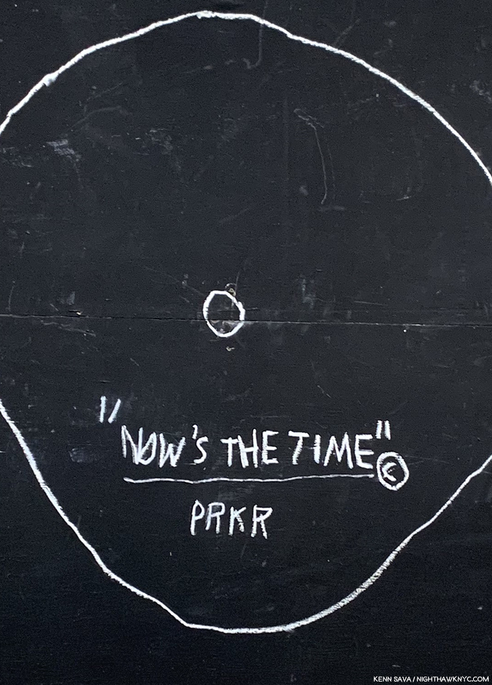
Detail of Now’s The Time, a Painting that looks like the classic 1945 Charlie Parker record of the same name, with “PRKR,” J-MB’s “shorthand” for Bird’s last name.

Now…is INDEED the time. It’s the time for the real assessment of Jean-Michel Basquiat’s Art to take over from the sensational biography. For me? Who knows when I’ll have the opportunity to see this much of his work in NYC again. It might be now, or never. NOW is my time, too.

My thoughts immediately turned to the Brant Foundation’s inaugural show in their new East Village location, Jean-Michel Basquiat, which was up and running and the clock was ticking on its run. NHNYC researcher Kitty, a Basquiat fan since she saw him in person back in the day at the Mudd Clubb, had seen it and gave a glowing report. I began scrambling to get a ticket. No luck online. The show had been completely sold out (though tickets were free) since it opened. Hmmm…HOW to see the most publicized and talked about show in NYC in early 2019? Or, would my glimpse at Xerox of what I had missed remain a lingering tease?

To be continued…

This piece is dedicated to my former friend, grae, who knew J-MB, and to Kitty, who was in the same room with him in the clubs back in the day, and who has patiently accepted his work not speaking to me all these years. My thanks to Nick. 

This is Part 1 of my series on the five Jean-Michel Basquiat shows going on in NYC this year. Part 2 may be found under this one, or here. Part 3 is here

*-Soundtrack for this Post is what else? “Xerox” by Julian Casablancas + The Voidz. If  you’re a Strokes fan, check this out, if you haven’t. Also, it doesn’t sound all that distant from J-MB‘s own band, Grey. Maybe they were an influence.?

NighthawkNYC.com has been entirely self-funded and ad-free for over 6 years, during which over 250 full length pieces have been published. If you’ve found it worthwhile, you can donate to keep it going & ad-free below. Thank you!

Written & photographed by Kenn Sava for nighthawknyc.com unless otherwise credited.
To send comments, thoughts, feedback or propositions click here.
Click the white box on the upper right for the archives or to search them.
For “short takes” and additional pictures, follow @nighthawk_nyc on Instagram.

Subscribe to be notified of new Posts below. Your information will be used for no other purpose.


  1. Here. He repeated this elsewhere as well.
  2. By “work,” I believe they mean a Painting. According to its site, MoMA owns 12 prints and Drawings by Jean-Michel Basquiat. No Paintings.
  3. //www.nytimes.com/1985/02/10/magazine/new-art-new-money.html?searchResultPosition=1
  4. They were the only company in the world to acknowledge the 100th Anniversary of the 1st Jazz record in 2017, though the record in question is not what I call “Jazz,” and featured an astounding array of classic under-known Blue Note Record covers on T shirts.
  5. Both, Pheobe Hoban’s Basquiat: A Quick Killing In Art, eBook P.19

Andy Warhol: Business Artist

Written & Photographed by Kenn Sava (*unless otherwise credited)

“So you should always have a product that’s not just ‘you.’ An actress should count up her plays and movies and a model should count up her photographs and a writer should count up his words and an artist should count up his pictures so you always know exactly what you’re worth, and you don’t get stuck thinking your product is you and your fame, and your aura.” Andy Warhol1.

Andy shopping for products. *Bob Adelman, Andy Warhol at Gristede’s Market near 47th Street. New York City, 1965, near where he lived with his mother. Countless millions went shopping in American grocery stores in the 1960s. Very few made Art out of it before he did. Click any picture for full size. 

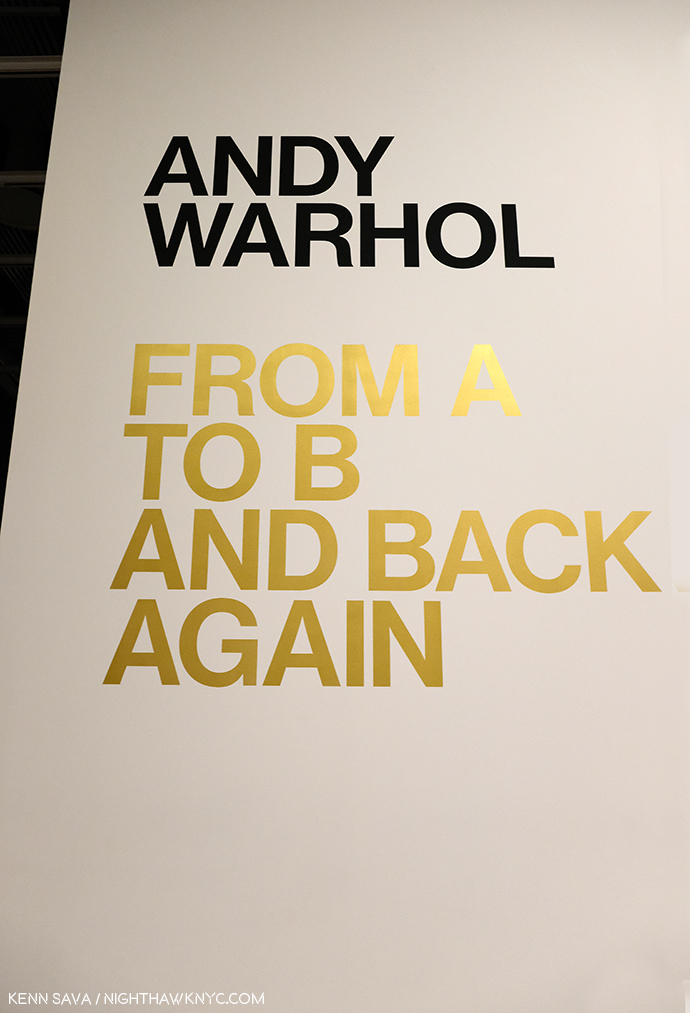
That being said, leaving the Whitney Museum’s Andy Warhol- From A to B and Back Again, the first Retrospective in NYC since MoMA’s in 1989, I was left believing Andy Warhol’s greatest creation was himself.

The use of gold here, and on the exhibition catalog’s cover, is interesting. It mimics Gold Marilyn, at MoMA, and also reminds of the background color of icons from the Eastern Orthodox and other churches. And? It’s a color often associated with money and “value,” so could it be a veiled reference to the high prices paid for his Art? Which of these is the intended meaning?

But, no matter how I feel about his Art, even I can’t deny that today, it can be said that we are living in his world to a greater extent than we realize. Look around you. His influence is everywhere. His innovations are now used by countless other Artists and businesses.

“A friend of mine named Ingrid from New Jersey came up with a new last name, just right for her new, loosely defined show-business career. She called herself ‘Ingrid Superstar.’ I’m positive Ingrid invented that word2.”

The everyday people he made into “superstars” presaged today’s television “reality stars.” His square portraits are now instantly recognizable as the Instagram standard. Andy Warhol came to define the Contemporary Artist working with a team of assistants at his Factory and his example is to be seen being followed by Artists all over the world today. How often do you see one of his color variated group of (4) portraits or flowers emulated by someone else? And on and on. These are only a few examples. Andy Warhol’s influence is incalculable. If it could be totaled, it might well rival that of Steve Jobs among THE most influential people of the past 75 years on our lives today.

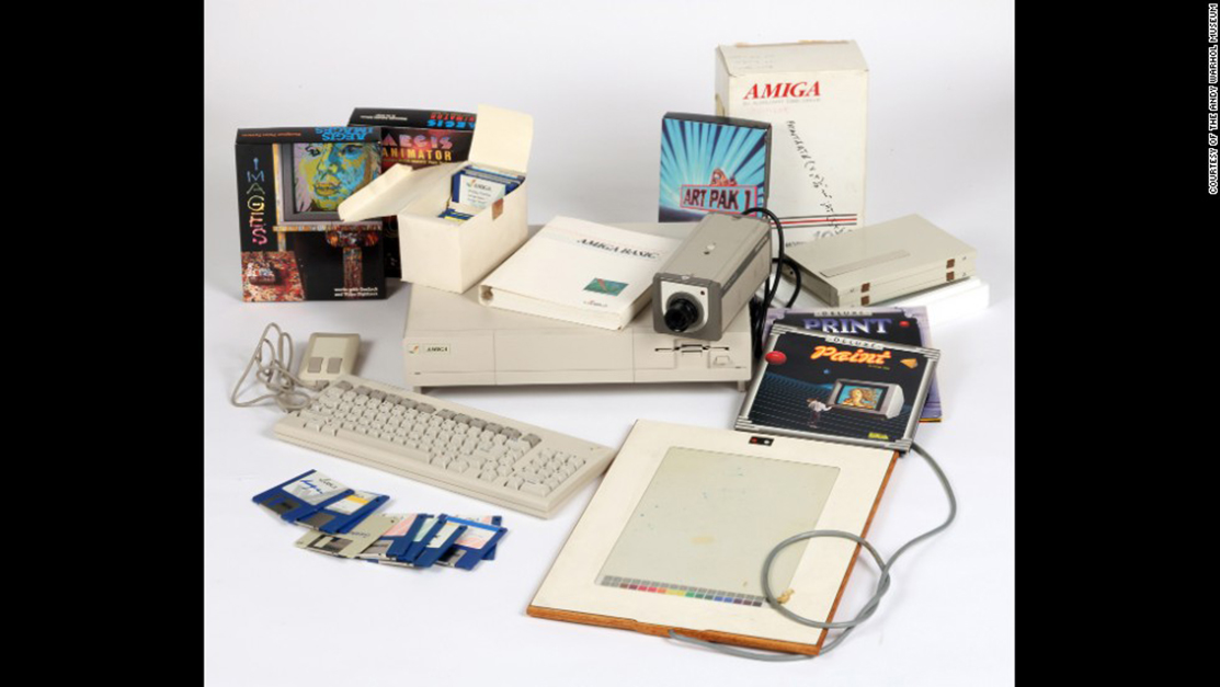
Commodore Amiga computer equipment used by Andy Warhol in 1985-86. Andy’s interesting computer Art was extracted from this machine by a team led by the Andy Warhol Museum in 2014! *Photo by The Andy Warhol Museum.

But, it was Andy Warhol, not Steve, who said,  “A computer would be a very qualified boss3 decades before the time when many people’s lives seem to be run by their devices. A-hem. Sometimes I wonder if the internet is nothing but a cyber projection of Andy Warhol’s brain.

Artistically, I respect him as an Artist who was continually innovative in so many mediums during his surprisingly short career. Yes, short. It feels like he was around forever, but he was just 58 when he passed away on February 22, 1987. This insatiable creativity now strikes me as a function of his innate ability to see the world in his own way, which led him, continually, in different directions, to try new things, and explore new ways of doing old things.

It seems to me, however, that THIS may be the peak moment of Andy Warhol’s influence- the influence of Warhol, the Artist and his Art.

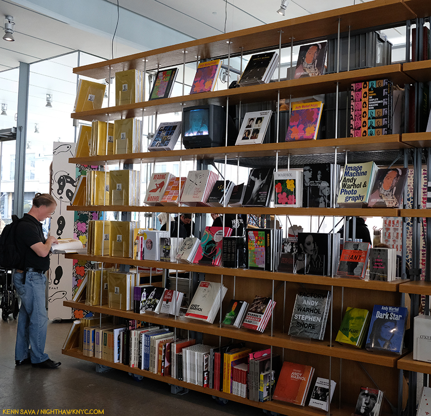
Warhol books, and ONLY Warhol books, seen in the Whitney Shop, March 27, 2019.

I wonder if the level of his fame may, in fact, work against its longevity from here. Virtually everything he did has been shown, written about, analyzed and assimilated. If you don’t think that’s true, take a look at this picture I took of part of the book shelves in the Whitney Museum’s Shop during the run on Andy Warhol- From A to B. I used a 28mm lens and even though I stood more than 20 feet away, backing into the middle of the admissions cue, I still wasn’t able to get ALL the Andy Warhol books on sale in the shot. There are books on his pre-Pop work, his newspaper-like work, his portraits, his posters, his prints, his record covers, his career as a publisher, his films, books on the Factory (including one of Photos taken by a teenaged Stephen Shore), a few about his Photography and polaroids, including a collection of Photos of him in drag, AND a multi-volume Catalogue Raisonne of his Paintings (on the far left of the bottom shelf). Oh, and Andy Warhol: Knives. ? This is not to mention all the books, by the Artist, and others, about his life, including the infamous, The Philosophy of Andy Warhol (From A to B and Back Again), published in 1977, which seems to have inspired the name of this show. My copy, bought from the display, is the 46th printing of the paperback. In all my many years of looking at Art books, I have to say the only other Artist who has as many books written about him and his Art is Picasso. 

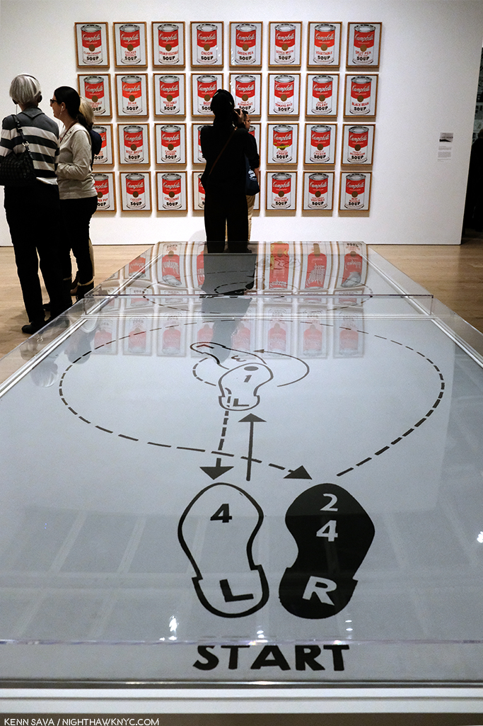
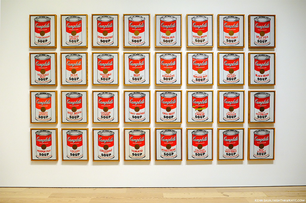
Start here. In the first gallery, which contains early Pop work, like Dance Steps, 1961, and a wall of Campbell’s Soup Cans in the back.

As I headed to the 5th floor for the main part of the show, I wondered- What’s left for the future to learn about Andy Warhol’s Art? Given his popularity, I’m sure people will find things for yet more books.

Andy’s mother fixed him Campbell’s Soup everyday for lunch, including after he became famous, until she passed. The family was poor. Beyond the comfort of the warmth of soup, having a lot of food around represents something of an ideal, a dream, even cheap food, like this soup was at the time, at 15 cents a can. Originally, these Paintings sold for $100 a piece at his first show at Ferus Gallery in LA, where Dennis Hopper bought one.

As I looked at his Art, it also raised questions. Questions that the passage of time has only intensified.

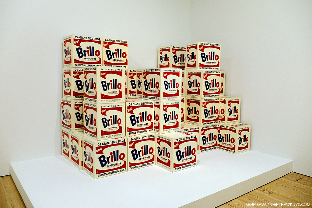
Brillo Boxes, 1969 (version of the 1964 original). Yes, a copy of a copy. The interesting thing about this work for me is that this “Art is everywhere around us” work of so-called “Pop Art,” which helped to mark the end of Abstract Art’s hold on the Art world, is based on the Brillo Box design of James Harvey, a moonlighting Abstract Expressionist Painter! Beyond that, and wondering if  Sol LeWitt was influenced by it, it’s lost on me.

First, and most importantly, Andy Warhol’s Art is accessible. This has been the most important factor in his achieving success and fame and it may be the most important factor in the longevity of both. Popularity doesn’t necessarily equate with quality. Since the future is unwritten, as Joe Strummer reminded us, it’s impossible to know what posterity will value, if anything. To this point quality has definitely been a factor. I wonder- Where does that leave Andy Warhol’s Art?

Arising at a time (the late 1950s) when the Art world had been fed a steady diet of extreme abstraction by the Abstract Expressionists, Andy Warhol’s Art burst on the world with images featuring things, yes, things, that everyone living in the country recognized. Brillo boxes, Campbell’sl soup cans, dollar bills. His work was instantly accessible in an Art world dominated by Art that was becoming more and more obtuse and remote. I’m not saying Andy Warhol’s work was “understandable,” or even “more understandable” than that of the Abstractionists, only relatable. Even in today’s world where fewer and fewer living beings remember S&H Green Stamps, walking through this show, this seems to still be the case.

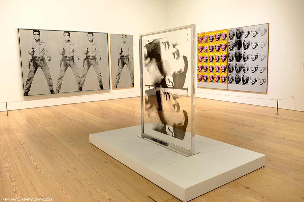
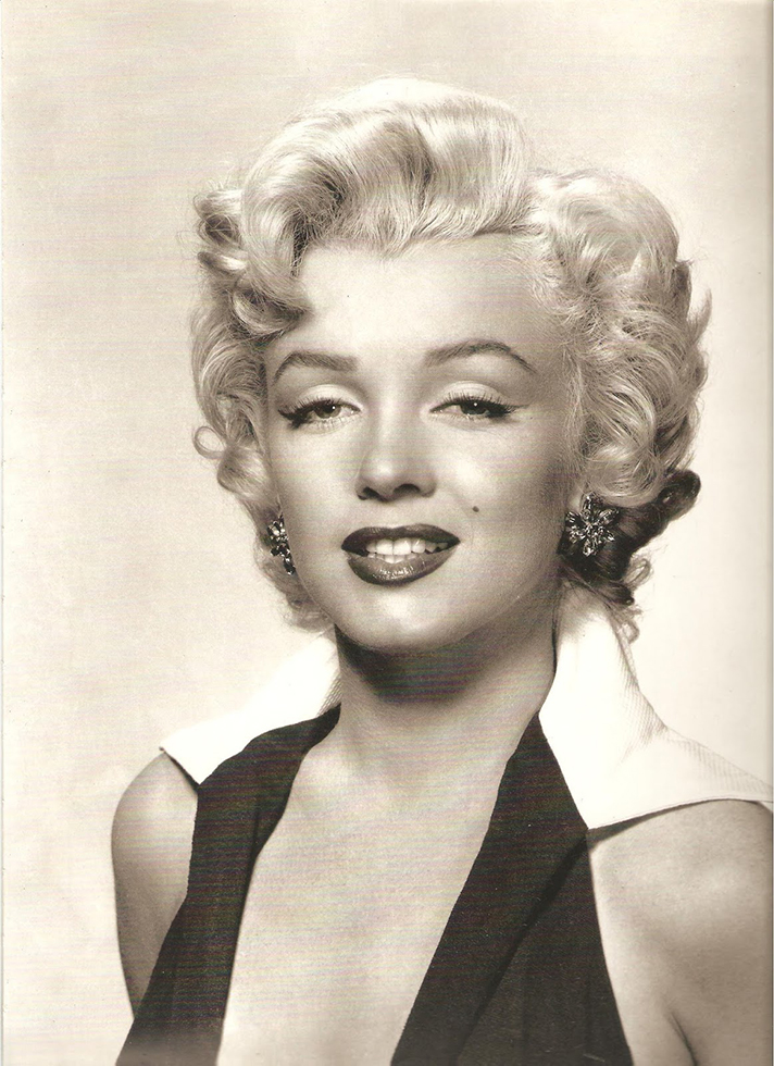
Marilyn & Elvis. Andy Warhol was always drawn to stars, and beautiful men. Personally, and in his Art.

But, the world has changed in the, now, 60 years since Andy Warhol’s career first took off. A lot of Artists have grown up with what he did and it’s become part of their work, even if it’s only unconsciously.

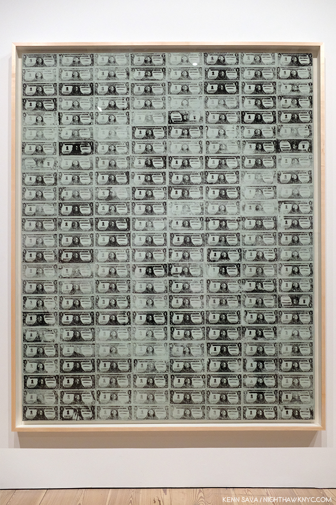
129 Dollar Bills, 1962, among the very first uses of silkscreening in Modern & Contemporary Art.

How many Artists have created with silkscreens since Andy Warhol introduced the possibilities of the ancient technique to the modern world in 1962? Even one of the other innovators and endlessly creative pillars of American Art in the late 1950s and 1960s (and after), Robert Rauschenberg, picked up the technique from Warhol. Since, silkscreening went from creating edgy Art to being used to create the large majority of the world’s T-Shirts, among countless other uses.

“I had by that time decided that ‘business’ was the best art. Business art is the step that comes after Art. I started as a commercial artist, and I want to finish as a business artist. After I did the thing called ‘art’ or whatever it’s called, I went into business art. I wanted to be an Art Businessman or a Business Artist. Being good in business is the most fascinating kind of art. During the hippie era people put down the idea of business—they’d say, ‘Money is bad,’ and ‘Working is bad,’ but making money is art and working is art and good business is the best art,” Andy Warhol. (Note- Not to be confused with my capitalization, caps and lowercase usage are Warhol’s own, reproduced exactly as the quote appears in TPoAW P.92.)

Ethel Scull 36 Times, 1963, jointly owned by The Whitney & The Met, was the first work commissioned from Andy Warhol. It’s a work that, in my view, has outlived its cachet as “Art,” and one that I don’t think posterity will look kindly upon.

Looking at the show, a takeaway for me was the distinct feeling I got was that there was his work, and then there is the work he did on commission (i.e. “Business Art,” a term he mentions in The Philosophy of, quoted above, but doesn’t define). After a while, I thought I could tell even before reading the card or researching the work, which was which- which were the work he did “for himself,” which were the works he did on commission, and I came away feeling there is a world of difference between the two. Wait! There’s a subject for a book I don’t think anyone’s written yet! For Andy Warhol, the business of Art was an Art in itself. Few before (maybe Rembrandt, Picasso and Dali in their ways) understood this and used it, but no one before him mastered it to the degree that Andy Warhol did. Its testament to how well he did it that a good many of his commissions, which detract from his other work when seen along side them as Ethel Scull 36 Times does in my opinion, hang in museums around the world, at least for now.

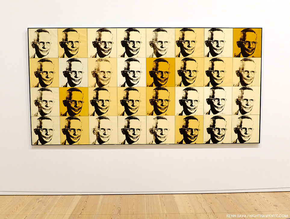
The American Man (Portrait of Watson Powell), 1964, a pseudo-companion piece to the Ethel Scull piece, above, and another commission, has aged better and still manages to speak to 2019 viewers.

To be fair, looking at some of his commissions now, we might well see in them a “commentary” by the Artist on matters beyond the mere representation of a given subject. The American Man, 1964, commissioned after seeing Warhol’s Ethel Scull piece, struck me that way. I’m still looking for that in a good many others, though.

After a couple visits, I was able to choose a few works in the great guessing game I like to play, and encourage everyone else to play- “Which works will be considered Art in the future- if any?” I came up with eight including the Campbell’s Soupcans and the 129 Dollar Bills already shown. 8 out of the 350 works the Museum says were on view. Personally, I don’t believe the passage of the centuries is going to be kind to most of Andy Warhol’s Art. Part of the reason for that is his pervasive influence. History doesn’t often look back favorably on who was first, particularly in Art. (Quick- Who “invented” oil painting? When I was growing up, I believed what Vasari wrote in The Lives of the Most Excellent Artists, 1550,  that it was the great van Eyck brothers, Jan and Hubert, who happened to be my first favorite Artists.) More recently there is no consensus and evidence of oil paint may have been found going back to 650AD.) Given the overheated state of his prices (still, in spite of a recent leveling off), his Art is definitely not where I’d put my money now. That ship has sailed. NOTHING goes up forever! Look elsewhere in 2019. (See my Post On Buying Art for additional considerations, all of which apply to the Art of Andy Warhol.)

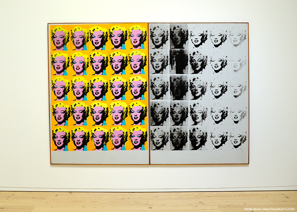
Marilyn Diptych, 1962

Let’s look at numbers 3 to 7 on my list for the ages (in no particular order). Next, Marilyn Diptych, 1962 – The duality of this work painted shortly after Marilyn Monroe’s suicide is revolutionary. On the one hand, Warhol shows Marilyn the idealized, beautiful, glamorous movie star, repeated radiantly in a sea of gold not unlike that of the religious icons of the Eastern Orthodox and other churches. On the right hand, the work seems to reference the darker side of both Marilyn’s life and death. This work is striking when one also considers that Andy was someone who sought autographs of movie stars as a child. Here, all the illusions of the silver screen are gone.

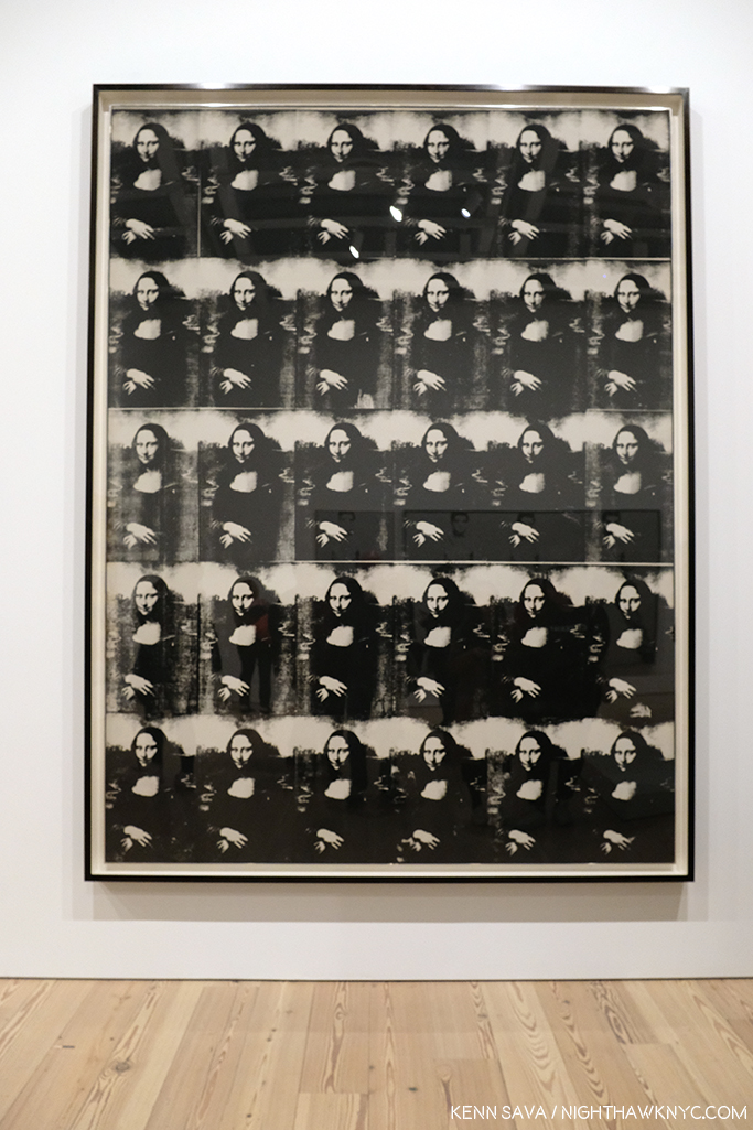
Thirty Are Better Than One, 1963

Thirty Are Better Than One, 1963, The multiple Mona Lisa as a commentary on the original’s visit to the USA at the time present an interesting counterpoint to the da Vinci- even in black & white. This one barely made my list, but given the precedent of other Artist’s commenting on or reinterpreting the Mona Lisa, like Duchamp, I think it will be of interest indefinitely.

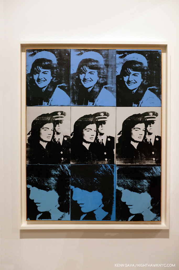
Nine Jackies, 1964

Nine Jackies, 1964. Something revolutionary in portraiture, the Artist captures the beauty of the Kennedy “Camelot,” and the horror and disbelief of what took place on November 22, 1963, as I remember it. A work that relies on the power of the Photograph, it’s one of the strongest uses of it in a medium outside of its own.

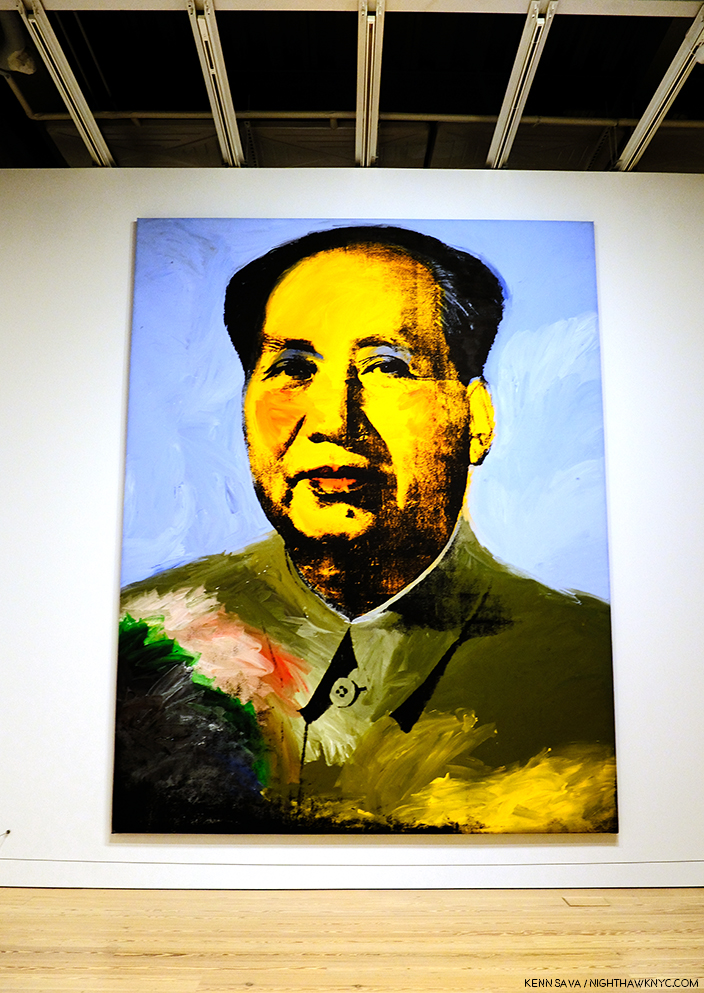
Mao, 1972

Mao, 1972- Created during the year of Nixon’s breakthrough visit to China, Andy Warhol’s image takes the portrait of Mao from the infamous Little Red Book of sayings and statements by the Chairman, which may have been the most reproduced image in the world at the time. Here, over 14 feet high, it symbolizes the Charman’s looming over all things in China, a different kind of manifestation of fame. Andy would make a brief trip, himself, to China in 1982, where he posed for a few pictures looking very stiff and uncomfortable.

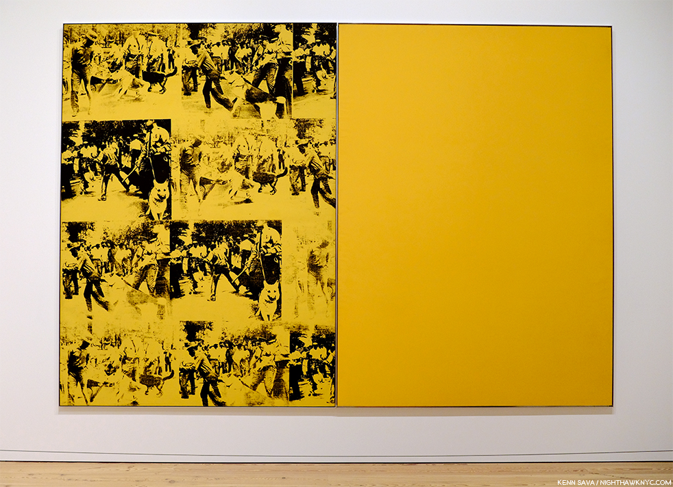
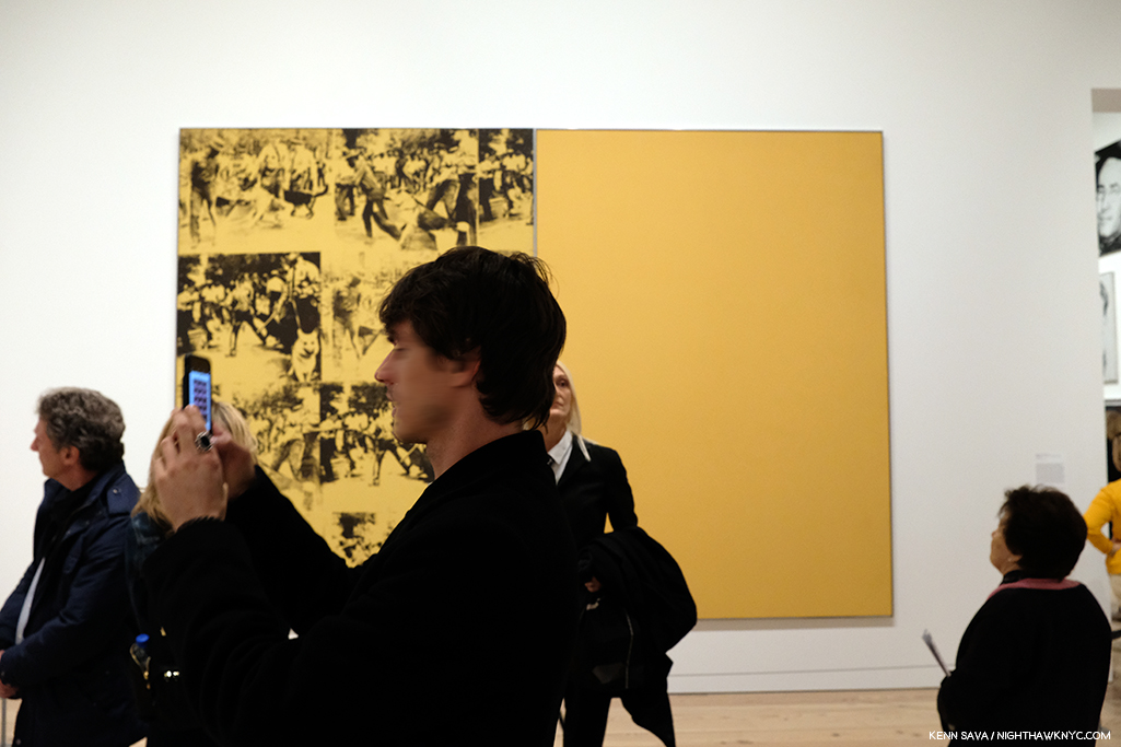
Mustard Race Riot, 1963.

Mustard Race Riot, 1963- Without a doubt, the most powerful work in the show, in my opinion, it sold for only $15,127,500.00 in 2004. “Only,” when you consider the current record price for a Warhol is $100 million (Eight Elvises), and when you consider another Warhol Race Riot, one that had been owned by Sam Wagstaff and Robert Mapplethorpe, sold for almost $63 million in 2014. As Artist Hank Willis Thomas, and others, have pointed out, this work looks as prescient as almost anything else in the show. Standing in front of it (which means standing a ways distant since it’s  114 by 82 inches), pondering it over multiple visits, I came away feeling that it may be one of the most important works of the 1960s, and for 1963, certainly gave those putting Andy Warhol in the “Pop Art” box pause for thought,  pointing out yet again the pointlessness of such terms.

Then? Something occurred to me to sleep top me dead in my tracks. ALL FIVE of these works involve the use of appropriated Photographs taken by others. Did Andy Warhol pay the Photographers for using them?

Gene Kornman, Photograph (Marilyn Monroe ), 1953. *Publicity Photo of Marilyn Monroe for the Film, Niagara.

This subject was not brought up anywhere that I saw in the show. They did mention (and exhibit) the Gene Kornman Photo Andy Warhol used, perhaps more than any other, was originally a publicity shot of Marilyn from her classic 1953 Film, Niagara. Also exhibited were the source Photos he used in Nine Jackies, which I subsequently learned Andy Warhol was sued over his use of. Charles Moore’s 1963 Life Magazine Photos were the source for Warhol’s Race Riot works, including Mustard Race Riot. Frankly? For an Artist who was so endlessly creative? That he did this, and did it for so long and so often surprises me. It took lawsuits for Andy and Robert Rauschenberg, who was also doing it, to decide to exclusively use their own Photographs henceforth, which, I think, improved the results for both. Yes, at the time, this was new territory for Artists. Copyright infringement was not a term that was not as common in Art in the late 1950s and early 1960s, and he had made his name using copyrighted names and trademarks for Campbell’s Soup, Brillo, etc., without issue- the companies involved, no doubt, relished the free advertising and attention, so giving his restless creativity the benefit of the doubt might apply here, I think (easy for me to say, I’m not Gene Kornman, who’s Photo of Marilyn wound up in Art that’s, no doubt, worth hundreds of millions of dollars, if not more, today).

I still think these are powerful works, among the best Warhols I’ve seen, but this does tarnish them a bit. It’s hard to ignore today. But, let’s move on.

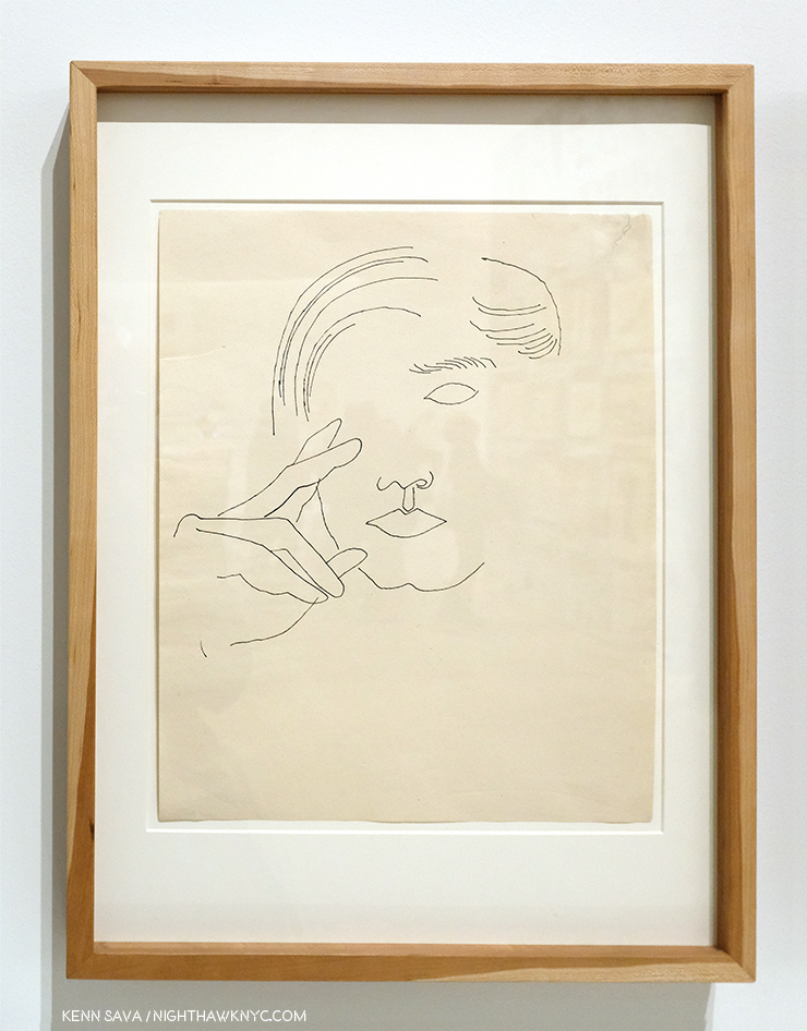
Self-Portrait, 1950s

I’m always interested to see any Artist’s Drawings, and I made a point of spending a considerable amount of time with the Drawings, mostly early, of Andy Warhol displayed here. It’s interesting that they reveal a wonderful sense of, and control of, line, which I’ve long thought to be the most technically difficult part of Drawing. So confident is the young Artist in his line that he dispenses with almost everything else- even parts of the composition! Shading is only hinted at once in a while. Throughout, it’s his line that carries the work. This style is reminiscent of one Picasso used in the early 1900s to create works like this. In addition, he shows an economy that makes it fascinating to consider what he’s left out, a uniqe way of using what Artists call “negative space.” This Drawing is markedly different from the “scratchy” drawings with halting lines seen in some of his commercial work of the period. He changed his style to fit the subject, and it always worked. He was a very successful illustrator and store window designer. But? Shoes and shoe design held a special place in his heart.

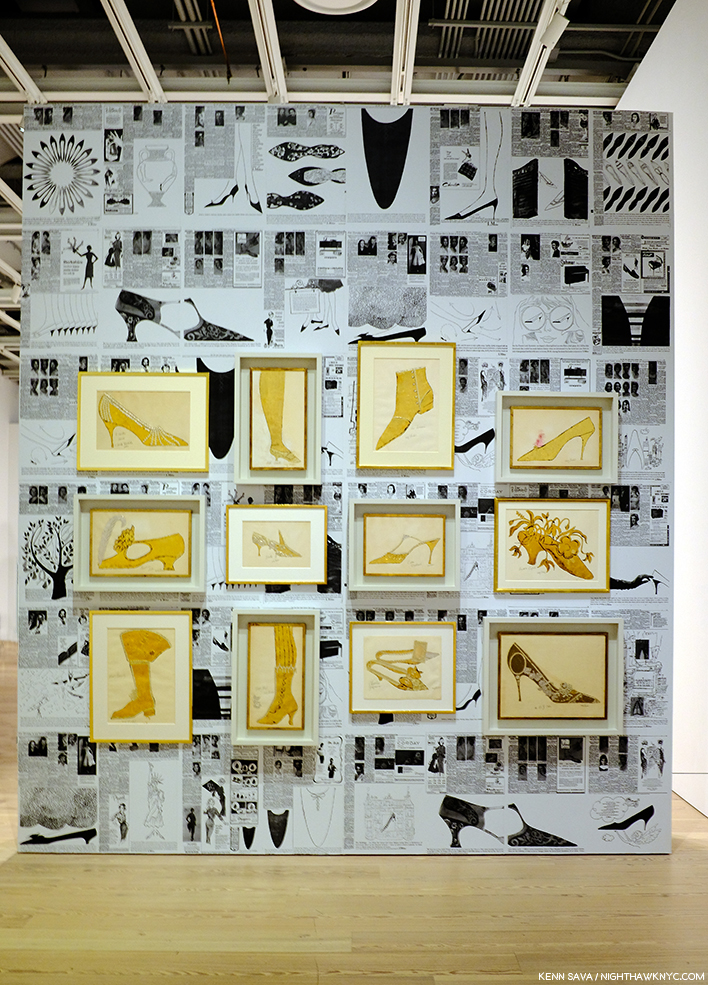
A wall of shoes. In each of the works in gold, Andy created a shoe as a caricature of a person.

It turns out that Andy Warhol had a shoe fetish. A real one, that surpasses the most shoe obsessed of my female friends, which John Giorno describes in graphic detail in the Documentary Andy Warhol: The Complete Picture! At 24:30, Mr. Giorno says, “There was Andy Warhol on his hands and knees kissing my shoes…”

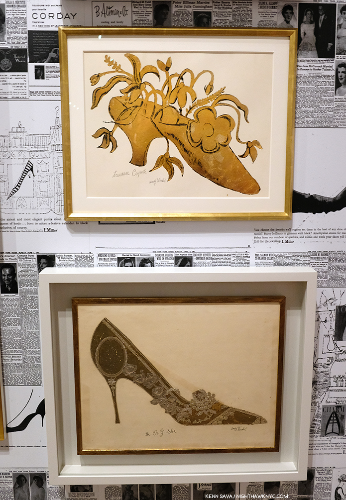
Andy’s Truman Capote Shoe, with calligraphy by his mom, is seen over his The B.J. Shoe. Given his shoe obsession, it’s interesting that there are no works after this period that feature shoes, as far as I know. Also interesting is that Andy, himself, wore the same pair of paint splattered shoes for 25 years, which are also shown in The Complete Picture.

Even in the midst of his intensive period of Drawing for his commercial illustration clients, he was always looking for ways to create multiples of his Drawings. This led to his use of silkscreens. But yes, he Painted. This early Painting is the one work in included that would meet the definition of a Painting for most of Art History- prior to Warhol.

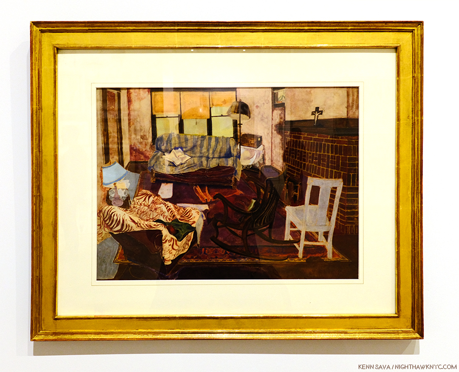
The charming Living Room, 1948.

From there, his Painting skills were used to modify and enhance works in other medium, like silkscreens, in works that were multi-media Paintings.

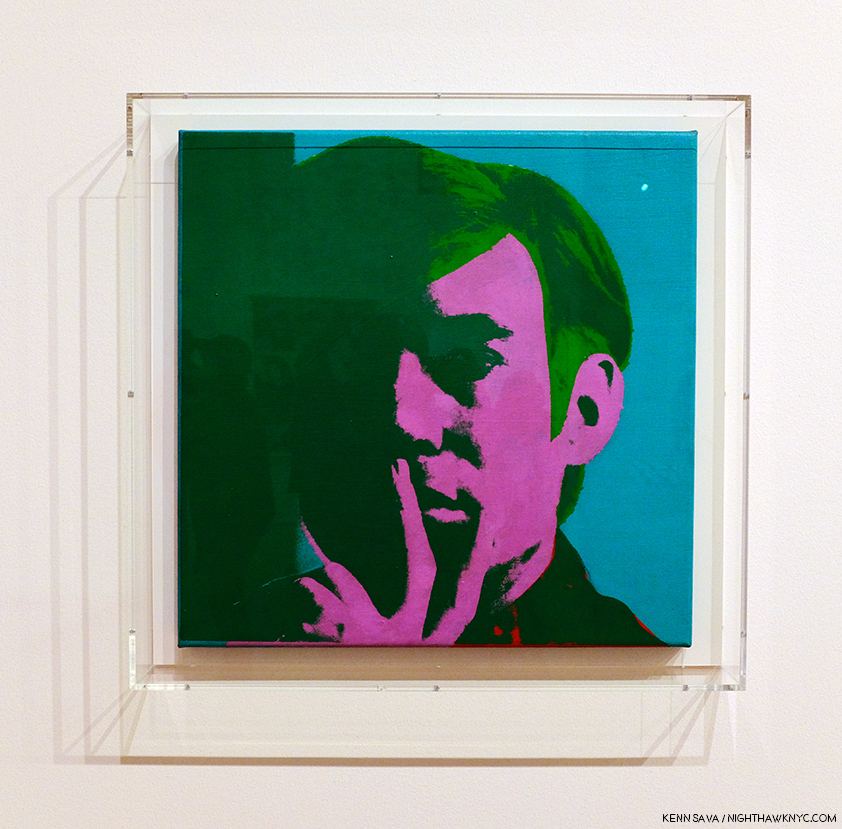
Self-Portrait, 1966, Acrylic, silkscreen ink, and graphite on linen.

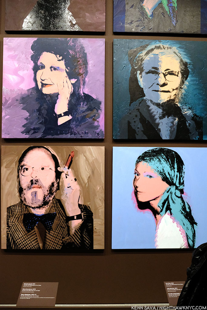
It seemed to me walking through the show that Warhol’s Self-Portraits are stronger than just about any of his other portraits. Downstairs on the first floor, an entire gallery was devoted to his square portraits, which alternated between the famous and the already forgotten with a fascinating portrait of his mom almost hidden among them.

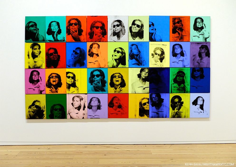
Julia Warhola, 1974, upper right, a year or so after she passed away in 1972. Interestingly, it’s in the collection of Roy Lichtenstein, and that’s Dorothy Lichtenstein, Roy’s wife, below her. To her left is Met Curator Henry Geldzhaler, who was also painted by David Hockney.

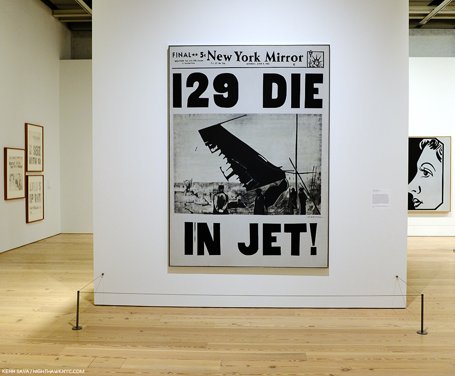
Along with fame, Andy Warhol’s other big theme was death. It’s a subject that makes an appearance early on in his Fine Art career, in works like 129 Die in Jet, 1962

129 Die in Jet, 1962

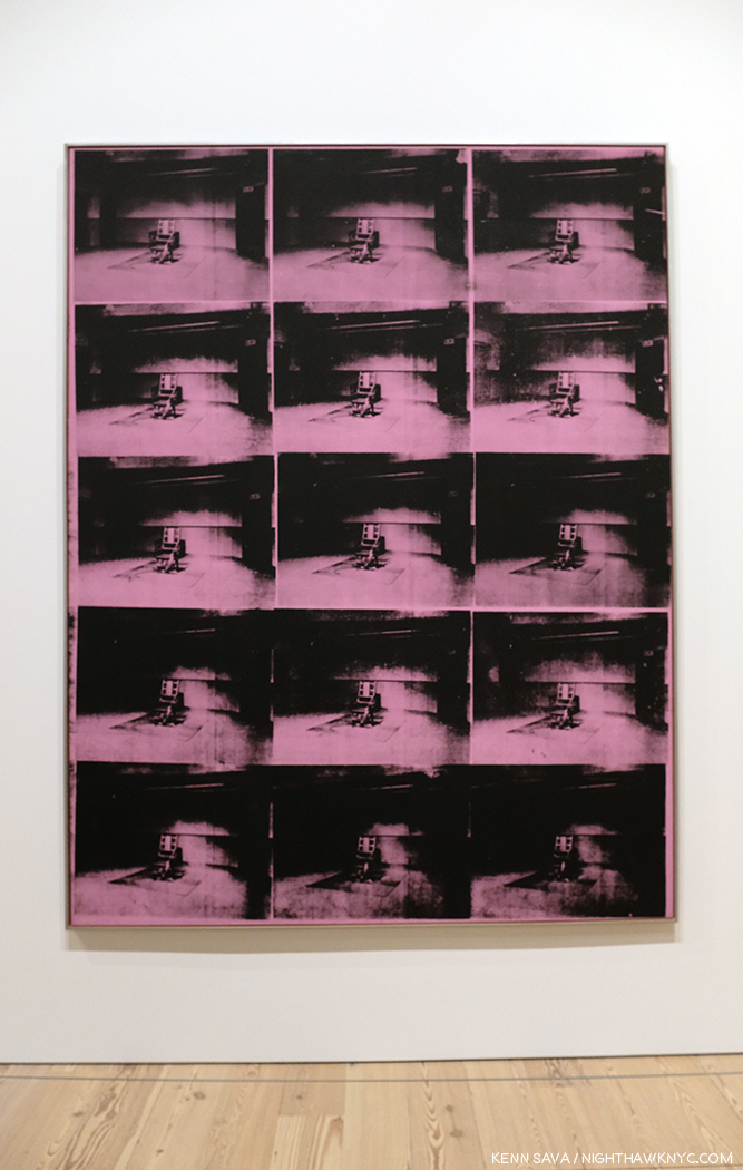
It carries on in his Electric Chair Paintings, and is an element in his Marilyn and Jackie pieces, both created shortly after deaths- Marilyn’s and JFK’s. The hold death has on visitors struck me on one visit while I was considering Mustard Race Riot. Given its large size, I had to stand a good distance away from it to take it all in.

I couldn’t help noticing a steady stream of visitors who entered the gallery and stood in front of me, facing to my left. They were looking at this-


Lavender Disaster, 1963.

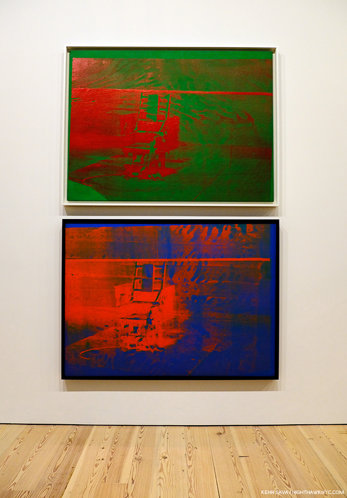
I heard someone say, it takes away the power of the electric chair as an image of fear. I don’t get that. I, for one, don’t get the point of multiplying the electric chair. I prefer these, individually-

Both, Big Electric Chair, 1967-8, top, 1967, bottom.

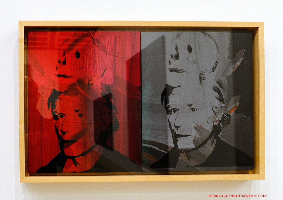
And, of course, there were the car wrecks, also featuring repeated Photos, which led into the next gallery, where the equally death-soaked Nine Jackies awaited, facing a wall of Most Wanted Men, 1964, Andy Warhol’s works based on wanted posters that hung at the New York Pavillion at the 1964 World’s Fair, and works from Flash-November 22, 1963, also about the JFK Assassination. But, of all the works related to death in this show, the eighth and final work on my “Art” list is Self-Portrait with Skull, 1978, in which the Artist brings his obsession with death home.

Self-Portrait with Skull, 1978

On the left, the red is hard to miss as the color of blood, and therefore, of life, while the grey/black image on the right recalls those in the Marilyn Diptych, which speaks to her demise and death. This work is based on one of Warhol’s own Photographs.

Andy Warhol- From A to B and Back Again was a good, but not a landmark show, in my opinion. In NYC, MoMA’s Warhol: A Retrospective remains the benchmark Warhol show. Part of the reason it’s not better is possibly due to the popularity and value of his work making loans very hard to get. After the silkscreen gallery with Mustard Race Riot, I felt the rest of the show continually declined, with isolated examples of better work. In much of the rest of it, I felt lost, adrift in galleries of work that either hadn’t held up to the passage of time (if they ever did stand out) or that contained ideas manifested on a gigantic scale, like the “piss paintings,” that were probably either left in the studio or done on a smaller scale. At this late date in his life and career, to suddenly go fully abstract smacked of running out of ideas, which is something that seems impossible for Andy Warhol.

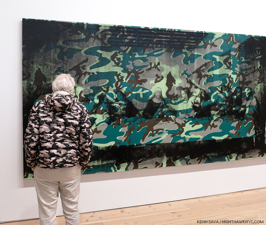
A camouflaged visitor scrutizies the left half of Camouflage Last Supper.

The culminating gallery with the also gigantic Camouflage Last Supper also struck me as a poor choice. Here, Warhol reprises the idea of the multiple Leonardo da Vinci’s, this time with 2 huge Last Supper reproductions side by side, which makes a point that escapes me, and then covers them with camouflage, perhaps to try and add some interest to his idea. Camouflage is, in keeping with Andy Warhol’s instantly recognizable images, a military artifact and symbol. What that has to do with the Last Supper is, also, lost on me.

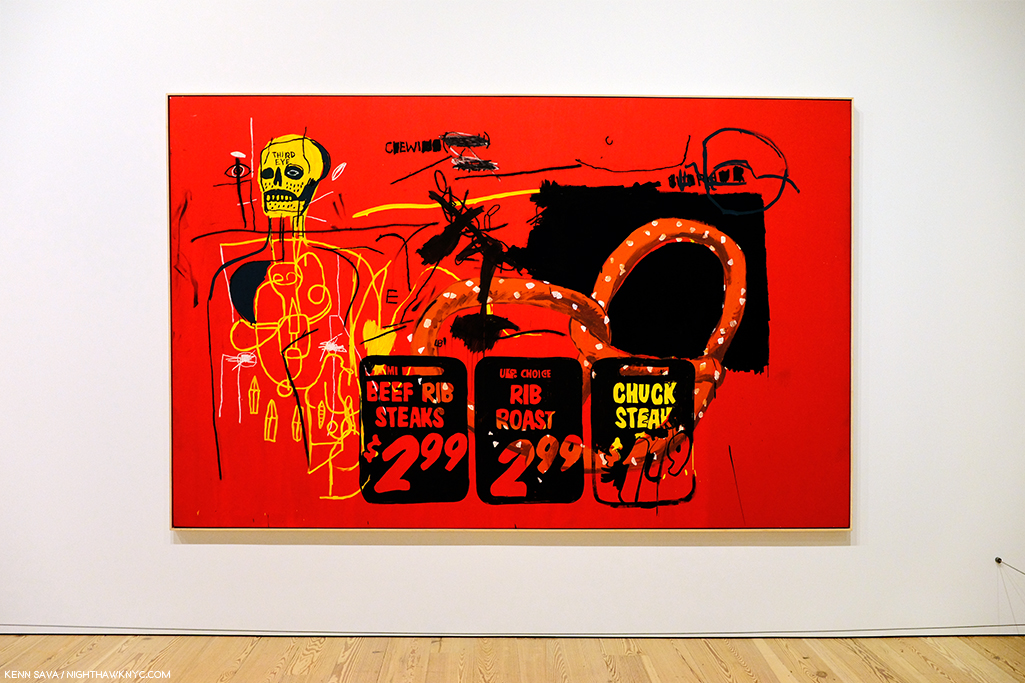
Andy famously collaborated with Jean Michel Basquiat, as seen here in Third Eye, 1985.

And then there were two of his collaborations with Jean Michel Basquiat. Though extremely colorful, looking at them I have as yet to see them as more than each bringing what they do to the work. The feeling of a true collaboration bringing the work to someplace else escapes me…so far, but I know people who love them.

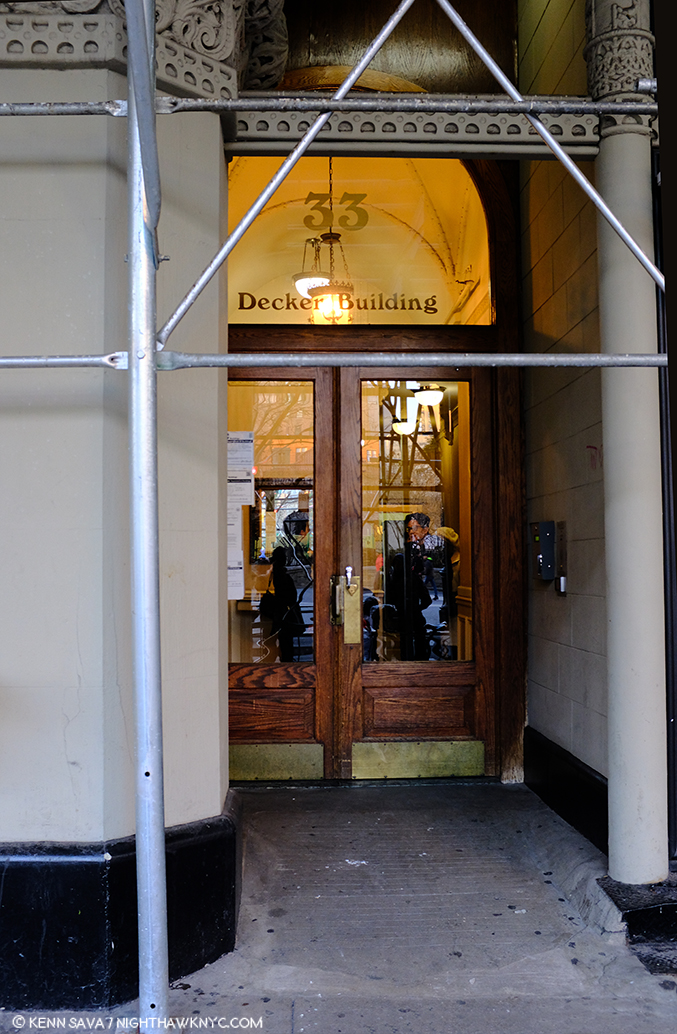
If these walls could talk. The site of Andy Warhol’s Factory when it was on Union Square, seen in Winter, 2018. Ironically, the scaffolding seems to be making an “A” for Andy.

Andy Warhol opened the doors to whole worlds of possibilities in the world of Art, and, indeed, the world. In doing so, he taught all of us how to see new possibilities in our work, and our lives. (And I am not speaking about his life or lifestyle in any of this.) There are very few Artists who even open one new door. For this, the world owes him a debt. A debt that might be best repaid by following his example of seeking new possibilities. He sought out, encouraged, and worked with, young, even beginning Artists, and so played a role in the creation of world renowned Artists including Stephen Shore, Robert Mapplethorpe, and  Jean Michel Basquiat, and treated them every bit the same as he did established Artists.

Regardless of what the world comes to think of his Art, these are the contributions of Andy Warhol I choose to remember and celebrate.


BookMarks-

As I showed earlier, a list of books written on and about Andy Warhol could fill a book itself. I have only seen a minuscule number of this vast library. Of those, a few stand out to me, particularly for those looking to keep from having a wall of Andy Warhol books that rivals that in the Whitney’s Shop!

The best overviews of his Art I’ve seen are these two-

Andy Warhol “Giant” Size: Gift Format has been issued in a few sizes over the years since it’s first release 10 years ago. Whatever size works for you, this “visual biography,”which includes over 2,000 images, remains the best one-volume survey of Andy Warhol’s Life & Work.

Andy Warhol: A Retrospective The catalog for MoMA’s 1989 Retrospective. Out of print, it’s reasonably priced in hard or softcover on the aftermarket. It remains the most comprehensive overview of his Art, and serves as the catalog for the most exhaustive show of his work yet mounted.

Factory: Andy Warhol by Stephen Shore is a fascinating book for Photography lovers. It preserves, both, the earliest body of work yet published by one of the most important American Photographers of his generation, and the most comprehensive look at Andy Warhol’s legendary Factory we have. Wasn’t it Andy who said, “It’s like an auto wreck you can’t take your eyes off of”? If not, he should have.

Finally, The Philosophy of Andy Warhol (From A to B and Back Again) is a must read, as much for its entertainment value as for its life experience advice, which is given on almost every page, though it’s light on Art and technique for Artists looking for a “how I did it.” Rumor has it a team “helped” Andy write it, but it’s hard to tell from the distant outside if that’s true or who did what. It’s something of a classic among pseudo-autobiographies, and plays a seminal role in the creation of Andy Warhol, as a work of Art in himself.

*- Soundtrack for this Post is, what else? “Andy Warhol” by David Bowie, who memorably played Andy in Julian Schnabel’s Film, Basquiat, looking for all the world like he was having a blast doing it.

Oh! PS- Andy? 4,627 words.

NighthawkNYC.com has been entirely self-funded and ad-free for over 6 years, during which over 250 full length pieces have been published. If you’ve found it worthwhile, you can donate to keep it going & ad-free below. Thank you!

Written & photographed by Kenn Sava for nighthawknyc.com unless otherwise credited.
To send comments, thoughts, feedback or propositions click here.
Click the white box on the upper right for the archives or to search them.
For “short takes” and additional pictures, follow @nighthawk_nyc on Instagram.

Subscribe to be notified of new Posts below. Your information will be used for no other purpose.


  1. The Philosophy of Andy Warhol, henceforth TPoAW, P.86
  2.  TPoAW, P.26
  3. TPoAW, P.96

China: Through The Looking Glass…That Looks Back

This site is Free & Ad-Free! If you find this piece worthwhile, please donate via PayPal to support it & independent Art writing. You can also support it by buying Art & books! Details at the end. Thank you.

Written & Photographed by Kenn Sava

China: Through The Looking Glass is finally over, and now I can look back on it. Extended an additional 3 weeks through Labor Day, it went out with a bang like those heard on Chinese New Year. Like New Year’s Eve, The Met was open until Midnight on Friday and Saturday, September 4 & 5. Of course, the Nighthawk was there. Of course, he had to mention to staff members what a great idea being open to Midnight was, one that should immediately be adopted 7/365! A bit to my surprise the show was quite crowded even late Saturday night. Maybe those visitors agree.

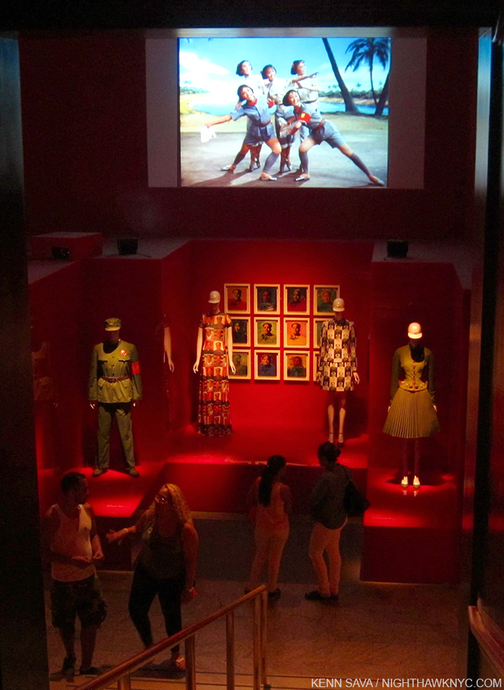
Chairman Mao & Chairman Andy


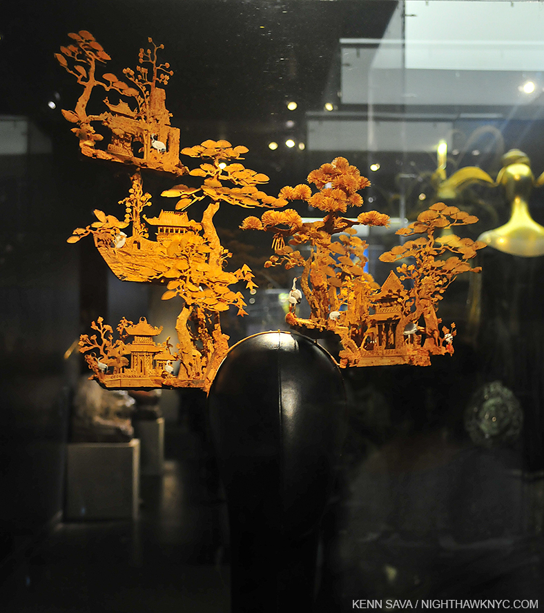
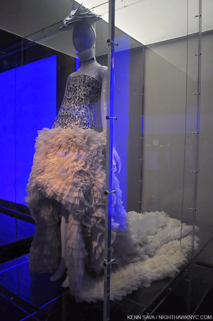
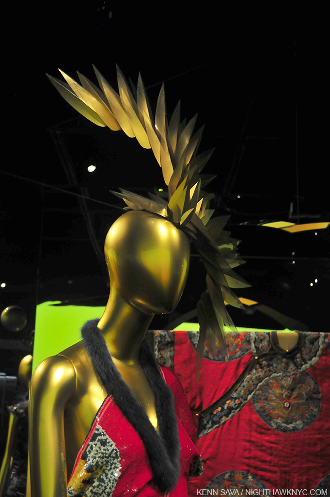
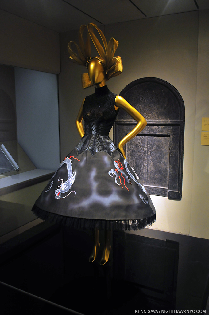
Yes, It’s a “hat.” Tie your shoes BEFORE putting it on! Extraordinary, and not by Stephen Jones.

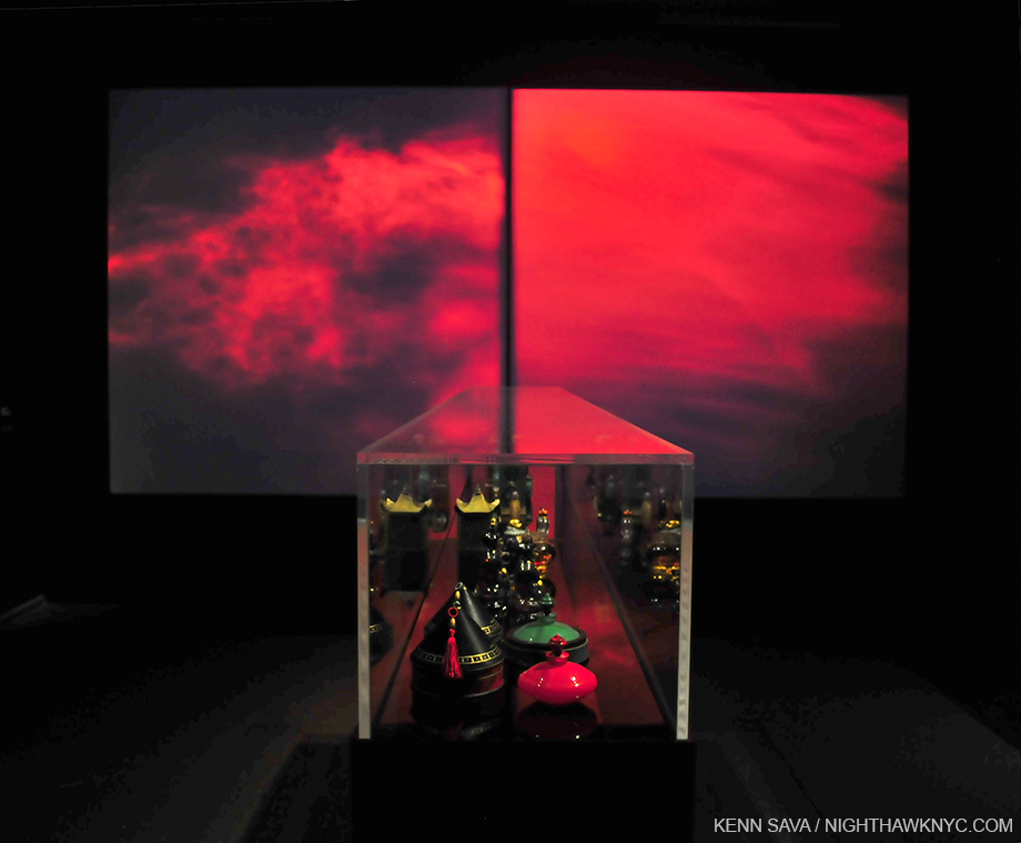
The Perfume Gallery featured 2 unsynchronized video screens, behind a selection of antique bottles. that evoked the visual essence of fragrance.

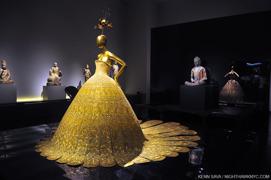
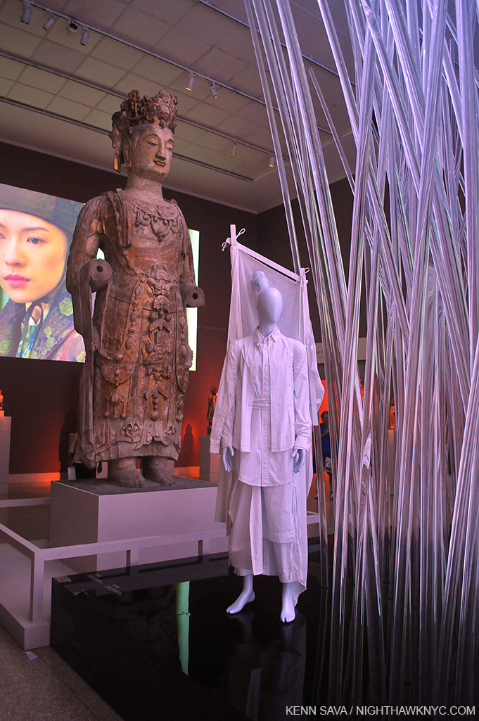
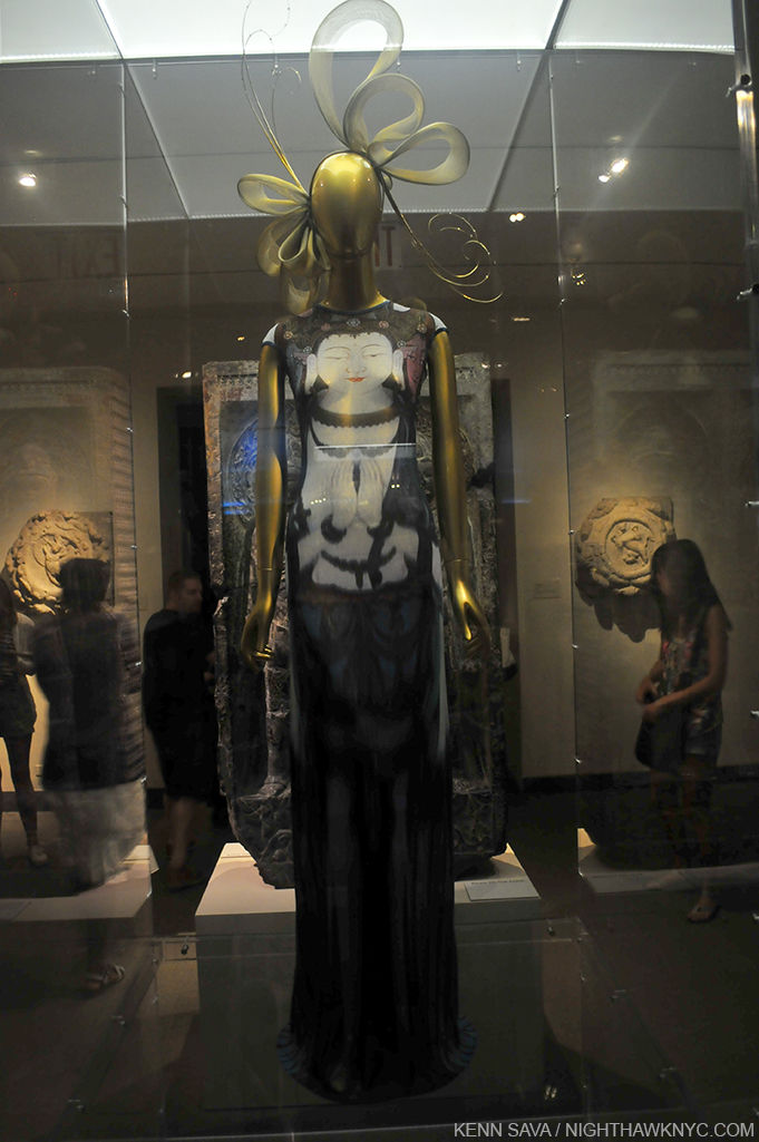
What would Buddha think?

Wandering the galleries for the fifth and final time, I started to focus on the “other” big question, besides midnight hours for The Met- China: Through The Looking Glass drew about 814,000 visitors 1. The hugely popular Alexander McQueen: Savage Beauty drew 661,500 2. This show drew over 150,000 more!!! As I said, I’m not going to compare them. The McQueen had a shorter run, and The Met was only open 6 days a week back then.

The one and only Alexander McQueen back at The Met.

Still, no matter how you slice it, the turnout was was astounding and unexpected-

How to explain the overwhelming success of this show?

Before getting to that, since I am replacing my previous brief post about the show with this one, some overall thoughts. China: Through The Looking Glass (or, C:TTLG) was a winner on every count, one of the best big shows in NYC in 2015 (I’m not going to say, “the best.” Comparing Artists, Art, shows, Films, Music or anything creative, or athletes for that matter, serves no purpose.) C:TTLG was that rare spectacle that illuminates.


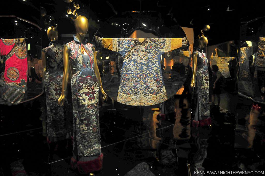
It casts light on how the west fantasizes China, Chinese fashion, and Chinese culture and Art (how it fantasizes Chinese women, briefly touched on through Anna May Wong, is too complex for this show, or any other), while showing us the difference between how western designers have mirrored Chinese fashion, out of context & tradition, of course, to suit their own purposes, and the possible influences of particular antique items, superbly selected and displayed, often side-by-side, using mirrors in differing ways as the show moves along.

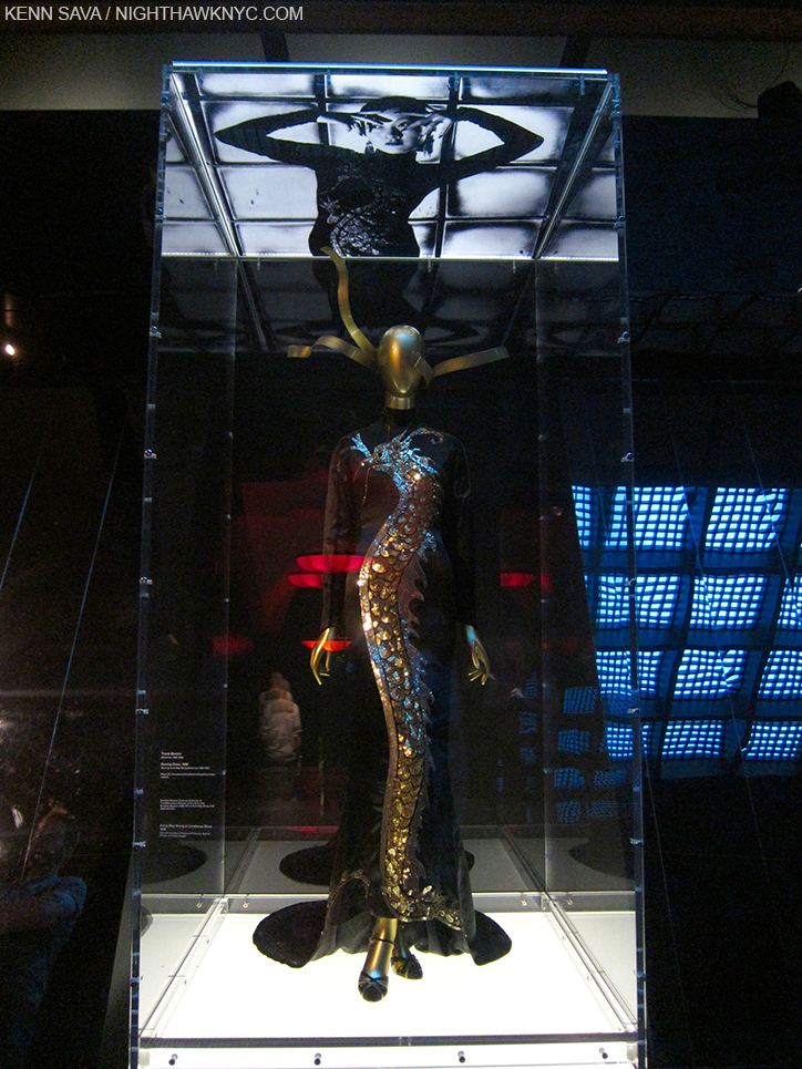
“These Foolish Things (Remind Me Of You)…” plays as Anna May Wong looks down on the very gown she’s immortalizing.

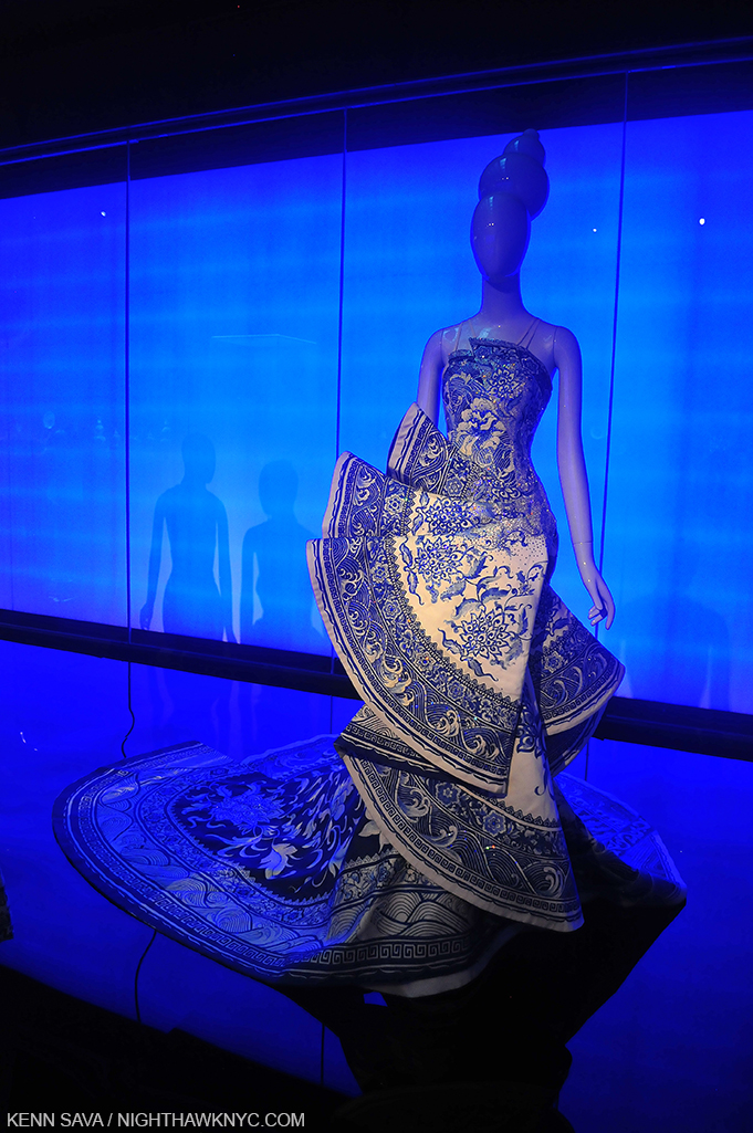
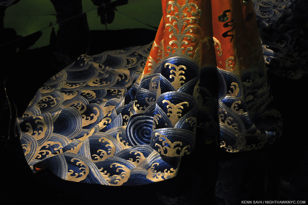
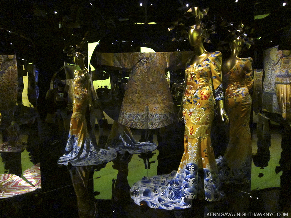
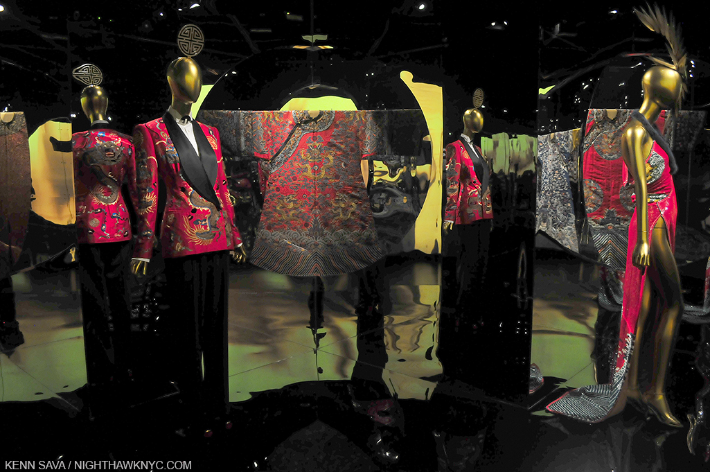
On both sides of the mirror the colors will pop your eyes right out of your skull, a miraculous thing for very old garments, which hold every bit of their own no matter what they are shown with, even Alexander McQueen (represented by at least 4 ensembles I saw, and a pair of Chopines), and this impact was spectacularly enhanced by yet another ground breaking Costume Institute installation (something I’ve admired about every one of their shows I’ve seen) and every element of it- the mirrors, the “mood lighting,” the extensive use of music and video.

A close up of one of the countless mirrors on display, this one used to frame a brilliantly colored antique garment.

It seems they pulled out the stops this year, bringing no less than an internationally renown film maker in as Artistic director and bringing in the brilliant milliner Stephen Jones to created hundreds(?) of “hats,” which somehow managed to almost steal the show, an incredible achievement.

My hat is off to the endlessly creative Milliner Stephen Jones.

Though I am very queasy when it comes to “big names” from the world of commerce being on view in The Met, and there are many “big names” represented, just about everything on display deserved to be included. Well, it’s The Met. They have the best curators in the world, in my opinion. I expect nothing less.

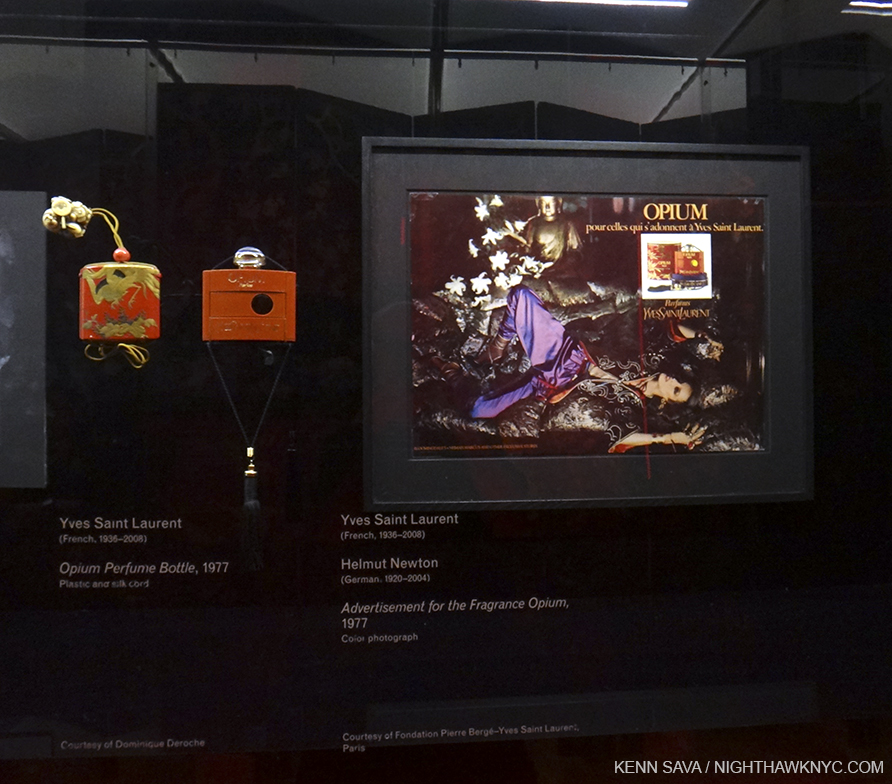
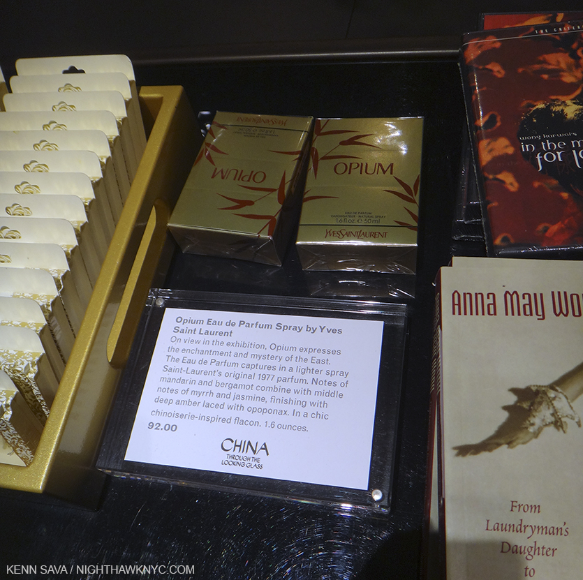
I could have, however, done without the section on the development of the perfume “Opium,” which, yes, was also on sale in the gift shop for 92.00…dollars.

C:TTLG was the first collaboration between the Costume Institute and the Department of Asian Art, which celebrates it’s 100th Anniversary this year. Beyond the combination of both world-class collections, the pairing was most fortuitous for visitors to this largest show in Met history as even though it was spread out over 3 floors, the galleries happen to be located right on top of each other, making them easily accessible by centrally located stairs and elevators, something that was a problem for Costume Institute shows in the past.

Ok…so, about getting over 800,000 visitors….?

People want an experience these days, and C:TTLG was that. Walking into this show was a bit like going to a movie- most of the galleries are dark or darkened, which gives a “theater-like” experience. This was enhanced through the use of video screens playing excepts from films in many galleries (acclaimed Hong Kong filmmaker Wong Kar Wai, who I’m a big fan of, known for his “unique, highly stylized, emotionally resonant work” 3 was the show’s artistic director), the use of mirrors, and curated music set the mood in every gallery. The Costume Institute has been at the forefront of creating “experiences’ with their installations- unforgettably for “Alexander McQueen: Savage Beauty” and no less than “recreating” CBGB’s infamous bathroom for their “Punk” show. (Ok, they omitted the filth, but it’s something I STILL can’t believe I saw at The Met! I’ll always wonder what CB’s owner Hilly Krystal would have thought…)

_DSC9842PNH

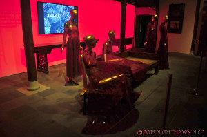
“The Red Boudoir” as I call it.

Yet, there was almost no “sex appeal” to the antique garments on display. It made me wonder how China ever became the most populous country in history! In fact, the “Red Boudoir” as I came to call Gallery 218, featuring Valentino’s 2013 evening wear, (which he debuted in Beijing, and which was kept quite dark so as to play down the fact that the clothes are see-through), was the only instance of “sexy” even among the western pieces, save for a lone mini dress, by someone unknown- their name, on the outside of the case had worn off (something that needs to be fixed going forward, as does the fact that many of these glass case labels were almost impossible to read in the dark.) There was no Lady GaGa-type figure (who had been famously wearing McQueen’s now immortal “Armadillo” Shoes at the MTV VMA’s before AMcQ:SB, which took place only a year after his tragic death. There was no seeming cultural “tie in” at all to push the box office to record heights. Yes, it’s The Met. Yes, there is the more-famous-every-year Met Fashion Gala that kicks off the show each year, but that’s been going on for a long time now. Yes, there are more Chinese than anybody else, and there are many Chinese tourists here and many Chinese living in NYC. Yet, I think the result, in this case, was more than the sum of those parts.

Also, unlike most special exhibitions at The Met, and though the signs read to the contrary, photography WAS permitted! I think this was a very shrewd idea as it allowed for something perhaps better than word of mouth- “Word of Sight,” as I call it. This show is very hard to describe (as you can tell by reading this!), but easy to “get” by seeing a picture (hopefully), which equals 1,000 words as they say.

It also seems to me it’s the same forces at work that make a movie hugely successful. There are the initial batch of folks who go and have a look see after it opens. My guess is that many of them reacted like I did- “OMG! You HAVE to see this.” And so, others go, and it feeds on itself from there. The show was so big that many went back time and time again to see the rest of it, or to see parts of it again. I think the press, which was very positive as far as I heard (I don’t read reviews until I’ve made up my own mind), play a relatively minor role in drawing a crowd like this, especially after a show has been open for a while. The press reminds that it’s still open, but nothing more is generally written about it after their initial review. It also seemed that this show drew women in huge numbers, above and beyond what the “fashion” oriented shows I’ve seen at The Met or F.I.T’s Museum. I can’t remember seeing so many single women at a show. I also saw a lot of women with a male partner who looked hopelessly “Please, Dear God…Get me through this.” lost. And yes, there were tons of tourists. Overall, while though there were many, though not a predominance of, Asians, the crowd was extremely diverse in my visits, though lacking the very young. Interestingly, there was no fashion on display for babies or children, which is actually consistent with every Costume Institute show I’ve seen.

In the final analysis, since I knew nothing of “real” Chinese fashion going in, I was careful to be mindful of whether I was seeing something old or new. Though there weren’t as many antique Chinese pieces as I hoped, I came away having seen another concept of femininity. The shapes of the garments, especially, stood out to me and I was continually reminded of Scholars’ Rocks, (a few of which were on display in the Astor Court where John Galliano’s Chinese Opera pieces were on view in a section entitled “”Moon In The Water”), and sculpture. The effect of the design is almost architectural, ala Frank Gehry, who has been on my mind since the new Whitney Museum opened. (Perhaps you can guess why. If not, I’ll come clean soon.) Beyond shape and it’s effect on style, the colors of both the antique and modern clothes, both in numbers of and combinations of, were absolutely exhilarating, especially in the dark. The west has a problem with color, something that can be seen taken to it’s furthest extreme here in NYC. Color is so powerful that wearing it tends to make one stand out in a bad way here. People wonder what you’re about. But if EVERYONE is wearing color the effect must be completely different, unimaginable to my eyes- I’ve never seen it. Of course the antique clothes on display at C:TTLG were exclusively garments of the upper class, so it remains unknown to me what the “common” person wore, and if there was THAT much color in those garments. Probably not. But, I’m going to hold on to my fantasy about everyone wearing color regardless.

It also made me think about western painting, where only briefly has anything like this amount of color been seen. Van Gogh may be first to mind. Though he was so incredibly prolific- about 900 paintings, it’s often forgotten that he only painted for NINE YEARS (1881-1890), and his early years were characterized by dark brown earth tone works influenced by Millet. Seurat, who I consider a genius of color, died at 31, leaving, perhaps, Matisse and Monet as the longest standing masters of color in western art. Though surely all of the Impressionists were influenced by Asian art, it was primarily Japanese art, which was more known in the west at the time, Monet even building a “Japanese” style bridge in his incomparable Giverny garden. I digress.) The point is that the color will linger in my mind as much as the shapes.

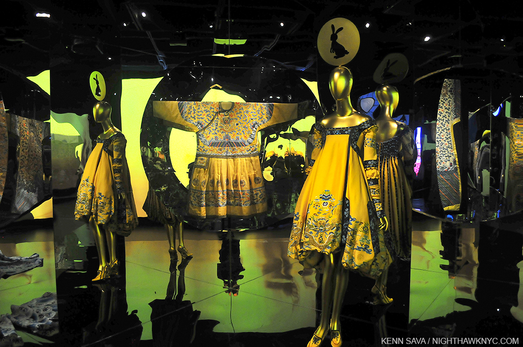
Not sure why Mr. Jones chose the rabbit, but I love it.

I should also mention that the catalog for the show is an experience in itself. It’s exceptionally well done, even for The Met, and features stylized photos of the clothes by Platon as well as quite informative essays from the curators. Since these shows take so long to install, a feat unto itself in an open 7 days a week Museum like The Met, the clothes are photographed in a studio setting and not as they appear in the show. This is good, and not so good. The good is you get to see things like the back of Anna May Wong’s amazing Dragon dress (depicted above) in the book, one of the few dresses without a mirror allowing that view in the show, though you may miss the view of a piece you liked as it is in the show.

Alexander McQueen, again, and Stephen Jones, bid us farewell…until next time.

So, yes, the show does beg the inevitable big question- “Ok, Mr. Bolton (newly minted Head of the Costume Institute)…What’s NEXT?” My mind pondered something never mentioned anywhere in this show- what was worn UNDER? There was no “underwear.” No Stockings. No gloves, even. Then I thought- Perhaps THIS will be addressed in a future, no doubt, blockbuster show, “Underwear- Exposed!” You heard it here, first. Finally, at 11:45pm Saturday,  I started to wonder if C:TTLG begins a “worldwide fashion tour.” After all, The Met is, possibly, the world’s greatest repository of art from all cultures and all times- what would be more appropriate? Perhaps Africa is next, a subject that might very well draw as many, or maybe even more fashionistas to The Met.

?

In the meantime, if you were one of the 800 thousand, I wonder if it will effect your personal style, or, if you missed it, visit The Met’s website for the show, and stay tuned to see what’s next.

Oh, and, in the meantime, don’t use too much opium.

Soundtrack for this post- “These Foolish Things (Remind Me Of You)” written for Anna May Wong by Eric Maschwitz, who was in love with her, and as performed by Billie Holiday.

NighthawkNYC.com has been entirely self-funded & ad-free for over 8 years, during which 300 full-length pieces have been published! If you’ve found it worthwhile, PLEASE donate to allow me to continue below. Thank you, Kenn.

You can also support it by buying Art, Art & Photography books, and Music from my collection! Art & Books may be found here. Music here and here.

Written & photographed by Kenn Sava for nighthawknyc.com unless otherwise credited. To send comments, thoughts, feedback or propositions click here. Click the white box on the upper right for the archives or to search them. Subscribe to be notified of new Posts below. Your information will be used for no other purpose.

  1. http://www.nytimes.com/2015/09/09/arts/design/andrew-bolton-chosen-to-lead-the-mets-costume-institute.html?_r=1
  2. http://www.nytimes.com/2015/08/30/fashion/nyc-museum-met-exhibition-china-and-fashion-proves-golden.html?_r=2
  3. imdb.com