The Photography Show Discoveries: Jeanine Michna-Bales

With so much to see from so many of the world’s leading galleries and Photography organizations it’s virtually impossible not to make a discovery, or two. Last year, Gregory Halpern’s work captivated me and continues to enthrall me. This year, there were two Artists new to me who’s work was remarkable-

  • Jeanine Michna-Bales, and
  • Kris Graves, who will be featured in the following Post

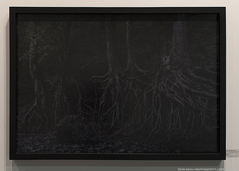
Late Saturday, I happened upon the outer wall of Dallas’ Photographs Do Not Bend (or PDNB) Gallery, when my eye was grabbed by this-

Hmmm…I’ve never seen night photography like this.

I stood and stared at this photo of tree roots, lost in the beauty of the image. It’s the blackest night imaginable, with seemingly no light source anywhere, yet the detail is amazing. So is the color, which is gorgeously subtle. I began to see unexpected things in the shapes…elements of Miro Surrealist landscapes, among them. It’s sculptural, as trees often are, though their roots are rarely seen, especially like this. Trees are, also, objects of meditation in Zen. Then, I pondered HOW it was created. I ran down some possibilities in my mind before realizing- it’s an extremely well done Photograph.

In spite of all this analyzing, little did I realize exactly what I was looking at. Staring at it for a good five minutes this close, I finally took a step back.

Jeanine Michna-Bales, “Eagle Hollow from Hunter’s Bottom, Just across the Ohio River, Indiana,” 2014, Digital C-Print. Seen at PDNB Gallery, Dallas.

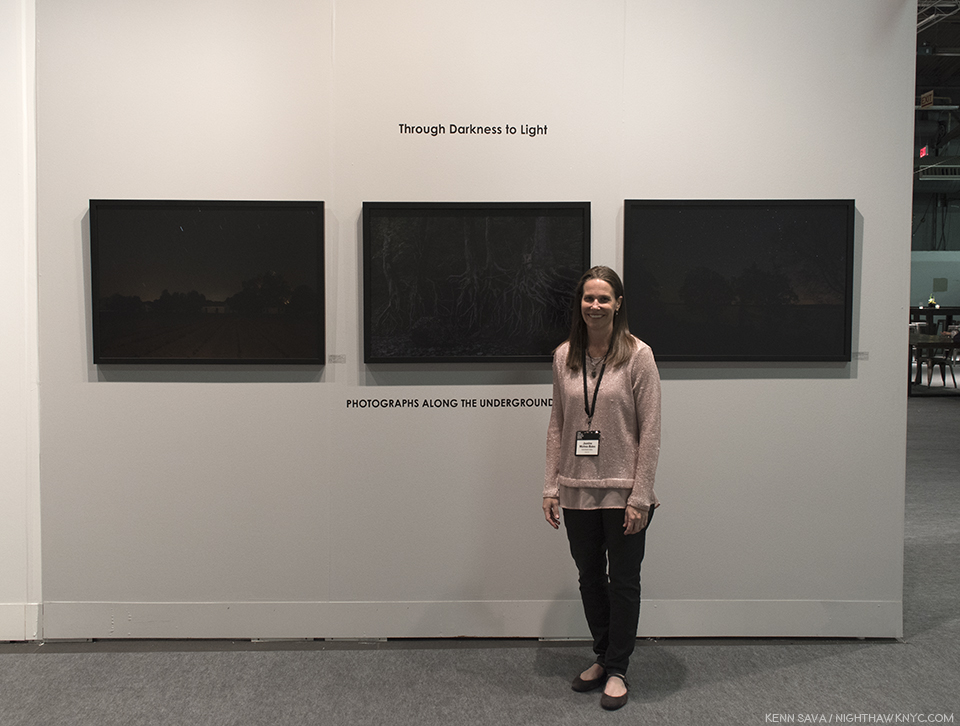
I happened to see the Artist speaking with another visitor, so I asked her to tell me about the series. Her name is Jeanine Michna-Bales, and what I was seeing t turned out to be images from her monumental project, “Through Darkness to Light: Photographs Along the Underground Railroad.” She spent FOURTEEN YEARS on this project (2002-16), researching, location scouting and Photographing the route and the sites of the Underground Railroad that an estimated 100,000 escaped slaves used between 1800 and 1865. Since everything about it was secret because most involved were risking their lives, details are still being uncovered, making researching it a very arduous task, before beginning to Photograph. She meticulously researched “fugitive” slaves and the ways they escaped, finally managing to document about 2,000 miles of  the Underground Railroad, crossing through seven states and ending in Canada!  She then scouted actual locations and spent 3 years taking the Photographs that resulted in the 81 the series consists of. The results are nothing less than spectacular, and vitally important as a reminder of this little known part of American history.

Jeanine Michna-Bales created this Timeline of slavery in the U.S. and the history of the Underground Railroad from 1619-1870, a product of her extensive research, see here in full size.

In addition to the wall of Photographs at PDNB Gallery’s booth, a further 10 were displayed at Arnika Dawkins Gallery, Atlanta’s booth, where they were accompanied by related texts in the most striking gallery installation I saw at AIPAD.

“They worked me all de day. Without one cent of pay, So I took my flight in the middle of de night, When de moon am gone away.” Chorus of a George W. Clark Liberty Song, the text below the Photographs read. As seen at Arnika Dawkins Gallery, Atlanta.

The Artist has created a website, througdarknesstolight.com, where you can see some of her research, educational resources and lesson plans for educators, along with an extensive bibliography. It also includes the itinerary for upcoming dates and venues for the traveling exhibition.

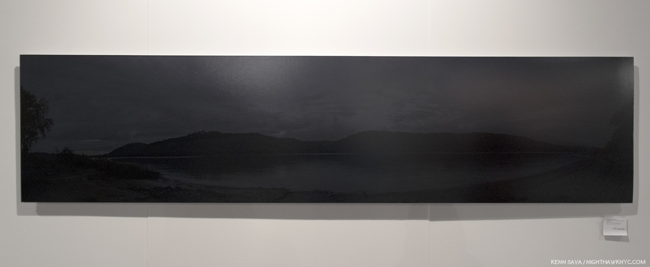
This stunning panorama is the largest work in the series. “The River Jordan. Crossing the Ohio River to Indiana,” 2014. 25 x 105 inches

At AIPAD, Ms. Michna-Bales, and both galleries, were debuting the limited edition Portfolio of 15 copies for the project which includes 12 prints. A beautiful trade hardcover book has been published by Princeton Architectural Press.

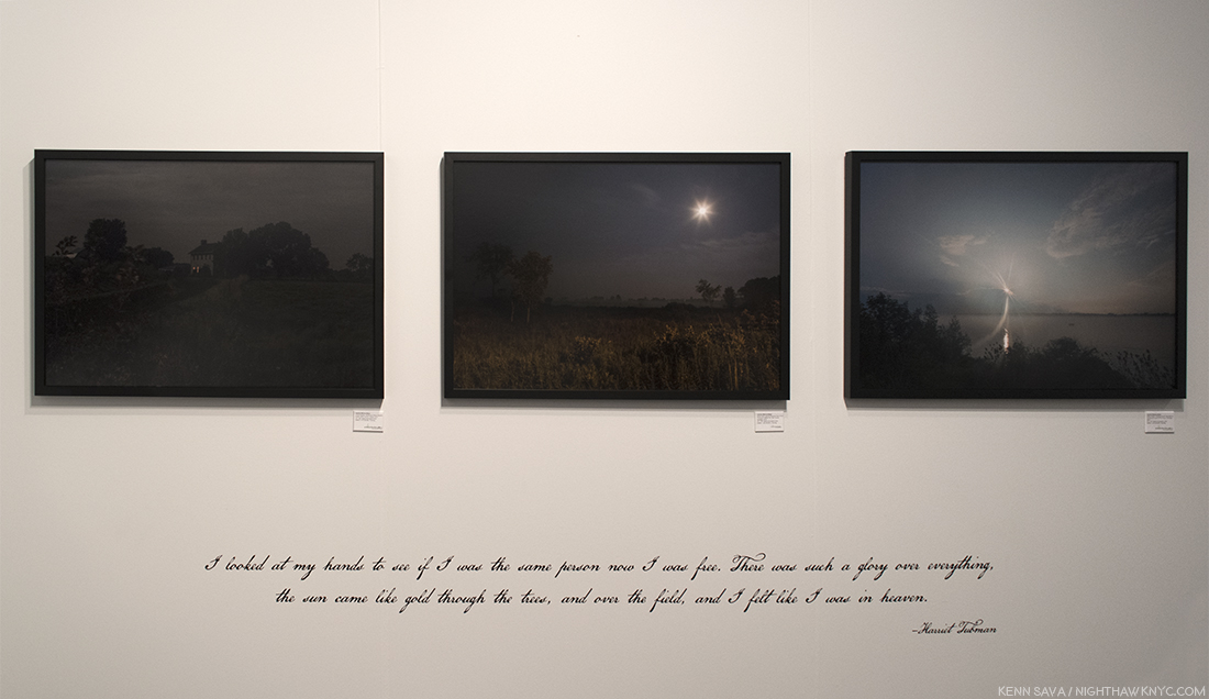
” I looked at my hands to see if I was the same person now I was free. There was such a glory over everything, the sun came like gold through the trees, and over the field, and I felt like I was in heaven.” Harriet Tubman, the quote reads. The final two Photographs in the series show light coming into the world. Seen at Arnika Dawkins Gallery, Atlanta.

In addition to the historic and educational value of the project, the stunning quality of Ms. Michna-Bales Photography shouldn’t be overlooked. There is quite a bit of audacity in presenting a projects that consists almost entirely of Photographs taken in the darkest of night. Yet, when you stand in front of them, none of the detail in the image is lost- the mood, power, terror, urgency is only enhanced. You begin to imagine a small part of what the experience might have been like, particularly being on the run, which is what the images on view were about. While we don’t see the conditions, or other details from the time, we do see some of the surviving original buildings. That safe house in the distance with a light on must have brought an incredibly wide range of emotions to those trying to reach it. The beauty of her work is essential to the quality and success of this project. A subject this important deserves spectacular Art. Jeanine Michna-Bales has created spectacular work that all who see it will long remember.

Jeanine Michna-Bales poses alongside her amazing work- some of the most beautiful night Photographs I’ve yet seen that, more importantly, pay homage to, and serve as a reminder of, an extraordinary event in American history.

Though new to me, the amount of press coverage seen on the project’s website shows the universal acclaim it’s received. The traveling exhibition is in such demand it’s site currently lists it’s itinerary through January, 2022! If it’s coming near you, don’t miss it.

Jeanine Michna-Bales “Through Darkness To Light” was the gallery presentation of AIPAD, 2018 in my view, and a major project that should be seen by all.

———————————–End————————————

UPDATE- June 3, 2018- Since my Post, above, barely scratches the surface of the gigantic undertaking that “Through Darkness to Light” is, I’m pleased to announce that Jeanine has done a follow-up “Q & A” with me in which she discusses how the project came about, what researching it was like and many other fascinating things that came up during the 14 years it took to complete this project. She also discusses the two new projects she began during this time. It may be seen here.

*-Soundtrack for this Post is “Go Down Moses,” by Louis Armstrong. Sarah Bradford’s biography of Underground Railroad conductor Harriet Tubman quotes her as having used “Go Down Moses” and a coded song to communicate with escaped former slaves fleeing Maryland. You can here him perform it, with different video added, here.

The Photography Show/AIPAD, 2018, is my NoteWorthy Show for April.

As I did in 2017, once again I’m pleased to provide THE most extensive coverage of The Photography Show, AIPAD, 2018, available anywhere. The rest of my coverage is here.

My coverage of The Photography Show/AIPAD, 2017 may be found here..

NighthawkNYC.com has been entirely self-funded & ad-free for over 7 years, during which over 275 full length pieces have been published!
I can no longer fund it myself. More on why here.
If you’ve found it worthwhile, PLEASE donate to keep it online & ad-free below.
Thank you, Kenn.

Written & photographed by Kenn Sava for nighthawknyc.com unless otherwise credited.
To send comments, thoughts, feedback or propositions click here.
Click the white box on the upper right for the archives or to search them.
Subscribe to be notified of new Posts below. Your information will be used for no other purpose.

“What Walking Looks Like” – Q&A With Jeanine Michna-Bales UPDATED

If ever there was a series of Photographs that could be termed “monumental,” Jeanine Michna-Bales’ “Through Darkness to Light: Photographs Along the Underground Railroad,” 2002-16, is one in my view. Fourteen years in the making, ten of those spent doing research into the Underground Railroad, (a field that due to the life and death nature of it for all involved, very little is known about even 150 some years later)..Three years scouting locations and taking Photographs. It’s only fitting the resulting project is now a touring exhibition from the Mid-America Arts Alliance that’s currently scheduled to run through 2024! Viewers, including yours truly, who saw some of these works on view at The Photography Show (AIPAD), earlier this year, were captivated by them. I recently called the Artist one of my two AIPAD “Discoveries,” and heard from any number of other show attendees who concurred. 

“Resting Place. Church Hill, Mississippi, 2015” Photo courtesy of Jeanine Michna-Bales. Click any image for full size.

Given how much there is to say about this 14 year project, I felt my initial look at it at AIPAD only scratched the surface. After the auspicious beginnings of the traveling exhibition over the past year, and considering how many more viewers will be discovering Jeanine Michna-Bales and “Through Darkness to Light”over the next eight years, I’m sure many will want more information about it and the Artist. Luckily, Jeanine has agreed to do a Q & A, only the second I’ve done here at NighthawkNYC in almost 3 years. 

Just back from being invited to speak at the National Gallery of Art, Washington, in conjunction with the Sally Mann Retrospective currently on view there, I asked Jeanine questions about “Through Darkness to Light” I haven’t seen answered anywhere as yet, and I also asked her about the two fascinating projects she started during the intervening fourteen years- “Fallout: A Look Back at the Height of the Cold War in America circa 1960,” 2013-date, and “Frack-tured: Seismic Activity in the Barnett Shale,” 2015-date. Taken as a group, the three projects show a common thread in her work thus far- While the events at the heart of her projects are in the past, many of the actual places lost, remaining evidence scarce, Jeanine Michna-Bales, through years of research, dedication and hard work, manages to recreate in her work convincing, and often beautiful, works that put the viewer in those places and times. Why? Perhaps she’ll tell us below. For my part, I’m reminded of what George Santayana famously said, “Those who cannot remember the past are condemned to repeat it1.”

Jeanine, who is represented by PDNB Gallery, Dallas, and Arnika Dawkins Gallery in Atlanta, also kindly supplied Photos to go along with a few I took at AIPAD, and this one-

Jeanine Michna-Bales in front of some of the fruits of over a decade’s work, the extraordinary night Photography of “Through Darkness to Light,” at AIPAD, April 7, 2018.

Kenn Sava (KS)- Let’s start at the start. Where did the idea for “Through Darkness To Light: Photographs Along the Underground Railroad” come from?

Jeanine Michna-Bales (JMB)- Part of my practice as an artist is to write 3 pages long hand each day. Or try to anyway. Sometimes trying to balance my time between my family and career gets difficult. Most days I do manage to write ‘my pages’.

I am usually exploring why I am interested in a particular topic, flushing out an artist statement, looking at a topic from different viewpoints, etc. What is it that resonates with me? What information from that topic is applicable to today?

I also enjoy taking walks to help clear my mind. Always have. I had just finished a project documenting the locations where I had taken these walks. So, I already had the thought in my mind of what walking looks like.

“Devil’s Backbone. Lewis County, Tennessee, 2014” Photo courtesy of Jeanine Michna-Bales.

Growing up in Indiana, the Underground Railroad was part of our curriculum in grade school. I remember being fascinated with the topic and trying to comprehend that someone would have to go through this journey in order to be free.

I like to think that “Through Darkness to Light” chose me. In 2002, the idea just showed up on the pages one day and wouldn’t let go of me. I kept coming back to the thought of what a journey out of slavery would look like. I spent years trying to research locations. I started before the U.S. Congress Freedom Trail Initiatives, where they were funding research to identify locations and narratives. Also, prior to the National Freedom Center in Cincinnati. So, there wasn’t a whole lot of information out there. I would research and get nowhere and then put the idea away and go back to my day job as an advertising agency art director. But, it wouldn’t let me go. I kept coming back to the idea over and over again. Finally, in 2008 or 2009 my step-dad suggested that I visit the Indiana Historical Society library. There was a librarian there who had been interested in the Underground Railroad. Anytime she came across anything that referenced it, she would make a photocopy and notation on how to find it and put it into a clipping file. She had clippings from period newspapers, to historical ones, to recent ones. Thesis papers. Books. And tons of information. I copied everything and brought it home. It took me months to go through and organize. But, it was the catalyst that gave me those first few locations to photograph.

Often, I would not be able to find locations or details. The amount of information I was going through was tremendous. I was searching for narratives in order to add their voices into the project, as well as give me a good idea of what to photograph. But, I would always manage to have the information given to me by someone.

The project won a 2014 CENTER Santa Fe Choice Award and some images from the series were a part of the group exhibition for the award winners. The woman whose work was on display next to mine invited her uncle to the show. He lives in Santa Fe. We ended up talking because he was intrigued by the images from “Through Darkness to Light.” I had been looking for a missing link in the path through Indiana for several years. As we got to talking, it turns out that he is the ancestor of abolitionist William Beard whose house I had been searching for. He was able to look up the address for me and send it to me.

Another time, I was out photographing around midnight in the Georgetown District of Madison, Indiana. The district was home to George DeBaptiste and other conductors on the Underground Railroad (UGRR). A woman came out of her house to walk her dog. She wanted to know what I was doing and I explained it to her. She was in the process of trying to get a monument built to highlight the history of the UGRR in the area. She had been in contact with numerous historians and was able to pass along their contact information and make introductions for me, as well.

I can’t count how many times things like this happened over the course of the 14 years working on the project. I definitely had help along the way.

“From Whence We Came. Following Robinson Road, Mississippi, 2014” Photo courtesy of Jeanine Michna-Bales.

KS- After the initial idea, how long was it before you realized that it would be the huge undertaking it turned out to be?

JMB- I don’t think it really dawned on me how big the undertaking was until I started to actually capture some of the images for the series. I initially had about nine photographs to show when I took the project to three photo reviews: PhotoNOLA in December of 2013, FotoFest in Spring of 2014 and Review Santa Fe in the summer of 2014. It took me 3.5 years to capture all of the images. I drove out the warranty of our new car during that time.

I’d say that I am extremely well versed in what not to do and am still learning what to do. My background is in large format photography: 4×5 field camera with sheet film. This was my first time using a digital system. I used the Canon system because their tilt/shift lenses mimic the movements of the 4×5 camera. The digital sensors of the camera weren’t quite capable of capturing what I was envisioning. So, I had quite a time trying to figure out ways to work around the camera’s limitations in order to create the images that I thought would best tell the narrative. Digital cameras are known for generating noise under low light situations. I was trying to show a large depth of field at night. Not a good combination for crystal clear images. Each time the next generation of camera was released (twice), I traded in my old one. And each time, the technology was much better. I still wish I had the last camera when I started the project.

Logistically, covering all of the terrain was difficult. I would scope out possible locations during the day. Then, stay up all night or almost all night to photograph. I quickly figured out that about 3 days was my maximum time that I could function. Then, I would head back home and regroup. Spend time with my family. Do more research and then head back out. I tried to keep the images so that they tracked logically in relation to time: i.e. each station was still operating at the same time, season-wise (didn’t want to shoot something in the fall and have the next image be in the summer), etc.

Oftentimes, I wouldn’t have the information that I needed until I was able to actually get to a historical society or library in a given town. Or talk to local homeowners, etc. In the notes of the book, information is given that discusses details of why I photographed places even if I was unable to find written documentation that they were an actual part of Railroad. The UGRR was word-of-mouth because it was illegal to help. I kept that in mind while piecing together this route that someone could possibly have taken.

“Off the Beaten Path. Along the Yockanookany River, Mississippi, 2014,” as seen at AIPAD.

I also visited local libraries, state libraries, historical societies, national/state parks, and contacted various historians. Any books that I saw (in my own library or while at the library), I referenced their bibliographies looking for other sources of information. Currently, I’d say about 1/16 of the historical research is online at throughdarknesstolight.com. I am in the process of going back through all of my materials with the intention of putting as much of it online as possible. Some of the period pieces belong to specific libraries and collections. So, cost may become an issue as far as posting some of the items. But, I am adding to and updating the bibliography section that was pulled together from the publication and traveling exhibition of the series. The traveling exhibition has been extended through March 2024 and has about 8 more slots available for venues to book the show.

KS-Given the secret nature of the Underground Railroad, how hard was it to undercover the stories and details, all these years later, you wanted for your Photographs to tell the story?

JMB- Finding a lot of the details was quite difficult over the years. Keeping records was a great risk for those helping as well as for those escaping. So, there simply isn’t a lot of documentation that exists. Largely, the Railroad ran via word-of-mouth. I tried to keep this in mind while working on the series and find as much documentation as possible to support local oral histories. 

A lot of the details and locations were pulled straight from narratives and reminiscences. In the north, different accounts referenced working with other station masters and often told tales of ‘cat and mouse’ games with local law enforcement officers, like Wright Rhea. He was the sheriff of Jefferson County, Indiana and used his office to capture many fugitive slaves.

In the end, is the documented route a known route that someone actually used to escape slavery? We simply don’t know. It is very possible. I made sure that each station or stop along the way was logistically feasible: i.e. stations in operation at the same time, geographically nearby, etc. From what I have learned, I don’t think that any specific route was used in the exact same order over and over again. That would have led to the capture of too many freedom-seekers.

I chose a first-person viewpoint to help us all understand that it was the freedom-seekers themselves that were making this tremendously difficult journey in search of a better life. They had some help along the way once they had to made it to the north. However the majority of the time, they were on their own. And they were in possession of amazing amounts fortitude, determination and sheer will.

“A Safe Place to Regroup. House of Levi Coffin, who was unofficially dubbed the president of the Underground Railroad, Fountain City (formerly Newport), Indiana, 2014” Photo courtesy of Jeanine Michna-Bales.

KS- What were you the most surprised to learn?

The Underground Railroad was America’s first civil rights movement. It blurred racial, religious, socio-economic and gender lines. And united a diverse group of people in the common cause of finding a way to abolish slavery within the United States. One thing leads to another and many of the voices that spoke out against slavery ultimately tried to introduce a civil rights bill.

“Keep Going. Crossing the Tennessee River, Colbert County, Alabama, 2014” Photo courtesy of Jeanine Michna-Bales.

KS- You mentioned heading off to Washington DC and doing some research at the Library of Congress while you’re there. Are you still researching the Underground Railroad?

JMB- “Through Darkness to Light” is finished. Although, I do still keep up with books and information as they come out. I just ordered a copy of “Barracoon: The Story of the Last ‘Black Cargo’” by Zora Neale Hurston.

I was asked to give a talk at the National Gallery of Art on Through Darkness to Light with artist Clarissa Sligh. Our talk was entitled “The Evidence of Things Seen and Unseen” and was held in conjunction with the exhibition “A Thousand Crossings” by Sally Mann (Update- June 26, 2018- I just received the full transcript of Jeanine’s remarks at the National Gallery. It has been appended to the bottom of this Q&A).

“A Brief Respite. Abolitionist William Beard’s house, Union County, Indiana, 2014” Photo courtesy of Jeanine Michna-Bales.

KS- Given how many miles the Underground Railroad covered, how did you decide on what to Photograph? Was it largely due to access to the remaining sites?

The UGRR encompassed countless, constantly changing routes. The documented route that I photographed was pieced together directly from the research for the project: i.e narratives, etc. Sometimes, what was planned didn’t necessarily end up what was photographed. Oftentimes, buildings had been torn down, were updated and lost their 19th century character, or simply they didn’t fit into the ‘look’ that was developing for the series.

For instance, “Approaching the Seminary” is a view of a corn field. The school house for the Union Literary Institute had been heavily damaged by a tornado. The school taught African Americans at a time when it was illegal to do so. Agriculture was a main component of their curriculum. And I also had come across a narrative of freedom-seekers being hidden in a corn field overnight because the station they had left was being watched by fugitive slave catchers, as well as the station they were headed to. The UGRR conductors were unsure of the property owner’s loyalties. But, they took a chance and were able to keep the fleeing slaves safe. 

“Within Reach. Crossing the St. Clair River to Canada just south of Port Huron, Michigan, 2014” Photo courtesy of Jeanine Michna-Bales.

KS- “Through Darkness” has been on quite a journey, itself, as a traveling exhibition, with much more to come, looking at the schedule of venues on your site. If you could summarize the experience for you so far, what’s been the takeaway from it being in so many places?

JMB- The traveling exhibition launched in Evanston, Illinois in January of 2017 followed by other solo and group shows around the country. I have traveled to quite a few of the venues for artist talks and book signings. For me, the conversations resulting from the work is why I decided to become a full-time artist. A lot of those conversations are complicated and can be uncomfortable at times. These are topics that have been ‘brushed under the rug’ for years. And we are just now starting to address the lingering aspect of not having face-to-face dialogues with people who have different backgrounds or beliefs from our own. We are a deeply divided country right now. And have been in the past as well. How do we use our history to find a common ground? Can we all sit down and talk with each other? Not attack, belittle or try to persuade someone to our viewpoint. But, truly listen. And, I hope, ultimately have empathy for our fellow humans. It might be a lofty goal. But, I feel that change starts slowly – one conversation at a time.

Is there any one image in particular that stands out, perhaps due to it’s meaning for you, or the story of the Underground Railroad, or for what you had to go through to get it?

There are quite a few images that have special meaning to me in regards to the ‘help’ that I received along the way. There were so many times during the project that I would run into a dead end and not be able to find the information that I needed. As I mentioned above, I ran into William Beard’s descendent at an award show exhibition. There were many serendipitous moments throughout the series. Every time I would arrive to photograph at a location, a Cardinal would be there, as if letting me know this was the right location to take an image. 

When I was out on the road photographing, I would scope out possible locations during the day and return at night to take the images. This left little time for sleep. When I was in Natchez, Mississippi, I had been out on several trips recently and was already tired. On the second night after staying out until 3:30am I headed back to my hotel to grab a cat nap. I planned to get up at 5am before sunrise to go photograph again. At the last minute, I decided I was too tired and turned off my alarm. At around 5am, the TV in the hotel room spontaneously turned on. It took me a minute to figure out what was happening. I turned it off and crawled back into bed. About 10 minutes later it turned on again. I got up and thought to myself, “Oh, alright, I’ll go out and photograph.” I ended up taking one of my favorite images that day “Moonlight over the Mississippi”.

I could mention other things that happened like this throughout the time that I worked on the series. And that is why I feel that the project chose me more than I chose to work on it.

“Freedom. Canadian soil, Sarnia, Ontario, 2014” Photo courtesy of Jeanine Michna-Bales.

KS- How close do you feel “Through Darkness” came to realizing your initial vision, or did it wind up being something completely different from it?

JMB- The initial thought was, ‘what would it look like escaping from slavery to freedom?’. I had started to research the series. I visited the Levi Coffin house in Indiana and took some images of the hiding places in the house during the daytime. I also took some images of a plantation during the day. I was completely disappointed in the results. But, the project wouldn’t let go. I kept researching and writing about what kept drawing me back to the topic. And then several years later, I was visiting my husband’s family in Tennessee and was out photographing at night in the woods. And I took the image “Through the Underbrush”. Once I saw that image, I knew that was the way that the series needed to be portrayed. It pointed directly to the research because the freedom-seekers moved under the cover of darkness. Darkness lent the images that sense of uncertainty and foreboding. Feelings, I imagine, one would be feeling on such a journey. And darkness also gave rise to the title of the series as well. And then I kept finding references to it in various period writings, especially an amazing passage from one of Frederick Douglass’s speeches in England. I now close my talks with his words.

“Approaching the Seminary. Near Spartanburg, Indiana, 2014” Photo courtesy of Jeanine Michna-Bales.

KS- Without giving away your secrets, could you speak a little about what went into getting these beautiful nocturnal Photographs?

JMB- From a technique called stacking – based on the fact that digital noise is generated randomly, where you take several images of the same scene and them stack them together at different opacities in Photoshop – to literally cloning out each little speck of noise and dust in each image. The latter would take me about 3 weeks at 8 hours a day for each image. Luckily, I didn’t have too many images that had that much noise in them. I was able to trade the initial camera I was using in for the next generation and the technology had drastically improved. I also learned to never set my ISO above 400. And I tried to keep it between 100 and 200. So, I ended up with longer exposures which I think lend that painterly quality to some of the images. I also quickly figured out that there is virtually no light in the woods on a new moon night. So, I did end up using some light painting in order to get any information to register on the light sensor. Light painting is a technique where while the camera shutter is open during a long exposure, you are able to ‘paint’ the scene with light. I have a pretty good collection of various lights that I can use now. The technique is a lot of trial and error because objects in the foreground will be much brighter than objects in the background. Since, it was a digital system, I could view ‘test’ images and be able to ‘paint’ better on the next capture. 

“Eagle Hollow from Hunter’s Bottom. Just across the Ohio River, Indiana, 2014” Photo courtesy of Jeanine Michna-Bales.

KS- Of the images from the series I’ve seen, “Eagle Hollow from Hunter’s Bottom” continues to captivate me. Why did you choose that particular spot? Was it the beauty of the roots, or is there something more relevant to it?

JMB- There were a system of safe houses that ran up from Eagle Hollow to Ryker’s Ridge and then up into one of three main routes through Indiana: western, central or eastern. In the image “Over the Hills” you are standing in Kentucky, a border state – and for all intents and purposes a southern state. The blue hills you see in the background are Indiana. You can also see more of that scene in the panoramic image “The River Jordan”. The land at the Ohio River is low and flat, but rises steadily up over the hills or mountains into the main part of Indiana. Ryker’s Ridge has a gorge or cut that goes from the top down to the river’s edge. Most of the year it is a dry creek bed. But, in the spring with the snow pack melting water rushes down into the Ohio River causing erosion along the edges. I was hiking through the bottom portion of this area with my Mom looking for a location to photograph. And we stumbled on the roots of the trees. Some of the places were big enough that someone could crawl into them and curl up and hide. The exposed roots symbolized so much and they became “Eagle Hollow from Hunter’s Bottom”.

Excerpts from “Through Darkness to Light” as seen at Arnika Dawkins Gallery’s booth at AIPAD, 2018. Contemporary testimonials, quotes (like this one from Harriet Tubman) and songs are an integral part of the the project.

KS- You’ve released a book that includes contributions from former Ambassador Andrew Young, historian Fergus Bordewich, Eric Jackson, head of the Black Studies Department at Northern Kentucky University and Robert Darden, a professor and author, that would indicate the book, and the project, walking the line between Art and history. What was the experience of working with them like?

Working with the contributors was amazing. They each had their own research and viewpoints to contribute to the project. I did want the book to cross over into different areas of interest and not just be a Fine Art book. The essays give us a glimpse of the United States in the mid-1800s. And are necessary for us to understand the back and forth of the north and south that lead us to the Civil War. “Through Darkness to Light” is a visual essay meant to grab the viewer and thrust them into the journey. Sometimes, pictures can speak louder than words.

Fergus Bordewich has written many books on the historical United States. His book “Bound for Canaan” is a well-written, resource-rich view into the UGRR. So, I approached him for the essay that would lay the groundwork for the existence of the UGRR in the U.S.

I came across Dr. Eric Jackson’s name when I found an article he had written in “Traces”, the magazine for the Indiana Historical Society. In his essay for the book, he was able to highlight several escapes from slavery. Especially, one from the region.

Singing and spirituals were such a part of the research I was digging through, I knew that topic had to be addressed. I heard an interview of Professor Darden on NPR and he agreed to contribute to the book.

Trying to get the project in front of Ambassador Young was a long, interesting process over the course of two years. I eventually was able to speak with him via telephone thanks to his assistant. I recorded the conversation and that transcript was reworked into the foreword for the book. He recited song lyrics, even singing some, from memory. He discussed their relevance to today. And it all tied back to the songs and spirituals from slavery times. The conversation couldn’t have been scripted better. 

“Over the Hills. North Trimble County, Kentucky, 2014” Photo courtesy of Jeanine Michna-Bales.

KS- You’ve now released a limited edition set of prints. How did you decide which prints to include in the limited edition out of the 81?

As for almost everything with the series, the research informed the narrative. I pulled 12 images together, along with 12 quotes from UGRR participants that give us the best sense of what a journey to freedom may have been like.

KS- As “Through Darkness” took so long to complete, you began two other projects, “Fallout: A Look Back at the Height of the Cold War in America,” 2013-, and “Frack-Tured Land: Seismic Activity in the Barnett Shale, 2015-, along the way. With “Through Darkness,” all three focus on giving the viewer a sense of the direct experience of their subject- what it was like to be on the Underground Railroad…The effects of fracking…What it was like to live in a period of heightened nuclear tension. All three show us the past as “warning” of the future. In each case, you have undertaken extensive research of the subject, where other Artists might not. Why? What do you feel it adds to your work? Is it hard to walk the line between historic fact and Art, even after the fact, like with the Underground Railroad?

JMB- Yes, I extended my stay in Washington D.C. a few days in order to do some research at the Library of Congress for two other projects. One I started in 2013 is called “Fallout: A Look Back at the Height of the Cold War in America, circa 1960.” I was freelancing for a local magazine in 2013 when an assignment came in to photograph a backyard ‘bomb’ shelter in Dallas.

“Interior Entrance. Public shelter, Paris, Texas, 2013,” from “Fallout: A Look Back at the Height of the Cold War in America Photo courtesy of Jeanine Michna-Bales.

I asked to come along on the shoot. And I was dumbfounded with how I felt after climbing down that ladder and stepping into this space. All of the fallacies were just glaring us in the face: i.e. hand-crank for clean air, only expecting to spend 7 days below ground, you had to go outside the blast door to use the ‘toilet’, etc. I went back and photographed that space and embarked on a tour of U.S. fallout shelters and the project entitled “Fallout”. How could/can photographs convey such a sense of panic, fear, and even resignation? The government was pulling reports studying fallout patterns, casualty statistics, etc. They knew that the shelters were useless. But, they had to keep the population calm.

“Capacity 105. Public Shelter, Power Plant, Weatherford, Texas, 2,’ from “Fallout: A Look Back at the Height of the Cold War in America Photo courtesy of Jeanine Michna-Bales.

Thousands of fallout shelters were left behind by the Cold War generation. Many remain intact, but are hidden, underground and unseen. I believe, in many ways, these spaces may be viewed as a warning to us today. Referencing declassified information from the Cuban Missile Crisis, I have been working since 2013 on a series that gives voice to these unique architectural spaces that were built throughout the U.S. in the 1950s and ‘60s. Spaces that one can step into and feel how terrified most Americans actually were at the thought of a nuclear holocaust. The images will ultimately highlight the Cold War experience through shelter spaces in 14 cities.

Found documents from the period overlaid on some of the images offer a chilling insight into the psychological effects of the Cold War on government officials and ordinary citizens. These period documents play an important role by serving as a kind of ‘interview’ with those who lived through this experience but are no longer here to bear witness. The juxtaposition of shelter spaces that have remained virtually untouched except by the effects of time, and found text like casualty statistics helps us understand that Civil Defense was only a way to maintain some semblance of order with the threat of nuclear war hanging over Americans’ heads day in and day out. Most major cities only had enough shelter space for roughly 40% of their daytime population. With the advent of faster technology to deliver nuclear warheads in the 60’s and later, the remaining populace would face dire circumstances if they survived at all.

“Survival Chances. Indianapolis Civil Defense Headquarters, Indianapolis, Indiana, 2016.” Photo courtesy of Jeanine Michna-Bales.

Fast forward to December 22, 2016 when President Elect Donald Trump and Present Vladimir Putin both declared that they were going to increase their respective countries nuclear arsenals. Hearing this we might actually think that we had stepped back in time to the height of the Cold War.


Popular Mechanics Magazine, February, 2018. “The good news is, if you make it through the blast and the shock wave, you are now in a survivable situation.” Keyword= “IF.”

In light of these announcements and other recent developments, it is more vital than ever to view our uncertain present through the lens of the past. If you take away the fact that one of the announcements was made via Twitter, the names and the date, you’d think we were back in the 1960s. Have we not learned anything from our past? Why does history need to come full circle? I think these fallout shelters and all of the pamphlets and government studies sit as a warning to us today. Don’t make the same mistakes. Evolve. Learn. And use the past to find a better way to navigate the future.

“Earthquake Epicenter: 2.3 magnitude at 7:37 am on January 6, 2015 Tower Village Apartments; Irving, Texas,” 2015, from “Frack-tured: Seismic Activity in The Barnett Shale.” One of seven earthquakes that occurred on the same day. Photo and caption courtesy of Jeanine Michna-Bales.

The reason I chose to photograph “Frack-tured: Seismic Activity in The Barnett Shale” was because we had moved from San Francisco, California to Dallas, Texas in 2004. We had earthquake insurance in California. And initially didn’t have it in Dallas. We do now. I was sitting at my desk working, when all of a sudden our house shifted back on its foundation (pier and beam foundation) about an inch or so and then slammed back into place again. The desk drawers were rattling like crazy. I went to get online to see what was going on. My initial thought was that it was an earthquake. But, we weren’t supposed to be having them here. The web was so jammed that I was unable to access any sites to see if it was an earthquake for about 45 mins.

“Location of the Old Dallas Cowboys Stadium, Irving, Texas.”
One of five earthquakes in the same day. The previous day had seven and the day after had three.

Once I was able to confirm that it indeed was an earthquake, I started to dig into what was going on. That’s when I learned that the Dallas-Ft. Worth area had no earthquakes on record until 10 hit the area within roughly a 24-hour period surrounding Halloween in 2008. And that clusters of earthquakes had been hitting 3 major areas around the DFW metroplex since then. This was 2015. And that became the year with the most earthquakes on record over 100 and magnitudes and frequencies were increasing. Why wasn’t I aware of this? Why was all of this information hidden? What was causing the earthquakes? Nothing in Texas is built to seismic standards, nor retrofitted. What are the implications of that?

I wanted people to be aware that we had been thrust into an active earthquake zone by the oil and gas companies. We are one of 17 areas within 8 states that are experiencing induced or manmade earthquakes. Scientists have linked this seismic activity to wastewater injection wells as far away as 50km and some say even further.

Jeanine Michna-Bales, “Artist’s timeline of earthquake data” pulled from the U.S. Geological Survey (earthquake.usgs.gov) and Earquaketrack.com. Not “Art” per se, rather one byproduct of her research. In an email to me on June 3rd, Jeanine told me that she had just updated this chart to include a 3.5 magnitude quake that occurred on May 21st, while she was in Washington. Click here for full size.

And another project that I have been researching for a few years and that I plan to start image capture on this fall is about the National Woman’s Party and their 1916 western campaign. Hundreds of women were sent west to the 11 states where women had the right to vote, asking to put aside all political agendas except for women’s suffrage. I am attempting to get the project ready for the centennial anniversary of the 19th Amendment in August of 2020.

I think my research process informs my projects from their titles, down to what and how I choose to capture the images. The research validates the images. And the images are ways to get complicated, disturbing, confusing, and relevant information out into the world. The visuals draw you into the narrative and make you start to learn more. This starts conversations. And the dialogue is what I am most interested in. Can we have an open discussion in mixed company about racial profiling and the prison industrial complex? Can we discuss our countries nuclear policy? How does this align with other countries that have nuclear warheads? What are the alternatives to fossil fuels? Is contamination, air and water, earthquakes, etc. worth independence from foreign oil? Can we actively and passionately explore other energy options? Questions spark discussions. And face-to-face conversations are what we are missing nowadays. I think they can lead to empathy and understanding. And we need to have more of them each and every day.

My projects walk the line between fine art and documentary. In my mind, the two are closely linked. I like to think that if I document a given project in a visually compelling way, then people will be drawn into the series. I want them to ask questions and want to learn more about the ‘who, what, where, when and why’. Are these topics relevant to contemporary society? I want the work to start conversations. Our society, and societies in general, has a tendency to come full circle in relation to history. The pendulum swings back and forth. I hope my work helps us make a more informed path for our collective future.

KS- Why did you decide to become an Artist? Who were your influences? Do you paint or draw?

JMB- I have always been interested in art. Over the years, art classes were some of my favorite ones. I used to be able to draw and paint pretty well. I’m not one of the naturally gifted people out there. So, without practice the skill diminishes.

My becoming an artist has been a long, winding journey. My former career was in advertising as an art director. Basically, the skills I learned from that job have served me well when I finally decided to take the leap of faith and become a full-time artist. I still thoroughly enjoy coming up with the concept for a new project. I use my word lists to come up with titles and descriptions. I am able to design and produce my own promotional materials. I am somewhat comfortable talking in front of crowds. However, I do still get nervous and tongue-tied.

While I was in advertising, we always joked around about the fact that what we were doing wasn’t ‘brain surgery’. Translation: our work wasn’t particularly important, unless of course, you were the client. There was something missing for me. I started to photograph projects on the side as a creative outlet. Some of this earlier work is in the archive section of my website. Again, I still felt like something was missing. But, I had no idea what that something was. Now, as I look back, I understand that my projects didn’t have a purpose. They were lacking a narrative, one that supports a broader purpose for being. The projects weren’t asking questions and starting conversations.

Fast forward to the late 1990s and early 2000s. I started writing, long hand, three pages a day. This is how I determine what topics I am drawn to and why. I can flush out artist statements and other things. Sometimes just by showing up to the page, I am rewarded with ideas. Such was the case back in 2002 when the idea for “Through Darkness to Light” materialized from the tip of my pen. It took 14 years, but I think I have managed to do the idea a bit of justice. Get the work out into the world. And get people talking. Because, as I mentioned before, change occurs slowly, one conversation at a time.

——————————— End———————————–

BookMarks- As mentioned in the Q & A, “Through Darkness to Light” is accompanied by a beautiful book of the same name published by the Princeton Architectural Press with 192 pages, 100 color illustrations, and 13 black & white illustrations, ISBN 9781616895655. Signed copies, and/or the Limited Edition Portfolio, may be obtained through Arnika Dawkins Gallery or PDNB Gallery.

For further information- Jeanine has 2 comprehensive websites, one for her Photography including all of her projects, and a separate site dedicated to “Through Darkness to Light,” which includes fruits of her research, resources for educators and an extensive Underground Railroad Bibliography. It also includes the schedule for the traveling exhibition of “Through Darkness to Light,” here.

*- Soundtrack or this Post is “Safe House,” by Senses Fail from “The Fire.”

My thanks to Jeanine Michna-Bales. 

————————————————————

UPDATED- July 20, 2018-

Here is the video of Jeanine and Clarissa Sligh’s remarks at at “The Evidence of Things Seen and Unseen,” on May 20, 2018, at the National Gallery of Art, Washington, DC, which was presented in conjunction with the Sally Mann Retrospective currently on view there. A transcript follows.

Here is the unedited transcript of Jeanine’s talk I received from the National Gallery-

“Hello, everyone. Well, thank you so much for having me. I appreciate it. So this project basically took me 14 years to complete. I did have, at the time when I started it, a job in advertising– like Sarah had mentioned, my degree. And I guess I was researching on the side. And it was before the Freedom Trail Initiatives, and so a lot of the information was very difficult to find.

So I was lucky enough to kind of stumble on a treasure trove at the Indiana Historical Society, where there was one librarian who had been working there for years and years and years. And any time she came across any information on the Underground Railroad, whether it was a newspaper clipping from the time period or something more recent, she would make a photocopy of it and stick it into this clippings file folder. And so when I stumbled on that, I was extremely excited to find some of the information.

So I have, I guess, a lot of quotes from the participants because all of the people that were part of this journey have all passed away. And so, I wanted to bring their voices and their thoughts into the project. And so, you’ll see throughout the book and the slides different quotes from people. So this is actually from Frederick Douglass. And he’s trying to give us a sense of what slavery would have been like.

And he states that he could think “No better exposure of slavery can be made than is made by the laws of the states in which slavery exists. If more than seven slaves together are found in any road without a white person, 20 lashes apiece. For visiting a plantation without a pass, 10 lashes. For letting loose a boat from where it is made fast, 39 lashes for the first offense, and for the second, shall have cut off from his head one ear.

For keeping or carrying a club, 39 lashes. For having any article for sale without a ticket from his master, 10 lashes. For traveling in any other than the most usual and accustomed road when going alone to any place, 40 lashes. For traveling in the night without a pass, 40 lashes.”

He further states, “I’m afraid you do not understand the awful character of these lashes. You must bring it before your mind, a human being in a perfect state of nudity, tied hand and foot to a stake, and a strong man standing behind with a heavy whip knotted at the end, each blow cutting into the flesh and leaving the warm blood dripping to the feet– and for these trifles.

For being found in another person’s quarters, 40 lashes. For hunting with dogs in the woods, 30 lashes. For being on horseback without the written permission of his master, 25 lashes. For riding or going abroad in the night or riding horses in the daytime without leave, a slave may be whipped, cropped, or branded in the cheek with the letter R, or otherwise punished such punishment, not extending to life, or so as to render him unfit for labor.” All of these laws referred to, you can still find in writing coming from Bravard’s Digest, Hayward’s Manual, Virginia Revised Code, Prince’s Digest, Missouri Laws, and the Mississippi Revised Code.

I wanted to go over some of the research that I did. Basically the entire project was informed by the research. Like I said, spent a long time on it, and that kind of gave me the framework of this series. And it informed the title, as well. So I found that fugitives would travel roughly 20 miles per night. So these are some of the maps that I was consulting to try to figure out stations that existed and then also tried to figure out what stations were nearby that they could have gone through within that amount of distance.

I read many, many, many first-person narratives. And the WPA in the 1930s actually went back and interviewed former slaves. And they put out these books. And they divided them by states from where they were living. I also consulted many other books in different historical societies and other such sources.

And it was the very heavy reading to do. Often times, I would have to put it down and go play with my dog or hang out with my son just to get the images that I had been reading about out of my head. This is kind of, maybe– I don’t know– an 8th or a 16th of the library that I built up while I was doing all the research.

So I would take some of those clipping files that I mentioned and put them into binders. And so I have little stickies kind of referencing where they were and if they were irrelevant along the path. And some of them are pulled from masters theses. I’m getting them from writing different historians and asking if they can share some of their research. So yeah, it was a logistical puzzle to put together.

I did consult a lot of period sources. So on the left is a handwritten minutes page from the Neil’s Creek Anti- Slavery Society. And they were in southern Indiana. And basically, their constitution is what you’re seeing up there. And their goal was to be the total abolition of slavery.

On the right, actually, it’s a pledge from J. Pearce. And so, at the time, it was illegal to help people escape slavery. And he was proclaiming publicly by signing this pledge– he signed his name to it– and then he wrote out that he

And he was proclaiming publicly by signing this pledge– he signed his name to it– and then he wrote out that he

was going to help. And then on the back also above his name, you’ll notice that there’s a cipher there. So they were actually encoding messages.

This is the Free Labor Advocate and Slavery Chronicle. So there was an area in Indiana kind of on the Ohio border. And it was a Quaker stronghold. And a lot of the people that had decided to live there had moved from Tennessee and North Carolina. So they had witnessed the atrocities of slavery firsthand. They were adamantly opposed to it.

What you’re seeing are some ads that are in that newspaper. And they’re actually free labor goods stories. So they were purchasing produce, cotton, and other things that were not made with slave labor.

This is the documented route that I settled on to photograph. It was changing constantly as I was going through the process, trying to find locations. Did the Underground Railroad exist in the South? Not so much.

So I kind of pieced together a route that I thought somebody could have possibly taken in the South using those first-person narratives about where they would have stopped. I did find that people would run away in protest just for a day or a week or something and go to the neighboring plantation and then return back. So I figured that they would adopt that philosophy if they were running permanently.

So it goes from Louisiana, across Louisiana, up through Mississippi, the corner of Alabama. Then you’re in Tennessee, Kentucky, Indiana, Michigan, and finally ending in Sarnia, Ontario. Detroit was actually dubbed “Midnight.” So slave catchers, if they didn’t catch anybody within the first couple hundred miles, they would just go to Detroit and wait. I can’t imagine getting that far and getting caught in the end.

This is the first image in the series. And it’s entitled Decision to Leave– Magnolia Plantation on the Cane River in Louisiana. And it was taken in 2013. Frederick Douglass states, “No man can tell the intense agony which was felt by the slave when wavering on the point of making his escape. All that he has is at stake. And even that which he has not is at stake also. The life which he has may be lost. And the liberty which he seeks may not be granted.”

Southern Pine Forest Following El Camino Real, La Salle Parish, Louisiana, 2014. Stopover, Frogmore Plantation, Concordia Parish, Louisiana, 2014. John Little, who is a former slave says, “‘Tisn’t he who has stood and looked on that can tell you what slavery is. ‘Tis he who has endured.”

Moonlight Over the Mississippi, Tensas Parish, Louisiana, 2014. And Frederick Douglass again states, “Brothers and sisters we were by blood, but slavery had made us strangers. I heard the words ‘brother’ and ‘sister’ and knew they must mean something, but slavery robbed these terms of their true meaning.”

On the left is Sunken Trace, Claiborne County, Mississippi, 2015. And on the right, Determining True North in the

Rain Along the Southern Part of the Old Natchez Trace, Mississippi, 2014. And this is the account of the escape of Reverend Jacob Cummings. A local grocer heard that the Smiths were mistreating their slaves. He showed Cummings a map of Lake Erie, spoke with him about Ohio and Indiana, taught him to find the North Star and determine direction by moss on the tree, and encouraged him to make a run for it. In July 1839, Cummings fled. And he was successful.

Cypress Swamp, Middle Mississippi, 2014. The Censor, which is an anti-slavery weekly– and this is from February 26, 1868, “The conveyance most used on the southern section is known as the foot and walker line– the passengers running their own trains, steering by the North Star, and swimming rivers when no boat could be borrowed.”

Keep Going, Crossing the Tennessee River, Colbert County, Alabama, 2014. Frederick Douglas says, “A keen observer might have detected in our repeated singing of ‘Oh Canaan, sweet Canaan, I am bound for the land of Canaan’ something more than a hope of reaching heaven. We meant to reach the North. And the North was our Canaan.

Devil’s Backbone, Lewis County, Tennessee, 2014. William, who was a slave and also a half brother to a United States senator, says “The man I called Master was my half brother. My mother was a better woman than his, and I was the smartest boy of the two. But while he had a right smart chance at school, I was whipped if I asked the name of the letters that spelled the name of the god that made us both of one blood.”

Fleeing the Torches, Warren County, Kentucky, 2014. Harriet Tubman says, “I had reasoned this out in my mind. There was one of two things I had a right to– liberty or death. If I could not have one, I would have the other, for no man should take me alive. I should fight for my liberty as long as strength lasted. And when the time came for me to go, the Lord would let them take me.”

Hidden Passage, Mammoth Cave, Barren County, Kentucky, 2014. Documents show that passengers of the Underground Railroad pass through the cities surrounding Mammoth Cave, including Cave City, Glasgow, and Munfordville. For where they could safely cross the Green River, there weren’t a lot of areas that they could get across there. While there is no evidence that the cave itself was used by the Underground Railroad, the most accurate map of the system was drawn by Stephen Bishop, who was a slave and cave guide. And he gave tours in the 1840s and 1850s.

When I actually contacted– it’s a national park now– the National Park Service to get access to photograph, they initially denied my request. And when I kept giving them more and more information that I was finding about the paths around the cave, they finally agreed that they just simply did not know and that it was OK for me to come in

and photograph, as long as I let everybody know that I wasn’t sure, so.

Over the Hills, North Trimble County, Kentucky, 2014. So basically, this is literally the dividing line between the North and the South that you’re looking at. You’re standing in Kentucky, which is a border state. They had plantations, so part of the South. Those blue hills that you see in the background, that is actually Indiana. So you’re looking at a free state. They actually called the Ohio River that separated Kentucky and Indiana and the states going east the River Jordan. And that was their goal, was to get across it.

Eagle Hollow from Hunter’s Bottom. Just Across the Ohio River, Indiana, 2014. At Eagle Hollow, part of a network of Underground Railroad stations that shepherded slaves northward through Indiana, Chapman Harris, a free man, reverend, and blacksmith, signaled safe crossing to fugitives waiting on the Kentucky shore of the Ohio River with hammer strokes on his anvil.

John H. Tibbets, he is actually a member of the Neil’s Creek Anti-Slavery Society that I showed you that book at the beginning with the Constitution. His first assignment on the Underground Railroad, he later wrote a book entitled his Reminiscences. And this is an excerpt from that. “After dark, I drove to the place agreed upon to meet in a piece of woods one mile from the town of work. I had been at the pointed place but a very short time when Mr. George DeBaptiste sang out, here’s $10,000 from Hunter’s Bottom tonight. A good slave at that time would fetch from $1,000 up. We loaded them in and started with the cargo of human charges towards the North Star.”

On the left, Nightlight. Passing into Fayette County, Indiana, 2014. On the right, Friend or Foe? Station Just Outside Metamora, Indiana, 2014. A Brief Respite. Abolitionist William Beard’s House, Union County, Indiana, 2014.

I kept coming across in my research reference to the Henry County Female Anti-Slavery Society in Indiana. And it was actually off of my path. And so I kept ignoring it. And it kept popping up, and I kept ignoring it.

So finally, I decided to pull it out and look at the original minutes book that was handwritten, like the one that I showed you earlier. And I found that members of the Henry County Female Anti-Slavery Society were taking up donations to buy 127 yards of free-labor cotton in order to sew garments, vests, coats, pants, dresses, shirts, and socks. Two thirds of the garments were directed to Salem, Union County, care of William Beard.

Another interesting part about this is that I was having trouble finding the original address of William Beard’s house. And this work was up on display in Santa Fe. And another woman had her work up as well in the awards show. And her uncle, who was a lawyer, came to the show.

And we started discussing the series and the work. And he said, oh, I grew up in Indiana. My ancestors are from there. Well, it turns out he was William Beard’s ancestor. And so he was able to look back through his family

records and send me the address so that I could go photograph the house. I had a lot of synchronistic moments like that during the series.

On the left is A Safe Place to Regroup. House of Levi Coffin, who is unofficially dubbed the president of the Underground Railroad, Fountain City, formerly Newport, Indiana, 2014. Levi Coffin wrote, “The dictates of humanity came in opposition to the law of the land, and we ignored the law.”

On the right is Approaching the Seminary. Near Spartanburg, Indiana, 2014. Article 8 of the seminary, it’s the Union Literary Institute Constitution. And it states “Differences in government, discipline, and privileges will not be made with regard to color, rank, or wealth.” So they were giving agricultural skills to African Americans and also teaching them how to read. And that was against the law at that time, but they did not care.

On the Safest Route. James and Rachel Sillivin cabin, Pennville, formerly Camden, Indiana, 2014. Several documents from the mid-1980s to the present indicate that Eliza Harris stayed at this location during her flight northward. Her crossing of the Ohio River would become one of the best known escapes due to her representation in Harriet Beecher Stowe’s 1852 novel, Uncle Tom’s Cabin.

Dirt Road. Outside Coldwater, Michigan, 2014. Within Reach. Crossing the St. Clair River to Canada just south of Port Huron, Michigan, 2014. English writer, William Cowper, wrote, “Slaves cannot breathe in England and Canada. If their lungs receive our air, that moment, they are free. They touch our country, and their shackles fall.”

And the last image in the series is Freedom. Canadian soil, Sarnia, Ontario, 2014. Harriet Tubman says, “I looked at my hands to see if I was the same person now I was free. There was such a glory over everything. The sun came like gold through the trees and over the fields. And I felt like I was in heaven.”

And Frederick Douglass gave a speech at Finsbury Chapel in Moorfields, England, May 12, 1846. So as he spoke and how he wished, I hope that we can all come through the darkness into the light together. And this is what he said during that speech.

“Slavery is one of those monsters of darkness to whom the light of truth is death. Expose slavery, and it dies. Light is to slavery what the heat of the sun is to the root of a tree. It must die under it.

All the slaveholder asks of me is silence. He does not ask me to go abroad and preach in favor of slavery. He does not ask anyone to do that. He would not say that slavery is a good thing, but the best under the circumstances. The slaveholders want total darkness on the subject. They want the hatchway shut down, that the monster may crawl in his den of darkness, crushing human hopes and happiness, destroying the bondman at will and having no one to reprove or rebuke him.

Slavery shrinks from the light. It hateth the light, neither cometh to the light, lest its should be reproved. To tear off the mask from this abominable system, to expose it to the light of heaven, ay, to the heat of the sun, that it may burn and wither it out of existence, is my object in coming to this country. I want the slaveholder surrounded as by a wall of anti-slavery fire, so that he may see the condemnation of himself and his system glaring down in letters of light.”

Thank you.”

END

My thanks to Isabella Bulkeley of the National Gallery of Art, Washington, DC.
You can now follow @nighthawk_nyc on Instagram for news and additional Photos!

NighthawkNYC.com has been entirely self-funded & ad-free for over 7 years, during which over 275 full length pieces have been published!
I can no longer fund it myself. More on why here.
If you’ve found it worthwhile, PLEASE donate to keep it online & ad-free below.
Thank you, Kenn.

Written & photographed by Kenn Sava for nighthawknyc.com unless otherwise credited.
To send comments, thoughts, feedback or propositions click here.
Click the white box on the upper right for the archives or to search them.
Subscribe to be notified of new Posts below. Your information will be used for no other purpose.

  1. George Santayana, “Reason in Common Sense,” Vol 1, 1905, P.284

The Photography Show: Memorable Meetings, 2018

One of the great things about The Photography Show (aka AIPAD) is beyond the staggering amount of Photographs to be seen, it’s rich in in the presence of Photographers, themselves. In this second Post on The Photography Show, 2018, I’m going to take look at some of those I saw, met and spoke to. Going in, I thought last year’s list of those I met would hard to top- Bruce Davidson, Mike Mandel, Gregory Halpern, Jim Jocoy, Raymond Meeks, Paul Schiek, Tabitha Soren, among others. But, this year’s edition turned out to be equally rich. Here are some highlights.

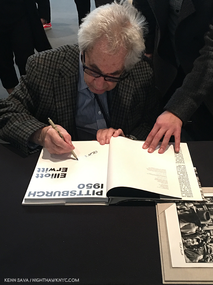
First, the legendary Elliott Erwitt, a former President of Magnum Photos, still going strong at 89, was on hand to sign “Pittsburgh 1950,” a new release of work unseen these past 68 years at GOST Books-

Elliott Erwitt joined Magnum Photos in 1953 and is still a member. Here, he signs the Special Edition of his book, “Pittsburgh 1950,” which comes with the print seen in the right corner, at GOST Books.

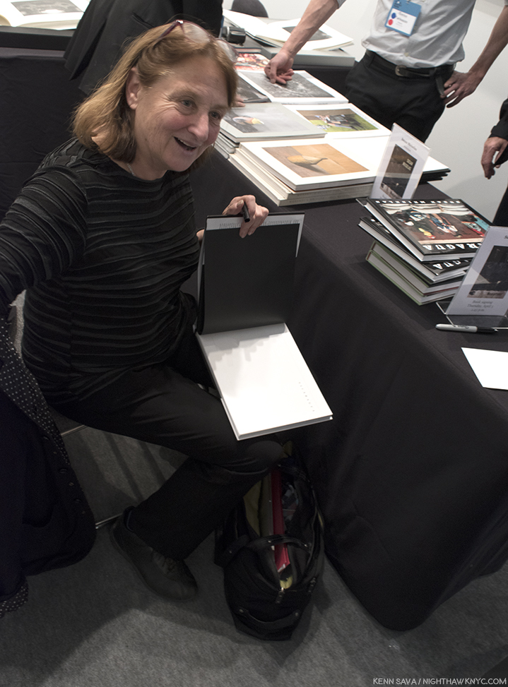
The equally legendary Susan Meiselas,  also a Magnum Photos member (since 1976), was on hand, graciously signing her classic Aperture book, “Nicaragua” for me at Damiani-

Susan Meiselas at the Damiani booth on Thursday

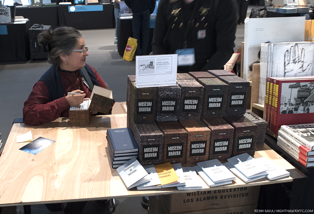
Dayanita Singh signed her newly minted Paris-Photo Aperture PhotoBook of the Year, 2017, “Museum Bhavan,” at Steidl’s table. It consists of a unique box that contains 10 smaller books that the Artist conceived as a portable museum-

Photographer Dayanita Singh, signs “Museum Bhavan,” at Steidl. As you can see, each copy comes in a unique box. The Artist graciously selected one for me she thought was particularly beautiful.

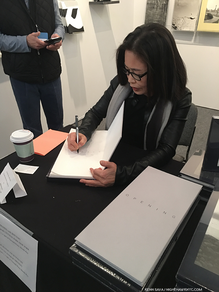
Jungjin Lee signed her beautiful book, “Opening,” at Nazraeli Press-

Jungjin Lee at Nazraeli Press’ booth.

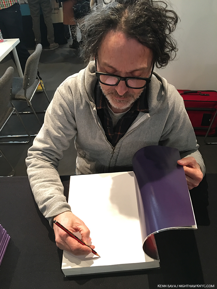
The renowned and influential Paul Graham spoke about his classic 12 volume set, “A Shimmer of Possibility,” then signed the newly released MACK Limited Third Edition-

Paul Graham at MACK Books.

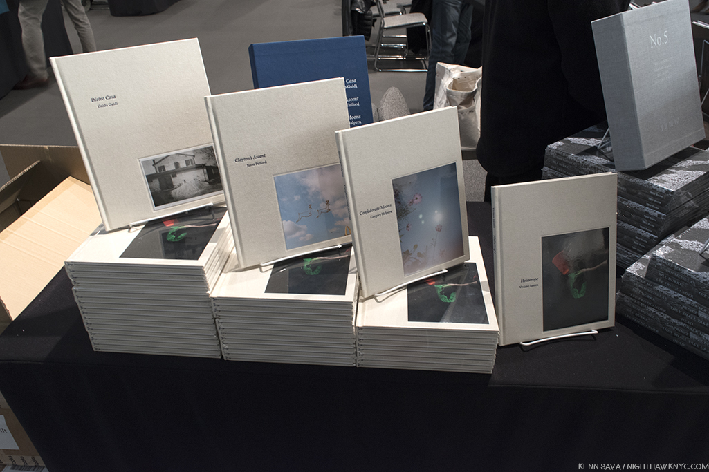
Along with MACK’s third edition of “A Shimmer of Possibility,” the most highly anticipated book release of the show was, perhaps, the debut of TBW Books 4 volume “Annual Series #6,” which resulted in the biggest book release crowd I saw. Last year’s “Annual Series #5,” which featured volumes by Lee Freidlander, Mike Mandel, Bill Burke and the aforedepicted Susan Meiselas, was shortlisted for the Paris-Photo Aperture PhotoBook of the Year, 2017. Both Gregory Halpern (“Confederate Moons”) and Jason Fulford (“Clayton’s Ascent,”) were on hand to sign their two books. Like many others, I was anticipating Mr. Halpern’s first book since “ZZYZX,” which won the Paris-Photo Aperture PhotoBook of the Year for 2016. Would this one, titled “Confederate Moons,” considerably shorter in the making, measure up?  No pressure.

TBW’s “Annual Series #6,” debuting at AIPAD, consists of new books by Guido Guidi, Jason Fulford, Gregory Halpern and Viviane Sassen, from left to right.

He didn’t seem to be worried when I spoke with him, first at MACK’s booth, where he signed “ZZYZX,” and later at TBW Books-

Gregory Halpern was a popular man. First, he was on hand to sign his classic, “ZZYZX” at MACK Books, ..

Then, like a blur, Mr. Halpern was over at TBW Books signing his terrific, new, “Confederate Moons.” Here’ he’s seen behind Artist & Publisher, Jason Fulford, who also has a book in “Annual Series #6,” titled “Clayton’s Ascent.”

I’ve said before that Gregory Halpern’s work speaks to me as much as any Photographer from the younger generations of Photographers I’ve discovered these past 18 months. I now live with his work on my walls. Seeing new work by him was an event for me, the way music lovers look forward to a new album/CD by an Musician or group that inspires them. So, I made a conscious effort to put any resulting bias aside and live with “Confederate Moons” for a week.

The first Photo in “Confederate Moons,” by Gregory Halpern, courtesy of the Artist and TBW Books.

It turned out to be very easy to do. I opened it, was presented by the first image, and just went on the trip from there. There is no text in “Confederate Moons,” beyond the title page and the colophon. The Photographs are not titled or dated. A few days after AIPAD ended, Mr. Halpern posted an “About” on the “Confederate Moons” section of his website. It revealed that “Confederate Moons” is a collection of Photographs taken in North and South Carolina, in August, 2017, the month of the solar eclipse. I find it a beautiful meditation on unity, difference and something that unites everyone, regardless of their location, demographics, beliefs, age, or race- the sun, the source of life. A good many of the Photos are portraits in one way or other, many show the subject looking up.

Photo from “Confederate Moons,” by Gregory Halpern, courtesy of the Artist and TBW Books.

Whereas “epic” is a word I’d use to characterize “ZZYZX”- as in an epic journey filled with epic images.  “Confederate Moons,” strikes me as something of a “love letter” to nature, including humanity, while also serving as a reminder that whatever our differences are, we are united by things like our dependency on the sun. Along with striking images of the eclipse and the darkened world (Mr. Halpern must have been EXTREMELY busy during those very few minutes) there are images of the south and it’s natural beauty and uniqueness, during what I assume may be before and after.

Photo from “Confederate Moons,” by Gregory Halpern, courtesy of the Artist and TBW Books.

It’s easy to make up your own story as you move through it. Or multiple stories. I find it’s enhanced by not having any texts or even titles for the Photographs, though I usually insist on titles (even if it’s “Untitled,” or “No Title”). It’s another extraordinary book, every bit as evocative as “ZZYZX,” though it feels more personal to me. Mr. Halpern mentioned to me that he still believes in the power of a Photograph or a work of Art to change the world. I hope he’s right. I do, too.

At TBW’s Book release, Mr. Halpern was joined by his friend, the accomplished and well-known Photographer & Publisher, Jason Fulford, who’s “Clayton’s Ascent,” is, also, one of the 4 volumes in “Annual Series #6.”

Jason Fulford puts his official stamp, appropriately of two men in a hot air balloon, on his wonderful, new, TBW Book, “Clayton’s Ascent.”

In addition to all of these renowned Artists, there seemed to be more Photographers present in gallery booths, on hand to talk to show goers about their work, something I think is just terrific. As I’ve said in the past, personal contact with an Artist is one of the great joys of buying Art. More often than not, priceless insights, stories and details are shared, which I’m sure help sales, but become cherished memories for both buyers (a sort of verbal/experiential provenance) and visitors.

Stephane Couturier discusses his “Paris 9- ilot Edouard VII- Photo no 10, 1998” at Les Douches la Galerie, Paris’ booth, where Tom Arndt followed discussing his work.

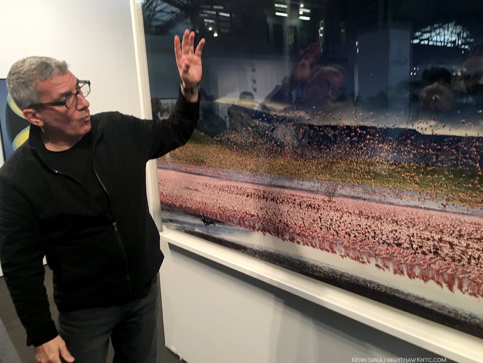
Over the course of the show, I noticed that Stephen Wilkes was on hand over multiple days at Bryce Wolkowitz Gallery, graciously discussing his monumental landscapes and answering questions from visitors. I know firsthand that he made fans out of some of those who heard and met him.

Stephen Wilkes at Bryce Wolkowitz was on hand for 3 days by my count to discuss his massive, extremely intricate landscapes.

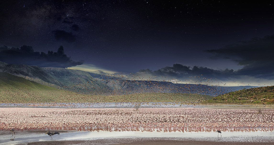
The work Stephen Wilkes is discussing- “Lake Bogoria, Kenya, Day to Night, 2017.” This is a composite of over 1,000 Photographs taken in a single day, from morning to night. The black birds in the front are circling their prospective dinner while the prospective prey gets nervous. Courtesy the Artist and Bryce Wolkowitz Gallery.

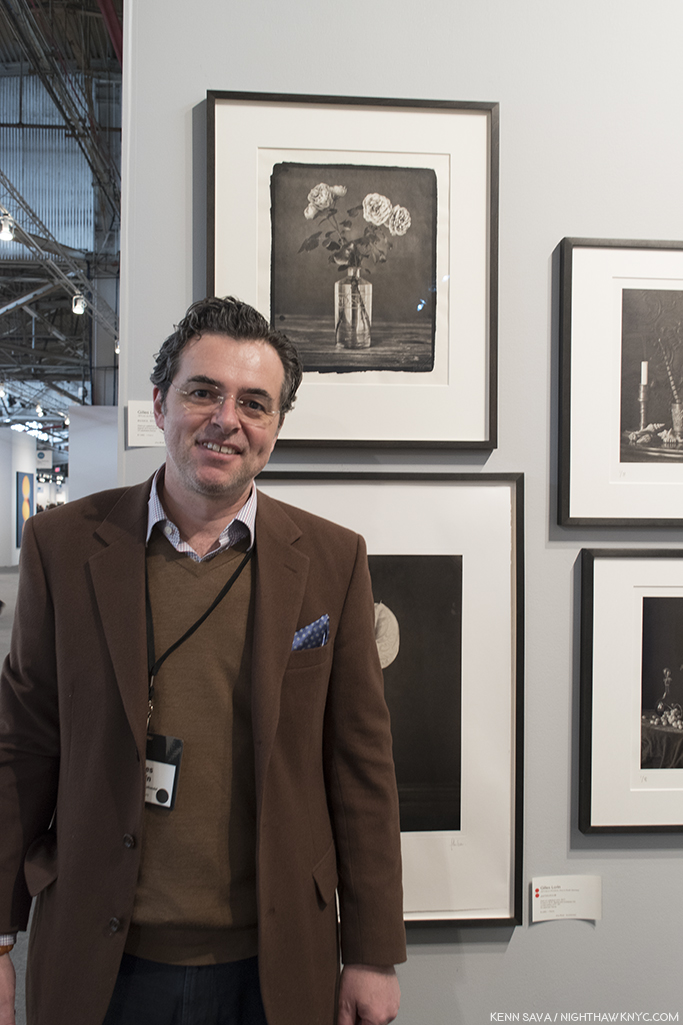
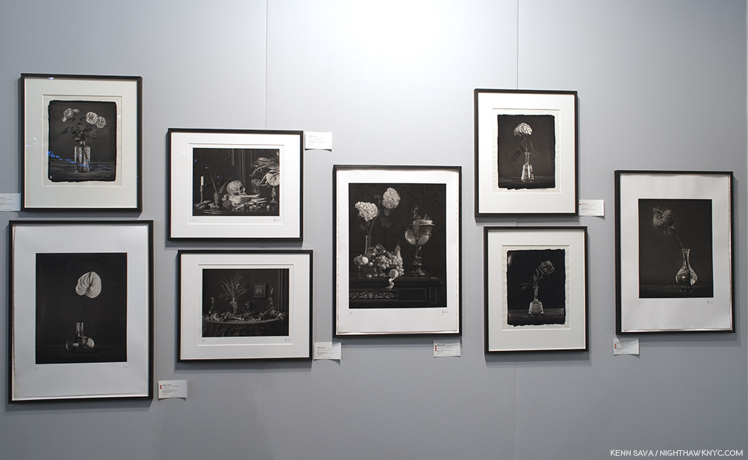
Over at Jorg Maass Kunsthandel, all the way from Berlin, Gilles Lorin was also on hand over multiple days to discuss his classical/modern still lifes. As if that wasn’t enough, he also did a terrific job designing the layout of the booth, one of the most beautiful I saw, that, in addition to a wall of Mr. Lorin’s darkly mysterious works also included Diane Arbus, Robert Frank, Painter Sean Scully(!), and a marvelous William Eggleston.

Gilles Lorin at Jotg Maass Kunsthandel, Berlin, where he also designed the booth’s layout superbly.

Still-lifes by Giles Lorin at Jorg Maass. One or two struck me as having a small bit of Durer’s “Melencolia.”

Ok. Quick quiz time- What do Picasso, Frank Lloyd Wright, Georgia O’Keeffe, JFK, Greta Garbo, Fellini, Jackson Pollock, Elaine and William DeKooning, Grace Kelly, Marcel Duchamp, Giorgio DeChirico, and World War II have in common?

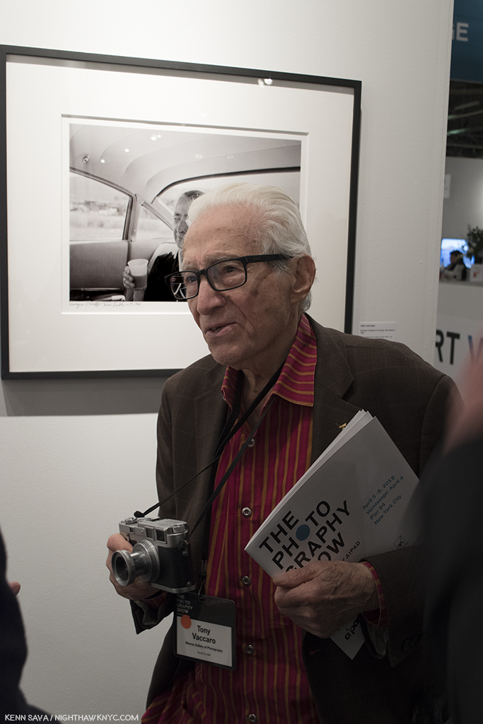
All were Photographed by Mr. Tony Vaccaro.

So, there I was…

Monroe Gallery booth, AIPAD, April 7, 2018

Henri Cartier-Bresson is famous for his Photography, and for the title of his most famous book- “The Decisive Moment,” 1952. It’s a cryptic, mysterious phrase that has become both a mantra for countless Photographers since, and something of a phantom for those seeking “it” in the real world. Adding to the mystery, and magic, of the book, beyond the 126 classic Photos within, is the fact that the original French title of the book translates as “Images on the sly.” Talk about a moving target!

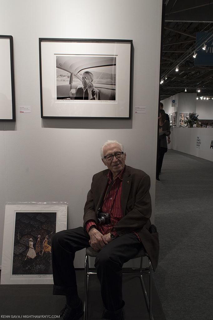
Standing in Sydney Monroe Gallery’s booth on Sunday, April 7th in mid-afternoon, I was faced with the scene above. In front of me sat the living legend, the Dean of Photographers, ninety-six years young, Artist Tony Vaccaro, the subject of an amazing HBO Documentary, “Underfire: The Untold Story of Pfc. Tony Vaccaro,” enchanting all who came within earshot of him with astounding and unforgettable tales of the classic Photo lining the wall above him. What was I saying about the value of personal contact with the Artist?

I yearned to say “Hello,” to tell him how much I admire his work, and congratulate him on an incredible life…

But? This was my third attempt at doing so.

Flashback. Last year, at 2017’s AIPAD, Mr. Vaccaro was present at Mr. Monroe’s booth, but the crowd was, understandably, unrelenting. This was as close as I got to him-

AIPAD, April 1, 2017. Tony Vaccaro at Monroe Gallery’s booth.

Going into AIPAD, 2018, he was scheduled to appear on Saturday, April 6th. But, delayed in traffic, I missed Mr. Vaccaro’s appearance! Darn! So? I stayed to look at his work on view.

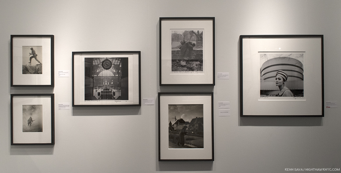
Wall of Photographs by Tony Vaccaro seen at Monroe Gallery’s booth at AIPAD, April 6, 2018.

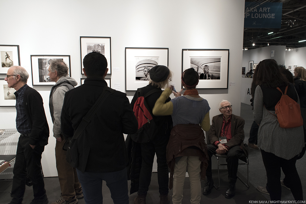
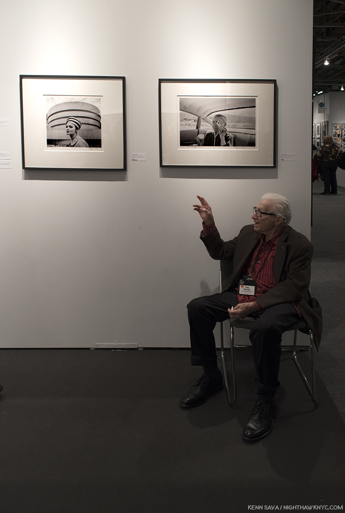
Before me was a history of much of the 2nd half of the 20th century. On the left, combat Photos taken, literally, in the trenches during World War II! To their right, a gorgeous Photo of the old Penn Station. Next to that, two Photos taken in Europe after the War. Next to that a model wears a hat very similar to the immortal rotunda of Frank Lloyd Wright’s Guggenheim Museum in 1960, a year after it opened! Each work was hand titled, numbered and signed by the Artist. And, to the right of that, the amazingly off the cuff Photo of Georgia O’Keeffe seen later.

I mentioned to Mr. Monroe my disappointment at having missed Mr. Vaccaro. “He’ll be back tomorrow afternoon,” he replied. “Really?,” I replied in shock. The third try might be the charm. Returning as soon as I arrived at the show, I was faced with the scene up top. This time, I stood patiently, waiting for the seas to part. Finally, I took a hard swallow. (Hey, I’m a pretty shy guy. It’s hard for me to approach strangers.) I walked forward and grabbed my own “decisive moment.”

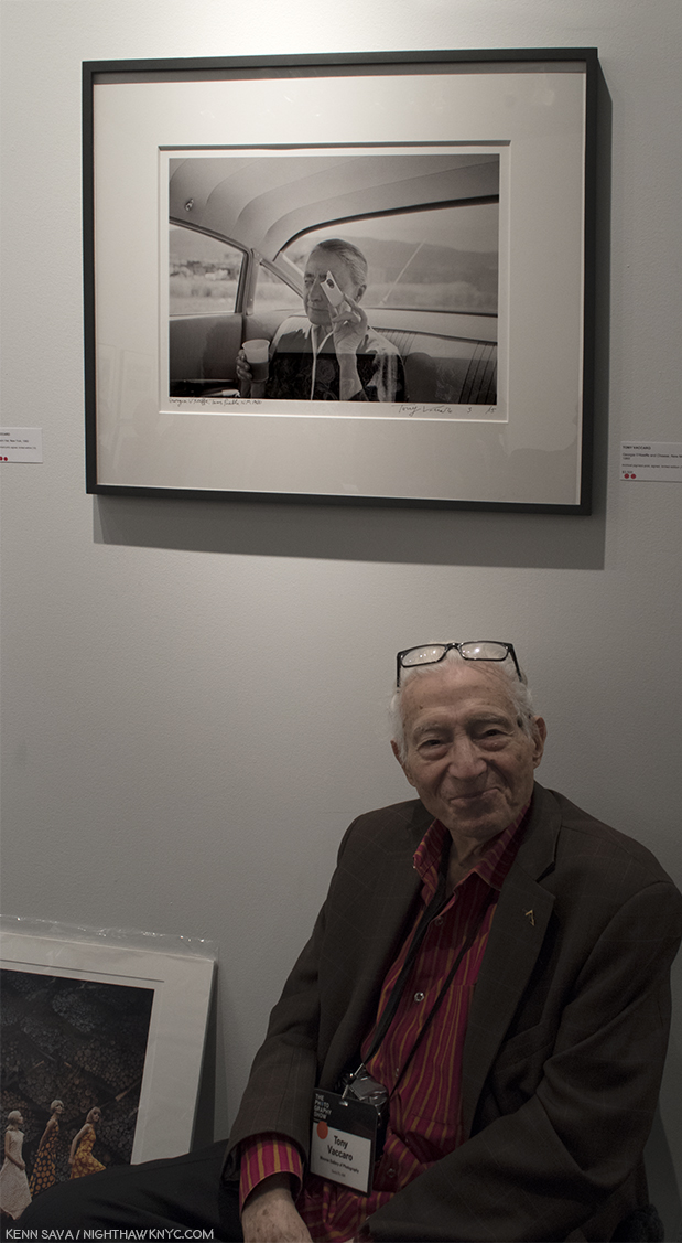
Then, all of a sudden, I was face to face with a chance to talk to a legend. He couldn’t have been nicer….more gracious…more welcoming. Wow… I asked him if I could take his Photo. Not only did he agree, he posed, then after I did, he even decided to remove his glasses.

I’ll never forget the next few moments. Though I have already forgotten just how many passed.

After taking the Photo, I asked him about his work. Regarding the one of a kind Photo of Georgia O’Keeffe he was sitting under, he said that he had spent a few days around her and she was not responsive to the idea of being Photographed. That’s understandable. Earlier in her life, Ms. O’Keefe had been the muse of legendary Photographer Alfred Stieglitz. Together, O’Keefe & Stieglitz created a unique, perhaps unequalled body of work, characterized by her haunting, ethereal beauty and a very rare intimacy. But, suddenly, she looked at him through a piece of cheese, and voila! I can’t recall ever seeing one as unguarded as this. The fact that she’s still not smiling, makes it all the more special. She’s only letting the viewer in so far. The cheese is in the way, acting like a shield. Of course, Mr. Vaccaro took other Photos of her, in color, which are now quite famous, but this one is the only one I’ve seen that shows another side of her.

Mr. Vaccaro graciously posing for yours truly under his classic Photo of the greeat Georgia O’Keeffe. I’m amazed you can’t see the camera shake in the Photo.

Next to it, the wonderful Photo of the model in front of the Guggenheim, elicited a question about it from a visitor. “I was there when Frank Lloyd Wight was designing the Guggenheim,” Mr. Vaccaro answered. Wait. What??? Sure enough. I remembered the famous shot, one of my favorites of Frank Lloyd Wright, standing in his work room, with his arms raised and outstretched, standing behind his desk. A spontaneous moment that became something of a “perfect” portrait of the great Architect. Blown away, I had to ask a follow up question. “What was Frank Lloyd Wright like?,” words I never expected to ask any one. “Hard worker. Hard worker,” Mr. Vaccaro said. “What was it like to Photograph him?” “He never told me anything. I told him just go about your work, do what you want to do, and I’ll take the Photographs. And that’s what we did. He never told me anything.” I asked him about his amazing World War II Photographs. He told me he was always able to get film, and he carried a small film developing set with him, with chemicals and small nesting trays that were easy to pack. He developed his film as he used it. As is shown in the Documentary, he went from Normandy to Berlin. “Mrs. Roosevelt was waiting for me when I got to Berlin,” he said. He moved on to the beautiful shot of the “Old Penn Station,” “It was lucky I photographed it. A short time later, they destroyed it. What a shame. What a beautiful building,” he said. I asked him if he had a favorite among the countless Photographs he’s taken. “The G.I. kissing the little girl.(“The Kiss of Liberation”) I think that’s marvelous.The French also thought that was super and they gave me the “Legion of Honor” (in 1994).

“I was there when Frank Lloyd Wright designed the Guggenheim,” Mr. Vaccaro said. That sound you heard was my jaw hitting the floor.

He mentioned having worked at Life Magazine after the War, and I asked him if he knew Gordon Parks, who would have been at Life at the same time. “Gordon was a good friend of mine,” he recalled. These days, Mr. Vaccaro and his family have the Tony Vaccaro Studio, in Long Island City, where Mr. Vaccaro was headed when he stopped to take the Photo of the “Old” Penn Station, which maintains and manages his archives, as Mr. Vaccaro continues to work. His daughter in law, Maria, who manages sales and the archive was on hand as well. I couldn’t help but notice the beautiful Leica Mr. Vaccaro had around his neck. He told me it was a gift to him from the great German camera maker. Well, you can’t get better advertising than what he’s created with one, that surrounded him on “his wall,” as he called it. Then? He talked about looking forward to his 100th Birthday!

A beautiful Man, and his beautiful Leica.

Right before I bid farewell, Mr. Vaccaro was discussing his work with a couple who promptly made a purchase they’ll never forget. Not privy to the conversation, he leaned back next to me and I heard him say, “I was at the right place at the right time.”

I leaned over and, smiling, said to him,, “Yeah. A LOT of times.”

*- Soundtrack for this Post is “Time In A Bottle,” by Jim Croce (for Sv)-

This Post is dedicated to Susan Meiselas, Paul Graham, Gilles Lorin, Dayanita Singh, Gregory Halpern and, the one and only, Mr. Tony Vaccaro, for their Art, for the beauty of their spirits, and for sharing both, with me, and the world.

The Photography Show/AIPAD, 2018, is my NoteWorthy Show for April.

Once again, for the second year, I’m proud to bring you THE most extensive coverage of The Photography Show anywhere. This is Part 2. The rest is here.

My coverage of The Photography Show, AIPAD, 2017 (including “Memorable Meetings, 2017”) is here, and my prior Posts on Photography are here.

NighthawkNYC.com has been entirely self-funded & ad-free for over 7 years, during which over 275 full length pieces have been published!
I can no longer fund it myself. More on why here.
If you’ve found it worthwhile, PLEASE donate to keep it online & ad-free below.
Thank you, Kenn.

Written & photographed by Kenn Sava for nighthawknyc.com unless otherwise credited.
To send comments, thoughts, feedback or propositions click here.
Click the white box on the upper right for the archives or to search them.
Subscribe to be notified of new Posts below. Your information will be used for no other purpose.

The Photography Show- AIPAD, 2018

There’s no “swim suit” for this vast sea of images. Just dive right in. Arthur Elgort, “Stella Diving, Watermill, Long Island,” 1995, seen at Staley Wise Gallery at The Photography Show. Click any Photo for full size.

The 2018 edition of “The Photography Show,” (commonly called “AIPAD,” the acronym of The Association of International Photography Dealers, the organization that presents it), was a week later than last year’s blockbuster, though much else was the same. I’m not surprised. As I said in the last of the 4 pieces I devoted to 2017’s show, there was little to complain about from this visitor’s perspective, so I very much anticipated this year’s model.

It did not disappoint.

The highlight of the NYC Photo Year beckons. Don’t let the small entrance fool you. A vast show awaits inside.

It returned to the same familiar, cavernous, space known as Pier 94, on the Hudson River, and it reprised many of last year’s popular features, including a Publisher, PhotoBook Dealer & Photography Organizations area, a dedicated “AIPAD Talks” area, a “PhotoBook Spotlight” area, and new this year, an AIPAD Screening Room featured films by Photographers, or relating to Photography.

“Say Cheese.” The view from above right before the opening bell on Thursday at noon. Even a panorama can’t capture the whole of AIPAD.

Though, by my count, there were about 20 fewer dealers than last year (103 vs 123 comparing this year’s guide to 2017’s. AIPAD, itself, reported 96 this year1), given the enormous size of the show, it’s highly unlikely that anyone who didn’t make a count would have realized it- there was still too much to see in one visit. I made four, spending all of Thursday, Friday, Saturday & Sunday exploring it. Still, I’m sure I missed something. 

The Floor Plan.

What I did see impressed me quite a bit. In the next piece, I’ll take a look at highlights. First, here’s an overview.

“Something for everyone,” the show’s Press Release said.

The best thing about AIPAD for me is that nowhere else in NYC all year long can so many very good, great, and even classic Photographs be seen in one place. You would have to spend weeks walking around the city’s galleries and Big Five Museums to come close. But? Even then, you wouldn’t come close. AIPAD provides the opportunity to see what Artists from around the world are doing; to discover new Artists, and to see beautiful examples of classic Photographs, both familiar and known only through books or legend.

f64. Robert Mann, left, stands outside his renowned gallery’s booth, Catherine Edelman Gallery, equally renowned Chicago dealer, right, with Gallery f5.6, Germany, Gallery 19/21 from Conn., further on the left, and the fascinating Legacy of the Black Panthers 50th Anniversary Exhibition further back on the right.

While Aaron Siskind, Alfred Steiglitz, Edward Weston, Berenice Abbott, Ansel Adams, Atget and Kertesz were among the classic Artists being shown at the most booths (per the guide), there was a very impressive amount of lesser known Artists who presented quite strong work, in an extremely wide range of styles and genres– from the literally unknown, like these-

Unknown Artist, “Selection from a Speedway Photograph Portfolio” on display at Harper’s Books booth.

To some of the most famous Photographs ever taken-

Well? Almost. Ansel Adams, “Moonrise Over Hernandez (Cancelled),” 1941, printed circa 1969. This print was created in Ansel Adams’ darkroom on what turned out to be defective Ilfobrom paper. As a result, they were marked “Cancelled” with a machine used in banking and then sent to Ilford to demonstrate the flaws in the paper. Seen at Scott Nichols Gallery.

Great works by revered names…

Henri Cartier-Bresson, “Rue De Bassano, 8th Arrondissement, Paris, 1953” seen at Contemporary Works/Vintage Works.

Sally Mann, “Naptime,” 1989, seen at Edwynn Houk Gallery is the subject of a current retrospective at the National Gallery of Art, Washington.

Robert Frank, “US 285, New Mexico, 1955,” from his enduring classic PhotoBook, “The Americans.” Seen at Howard Greenberg Gallery.

The Photographs in Painter Ed Ruscha’s “Gasoline Stations Portfolio,” 1962, weren’t even taken as “serious Photography” by the Artist when he took them. 56 years later, they’re some of the most influential Photographs taken since. Seen at Bruce Silverstein.

To surprises from Artists previously seen, like this wonderful wall of work by Jeff Brouws which channels the classic work of Bernd & Hilla Becher…

Jeff Brouws, “Coaling Tower series,” 2013-17, seen at Robert Mann Gallery. Apologies for the glare. Like the Becher’s classic series, Mr. Brouws has Photographed in the same weather and lighting conditions they always used.

To work previously not known to me that impressed…

Gohar Dashti, “Home (series),” 2017, at Robert Klein Gallery

Or…

Omar Imam, “Untitled, 2017 (serene place),” from his powerful “Syrialism” series at Catherine Edelman Gallery.

This year’s show also included special exhibitions, including this one, curated by Sir Elton John, titled “A Time For Reflection”-

Sir Elton John curated this selection from AIPAD member galleries titled “A Time For Reflection.” Included is Gordon Parks’ “American Gothic,” near the right corner, which can be seen in my recent Post about Mr. Parks just concluded shows.

Another special exhibition was “All Power: Visual Legacies of the Black Panther Party,” from the book of the same name, presented by the Photographic Center Northwest, in honor of the 50th Anniversary of the founding of the Black Panther Party’s Seattle chapter.

Installation view of one corner of “All Power.” Work by Robert Wade, Gill Baker, Deborah Willis, and Lewis Watts among those seen here. The words are from Point 7 of the Black Panther Party Platform and Program, 1972.

It featured a very impressive roster of Artists, and I was particularly impressed by the works of LaToya Ruby Frazier’s, including 2 pieces from her poignant “The Grey Area,” about the demolition of the hospital in her home town in spite of efforts, that she was involved in and Photographed, to save it. The work “UPMC Global Corporation, 2011” from her series “The Grey Area,” especially struck me as I have been looking at a lot of work by the so called “New Topographics” Artists Lewis Baltz and Stephen Shore2. This work seems like a culmination of what those Artists were depicting in series like Lewis Baltz’ “New Industrial Parks Near Irving, California,” and “The Tract Houses,” in the 1970s.

LaToya Ruby Frazier, “UPMC Global Corporation, 2011” from her series “The Grey Area,” 2010-12, that documents the demolition of Braddock Hospital in her Pennsylvania home town, which she had been involved in trying to save.

One of the things I look forward to most about AIPAD is the chance to see what galleries from elsewhere in the world bring and display.

see + gallery, Beijing, China, left, Atlas Gallery, London, right, with Laurence Miller Gallery, NYC behind them, and Les filles du calvaire, Paris, France behind on the left.

As they did last year, many showed work completely new to me, and possibly a good many other show goers, like this-

Alfredo Jarr, “The Power of Words,” 1984, at Jean-Kenta Gauthier, Paris, France

Detail.

and this…

Raghu Rai, “A Photographer, The Wall Series, Delhi, 1973,” seen at TASVEER from Karnataka, India

and for the lover of modern vintage prints-

Two gorgeous examples by Eikoh Hosoe, “Ordeal by Roses, #29,” 1962, left and #16, 1961, right. Seen at IBASHO, Japan.

Making the rounds, the first thing that strikes you is the level of seriousness of the work on view. Almost nothing here is frivilous. Given the very significant cost of being here, the travel (some came from down the street, some from, literally, the other side of the world), the logistics, the hours involved in being at AIPAD- every single thing here is something someone significant in the Photography business believes is worthy of being here and being seen along side what everyone else feels should be seen here. So, the show provides fascinating insights into, and a barometer of, what so many leading dealers think about the Photography market and what’s selling, while balancing that with making a statement about the overall identity of their gallery. I find all of this endlessly fascinating. This year there was a distinct absence of the encroachment of “video,” or moving elements incorporated in Photography, which, to my eyes, has thus far come across as gimmicky. I much prefer seeing this-

Made using brand new “technology”… of the 16th century. Abelardo Morell, “Camera Obscura: The Philadelphia Museum of Art East Entrance in Gallery with a de Chirico Painting,” 2005. Light from outside (the exterior of the building) enters the darkened gallery seen above through a small hole, and is “projected” on the opposite wall, where the de Chirico hangs, upside down. At Edwynn Houk Gallery.

As you walk through AIPAD, you’ll find the work that doesn’t hold up to such “company” is in the extreme minority. to the contrary, you’re virtually guaranteed to discover a new Artist of interest you previously didn’t know.

Jean Pagliuso, 4 works from her “Owl” series, at Mary Ryan Gallery. Of course, anyone showing Owls, the Official Bird of NighthawkNYC, let alone these 4 beauties, was bound to catch my eye.

Then, there is the area devoted to Book Dealers, Publishers and Photography based Organizations, including Aperture, which held a steady stream of PhotoBook talks (in the area to the far right, below, with AIPAD Screenings just behind it in the far right corner) throughout the weekend. This area also hosted a steady stream of Booksignings and Book Launches, while also giving book collectors a chance to talk to a number of the world’s leading PhotoBook publishers, from bigger (Steidl, ArtBook DAP, Mack, Damiani, and Nazraeli), to specialty publishers TBW Books and Minor Matters, to Japanese Publishers, Akio Nagasawa and SUPER LABO among a number of others. The organizations also included Light Works, the Photography Collections Preservation Project, and the Florida Museum of Photographic Arts, who told me that their striking home doesn’t have plumbing!

The front of the Publishing and PhotoBook area. The show is so big, this large section of it isn’t even seen to the left of the panorama posted earlier.

Books have long ago secured their place as essential to Photographers and the world of Photography. In many, even most cases, they are the only way to see the work of the vast majority of Artists. Over time, they have become an “Art-form” unto themselves. For both reasons, it’s only natural, and in my opinion, critical, that they be included in AIPAD. The best PhotoBooks publishers (Gerhard Steidl, Chris Pichler of Nazraeli, Michael Mack of MACK, Paul Schiek of TBW Books, among them) are Artists themselves, either literally, or as bookmakers. The beauty and craft they bring to their work enhances the experience exponentially to the point that it’s an essential part of the experience of the work. In addition to these world-class publishers, intrepid book sellers, like Harper’s Books (who showed a spectacular collection of rare books and collectibles, seen in the center glass case in the Photo above) and Photo-eye (who featured the MASSIVE new Taschen book, “Murals of Tibet,” hand signed by H.H. The Dalai Lama, which starts at $12,000.00) were highlights. But, the “stars” of this area were many of the book booths offered exceedingly rare chances to meet, and have a book signed by, Artists including Susan Meiselas, Elliott Erwitt, Paul Graham, Ralph Gibson, Jungjin Lee, Gregory Halpern, Jason Fulford, and Dayanita Singh, among others.

In assessing the “world of Photography,” since AIPAD is so international in scope- in all of it’s dimensions, I’d be remiss if I didn’t make special mention of the renowned, non-profit, Aperture Foundation, who’s founders include Ansel Adams and Dorothea Lange, and who celebrated their 65th anniversary in 2017. In my opinion, through everything they do, they are one of the lynchpins of the Photography world. As is well known, they nurture up and coming Photographers who deserve wider attention, publish important PhotoBooks (“Stephen Shore” was one of the very best PhotoBooks I saw in 2017), put on terrific shows (like their recent “Prison Nation”), and publish often terrific limited edition prints by many of the leading lights of both contemporary and classic Photography at exceedingly reasonable prices.

Aperture’s PhotoBook Spotlight, this one featuring legendary Photographer, Paul Graham, center, who discussed his classic book “A Shimmer of Possibility.”

At the show, they ran a steady stream of PhotoBooks spotlights, which included Paul Graham, who’s “A Shimmer of Possibility,” (winner of the Paris Photo-Aperture Prize for the Best PhotoBook of the Last 15 Years in 2012), spoke about it on the debut of MACK’s third edition. In my opinion, everyone involved in Photography owes a debt to the Aperture Foundation, and I hope they support them through buying their books, prints and magazine, or making a donation. That’s my opinion, and no…they didn’t ask me to say that.

Nico Krijno, “Burning Wicker Chair,” 2011, a Huxley Parlour Gallery, London. The South African Photographer’s fascinating work is something I definitely have my eye on.

With so much to see, I strongly advise getting the multi-day ticket. Thursday is my favorite day to go and get acclimated. The weekend crowds haven’t arrived and you can actually talk to the dealers and booth holders and get some of the fascinating backstories behind what they’re showing. Things have a tendency to germinate in my mind overnight. I’ll see something I don’t know, then go home and research it or the Artist, and go back and see it again. Friday and Saturday things were steady and busy throughout, with the weather cooperating this year. Sunday seemed to me to be surprisingly busy. During my rounds on Sunday, within 2-3 hours of closing, most (not all) of the dealers I spoke with said the show was “Good,” or “Very good” for them, and I was surprised by how few expressed a negative sentiment. What this tells me, beyond how successful The Photography Show was (and there is no doubt it was) is that the Photography market remains robust, and signs of a downturn were not to be seen, as far as I could tell. This is good news for the Artists, particularly, as well as the dealers, of course. After it ended, AIPAD reported record attendance numbering over 15,0003.

Lisa Kereszi, “Gold Curtain, Poconos Resort, PA, 2004,” seen at Yancey Richardson Gallery.

As so? I look forward to the curtain going up on The Photography Show, 2019. But, don’t worry- The curtain is not coming down on my AIPAD 2018 coverage…yet. Stay tuned!

*- Soundtrack for this Post is “Take Me To The River,” by the great Al Green, which I actually said to a cab driver on Saturday. It can be seen in an early performance by Talking Heads here.

Uh-oh…Guess who’s back from their Winter Migration…

On The Fence, #18 – “The Wall Has Eyes” Edition. Celebrating the 1st Anniversary of my fine feathered friends and “On The Fence,” who debuted after AIAD, 2017.

The Photography Show/AIPAD, 2018, is my NoteWorthy Show for April.

Once again, for the second year, I’m proud to bring you THE most extensive coverage of The Photography Show anywhere. The rest of it is here.

My coverage of The Photography Show/AIPAD, 2017 may be seen here.

My previous Posts regarding Photography are here.

My thanks to Margery Newman and Nicole Strauss.

NighthawkNYC.com has been entirely self-funded & ad-free for over 7 years, during which over 275 full length pieces have been published!
I can no longer fund it myself. More on why here.
If you’ve found it worthwhile, PLEASE donate to keep it online & ad-free below.
Thank you, Kenn.

Written & photographed by Kenn Sava for nighthawknyc.com unless otherwise credited.
To send comments, thoughts, feedback or propositions click here.
Click the white box on the upper right for the archives or to search them.
Subscribe to be notified of new Posts below. Your information will be used for no other purpose.

  1. Press release April 12, 2018
  2. I’m not putting them in that box. They were part of a show with that title which spawned the term at the George Eastman House, Rochester, NY in 1975.
  3. Ibid

Edvard Munch: Between The Canvas & The Camera

Edvard Munch (1863-1944) is mostly known in the USA for The Scream, so, Edvard Munch: Between The Clock & The Bed, at The Met Breuer was something of a revelation, an all too rare chance to see a selection of his work, in this case 43 Paintings, and see a bit more of what the Norwegian Artist was all about. The fact that more than half of the works on view remained in his collection until his death gave it a personal feel. Munch, who never married, considered his Paintings to be his children. So, when he passed away in January, 1944, he bequeathed his collection to the city of Oslo- 1,100 Paintings, 4,500 Drawings and 18,000 Prints, now housed in the Munch Museum.

Installation view of the entrance at The Met Breuer.

The personal feeling was heightened by the fact the show included 16 self-portraits, created over the 6 decades he was active. And so, we get to see the changing face of Edvard Munch-

Self-Portrait, 1886, Oil on canvas. Age 23. The first work Munch signed, created using a spatula and by scratching the surface, in some areas, baring the canvas.

Self-Portrait with Cigarette, 1895, Oil on canvas.

The Night Wanderer, 1923-24, Oil on canvas.

Self-Portrait: Between the Clock and the Bed, 1940-43, Oil on canvas. In his last significant “self-scrutiny” as he referred to his self-portraits, he stands before the faceless clock and bed, in front of his Paintings, facing mortality, and immortality.

Munch’s journey saw him experiment with a variety of styles, including Impressionism. But, even early on, as seen in his “Self-Portrait,” 1886, above, he showed signs of breaking out and finding his own way. Once he did, there is a strain in his mature work that is, famously, characterized by a depth of feeling that regularly includes agony and isolation, which he expresses in a style uniquely his own. Those works are what is mostly seen at The Met Breuer, and they proved captivating in one of the best shows thus far in 2018.

Ashes, 1925, Oil on canvas. The anguished man..the sensuous woman, and the log in the rear turning to ashes, it’s flame apparently gone out…

In these works, he’s moved beyond “Impressionism,” and all that’s left is raw emotion, powerfully and poignantly expressed in unusual poses and striking compositions.

Sleepless Night: Self-Portrait in Inner Turmoil, 1920, Oil on canvas

In another Self-Portrait, Sleepless Night: Self-Portrait in Inner Turmoil, 1920, the walls, floors and table surfaces seem to vibrate, and fade into other dimensions, as if the spaces themselves are emoting. Here and in the later Self-Portraits, Munch has also moved past the great self-portraitist, Van Gogh, to reveal himself at seemingly odd and unexpected random moments. The loneliness in these self-portraits as an older man is still somewhat startling, something rarely seen in Art History to that point. Michelangelo’s, apparent, inclusion of himself as Nicodemus in The Deposition aka The Florentine Pieta,” and, of course, Rembrandt’s late Self-Portraits being two that come to mind.

Of course, any discussion of loneliness, pain and agony in Munch must include The Scream.

The Scream, 1895, Lithographic crayon. The inscription near the lower right, reads, “I felt a loud unending scream piercing nature.”

At The Met Breuer,The Scream was included in an 1865 version done in lithographic crayon, Interestingly, he has rendered virtually the entire composition in lines, except for the coats and the sides of the railing. But, the highlight of this show was the chance to see precursors of The Scream, which I had never seen before.

Sick Mood at Sunset: Despair, 1892, Oil on canvas. A precursor to the first version of The Scream, 1983, The wall card says Munch referred to this work as “the first Scream.”

On January 22, 1892, while in Nice, where he painted Sick Mood at Sunset: Despair, Munch recorded in his diary an event that took place years earlier in Norway, “I was walking along the road with two friends. The sun set. I felt a tinge of melancholy. Suddenly the sky became a bloody red. I stopped, leaned against the railing, dead tired and I looked at the flaming clouds that hung like blood and a sword over the blue-black fjord and city. My friends walked on. I stood there trembling with fright. And I felt a loud, unending scream piercing nature.”

Despair, 1894, Oil on canvas.

These two take an opposite, introverted approach to the famous Scream. As such, they seem much more in character with the Edvard Munch seen in the rest of this show (admittedly, a low single digit percentage of his Painted output), and so serve to sharpen the feeling that The Scream is that rare moment of extroverted outburst that so many of his other works keep just below the surface. All three works (counting the Painted “Scream,” not here) are marvelously original, with searingly burning skies that even Van Gogh might have envied. The two above are masterpieces in their own right, in my view.

Photo, circa 1870, showing the Ljaborveien road Munch depicts. Oslo is in the background.

The show also included an 1870 Photo of the Ljaborveien road Munch depicts. It was here that Munch “felt a loud, unending scream piercing nature,” which he would immortalize over two decades later.

Starry Night, 1922-24, Oil on canvas. Even this late in his career, the influence of Van Gogh remains, here as a jumping off point. Note the two shadowy figures.

As I moved through this marvelous show, while bearing in mind that these works are only a tiny percent of his oeuvre, I couldn’t help but feel that after he left Impressionism behind, the influence of Vincent Van Gogh lingered. Of the countless Artists who have been similarly influenced, Edvard Munch is one of the very few who’s work would make an interesting counterpoint if hung along side his.

“The Sick Child,” 1907, Oil on canvas. One of the seminal works in Munch’s career.

Whereas Vincent never shows us pain in an actual event, leaving us to feel it, and everything else, in the “quiet” scenes he shows us after, like in his Self Portrait with Bandaged Ear,or in the garden scenes of the hospital he’s in. Edvard Munch shows us the events, like The Scream, and his terminally ill sister in The Sick Child, 1907, and this seemingly inconsolable woman, below, in Weeping Nude, 1913-14, as if to let us feel what he’s feeling and see why. The deaths of his mother when he was 5, and then that of his beloved sister, Sophie, when Munch was 13, both from tuberculosis (despite the fact that his father was a physician), stayed with him the rest of his life. He created six versions of The Sick Child, (the one above is #3), using a different model, over FORTY years (between 1885 and 1927), such was it’s hold on him. Therefore, it’s hard to think Painting these scenes were “therapeutic” for him.

Weeping Nude, 1913-14, Oil on canvas.

Edvard Munch: Between the Clock and the Bed shows an Artist who stands apart. He found his own way, apart from everything else that was going on in the Art world during his time. In an Art world full of genres, I find it refreshing that his work doesn’t really belong in one, as a reminder that no Artist’s work does. And? As I discovered in an interesting satellite show, Like Edgar Degas, Thomas Eakins, and other Artists of the time who are generally considered Painters, it turns out that Edvard Munch was, also, an avid Photographer.

Edvard Munch, Self-Portrait on the Beach with Brushes and Palette in Warnemunde, 1907, Printed from a collodion contact print. Perhaps channeling Gauguin in Tahiti.

If his Painting is not as well known here as it should be, his Photography is completely unknown. Into the void came the Scandinavian House who mounted a thorough show of these works (along a few graphics, and his experiment with filmmaking), titled Edvard Munch: The Experimental Self, as a satellite to The Met Breuer’s show. Part of the reason his Photography is unknown is that his surviving Photographs are extremely fragile. So much so, they had to be scanned and reproduced to be displayed here.

Edvard Munch strikes what would turn out to be a familiar pose in the introduction to this surprising show of his Photography and Films.

As I’ve been exploring the world of Contemporary Photography intensely since December, 2016, one thing that’s become apparent to me is that a surprising number of Painters have, also, been Photographers of varying degrees of seriousness, and almost none of them have had their Photography taken seriously- either by the Art world or by the world of Photography. Edvard Munch is yet another Painter who explored Photography. In his case, “explored” might be the best term to characterize his approach.

Scandinavian House Installation view. 3 prints in the far gallery, Photographs in the near gallery.

Munch considered himself an amateur as a Photographer, though he was pleased with the results he got and said that he planned on preparing this work for display at some point. It is interesting that none of the Photographs on view were, apparently, studies for subsequent Paintings, even with, as in The Met Breuer show, so many Self-Portraits included.

Self-Portrait wearing glasses and seated, with two Watercolors at Ekely, 1930, Print after an original silver gelatin print. Munch, hauntingly, with parts of two of his works, in, perhaps, a double exposure?

Munch Photographed during two periods. First, between 1902 and 1910, a period that began with the tumultuous end of a relationship during which one of the Artist’s fingers was mutilated by a gunshot, and ended with a rest cure for “emotional turmoil,” and again between 1927 and the mid-1930s, a period that began with the success of retrospectives in Berlin and Oslo and ended with a hemorrhage that temporarily impaired his vision in his right eye.

4 Self-Portraits, all taken in 1930. Munch was, apparently, very fond of this very serious pose, taken by himself with an extended arm, or with a cable shutter release, as it appears over and over again at different times, as seen here.

The “revelations” I found in his Photography was that along with the fact that he was his own preferred model with a camera, his poses are more serious. This may be due to the need to hold still during the long exposure times, but it does offer an interesting counterpoint to the Edvard Munch we see in his Paintings and Prints, where he seems more “natural.” It also appears that Munch was one of the first Artists obsessed with the “selfie,” and given how many variations he made with the same pose makes one wonder if Andy Warhol knew about them.

Courtyard at Pilestredet 30B, 1902, Original contact print on silver gelatin paper. I prefer this interesting shot of one of his childhood homes. He moved the camera while the shutter was opened and he, too, apparently liked the results enough to sign it.

The Photographs don’t portray the isolation and loneliness, nor the depth of emotion and expression his Paintings do. Therefore, it seems to me they will be considered an appendix to his Paintings and Graphic work, of interest, primarily, to Munch specialists.

Detail of Munch and the faceless clock in Between the Clock and the Bed.

All in all, Edvard Munch has been a figure who’s notoriety largely rests on one work, The Scream. It’s a work that speaks to the depth of feeling that characterizes a good many of the rest of his Paintings seen at The Met Breuer. The show proved his Paintings retain their power to speak to us and they reward both close, and repeat, looking. Perhaps even more than the Impressionists, Edvard Munch, working away in isolation in Oslo, created Paintings & Prints that resonates with our time. Like that clock with no hands, the emotions he Paints are timeless.

Edvard Munch: Between the Clock and the Bed is my NoteWorthy show for March, though it ended on February 4th. Edvard Munch: The Experimental Self ended on April 7th.

*- Soundtrack for this Post is “Forlorn,” by Weather Report, which may be heard here.

NighthawkNYC.com has been entirely self-funded and ad-free for over 7 years, during which over 250 full length pieces have been published. As I face high expenses to keep it going, if you’ve found it worthwhile, please donate to keep it up & ad-free below. Thank you!

Written & photographed by Kenn Sava for nighthawknyc.com unless otherwise credited.
To send comments, thoughts, feedback or propositions click here.
Click the white box on the upper right for the archives or to search them.
For “short takes” and additional pictures, follow @nighthawk_nyc on Instagram.

Subscribe to be notified of new Posts below. Your information will be used for no other purpose.

Deana Lawson’s Rising Star

Recently, MoMA opened “Being,” it’s New Photography 2018 show featuring 16 Photographers born between 1974 and 1987. Walking through the show, I couldn’t help but remember that one of those included in their New Photography 2011 show was Deana Lawson. Being born in 1979, Ms. Lawson would fit right into the demographics of MoMA’s current show. But, she’s already made her “name” and her star is still ascendant. After being an Artist in Residence at Light Work in 2008 (from who you could buy an original Deana Lawson signed & numbered print for all of $300. as recently as January), Ms. Lawson’s work has continued to impress every time I’ve seen it. She has a remarkable way of creating unique works out of what seems to be standard portrait situations and poses, that in her hands become entirely her own.

On March 1st, Sikkema Jenkins & Co. opened what I believe to be the first NYC solo show of her work featuring 10 new pieces. An Artist who works, and produces work, slowly, each piece was characterized by the extraordinary intimacy I’ve admired in her earlier works.

Since each Photograph appears to have been taken in the subject’s home, they contain the “dual intimacy” of the subject in their space. The sense of family looms large in most of her work, which shouldn’t surprise as she has said she considers her subjects to be “family,” though the works in this show were taken in South Carolina, Swaziland, Jamaica, Soweto, South Africa as well as in Brooklyn, where the Rochester, NY native lives now.

As part of what makes her style already instantly recognizablly a “Deana Lawson,” many of her subjects are “cornered” in one way or other. Many are standing or sitting along a wall. They look at the camera at 45 degree angles. Above all, there’s an obvious level of comfort they feel with the Artist, which brings a level of openness to the picture that’s generally only seen in family snapshots or selfies, and is rare in Fine Art Photography. But, there’s more. As we look at them and their surroundings, her subjects look back at us.

Last year, I called Deana Lawson one of the “stars” of the 2017 Whitney Biennial, where her work was brilliantly shown in dialogue with that of Painter Henry Taylor. Before the Biennial, Ms. Lawson was commissioned to do the Photographs for Time Magazine’s piece on the June 17, 2015 Charleston, South Carolina massacre. The article, which shows another side of her work, may be seen here.

Flashback- May, 2017. Installation view of the Deana Lawson-Henry Taylor gallery at the 2017 Whitney Biennial.

Ms. Lawson, currently an Assistant Professor of Photography at Princeton, is also the subject of the solo show, Forum 80: Deana Lawson, which opened recently at the Carnegie Museum of Art in Pittsburgh through July 15.

Deana Lawson, left, talks with renowned Artist Kara Walker, right, who braved the freezing temperatures to attend the opening on March 1st in the same space where her latest show was this past fall.

Knowing I was going to write a piece on both Artists, unfortunately, I didn’t get a chance to ask Deana Lawson about Gordon Parks‘ possible influence on her. Then, this past week, word coincidentally came that the Gordon Parks Foundation has awarded the 2018 Gordon Parks Foundation Fellowship to her. As Ms. Lawson’s star continues to rise, the Aperture Foundation is preparing to release the first monograph on her work, with an essay by acclaimed English Novelist Zadie Smith, this fall. Among many other things, Aperture is renowned for publishing Diane Arbus’s first monograph in 1972. While I’m certainly not comparing Diane Arbus and Deana Lawson (or any creative beings or works), there are some interesting similarities in their work, particularly the striking level of intimacy they both achieve and the comfort level they elicit from their subjects. Stay tuned.

*- Soundtrack for this Post is “Family Portrait,” by Pink from Missundaztood.
NighthawkNYC.com has been entirely self-funded & ad-free for over 7 years, during which over 275 full length pieces have been published! If you’ve found it worthwhile, PLEASE donate to allow me to continue below. Thank you, Kenn.

You can also support it by buying Art, Art & Photography books, and Music from my collection! Books may be found here. Music here and here.

Written & photographed by Kenn Sava for nighthawknyc.com unless otherwise credited. To send comments, thoughts, feedback or propositions click here. Click the white box on the upper right for the archives or to search them. Subscribe to be notified of new Posts below. Your information will be used for no other purpose.

Grant Wood: The Wheat From The Chaff

Wait. What? My rough realization of what Grant Wood may have REALLY wanted “American Gothic” to look like. I’ll explain shortly. Click any Photo for full size.

There is no denying Grant Wood’s contribution to what is now called “American Art.” He was one of the staunchest advocates for this country developing it’s own style of Art. He did as much as anyone else from the late 1920’s on, towards making it a reality. He spoke, taught, and formed Artist’s communities. and created Art that received wide acclaim as being American. Yet, seventy-five years after his death, the image we have of Grant Wood, the man, as well as the common perception of his work, is not the whole picture.

Behind the show’s entrance, the first gallery is ominously dark, ostensibly to show off the work in the next Photo. It did “set a tone,” at least for this viewer.

Like Michelangelo, he carefully monitored his public image, and like Il Divino, this was no easy task given the unprecedented level of popularity “American Gothic”, um…the real one… received, literally overnight, when it debuted at the Art Institute of Chicago’s Annual Exhibition of Painting & Sculpture in October, 1930. It  pretty much never waned the rest of his life. Along the way, he carefully monitored his public image to keep out any inkling of homosexuality, which was, apparently his preference, though he married, once. Critics, and the public, have looked long and hard at his Art for “telltale” signs of it. I find very few passages that are even “suggestive.” That doesn’t mean he wasn’t homosexual1. That only tells me he was careful. Looking at the work, I find far more that would belie his image as the “Painter of Middle American values.”

Grant Wood, yes. Grant Wood, “Corn Cob Chandelier,” 1925, Copper, iron, paint. I can just hear Frank Lloyd Wright and Louis Comfort Tiffany, the two geniuses of American Design and Ornamentation of the time saying, “Now WHY didn’t I think of that??”

“Fire Screen Ornament,” 1929-30, Wrought iron. Grant Wood was accomplished at a wide range of things, including iron working, as here, jewelry making and he even designed and constructed a few houses. As seen here, he had his own style in these materials, that was different from the ornament created by Wright, Sullivan or the Europeans.

My initial walk through of the entire “Grant Wood: American Gothic & Other Fables’” 9 galleries over 3 visits to the Whitney Museum, left me with one overriding feeling. Though his mature period lasted barely 11 years, from 1930 to his death at age 50 in 1941, I found much of this work unsettling. Over my subsequent re-visits, I searched for why.

Overmantel Decoration,” 1930, Oil on composition board. Also displayed in the first, darkened gallery. Painted the same year as “American Gothic,” to go over the mantel of a couple’s new home, this “idyllic” scene bothers me to no end. Notice, half of the front lawn is covered by an ominous shadow (or a dying lawn2, the trees on the right look more like circular saws (not exactly welcoming), and the mother looks away from the man on horseback, who is going past her and what we assume are her children, given his horse’s leading hoof is already past the path they’re standing on. The tall tree to the right is brown- is it dead? In the background 2 dark clouds loom. The house is already being covered in vines. What, exactly, is going on here, and why are we “spying” on this scene from behind the plants across the road?

“Overmantel Decoration,” 1930, ostensibly fills it’s commission- Art to hang over the mantel of a family’s new home. Yet, I can’t help wonder if it’s “more.” The scene depicted, an almost ideal middle class life circa the late 1890’s, would be something almost impossible for an Arist to attain. Especially one in the mid-west, far away from where Art was trading hands for serious money at the time. Grant Wood well knew this. I can’t help but wonder if that’s why the scene is almost being evesdropped on. Most people would want to show their house from directly in front of it. Yet, we “spy” it from a 45 degree angle at a time when the front facade is in shadows. It’s as if the Artist is evesdropping on a life he’ll never know choosing to follow his creative star. Of course, any life is fraught with dangers, and maybe that’s why there’s so much of it, apparently, in this work, where one would expect the kind of bliss Currier & Ives made famous.

Detail. A strange “Welcome home” from the woman, IF this is her husband.

Grant Wood was born to a farmer and his wife in Anamosa, Iowa in February, 1891. His father was a very strict, my-way-or-the-highway kind of man, who wouldn’t hesitate to discipline if things weren’t done his way. He was a man’s man, and to his son Grant, more a God than a man, as he said in his autobiography. Plump and not blessed with physical strength, Grant (who was named after that paragon of manliness, U.S. Grant), was not cut out to follow in his father’s footsteps. His sense of inadequacy and his sense of striving to put forth a “manly” persona remained with him for the rest of his short life. (He died 2 hours short of turning 51 in 1941.) His father suddenly died when Grant was 10, forcing his mother to sell the family farm, and leaving Grant with issues that stayed with him the rest of his life, and I feel, are quite visible in his work. Yes, right there alongside the “wholesome,” American values so many see in his work.

“Market Place, Nuremberg,” 1928, Oil on canvas.

In 1920, he sailed to Europe on the first of 4 visits. In 1940, he explained, “when I told my friends in Cedar Rapids, Iowa that I was going ‘there’ to Paint, I immediately became an outcast. It wasn’t considered manly to be an Artist. Then I read H.L. Mencken’s articles, and decided I must leave the Bible Belt at once and go to Paris for freedom3.” During his 4th trip, in 1928, Grant Wood suddenly had an “epiphany” as he called it during a visit to Munich, Germany’s Alte Pinakothek, when he came upon works by the Northern Renaissance masters, particularly Hans Memling and Albrecht Durer. Virtually instantaneously, he abandoned the “Impressionistic” style he had been using (as seen above) in his non-commissioned work, for most of the 1920’s.

“Portrait of John B. Turner, Pioneer,” 1928/30, Oil on canvas. Almost on a dime, his work changed to this, sharply realistic style, that harkens back to Memling and Van Eyck, in a work that marks the beginning of his “mature” period. A number of portraits followed, this prize-winning work.

Returning home, almost immediately, his mature style debuted in the portrait of the father of the Artist’s patron, David Turner. Grant Wood was obsessed with the appearance of “manliness” throughout his life. David Garwood, who wrote the first biography of Grant Wood, said his father, Maryville (pronounced “Mervil”), “looked at Grant now and then and wondered how he happened to bring such a son into the world4.” For the rest of his life, Grant Wood would be so mindful of the impression he made he even adopted overalls when he worked and often when he was Photographed so as to not look like the stereotypical “Artist” of the day, which was associated with “unmanliness,” since Art making wasn’t considered “real work”. In “Portrait of John B. Turner, Pioneer,” the subject looks out at us as if to say, “I have secured my place in Iowa history. Can you measure up?” “The sitter appears to know” the answer, R. Tripp Evans, says. He also sees it as a “down payment on his debt to Maryville, whose death had freed him to become an Artist. Safely contained behind the mask of ‘Daddy’ Turner, as John Turner was familiarly known, Maryville sits before the map that will lead Wood back to his past- and to a new approach5.”

Continually using his family and friends as models, a series of portraits of them followed, Most notably this one-

“Woman with Plants,” 1931, Oil on composition board. The Artist’s mother in what was Grant Wood’s favorite of his own works.

It’s a portrait of his mother, Hattie Deette Weaver Wood, who Grant Wood lived with for the rest of her life after Maryville’s death in 1900, until her own death in October, 1935, partially perhaps, to shield him from the scrutiny and gossip surrounding him being a “bachelor Artist.” In it he depicts her as he remembered her looking on the day of her husband’s death. She wears an apron over a black long sleeve top, possibly in reference to the Artist’s comment regarding his change of styles, ” I spent twenty years wander around the wold hunting ‘arty’ subjects to Paint. I came back to Cedar Rapids, my home town, and the first thing I noticed was the cross-stitched embroidery of my mother’s kitchen apron6.” His eyes opened to the potential subjects all around him, the change would last the rest of his life. After the fact, he tried to alter the dating of these two works to make it appear that “Woman with Plants” had come first, and before “Portrait of John B. Turner, Pioneer,” but it had not. Though he dearly loved it, Hattie insisted he sell it. Sorrowfully, he did, but intended to do another portrait to replace it. When the idea for “American Gothic” came to him, after seeing the now famous small house with the upstairs Gothic window in Eldon, Iowa, he had an idea. His sister Nan, who posed for the young lady in the Painting, said this in an interview soon after-

“As he put together his composition for the house and two people while he was at the breakfast table that morning in 1930, he said he had models in mind—a man and a woman who would be just perfect. However, he was afraid to ask the woman, fearing she would be angry at the idea of being made something less than beautiful … Grant never told me whose place I took as the model, but I’m sure it was a spinster who had hounded him7.”

So, finally, he arrived at this-

The “real” “American Gothic,” 1930, Oil on composition board. On loan from the Art Institute of Chicago, who bought it for the outrageous sum of…three HUNDRED dollars!

How can ANYone stand in front of this and not feel uneasy? I, for one, don’t like having the business end of a pitchfork pointed at my eyes.

The Artist happened to drive by the house one day and was taken by the gothic window on the second floor, which reminded him of the Cathedrals he’d recently seen in Europe. Dr. Byron McKeeby, Grant Wood’s dentist, 62, by accounts an affable man, posed as the farmer. His sister, Nan, 30 at the time, posed as the lady who has been identified as either the farmer’s wife, or his daughter (Grant Wood is quoted calling her either at least once, though, like Michelangelo, he appears not to be above saying things for his own reasons, on occasion). The uneasiness this work invokes, along with a “Mona Lisa”-like enduring mystery about it’s “meaning,” hasn’t stopped it from becoming one of the most famous works of American Art of the 20th Century. My reading of it is that it has to do with the Artist’s feelings of confronting his father about his being an Artist and not a farmer.  That it’s his devoted sister, Nan, standing besides the father figure, says to me that she wants him to show him some understanding. It also expresses the Artist’s sense of feeling like an outsider in his native state. Those feelings may have been sharpened into irony (if not outright scorn of his neighbors) by his reading of H.L. Mencken8.

No, Grant Wood wasn’t a farmer. The closest he got to it was tending a garden. He was, originally, a Decorative Artist. He studied and worked at making silver jewelry and coffee and tea sets, he worked in iron, as seen earlier, and he did stage design. None of these were considered “manly” and most weren’t considered actual “work” by his father and others at the time in Iowa. Right up until the 1930’s, years after he had settled on being a Painter, he was still supporting himself designing, building and furnishing homes. He spent his whole life striving to overcome what he perceived was a lack of manliness in the perception of him by others, ingrained on him by Maryville.

Over 6 visits I made a point of carving out a few minutes each time to stand alongside viewers looking at “American Gothic.” I stood to the side so I could watch their expressions. Yes, quite a few posed for selfies with it, and in those cases, I looked at their faces, too. No one smiled. It seemed to me that the mood of the work was imparting something beyond the hype the work has received for 80 years as being an icon of the American Mid-west and it’s core values. I detected uneasiness in my fellow viewers as well. The power of the work begins in the eyes. R. Tripp Evans says the farmer’s eyes don’t make eye contact with the viewer, they look just past him/her. They bored right through me.

So…? What’s up with the image I posted up top?

The same R. Tripp Evans makes a strong case that the “woman who would be just perfect” was the Artist’s mother, Hattie. But, asking her to pose alongside another stern farmer other than her late hubsand would have been too close to home for her, and too painful. She would never had agreed. So, he posed Nan in her stead. Somewhat revealingly, Nan wears the same cameo (of Persephone) that Hattie wears in “Woman with Plants,” She wears long black sleeves under her apron, like Hattie does, both with pointed fringe and collar poking out up top, and, both women wear their hair back. Also, the potted sansevieria, which Hattie grasps with both hands on her lap in “Woman with Plants,” now appears on the porch over Nan’s right shoulder. Grant Wood never reused items that had appeared in one of his works in any other work ever again. Where there’s smoke? There’s fire. There’s quite a bit of “Hattie smoke” in Nan’s portrait here.

Is this the farmer’s wife, or daughter? She’s both. She’s made to look like Hattie, but she’s Grant Wood’s devoted sister, Nan, here taking his side, as usual. Note the sansevieria plant on the porch.

His father having passed away, his mother not being ammenable to posing, he did the next best thing. He asked his sister, Nan, to pose, and asked his dentist, Dr. Byron McKeeby to pose as the farmer. In his unfinished autobiography, “Return from Bohemia,” Grant Wood describes Maryville as “Tall and gaunt,” with a “solemn, stern, angular face9.” The affable Dr. McKeeby was able to capture the grim look Grant Wood wanted, aided in no small part by the fact that he is wearing Maryville Wood’s eyeglasses! The only item belonging to his father that Grant Wood kept. He liked them so much, he had a duplicate pair made for himself. All these things point to the Artist’s original intention to depict his mother and father in “American Gothic.” The  Artist, himself, is represented, I believe, by the European Gothic window- quite out of place in 1930’s Iowa, like Grant Wood felt he was, fittingly, with it’s curtain down, hiding what’s inside.

So? I’ve created a very rough idea of what “American Gothic” might have looked like if he had asked Hattie to pose and she agreed.  Taking her portrait from “Woman with Plants,” my job was made easier because there are so many similarities with Nan’s appearance in “American Gothic,” and her mother’s in “Woman with Plants,” as I’ve listed. The main visual difference being the disparity of their ages.

What this exercise showed me is the difference in the effect in switching Nan for her mother would be major. Of course, we have no idea how Grant Wood would have rendered Hattie had she agreed, and enabled the Artist to follow through on his yearning to replace “Woman with Plants.” If this had happened, it is interesting to ponder if the public would have responded to it the way they have to the “American Gothic” we have. That circles the question back as to why they have.

It’s ironic that it was his mother, who’s protective presence shielded him from unwanted public scrutiny, who inadvertently led to more of it than either of them could have ever imagined. Perhaps, only the Artist would have preferred it with his intended “perfect models,” and if he had gotten them, would he have remained a strictly local favorite Artist- a while longer, or permanently, as so many others have?

“Dinner for Threshers,” 1934, Oil on board, nearly 7 feet long. Ostensibly, a communal meal on “threshing day,” the day when the edible part of the grain was loosened from the husks and stalks (i.e.-the chaff). For Grant Wood, threshing day was “the big event of the year10.”

While most people who see “Dinner for Threshers” will take it at face value, as a meal after working in the fields, it harbors quite another level. Set in an open house, his childhood farmhouse near Anamosa, like a stage show, what we are seeing is nothing less than the Artist’s reimagining of his father’s last meal before he suddenly “dropped dead,” as the local newspaper headline read, in 1900 at the window in the center- the vanishing point of the work, in multiple ways, as Mr. Evans points out. It’s design is an apparent homage to Leonardo da Vinci’s “Last Supper,” complete with untanned foreheads instead of halos, 13 workers instead of 12 disciples, and features what might be the Artist, himself, three times on the far left, outside, and again at the table looking up at the woman, who may be Hattie, who appears as the other three women, to the right, according to Mr. Evans11. Since Wood said that “It includes my family…,” that leaves me wondering where Nan is. Maryville, appears in the center, taller than everyone else, with his back to the viewer, in the light shirt, in what would be the only time his son Painted him. So, what we are seeing here is nothing less than the end of one life, and the beginning of another- Grant Wood’s career as an Artist. In that sense, too, “wheat has been separated from the chaff.” Treshing day, indeed.

“Parson Weem’s Fable,” 1939, Oil on canvas.

In “Parson Weem’s Fable,” 1939, the fictitious fable about George Washington it depicts is not the only “fable” being told. Here, also, as late as 2 years before his death, Grant Wood is having it out with his father. By not wanting to become a farmer, he is ostensibly killing the cherry tree, i.e. his farm, which was sold after his sudden death in 1900. He refuses to return the axe, that is go back on his choice of an Artistic career. Grant Wood acknowledged that Washington’s attitude is his own[Ibid P.409]. The house in the back is his and his wife, Sara’s house, and the house where his mother would die. The red curtain the Parson opens is his mother’s curtain used in their prior Turner Alley sleeping quarters for a decade. Those would would classify Grant Wood’s work as Magic Realism, including Emily Braun in the show’s catalog (P.67), need to look no further, as what I believe they mean is seen in full effect here. No less than Gilbert Stuart’s portrait of the mature George Washington12, the one seen on the dollar bill, is morphed on to young George’s body, because, as he said, no portraits of the young Washington exist. Intriguingly, in the back of the scene a black woman and man tend to another cherry tree. Are they a couple? Mother and son? They do serve to remind us that both George Washington and Washington’s father owned slaves. They are the only African Americans to appear in Grant Wood’s work (as far as I know).

“Fall Plowing,” 1931, Oil on canvas

“Fall Plowing,” 1931, is an example of what others call “Magic Realism” (a term that Edward Hopper gets lumped into and I will never understand why), with it’s classic, surreal, Grant Wood  background. What strikes me is the unattended plow. While others (R. Trip Evans, “Grant Wood,” P. 204) see a sexual metaphor, there is no other way for me to “read” this work than to think it’s a very poignant homage to his father, Maryville and his sudden passing. He may well have left some farm implement right where he was working and using it. The plowed and planted fields rolling off into the distance speak of work accomplished, while the unplowed land in the immediate foreground speak of work to come and now left undone. I can picture the Artist coming across such a scene after his father died, so for me, this strikes closest to home among all of Grant Wood’s landscapes. It’s interesting how the only sign of other human life is way off in the distance, heightening the sense of isolation. In the most recent biography of Grant Woods, by R. Tripp Evans, which is full over very interesting biographical detail, the author goes to great length to sexualize this work, as he does too many times, in my opinion. Frankly, I just don’t get that at all standing in front of “Fall Plowing.” I also note that in the same year, he painted Portraits of his sister, Nan (“Portrait of Nan”), and his great-aunt, Matilda Peet, (“Victorian Survival”).,

“Victorian Survival,” 1931, Oil on composition board. Grant Wood’s maternal great-aunt, Matilda Peet, rendered, in a different style, from a 19th century family tin-type…with the addition of a “modern” telephone on the left.

Here there is, also, the overriding distance that is seen in most of Grant Wood’s mature landscapes. The scenes are seen from far away, leaving the viewer isolated, as in “The Midnight Ride of Paul Revere,” 1931, for one example. The feeling is not all that different from that in the work of Edward Hopper at about the same time.

The loneliness seen throughout Grant Wood’s work may be rooted in the isolation he and his family lived during his first decade, isolated on a farm near Anamosa, a village of less than 2,000, “as if we had been on an island in the ocean,” he said. “If the unique circumstances of Wood’s childhood- it’s profoundly rural setting, his father’s strict expectations, and his own emotional makeup- established early self-doubts concerning his masculinity, then the cultural context of his youth only compounded the problem…the most compelling element of his mature work- his selective reorganization of past experience-was present in his art from an early age, and appears to have served a deeply cathartic function13.”

“Death on the Ridge Road,” 1935, Oil on composition board. The only appearance of multiple motorized vehicles in this show.

Death is, obviously, an undertone that accompanies many of Grant Wood’s works, and a theme in his life. Even beyond his father’s death, Grant Wood, appears to almost be obsessed with it. He took walks in graveyards, he worked for at least two funeral homes, including his first job as a night watchman. He took various roles at David Turner’s Funeral Home, including designing casket biers, and after being given a studio directly behind it, he used a coffin lid as it’s front door. In this work, “Death on the Ridge Road,” 1935, he Paints it. Inspired, Nan says, by a close call a friend had but survived, here, the long sedan has no way out. At this time, Grant Wood was facing the eminent demise of his “we three” family unit he had been nurtured by for the past 25 years. Nan moved to Albuquerque and his mother, Hattie, was starting to go. She would die in October. Startlingly, on March 2nd Grant Wood, 44, finally married. Of course, some surmised, at the time and since, that his marriage was a “cover,” necessitated by Hattie’s demise. I have no idea. It ended in divorce some 3 and a half years later.

“Spring in Town,” 1941, Oil on Wood.

As the Nazis blitzkrieged across Europe, Grant Wood embarked on a series of works designed to show Americans what they stood to lose. “Spring in Town,” 1941, is one of the two he lived to finish before he died of pancreatic cancer on February 12, 1942. In the midst of the townspeople busy with their daily chores, I can’t help but notice the gent planting in the foreground. For me, this symbolizes much of Grant Wood’s Art. His work speaks for  him, and they do so on a number of levels, not all of them obvious. As this increasingly comes to light, the reassessment of Grant Wood is continuing. Just what is he really sowing in that ground, and in these Paintings? He had quite mixed feelings for Iowa, it’s citizens and their lifestyle, and some of his most famous works, including “American Gothic” were born out of his desire to poke fun at them in response to the way he felt he was treated as an Artist then and there. But more than that, seeing this many of his works together, it becomes obvious that Grant Wood was painting his childhood of the 1890’s, and not the mid-west of the 1930’s. He was painting what he lost, not what was disappearing as he grew older, and he was working out that most significant relationship of his life, that failed relationship with his father.

With 117 works on view by my count,  the show is larger than the Stuart Davis show. It does feel light on his early work (I saw one Painting from the decade of the 1910s, three dated 1920-25), which misses a chance to trace his development from nearer his beginnings. I doubt the overall impression would be much different. “Grant Wood: American Gothic & Other Fables” provides New York with a rare chance to see so many of the Artist’s works in one show (the last time, if I recall correctly, was also at the Whitney in 1983), given the overwhelming number of them permanently reside in Iowa, and most importantly, a rare chance to assess his work in light of all that has come after it, and to see what it has to offer to us today.

“The Return from Bohemia,” 1935, Pastel, gouache and pencil on paper. The cover for his unfinished autobiography shows the Artist surrounded by Nan, his early dealer, Ed Rowan, his patron, funeral home owner, David Turner, Hattie, and his younger self, left to right, looking over his shoulder. Mysteriously, each of their eyes are hidden from us.

When you begin to piece it all together, Grant Wood comes across as more of a “contemporary” American, who’s complex, had issues with his family and neighbors, and was a member of a sexual minority. He looked forward to, and did all he could to help establish, an American style of Art, while at the same time, his own Art seems fixed in time- the 1890s. In that sense he was “old-fashioned,” too. Having dealt with rejection from his childhood, by the time he achieved his breakthrough, Grant Wood was an expert at managing what he revealed to others. He edited his work relentlessly to make sure it presented the image he intended, and he destroyed what he thought didn’t. Therefore, it should be no surprise that looking for “proof” of his homosexuality (in things like the gent in “Spring in Town,” above, working without a shirt on, or in “Fall Plowing”) is a waste of time, in my opinion. He didn’t want it to be found because the results would have been disastrous, personally and professionally, and he knew his work better than anyone else ever will. Looking, instead, at his work for messages and intentions that lie beneath the surface may be a bit more fruitful, but, again, it seems to me that so much of what he did was known only to himself. We can find elements of it through a study of his biography, his interviews, the memoirs of his sister, Nan, and the unfinished autobiography he left. But, it seems to me, that the still un-tilled, “deeper” levels in Grant Wood’s work, (reminiscent of the planting going on in “Spring in Town”), which I believe are there, are purposely buried so deeply under it’s topsoil that only he knew where they are.

*- Soundtrack for this Post is “I Shall Be Released” by Bob Dylan, lyrics here, as performed with The Band and a cast of thousands in “The Last Waltz.”

References-

“Grant Wood: American Gothic & Other Fables,” by Barbara Haskell, Glenn Adamson, et al, Whitney Museum, 2018- Ms. Haskell and her team have done an excellent job with this 272 page catalog. The quality of the reproductions are excellent (180 color, 30 B&W), and include works not seen in the show, and different views of some that are, though some suffer loss of detail due to being across two pages. The essays are interesting, informative and even unusual, especially an entire essay about Grant Wood’s Homosexuality by Richard Meyer. Also included is a thorough Chronicle by Ms. Haskell, which includes a number of texts and additional Photos. Throughout rarely seen Photos add much to the book, which is now, the standard in Grant Wood monographs, admittedly a small field.

“My Brother, Grant Wood,” by Nan Wood Graham. I haven’t found an actual copy of this book, which is still in print, but the fact that she burned her brother’s letters after he passed would seem to indicate a protective slant. That being said, from the excerpts I’ve read of it, and interviews with her published elsewhere, I have no doubt it’s an essential resource.

“Grant Wood,” by R. Tripp Evans. Though marred by, what I consider to be, oversexualized interpretations of the Artist’s work, it is extremely well researched and adds countless key insights and details to his biography and background on his work.

My thanks to Danielle Bias and Veronica Brown of the Whitney Museum.
NighthawkNYC.com has been entirely self-funded & ad-free for over 7 years, during which over 275 full length pieces have been published! If you’ve found it worthwhile, PLEASE donate to allow me to continue below. Thank you, Kenn.

You can also support it by buying Art, Art & Photography books, and Music from my collection! Books may be found here. Music here and here.

Written & photographed by Kenn Sava for nighthawknyc.com unless otherwise credited. To send comments, thoughts, feedback or propositions click here. Click the white box on the upper right for the archives or to search them. Subscribe to be notified of new Posts below. Your information will be used for no other purpose.

  1. Writers, including R. Tripp Evans in the most recent biography of Grant Wood, provide details, and there is an entire chapter devoted to the subject, by Stanford Art History Professor, Richard Meyer, in the show’s catalog.
  2. Interestingly, “The Birthplace of Herbert Hoover, West Branch, Iowa,” 1931, also has a brown/dying lawn.
  3. R. Tripp Evans, “Grant Wood,” P.72
  4. Ibid P.33
  5. Ibid, P.103
  6. Ibid, P.122
  7. Ibid, P.144
  8. Ibid P.140
  9. Ibid P.146
  10. Ibid, P.249
  11. Ibid, P.255-6
  12. Throughout his work, Grant Wood, an astute student of Art History, quotes from the masters, often with humorous effect. See “Daughters of Revolution,” 1932
  13. Ibid, P.34

Gordon Parks: Re-Emerging Man

The Invisible Man, Harlem, New York, 1952. One of Gordon Parks’ most iconic Photographs, among many other great ones.

The renowned 20th Century Photographer/ Filmmaker/ Painter/ Writer/ Musician & Composer/ (I keep finding more talents, so I’ll leave this one open for the next one)… “Renaissance man,” Gordon Parks (1912-2006) was a self-taught Photographer who bought his first camera from a pawn shop at 25. He went on to create an extraordinary body of work over the next 60 years that was marked as much by its range as by its quality. Along the way, he became, perhaps, best known for two of his films that are legendary in different ways. The semi-autobiographical The Learning Tree, 1969, achieved and retains critical acclaim, and Shaft, 1971, a much bigger commercial success, remains an influential cult classic.

After getting that first camera, Gordon Parks promptly became good enough with it to gain employment with the Farm Security Administration (FSA) until it closed in 1943. His subsequent work as a freelancer led to acclaim and his becoming the first African American staff Photographer and Writer at Life Magazine, then the #1 Photojournalist publication in the world. After 2 decades at Life, he turned his own best-selling novel, The Learning Tree, into a 1969 movie that was one of the first 25 films selected for permanent preservation by the National Film Registry of the Library of Congress1. Two years later, he followed it up with the wildly popular film Shaft, made for $500,000, which was added to the Library of Congress’ Preservation List in 2000. That same year, Gordon Parks was named one of 26 “Living Legends” by the Library of Congress. All the while, he would continue to create Photographs and explore Photography until his death six years later.

Monumental. Gordon Parks Collected Works, 2012, published by Steidl and still in print. Photo by Steidl.

After his passing in March, 2006, the Gordon Parks Foundation has been carrying on promoting his work, with particular attention to his Photography. Though renowned during his lifetime, his body of Photographs has seemed to be somewhat overlooked in the plethora of Photographs coming before the world these days. To reverse this, in 2012, the Foundation and the world’s leading Publisher of Photography Books, Steidl, produced an exceptional five-volume set of Gordon Parks’ Photographs entitled Collected Works that can found at quite reasonable prices online. But, seeing the real thing in person, as with most Art, has a power all its own.

Keeping the light burning. It was still getting dark before 5pm as I stood outside Jack Shainman on West 24th Street when Part 1 opened in early January. And, when Part 2 opened on February 15th.

To this end, Jack Shainman Gallery mounted two shows, Gordon Parks: I Am You Part 1 & 2, between January 11th through March 24th, that provided a beautiful and succinct overview of some of Mr. Parks’ finest work, and included a number of surprises.

An unexpected dialogue. 3 Photographs of Alberto Giacometti and his work- Falling Man, Strollers, and Untitled left to right, Paris, 1951.

For those who know his early work for the Farm Security Administration (FSA)-

American Gothic, Washington, D.C., 1942, meanwhile, the “other” one, by Grant Wood, is on display at the Whitney right now, about 15 blocks south.

Or, as a PhotoJournalist-

Untitled, Harlem, New York, 1949, left, Untitled, New York, New York, 1952

or his work documenting the Civil Rights movement-

Both, Untitled, Washington, D.C., 1963. The Civil Rights March on Washington

Untitled, Washington D.C. (Rosa Parks), 1963

Or, those that are hard to classify-

Invisible Man Retreat, Harlem, New York, 1952

Gordon Park’s work as a Fashion Photographer

and his later, color, works that explored much more freely, may come as a surprise.

In an age where there are far too many Photos taken of celebrities, I continually find myself stopped by the images he took of Muhammad Ali. Many of his shots of the Champ are somewhat unorthodox, and almost all of them have an intimacy not seen elsewhere. So well done are they, so natural, it’s extremely hard to tell if Mr. Ali is posing or was captured in the moment.

Untitled, London, England, 1966

Untitled, Miami, Florida, 1966

And this, seen last year-

Muhammad Ali (Wrapped Hands), 1966, as seen at the Weinstein Gallery, Minneapolis, AIPAD Booth in March, 2017

Even over two shows, given the length of his career and the extraordinary wide range of his work, it’s possible to only get a taste of his accomplishment. Luckily, the Steidl set, (which is also available, minus the slipcase, in a “Study Edition”), is around to provide a complete look. Still, my takeaway after both shows is that it’s hard to find a genre of Photography at which Gordon Parks did not excel, one in which he did not create memorable works of lasting strength, significance and beauty.

Emerging Man, Harlem, New York, 1952. Along with American Gothic, two of his most well-known Photographs.

There are some interesting parallels, and divergences, in the Photographic careers of Walker Evans (1903-1975) and Gordon Parks2. Both worked for the FSA, both went on to work for magazines, though Evans was, of course, white, both Photographed African-Americans, and both explored color Photography as their careers went on. But, Evans found a champion at the Museum of Modern Art in Lincoln Kirstein, which resulted in his work being given a solo show in 1933 and a breakthrough show, the now legendary “Walker Evans: American Photographs,” in 1938, the catalog for which is still considered a benchmark for all subsequent PhotoBooks. Gordon Parks has never been given a solo show in a NYC Museum (as far as I know), and wasn’t included in a MoMA group show until 1965. MoMA shows 17 Photographs by Mr. Parks in their collection. The Met shows O N E, the Whitney shows 5. In contrast, MoMA shows 205 works by Walker Evans, who has been included in 66 of its exhibitions, and The Met now owns the Walker Evans Archive.

“In my youth, violence became my enemy…Photography, Writing, Music and Film are the weapons I use against it.”
Gordon Parks, quoted on the cover of the documentary Half Past Autumn.

Untitled, 1941.

Looking at his work, Gordon Parks’ Photographs look every bit as relevant, and as good, today as they ever have. I think it’s going to be a very long time before that changes.

*- Soundtrack for this Post is “Do Your Thing,” by Isaac Hayes from the Shaft Soundtrack. The late Mr. Hayes performs it here, at the Glastonbury Festival in 2002-

NighthawkNYC.com has been entirely self-funded & ad-free for over 7 years, during which over 275 full length pieces have been published! If you’ve found it worthwhile, PLEASE donate to allow me to continue below. Thank you, Kenn.

You can also support it by buying Art, Art & Photography books, and Music from my collection! Books may be found here. Music here and here

Written & photographed by Kenn Sava for nighthawknyc.com unless otherwise credited. To send comments, thoughts, feedback or propositions click here. Click the white box on the upper right for the archives or to search them. Subscribe to be notified of new Posts below. Your information will be used for no other purpose.

  1. http://www.tcm.com/tcmdb/person/147876|62854/Gordon-Parks/
  2. No qualitative comparison between them is intended.

700,000 Michelangelo Fans Can’t Be Wrong

Take that, Elvis, who’s 1959 album title, and cover, I just borrowed. Michelangelo was the “King” of a different kind of rock. Old school rock.

Marble.

So “old school,” his work is proving to be timeless. Good luck outlasting him, Mr. Presley. No, they didn’t call him “The King.” Such were his skills as a Sculptor, Painter, Architect and Poet, they called him “Il Divino” during his lifetime. “The Divine One.”
Met Curator Carmen C. Bambach deserves a medal. Nine years in the making, she now joins the ranks of The Museum’s “superstar” curators, like Andrew Bolton. After curating the Leonardo da Vinci, Master Draftsman Blockbuster, in 2003, Michelangelo: Divine Draftsman & Designer is her crowning masterpiece. In her superb catalog for this show she points out that Michelangelo, himself, was quite fond of this rendering of his profile in this Portrait Medal of Michelangelo, c.1561, one of which was given to him by its creator, Leone Leoni. Click any Photo for full size.

Since Art is my religion, “Il Divino” works in my book, too, these 542 years after his birth. For me, Michelangelo is not “Divine,” as in “more” or “other than human.” His talent is “Divine”- Merriam-Webster definition 2a “supremely good: superb.” It is in that sense I relate to him as “Il Divino.” While qualitatively comparing creative people or their work is meaningless, I will say that if there is a “greater” Artist than Michelangelo? I haven’t found him, or her. Michelangelo was Art’s first “reality” superstar. He was the first Artist to have a biography written about him during his lifetime. In fact, there were three 1. Such was his renown that people came from all over Europe hoping to simply see him, or in hopes of acquiring something from his hand (like a Drawing).
Met fun fact- If you look over the banner, one of the largest I’ve ever seen hung outside, into the corner alcove on the right, that’s Michelangelo’s circular portrait permanently part of the wall of The Museum. It’s a “Badge of Honor” now. Though, I don’t think he’d be thrilled at having to face his rival Raphael, left alcove, in perpetuity. By accounts Michelangelo wasn’t fond of the younger Artist because of his “borrowing” from/being influence by him, and then having to compete with him for work. But? He can smirk now. Raphael is still waiting for his Met blockbuster show.

Yet, a good deal of the “Il Divino” cult that has surrounded him ever since his passing in 1654, at 88, was his own doing in creating. The third of those biographies, A Life of Michelangelo, 1553, by Ascanio Condivi, has been seen by many/most Michelangelo scholars as being ghostwritten by Michelangelo as a means of giving the world his story the way he wants it to be seen and known. The recent birth of the printing press served to help make it “go viral.” Ok. Widely read by many more than had ever been possible. That theory also holds that it was created as a “response” to the story of his life as told in Giorgio Vasari’s 1550 edition of The Lives of the Artists. For instance, in Michelangelo’s view (per Condivi), he burst on the Art world fully formed- i.e. without having studied Art. If this had been true, it would have been highly unlikely Pope Julius II would have entrusted him with Painting the Sistine Chapel ceiling, the most important church in Christiandom, a surface that amounts to about 10,000 square feet, if he had not been trained in Painting2. Vasari’ “replied” with a revised version of his Life of Michelangelo in 1568, four years after Michelangelo’s passing3. The revised version includes documentary proof, that Michelangelo was, indeed, apprenticed to Domenico Ghirlandaio. Nonetheless, the legend took root, including fact and fiction, and thanks to popular novels and movies, has lived on.

I’ll be seeing this in my dreams for the rest of my life. The show’s sign in Gallery 1 covers the faux scaffolding in the large Gallery 7 behind it devoted to the Sistine Chapel ceiling.

It doesn’t end with his life. There are all sorts of myths about Michelangelo’s works as well, and this show, along with recent scholarship, is slowly bringing the truth to light, even though it takes some darkened rooms to do so. Works by Michelangelo in the Western Hemisphere are about as rare as Leonardo da Vinci’s are. His Drawings (the only works in this part of the world besides one Sculpture and one Painting- both of which are included in this show) appear every once in a while, but given they are going on 500 years old and done in the days before acid-free or archival papers, their sensitivity to light means they’ll be shown briefly and in the darkened galleries, seen throughout this show. So, I’ve waited my whole life to see more than one or two Michelangelos in one place, let alone upwards of about ONE HUNDRED FORTY (I got chills typing that) by Il Divino among 250 items the catalog lists. The closest I’ve come to this point was when I last left Manhattan overnight, exactly six years ago in early February, 2012 to see the once in a lifetime Leonardo da Vinci: Painter at the Court of Milan, on its closing day, at London’s National Gallery, then stayed 3 more days solely to see the rest of the National Gallery, including their two, strange, Michelangelo Paintings (Photos were not allowed). So, to say I’ve been eagerly anticipating Michelangelo: Divine Draftsman & Designer since The Met announced it, is as big an understatement as I’ve yet made on this site.

When I finally turned the corner to see it, I was stopped in my tracks. I’ve said before in these pages that sometimes I don’t feel like I’m alive anymore. Here was one of those moments. How else to explain THIS?-

Art Heaven? No. It’s just one part of The Met’s 2nd floor. From far right to left- 1- Rodin In The Met, 2- Michelangelo, in the darkened room, 3- David Hockney, straight ahead, 4-  Joseph Cornell & Juan Gris seen in this 270 degree view. It’s so big, it’s seen better if you click to enlarge it.

Being The Met, the “once in a lifetime” (to quote their own press release) Michelangelo show, apparently, isn’t “enough.” Not only was that going on, right NEXT to it on one side, the David Hockney 80th Birthday Retrospective was going on in 8 large galleries, on the other side, “Rodin in The Met, was going on, AND down the hall, the Joseph Cornell/Juan Gris show, Birds of a Feather, had opened!  Just amazing. The run of the four shows overlapped for 8 days. I don’t know what’s on view now in Heaven’s Art Museum, and I’m not in a hurry to find out, but can it be any better? I hear they don’t allow Photos, either.
Welcome to New York. At the back of the line in the gallery now occupied by the Joseph Cornell/Juan Gris show, “4”, above, on December 29th, with a long way to go to get in.

Over the holidays there was a waiting line that snaked all the way down that long hall, to the left in the panorama, around the corner and through the Modern Art galleries, including the one now occupied by the Joseph Cornell/Juan Gris show, Birds of a Feather, “4” in the panorama, above. Still, I managed 10 visits, and I was there when the show ended at 9pm on February 12th. The Met staying open that late on a Monday is unheard of in my experience. After its first month, it was continually crowded right to the end, amazing given the show’s huge size (see my floor plan further below). On February 13th, The Museum announced 702,506 other visitors attended (702,516 all told), making it the 10th most visited exhibition in Met history.
“It’s full of stars.” Stanley Kubrick was right. It really was. Before Michelangelo, the Sistine’s ceiling was a Painted blue sky with stars until a structural collapse in 1504 necessitated it be repainted after being repaired. Michelangelo’s rivals wanted the Pope to select him because they were sure he couldn’t possibly Paint as well as he could Sculpt. I would laugh out loud at them if I weren’t eternally in their debt.

Michelangelo: Divine Draftsman and Designer is a dream come true. Wandering the 20 sections in the 12 galleries, a number of them large, all of them densely lined with 250 pieces, including 133 Drawings by Michelangelo, 3 of his sculptures and one Painting, the largest Michelangelo show in this country during our lifetimes (regardless of when you were born), I was left to wonder if anything like this will ever be mounted on this side of the pond again. Only the 1980 Picasso Retrospective, which took over all of the old MoMA, is comparable among shows I’ve seen in NYC.
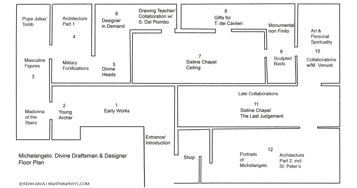
My Drawing of the show’s floor plan.

“It’s overwhelming…” was the comment I heard visitors say most often as they passed me. Most said it in the affirmative4. Yes, there is a lot to take in. The detail in the Drawings is staggering- on a number of levels. First, Michelangelo’s technical mastery of Drawing provides an endless amount to admire and study. Second, since many of the Drawings here are details of large compositions (like the Sistine Chapel’s ceiling and The Last Judgement), the show presents a rare chance to study how these details fit into his grand vision for both of those incomparable works, as well as to appreciate how much Artistry is packed into them. (A Note- Michelangelo’s immortal Vatican Pieta, and David are omitted here. In the show’s catalog, page 69, Carmen Bambach says no Drawings for the former survive. He, possibly, worked from a model, which may, or may not, have been found. I remain to be convinced by it. Michelangelo, famously, burned many of his Drawings right before he died, as Vasari theorized, so nothing remaining by him would appear to be less than perfect5.) Out of the 140 works by him on view, complete works (i.e. whole compositions) by Michelangelo are in the minority. Studies of details for huge compositions are what most of these Drawings are. They are, often, the Artist working out on paper exactly how to realize figures, body parts, faces, etc.. There are also Drawings for Architectural works, most of them details, as well. It’s hard not to come away thinking that his large Paintings for the Sistine Chapel were not conceived the way he conceived his Architectural plans. His work on Pope Julius’ Tomb, which occupied him for FORTY YEARS (Seriously!… Don’t get me started.), is something of a “bridge,” it seems to me, between these enormous Paintings and his Architectural works, since the Pope’s Tomb is equal parts Sculptured figures and Architecture. Especially in its early incarnations as a free standing monument, it combines these two of his three core Arts. Painting and Architecture are also, in a sense, combined in the Sistine Chapel, which includes Painted Architectural elements throughout the composition. But, before I get too far ahead, let’s start at the beginning…
The first gallery contains his earliest surviving work, alongside brilliant examples by his teacher, Ghirlandaio (first two works, center), and his fellow student under him, Granacci (large Painting from The Met’s collection, left).

Based on the evidence here, Michelangelo demonstrated his genius for design early on. In the first gallery, we’re treated to masterpieces of Drawing by Ghirlandaio, who Michelangelo was apprenticed to, and a brilliantly executed Painting by Francesco Granacci, Michelangelo’s fellow student under Ghirlandaio, from The Met’s collection.
Saint John the Baptist Bearing Witness, 1506-7, by the “Workshop of Francesco Granacci.” In 2010, Everett Fahy, no less than the former head of European Paintings at The Met, announced that in his opinion, this was really by Michelangelo, not Granacci. Carmen Bambach disagrees, saying that some of the figures may be based on a Michelangelo Drawing6. Looking at it, the work lacks the overall compositional unity seen in, say, Michelangelo’s version of St. Anthony, below. Strangely, at least 6 of the foreground figures are not even paying attention to St. John. The top half of the figure of the Saint’s body doesn’t seem attached to the lower part. Finally, it’s so different stylistically, with none of Michelangelo’s “dash and daring,” combining to make it too hard for me to believe that Michelangelo could have Painted this a mere two years before Painting the Sistine Chapel ceiling, which he began in 1508.

Granacci is an Artist who, nonetheless, deserves closer study, because of his involvement with Michelangelo as well as to fully study and recognize his style, particularly in the Sistine ceiling. About 6 years older, he introduced Michelangelo to Ghirlandaio, and later became the foreman of the assistant Painters for the Sistine Chapel’s ceiling. But, the star of this gallery is The Torment of Saint Anthony, 1487-88, which Met curators determined is Michelangelo’s long lost first painting, after restoring it, and presenting it as such in its own show in 2009, which I saw. Based on a print of the same name the brilliant Martin Schongauer created between 1470-75, shown to him by Granacci, so taken with it was Michelangelo that he decided to create his own version of it- in color! Legend has it he haunted fish stands to learn how to render their skin. Beyond Painting it, in color, which adds another element of realism to it entirely, he recast the composition. Whereas Schongauer’s imagines the scene from “The Golden Legend” by Jacobus de Voragine, 1260, of Saint Anthony beset by various savage beasts, as taking place in mid-air. Michelangelo, does him one-better. He fills out the composition, adding a landscape, with rocky cliffs in the foreground, and a river complete with sailing craft behind. It’s been said that even Ghirlandaio envied it. The Torment of Saint Anthony, 1487-88, is more than “just” astonishingly well-executed for a 13 or 14 year old. It reveals a young Artist of vision, someone able to conceive, and wonderfully execute, a complex, unified, composition. Michelangelo felt something was “lacking” in Schongauer’s original and set out to solve this “problem” for himself. My question is- The Met had the chance to buy it circa 2009. WHY didn’t they? Instead, led by their own brilliant head Conservator, Michael Gallagher, they  gorgeously restored it, and it now resides in the collection of the Art Museum in Fort Worth, Texas, where it remains the only Michelangelo Painting in the country.
A shot across the bow of Art History. Two versions of the The Torment of Saint Anthony. Martin Schongauer’s print, right, which inspired Michelangelo’s astonishing first Painting, left.

Looking at it, I realized his genius for design begins here (among the works that have survived to reach us), and I now see it as nothing less than a “Rosetta Stone” of sorts for much that came after. It’s hard not to remember that both of his most famous later Paintings- the Sistine Chapel’s ceiling and The Last Judgement take place, largely, in mid-air, though both have elements that “attach” them to the Earth. On the ceiling, he does this by including faux Architectural elements he Painted between and among the scenes, and in The Last Judgement, of course, by including Earth, Purgatory and Hell. In fact, there are quite a few interesting similarities between The Last Judgement (seen here, and further below), and The Torment of Saint Anthony, including the landscape, river and sailing craft, and of course, beings suspended in mid-air. As brilliant as the execution of the Painting is, it’s the mind at work in the background creating the overall composition, from Schongauer’s original, in light of its similarities with these later works that proves for me that this IS a Michelangelo.
Michelangelo, The Torment of Saint Anthony.

And so, even in Gallery 1, we see that underlying much of what he created is his mastery of Drawing and his genius for design and compositions. This will be made clearer in every following gallery. As a result, Carmen Bambach serves to rewrite our understanding of Michelangelo as not only a genius of Sculpture, Painting and Architecture, but one of the supreme masters of composition and design.

The first gallery is completed with our first taste of masterpieces of Michelangelo’s Drawings. Drapery studies have been a staple for Art students probably since the advent of Drawing. Having recently seen, and written about a masterpiece of Drapery Drawing by Leonardo da Vinci at MoMA, it’s utterly fascinating to compare it with those of his great rival, Michelangelo. Leonardo’s though “perfect” as it is, is focused solely on the thigh, knee and calf of the subject, leaving much of the rest undone/unfinished, particularly on the fabric that lies on the floor. In this Drawing, a study after Giotto, Michelangelo gives us an almost complete figure, and another in less detail, save for his face and hands. While it is fascinating to compare these two supreme masters of Drawing, some consider this to be Michelangelo’s earliest extant drawing, which might make it unfair to compare with the more mature Leonardo piece.
Michelangelo’s earliest surviving Drawing, Studies after Two Figures in the Ascension of Saint John the Evangelist by Giotto, c.1492. Michelangelo would have been 16 or 17. Notice the standing figure clutching at his robe- something that makes the folds so difficult to draw, you rarely see a student attempt it. Interesting, also, these are two male figures which are not “sculptural.” Rare in Michelangelo’s later figures.

Few people may realize that Michelangelo started out as a Painter. It was only in 1490, when he was all of 15, that he began Sculpting. From Saint Anthony, the Young Archer greets us alongside a few possible influences and examples of other works that bear some similarity to lost early Sculptures by Michelangelo.
Young Archer, c. 1490, when Michelangelo would have been about 15, seen at The Met in 2015. Recognized as an early Michelangelo by Kathleen Weil-Garnis Brandt in 1996, it’s been the only work by the Master regularly on view in NYC since 2009, though, most visitors to The Museum, apparently, don’t realize it given this typical “crowd” I’ve encountered around it every time I’ve seen it- until now.

As if to make up for it’s questionable placement for much of the past decade, The Met placed it smack dab in the middle of the path to the next gallery so you can’t miss it. It’s certainly worth a long look wherever it winds up being displayed in The Museum now that the show has ended, to see if you think it’s the real thing, or…?
After 527 years? The Young Archer’s moment has arrived.

In The Room With Michelangelo.

“In the room the women come and go
Talking of Michelangelo”
T.S. Eliot, “The Love Song of J. Alfred Prufrock”

’Tis no different almost exactly 100 years after T.S. Eliot wrote those immortal words in 1920. At The Met I heard them. More than once. It was hard not to. Visitors were often shoulder to shoulder its last two months.
Rush hour on the A Train? Gallery 3 on February 11th, the day before it ended. I was thrilled to see so many people at this show. Not only that, they looked and they looked hard. That’s particularly amazing given that many of the works were studies of details of large compositions.
Seen without the crowd, Bastiano da Sangallo’s famous, Copy after the Central Episode of the Bathers in Michelangelo’s Battle of Cascina, The only surviving record of Michelangelo’s lost Battle of Cascina, which he was commissioned to do on a wall opposite the also lost Battle of Anghiari, commissioned from Leonardo da Vinci, of which a Drawing by Rubens is it’s only record. Still, so many Artists have been influenced by this work. I always wonder if Gericault’s masterpiece The Raft of the Medusa, is one.

I admit it. I did lean in to hear the details, and FINALLY know what Thomas Stearns Eliot was referring to. Most of the time? There were commenting on Michelangelo’s “unusual” female bodies. Their second most popular topic was his “choice of ‘friends.’” Oh well. Imagine my disappointment. Neither of these topics were news to me.
Sketches of the Virgin, the Christ Child Reclining on a Cushion, and Other Sketches of Infants. Early on, as seen here, and in the immortal Vatican Pieta, Michelangelo’s women seemed much more feminine to my eyes. This beautiful Drawing, which echoes his early Madonna of the Stairs, may have been a model for the Painting Virgin and Child with the Infant Saint John, possibly by Piero d’Argents, that was displayed next to it.
One of his “friends.” One Michelangelo portrait in the aptly titled, staggering, “Divine Heads,” section of Gallery 5, Portrait of Andrea Quaratesi, c. 1532.

A section on his early designs for Pope Julius II’s tomb leads us to a gallery of early Architectural projects, and then to a gallery full of “Divine Heads,” which includes the one above.
Demonstration Drawing for the 1505 Design of the Tomb of Pope Julius II. It’s interesting to me that once again, we see a compositions of multiple levels- like The Last Judgement. In this one, as well, salvation is to be found at the top. This was just one  of the countless incarnations of the design for Pope Julius’ Tomb, as it evolved from free standing monument to the wall tomb it is today, which was FINALLY finished in 1545. The haggling lasted so many years that of course the Pope died (in 1513!) before it was finished…32 years  before it was finished! Michelangelo’s Moses, one of his enduring, greatest, masterpieces, is its central Sculpture, in quite a different design, in the church of San Pietro in Vincoli.

Moving back to figurative Drawings, in Galleries 5 & 6, one card described his style perfectly- “He drew like a Sculptor.” Meaning he drew with a heavy hand, the examples just above notwithstanding. Yes, his outlines are distinct, lyrical, and strong, and yes, his figures are often “Sculptural,” but even beyond all of this, his brilliant composition extends beyond the possibilities of Sculpture. Look at this, for example-
The Archers A work of sublime beauty equalled only by its mystery that starts with the fact that most of the the titular “archers” hold no bows.
The Risen Christ. A fascinating, “simpler,” composition with only one figure that nonetheless reaches to the infinite.
Its wall card. I selected this one as a typically, enlightening, example of the commentary throughout.

Michelangelo presented a design for the Pope’s tomb that included 40 Sculptures, a composition so incredibly ambitious it was impossible for any one man, even one with “divine” skills, to Sculpt during one lifetime. Though he considered himself a “Sculptor,” we can be thankful that he was compelled to Paint the Sistine Chapel ceiling (seen, fully, here). Painting, especially (and Drawing in lieu of a Painting), provided the best means of realizing many of his extraordinarily ambitious and involved compositions. Thankfully, he was able to finish this one- in four years. Sill clouded in drama, fiction and fantasy after 500 years of dirt was removed from it in the 1980s, the real story of the ceiling’s creation is every bit as dramatic as are the incomparable results, which many consider to be the greatest work of Art in the Western world.
“It’s not the real thing.” I heard one visitor comment in Gallery 7. ! No, but it’s 1/4 size of the original. You can take a 360 degree tour of this gallery, with The Met’s brilliant curator, Carmen Bambach, here. By the way, Michelangelo’s scaffolding ingeniously hovered over the floor and was moved as the work progressed. So brilliantly conceived, the 1980 restoration team reconstructed it, in lightweight metals, as STILL the best option to work on the ceiling.

In the heart of the show, Gallery 7 featured a range of studies for the Sistine Chapel ceiling that provide fascinating insights to the individual characters and the overall composition. Full of details who’s meanings have faded over the centuries (like what’s up with all the acorns?), one of the most fascinating and thought-provoking voices about it belongs to Art critic, writer and filmmaker, Waldemar Januszczak, who was one of those to receive permission to observe the restoration up close on the reconstruction of Michelangelo’s ingenious scaffolding in the 1980s. He used the opportunity to launch into a full fledged investigation of the ceiling’s history, and its “meaning.” His resulting book, Sayonara, Michelangelo: The Sistine Chapel Restored And Repackaged, 1990, and documentary, The Michelangelo Code: Lost Secrets of the Sistine Chapel, looks at the history of the Chapel and the “meaning” of both the ceiling and The Last Judgement. More on that in a bit.
Fact versus fiction. Michelangelo’s self-portrait Painting the Sistine Chapel ceiling.

Regarding the infamous “he Painted it lying on his back” story, Mr. Januszczak says, “Its origins can be traced back to a mistranslation of Michelangelo’s first biography, 31 lines written in Latin by Paolo Giovio, Bishop of Nocera, sometime between 1523 and 1527, (which can be read here). Giovio describes Michelangelo’s posture while painting the Sistine ceiling as resupinus. This was assumed to mean ‘on his back’ by various Michelangelo commentators who spent 5 centuries enthusiastically emphasizing his agony at the expense of his ecstasy. A more accurate translation of resupinus would be ‘bent backward7.’” In the show, we see Michelangelo’s own Drawing of the way he worked, above, alongside a sonnet he wrote to a friend about it.

The Met’s caption for the Drawing, above.

Apparently, The Agony & The Ecstasy author Irving Stone, and the film’s director, Carol Reed, haven’t seen this. At The Met, old wives’ tales died hard in the dim light of the darkened galleries.
No. Michelangelo did not paint it lying  on his back. Given how crowded it was, and how many visitors were looking up, it’s a bit amazing he didn’t get stepped on, though the young lady on the left almost got him.
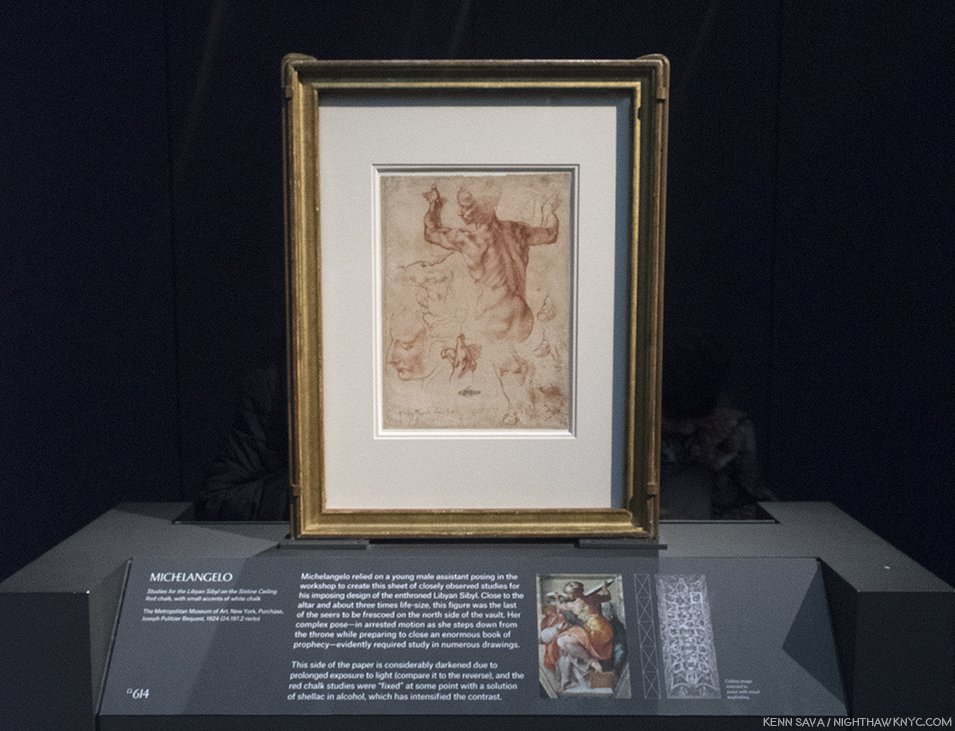
Studies for the Libyan Sibyl in the Sistine ceiling. One of the most amazing things for me in the ceiling, beyond the astounding overall composition, are the postures of the figures- almost all of them. Perhaps none is more extreme than the immortal Libyan Sibyl. In the finished work, this priestess is seen at once stepping down from her throne while apparently preparing to move or close the gigantic book she holds in both hands. So complex are these movements that Michelangelo made studies of this figure in sections so he could closely analyze them, like this well-known example, in which the left hand is slightly higher than the right- the opposite of how they are in the Painting. The Artist possibly realized this would have made the whole pose look extremely unbalanced, not to mention rob the figure of much of its timeless grace.
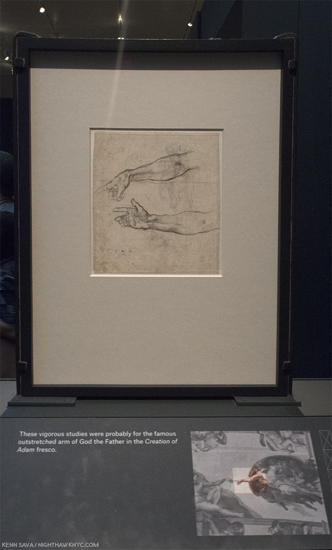
Jaw dropping. One of the most important Drawings in existence. Every time I went, I had to stop and ponder this. I never knew it existed. Two Studies for an Outstretched Right Arm, Very possibly for God the Father in the Creation of Adam section of the Sistine Chapel. According to Waldemar Januszczak, the celing’s fingers have been REPAINTED by restorers at least twice, including during the most recent restoration in the 1980s8! So? THIS is as close as we may ever get to what Michelangelo intended they look like, from his own hand. Just astounding.

In Gallery 9, viewers were treated to the rarest of the rare- TWO sculptures by Michelangelo (with, or without, assistants), both unfinished. Both remarkable. When was the last time was that THREE sculptures (counting the Young Archer) by Michelangelo were shown in the U.S.A., at the same time? I don’t think it’s ever happened. If you know differently, please drop me a line.
Bust of Brutus, (with “some assistance” from Tiberio Calcagni), My recreation of an iPhone Photo the great Photographer, Stephen Shore, the subject of a terrific retrospective up right now at MoMA, took of it during his visit and posted on his Instagram page.
Last look. The crowd was still heavy around Michelangelo’s stunning, Bust of Brutus, in the final hour of the run of the show on February 12th.
Apollo-David, (Unfinished). Both it, and the Brutus, were on loan from the Museo Nazionale del Bargello, Florence, Italy. I can’t imagine how much the insurance was to ship these…round trip.

The Met’s glorious show goes a long way further to set the record straight about Michelangelo and his accomplishments, in my view. Michelangelo, the somehow “not human” myth, is dead. Long live Michelangelo, the all too human genius of Art & Design. It seems to me that the myth does him a disservice. If he wasn’t human, it would have been easier for him to accomplish Artistic perfection. But, he was very human, as his Poems and letters reveal, as does how hard he worked for a very long time (he died at 88, about 3 weeks short of his 89th Birthday- unheard of in the fifteenth & sixteenth century, when 35 was closer to the norm) to achieve the brilliant results he brought the world. Yes, human. He was continually worried about his finances (as we see in this show, where he uses every square inch of paper, on both sides, to economize), he continually worried about his family and their status, he worried about being paid, often by whichever Pope he was working for (He lived through the reigns of 12 popes and, extraordinarly, worked for 7 of them9.), and his temperament ran hot and cold. If you were out, he could be very hard on you. It seems to me he lived a largely loveless, isolated life. His loves, such as we see in his Drawings and Poems and in his relationships, remained largely unrequited.
Michelangelo, Fragment with a Study for the Virgin for a Crucifixion, left, and Fragment, with a Study for Saint John the Baptist for a Crucifixion, right.

Michelangelo: Divine Draftsman & Designer, serves to revise our perception of Il Divino. To this point, he, and Leonardo, are perceived as geniuses who finished little of what they started. While there are many projects that Michelangelo didn’t complete (as well as others he did finish that are now lost), the bigger picture is that he completed a remarkable number of compositions & designs- some of which were either intended for, or realized by, other Artists, or were completed after his death. During his lifetime, Michelangelo was the only Artist thought to have excelled the revered masters of ancient Greece and Rome (per Vasari), who inspired the Renaissance- perhaps the highest esteem a Renaissance Artist could achieve.
Marcello Venusti, The Crucifixion with the Virgin and Saint John the Evangelist, based on Drawings by Michelangelo, above, shown as one example among many of Michelangelo’s designs adapted by other Artists in this show. I selected Venusti’s because, well, it’s just gorgeous.

In one of the great mysteries in Art History, TWENTY FOUR YEARS after completing the ceiling, Michelangelo returned to the Sistine Chapel to Paint this. Well, almost this, The Last Judgement.
Marcello Vanusti’s copy of The Last Judgement, is a very valuable record of what the work looked like in the mid-sixteenth century, before the addition of the controversial loincloths. However, Venusti took a number of liberties elsewhere, himself, so this is not a verbatim record of what he saw, though important nontheless. Due to its popularity, this was, perhaps, the hardest work to get full frame in the entire show.

WHY? Never before had an Artist returned to the scene of one work to complete another after such a long period. Whereas the ceiling gives us Genesis, the beginning of the universe, and life, on the wall over the altar, Michelangelo now gives us the end of the world, in all of it’s shocking glory. A bit too shocking for the time as it turned out. The beginning, and the end, in one space. In the interest of keeping this piece shorter than it might be, I’m only going to briefly mention something I feel is important, though not addressed in this show- The possible “meaning” of the Sistine Chapel ceiling and The Last Judgement. There seem to be two main theories. First, Waldemar Januszczak believes the Chapel building, itself, is modeled on the plan of the universe laid out by the ancient Christian Cartographer, Cosmas, in his Christian Typography, 547 AD. In it, the universe is rectangular, with a dome, like the Sistine Chapel, and its proportions are the same as the Temple of Solomon’s, which also match the Sistine Chapel’s. The universe is bordered by curtains with heaven and a second earth lying beyond. This is where the Genesis story takes place. So, when we look at the ceiling, we see into the past, through the painted Architectural elements all over the ceiling, in a world that is flat with the Sun revolving around it.
Waldemar Januszczak mentions the long forgotten sixth century Christian Cartographer, Cosmas, as the creator of this model for the universe, which looks shockingly similar to the structure of the Sistine Chapel. Notice, the Sun revolves around the Earth, with God & Christ above. Interestingly, it shows a blue background sky, with stars, which is how the Sistine’s ceiling looked before the collapse led to Michelanglo repainting it.

The second theory is based on the coincidence that Nicolaus Copernicus happened to be in Rome espousing his theory the the Earth revolved around the Sun at the exact moment Michelangelo was painting the ceiling. It believes he, and the Pope, were privy to it, though it had not as yet been published, and they included it in the ceiling and The Last Judgement. In the latter work, Jesus’ left thigh is at the exact center of the composition. Dr. Valerie Shrimplin says, “The most probable source for this choice of a central point on Christ’s thigh, as the pivotal centre of the entire cosmological fresco, seems to be the Book of Revelation 19:16. In a description of the Christ of the Judgment, it reads: ‘And he hath on his vesture and on his thigh a name written, KING OF KINGS AND LORD OF LORDS.’ This text is immediately followed by a reference to the Sun-symbol: ‘And I saw an angel standing in the sun…’ (v. 17). In the Sistine Last Judgment, Christ is thus depicted (theologically, neoplatonically and scientifically) as Michelangelo viewed Him: as King of Kings and Lords of Lords, the Sun, the centre of the Universe.”

Given the lack of anything definitive in Michelangelo’s surviving documents (his Drawings or letters), to support either of these theories, I find Mr. Januszczak’s the more compelling case. Pope Julius was a theological scholar who became a Doctor of Theology before becoming Pope. It makes sense to me that he would have known about Cosmas, and given that his uncle built the Sistine Chapel in the exact same dimensions Cosmas espoused (the building is not mentioned in the other theory), means that TWO Popes were involved in the Sistine Chapel. Nicolaus Copernicus was 2 years old when the Sistine Chapel’s construction, in Cosmas’ proportions, began, which would seem to make it a moot point. These factors tips the balance to Mr. Januszczak’s theory, in my mind.

By the way, Pope Julius II and his uncle, Pope Sixtus IV, were members of the della Rovere family who’s coat of arms include acorns and oak trees, both of which are seen all over the ceiling, and indeed, all over Italy, by way of “marking their turf,” as it has been called.

From all I’ve read, one thing seems certain. Michelangelo was a deeply religious man. An Artist who included himself in his final Pieta, called The Deposition, as well as including his Self-Portrait on his flayed skin that St. Bartholomew holds in The Last Judgement. Some see a self portrait included in the depiction of the Archangel Michael (or “Michelangelo”) on the ceiling. I don’t think he would have done any of these things if he was not deeply religious. It also makes me think that he went back to the Sistine Chapel to Paint The Last Judgement years after Pope Julius’ death because, then in his 60’s, he may have been thinking of his own mortality. Regardless, 506 years after he completed the ceiling, and going on 500 years after he completed The Last Judgement, the discussion remains ongoing about trying to understand these two incomparable masterpieces.

The controversy doesn’t end there. Regarding those “ladies talking of Michelangelo”… Waldemar Januszczak says, “Michelangelo was thus never a fully accepted and fully committed homosexual of the modern kind. He belongs, rather, besides Donatello, Leonardo, Botticelli and the painter nicknamed Sodoma among those homogamous Renaissance artists about whom we have conflicting evidentce of a conflicting sexuality. That he was a homosexual in some form seems certain. that he was not homosexual, in the way we understand the word today, appears equally unarguable10.” And, on the question of his depictions of the female body, he continues, “Given Michelangelo’s obsession with human anatomy, it seems improbable that he never actually saw a naked woman in his life. But he cannot have seen very many. And he does not appear to have looked too closely11.”

Nothing Less than Michelangelo’s model for the vault of the Chapel of the King of France, 1556-57, created under his direction by Fabbrica di San Pietro, Vaticano, Vatican City. The calotte of the dome of the south apse at a scale of 1:30. He would not live to see his designs for St. Peter’s, of which he was chief architect for 17 years,  completed, and those that were were, including its dome, were altered12.

Drawing, Draftsmanship & Design underlie all of his works. As such, they are the key to understanding his genius as a visual Artist. His brilliant Poetry lies on yet another plane of it, a tributary springing from the same font. Regarding his work as an Architect, Camen Bambach summed it up saying, “The physical beauty of the human body, which so deeply inspired Michelangelo’s Drawings, Sculptures and Paintings, also provided some meaningful analogies for his work as an Architect. His sheets with preparatory Drawings often combine ideas for figures and buildings…The human body offered an organizing principle in creating a unity of forms, whether the component parts were symmetrical or in freestyle13.”

Frederico Zuccaro, Portrait of Michelangelo as Moses, showing “Il Divino” in a similar posture to that of his brilliant Sculpture for Pope Julius’ tomb. Michelangelo was not a tall man, and I imagine his arms must have looked not all that different to these after a life of carving stone. The tools of his trade lie on the pedestal beneath his feet. Carmen Bambach says of it, “Much as the prophet (Moses) led the Children of Israel out of Egypt, do did Michelangelo save the Artis, by indicating the true path through a command of disegno and visual judgment..” (Catalog, P.257)

While I continue to love and admire his Sculpture, Painting, Drawing, Poetry, and what I can understand of his Architecture (most of which was unbuilt), I now see him as a genius of design and composition, first and foremost, due to this show. That his Art continues to speak to so many of us 542 years after his birth is the supreme testament to his skill. It makes me wonder why he felt he needed to “pump himself up” to mythic proportions when his work, itself, has done so for him. His real story, as far as is known, makes him much more “human,” than “divine,” and I, for one, find that more compelling. It gives me hope that there may be another “supremely talented” Artist, or perhaps there already has been and he or she remains unknown to us. For the here and now, nearly three-quarters of one million people saw something they’ll never forget. One of the ultimate displays ever mounted of what human Creativity is capable of, and has achieved.

I am thankful I lived to see it.
“Now, speak!,” Michelangelo said after finishing the monumental “Moses” for Pope Julius’ Tomb, according to legend. I muttered it silently when I stood in front of his friend and collaborator Daniele de Volterra”s lifelike bust of him, partially created from Michelangelo’s death mask, at the very end of the final Gallery #12.

“‘Immortality’
Here my fate wills that I should sleep
too early,
but I’m not really dead; though I’ve
changed homes,
I live on in you, who see and mourn
me now,
since one lover is transformed into
the other.
Here I am, believed dead; but I lived for
the comfort
of the world, with the souls of
thousand true lovers.
Although I have been deprived of my
own soul,
I still live on in the souls of all those
who loved and remember me.”*


* * * * * * * * * * * * *

(Happy 543rd Birthday, Michelangelo di Lodovico Buonarroti, born March 6, 1475 in Caprese near Arezzo, Tuscany, since renamed Caprese Michelangelo.)

Michelangelo: Divine Draftsman & Designer is a NoteWorthy show in my life, and for February, 2018.

*-Soundtrack for this Post is “Suite on Verses of Michelangelo Buonarroti,” Op. 145a, by Dmitri Shostakovich in 1974, the year before he died, which includes Michelangelo’s words quoted above in its final section, titled “Immortality.” Shostakovich, one of the great symphonists of the 20th Century, considered it to be his Sixteenth (and obviously, final,) Symphony, as he told his son.

Appendix- Recommended Resources-

-The Exhibition Catalog for Michelangelo: Divine Draftsman & Designer, by Carmen Bambach, is one of the best books on Michelangelo I’ve come across this past year, at least. It’s certainly the first stop for anyone who saw this show and wants to know more about it, and I highly recommend it to those who missed it as all the works displayed are wonderfully reproduced, along with a good many that were not here. Unlike many exhibition catalogs I see that are slapped together quickly, this one was NINE YEARS in the researching and writing (Catalog P.8). It shows on every page. Full of insights, stories and details, I haven’t seen anywhere else, it truly is the next best thing to having been there, and the best record of what it was. Though its focus is on the show and works included in it, Ms. Bambach never forgets to tie the works into the bigger picture, providing a remarkably thorough running biographical picture in the process, plainly sorting facts from fiction as she sees them in a wonderfully no-nonsense way, along with including priceless technical details and insights only a world class curator, who’s spent her life immersed in this work would have. Essential reading for Art History students, Michelangelo collectors (soft smile), and anyone with a passion for Art History, or Michelangelo.

-The best overall current Michelangelo book is Frank Zollner’s Michelangelo, The Complete Paintings, Sculptrues and Architecture, published by Taschen. I’m saying that while also saying there are better books for the Paintings. Better books for the Sculptures, but most are out of print and would require quite a bit of digging. But, if you want one book on Michelangelo, with as many good Photos of the full range of his accomplishment (yes, that means after restoration where they have been done, and I have no problem with any of them I’ve seen thus far), I’d recommend you look at it. Prior to the Taschen book, which originally came in the HUGE, 23 pound, XL size (which I, personally LOVE), look for “Michelangelo: The Compete Sculpture, Painting, Architecture,” by William E. Wallace, who teaches and lectures on the Artist, and has also written a good biography of him.

-The best books on the restored Sistine Chapel is the 2 Volume set, The Sistine Chapel, 1991, featuring the Photographs of Takashi Okamura, very probably the best ever taken of the ceiling and “The Last Judgment,” because he, and NHK TV had exclusive rights to Photograph it in return for NHK Japanese TV putting up 3 million dollars for their restorations. But? Being issued in limited editions, weighing 27 pounds, they’re very expensive now. The good news is there are other books with many of the same Photos, though smaller, and text by the restorers which are currently very cheap, including- “The Sistine Chapel: A Glorious Restoration,” “Michelangelo: The Last Judgement,” and Michelangelo: The Vatican Frescoes” which have all been on my shelf for years.

-As for his Sculpture- There are two ways to go- General overviews, or books that focus on one work. Which way you go depends on how closely you want to look at one particular work. A good number of the specialized books are out of print, but can be found at a decent price used, and of course, depending on age, feature black & white Photos, the older you get. I have the Hartt Frederick book published by Abrams, but it’s out of print, now and pricey. For current overviews, take a look at the Zollner and Wallace books cited earlier and see what you think of them.

-Writings- Michelangelo’s Poems are beautiful. They reveal the depth of his feelings in a way that is surprising at first, while they give a bit of insight to how his mind worked. For the true devotee of Michelangelo, they are essential. The problem is that there has yet to be a “definitive” translation of them into English. You can drive yourself crazy reading different translations of the same Poem. Find one that speaks to you, and don’t read any others…unless you’re THAT obsessed. I have the James M. Saslow paperback, which includes annotations, and more than 300 of his sonnets, madrigals and other poems.

-As for the biographies, Condivi’s or Vasari’s Biographies of Michelangelo both have the issues I outlined earlier. Condivi’s is a bit harder to find currently. Another way to go is to start by reading his letters. There’s a lot of them, and the 2 volume set edited by E.H. Ramsden (the one I have), gives a the largest number of them. They’re presented chronologically, and give you the feeling of his day to day life, which no biography does, and, in my opinion, you also get a sense of some of his values, and what’s important to him. Then, you can read the biographies and sort out for yourself what’s true and what’s “marketing.” Penguin has a paperback of selected poems and letters, which I have not looked at, so I can’t share any thoughts about it. Please, do not read Irving Stone’s books on Michelangelo (or Vincent Van Gogh) as “biography.” You’ll get much closer to the real Michelangelo’s biography reading Carmen Bambach’s catalog for this show, and it’s not, primarily, a “biography.”

-Finally, as I mention in the piece, I find Waldemar Januszczak’s book, Sayonara, Michelangelo: The Sistine Chapel Restored And Repackaged, 1990, and documentary on the Sistine Chapel, “The Michelangelo Code: Lost Secrets of the Sistine Chapel,” to be the most enlightening, and extremely well researched exploration of the ceiling’s history I have found. It also includes a fascinating presentation of a possible “meaning” Mr. Januszczak researched and developed over more than a decade. He may be right about it. Agree with him, or not, it’s well worth seeing for the tour it gives, which includes access to many off-limits areas, as well as for the history lesson. The 2-part film is out of print on DVD, but appears on Public Television’s “Secrets of the Dead” series every once in a while.
The former entrance as seen on February 23rd, thirteen days after it closed. “Sayonara, Michelangelo.”

NighthawkNYC.com has been entirely self-funded & ad-free for over 7 years, during which over 275 full length pieces have been published!
If you’ve found it worthwhile, PLEASE donate to allow me to continue below.
Thank you, Kenn.

Also- I’m pleased to announce I’m curating a selection of Art, ArtBooks & PhotoBooks for sale! All items are from my collection or selected by me in my travels through the Art world. The complete selection of over 370 items is here.

Written & photographed by Kenn Sava for nighthawknyc.com unless otherwise credited.
To send comments, thoughts, feedback or propositions click here.
Click the white box on the upper right for the archives or to search them.
Subscribe to be notified of new Posts below. Your information will be used for no other purpose.
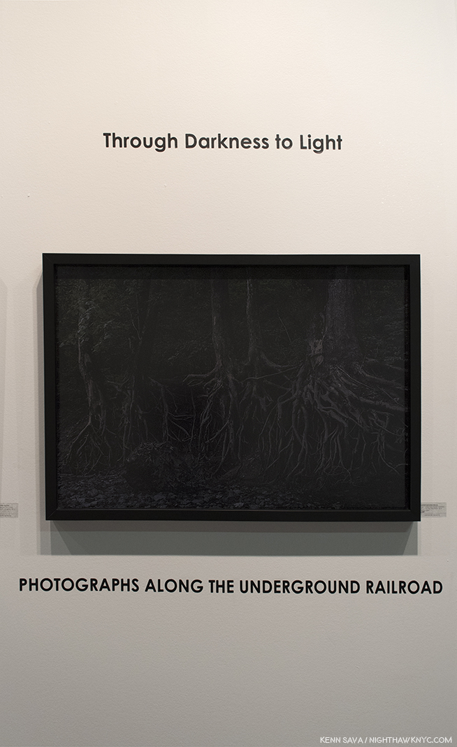
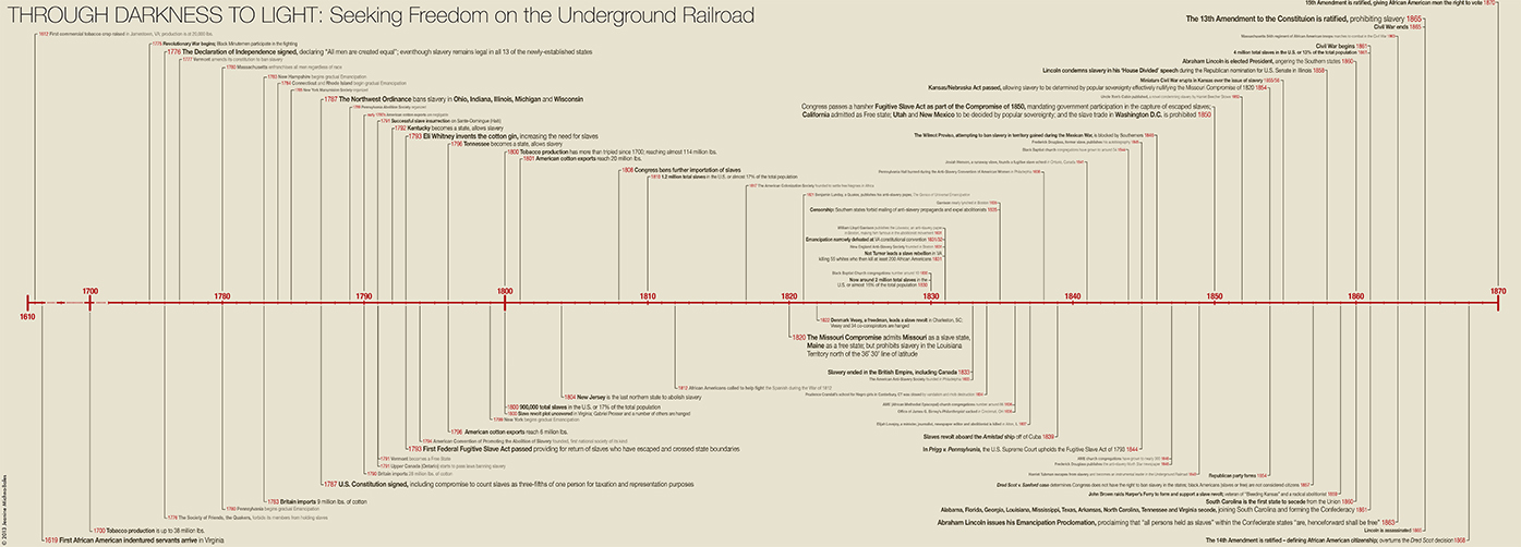
  1. Paolo Giovio’s, brief Michaelis Angeli Vita, circa 1527, which was all of 32 lines, which can be read here, Giorgio Vasari’s “The Lives of the Artists,” 1550, which was revised in 1568, and Ascanio Condivi’s A Life of Michelangelo, 1553.
  2. as Waldemar Januszczak points out in Sayonara, Michelangelo: The Sistine Chapel Restored And Repackaged, 1990, P.22
  3. Varari also designed Michelangelo’s tomb in the Basilica di Santa Croce in Florence, Italy.
  4. One complained, “It’s overwhelming. So many small works, with so much detail…I get it. Let’s go see something big and colorful.” Yikes. The David Hockney Retrospective is right next door.
  5.  The Vatican Pieta, was shipped to NYC for the 1964 World’s Fair, where my parents saw it. Their only experience with Art, as far as I know.
  6. Exhibition Catalog P.37. Henceforth referred to as “Catalog.”
  7. Sayonara, Michelangelo, P.56
  8. Sayonara, Michelangelo P.39
  9. Sayonara P.53
  10. Sayonara, Michelangelo, P.135
  11. Sayonara, Michelangelo, P.139
  12. Catalog, P.237
  13. Catalog, P.237-8

Catherine Murphy’s Dreams

After months of Photography shows…Hark! I see a flag and a light that portends some State of the Art American Painting & Drawing in 2018 within.

Fellow lovers of Painting, fear not. I’ve surfaced from my year long deep-dive into the world of Contemporary Photography, finding equilibrium just as the New Year is continuing the holiday spirit, bearing Art gifts of it’s own. First, there were the unexpected wonders of “Edvard Munch: Between The Clock and the Bed,” at The Met Breuer, the fascinating “Figuratively Speaking” at Michael Rosenfeld Gallery, and now with “Catherine Murphy,” the long awaited show of recent Paintings & Drawings by the singular and influential Artist and Educator1 at Peter Freeman, Inc., I can positively feel the wind of great Painting blowing through my hair once again. Well, at least my eyebrows. “Long awaited” as Ms. Murphy’s last show, “Catherine Murphy: Working Drawings” at Sargent’s Daughters, was in 2016, but the last show of her Paintings and finished Drawings, also at Peter Freeman, Inc., was back in 2013.

Over a career that now extends more than 50 years, though her style, focus, and her choice of subjects have evolved, there is one constant- an extraordinarily high level of accomplishment. It’s hard to think of another Artist who’s Paintings AND Drawings are among the finest created in each medium over that time. Both bodies of work are marvels. And, at least her more recent pieces are inspired by her dreams. Her new show, which focuses on this more recent work, is a visual tour de force- in more ways than one. No less than Artist Rod Penner told me in the Q&A I did with him last year that, in his opinion, Catherine Murphy “is in a class of her own,” among Artists he feels have been overlooked and/or are “important” today.

Installation view of part of the first gallery. All Photos by Kenn Sava, courtesy of the Artist and Peter Freeman, Inc. Click any Photo for full size.

As I moved through the galleries I was struck by something I hadn’t noticed as a focus of her work before. Unlike, say, her early landscapes, many of the pieces on view shared the common theme of seeing & perception. Take for example the first Painting in the show, “Cherry Pie,” from 2104. It’s obviously a pie, yet even a quick look reveals it’s a Painted pie, not a “photorealistic” pie.

“Cherry Pie,” 2014, Oil on canvas, 38 x 45 1/4 inches

No matter how close, or far, you stand from it, the work remains just out of focus, as if seen at a glance or in a slightly blurry photograph, but the level of artistry brought to bear in the entire work is staggering. The crust is open, missing one section. Strange. You’d expect a slice to be missing. Looking closer I was enraptured by what I saw.

The cherries, for instance, seem to have taken Cezanne’s immortal still lives to a different level. (Not “better,” I don’t believe in those kinds of comparisons. Different.) Look at how finely the highlights and the shading are done on each one. Then look at the broken edge of the pie crust to the left- each flake is carefully and sharply delineated in a way that is positively surreal. When have you seen real pie crust look like this? Their sharpness is in contrast to the overall blurriness, as if they are the point of focus for the absent camera. Then, there’s the pie tin. It’s countless folds appear to be almost individually colored as the light plays off them so magnificently, echoed in the wonderfully realized cast shadows underneath. If we take the pie tin for a “ground,” the work strikes me as a Painting that strives to go beyond two dimensions. It wants to, at once, lie above the surface, on it, and under it- all while drawing us inside of it. These questions of seeing (What do you see? What do you expect to see?) and looking into, though a painting is a flat, thin surface, recur repeatedly in this show.

“Shift,” 2016, Oil on canvas in two parts, each 37 7/8 x 45 1/8 inches.

Directly across the room from it is another pie-related work, in two parts. This time, what is apparently the top of the crust is an entirely separate work, displayed next to the empty pie crust. If these were hung separately, Would we think they are a pie crust and it’s top? They could be one of Edward Burtynsky’s aerial landscape Photographs of some distant land and an aerial shot of a crater in an icy land. Still, even in this context, shown together, it seems strange. It’s hard to not see the apparent top being on a pie. I kept thinking about what’s under it. Nothing but the surface it’s laid on. As for the pie crust, itself, we’re left to imagine what’s going to go inside, while we ponder the top now being a surface instead of a top and the empty space of the pie drawing us into a space, which is in reality, flat.

“Flat Screen,” 2016, Oil on canvas, 35 1/2 x 19 1/4 inches.

Adjacent to the previous two works is “Flat Screen,” a work that depicts a lovely, Painted, sunny, outdoor scene on the titular flat screen monitor. Perhaps, it’s a screen saver given the partial text on the lower right. The window behind it is blank being mostly covered by what appears to be a window shade. The light that does come through around the shade mimics the black border around the monitor’s screen. I wonder…wouldn’t we expect see the reverse- a blank, or grey, computer screen, and the sunny outdoor scene outside of the window?  It might be technology taking the place of experiencing nature via a live feed from outdoors, except that we see it’s a Painting. Is it the scene outside the window? We’ll never know. Continuing the spacial relationships, it also reminds us a monitor is flat and presents us with the illusion of 3 dimensions, like a Painting does.

“Float,” 2015, left, “Becalmed,” 2017,  right, both Oil on canvas, 72 x 54 inches and 54 x 72 inches ,

In the main gallery, are two works that might seem descendants of late Monet- both depict scenes taking place on bodies of water with trees nearby. In both, we are left to ponder, and admire, the surface, what’s on top of it, and what’s being reflected on it- all handled masterfully.

“Float,” 2015, Oil on canvas, 54 x 72 inches.

The one above, “Float,” 2015, is over the top, literally and figuratively. It continues the line of her early landscapes, which were painted outdoors. In 2013, she said, “Any Painting that you see is outdoors is a really slow Painting. Because I have to wait for the sun. I have to wait for the weather…2” “I got very interested in things that look spatial, but are not spatial,” she said in 2014. As you look at “Float,” it’s a bit like looking down the rabbit hole. I almost wondered if I was underneath the water looking up at the surface and the foliage above it, but the yellow leaves would seem to indicate we’re looking down on it. The floats and the leaves floating on the water provide a fulcrum between the two worlds- outer and inner. Again, she has created a scene of extraordinary depth on a simple, flat canvas, a bit like the feeling I got from “Cherry Pie.”

Don’t fall in. It’s only an inch or so “deep” and there’s a concrete wall behind it.

Then, “…I started dreaming Paintings, and thinking about Paintings differently. It was the beginning of a whole thing, giving myself permission to do it in a new way. that is really what stops everyone in the world: because of an idea of who you are you’re afraid to break your rules3.” So, more recently, she’s moved to scenes that are “smaller” closer, or more intimate, like those seen in most of this show. She says that after being inspired by her dreams, she then sets up the scene in her studio.

Half the show is devoted to Catherine Murphy’s amazing Drawings, all of which are these indoor scenes. And, I mean amazing. Like this one-


“Studio Floor,” 2015, Graphite on paper, 28 3/4 x 31 3/16 inches.

Again, the mastery of rendering surfaces is just stunning- the shading of each wire mezmerizes. Then, there’s the beautiful wooden floor- all Drawn in graphite. Once again, the feeling of depth is present. We can’t tell how high the pile of wire is from that floor. Is it one insanely long cable, or more? If it’s more, despite the yards of spare cable lying around, those two ends are never going to reach each other. It’s a very daring piece. If you want to test your technique, and your eye? Take a shot at Drawing something like this.

Catherine Murphy, long seen as a champion of figurative/representational Art, surprisingly said she’s “a compulsive Abstract Expressionist.” While I think she may have been referring to the technique of applying paint, I filed that in the back of my mind, though yes, there are passages here and there in this show that do qualify. Perhaps, none more so than “Studio Wall,” 2014, Graphite on paper. Without it’s title or the name of the Artist, one might think it’s by Cy Twombly. The more I looked at it the more I couldn’t believe it’s ONLY graphite on paper.

“Studio Wall,” 2014, Graphite, yes, Graphite on paper, 32 3/8 x 34 3/8 inches.

Standing in front of it for the longest time, it looked for all the world to have been Painted. So, I asked Catherine Murphy through the gallery how the background was done. She said, “I just keep adding graphite until the tone is correct.  There is not much actual “white” (although the wall I was drawing from was painted white).  What “white” there is, is the paper.” The fact that there is so little white of the paper left is what amazes me. The shading is so brilliantly done that no matter how close you get to it, the background looks like Paint.

Since she said that her dreams inspire many of her works these days, I asked her if she dreams in color, or black & white, as the resulting works are in both. She replied, “In the dreams the color suggests itself, but I could be dreaming color for all I know. Some things have to be in color and some things have to be in black and white.  But one way or another they are both about color.” Her Drawings are unique, whole works unto themselves that have nothing to do with her Paintings. They stand alongside her Paintings as “different but equal,” so to speak. Well? Except for this one-

“Painting Drawing Painting,” 2017, Oil on canvas, 51 x 72 inches.

In “Painting Drawing Painting,” 2017, she seems to be playing with that, though, blurring the boundaries between the two medium. Again, making us question what we’re seeing- What’s “Drawn?” What’s Painted?” Being oil on canvas, it’s all Painted, but much of it “looks” Drawn. It’s also fascinating that she’s left part of it, apparently, unfinished, while another part, along the right white border, appears to have been erased or removed, something she doesn’t do in her “real” Paintings.  My takeaway was that in this work, she’s giving Drawing the same “status” as Painting, which is traditionally the more valued medium, which also serves to reinforce their importance in her oeuvre as equals.

“Stacked,” 2017, Oil on canvas, 60 x 60 inches.

“Stacked,” 2017, one of the three newest Painting on view (“Painting Drawing Painting” being another, “Becalmed,” seen further on, the third), creates the optical illusion that the stacks of books are suspended in mid-air. When I saw this, I wondered if Catherine Murphy had seen my apartment in her dreams. Then, alas, mine haven’t levitated. Yet.

“Floribunda,” 2015, Oil on canvas, 66 1/16 x 41 1/8 inches.

“I’m avoiding the comfort of realism. The pillow you know. The bottle you know. The landscape you know…I want to confront,” she said in 2013. The masterful, knock-out, “Floribunda,” 2015, is a classic example of that. It also speaks to what we see. What, exactly, are the broken dishes lying on, or seen against? The two patterns of whatever it is and the dishes are so similar it takes effort to see where one ends and the other begins as the eye moves across the canvas. It’s almost M.C. Escher-esque. Yes, they, positively confront each other. A detail that caught me in this, among so many others, is the “marrow” of the broken yellowish cup in the lower left corner.

Catherine Murphy has always followed her own star, regardless of what the rest of the Art world was doing or favoring. Marketing ploys, like “photorealism,” have proved to be an albatross around the necks, and careers, of any number of Artists, which has only served to delay (hopefully not permanently) the proper assessment of their work and accomplishment. Modern & Contemporary Realistic, Representational and Figurative Art has been slowly coming back, mostly in the galleries, and in museums elsewhere, but not the NYC museums, beyond, Kerry James Marshall in late 2016, early 2017.

Looking at their websites, Catherine Murphy is in, at least, 3 of NYC’s “Big Five” Museums (as I called them recently). The Met’s site shows 2 Paintings (acquired in 1986 and 1991), The Whitney’s shows 1 Painting (acquired in 1973), and 2 Drawings (acquired in 1993), and MoMA’s shows 2 Drawings, (acquired in 1987 and 2004). It’s a start, but one that hasn’t been followed up on in 14 years, plus. Of those three, only MoMA lists Catherine Murphy’s work as having appeared in an exhibition, both times in group shows, once when she was selected by Artist Vic Muniz, the show’s curator.

“Studio Floor,” 2015, left, “Chairback,” 2016, Graphite on paper, center, “Studio Wall,” 2014, right.

Yes, many have put her in the category of “Realism,” “Representational” and “Figurative” Art, I know, but Catherine Murphy’s work seems to me to stand aside of all of those categories because there are bits and pieces of any number of influences, periods, and styles going on in her work. Interestingly, she said in 2013 that there isn’t a style of Art she doesn’t like, because there is always someone doing something good in it. Elsewhere she has shown a familiarity with contemporary Photographers Jeff Wall and Gregory Crewdson (both of whom meticulously set up their shots, as Catherine Murphy sets up the scenes she Paints). I have a feeling along with not being afraid “to break your own rules,” as she said, it’s that range that helps her stand apart.

While shows like the Whitney Biennial and the New Museum “Triennial” are major events in the Art world that draw big crowds and gain instant recognition for a number of their younger participants, it seems to me that the time has come for such a show that features established Artists that have, as yet, not received their due in a major Museum show. The point is not to “shame” the Museums, but to give these Artists some of the exposure, attention and recognition, I for one, feel is long overdue.

Casting around for recommendations to be included in such a show (not to mention a Retrospective of her own), you need to look no further than Catherine Murphy.

*-Soundtrack for this Post is “Time Passes Slowly,” by Bob Dylan from “New Morning.” Catherine Murphy has said that her Paintings are about the passing of time. In lieu of the album version I would like to include, Mr Dylan may be seen and heard performing an early version of it, with George Harrison, here.

My thanks to Catherine Murphy, and Alexander Whitehead of Peter Freeman, Inc.

The Archive of previous Posts related to Painting & Drawing may be found here.
NighthawkNYC.com has been entirely self-funded & ad-free for over 7 years, during which over 275 full length pieces have been published! If you’ve found it worthwhile, PLEASE donate to allow me to continue below. Thank you, Kenn.

You can also support it by buying Art, Art & Photography books, and Music from my collection! Books may be found here. Music here and here.

Written & photographed by Kenn Sava for nighthawknyc.com unless otherwise credited. To send comments, thoughts, feedback or propositions click here. Click the white box on the upper right for the archives or to search them. Subscribe to be notified of new Posts below. Your information will be used for no other purpose.
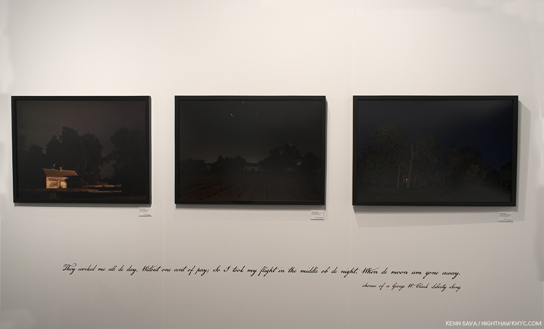
  1. Catherine Murphy was the Senior Critic in Painting & Printmaking at Yale’s School of Art for 22 years, followed by being the Tepper Family Endowed Chair in Visual Arts at Rutgers Mason Gross School of the Arts, where she was followed by Kara Walker.
  2. Here.
  3. Here.