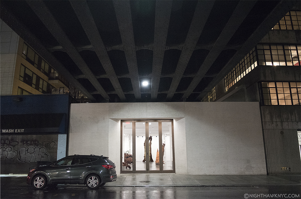
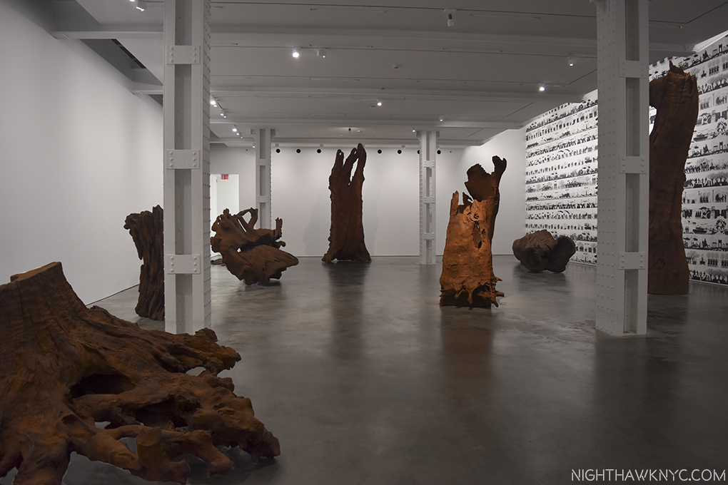
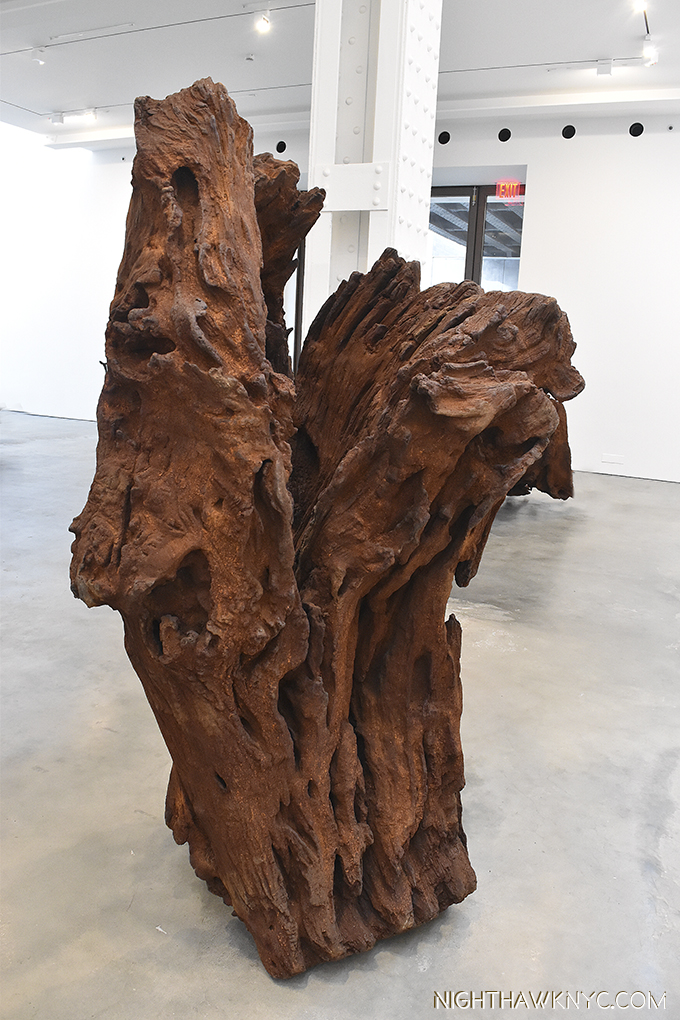
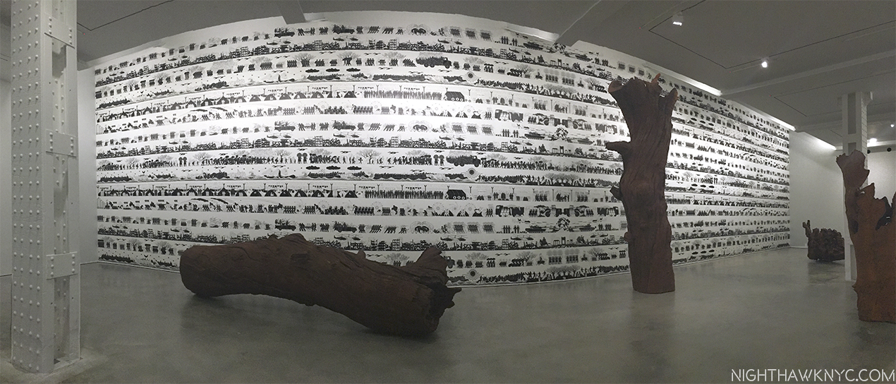
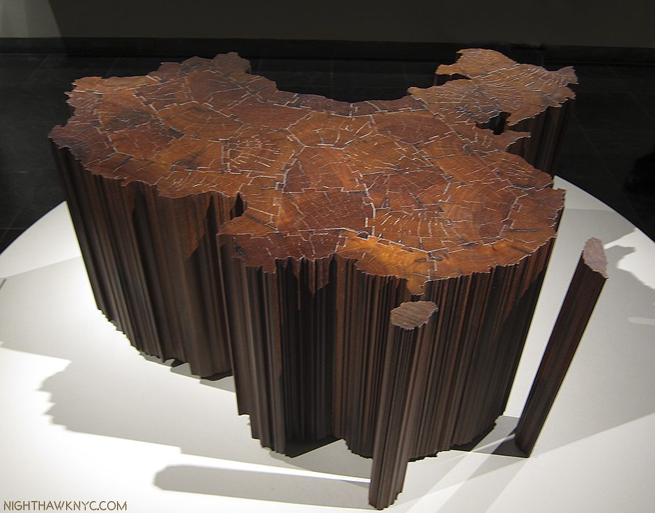
Art Is Back In Chelsea

Written & Photographed by Kenn Sava
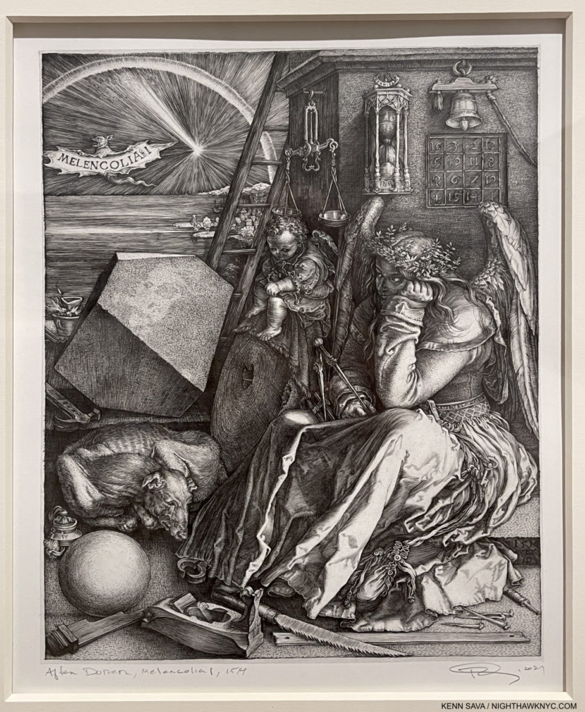
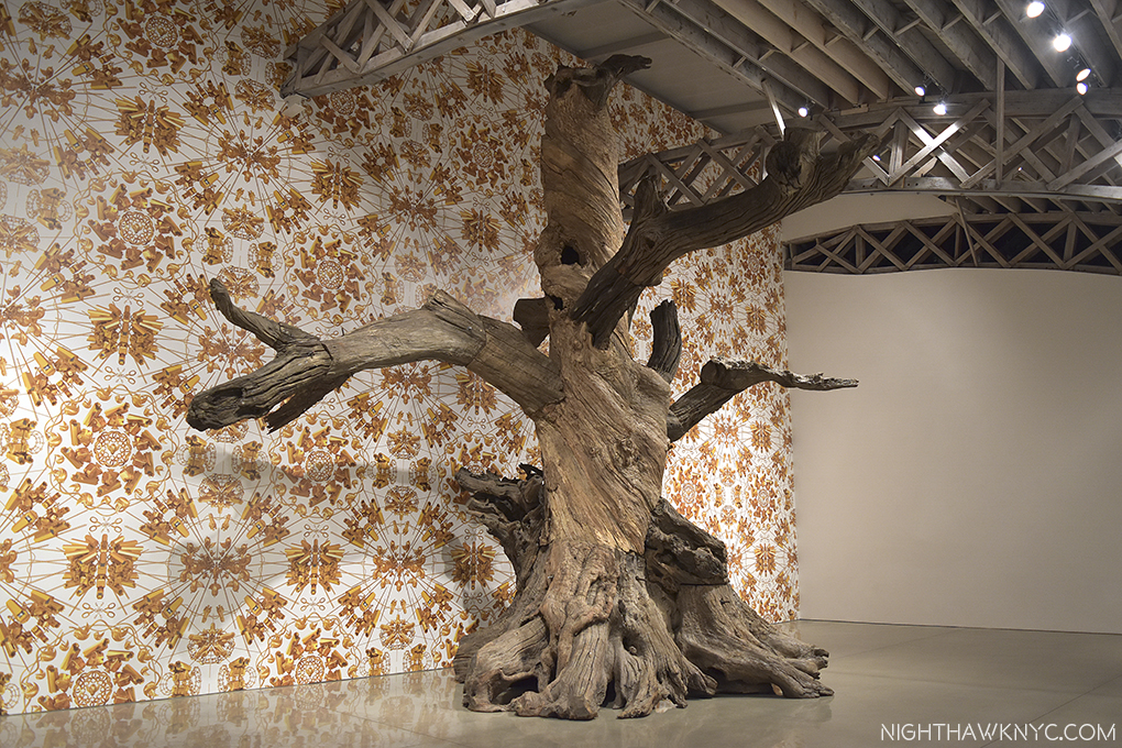
One of the most astounding works in Western Art history. Albrecht Dürer’s, Melencolia I, 1514, right? No! Read on…

There were some dark times in Chelsea’s (unofficial) Art district these past 18 months, like there was everywhere on planet earth. Some galleries went out of business, many gallery staffers lost their jobs, some galleries moved elsewhere. Early this year, things were slow. There were some shows here but not nearly as many as the pre-covid norm, and few here had been vaccinated at that point making it tricky for gallery staff and would-be visitors. I stayed away until I got vaccinated.
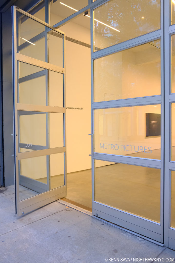
Going, going…Metro Pictures on West 24th Street. I have seen many memorable shows here, including the fine Louise Lawler show that’s up now inside that open door. They said they decided to close because of the globalization of the Art market, which doesn’t suit their model. I’ll miss them. Seen in October, 2021.

In March, legendary Metro Pictures on West 24th Street, an anchor of the neighborhbood since 1996, announced they would close this year, for reasons unrelated to the pandemic, they said1.

Don’t believe the hype. Real New Yorkers never went anywhere.

This whole summer there had only been two shows on my list- Richard Estes: Voyages and the blockbuster Cèzanne Drawing at MoMA, which I wrote about here. As the summer wound down I was curious to see what the fall season, the busiest of the year in Art, would bring. What would the “new normal” look like in the galleries & museums? Around Labor Day, I suddenly found myself with something I hadn’t had in 18 months- a list of shows, numbering 20, to see- carefully.
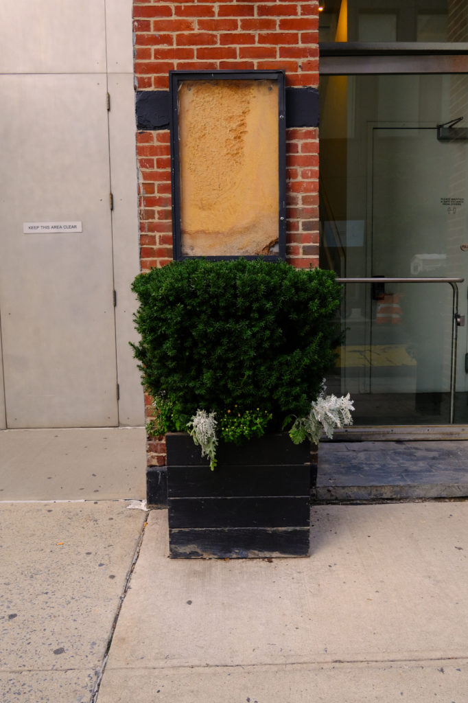
(Not) Coming (anytime) Soon. An abandoned sign outside a former Chelsea gallery on West 25th Street, October, 2021. A few of these on this block are an eerie reminder of what once was.

As I made my way down into the all too familiar West Side canyons very curious about what I would find, indeed, there was much that was different. Some familiar spots were gone, (most) others remain and virtually all of those were open, with varying degrees of precautions. Most surprisingly of all, a number of new galleries opened in spaces that had been under construction before the virus hit the fan around the High Line, and under it. Given I don’t generally attend openings (even pre-covid), and avoid going during the busier times (like weekends), I cannot attest to the level of foot traffic, a main reason galleries are here. 
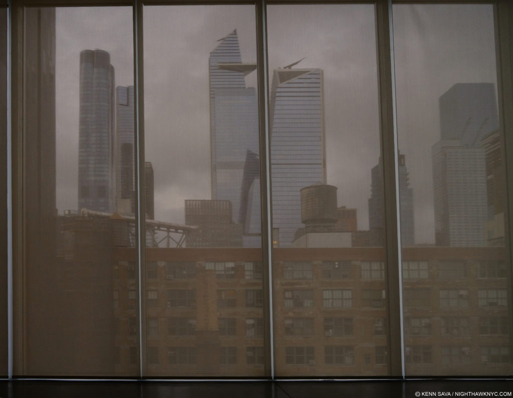
Forecast- cloudy. New and old on an appropriately grey day. The new skyline of Hudson Yards just north of Chelsea dwarfs the 100 year old buildings that have housed galleries for the past 30 years or so in better times, seen through the closed shades on the top floor of Pace’s new mega-plex gallery in October.

What I can say is that I notice there has been no slowing in the sheer mountain of new work that’s been created during these dark times, just as it was ever increasingly so as this new millennium has worn on. (Geez, it already feels like it’s worn on in 21 years?) Yet, in spite of the endless volume of Art for sale I have only seen a slight softening of prices, which I find surprising, and telling. Then again, these are usually “asking” prices. Actual “sold for” prices could be (and probably are) lower by an unknown amount. On the Art front, it turns out there are a number of good and very good shows up in Chelsea this fall. While there are still some on my list I haven’t gotten to see, of those I’ve seen thus far, some highlights include (in no particular order)-

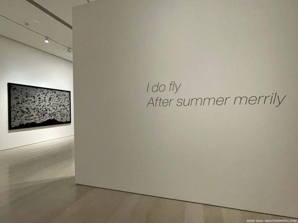
Installation view. Untitled (The Cauldron), 2021, Charcoal mounted on paper, 70 x 120 inches, left.

Robert Longo: I do fly / After Summer Merrily, at Pace, West 25th Street-
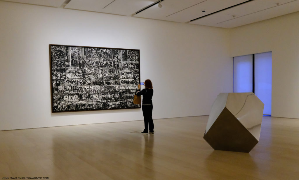
Untitled (Robert E. Lee Monument Graffiti, Richmond, Virginia), 2021, Charcoal mounted on paper, 96 by 146 inches, and Dûrer’s Solid, Stainless Steel, 2021. See following picture.

This is Robert Longo’s first show with Pace, after being represented by Metro Pictures for an unheard of 40 years, until they announced their plans to close. Famously part of the so-called “Pictures Generation” with Cindy Sherman, et al, Mr. Longo is one of the finest practitioners of the rapidly becoming lost Art of Drawing we have. I’ve been surprised with his choice of subjects, but always impressed by his new work with every succeeding show I’ve seen going back well over 20 years. They always leave me marveling.
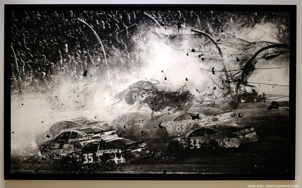
Untitled (Nascar Crash, Daytona), 2021, Charcoal mounted on paper, 70 x 120 inches. Keep reminding yourself that these are Drawings.

His new show, I do fly / After Summer Merrily, kicking off a run of Robert Longo shows around the world over the next few years, is equally impressive. Most of his pieces are Drawings in charcoal, though in this show he also shows off his remarkable skill with graphite.

Robert Longo, Untitled (After Dürer’s, Melencolia I, 1514) 2021, Graphite on paper(!), 12 3/4 by 9 15/16 inches. You could have knocked me over with a feather when I first saw this. My jaw was open to the bottom of my mask.

In addition to creating new works often based on Photographs of recent events, the other thread in Mr. Longo’s work these past many years has been painstaking creation of his own versions of masterpieces of Painting, most notably his Gang of Cosmos works, monochromatic charcoal copies of Abstract Expressionist masterworks, which filled an entire show at Metro Pictures in 2014. Now, he has turned his eye and hand to Albrecht Dürer’s Melencolia I, 1514, which is an engraving. Mr. Longo has done his version in graphite! While the more unforgiving engraving may be the more challenging technique, to translate Dürer’s marvel to this level of detail is astounding. It appears every single line has been replicated, down to Dürer’s famous “AD” monogram signature in the shadow above the tools to the right. As if this wasn’t enough, he’s also created a Sculpture of his imagining of the famous “Solid” seen to the left of center, which was also on view a few feet away, as I showed earlier.

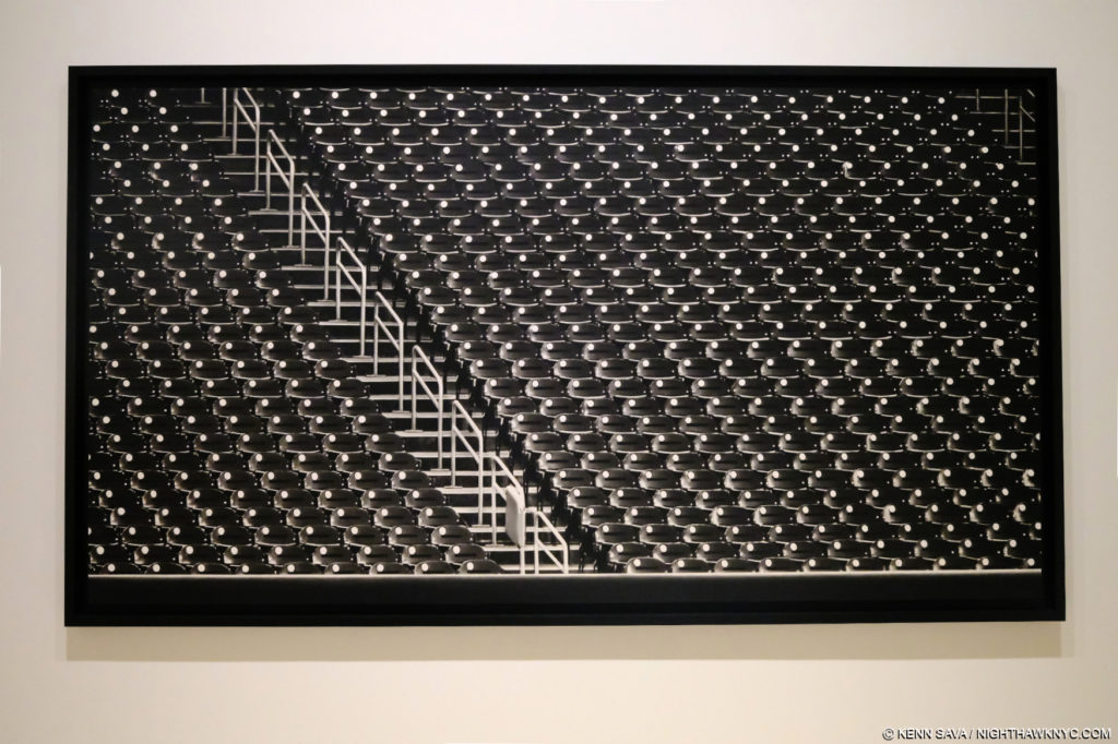
Untitled (Baseball Stadium, 2020), 2021, Charcoal mounted on paper, 78 by 125 inches(!)

After all the work shown in his Metro Pictures shows this century, as well as museum shows, like Proof: Goya, Sergei Eisenstein, Robert Longo, which opened at the Garage, Moscow, then travelled to the Brooklyn Museum, the time has come for a full Retrospective of his work in this country. The last one was at the Los Angeles County Museum of Art in 1989. One is opening in Europe in 2024. I hope it makes it here.
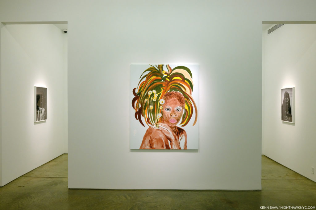
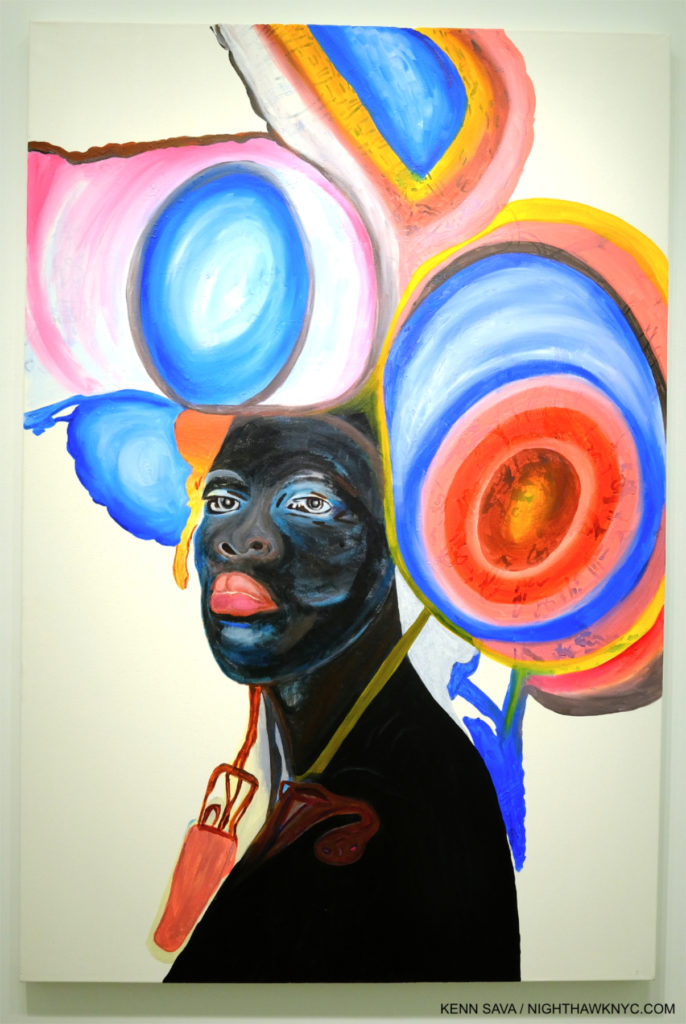
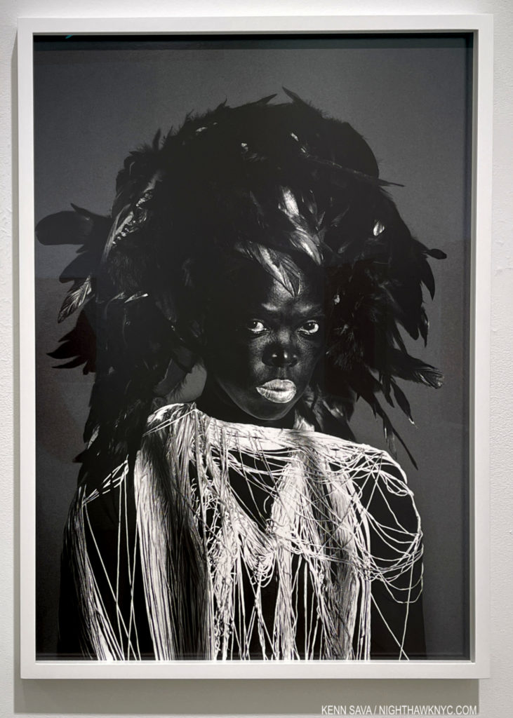
Zanele Muholi, Itha, 2021, Acrylic on canvas, from the first show to include her Paintings along with her Photographs in the second gallery.

Zanele Muholi, Awe Maaah! at Yancey Richardson- Zanele Muholi has established herself as one of the world’s great portraitists. Though she’s done far more, for my money that claim was sealed with Zanele Muholi: Somnyama Ngonyama, Hail the Dark Lioness, a book of Self-Portraits, published by Aperture in 2018, a masterpiece among PhotoBooks of the past decade. Now, for the first time, Awe Maaah! shows there is more to the renowned Photographer and visual activist. Stepping into the show, a fan of Ms. Muholi’s black & white Photographs might be shocked by seeing something new- color! It turns out she Paints, too! And quite well indeed as the debut selection of her Paintings in the show reveals.

Somile, 2021, Acrylic on paper

Known for her gorgeous black & white Photographs, her Paintings are FULL of bright, vivid colors. Zanele turned to Painting during the pandemic when Photographing others was not possible. Though in color, her Paintings share familiar elements with her Photographs. First, these were all portraits, of one or two sitters. Second, in many of her Paintings, the Artist is depicted, like her Photographs, n a variety of guises. Then, the eyes are the focus of both bodies of work. In some of her Photographs, they almost look like they are Painted. Compositionally, they both feature empty backgrounds, though some of the Paintings were colored. I was impressed with the range of approaches. Each Painting is different. Quite an auspicious first showing.

Zimpaphe I, Parktown, 2019, Gelatin silver print

But, for anyone new to her work, or in need of a refresher as to why she is one of the most respected Photographers working today, all that was needed was to take a few steps into the second gallery.
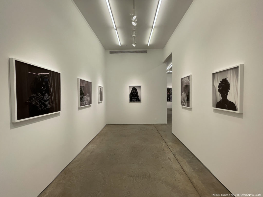
The second gallery of Awe Maaah! contains 8 stunning Self-Portrait Photographs (the one just shown is behind me in this shot)

There, a gorgeously selected group of her Photographic Self-Portraits was all the reminder needed. Not surprisingly, the entire show was sold out. Already one of the most vital Artists working in Photography, today, Awe Maaah! announces there are more sides to Zanele Muholi to recon with than we’ve seen thus far.

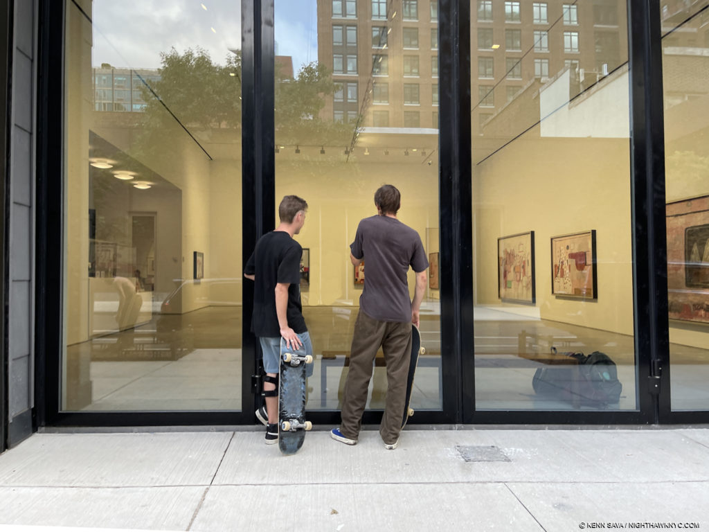
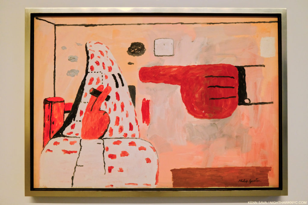
Looking in at a gallery of “hooded”/klan Paintings outside Philip Guston 1969-79 in October.

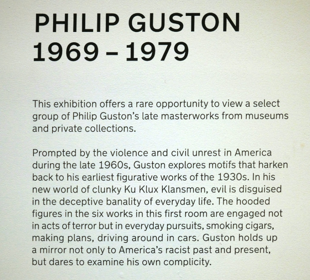
Philip Guston: 1969-79 at Hauser & Wirth- With a large, street-facing, gallery featuring Philip Guston’s “klan” Paintings I wondered if this show was a sort of “test balloon” after the controversial postponement of Philip Guston Now museum show. They certainly served to stop people on the street, who seemed perplexed as to what they were, and what they were about, from the conversations I heard walking past.

I think that many who are familiar with Philip Guston’s work wonder about them, too. Delving into their history sheds some light on them. I wrote about the history of Philip Guston’s hooded/klan (lower case, mine) works, saying- “I think it’s important to remember that they go back to when the Painter was about 18. In Philip Guston Retrospective, the backstory is relayed on pages 16 & 17. It begins by quoting Mr. Guston- I was working at a factory and became involved in a strike. The KKK helped in strike breaking so I did a whole series of paintings on the KKK. In fact I had a show of them in a bookshop in Hollywood, where I was working at that time. Some members of the klan walked in, took the paintings off the wall and slashed them. Two were mutilated. That was the beginning.'”

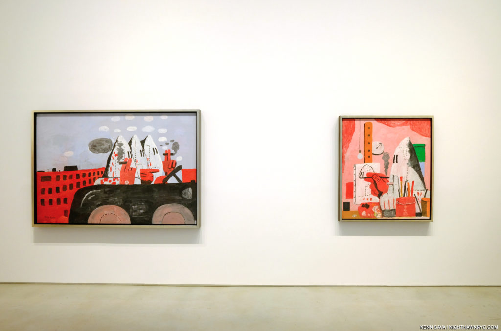
Riding Around, left, and The Studio, both 1969, Oil on canvas, left

“(The text then continues) ‘The Ku Klux Klan, also known as the Invisible Empire, had a significant membership in California in the 1930s and 1940s, and Los Angeles County was its most active Klavern. Guston and several other of his friends also painted portable murals for the John Reed Club on the theme of ‘The American Negro.’ Guston’s submission was particularly volitile. Based on the Scottsboro case, in which nine black men were sentenced (many said on false and circumstantial evidence) to life in prison for raping a white girl. Guston’s mural depicted a group of hooded figures whipping a black man. The murals were eventually attacked and defaced by a band of ‘unidentified’ vandals. The experience of seeing the effect of art on life and life on art never left Guston, and the unsettling image of the hooded figure was branded into his visual imagination.’ In the 1930s, in addition to strike breaking, the klan also targeted Jews. Philip Guston, originally Philip Goldstein, was Jewish. Of course, their main target were Blacks…Philip Guston lived long enough to see that racism was deeply embedded in the fabric of American life, possibly even in his own life.” (End quote.) So, circa 1970, when he moved away from pure abstraction, he began including hooded figures in his work again.

Scared Stiff, 1970, Oil on canvas. Shocking, damning, incredibly daring. and unprecedented in Art.

This time, it seems to me, he was looking inside for signs of prejudice in himself as well as society at large. And so, these are somewhat unique works in Art history. Not many other Artists have been as open, daring, or had the courage to lay themselves so bare as Philip Guston may have been doing in them. And, they are part of his enormously fresh late period, a real breakthrough for the Artist stylistically, which was met with puzzlement when they were new.

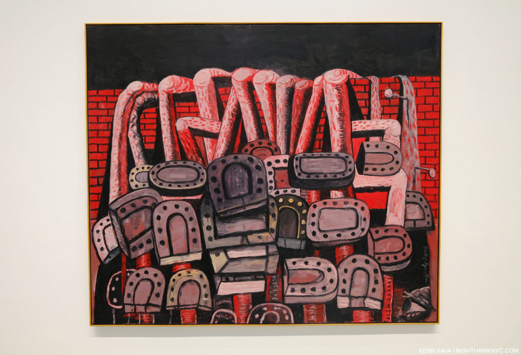
Ancient Wall, 1976, Oil on canvas

A very nice selection of “other” work from 1969-79 was on view in the large, second gallery. Today, they have become hugely influential, though the hooded figure works remain puzzling or misunderstood by some. (My pieces on prior Philip Guston shows in NYC are here, on the 1950’s abstractions, and here, on his Poor Richard Nixon Drawings.)
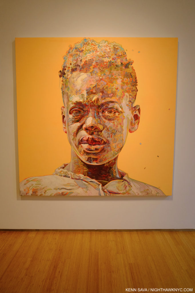
Hung Liu, Portrait: Sharecropper, 2018, Oil on canvas. Hung Liu lived and worked among country laborers for 4 years after being sent there by Mao Zeodong’s government for “re-education.” As a result, Hung Liu shared a special bond with the work of FSA legend Dorothea Lange dust bowl Photographs, upon who’s work Hung Liu based some of her Paintings. Ms. Liu emigrated to California in 1984, where she lived & worked for the rest of her life.

Hung Liu: Western Pass at Nancy Hoffman Gallery- Beautiful, and bitter sweet is the only way I can characterize this wonderful show, which the Artist worked on with Nancy Hoffman Gallery right before her tragic passing on on August 7th. It opened a month later, on September 9th. Along with the major retrospective up as I write at the National Portrait Gallery of the Smithsonian in Washington, it will serve as a fitting tribute to this terrific Artist who was just beginning to gain the wide recognition and acclaim I believe her work deserves when she passed away. Long a champion of the late Chinese-American Painter, Nancy Hoffman has been showing her work going back to at least 2010 as far as I can tell and they have published some exquisite catalogs for each of them which are still available.
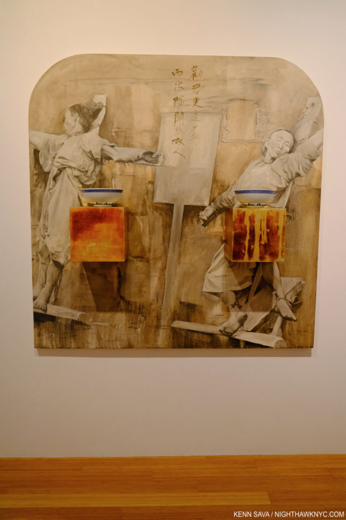
Western Pass, 1990, Oil on canvas, silver leaf on wood, ceramics. I asked Phil Cai what was going on in this work. He spoke about how we’re seeing two prisoners about to be executed with an ancient Chinese poem between them. The poem speaks of having another glass of wine before you pass beyond the western pass where you won’t have any friends. Two empty wine bowls sit in front.

This show is a beautifully chosen selection of 31 years of her work, right up to earlier this year. It’s possible to watch her style change and evolve over time, a testament to her flexibility and talent. Her subject matter, however, doesn’t change. Like Alice Neel, “people come first” for Hung Liu, too, and much of what she shows us is based in the Photographs of Dorothea Lange, found Chinese Photographs, or her own Photographs taken during the 4 years after she spent in the countryside laboring in rice and wheat fields as part of her agrarian “re-eduction” under Mao Zeodong. So, it is easy for her to related to the FSA work of Dorothea Lange, and the lives of is based on her own personal experiences. Haunting and powerful work that effortless cuts across place, cultures and time. Work that will be around for the long haul, in my opinion. I was lucky enough to see this show with Phil Cai, Director of Eli Klein Gallery, who’s remarkable Cai Dongdong show I wrote about in 2018. Phil, one of the rising stars in the Art world, met Hung Liu and visited her studio in Oakland. He provided fascinating insights into her work that he has been looking at for almost a decade. “I hope to wash my subjects of their ‘otherness’ and reveal them as dignified, even mythic figures on the grander scale of history painting,” she wrote.
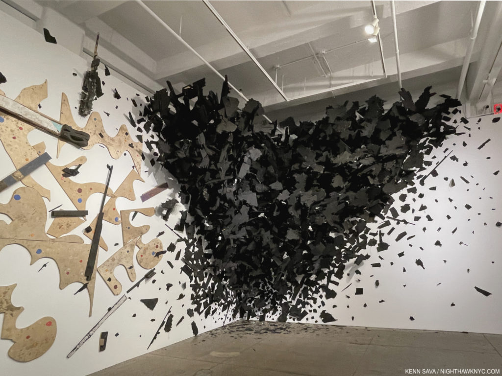
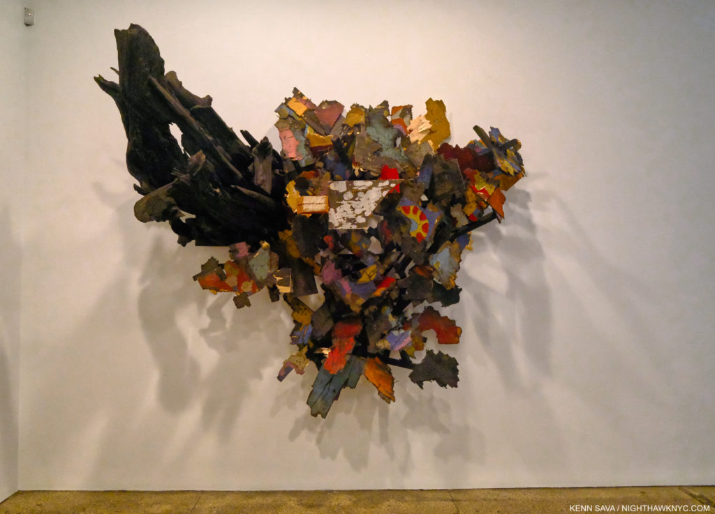
Leonardo Drew, Detail of Number 305, 2021, Mixed Media. Just one corner, plus, of this piece installed on all 4 walls of the large room.

Leonardo Drew at Galerie Lelong- I wrote extensively about Mr. Drew’s last two NYC shows in 2019, during which I met and spoke with the Artist. He returns this fall with his first show since, with all the work on view created in 2021. It says a lot to say that it took 5 people 4 days to install this show! The endless details in his work is only equalled today in Contemporary “Sculpture,” in my experience, by the shows of his great contemporary, Sarah Sze. Mr. Drew continues to reinvent Sculpture and to push the limits and the boundaries of what it can be including another work that seems to explode from the corner as his last show here had one exploding from the rear wall. Both “explosions” frozen in time. Whereas in his last show, he introduced color to his sculpture, which had been black & white to that point, here, he continues that with supreme taste in works that almost look like a new take on Abstract Expressionism, if I believed in such terms. I don’t, so the only term that remains applicable to this major Artist remains- Leonardo Drew. And, if this wonderful show of terrific new work isn’t enough, Mr. Drew’s Prints are on view at Pace Prints nearby. I have not as yet seen them. 

Number 294, 2021, Wood, paint and sand

At this moment, I imagine that the “bleeding” is going to continue in Chelsea, as it is in far too many other places and in many other fields, for some time. More galleries will close, consolidate or move. Yet, it seems to me that the mega-galleries building their own buildings in the neighborhood may actually draw other galleries here, depending on the asking prices for space. Maybe things are at or near the bottom? It’s too early to tell. 

After what I wrote during the shutdown last year, it seems that at least things have begun to bounce back after a very slow spring. But, Art is not life. Many other things have to be in place for anyone to be able to, or want to, see Art. It’s taken a long time for many of those things to get back into place here. I hope things are getting better where you are.

*-Soundtrack for this post is “How Can You Be Sure?” a B-side by Radiohead from The Bends Collector’s Edition-

“Seen all the good things and bad
Running down the hill
All so battered and brought to the ground

[Pre-Chorus]
I am hungry again
I am drunk again
With all the money I owe to my friends

[Chorus]
When I’m like this
How can you be smiling, singing?
How can you be sure?
How can you be sure?”*

NighthawkNYC.com has been entirely self-funded and ad-free for over 6 years, during which over 250 full length pieces have been published. If you’ve found it worthwhile, you can donate to keep it going & ad-free below. Thank you!

Written & photographed by Kenn Sava for nighthawknyc.com unless otherwise credited.
To send comments, thoughts, feedback or propositions click here.
Click the white box on the upper right for the archives or to search them.
For “short takes” and additional pictures, follow @nighthawk_nyc on Instagram.

Subscribe to be notified of new Posts below. Your information will be used for no other purpose.


  1. https://www.nytimes.com/2021/03/08/arts/design/metro-pictures-gallery-close.html

Inside Kris Graves Projects’ Monumental LOST II

Written by Kenn Sava. Photos by Kenn Sava & Kris Graves Projects

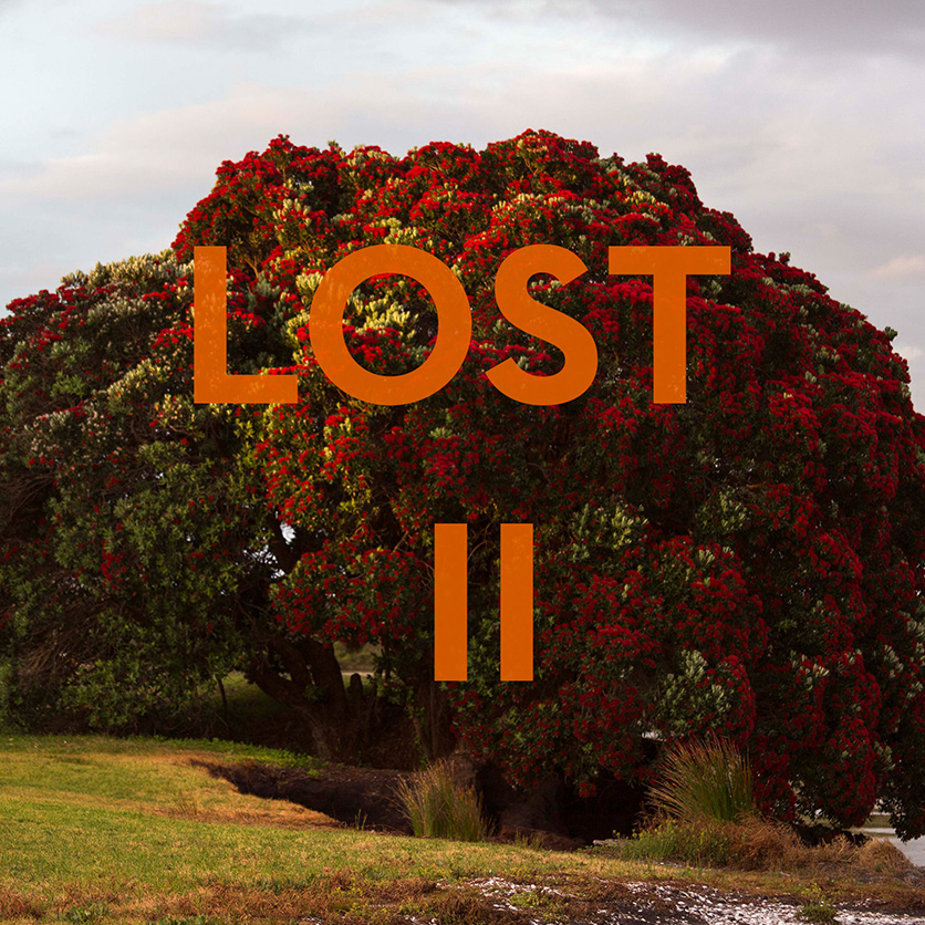
Slipcase Cover for the newly announced 20 volume set, LOST II. Click any Photo for full size.

Kris Graves, and his publishing company, Kris Graves Projects (+KGP), shocked many in the Photography and PhotoBook world when he released the ten-volume set, LOST, almost exactly a year ago. The shock at its size quickly turned to admiration once the quality of the individual books it included set in. I was as impressed by the overall vision that unified the project across those 10 books as I was the work of each of the 10 Photographers it included. Alphabetically by city, LOST consisted of-

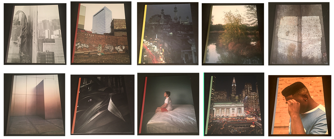
The covers of the 10 volumes of LOST, 2018

Beijing by Lois Conner
Berlin by Andreas Gehrke
Boston by Michael Cardinali
Calcutta by Laura McPhee
Chicago by Owen Conway
Long Island City by Kris Graves
New York by Lynn Saville
Omaha by Zora J Murff
San Francisco by Luke Abiol
-and Seattle by Joseph P. Traina

Then, there was the daring of a company that’s not yet one of the “big names” in the PhotoBook world (let alone possessing their resources) the set represented. That +KGP marshalled the wherewithal to pull off such a set was equally stunning. LOST made my NoteWorthy PhotoBooks of 2018 list, and probably some others, for all of these reasons. As memorable as it was and remains, even it didn’t prepare me for the news that Kris Graves Projects was about to release LOST II- consisting of TWENTY VOLUMES! Shaking my head in wonder, this time I was determined to find out- “HOW do they do it?”

I reached out to some of the Artists involved, and I visited Kris Graves at his Long Island City studio, where I found him hard at work putting the finishing touches on the set that he was about to send off to Spain to be printed, under the watchful eyes of +KGP team member, Pablo Lerma.

LOST II Slipcase cover verso.

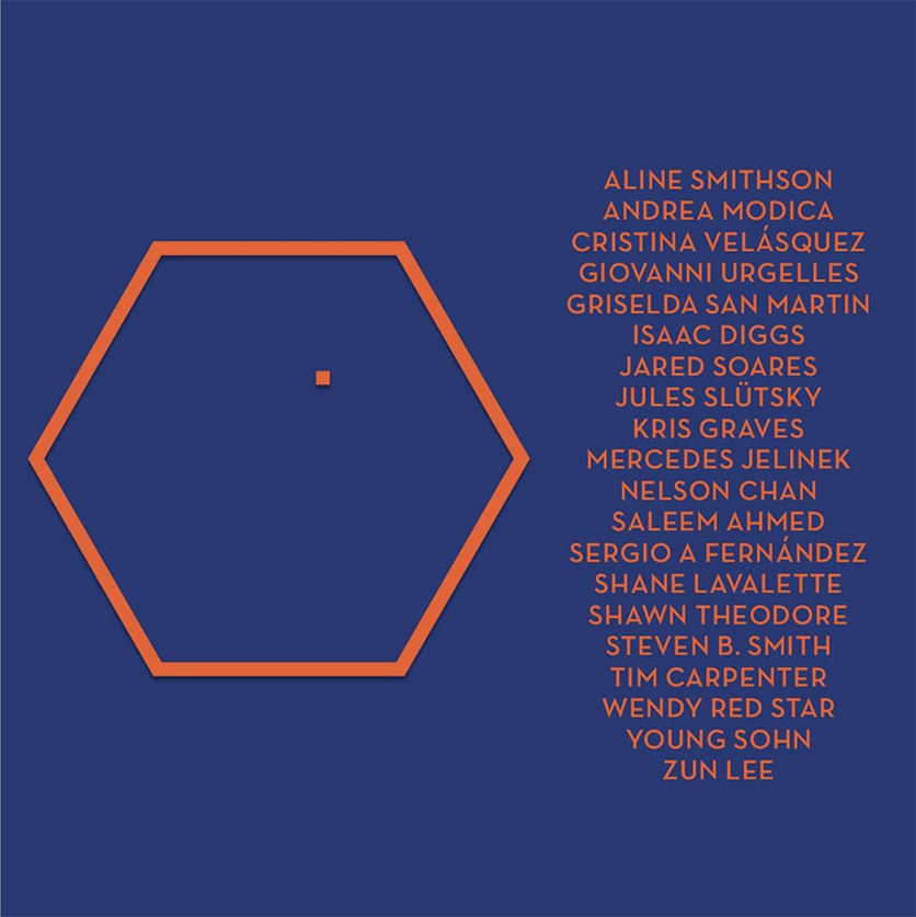
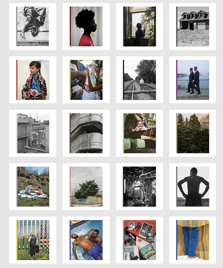
As a result, this piece marks the first time I’m writing about books I haven’t physically seen. Even without having books in hand, from everything I have seen thus far, it’s apparent to me that LOST II is going to be nothing short of monumental, in ways beyond its 7 1/2 pound size (for the full set in its heavy duty slipcase). For one thing, it’s already apparent that, it’s different from LOST, and that’s as it should be. After all, LOST already stands on its own- why repeat it?  This time, it seems less about the place, per se, and more directly involved in what it’s like for the people who actually live in it. Tough no place is revisited, the basic premise remains- Each of the, now twenty, Photographers contributes a book of Photographs taken in one city around the world. LOST II will include-

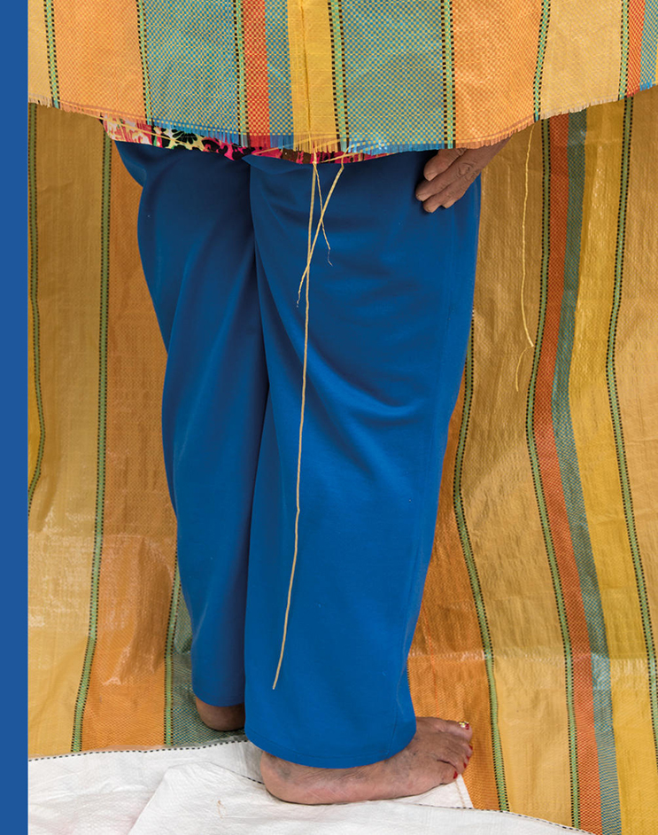
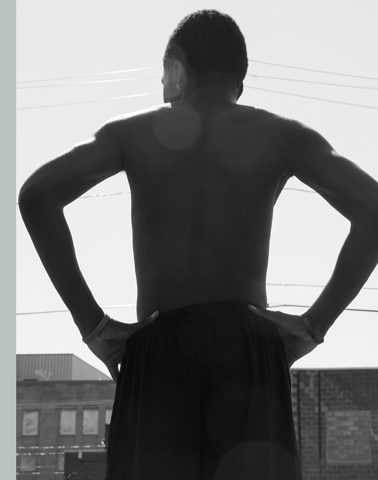
The covers of LOST II. Top row, from left-Washington DC, Birmingham, The Bronx,  Colorado City. Row 2- Crow Country, Hong Kong, Illinois Central, Lagos. Row 3- Lentini, London, Los Angeles, New Zealand. Row 4- Ossining, Philadelphia, Spruce Pine, Syracuse. Row 5- Tijuana, Toronto, Uzhhorod, and Viterbo

A link to a preview of each book is included in the list, below-

Birmingham by Shawn Theodore
The Bronx by Kris Graves
Colorado City by Steven B. Smith
Crow Country by Wendy Red Star
Hong Kong by Nelson Chan
Illinois Central by Tim Carpenter
Lagos by Isaac Diggs
Lentini by Andrea Modica
London by Sergio A. Fernandez
Los Angeles by Aline Smithson
New Zealand by Young Sohn
Ossining by Giovanni Urgelles
Philadelphia by Saleem Ahmed
Spruce Pine by Mercedes Jelinek
Syracuse by Shane Lavalette
Tijuana by Griselda San Martin
Toronto by Zun Lee
Uzhhorod by Jules Slutsky
Viterbo by Cristina Velasquez
Washington DC by Jared Soares

Even though LOST II is BIG, I can feel the world getting smaller. I’ll explain. First a quick recap by way of providing some background for those wondering what it’s all about…

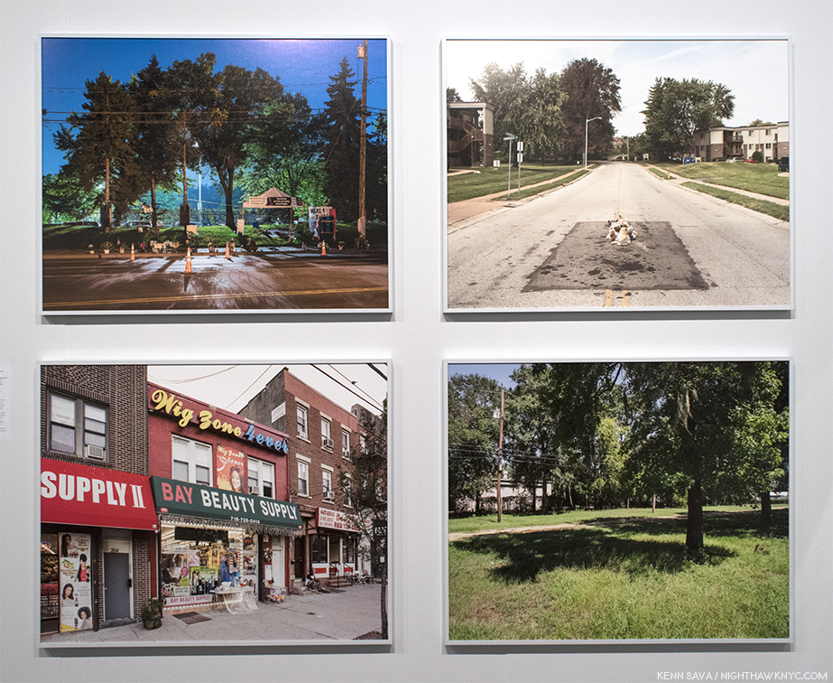
Kris Graves, 4 works from A Bleak Reality, 2018, +KGP

Kris Graves and his work were introduced to me when I came across four of his Photographs in the All Power: Legacies of the Black Panther Party Exhibitionmemorably curated by Michelle Dunn Marsh at The Photography Show (AIPAD) in April, 2018. The work, a series taken at the locations where young black men were murdered by police (since published in his book, A Bleak Reality,+KGP, 2018), stopped me cold. Enquiring at the show’s info desk I discovered that Mr. Graves was ALSO a publisher AND he had a table in the book section.

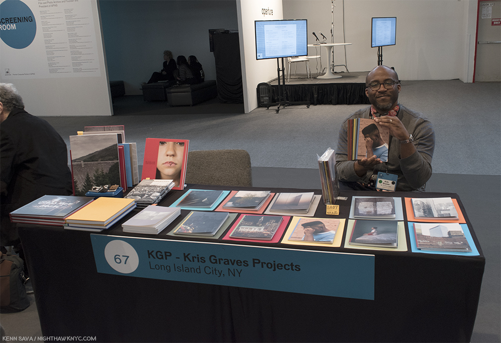
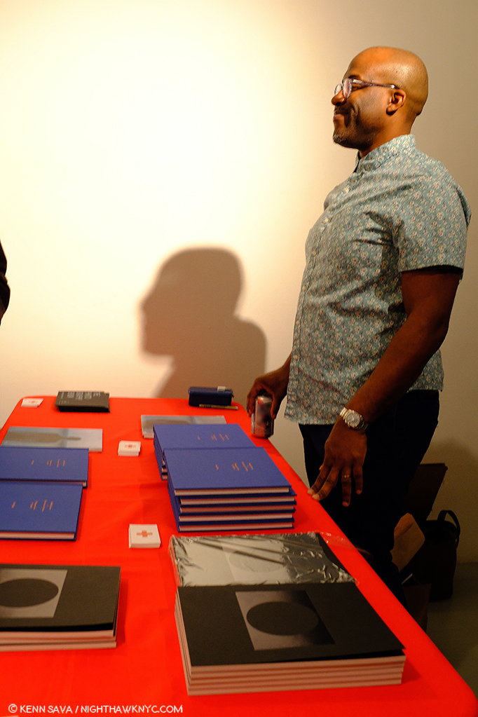
Kris Graves holds a set of LOST, with its individual component volumes displayed in front of him, at the Kris Graves Project table at AIPAD, April, 2018.

Walking over, indeed, there he was. After “Hellos,” I saw the newly announced 10 volumes of his then latest project, LOST, displayed in front of him. Perusing them, as accomplished as his Photography is, I was equally shocked to discover the quality of the books he published. I subsequently wrote about the experience here. One year into following both his own work and the books +KGP has produced my respect and admiration has continued to grow. I went to the LOST book release party shortly after AIPAD, where I met some of the Artists included in the series and bought my own set. LOST quickly sold out and is now something of an Urban PhotoBook Legend given how often I hear it referred to.

Kris Graves hard at work while talking (and selecting tasty vinyl from his impressive Lp collection), finishing up LOST II before sending it off to be printed in Spain on February 13, 2019.

Curious about how these bodies of work came about, I asked Kris if they were work that the Artists coincidentally happened to have on hand, or if any created them based on discussions with him for LOST II? He said, “I have interest in cities in general and I am always interested in seeing a new place through a strong artist’s point of view. Many of the chosen artists call a few places home, and they had the freedom to show me any work they felt made a good series. Some artists made new work for the project, which is flattering. Most artists have been working on these series’ for a long time, even decades. All of the artists have had the freedom to create these projects. I help with some sequencing suggestions and layout. These are editioned art pieces.” On LOST II’s roster, he added, “…this list of artists is stellar and I am humbled that they trusted me and the project. I’m still in the heart of it and can’t choose a project over another. I can say that Steven B. Smith’s project Colorado City is going to raise some eyebrows and Andrea Modica’s Lentini and the 8 x 10″ view camera work within makes me with these books could be larger in size. And to keep it ultra-real, I keep the project Purchase College strong with the monographs Ossining by Giovanni Urgelles, Uzhhorod by Jules Slutsky, and Spruce Pine by Mercedes Jelinek. I can’t wait for you to see these, I am excited to even talk about them.”

A lovely, early, +KGP promo image for LOST II, now lost, itself. I think it fell into that sink hole in front of the tree.

When I last spoke to Kris about it this past fall, LOST II consisted of nine books with an open call being held to choose an Artist for slot 10. I asked him how the project grew from 10 to 20 books. “I decided sleep wasn’t important. I wanted to cover more ground and also realized that I had more than ten artists in mind that I wanted to work with immediately. Twenty unique projects means we get to cover more of the world.” That made me wonder about the “secret sauce” he uses to determine exactly who and where is going to be in LOST II. So, I asked him- As the publisher, and creative lead on these projects- Do you start with a “hit list” of places you’d like to include, is it more based on available bodies of work by Artists you’d like to include, or a serendipitous mix of the two? He said, “It is a mix of the two but never evenly. I have some talented colleagues and I simply ask people if they wanted to take part. A few got at me to show me work in the last year, and we’ve worked together to make the projects.”

Cover of Viterbo, by Cristina Velasquez. Viterbo is in Columbia.

This has led to one of the things that made LOST memorable and special- its blend of well known and not as well known Artists seamlessly side by side. It’s a testament to LOST, and Kris, that LOST II is something Artists want to be a part of. I learned that no less than 150 submitted portfolios for that open call for that final slot in LOST II! Cristina Velasquez was chosen (by Hamidah Glasgow, Director of the Center for Fine Art Photography, Fort Collins, Mr. Graves pointed out to me), and her book, Viterbo, will leave no doubt why. I reached out to Cristina to congratulate her, and ask about its creation. She said, “Viterbo is a town in the mountains of Colombia where my family and I spent most of our childhood. It is also a generous, infinite studio, where I am able to compose freely and make pictures of the things that I care about, the real and the imagined. By referencing this location, my aim is not to indicate the origin of the pictures or to represent the place in any way. This book is a tribute to its people and to the everyday struggles of working-class families that resist and find joy in the midst of informality and precarious forms of labor. It is also a love letter to my childhood days and memories from Viterbo —the streets, the mountains, the stories—. Their imprint will forever infuse my artwork and the way I experience the world with a sense of dignity, absurdity, and joyous colour.”

“In Syracuse, New York, Interstate 81 separates those who live on the right side of town from those who do not,” per Arthur Flowers in TOPIC. Shane Lavelette’s, Syracuse, who’s cover is seen herelooks at the lives effected.

Among those joining Ms. Velasquez, is Shane Lavelette, the Director of the non-profit, Light Work, one of the country’s most respected Photo organizations, and an accomplished Photographer in his own right, who contributes the haunting Syracuse, his first book solely in black & white. I asked Mr. Lavelette how this body of work came to be, and came to be part of LOST II. He said Syracuse “began as an editorial piece for TOPIC (which can be read here). Since then, the spring of 2017, I’ve continued photographing for this body of work, as the issues/conversation around the highway develops. Essentially, the project explores the ways in which decisions of urban planning can connect or divide communities and the voices that are represented or lost in the process. Kris asked me to be a part of LOST II and I was originally exploring another idea for the publication but returned to this work because I think there’s an urgency to this story. I’m working with him to produce some extra copies of the book, which can be distributed for free to the local community. I don’t believe my own view/voice is very important in this work, but the project is one way to try to use an artistic project as an agent for dialogue in various contexts.”

He’s being modest. Syracuse, is stunningly beautiful and poetic, and is sure to impact all who see it. While this is an issue looming large in Syracuse right now, the bigger question it asks is- In how many other places is this same thing going on?

In that sense, it presents what seems to me to be one of the “themes” of LOST II as a set- revealing national, even, global issues in 2019 from a local perspective, consciously or subconsciously, as also witnessed in Crow Country by Wendy Red Star, Birmingham, by Shawn Theodore or Uzhhorod by Jules Slutsky. Perhaps, nowhere else in the set, is this more apparent than in Tijuana by Griselda San Martin.

The cover of Tijuana by Griselda San Martin.

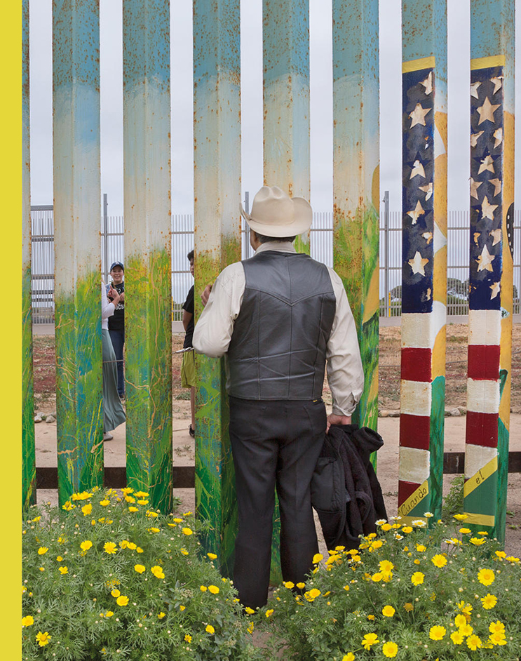
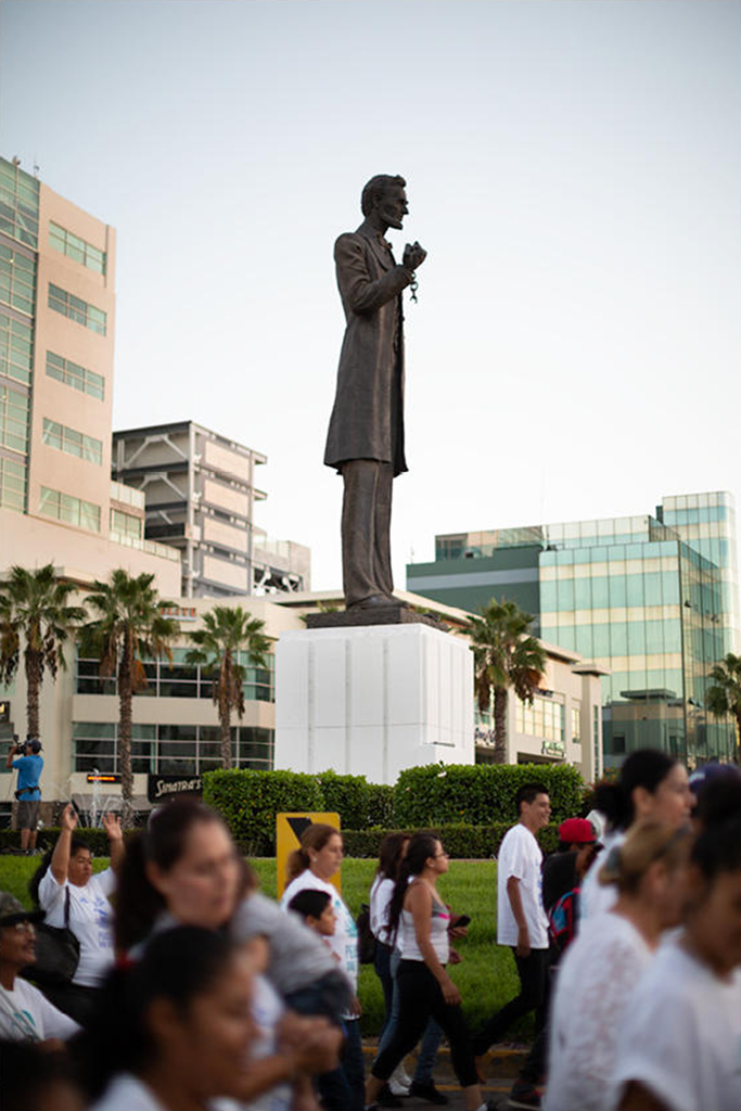
Griselda San Martin is a Spanish Documentary Photographer who’s work in Tijuana seems to encapsulate a number of the series she has been working on, each of which a part of her mission statement- “My goal is to represent the immigration issue in all of its complexity, addressing the social, political and economic factors that motivate individuals to leave their homes. I hope to create images that stimulate dialogue and reflection1.” Her work is often up close and personal, yet, she’s equally adroit at stepping back to show the bigger picture. All of this is beautifully rendered in Tijuana, where her twin gifts with color and light are apparent in every image. The documentary elements, as seen on the cover, are powerful and poignant, but the book contains a variety of styles, some more commonly seen in Fine Art Photography, showing off the range of her talent, while keeping Tijuana fresh.

Griselda San Martin, from Tijuana.

About Tijuana, she said- “Contrary to what we are shown in mainstream media, Tijuana is a fascinating place,” she said. “All we hear right now about Tijuana has something to do with the several migrant caravans and Central American immigrants who have arrived in the city during the past few months. My book has nothing to do with that. All the images were taken before the first caravan arrived. The first time I was in Tijuana was during my graduate studies at the school of journalism at the University of Colorado Boulder. My graduation project led me to this border city, where I was captivated by its culture and dynamics, and the complexities (and contradictions) of the border region. For the past six years, I have been going back for different periods of time, working on several projects. Perhaps the most successful one has been The Wall, a photography and video project that documents families separated by their immigration status, who gather at Friendship Park, the only federally established  binational meeting place (currently closed). Through photographs and a short documentary film, the project examines the concept and relevance of a border wall, border security, and the effects of immigration policies on individuals and families affected by them, during a time of rising xenophobic political tensions. I also documented the small but growing Muslim community in the border region.” How did it become part of LOST II? “I met Kris Graves a couple of years ago. We were part of a group exhibition at CPW (Center for Photography at Woodstock). He contacted me directly to invite me to be part of Lost II.

Along with all of this, many of the books are also equally personal.

The cover of Hong Kong by Nelson Chan perfectly captures the mood of its contents.

Take Hong Kong, where Photographer, TIS Books co-founder/co-publisher, and Aperture Foundation staff member, Nelson Chan, has spent quite a bit of his life. “The book came to be quite naturally,” he said. “I grew up in Hong Kong and live there during various parts of the year while I’m overseas printing books for the Aperture Foundation. A lot of the images were made during these travels. Kris knew I photographed in Hong Kong quite a lot and simply asked me if I wanted to take part in his project. I was emphatic about it from the start. One of the things that I did with this book that was a bit unexpected for me was that I actually combine some black and white negatives from some of the very first photos I ever took. Not just in Hong Kong, but as a young budding photographer. You see, the city was what sparked that interest in putting a camera to my eye.” Joining Nelson is his TIS Books partner, Tim Carpenter, who contributes Illinois Central to LOST II. (By the way, TIS Books also made my NoteWorthy PhotoBooks of 2018 list with El Libro Supremo De La Suerte, by Rose Marie Cromwell.)

Cover of Spruce Pine by Mercedes Jelinek

Then there is Spruce Pine by Mercedes Jelinek, which offers an almost meditative approach, sans people, which, I believe, may be  the only book in the set to do so. It’s her eagerly awaited second book after her sold out debut, the powerful, These Americans, (+KGP, 2018). Though its meditative quiet couldn’t be more different in tone from the raucous These Americans, revealing another side of her range, it retains the depth of feeling, even without human subjects. I asked Mercedes how Spruce Pine came to be, and came to be part of LOST II. “I was a resident artist at Penland School of Craft in Penland NC (right next to Spruce Pine),” she said. “Over the three years I lived there, I would go out and explore the area – going down back roads and side roads until I would reach a dead end. I realized I seemed to gravitate towards photographing quiet scenes – something I don’t usually have where I’m from in NYC. Not necessarily boring or mundane scenes but more of absence- and I was attracted to it in the photos… If that makes sense. Over time it grew into a project. Kris Graves Projects published my first book. When I returned to NY, I showed Kris my Spruce Pine images and he invited me to be part of Lost II.”

Kris Graves hosting the +KGP Book release for Isaac Diggs/Mikhail Mishin Book Release

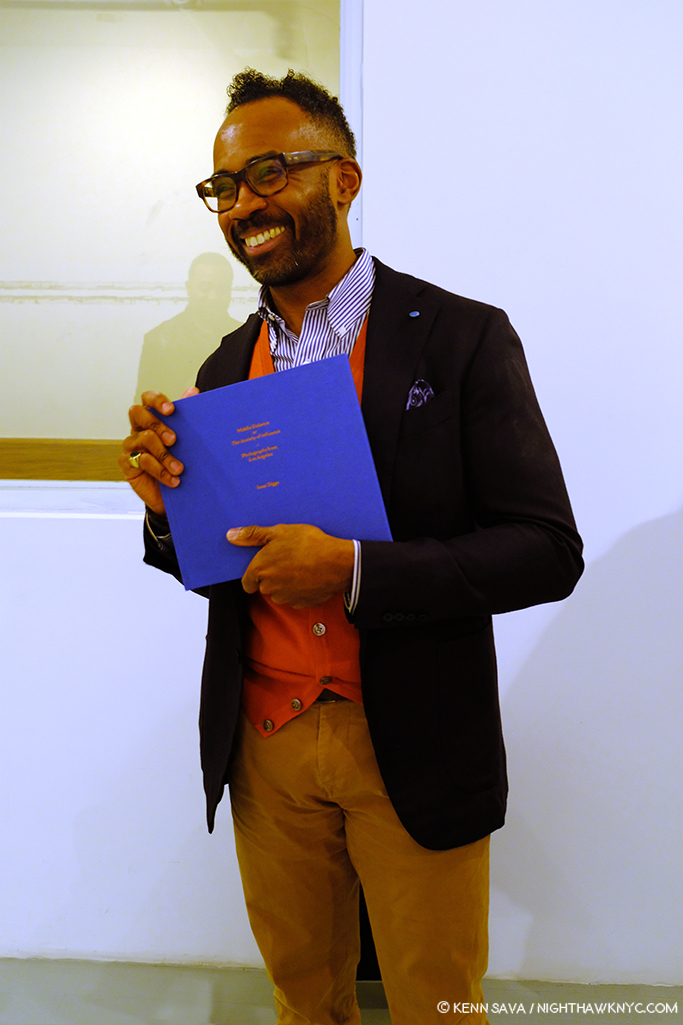
On February 22nd, +KGP held a book release & signing for their three newest releases- Isaac Diggs’ Middle Distance,  Mikhail Mishin’s Endless Bridge, and Rana Young’s The Rug’s Typography, with the first two Artists in attendance.

Photographer & educator Isaac Diggs introduces his brand new PhotoBook, Middle Distance on February 22nd. He should be smiling- It’s very good. His Photographs of Los Angeles, “conjure the underlying tension I sense in much of the American urban landscape,” he says on the +KGP site.

I took the opportunity to meet Isaac Diggs, the well-known Photographer and educator at NYC’s School of Visual Arts the past 19 years, and speak to him about how his book, Lagos, in LOST II, came about. He told me that he’s made a dozen trips to Nigeria, his wife’s homeland, since the mid-1990s, with the book consisting of work created during the last half dozen trips. The focus throughout is on the daily lives of its subjects through unexpected glimpses into them. It’s a book that reveals a diversity of lives being lived in views at once close up, and again expansive, in a city that few in this country are familiar with.

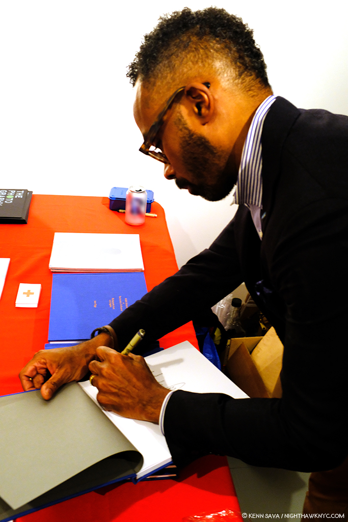
Mr. Diggs personalizing a copy of Middle Distance.

I also perused Middle Distance, which is as exceedingly well done Photographically as it is well produced, again with images taken over time, this time in California. Thinking about it and Lagos, I see the same eye in both books-it’s an eye that works very quickly and very quietly. In photo after photo images are captured while the subject, who’s often close by, does not even appear to know there’s a camera pointed at them which captures them spontaneously, while the background and the entire composition has a carefully considered feel. Mr. Diggs also has a talent for interesting/unusal fleeting moment. Not the “waited for moment” we see wonderfully in the work of, say, Harry Gruyaert or Alex Webb, Mr. Diggs’ moments feel like they required a fast shutter speed to capture, though it was probably his quick mind.

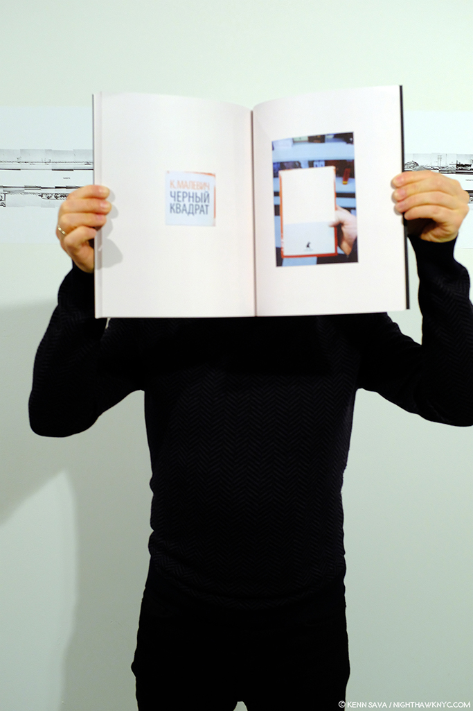
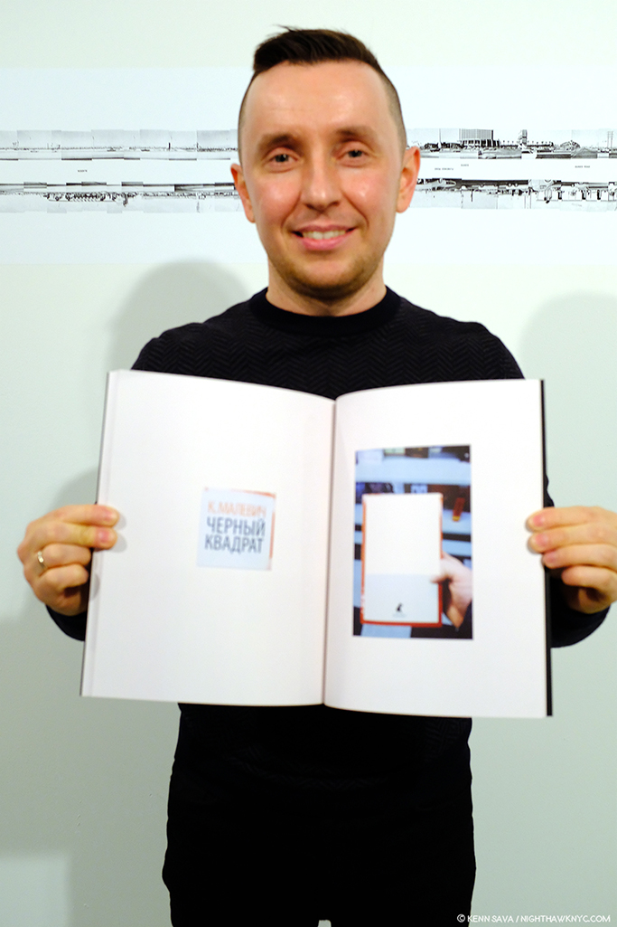
Sharing the book release with Mr. Diggs was Mikhail Mishin, who told me his new book, Endless Bridge, began by culling through his scrapbooks. Looking through it, I then asked him if Kazimir Malevich was an influence. He smiled, and then responded with this photo-op, which could have been a page right out of his book!

Mikhail Mishin demonstrates the influence of Malevich on his work. The first word in red on the left hand facing page happens to be “Malevich” in Russian.

Though he’s not one of the LOST II Artists, I asked Mikhail what his experience was like having his book published by Kris Graves Projects. “Producing the book with Kris was pretty seamless and pleasant experience and he has an excellent knowledge of, and insight into, the art book industry and in the art world,” he said. “I had my book dummy designed and printed before I was introduced to Kris by our mutual friend. After our initial meeting and discussion Kris was interested in producing this book and we started the process.”

Mikhail Mishin with Endless Bridge, February 22, 2019.

“We had a few sessions after when we discussed edition, choosing the press, paper quality, the cover design and so on. All of that went very smooth as Kris already had pretty good idea where and what to do. Soon after we finalized the files and sent to press in New Hampshire which did a very nice job as you could see in the result.”

While the Isaac Diggs/Mikhail Mishin Book Release was going on, Kris Graves was also checking in on the printing of LOST II happening at that very moment(!) in Spain. February 22, 2019.

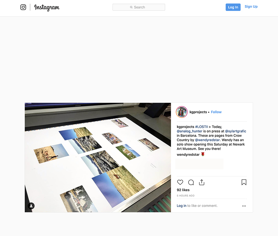
Meanwhile, back on the LOST II front, while the book release was going on, Mr. Graves was multi-tasking as ever, checking in on the progress of the printing of LOST II on his phone, which was going on in Spain at that very moment(!) …

As he posted on Instagram shortly thereafter. Seen here are images from Wendy Red Star’s highly anticipated Crow Country hot off the press. Her show, A Scratch on the Earth, is now open at the Newark Museum.

where Kris Graves Projects’ Pablo Lerma was onsite in Barcelona pulling a 16 hour day overseeing the printing of ALL 20 books!

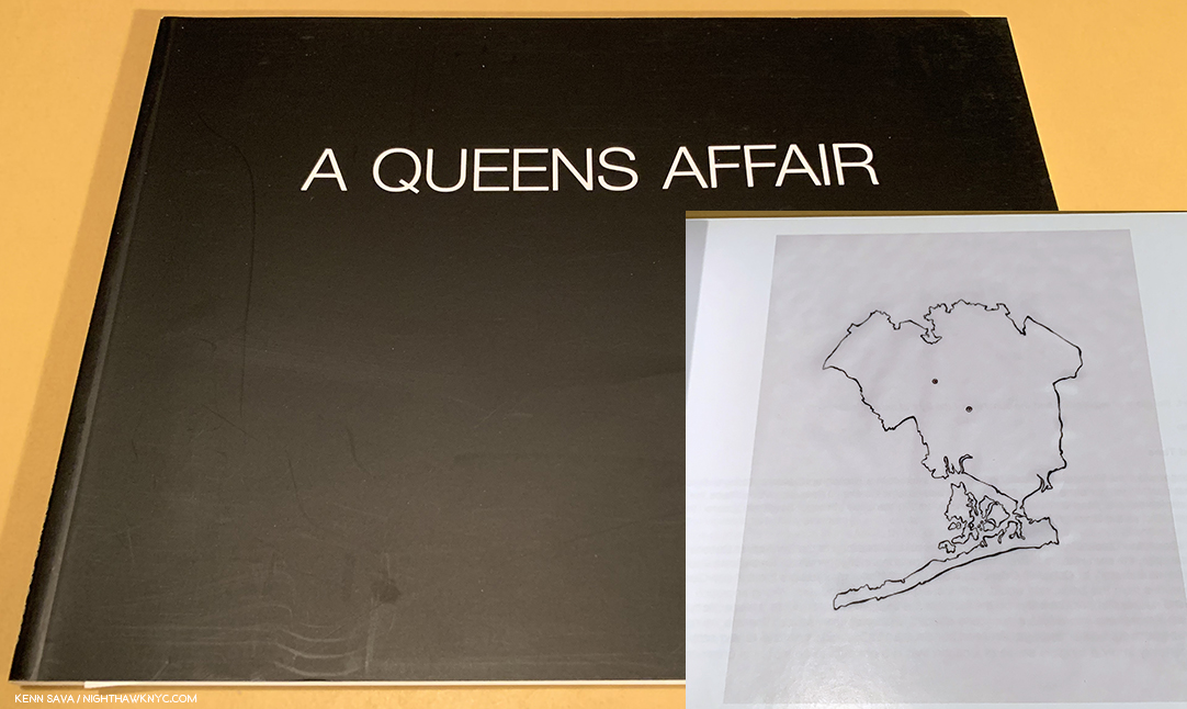
Kris Grave & Eric Hairabedian’s A Queens Affiar, 2010, Kris Graves’ first book, which includes an outline map inside.

Speaking of the bookmaking side, in thinking about the evolution of LOST and LOST II, I was struck when I recently saw a copy of Kris Graves’ first PhotoBook- A Queens Affair, 2010, in which his exterior Photos are wonderfully paired with interiors by Eric Hairabedian. The book has something of the feel of a precursor of LOST, in its unique, capsule, exploration of the borough, right down to the inclusion of an outline map, a staple of LOST & LOST II.

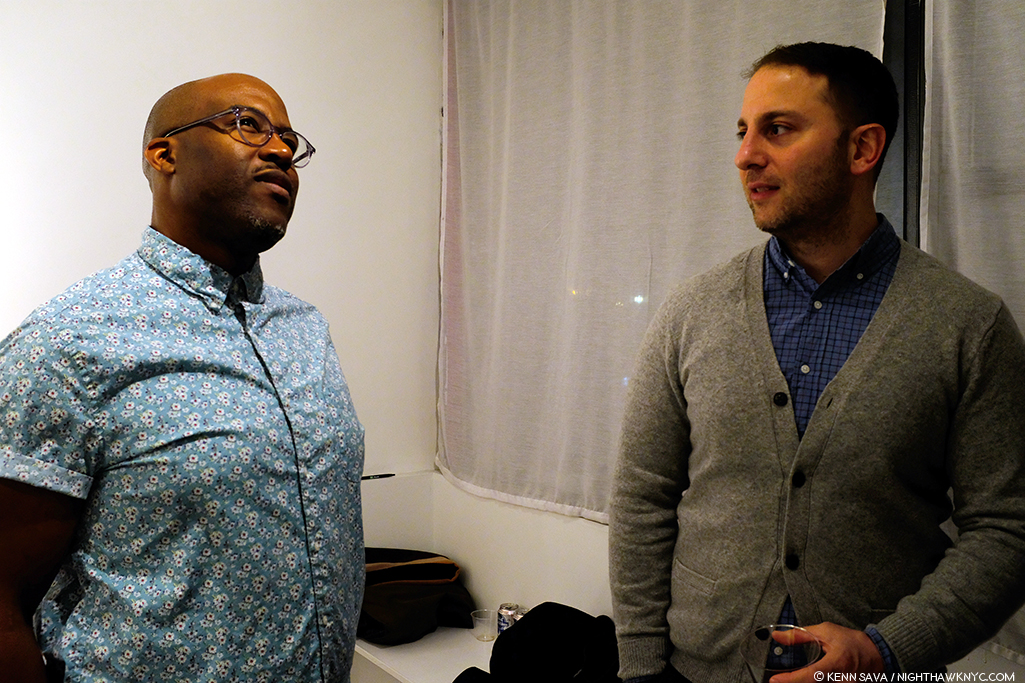
Kris Graves with Eric Hairabedian, February 22, 2019- nine years after they made A Queens Story. His relationships and his network, also, play a part in the success of +KGP and the LOST series.

In the succeeding 9 years, Kris’ publishing has come a long way. I asked him how his bookmaking has changed just between LOST and LOST II. “I produced LOST with a digital offset printer in New Jersey,” he told me. “We loved the quality, and are using those materials for other books. This time, we are working with a press in Barcelona, and making the books in offset, not digital. In addition to the slightly larger size, the books will now be able to be opened further, so book spreads will look a bit better. Since we want to make a better project every time we make a book, we also wanted to splurge on a more expensive process for LOST II. Printing of the books is now complete, the down payment is in (smiles), and the books should set sail from Barca in a week or so, just in time for their AIPAD launch.”

It’s been apparent to me this past year that one of the most remarkable thing about +KGP’s books is their high quality and quite reasonable cost. While a set of the 20 volumes of LOST II is (currently) 350.00, the individual books have a price of 28.00 each. Though his books are affordable, the quality of the work they contain has been noticed at very high levels.  LOST was acquired by The Metropolitan Museum, Guggenheim Museum, Art Institute of Chicago, Museum of Fine Arts, Houston, among other esteemed institutions. I asked Kris what he was most proud of about its success. “Good question. I am proud that this group of artists works as hard as they do. That’s it. Getting into collections is gravy, maybe it means that someone will peep the series 150 years from now. That would be cool. Usually, I’m too busy to feel pride.”

Luckily, we the living won’t have to wait long to see LOST II. It debuts at The Photography Show, 2019 (AIPAD) in early April, where it will be available to the general public, accompanied by a book signing.

However if you’re a Photographer interested in getting a slot in LOST III? I learned it’s going to require a very special distinction- You have to be female.


BookMarks-

Some facts about LOST II known to me as I write-

First- Less than SIXTY complete sets, in a custom LOST II Slip case, were available when it was announced. I bought one. And no, I didn’t ask for, or get a discount. Why not? Let’s do some math. The complete set of LOST II is being released at $350.00- a quite sizable sum by any standards. Considering there’s 20 books in the set? That makes it $17.50 a book, with a free slipcase. For a first rate PhotoBook? That’s on the low end (if not at the very bottom) of the prices I see charged by ANY publisher in the world. Besides that compelling reason, I believe in supporting Artists doing great and/or important work, so they can make more of it.

Second- Regarding individual book sales, Kris told me there will be just 125 first edition/first printing copies available of each title! When you take a look through the +KGP site, you’ll notice the high percentage of recent titles marked “SOLD OUT,” so part of the reason I’m doing this piece is as a community service for my readers who have read my prior Kris Graves Posts, and/or have bought LOST, so they can get LOST II, if they wish, as well as providing some insights into how a unique series like this comes into being.

Third- LOST II is available for pre-order from Kris Graves Projects online here. In the time it’s taken to prepare this Post, I now believe no more than 30 sets are still available. ALSO! I’m pleased to mention that if you mention “Kenn Sava” when you order a set from +KGP, your order will include a signed copy of Kris Graves’ The Bronx. 

Besides LOST II, also recommended are Isaac Diggs just released book, Middle Distance, and be sure to check out Mikhail Mishin’s fascinating new book, Endless Bridge, both of which were moving quickly at the book release.

Finally, a tip- I saw Mercedes Jelinek’s powerful first PhotoBook, These Americans, at AIPAD last year on the +KGP table I showed earlier. While I was busy looking at something else, the last copy was sold. After spending the last year looking for it, I’m happy to report that I just found out that a few copies are STILL AVAILABLE, here, at the Asheville Art Museum! Mine came signed. Highly recommended.

*- Soundtrack for this Post is “The National Anthem” by Radiohead (a band Kris and I both admire) from Kid A, performed here (with horns!) on Later

My thanks to Shane Lavalette, Nelson Chan, Isaac Diggs, Mercedes Jelinek, Cristina Velasquez, Mikhail Mishin, Griselda San Martin, the Asheville Art Museum, and Kris Graves. 

NighthawkNYC.com has been entirely self-funded and ad-free for over 6 years, during which over 250 full length pieces have been published. If you’ve found it worthwhile, you can donate to keep it going & ad-free below. Thank you!

Written & photographed by Kenn Sava for nighthawknyc.com unless otherwise credited.
To send comments, thoughts, feedback or propositions click here.
Click the white box on the upper right for the archives or to search them.
For “short takes” and additional pictures, follow @nighthawk_nyc on Instagram.

Subscribe to be notified of new Posts below. Your information will be used for no other purpose.


  1. She said, here

Brimstone And Blood: Q&A With Shane Rocheleau

Written by Kenn Sava. Photographed by Kenn Sava & Shane Rocheleau.

Five Photographs, in the recent Aint-Bad Curator’s Choice, Issue No. 12, and the accompanying interview with Stephen Frailey who chose him to be included, were enough for me to put Shane Rocheleau on my “watch list.” It turned out I didn’t have to wait long to see more.

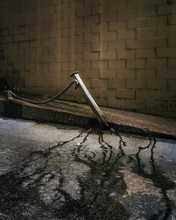
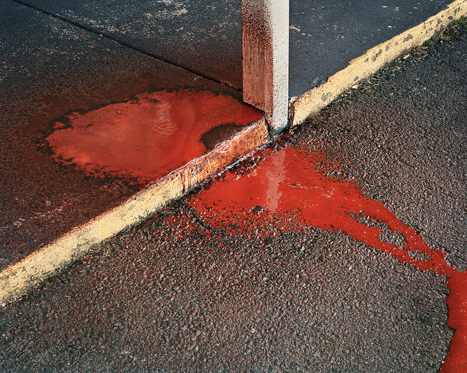
This Photo is called Broken Stake in the book. I’ve also seen it referred to as Bleeding Stake. As he reminded me when we spoke, a stake has a number of purposes…and meanings. This one also serves to create a riveting image. Photo by Shane Rocheleau from You are Masters of the Fish and Birds and All the Animals. Click any Photo for full size.

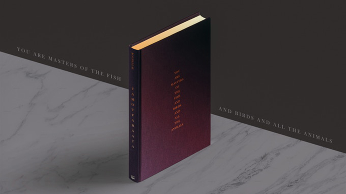
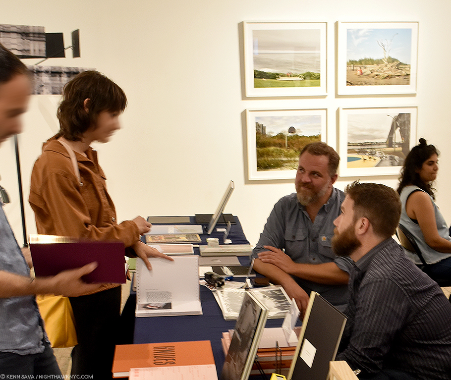
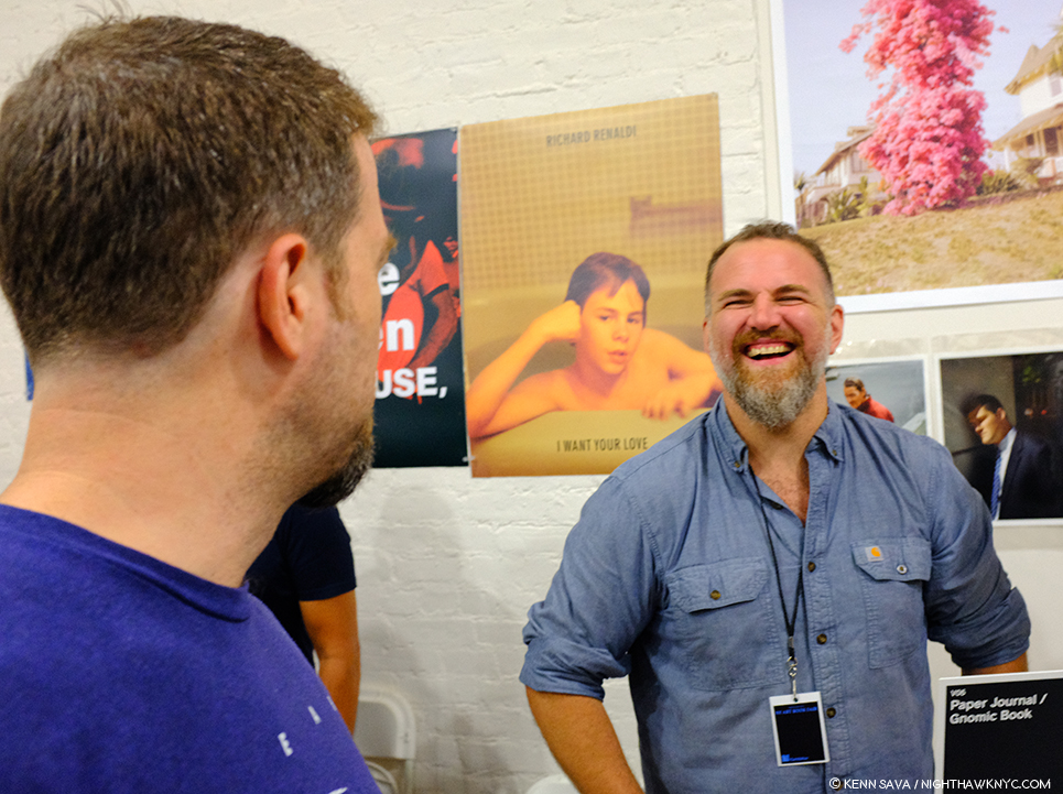
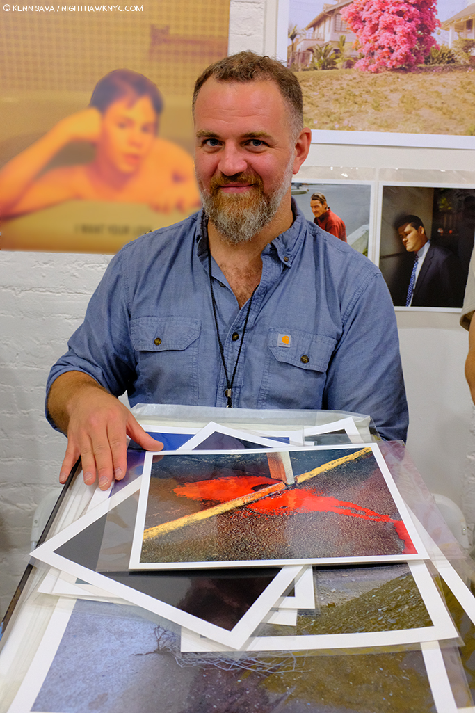
Coming upon the Gnomic Book publisher’s table at the recent LES Fotobookfair, Mr. Rocheleau was on hand to sign his new Gnomic release, and first PhotoBook, You are Masters of the Fish and Birds and All the Animals (or YAMOTFABAATA, as it reads on its spine and so, is referred to). There he was discussing what he considers to be a good job of gluing the endpapers as I approached. When he paused, I asked him if I could see the copy he was holding.

You are Masters of the Fish and Birds and All the Animals, by Shane Rocheleau, his first book, just published by Gnomic Book

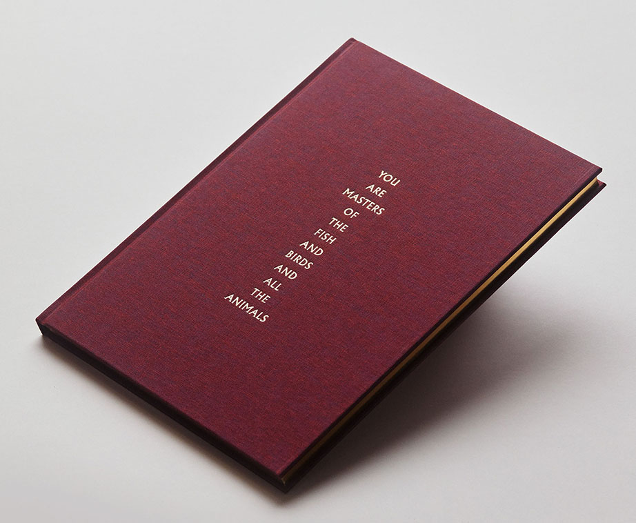
The YAMOTFABAATA experience begins with the cover, which I swear has hypnotic qualities. The book is so beautiful to hold you don’t want to put it down. Opening it and looking inside, my initial conception of his work was quickly obliterated as I moved through the beautiful volume he handed me. I immediately realized that this was no mere collection of fine Photographs. Each Photo is exquisitely considered- both in its execution and in its placement. Here is a powerful book of visual poetry that casts a far ranging net capturing slices of the essence of the American condition in 2018, in macro and micro terms, with an epic impact that borders on the biblical.

Or, YAMOTFABAATA the first book by Shane Rocheleau, just published by Gnomic Book. It’s a beautiful publication, clad in a stunning iradescent grape fabric called Bamberger Kaliko Duo. Its gleaming gold edging, carrying over the gold of the font. The whole thing has the feel of a Bible, echoing to the quote from Genesis in the title.

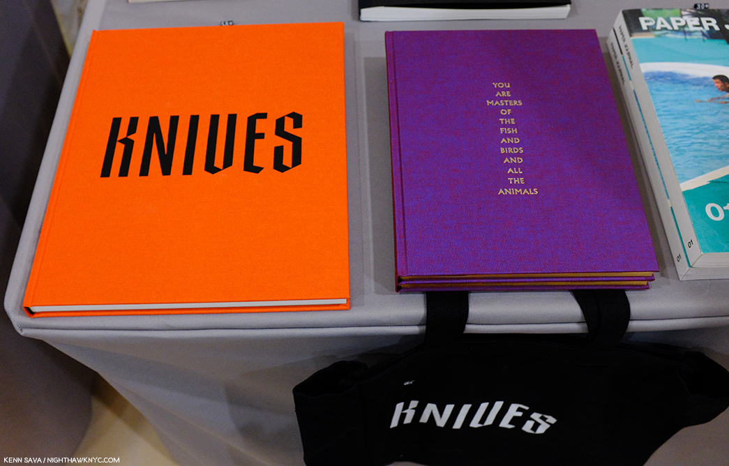
I had gone to the LES FBF to see two new books- Kris Graves’ A Bleak Reality, and Jason Koxvold’s Knives, that rarest of PhotoBooks that has its own tote bag (sold separately). While I came away very impressed with both, YAMOTFABAATA turned out to be my biggest discovery at the fair. As I looked through it, and Knives, I was struck by the similarity and the differences of the two books, both published by Jason’s publishing company, Gnomic Book.

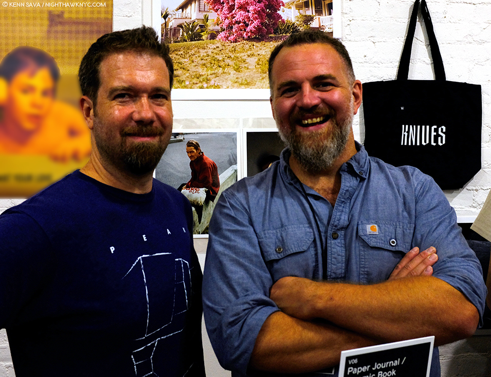
Shane Rocheleau, left, with his good friend, multi-talented Artist/Photographer and Gnomic Book publisher, Jason Koxvold, at the MoMA/PS1 Book Fair, September 22, 2018. The spiffy Knives tote bag is seen over Jason’s shoulder.

Some background- Shane Rocheleau received his MFA in Photography and Film from Virginia Commonwealth University (VCU) in 2007. He has taught photography as an Assistant Professor of Art at St. Norbert College in Wisconsin, as an Adjunct Professor at numberous institutions, and presently serves as an Adjunct Assistant Professor at VCU. IMDb lists him as the Writer, Director & Producer of the a 2008 short, TideYAMOTFABAATA is indeed a book that has a cinematic feel to it. As I wrote in my Third Anniversary Post in July, of my intention to ramp up the coverage of Artists who are not “big names” yet, but who are doing great and/or important work that I feel deserves to be better known. Shane Rocheleau is one such Photographer.

Researching Mr. Rocheleau, I was struck by his down to earth eloquence in the interviews I came across. Given the abstract nature of the images in his book, and the lack of any words from him in it, beyond some titles, I decided his voice should be the one featured in this piece, feeling that this would be the best way to compliment his exceptional book. For additional background on YAMOTFABAATA and Gnomic Book, which in two short years has gotten off to an auspicious start, I also reached out to Jason Koxvold with some questions, and his answers I weave into the following discussion with Mr. Rocheleau.

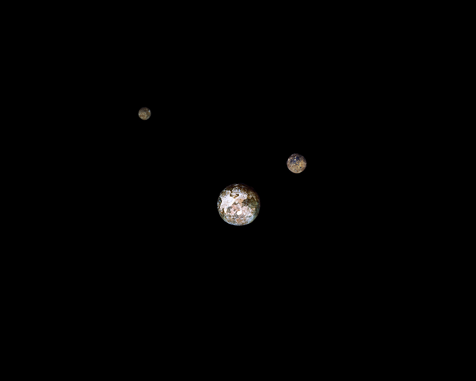
The first image in the book reminded me of the planets aligning in Stanley Kubrick’s 2001, until I discovered its title. Musket Balls. A fitting opening salvo, given the subject matter. Photo by Shane Rocheleau from YAMOTFABAATA

Kenn Sava (KS)- Let’s start near the beginning, Shane…When did you first become interested in Photography?

Shane Rocheleau (SR)- First day of classes a couple weeks ago, I asked my students a similar question: “I didn’t discover photography until my freshman year of High School”; “In fifth grade”; “When I was three”. That artists are discovering photography so young is wonderful news for the medium. Photography found me when I was 22.  Two friends of mine and I went cross-country in a 1990-something blue Ford Escort Hatchback. I had no illusions that I’d write the great American road-trip novel, but I figured I’d try anyhow. First night, we camped on the shore of Lake Eerie.  We awoke next morning seeing sparks and feeling the gasoline running through us, intent on getting elsewhere. My buddy handed me his little Kodak Andvantix camera: “Take a pic of me at the water’s edge.” “Yup, got it.” When I released the shutter (and I’m very sorry for the pun, but) something clicked. I really never gave him that camera back. Every town we hit I went straight to the drugstore to find film. Photographically, I’m still on that trip. (Suffice to say, the novel didn’t get written.) 

KS- What, or who, were your influences?

SR- It was somewhere in Wyoming in July, 1999 that I said to myself, “I think I want to be a photographer.” At that moment, I knew of exactly one photographer: Ansel Adams.  Through him, I discovered Edward Weston, Minor White, and Wynn Bullock. The latter two became my heroes. And for several years, I knew very few others, maybe only Richard Avedon. I’ve always tended toward the hermitage, and my hermitage kept me fairly naïve in those pre-Google days.  

In the last decade, though, I’ve been endlessly influenced!  To name a few:  Ron Jude, Heikki Kaski, Dana LIxenberg, Alec Soth, Katrin Koenning, Bill Henson, Brian Ulrich, Cig Harvey, Greg Halpern, Robert Bergman, and on and on.

Narcissus. Photo by Shane Rocheleau from YAMOTFABAATA. To read Mr. Rocheleau’s comment on Ovid’s Narcissus, click this footnote1.

KS- I’ve seen some of the images in YAMOTFABAATA previously in A Glorious Victory online- What’s the genesis of YAMOTFABAATA?

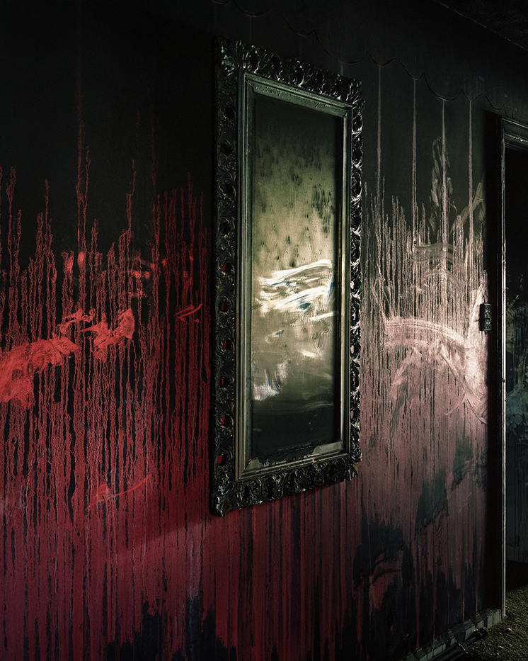
SR- My collaborative project (with Stanley Wolukau-Wanambwa and Brian Ulrich, primarily), A Glorious Victory, is about Petersburg, Virginia, and one I worked on immediately following Oyster Park, (a series of pictures I made 2011-2013, when I spent days and night hanging out with a local group of homeless men). While it’s impossible to pinpoint the moment YAMOTFABAATA began, it may have been when one morning a prospective portrait subject walked me around to the front of the motel where I’d been spending time. The police, medics, and press had gone, but the murder scene remained, seemingly untouched (“Site of the Death of Edward Jones”).  The rich red vestiges of a man’s life left me drained and scared and liminal.  I didn’t make a picture for another month. My guess is that when I picked the camera up again, it began turning away from Petersburg and toward myself. Slowly out of this inflection point rose YAMOTFABAATA.

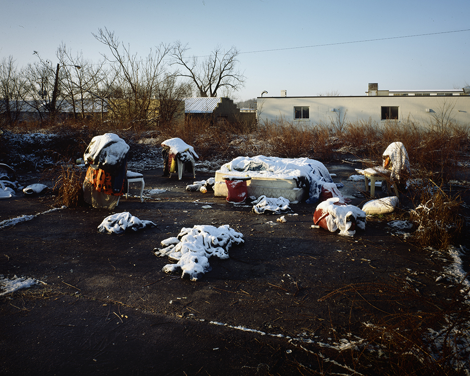
George’s Camp in Snow, from Oyster Park. About as clear of a definition of “homeless” as I’ve seen, and one of the most poignant. Photo by Shane Rocheleau.

KS- You’ve taken numerous Photos of homeless people, including those in Oyster Park, which is about them, as you say, and again in YAMOTFABAATA, where they are one element of the larger picture. When did you begin to take Photos of the homeless? Was it hard to gain the confidence of these folks?

SR- I moved to the Southside of Richmond in 2012. After work each day, I would take my exit home and pass a group of men who shared the corner at the bottom of the ramp. I lived just three blocks from where these men spent their days. On closer inspection, I realized there were tents everywhere, hidden if one doesn’t think to look. These men were my neighbors. Over a few months, I just couldn’t shake that “homeless” men may be the most objectified demographic in our country. One day I stopped my car and walked up to Deano, Lee, Juan, Bob, and George. 

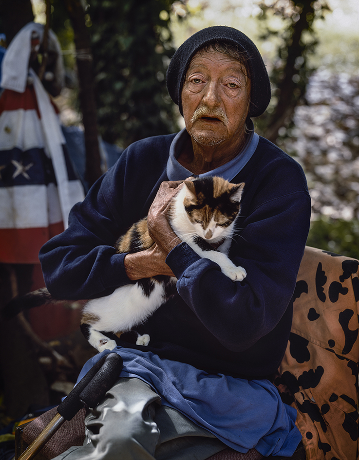
Deano and Kitty Kate. One of the Photos that appears in both Oyster Park and YAMOTFABAATA. Photo by Shane Rocheleau.

I told them who I am, that I’m a photographer, and asked could I sit down and talk? And they welcomed me. Some were more wary than others, but each of them, over many months, opened up to me; as did others who later arrived into this little community. I can’t remember the catalyst, but several weeks later, I made my first pictures. I hung out day and night, learned about their lives and they about mine; and, I made pictures. After 18 months, the shape of the area drastically changed, their tents and belongings were discarded by developers, and though I was able to keep in touch with some of the men initially, I haven’t seen any of the men in many years. The men of Oyster Park taught me more about life and humanity than anyone or anything before or since. I’m so grateful for my time with them.

KS- YAMOTFABAATA‘s Photographs seem to be taken in various places. How long did the project take to shoot, and then to put into its final form?

SR- The pictures in YAMOT were made mostly in Virginia. There are several from Tennessee, as well, and one each from California and Alabama.

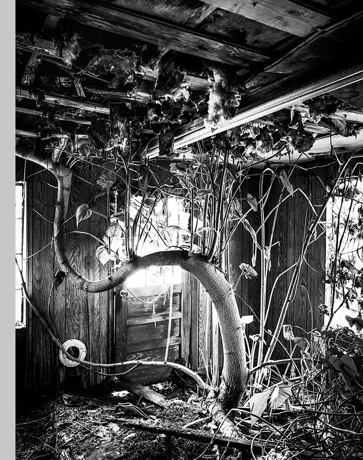
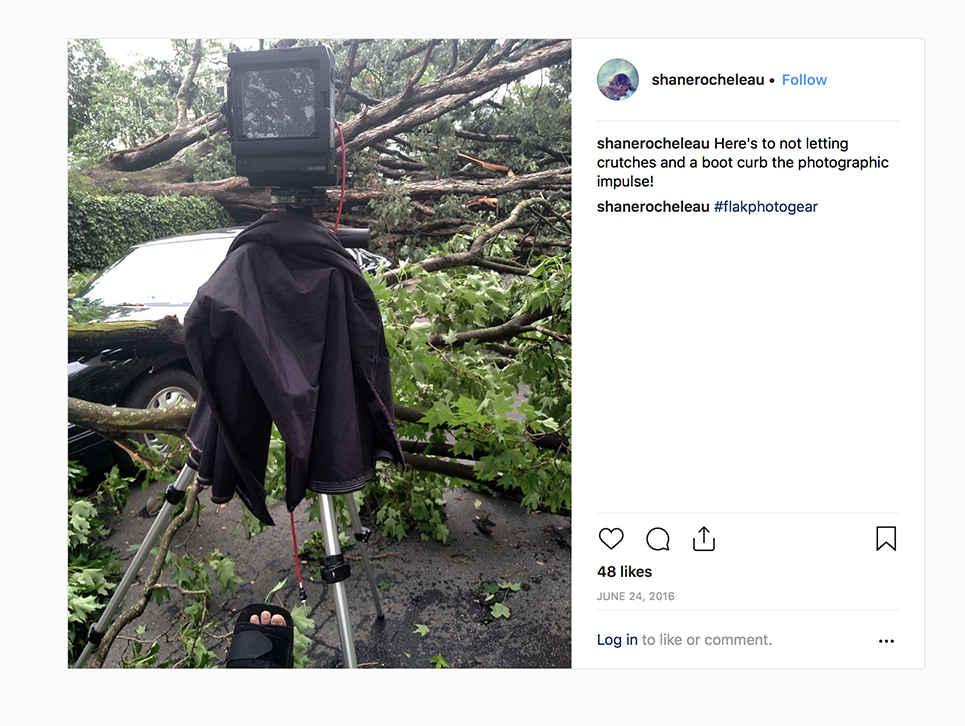
Behind the scenes. Even a torn achilles injury, devastating for us mere mortals, didn’t keep Mr. Rocheleau from creating Photos for YAMOT. Here he (at least his booted foot) is seen using his Toyo 45cf 4×5 field camera at the scene of what is now the Photo ——– (redacted. My read is Fallen Tree) in the book. Photo from Shane Rocheleau’s Instagram feed, June 24, 2016.

I made pictures exclusively for this project for about two years, but its first pictures were made several years earlier. The final form of the book took shape over a year and a half, and then, near the end of that process, I made several new pictures in a flurry of excitement and desperation. Though the book had been essentially finished, I now can’t imagine it without at least two of those new pictures: God and War (Inheritance), and, Untitled, which is a picture of my daughter. They feel necessary.  

KS- Among those places, you’ve Photographed Virginia for a number of years, where you live and teach (I believe), what is it that particularly appeals to you about it as a subject?

SR- I live and teach in Richmond, VA. The narrative of American History criss-crosses Virginia through parts of five or six centuries. It feels like it’s all here: our earliest settlers and their struggles, John Smith, early treaties with and betrayals of Native Americans, the birth of our governing philosophies, Slavery, the Civil War and Confederacy’s Capital, John Wilkes Booth, Jim Crow, Free Black settlements, World War II and the military, the rise and fall of manufacturing, Civil Rights, 9/11, and so on.  

But, truly, I photograph here because I live here. I’m just lucky that Virginia is so narratively and historically rich.

Photographer & Publisher Jason Koxvold, facing with his arm on the table, and Photographer Shane Rocheleau, right, discuss the finer points of their terrific new books at the Gnomic Book table at the LES Fotobookfair, July 21st, 2018, the day I discovered YAMOTFABAATA.

KS- How did you come to meet and work with Jason Koxvold and Gnomic Book?

SR- Our mutual friend, Stanley Wolukau-Wanambwa, used to host photographer gatherings at Jason’s Brooklyn studio. On occasion, I’d drive up from Richmond to partake. Stanley and I would arrive early, and Jason and I invariably hung-out before the raucous arrived. We became easy friends. The very last one of these gatherings, Stanley snuck my book dummy. Jason was the first to look at it that night. Soon after, he started Gnomic. I received an email one morning about a year later; he asked if I might consider that YAMOT be its second project.

Spend any time around these two Artists and it’s immediately apparent what good friends they are. There’s an important lesson here that obviously translates directly to the quality of their end product.

I was close to publishing elsewhere, so I felt immediately reticent. Jason is driven and smart and talented. And he’s my friend. I wanted to work with a friend, with someone I knew I could trust. In the end, it felt obvious and simple.  

KS- The book is an exceptionally beautiful object. You’ve spoken about the trip to Germany to print it, could you talk a bit about the planning that went into it? What role did Jason & Gnomic play in its realization?

SR- Jason and I Skyped or met almost weekly between December, 2017 and early March, 2018, when we departed for Germany. Each time we had a general agenda and discussed those items: design, sequence, materials such as paper type and fabrics, distribution, the Kickstarter campaign, where to print, whether to take a boat or a plane to Europe, font, the sources of my anxieties as best as we could identify, size of letters or pictures or drawings or run, whether this thing or that thing should be centered or just look centered, and so on. We beat to pulp any detail bigger than a quark. 

Though we each gave the other lots of feedback: ultimately, our roles were fairly distinct. I sequenced the pictures, chose the text, and prepared the files for printing.  Jason designed everything. He chose the font and the fabric, designed the layout, created and kicked-off the Kickstarter, and planned our European caper. I’m so thankful to have found such an energetic, talented, and supportive partner in the realization of YAMOTFABAATA.

At this point, I’m bringing Gnomic Book founder/publisher Jason Koxvold in.

The multi-talented Jason Koxvold, who’s Gnomic Book is quickly becoming one of the most important newer PhotoBook publishers in the world. Here, he gives me a peak at a secret- Shane has made a few signed prints from YAMOTFABAATA in two sizes that are indeed for sale! Two portraits, in the smaller size, may be seen behind him on the right in this Photo are 100.00 each. The beautiful, larger size, that Jason is showing me are 200.00 per. You heard it here, first.

KS- Jason, how did YAMOTFABAATA come about from your end?

Jason Koxvold (JK)- In 2016 I was fortunate enough to see a maquette that Shane had made of his book, and it immediately resonated with me. As we became closer friends, we started to talk about publishing the book. Shane is one of the most intelligent people I know, deeply intuitive and yet rigorously thoughtful, so the process of editing the book and rationalizing design decisions was a pleasure.

KS- At the LES Fotobookfair, I was enthralled listening to stories told by publishers and artists about the finer points of bookmaking. Given this is your first book, and since so many Photographers are interested in making PhotoBooks, how did you learn so much about what to look for that you used in making YAMOTFABAATA such an exceptionally beautifully produced book your first time out?

Shane Rocheleau- Firstly, I have many wonderful, giving, and engaged friends; many looked very closely at the many manifestations of this project. Their feedback was invaluable and inspiring. Without those whom I thank at the end of the book, there is no book.

I look at Photobooks weekly. Even if unconsciously, I’ve learned a rich Photobook language through this practice. I’ve thought enough about my new lexicon that some of my decisions felt rather natural and intuitive, like speaking. But honestly, that production value is on Gnomic. Jason is uncompromising on quality. I think it’s beautifully done, too; I didn’t imagine it would be this beautiful.    

KS- What was the most difficult part?

SR- Printing day front flanked me; I marched with the work toward it. I’d never needed to commit so fully to artistic action. Nothing was more difficult than finally yelling charge and letting the work go, committed and flawed and unfinished, off to the printer, off my desktop, dispossessed. I felt beleaguered, like a lonely, impotent General slumped in a three-legged chair. (Except no violence or gore or threats to life and such.  How privileged am I that that’s one of the more difficult things I’ve done in years?)

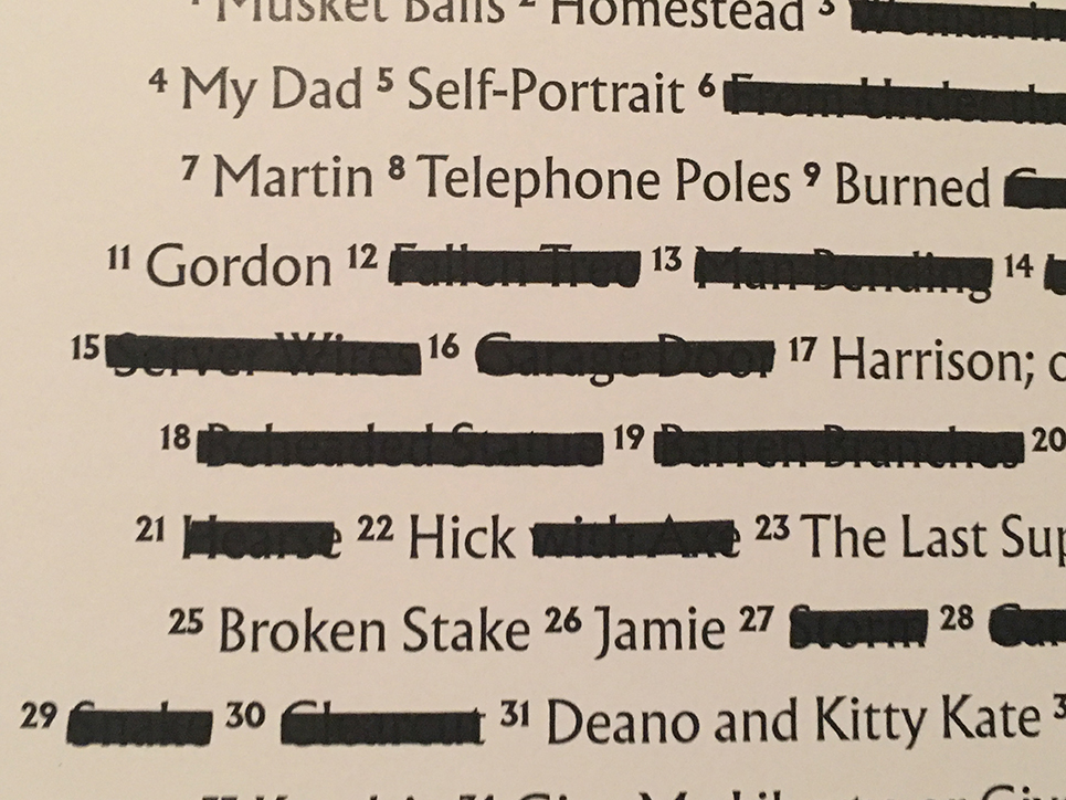
Excerpt of the Title List

KS- The Title List is sure to fascinate readers. 20 out of the 50 images have their titles fully crossed out, another 10 are partially crossed out. If a reader is really determined, they could most likely still make out many of the crossed out titles. Without giving away the mystery, could you speak about why you decided to do it this way, and why you decided to use the black marker instead of naming them “Untitled?”

SR- I don’t mind “Untitled” as a title. I do mind 40% of pictures titled this way. I don’t like that sort of redundancy. But I also don’t like when titles give too much away. With that said, some titles – and the information carried therein – were absolutely necessary for the book’s narrative (think Patrick Henry’s words, or that the building near the end is a Federal Reserve Building). My quandary then:  how do I balance that I want to withhold information and avoid repetitively titling pictures “Untitled” and provide the information I deem integral to understanding this book?

I’ve used redaction in past projects, so I already had the language at my disposal. Given that redaction is an indispensable element of propaganda and indoctrination, the solution seemed almost obvious once it suggested itself to me. Plus, it’s interesting to look at. The unintended benefit of this solution is that the title page is part of the art rather than a perfunctory addendum.

KS- Another element is the fairly frequent use of blank pages. I counted over 50 including 5 sets of double blank (facing) pages. In many cases, they serve to set off an image on the opposite side, which is common in PhotoBooks, though their appearance, particularly in the use of facing blank pages, feels unpredictable. Are they purely there as a means of pacing the images, or…?

SR- In music, there are breaks.  Those breaks signal a shift and are necessary for establishing rhythm. I love thinking of Photobooks as musical. I tried to sequence and break YAMOT musically, if you will. But with that said, I know no more about music than what I’ve gleaned while listening. My best instrument is my voice, and it’s not good.

Also, while a book requires that individual pictures be sounds in a larger symphony, I also wish for each picture to be a self-contained piece. As you note, much of the book has one picture per spread, alone in space; of course, each still generally follows and is followed by another. This solves my need to eat my cake and have it, too.

KS- There’s so much that YAMOTFABAATA has in common with Knives, your publisher, Jason’s, terrific new book. Both deal with the failure of promises and institutions, the realities brought on by a changing world bringing shrinking opportunity in the USA for many, and the state of the country the white majority has created  Your’s is more abstract, while Jason’s is more documentary. Jason’s looks at life in the Hudson Valley, after the loss of its 150 year old cutlery industry, and your’s looks at a wider realm. Still, they’re two sides of the same coin in so many ways. Is that coincidental?

SR- On the one hand, it’s absolutely coincidental. Jason and I each began our respective projects independent of the other. On the other hand, Jason and I are friends.  We have conversations, many of the same concerns, and, as fairly well-off white dudes, similar experiences in the world. He thinks deeply about his position, and I try to, as well. It is not a coincidence that as persons participating in the same on-going conversation – on whiteness and race, poverty and opportunity, privilege and responsibility – we would independently make work addressing those very things. Indeed, many of my photographer friends are making work that at least obliquely confronts these same cultural difficulties, ills, and realities. 

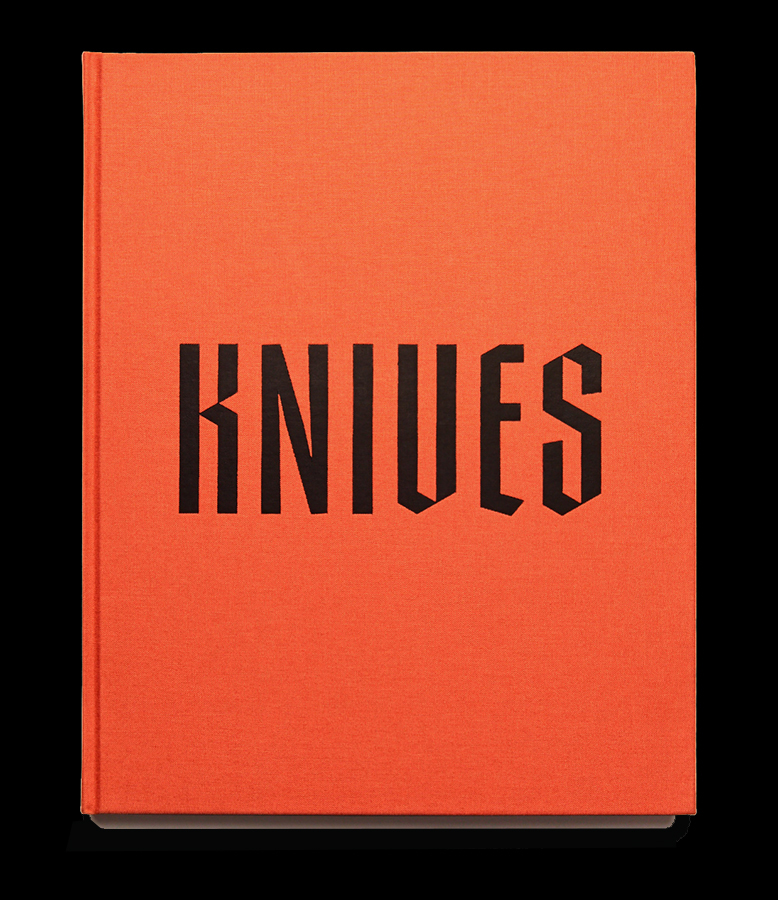
Knives by Jason Koxvold.

KS- I then asked Jason if he hesitated to publish YAMOTFABAATA because of its similarities to Knives, or if he saw it as “complimentary.”

Jason Koxvold- Shane and I were both coming at the same themes from very different angles; in that regard the two can be seen as complementary to some extent. I like that in viewing both, readers might build some kind of mental Venn diagram in terms of where our ideas overlap and where they don’t.

KS- On the Gnomic site, it says that the focus is on exploring the notion of the book as object, which is easy to see with Knives, its sister book, You were right all along, (or YWRAA) and YAMOTFABAATA. As far as YAMOTFABAATA goes, what were the particular challenges in making such a beautiful book?

JK- Each book we produce is an attempt to make something greater than the sum of its parts. With YAMOTFABAATA we wanted to echo the quality of religious texts in the form of our book, using an iridescent purple cloth, gilded edges on the book block. Each of these decisions incurs some level of cost and technical challenge; our printer had to outsource the gilding to a company that specializes in bibles. Fortunately, working with experienced craftsmen in ‘Old Europe’ gave me a great deal of confidence in the process.

KS- Given your diverse and successful background, why did you decide to start Gnomic Book?

JK- I wanted to leverage and combine skills which I had acquired over the course of my career to make objects that have some kind of permanence, collaborating with different artists to do so. It’s truly a mutually beneficial process.

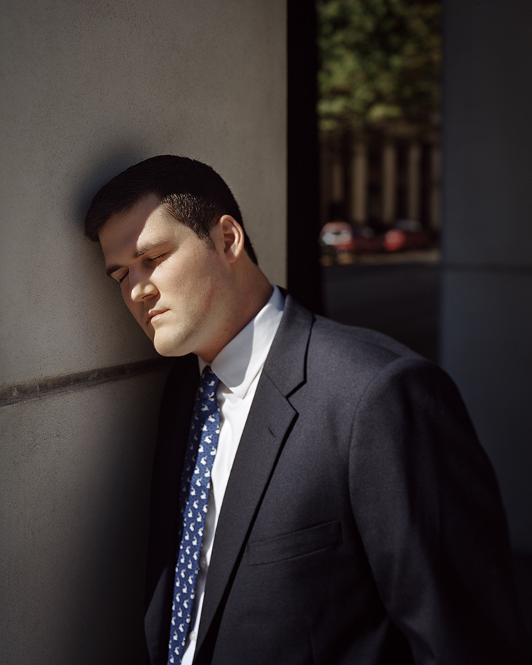
Harrison, or White Whales. Photo by Shane Rocheleau from YAMOTFABAATA

KS- Before I actually saw it, I heard the book is ostensibly about white masculinity. That turns out to be true, as it shows what those in power and their institutions have made of the world. However, none of the white men depicted seem to be enjoying themselves or their “status” in the world. Then, there are other themes that run through the book- religion, decay, death, national institutions, and hovering over all of it, the power of nature to superimpose its supreme will on man at any given point. That’s a lot to take on in one book. Did it feel that way when you were making it?

Shane Rocheleau- There is a contradiction driving white male rage in this country: at the top, white men still reign. Women and minorities represent less than 20% of congress, for instance. But uniformity at the top is belied by a slow progression toward equality in the body politic.  White men in this country are raised by parents and the American Dream alike to believe power and supremacy are their personal destinies. Except it’s not, not for most white men. Many white men, like so many other demographics, are struggling.  (And for those who aren’t struggling so much? Loss is loss, even to one who still has more than everyone else.) Increasingly, white men must settle for less than supremacy. While you and I know this to be right and necessary, I imagine many white men have not resigned to relinquishing any of the historical spoils of being born white and male, especially when in both cultural messaging and the demographics of power, the opposite is suggested. It’s important to me that I seek to empathize. The men in my book, largely, represent this contradiction. I wish I knew how to demonstrate that equality is not a zero-sum game. The lesser the inequality, the happier and more decent everyone becomes, bottom to top.  

To your question about taking on so much in this book: I’m always some version of overwhelmed and confused, so inasmuch as I always feel a bit like I’m taking on too much, it absolutely felt that way when I was making this work. With that said, I wanted to address each of those themes you highlight. It was a fun problem to solve: how do I weave so much into so little? My answer is my book. 

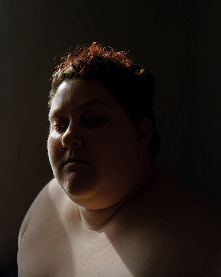
Jaime. Photo by Shane Rocheleau from YAMOTFABAATA

KS- The 4 women in YAMOTFABAATA each seem lost in thought. In Jason’s “Knives,” one of the final Photos is of a mother who stares out at the camera while holding a young child. In your book, your daughter is seen in the final image. In it, we see her through what appears to be a rain streaked window, where we can barely make out that it’s a young woman, but, as in many of the other portraits in the book- of male and females, we can’t see her eyes. I see dread and melancholy in this image. How is the young woman going to deal with all of this metaphorical “rain” in the world? The window is made of glass, and so provides limited protection from the world while allowing a chance to see it outside. Perhaps, she’s sleeping through the storm. Perhaps she’s lost in a dream, or lost in thought, or worry about it.

SR- I appreciate that reading. And to continue it, maybe, after the storm’s climax: the rain should let up, as rain does. The young woman steps outside. The gentle day drips and refracts little miracles, smelling of nectar and the dusty after-rain. And then the flowers grow, the bugs buzz songs under a symphony of chirping, and the world in her eyes can be new and open. For my daughter, and everyone else, I hope this is the case and that after the storm it’s better than before:  kinder, calmer, with less disparity and more community. As I write this, though, I’m scared I hope for too much, and I don’t know if I’ll be there for it anyway, if it does ever manifest. Maybe it will, and maybe that’ll be my daughter’s book.

My Dad, Photo by Shane Rocheleau from YAMOTFABAATA

KS- Elsewhere, your father is included, and there’s a “Self-portrait,” interestingly showing only your right arm and hand, which you probably use to take your Photos with. These, and the Photo of your daughter add to the autobiographical nature of the book. How did they feel about being included?

SR- My daughter refuses to be photographed. I got lucky with this picture: I was making a picture of my girlfriend’s mother, Holly, seated right there where my daughter is seated.  My daughter wanted to help. Because I needed to direct Holly and she is seated inside a closed car, I called her cell phone. She placed it on speaker then on the passenger seat. I gave my daughter instructions for Holly, and she relayed those instructions through my cell phone. After we were finished, I think my daughter was taken enough by the whole experience (and hopefully by all the wonderful seeing!) that, for the first time ever, she asked if I could photograph her. Absolutely!  

But while myriad subsequent gestures suggest she’s really happy to be a part of the book, she hasn’t explicitly said so (she’s not just in a picture and the subject of the dedication:  she also hand-wrote the title for the title page and drew a little drawing that’s hiding toward the end). As for my dad: same. I think he’s happy to be part of it, but he’s thus far kept it to himself. Everyone has those things they haven’t the tools to express.

Site of the Death of Edward Jones. Unforgettable. Photo by Shane Rocheleau from YAMOTFABAATA. It also appears in his series, A Glorious Victory.

KS- I will preface it by saying I’ve learned the hard way not to ask about specific works less the answer takes away some of its mystery. I’m hoping that won’t be the case if I ask you about Edward Jones, as in “”Site of the Death of.” I haven’t been able to find out who this might be.

SR- Edward Jones is the man who bled out above that spot. He was shot in the head in a drug deal or burglary gone wrong. I arrived at the motel where he was staying to make pictures of another resident, unaware what had transpired just hours earlier. Though the police had left, the blood that had dripped from the second floor onto the parking lot below remained. It was the most horrific thing I’ve ever seen and felt. And that’s the short story. As for where? Petersburg, VA. I felt like I needed to name him. It felt like the right thing to do, rather than entitle the picture “Site of Anonymous Man’s Death” or something of the sort.

KS- In the midst of so much darkness we move through in YAMOTFABAATA, and the white-male led world today …so many failed promises, including “the American dream,” so many broken institutions, including religious ones, there’s also the ever-present possibly of disaster…man-made or natural, all of which is poetically rendered in your book. The images speak to a world that’s cracking, not seemingly working for anyone depicted, particularly the deceased Edward Jones. YAMOTFABAATA leaves me feeling that it’s hard to have hope in 2018. You appear in the book as an older version of your father’s child, with your own child appearing at the end. And so, you’re in the middle. As much as the book looks forward to your daughter’s generation, it’s also a looking back on your father’s and our generations. It’s obvious that things didn’t get this way in one day, and the weight of history is, at this point, daunting. Given all of this, why did you decide to dedicate it to your daughter?

SR- In the ways I know how, I am working to make my world a better place than it was before me. I think both my parents really did try to do the same thing. They raised me well, lovingly, to be a kinder, more open human being than was recommended to them.  I’m empowered by this demonstration in my life of how to actively make things better than they were. I want my daughter to be empowered by the same demonstration. I hope I raise her to be a decent and active participant in whatever community she finds herself. Like her picture, the dedication is an act of faith in the face today’s discord; I can’t tell the future, so I won’t suggest to her that discord is inevitable. She has power.  I hope she uses it for good, and better than I’ve used mine.

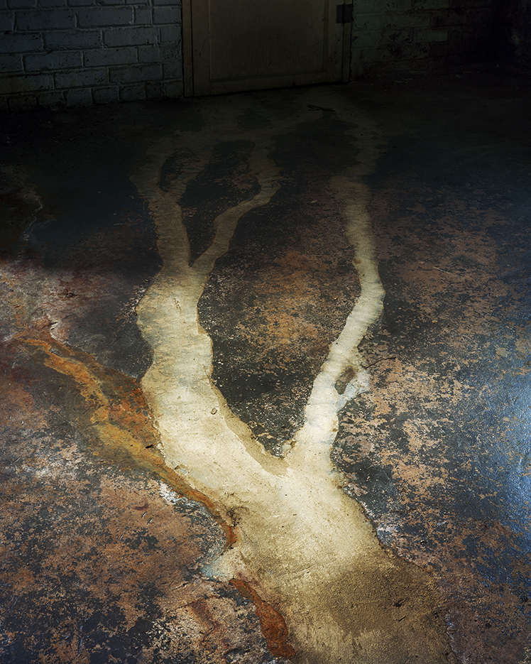
——- Cellar Door The first three words are redacted, hidden under a black marker strike through. My reading is From Under The Cellar Door. Photo by Shane Rocheleau from YAMOTFABAATA.

KS- Since NHNYC was originally primarily a Painting site, until it was hijacked in the dead of night by Photography in late 2016, I have to ask you what, if any, role Painting has played in your Artistic life and development.? (If any, which Artists or works?)

SR- I grew up loving Picasso. I think he taught me that strange can be good and about balance inside a frame.  When I studied a bit of art in college, I found myself compelled by the Hudson River painters, Caravaggio, J.M.W. Turner, and Rembrandt Peale, amongst others. More recently, I’ve loved Lucien Freud and John Currin. I’m guessing you can tell by this list, though, that I’m not exactly keeping up with the trajectory of painting. I can say this, though: I work my photographic files very much like I imagine a painter might. I add and subtract color and tone in strokes, attempting to create a canvas that can instruct and contain the viewer’s eye. I fear, though, that even in saying that, I sound a bit naïve!

KS- You thank Gregory Halpern. Being very taken with his work, myself, as I’ve written many times, what was his involvement in this…if he was?

SR- I don’t know Greg that well, but I respect him immensely. He’s as good a person as he is an artist. Greg was not involved, per se. But at that same photographer gathering I spoke about earlier, he was the last person that night who looked at my book dummy.  The next day, he, Stanley, and I were walking in Manhattan and Greg pulled me aside. He apologized for not commenting on the dummy the night before. Still reeling that anyone saw it – nevermind one of my heroes – I froze. He told me he loved it and asked if he could recommend it for a fairly major prize. That moment drew me as close to vertigo as I’ve probably ever found myself. He told me that my “pictures are meant to be seen”. Because of Greg’s gesture to me that day, I have a blessing to allow for just that.

KS- You’ve spoken about thinking of music while you were editing and sequencing YAMOTFABAATA. Do you listen to music while you Photograph?

SR- I don’t. I photograph with only the sounds of my environment, and when I’m under the dark cloth, I don’t even hear them. But when I’m editing? I blast music! You’re likely to hear Radiohead, Tom Waits, Mazzy Star, Pearl Jam, Tragically Hip, David Bowie, Lou Reed, Pink Floyd, and 80s hits, amongst others!

KS- The book has gotten quite a bit of critical notice already. Does that surprise you?

SR- Yes, I’m totally surprised. I believe the work I’m making is relevant and worth seeing, but I also understand that there are significant challenges getting work in front of an audience beyond my small community of friends and artists. I’m so happy YAMOTFABAATA is getting noticed.  I never expect exposure. This is a wonderful surprise.  

KS- Finally, with your busy life, have you had any time to think about your next project?

SR- I’m deep into my next project. Though it’s still shape-shifting too fast to capture, I’m really excited about it.  It’s about the smallness of a human being, paranoia and his ascetic’s loneliness, oblivion and artifacts, spiders and webs and life-cycles…if any of that makes any sense at all. I guess we already covered that I’m generally overwhelmed and confused; I’m also generally excited by my work, in spite of all the persistent liminal turmoil!


BookMarks

Good friends make very good books…and a bag.

YAMOTFABAATA, which contains 56 color plates, is currently available in a first edition/first printing of 500 gorgeous copies, which are not going to last long. It may be purchased here, or here.

Jason Koxvold’s Knives (and its tote bag), may be ordered here, or here, 

Aint-Bad Curator’s Choice, Issue No. 12, may still be available here. If it says “sold out,” email them directly and ask. They told me recently there are a few copies left. It contains 15 curators each getting a section, who choose 31 Photographers between them, representing what they feel are “the best of contemporary Photography.”

*-Soundtrack for this Post is Karma Police, by Radiohead from 1997’s O.K. Computer. Lyrics are here, video, right here-

My thanks to Shane Rocheleau, Jason Koxvold and Kris Graves.

My previous Posts on Photography are here

NighthawkNYC.com has been entirely self-funded and ad-free for over 6 years, during which over 250 full length pieces have been published. If you’ve found it worthwhile, you can donate to keep it going & ad-free below. Thank you!

Written & photographed by Kenn Sava for nighthawknyc.com unless otherwise credited.
To send comments, thoughts, feedback or propositions click here.
Click the white box on the upper right for the archives or to search them.
For “short takes” and additional pictures, follow @nighthawk_nyc on Instagram.

Subscribe to be notified of new Posts below. Your information will be used for no other purpose.


  1. Shane Rocheleau- “I’ve been meditating on empathy for over a decade, now, on its receipt and provision and on its absence. But when I read Ovid’s Metamorphoses, empathy became immediately central to my practice. Upon a closer reading of the Narcissus myth, I realized it isn’t about Narcissism at all; rather, it’s about the power and necessity of empathy. Narcissus is not a Donald Trump; he is a beautiful boy living in a Greek culture wherein beautiful boys are lusted after and objectified (this culture does the same to young, magazine-thin women, for instance). When Narcissus kneels to the pond, he sees his reflection and remarks:
    I reach, your arms almost embrace me, and as
    I smile, you smile again at me; weeping
    I’ve seen great tears flow down your face (…)
    Narcissus had only ever seen lust and admiration in the eyes of others; never had he seen his complex, human emotions returned to him. That new experience felt so necessary that he stays with its giver, forsakes sustenance, and ultimately dies.The combination of my giving this ancient character overdue empathy and coming to understand that empathy is this powerful and necessary was a profound and important personal experience. I am a better artist and person because of it.”

Ai Weiwei’s Mute Witnesses

This is the second of two Posts about Ai Weiwei’s 4 recent concurrent NYC shows. Part One, about Ai Weiwei: Laundromat, at Deitch Projects, may be found here. This piece is on the other 3 shows. 

Written & Photographed by Kenn Sava.

Show Seen: Ai Weiwei: 2016: Roots and Branches, Lisson Gallery, Chelsea

If there’s one thing I think NYC needs many more of, it’s trees. Given the extremely high rate of tree deaths here1, it’s always great when new ones show up. Even transiently. Ai Weiwei temporarily added to our tree population in 2 of his 4 shows, as only he could. Though it’s been over for nearly a month as I write this, I continue to think about this show every day, only partially due to the meditative properties of trees.

Lisson Gallery, December, 2016, nicely nestled under the High Line. Click any photo to see it full size.

Walking into the long rectangular space of Lisson Gallery on West 24th Street in Chelsea during “Ai Weiwei: 2016 Roots and Branches,” you’re confronted by a “forest” of 9 massive tree parts (3 measure almost 16 feet each) situated among 4 newly exposed and equally massive columns for the High Line, which runs directly above the gallery’s ceiling. Along the seemingly endless right hand (western) wall, 16 rows of black and white graphic images fill it’s wallpaper. The other 2 walls remains stark white (the 4th wall being the doors). Natural light streams in from both sides of the long ceiling as if there really were a canopy of leaves and branches above the “trees” allowing only some sunlight in.

A “Zen Garden” of the beauty, and horror, man can create. 7 of the 9 sculptures are seen, or partially seen, along with a partial view of the wallpaper, right.

But, these tree parts show no signs of life, the ones that “stand” only do so due to placement. Or, is it dis-placement?

Though their arrangement invites walking around them and viewing them from all sides, a relevatory experience in itself…

9 views of the same piece- Iron Root, 2015. Seen larger, below-

it is viewing them from one angle in particular- directly behind, that one gains a unique perspective. Standing behind them (to their east, that is) you see them with the wallpaper behind them. The effect struck me as making them “mute witnesses” to the seemingly endless spectacle unfolding on the wall. The saga unfolding therein is about war and displacement. The displacement of countless thousands of refugees due to the war in Syria.

A view of just about all of the 200 x 25 feet (my estimate) of wallpaper.

The wallpaper is also designed to be looked at every bit as closely as the tree parts are.

A close-up. You’re not alone if you think you’re looking at real tree bark. Then again? I never get out of Manhattan. This is cast iron.

So encouraged, I returned again and again, continually seeing something “else” so often that after 15 visits, I stopped counting. The first thing that’s striking is it’s all in black and white. Looking a bit closer you note the poses, the lack of detail, and even some of the outfits call to mind the Ancient Greek Vases I’ve seen often at The Met, which is fitting since Idomeni, home of the camp in Ai Weiwei’s Laundromat, is in Greece.

About a third of the wallpaper. Each row seems to have it’s own theme.

There’s a lot to see. A detail of 12 of 16 rows in this section.

From bottom- 2 rows of the refugees in flight- by boat, by foot, by vehicle, while the third row depicts the reasons why. In the 4th row from the bottom, Ancient Greek soldiers march on the left, while their modern counterparts march to the right of the fighting animals. Directly above them in Row 5, Ai Weiwei’s iconic extended arm and middle finger looms as a repeating circular motif, which will appear again. To the left in Row 5, a backhoe picks up the clothes left by the refugees in the Idomeni Camp that would become the clothes in Ai Weiwei’s show, Laundromat.

Looking even closer, I realized that some of the motifs recur, except in the very middle! There, in what musicians call “the golden section,” some fascinating images appear. They include Michelangelo’s Vatican Pieta, and a variant of the image of Nour Al Khzam, the 24 year old Syrian woman refugee who Ai Weiwei had a piano brought to the Idomeni Camp for, (as I wrote about, and Posted a photo of, in Part 1)! We see her playing the piano, while others (including Ai Weiwei himself, seen from the back) hold up a plastic sheet to protect her from the rain that day. Yet, in the wallpaper, we don’t see rain. So? Perhaps they are protecting her from everything else that’s going on. Is this Ai Weiwei’s way of speaking about the value of protecting your creativity, no matter what’s going on around you? Or, protecting what’s most important to you? Or, does it speak to overcoming all over this and having a life after, like Ai Weiwei, himself did?

The wallpaper’s “Golden Section,” (the darkened center section) features Nour Al Khzam right smack dab in the middle of the entire 200 foot piece (rows 6 & 12). Also notice Michelangelo’s Vatican Pieta, just to the left of center in rows 3, 9 and 15. Elsewhere we see a huge explosion (rows 4, 10, 16) and a baby, perhaps abandoned, under trees (rows 1, 7 and 13).

A singular image. A close-up of the image of 24 year old Nour Al Khzam playing piano as Ai Weiwei (right) and others hold a plastic sheet over her. A photo of the event is here.

I was left to ask my friends, the trees.

If you were careful, you could stand inside the semi-circular Iron Tree Trunk, 2015. It felt like a hug.

I felt a terrible pang when this show ended on December 23, and I’ve missed it daily since.

Outside Lisson Gallery on December 26, “Iron Tree Trunk,” 2015, and a piece of the wallpaper still barely visible on the right. My tears are not shown.

Why?

Partially, it’s the beauty of these “trees.” They are contemporary sculpture at it’s finest, in my opinion. I could look at them endlessly. Partially it’s the wallpaper has sucked me in to trying to understand it’s every detail. Real trees spend their entire lives in one place. Something humans can’t imagine doing. Trees have been meditative objects for a thousand years in Zen Buddhism and elsewhere. They are that, here, as well. These “tree parts” were created from parts of dead trees brought down from the mountains of southern China and sold in the markets of Jingdezhen, Jiangxi province, where Ai Weiwei found them and brought them to his studio.

Maybe the show reminds me of life in NYC, where the few trees we have stand alone as all the chaos and activity of this insanely busy City happens around them. Perhaps, Ai Weiwei, who lived here for 10 years, intends this. Perhaps not. But this is no story of City life unfolding up there, with each of those 16 bands telling a different part of it simultaneously, perhaps symbolizing that these events were happening to so many people simultaneously, each making their own journey, and each with their own experiences and story. It’s a story that begins with the horrors of war and it’s various instruments (including Ai’s trademark surveillance cameras), followed by the long, treacherous journeys, of (too) many refugees, to lands unknown, their lives in the camps, a story that, unfortunately, continues for who knows how many. Here we come face to face with man- at his best, as when he is creating Art, and at his worst, when he is killing and ruining the lives of countless innocents, who have no one to turn to for help. Taken as a whole, Ai Weiwei has created one of the most unique Zen-like “Gardens” ever seen. One that offers almost as much to ponder as a “real” Zen Garden.

Ai Weiwei: 2016: Roots and Branches, Mary Boone Gallery, Chelsea

The new LEGO triple self portrait, Dropping a Han Dynasty Urn, a LEGO version of his well-known work of the same name from 1995, is seen in the background. Better view and details below-

Ai “was so much older then, he’s younger than that now.” And, “playing” with toys. Sorry, Bob. Ai Weiwei as seen in his recent LEGO version of his work, Dropping a Han Dynasty Urn, 1995

Besides Laundromat (the only show of the 4 with a different title), Ai Weiwei’s three other NYC shows, Ai Weiwei 2016: Roots and Branches, eshewed the use of his most renowned media- the internet, photography and words (seen to devastating effect in “Laundromat”) to focus on two other of his “signature” mediums- natural elements and ancient artifacts along with one newer medium- LEGO portraits, originally inspired by his son, who constantly plays with them. His LEGO works were previously seen in, perhaps, his most political show to date- Ai Weiwei: @Large, which took place at none other than the former site of one of the world’s most notorious prisons, Alcatraz. Ironically, Ai Weiwei, himself, was not able to attend that show as he was still living out the rest of his sentence following his 81 days of imprisonment, that saw him unable to travel internationally (because his passport was still held). At Alcratraz, the work, Trace, consisted of LEGO portraits of 176 people from around the world who have been imprisoned or exiled because of their beliefs or affiliations,” according to the show’s press release. This time, the LEGO Portraits on view at Mary Boone Gallery, Chelsea (a few hundred feet west of the Lisson Gallery show), were confined to Self Portraits. These were juxtaposed with two works in wood- both “sculptural,” and both “puzzles” in their own way, while, again, one wall was lined with gorgeous, fascinating wallpaper, this time in gold.

Tree at Mary Boone Gallery, Chelsea

In the main room, facing the LEGO triple self portrait seen above, a Tree was, again, the centerpiece, This time it’s one, monumental Tree, 25 feet tall, that is constructed of actual weathered sections of dead trees that, according to the press release, “may be seen as a comment on the strength of modern China built from many ancient ethnic groups, or a determined attempt to create something new and vital from what is irrevocably lost.” In China, dead trees are venerated as important counterparts to the dead on earth, the realm between heaven and the underworld.2 It stands in front of another monumental wallpaper piece, this one I believe titled “Golden Age,” another graphic tour de force. This work is based on images from AWW’s life- from the ever present surveillance cameras, police chains and handcuffs, to cats- all depicted in a lustrous 3-D gold. For me, it stands for overcoming oppression and turning it’s artifacts into beautiful objects that are, now, just another part of his life, like his beloved cats.

Golden Age, detail, and reflection.

Situated on center stage, here, Tree, is, seemingly, another work that speaks to modern China being a blend of many ethnic groups, like Map of China is, see further down. That the parts making it are dead, as is the whole construction, of course, is something I cannot offer a comment about. I can say that I find it a compelling idea, and object, and one that some of it’s base parts seemed to bear a resemblance to the Iron Roots seen at Lisson.

Also on view here was the amazing Treasure Box, a sculptural piece of furniture made of ancient reclaimed huali wood, which is actually an intricate puzzle box of sliding and locking components3

Ancient & Contemporary puzzles. Treasure Box, sits in front of Self-Portrait, made of LEGO bricks.

This is, surely, an aspect of Weiwei’s work that, while not by any means new, deserves more attention and study. The Mary Boone, Chelsea show struck me as being “about” things not being what they seem. Being “more,” perhaps, and being “other.” There’s still one more show left to see…

Ai Weiwei: 2016: Roots and Branches, Mary Boone Gallery, Uptown

40,000 spouts broken from antique Chinese porcelain teapots are surrounded by Finger Wallpaper.

The final show, at Mary Boone’s Uptown Gallery may be his comment on all of this.

Detail of the spouts

Finger Wallpaper, and detail-

Yes, a variant of this wallpaper, too, is available, here.

As the world has seen these past 6+ years since his “Sunflower Seeds” Show at Tate Modern, London, brought him to international renown in 2010, Ai Weiwei is a man with a strong conscience. He’s not shy to share it with the world, whenever, and wherever he sees things that bother him. While it’s tempting to say that he’s turning his attention away from China after his arrest and 81 day imprisonment in 2011, he said to the Council on Foreign Relations in November

“When I fight human rights in China, I never think that’s human rights in China. I think that’s human rights everywhere. That’s first. And also, when I’m dealing with situation outside of China, I don’t even think that it’s not going to help China, you know? Human rights is the value which I believe is universal, it relate to everybody.”

Garbage Container, an elegy to five homeless boys who suffocated in a dumpster while trying to stay warm.

Summing up…

The meditative effect of all four shows was the common takeaway for me, vastly different from the meditative effect of Mark Rothko: Dark Palette, a few hundred feet away from Ai Weiwei’s 2 Chelsea shows. While Rothko’s meditative impact is almost otherworldly, akin to standing in a door way open to…?, Ai Weiwei has us meditate on life, presence and absence, having roots and being rootless, what it is to be human, and what it should be to be human.

Speaking of “being human,” it almost looks like a hand. Or, maybe an extended arm and extended…hmmm…

For me, the shows seemed to flow into each other from south to north, beginning with Laundromat, the southern most, in Soho, to Lisson on West 24th, to Mary Boone, Chelsea, further west on 24th, and finally up to Mary Boone uptown. I have no idea if this was the intention, or not.  The Lisson show carries pieces of Laundromat, while the Mary Boone, Chelsea, shares the “tree” motif of Lisson, and Mary Boone uptown shares Ai Weiwei’s trademark extended arm and extended middle finger motif with Mary Boone, Chelsea, though it now is the overriding motif. It’s hard, for me, not to see this as Ai Weiwei extending his middle finger (and that of 39,999 refugees), now, to the “powers that be,” that have created and largely ignored this refugee crisis, while seemingly having little solution for the crisis to come. But? Your results may differ. Everyone is free to take from it what they will, or leave without taking anything from it. In this case, that would be a shame, and might be shortsighted. If it’s not “personal” for you now, it might be one day. There…but by grace, go I.

Golden Age, Detail. You, too, can hang (a variant) of this on your wall, here.

Of course, Ai Weiwei is not the only Artist who was a refugee. The 20th Century, for instance, is full of them. Some of them, like Marc Chagall, and the great composer Bela Bartok, created works of nostalgia for their homelands, not documentary works about being exiled. Then, there is Picasso, who created “Guernica,” in 1937, about the tragic bombing of that small Spanish town in his homeland, while he was living in Paris, where he would remain throughout the Nazi occupation that began a few years later, through the end of the Second World War, and after, in continuing exile from Spain. Perhaps the greatest artistic record of exile we have was created by a “young girl,”- Annelies, better known as Anne, Frank, the brilliant young writer who’s life ended at 15 at the hands of the Nazis, but who managed to write for the ages about her exile in her own country before she was discovered, and arrested in her “Diary of a Young Girl,” which has sold 30 million copies to date. While Ai Weiwei depicts, and documents, the Syrian Refugee crisis, he has only, as yet (as far as I know), documented his own exile in words. He’s spoken about it in interviews, and written about it in Ai Weiwei’s Blog. His words are chilling, unforgettable, and impossible for me to get out of my mind when I visited these shows. About the “earthen pit” his family lived in when he was 8 years old he said –

“…when pigs would run overhead, their bottoms would fall through our roof, making us all too familiar with the sight of swine nether regions….on one occasion, because there was no light in our earthen pit, my father was descending into our home and smashed his head on a roof beam. He fell immediately to the earth on his knees with a bleeding forehead. Because of this, we dug out a shovel’s depth of dirt, an equivalent to raising our roof twenty centimeters (about 8 inches).”4

While his mediums keep expanding (LEGO portraits), others, especially his sculpture and “furniture,” continue to evolve in wonderful ways. Yet no matter what he does, or what he creates with, his heart, mind, passion, and humanity- his core values, come through loud and clear. Not being one who’s given to compare creative beings, I still find it hard to think that this decade, that still has 3 years to go, is the decade of any other Artist. This is Ai Weiwei’s decade.

Like son, like father. Ai Weiwei says he was inspired by his son’s passion for LEGO to try them himself.

As this decade has unfolded, I find he reminds me of someone else. Another man from the East, who has lived in exile for a very long time. A man with a deep knowledge of the West, a man of compassion, wisdom and humanity. The Dalai Lama. One has written a book called The Art of Happiness, the other has done more than most others to bring compassion to those suffering, through Art. I make no comparison of them. I am simply saying that one brings the other to mind. In any event, there is no doubt that Ai Weiwei has gone from being an exile to being an unknown Artist and Art Student in New York for a decade to now having the eye, and ear, of a good part of the world. In doing so, am I alone in feeling that what he espouses about human rights and freedom sounds a good deal like what passed for “traditional American values” for most of my life?

A detail of the above. LEGO refused a bulk order from Ai Weiwei last year, which resulted in a furor that led to the company reversing themselves.

Artistically, these shows raised another question for me.

Even now, very rarely do I see his work on view in the museums here. Right now, The Met lists zero works of his in their online database of over 700,000 items (about 1/3 of their total holdings)! I do recall seeing 5 works of his displayed during the Ink Art: Past as Present in Contemporary China. Show there in 2014., including the one I photographed, below. It turns out that all five were lent to The Met. MoMA lists 12 of his works out of their 73,000 items currently online. Of those 12, 7 are photographs with his extended middle finger at various locations, 4 are books, and one is a magazine! I have to say I find it shameful that there is no major work of his in either The Met or MoMA! I would love for either, or both, to tell me why not.

Ai Weiwei at The Met! Map of China, 2006, a work that speaks to the mosaic of fragments that is China today, made from wood salvaged from destroyed temples, as seen (on loan) in the Ink Art in China Show in 2014.

While we see the results of uprooting in both it’s natural and unnatural ways, at Lisson, Ai Weiwei turns uprooting into creative acts in using the felled tree parts as the basis for his sculptures and the travails of the refugees who’s journeys he shows us in “Laundromat” into what he depicts so beautifully on Lisson’s western wall, in trying to give them a voice, and make their experiences known. During my daily visits, I, and many of my fellow visitors, stood looking at, and contemplating, the complex images that seemed to stretch out endlessly before us on that wall. Like the lines of refugees must have looked like in transit. When I was alone in the gallery, I was like the the cast iron trees before me standing as “mute witnesses” to what was going on in front of us on the wallpaper.

Now that this unique show that was equal parts horror show, and equal parts astonishingly beautiful- depicting the best, and worst of what man is capable of, is over, it’s up to all of those who saw it to not remain mute.

Since Ai Weiwei lived in New York for 10 years? In my book, he will always be a New Yorker.

Welcome home, Ai Weiwei. Come back soon.

*-Soundtrack for this Post is “Subterranean Homesick Alien,” by Thom Yorke, Jonny Greenwood, Phil Selway, Ed O’Brien and Colin Greeenwood of Radiohead, as performed on OK Computer.

NighthawkNYC.com has been entirely self-funded and ad-free for over 7 years, during which over 275 full length pieces have been published. If you’ve found it worthwhile, PLEASE donate to keep it up & ad-free below. Thank you!

Or-
I’M PLEASED TO ANNOUNCE I’M CURATING A SELECTION OF ART, ARTBOOKS & PHOTOBOOKS FOR SALE! All items are from my collection or specially selected in my travels through the Art world for my readers. The initial selection of over 400 items is here. Either way, all proceed go to support the site. With my thanks.

Written & photographed by Kenn Sava for nighthawknyc.com unless otherwise credited.
To send comments, thoughts, feedback or propositions click here.
Click the white box on the upper right for the archives or to search them.
For “short takes” and additional pictures, follow @nighthawk_nyc on Instagram.

Subscribe to be notified of new Posts below. Your information will be used for no other purpose.

  1. In my 25 years of living here, I’ve come to believe this is part of the reason for so many tree deaths. Not all of it. Part.
  2. https://www.royalacademy.org.uk/article/ai-weiwei-6
  3. It can be seen opened in the Royal Academy, London’s Ai Weiwei Exhibition catalog.
  4. Ai Weiwei’s Blog, P. 53