Charles White & Leonardo da Vinci…at MoMA!

“I am a traveler of both time and space
To be where I have been
And sit with elders of the gentle race
This world has seldom seen
Who talk of days for which they sit and wait
When all will be revealed”*

In all the years I’ve been going to MoMA, which pre-dates the 1980 Picasso Retrospective, this is one of the most unusual shows I’ve seen there. Charles White-Leonardo da Vinci. Curated by David Hammons consisted of two works. Well? Four works if you count the two Vedic astrological charts included. Two works of Art…both masterpieces, separated by more than four and a half centuries.

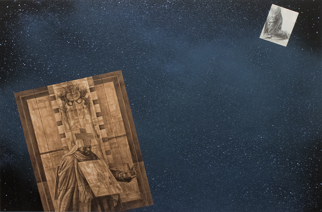
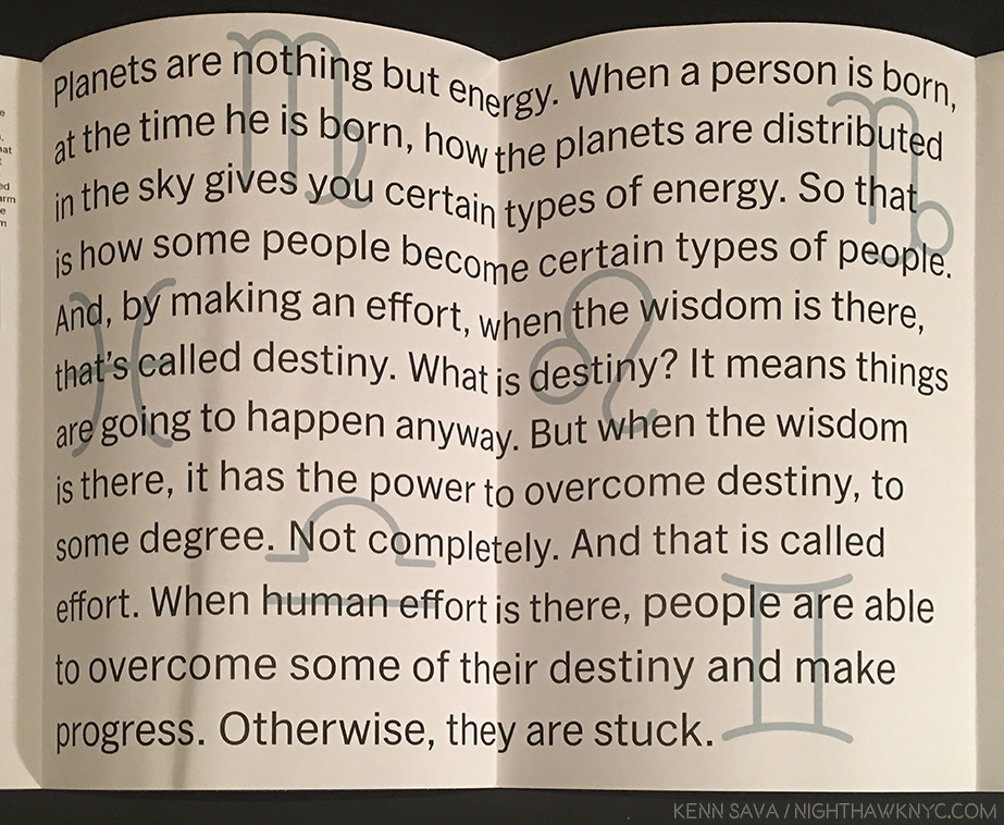
The Exhibition Brochure folds out into this cosmic poster. Click any Photo for full size.

Here each was separated by only tens of feet, installed facing each other across the gallery.

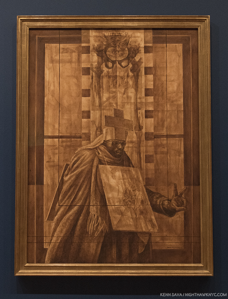
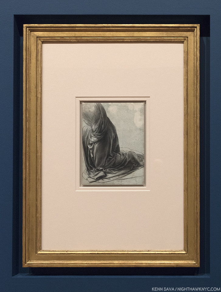
Installation view…of the whole show. Leonardo da Vinci, Drapery of a kneeling figure, c.1491-4, Brush and black ink with white heightening on pale blue prepared paper, left, Charles White’s Black Pope (Sandwich Board Man), 1973, right. Vedic astrological charts for both Artists center.

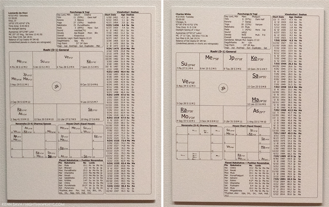
They were brought together by one man- the curator of this show, Artist David Hammons, who also commissioned Vedic astrological charts for both Artists, seeking connections that extend beyond what’s on the walls. What’s on the walls are Charles White’s lack Pope (Sandwich Board Man), 1973, Oil wash on board, from MoMA’s Permanent Collection, right, and Leonardo da Vinci’s Drapery of a kneeling figure, c.1491-4, Brush and black ink with white heightening on pale blue prepared paper, here on loan from Queen Elizabeth’s collection. It’s a study for the kneeling angel in his The Virgin of the Rocks, in the National Gallery, London, that I had a once-in-a-lifetime experience with in February, 2012.

Charles White, Black Pope (Sandwich Board Man), 1973, Oil wash on board.

Wait. Leonardo da Vinci in The Museum of Modern Art? That, alone, made this something to see. It’s only the 3rd time a da Vinci has been shown at MoMA.

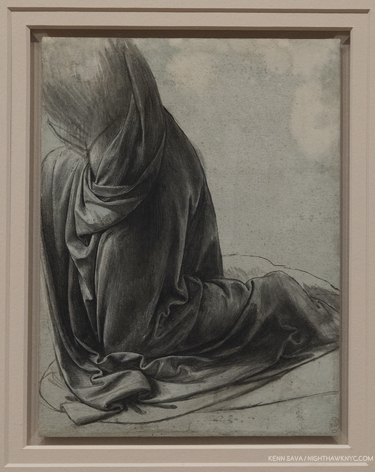
Leonardo da Vinci, Drapery of a kneeling figure, c.1491-4, Brush and black ink with white heightening on pale blue prepared paper

Closer. Who was the genius that decided to mark THIS with the “E R” tag on the lower right corner? Seriously? Isn’t the notation on the accompanying card that it’s in Queen Elizabeth’s collection sufficient?

But, don’t sleep on Charles White. His is a name that’s increasingly being brought up by Artists, acknowledging his influence, and/or his direct instruction. I have a feeling that as time goes on, his Art, too, will be increasingly part of the conversation. Black Pope, 1973 is considered one of his masterpieces. It’s haunting presence and mysterious message- his left hand giving the “Peace Sign,” the sandwich board reads, simply, “NOW,” as the figure moves under the word “Chicago,” emblazoned on the lower half of a skeleton, wonderfully executed, is a work that immediately impresses as “important.” The first thought turns to the war in Vietnam, which would not end for another 2 years, in 1975. Somehow, I don’t think it’s that simple. As it continues to haunt me, it also serves to make me want to see much more of his work.

The mercurial and elusive David Hammons was one of Charles White’s students. Though he chose a different stylistic path from his teacher’s realism (like, infamously, selling snowballs one winter’s day), he retained the latter’s activist stance, and has steadfastly held on to his “outsider” position. As a result, it’s somewhat surprising to see his name as the curator for this museum show. Another reason this was a must see show. Mr. Hammons has come up with a fascinating idea. In trying to understand his concept and intentions, I looked at MoMA’s recently published book on Charles White’s Black Pope, written by Esther Adler, Assistant Curator of Drawings and Prints at MoMA. In it, David Hammons, who sought Charles White out in 1968 as a teacher, is only quoted once. He says that “He (Charles White) is the only Artist I really related to1.”

Then, there’s this, in the exhibition’s brochure-

Inside of the exhibition brochure. Written by David Hammons..? No one is credited.

Beyond that, the wall tag reads, in part, “Hammons…asks us to consider commonalities between these two artists.” Ok. Let’s see…

On the surface the two Artists couldn’t seem to be more different.

Born 460, or so, years apart. Half a world apart. Leonardo was illegitimate (“a social disadvantage that was nearly impossible to overcome…2”  at the time). Charles White was a black man, born the son of a steel worker who was a Creek Indian- not exactly “favored” social standing. One fantasized about manned flight and his Drawings of it are still studied today. The other, born in 1918, grew up in the early days of real manned flight, and died in 1979, 10 years after man first set foot on the moon. One spoke Italian and wrote backwards, the other’s major concern was “to be accepted as a spokesman for my people3.” But, there are similarities that become more apparent as you look, and, yes, even more.

The first thing that becomes obvious, at least to me, is that they are both Masters. Fear not, Charles White holds his own, a remarkable achievement for any Artist.  The second is that they are not at all at odds with each other, nor do they look jarring alongside each other, at least to my eyes. Obviously, they both valued the craft and Art of Drawing. Going further, they were both born in the first half of April. Leonardo on April 15, 1452, Charles White on April 2, 1918. Hence the idea of commissioning Vedic Astrologer Chakrapani Ullal to create charts for each.

Ahhh…It was all written in the stars. The first page of da Vinci’s Vedic astrology chart, left, and Charles White’s right. If only I could read them. I do note that “Ke” is in the upper right quadrant of both.

“Talk and song from tongues of lilting grace
Whose sounds caress my ear
But not a word I heard could I relate
The story was quite clear”*

Both Artists “taught” Drawing- Leonardo’s dedication to the technique of Art has been exceeded by few, if any Artists before or after him. He “taught” drawing, directly, to his apprentices and ever since his death, his voluminous Notebooks have been excerpted into a number of texts on technique, that, along with his few Paintings and many Drawings have served to inform and inspire countless Artists down through the centuries. As Leonardo is a “tree” from which countless Artists have become branches, Charles White now has his own tree. He taught directly, in person, with numerous students over the years, at Dillard University, then most notably later in his life at Otis Art Institute, from 1965-79. It was while he was at Otis Art Institute , that David Hammons sought him out to study with in 1968. Kerry James Marshall closely studied Charles White’s work from a distance during his formative years, finally deciding in 7th grade that he would take his class and study under him. “In high school, Marshall sneaked into Otis and sat at the back of Charles White’s evening art class, hoping to remain unnoticed. “I didn’t have any business being in there in the first place, and then there was a naked person in there, so that was even more of a factor, you know,’ Marshall recalls, laughing. White noticed the youngster and approached him, saying, ‘You can’t see nothing from back here.’ He moved Marshall to the front and taught him how to draw a head in profile. He could come back anytime, White said4.” Marshall, fresh off his monumental, traveling retrospective is, at the moment, the most prominent member of Charles White’s influence tree, and he has continually spoken of his debt to Charles White.

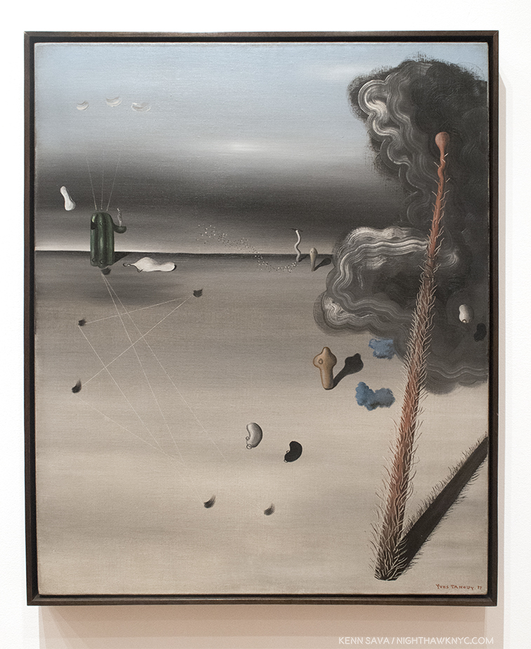
Looking further, both Artist’s work is “representational,” though Charles White does touch on realms considered abstract. Still, standing in front of the Leonardo, and looking towards the very next gallery, filled with Surrealism, I wondered what he would think of this, which was in it’s direct sightline-

Yves Tanguy, “Mama, Papa Is Wounded!,” 1927, Oil on canvas

Interestingly, in Charles White’s “Black Pope (Sandwich Board Man),” 1973, we see the figure from, apparently, right above his knees (though the skeleton of a lower body looms above him5). In Leonardo’s Drawing, we see the figure’s lower body. Between the two works of Art, we’d have one whole human body (half female, half male). Looking at it another way, it’s as if Leonardo’s is providing the foundation-figuratively and literally. Both have a fair amount of beautiful drawn “drapery,” or clothing, the folds and nuances of shading is something that Artists have long prided themselves on mastering- Leonardo, a supreme Master of it, gives us a classic example of one such exercise here.

Leonardo’s work is a study for the Virgin of the Rocks, a work that seems to focus on Saint John the Baptist, a prophet. Charles White’s Black Pope, also appears to be something of a prophet, but “saying,” or “foretelling” exactly what, is not clear. Both works are surrounded in mystery as to exactly what is happening.

“Oh, father of the four winds, fill my sails
Across the sea of years
With no provision but an open face
Along the straits of fear.”*

Perhaps, Mr. Hammons has some personal insight from Charles White about Leonardo and his influence on him, but that is not shared here. Leonardo is one of the most respected and revered Artists in Western Art History. Is Mr. Hammons putting him, alone, in the same room with Charles White his way of saying that Charles White, “the only Artist he related to,” is comparable for him to how Leonardo is held by the larger, and largely white, Art world?

I think Kerry James Marshall may have summed it up best- “When I looked at his (Charles White’s) work it seemed as good as something anyone else ever made, and better than a lot of things other people made, but how come he’s invisible to Art history?” 6

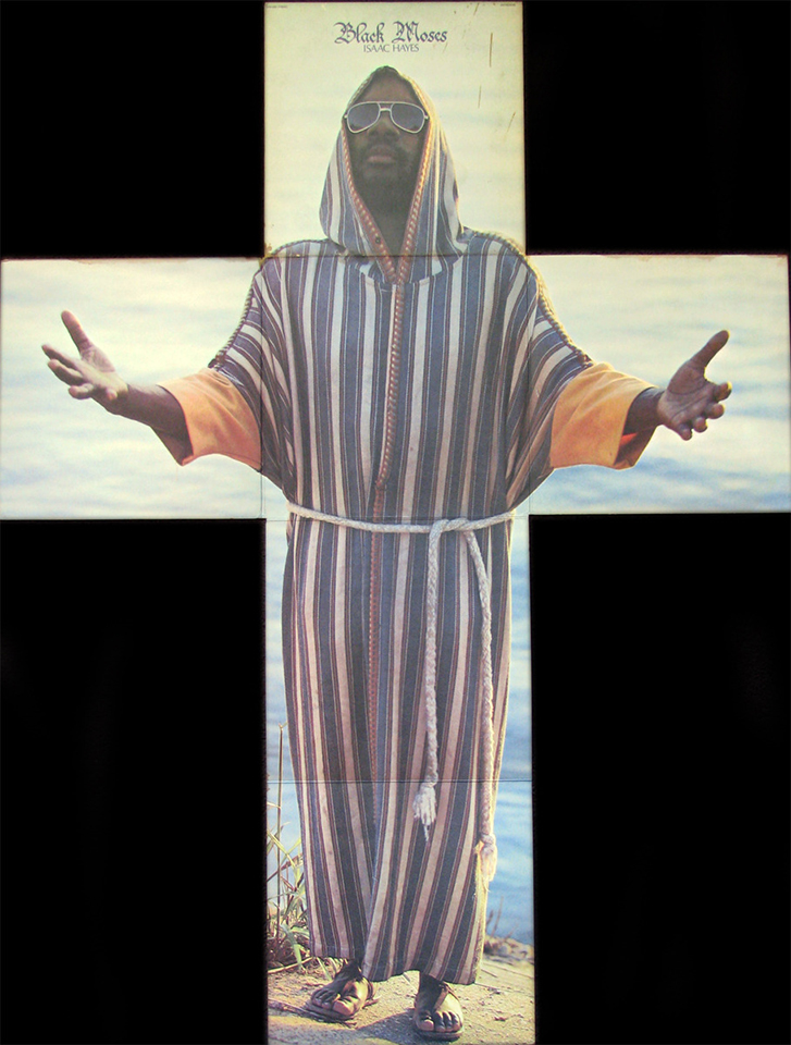
Getting back to Black Pope, the Artwork, MoMA’s new book on the piece does an excellent job of tracking down some of Charles White’s possible visual references. Though they located newsphotos that appear to be closer to Charles White’s composition, I was, also, struck that among them is the fold out cover for Isaac Hayes album Black Moses, released by Stax Enterprise Records, 1971.

Isaac Hayes, Black Moses, Foldout Lp Cover, Stax Enterprise Records, 1971.

Charles White’s influence is already well-established through his illustrious and important students. Art history may, also, be slowly beginning to catch up. It turns out that this show is something of  an “appetizer” for MoMA’s Charles White: A Retrospective which opens next year (Update, January, 2019- which I’ve written about, here). It’s an overdue show that could go a long ways in finally solidifying Charles White’s place as an important Artist.

*- Soundtrack for this Post is “Kashmir” by John Bonham, Jimmy Page & Robert Plant of Led Zeppelin, and which was recorded on Physical Graffiti, 1975, 2 years after Charles White created Black Pope. A great performance of it is here.

NighthawkNYC.com has been entirely self-funded & ad-free for over 7 years, during which over 275 full length pieces have been published! If you’ve found it worthwhile, PLEASE donate to allow me to continue below. Thank you, Kenn.

You can also support it by buying Art, Art & Photography books, and Music from my collection! Books may be found here. Music here and here.

Written & photographed by Kenn Sava for nighthawknyc.com unless otherwise credited. To send comments, thoughts, feedback or propositions click here. Click the white box on the upper right for the archives or to search them. Subscribe to be notified of new Posts below. Your information will be used for no other purpose.

  1. This Charles White-Leonardo show, upcoming at the time, is mentioned in a footnote.
  2. https://www.press.umich.edu/17155/illegitimacy_in_renaissance_florence
  3. charles white-imagesofdignity.org
  4. Sam Worley, Chicago Mag, 3/29.2016
  5. Remarkably reminiscent of Robert Rauschenberg’s X Ray in his 196 7work, Booster, created at Gemini G.E.L., where Charles White was also working at the time.
  6. https://www.independent.co.uk/news/people/kerry-james-marshall-interview-putting-black-artists-into-the-textbooks-9801055.html

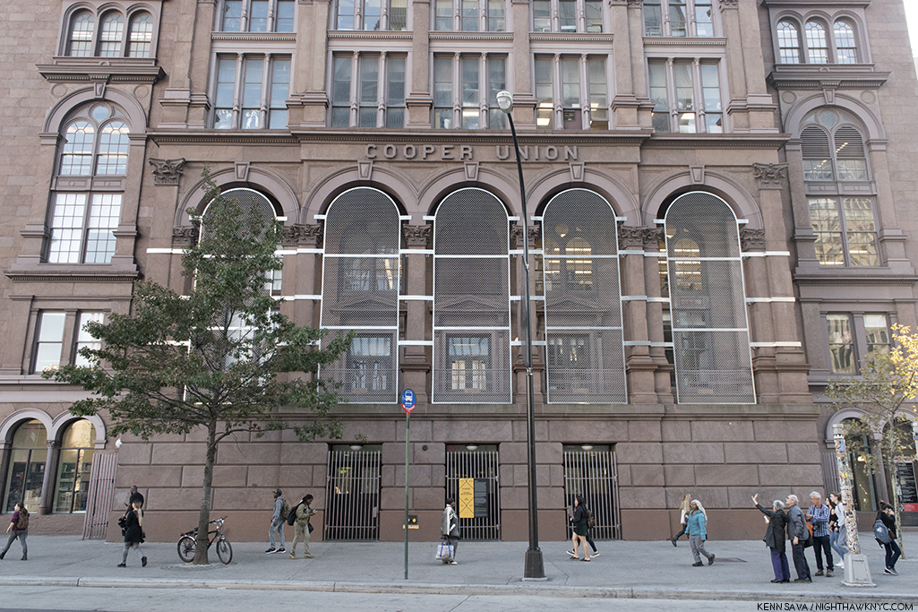
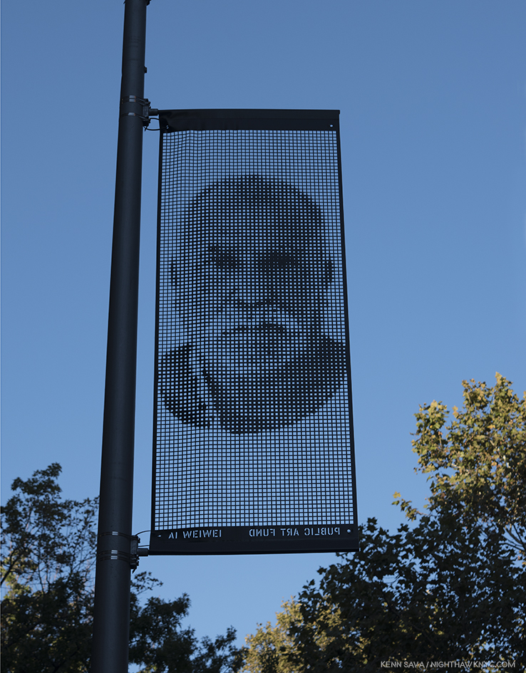
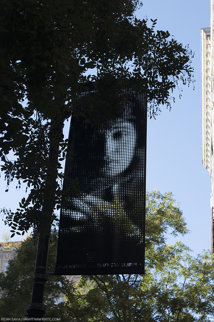
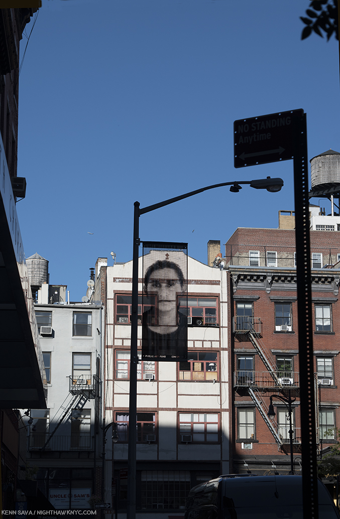
About Banner #8

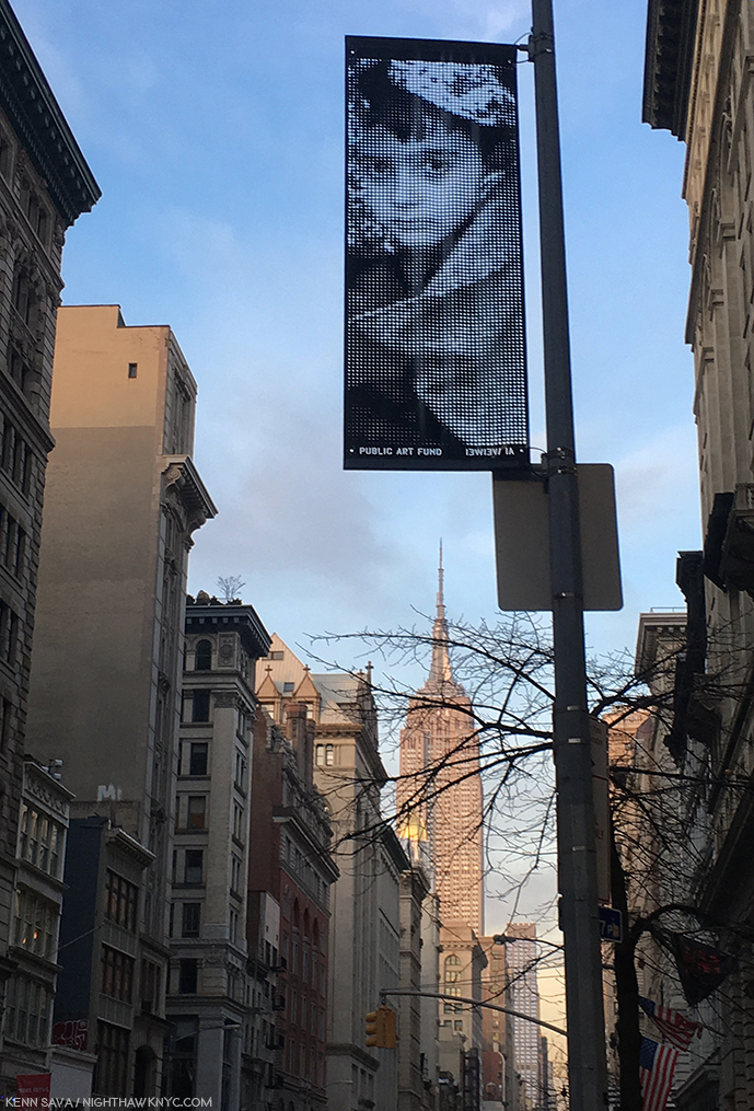
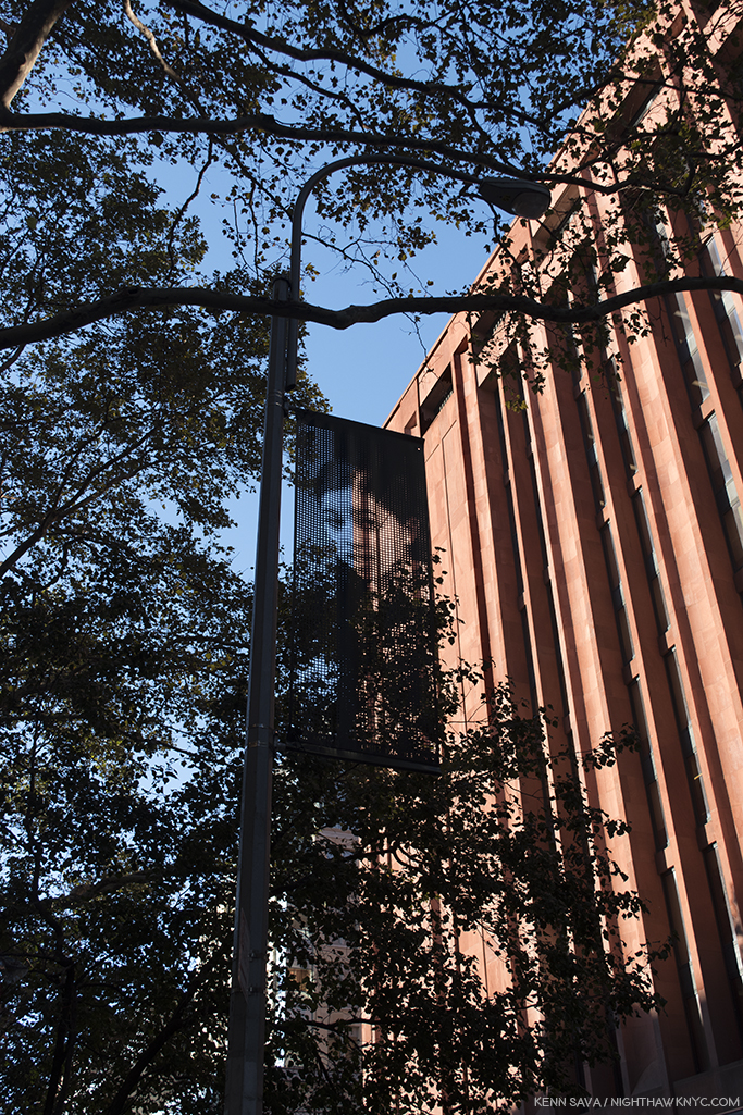
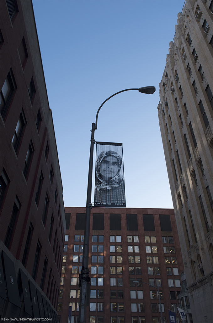
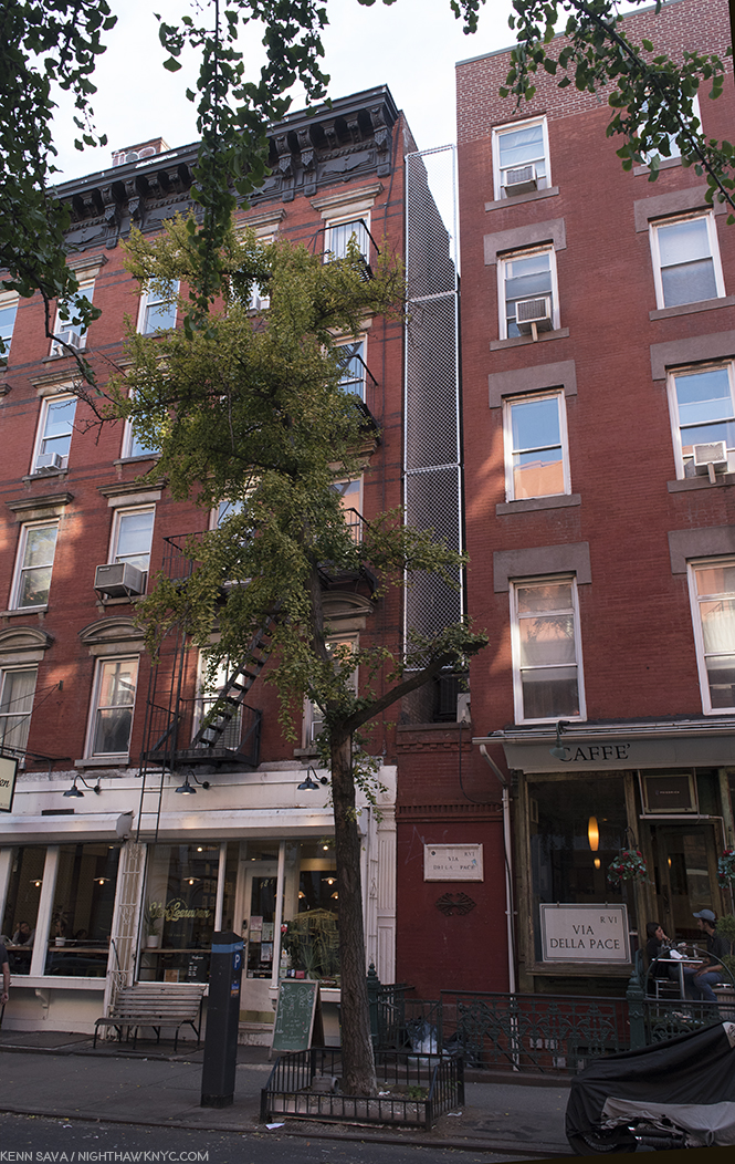
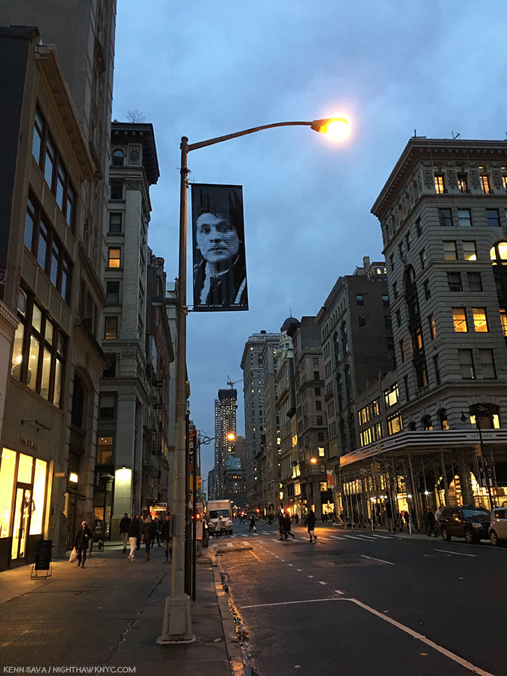
Banner 8. Looking east across Madison Square Park from West 24th Street & 5th Avenue. Click any Photo for full size.

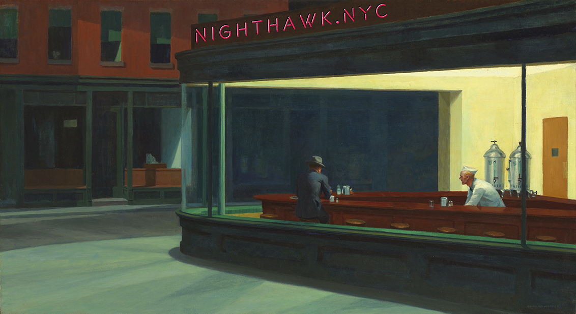
“WHERE was Edward Hopper’s “Nighthawks” set?”

Edward Hopper, “Nighthawk,” 1942, Oil on canvas

For many years, that question has been lingering somewhere in the back of my mind. Every day, as I walk around the City, any time I see a triangular corner, I wonder, “Could THIS be it?” The excellent website, Jeremiah’s Vanishing New York did a 4 part series analyzing each and every possible location they could find, which is, still, the most thorough search I know of. Part one is here.

It could well be a place Hopper imagined. It could be based on a few different locations. Or, it could be a place that is now long gone. But? Many other Hoppers were painted in places well known, even all these years later. Some years ago, I spent the night in a small hotel in Cape Cod solely because Hopper had Painted it in a work called “Rooms for Tourists.” Being one, and looking for a place to stay, I immediately recognized it- it still looked exactly like the Painting. Gail Levin’s book, “Hopper’s Places,” revisits many of these places, and so, makes me feel that the locale of “Nighthawks” MUST exist.

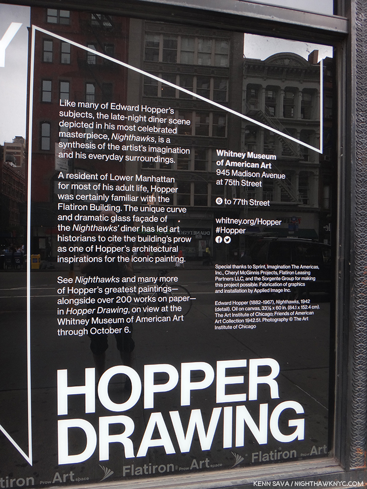
In 2013, at the time of  their excellent “Hopper Drawing” show, (which included the original “Nighthawks”) the Whitney Museum said the following on a wall card-

“A resident of Lower Manhattan for most of his adult life, Hopper was certainly familiar with the Flatiron Building. The unique curve and dramatic glass facade of the “Nighthawks” diner has led art historians to cite the building’s prow as one of Hopper’s architectural inspirations for the iconic building.”

“Well I don’t really care
If it’s wrong or if it’s right
But until my ship comes in
I’ll live night by night.”*

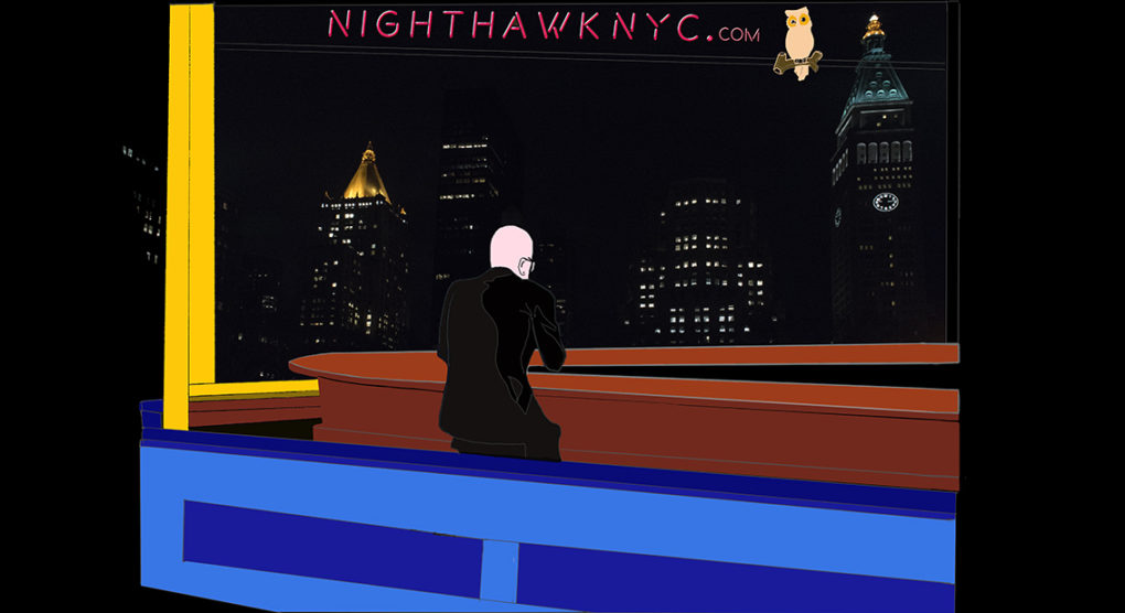
So, for Banner #8, I chose this scene because it’s one block north of the “Prow” of the Flatiron Building (speaking of “ships”), at the corners of 23rd Street and Broadway and 5th Avenue. I’ve opted to move “Eddie’s Cafe,” to just off of Madison Square Park, looking east across it from 5th Avenue at West 24th Street. You can see the New York Life Building, at 51 Madison Avenue, with it’s famous gold pyramid, left, the Metropolitan Life North Building, a very cool 30 story Art Deco geometric abstraction at 11 Madison Avenue, center, and the Met Life Tower, right, the world’s tallest building from 1909 to 1913.

If they’re right about the Flatiron, this scene would have been just out of the frame of the Painting to the left. I picked it because all of these buildings were standing when Hopper painted “Nighthawks” in 1941-2 (except that rectangular, mostly dark, building immediately behind my head to the left.) The buildings behind the cafe in the Painting are long gone and what’s there now appears to have been moved further back from where they are in the Painting.

So? It’s as close as I could get to setting “Nighthawks,” now, with buildings that were standing when Edward Hopper Painted “Nighthawks,” a block away…IF he was using the Flatiron’s Prow as the scene. It becomes a window back to that time.

Personally, I remain to be convinced about the Flatiron. The “Prow” is too small to have housed an actual cafe, so that means it would have been one of his inspirations. So, I remain hopeful that an actual place will be discovered at long last, though I’m not expectant. Until that ship comes in, I’ll do what I always do- live night by night…

*- Soundtrack for this Post is “Night By Night,” by Donald Fagen and the late Walter Becker (R.I.P. September 3, 2017) of Steely Dan and recorded on “Pretzel Logic,” 1974.

NighthawkNYC.com has been entirely self-funded & ad-free for over 7 years, during which over 275 full length pieces have been published! If you’ve found it worthwhile, PLEASE donate to allow me to continue below. Thank you, Kenn.

You can also support it by buying Art, Art & Photography books, and Music from my collection! Books may be found here. Music here and here.

Written & photographed by Kenn Sava for nighthawknyc.com unless otherwise credited. To send comments, thoughts, feedback or propositions click here. Click the white box on the upper right for the archives or to search them. Subscribe to be notified of new Posts below. Your information will be used for no other purpose.

Cai Dongdong: Guns & Shutters

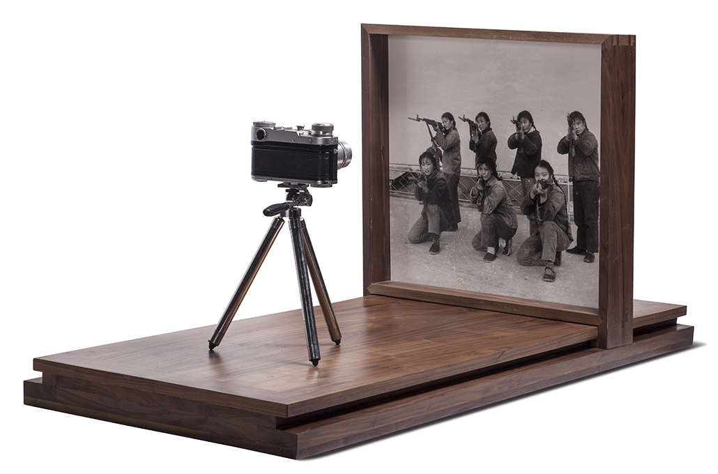
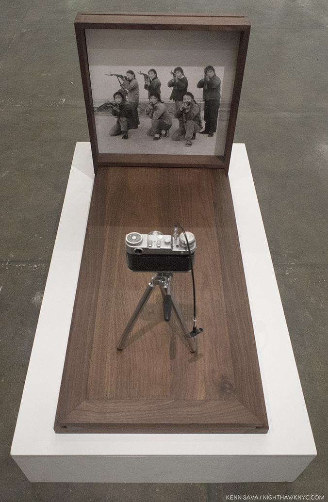
Cai Dongdong “Aiming at the Camera,” 2017, Gelatin silver print, Russian camera(!), wood. Photo courtesy Cai Dongdong and Klein Sun Gallery. Click any Photo for full size.

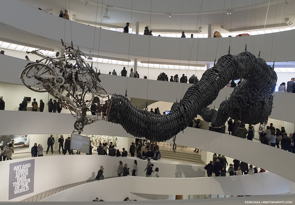
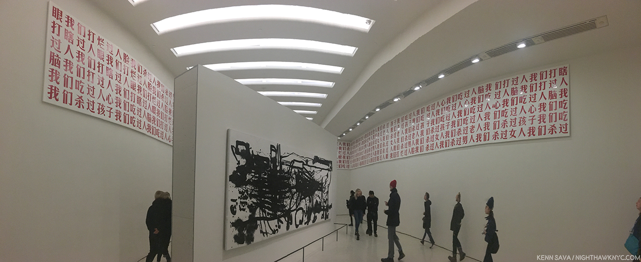
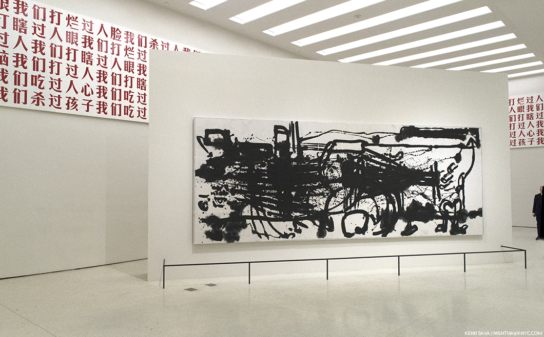
On October 6th the NYC Art world was permanently changed with the opening of the monumental “Art and China after 1989: Theater of the World” at the Guggenheim. Filling all 6 floors of Frank Lloyd Wright’s Rotunda and spilling over into two of the side galleries, it was as close to encyclopedic as any show of it’s kind could ever hope to be. Having closed on January 7, I’m still processing my thoughts about it. (Update- My piece on it is here.)This much I can say- In it’s wake, the training wheels are now off. The flood gate of what’s been going on in Contemporary Art in China has opened and we’re officially in the deep water.

And it’s about time.

The 71 “key Artists and groups” as the show’s site calls them were remarkably well chosen, in my opinion, divided between historically important Artists and works, and those of the moment. Still? In a country of 1.4 Billion people, it’s impossible to include everyone. Many deserving Artists were missed, especially with only 9 women represented. (My Post on it is here.) While big on video & installations, almost completely missing was Photography, Ai Weiwei’s famous “Dropping a Han Dynasty Urn,” 1995, being one of the few works included.

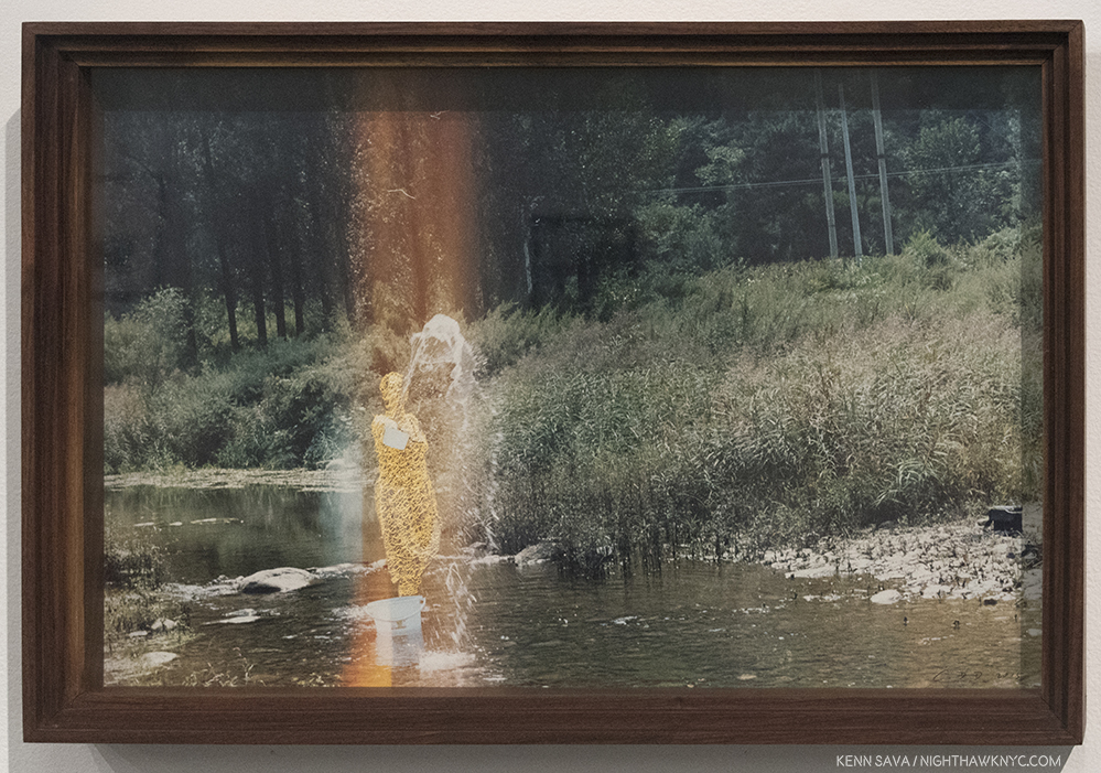
Cai Dongdong, “Splashing Woman,” 2016, Handmade color photo, knitting, in Artist’s frame. I can’t say I’ve ever seen anything quite like this.

If you are among those left wanting to see more, see what other Contemporary Chinese Artists are doing, or see what Contemporary Chinese Photography Artists are doing, I strongly encourage you to check out some of the fine and daring galleries around town that specialize in Contemporary Chinese Art. With a 10 year history of representing and showing Chinese Artists who are, largely, in the process of becoming better known in the USA, Klein Sun Gallery on West 22nd Street is among the leading galleries in the field. Gallerist Eli Klein speaks with both passion and experience about the Artists he, and his gallery, represent, but, also about “the difficult concepts and social commentary portrayed by some of our artists,” as he told me.

The latter is exactly what makes Klein Sun a must visit gallery on my rounds. Mr. Klein comes by his passion naturally. He is the son the late, extraordinary, women’s champion, Janet Benshoof, who passed away on December 18th.

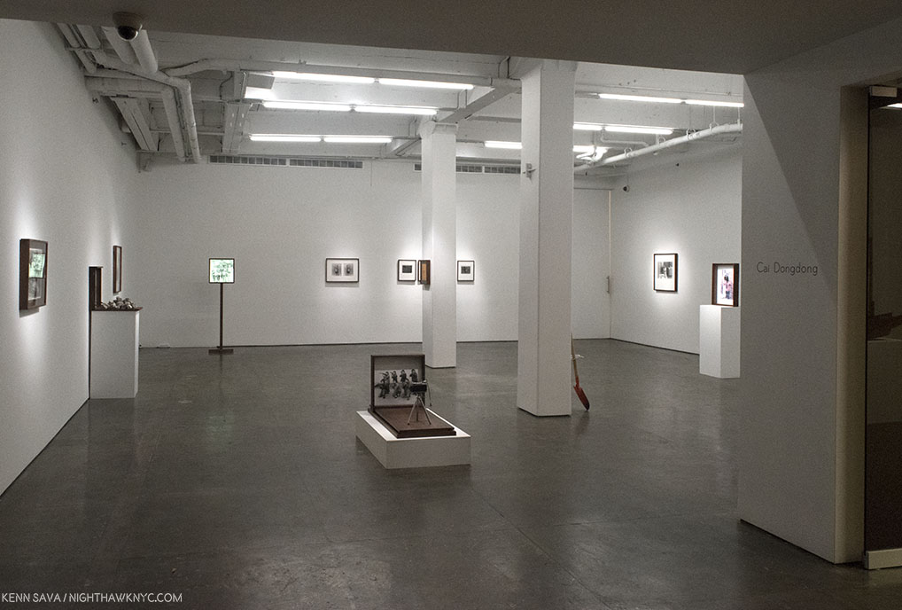
Installation view of the first gallery.

In all the years that I’ve been going to Klein Sun, this is a particularly good time to go. Their current show, “Cai Dongdong: Photography Autocracy,” through January 18, is an eye-opener, full of pushing-the-envelope creativity, in works that will linger with you after they upend your preconceptions. Mr. Dongdong’s work, which is centered on Photography, is rife with commentary, divided between themes including the military, the act of seeing and being seen, and Henri Cartier-Bresson’s famous “Decisive Moment.” But it’s the universality and humanity of his work as a whole that impresses me the most. Though the faces are Chinese, they could be anyone. For western eyes, there are echoes of Man Ray, Max Ernst, Marcel Duchamp and Joseph Cornell in works that are “Photo-Sculptures,”as he calls them, but decidedly different from Robert Rauschenberg’s “Combines.” Unique among all the Photographers I spent last year seeing, Cai Dongdong, also, constructs the beautiful stands and frames he uses himself, ala Joseph Cornell or Holly Lane, creating an all in one experience in which the Photograph plays one part. The Artist, who turns 40 this year, has a bit of a unique background. He joined the People’s Liberation Army- as a portrait Photographer, a post he remained in for about a decade. This served to have a lasting influence on him, as one might suspect, as one side of his subsequent Art incorporates these Photos, while another side uses found images, (selected from an archive that Phil Cai, Mr. Klein’s Associate at Klein Sun, told me numbers over 600,000 images), but in all his work, he combines Photographs in ways that defy the “Autocracy” of the image to force it to say “something else,” always unexpected.

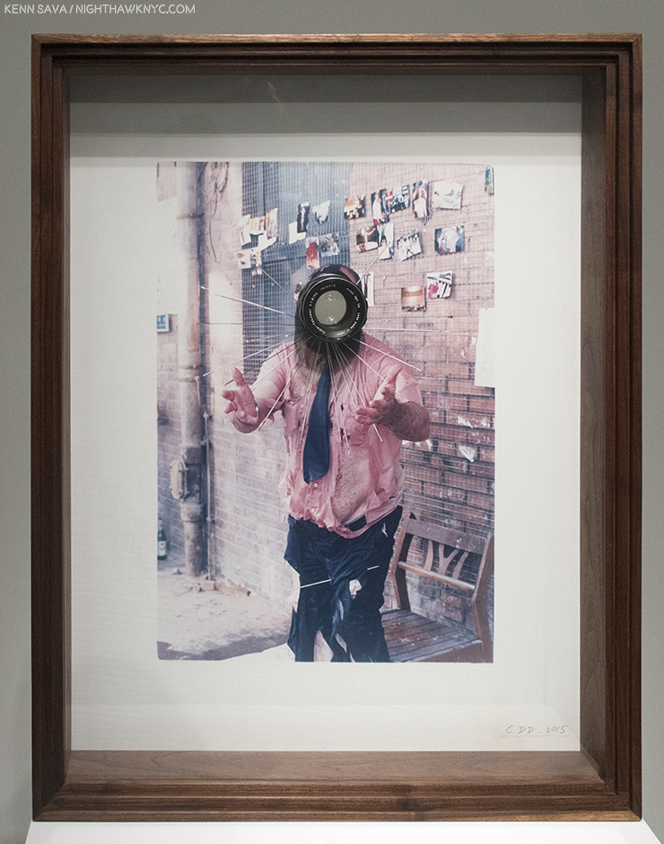
Cai Dongdong, “The Photographer II,” 2015, Handmade color photo, photographic lens in Artist’s frame. The lens goes right through the work.

Going beyond Photographs with his passion for Photography, a number of these works contain camera lenses inserted right into the piece, making the viewer the subject. Many others contain mirrors or reflective surfaces, and one, seen at the beginning, and below, puts you at the place of the Photographer- if you dare.

Cai Dongdong “Aiming at the Camera,” 2017,

Through mirrors and lenses, he also puts the viewer in the work, reminding us of our complicity by looking and seeing, most poignantly they’re included in a number of nudes on view, including one that replaces the model’s head with a round mirror, all ready for your face.

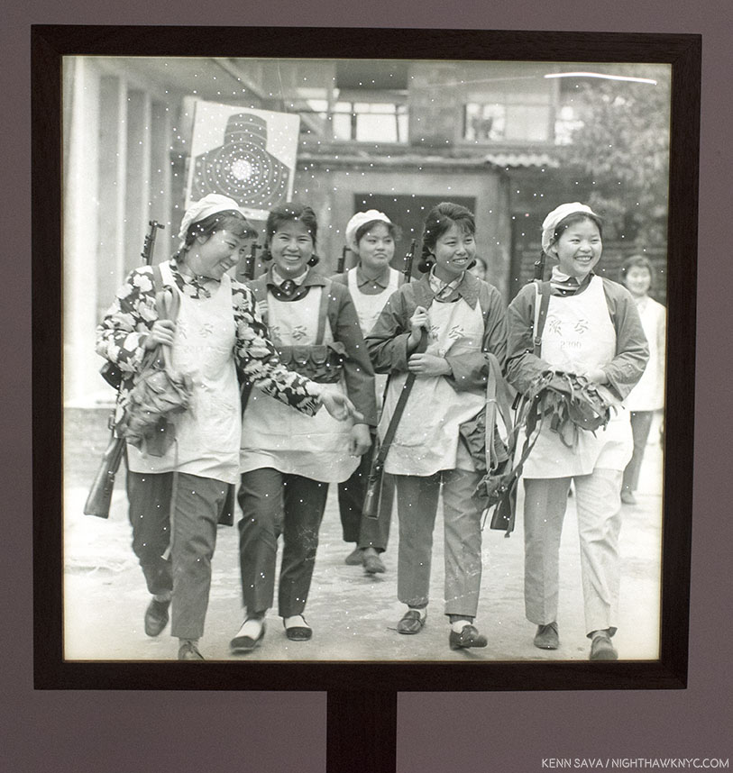
Cai Dongdong, “Back from Target Practice,” 2017, Gelatin silver print, LCD Light box. These harmless looking smiling armed ladies are returning from target practice. Or? Are they coming for us? Interestingly, the piece is mounted about head high for many viewers, making it personal.

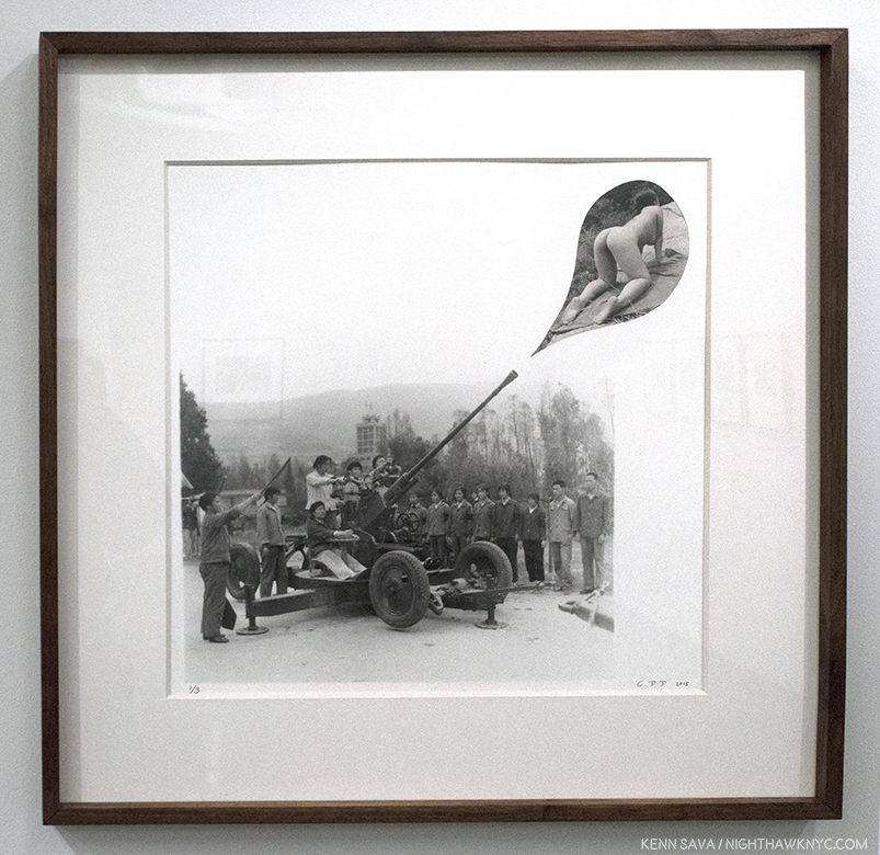
The central element, for me, in his work is the humanity that runs through it. In “Aiming at the Camera,” 2017, the Artist, literally, puts you in his shoes when he took this Photo. In “The Association of the Cannon,” 2016, a cannon goes off expelling a harmless and lovely nude. Right next to it, in “Back from Target Practice,” 2017, a group of armed young women walk towards the viewer, making you feel that even women, the givers of life, when armed, can pose a real danger to you-particularly when they’re coming your way. These Photos have a “journalistic” feel that’s turned into something else in the whole, something the Photo may, or may not have originally intended. Hence, the Photo’s “Autocracy” in the show’s title is subject to Artist’s intervention. The Artist is the one with the unlimited power to control what it says.

Detail.

The role of guns (rifles and cannons) is a recurrant theme in the Artist’s work that was also a memorable part of his last Klein Sun show, “Fountain,” 2015. Here, guns alternate between being a threat and being “defused.” The two shows mirror each other beautifully, down to their success, with “Fountain” selling out, and “Photography Autocracy” getting very close to it. (A word to book collectors-  The Artist created an extraordinary book for “Fountain,” in a limited edition of 500 signed & numbered copies, the stack of available copies at the gallery dwindled each time I visited, partially my fault. For someone who has been buried, literally up to his neck in Art & PhotoBooks, as anyone who has seen my apartment this year could swear to in court, I was shocked to see the intricate details that have been painstakingly included in this book. It’s gorgeous. Another example of the extreme care and craftsmanship that goes into Cai Dongdong’s Art.)

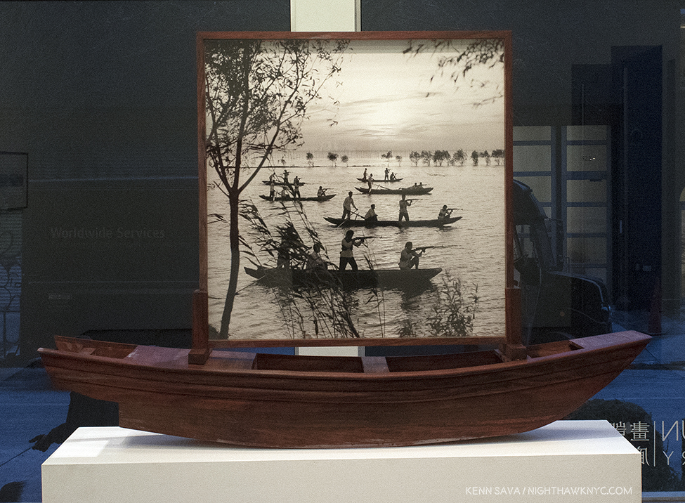
Cai Dongdong, “The Guerrilla on Hunghu Lake,” 2017, Gelatin silver print, wood. This is just an extraordinarily beautiful Photograph, in addition to being a powerful image. The background is ravishing, which serves to bring another level of meaning to the “action” of the approaching guerrillas in front of it. The idea of setting this in a hand made boat is just brilliant, in my opinion.

It’s fascinating to look for evidence of his experiences in the Army in these works, but it’s unknown (to me) which Photo Mr. Dongdong took and which he found. In the end, it matters not. Some of the end results, however, have a “day dream” effect, where I picture the Artist in his Army job, armed with his camera, fantasizing about whatever scene is going on in front of him. “Wouldn’t it be great if a beautiful lady came out of this cannon right now instead of a shell?”

Cai Dongdong, “The Association of the Cannon,” 2016, Gelatin silver print in Artist’s frame. Right out of Max Ernst, a work I might have expected from John & Yoko, seems to sum up this show.

I think it’s exactly that that makes this show so successful and so popular- it’s very easy to relate to the humanity in the work, regardless of your culture or background.

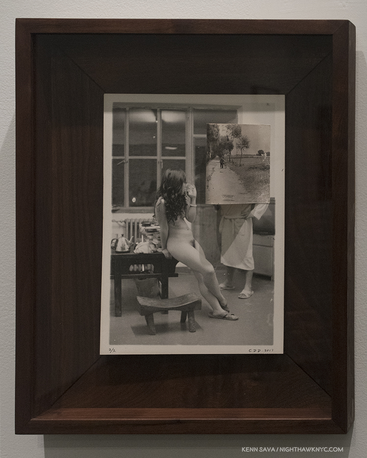
“Road,” 2016, Gelatin silver print in Artist’s frame. The Photo of the “road” in the upper right is collaged on and extends out from the surface, curved on the side nearest the lady.

Regarding his background, I asked the Artist a few questions, through the gallery since he lives and works in Beijing-

Frist- What inspired you to become an Artist?

Cai replied, “A rain when I was born.”

And- Who influenced your Art?

Cai- “My kids.”

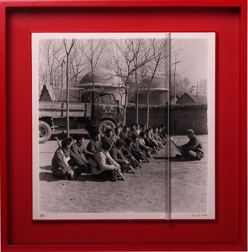
Cai Dongdong, “Obstacle,” Gelatin silver print in Artist’s frame. Notice the ridge where the print is folded about 2/3 to the right. Photo courtesy of Cai Dongdong and Klein Sun Gallery.

As Phil Cai pointed out to me, looking at it from the right, the lecturer is cut off by the ridge made by the folded print…as the solders are cut off from him on the lefl.

I also asked Mr. Klein how he discovered Cai Dongdong. He said, “I first saw his work on a chance Studio visit in Beijing. His studio was close to one of another artist I was visiting and was told I shouldn’t miss it. Quite frankly I was blown away. It was such pure art, no bullshit, no trying too hard, not showing off. It was just Real. Cameras and parts all over the place, wood that he was using to make his own frames. A unique mix of installation, old and new photography, mixed media, collage, sculpture and compelling cultural commentary. I had to pursue representing him and knew that very quickly. His demeaner and dedication were also very clearly defined which is indicative of a better potential for a long and successful career.”

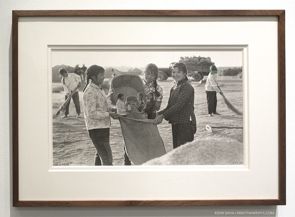
Cai Dongdong, “Big Harvest,” 2017, Silver gelatin print in Artist’s frame. Phil Cai spoke to me of the influence of China’s “Collectivsim,” in this work, that they are “gathering themselves.” When I see it, I see the succeeding smaller figures representing future generations.

Mr. Dongdong’s work speaks to the larger “cultural commentary” than to one that’s specifically Chinese, in my opinion.  These are works that end up expressing the universal experience of being human- even in a “collective.” People can be “trained” to move and operate together, but it’s harder to control their thoughts, imaginations, fantasies, and Artistic impulses. Yes, guns can be dangerous. Yes, nations are continually preparing for war. But, these nations are made up of human beings who are living their daily lives, too. Here are works about the experience of being human- from basic events like being seen naked, being seen at work, being seen serving your country, that every human being experiences. In Cai Dongdong’s Art, the world becomes a little smaller, and that’s one of the best things Art can accomplish. It also looks like he has fun creating it, and that comes through, too.

Time will tell if Cai Dongdong achieves the stature of Gu Dexin, Alec Soth or Ai Weiwei, but in the meantime he’s creating beautifully made objects with their own point of view, a decidedly unique way of seeing the world, each one overflowing with humanity. That’s certainly a recipe that’s stood the test of time, for a long time.

*-Soundtrack for this Post is “Happiness is a Warm Gun,” by John Lennon & Paul McCartney, and recorded by The Beatles on “The White Album.” (No, It’s not a drug song, as you can hear John say, here.) In lieu of their version, Gavin DeGraw does it here-

This Post is dedicated to the memory of Janet Benshoof. 

NighthawkNYC.com has been entirely self-funded & ad-free for over 7 years, during which over 275 full length pieces have been published! If you’ve found it worthwhile, PLEASE donate to allow me to continue below. Thank you, Kenn.

You can also support it by buying Art, Art & Photography books, and Music from my collection! Books may be found here. Music here and here.

Written & photographed by Kenn Sava for nighthawknyc.com unless otherwise credited. To send comments, thoughts, feedback or propositions click here. Click the white box on the upper right for the archives or to search them. Subscribe to be notified of new Posts below. Your information will be used for no other purpose.

Art In Manhattan, 2017- And Then There Were Five

It was a year of discovery. A year where I discovered some great Artists I previously hadn’t known, finally caught up with some I knew about but hadn’t gotten to see much of their work, and got lost exploring some remarkable Retrospectives- for Raymond Pettibon and Robert Rauschenberg, both accompanied by memorable satellite shows. Most of these are represented in my monthly NoteWorthy Show selections throughout the year. But? There was more! So, I’m going to take this moment to pause and look back at the revelations of 2017, look at some memorable shows I didn’t write about at the time, and finally, highlight a pair of men who, I feel, had an exceptional 2017 in Manhattan Art.

No doubt about it- the biggest discovery this year was a long overdue deep dive into the world of Contemporary Photography. From seeing well over 100 Photography shows, to spending five long days at “AIPAD: The Photography Show” (with well over 120 galleries from all over the world showing work), to going through hundreds of PhotoBooks, and meeting many Photographers, legendary, famous, or not quite yet, along with the staffs of two of the world’s leading Photography organizations- Aperture and Magnum, both celebrating major anniversaries this year. Rarely did a week pass when Photography wasn’t in the the picture. Of course, in a world were there are now more cameras than people it’s impossible to get to see everyone who’s doing great work. As happens each year, NO matter WHAT I do to prevent it, this year too, there were shows I didn’t find out about until they closed. UGGGH!!!! Along the way, there were quite a few revelations, and a good many other things solidified…at least for the moment.

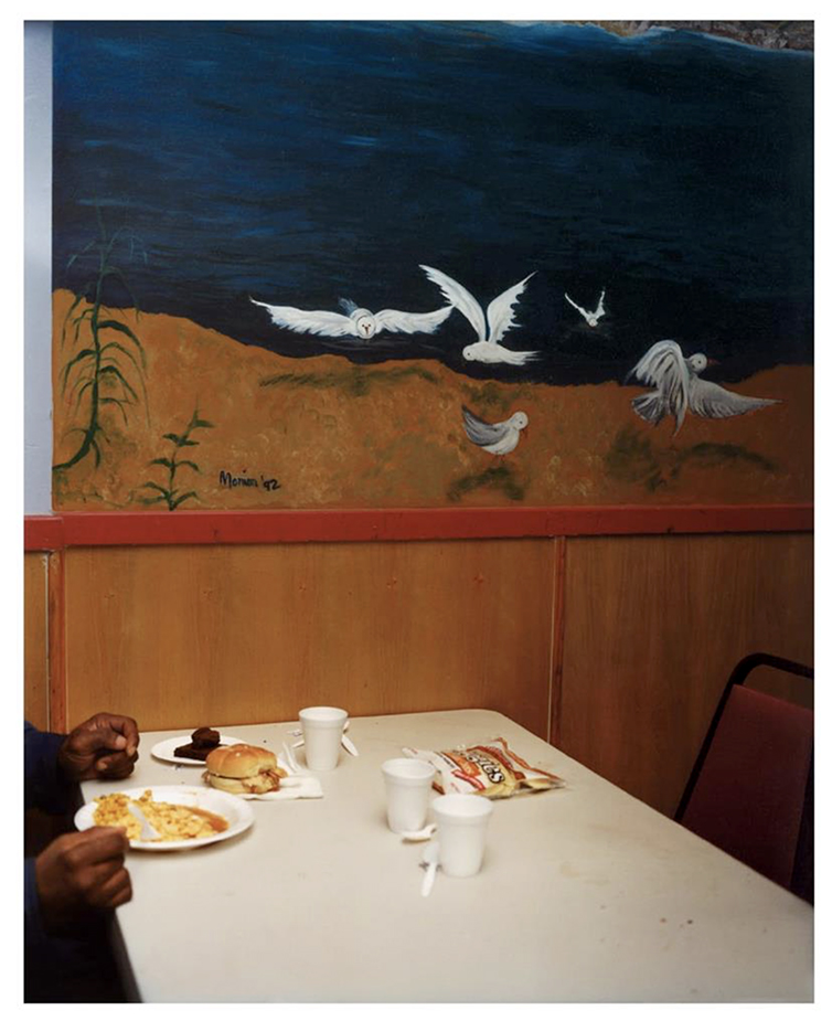
First, the revelations. In Photography, particularly among those younger than 50 (I say 50 only because I seem to know/have heard of many of those over) and unknown to me, Gregory Halpern was the biggest revelation I had this year. His book “Zzyzx” won the prestigious Aperture Best Book Award for 2016, but I didn’t know that when I discovered his work at Aperture’s booth at AIPAD. I had never heard of him.

Gregory Halpern, “Untitled,” 2016, from his “Buffalo” series. Click any Photo for full size.

The work, “Untitled,” was a Photograph Aperture had run in the Spring, 2017 issues of it’s excellent quarterly magazine, in a pictorial by Mr. Halpern, titled “Buffalo.” I didn’t know that then, either. I simply saw the work, and then couldn’t get it out of my mind. It now hangs a few feet away. Out of everything I saw at AIPAD, particularly by those younger than 50 and unknown to me, this work grabbed me and didn’t let go. I went home that night with one thought on my mind- “WHO is Gregory Halpern?” After researching him most of the night, (including finding his incredibly honest and insightful answer to one very important question), serendipitously, I got to meet him the next day, and spoke to him about his book. It turned out to be a classic case where some things are better left unexamined. Gregory was so forthcoming in his answers about specific images I came too close for comfort to losing some of their mystery.

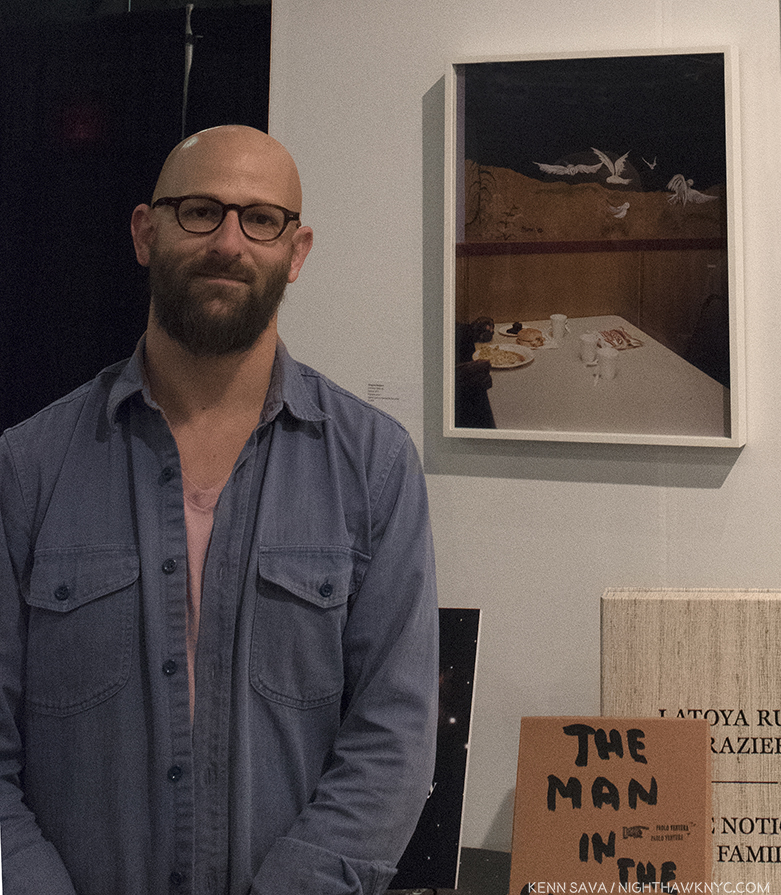
Gregory Halpern standing next “Untitled,” at Aperture’s Booth at AIPAD, March 31st.

In addition to being, in my eyes, one of the most talented Photographers of his generation, he is, also, one of it’s best writers. He’s the co-author of one of the most popular and respected Photography Manuals of 2017, “The Photographer’s Playbook,” and his occasionally published articles always enlighten and leave me wanting more. A Harvard grad, he’s now a professor in the College of Imaging Arts and Sciences at Rochester Institute of Technology for some very lucky students. As if all of that isn’t enough, his wife, Ahndraya Parlato is, also, one of the revelations of the year as a Photographer. Her Photographs “glow”- in one way or another. Her most recent book, “A Spectacle and Nothing Strange,” is ethereal…mesmerizing…magical.

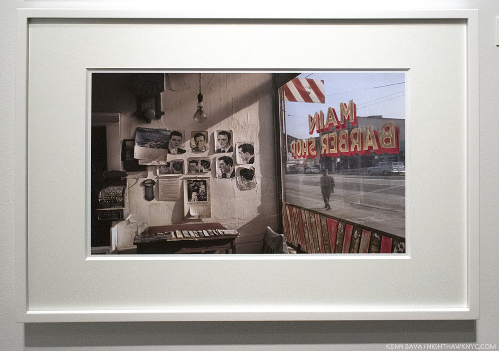
Leaving aside age or era, the work of Fred Herzog was, also, unknown to me. Early pioneers of color Photography have taken decades coming to the attention they deserve, such was the disdain color held among the Photographic cognoscenti for color Photography. With the publication of “Fred Herzog: Modern Color,” in February, 2017, an Artist who was fairly well-known, and appreciated, in his native Canada finally began becoming wider known in the USA. His work was memorably shown by Equinox Gallery of Vancouver at AIPAD this spring, where, I felt, it stood out.

Fred Herzog, “Main Barber,” 1968, seen at Equinox Gallery’s AIPAD booth.

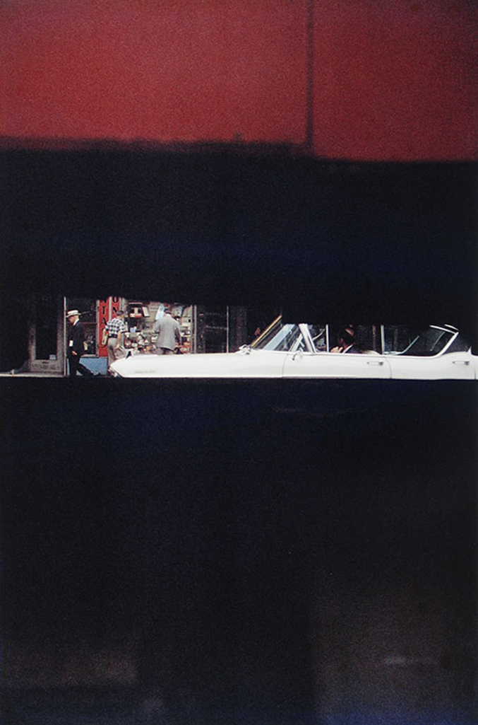
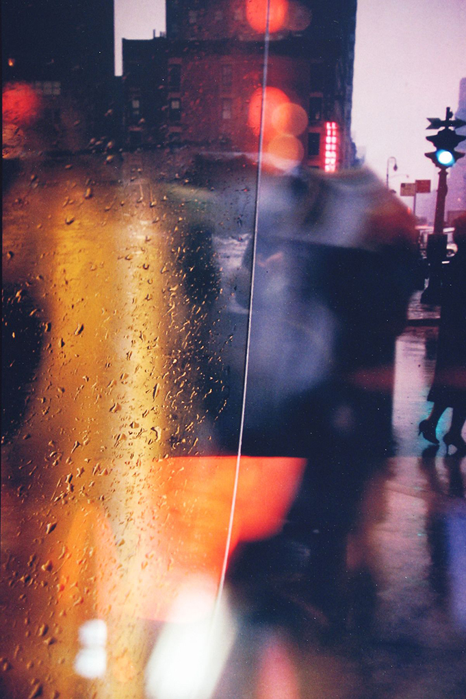
Fred Herzog considers Saul Leiter THE master of early color Photography, and even with a giant like William Eggleston to consider (who’s 1976 MoMA show, “Photographs by William Eggleston,” which can be “visited” here, is widely credited with making color Photography “acceptable” in the world of “Fine Art”), it’s hard to argue with him. No Photographer new to me, regardless of age or period, had a bigger impact on me this year than Saul Leiter.

Saul Leiter, “Through Boards,” Circa 1957. This image appears (cropped) on the cover of the now classic book, “Saul Leiter: Early Color,” 2006, which launched the “Saul Leiter Renaissance.” It’s, perhaps, my very favorite Photobook. Sadly, now out of print, it would take real diligence to find a very good copy for less than $100. But, there are many worse uses of time. Photo by the Saul Leiter Foundation.

It took until 2006 for Saul Leiter to be recognized- FIFTY EIGHT years after he started taking color photographs. As with William Eggleston, Mr. Leiter was, also, a devoted Painter. I can see it in both of their work, and I believe it’s part of the reason their work speaks to me, perhaps, more than the work of any other Photographer of any period. It was his friend, no less than the great Artist Richard Pousette-Dart (who’s also an under appreciated Photographer), to encouraged him to pursue Photography.

“Walk with Soames,” 1958, This was 20 YEARS before William Eggleston’s ground breaking MoMA show “legitimized” color Photography in the Art world! Photo by Howard Greenberg Gallery.

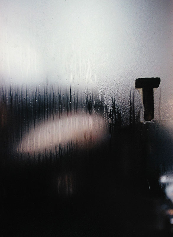
Mr. Leiter saw and used color in his Photography in ways no one else has, achieving effects that today’s finest digital manipulators can only dream of. Saul Leiter didn’t need Photoshop to get his results. As very good as his Black & White work is, like Turner or Van Gogh, Saul Leiter was a true Poet of color, perhaps the greatest Master of Color in Photography, though it’s, of course, impossible and pointless to qualitatively compare.

“T,” Circa 1950(!).Photo by the Saul Leiter Foundation. Daring. Gorgeous.

A number of established Photographers had terrific shows in NYC in 2017 that I didn’t get to write about here. Among them are Mark Steinmetz, Mike Mandel, Raghubir Singh (though marked by controversy), Richard Avedon, Herman Leonard, Michael Kenna, and Edward Burtynsky. But, I’m going to address one I simply can’t let pass, because I continue to think about it.

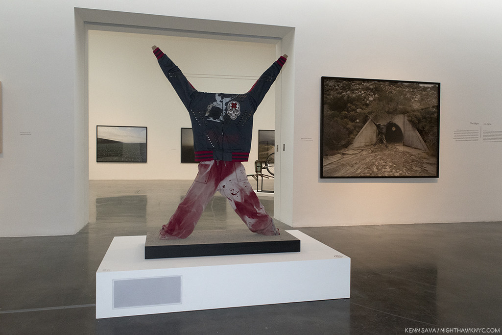
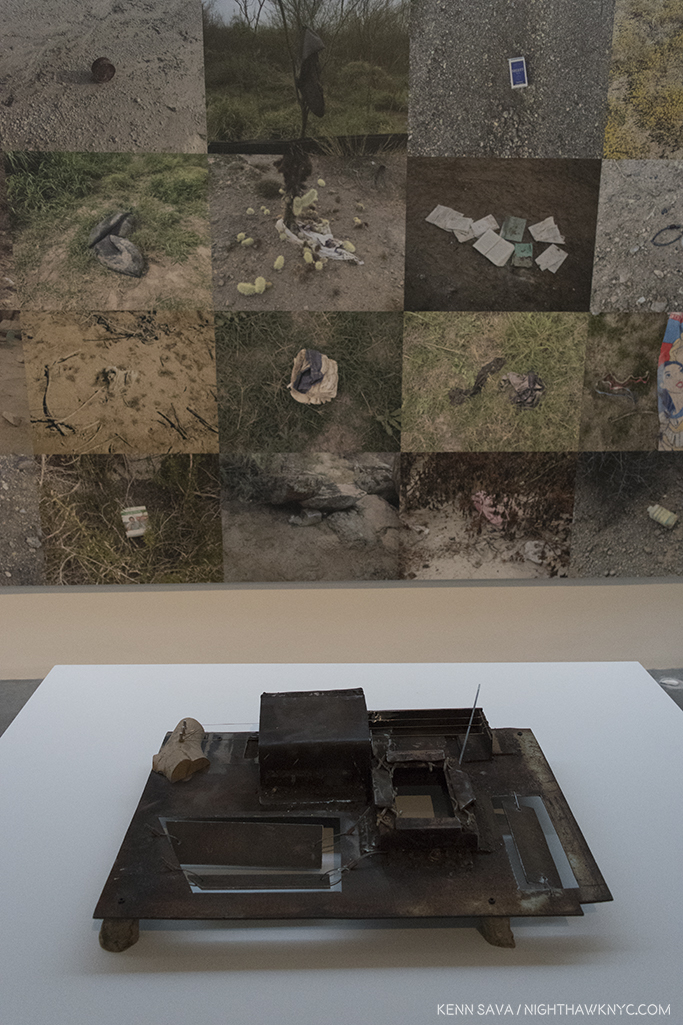
Richard Misrach’s Photo, “Effigy #3, near Jacumba, California,” 2009, Pigment print mounted to Dibond, right rear, with Guillermo Galindo’s Musical Instrumet/Sculpure “Effigy,” 2014, center2014. Barely visible are two strings between the forearms. The grey rectangle on the lower left side of the pedestal is where a speaker is mounted.

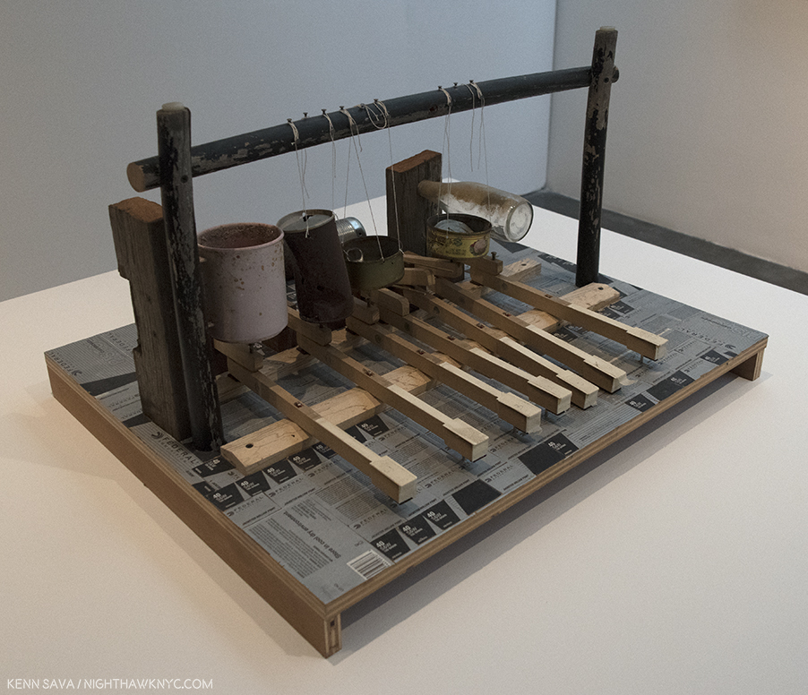
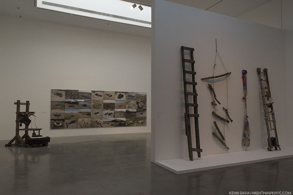
“Richard Misrach: Border Cantos,” (at Pace, 510 West 25th Street), was an utterly remarkable and serendipitous collaboration between renowned Photographer Richard Misrach & Composer/Sculptor Guillermo Galindo on the subject of our southern border, those protecting it, and those trying to cross it. To accompany Mr. Misrach’s large, atmospheric Photographs, Mr. Galindo created a whole orchestra of Musical Instruments out of objects found along the border, and proceeded to compose and record a 4 hour score that was looped in the show’s back room to meditative effect, ingeniously installed so that the music being played was coming from speakers mounted inside the display of the specific instruments that were playing at any given moment. (The Artists have an excellent website for this show where you can, also, hear these remarkable instruments.)

Instruments, like this. Guillermo Galindo, “Tortillafono/Wall Vibraphone,” 2014, Metal. The discarded metal cap of an electrical box from the failed SBInet (Secure Border Initiative) surveillance program was turned into a mallet and string instrument sits in front of Richard Misrach’s “Artifacts fround from California to Texas between 2013 and 2015,” 2013-5, 86 x 57 inches, Pigment prints mounted to Dibond. Photos of items found along the border.

And this- Guillermo Galindo, “Teclata,” His description- “On this keyboard, empty cans, bottles, and a plastic cup act as piano strings. The surface of the instrument is decorated with Border Patrol ammunition boxes.”

The surround sound effect was like sitting in the middle of a small chamber music group. The instruments, themselves, were beautiful as sculpture, and the music, which sounded to me like a cross between Harry Partch (who, also, made his own instruments) and John Cage, on instruments that looked like Rauschenbergs, had me asking if it had been released on CD. Why not?

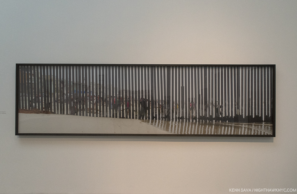
Richard Misrach, “Playas de Tijuana #1, San Diego,” 2013, Pigment print mounted to Dibond, 42 x 160 inches.

Mr. Misrach, who has spent forty years working in the American Desert on his renown “Desert Cantos” project, showed a remarkable selection of images taken since 2004, but more intensely since 2009 (the collaboration with Mr. Galindo dates back to 2012), that told the story in slices. The effect of the music, the images and the sculptures (musical and non) was hypnotic, and ultimately meditative on the situation, the people protecting the border, and the refugees, while at the same time, even for those directly untouched by this story, the show spoke to a larger sense of walls, borders and refugees, and resilience. The Artists found, or created, beauty in this situation, reflecting the very perseverance that is at the essence of survival.

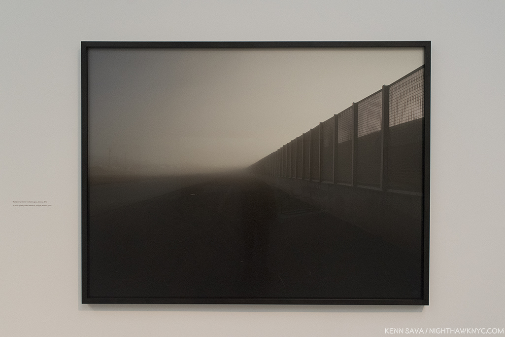
Richard Misrach, “Wall, east of Nogales, Arizona,” 2014, 68 x 84 inches, Pigment print mounted to Dibond

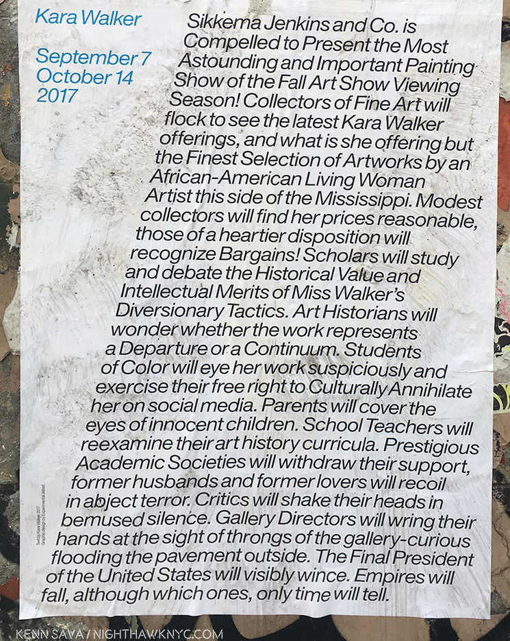
On the Painting & Drawing front, the most important Painting/Drawing gallery show I haven’t addressed was Kara Walker (at Sikkema Jenkins and Co.). Before it opened the buildup was downright intense. First, these posters began appearing, which certainly raised eyebrows until you notice (along the lower left side) that the text was written by the Artist. The show was also featured in a cover article in one of the last print issues of the Village Voice. I can’t remember the last time an Art show made the Voice’s cover, but this was the last time one did.

 Kara Walker sounds a bit weary in the poster, and particularly in the “Artist’s Statement” that appears on the show’s page on the Sikkema website.

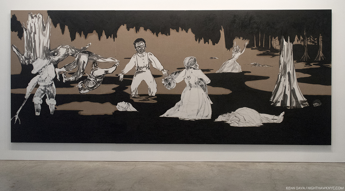
“Dredging the Quagmire (Bottomless Pit),” 2017 Oil stick and Sumi ink on paper collaged on linen, 18 feet long, seen in the show’s first room. A “bottomless quagmire” is what the history of and current state of race and gender relations does feel like at this moment in time.

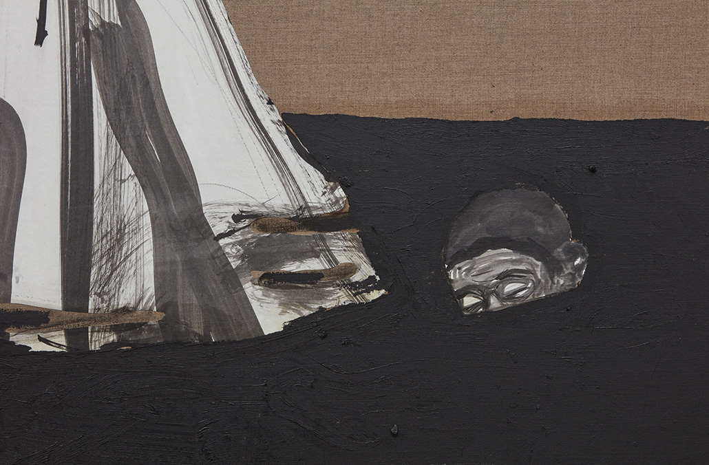
In the lower right side, this almost submerged head seemed to echo Ms. Walker’s weariness in her Artist’s Statement. “But frankly I am tired, tired of standing up, being counted, tired of ‘having a voice’ or worse ‘being a role model.'”

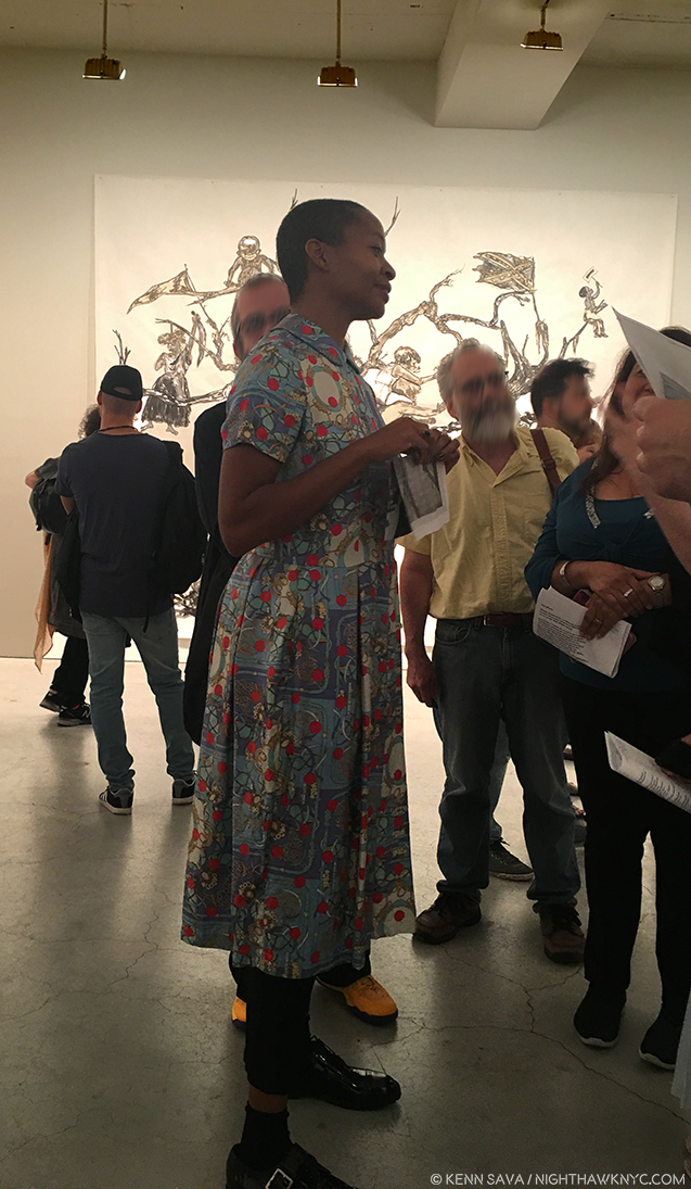
After all the anticipation and buildup, at the packed opening, Ms. Walker, herself, was only to be seen for a little while, at least while I was there.

Kara Walker at the opening, September 7, 2017, with part of  “U.S.A. Idioms,” 2017, Sumi ink and collage on paper, almost 15 by 12 feet, in the background.

While she continues to create her signature Silhouettes, showing a gorgeous 2017 work titled “Slaughter of the Innocents (They Might be Guilty of Something),” that’s almost 18 1/2 feet long, the bulk of the show consists on her ink and collage works, that have increasingly come to the forefront of her shows as time has gone on, most recently in her Cleveland Museum show, “The Ecstasy of St. Kara,” 2016, and at MoMA’s “Unfinished Conversations: New Work from the Collection,” which closed on July 30, 2017, where her “40 Acres of Mules,” a Charcoal Drawing on 3 sheets totaling almost 18 feet long that was acquired by the Museum the year before, was on view in what was something of a one-work preview for her Sikkema show.

“Slaughter of the Innocents (They Might be Guilty of Something),” 2017, Cut paper on canvas. For me, one thing Ms. Walker’s Silhouettes all seem to ask is “Why do you see, what you see?”

Whereas it’s hard for me to imagine the care, patience and deliberation it must take for Ms. Walker to create one of her silhouettes, her Drawing & Collages look like they are done in bursts of raw energy and passion. At times the images approach the quality of a caricature of an event. No matter the differences in creation, when you see her Silhouettes and Drawings side by side they’re unmistakably by the same Artist.

While the Silhouettes, mostly, seem to leave quite a bit to the imagination, including the race of each character, her Drawings & Collages do not, especially when it comes to violence. Nothing is held back, hinted at or hidden. In the Drawings and collages, she has taken away the curtain inherent in Silhouettes in depicting racism and gender crimes. We see the faces, skin color, eyes, and what each one is involved in doing.  You can choose to look away, but otherwise, it’s pretty hard to “miss” what’s going on. The results are shocking, though they have precedent going back to Goya’s “Los Caprichos,” and “The Disasters of War,” and Daumier through Warhol, as well as in the work of Photojournalists and “Conflict Photographers” from all over the world. In Kara Walker’s work, though, the time is centered between 1788, when slavery was legalized in the US, through post Civil War “Reconstruction.”  Where the Silhouettes present a shadow of the figure, and the actions, the Drawings shine direct light. In fact, there are almost no shadows in her drawings- there’s no where for the perpetrators to hide.

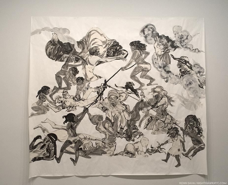
“The Pool Party of Sardanapalus (after Delacroix, Kienholz,” 2017, Sumi ink and collage on paper, Almost 12 feet long.

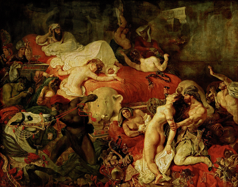
Eugene Delacroix, “The Death of Sardanapalus,” 1844, Oil on canvas, Louvre, Paris. Kara Walker is, also, an astute student of Art History. In her work, Sardanapalus lies horizontally near the upper left corner, apparently, taking no interest in the orgy of death going on, as he does, lying arm on elbow on a huge red bed in Delacroix’. Her Ed Kienholz reference is a bit harder to track down, but it might be this one.

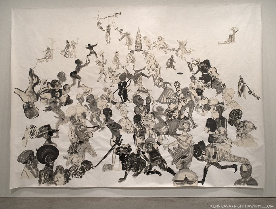
In “Christ’s Entry into Journalism,” 2017, the ground is, also, gone. The figures hang in the space of the paper, though some sense of perspective remains- as you get closer to the top of the sheet, they get smaller.

“Christ’s Entry into Journalism,” 2017, Sumi ink and collage on paper, 140 x 196 inches.

In this work, Ms. Walker’s figures cut across time, with some appearing to be contemporary. To the right of center, a figure “rocks the mic.” In the lower center is a figure that appears to be a modern riot trooper, in a helmet with face shield and body armor. He appears to have clubs in each hand. Right next to his left hand is what appears to be a black head, in a hoodie, on a platter, being carried by a woman, who looks away, while others nearby watch, some with shock on their face, some pointing to the scene. Just behind them, an extended arm holds and American flag, while above them a figure gives a Nazi salute with one hand while holding a Rebel flag with the other. Up top, a lynched figure hangs from a tree branch while women on either side of him perform acrobatics, with Klansmen standing next to them. In front of that naked black women are attacked by a group of men, while, again, others see what is going on. In the center of the work, the decapitated hoodied head looks straight across at a Civil War soldier pointing a gun at him, across time. Is this 1863? Or 2016?

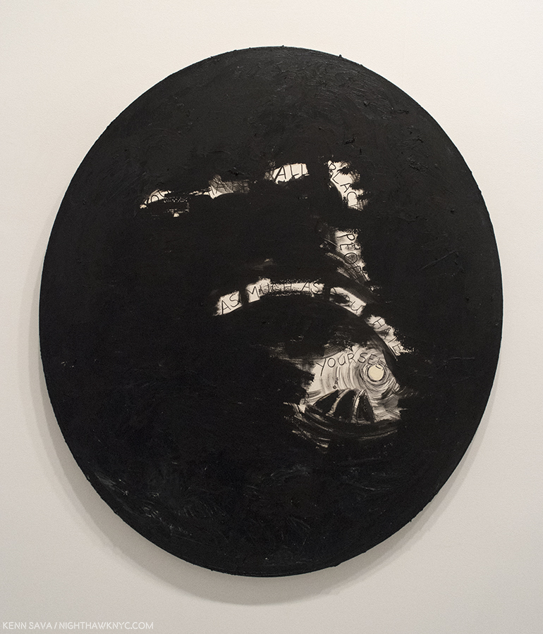
“Storm Ryder (You Must Hate Black People as Much as You Hate Yourself),” 2017, Oil stick and Sumi ink on paper collaged on linen.

The primacy of Drawing in her work was reinforced with the recent release of one of Ms Walker’s Sketchbooks from 1999, when the Artist was 29, as a book appropriately titled, “MCMXCIX.” It contains Drawings that, in style and subject, visitors to the Sikkema show will immediatley recognize. Interestingly, as Raymond Pettibon does in his shows (the latest concluding on June 24th, shortly before Ms. Walker’s opened), she prefers her larger works be tacked to the walls.

“Future Looks Bright,” 2017, Oil stick and Sumi ink on paper collaged on linen.

Kara Walker may be growing tired of being a “role model,” of being “a featured member of my racial group and/or my gender niche,” (as she says in her Artist’s Statement referenced above). Of course, I can’t imagine being Kara Walker, but I can understand that it gets to be “too much.” I’m not sure, however, what her other choice is. I mean, I’m sure she COULD do something else if she REALLY wanted to. After seeing all the work and passion she put into this show? I guess I’m just not convinced that she really DOES want to do something else. Yet.

Finally…Looking back on 2017… Last year I wrote that I felt Sheena Wagstaff had the best year in NYC Art. She’s had a very good 2017, too. But, this year, I think that The New Museum’s Massimiliano Gioni & Gary Carrion-Murayari. had special years, highlighted by the truly exemplary, and revolutionary, “Raymond Pettibon: A Pen of All Work” retrospective, which they then remounted simultaneously in Maastricht and Moscow. I feel it was “revolutionary” because totaling an unheard of 800 works, including brand new works created by the Artist for this show (some on the very walls of the New Museum), they gave an exhaustive look at Pettibon’s career, yet the show never slowed, never failed to keep and even raise interest. It even included work Pettibon did as a small child that he has now ammended in his own, unique style. Word has recently come that Gary Carrion-Murayari, who kindly answered my questions on the Pettibon Moscow show he co-curated, has also been named as a co-curator for the New Museum’s 2018 Triennial, so he could be ready to have another “big” year. Stay tuned!

The end result is that Massimiliano Gioni, Gary Carrion-Murayari, and the New Museum have served to put the “Big Four”1 Manhattan Museums on notice that, on their 40th anniversary, we are going to have to get used to saying the “Big Five.”

———————————–
A Special “Thank You!” to all the Artists who gave me their time and shared their thoughts with me in 2017, and to David White & Gina Guy of the Robert Rauschenberg Foundation and Gary Carrion-Murayari and Paul Jackson of the New Museum.
“Thank you!” to the Hattan Group and Kitty for research assistance, and to The Strand Bookstore for being open until 10:30pm seven nights a week. R.I.P. Owner, Fred Bass this week.

*- Soundtrack for this Post is “Heroic Elegy, Op. 36,” (1918), by Ernest Farrar, in honor of the 100th Anniversary of WW1, which was featured in another memorable show, “World War 1 & The Visual Arts” at The Met this year, as a way of honoring it, and all the Artists, and Musicians, lost during it. Shortly after “Heroic Elegy’s” premiere, Second Lieutenant Farrar was ordered to the Western Front. Two days after he arrived there, he was killed at the Battle of Epehy. He was 33. I first heard it while I was driving in Florida on September 11, 2002. The classical station there played it in honor of the first anniversary of 9/11. So taken with it was I that I pulled over and listened to it with my eyes closed, then immediately set about researching it’s composer. Though he wrote other fine works, “Heroic Elegy,” is special. It’s lightning in an 8 minute bottle. As beautiful as it is, there’s a quality, a confidence, in it that seems to promise so much more to come that he, tragically, never got the chance to give us, like the other Artists & Musicians lost far too early in this most senseless of wars.

On The Fence, #17, The Good Riddance” Edition.

NighthawkNYC.com has been entirely self-funded & ad-free for over 7 years, during which over 275 full length pieces have been published! If you’ve found it worthwhile, PLEASE donate to allow me to continue below. Thank you, Kenn.

You can also support it by buying Art, Art & Photography books, and Music from my collection! Books may be found here. Music here and here.

Written & photographed by Kenn Sava for nighthawknyc.com unless otherwise credited. To send comments, thoughts, feedback or propositions click here. Click the white box on the upper right for the archives or to search them. Subscribe to be notified of new Posts below. Your information will be used for no other purpose.

  1. With all due respect to The Frick Collection, who the powers that be that came up with “the Big Four” left out.

Ellen Harvey’s Global Beautification Project

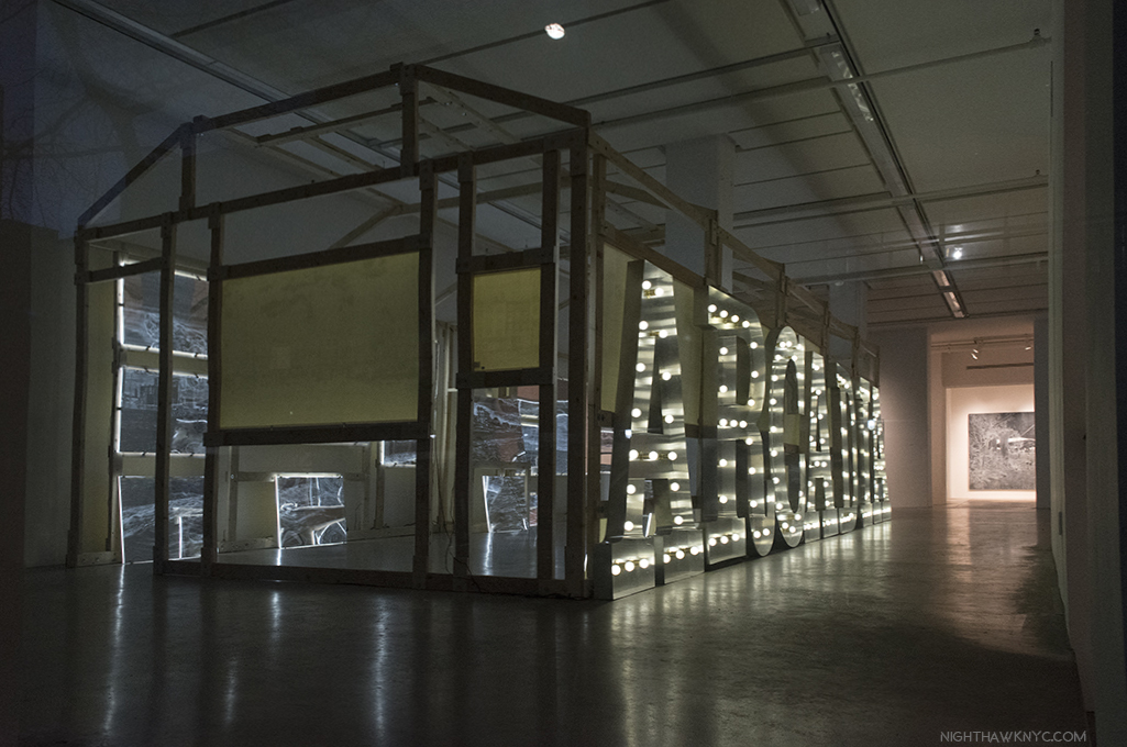
A few weeks back, I walked across West 22nd Street after visiting Gary Hume’s show, “Mum” at Matthew Marks, lost in the whirlwind of emotions, past and present, it elicited, barely cognizant of the traffic, weather, or time. Luckily, Thanksgiving week in NYC tends to be on the quiet side. As I crossed the street, bright lights, like those seen in a carnival, beckoned from inside the front window of Danese/Corey Gallery. Reaching the sidewalk, I could see the lights made a sign that was attached to the frame of a wooden shack. They read “ARCADIA.”

The view from the sidewalk outside Danese/Corey. Click any Photo for full size.

Hmmm…”Arcadia.” A word that evokes simple pleasures. In need of some cheer, I stepped inside. While I can’t say I found “cheer,” I found Art.

Installation view from inside the “shack.” An extraordinarily imaginative vision, stunningly well realized.

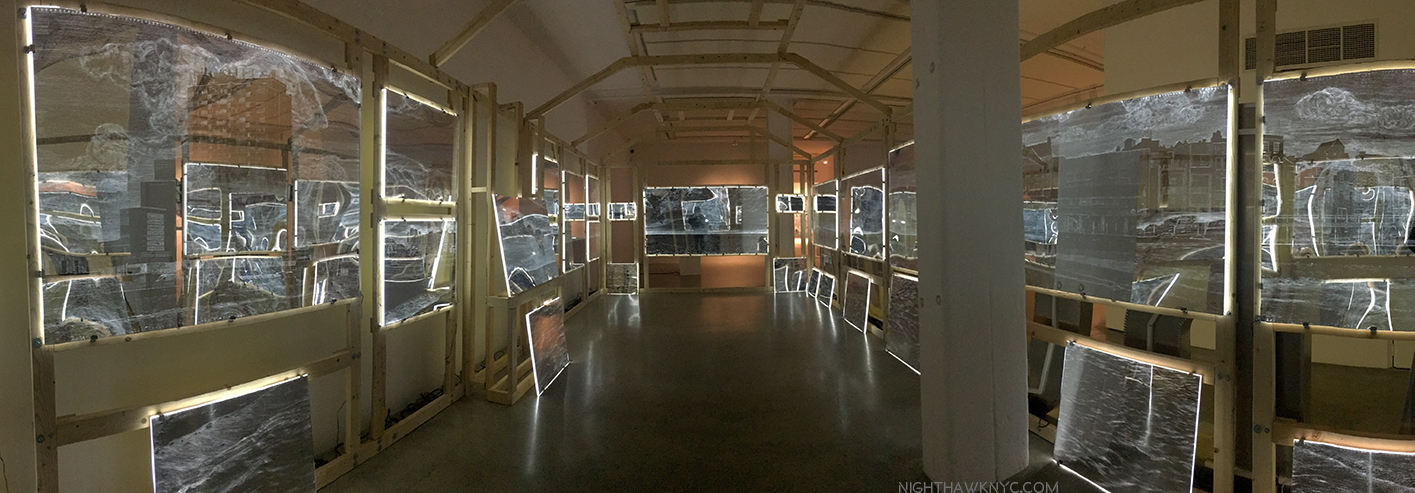
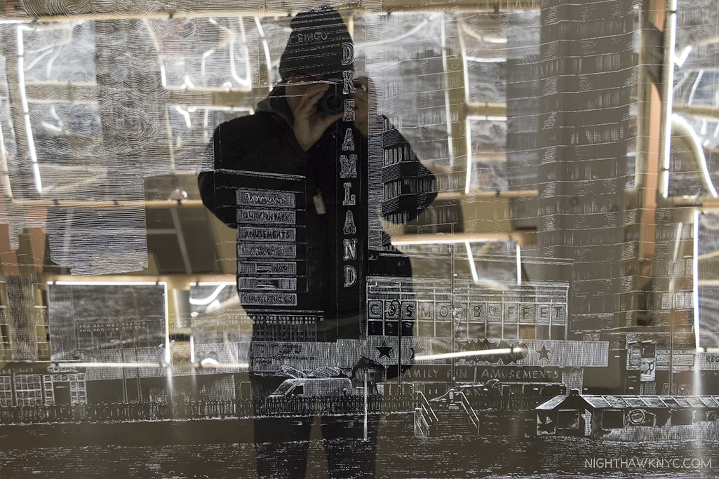
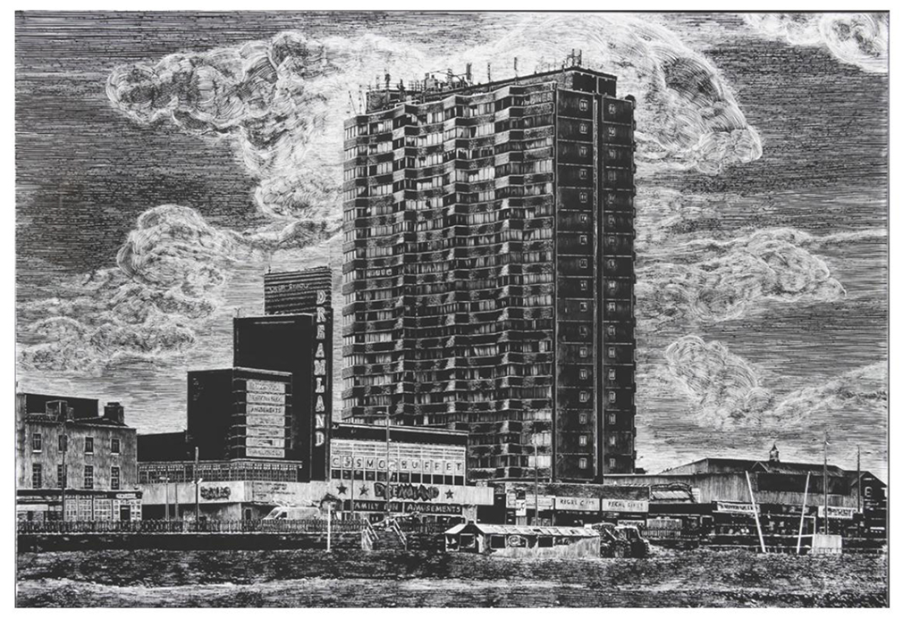
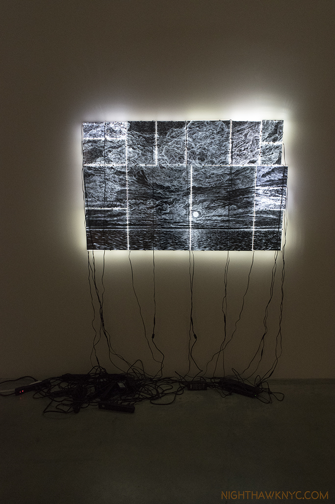
The show was “Ellen Harvey: Nostalgia.” Inside the wooden framed shack, the carnival-like atmosphere of the sign outside quickly faded into darkness, pierced with lines of white light. Looking closer, the lines turned out to be etched on mirrors lit from the back. The light they emitted was reflected back by more back lit mirrors on the opposite side of the shack, as was the viewer, which made the design they held frustratingly hard to see. It was like “seeing” through a haze, a bit like walking around Times Square (I hear). Taken by the beauty I knew was there, I wandered around the space, enthralled and puzzled. Scenes of buildings, waves, and sky lined both sides culminating in a large panel showing the moon over the sea. Making my way to the gallery’s desk, I found that the work, titled “Arcade/Arcadia,” 2011, contains 34 hand engraved mirrors mounted on light boxes to form a 360 degree panorama of the town of Margate, England as seen from the beach. Hmmm…

Intentionally hard to see the amazing engraving on the mirrors.

Then same mirror, without anything in front of it. From the show’s catalog.

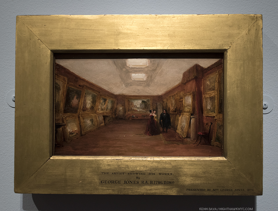
Unable to get the work out of my mind while I was looking at other shows, I went back to Danese/Corey later and bought the monograph, “ Ellen Harvey: The Museum of Failure1,” which has the backstory and images of the mirrors without reflections, (which, while defeating the point of the installation, allows appreciation of her amazing technique). I learned that the project was commissioned by the Turner Contemporary Gallery in Margate, England for it’s opening in 2011. The shed is a remimagining of JMW Turner’s London gallery (in 3/4 size) and the mirrors are arranged in the way Turner displayed his work- “salon” style, as seen in George Jones  “Interior of Turner’s Gallery: the Artist showing his Works,” 1852. Along with another Painting George Jones did of it after Turner died, they are the only records we have of what JMW Turner’s gallery looked like.

George Jones “Interior of Turner’s Gallery: the Artist showing his works,” 1952, Oil on canvas, Ashmolean Museum.

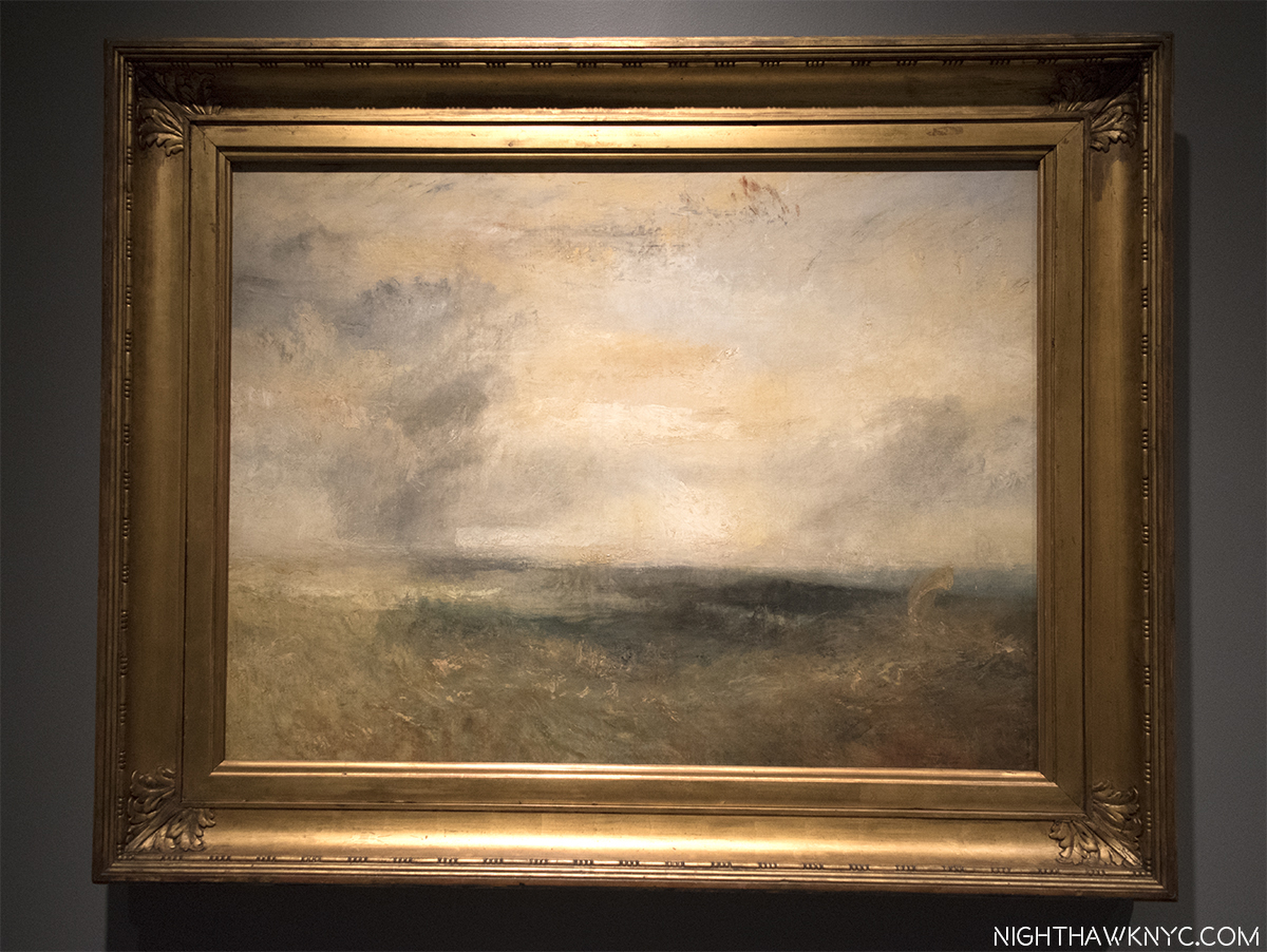
Turner loved Margate and lauded it’s natural beauty. So inspired, he is believed to have created around 100 Paintings of it, possibly including this one, given that he began using Margate as a second home around 1830.

JMW Turner, “Margate(?), Seen From the Sea,” c.1835-40, on loan from the National Gallery, London and seen in The Met Breuer’s “Unfinished” show in 2016, which I wrote about, here. Possibly one, of hundreds, of works he did depicting Margate.

In addition to finding inspiration, he, infamously, “shacked up” with his landlady there. The town eventually became a tourist mecca which led to it’s (over?) commercialization. When it fell on hard times, the amusement park, called “Dreamland,” (who’s sign Ms. Harvey pays homage to in her “Arcadia” sign, using the same font), closed and became a blight on the natural beauty which led so many to want to come there in the first place. In the piece, Ellen Harvey depicts a more recent view of Margate as seen from the beach, in apparent complete desolation.

The work is like an onion in it’s many layers. There’s the Turner layer, the Margate/nature layer, the Dreamland/commercialization layer, the mirror layer (with it’s funhouse effect, seen earlier), and the layer of light being distorted, which could be a reference to the light that Turner loved, and what’s become of it, with the addition of so many electric lights and buildings blocking sunlight. There’s, also, the layer of the styles of the two Artists, Ellen Harvey and JMW Turner, in dialogue. With the large shadow of no less than Turner looming, this is, certainly, a daring undertaking. Ms. Harvey’s mirrors contain many passages of sky and sea, crescendoing in the large center rear panel, that can’t help but remind today’s viewer of the English Master, though in decidedly her own style. Though “Dreamland” has recently reopened, the metaphor, and the warning, in the work is powerful, and both specific and universal. Experiencing it was a highlight among all the Art I’ve seen in 2017.

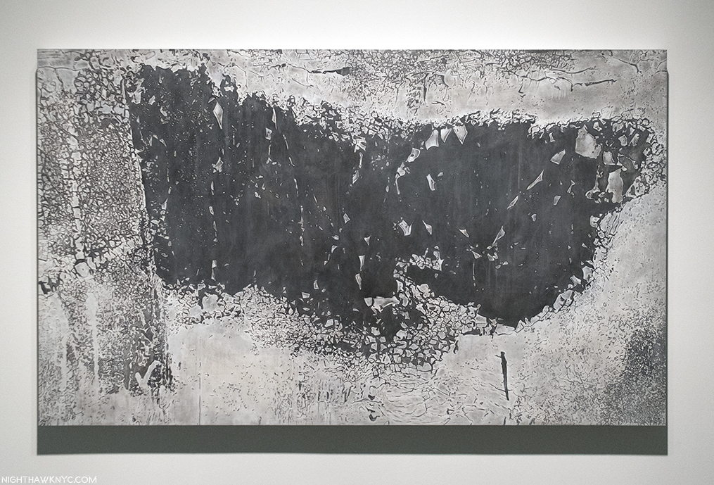
The rest of the show impressed me just as much. Adjacent to “Arcade/Arcadia,” was a Painting that depicted what looked to be a rough surface that seemed like it should be in relief, but was, in fact, flat. Hmmm…Is this the same Artist who just gave us all those meticulously engraved lines on those 34 mirrors2? It was closer in style to the Photographs of Aaron Siskind than the style I’d just seen. When I saw the title, I got it. “Crack/Craquelure.” Craquelure is a term referring to the cracking patterns seen in many old Paintings. “Nostalgia,” in another sense.

‘Crack/Craquelure,” 2017, Oil on wood panel.

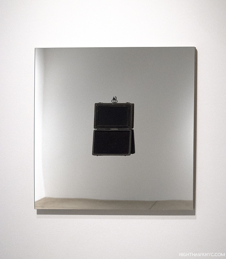
There are other instances of “nostalgia” for the craft of Art in the show, like “Picture(esque),” 2017, Antique “Claude Glass,” float glass mirror, hook and plywood. A “Claude Glass,” (or “Black Mirror”) is an 18th & 19th century device, which Ms. Harvey is fond of.

“Picture(sque),” 2017. The “Black Mirror” was, also used for magic, particularly for seeing the future. Ellen Harvey’s work often contains images of ruins & destruction…images of a dark future.

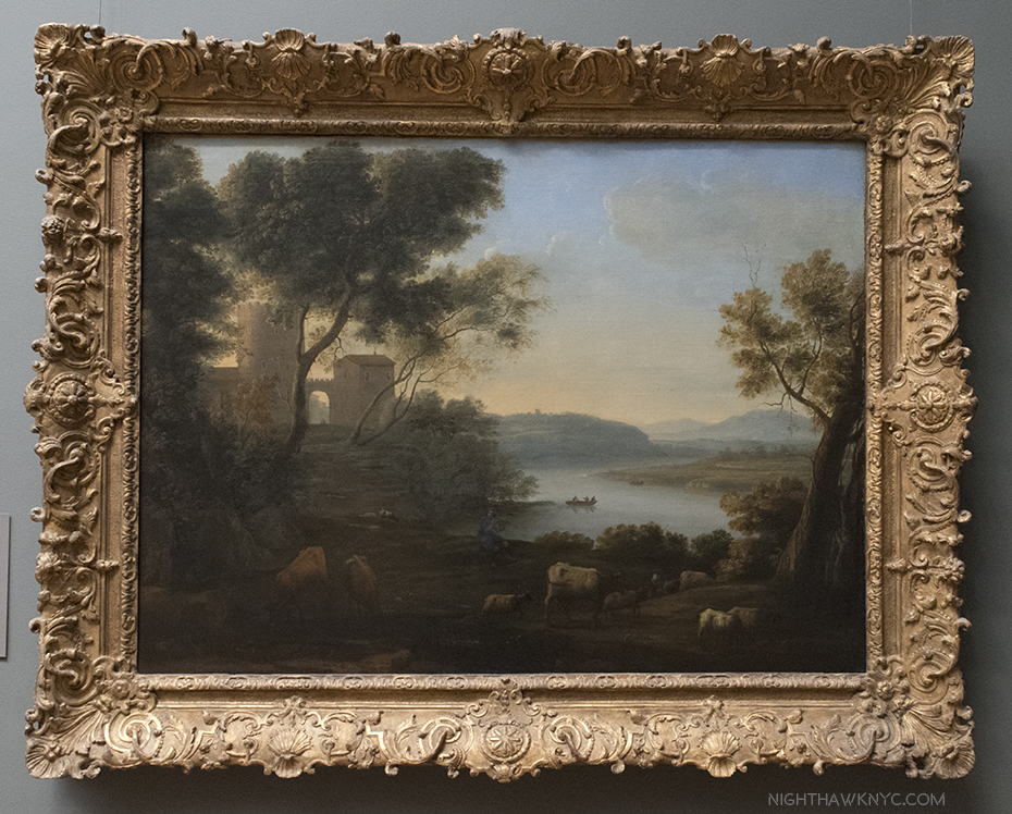
They have been used by landscape Artists aiming for that special quality achieved by the great landscape Painter, Claude Lorrain (c.1604-1682), who it’s named after.

Claude Lorrain, “Pastoral Landscape: The Roman Campagna,” 1639, seen at The Met. A classic example of the much admired, and copied, “dark” landscape, which inspired the “Claude Glass.”

Beyond the other themes present in this diverse show, there is the theme of mirrors. Since Robert Rauschenberg, I can’t think of another Artist who uses mirrors as frequently to such wonderful effect. Hand-engraved, without engraving, or with “Black Glass,” above. I asked the Artist about her use of mirrors, and specifically when it started. She replied, “I’ve always loved mirrors — but the first mirror piece I really made was in 2005 for the Pennsylvania Academy — aptly titled “Mirror” because I wanted to show the space and comment on their collection of paintings…and then I got hooked. Before that, I was all about Polaroids.” She’s referring to her monumental installation where she reinvisioned the entrance hall of the landmarked Furness and Hewitt Pennsylvania Academy of Fine Art Building, Philadelphia, as a ruin, using video and four 9 by 12 foot hand-engraved mirrors. Ruins are part of the “dark future” Ellen Harvey believes we are destined for. Rogier van der Weyden’s “The Last Judgement” was the first painting she fell in love with. “That red-hot sword is coming for us all,” she said3, referring to what looms above Christ’s left hand. If it’s coming, I hope it gets here before I have to file my “new” taxes.

Further on, “Nostalgia” takes on more of a traditional meaning in “Ghost of Penn Station,” 2017, Oil on wood panel, where we see the tragically lost Architectural masterpiece, rendered in oil, as if seen through a haze or in a dream. Whereas Ms. Harvey has created a number of works showing existing buildings (even creating an “Alien’s Guide to the (future) Ruins of Washington DC“) in ruins, this is a rare case where a building that was ruined is shown before, in all it’s glory. In the rear gallery, “New Forest (The I.R.S. Office Reforested),” 2013, Gesso, oil, acrylic, and varnish on wood,  about 13 1/2 feet long, shows a part of the I.R.S. offices (speaking of taxes) in a deserted state with the area in the process of being reclaimed by nature. Interestingly, the I.R.S. bought a sister work on the same subject, titled “Reforestation,” that, also, depicts their new offices in ruins, being reclaimed by nature, rendered in mirrors which, now installed, reflect those very offices! Fact is stranger than Art. When I asked Ms. Harvey about this, she replied to the effect that they have a, surprisingly, good sense of humor.

“New Forest (The I.R.S. Office Reforested),” 2013, Black gesso, oil, acrylic, varnish on 20 wooden panels. Overall- 13 1/3 feet long by 7 3/4 feet high. There is a social/political/economic conscience, or awareness that runs through Ellen Harvey’s work that I find most tastefully handled.

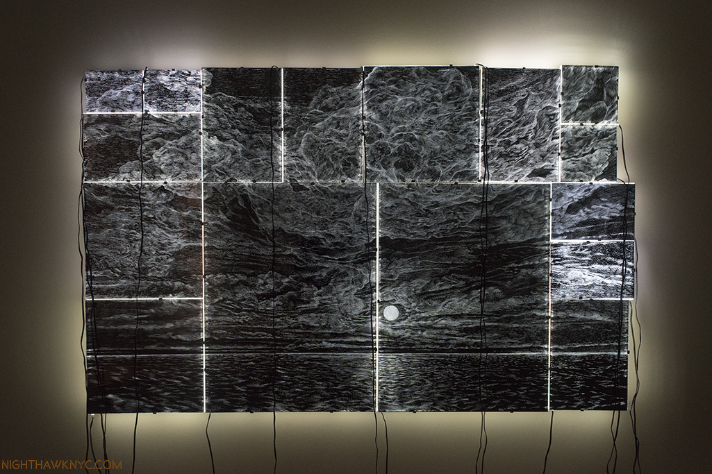
Finally, there is another, spectacular, engraved mirror work, the fascinating “On the Impossibility of Capturing a Sunset,” 2017, 16 Hand-engraved plexiglass mirrors, 16 Lumisheets, plywood. Ms. Harvey lets the wires for the light boxes dangle down in front…Yes. In front of the work,  another way of adding an obstacle to the “pure” appreciation of her image. They fall to a jumble of power strips on the floor, where they look as intricate as the engraving above them. Perhaps they’re a metaphor for the huge effort it took to get this close to the “impossible” task she refers to. (In earlier engraved mirror works (like “Destroyed Landscape (Cloudy Moon),” 2012, she scratched over the finished engraving, graffiti-like, making it almost impossible to see the underlying composition.)

“On the Impossibility of Capturing a Sunset,” 2017, 16 Hand-engraved plexiglass mirrors, 16 Lumisheets, plywood.

Close-up.

As I considered “Nostalgia,” over multiple visits, this work became something of a touchstone for me as I learned (and still learn) about her work. In it, her gorgeous technical achievement becomes subservient (in a way) to her “larger point.” Across her career, it seems to me that that “larger point” is her vision. About this, she said-

“What is it that all these viewers might want in this situation? That’s really where all of this work comes from. It comes from my desire to take particular situations, either physical or social, and say, ‘What is it that people want from Art in this situation?  What can Art do here?’ And of course the answers are often completely ridiculous. When you think about it what people dream of, it’s like falling in love with someone, it’s all projection. It’s a sort of mad fantasy that’s very hard to understand.” 4

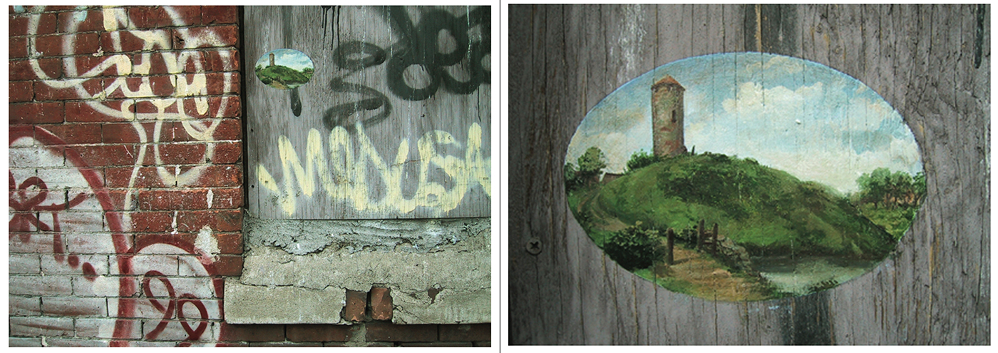
“495 West 37th Street at Ninth Avenue, Hell’s Kitchen, Manhattan, From The New York Beautification Project,” February, 2001, Oil on Wood(?) Wall. Close-up, right. Photos from ellenharvey.info, which has it’s backstory.

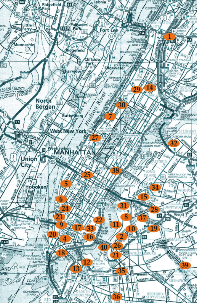
This “What can Art do here?” approach can be seen all the way back in 1999, in her remarkable “New York Beautification Project.” In it, the Artist hand painted 40 five by seven inch oval oil paintings on top of existing graffiti, over the course of 2 years! During the project, she was mugged once, and had encounters with the NYPD. While her remarkable Paintings were influenced by classic (and classical) landscape Paintings (WHAT could be MORE out of place in the world of NYC graffiti?), what floors me is the map of the locations she created them.

Map of locations of the Paintings in Ellen Harvey’s “New York Beautificalion Project,” 1999-2001. From ellenharvey.info

She almost circled the entire City! Ok, she did this without permission, or renumeration, as the works were affixed to non-movable locations, to the displeasure of gallerists, which might make you wonder…”WHY???” I chalk it up as an early sign of the scale of, the dedication to, and persistence of her vision. It was a taste of things to come.

Her “What is it that people want from Art in this situation?” reached, perhaps, it’s ultimate expression when only a short time later she got a chance to do public art “for real.” Actually? Two chances. The NYC MTA commissioned her to create the Art for TWO NYC Subway stations. She is one of the very few (perhaps, the only one?) to have been commissioned to do more than one. In 2005, she created “Look Up, Not Down,” in 2,000 square feet of the Queens Plaza Subway Station. This MTA video provides a look at it, and the backstory, and also includes rare glimpses of the NY Beautification Project’s Paintings, which are now long lost.

Then, in 2009, she was commissioned to do the Art for the (new) Yankee Stadium Metro North Station. Typically, she took a Yankees ad logo, “The Home of the Stars,” and flipped it in a way everyone could relate to- Yankee fan, or not.

Someone once said that mosaics are the most durable medium. There are gorgeous examples in The Met from 200 AD. So, it seems fairly likely that her work in the subway (at least) will last for at least the next 100, if not 1,000 years. I’ve lauded the MTA on their choices of Artists to create Art for the Subway before. Here is another case where I think they made an excellent choice. Both of these works are related to the sky and stars theme that continues in “Nostalgia.” Well? I’m not sure even Ellen Harvey is going to find a bigger stage than the stars.

Regarding her statement about giving the viewers what they want, I remain to be convinced that many, if anyone else, sees the world as Ellen Harvey does. It seems to me that she takes spaces (or materials) and reimagines them in ways visitors might enjoy, but, perhaps, don’t quite expect, and I doubt anticipated. Her work seems to cut across and through periods, schools, styles- abstract or realistic, to speak to people, and so, it “gives the people what they want.” That’s a pretty rare gift. Christo & Jeanne Claude come to mind as Artists who are/were capable of similar things. Her projects often require her to bring an extremely wide range of talents to bear, in an equally wide range of mediums and scale, to create her visions, though like Rauschenberg, she has said she considers herself a Painter. A Painter, who loves Painting dearly, though she has real doubts about it’s ongoing relevance given many of it’s original functions having been replaced by other mediums. For my part, it seems Painting was in trouble in the 90’s, but I’ve seen any number of very good (and relevant) Painting shows recently, especially this past year. Since Painting is, still, my favorite medium, I remain hopeful.

Looking through the 300 plus pages of “Museum of Failure” it’s very hard not to be amazed at the daring of her work, it’s diversity, as well as the consistent quality of it. In two instances she has taken on Painting reproductions of the bulk of the collections of two museums(!)- the Whitney and the nudes in the Bass Museum, Miami, and rendered them exceedingly well- regardless of the style or period. Yet Painting is just one of the many mediums she works, and excels, in.

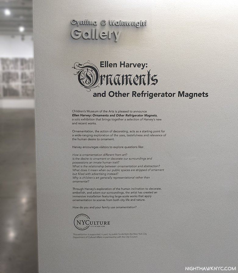
With “Nostalgia,” one of the best shows of the fall season, you might think that Ellen Harvey would be satisfied. But, no. On December 13, ANOTHER show, including new work, “Ellen Harvey: Ornaments and Other Refrigerator Magnets,” opened at the Children’s Museum of Art downtown.

The CMA show continues her exploration of ornamentation (a subject near and dear to my heart), which, gets it’s own section on her website, showing work going back to at least 2002. It’s a show that, hopefully, will inspire and instill a love of ornament in a young audience that will grow up to bring it back to a world that sorely needs it. In it, another of her themes, seen in her 2014 installation, “The Unloved,” at the Groeninge Museum, Bruges, Belgium, comes to the fore- the forgotten/overlooked/yes, unloved, in Art. These days? Not much is more unloved than ornamentation in Architecture.

“Those days are recalled on the gallery wall
And she’s waiting for passion or humour to strike

[Chorus]
What shall we do, what shall we do with all this useless beauty?
All this useless beauty”*

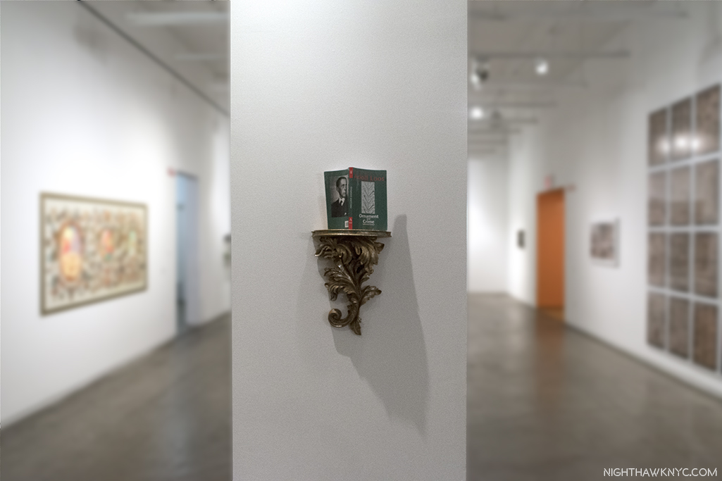
Appropriately, and prominently, placed around the show were various editions of Austrian Architect Adolf Loos’ essay collection, “Ornament & Crime,” as if saying “Ornament is NOT a crime!”

Adolf Loos’ “Ornament and Crime,”a collection of essays, including the title piece, a lecture given in 1908, appropriately displayed on a lovely, ornate pedestal.

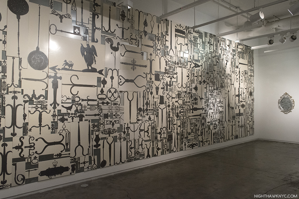
Featured is her 2015 “Metal Paintings for Dr. Barnes,” in which she painted every piece of metal work installed at the Barnes Foundation, Philadelphia, on 826 wood panels with magnets inset then mounted on steel panels so they could be endlessly rearranged, unlike those in the Barnes.

“Metal Paintings for Dr. Barnes,” 2005, Oil on 826 wood panels with inset magnets, steel panels, overall, 25 by 15 feet, left, and “Mass Produced,” 2017, Metal hardware, screws, plywood, and plastic frame.

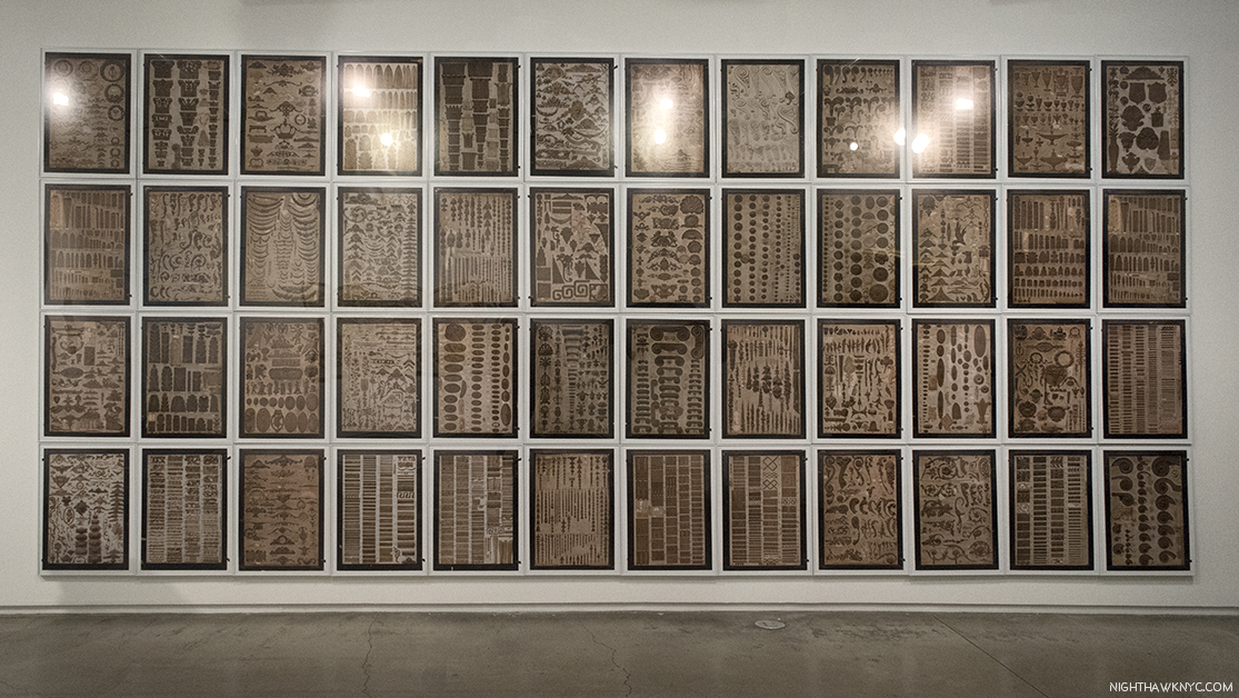
More recently, much of her work with ornaments has been inspired by her visits to the  American Wood Column Company, in Brooklyn, founded in 1916, and their collection of over 6,000 antique molds. On view was a 48 part visual catalog of samples of their work, which Ms. Harvey had photographed by accomplished Photographer Etienne Frossard, who has been working with her since 2012, in a new work titled “Mr. Lupo’s Collection,” in honor (in a sense) of this man and his company’s devotion to currently unloved work that may be on the verge of being lost.

“Mr. Lupo’s Collection,” 2017, 48 Framed Photographs, individually photographed by Etienne Frossard. (Apologies for the glare in my photo of them.)

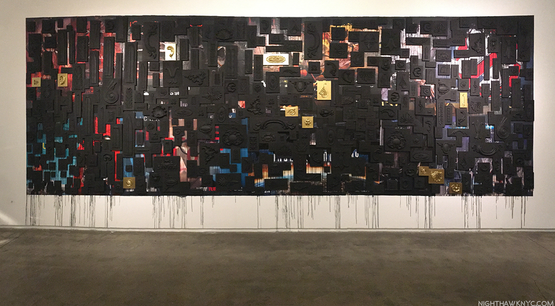
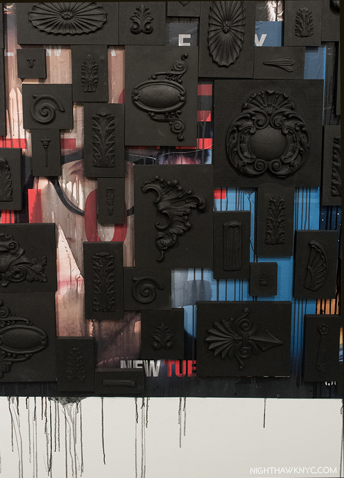
Ornaments made by American Wood Column Company were featured in a large, new work that brings them right into the 21st Century. Not being satisfied with creating Art in two Subway stations, here, “Ornaments for the Subway,” 2017, goes further. It attempts to beautify that universal blight of all Subway stations- the ads. The card says, “It used to be that public spaces were covered with architectural ornaments rather than advertising….Here the Artist imagines taking back the public space from which they have been removed.” Bravo.

“Ornaments for the Subway,” 2017, Pressed glue ornaments made by the American Wood Column Co., plywood panels with inset magnets, subway posters and 20 steel panels.

Detail.

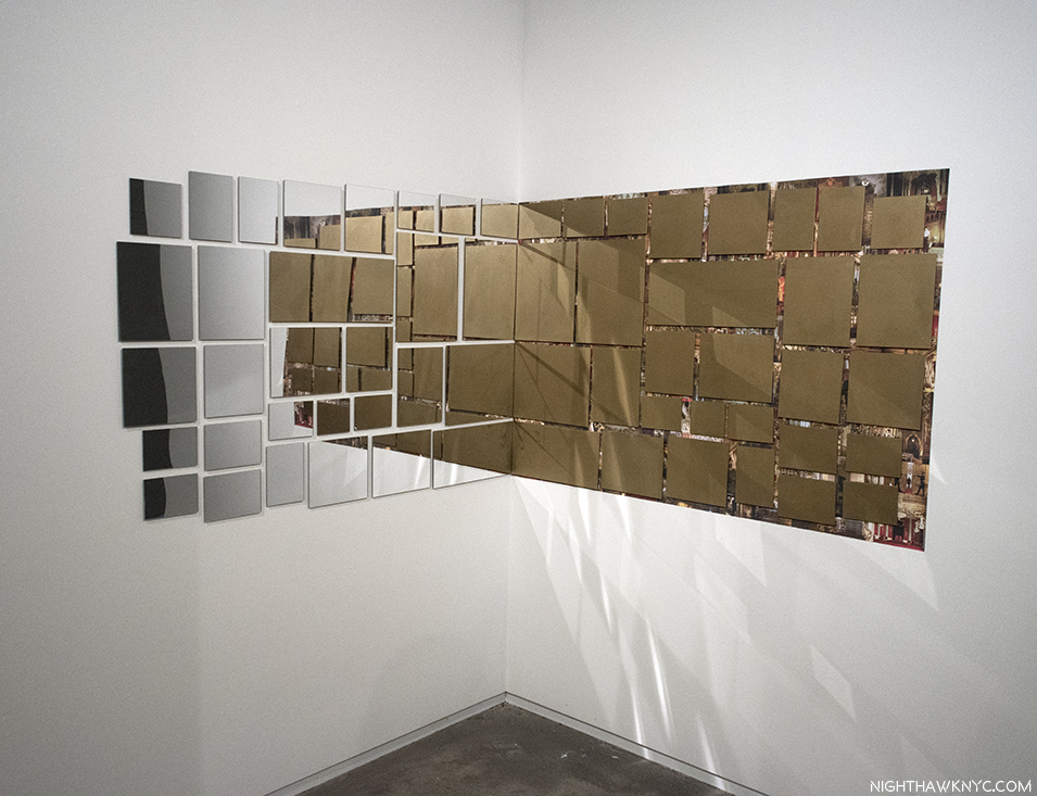
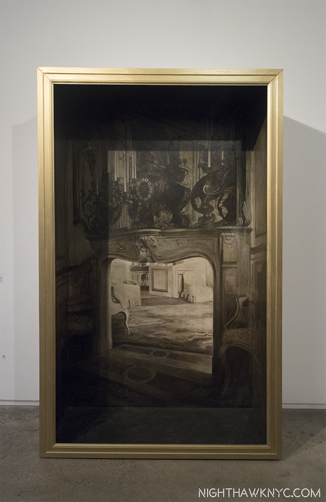
I spoke with Ellen Harvey at the opening, and she turned out to be exceedingly gracious, generously walking this complete stranger around her new show, pointing out all kinds of subtle detail that would take me many visits to discover. Here again, some of the themes I’ve seen in her other works are on display- a critique of Art, museums, and the rich, her passion for giving the viewers what they want, more use of mirrors (as mirrors this time!) and yes, “nostalgia,” is a theme, here, too. This work with mirrors includes people I know I’ve seen somewhere before.

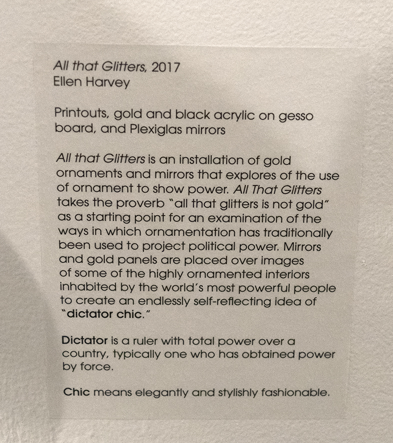
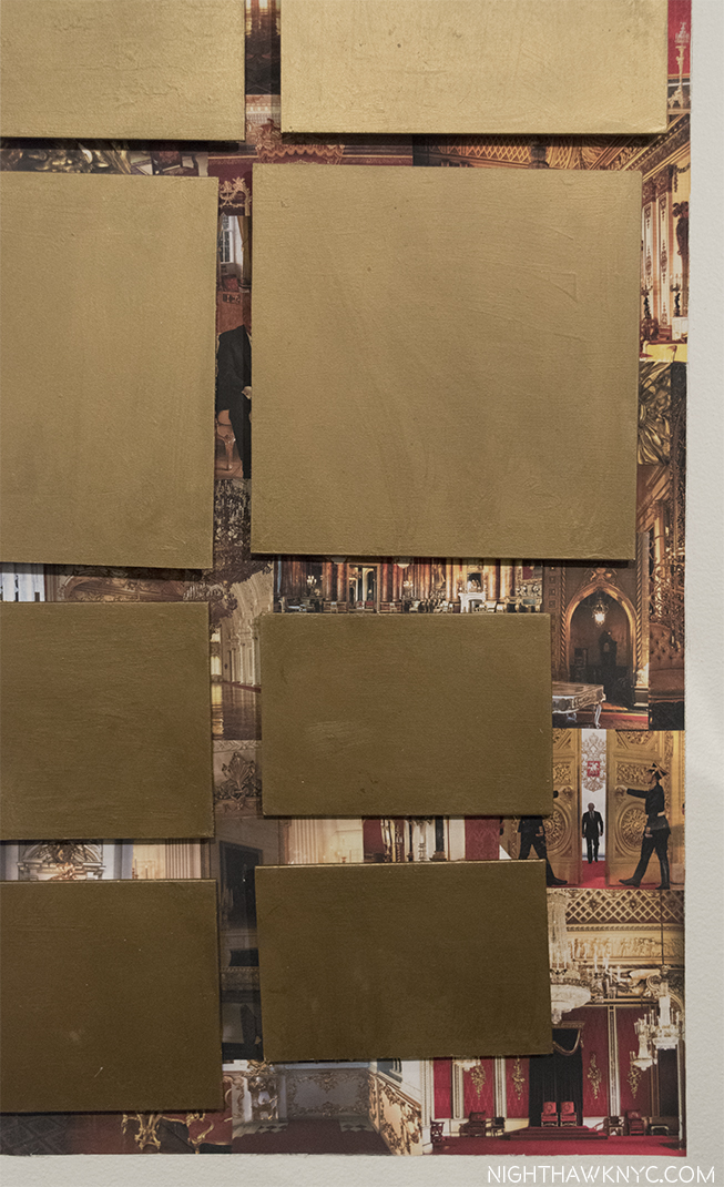
“All That Glitters,” 2017. Card and detail below.

Detail of the lower right corner of the right side shows Mr. Putin, right, and Mr. Trump, above to the left of center, who’s wife appears elsewhere.

I titled this piece “Ellen Harvey’s Global Beautification Project,” because looking through her projects to date, they’ve taken place around the world, from California, to Miami to Philadelphia to Ghent, Bruges, Margate, Vienna, Warsaw, and of course, NYC, including the 2008 Whitney Biennial and the two Subway Stations. Together, they make part of a map of the world that will soon start to look like a global version of the map of her New York Beautification Project.

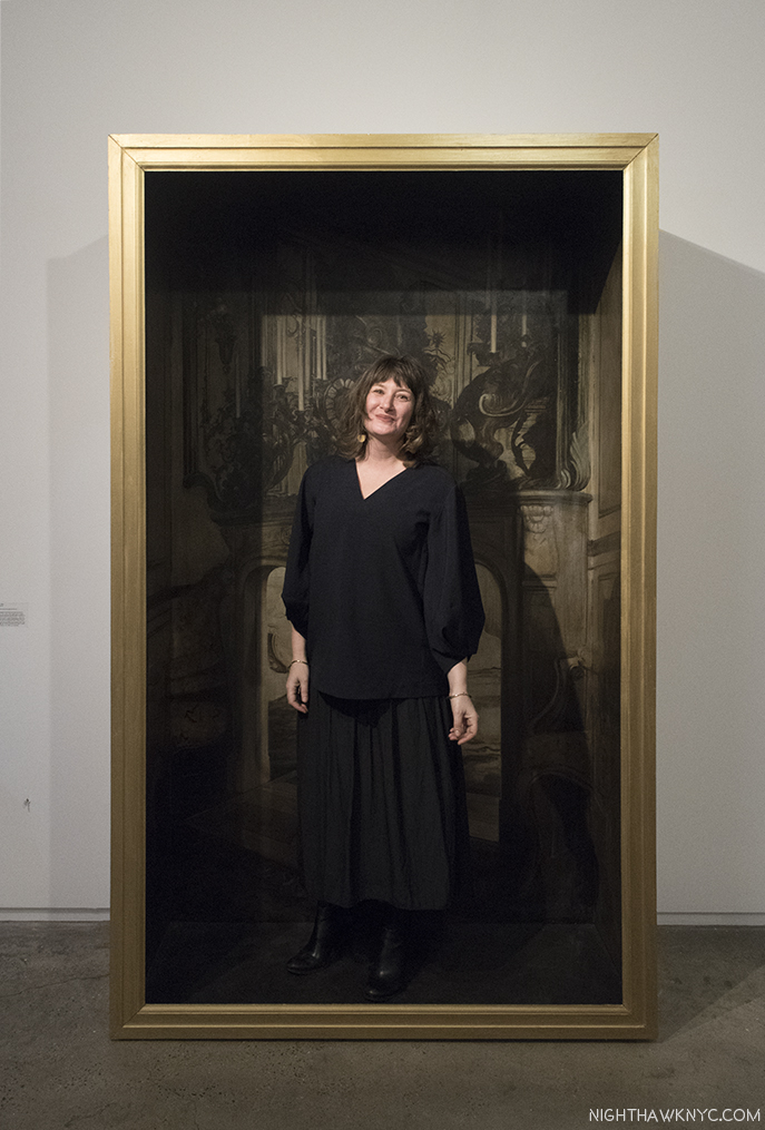
Before I left CMA, I came across “Walk In,” 2005, Oil on plywood and gilded frame, a booth to allow visitors to pose in glamorous surroundings, as if walking into a painting.

“Walk In,” 2005, 005, a work designed to be a background and frame in one for a do it yourself portrait.

Inspired by her work, and her approach, it was at that point that I decided to be a visionary, myself. “Hmmm….What does this picture need? What would the people like to see here?,” I asked myself.

The very gracious Artist graciously poses for yours truly in her “Walk In,” 2005.

And so, “My Portrait of Ellen Harvey” ends…with one.

“Ellen Harvey: Nostalgia” is my NoteWorthy show for November. 

*- Soundtrack for this Post is “All This Useless Beauty,” by Elvis Costello from the 1996 album of the same title, publisher not known to me. It’s rendered here.

NighthawkNYC.com has been entirely self-funded & ad-free for over 7 years, during which over 275 full length pieces have been published! If you’ve found it worthwhile, PLEASE donate to allow me to continue below. Thank you, Kenn.

You can also support it by buying Art, Art & Photography books, and Music from my collection! Books may be found here. Music here and here.

Written & photographed by Kenn Sava for nighthawknyc.com unless otherwise credited. To send comments, thoughts, feedback or propositions click here. Click the white box on the upper right for the archives or to search them. Subscribe to be notified of new Posts below. Your information will be used for no other purpose.

  1. A new edition, which features “Arcade/Arcadia” on it’s cover, is the most complete book on her work and is recommended. Ellen Harvey’s website, ellenharvey.info is, also, a goto resource.
  2. The first question I asked Ellen Harvey was about engraving those mirrors- “What happens when you make a mistake?” “It happens often. I press on,” she said!
  3. “Ellen Harvey: Museum of Failure,” P. 299.
  4.  https://youtu.be/juIqarKNAGY

Chris Ware-“The World’s Smartest Cartoonist”

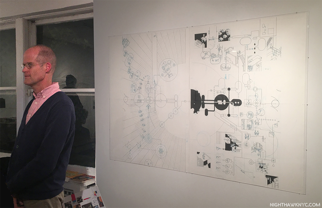
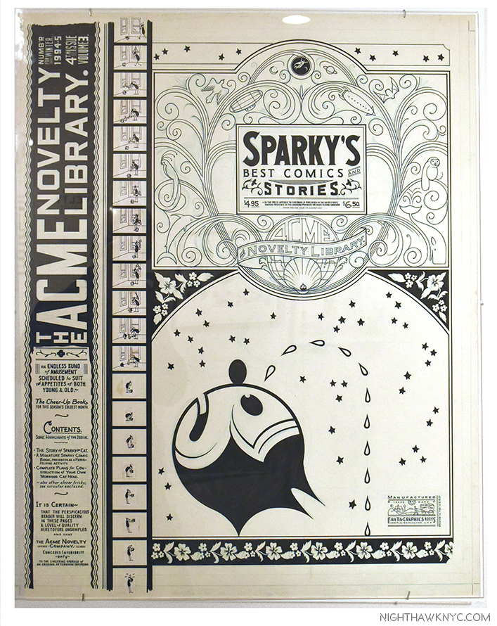
Chris Ware stands in front of the original Art for the covers of his new book, Monograph, at the opening for the show of the same title at Adam Baumgold Gallery on November 10, 2017. Click any Photo for full size.

Chris Ware has been universally respected among his fellow Cartoonists & Graphic Novelists for quite some time. At this point, it’s becoming relevant to consider his place among ALL his peers, including the all-time legends. Now, he has made that a much easier thing to assess with the release of his new book, Monograph, a gorgeous, and, (typically) meticulously well-done, Rizzoli mid-career autobiography and retrospective in one. But before anyone else can begin to assess his accomplishment through it, no less than Art Speigelman, one of those enduring masters of Cartons & Graphic Novels in that pantheon of legends, calls him “the World’s Smartest Cartoonist,” in his Introduction to it. After he, his wife, Francoise Mouly, the Art Editor of the New Yorker & an Independent Publisher, and Ira Glass have their say up top, the rest of it is so well done, I don’t think there’s a better case to be made for his accomplishment. Take that, future biographers/monographers! For the rest of us, no matter how closely you’ve followed Chris Ware, you’ll find known favorites alongside much that is previously unknown, including a surprising amount of detail about Mr. Ware’s life along the way.

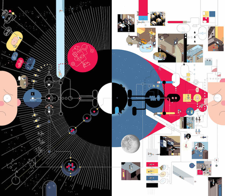
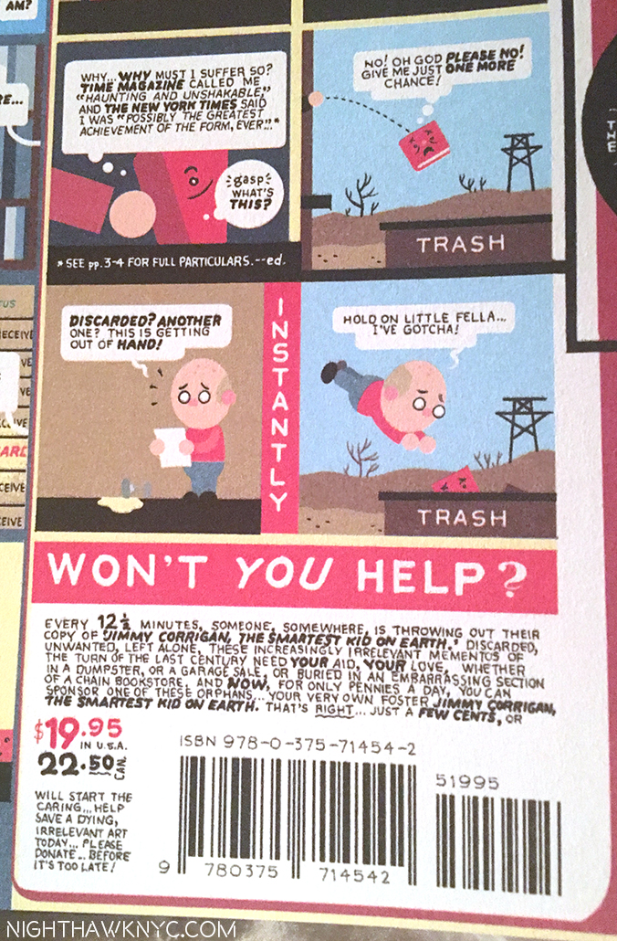
“Good cartoon drawing is good design.” Charles M. Schulz, the creator of “Peanuts,” said in 1997. The published covers from the Drawings, above, for  Monograph, 2017. Front cover, right side, and back cover, left. Their “meaning?” Perhaps, that there’s a lot going on in that head…Inside (between the covers).

Speaking of what might be going on in that head, along the way, Monograph’s 280 pages also provides the best evidence that Chris Ware is a bit of a throw-back in his tastes in Art, Cartooning, Music & Architecture, a side that co-exists with, and informs, the visionary that is given to flights of fantasy, usually involving the past or the future, often without notice. They all coalesce in Art that, at times, could be mistaken at a distance for an Architect’s plans, as seen above.

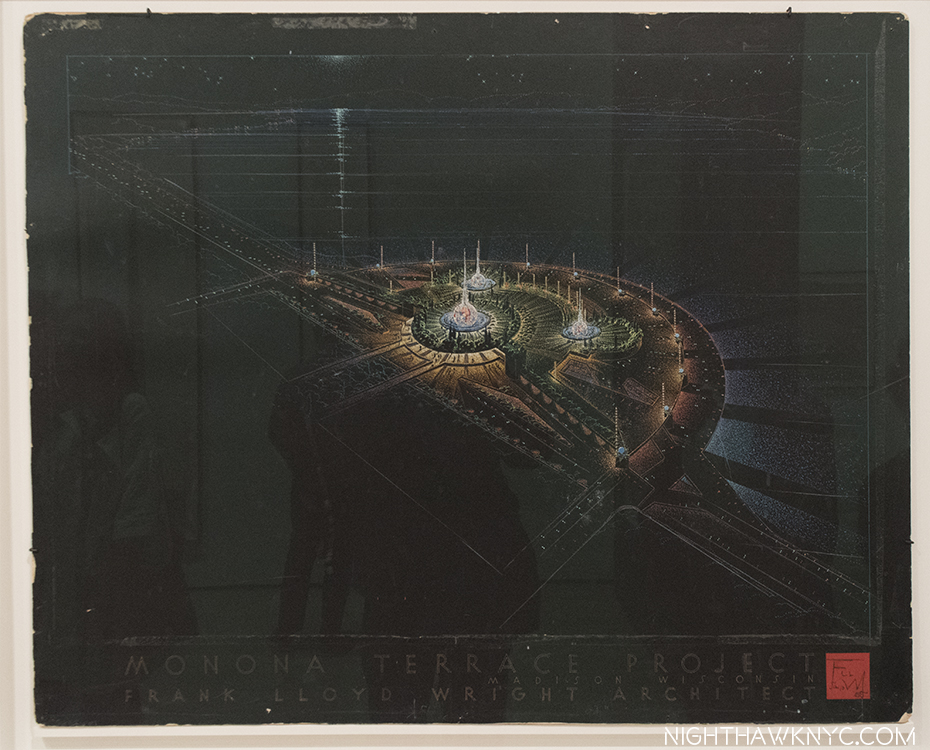
An echo? Speaking of Architects, Frank Lloyd Wright, “Madison Civic Center (Monona Terrace)” Night View, 1955, Ink on paper presentation drawing. When I first saw Monograph, this drawing by Wright, recently on view at MoMA, came to mind. Chris Ware lives near the early Frank Lloyd Wright houses in the Chicago suburbs.

By now, none of this is news to anyone who has seen his work over what is already 30…Can it be? Yes, it is…30 years! What’s lesser known is that, personally, he’s also an enigma. I’m only 15 years in myself, yet, what I still have trouble getting used to is that along with all the things Chris Ware is, he is, on top of it all, endlessly self-effacing.

I don’t think it’s an act.

Take a look at his expressions and body language during his first national television appearance, November 13th, on one of the last episodes of Charlie Rose, which is, also, a good introduction to him. Note the 5:07 mark, for instance-

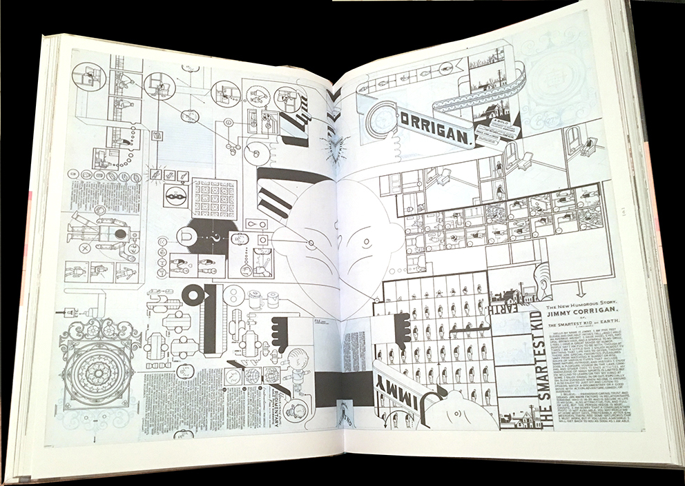
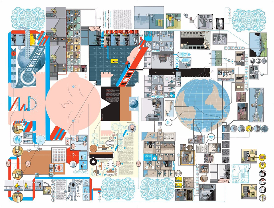
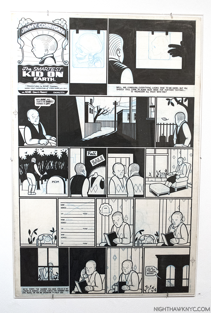
For the past 15 years he’s been telling me off and on that his original Art, which now sells for upwards of many thousands of dollars per in galleries, “is easily disposable.” First, he said it in 2002, after Jimmy Corrigan: The Smartest Kid on Earth came out. Just this past week, he said it again. Standing in the middle of the opening of his newest show at Adam Baumgold’s East 66th Street gallery. I had commented on the fact that he is his best and most astute collector, and asked if he was planning to open a museum. He replied by talking about disposing of it.

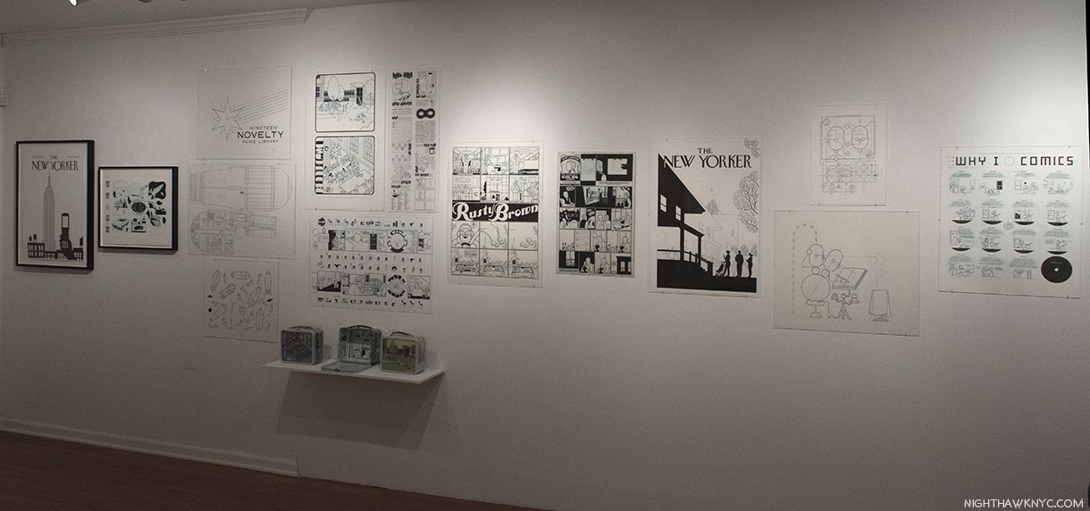
From left to right- Art for “Hold Still,” an iconic 2005 New Yorker cover, Art for the Acme Novelty Lunchbox, a page of Rusty Brown, subject of his next book, a very early “Jimmy Corrigan” page from Acme #1, two Self-Portraits, and a page that appeared in the New York Times Book Review in October, 2015, far right. Mr. Ware’s Original is titled “Why I O Comics.” I heard he wasn’t pleased that the Times published this with the heading “Why I Love Comics.” All of this Art is, or was, part of the collection of Chris Ware.

All I could do was shake my head and nervously smile when he said it, again, because he can’t be serious. CAN HE? Taking no chances, I did the only responsible thing I could. I told him to call me first. Then, I looked for “answers” in the show, and in Monograph, itself.

The museums will, also, come calling one of these days. I have no doubt of that. In my opinion, they should have, already. I’m referring to his work being in the permanent collection of MoMA, The Met and The Whitney, and the other big museums around the world. To be fair, the Whitney Museum did include Chris Ware in their 2002 Biennial, when he was the first cartoonist ever invited, and was given an entire gallery where about 48 works, by my count, were on view. They even commissioned him to create the poster for the show. He has, also, been included in important shows at other museums, at NYC’s Jewish Museum, and the Museum of Contemporary Art, Chicago, both in 2006, and elsewhere.

During this latest encounter, we stood in the midst of the opening for his newest show with Mr. Baumgold, for Monograph. The rooms were filled with original Drawings by Mr. Ware going back to the late 1980’s, when he was 20 or 21 years old, works that even his most avid readers have not seen, or probably even knew about.

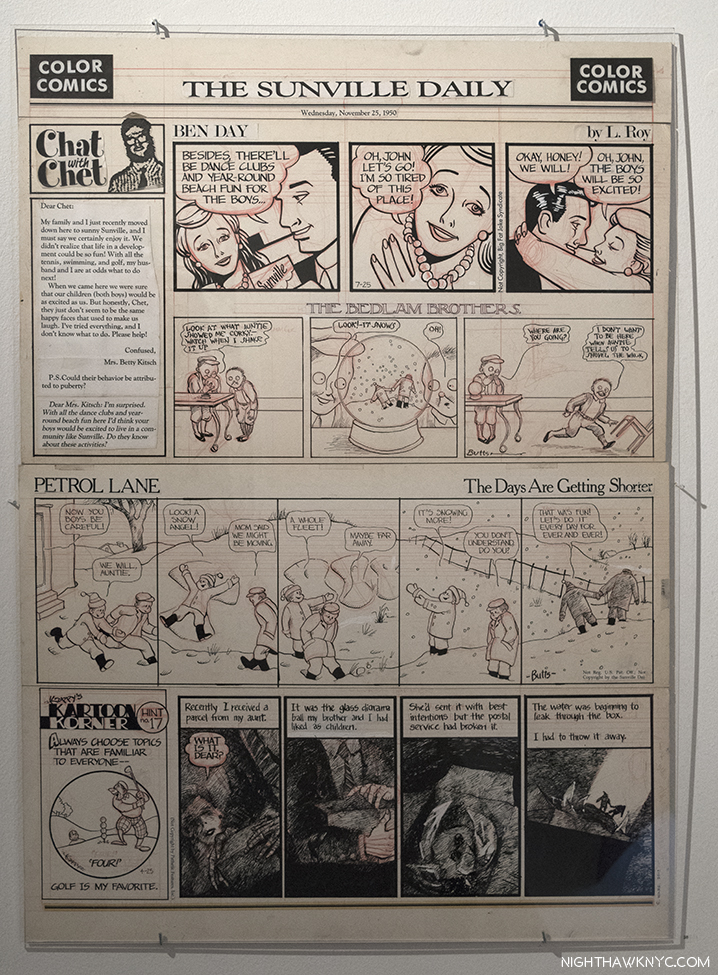
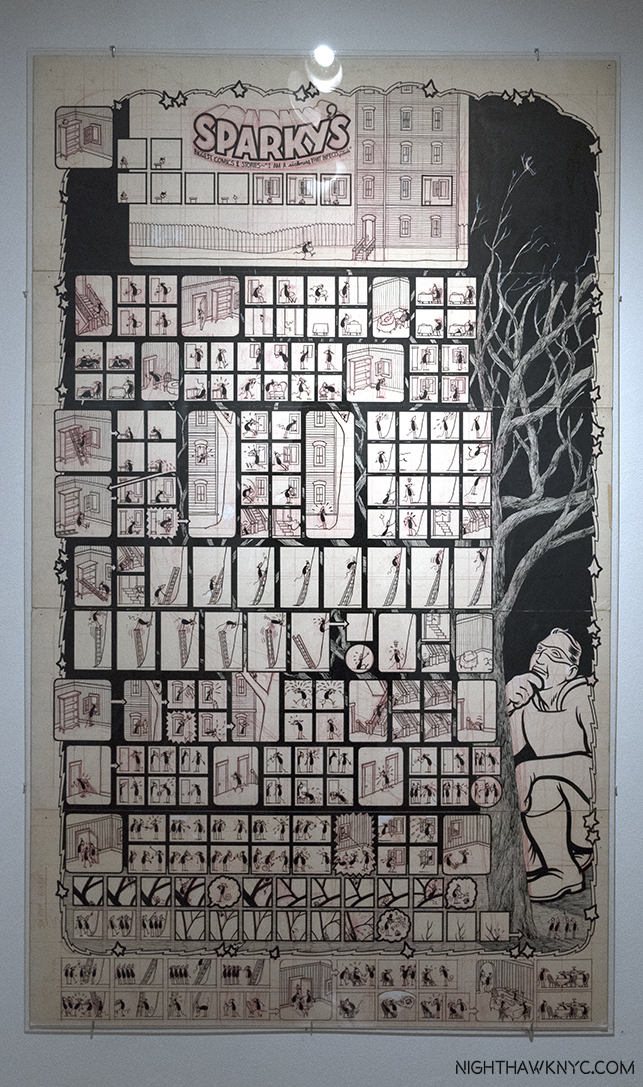
“The Sunville Daily,” 1987, Ink and red pencil on paper. By Chris Ware at about age 20. Looking very closely, you’ll find elements of his later work, but, overall, this is shockingly different from everything that came after.

The fact that he’s kept a good number of his earliest work that those long time readers have never seen, proves that he attaches at least some value to them, himself, and I have a hard time believing it’s only sentimental. Chris Ware has a professor’s level knowledge of the history of cartooning (as seen here), as well as an acute awareness of its current state, witness the expert (yes, expert) contributions he’s made to books on George Herriman and Daniel Clowes, as well as the astute quotes bearing his name that appear on many new and notable graphic novels, including being front and center on the front cover of, perhaps, the most auspicious debut of 2017, Emil Ferris’ “My Favorite Thing Is Monsters,” which I wrote about here. Of course that eye is applied first, foremost, and probably, most critically, to his own work.

Athletically challenged. “Gym Class,” 1987, Ink and red pencil on paper, depicts some of the dread, and possibly, the bullying, he dealt with in school. One of the earliest works in “Monograph,” elements of his now “classic” graphic style appear, and are already confidently rendered. A key point in Chris Ware finding his direction. (That’s a reflection from across the gallery above the center character’s head. Sorry.)

Mr. Ware came to fame with the release of his first full length book, the graphic novel, Jimmy Corrigan: The Smartest Kid Alive, in 2000. It won the Guardian First Book Award in 2001, an award that considers not only graphic novels, but ALL books released during the year. The glowing reviews served to highlight the fact that there had, literally, been nothing like it to that point. The graphic novel had seen its first big breakthrough in underground and non-superhero comics, perhaps, since Art Spiegleman’s Maus, the Pulizer Prize winner in 1992. Seven years in the making, it’s possible to watch his style solidify over its 380 unnumbered pages. Almost as soon as it was released, Chris Ware’s name had been made. When I first saw it, I knew from the one of a kind dust jacket that opened out into an amazingly intricate double sided poster that here was a truly unique book. 16 years later? A well worn copy is still near to hand. It’s a book that doesn’t reveal all its secrets in one reading. Every time I pick it up I still find new things, new threads, I’d previously missed. I’m not alone. “Jimmy Corrigan” has given rise to a continuing stream of critical examination, theorizing, analysis and speculation.

The original cover Drawing for the front of the remarkable folded book jacket/double sided poster for Jimmy Corrigan as seen in Monograph.

“Reading him, I always have the feeling that the pages aren’t big enough for everything he’s trying to squeeze into those orderly rectangular panels.” Ira Glass, Monograph Preface.

A flat of the whole, double sided cover, in color. The Drawing reproduced above is the left half of this image. Little discussed (perhaps because it’s the back of the cover/poster), the right half contains the story of Jimmy’s ancestors, including his African-American ancestors (one seen being sold as a slave), which were unknown to him. Some see commentary on the “imperialistic” nature of American colonization and the idealism of the “American dream” in the story of Jimmy’s ancestors as well.

Jimmy Corrigan turned out to be semi-autobiographical. In it, Jimmy gets a letter and phone call out of the blue from the father he’s never met suggesting they meet over Thanksgiving. Before going, he tries to imagine him and what impact knowing him would have on his life. When he finally meets him, he discovers he’s nothing like he imagined him to be. He also meets his dad’s adopted African-American daugther, Amy, who Jimmy had no knowledge of.

Some time after it was published we learned that Chris Ware, himself, never knew his father growing up, until finally meeting him, once, mid-way through writing Jimmy Corrigan. Sadly, the elder Mr. Ware passed away shortly before the book was finished, without ever having seen his son’s close-to- home masterpiece. Later, Chris Ware said that “I didn’t spend that much time with him. I added it all up once…I knew my father for just about five hours1.” That’s about as long as it takes to read it, something that is on my mind when I re-read it now, which I prefer to do in a single sitting to really feel that length of time pass. Through the mastery of his creativity, and the unique ways the characters are depicted, the work becomes more than a story, “more,” even, than Art. It’s also a record of the moment to moment thoughts, hopes and dreams of 4 generations of the Corrigans, and their reactions to events as their lives unfold before our eyes, across time. Reactions that most often include little, even no, inter-action. Almost every character in it is, mostly, cut off from every one else. In that sense, it’s also a classic of isolation, a meditation on its eternal nature (across generations)- Every character in Jimmy Corrigan suffers from extreme isolation and loneliness. Unlike the hard-core lonely, who have given up on the human race, every character longs for it to end. At least in Chris Ware’s work, life always happens in spectacular rendering, in color that speaks its own language, and with gorgeous, ever-surprising design.

Back at the show, increasingly sought after, only one Jimmy Corrigan original page, (from the Acme Novelty Library #1, which predates the book), was on display, but it was a good one, that succinctly sums up what I said about the book, itself.

“Jimmy Corrigan, Calling Mom,” Acme #1, 1993, Ink and blue pencil on paper. This page, from the first year he drew Jimmy  didn’t make it into the final “Jimmy Corrigan” book, though it captures much of the poignancy of it.

While Chris Ware is well-known as an admirer of the great George Herriman and his “Krazy Kat” strip, having done the cover art for the 13 volume reissue of what many, including he, consider the greatest comic strip of all time, his influence lives on in Mr. Ware’s own ground-breaking graphic design, which builds on “Krazy Kat’s” Sunday full pages, that Mr. Herriman treated freely, like a blank canvas, when it came to laying out his stories. Over the past 30 years, it’s been taken to the point that it has become one of his trademarks. Along with George Herriman, Charles Schulz and his “Peanuts” cartoon strip that ran for 50 years are another major influence on Chris Ware. “Charles Schulz is the only writer I’ve continually read through childhood and into college2.” Charlie Brown, who Mr. Ware calls “the first sympathetic cartoon character3,” is the predecessor of Jimmy Corrigan. Interestingly, the final Peanuts strip ran on February 13, 2000. After serializing the story in the early 1990’s, the first edition of the completed and collected Jimmy Corrigan: The Smartest Kid on Earth was published on September 12, 2000.

Learning at the elbow of the master. Chris Ware included this self-portrait in his “Tribute” to Peanuts after their final strip in 2000,  ending by paraphrasing Mr. Schulz final panel- “How could I ever forget them?” The complete strip is reproduced in Monograph.

In the years before and after Jimmy Corrigan, Mr. Ware developed a whole slew of characters, that appear sporadically, only some of them “human.” They range from “Quimby the Mouse,” and “Branford the Bee” to “Rusty Brown,” and “Rocket Sam.” But, in the end? It seems to me whatever lifeforms they are doesn’t matter a bit. It only serves to make them seem “uncannily human” to the reader.

“Quimbies the Mouse,” 1990, Ink and red pencil on paper. Later, he would lose the “siamese” aspect and it would just be “Quimby the Mouse.”

These appeared in the (shorter) installments of the Acme Novelty Library, released sporadically over the years. Mr. Ware’s full length books take him so long to create we’re lucky to get one per decade. There must be something in the water in the Chicago burbs because Monograph is second for this decade. And? At the show, he was speaking about ANOTHER book, to be released in 2018, “Rusty Brown, Part 1.” And though Zadie Smith commented “There’s no writer alive I love more than Chris. Ware. The only problem is it takes him ten years to draw these things and then I read them in a day and have to wait another ten years for the next one4.” it may take even Mr. Ware’s most devoted reader more than a day to work their way through Monograph 280 pages that are jam-packed with almost as many details as this image of the Milky Way.

Monograph’s surprises include this six page story including the red pencil underdrawing on paper he was using at the time. “I Guess, (from RAW Volume 2, No. 3, 1991),” 1990, Ink on mylar, red pencil on paper.

Over the years, Mr Ware has created books that range in size from miniatures to the gigantic, even one with a multitude of sizes (14) in one (the award winning Building Stories, 2012). Now? He has outdone himself. Weighing in at over 9 pounds and measuring 18 by 13 inches, it’s fitting that this mid-career Autobiographical Retrospective is large enough to mirror his achievement. In this case, Monograph needs to be this big. Trying to read the detail in something like the folded book jacket for Jimmy Corrigan, above, would be neigh impossible in a smaller size.

Speaking of gigantic. “Sparky’s Sparky Is Best Comics and Stories (I Am a Sickness That Infects my Friends.),” 1991, Ink, red pencil on paper, 50 inches tall(!) by 30 wide.

As for what else Monograph contains, Mr. Ware’s work has appeared on 23 New Yorker Magazine covers, almost every one of which eschews his “intricate” graphic design (the most recent one, in September, 2017, I wrote about, here), while also holding the distinction of being the very first “cartoonist” to have his work serialized in the New York Times.

The devil is in the details. Chris Ware is, also, endlessly fascinated with stand alone characters, especially hand-made mechanical examples. “Quimby the Mouse,” was incarnated as a wooden toy a while back. Unfortunately, the manufacturer painted every one of his eyes wrong. So? Mr. Ware grabbed the 14 of them in the vitrine and correctly hand painted each eye. Shown with the original Art for their box cover.

After Jimmy he continued to release regular installments of his “Acme Novelty Library,” along with smaller books, including “Lint,” two volumes of excerpts from his sketchbooks, a “Quimby the Mouse” collection, forays into mechanical figures, products and toys, book covers for others and the Ragtime Ephemeralist, an “infrequently appearing” volume devoted to you guessed it- ephemera, and scholarly articles, related to Ragtime, edited, designed and published by Chris Ware. The latest issue, from 1995, totals 256 pages! In 2011, he even broke out of the medium of print, for the first time, digitally publishing “Touch Sensitive” an interactive story from Building Stories that is still available for free download on iOS, here. In 2015, he debuted an actual internet-only work, serializing “The Last Saturday” online, here, on The Guardian’s website. Though he wasn’t a fan of technology early on, as the digital forays “Touch Sensitive” and  “The Last Saturday” show, Chris Ware is a man with one foot in the past who is, surprisingly, open to selectively dipping a toe in the future, though he is an avowed lover of the print medium.

3 Views of a Secret. A rare Chris Ware Painting, bottom, the Drawing for its appearance on an Acme cover, and a version of the same piece, as a New Yorker cover mock up, all featuring Jimmy Corrigan- with, and without, Super-man.

The next milestone was Building Stories, which had been partially serialized in the New York Times, released in 2012 in a large box containing 14 publications of varying size and bindings. The order which the reader read it was up to them, thereby creating countless ways its tales could be told. Five years later, almost to the month, now comes Monograph. Its huge size is, no doubt, daunting to many. After seeing his original Art, I realized that Monograph mirrors the size of the illustration board Mr. Ware favors to draw his Art on. So, the book will provide an experience as close as is possible to seeing the actual original Art in person. As the ultimate Chris Ware (Auto)biography, it’s chocked full of historical Photos of Mr. Ware, his family, friends and associates, while its running commentary sheds new light on the path he and his Art has taken, an invaluable resource to those studying his Artistic development.

As we chatted this time, he drew two small self portraits in my copies of the Acme Novelty Datebook (his Sketchbooks), Vol 1 & 2. He seemed pleased to see them when I produced them for his signature, sketchbooks being near and dear to my heart (I made my own for many years). He mentioned that there would be a Volume 3! Later, I looked at the Drawings he did. Wow.

Sketch by Chris Ware in my copy of the Acme Novelty Date Book, Volume 1.

A bit reminiscent of this, which was on view in a corner across the room- Acme #4 (Sparky’s Best Comics and Stories) Cover, 1994, Ink and blue pencil on paper. What was I saying about all his characters acting “human?”

“The accolades he got he felt weren’t his, for some reason. He didn’t feel they were…deserved. And I think he didn’t feel particularly connected to the world.
He was appreciative and very, very loving about all of the good things that came his way but I think he was always mildly surprised.” Whoopi Goldberg on Charles Schulz 5

As with Charles Schulz, the creator of the most famous comic strip in history, I don’t know what lies at the heart of Mr. Ware’s self-effacement, but  I hope it won’t take another 30 years for him to accept the compliments his work receives. If he continues producing the kind of work he has over the past 30 years, then, he might not have any choice but to get used to people saying nice things about his work.

Back from the show, with this question on my mind, I began to re-read Jimmy Corrigan for the umpteenth time, this time in its paperback incarnation (which has a few significant differences from the hardcover), I happened upon this beauty on the lower right back cover.

A-ha! Chris Ware dumpster diving to SAVE copies of his work that have been discarded! Jimmy Corrigan, Paperback edition, back cover detail.

I get it! I FINALLY found the answer to his self-affacement. He WANTS me to throw out his work so he can save it and re-sell it!

They’re right. He IS smart! ; )

**********************************************************************
Collector’s Note- This is something I’ve yet to see anyone point out. While I suspect that many/most of Chris Ware’s fans already have Monograph, for those that don’t, I’ve discovered something that you might want to keep in mind.

There are TWO editions of Monograph.

When I discovered it, I called the publisher, Rizzoli, and even they didn’t know what the differences were! So, I took it on myself to find out. The “regular edition,” ISBN 978-0847860883, is the one most commonly available. However, there’s also the “Bookplate Edition,” ISBN 978-0847858125, which I’ve almost always seen selling for the same list price ($60.00) as the “regular” edition. However, it contains 2 major differences. First, it comes with a small double-sided “errata” sheet that is SIGNED by Chris Ware. Second, the “errata” sheet comes tucked inside of a folded reproduction of the original Drawing for his quite rare 2002 Whitney Biennial Poster, “The Whitney Prevaricator.”

Top of the inside of the inserted Reproduction of the Drawing for the Whitney Biennial Poster. If you collect Chris Ware, I recommend you get the “Bookplate Edition,” which is signed TWICE by Mr. Ware, and includes this.

On the top of the verso of this sheet is text noting that this is the “Fine Art Edition,(referred to as the “Bookplate Edition” in the trade) of Monograph, which Chris Ware has ALSO signed, and numbered out of an edition of 550. Buyer? Be Ware. (Sorry.)

*-Soundtrack for this Post is “In The Future When All’s Well,” by Morrissey from Ringleaders of the Tormentors. Another Artist who’s work is deemed “depressing” by some.

On the Fence, #16, The Smartest Birdies…on this Fence…on April 1st…at 3pm” Edition.

You can now follow @nighthawk_nyc on Instagram for news and additional Photos!

NighthawkNYC.com has been entirely self-funded & ad-free for over 7 years, during which over 275 full length pieces have been published! If you’ve found it worthwhile, PLEASE donate to allow me to continue below. Thank you, Kenn.

You can also support it by buying Art, Art & Photography books, and Music from my collection! Books may be found here. Music here and here.

Written & photographed by Kenn Sava for nighthawknyc.com unless otherwise credited. To send comments, thoughts, feedback or propositions click here. Click the white box on the upper right for the archives or to search them. Subscribe to be notified of new Posts below. Your information will be used for no other purpose.

  1. http://edition.cnn.com/2000/books/news/10/03/chris.ware.qanda/index.html
  2. https://www.theparisreview.org/interviews/6329/chris-ware-the-art-of-comics-no-2-chris-ware
  3. http://classic.tcj.com/alternative/interview-with-chris-ware-part-1-of-2/
  4. Quoted on a sticker on the shrink-wrap for Monograph.
  5. in “The Complete Peanuts, Volume 5 1959-1960, p.xi.

Gary Hume and The Long Goodbye

“Is it all in that pretty little head of yours?
What goes on in that place in the dark?
Well I used to know a girl and I would have
sworn that her name was Veronica”*

Too many people can relate to this.

Like cancer, almost everyone knows someone who’s suffering, or has suffered, from dementia or alzheimer’s disease. Gary Hume does. So do I. I mention it because that might make me, perhaps, not the most impartial viewer of Mr. Hume’s new show, Mum, at Matthew Marks Gallery. Mr. Hume’s Mum, Jill Henshaw, has dementia. The 14 works on view relate to his Mum, as seen by the Artist as a child, and as an adult. Mr. Hume said in a New York Times interview, “I just wanted to paint a picture of my mum, and I wanted to do it to honor her.”

Knowing the subject before I walked in, the show still blindsided me with its understated power. Though there is only 1 portrait of his Mum on display, the other works leaving it to the viewer to connect them with her, the real strength of the show comes in its sum effect.

It had me close to tears.

Three Leaves, 2016-17, Enamel paint on paper. Falling as part of the cycle of their life. Falling like tears. Or, they could be floating away on a river of rippled paper…Click any photo for full size.

Mr. Hume is part of the “Young British Artists” group that sprang out of the Freeze Sensation show in 1988, though he’s not as flamboyant as some of its other members who were his classmates, studying for their B.A.’s in Fine Art, at Goldsmiths College, London, at the time. Now 55, his choice of subject has led to Mr. Hume’s work taking something of a radical turn, resulting in his most personal show yet. While Artist’s mothers are certainly not an unusual subject in Art, dementia is, in my experience. In Art, perhaps it’s most been discussed by those wondering if they can “see” Willem de Kooning’s dementia in his work.

“Georgie,”(Mr. Hume’s wife), left, and “Mum on the Couch,” right, both 2017, Enamel paint on aluminum, and a perfect place for a bench.

An initial visit to the show gives the impression that Mr. Hume’s Paintings share the quiet dignity of Ellsworth Kelly’s final Paintings that recently hung on these same walls. They also possibly share a similar technique with Mr. Kelly’s Plant Drawings that hung next door at the same time, both Artists being fond of rendering a plant in outline. (I wrote about both Ellsworth Kelly shows here.) But their apparently simple compositions and minimal palette are deceiving.

Mr. Hume has developed new techniques that he has mastered to the point that he can use them with wonderful subtlety. Raised lines of paint lie on the flat surface, and act like the lines in a Drawing, delineating and detailing shapes. Elsewhere these lines are smudged, possibly with a finger, into the shape of a mouth, or an eye. They are executed in the same color as the shape they appear on, making details hard to see clearly, requiring the viewer to stand close to the work to see them. This remarkable effect adds to the “there/not thereness” of the image. Paintings on paper became crinkled and wavy as the enamel house paint Mr. Hume uses (in colors pre-mixed in a hardware store) dries creating marvelous textures and effects. Other works on aluminum have very flat background surfaces, and reflect light making it even harder to see the detail. Using these techniques, and others, Mr. Hume does a remarkable job of making us feel both presence and absence in the same image. They are, also, a meditation on the nature of memories.

Even standing in front of the bench, the detail is hard to see.

Close-up of “Georgie,” reveals one of the “drawing” techniques Mr. Hume uses to add still nebulous “details” to these works.

The middle room of the show features Paintings of his Mum, and his wife, Georgie, surrounded by Paintings of plants, flowers and gardens, including this one.

Abstraction of another sort. “Grandma Looks at the Garden,” 2017, Enamel paint on aluminum

“Well she used to have a carefree mind of her
own and a delicate look in her eye
These days I’m afraid she’s not even sure if her
name is Veronica”*

The third and final room seemed to be focused on life continuing. It includes a painting of yellow rain against an orange background that struck me as, possibily, a sunshower.

“Rain,” 2017, Enamel paint on paper. A seemingly “simple” idea that in the context of this show takes it entirely elsewhere.

Contrastingly, next to it, is possibly a garden seen at night, where only the outlines of the plants are visible. Together, they emphasize loss, and memory, being something felt day and night, triggered by almost anything, and manifesting themselves in every situation and time.

“No Light,” 2016, Enamel paint on aluminum. Difficult to see clearly, like many memories are…

On an adjacent wall, a bird looks skyward, its beak closed, without a song.

“The Diver,” 2016-17, Enamel paint on paper.

And, finally in this room, one of two Paintings of berries, “Ripe,” below, bursting with life. (Whiter to, from here?)

“Ripe,” 2015, Enamel paint on paper. Bursting with so much life, the paper can barely contain it.

Meanwhile, the flowers in the show are mostly muted. After all, flowers are, often, symbols of beauty, and loss. Seen at both weddings and funerals.

“Mourning,” 2016, Enamel paint on aluminum

In her article about these works in the New York Times, Barbara Pollack said that Mr. Hume “recoils at any interpretation that reduces the work to merely being a response to his visits with his mother. He prefers to think about the relationship to subject matter as a process of ‘permissions.’…” The thing about Paintings, or Art, is that once it’s been created and put on public display, every person who sees it will have their own “interpretation” of it. I doubt these (especially my own) line up with the Artist’s very often.

Perhaps nowhere here is this better summed up than in “Blind,” a 2016 Painting in the first room. Pale flowers are shown against a white background. A nut seems to be falling towards the lower right corner. Every time I see it, it speaks of something else, but it, also, speaks to loss/impending loss of a mother, with the seed, the harbinger of new life, symbolizing the offspring…himself.

“Blind,” 2016, Enamel paint on aluminum, seen in the show’s first room.

These “ridges” appear in a number of works (like the other flower Paintings above), and are interesting to contrast with the more often than the “softer technique he uses in “Georgie,””Mum on the Couch,” and “Rain.” I haven’t found out as yet how he creates them, but they are stunning and add much to the mystery, and beauty, of these works. The Artist has been trying to replicate them in his prints.

As I said, I may well not be impartial when looking at these works. Ironically, my Mom’s dementia first became apparent one Thanksgiving day. Ironically, this show happens to be up from November 4 to December 22. I was drawn back to it 3 times Thanksgiving week. Now, stepping back from myself, and thinking about the beauty and the power of “Mum,” and seeing other works that Mr. Hume has created recently in the show’s catalog, it seems to me that Gary Hume has made a breakthrough both stylistically, and in portraiture.

“Mum in Bed,” 2017, Enamel paint on aluminum, not on view in the show, from the show’s catalog.

“Do you suppose, that waiting hands on eyes,
Veronica has gone to hide?”*

Mr. Hume’s work has greatly evolved in the almost 30 years since the “Sensation” show brought him and the YBA’s to wide attention. For years known as the “quiet one” in that group, it’s hard for me not to feel he’s only now hitting his stride. Though I doubt that many will agree with me at the moment, Gary Hume may yet turn out to be the Artist the YBA’s are remembered for. While each work on view is uniquely beautiful on its own, its as a group where each plays a part in telling a larger story, a story of life, love and impending loss (“the long goodbye,” as it’s called), ironically, in slivers that are almost there…like memories.

Human memories may have a finite lifespan, even under the healthiest of conditions. It’s in translating them to other forms where they have their back chance to live on…indefinitely.

Gary Hume, “Mum,” is my NoteWorthy show for November. 
*- Soundtrack for this Post is “Veronica,” by D.P.A. MacManus (aka Elvis Costello) and Paul McCartney,  from “Spike,” published by Universal Music Publishing Group.

NighthawkNYC.com has been entirely self-funded & ad-free for over 7 years, during which over 275 full length pieces have been published! If you’ve found it worthwhile, PLEASE donate to allow me to continue below. Thank you, Kenn.

You can also support it by buying Art, Art & Photography books, and Music from my collection! Books may be found here. Music here and here.

Written & photographed by Kenn Sava for nighthawknyc.com unless otherwise credited. To send comments, thoughts, feedback or propositions click here. Click the white box on the upper right for the archives or to search them. Subscribe to be notified of new Posts below. Your information will be used for no other purpose.

On The Frontiers of Photography: Trevor Paglen, Willa Nasatir, Caslon Bevington

Written & Photographed by Kenn Sava (*-unless otherwise credited)

While I’ve spent much of this year exploring the world of Photography, my focus has largely been on the period beginning with Robert Frank’s universally revered book The Americans, 1958. Most of those I’ve encountered work in fairly “traditional” realms- “Find a subject and shoot it.” Ah…the good old days. Of course, the world isn’t going to stand still for me while I look back, thank goodness, a point brought home by 3 concurrent shows this fall.

Unprecedented times call for extlraordinary means. Trevor Paglen at work on a prior project using equipment originally designed to see distant galaxies. Photo from his website.

Trevor Paglen (B. 1974), who holds both an MFA from the Art Institute of Chicago’s School and a PhD in geography from Berkley is, perhaps, best known for his Photos of “black sites”- classified defense department/CIA/NSA installations. Those pictures are usually murky, because of the haze from the extreme distances he has to work from because of security, and legal, restrictions to shoot many of these places. He prefers them that way, usually foregoing clearer images because, as he told the New Yorker in 2012, his “aim is not to expose and edify so much as to confound and interest1.” In the same piece, he said that a clearer image would say “a little less, really,” adding “that blurriness serves both an aesthetic and an ‘allegorical’ function2.” “It makes his images more arresting while providing a metaphor for the difficulty of uncovering the truth in an era when so much government activity is covert,” writer Jonah Weiner concluded3. As a result, some of his more “atmospheric” work have been compared to Painters, including J.M.W. Turner and Gerhard Richter, by some.

So, I was somewhat surprised when I walked into his new show, A Study of Invisible Images, at Metro Pictures. Robert Longo’s The Destroyer Cycle had recently been up on these walls, featuring huge charcoal drawings deep with socio-political imagery. I was expecting more of the same from Mr. Paglen given his books of “black site” Photos.

That’s not quite what we get.

Installation view, with a still from his video, Behold These Glorious Times, 2017. Click any image for full size.

It’s about something different, though not entirely unrelated. It turns out that Mr. Paglen has, also, been deeply involved in studying computer learning, specifically, how computers see the world. As he explains in the “Artist’s Notes” for the show-

 “Over the past decade or so, something dramatic has happened to the world of images: they have become detached from human eyes. Our machines have learned to see. Without us.”

He goes on to talk about how smart airports, smart homes, even smart cities are becoming ubiquitous, with self-driving cars possibly on the way, before adding, “Most images these days are made by machines for other machines, with humans rarely in the loop. I call this world of machine-machine image making ‘invisible images,’ because it’s a form of vision that’s inherently inaccessible to human eyes. This exhibition is a study of various kinds of these invisible images.” They break down to three groups- “machine readable landscapes (landscape images overlaid with marks that show how they’re being interpreted by machines), training images (made by humans for machine eyes), and things that we might call ‘ghosts.'”

It Began as a Military Experiment, 2017, ten pigment prints

While the new iPhone X uses facial recognition technology instead of passwords or fingerprints, this technology is nothing new. The military wanted it developed back in the mid-1990’s, so the Defense Advanced Research Projects Agency (DARPA) began funding research. They quickly realized they needed to create a gigantic database of facial images and these folks, above, mostly military employees, were among the first of tens of thousands of photos it took and compiled into what was called the FERET database. Mr. Paglen then combed this database to arrive at this selection of faces. He then ran them through an algorithm to locate the key features of their faces. “One of the ways I think about these portraits is as a kind of super-structuralism in the sense that they are images not made for human eyes. They are meant for machine eyes. What’s more, these photos represent the original faces of human facial recognition- the ‘Adam and Eves’ that nearly all subsequent facial recognition research has been built upon,” he says in the “Artist’s Notes.”

Closeup of the fifth Portrait, shows the key points on his face.

Recognizing one face out of this gigantic database first requires a “faceprint,” made out of all of the faces of a particular subject, aligned so their eyes and mouths are in the same place. Once you “average” them, you subtract the average image of all the other people in the database from the average of your subject. You’ll end up with a faceprint of your subject showing what distinguishes him form everyone else in the group. This portrait translates the faceprint of philosopher Frantz Fanon into an image that looks like a face to human eyes.

We’ve gone from the images seen just above- images that humans would recognize as people and faces, to this, an image constructed from computer to computer images so humans can recognize it as a face. Fanon”(Even the Dead Are Not Safe) Eigenface, 2017, Dye sublimation metal print. The Afro-Carribbean psychiatrist Frantz Fanon is the subject.

It gets stickier from there. The Artist’s Notes continue, “A.I.s (artificial intelligences) are taught how to recognize objects by giving them training sets….(which may) consist of thousands or even millions of images organized into pre-sorted classes that correspond to each of the kind of objects that the A.I. will eventually be able to distinguish. For example, if you want to train an A.I. to recognize all the objects in a kitchen, you might give it a thousand pictures of a fork, a spoon, a knife, a countertop, etc…Once that A.I. is trained, you can give it a picture of a fork it has never seen before and it should be able to recognize it as a fork. ” After mentioning that “every image posted to Facebook or other social media sites undergoes powerful artificial intelligence algorithms that can recognize the identities of people, the objects, the products, and even the place depicted in those images,” Mr. Paglen created his own “massive” training sets, “based on literature, philosophy, folk-wisdom, history, and other ‘irrational’ things, and taught the A.I. to recognize things from those ‘corpuses.'” The last half of the show consists of the results of these experiments, which are much more ethereal and evocative than literal, at least to this human’s eyes.

A Man (Corpus: The Humans) Adversarially Evolved Hallucinations, 2017, Dye sublimation print.

Mr. Paglen has groups this part under the broad heading of Hallucinations, or Adversarilly Evolved Hallucinations. These further break down into the subcategories, or Corpuses, which includes-
Corpus: Eye Machines (Fittingly)
Corpus: American Predators (The Artist’s notes include Mark Zuckerberg, who he lists as a “predatory machine,” reminding viewers that computers mine every image loaded to his site and are capable of reading a tremendous amount of information from them.)
Corpus: The Humans (As seen in the image above. Porn was included in the training sets, and another image depicts it as seen by a computer…or so the title says.)
Corpus: Omens and Portents
Corpus: Interpretations of Dreams (Examples of both are seen below.)

Rainbow (Corpus: Omens and Portents), left, False Teeth (Corpus: Interpretation of Dreams) both from Adversarially Evolved Hallucinations, 2017, Dye sublimation prints.

Trevor Paglen seems to like to push the boundaries of our perception while avoiding the sharp detail most Photographers live by, which, indeed, ventures into the domain of Painting. Now, he has gone beyond what humans can perceive, and into the realm of what is only “seen” by computers to create Art for humans. I wonder how long it will be before computers get around to doing that for us on their own.

Installation view, with another still from his video, Behold These Glorious Times, 2017.

These images are haunting, nightmarish, and beautiful, at the same time. In his Art Basel Conversation with Jenny Holzer, Mr. Paglen said the basis of his work can be summed up as- “How do you see the historical moment that you live in?” This show certainly provides answers to part of that question, though it raises others. Mr. Paglen’s new work is no less unsettling than his “black sites” and drone Photos. Perhaps most unsettling is not what’s in these images. It’s what they portend for the future.

Willa Nasatir,R.V., The Green Room, Bird, Blue Girl, Sunbather, Conductor, 2017, Chromongenic print mounted on wood, from left to right. Installation view, Whitney Museum.

Unlike the other Artists featured in this piece, Willa  Nasatir (B. 1990) doesn’t use digital techniques to create her Photographs. That might be hard to believe after seeing her work. Her analog process involves creating props, often from found objects, shooting them, and then reshooting the resulting Photographs, which has sometimes been modified by fire, water, and any number of other things. The results, as seen in her revelatory Whitney Museum show, “Willa Nasatir,”achieve something of a 3D effect in a 2D work. Fresh from a show at the Knox-Albright Art Gallery, Buffalo, who owns one of her most stunning images, Ms. Nasatir shows herself to be at once a throwback, and a visionary.

The Red Room, 2017, Chromongenic print mounted on wood. The-Albright-Knox Art Gallery owns this one. They chose well.

Ms. Nasatir created the 6-part work, shown first in this section, especially for the Whitney’s long gallery wall, the unifying feature of which seems to be the color grey with green or blue. All of the works on view are dated 2017 and show a remarkably consistent unity of style and vision, and a somewhat daring use of color.  As for what’s going on in these, or any of her work? You’re on your own. The Whitney’s introduction to the show says, in part, “The resulting works are hand-manipulated images that become psychologically charged and difficult to discern; the viewer is left to parse out unresolved narratives that the image only implies.”

The Green Room, 2017. When I look at this, with it’s mirror reflection, even some of it’s props, I can’t help but recall Samara Golden’s work in this year’s Whitney Biennial.

Hmmm…Where have I heard that recently? Her style shares some similar props and some of the effect of Samara Golden’s work, particularly The Meat Grinder’s Iron Clothes, 2017, which I felt was the show-stopper of this year’s Whitney Biennial. Ms. Golden’s work can look like “sets” that Willa Nasatir might base one of her Photographs on. Whereas I called Ms Golden’s astounding work in this year’s Whitney Biennial “unphotographable,” (as a whole), Ms. Nasatir’s Photographs are often impossible to locate in the real world. Both Artist’s works features elements of the “known world,” but place them in contexts which are unknown, mysterious, ominous.

Samara Golden’s The Meat Grinder’s Iron Clothes, (detail), 2017, at the Whitney Biennial earlier this year.

In thinking about precedents for Ms. Nasatir’s work, Man Ray once again comes to mind. Ray, of course, didn’t use digital techniques, either. He pre-dated them. The Dadaists, Marcel Duchamp, the German Expressionist filmmakers also come to mind, as do Robert Rauschenberg’s found objects. But, as with Samara Golden, it’s what these image stir in the mind, and the mind’s eye, that overcomes any attempt at reference- in the real world, or the historical one.

Willa Nasatir, Street Sweeper, right, Half Heart, Bus Depot, both 2017, Gelatin silver prints.

It all fades away as you ponder “What happened here?” Or, “What is about to happen?,” and then feel resonances in your mind and life. Oh, and by the way, there’s the beauty of her work, which I say as almost an afterthought, though it’s not, to their main impact- mystery.

Butterfly, 2017, Chromongenic print mounted on wood.

With two museums shows to her name by her mid-20’s, Willa Nasatir is an Artist who’s stock is rising pretty quickly. It will be interesting to see how her work evolves from here.

Caslon Bevington (B. 1992) is an up and coming NYC Artist I met during the run of the Raymond Pettibon show at David Zwirner. Her reaction to that show struck me, so I became interested in seeing her work. To this point, I had only seen what’s on view on her gallery’s, Apostrophe NYC’s, website.

One of the earlier pieces by Csalon Bevington I saw on Apostrophe NYC’s site. When I saw it in person, I guesstimated it at 12 feet tall. Photo courtesy of the Artist & Apostrophe NYC

My shock was palpable when I walked into her show, A Home for Formless Creatures: The Charisma of Fragmentation, at Apostrophe NYC’s studio & gallery space at Mana Contemporary in Jersey City, NJ. (Yes…I went to N.J.) to find she had spent the summer creating a new body of work that, at first look seemed quite different from what had come before. When I looked at the show of new work one word summed up the experience.

Qucksilver…

Installation view of Caslon Bevington’s show A Home for Formless Creatures: The Charisma of Fragmentation, shows her new, Translation, series, 2017. Photo by Roman Dean, courtesy of the Artist and ApostropheNYC

As fast as lightning, her work had altogether changed and, low and behold, there was an entire show of new work that was largely unlike any of her work I’d seen thus far. The show centered on a series of 10 works in which the Artist takes found and original images and processes them using more software programs than she could list for me, including some involving sound waves. The results were outputted to paper and then mounted on wood blocks with resin to create a series of black and white works titled “Translation” that are quite mezmerizing.

Caslon Bevington, Translation #8,, 2017. Photo by Roman Dean, courtesy of the Artist and Apostrophe NYC

They have the glossy surface of gelatin prints, but the images are mounted on blocks that extend 2 and a half inches out from the wall, jutting into the viewer’s space. Their rectangular shape and size (7 x 11 inches) is different from the usual sizes of Photographs, making them feel like something else. In them, images are juxtaposed- sometimes recognizable images (like fire escapes), with unrecognizable images, or repeating lines or waves, or abstract patterns or circles, leaving the viewer somewhere between reality and…?

Translation #10, 2017. Photo by Roman Dean, courtesy of the Artist and Apostrophe NYC.

They have a presence as a group, like a visit to another world that exists in multiple visual dimensions. Images explode out of some, interrupt others, or dialogue with each other, or mirror each other, while sharing not quite half of the work. There’s an elegance, an other-worldliness, and a haunting presence to these new works, especially, when seen in a group of them.

As for Quicksilver…What are the processes in an Artist’s mind that leads to such radical changes in their direction? Changes that seem “quick” to outsiders?

The Artist’s statement in the lovely catalog she produced, in conjunction with Apostrophe NYC, for the show.

Later, she gave me a tour of her studio, and we looked at, and discussed, her earlier work. I was very surprised at the journey her work has taken. Having studied at the Art Student’s League and Parsons, the drawings she showed me were by no means academic. They explored geometric possibilities of color in abstraction. Later works all around were often complex weaves (literally) of painted cut strips of fabrics and canvas, in a square or rectangular grid. She then explored the possibilities of rope in patterns that freed the composition from the grid, and made the picture plane transparent, including one fascinating and intricate rope work of many layers on a large rectangular frame that looked to me to be about 12 feet tall (shown earlier). Ms. Bevington has also worked in metals bending strips of them onto a frame, delicately weaving each piece, and in fashion, creating a very cool T Shirt for the show.

Flying Saucer Archive, 2017, Photo Transfer on Linen. Photo by Roman Dean, courtesy of the Artist and Apostrophe NYC.

Along with these works, were some works, that also involved Photographs, on woven grids, that seem to bridge the woven grids seen in some of her prior work. One features found images of UFO’s, or what might be UFO’s. Two others featured images of sunsets shot from moving vehicles.

Photos of Sunsets Taken From Moving Cars #1 & 2, 2017, left to right. Photo by Roman Dean, courtesy of the Artist and Apostrophe NYC.

Whereas earlier she took abstract painted canvas cut into strips and imposed “order” on them by subjecting them to being woven into a rectangular or square grid, now she does the same thing using images. Along with these, also on view was an Artist’s Book she created from found images using all kinds of search algorithms- closeups of fabrics, rugs, and she only knows what else. Caslon tried to explain the process of finding and selecting it’s images to me, but I was lost looking at the pages go by as she turned them. Besides, knowing too much often steals some of the mystery. This beautiful object was produced in an edition of 9, while the other works shown were unique.

Yes, there was Painting, too. Static Painting, 2017, Oil on Wood. Photo by Roman Dean, courtesy of the Artist and Apostrophe NYC.

The Translation pieces struck me, among other things,  as creating successful, new, compositions out of the juxtaposition of existing images. Thinking about her new and earlier work, while she makes something “else” out of unexpected combinations (of materials or images), for this viewer, they share the common thread of having a “new order” brought to them.

Caslon Bevington seen with Translations #10, 11, 12, 13 and 14, 2017, left to right, at Apostrophe NYC’s gallery at Mana Contemporary, Jersey City.

Caslon Bevington is part of “Base 12,” “an experimental project…(that) groups together 12 emerging artists in a quasi-collective,” represented by Apostrophe NYC, which is run by the brothers Sei and Ki Smith, and has been in residency at Mana Contemporary. Given how rapidly Caslon’s work is evolving, seemingly like quicksilver, she’s an Artist who will be fascinating to watch. It will be interesting to see what she does next, and if she continues to explore this new realm of her work, or moves to another new frontier.

Bonus Show- Lucas Samaras (B. 1936) may be as familiar to many Art lovers as a subject for Chuck Close (like this one) as he is for his own work. At his new show, New York City, No-Name, Re-Do, Seductions, at Pace, 510 West 25th Street, all the works on view were digitally modified Photographs. The show  concluded with a large gallery of what he calls Kastorian Inveiglements, works that began as Photographs that depict “every day objects” subsequently manipulated in Photoshop into symmetrical abstractions.

Lucas Samaras, NO NAME (Kastorian Inveiglements), 2017, Pure pigment on paper mounted on Dibond

Detail of lower left quadrant.

Having seen other Artists experiment with these, though not to this level of complexity or accomplishment, I decided to try one myself to gain an understanding of the process. Here is my first experiment-

Kenn Sava, Symmetrical Abstraction 1, 2017, based on one of my Photos.

It shows that I’ve got a ways to go to match Mr. Samaras, as I do in getting up to speed on the frontiers of Photography, and Photo-based Art. Before it moves, again.

“Willa Nasatir” is my NoteWorthy show for October, though it ended on October 1.
*- Sundtrack for this Post is “X-Ray Visions,” by Clutch, from the appropriately titled album Psychic Warfare.

NighthawkNYC.com has been entirely self-funded & ad-free for over 7 years, during which over 275 full length pieces have been published!
I can no longer fund it myself. More on why here.
If you’ve found it worthwhile, PLEASE donate to keep it online & ad-free below.
Thank you, Kenn.

Written & photographed by Kenn Sava for nighthawknyc.com unless otherwise credited.
To send comments, thoughts, feedback or propositions click here.
Click the white box on the upper right for the archives or to search them.
Subscribe to be notified of new Posts below. Your information will be used for no other purpose.

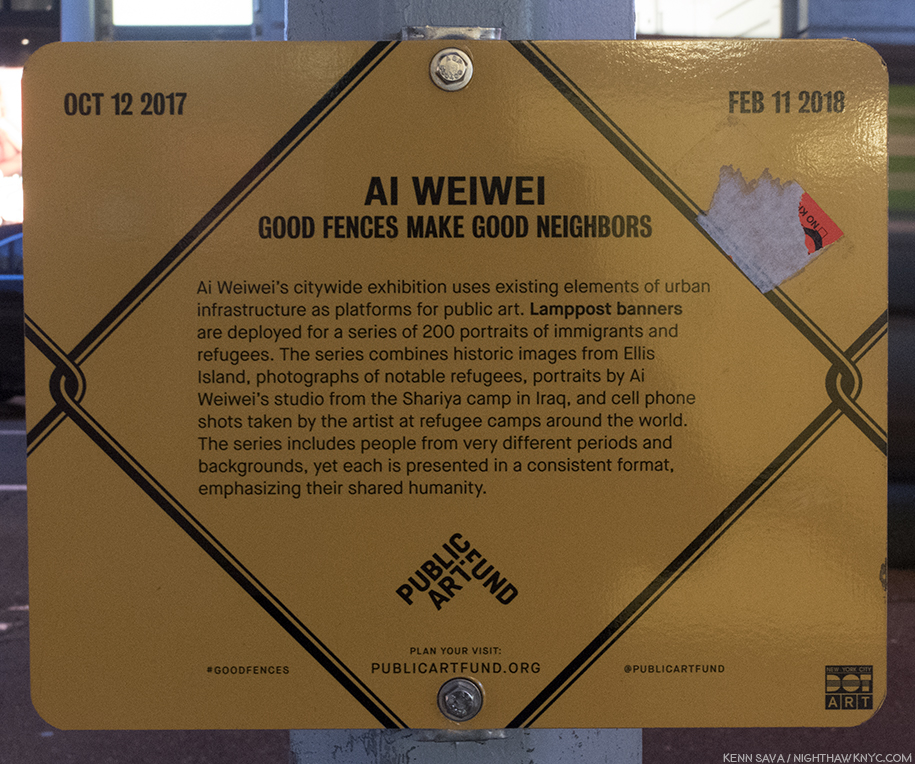
  1. New Yorker, October 22, 2012, P.56
  2. ibid P.57
  3. ibid P.56-57

Up All Night With Frank Lloyd Wright

“Architects may come
Architects may go
and never change your point of view.
When I run dry
I stop awhile
and think of you.”*

Once, back in the day, I came home from work on a Friday evening and put that Simon & Garfunkel song on. Then, I hit the repeat button. “So Long, Frank Lloyd Wright” played all weekend, non-stop, until I had to go to work on Monday. Even while I slept.

Such was my life under the spell of Frank Lloyd Wright.

The mark of genius. Frank Lloyd Wright’s “symbol” (the red square) and his signature on the corner of one of his Drawings. “The color red is invincible. It is the color not only of blood-it is the color of creation. It is the only life-giving color in nature…1

I guess I hoped that playing this unique song from Bridge Over Troubled Water, with its unusual marriage of Brazilian rhythm and a string quartet under the ethereal vocals, would lend a different perspective on Wright and his work.

In the years after my father passed, Wright, became an all encompassing figure to me, something I didn’t realize until a German Architect I was dating pointed it out to me. She might have been (W)right. Looking back, though, I think it was the discovery of, and the falling in to, the seemingly bottomless pit of creativity that was Frank Lloyd Wright, and the enigma and charisma of the man, his ideas and his accomplishments (including the countless buildings he designed that were never built, or that were built and since lost). This passion took many forms in my life at the time. Along the way, I learned that the man was a great Artist in other ways beyond Architecture- as a Draughtsman and, in my opinion, as a writer. His writings often marry Art & Architecture and philosophy. He was, also, something of a “teacher,” or model, later in his life at his Taliesen Fellowship. His “teaching” seems to have greatly influenced some, and left others unhappy. Beyond all of this work, his personal life? Well…as I’ve said previously about others…is not for me to judge. My interest in is the Art, his creative ideas and the work.

Speaking of teaching & learning…Just outside MoMA’s show, in “The People’s Study,” the public was invited to create and experiment with a range of materials, including blocks, which Wright, himself, created with as a child. Along the windows, they were invited to design their own “Broadacre City,” Wright’s concept for urban/suburban development.

MoMA’s show, Frank Lloyd Wright at 150: Unpacking the Archive is a major event, honoring two major events.  First, it opened on June 12th, four days after Frank Lloyd Wright’s 150th Birthday. Second, it marks the joint acquisition by MoMA and the Avery Architectural & Fine Arts Library of Columbia University of Frank Lloyd Wright’s Archives. It’s a fascinating show, though, of course, it’s a mere sliver of the massive Archive that will keep scholars busy for decades Some of the early fruits of their labors were on view, particularly in short videos on display in each gallery where curators spoke of some of the highlights they’ve found so far. Parts of Wright’s Archives have been known to me through earlier shows at MoMA and the Guggenheim, and through books, most notably In His Renderings, the final volume of  the landmark 12 volume box set published by A.D.A Edita Tokyo in 1984, right in the middle of my Wright obsession2. The 200 Drawings In His Renderings included made the case for Wright’s Drawings being works of Art in themselves, and a good many of them are in MoMA’s show, which totals about 450 items. Indeed, they are right at home on the walls of the great museum.

The show is made up of galleries devoted to individual projects and galleries devoted to aspects of his work. Of course, given his career lasted over 60 years, only selected Wright projects are here and they range from key buildings, like the Imperial Hotel, 1923, to some much less well known, like his design for the Rosenwald School for Negro Children, 1928, as it was labelled, as well as galleries devoted to Wright’s Ornamentation (an almost completely lost art in today’s Architecture), Urban projects, the role of landscaping in his projects, and built, and (mostly) unbuilt projects for NYC. There is also a gallery showing 2 rare videos of Frank Lloyd Wright- one an infamous interview with Mike Wallace in 1957, the other an appearance on the game show, “What’s My Line.” The long central, first gallery includes a range of Drawings, many masterpieces- both as Architecture and as Artworks, from a wide range of periods of Wright’s career, including the Winslow House, 1893, Unity Temple, 1908, Fallingwater, 1935, and the Marin County Civic Center, which opened in 1962.

Frank Lloyd Wright seen at the end of the first gallery as he’s interviewed by Mike Wallace in 1957, at age 90. Still sharp as a tack.

When Wright burst on the scene, after leaving his employer & mentor, the great Louis Sullivan3, the “Father of the Skyscraper,” (who he held in such high esteem, he referred to him as “Lieber Meister,” German for “Dear Master”), and began his own practice, there was no such thing as a truly “American” style of Architecture.

Louis Sullivan’s Bayard-Condict Building, 1898, on Bleecker & Crosby Streets, his only NYC building, was one of the first steel skeleton skyscrapers in NYC. As the columns between the windows rise, they lead to the parapet decorated with angels.

Even half-hidden by scaffolding the genius of Louis Sullivan’s ornament is impossible to miss, here on the entrance.

While Henry Hobson Richardson and Sullivan (both a bit under appreciated today), had taken steps towards creating an American style, Wright completed it with the introduction of his Prairie Style in the first decade of the 20th Century, like the “Unity Temple,” 1908, in Oak Park, IL, below.

Rendering of Unity Temple, Oak Park, IL, 1908, which still stands, an example of his “Prairie Style,” with its low, land-hugging profile. Wright, who’s church was “Nature,” went on to design churches for many religions.

Off the central gallery, the first side gallery is devoted to Wright’s Imperial Hotel, Tokyo. Incredibly, it was dedicated on September 1, 1923, the very day of the devastating Great Kanto Earthquake that killed 100,000 people and leveled almost every other structure in Tokyo, except for Wright’s Masterpiece, which he had designed to withstand such an event. Instant world-wide fame followed. The genius in its floating concrete foundation below was also abundant in the superhuman amount of creativity above it.

Imperial Hotel, 1923, cross section.

Wright designed the furniture, the windows, the lamps, the dishes- all of it. He created a massive building that was one unified composition from top to bottom, down to the smallest detail. I couldn’t get over it. Yet the Imperial Hotel was far from the only building he did this for. No other Wright structure has captured my fascination, and awe, more than the Imperial Hotel (which is saying something), perhaps because, though it was gigantic, so little of it remains- even in photographs, film or books (An amazing online collection of photos and relics of the “Imperial Hotel” I’ve seen is to be found here.). What is left teases the viewer to imagine the rest. I’ve tried to imagine walking around in it…what that must have looked like and felt like. It withstood what Nature (Wright capitalized it, since he said it was his “religion,” my inspiration for capitalizing “Art,” “Music,” “Painting,”etc., since Art is my religion) threw at it, and World War II, but it couldn’t withstand the rising value of Tokyo real estate leading to its tragic demolition in 1958 after standing for a mere 45 years! The facade was saved and reconstructed at Japan’s Meiji Mura Outdoor Architectural Museum, a few pieces of furniture are in The Met (which also has one of the Urns that was out in front of the entrance), and other items are in collections elsewhere.

Frank Lloyd Wright’s First Symphony. The Imperial Hotel, Tokyo. Imagine designing this, AND all the furniture, dishes, windows, lamps, and on an on. For my money, one of mankind’s supreme creative achievements. It’s so large it extends off the frame from across the street. Part of the entrance is barely visible to the right, center.

Fragments of the Imperial Hotel,  The two side chairs are on loan from The Met. The dishes are reproductions.

Wright’s other huge early masterpiece was Chicago’s Midway Gardens, 1914, an indoor/outdoor entertainment complex in the Hyde Park section. Again, Wright designed all of it, and once again, almost nothing remains. Either one of these two buildings would have been enough to secure his name, and his legend. Midway Gardens, stood for FIFTEEN years. The loss of both is a cultural tragedy that will echo on through centuries to come.

Like a vision of the past through a misty glass. Rendering of Midway Gardens, 1913, Chicago. Another early lost masterpiece.

Represented in MoMA’s show by this “Block for Midway Gardens,” 1914. Remnants of it are extremely rare. Photos of, and more about Midway Gardens, can be found here. (Scroll down.)

Gone forever was the chance for young Artists & Architects to experience and be directly influenced by them the way you only can from seeing Architecture, or Art, in person. Wright’s buildings require your presence in their space to fully appreciate them. He was fond of low corridors giving way to large open spaces, and this is just one of the experiences you can’t get from a book. Speaking of books, after one of my visits, I wandered into MoMA’s bookstore. A young couple next to me picked up a book on Wright and one said, “What did he build? Oh! He did the Guggenheim.” I thought everyone knew who Frank Lloyd Wright was. I don’t know if they went up to see the show or not, but I decided then and there to write this Post.

After these early masterpieces, Wright’s style evolved from the Prairie style, through the Mayan and Japanese influence seen in the Imperial Hotel and a number of houses he designed at the time, to his “Usonian”style of the mid-1930’s, to buildings beyond style, like the Johnson Wax Headquarters, Fallingwater, and eventually, The Guggenheim Museum. They would all fall under the umbrella of “Organic Architecture.” The “Usonian” houses began around 1936, and have a style which brings these houses even closer to the land than the “Prairie Style” houses, being almost universally a single storey, while featuring simpler materials, which, Wright believed, would make them more affordable. Though more “popularly priced”, he still designed all the furniture for them as well, and the chair I once owned came from a “Usonain” house. These “Usonian” houses, along with his “Broadacre City,” were part of his vision for urban and suburban landscape design, called “Usonia,” as in “U.S.-onia.”

Rendering of the Johnson Wax Headquarters, 1936. Its innovations are everywhere from the dendriform columns in the great workspace that rise from 9 inch bases to 15 foot “lily-pad” tops (see below), to the design of the furniture to expedite cleaning, to the use of glass tubes to block out the “urban blight” outside while creating a soft light inside. A sideshow of Photos of this incredibly beautiful building are here.

No one believed Wright’s slender columns for the Johnson Wax Headquarters could support enough weight to be practical. So, he staged this demonstration and piled 60 TONS on top of one! Photographer unknown. 81 years later? They’re still standing tall.

The later masterpieces while unique to themselves, still remain true to Wright’s core beliefs. Herbert F. Johnson, president of the S.C. Johnson Company hired Wright to build his company’s corporate headquarters in 1936 in Racine, Wisconsin. The resulting landmark, above, is a sheer wonder- a cathedral of capitalism. Though they encountered some problems, Mr. Johnson was so pleased with Wright that he contracted him to build a research tower on the property and then to design a large house for himself, known as Wingspread.

Within the year, he, also, created what may be the most famous private house ever built. Fallingwater, for Edgar J. Kaufmann, owner of Kaufmann’s department store.

Rendering of Fallingwater, 1935. Legend has it that Wright had put nothing on paper though his client, Edgar Kaufman, was on his way from the airport to see the design of his house. Wright had it all in his head and put it down on paper in time for Mr. Kaufman’s arrival. This is probably not that Drawing.

Perhaps nowhere in Art is there greater harmony of Art & Nature than there is in Fallingwater, which may make it Wright’s ultimate expression of his “Organic Architecture.” In it, the Artist strives to achieve the ultimate- create something worthy of a spectacular natural site, a work that seems to grow out of it, and be integral to it. Mr. Kaufmann was expecting the house to be sited across from the waterfall so he could enjoy looking at it. Instead, Wright put the house directly on top of it, centering the living room on a rock the family liked to picnic on.

As a result of all of this, it shouldn’t come as a surprise that later in his career he spoke defiantly about the Architects of the new “International Style,” with their bland, impersonal boxes of steel and glass, that are about as far from “Nature” as anything could be. Here in NYC, as in many other places, a casual look around reveals they’re already dated, and many (most? All?) are plain eyesores. One thing MoMA’s show reinforces is that Wright’s work has a way of not going out of fashion. Perhaps it’s because it’s so tightly integrated with its surroundings- with nature. It also helps that most of what he built and remains is out in nature, i.e. not in a City. Then again, perhaps it’s because his endless, unique, creativity serves to constantly inspire. Like the song says. For myself, my now long-standing passion for the work of Frank Lloyd Wright leaves me wondering if he is not the greatest Architect who ever lived. I’m lucky. I don’t believe in qualitatively comparing Art or Artists. But if I did? That’s one statement I might actually make. Now, I’m content wondering.

“The tree that escaped the forest.” Like a tree, it looks different from every angle. Originally designed for Astor Place in Manhattan, after it was rejected, it was redesigned and became the only “skyscraper” Wright built during his lifetime, the Price Tower in, you guessed it- Bartlesville, Oklahoma.

Speaking of “not being in the City,” though Wright has only one building in NYC, that’s not because he didn’t try. Though he loathed cities, particularly this one, he did. He designed many structures that he wanted to have built here but he was shot down by the powers that be every single time4! Only when he had a client powerful enough to push through his project did the Guggenheim get built. MoMA’s show serves as a reminder of this nightmare as it shows us some of the projects he envisioned for the City, along with an in-depth look at the Guggenheim’s coming to be. It, therefore, serves to remind us that the travails of that other brilliant Architect named “Frank,”…Gehry, has had getting projects built here are nothing new. To date. Mr. Gehry, who has tried to get countless plans built that would have transformed the City, to date has only two. Between Wright & Gehry? Ohhhh…the City we should have had.

Rendering of the New York Sports Pavilion, for Belmont Park, 1956 , another of the countless structures Wright designed for Manhattan that were never built.

As his only NYC building, the Guggenheim Museum it is still able to inspire with its incredibly bold vision almost 60 years on. It echoes the trees across 5th Avenue in Central Park as a way of bringing a hint of Nature across the street into the City. But, lesser known is the building as we see it now went through quite a metamorphosis on the way. Take a look at this-

The Guggenheim Museum underwent extensive design modifications between this model and the finished building. Looking at it from the 5th Avenue side, very little is the same besides the ramp/rotunda (though here it’s located on the East 89th Street corner, instead of the East 88th Street corner, to the right, as it was built), and the lower overhanging floor. Everything else is different.

This detail fascinates me. It shows Wright’s rarely seen original design for the roof, most notably the skylight over the famous rotunda. The variously sized circles make much more sense to the overall composition than the grid that’s up there now, since so much of the composition involves circles (right down to circles being etched on the sidewalk out front). Of course, the Guggenheim chose to ignore all of this when they put a square building behind it. I wonder why this design was not used. Nor were the surrounding small domes.

The rotunda is now on the right in this rendering, done to demonstrate how it would look in pink. Yes…pink! Still, along with the final color, so much about the building remained to be finalized even here.

The Guggenheim didn’t follow through on all of Wright’s ideas when completing the building (which may, or may not explain the current skylight). So, perhaps, it shouldn’t be a surprise when the Guggenheim was altered in the early 1990’s, terribly in my opinion. I was actively involved in trying to prevent it, and the modification of the Breuer Whitney Museum (now, unmodified, it’s The Met Breuer). To that end, in June, 1987, my letter was published in the New York Times-

My letter in the NY Times Op-Ed page opposing the & Guggenheim & Whitney modifications, June, 1987. I love the very fitting Drawing they added.

“So long, Frank Lloyd Wright.
All of the nights we’d harmonize till dawn.
I never laughed so long.
So long.”*

Today, are there ANY Architects who are also designing the dishes, rugs, windows, lamps & furniture for their buildings on a regular basis? Having owned an original Frank Lloyd Wright chair I can attest to both the ingenuity of the design (though “impractical” most people who saw it said, its 3 legs required you to sit with both feet on the floor, or fall off. Wright teaching proper posture), and to the fact that it was in itself a miniature work of Architecture. When I thought of Wright, I thought of Brahms, Mahler or Anton Bruckner (all of whom were alive during Wright’s lifetime) or his beloved Bach & Beethoven. Wright was building symphonies in the physical world. The extraordinary attention to detail in his work- down to even designing the napkin rings at “Midway Gardens,” is something akin to the musical structure of any of those Composer’s compositions, where every note plays a role in the whole. Wright creates a unified physical structure that is hard to find in any other Architect’s work- before or after. Music was the only analogy I could think of for what he had done. At least for me. I think he may have agreed- music was always central to him, particularly chamber music, which he would have weekly performances of at his Taliesin homes. It was hard for me to understand my fascination & obsession with all things Frank Lloyd Wright until I realized what he was doing was creating buildings the way Bach, Mahler or Bruckner created “edifices in sound.” Wright loved music and the connection is something that needs closer study.

Like Picasso, or Miles Davis, he was not one to stay in the same place for long. They are the only two other 20th Century Masters who had multiple unique “periods.” Wright’s style continually evolved, but it were always true to his principles- using nature as the supreme guide, building in harmony with the site, and building “organically.”

Approaching age 90, Wright unveiled one of his most daring ideas yet- “The Illinois,” perhaps better known as the “Mile High Skyscraper,” because that’s what it was- a mile tall. A number of Drawings related to it were on view at MoMA, five about 8 feet high each.

8 foot tall rendering of The Illinois, 1956. Wright’s “Mile High Skyscraper.” Designed to be made of concrete, some doubt its feasibility. It would have been FOUR times the height of the Empire State Building!

Interestingly, in one Drawing, the “Mile High” shares the sheet with extensive text. The curator’s video in the gallery says this Drawing is his second “Autobiography,” to the book of that title. On it, Wright pays tribute to his influences, and proceeds to list some of his accomplishments. As a result, it’s perhaps the most fascinating Drawing in the show. Its something of a testament. It’s hard for me to look at the “Burj Khalifa” in Dubai and not think its Architect, Adrian Smith of S.O.M., owes a serious debt to The Illinois. It’s “only” 2,722 feet tall, though, half of the proposed height of The Illinois.

Wright’s “salutations,” list of accomplishments, and building stats on the top half of another 8 foot tall Drawing of the “Mile High.”

One striking thing about Frank Lloyd Wright is that at the time of his death on April 9, 1959, Frank Lloyd Wright was exactly half as old as his country. (He was 91, the country was 182 years old.) Remarkable. When Wright started in Architecture, working for Joseph Silsbee in 1872, he did so in a Chicago that was still digging out from the Great Fire the previous year. There were no skyscrapers until his “Lieber Meister” Sullivan began to create them 20 years later. When he passed away in 1959, one of his final masterpieces, the Guggenheim Museum was about to open. Much had changed in the 87 years between. But, given that he stayed true to his core belief in “Organic Architecture,” (“building as nature builds,” he said), I’m not sure that Wright changed all that much as much as he evolved. As a result, in the final analysis, he showed us that his idea was infinitely pliable, and that creativity and imagination had a central role in it, something that seemed to go out of Architecture, increasingly, during that same period. While some of his greatest works are gone, his Archives contain an enormous wealth of materials that can bear witness to them, and the thousand or so projects he undertook (about 400 or so still stand). It was a lot for one life- even one that lasted 91 years.

Frank Lloyd Wright during the “Mike Wallace Interview,” 1957, near the age of 90, two years before he passed away.

“So long, Frank Lloyd Wright.
I can’t believe your song is gone so soon
I barely learned the tune
So soon, so soon”*

As I left this show, filled with that same, familiar, head-shaking amazement, I was reminded of a quote of Wright’s- “The scientist has marched in and taken the place of the poet. But one day somebody will find the solution to the problems of the world and remember, it will be a poet, not a scientist5.” Whether the world will listen to the next poet is a question that remains to be answered. In the meantime, with regard to this poet, there is much still to learn.

“Frank Lloyd Wright at 150: Unpacking the Archive” is my NoteWorthy Show for September.

*- Soundtrack for this Post is “So Long, Frank Lloyd Wright,” by Paul Simon, which is, also, something of his farewell to Art Garfunkel as Garfunkel was about to leave to go to Mexico to shoot Catch 22, which marked the end of Simon & Garfunkel. Garfunkel majored in Architecture at Columbia, admired Wright, and suggested to Simon that he write a song about the Architect. Published by Universal Music Publishing Group.

On The Fence, #14,” the Stair way to Heaven Edition.

You can now follow @nighthawk_nyc on Instagram for news and additional Photos!

NighthawkNYC.com has been entirely self-funded & ad-free for over 7 years, during which over 275 full length pieces have been published! If you’ve found it worthwhile, PLEASE donate to allow me to continue below. Thank you, Kenn.

You can also support it by buying Art, Art & Photography books, and Music from my collection! Books may be found here. Music here and here.

Written & photographed by Kenn Sava for nighthawknyc.com unless otherwise credited. To send comments, thoughts, feedback or propositions click here. Click the white box on the upper right for the archives or to search them. Subscribe to be notified of new Posts below. Your information will be used for no other purpose.
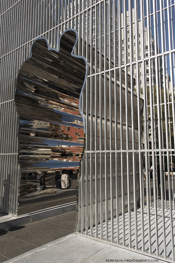
  1. Kliment Timiriazev
  2. Eight of the other eleven volumes are monographs dedicated to period of Wright’s career, the remaining 3 volumes contain preliminary studies, which I assume are part of his Archives. These books were the only way most of us could see these pieces of the Archives, except for occasional shows, until now.
  3. Controversy still surrounds whether he left or was fired by Sullivan for taking freelance commissions on the side.
  4. To read this very sorry tale, in detail, I highly recommend the book “Man About Town,” by Herbert Muschamp, who details Wright’s plans for Manhattan and efforts to overcome the powers that be. i.e Robert Moses.
  5.  As quoted in “The Star,” 1959, and “Morrow’s International Dictionary of Contemporary Quotations,” 1982, by Jonathon Green.

This Summer In “The Era of Rauschenberg”

Everyone thought it was a joke, the gallery owner included, at his first show’s debut in Rome. Then, the respected reviewer of a show of work by a 28 year old Artist at its second stop at the Galleria d’Arte Contemporanea in Florence, Italy, called it a “psychological mess.” But, he wasn’t done. After continuing in biting terms, the reviewer concluded that the work should be “thrown into the Arno (River).” Shortly thereafter, the Artist sent the reviewer a note that read, “I took your advice.” Saving five or six works to bring home to NYC, he threw the rest, discreetly, into the Arno, finding a spot where he wouldn’t be caught in the act, and doing so in a manner to prevent their re-surfacing1.

The Artist’s photos of his hanging works called Feticci personal, or Personal fetishes, displayed in his shows in Rome & Florence. One, left, shown hung on a bust. 9 of them shown hanging in a park, right. They seem to have disappeared since. Click any photo to view it full size.

His story continued…as the esteemed Calvin Tomkins tells it…

So branded an “Enfant Terrible,” “he had come back with two wicker trunks and five dollars in cash, and for a while that spring and summer he lived on the far edge of poverty. He found a loft on Fulton Street, near the fish market, a big attic space with twenty-foot ceilings but no heat or running water; the rent was fifteen dollars a month, but he talked the landlord into letting him have it for ten. A hose and bucket in the backyard served as his basin, and he bathed at friend’s apartments, sometimes surreptitiously, asking to use the bathroom and taking a lightning shower at the same time. His food budget was 15 cents a day, usually spent at Riker’s cafeteria, and supplemented by bananas he picked up on the United Fruit Company’s docks. Living that far downtown, he saw few other artists. Most of the New York artists lived in Greenwich Village then, or further uptown, and he could rarely afford the subway fare (still only a dime) to socialize.2” Shortly after, his NYC Dealer was not overly enthused about his latest paintings, so she dropped him.

So…You say you wanna be an Artist? Somehow, as bad as things got, he persevered when few would have.

44 years later, in 1997, his work filled Frank Lloyd Wright’s Guggenheim Museum Building, spilled over to fill the Guggenheim Soho (its final show ever), the Ace Gallery downtown, and numerous other satellite shows in galleries around town simultaneously, in what was to my eyes at the time, and my mind since, a monumental and utterly overwhelming Retrospective, an effect not unlike seeing the incomparable Picasso Retrospective, which filled all of  MoMA in 1980, or the Rothko show at the Whitney in 1998. 64 years A.A. (After Arno), as I type, his work fills MoMA’s 4th floor (until September 17). No less than Frank Lloyd’s Wright’s just happens to fill the 3rd floor. Be careful walking by MoMA. With that much American creativity on view, the building might just levitate.

The entrance on MoMA’s 4th Floor.

Speaking about his achievement, Artist, and former partner, Jasper Johns once said he “was the man who in this century had invented the most since Picasso3.” In the Catalog for that Guggenheim Retrospective, Charles F. Stuckey wrote-

“Globally speaking artists and their audiences have been living since around 1950 in what might well be called the Rauschenberg Era (his cap). As we look toward the culture of the next millennium, our vantage is from atop his shoulders4.”

Wait. Stop the march of time for one second. WHO has an “Era?”

Michelangelo and Leonardo share the Renaissance, with Raphael, Titian and a host of other “Old Masters.” Rembrandt & Vermeer are part of the Dutch Golden Age of the 17th Century that includes literally hundreds of Artists still fondly considered almost 400 years on. The Impressionists were a group. So were the Surrealists and the first generation Abstract Expressionists (though Rothko had his own name for it). Perhaps Picasso (who, early on, shared Cubism with Braque and Juan Gris) comes closest, especially in recent times. Well, Picasso is Picasso.

How did Robert Rauschenberg get from being told to throw his work into the Arno, to having an “Era” that’s lasted 50 years (to 2000), and may well still be going on, even though he passed away in 2008? This, and other questions, were foremost on my mind, during the first of 17 visits to MoMA’s 250 work retrospective, Robert Rauschenberg: Among Friends, and half as many to the 4 satellite shows around town, in this “Summer of Rauschenberg,” as I saw a writer call it. The other questions included- Does the show finally make the “case” for his later work? Does it finally make one for him as a major Photographer? First, putting off a look at the other shows, let’s take a look at Robert Rauschenberg: Among Friends. Outside, on the entrance wall, Photos of Rauschenberg & his friends, seen above, reinforce the message that the show features his interactions, mutual influence and collaboration with his friends, many of who happened to be brilliantly talented Artists, themselves. This is the view immediately inside those Star Trekian automatic sliding glass doors. Beam me up, Bobby.

Partial installation view of the first gallery.Untitled (Double Rauschenberg), c.1950, Monoprint; Exposed blueprint paper, a collaboration with Sue Weil, center, White Painting (Seven Panel), 1951, left and Untitled (Black Painting), 1952-3, right, examples of the two bodies of work that were to come shortly after, once Rauschenberg had decided to become a Painter, not a Photographer. The White Paintings would inspire John Cage. Of the Black Paintings, which had newspaper collaged on them, painted over with black paint, he said- “I was interested in getting complexity without their revealing much. In the fact that there is much to see but not much showing. I wanted to show that a painting could have the dignity of not calling attention to itself, that it could only be seen if you really looked at it5.”

Untitled (Black Painting), 1952-3, Oil and newspaper on canvas, affixed to screen door.

The first room contains his earliest work (unlike the 1977 Rauschenberg Retrospective, which came to MoMA, and started with his newest work). On either side of the door, and facing it, are 3 of the Blueprint images he created with Artist, and future ex-wife, Sue Weil in 1950 & 51. They were as attention getting then as they are now, garnering the couple a 3 page spread in Life Magazine in April, 1951, in which they demonstrated their process. To the right, a wall of his early Photographs are collected, mostly done in his days at Black Mountain College, including two that were the first works by Rauschenberg to be acquired by MoMA, in 1952, six years before it would acquire anything else by the Artist.

To the right of the door, a wall of early Photographs, and the Blueprint, Sue, c.1950, make it easy to see why he had a hard time deciding whether to be a Photographer or a Painter. I’m not entirely sure he ever truly chose one.

To the left are his earliest non-photographic works, including his earliest surviving painting, 22 The Lily White, c.1950, one of very few survivors from his very first show at Betty Parsons Gallery in May, 1951.

22 The Lily White, c.1950, Oil and graphite on canvas. The earliest surviving Rauschenberg Painting. The red star mimics those galleries put near sold items. This one didn’t sell. Perhaps viewers thought it had already been sold.

Untitled, 1952, Mirrors and objects in Coca-Cola box. The shape of things to come..Perhaps his first effort at blurring the lines between Painting & Sculpture he would revisit in his “Combines.” Believe it or not, at this point, he had not seen the boxes of Joseph Cornell.

Behind the pillar displaying Double Rauschenberg, is a Seven Panel White Painting, left, and 3 of the Black Paintings, one shown above, which came next. In the center of the space is a vitrine containing, among other artifacts, the original “score” for John Cage’s infamous 4’33, which the “White Paintings,” which Cage was a vocal, and poetic, admirer of, were one of the inspirations for.

The most avant-garde piece of “music” ever “written”. The manuscript John Cage’s 4’33 1952-53,, partly inspired by Rauschenberg’s White Paintings. The cover is seen, left, and the actual “score,” right. Go ahead. Try it at home.

The first “performance” of Cage’s 4’33 consisted of pianist David Tudor walking on stage and sitting at the piano for 4 minutes and 33 seconds. Then, he got up and walked off. It’s hard to imagine a more “avant-garde” piece of “music.” Rauschenberg’s exploration of the possibilities of materials, beyond painting, now took center stage in his work. “He thought of his work as a collaboration with materials, as he put it. He was not interested in expressing his own personality through art- ‘I feel it ought to be be much better than that,6‘”

Dirt Painting (For John Cage), 1953, Dirt and mold in wood box. “Painting” doesn’t get more avant-garde than this (or, his White Paintings.). More on this subject later.

More of the second gallery showing “Elemental Sculptures,” Scatole Personali 0r Personal Boxes, both on pedestals, the Erased de Kooning Drawing, right, another White PaintingTiznit, 1953, Oil on canvas, by Cy Twombly, left corner, and the Automobile Tire Print, with John Cage, 1953, in the back.

At this point, he went to Italy with Cy Twombly, culminating with the shows mentioned at the beginning, after which he returned to NYC. He decided to commence a series of Paintings using red, because white, and then black “impressed  a lot of people as aggressive, ugly, and full of the anger of negation. So, Rauschenberg “thought he had better find out whether there was any truth to these charges. He would test his own motives by turning from black and white to red, for him almost aggressive, the most difficult, the least austere color in the spectrum. [7, “Off the Wall,” P.78]” These are featured in the 3rd gallery, which includes some of his most well-known and influential works.

Charlene, 1954, a “Combine Painting,” and the last Red PaintingBed, and Rebus, both 1955, left to right, with a column of 3 Untitled Drawings, 1954 by Cy Twombly in between.

On the facing wall is Minutiae, 1954, a Combine, created as a set for the Merce Cunningham Dance Company, which Rauschenberg served as set, costume and lighting designer for at the time.

Something happened to Robert Rauschenberg in 1954. A number of writers have tried to explain exactly what it was. I’m not sure I understand. Whatever it was, it led to a breakthrough. He started adding more to his collages, anything was game, he said, as in Bed, 1955, which uses an old comforter since he had run out of canvas. Then, Red went out and was replaced with the the more neutral tones seen in Rebus, 1955. He had been including newspapers in his works going back to the Black Paintings, in 1951-2. At some point, around this time, he also began including photographs- found images from magazines and newspapers, etc.7 As time went on, however, he started incorporating large found objects, including an Angora goat and a Bald eagle, which, of course, grab your attention before you get to any of the details the works also include. Among Friends, is a very rare chance to see the two famous works that feature them, Monogram and Canyon, together. 8

Reinventing Painting, Sculpture & Drawing. Monogram, 1955/59 on loan from the Moderna Museet, Stockholm, front, with Gift for Apollo, 1959, right, Winter Pool, left, both 1959, and 34 Illustrations for Dante’s Inferno, 1958-60, on the far wall. Some of the most revolutionary Art of the past 60 years.

Canyon, 1959, Combine. One of the masterpieces of post WW2 Art. Rauschenberg on the Ganymede myth, with a Bald Eagle standing in for Jupiter’s Eagle, and fascinating to compare with Rembrandt’s Abduction of Ganymede, 1635, down to the inclusion of Rauschenberg’s Photograph of his son Christopher, on the left.

Canyon, 1959, is my personal favorite among his Combines (the word denotes a work that is a “Combination” of Painting and Sculpture, or as Jasper Johns said, “It’s painting playing the game of sculpture9.”) The controversial American Bald eagle’s very strange “pose,” standing on the sides of an open cardboard box, notwithstanding. It audaciously revisits the Ganymede myth, as he was doing in the Dante Illustrations (bringing a contemporary interpretation to an ancient tale) and, creating something of his own mythology, enhanced by the presence of a Rauschenberg Photo of his young son, Christopher (now a Photographer and head of the Rauschenberg Foundation), and including the cardboard box, which would become a staple Rauschenberg material (from the days before acid-free papers, adding to the conservator’s nightmare this works is). It takes the concept he realized in his 34 Illustrations for Dante’s Inferno one step further, into a 3-D Combine. 58 years later, it’s still a thrilling, unique experience, that’s every bit as audacious as it must have been in 1959.

As they hadn’t in Italy in 1953, a sizable amount of the viewing public still didn’t take Rauschenberg seriously by the late 1950’s, and the Combines actually served to reinforce that. Standing near Monogram for 15 minutes on 3 different occasions, I noted the immediate reaction of at least 75% of viewers were smiles, or outright laughs. I don’t know what they wound up thinking of it after taking a closer look. Increasingly “troubled10”  by this reaction 60 years ago, in 1958, he decided to illustrate Dante’s Inferno. To do so would require nearly 3 years. The resulting series of “34 Illustrations,” displayed at the Leo Castelli Gallery in December, 1960, finally served to alter the public, and critical, perception of Rauschenberg. The complete series lines the back wall of this gallery, where they loom as something of a “spiritual center.” For me, their Artistic importance in his entire oeuvre cannot be overstated- so much of what was to follow can be seen in them. Including his use of Photographs, now as independent elements, standing in for many of the characters in the Inferno, in Rauschenberg’s unique, contemporary imaging of the story. I take a closer look at them in the “Highlights” Post, following.

The Combines and Combine Paintings lead us to a “central” gallery containing his classic Silkscreen Paintings of 1962-64, and Oracle, a five-part found object assemblage integrated with technology that he created with engineer Billy Klüver and 4 others between 1962-5. Rauschenberg discovered silkscreening during a 1962 visit to the studio of Andy Warhol, who had been working with the technique since 1961. Silkscreening provided the answer he had long sought- how to transfer images to canvas in good resolution. His Transfer drawing technique only taking him part of the way (though he would continue to use it when he felt it was needed through the years).

Oracle, 1962-65,a five-part assemblage, with wireless microphone system, concealed radios & speakers, washtub with running water, surrounded by 10 of his groundbreaking Silkscreen Paintings, 1962-64

His silkscreens look nothing like Warhol’s, as can be seen below. Especially early on, Warhol took a single image and replicates it and/or varies it, using a grid. While Rauschenberg may repeat the same image up to 4 times in a work (usually varying it), he never allows it to become the central “point” of the work.

Warhol’s Let Us Now Praise Famous Men (Rauschenberg Family), 1962, Silkscreen on canvas, along side Rauschenberg’s early Silkscreen Painting, Crocus, 1962

Rauschenberg’s insatiable creativity led him to move forward, so the period he made these Silkscreen Paintings lasted only from 1962-64. Though he used Abstract Expressionist techniques (his work is characterized by his use of everything & all techniques), they complete his moving beyond the style of Abstract Expressionism, something he began working towards doing in the early 1950’s, to Painting wholly in his own style, and along the way, freeing Art to move on. While these works include some of his own Photographs, the featured images are, primarily still found images. As such, as great as they are, they are another step, an important one, to what his work would eventually become.

Persimmon, 1964, Oil and silkscreen on canvas. There’s much to say about this revolutionary work, but notice the mirror in Ruben’s Venus, which I’ll get to. Interestingly, Ruben’s Venus appears in a number of the silkscreen paintings, and curator Roni Feinstein noted they seem to be a female counterpart to JFK, who appears many times.

After becoming the first American to ever win the grand prize in Painting at the 1964 Venice Biennale, he would soon largely stop painting and turn his focus to performances, and the marrying of Art & Technology.

Scaling the heights of Art. Rauschenberg performing in his Elgin Tie, in 1964 in Stockholm. From the Hardcover edition of the show’s excellent catalog.

The latter took place in both stand alone works, and in performances, particularly “9 Evenings,” which is marvelously explored here11, and includes Rauschenberg’s contribution, Open Score. (See my look at Early Networks in Part 3 of this series, here.) The massive Mud Muse, which I’ve seen described as an experience akin to a visit to Yellowstone, is one stand alone work that is certainly popular with younger viewers. A monumental feat of installation considering the work holds 8,000 pounds of “listening” Bentonite mud,  with embedded sensors that cause the mud to react with the music being played on the control unit nearby. On loan from the Moderna Museet, Sweden, it’s one of the most ambitious and technologically complex works Rauschenberg ever made, and is making its first NYC appearance since Rauschenberg completed it here in 1971.

Now, I’ve seen everything. Mud Muse, 1968-71, 8,000 pounds of Bentonite mixed with water, in action.

From there, the show moves through his Cardboards (sculptures made from found cardboard boxes), the famous Son Aqua (Venetian), 1973, with its water filled bathtub, and works inspired by trips to India, before getting to the penultimate, large gallery of later works.

Sor Aqua (Venetian), 1973, Water-filled bathtub, rope, metal, wood and glass jug. Rauschenberg continued to use found objects, like these, his entire career, even after he could afford traditional supplies. “Gifts from the Street,” he called them. After a while of looking at this, it hit me- There’s no drain in the bathtub. Maybe that’s why its owner threw it out, to become a Rauschenberg found object. A guard told me he called the metal on wood structure above, “The Angel.”

The large gallery of later works includes Hiccups, 1978, the horizontal rows, left & right, joined by zippers,Glacial Decoy, the collaboration with Trisha Brown (black and white photos, left), Triathlon, 2005, from Scenarios, the color painting, left of center, the latest work here, and For A Friend And Crazy Kat (Spread), 1976, along with a few examples from his Gluts series of found metal objects & signs. I will long wonder about what was omitted from this gallery.

The large gallery of later work, above, includes a very wide range of pieces that attest to some of the incredibly wide range of materials and styles Rauschenberg worked in. It highlights the fact that he continued to use found materials even when he could well afford art store materials. This was one of his ways of bringing “life” into his work, which he felt was essential in Art. Though not nearly as well known as the earlier periods of his work, there are a number of major works on view here, too. To my eyes, Mirthday Man, from his Anagrams series, Inkjet dye and pigment transfer on polylaminate (center, on the wall in the photo below), created on the Artist’s 72nd Birthday, in 1997, is one. Booster, a print from 1967, to its right, is as well.

Urban Katydid, (Glut), 1987, Riveted street signs on stainless steel,, front, Mirthday Man, 1997, Inkjet dye & pigment transfer created on his 72nd Birthday, center, and Booster, 1967, Lithograph & screen print, right, end the gallery of late works. The latter two feature almost life size X-rays of Rauschenberg. Both are among his major works in my opinion.

Partially seen in the last gallery photo, on the back wall to the left, and below, are black & white photos that form the backdrop for Rauschenberg’s collaboration with the late Trisha Brown called Glacial Decoy, 1979, in an installation by Charles Atlas, who worked with Rauschenberg. The piece comes closest to showing Rauschenberg’s later Photography, cleverly getting 620 examples of it in the show, though the images move one space from left to right every 4 seconds. The smaller color screen hanging in front shows video of a performance of the work from 2009 at BAM. All the way around, this is a terrific work, though if you want to focus on the Photos, you have 16 seconds to ponder each one before it disappears. The performance is, also, amazing. The installation? I’m not so sure. Sitting directly in front of the transparent hanging color screen, it’s a bit hard to make out everything that’s going on onstage since the large black and white photos on the back wall shine through. Though they are in the same sequence as they  are in the background of the performance, they’re in a different scale and so it serves to make it hard to see the screen. The resulting effect is somewhat strange. I found it better to see, standing quite a bit off to the side, as below.

Glacial Decoy, 1979, with 620 Photographs that scroll from left to right in 4 second segments & costumes by Rauschenberg, choreography by Trisha Brown. Interestingly installed by Charles Atlas, who worked with Rauschenberg.

The view directly in front of Glacial Decoy. The background of the on-screen performance is synched to the large Photos on the back wall, but they’re in a different scale, and they are both moving to the right every 4 seconds.

As with his fondness for found objects and Photography, Rauschenberg continued to refine and develop his techniques from the beginning to the end, as we see in Holiday Ruse (Night Shade), 1991, a captivating work, which has a look that seems to harken back to his “Black Paintings” (like Untitled (Black Painting), 1952-3, shown near the beginning), bringing them full-circle, with black images layered under black paint requiring a very close look to make them out.

Holiday Ruse (Night Shade), 1991, Screenprint chemical-resistant varnish, water and Aluma-Black

Also noteworthy, among the Gluts, works made of found street signs and other metal objects, Mercury Zero Summer (Glut), 1987, an electric fan with metal “wing,” an ecology-themed work, stood out. Finally, Triathlon (Scenario) 2005, Inkjet pigment transfer on polylaminate, from one of his final series, Scenarios, immediately “looks different,” than all that’s come before, with each of its Photos given their own place, and not being layered as earlier, with added prominence intriguingly given to white space, the overall effect is striking. Finally, Photos, in stunning clarity, stand to speak on their own as “characters” in the whole. The three images of the hand with the sphere, left, remind me of the repeated/slightly altered birds in Overdrive, and other Silkscreen Paintings, and masterfully unify the composition horizontally. Interestingly, since his right (Painting & Photographing) hand had been paralyzed in a stroke a few years earlier, and he could no longer take Photos, he had to, again, use the Photos of others (possibly under his direction at times), as he had done when he first started to use Photos, in the 1950’s.

Triathlon (Scenario), 2005, from 3 years before his passing is the latest work in the show.

The show concludes with a room dedicated to R.O.C.I., the Rauschenberg Overseas Culture Interchange, “a tangible expression of Rauschenberg’s long-term commitment to human rights and to the freedom of artistic expression,12,” a self-funded collaboration with Artists in 10 countries that Rauschenberg was extremely dedicated to, even mortgaging his homes, and selling his vaunted Art collection to fund. Rauschenberg took the term “action painting,” first coined to describe the technique of abstract expressionists Jackson Pollock, and others, literally. For him, it meant ethical action, as well. Thist took many forms during his career. As Barbara Rose said about him, he was “among the last artists to believe that art can change the world.13

The final gallery contains 12 Posters for R.O.C.I.- the Rauschenberg Overseas Culture Interchange, 1985-91, along with 3 videos shot in Mexico, Cuba and China. 10 countries are represented here.

Though work by Rauschenberg has been in 152 shows at the Museum, only ONCE before has MoMA presented a retrospective of his work- FORTY years ago, in 1977. That show originated at the National Collection of Fine Arts (associated with the Smithsonian) and was curated by its Walter Hopps. Among Friends, is co-produced by MoMA and the Tate Modern, London, where it appeared under the title Robert Rauschenberg. So, this is the FIRST large show devoted to Rauschenberg that MoMA has been credited with creating. In fact, of those 152 shows I mentioned, only 4 had his name in the title- this is number five14. For someone so important and influential, I find this most puzzling. In fact, it’s only been fairly recently that MoMA has begun to fill in some of the substantial gaps in their Rauschenberg holdings, acquiring Rebus, one of his most important Combine Paintings, Canyon, in 2012, one of the most important Combines, and the now classic Silkscreen Painting, Overdrive, 1963, (seen in far left in the photo of the Silkscreen Paintings with Oracle, above) in 2013.

Rebus, 1955, Combine painting. The info label says its a “promised gift,” but Calvin Tomkins says MoMA paid 30 million dollars for it. (Off the Wall, P.282) This would be most interesting as MoMA’s Alfred Barr was offered Rebus in 1963 but he declined. (ibid.).

My reaction to Among Friends was tinged with a bit of disappointment- Though the early galleries, up through the Mud Muse/’9 Evenings,” 1965, are extraordinary. Stories abounded of curators bringing in “people who were there” to recreate how works had been originally displayed, complimenting major loans, like Charlene, Monogram, among many more. After 1965, I felt the show “thinned out.” The huge, penultimate gallery of his late works (a period I believe is very under-appreciated), left me wondering why it had so much empty space. In fact, I can’t quite recall seeing anything like it in a major show. Part of the reason is Among Friends attempts to integrate larger videos of performances right in the show, as opposed to having separate rooms for them (as MoMA did with Bruce Conner: It’s All True, last year). The spot chosen for Glacial Decoy’s installation left a large corner completely dark and empty. As nice as it is to see all of Hiccups, 1978, a beautiful work consisting of 97 solvent transfers (an “update of his “Transfer Technique”) on paper panels held together by zippers, so it can be endlessly rearranged. (Rauschenberg may have employed his mother, Dora, to attach the zippers, David White told me.) Taking up the better part of 2 long walls, I was left feeling that space could have been put to better use, and Hiccups displayed in another manner, as it has been in the past.

Another view of the later works gallery shows a lot of open floor space, and on the middle right, behind Charles Atlas hanging video screen for Glacial Decoy, which is in the center of the room, a dark, empty corner. An interesting installation, I’m not sure was entirely successful, but should it have been mounted elsewhere?

Rauschenberg, perhaps more than any other Artist, established what it was to be an American Artist around the world, continually going seemingly everywhere, beginning in the early 1950’s, but his travel during his later years is not mentioned in the later works gallery, including his trip to China in 1982, where he collaborated with local paper makers, and others, the trip resulting in a typically large creative output, entirely absent here. That’s one example. The travel thread is picked up in the next, and final, R.O.C.I. gallery.

Whereas the show to this point had been chronological, this room is a bit all over the map, with works ranging from 1967-2005 on view. With the only large placard, the show uses to give context, next to Mirthday Man, one of the last works in the show all the way on the other side of the gallery, visitors here were left a bit hanging about what was going on in Rauschenberg’s Art and the path its development was taking, which its non-chronological display didn’t help. It’s a bit of a shame. While what’s included in this gallery may serve to pique the interest of viewers to investigate it further, the overall result, I feel, is a “sketch” of what the Artist created, achieved and accomplished in this period. The result is the show feels like it progressively winds down in the later galleries, and ends on somewhat “quiet” notes. A chance to shine new light on Rauschenberg’s late period was, I feel, missed. It should be noted that, not unlike Picasso, Rauschenberg’s later works have been largely overlooked by the Art world to this point, save for a few gallery shows (including this one I wrote about in 2015)15. (Though, they have not been overlooked by Artists.) So, the other possibility is, of course, that the show’s curators do not feel the rest of his later work is important enough to be here.

With the catalog for the 1997 Guggenheim Retrospective, one of the greatest shows I’ve ever seen, listing 480 items, almost double the amount here, I prefer to think of this show as an “overview,” being as it wonderfully selects key works from key periods through 1965. With an Artist as prolific as Rauschenberg was (Calvin Tomkins says he created over 6,000 works by 2005, not counting multiples), it’s probably not likely a full retrospective is even possible. But? I would LOVE for someone to try!

Still, Among Friends is, caveats aside, important in its own right because it does include so many works created at key moments in his career, and because it shines a light on the importance to his work, and accomplishment, of collaboration- with other Artists, Engineers & Performers, and with the materials he was working with16 It also allows a very rare chance to see, and experience, rarely seen works involving technology (collaborations with engineers), putting OracleMud Muse, and “9 Evenings” front and center, each one a major feat of museum installation. Alas, it, also leaves, until another day, a complete assessment of both his late period and his Photography (i.e. the body of Photographs he created). Regardless of what isn’t here, a careful examination of what does comprise the 250 works in Among Friends reveals there is no doubt whatsoever that this is an important show, a major event in Rauschenberg scholarship and appreciation, and one of the best shows of 2017.

In the early 2000’s, Rauschenberg suffered a stroke which paralyzed his right (Painting & Photography) arm. Nonetheless, he continued creating, having others take the photos, and signing his works, with difficulty, with his left hand, as here, on Triathlon, 2005, from Scenarios, one of his last series.

Speaking of friends and collaborators, another question lingers with me- As Among Friends beautifully details, Rauschenberg was friends early on with John Cage, Merce Cunningham, Morton Feldman, among others, who were among the most avant-garde creators of the 20th Century. HOW was it possible that Robert Rauschenberg, alone among them, escaped the “avant-garde ghetto” to achieve both fame and fortune, while holding on to his integrity? I well remember when avant-garde composer Pierre Boulez was named Musical Director of the New York Philharmonic, succeeding no less than Leonard Bernstein, and how audiences voted with their feet and voices in displeasure when he performed a modern & contemporary work, as you can plainly hear on recordings of the Philharmonic broadcasts at the time. Rauschenberg, as I mentioned earlier, was actually an inspiration for the most avant-garde work of music ever “written”- John Cage’s 4’33,” 65 years later, Cage is highly respected, but, still his music is sparsely performed. Among his other friends, Morton Feldman (a major composer who remains under-known, and who Rauschenberg gave his first public performance at one of his early shows), is a cult figure who shows signs of becoming more. Even Pierre Boulez, who passed last year, is, mostly, remembered for creating the most “definitive” body of recordings of 20th Century music we have thus far, while his own music is still sparsely performed. Meanwhile…during all of this, Robert Rauschenberg had, or has, an “Era,” and had a long career that was marked with a good deal of success, however you’d care to define it, including financial. Given the “edginess” of much of his work, a fair percentage of its components coming from the trash, and not art supply stores, I find it absolutely remarkable.

How was Rauschenberg able to avoid the “Avant-garde ghetto?” Walking through the show, I think it is possible to “experience” the answer. As Among Friends highlights, collaboration may well have been key to his success. Beyond collaborating with so many gifted Artists, across realms, and collaborating with his materials, as Calvin Tomkins said- “All his work, Rauschenberg increasingly felt, was a form of collaboration with materials. He wanted to work with them, rather than to have them work for him17.”

There is more. One of his most famous quotes is “Painting relates to both art and life. Neither can be made (I try to act in the gap between the two)18.” That gap also includes life being lived now…i.e. the viewer’s experience.

Have a seat. (No, Don’t!) Rauschenberg understood that his ultimate collaboration was with his viewers. He continually strove to bring them in to his works. Pilgrim, 1960, Combine Painting.

Rauschenberg’s most important collaboration may be with his viewers. He never forgot the experience of the viewer, something, it seems to me, most other avant-gardists of the period seemed to ignore, if not take a polar opposite approach to. Therein may lie the key. As one of them, John Cage, himself, wrote in Silence, “The real purpose of art was not the creation of masterpieces for the delectation of an elite class, but rather a perpetual process of discovery, which everyone could participate19.” It seems to me that this, as much as anything else, was at the heart of Rauschenberg’s approach during his entire career. As he said, “I don’t want a painting to be just an expression of my personality. I feel it ought to be much better than that20.” What’s “better than that?” He said that he wanted to create a situation  “in which there was as much room for the viewer as for the artist21.” This collaboration  takes an exceedingly wide range of forms. The “White Paintings” were intended to allow the shadows of viewers, and the atmosphere of the room to be “reflected” on their surfaces. Numerous other works, from  Charlene, in 1954, right through the late “Gluts” have reflective mirrors or surfaces that reflect whatever is in front to it, even the viewer themselves. This goes way back to the mirrors in the upper left corner of Untitled, 1952, pictured early on. And, in Persimmon, Ruben’s Venus holds a mirror so she can look out at us, though her back is turned.  Once you look for ways that Rauschenberg includes the viewer in his work, you’ll see it more and more- throughout his career. Like that welcoming chair in Pilgrim, 1960, above. But, don’t really sit in it. You know…

Another thing that becomes apparent- The more work of Robert Rauschenberg’s I look at, one thing strikes me above all others- While I loathe comparisons of anyone creative, I don’t think I’ve ever seen any Artist with a better “eye” than Robert Rauschenberg. “I have a peculiar kind of focus,” he once told an interviewer. “I tend to see everything in sight22.” He was, also, one of the most creative people I’ve ever come across. He broke all the rules, and used that eye to create his own world out of ours.

Collaboration with his viewers, itself, led to more. Some of those viewers became Artists, themselves. From what I see in the shows I attend, and have attended, particularly over the past 15 years, I would say we are still in the “Rauschenberg Era.” His influence is all around. “Bob is the wind, blowing through the art world for almost a century now, pollinating everything,” Arne Glimcher, founder of Pace Gallery said in the BBC Documentary “Robert Rauschenberg: Pop Art Pioneer.”

Regardless whether you think we are still in the “Rauschenberg Era,” or not, one thing strikes me as undeniable- Nearly 10 years after his 2008 passing, the full assessment of the achievement of Robert Rauschenberg is no where near finished. Among Friends is another piece, one that will be long rememeberd, towards that end.

*- The soundtrack for this Post is “Moon Rocks,” by Talking Heads, from Speaking in Tongues, 1983, which Robert Rauschenberg did the artwork for the limited edition release of, seen below. Another classic collaboration. NASA invited Rauschenberg to witness the launch of Apollo 11, in July, 1969.

Robert Rauschenberg’s Cover for the limited edition of Talking Heads’ Speaking in Tongues. No, it wasn’t in Among Friends, but it is in my collection.

“Robert Rauschenberg: Among Friends” is my NoteWorthy Show for August. 

A second Post, which follows below, looks at highlights from Among Friends. Between the satellite shows- Robert Rauschenberg: Rookery Mounds, and Selected Series from the 60s & 70s, at Gemini G.E.L. at Joni Moisant Weyl Gallery, Robert Rauschenberg: Early Networks at Alden Projects, Robert Rauschenberg: Outside the Box, at Jim Kempner Fine Art, and Susan Weil at Sundaram Tagore Gallery, there were, also, many highlights. The third Post, further below, focuses on them. 

January 8, 2018-All three Posts are dedicated to the memory of my friend, the late Artist Tim Rollins. Tim and I spoke about and compared notes on these shows both of the last two times I saw him. He told me that he knew Rauschenberg, and he agreed to give me a quote about Rauschenberg for this series. But, I never got around to getting one from him. R.I.P., my friend. I hope you like them.

“On The Fence, #10, The Rausch-and-Bird Edition.” (Sorry, Bob.)

NighthawkNYC.com has been entirely self-funded and ad-free for over 6 years, during which over 250 full length pieces have been published. If you’ve found it worthwhile, you can donate to keep it going & ad-free below. Thank you!

Written & photographed by Kenn Sava for nighthawknyc.com unless otherwise credited.
To send comments, thoughts, feedback or propositions click here.
Click the white box on the upper right for the archives or to search them.
For “short takes” and additional pictures, follow @nighthawk_nyc on Instagram.

Subscribe to be notified of new Posts below. Your information will be used for no other purpose.
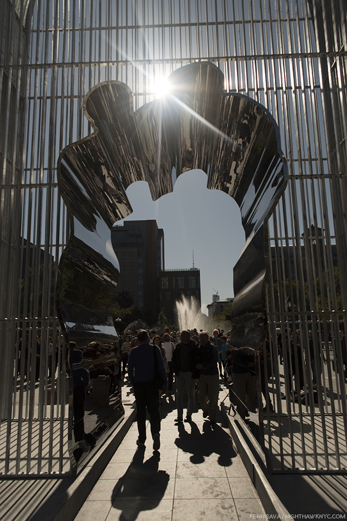
 

  1. The story in this section is excerpted and paraphrased from Robert Rauschenberg’s work, Autobiography, and from Calvin Tomkins’ excellent biography of Robert Rauschenberg, Off The Wall, 2005, P. 72-4.
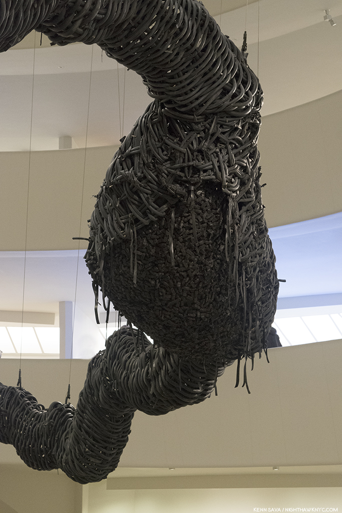
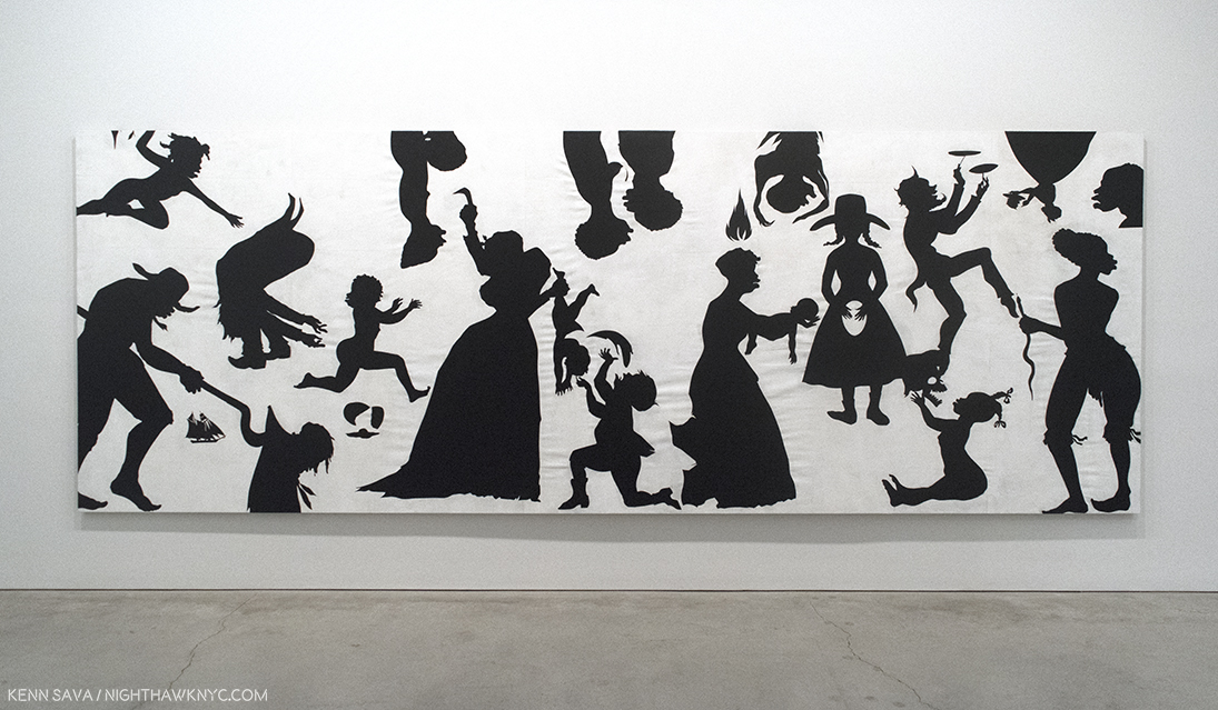
  2. “Off the Wall,” P.76
  3. Paul Schimmel Robert Rauschenberg: Combines, P.9
  4. Charles F. Stuckey in Robert Rauschenberg: A Retrospective, Guggenheim Museum, 1997, P. 31
  5. Tomkins Off The Wall, P.65
  6. Calvin Tomkins- “Master of Invention,” The New Yorker, Oct 13, 1997 P.92
  7. the Combine, Untitled, ca.1954, not in the show is the earliest work I’ve seen this in so far.
  8. MoMA had a chance to acquire Monogram early on, but Alfred Barr passed, fearing it might harbor vermin, among other reasons. Off the Wall, P. 282.
  9.  Everything In Sight,” Calvin Tomkins, The New Yorker, May 23, 2005
  10. Off the Wall, P.143
  11. and it’s also wonderfully displayed in Robert Rauschenberg: Early Networks at Alden Projects
  12. raushcenbergfoundation.org
  13. Barbara Rose, Rauschenberg, P.4
  14. Two of the those featured the 34 Illustrations for Dante’s Inferno as a set, in 1966 and 1988, the other featured his work Soundings, in 1969.
  15. To this point, the best overview of the later period works I’ve seen is in the Guggenheim Retrospective Catalog, one of the greatest exhibition catalogs- for any show, ever produced. The caveat to that is that when it was published in 1997, he would still work for a further 11 years.
  16. Guggenheim Retrospective Catalog, P.36-7.
  17. Tomkins in Off The Wall, P.79
  18. Rauschenberg’s statement in 16 Americans, MoMA Exhibition Catalog, 1959
  19. Off The Wall, P.62
  20. Off The Wall, P.66
  21. Off The Wall, P.xv
  22. “Dore Ashton, Art News, Summer, 1958, quoted in “Off The Wall,” P.8