Burt Glinn: Meet The Beats

Written & Photographed by Kenn Sava (*unless otherwise credited)

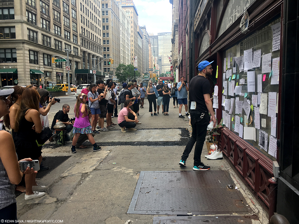
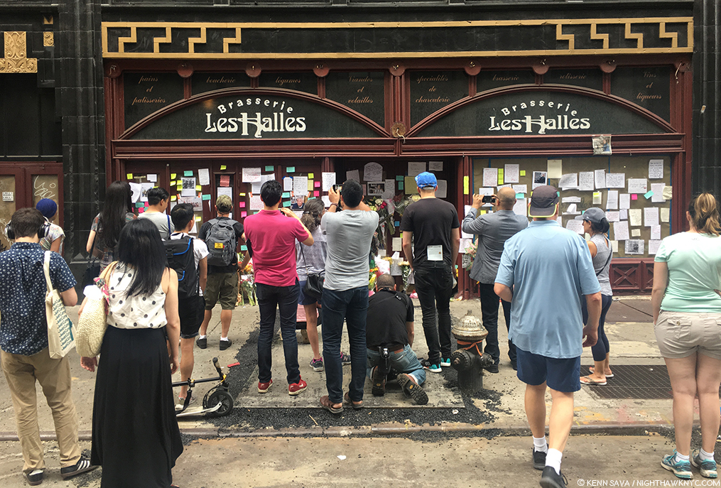
It’s impossible to walk around NYC and not be walking on history. More often than not? You’re walking on a spot where something historic happened. Usually, time and “progress” have left no reminder. You have to be an historian to know, or a long time resident to remember. Unless someone pulls your coat. Just this happened to me this past May 5th as I was walking down Cooper Square between East 4th and 5th Streets in the Lower East Side. When someone did…

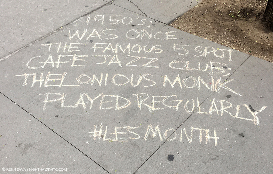
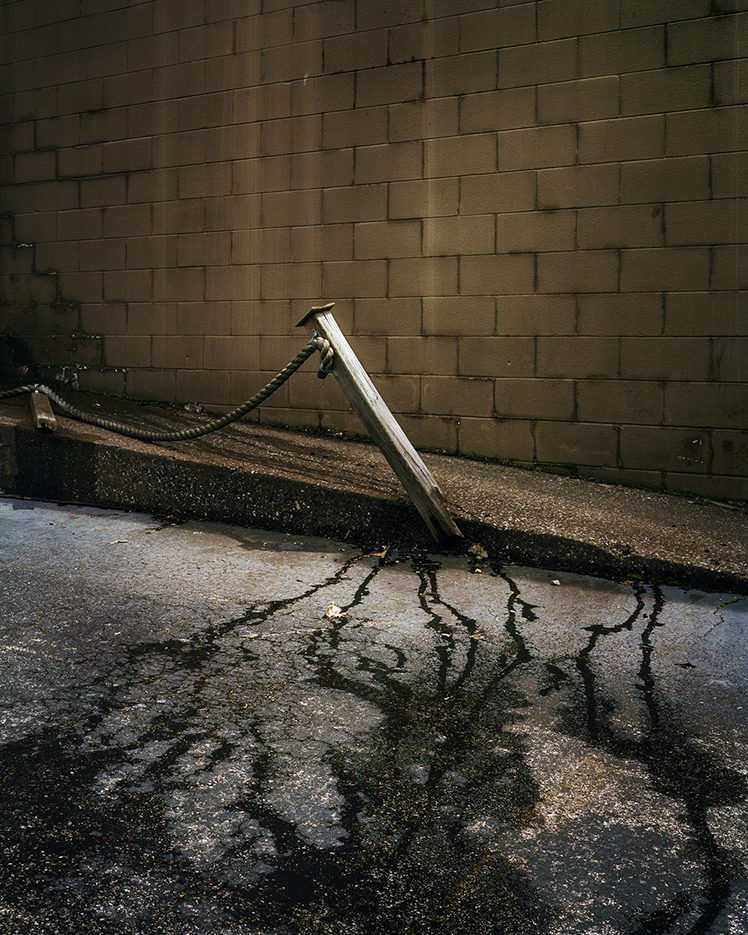
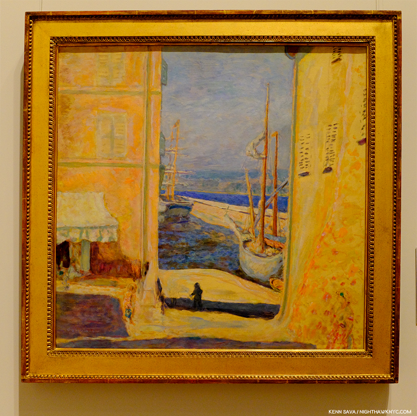
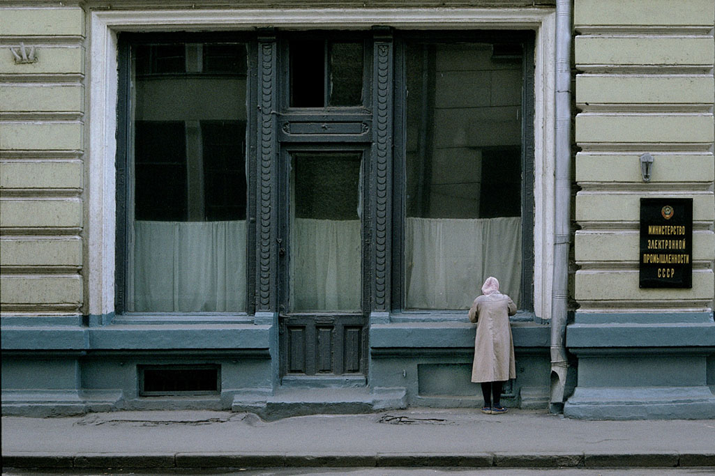
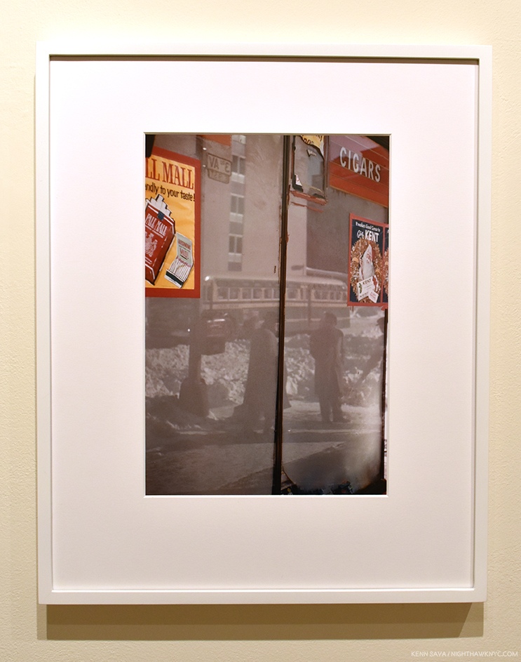
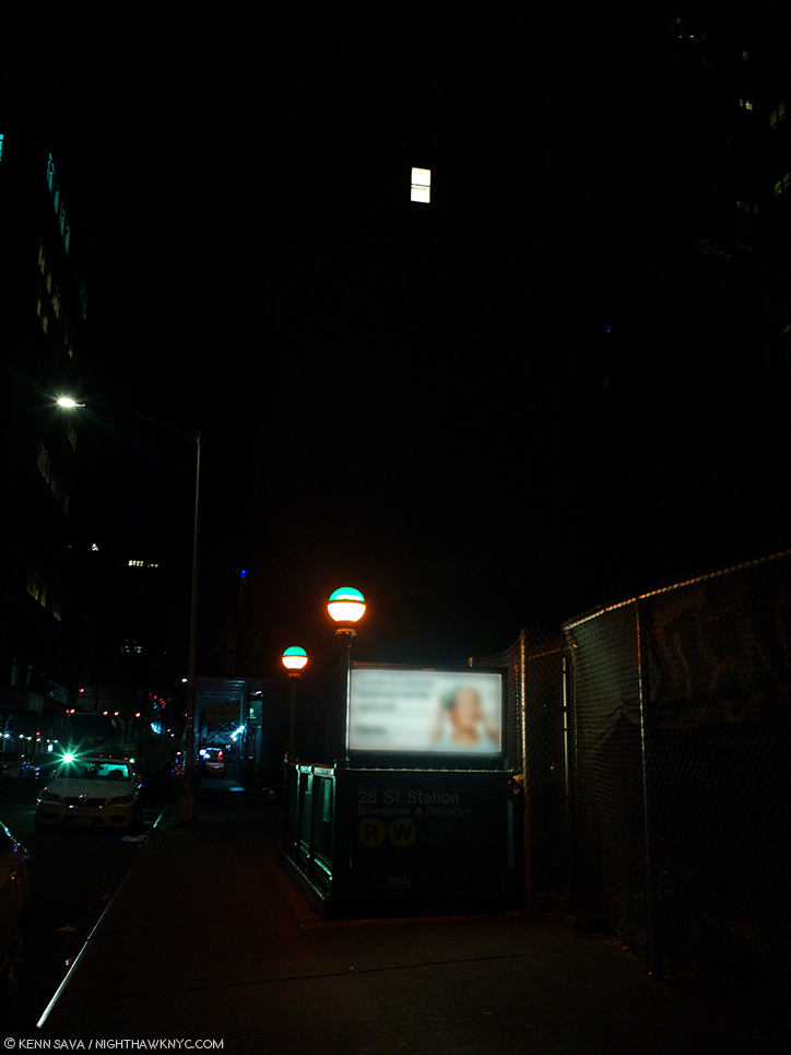
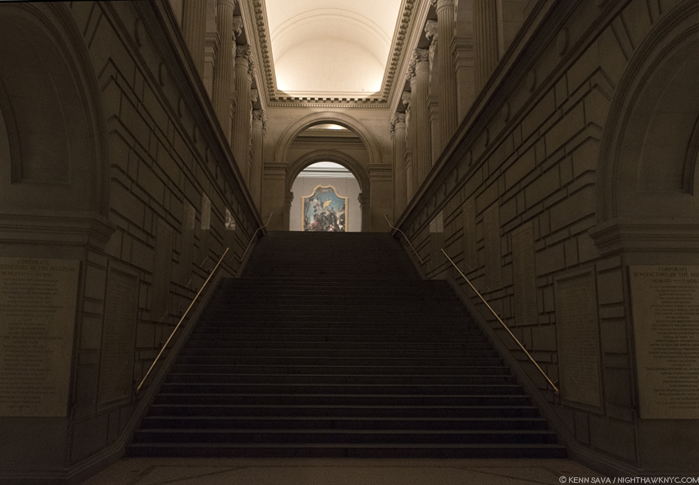
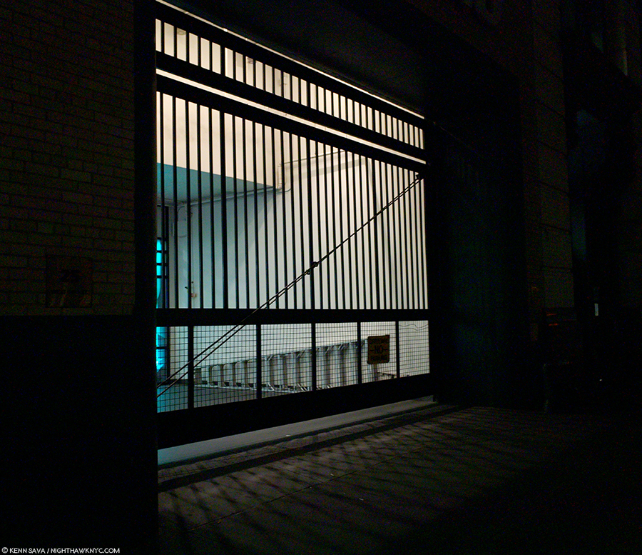
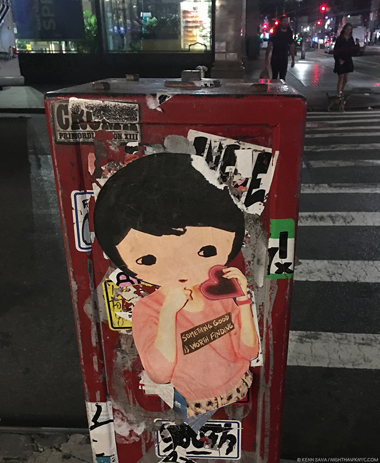
Once upon a time…On THIS spot stood The Five Spot Cafe, Cooper Square at East 5th Street, Lower East Side, (LES), NYC, May 5, 2018. Well? It’s gone now. But, is it? Chalk Editor’s Note- Add “This” in front of “was once…” Click any Photo for full size.

This story begins with chalk on the pavement, and a box.

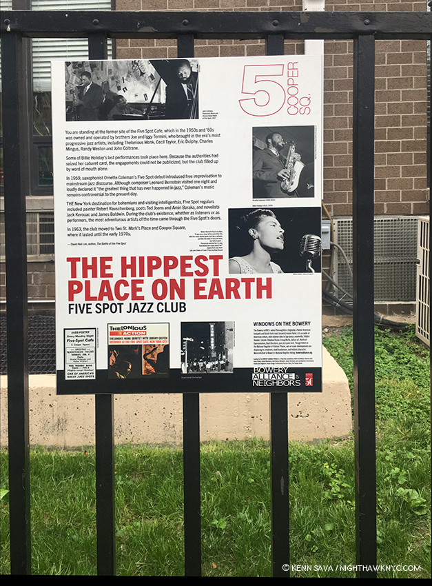
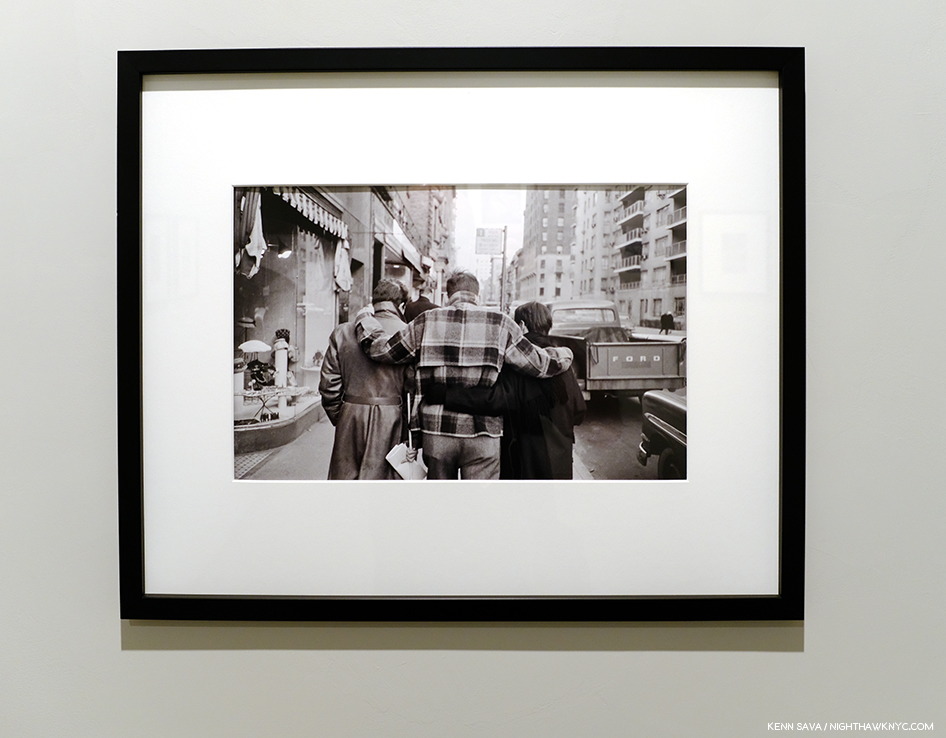
From everything I’ve heard about it, as a lifelong Jazz fan, and in preparing this piece, considering the Musicians who performed there, the Artists, Writers and Poets who frequented it? In the late 1950’s, the Five Spot was THE hippest place on earth. A temporary sign seen on the fence where it stood, above the sidewalk shot, May, 2018, shows Billie Holiday (who made some of her final performances here), Ornette Coleman, who changed the course of Jazz History, and a very rare Photo of Thelonious Monk with John Coltrane performing here, top, by unknown Photographers.

Shortly after the very moment I felt that tug on my coat, a discovery long hidden in the estate of a Magnum Photographer who passed away in 2008 would bring history back to life in the form of a PhotoBook and 2 shows. Before I get too far ahead of myself…

Magnum Photos has been around as the world’s leading Photo Agency, documenting what is history now for 71 years, since being founded by legends Robert Capa and Henri Cartier-Bresson along with David “Chim” Seymour, George Rodger, William & Rita Vendivert and Maria Eisner in 1947. Along the way many of the greatest Photographers of our time have been members at one point or another. Today, it’s going as strong as ever, with as well-rounded a roster as its possibly ever had, including Harry Gruyaert, who I recently interviewed, and other living legends, including Bruce Davidson, Elliott Erwitt and Susan Meiselas, as well as a veritable “all-star team” of younger Artists counting Alec Soth, Alessandra Sanguinetti, Cristina de Middel and, in 2018, Gregory Halpern among them.

Those who come now are standing on the shoulders of giants of Photography.

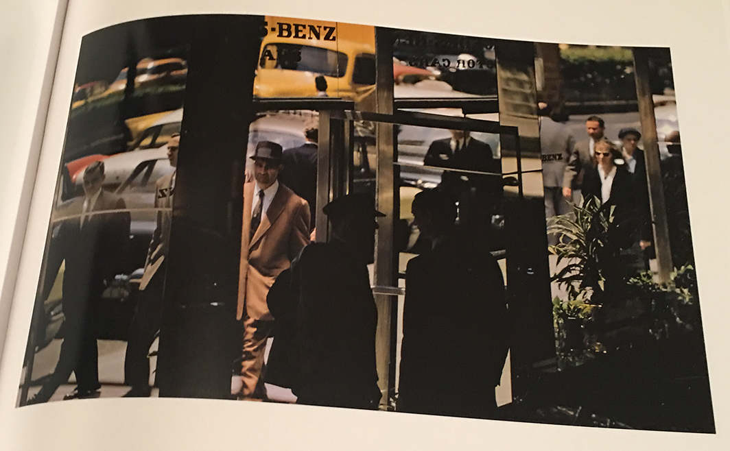
With so many luminaries in its already storied history, it’s easy for one to slip into a bit of a lack of attention from time to time. Take Burt Glinn for example. Born in Pittsburgh in 1925, he joined Magnum in 1951, one of the first group of Americans in the member owned organization. He became president of it in the 1970s and again in the 1980s. He achieved fame for his international work, including beautiful Portraits of Russia and Japan in color, as well as for his coverage of the Cuban Revolution, which saw him somehow gain access to Fidel Castro and his inner circle. Back at home, he profiled Marilyn Monroe, Elizabeth Taylor, and Katherine Hepburn, while also shooting Queen Elizabeth II’s visit to NYC. Burt Glinn is one of those Photographers who might illicit a “who?” from some today, but as soon as you start looking at his work, that’s quickly replaced by, “Oh, that’s his. So is that. So is that…” Like this one, perhaps the most famous image of Andy Warhol with Edie Sedgewick-

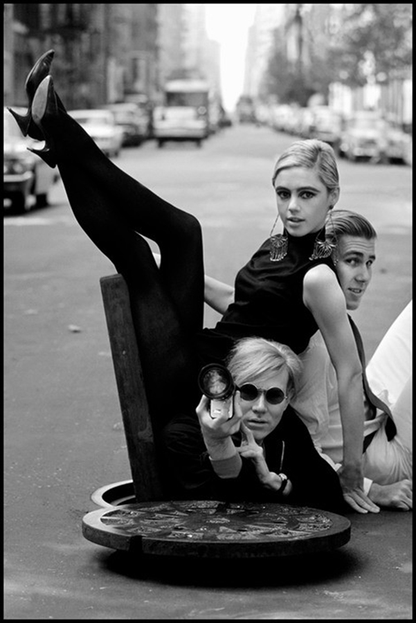
Andy Warhol with Edie Sedgwick and Chuck Wein, 1965, New York City. Photo by Burt Glinn/Magnum Photos.

Or, this unbelievable moment-

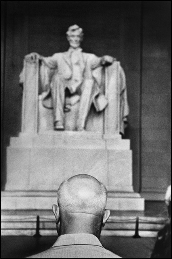
Nikita Khrushchev in front of the Lincoln Memorial, 1959, Washington, D.C. “Without a doubt,” the image of his that he most closely identifies with1. Photo by Burt Glinn/Magnum Photos.

But, there are many sides to the work of Burt Glinn. In fact, so many sides, some are still coming to light 10 years after his passing in 2008. While working on an upcoming Burt Glinn Retrospective, Michael Shulman of Magnum Photos, Elena Glinn, the Artist’s widow, and Tony Nourmand of Reel Art Press discovered a box labelled “nonconformists.” Inside were never before seen Photos of those legendary “nonconformists,” the Beats, along with his notes and an original Jack Kerouac manuscript! The Retrospective was immediately put on hold while Reel Art Press published the beautiful PhotoBook, Burt Glinn: the beat scene, in July, that includes the first color Photographs of the Beats ever published. Some of these images were then shown at the Beat Museum, San Francisco, in July, and now others, including many not published in the book, were exhibited at Burt Glinn: Photographs of the New York Beat Scene at New York’s renowned Jason McCoy Gallery, a 40 year fixture in the famous NYC Art Mecca, the Fuller Building, on West 57th Street, from September 12th through October 12th.

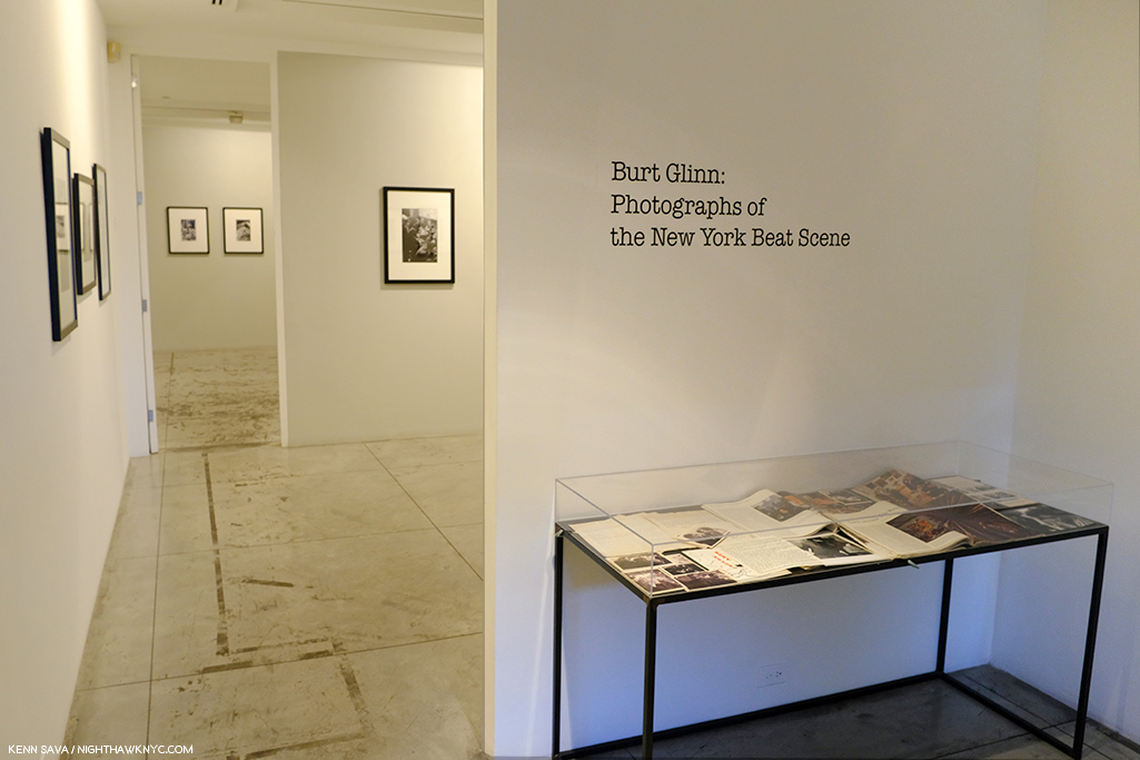
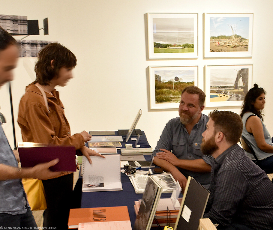
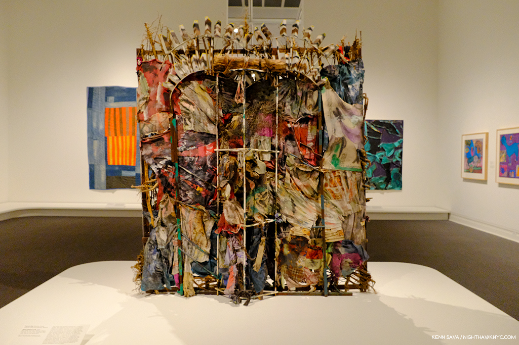
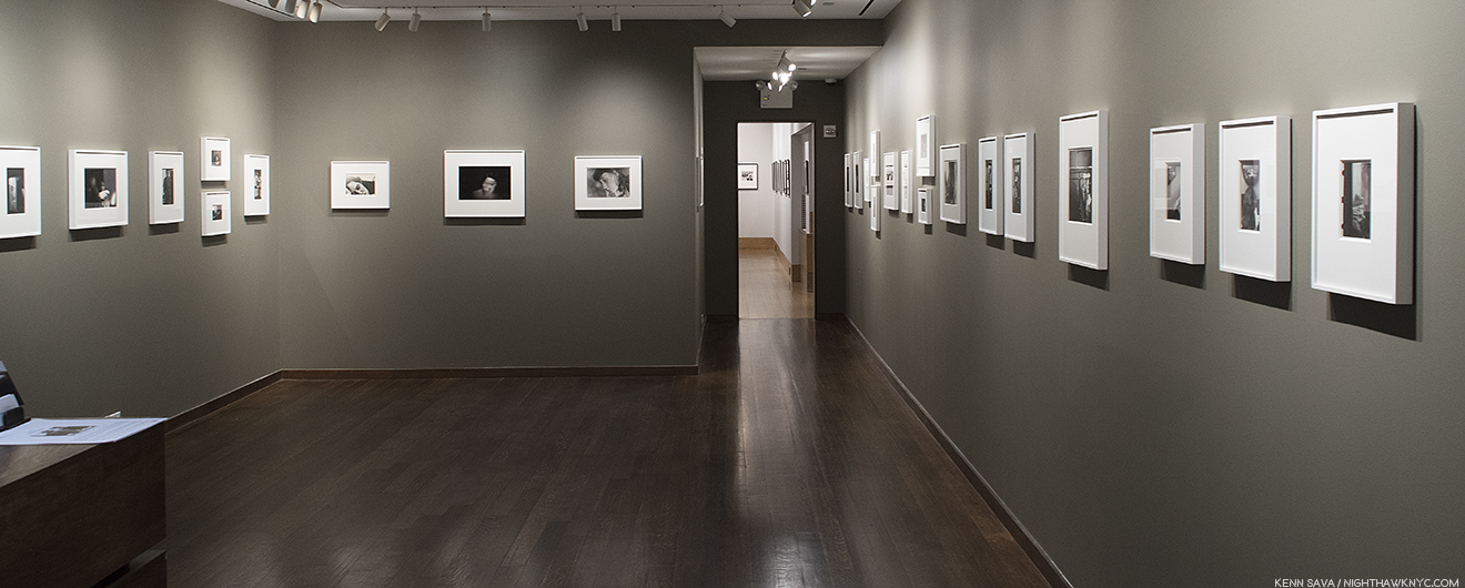
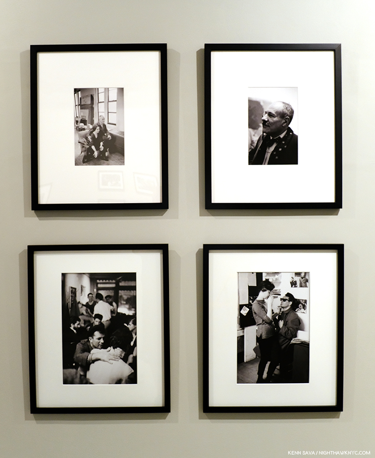
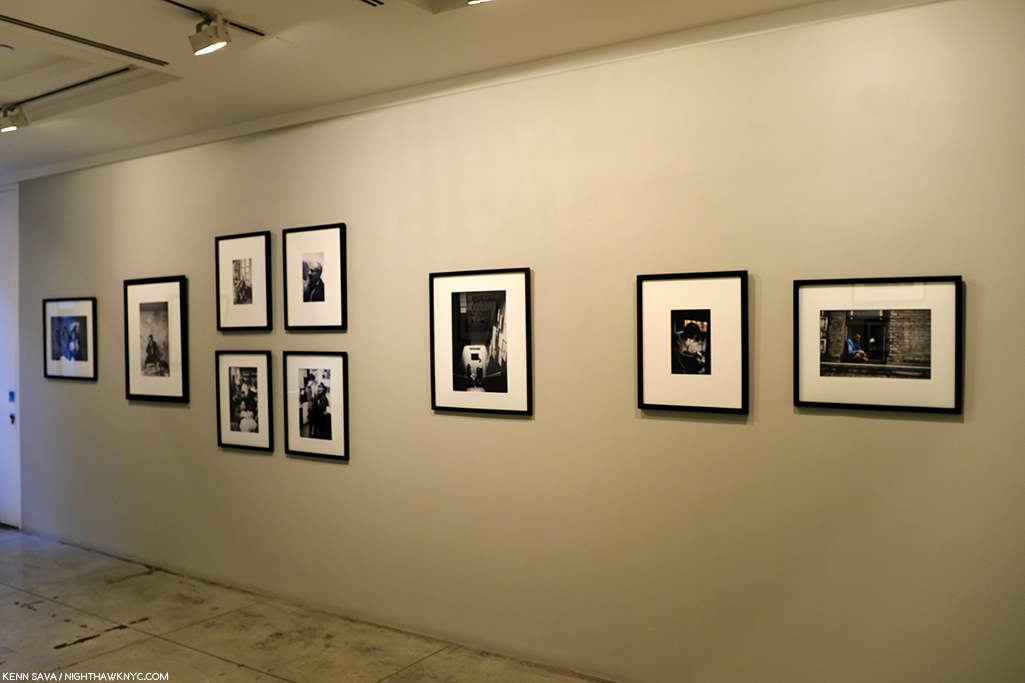
Installation view of the entrance to, Burt Glinn: Photographs of the New York Beat Scene, at Jason McCoy Gallery.

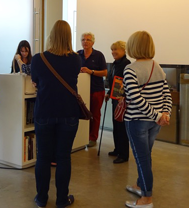
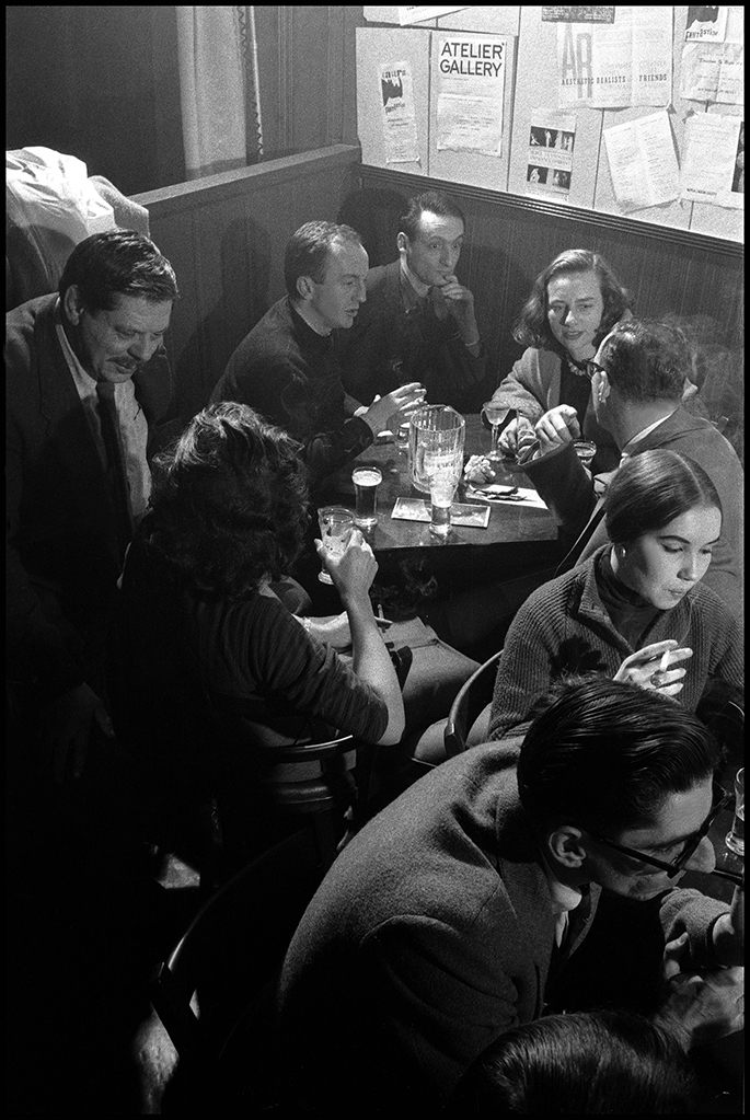
The NYC Art world is a mysterious place to most people on the outside, so having the rare chance to walk through a show in a famous gallery with its curator, particularly this show’s curator, Samantha McCoy, who works regularly with the Photographs of this Artist and his estate, at Magnum Photos, was a special privilege. It turned out that Samantha was also curating a show by Artist Carla Gimbatti at ChaShaMa– at the same time! “He’s a chameleon,” she warned me before we began. As we turned the corner into the first gallery, I saw what she meant.

Jack Kerouac holds forth to an enraptured audience, Seven Arts Coffee Gallery, 1959. This is how it started- with a poet or writer reading his work aloud in coffee shops, bars, or wherever they could.  I’d love to know if that woman laughing in the back was laughing at something Jack said, or not. Everyone else looks very serious. The beret became a Beat trademark. Photo by Burt Glinn/Magnum Photos courtesy Jason McCoy Gallery.

As we looked, it immediately became apparent that these aren’t just any Photos of the Beats (Jack Kerouac, Allen Ginsberg, LeRoi Jones, who was later change his name to Amiri Baraka, and Gregory Corso). They’re a fascinating window into their daily lives, an invitation to hang out with them in moments public and private, and, in a revelation, they also offer an unprecedented chance to see the Beats in the company of a number of Painters and Sculptors, including Helen Frankenthaler, Willem de Kooning, David Smith, Franz Kline, Joan Mitchell, Larry Rivers, and Musicians, including David Amram and Lee Bostic. These images fire the imagination as they draw you in to ponder just what was being discussed. In addition to being beautiful Photographs that add another dimension to Burt Glinn’s achievement, like so many of his other works, these are vitally important historical and cultural documents. To top it all off, the book and the shows mark the first time color Photographs of the Beats in their early days have been seen!

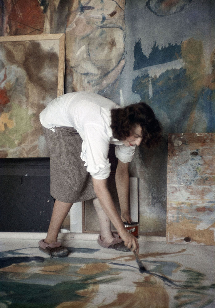
Young Helen Frankenthal her in her studio working on an abstract expressionist painting. I always look at her work and wonder how she Painted it. Now, I have an idea. Helen Frankenthaler at about age 28, rarely seen at work in this period, shown in the act of creation in her NYC studio in 1957, in color! Photo by Burt Glinn/Magnum Photos courtesy Jason McCoy Gallery.

Given her experience working with Burt Glinn’s Photographs at Magnum, I asked Samantha what surprised her about this newly discovered body of work. “Before learning about the release of the beat scene by Reel Art Press, I was actually not at all familiar with this particular body of work,” she said. “It was a surprising and exciting discovery. I found it particularly impressive to learn that Burt had followed the Beats on his own accord2. As Elena Glinn informed me, ‘It was Burt’s roommate, Clay Felker, who had said to Burt, ‘We have to do something with these nonconformists who are all over the place. Go after those guys. Go to openings.’ Burt just did it, and he went to everything. He went to the poetry readings, to the gallery openings, to artist’s studios.'”

3 years younger than Jack Kerouac, a year older than Allen Ginsberg and 3 years older than Helen Frankenthaler, Burt fit right in with the Beats and the Artists.

” I love how Burt is able to transport you to this pivotal time in New York; he had this uncanny ability to really capture the atmosphere in such a way that you feel you are there,” Ms. McCoy added. “He was a true chameleon in that sense. And then, of course, to put this series into the context of everything else he was shooting at that time is all the more riveting. He was an immensely gifted storyteller.”

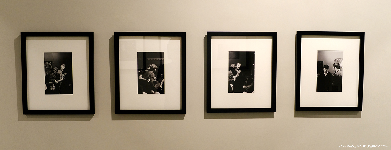
Speaking of telling stories, Samantha McCoy was, also, doing just that in the way she installed the show. As we see in this particularly interesting grouping she chose. Upper left, Dancer Anita Huffington and Willem de Kooning, 1957 NYC, Painter Barnett Newman at a gallery opening, 1957, NYC, right. Lower left and lower right- 2 Photos from the series Jack Kerouac holds forth to an enraptured audience, Seven Arts Coffee Gallery, 1959. As she says, Burt Glinn seemed to be everywhere.

I asked Samantha about the her groupings that seem to tell “short stories” within the larger body, and about her approach to installing this show. She said, “This is a very keen observation, and was definitely on my mind while curating, though I must say Burt’s work lends itself to this type of curation.”

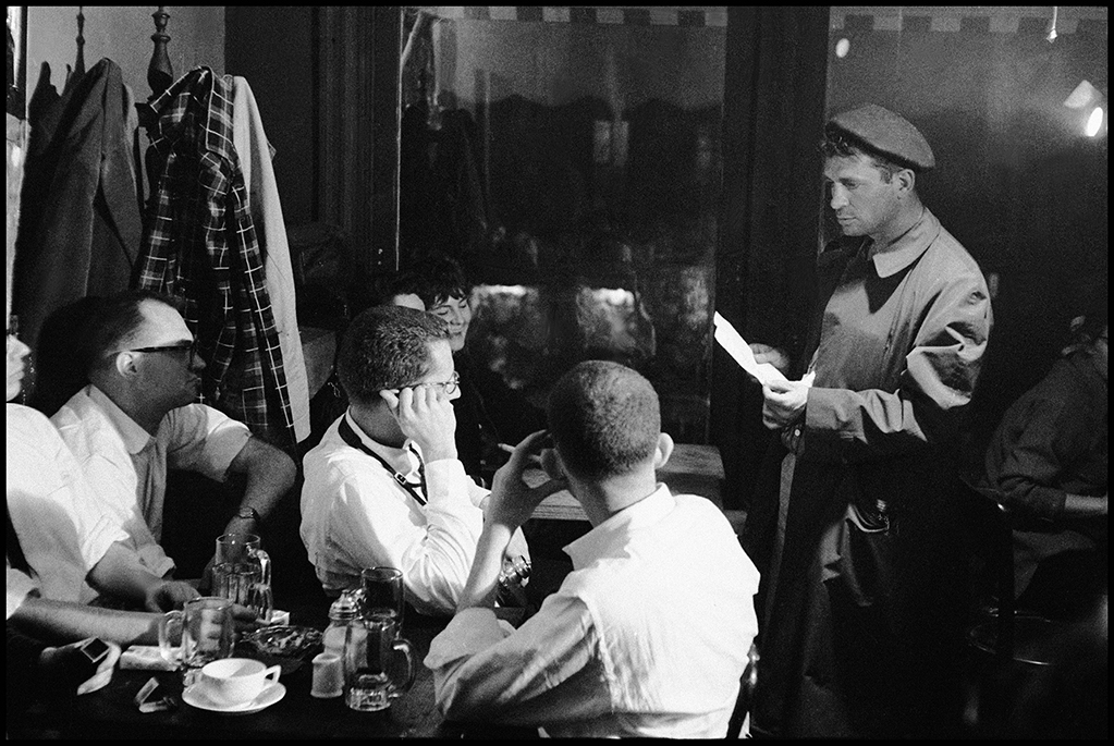
Four from the series, Things get rough. John Rapinic restraints Corso who hurls insults at reporter: “But you don’t understand Kangaroonian weep! For sake thy trade! Flee to Enchenedian Islands”
And foreground, wizened Kerouac plays it cooler, 1959, NYC. That is Burt Glinn’s title for this series!

She continued, “There were so many anecdotes that spoke to me when I was making the edit, so I suppose I was hoping to give each of them life. The Beat life in New York was full of small stories, in different landscapes and pockets of New York. I wanted the viewer to have a feeling of all of them, as well as the scope of this movement.”

This wall, in particular, is full of unexpected intimacies. It starts with LeRoi Jones at home, Newark, New Jersey, USA, 1959, seen, apparently unawares, sitting in the window of his Jersey City home, right, and includes Photos of Helen Frankenthaler hugging David Smith, far left and below, as well as the group of four seen just earlier.

Particularly interesting to me is that these Photos were taken at the exact moment when the first generation Abstract Expressionists were seeing their hold on the cult of culture in NYC begin to gravitate to the Beats3, which would continue well into the Rock ‘n Roll era of the 1960s and beyond. NYC, and indeed, the world, would never be the same.

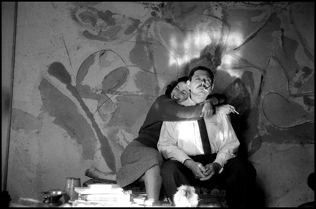
HOW was Burt Glinn able to get this shot? Painter Helen Frankenthaler and Sculptor David Smith in Frankenthaler’s studio, New York City, 1957. My favorite image in the show. David Smith is a very under-appreciated Artist, today, in my view, but not, apparently, by Ms. Frankenthaler.

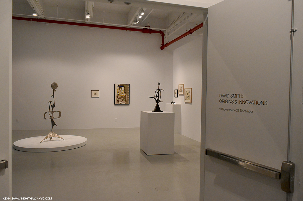
Installation view of the excellent David Smith: Origins & Inventions, Hauser & Wirth, NYC, December 21, 2017.

No less than half of the Photos included in the show (22) were taken in 1957, the year On The Road was published, the very moment the Beats rose to cultural and literary prominence. That same summer, on stage at the Five Spot, the great Thelonious Monk was joined by the equally great John Coltrane, recordings of which were discovered and released in 1993. A further 14 of these Photos were taken in 1959, the year that Jack Kerouac, Allen Ginsberg, Gregory Corso, Larry Rivers, and David Amram, featured here, also appeared in Robert Frank’s legendary film, Pull My Daisy. And, 1959 was also the year that Burt Glinn received the Matthew Brady Award for Magazine Photographer of the Year from the University of Missouri. Heady times, indeed.

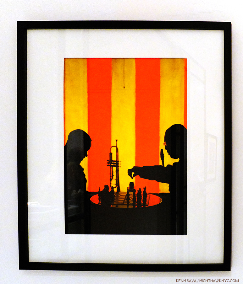
Burt Glinn’s startling color Photos of the Beats are the first ever published. Here- A Chess interlude during a break in the revelry at the Blackhawk, a night spot on the corner of Turk and Hyde Street where eminent jazz performers are often to be found in action. The player making the move here is Earl Bostic virtuoso of the loud  tone alto, 1960, San Francisco.

Although he later went to San Francisco to Photograph the Beat scene there, only one of those shots is on view here. “I really wanted to stay focused on the New York work,” Samantha said.

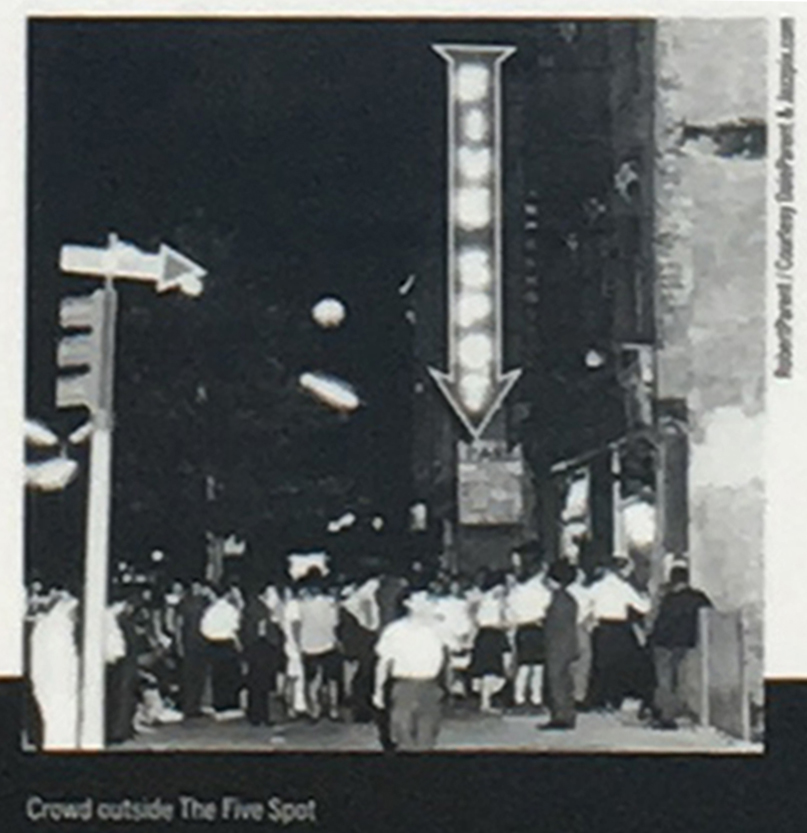
The crowd outside the Five Spot. I love that the sign scream THIS is the place! Unknown date. Unknown Photographer.

In New York, along with the famous Cedar Tavern, perhaps no where was more the place to be in the day than the Five Spot. There aren’t many Photos of the club, or what was going on inside of it, so Burt Glinn’s are an invaluable addition to those we have, taking us right into the midst of it.

Live from the Five Spot. This looks like Burt Glinn was actually right onstage! David Amran entertains at the Five Spot Cafe, 1957. Then, as now, a French Horn is still unusual to see in a Jazz club. Photo by Burt Glinn/Magnum Photos courtesy Jason McCoy Gallery.

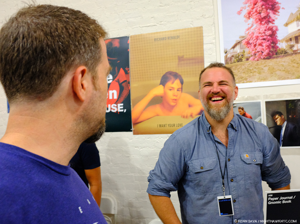
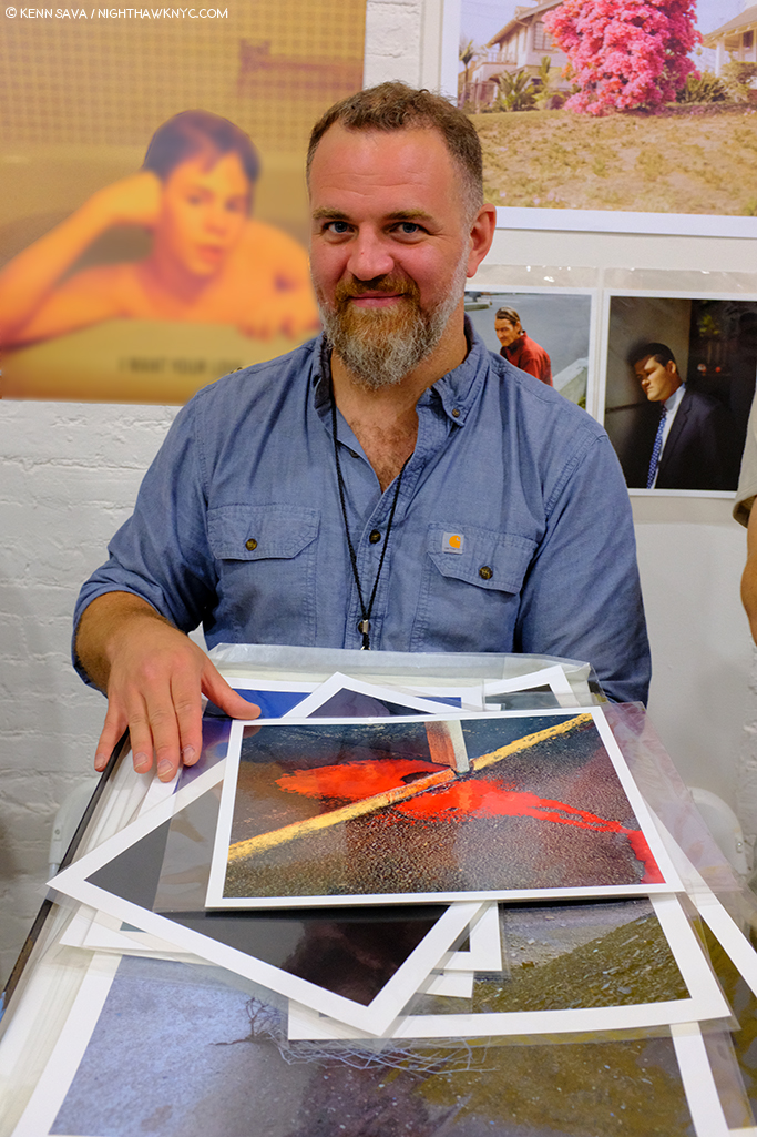
Then, there are the recollections of those who were there4. I asked gallery owner Jason McCoy what he thought of the show, he said, “The photographs and the New York light brought back a nostalgia and sense of smell I associate with tenement hallways in Chinatown and in the Bowery, all places frequented by artists in those days!”

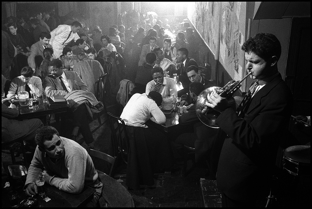
A back table at the Five Spot. left to right are sculptor David Smith, Art guru frank O’Hara, 
a poet; Larry rivers and grace Harriman, both artists; an economist, Sydney Rolfe, dancer Anita Huffington, and Bill Hunter a neurosurgeon. The lady with her back to the camera is painter Helen Frankenthaler. Peak crowd is about midnight. In quieter moments a poet will sometimes read his verse to the music. Bar jumps till 4 AM, NYC, 1957.
A wonderful composition. My guess is that this is the corner seen in the top, right of center in the preceding Photo. Photo by Burt Glinn/Magnum Photos courtesy Jason McCoy Gallery.

During this time, Burt Glinn was not only busy documenting the activities of the famous and the rising stars, he was also, everywhere else. He showed up at parties where none of the “big names” were. He haunted side streets as well as the bars, all of this enabled him to capture the full flavor of the scene, catching its atmosphere as he strove to find its essence. He’s even in Washington Square as the sun rises on a new day catching a lone minstrel with an acoustic guitar putting the night to bed with a song.

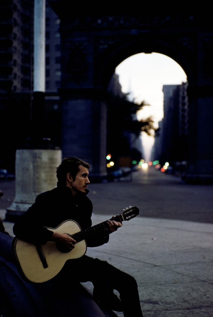
It’s a new day rising. A streak of loneliness runs through these Gordy evenings on the town. Today, a lone guitarist plays the last music of the night, NYC, 1959. Photo by Burt Glinn/Magnum Photos courtesy Jason McCoy Gallery.

No matter where he is, in his photos you’re right there- sitting at a crowded table, having drinks, and discussing literature, poetry, Art, life. You’re hunched in a corner of the Five Spot listening to the band, though you can’t even see all the musicians. Or, you’re listening to the Beat poets recite or test drive their latest creation at 2 a.m. You’re in the studio with Helen Frankenthaler, Willem de Kooning, and others. You’re going over to visit LeRoi Jones…

For the Beats, it was the best of times. Soon, millions of young people (including four lads from Liverpool, England, who would borrow the name) would aspire to be part of what was happening right in front of Burt Glinn’s lens. Back when very few knew.

Walking into history. Samantha McCoy told me chose this work to close the show as a “fitting farewell.” From left to right: Gregory Corso, Allen Ginsberg, and an unidentified woman. New York City, USA, 1957.

Jack Kerouac knew. He wrote a piece to accompany Burt’s Photographs called “and this is the beat nightlife of new york,” which reminded me why I went through a “Kerouac period.” Fittingly, the original was found with them. Where it belongs. Like in a time capsule. A parchment testament of the times.

But not the New York Times, these are the On The Road times. The Dharma Bums times. The Howl times. The Subterraneans times. The ‘Round Midnight times. The Pull My Daisy times.

The times they were a-changin.

5 Cooper Square, NYC, October, 2018.


BookMarks

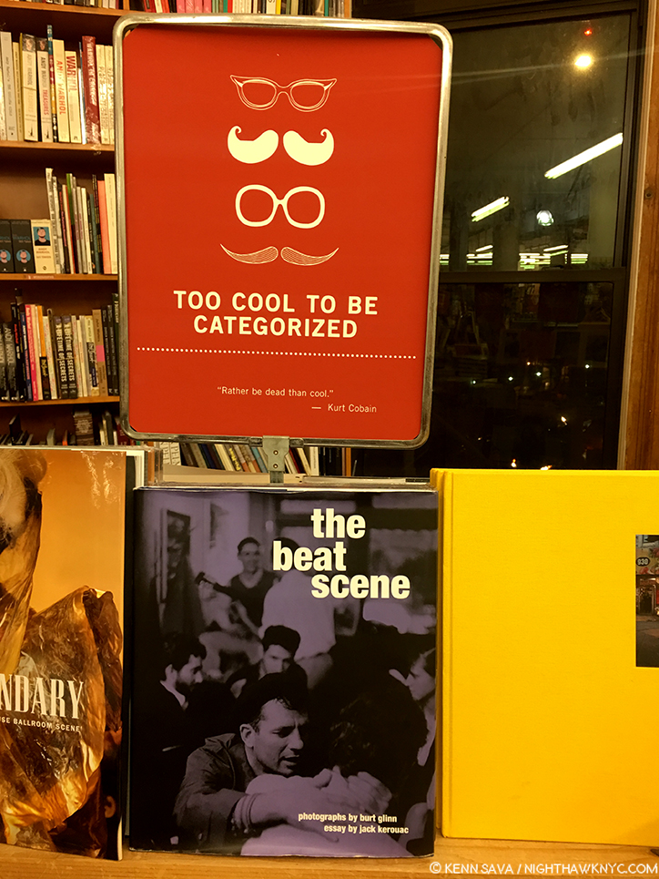
As seen at The Strand Bookstore.

the beat scene: Photographs by Burt Glinn– Includes that terrific essay by Jack Kerouac, “and this is the beat nightlife of new york,” 170 Photographs, including the first 70 color Photos of the Beats in their early days ever published, and many Photos that show more of the public, and private, life of the Beats, the Artists, Musicians and others. It’s a unique PhotoBook because it shows seminal figures in 20th century Art, Music and Literature in close proximity as they live their lives at what was a key moment in each of their lives, and the culture of the world, along with other folks the world either never knew or has already forgotten, who, as Samantha McCoy said, “were more friends and drinking buddies.” Recommended.

Allen Ginsberg Photographs, 1990- is the other classic book of Photographs of the Beats. Ginsberg is a Poet whose work seems every bit as relevant today as it was when he wrote it, and his Photographs came to public attention, and acclaim, late in his life. They deserve the acclaim, in my opinion. Andrew Roth agreed and he included Allen Ginsberg: Photographs in his The Book of 101 Books: Seminal PhotoBooks of the Twentieth Century, one of the standard references on the subject for many. To date, I have only seen 1991 second edition copies and I found the reproductions lacking, though they are printed in a nice size. Perhaps the paper hasn’t aged well, I’m not sure. Perhaps they’re better in the out of print first edition, or perhaps this important part of Mr. Ginsberg’s oeuvre needs a new edition. In that case, unlike Allen Ginsberg: Photographs, he will no longer be able to oversee it, unfortunately. Recommended, if you can find a copy who’s reproductions do justice to the work.

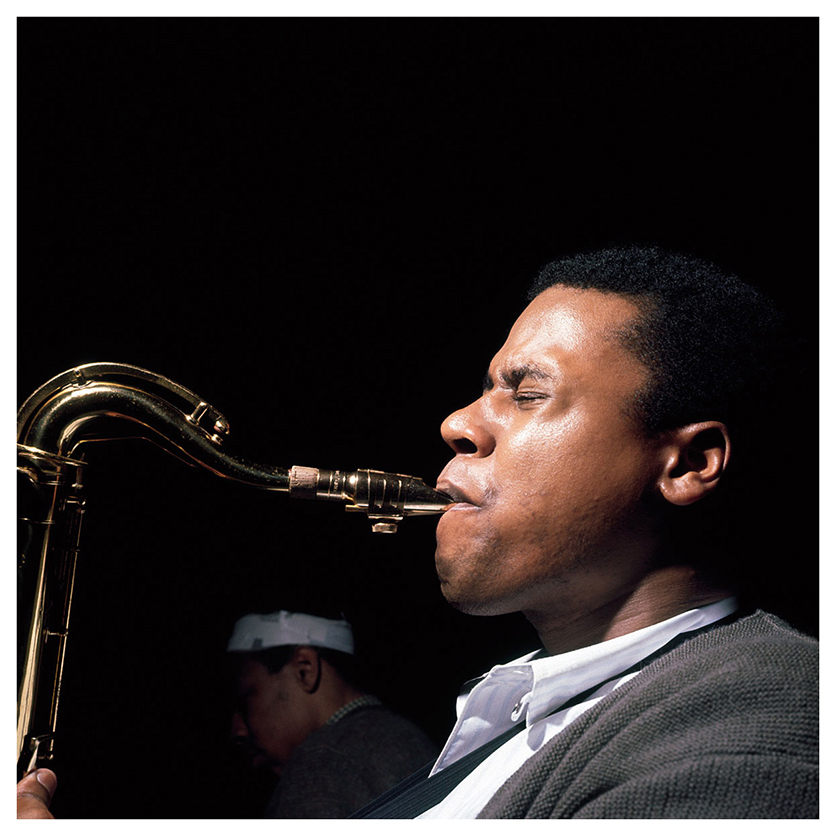
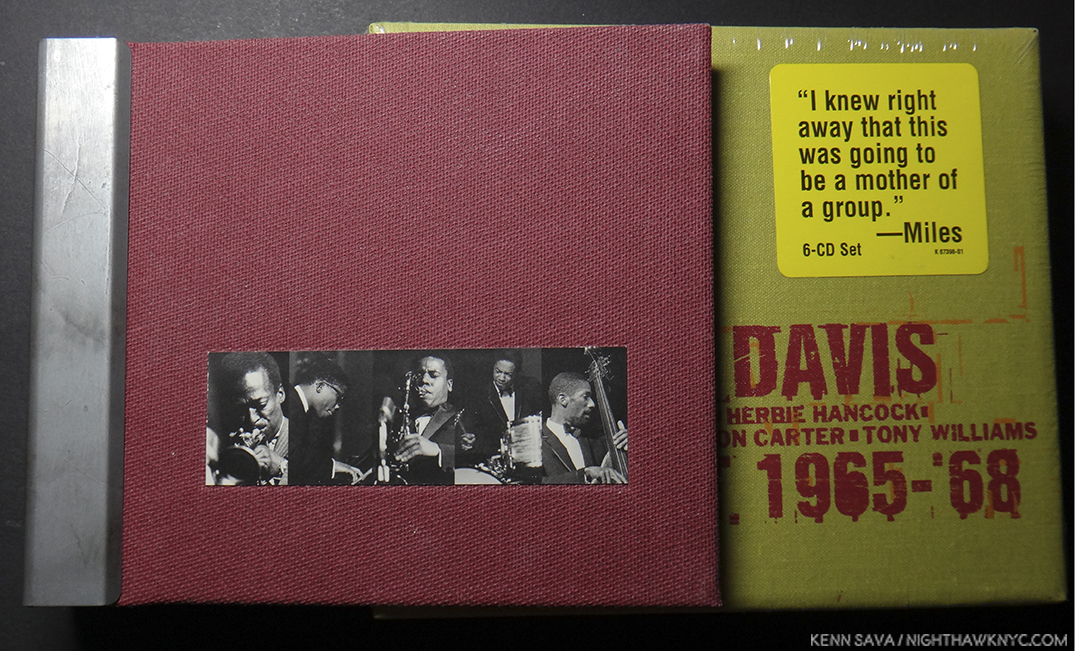
*-Soundtrack for this Post is The Thelonious Monk Quartet: Live at the Five Spot: Discovery!, a very rare meeting of two Musical giants of the 20th century, Monk & John Coltrane, (let alone whoever may  have been in the audience that night), part of which you can hear, here-

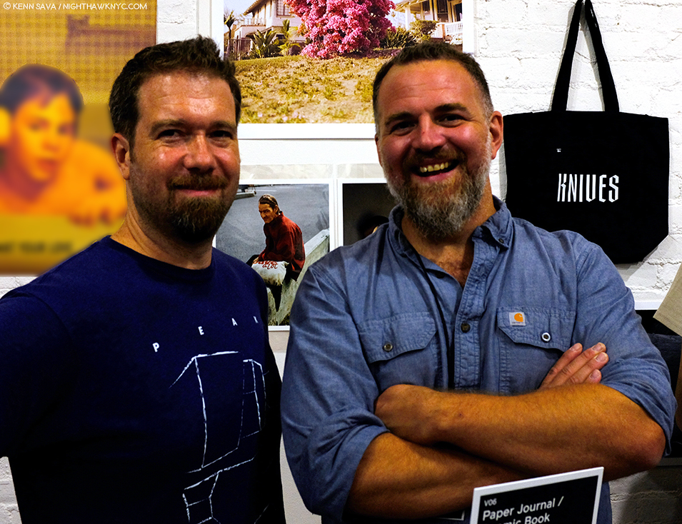
My thanks to Samantha McCoy of Magnum Photos, and to Jason McCoy and Amanda Konishi of Jason McCoy Gallery.

NighthawkNYC.com has been entirely self-funded and ad-free for over 6 years, during which over 250 full length pieces have been published. If you’ve found it worthwhile, you can donate to keep it going & ad-free below. Thank you!

Written & photographed by Kenn Sava for nighthawknyc.com unless otherwise credited.
To send comments, thoughts, feedback or propositions click here.
Click the white box on the upper right for the archives or to search them.
For “short takes” and additional pictures, follow @nighthawk_nyc on Instagram.

Subscribe to be notified of new Posts below. Your information will be used for no other purpose.


  1.  https://web.archive.org/web/20091229204516/http://www.nppa.org:80/news_and_events/news/2008/04/glinn.html
  2. Later, he was given an assignment to Photograph the San Francisco Beats for Holiday Magazine. Some of these images were last, and only, seen there, and in a few other magazines of the time. The rest have not been seen previously.
  3. Partially due to the tragic death of Jackson Pollock, Jason McCoy’s uncle, on August 11, 1956 at 44
  4. You can read the recollections of some of the Musicians who played there, here.

Brimstone And Blood: Q&A With Shane Rocheleau

Written by Kenn Sava. Photographed by Kenn Sava & Shane Rocheleau.

Five Photographs, in the recent Aint-Bad Curator’s Choice, Issue No. 12, and the accompanying interview with Stephen Frailey who chose him to be included, were enough for me to put Shane Rocheleau on my “watch list.” It turned out I didn’t have to wait long to see more.

This Photo is called Broken Stake in the book. I’ve also seen it referred to as Bleeding Stake. As he reminded me when we spoke, a stake has a number of purposes…and meanings. This one also serves to create a riveting image. Photo by Shane Rocheleau from You are Masters of the Fish and Birds and All the Animals. Click any Photo for full size.

Coming upon the Gnomic Book publisher’s table at the recent LES Fotobookfair, Mr. Rocheleau was on hand to sign his new Gnomic release, and first PhotoBook, You are Masters of the Fish and Birds and All the Animals (or YAMOTFABAATA, as it reads on its spine and so, is referred to). There he was discussing what he considers to be a good job of gluing the endpapers as I approached. When he paused, I asked him if I could see the copy he was holding.

You are Masters of the Fish and Birds and All the Animals, by Shane Rocheleau, his first book, just published by Gnomic Book

The YAMOTFABAATA experience begins with the cover, which I swear has hypnotic qualities. The book is so beautiful to hold you don’t want to put it down. Opening it and looking inside, my initial conception of his work was quickly obliterated as I moved through the beautiful volume he handed me. I immediately realized that this was no mere collection of fine Photographs. Each Photo is exquisitely considered- both in its execution and in its placement. Here is a powerful book of visual poetry that casts a far ranging net capturing slices of the essence of the American condition in 2018, in macro and micro terms, with an epic impact that borders on the biblical.

Or, YAMOTFABAATA the first book by Shane Rocheleau, just published by Gnomic Book. It’s a beautiful publication, clad in a stunning iradescent grape fabric called Bamberger Kaliko Duo. Its gleaming gold edging, carrying over the gold of the font. The whole thing has the feel of a Bible, echoing to the quote from Genesis in the title.

I had gone to the LES FBF to see two new books- Kris Graves’ A Bleak Reality, and Jason Koxvold’s Knives, that rarest of PhotoBooks that has its own tote bag (sold separately). While I came away very impressed with both, YAMOTFABAATA turned out to be my biggest discovery at the fair. As I looked through it, and Knives, I was struck by the similarity and the differences of the two books, both published by Jason’s publishing company, Gnomic Book.

Shane Rocheleau, left, with his good friend, multi-talented Artist/Photographer and Gnomic Book publisher, Jason Koxvold, at the MoMA/PS1 Book Fair, September 22, 2018. The spiffy Knives tote bag is seen over Jason’s shoulder.

Some background- Shane Rocheleau received his MFA in Photography and Film from Virginia Commonwealth University (VCU) in 2007. He has taught photography as an Assistant Professor of Art at St. Norbert College in Wisconsin, as an Adjunct Professor at numberous institutions, and presently serves as an Adjunct Assistant Professor at VCU. IMDb lists him as the Writer, Director & Producer of the a 2008 short, TideYAMOTFABAATA is indeed a book that has a cinematic feel to it. As I wrote in my Third Anniversary Post in July, of my intention to ramp up the coverage of Artists who are not “big names” yet, but who are doing great and/or important work that I feel deserves to be better known. Shane Rocheleau is one such Photographer.

Researching Mr. Rocheleau, I was struck by his down to earth eloquence in the interviews I came across. Given the abstract nature of the images in his book, and the lack of any words from him in it, beyond some titles, I decided his voice should be the one featured in this piece, feeling that this would be the best way to compliment his exceptional book. For additional background on YAMOTFABAATA and Gnomic Book, which in two short years has gotten off to an auspicious start, I also reached out to Jason Koxvold with some questions, and his answers I weave into the following discussion with Mr. Rocheleau.

The first image in the book reminded me of the planets aligning in Stanley Kubrick’s 2001, until I discovered its title. Musket Balls. A fitting opening salvo, given the subject matter. Photo by Shane Rocheleau from YAMOTFABAATA

Kenn Sava (KS)- Let’s start near the beginning, Shane…When did you first become interested in Photography?

Shane Rocheleau (SR)- First day of classes a couple weeks ago, I asked my students a similar question: “I didn’t discover photography until my freshman year of High School”; “In fifth grade”; “When I was three”. That artists are discovering photography so young is wonderful news for the medium. Photography found me when I was 22.  Two friends of mine and I went cross-country in a 1990-something blue Ford Escort Hatchback. I had no illusions that I’d write the great American road-trip novel, but I figured I’d try anyhow. First night, we camped on the shore of Lake Eerie.  We awoke next morning seeing sparks and feeling the gasoline running through us, intent on getting elsewhere. My buddy handed me his little Kodak Andvantix camera: “Take a pic of me at the water’s edge.” “Yup, got it.” When I released the shutter (and I’m very sorry for the pun, but) something clicked. I really never gave him that camera back. Every town we hit I went straight to the drugstore to find film. Photographically, I’m still on that trip. (Suffice to say, the novel didn’t get written.) 

KS- What, or who, were your influences?

SR- It was somewhere in Wyoming in July, 1999 that I said to myself, “I think I want to be a photographer.” At that moment, I knew of exactly one photographer: Ansel Adams.  Through him, I discovered Edward Weston, Minor White, and Wynn Bullock. The latter two became my heroes. And for several years, I knew very few others, maybe only Richard Avedon. I’ve always tended toward the hermitage, and my hermitage kept me fairly naïve in those pre-Google days.  

In the last decade, though, I’ve been endlessly influenced!  To name a few:  Ron Jude, Heikki Kaski, Dana LIxenberg, Alec Soth, Katrin Koenning, Bill Henson, Brian Ulrich, Cig Harvey, Greg Halpern, Robert Bergman, and on and on.

Narcissus. Photo by Shane Rocheleau from YAMOTFABAATA. To read Mr. Rocheleau’s comment on Ovid’s Narcissus, click this footnote1.

KS- I’ve seen some of the images in YAMOTFABAATA previously in A Glorious Victory online- What’s the genesis of YAMOTFABAATA?

SR- My collaborative project (with Stanley Wolukau-Wanambwa and Brian Ulrich, primarily), A Glorious Victory, is about Petersburg, Virginia, and one I worked on immediately following Oyster Park, (a series of pictures I made 2011-2013, when I spent days and night hanging out with a local group of homeless men). While it’s impossible to pinpoint the moment YAMOTFABAATA began, it may have been when one morning a prospective portrait subject walked me around to the front of the motel where I’d been spending time. The police, medics, and press had gone, but the murder scene remained, seemingly untouched (“Site of the Death of Edward Jones”).  The rich red vestiges of a man’s life left me drained and scared and liminal.  I didn’t make a picture for another month. My guess is that when I picked the camera up again, it began turning away from Petersburg and toward myself. Slowly out of this inflection point rose YAMOTFABAATA.

George’s Camp in Snow, from Oyster Park. About as clear of a definition of “homeless” as I’ve seen, and one of the most poignant. Photo by Shane Rocheleau.

KS- You’ve taken numerous Photos of homeless people, including those in Oyster Park, which is about them, as you say, and again in YAMOTFABAATA, where they are one element of the larger picture. When did you begin to take Photos of the homeless? Was it hard to gain the confidence of these folks?

SR- I moved to the Southside of Richmond in 2012. After work each day, I would take my exit home and pass a group of men who shared the corner at the bottom of the ramp. I lived just three blocks from where these men spent their days. On closer inspection, I realized there were tents everywhere, hidden if one doesn’t think to look. These men were my neighbors. Over a few months, I just couldn’t shake that “homeless” men may be the most objectified demographic in our country. One day I stopped my car and walked up to Deano, Lee, Juan, Bob, and George. 

Deano and Kitty Kate. One of the Photos that appears in both Oyster Park and YAMOTFABAATA. Photo by Shane Rocheleau.

I told them who I am, that I’m a photographer, and asked could I sit down and talk? And they welcomed me. Some were more wary than others, but each of them, over many months, opened up to me; as did others who later arrived into this little community. I can’t remember the catalyst, but several weeks later, I made my first pictures. I hung out day and night, learned about their lives and they about mine; and, I made pictures. After 18 months, the shape of the area drastically changed, their tents and belongings were discarded by developers, and though I was able to keep in touch with some of the men initially, I haven’t seen any of the men in many years. The men of Oyster Park taught me more about life and humanity than anyone or anything before or since. I’m so grateful for my time with them.

KS- YAMOTFABAATA‘s Photographs seem to be taken in various places. How long did the project take to shoot, and then to put into its final form?

SR- The pictures in YAMOT were made mostly in Virginia. There are several from Tennessee, as well, and one each from California and Alabama.

Behind the scenes. Even a torn achilles injury, devastating for us mere mortals, didn’t keep Mr. Rocheleau from creating Photos for YAMOT. Here he (at least his booted foot) is seen using his Toyo 45cf 4×5 field camera at the scene of what is now the Photo ——– (redacted. My read is Fallen Tree) in the book. Photo from Shane Rocheleau’s Instagram feed, June 24, 2016.

I made pictures exclusively for this project for about two years, but its first pictures were made several years earlier. The final form of the book took shape over a year and a half, and then, near the end of that process, I made several new pictures in a flurry of excitement and desperation. Though the book had been essentially finished, I now can’t imagine it without at least two of those new pictures: God and War (Inheritance), and, Untitled, which is a picture of my daughter. They feel necessary.  

KS- Among those places, you’ve Photographed Virginia for a number of years, where you live and teach (I believe), what is it that particularly appeals to you about it as a subject?

SR- I live and teach in Richmond, VA. The narrative of American History criss-crosses Virginia through parts of five or six centuries. It feels like it’s all here: our earliest settlers and their struggles, John Smith, early treaties with and betrayals of Native Americans, the birth of our governing philosophies, Slavery, the Civil War and Confederacy’s Capital, John Wilkes Booth, Jim Crow, Free Black settlements, World War II and the military, the rise and fall of manufacturing, Civil Rights, 9/11, and so on.  

But, truly, I photograph here because I live here. I’m just lucky that Virginia is so narratively and historically rich.

Photographer & Publisher Jason Koxvold, facing with his arm on the table, and Photographer Shane Rocheleau, right, discuss the finer points of their terrific new books at the Gnomic Book table at the LES Fotobookfair, July 21st, 2018, the day I discovered YAMOTFABAATA.

KS- How did you come to meet and work with Jason Koxvold and Gnomic Book?

SR- Our mutual friend, Stanley Wolukau-Wanambwa, used to host photographer gatherings at Jason’s Brooklyn studio. On occasion, I’d drive up from Richmond to partake. Stanley and I would arrive early, and Jason and I invariably hung-out before the raucous arrived. We became easy friends. The very last one of these gatherings, Stanley snuck my book dummy. Jason was the first to look at it that night. Soon after, he started Gnomic. I received an email one morning about a year later; he asked if I might consider that YAMOT be its second project.

Spend any time around these two Artists and it’s immediately apparent what good friends they are. There’s an important lesson here that obviously translates directly to the quality of their end product.

I was close to publishing elsewhere, so I felt immediately reticent. Jason is driven and smart and talented. And he’s my friend. I wanted to work with a friend, with someone I knew I could trust. In the end, it felt obvious and simple.  

KS- The book is an exceptionally beautiful object. You’ve spoken about the trip to Germany to print it, could you talk a bit about the planning that went into it? What role did Jason & Gnomic play in its realization?

SR- Jason and I Skyped or met almost weekly between December, 2017 and early March, 2018, when we departed for Germany. Each time we had a general agenda and discussed those items: design, sequence, materials such as paper type and fabrics, distribution, the Kickstarter campaign, where to print, whether to take a boat or a plane to Europe, font, the sources of my anxieties as best as we could identify, size of letters or pictures or drawings or run, whether this thing or that thing should be centered or just look centered, and so on. We beat to pulp any detail bigger than a quark. 

Though we each gave the other lots of feedback: ultimately, our roles were fairly distinct. I sequenced the pictures, chose the text, and prepared the files for printing.  Jason designed everything. He chose the font and the fabric, designed the layout, created and kicked-off the Kickstarter, and planned our European caper. I’m so thankful to have found such an energetic, talented, and supportive partner in the realization of YAMOTFABAATA.

At this point, I’m bringing Gnomic Book founder/publisher Jason Koxvold in.

The multi-talented Jason Koxvold, who’s Gnomic Book is quickly becoming one of the most important newer PhotoBook publishers in the world. Here, he gives me a peak at a secret- Shane has made a few signed prints from YAMOTFABAATA in two sizes that are indeed for sale! Two portraits, in the smaller size, may be seen behind him on the right in this Photo are 100.00 each. The beautiful, larger size, that Jason is showing me are 200.00 per. You heard it here, first.

KS- Jason, how did YAMOTFABAATA come about from your end?

Jason Koxvold (JK)- In 2016 I was fortunate enough to see a maquette that Shane had made of his book, and it immediately resonated with me. As we became closer friends, we started to talk about publishing the book. Shane is one of the most intelligent people I know, deeply intuitive and yet rigorously thoughtful, so the process of editing the book and rationalizing design decisions was a pleasure.

KS- At the LES Fotobookfair, I was enthralled listening to stories told by publishers and artists about the finer points of bookmaking. Given this is your first book, and since so many Photographers are interested in making PhotoBooks, how did you learn so much about what to look for that you used in making YAMOTFABAATA such an exceptionally beautifully produced book your first time out?

Shane Rocheleau- Firstly, I have many wonderful, giving, and engaged friends; many looked very closely at the many manifestations of this project. Their feedback was invaluable and inspiring. Without those whom I thank at the end of the book, there is no book.

I look at Photobooks weekly. Even if unconsciously, I’ve learned a rich Photobook language through this practice. I’ve thought enough about my new lexicon that some of my decisions felt rather natural and intuitive, like speaking. But honestly, that production value is on Gnomic. Jason is uncompromising on quality. I think it’s beautifully done, too; I didn’t imagine it would be this beautiful.    

KS- What was the most difficult part?

SR- Printing day front flanked me; I marched with the work toward it. I’d never needed to commit so fully to artistic action. Nothing was more difficult than finally yelling charge and letting the work go, committed and flawed and unfinished, off to the printer, off my desktop, dispossessed. I felt beleaguered, like a lonely, impotent General slumped in a three-legged chair. (Except no violence or gore or threats to life and such.  How privileged am I that that’s one of the more difficult things I’ve done in years?)

Excerpt of the Title List

KS- The Title List is sure to fascinate readers. 20 out of the 50 images have their titles fully crossed out, another 10 are partially crossed out. If a reader is really determined, they could most likely still make out many of the crossed out titles. Without giving away the mystery, could you speak about why you decided to do it this way, and why you decided to use the black marker instead of naming them “Untitled?”

SR- I don’t mind “Untitled” as a title. I do mind 40% of pictures titled this way. I don’t like that sort of redundancy. But I also don’t like when titles give too much away. With that said, some titles – and the information carried therein – were absolutely necessary for the book’s narrative (think Patrick Henry’s words, or that the building near the end is a Federal Reserve Building). My quandary then:  how do I balance that I want to withhold information and avoid repetitively titling pictures “Untitled” and provide the information I deem integral to understanding this book?

I’ve used redaction in past projects, so I already had the language at my disposal. Given that redaction is an indispensable element of propaganda and indoctrination, the solution seemed almost obvious once it suggested itself to me. Plus, it’s interesting to look at. The unintended benefit of this solution is that the title page is part of the art rather than a perfunctory addendum.

KS- Another element is the fairly frequent use of blank pages. I counted over 50 including 5 sets of double blank (facing) pages. In many cases, they serve to set off an image on the opposite side, which is common in PhotoBooks, though their appearance, particularly in the use of facing blank pages, feels unpredictable. Are they purely there as a means of pacing the images, or…?

SR- In music, there are breaks.  Those breaks signal a shift and are necessary for establishing rhythm. I love thinking of Photobooks as musical. I tried to sequence and break YAMOT musically, if you will. But with that said, I know no more about music than what I’ve gleaned while listening. My best instrument is my voice, and it’s not good.

Also, while a book requires that individual pictures be sounds in a larger symphony, I also wish for each picture to be a self-contained piece. As you note, much of the book has one picture per spread, alone in space; of course, each still generally follows and is followed by another. This solves my need to eat my cake and have it, too.

KS- There’s so much that YAMOTFABAATA has in common with Knives, your publisher, Jason’s, terrific new book. Both deal with the failure of promises and institutions, the realities brought on by a changing world bringing shrinking opportunity in the USA for many, and the state of the country the white majority has created  Your’s is more abstract, while Jason’s is more documentary. Jason’s looks at life in the Hudson Valley, after the loss of its 150 year old cutlery industry, and your’s looks at a wider realm. Still, they’re two sides of the same coin in so many ways. Is that coincidental?

SR- On the one hand, it’s absolutely coincidental. Jason and I each began our respective projects independent of the other. On the other hand, Jason and I are friends.  We have conversations, many of the same concerns, and, as fairly well-off white dudes, similar experiences in the world. He thinks deeply about his position, and I try to, as well. It is not a coincidence that as persons participating in the same on-going conversation – on whiteness and race, poverty and opportunity, privilege and responsibility – we would independently make work addressing those very things. Indeed, many of my photographer friends are making work that at least obliquely confronts these same cultural difficulties, ills, and realities. 

Knives by Jason Koxvold.

KS- I then asked Jason if he hesitated to publish YAMOTFABAATA because of its similarities to Knives, or if he saw it as “complimentary.”

Jason Koxvold- Shane and I were both coming at the same themes from very different angles; in that regard the two can be seen as complementary to some extent. I like that in viewing both, readers might build some kind of mental Venn diagram in terms of where our ideas overlap and where they don’t.

KS- On the Gnomic site, it says that the focus is on exploring the notion of the book as object, which is easy to see with Knives, its sister book, You were right all along, (or YWRAA) and YAMOTFABAATA. As far as YAMOTFABAATA goes, what were the particular challenges in making such a beautiful book?

JK- Each book we produce is an attempt to make something greater than the sum of its parts. With YAMOTFABAATA we wanted to echo the quality of religious texts in the form of our book, using an iridescent purple cloth, gilded edges on the book block. Each of these decisions incurs some level of cost and technical challenge; our printer had to outsource the gilding to a company that specializes in bibles. Fortunately, working with experienced craftsmen in ‘Old Europe’ gave me a great deal of confidence in the process.

KS- Given your diverse and successful background, why did you decide to start Gnomic Book?

JK- I wanted to leverage and combine skills which I had acquired over the course of my career to make objects that have some kind of permanence, collaborating with different artists to do so. It’s truly a mutually beneficial process.

Harrison, or White Whales. Photo by Shane Rocheleau from YAMOTFABAATA

KS- Before I actually saw it, I heard the book is ostensibly about white masculinity. That turns out to be true, as it shows what those in power and their institutions have made of the world. However, none of the white men depicted seem to be enjoying themselves or their “status” in the world. Then, there are other themes that run through the book- religion, decay, death, national institutions, and hovering over all of it, the power of nature to superimpose its supreme will on man at any given point. That’s a lot to take on in one book. Did it feel that way when you were making it?

Shane Rocheleau- There is a contradiction driving white male rage in this country: at the top, white men still reign. Women and minorities represent less than 20% of congress, for instance. But uniformity at the top is belied by a slow progression toward equality in the body politic.  White men in this country are raised by parents and the American Dream alike to believe power and supremacy are their personal destinies. Except it’s not, not for most white men. Many white men, like so many other demographics, are struggling.  (And for those who aren’t struggling so much? Loss is loss, even to one who still has more than everyone else.) Increasingly, white men must settle for less than supremacy. While you and I know this to be right and necessary, I imagine many white men have not resigned to relinquishing any of the historical spoils of being born white and male, especially when in both cultural messaging and the demographics of power, the opposite is suggested. It’s important to me that I seek to empathize. The men in my book, largely, represent this contradiction. I wish I knew how to demonstrate that equality is not a zero-sum game. The lesser the inequality, the happier and more decent everyone becomes, bottom to top.  

To your question about taking on so much in this book: I’m always some version of overwhelmed and confused, so inasmuch as I always feel a bit like I’m taking on too much, it absolutely felt that way when I was making this work. With that said, I wanted to address each of those themes you highlight. It was a fun problem to solve: how do I weave so much into so little? My answer is my book. 

Jaime. Photo by Shane Rocheleau from YAMOTFABAATA

KS- The 4 women in YAMOTFABAATA each seem lost in thought. In Jason’s “Knives,” one of the final Photos is of a mother who stares out at the camera while holding a young child. In your book, your daughter is seen in the final image. In it, we see her through what appears to be a rain streaked window, where we can barely make out that it’s a young woman, but, as in many of the other portraits in the book- of male and females, we can’t see her eyes. I see dread and melancholy in this image. How is the young woman going to deal with all of this metaphorical “rain” in the world? The window is made of glass, and so provides limited protection from the world while allowing a chance to see it outside. Perhaps, she’s sleeping through the storm. Perhaps she’s lost in a dream, or lost in thought, or worry about it.

SR- I appreciate that reading. And to continue it, maybe, after the storm’s climax: the rain should let up, as rain does. The young woman steps outside. The gentle day drips and refracts little miracles, smelling of nectar and the dusty after-rain. And then the flowers grow, the bugs buzz songs under a symphony of chirping, and the world in her eyes can be new and open. For my daughter, and everyone else, I hope this is the case and that after the storm it’s better than before:  kinder, calmer, with less disparity and more community. As I write this, though, I’m scared I hope for too much, and I don’t know if I’ll be there for it anyway, if it does ever manifest. Maybe it will, and maybe that’ll be my daughter’s book.

My Dad, Photo by Shane Rocheleau from YAMOTFABAATA

KS- Elsewhere, your father is included, and there’s a “Self-portrait,” interestingly showing only your right arm and hand, which you probably use to take your Photos with. These, and the Photo of your daughter add to the autobiographical nature of the book. How did they feel about being included?

SR- My daughter refuses to be photographed. I got lucky with this picture: I was making a picture of my girlfriend’s mother, Holly, seated right there where my daughter is seated.  My daughter wanted to help. Because I needed to direct Holly and she is seated inside a closed car, I called her cell phone. She placed it on speaker then on the passenger seat. I gave my daughter instructions for Holly, and she relayed those instructions through my cell phone. After we were finished, I think my daughter was taken enough by the whole experience (and hopefully by all the wonderful seeing!) that, for the first time ever, she asked if I could photograph her. Absolutely!  

But while myriad subsequent gestures suggest she’s really happy to be a part of the book, she hasn’t explicitly said so (she’s not just in a picture and the subject of the dedication:  she also hand-wrote the title for the title page and drew a little drawing that’s hiding toward the end). As for my dad: same. I think he’s happy to be part of it, but he’s thus far kept it to himself. Everyone has those things they haven’t the tools to express.

Site of the Death of Edward Jones. Unforgettable. Photo by Shane Rocheleau from YAMOTFABAATA. It also appears in his series, A Glorious Victory.

KS- I will preface it by saying I’ve learned the hard way not to ask about specific works less the answer takes away some of its mystery. I’m hoping that won’t be the case if I ask you about Edward Jones, as in “”Site of the Death of.” I haven’t been able to find out who this might be.

SR- Edward Jones is the man who bled out above that spot. He was shot in the head in a drug deal or burglary gone wrong. I arrived at the motel where he was staying to make pictures of another resident, unaware what had transpired just hours earlier. Though the police had left, the blood that had dripped from the second floor onto the parking lot below remained. It was the most horrific thing I’ve ever seen and felt. And that’s the short story. As for where? Petersburg, VA. I felt like I needed to name him. It felt like the right thing to do, rather than entitle the picture “Site of Anonymous Man’s Death” or something of the sort.

KS- In the midst of so much darkness we move through in YAMOTFABAATA, and the white-male led world today …so many failed promises, including “the American dream,” so many broken institutions, including religious ones, there’s also the ever-present possibly of disaster…man-made or natural, all of which is poetically rendered in your book. The images speak to a world that’s cracking, not seemingly working for anyone depicted, particularly the deceased Edward Jones. YAMOTFABAATA leaves me feeling that it’s hard to have hope in 2018. You appear in the book as an older version of your father’s child, with your own child appearing at the end. And so, you’re in the middle. As much as the book looks forward to your daughter’s generation, it’s also a looking back on your father’s and our generations. It’s obvious that things didn’t get this way in one day, and the weight of history is, at this point, daunting. Given all of this, why did you decide to dedicate it to your daughter?

SR- In the ways I know how, I am working to make my world a better place than it was before me. I think both my parents really did try to do the same thing. They raised me well, lovingly, to be a kinder, more open human being than was recommended to them.  I’m empowered by this demonstration in my life of how to actively make things better than they were. I want my daughter to be empowered by the same demonstration. I hope I raise her to be a decent and active participant in whatever community she finds herself. Like her picture, the dedication is an act of faith in the face today’s discord; I can’t tell the future, so I won’t suggest to her that discord is inevitable. She has power.  I hope she uses it for good, and better than I’ve used mine.

——- Cellar Door The first three words are redacted, hidden under a black marker strike through. My reading is From Under The Cellar Door. Photo by Shane Rocheleau from YAMOTFABAATA.

KS- Since NHNYC was originally primarily a Painting site, until it was hijacked in the dead of night by Photography in late 2016, I have to ask you what, if any, role Painting has played in your Artistic life and development.? (If any, which Artists or works?)

SR- I grew up loving Picasso. I think he taught me that strange can be good and about balance inside a frame.  When I studied a bit of art in college, I found myself compelled by the Hudson River painters, Caravaggio, J.M.W. Turner, and Rembrandt Peale, amongst others. More recently, I’ve loved Lucien Freud and John Currin. I’m guessing you can tell by this list, though, that I’m not exactly keeping up with the trajectory of painting. I can say this, though: I work my photographic files very much like I imagine a painter might. I add and subtract color and tone in strokes, attempting to create a canvas that can instruct and contain the viewer’s eye. I fear, though, that even in saying that, I sound a bit naïve!

KS- You thank Gregory Halpern. Being very taken with his work, myself, as I’ve written many times, what was his involvement in this…if he was?

SR- I don’t know Greg that well, but I respect him immensely. He’s as good a person as he is an artist. Greg was not involved, per se. But at that same photographer gathering I spoke about earlier, he was the last person that night who looked at my book dummy.  The next day, he, Stanley, and I were walking in Manhattan and Greg pulled me aside. He apologized for not commenting on the dummy the night before. Still reeling that anyone saw it – nevermind one of my heroes – I froze. He told me he loved it and asked if he could recommend it for a fairly major prize. That moment drew me as close to vertigo as I’ve probably ever found myself. He told me that my “pictures are meant to be seen”. Because of Greg’s gesture to me that day, I have a blessing to allow for just that.

KS- You’ve spoken about thinking of music while you were editing and sequencing YAMOTFABAATA. Do you listen to music while you Photograph?

SR- I don’t. I photograph with only the sounds of my environment, and when I’m under the dark cloth, I don’t even hear them. But when I’m editing? I blast music! You’re likely to hear Radiohead, Tom Waits, Mazzy Star, Pearl Jam, Tragically Hip, David Bowie, Lou Reed, Pink Floyd, and 80s hits, amongst others!

KS- The book has gotten quite a bit of critical notice already. Does that surprise you?

SR- Yes, I’m totally surprised. I believe the work I’m making is relevant and worth seeing, but I also understand that there are significant challenges getting work in front of an audience beyond my small community of friends and artists. I’m so happy YAMOTFABAATA is getting noticed.  I never expect exposure. This is a wonderful surprise.  

KS- Finally, with your busy life, have you had any time to think about your next project?

SR- I’m deep into my next project. Though it’s still shape-shifting too fast to capture, I’m really excited about it.  It’s about the smallness of a human being, paranoia and his ascetic’s loneliness, oblivion and artifacts, spiders and webs and life-cycles…if any of that makes any sense at all. I guess we already covered that I’m generally overwhelmed and confused; I’m also generally excited by my work, in spite of all the persistent liminal turmoil!


BookMarks

Good friends make very good books…and a bag.

YAMOTFABAATA, which contains 56 color plates, is currently available in a first edition/first printing of 500 gorgeous copies, which are not going to last long. It may be purchased here, or here.

Jason Koxvold’s Knives (and its tote bag), may be ordered here, or here, 

Aint-Bad Curator’s Choice, Issue No. 12, may still be available here. If it says “sold out,” email them directly and ask. They told me recently there are a few copies left. It contains 15 curators each getting a section, who choose 31 Photographers between them, representing what they feel are “the best of contemporary Photography.”

*-Soundtrack for this Post is Karma Police, by Radiohead from 1997’s O.K. Computer. Lyrics are here, video, right here-

My thanks to Shane Rocheleau, Jason Koxvold and Kris Graves.

My previous Posts on Photography are here

NighthawkNYC.com has been entirely self-funded and ad-free for over 6 years, during which over 250 full length pieces have been published. If you’ve found it worthwhile, you can donate to keep it going & ad-free below. Thank you!

Written & photographed by Kenn Sava for nighthawknyc.com unless otherwise credited.
To send comments, thoughts, feedback or propositions click here.
Click the white box on the upper right for the archives or to search them.
For “short takes” and additional pictures, follow @nighthawk_nyc on Instagram.

Subscribe to be notified of new Posts below. Your information will be used for no other purpose.


  1. Shane Rocheleau- “I’ve been meditating on empathy for over a decade, now, on its receipt and provision and on its absence. But when I read Ovid’s Metamorphoses, empathy became immediately central to my practice. Upon a closer reading of the Narcissus myth, I realized it isn’t about Narcissism at all; rather, it’s about the power and necessity of empathy. Narcissus is not a Donald Trump; he is a beautiful boy living in a Greek culture wherein beautiful boys are lusted after and objectified (this culture does the same to young, magazine-thin women, for instance). When Narcissus kneels to the pond, he sees his reflection and remarks:
    I reach, your arms almost embrace me, and as
    I smile, you smile again at me; weeping
    I’ve seen great tears flow down your face (…)
    Narcissus had only ever seen lust and admiration in the eyes of others; never had he seen his complex, human emotions returned to him. That new experience felt so necessary that he stays with its giver, forsakes sustenance, and ultimately dies.The combination of my giving this ancient character overdue empathy and coming to understand that empathy is this powerful and necessary was a profound and important personal experience. I am a better artist and person because of it.”

A Conversation With Photographer Harry Gruyaert

Written by Kenn Sava. Photographs by Harry Gruyaert.

Harry Gruyaert is a mystery to me.

I wonder…HOW does he get such miraculous, beautifully atmospheric Photographs, over and over, again? It doesn’t matter what time of day,

Los Angeles, California, USA, 1981. Photo by Harry Gruyaert/Magnum Photos. I came across a print of this work in June and realized that I hadn’t done a deep dive into Harry Gruyaert’s work. Well? It’s summer. Into the pool!  Three months later, I’m still immersed in the sheer joy of looking. Click any Photo for full size.

or night it is.

Launderette. Town of Antwerp, Flanders Region, Belgium 1988. Photo by Harry Gruyaert/Magnum Photos.

What the weather is,

Ostende, Belgium, 1988. Photo by Harry Gruyaert/Magnum Photos.

or even what’s going on.

Commemoration of the Battle of Waterloo, 1981, Village in the Province of Brabant, Belgium. Photo By Harry Gruyaert/Magnum Photos.

And, he’s been doing it for going on 50 years now.

His Photographs will make you stop and wonder- What’s going on here?

Rue Royale, 1981. Brussels, Belgium. Photo by Harry Gruyaert/Magnum Photos.

Or, marvel at the almost magical combination of elements coming together in a split second of time,

Parade, 1988.Flanders region, Province of Brabant, Belgium. Photo by Harry Gruyaert/Magnum Photos.

any time,

Galway, Ireland, 1988. Photo by Harry Gruyaert/Magnum Photos.

any where.

National Communist party congress, Trivandrum, India, 1989. Photo by Harry Gruyaert/Magnum Photos.

But, the biggest mystery of all, for me, is WHY is he still so relatively little known in the USA?

His name is heard nowhere nearly as often as his fellow contemporary Masters of color Photography- William Eggleston, Saul Leiter, Stephen Shore, and the rest. As I write this, there are only TWO books of his work in print here (see BookMarks at the end). Yet, I find, his work has a richness and subtlety, those gorgeous colors he’s legendary for, all in the service of a mystery, like an untitled still from a movie (sorry, Cindy), that brings me back to have another look, again and again. His work can stand right alongside that of his peers, and it will hold its own alongside any of them. Even beyond contemporary Photography, Harry Gruyaert’s work, also, speaks to the lover of Painting in me. His is that rarest of work that touches some of the same nerves that Edward Hopper is, perhaps, most renowned for- the insular loneliness that defines modern life.

Covered market, Bairritz, France, 2000. Photo by Harry Gruyaert/Magnum Photos.

Born in Antwerp, Belgium in 1941, he joined Magnum Photos in 1981, as admittedly, and somewhat controversially, the first and only, non-PhotoJournalist in the legendary group. 37 years later, he’s still a member, and is it only a coincidence that the current roster may be the most diverse in its 71 year history? Still going strong, 2018 is turning out to be a big year for Harry. First, the Harry Gruyaert – Retrospective at FOMU Foto Museum in Antwerp, Belgium, from March 9th to June 9th, 2018, while the feature length documentary, Harry Gruyaert Photographer, premiered this summer. Meanwhile, this past Saturday, September 8th, saw the opening of his new show at Antwerp’s renowned Gallery Fifty One. The show is titled Roots, and features work Mr. Gruyaert created in his native Belgium, where his “roots” are.

I’m thrilled to say I had the privilege of speaking with Mr. Gruyaert in France after he just returned home from attending the opening of Roots, and in a far ranging interview, I was fortunate to ask him every question I could think of that I have yet to see asked of him thus far. What follows is not a blow by blow biography. It’s meant to fill in the gaps in what’s been written about Harry Gruyaert thus far. And so, it’s meant to intrigue, to inspire you to delve further into his long and rich career. I quickly discovered that he is not one to mince words. Hold on to your seats, and prepare to meet a living legend, who’s bursting with passion in his mid-70s. Ladies and gentlemen, my conversation with Harry Gruyaert on September 11th, 2018…

Before I could get a word out, he said…

Harry Gruyaert- I liked what you did on Saul Leiter, so…

Kenn Sava- Oh, you did? Thank you very much. It’s interesting…I notice there’s a couple of things you seem to have in common with Saul. Early on, his father, also, was adamantly against his becoming a Photographer, and eventually disinherited him. He was also really loved Pierre Bonnard, as I mentioned. I note that you are as well. Saul who was known for his color work, did most of his intimate work in black & white, as you have.

Pierre Bonnard, View of the Old Port, Saint-Tropez, 1911, oil on canvas, seen at The Met.

Pierre Bonnard is not somebody who comes up all that often, I’ve had him come up twice with such great Photographers recently. What is it about Bonnard that particularly speaks to you?

Pierre Bonnard, The House of Misia Sert, 1906, Oil on canvas.

HG- It’s extremely sensual, you know. It’s amazing. His cropping is really amazing. I really like so much the feeling he has towards his life, and his wife. It’s quite amazing.

Town of Jaisalmer, State of Rajasthan, India, 1976. Photo by Harry Gruyaert/Magnum Photos. I couldn’t resist pairing this with Bonnard’s House above, without any input from Mr. Gruyaert. The more I look at them, the more I find coincidentally in common. Down to the animals just inside each door.

A funny thing about Saul Leiter. When I arrived in Paris in April, 1962, I went to Elle Magazine, which is a fashion magazine, and I showed my work to the art director, Peter Knapp, and he said, “Oh, you are the little Saul Leiter. “ I had no idea who Saul Leiter was. It took me 40 years to realize who was Saul Leiter, and strangely enough in the last Paris Photo, my work was hanging next to his in the booth of Gallery Fifty One, run by Roger Szmulewicz, and  believe it or not, who walks by as I was standing in the booth ? Peter Knapp ! It’s amazing. So I asked him, “Why did you tell me that all those years ago?” He said, “It’s because of the way you work with color, obviously.” I really find it exciting  when things like that happen. 

KS- So, his work had no influence on you. You weren’t aware of it.

HG- No. No. I found out much later when his first Steidl book came out and when I saw his show at the Foundation Cartier-Bresson in Paris, which was only a couple of years ago.

KS- This has been a big year for you with the FOMU Retrospective, the Documentary Harry Gruyaert Photographer, and now the Gallery Fifty One show, Roots, I wanted to congratulate you on all of that.

Harry Gruyaert, in the red slacks facing the camera, at the opening for his new show, Harry Gruyaert: Roots, September 8th. Photo by Gallery Fifty One..

HG- Thank you. 

KS- I came across your work in the Magnum Square Print sale and realized I hadn’t done a deep dive into your career. Part of the reason is there aren’t a lot of books of your work in print here. The Retrospective, with the red cover, and East/West being two. It seems that you’re slowly reissuing your books, right?

HG- Sure. You know I accumulated so much work. And the good thing about making books now, is that you have much more control than before. The quality of printing is much better and my new books look better than the ones I published before.

Moscow, Russia, USSR, 1989. From East in the 2 volume set, East/West. Photo by Harry Gruyaert/Magnum Photos.

KS- East/West is a fascinating book in that regard. I’m interested in why you chose to group the two books together. I know you’ve said many times you’re not a journalist, but looking at this work now from so many years later, it almost has a journalistic feel to it- A commentary about the materialism in America and the fall of the USSR at the time you were taking the pictures. Was that any part of the intention in issuing them together now in a slipcase? 

Freemont Street. Las Vegas, Nevada, USA, 1982. From West in East/West. Photo by Harry Gruyaert/Magnum Photos.

HG- Yes, that was part of the idea of publishing these two series of pictures together. Don’t forget, I’m a documentary Photographer, and in that sense I feel quite close to somebody like Cartier Bresson whose work is always about a particular place at a particular time. We have both travelled a lot and taken pictures in many different countries and share that same openness to different world and different cultures. Though I am a great admirer of american photographers, I sometimes feel that the work they have done in the states is more interesting than their work in other countries. I don’t know why that is. 

KS- You were involved with Henri Cartier-Bresson and I read the story of him asking you to color his prints. For everyone who wasn’t able to know him, what would you like them to know about him? Is there any one thing that particularly stands out?

Henri Cartier-Bresson, Hyeres, France, 1932

HG- (Laughs)…Oh boy. I was very lucky to have known him. He was very provocative. He was full of energy. Very provocative, and at the same time, he wanted to be a zen buddhist. (Laughs) Very interesting person. Complex. It’s such a lesson that he gave up Photography and went back to his old passion, Painting and Drawing, when he felt he had nothing more to say through photography. It was not on the level of what he did before, but it’s such a lesson. Then, he’d come and ask you, “What do you think of my Painting or Drawing?” He started all over again, questionning himself instead of relying on his reputation.

Shaded streets of the medina (old district), Near “Jemma el Fna” square, Marrakech, Morocco, 1986. Photo by Harry Gruyaert/Magnum Photos.

KS- That’s quite a compliment to you that he’d ask you to Paint his prints. 

HG- It all started when he came to see my first show about Morocco at the Delpire Galerie in Paris. My C. prints were far from perfect and he started making comments. He took bits of paper or little objects and put them on my prints to explain to me what he meant.Amazing. Then he sent me his book about Andre Lhote, who was his teacher in Painting and  called me up two weeks later, and said «  I have a suggestion to make.I will send a couple of my prints and I will send you a big box of pastels and you can try and color them.” I said, “Henri, it’s nice to think about it, but I’m not a Painter. I can’t even make a drawing.”

He had a problem with color photography. He felt it was only used for commercial reasons and was not really interested. And I think he really didn’t like the fact that many Magnum Photographers moved to color because that’s what magazines were asking for when they were better doing black & white. But some became very good magazine photographers and were very successful. 

In 2017, 174 Harry Gruyaert Photographs were on view in 11 stations of the Paris Metro at the invitation of RATP, the Paris public transport operator. Seen here are two images from his beach series, “Rivages,” (shores, or “Edges” as it’s called here), images that speak of the insignificance of man in the scope of nature, the Artist has said, while at the same time, showing a sense of humor, particularly on the left. Seen here in a still from the Harry Gruyaert Photographer Documentary.

KS- Was there a single moment or an event that got you first interested in Photography?

HG-Different things…I wanted to travel. I went to an exhibition in ’58 at the World’s Fair in Brussels. I saw the different pavilions : America, Russia, Japan, India… I was looking at the globe which I had at home. And I thought, I want to go to all these places. And I was also interested in fashion. I loved  Fashion magazines which were much better at the time, like Harper’s Bazar and Vogue, and photographers like Avedon and Irving Penn. And there were all these beautiful girls…

KS- So, it came out of your desire to travel.

Still from Harry Gruyaert Photographer.

HG- To travel, to discover things…I was always interested in Paintings. I always went to Museums. 

I never even thought about doing anything else. I was Director of Photography for a couple of television Film. I had a big admiration for the directors of photography who worked with  Italians film directors like Antonioni, I through they were really fantastic. I could have made a profession out of that, but I wanted to do my own stuff, my own Films and it meant working with a large crew of people and you needed a lot of money. The good thing about photography is that you can work on your own. If the digital small cameras of the quality we have now had existed at the time, things might have been different.

KS- When I look at your work I see elements of both- they seem like stills from a movie but then when it comes to printing, it’s some of the same techniques that come to bear that Painters would use, so you’ve almost married the two. Do you see it that way at all?

HG- Yeah, sure. The funny thing is that the directors I know in Paris, I’m friendly with some of them, have told me they’ve been inspired by some of my photographs…So it’s wonderful that it works both ways. 

Edward Hopper, New York Movie, 1939, Oil on canvas.

KS- I’ve read a couple of your interviews over time talking about Edward Hopper. I think in one interview you said you didn’t really look at his work early on, but you can kind of see what people say when they talk about the similarities in the loneliness and isolation in your work. Since it didn’t come from Hopper, that sense that is in some of your work, where do you think that came from? Those isolated figures, that sense of loneliness and isolation that occurs in your work? 

Trans-Europe-Express, 1981. Belgium. Photo by Harry Gruyaert/Magnum Photos.

HG- I don’t really know. It’s not the person that interests me most. It’s the person in its environment. To me, all the elements are important. I don’t have any particular intention. It’s just what I see.

Bay of the Somme River in the town of Fort Mahon, Picardie, France, 1991. Photo by Harry Gruyaert/Magnum Photos.

I think humans have such a great idea about ourselves but nature is so much more powerful.

The Flemish House, by George Simenon. Cover Photo by Harry Gruyaert/Magnum Photos.

Talking about loneliness in the city…A funny thing that came up. Do you know (Georges) Simenon, the Belgian Writer of detective stories ? Inspector Maigret is the name of the detective. They translated them into english and they had trouble finding covers for them. Peter Galassi said to them, “Look at Harry’s work. I think you can find something there.” So, the guy from the publishing company sent me some lay-outs and I didn’t think it could work because the cover is vertical and 90% of my work is horizontal. But, the way he cropped it, it was really quite interesting and I asked him to print the full frame image on the back cover. 

The full frame source Photo for the cover. Bar, Antwerp, Belgium. Photo by Harry Gruyaert/Magnum Photos.

Then, Penguin Books in London picked it up. Believe it or not, we’ve done 65 covers.

KS- You’ve done 65 covers for them?

HG- Yes. Just from my archive. My archives are not only Magnum, only a small percentage is Magnum. So, she comes to Paris and looks through mainly my old work. When I did my show at FOMU at Antwerp, there was a big wall with all the covers of the books and small pictures of the full frame.

The strange thing is Simenon is Belgian. He’s from Liege. I’m from Antwerp. I met his son and he showed me some Photographs that Simenon did himself, and you find this kind of thing of a small figure in an urban landscape. With a certain lonelieness. Which you find often in my work. It’s really quite funny.

KS- You’ve spoken about a number of the places you’ve worked- Moscow, Belgium, California & the American West. How do you feel about New York?

It’s a small world. New York City. USA, 1996. The 23rd Street Subway station, across from the Met Life Building. It’s immediately recognizable to me because it’s in my neighborhood. Photo by Harry Gruyaert/Magnum Photos.

HG- Extremely exciting. I’ve done lots of work in New York. The first time I came to New York was in ’68. I was friends with people like Gordon Matta-Clark. All those Artists were important to me, in terms of the energy, in terms of what they were doing. 

National Road 1,near Mechelen, Antwerp Province, Belgium, 1988

Pop Art taught me to look at a certain banality with interest, a visual interest and a certain sense of humor.That changed the nature of the work I was doing in Belgium at the time.  In the beginning it was only in black & white. For two years, I didn’t see any color there. But Pop Art taught me to look at things in a different way and then I started to work in color.

So for two years there I only shot black & white.

Near Bruges, Belgium, 1975. Photo by Harry Gruyaert/Magnum Photos.

KS- I don’t really consider Robert Rauschenberg a Pop Artist but he was obviously very important at that time, and since. Has he had any influence on you at all?

Robert Rauschenberg, Black Market, 1961, seen at MoMA’s Robert Rauschenberg: Among Friends show, 2017.

HG- Oh, I love his work. I mean the personality… the openness, trying other things. There’s more sensuality in Rauschenberg. It’s more fun as well. 

KS- In looking at someone like Robert Rauschenberg, and there’s others, too, who were Painters, but also were Photographers, it seems to me that their Photography doesn’t get any attention at all. Have you seen Rauschenberg’s Photography, and if so, what do you think of it?

Robert Rauschenberg, Anchor, from Studies for Chinese Summerhall, China, 1983. Photo by Graphicstudio, USF.

HG- Oh, sure. It’s interesting. Sometimes it takes time to discover things. So many Photographers are being discovered…look at Saul Leiter.

Excerpts from T.V. Shots, Photos taken between 1969 and the early 1970s. From the publisher- “Gruyaert’s break from television wasn’t all peaceful, though: his first serious body of work contained photographs of distorted TV images. By following events such as the 1972 Munich Olympics from home, he created a distressed parody of the current-affairs photo-story. The work caused controversy, both for its disrespectful assault on the culture of television and for its radical challenge (both formally and in terms of content) to the conventions of press photography. Gruyaert views it as the closest thing to journalistic photography he has ever made.” Photos by Harry Gruyaert/Magnum Photos, as seen in the 2007 Steidl book of the same name.

Imitation is the sincerest form of flattery, someone said. This is NOT by Harry Gruyaert. NYC Subway ad for Maniac, September, 2018

KS- Speaking of that…another Photographer who is also a Painter, is William Eggleston. You were able to see the legendary 1976 show at MoMA, Photographs by William Eggleston, and you spoke about being impressed with his dye-transfer prints. I’m wondering- What did you think of his work when you first saw it?

HG- It was amazing to see that, especially the quality of the printing. The first book is one of his best and one of my favorites. 

KS- So you think William Eggleston’s Guide would be among his best work?

HG- Sure. Yes. Definitely. There are other good things too. But the problem now is that publishers want to publish too many books. Some are good, some are not so good. Banality can be interesting, but sometimes, it’s just banal!

KS- In the Gallery Fifty One show you have 41 works in black & white and 19 works in color, though they are large. I notice there seems to be more surrealism in the black & white works, where it’s more subtle in the color work. Does that seem to be the case for you?

Belgium, Hofstade, Carnival (Superimposition), 1975, is included in the Gallery Fifty One show. Photo by Harry Gruyaert/Magnum

HG- Black and white and color are two different approaches. I took pictures of my daughters in black & white because I felt I got closer to them. Shooting in black and white I feel less preoccupied by the way people dress, the background or things that could distract me. I concentrate on the human quality of the person. Color is more complex. With color, the color really has to be the main thing…the most important thing…

A normally very busy street deserted by citizens for the first meal of the day. During the Ramadan. Cairo. Egypt, 1987. Photo by Harry Gruyaert/Magnum Photos.

KS- It’s said that Roots was, at one point, basically a “farewell” to Beligum, after your difficulties with your father…

HG- That was not so much the problem as the lack of a cultural environment.

“Midi” train station district, Brussels, Belgium, 1981, is included in the Gallery Fifty One show. Photo by Harry Gruyaert/Magnum Photos.

KS- But, it seems that you’ve made peace with Belgium. Have you done work in Belgium since Roots? 

HG- I do all the time. At the show I gave Roger (Gallery Fifty One’s Director) about 15 prints I did very recently, to show whoever’s interested that things change. Nothing stays the same. The colors are different now. The mentality’s different. Belgium is more like the rest of Europe, I guess…the same clothing…the same advertisements. It’s actually much more colorful, but in a more capitalistic driven way. It’s more fashionable somehow, and It’s more alike. Before, in Holland and Belgium, which are very near to each other, things were very different in the color aspect and all that. And now, things have become much more the same, like in the States.

KS- So you were saying that some of the American Photographers influenced you more than the Europeans. Who were those American Photographers who influenced you?

HG- (Lee) Friedlander, definitely. (Irving) Penn, (Richard) Avedon. Helen Levitt is wonderful, sure, Bruce Davidson and others…

Stephen Shore, Merced River, Yosemite Park, CA, 1974, Seen at the Stephen Shore Retrospective at MoMA, 2018

When I look at Stephen Shore’s work, I have the feeling that I am traveling with him. It’s really important in Photography to get to the person and have the feeling of being with him. That’s really important. Stephen Shore, but other Photographers as well. It’s physical. It’s the experience they have that appeals to me. It’s a physical thing. That’s why I don’t care much for conceptual work. It comes from the brain. For me, it has to come more from the stomach. It’s physical. It’s experience, which someone has at a given time, and through the experience I get contact with the person who did it.

A visitor spends quality time with Rembrandt(s). At The Met, February, 2015.

To me, Art is…When I look at Rembrandt, I’m with Rembrandt. When I look at Bonnard, I’m with Bonnard. When I look at conceptual work, I’m with the brain of somebody. If they have to write a lot of stuff before we’re able to understand what it’s all about, I’m not interested in the exhibition. I have to first look at the work and it should mean something. It has to appeal to me visually. 

KS- Have there been any Directors or Painters that have spoken to you more recently?  Anyone that’s come along since Antonioni, Magritte? Anything that’s more contemporary? Anything that you’ve really been impressed with?

HG- Recently? I’m a movie fan. I go to movies all the time. In the past I went to the cinema every day. I learned more from movies than anywhere else…movies and paintings…

About Antonioni. What’s really interesting…In 2009, 10 Magnum Photographers had a show at the Cinematheque Francaise in Paris, exploring  the relationship between still Photography and Film. My part was to show how much I was inspired by Film, and mainly, by Antonioni. So, I did a projection, which lasts about 25 minutes, with extracts of his movies – l’Avventura, The Eclipse and the Red Desert –  and some of my Photographs next to them.

Province de Brabant, Belgium, 1981. One of my personal favorite Harry Gruyaert Photos reminds me of the scene in Antonioni’s La Notte when Jeanne Moreau sits in the car in the rain. Photo by Harry Gruyaert/Magnum Photos.

There are three Antonioni Films I was limited to1. So, I was able to use certain things. …. But, when they saw the thing produced, the review were very happy about it.

KS- I would love to see that. You have a new book, Rivages about to come out, (to be released in the USA as Edges later this year). I’ve read that you’ve been enjoying using today’s technology to make better prints. Are you also involved with the selecting of the images for the books and the way they are sequenced, or does somebody else do that?

HG- Completely. It’s team work. I’m the first person, obviously. I’ve been working with the same people the past 4 or 5 books. It’s like teamwork. 

The English edition of Rivages (Edges) is coming out at the end of September. The French edition is earlier. I’m very happy with them. The printing and everything. 

KS- So, you’re selecting the images for the books. 

HG- Sure. There’s some discussions, obviously…yeah, teamwork.

KS- Are you working on another version of Morocco?

HG- No plans for the moment, but everything is sold out. 

I want to do a book about street photography in the different cities I’ve been to. You know like New York, Brussels, or whatever And also a book on India and Egypt, a book about my industrial work, about airport, about my daughters… So many things… I also want to redo It’s not about cars, which was first published with  Roger Smulewicz of Gallery 512, but in a larger and more complete version. 

KS- Was Luigi Ghirri an influence?

HG- I discovered him later. I like some of his work…I think lots of his …He’s more of an intellectual. He has a real concept, I think. And I’m kind of… I think more in terms of color and I don’t think that’s his main interest. We have a very different approach

KS- There’s a couple of images that kind of remind me of yours. The shot of Versailles from the distance…

HG- Those are the ones I prefer. 

Still from the Harry Gruyaert Photographer Documentary showing the Artist on the corner of West 42nd Street and 7th Avenue.

KS- What did you think of the final documentary, Harry Gruyert Photographer? Did you have a chance to see it?

HG- Sure.

KS- What was your reaction? Were you pleased with it?

HG- I’m pleased with it. It’s not my Film. Well, it’s the Film of the director. It became very personal. You know, the thing is my father had about 25 hours of family films. The director knew that and he used a lot of that in the Film, comparing what my father did and what I did, and talking about my upbringing, so it became a very family kind of Film, which is fine, I think it’s a bit over done…it’s his Film.

Harry Gruyaert in action in Times Square, NYC. He has spoken about how taking Photos is like a “dance” for him, which is obvious, here, in this shot from the Harry Gruyaert Photographer Documentary website. While other Photographers bring full Hollywood movie making gear to bear in making their Photos look “cinematic.” Mr. Gruyaert does it the old fashioned way, as you can see.

KS- Are there any plans to release it in America? Are we going to get to see it over here?

HG- Who knows. It’s just the beginning. 

Gallery Fifty One, Antwerp, Belgium.

KS- You just returned form Gallery Fifty One and the opening of your show in Antwerp. How did you feel about the show? How did the installation look to you?

HG- We tried something I had never done before. We set two screens, one on top of the other, very close. On one we showed black and white photographs and on the other color photographs.

Installation view of Roots at Gallery Fifty One showing dual video monitors. Photo by Gallery Fifty One.

Sometimes the relationship between them worked, sometimes it did not. But it was an an interesting experience. There’s much more black and white stuff (included in the show) than I have ever showed. The color photographs are the ones published in the new edition of Roots.

The Gruyaert family at dinner in a peaceful moment. Harry’s father, left, worked for the AGFA Film Company. His feelings about his son becoming a Photographer have been written about elsewhere. Still from Harry Gruyaert Photographer.

KS- Did your father ever come to accept you being a Photographer? Did he come to appreciate your work at all?

HG- Oh yes. He became very proud. (laughs) Once I was vice-president of Magnum, that was it for him. I think it was more about my position at Magnum than about my work.. 

KS- No one’s ever mentioned that anywhere. They always talk about how adamant he was against your becoming a Photographer. They never mention that he did finally come to accept it. Unlike Saul Leiter, who’s father disinherited him. So, at least, that’s good to hear.

HG- No, no no. My father was very proud at the end. He was. Whenever he would tell others how great his son was, it was special for him.

Our conversation ended there. A few days later in an email, Harry added this-

“I am just a photographer. If people look at my work and think it’s art, I am happy about it. But it is not for me to decide.”

Count me in that group of “people.”

While the mystery in Harry Gruyaert’s work will enthrall me for years to come, I hope the mystery surrounding his lack of recognition here will be history in the near future. After all, I’d rather leave the mystery writing to Simenon.


BookMarksMorocco is Harry Gruyaert’s most renowned book, winning the 1975 Kodak Prize. As he said, it’s been out of print since the last French edition, Maroc, published by Textuel in 2013. At the moment, two books are in print in the USA, Harry Gruyaert, with a red cover, a retrospective, published by Thames & Hudson in 2015, is likely to remain the most comprehensive overview of his work for the foreseeable future, particularly because, as he said, it has the Artist’s direct involvement.

It’s gorgeous, in my view, and the place to start exploring Harry Gruyaert’s work and achievement among books currently in print in the USA.

Harry Gruyaert: East/West, a two volume set in a slipcase, contains East, Photos taken in Moscow near the very end of the USSR in 1989, and West, Photos taken in the American West (including Los Angeles and Las Vegas) in 1981, was published in 2017 by Thames & Hudson. It’s a fascinating look at both places decades ago, and intentionally, or not, provides a powerful visual contrast between capitalism and communism.

East/West

Equally compelling is how much Mr. Gruyaert’s color palette changes between the two bodies of work.

Just released by Editions Xavier Barral this past May (2018) is the new edition of Harry Gruyaert – Roots, a book “about” the Artist’s relationship with his native country, Belgium. It adds over 20 additional Photos to the 2012 edition, which quickly went out of print. As the Artist said in the conversation, he finds today’s printing far superior to what he was able to achieve in the past, making this the edition to get.

Coming soon will be Edges (or Rivages in French), another new edition of an out of print beautiful collection. In visual poetry, Mr. Gruyaert explores the relationship of man to nature, the land to the sea, and the earth to the sky in 144 pages. Soon to be published by Thames & Hudson.

While I recommend starting with the red Retrospective, all of these books are excellent and recommended.

Cover image cropped from an original by Harry Gruyaert/Magnum Photos.

And, for lovers of detective novels, Harry’s images appear as covers on 65 Simenon novels published by, and available in the USA through, Penguin Books.

*- Soundtrack for this Post is “I Should Watch T.V.” by David Byrne & St. Vincent from “Love This Giant.” Lyrics, here. Video, here-

My thanks to Harry Gruyaert and Gallery Fifty One.

My prior Posts on Photography may be found here.

NighthawkNYC.com has been entirely self-funded and ad-free for over 6 years, during which over 250 full length pieces have been published. If you’ve found it worthwhile, you can donate to keep it going & ad-free below. Thank you!

Written & photographed by Kenn Sava for nighthawknyc.com unless otherwise credited.
To send comments, thoughts, feedback or propositions click here.
Click the white box on the upper right for the archives or to search them.
For “short takes” and additional pictures, follow @nighthawk_nyc on Instagram.

Subscribe to be notified of new Posts below. Your information will be used for no other purpose.


  1. In 2009 the Cinematheque Francaise presented Images to Come, an exhibition exploring Magnum photographer’s take on the relationship between cinema and photograhy. The works are displayed alongside still from L’Avventura, The Eclipse and the Red Desert.
  2. Harry Gruyaert: It’s Not About Cars, published by Gallery Fifty One in 2017.

The Met To Close The Met Breuer In 2020

Written & Photographed by Kenn Sava

Outside The Met Breuer. Click any Photo for full size.

This, today, from Met Museum President and CEO, Daniel Weiss-

The Met
Dear Member:

I am writing to bring you up to date on a new series of developments related to The Met Breuer and, more generally, on our long-term goals for modern and contemporary art at The Met.

We are in the process of creating an arrangement between The Met and The Frick Collection through which the Frick will use the Breuer building while its own building undergoes a substantial upgrade and renovation. This collaboration would ensure that the public continues to have access to the Frick’s collections, exhibitions, library resources, and education programs.

Although final details are still under review, as currently envisioned the Frick would begin its programming at the Breuer building in late 2020, after obtaining the necessary public approvals for its renovation project. The Met will continue operations at the Breuer until the summer of 2020.

In the last few years, under the outstanding leadership of Sheena Wagstaff, the Leonard A. Lauder Chairman of Modern and Contemporary Art, The Met Breuer has received critical and public acclaim for its exhibition program, which has been devoted to telling multiple histories of modernism from across the world.

Most of all, we have enjoyed sharing the building with Members like you. Together, we have examined modern and contemporary art through unparalleled exhibitions such as Like Life: Sculpture, Color, and the Body (1300-Now) and Unfinished: Thoughts Left Visible, and important displays of artists who were overdue for recognition, such as Nasreen Mohamedi, Marisa Merz, Lygia Pape, Kerry James Marshall, and, now on view, Jack Whitten.

In the coming months, we have several major exhibitions planned for the current Modern and Contemporary galleries at The Met Fifth Avenue, including Epic Abstraction: Pollock to Herrera later this fall, and our special exhibition galleries in the main building, as well as a number of large photography exhibitions. Finally, our programming at Breuer will continue until summer 2020, with a very exciting and diverse exhibition schedule ahead.

Our long-term commitment remains with the main building, and, of course, the Cloisters. We are actively working to reinvigorate and reimagine the role of modern art in the Fifth Avenue building, guided by the leadership of The Met’s new Director, Max Hollein, and in partnership with Sheena and the Modern and Contemporary team.

We are extraordinarily proud of our work at The Met Breuer. Over the last three years, we have accomplished exactly what we set out to do, namely, present modern and contemporary art within the context of our broader mission and encyclopedic collection. Building on that success, we are now able to realize an even more ambitious program at The Met Fifth Avenue.

I am excited about the collaboration with The Frick, and the opportunity to unify and expand modern and contemporary initiatives at The Met Fifth Avenue.

Dan
The Met
Fifth Avenue 1000 Fifth Avenue
New York, NY 10028
The Met
Cloisters 99 Margaret Corbin Drive
Fort Tryon Park
New York, NY 10040
The Met
Breuer945 Madison Avenue
New York, NY 10021
metmuseum.org

According to Mr. Weiss, the new arrangement will save The Met about 45 million dollars over 4 years1. That The Met would try and exit their lease on the Breuer building early is not totally unexpected, but that they were able to execute it so soon (two and a half years after the Met Breuer opened in March, 2016, and a year and seven months after the resignation of Director, Thomas P. Campbell, under who’s regime, the Museum had taken on the Breuer), seems quite fortuitous for their bottom line beginning in a few years, and so will probably be seen as a coup for the Museum. Part of the reason The Met wanted the Breuer was to display Modern & Contemporary Art while those galleries at 1000 Fifth Avenue were being renovated. With that plan shelved in 2017, and the existing galleries continuing to serve, today’s announcement makes me wonder what effect, if any, there is to the April, 2013 gift of Leonard Lauder’s superb collection of 78 Cubist paintings, drawings, and sculptures, among them 33 Picassos, 17 Braques, and 14 Légers valued at more than $1 billion, which was seen as part of The Met leasing the Breuer, and which were to be housed in part of the new Modern & Contemporary Wing. Nothing about it is mentioned in Mr. Weiss’ letter.

Thornton Dial, History Refused to Die, 2004, verso, seen in the excellent show of the same name that just ended at The Met 5th Avenue,, put on by Sheena Wagstaff and her team.

On the Art front, I am pleased to see that Sheena Wagstaff will, apparently, continue as Chairperson of Modern & Contemporary Art. As I’ve said, in my view, she has done a terrific job.

UPDATE- To be clear, The Met will still hold the lease on the Breuer building. They will be “subleasing” it to The Frick Collection for the final 4 years of The Met’s lease on it. This wasn’t made clear at the time of Mr. Weiss’ letter.

*-Soundtrack for this Post is “One Too Many Mornings” by Bob Dylan from The Times They Are A-Changin’. Lyrics, here

NighthawkNYC.com has been entirely self-funded and ad-free for over 6 years, during which over 250 full length pieces have been published. If you’ve found it worthwhile, you can donate to keep it going & ad-free below. Thank you!

Written & photographed by Kenn Sava for nighthawknyc.com unless otherwise credited.
To send comments, thoughts, feedback or propositions click here.
Click the white box on the upper right for the archives or to search them.
For “short takes” and additional pictures, follow @nighthawk_nyc on Instagram.

Subscribe to be notified of new Posts below. Your information will be used for no other purpose.


  1. New York Times, March 5, 2016

85 Years of the Genius of Wayne Shorter…And Counting

Written and Photographed by Kenn Sava (*-unless otherwise credited)

Or rather, of Wayne, I should say. In Jazz, many of the icons are known simply by a one word name…

Duke

Louis

Bird

Trane

Monk

Count

Prez

Fats

Billie

Hawk

Miles

Sonny

Ornette

Cannonball

Jaco

Wayne1

In 85 years of life, as of today, August 25th, 2018, and 59 years of recordings and public performances, he’s earned that level of respect.

Introducing Wayne Shorter, 1959, Vee-Jay Records, features all original compositions by Wayne (and 1 cover tune), and includes the great Lee Morgan on trumpet. In 1959, Wayne Shorter was better known as “The Newark Flash,” than as “Wayne.” *- Photographer unknown.

Like Picasso, or his one time employer, Miles Davis, Wayne Shorter’s music has never stayed in one place for too long. Whereas Picasso and Miles went off to create whole new styles of Art and Music, over and over again, with Wayne, I think his “periods” show us different sides of his creative self, and the incredibly large range of his vision. Wayne has left his mark in “hard-bop,” with Art Blakey, in helping to revolutionize small group Jazz with Miles, in exploring the boundaries of electric Jazz with Weather Report, and more recently, in revisiting the possibilities of the small group for the 21st century with his Wayne Shorter Quartet. Along the way, he’s also given us a remarkable body of solo albums for Vee-Jay, Blue Note, Columbia, Verve, and for the past 5 years, Blue Note again, as well as appearing as a guest on innumerable great albums, including the legendary Aja by Steely Dan, Don Juan’s Reckless Daughter, and Mingus among others by Joni Mitchell , and Jaco Pastorius’ two classic solo albums. In beginning to assess Wayne’s accomplishment to this point, it’s helpful to break it down to some of the realms it’s been most prominent in.

(Spoiler Alert!) However, I say this, knowing what I will say towards the end of this piece: That given the paucity of records released in this century of his Music a full assessment and appreciation of Wayne Shorter’s Music and accomplishment to this point is, most likely, decades away. The new 3 album/CD Blue Note set Emanon to be released next month NOTwithstanding. It’s only a start in rectifying a terrible situation in my view. Ok. I got ahead of myself…

Wayne Shorter at the Village Vanguard, NYC, 1965. *- Photo by Francis Wolff, co-founder of Blue Note Records AND one of the finest Photographers in the history of Jazz.

As a saxophonist, his playing is characterized by three things. First, like Lester “Prez” Young, a major influence on him, Wayne is a Master of using space in his playing. During a solo, silence becomes an integral part of the music. Coincidentally, or not, Miles Davis is, perhaps, the most famous soloist in Music history for his use of silence, and this is a trait that seems to become more and more prominent in Wayne’s playing during his days with Miles (beginning in September, 1964), and ever since. The second defining thing about Wayne’s playing is that he added the distinctive sound of the soprano saxophone, popularized earlier in Jazz by Sidney Bechet, Steve Lacy and Wayne’s friend, John Coltrane (among others), to his standard tenor sax in performances and recording beginning in late 1968, and it quickly became a sound he was identified with. The soprano’s higher range is ideal for cutting through the layers of electronic instruments Wayne was heard with beginning with Miles’ legendary Bitches Brew album and then with Weather Report.

Adam’s Apple, Blue Note, 1966, features his Miles Davis band-mate at the time, Herbie Hancock, who has remained one of his closest friends to this day. *- Blue Note Records Photo.

Third- Jazz soloing is frequently referred to as “spontaneous composing,” When Wayne Shorter plays, his economy creates melodies in his solos that comes closer to that definition than just about anyone else I can think of. Here’s an example of what I mean, Wayne performing his now classic composition Footprints, in 1966 on his Blue Note album, Adam’s Apple, with his long time friend, and former collaborator with Miles Davis, Herbie Hancock, on piano. Wayne plays the melody (also known as the “head” of the composition) twice, then his solo begins at the 1:15 mark. (Sorry. youtube won’t let me embed the video.)

As a composer, who’s Music graces some of the greatest recordings ever made, Wayne Shorter is, likely, to have the longest influence. Many of his compositions have been considered “standards” for decades. Yet, his orchestral and larger ensemble pieces remain either unheard or overlooked. Some of these will finally be heard on disc when Blue Note releases Emanon next month, which will include a whole CD Of Wayne’s orchestral arrangements performed with the Orpheus Chamber Orchestra. Underrated is his accomplishment as a bandleader. His Wayne Shorter Quartet, 2000-ongoing, is high on the list of great Jazz groups of the century.

Then there is his recorded legacy.

Wayne Shorter with Lee Morgan during Shorter’s Night Dreamer session, Englewood Cliffs NJ, April 29, 1964. *- Photo by Francis Wolff.

The first recorded appearance I can find of Wayne is from July 3, 1959, when at 25, he was a member of the Maynard Ferguson Big Band at that year’s Newport Jazz Festival. Yes, a recording exists! 1959…That’s 2 years before Bob Dylan started performing in NYC. Almost immediately after that concert Art Blakey approached Ferguson trying to pry Wayne from his band. “The Big Band is a bomber,” he told Ferguson. “Wayne is a fighter pilot,” referring to his better suitability for his own small group, Blakey’s Jazz Messengers (usually 5 pieces in those days). Ferguson released Wayne, who immediately flew to join The Messengers in Fort Lick, Indiana. The subsequent five years produced a zenith in the long and storied career of Blakey’s renowned Jazz Messengers and, as much as any other group, served to define the sound of the still popular genre known as “Hard-Bop,” who’s classic grooves (including many by the Messengers), became a favorite source of sampling for “Acid-Jazz” and Hip-Hop in the 1990s.

Wayne Shorter, left, quickly became Music Director of the Jazz Messengers, supplying the band with much of its repertoire. He’s shown with bassist Jymie Merrit, and drummer Art Blakey, rear, the leader of the Jazz Messengers, in August, 1960. *-Photo by Francis Wolff

During his Messengers period, he recorded his first solo album, Introducing Wayne Shorter (shown earlier) in November, 1959, and the rest is a history that is STILL being written. The latest chapter, Emanon, to be released next month, a year short of the 60th Anniversary of Introducing, will include a graphic novel, co-written by Mr. Shorter.

An extremely rare shot of Miles & Wayne both smiling during a live performance by the Miles Davis Quintet. Source- probably a TV Broadcast, most likely in Europe. *- Photographer unknown.

After leaving Blakey, Wayne was hired by Miles Davis in the fall of 1964, completing what was one of the greatest groups in Jazz history- Miles Davis’ mid 1960’s Quintet, aka “Miles Davis’ Second Great Quintet” (from late 1964 through 1968), with Herbie Hancock, piano, Ron Carter on bass and Tony Williams on drums. Wayne proceeded to write yet more songs that are now “standards,” (including “Footprints,” “Orbits,” “Dolores,” “Masqualero,” “Limbo,” “Vonetta,” and “Nefertiti”) for a group that re-wrote what small group interplay could be on the albums Nefertiti, Miles Smiles, Sorcerer, and the aptly named E.S.P., named after another of Wayne’s compositions, to such an extent that it’s never been surpassed, in my opinion, and given the incomparable level of talent among its 5 members, may never be equalled. To my ears, it was a revolution in small group musical performance akin to the creation of Cubism in painting and sculpture by Picasso, Braque & Juan Gris, Miles being something of a “musical Picasso,” who’s career has about as many different periods and styles as the Spanish Master Artist.

As timeless as this music is, Wayne Shorter, like Picasso or Miles, wouldn’t stay in the same place musically for long. His years with Miles, spanning an appearance on the Steve Allen TV Show on September 1, 1964 through March 7, 19702, would be one of the few groups who would change the face of music, particularly small group Jazz.

The MDQ live at the Newport Jazz Festival, 1966. *- Photo from the Sony Miles Davis Newport Festival Box Set. Herbie Hancock, Miles, Ron Carter, Wayne, and Tony Williams on drums, left to right. Photographer unknown.

Miles’ First Great Quintet was the group he led featuring the incendiary John Coltrane on Tenor Sax. Wayne and Coltrane were friends who frequently practiced together3. When Coltrane left Miles in 1960 to form his own group, he suggested Wayne to Miles, but at that point, Wayne was playing with Blakey’s Jazz Messengers.  John Coltrane, was famous for his “sheets of sound” style, of which Miles once said, “I had seven tenor players, once.” Paired with Miles’ sublime taste and genius for using silence, the two made perfect foils. It’s interesting that as his time with Miles went on, Wayne Shorter almost seemed to take an opposite, “less is more,” approach, almost the opposite of Coltrane’s, adopting a style a bit like Miles himself.

Art in a box. If I were to take five albums with me to that desert island? You’re looking at one: The Complete Recordings of Miles Davis Second Great Quintet.

Whereas Jazz, to that point, had been characterized by improvisation in solos, in the Second Great Quintet, group improvisation, perhaps influenced by the “free Jazz” of the avant garde, revolutionized more mainstream Jazz. Now, every single note this group played together is considered among the essential Jazz recordings ever made. The box set, above, is complemented by another extraordinary box set, “Live at the Plugged Nickel,” which documents a week of performances during which you can actually hear the group in the process of evolving, Miles, himself, had noted that early on in their live career, the rhythm section played differently behind him than it did behind the other soloists in the group, being more daring behind them. He called them out about it, and the results are there to be heard.

The title of this CD compilation of “greatest hits” from Wayne’s Blue Note period is both true, and an understatement. It’s a great place to start exploring Wayne’s accomplishment. *-Photo by Francis Wolf.

As if all this wasn’t enough, during his time with Miles, Wayne ALSO recorded a string of solo albums for the legendary Blue Note Records label that are now classics, themselves, beginning with 1964’s Night Dreamer. If you haven’t heard it, Juju, Speak No Evil, or the others, I think they’re a great place to start exploring Wayne. He continued to record for Blue Note as a solo artist right up until he left Miles.

On September 20th, 1969, John Lennon announced to the others that he was leaving The Beatles, effectively ending their era. One month before, on August 19th, 1969, Miles began the recording sessions that would mark the beginning of a completely new era in Jazz, creating the bombshell that was and is Bitches Brew, who’s effects and aftereffects revolutionized Jazz and any number of other Musical styles as well. As part of his exploration of electric music, Miles expanded the Quintet. Wayne left in 1970.

My Photo of Wayne performing with Weather Report at the Palladium, NYC, in the 1980’s next to Joe Zawinul’s keyboard gear.

How to follow being a member of one of the greatest groups in the history of recorded Music? He banded together with another ex-Miles sideman, keyboardist & composer, Joe Zawinul, who he had first played with way back in 1959 with Ferguson!, to co-lead the now legendary group Weather Report. Like its name, the sound of the band changed as often as the weather, or the release of their next album. Unlike the rest of what came to be called “Jazz Fusion,” Weather Report obeyed no formula. Their first 2 albums border on the avant garde. From their third album, Mysterious Traveller, on, they found their stride, and though the rhythm section continually changed (coalescing for a time around the incandescent bass genius, the late, Jaco Pastorius, an acquaintance of mine over the last decade of his life), into a “classic” period.

The Wayne Shorter Quartet live at Town Hall, NYC, February, 2011. Wayne is on Soprano Sax, with Danilo Perez (piano), John Patitucci (bass) and Brian Blade (drums).

After Weather Report, possibly inspired by something Miles had said to him about this being his time, Wayne Shorter, finally, became a band leader. And what a band he led! The Wayne Shorter Quartet, consisting of younger masters, Danilo Perez, piano, John Pattitucci, bass, and Brian Blade on drums, dared the seemingly impossible- to follow in the musical footsteps of one of the most daring and innovative acoustic groups in Music history- Miles’ Second Quintet, though with only one horn- Wayne’s. Beginning on September 17, 2000, until the current moment, they have been, to my ears, the first great and important Jazz group of the millennium. Astoundingly, over 18 years of extraordinary performances, only TWO official records have been released by them- 2005’s “Beyond the Sound Barrier,” on Verve, and 2013’s “Without a Net,” on Blue Note, released 49 years after the release of Wayne’s first solo Blue Note album, 1964’s Night Dreamer. Next month, Blue Note will mark Wayne’s 85th by releasing the 3-CD/Lp set by the Wayne Shorter Quartet, Emanon. It’s about time!

Imagine the sound. Moments before I took this, the Wayne Shorter Quartet had just finished lifting the roof off of Lincoln Center’s Rose Theater in 2012. John Patitucci’s bass rests on its side behind Wayne’s soprano sax. Given the group has been heard on only TWO albums to this point as I write this, “imagining” the sound, range, daring and inventiveness this incomparable group creates each and every time it’s graced the stage over the past 17 years is what we have been left with, and what I was thinking about when I shot this.

As GREAT as his recorded legacy is, the albums represent only one part of it- particularly in documenting the Music of Wayne Shorter in this millennium. Since 2000, there have only been FOUR Wayne Shorter albums released. Meanwhile, he’s been leading one of the most important groups in Jazz, or in any kind of Music, since 2000, the Wayne Shorter Quartet. To date, this group has been heard on only TWO records-2005’s Beyond the Sound Barrier, and 2013’s Without A Net, a titled that perfectly sums up their live performances. In an interview with Joe Lovano (below), Wayne refers to “the mission” of this group, to continue to explore the territory marked out earlier in the Miles Davis Live at the Plugged Nickel recordings. Since their first performance (known to me) at the Monterey Jazz Festival in September, 2000, the Wayne Shorter Quartet has performed hundreds, possibly thousands, of times. With only two albums to their credit, their evolution and accomplishment remains undocumented. The records companies have seriously let the world, posterity and Music history down here. Some of their performances have been recorded and broadcast by various broadcasting companies around the world, and some are traded among collectors4. They help document the development and evolution as well as prove the importance of this group, and serve to make me feel that the failure to completely and fully document them approaches a cultural tragedy. Will some of these recordings continue to leak out, like John Coltrane’s have, 50 years after his passing? How long will it be before the world is able to hear hear it in the depth it deserves to be heard and finally be able to fully assess the accomplishments of the Wayne Shorter Quartet?

Then there are the orchestral pieces Wayne Shorter has written. Some may appear on Emanon, but there have been rumors of others. These have been sparsely, if ever, performed to date, and so it may be a while before we get to hear them. As a result, I write this piece with the caveat that I know that much of the man’s astounding accomplishment remains unheard. I hope I get to hear it before I’m 85.

Finally, Wayne, the survivor, the Buddhist, and student of life, physics, science fiction and the possibilities, has achieved the status of “sage” when he speaks, which is both rare and sparingly, not unlike his sax playing. He’s become something of a “Yogi Berra of Jazz” with his memorable quotes. If you want an extended taste, here’s one of the longest recorded interviews with Wayne, chocked full of incredible recollections, conducted by saxophonist Joe Lovano-

Perhaps my favorite Wayne-ism is his definition of Jazz- “Jazz means I dare you.” Keep that in mind when you listen to him.

As he turns 85 today. I wish Wayne the VERY Happiest of Birthdays!, a heartfelt THANK YOU for your genius and artistry, and many more years of health, life and Art. Congratulations on the long overdue Kennedy Center Honors coming up this fall!

For everyone else, I hope you avail yourself of a chance to go hear him, or listen to his records again soon, and often. There are galaxies to discover and even life lessons to learned from his music. So much so that I believe people will be listening to Wayne for as long as they are born with ears. And then, by “E.S.P” after.

Recommended Wayne-

It’s all good.

Seriously. In fact, I can’t think of many other Musicians who I could say I haven’t heard a “bad” or “uninteresting” recording by. That includes live dates traded by collectors. You may not like the setting, you may prefer acoustic music to electric, etc., but as for Wayne and his playing? It’s always good. That speaks to the integrity of the man as an Artist, and part of the reason so many revere him. If you choose to buy some Wayne from the links below (only), I will receive a small commission. Thanks.

If you’re new to him and want to dip your toe in the Ocean of Wayne, I recommend starting with Classic Blue Note Recordings, a sort of “Greatest Hits” of his Blue Note period, or the Blue Note albums Night DreamerJuju, or Speak No Evil. For classic, electric Wayne, get Heavy Weather by Weather Report. High Life, on Verve, is a masterpiece in my view, and the most overlooked of Wayne’s classic solo albums. If you want to hear Wayne in the groove, check out Ugetsu, Free For All, or Indestructible by Art Blakey’s Jazz Messengers. To hear Wayne making history with Miles, Nefertiti, Miles SmilesSorcerer, and E.S.P. are impossible for me to choose between, so I’d opt for the box set, The Complete Columbia Studio Recordings Of The Miles Davis Quintet January 1965 To June 1968, while the live set The Complete Live At The Plugged Nickel 1965 presents the other side of that coin. For the best of the current Wayne Shorter Quartet, as I look forward to Emanon, Without A Net, his return to Blue Note is stellar. The title sums up the group’s approach, which you can experience in full effect, here-

*- Soundtrack for this post- “Footprints” by Wayne Shorter and recorded by the Miles Davis Quintet on Miles Smiles.

(UPDATE- My thoughts on Wayne’s passing on March 2nd, 2023 are here.)

NighthawkNYC.com has been Free & Ad-Free for over 7 years, during which over 300 pieces have been published! If you’ve found it useful, I need your support to continue.
I’m pleased to announce you can now support it by buying Art, ArtBooks and PhotoBooks! I’ve curated a selection of 400 books & pieces of Art from my collection, offered through my partnership with eBay seller GallerieK. Featured items of particular interest to my readers may be seen here. The complete selection is here now!

Or, you can donate by PayPal to help keep NighthawkNYC.com online & ad-free below. Thank you!

Written & photographed by Kenn Sava for nighthawknyc.com unless otherwise credited.
Comments, thoughts, feedback or propositions? Click here
Click the white box on the upper right for the archives or to search them.
Subscribe to be notified of new Posts below. Your information will be used for no other purpose.

  1. In reply to an email- Duke is Edward Kennedy “Duke” Ellington, Louis is Louis Armstrong, Bird is Charlie “Yardbird” or “Bird” Parker, Trane is John Coltrane, Monk is Thelonious Monk, Count is William James “Count” Basie, Prez is Lester Young, ie “The President,” Fats is Thomas “Fats” Waller, Billie the one and only Billie Holliday, Hawk is Coleman Hawkins, Miles is Miles Davis, Sonny is Sonny Rollins, Ornette is Ornette Coleman, Cannonball is Julian “ Cannonball ” Adderley, Jaco is my late acquaintance John Francis Pastorius, and Wayne is the inimitable Wayne Shorter.
  2. As far as my research shows, these are the first and final appearances Wayne Shorter made as a member of Miles Davis’ groups.
  3. Wayne speaks about his relationship with John Coltrane among others in the interview/conversation he did with Joe Lovano, posted below. It’s completely enthralling stuff which makes me pray that he’s, also, working on a book or autobiography, though I have never heard rumor to this effect. He does mention in it that John Coltrane kept a diary. That has not yet been made public.
  4. A list of unreleased, live, Wayne Shorter dates going back to 1959 currently runs to over 200 pages!

Aretha Franklin, R.I.P.

Written & Photographed by Kenn Sava

Click any Photo for full size.


NighthawkNYC.com has been entirely self-funded and ad-free for over 6 years, during which over 250 full length pieces have been published. If you’ve found it worthwhile, you can donate to keep it going & ad-free below. Thank you!

Written & photographed by Kenn Sava for nighthawknyc.com unless otherwise credited.
To send comments, thoughts, feedback or propositions click here.
Click the white box on the upper right for the archives or to search them.
For “short takes” and additional pictures, follow @nighthawk_nyc on Instagram.

Subscribe to be notified of new Posts below. Your information will be used for no other purpose.


Behind Closed Doors With Saul Leiter

Written & Photographed by Kenn Sava (*unless otherwise credited)

One of the few good things about being out on a rainy day is that I use the opportunity to look around and see if I can see a “Saul Leiter.” Maybe the rain is being reflected off the pavement glistening in some unusual shade of neon, or a bright red umbrella will slice through the grey air unexpectedly, or I’ll see shapes abstracted through a misty cab window and try to figure out what they are…the possibilities are seemingly endless…

Outside the galleries…July, 2018.

Given how popular Saul Leiter has become, I doubt I’m the only one who does this.

Street Scene, 1959, by Saul Leiter, seen at the Howard Greenberg Gallery Viewing Room. Saul Leiter started out to be a Painter. To my eyes, works like these brilliantly walk the line between abstraction and realism, showing how abstraction is all around us in the “real world,” in ways, perhaps, only Ernst Haas was doing at the time, among Photographers. Meanwhile the “New York School” of Abstract Expressionists, including his friend, Richard Pousette-Dart, was revolutionizing Painting.

Of course, Saul Leiter (1923-2013) was able to make great Photos in any light, and included among them, he struck me as having a unique way with inclemency. It’s just one way that he’s impacted the way I see the world. For those who love Saul Leiter’s work, too much of it is never enough. So, the chance to see more is an event. Recently, two such chances appeared- a show at Howard Greenberg Gallery, which was accompanied by the release of a new Steidl book, both titled In My Room.

Self-Portrait with Inez. The first Photo in the book and the only time the Artist appears in it. *Photo courtesy the Saul Leiter Foundation and Steidl.

They center around a body of work that almost no one saw during the Artist’s lifetime, a collection of “intimate” Photographs taken of his female friends, often in various stages of dressing/undress. The show adds a second body of seldom seen work, Saul Leiter’s “Painted Nudes,” works that consist of black & white prints from the “intimate” series that he then hand Painted. First shown in the U.S. in 2014, to date they are the only body of Saul Leiter’s Paintings we’ve gotten to see. Having only seen them in the book “Saul Leiter: Painted Nudes,” which was released in 2015, this was my first time seeing some of them in person.

Inez, c.1947. One of the earlier works in this show.

Saul Leiter took thousands of nude Photographs of his friends and lovers between about 1947 through the early 1970s. Perhaps the first thing that’s interesting about them is they’re in black & white, though he worked exclusively in color during most of that period. Why are these then in black & white? The best theory I’ve heard is that he was able to develop and print them in his home darkroom, and could, therefore, keep them private. As a result, almost no one saw them. One of the few who did was his former art director at Harper’s Bazaar, Henry Wolf, who wanted to publish a selection of them as a book in the 1970’s. It didn’t come to pass then. By this point, Saul Leiter had fallen into eclipse. A total eclipse that had him completely out of the view of the public.

“I spent a great deal of my life being ignored. I was always very happy that way. Being ignored is a great privilege. That is how I think I learned to see what others do not see and to react to situations differently. I simply looked at the world, not really prepared for anything1.”

He got his wish, but It wasn’t always so.

The great Photographer Edward Steichen, then Director of Photography at MoMA2, included 5 works by Saul Leiter in his 1953 group show, Always the Young Stranger, the title a line borrowed from Carl Sandburg, who the show was intended as a 75th Birthday tribute to. He subsequently went on to a long career in fashion working for some of the most renowned publications of the time, until one day, he walked away, fed up with the micro-management that had crept into his shoots. He was rarely seen again until Steidl released the instant classic, Saul Leiter: Early Color, in 2006, launching the Saul Leiter renaissance. Now in its 8th edition, Early Color was followed by Early Black & White, in 2014, a year after Saul Leiter passed away, a week short of his 90th birthday. Now, In My Room brings Henry Wolf’s idea full circle. It’s dedicated to him.

Saul Leiter: In My Room, just published by Steidl. 148 pages, 81 images.

Saul Leiter is often referred to as “a pioneer of color Photography.” What, exactly, do they mean? Apparently he, too, was puzzled. “I’m supposed to be a pioneer in color. I didn’t know I was a pioneer….,” he told Time Magazine, in 2013. Fascinated by the history of color in Photography, I’ve spent most of this year researching it, which may help me understand what they mean. The story of color in Fine Art Photography is one that has only gradually, and relatively recently, been coming more to light. So entrenched has black & white Photography been in the Art world, that it seems that many Photographers kept their color work to themselves, when it wasn’t commissioned for magazines. It makes me wonder- if color film had been invented first, would black & white still have dominated? Maybe in media where color printing/reproducing technology hadn’t yet been invented, but in the world of Art? I wonder. In the world of Painting, even going back to ancient times, the Artist was working in color. Interestingly, Drawings (which are most often in pencil, and hence, in black & white) are often seen and still treated as “preliminary works” to something more “finished,” even when they ARE the final work. A preference for black & white imagery exists nowhere else in the world of Art besides the place it held in Photography until the 1970s.

New York City, USA, 1953. It’s got to be by Saul Leiter…right?

Meanwhile, Steichen in Color Portraits, Fashion & Experiments by Edward Steichen shows the aforementioned Edward Steichen’s color images from 1908!, on. Jacques-Henri Lartigue began making color images in 1912. Ansel Adams was making color images in the 1940’s, as was Keld Helmer-Petersen, who’s book Keld Helmer-Petersen: 122 Colour Photographs: Books on Books No. 14, released in 1948, will astound lovers of William Eggleston and Stephen Shore. Eliot Porter was making them in the 1950’s…And then there is Ernst Haas. It was Ernst Haas, and NOT William Eggleston who was given the FIRST show of color Photographs ever at MoMA in 1962, a full 14 years before Photographs by William Eggleston!, and its classic accompanying catalog William Eggleston’s Guide, finally marked the beginning of the acceptance of color Photography into the world of Fine Art Photography. Haas’ abstract works of the 1950’s on were seen in the terrific Steidl book, Ernst Haas: Color Correction: 1952–1986, that reveals another side of the Artist, one who loved abstraction, that stands in contrast to the somewhat staid image many had, and still have, of Ernst Haas. In fact, the image just above is not by Saul Leiter. It’s New York City, USA, 1953, by Ernst Haas, from Color Correction! There are, no doubt, others who will still come to light, as Fred Herzog, who also took color Photos of Vancouver in the 1950’s, has more recently (Mr. Herzog is an admirer of Saul Leiter’s). Helen Levitt Photographed NYC in color in 1958-9, but, unfortunately, most of those images were lost in a fire. She later went back out and shot the images included in the terrific book, Slide Show: The Color Photographs of Helen Levitt.” So? Saul Leiter was one of the first Photographers to take color Photographs on the streets in NYC, and so, he is a pioneer, though he is not a “street Photographer” like Robert Frank or Garry Winogrand3. His was an Artist’s eye, and that’s on view in all of his work, inside and outside of his Apartment, in Photography and in Painting, and, in my view, has a difference effect than street Photography does.

“They’re people who are driven by the notion…they sacrifice everything for success. I didn’t feel that way. I attached more importance to the idea that there might be someone who might love me and who I might love4.”

Both works are titled Soames, c.1960 featuring his long time lover and partner, the Artist Soames Bantry. Perhaps as close as Saul Leiter got to finding that person. A number of these images take advantage of furnishings, windows, or items in the apartment. Here both shots feature the same mirror.

I had those words in my mind as I walked through “In My Room” at Howard Greenberg. I’m not sure there’s really any other way to look at these images. Yes, we see them as “Fine Art” now, but back then they were among the most personal images Saul Leiter ever created, and his statement, above, speaks as much to what may have been one his mind in creating them as anything else I’ve read does. In the new Steidl book, the images are not captioned or dated, and the subject is not identified. And so, the book becomes a sort of scrapbook of intimate moments Saul Leiter shared with these women- lovers, and friends who felt comfortable being nude with him.

Installation view of In My Room.

As such, they’re intimate beyond the nudity. The women, obviously, feel free to be themselves while the Artist approaches taking their pictures in ways that will look familiar to those who know his color work, where it often feels like he is almost eavesdropping on his subject. Here, and in the book, it feels as if he is always watching them. But, it’s not mutual. by my count of the images in the book, out of 81, only in 14 do the women make eye contact with him, in 18 they appear to be asleep, and in a further 11 they’re awake but lying down. In 44 they are nude or topless. Abstraction plays a lesser role here compared with his more familiar color work, but it’s here in the unusual camera angles he uses, and in seeing his subject through doors, furniture, or in mirrors. But posing is never going on here. The natural postures are striking, completely unlike anything you’d find in texts about Drawing or Painting from live models. This is particularly fascinating given that Saul Leiter was, also, a Painter who revered Vermeer5.

Pierre Bonnard, Mirror on the Wash Stand, 1908, Oil on canvas. Early on, Bonnard was a founding member of the avant-garde group Les Nabis. *Unknown Photographer.

Roger Szmulewicz, Director of Gallery Fifty-One, Antwerp, who have represented Saul Leiter, and now his Foundation, since at least 2008 (Howard Greenberg Gallery, who have been showing Saul Leiter since at least 2006, is the other representative of the Saul Leiter Foundation), said, “The influence of his Painting on his Photographs is made apparent when the two are present side by side6.” As they are in this show, though the Paintings are not his “pure” Paintings, but created on existing Photographs. When I look at these works side by side (the Photos and the “Painted Nudes”), it is possible to see the influence of another of his favorite Painters, Pierre Bonnard (1867-1947). Saul Leiter was 24 when Bonnard passed away. There was a posthumous exhibition of Bonnard’s work at MoMA in 1948 with over 150 items, 2 years after Saul Leiter moved to NYC from Pittsburgh to become a Painter, so it’s possible he saw it. Interestingly, these “intimate works” seem to begin around 1947, shortly after he began taking Photographs.

Snow Scene, 1960

Saul Leiter’s color work is renowned for the astonishing way he uses color, but it seems to me that it’s equally impressive for his breaking of the “rules of composition.” His subject will be seen off center, or not complying with the “rule of thirds,” or be in shadows (even partially obscured as above), behind or visible through an object, window or mirror in the foreground. Sometimes, these foreground hindrances act as “curtains,” perhaps, a distant echo of Vermeer’s use of curtains.

Kathy, 1952.. Inscribed on the back- “In the collection of the Museum of Modern Art.”

Most intriguingly for me, Saul Leiter, like William Eggleston, Henri-Cartier Bresson and others, is another great Photographer who was also a Painter. My opinion is that being a Painter played an important role in the impact of their Photography, and is very possibly a reason why their work “looks different” from many other Photographers. When I see a Leiter or an Eggleston, it often feels to me that they are doing things they don’t do with Paint. Focusing on a detail that would seem to be too slight or unimportant for a whole Painting, or capturing a fleeting moment when light, setting and people are aligned for a split second. Or, in his “intimate” indoor work, capturing postures that are rarely seen in Paintings, perhaps, because they can’t be held long enough.

Barbara, 1950, left, Soames, c. 1960, top right, Untitled, 1950s, bottom right.

Saul Leiter is not often thought of as a portraitist, but he did them over his long career7. The portraits included here are beautiful, typically different but wonderfully evocative.

Inez, c.1947.

The lighting in these works is the natural light coming in through the large windows or the electrical lights in his apartment. No flash or extra lights.

All in all, the “intimate” series presents a remarkable tour de force of possibilities, of living in the moment, and of working creatively with whatever that moment presents to you, which is, of course, exactly what we see him capturing outside on the street in Early Color, but minus the personal element, which is entirely absent there. Those subjects are not connected, either to each other or to the Photographer. Here they are.

Barbara and Bettina, c.1950.

We’re told going in that these women are lovers and friends of Saul Leiter, though it might be hard to see that in these works. The Artist appears with one of the women in only two Photos (one in the show, and one in the book). There is no interaction beyond an occasional glance. There is comfort, obviously, but nothing is being done together. There is affection, but no romance or anything more. And so, when all is said and done, the overriding feeling I come away with is a sense of isolation on the part of the subject and the Photographer.

Inez, c.1947, left. Inez c.1947 above, right, and Self Portrait with Inez, c.1947, bottom right.

To outsiders, these Photos show the relaxed, natural beauty of his friends, in studies and portraits of them in the moment, and moment to moment.  Though they are “intimate,” no love or physical intimacy is taking place in them. Maybe it already has, or is about to, and what we’re seeing in a number of these works is the moments after, or before. A number of the Photos in the show are not in the book. Whatever the case may be, since he knew these women, they are momentos of intimacy, and possibly, momentos of moments where that search for “someone who could love me” was close at hand, proof that it WAS possible to find.

Then, there were the “Painted Nudes.”

A selection of works from the “Painted Nudes” group. All of these works are gouache, casein and watercolor on silver gelatin paper.

The “Painted Nudes” are often revelations. They look like nothing else I’ve seen. Here and there one might spot a passage reminiscent of Degas, but the brushwork, and the choice of color, is daring…free and exciting, at times reminiscent of his beloved Pierre Bonnard (particularly his lateSelf Portrait, 1939-42), but always wholly in his own style. The paint bursts with energy…motion…even when the woman is lying at rest. Seeing some of them for the first time, I wondered why the great Richard Pousette-Dart steered Saul Leiter to Photography. Not that I’m questioning the judgement of the most overlooked Abstract Expressionist, not enough of Saul Leiter’s Painting has been placed before the public to form any full sense of his talent and the scope of his achievement.

Untitled, 1970s-90s

Of Painting, Saul Leiter said, “I sometimes thought that maybe I would have been a better photographer if I were not a painter. And then sometimes I thought that maybe if I were not wasting my time doing photography maybe I’d be a better painter. But, in the end, I did both. I enjoy taking a brush and making a mark. Then making another mark. It’s a little bit almost like jazz, you know? You don’t know what you’re going to do8.”

Untitled, 1987. Unprecedented. About as abstract as anything the Abstract Expressionists were doing, but with a Photo added.

Of the group on view at Howard Greenberg, I find the best of these works to be terrific and they left me longing to see Saul Leiter’s “other” Paintings that are not done on top of Photographs. They may well be yet another body of Saul Leiter’s work that has gone under-appreciated for too long. Wouldn’t that be something if Saul Leiter turned out to be a great Photographer AND a great Painter?

Untitled, 1970s-90s.

At the moment, Saul Leiter has rapidly been ascending to his rightful place as one of the Master Photographers of the 20th Century. Having been forgotten for decades of his life, it now seems highly unlikely the world will forget Saul Leiter again.


BookMarks-

Steidl’s series of books share the same book design as Early Color, which was done by Martin Harrison. If it ain’t broke…

Saul Leiter: Early Color” is the place to start exploring the work of Saul Leiter. Just reissued in its 8th edition, in my view, it is one of the “must have” PhotoBooks released thus far this century. For a wider view of his work, pairing “Early Color,” with Steidl’s “Saul Leiter: Early Black and White” provides a good overview of his non-commercial Photography- at least as far as his large body of his work has been reintroduced to us thus far, especially while the latter is still in print. To supplement these, “Saul Leiter – All About Saul Leiter (Japanese and English Edition),” the catalog for a Retrospective in Japan last year, is a gorgeous, small, 300 page volume. Rumor has it that it is to be released in the USA later this year, but the original edition was named one of the 3 best PhotoBooks of the year by no less than Photographer Todd Hido. Two other retrospectives of note are much harder to find, especially at cheaper prices- Saul Leiter (Retrospektive/Retrospective published in 2012 by Kehrer Verlag is a 300 page volume that’s a full 9 by 10 inches. Second, there is the catalog for the show at the Henri Cartier-Bresson Foundation they co-published with Steidl in 2008, simply titled Saul Leiter. At 150 pages it’s a smaller retrospective, but benefits from a beautiful Steidl production. Finally, Saul Leiter: In My Room offers the best look we’re likely to get at Saul Leiter’s “intimate” work and nudes. Just published by Steidl, it includes 81 Photos, with only a few previously seen in Early Black & White. It’s far and away the most intimate and personal collection of Saul Leiter’s work. For the rest of us, who didn’t know these women, it’s something of a classic of the unguarded moment, filled with marvelously unconventional poses and compositions. It fills out our picture of Saul Leiter’s accomplishment, adding a very personal group of works that held a very special place in his life to those, largely impersonal work seen previously. It is another book that will surprise and enthrall his growing number of fans. Finally, Painted Nudes, published by Sylph Editions in 2015 is something of a sleeper. To date, it is the only book length collection of his Painting thus far released. Consisting of  black & white prints of nudes from the “intimate” series the Artist then hand Painted, as I said above, it leaves me yearning to see more of his Painting.

Regarding Ernst Haas, Color Correction is out of print and fine copies are trading for hundreds of dollars on the secondary market. However, if you look hard, there’s a little known French edition that’s still in print and available for about $60. I’ve compared them and they contain the same images, the same number of pages, but the introduction and the essay are in French. Steidl is about to release a new book, Ernst Haas: Abstrakt, which will include 118 of his abstract images and so is certainly a book anyone interested in Mr. Haas should check out.

*-Soundtrack for this Post is “In My Room,” by the Beach Boys, which they wrote during the time Saul Leiter was taking his “intimate” Photos, as performed by the amazing Jacob Collier -an Artist who created this entire recording in his room!

My thanks to Monika Condrea and Steidl.

NighthawkNYC.com has been entirely self-funded and ad-free for over 6 years, during which over 250 full length pieces have been published. If you’ve found it worthwhile, you can donate to keep it going & ad-free below. Thank you!

Written & photographed by Kenn Sava for nighthawknyc.com unless otherwise credited.
To send comments, thoughts, feedback or propositions click here.
Click the white box on the upper right for the archives or to search them.
For “short takes” and additional pictures, follow @nighthawk_nyc on Instagram.

Subscribe to be notified of new Posts below. Your information will be used for no other purpose.


  1. “Saul Leiter,” 2008 Co-published by Steidl and the Foundation Henri-Cartier Bresson
  2. from 1947-61, when he was succeeded by John Szarkowski, who went on to be a major shaper of the world of modern Fine Art Photography, and who he selected for the post.
  3. Saul Leiter is barely mentioned in Joel Meyerowitz & Colin Westerbeck’s Bystander: A History of Street Photography,” Joel Meyerowitz is, also, a Photographer who worked with color early on, beginning in 1962.
  4. Saul Leiter quoted in the introductory video on saulleiterfoundation.org
  5. “My favorite Painter is Vermeer,” Saul Leiter: I just want to be left alone, Published 2015, Interview with Sebastian Piras in 2009
  6. “Saul Leiter Photographs and Works on Paper, Gallery Fifty-One, P.3
  7. Including a fascinating series of Diane Arbus in 1970, in her own space, that (not nude) have an intimacy akin to that seen in these works.
  8. School of Visual Arts interview, 2013

Three Years of NighthawkNYC!

Written & Photographed by Kenn Sava

July 15th, 2018 marks the third Anniversary of NighthawkNYC.com. Almost 200 pieces in (24 full length pieces thus far in 2018 alone!), I feel like a largely different person today- wholly as a result of this site. I’m not talking about the full time job it became early on, one that swallowed my “life” such as it was whole, in one gulp. I’m talking about all the learning that’s happened from assimilating all I’ve seen, read, and heard. It’s time to pause and reflect.

Art Heaven. “Hey, man. Question- How do you get all of those empty gallery shots?” The answer? Patience. That’s right. I pick my spot and wait until I get it. Just go when it’s not likely to be packed! This one of the Grand Staircase at The Met in February might be my favorite. It makes it feel like it’s open just for me.

First, and foremost, my thanks to all of you who take the time to read these pages. Over three years, I’ve heard from many of you, and I appreciate your taking the time to write, offer feedback, comments and support.

Two generations of Magnum Photos. The legendary Susan Meiselas, left, a former Magnum Photos President, and the creating-her-own-legend-as-we-speak, Bieke Depoorter, right, one of Magnum’s newer members, at Aperture, June 15, 2018.

Thanks to the Artists who have taken their valuable time to speak with me as I work on these pieces, and then after to give me their feedback. 

The great Sanle Sory, all the way from Burkina Faso, graciously poses for me at the opening of the terrific show of his studio portraits from the 1960s to the 80s at Yossi Milo Gallery on April 26. He’s every bit as nice as he is talented. And that’s saying something.

After long thought and discussions, I recently added a Paypal Donation button, accessible by clicking the white box at the upper right of the screen to help defray expenses and keep this site ad-free and independent. I want NighthawkNYC to be about Art, Music and Life, and having written for a national Music magazine for 4 years, I relish the independence I now have. Being independent means I get to write about shows that speak to me, and hopefully others, shows that I feel are important.

Yayoi Kusama, Infinity Mirror Room, at David Zwirner, December, 2017. I waited over 2 hours on a frigid day to spend the 60 seconds visitors were permitted in this space. Hmmm…

It also comes with responsibility. As you may have noticed, I don’t write about shows I don’t like, or that don’t speak to me. Why? I don’t believe in being negative. It’s very hard to survive as an Artist or Musician in 2018. I prefer to revisit things that don’t speak to me now in the future and reassess. I’ve discovered a lot of great Artists that way. Part of my goal with this site is to give those who don’t have a chance to see these shows a sense of what they were like. Of course, given the sheer volume of shows going on in Manhattan (let alone the rest of the City and now New Jersey), there’s just no way I can cover all of them. I have to be selective. While I have included Artists who are not “big names” yet but are doing great and/or important work that I feel deserve to be better known, I’d like to ramp this up going forward. I’m always looking for “candidates.”

Photography has taught me to open my eyes and look more carefully at the world around me.

Looking back over these 3 years, it’s obvious that the amount of coverage I’ve given to Painting has been on the decline, while Photography has, almost, taken over. Two years running, I have had the most extensive coverage of The Photography Show/AIPAD anywhere. (2017, here. 2018, here). What can I say? It’s a symptom of my seeing fewer and fewer Painting shows in the galleries that speak to me. Painting remains my favorite Artform, so this pains me very much. On the other hand, given that there are more cameras in the world than people, that people are living and working longer, that Photographic technology has been growing and evolving as never before in this century, it’s all combined to create an almost perfect storm, putting us, it seems to me, in a “golden age” of Photography. A big part of what’s created this moment is that Photography is (often) best seen in PhotoBooks and not on gallery or museum walls.

Dashwood Books in SoHo carries nothing but PhotoBooks.

This has led to an unprecedented explosion of PhotoBooks from famous and unknown Photographers and PhotoBook publishers big, small and D.I.Y. Somewhat remarkably, this is a movement that has almost entirely resisted electronic books (eBooks) in favor of good ole physical books. In fact, the publishers I spoke to at AIPAD this year UNANIMOUSLY told me they have NO intention of going to eBooks! This has brought an unprecedented number of Photographers into the consciousness of the world at large, whereas in the past, great Photographers (like Saul Leiter, Fred Herzog and many others) worked for much of their lives completely ignored. It is now possible to see more Photographs by more Photographers in a visit to a good bookstore than it is to ANY museum or gallery in the world. This is more than a publishing revolution. It’s an indication that the way Artists reach their public is changing, something that could have huge ramifications for the Art World as a whole. Buckle up! It’s going to be utterly fascinating to see how this plays out.

10:26pm at the world famous Strand Bookstore’s Art Book Department. 4 minutes before closing. The last one out, again. I’m here an average of 4 times a week. Some weeks more.

And so, as you may have also noticed, books have come more and more to the fore. I’ve always mentioned them. In response to requests I’ve gotten for recommendations of places to start delving into an Artist, I decided to devote a section at the end of the piece I call “BookMarks” to recommended books. Of course, many Artists have extensive bibliographies (and then there’s Picasso…or Daido Moriyama), so it’s often hard to decide where to start. I decided to share my thoughts since I generally look at as many books as I can find on an Artist I’m writing about, and I wind up living with a good many of them (cough). As far as I know, I was the first one to bring to public attention that Chris Ware’e superb book Monograph comes in a limited, signed, edition. Even the publisher, Rizzoli, made no mention of it. I heard from a number of you who were subsequently able to get a copy. Though “BookMarks” is new, I want to thank Monika Condrea and Steidl, the world’s premier PhotoBook publisher, for their support, and the Guggenheim Museum for their support of my Chinese Contemporary Art & Danh Vo pieces.

Amerika the Stoker, 1993-94, by my late friend, Tim Rollins & K.O.S. seen in American Landscape at Lehmann Maupin in May, 2018.

Three years later, in addition to being fortunate enough to have seen so many amazing shows, meeting so many Artists and speaking to so many art lovers, gallerists and scholars, as it was when I started NHNYC, the main joy for me remains learning- discovering someone new and great I didn’t previously know and/or discovering a new great work by, enlightening fact about, or gaining a new insight into an Artist I do know.

Her shirt reads “Something good is worth finding.” It could be my mantra.

In mulling it all over? If there’s one thing I have learned it’s that there’s A LOT to learn, see, explore and even enjoy. Three years in? As the song, “The Rhythm Changes” says, I’m still here, but I’ve only scratched the surface. 

“Are we there yet?”

*-Soundtrack for this Post is “The Rhythm Changes,” by Kamasi Washington & Patrice Quinn from The Epicgenius.com commenter, Crown_of_the_Barren-Synod said of this track, “While our opinions, beliefs, physical characteristics and even our personality can change with time there is still some being- our self- which transcends all of these characteristics and their transience.”

Special Thanks to Kitty for research assistance.
Special Thanks to Sv for pushing me to begin, and since, for her support.

NighthawkNYC.com has been entirely self-funded and ad-free for over 6 years, during which over 250 full length pieces have been published. If you’ve found it worthwhile, you can donate to keep it going & ad-free below. Thank you!

Written & photographed by Kenn Sava for nighthawknyc.com unless otherwise credited.
To send comments, thoughts, feedback or propositions click here.
Click the white box on the upper right for the archives or to search them.
For “short takes” and additional pictures, follow @nighthawk_nyc on Instagram.

Subscribe to be notified of new Posts below. Your information will be used for no other purpose.


Thomas Cole- Ahead of His Time. And Ours

Written & Photographed by Kenn Sava (*unless otherwise credited)

And then? There is beauty… 

The entrance. Not seen to the right, an intro video narrated by none other than Sting. Click any Photo for full size.

With all the recent talk about the Art world loving “ugly” Art, including Painting1, along came The Met’s Thomas Cole’s Journey: Atlantic Crossings. It’s an homage to “beautiful” Painting- to American Landscape Painting, to the birth of the Hudson River School that Mr. Cole is often credited with being a co-founder of (the first Art movement to form in America), and, it’s a testament to some very great Painters who expressed their passionate love of nature and it’s beauty on canvas and paper. Tucked away in galleries in the back of the first floor of the renovated American Wing, it was fitting that it was installed as close to the (man-made) natural glory of Central Park as is possible in American Wing. After closing at The Met on May 13th, it’s now been reinstalled, and added to, at London’s National Gallery, where it’s called Thomas Cole: Eden to Empire.

A hard act to follow. This is how the show begins- with a text intro accompanied by TWO amazing works by no less than JMW Turner.

The beauty it contains is (at least) three fold. First, there is the beauty of Thomas Cole’s Painting. We get to watch the Artist develop over time and travels, from his native England (where he was born in 1801), to America after his family emigrates here in 1818, to return trips to England and on to Italy, until he finds his voice, a voice that resonates as powerfully today as it ever has. Proof of that can be seen in expected and unexpected places, ranging from his direct disciples to contemporary masters, like Ed Ruscha and Rod Penner. Since influence is a continuum, we also get to see work by other Artists who influenced Thomas Cole, and who he learned from. This second kind of beauty, in the form of beautiful works by these influences and contemporaries, who’s presence caught me completely by surprise in the show. In fact, as soon as I entered, I was immediately bowled over by not one but two masterpieces by no less than the man many consider to be THE supreme landscapist, JMW Turner. And? There would be more!

Talk about setting the bar high.

J.M.W. Turner, Leeds, 1816, Watercolor, scraping out, pen and ink on paper. “One of the earliest and most sophisticated depictions of an industrial city, ‘Leeds’ was painted when Cole was 15 years old and living 60 miles away in Chorley, another center of textile production. Turner…chronicles the pollution and chaos of the growing city,” paraphrasing the wall card.

J.M.W. Turner, Dudley, Worcestershire, 1832, Watercolor and body color on paper. “Dudley lies in ‘the Black Country,’ an area characterized by smoke and soot from hundreds of forges, furnaces and hearths. Topographical features present a sharp contrast of ancient and modern: on top of the hill, the ruins of Dudley Castle, echoed by the recently rebuilt neo-Gothic tower of Saint Thomas’s Church, allude to the town’s history, while industrial mills vent dark smoke into the air in the foreground. The scene offered Turner the opportunity for a meditation on change over time, and for a solemn commentary on the industrial sublime.” Per the wall card, paraphrased.

Staggered, but not felled, by these bodyblows, my head cleared long enough to think about how Turner brilliantly uses two different styles sixteen years apart to convey similar messages. Whereas his later works strike us now as almost “impressionistic,” here he’s showing us real scenes. Already a lot to take in, I was ready to go home. Ah, but fear not. The “star” of our show would not be eclipsed. Thomas Cole hit the ground running.

View of Round-Top in the Catskill Mountains, 1827, Oil on panel. Cole discovered the Catskills in 1825, and he was about 26 when he Painted this masterful mix of landscape, realism and the sublime, as it was called at the time, in an American setting. This breathtaking vista was  one of his favorite spots.

The third kind of beauty on view is the beauty of nature that all of the works on view- by Cole, Turner, John Trumbull, Claude Lorrain, John Constable, John Martin, and the others included depict. The works included focus on natural beauty, what man has done with and to that natural beauty, and the possible ramifications of that.

The Garden of Eden, 1828, Oil on Canvas. Thomas Cole, the “romantic” is on view here, though in the service of the “message,” or “warning,” of paradise about to be lost. A theme that will recur.

The Hudson River School spent decades in eclipse in the 20th century as abstraction took center stage, but they’ve never failed to influence Artists, and their “popularity” has seemed to be on the upturn over the past 20 years. Upstairs in the American Wing, The Met’s Hudson River School permanent galleries are one of the lesser known glories of The Museum, judging by the fact that I’ve yet to see them crowded. While Art history has moved on, giving us countless styles, schools and movements since, no where else can the glories of original America be seen (pre-landscape Photography). Though the names of many of the places they Painted are familiar we longer can largely not recognize them. Beyond that, the Hudson River School includes some of the great Artists in 19th Century Painting. While they have enjoyed a “cult” following lo these many years, it’s high time they gain the wider acceptance and appreciation their work deserves. There’s no better place to start that than with a closer look at Thomas Cole.

View on the Catskill- Early Autumn, 1836-37, Oil on canvas.

Thomas Cole, who was born in England and emigrated to the U.S. in 1818, was 28 when he met JMW Turner on a return visit to London after a decade here. He visited Turner’s Gallery2. There, he saw, and was deeply impressed by, Turner’s Snow Storm: Hannibal and His Army Crossing the Alps. The Met’s wall card tells us Thomas Cole was not taken with Turner’s later work.

JMW Turner, Snow Storm: Hannibal and His Army Crossing the Alps, 1812, Oil on canvas.

At London’s newly opened National Gallery, he discovered Claude Lorrain and John Constable’s Hadleigh Castle, which haunted him for the rest of his life. He and Constable became friends.

John Constable, Hadleigh Castle, The Mouth of the Thames-Morning after a Stormy Night, 1829, Oil on canvas

In 1831, he went to Italy, where he painted this-

Aqueduct near Rome, 1832, Oil on canvas. Intriguingly, both of these work show ruins, in this case, that left by a great empire.

In Aqueduct near Rome, 1832, we see the ruins of a once great civilization, seen by Cole during his Italian trip and Painted from sketches he made of it. Among the ruins, we see a shepherd and his flock, a human skull, reminders of the passing of time and life going on. Looking at it in hindsight, it’s hard not to see it as something of a precursor for his masterwork, the 5 Painting series, The Course of Empire, 1934-36, the inclusion of which, on loan from the New York Historical Society, is one of the highlights of the show. Originally intended to hang over and around a fireplace by the gent who commissioned them, they seem much better hung as they are here, in a semi circular row where the endless detail in each can be better considered and appreciated. Interestingly, the largest of the five, designed to go in the center directly over the fireplace surrounded by the other four in vertical rows of 2 on each side, may well be the least “important.” At least, that’s a Met curator who spoke about the show in the galleries said.

Course of Empire, 1834-36, The rise and fall of civilization as seen from the same place. Notice the same distinctive mountain peak appearing in each Painting.

From The Course of Empire – The Savage State, 1834

From The Course of Empire – The Arcadian or Pastoral State, 1934.

Detail. In the center foreground, the Artist has included a Self-Portrait as a young man, Drawing, also showing the place of Art in this “ideal” world.

From The Course of Empire – The Consumation of Empire, 1836.

From The Course of Empire – Destruction, 1836.

From The Course of Empire – Desolation, 1836.

After Thomas Cole died in 1848, he was remembered by a number of Artists, including Frederic Church and Asher Durand, but his influence is ongoing. The London reinstallation of this show, at the National Gallery, is accompanied by a show of the work of the American Artist, Ed Ruscha, one of the most influential Artists of our time, who personally installed his own renowned Course of Empire series in a dialogue with one of his great influences. Mr. Ruscha traveled to NYC to speak about Thomas Cole at The Met on April 8th, and that fascinating conversation may be seen and heard here. In it, he speaks about visiting the New York Historical Society (“and not MoMA”) during his visits to the City because he wanted to see Cole’s The Course of Empire, who own the series, repeatedly.

Ed Ruscha, Jet Baby, 2011, lithograph. *Photo by Hamilton Press.

Many of Mr. Ruscha’s recent Paintings and prints have featured a mountain peak, often in snow, a constant reminder of the beauty and wonder of nature that was so close to Thomas Cole’s heart, and possibly a reference to the peak that recurs in each work of Cole’s The Course of Empire series. At The Met, Mr. Ruscha spoke about his love of nature in terms reminiscent of Thomas Cole. It speaks volumes that Mr. Ruscha would go to such lengths to bring Thomas Cole to a wider audience. But, he’s not alone. The string of Artists who’s work would seem to bear at least some debt to Thomas Cole is a very long one. Then there’s the line of Artist’s who’s work contrasts with Thomas Cole’s as they show us what man has done to the landscape in the years since, as he saw this beginning to happen in View from Mount Holyoke, 1836, below.

View from Mount Holyoke, Northampton, Massachusetts, after a Thunderstorm- The Oxbow, 1836, Oil on canvas.

Landscape Painting was joined by Landscape Photography, from about the 1850’s culminating in the work of Ansel Adams and Edward Weston in the first half of the 20th century. They were followed by Stephen Shore3, Lewis Baltz, Robert Adams, Joe Deal and others who were given a landmark show in 1975-76 at the George Eastman House, Rochester, called New Topographics: Photographs of a Man-Altered Landscape. The show’s theme was that the American landscape was no longer what it once was in the days of Ansel Adams,  Weston and Cole, that industrialization, commercialization and development had changed the landscape, and so, this new generation of Artists were bent on depicting the American Landscape they saw all around them.

Sketch for View from Mount Holyoke, Northampton, Massachusetts, after a Thunderstorm (The Oxbow), 1936. Thomas Cole masterfully lays out his conception of the composition with a remarkable sparseness of brushstrokes, which only seems to lack the self portrait he included in the final masterpiece seen above. Instead, there is what appears to be a female figure to the lower right. Though in it’s permanent collection, I’ve never seen this remarkable 5 1/2 by 9 1 /2 inch Sketch on display in The Met before.

Painters, too, were hard at work doing the same thing- Painting the world they saw around them. Thomas Eakins painted the encroachment of the industrial world in The Champion Single Sculls (Max Schmitt in a Single Scull, 1871. In the 20th Century, the Regionalists, including Thomas Hart Benton and Grant Wood did their best to focus on the beauty of nature and the American Landscape, but even in their work, the modern world is encroaching. This was all presaged in Thomas Cole’s View from Mount Holyoke, Northampton, Massachusetts, after a Thunderstorm- The Oxbow, 1836, in which the Artist shows us undeveloped land, left, developed land to the right, as he, himself, looks back at the viewer from a crevice right in the lower center, a man caught between the past, the present and the future. In this work he gives us at least the first two installments of The Course of Empire, and, with his turned look at the viewer seems to be directly asking us “Whither to from here?”

“Nature has spread for us a rich and delightful banquet.
Shall we turn from it?
We are still in Eden;
the wall that shuts us out of the garden is our own ignorance and folly.”
(Quotes by Thomas Cole from the introductory video.)

Thomas Cole’s Sketch Box, with added Italianate landscape, perhaps used for the Sketch, above.

The “Ash Can” School painted the harsh reality of American urban life as it rapidly expanded. Meanwhile, Georgia O’Keefe and Charles Sheeler were two Artists who walked the line between the traditionalists and the modern world, with the former gradually disappearing in Sheeler’s work (as both a Photographer and a Painter) as time went on, while Ms. O’Keefe added abstraction to her images of the natural world, while also Painting the city. Edward Hopper lived in both worlds for most of his life, splitting time between Manhattan and Maine. Hopper has been followed by Richard Estes, who also splits his time between Manhattan and Maine, and like Hopper, paints works that show the beauty of nature, in one thread, and the extremes of human development in his Paintings and “Urban Landscape” print series. 

John Salt, Red Mailbox #2, 2015, Casein on linen, seen at Meisel Gallery, 2018.

Along with Mr. Estes, other Painters, including John Salt and Rod Penner, like Thomas Cole, were born elsewhere, yet give us landscape Paintings of contemporary American scenes, as do many Photographers, including Catherine Opie, below, while others, including Emmet Gowin, Edward Burtynsky and David Maisel, have taken to the air to create works based on some of the most extreme uses man has made of the earth…so far.

Catherine Opie, Untitled #7 (1999), 1999, C-print, seen at Lehmann Maupin, 2018.

David Maisel, Termiinal Mirage 2, 2003, seen at Yancey Richardson Gallery. An aerial shot taken at the Great Salt Lake. The Artist calls the appeal of works like this “the apocalyptic sublime.”

Whether they have been influenced by Thomas Cole, or their work stands in contrast to his, somewhere in all of it lies a message (intentional or not) that is not all that dissimilar to that of Thomas Cole in one of the stages of The Course of Empire. The overriding question becomes- Which stage are we in?

*- Soundtrack for this Post is “Message in a Bottle,” by Sting and the Police.

NighthawkNYC.com has been entirely self-funded and ad-free for over 6 years, during which over 250 full length pieces have been published. If you’ve found it worthwhile, you can donate to keep it going & ad-free below. Thank you!

Written & photographed by Kenn Sava for nighthawknyc.com unless otherwise credited.
To send comments, thoughts, feedback or propositions click here.
Click the white box on the upper right for the archives or to search them.
For “short takes” and additional pictures, follow @nighthawk_nyc on Instagram.

Subscribe to be notified of new Posts below. Your information will be used for no other purpose.


  1. Like this piece in the New York Times
  2. George Jones Interior of Turner’s Gallery: The Artist Showing His Works, 1852, Oil on millboard, is here in this show on loan from the Ashmolean. My Photo of it appears in my Post on Ellen Harvey’s recent shows since her wonderful work, Arcadia is somewhat based on it. It may be seen here.
  3. The only one to show color work.

Anthony Bourdain, R.I.P.

Written & Photographed by Kenn Sava

The covers of the New York Post and the Daily News. Click any Photo for full size.

I was saddened to learn of the sudden passing of Anthony Bourdain. Particularly in the way it happened. I sat across from him on the Subway once. We glanced at each other, but I didn’t say anything to him, as New Yorkers are wont to do. Too many of us, myself included, have had personal experience with suicide. While “what happened” remains unknown, the tragedy is that he didn’t get help, and as a result, the world has lost someone with a unique voice who created an equally unique platform he used to show the world to the world. Though he was born across the river in Jersey, I consider him to be a true New Yorker in how he welcomed and explored all cultures. More than that, Tony was what I call an “Ultimate New Yorker:” someone who lived and embodied what it means to be a New Yorker, and who effected life in the City, and beyond. It was a spirit he carried with him everywhere, and as a result, made me feel I was in all of these exotic places he visited that I’ll never see because travel is not in my blood. As I watched his shows, I realized that the way he explored food and culture crystalized the attitude I aspire to in exploring the world of Art & Music- That keeping an open mind often leads to “sensations that stagger the mind,” as Steely Dan said, and enrich one’s life to no end.

Apparently, many others feel a sort of similar connection with Mr. Bourdain. Before he became a famous TV show host, he was the executive chef at Brasserie Les Halles on Park Avenue in Manhattan, and he maintained a relationship with the restaurant that lasted until it closed due to bankruptcy in 2017. Here is the scene in front of it yesterday, June 9th, as I joined some of those paying their respects.

As I stood there among these people, I noticed that no one said a word to anyone else, as you can see in my Photos. It struck me that through television, Mr. Bourdain had a personal connection to his viewers that was one to one. He spoke to his viewers directly, and frankly, and was usually in the company of one other person, or alone, creating a surprising level of intimacy for those watching.

I realized that, perhaps, all of these people standing on Park Avenue along side of me were having that experience now as they stood reading the memorial messages that covered every inch of the wall, except he was no longer here to speak to us. The air was silent. It struck me that the sound that was absent, the sound everyone was straining to hear was Mr. Bourdain’s distinctive voice.

More than respect, there was also something else- an air of disbelief. That this man who lived life in an almost superhuman way- going everywhere, eating and drinking everything, and talking to people about food, their lives, and more, and doing it all again, and again, and again, and again, was suddenly gone. Part of that silence was that no one really knew what to say. Beyond, “Thanks, Tony. The world will miss you.”

For the rest of us? The takeaway is- When the pain gets to be THAT bad? Don’t let it be “unknown.” Reach out to someone.

*- Soundtrack for this Post is “Beautiful World,” the theme to his show, “Parts Unknown,” by Josh Homme and Mark Lanegan of Queens of the Stone Age.

NighthawkNYC.com has been entirely self-funded and ad-free for over 7 years, during which over 275 full length pieces have been published. If you’ve found it worthwhile, you can donate to keep it going & ad-free below. Thank you!

Written & photographed by Kenn Sava for nighthawknyc.com unless otherwise credited.
To send comments, thoughts, feedback or propositions click here.
Click the white box on the upper right for the archives or to search them.
For “short takes” and additional pictures, follow @nighthawk_nyc on Instagram.

Subscribe to be notified of new Posts below. Your information will be used for no other purpose.