Shakespeare, After All…

THIS STIE IS FREE AND AD-FREE!
If you find this piece worthwhile, please Donate securely via PayPal so I can continue doing them. Thanks!

Written & photographed by Kenn Sava (*- unless otherwise credited).

Having announced that I’m taking a break from Art writing in September to recover from a year’s worth of illnesses and ailments, compounded by the absence of any means of support for Independent Art writing, I’ve finally had time for something else!

In what little free time I have not spent working on surviving I’ve turned to Literature. Not one of the “Visual Arts,” per se, but an Art, of course, nonetheless.

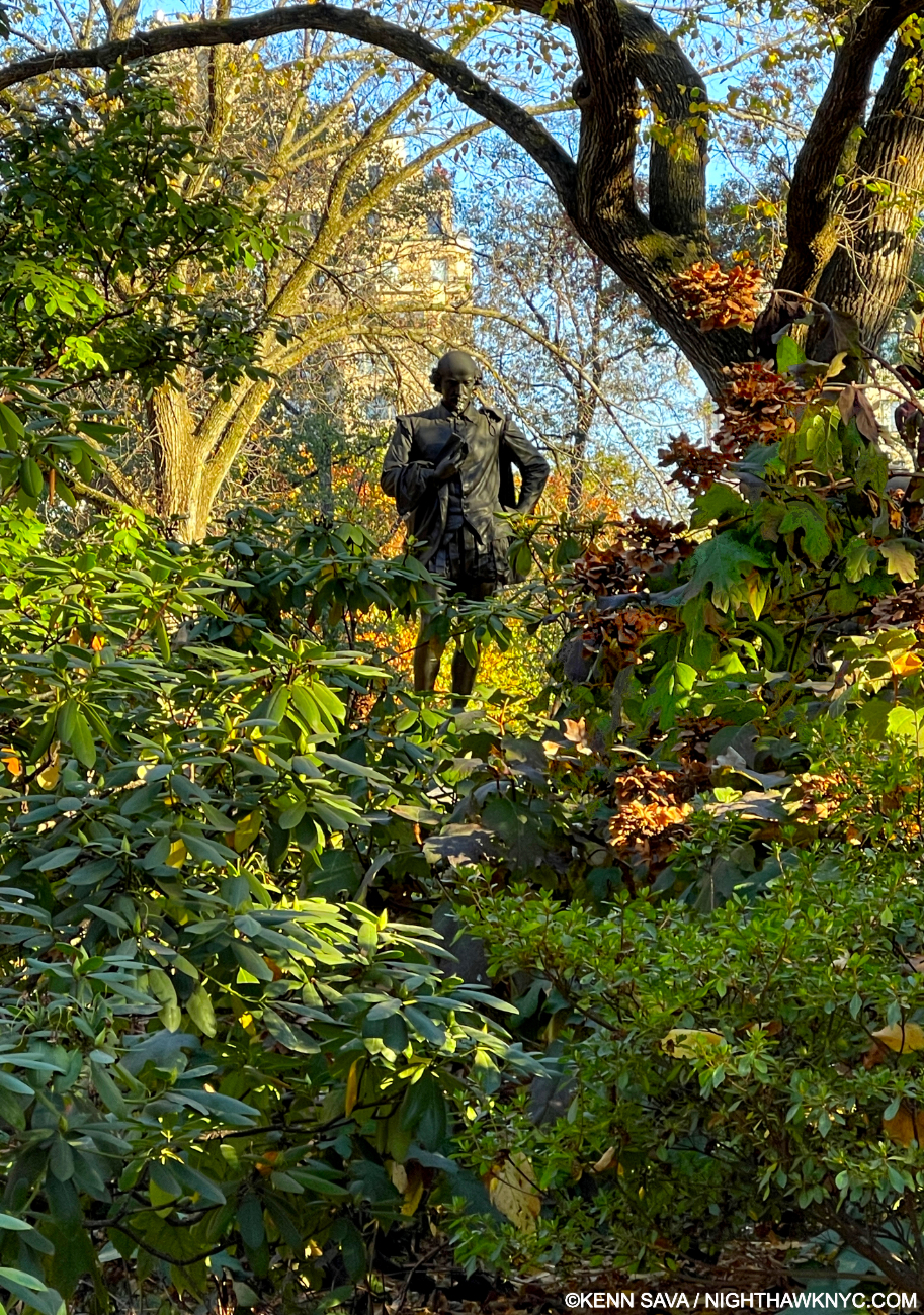
It’s like he’s been there waiting for me for my whole life…Shakespeare, by John Quincy Adams Ward. I’m not a fan of any of the Statues in Central Park besides Bethesda Fountain and this one. Seen on October 27, 2024. Click any picture for full size.

Having been assigned to read James Joyce’s Dubliners as a senior in high school, the highest grade I was allowed to attain by my parents, so taken by it was I that I went on to his A Portrait of the Artist as a Young Man and then Ulysses on my own after. And so ended my life’s experience with Literature (and formal education for that matter. Everything I “know” now I learned on my own, except how to read & write and basic math). My life then became an endless procession of Art book after Art book. Until September. With no Art pieces hanging over my head to finish, in late September I decided to try and begin to try fill that gnawing Lit gap that’s been there for a very long time indeed. Immediately, there was NO DOUBT in my mind who I would turn to first in this quest.

William Shakespeare (circa April 23, 1564- April 23. 1616)

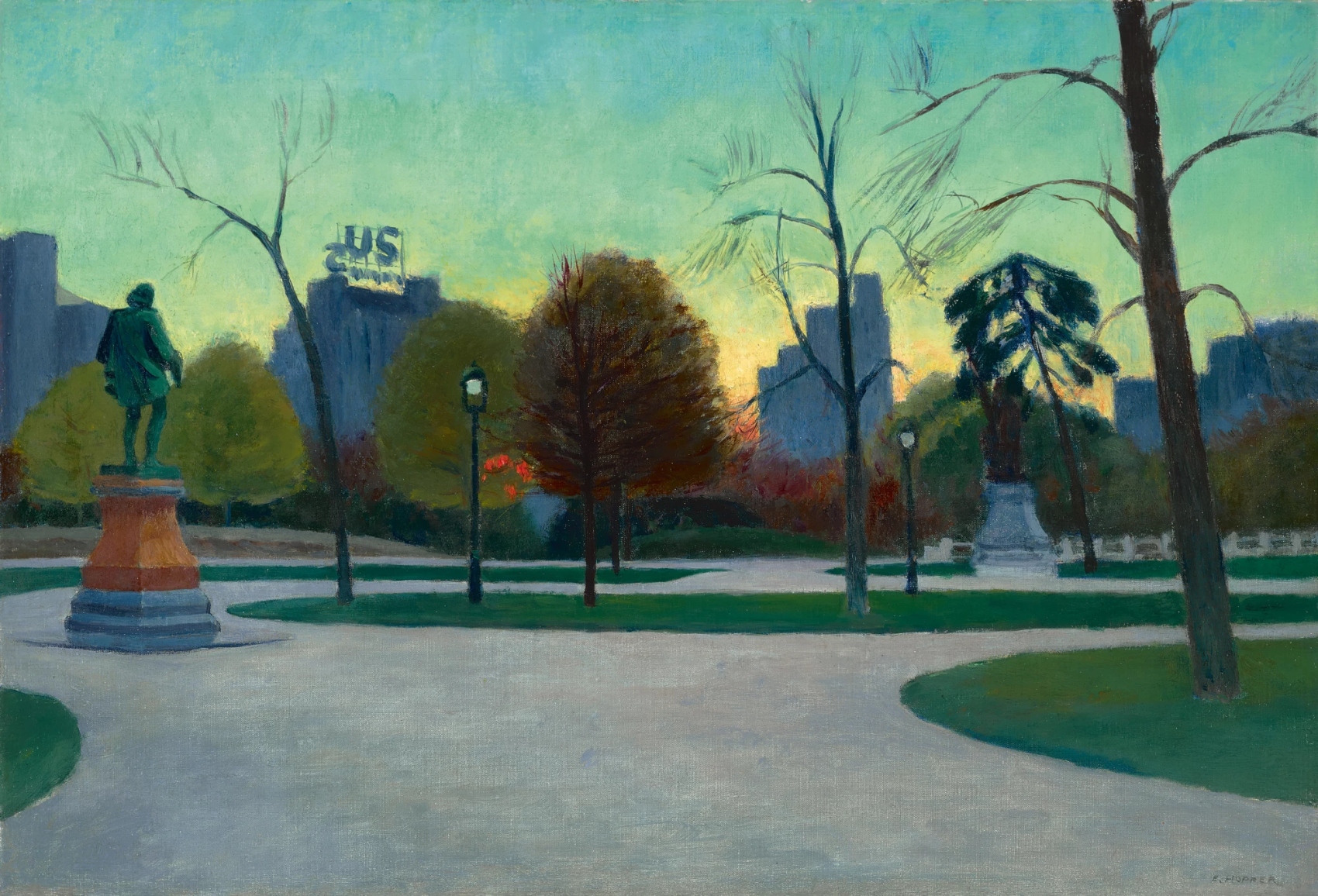
Edward Hopper, Shakespeare at Dusk, 1935, Oil on cavas. Literary Walk, Central Park, 90 years ago. The same Sculpture I shot above, 89 years after Hopper Painted it.  The inscription on the base says it was installed here in Central Park in honor of  The Bard’s 300th Birthday, which was in April, 1864. Yet, the Artist inscribed “1870” under his signature. Something is wrong in the State of New York.*- Photographer unknown.

Believe it or not, I’ve reached this stage in my life and never once cracked open one of his Plays or collection of Poems. HOW is that possible?  I blame my teachers. I remember being assigned such things as Ivanhoe in school which my book report on received a failing grade for primarily because I just couldn’t even bring myself to even open it. At the same time, my parents confiscated my copies of Orwell’s Animal Farm and 1984 because the “legion of decency” (small caps, mine-they were neither) blacklisted them. Suffice it to say that if I read Lit for the next 50 years, Ivanhoe is STILL going to remain unopened!

I quickly realized, however, that it may be impossible to reach adulthood without your life having been touched by William Shakespeare- even if, like me, you’ve never read him! How? Lines from his Plays and Poems have become cliches in many of our daily lives, often/usually without realizing their origins. FIFTY of them, including “For goodness sake,” “Too much of a good thing,” “Vanish into thin air,” or “All’s well that ends well,” can be found here! 

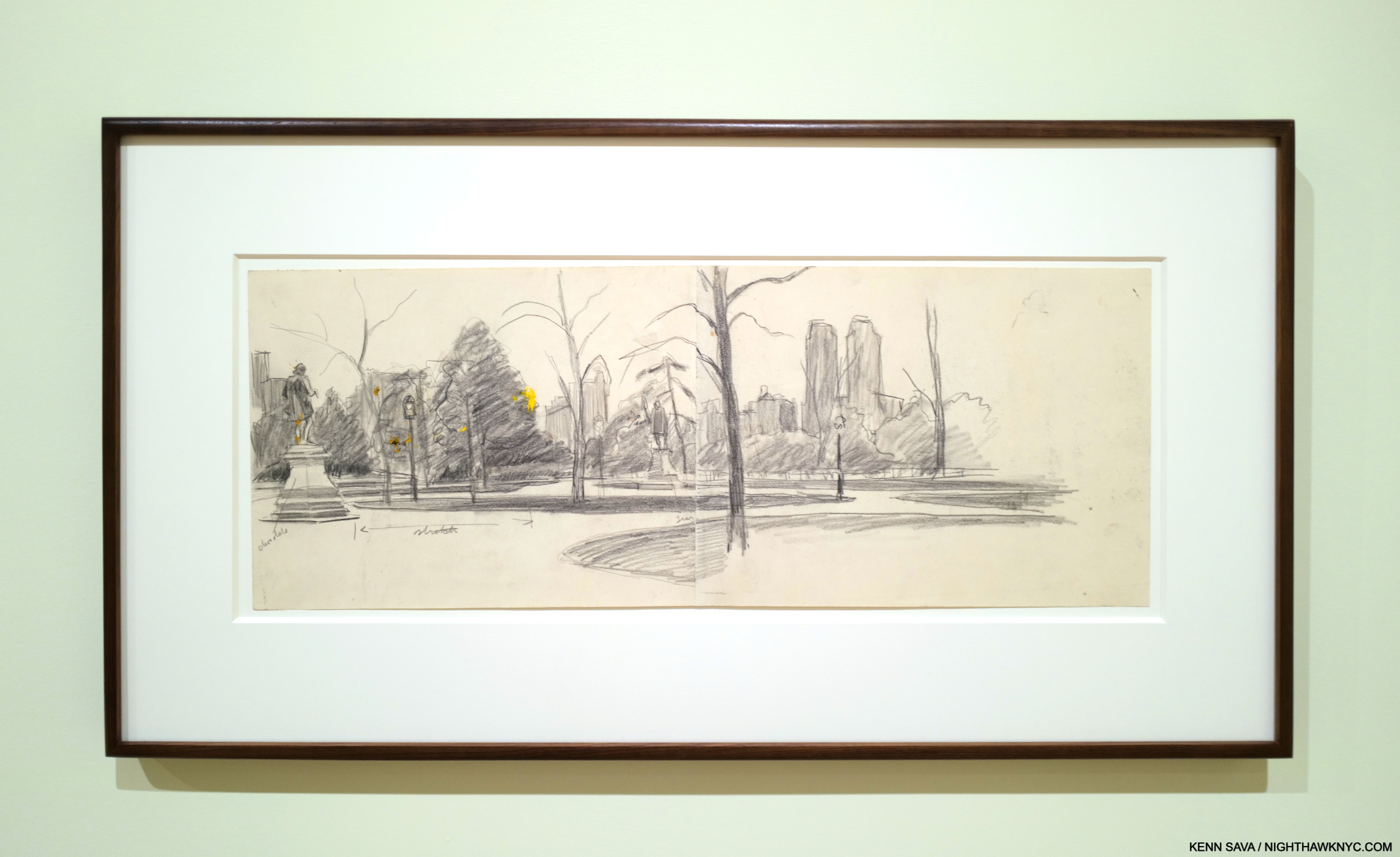
Edward Hopper, Study for Shakespeare at Dusk, 1935, Graphite pencil on paper. Comparing his Studies to the final Painting, shown earlier, t’s interesting how Hopper moved the trees around and changed the buildings. Seen at Edward Hopper’s New York, October, 17, 2022

In addition to that, the man contributed somewhere between 1,700 and 3,00 words to the English language (depending on whose numbers you choose to believe)! And these are not obscure words. They include-

Alligator

Bedroom

Critic (gulp)

Downstairs

Eyeball

Fashionable

Gossip

Huffy

Kissing

Lonely

Manager

Obscene

Puppy dog

Questioning

Rant

Skim milk

Traditional

Undress

Worthless

Zany

PHEW! (That’s not one- as far as I know!)

Between the quotes that have become catchphrases and the words he contributed to the language, I can’t think of any Visual Artist (i.e. Painter, Photographer, et al) who has had such a reach into our everyday lives as Shakespeare has. And that’s not even considering his Plays and Poems as Plays and Poems!

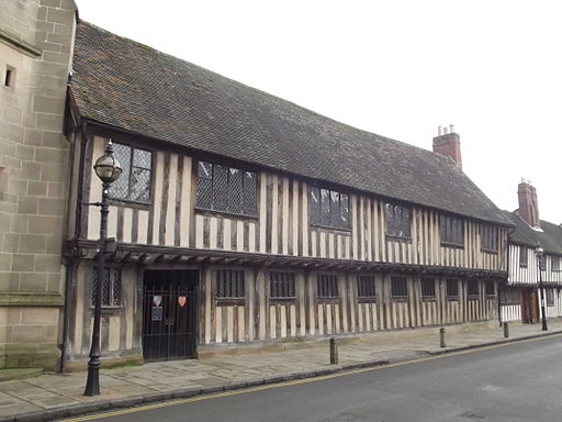
If these walls could talk! King Edward VI Grammar School – Church Street, Stratford-upon-Avon. It is “almost certain” that Shakespeare attended school here. *- Photo by Elliott Brown, Wikimedia Commons

As if that’s not astounding enough, remember Shakespeare only went to school until he was 14! He wasn’t permitted to go to college. What he didn’t learn in school, he taught himself!

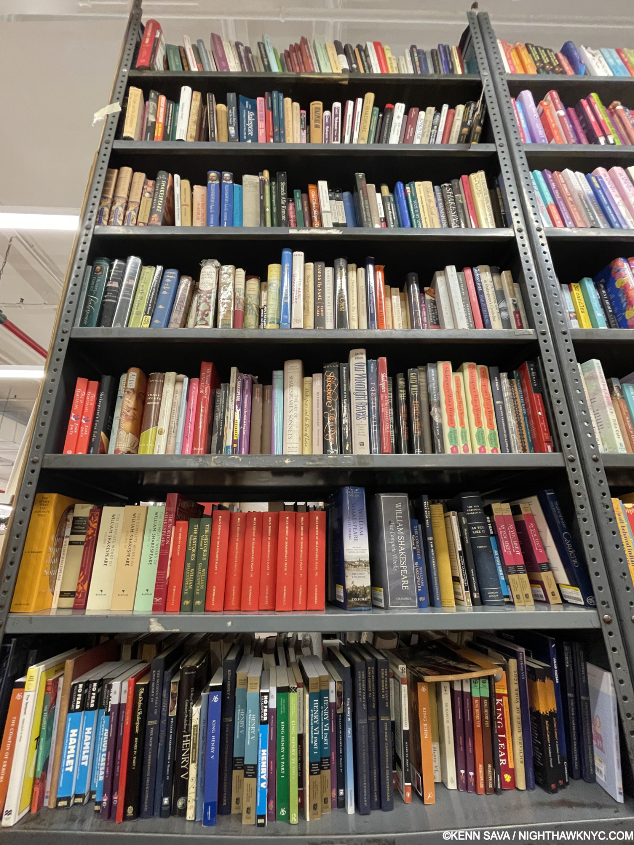
PARTIAL view of the Shakespeare books at The Strand Bookstore, September 28, 2024. This bookcase has 10 shelves of books on The Bard. On the bookcases directly behind it, I counted 7 more shelves of Shakespeare books!

So, there I was in late September in a book store, but, for the first time in the 40+ years I’ve been going to this store, I found myself in a section I’d never been in before. Their Shakespeare section. I was shocked by what I saw. The books filled the entire bookcase! And, it filled most of the bookcase behind it! Though I’ve focused on these pages on Modern & Contemporary Art, I have written about Artists going back to the 15th century- Jan van Eyck, and the Renaissance- Michelangelo. In the 600 years that represents (1400-2025) NO Artist known to me has had anything close to the amount written about them as William Shakespeare has! Not Michelangelo, or Leonardo- even combined. Not Picasso. Not Vincent van Gogh (who I’ve written about twice). No one.

This is a bit ironic. Professor and Shakespeare biographer, Stephen Greenblatt, has this to say about Shakespeare and books-

“Even though as a poet Shakespeare dreamed of eternal fame, he does not seem to have associated that fame with the phenomenon of the printed book. And even when he was well established as a playwright, with his plays for sale in the bookstalls in St. Paul’s Churchyard, he showed little or no personal interest in seeing his plays on the printed page, let alone assuring the accuracy of the editions. He never, it seems, anticipated what turned out to be the case: that he would live as much on the page as on the stage… but the real excitement for him would have been access to books. Books were expensive, far too expensive for a young actor and untried playwright to buy out of his own pocket, and yet the ambitious Shakespeare needed them if he was to rise to the challenge posed by (Christoper) Marlowe’s stupendous work (i.e. specifically Tamburlaine).1

That explains a question a number of writers have wondered about- according to his last will, Shakespeare left no books. As I stood in front of more books on a subject I’m interested in than I’ve ever faced, one question loomed large- Where do I start?

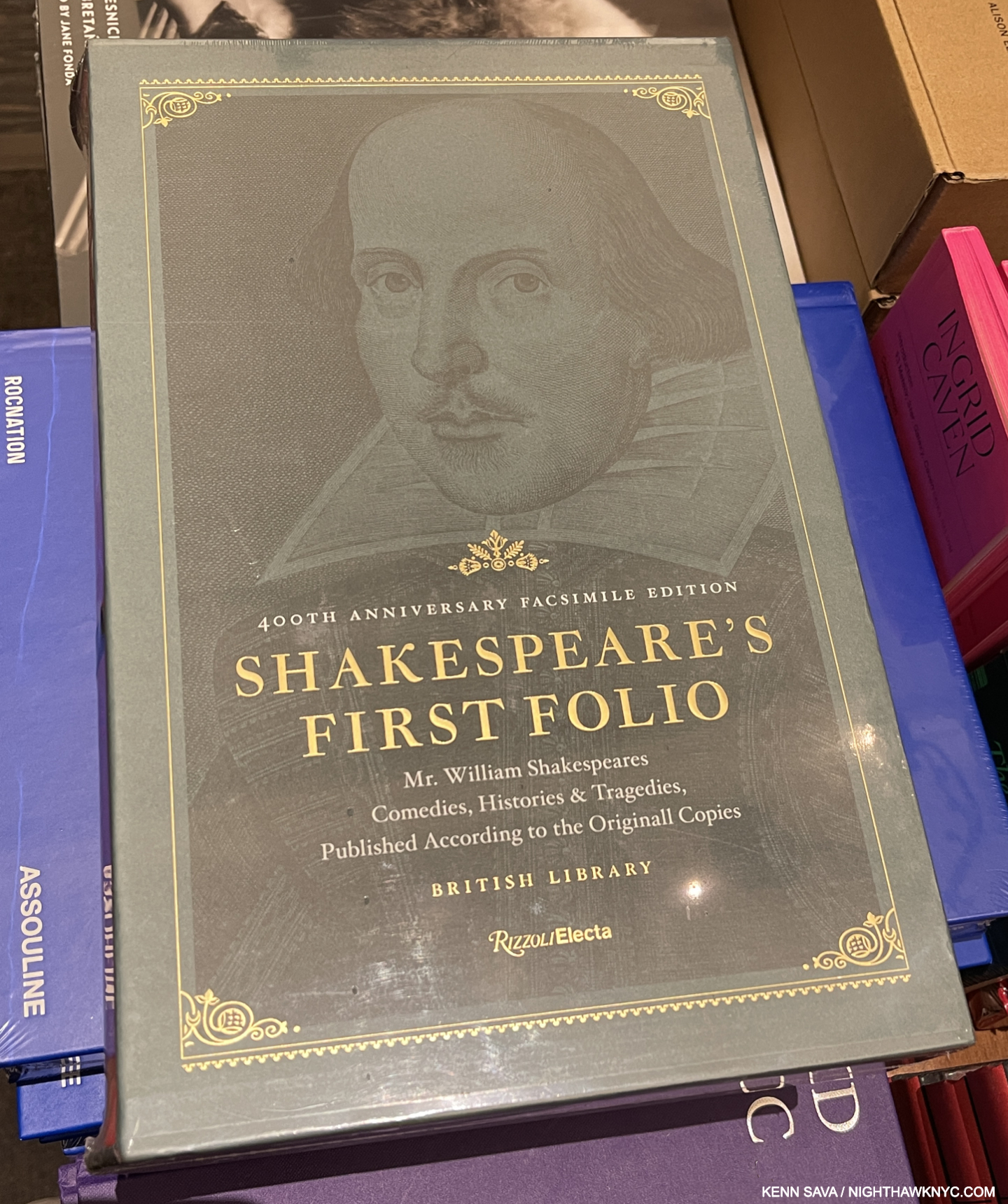
The Rizzoli 400th Anniversary Edition of The First Folio of Shakespeare. It’s nice, but if I were in the market for a copy of The First Folio (TFF hence), I’d get the Norton Facsimile Edition. Why? The Rizzoli is a repro of the copy of TFF in the British Library. The Norton selects the page in each of 82 of the existing copies that’s in the best condition.

Eschewing all the biographies and commentaries, I started looking at the books containing his work- what he Wrote. I quickly discovered that there are COUNTLESS editions of EVERYTHING Shakespeare Wrote going back to what is called The First Folio (TFF hence), the very first published collection of his Plays published in 1623, seven years after his death, by two of his fellow actors & friends. The world owes an incalculable debt to those friends, John Hemminge (aka John Heminges) and Henry Condell. Shakespeare remembered them in his will. Now considered the most important book of fiction ever published. In it, about half of Shakespeare’s plays make their first appearance. They most likely would have been lost to history if not for its publication, the story of which has been the subject of a good many books on its own. I’ve come across 3 reproductions of TFF– The luxurious 400th Anniversary Edition published in 2023 by Rizzoli, the equally luxurious compilation edition published by Norton (which I prefer, IF I were in the market for one, as I explain above), and a used paperback copy of a knockoff edition of it that Norton sued over and was subsequently withdrawn. 

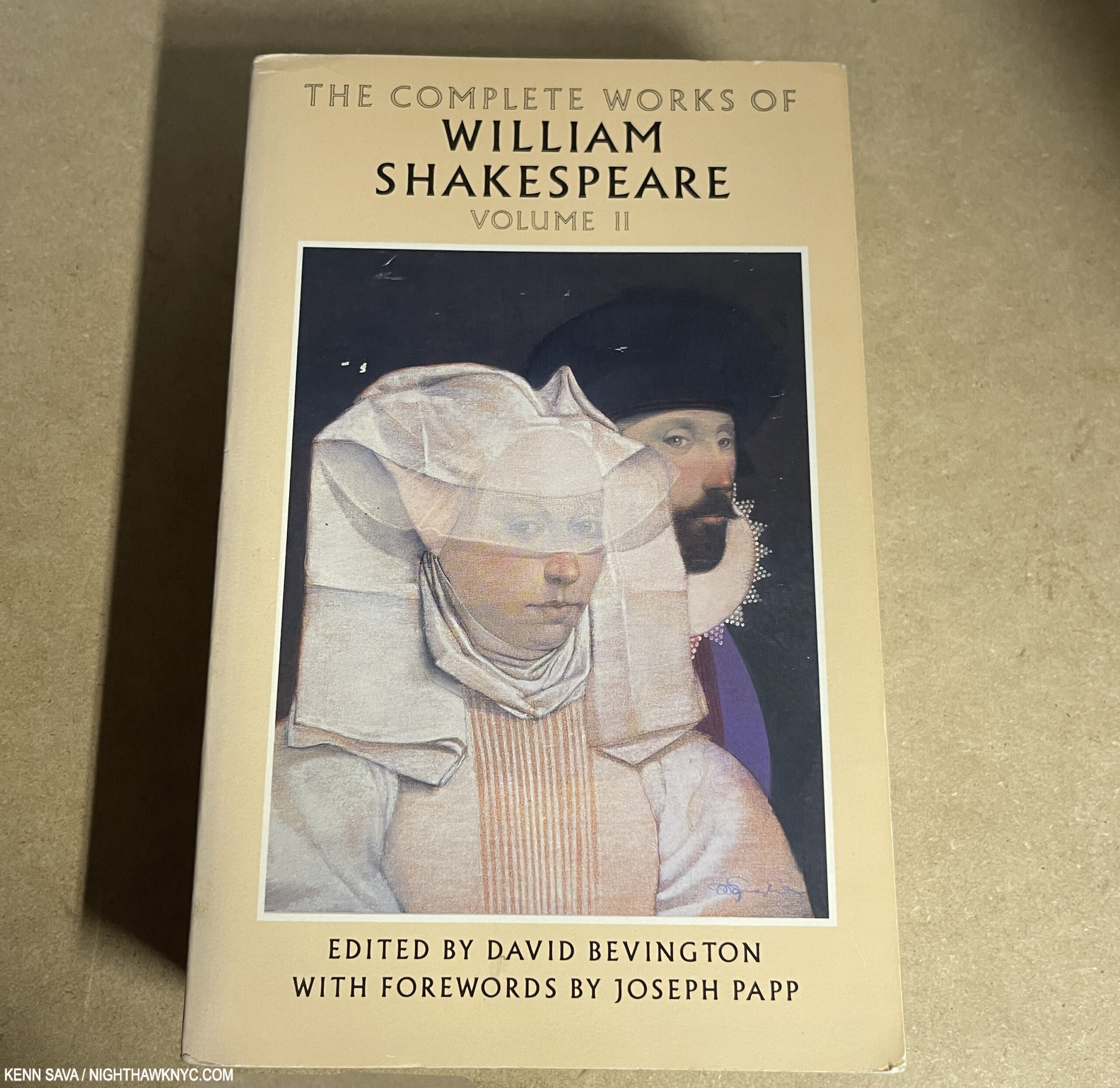
The cover of Volume II of the Bantam paperback edition of The Complete Works of William Shakespeare. David Bevington edited the plays and contributes superb introductions to each Play.

But, Early Modern English, which is what Shakespeare wrote and spoke is a tough nut for me to crack. So are the fonts they used in 1623. So, I put TFF back on the shelf and kept looking. My eyes then alighted on a set of the Complete Works published by Bantam. Five words on the covers caught my attentions- “WITH FOREWORDS BY JOSEPH PAPP.” Even I know that Joseph Papp (1921-1991) was, and remains, “Mr. New York Shakespeare.”

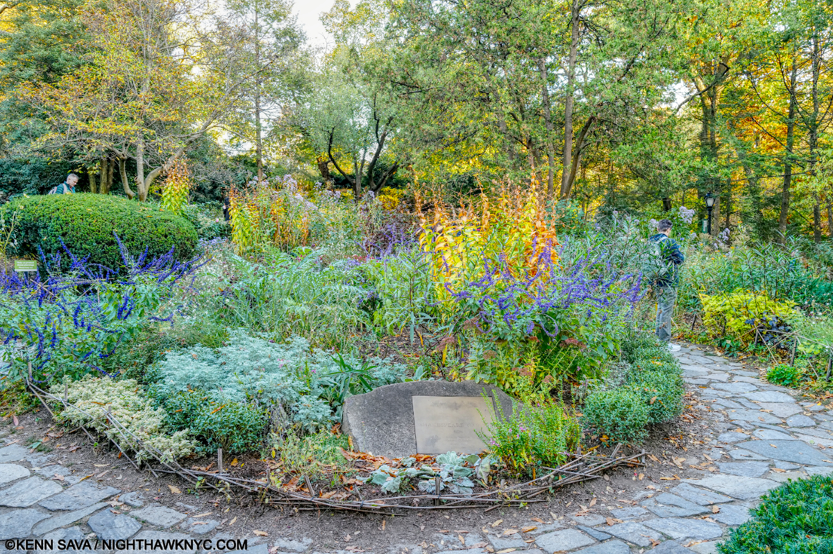
Shakespeare Garden, Central Park, mere steps from The Delacourt Theater, home of Shakespeare in the Park.

Legendary for founding both The Public Theater and the annual, beloved, Shakespeare in The Park performances (i.e. in Central Park, under his New York Shakespeare Festival), who better to turn to for guidance? And so, the very first Shakespeare book I opened was Volume 1 of the Bantam Complete Works of William Shakespeare. I immediately turned to Mr. Papp’s “Foreword” for the whole set (reproduced below. (He also contributed “Forewords” to each Play!), I read these words—

“It’s hard to imagine, but Shakespeare wrote all his plays with a quill pen, a goose feather whose hard end had to be sharpened frequently. How many times did he scrape the dull end to a point with his knife, dip it into the inkwell, and bring up, dripping wet, those wonderful words and ideas that are known all over the world?,” as you can see below-

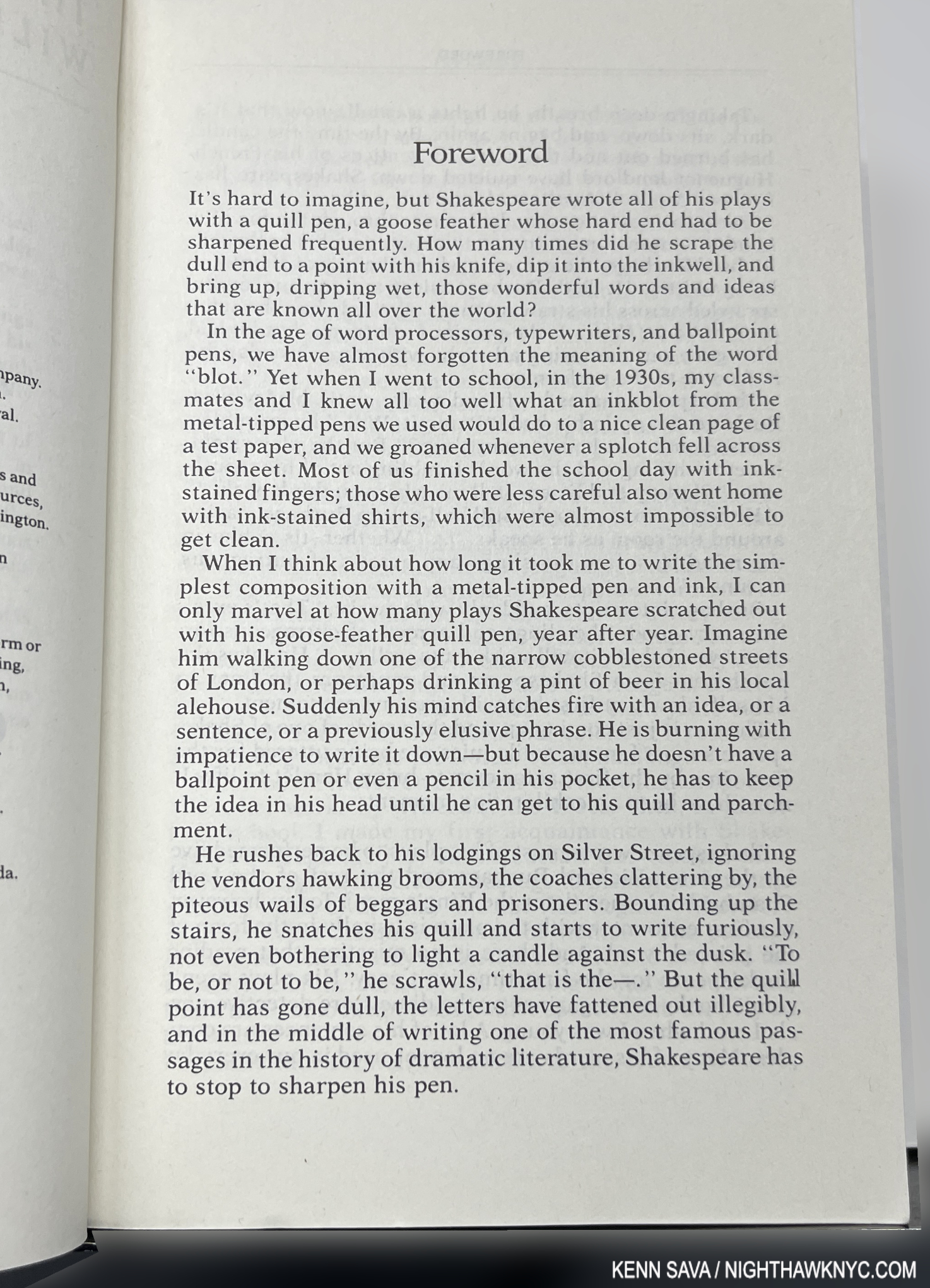
Bingo. I was immediately hooked, and 4 months later, remain so. Shakespeare has taken over my life. I found out the set in the store was incomplete, so I went home and bought a complete used 6-volume set online for $25. However, before I left the store that night, so I could get started right away, I opted for Helen Vendler’s The Art of Shakespeare’s Sonnets, which includes all of them, in a reproduction of the original publication accompanied by a version in a modern font, her commentary on each, and a CD of her reading most of them. I was especially taken with how she depicts their form visually. Faced with upwards of 20 shelves of books, I must have been guided by providence in choosing both of these as my starting points. 

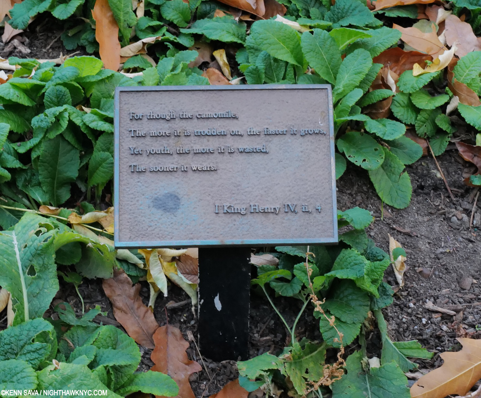
“For though the camomile, The more it is trodden on, the faster it grows, Yet youth, the more it is wasted, The sooner it wears.” A scene in Shakespeare Garden with a quote from 1 Henry IV (II, 4).

After reading the first half of  the Sonnets, the Bantams arrived and I chose to begin the Plays with King Lear for no particular reason. It proved to be a most interesting choice- especially after the opening body of Sonnets. As you know, the first section of Sonnets harp over and over on the duty of a young and beautiful man to father children, a subject particularly hard for my older, childless, self to read, over and over, in the words of the man I already consider the greatest writer the language has ever produced.

Pregnant pause.

Then, King Lear is the story of an older man who is turned out by two of his three adult children! Damned if you do, and damned if you don’t, eh Shakespeare? Needless to say, my head was spinning after my first two Shakespeare experiences. What’s “the answer?” What is Shakespeare “telling us?”

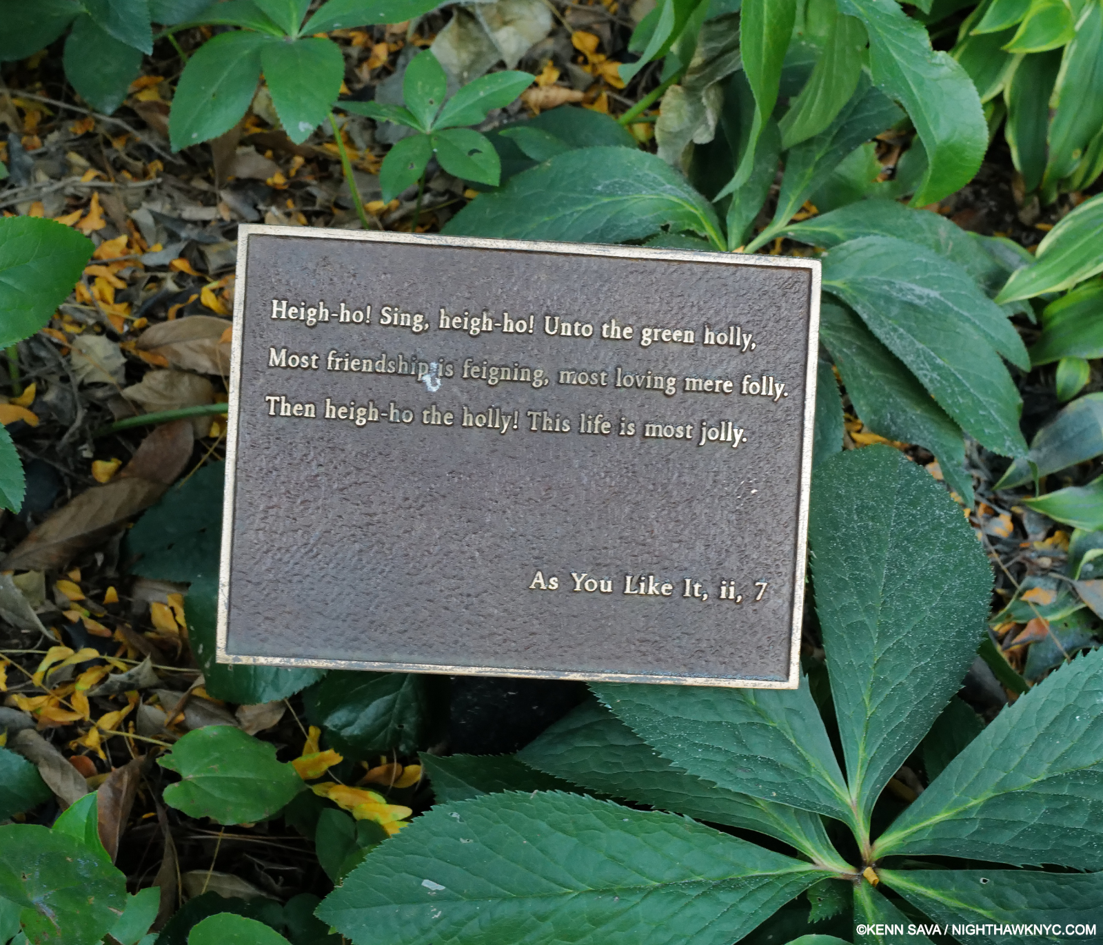
“Heigh-ho! Sing, heigh-ho! Unto the green holly, Most friendship is feigning, most loving mere folly. Then heigh-ho the holly! This life is most jolly.” A quote from As You Like It (II, 7)  in Shakespeare Garden.

One thing that’s already apparent to me from that bookcase, above, is that any number of the greatest minds of the past 400 years have written about and commented on Shakespeare. Tolstoy, Freud, George Bernard Shaw, Mark Van Doren, Isaac Asimov, Harold Bloom, Bertolt Brecht, and the aforementioned James Joyce among them, the list is endless and formidable. I’m not daring to throw my hat in that ring speaking on what Shakespeare is saying- especially only 4 months into exploring The Bard! As a result, after finishing each Play (Romeo & Juliet and Hamlet have followed), I’m taking 2 to 3 weeks to read commentary by some of these illustrious figures on the play just finished (I go into each Play cold. So far I’m choosing which one to read randomly. That may change to roughly chronologically as I get more info on dates when they may have been Written- there doesn’t seem to be a consensus.). I’m also waiting to watch any of the Films made of these Plays (most of which are incomplete, edited versions of the Play) until my own ideas on them have solidified.

DISCLAIMER- The subjects I touch on below remain contested. Therefore, I want to make it clear that I’m stating my opinions. 

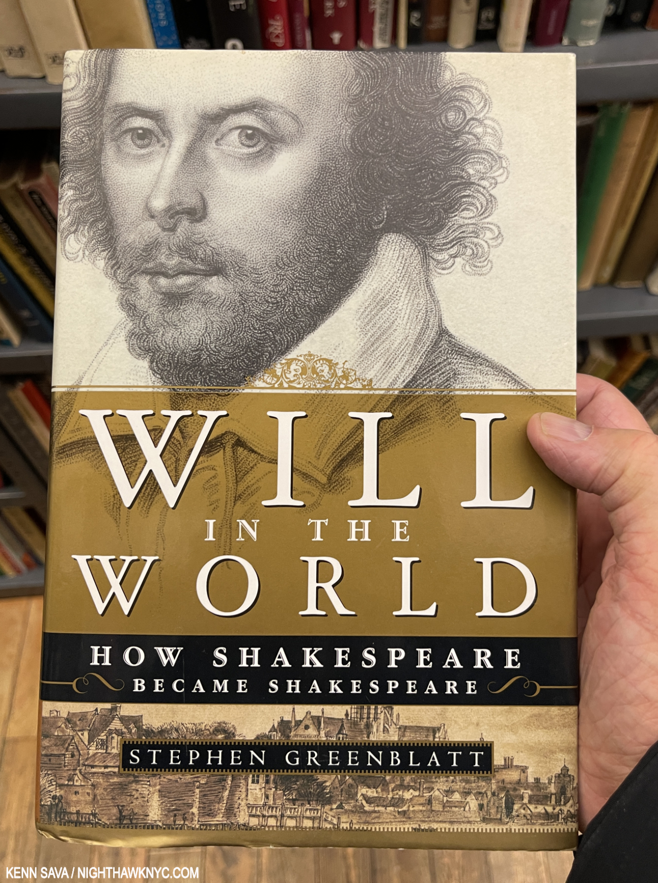
A NighthawkNYC Art Book of the (1st Quarter of the) 21st Century. (The full list to come.) Though I answered a good many Shakespeare questions through my research, Stephen Greenblatt’s classic Will in the World, 2004, answered the rest, and those I hadn’t thought of. A spectacular achievement, if you read one book ON Shakespeare, this would be my recommendation. A New York Times Bestseller for 9 weeks, Professor Greenblatt is the general editor of The Norton Shakespeare, a Pulitzer Prize Winner, a National Book Award Winner for Nonfiction, and a Harvard Professor who has written 4 other books on Shakespeare.

In September, I decided to begin this quest by answering two questions (for myself)- First, WHO wrote Shakespeare? Second, when you consider his collected works total 835,996 words! Of these, 12,493 words occur only once, HOW did a man who was not permitted to go to college manage to write such knowing and diverse work, including so many words? I’ll make this short and just say, my research proved (to my satisfaction) that Shakespeare indeed wrote Shakespeare, and if you want specifics, I subsequently found them all wonderfully delineated in Pulitzer Prize & National Book Award Winner Stephen Greenblatt’s Will in the World. Even the title is startling; calling him “Will,” humanizes him and makes me feel like he’s someone I “know” already. Why do I care who wrote Shakespeare? Because I care who Painted The Starry Night, The Sistine Chapel, and on and on. There is autobiography to a lesser or greater extent in a good deal of, perhaps most of, the Art I’ve seen, and that becomes integral to looking at the work. IF we didn’t know who Painted the Mona Lisa don’t you think the #1 question people would have is not about her smile, but about who Painted it? Professor Greenblatt gets this.

“But the whole impulse to explore Shakespeare’s life arises from the powerful conviction that his plays and poems spring not only from other plays and poems but from things he knew firsthand, in his body and soul2.”

Through 419 absolutely riveting pages he goes on to make it perfectly plain that NO ONE else could have written Shakespeare (in my reading). Suffice it to say that though I became convinced of the answers to my first two questions elsewhere, Professor Greenblatt does a much more complete job of answering both.

HOW did the son of the failing glover make it into the theater? In the absence of any documentary traces, the principal evidence, pored over for clues by generations of ardent admirers, is the huge body of work that Shakespeare left behind, the plays and poems that spark the interest in the life in the first place and provide tantalizing hints of possible occupations he might have followed3.”

Along the way, I began to see that very intensive, focused, research may have been key for Shakespeare. I can relate to that in my own, tiny, way4. Having written 350 pieces here on about 300 Artists, many of which I was working on 3 or 4 at a time, I had to do my research, distill it, and move on to the next topic. Most of his Plays are based on the work of predecessors, and those sources are known, I wonder if Shakespeare did something somewhat similar. As an actor, he was already, no doubt, a quick study. 

“Shakespeare was a master of double consciousness. He was a man who spent his money on a coat of arms but who mocked the pretentiousness of such a claim; a man who invested in real estate but who ridiculed in Hamlet precisely such an entrepreneur as he himself was; a man who spent his life and his deepest energies on the theater but who laughed at the theater and regretted making himself a show.” 

Is this why there seem to be conflicting “messages” about having children between the Sonnets and King Lear? He continues…

“Though Shakespeare seems to have recycled every word he ever encountered, every person he ever met, every experience he ever had—it is difficult otherwise to explain the enormous richness of his work—he contrived at the same time to hide himself from view, to ward off vulnerability, to forswear intimacy5.”

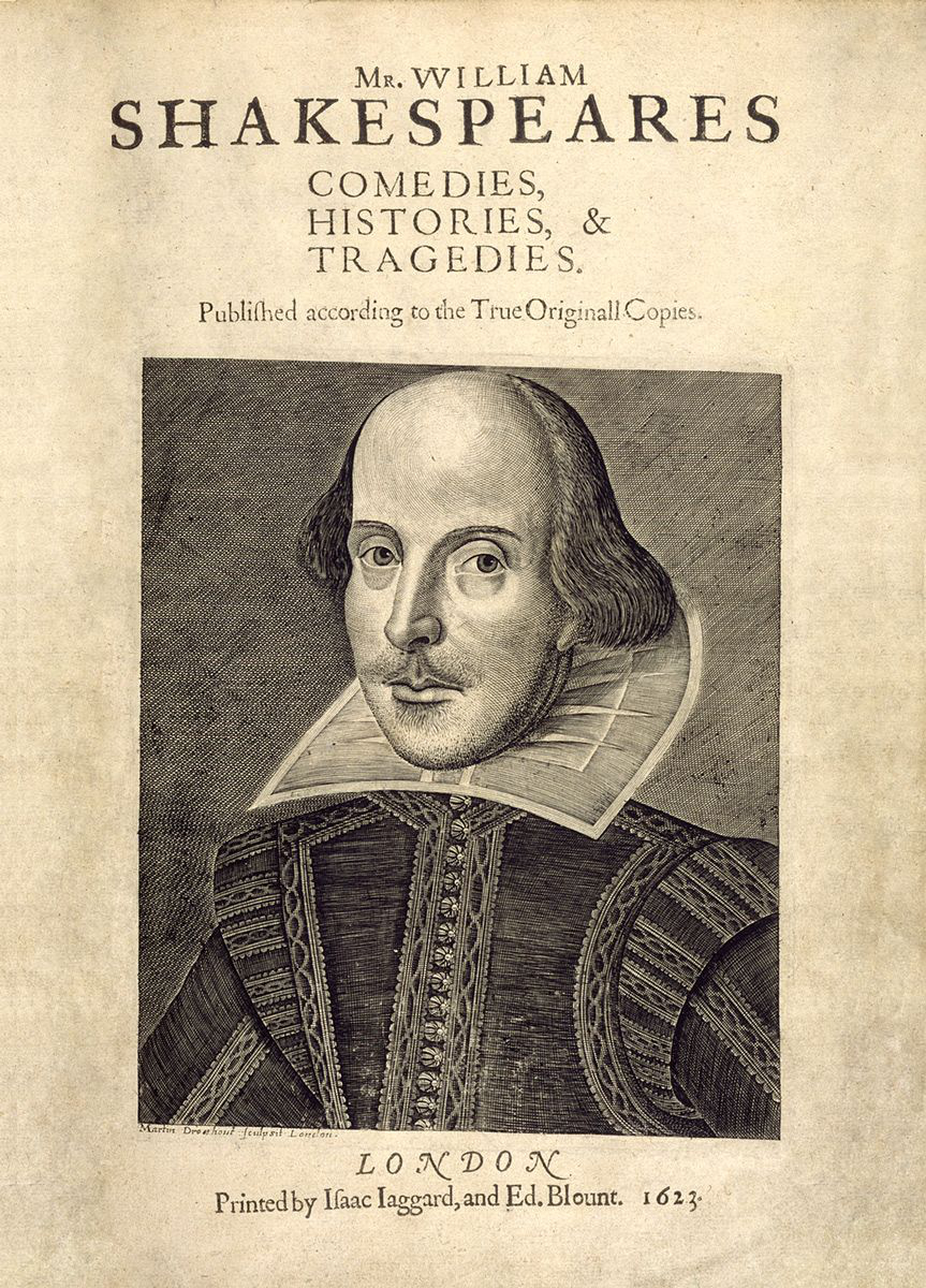
Since The First Folio was compiled and edited by two Actors and friends of Shakespeare, John Heminges and Henry Condell, Martin Droeshout’s Portrait of William Shakespeare as it appears in it seven years after his death, is the most accepted representation of what Shakespeare looked like. On the facing page, Writer & Shakespeare associate, Ben Jonson writes that “the graver had a strife with nature to out do the life.” I’ve reproduced his full text, with his original spelling-

Ben Jonson
To the Reader

This Figure, that thou here seest put,
It was for gentle Shakespeare cut:
Wherein the Grauer had a strife
with Nature, to out-doo the life:
O, could he but haue drawne his wit
As well in brasse, as he hath hit
His face; the Print would then surpasse
All, that was euer writ in brasse.
But, since he cannot, Reader, looke
Not on his picture, but his Booke.

B.J.

Irony of ironies, something else then entered into my exploration of Shakespeare. Painting. “Just when I thought I was out…” Wait. That’s not from Shakespeare. (Is it?)

Having “settled” the above questions for myself, I was able to begin reading his work. Then, I got “stuck” on something I’d seen in the first few pages of TFF: Shakespeare’s Portrait, in an engraving done by one of  two Martin Droeshouts (There may have been two Martin Droeshouts in the same extended family, one, or both, of who may have been engravers). The consensus seems to be Martin Droeshout the Younger, 1601-c.1650, who was too young to have seen/known Shakespeare during his life.  Martin’s Portrait is, frankly, bizarre! The head too big for the body, and apparently disassociated from it, something’s wrong with his left eye (which might be his right eye since everything is usually reversed in an engraving), and on and on. Yet, on the facing page is the great Writer and Shakespeare associate, Ben Jonson’s, statement that “the graver had a strife with nature to out do the life,” meaning, I take it, that the Portrait looks better than Shakespeare did in real life, in his view. And that, along with the implied approval of two of his “fellows,” as Shakespeare refers to them in his will, John Hemminge (aka John Heminges) and Henry Condell who complied (“gather his works,” in their words), edited TFF and thereby approved the Portrait, are the most direct testimony there is on what Shakespeare looked like that we still have!

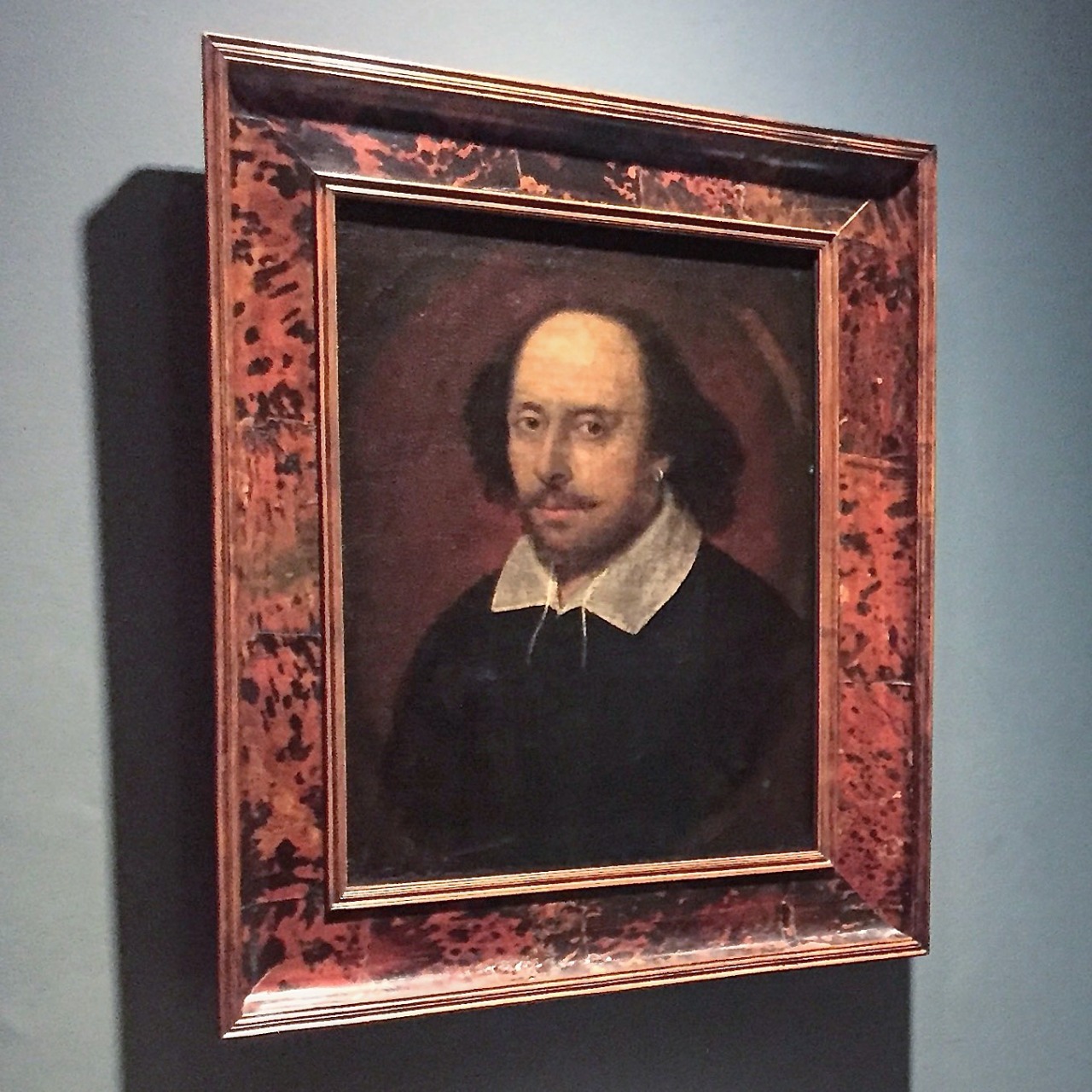
Attributed to John Taylor, William Shakespeare, aka the Chandos Portrait, Datę unknown. Seen in the National Portrait Gallery, London. *-Photo by City Guide London on Tumblr.

The second most accepted “Portrait” of Shakespeare is that on his funeral monument, since that, too, was overseen by those who knew him (though it has been altered over time). That attributed to John Taylor, above, is the 3rd and most accepted Painting. The very first work acquired by London’s National Portrait Gallery, they seem to have hedged their bet on it, saying their claim that it represents Shakespeare has “increased, but it’s not absolutely watertight. We may never find the clincher piece of evidence- though it may turn up6,” Dr. Tarnya Cooper of the NPG said.

The theory is that the Droeshout Portrait was based on a Painting. But, if it survives, which one? Over the centuries a number of candidates have been put forth. You know me. Unable to resist, I began looking at supposed Portraits of The Bard. I actually saw the Chandos Portrait on my last trip out of NYC overnight, when I went to London’s National Portrait Gallery in 2012. It hasn’t been cleaned since the NPG acquired in 1856, which makes it really hard to see, and some alteration has occured. The “white” of the collar has been worn down to just the undercoating for the whole Painting. It also features a possibly damaged, left eye. It has a beard, what appears to be curlier hair, and an earring- things that don’t appear in the Droeshout. It does, however, have the best provenance of the bunch of Paintings claiming to be “him.” But, as Dr. Cooper says, not enough to make it conclusively Shakespeare- or by John Taylor, for that matter. 

William Shakespeare lived from circa April 23, 1564 to April 23, 1616 and spent much of his adult life in London, a time when there were more than a few great Painters around. Having your portrait done was coming into fashion at this time, too. Being a man of enough success that he was both part owner of The Globe Theater and able to retire in his early 50s, it stands to reason that he would have had one done at some point, maybe more than one. Still, most of those we have are posthumous portrayals. Finding one rendered from life is the holy grail, and the reason why the search is so intense. It’s been postulated that these posthumous portrayals may have been done from Shakespeare’s death mask (which also apparently survives), or his skull (which was removed from his tomb, violating his curse, which itself may be the final thing he wrote, against “moving his bones,” and may also still be around).

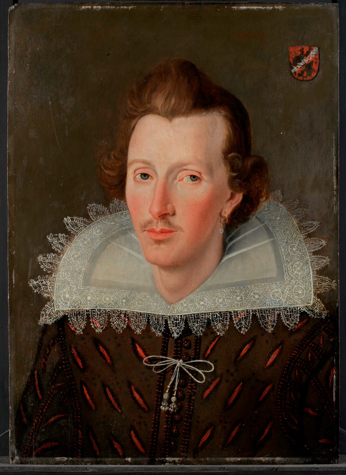
The Wadlow Portrait, c.1590s, Oil on canvasas *-Photographer unknown.

A number of these Portraits, the Chandos, the Droeshout, share an interesting trait-  if we take their primary features, the eyes and mouth and superimpose them, which I did using photo editing software, they line up. That, itself is quite strange, but hard to ignore. I was taken by one of the newest entries to the “Shakespeare” Portrait field, a Painting that’s come to be known as “The Wadlow Portrait,” after its owner, Stephen Wadlow, a self-employed window washer who inherited the Painting from his father, Peter. It hung over the family TV until an OMG moment watching a Shakespeare doc made the family wonder IF it might be HIM. Stephen has spent the past decade researching it and the results have been increasingly encouraging. Though I can’t imagine the drain of time and resources involved in such a quest, it seems that he’s been getting positive feedback from the tests the piece has undergone and his research. Looking over the documentation on his website, it doesn’t seem the time to stop looking for an answer is now.

So as to not make a very long piece longer, I will let Simon Andrew Stirling neatly sum up the stories on ALL of the major purported Shakespeare Portraits in this fascinating piece he wrote for Goldsmiths University, which completes the path I have been going down in what is compelling fashion, in my view- thus far.

Answering the “What did Shakespeare look like?” question is not going to be as “easy” as answering the “Who wrote Shakespeare?” question. At least for me! Ben Jonson neatly summed up the real point of all this 400 years ago in his “To the Reader” piece, above-

“Reader, looke not on his picture, but his Booke.”

And so, onward to Macbeth.

*- Soundtrack for this piece is “I Contain Multitudes,” (a Walt Whitman quote) by Bob Dylan from Rough and Rowdy Ways, 2020.

NighthawkNYC.com has been entirely self-funded & ad-free for 9 1/2 years, during which over 340 full-length pieces have been published! If you’ve found it worthwhile, PLEASE donate securely by PayPal below to allow me to continue. Thank you, Kenn.

You can also support it by buying Art, Art & Photography books, and Music from my collection! Art & Books may be found here. Music here and here.

Written & photographed by Kenn Sava for nighthawknyc.com unless otherwise credited. To send comments, thoughts, feedback or propositions click here. Click the white box on the upper right for the archives or to search them. Subscribe to be notified of new Posts below. Your information will be used for no other purpose.

  1. Stephen Greenblatt, Will in the World, P.193
  2. Stephen Greenblatt, Will in the World, P. 119
  3. Stephen Greenblatt, ibid, P.71
  4. PLEASE don’t read that as my comparing myself to Shakespeare. (I laughed typing that.)
  5. Stephen Greenblatt, ibid, P.185
  6. Here.

Ed Ruscha’s Head Scratchers

This site is Free & Ad-Free! If you find this piece worthwhile, please donate via PayPal to support it & independent Art writing. You can also support it by buying Art & books! Details at the end. Thank you.

Written & Photographed by Kenn Sava (*- unless otherwise credited)

Show seen: Ed Ruscha/Now Then @MoMA

Who doesn’t like the Art of Ed Ruscha?

Installation view of the entrance, September 14, 2023. Images in this piece are thumbnails. Click any picture for full size.

Walking through the crowds at MoMA’s winter blockbuster, Ed Ruscha/Now Then over my six long visits bookending a terrible, six-week illness, I saw smiles as visitors moved from piece to piece, yet I couldn’t help but wonder how many of them felt they “understood” his Art. While humor undoubtedly plays a part in the craft of an Artist who knows you catch more flies with honey than vinegar, however they appear at first glance, his work usually leaves me scratching my head.

Returning to look at it again and again, that his work says something different to me every time I look at it has kept Ed Ruscha among my favorite Contemporary Artists. Judging from the turnout at MoMA, I’m far from alone in that. Having the chance to explore, and be mystified by, 200 pieces of his Art in Now Then from the, approximately, SIXTY-SEVEN YEARS(!) he’s been making it proved an all-too-rare chance to take a good hard look and try to get to the bottom of the mystery.

I Don’t Want No Retro Spective, 1979, Pastel on paper. The catalog for the last Ed Rusha retrospective in 1982(!) is also known by the Ruscha on the cover of its catalog, I Don’t Want No Retro Spective, though the show’s title was THE WORKS OF ED RUSCHA

“All too rare,” as in Now Then is the first Ed Ruscha retrospective here since 1982, (and so mine, too): over FORTY YEARS ago!1 The gap between them is another head scratcher given how popular Ed Ruscha’s Art is. The title Ed Ruscha/Now Then can be taken as a reference to the Artist’s penchant for revisiting his subjects over time, as well as the fact the show includes old and recent work, or a chance to see his older work now. It’s also a rare retrospective of a West Coast Artist who came to prominence in the 1960s mounted on the East Coast. Bruce Conner didn’t live to see his at MoMA like Ed Ruscha has. Ed Kienholz, and Mr. Conner’s friend, Jay DeFeo, among others, are still waiting for their East Coast retrospective.

Installation view from just inside the entrance of the first gallery looking into the second. Boss, 1961, the famous Large Trademark with Eight Spotlights, 1962, and the infamous OOF, 1962-3, left to right, all Oil on canvas.

Walking through it, I became particularly fascinated by how his style(s) developed, and how Edward Joseph Ruscha IV became Ed Ruscha, one of the most influential Artists in the world among Modern & Contemporary Artists, if not THE most influential, at this point in time.

Oklahoma-E, 1962, Pencil, colored pencil and charcoal on paper

Born in Omaha in 1937, his family moved to Oklahoma City when Ed was 5. Early on, he had a passion for comics and a love of typography, particularly as it appeared in commercial publications. All of these are combined in Oklahoma-E from 1962, a seminal year in his early career. His initial desire was to become a Commercial Artist, and it was towards that end that he left OKC after graduating high school to head to L.A. with a friend in a lowered 1950 Ford, to study it. He chose to go west rather than east because of its energy, glamour, and its “hot rods and custom cars2.” Unable to get into his chosen school, he was accepted at Chouinard Art Institute (later Cal Arts, where Henry Taylor would study in the 1990s). His teachers, disciples of Abstract Expressionism, “wanted to collapse the whole art process into one act3.’’ “It (Abstract Expressionism) was, in his opinion, ‘a solid way of thinking…If you think about the paintings that were done in the 1950s, I find them overwhelming, nothing but quality…It was a very powerful time in art.’ However, ‘…within AbEx there was no room for my ideas4.'” While this frustrated him, they did succeed in getting him to change his focus from Commercial Art to Fine Art, which we can all be grateful for. After Now Then, I wonder if they accomplished more.

While in school in 1957 he had an epiphany.

One of the most extraordinary works of the 1950s. Jasper Johns, Target with Four Faces, 1955, Encaustic on newspaper and cloth over canvas surrounded by four tinted-plaster faces in wood box with hinged front. Seen in Jasper Johns: Mind/Mirror at the Whitney in 2021.

“The breakthrough he sought came in 1957, when he spotted a small black-and-white repro of Jasper Johns’s 1955 Target with Four Faces in the Feb/Mar 1957 issue of Print Magazine. Encountering Johns’s painting was, he said, an ‘atomic bomb’ in his training, ‘a stranger fruit’ that he ‘saw as something that didn’t seem to follow the history of art. My teachers said it was not art. ‘I didn’t need to see the colors or the size…’ ‘I was especially taken with the fact that it was symmetrical, which was just absolutely taboo in art school- you didn’t make anything symmetrical…Art school was modernism, it was asymmetry, it was giant brush strokes…it was all these other things that were gestural rather than cerebral. So I began moving to things that had more of a premeditation5.’”

Dvision, 1962, Mimeograph on paper, One of five Prints by five Artists in the Portfolio issued in conjunction with the New Painting of Common Objects show.

That has continued to this day. Along the way, he and others (including Andy Warhol, Roy Lichtenstein and James Rosenquist), built on what Johns, Rauschenberg and Marcel Duchamp had started: the “next thing” after Abstract Expressionism, an Art based in the recognizable, the familiar, the every day. Some called it “pop.” Personally, I see nothing but danger in trying to box Ed Ruscha (who has consistently eschewed boxes).

In fact, one word comes to my mind over and over again as I look at his Art over time: abstract. If I were going to use two words to describe it they would be “premeditated abstraction.” Look at Division, above. It contains what would become Ed Ruscha trademarks- text, typography, and images, combined in a way that are next to impossible for most viewers to “read.” If that’s not “abstract?” What is? Maybe his teachers would be proud after all. It was only through delving into his history, I found that 3327 Division Street was the address of his first L.A. studio6. The car might have been his. Does that mean there’s more of a backstory to it? I haven’t found it. In the end, for me this says there may, or may not, be personal meaning to some/many/even all of his Art, but, 60+ years on, they haven’t come to light. So, with Division, as with all his Art, the viewer is left to make of them what they will.

The two earliest piece in the show, SU, 1958, Oil, ink and fabric on canvas, (sixty-six years old!), left, with Dublin,, 1960, Oil and ink on canvas, right. Yes, a comma is part of the title.

Before graduating, he took hitchhiking trips that he immortalized in some of the earliest works in the show. the mysterious SU, 1958, the earliest, strikes me as a forerunner of what would come later. Even in these early works, text and imagery appear, though separately, as different elements that seem to stand apart from each other until the viewer brings them together, or creates a narrative around them, in his or her mind. These elements have continued in his work to this day, though he would soon start layering them. SU is, also, one of the relatively few of his works that refers to an actual person, the title referring to Su Hall, his girlfriend at the time.

Actual Size, 1962, Oil on canvas, 67 1/16 x 72 1/16 inches. His breakthrough work when it was included in the landmark New Paintings of Common Objects show. A Painted, flaming, “actual size” can of Spam in its lower section is accompanied by some brush marks that might be associated with Abstract Expressionism. In fact, a number of his early pieces, like Three Standard Envelopes, 1960, also include them. Given his prodigious technique, on display in this, I don’t see how these marks can be considered accidental. Jennifer Quick7 surmises these connote AbEx’s commercialization. I see them as Ruscha making this technique his own, using it in a way none of the AbEx Artists did. I also see it as an early example of the many forms that abstraction would take in his work.

A number of his early works are quite edgy, daring and ripe with a surprisingly loose use of the brush. Were these done for class to please his teachers, or…? In fact, even some later pieces, like his Stains portfolio, contains marks that seem right out of AbEx. These stands at the other end of the technical spectrum for an Artist who possesses a superb Painting technique, something he doesn’t get nearly enough credit for in my view. They also make me wonder if his AbEx disciple teachers had a bigger effect on their student than it might seem.

The rest of the gallery includes highlights of his early 1960s Word Paintings. We watch as he continued to strip away excess and refine his concept. Eventually, single words appeared alone on solid backgrounds This is interesting because he has said of his recent phrase Paintings that the backgrounds are simply that. Early on, as in Actual Size, they appear to be more.

Vienna, Austria, 1961. This striking Photo was in a vitrine in the show, which prevented my getting a decent picture. This image of it comes from the book Ed Ruscha and Photography, P.48

After  he graduated college, Ed spent 10 months on an extensive tour of Europe. While he reports not being impressed with the museums (among other things, he was disappointed by the lack of Contemporary Art), he took note of quite a bit of what he saw while out and about, particularly the street signs, with their foreign words, different design & typographies. He Drew and Painted a number of these, but he also put the new Yashica twin-lens reflex camera he was required to get in one of his classes to good use, taking a number of interesting Photos, beginning a revolutionary career in the medium in the process. Back home in fall, 1961, he set to work. Less than a year later his work was included in the landmark show, New Paintings of Common Objects at the Pasadena Art Museum, along with that of Andy Warhol, Roy Lichtenstein, Wayne Thiebaud and others, and so-called “pop” Art was born. Ed Ruscha has consistently rejected being boxed, though he rode on the coattails of the “movement,” and the word is still used in describing his work, ignoring the visual evidence.

The first gallery concludes with an infamous work. Does this look familiar?

Ummm…It might not be what you might think it is. It’s a detail of the center of the target in Jasper Johns’s, Target with Four Faces, 1955, shown earlier. Now, look at this-

Yes! One of the two “Os” in Ed Ruscha’s OOF, 1962 (reworked 1963). Just five years after he saw Target with Four Faces, Ed Ruscha Painted the above. Coincidence? Homage? Fallout from that “atomic bomb going off in my training?” My feeling is the visual evidence is pretty strong for making a case for any or all three.

Hello! I’ve never appeared on NighthawkNYC over its 8 1/2 years, except in my self-portrait in the Banner (and a picture in my last piece, here, from the distant past). Until now. I’m introducing myself to NHNYC readers in front of a Painting I have a personal connection to: OOF, 1962-3, Oil on canvas, 71 1/2 x 67 inches on Ed Ruscha/Now Then’s final day, January 15, 2024. As for my “personal connection” to OOF? Very, very few know. My thanks to the lady who graciously agreed to take this.

Personally, it’s hard for me not to think there’s an influence; in the colors, the shape of the circle/”Os.” Even if it’s subconscious. Looking at both of these works now, they’re both revolutionary in their way. The Johns has been discussed at length over the past 60 years. Does anyone else think OOF is a revolutionary work, let alone a masterpiece? I believe it’s both. Revolutionary? It’s possibly the first time (as far as I know) that a Painting features a “word” that Merriam-Webster categorizes as an “interjection,” and not an actual “word” per se. I also believe it’s an “alt masterpiece.” Seriously. The composition, colors, font, placement of the text are all perfect, belying Ed Ruscha’s mastery of typography and graphic design, with the sublime taste that would be a hallmark of his work. OOF stands as the pinnacle of his early word Paintings in my view. Oof is a word, if it is one, that defies concrete understanding, making it a perfect (unofficial) conclusion of sorts to the series. Merriam-Webster says Oof is an interjection “used to express discomfort, surprise, or dismay8.” They point out “the first known use of the word was in 1777,” which I find hilarious. How do they know? Did they consult an Oofologist? They further define an interjection as “an ejaculatory utterance usually lacking grammatical connection9.”

Oof!

OOF everywhere around town. A first step to a better world! I yelled “OOF,” but he didn’t stop.

As such it seems to me that OOF stands as an outlier among the single words Ed Ruscha chose as the subjects of his early 1960s Word Paintings (BOSS, HONK, ACE, SMASH, FLASH and NOISE, shown below, et al) because it is quite abstract, and therefore, a jumping off point for what was to come. I wish I had asked viewers what the Painting said to them. Having owned it for 61 years, MoMA is well aware of its mysterious appeal. No doubt that is why the museum chose to emblazon OOF all around town as the focus of their show marketing.

Noise, Pencil, Broken Pencil, Cheap Western, 1963, Oil and wax on canvas, 71 1/4 x 67 inches. There are two Painted pencils in the piece, and lo and behold someone left another one on the floor, behind the left stanchion. I resisted the urge to move it for effect for this picture. Maybe, I should have…

Along with abstraction, it seems to me there are surreal elements in his work. Perhaps no single word Painting has these abstract/surreal qualities than Noise, Pencil, Broken Pencil, Cheap Western, 1963, which also represents an evolution. Ed Ruscha has long considered it one of his best Paintings[3, Per the wall card.]. In it, the mystery of the word is added to with three very realistic images, close to its own edge. Unusual for a Painting, or Art, it leaves the center, the focus of most Art, empty except for the background color. Most of the previous Word Paintings centered the featured word. As such, it’s both unique and a precursor of other works that combine words and images. It’s also both abstract, thought it depicts realistic objects, and surreal. If I read it from the left, the whole pencil lies quietly seemingly in mid-air. The word “NOISE,” another monosyllabic word, grows until it reaches the right side (again, like a speeding train) where it hovers above the broken pencil. The cheap western seems to be hovering in the air, too, like the left-hand pencil, where it wouldn’t make noise until it lands, which it might be close to doing. The Artist has created “action” from three still objects and a word.

In the catalog for that last major Ruscha retrospective there’s this-

“The broken pencil calls to mind the incident Ruscha has referred to a number of times in interviews when as a child in parochial school he was regularly rapped on the knuckles with a pencil by a nun who caught him misbehaving in class. Is the pencil, then, simultaneously a symbol of expression and repression10?”

If this is the case, though Mr. Ruscha has not said that this incident is what’s depicted here, my reading of it wonders if the “Cheap Western,” i.e. the comic book which appears to be reaching the bottom of the piece, was struck from his hand when he was caught reading it in class, being a big fan of comics at this age, the broken pencil having been cracked over his hand. It’s also, simultaneously, an abstract and a surreal composition. As many have pointed out, it also leaves the center bare. It carries forward his use of the single word, while also taking it on a new tangent.

Bouncing Marbles, Bouncing Apple, Bouncing Olive, 1969, (not in the show) has much in common with Noise, Pencil, Broken Pencil, Cheap Western from six years earlier. One of countless Ed Ruschas that feel surreal to me. Here, he “sugar coats” the surrealism by using harmless objects like marbles and an apple on a welcoming green background. Leaving the olive, the looming black, and the fact that the marbles & apple are bouncing to stir up our imaginations, making the work decidedly not a “still life.” *- Photographer unknown.

Noise, Pencil, Broken Pencil, Cheap Western is another one-Painting revolution, like OOF was. Though both were only followed-up indirectly, as in Bouncing Marbles, Bouncing Apple, Bouncing Olive, 1969. Now, look at this-

Salvador Dali, the legendary Surrealist, Open Field with Ball in Centre and Mountains in Rear, Study for the Disney film Destino, 1946, Oil on masonite. Influence? Seen in MoMA’s catalog for their show Dali & Film.

Works like Noise, Pencil, Broken Pencil, Cheap Western and Bouncing Marbles, Bouncing Apple, Bouncing Olive (and other works that include marbles and olives) are so different from anything that’s come before in his work. Yet, as time went on, they are joined by many works that while they depict recognizable objects are very abstract, even surreal, including his recent Tom Sawyer Paintings. Most of them have no words, and taken as a group they now form a sizable part of his oeuvre. For my part, I trace them all back to Noise, Pencil, Broken Pencil, Cheap Western from 1963.

Large Trademark with Eight Spotlights, 1962, Oil on canvas 66 9/10 x 133 1/10 inches. An early L.A.-inspired work, like most of Ed Ruscha’s work its “meaning” is nebulous. At the time he Painted this, the famous Film studio was in decline and going through layoffs. One reading might be a comment on fleeting fame about to fade out, or like his PhotoBook, Every Building on the Sunset Strip, 1966, possibly a hard realization for the Artist who relocated from Oklahoma City, that glamour is not all it appears to be from afar. It’s also a work that is reminiscent of a speeding, approaching train, a compositional device he would use again. Though it’s described as “Oil on canvas,” those are graphite lines leading to or from the vanishing point.

In 1962, L.A./Hollywood, its sites and culture began appearing in Ed Ruscha’s Art, as in Large Trademark with Eight Spotlights, which is also a precursor to his multi-word and phrase Paintings. Over the succeeding 60+ years, few if any, Artists would become more associated with Los Angeles than Ed Ruscha is and has been. From then to now, he would continue to Paint the city, and words and image would coexist in his Art, while single words largely became multiple words and, beginning in 1973, short phrases that he has continued to create to this day.

By the beginning of the second gallery of Now Then, some of the core themes of his work have been created and have already metamorphosized. This revealed the development of a working process based in an endlessly restless creative drive that would not let Ed Ruscha stay in one place for very long Artistically. What lay ahead over the next six plus decades(!) has been nothing if not the continually unexpected.

Part 2, “Ed Ruscha’s Wall Rockets,” is here. The concluding Part 3, “Ed Ruscha & The Two-Sided Coin of Influence,” is here

*-Soundtrack for this piece is “Down the Highway,” by a Musician who has been creating and performing for about as long as Ed Ruscha has: Bob Dylan, born May 24, 1941, 3 1/2 years after Ed Ruscha. Bob released “Down the Highway” the same year Mr. Ruscha created a number of the Paintings in this piece, on 1963’s The Freewheelin’ Bob Dylan.

NighthawkNYC.com has been entirely self-funded & ad-free for over 8 years, during which 320 full-length pieces have been published! If you’ve found it worthwhile, PLEASE donate by PayPal to allow me to continue below. Thank you, Kenn.

You can also support it by buying Art, Art & Photography books, and Music from my collection! Art & Books may be found here. Music here and here.

Written & photographed by Kenn Sava for nighthawknyc.com unless otherwise credited. To send comments, thoughts, feedback or propositions click here. Click the white box on the upper right for the archives or to search them. Subscribe to be notified of new Posts below. Your information will be used for no other purpose.

  1. The traveling retrospective, THE WORKS OF ED RUSCHA, came to the Whitney Museum in 1982, one of five museum stops it made, when the Artist was about 45.
  2. ER, Tate, P. 9
  3. Alexandra Schwartz, Ed Ruscha’s Los Angeles, P.17
  4. Alexandra Schwartz, Ed Ruscha’s Los Angeles, P.15
  5. Alexandra Schwartz, Ed Ruscha’s Los Angeles, P.15
  6. E.R. Tate, P.100
  7. in her book, Ed Ruscha: Art & Design in the 1960s
  8. Here
  9. Here
  10. I Don’t Want No Retrospective- The Works of Ed Ruscha, P.15

Edward Hopper At The Whitney: Troubling Choices

This site is Free & Ad-Free! If you find this piece worthwhile, please donate via PayPal to support it & independent Art writing. You can also support it by buying Art & books! Details at the end. Thank you.

This is the Postscript to my series on Edward Hopper’s New York at the Whitney Museum, which may be found here-

 Part 1: Edward Hopper’s Impressions of New York

Part 2: Edward Hopper: The Last Traditionalist Faces Change

The Postscript follows-

Written & Photographed by Kenn Sava (*-unless otherwise credited)

Postscript

“Train wheels running through the back of my memory
When I ran on the hilltop following a pack of wild geese
Someday, everything is going to be smooth like a rhapsody
When I paint my masterpiece.”*

After ALL I said in Parts 1 & 2 about Edward Hopper’s Art & Edward Hopper’s New York at the Whitney, all is not sunshine in the world of Edward Hopper’s Art in 2022-3 in spite of the show’s resounding popularity.

Edward Hopper, Night Shadows, 1921, Etching. One of the first pieces by Hopper to speak to me. Looking at it, I wonder- who is the lonelier? The man walking on the street, or the observer? A similar experience is to be had with Nighthawks. Seen at Edward Hopper’s New York. I chose this piece because it mimics the shadows I see surrounding the Art of Edward Hopper in 2022-23. Click any picture for full size.

While Edward Hopper might not have been a fan of some of the changes he saw going on around him, as I showed in Part 2, those who are admirers of his work may not approve of some of the choices being made involving his Art by the Whitney Museum, the  holders of the largest collection of Edward Hopper’s Art in the world. Their holdings, built up over the prior 40 years, ballooned to extraordinary size when they became the beneficiary of the Jo Hopper Bequest in 1970, which gifted them Edward & his wife Jo’s estates (including both of their Art; Jo was an Artist, too), an unprecedented gift from an American Painter to an American museum. Edward Hopper chose the Whitney as his beneficiary due to Gertrude Vanderbilt Whitney having been an early supporter of his Art. In 1920, Mrs. Whitney’s manager, Juliana Force, gave him his first one-man show at the Whitney Studio Club, the predecessor of the Whitney Museum. After he passed in 1967, Jo Hopper was too ill to change his wishes- which she may well have done had she been in better health1.

Going…going…SOLD! Cobb’s Barns, South Truro, 1930-3, Oil on canvas. I spent two days in Truro, MA, where the Hoppers spent their summers, back in the 1980s, drinking in the air, the light and the atmosphere Hopper loved for most of his life. *- Whitney Museum Photo. Not in the show.

In May, the Whitney sold (at least) one Edward Hopper Painting, Cobb’s Barns, South Truro, 1930-3 from the 1970 Bequest. I find that quite worrisome (Wait. No. There is no strike-through button in WordPress- make that “I’m sickened by this”) for any number of reasons. For one thing, from what I saw over 14 visits to Edward Hopper’s New York, it looks to me that Hopper’s popularity is, and has been, steadily increasing, world-wide to the point that he is now among the most popular American Artists world-wide, if he is not now the most popular. Is the Whitney “selling at the top” in parting with his work now? Or, is their selling short-sighted?

Of course, no one can foresee the future, and though the Art market has done nothing but go higher since the late 1980s, no bull market lasts forever. As a result, I would have chosen something else to sell while the market is high. With all due respect to the other Artists in their collection, something else not by Hopper. In spite of all that’s already been written about his work these past 100 years, it seems to me it’s still early in the assessment of Edward Hopper’s Art & accomplishment. His work with human subjects has received so much attention that his landscapes, for example, are still to be fully assessed & fully appreciated, I believe, as I said in Part 2. They have begun to receive more attention this past decade, but there is still much to learn from them. Therefore, the Whitney’s decision to sell one of his Landscapes (a man-altered landscape, as I characterized these in Part 2) comes with the risk of being premature. I believe they will be worth more as time goes on. Apparently, so does the buyer.

Unbeknownst to most visitors to Edward Hopper’s New York on the 5th Floor, upstairs on 7, the Whitney has been rotating Edward Hopper works in half a gallery. Seen in January, 2023, these three are from his trips to Paris, 1906-10, and so not appropriate for inclusion in the New York show. Like his Landscapes, they have been overlooked to this point.

Besides his Landscapes, his early work (to 1922) also remains under-appreciated and considered it seems to me.

“In every artist’s development the germ of the later work is always found in the earlier. The nucleus around which the artist’s intellect builds his work is himself; the central ego, personality, or whatever it may be called. and this changes little from birth to death. What he was once, he always is, with slight modification. Changing fashions in methods or subject matter alter him little or not at all.” Edward Hopper2

There has not as yet been a full assessment done of them. In light of the powerful work that came later it’s easy to pass these by, but in them I see the germs of much of what was to come. It may be that this early work and his landscapes turn out to not be as popular as his later work. That doesn’t mean they’re not important for other reasons.

Soir Bleu, 1914. A work that has puzzled viewers for almost 110 years also seen on the Whitney’s 7th floor Permanent Collection galleries in January, 2023, while Edward Hopper’s New York was up on the 5th.

One of the most notorious pieces of his early work, Soir Bleu, 1914, is a unique outlier in Edward Hopper’s oeuvre. A work depicting a scene ostensibly in Paris but Painted in NYC after he returned, it doesn’t quite fit with what came before, or after. Exactly what is going on here has mystified many. It’s another example of how far Hopper studies have to go.

Earlier this year I looked at the state of Jean-Michel Basquiat’s Art and concluded that there may not be enough in his family’s collection to open a museum. Jean-Michel sold much of his Art as he created it, so much of it had long been dispersed when he died in 1988. His estate went to his family who retain was was left (which formed the basis for the show Jean-Michel Basquiat: King Pleasure, which I wrote about here). The Whitney, on the other hand, currently shows over 3,000 pieces by Edward Hopper from their collection online. They just might have enough to open something of a substantial, permanent, rotating, Edward Hopper exhibition, if not an outright museum! (They have been running a small rotating selection of his work in part of a gallery on the 7th floor where they display work from the Permanent Collection for a while, part of which, seen in January, 2023, I show above.)

Can you imagine what a big deal an Edward Hopper Museum in NYC would be? No other Artist has one here…yet. I can only begin to imagine how much it would enhance the value of their collection. Should they? Obviously, the finances would need to be considered, and I have no idea how that would shake out. It’s just one possible avenue the Whitney can explore. Have they? No one knows.

The selling of Hopper’s Art at this point makes me wonder what the long-term plan is for their Hopper holdings. It’s a question I think more people should be asking. My opinion is that at this point (June, 2023), I would not only hold on to everything they have, I would be adding to it.

The Whitney’s history of managing the extraordinary 1970 Jo Hopper Bequest has already proved littered with questionable decisions, this sale being only the latest. They sold some of it early on until the public outcry caused them to stop. I can’t help but wonder how The Met would have handled the Hopper gift. They have received extraordinary gifts from the estates of Diane Arbus and Walker Evans (among others), both of which they have handled masterfully, in my view.

Unfortunately, there’s more…

Jo Painting, 1936, Oil on canvas. Jo Hopper doing what she loved doing most. Though he met her when they were both Art students of Robert Henri, Edward was not a fan, or supporter, of her Art. Seen in Edward Hopper’s New York.

You may have noticed that I said the Whitney  are “the  holders of the largest collection of Edward Hopper’s Art in the world,” though I mentioned the Jo Hopper Bequest gifted his and Jo’s Art to the museum. The reason I didn’t mention hers is that they no longer have it. The Whitney allegedly disposed of most of Jo Hopper’s work that was included in her 1970 gift with her husband’s work, as hard as that is to imagine.

Regarding the woman, herself. Gail Levin, the Whitney’s first Edward Hopper curator and author of the definitive Hopper biography, Edward Hopper: An Intimate Biography, based on decades of research into Edward, Jo, and their relationship, writes at length about his wife of 43 years, Josephine Nivison (“Jo”) Hopper. Based on her feelings as expressed in the unpublished Diaries she kept for about 30 years, and interviews, the resulting picture is not a pretty one for those who look at Edward with admiration. At her husband’s death, everything passed to Jo, who was ill, and then blind, the final year of her life. She was in no condition to change her husband’s intentions and gift their estates to another institution. After the Bequest went to the Whitney, they then hired Gail Levin to curate it. She recounts what she discovered when she looked for Jo’s Art-

“In going through the Hopper collection, I expected to see Jo’s art as well as Edward’s. I had read James Mellow’s article in the Times, describing canvases by Jo in the bequest as “generally pleasant, lightweight works: flowers, sweet-faced children, gaily colored scenic views.” But I found nothing. Dealing with the bequest, (Whitney Director John) Baur naturally looked for advice to (Lloyd) Goodrich, his immediate predecessor as director and Hopper’s recognized interpreter and friend. Together Baur and Goodrich rejected Jo’s work as unworthy of the museum. They arranged for some of her paintings to be given away; they simply discarded the rest. They saw no need to invest even in archival photographs. Ironically, the only paintings from this group that can now be traced are four that went to New York University, which had troubled the Hoppers for years with efforts to evict them from their home.

In all, only three works by Jo were added to the Whitney’s permanent collection. None was ever exhibited. All three had disappeared by the time I began work in 1976. None has ever turned up 3.”

Ms. Levin also states that “From what remains of Jo’s paintings, it is clear that she was not the major talent that her husband was4,” Still, her importance, as a witness, a model, a partner & wife, and for what she went through during their 43-year marriage is only going to grow as time goes on, I believe, especially if her Diaries are ever published. The importance of her work will also rise, as a result- above and beyond whatever judgement is placed on its quality. The result is that history has been forever denied everything her work would tell us. Another reason to be angry at the way the Bequest has been handled.

3 works by Jo Hopper seen in Edward Hopper’s New York. Left to right- 74 Stairs to Studio at Three Washington Square, 1932, Stove and Fireplace, Three Washington Square, 1932, Back of E. Hopper, 1930, Each Watercolor and graphite on paper.

Edward Hopper’s New York honored his wife and the Jo Hopper Bequest, which made up the vast majority of the work on view, by including 3 of her Watercolors. 2 were on loan.

Unfortunately, there’s still more…

Essential for researchers and anyone interested in Hopper’s Art, or the man and his wife, Edward Hopper: An Intimate Biography, by Gail Levin, out of print for a while has just been reprinted again. At 700+ pages, it’ll fill all your summer reading needs.

As if selling Edward Hopper’s work and discarding Jo’s is not enough to diminish the Whitney’s Hopper holdings, they may have been further diminished by theft of Hopper’s Art from his estate! Gail Levin has called out the man behind a donation recently made to the Whitney, part of which was included in Edward Hopper’s New York (none of which I showed- purposely), with a mysterious (to put it politely) provenance. According to her, this man (who I will not name here) may have stolen quite a bit of Art & ephemera from the Hopper estate while he had access to their properties when he was serving as a caretaker- all of which should have gone to the Whitney under the terms of Jo Hopper’s will, as Edward’s survivor. This person kept what he took, sold some of it, and has donated some to the Whitney. About 1,000 pieces may still be in the hands of his heirs. If ALL of it had gone to the Whitney, as the Hoppers intended, the world would be that much closer to gaining a full appreciation of the Hopper’s Art & accomplishment. And, the Whitney would be that much closer to a Hopper Museum.

Screenshot of the homepage of Gail Levin’s “Ethics & Visual Arts” site. I so admire her courage & dedication.

Ms. Levin brought the subject of this alleged theft to public light in 2012 around the time of the Whitney’s Hopper Drawing show. Earlier, after she discovered it, she brought it to the attention of the Whitney, who subsequently fired her as a result, she says. Wait. Weren’t they outraged when they heard about this? What did they do about it, besides fire Gail Levin? The controversy was rekindled when Edward Hopper’s New York opened in October including some of these questionable pieces. She has revealed the full story in a series she calls “Ethics and the Visual Arts.”  I feel it’s important that anyone who cares about Hopper’s Art read what she has to say about what happened, here. (She also did a video interview earlier this year about all of this which may be seen here.)

Robert Henri, Gertrude Vanderbilt Whitney, 1916. I wonder what Gertrude Vanderbilt Whitney, whose collection of American Art became the basis of the  Whitney Museum, would make of how the Jo Hopper Bequest has been handled. Mrs. Whitney was also an under-appreciated Sculptor. Seen on the 7th Floor while Edward Hopper’s New York hung on the 5th, January, 2023. Robert Henri taught both Edward & Jo Hopper a decade earlier, and Painted a Portrait of Jo.

It’s hard not to feel outraged and violated by all of this. So, I do!

It’s my hope a thorough investigation will take place into all of this- including the Whitney’s mysterious involvement in it, according to Ms. Levin, and if it is determined the pieces were gained illicitly by this man steps are taken to rectify it as soon as possible. As extremely concerning as this all is on Hopper’s Art, it seems to me it also serves as a warning to living Artists to learn from this and safeguard their own estates and intentions.

This extremely troubling episode Gail Levin has brought to the public’s attention cast a shadow on what was otherwise an excellent and important show. I hope it will be the last Hopper show it hangs over.

Cobb’s Barns, South Truro hanging in the Oval Office of the White House where President Obama is admiring it. February 7, 2014. *-Photo by Chuck Kennedy.

Between the Jo Hopper Bequest and the Hopper they have in their Permanent Collection, what amounts to the Edward Hopper Archives at the Whitney is very likely their most important holding at this point. They have a huge responsibility to the public, now and in the future, to protect and preserve it. It’s past time Art lovers speak up about what’s been going on with it and get some concrete answers.

“Everyone was there to greet me when I stepped inside
Newspapermen eating candy
Had to be held down by big police
Someday, everything is going to be different
When I paint my masterpiece”*

*- Soundtrack for this Post is “When I paint my masterpiece,” by Bob Dylan from Bob Dylan’s Greatest Hits Vol. II, 1971-

NighthawkNYC.com has been entirely self-funded & ad-free for over 8 years, during which 300 full length pieces have been published! If you’ve found it worthwhile, PLEASE donate to allow me to continue below. Thank you, Kenn.

You can also support it by buying Art, Art & Photography books, and Music from my collection! Art & Books may be found here. Music here and here.

Written & photographed by Kenn Sava for nighthawknyc.com unless otherwise credited. To send comments, thoughts, feedback or propositions click here. Click the white box on the upper right for the archives or to search them. Subscribe to be notified of new Posts below. Your information will be used for no other purpose.

  1. Source for all of this information is Gail Levin, Edward Hopper: An Intimate Biography, Expanded Edition, 2007, Introduction & P.128
  2. from a letter from Hopper dated 1935 quoted in Gail Levin, Edward Hopper As Illustrator, P.1.
  3. Gail Levin, Edward Hopper: An Intimate Biography, Expanded Edition, P. xvi
  4. Gail Levin, Edward Hopper: An Intimate Biography, Expanded Edition, P.723

Not Your Father’s Winslow Homer

Winslow Homer: Crosscurrents is now over. If you missed it, one of the few places you can still see a bit of it is here! If you appreciate that, please donate to keep this site alive. I can no longer create it AND fund it myself. Thank you.

Written & Photographed by Kenn Sava (*-unless otherwise credited)

Ahhh….The summer blockbuster. What would Art life be without one? In spite of covid, we’ve been blessed here in NYC with big and memorable shows the past two summers, though of course, remaining careful is the only way to see one. So, I donned my double masks and went to see this year’s summer-fest, Winslow Homer: Crosscurrents, at The Met.

Winslow & chill…Detail of Lady of Santiago (Girl With a Fan), 1885, Watercolor on paper. Less than one quarter of the whole 8 7/8 by 11 1/2 inch piece is shown. How this is Painted is just stunning. Look at her face! Look at those Palm tree leaves! Not bad for not having any lessons, right? His mother was an accomplished Artist and gave Winslow some help early on, later he took a few lessons in Oils, beyond that, he was self-taught.

Interestingly, and probably purely coincidentally, Winslow Homer turns out to be almost an exact contemporary of the Artist who enthralled me last summer, Paul Cézanne, he of Cézanne Drawing at MoMA: Cézanne, 1839-1906; Homer, 1836-1910! Cézanne was, and remains, one of the most influential Artists of his time. Winslow Homer, though continually popular since he began creating, has not enjoyed the same reputation as a ground-breaker as the French master. To this point.

You’d need a telescope to see The Gulf Stream, center, from the show’s entrance, which announces it as the centerpiece for the entire show. There are a lot of very good Paintings before and after you get to it.

That sound you heard might be the tides beginning to turn after Winslow Homer: Crosscurrents.

The Surgeon at Work at the Rear During an Engagement, from Harper’s Weekly, July 12, 1862, Wood engraving on paper. A number of Homer’s War pieces compile different scenes he may have witnessed on one of his trips to the front of the Civil War into one composition. I wonder if this is the case here. Homer was about 26 at the time he created this Drawing which was sent back, and then engraved by someone else. (* Not included in Crosscurrents. Smithsonian Museum of American Art Photo)

After early work as a free-lance illustrator covering the genteel life around him, Winslow Homer moved to NYC in 1859, where he took a few lessons in Oil Painting at the National Academy of Design with Frederic Rondel. He took a job as an illustrator for Harper’s Weekly right after the Civil War started in April, 1861, and much to his surprise, quickly found himself at the front in Virginia! It was there that he would come into his own, creating a body of War Illustrations that was important, historic, and ground-breaking, becoming, along with renowned Photographers Matthew Brady and Alexander Gardner, America’s first visual War reporters.

Crosscurrents begins at this point, in 1863. With 88 Oils and Watercolors, covering the full range of subjects the Artist rendered after he found himself and his direction during the War, and tracing the rest of his long career, the show is centered around The Met’s masterpiece, The Gulf Stream, 1900,1906. Work after work shows the lie to the out-dated standing perception and in its stead reveals how shockingly contemporary Winslow Homer is, 112 years after his death. The feeling one leaves the show with is akin to “How could we have missed so much in Winslow Homer?”

The Veteran in a New Field, 1865, Oil on canvas. As time went on, he felt he needed a different medium to express the depth of what he wanted to communicate. So, in 1863, he turned to Oil Painting, a medium he had only briefly studied. The soldier’s jacket lies to the right in this powerful image from the end of the War and the beginning of the Reconstruction. Originally, the scythe’s blade was even longer.

Part of the reason opinions on Winslow Homer haven’t changed is there’s been a lack of big Homer shows, and even Crosscurrents isn’t a full blown retrospective. The Met and National Gallery of Art in Washington had a Homer Retrospective in 1959, which the catalog shows to have had around 130 works. The Whitney had a Homer show in 1974 that had 200 works (per its catalog). For perspective, Winslow Homer created 300 Oil Paintings and 685 Watercolors, plus Prints and Drawings over the course of his career1. 2022 is proving to be a fortuitous time to see 88 Homers. 

Prisoners from the Front, 1866, Oil on canvas. The work that made Winslow Homer’s name, reputation and career. It was then quickly acquired by the young Metropolitan Museum.

Before the War ended, Winslow wound up making multiple trips to the Virginia front. Of one, his mother wrote-

“Winslow went to the war front of Yorktown and camped out about two months. He suffered much, was without food 3 days at a time & all in camp either died or were carried away with typhoid fever- plug tobacco & coffee was the staples…He came home so changed that his best friends did not know him, but is well & all right now2.”

The War forever changed Homer, and his Art. The genteel subjects were gone. To go deeper, he finally turned to Oil Painting in 1863 at the age of 27, fairly old to begin.

Sharpshooter, 1863, Oil on canvas. Not bad for a first Oil Painting, right?

“He was painting by eye, not by tradition; painting what he saw, not what he had been taught to see.” Lloyd Goodrich3

Sharpshooters were, perhaps, the most deadly branch of the Army in the Civil War. The series The Civil War: Brothers Divided, credits sharpshooters with winning the Battle of Gettysburg, and by extension the Civil War4. In Sharpshooter, we see one taking aim. In 1896, Homer recalled-

“I looked through one of their rifles once when they were in a peach orchard in front of Yorktown in April, 1862. The impression struck me as being as near murder as anything I ever think of in connection with the army & I always had a horror of that branch of the service5.“ He included this sketch in his letter-

His very first Oil Painting, Sharpshooter, 1863, opens the show in attention- grabbing fashion. When I look at it, I feel for whoever may be on the other end of the telescope. After seeing the Drawing, I believe that’s what Homer intended.

There it is: right from the very first work, and then time and again, as I walked through the 40+ years of his career covered in Crosscurrents, what stands out for me is his empathy. This is what makes Winslow Homer special in his time, and timely today.

His strikes me as being on the level of the empathy I see in Rembrandt, Vincent Van Gogh, and especially in Goya. All his life he traveled, and many of his pieces reflect things he actually witnessed (some were based on newspaper reports). This combination of observation with his inherent empathy brings an uncanny “realism” to his work, even allowing that some pieces are based on the accounts of others, and some are compilations of events. And so, taking his Paintings as “documentary” is a bit problematic. I prefer to focus on the empathy.

Defiance: Inviting a Shot before Petersburg, 1864, Oil on panel. A Confederate soldier about to get what he’s asking for- two small puffs of smoke are seen at the middle left would seem to indicate the dare accepted, the shots on their way. And so, this is the flip-side of Sharpshooter.

On an adjacent wall, the very next Painting would seem to indicate the Artist may have been thinking similarly. Perhaps, he felt he wanted to be clearer about his intentions, and create a “more direct” work? Here, he shows us the opposite viewpoint. Brilliantly paired in the show. Defiance is utterly remarkable. It’s not like the sharpshooters needed a lot of help.

A Visit from the Old Mistress, 1876, Oil on canvas. Seeing this work from 11 years after the end of the War and the middle of the Reconstruction made me wonder if I’ve seen a more powerful 19th century American Painting. Who else Painted anything like this before 1900?

Then, in the period after the War, the Reconstruction, Winslow Homer did something no other Artist I know of did- He made Paintings showing the life of the newly freed Black men and women, and in the process created a unique record of part of their experience, and race relations in the country, at the time. This is another thing that makes him a ground-breaking Artist and gives hm much relevance, today. In A Visit From the Old Mistress, 1876, volumes are said in the eyes and body language. Early on, the Mistress held a red flower in her right hand, which the Artist Painted over after changing his mind. Over time, a hint of the red has become visible near her shoulder. Given that much (but not all) of what he shows us are scenes he witnessed, I’m left to wonder if he saw this scene and the one below. If not, how could he have Painted them so convincingly? His empathy powerfully comes through, yet as strong as it is, here and in all his work, he never hits the viewer over the head with it, and it is his subtlety that I believe has caused the appreciation of his empathy, power and brilliance to be somewhat under-appreciated for so long.

Dressing for the Carnival, 1877, Oil on canvas. A tour de force in so many ways beginning with color and ending up in a timeless meditation on so many things. Who else Painted anything like this?

In 1873, Winslow Homer produced his first Watercolor (at about 37 years of age!). They would become both rightly revered for their virtuosity among any done during his lifetime and extremely popular, helping the Artist survive. No small thing since after Prisoners from the Front, he struggled to regain the same level of success with his Oils, which continually disturbed him, no matter how popular his Watercolors became. Along the way, his focus changed. He turned to the sea. First, in Cullercoats, England, than in New England, and finally in the Gulf Stream- the Bahamas, Bermuda, Cuba and Florida. Based in Prouts Neck, Maine, he regularly traveled south to avoid the harsh northern winters. That might  be why there was only one Winslow Homer snow scene in the show!

Eight Bells, 1886, Oil on canvas, struck me as endemic of Homer’s work on man & the sea. Here, two sailors take measurements. Man trying to understand the sea.

Of course, Winslow Homer is rightly revered for his sea pictures. Along with the intense, timeless drama in many of these pieces, what has always stood out for me is his mastery of rendering the sea itself. Crosscurrents includes quite a few highlights, including some daring sea rescues Homer witnessed or read about. Regarded so at the time, Winslow Homer remains one of the real masters of sea Paintings. No mean feat in a country about 100 years old at the time in view of the long history of sea Art in many other countries.

Oranges on a Branch, 1885, Watercolor on paper. Hypnotically beautiful, during one visit, another visitor nearby railed against the inclusion of the building on the lower right in this rare Homer Still Life. Oranges were something of a delicacy at the time, and a treat as a staple at meals in the Bahamas, they would seem exotic to many contemporary American viewers.

As darkly hued as many of his Oil Paintings are, as a result of his yearly winter trips south, all of a sudden come his Watercolors that just explode with light and color.

Native Hut at Nassau, 1885, Watercolor on paper. During his trips, Homer kept a close eye on the local population and had a gift for capturing their lives in extraordinary works like this, a scene he may have seen on a walk from his luxury hotel. While picturesque elements of the piece would appeal to American viewers, the condition of the local’s lives is front and center. Again, something not many were doing in 1885.

Homer’s Watercolors were extremely popular with collectors, and even he seemed to get caught up in it. He’s quoted in the show saying-

“You will see, in the future I will live by my watercolors.”

At The Met, they indeed glisten with the beautiful light he found in the Bahamas and elsewhere on the Gulf Stream. But, for me, it’s his Oils that are the revelation, and which largely serve to rewrite our perception of him. Homer followed sales of his Oils closely, and took the results personally, particularly when they were misunderstood. His Watercolors cast his subjects in a different light, no pun intended, and seem to me to be more meditative, while his Oils bring the power.

A Garden in Nassau, 1885, Watercolor on paper. Another poignant example shows a child outside a walled private garden. A small detail- Homer’s watercolor palm leaves are always amazing, and offset the sparseness of the wall.

Still, a number of those on view, like these two above, get to the same power, empathy and subtlety, seen in his Oils.

Shark Fishing, 1885, Watercolor on paper. Ummm…I think they’re going to need a bigger boat. The shark is similar to one seen in The Gulf Stream, 15 years later.

In 1885, while in the Gulf Stream, Winslow Homer may have seen and recorded a boat in distress in a sketchbook. The sketch was in the show, as were a number of fascinating Watercolors that seem to reveal something of the development of The Gulf Stream Oil Painting over the next 21 years. Not all of the pieces I’m showing here were in the show’s Gulf Stream section. I’m including Shark Fishing, above, (which is not a disaster work like the others), due to the similarities between the shark in The Gulf Stream. It also includes two Black sailors.

Sharks (The Derelict), 1885, Watercolor on paper. It would seem that this was a work that informed The Gulf Stream, with many of its familiar compositional elements, minus the sailor.

The Gulf Stream Oil was displayed in 1900, then Homer reworked it in 1906. (Possibly in response to criticism?) The Met quickly acquired it the same year.

The Gulf Stream, c.1889, Watercolor on paper. What would be the final composition is taking shape.

In this version, there is no sign of rescue, which is closer to the Oil as it was originally displayed. No water spout to the right. The sailor looks down in the direction of the sharks.

The Gulf Stream, 1900, 1906, Oil on canvas. It was praised and condemned early on. From The Met’s Audio Guide- “When the Worchester Art Museum was considering its purchase, two women Trustees objected to the unpleasantness of the subject. Homer wrote to his agent- “The boat and sharks are of very little consequence. You can tell these ladies that the unfortunate negro who is by now so dazed and parboiled will be rescued and return to his friends and home and ever after live happily.” In 1906 he added the ship on the upper left horizon. 

Not many images exist of The Gulf Stream before his 1906 modifications of it, most noticeably adding the ship on the horizon in the upper left in 1906. A print displayed nearby shows the work as it originally was displayed in 1900 without it. Was it added in response to the worry for the lone sailor expressed to him by viewers? In a letter to his dealer the Artist vehemently expressed that “the subject of this piece is its title.” It’s hard for me to see one subject in it. I’m puzzled by how the man is Painted, and why he is looking off to our right. Perhaps, Homer felt that looking straight ahead, as he does in the Watercolor above, was too obvious. Some see the Painting as being inspired by the recent death of Homer’s father. Yet, he had produced Watercolors of this subject 15 years before. Whatever the case is, it again features a Black man. Perhaps the most iconic American Painting to do so from its time, or earlier. Or, from substantially later, for that matter.

Natural Bridge, Bermuda, 1901, Watercolor on paper. It’s hard for me to look at this and not think of Cézanne’s rock formations I showed in my Cézanne Drawing piece his last year that were done at almost the same time.

“If a man wants to be an artist, he should never look at pictures.” Winslow Homer quoted in Lloyd Goodrich’s Winslow Homer, P.21.

Winslow Homer kept to himself. His life is in his work. He refused to cooperate with his biographer and so very little is known about his possible influences. Writers and critics have been left to wonder about them, and I do, too. He spent 10 months living in Paris when much was going on in the Art world there. Yet, almost nothing is known about how he felt about what he saw. I see bits of Manet, Monet, Cézanne and Goya in his work. Is it coincidental?

Near Andersonville, 1865-66, Oil on canvas. The wall card speaks of the “Black woman emerging from a darkened interior, standing on a threshold and contemplating an uncertain future” near Andersonville, the site of an horrific Confederate prison.

Strong women are also featured in Homer’s work. The Black woman in the stunning early Oil, Near Andersonville, above, and women he encountered in the seaside communities he lived in in Cullercoats, England, and New England, like this one-

The Gale, 1883-93, Oil on canvas.

Again, something not many other Artists were doing at the time.

Right and Left, 1909, Oil on canvas. Homer’s next to last Oil Painting.

Late in his life, he turned his attention to mortality and the struggle of life and death, animal versus animal and man versus animal, as here, and of course earlier, he had depicted the struggle of man versus man, in the Civil War, and man versus the sea. It takes an effort to find the hunters in the piece, since the work is designed to show us the scene from the victim’s viewpoint, like Defiance, shown earlier. This is something unique in my experience to Homer in Art.

As if ALL of that isn’t enough, Winslow Homer’s compositions continually surprise me with their originality. Right and Left being one classic example among many. Something he is not generally appreciated for.

Winslow Homer with The Gulf Stream and his palette in his Prouts Neck, Maine Studio, c. 1899-1900

Francis Bacon said whether something was art or not wouldn’t be known for 75 to 100 years. I’ve always felt it took longer. Still, at about 100 years since his passing, it seems to me that Winslow Homer’s stock is beginning to rise to about mark twain (2 fathoms, or 12 feet, the depth the river must be for a riverboat to pass safely), also the pen name of almost an EXACT contemporary of Winslow Homer- Samuel Langhorne Clemens, 1835-1910, being 1 year older, and passing in the same year! Like Mark Twain is, for many among American Novelists, in my book, Winslow Homer is just about at the top of innovative and important 19th century American Painters, for his Paintings, his mastery of Watercolor, and his illustrations.

Regardless of how the future looks at him, it seem to me that he’s certainly an Artist with a lot to say to us today. His technique catches the eye, then his subtlety and empathy hold the mind, and the heart.

*- Soundtrack for this Piece is- (“I ain’t gonna work on) Maggie’s Farm (no more),” by Bob Dylan from Bringing it All Back Home, 1965.

This Piece is dedicated to Amy Harding (who made a long trip to see this show, particularly admiring Dressing for the Carnival), for her help in getting this piece published and her long-time support!

NighthawkNYC.com has been entirely self-funded and ad-free for over 7 years, during which over 275 full length pieces have been published. I can no longer fund it myself. (More here.) If you’ve found it worthwhile, please donate to keep it online & ad-free below. Thank you!

Written & photographed by Kenn Sava for nighthawknyc.com unless otherwise credited.
To send comments, thoughts, feedback or propositions click here.
Click the white box on the upper right for the archives or to search them.
For “short takes” and additional pictures, follow @nighthawk_nyc on Instagram.

Subscribe to be notified of new Posts below. Your information will be used for no other purpose.

  1. According to Helen A. Cooper, Winslow Homer Watercolors, P.16
  2. Winslow Homer: The Nature of Observation, P.34
  3. Lloyd Goodrich, Winslow Homer, 1973, P.17
  4. https://www.imdb.com/title/tt5427912/
  5. https://americanart.si.edu/artwork/army-potomac-sharp-shooter-picket-duty-10711

William Buchina’s Stream

Written & Photographed by Kenn Sava

“What’s the matter with me
I don’t have much to say
Daylight sneakin’ through the window
And I’m still in this all-night café
Walkin’ to and fro beneath the moon
Out to where the trucks are rollin’ slow
To sit down on this bank of sand
And watch the river flow”*

William Buchina, Low Information Settings #1. 48 x 72 inches. Redacted documents, things being dug up, cryptic symbols, protest signs, places that almost look familiar (Is that a WWII Berlin Flak Tower upper left?), welcome to just some of the mysterious recurring images in Mr. Buchina’s work. All works 2020, Acrylic on canvas, unless specified.

Roaming your eye over one of William Buchina’s pieces feels a bit like watching an image stream. There’s so much going on in any of them, as seen in William Buchina: Low Information Setting, at Hollis Taggart, on West 26th Street, Chelsea, it’s a daunting task to unpack it all. His ideas seem endless, and they look back as much as they seem to look at “now” (well, it sure feels like now), or a time undetermined. While you look, there’s also a stream of names that run through your mind as possible “influences” for such work. For me, they range from Max Ernst to Bruce Conner to R. Crumb and Neo Rauch. Then, the next time you look, all of that starts all over again.

Low Information Settings, #7, 24 x 36 inches. Deserted stores or malls are another recurring element. All too real-world right now.

I’ve only been looking, and looking again, for about 2 months so I’m not going to claim any special insight into what his work “means,” but I will say it certainly resonates with the moment. This led me to look at his prior work, and see if to see if he had found serendipity in 2020-21. His website shows work going back to 2012 and a fascinating evolution. I found similar intrigue, complexity and depth. A soft touch for an Artist who Draws well, judging from what he shows there, Drawing has been central to William Buchina’s Art for quite a long time. His older works, like Lust, Crime & Holiness #30, 2013, shown further below, are every bit as complex, if not even more so. The stream of images that populate his older pieces, too, has now become a river.

Installation view. Low Information Settings #10, 2021, 96 x 72 inches, center, features a composition that reminds me of the ground-breaking layouts of George Herriman, Charlotte Salomon and Chris Ware.

Detail of the lower two thirds of L.I.S. #10. Unlike the Artists just mentioned, Mr. Buchina’s horizontal sections seem to add more mystery to the work. Looking at this section, the death and mouring (and lack of mourning in some quarters) of Princess Diana came to mind.

At first glance, his pieces often seem to be a chaotic jumble of people, places & things, but order is miraculously achieved through a number of compositional devices, brilliantly handled, the horizontal layers in this composition being only one. In pieces this complex they become fascinating to spot. How they hold the work’s wildly disparate images and multiple sections together is something of a tour de force.

Low Information Settings #3, 2020, 75 x 48 inches.

Though his images are often fantastic, unique amalgamations, the unexpected melded to something seemingly mundane, their inspiration appears to be more surrealistic than the fantastic work from the drug saturated 1960s as seen in Robert Williams or the early R. Crumb of Zap Comics. Yet, among the Surrealists, Mr. Buchina is closer to the Max Ernst of La Femme 100 Tetes (The Hundred Headless Women) or Duchamp than to Dali or Miro. Behind the curtain, it turns out that Mr. Buchina keeps a trove of found Photographs and other images, some of which he displayed in a prior show, that serve as inspiration/jumping off points for the streams of images he shows us that have a habit of looking vaguely familiar but you just can’t quite place it, or he adds other, usually unexpected elements to it, making it his own. Regardless the source, the imagination is his. It’s stunning and it never lets up.

Mask up! Detail of Low Information Settings #5. Full work is 72 x 48 inches.

Heightening this, remarkably, the times have caught up with some of what he has shown us. Though masks are seen regularly in the Low Information Settings pieces, as in the detail from #5 from 2020, above, the viewer might take it for granted these are covid19 pandemic references, until you realize masks have appeared in his work for years as his archive shows.

Lust, Crime & Holiness #30, 2013 India ink on paper 72 x 108 inches (hexaptych) shows a wide variety of masks 7 years before covid, and is just one of his pieces that show them pre-2020. Photo from williambuchina.com

Going back in time to look at work like this, I was struck by how the new works (Low Information Settings & the Scenery series) seem to be set in large buildings, complexes, or malls, which serves to provide a setting and a unifying element. The earlier works are more “free form,” with sections often hanging in pictorial space. Low Information Settings strikes me as a real breakthrough for Mr. Buchina. Not better. Different.

As for echoes of the recent political and social past in his work? According to the show’s catalog, “Mr. Buchina never views his imagery as overtly political.” Words to bear in mind, particularly when looking at a work like this-

Low Information Setting #6, 2021, 72 x 96 inches.

Detail. According to the show’s catalog, this work was finished days before the Washington insurrection. When I look at this work, I wonder if the setting isn’t a museum given all the Art on view in the background and on the upper levels, as seen in the prior image. After all, 2019 was a year when museum boards came under intense scrutiny, and 2020 a year when the museums came under fire for inequality, predjudice and exclusion.

“People disagreeing everywhere you look
Makes you wanna stop and read a book
Why only yesterday I saw somebody on the street
That was really shook
But this ol’ river keeps on rollin’, though
No matter what gets in the way and which way the wind does blow
And as long as it does I’ll just sit here
And watch the river flow”*

It doesn’t end there. In William Buchina: Low Information Setting, unrest, protests (of an unspecified kind), deserted/abandoned stores & malls, and any number of other things that are to be seen on a walk through any city probably anywhere in the world in 2020-21, appear in almost all of the pieces on view. The only thing missing are ambulances rushing people to treatment centers.

Low Information Settings #8, 2021, 24 x 36 inches. While the colors are exaggerated to an almost Day-Glo extent, these three complementary colors (red-yellow-blue based)harmonize a number of other works and set an atmospheric tone for the series.

But, then it was the surreal colors, the reds, yellows and blues particularly, that stopped me. What if you didn’t take all of this literally?

Scenery in Blue #8, 2021, Ink on paper, 30 x 44 inches.

Who was it who first said that all Art is really Self-Portraiture? These could all be inner portraits. Could they be scenes from the inner life of the Artist as he navigates both his world and the world of Art & image history? Could these be portraits of an imagination that’s image based and has a gift for stringing together disparate snippets that somehow manage to not only hold together, but do something far more difficult in today’s image oversaturated world- hold the viewer’s attention, and hold it long enough to get them to think about what they’re seeing?

Low Information Settings #2, 2020, 44 x 44 inches.

Then, of course, they could all “mean” nothing. But where’s the fun in that? Personally, I doubt it. Perhaps William Buchina’s Art strikes the raw nerve of navigating and surviving a “new norm” that’s anything but “normal.” The world in 2021 feels surreal in so many ways. Even things we thought we knew well are different or changed (like waiting in lines to buy food). And, there are a lot of people fed up with that “old norm” that are demanding to be heard. It’s possible to read all kinds of things into these works, but 2 months in, it seems you might have to look long and hard for specific references. And that leaves me continuing to think about them.

The moment I discovered William Buchina. 7pm, March 6, 2021. I was walking up West 26th Street when I saw this in the almost dark (closed) Hollis Taggart Gallery through their window. That was all it took. Immediately intrigued, it would be a month before I could go back and actually see the show.

At Hollis-Taggart, the show was rapidly selling out by the time I finally got to see it after being vaccinated. That’s evidence that some images in the endless stream still have the power to stick for longer than the moment they take to flash by.

Detail of Low Information Settings #5. The full piece, seen above, is 72 x 48 inches.

“Wish I was back in the city
Instead of this old bank of sand
With the sun beating down over the chimney tops
And the one I love so close at hand
If I had wings and I could fly
I know where I would go
But right now I’ll just sit here so contentedly
And watch the river flow”*

*-Soundtrack for the Post is “Watching The River Flow” by Bob Dylan from Bob Dylan’s Greatest Hits Volume II

NighthawkNYC.com has been entirely self-funded and ad-free for over 6 years, during which over 250 full length pieces have been published. If you’ve found it worthwhile, you can donate to keep it going & ad-free below. Thank you!

Written & photographed by Kenn Sava for nighthawknyc.com unless otherwise credited.
To send comments, thoughts, feedback or propositions click here.
Click the white box on the upper right for the archives or to search them.
For “short takes” and additional pictures, follow @nighthawk_nyc on Instagram.

Subscribe to be notified of new Posts below. Your information will be used for no other purpose.


Jia Aili’s Transcendental Vision

Written & Photographed by Kenn Sava (*unless otherwise credited)

T-minus two months to 50 years ago human beings first set foot on the moon. I well remember following the trip on TV (though I have a friend who, though alive at the time, doesn’t believe it actually happened). With all the hoopla about to begin commemorating mankind’s greatest scientific achievement, I saw this relatively small Painting hanging on the wall at Gagosian, West 21st Street, and was suddenly struck by a different feeling. A feeling of what life, on earth, is like today.

Jia Aili, Astronaut, 2018. Oil on canvas, 23 1/2 x 19 11/16 inches.

Buckle up!

Watch your step!

Keep an eye on the sky and the other on where you’re about to put you next footstep.

And off you go into the great adventure called life in these increasingly challenging times. Heaven only knows where any of us will wind up. Back safely “home,” or…

But, this isn’t Neil Armstrong, Buzz Aldrin or John Glenn. The uniform is the wrong color. My associate, Lana Hattan, informs me it’s early Soviet space pioneer cosmonaut Yuri Gagarin, 1934-1968, the first human being to go into outer space, and so, ideology aside, a man who has earned his place among the bravest men who ever lived.

Yuri Gagarin in a possible source image. *Photographer unknown. 

Seeing this now, almost exactly 58 years after his flight (April, 1961), I was gripped by the metaphysical aspects of it- as a response to the twin questions of “What is there? What is it like?” Living in an age when technology is ever so gradually pushing us into “brave new worlds,” it takes courage on all of our parts to respond to what’s there and what it’s like, to take the leap of faith life today requires simply to survive. Oh, and make sure you have your pressure suit, gloves and helmet fully secured to survive the increased traffic of all kinds coming at you from all directions on the streets and even the sidewalks!

Untitled, 2012-14, 52 x 37 1/2 inches.

Protection suits…technology…nuclear explosions…lightning storms…apocalypse…desolation. All of these things loom as large in the Paintings of Chinese Contemporary Painter Jia Aili as seen in Jia Aili: Combustion at Gagosian, West 21st Street, as they do in the modern world- all over the world.

And? In the middle of all of this, there are a number of “humanoid” beings with their heads on fire.

Detail from Jia Aili’s Untitled, 2013, Oil on canvas, 47 1/2 x 81 inches.

A Painter at the peak of his or her talent can seem like someone with their head on fire. The wonderful canvases just seem to flow like a molten stream from their hand to the walls of galleries, museums or their collectors. That’s how I felt seeing this show spanning about a decade of Jia Aili’s Paintings. Completely enthralled, as I looked closer, there were so many passages in his Paintings that looked like they could be a work of their own. Combined, it seems to me, these passages create an entirely fresh style of composition. Take a look at this-

The gigantic Sonatine, 2019, 196 x 393 inches- 33 feet long!

Since there is so much to see in any one of these works, I’m going to focus on one in this piece. The huge, new, Sonatine, 2019, strikes me as the Artist’s most compelling work among the pieces I’ve seen on view here or in the monograph Jia Aili: Stardust Hermit, 2019. A sonatine  in Music, is a shorter sonata, both are musical compositions for one or two instruments in three, maybe four, movements, each in a different style, the whole may last about 40 minutes, more or less. Sonatine was also a 1993 Japanese gangster film. Which one of these is referred to here? Your guess is as good as mine, but I’m going with the musical composition definition, particularly because it has four panels and the mood seems to change between them.

“I almost never have a narrative in mind when I’m beginning a work, I start out from pure intuition. But quite a few viewers discover narratives, particularly in the larger-scaled pieces. That made me realize that narrative is about a way of reading-a visual narrative is produced by the order of vision,” Jia Aili1.

Sonatine begins, in my reading, in an unsettling, ominous, quiet in the far left of its four large panels, progressing to otherworldly utter chaos on the right. Along the way, there’s a fascinating mix of styles, references, shapes, images and partial images that take the mind in an any number of directions. First, regarding the huge scale, I’m reminded that Jia Aili studied billboard painting, like another great Painter who worked marvelously in huge scale, James Rosenquist, before changes in advertising in northeastern China brought the end of jobs for them. Yet, the motifs here have more to do with a kind of “personal language” than they do with anything that could be called “pop.”

Detail of Sonatine, its left hand panel.

Nothing I have read indicates Sonatine’s four panels should be considered individually. Yet, the more I looked at it, the more each took on a life of its own in my mind. Your results may differ. (Keep that in front of your mind throughout this.) In the left panel, I get the sense of being in a deserted or abandoned shopping center or commercial parking lot, but the odd triangular shape on the far left, almost seems to be sucking the atmosphere up and out of the Painting’s upper left corner. Looking very closely, I noticed that the line that extends down to the right, looking like a wall in perspective, faintly continues under the triangular shape. Well, whatever this white shape is, it reminds me of a wall. It leads the eye to a mysterious, distant horizon that contains a signpost or totem of sorts, under a threatening dark sky.

Sonatine, detail of the left hand panel.

Two figures appear, one shadowy about half way down the “wall” on the left, the other a dark shape, both possibly mounted on bikes, otherwise disconnected and at purposes unknown. The dark figure in the rear is being struck by lightning, a recurring meteorlogical motif in the skies of Jia Aili’s work. As I walked through the show, and noted more recurring motifs, I came to feel that these elements make up his dramatis personae. In Jia Aili’s case, the way he uses them almost seems like a sort of “code.”

From Jia Aili: Stardust Hermit

Back in the left center panel, another wall comes in diagonally from the right, serving to move the eye to the left panel’s background and then leading the viewer towards the center of the massive work, where things get extremely complicated. Still, i found myself repeatedly drawn back to the mysterious far left panel. I don’t know why,

*Curran Hatleberg, Waiting, 2012, Photograph.

The left hand panel eerily reminds me of this Photograph by Curran Hatleberg, who was selected to appear in the 2019 Whitney Biennial, taken in 2012, seven years before Jia Aili painted Sonatine.

Detail of Sonatine, its center left panel.

The sky suddenly clears at the top of the center left panel. Two figures, at least one who’s head is on fire, appear, shrouded in a triangular shape that almost entirely covers them. It almost looks like a black hole, possibly to another dimension. Is the second figure, which is grey and appears to be wrapping the flaming figure with a boney arm, a skeleton?

Sonatine, Detail of the far left and center left panels.

It’s hard to tell, yet in my reading of the work it is2. From looking at the works in this show featuring flaming figures, I came to regard them as living human beings- the flame represneting life, being alive, like that in a lit candle. From the direction of the flames, I believe the figure on fire is moving towards the center, though it’s main struggle appears to me to be with death, who’s desperately clinging to him, as again, a pair of shapes, this time jagged triangles, frame the two figures.

Sonatine, the center right panel.

In the center right panel things get sticky. It’s hard to tell exactly who is involved or what is going on. A white figure strains in the very center. Why and against what is nebulous at best- at least to me. Just behind him or her, is the figure of a woman holding a large bowl over her head, another recurring motif in the works on view here. Is the figure in white, who appears to be wearing a black helmet with, possibly, a horn protruding from the right top, a threat to her? Immediately to its left is the torso of another figure with a white hat or hood pointed in the same direction, towards the woman with the bowl. What is the woman carrying in the bowl? Life giving water, or food? There’s no way of knowing. She appears to be turned slightly to the left, though there’s no obvious way for her to move there. This makes me feel she’s not an actual “figure,” but a symbol- a piece of Jia Aili’s “code.” These three figures stand on another angled plane, this one seemingly beginning in mid air near the foreground and ending at a point in the mid background. All around them is a cacophony of shapes, colors and partial figures, at least one upside-down, which climaxes in the far right panel.

Sontaine, the right panel.

Dominating the far right panel is a large figure near the top with a naked torso and a mask. he’s sitting on a large white sphere with two horns at each side of the top. This sphere figure also recurs in quite a few places, in varying sizes, throughout the show. It looks to have two nostrils and a mouth with two large teeth extending down. They both appear to be watching what’s going on in the three left hand panels.

Sonatine, detail of the right panel reveals a quote from Edward Hopper’s Girlie Show, 1941.

Hiding near the center of the right panel is a small nude figure. On closer inspection, I realized it’s a quote from Edward Hopper’s Girlie Show, 1941. Why is it here in the midst of all of this chaos? There’s no way of knowing from the evidence before us. But, I wasn’t able to get it out of my mind for a number of reasons. It’s the most literal of any number of influences of other Western Painters that are hinted at in Jia Aili’s work.

Sonatine. Detail of upper center right panel.

The symphony of darkness and chaos reaches Sistine Chapel levels with ominous figures on the right looking down on the seemingly insignificant figures below. Except for one element. Taking flight in the middle of the center right panel, a lone balloon rises into the reappearing sunlight. The only person or thing that appears to be escaping, or having hope of doing so.

As I walked through the show, along with all the recurring motifs, I noticed the theme of “escape” recurring as well. It appears in a variety of means. There’s Astronaut, 2018, which Ms. Hattan believes is Yuri Gagarin. Then, there’s this-

The Engine, 2018. 118 x 157 1/2 inches. The means to escape, landlocked on a cart that needs some other means of moving. Seen from the show’s entrance.

And this angelic being leaving the scene of cataclizmic chaos to the left in Frozen Light, 2017-

Frozen Light, 2017, 125 1//4 by 100 3/4 inches.

Looking at Sonatine, or any work of Art is purely subjective and likely to change the very next time I look at it. See what it says to you.

What do you see? Producer and Art researcher, Lana Hattan, the person responsible for NighthawkNYC existing, pondering Hermit From The Planet, 2015-16, 157 1/2 by 236 1/4 inches on 3 panels, on March 15, 2019.

Part of the joy in looking at the work of Jia Aili is his sheer creativity and how much there is to see in each of his pieces.

Jia Aili, Blues, No. 49, 2018, Acrylic on canvas in 2 parts, 106 1/2 x 165 1/2 inches. The torso in red at the very center reminds me a bit of the anamorphic skull in Hans Holbein the Younger’s The Ambassadors, 1533.

In Sonatine and in Blues, No. 49, I’m continually drawn to thinking they’re autobiographical, “about” being an Artist working with the whole of Art History and dealing with the current condition of humanity. The light skies and bright colors, (which almost look like a Pantone chart in the right side of Blues, No. 49), alternate with dark, desolate landscapes populated sparsely.

This, and the following two stills below, are from the video produced for * Christie’s Shanghai 2015 Spring Auctions: The Art of Jia Aili.

Jia Aili grew up in Dandong, a city in the northeastern Chinese province of Liaoning, which directly borders, and faces, Sinuiju, North Korea(!) across the Yalu River.

Untitled, 2013, 63 x 47 inches. The entire, incredible, work, I showed a detail of early on.

The more I looked at it, I wondered if Untitled, 2013 was a pseudo- “Portrait of the Artist as a Young Man.” At least, that’s the image I have from reading about his upbringing. Frankly, it’s now hard for me not to think of it when I look at his work. But, it doesn’t end there, which is a good thing for someone who has never been to China. Jia Aili has gone to school on Art History as well and as thoroughly as almost any other Contemporary Artist I’ve come across recently. The more I looked at this show, which I returned to numerous times, drawn to its unearthly beauty, it’s universal imagery, and it’s subtle and not so subtle references to a whole plethora of Artists, it became hard not to feel that Jia Aili is “speaking” to, and possibly for, many, many human beings who are living in a nuclear world that’s becoming overwhelmed by technology that is just about beyond the ability of anyone to control. This is interesting because though many of the items he shows are familiar, their reality isn’t. Everything is slightly different, as in an alternate reality.

Of all the influences I saw and continue to see in Jia Aili’s work, perhaps none seems to be more present to me than that of the great Francis Bacon. How else to feel about this-

The earliest work in the show. Jia Aili was about 29 when he painted this. Untitled, 2008, Oil, acrylic, mirror, artist’s tape on canvas in 3 parts, 118 x 236 inches.

Jia Aili was new to me when I walked into Gagosian on March 5th. By the time I had finished the second room, and seen a total of 9 works, I was enthralled. I left kicking myself for having missed the Artist in town from Beijing at the opening the night before. Looking into him further, I discovered that Contemporary Chinese Art specialist, gallerist Eli Klein, of Eli Klein Gallery, was the first to show Jia Ailia in this country. I asked Mr. Klein how he discovered Jia Aili. He said, “I first heard about Jia Aili in speaking with a curator named Eli Zagury. I have a habit of picking the brains (and eyes) of those whom are working in contemporary Chinese art so I asked him which artists he was into. I can’t remember when and where this conversation took place, it must have been sometime in 2008. He may have mentioned a number of artists, but in my subsequent research Jia Aili was the only one who garnered my significant interest. I made it a point to set up a studio visit with Jia Aili the next time I was in Beijing. I met with him there for close to half a day, visiting two of his studios, including one airplane hanger-sized space containing a massive work he was painting which was acquired by the DSL Collection. The visit stuck with me and I kept a dialog open, finally inviting him to exhibit with my gallery in Miami the next December (2009).”

These early works, like Untitled, 2008, above, are particularly fascinating to me now, both to trace the evolution of Jia Aili’s work, to look for continuities, and to place it in his continuum. Much has changed, but not everything. Some of the motifs remain.

Jia Aili, who turns 40 this year, is now high on my list of Contemporary Painters anywhere in the world. I will be keeping an eye on where he and his Art goes from here. He’s already been receiving the attention of others. His Nameless Days 2 sold for 1.3 million dollars in 2015, though as I’ve said many times, auction results are meaningless to me when talking about Art- People buy Art for a lot of reasons. I will say, in his case, I think his work is going to be around. For a while. His work shows just what Painting can still achieve in the face of onslaughts from other Artforms and from technology.

Dust, 2016, 177 1/4 x 315 inches. Exactly what it looks like. From a destroyed world? Note the glass ball hanging near the upper left corner just in front of the canvas.

“What a painting expresses depends on more than its image alone. I don’t think my paintings are born out of the emotion or feeling of a certain moment; I hope their meaning emerges from a more complete level. For me, the action of painting involves facing specific, delicate matters. I rarely make overall cultural assumptions, I prefer to focus on the relativity and absoluteness of painting, on using color, shape, and structure to create transcendental vision.” Jia Aili3

Though Jia Aili comes from a place, and has grown up in an environment, so different from my experience that I can’t even begin to imagine them, his vision and talent is such that they enable the Artist, aided by his extensive knowledge of Western & Eastern Art History & techniques, to cut across space and place to speak to humanity- wherever it is. Jia Aili has achieved a universality that is rare in Contemporary Painting. While we live in a time when so much feels unsettled, contentious and downright terrifying. Jia Aili expresses all of this, while staying true to his roots, his influences and his experience.

It’s hard for me to think of a more exciting, more accomplished and more promising Painter aged 40 or under anywhere.

*- Soundtrack for this Post is “Bob Dylan’s Dream” by Bob Dylan from FreewheelinBob Dylan. When Jia Aili was in town for his show, he spoke to Gagosian Quarterly of being “in New York again, where Bob Dylan, F. Scott Fitzgerald and J.D. Salinger have all lived,” while telling a story of his life in 2007 when he moved to Beijing that reminded me of its lyrics-

[Verse 1]
While riding on a train going west
I fell asleep for to take my rest
I dreamed a dream that made me sad
Concerning myself and the first few friends I had
[Verse 2]
With half-damp eyes I stared to the room
Where my friends and I spent many an afternoon
Where we together weathered many a storm
Laughin and singin till the early hours of the morn
[Verse 3]
By the old wooden stove where our hats was hung
Our words was told, our songs was sung
Where we longed for nothing and were satisfied
Jokin and talkin about the world outside
[Verse 4]
With hungry hearts through the heat and cold
We never much thought we could get very old
We thought we could sit forever in fun
And our chances really was a million to one
[Verse 5]
As easy it was to tell black from white
It was all that easy to tell wrong from right
And our choices, they were few and the thought never hit
That the one road we traveled would ever shatter or split
[Verse 6]
How many a year has passed and gone
Many a gamble has been lost and won
And many a road taken by many a first friend
And each one I’ve never seen again
[Verse 7]
I wish, I wish, I wish in vain
That we could sit simply in that room again
Ten thousand dollars at the drop of a hat
I’d give it all gladly if our lives could be like that

*- My thanks to Lana Hattan, and to Phil Cai and Eli Klein of Eli Klein Gallery. 

NighthawkNYC.com has been entirely self-funded and ad-free for over 6 years, during which over 250 full length pieces have been published. If you’ve found it worthwhile, you can donate to keep it going & ad-free below. Thank you!

Written & photographed by Kenn Sava for nighthawknyc.com unless otherwise credited.
To send comments, thoughts, feedback or propositions click here.
Click the white box on the upper right for the archives or to search them.
For “short takes” and additional pictures, follow @nighthawk_nyc on Instagram.

Subscribe to be notified of new Posts below. Your information will be used for no other purpose.


  1. Interview in Gagosian Quarterly, Spring, 2019, P.138.
  2. This couple is repeated in what may be a study for Sonatine (my conjecture) included in the show, titled Angry Practice, 2018.
  3. Gagosian Quarterly, Spring, 2019, P.138.

The Met To Close The Met Breuer In 2020

Written & Photographed by Kenn Sava

Outside The Met Breuer. Click any Photo for full size.

This, today, from Met Museum President and CEO, Daniel Weiss-

The Met
Dear Member:

I am writing to bring you up to date on a new series of developments related to The Met Breuer and, more generally, on our long-term goals for modern and contemporary art at The Met.

We are in the process of creating an arrangement between The Met and The Frick Collection through which the Frick will use the Breuer building while its own building undergoes a substantial upgrade and renovation. This collaboration would ensure that the public continues to have access to the Frick’s collections, exhibitions, library resources, and education programs.

Although final details are still under review, as currently envisioned the Frick would begin its programming at the Breuer building in late 2020, after obtaining the necessary public approvals for its renovation project. The Met will continue operations at the Breuer until the summer of 2020.

In the last few years, under the outstanding leadership of Sheena Wagstaff, the Leonard A. Lauder Chairman of Modern and Contemporary Art, The Met Breuer has received critical and public acclaim for its exhibition program, which has been devoted to telling multiple histories of modernism from across the world.

Most of all, we have enjoyed sharing the building with Members like you. Together, we have examined modern and contemporary art through unparalleled exhibitions such as Like Life: Sculpture, Color, and the Body (1300-Now) and Unfinished: Thoughts Left Visible, and important displays of artists who were overdue for recognition, such as Nasreen Mohamedi, Marisa Merz, Lygia Pape, Kerry James Marshall, and, now on view, Jack Whitten.

In the coming months, we have several major exhibitions planned for the current Modern and Contemporary galleries at The Met Fifth Avenue, including Epic Abstraction: Pollock to Herrera later this fall, and our special exhibition galleries in the main building, as well as a number of large photography exhibitions. Finally, our programming at Breuer will continue until summer 2020, with a very exciting and diverse exhibition schedule ahead.

Our long-term commitment remains with the main building, and, of course, the Cloisters. We are actively working to reinvigorate and reimagine the role of modern art in the Fifth Avenue building, guided by the leadership of The Met’s new Director, Max Hollein, and in partnership with Sheena and the Modern and Contemporary team.

We are extraordinarily proud of our work at The Met Breuer. Over the last three years, we have accomplished exactly what we set out to do, namely, present modern and contemporary art within the context of our broader mission and encyclopedic collection. Building on that success, we are now able to realize an even more ambitious program at The Met Fifth Avenue.

I am excited about the collaboration with The Frick, and the opportunity to unify and expand modern and contemporary initiatives at The Met Fifth Avenue.

Dan
The Met
Fifth Avenue 1000 Fifth Avenue
New York, NY 10028
The Met
Cloisters 99 Margaret Corbin Drive
Fort Tryon Park
New York, NY 10040
The Met
Breuer945 Madison Avenue
New York, NY 10021
metmuseum.org

According to Mr. Weiss, the new arrangement will save The Met about 45 million dollars over 4 years1. That The Met would try and exit their lease on the Breuer building early is not totally unexpected, but that they were able to execute it so soon (two and a half years after the Met Breuer opened in March, 2016, and a year and seven months after the resignation of Director, Thomas P. Campbell, under who’s regime, the Museum had taken on the Breuer), seems quite fortuitous for their bottom line beginning in a few years, and so will probably be seen as a coup for the Museum. Part of the reason The Met wanted the Breuer was to display Modern & Contemporary Art while those galleries at 1000 Fifth Avenue were being renovated. With that plan shelved in 2017, and the existing galleries continuing to serve, today’s announcement makes me wonder what effect, if any, there is to the April, 2013 gift of Leonard Lauder’s superb collection of 78 Cubist paintings, drawings, and sculptures, among them 33 Picassos, 17 Braques, and 14 Légers valued at more than $1 billion, which was seen as part of The Met leasing the Breuer, and which were to be housed in part of the new Modern & Contemporary Wing. Nothing about it is mentioned in Mr. Weiss’ letter.

Thornton Dial, History Refused to Die, 2004, verso, seen in the excellent show of the same name that just ended at The Met 5th Avenue,, put on by Sheena Wagstaff and her team.

On the Art front, I am pleased to see that Sheena Wagstaff will, apparently, continue as Chairperson of Modern & Contemporary Art. As I’ve said, in my view, she has done a terrific job.

UPDATE- To be clear, The Met will still hold the lease on the Breuer building. They will be “subleasing” it to The Frick Collection for the final 4 years of The Met’s lease on it. This wasn’t made clear at the time of Mr. Weiss’ letter.

*-Soundtrack for this Post is “One Too Many Mornings” by Bob Dylan from The Times They Are A-Changin’. Lyrics, here

NighthawkNYC.com has been entirely self-funded and ad-free for over 6 years, during which over 250 full length pieces have been published. If you’ve found it worthwhile, you can donate to keep it going & ad-free below. Thank you!

Written & photographed by Kenn Sava for nighthawknyc.com unless otherwise credited.
To send comments, thoughts, feedback or propositions click here.
Click the white box on the upper right for the archives or to search them.
For “short takes” and additional pictures, follow @nighthawk_nyc on Instagram.

Subscribe to be notified of new Posts below. Your information will be used for no other purpose.


  1. New York Times, March 5, 2016

Grant Wood: The Wheat From The Chaff

Wait. What? My rough realization of what Grant Wood may have REALLY wanted “American Gothic” to look like. I’ll explain shortly. Click any Photo for full size.

There is no denying Grant Wood’s contribution to what is now called “American Art.” He was one of the staunchest advocates for this country developing it’s own style of Art. He did as much as anyone else from the late 1920’s on, towards making it a reality. He spoke, taught, and formed Artist’s communities. and created Art that received wide acclaim as being American. Yet, seventy-five years after his death, the image we have of Grant Wood, the man, as well as the common perception of his work, is not the whole picture.

Behind the show’s entrance, the first gallery is ominously dark, ostensibly to show off the work in the next Photo. It did “set a tone,” at least for this viewer.

Like Michelangelo, he carefully monitored his public image, and like Il Divino, this was no easy task given the unprecedented level of popularity “American Gothic”, um…the real one… received, literally overnight, when it debuted at the Art Institute of Chicago’s Annual Exhibition of Painting & Sculpture in October, 1930. It  pretty much never waned the rest of his life. Along the way, he carefully monitored his public image to keep out any inkling of homosexuality, which was, apparently his preference, though he married, once. Critics, and the public, have looked long and hard at his Art for “telltale” signs of it. I find very few passages that are even “suggestive.” That doesn’t mean he wasn’t homosexual1. That only tells me he was careful. Looking at the work, I find far more that would belie his image as the “Painter of Middle American values.”

Grant Wood, yes. Grant Wood, “Corn Cob Chandelier,” 1925, Copper, iron, paint. I can just hear Frank Lloyd Wright and Louis Comfort Tiffany, the two geniuses of American Design and Ornamentation of the time saying, “Now WHY didn’t I think of that??”

“Fire Screen Ornament,” 1929-30, Wrought iron. Grant Wood was accomplished at a wide range of things, including iron working, as here, jewelry making and he even designed and constructed a few houses. As seen here, he had his own style in these materials, that was different from the ornament created by Wright, Sullivan or the Europeans.

My initial walk through of the entire “Grant Wood: American Gothic & Other Fables’” 9 galleries over 3 visits to the Whitney Museum, left me with one overriding feeling. Though his mature period lasted barely 11 years, from 1930 to his death at age 50 in 1941, I found much of this work unsettling. Over my subsequent re-visits, I searched for why.

Overmantel Decoration,” 1930, Oil on composition board. Also displayed in the first, darkened gallery. Painted the same year as “American Gothic,” to go over the mantel of a couple’s new home, this “idyllic” scene bothers me to no end. Notice, half of the front lawn is covered by an ominous shadow (or a dying lawn2, the trees on the right look more like circular saws (not exactly welcoming), and the mother looks away from the man on horseback, who is going past her and what we assume are her children, given his horse’s leading hoof is already past the path they’re standing on. The tall tree to the right is brown- is it dead? In the background 2 dark clouds loom. The house is already being covered in vines. What, exactly, is going on here, and why are we “spying” on this scene from behind the plants across the road?

“Overmantel Decoration,” 1930, ostensibly fills it’s commission- Art to hang over the mantel of a family’s new home. Yet, I can’t help wonder if it’s “more.” The scene depicted, an almost ideal middle class life circa the late 1890’s, would be something almost impossible for an Arist to attain. Especially one in the mid-west, far away from where Art was trading hands for serious money at the time. Grant Wood well knew this. I can’t help but wonder if that’s why the scene is almost being evesdropped on. Most people would want to show their house from directly in front of it. Yet, we “spy” it from a 45 degree angle at a time when the front facade is in shadows. It’s as if the Artist is evesdropping on a life he’ll never know choosing to follow his creative star. Of course, any life is fraught with dangers, and maybe that’s why there’s so much of it, apparently, in this work, where one would expect the kind of bliss Currier & Ives made famous.

Detail. A strange “Welcome home” from the woman, IF this is her husband.

Grant Wood was born to a farmer and his wife in Anamosa, Iowa in February, 1891. His father was a very strict, my-way-or-the-highway kind of man, who wouldn’t hesitate to discipline if things weren’t done his way. He was a man’s man, and to his son Grant, more a God than a man, as he said in his autobiography. Plump and not blessed with physical strength, Grant (who was named after that paragon of manliness, U.S. Grant), was not cut out to follow in his father’s footsteps. His sense of inadequacy and his sense of striving to put forth a “manly” persona remained with him for the rest of his short life. (He died 2 hours short of turning 51 in 1941.) His father suddenly died when Grant was 10, forcing his mother to sell the family farm, and leaving Grant with issues that stayed with him the rest of his life, and I feel, are quite visible in his work. Yes, right there alongside the “wholesome,” American values so many see in his work.

“Market Place, Nuremberg,” 1928, Oil on canvas.

In 1920, he sailed to Europe on the first of 4 visits. In 1940, he explained, “when I told my friends in Cedar Rapids, Iowa that I was going ‘there’ to Paint, I immediately became an outcast. It wasn’t considered manly to be an Artist. Then I read H.L. Mencken’s articles, and decided I must leave the Bible Belt at once and go to Paris for freedom3.” During his 4th trip, in 1928, Grant Wood suddenly had an “epiphany” as he called it during a visit to Munich, Germany’s Alte Pinakothek, when he came upon works by the Northern Renaissance masters, particularly Hans Memling and Albrecht Durer. Virtually instantaneously, he abandoned the “Impressionistic” style he had been using (as seen above) in his non-commissioned work, for most of the 1920’s.

“Portrait of John B. Turner, Pioneer,” 1928/30, Oil on canvas. Almost on a dime, his work changed to this, sharply realistic style, that harkens back to Memling and Van Eyck, in a work that marks the beginning of his “mature” period. A number of portraits followed, this prize-winning work.

Returning home, almost immediately, his mature style debuted in the portrait of the father of the Artist’s patron, David Turner. Grant Wood was obsessed with the appearance of “manliness” throughout his life. David Garwood, who wrote the first biography of Grant Wood, said his father, Maryville (pronounced “Mervil”), “looked at Grant now and then and wondered how he happened to bring such a son into the world4.” For the rest of his life, Grant Wood would be so mindful of the impression he made he even adopted overalls when he worked and often when he was Photographed so as to not look like the stereotypical “Artist” of the day, which was associated with “unmanliness,” since Art making wasn’t considered “real work”. In “Portrait of John B. Turner, Pioneer,” the subject looks out at us as if to say, “I have secured my place in Iowa history. Can you measure up?” “The sitter appears to know” the answer, R. Tripp Evans, says. He also sees it as a “down payment on his debt to Maryville, whose death had freed him to become an Artist. Safely contained behind the mask of ‘Daddy’ Turner, as John Turner was familiarly known, Maryville sits before the map that will lead Wood back to his past- and to a new approach5.”

Continually using his family and friends as models, a series of portraits of them followed, Most notably this one-

“Woman with Plants,” 1931, Oil on composition board. The Artist’s mother in what was Grant Wood’s favorite of his own works.

It’s a portrait of his mother, Hattie Deette Weaver Wood, who Grant Wood lived with for the rest of her life after Maryville’s death in 1900, until her own death in October, 1935, partially perhaps, to shield him from the scrutiny and gossip surrounding him being a “bachelor Artist.” In it he depicts her as he remembered her looking on the day of her husband’s death. She wears an apron over a black long sleeve top, possibly in reference to the Artist’s comment regarding his change of styles, ” I spent twenty years wander around the wold hunting ‘arty’ subjects to Paint. I came back to Cedar Rapids, my home town, and the first thing I noticed was the cross-stitched embroidery of my mother’s kitchen apron6.” His eyes opened to the potential subjects all around him, the change would last the rest of his life. After the fact, he tried to alter the dating of these two works to make it appear that “Woman with Plants” had come first, and before “Portrait of John B. Turner, Pioneer,” but it had not. Though he dearly loved it, Hattie insisted he sell it. Sorrowfully, he did, but intended to do another portrait to replace it. When the idea for “American Gothic” came to him, after seeing the now famous small house with the upstairs Gothic window in Eldon, Iowa, he had an idea. His sister Nan, who posed for the young lady in the Painting, said this in an interview soon after-

“As he put together his composition for the house and two people while he was at the breakfast table that morning in 1930, he said he had models in mind—a man and a woman who would be just perfect. However, he was afraid to ask the woman, fearing she would be angry at the idea of being made something less than beautiful … Grant never told me whose place I took as the model, but I’m sure it was a spinster who had hounded him7.”

So, finally, he arrived at this-

The “real” “American Gothic,” 1930, Oil on composition board. On loan from the Art Institute of Chicago, who bought it for the outrageous sum of…three HUNDRED dollars!

How can ANYone stand in front of this and not feel uneasy? I, for one, don’t like having the business end of a pitchfork pointed at my eyes.

The Artist happened to drive by the house one day and was taken by the gothic window on the second floor, which reminded him of the Cathedrals he’d recently seen in Europe. Dr. Byron McKeeby, Grant Wood’s dentist, 62, by accounts an affable man, posed as the farmer. His sister, Nan, 30 at the time, posed as the lady who has been identified as either the farmer’s wife, or his daughter (Grant Wood is quoted calling her either at least once, though, like Michelangelo, he appears not to be above saying things for his own reasons, on occasion). The uneasiness this work invokes, along with a “Mona Lisa”-like enduring mystery about it’s “meaning,” hasn’t stopped it from becoming one of the most famous works of American Art of the 20th Century. My reading of it is that it has to do with the Artist’s feelings of confronting his father about his being an Artist and not a farmer.  That it’s his devoted sister, Nan, standing besides the father figure, says to me that she wants him to show him some understanding. It also expresses the Artist’s sense of feeling like an outsider in his native state. Those feelings may have been sharpened into irony (if not outright scorn of his neighbors) by his reading of H.L. Mencken8.

No, Grant Wood wasn’t a farmer. The closest he got to it was tending a garden. He was, originally, a Decorative Artist. He studied and worked at making silver jewelry and coffee and tea sets, he worked in iron, as seen earlier, and he did stage design. None of these were considered “manly” and most weren’t considered actual “work” by his father and others at the time in Iowa. Right up until the 1930’s, years after he had settled on being a Painter, he was still supporting himself designing, building and furnishing homes. He spent his whole life striving to overcome what he perceived was a lack of manliness in the perception of him by others, ingrained on him by Maryville.

Over 6 visits I made a point of carving out a few minutes each time to stand alongside viewers looking at “American Gothic.” I stood to the side so I could watch their expressions. Yes, quite a few posed for selfies with it, and in those cases, I looked at their faces, too. No one smiled. It seemed to me that the mood of the work was imparting something beyond the hype the work has received for 80 years as being an icon of the American Mid-west and it’s core values. I detected uneasiness in my fellow viewers as well. The power of the work begins in the eyes. R. Tripp Evans says the farmer’s eyes don’t make eye contact with the viewer, they look just past him/her. They bored right through me.

So…? What’s up with the image I posted up top?

The same R. Tripp Evans makes a strong case that the “woman who would be just perfect” was the Artist’s mother, Hattie. But, asking her to pose alongside another stern farmer other than her late hubsand would have been too close to home for her, and too painful. She would never had agreed. So, he posed Nan in her stead. Somewhat revealingly, Nan wears the same cameo (of Persephone) that Hattie wears in “Woman with Plants,” She wears long black sleeves under her apron, like Hattie does, both with pointed fringe and collar poking out up top, and, both women wear their hair back. Also, the potted sansevieria, which Hattie grasps with both hands on her lap in “Woman with Plants,” now appears on the porch over Nan’s right shoulder. Grant Wood never reused items that had appeared in one of his works in any other work ever again. Where there’s smoke? There’s fire. There’s quite a bit of “Hattie smoke” in Nan’s portrait here.

Is this the farmer’s wife, or daughter? She’s both. She’s made to look like Hattie, but she’s Grant Wood’s devoted sister, Nan, here taking his side, as usual. Note the sansevieria plant on the porch.

His father having passed away, his mother not being ammenable to posing, he did the next best thing. He asked his sister, Nan, to pose, and asked his dentist, Dr. Byron McKeeby to pose as the farmer. In his unfinished autobiography, “Return from Bohemia,” Grant Wood describes Maryville as “Tall and gaunt,” with a “solemn, stern, angular face9.” The affable Dr. McKeeby was able to capture the grim look Grant Wood wanted, aided in no small part by the fact that he is wearing Maryville Wood’s eyeglasses! The only item belonging to his father that Grant Wood kept. He liked them so much, he had a duplicate pair made for himself. All these things point to the Artist’s original intention to depict his mother and father in “American Gothic.” The  Artist, himself, is represented, I believe, by the European Gothic window- quite out of place in 1930’s Iowa, like Grant Wood felt he was, fittingly, with it’s curtain down, hiding what’s inside.

So? I’ve created a very rough idea of what “American Gothic” might have looked like if he had asked Hattie to pose and she agreed.  Taking her portrait from “Woman with Plants,” my job was made easier because there are so many similarities with Nan’s appearance in “American Gothic,” and her mother’s in “Woman with Plants,” as I’ve listed. The main visual difference being the disparity of their ages.

What this exercise showed me is the difference in the effect in switching Nan for her mother would be major. Of course, we have no idea how Grant Wood would have rendered Hattie had she agreed, and enabled the Artist to follow through on his yearning to replace “Woman with Plants.” If this had happened, it is interesting to ponder if the public would have responded to it the way they have to the “American Gothic” we have. That circles the question back as to why they have.

It’s ironic that it was his mother, who’s protective presence shielded him from unwanted public scrutiny, who inadvertently led to more of it than either of them could have ever imagined. Perhaps, only the Artist would have preferred it with his intended “perfect models,” and if he had gotten them, would he have remained a strictly local favorite Artist- a while longer, or permanently, as so many others have?

“Dinner for Threshers,” 1934, Oil on board, nearly 7 feet long. Ostensibly, a communal meal on “threshing day,” the day when the edible part of the grain was loosened from the husks and stalks (i.e.-the chaff). For Grant Wood, threshing day was “the big event of the year10.”

While most people who see “Dinner for Threshers” will take it at face value, as a meal after working in the fields, it harbors quite another level. Set in an open house, his childhood farmhouse near Anamosa, like a stage show, what we are seeing is nothing less than the Artist’s reimagining of his father’s last meal before he suddenly “dropped dead,” as the local newspaper headline read, in 1900 at the window in the center- the vanishing point of the work, in multiple ways, as Mr. Evans points out. It’s design is an apparent homage to Leonardo da Vinci’s “Last Supper,” complete with untanned foreheads instead of halos, 13 workers instead of 12 disciples, and features what might be the Artist, himself, three times on the far left, outside, and again at the table looking up at the woman, who may be Hattie, who appears as the other three women, to the right, according to Mr. Evans11. Since Wood said that “It includes my family…,” that leaves me wondering where Nan is. Maryville, appears in the center, taller than everyone else, with his back to the viewer, in the light shirt, in what would be the only time his son Painted him. So, what we are seeing here is nothing less than the end of one life, and the beginning of another- Grant Wood’s career as an Artist. In that sense, too, “wheat has been separated from the chaff.” Treshing day, indeed.

“Parson Weem’s Fable,” 1939, Oil on canvas.

In “Parson Weem’s Fable,” 1939, the fictitious fable about George Washington it depicts is not the only “fable” being told. Here, also, as late as 2 years before his death, Grant Wood is having it out with his father. By not wanting to become a farmer, he is ostensibly killing the cherry tree, i.e. his farm, which was sold after his sudden death in 1900. He refuses to return the axe, that is go back on his choice of an Artistic career. Grant Wood acknowledged that Washington’s attitude is his own[Ibid P.409]. The house in the back is his and his wife, Sara’s house, and the house where his mother would die. The red curtain the Parson opens is his mother’s curtain used in their prior Turner Alley sleeping quarters for a decade. Those would would classify Grant Wood’s work as Magic Realism, including Emily Braun in the show’s catalog (P.67), need to look no further, as what I believe they mean is seen in full effect here. No less than Gilbert Stuart’s portrait of the mature George Washington12, the one seen on the dollar bill, is morphed on to young George’s body, because, as he said, no portraits of the young Washington exist. Intriguingly, in the back of the scene a black woman and man tend to another cherry tree. Are they a couple? Mother and son? They do serve to remind us that both George Washington and Washington’s father owned slaves. They are the only African Americans to appear in Grant Wood’s work (as far as I know).

“Fall Plowing,” 1931, Oil on canvas

“Fall Plowing,” 1931, is an example of what others call “Magic Realism” (a term that Edward Hopper gets lumped into and I will never understand why), with it’s classic, surreal, Grant Wood  background. What strikes me is the unattended plow. While others (R. Trip Evans, “Grant Wood,” P. 204) see a sexual metaphor, there is no other way for me to “read” this work than to think it’s a very poignant homage to his father, Maryville and his sudden passing. He may well have left some farm implement right where he was working and using it. The plowed and planted fields rolling off into the distance speak of work accomplished, while the unplowed land in the immediate foreground speak of work to come and now left undone. I can picture the Artist coming across such a scene after his father died, so for me, this strikes closest to home among all of Grant Wood’s landscapes. It’s interesting how the only sign of other human life is way off in the distance, heightening the sense of isolation. In the most recent biography of Grant Woods, by R. Tripp Evans, which is full over very interesting biographical detail, the author goes to great length to sexualize this work, as he does too many times, in my opinion. Frankly, I just don’t get that at all standing in front of “Fall Plowing.” I also note that in the same year, he painted Portraits of his sister, Nan (“Portrait of Nan”), and his great-aunt, Matilda Peet, (“Victorian Survival”).,

“Victorian Survival,” 1931, Oil on composition board. Grant Wood’s maternal great-aunt, Matilda Peet, rendered, in a different style, from a 19th century family tin-type…with the addition of a “modern” telephone on the left.

Here there is, also, the overriding distance that is seen in most of Grant Wood’s mature landscapes. The scenes are seen from far away, leaving the viewer isolated, as in “The Midnight Ride of Paul Revere,” 1931, for one example. The feeling is not all that different from that in the work of Edward Hopper at about the same time.

The loneliness seen throughout Grant Wood’s work may be rooted in the isolation he and his family lived during his first decade, isolated on a farm near Anamosa, a village of less than 2,000, “as if we had been on an island in the ocean,” he said. “If the unique circumstances of Wood’s childhood- it’s profoundly rural setting, his father’s strict expectations, and his own emotional makeup- established early self-doubts concerning his masculinity, then the cultural context of his youth only compounded the problem…the most compelling element of his mature work- his selective reorganization of past experience-was present in his art from an early age, and appears to have served a deeply cathartic function13.”

“Death on the Ridge Road,” 1935, Oil on composition board. The only appearance of multiple motorized vehicles in this show.

Death is, obviously, an undertone that accompanies many of Grant Wood’s works, and a theme in his life. Even beyond his father’s death, Grant Wood, appears to almost be obsessed with it. He took walks in graveyards, he worked for at least two funeral homes, including his first job as a night watchman. He took various roles at David Turner’s Funeral Home, including designing casket biers, and after being given a studio directly behind it, he used a coffin lid as it’s front door. In this work, “Death on the Ridge Road,” 1935, he Paints it. Inspired, Nan says, by a close call a friend had but survived, here, the long sedan has no way out. At this time, Grant Wood was facing the eminent demise of his “we three” family unit he had been nurtured by for the past 25 years. Nan moved to Albuquerque and his mother, Hattie, was starting to go. She would die in October. Startlingly, on March 2nd Grant Wood, 44, finally married. Of course, some surmised, at the time and since, that his marriage was a “cover,” necessitated by Hattie’s demise. I have no idea. It ended in divorce some 3 and a half years later.

“Spring in Town,” 1941, Oil on Wood.

As the Nazis blitzkrieged across Europe, Grant Wood embarked on a series of works designed to show Americans what they stood to lose. “Spring in Town,” 1941, is one of the two he lived to finish before he died of pancreatic cancer on February 12, 1942. In the midst of the townspeople busy with their daily chores, I can’t help but notice the gent planting in the foreground. For me, this symbolizes much of Grant Wood’s Art. His work speaks for  him, and they do so on a number of levels, not all of them obvious. As this increasingly comes to light, the reassessment of Grant Wood is continuing. Just what is he really sowing in that ground, and in these Paintings? He had quite mixed feelings for Iowa, it’s citizens and their lifestyle, and some of his most famous works, including “American Gothic” were born out of his desire to poke fun at them in response to the way he felt he was treated as an Artist then and there. But more than that, seeing this many of his works together, it becomes obvious that Grant Wood was painting his childhood of the 1890’s, and not the mid-west of the 1930’s. He was painting what he lost, not what was disappearing as he grew older, and he was working out that most significant relationship of his life, that failed relationship with his father.

With 117 works on view by my count,  the show is larger than the Stuart Davis show. It does feel light on his early work (I saw one Painting from the decade of the 1910s, three dated 1920-25), which misses a chance to trace his development from nearer his beginnings. I doubt the overall impression would be much different. “Grant Wood: American Gothic & Other Fables” provides New York with a rare chance to see so many of the Artist’s works in one show (the last time, if I recall correctly, was also at the Whitney in 1983), given the overwhelming number of them permanently reside in Iowa, and most importantly, a rare chance to assess his work in light of all that has come after it, and to see what it has to offer to us today.

“The Return from Bohemia,” 1935, Pastel, gouache and pencil on paper. The cover for his unfinished autobiography shows the Artist surrounded by Nan, his early dealer, Ed Rowan, his patron, funeral home owner, David Turner, Hattie, and his younger self, left to right, looking over his shoulder. Mysteriously, each of their eyes are hidden from us.

When you begin to piece it all together, Grant Wood comes across as more of a “contemporary” American, who’s complex, had issues with his family and neighbors, and was a member of a sexual minority. He looked forward to, and did all he could to help establish, an American style of Art, while at the same time, his own Art seems fixed in time- the 1890s. In that sense he was “old-fashioned,” too. Having dealt with rejection from his childhood, by the time he achieved his breakthrough, Grant Wood was an expert at managing what he revealed to others. He edited his work relentlessly to make sure it presented the image he intended, and he destroyed what he thought didn’t. Therefore, it should be no surprise that looking for “proof” of his homosexuality (in things like the gent in “Spring in Town,” above, working without a shirt on, or in “Fall Plowing”) is a waste of time, in my opinion. He didn’t want it to be found because the results would have been disastrous, personally and professionally, and he knew his work better than anyone else ever will. Looking, instead, at his work for messages and intentions that lie beneath the surface may be a bit more fruitful, but, again, it seems to me that so much of what he did was known only to himself. We can find elements of it through a study of his biography, his interviews, the memoirs of his sister, Nan, and the unfinished autobiography he left. But, it seems to me, that the still un-tilled, “deeper” levels in Grant Wood’s work, (reminiscent of the planting going on in “Spring in Town”), which I believe are there, are purposely buried so deeply under it’s topsoil that only he knew where they are.

*- Soundtrack for this Post is “I Shall Be Released” by Bob Dylan, lyrics here, as performed with The Band and a cast of thousands in “The Last Waltz.”

References-

“Grant Wood: American Gothic & Other Fables,” by Barbara Haskell, Glenn Adamson, et al, Whitney Museum, 2018- Ms. Haskell and her team have done an excellent job with this 272 page catalog. The quality of the reproductions are excellent (180 color, 30 B&W), and include works not seen in the show, and different views of some that are, though some suffer loss of detail due to being across two pages. The essays are interesting, informative and even unusual, especially an entire essay about Grant Wood’s Homosexuality by Richard Meyer. Also included is a thorough Chronicle by Ms. Haskell, which includes a number of texts and additional Photos. Throughout rarely seen Photos add much to the book, which is now, the standard in Grant Wood monographs, admittedly a small field.

“My Brother, Grant Wood,” by Nan Wood Graham. I haven’t found an actual copy of this book, which is still in print, but the fact that she burned her brother’s letters after he passed would seem to indicate a protective slant. That being said, from the excerpts I’ve read of it, and interviews with her published elsewhere, I have no doubt it’s an essential resource.

“Grant Wood,” by R. Tripp Evans. Though marred by, what I consider to be, oversexualized interpretations of the Artist’s work, it is extremely well researched and adds countless key insights and details to his biography and background on his work.

My thanks to Danielle Bias and Veronica Brown of the Whitney Museum.
NighthawkNYC.com has been entirely self-funded & ad-free for over 7 years, during which over 275 full length pieces have been published! If you’ve found it worthwhile, PLEASE donate to allow me to continue below. Thank you, Kenn.

You can also support it by buying Art, Art & Photography books, and Music from my collection! Books may be found here. Music here and here.

Written & photographed by Kenn Sava for nighthawknyc.com unless otherwise credited. To send comments, thoughts, feedback or propositions click here. Click the white box on the upper right for the archives or to search them. Subscribe to be notified of new Posts below. Your information will be used for no other purpose.

  1. Writers, including R. Tripp Evans in the most recent biography of Grant Wood, provide details, and there is an entire chapter devoted to the subject, by Stanford Art History Professor, Richard Meyer, in the show’s catalog.
  2. Interestingly, “The Birthplace of Herbert Hoover, West Branch, Iowa,” 1931, also has a brown/dying lawn.
  3. R. Tripp Evans, “Grant Wood,” P.72
  4. Ibid P.33
  5. Ibid, P.103
  6. Ibid, P.122
  7. Ibid, P.144
  8. Ibid P.140
  9. Ibid P.146
  10. Ibid, P.249
  11. Ibid, P.255-6
  12. Throughout his work, Grant Wood, an astute student of Art History, quotes from the masters, often with humorous effect. See “Daughters of Revolution,” 1932
  13. Ibid, P.34

Catherine Murphy’s Dreams

After months of Photography shows…Hark! I see a flag and a light that portends some State of the Art American Painting & Drawing in 2018 within.

Fellow lovers of Painting, fear not. I’ve surfaced from my year long deep-dive into the world of Contemporary Photography, finding equilibrium just as the New Year is continuing the holiday spirit, bearing Art gifts of it’s own. First, there were the unexpected wonders of “Edvard Munch: Between The Clock and the Bed,” at The Met Breuer, the fascinating “Figuratively Speaking” at Michael Rosenfeld Gallery, and now with “Catherine Murphy,” the long awaited show of recent Paintings & Drawings by the singular and influential Artist and Educator1 at Peter Freeman, Inc., I can positively feel the wind of great Painting blowing through my hair once again. Well, at least my eyebrows. “Long awaited” as Ms. Murphy’s last show, “Catherine Murphy: Working Drawings” at Sargent’s Daughters, was in 2016, but the last show of her Paintings and finished Drawings, also at Peter Freeman, Inc., was back in 2013.

Over a career that now extends more than 50 years, though her style, focus, and her choice of subjects have evolved, there is one constant- an extraordinarily high level of accomplishment. It’s hard to think of another Artist who’s Paintings AND Drawings are among the finest created in each medium over that time. Both bodies of work are marvels. And, at least her more recent pieces are inspired by her dreams. Her new show, which focuses on this more recent work, is a visual tour de force- in more ways than one. No less than Artist Rod Penner told me in the Q&A I did with him last year that, in his opinion, Catherine Murphy “is in a class of her own,” among Artists he feels have been overlooked and/or are “important” today.

Installation view of part of the first gallery. All Photos by Kenn Sava, courtesy of the Artist and Peter Freeman, Inc. Click any Photo for full size.

As I moved through the galleries I was struck by something I hadn’t noticed as a focus of her work before. Unlike, say, her early landscapes, many of the pieces on view shared the common theme of seeing & perception. Take for example the first Painting in the show, “Cherry Pie,” from 2104. It’s obviously a pie, yet even a quick look reveals it’s a Painted pie, not a “photorealistic” pie.

“Cherry Pie,” 2014, Oil on canvas, 38 x 45 1/4 inches

No matter how close, or far, you stand from it, the work remains just out of focus, as if seen at a glance or in a slightly blurry photograph, but the level of artistry brought to bear in the entire work is staggering. The crust is open, missing one section. Strange. You’d expect a slice to be missing. Looking closer I was enraptured by what I saw.

The cherries, for instance, seem to have taken Cezanne’s immortal still lives to a different level. (Not “better,” I don’t believe in those kinds of comparisons. Different.) Look at how finely the highlights and the shading are done on each one. Then look at the broken edge of the pie crust to the left- each flake is carefully and sharply delineated in a way that is positively surreal. When have you seen real pie crust look like this? Their sharpness is in contrast to the overall blurriness, as if they are the point of focus for the absent camera. Then, there’s the pie tin. It’s countless folds appear to be almost individually colored as the light plays off them so magnificently, echoed in the wonderfully realized cast shadows underneath. If we take the pie tin for a “ground,” the work strikes me as a Painting that strives to go beyond two dimensions. It wants to, at once, lie above the surface, on it, and under it- all while drawing us inside of it. These questions of seeing (What do you see? What do you expect to see?) and looking into, though a painting is a flat, thin surface, recur repeatedly in this show.

“Shift,” 2016, Oil on canvas in two parts, each 37 7/8 x 45 1/8 inches.

Directly across the room from it is another pie-related work, in two parts. This time, what is apparently the top of the crust is an entirely separate work, displayed next to the empty pie crust. If these were hung separately, Would we think they are a pie crust and it’s top? They could be one of Edward Burtynsky’s aerial landscape Photographs of some distant land and an aerial shot of a crater in an icy land. Still, even in this context, shown together, it seems strange. It’s hard to not see the apparent top being on a pie. I kept thinking about what’s under it. Nothing but the surface it’s laid on. As for the pie crust, itself, we’re left to imagine what’s going to go inside, while we ponder the top now being a surface instead of a top and the empty space of the pie drawing us into a space, which is in reality, flat.

“Flat Screen,” 2016, Oil on canvas, 35 1/2 x 19 1/4 inches.

Adjacent to the previous two works is “Flat Screen,” a work that depicts a lovely, Painted, sunny, outdoor scene on the titular flat screen monitor. Perhaps, it’s a screen saver given the partial text on the lower right. The window behind it is blank being mostly covered by what appears to be a window shade. The light that does come through around the shade mimics the black border around the monitor’s screen. I wonder…wouldn’t we expect see the reverse- a blank, or grey, computer screen, and the sunny outdoor scene outside of the window?  It might be technology taking the place of experiencing nature via a live feed from outdoors, except that we see it’s a Painting. Is it the scene outside the window? We’ll never know. Continuing the spacial relationships, it also reminds us a monitor is flat and presents us with the illusion of 3 dimensions, like a Painting does.

“Float,” 2015, left, “Becalmed,” 2017,  right, both Oil on canvas, 72 x 54 inches and 54 x 72 inches ,

In the main gallery, are two works that might seem descendants of late Monet- both depict scenes taking place on bodies of water with trees nearby. In both, we are left to ponder, and admire, the surface, what’s on top of it, and what’s being reflected on it- all handled masterfully.

“Float,” 2015, Oil on canvas, 54 x 72 inches.

The one above, “Float,” 2015, is over the top, literally and figuratively. It continues the line of her early landscapes, which were painted outdoors. In 2013, she said, “Any Painting that you see is outdoors is a really slow Painting. Because I have to wait for the sun. I have to wait for the weather…2” “I got very interested in things that look spatial, but are not spatial,” she said in 2014. As you look at “Float,” it’s a bit like looking down the rabbit hole. I almost wondered if I was underneath the water looking up at the surface and the foliage above it, but the yellow leaves would seem to indicate we’re looking down on it. The floats and the leaves floating on the water provide a fulcrum between the two worlds- outer and inner. Again, she has created a scene of extraordinary depth on a simple, flat canvas, a bit like the feeling I got from “Cherry Pie.”

Don’t fall in. It’s only an inch or so “deep” and there’s a concrete wall behind it.

Then, “…I started dreaming Paintings, and thinking about Paintings differently. It was the beginning of a whole thing, giving myself permission to do it in a new way. that is really what stops everyone in the world: because of an idea of who you are you’re afraid to break your rules3.” So, more recently, she’s moved to scenes that are “smaller” closer, or more intimate, like those seen in most of this show. She says that after being inspired by her dreams, she then sets up the scene in her studio.

Half the show is devoted to Catherine Murphy’s amazing Drawings, all of which are these indoor scenes. And, I mean amazing. Like this one-


“Studio Floor,” 2015, Graphite on paper, 28 3/4 x 31 3/16 inches.

Again, the mastery of rendering surfaces is just stunning- the shading of each wire mezmerizes. Then, there’s the beautiful wooden floor- all Drawn in graphite. Once again, the feeling of depth is present. We can’t tell how high the pile of wire is from that floor. Is it one insanely long cable, or more? If it’s more, despite the yards of spare cable lying around, those two ends are never going to reach each other. It’s a very daring piece. If you want to test your technique, and your eye? Take a shot at Drawing something like this.

Catherine Murphy, long seen as a champion of figurative/representational Art, surprisingly said she’s “a compulsive Abstract Expressionist.” While I think she may have been referring to the technique of applying paint, I filed that in the back of my mind, though yes, there are passages here and there in this show that do qualify. Perhaps, none more so than “Studio Wall,” 2014, Graphite on paper. Without it’s title or the name of the Artist, one might think it’s by Cy Twombly. The more I looked at it the more I couldn’t believe it’s ONLY graphite on paper.

“Studio Wall,” 2014, Graphite, yes, Graphite on paper, 32 3/8 x 34 3/8 inches.

Standing in front of it for the longest time, it looked for all the world to have been Painted. So, I asked Catherine Murphy through the gallery how the background was done. She said, “I just keep adding graphite until the tone is correct.  There is not much actual “white” (although the wall I was drawing from was painted white).  What “white” there is, is the paper.” The fact that there is so little white of the paper left is what amazes me. The shading is so brilliantly done that no matter how close you get to it, the background looks like Paint.

Since she said that her dreams inspire many of her works these days, I asked her if she dreams in color, or black & white, as the resulting works are in both. She replied, “In the dreams the color suggests itself, but I could be dreaming color for all I know. Some things have to be in color and some things have to be in black and white.  But one way or another they are both about color.” Her Drawings are unique, whole works unto themselves that have nothing to do with her Paintings. They stand alongside her Paintings as “different but equal,” so to speak. Well? Except for this one-

“Painting Drawing Painting,” 2017, Oil on canvas, 51 x 72 inches.

In “Painting Drawing Painting,” 2017, she seems to be playing with that, though, blurring the boundaries between the two medium. Again, making us question what we’re seeing- What’s “Drawn?” What’s Painted?” Being oil on canvas, it’s all Painted, but much of it “looks” Drawn. It’s also fascinating that she’s left part of it, apparently, unfinished, while another part, along the right white border, appears to have been erased or removed, something she doesn’t do in her “real” Paintings.  My takeaway was that in this work, she’s giving Drawing the same “status” as Painting, which is traditionally the more valued medium, which also serves to reinforce their importance in her oeuvre as equals.

“Stacked,” 2017, Oil on canvas, 60 x 60 inches.

“Stacked,” 2017, one of the three newest Painting on view (“Painting Drawing Painting” being another, “Becalmed,” seen further on, the third), creates the optical illusion that the stacks of books are suspended in mid-air. When I saw this, I wondered if Catherine Murphy had seen my apartment in her dreams. Then, alas, mine haven’t levitated. Yet.

“Floribunda,” 2015, Oil on canvas, 66 1/16 x 41 1/8 inches.

“I’m avoiding the comfort of realism. The pillow you know. The bottle you know. The landscape you know…I want to confront,” she said in 2013. The masterful, knock-out, “Floribunda,” 2015, is a classic example of that. It also speaks to what we see. What, exactly, are the broken dishes lying on, or seen against? The two patterns of whatever it is and the dishes are so similar it takes effort to see where one ends and the other begins as the eye moves across the canvas. It’s almost M.C. Escher-esque. Yes, they, positively confront each other. A detail that caught me in this, among so many others, is the “marrow” of the broken yellowish cup in the lower left corner.

Catherine Murphy has always followed her own star, regardless of what the rest of the Art world was doing or favoring. Marketing ploys, like “photorealism,” have proved to be an albatross around the necks, and careers, of any number of Artists, which has only served to delay (hopefully not permanently) the proper assessment of their work and accomplishment. Modern & Contemporary Realistic, Representational and Figurative Art has been slowly coming back, mostly in the galleries, and in museums elsewhere, but not the NYC museums, beyond, Kerry James Marshall in late 2016, early 2017.

Looking at their websites, Catherine Murphy is in, at least, 3 of NYC’s “Big Five” Museums (as I called them recently). The Met’s site shows 2 Paintings (acquired in 1986 and 1991), The Whitney’s shows 1 Painting (acquired in 1973), and 2 Drawings (acquired in 1993), and MoMA’s shows 2 Drawings, (acquired in 1987 and 2004). It’s a start, but one that hasn’t been followed up on in 14 years, plus. Of those three, only MoMA lists Catherine Murphy’s work as having appeared in an exhibition, both times in group shows, once when she was selected by Artist Vic Muniz, the show’s curator.

“Studio Floor,” 2015, left, “Chairback,” 2016, Graphite on paper, center, “Studio Wall,” 2014, right.

Yes, many have put her in the category of “Realism,” “Representational” and “Figurative” Art, I know, but Catherine Murphy’s work seems to me to stand aside of all of those categories because there are bits and pieces of any number of influences, periods, and styles going on in her work. Interestingly, she said in 2013 that there isn’t a style of Art she doesn’t like, because there is always someone doing something good in it. Elsewhere she has shown a familiarity with contemporary Photographers Jeff Wall and Gregory Crewdson (both of whom meticulously set up their shots, as Catherine Murphy sets up the scenes she Paints). I have a feeling along with not being afraid “to break your own rules,” as she said, it’s that range that helps her stand apart.

While shows like the Whitney Biennial and the New Museum “Triennial” are major events in the Art world that draw big crowds and gain instant recognition for a number of their younger participants, it seems to me that the time has come for such a show that features established Artists that have, as yet, not received their due in a major Museum show. The point is not to “shame” the Museums, but to give these Artists some of the exposure, attention and recognition, I for one, feel is long overdue.

Casting around for recommendations to be included in such a show (not to mention a Retrospective of her own), you need to look no further than Catherine Murphy.

*-Soundtrack for this Post is “Time Passes Slowly,” by Bob Dylan from “New Morning.” Catherine Murphy has said that her Paintings are about the passing of time. In lieu of the album version I would like to include, Mr Dylan may be seen and heard performing an early version of it, with George Harrison, here.

My thanks to Catherine Murphy, and Alexander Whitehead of Peter Freeman, Inc.

The Archive of previous Posts related to Painting & Drawing may be found here.
NighthawkNYC.com has been entirely self-funded & ad-free for over 7 years, during which over 275 full length pieces have been published! If you’ve found it worthwhile, PLEASE donate to allow me to continue below. Thank you, Kenn.

You can also support it by buying Art, Art & Photography books, and Music from my collection! Books may be found here. Music here and here.

Written & photographed by Kenn Sava for nighthawknyc.com unless otherwise credited. To send comments, thoughts, feedback or propositions click here. Click the white box on the upper right for the archives or to search them. Subscribe to be notified of new Posts below. Your information will be used for no other purpose.

  1. Catherine Murphy was the Senior Critic in Painting & Printmaking at Yale’s School of Art for 22 years, followed by being the Tepper Family Endowed Chair in Visual Arts at Rutgers Mason Gross School of the Arts, where she was followed by Kara Walker.
  2. Here.
  3. Here.

About My Art Show Posts…

This site is Free & Ad-Free! If you find this piece worthwhile, please donate via PayPal to support it & independent Art writing. You can also support it by buying Art & books! Details at the end. Thank you.

Written & Photographed by Kenn Sava.

There are so many writers who write about shows immediately as they open, and that’s great. It gives people an idea if they want to see them or not. As you may have noticed by now- I’m not one of them. Many (most) of my Posts on Art shows appear after the show closes.

Why?

If a show is large, there’s too much to see in one visit for me to do it justice. I only scratch the surface of it the first time I see it. If it’s over 100 pieces, I’ll typically do a walkthrough to get “the lay of the land,” so I can strategize how to approach seeing it in full, based on how long it’ll be there. I prefer to see larger shows in sections.

Just keep moving towards the light. April Gornik @ Danese Corey

I find it takes me time to see Art. To see 100, 200, or 800 pieces? That takes me A LOT of time, and visits. In such cases, I’ll go and see it as many times as I can. While many shows have some works that may be familiar from books or photos, no matter how much Art you’ve seen, most of the work on display in any given show are pieces that are either not famous, rarely seen, unseen, or new. Also, great curators hang shows in unique ways and combinations that need to be appreciated and pondered on their own. Beyond all of this, really good Art rarely reveals all it’s secrets in one viewing. I find that Art I especially admire says something new, or something different, to me each time I see it. Given the high prices of Art these days, there is no other way to see these works, unless they are publicly displayed. Therefore, making multiple visits is as close to “living with the Art” as I’ll ever get. Often, while I start writing about a show while it’s up, the real work begins once I can no longer see it and I have time to let the dust settle, and see what remains.

Outside Alexi Torres‘ excellent show @ UNIX Gallery in 2016.

On the other hand? If I don’t like a show? You’re not going to read about it here. The same applies to music. This has always been my policy, even when I was writing for a national music magazine. There’s too many great things around to waste time and space writing about things I don’t like. Besides, I also believe that “Someone who loves something may know more about it than someone who doesn’t.” So? I prefer to revisit whatever it is I don’t like on another day. Maybe I’ll “get it” then. (But? Yes. There are things I can’t stand that I know I will never come around about!)

Outside “Jeff Elrod” @ Luhring Augustine. I walked through that door quite a few times while it was up.

It further seems to me that once a show is over, it’s gone. It only continues to live on in the show’s catalog (if there was one), and whatever was written about it or posted online. Therefore, my aim is to Post something as substantial as I can about the shows I write about, to that end. Most people don’t live in or near NYC, and so, will have missed much of what goes on here. Hopefully, these will provide a bit of a sense of what the show was like.

The Skylight @ Matthew Marks Gallery

This is the approach I’m taking in this Blog. So be warned- My Posts aren’t meant to be the “This just opened,” type.

A Skylight @ The Met. At night, when I’m usually there.

Sorry, Jeff!

The bottom line is that while some shows may still be up by the time I get my Post about them up. Increasingly? They are not. Even a long running show like “Unfinished,” which opened on March 8, 2016 (to members), and only closed on September 4, 2016 ended TEN DAYS before my Post was finished! I find that I’ve been spending months doing additional research about the shows, and Artists, I’m working on writing about, but I never read what anyone else has said about something I’m going to write about. I research the Artist, what they’ve said, or written about the work, and what was going on before and during the period they were creating the work being displayed. And this is taking more time than I expected it to. Even with Artists I have been looking at for a long time- like Robert Rauschenberg & Frank Lloyd Wright, who I’m currently working on.

February, 2015. It’s good to be Home. 1,500 visits to The Met later I’ve spent more time there than I have at all but 2 places I’ve ever lived in.

Most of what’s out there doesn’t speak to me. Much of it is decorative, which is fine, but it’s not for me.

“It has to go with my wallpaper.” Yes. I’ve actually heard prospective buyers say this in Art galleries.

With so much going on, I’m lucky if I can keep from missing something great, which, unfortunately still happens no matter how hard I try to keep it from happening.

The fliers for old and new things going on are probably inches thick on this wall. No one can see everything going on in NYC.

These Posts are more meant to be- “This was here, and here’s a bit of what it was like, and what remains with me.” So, buyer beware!

Until the next time I darken your gallery doorway, again.

Thanx for your understanding.

Have a great night,
Kenn.

On The Fence #10, Him, again, Edition “

*-Soundtrack for this Post is “I’ll Remember You,” by Bob Dylan.

NighthawkNYC.com has been entirely self-funded & ad-free for over 8 years, during which 300 full length pieces have been published! If you’ve found it worthwhile, PLEASE donate to allow me to continue below. Thank you, Kenn.

You can also support it by buying Art, Art & Photography books, and Music from my collection! Art & Books may be found here. Music here and here

Written & photographed by Kenn Sava for nighthawknyc.com unless otherwise credited. To send comments, thoughts, feedback or propositions click here. Click the white box on the upper right for the archives or to search them. Subscribe to be notified of new Posts below. Your information will be used for no other purpose.