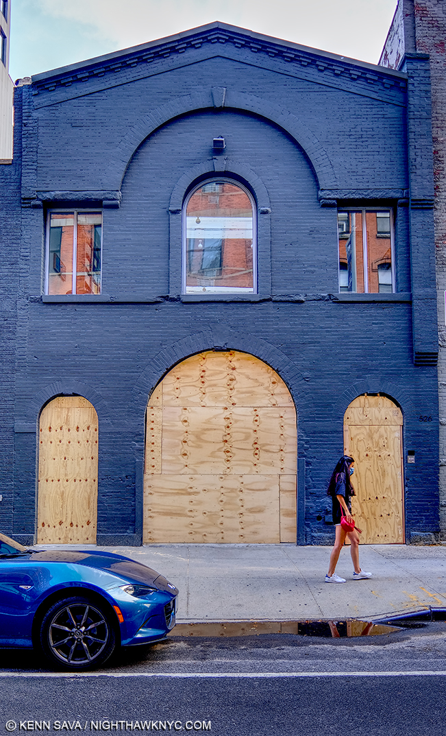
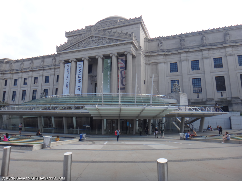
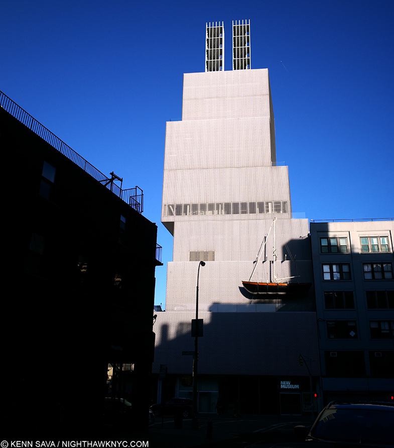
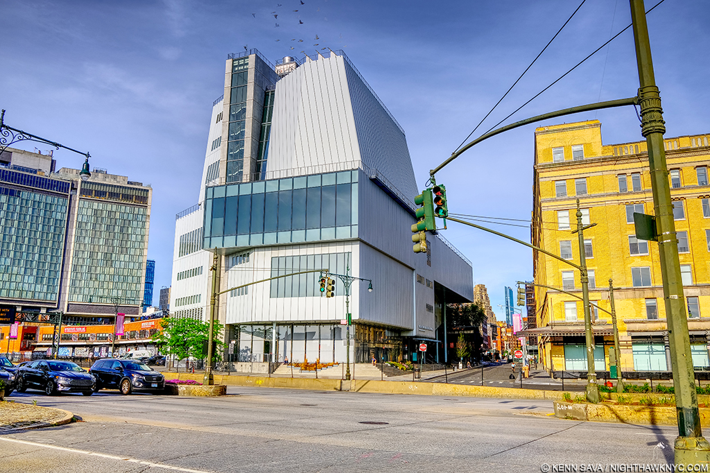
Stepping Into “Edward Hopper’s Nighthawks”

This site is Free & Ad-Free! If you find this piece worthwhile, please donate via PayPal to support it & independent Art writing. You can also support it by buying Art & books! Details at the end. Thank you.

Written & Photographed by Kenn Sava.

The numeric convergence begins. August 28, 2013, eleven years ago next month- – The last time I stood in front of the real thing- Edward Hopper, Nighthawks, 1942, at Hopper Drawings at the old Whitney Museum. A moment later, a friend snapped a picture of me standing next to it. Would I ever get closer to it? Pictures in this piece are thumbnails. Click any for full size.

The Edward Hopper/NighthawkNYC Convergence, 1-

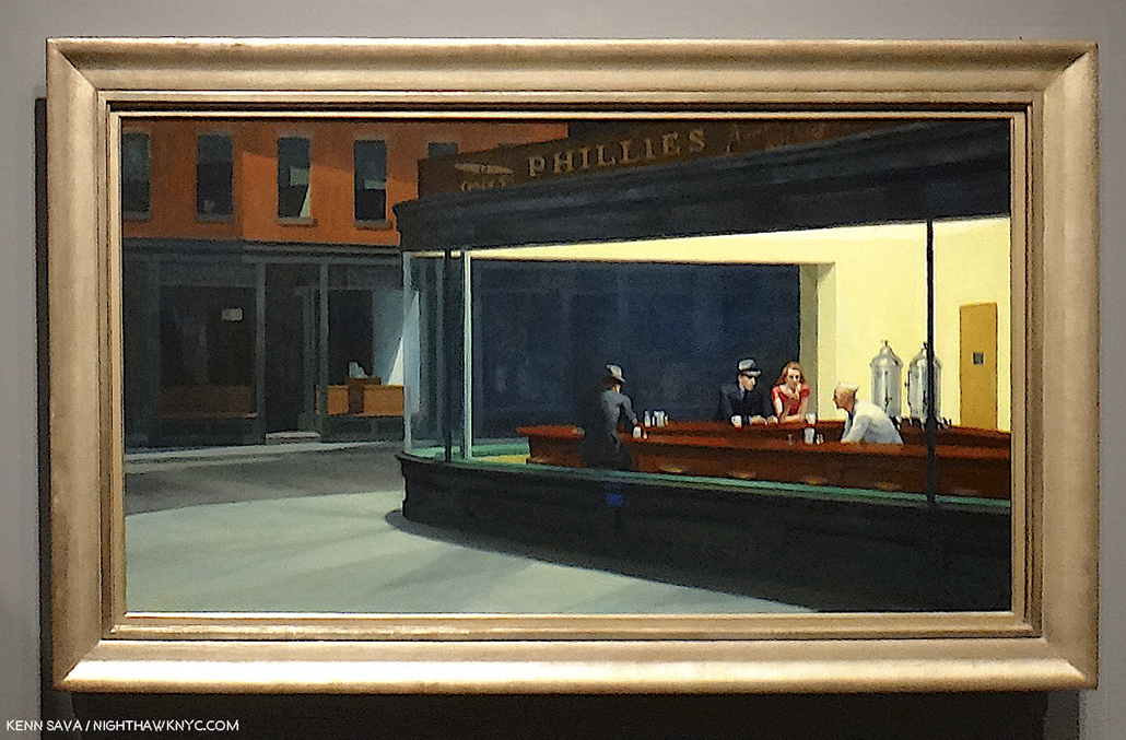
July 15, 2015, nine years ago this month, in my very first piece, “Welcome to the Night,” I mentioned I’ve always related to that figure sitting by himself with his back to the viewer in Edward Hopper’s Nighthawks, 1942. The one that no one ever talks about. Why is he even in the Painting?  Well, he’s really only half in it; his left side completely blends into the black background. So, what’s his deal? Did his date go bad? Is he worried about the recent outbreak of World War II? Is he waiting for the lady in red to lose her guy? (The couple are likely Edward & Jo Hopper stand-ins.1).  Well, he’s there and I’m glad he is. He’s also a witness to everything going on inside, close enough to the other subjects to hear their conversations. In Nighthawks, he has THE ideal seat to see and hear everything that’s really going on, that the rest of us can only imagine.

I’ve been that guy too many times to count, out on my own late at night in Hopper’s Greenwich Village neighborhood. I relate to that “witness” aspect of him, too. After all, isn’t that what I’m doing here; being a witness to the Art, Photography, Music  books I’ve experienced?. So, I named this site NighthawkNYC after him. Hopper’s Painting is titled “Nighthawks.”

But, what would it be like to be him?

Triple self-portrait, August 28, 2013. “That shape is my shade, there where I used to stand,” as I quoted Steely Dan’s “Deacon Blues” in my very first piece, “Welcome to the Night,” on July 15, 2015.

Convergence 2-

On July 29, 2019, five years ago this week, I published “My Search For Edward Hopper’s Nighthawks Diner,” chronicling my decades-long quest to find the iconic eatery/drinkery. It’s turned out to be my most popular piece thus far.

This past Sunday, July 21st, I finally found it!

It happened to be on a triangular corner- Check.
It happened to be in the West Village, not all that far from 3 Washington Square, where Edward & Jo Hopper lived for half a century- both key criteria the real deal has to fit- Check.
But, it was not where I’d looked for it as I wrote in the piece. It was out in the open! Without a roof!?

I let that slide. After all, in the Painting we really can’t see the ceiling, just the light coming down, and it’s a one-story building shown at night. Maybe there was no roof? Imagine that. “Maybe. Maybe not,” I hear you saying.

The famous “Only 5c Phillies America’s No. 1 Cigar” sign was up top- Check.
The outside was painted in that familiar green- Check.

Everything looked like it was supposed to. Am I dreaming? Then, a nice gent named Nilo beckoned me inside!

As I approached the counter, about to take “my”place- the only seat I was interested in taking,  all the details long engrained in my memory were right in front of me.

It was empty. Wow. Perfect! I could look around and drink it all in without feeling self-conscious. Wait!…AM I conscious? A coffee will wake me up. I’m in the right place.

Living a dream…Kenn Sava, left, Lucas, right. July 21, 2024, Meatpacking District, NYC. Photo by Nilo for NighthawkNYC.com.

I could take the seat of my alter ego in peace, without that pesky couple, she in the flame-red dress, with her male companion, who for the past 82 years have gotten all the attention, in the room. I was free to finally chat with the counterman. His name was Lucas and I told him how long I’ve been looking for the place- and even wrote about just that, the nice weather, what else was going on this weekend. You know, small talk; the kind of stuff strangers talk about when they’re suddenly thrust together. But, we weren’t total strangers in the classic sense. We both knew why we were here. As he went back and forth to his duties, I just kept looking around, drinking it all in. Wow. I’m sitting inside of Nighthawks!

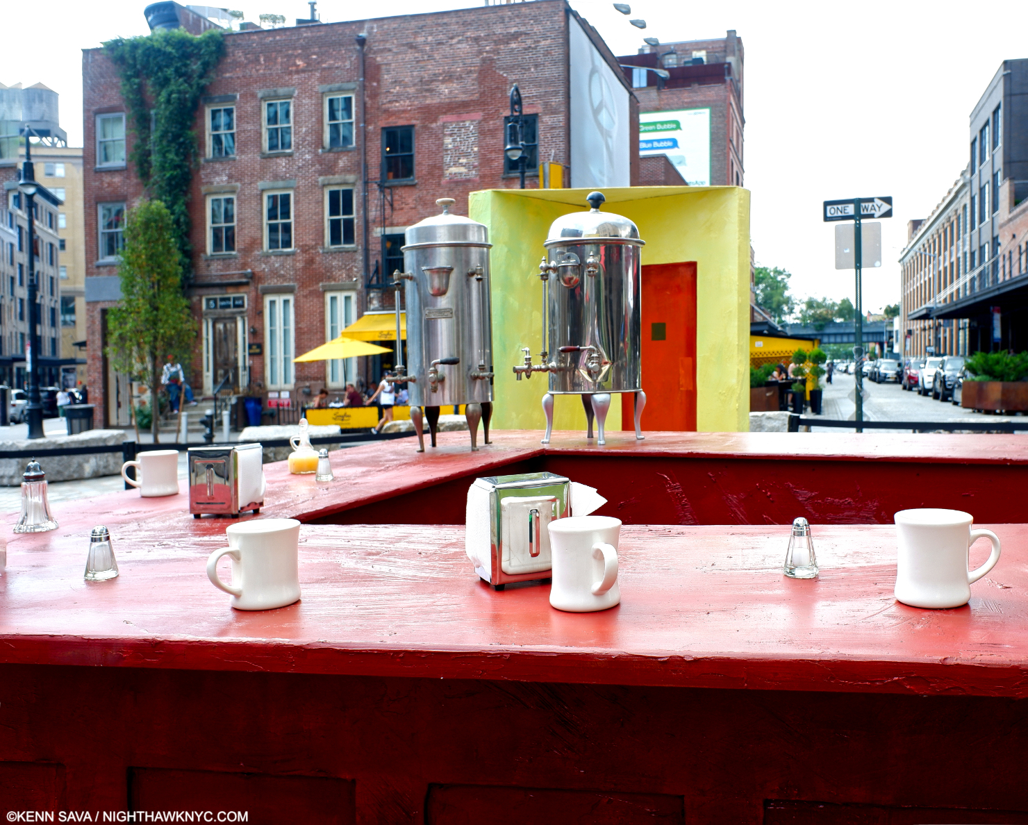
There’s the famous two large coffee urns.
There’s the yellow wall with that mysterious door.
The bar was the familiar brown.
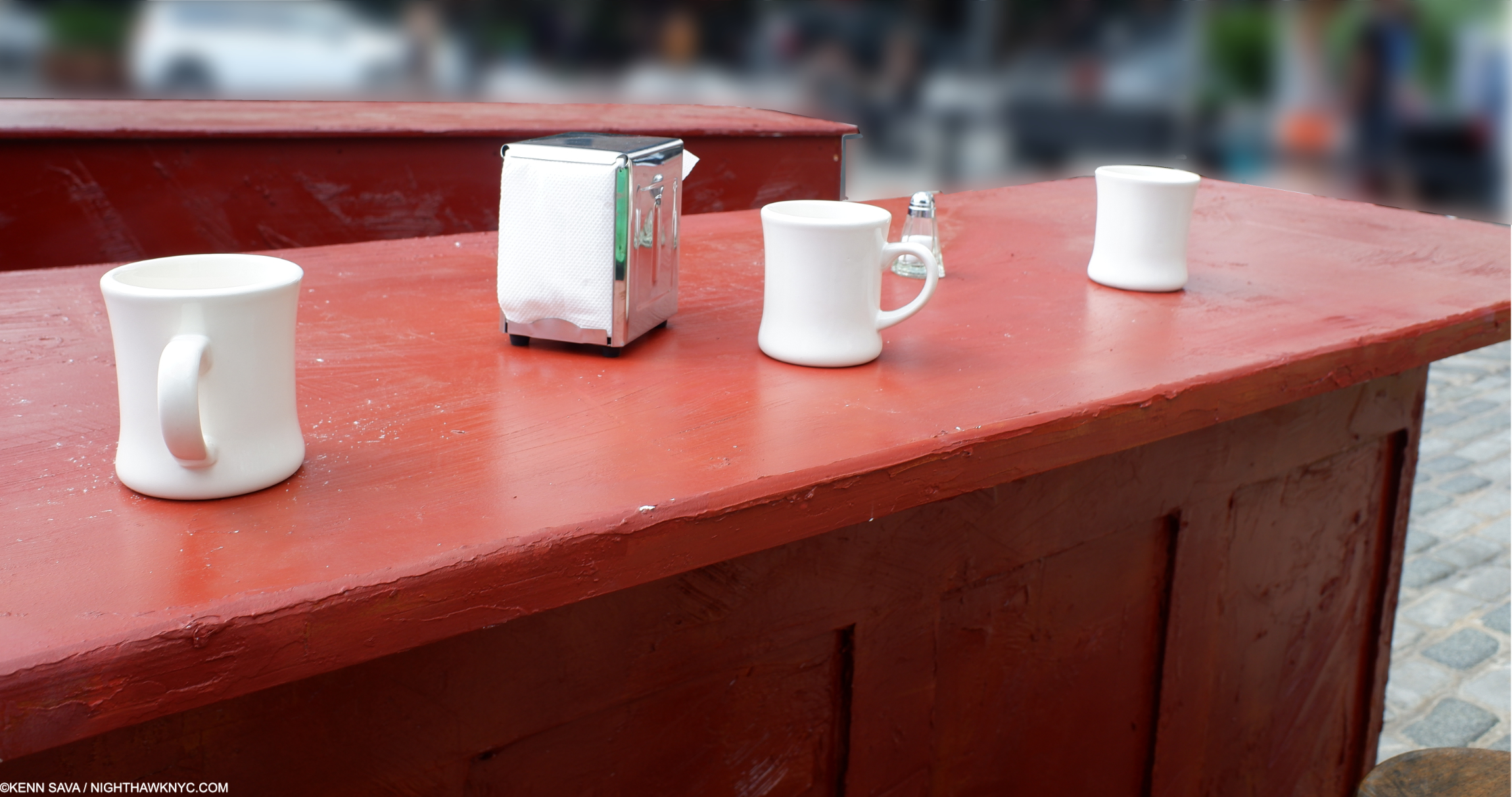
The classic white ceramic coffee cups, glass salt & peppers, and napkin dispensers were all around giving me a feeling of familiarity and “home.” I guess that’s what happens when you’ve been looking at them for so long in Painted form.

So real, you could reach out and touch them. Of course, I did…

And, I got to experience it from THE seat, to see what “he” saw and ponder him anew. Maybe “he” was me in a prior life. If so, how many people have gotten to relive a moment from a prior life?

This MUST be the place! FINALLY! I can’t wait to rush home and tell readers I found it! What a scoop!

A close call with a bike running a Walk sign on the walk home snapped me out of it and back to reality. As I reviewed my pictures to make sure my phone was OK, it turns out I had come upon something called “Step Into Hopper. 

Convergence 3-

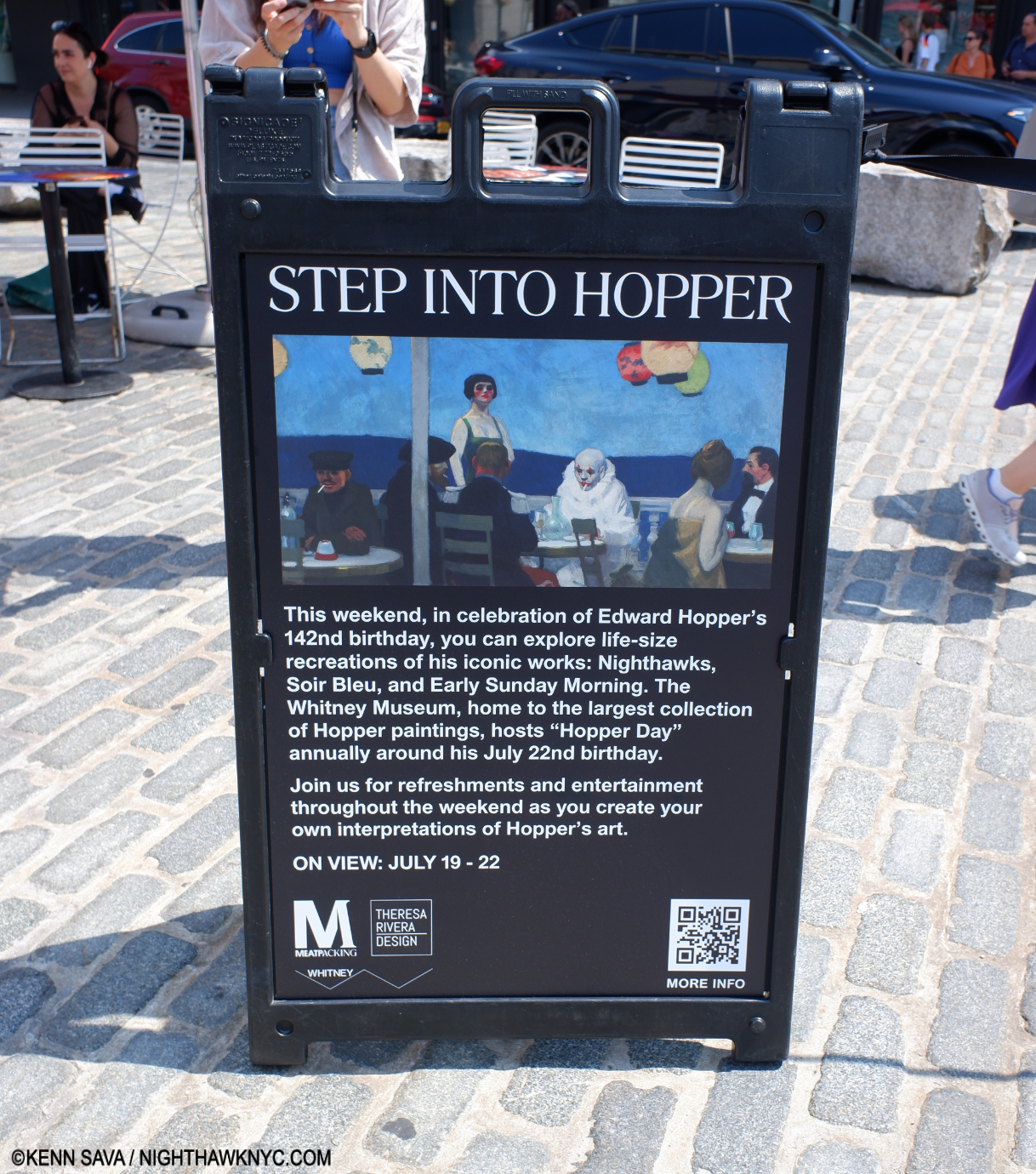
After nine years of “riffing” on Nighthawks in my Banner, it finally came to life! The Whitney Museum & the Meatpacking District got together to mount “Step Into Hopper,” along with fabrication by Theresa Rivera Design and an exceptional, welcoming, staff, to “recreate” Nighthawks, 1942, Early Sunday Morning, 1930, and his eternally mysterious Soir Bleu, 1914within one mile or so of the original sites of two of them2.

“Early Sunday Morning,” a take-off on Hopper’s 1930 timeless masterpiece of a street in my neighborhood, a few blocks away, on Seventh Avenue between West 15th & 16th Streets. Notice the shadow from the barber pole goes the “wrong way,” as it does in the Painting. People who live there know the sun never shines in that direction on 7th & 15/16th!

Convergence 4-

It truly was a moment frozen in time. Something out of a dream… I ended “My Search For Edward Hopper’s Nighthawks Diner”  with a quote from the song I chose as the Soundtrack for the piece, “I Saw You In A Dream” by Japanese House….

“I saw you in a dream
You had stayed the same
You were beckoning me
Said that I had changed”

How prescient.

Before I “changed.” Take away the side addition, and the former Rivera Cafe on 7th Avenue was my “Oh my gosh!” moment, as I wrote in “My Search…” Seen on July 23, 2018- convegently, six years ago this week.

In reading the mail that continues to come in on the piece, it seems that many people share my dream of unexpectedly coming across the Nighthawks Diner and having an “Oh my gosh!” moment of discovery.

Kenn Sava “inside” “Soir Bleu” (the Painting seen on the sandwich sign above) with the wonderful Tillie the Clown proving every bit as mysterious and stunning as the figure in the 1914 Painting done in Paris. Photo by Gregory for NighthawkNYC.com

A lot of folks seem to want to step inside, sit down at the counter for a bit, and just live in the Painting; experience it from the inside  even for a few moments. As if that might help solve its mystery…On Sunday, I came as close as I’m likely going to to having my “Nighthawks” moment.

A few moments after the Photo of me and Lucas inside “Nighthawks” was taken, I looked around for him and couldn’t find him. Lucas disappeared.

Of course he did.

Convergence 142-

Today, as I write this on July 22nd is Edward Hopper’s 142nd Birthday. Happy Birthday, big guy (Hopper was 6’5″). Thanks for saving me a seat in Art heaven. A short visit is probably the best I can hope for.

*- As it was for “Welcome to the Night” 9 years ago, the Soundtrack for this piece is  “Deacon Blues,” by Steely Dan (my “Forgotten Songs I Will Love Forever #2″, which remains the Anthem of NighthawkNYC.com, from their immortal album Aja, 1977. (I have no idea why the guy who made tihis video shows their album Gaucho. Ignore that- it’s Track 3 on Aja.)

“Sharing the things we know and love
With those of my kind
Libations, sensations
That stagger the mind.”

If the Nighthawks Diner had a jukebox, I like to think “Deacon Blues” would be on it.

Undying thanks to Kevin Callahan for the tip, the iconic Lucas for the coffee & the convo, Tillie the Clown for the Tillie Experience, Milo, Wendy, Alisa and Gregory for the Photos, their consideration and kindness in creating an experience I’ll never forget. A tip of the Fedora to the Meatpacking District, the Whitney Museum & Theresa Rivera Design for mounting Step Into Hopper. Push by Lana Hattan (9 years of NighthawkNYC.com– it’s ALL her fault!)

Be sure to see my 3-part series on the 2022-23 blockbuster Edward Hopper’s New York which begins here.

NighthawkNYC.com has been entirely self-funded & ad-free for 9 years, during which 330 full-length pieces have been published! If you’ve found it worthwhile, PLEASE donate by PayPal below to allow me to continue. Thank you, Kenn.

You can also support it by buying Art, Art & Photography books, and Music from my collection! Art & Books may be found here. Music here and here.

Written & photographed by Kenn Sava for nighthawknyc.com unless otherwise credited. To send comments, thoughts, feedback or propositions click here. Click the white box on the upper right for the archives or to search them. Subscribe to be notified of new Posts below. Your information will be used for no other purpose.

For “short takes,” my ongoing “Visual Diary” series, and outtakes from my pieces, be sure to follow @nighthawk_nyc on Instagram!

  1. Cone to think of it, why are both guys wearing their Fedoras inside? Preparing for quick exits?
  2. The original site of Nighthawks remains up for discussion, as I wrote about, but most likely was inspired by locations in the nearby West Village.

Jaune Quick-to-See Smith’s Survival Map

This site is Free & Ad-Free! If you find this piece worthwhile, please donate via PayPal to support it & independent Art writing. You can also support it by buying Art & books! Details at the end. Thank you.

Written & Photographed by Kenn Sava

Show Seen: Jaune Quick-to-See Smith: Memory Map @ The Whitney Museum

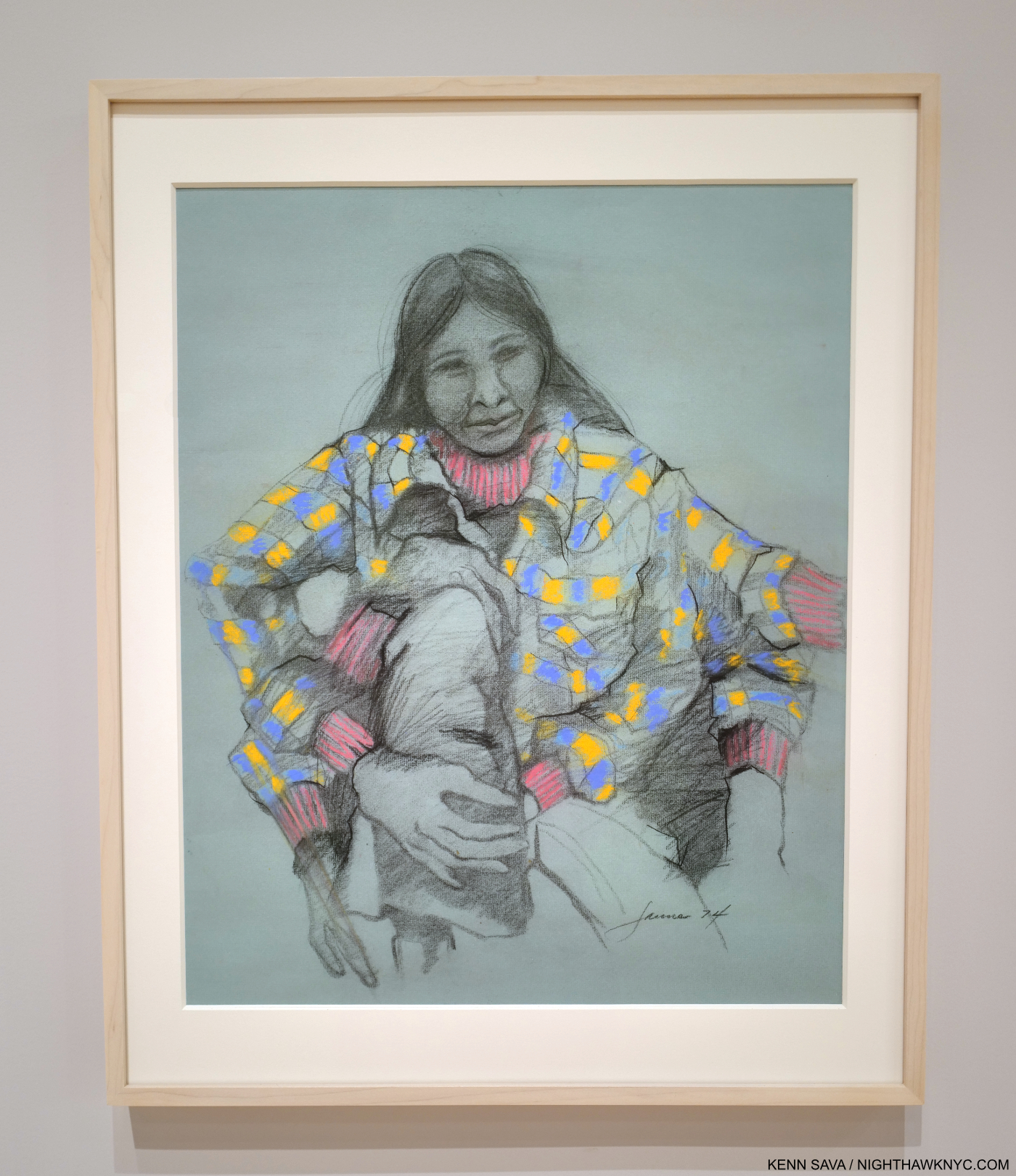
Indian Madonna Enthroned, 1974, Mixed-media.

It took 83 years for Jaune Quick-to-See Smith to get her first NYC retrospective. As if that’s not notable enough, Jaune Quick-to-See Smith: Memory Map is also the “largest and most comprehensive show of her work to date,” the Whitney says of its installation of 130 of her Paintings, Drawings, Prints, and Sculptures covering almost 5 decades of her career on its 5th floor, where it follows Edward Hopper’s New York, and 3rd floors.

Self-Portrait, 1974, Pastel, graphite pencil and charcoal on paper. The Artist showing herself with 6 arms.

Born in 1940, a citizen of the Confederated Salish and Kootenai Nation, the show reveals Jaune Quick-to-See Smith to be an Artist of her time, one that is fluent with contemporary Art styles and techniques. An Artist, and a person, passionate about the well-being of her people and the world in which they, and we all, live. Yet, she’s also been ahead of her time in bringing many issues her people face to the Art world, which has only recently begun to be more open to Indigenous Artists.

Homeland, 2017, Oil and acrylic on canvas, radiates from the Confederated Salish and Kootenai Nation’s Flathead Reservation in Montana.

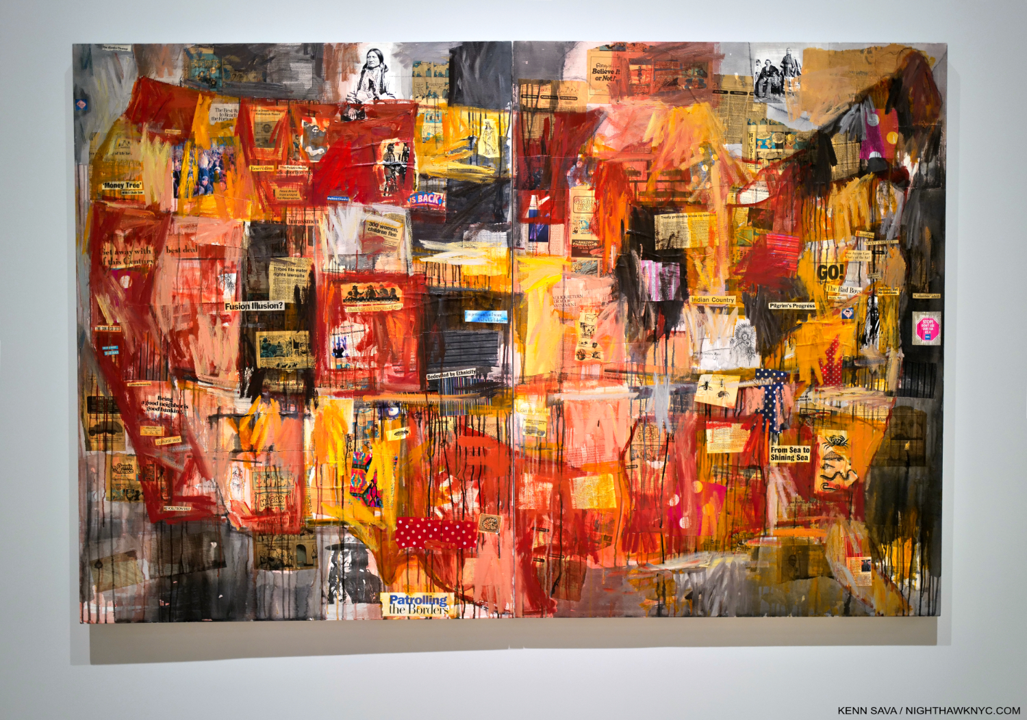
Indian Map, 1992, Oil, paper, newspaper and fabric on canvas.

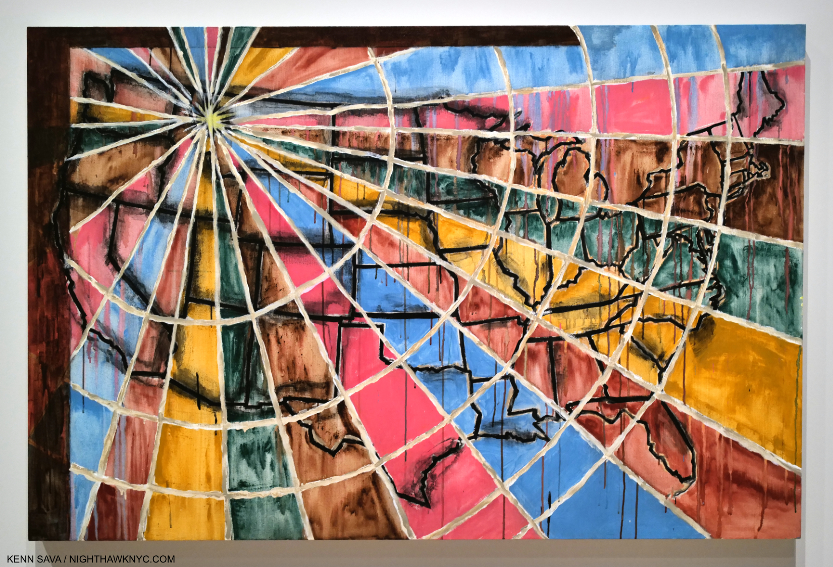
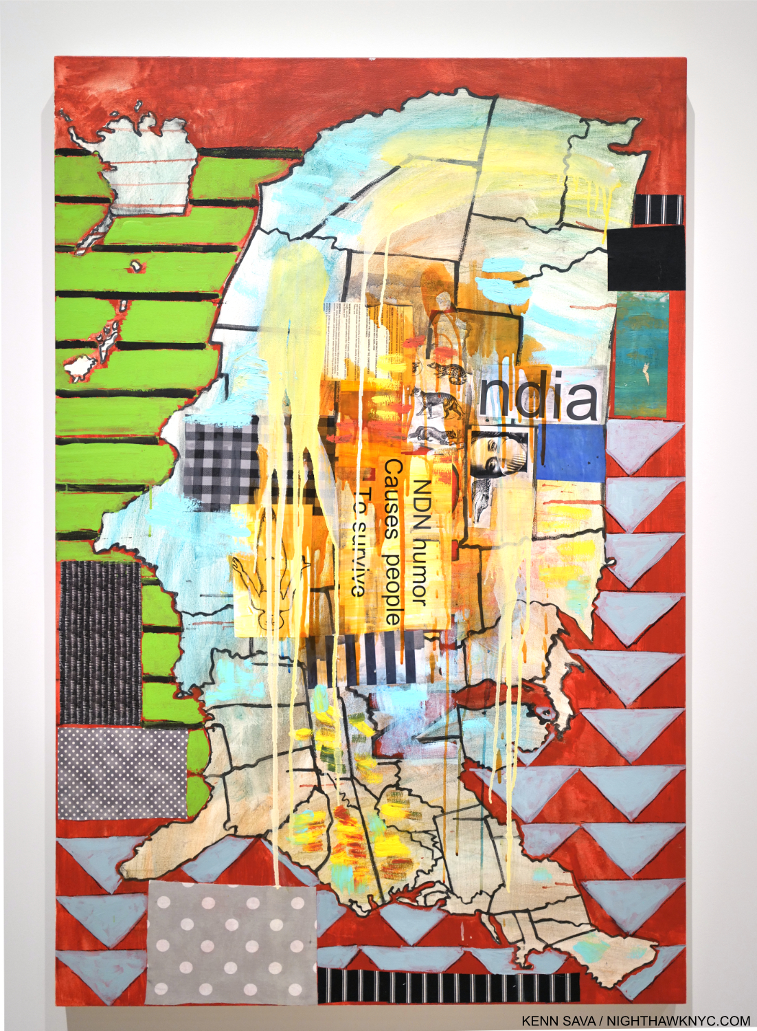
Survival Map, 2021, Acrylic, ink, charcoal, fabric, and paper on canvas

As a result, it seems to me that her work has been on the line between being of its time and ahead of its time throughout her career, both in terms of style and content. She proves herself fluent in moulding the language developed by her peers to her purposes over her career while also creating as many of her own innovations.

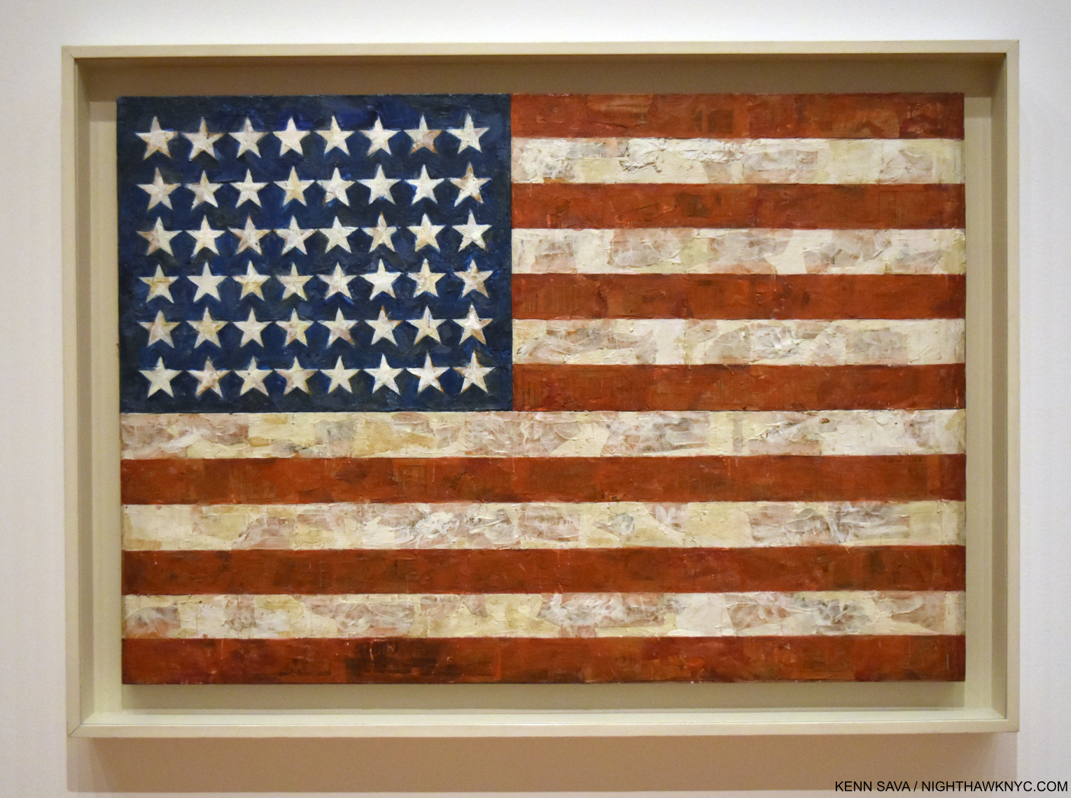
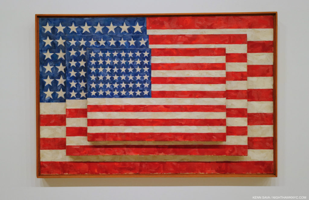
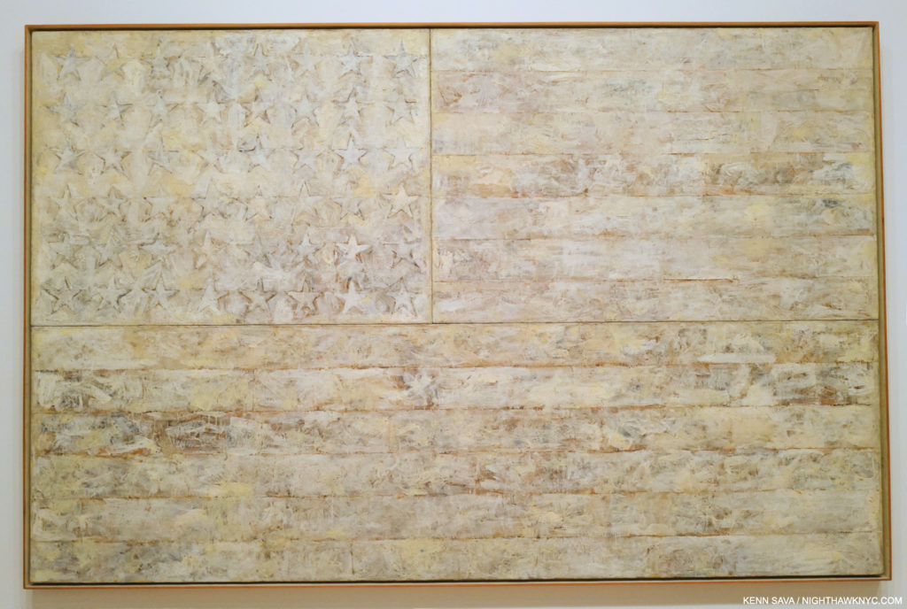
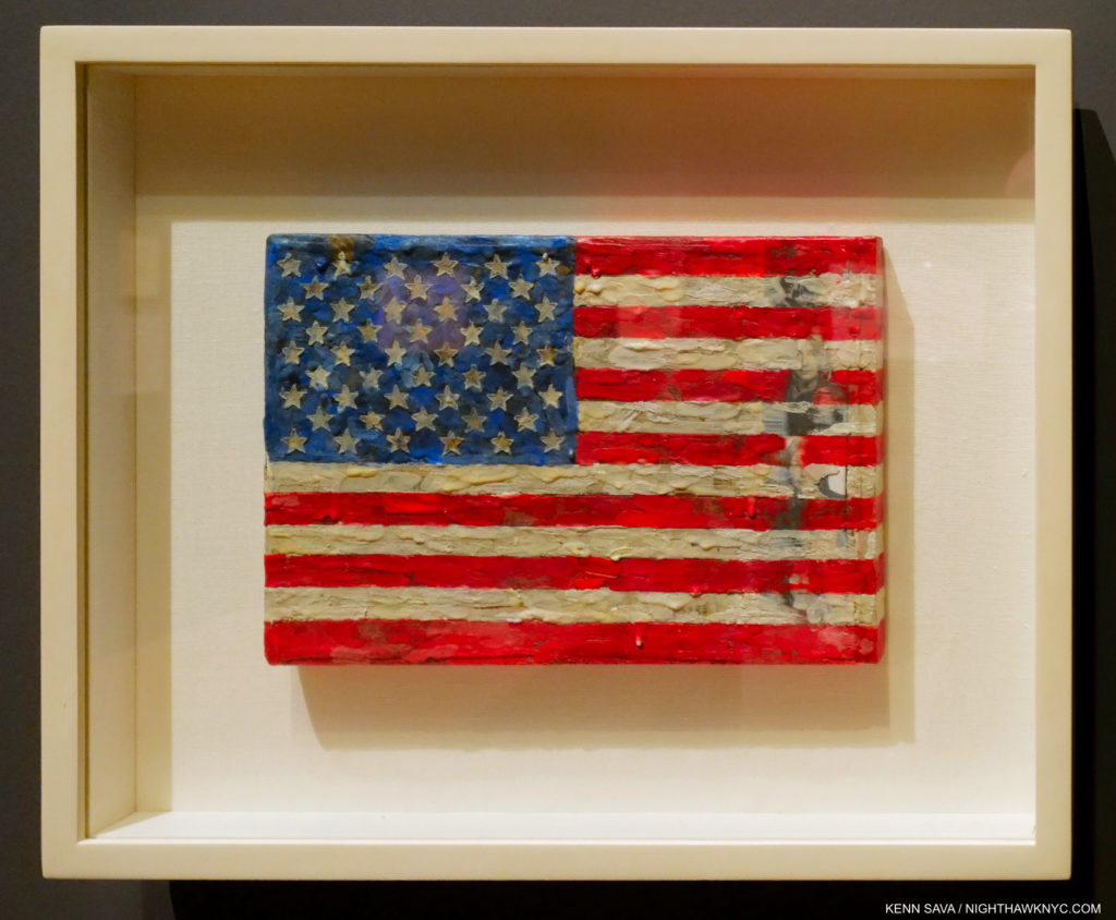
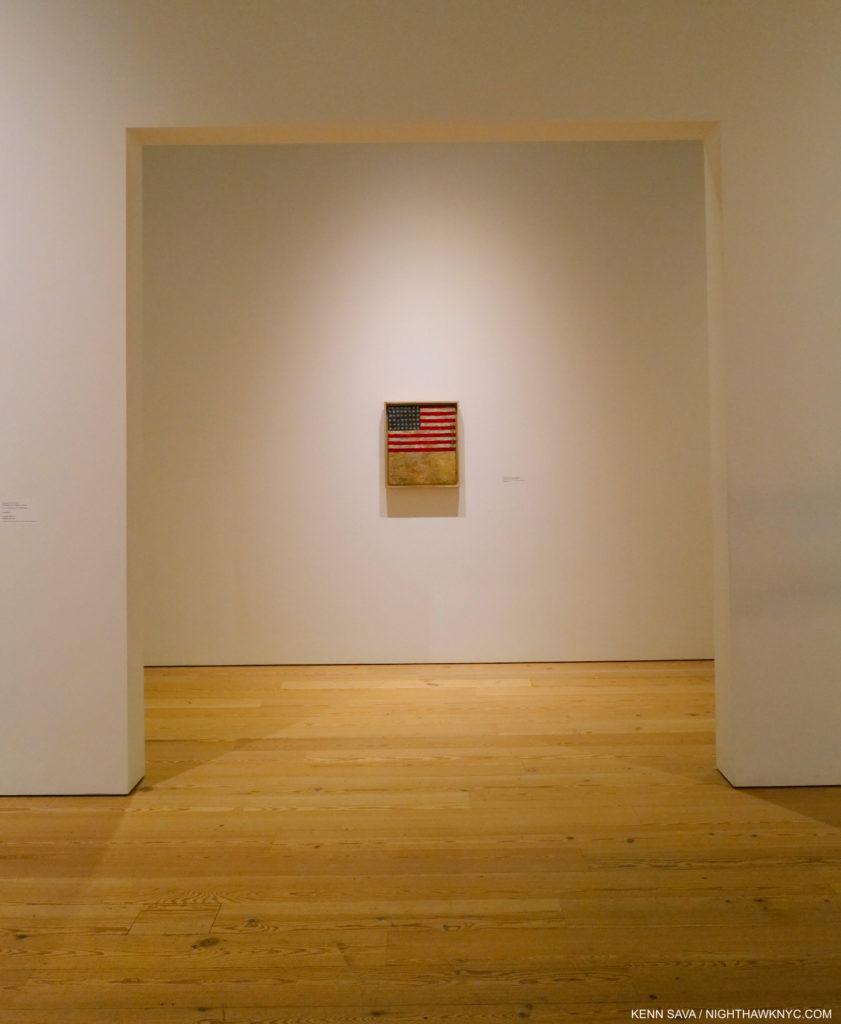
Jasper Johns, Flag, 1954-55, Encaustic, oil, and collage on fabric mounted on plywood, three panels, seen at MoMA, 2017.

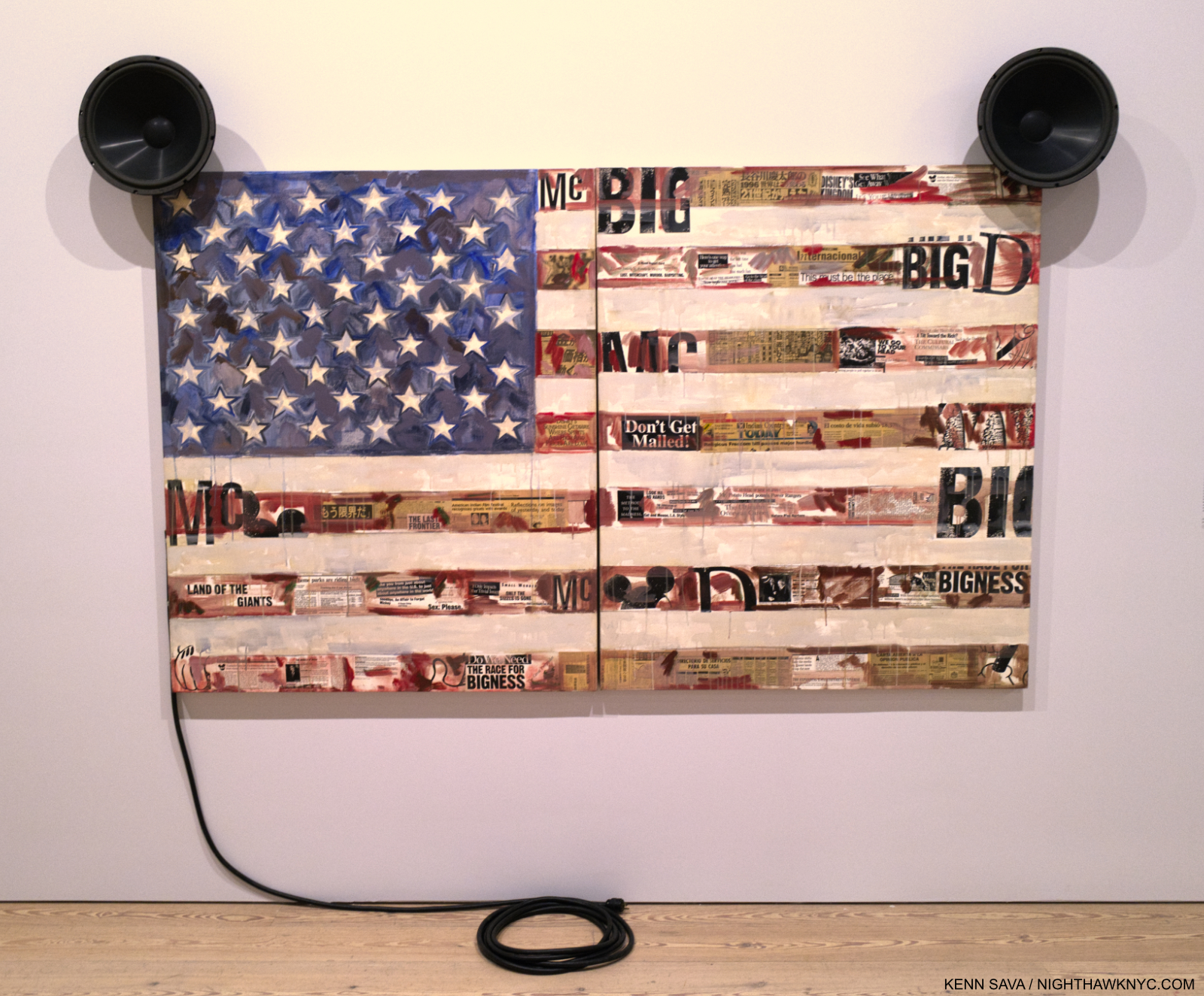
McFlag, 1996, Oil, paper and newspaper on canvas with speakers and electrical cord

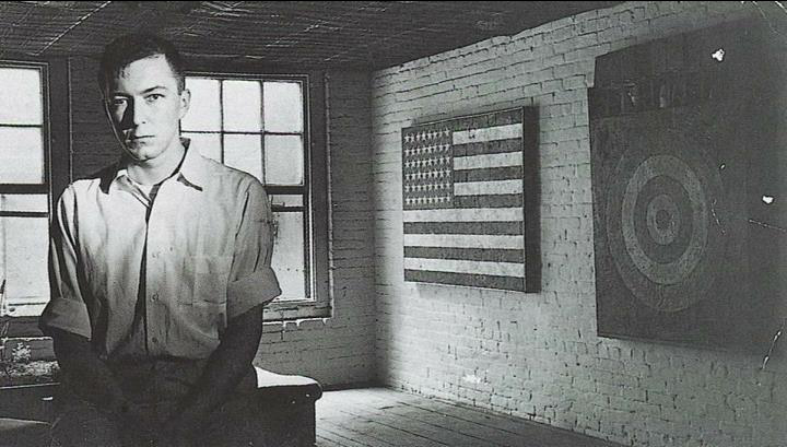
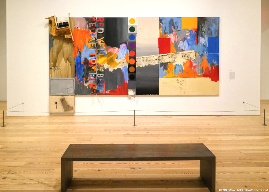
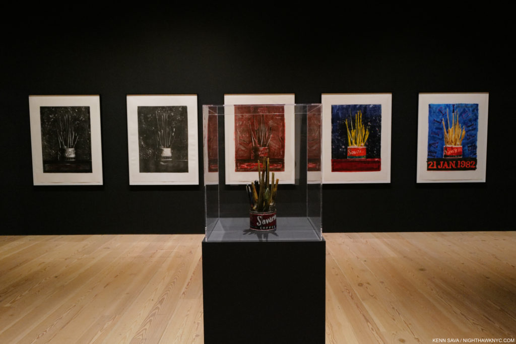
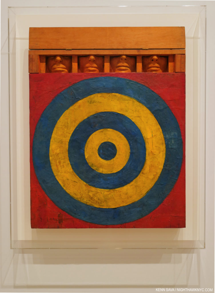
Among the numerous Artists she references, including Magritte and Picasso, two names repeatedly came to mind, both at the forefront of the developments in American Contemporary Art of her time. Maps and Flags play a central role in the work on view, echoing Jasper Johns (B. May 15, 1930). Whereas Mr. Johns’s intentions for using the flag and maps remains, like most of his work, ambiguous, Ms. Quick-to-See Smith uses them to powerfully present the lives and issues faced by Indigenous People. 

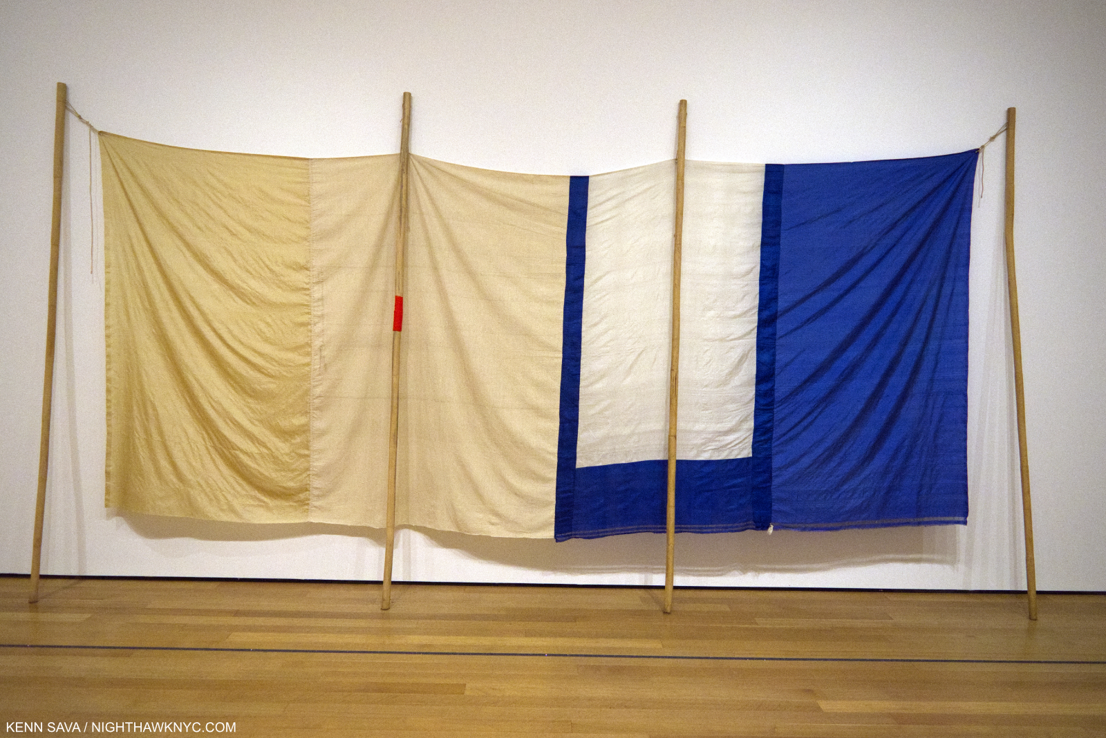
Robert Rauschenberg, Gull (Jammer), 1976, Sewn silk, rattan poles, and twine, 1976, seen at MoMA in 2017.

Other works echo Robert Rauschenberg (Oct 22, 1925- May 12, 2008).

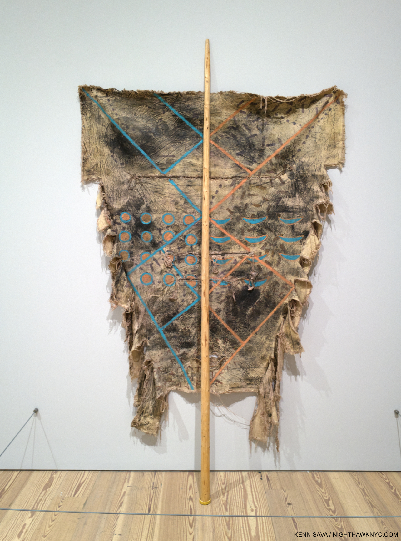
Ronan Robe #4, 1977, Oil, beeswax, charcoal and soot on canvas with lodgepole.

In 1985, the Artist got involved in efforts to save Petroglyph Park in New Mexico, creating what would become her Petroglyph Park Series, 1985-7, and marking the beginning of the appearance of current events in her Art.

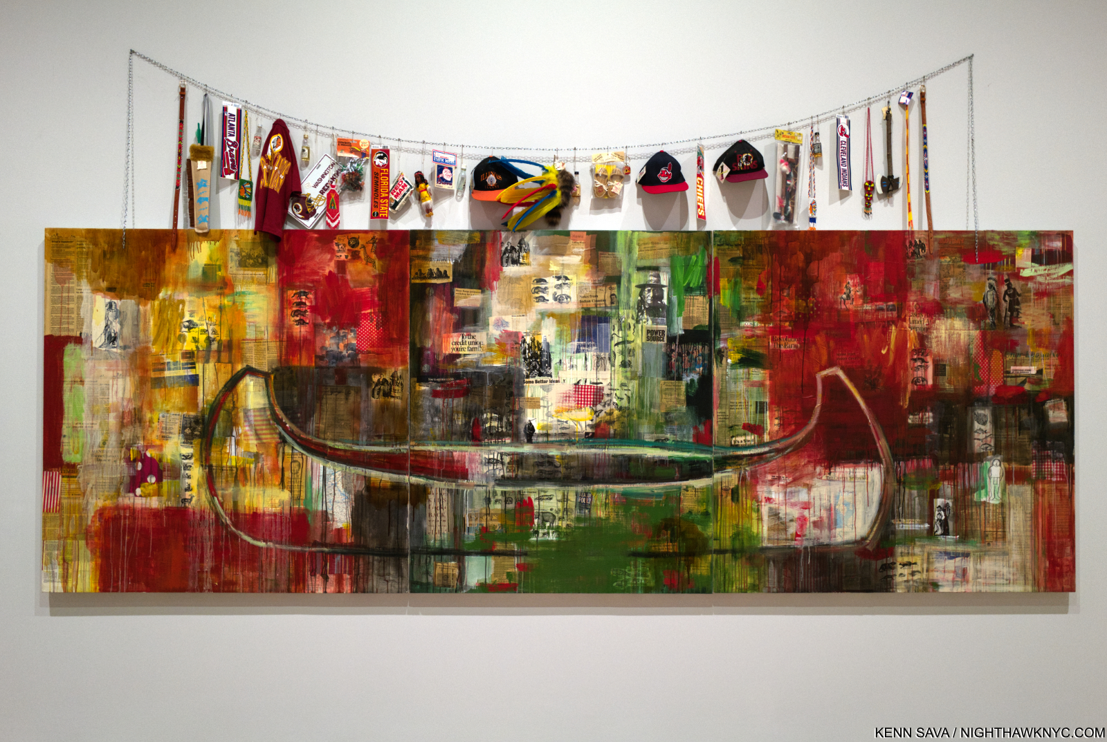
Trade (Gifts for Trading Land with White People), 1992, Oil, paper, newspaper, and fabric on canvas with found objects on a chain. Perhaps a history of exploitation with “trinkets” being exchanged for land. A number of the sports teams whose ephemera hangs above the Painting, have subsequently changed their names, some have not. Other items shown remain in production, including children’s toys which cheaply knock-off Native American culture.

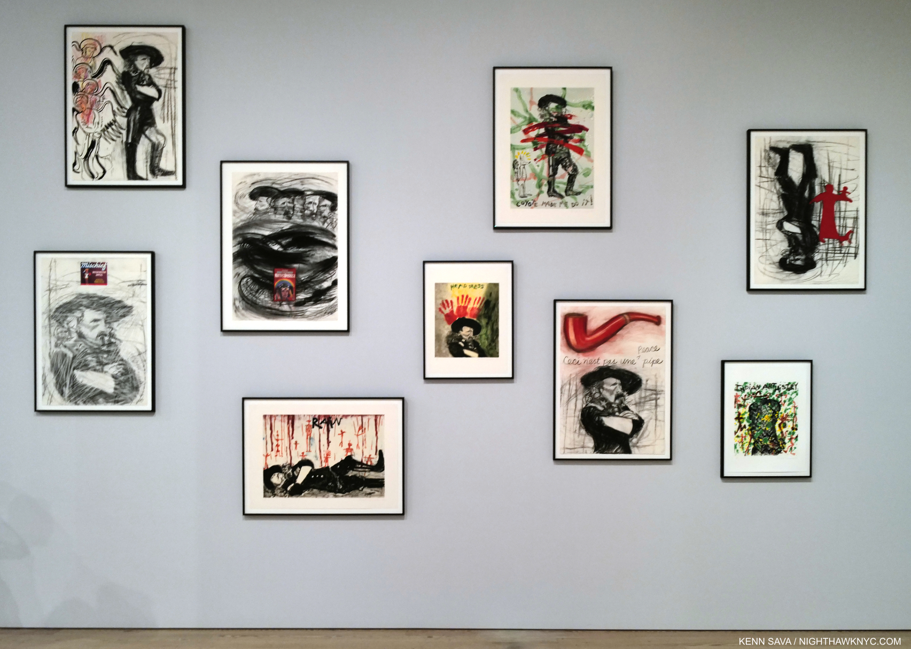
Historic events don’t escape her attention, either.

9 Monotypes from the Custer Series, 1993. The work next to the lower right is after Magritte. The text reads, “This is not a peace pipe.”

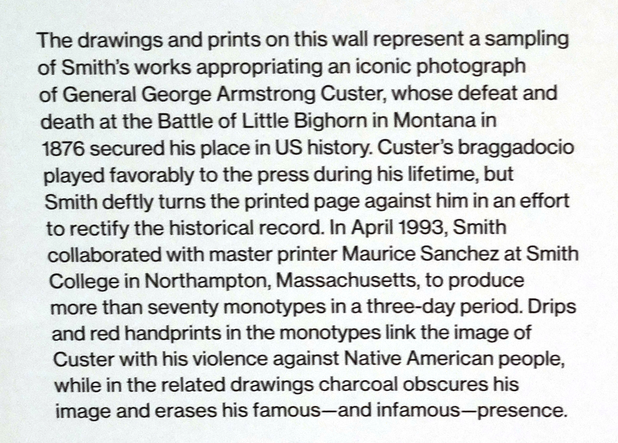
Wall card for the Custer Series.

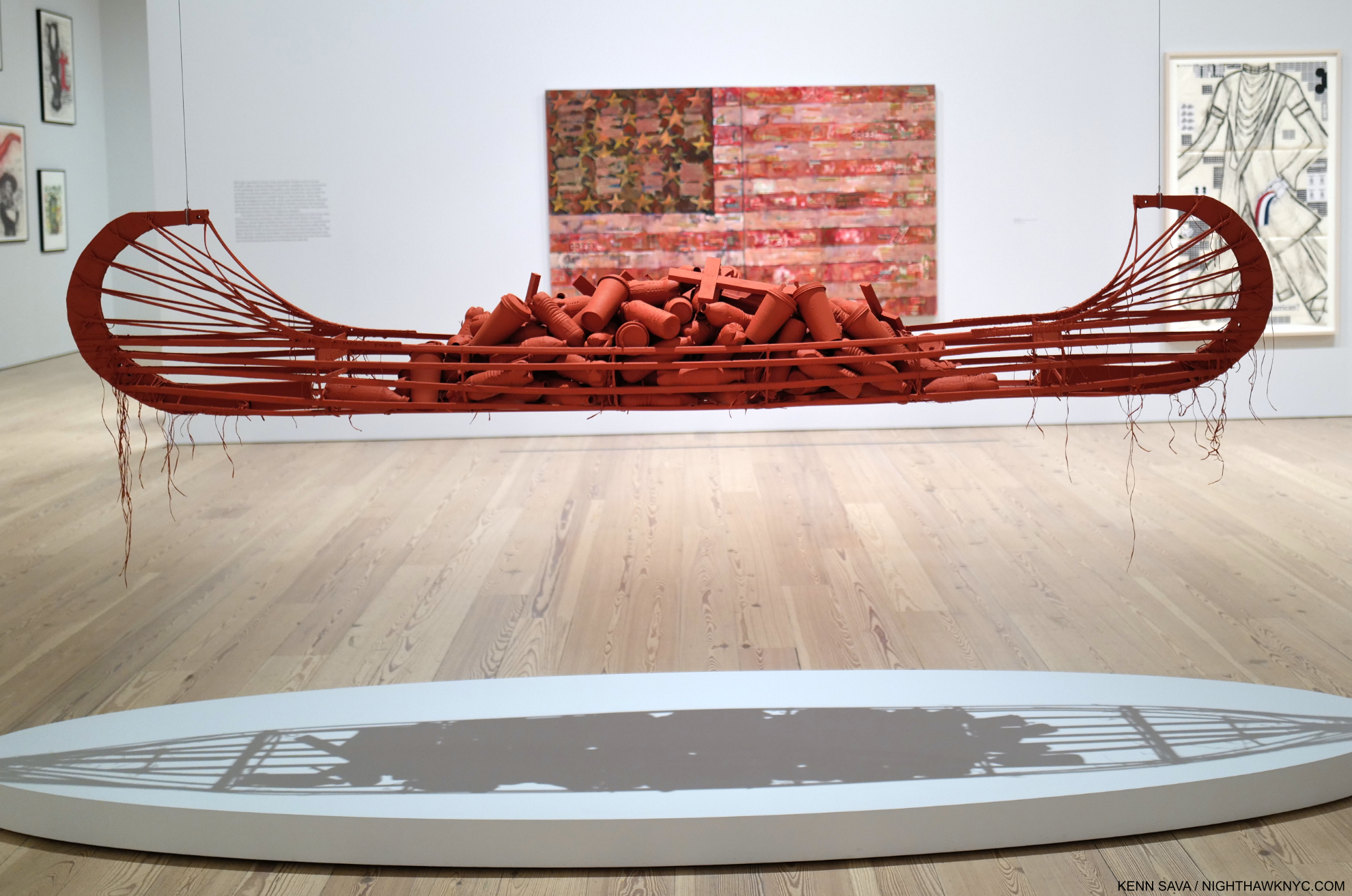
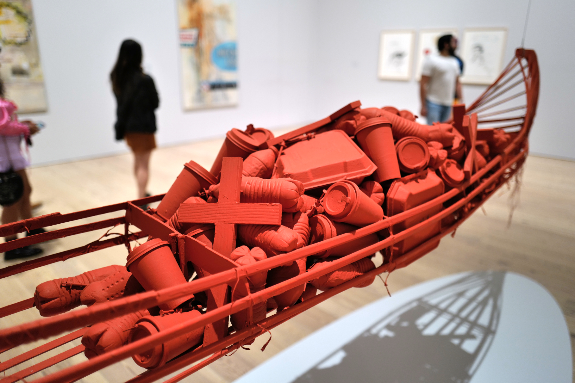
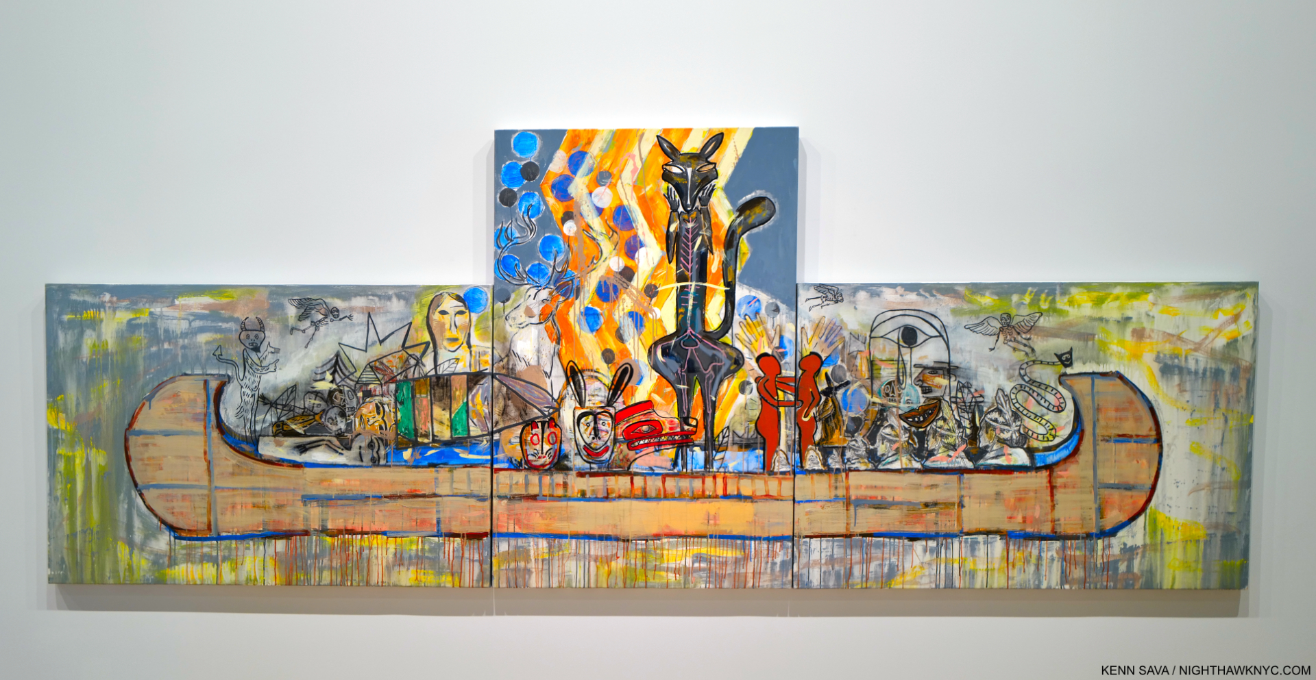
The Confederated Salish and Kootenai Nation’s Flathead Reservation is located in Montana, site of the Little Bighorn. Canoes, often labelled “Trade Canoes” (except for the one above), are a recurring theme, each one rendered strikingly differently.

Trade Canoe: Making Medicine, 2018, Mixed media, foreground, Green Flag, n.d., on the back wall.

Detail.

Trade Canoe: Forty Days and Forty Nights, 2015, Oil, acrylic, oil crayon, paper and charcoal on canvas, introduces the show, and is seen to the left in the picture of the show’s lobby, seen further below.

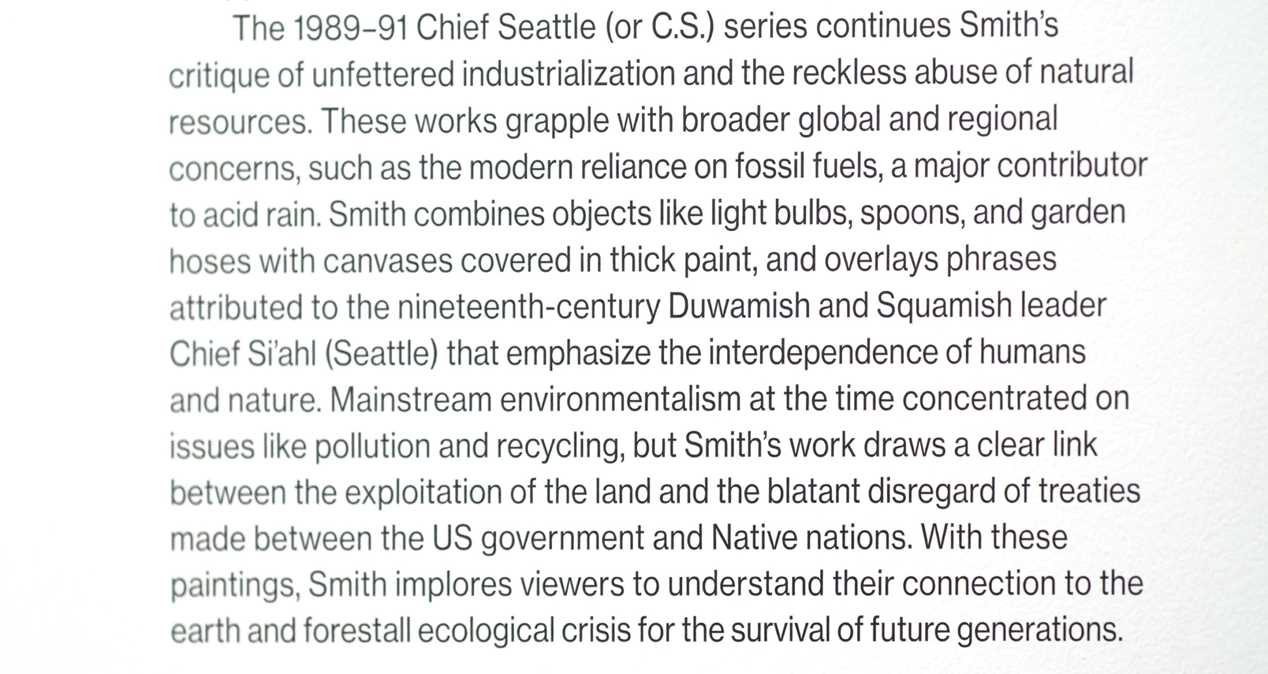
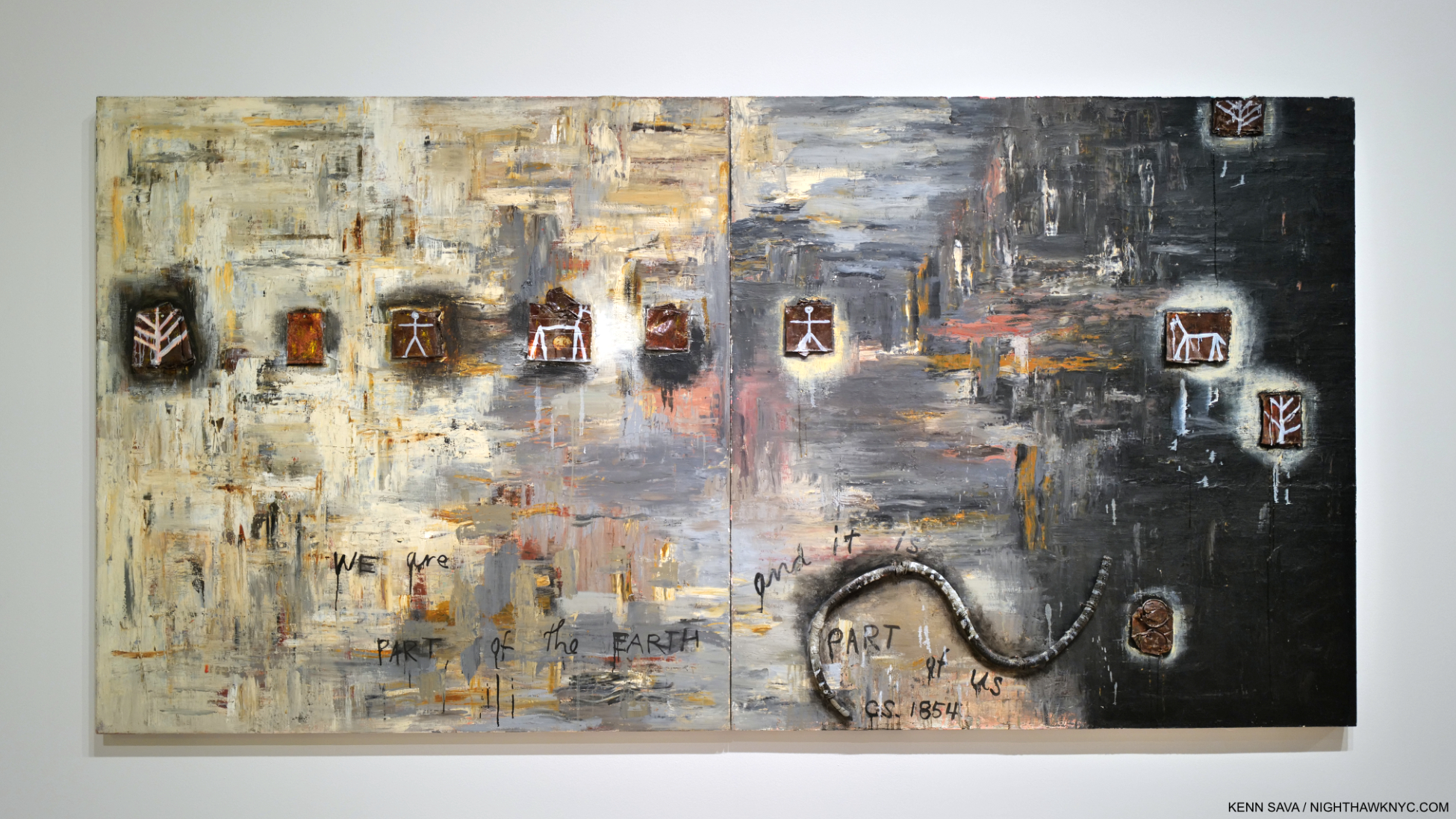
In addition to having her eye on what’s going on around her, her Art also has a wonderful way of looking back to the rich history of her culture. Messages of protest are side by side with sage wisdom. Her Chief Seattle Series (or C.S. Series), 1989-91, does this wonderfully and adds a timeless element to her work. The Wall Card says-

The Garden (C.S. 1854), 1989, Oil, rubber hose, crushed tin and aluminum cans, and nails on canvas. C.S. is Chief Seattle and The Garden is part of Chief Seattle Series from 1989-91. It reads, “WE are part of the EARTH and it is PART of US, C.S., 1854.”

Jaune Quick-to-See Smith has created an important, innovative and powerful body of work that somehow all manages to remain of the moment no matter when she created it. On the one hand, that’s a sign the country hasn’t evolved faster and how much remains to be done. 

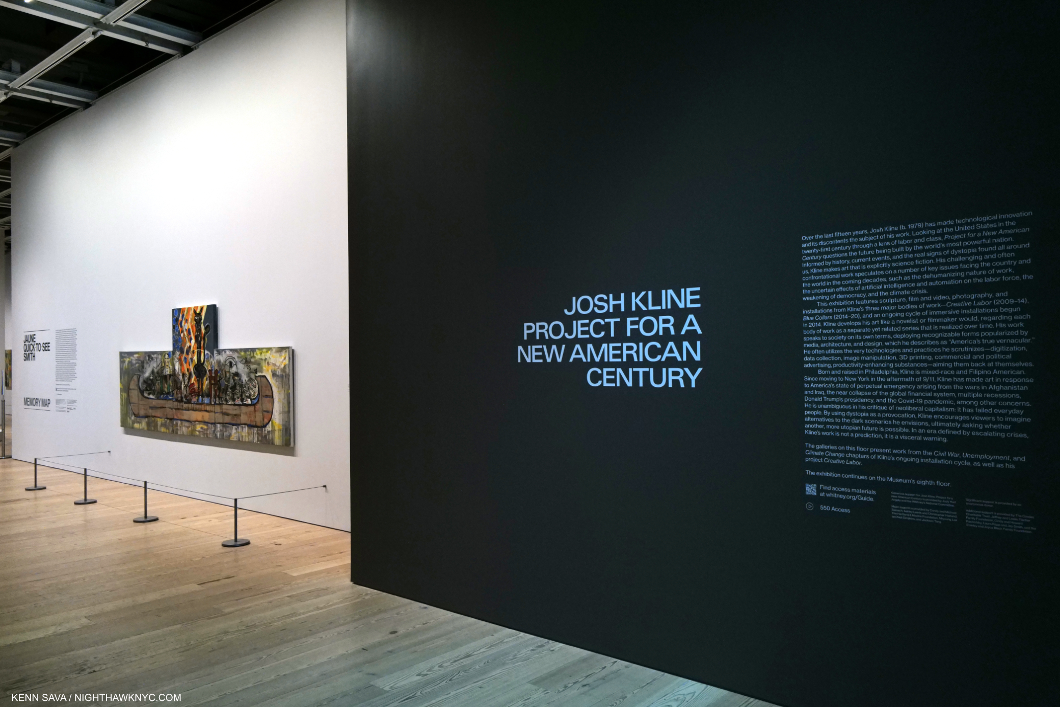
Memory Map shares the 5th floor with Josh Kline: Project for a New American Century, which is compelling in its own right. The shows overlap as both express concern over climate change and the impact of social, economic and technological change on the labor force.

On the other hand, it’s a testament to the Artist’s range, humanity, and perhaps above all, her perseverance. 

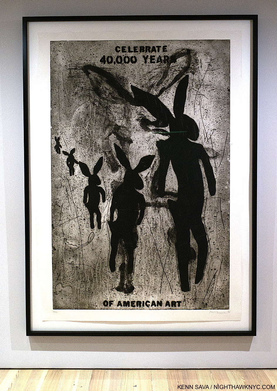
Celebrate 40,000 Years of American Art, 1995, Collagraph. A reminder that the ancient, original Art of our land has yet to be fully appreciated.

In some ways, the case of Jaune Quick-to-See Smith reminds me of Alice Neel, who didn’t see her first full-length monograph published until she was 83, the year before she died. Shows of, and books on, her work have increased ever since. I expect Ms. Quick-to-See Smith to also receive increasing attention as time goes on, and hopefully, she will still be around to see, and enjoy, it. Memory Map proves she deserves every bit of it. 

*- Soundtrack for this piece is “Now That the Buffalo’s Gone” by Buffy Sainte-Marie, who was born on the Piapot 75 Reserve in Saskatchewan, Canada. She announced her retirement from live performance earlier this month after 60 years of performing.

NighthawkNYC.com has been entirely self-funded & ad-free for over 8 years, during which 300 full-length pieces have been published! If you’ve found it worthwhile, PLEASE donate to allow me to continue below. Thank you, Kenn.

You can also support it by buying Art, Art & Photography books, and Music from my collection! Art & Books may be found here. Music here and here.

Written & photographed by Kenn Sava for nighthawknyc.com unless otherwise credited. To send comments, thoughts, feedback or propositions click here. Click the white box on the upper right for the archives or to search them. Subscribe to be notified of new Posts below. Your information will be used for no other purpose.

Edward Hopper At The Whitney: Troubling Choices

This site is Free & Ad-Free! If you find this piece worthwhile, please donate via PayPal to support it & independent Art writing. You can also support it by buying Art & books! Details at the end. Thank you.

This is the Postscript to my series on Edward Hopper’s New York at the Whitney Museum, which may be found here-

 Part 1: Edward Hopper’s Impressions of New York

Part 2: Edward Hopper: The Last Traditionalist Faces Change

The Postscript follows-

Written & Photographed by Kenn Sava (*-unless otherwise credited)

Postscript

“Train wheels running through the back of my memory
When I ran on the hilltop following a pack of wild geese
Someday, everything is going to be smooth like a rhapsody
When I paint my masterpiece.”*

After ALL I said in Parts 1 & 2 about Edward Hopper’s Art & Edward Hopper’s New York at the Whitney, all is not sunshine in the world of Edward Hopper’s Art in 2022-3 in spite of the show’s resounding popularity.

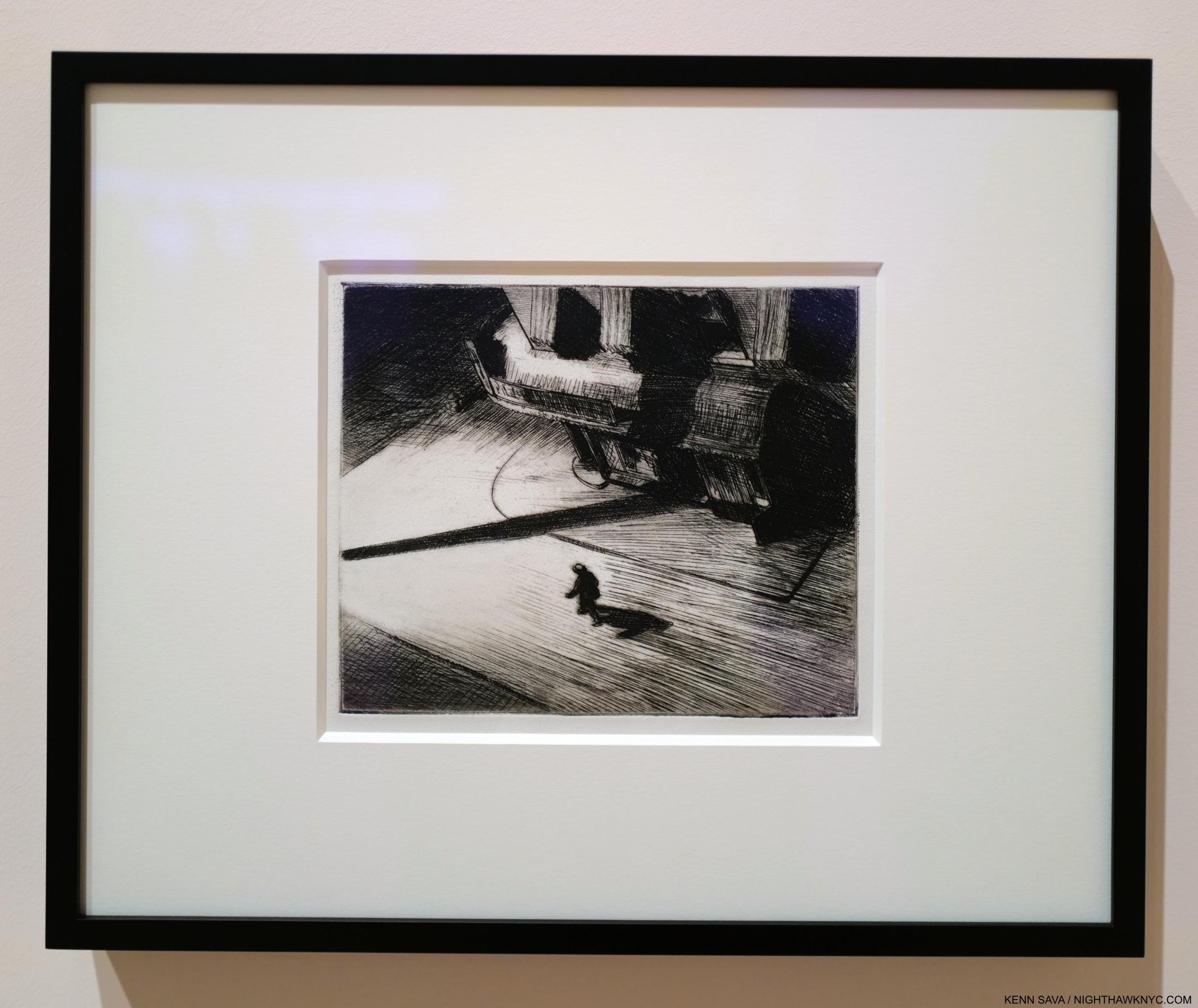
Edward Hopper, Night Shadows, 1921, Etching. One of the first pieces by Hopper to speak to me. Looking at it, I wonder- who is the lonelier? The man walking on the street, or the observer? A similar experience is to be had with Nighthawks. Seen at Edward Hopper’s New York. I chose this piece because it mimics the shadows I see surrounding the Art of Edward Hopper in 2022-23. Click any picture for full size.

While Edward Hopper might not have been a fan of some of the changes he saw going on around him, as I showed in Part 2, those who are admirers of his work may not approve of some of the choices being made involving his Art by the Whitney Museum, the  holders of the largest collection of Edward Hopper’s Art in the world. Their holdings, built up over the prior 40 years, ballooned to extraordinary size when they became the beneficiary of the Jo Hopper Bequest in 1970, which gifted them Edward & his wife Jo’s estates (including both of their Art; Jo was an Artist, too), an unprecedented gift from an American Painter to an American museum. Edward Hopper chose the Whitney as his beneficiary due to Gertrude Vanderbilt Whitney having been an early supporter of his Art. In 1920, Mrs. Whitney’s manager, Juliana Force, gave him his first one-man show at the Whitney Studio Club, the predecessor of the Whitney Museum. After he passed in 1967, Jo Hopper was too ill to change his wishes- which she may well have done had she been in better health1.

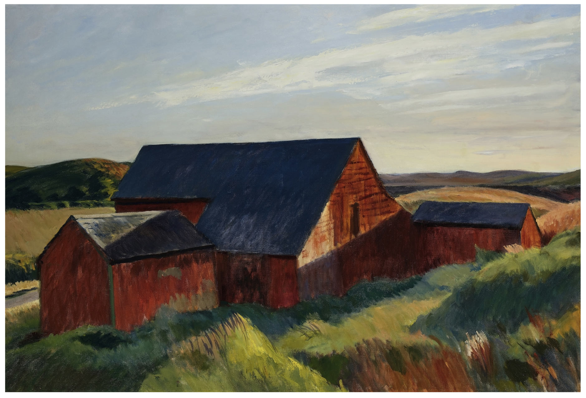
Going…going…SOLD! Cobb’s Barns, South Truro, 1930-3, Oil on canvas. I spent two days in Truro, MA, where the Hoppers spent their summers, back in the 1980s, drinking in the air, the light and the atmosphere Hopper loved for most of his life. *- Whitney Museum Photo. Not in the show.

In May, the Whitney sold (at least) one Edward Hopper Painting, Cobb’s Barns, South Truro, 1930-3 from the 1970 Bequest. I find that quite worrisome (Wait. No. There is no strike-through button in WordPress- make that “I’m sickened by this”) for any number of reasons. For one thing, from what I saw over 14 visits to Edward Hopper’s New York, it looks to me that Hopper’s popularity is, and has been, steadily increasing, world-wide to the point that he is now among the most popular American Artists world-wide, if he is not now the most popular. Is the Whitney “selling at the top” in parting with his work now? Or, is their selling short-sighted?

Of course, no one can foresee the future, and though the Art market has done nothing but go higher since the late 1980s, no bull market lasts forever. As a result, I would have chosen something else to sell while the market is high. With all due respect to the other Artists in their collection, something else not by Hopper. In spite of all that’s already been written about his work these past 100 years, it seems to me it’s still early in the assessment of Edward Hopper’s Art & accomplishment. His work with human subjects has received so much attention that his landscapes, for example, are still to be fully assessed & fully appreciated, I believe, as I said in Part 2. They have begun to receive more attention this past decade, but there is still much to learn from them. Therefore, the Whitney’s decision to sell one of his Landscapes (a man-altered landscape, as I characterized these in Part 2) comes with the risk of being premature. I believe they will be worth more as time goes on. Apparently, so does the buyer.

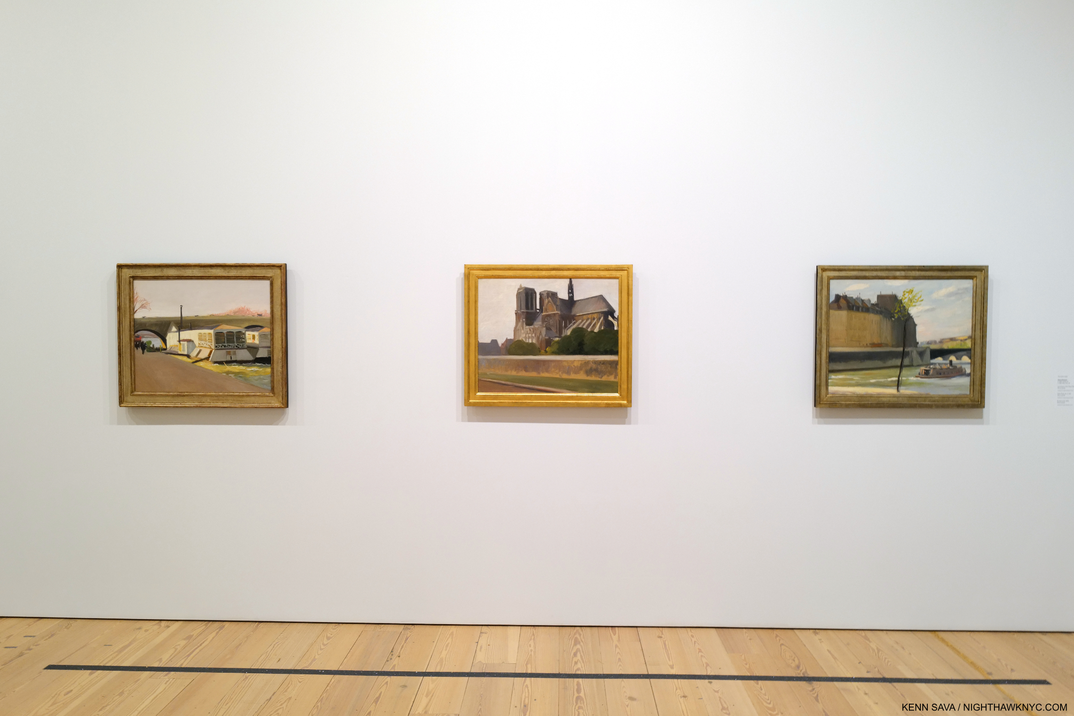
Unbeknownst to most visitors to Edward Hopper’s New York on the 5th Floor, upstairs on 7, the Whitney has been rotating Edward Hopper works in half a gallery. Seen in January, 2023, these three are from his trips to Paris, 1906-10, and so not appropriate for inclusion in the New York show. Like his Landscapes, they have been overlooked to this point.

Besides his Landscapes, his early work (to 1922) also remains under-appreciated and considered it seems to me.

“In every artist’s development the germ of the later work is always found in the earlier. The nucleus around which the artist’s intellect builds his work is himself; the central ego, personality, or whatever it may be called. and this changes little from birth to death. What he was once, he always is, with slight modification. Changing fashions in methods or subject matter alter him little or not at all.” Edward Hopper2

There has not as yet been a full assessment done of them. In light of the powerful work that came later it’s easy to pass these by, but in them I see the germs of much of what was to come. It may be that this early work and his landscapes turn out to not be as popular as his later work. That doesn’t mean they’re not important for other reasons.

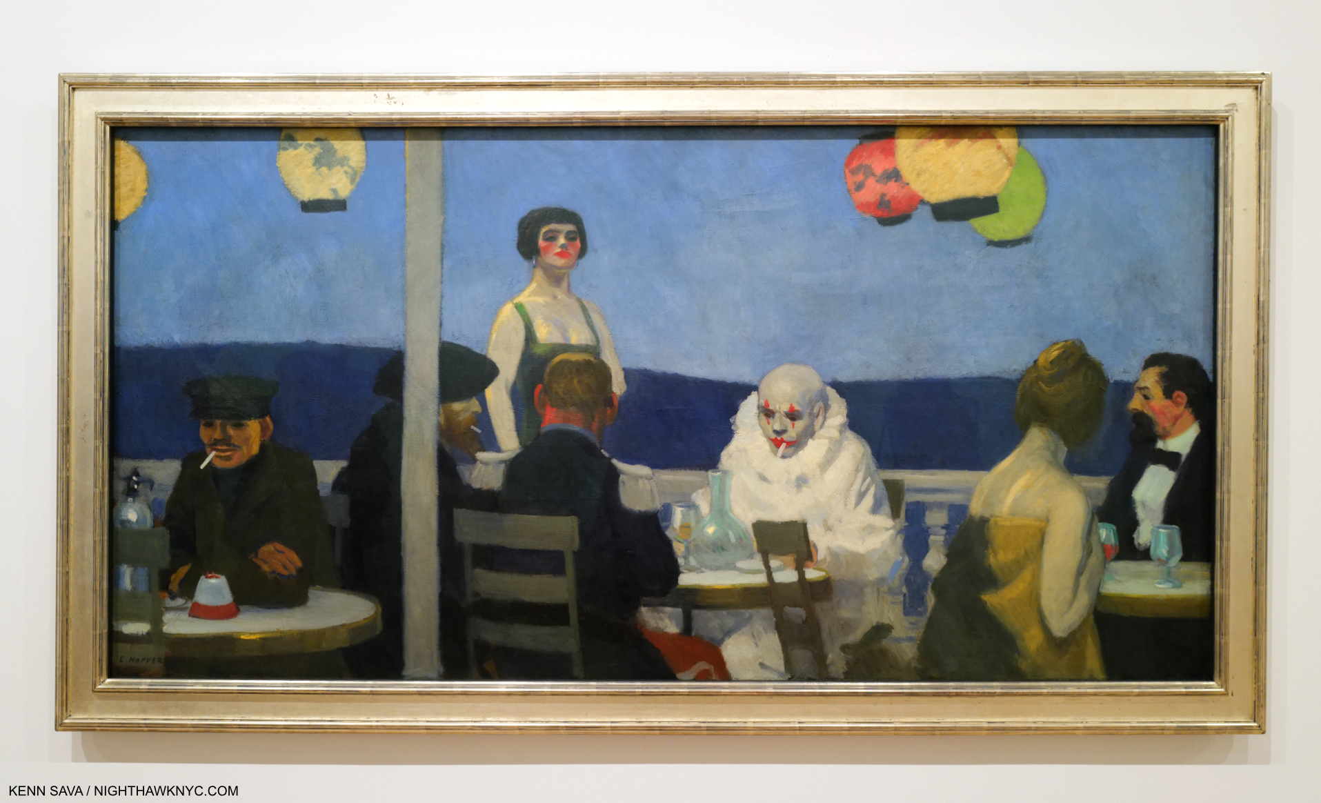
Soir Bleu, 1914. A work that has puzzled viewers for almost 110 years also seen on the Whitney’s 7th floor Permanent Collection galleries in January, 2023, while Edward Hopper’s New York was up on the 5th.

One of the most notorious pieces of his early work, Soir Bleu, 1914, is a unique outlier in Edward Hopper’s oeuvre. A work depicting a scene ostensibly in Paris but Painted in NYC after he returned, it doesn’t quite fit with what came before, or after. Exactly what is going on here has mystified many. It’s another example of how far Hopper studies have to go.

Earlier this year I looked at the state of Jean-Michel Basquiat’s Art and concluded that there may not be enough in his family’s collection to open a museum. Jean-Michel sold much of his Art as he created it, so much of it had long been dispersed when he died in 1988. His estate went to his family who retain was was left (which formed the basis for the show Jean-Michel Basquiat: King Pleasure, which I wrote about here). The Whitney, on the other hand, currently shows over 3,000 pieces by Edward Hopper from their collection online. They just might have enough to open something of a substantial, permanent, rotating, Edward Hopper exhibition, if not an outright museum! (They have been running a small rotating selection of his work in part of a gallery on the 7th floor where they display work from the Permanent Collection for a while, part of which, seen in January, 2023, I show above.)

Can you imagine what a big deal an Edward Hopper Museum in NYC would be? No other Artist has one here…yet. I can only begin to imagine how much it would enhance the value of their collection. Should they? Obviously, the finances would need to be considered, and I have no idea how that would shake out. It’s just one possible avenue the Whitney can explore. Have they? No one knows.

The selling of Hopper’s Art at this point makes me wonder what the long-term plan is for their Hopper holdings. It’s a question I think more people should be asking. My opinion is that at this point (June, 2023), I would not only hold on to everything they have, I would be adding to it.

The Whitney’s history of managing the extraordinary 1970 Jo Hopper Bequest has already proved littered with questionable decisions, this sale being only the latest. They sold some of it early on until the public outcry caused them to stop. I can’t help but wonder how The Met would have handled the Hopper gift. They have received extraordinary gifts from the estates of Diane Arbus and Walker Evans (among others), both of which they have handled masterfully, in my view.

Unfortunately, there’s more…

Jo Painting, 1936, Oil on canvas. Jo Hopper doing what she loved doing most. Though he met her when they were both Art students of Robert Henri, Edward was not a fan, or supporter, of her Art. Seen in Edward Hopper’s New York.

You may have noticed that I said the Whitney  are “the  holders of the largest collection of Edward Hopper’s Art in the world,” though I mentioned the Jo Hopper Bequest gifted his and Jo’s Art to the museum. The reason I didn’t mention hers is that they no longer have it. The Whitney allegedly disposed of most of Jo Hopper’s work that was included in her 1970 gift with her husband’s work, as hard as that is to imagine.

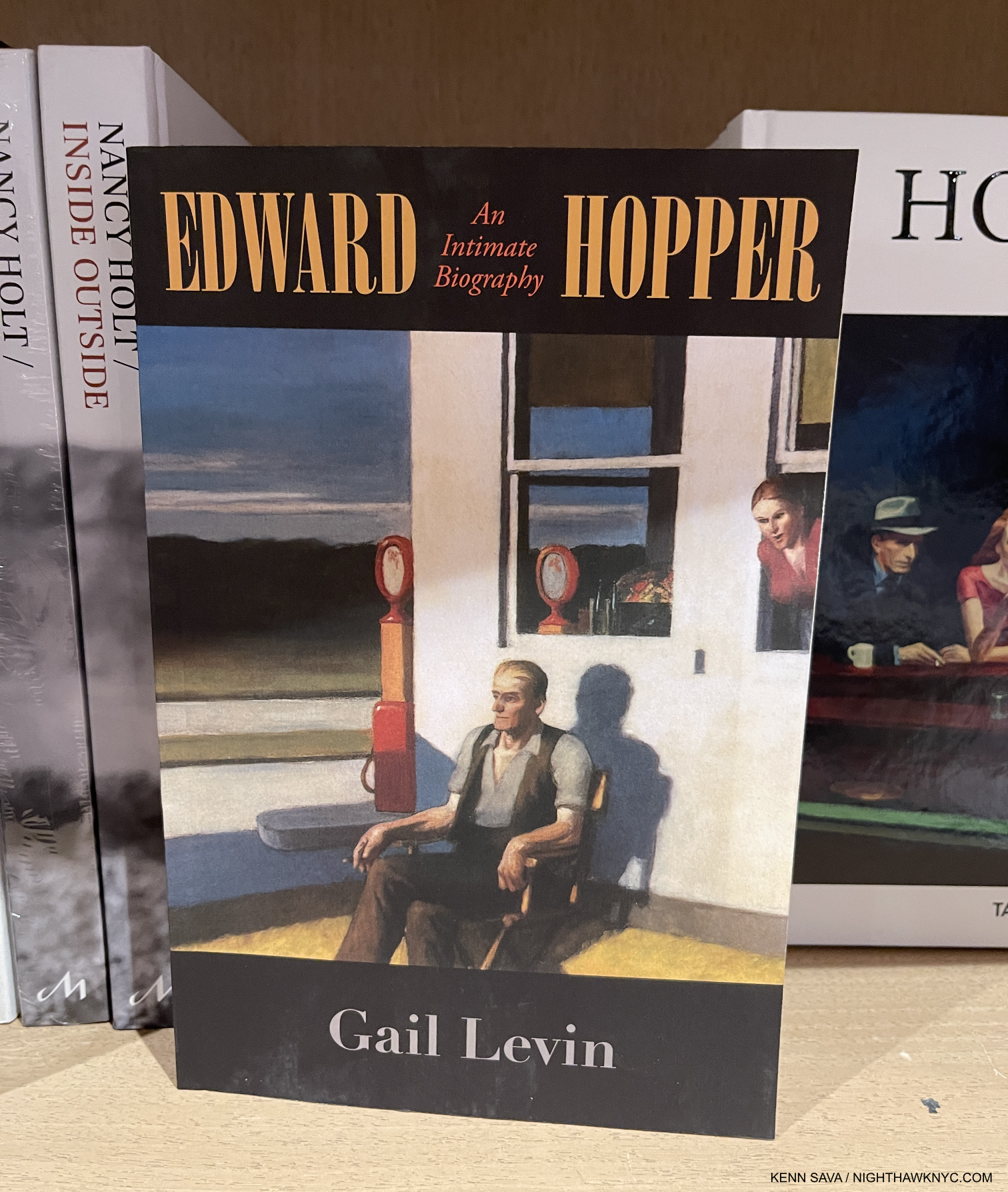
Regarding the woman, herself. Gail Levin, the Whitney’s first Edward Hopper curator and author of the definitive Hopper biography, Edward Hopper: An Intimate Biography, based on decades of research into Edward, Jo, and their relationship, writes at length about his wife of 43 years, Josephine Nivison (“Jo”) Hopper. Based on her feelings as expressed in the unpublished Diaries she kept for about 30 years, and interviews, the resulting picture is not a pretty one for those who look at Edward with admiration. At her husband’s death, everything passed to Jo, who was ill, and then blind, the final year of her life. She was in no condition to change her husband’s intentions and gift their estates to another institution. After the Bequest went to the Whitney, they then hired Gail Levin to curate it. She recounts what she discovered when she looked for Jo’s Art-

“In going through the Hopper collection, I expected to see Jo’s art as well as Edward’s. I had read James Mellow’s article in the Times, describing canvases by Jo in the bequest as “generally pleasant, lightweight works: flowers, sweet-faced children, gaily colored scenic views.” But I found nothing. Dealing with the bequest, (Whitney Director John) Baur naturally looked for advice to (Lloyd) Goodrich, his immediate predecessor as director and Hopper’s recognized interpreter and friend. Together Baur and Goodrich rejected Jo’s work as unworthy of the museum. They arranged for some of her paintings to be given away; they simply discarded the rest. They saw no need to invest even in archival photographs. Ironically, the only paintings from this group that can now be traced are four that went to New York University, which had troubled the Hoppers for years with efforts to evict them from their home.

In all, only three works by Jo were added to the Whitney’s permanent collection. None was ever exhibited. All three had disappeared by the time I began work in 1976. None has ever turned up 3.”

Ms. Levin also states that “From what remains of Jo’s paintings, it is clear that she was not the major talent that her husband was4,” Still, her importance, as a witness, a model, a partner & wife, and for what she went through during their 43-year marriage is only going to grow as time goes on, I believe, especially if her Diaries are ever published. The importance of her work will also rise, as a result- above and beyond whatever judgement is placed on its quality. The result is that history has been forever denied everything her work would tell us. Another reason to be angry at the way the Bequest has been handled.

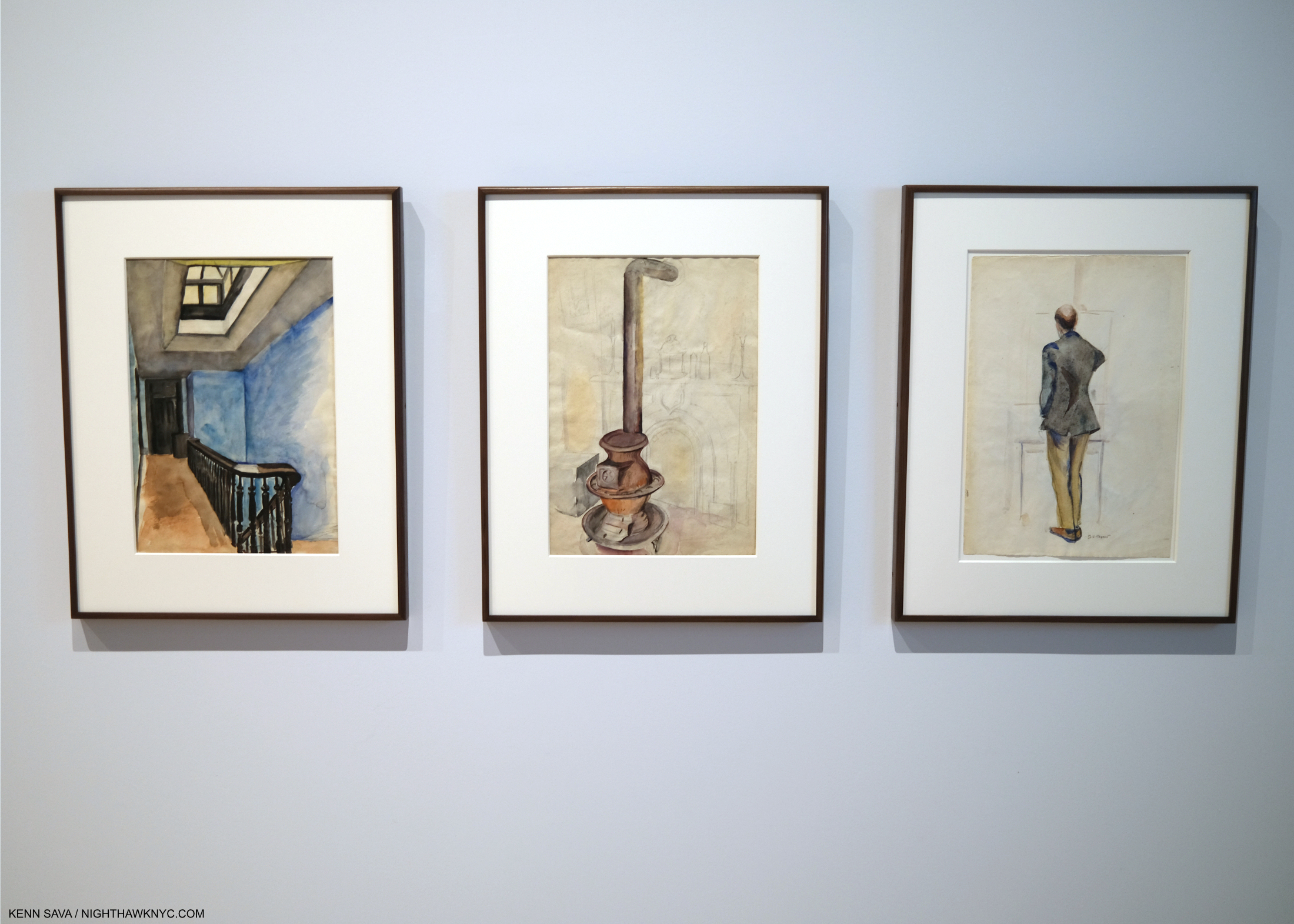
3 works by Jo Hopper seen in Edward Hopper’s New York. Left to right- 74 Stairs to Studio at Three Washington Square, 1932, Stove and Fireplace, Three Washington Square, 1932, Back of E. Hopper, 1930, Each Watercolor and graphite on paper.

Edward Hopper’s New York honored his wife and the Jo Hopper Bequest, which made up the vast majority of the work on view, by including 3 of her Watercolors. 2 were on loan.

Unfortunately, there’s still more…

Essential for researchers and anyone interested in Hopper’s Art, or the man and his wife, Edward Hopper: An Intimate Biography, by Gail Levin, out of print for a while has just been reprinted again. At 700+ pages, it’ll fill all your summer reading needs.

As if selling Edward Hopper’s work and discarding Jo’s is not enough to diminish the Whitney’s Hopper holdings, they may have been further diminished by theft of Hopper’s Art from his estate! Gail Levin has called out the man behind a donation recently made to the Whitney, part of which was included in Edward Hopper’s New York (none of which I showed- purposely), with a mysterious (to put it politely) provenance. According to her, this man (who I will not name here) may have stolen quite a bit of Art & ephemera from the Hopper estate while he had access to their properties when he was serving as a caretaker- all of which should have gone to the Whitney under the terms of Jo Hopper’s will, as Edward’s survivor. This person kept what he took, sold some of it, and has donated some to the Whitney. About 1,000 pieces may still be in the hands of his heirs. If ALL of it had gone to the Whitney, as the Hoppers intended, the world would be that much closer to gaining a full appreciation of the Hopper’s Art & accomplishment. And, the Whitney would be that much closer to a Hopper Museum.

Screenshot of the homepage of Gail Levin’s “Ethics & Visual Arts” site. I so admire her courage & dedication.

Ms. Levin brought the subject of this alleged theft to public light in 2012 around the time of the Whitney’s Hopper Drawing show. Earlier, after she discovered it, she brought it to the attention of the Whitney, who subsequently fired her as a result, she says. Wait. Weren’t they outraged when they heard about this? What did they do about it, besides fire Gail Levin? The controversy was rekindled when Edward Hopper’s New York opened in October including some of these questionable pieces. She has revealed the full story in a series she calls “Ethics and the Visual Arts.”  I feel it’s important that anyone who cares about Hopper’s Art read what she has to say about what happened, here. (She also did a video interview earlier this year about all of this which may be seen here.)

Robert Henri, Gertrude Vanderbilt Whitney, 1916. I wonder what Gertrude Vanderbilt Whitney, whose collection of American Art became the basis of the  Whitney Museum, would make of how the Jo Hopper Bequest has been handled. Mrs. Whitney was also an under-appreciated Sculptor. Seen on the 7th Floor while Edward Hopper’s New York hung on the 5th, January, 2023. Robert Henri taught both Edward & Jo Hopper a decade earlier, and Painted a Portrait of Jo.

It’s hard not to feel outraged and violated by all of this. So, I do!

It’s my hope a thorough investigation will take place into all of this- including the Whitney’s mysterious involvement in it, according to Ms. Levin, and if it is determined the pieces were gained illicitly by this man steps are taken to rectify it as soon as possible. As extremely concerning as this all is on Hopper’s Art, it seems to me it also serves as a warning to living Artists to learn from this and safeguard their own estates and intentions.

This extremely troubling episode Gail Levin has brought to the public’s attention cast a shadow on what was otherwise an excellent and important show. I hope it will be the last Hopper show it hangs over.

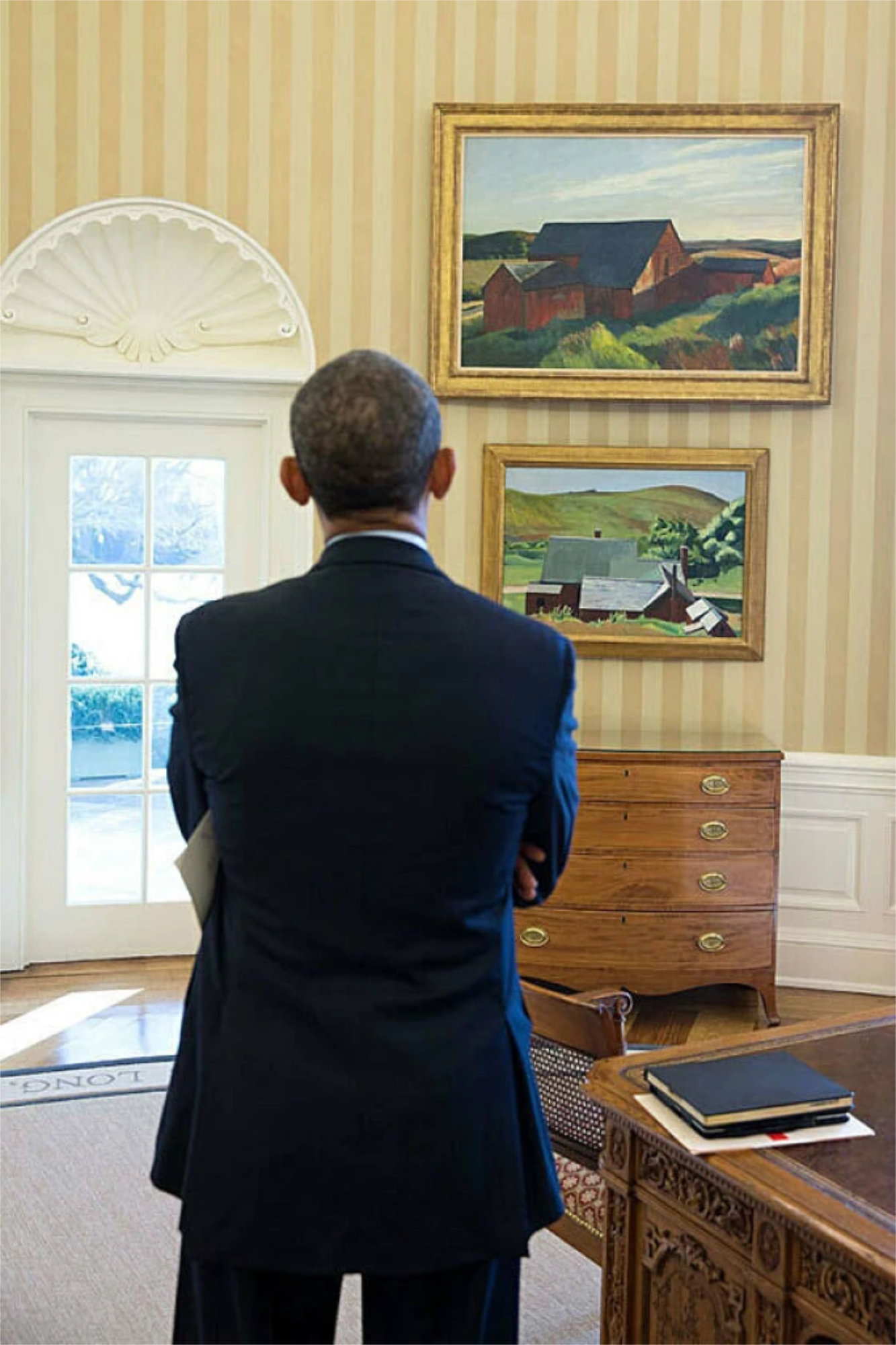
Cobb’s Barns, South Truro hanging in the Oval Office of the White House where President Obama is admiring it. February 7, 2014. *-Photo by Chuck Kennedy.

Between the Jo Hopper Bequest and the Hopper they have in their Permanent Collection, what amounts to the Edward Hopper Archives at the Whitney is very likely their most important holding at this point. They have a huge responsibility to the public, now and in the future, to protect and preserve it. It’s past time Art lovers speak up about what’s been going on with it and get some concrete answers.

“Everyone was there to greet me when I stepped inside
Newspapermen eating candy
Had to be held down by big police
Someday, everything is going to be different
When I paint my masterpiece”*

*- Soundtrack for this Post is “When I paint my masterpiece,” by Bob Dylan from Bob Dylan’s Greatest Hits Vol. II, 1971-

NighthawkNYC.com has been entirely self-funded & ad-free for over 8 years, during which 300 full length pieces have been published! If you’ve found it worthwhile, PLEASE donate to allow me to continue below. Thank you, Kenn.

You can also support it by buying Art, Art & Photography books, and Music from my collection! Art & Books may be found here. Music here and here.

Written & photographed by Kenn Sava for nighthawknyc.com unless otherwise credited. To send comments, thoughts, feedback or propositions click here. Click the white box on the upper right for the archives or to search them. Subscribe to be notified of new Posts below. Your information will be used for no other purpose.

  1. Source for all of this information is Gail Levin, Edward Hopper: An Intimate Biography, Expanded Edition, 2007, Introduction & P.128
  2. from a letter from Hopper dated 1935 quoted in Gail Levin, Edward Hopper As Illustrator, P.1.
  3. Gail Levin, Edward Hopper: An Intimate Biography, Expanded Edition, P. xvi
  4. Gail Levin, Edward Hopper: An Intimate Biography, Expanded Edition, P.723

Edward Hopper: The Last Traditionalist Faces Change

This site is Free & Ad-Free! If you find this piece worthwhile, please donate via PayPal to support it & independent Art writing. You can also support it by buying Art & books! Details at the end. Thank you.

Written & Photographed by Kenn Sava (*-unless otherwise credited)

Show seen: Edward Hopper’s New York @ The Whitney Museum, Part 2. (Part 1 is here.)
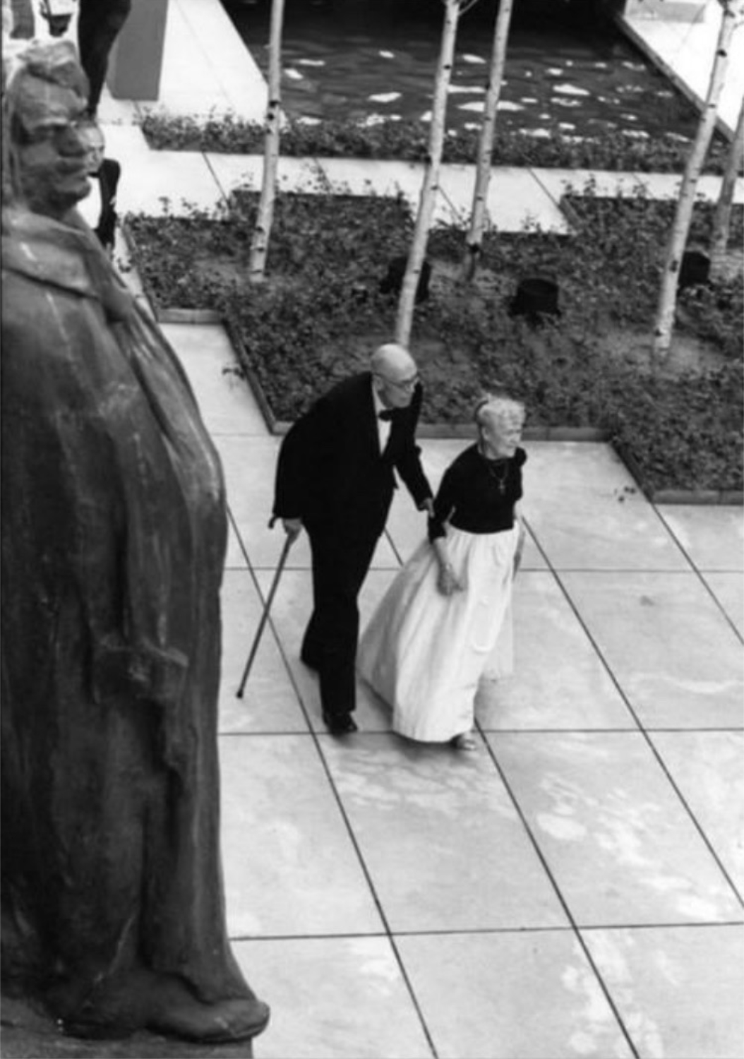
Edward Hopper in his New York. With his wife, Jo, strolling the Museum of Modern Art’s Sculpture Garden in 1964. In this Photo, by Eve Arnold, Edward is glimpsed unawares like a good number of his subjects were. *-Photo by Eve Arnold, Magnum Photos. Thanks to Lana for finding it. Click any picture for full size.

Change is the only constant in the universe. For those, like me, for who New York City IS the universe, every day brings change. During Edward Hopper’s time here (1900-67), the City of continual change metamorphosized more than it ever had.
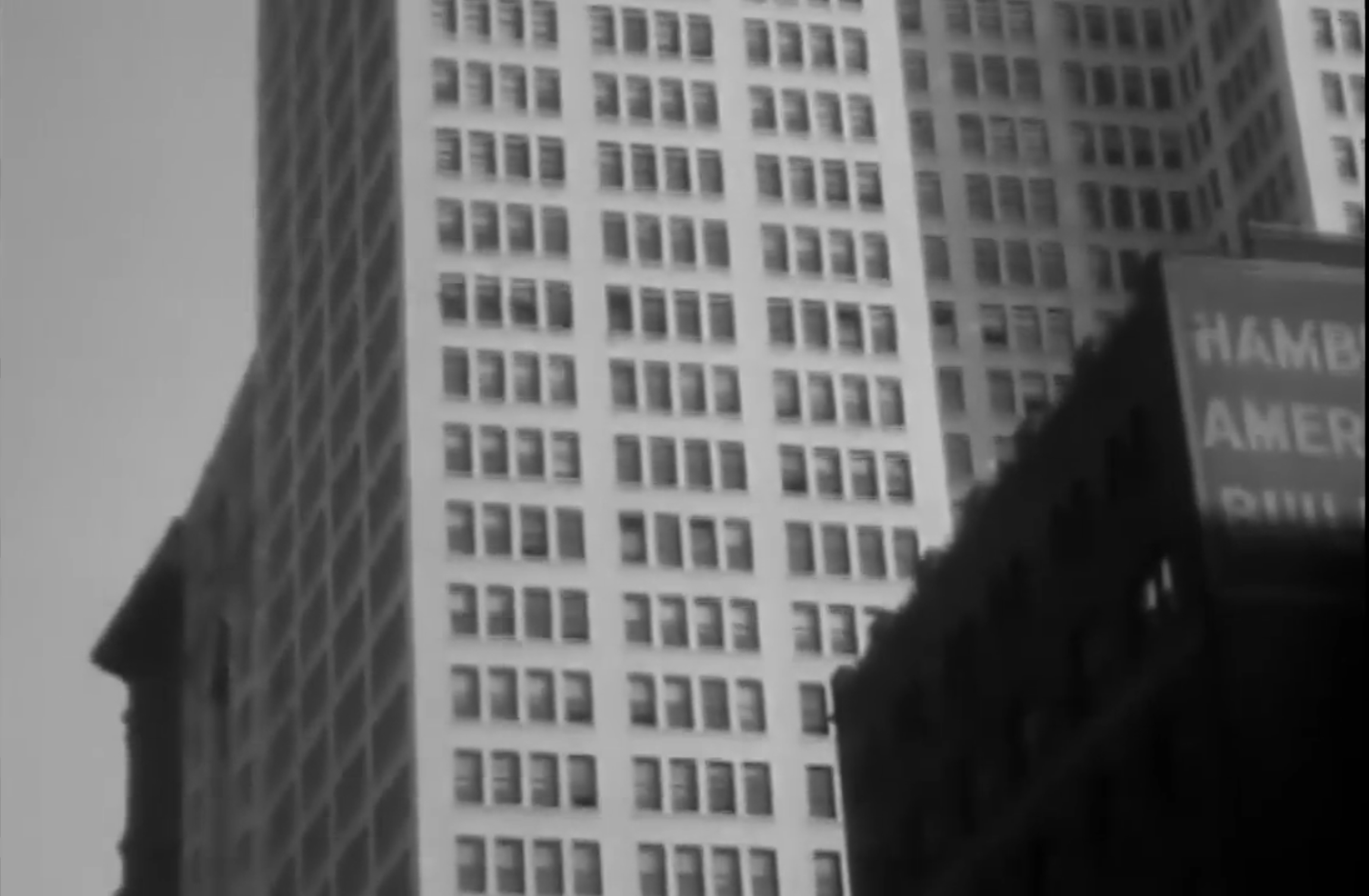
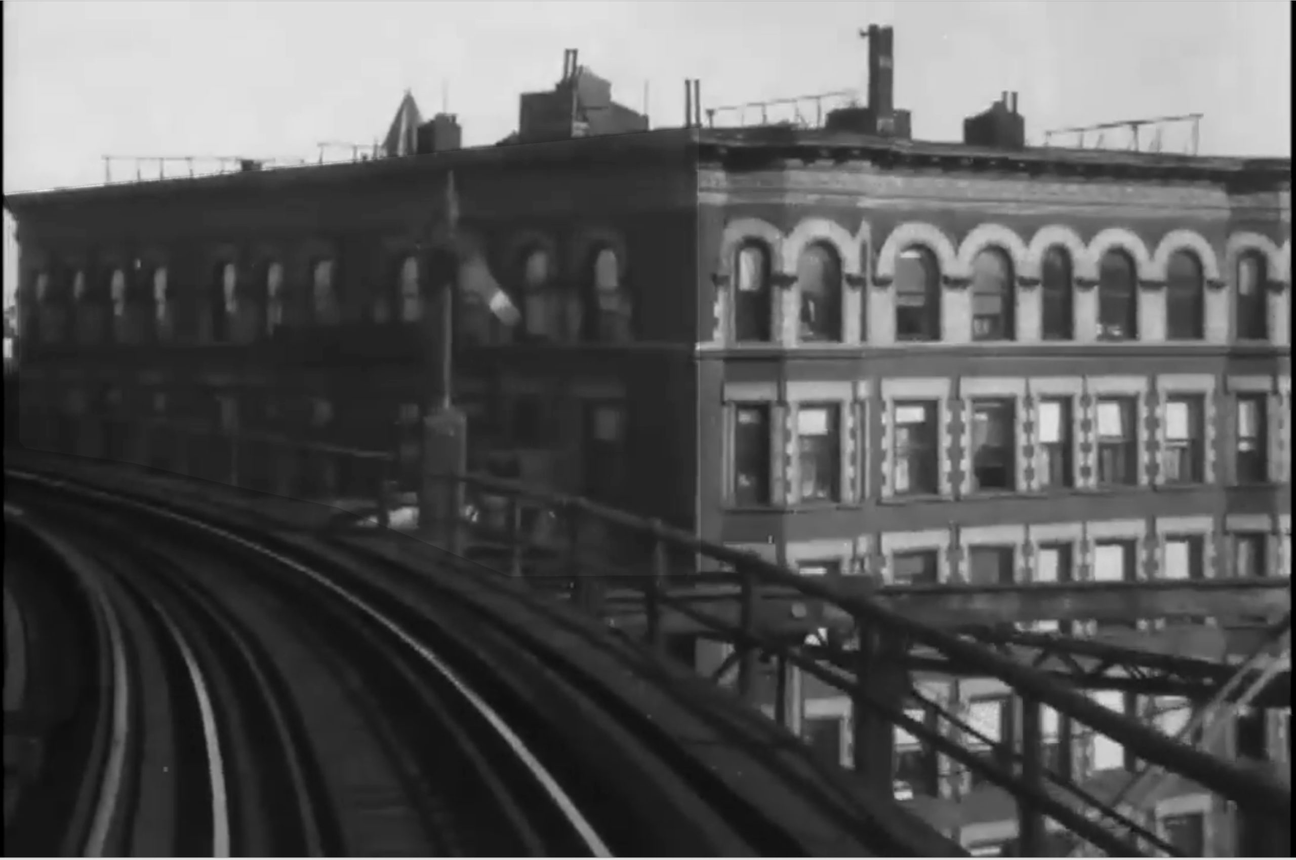
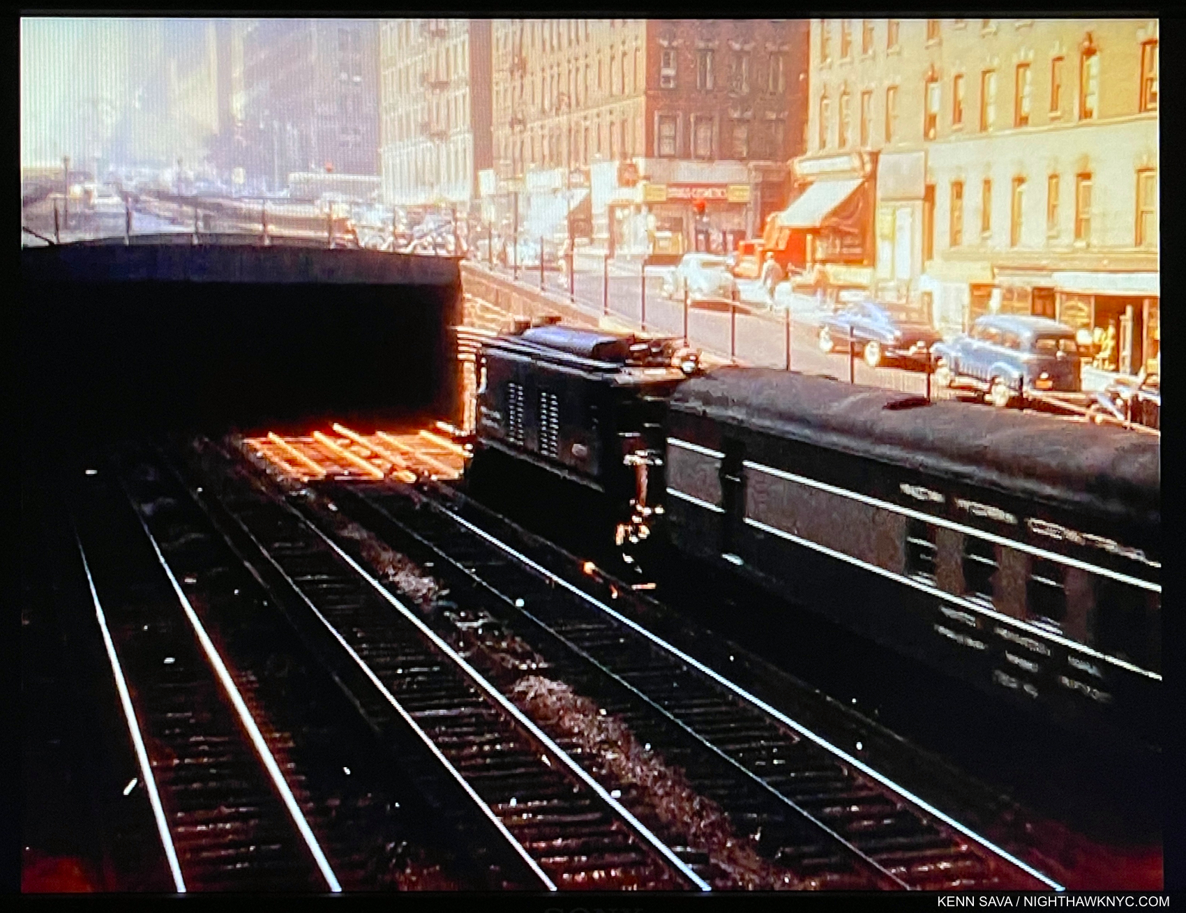
Screencap from the short Film, A Ride on the 6th Ave El, 1916. Edward Hopper frequently rode NYC’s elevated trains, and he was located closest to the 6th Avenue el, which he no doubt rode before, during and after 1916. He glimpsed more than one scene he turned into a Painting while riding one. *-Ford Motor Company video.

The advent of the tall building & skyscrapers (facilitated by the development of elevators with safety brakes), first in Chicago and then here, along with the ongoing spate of bridge building (Brooklyn Bridge, then Manhattan Bridge and others), the advent of the elevated train, the subway, electric lights, movies, and the rest, ushered in with them what we know as modern urban life. All of these inventions & developments brought side effects. Edward Hopper’s New York reveals that the Artist may not have been a fan of some of these changes.

Edward Hopper’s Art: What I See

As I said in Part 1, having the chance to see 58 Hopper Paintings from early through late in his career 14 times, Edward Hopper’s New York completely changed how I see his work. This is shocking to me because I’ve been looking at his work almost as long as I have anyone else’s- well over 40 years. To this point, I saw his work as one of the ultimate (and perhaps unsurpassed) expressions of modern loneliness and isolation in the Art of the 20thy century. But, this is a theme that requires human subjects (like the vast majority of his NYC work has, though he Painted these scenes with people elsewhere as well). What about the rest of his oeuvre; all the other scenes he Painted that don’t include people? These include landscapes he Painted in Maine, Cape Cod, and elsewhere in the U.S., and Paintings he made on, or inspired by, trips to Europe and Mexico. Some of the non-peopled landscapes include houses, buildings, bridges or other man-made structures. Some of them are pure landscapes. (An overview of the range of his work can be seen in any comprehensive book on Hopper. I particularly recommend seeking out Edward Hopper: The Art & The Artist, by Gail Levin, the catalog of the last U.S. Hopper Retrospective, at the Whitney in 1981.)

As a result of considering the whole, I’ve come to believe there are two primary threads, intentional, or not. that run through almost all of Edward Hopper’s work.

First, the “man-altered landscape,” i.e. what man has done with and to nature.
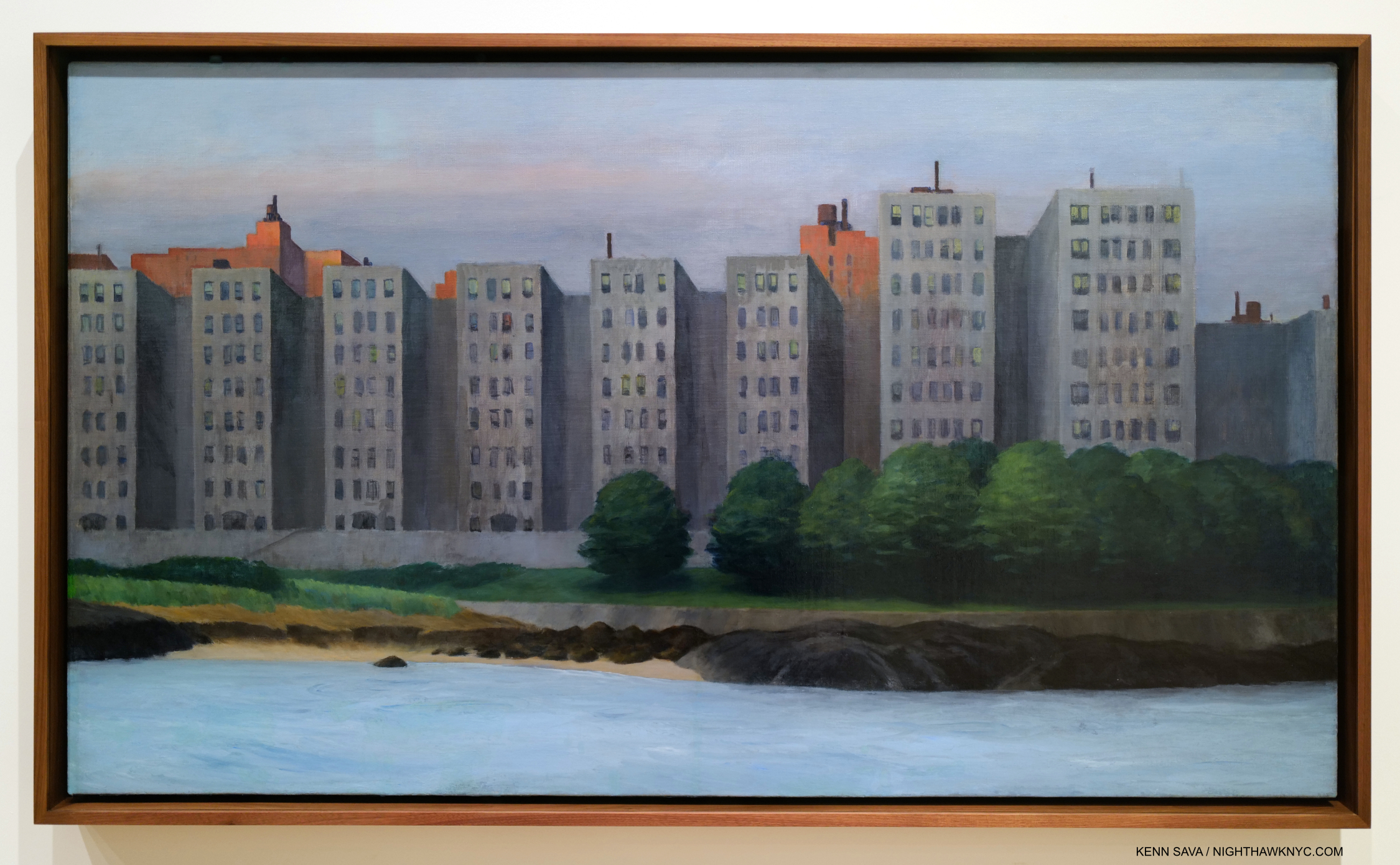
The man-altered landscape. Apartment Houses, East River, 1930. It seems fairly obvious what Edward Hopper thought of this waterfront development. All works are Oil on canvas, unless specified.

In Photography circles, this is what is called “New Topographics” in honor of the legendary Photo show of the same name at the Eastman House, Rochester, in 1975-6, eight years after Edward Hopper’s passing. The subtitle of the show was “Photographs of a Man-Altered Landscape.” What man has done to and with nature, as in Apartment Houses, East River, is a theme I now see in more of Edward Hopper’s work than I see any other theme.
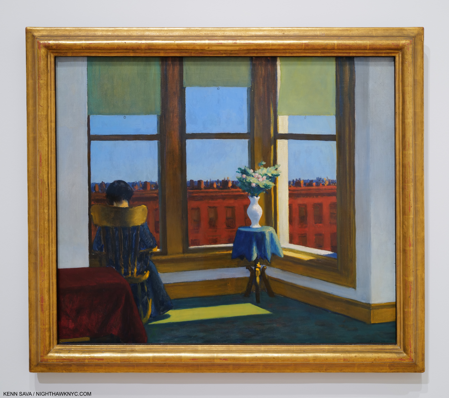
Room in Brooklyn, 1932

Yes, I even see the “what man has done with and to nature” theme in works like the sedately charming Room in Brooklyn, where “nature” is reduced to flowers in a vase. It’s interesting that Hopper’s flowers are higher than the background buildings.
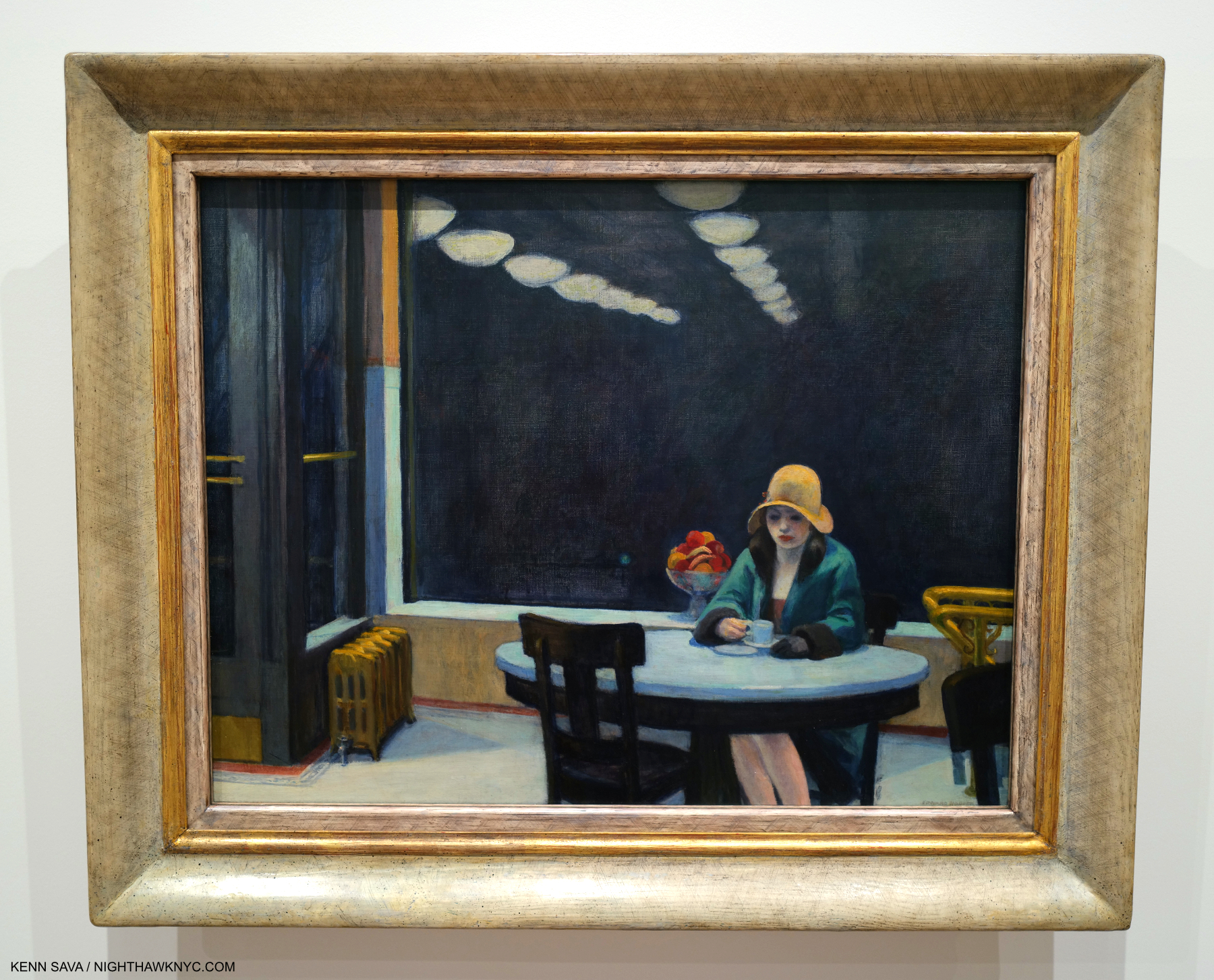
Automat, 1927. Edward Hopper spent a lot of time in Horn & Hardart’s extremely popular Automat Restaurants in the 1920’s, so much that Jo worried he was drinking too much 5-cent coffee. It was worth it because he produced this, another of his show stoppers. Jo chided him for not being able to Paint beautiful women, but Automat certainly puts the lie to that. Its stripped-down composition is a masterpiece of including only the essential. I still wonder about that fruit bowl in the back, though. Is this an instance of “what man has done with nature,” along the lines of Room in Brooklyn?  The reflected receding lights are a master stroke.

A byproduct of what man has done with nature in cities, in Hopper’s time and everywhere since, which some call “progress,” is the effect of what man has built on those who live and work in these places. So, I now include all of Edward Hopper’s work that includes human subjects under this man-altered landscape theme, including his New York work (though not all of them include people- like Apartment Houses, East River, shown earlier).
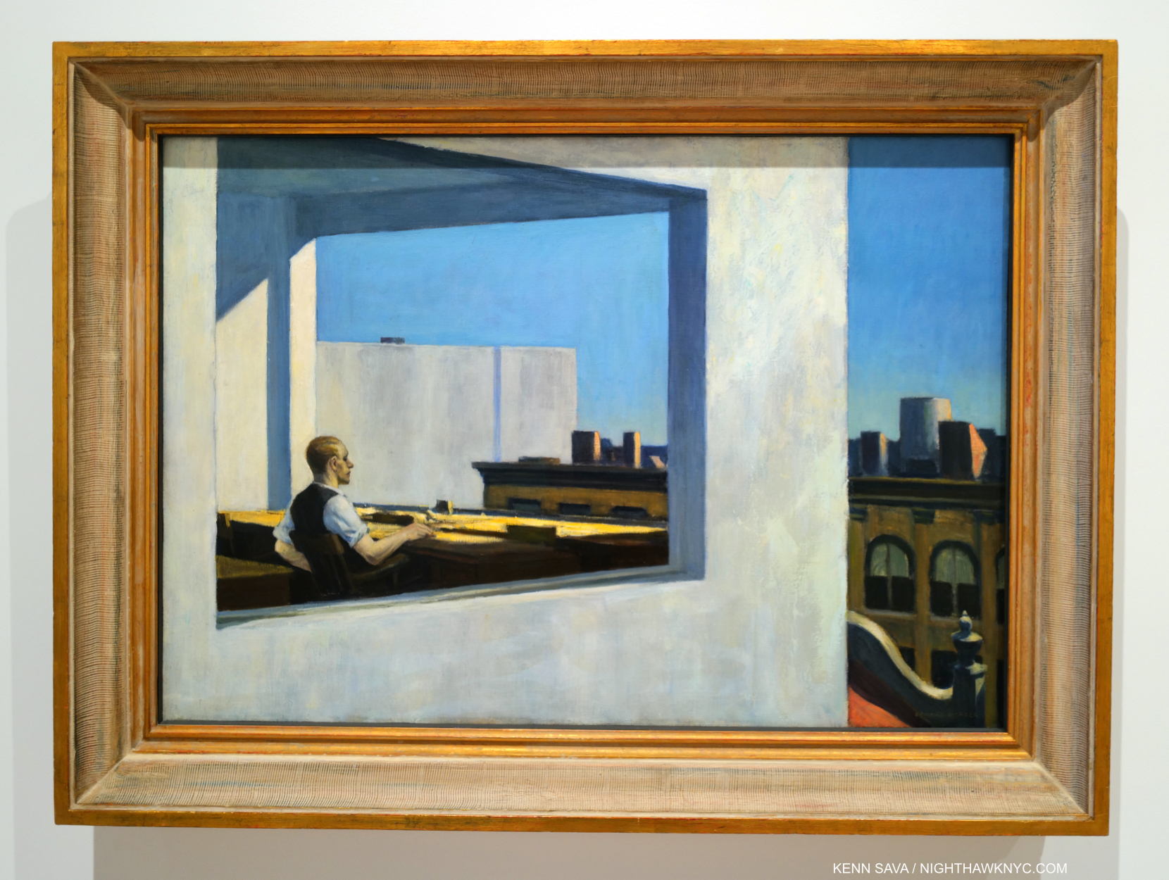
Office in a Small City, 1953. Life in the cube. An example of what I call the “Hopper fish bowl.”

Many may see Edward Hopper as the “king” of depicting the isolation and loneliness that was endemic in 20th century modern life, and feels increasingly so in the 21st century, but after seeing it as his primary theme for so long, myself, I now believe he is depicting side-effects of this new modern urban life in the man-altered landscape to “turn up the volume” on his feelings about these changes. Therefore, when he depicts it, in my view, he’s also “commenting” on what man has wrought on his fellow man through altering the world so. All of this also makes me wonder about the melancholy that permeates his Art. Is it indicative of “the inner state of the Artist” (as I quoted Hopper saying in Part 1), or is it solely being used to depict the state of his subjects in the man-altered environment? Gail Levin’s Edward Hopper: An Intimate Biography certainly provides fodder for the former-

“Raphael Soyer, for whom Hopper posed for a portrait…observed: ‘There is a loneliness about him, a habitual moroseness, a sadness to the point of anger1.'”

That makes me wonder if the effects of this new, modern world ON HIM is a good deal of what we’re seeing in his work/or, that he’s recognizing in people he sees.
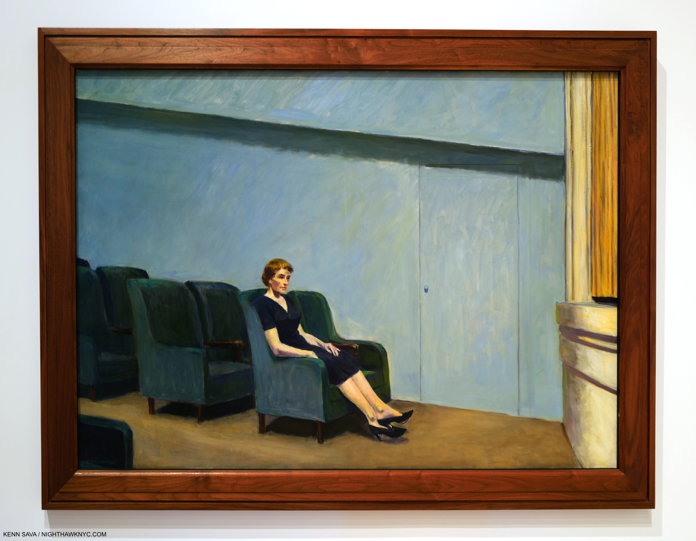
Intermission, 1963. Edward & Jo Hopper were avid movie & theater goers, and Edward Hopper’s New York dedicated a gallery to his movie/theater work making interesting observations of how some theater sets and Films may have influenced the settings of some of his Paintings. Others, like this, are set in these venues. Intermission presents a “basic” idea in a theater environment, yet it makes me wonder- People have been going to concerts and theaters for many hundreds of years. Why haven’t I seen it done like this before?

The man-altered world’s effects on the population, then and now, run deep. So deeply, in fact, I’d been living with these symptoms for 40 years myself before I realized that they are what I was seeing them in Hopper’s work! ”

Was mankind meant to live this way?” may be another question his Art asks.
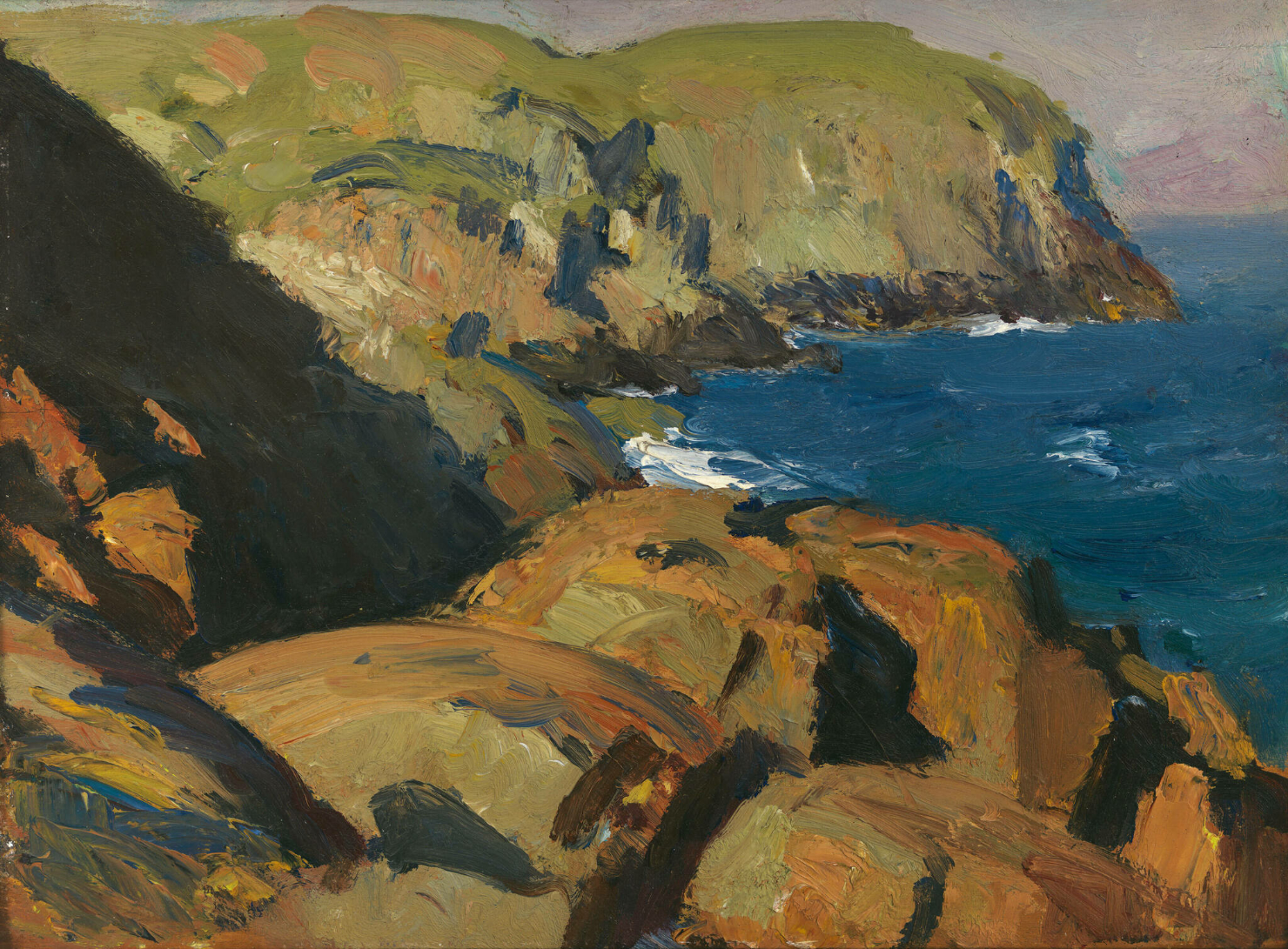
Nature. In all its natural glory. Blackhead, Monhegan, 1916–19. Edward Hopper in Maine. *-Whitney Museum Photo. Not in the show.

The second theme that I see in his Art is the unaltered natural landscape. These exclusively depict locations outside of NYC.

  “If you look at landscape painting from that time in America, there isn’t anyone close to him (Edward Hopper) in technique.” Alex Katz, Artist, and designer of the installation of Edward Hopper’s Maine at the Bowdoin College Museum of Art in 2011 on Hopper’s landscapes.

I’ve come to believe his unaltered natural landscapes, like Blackhead, Monhegan, remain very under-appreciated. Though they are beyond the scope of this piece, I will say that it’s fascinating to me to consider that this one was done after Cézanne & Monet’s innovations; two of the “earlier French Artists” I referenced in Part 1. I don’t see their direct influence, though indirectly, his unaltered natural landscapes, like this, also strike me as “impressions,” as I called his New York Paintings there.

“There is a sort of elation about sunlight on the upper part of the house. You know, there are many thoughts, many impulses, that go into a picture … I was more interested in the sunlight on the buildings and on the figures than in any symbolism.” Edward Hopper2.

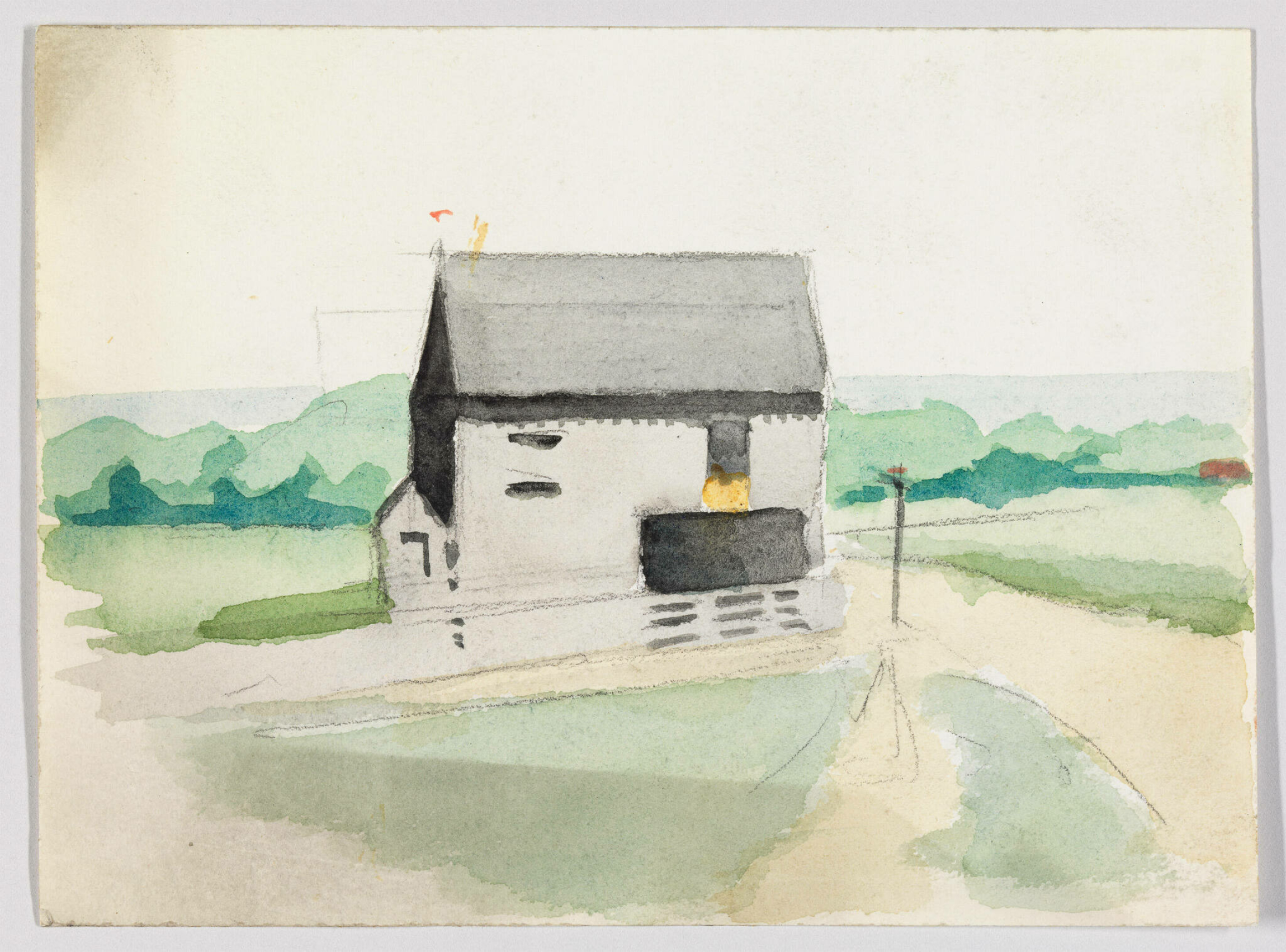
Landscape with Building, c.1900, Watercolor and graphite pencil on paper. *-Whitney Museum Photo. Not in the show.

As I mentioned in Part 1,  Edward Hopper’s New York sent me back to the beginning of his Art looking to see how his themes began and evolved. This non-NYC work from the year he started Art school strikes me as an early example of the man-altered landscape theme. At various points in his life, Hopper professed an interest in rendering “sunlight on buildings,” and he had a love of Architecture. You can say he’s expressing both here. But the building, rendered in a predominance of grey, certainly doesn’t look to be basking in the sunlight. It’s almost like he’s using the grey wash  (instead of simply leaving the paper a bare white) to downplay the effects of the sunlight. What strikes me is how forlorn and seemingly out of place the building looks in the peaceful landscape. 30 years later, Hopper Painted East River Apartments, shown earlier, again rendering the buildings in grey. The only sunlight in that Painting is playing on the buildings in the back. If he is not showing his love of “sunlight on the buildings,” in these, what is he showing us? Is he being Edward Hopper: Architectural critic? The encroachment of man into nature seems plausible to me. The unspoken question he may be asking is “What do you think of this?” A question I feel being asked in any number of his man-altered landscapes. Given what he said about no “symbolism,” is what I see a coincidence? A coincidence that runs through most of his work is most likely not a coincidence.
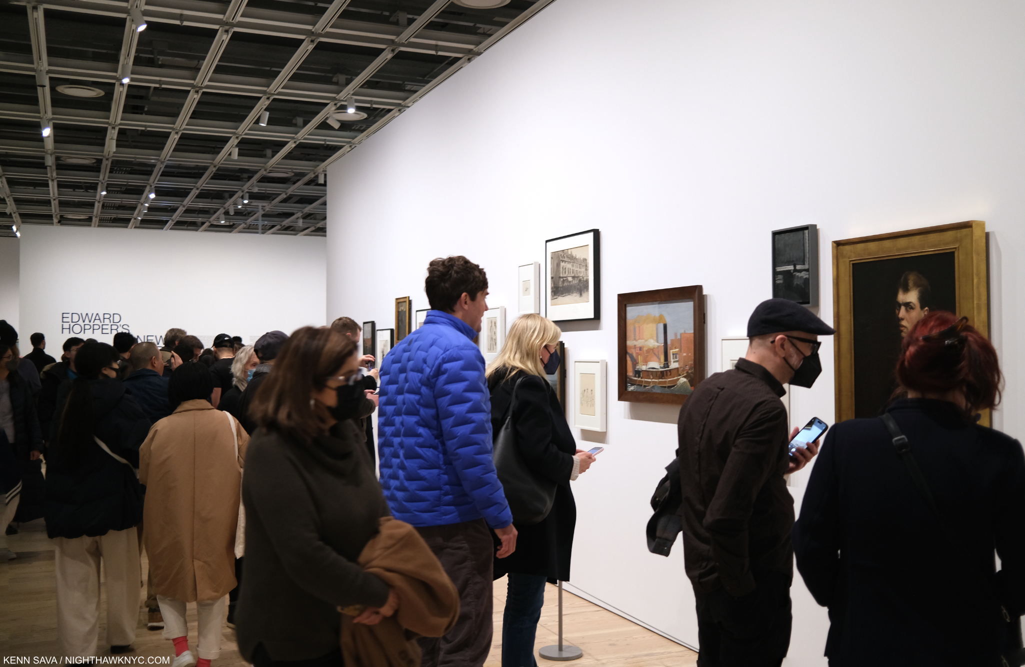
Remember how this looked on opening day in Part 1? Here’s the opening section on closing day, March 5, 2023.

What we call modern city life now only existed in Chicago, the birthplace of the tall building, and New York when Edward Hopper began to Paint here in the first third of the 20th century. Since, of course, it has spread everywhere, all around the world. There are countless millions more people living in these environments now than when he began rendering these places. In some ways, Edward Hopper was reporting from the front lines on the change that was happening around him in NYC. Change that was soon to happen in those countless other places around the world.
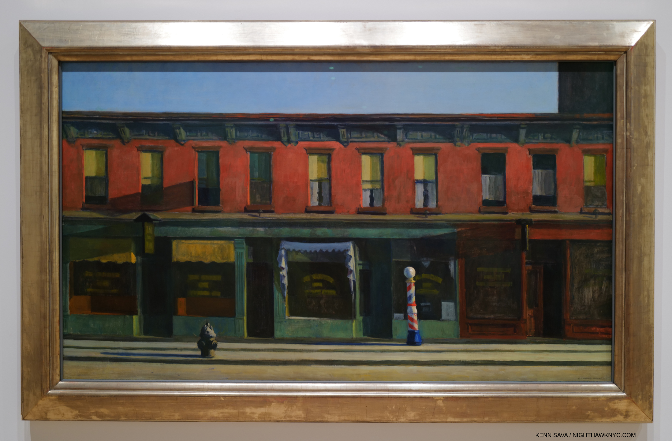
Early Sunday Morning, 1930. Edward Hopper is not going to hit you over the head with it. Instead, his subtlety is front and center here, in my view. The Whitney paid $3,000. for it in 1931, then featured it when the Whitney Museum opened to the public for the first time in November, 1931. 91 years later, it’s featured again.

For a long time I looked at Hopper’s famous Early Sunday Morning, 1930 as a charming Manhattan street view, one that depicts a block in my neighborhood 93 years ago. Now, I see it as something more ominous. I can attest that as 7th Avenue, shown here, runs North/South, the Sun, which rises directly behind the viewer, has never shone as Mr. H. has depicted it here- see the Photo of the site now in Part 1. Why did he do so? For me, the long shadows mimic the subtle dark rectangle extending off the canvas to the upper right. That’s part of the newer, tall building you can see in my recent Photo of this scene in Part 1, which was just going up when he Painted it. It’s the only building in this Painting that is still standing. The charm of the old human-scale neighborhood is evidenced by the barber pole, shown in full sunshine just to the right of the center of the composition, which emphasizes the human scale of the buildings. This is about to be lost as it is already being ominously encroached upon (if not engulfed) by “progress” (i.e. new tall buildings) while the City sleeps, i.e. while the public was helpless to stop it. This scene is about to be lost, which it was, as I showed. This idyllic, peace hides the loss of a world the Artist knew and loved, and the helplessness to do anything about it.

For me,  Early Sunday Morning is a work that encapsulates Edward Hopper’s melancholy as he was about to lose the City he loved, and a  “wake-up call” to those “sleeping” through what was happening around them. Now, it’s a reminder that there are always things happening most people aren’t all that aware of that will change their lives. Is he saying here, “Wake up, before it’s too late”?
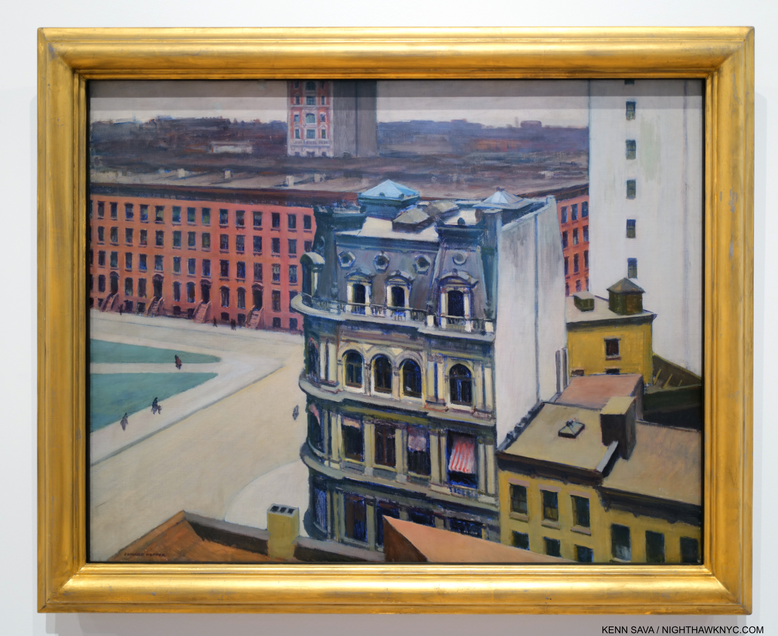
The City, 1927. Change comes to Edward Hopper’s front door.

In The City, Hopper’s home, 3 Washington Square (see my picture of it from November, 2022 in Part 1), is seen in the row of buildings in the mid-distance. For me, everything about this screams distaste. This is Edward Hopper’s neighborhood; the block he lived on, on Washington Square Park in Greenwich Village. From the vantage point of a new taller building to the east, the people now look like ants. Two, new, taller buildings are unceremoniously chopped off. Edward Hopper Painted, virtually exclusively, in the landscape format. I take this as another instance of holding on to his values and refusing to compromise by Painting tall buildings in the portrait format. Eventually, change would come up and knock right on his apartment door. In 1946, NYU, which was in the act of swallowing up much of the area, bought 3 Washington Square and proceeded to try to evict its residents. The Hoppers publicly fought NYU for a few years before winning permission to stay. They would both live out their lives here.

The show made me think about the locations he Painted, and those he didn’t Paint. The latter is easier- it’s interesting that in spite of living and working here for so long, he never Painted NYC’s most iconic landmarks- Brooklyn Bridge, the Empire State, the Chrysler Building, The Metropolitan Museum (or ANY New York museum), and on and on. Instead, he found his meat in “second-tier landmarks” and everyday locations. Still, in each work, it seems to me that the notoriety of the building or bridge included isn’t his point. He down plays it or presents it as an element in a man-altered landscape composition, again asking, I believe, “What do you think of what man has done here?” Again and again, the takeaway for me was it was all about change: rapid change, or change over time.
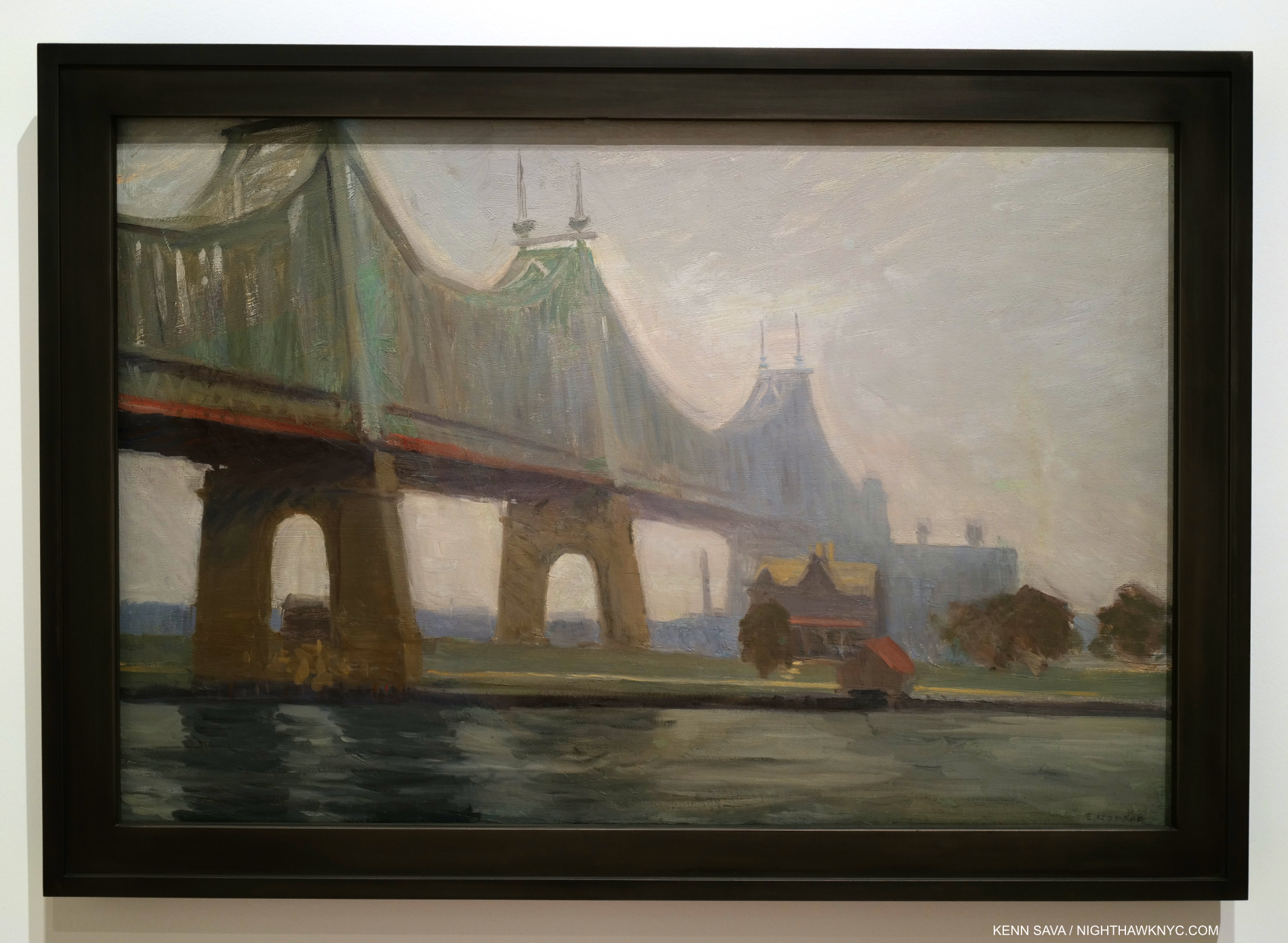
Queensborough Bridge, 1913. All of Hopper’s bridge Paintings (including Macomb’s Dam Bridge, 1935, which has much in common with Queensborough Bridge) strike me as man-altered landscape works.

Bridges were a favorite subject for Edward Hopper going back to his time in Paris (I showed Le Pont des Arts, which he Painted there in 1907, in Part 1). Back in NYC, he Painted Queensborough Bridge in 1913, just 4 years after it opened in 1909! It has a few things in common with most of his other bridge Paintings. Most of them show the bridge from underneath, reminding us of human scale, and giving the viewer the sense he must have felt at the time of suddenly being VERY small. In this one, the first tower is chopped off by the top of the canvas- like he does with the new tall buildings. A sign of distaste? Also typical, the structure is cropped oddly and ends suddenly just past the right of center. This gives me the feeling that it’s not the sole focus of the composition. We also see East River and what is now Roosevelt Island with a colonial style (i.e. older) house. The house is in a bit shaper focus and is just to the right of center. The bridge draws the eye along until it suddenly trails off right over the house. Human scaled, it looks puny next to the huge bridge. The juxtaposition of size between these two man-made objects is jarring. Given the water in the foreground, which with the strip of land, represent nature, I see this as both an example of the man-altered landscape and how man changed it, first with the colonial style house, and again later with the bridge. The island looks fairly deserted, but it wouldn’t be for much longer as “progress” marched on inexorably.
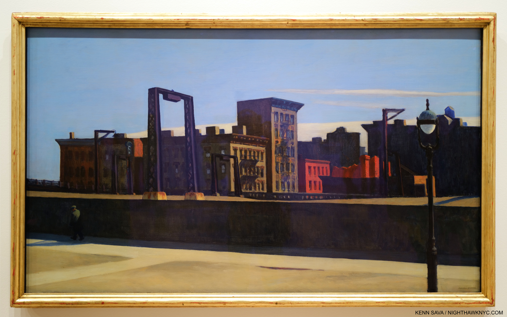
Manhattan Bridge Loop, 1928. The lone figure, dwarfed by a wall in the Loop part of the Bridge, who adds so much, might have been a late addition to the composition. He does not appear in the Drawn Study on view in another gallery. Perhaps my favorite Painting in the show.

In the wonderful Manhattan Bridge Loop we aren’t seeing the bridge from underneath as he usually shows. We’re on a little known and now lost part of the Manhattan Bridge that was called the “Loop.” Built in 1906, Manhattan Bridge, which connects Lower Manhattan at Chinatown with Brooklyn across the East River, was another bringer of change to the City. It’s hard for us to imagine this now, but for several years after it opened in 1883, Brooklyn Bridge at 272 feet tall, remained the tallest structure in the Western hemisphere for a few years3! Walking across it, when you reach the middle of the Bridge, you suddenly find yourself out in the open, its structure having magically disappeared due to the genius of its design. Every time I stand there I try and imagine what it must have felt like to those who stood here in 1883 when, as far as the eye could see, nothing was higher than you were. What a feeling that must have been! It still is. At 336 feet in height, Manhattan Bridge was even taller. These tall bridges presaged the era of tall buildings, and the effect of these immense structures that dwarfed human scale must have had a profound effect on the populace. I get that feeling looking at Queensborough Bridge, in particular, the newness of suddenly feeling so very small in the presence of the new bridge. Perhaps this is also Edward Hopper’s motif for Manhattan Bridge Loop- with a twist Behind the wall the man walks in front of, which dwarfs him, and under the gantry, which mimics a bridge tower, is a trolley that ran on a loop from one side of the bridge to the other giving the work its title. In  Manhattan Bridge Loop, Edward Hopper finds a new way to express the size of the bridge versus the human scale world he knew. And guess what would happen to those buildings along the back.
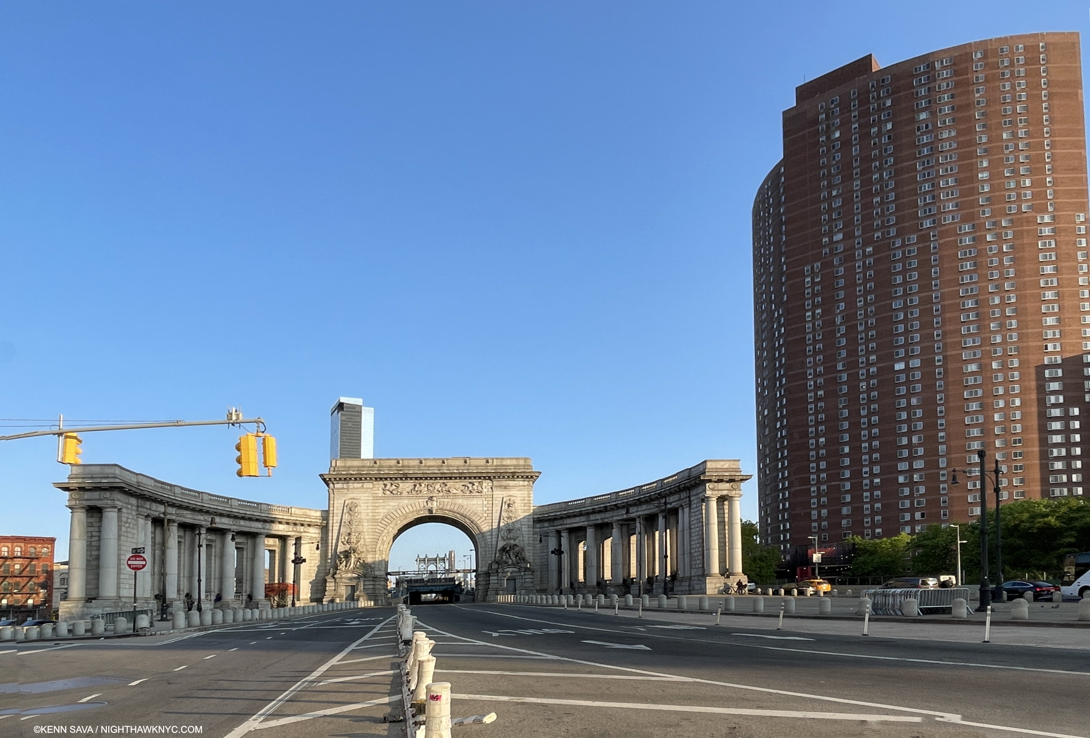
Change continued after Hopper. The approach to the Manhattan Bridge (seen in the far distance under the arch) on May 18, 2023. That’s the Confucius Plaza complex on the right. The Loop Hopper Painted was located to the right behind the arch. The only way to access it now is to walk around the center arch on the Bridge roadway(!) and hope it happens to be as deserted as it is here, which it almost never is. No, thank you.
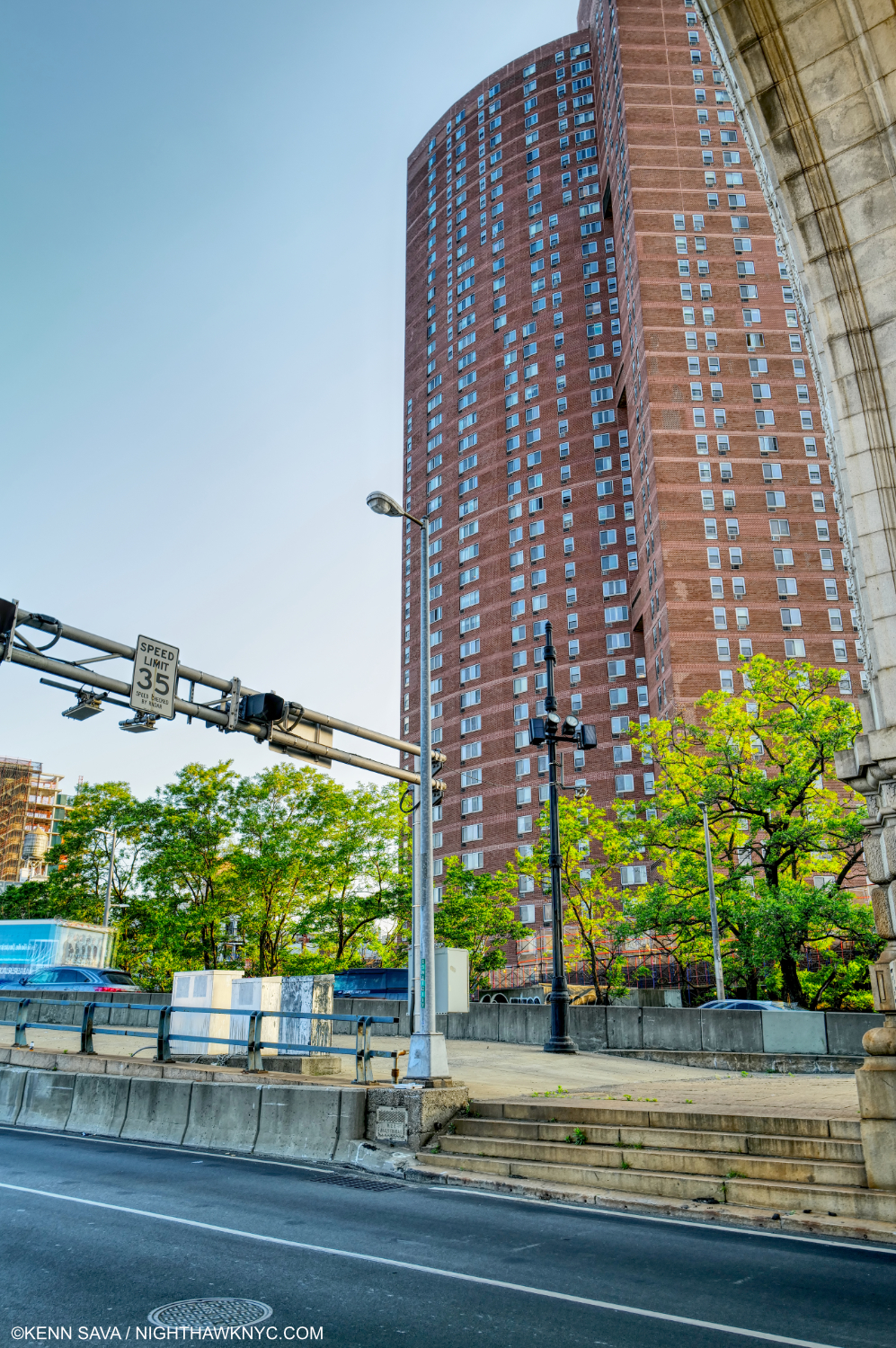
Not willing to risk life and limb as I did further below, I shot this from in front of the arch (part of which is seen at the upper right across the busy two-way roadway on May 18, 2023. This is approximately the scene of Manhattan Bridge Loop . Human scale was lost in a big way. Unlike Hopper, I’m using the portrait format to show just how tall the Confucius Plaza complex, which is where the buildings in the Hopper stood, is.

As in Early Sunday Morning, as time progressed, the beginnings of the loss of human scale in Manhattan Bridge Loop would only dramatically increase as time went on.
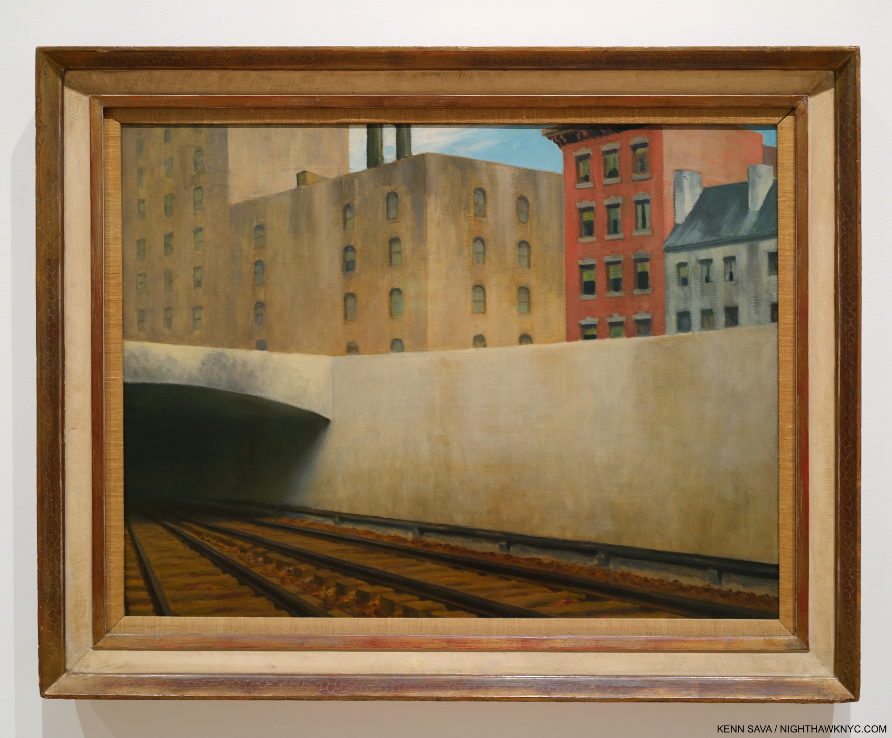
Approaching a City, 1946. Perhaps not one of NYC’s more scenic locations. The Artist visited the site, at Park Avenue at East 97th Street, the point where above ground trains become underground trains (and vice versa) going to and from Grand Central Terminal 55 blocks south, multiple times in 1945 to Draw it. Interestingly, the first work in Edward Hopper’s New York, my research reveals it was the last work shown in the Whitney’s 1950 Edward Hopper Retrospective catalog. I’ve been unable to find out if that means it closed the show. 

After the introductory wall of early works I showed in Part 1, Approaching a City, 1946, showing another bridge, is the first work in Edward Hopper’s New York, proper after the introductory wall. I was surprised by this choice, but the more I studied it, I’ve come to see it as a commentary on change in the City over time. First, I was interested that Hopper chose this site, given how far it is from his apartment (and mine). As a result, it’s a bit of an outlier among all the subjects of his NYC Paintings. That made me wonder if this, too, was another scene he initially glimpsed while a passenger on a train, particularly given its low vantage point, and then decided to go back and Draw it. I was so puzzled by the Painting and why he chose this location that I visited the site to see what the real thing would reveal.
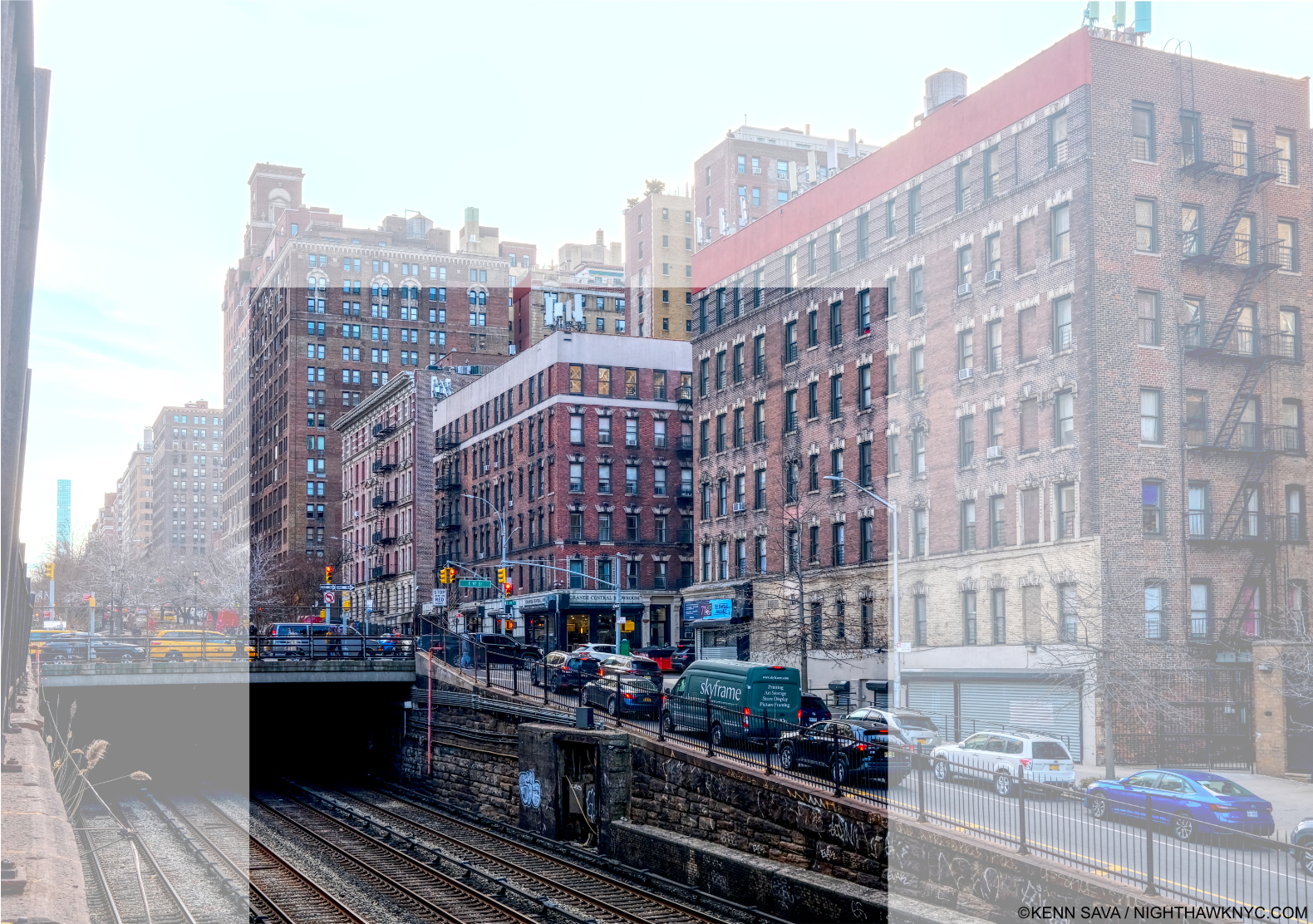
Park Avenue & East 97th Street, February 15, 2023 with the area shown in the Painting centered. What strikes me is that factory Hopper shows in the center & left of the Painting. Was it really there in 1946, right across East 97th Street from an apartment building? I didn’t crop this picture to the area showing in the Painting to show that the entire surrounding neighborhood is residential, and these building look to me to be 100 years old, if not older.

Today, it’s not possible to get down low enough to recreate the angle he shows- unless you’re on a train coming or going from Grand Central Terminal, 55 blocks to the south. Standing above, I took considerable risk taking this photo, my back danger close to the traffic zipping by on Park Avenue behind me. Vintage Photos in the City’s archive from the early 1940s show there was no factory where Hopper Painted it. The neighborhood was, and is, residential, and I believe the buildings I saw there now were there then.
I spotted this fleeting scene in the Film, The Band Wagon, 1953, showing the scene Hopper Painted just 7 years after he did! It’s highly unlikely the buildings in the background had changed that much.

Instead, Hopper chose to show a range of Architectural styles from Colonial, far right, to brownstone, to its left, to the modern factory, center, which could be taken as a comment, or a lament, on change in the City over time (a bit like Queensborough Bridge, and Early Sunday Morning do for me). The evidence would seem to show that he modified the background buildings to suit his purposes. So, what does modifying an actual place in a Painting mean? It means the Artist is using “Artistic license,” and putting it at the service of his or her intentions. (So much for so-called “realism.”) He or she may also want to remove the distraction of the place from the “point” they are trying to make. In the case of Approaching A City, Edward Hopper replaced a residential building with a factory and placed it among other residential buildings. He also changed the Architectural styles of the other buildings. It’s up to the viewer to read this as he or she will. For me, it shows that if he did so once, he would do so again. And he did.

Therefore, when I look at the places he shows, whether or not they are actual places is now a secondary consideration, said the guy who spent decades looking for the “actual site” of Nighthawks. I was driven by the fact that Hopper had Painted actual sites. But, as time went on, he moved away from doing so because it no longer served his purposes, or he modified them as he did here. (For those interested in knowing more about the actual sites Hopper did Paint, and comparing them with his Paintings, Hopper authority, Gail Levin, the Whitney’s first Hopper curator, and author of both the Hopper Catalogue Raisonne and the definitive biography, has published a book of Photographs she took traveling in NYC, the rest of the U.S. and Europe of places Hopper Painted appropriately titled, Hopper’s Places.) Finally, the darkness inside the tunnel I find interesting. Is it a comment on where things are heading? Into the unknown4?

The Hopper Fish Bowl

A frame from the 1916 short Film, A Ride on the Sixth Avenue Elevated shows the train approaching a row of windows, which might have provided Edward Hopper, a regular rider, with ample opportunity for fleeting inspiration…

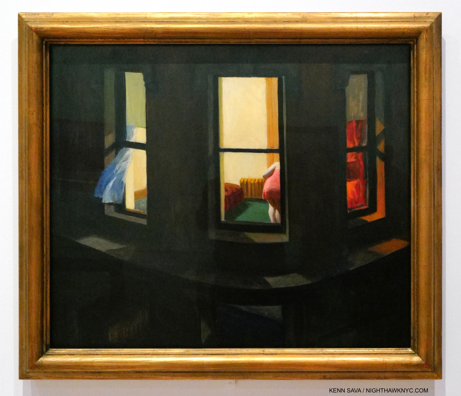
Life in NYC offers little privacy. New Yorkers are forced to adapt, but somewhere in the back of their mind lives the thought that “someone’s always watching.” That was born in the days long before video cameras, helicopter & drone surveillance! That Edward Hopper had his eyes open is seen by the number of his Paintings that look into a window. These strike me as new in Art. Some of these may have been inspired by fleeting, passing moments witnessed while a passenger on a train, others while on one of his walks around town. In any number of his Paintings we see one or more people behind glass. As I said in the caption for Office in a Small City, earlier, I call this the “Hopper fish bowl.” These include the “looking into a window” works, like Night Windows, 1928, which I showed in Part 1, and Nighthawks, which includes 4 figures behind glass.
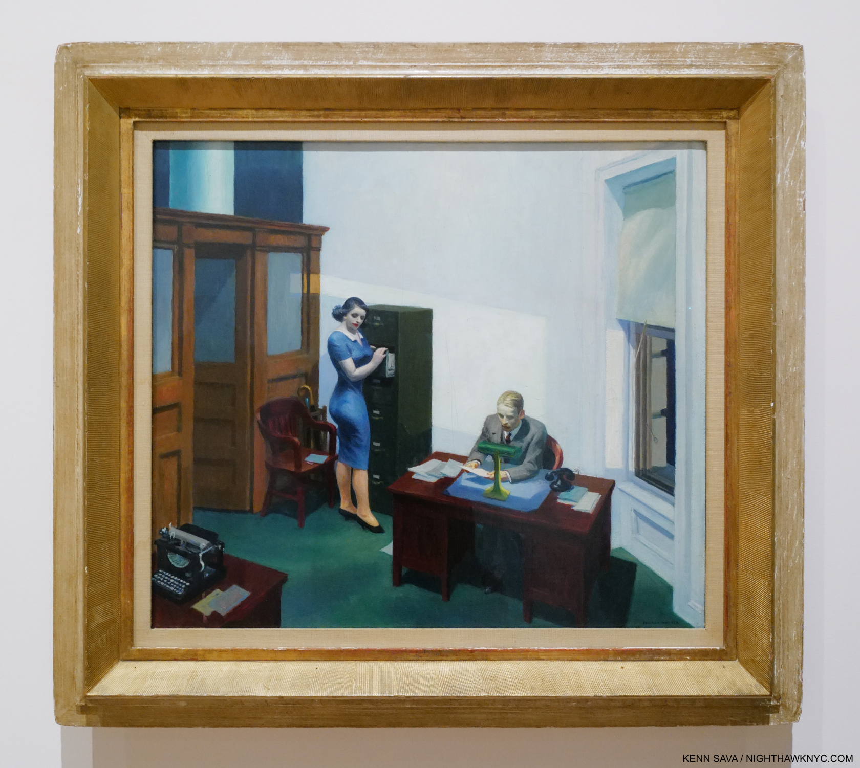
Office at Night, 1940. A work that has haunted me for over 40 years. I saw it here for only the second time in person.

Office at Night, 1940, is another scene apparently glimpsed through a window. Or is it? In The Art & The Artist, P.60, Gail Levin quotes Hopper saying there are three sources of light for this picture- the overhead light, the desk light and the window. If it was a scene glimpsed while on a passing train there would need to be 4- with another window in the front. I think people who have seen many Hoppers will immediately assume this is another “glimpsed in passing” scene, as I have until I read that. Who else Painted something like this before 1940? I grew up being forced to work in an old office that looked a bit like this one as a child, so it always gives me the chills to see it. The quiet drama at work here speaks volumes, and says everything about what has become “life in the cube.” It seems to me that Edward Hopper owns the genre of Painting office interiors (including Office in a Small City, shown earlier), and the next one, all showing the effects of the man-altered landscape on those who live in these places.

 Edward Hopper’s New York, Now
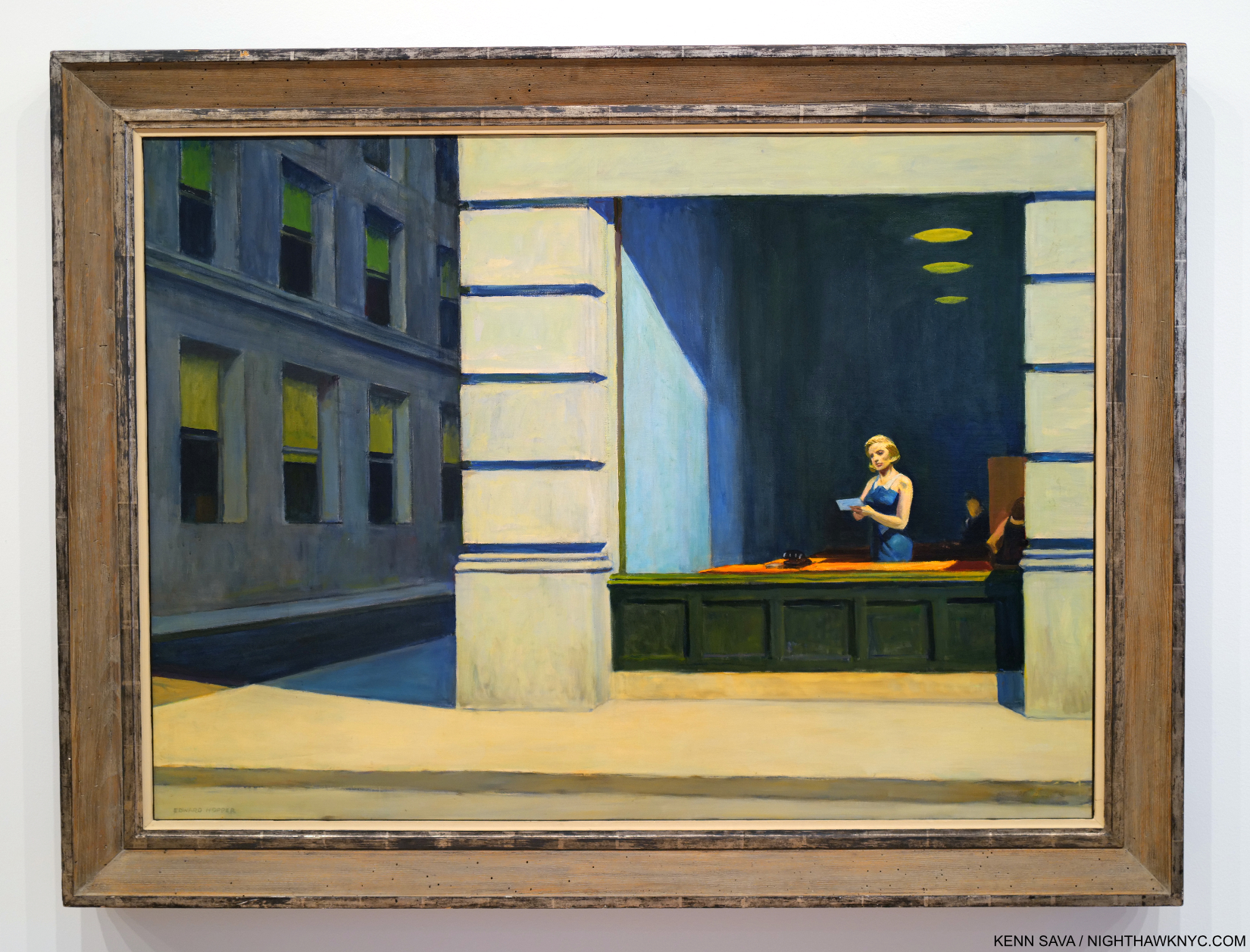
New York Office, 1962. With a change in telecommunication equipment, this could be now in Downtown, NYC. In 500 years, if people make it that far, it’s hard for me to imagine this won’t still be speaking to them. Hopefully, it will have a better frame by then.

Beyond changing my thinking about his work, Edward Hopper’s New York made me realize that sooner or later, everyone who lives in NYC (and perhaps most other cities) for a period of time winds up lamenting the loss of what it “used to be.” Early Sunday Morning is, perhaps, the epitome of this, but I think it’s there in many of his works. I miss the NYC of the 1970s and the 1990s. The pandemic has changed the City dramatically, too. It’s still hard for me to believe that 45, 215 irreplaceable people have died in NYC from covid as of June 1, 20235. Building and renovation (i.e. “progress”) continues as robustly as ever- for better or for worse. Rarely has there been an Artist who documented change in the City as Edward Hopper did. In spite of all these changes, he never changed. He kept working in the landscape format until the end. There were only a handful portrait formatted Paintings in Edward Hopper’s New York, notably his Self-Portraits and his Portrait of Jo, and a few in the square format, like Office at Night. It’s easy for me to relate to his angst at losing part of what he loved. It’s obvious how much he cared. As we venture into this new time of change, Edward Hopper’s New York can also be seen as lessons to us now- before, during and after change.

What I’m saying here is what Edward Hopper’s Art says to me. As with all Art, it’s up to each of his viewers to take from it what they will.
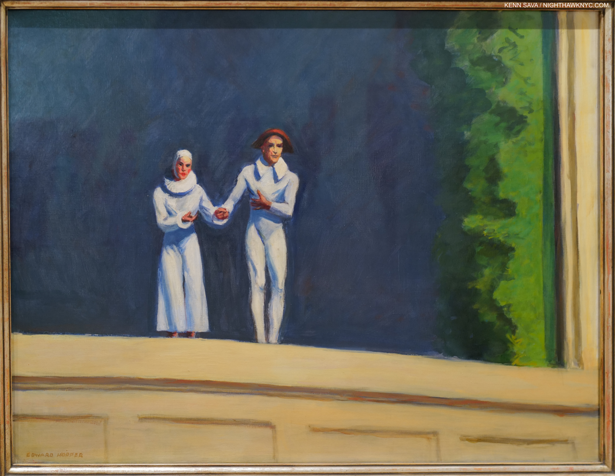
Edward Hopper’s final Painting, Two Comedians, 1965. He and Jo taking a bow in front of a dark blue sky(?) background with a landscape prop to the right. At first glance, it seems a straight-ahead Painting. I now also see it as showing a man-made setting (the backdrop and prop) depicting the “natural world,” thus “flipping the narrative” from what man has done with and to nature in his final work. Or, is it a reminder that everything he’s shown us was created by by him, assisted by Jo, in paint?

Back at home, Edward Hopper always struck me as being somewhat out of place in Greenwich Village. It became the home of the beatniks and then the hippies as his life came to a close. He died on May 15, 1967- right at the dawn of the “Summer of Love.” Throughout his 84 years, Edward Hopper held on to his traditional values and way, as I discussed in Part 1. He never went with fads, changing styles, or trends. At times this made him seem “old-fashioned,” particularly in the face of Abstract Expressionism and then Pop, but he’s having the last laugh now. The crowds that flock to see his work wherever it’s displayed around the world are proof positive that his Art is speaking to more people right now than it ever has before. People everywhere have seen the modern, man-altered world that was new in his time in New York up close and personal where they live and have been effected by it- for better, for worse, or some of both.
 

Last look at Automat. Closing day, March 5,2023.

Another big take away from Edward Hopper’s New York came from observing my fellow show-goers. It struck me that that for many others, as it does for me, it serves as a confirmation of what they’re feeling wherever they’re living. That makes me wonder- was Edward Hopper a visionary, too? Did he foresee that what was going on around him in NYC between 1910 and 1950 would become a world-wide phenomenon? I tend to think he was NYC-centric, like I am. He was worried about what he saw going on around him in a place he loved and loved living in. He noticed the effects these changes had on his friends and neighbors and on total strangers he happened to glimpse for a fleeting moment as he moved around town. He froze those moments in oil paint where they have become frozen in many of our minds. That front line moved further and further until it covered much of the world in the following 100 years since he started.
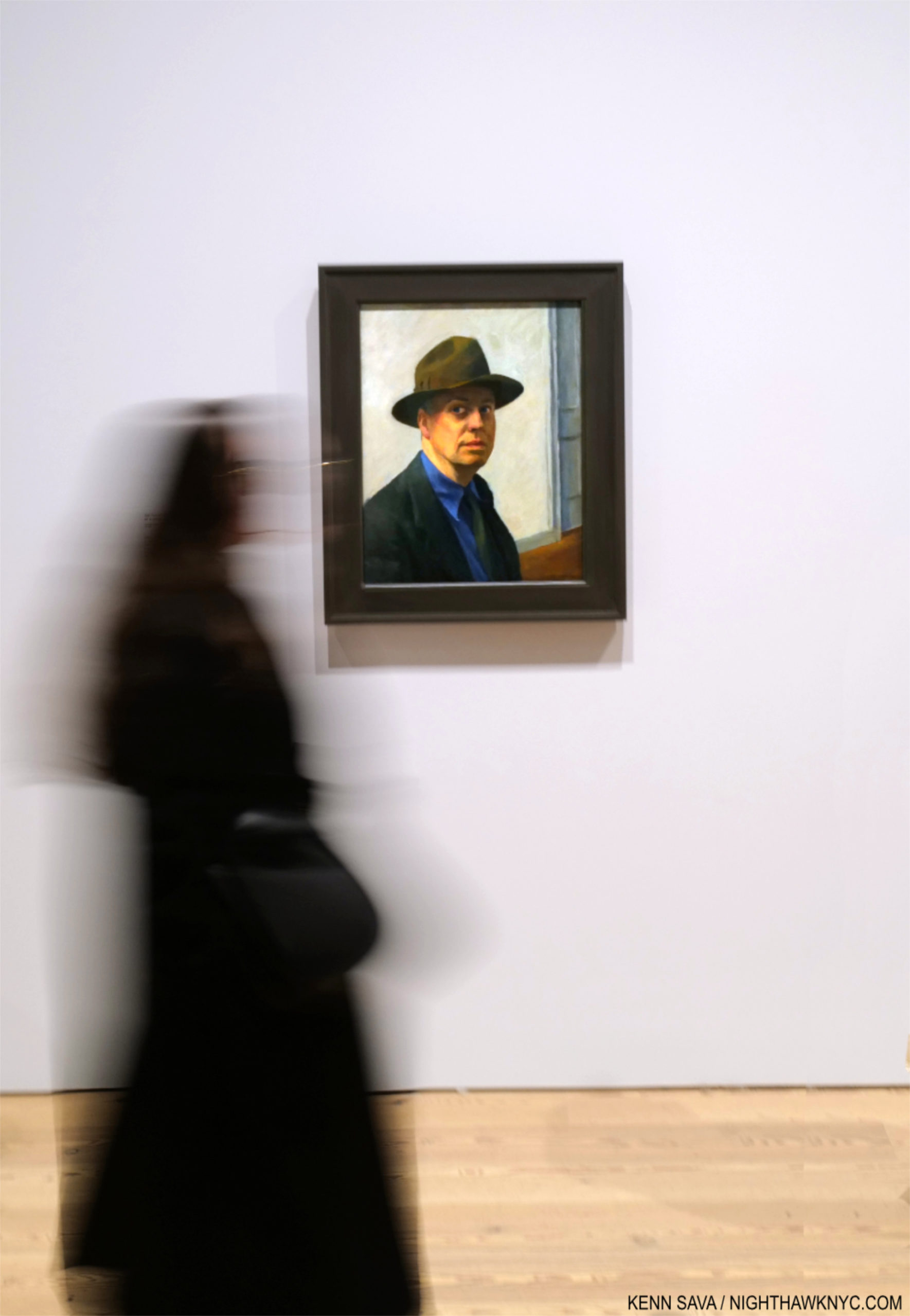
Ending this series with the same piece I began Part 1 with: Edward Hopper’s Self-Portrait, 1925-30, begun 98 years ago. Seen on March 1, 2023. In 2022, I also featured it here, where you can see it close up.

“I saw the Edward Hopper exhibition at the Whitney Museum in the fall of 1995 and I was amazed at the number of people there and how they reacted to the paintings….Hopper seems to reach more people than any other American artist.” Alex Katz, Looking at Art with Alex Katz, P.88-9.

Since that show Alex Katz refers to in 1995, Edward Hopper’s star has continued to rise- both here and especially around the world, If Edward Hopper isn’t THE most popular American Painter world-wide right now (and he may be), the inexorable rise in popularity his work has seen these past 100 years tells me he will be just that one day soon.
Closing Day, March 5, 2023

For me, in the end, the very good thing about that would be that his popularity is not due to a fad, sex appeal, a glamorous lifestyle, or the trappings of celebrity. It’s solely due to his Art speaking to people! In this modern day & age, with all the trappings of 21st century life that Edward Hopper couldn’t begin to dream of…imagine that.

A Postscript that looks at some serious issues involving & surrounding the Art of Edward Hopper at the Whitney Museum is here

*- Soundtrack for this piece is “Rhapsody in Blue” by George Gershwin, who returns from Part 1. Feeling “blue” may be a symptom of the man-altered environment. Gershwin was the ultimate interpreter of his own Music, of course. After his early death, the charge of performing Gershwin authentically fell on his friend, the extraordinary Oscar Levant. Best known as a somewhat sarcastic actor in An American in Paris, and other Films, lesser known is as one of the great pianists of the 20th century he was the highest paid concert artist for quite a while. (If you want to be blown away, check out this segment from the Film, which may be the first Music video.) Here, he powerfully performs “Rhapsody in Blue” with Eugene Ormandy conducting. It is posterity’s eternal loss that the record companies never sat Mr. Levant down in front of state-of-the-art studio recording equipment and had him record every note George Gershwin wrote that included a piano part. I cherish what we have.

<

NighthawkNYC.com has been entirely self-funded & ad-free for over 8 years, during which 300 full length pieces have been published! If you’ve found it worthwhile, PLEASE donate to allow me to continue below. Thank you, Kenn.

You can also support it by buying Art, Art & Photography books, and Music from my collection! Art & Books may be found here. Music here and here.

Written & photographed by Kenn Sava for nighthawknyc.com unless otherwise credited. To send comments, thoughts, feedback or propositions click here. Click the white box on the upper right for the archives or to search them. Subscribe to be notified of new Posts below. Your information will be used for no other purpose.
  1. Gail Levin’s Edward Hopper: An Intimate Biography, Expanded Edition, P. 722.
  2. Quoted in Sheena Wagstaff, “The Elation of Sunlight,” in Edward Hopper, Tate Exhibition Catalog, 2004, P.12
  3. https://www.history.com/topics/landmarks/brooklyn-bridge
  4. Compare it with this from 1906.
  5. Source and updated total, here.

Edward Hopper’s Impressions of New York

This site is Free & Ad-Free! If you find this piece worthwhile, please donate via PayPal to support it & independent Art writing. You can also support it by buying Art & books! Details at the end. Thank you.

Written & Photographed by Kenn Sava (*-unless otherwise credited)

Show Seen: Edward Hopper’s New York @ The Whitney Museum
Part 1 of 3 Parts.

Introduction

Smack dab in the heart of Edward Hopper’s New York, the Artist stares out at us in one of hs few Self-Portraits, one he began 98 years ago (1925-30). What would Edward Hopper make of his New York now? Click any picture for full size.

Edward Hopper. What more can I say about his Art? In 2015, I named this site after his masterpiece, Nighthawks, because of that figure with his back to us that no one ever talks about. I relate to him more than I do any other figure I’ve ever seen in a Painting because I’ve been that guy, alone in a bar, cafe or restaurant in Edward Hopper’s New York too many times to count.

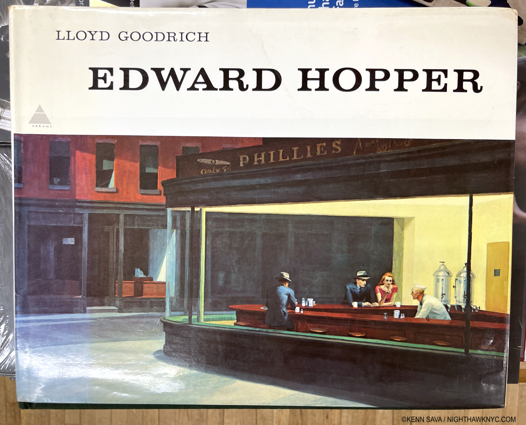
The first time I ever saw Edward Hopper’s work was in the late 1970s in a friend’s parent’s copy of this massive 10-pound, 16 by 13 1/2 inch, monograph by Lloyd Goodrich 1 published by Abrams in 1978, with 306 pages and 246 illustrations, but only 88 in color, unfortunately. One or other of his Paintings has been lingering somewhere on my mind since. My banner has been a continual homage to Nighthawks for the past 7+ years2.

Mister Hopper’s Neighborhood

The heart of Edward Hopper’s New York for over 50 years: 3 Washington Square (center). Between them, he &  his wife Jo, lived on the top floor from 1913 to 19683. Beginning in 1947, they had to fight NYU, who took over the building in 1946, to stay. Today, the Hopper Studio has been preserved though the rest of the building is in active use by NYU, as it was when I shot this, November 16, 2022. Nighthawks, among countless other Hoppers, was Painted here4.

At this point, I have lived in what was his extended neighborhood for over 3 decades. I have sat in the Park right in front of his long-time home and wondered if he sat on this very spot. I’ve walked by numerous actual sites he Painted, and I spent a night in the Provincetown, Massachusetts  rooming house he Painted in Rooms for Tourists, 1945, while I was in Cape Cod fruitlessly trying to find his Truro summer house and drinking in the atmosphere of another area he Painted. Today, any number of times I’m reminded I’m literally walking in his footsteps on streets he is known to have walked. Living in his footsteps is probably more accurate.

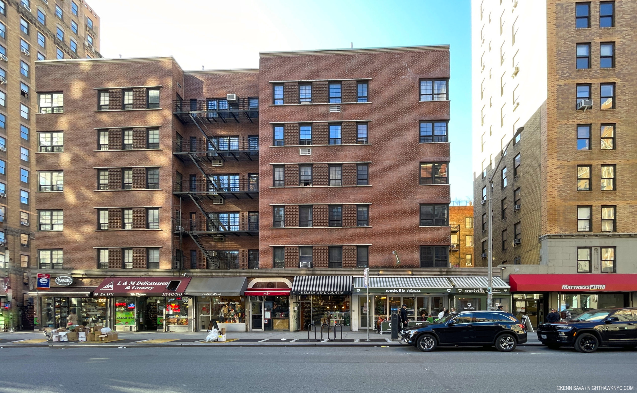
Early Sunday Afternoon, March 26, 2023. Does this scream “Edward Hopper Painting?” 93 years later, it’s hard to see Early Sunday Morning, 1930 (which I discuss in Part 2), in this scene in my neighborhood, but this is where it was on 7th Avenue between West 16 & 17th Streets. Only the building partly shown on the right is in the Painting. I had to wait for the sun to go behind the center building (to the west) to take this shot, its glare still bleaches out the wall of the building on the right, proving the direction the Sun shines in the Painting was “Artistic license.”

A bit of my passion for his Art comes from this “shared experience” of this part of Manhattan at different times, but most of it lies in the endless mystery at the heart of his Art. Mystery that no amount of looking seems to solve. Until I saw Edward Hopper’s New York, that is. 300 pieces in here on NighthawkNYC.com since July, 2015, except for a bit at tail end of “My Search for Edward Hopper’s Nighthawks Diner,” this is the first time I’ve written about his Art.

Setting the Stage

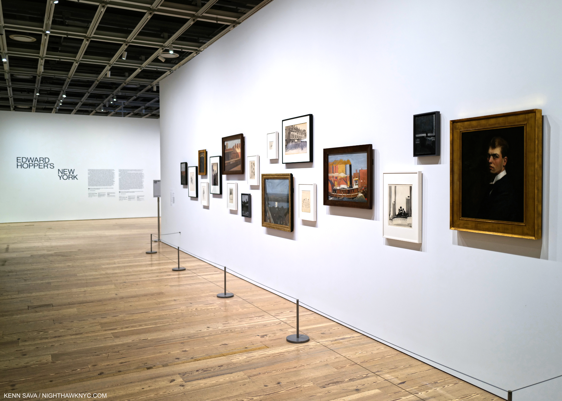
Before the crush. Edward Hopper’s New York Member’s Preview Opening Day, October 13, 2022. A wall of early work, including Self-Portrait, Oil on canvas (as all works featured are, unless specified), right, introduces the show. For Hopper, 1906 marks the beginning of his life as an Artist, the year he graduated from Art school, then embarked on his first trip to Paris. He would return twice before 1910, then return to NYC to get his Art career started.

While not a career retrospective (there has not been an Edward Hopper Retrospective in the U.S. since Edward Hopper: The Art & the Artist in 1980-81 5), Edward Hopper’s New York is a career-long look at what is, perhaps, his most famous subject- New York City, where he lived & worked for almost 60 years. I took the chance to see its 58 Oil or Watercolor Paintings6 by Hopper, among the 200 works and items of ephemera on view, 14 times between its opening day, above, and its closing day, below.

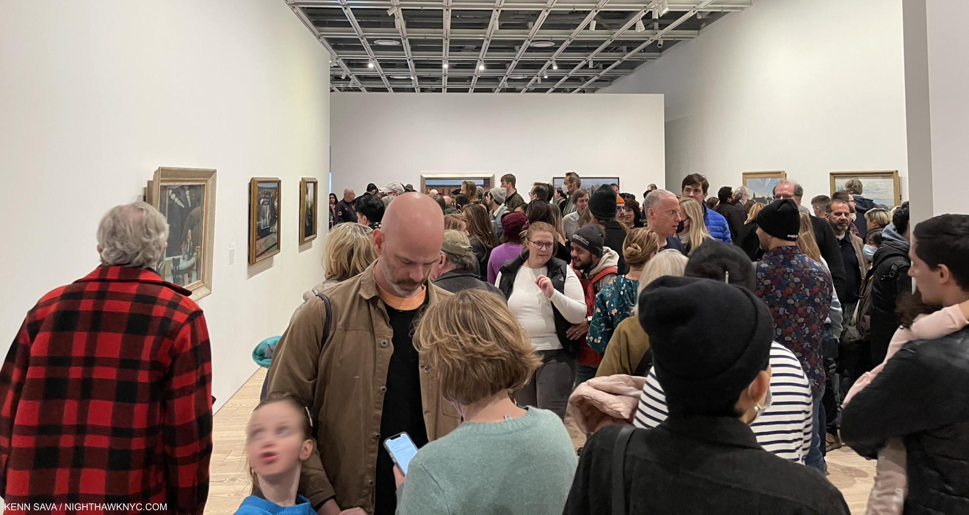
Now. Or never. This is about as crowded as an NYC Art show gets. 5pm, March 5, 2023. One hour to go on its final day. The final weekend was sold out.

Edward Hopper’s New York was the very first time  I’ve seen so many Edward Hopper Paintings in one place. I went 14 times because who knows when I’ll get another chance.

There’s how Hopper Painted, then there’s what he Painted. I’m going to attempt to look at both. In this part, I take a look at how he Painted, i.e. his style, and how, and if, it evolved. In Part 2, I look at what he Painted in a piece that is a personal reaction to what I see when I look at Edward Hopper now. Having the chance to see and study this many Hopper Paintings from early through late in his career Edward Hopper’s New York completely changed how I see his work. This is shocking to me because I’ve been looking at his work almost as long as I have anyone else’s- well over 40 years. To this point, I saw his work as one of the ultimate (and perhaps unsurpassed) expressions of modern loneliness and isolation of the century. Now, I see that as ancillary to other themes, themes that occur even when there are no human subjects. Themes that occur in his work in and outside of NYC.

One great thing about Art is that it’s there for everyone to see and make up their own minds what it says to them. I’m sharing here what it says to me. I hope everyone will look at Edward Hopper, and all Art, for themselves. 

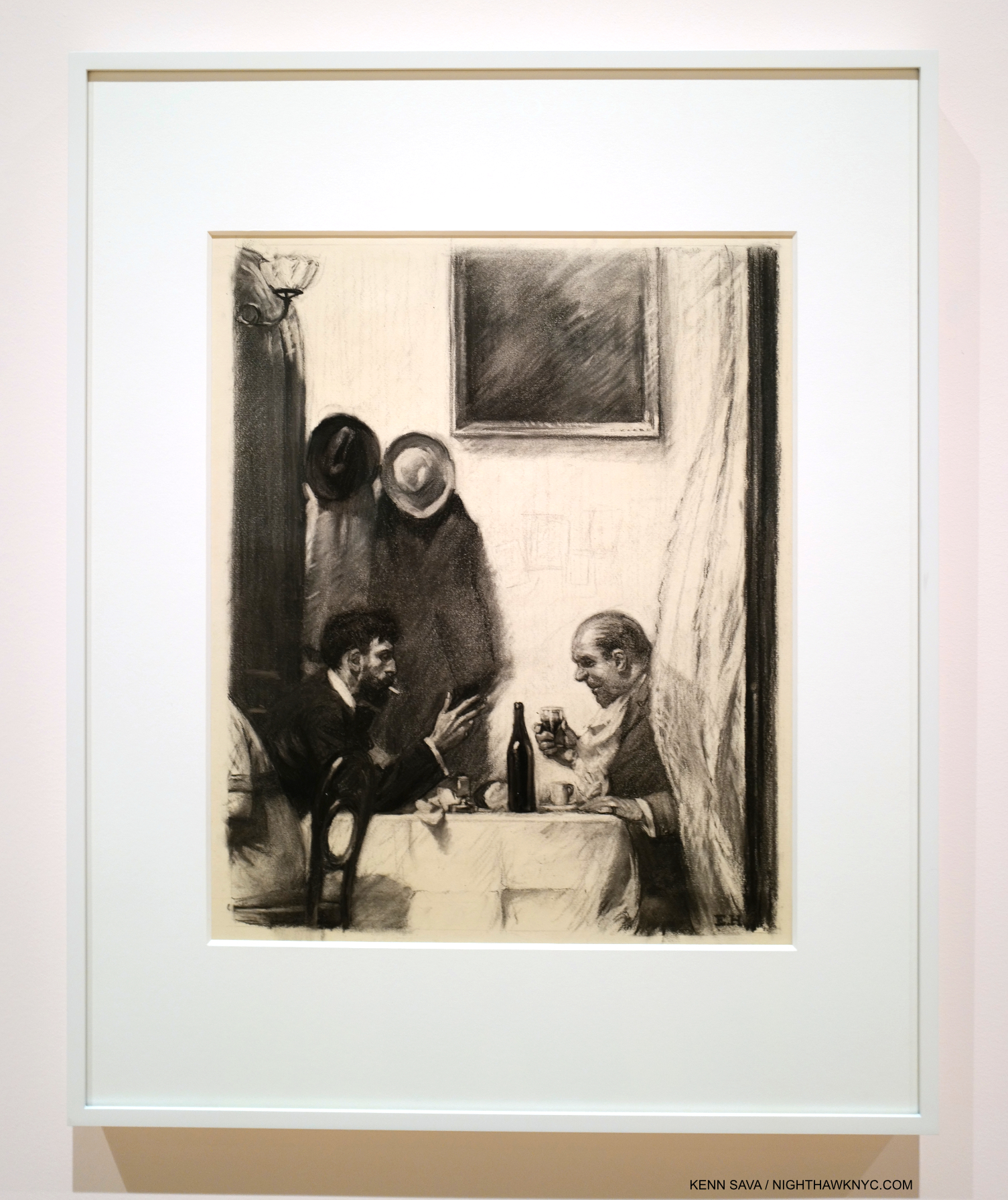
In a Restaurant, 1916-25, Charcoal on paper. For those who’ve criticized Hopper’s technique. He came by it honestly. 6 years in Art schools under esteemed Artist teachers. How they felt about his skill is evident in the fact that he was assigned to teach life Drawing, one of the hardest types of Drawing, before he graduated.

“In every artist’s development the germ of the later work is always found in the earlier. The nucleus around which the artist’s intellect builds his work is himself; the central ego, personality, or whatever it may be called. and this changes little from birth to death. What he was once, he always is, with slight modification. Changing fashions in methods or subject matter alter him little or not at all.” Edward Hopper7

Edward Hopper was born on July 22, 1882 in Nyack, NY, some 80 miles as the Owl majestically flies from the City. He visited the City as a child with his parents, then came here on a daily basis while attending Art school from 1899-19068. Towards the end of that time, he took up residence on West 14th Street, before taking three trips to Paris from 1906-10. After returning to the City, he lived at 53 East 59th Street9 before moving to 3 Washington Square in 191310.

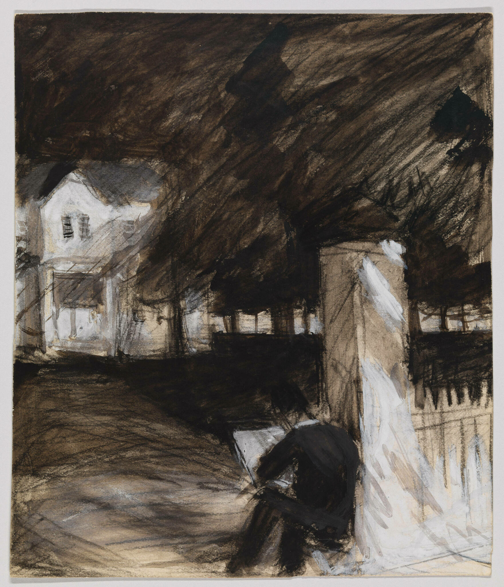
Untitled (Study of Man Sketching in Front of a House), c. 1900, Opaque watercolor, fabricated chalk and graphite pencil on paper (recto); Graphite pencil, pen and ink and opaque watercolor (verso). *-Whitney Museum Photo. Not in the show.

Seeing that introductory wall, shown earlier, sent me delving deeper into Edward Hopper’s Artistic beginnings (1895, at about age 15, to 1913, when he moved into 3 Washington Square at about 31) for the first time, looking to see when his themes began, how his style and technique changed over that time, and what they could tell me about his familiar later work. Most of Hopper’s early work is in the Whitney’s Permanent Collection, thanks largely to the 1970 Jo Hopper Bequest. It is, unfortunately, too rarely seen, and in my view, under-considered.

From the beginning, one thing that stands out to me is that Edward Hopper was a “traditional” Painter. That is, he relied on his preliminary Drawings & Studies as the basis of his Paintings, as Painters had been doing for as long as there had been Painters. Though Photography was making steady inroads into all aspects of life, and being used by an ever-increasing number of Artists & Painters during his lifetime, Edward Hopper never used Photographs as the basis of his work11. Untitled (Study of Man Sketching in Front of a House), from the year his Art school studies began, may be of a fellow student or be a de-facto Self-Portrait. In either case, it shows something I imagine Edward Hopper did regularly for the rest of his career. In addition to relying on long-standing traditional methods, Edward Hopper steadfastly remained true to his vision. He not only resisted Abstraction, but he uncharacteristically fought against it in print, in a publication titled Reality, which he contributed to.

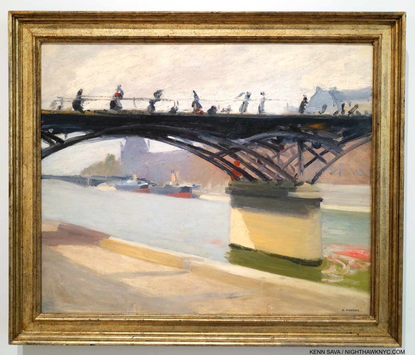
Le Pont des Arts, 1907. Edward Hopper Painted this outdoors near where he was staying on his first trip to Paris. So, it’s strange to see early on in a show devoted to his NYC work. Nonethelessless, it’s interesting for its style and for its content (see Part 2).

While in Paris, Edward Hopper saw shows of the work of the so-called “impressionists,” (a box I don’t subscribe to, so I will use “earlier French Painters” instead) but, apparently did not see the work of Picasso. It’s hard not to see their influence in this, but, at least for me, not that of any one Artist in particular stylistically. Under their spell, he seems to be doing his own take on it.

The question for me became- How far did this influence go, and how long did it last?

“It took me ten yers to get over Europe,he said.12. Ten years after Europe would be 1920. Looking at the show, a case could be made it lasted much longer.

New York Corner (Corner Saloon), 1913 became a touchstone for me over my 14 visits. If it wasn’t for the familiar lamp post and the smoke stacks in the rear, you might think this is a corner in Paris. A charming and unique early New York work, it was in MoMA’s collection until at least 1981. At some point after, they sold it! A shortsighted mistake in my view.

After returning from Paris, the 28-year-old Artist set about surviving as one. To this end, his work as an Illustrator from 1917 to 1925 provided him with income until his work began to sell. His first show, at the Whitney Studio Club in 1920 (the predecessor to the Whitney Museum), with 16 Oils, produced no sales. In 1923, his Watercolors began to sell after they were shown at the Brooklyn Museum. Then, in 1925, The Met bought 15 Hopper Etchings. Later that year, he sold Apartment Houses to the Pennsylvania Academy, his first museum Painting sale. As his Paintings finally began to sell (mirroring the experience of Winslow Homer, to whom his Watercolors were compared, whose Watercolors also sold before his Oils began to13), in September, 1925, he was able to give up illustration14. Among his early Paintings, the wonderful New York Corner, 1913, caught my eye. It’s interesting to contrast it with this work by John Sloan, one of his teachers, Sixth Avenue and Thirtieth Street, 1907.

John Sloan, Sixth Avenue and Thirtieth Street, 1907. The Sixth Avenue elevated train, which Hopper frequented, runs to the left. The gold sign on the right reads “LION BEWERY,” which was the 6th largest brewery in the US in 189515. I believe this view may be looking downtown, if that’s the Jefferson Market Courthouse in the background. *-Photographer unknown.

New York Corner currently resides in the collection of the Canter Center, Stanford University. Upon acquiring it, their press release says, “New York Corner, created when the artist was 31 and considered the first work made in his representational style.” Wait. What?

“representational-noun 1. showing things as they are normally seen” Cambridge Dictionary

What’s “representational” about it?

In December, 1913, Edward Hopper moved into 3 Washington Square on the Park, where he would live for the rest of his life, so this may have been executed based on a scene near his East 59th Street home just before or just after his move (unless this is a scene on East 14th Street. There’s nothing like the background anywhere else in what would be his West Greenwich Village neighborhood.). When I look at New York Corner, I see an Artist who’s in transition. It seems to me Hopper is wrestling with the influence of his teachers Robert Henri & John Sloan, and what he’d seen in Paris. The top half (i.e. the building) is slightly more “representational,” slightly more resolved (especially in comparison to work he did in Pars, like River Boat or Le Pont Royal, both 1909, and American Village, 1912,), while the bottom half is entirely out of focus. The figures are more like shadows, the indistinct but distinctive gold signage is striking, and stands in stark contrast to the sign in the Sloan. It only adds more mystery to the feel of the whole piece. The upper two floors of the building feature windows that are not much different from those seen on the upper floor of Early Sunday Morning (which are more defined) or across the street from the diner in Nighthawks (ditto). He’s starting to get there.

New York Interior, 1921. Seen through a window, this wonderful piece is one of a number of Hoppers that reminds me of Degas. See Night Windows, below. Notice the clutter on the mantel. Then compare this with Room in New York, seen further below.

As I’ve said, I don’t subscribe to most of the “-isms” that proliferate in Art, and the world, and that applies to putting Edward Hopper in anything other than the “Edward Hopper box.” As time goes on, putting him in the “realism” box he’s usually stuck in seems increasingly problematic. To wit- In Gail Levin’s massive 780-page Expanded Edition of her Intimate Biography of the Hoppers I couldn’t find one instance of Edward Hopper referring to his Art as “realism.”

“realism-noun 1: corcern for fact or reality and rejection of the impractical and visionary” Merriam-Webster

Richard Estes, Times Square, 2004, Paintings don’t come much more technically astounding than this. Unless, they’re by Jan van Eyck. Having stood on this spot before, during and after 2004, I can certainly verify the overwhelming visual noise that still is Times Square, something that has never been more faithfully realized than it is here.

I’m sorry, but when I look at his Art, it doesn’t fit that definition. For another thing, “realism” in Art is a term that began seeing heavy use in the 19th century, though I’ve seen the term applied to Artists like Caravaggio, 1571-1610. In all that time, things have changed. In 1966, the year before Edward Hopper died, Richard Estes began Painting New York in ways that redefined what had been called “realism,” making everything stuck in that box previously look, well, “different.” While Edward Hopper often Painted scenes looking through windows, Mr. Estes took the art of rendering their reflections to an entirely new level, while often Painting at the hyperfocal distance, which added new depth to his depictions of the world. Suddenly, the eye was free to go anywhere on the canvas and it was all rendered “democratically” (i.e. with apparent equal weight) and in focus. Others, including Rod Penner, followed, pushing the envelope of what had been done, all the while in the service of Art. There was suddenly more than one kind of “realism!” Since none of them have put their Art in a box in their interviews, I certainly don’t subscribe to the terms others ascribe to their Art. Therefore, Messers Hopper, Estes and Penner reside in only one “box” each: the one with their name on it. “Realism” has been used for over 125 years! it’s past time to retire it. It’s outlived its supposed meaning.

Night Windows, 1928. Among the earlier French Painters, Edgar Degas is someone I see in numerous Edward Hopper compositions. Perhaps more than I see any other Artist. Hopper seemed to share Degas’s voyeuristic streak. Many of both of their Paintings show women being observed apparently without their knowledge.

It’s pretty plain to see that these recent developments are at odds with Edward Hopper’s style. Then again, I don’t think he was ever out to win the realism race. Hopper authority Gail Levin said his work has “the suggestion of reality16.”

Finally, there’s this for all those who box Hopper as a “realist”-

“I think I’m still an impressionist…” Edward Hopper.

Edward Hopper didn’t say that in 1913 after Painting New York Corner. He said it in 1962, a mere five years before he died! He said it in an interview published in Katherine Kuh’s book The Artist’s Voice: Talks With Seventeen Artists, in 196217. That Edward Hopper, who never minced words, or used them without careful consideration (like the careful consideration he gave every detail of his compositions) especially in the very few interviews he did, would say this so late in his life and career HAS to be taken seriously. So far, it hasn’t been. The “realism” noise surrounding his work remains deafening. I came upon the “impressionist” quote after already being convinced by the visual evidence in Edward Hopper’s New York that he took what he learned from the earlier French Artists and used it in his own way. He was one of the Artists who forged what some call an “American style,” an important goal at the time. Yet, his influences remained in his work throughout his life to the extent he chose to use them, in varying degrees, to suit his purposes in each particular work.

GeorgiaO’Keeffe quoted on the back cover of the catalog for her 2021 show at Museo Nacional Thyssen-Bornemisza.

Part of that influence, I believe, was that as time went on, Edward Hopper began removing unnecessary objects from his Paintings. It seems to me his work lives on its mystery. Isn’t too much information an enemy of mystery? He also stopped using “real” settings, creating his own, possibly based on actual places combined with his imagination. In spite of my decades of looking for the “real” Nighthawks diner, this may well be what he really did: he based it on a place he saw then modified it in his imagination to suit his purposes (and he said as much). And that is the key: everything superfluous went out of his Art. That’s one thing that makes Nighthawks such a brilliant, timeless, nebulous work.

The result? For me, many of Edward Hopper’s New York Paintings are “impressions.”

Room in New York, 1932.

I rest my case with Room in New York, from 1932. One of his masterpieces, in my view, it defies every single box Edward Hopper has been put in. It’s one of his many scenes looking into a window. Perhaps something he saw in a fleeting moment while riding the Sixth Avenue elevated train, or in passing as he walked, or maybe it’s a scene he imagined, possibly filtered through his own relationship experience. If, and it’s a huge “if,” this is (at least partially) filtered through his marriage, this may be as frankly as he ever depicted it. Look closer-

Edward Hopper’s “realism?” Bah humbug. A classic example of why I ignore boxes and just look at the work for myself!

Look! The faces have no details! This is by intent, of course. He obviously considered facial details to be unnecessary to what he was trying to express, or distracting from it. Is this what he meant when he said, “I think I’m still an impressionist…?” Isn’t this closer to the work of the earlier French Painters than anything else? No so-called “realist” Painted like this! Only George Seurat, among those earlier French Painters, Painted like this- on occasion (not all the time). In most Paintings that include humans, their faces and expressions carry the weight of the work. Not here in this scene that includes a woman and a man and not much else. How utterly daring! Without them, what’s a viewer to focus on? For me, all that’s left is the body language. And that red dress. “All dressed up with no where to go?” The woman in Nighthawks is also wearing a red dress. Could it be a pendant to Room in New York?

When people talk about the”genius” of Edward Hopper, for me, it’s on view in Room in New York, 1932. He had evolved through his education, his time overseas, his influences & experiences, and had arrived at the place of knowing, then executed it using his time-tested, traditional, methods. He knew what he wanted to say here, and had developed the confidence to leave out the non-essential (perhaps, inspired by seeing the earlier French Painters do it), including “minor details” like facial features! He created an impression of a scene, in my view, real or imagined, that mimics the fleeting moment that may have inspired it and somehow works perfectly, just as it is, without them.

Two on the Aisle, 1927.

In Two on the Aisle, from 1927, five years before Room in New York, the faces are “incomplete,” but more “defined” than the two in Room in New York. Perhaps he became emboldened to go further after works like this. 

The Sheridan Theater, 1937.

In Sheridan Theater, nothing is in sharp focus.

Then, in Morning Sun, 1952, the woman’s face (Jo was his model) is Painted so expertly (in my opinion) as to leave her expression ambiguous, making the work open to endless contemplation. These are just a few of the works that have “selective details,” i.e. details the Artist chose to include, or omit. In my view, this is always done to forward what he’s trying to express.

Boxes confine an Artist to one style. If the Artist says my work is in this box? So be it. It’s when other people put an Artist in a box that’s wrong in my view; for the Artist, and for not giving the viewer the chance to see the Art for themselves. Artists, being people, are free to change their minds, evolve, even move into other styles over time. Boxes don’t allow for this. Edward Hopper used his technique and the wide range of his skill as he saw fit in each work. A good number of them (i.e. many) strike me as “impressions,” and it’s their nebulosity that adds so much richness to considering them. There is enough detail in these to ring true with viewers, and enough vagueness to allow them to return to the work again and again. In other works, like Office at Night,1940, he chose to sharpen things up, but still managed to keep the mystery and the drama due to the brilliance of his composition and the realization it.

“Great art is the outward expression of an inner life in the artist, and this inner life will result in his personal vision of the world,” Edward Hopper18.

On the surface, these works may be “impressions” to my eyes. They are also transcriptions of the Artist’s “personal vision of the world.” Whatever you call them, they are as close as Edward Hopper got to making his inner world, “reality.”

*-Soundtrack for this piece is “An American in Paris” by George Gershwin, 1898-1937, a contemporary of Edward Hopper. Born 16 years after Hopper, he died, tragically of an undiagnosed brain tumor, 30 years before the Painter would. Hopper’s taste (if any) in Music is unknown to me, however as Edward Hopper’s New York points out in a room dedicated to it, he was an avid theater and movie-goer. As such, the name George Gershwin could not have been unknown to him. Gershwin, like Hopper, helped define what some call an “American style” of Music, as some say Hopper did for Art. Gershwin, who also Painted, was born in the City and spent most of his life here. Here “An American in Paris,” in homage to Hopper’s time there, is performed on a piano roll by George Gershwin, himself-

In Part 2, here, I take a look at what Edward Hopper’s Art says to me now, after immersing myself in Edward Hopper’s New York. Part 3 looks at some current issues surrounding Edward Hopper’s Art. 

NighthawkNYC.com has been entirely self-funded & ad-free for over 8 years, during which 300 full length pieces have been published! If you’ve found it worthwhile, PLEASE donate to allow me to continue below. Thank you, Kenn.

You can also support it by buying Art, Art & Photography books, and Music from my collection! Art & Books may be found here. Music here and here.

Written & photographed by Kenn Sava for nighthawknyc.com unless otherwise credited. To send comments, thoughts, feedback or propositions click here. Click the white box on the upper right for the archives or to search them. Subscribe to be notified of new Posts below. Your information will be used for no other purpose.
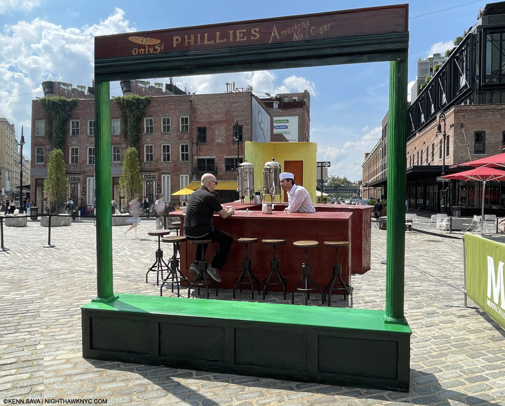
  1. The first Hopper authority, outside of his wife, the Artist Josephine Nivison Hopper aka Jo, and curator behind the 1950 Edward Hopper Retrospective and the 1964 Edward Hopper show.
  2. In saying all of the above I am not saying that Edward Hopper is my favorite Artist, or I think he’s “the best.” I don’t believe in qualitatively comparing creative beings or works.
  3. Edward passed in 1967. Jo, the Artist Josephine Nivison Hopper, continued to live there in failing health until she died in 1968.
  4. Hopper worked on Nighthawks during the beginning of World War II for the U.S., having started it around the time of Pearl Harbor. In the Logbook of Hopper’s work, Jo recorded it being completed on January 21, 1942, as I show here. Jo worried German bombs would be falling through their skylight. Edward was too busy working to seem to care, or maybe he was escaping into work (Gail Levin, Edward Hopper: An Intimate Biography Expanded Edition, P.348.)
  5. on 2 floors of the old Whitney, who have mounted smaller shows juxtaposing Hopper with other Artists, since, as well as the floor they gave him in their Full House show in 2005, and the Hopper Drawing show, which I saw in 2013, which had over 200 Drawings and some Paintings, including Nighthawks, on loan, as I partially showed in my very first piece in 2015.
  6. which does not include about 30 Illustrations whose media were not listed but many appear to include watercolor.
  7. from a letter from Hopper dated 1935 quoted in Gail Levin, Edward Hopper As Illustrator, P.1.
  8. Twice the length of time his teacher Robert Henri recommended.
  9. Gail Levin, Intimate Biography, P.84
  10. While spending summers in Maine and then in Truro, MA.
  11. The lone exceptions I’m aware of are his 2 Civil War-related Paintings which may have been based on Photographs he saw in a published collection of Civil War Photographs.
  12. Gail Levin, Edward Hopper: The Art & the Artist, P.126
  13. Gail Levin, Intimate Biography Expanded, P.171
  14. https://archive.artic.edu/hopper/chronology/
  15. https://en.wikipedia.org/wiki/Lion_Brewery,_Inc.
  16. Gail Levin, Intimate Biography Expanded, P. 441.
  17. P.135, as quoted in Sheena Wagstaff, “The Elation of Sunlight,” in Edward Hopper Tate Exhibition Catalog, 2005, P.25.
  18. Statement in Reality #1 as seen in the show.

Jane Dickson: The Artist Laureate of Times Square

This site is Free & Ad-Free! If you find this piece worthwhile, please donate to support it & independent Art writing. You can also support it by buying books! More at the end. Thank you. 

Written & Photographed by Kenn Sava

“They say the neon lights are bright on Broadway
They say there’s always magic in the air.”*

Perhaps the most “famous” of the Times Square porn theater signs, the infamous Peepland sign stood on 7th Avenue (i.e. Broadway), between 47th & 48th Streets. Big Peep Eye, 2021, Oil stick on linen, 62 x 76 inches. Seen at Jane Dickson: 99c Dreams at James Fuentes, April 7, 2022.

It takes a poet to turn the lurid den of iniquity that was Times Square in the 1980s into Art. Jane Dickson has spent a good part of her career doing just that. Now, times have changed. Visitors to the place today have to look long and hard to get a sense of what it was like 30 or 40 years ago. But, has it been change for the “better?” Earlier this year I asked Jane Dickson which she liked better- the “new” Times Square, or the “old?”

“They’re equally bad,” she replied without even taking a moment to think about it.

Her answer may surprise many who don’t live here, but New Yorkers know and largely agree. I’ve lived through both, so I wanted to get her take on it since she actually lived in the middle of it in it’s most notorious heyday, while I was always ensconced at least a mile away- close enough to walk there easily, passing through it often enough, and leave when I wanted. Meanwhile she stayed in her loft on 8th Avenue near 43rd Street, right in the heart of all of it, watching it all go down from her window, or on the street.

99c Dreams Felt, 2022, Acrylic on felt, 62 x 84 inches. The titular piece from her spring, 2022 James Fuentes solo show.

The place had a look all its own. While you were looking, keeping your eyes open in “old” Times Square, best known to most from Martin Scorsese’s Taxi Driver, was key to surviving it. Still, I was mugged once on “the Deuce” as 42nd Street was called. Keeping your eyes open in “new” Times Square is also key to surviving it, for different reasons. Now, you’re not as likely to get mugged as you are to get hit by a bike. Looking at the Art of Jane Dickson, it seems that she never closes her eyes. Her work is full of fleeting moments that may not be the “decisive moments” Henri Cartier-Bresson immortalized. They’re more like “What just happened?” moments, where the pitch black night is “stabbed by the flash of a neon light,” as Paul Simon wrote in “The Sound of Silence.”

Big Terror, 2020, Acrylic on linen. What appears to be the strip of theaters on West 42nd Street between 7th & 8th Avenues back in the day. All the marquees are gone now.

While Taxi Driver definitely captured the look and feel of the place, Travis Bickle traveled mostly by car. You can’t really get the sense of what the place was like unless you were walking it. And walking it was risky, as I said. Times Square back in the day was seedy and dirty- in most of the definitions of that word in standard usage, both of those terms ran neck and neck with each other on a daily basis to see which one would win.

Reader Advisor, 2021, Oil stick on linen, 22 x 32 inches.

It wound up a toss up, at least in my book.

Halloween Wigs, 2021, Oil stick on linen, 32 x 22 inches.

“They say the women treat you right on Broadway
But looking at them just gives me the blues
‘Cause how you gonna make some time
When all you got is one thin dime
And one thin dime won’t even shine your shoes”*

What may, or may not be, the same place, seen on 8th Avenue & West 35th Street, November 22, 2022.

So, it’s a very strange thing to say that “cleaning up,” or “disneyfying” Times Square, in honor of its most famous new anchor tenant1, wasn’t an improvement. But, it wasn’t. Times Square went from being the City’s capital of porn to being the City’s capital of tacky chain commerce porn. For my part, I’m still waiting for signs of life IN new Times Square. Though, yes, there are some good shows, like this one, on the side streets off the actual Square. 

Traffic Cop Port Authority, 2020, Oil stick on linen, 34 x 20 inches. If you’re coming to NYC, crossing the street is, perhaps, THE most dangerous thing you’ll have to do. It’s not only cars, trucks, busses. Now the bigger problem are all the bikes, e-bikes, scooters, motorcycles that obey no laws or rules that are deadly. A man was hit by a bike on my corner in August. He died of his injuries. The cyclist got up and left. I’ve spoken to many cops about this problem. They’re at just as much risk! Right now, no one cares. My advice? Have eyes installed in the back of your head before you get here, and use them!

All the while, Jane Dickson has built a considerable career out of observing life in old Times Square. Her Paintings, Photos, Mosaics, Videos, works on paper, et al, show the Times Square where life happens in the living definition of a “New York Minute”- a nano-second.

Fascination Sign 1, 2020

“I chose to be a witness to my time, not to document its grand moments but to capture the small telling ones, the overlooked everyday things that define a time and place,” she said.

Her work features two recurring elements- the deepest black of the dead of night, punctuated by the glow of lightbulbs, neon tubes, or both, rendered in paint on such surfaces as Astroturf, felt, sandpaper, or carpet. A number of her subjects are faceless or indistinct. They literally could be anyone. While many others have created work in Times Square, (including Richard Estes, who has made some stunning Urban Landscapes there), no other Artist or Photographer has devoted more than 50% of their body of work to it.

Late Show Cop, 2020, 32 x 22 inches, left, and Open, 2021, 34 x 24 inches, right. Both Oil stick on linen.

Little by little, Ms. Dickson is starting to get the recognition she deserves.  In 2007, her Mosaics, The Revelers, depicting Times Square New Year’s Eve celebrants, were installed in the IRT 42nd Street/Times Square Subway Station- permanently.

You’ve made your mark when your Art is rendered in the permanence of mosaics, publicly. Jane Dickson’s The Revelers partially seen here installed in the NYC Subway, fittingly right under Times Square where the titular celebrants gather each year on New Year’s Eve to…revel. Seen on July 2, 2022, when most New Yorkers look like they could use some revelry.

I’ve lauded MTA Arts previously, and once again, their selection of this Artist for this location is spot on. The Revelers is installed right under the place where the event takes place each year- New Year’s Eve in Times Square. Walking through the long corridor the piece is installed in on a summer day, I was stopped by a number of the figures.

Yes, the “confetti” around the figures is recreated in glass mosaic and embedded into the tiles surrounding the figures.

The real thing. Leftover confetti from the New Year’s Eve celebration in Times Square on West 42nd Street at 7th Avenue directly beneath where the Ball was dropped. January 4, 2022.

Many of them ARE reveling. Some are hugging and kissing. Many carry or play horns. Joy & happiness abounds. Not things you see every day in the Subway. I tried to put myself in the place of those people and remember what they were feeling. New Year’s Eve isn’t a big deal to me. I haven’t celebrated any holiday in years. The pandemic sealed that. Still, it is a good thing to see here, it’s good to have a reminder of happiness & joy, which many will see almost every single day on their commute.

Installation view.

As I think about the piece, having made a few trips just to see it, I’m struck that it provides the only vestige of the feeling the holidays bring for some all year long, anywhere in the City.

Installation view of Jane Dickson in the 2022 Whitney Biennial, seen on March 31, 2022.

The first large monograph on her work, the stunning Jane Dickson in Times Square, was released in late 2018. This year, to my eyes (along with Matt Connors who I wrote about here), she was a “star” of this year’s Whitney Biennial. Concurrent with the Biennial, Ms. Dickson also showed new work in a solo show Jane Dickson: 99c Dreams at James Fuentes from April 7th through May 8th in Soho. Both shows reveal she has lost none of her power, and her eyes remain wide open.

Living the dream…Jane Dickson at the opening of Jane Dickson: 99c Dreams at James Fuentes, April 7, 2022, while her work was also starring across town in The Whitney Biennial.

“They say I won’t last too long on Broadway
I’ll catch a Greyhound bus for home, they all say
But they’re dead wrong, I know they are
‘Cause I can play this here guitar
And I won’t quit ’til I’m a star on Broadway”*

Jane Dickson is yet another example of a wonderful Artist who has been making very good work for a long time (over 4 decades) finally beginning to get the recognition her work deserves. She captured the feel and the experience of Times Square (and beyond) as  no one else has. In doing so, she’s done something remarkable: she not only survived it, she created something lasting out of it all.

For me, Jane Dickson is the “Artist Laureate of Times Square,” by definition 3 of this definition of “poet laureate” from the American Heritage Dictionary:

poet laureate
noun
  1. A poet appointed for life by a British monarch as a member of the royal household and expected to write poems celebrating occasions of national importance and honoring the royal family.
  2. A poet appointed to a similar honorary position or honored for artistic excellence.
  3. A poet acclaimed as the most excellent or most representative of a locality or group2. <–Bingo.

*- Soundtrack for this piece is “On Broadway,” by Mann, Weill, Lieber & Stoller as performed by George Benson in 1978. 

NighthawkNYC.com has been Free & Ad-Free for over 7 years, during which over 275 pieces have been published! If you’ve found it useful, I rely on your support to continue.
I’m pleased to announce you can now support it by buying Art, ArtBooks and PhotoBooks! I’ve curated a selection of 400 books & pieces of Art from my collection, offered through my partnership with eBay seller GallerieK. Featured items of particular interest to my readers may be seen here. The complete selection is here now!

Or, you can donate to help keep NighthawkNYC.com online & ad-free below. Thank you!

Written & photographed by Kenn Sava for nighthawknyc.com unless otherwise credited.
Comments, thoughts, feedback or propositions? Click here
Click the white box on the upper right for the archives or to search them.
Subscribe to be notified of new Posts below. Your information will be used for no other purpose.
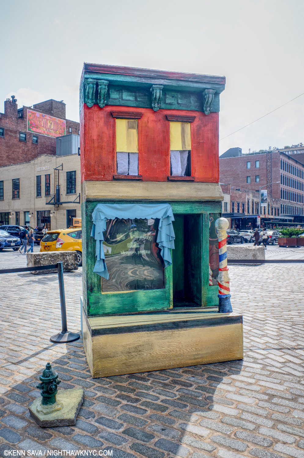
  1. Are they still there? Like most New Yorkers, when I find myself in Times Square, I don’t stick around long enough to see the sites, so I don’t even know.
  2. The American Heritage® Dictionary of the English Language, 5th Edition.

Highlights of the 2022 Whitney Biennial: Matt Connors

Written & Photographed by Kenn Sava

There I was, wandering the 5th Floor of the Whitney Museum on my first visit to the 2022 Biennial edition, filled with my usual trepidation, when about 10 minutes in I discovered Matt Connors. I was immediately captivated.

Ahhh…That rarest of rare things: Great Painting on view in the Whitney Biennial. Six works by the amazing Matt Connors line one of two walls given to him on the 5th floor of the Whitney Biennial. After Scriabin (Red), 2020, Untitled, 2021, Body Forth, 2021, I / Fell / Off (After M.S.), 2021, Number Covered, 2021, Fourth Body Study, 2021, left to right.

He was generously given parts of 2 walls and I came away feeling that every one of his works displayed was strong. A feeling I only had one other time on the floor- that for the Paintings on view by Jane Dickson. Ms. Dickson has been working somewhat under the radar of many documenting a time and place in Paintings & Photographs, that no one else has- the Times Square area, before its Disneyfication (which makes it as loathed by locals today as the area was before. No small feat!). When I left, I stopped into the bookstore, as I usually do on my way out, and discovered this huge Matt Connors monograph with the cryptic title, GUI(L)D E. (Hmmmm…If the means the “L” is silent, it becomes GUID E.?) I looked through it to see if my intrigue would grow into more, and I couldn’t put it down. But I had to when they closed.

Body Forth, 2021, Oil and acrylic on canvas

That night, I did some research and discovered that Mr. Connors is not new by any means, but he’s not even in mid-career yet. In fact, his most recent show just closed days before the Biennial opened. Drat! I would have loved to have seen it.
Not only is he not new, he is, apparently, exceptionally prolific. GUI(L)D E is, apparently, part 2 of a retrospective of his work to date, following 2012’s A Bell Is Not A Cup, reprinted in 2016. GUI(L)D E covers his work since in almost 500 pages! His auction prices put him in the “established” category. 30 to 50 grand, or more, for his Paintings were the prices I saw. Even considering what I’m about to say next, my feeling is those prices are likely to hold for the time being. Being so prolific might work against him in this regard. Fewer, of anything, equals more expensive.

Though his work to date is abstract, these two works only hint at Matt Connors’s range. First Fixed, 2021, and How I Made Certain of My Paintings, 2021, left to right. I stood in front of How I Made for quite a while, getting increasingly drawn in to the composition’s unique geometry…

I have seen enough to call Matt Connors one of the “stars” of this Biennial. 

Let’s get lost. About to dig into my copy of Matt Connors GUI(L)D E, published by Karma in 2019, for the first time…

Not being able to get it, or his work off my mind, I went back to the Whitney just to buy GUI(L)D E the following night. After its 464 pages, plus the dozen works I saw the day before, my intrigue solidified into love, as in: “I love his work!” What? So fast? Why? First, I am extremely impressed with his color sense. In my view, Matt Connors is a true master of color. His choices are just gorgeous, rich, ripe, and work together brilliantly (not meant as a pun, but I’ll take it). Proof of this can be found in the Special Edition of GUI(L)D E, which comes with a Limited Edition print that seems to be based on his 2019 Painting Bird Through a Tunnel, or After Scriabin (Red), 2020 (seen in the first image in this piece) in any one of TWENTY-FOUR color ways! I’ve spent hours arguing with myself over which one I like best! Then, his compositions are unique and run the gamut from, apparently, completely free, perhaps improvised, to based on more representational scenarios. Then, there’s the way he manages, and reimagines, shapes. Fond of basic shapes, and multiples of them, “perfect” geometry is not always what he aims for, and that helps to leave his pieces fresh, in my view. His work continually surprises. At times I think he’s another Mondrian, on the next page another Matisse. All the while, he is as prolific as Jasper Johns, and as creative with paint as Paul Klee, as his work shape shifts from one to the next. Though some, many, all, or none, may be influences, he resolutely follows his own sense. In the end, that’s what I admire most, along with there being real variety in his strokes and mark making that is stunning.

Good luck(!) to those “isms” lovers trying to “box” Matt Connors! His work proves the folly in that. Why bother? Just sit back and enjoy looking for a change.

I / Fell / Off (after M.S.), 2021

Though he works in what most would call “abstraction,” his work strikes me as being accessible to virtually anyone. Accessible, perhaps. Understandable is another matter. His work is (almost) fiendishly inventive, leaving the viewer to ponder “what it all means,” while his color sense, which can be breathtaking, is going to seduce many an eye and surprise even those who think they’ve seen every palette an Artist ever invented.

One Wants to Insist Very Strongly, 2020

It’s nice to see Matt Connors, and Jane Dickson (along with what may still lie ahead on the 4th floor, yet unseen), like Jennifer Packer in the 2019 Biennial, holding the Painting flag high in these two Biennials, which have far too much video and installation work for my taste (not meant to disrespect these mediums or the Artists who work in them- I’m forever a Painting guy, who also has a passion for Modern & Contemporary Photography), and way too little Painting and Photography. Painting (especially Painting by Americans) has made a grand resurgence this century, but you wouldn’t know it from looking at the past few Biennials. You’d have to go up to the 8th floor to see the landmark Jennifer Packer: The Eye Isn’t Satisfied With Seeing (until April 17th) for living proof of that. And, hey wait- Isn’t Photography now the most popular medium in the world? WHY are there so few Photographers represented, again, at a time when virtually EVERYone is a Photographer? A good number of those I see are doing excellent, even ground-breaking, work.

First Fixed, 2021

A terrific, and large, Biennial could be mounted just from these overlooked American Painters and Photographers. Someone should do one! Message me if you want my suggestions.

As with Jennifer Packer, I’m sorry I missed the boat on Matt Connors’s work when I may have been able to afford it. Those days are likely gone forever. So, I will continue to explore & enjoy his work on the printed page, and just be happy I got a copy of GUI(L)D E before it went out of print and sells for $500.00 per, like the 2012 edition of A Bell Is Not A Cup does.

*-Soundtrack for this post is “Sister I’m a Poet,” by Morrissey from Beethoven Was Deaf and My Early Burglary Years.

NighthawkNYC.com has been entirely self-funded and ad-free for over 6 years, during which over 250 full length pieces have been published. If you’ve found it worthwhile, you can donate to keep it going & ad-free below. Thank you!

Written & photographed by Kenn Sava for nighthawknyc.com unless otherwise credited.
To send comments, thoughts, feedback or propositions click here.
Click the white box on the upper right for the archives or to search them.
For “short takes” and additional pictures, follow @nighthawk_nyc on Instagram.

Subscribe to be notified of new Posts below. Your information will be used for no other purpose.
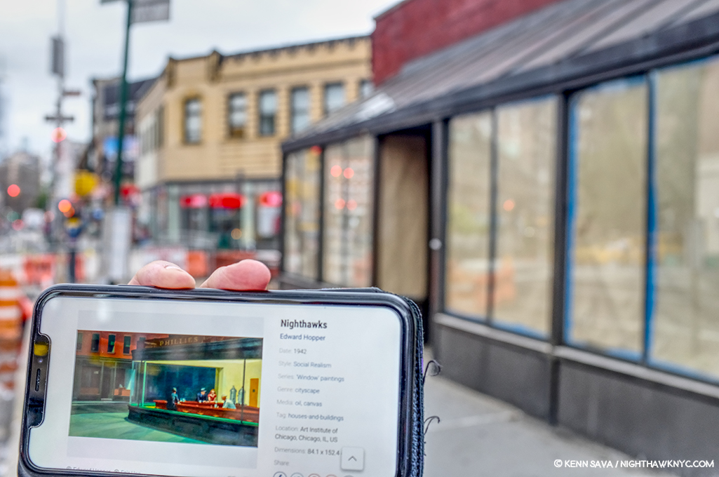
Jennifer Packer Arrives

Written & Photographed by Kenn Sava

Art in NYC, 2021, Part 2-

David Hammons, Day’s End, 2021, a permanent installation, which opened in May, 2021 on the Hudson River on the former site of Pier 52, which the great de-constructivist Artist Gordon Matta-Clark once “modified” into a work also called Days End in 1975. Appropriately seen here at day’s end, December 23, 2021.

In spite of everything that happened in 2021, particularly the “return to normal” that wasn’t, there were some extremely good shows up here last year. I’ve written about a number of them- Alice Neel: People Come First, Goya’s Graphic Imagination, Cezanne Drawing, and shows of Tyler Mitchell, John Chamberlain, and some others. Having just featured the monumental NYC half of Jasper Johns: Mind/Mirror in Part 1 of this look at Art in NYC, 2021, there was another NoteWorthy show of 2021 going on at the Whitney at the same time.

Of all the shows I saw last year, Jennifer Packer: The Eye Is Not Satisfied With Seeing, was the biggest revelation.

Jennifer Packer gets top billing. That might be reflective of the fact her show is on 8 while Jasper Johns is on the 5th floor?, or her name is longer? 7 years later, I still haven’t warmed up to the architecture of the new Whitney, the east end of it seen here from the High Line. But the shows have dramatically improved, in my opinion. That’s the High Line Admin building to the lower foreground, also designed by Renzo Piano, who designed the Whitney.

The Johns and Jennifer Packer shows are a fitting cap to 2021 for the Whitney Museum, which has had a steady string of excellent shows beginning with Vida Americana in 2020 (which I wrote about here) that continued throughout 2021. The stellar Julie Mehretru and overdue Dawoud Bey shows up from spring through the summer, 2021, continued Vida’s momentum, with Jasper Johns and Jennifer Packer now setting the stage for the next Whitney Biennial in the spring. The Whitney also collaborated with Hudson River Park (which lies across the West Side Highway to its west) on legendary Artist David Hammon’s Day’s End, which opened in May, 2021 directly opposite the Museum. A permanent installation right next to the site of a large public park (to the right in the picture up top) currently under construction (where the Department of Sanitation complex was when I looked at the “new” Whitney Museum Building, here, in 2016). It’s something of a major coup in my view, that with the new park when it opens and the Little Island a few blocks away should bring more people to the area and the Whitney. As hard as I was on them during their early years on Gansevoort Street, in spite of everything, the Whitney had a great year in 2021, and they deserve a lot of credit for it.

Flashback- May 25, 2019. Two of the four works by Jennifer Packer in the 2019 Whitney Biennial, each in a different size that ranged from letter size (right), to small mural size.

On October 29th, after my 4th visit to Jasper Johns: Mind/Mirror at the Whitney, I headed up to the 8th floor to see the member’s preview of Jennifer Packer: The Eye Is Not Satisfied With Seeing. I had seen 4 of Ms. Packer’s Paintings in the 2019 Whitney Biennial, where they gave me pause. Painting has increasingly become a minor medium in each succeeding Biennial, much to my dismay, and this was true, again, in 2019, so I opted not to write about it, after having written about the 2017 edition. Whereas 2017’s installment was memorable for the marvelous “dialogue” between Henry Taylor, who was already quite established, and Deana Lawson, who was just making her name, it was hard to get a full sense of what Jennifer Packer was about from this selection. I filed her name and the impression. Before that, she had been Artist-in-Residence at the Studio Museum from 2012-13, with a show there, her work was then shown at Sikkema Jenkins in Breathing Room in 2015 and Quality of Life, 2018, the Renaissance Society in Chicago in 2017 in a show titled Tenderheaded. But, it was the debut of Jennifer Packer: The Eye Is Not Satisfied With Seeing at its first stop at the Serpentine Gallery, London, in May through August, 2021, that began the buzz that’s now taking on a life of its own at the Whitney. Simultaneously, there is Jennifer Packer: Every Shut Eye Ain’t Sleep at MOCA, L.A., her first West Coast show. 

The opening gallery during the early days of the show’s run. Blessed Are Those Who Mourn (Breonna! Breonna!), 2020, Oil on canvas, 118 by 172 inches, her largest Painting to date.

Still, it turns out I had no idea what I was in for when I stepped off that elevator in late October. An hour and a half later, I left awestruck.

Mourning is a central theme of this stunning, meditative, work, and others in the show. Here, in a work that also includes 3 fans, the 2020 violent death of Breonna Taylor is echoed in this reminder that the mourning continues as does the search for justice. I don’t know if Ms. Packer knew Ms. Taylor or not, but the sense of loss here fits right in with the intimacy of her Portraits of her friends and those she does know.

I can’t remember the last time I was in a show of work by an Artist largely unknown to me that left me with the undeniable feeling that I was in the presence of true greatness.

Fire Next Time, 2012, Oil on canvas, 72 x 156 inches. The presence of fans (2), a recurring motif, doesn’t keep this  remarkable large work from literally burning off the canvas. The stairs offering the only way out for the figure slumped to the left.

I did not writing that last sentence lightly. I’ve spent two months thinking about it and letting the dust begin to settle before writing this piece. I started going to Art shows in 1980. The very first show I saw was the 1980 Picasso Retrospective at MoMA. I was on the road with a band and flew back to NYC, twice, just to see it. I could have stopped looking at Art right then. I’ve never seen anything like it- still. In the intervening 41 years I’ve seen thousands of shows, hundreds each year, and I count 1,700+ visits to The Metropolitan Museum among them. I’ve been thinking back trying to recall having had this feeling before… When I first saw a Sarah Sze show in the 1990s that had a similar effect, though, given the large size of the work, there were only a few pieces in the show. Most of the great shows I’ve seen have been of work by Artists very well known to me. It takes years, decades, for an Artist to create a body of truly great work. Jennifer Packer has managed to put together an extremely impressive, even revolutionary, body of work at at the ripe old age of about 37. It’s even more remarkable to consider that some of the major pieces in this show are 10 years old (Fire Next Time, 2012 or Lost In Translation, 2013), or close to it!

Lost In Translation, 2013, Oil on canvas. One of the most remarkable Paintings I’ve seen in years. One of Ms. Packer’s “trademarks” is the there/not-thereness of her Portrait subjects. Here, in this double Portrait, things get taken to an entirely different level. I under exposed this shot to try to show the gorgeous, subtle, range of tones that are easily lost under bright light.

Revolutionary? How?

In the space of 35 works, Ms. Packer manages to “reinvent,” in a sense, both the Portrait and the Still Life. Portraits have been around for thousands of years, going at least as far back as the Ancient Egyptians. Yet, I can’t recall ever seeing anything like Lost In Translation before. The figures melt into each other in a way that Abstraction overplays and Representational Painting doesn’t attempt. Here, we have something “in between,” leaving it up to the viewers to try and decipher. Well, yes, Picasso managed to reinvent the Portrait any number of times (no comparison of the two Artists is intended). He was about 26 when he Painted Les Demoiselles d’Avignon in 1907, perhaps the beginning of his continual reinvention of the Portrait (though in a group ). Jennifer Packer was about 27 when she Painted Lost In Translation.

The renowned Painter Jordan Casteel sits in her studio at Yale where Jennifer Painted her in 2014. Jordan, 2014, Oil on canvas, 36 by 48 inches.

More Art in NYC, in 2021. The same Jordan Casteel was commissioned to Paint this Mural, The Baayfalls,  on the High Line. It should be up until March.

She favors friends, loved ones and those in her circle as subjects, so this there/not-thereness of her subjects in her Paintings is partially a way of “protecting” them she has said. This is achieved through a very wide range of mark-making that magically coalesce into images that are remarkable for both their “thereness” and their nebulosity.

Her use of color is another bombshell. When was the last time you saw a Portrait done in red as she does here (in the face not the hoodie)? The Body Has Memory, 2018, Oil on canvas, 60 x 48 inches, a Portrait of the Artist’s friend Eric N. Mack, a fellow-2019 Whitney Biennal Artist.

The power in her work, for me, lies in her uncanny way of combining opposites- intimacy and nebulosity, presence and absence, color and emptiness, created and enhanced with that extremely wide range of mark making techniques I mentioned that all flow together magically. I haven’t seen anything like her intimacy and nebulosity since Francis Bacon, while other elements, like her settings, echo Kerry James Marshall for me. Jennifer Packer seems to prefer to place her subjects in their surroundings, reminiscent of Mr. Marshall’s marvelous, and intimate, home settings. Her poses have an amazing “comfortable in their own skin”-ness that are a hallmark of Alice Neel’s Portraits. In the end, all of this leaves much for the viewer to ponder for his or herself, and, at least in my case, brings me back again and again to look further.

A wall of her Still Lifes in the third gallery.

How has she revolutionized the Still Life?

Say Her Name, 2017, Oil on canvas. Ms. Packer memorialized Sandra Bland, two years after her death in police custody at age 28.

Those on view at the Whitney are freed from their usual setting in a vase or a bowl on a table. In Jennifer Packer’s, the plants seem to float in thin air. Have you ever seen any like them1? Doing this allows her to control the context. All of a sudden, these pieces are not “about” place. They are about something else. They are about what the Artist has on her mind while she’s Painting them, and that’s what the viewer is left to ponder.

Oh, and to those obsessed with putting Artists in boxes, for reasons that continue to escape me (besides laziness), Good Luck boxing Jennifer Packer in anything besides the Jennifer Packer “box!”

In case you’re wondering, she Draws as uniquely as she Paints.

The Mind Is Its Own Place, 2020, Charcoal and pastel on paper.

The Mind Is Its Own Place strikes me as something of a counterpart to Lost In Translation from seven years before, retaining much of the power of the earlier Painting. Her lines carry much of the weight of the color in her Paintings. The Drawings on view here are every bit as mysterious and nebulous as her Paintings, though in different ways, particularly without the colors. And every bit as stunning, which is no mean feat.

The word is out. The crowds are beginning to show up, the catalog is sold out. December 28, 2021. By the time this show ends in April, I expect there to be a line to see it. And not only because of the virus.

After six visits, two and a half months in as I write this, it astounds me to write that I’m left with the inexorable feeling that we are watching the arrival of an important, major Artist. That’s “major” as in the major Artists who line the galleries of our greatest museums.

Important how?

First, reinventing the Portrait and the Still Life puts her in that discussion. That’s more than a lot of all Painters living or dead have done. Second, as she’s said, “My inclination to paint, especially from life, is a completely political one. We belong here. We deserve to be seen and acknowledged in real time. We deserve to be heard and to be imaged with shameless generosity and accuracy.” Looking at her work, though, one thing that strikes me hard is that in her efforts to imagine “with shameless generosity and accuracy,” many, if not most, of her Portraits have an other world quality that is fresh and haunting. She brings “negative space” into the physical body! Parts of her subject’s bodies are left blank in a different way they are in Egon Schiele’s work, or anyone else’s. It’s almost like she doesn’t want to reveal, or share, too much of the sitter, who are often those close to her. For me, at least, that feels endearing and heightens their intimacy. Those are the qualities I respond to. She accomplishes this using an extremely wide range of mark making. Not since so-called Abstract Expressionism have I seen a Painter who is so free in her technique, but it always just works. It always looks “right.” When I look at her Portraits, they  look to me exactly like what it really is- A sitter who might have been there (i.e. sitting in front of Ms. Packer) once. A temporary state. “It’s not figures, not bodies, but humans I am painting,” she said.

Equally astounding for me is to say that, all of one show in, Jennifer Packer’s name is at the top of my list of important Painters to arrive in the 21st century. Yes, I know. I’m the guy who doesn’t believe “best” exists in the Arts. It doesn’t. Let’s just say that if the conversation turned to “Who are the important Painters to arrive in the 21st century?” She’d be the first one I’d name. It’s a symptom of how much her work is on my mind.

Besides, someone has to be first. ; )

BookMarks-

Going…going…gone….

The catalog accompanying the London & Whitney installations of Jennifer Packer: The Eye Is Not Satisfied with Seeing: Serpentine Gallery, London is exceptionally well-done. One of the most beautiful Painting books I’ve seen, it carries over Ms. Packer’s unique color sense to varying colored paper for the text sections. It was easily one of my NoteWorthy Art Books of 2021 among most highly recommended Art Books I saw last year. If you buy it from the link in the book title in this paragraph (only), NHNYC will receive a small commission, with my thanks. 

*Soundtrack for this Post is “Hidden Place” by Björk, the first track on her album Verpertine, 2001, performed here (at 23:04) in 2001 in her extraordinary concert at Riverside Church.

NighthawkNYC.com has been entirely self-funded & ad-free for over 7 years, during which over 275 full length pieces have been published! If you’ve found it worthwhile, PLEASE donate to allow me to continue below. Thank you, Kenn.

You can also support it by buying Art, Art & Photography books, and Music from my collection! Books may be found here. Music here and here

Written & photographed by Kenn Sava for nighthawknyc.com unless otherwise credited. To send comments, thoughts, feedback or propositions click here. Click the white box on the upper right for the archives or to search them. Subscribe to be notified of new Posts below. Your information will be used for no other purpose.
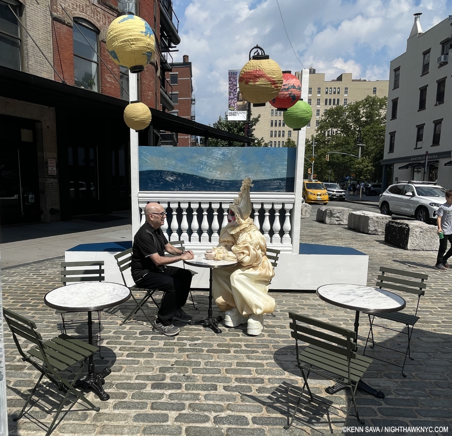
  1. There have been isolated instances, like Fantin-Latour’s White Lilies, 1877, but I have not seen a body of them, and certainly not with Mr. Packer’s intent.

Jasper Johns: Contemporary Art Begins Here

Written & Photographed by Kenn Sava (except *)

Art in NYC, 2021, Part 1-

Robert Rauschenberg and Jasper Johns. Or is it Jasper Johns and Robert Rauschenberg? Who came first? Mr. Johns said, Mr. Rauschenberg “was the first person I knew who was a real artist (i.e. a working artist)1.” At the time, Jasper Johns was working at the Marlboro Bookstore.

Contemporary Art starts here. Jasper Johns seen in his Pearl Street studio in 1955, with two of the most important early works in Contemporary Art- the first Flag Painting, 1954-55, and Target with Four Faces, 1955. At the time, Robert Rauschenberg had an apartment/studio upstairs. *Photo by George Moffet from the MoMA Jasper Johns: A Retrospective catalog, p.125.

Still, it was Jasper Johns who came to acclaim first when in 1957, Leo Castelli visited his Pearl Street studio, seen above, saw his work and offered him a solo show the following January. The rest is history. In 1959, Time Magazine said-

“Jasper Johns, 29, is the brand-new darling of the art world’s bright, brittle avant-garde. A year ago he was practically unknown; since then he has had a sellout show in Manhattan, has exhibited in Paris and Milan, was the only American to win a painting prize at the Carnegie International, and has seen three of his paintings brought for Manhattan’s Museum of Modern Art.” 2.

For my part, I was so taken with Robert Rauschenberg’s work that I was slow in getting to Jasper Johns. Over the years, his work has spoken to me more and more, to the point of shouting to me now. Messers Johns & Rauschenberg eventually became romantically involved only to have it end in 1961. At this point, almost 70 years since the Photo above was taken, all that really matters for the rest of us is that both have created two of the most important bodies of work of our time.

Happy Birthday, Jasper Johns! The Artist cutting an Ale Can Birthday Cake on his 90th birthday, May 15, 2020. *Unknown Photographer.

Jasper Johns: Mind/Mirror is an early candidate for the show of the decade. With around 500 pieces, it’s so vast it’s split between two major museums simultaneously- the Whitney Museum of American Art, and the Philadelphia Museum. Scheduled to coincide with the Artist’s 90th birthday on May 15, 2020, its opening was unfortunately delayed due to covid until September 29, 2021. Still, it’s a stellar 90th Birthday present. Having visited the Whitney half about 10 times, in my opinion, it ranks with the finest shows yet mounted in their new building- Frank Stella, Vida Americana, and Julie Mehretu. It’s brilliantly conceived & laid out and very thoughtfully & intelligently installed.

Roll up! It just so happens this bus, the M14, will take you to the show, among other places…

There have been some important, major, Jasper Johns shows to this point including the 1996 Jasper Johns: A Retrospective at MoMA, Jasper Johns: Something Resembling Truth, at the Royal Academy, London in 2017, and previous large shows at the Whitney & Philadelphia Museums. Yet, given the long-standing relationships Mr. Johns has had with both of those institutions, and the large holdings of his work they each have, I wonder if there will EVER be a more comprehensive look at the work & career of this now legendary Artist, especially with his involvement. As a result, Jasper Johns: Mind/Mirror is something of a perfect storm in an imperfect time of a show. Though I have only seen the Whitney half (and the rest in the fine Jasper Johns: Mind/Mirror catalog, the only place where you can see the entire show) , it still ranks among the great shows I’ve seen in the past decade including Michelangelo: Divine Draftsman & Designer and Kerry James Marshall: Mastry. Also, consider this- Imagine being the curator of the largest Jasper Johns show ever, then being told you only get to mount half of it in your institution! HOW do you divide an Artist’s career in half, and make it cohesive particularly to a discerning Art audience like NYC, while not shorting the equally discerning Philadelphia Art audience?– or vice versa?

Off and running. The exhibition’s lobby contains 39 Paintings, Drawings & Prints that range over his entire career arranged chronologically, and includes a number of very well-known works.

From the evidence I have right now, having seen the NYC half and the Mind/Mirror catalog , they’ve done an extraordinary job. Both halves are full of important pieces and rarely seen supporting works. The show is broken down into themes, which follow the chronological arc of the Artist’s career, which are then divided in half between the two locations and arranged into rooms by theme. Somehow, a visit to one doesn’t leave you with an overriding feeling of missing too much. Yes, if you have followed Mr. Johns career and you go to the Whitney you’ll find yourself looking for his first Flag, 1954-5, or Untitled, 1972, both of which are on view in Philly, but what IS here more than makes up for it. Time and again I found myself surprised that such and such a work WAS here. Not only that, more often than not, it is so thoughtfully displayed that there’s very likely supporting pieces nearby which shed completely new light on it. A good example of this is the wonderful gallery devoted to one of his most fascinating pieces, According to What?, 1964, which was surrounded with three walls of related work that reveal how much each detail in According to What? means to the Artist and how much thought and planning went into it. 

According to What?, 1964, Oil and objects on canvas. This is one of his works that can be seen as a “summing” up of where he was at that point, coming on the heels of Retrospectives at the Jewish Museum, NYC, and the Whitechapel Gallery, London (which would happen, again, after his MoMA Retrospective in 1996. It’s full of objects that he would reference in other works, which surround it in this gallery. It’s also a “tribute” to Marcel Duchamp, with a copy of his Self-Portrait hanging down on the left on the panel that is usually closed when this piece is seen.

Having said all of that, there is a somewhat basic conundrum to consider. Seeing ONE work by Jasper Johns leaves the exact same feeling as seeing, approximately, 250 in each half of this show, or all 500 for that matter: What’s going on? What is it “about?”

Installation view of parts of two of the surrounding and supporting walls. The series of Prints on the left isolate elements of the Painting, which brings the viewer back to study each in the larger work. There is another half of this gallery behind me.

Looking at a few or a few hundred begins to shed light. At the age of 24, in the fall 1954, Jasper Johns destroyed all of his work in his possession 3. He wiped the slate clean (something he would do again, non-destructively, after the MoMA Retrospective in 1996). Right from the earliest work he then created using “things the mind already knows,” he said of the flags, targets, numbers, etc. he featured resulted in pieces the viewing public immediately had a way “in to” at a time of densely personal Abstraction that often lacked one. He created multiple pieces with each object around the same time, then suddenly, one would return years, even decades, later. They became parts of his own language. Symbols. Stand ins. Of what? That’s up to Mr. Johns and each viewer to decide. Thus far, that’s kept viewers and the Art world busy for over 6 decades.

Three Flags, 1958, Encaustic on canvas.

“Jasper Johns is an American painter, sculptor and printmaker whose work is associated with abstract expressionism, Neo-Dada and pop art.” Wikipedia.

There, in one sentence spotted on a search result page is why I avoid Wikipedia. Mr. Johns’s early work is the antithesis of Abstract Expressionism! He and Robert Rauschenberg set out to do their own thing in the face of the all-encompassing tide of AbEx that was at its zenith when they began. To this end, Mr. Rauschenberg even famously erased a Drawing by Willem de Kooning, one of the most prominent of the first wave of AbEx Painters. Jasper Johns’s stated creed was “When I could observe what others did, I tried to remove that from my work. My work became a constant negation of impulses.4” “I was anxious to clarify for myself and others what I was5.” As for “Neo-Dada,” he, like countless others, was influenced by Marcel Duchamp AFTER he saw his work in 1957 and then met him circa 1958-9. But, people “associated” his work with Duchamp’s beginning in 1957, when he had never seen it!

White Flag, 1955, Encaustic, oil, newsprint, and charcoal on canvas. His second and largest flag, on loan from The Met.

Yes, his post-1954 early work center around familiar objects that he has turned into Paintings or Sculpture, his “vocabulary” of elements “the mind already knows” famously include the American Flag, targets, numerals, words, ale cans, Savorin cans and string. yet I don’t see them as “pop,” and I don’t consider Mr. Johns (or Robert Rauschenberg or James Rosenquist for the matter), “pop” Artists, though I know some do. Flags, targets and numbers are not soup cans or Brillo boxes. (His Ale Can Sculpture resulted from a dare, so I read it somewhat tongue in cheek.) His Savorin can Sculpture and Prints are based on the can and brushes in his studio. The wall card makes the case that the Savorin can and paint brushes are “stand-ins” for the Artist. Again, not “pop.” This is interesting because his “object” based work of the 1950s allowed him to remain detached. “I don’t want my work to be an exposure of my feelings,” he said around 1977 6. Over time that has seemed to change, but looking for specifics gets tricky.

A gallery full of his Savorin can Sculpture, 1960, and Monotypes from the 1970s and 80s he made of the object on the 4 surrounding walls. He used a Savorin can as a paint brush holder in his studio. Not sure that makes it “pop.”

As you walk through the show you’ll see expressive passages in Paintings that are a hallmark of AbEx (as in According to What?), but rarely entire Paintings (there are a few), and these were done after the heyday of the first wave Abstract Expressionist Painters. These passages don’t define him or any of his work, in my view, especially given his early work stood diametrically opposed to theirs. It’s really one technique among the very many Mr. Johns uses. As time has gone on, Jasper Johns has shown more interest in Art history, and numerous Artists, like Picasso, Leonardo, Duchamp and Edvard Munch, have “appeared” in his work. As I mentioned in my piece on MoMA’s Cézanne Drawing show, which included a dozen works from Mr. Johns’s collection, he has amassed a world-class Art collection, demonstrating impeccable taste in his acquisitions, that is fascinating in its breadth. Whatever his initial influences were, from the beginning with Flag, 1954-55, Jasper Johns’s work has looked like no one else’s. In my view, that Wikipedia page should read- Jasper Johns’s work is associated with Japer Johns.

One of the most extraordinary works of the 1950s. Target with Four Faces, 1955, Encaustic on newspaper and cloth over canvas surrounded by four tinted-plaster faces in wood box with hinged front.

Another fascinating early work is Target with Four Faces, 1955, which contains 4 heads cut off at just below the eye. They all appear to be male. The piece has a door that can be lowered blocking the faces from view. And, there it was, on loan from MoMA, appropriately on the first wall in the first gallery. A shot over the bow of the Art world in 1955, and today. I came away believing that if Jasper Johns had never made another work after it, Target with Four Faces was enough to seal his stature.

Detail. I was told by a Whitney staffer that the heads were cast from four people in his studio. Note the hinged door above them, which when closed, gives the work an entirely different effect. Also notice the amount of work that went into placing the heads just so. Standing to the side reveals that the tip of the noses must be right up against that door when it’s closed.

Either way, they can’t see what is going on in front of them. Are they present while someone is being targeted, but unseeing? Or, are they the ones with the target on them? It’s easy to read things into them, including Mr. Johns’s fellow gay men being targets, or the public being blind to the “targeting” of others. What about the prominence of their noses, or their closed mouths? Or…..? It’ll say something else the next time I look at it.

One of my favorite elements of Jasper Johns’s early collages are when the underlying material, often newspapers, comes through- either intentionally or through age. In this marvelous very small Flag from 1965, Encaustic and collage on canvas, 7 3/4 by 11 1/4 inches, it’s hard to tell which is the case, particularly with the row of faces to the right. Included in a stunning gallery at the heart of the show of small works from throughout his career.

But, fortunately for the world, he has continued to create. For 68 more years, so far! His Flags raise similar wonder. Does that they were Painted by a gay man in the 1950s living in a country with harsh stereotypes against him and his kind enter into it? A yearning for a Flag that stood for all? For me, anyway, it’s hard to see either of these pieces and not wonder about these things. Of course, as you move through the show one thing becomes quickly apparent. In the Art of Jasper Johns virtually nothing is THAT simple. 

Untitled, 1992-5, Oil on canvas, 78 by 118 inches.

After these early “objects” and object based works, in the early 1960s, Mr. Johns’s work becomes something of a “non abstract form of abstraction,” as the late Kirk Varnedoe, curator of the MoMA Johns Retrospective called it7, where objects and symbols become elements and not the sole subject. Was this done to subvert attempts at “reading” his Art?

The Seasons, 1989-90, Acrylic over intaglio on paper. That figure is reputed to be the Artist’s. On the terrific installation of this show- While this might seem a small detail, I can’t recall ever being in a show where virtually NONE of the pieces suffered terribly from glare. Here, I’m standing directly in front of  The Seasons and there is no reflection. Oh, if only other museums (and galleries) would see what a huge difference it makes it might help persuade them to pay the considerable current cost for glare-free acrylic glazing on pieces with glazing.

In the 1960s his work turned to more private imagery and symbols as opposed to the well-known objects, like Flags and targets. In works like According to What? his use of them reaches a crescendo, and these continued for some years until he wiped the slate clean, again, and began his Cross-hatched period. Things seem to build to another crescendo, like The Seasons, above or Untitled, 1992-94, which led up to his MoMA Retrospective, which would change everything.

Catenary (I Call to the Grave), 1998, Encaustic on canvas with wood and string. After the MoMA Retrospective, Mr. Johns stripped his canvases bare and began to address aging and death in the Catenary series, which numbers 19 Paintings, of which this one never fails to stir me, 55 Drawings and 6 Prints.

The MoMA Retrospective in 1996 caused the Artist to take stock of where he was and led to him drastically changing course. He wiped the slate clean, again. By that time, his work had grown very complex, but now his work emptied. His focus turned to the eventuality of death. This resulted in his extraordinary Catenary series, 1998, and has continued to be (one of) the overriding themes of his work to this day. 

The remarkable Farley Breaks Down 2014, Ink and water-soluble encaustic on plastic. I was stunned when I first saw this in 2019. A work without precedent in Jasper Johns’ enormous output created at 84. The Whitney wisely acquired it.

In 2019 I happened in to Jasper Johns: Recent Paintings & Works on Paper at Matthew Marks Gallery and was frankly overwhelmed when I saw a series of works titled Farley Breaks Down. I’d never seen anything like them, typical of Jasper Johns, yes, but even in his long and productive career they stand alone. I wrote about the show here. Just prior to these there are works in ink and water-soluble encaustic on plastic, but with this subject, Mr. Johns has reached an entirely new level. In 1965, LIFE Magazine Photographer Larry Burrows created a series of Photographs following a helicopter crew, Yankee Papa 13, on a mission in the Vietnam War. During it, one crew member was killed and another wounded. The last Photograph in the series shows Cpl. Farley back at the base breaking down. A few years later Larry Burrows was killed in another of these helicopter missions. It is this image that Jasper Johns chose to interpret. Jasper Johns did 2 years in the Army during the Korean War based in South Carolina and Japan. Still, exactly why he chose to create this series of works in his 80s is up for conjecture.

Detail of “Farley.”

Is it coincidence that over the years, Mr. Johns has lost his entire circle of fellow Artists- Robert Rauschenberg, Merce Cunningham, Morton Feldman and John Cage among them? The series is remarkable both for its incredible power and melancholy (which is not new to his work), as well as it’s stunningly beautiful flowing technique. It’s almost like these pieces are created with colored tears. Yet here, loss is the subject, and for the first time in his work, it’s presented almost nakedly.

A half gallery of dark works created after the breakup with Rauschenberg in 1961 (except for the work on the far left and the sculpture in the middle, including Liar, in the facing left corner.

There is also the pain of another kind of loss. The loss of romantic love. While I have no idea what Jasper Johns’s romantic life has been like, the second part of the first gallery is devoted to the searing works Mr. Johns created after his relationship with Robert Rauschenberg ended in 1961. The visual evidence is overwhelming that it had a devastating effect on him. After these, there is silence in his work where romance might be concerned. He shows deep affection for friends and those he admires, but there is never an expression of romantic love. This, also, is rare in Art8.

Recent Jasper Johns. Untitled, 2020, Intaglio on Magnani Insisioni paper. This piece was on view in both the Matthew Marks & Whitney shows.

As if the Whitney & Philadelphia Museums shows weren’t enough Jasper Johns there was also a remarkable show of his most recent work coinciding with the opening of JJ:M/M, Jasper Johns: New Works on Paper at Matthew Marks Gallery!

Untitled, 2021, Acrylic and graphic over etching on paper. Different, as ever, these works emphasized the cosmology theme which has appeared in some earlier works. The detail in these is both subtle and remarkable. The show consisted of a wall of these, facing a wall of Drawing based works like Untitled, 2020, above with stick figures.

Having seen upwards of 300 of his pieces between the two NYC shows two things stand out for me are- first, Mr. Johns incredible intellect. As you walk through the show you begin to notice that Jasper Johns does nothing- including speak, without very carefully considering what’s going to come out. At first glance some of his pieces look improvised, until you see a carefully crafted Drawing or other supporting pieces in which every detail has been carefully rendered, belying the careful consideration and the large amount of work that went into them. And this is continued over a seemingly endless body of work over 65 years of continually doing something different.

Diver, 1962-3, Charcoal, pastel and paint on two sheets of paper mounted on two adjoining canvas supports, 7 FEET 2 1/2 by 71 3/4 inches!

Second, I haven’t realized how much the anguish of loss is a central theme of his work. This includes the thought of facing one’s own aging and death. For such a private man who’s work is often so dense as to defy understanding, he has repeatedly found his own unique ways of expressing it powerfully. Though each section (of both the NYC & Philly halves ) of Jasper Johns: Mind/Mirror is titled, loss and death are not among them. They are the unstated central themes of a good deal of his work, which continues through his latest work shown at Matthew Marks this past fall.

In the final gallery, along side 4 pieces from the remarkable Farley Breaks Down series, is this Painting, similar to the pieces lining the west wall of the Matthew Marks show, like Untitled, 2021, shown above.

Slice, 2020, Oil on canvas. A close look at this large piece reveals amazing detail and depth, the background reminiscent of End Paper, 1976 and Céline, 1978.

As the wall card says, “…ungraspable…”

Picasso outlived, and outworked, all of the boxes his work was put in- the so-called “Blue Period,” the “Rose Period,” Cubism, etc., etc. He did this by simply being himself. His Art changed as he changed. Jasper Johns, who has outlived all his contemporaries, was, perhaps, the first Artist to be lumped into the “Contemporary Art” box in 1958. Still going strong at 91 in 2022 as the Art world is morphs into whatever is coming next, Mr. Johns career has been one long continuous model for Artists- “When I could observe what others did, I tried to remove that from my work,” which has led to 68+ years of fresh ideas that point the way to the future.

Flag Above White With Collage, 1955, Encaustic and collage on canvas. Mr. Johns has used encaustic (a mixture of hot wax and paint) continuously throughout his career, one of the very few to use it so frequently, if not the only one, among major Artists. It is used in most of the works in the show.

It turns out that Jasper Johns: Mind/Mirror is not the only great and important show currently up in the Whitney this fall/winter! Since I sub-titled this piece “Art in NYC, 2021, Part 1,” Part 2 will look at it.

*-Soundtrack for this Post is “I Don’t Want to Be Your Shadow,” by the Psychedelic Furs, from Forever Now, 1982, or “My Life is a Succession of People Saying Goodbye,” by Morrissey from You Are The Quarry, Extended Edition.

BookMarks-

With a career spanning a whopping 68 years(!), and counting, among the longest in Art history, you’d expect there have been a LOT of books published on Jasper Johns, and you’re right. There are. I see books I”ve never seen before each time I look. The latest being a catalog for a show on Jasper Johns and Edvard Munch (the book with the orange spine, above)! Among them, a few that I’ve seen are particularly recommended-

Jasper Johns: Mind/Mirror, Philadelphia Museum/Whitney Museum/Yale-  Though it’s close to 4 pounds, it’s wonderfully succinct and the best place to get an overview of Jasper Johns’s work over his amazingly long career up to 2020. The text accompanying each chronological section is also concise, remarkably distilling voluminous information down to a few pages, though I found the essays hit or miss. The book is the only way to see the whole show besides traveling to both museums (where it is only up until February 13, 2022). Highest recommendation for those seeking one Jasper Johns book with the most and broadest range of his Art in color.

Jasper Johns: A Retrospective, Museum of Modern Art- The catalog for the landmark Johns show in late, 1996 to early 1997 with a fine essay by curator Kirk Varnedoe, is a thorough look at his work up to 1996. In my opinion, it remains the finest reference on Jasper Johns due to its comprehensive 250 page Chronology and Plates section which goes up to the end of 1995. It’s also of ongoing importance in the history of the Artist when you consider that having this Retrospective had such an impact on the Artist that it caused his work to drastically change after and since. The immediate result was the extraordinary Catenary series, though all of his work since bear the hallmarks of that change. Here is a terrific record of his work up to that point that includes many illustrations. A model exhibition catalog that Mr. Johns designed the endpapers for. Essential for the Jasper Johns fan.

Jasper Johns: Redo an Eye, Wildenstein- A 300+ page look at the work of Jasper Johns that provides a comprehensive look at the Artist’s Art over his entire career up to about 2018, and one of the few to cover his later work. Author Roberta Bernstein says she has spent much time with Mr. Johns over the past 50 years, in addition to focusing on studying his Art. As a result, the book provides numerous insights. The most comprehensive overview currently available, it’s also available as Volume 1 of the Jasper Johns: Catalogue Raisonné of Painting and Sculpture, listed further below. Includes many illustrations, though in smaller sizes then the MoMA Retrospective, above, or the Whitney book, which are meant to illuminate the text since it originally served as the introduction to the Catalogue Raisonné, which has the large size reproductions. Recommended for those who want to dive deeper into Jasper Johns.

Jasper Johns: Catenary, Matthew Marks Gallery- (The book with the blue spine in the bookshelf pic with the string appropriately hanging down from it.) Matthew Marks Gallery has shown the Artist for many years, and has often published very well done and beautiful catalogs for their shows. Each is worth seeking out. Among them, I’ll highlight two here. Published to accompany the show of the same name in 2005, this was the only opportunity to date to survey this exceptional body of 80 later works which was the result of the Artist’s reaction to the aforementioned MoMA Jasper Johns: A Retrospective. They center around aging and death, each of which is illustrated in color here. It includes a fine essay by Scott Rothkopf, the co-curator of Jasper Johns: Mind/Mirror. It’s also beautifully published by Steidl. Out of print but not expensive.

Jasper Johns: Recent Paintings and Works on Paper, Matthew Marks Gallery- Published to accompany the unforgettable show of the same name in 2019, a NoteWorthy Show, which shows yet another new side of the Artist’s work. Featuring the extraordinary Farley Breaks Down series along with a number of other compelling recent works, with over 60 illustrated here. I was stunned when I saw the Farley pieces. They seemed to be without precedent- both in Johns’s work or that of any other. Both books are highly recommended to those interested in John later & current work.

For serious study & research, there is the Jasper Johns: Catalogue Raisonné of Painting and Sculpture, a 5 volume set that currently trade at big discounts from its $1,500.00 list price. I can’t help but wonder if this is because they are already out of date since Mr. Johns has continued to create prolifically since it was published. It only goes to 2014. Then there is the Jasper Johns Catalogue Raisonné of Drawing set published in 2018 and the Jasper Johns: Catalogue Raisonné of Monotypes, collecting his unique prints to about 2018 (like the Savorin can Prints seen above).

NighthawkNYC.com has been entirely self-funded and ad-free for over 7 years, during which over 275 full-length pieces have been published. If you’ve found it worthwhile, you can donate to keep it going & ad-free below. Thank you!

Written & photographed by Kenn Sava for nighthawknyc.com unless otherwise credited.
To send comments, thoughts, feedback or propositions click here.
Click the white box on the upper right for the archives or to search them.
For “short takes” and additional pictures, follow @nighthawk_nyc on Instagram.

Subscribe to be notified of new Posts below. Your information will be used for no other purpose.


  1. Jasper Johns: A Retrospective MoMA Catalog, p.124
  2.  “His Heart Belongs to Dada,” Time, May 4, 1959
  3. Jasper Johns, Mind/Matter, p.29
  4. Quoted in Michael Crichton, Jasper Johns, 1977 Whitney Catalog, p.27. Roberta Bernstein, Jasper Johns: Redo An Eye, p.20, says “While Johns respected many of the Abstract Expressionists, he was committed to establishing a new direction that embraced a more literal subject matter and engaged viewers in a way that was independent of the artist’s personality.
  5. Roberta Bernstein, Jasper Johns: Redo An Eye, p.20
  6. Michael Crichton, Jasper Johns Whitney 1977 exhibition catalog,  p.20
  7. MoMA Retrospective Catalog, p.15
  8. Robert Rauschenberg is, coincidentally or not, another Artist who’s work appears not to reference his romantic life.
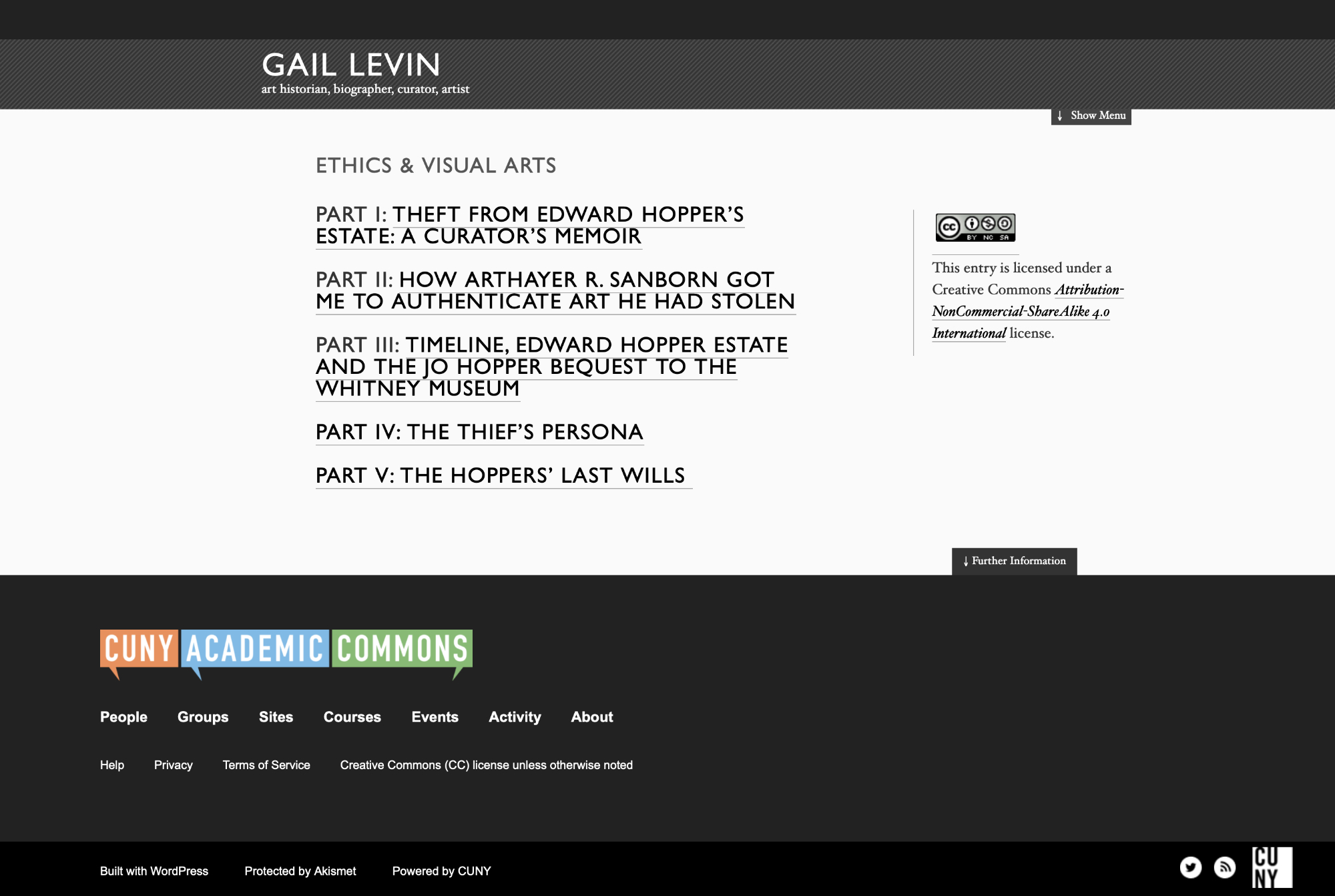
The End Of The Art World…As We Know It

Written & Photographed by Kenn Sava
This is Part 3 of my series on the end of The Met Breuer also concludes my look at what I saw before the March 12th “temporary closing,” Part 1 looked at some of the history of the Breuer building, Part 2 looked at some of the most memorable moments and its legacy. Part 3 looks at where we are now, and wonders about the future…
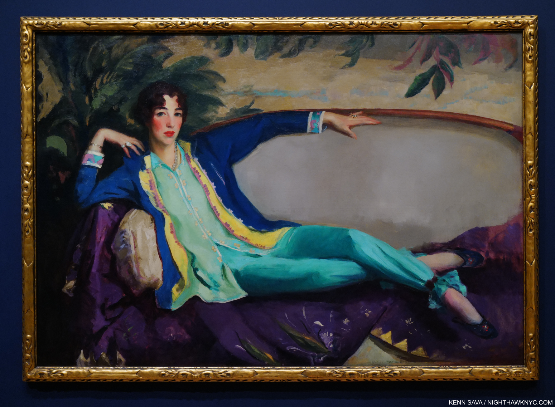
Forlorn. The Met two months deep into its “temporary closing,” seen on May 21st.

When the clock struck 6pm on March 12th and I walked away from The Met Breuer on my last visit, much was unknown. I didn’t even know it would be the last time I would visit it. Five months later, a few questions have been answered, but the answer to most of them remain unknown. As I wrote in Part 1 and Part 2, March 12th turned out to be the very last day of The Met Breuer, which remained closed until The Met turned the Breuer building over to The Frick Collection in July, ending the Gerhard Richter: Painting After All show, which I saw on its last day, with it. Now, looking back on The Met Breuer (TMB), it’s becoming clearer that more than it has ended. In the ensuing five months, among Manhattan’s Big 5 museums, and the Brooklyn Museum, only The Met has announced plans to “hopefully” reopen on August 29th, (after being closed for five and a half months- unprecedented in my lifetime, and losing TMB along the way, as they “celebrate” their 150th Anniversary). As the fall season in the NYC Art world rapidly approaches, it looks right now to be a non-event.

A number of people I’ve spoken to in the Art business have lost their jobs or are scaling back their operations. I’m sure they are the tip of the iceberg among Art business professionals who have been laid off or furloughed. The rest gamely soldier on, hopefully safely. The Art Fair world (including The Photography Show, which I’ve extensively covered the past three years) ever-increasingly a staple of the Art business, has virtually disappeared overnight world-wide. While some events and shows have moved online, I think most people would agree, it’s not the same. Yes, Art & Photography can be sold online, and it is in large amounts, but it’s not the same as seeing it in person. I look at as much Art as anyone does online, and with rare exceptions, like Closer to Van Eyck, which I wrote about in January, wondering if it was the future of seeing Art, it’s just not the same experience. For me, looking at most Art online can only give one an idea of the piece. 
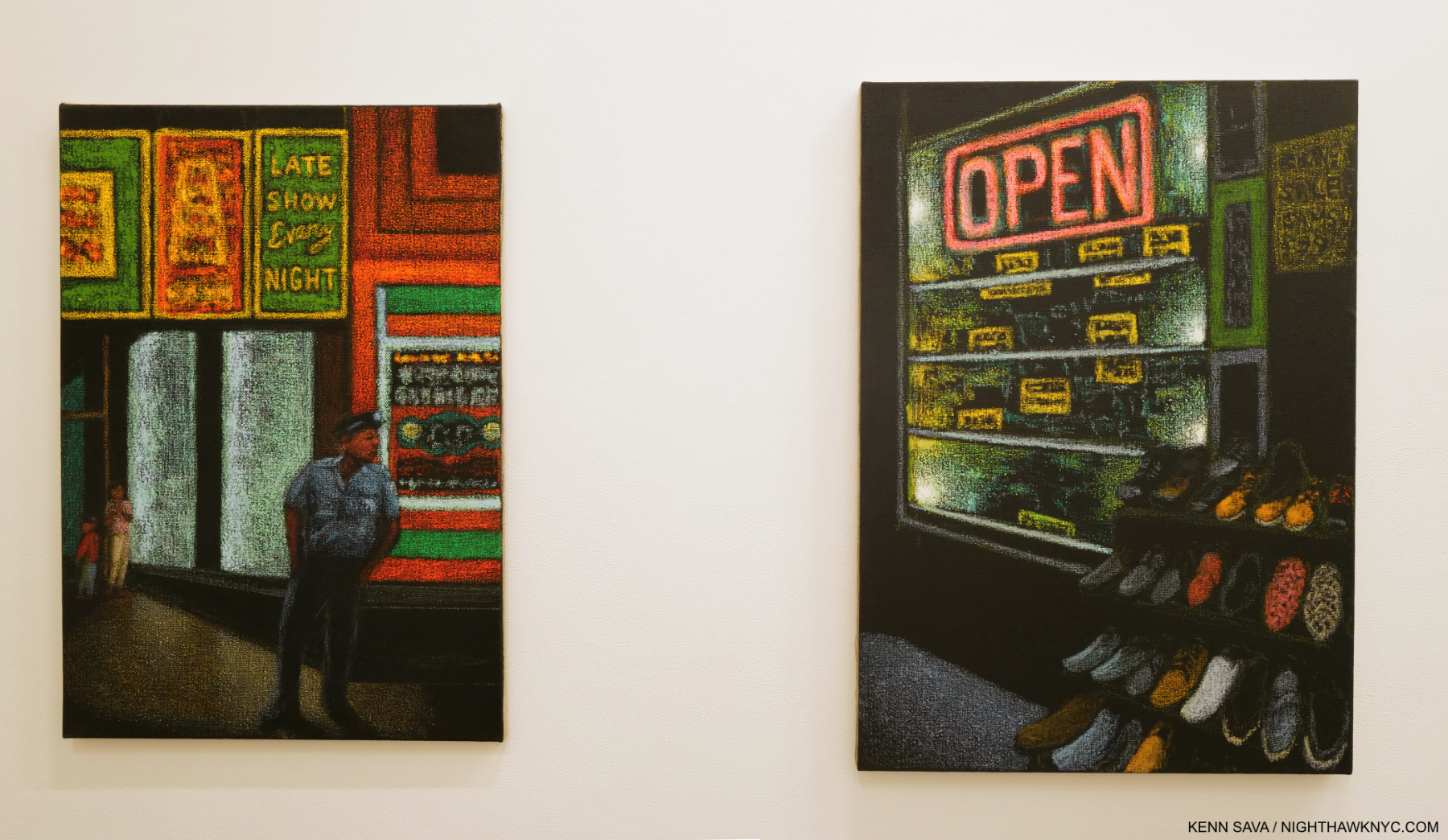
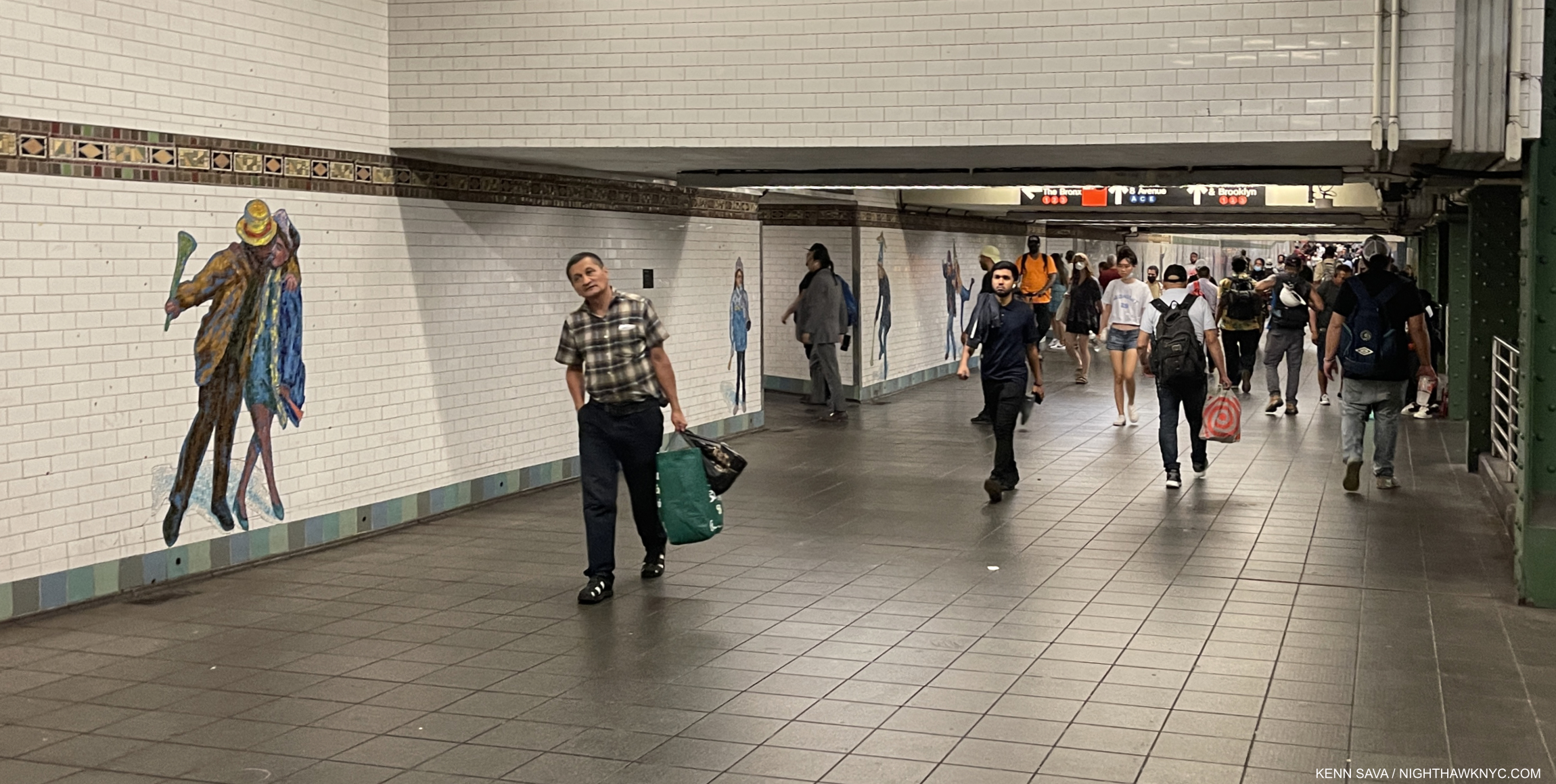
So, whither to the Art world, and Art in NYC?

The shuttered Matthew Marks Gallery on West 22nd Street, received a small business Paycheck Protection Program loan from the Small Business Administration of between $350,000 and $1,000,000. Note- All loans quoted in this piece are sourced from the Small Business Administration, here. Seen in June, 2020.

Nothing has been heard from any of NYC’s “big 5” museums or the Brooklyn Museum about their plans since March, beyond The Met’s reopening announcement, which is dependent on City and State approval. Some galleries are open. Some galleries are “open by appointment only.” Some galleries here are not open. Some are gone, as in out of business. Email from the Art world has provided little to no additional insight. I began to look elsewhere for answers to some of the countless questions.

The American Alliance of Museums conducted a survey of its member museums and its findings are dated June, 2020. I found the report chilling but not surprising. The result that has gotten the most publicity so far is the answer to-

“Do you believe there is a significant risk of your museum closing permanently in the next 16 months, absent additional financial relief?”

16% of 648 responders answered “YES.” With Art museums making up 20% of responders, doing some extrapolations, I calculate that as being “YES” from 24 out of 152 US Art museums. Since there’s no way of knowing how (or if) the NYC museums responded, we still have no way of knowing how they stand. I, for one, would be very surprised if any of Manhattan’s “big 5” museums or the Brooklyn Museum were to permanently close in the next 16 months, but who knows.

As concerning as the survival question, very surprising to me is the response to the question- “Months of Operating Reserves Remaining?” 56% of all US museums have 6 months OR LESS of operating reserves on hand. 67% of all museums responding have LESS than 1 year on hand (as of June, 2020, presumably). Again, I doubt the “big 5″+ Bklyn are among them. But, I am starting to wonder what their “staying power” is.

Each of them has been spending money like it’s going out of style this century- but not on Art, leaving each of their collections lagging those elsewhere in Modern & Contemporary Art! Consider-

The Brooklyn Museum seen on August 7, 2014, during its terrific Ai Weiwei: According to What? show, 10 years after its new entrance opened.

In 2004, The Brooklyn Museum remodeled at a reported cost of $63,000,000., which included adding this new entrance and outdoor plaza, a new lobby, a boardwalk, and “Vegas-style fountains with jets of water that dance1.”

In 2006, MoMA moved their exhibitions, including the historic Matisse-Picasso show, to their storage facility in Queens, dubbed MoMA Qns, while they undertook an $858,000,000. renovation.

In 2006 the Morgan Library and Museum opened their 90,000 square foot expansion of their 225 Madison Avenue campus designed by Renzo Piano. Cost= $75,000,000[1 Here.]. 

In 2007-8, the Guggenheim Museum spent $29,000,000. renovating their immortal Frank Lloyd Wright building that I tried to help save in 1984 from their dubious expansion2. (Though we’ve been living with it since, yes, I still consider it dubious.) 

The New Museum presents an attention grabbing silhouette that contrasts with the rough and tumble history of the Bowery at the expense of the gallery spaces inside. There are too many odd, small and strangely placed galleries that are easy to miss and must be very problematic for their excellent curators. Seen here in April, 2017.

December 1, 2007, the New Museum opened its new 50,000 square foot building on the Bowery. Cost= $50,000,000.3

The Whitney, seen shuttered on May 27th. What is it with NYC museums and Renzo Piano? And WHY? Five years after this building opened, it still says absolutely nothing to me. Inside, the lobby is useless and the galleries just “Ok” in my opinion. My bet is that over time, the 13,000 square feet of outdoor space will come to be seen as a mistake. The big question so far, beyond the Whitney’s board, is why have so many of its major shows felt truncated or petered out? Vida Americana is the first one that doesn’t

October, 2014, The Whitney Museum’s final show closed at the building Marcel Breuer designed for it at 945 Madison Avenue and that they occupied since September, 1966, almost 50 years. In 2015, they reopened on Gansevoort Street in a building also designed by Renzo Piano. Cost= $442,000,0004.

MoMA’s famous main entrance shuttered during the protests, seen on June 27th.

The second “new” MoMA of this century was open, officially, from October 21, 2019 through March 12th, 2020, at a cost this time of $450,000,000. (400 million for new construction, 50 for renovation of the last “new” MoMA)5. Total cost of 21st century MoMA renovations and expansion= $1.3 BILLION. Though I referred to “the gorillas in the room” in my look at the “newest” MoMA, beyond spending that $1.3B on Art, there is another gorilla they could have spend it on.

The sun is setting on the New Museum building, seen here in April, 2019, in more ways than one. Plans have been announced to expand into the building to its right, once that building is torn down, with a design that has nothing to do with its existing design, and once again, leaves me scratching my head. As we just saw with MoMA- getting it right the first time would have been much smarter. Ever notice how this never happens to The Met, the kings of museum renovations? Nonetheless, the New Museum have had a run of excellent shows, including unforgettable retrospectives of Raymond Pettibon and Nari Ward. For those of you keeping score at home, Renzo Piano has nothing to do with this expansion- as far as I know.

In June, 2019, the New Museum announced plans to expand the building they only opened in 2007. Cost- $63,000,000.6 Their total 21st century building & renovation costs= $113,000,000. Note- The New Museum has no permanent collection. Under the Paycheck Protection Program, The New Museum received $1,000,000. to $2,000,000. in loans.

Fotografiska – New York across Park Avenue, seen on August 15th.

December 14, 2019, the Fotografiska- New York, a new Photography museum opened on Park Avenue South. Cost not known to me. They renovated an entire landmarked six story building, so it wasn’t cheap. They were open for 3 months before the shutdown.

The Met. Not exactly how they drew up celebrating the 150th Anniversary of their founding. They’re probably hoping to get another chance on the 150th Anniversary of the 1000 Fifth Avenue building in another couple of years. Hopefully, they’ll have a better logo then, too. From a distance, this looks like “15C,” no? Seen May 21, 2020.

And, all this while The Met has done countless renovations including the entire Greek & Roman Wing and the entire American Wing. When the closure hit, they were also knee deep in their European Paintings Skylight renovations. In 2011, Thomas Campbell, then Director, announced a renovation to their Modern & Contemporary Wing using TMB as a satellite for shows in the 8 year interim, at a cost of $800,000,000, plus renovations and rent of the Breuer, only to see The Museum fall on financially hard times, in spite of record attendance due to a legal loophole changing the admissions policy. Mr. Campbell resigned, and the plan was scrapped. On September 22, 2018, The Met announced it had made a deal to ‘sublease” the Breuer building to The Frick Collection in July, 2020, so The Frick could renovate their own building. Daniel Weiss, President/CEO. said The Met would save $45 million under the deal7. Cost of renovations to The Frick Collection is reported to be $160 million. It’s unknown if that includes whatever they’re paying to The Met for their “sublease” on the Breuer building8. I don’t think it does since this figure was published before The Met and Frick agreement was made public. 

The Met’s plaza under reconstruction to install fountains seen in May, 2014. Their $65,000,000 cost was paid for by David H. Koch, who’s name was controversially installed in gold letters on both fountains when they opened in September, 2014, to protests.

In November, 2018, Daniel Weiss and new Director Max Hollein announced a $70,000,000. plan to renovate the Africa, Oceania and the Americas Wing and a $600,000,000 dollar plan to renovate their Modern & Contemporary galleries (down from the $800,000,000 original plan,) “now that the museum is on track to balance it’s $320,000,000. annual budget by 2020,” according to the NY Times, November 18, 20189. There has been no word yet on whether their budget will still be in balance this year, or on the status of announced renovation plans. 

Why all of this building, renovating and huge outlays of capital?

2019 Visitors per the Art Newpaper
Metropolitan Museum- 6,479,548
Museum of Modern Art- 1 ,922,121 (MoMA was closed for renovation for 4 months)
Guggenheim Museum- 1,283,209
Whitney Museum- 1.030,945
Other NYC Art museums- less than 1,000,000 each.

The museums were in a race to compete with each other for visitors. It seemed like each and every year new attendance records were set in NYC. The museums felt the need to go bigger and better to keep up and keep drawing record numbers (and to lure donations of money, naming rights, and Art- particularly since they have now been priced out of buying many of the masterpieces of Modern & Contemporary Art they missed when they were new). These seemed to feed on each other in an unprecedented cycle of museum building and renovations this century.

Then, on March 13, 2020, the music suddenly stopped. Only Daniel Weiss, it seems to me, was left with a chair. In September, 2018, a year and a half before the pandemic, he saved The Met $45,000,000. by getting The Frick to sublease the Breuer building. Wait. What? An NYC museum getting OUT of an expensive expansion project? We didn’t know it then, but that may have marked the beginning of the end of these projects. Between that and how deftly he has handled The Met’s precarious finances to this point, he has earned a job for life, in my opinion. Still, looking back on March 13th from the vantage of five months it seems obvious to me that that was the day the Art world, as we knew it10, ended.

The closed front doors of the Whitney Museum, May 27th. It looks like when these doors do reopen, the blockbuster Vida Americana will as well. The Whitney & The Guggenheim each received between $5,000,000 and $10,000,000. in small business loans under the Paycheck Protection Program. The Met and MoMA received nothing under this program.

Five months later, the best that can be hoped for in 2020 is these museums were open for a total of 6 1/2 months- from January 1st through March 12th and September 1st through December 31st (the best case scenario at the moment). If so, they will be EXTRAORDINARILY lucky to reach half of 2019’s numbers. Given a new reality of fewer open days, shorter hours and admissions limits, that would appear to be extremely unlikely. The bigger question is WHEN will the big numbers return to the museums? The biggest question is- What happens if they don’t soon? Or ever?

It’s possible we are heading into dark times. Given scarce public funding, philanthropy fills in the gaps for  the museums. Despite the fact that sources of museum funding has come under closer scrutiny, in the near future there may be too many places in need of funding for those willing to fund. That closer scrutiny may give way to necessity. That before most of them reopen 16% of museums (of all kinds- not only Art museums) say there is a “significant risk” of permanent closure is a number that may or may not rise as things develop. NYC’s Art museums may be a bit more insulated than most, but they have made some huge decisions that may prove to be very shortsighted. 

One building that won’t be open soon is the new Hauser & Wirth behemoth on West 22nd Street towering over and horribly out of place among its residential neighbors. Frankly, it’s already an eyesore. As numerous small galleries go out of business around it, Hauser received $1,000,000.-$2,000,000. in Paycheck Protection Program loans in July. Yet, they have the money to build this?

Of course, ALL of this leaves out one very important group- living Artists. Most Artists (not named Jeff Koons, who received a PPP loan of $1,000,000. to $2,000,000.) are largely left on their own, and, whether they have gallery representation or not, are relying on the internet to sell their work. When you consider the workforce as a whole, they are a bit “lucky” to even have that outlet. Many others have no ability to work or earn without physically going to a  workplace.

Still, I’m sure there are many Artists around the world who are beginning to wonder “If this gallery isn’t showing my work to people in person, what am I paying them for?,” adding even more fuel to the “We NEED a new model!” movement I’ve heard from countless Artists & Photographers these past five years, from which there is no going back. The vast majority of Artists in the world don’t have gallery representation and have been making their own way in the Art world for their entire careers. In my opinion, and in my experience, this movement is only going to continue and grow.

Since no one yet knows how long this is likely to last, it’s also unknown if those loans are sufficient to tie over those who received them. (Full disclosure- Amount given/loaned/granted or donated to NighthawkNYC= $0.) For the rest of the Art world, as it is for the rest of us, it’s “God Bless the child who’s got his own,” as Billie Holiday sang in 1941. Right now, I can’t help but wonder- Will the day come when any or all of the museums who’ve spent tens, hundreds of millions, or billions of dollars on renovations or new buildings come to rue the day they did? As they presumably prepare to enter the “brave new world” we all face, wherever we are, IF  they are among the 34% of museums who told the AAM they have 4 months of Operating Revenue Remaining as of June? They will.

It seems to me in their race to outdo each other, they may be in danger of shortsightedly overlooking the REAL race. The most important race. The race to survive. 

*-Soundtrack for this Post is “It’s the End of the World as We Know It” by R.E.M. from Document, 1987 seen here in their official video, brilliantly Directed by James Herbert-

NighthawkNYC.com has been entirely self-funded and ad-free for over 6 years, during which over 250 full length pieces have been published. If you’ve found it worthwhile, you can donate to keep it going & ad-free below. Thank you!

Written & photographed by Kenn Sava for nighthawknyc.com unless otherwise credited.
To send comments, thoughts, feedback or propositions click here.
Click the white box on the upper right for the archives or to search them.
For “short takes” and additional pictures, follow @nighthawk_nyc on Instagram.

Subscribe to be notified of new Posts below. Your information will be used for no other purpose.