Es Devlin Rides the Wild Horses

This site is Free & Ad-Free! If you find this piece worthwhile, please donate via PayPal to support it & independent Art writing. You can also support it by buying Art & books! Details at the end. Thank you.

Written & Photographed by Kenn Sava (*- unless otherwise credited).

Show Seen: An Atlas of Es Devlin @ the Cooper Hewitt, Smithsonian Museum of Design
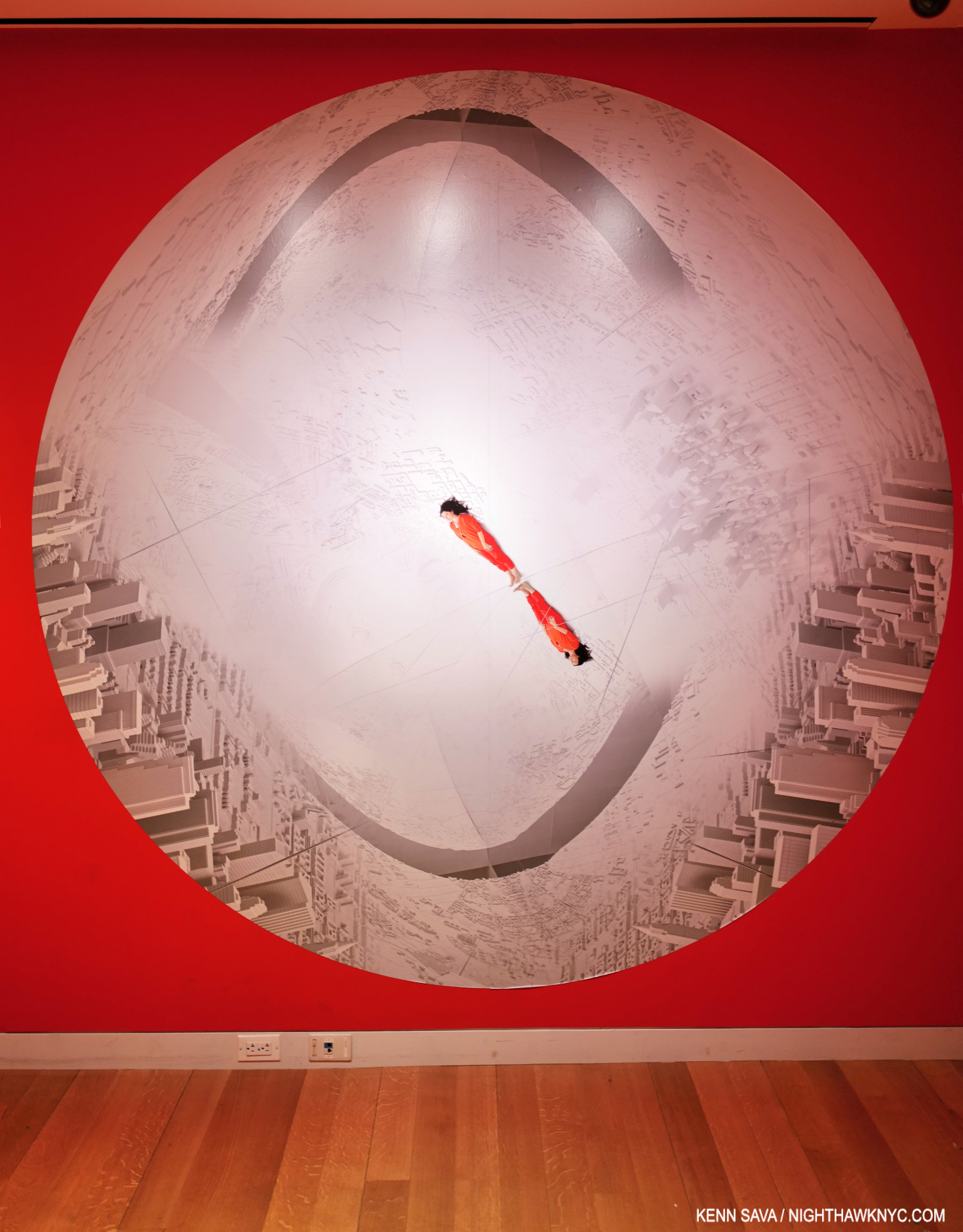
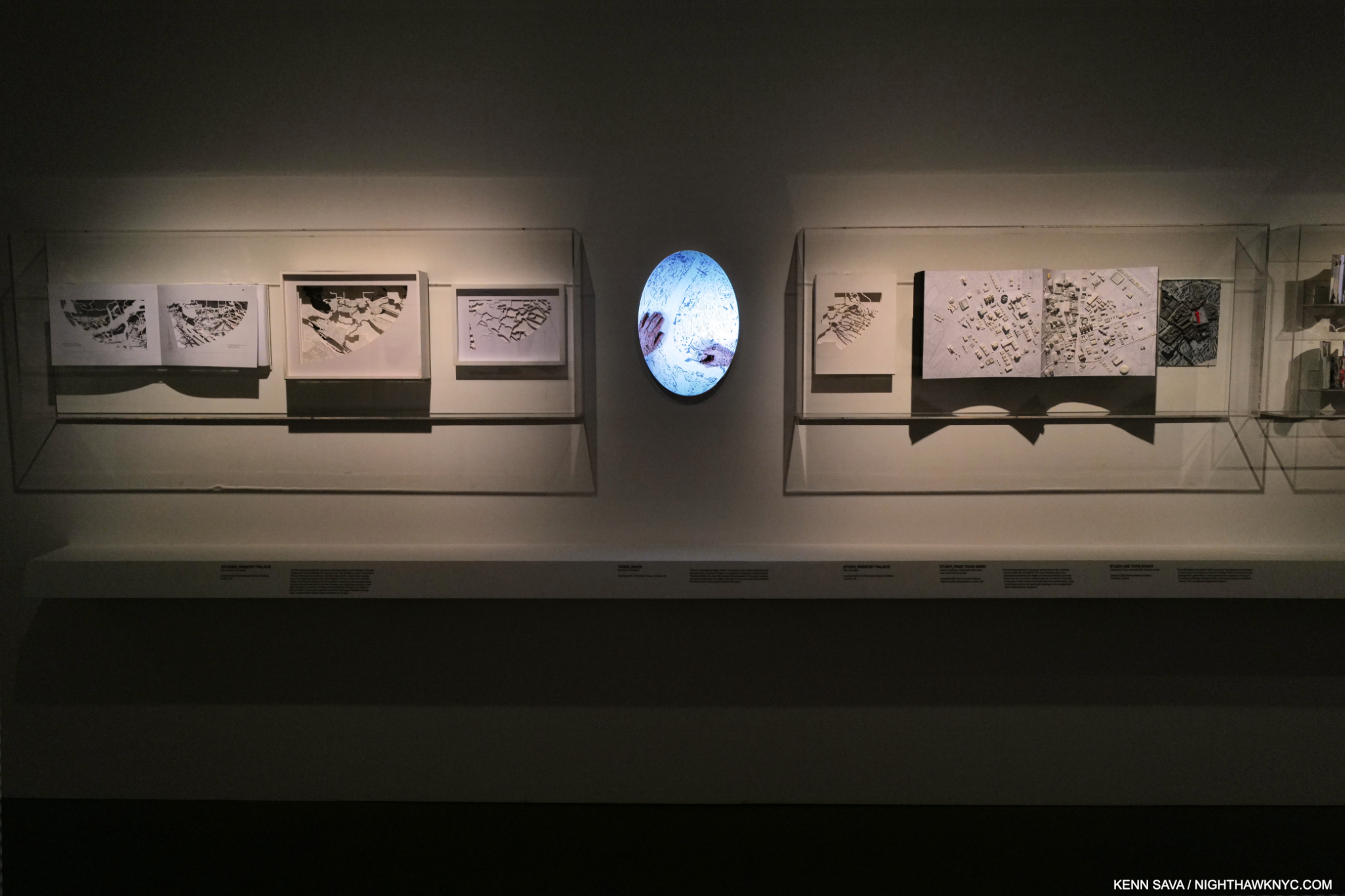
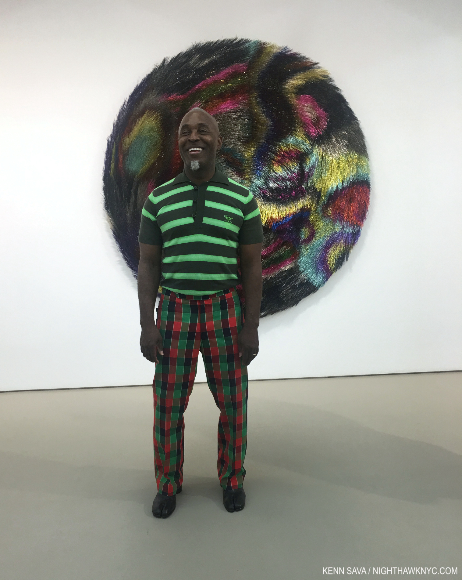
The one and only Es Devlin in the one and only time she appears in her show, in her piece Memory Place. (her hands appear a few times elsewhere). Displayed in the show’s entrance lobby where visitors wait for the next showing of her 4-minute intro video which takes place in a fascinating recreation of her studio. The pictures in this piece are thumbnails. Click any for full size.

Having first experienced Es Devlin’s brilliance in 2010, the release of her debut Art , An Atlas of Es Devlin, the NighthawkNYC.com NoteWorthy Art Book of the Year for 2024, fired my curiosity as to what the show of the same name would be like. How would Es Devlin and the curators at the Cooper Hewitt distill the innumerable projects Ms. Devlin has been involved in these past 29 years already, and the book’s 900 pages, into a comprehensive and concise show, a “mid-career” retrospective, no less?
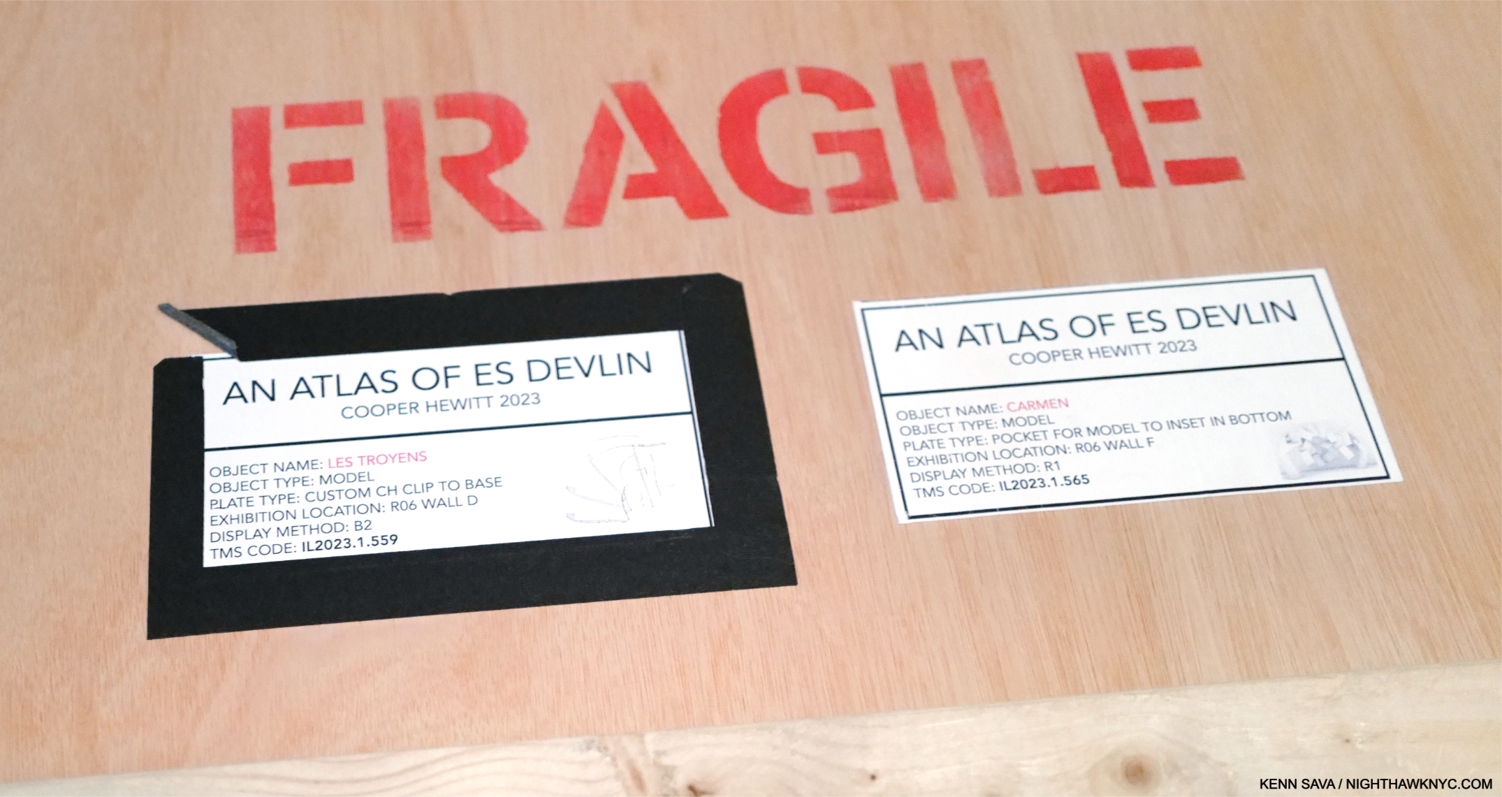
The show is so innovative, the attention to detail so exceptional, that even the shipping crates that transported the Art have their place in it! One of many things in An Atlas I’ve never seen before. I explain further on. Seen here are the labels on a crate that contained 2 models.

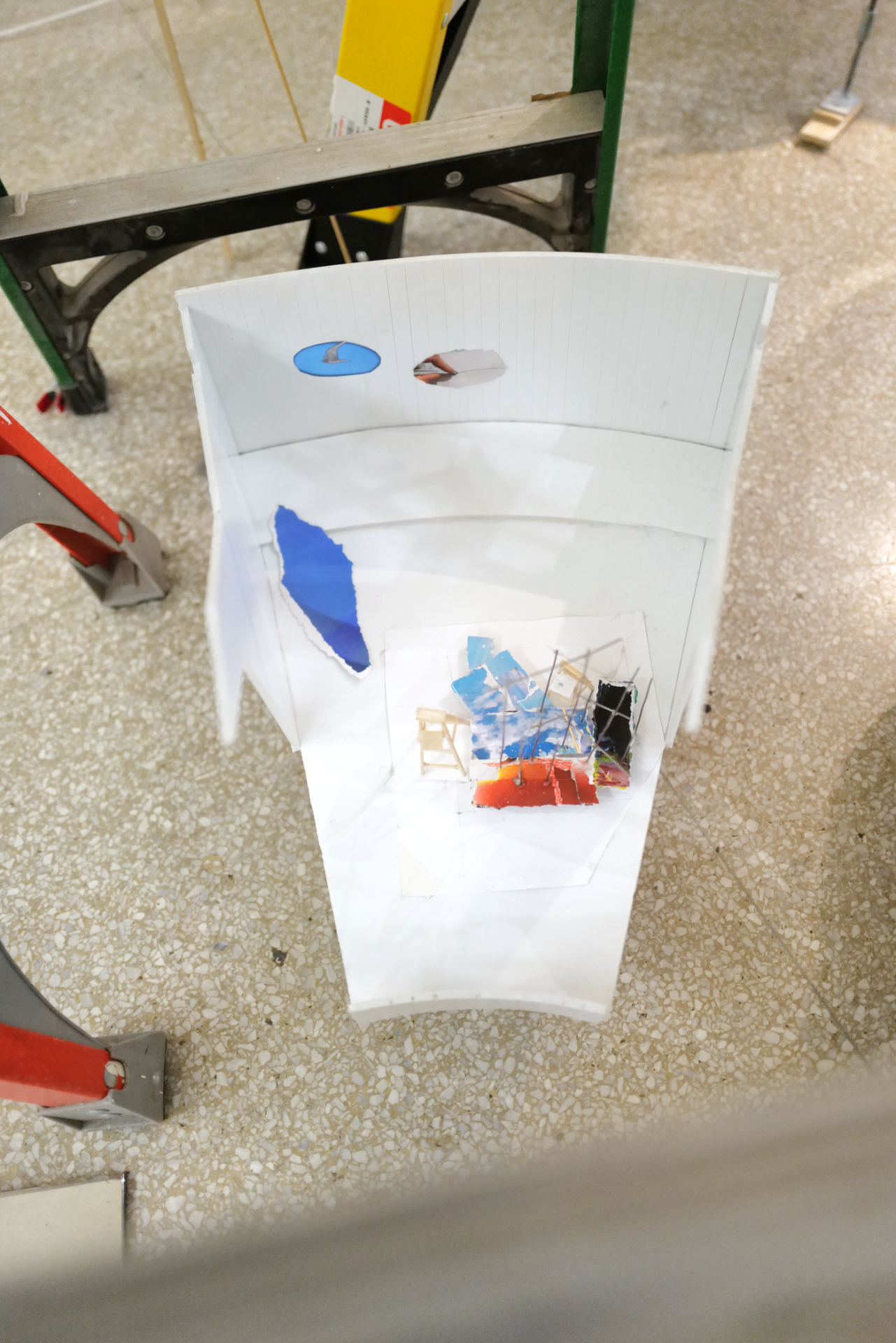
Opening in November, 2023, I pondered this all through 2024 as various ailments kept me from getting to 2 East 91st Street, and finding out. Stage Design is one of the most ephemeral Art forms there is. The book is divided between Sketches and notes, followed by a large section of color Photos of the performances. Building my expectations around that, finally getting to see the show twice during it’s final week, I got the unexpected: a show that largely consisted of beautiful scale Models of the stage sets, most created for exhibition! (Two were contained in the shipping crate shown here.) Well, if anything has proven to be the trademark of Es Devlin’s work, it’s the unexpected, which continues to remind me of Robert Rauschenberg.
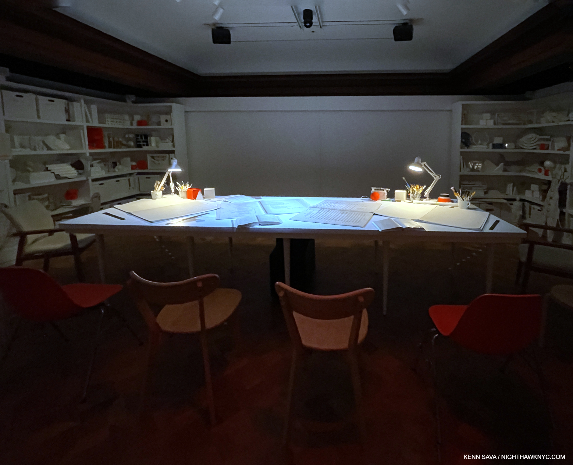
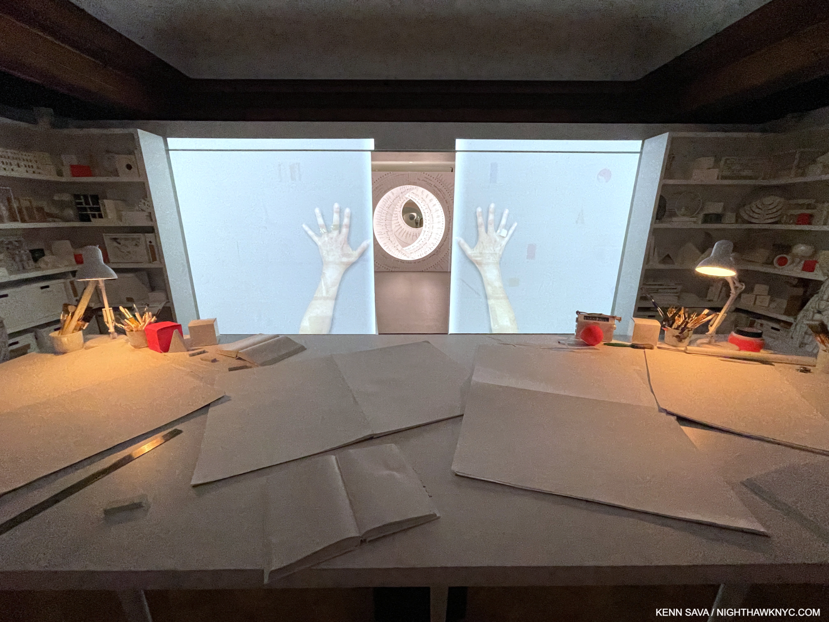
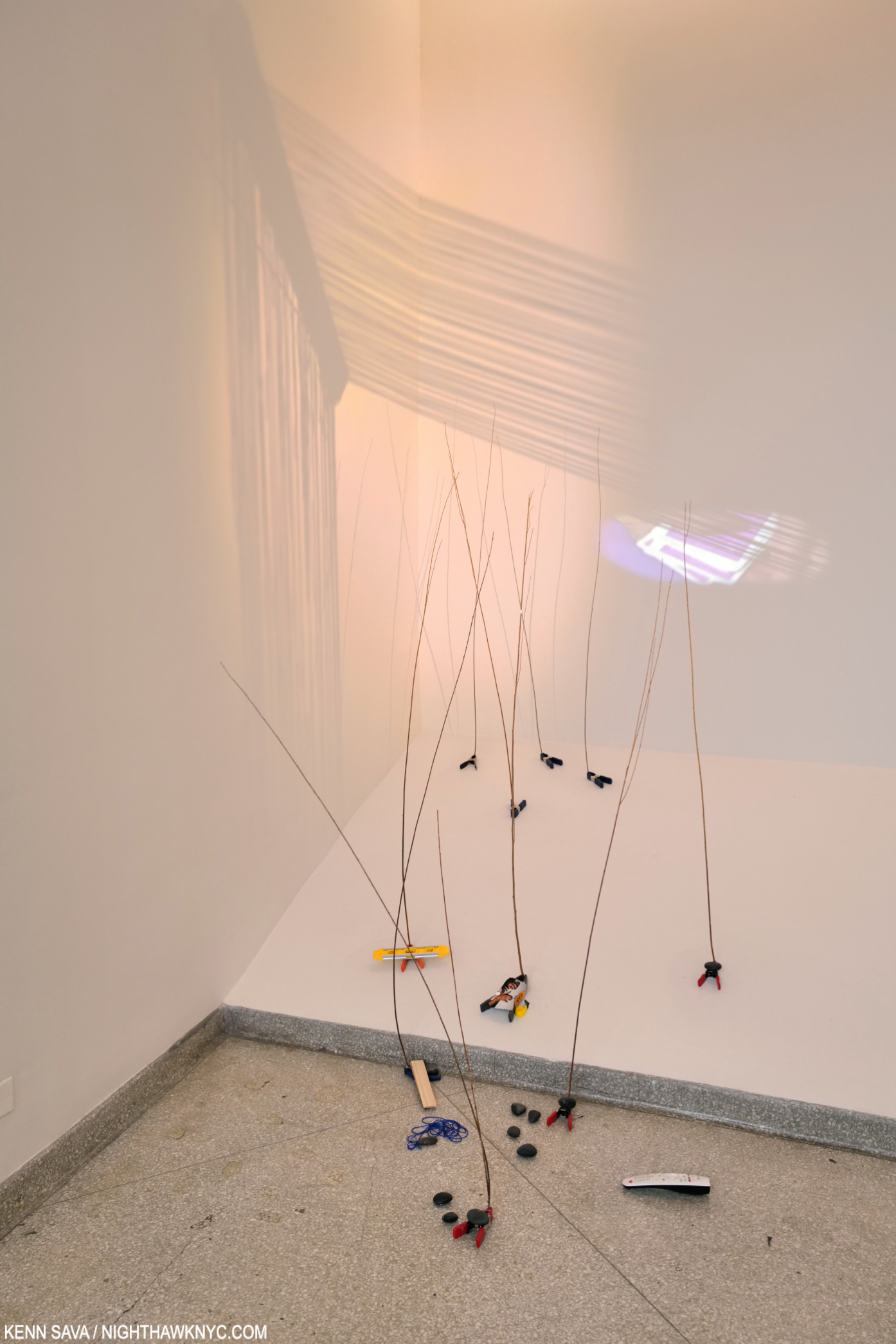
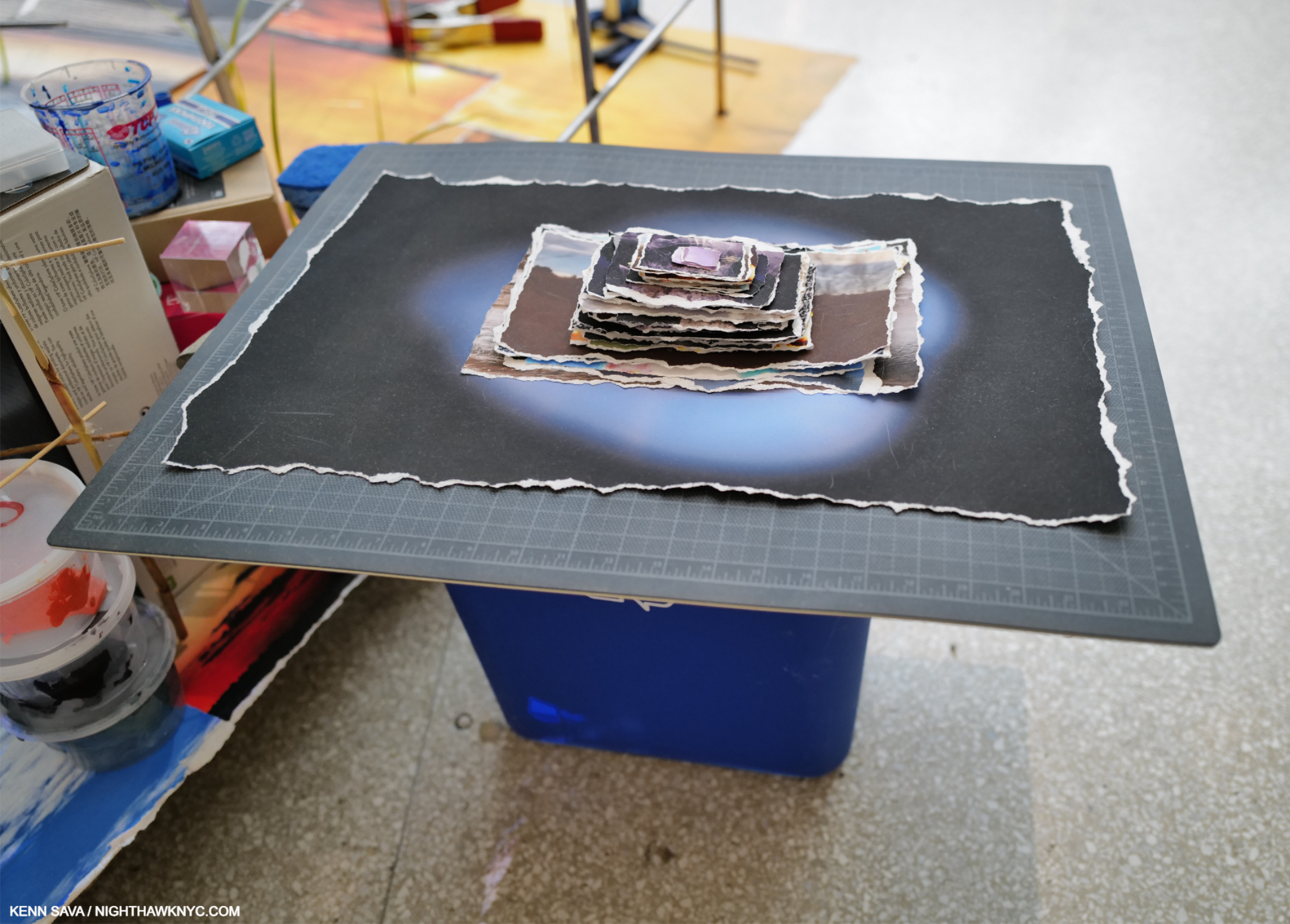
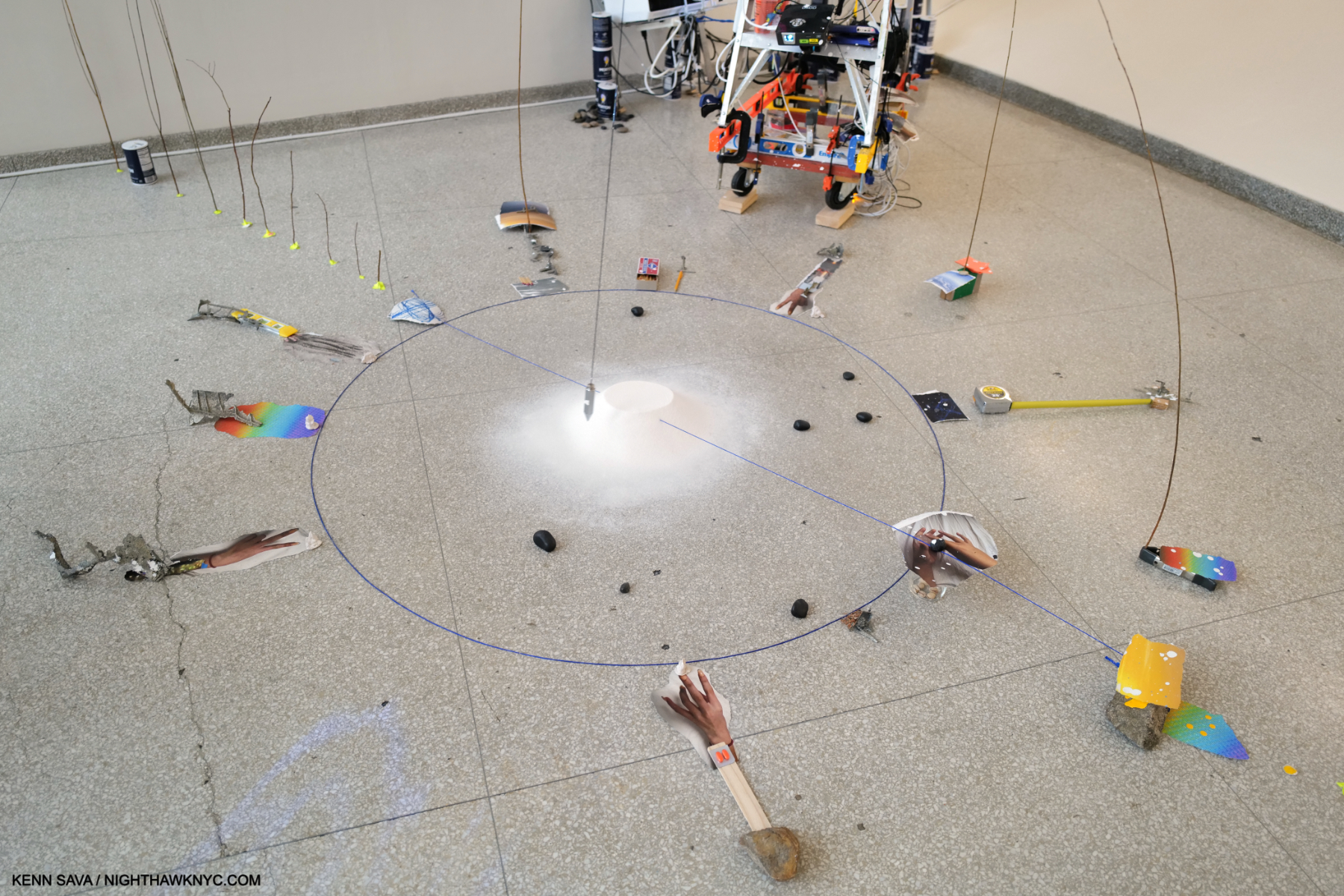
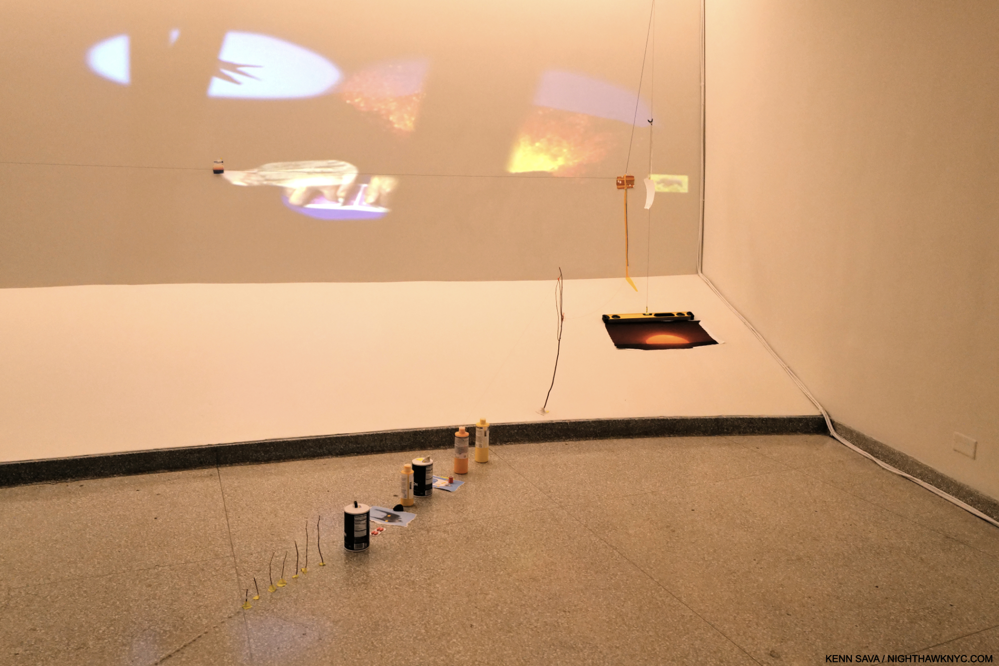
Hang on to your hats! Installation view of the introductory gallery in the recreation of her studio before the Film begins. I rushed in to get this shot before it was filled up by those in line behind me. Beware, those seemingly innocent items on the table are not what they seem. Neither is that back wall.

Filling  the entirety of the 3rd floor, arriving visitors are asked to wait for the next showing of a 4-minute Introductory Film, which takes place in a gallery designed as a recreation of her studio, with a large work table in the middle, filled with the tools of her craft.
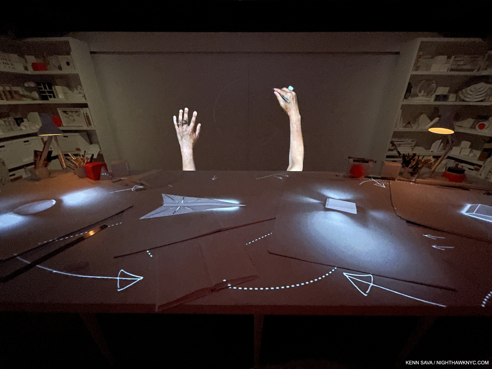
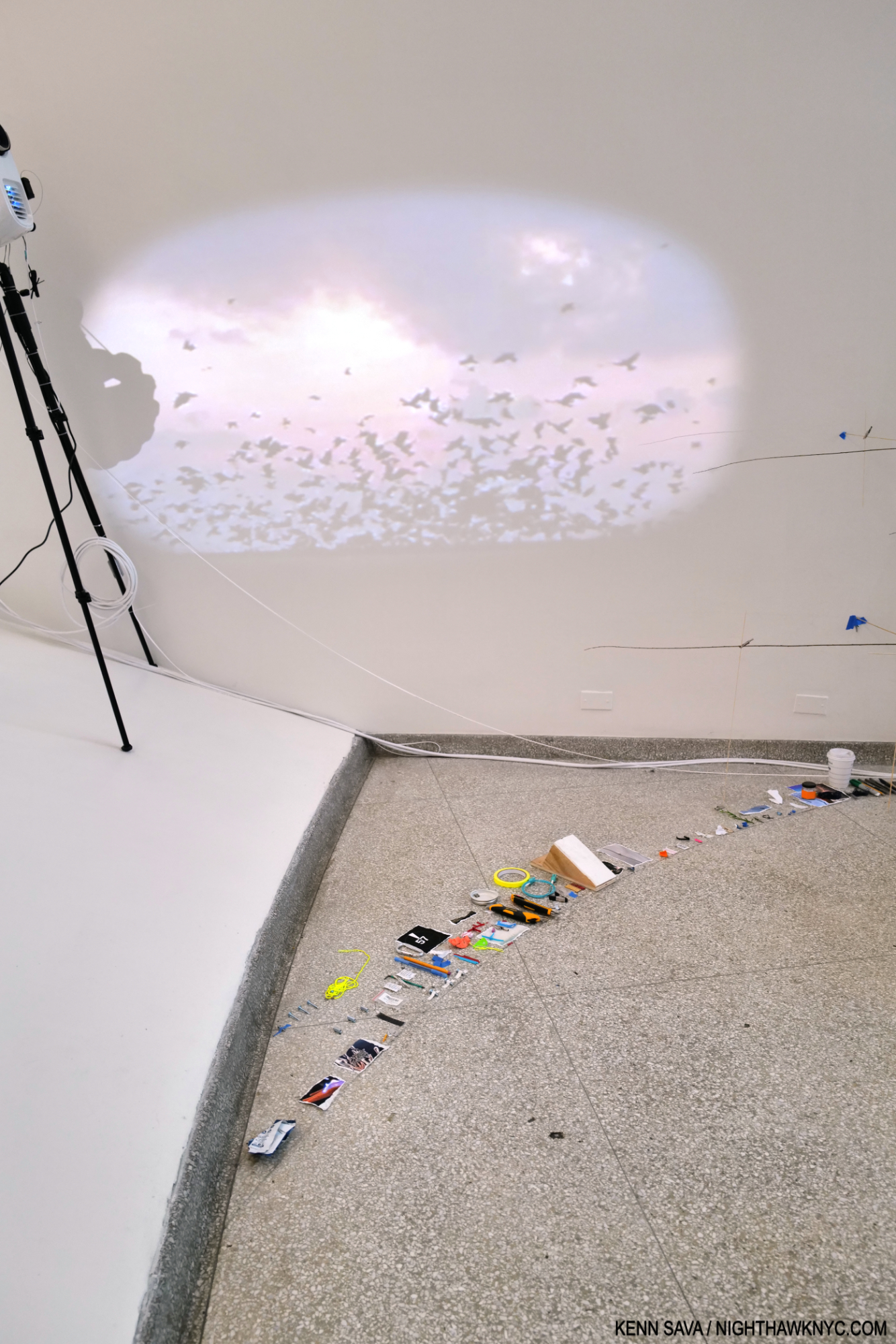
As the Artist speaks and Draws in the Video projected on the rear wall, the objects on the table undergo all sorts of permutations.

As visitors surround it and begin to take it all in, the Film begins. Compellingly narrated by the Artist in powerfully evocative words in Ms. Devlin’s hypnotic voice, accompanied by stunning visuals that somehow bring items lying on the table to life, the Artist takes us on a tour of her ideas and her work.
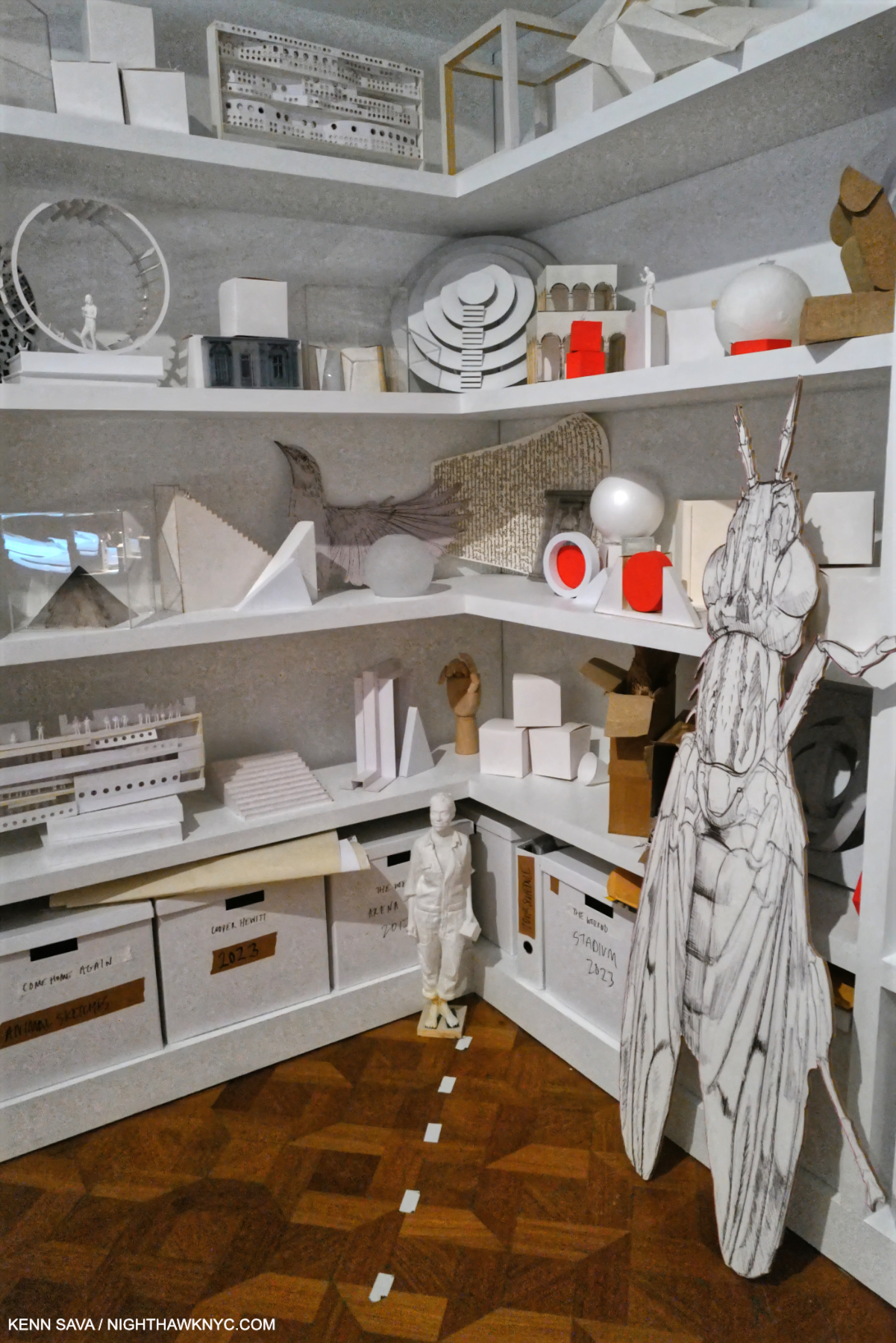
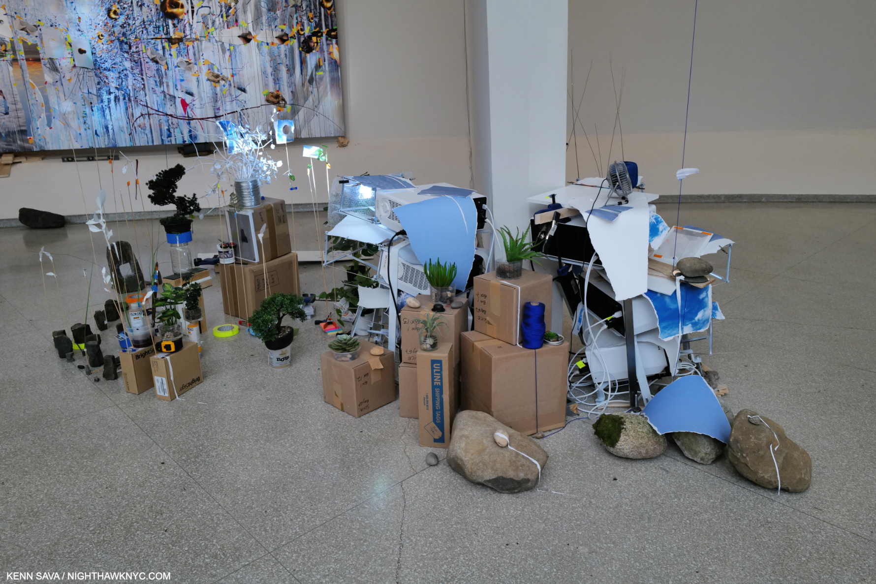
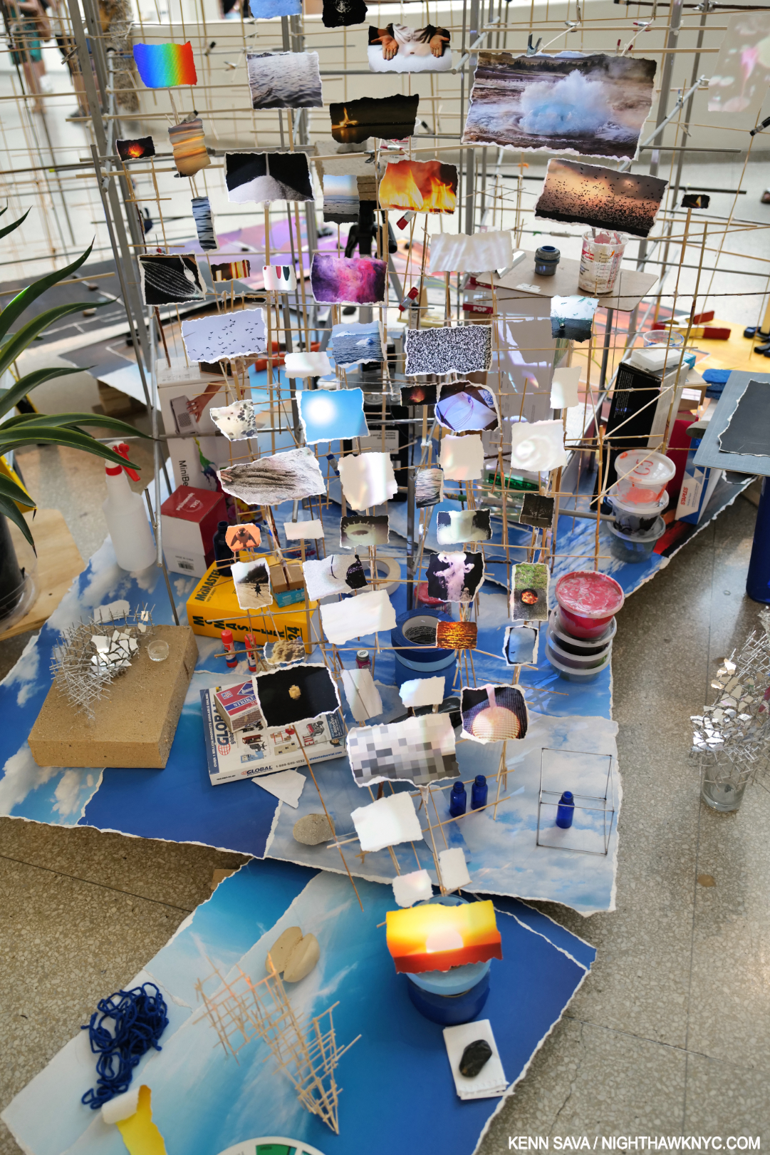
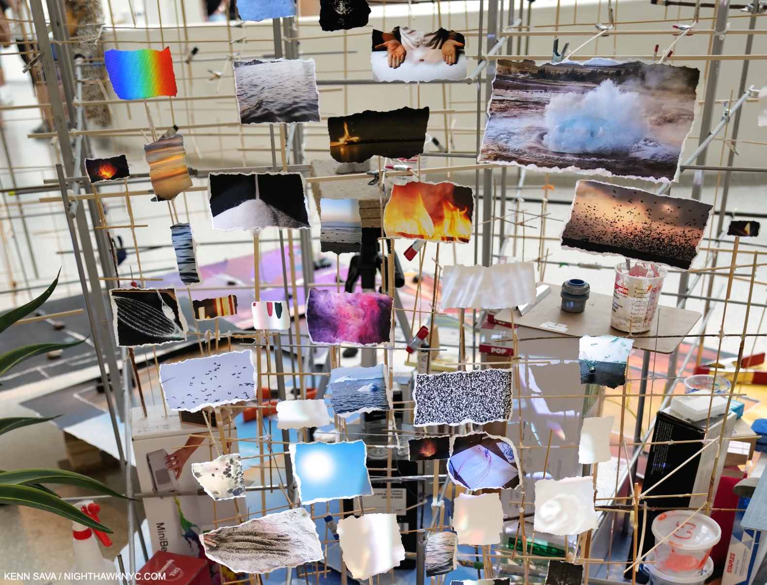
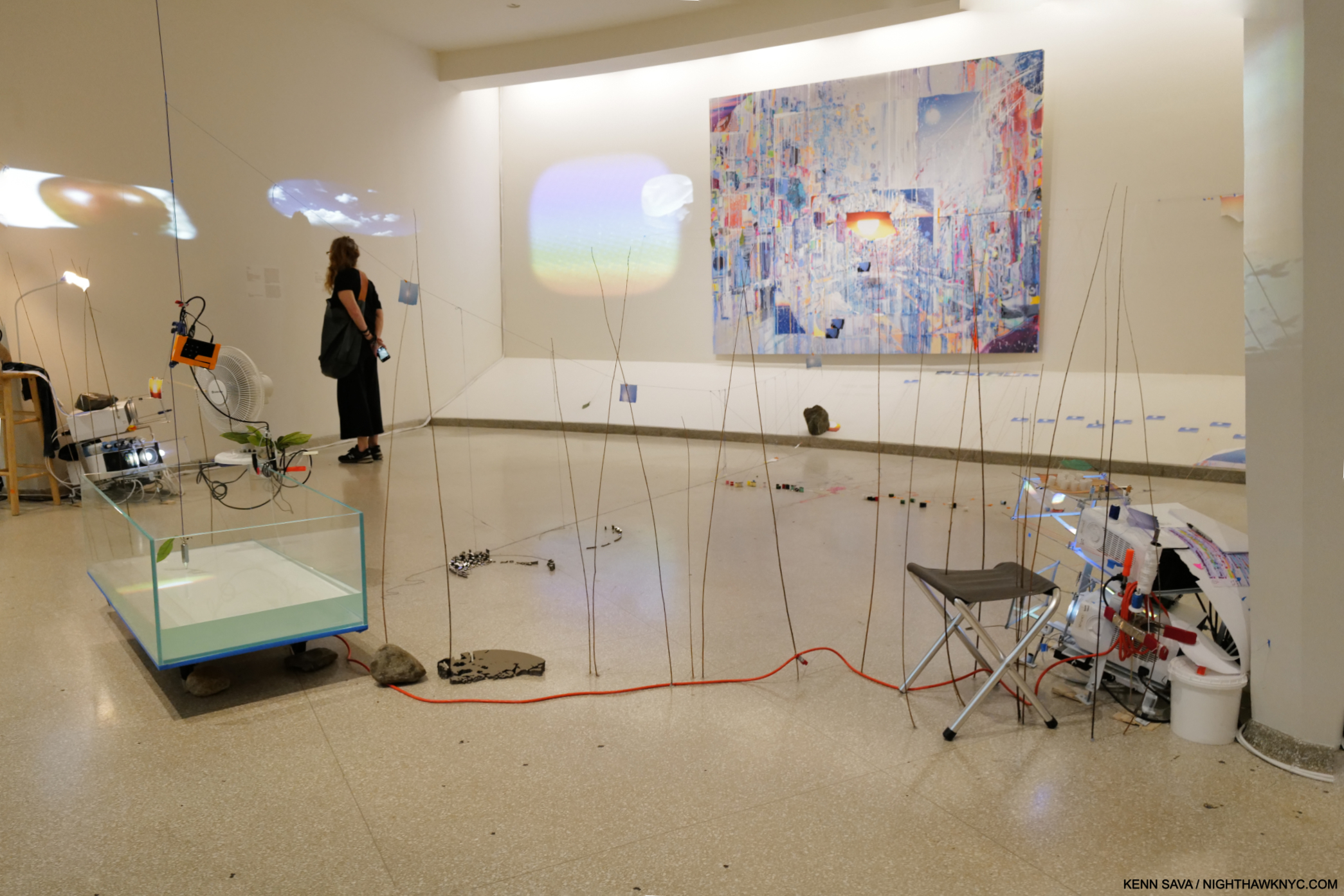
One section of the recreation of Es Devlin’s studio with the lights low during the Introductory Film. Full of ideas, some realized, some partially realized, some not realized yet, I imagined this room to be something akin to walking around in her brain.

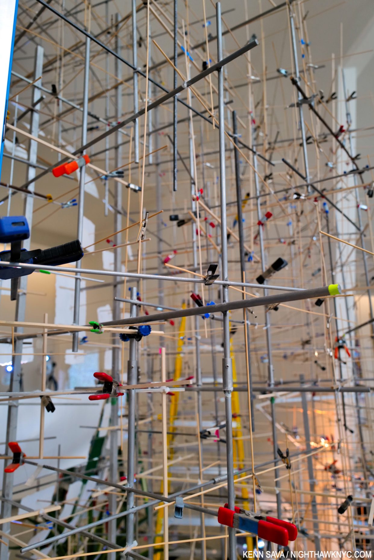
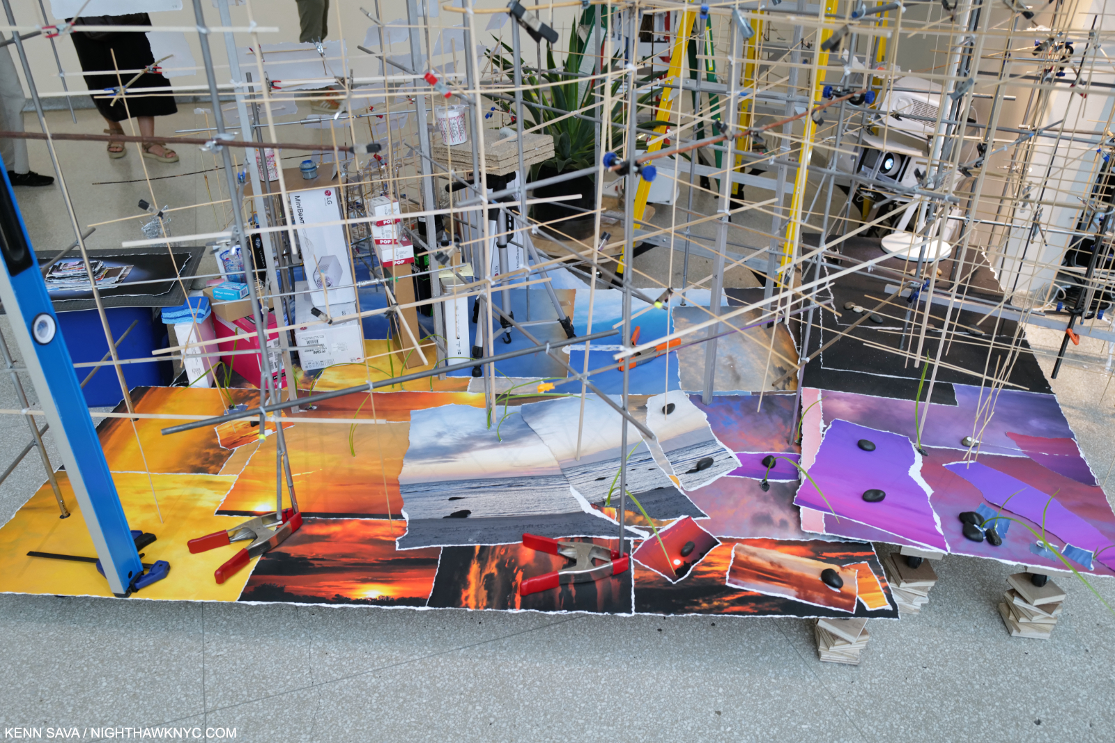
On three of the walls surrounding the table were a cornucopia of fascinating objects I could have spent a few hours studying on their own. A bit like Sarah Sze’s incredibly involved installations, a lot of work went into their installation.

The Film ends with a bang.

At the culmination of the presentation, the Artist’s hands split the screen in half, opening the back wall, revealing her piece, Iris, beckoning visitors to enter the beginning of the main body of the show. Talk about a dramatic opening. Stage craft meets Art show in a way I can’t say I’ve experienced before. But, I bet I will again. I have no doubt An Atlas was must-see viewing for innumerable curators and gallerists.

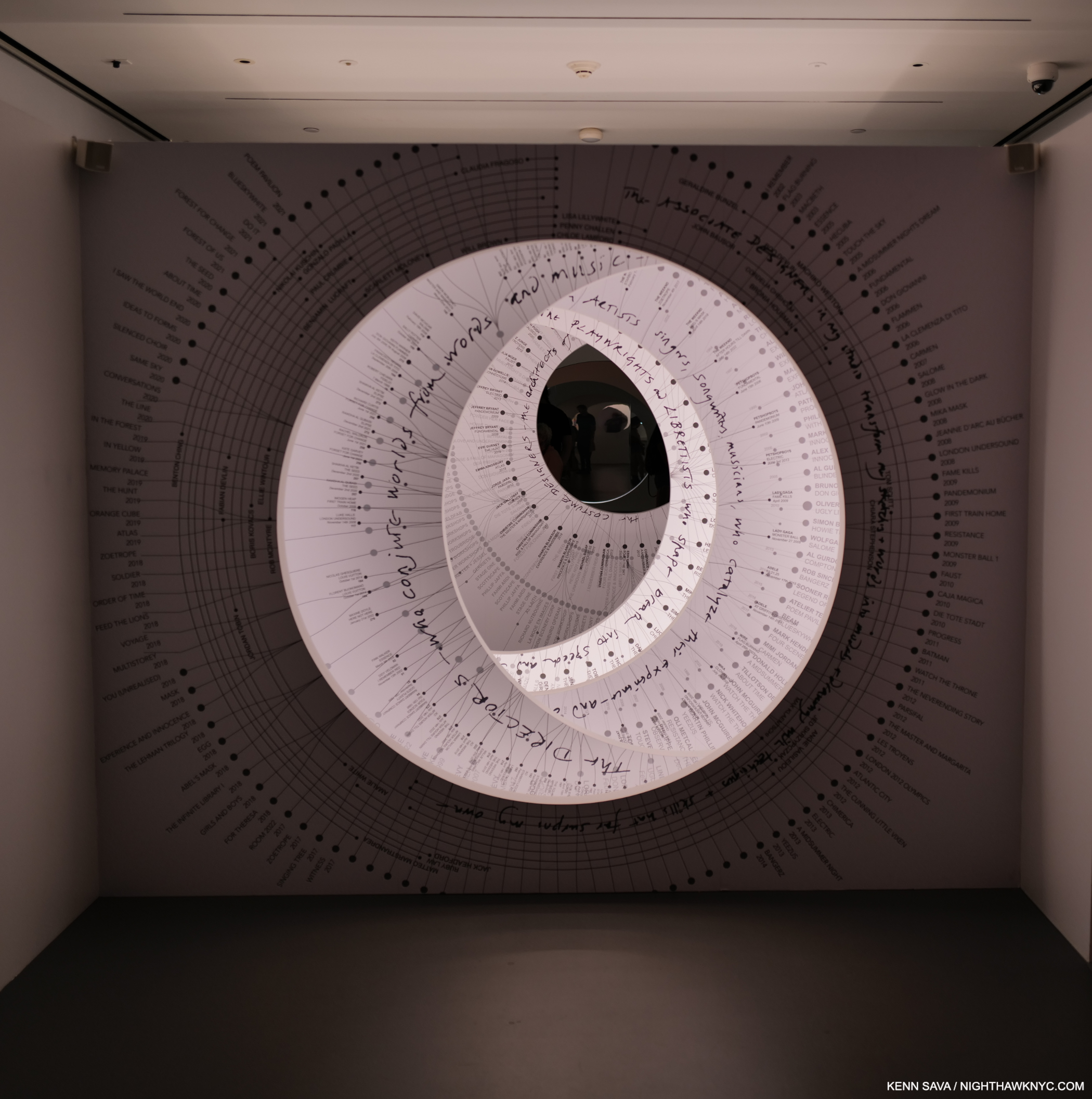
The second “introductory gallery” features Es’s Iris.

Working with “names’ virtually her entire career, the first stop is her Iris with a voice over of Es reciting the names of her collaborators. A nice “Thank You” for the opportunities and sharing the credit for the results of this most collaborative of mediums. Iris, with multiple aperture blades, contains the names of the Artist collaborators on the outer blades, and all those involved with creating and mounting her projects fill the inner blades, a list that fills the first 9 pages in her book! It introduces what is a running theme in the show: collaboration, as you might expect for an Artist whose craft is Stage Design, like a bass player, something that doesn’t exist on its own (unless you’re a genius, like my late acquaintance, Jaco Pastorius). Still, it’s definitely her show. Her voice and vision runs through each and every work. Still, as any creative person who’s been hired by someone knows, working with someone else “who has a say” is often extremely challenging; perhaps the hardest part of the job. More than likely the Artist got the job for being who he or she is. For someone else to come in and suddenly want to change/modify that vision can be both counterproductive and counterintuitive. Not every Artist can do it.  The “dynamics” of creative collaboration is why most bands have the shelf life of milk. Yet, though it must have been there, in An Atlas there is no sign of creative struggle or difficulty. Making this all the more impressive, the list of her projects takes 4 pages in the book (as I showed here)! Either her brilliance is just a matter of fact for all her bosses, or she has an extremely winning way, as belied by her hypnotic voice. My money’s on both.
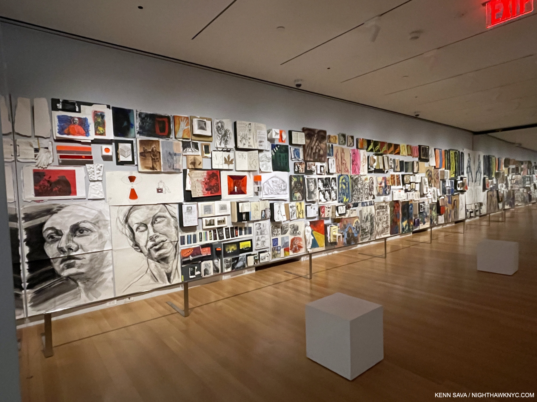
Installation view of the first gallery of work, with the earliest pieces at the far end. If you look closely you’ll notice mirrors at each end of the wall. In what might have been an effort to make the show feel larger, all the galleries had wall-sized mirrors on each end.

After leaving Iris, next up is the gallery of her fascinating early works, largely Drawings and Mixed Media works on paper, i.e. pen, markers, paint on paper Portrait and figure studies, like countless other Art students. I had to look closer to find the roots of her Stage Design work. In between the large studies, I saw sketchbooks, notebooks and loose sheets that contained outlines and ideas for stage productions, none of which are listed in her book.
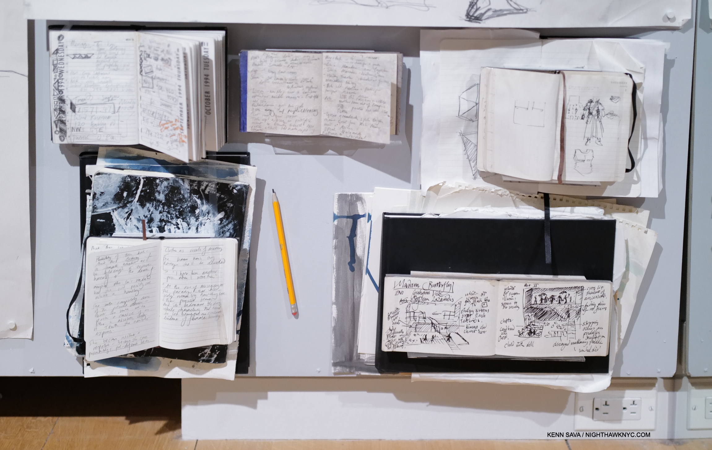
On the very bottom of the far end of the wall, just above the power outlets, and so difficult to see, I spotted these notebook pages, the one at the lower right reads “Madam Butterfly,” perhaps one of the earliest Stage Designs in the show (the book in the upper left is dated October, 1994). Note that Es has Drawn the entire thing, boldly and confidently, in ink with no white-out or corrections. That speaks to the clarity of her vision, even early on. Immediately above it is a costume design. Note the inclusion of the pencil. I just love that her work was so centered on Drawing and hand-written notes, and continues to be. I don’t see Madam Butterfly listed in her book.

From this gallery, what are we to make of her beginnings? Where did all of what has followed come from? Between visits, I researched her background. Her CV on esdevlin.com, lists her Education, chronologically, as-

-Cranbrook School, 1984-1989 (a “co-ed grammar school1)
-BA Hans English Literature 2.1, Bristol University, 1990-1993
-Fine Art Foundation, Central Saint Martins, UAL, 1994-1995
-Motley Stage Design Course, 1995-1996

That’s it! After taking Art-centric courses for scarcely two years, then she just takes off. In only the second gallery of work, at the beginning of her professional career, the ideas are fresh, innovative & previously unseen- qualities that characterize her work to this day. Still in school(!), she’s already on her way. In the first vitrine, I was struck by her work with Wire, a 4-piece rock band, in 2003. Zillions of 4-piece bands, including a few with yours truly involved, have appeared on stage since The Beatles set a standard for what such a lineup “should” look like. “I didn’t know much, but I was bored of seeing the typical silhouette of a band,” she said on the wall card (where all Es Devlin quotes herein derive).

And so, Wire appeared like this-

Studies: Flag: Burning, for the band Wire’s Farewell Performance, 2003, Barbican Hall, London. Es Devlin’s first stage design for a concert. She made “illustrated cue sheets from which they ran the lights and the videos.” She spoke about not having enough money to afford velcro to enclose the band, so she had to use staples.

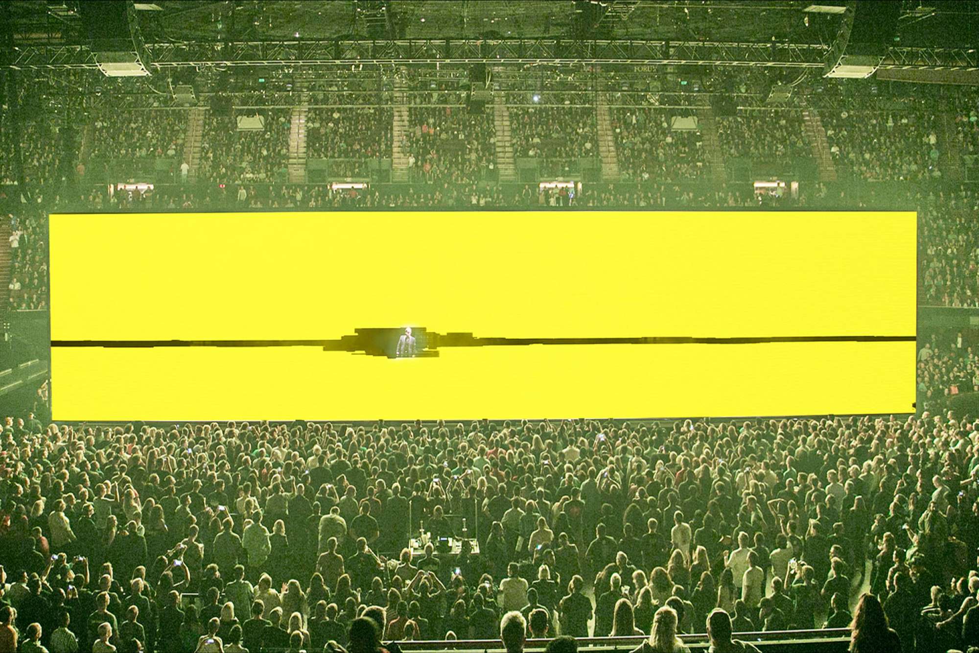
11 years later, another 4-piece band looked like this-

No staples here! U2, “Innocence & Experience” World Tour, 2014. *= Photo from esdevlin.com.

Wire would lead to such extraordinarily innovative shows as “Innocence & Experience,” 2014, and the subsequent “Experience & Innocence,” 2018, both by U2, who also includes 4 members. I believe this performance of “Who’s Gonna Ride Your Wild Horses” is from the “Experience & Innocence” tour. I saw U2 on what I believe was their first U.S. tour at the Ritz in 1980. Bono still sounds as strong as ever. To my mind, Wire, 2003, to U2 a decade later provides a classic case study in Es Devlin’s evolution.

Model, Bangerz, 3-D printed resin, recreated for exhibition. Staged, 2014, Miley Cyrus’s Bangerz World Arena Tour. Models of Ms. Devlin’s designs were the highlight of the show for me. Here, her face is a video projection from above that continually changed. To the side, a huge model of her beloved dog was also on stage. “We decided the Miley Cyrus should perform the entire show on her tongue. The first iteration was impractical, so we reduced the length of the tongue to a slide, down which Miley made her entrance- a sculptural portrait of a young woman rewriting her own script.”

Moving through the show, it became apparent to me that though elements recur, as. you see, Es Devlin has no one “style.” Since her words appear on virtually every wall card. Who else to speak better about her work? I’ll largely let her take it from here.
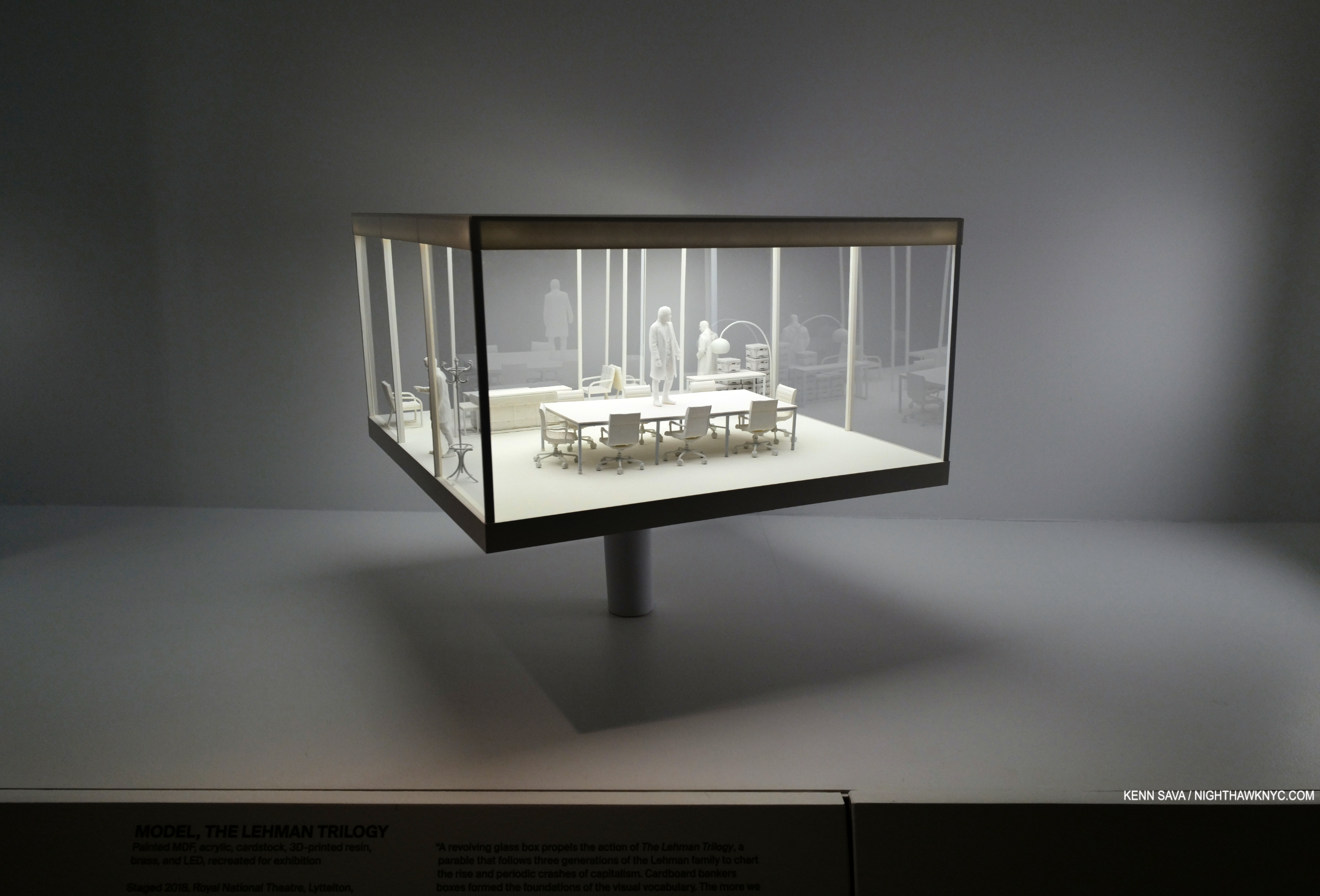
Model, The Lehman Trilogy, Painted MDF, acrylic, yardstick, 3-D printed resin, brass, and LED, recreated for exhibition, Staged in 2018 at the Royal National Theater, London, and the Park Avenue Armory, NYC. Es Devlin’s Tony Award-winning, rotating, design for Stefano Massini’s play The Lehman Trilogy, based on the family of businessmen. All the Models shown here with a center pole rotated. “A revolving glass box propels the action of The Lehman Trilogy, a parable that follows three generations of the Lehman family to chart the rise and periodic crashes of capitalism. Cardboard bankers boxes formed the foundations of the visual vocabulary. The more we invested the boxes with meaning, the more poignant the revelation became that those containers of cotton and coffee would become containers of financial records and numbers, ultimately revealing themselves to contain nothing at all.”
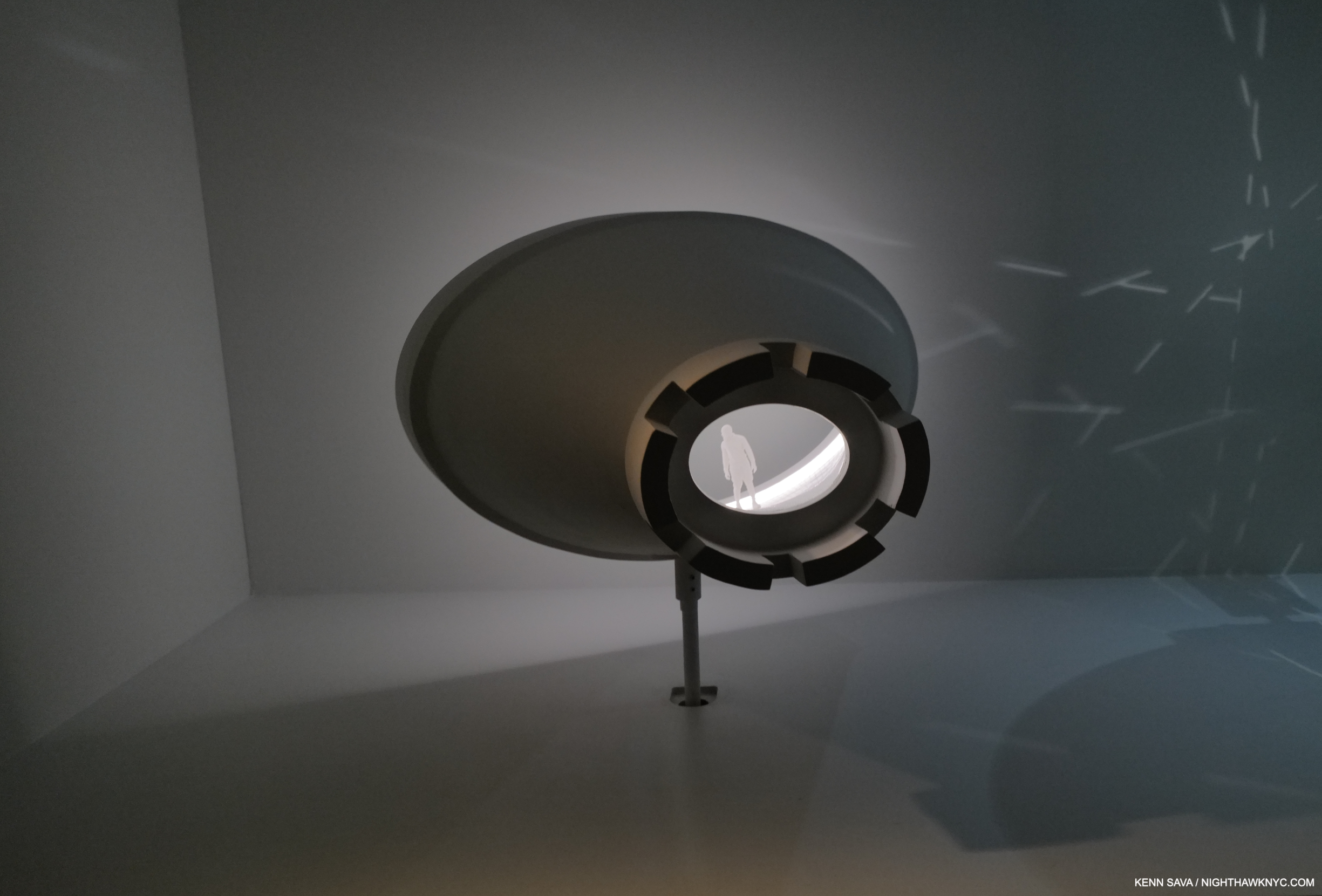
Model, Parsifal, Laser-cut form, resin and paint, recreated for exhibition. Staged in 2012 at the Royal Danish Opera, Copenhagen. “Richard Wagner conceived his final work as a ritual mass for the consecration of a stage. Over four hours of largely static drama, the audience transcends time and space through a rite of compassion. The director Keith Warner and I conceived an enormous revolving rook chess piece whose conical interior formed a new theater within Copenhagen’s opera house. We presented Parsifal’s odyssey from naivety to wisdom as a resistance to the rules of an antiquated game.”

As her career has progressed, a good number of her works have an “otherworldly” feel to them. Figures are frequently enclosed, in a maze, or presented in surroundings that are hard to fathom, often with no apparent way out.
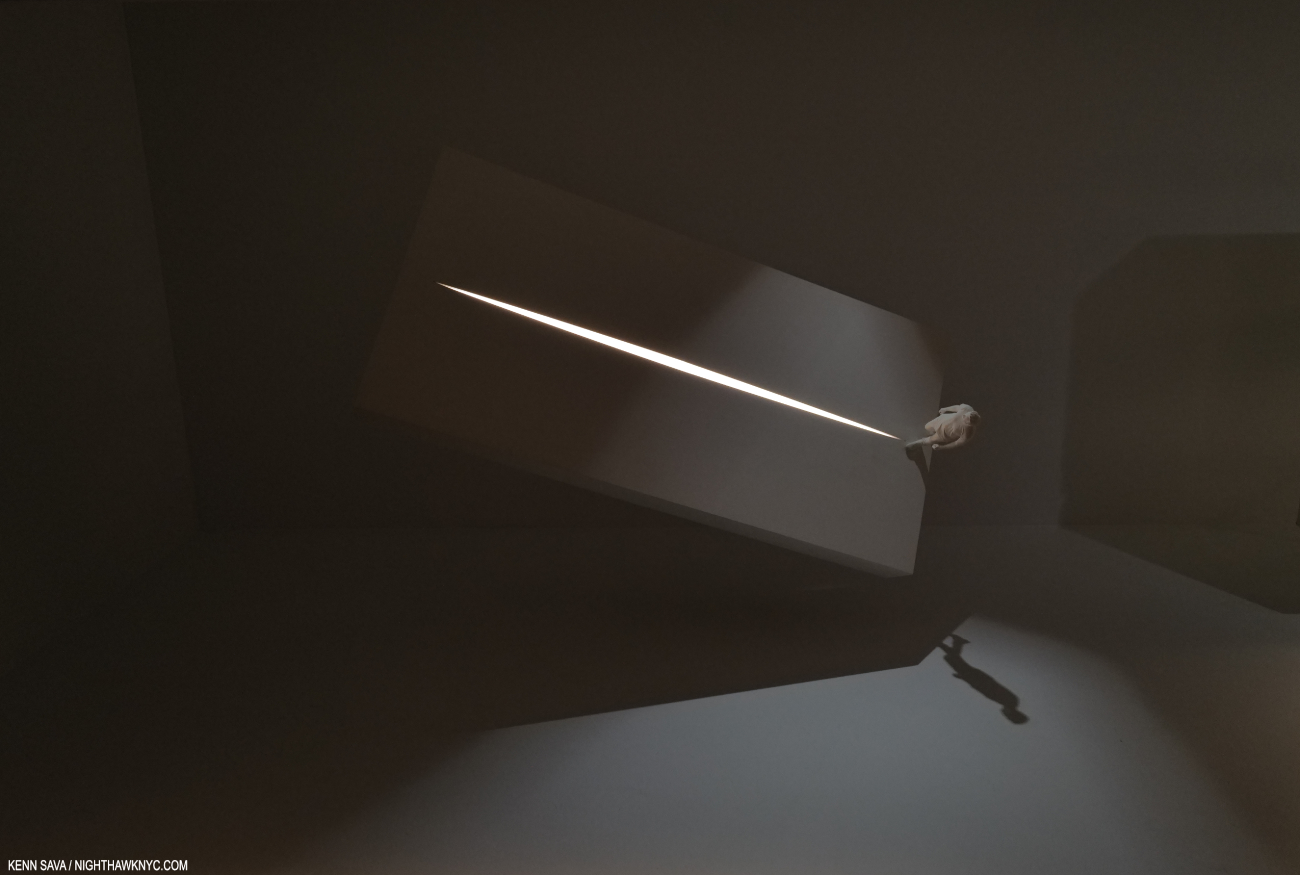
Model, Howie The Rookie, Graphite and paint on laser-cut MDF and LED, recreated for exhibition, Staged 1999, Bush Theater, London, UK. “My first stab designs were experiments in framing light. The Bush Theatre was a room above a West London pub with an audience of 75 people. Mark O’Rowe’s play Howie the Rookie is a pair of potent, visceral monologues set in the housing estates of Tallaght on the outskirts of Dublin, Ireland. I perforated a concrete plane with a line of light. This line conveyed both a burning horizon and a road making on a highway.”
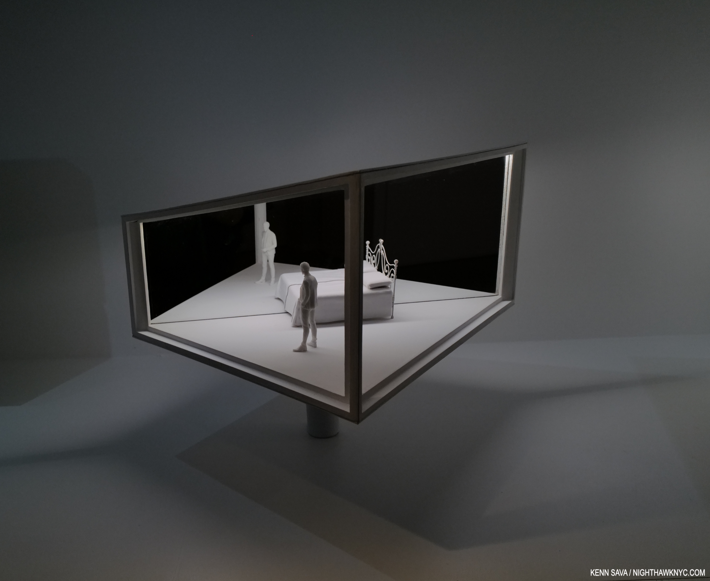
Model, Macbeth, Graphite and paint on laser-cut MDF, acrylic mirror and LED, recreated for exhibition, Staged 2003, Theater an her Wien, Vienna. “The design for Ernest Block’s opera of Shakespeare’s play Macbeth was based on a revolving mirrored illusion box. It’s rotations evoked Macbeth’s churning conscience. We conjured scenes through smoke and mirrors. A half-bed wedged against a mirror appeared as a single whole, while Macbeth and his wife were duplicated. The illusion of a whole banquet full of guests overlaid their machinations as the box turned.”
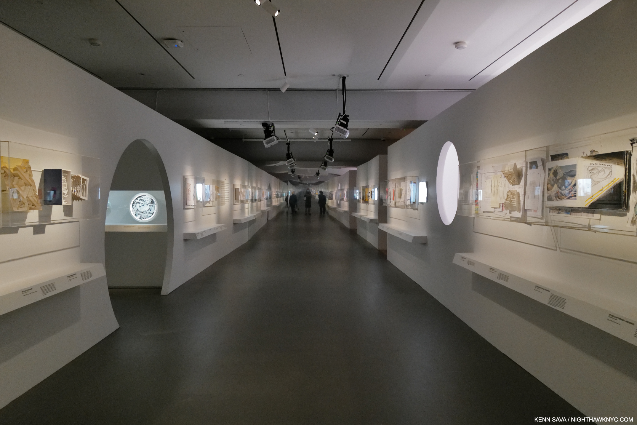
Installation view of one of the corridors. It’s not as long as it looks. Note the overhead video projectors.
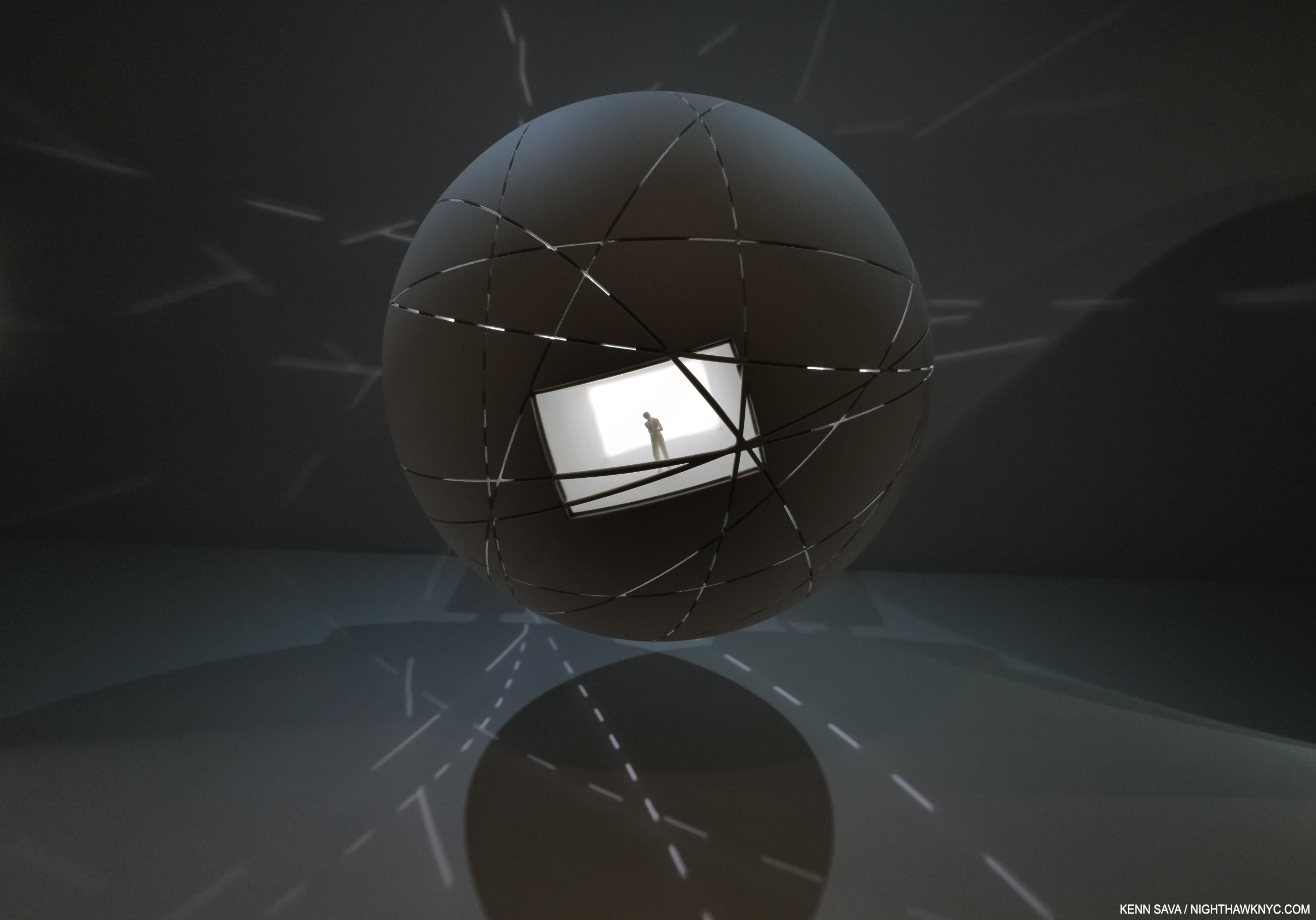
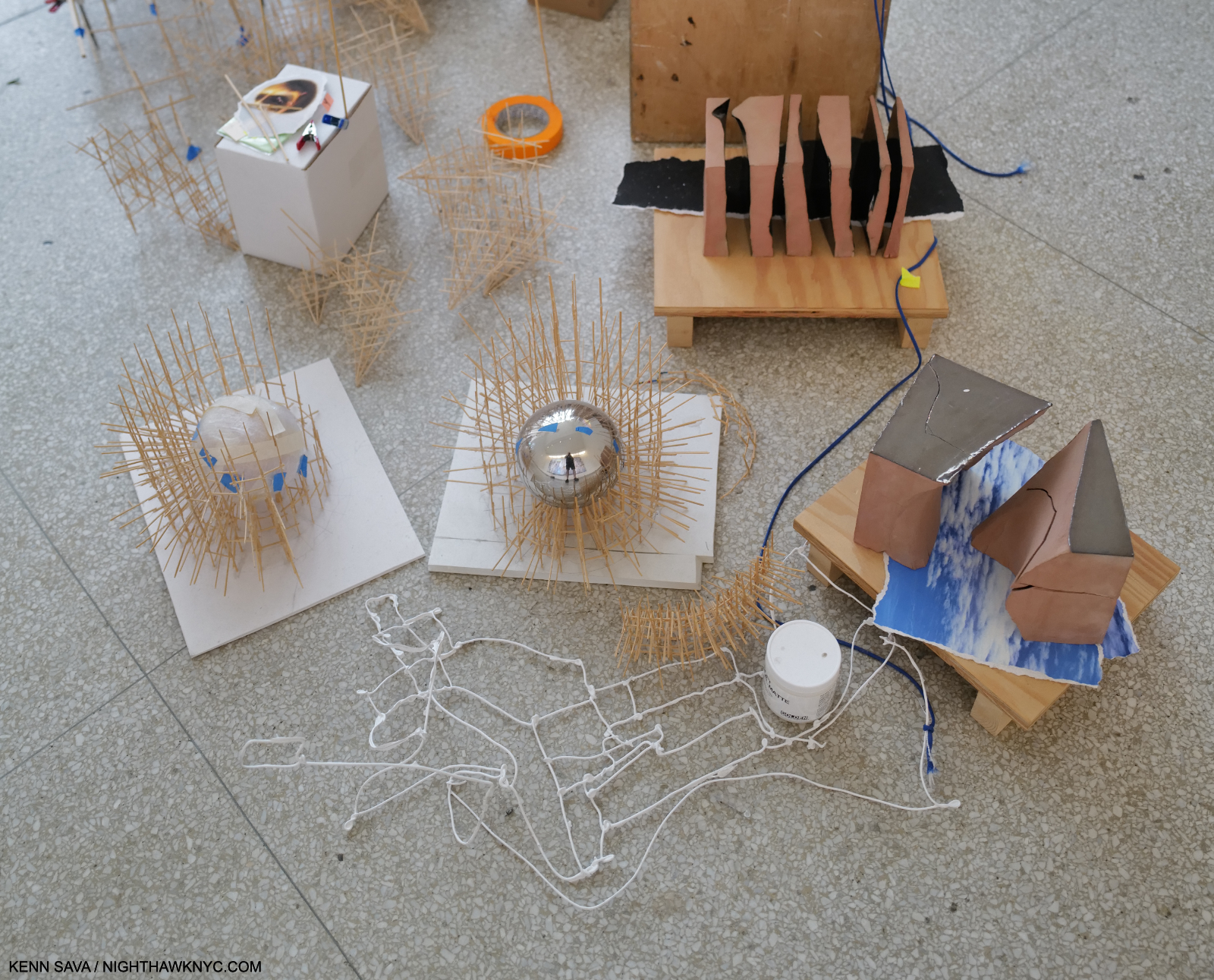
Model, Atlas, 3D-printed resin and LED, recreated for exhibition. Staged 2019, Los Angeles Philharmonic, Walt Disney Concert Hall, Los Angeles, CA. Meredith Monk’s transcendent wordless opera, Atlas, charts the spiritual growth of the 19th-century explorer Alexandra David-Néel. The young girl encounters travel companions and spirit guides within a 12-meter-diameter sphere, scored with webs of international trade and travel routes. The form encompasses Monk’s radiant vision of a possible alternative to the current world order.”
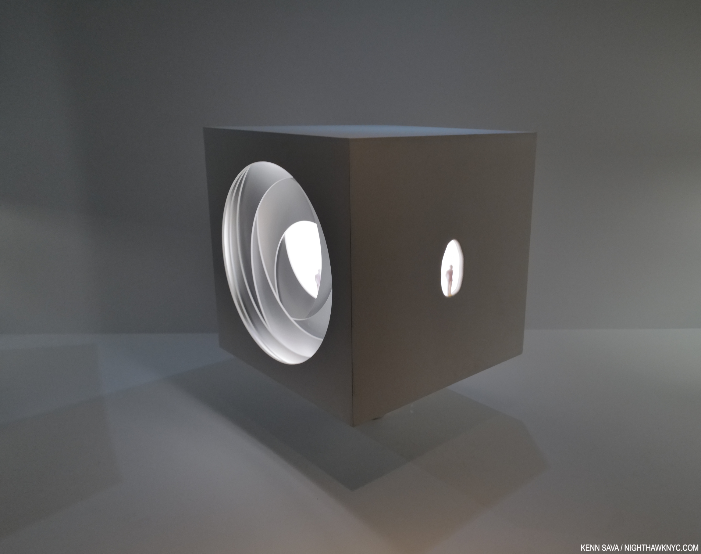
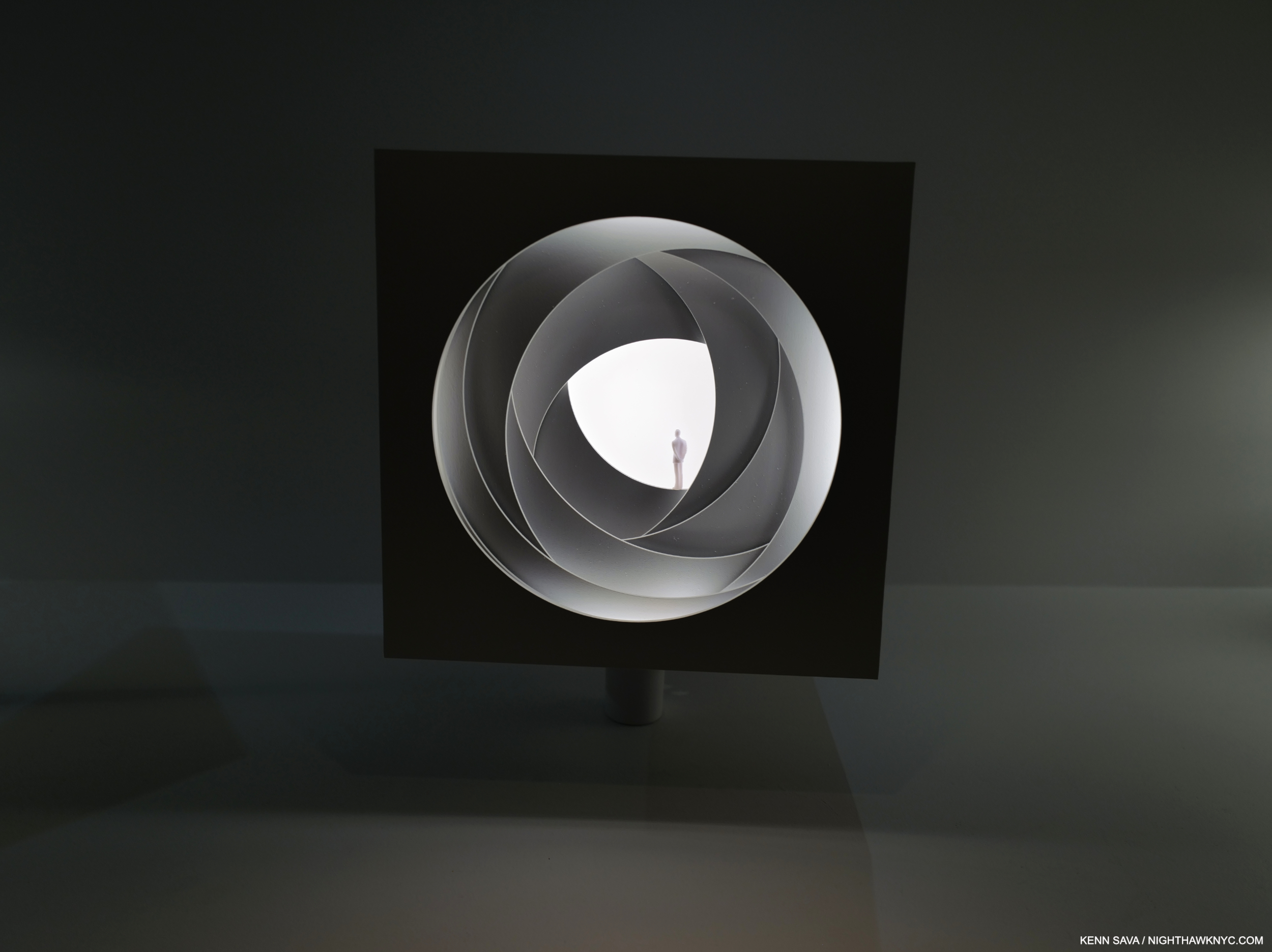
Model, La Caja Mágica/The Seed, Graphite and paint on laser-cut MDF, nd LED, recreated for exhibition. Staged 2010 MTV Europe Music Awards, La Caja Mágica Arena, Madrid, and 2020, Jubail Mangrove Park, Abu Dhabi. “For the MTV Europe Music Awards, I imagined a 10-meter high revolving box that could reveal a shapeshifting series of performances. (Among others) Rhianna sang within a sea of red carnations pouring out of an iris (see next pic).”

Model, Fundamental, MDF, acrylic, acetate, and LED, recreated for exhibition. Staged for the Pet Sop Boys World Tour, 2006-7. Es says, “Neil Tennant and Chris Lowe’s album Fundamental critiqued Tony Blair, George W. Bush, the Iraq War, and immigration policy. For the tour, an X-ray image of a divided brain expressed the cognitive dissonance we felt as our country remained entangled in a ware we didn’t want. The show was performed outside the Tower of London, complete with projected pink tanks for the anti-war extravaganza ‘The Sodom and Gomorrah Show’ and giant sequined cowboy hats for the Bush/Blair pantomime “I’m with Stupid.” 
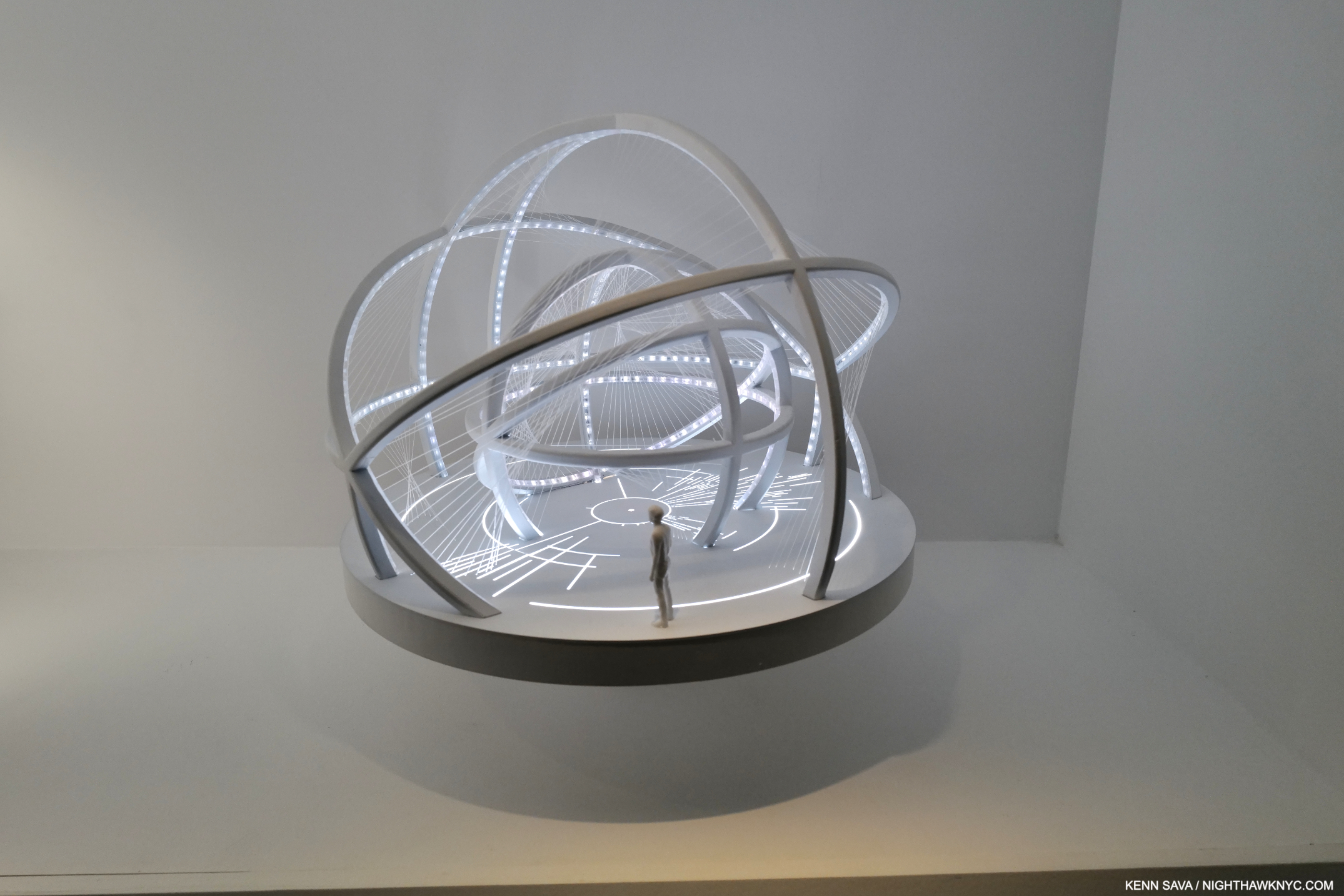
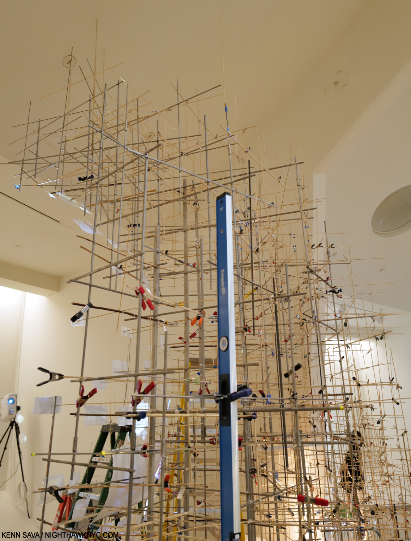
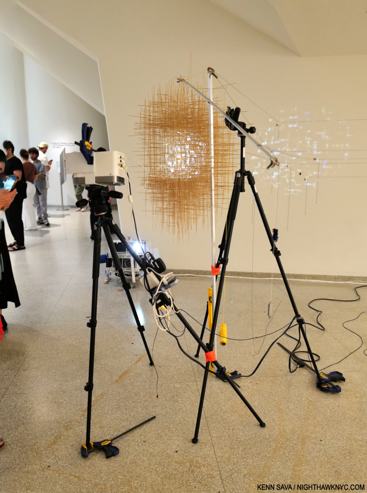
Model, Your Voices, Acrylic, filament, nylon thread, and LED, recreated for exhibition. Installed in the fountain at Lincoln Center, NYC, in 2022, Es says of it, “New York is the most linguistically diverse city on the planet, with 637 languages spoken by its inhabitants. Your Voices celebrated this diversity. Like a giant harp, the sculpture’s glowing arcs enveloped visitors and local choirs with an illuminated web. The piece rotated through a soundscape of languages from all over the city: from Arabic to Ashanti to Zapotec and Zulu. The strands spliced and framed the viewer’s perspectives, just as our perspectives are shifted when we learn to speak through the voices of others.”
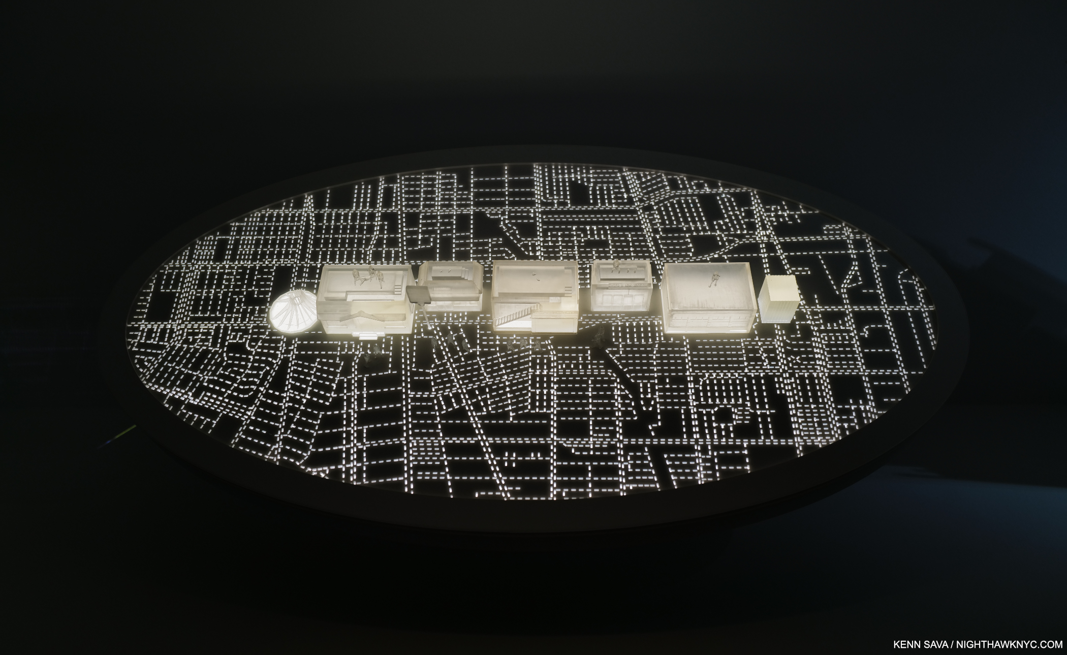
Installation view.

Model, Compton Super Bowl, Laser-cut MDF, acrylic, 3D-printed resin, and LED, recreated for exhibition. Staged for the 2022 NFL Super Bowl Halftime Show featuring Dr. Dre, Kenrick Lamar, Eminem, Mary J. Blige, Snoop Dogg, and 50 Cent, Los Angeles, CA. “Dr. Dre and I proposed etching a map of the city of Compton onto the global Super Bowl stage. We case the buildings as charcters that led from Snoop Dogg’s house to 50 Cent in the club to Eminem breaking out of jail.”
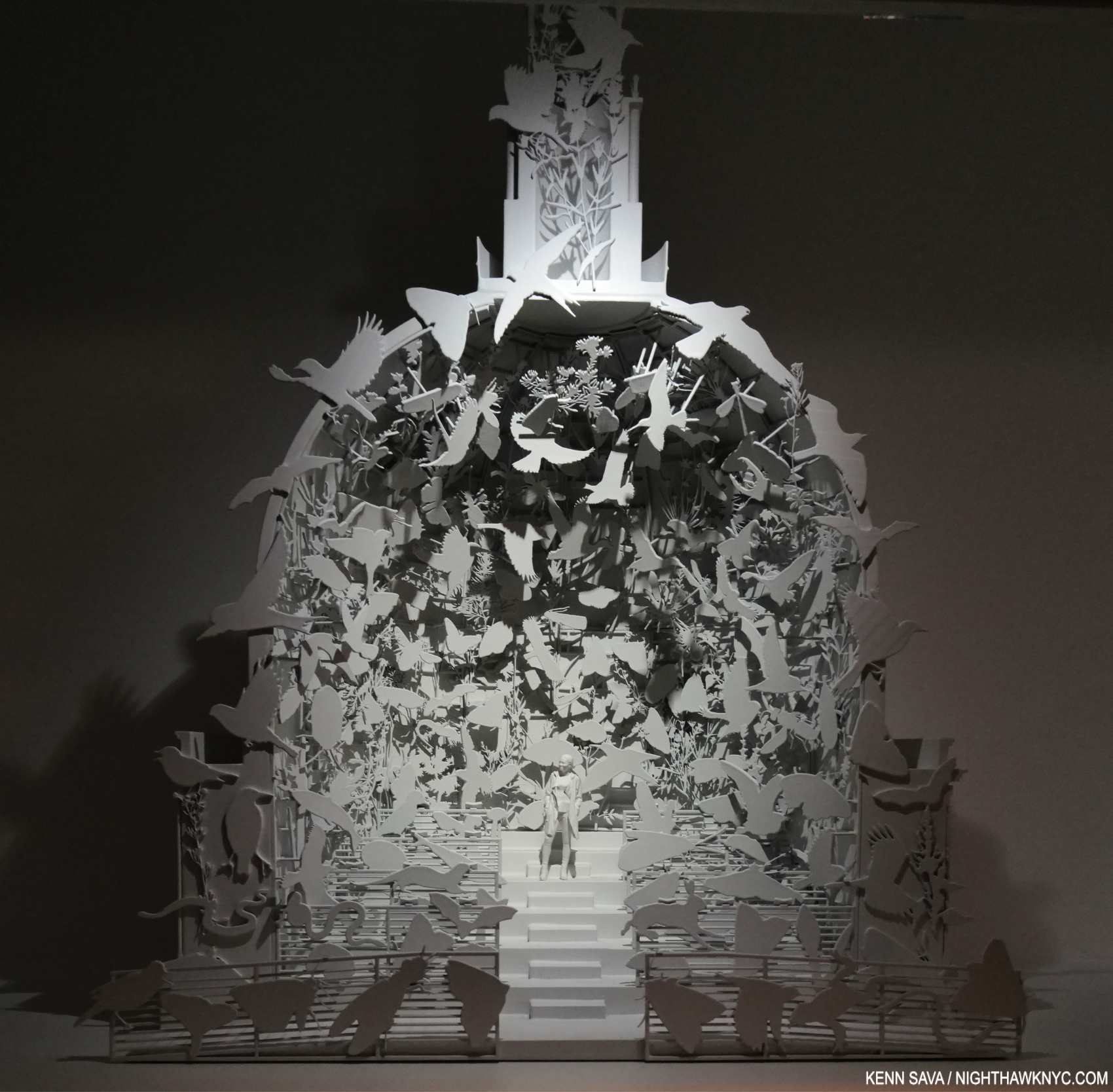
Model: Come Home Again, 2022, Acrylic and printed resin. “For Come Home Again, I constructed a one-third-scale replica of the dome of London’s St. Paul’s Cathedral on the lawn outside Tate Modern, facing the cathedral across the river. I filled dome with observational drawings of 243 of the 15,000 non-human species that call London home; the Londoners most at risk of extinction. ”All of the 243 animals depicted were based on Es Devlin Drawings.
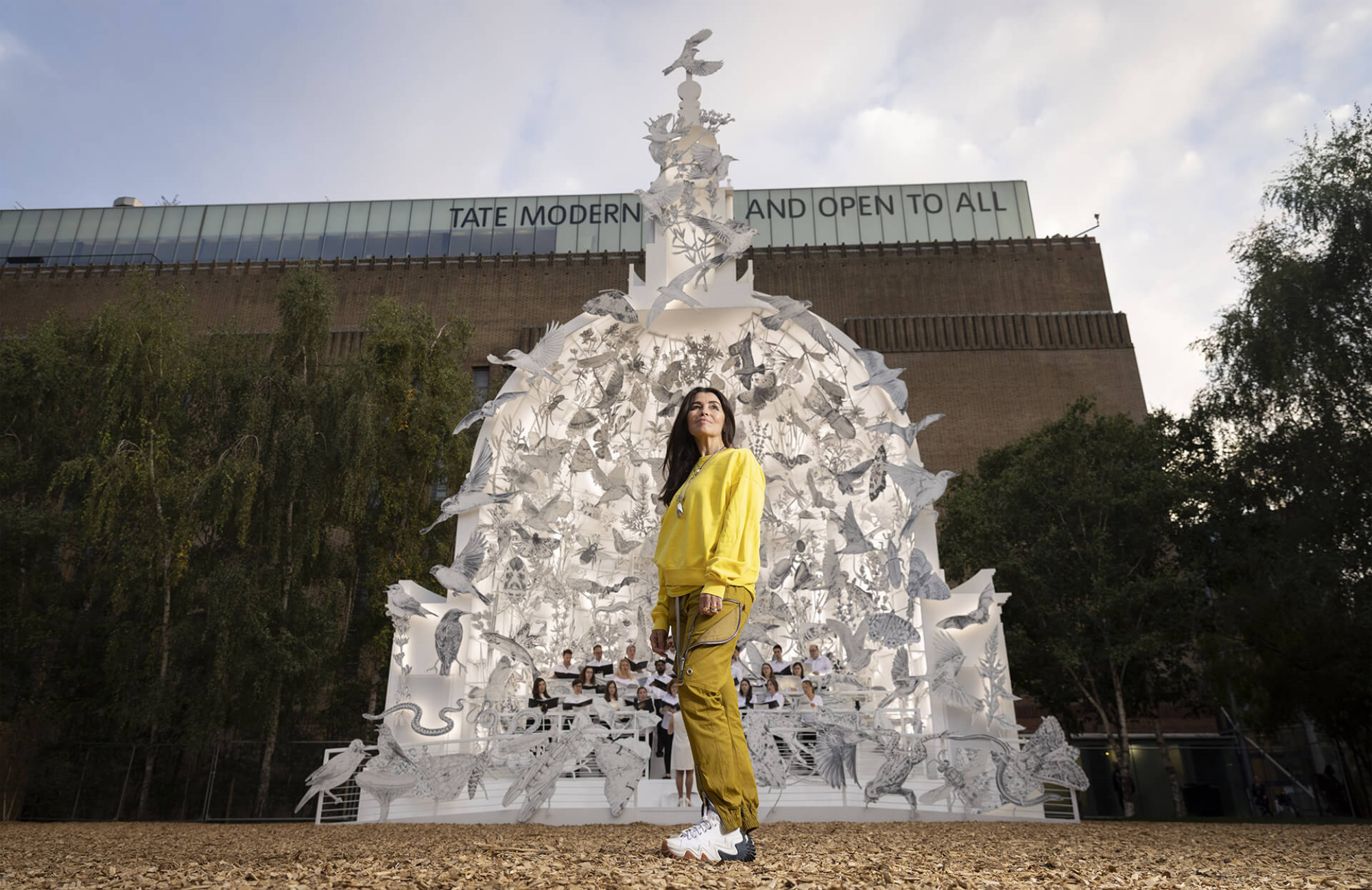
Es Devlin in front of  the real Come Home Again, Tate Modern, London, 2022 *- Photo by Matt Alexander
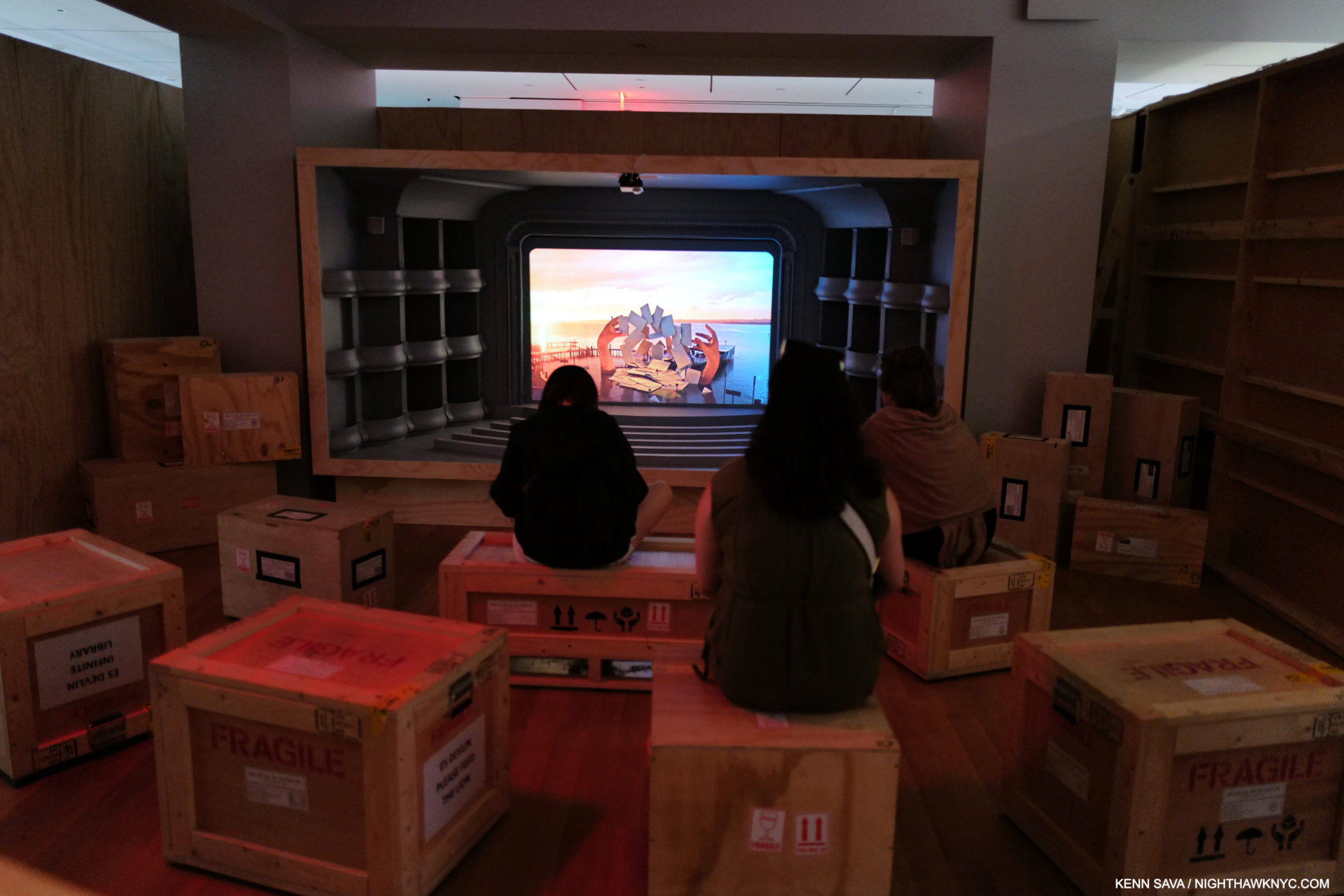
The shipping crates for the Art, teased earlier, filled a gallery where a video screen was mounted in a stage set, providing seats for the visitors, with more all around me as I took this, and, cutting down on the need for space to store them! Something I’ve never seen before, it’s a  touch that shows the depth of the imagination and attention to detail that went into An Atlas at the Cooper Hewitt.
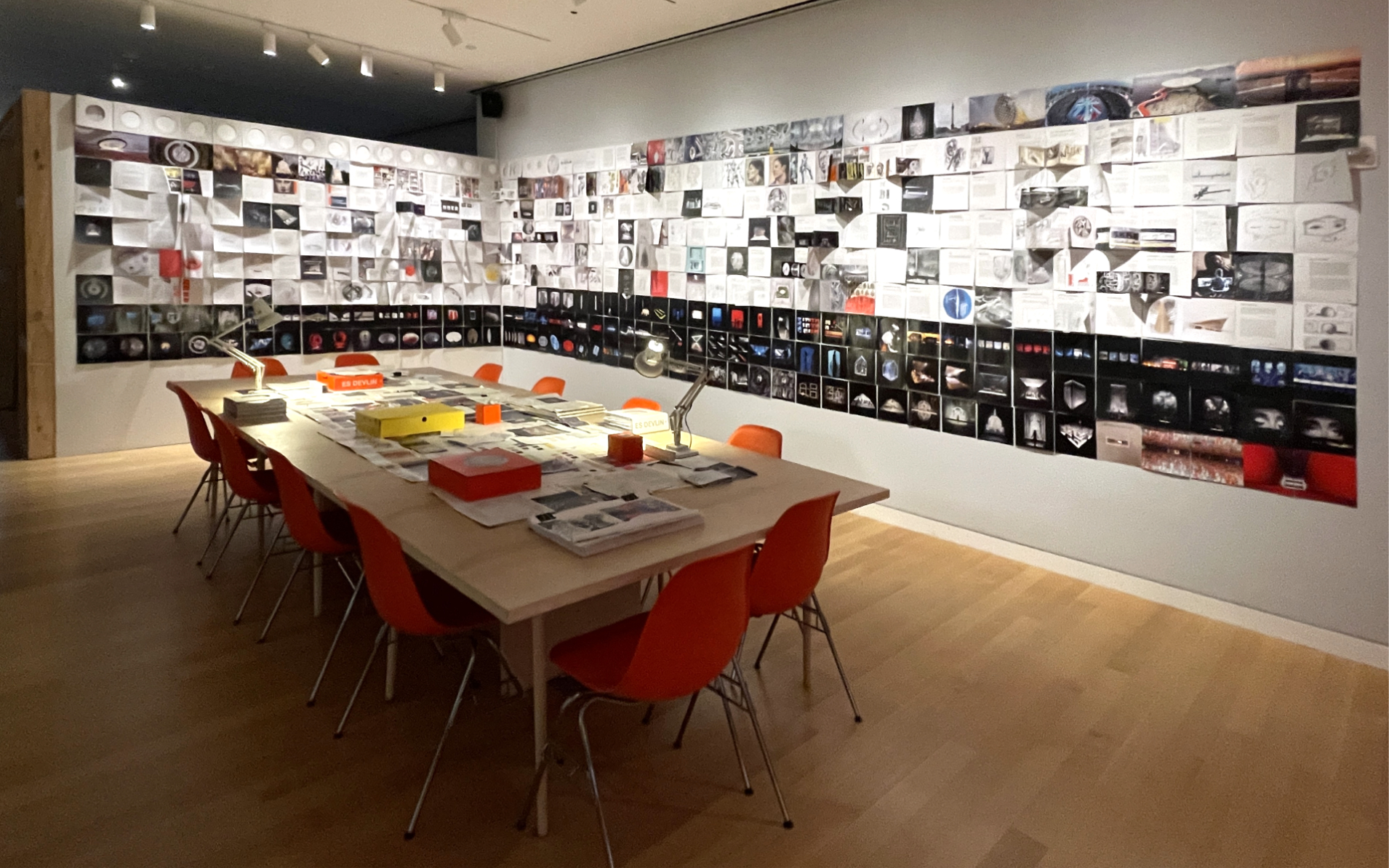
As if all the thought, planning and work that went into mounting An Atlas wasn’t enough, there is the incredibly innovative 900-page(!) book that accompanies it! So far, it’s the only Art book I’ve named a NoteWorthy Art Book for 2024, and that was before I saw the show. Here, in the show’s final gallery, another recreation of her studio, visitors get a look at the making of it, including the original book dummy (off-camera, in a vitrine to my left). This time, visitors were free to handle the items on the table, which were reproductions of the original work materials…right?

An Atlas, the show, reveals, that as her fame and notoriety grows,  so too are the opportunities for the Artist to step out and present her own work, without an overriding “boss,” as she has in major works like Come Home Again, and Your Voices, both 2022, and, of course, in An Atlas of Es Devlin, the book & show. Her own work shows the Artist bringing “big questions” to the forefront- including species near extinction (in Come Home Again, and in her piece Nevada Ark for U2’s The Sphere shows in 2023),

That Es Devlin’s work, and practice, is deeply rooted in traditional Art-making techniques, like Drawing and Sculpture, is a continual touchstone in both the show and the book. She uses them to produce work that lives on, and continually pushes, the cutting-edge of Stage Design and Production. I find this both fascinating and inspiring. On one hand, her example shows what is still possible by just putting pen or pencil to paper; that a master’s or doctorate degree are not prerequisites for achieving a very successful career, or greatness, in one’s chosen field in the Arts. On the other, it also reaffirms over and over again the power of one person’s creative vision. In her chosen field, her work strikes me as being downright unprecedented. In the larger world of Art, Es Devlin’s vision is at once as personal and as expansive as almost anyone else’s working today.

*- Soundtrack for this piece is “Who’s Gonna Ride Your Wild Horses,” by U2 from Achtung Baby, 1991.

My look at the 900-page An Atlas of Es Devlin, the NighthawkNYC.com NoteWorthy Art Book of 2024, published to accompany the show, is here

NighthawkNYC.com has been entirely self-funded & ad-free for 9 years, during which 330 full-length pieces have been published! If you’ve found it worthwhile, PLEASE donate by PayPal below to allow me to continue. Thank you, Kenn.

You can also support it by buying Art, Art & Photography books, and Music from my collection! Art & Books may be found here. Music here and here.

Written & photographed by Kenn Sava for nighthawknyc.com unless otherwise credited. To send comments, thoughts, feedback or propositions click here. Click the white box on the upper right for the archives or to search them. Subscribe to be notified of new Posts below. Your information will be used for no other purpose.

For “short takes,” my ongoing “Visual Diary” series, and outtakes from my pieces, be sure to follow @nighthawk_nyc on Instagram!

Thank you, SV.

  1. Their site describes the school as “a co-educational grammar school in the heart of the glorious Wealden countryside.”
Stepping Into “Edward Hopper’s Nighthawks”

This site is Free & Ad-Free! If you find this piece worthwhile, please donate via PayPal to support it & independent Art writing. You can also support it by buying Art & books! Details at the end. Thank you.
Written & Photographed by Kenn Sava.

The numeric convergence begins. August 28, 2013, eleven years ago next month- – The last time I stood in front of the real thing- Edward Hopper, Nighthawks, 1942, at Hopper Drawings at the old Whitney Museum. A moment later, a friend snapped a picture of me standing next to it. Would I ever get closer to it? Pictures in this piece are thumbnails. Click any for full size.

The Edward Hopper/NighthawkNYC Convergence, 1-

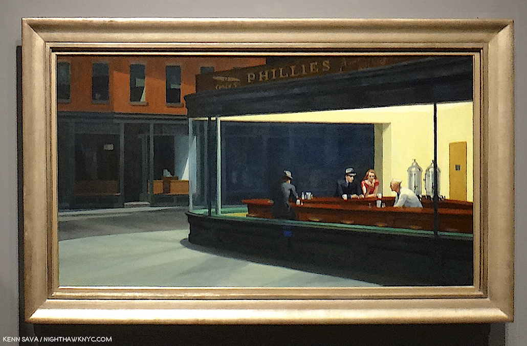
July 15, 2015, nine years ago this month, in my very first piece, “Welcome to the Night,” I mentioned I’ve always related to that figure sitting by himself with his back to the viewer in Edward Hopper’s Nighthawks, 1942. The one that no one ever talks about. Why is he even in the Painting?  Well, he’s really only half in it; his left side completely blends into the black background. So, what’s his deal? Did his date go bad? Is he worried about the recent outbreak of World War II? Is he waiting for the lady in red to lose her guy? (The couple are likely Edward & Jo Hopper stand-ins.1).  Well, he’s there and I’m glad he is. He’s also a witness to everything going on inside, close enough to the other subjects to hear their conversations. In Nighthawks, he has THE ideal seat to see and hear everything that’s really going on, that the rest of us can only imagine.

I’ve been that guy too many times to count, out on my own late at night in Hopper’s Greenwich Village neighborhood. I relate to that “witness” aspect of him, too. After all, isn’t that what I’m doing here; being a witness to the Art, Photography, Music  books I’ve experienced?. So, I named this site NighthawkNYC after him. Hopper’s Painting is titled “Nighthawks.”

But, what would it be like to be him?

Triple self-portrait, August 28, 2013. “That shape is my shade, there where I used to stand,” as I quoted Steely Dan’s “Deacon Blues” in my very first piece, “Welcome to the Night,” on July 15, 2015.

Convergence 2-

On July 29, 2019, five years ago this week, I published “My Search For Edward Hopper’s Nighthawks Diner,” chronicling my decades-long quest to find the iconic eatery/drinkery. It’s turned out to be my most popular piece thus far.

This past Sunday, July 21st, I finally found it!

It happened to be on a triangular corner- Check.
It happened to be in the West Village, not all that far from 3 Washington Square, where Edward & Jo Hopper lived for half a century- both key criteria the real deal has to fit- Check.
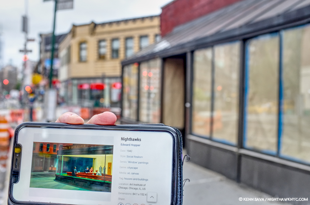
But, it was not where I’d looked for it as I wrote in the piece. It was out in the open! Without a roof!?

I let that slide. After all, in the Painting we really can’t see the ceiling, just the light coming down, and it’s a one-story building shown at night. Maybe there was no roof? Imagine that. “Maybe. Maybe not,” I hear you saying.

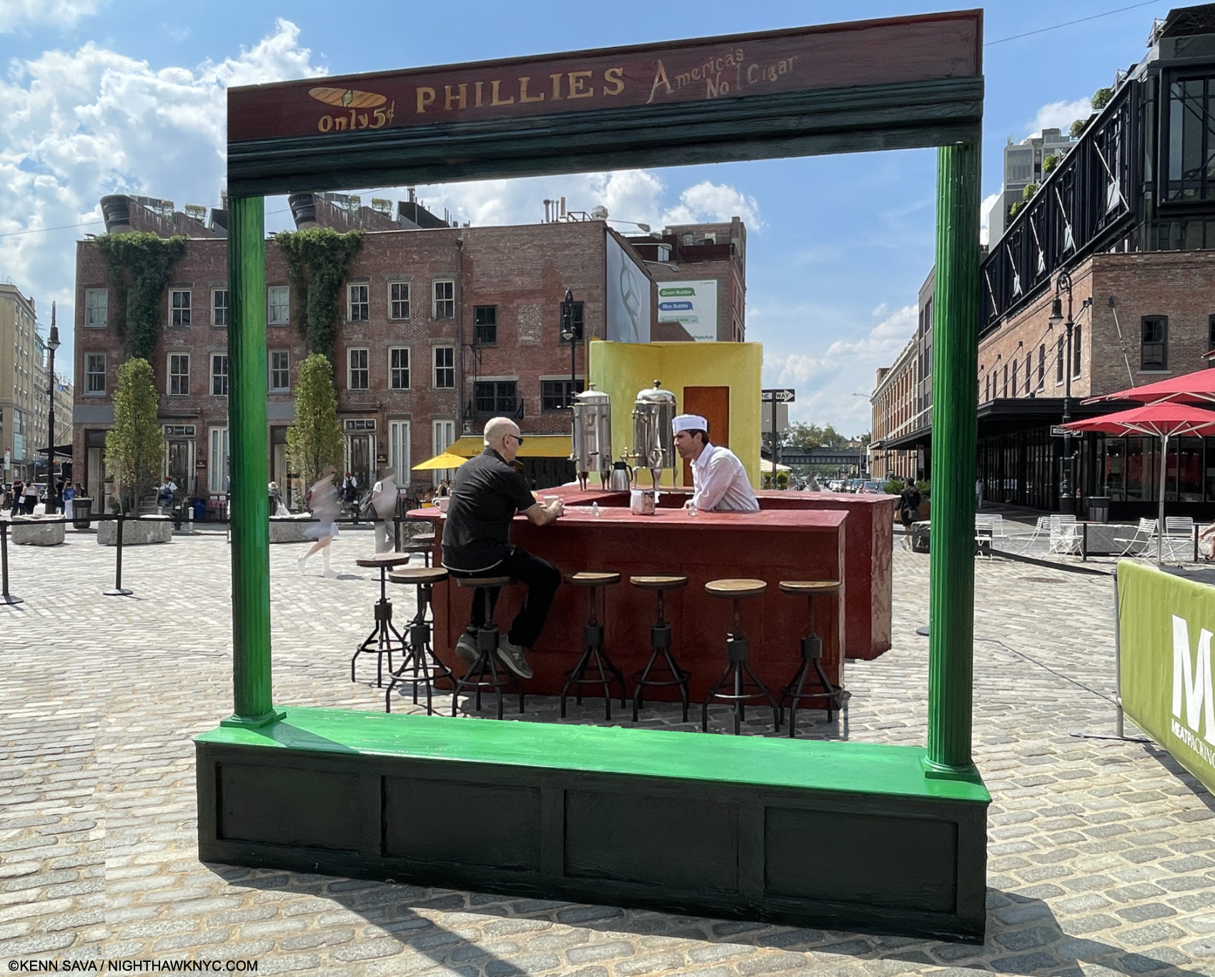
The famous “Only 5c Phillies America’s No. 1 Cigar” sign was up top- Check.
The outside was painted in that familiar green- Check.

Everything looked like it was supposed to. Am I dreaming? Then, a nice gent named Nilo beckoned me inside!

As I approached the counter, about to take “my”place- the only seat I was interested in taking,  all the details long engrained in my memory were right in front of me.

It was empty. Wow. Perfect! I could look around and drink it all in without feeling self-conscious. Wait!…AM I conscious? A coffee will wake me up. I’m in the right place.

Living a dream…Kenn Sava, left, Lucas, right. July 21, 2024, Meatpacking District, NYC. Photo by Nilo for NighthawkNYC.com.

I could take the seat of my alter ego in peace, without that pesky couple, she in the flame-red dress, with her male companion, who for the past 82 years have gotten all the attention, in the room. I was free to finally chat with the counterman. His name was Lucas and I told him how long I’ve been looking for the place- and even wrote about just that, the nice weather, what else was going on this weekend. You know, small talk; the kind of stuff strangers talk about when they’re suddenly thrust together. But, we weren’t total strangers in the classic sense. We both knew why we were here. As he went back and forth to his duties, I just kept looking around, drinking it all in. Wow. I’m sitting inside of Nighthawks!

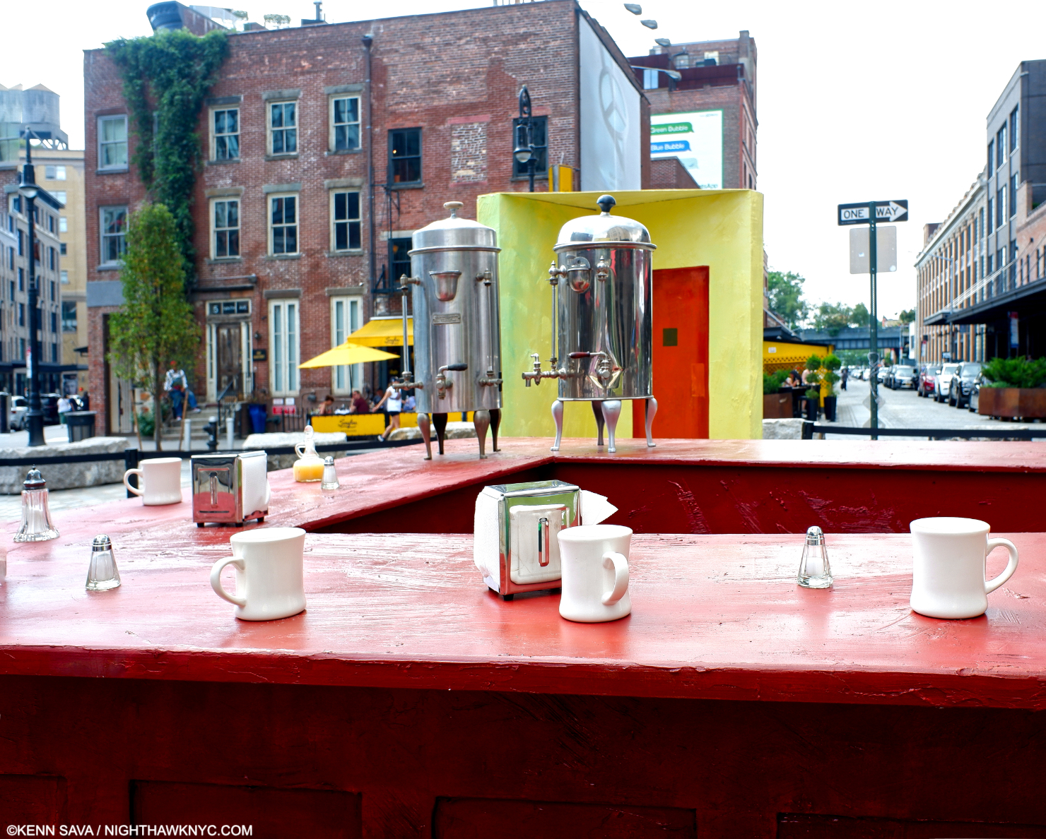
There’s the famous two large coffee urns.
There’s the yellow wall with that mysterious door.
The bar was the familiar brown.
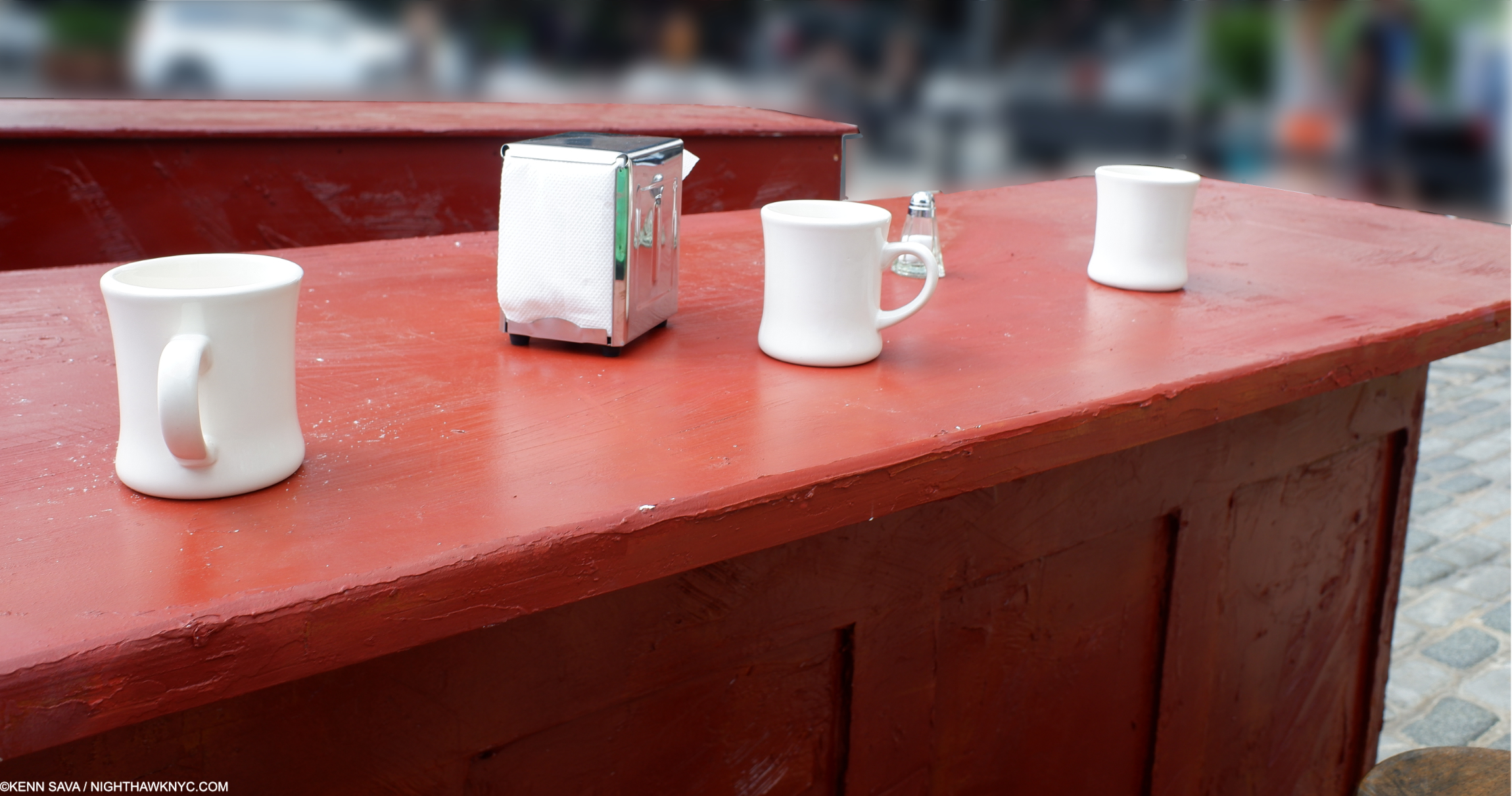
The classic white ceramic coffee cups, glass salt & peppers, and napkin dispensers were all around giving me a feeling of familiarity and “home.” I guess that’s what happens when you’ve been looking at them for so long in Painted form.

So real, you could reach out and touch them. Of course, I did…

And, I got to experience it from THE seat, to see what “he” saw and ponder him anew. Maybe “he” was me in a prior life. If so, how many people have gotten to relive a moment from a prior life?

This MUST be the place! FINALLY! I can’t wait to rush home and tell readers I found it! What a scoop!

A close call with a bike running a Walk sign on the walk home snapped me out of it and back to reality. As I reviewed my pictures to make sure my phone was OK, it turns out I had come upon something called “Step Into Hopper. 

Convergence 3-

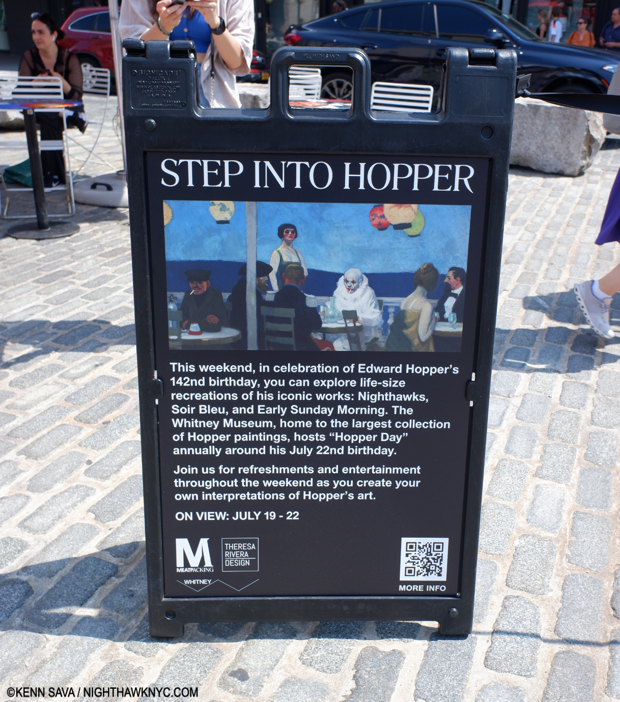
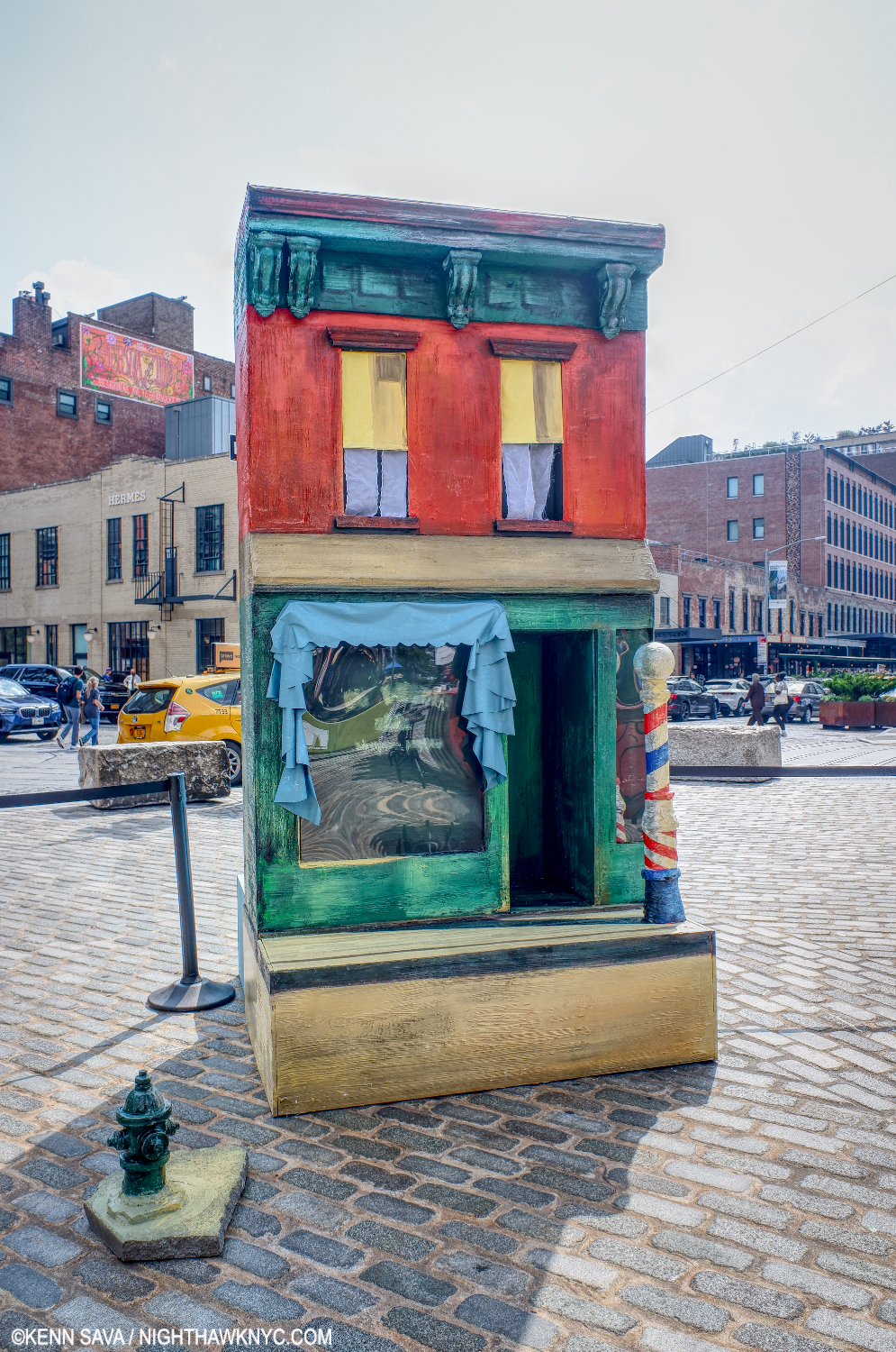
After nine years of “riffing” on Nighthawks in my Banner, it finally came to life! The Whitney Museum & the Meatpacking District got together to mount “Step Into Hopper,” along with fabrication by Theresa Rivera Design and an exceptional, welcoming, staff, to “recreate” Nighthawks, 1942, Early Sunday Morning, 1930, and his eternally mysterious Soir Bleu, 1914within one mile or so of the original sites of two of them2.

“Early Sunday Morning,” a take-off on Hopper’s 1930 timeless masterpiece of a street in my neighborhood, a few blocks away, on Seventh Avenue between West 15th & 16th Streets. Notice the shadow from the barber pole goes the “wrong way,” as it does in the Painting. People who live there know the sun never shines in that direction on 7th & 15/16th!

Convergence 4-

It truly was a moment frozen in time. Something out of a dream… I ended “My Search For Edward Hopper’s Nighthawks Diner”  with a quote from the song I chose as the Soundtrack for the piece, “I Saw You In A Dream” by Japanese House….

“I saw you in a dream
You had stayed the same
You were beckoning me
Said that I had changed”

How prescient.

Before I “changed.” Take away the side addition, and the former Rivera Cafe on 7th Avenue was my “Oh my gosh!” moment, as I wrote in “My Search…” Seen on July 23, 2018- convegently, six years ago this week.

In reading the mail that continues to come in on the piece, it seems that many people share my dream of unexpectedly coming across the Nighthawks Diner and having an “Oh my gosh!” moment of discovery.

Kenn Sava “inside” “Soir Bleu” (the Painting seen on the sandwich sign above) with the wonderful Tillie the Clown proving every bit as mysterious and stunning as the figure in the 1914 Painting done in Paris. Photo by Gregory for NighthawkNYC.com

A lot of folks seem to want to step inside, sit down at the counter for a bit, and just live in the Painting; experience it from the inside  even for a few moments. As if that might help solve its mystery…On Sunday, I came as close as I’m likely going to to having my “Nighthawks” moment.

A few moments after the Photo of me and Lucas inside “Nighthawks” was taken, I looked around for him and couldn’t find him. Lucas disappeared.

Of course he did.

Convergence 142-

Today, as I write this on July 22nd is Edward Hopper’s 142nd Birthday. Happy Birthday, big guy (Hopper was 6’5″). Thanks for saving me a seat in Art heaven. A short visit is probably the best I can hope for.

*- As it was for “Welcome to the Night” 9 years ago, the Soundtrack for this piece is  “Deacon Blues,” by Steely Dan (my “Forgotten Songs I Will Love Forever #2″, which remains the Anthem of NighthawkNYC.com, from their immortal album Aja, 1977. (I have no idea why the guy who made tihis video shows their album Gaucho. Ignore that- it’s Track 3 on Aja.)

“Sharing the things we know and love
With those of my kind
Libations, sensations
That stagger the mind.”

If the Nighthawks Diner had a jukebox, I like to think “Deacon Blues” would be on it.

Undying thanks to Kevin Callahan for the tip, the iconic Lucas for the coffee & the convo, Tillie the Clown for the Tillie Experience, Milo, Wendy, Alisa and Gregory for the Photos, their consideration and kindness in creating an experience I’ll never forget. A tip of the Fedora to the Meatpacking District, the Whitney Museum & Theresa Rivera Design for mounting Step Into Hopper. Push by Lana Hattan (9 years of NighthawkNYC.com– it’s ALL her fault!)

Be sure to see my 3-part series on the 2022-23 blockbuster Edward Hopper’s New York which begins here.

NighthawkNYC.com has been entirely self-funded & ad-free for 9 years, during which 330 full-length pieces have been published! If you’ve found it worthwhile, PLEASE donate by PayPal below to allow me to continue. Thank you, Kenn.

You can also support it by buying Art, Art & Photography books, and Music from my collection! Art & Books may be found here. Music here and here.

Written & photographed by Kenn Sava for nighthawknyc.com unless otherwise credited. To send comments, thoughts, feedback or propositions click here. Click the white box on the upper right for the archives or to search them. Subscribe to be notified of new Posts below. Your information will be used for no other purpose.

For “short takes,” my ongoing “Visual Diary” series, and outtakes from my pieces, be sure to follow @nighthawk_nyc on Instagram!

  1. Cone to think of it, why are both guys wearing their Fedoras inside? Preparing for quick exits?
  2. The original site of Nighthawks remains up for discussion, as I wrote about, but most likely was inspired by locations in the nearby West Village.

Ed Ruscha & The Two-Sided Coin of Influence

This site is Free & Ad-Free! If you find this piece worthwhile, please donate via PayPal to support it & independent Art writing. You can also support it by buying Art & books! Details at the end. Thank you.

Written & Photographed by Kenn Sava (*- Unless otherwise credited.).

This is the third and final part of my look at Ed Ruscha/Now Then. Part 1  is here. Part 2 is here.

1- Heads

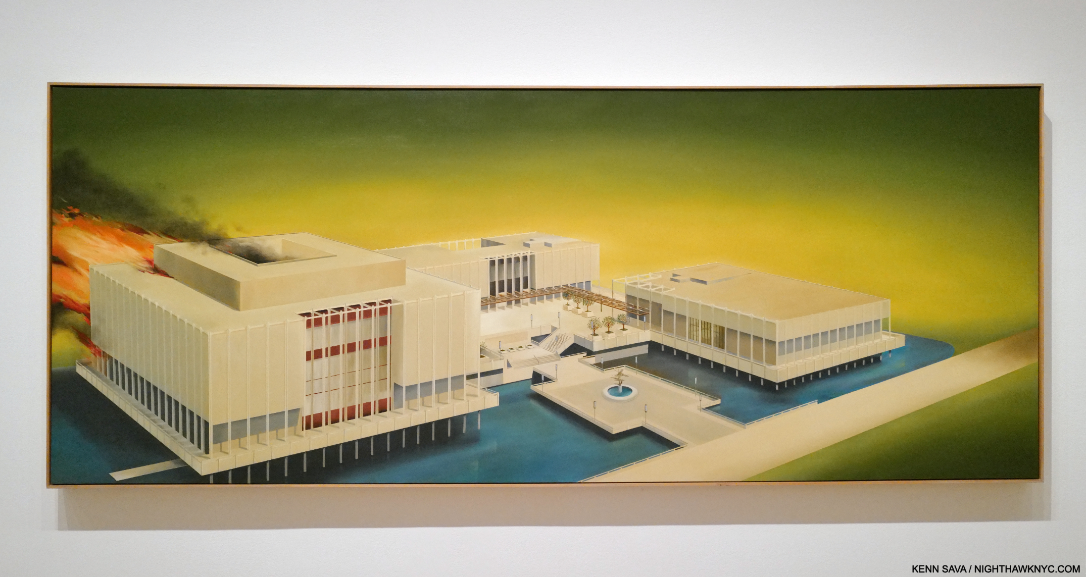
One door closed, another opened. Los Angeles County Museum on Fire, 1965-8, Oil on canvas, seen at MoMA. Ed Ruscha/Now Then is now open there. Pictures in this piece are thumbnails. Click any for full size.

Ed Ruscha/Now Then is a memory for those of us who saw it at MoMA from September 10, 2023 to January 15th of this year. It’s a memory in the making for those who are seeing it now at LACMA, seen above in Ed Ruscha’s 1965-8 nebulous “portrait” of it (which I discussed in Part 1), or will be seeing it until it closes there on October 6th. They’ll be pleased to know it’s a show with staying power, a show I continue to relive and think about on a daily basis, six months after it closed here. After following the trail of his devlopment in Part 1, “Ed Ruscha’s Head Scratchers,” seeing some echoes of the work of Artists past, I began to wonder… Every Artist I’ve come across has had influences. Who influenced Ed Ruscha? As the show was up, and now after it ended here, that question lingered.

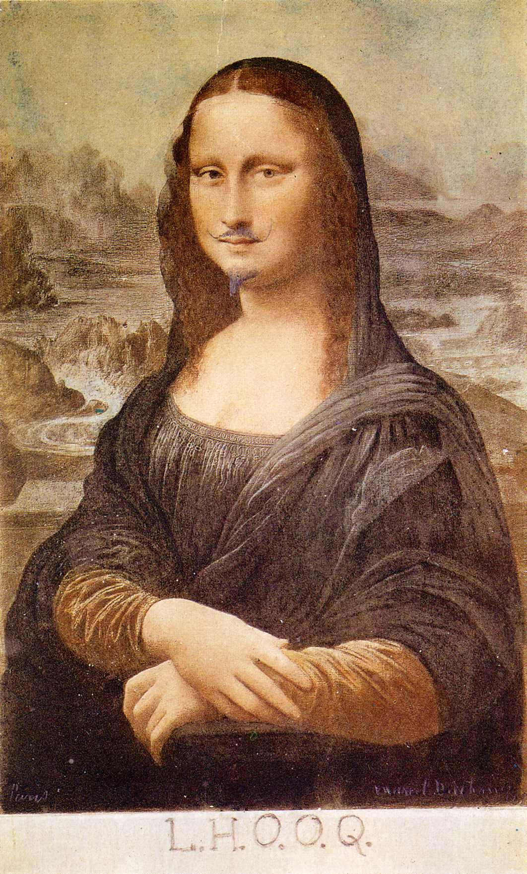
Marcel Duchamp, L.H.O.O.Q., 1919, or later. One Artist Ed Ruscha has repeatedly expressed his admiration for is Duchamp, who he met in the early 1960s. There are numerous version of L.H.O.O.Q. since the 1919 original. I chose this one because t contains all the elements of the original, which I cannot find (if you have  let me know)- the mustache, the goatee, and the famous letters all of which Duchamp added to a Mona Lisa postcard. Duchamp once said that L.H.O.O.Q. means “there is fire down below,” though I’ve seen other definitions.  *- Photographer unknown.

“Duchamp had quite a sizable influence on me from a pictorial standpoint and from an emotional standpoint,” Ed Ruscha (Ed Ruscha, Leave Any Information After the Signal, P.324).

Ed Ruscha has not written an autobiography, so his book, Leave Any Information After the Signal, a collection of “Writings, Interviews, Bits, Pages” from 1960 to 2000 is the closest thing we have to a primary written source. In addition to just looking, I turned to it, along with the numerous other interviews he’s given over his six-decade plus career, for insights.

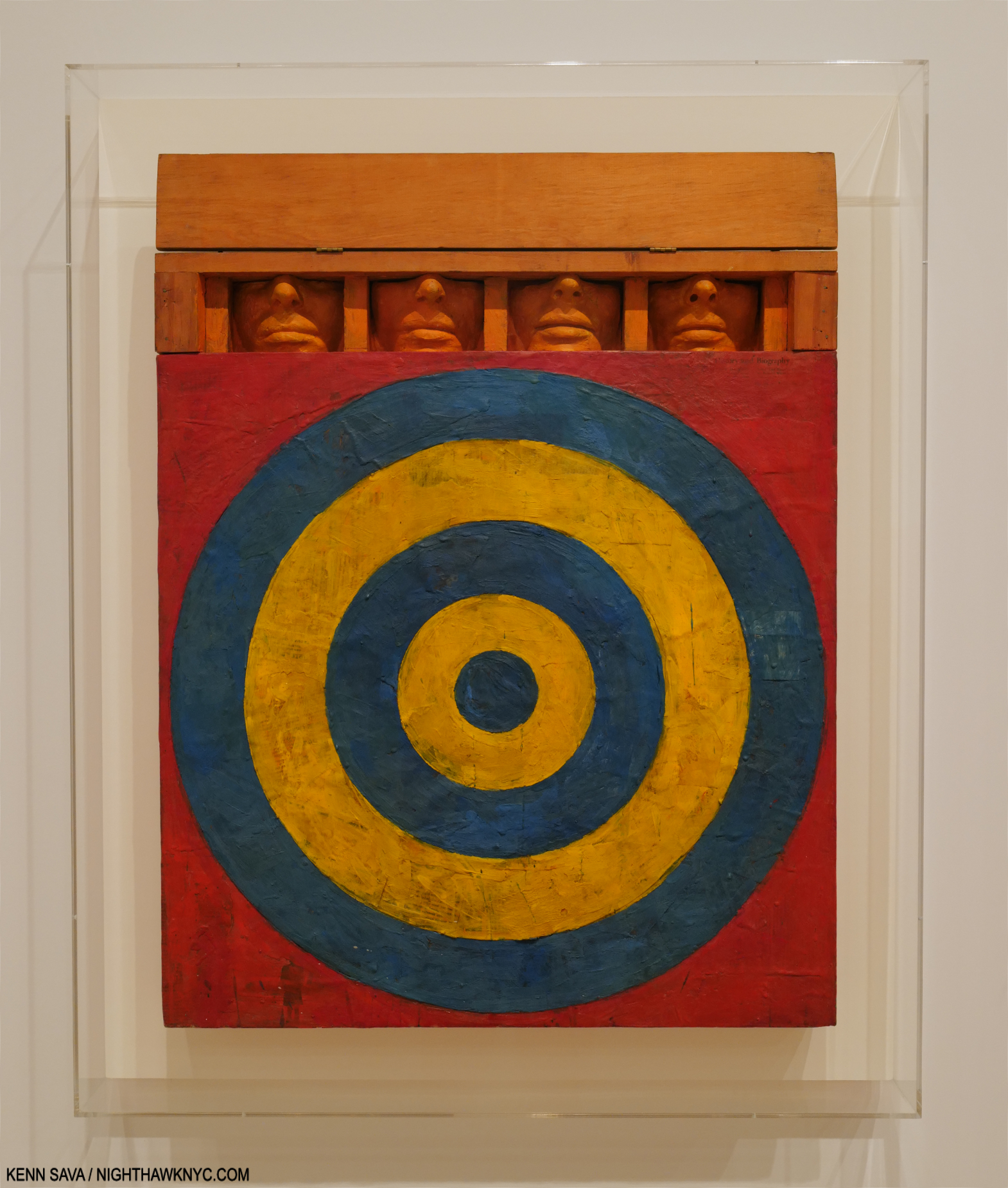
As seen in Part 1– Encountering Johns’s  Target with Four Faces in a black & white reproduction in a 1957 magazine was, he said, an ‘atomic bomb’ in his training, ‘a stranger fruit’ that he ‘saw as something that didn’t seem to follow the history of art. My teachers said it was not art. ‘I didn’t need to see the colors or the size…’ ‘I was especially taken with the fact that it was symmetrical, which was just absolutely taboo in art school- you didn’t make anything symmetrical…Art school was modernism, it was asymmetry, it was giant brush strokes…it was all these other things that were gestural rather than cerebral. So I began moving to things that had more of a premeditation1.’” Jasper Johns, Target with Four Faces, 1955, Encaustic on newspaper and cloth over canvas surrounded by four tinted-plaster faces in wood box with hinged front. Seen in Jasper Johns: Mind/Mirror at the Whitney in 2021.

Besides naming Duchamp, Jasper Johns and his counterpart Robert Rauschenberg, Ed Ruscha hasn’t addressed the subject of influences all that often.

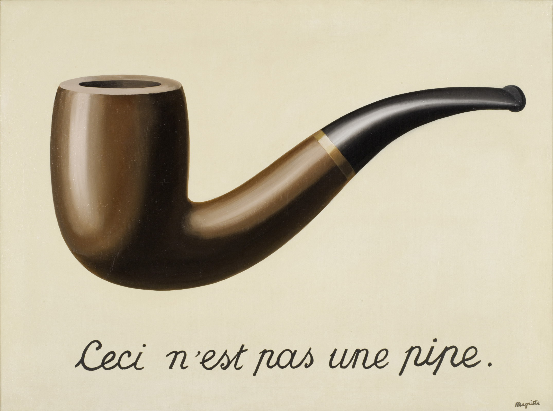
René Magritte, The Treachery of Images (This is Not a Pipe), 1929, Oil on canvas. (Not in the show.) *-LACMA Photo

Pondering the visual evidence, the first name that came to mind was Rene Magritte, 1898-1967, a well-known Belgian Artist who also had a long career and touched on a number of subjects Ed Ruscha has, while sharing his fondness for taking the familiar out of context (which Mr. Ruscha does with words, objects and places). He also incorporated words. Though often labelled a “Surrealist,” his work touches on any number of other realms and styles of Painting, which made him ahead of his time. As a result, his influence is extraordinary and ongoing. Time and again, I’d look at an Ed Ruscha, or a section of one, and think “Magritte,” beginning with Actual Size, 1962, which I showed in Part 1, which echoes Magritte’s The Treachery of Images, 1929 better known by the famous words it includes, “This is Not a Pipe2.” The Magritte seems to echo his contemporary, Duchamp’s L.H.O.O.Q., from 1919.

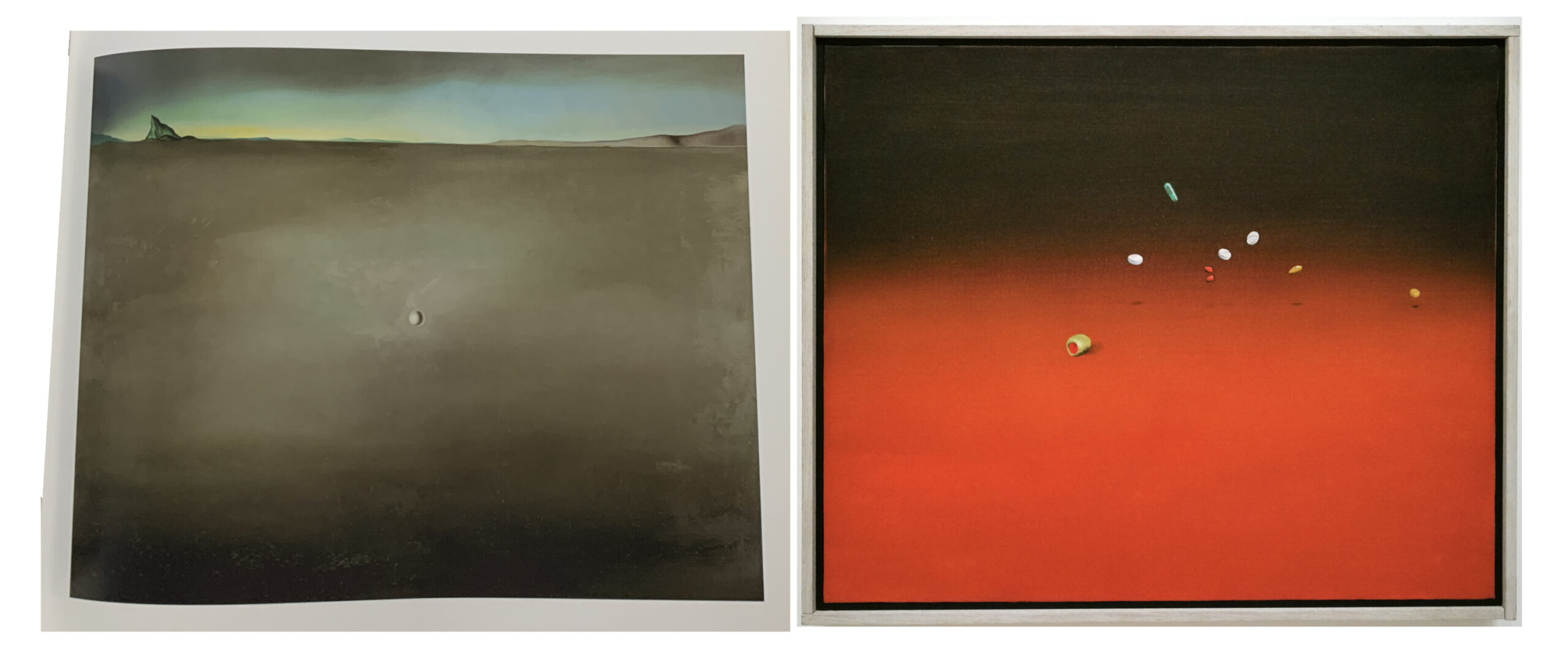
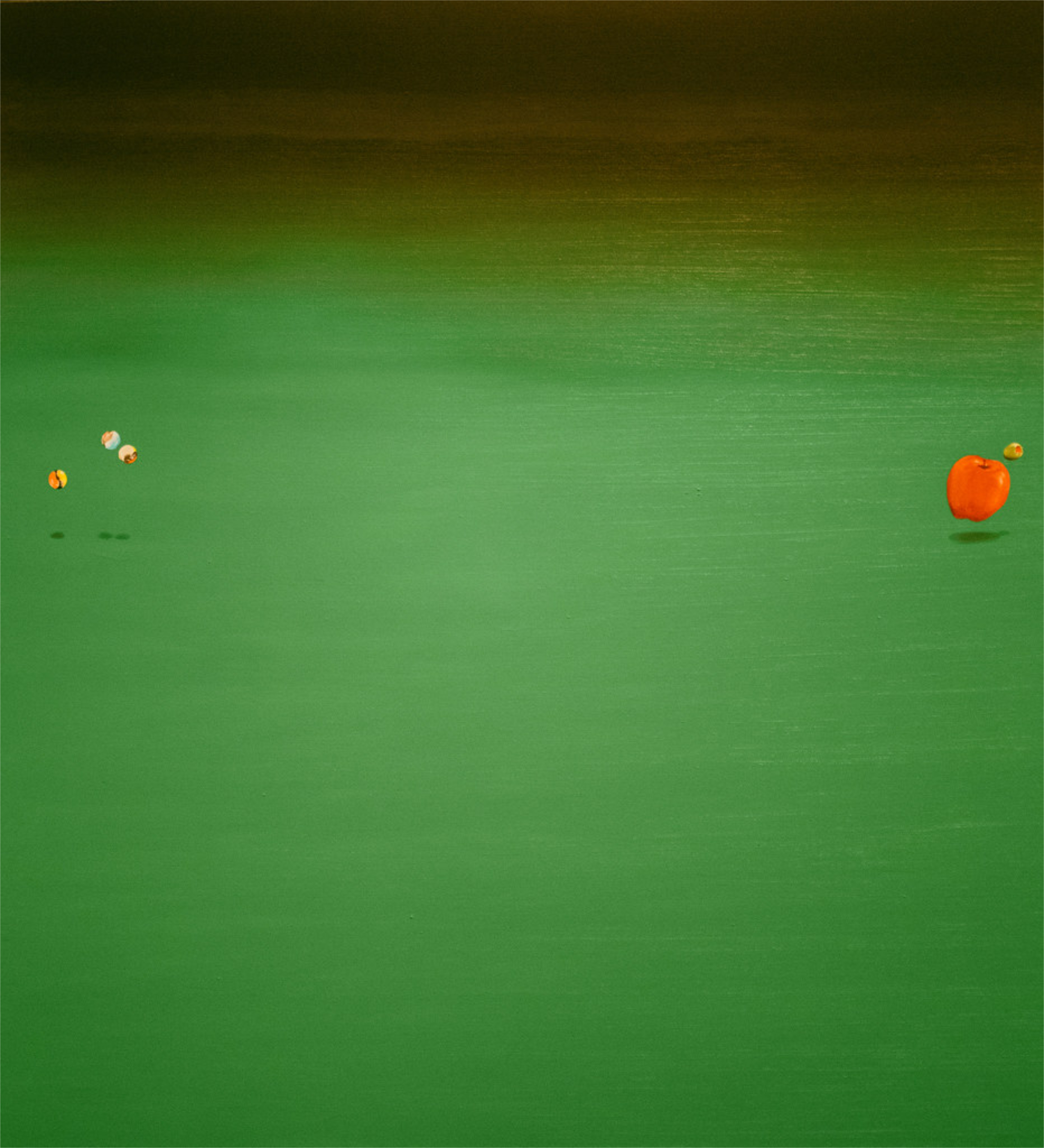
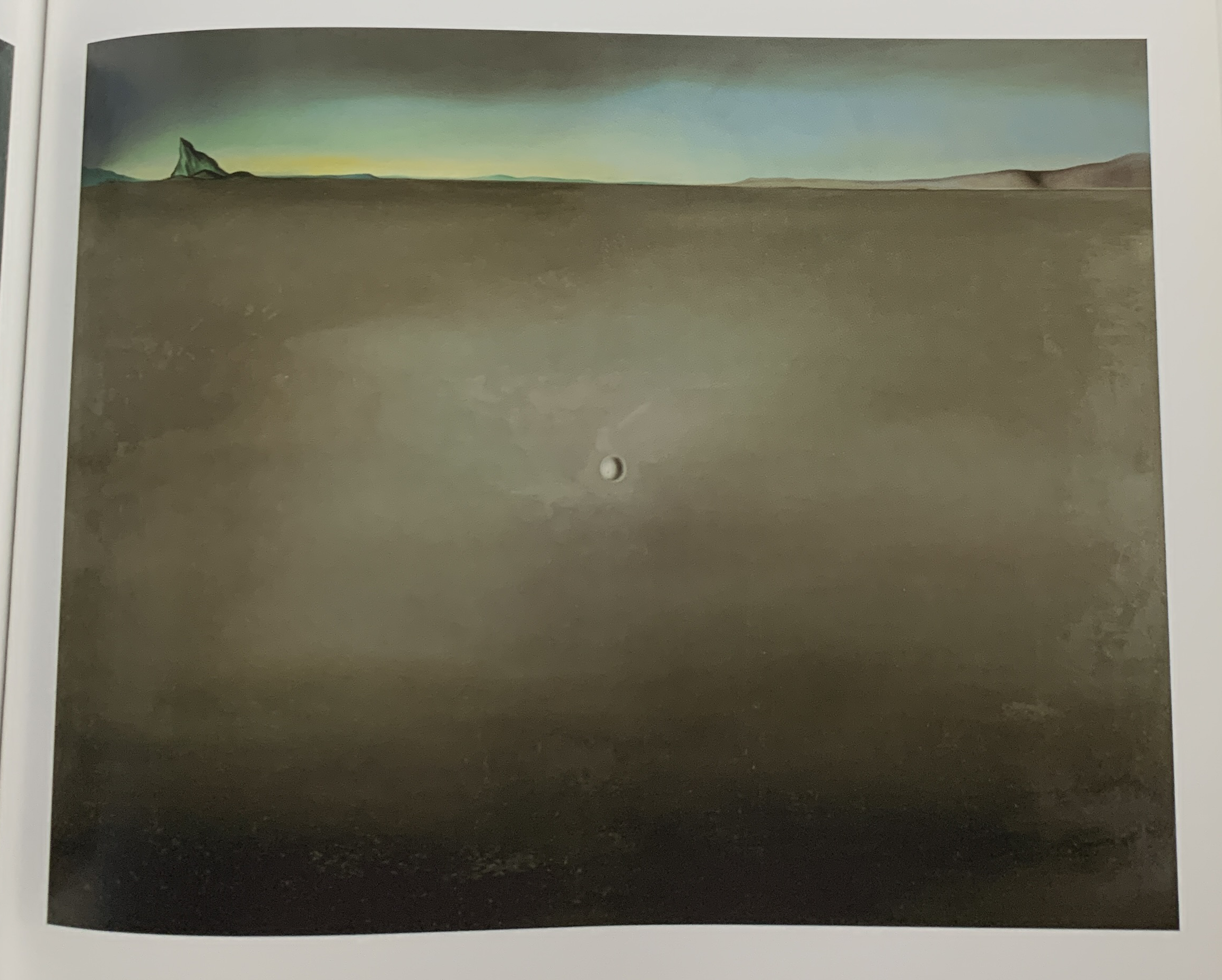
Salvador Dalí, Open Field with Ball in Centre and Mountains in  Rear, Study for the Walt Disney film Destino, 1948, Oil on masonite, left. Ed Ruscha, Painkillers, Tranquilizers, Olive, 1969, right. (*- Dali from the Dalí & Film MoMA catalog. Ed Ruscha as I saw it in the show.)3.

Of him, Mr. Ruscha said, “Yes, Magritte did influence me, but it came the other way around—what I call 360-degree influence. That’s influence from a person’s thoughts and force and not from his pictures, which the person being influenced has not seen, until later on. The same with Dalí. I’ve been influenced by Dalí, but it’s been through other sources. Because I’ll go back, and I’ll be working on something and I’ll see a picture of Dalí’s I’ve never seen before, and there is my work. (P.56).” I wrote about seeing Dalí in Rauscha in Part 1– before I found that quote.

Surrealism Soaped and Scrubbed, Ed Ruscha’s cover design for Artforum 5, No. 1, Special Issue: Surrealism, September, 1966. 

What about “Surrealism’s” influence, that of the group of European Artists so labelled?

Ed Ruscha was Art Director for Artforum Magazine from 1966-19724. His cover for the September, 1966 “Surrealism” Special Edition I find fascinating, particularly in regards to Ed Ruscha’s Art, overall. While this image has almost nothing to do with “historical Surrealism,” I find it ripe with the “kind” of surrealism (small “s,” which he also uses here) I see in Ed Ruscha’s work, while also being another of his trademarked play on words. There is nothing in “historical Surrealism” that influenced this (as far as I know), and so it’s another work that makes me wonder what, if anything, inspired it. On page 349 of Leave Any Information After the Signal, Mr. Ruscha denies the influence of the Surrealists handling of light on his work. That’s all he has to say about it.

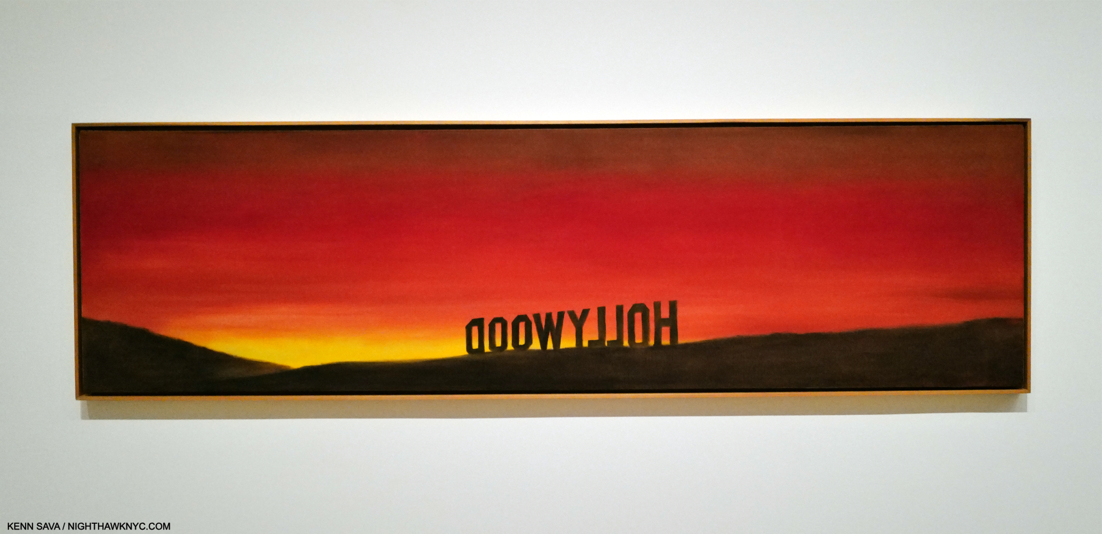
The Back of Hollywood, 1977, Oil on canvas. Was Ed Ruscha the first to Paint words backwards? Probably not.

What about influences on his Word Painting? In After the Signal, he said,  “Well, there’ve been so many artists who have used words throughout the centuries really, but the ones I enjoy are mostly from the twentieth century. Say, Kurt Schwitters. [. . .] 5” On page 115, Paul Karlstrom directly asks Mr. Ruscha,  “Who were your heroes then, your role models?” He replied, “Well, I guess de Kooning was, and Franz Kline. Franz Kline had a lot to say at that particular time, and so they were more or less the passwords. You just emulated them, almost automatically. Then if you couldn’t emulate them you weren’t really on the right track. I still think that. But the work of Johns and Rauschenberg marked a departure in the sense that their work was premeditated.” It sounds like he was referring to his early days as a student under the Abstract Expressionist influenced Chouinard faculty in the late 1950s, as once again, it’s hard for me to see the influence of de Kooning or Kline in Ed Ruscha’s work.

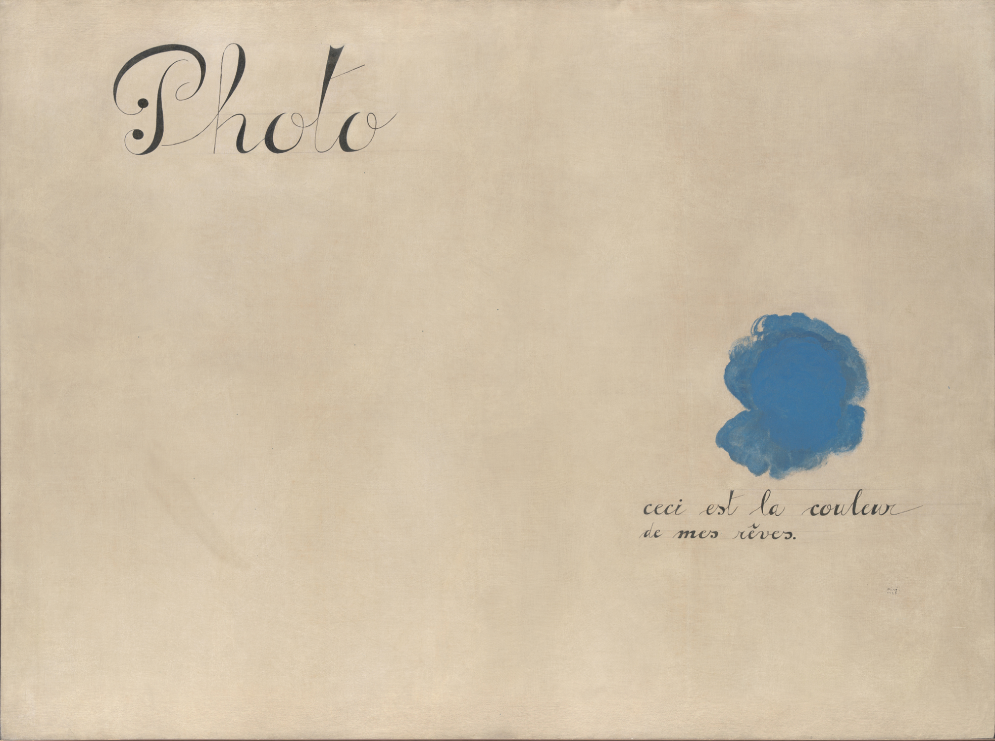
Joan Miró, Photo: This is the Color of My Dreams 1925, Oil on canvas. *- Met Museum Photo

The Surrealists began as a literary “movement,” that experimented with “automatic writing.” Later, their influence spread to Painting. In Miró’s Photo: This is the Color of My Dreams, it comes full circle. Part of the Artist’s “peinture-poésie” (painting-poetry) series, this strikes me as a forerunner or precursor to the Word Paintings of Ed Ruscha. Yet, I have no idea if he saw it, or other works in Mirós series,  or when.

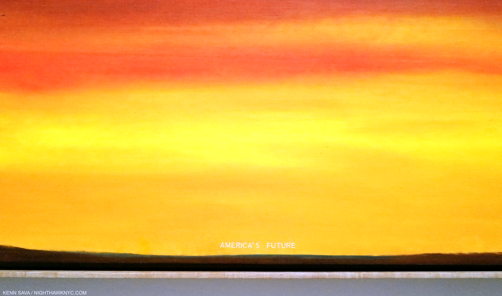
America’s Future, 1977, Oil on canvas. The title is shown in the next picture.

The feeling I’m left with is that these Artists “effected” him in ways outside of a direct visual influence. They are, what I call, “echoes.” What Ed Ruscha called “360 degree” influences. As for the stated influences, in Part 2, I mentioned that Thomas Cole was the influence on Mr. Ruscha’s Course of Empire series, from who he borrowed the name of the series. It seems to me the rest of his influences, if any, remain up for conjecture. Still, taking him at his work on possible influences would leave Ed Ruscha remarkably original.

Detail. Though Painted 18 years before he began his Course of Empire series I showed in Part 2, seeing this made me wonder if this work should be appended to the end of the series, i.e. the final outcome of it.

2- Tails

Turning the influence coin over, however, 67 years, and counting, into one of the most remarkable careers in American Art history, at this moment in time it’s hard to think of another Modern & Contemporary Artist, let alone an American Artist, who is more influential than Ed Ruscha is. In fact, it’s impossible for me to list here all the realms in which his influence can be seen. Those that come to mind the quickest include-

-His role in furthering the breaking of the strangle hold of Abstract Expressionism in Painting in the early 1960s.

-His unique way of incorporating words and typography into his Art.

-His Paintings of L.A. and the American West6.

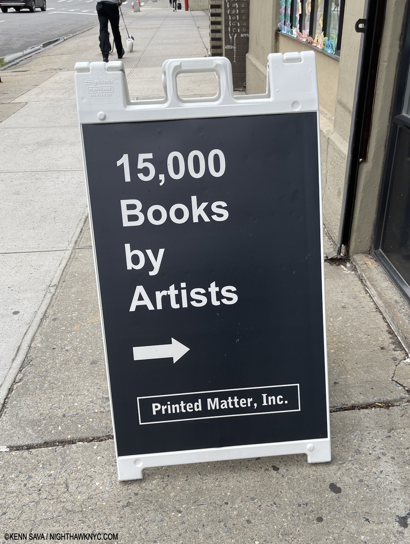
No place on the planet has more Artist’s books than NYC’s Printed Matter, home of 15 ,000 books they’ve created. How many are/were inspired in part or wholly by Ed Ruscha? I don’t know the total but I keep finding more every time I go in. May 6, 2024.

-His ground-breaking Artist’s books/PhotoBooks. (Is it a stretch to say he’s played a defining role in the Contemporary Artist’s Book & PhotoBook phenomenon? I don’t think so.)

-His style of nonjudgmental roadside and aerial Photography.

-Entire genres of Painting, Photography and books have sprung up around his work.

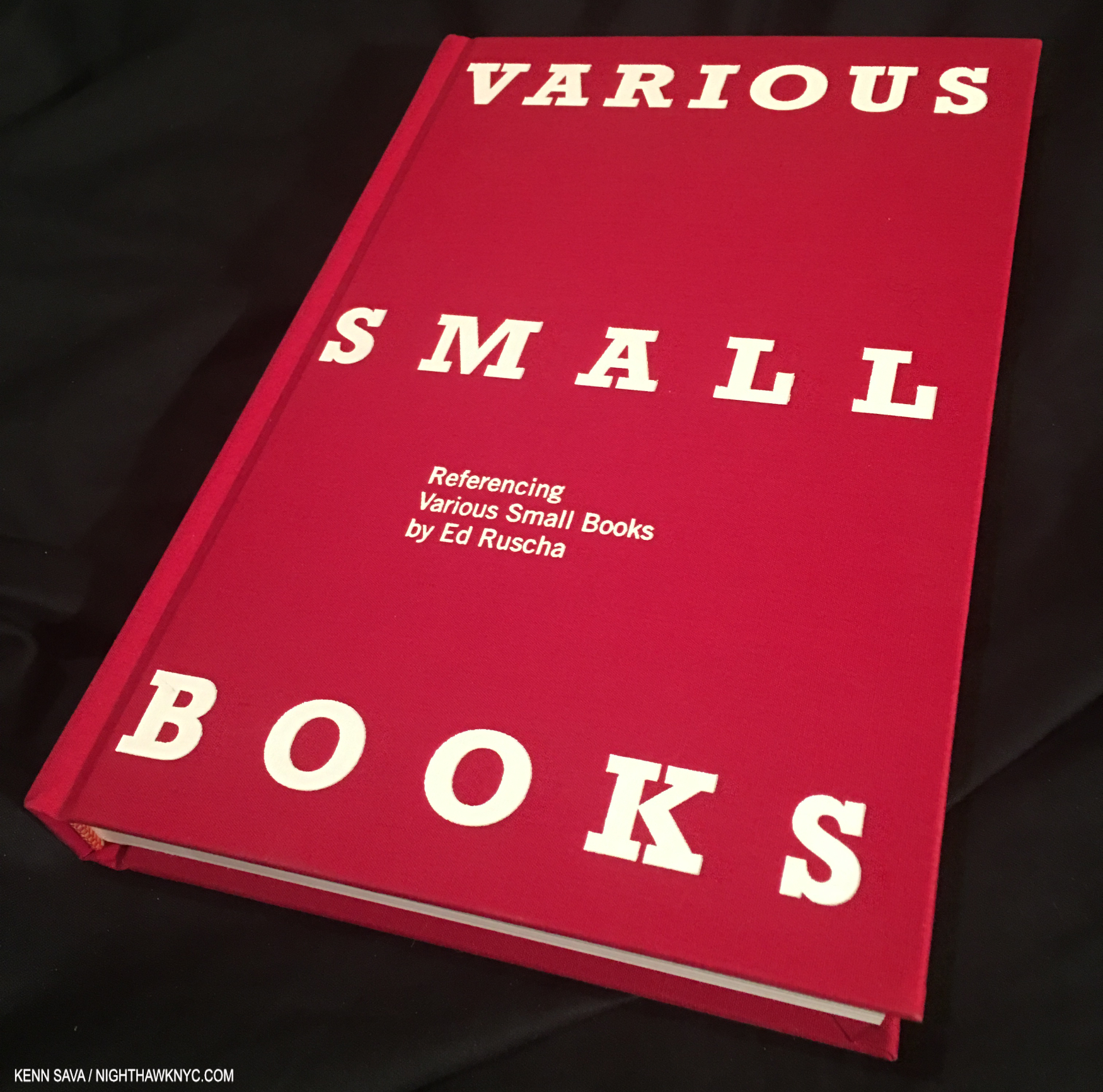
Jeff Brouws, Various Small Books Referencing Various Small Books by Ed Ruscha, 2013. 288 pages of books, and just books, by other Artists influenced by Ed Ruscha, and it’s now 11 years old!

To this point, at least two substantial books, including the book above, have been published focused solely on his influence! All of this is even more impressive (or mind-boggling) when you consider Ed Ruscha is still with us and going strong at 86. Usually, the influence of Artists is something referred to in the past tense.

-His unique way of incorporating words and typography into his Art.

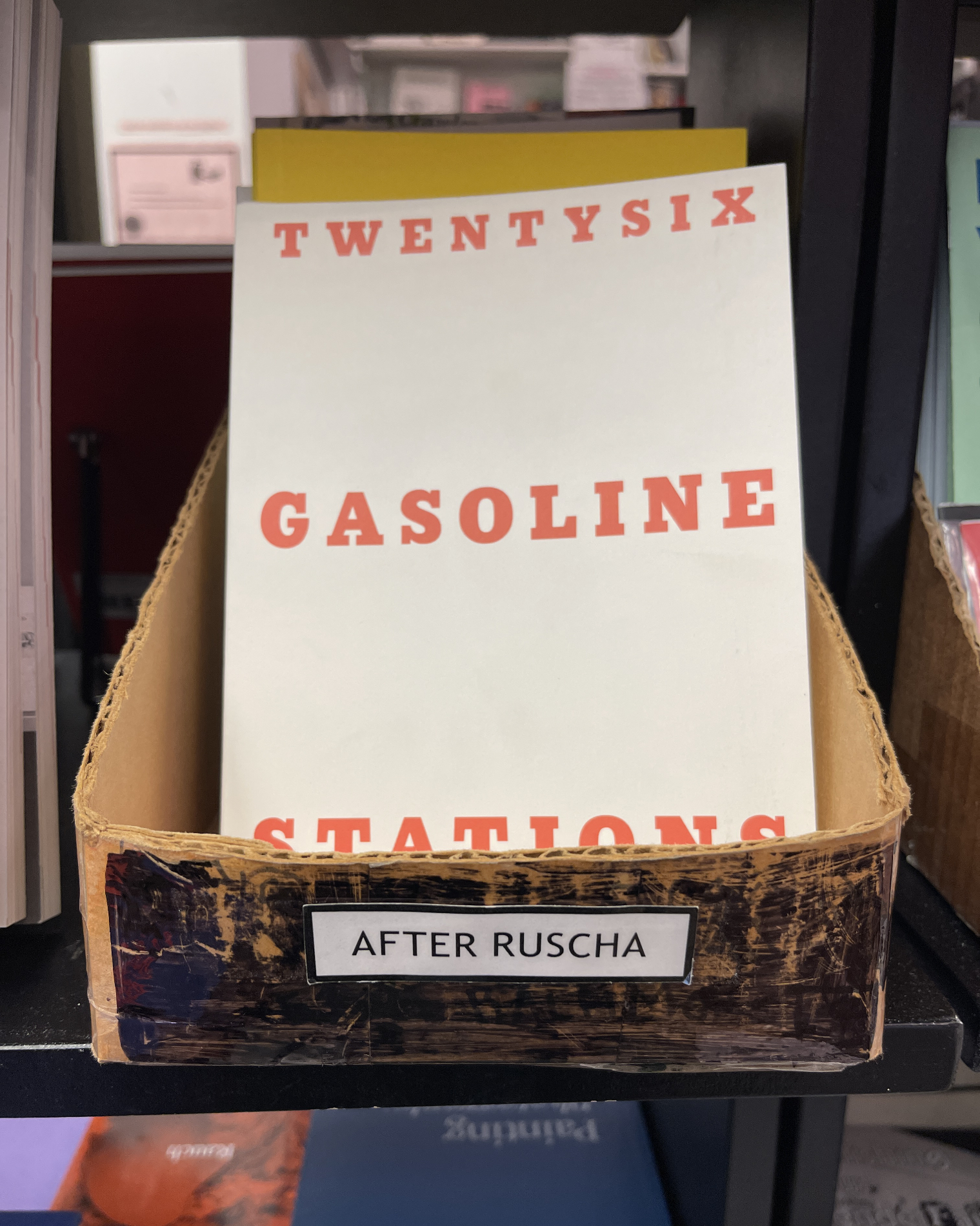
Ed Ruscha’s presence is so pronounced at Printed Matter, they even have a well-worn box just for books he’s influenced. ‘Nuff said. No, that’s not a copy of Mr. Ruscha’s very rare Twentysix Gasoline Stations. It’s Michalis Pincher’s 2009 homage to it, which “borrows” Ruscha’s cover verbatim.

All of this, also, makes it harder to fathom that Ed Ruscha/Now Then was the first large Ed Ruscha show here in 41 years7, and his first show at MoMA! That makes the extent of his influence that much more impressive. Suffice it to say it’s a lot easier to see Ed Ruscha’s influence than it might be to see the influence of others on his work.is so pronounced.

The saddest moment of the entire 4 month run of Ed Ruscha/ Now Then: the show’s entrance, moments after it closed for the last time on January 15, 2024. I saw it on its first preview day, and I was there when it closed for good. Shows are fugacious events. The ending of a great show is always sad; like saying “goodbye” to a friend. One you’ll never see again.

-Takeaways

In addition to providing an opportunity to ponder the scope of his influence, Now Then provides the chance to assess his achievement and his place among the important Artists of both the 20th and 21st centuries. Ed Ruscha strikes me as an Artist who is continually moving forward to the point that he is a seemingly endless innovator. Ed Ruscha/Now Then provided a rare chance to see the craft behind the mystery his work evokes; to watch the Artist move on an almost step-by-step basis from his beginnings though each of his phases, with a focus on his recurring themes and his innovations.

Yet, he’s also an Artist who’s extremely aware of his, and our, pasts, and his Art stays in touch with it often in surprising ways. Ed Ruscha has never stood still long enough to have any box his work gets put in fit for very long. The Ed Ruscha box is the only one that fits an Artist as extraordinarily diverse as Mr. Ruscha has been and continues to be. Ed Ruscha/Now Then is a show that will live long in memory, and no doubt, influence.

Part 1 of my look at Ed Ruscha/Now Then is here. Part 2 is here.

*- Soundtrack for this piece is  “Goodnight My Love,” as performed by Paul Anna. In 2017, MOCA commissioned a short documentary on two themes in Ed Ruscha’s work (the text of which is here). In the resulting piece, Ed Ruscha says, “I’m gonna play this tune called ‘Goodnight My Love’ and this represents everrything I felt about California when I first came out here…” Because he doesn’t specify which recording he’s going to play, I chose the Paul Anka version from 1969.

NighthawkNYC.com has been entirely self-funded & ad-free for 9 years, during which 330 full-length pieces have been published! If you’ve found it worthwhile, PLEASE donate by PayPal below to allow me to continue. Thank you, Kenn.

You can also support it by buying Art, Art & Photography books, and Music from my collection! Art & Books may be found here. Music here and here.

Written & photographed by Kenn Sava for nighthawknyc.com unless otherwise credited. To send comments, thoughts, feedback or propositions click here. Click the white box on the upper right for the archives or to search them. Subscribe to be notified of new Posts below. Your information will be used for no other purpose.

For “short takes,” my ongoing “Visual Diary” series, and outtakes from my pieces, be sure to follow @nighthawk_nyc on Instagram!

  1. Alexandra Schwartz, Ed Ruscha’s Los Angeles, P.15
  2. I cannot think of Rene Magritte without thinking of the singular Photographer, Duane Michals. When I met him, I quickly shifted the chat from Photography to Painting. He rightly gloated over the fact that he had met and Photographed his three favorite Painters- Balthus, Giorgio de Chirico, and Rene Magritte, with who he did a terrific PhotoBook, that he graciously signed for me. All three are under-appreciated in my book, and remain among my favorites, too.
  3. In spite of being among the best known, in my view, Dalí may be the most under-appreciated Artist of the 20th century, as anyone who saw the incredible Salvador Dalí Centennial Exhibition at the Philadelphia Museum in 2005 knows. It’s partially his own fault, as the endless fantastic stunts he put on overshadows the appreciation of his Art in my opinion. History will eventually fix that, I believe.
  4. Alexandra Schwartz, P.35
  5. Ed Ruscha, Leave Any Information After the Signal, P. 324
  6. Along with those of, and quite different from,Georgia O’Keeffe.
  7. As I mentioned in Part 1, the last big Ed Ruscha show here was the traveling retrospective, The Works of Ed Ruscha, which came to the Whitney Museum in 1982!

NoteWorthy PhotoBook of 2024: LaToya Ruby Frazier: Monuments of Solidarity

This site is Free & Ad-Free! If you find this piece worthwhile, please donate via PayPal to support it & independent Art writing. You can also support it by buying Art & books! Details at the end. Thank you.

Written & Photographed by Kenn Sava.

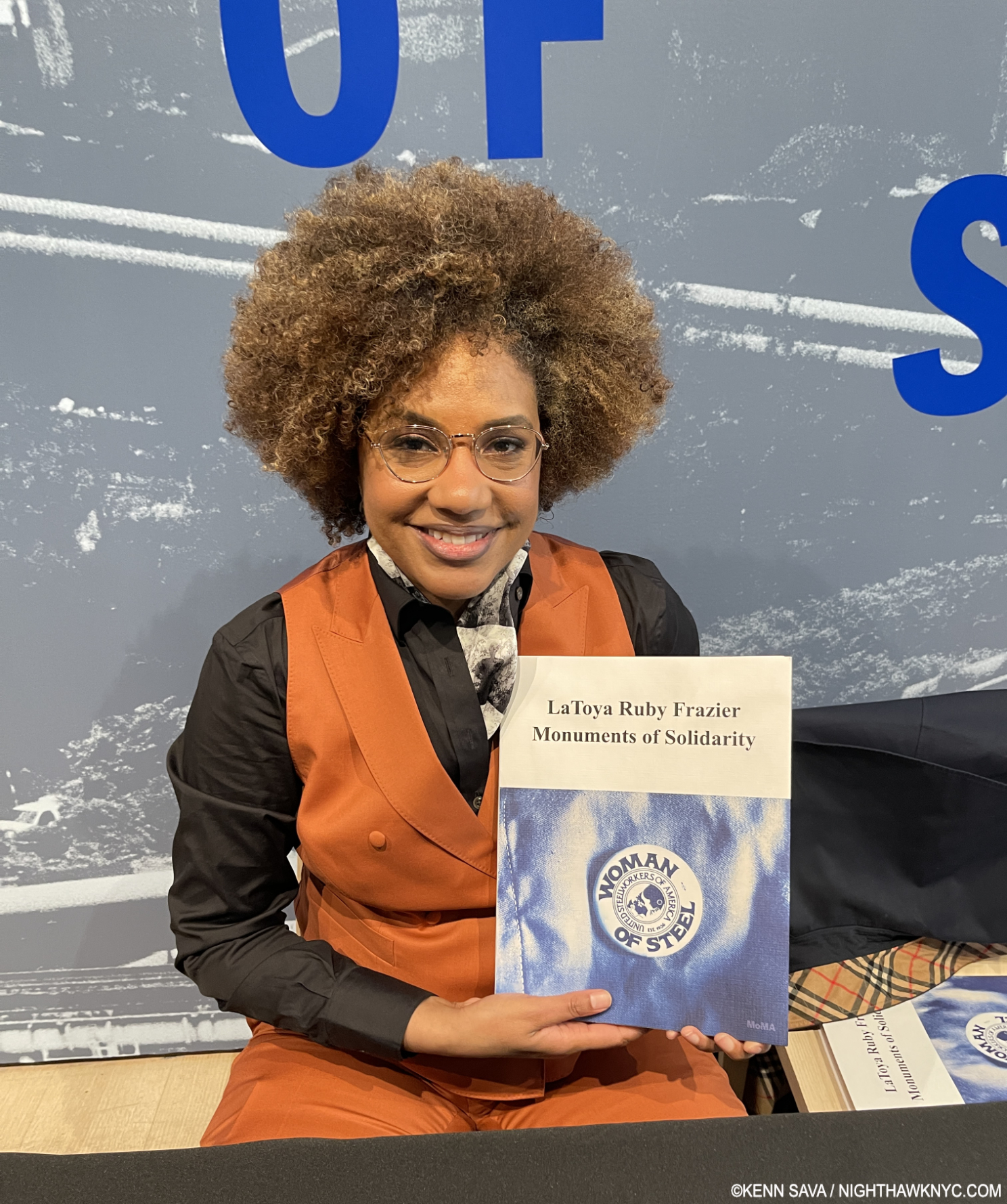
The NighthawkNYC.com NoteWorthy PhotoBook of 2024: LaToya Ruby Frazier: Monuments of Solidarity, Published by the Museum of Modern Art

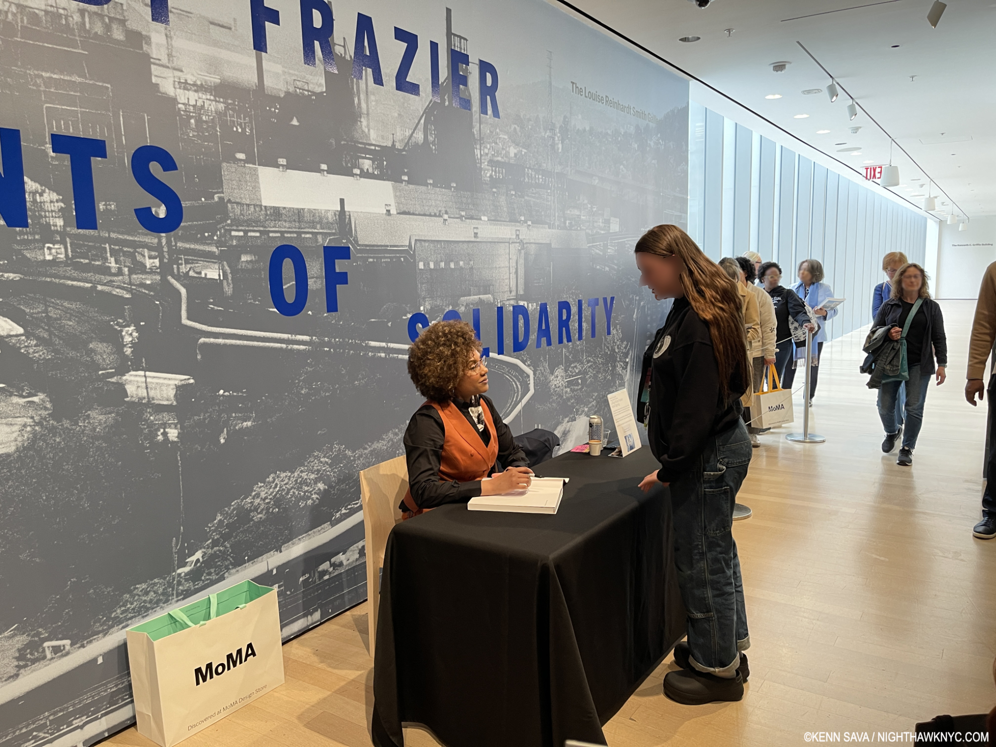
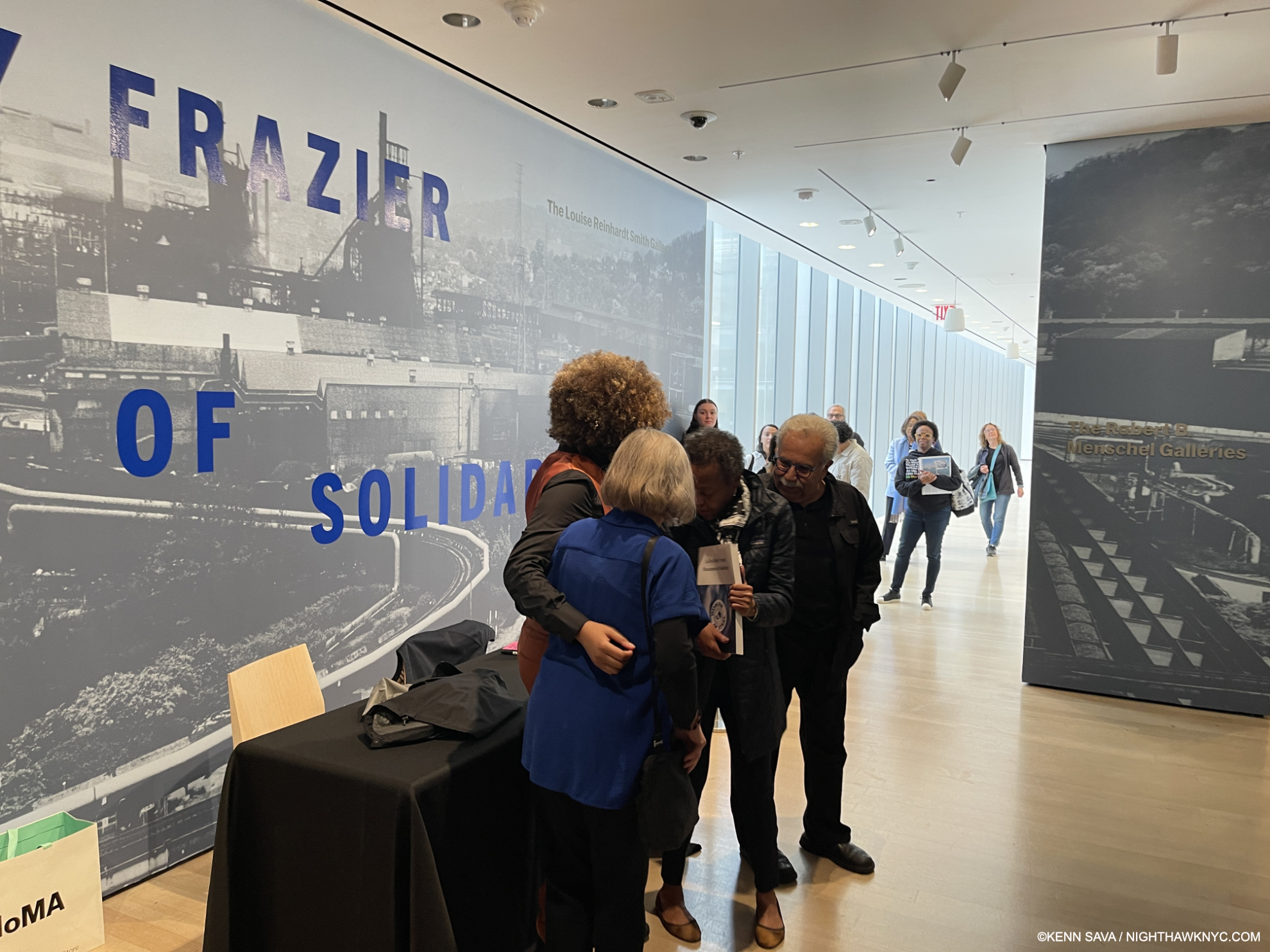
When I met her at the Museum of Modern Art on May 10th, at the Preview of her stunning early mid-career retrospective, I told Ms. Frazier her book, LaToya Ruby Frazier: Monuments of Solidarity, was my NoteWorthy PhotoBook of the Year. Yes, the year. Even though we’re barely half way through 2024 as I write this and there are still six full months to go). With all due respect to all the books not yet released as well as those I have not yet seen, Ms. Frazier  gets my 2024 Trophy as most recommended PhotoBook for her powerful & urgently important book, published to accompany and expand on the show of the same name. Frankly, she deserves a medal for the work she has done.

LaToya Ruby Frazier proudly showing me her new book, Monuments of Soilidarity at MoMA, May 10, 2024

Having begun taking Photographs at 16, she seemed to find her voice almost immediately. “I had decided when I was a teenager that I had to make work that was socially and politically conscious1,” she said.

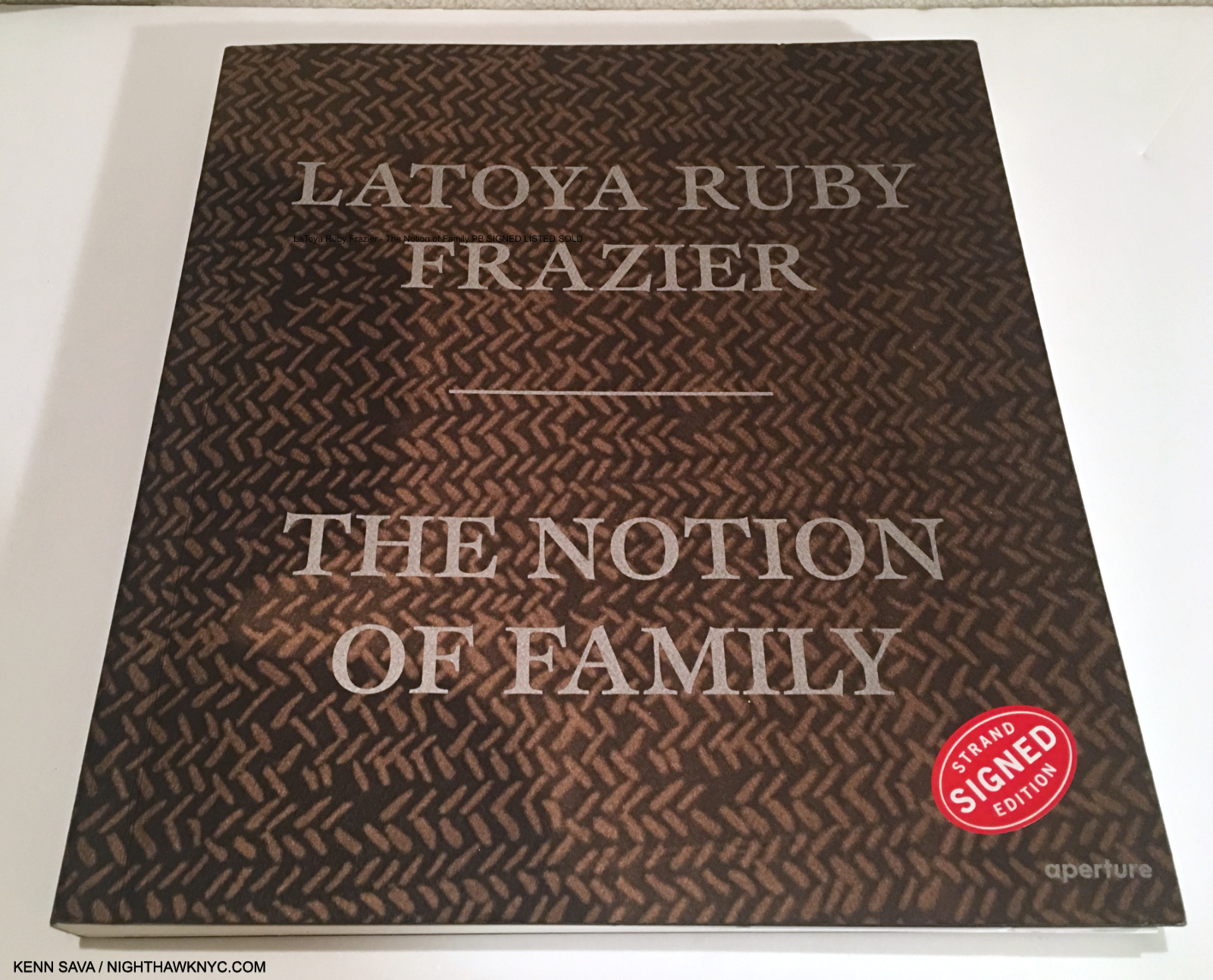
Auspicious beginnings. The Notion of Family, 2016.

Her early work focused on 3 generations of her family and life in her hometown of Braddock, PA in her debut PhotoBook, The Notion of Family, in 2016, which announced her arrival to the world in memorable fashion. She subsequently turned her attention to the coalminers in the Borinage, Belgium, in And From the Coaltips a Tree Will Rise, in 2017. Returning the U.S., she documented the closing of the G.M. plant in Lordstown, Ohio in The Last Cruze, 2019, and the man-made water crisis in Flint, Michigan in Flint Is Family In Three Acts, 2022 in book form. All four books are NoteWorthy in their own right.

MoMA, May 12, 2024

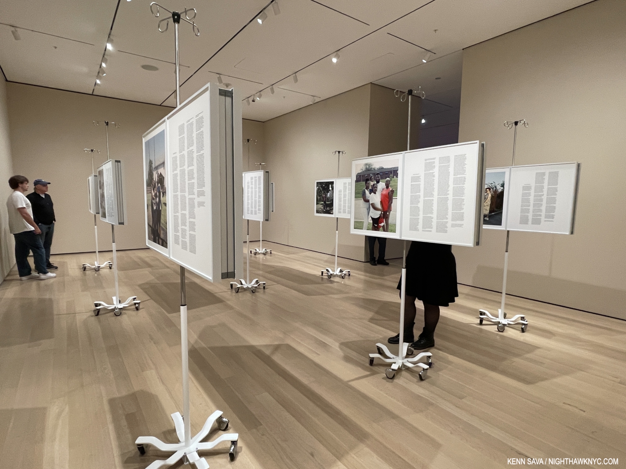
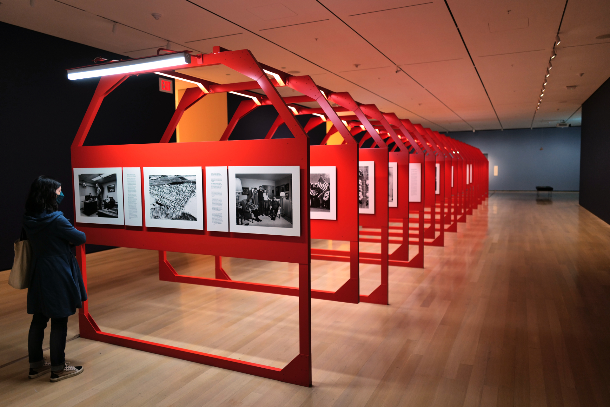
Monuments of Solidarity is an overview of LaToya Ruby Frazier’s work to date in what is a Show of the Year candidate along with Käthe Kollwitz, which happens to be installed right next to Monuments of Solidarity at MoMA. Monuments takes the viewer right up to the work shown in her most recent NYC gallery show, More Than Conquerors: A Monument for Community Health Workers of Baltimore, Maryland, 2021-22, which I wrote about here. The piece, which consists of 18 Inkjet panels on IV stands, was recently fittingly acquired by the forward-looking Baltimore Museum.

Partial installation view, More Than Conquerors: A Monument for Community Health Workers of Baltimore, Maryland, 2021-22, as installed at MoMA May 12, 2024. Each piece is in 2 parts. On the right-hand panel is a text written by the subject of her Photo on the left panel. You can see it installed at Gladstone Gallery in my look at it here.

There are a lot of great Artists in this country. You have your list. I have mine. There are also a lot of important Artists working here today. One thing that sets LaToya Ruby Frazier apart, in my view, is that, in addition to her poignant Photography, she brings her subjects right into her work. Though hers is the overall vision, the results feel collaborative. This serves to make the results unlike most of what’s come before.

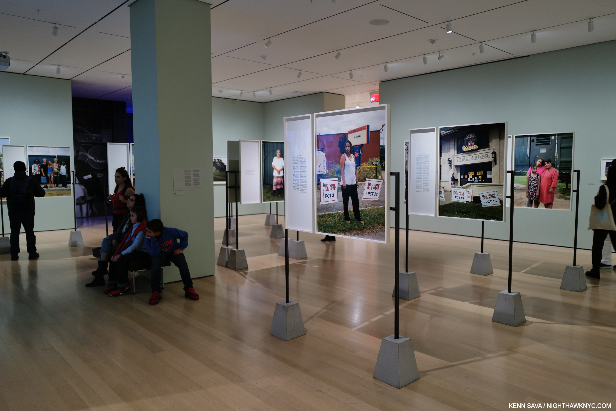
Installation view. Flint Is Family section. May 12, 2024 including more compelling texts from her subjects accompanying her Photos.

After posing for the picture with her book, she asked me what I thought of her show. I told her I was very moved by the Photos she took with and about her Grandmother, now well-known images from her instant classic The Notion of Family. In them we see the Artist’s vision and talent were stunningly present from an early age, as if she was born with a camera in her hand, while we also get insights into her and her family’s life in her hometown. Braddock, PA, which in turn fueled her passion to inspire change and to right wrongs.

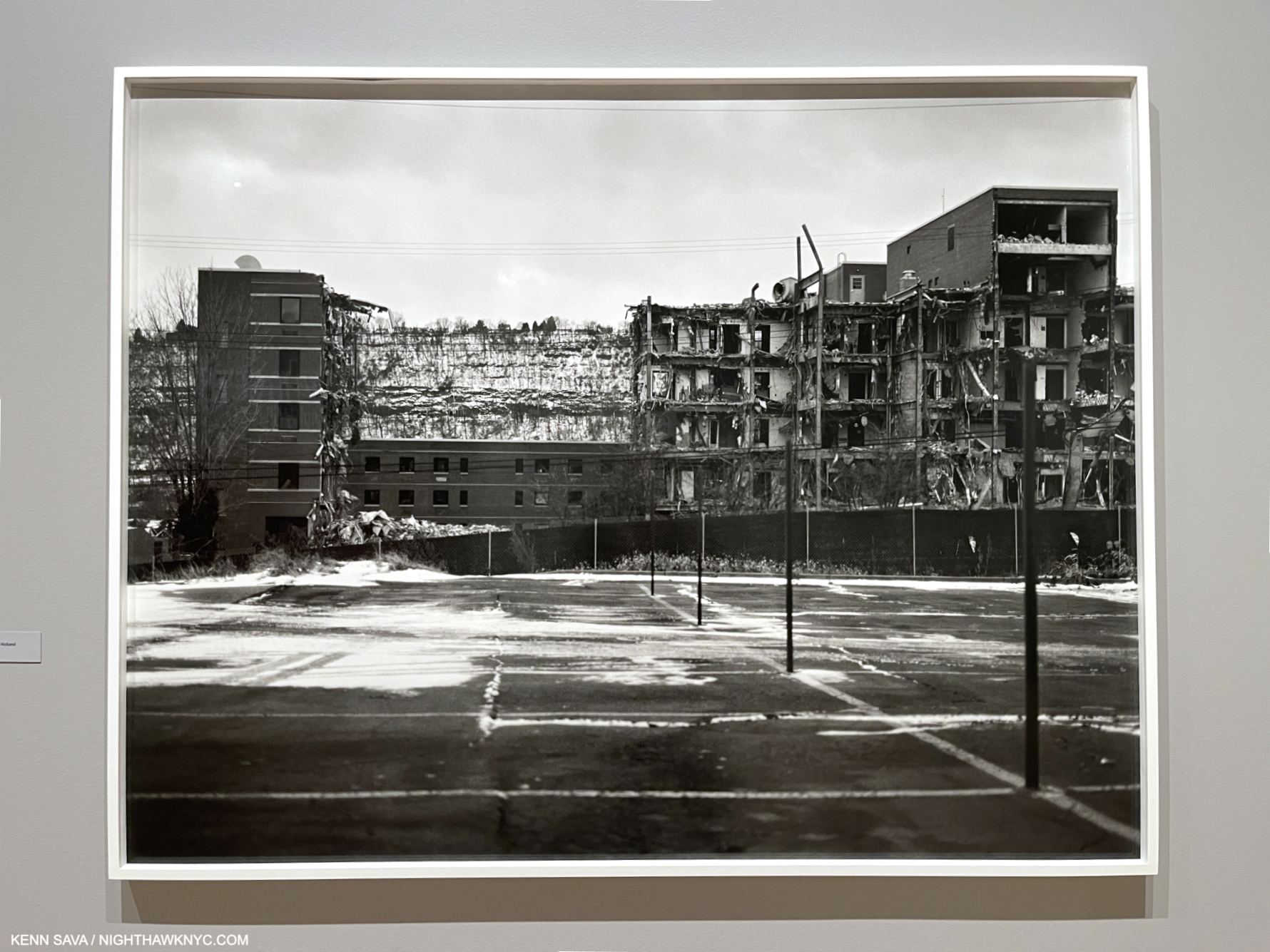
UPMC Braddock Hospital and Holland Avenue Parking Lot, 2011. The community hospital in ruins, where her grandmother passed.

After we see the passing of her Grandmother, the show took an immediate turn and from then on was focused on depicting crises effecting “everyday” citizens, working class people, and issues of race. 

MoMA, May 10, 2024

Monuments of Solidarity is not only a “PhotoBook.” It delves deeply into its subjects in a way I find every bit as powerful as her Photographs are. This is evidence of LaToya’s extraordinary way with people. Watching her at MoMA, she took the time to have an actual moment with everyone she encountered. Even me (we’d never met).

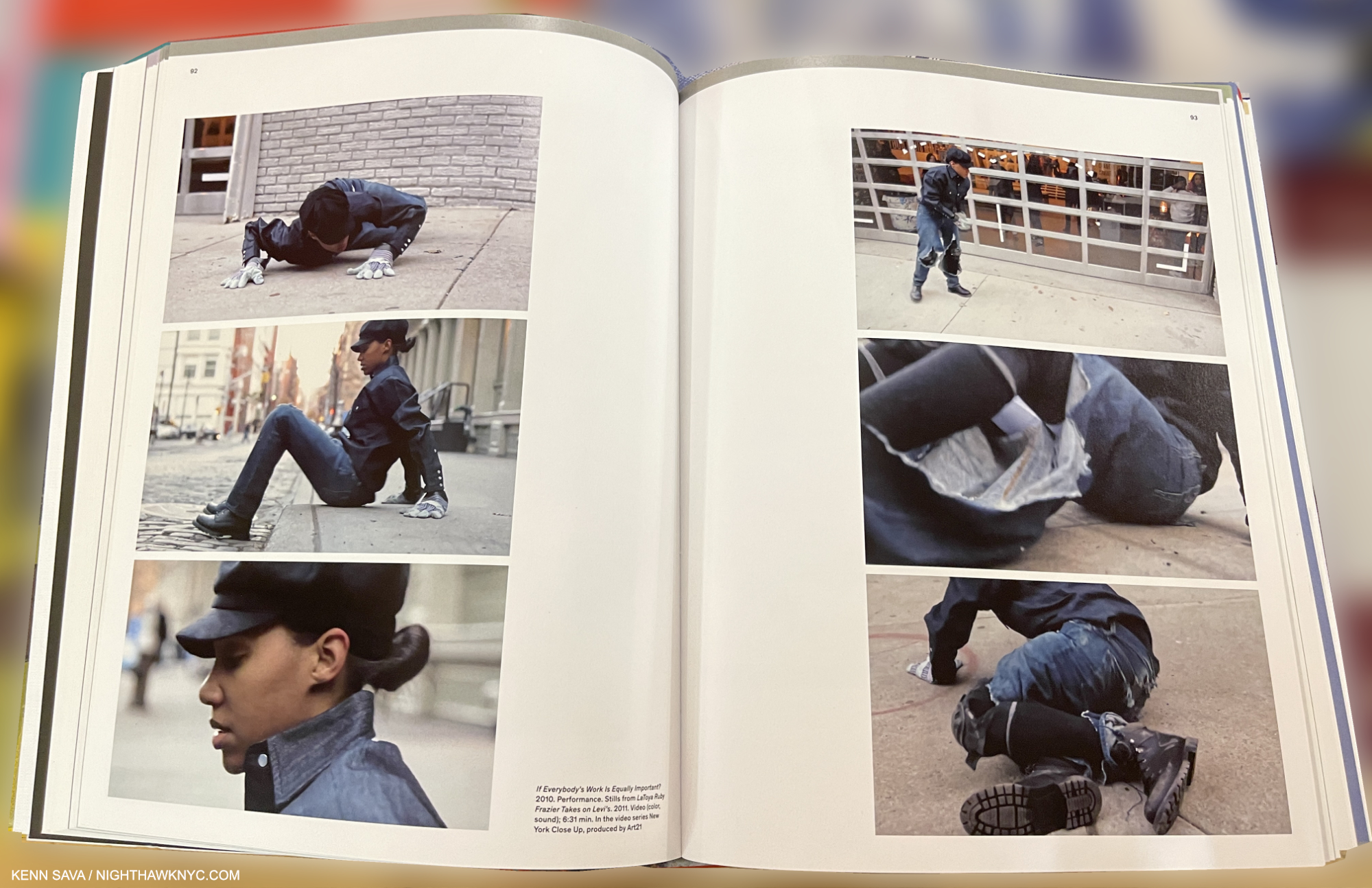
LaToya Ruby Frazier Takes on Levis, 2011, Stills from the Video which premiered on Art21. LaToya took issue with Levi’s after they featured her hometown, Braddock, PA, in an “Everybody’s Work Is Equally Important” ad campaign. As part of the campaign, Levi’s  opened a public Photo Workshop in SoHo. In response, LaToya put on a pair of Levi’s and in a performance in front of the Levi’s Photo Workshop, preceded to destroy them while wearing them. The intense Video is looped in the show. From the book, Monuments of Solidarity.

LaToya Ruby Frazier, the person, makes every bit as good, and memorable, an impression as her work does, though the intensity we see in pieces like her incredible Levi’s Performance Video remained under the surface.

MoMA, May 10, 2024

I think her people skills, which isn’t the right term for someone who is as genuine as Mr. Frazier is…make that her humanity, is a central reason why her Art is so powerful and so direct, project after project. LaToya gets to the heart of the issue and speaks to why it is important- for those directly involved, and for all of us, like very few Artists working today can.

Partial installation view. The Last Cruze, 2019 (recently acquired by MoMA), looks at the last Chevy Cruze to be made in Lordstown, Ohio after G.M. halted production and closed the plant, throwing all the workers out of their jobs.

Ms. Frazier’s work is compared by some to that of the F.S.A. (Farm Services Administration) Photographers of the 1930s, including Dorothea Lange. As I ‘ve showed, one thing of many that sets her work apart is that she foregrounds the experiences of her subjects right alongside her Photographs in texts they authored; something the FSA Artists didn’t do. In fact, I can’t think of any Artist who has done it as consistently as LaTory Ruby Frazier has.

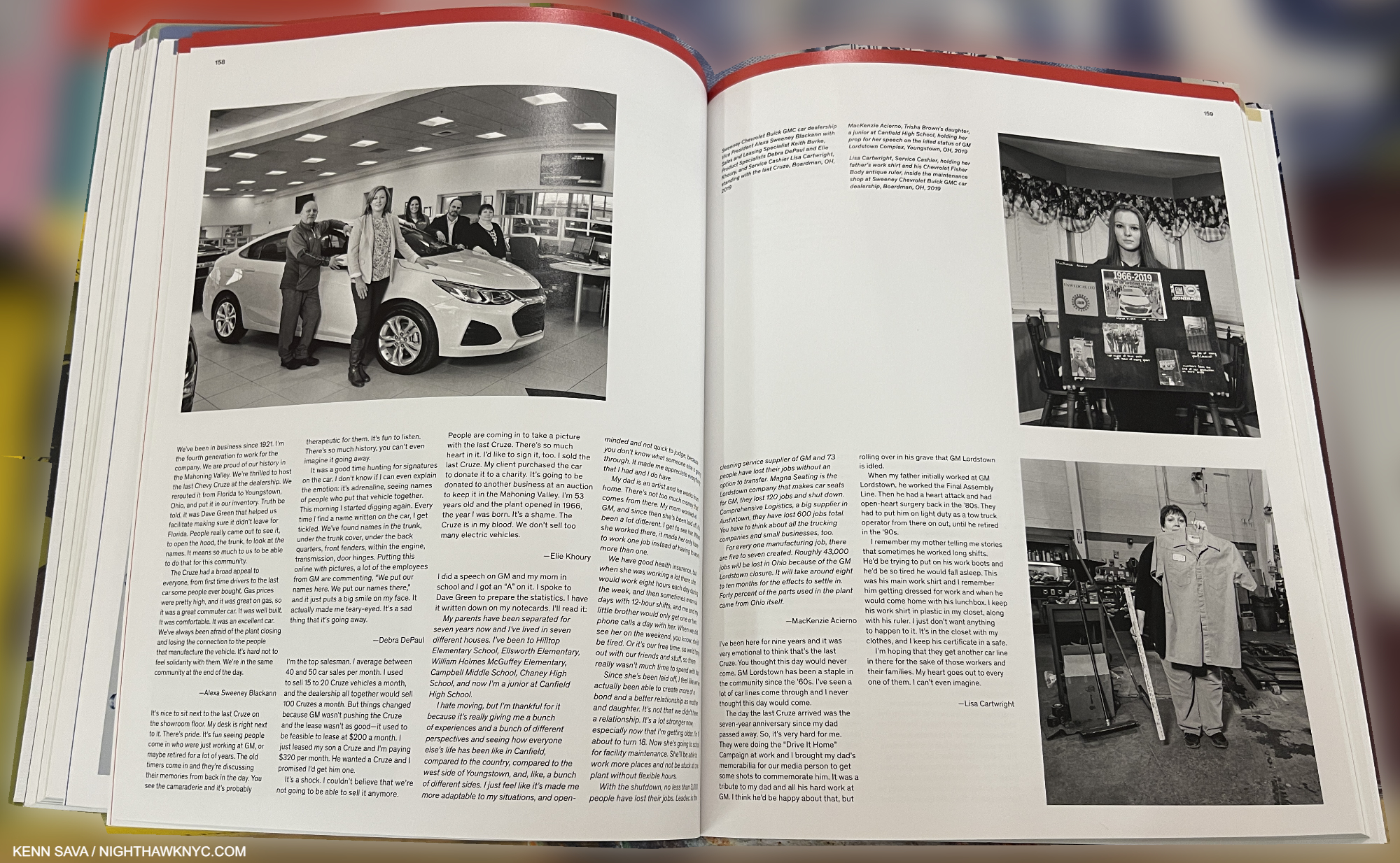
On this spread from The Last Cruze PhotoBook the subjects of Photos accompany them in pieces they wrote.

She gives many, maybe event most, of the actual people she depicts in her projects, their own voice. Quite often their words take up more space in her books and in this exhibition than her Photos do! I can’t say I’ve ever seen that before, either. In the literal sense, her work truly is a collection of  “moments of solidarity” between Artist and subject.

Entrance to at MoMA as seen on May 10, 2024. The show is up through July 20th.

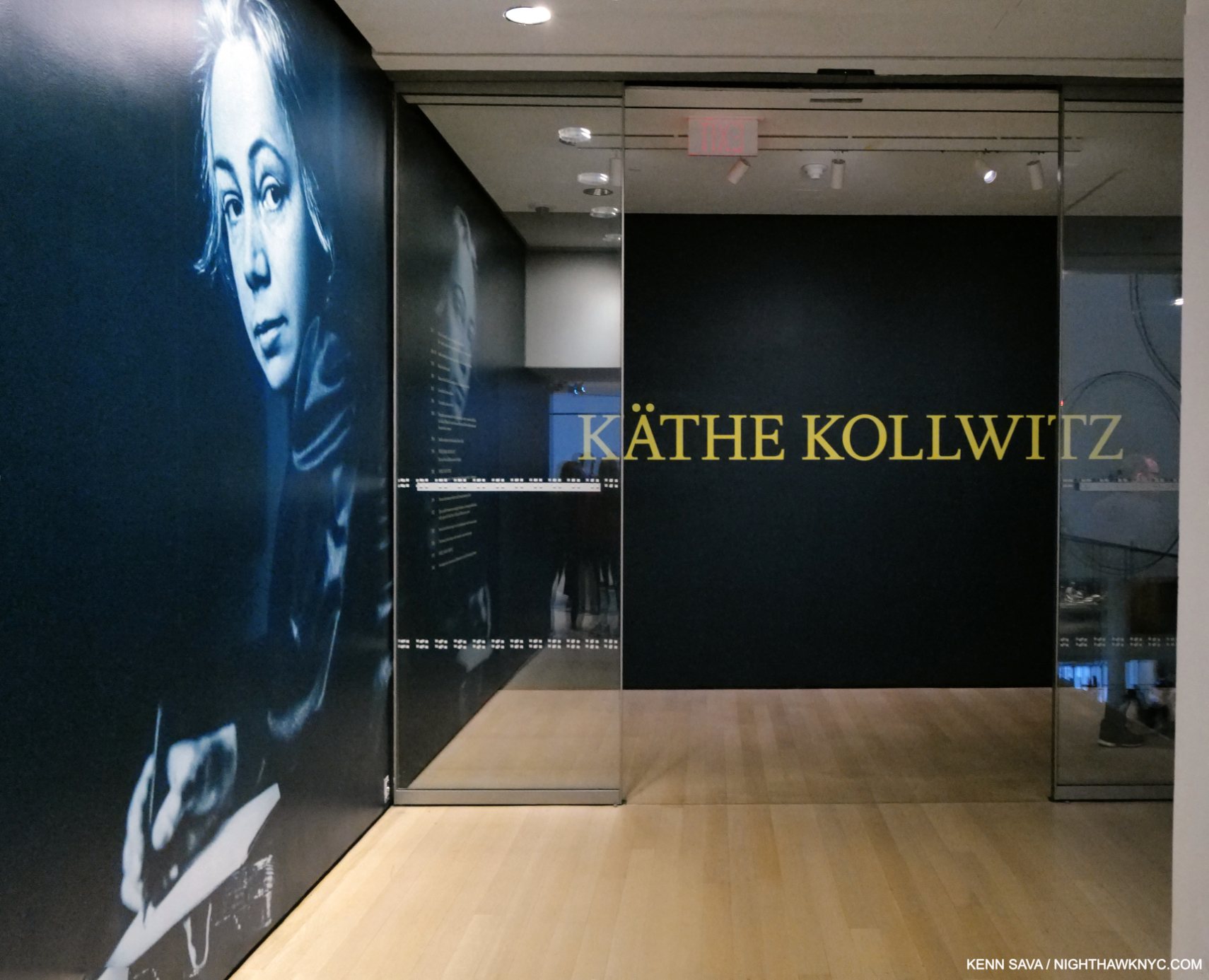
Two asides- Two coincidences struck me while preparing this piece. First, LaToya Ruby Frazier – Monuments of Soilidarity is installed right across the hall from the equally terrific Käthe Kollwitz at MoMA. Walking through one, and then the other, it was impossible for me to ignore how much in common they share. I wish I had asked LaToya what she made of Ms. Kollwitz’s show. Both Artists have made the “Art of social purpose” the center of their work.

“I have no right to withdraw from the responsibility of being an advocate. It is my duty to voice the sufferings of men, the never-ending sufferings heaped mountain-high.” Käthe Kollwitz, 1867-1945, 2.

Her first major retrospective at an NYC museum (How is that possible?) makes an open and shut case for Käthe Kollwitz as one of the major Artists of her time, something that has been well-known in Germany and elsewhere, making it past time for the rest of the world to catch up.

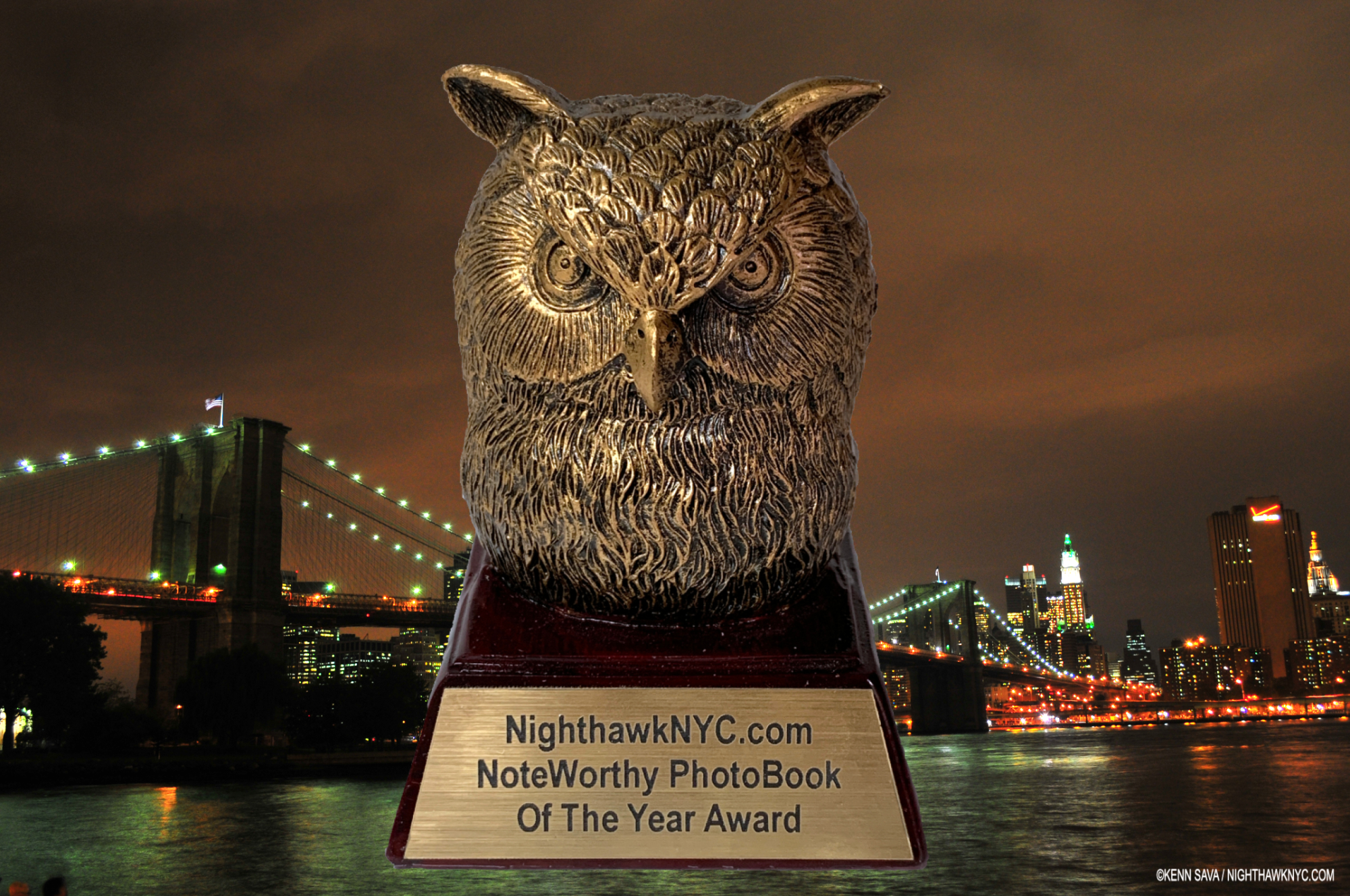
Preparing this piece also reminded me of another young woman Artist who I selected as my NoteWorthy Art Book of 2024: Es Devlin. Though they’re from different parts of the world, and work in different mediums, they’re both making extraordinary inroads into the world with their work. As I wrote in my look at Es’s book, An Atlas of Es Devlin, she’s garnered unheard of media acclaim. LaToya was just named one of Time’s “100 Most Influential People of 2024.” That’s pretty amazing, of course, but I bet it doesn’t come with a cool Owl statuette!  ; )

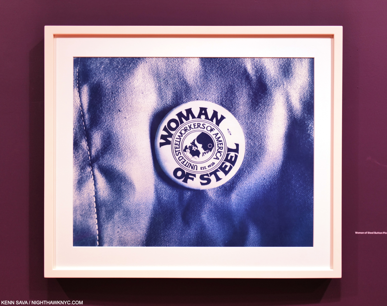
Woman of Steel Button Pin, 2017

“Woman of Steel” reads the button on the cover. Though she’s not a steelworker, she could easily wear one and it would completely suit her in the literal sense.

*-Soundtrack for this piece is “Poverty” by Yemi Alade, from her album, Woman of Steel, fittingly, performed here live-

NighthawkNYC.com has been entirely self-funded & ad-free for over 8 1/2 years, during which 320 full-length pieces have been published! If you’ve found it worthwhile, PLEASE donate by PayPal to allow me to continue below. Thank you, Kenn.

You can also support it by buying Art, Art & Photography books, and Music from my collection! Art & Books may be found here. Music here and here.

Written & photographed by Kenn Sava for nighthawknyc.com unless otherwise credited. To send comments, thoughts, feedback or propositions click here. Click the white box on the upper right for the archives or to search them. Subscribe to be notified of new Posts below. Your information will be used for no other purpose.

  1. “Latoya Ruby Frazier Takes on Levi’s,” Art21
  2. As quoted, here.

Ed Ruscha’s Wall Rockets

This site is Free & Ad-Free! If you find this piece worthwhile, please donate via PayPal to support it & independent Art writing. You can also support it by buying Art & books! Details at the end. Thank you.

Written & Photographed by Kenn Sava.

This is Part 2 of my look at Ed Ruscha/Now Then at MoMA. Part 1 is here, Part 3 is here.

From the late 1950s, through the early 1960s Ed Ruscha made regular trips back and forth between Oklahoma City, where he grew up, and L.A., his adopted home since the late 1950s. In 19621, he Photographed the gas stations that caught his eye on these journeys with his trusty Yashika Twin-reflex camera, taking 60 or 70 Photographs2. In an interview in 1973 he said, “What used to belong to the Navaho and Apache Indians now belongs to the white man and he’s got gas stations out there. So, I started seeing it as cultural curiosities.”

“I’d always wanted to make a book of some kind.”

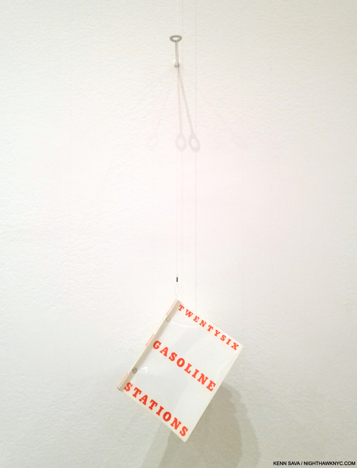
He continues. “When I was in Oklahoma I got a brainstorm in the middle of the night to do this little book called Twentysix Gasoline Stations. I knew the title. I knew it would be photographs of twenty-six gasoline stations3.” “The first book came out of a play with words. The title came before I even thought about the pictures. I like the word ‘gasoline’ and I like the specific quality of ‘twenty-six4.'”  “Months went into the planning of that. I could have saved myself a lot of trouble by loosening up. You know, not gotten so concerned with how I wanted the thing to look. I changed the form about fifty times at the printer’s5.” He self-published Twentysix Gasoline Stations in 1963 (although the title page states 1962).

You’re looking at a revolution. Twentysix Gasoline Stations, 1963, revolutionized the Artist book, the PhotoBook, and street-side Phtography, with unique design, turning gas station Photography into a genre in the process. This copy was hanging for visitors to peruse, which was somewhat surprising as it’s now a rare book- even this second edition copy is worth hundreds of dollars. Knowing all of it from reproductions, this was the first time I was able to page through an actual copy of it. Pictures in this piece are thumbnails. Click on any for full size.

It’s an Artist’s book/PhotoBook whose influence is now incalculable.

Published in an edition of 400 copies, a case can be made that it ‘s the most influential PhotoBook of the contemporary period after Robert Frank’s The Americans (which the Artist acknowledges as an influence). Twentysix Gasoline Stations, with its “industrial” look and feel stood at odds with the frequently hand-made Artist’s book norm to the time. Virtually every aspect of the Artist’s book was reimagined, from the typography and text layout on the cover to the sparseness of the interior contents, with a lack of text save for image titles.

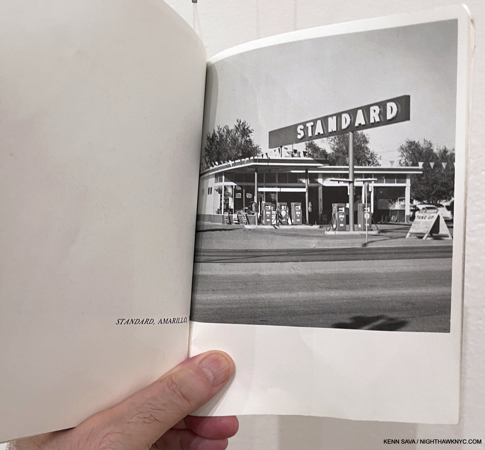
Believe it or not, this is one of the most influential Photographs in Modern & Contemporary Photography. STANDARD, ARMADILLO, TX, perhaps the key image in Twentysix Gasoline Stations, went on to have multiple lives of its own, inspiring numerous Ed Ruscha Paintings, Drawings & Prints, as well as the work of other Artists.

Speaking of the end result, he said-

“I realized that for the first time this book had an inexplicable thing I was looking for, and that was a kind of a “Huh?” That‘s what I’ve always worked around. All it is is a device to disarm somebody with my particular message6.”

Having immersed myself in PhotoBooks for the past 7 years, and Art books most of my life, it’s impossible for me to overstate the influence Twentysix Gasoline Stations has had, and continues to have, on the Art world. It turned Art & PhotoBook creation and publishing on its head, rewriting what a book could be and who could make one. He’s said he meant the pictures to be “like a collection of readymades7,” a term and genre Marcel Duchamp put on the Art map. Still, it received a mixed reaction when it was released, including famously being rejected by the Library of Congress.

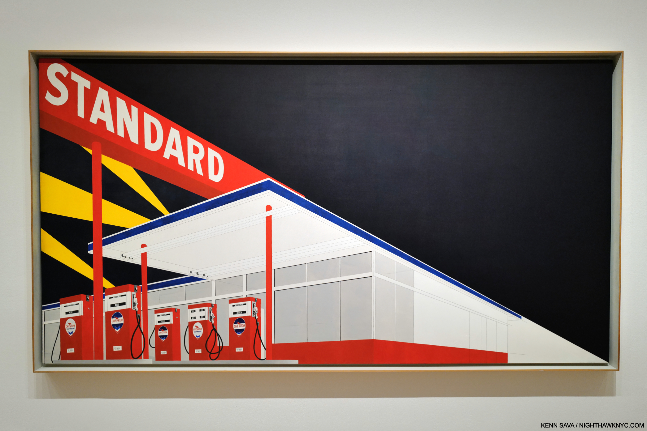
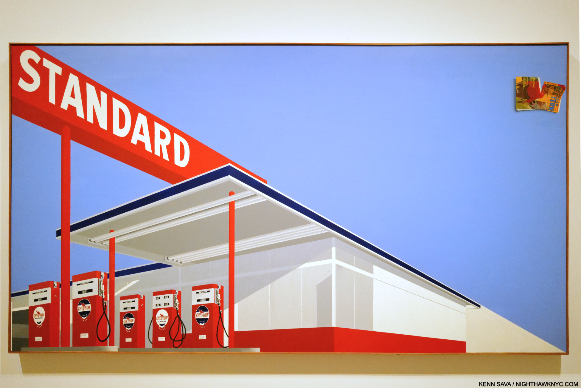
Standard Station, Amarillo, TX, 1963, Oil on canvas, 64 15/16 x 121 13/16 inches. The “locomotive” compositional device, seen in Large Trademark with Eight Spotlights, 1962, in Part 1, returns, splitting the composition in two, just the beginning of what’s fascinating about this.

“I would say I came to painting through photography,” Ed Ruscha8

The STANDARD, ARMADILLO, TX, Photograph begat the Standard Station, Amarillo, TX Painting in 1963. Obviously, the Photo just shown has been reworked, reimagined, or he based this on another Photo. Whatever the case may be, the resulting composition seen here would subsequently take many forms and become iconic. Standard Station, Ten Cent Western Being Torn in Half, below, followed a year later.The Paintings begat Standard Station, Amarillo, TX Prints, with Standard Station, Amarillo, TX Drawings being created along the way. So ubiquitous did they become that gas station Paintings and gas station Photography are now, basically, his genres. Sooner or later, everyone who shoots or Paints a gas station is going to be compared to Ed Ruscha. Many, like Vik Muniz, openly acknowledge the influence.

What strikes me are the abstract elements, like the selective detailing- you can read the prices on the gas pumps, but detail disappears on everything behind them, creating a surreal experience (the “realistic” gas pumps offset against the featureless building behind them), under that big red sign whose white lettering, offset against the engulfing darkness, feels bold.

Standard Station, Ten Cent Western Being Torn in Half, 1964, Oil on canvas, 65 x 121 1/2 inches. Mr. Ruscha has likened  the comic flying off the canvas to the upper right to a “coda” in Music. For me, it looks like debris, garbage, pollution. In this piece, the featureless building has light and shadows added to it. Once again, the numbers and text on the gas pumps are very legible.

At the time, Ed Ruscha shot them, gas stations were bastions of the new found freedom of the open road and the catalyst of the massive post-war westward exodus that the Artist, himself, became a part of. Over time, gas stations would be seen differently as the toll of pollution and environmental decay mounted.

Ed Ruscha’s second most famous Artist book/PhotoBook. A copy of the legendary Every Building on the Sunset Strip, 1966, published in one long accordion fold. Ed Ruscha put a tripod on the back of a truck and went up and down Sunset Strip taking one Photo after another until he had shot every building on both sides of the street. Here, we get one direction on the top of the page, with what’s across the street synchronized and mirrored along the bottom.

Further books followed- 14 more to 1972, the most famous of which is Every Building on the Sunset Strip, 1966, another ground-breaking work. Ed Ruscha has stated that part of the reason he went west after high school, instead of east, was because of the glamour of L.A. Here, he shows the “glamour” of the famous Sunset Strip in all its “glory.” Then, in 1973, he shot all 12 miles of Hollywood Blvd. In 2004, he reshot Hollywood Blvd in color, and paired with the 1972 images, they became the book THEN & NOW in 2005. It’s one example of Ed Ruscha combining his love of the effects of time with revisiting his past subjects.

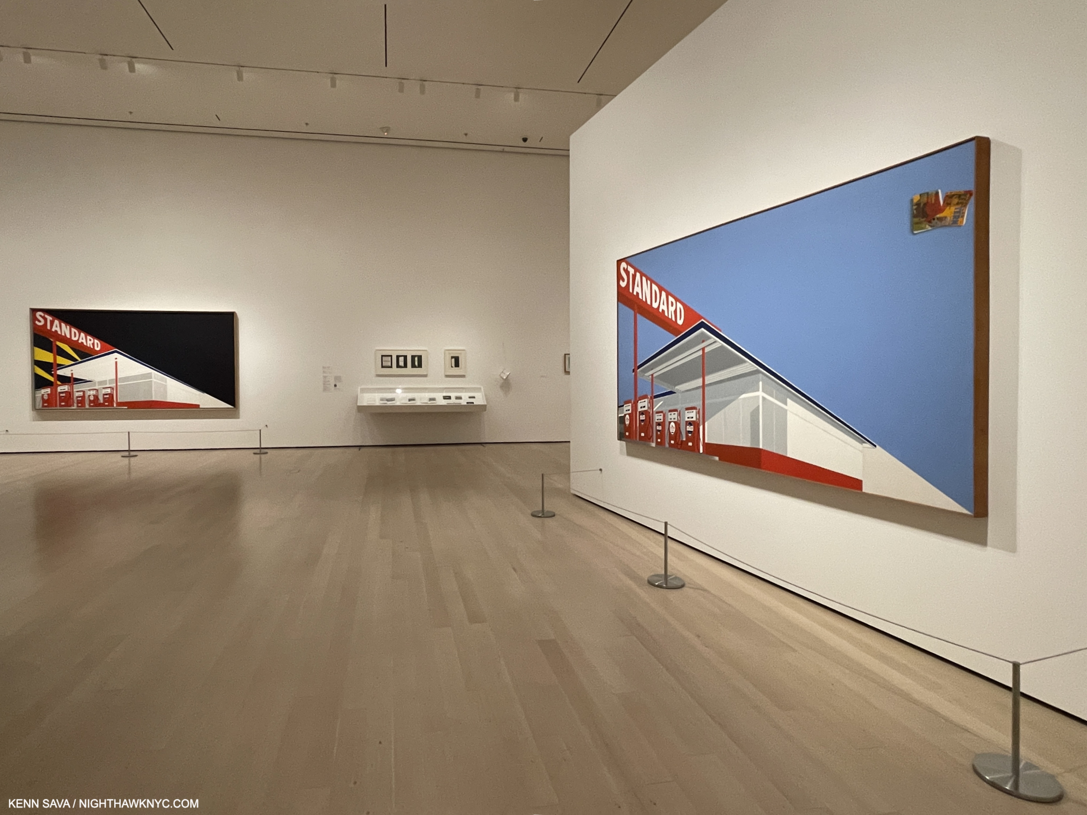
In all the acclaim he receives I almost never hear credit given the Artist for his exceptional Painting technique- the equal of anyone else’s of his time. Right from the start, Painting after Painting reveals sublime subtlety and under-appreciated skill.  Then Now provided a glorious chance to study his, often large, Paintings up close and marvel at his skill and taste. It also provides the extremely rare chance to see works of the same subject side by side, particularly two of his famous Standard Gasoline Station Paintings.

Shows present once-in-a-lifetime opportunities to see great works united from distant parts of the globe for a brief time. That’s why I waited over an hour for the crowds to part to get this shot. More than likely, I’ll never see these two great Standard Stations together again. Both of these also feature the “speeding locomotive” compositional device seen in the Large Trademark Painting, which adds to the somewhat surreal overall effect, wonder and mystery.

Further to the Large Trademark Painting, Ed Ruscha also began Painting the sights of L.A., which again seems to be his domain to the point that I can’t think of anyone who Painted the city before he did. (I’m sure there were. Right?)

“Being in Los Angeles has had little or no effect on my work. I could have done it anywhere.” Ed Ruscha, Leave Any Information at the Signal, Statement in “West Coast Style”

Los Angeles County Museum on Fire, 1965-8, 53 1/2 x 133. 1/2 inches. Fun fact- Guess where Ed Ruscha/Now Then reopened on April 7, 2024 after closing at MoMA? You’re looking at it.

Los Angeles County Museum on Fire, 1965-8, like most of Ed Ruscha’s work, has been the subject of endless conjecture. Over the years, the Artist has made a few statements about it, including this one, “… There’s no great message here. It’s just a picture to look at9.” That might be hard to believe. After graduating college, he took that trip to Europe I mentioned in Part 1, and came away disappointed at the lack of Contemporary Art on view in the museums. Back home, things weren’t much better. Contemporary Art was slow to gain admission to the hallowed halls of institutions here. Is it a stretch to think this was somewhere on his mind when he Painted this? I tend to think it was in there somewhere. The Watts riots had recently taken place. The Now Then Catalogue has this to say about it-

“Ruscha’s characteristic denial of content ignores the fact that not far from his studio in mid-August 1965, just a few months after the inauguration of the Los Angeles County Museum of Art, the city of Los Angeles was burning10.”

Ed Ruscha said, “The plain truth behind the Watts riots is that the riots themselves were good and beneficial and healthy regardless of loss of life. The Watts riots nationalized sympathy for a gigantic racial injustice11.”

He soon set a number of other sites on fire in his Paintings, including the an Amarillo Standard Station (which wasn’t in the show), and Norm’s, which was.

Norm’s, La Cienega, on Fire, 1964, Oil and pencil on canvas. The work features a complete lack of detail, save for the letters “ORMS” on the sign.  It’s interesting how the flames follow the “locomotive” line. Without those letters (which themselves are meaningless without the title), this Painting would be a completely abstract composition of shapes and lines.

For someone who’s so closely associated with L.A., and has been for over 60 years, it’s strange that some of his most well-known work shows L.A. landmarks being destroyed or in ruins. For example, he has continued to “destroy” the Hollywood sign, in different ways, over and over again throughout his career. Still, his fame continued to rise as did his association with the city. In spite of all this (and possibly because of it), in 1978, a six-story(!) tall mural (also referred to as the “Ed Ruscha Monument”) of the Artist was created by the Artist Kent Twitchell, for who Ed Ruscha was “the unorthodox hero of the art world.” Would anyone else be able to “destroy” a city’s landmarks and then become seen as the figurehead of that city’s Art community with a monument created for them? It didn’t happen for Nero. Unlike the emperor, Ed Ruscha didn’t actually destroy anything, except maybe in his mind and on some large canvases.

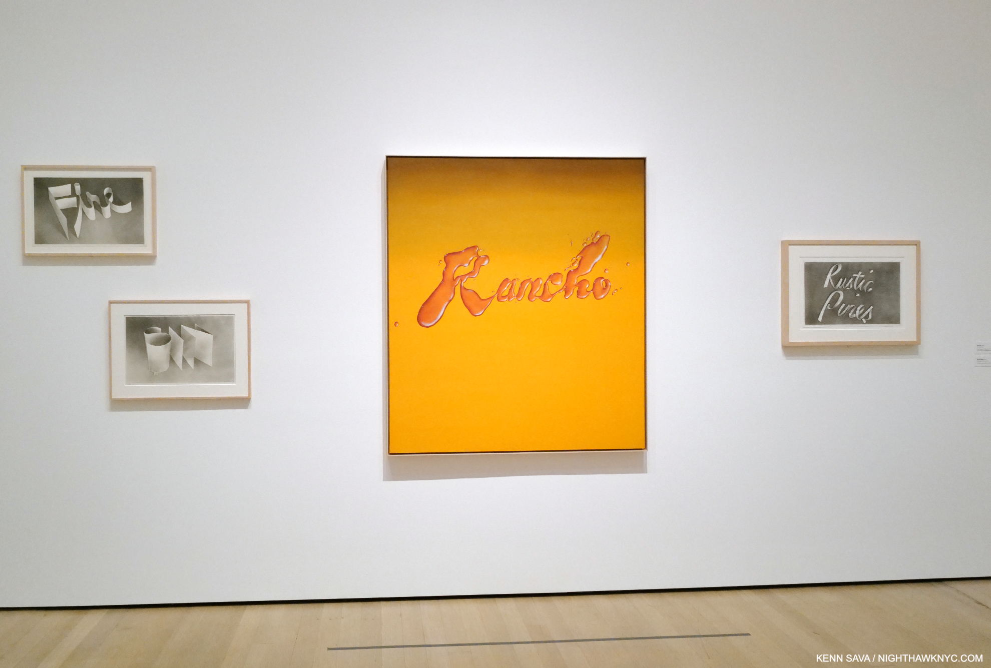
Rancho, 1968, Oil on canvas, which looks like it was made with a liquid, surrounded by Fire, Sin, Rustic Pines, each 1967, Gunpowder on paper, from left to right.

This calls to mind another thing Ed Ruscha doesn’t get enough credit for: innovation. In the 3rd, 4th and 5th galleries we see pieces made out of strange and unprecedented materials. Unhappy with the possibilities of paint or pencil, the Artist began exploring the possibilities of Drawing with gunpowder! The results, as seen above, are incredible. He found he had more control with it. In 1969, the Artist began going further, using unconventional materials in his Stains Portfolio of seventy-five substances ranging from L.A. tap water to egg yolk.

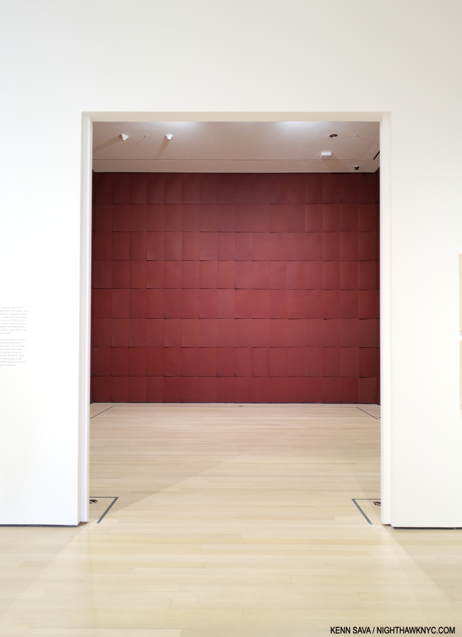
Installation view of Chocolate Room, 1971/2023, Chocolate on paper sheets.

His Chocolate Room for the United States Pavilion at the 1970 Venice Biennale, and recreated in a room of its own in Now Then, followed. After that, he began using a number of these “other” materials in his Word and Phrase Paintings.

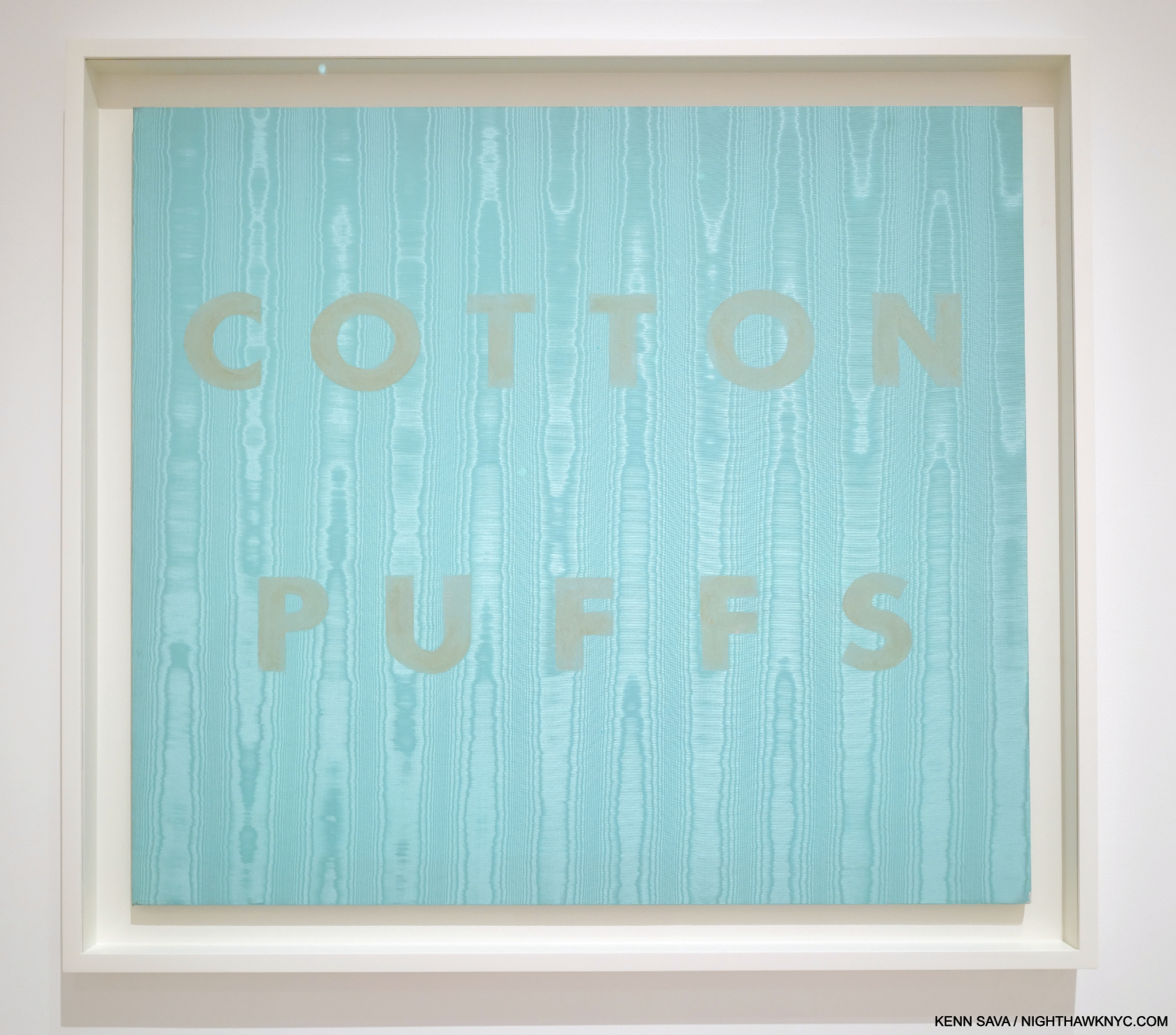
Cotton Puffs, 1974. Egg yolk on moiré fabric, 36 × 40″

Along with this constant experimentation came the inevitable failure, like the egg yokes in Cotton Puffs, 1974, fading quickly. Ed has been remarkably cool with these. Accepting them for what they are12. (And probably learning in the process.) Each has its place in his oeuvre, with all the examples on view seeming to hold up remarkably well over the years given they are experiments. By the mid-70s, he had gone back to pastel on paper13. Though the materials experiments were short-lived, it led me to peruse the 7 volumes of the Ed Ruscha: Catalogue Raisonne of the Paintings, published by Steidl (which is a bit ironic- or fitting- because Steidl has published the work of any number of Photographers who include gas stations in their work, including the entirety of the 3-volume set, Gas Stop, by David Freund), which revealed that this insatiable exploration of materials was only the tip of his creativity iceberg. Paging through it (which only goes up to 2011 at this point), I was amazed to discover that though he has created a number of works with ostensibly the same subject, no two are identical. The differences are obvious or subtle. Still, this speaks to Ed Ruscha’s seemingly endless powers of invention and refusal to repeat himself verbatim. I was stunned when I discovered this, which was completely unexpected (though I should have been tipped off by what his STANDARD STATION, ALBUQUERQUE Photograph became). Seeing this range and variety gave me a glimpse of insight into just what may be keeping him going and creating since the late 1950s.

Wall Rockets, 2000, Acrylic on canvas

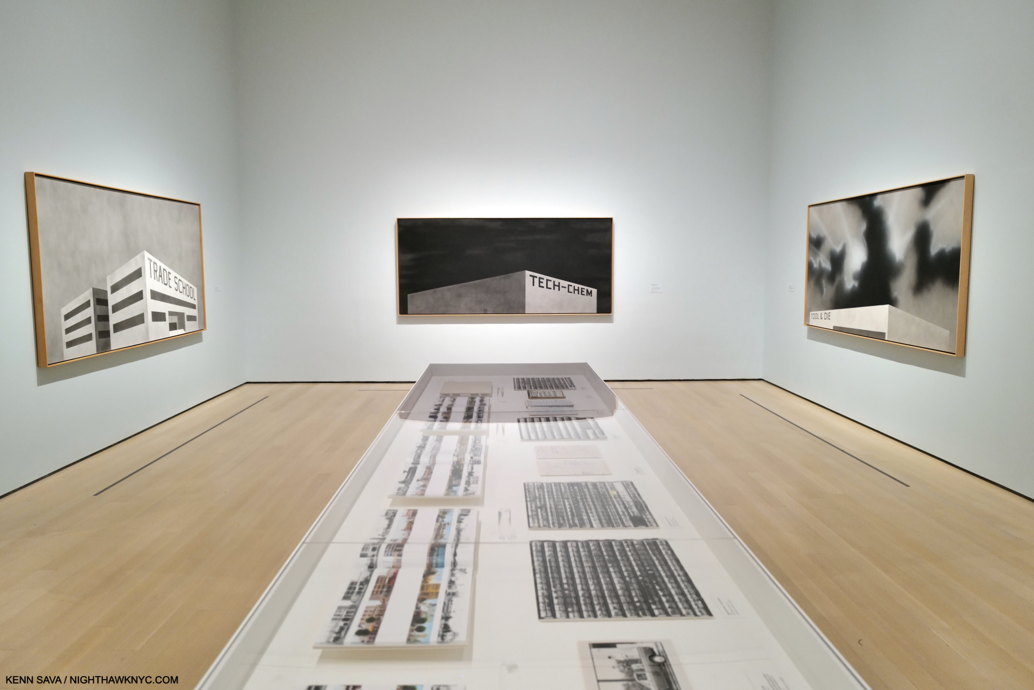
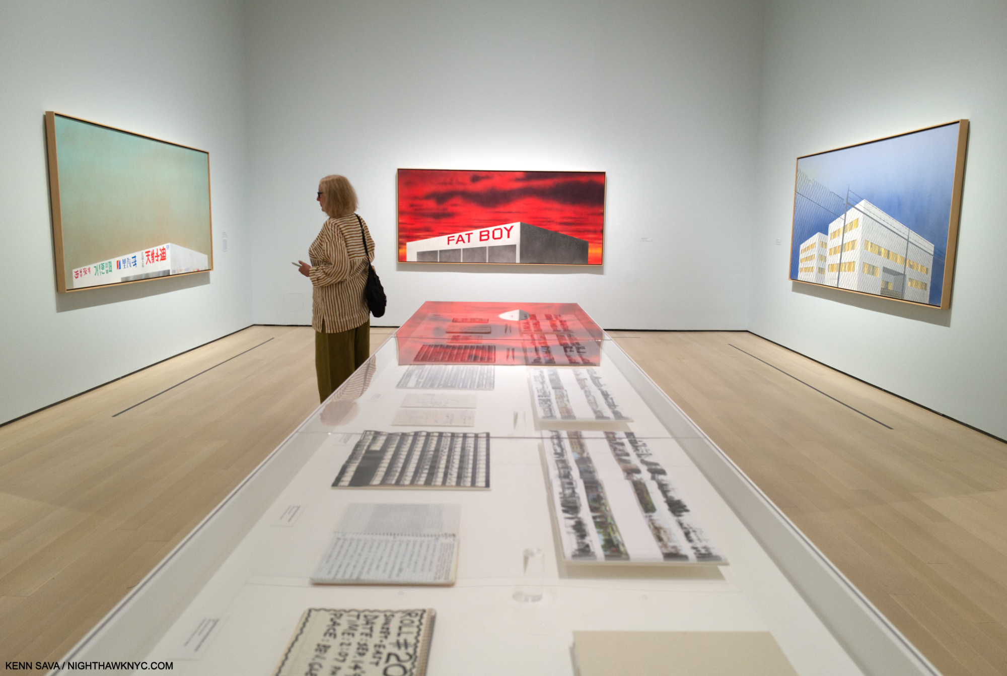
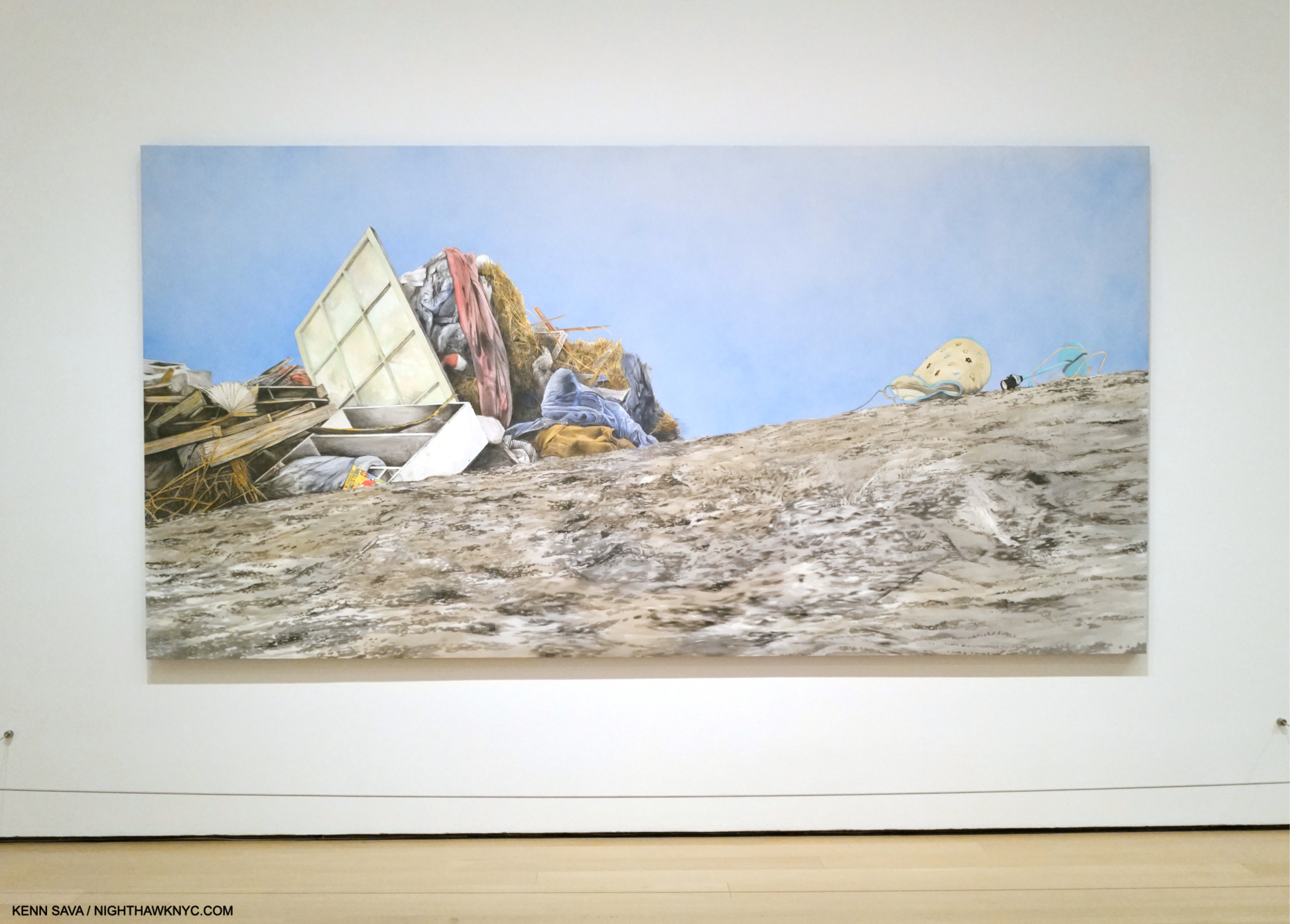
Perhaps THE highlight of Ed Ruscha/Now Then at MoMA for me was the chance to see 6 of the 10 Paintings from the Artist’s Course of Empire series. As I’ve looked at his work over the past 24 years of this century, these have fascinated me as much as any other work by Mr. Ruscha. Created for, and then debuted, at the 2005 Venice Biennalle, they subsequently travelled to NYC where they were on display at the Whitney in a show of the same name, the last important (though small) Ed Ruscha show in NYC until Now Then. Somehow, I missed them there, so seeing 6 might be as close as I get to seeing them all.

3 works from Ed Ruscha’s Blue Collar series, 1993, on the 3 facing walls.

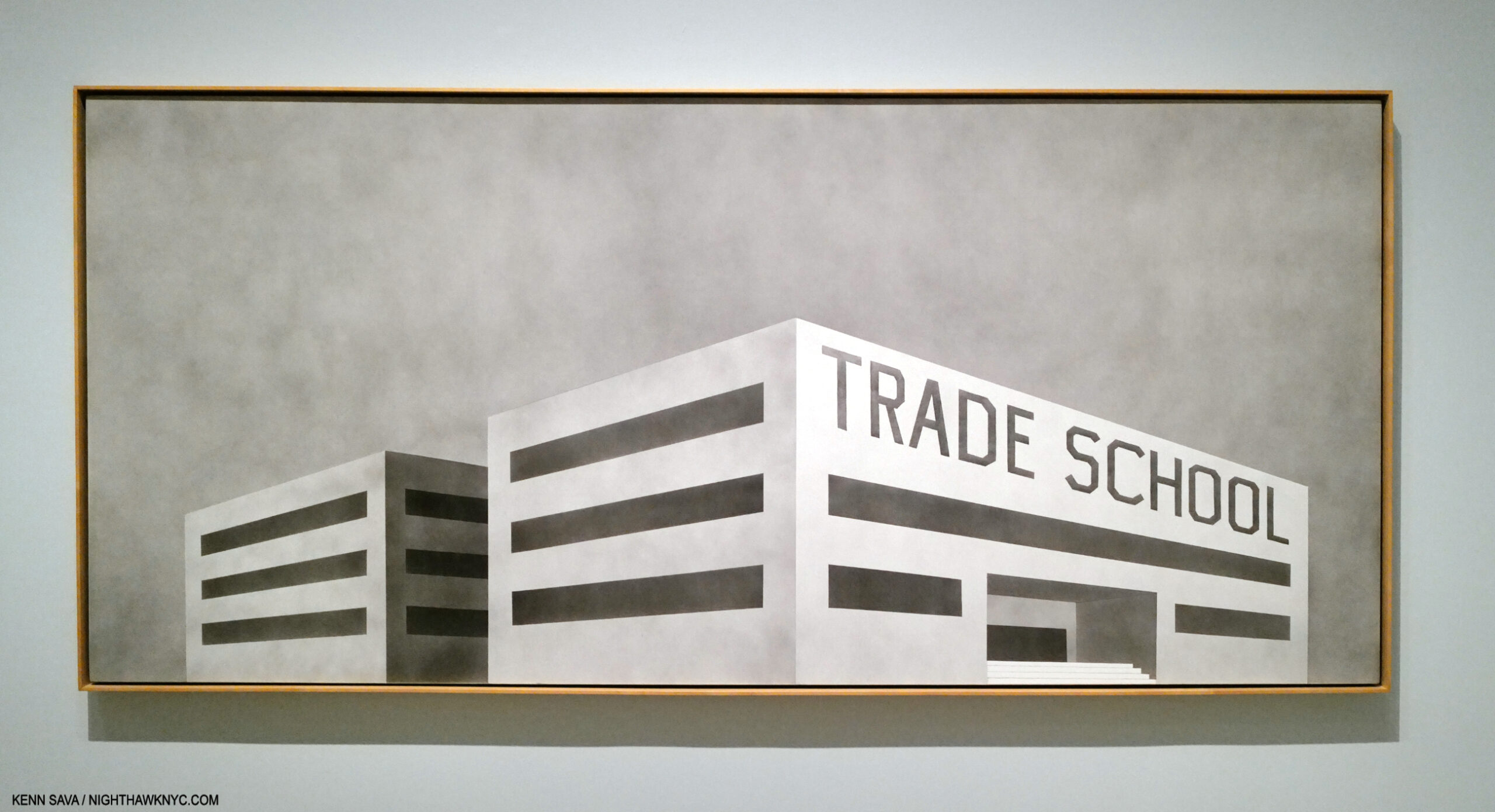
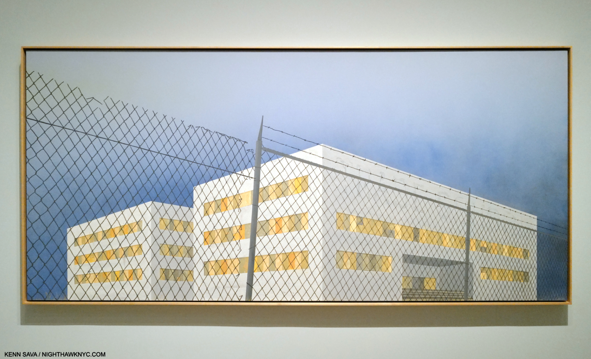
Occupying the large, penultimate gallery of the show, the Course of Empire Paintings strike me as serving as a touchstone for a number of Ed Ruscha themes. They also eerily presage what has been going on in much of NYC (and perhaps elsewhere) this decade, with a number of stores and businesses closing due to Covid, then more closing due to the realities of our post-Covid (if we are post-Covid) economy, many have changed hands in a short time. Others remain for rent. The shape, perspectives and lack of detailing on the one-story  buildings I find reminiscent of Standard Station, Ten Cent Western Being Torn in Half, seen earlier. In each, our point of view is the same, and the same as in that Standard Station Painting- they are seen from below.

At the opposite end of the gallery, the same scenes reappear in his Course of Empire series, 2005, now in color, though right and left are flipped. (The scene on the right wall is that depicted on the left wall in Blue Collar Photo, above this one. The scene on the left wall is the scene shown on the right wall of the Blue Collar series above this one.)

The series evolved over a period of 13 years, with Ed Ruscha Painting the 5 black & white pieces, titled Blue Collar, in 1992-

Blue Collar Trade School, 1992, Acrylic on canvas. The only multi-story structure in the series.

Returning to the subject and the same sites  in 2005, this time in color and showing the effects of time passing.

The Old Trade School Building, 2005, Acrylic on canvas

Perhaps, his most subtly powerful series, their under-stated compositions lead to open-ended interpretations.

Installation view of the complete Course of Empire, by Thomas Cole, 1834-36, as seen at The Met’s Thomas Cole’s Journey in 2018. The rise and fall of civilization as seen from the same place, with the same distinctive mountain peak appearing in each Painting.

Based on, and in homage to, Thomas Cole’s legendary Course of Empire series, 1834-6, (which I wrote about here), they are another instance of Ruscha revisiting earlier work, his Blue Collar series from 1992. These also highlight that alongside the humor in any number of his pieces, running parallel, is a real depth of concern. Concern for the country, the world, the environment.

Psycho Spaghetti Western #7, 2010-11, Acrylic on canvas

“It’s all just rape of the land for profit these days. It’s fairly sick. Southern California is all just one big city now. But what do you say about progress? … So something’s got to give, and the landscape’s the first thing that gives….There is a certain flavor of decadence that inspires me. And when I drive into some sort of industrial wasteland in America, with the themeparks and warehouses, there’s something saying something to me. It’s a mixture of those things that gives me some sense of reality and moves me along as an artist,” Ed Ruscha 14.

Taking full advantage of having such a long career, the Artist has revisited past themes, and places, fairly often to the point that it’s a running theme in his work. Change over time…for the better, or worse, is left to the viewer to decide. Ostensibly set in L.A., the structures in Blue Collar/Course of Empire could be literally anywhere. As such they have a universality to them (as do a number of other 21st century Ruscha’s) that sets them apart from his purely L.A. work, like his Hollywood sign pieces.

Our Flag, 2017, Acrylic on canvas. The last work in the show.

Thomas Cole influencing Ed Ruscha’s Blue Collar & Course of Empire series started me thinking about other possible influences on his work. I touched on some in Part 1. In Part 3, I’ll take a closer look at them, and then flip that coin over.

Part 3 is here

*- Soundtrack for this piece is “L.A. Woman” by The Doors, one of the ultimate L.A. bands, from the 1971 album of the same name. (Narrowly beating out “California Girls” by the Beach Boys from Summer Days (And Summer Nights), 1965.) Ed Ruscha was into “car culture” before moving to L.A., and after, among other things he has in common with the #1 L.A. band of its time. Notice the gas station Jim Morrison, “another lost angel,” to quote his lyric, stops in to about half way through-

NighthawkNYC.com has been entirely self-funded & ad-free for over 8 3/4  years, during which 320 full-length pieces have been published! If you’ve found it worthwhile, PLEASE donate by PayPal below to allow me to continue. Thank you, Kenn.

You can also support it by buying Art, Art & Photography books, and Music from my collection! Art & Books may be found here. Music here and here.

Written & photographed by Kenn Sava for nighthawknyc.com unless otherwise credited. To send comments, thoughts, feedback or propositions click here. Click the white box on the upper right for the archives or to search them. Subscribe to be notified of new Posts below. Your information will be used for no other purpose.

  1. Ed Ruscha: Catalogue Raisonne of the Paintings, Vol 7, P.476
  2. E.R., Tate, P.30
  3. Willoughby Sharp, ‘“… a kind of a Huh?”, An Interview with Edward Ruscha’, Avalanche, no.7, Winter/ Spring 1973, p.30.
  4. ER, Tate, P. 31
  5. https://www.tate.org.uk/art/artists/edward-ruscha-1882/ed-ruscha-and-art-everyday
  6. Here.
  7. Reading Ed Ruscha, P.50
  8. Ed Ruscha, Photographer, P.7
  9. Ed Ruscha quoted in Ed Ruscha/Now Then Exhibition Catalog, P.21
  10. Ed Ruscha/Now Then Exhibition Catalog, P.21
  11. Ed Ruscha, Leave Any Information at the Signal, P.5
  12. E.R., Tate, P.65
  13. Ed Ruscha/Now Then, P.170
  14. Leave Any Information at the Signal, P.18

Ed Ruscha’s Head Scratchers

This site is Free & Ad-Free! If you find this piece worthwhile, please donate via PayPal to support it & independent Art writing. You can also support it by buying Art & books! Details at the end. Thank you.

Written & Photographed by Kenn Sava (*- unless otherwise credited)

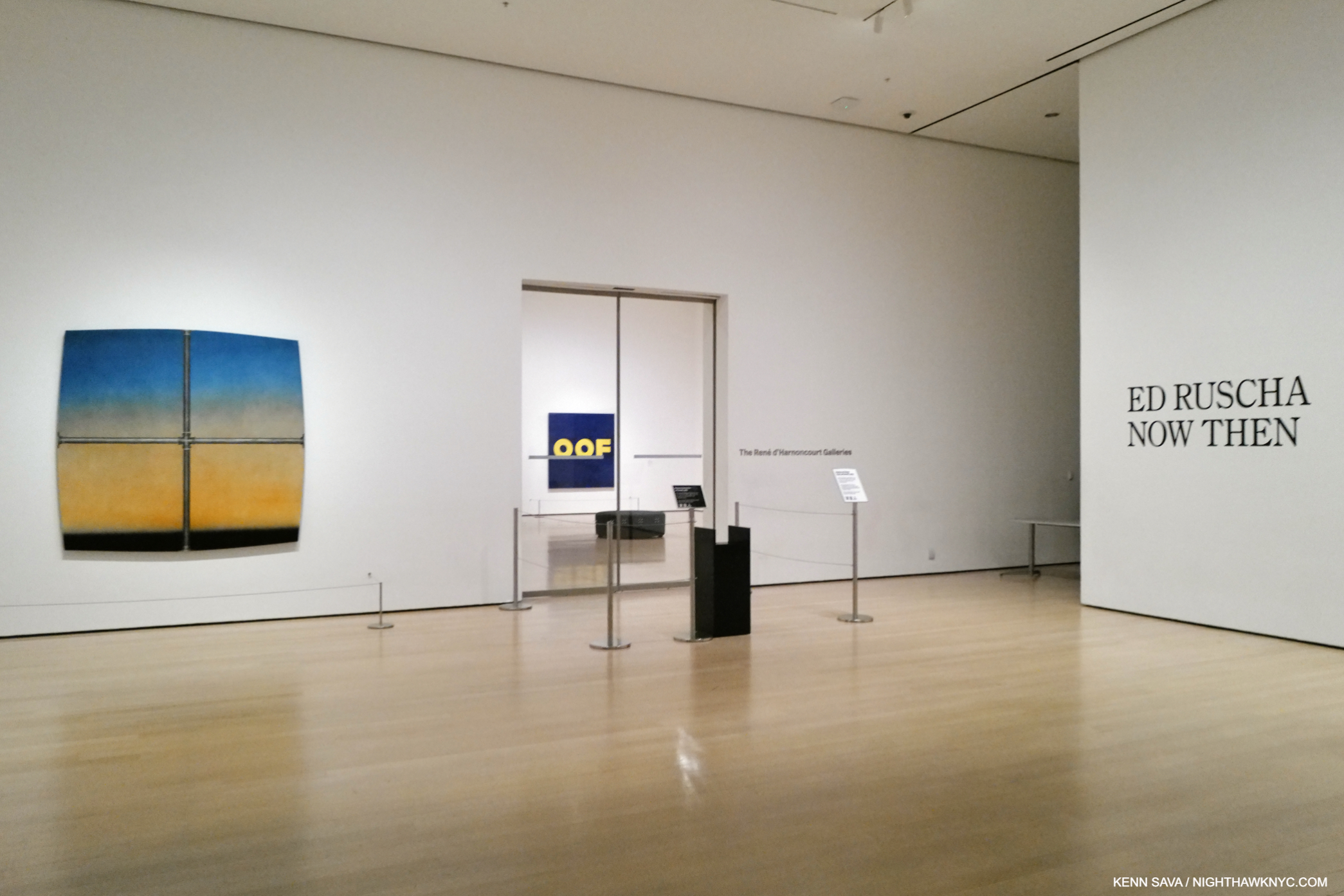
Show seen: Ed Ruscha/Now Then @MoMA

Who doesn’t like the Art of Ed Ruscha?

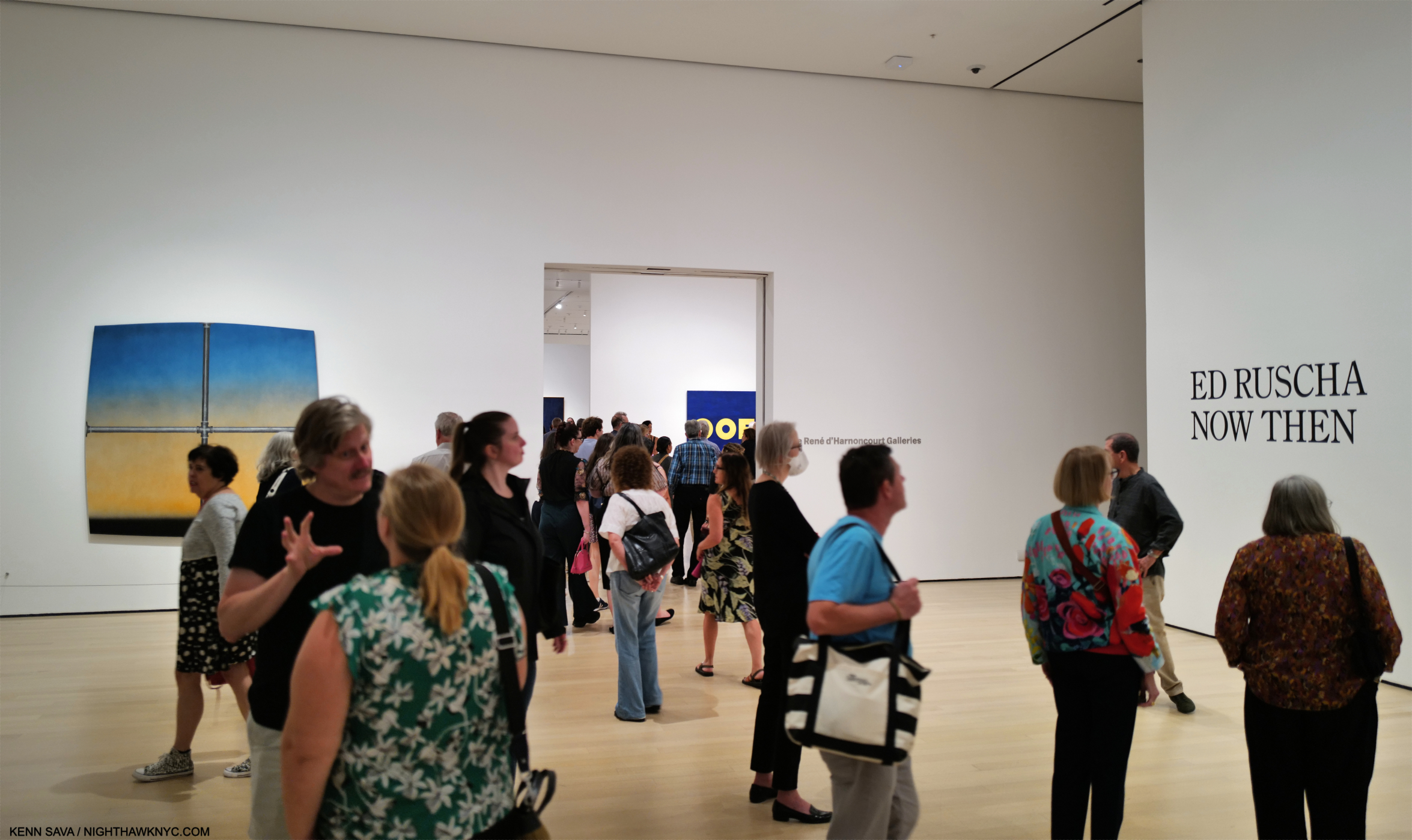
Installation view of the entrance, September 14, 2023. Images in this piece are thumbnails. Click any picture for full size.

Walking through the crowds at MoMA’s winter blockbuster, Ed Ruscha/Now Then over my six long visits bookending a terrible, six-week illness, I saw smiles as visitors moved from piece to piece, yet I couldn’t help but wonder how many of them felt they “understood” his Art. While humor undoubtedly plays a part in the craft of an Artist who knows you catch more flies with honey than vinegar, however they appear at first glance, his work usually leaves me scratching my head.

Returning to look at it again and again, that his work says something different to me every time I look at it has kept Ed Ruscha among my favorite Contemporary Artists. Judging from the turnout at MoMA, I’m far from alone in that. Having the chance to explore, and be mystified by, 200 pieces of his Art in Now Then from the, approximately, SIXTY-SEVEN YEARS(!) he’s been making it proved an all-too-rare chance to take a good hard look and try to get to the bottom of the mystery.

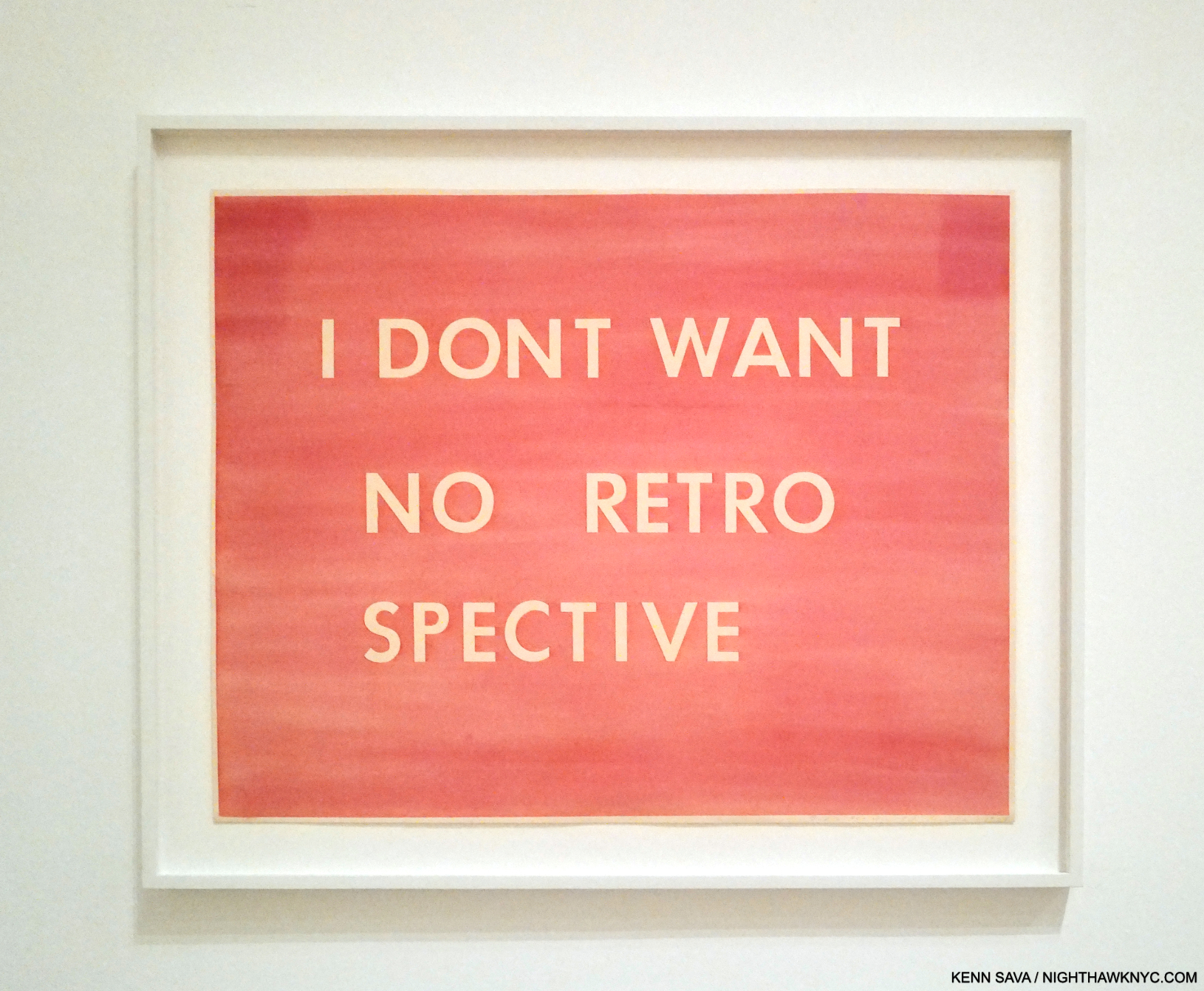
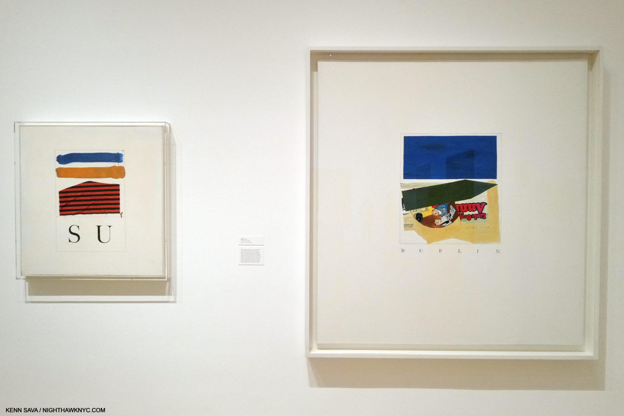
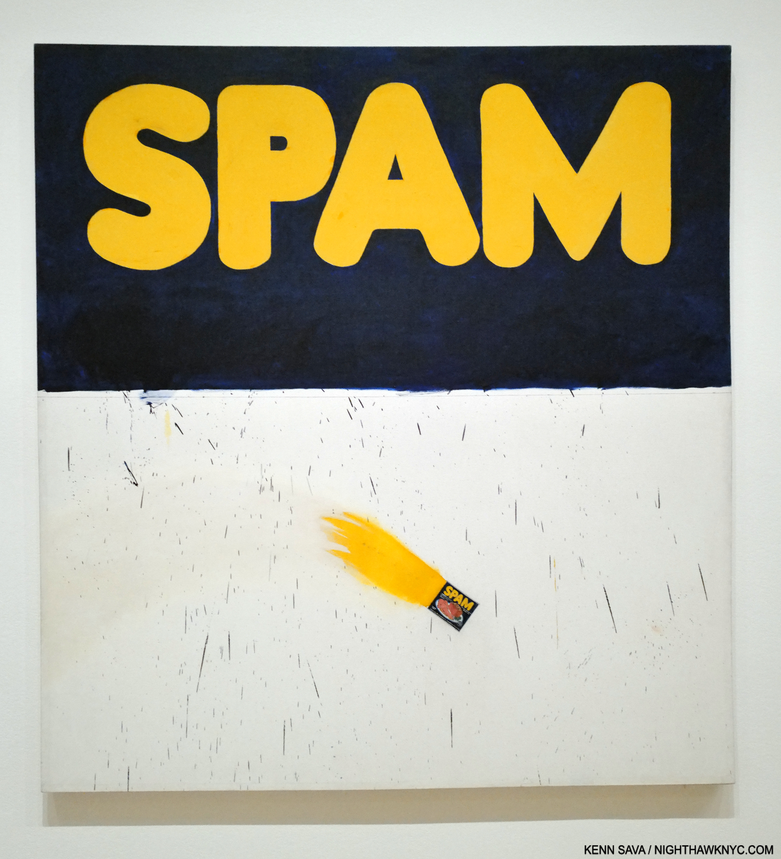
I Don’t Want No Retro Spective, 1979, Pastel on paper. The catalog for the last Ed Rusha retrospective in 1982(!) is also known by the Ruscha on the cover of its catalog, I Don’t Want No Retro Spective, though the show’s title was THE WORKS OF ED RUSCHA

“All too rare,” as in Now Then is the first Ed Ruscha retrospective here since 1982, (and so mine, too): over FORTY YEARS ago!1 The gap between them is another head scratcher given how popular Ed Ruscha’s Art is. The title Ed Ruscha/Now Then can be taken as a reference to the Artist’s penchant for revisiting his subjects over time, as well as the fact the show includes old and recent work, or a chance to see his older work now. It’s also a rare retrospective of a West Coast Artist who came to prominence in the 1960s mounted on the East Coast. Bruce Conner didn’t live to see his at MoMA like Ed Ruscha has. Ed Kienholz, and Mr. Conner’s friend, Jay DeFeo, among others, are still waiting for their East Coast retrospective.

Installation view from just inside the entrance of the first gallery looking into the second. Boss, 1961, the famous Large Trademark with Eight Spotlights, 1962, and the infamous OOF, 1962-3, left to right, all Oil on canvas.

Walking through it, I became particularly fascinated by how his style(s) developed, and how Edward Joseph Ruscha IV became Ed Ruscha, one of the most influential Artists in the world among Modern & Contemporary Artists, if not THE most influential, at this point in time.

Oklahoma-E, 1962, Pencil, colored pencil and charcoal on paper

Born in Omaha in 1937, his family moved to Oklahoma City when Ed was 5. Early on, he had a passion for comics and a love of typography, particularly as it appeared in commercial publications. All of these are combined in Oklahoma-E from 1962, a seminal year in his early career. His initial desire was to become a Commercial Artist, and it was towards that end that he left OKC after graduating high school to head to L.A. with a friend in a lowered 1950 Ford, to study it. He chose to go west rather than east because of its energy, glamour, and its “hot rods and custom cars2.” Unable to get into his chosen school, he was accepted at Chouinard Art Institute (later Cal Arts, where Henry Taylor would study in the 1990s). His teachers, disciples of Abstract Expressionism, “wanted to collapse the whole art process into one act3.’’ “It (Abstract Expressionism) was, in his opinion, ‘a solid way of thinking…If you think about the paintings that were done in the 1950s, I find them overwhelming, nothing but quality…It was a very powerful time in art.’ However, ‘…within AbEx there was no room for my ideas4.'” While this frustrated him, they did succeed in getting him to change his focus from Commercial Art to Fine Art, which we can all be grateful for. After Now Then, I wonder if they accomplished more.

While in school in 1957 he had an epiphany.

One of the most extraordinary works of the 1950s. Jasper Johns, Target with Four Faces, 1955, Encaustic on newspaper and cloth over canvas surrounded by four tinted-plaster faces in wood box with hinged front. Seen in Jasper Johns: Mind/Mirror at the Whitney in 2021.

“The breakthrough he sought came in 1957, when he spotted a small black-and-white repro of Jasper Johns’s 1955 Target with Four Faces in the Feb/Mar 1957 issue of Print Magazine. Encountering Johns’s painting was, he said, an ‘atomic bomb’ in his training, ‘a stranger fruit’ that he ‘saw as something that didn’t seem to follow the history of art. My teachers said it was not art. ‘I didn’t need to see the colors or the size…’ ‘I was especially taken with the fact that it was symmetrical, which was just absolutely taboo in art school- you didn’t make anything symmetrical…Art school was modernism, it was asymmetry, it was giant brush strokes…it was all these other things that were gestural rather than cerebral. So I began moving to things that had more of a premeditation5.’”

Dvision, 1962, Mimeograph on paper, One of five Prints by five Artists in the Portfolio issued in conjunction with the New Painting of Common Objects show.

That has continued to this day. Along the way, he and others (including Andy Warhol, Roy Lichtenstein and James Rosenquist), built on what Johns, Rauschenberg and Marcel Duchamp had started: the “next thing” after Abstract Expressionism, an Art based in the recognizable, the familiar, the every day. Some called it “pop.” Personally, I see nothing but danger in trying to box Ed Ruscha (who has consistently eschewed boxes).

In fact, one word comes to my mind over and over again as I look at his Art over time: abstract. If I were going to use two words to describe it they would be “premeditated abstraction.” Look at Division, above. It contains what would become Ed Ruscha trademarks- text, typography, and images, combined in a way that are next to impossible for most viewers to “read.” If that’s not “abstract?” What is? Maybe his teachers would be proud after all. It was only through delving into his history, I found that 3327 Division Street was the address of his first L.A. studio6. The car might have been his. Does that mean there’s more of a backstory to it? I haven’t found it. In the end, for me this says there may, or may not, be personal meaning to some/many/even all of his Art, but, 60+ years on, they haven’t come to light. So, with Division, as with all his Art, the viewer is left to make of them what they will.

The two earliest piece in the show, SU, 1958, Oil, ink and fabric on canvas, (sixty-six years old!), left, with Dublin,, 1960, Oil and ink on canvas, right. Yes, a comma is part of the title.

Before graduating, he took hitchhiking trips that he immortalized in some of the earliest works in the show. the mysterious SU, 1958, the earliest, strikes me as a forerunner of what would come later. Even in these early works, text and imagery appear, though separately, as different elements that seem to stand apart from each other until the viewer brings them together, or creates a narrative around them, in his or her mind. These elements have continued in his work to this day, though he would soon start layering them. SU is, also, one of the relatively few of his works that refers to an actual person, the title referring to Su Hall, his girlfriend at the time.

Actual Size, 1962, Oil on canvas, 67 1/16 x 72 1/16 inches. His breakthrough work when it was included in the landmark New Paintings of Common Objects show. A Painted, flaming, “actual size” can of Spam in its lower section is accompanied by some brush marks that might be associated with Abstract Expressionism. In fact, a number of his early pieces, like Three Standard Envelopes, 1960, also include them. Given his prodigious technique, on display in this, I don’t see how these marks can be considered accidental. Jennifer Quick7 surmises these connote AbEx’s commercialization. I see them as Ruscha making this technique his own, using it in a way none of the AbEx Artists did. I also see it as an early example of the many forms that abstraction would take in his work.

A number of his early works are quite edgy, daring and ripe with a surprisingly loose use of the brush. Were these done for class to please his teachers, or…? In fact, even some later pieces, like his Stains portfolio, contains marks that seem right out of AbEx. These stands at the other end of the technical spectrum for an Artist who possesses a superb Painting technique, something he doesn’t get nearly enough credit for in my view. They also make me wonder if his AbEx disciple teachers had a bigger effect on their student than it might seem.

The rest of the gallery includes highlights of his early 1960s Word Paintings. We watch as he continued to strip away excess and refine his concept. Eventually, single words appeared alone on solid backgrounds This is interesting because he has said of his recent phrase Paintings that the backgrounds are simply that. Early on, as in Actual Size, they appear to be more.

Vienna, Austria, 1961. This striking Photo was in a vitrine in the show, which prevented my getting a decent picture. This image of it comes from the book Ed Ruscha and Photography, P.48

After  he graduated college, Ed spent 10 months on an extensive tour of Europe. While he reports not being impressed with the museums (among other things, he was disappointed by the lack of Contemporary Art), he took note of quite a bit of what he saw while out and about, particularly the street signs, with their foreign words, different design & typographies. He Drew and Painted a number of these, but he also put the new Yashica twin-lens reflex camera he was required to get in one of his classes to good use, taking a number of interesting Photos, beginning a revolutionary career in the medium in the process. Back home in fall, 1961, he set to work. Less than a year later his work was included in the landmark show, New Paintings of Common Objects at the Pasadena Art Museum, along with that of Andy Warhol, Roy Lichtenstein, Wayne Thiebaud and others, and so-called “pop” Art was born. Ed Ruscha has consistently rejected being boxed, though he rode on the coattails of the “movement,” and the word is still used in describing his work, ignoring the visual evidence.

The first gallery concludes with an infamous work. Does this look familiar?

Ummm…It might not be what you might think it is. It’s a detail of the center of the target in Jasper Johns’s, Target with Four Faces, 1955, shown earlier. Now, look at this-

Yes! One of the two “Os” in Ed Ruscha’s OOF, 1962 (reworked 1963). Just five years after he saw Target with Four Faces, Ed Ruscha Painted the above. Coincidence? Homage? Fallout from that “atomic bomb going off in my training?” My feeling is the visual evidence is pretty strong for making a case for any or all three.

Hello! I’ve never appeared on NighthawkNYC over its 8 1/2 years, except in my self-portrait in the Banner (and a picture in my last piece, here, from the distant past). Until now. I’m introducing myself to NHNYC readers in front of a Painting I have a personal connection to: OOF, 1962-3, Oil on canvas, 71 1/2 x 67 inches on Ed Ruscha/Now Then’s final day, January 15, 2024. As for my “personal connection” to OOF? Very, very few know. My thanks to the lady who graciously agreed to take this.

Personally, it’s hard for me not to think there’s an influence; in the colors, the shape of the circle/”Os.” Even if it’s subconscious. Looking at both of these works now, they’re both revolutionary in their way. The Johns has been discussed at length over the past 60 years. Does anyone else think OOF is a revolutionary work, let alone a masterpiece? I believe it’s both. Revolutionary? It’s possibly the first time (as far as I know) that a Painting features a “word” that Merriam-Webster categorizes as an “interjection,” and not an actual “word” per se. I also believe it’s an “alt masterpiece.” Seriously. The composition, colors, font, placement of the text are all perfect, belying Ed Ruscha’s mastery of typography and graphic design, with the sublime taste that would be a hallmark of his work. OOF stands as the pinnacle of his early word Paintings in my view. Oof is a word, if it is one, that defies concrete understanding, making it a perfect (unofficial) conclusion of sorts to the series. Merriam-Webster says Oof is an interjection “used to express discomfort, surprise, or dismay8.” They point out “the first known use of the word was in 1777,” which I find hilarious. How do they know? Did they consult an Oofologist? They further define an interjection as “an ejaculatory utterance usually lacking grammatical connection9.”

Oof!

OOF everywhere around town. A first step to a better world! I yelled “OOF,” but he didn’t stop.

As such it seems to me that OOF stands as an outlier among the single words Ed Ruscha chose as the subjects of his early 1960s Word Paintings (BOSS, HONK, ACE, SMASH, FLASH and NOISE, shown below, et al) because it is quite abstract, and therefore, a jumping off point for what was to come. I wish I had asked viewers what the Painting said to them. Having owned it for 61 years, MoMA is well aware of its mysterious appeal. No doubt that is why the museum chose to emblazon OOF all around town as the focus of their show marketing.

Noise, Pencil, Broken Pencil, Cheap Western, 1963, Oil and wax on canvas, 71 1/4 x 67 inches. There are two Painted pencils in the piece, and lo and behold someone left another one on the floor, behind the left stanchion. I resisted the urge to move it for effect for this picture. Maybe, I should have…

Along with abstraction, it seems to me there are surreal elements in his work. Perhaps no single word Painting has these abstract/surreal qualities than Noise, Pencil, Broken Pencil, Cheap Western, 1963, which also represents an evolution. Ed Ruscha has long considered it one of his best Paintings[3, Per the wall card.]. In it, the mystery of the word is added to with three very realistic images, close to its own edge. Unusual for a Painting, or Art, it leaves the center, the focus of most Art, empty except for the background color. Most of the previous Word Paintings centered the featured word. As such, it’s both unique and a precursor of other works that combine words and images. It’s also both abstract, thought it depicts realistic objects, and surreal. If I read it from the left, the whole pencil lies quietly seemingly in mid-air. The word “NOISE,” another monosyllabic word, grows until it reaches the right side (again, like a speeding train) where it hovers above the broken pencil. The cheap western seems to be hovering in the air, too, like the left-hand pencil, where it wouldn’t make noise until it lands, which it might be close to doing. The Artist has created “action” from three still objects and a word.

In the catalog for that last major Ruscha retrospective there’s this-

“The broken pencil calls to mind the incident Ruscha has referred to a number of times in interviews when as a child in parochial school he was regularly rapped on the knuckles with a pencil by a nun who caught him misbehaving in class. Is the pencil, then, simultaneously a symbol of expression and repression10?”

If this is the case, though Mr. Ruscha has not said that this incident is what’s depicted here, my reading of it wonders if the “Cheap Western,” i.e. the comic book which appears to be reaching the bottom of the piece, was struck from his hand when he was caught reading it in class, being a big fan of comics at this age, the broken pencil having been cracked over his hand. It’s also, simultaneously, an abstract and a surreal composition. As many have pointed out, it also leaves the center bare. It carries forward his use of the single word, while also taking it on a new tangent.

Bouncing Marbles, Bouncing Apple, Bouncing Olive, 1969, (not in the show) has much in common with Noise, Pencil, Broken Pencil, Cheap Western from six years earlier. One of countless Ed Ruschas that feel surreal to me. Here, he “sugar coats” the surrealism by using harmless objects like marbles and an apple on a welcoming green background. Leaving the olive, the looming black, and the fact that the marbles & apple are bouncing to stir up our imaginations, making the work decidedly not a “still life.” *- Photographer unknown.

Noise, Pencil, Broken Pencil, Cheap Western is another one-Painting revolution, like OOF was. Though both were only followed-up indirectly, as in Bouncing Marbles, Bouncing Apple, Bouncing Olive, 1969. Now, look at this-

Salvador Dali, the legendary Surrealist, Open Field with Ball in Centre and Mountains in Rear, Study for the Disney film Destino, 1946, Oil on masonite. Influence? Seen in MoMA’s catalog for their show Dali & Film.

Works like Noise, Pencil, Broken Pencil, Cheap Western and Bouncing Marbles, Bouncing Apple, Bouncing Olive (and other works that include marbles and olives) are so different from anything that’s come before in his work. Yet, as time went on, they are joined by many works that while they depict recognizable objects are very abstract, even surreal, including his recent Tom Sawyer Paintings. Most of them have no words, and taken as a group they now form a sizable part of his oeuvre. For my part, I trace them all back to Noise, Pencil, Broken Pencil, Cheap Western from 1963.

Large Trademark with Eight Spotlights, 1962, Oil on canvas 66 9/10 x 133 1/10 inches. An early L.A.-inspired work, like most of Ed Ruscha’s work its “meaning” is nebulous. At the time he Painted this, the famous Film studio was in decline and going through layoffs. One reading might be a comment on fleeting fame about to fade out, or like his PhotoBook, Every Building on the Sunset Strip, 1966, possibly a hard realization for the Artist who relocated from Oklahoma City, that glamour is not all it appears to be from afar. It’s also a work that is reminiscent of a speeding, approaching train, a compositional device he would use again. Though it’s described as “Oil on canvas,” those are graphite lines leading to or from the vanishing point.

In 1962, L.A./Hollywood, its sites and culture began appearing in Ed Ruscha’s Art, as in Large Trademark with Eight Spotlights, which is also a precursor to his multi-word and phrase Paintings. Over the succeeding 60+ years, few if any, Artists would become more associated with Los Angeles than Ed Ruscha is and has been. From then to now, he would continue to Paint the city, and words and image would coexist in his Art, while single words largely became multiple words and, beginning in 1973, short phrases that he has continued to create to this day.

By the beginning of the second gallery of Now Then, some of the core themes of his work have been created and have already metamorphosized. This revealed the development of a working process based in an endlessly restless creative drive that would not let Ed Ruscha stay in one place for very long Artistically. What lay ahead over the next six plus decades(!) has been nothing if not the continually unexpected.

Part 2, “Ed Ruscha’s Wall Rockets,” is here. The concluding Part 3, “Ed Ruscha & The Two-Sided Coin of Influence,” is here

*-Soundtrack for this piece is “Down the Highway,” by a Musician who has been creating and performing for about as long as Ed Ruscha has: Bob Dylan, born May 24, 1941, 3 1/2 years after Ed Ruscha. Bob released “Down the Highway” the same year Mr. Ruscha created a number of the Paintings in this piece, on 1963’s The Freewheelin’ Bob Dylan.

NighthawkNYC.com has been entirely self-funded & ad-free for over 8 years, during which 320 full-length pieces have been published! If you’ve found it worthwhile, PLEASE donate by PayPal to allow me to continue below. Thank you, Kenn.

You can also support it by buying Art, Art & Photography books, and Music from my collection! Art & Books may be found here. Music here and here.

Written & photographed by Kenn Sava for nighthawknyc.com unless otherwise credited. To send comments, thoughts, feedback or propositions click here. Click the white box on the upper right for the archives or to search them. Subscribe to be notified of new Posts below. Your information will be used for no other purpose.

  1. The traveling retrospective, THE WORKS OF ED RUSCHA, came to the Whitney Museum in 1982, one of five museum stops it made, when the Artist was about 45.
  2. ER, Tate, P. 9
  3. Alexandra Schwartz, Ed Ruscha’s Los Angeles, P.17
  4. Alexandra Schwartz, Ed Ruscha’s Los Angeles, P.15
  5. Alexandra Schwartz, Ed Ruscha’s Los Angeles, P.15
  6. E.R. Tate, P.100
  7. in her book, Ed Ruscha: Art & Design in the 1960s
  8. Here
  9. Here
  10. I Don’t Want No Retrospective- The Works of Ed Ruscha, P.15

Sarah Sze: Timelapse- Freeze Frame

This site is Free & Ad-Free! If you find this piece worthwhile, please donate via PayPal to support it & independent Art writing. You can also support it by buying Art & books! Details at the end. Thank you.

Written & Photographed by Kenn Sava

This is Part 2 of my look at Sarah Sze: Timelapse at the Guggenheim Museum. Part 1 is here.

Slice detail with Wright’s Oculus.

As I said in Part 1, there were so many amazing details in Timelapse I decided to devote a separate piece to them. I’m showing 40 as thumbnails. Click on any image for full size. There’s also a short video clip.

…and wonder about Timelapse I continue to…Show posters behind appropriate scaffolding, Seen on 10th Avenue, June 5, 2023.

The hub for the black string.

Following are Photos of details in the 8 Bays on the 6th floor. Please refer to the overall shots of each installation in Part 1 for orientation and where they are installed in each piece.

The following are details from Bay 1, The Night Sky is Dark Despite the Vast Number of Stars in the Universe

Detail of the Hammock in Bay 1. The Hammock over the ground floor pool and the Hammock Sarah Sze created in 2015 had a similar overlay. I believe the material on the floor is part of the installation, and hasn’t fallen through.

Detail of the far left corner of Bay 1, with a shadow from the Hammock and an image from River of Images.

The following are details from Bay 2, Travelers Among Streams and Cascades

Three details from the Painting, Travelers Among Streams and Cascades. This one from the left section…

Detail of the center section…

Detail of the right section.

The following are details from Bay 3, Slice.

Slice. Detail of the front.

Slice. Close up of the front. Shown here are a number of the recurring image “themes”: hands, birds, the Sun, fire, the sky and other aspects of nature.

Detail behind Slice with River of Images.

One of many levels and rulers.

Looking over a rung of a ladder to see the model of Slice in its Bay installed under it displayed next to the final piece.

Throughout Timelapse lamps were used apparently to draw the viewer’s attention to specific images or objects.

The following are details from Bay 4, Diver, Second of two parts and Images That Images Beget

The following are details from Bay 5, Times Zero

Times Zero, 2023.

The following are details from Bay 6, A Certain Slant,

Detail of the center surrounded by images of hands and objects.

Detail of the far right corner looking to the right from the image above. I imagine the salt from those blue containers is what is in the center of the circle.

Detail of part of the installation on the floor further to the right in the previous picture.

The following are details from Bay 7, Last Impression

An alternate, slightly closer view of Bay 5 from what I showed in Part 1. As you can see in the full size image, the empty frames to the right are attached to the strings that run across the gallery.

Some details of the ladder at the right side, front, of the Bay.

The following detail is from Bay 8, Things Caused to Happen (Oculus)

Short clip of Things Caused to Happen (Oculus).

The Artist points out that in the end, the digital images beamed on to Things Caused to Happen (Oculus) break up on the far wall.

*- Soundtrack for this piece is “I’ve Seen It All” by Bjork. This time in the version with Thom Yorke.

NighthawkNYC.com has been entirely self-funded & ad-free for over 8 years, during which 300 full-length pieces have been published! If you’ve found it worthwhile, PLEASE donate to allow me to continue below. Thank you, Kenn.

You can also support it by buying Art, Art & Photography books, and Music from my collection! Art & Books may be found here. Music here and here.

Written & photographed by Kenn Sava for nighthawknyc.com unless otherwise credited. To send comments, thoughts, feedback or propositions click here. Click the white box on the upper right for the archives or to search them. Subscribe to be notified of new Posts below. Your information will be used for no other purpose.

Van Gogh’s Cypresses: Art From Hell

This site is Free & Ad-Free! If you find this piece worthwhile, please donate via PayPal to support it & independent Art writing. You can also support it by buying Art & books! Details at the end. Thank you.

Written & Photographed by Kenn Sava (*- unless otherwise credited)

This new decade promptly brought with it the coronavirus pandemic, then a rolling lockdown in response. Isolation followed worldwide to a degree not seen since the equally devastating Spanish flu pandemic, 1918-20. I imagine most of us experienced isolation, or close quarters living, more than we had in our lifetimes. Still emerging from mine, as others are around the globe, it was somewhat ironic and timely that The Met chose Vincent van Gogh (1853-90) as the subject of its 2023’s summer blockbuster show. I also found it fortuitous. There’s spending a few years alone. Then, there’s spending virtually your entire adult life alone. As a momentous day dawned in my life, one I had dreaded spending alone- Who better to spend it with than Vincent van Gogh?

Perhaps no one I know of was more familiar with isolation and being alone than Vincent was. 

Welcome to The Met! In all my years of going to The Museum as I call it, currently 1,800+ visits since 2002, I’ve never seen TWO banners (left & right) up devoted to the same show. And, as I was soon to find out, it’s not like there weren’t other terrific shows going on! And, after all these years, I still get a tingle up my spine when I see this in front of me. Seen on June 2, 2023. Click any image for full size.

The Met’s Van Gogh’s Cypresses, centered on his depictions of the coniferous tree in his Art from March, 1888 through May, 1890, which the curators compare to his iconic sunflowers in his oeuvre. I, however, couldn’t get the backstory out of my mind. Rarely mentioned on the wall cards, was the utter hell Vincent was living through during the final year and a half covered by the show. In a life marked by struggle & loneliness, perhaps nothing he experienced was as bad as the confluence of hardships Vincent van Gogh faced from December 23, 1888 through May, 1890, when the show ends, 2 months before his death by suicide or murder.

The maze-like ticket line. You buy yours, then get on the “virtual line” and wait for a text…

I saw Van Gogh’s Cypresses three times. Each time, I bought my ticket, then waited on the “virtual line” for 2 hours before it was my turn to go in. Well, if I could pick a place on Earth to be “stuck in” with 2 hours to kill, “Oh, PLEASE let it be The Met!” Suffice it to say that during my waits I saw exceptional shows: Cecily Brown: Death and the Maid; Juan de Pareja, Afro-Hispanic Painter; In Praise of Painting: Dutch Masterpieces at The Met; and Philip Guston: What Kind of Man Am I? ! Two I’ve subsequently written about. PHEW. And then, I then spent close to 3 hours in Cypresses each time. 

During my wait I also checked out Vincent in the Permanent Collection upstairs to reconnect with his work that wasn’t in the show. I wrote about this gallery in 2018 when they were reinstalled after the skylight project had been completed here. Notice the light coming in from above.

Along the way, I realized I have been looking at Vincent for over 40 years. Van Gogh’s Cypresses is the FOURTH major Met Van Gogh show I’ve seen. In 1984, I saw Van Gogh in Arles. In 1986, Van Gogh in Saint-Rémy and Auvres (which includes the period covered in Cypresses), and in 2005, Vincent Van Gogh: The Drawings. Each one terrific1. The common denominator of each show is Susan Alyson Stein, who was on the staff of the first two, rose to co-curator of The Drawings, and now curator of Cypresses. Her legacy at The Met is approaching that of Carmen Bambach, Met curator of Drawings & Prints, who has given us the landmark Michelangelo: Divine Draftsman & Designer and Leonardo da Vinci: Master Draftsman, among others. HOW Ms. Stein, her team, & The Met ever got MoMA to part with The Starry Night, perhaps MoMA’s biggest single attraction, for the entire summer amazed me.

You may never see this again. MoMA’s Van Gogh wall on July 4, 2023 with The Met’s Irises, center, in the spot previously (and currently as of October 20, 2023) occupied by The Starry Night. Unfortunately, its original pink background has faded and apparently can’t be restored.

On a visit to MoMA this summer, I discovered The Met had “traded”/lent Vincent’s Irises, 1890, for it, which MoMA hung in The Starry Night’s spot. Interestingly, both it, and the work to its left in the picture above, The Olive Trees- Saint Rémy June-July, 1889, were Painted while Vincent was in the Asylum, the subject of the central, Part II of the show, but are not included in Cypresses because neither depict them.

Meanwhile, at The Met, Cypresses begins in somewhat subdued, though beautiful, fashion.

Drawbridge, May, 1888, All Paintings shown are Oil on canvas unless stated. The cypresses stand off to the side.

Arranged in three Parts, Part I of the show takes place in Arles from March, 1888 to early Spring, 1889. Vincent is hard at work trying to build on all he’d seen in his prior 2 years in Paris, a time that saw his work go from the dark, almost monochromatic, earth tones of works like The Potato Eaters to vibrant color. His palette has opened up, his journey to being “the first great colorist. Great…great colorist,” as David Hockney called him2, has begun. Now, he was after a style of his own. Note the very flat sky in Drawbridge, the first Painting in the show.

Installation view of Part I. The entrance is on the far right. Drawbridge straight ahead.

Throughout this period, and for the rest of his life, he juggled the influence of countless Artists, including the so-called Impressionists, the so-called Post-Impressionists and Japanese Woodblock Prints, all of which can be seen in Drawbridge. He had met and been influenced by Georges Seurat3, Paul Gauguin and Claude Monet (who was represented by his Art dealer brother, Theo, for a time), among others. His mission now was to develop his own style and begin to have his work sell, like theirs was beginning to. Totally dependent on Theo for money to survive, the heat was on.

Garden at Arles, July, 1888. Another flat sky, but notice how everything else is different. It has an almost spontaneous feel to it, until you see the Drawing next to it, now below. It’s endlessly fascinating to compare them both. 

Looking at the Paintings and Drawings in Part I, almost no two share entirely the same style. In Drawbridge, and Garden at Arles, above the skies are fairly flat. That would end. Notice the difference in the landscapes in both Paintings, created 2 months apart. In Part 1 we see the state of flux his style was in, indicative of his efforts to meld all he had seen in Paris and in Japanese Prints into a style of his own.

Garden with Flowers, July-August, 1888, Reed pen and ink over graphite on wove paper. Yes, a reed pen, which is made by cutting and shaping a single reed straw or length of bamboo. In Part I, a Drawing is pared with its resulting Painting a few times. Though some of his work, like Garden at Arles, above, has a “spontaneously dashed off” look to it, this is deceiving. Studying both, it’s striking to me how exact Vincent was when it came to translating his work from Drawing to canvas. Close looking reveals that even the smallest details are faithfully copied over from one to the other. After. you’re done studying that, then ponder his choices of color for each part.

By 1888, his Drawings, on the other hand, needed no additional inspiration beyond what he seems to have learned from his passion for Japanese Prints, which he amassed a sizable collection of. At least, that’s the only explanation I can find for them- there is none in Western Art that I know of. His Landscape Drawings from this time, like Garden with Flowers above, were and are, singular. Ever since I saw them in depth at The Met’s Van Gogh: The Drawings show in 2005, I continuously marvel at how he now saw and rendered fields, trees, and skies, especially since earlier on his Landscape Drawings, like this one, were much more “traditional.” His evolution as a Draftsman was as quick and as stunning as that of his as a Painter, and are among the most remarkable things about Vincent’s Art career.

Theo would convince Gauguin to join Vincent in the Yellow House in Arles, after offering him financial assistance to do so. This would FINALLY be the beginning of the realization of Vincent’s dream of establishing the “School of the South.” Arriving in September, the two co-existed for a while, but their personalities were bound to combust at some point. Very little is said in the show about what happened to Vincent next.

Still Life of Oranges and Lemons with Blue Gloves, January, 1889. The culminating work in Part 1. The prevailing serenity of this work, with cypress branches surrounding the basket, is shattered when you realize that this was Painted a few weeks after the attack that resulted in Vincent cutting off his left ear! In and out of the Arles hospital in January, and caught in an overwhelming fear of another attack (which he would have a few weeks later4)- all of which he was dealing with alone- HOW is it possible he could Paint this?

On that fateful December 23rd, 1888, the stuff hit the fan with Gauguin. Things had been festering while the two passionate & volatile temperaments were largely stuck inside working in close quarters due to the winter weather, until the boiling point made Gauguin announce he was leaving Arles to return to Paris, ending their “experimentation” in the Yellow House and Vincent’s long-standing dream of a “School of the South.” As if this wasn’t upsetting enough, Vincent had just received a Letter announcing that his brother Theo planned to marry, ending his hopes for the two brothers to live & work together. These portents of abandonment, the dashing out of hope (critical for someone as isolated as Vincent was), and the impending Christmas holiday, which reminded the Artist of his horrible falling out with his family one Christmas past, apparently conspired to bring on an attack5. The exact illness Vincent suffered from is still the subject of hot debate 130+ years later. Some say it was due to his drinking. Other theories include syphilis and epilepsy. In the throes of all of this he cut off his left ear, apparently leaving only the earlobe, then wrapped it and took it to a brothel that Gauguin may, or may not, have been in at the time. Barred entrance, he presented it to the “sentry” at the door, then went home and collapsed6. Theo was summoned, but stayed only a few hours before rushing back to Paris(?), with Gauguin! Vincent was hospitalized in Arles, with an initial diagnosis by the 21-year-old medical student on duty as suffering from frontal lobe epilepsy.

Vintage advertisement for the Asylum in Saint-Rémy. Notice the walls around the Asylum. *-Photo from the Van Gogh Museum

He would be in and out of the hospital7 until, steps ahead of his neighbors who had signed a petition to have him removed from their midst, he decided to VOLUNTARILY admit himself  to the insane asylum in nearby Saint-Rémy, in May, 1889, which is the point at which Part II of Van Gogh’s Cypresses begins. Phew…

Installation view of Part II, which is centered on a veritable “murder’s row” of 5 Van Gogh Masterpieces, highlighted by The Starry Night, right of center, with the Met’s Wheatfield with Cypresses partially hidden by the column. In my view, these are some of the most unfathomable Paintings in the entirety of Western Art history given the circumstances of their creation. It’s stunning how The Starry Night breaks up the vibrant sunshine in the others as the only nocturnal work among them.

For the next year, in particular, and for the short rest of his life, his fears of another attack proved well founded. He had had smaller attacks before the December, 1888 attack in which he cut off his ear. He would have four serious attacks in the year he spent in the asylum.

“Each time he hoped would be his last. ‘A more violent attack,” he feared, “could destroy my ability to paint for good.’ But instead, the attacks grew longer and fiercer; the intervals between them, shorter; his behavior, more bizarre and violent. Once, while in the garden, he scooped up a handful of dirt and began to eat it. Another time, he assaulted his asylum escort, accusing him of being a spy for the secret police.”

“With each escalation, the misery between attacks deepened and the leash of restrictions tightened. He was confined to the asylum; then to his dormitory; then to his room; then to his bed. He spent almost two months deprived of “open air.” His throat swelled up with sores. He barely ate or spoke, and wrote no letters. At times, he longed for death, if only the next attack would be his last. ‘I hated the idea of regaining my health,’ he later recalled, ‘always living in fear of relapses … I preferred that there be nothing further, that this be the end.’” Van Gogh: The Life, P.772

When Painting was forbidden, that might have been the hardest for him being the only thing he cared about. Painting was all he had left. (I shuttered as I wrote that.)

A (partial) list of the breakdowns/attacks Vincent suffered as they appear in the Index of Van Gogh: The Life. Arles is where he was in Part I of the show, where the smaller attacks led to the big “ear-cutting attack”. He was in the Asylum in Saint-Rémy in Part II. Only the major, ear-cutting, attack on December 23, 1888 is even mentioned, in passing, in the show.

But, as horrible as all of that must have been, there were still more levels of hell in store for Vincent. Things got worse. 

“Is there a reason for today?
Do you remember?”
*- Cream “World of Pain”

If you love Vincent van Gogh, this woman deserves your thanks. Johanna (Jo) van Gogh-Bonger was Theo’s wife for a year and a half before he died of syphilis, six months after Vincent died. Vincent strongly resented her coming in and “taking” Theo from him. Though she knew nothing about Art she inherited Vincent’s Estate from his brother and went on to make Vincent one of the most popular & beloved Artists in the world today. She did it by realizing Vincent’s Letters were the key to getting people interested in him. She edited & published them, though her edition is out of print, and not the one seen here in The Met’s bookstore, June 2, 2023. Hans Luijten’s biography is extremely detailed and is recommended- after you read Van Gogh: The Life and Vincent’s Letters.

As if his all of that wasn’t enough, during this time, he often went for a month or longer without hearing from Theo, who was busy with his impending marriage to Jo Bonger, finding and preparing an apartment for the new couple, and then for the arrival of their first child- ALL of this pained Vincent greatly, Theo being his lifeline to the world & support in it. As if that wasn’t enough, furthering his intense feeling of abandonment & isolation, Vincent was not allowed to explore the surrounding countryside for the first month in the asylum. A man now regarded among the great Landscape Painters the world has yet seen was forced to settle for the asylum’s enclosed garden and seeing the surrounding countryside from his window- a window with bars on it!

Somehow, NONE of this stopped him from creating masterpieces.

Landscape from Saint-Rémy, June, 1889. June, the month after his arrival, would be the key month in his year at the Asylum.

“I have two landscapes on the go of views taken in the hills. One is the countryside that I glimpse from the window of my bedroom. In the foreground a field of wheat, ravaged and knocked to the ground after a storm. A boundary wall and beyond, grey foliage of a few olive trees, huts and hills.” Letter to Theo (Letter 779, June 9, 1890).

Painted in June, 1889, almost exactly one month after he arrived in the asylum, this is the view from his 2nd floor bedroom window- minus the bars. It’s very interesting to me that he left the bars out. (There is a work in the show of the wall in his studio that shows its window with bars, shown below.) It certainly wouldn’t have been salable at the time if he had included them, but, how much more so is this? This is a Painting about nature- the land (with distant, almost incidental, cypress trees), the hills, the sky- and not a defacto “self-portrait.” Or is it? The wheat has been “ravaged and knocked to the ground after a storm,” confined in a space bordered by “a boundary wall.” Is that an analogy to his condition and situation at the time? There’s nothing more about it in Letter 779, so it would only be my speculation. IF that is not the case, and Vincent’s sole intention is what we see- without the bars that he saw- then I find it utterly transcendent. Note the mountains and the way the huts are situated- they would have another life.

Inside his life in the asylum. Vincent was granted the use of an empty room downstairs from his room as a studio. Window in the Studio, October, 1889, Chalk, brush, oil paint, and watercolor on paper, seen in Part III, shows a window he saw the outside world through- this time with the bars on it. Note the Artwork hanging in the upper right corner.

The opening of Part III: Vincent’s window, left, with the actual work he shows in the upper right corner hanging next to it- Trees in the Garden of the Asylum, October, 1889, right. It shocked and almost overwhelmed me when I realized this work hung in his asylum Studio. As such it’s one of the most extraordinary things I’ve ever seen (even beyond Art). Vincent chose this work to look at while he was living a horror show.

“Outside my window is a tree
Outside my window is a tree
There only for me” *

Here he is, having admitted himself to an insane asylum(!) with an ailment that doctors still argue about, entirely alone, surrounded by the insane, and living in fear of suffering another attack. Still, his Letters reveal he put himself under continual pressure to develop his own style AND create work that was salable to justify the expense Theo was incurring and, possibly, support himself. Yet, in spite of ALL of this he SOMEHOW managed to create 150 Paintings, including any number of masterpieces! Among them, what is now, perhaps, the most beloved Painting in the world- The Starry Night– which he Painted that same June- one month after entering the asylum, during a period when he was not allowed outside at night!

“I can hear all the cries of the city
No time for pity
For a growing tree
There is a world of pain
In the falling rain
Around me” *

Is this the “greatest” Painting in Western Art? While I don’t believe “best” exists in the Arts, a case can certainly be made for just that. I think an even stronger case can be made that it is the most revolutionary Painting of its time and before. It’s unprecedented. In any event, it certainly must be among the most loved today, if it is not THE most loved Painting in the world. But? It twasn’t always thus! There is no Painting I’ve stood in front of more often in my life than The Starry Night, June, 1889. That’s because MoMA owns it, I live here and I make a point of seeing where they have installed it on each visit8. No matter- Every single time I see it, it thrills me. Seen here during the first time of all those I haven’t seen it at MoMA. The Met, June 2, 2023.

That’s right- Perhaps, the most famous night Painting in Art history was Painted indoors because the Artist was not allowed outside at night. (Read that again. I almost typed it twice it’s so hard to believe.) When you compare it to Starry Night Over the Rhone, September, 1888, which he did Paint outdoors at night, the difference becomes obvious. Stuck inside, to create The Starry Night, he combined a few Paintings he had already created into a night scene. He “borrowed” the horizon of hills from the recently completed Landscape from Saint-Rémy shown earlier. Front left is a large cypress, the tree having arrived as a focus after having lived in the background as seen earlier. The Met’s curators make the case of the numerous meanings the tree has had down through the centuries, death among them, given its frequent appearance at cemeteries. Long life, another, given the 1,000 year life of some. It would be central for a few months that summer, then, it suddenly disappeared from his focus, again relegated to the distance. This makes me wonder if the cypress had a connection with Paul Gauguin, who Vincent was eternally trying to win back after the disaster before Christmas the year before. The sky, the stars and the moon, however, are something else entirely- something not based on an earlier Painting he or anyone else did. Here, in all its glory, we finally see Vincent coming into his own!

After he Painted it, Vincent came to regard The Starry Night as a “failure!” He sent it to Theo, as he did all his Paintings. Theo didn’t know what to do with it. He railed against Vincent exploring stylistically, considering efforts like this to be “unsalable.”

“’it is better to attack things with simplicity than to seek after abstractions’, he confessed to having erred in the past with images like La Berceuse and the second Starry Night (i.e. this one, from June, 1889), both of which he dismissed as ‘failures.’ ‘I allowed myself to be led astray into reaching for stars that are too big,’ he wrote, ‘and I have had my fill of that9.'”

Vincent promised to toe the mark and produce more conventional work. That sound you hear is the wind rustling through the trees caused by countless millions of Art lovers today shaking their heads in disbelief.

You’re looking at the reason The Met had to get MoMA to lend them The Starry Night. Under the terms of its acquisition, the Met’s Wheatfield with Cypresses, June, 1889, is not permitted to leave the building. In the show, it was displayed immediately following the immortal nocturnal work. Both were Painted in June, 1889, as was Landscape from Saint-Rémy, shown earlier, making June, 1889 one of the most historic months in Art history. Wheatfield with Cypresses is usually displayed on its own wall in The Met’s Permanent Collection Galleries, signifying how The Museum feels about it, though they have 24 Paintings by Vincent! MoMA has 3. Wonder why I heart NYC?

Let’s think about it for a moment. The Starry Night is a one-Painting revolution that no one followed! Almost every other work of daring has inspired imitators or disciples, from Picasso’s Cubism to Seurat’s “chromoluminarism,” as he called his style (others have called it “pointillism”), to Jackson Pollock’s abstractions. Artists who are or were influenced by Van Gogh (like Edvard Munch) seem to me to be “more generally” influenced by him than influenced by The Starry Night specifically. Vincent, himself, infrequently revisited his Starry Night innovations later. Can you imagine what it would have been like if had taken them from the get-go in June, 1889 and ran with them?

Though it’s a copy of The Met’s Wheatfield with Cypresses, it’s titled A Wheatfield, with Cypresses, September, 1889, now in the collection of the National Gallery, London. The two were hung side-by-side in a once in a lifetime chance to study them together. I spent a few hours over 3 visits just going back and forth between these two masterpieces, comparing a detail in one with that in the other. Vincent’s style at this point bordered on total freedom, yet a close look reveals how amazingly similar these two Paintings are- except for the brushwork (and the clouds). The Met’s Painting is rich with impasto, the London picture is much more refined with a greatly toned down exuberance in the application of paint.

You never hear Vincent mentioned as an “abstract” Painter, yet looking at the “London” version of The Met’s Wheatfield, which Vincent Painted 3 months after the original, it would seem to me the case could be made as elements here border on abstraction. As if The Starry Night wasn’t enough of an indication of it, the two Wheatfields with Cypresses are more examples of how far he was now ahead of his time, in my view, having started out a mere 8 years earlier as a beginner! Just incredible.

One of the very best things about Art shows is the chance to see related pieces now housed in distant corners of the earth reunited for a brief moment, like this.

Yet, despite having this apparent “freedom,” he still stuck to his original composition down to small details, though with modifications. It’s fascinating to notice what he did change and wonder why.

Cypresses, June, 1889. To my eyes, all the forms seem to want to just fly off into what we might call pure abstraction. It’s interesting the taller cypress is cut off.

It seems to me that even more than Seurat, from June, 1889, on, Vincent was pushing the frontier of what would be called “Modern Art” a few years later. I wonder if not having a formal Art education allowed him this freedom to continually break rules he may, or may not, have even been aware of.

Meanwhile, over at the Guggenheim Museum, I saw this- Vincent’s Mountains at Saint Rémy. While not in the show, I’m including it because it was Painted one month after The Starry Night and Wheatfield with Cypresses in July, 1889. While it doesn’t include cypress trees (as far as I can tell), it says much about the direction Vincent’s style was going.

While many credit Manet as the beginning of Modern Art, a case can be made that what became known as “20th Century Painting” really started in the works we see on this wall that Vincent painted from June to September, 1889- while he was in an insane asylum.

Cypresses and Two Women, February, 1890, Oil on canvas. Vincent is back at work on the cypresses, and it all has changed so much. He intended this Painting to go to Albert Aurier, the author of one of the very first reviews of his work, in January, 1890, in appreciation. In it, he called Vincent a worthy successor to the seventeenth-century Dutch masters10. This work speaks volumes of what that meant to him.

After the June whirlwind, cypresses continued in his work, as we see in the remainder of Part II, then in Part III, they almost completely and suddenly disappear.

The final wall shows that by the end of his time in the asylum, in spite of all he had endured, Vincent had indeed created his own style.

The Landscapes in the final gallery are more varied, before the final work brings it all to a rousing climax.

A Walk at Twilight, May, 1890. The penultimate work in the show is a fresh and daring approach to early evening. All the trees, including the cypresses, appear to be vibrating as if trying to shake free of form. The cypresses, though, are now ancillary in the background.

In his Letters while he was there, Vincent speaks about wishing he could stay in the asylum. SOMEHOW, in spite of it everything, he managed to create 150 Paintings, including some of the great masterpieces in Western Art, as I said, while he was there. Then, in May, 1890 he left. Two full months later, he would be dead.

A Walk at Twilight, May, 1890. A cypress stands smack in the middle in an evening work that harkens back to The Starry Night from 11 months earlier, possibly proving that perhaps Vincent didn’t think it was such a “failure” after all. Painted 2 months before his death, it’s a work that can be read in any number of ways. For me, it may be the summation of Vincent’s achievement as a Painter and innovator.

By all accounts Vincent van Gogh was extremely hard to get along with, especially for any length of time. He drank too much. He smoked too much. He was obsessive about everything he cared about and he cared about a good many things. He could be intensely argumentative in defense of what he believed. He had a LOT of trouble finding love, or even real & lasting friendships, and on and on…Then, there’s his Art.

Self-Portrait with a Straw Hat, 1887, my personal favorite work in entirety of The Met, Painted on the raw, unprimed side of the canvas (because he had already Painted on the primed side and apparently couldn’t afford more canvas), which adds to the unique texture of the work. I’ve looked at it countless times over quite a few decades now and every time I see it, I marvel at its unique way of seeing the world. Interestingly, no Self-Portraits are included in the show. This was seen on September 15, 2018 in the Permanent Collection galleries.

“As for himself, he said, ‘as a painter I shall never amount to anything important, I am absolutely sure of it11.”

Vincent was a very astute observer of Art and Artists even before becoming a Painter. So, it’s odd he was so wrong about his own Art. Still, here’s the thing I can NEVER get past-

Beginning at the incredibly late age of 27, Vincent’s Art career lasted exactly TEN YEARS from July, 1880 to July, 1890!12
His entire Painting career lasted barely NINE YEARS, from 1881 to July, 1890!

The fact that one could ask the impossible to answer question “Is The Starry Night the greatest Painting ever?,” as I posited earlier, and have it taken seriously regardless of the outcome, shows me how utterly remarkable what Vincent van Gogh’s accomplished in one decade is. Painters as diverse as Francis Bacon and David Hockney, both astute, lifelong students of Art history, consider him to have been right up there with the very greatest Painters who ever lived! Far be it from me to argue with them, but that they would consider someone who Painted for 10 years in those terms is hard to imagine. The approximately 2,100 Artworks he created, including about 860 Paintings are extraordinary- if only for their stylistic diversity as I’ve found looking at them for 40 years13.

In 2018, I wrote a piece wondering what Vincent would make of his popularity today. For someone who lived without anyone in his life, and so little acceptance & love THIS level of both- worldwide- would have to be both the ultimate irony, and completely overwhelming.

With all he had to face- isolation, loneliness, fights with his parents14, illness, poverty, years of struggle and rejection attempting to find his way in various occupations, and everything else- though a good deal of it (if not all) he brought on himself (could anything make him more human?)- before becoming a beginner Artist at 27(!), HOW is it possible he was able to overcome ALL of it to create many of the most beloved works of Art in the world, including a good many while in an insane asylum?

The only answer I’ve found is that he loved Painting THAT much. No matter what, no matter everything I’ve delineated above, and everything else I haven’t- he overcame ALL of it by Painting.

It just boggles my mind.

*-Soundtrack for his piece is “World of Pain” by Gail Collins & Felix Pappalardi and recorded by Cream on Disraeli Gears, 1967.


(A “Postscript: My Journey to Vincent” follows below, or may be seen here.)

NighthawkNYC.com has been entirely self-funded & ad-free for 9 years, during which 330 full-length pieces have been published! If you’ve found it worthwhile, PLEASE donate by PayPal below to allow me to continue. Thank you, Kenn.

You can also support it by buying Art, Art & Photography books, and Music from my collection! Art & Books may be found here. Music here and here.

Written & photographed by Kenn Sava for nighthawknyc.com unless otherwise credited. To send comments, thoughts, feedback or propositions click here. Click the white box on the upper right for the archives or to search them. Subscribe to be notified of new Posts below. Your information will be used for no other purpose.

For “short takes,” my ongoing “Visual Diary” series, and outtakes from my pieces, be sure to follow @nighthawk_nyc on Instagram!

  1. Each lives on in terrific catalogs, which are all highly recommended.
  2. David Hockney on Vincent van Gogh.
  3. Vincent’s time with Seurat, Paul Signac, Emile Bernard and Charles Angrand in Asnières, a Parisian suburb, which directly precedes the period of Cypresses, was the subject of a fascinating show at the Art Institute of Chicago concurrent with, but otherwise not connected to, Van Gogh’s Cypresses
  4. on February 4, 1890, per vangoghletters.org
  5. In Van Gogh: The Life, the authors, Stephen Naifeh and Gregory White Smith, correlate Vincent’s attacks with the level of stress & strain he was under.
  6. Van Gogh: The Life, P.704
  7. and having the 3rd attack since December on February 26, 1890 per vangoghletters.org
  8. As I’ve written, it’s endlessly puzzling how MoMA can spent 2 BILLION dollars on renovations this century and apparently never consider where they are going to display their most popular pieces- particularly The Starry Night, which has continually been relocated often without ever finding the “perfect” spot.
  9. Van Gogh: The Life, P. 784
  10. Here
  11. Van Gogh: The Life, P.743
  12. Like that of Jean-Michel Basquiat.
  13. Just page through a copy of Van Gogh: The Complete Paintings, one of my Desert Island Art Books, to see for yourself, the “Brick” edition is about $25. new.
  14. His mother, Anna Carbentus, who had Painted and gave him his first Drawing lessons, and who survived him by about 17 years to 1907, 2 years after the first big Van Gogh show mounted by Jo, never warmed to his Art (Van Gogh: The Life, P.795).

Cecily Brown At The Met: Bold, As Love

This site is Free & Ad-Free! If you find this piece worthwhile, please donate via PayPal to support it & independent Art writing. You can also support it by buying Art & books! Details at the end. Thank you.

Written & Photographed by Kenn Sava

Show seen- Cecily Brown: Death and the Maid @ The Metropolitan Museum through December 3, 2023.

The show’s opening brought me to a dead stop. Click any image for full size.

Over the course of its generous run, from April 4th through December 3rd, Cecily Brown: Death and the Maid  has had some VERY serious competition among great Art shows up in NYC’s museums for Art lover’s attention this year. Consider- MoMA had the excellent Georgia O’Keeffe: To See Takes Time (April 9th through August 12th), and now the equally excellent Ed Ruscha / Now Then (September 10th through January 13, 2024). The Whitney has Henry Taylor: B Side (October 4th through January 28, 2024). In addition to Death & The Maid, The Met had its summer blockbuster, Van Gogh’s Cypresses (May 22- August 27), and the just opened Manet/Degas (September 24th through January 7, 2024). Phew! While all of them deserve mention as “Show of the Year” candidates, in my opinion, Cecily Brown: Death and the Maid is the biggest breakthrough Painting show in a NYC museum since Jennifer Packer: The Eye Is Not Satisfied With Seeing, 2021-2, which I wrote about here. It provided the first opportunity we’ve had to see an overview of her work outside of books. Seeing 50 of her Paintings, Drawings, and Monotypes in person left me feeling that the show is a game-changer that will rewrite the Art world’s appreciation of Cecily Brown’s Art & her standing in Art– even though both are well-established. Her diligence and continual hard work over the past 25 years has paid off in spades. The fruits of her labors explode on the walls.

Time passes slowly. Painted during the initial outbreak of the pandemic, the stunning Selfie, 2020, Oil on linen, kept me transfixed at the entrance as minutes passed, mirroring in a small way the time the Artist spent creating it. In fact, mirrors are a key, recurring, element in the show. Anchored by the reclining figure to the right, and the vanity with the round mirror to the right rear, the whole has a feeling of claustrophobia, from too much time spent in the same place that every last detail becomes all-too-familiar. It’s perfectly chosen to begin the show in my view (or, end the show, depending on which end of the show you enter from) as it sets the stage for (or culminates) a show that covers about 25 years and includes very recent work.

One night in 2004, I met Cecily (who was born in London in 1969) when she and a date happened to sit down next to me at East of Eighth, the now-lost Chelsea bar/restaurant/Mother Ship on West 23rd Street a few doors west of the legendary Hotel Chelsea. At that point, the buzz around her was just forming. Days earlier, I had read an article about her in the Art press intrigued by the fact that she is David Sylvester’s daughter. Mr. Sylvester will always be remembered by Art history for being the interviewer in what is, perhaps, the most important Artist interview book yet- Interviews with Francis Bacon, (one of my Desert Island Art Books). A book that helped form my long-standing obsession with Mr. Bacon. It was right in the middle of my decade of drawing (small “d”) daily, which I was when she sat down. Recognizing her from the article, I quickly put my sketchbook away. I told her I had read the article and we chatted briefly, then I let her get back to her date.

No You For Me, 2013, Oil on linen. The viewer looks into the mirror on a vanity at a figure in a room. It appears there’s a spanking going on. Perhaps as close as Cecily Brown comes to the realm of Francis Bacon isn’t that close at all.

I regret I didn’t get a chance to ask her if she met Bacon. Cecily’s Art has been influenced by his, I’ve read, and they both seem to me to be on the cutting edge of “abstracting” the portrait, yet the influence might be in spirit as opposed to a direct visual or stylistic influence as far as I can see. As many have pointed out, Cecily Brown lives on the edge between abstraction and figuration, more or less. Whereas “pure abstraction” leaves nothing “familiar” for the viewer to hold on to, Cecily Brown usually does, even if it’s just the title. In the work included in the show I felt there were “handles,” so to speak, in virtually all of the pieces that lead the viewer into her world.

Francis Bacon, Seated Woman, 1961, Oil on canvas, which sold for $28 million in 2015, Oil on canvas, seen at Skarstedt, June 24, 2022.

In Bacon, the world (through his eyes) is represented to an apparent larger extent, but then the figure or figures are rendered with a selective fluidity that allows the Artist to mould them to his intentions. This often makes them seem out of place in their settings. In Cecily Brown’s work, even though many of her works depict interiors, there is no stylistic difference. Everything is rendered as part of the whole.

The moment I realized Cecily Brown had arrived as a Painter to be reckoned with. A Day! Help! Another Day!, 2016, Oil on linen, 109 x 397 inches (that’s just over 33 FEET long!) seen in Cecily Brown, A Day! Help! Help! Another Day!, Paula Cooper Gallery, October 31, 2017.

Since 2004, as I’ve followed her career and gone to her shows, her work has grown, and grown on me, continually. The record shows I’m not alone in that. Though she quickly gained major gallery representation, and shows in European museums, it seems to me the Art world has been slow to fully “get” her, like here, as incongruous as that may be to say for an Artist who has achieved her stature.

Sketchbook, 2004, Oil pastel, ballpoint pen and pencil on paper, from the year I met her. The image on the left is at the heart of the show. A woman embraces a skeletal figure, whose knee is between hers. Possibly a copy of Edvard Munch’s Death and the Woman, 1894-5, a Print in The Met’s collection, here, this motif appears in Cecily’s recent Painting Death & The Maid, 2022, shown below, revealing how long this subject has been on the Artist’s mind.

Early on, her work was quite sexually oriented, then it steadily opened up. As it did, more and more people began to see the breadth of her talent. The real turning point for me came on October 31, 2017l, when I walked into Paula Cooper Gallery and was face to face with A Day! Help! Another Day!, seen earlier, in Cecily Brown: A Day! Help! Help! Another Day!

Death & The Maid, 2022, Oil on linen. The title of the famous String Quartet #14 by Franz Schubert, “Death & The Maiden,” is shortened here to “Maid,” possibly as a reference to Ms. Brown’s time working as a maid to pay for Art school. The center of her Painting shows the titular figures embracing and Death’s leg extending to the left, climaxing the influence of Munch’s Death and the Woman, as seen above. “Death & The Maiden” is also the title of a Painting by Albrecht Dürer’s remarkable student & friend, Hans Baldung, from 1517, which can be seen here. That might be the earliest use of the title.

In April, almost exactly 19 years after I met her, Cecily Brown: Death and the Maid opened in the hallowed halls of The Metropolitan Museum, in the same gallery I saw Louise Bourgeois: Paintings in, an interesting coincidence (two European-born women Artists who settled in NYC for good a half-century+ apart). Having moved to NYC in 1994, after winning a plane ticket, it’s the first show she’s been given by an NYC museum. I think she might say the wait was worth it.

Installation view with The Picnic, 2006, Oil on linen in three parts, center, on the wall.

Brilliantly selected from the past three decades and installed (with the involvement of the Artist), it all hangs together seamlessly. Though her style has evolved over the years of her still-young career, the show really does all look like part of a whole. This is aided to no end by the continuity of themes- vanity, death, interiors, and influences & dialogues with Art history.

Full of Face, Full of Woe, 2008, Oil on canvas in three parts. With a title that comes from the “Monday’s Child” nursery rhyme, it’s the first Cecily Brown Painting in The Met’s Permanent Collection. It captivated me when I first saw it last year in the Modern & Contemporary Galleries, and again in the show. Note what appears to be a woman looking in a vanity mirror in the left panel.

The first thing that was apparent to me is how her work looks like no one else’s. She has achieved a style instantly recognizable as Cecily Brown. A major achievement in its own right. The second thing that stands out for me is how deeply and continually she mines Art history. There are references to Munch, Bruegel, Manet, Rubens, Hogarth, Gilbert, Frans Snyders, Dutch & Flemish Still Lifes, among others here, but the resulting work is completely her own no matter the origin, and provides for an interesting “conversation” over time. Filtered through a different viewpoint, experiences and century into nothing less than a striking personal vision, one that strikes me as unprecedented, though I do see a kinship to the work of her teacher, Maggi Hambling and occasional echoes of the late-50s work of Janice Biala.

Blood, Water, Fruit and Corpses, 2017, Oil on linen.

“My red is so confident he flashes trophies of war
And ribbons of euphoria
Orange is young, full of daring
But very unsteady for the first go ’round
My yellow in this case is not so mellow
If fact, I’m trying to say it’s frightened like me
And all of these emotions of mine keeps holding me from
Giving my life to a rainbow like you.” *-  Jimi Hendrix, “Bold as Love”

The third thing that’s instantly apparent is her color. For the past eight & 1/4 years, I’ve posted a piece of Music as the “Soundtrack” for each piece I’ve written here. As I walked through Death & The Maid, one song screamed at me from the walls: “Bold as Love” by Jimi Hendrix.

“Bold” sums up much of Cecily Brown’s work for me. In her daring and boldness lies energy and excitement.

As for “Bold as Love,” Hendrix “paints a vivid picture of the spectrum of human emotion using colors,” as genius.com puts it. Virtually every color Jimi writes about is powerfully featured at one point or other in the show. I’m not saying this is a literal interpretation, of course. It’s a reflection of the power of color as a language. The choice is not as arbitrary as it might seem. In the early years of the past decade, Ms. Brown was so taken with the cover image for Jimi’s 3rd album, Electric Ladyland, the last album he completed in his lifetime, that she did a series of Paintings based on the original cover Photo for the U.K. release that was banned for its U.S. release.

All is Vanity (After Gilbert), 2006, Monotype

Cecily Brown’s color strikes me as being that of life. Of being alive. As Adrian Piper pointed out in her brilliant MoMA show, A Synthesis of Intuition, in 2018, “Everything will be taken away.” In death, the colors of life are one the of the first things taken away. Here, it runs as a consistent and compelling counterpoint to the theme of death. It’s interesting that in some of the work that seems to be more centered on death (not all), the color is washed out.

Untitled (Vanity), 2005, Oil on linen

The other thread is the the face/the temporality of youth/and the body (which takes many forms, including the frequent “looking in a mirror” works). Of course, any living body must confront the idea and the reality of death. In the show, it’s the central focus, but it has been one of her central themes, among others, virtually all along. This makes her unique among major Contemporary Painters. While many address it, I can’t think of anyone who makes it a main focus. The show is also interesting for a virtually complete absence of her earlier sexual work.

Vanity Shipwreck, 2021-2, Oil on linen

On the technical side, her compositions, she says, come together in the making. In a number of pieces, figures are in the center, and everything else happens around them. The same feeling occurs in Selfie, though the figure is in the lower corner, and in pieces like Carnival and Lent, below, where bits of figures pop up all over, virtually awash in all that surrounds them. “Abstraction?” What could be a more realistic representation of the chaos of contemporary life where everyone is continually bombarded from all sides, by everything?

“You start with something that’s say, a day old, and then you look at the different directions it can go. And in a way, you can argue that you’re never losing anything, because you try and always keep those things in mind. You have to be willing to lose it all. And that really does happen all the time in painting. And I always want to keep that possibility, just to go back to what kind of painter I am. That’s what I call being a painterly painter, and what’s kind of old-fashioned about it is that attitude that you can lose it all….the paint itself telling the story. The idea that paint can carry or contain a sort of life of its own. Paint traps energy1.”

Carnival and Lent, 2006-8, Oil on linen. Cecily Brown’s take on Pieter Bruegel the Elder’s Fight Between Carnival and Lent, 1559.

I’m struck by the fact that Jackson Pollock could only do his so-called “drip” Paintings from 1947-1952. Ms. Brown has been working in, and developing her style for almost 30 years. Then, there’s her technique, her brushwork. Whereas she said that “Paint traps energy,” her brushwork brings it. 

Detail.

It seems to me that the recent pieces included in Death and the Maid (particularly Selfie, the titular work shown earlier, and A Year on Earth, below) show her reaching a new level. Though her work probably looks very abstract to many viewers, including this one, almost all of them have titles that ground them in the “known world,” separating her from many abstract Artists (though she is not one. Cecily Brown’s work only belongs in the Cecily Brown “box“) who use “Untitled” most often. Titles which function as one of the “handles” I referred to earlier,

A Year on Earth, 2020-21, Oil on linen. Begun in the early months of the pandemic.

Mounted near the end of the show, it could be just me and my life these past 4 years, but I found her Painting BFF incredibly moving.

BFF, 2006-15, Oil on linen.

The wall card explains that Cecily’s teacher, the Artist Maggi Hambling, “once told her to make painting her best friend, as it would always be there for her.” It seems to me that’s not only true for the act of Painting for Painters, but also in the act of looking: Painting is always there for everyone!

There’s a feeling Cecily Brown: Death and the Maid gave me that made me just not want to leave it. I’ve thought about what that feeling is and why I had it since I did leave (to go see the gigantic Manet/Degas show- about 12 galleries worth!). One thing I can say is that it’s a feeling I live for. It’s not only being in the presence of great Painting- there’s plenty of that on view in Manet/Degas as well as everywhere in The Met. It’s the excitement of being in the presence of something alive, pulsing with energy and color with a vibrancy that jumps off the wall- and a lot of it! In Death and the Maid we get a first chance here to play catch up and take stock of 25 years of Cecily Brown’s Art and accomplishment, while getting set up to watch where she goes from here. That’s exciting, too.

This May, I ran into Cecily, again, when we were both leaving the opening of Rosa Loy’s wonderful new show (separately, of course), though I didn’t get the chance to speak to her. It said a lot to me that she was out and about seeing Art, even while her own show was up on the walls at 1000 5th Avenue. I took it as a sign she’s not slowing down or resting on her laurels; she remains fully engaged in the Art world around her, which has inspired her all along.

In the end, you just never know when that person who happens to sit down right next to you one night is going to wind up being one of the world’s major Painters less than 20 years later.

*- Soundtrack for this piece is “Bold As Love,” by Jimi Hendrix from his immortal album Axis: Bold As Love.

NighthawkNYC.com has been entirely self-funded & ad-free for over 8 years, during which 300 full-length pieces have been published! If you’ve found it worthwhile, PLEASE donate to allow me to continue below. Thank you, Kenn.

You can also support it by buying Art, Art & Photography books, and Music from my collection! Art & Books may be found here. Music here and here.

Written & photographed by Kenn Sava for nighthawknyc.com unless otherwise credited. To send comments, thoughts, feedback or propositions click here. Click the white box on the upper right for the archives or to search them. Subscribe to be notified of new Posts below. Your information will be used for no other purpose.

  1. Cecily Brown, Phaidon Contemporary, P.38

Nick Cave: Beauty Deeper Than Skin

This site is Free & Ad-Free! If you find this piece worthwhile, please donate via PayPal to support it & independent Art writing. You can also support it by buying Art & books! Details at the end. Thank you.

Written & Photographed by Kenn Sava

Show Seen- Nick Cave: Forothermore @ the Guggenheim Museum

No. Not THAT Nick Cave.

THIS Nick Cave. The Artist standing in front of Tondo, 2018, Mixed media including wire, bugle beads, sequined fabric and wood at the opening of Nick Cave: Weather or Not at Jack Shainman May 17, 2018 . Tondo was also on view in Fororthermore.

Nice Cave, the multi-dimensional Artist, that is, who deserves every bit as much notoriety as the other, rightly very well-known Nick Cave, whose work I also admire. This Nick was born in 1959 in Fulton, Missouri, and now lives & works in Chicago, where he has been creating beautiful heart-rending Art for over 30 years. Art, largely created as his response to the world around him marked by racism, profiling and the murders of unarmed Black men and women.

Arm Peace, 2018, Cast bronze, sunburst and vintage tole flowers 85 × 39 × 12 inches. (One of two pieces in the show named Arm Peace.) In my book, this deserves to be “iconic,” as do a number of other pieces in Forothermore.

Even though I had seen a number of his shows at Jack Shainman, his books, and I have been in his presence twice, I was completely unprepared for Nice Cave: Forothermore his mid-career Retrospective at the Guggenheim. I went in believing Mr. Cave is one of the more important Artists working today. I left speechless.

Rescue, 2013, Mixed media including ceramic birds, metal flowers, ceramic Pug, vintage settee, and light fixture 91 × 78 × 54 1/2 inches, front, Nick Cave in collaboration with Bob Faust Wallpaper Near Rescue Works (New Work), 2021, TBC, Dimensions variable, on the back wall.

As a result, I’ve decided to let Mr. Cave, who has a gift for expressing himself in words, to go with his extraordinary gifts for visual expression, do much of the talking in this piece. In Forothermore, a number of the pieces I’d seen over the years, and many others, came together as a startling whole of 49 pieces over three sections: What It Was, What It Is, and What It Shall Be, in 3 locations in the museum. I must admit that I am not a fan of the side galleries the Guggenheim added during their expansion of Frank Lloyd Wright’s masterpiece (which I fought at the time they announced them, and my argument was published in The New York Times, my first published writing). The newer galleries are oddly shaped, because Wright didn’t design these spaces to be galleries. In my view, they detract and distract from Wright’s original intention and design of Art in the Rotunda. That being said, Nick Cave: Forothermore was one of the more important shows in NYC so far this young decade, if not THE most important show I’ve seen. The Guggenheim deserves kudos for bringing it here.

Untitled, 2018, Mixed media including a bronze head and 13 American flag shirts, 23 3/4 × 15 3/4 × 12 inches

At first glance, much of Nick Cave’s Art, particularly his famous Soundsuits, look otherworldly until a close look reveals virtually all of it consists of everyday or found items used in incredibly imaginative ways. Part Sculpture, part Music, part furniture, part Collage, part fashion, and partially created using textile production and jewelry-making techniques, there seems to be no limit to what Mr. Cave’s pieces are or fixed rules about how they’re made. Still, all of what we see now is part of his extraordinary response to the reality of his life and that of other Black men and women.

It started early…

Penny Catcher, 2009, Mixed media including vintage coin toss, suit, and shoes 74 × 23 × 14 inches

“My mother told me when I was, like, eight years old, the complexity of what I would have to deal with. So knowing made me think, ‘I’ve got to build a thick skin. I’ve got to be able to operate in a world…that could work against me as opposed to for me. What do I do with that?'”1

Sea Sick, 2014. Mixed media including oil paintings, ceramic container, cast hands, and plastic ship 96 × 72 × 10 1/2 inches. At 8 feet tall, with 11 Paintings of the kind of 17th century ships slavers used mounted salon-style, each shown in full sails, almost looking to be going back and forth, at angles to inspire sea sickness among those on board, with a striking head and hands in the center, as if screaming “ENOUGH!” The head was a tobacco holder that was later sold as a spittoon!

“I have been racially profiled. I’m walking home with my portfolio from teaching. I am pulled…surrounded by undercover cops saying, ‘Lie down on the floor’– because the convenience store was robbed down the street. That has been my reality. Get it together up here (points to his head). Psychologically, I have to really get it together. And I just have to get quiet–to put it in perspective and to not lash out into rage. And if I do, lashing out for me is creating this (a Soundsuit). All of that becomes the impulse to create.”2

Soundsuit 2012 Mixed media including embroidery, fabric, vintage toys, rug, and mannequin Soundsuit: 127 × 98 × 93 inches

Best known to this point for his ongoing series of Soundsuits– works that combine all the processes listed earlier in an ultimate manifestation of that “thick skin” he referred to, that a performer then wears as one of many in  one of Mr. Cave’s joyous and bombastic performances. For display, the performer is replaced with a mannequin. The range of materials they have included over the years would fill a Sears Roebuck catalog. In spite of the long history of both fashion and theater, I have seen virtually nothing like them3. The Soundsuits brought him immediate fame. Their origin may be lesser known-

“The first Soundsuit was in ’92 in response to the Rodney King incident, the L.A. riots. I was sitting in the park one day  and just sort of thinking about, What does it feel like to be  discarded, dismissed, profiled?
There was this twig on the ground. And I looked at that twig as something discarded. And then I proceeded to just start collecting the twigs in the park. And I brought them all back to the studio. And then I started to build this sculpture. I started to realize that the moment I started to move in it, it made sound. Then it just literally put everything in perspective. I was building this suit of armor, something that I could shield myself from the world and society. And so out of that came this sculpture-performative kind of work.”4

Detail of a Soundsuit made largely from twigs. Soundsuit, 2011, Twigs, wire, upholstery, basket, and metal armature, 83 × 27 × 40 inches. Seen in full from the side in the next picture.

That “discarded” and “forgotten” twig set a precedent for the materials he’s used in his Art since, a collection of objects and materials that seems encyclopedic, some of which speak to Mr. Cave of his childhood, when objects like figurines were cherished family possessions. This creates a duality whereby even though a number of the objects he incorporates are offensive, even disgusting (like the spittoon in Sea Sick), it’s very hard not to see “beauty” and “Art” in Nick Cave’s work, particularly in how masterfully he combines everything in ways that are reminiscent of Duchamp, Rauschenberg and Betye Saar, among others, though in entirely his own way. In so doing, he’s forged a style without having one style. Along with the beauty, there’s an undeniable joy in a good deal of his work, which reaches its zenith, perhaps, in his live performances with dancers performing in his Soundsuits in a communal celebration.

Soundsuits. From left, Soundsuit, 2022 with vintage bunny, Soundsuit, 2015 with synthetic hair, Soundsuit 9:29, 2021-2022, Soundsuit, 2011 shown in the prior picture, Nick Cave, Soundsuit 9:29, 2021, Soundsuit, 2019, and Soundsuit 8:46, 2021, far right.

Yet, in spite of their outward appearance, all is not joy with his Soundsuits. Mr. Cave reveals how he sees them-

“I don’t ever see the “Soundsuits” as fun. They really are coming from a very dark place. The “Soundsuits” hide gender, race, class. And they force you to look at the work without judgment. You know, we tend to want to categorize everything. We tend to want to find its place. How do we, sort of, be one on one with something that is unfamiliar?”5

“I think after the first Soundsuit, I had a different approach to art making. And I realized that I was an artist with a conscience. The moment I did was the moment that  my life literally turned upside-down. I think it’s just me kind of experimenting. It’s like, you know, a scientist  exploring alternative ideas.”6

TM13, 2015. Mixed media including vintage blow molds, pony beads, pipe cleaners, mannequin, and garments, 89 × 48 × 49 inches. The Trayvon Martin Soundsuit.

Trayvon Martin is a new work  that was shown at Cranbrook. It’s made up of a Black mannequin dressed  in a hoodie and sneakers and jeans. And then surrounding its body  is these plastic blow molds. Which are, like sometimes at Halloween, there are these plastic forms  that are set out in yards. And so they are surrounding this  sort of figure almost as guardians. But then over top of the entire structure is  this web that’s constructed out of pony beads. So from a distance, it looks like this amazing sort of gold  sculptural form until you get up close and you realize that there  is someone trapped inside.” 7

Wall Relief, 2013, Mixed media including ceramic birds, metal flowers, afghans, strung beads, crystals and antique gramophone
4 panels: 97 × 74 × 21 in., each. Perhaps the most complex work on view among many very complex pieces.

“The title (“Forothermore”) is a neologism, a new word that reflects the artist’s lifelong commitment to creating space for those who feel marginalized by dominant society and culture—especially working-class communities and queer people of color. The show both highlighted the development of Cave’s singular art practice and interrogated the promises, fulfilled or broken, that the late 20th and early 21st centuries offered to the ‘other,'” the Guggenheim said.

Untitled, 2018, Mixed media including round table, clay head, piano bench, carved head with vintage tole flowers, child pink chair, 19 carved heads, 1 carved eagle, cast polyurethane hands, 52 1/8 × 52 1/8 × 61 inches

“You know, I think at the end of the day,  it’s me giving back to the community  and being this sort of change agent. I want to change our way of  engaging with one another. I want to use art as a form of diplomacy. That’s why I’m in this state of urgency right now. And I don’t know. I just feel so unsettled. I’m doing what I’m doing, but I’m not sure if it’s happening fast enough.”8

Detail of Tondo, 2022, Metal mesh, hardware cloth, bugle beads, wire, sequin fabric and wood.

Nick Cave is rewriting the power of Art, to paraphrase Simon Schama. He’s doing it by channeling horror and pain- both experienced by others, and by himself, into “lashing out” by creating. And, he’s doing so in ways never before seen. I see a lot of Art, and I see a lot of shows. It’s not often that I am awestruck by an Artist’s creativity, but I am by Nick Cave’s. Still, it’s hard to really get a full sense of Mr. Cave’s extraordinary gifts. If Nick Cave can produce such beautiful and powerful work in a world like this, I can’t help but wonder what he’d create in a world without racism.

*- Soundtrack for this piece is “Peace,” by Gil Scott-Heron, a Bonus track from the 2014 reissue of his 1971 album Pieces of a Man.

Thank you, Maddie.

SPECIAL ADDENDUM- The NYC MTA recently completed the installation of Nick Cave’s monumental, 4,600 square feet, 3-part, permanent Public Art piece, Each One, Every One, Equal All, in the subway under Times Square, the latest in their absolutely stellar on-going series of Public Art projects for the NYC subway. It rivals Sarah Sze’s entire subway station installation (which I showed here) for the largest Art work in the NYC subway system. It took multiple trips to fully see the whole thing, and my look at it can be seen here.

NighthawkNYC.com has been entirely self-funded & ad-free for over 8 years, during which 300 full-length pieces have been published! If you’ve found it worthwhile, PLEASE donate to allow me to continue below. Thank you, Kenn.

You can also support it by buying Art, Art & Photography books, and Music from my collection! Art & Books may be found here. Music here and here.

Written & photographed by Kenn Sava for nighthawknyc.com unless otherwise credited. To send comments, thoughts, feedback or propositions click here. Click the white box on the upper right for the archives or to search them. Subscribe to be notified of new Posts below. Your information will be used for no other purpose.