Behind Closed Doors With Saul Leiter

Written & Photographed by Kenn Sava (*unless otherwise credited)

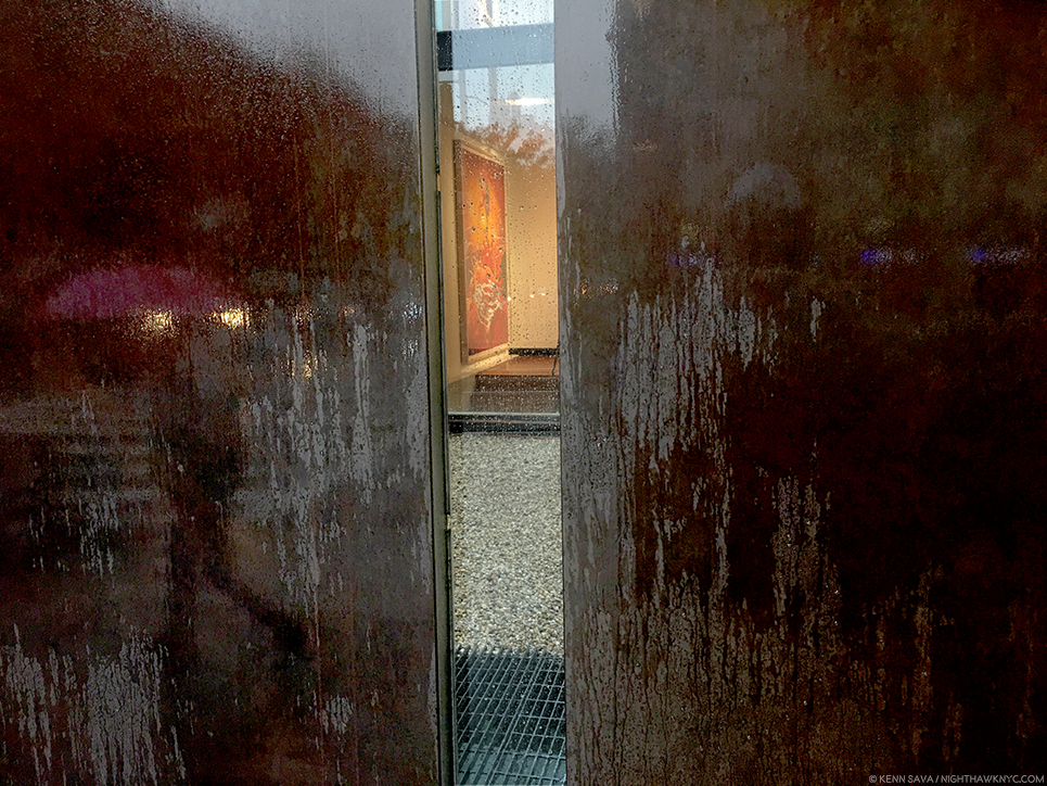
One of the few good things about being out on a rainy day is that I use the opportunity to look around and see if I can see a “Saul Leiter.” Maybe the rain is being reflected off the pavement glistening in some unusual shade of neon, or a bright red umbrella will slice through the grey air unexpectedly, or I’ll see shapes abstracted through a misty cab window and try to figure out what they are…the possibilities are seemingly endless…

Outside the galleries…July, 2018.

Given how popular Saul Leiter has become, I doubt I’m the only one who does this.
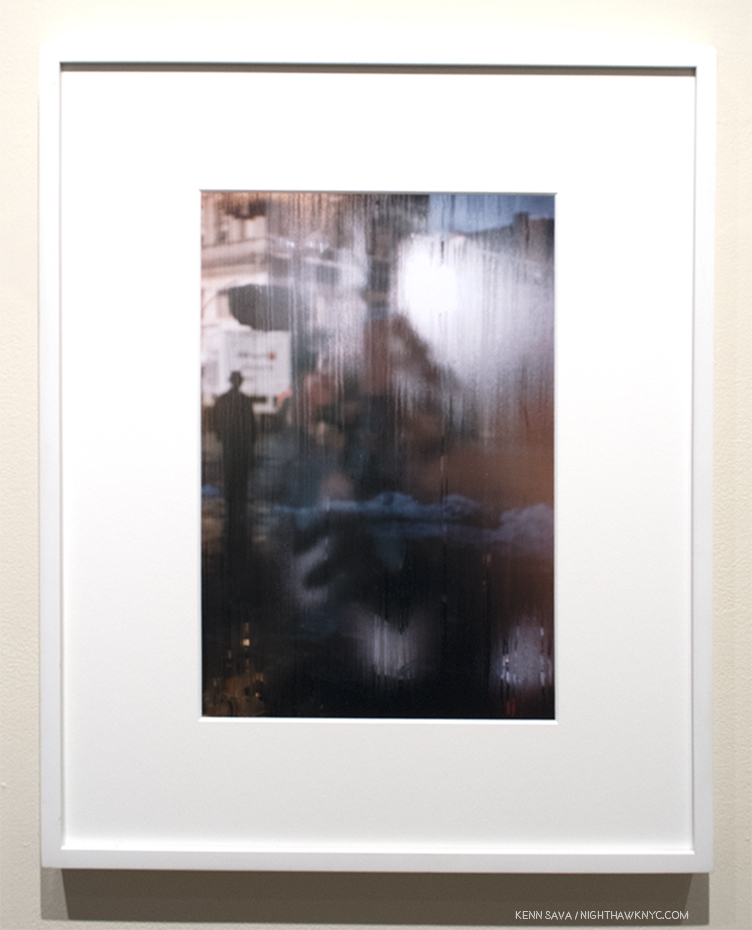
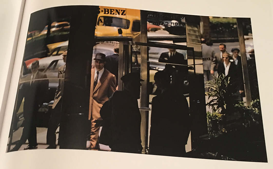
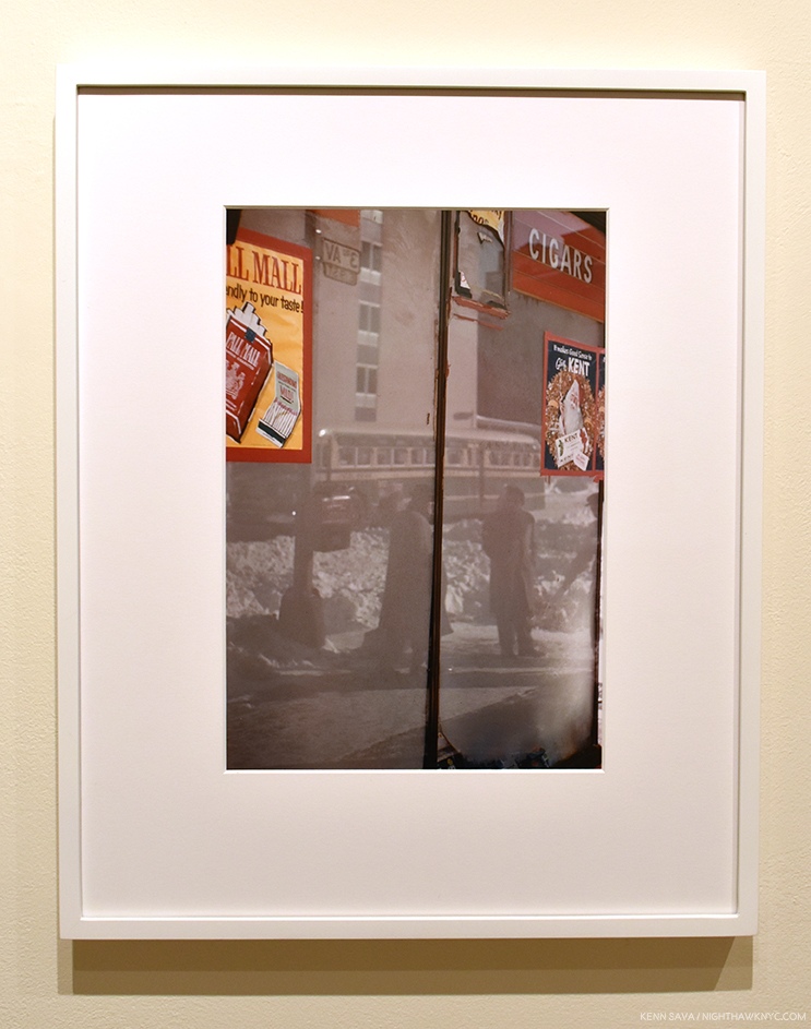
Street Scene, 1959, by Saul Leiter, seen at the Howard Greenberg Gallery Viewing Room. Saul Leiter started out to be a Painter. To my eyes, works like these brilliantly walk the line between abstraction and realism, showing how abstraction is all around us in the “real world,” in ways, perhaps, only Ernst Haas was doing at the time, among Photographers. Meanwhile the “New York School” of Abstract Expressionists, including his friend, Richard Pousette-Dart, was revolutionizing Painting.

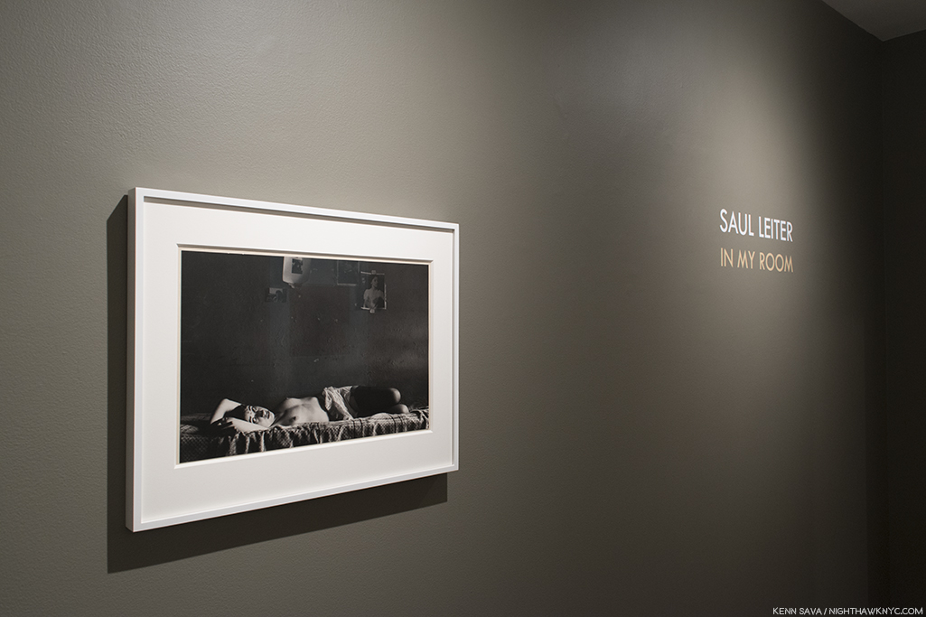
Of course, Saul Leiter (1923-2013) was able to make great Photos in any light, and included among them, he struck me as having a unique way with inclemency. It’s just one way that he’s impacted the way I see the world. For those who love Saul Leiter’s work, too much of it is never enough. So, the chance to see more is an event. Recently, two such chances appeared- a show at Howard Greenberg Gallery, which was accompanied by the release of a new Steidl book, both titled In My Room.
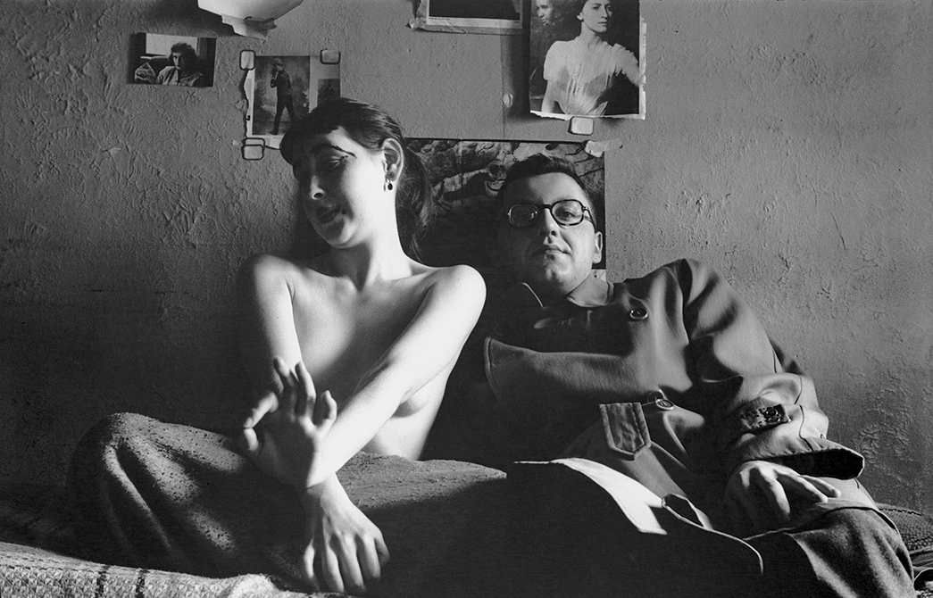
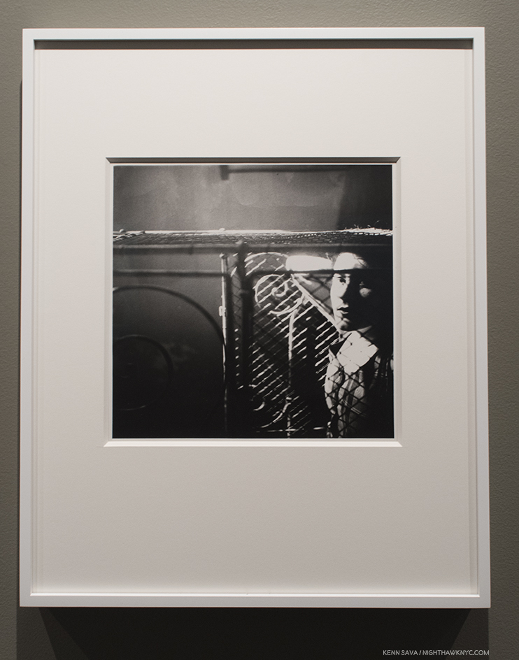
Self-Portrait with Inez. The first Photo in the book and the only time the Artist appears in it. *Photo courtesy the Saul Leiter Foundation and Steidl.

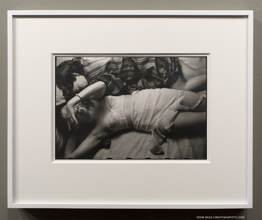
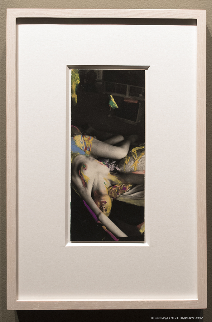
They center around a body of work that almost no one saw during the Artist’s lifetime, a collection of “intimate” Photographs taken of his female friends, often in various stages of dressing/undress. The show adds a second body of seldom seen work, Saul Leiter’s “Painted Nudes,” works that consist of black & white prints from the “intimate” series that he then hand Painted. First shown in the U.S. in 2014, to date they are the only body of Saul Leiter’s Paintings we’ve gotten to see. Having only seen them in the book “Saul Leiter: Painted Nudes,” which was released in 2015, this was my first time seeing some of them in person.

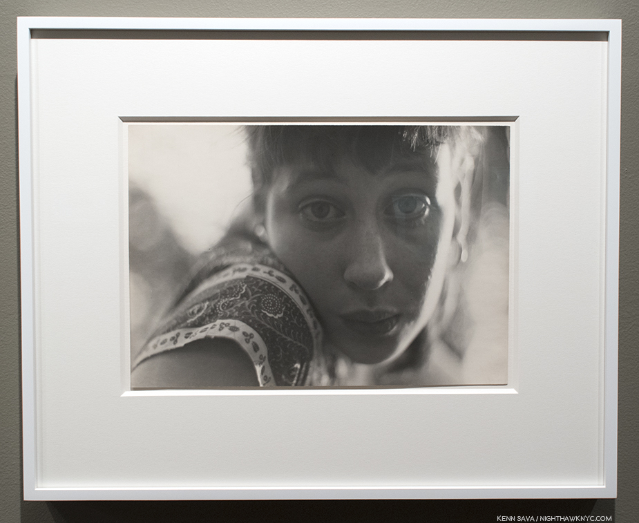
Inez, c.1947. One of the earlier works in this show.

Saul Leiter took thousands of nude Photographs of his friends and lovers between about 1947 through the early 1970s. Perhaps the first thing that’s interesting about them is they’re in black & white, though he worked exclusively in color during most of that period. Why are these then in black & white? The best theory I’ve heard is that he was able to develop and print them in his home darkroom, and could, therefore, keep them private. As a result, almost no one saw them. One of the few who did was his former art director at Harper’s Bazaar, Henry Wolf, who wanted to publish a selection of them as a book in the 1970’s. It didn’t come to pass then. By this point, Saul Leiter had fallen into eclipse. A total eclipse that had him completely out of the view of the public.

“I spent a great deal of my life being ignored. I was always very happy that way. Being ignored is a great privilege. That is how I think I learned to see what others do not see and to react to situations differently. I simply looked at the world, not really prepared for anything1.”

He got his wish, but It wasn’t always so.

The great Photographer Edward Steichen, then Director of Photography at MoMA2, included 5 works by Saul Leiter in his 1953 group show, Always the Young Stranger, the title a line borrowed from Carl Sandburg, who the show was intended as a 75th Birthday tribute to. He subsequently went on to a long career in fashion working for some of the most renowned publications of the time, until one day, he walked away, fed up with the micro-management that had crept into his shoots. He was rarely seen again until Steidl released the instant classic, Saul Leiter: Early Color, in 2006, launching the Saul Leiter renaissance. Now in its 8th edition, Early Color was followed by Early Black & White, in 2014, a year after Saul Leiter passed away, a week short of his 90th birthday. Now, In My Room brings Henry Wolf’s idea full circle. It’s dedicated to him.
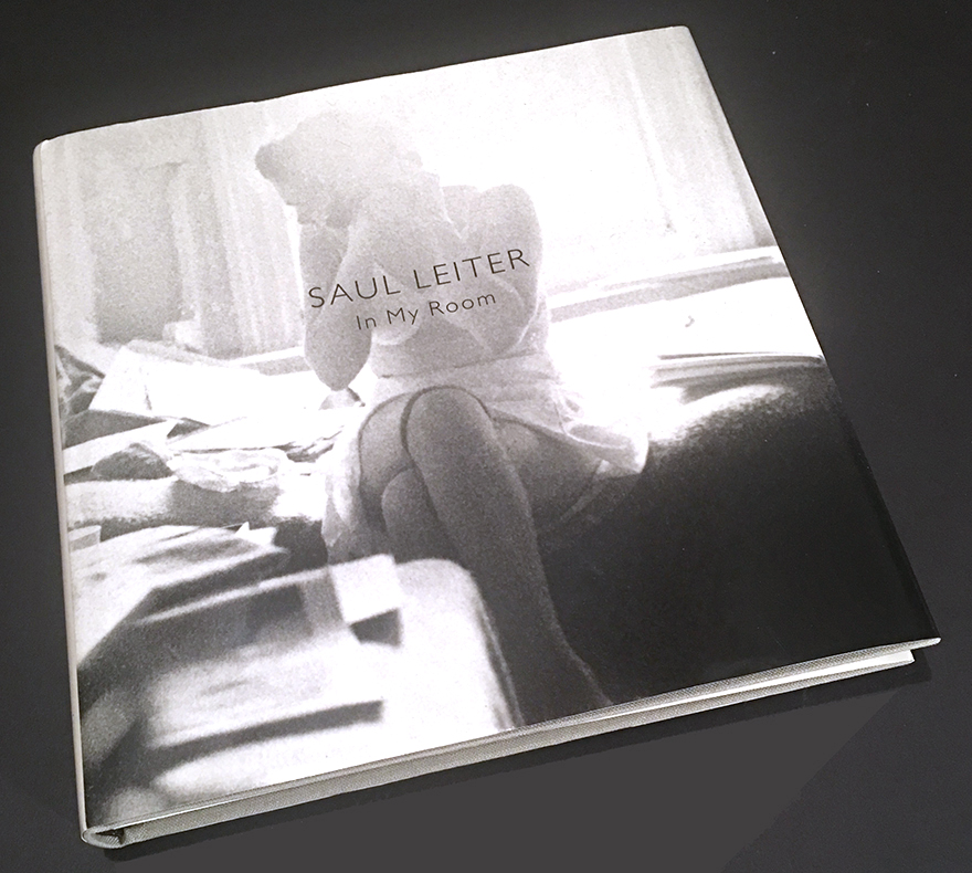
Saul Leiter: In My Room, just published by Steidl. 148 pages, 81 images.

Saul Leiter is often referred to as “a pioneer of color Photography.” What, exactly, do they mean? Apparently he, too, was puzzled. “I’m supposed to be a pioneer in color. I didn’t know I was a pioneer….,” he told Time Magazine, in 2013. Fascinated by the history of color in Photography, I’ve spent most of this year researching it, which may help me understand what they mean. The story of color in Fine Art Photography is one that has only gradually, and relatively recently, been coming more to light. So entrenched has black & white Photography been in the Art world, that it seems that many Photographers kept their color work to themselves, when it wasn’t commissioned for magazines. It makes me wonder- if color film had been invented first, would black & white still have dominated? Maybe in media where color printing/reproducing technology hadn’t yet been invented, but in the world of Art? I wonder. In the world of Painting, even going back to ancient times, the Artist was working in color. Interestingly, Drawings (which are most often in pencil, and hence, in black & white) are often seen and still treated as “preliminary works” to something more “finished,” even when they ARE the final work. A preference for black & white imagery exists nowhere else in the world of Art besides the place it held in Photography until the 1970s.

New York City, USA, 1953. It’s got to be by Saul Leiter…right?

Meanwhile, Steichen in Color Portraits, Fashion & Experiments by Edward Steichen shows the aforementioned Edward Steichen’s color images from 1908!, on. Jacques-Henri Lartigue began making color images in 1912. Ansel Adams was making color images in the 1940’s, as was Keld Helmer-Petersen, who’s book Keld Helmer-Petersen: 122 Colour Photographs: Books on Books No. 14, released in 1948, will astound lovers of William Eggleston and Stephen Shore. Eliot Porter was making them in the 1950’s…And then there is Ernst Haas. It was Ernst Haas, and NOT William Eggleston who was given the FIRST show of color Photographs ever at MoMA in 1962, a full 14 years before Photographs by William Eggleston!, and its classic accompanying catalog William Eggleston’s Guide, finally marked the beginning of the acceptance of color Photography into the world of Fine Art Photography. Haas’ abstract works of the 1950’s on were seen in the terrific Steidl book, Ernst Haas: Color Correction: 1952–1986, that reveals another side of the Artist, one who loved abstraction, that stands in contrast to the somewhat staid image many had, and still have, of Ernst Haas. In fact, the image just above is not by Saul Leiter. It’s New York City, USA, 1953, by Ernst Haas, from Color Correction! There are, no doubt, others who will still come to light, as Fred Herzog, who also took color Photos of Vancouver in the 1950’s, has more recently (Mr. Herzog is an admirer of Saul Leiter’s). Helen Levitt Photographed NYC in color in 1958-9, but, unfortunately, most of those images were lost in a fire. She later went back out and shot the images included in the terrific book, Slide Show: The Color Photographs of Helen Levitt.” So? Saul Leiter was one of the first Photographers to take color Photographs on the streets in NYC, and so, he is a pioneer, though he is not a “street Photographer” like Robert Frank or Garry Winogrand3. His was an Artist’s eye, and that’s on view in all of his work, inside and outside of his Apartment, in Photography and in Painting, and, in my view, has a difference effect than street Photography does.

“They’re people who are driven by the notion…they sacrifice everything for success. I didn’t feel that way. I attached more importance to the idea that there might be someone who might love me and who I might love4.”
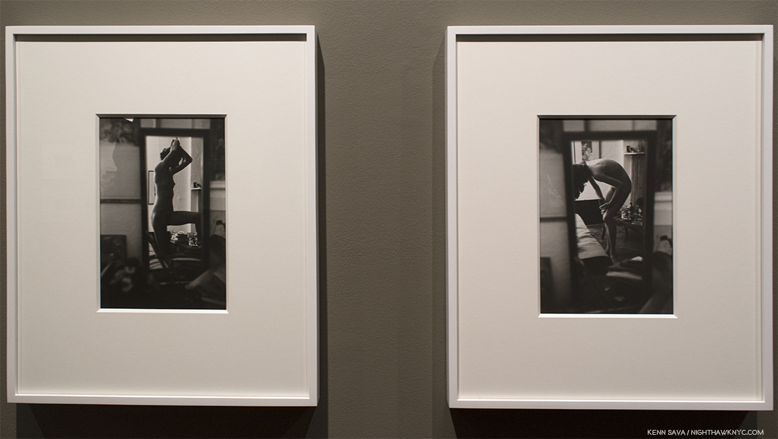
Both works are titled Soames, c.1960 featuring his long time lover and partner, the Artist Soames Bantry. Perhaps as close as Saul Leiter got to finding that person. A number of these images take advantage of furnishings, windows, or items in the apartment. Here both shots feature the same mirror.

I had those words in my mind as I walked through “In My Room” at Howard Greenberg. I’m not sure there’s really any other way to look at these images. Yes, we see them as “Fine Art” now, but back then they were among the most personal images Saul Leiter ever created, and his statement, above, speaks as much to what may have been one his mind in creating them as anything else I’ve read does. In the new Steidl book, the images are not captioned or dated, and the subject is not identified. And so, the book becomes a sort of scrapbook of intimate moments Saul Leiter shared with these women- lovers, and friends who felt comfortable being nude with him.

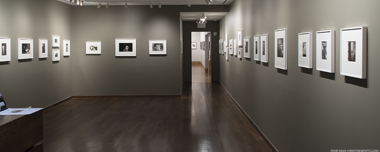
Installation view of In My Room.

As such, they’re intimate beyond the nudity. The women, obviously, feel free to be themselves while the Artist approaches taking their pictures in ways that will look familiar to those who know his color work, where it often feels like he is almost eavesdropping on his subject. Here, and in the book, it feels as if he is always watching them. But, it’s not mutual. by my count of the images in the book, out of 81, only in 14 do the women make eye contact with him, in 18 they appear to be asleep, and in a further 11 they’re awake but lying down. In 44 they are nude or topless. Abstraction plays a lesser role here compared with his more familiar color work, but it’s here in the unusual camera angles he uses, and in seeing his subject through doors, furniture, or in mirrors. But posing is never going on here. The natural postures are striking, completely unlike anything you’d find in texts about Drawing or Painting from live models. This is particularly fascinating given that Saul Leiter was, also, a Painter who revered Vermeer5.
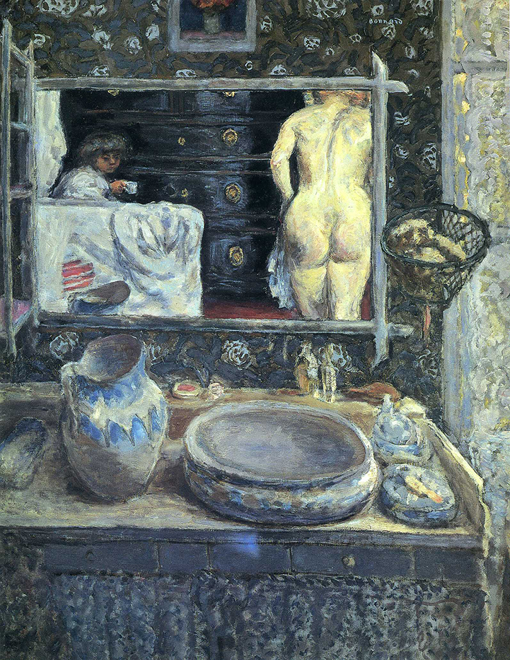
Pierre Bonnard, Mirror on the Wash Stand, 1908, Oil on canvas. Early on, Bonnard was a founding member of the avant-garde group Les Nabis. *Unknown Photographer.

Roger Szmulewicz, Director of Gallery Fifty-One, Antwerp, who have represented Saul Leiter, and now his Foundation, since at least 2008 (Howard Greenberg Gallery, who have been showing Saul Leiter since at least 2006, is the other representative of the Saul Leiter Foundation), said, “The influence of his Painting on his Photographs is made apparent when the two are present side by side6.” As they are in this show, though the Paintings are not his “pure” Paintings, but created on existing Photographs. When I look at these works side by side (the Photos and the “Painted Nudes”), it is possible to see the influence of another of his favorite Painters, Pierre Bonnard (1867-1947). Saul Leiter was 24 when Bonnard passed away. There was a posthumous exhibition of Bonnard’s work at MoMA in 1948 with over 150 items, 2 years after Saul Leiter moved to NYC from Pittsburgh to become a Painter, so it’s possible he saw it. Interestingly, these “intimate works” seem to begin around 1947, shortly after he began taking Photographs.

Snow Scene, 1960

Saul Leiter’s color work is renowned for the astonishing way he uses color, but it seems to me that it’s equally impressive for his breaking of the “rules of composition.” His subject will be seen off center, or not complying with the “rule of thirds,” or be in shadows (even partially obscured as above), behind or visible through an object, window or mirror in the foreground. Sometimes, these foreground hindrances act as “curtains,” perhaps, a distant echo of Vermeer’s use of curtains.

Kathy, 1952.. Inscribed on the back- “In the collection of the Museum of Modern Art.”

Most intriguingly for me, Saul Leiter, like William Eggleston, Henri-Cartier Bresson and others, is another great Photographer who was also a Painter. My opinion is that being a Painter played an important role in the impact of their Photography, and is very possibly a reason why their work “looks different” from many other Photographers. When I see a Leiter or an Eggleston, it often feels to me that they are doing things they don’t do with Paint. Focusing on a detail that would seem to be too slight or unimportant for a whole Painting, or capturing a fleeting moment when light, setting and people are aligned for a split second. Or, in his “intimate” indoor work, capturing postures that are rarely seen in Paintings, perhaps, because they can’t be held long enough.

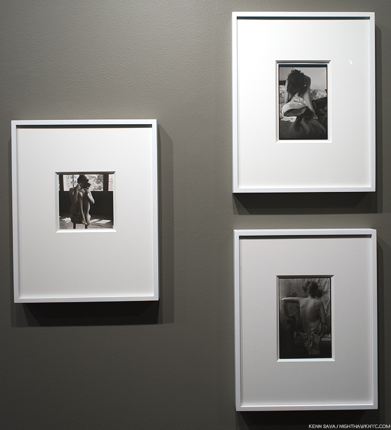
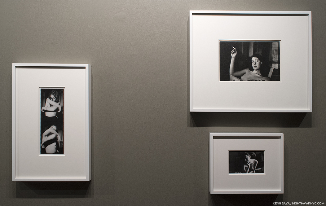
Barbara, 1950, left, Soames, c. 1960, top right, Untitled, 1950s, bottom right.

Saul Leiter is not often thought of as a portraitist, but he did them over his long career7. The portraits included here are beautiful, typically different but wonderfully evocative.

Inez, c.1947.

The lighting in these works is the natural light coming in through the large windows or the electrical lights in his apartment. No flash or extra lights.

All in all, the “intimate” series presents a remarkable tour de force of possibilities, of living in the moment, and of working creatively with whatever that moment presents to you, which is, of course, exactly what we see him capturing outside on the street in Early Color, but minus the personal element, which is entirely absent there. Those subjects are not connected, either to each other or to the Photographer. Here they are.

Barbara and Bettina, c.1950.

We’re told going in that these women are lovers and friends of Saul Leiter, though it might be hard to see that in these works. The Artist appears with one of the women in only two Photos (one in the show, and one in the book). There is no interaction beyond an occasional glance. There is comfort, obviously, but nothing is being done together. There is affection, but no romance or anything more. And so, when all is said and done, the overriding feeling I come away with is a sense of isolation on the part of the subject and the Photographer.

Inez, c.1947, left. Inez c.1947 above, right, and Self Portrait with Inez, c.1947, bottom right.

To outsiders, these Photos show the relaxed, natural beauty of his friends, in studies and portraits of them in the moment, and moment to moment.  Though they are “intimate,” no love or physical intimacy is taking place in them. Maybe it already has, or is about to, and what we’re seeing in a number of these works is the moments after, or before. A number of the Photos in the show are not in the book. Whatever the case may be, since he knew these women, they are momentos of intimacy, and possibly, momentos of moments where that search for “someone who could love me” was close at hand, proof that it WAS possible to find.

Then, there were the “Painted Nudes.”
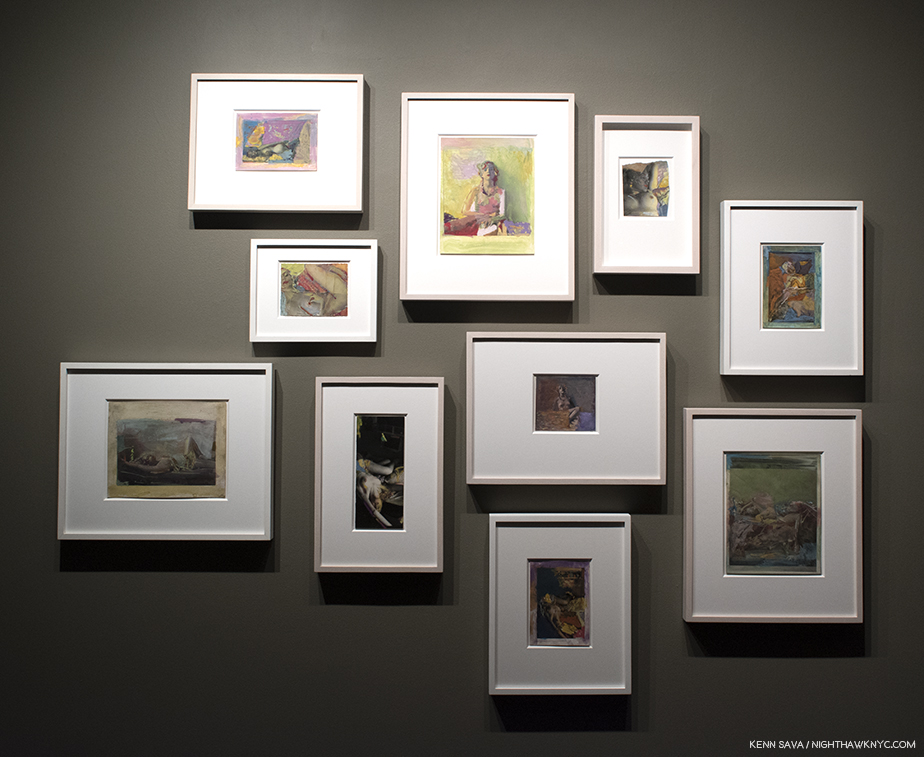
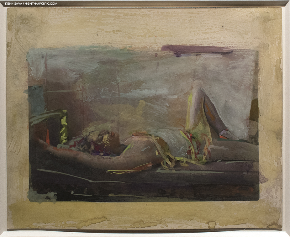
A selection of works from the “Painted Nudes” group. All of these works are gouache, casein and watercolor on silver gelatin paper.

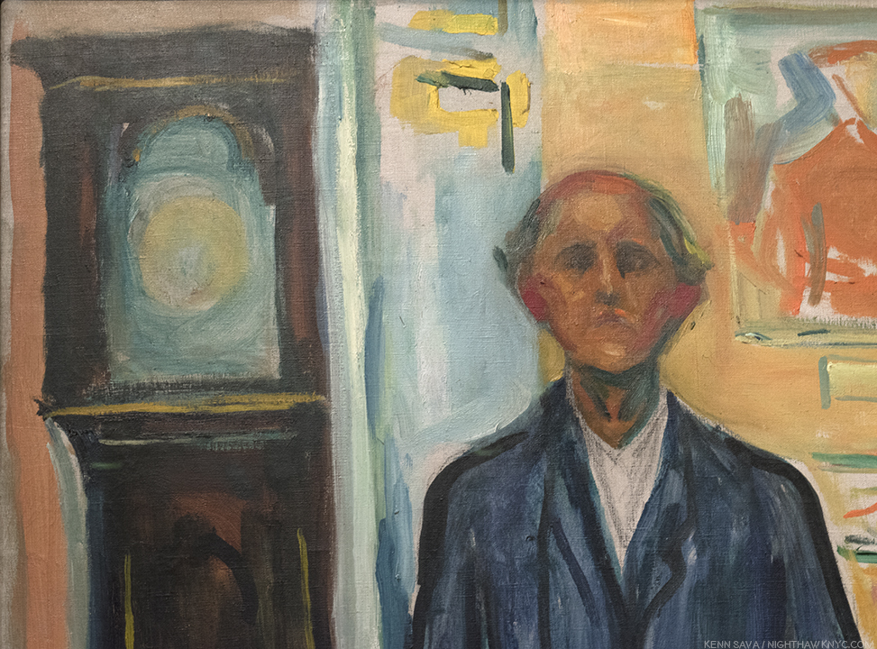
The “Painted Nudes” are often revelations. They look like nothing else I’ve seen. Here and there one might spot a passage reminiscent of Degas, but the brushwork, and the choice of color, is daring…free and exciting, at times reminiscent of his beloved Pierre Bonnard (particularly his lateSelf Portrait, 1939-42), but always wholly in his own style. The paint bursts with energy…motion…even when the woman is lying at rest. Seeing some of them for the first time, I wondered why the great Richard Pousette-Dart steered Saul Leiter to Photography. Not that I’m questioning the judgement of the most overlooked Abstract Expressionist, not enough of Saul Leiter’s Painting has been placed before the public to form any full sense of his talent and the scope of his achievement.

Untitled, 1970s-90s

Of Painting, Saul Leiter said, “I sometimes thought that maybe I would have been a better photographer if I were not a painter. And then sometimes I thought that maybe if I were not wasting my time doing photography maybe I’d be a better painter. But, in the end, I did both. I enjoy taking a brush and making a mark. Then making another mark. It’s a little bit almost like jazz, you know? You don’t know what you’re going to do8.”
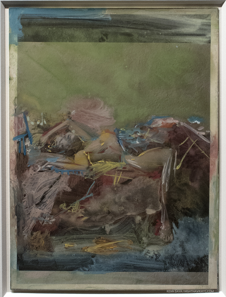
Untitled, 1987. Unprecedented. About as abstract as anything the Abstract Expressionists were doing, but with a Photo added.

Of the group on view at Howard Greenberg, I find the best of these works to be terrific and they left me longing to see Saul Leiter’s “other” Paintings that are not done on top of Photographs. They may well be yet another body of Saul Leiter’s work that has gone under-appreciated for too long. Wouldn’t that be something if Saul Leiter turned out to be a great Photographer AND a great Painter?

Untitled, 1970s-90s.

At the moment, Saul Leiter has rapidly been ascending to his rightful place as one of the Master Photographers of the 20th Century. Having been forgotten for decades of his life, it now seems highly unlikely the world will forget Saul Leiter again.


BookMarks-
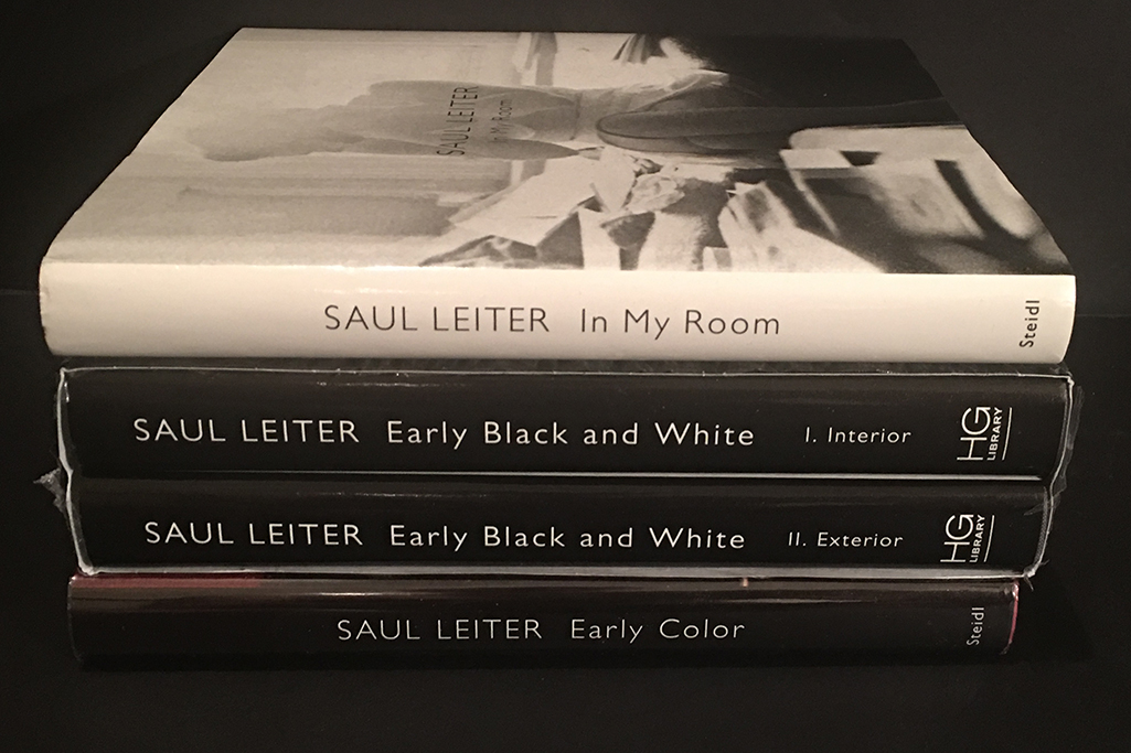
Steidl’s series of books share the same book design as Early Color, which was done by Martin Harrison. If it ain’t broke…

Saul Leiter: Early Color” is the place to start exploring the work of Saul Leiter. Just reissued in its 8th edition, in my view, it is one of the “must have” PhotoBooks released thus far this century. For a wider view of his work, pairing “Early Color,” with Steidl’s “Saul Leiter: Early Black and White” provides a good overview of his non-commercial Photography- at least as far as his large body of his work has been reintroduced to us thus far, especially while the latter is still in print. To supplement these, “Saul Leiter – All About Saul Leiter (Japanese and English Edition),” the catalog for a Retrospective in Japan last year, is a gorgeous, small, 300 page volume. Rumor has it that it is to be released in the USA later this year, but the original edition was named one of the 3 best PhotoBooks of the year by no less than Photographer Todd Hido. Two other retrospectives of note are much harder to find, especially at cheaper prices- Saul Leiter (Retrospektive/Retrospective published in 2012 by Kehrer Verlag is a 300 page volume that’s a full 9 by 10 inches. Second, there is the catalog for the show at the Henri Cartier-Bresson Foundation they co-published with Steidl in 2008, simply titled Saul Leiter. At 150 pages it’s a smaller retrospective, but benefits from a beautiful Steidl production. Finally, Saul Leiter: In My Room offers the best look we’re likely to get at Saul Leiter’s “intimate” work and nudes. Just published by Steidl, it includes 81 Photos, with only a few previously seen in Early Black & White. It’s far and away the most intimate and personal collection of Saul Leiter’s work. For the rest of us, who didn’t know these women, it’s something of a classic of the unguarded moment, filled with marvelously unconventional poses and compositions. It fills out our picture of Saul Leiter’s accomplishment, adding a very personal group of works that held a very special place in his life to those, largely impersonal work seen previously. It is another book that will surprise and enthrall his growing number of fans. Finally, Painted Nudes, published by Sylph Editions in 2015 is something of a sleeper. To date, it is the only book length collection of his Painting thus far released. Consisting of  black & white prints of nudes from the “intimate” series the Artist then hand Painted, as I said above, it leaves me yearning to see more of his Painting.

Regarding Ernst Haas, Color Correction is out of print and fine copies are trading for hundreds of dollars on the secondary market. However, if you look hard, there’s a little known French edition that’s still in print and available for about $60. I’ve compared them and they contain the same images, the same number of pages, but the introduction and the essay are in French. Steidl is about to release a new book, Ernst Haas: Abstrakt, which will include 118 of his abstract images and so is certainly a book anyone interested in Mr. Haas should check out.

*-Soundtrack for this Post is “In My Room,” by the Beach Boys, which they wrote during the time Saul Leiter was taking his “intimate” Photos, as performed by the amazing Jacob Collier -an Artist who created this entire recording in his room!

My thanks to Monika Condrea and Steidl.

NighthawkNYC.com has been entirely self-funded and ad-free for over 6 years, during which over 250 full length pieces have been published. If you’ve found it worthwhile, you can donate to keep it going & ad-free below. Thank you!

Written & photographed by Kenn Sava for nighthawknyc.com unless otherwise credited.
To send comments, thoughts, feedback or propositions click here.
Click the white box on the upper right for the archives or to search them.
For “short takes” and additional pictures, follow @nighthawk_nyc on Instagram.

Subscribe to be notified of new Posts below. Your information will be used for no other purpose.


  1. “Saul Leiter,” 2008 Co-published by Steidl and the Foundation Henri-Cartier Bresson
  2. from 1947-61, when he was succeeded by John Szarkowski, who went on to be a major shaper of the world of modern Fine Art Photography, and who he selected for the post.
  3. Saul Leiter is barely mentioned in Joel Meyerowitz & Colin Westerbeck’s Bystander: A History of Street Photography,” Joel Meyerowitz is, also, a Photographer who worked with color early on, beginning in 1962.
  4. Saul Leiter quoted in the introductory video on saulleiterfoundation.org
  5. “My favorite Painter is Vermeer,” Saul Leiter: I just want to be left alone, Published 2015, Interview with Sebastian Piras in 2009
  6. “Saul Leiter Photographs and Works on Paper, Gallery Fifty-One, P.3
  7. Including a fascinating series of Diane Arbus in 1970, in her own space, that (not nude) have an intimacy akin to that seen in these works.
  8. School of Visual Arts interview, 2013

Thomas Cole- Ahead of His Time. And Ours

Written & Photographed by Kenn Sava (*unless otherwise credited)

And then? There is beauty… 

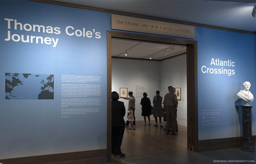
The entrance. Not seen to the right, an intro video narrated by none other than Sting. Click any Photo for full size.

With all the recent talk about the Art world loving “ugly” Art, including Painting1, along came The Met’s Thomas Cole’s Journey: Atlantic Crossings. It’s an homage to “beautiful” Painting- to American Landscape Painting, to the birth of the Hudson River School that Mr. Cole is often credited with being a co-founder of (the first Art movement to form in America), and, it’s a testament to some very great Painters who expressed their passionate love of nature and it’s beauty on canvas and paper. Tucked away in galleries in the back of the first floor of the renovated American Wing, it was fitting that it was installed as close to the (man-made) natural glory of Central Park as is possible in American Wing. After closing at The Met on May 13th, it’s now been reinstalled, and added to, at London’s National Gallery, where it’s called Thomas Cole: Eden to Empire.

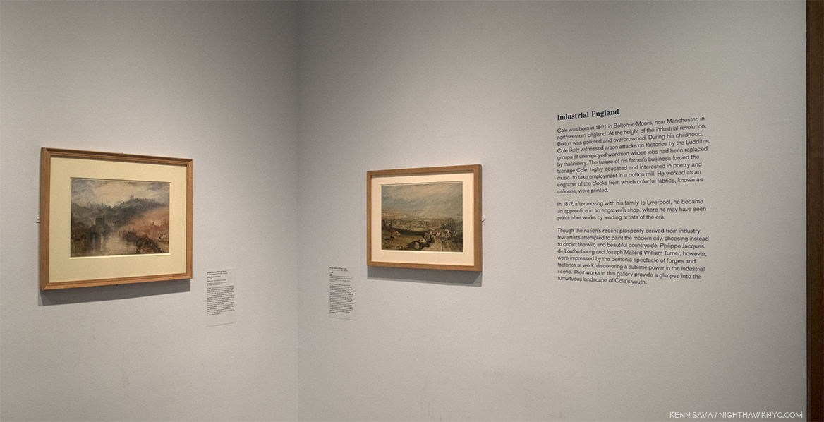
A hard act to follow. This is how the show begins- with a text intro accompanied by TWO amazing works by no less than JMW Turner.

The beauty it contains is (at least) three fold. First, there is the beauty of Thomas Cole’s Painting. We get to watch the Artist develop over time and travels, from his native England (where he was born in 1801), to America after his family emigrates here in 1818, to return trips to England and on to Italy, until he finds his voice, a voice that resonates as powerfully today as it ever has. Proof of that can be seen in expected and unexpected places, ranging from his direct disciples to contemporary masters, like Ed Ruscha and Rod Penner. Since influence is a continuum, we also get to see work by other Artists who influenced Thomas Cole, and who he learned from. This second kind of beauty, in the form of beautiful works by these influences and contemporaries, who’s presence caught me completely by surprise in the show. In fact, as soon as I entered, I was immediately bowled over by not one but two masterpieces by no less than the man many consider to be THE supreme landscapist, JMW Turner. And? There would be more!

Talk about setting the bar high.

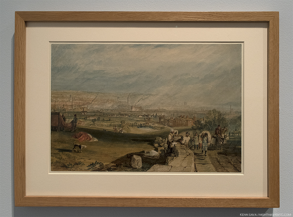
J.M.W. Turner, Leeds, 1816, Watercolor, scraping out, pen and ink on paper. “One of the earliest and most sophisticated depictions of an industrial city, ‘Leeds’ was painted when Cole was 15 years old and living 60 miles away in Chorley, another center of textile production. Turner…chronicles the pollution and chaos of the growing city,” paraphrasing the wall card.

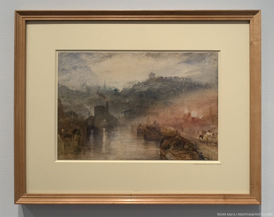
J.M.W. Turner, Dudley, Worcestershire, 1832, Watercolor and body color on paper. “Dudley lies in ‘the Black Country,’ an area characterized by smoke and soot from hundreds of forges, furnaces and hearths. Topographical features present a sharp contrast of ancient and modern: on top of the hill, the ruins of Dudley Castle, echoed by the recently rebuilt neo-Gothic tower of Saint Thomas’s Church, allude to the town’s history, while industrial mills vent dark smoke into the air in the foreground. The scene offered Turner the opportunity for a meditation on change over time, and for a solemn commentary on the industrial sublime.” Per the wall card, paraphrased.

Staggered, but not felled, by these bodyblows, my head cleared long enough to think about how Turner brilliantly uses two different styles sixteen years apart to convey similar messages. Whereas his later works strike us now as almost “impressionistic,” here he’s showing us real scenes. Already a lot to take in, I was ready to go home. Ah, but fear not. The “star” of our show would not be eclipsed. Thomas Cole hit the ground running.

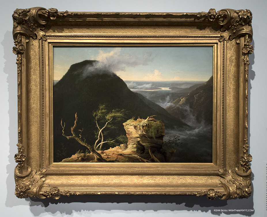
View of Round-Top in the Catskill Mountains, 1827, Oil on panel. Cole discovered the Catskills in 1825, and he was about 26 when he Painted this masterful mix of landscape, realism and the sublime, as it was called at the time, in an American setting. This breathtaking vista was  one of his favorite spots.

The third kind of beauty on view is the beauty of nature that all of the works on view- by Cole, Turner, John Trumbull, Claude Lorrain, John Constable, John Martin, and the others included depict. The works included focus on natural beauty, what man has done with and to that natural beauty, and the possible ramifications of that.

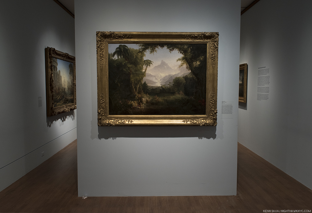
The Garden of Eden, 1828, Oil on Canvas. Thomas Cole, the “romantic” is on view here, though in the service of the “message,” or “warning,” of paradise about to be lost. A theme that will recur.

The Hudson River School spent decades in eclipse in the 20th century as abstraction took center stage, but they’ve never failed to influence Artists, and their “popularity” has seemed to be on the upturn over the past 20 years. Upstairs in the American Wing, The Met’s Hudson River School permanent galleries are one of the lesser known glories of The Museum, judging by the fact that I’ve yet to see them crowded. While Art history has moved on, giving us countless styles, schools and movements since, no where else can the glories of original America be seen (pre-landscape Photography). Though the names of many of the places they Painted are familiar we longer can largely not recognize them. Beyond that, the Hudson River School includes some of the great Artists in 19th Century Painting. While they have enjoyed a “cult” following lo these many years, it’s high time they gain the wider acceptance and appreciation their work deserves. There’s no better place to start that than with a closer look at Thomas Cole.

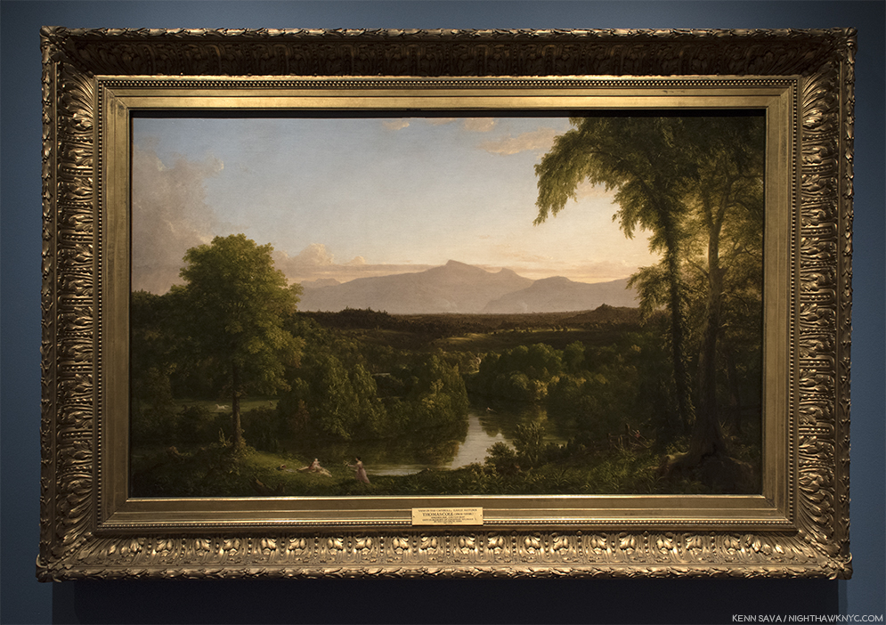
View on the Catskill- Early Autumn, 1836-37, Oil on canvas.

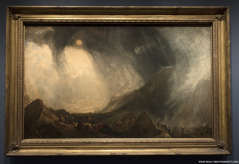
Thomas Cole, who was born in England and emigrated to the U.S. in 1818, was 28 when he met JMW Turner on a return visit to London after a decade here. He visited Turner’s Gallery2. There, he saw, and was deeply impressed by, Turner’s Snow Storm: Hannibal and His Army Crossing the Alps. The Met’s wall card tells us Thomas Cole was not taken with Turner’s later work.

JMW Turner, Snow Storm: Hannibal and His Army Crossing the Alps, 1812, Oil on canvas.

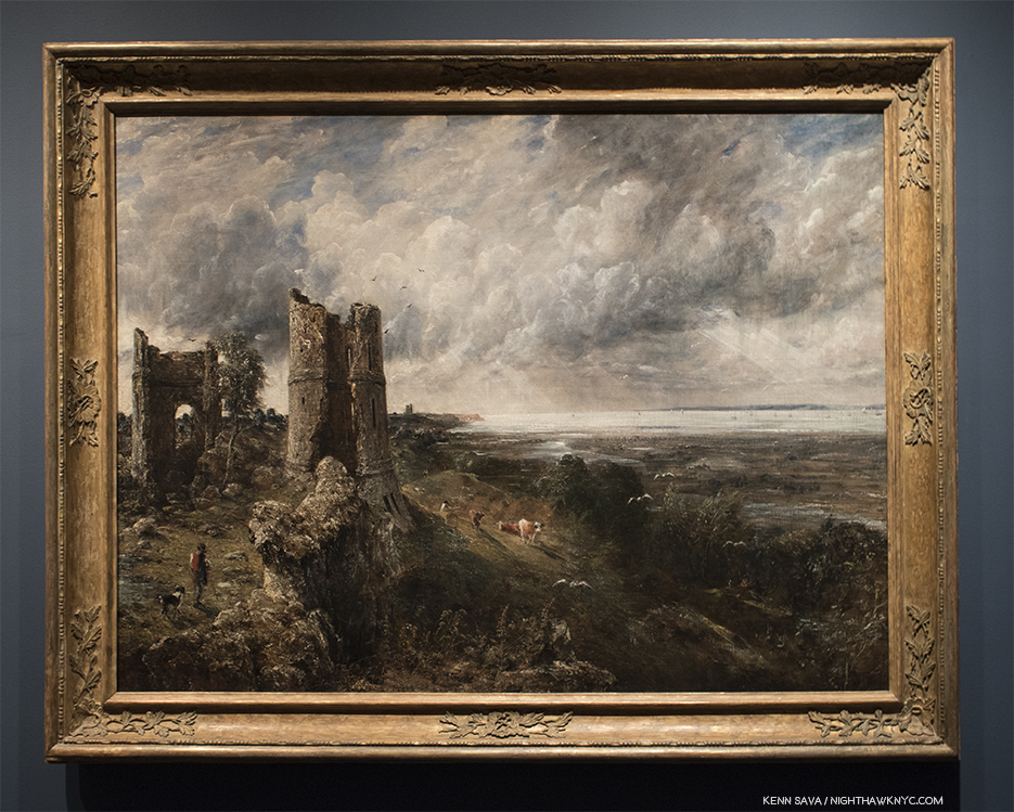
At London’s newly opened National Gallery, he discovered Claude Lorrain and John Constable’s Hadleigh Castle, which haunted him for the rest of his life. He and Constable became friends.

John Constable, Hadleigh Castle, The Mouth of the Thames-Morning after a Stormy Night, 1829, Oil on canvas

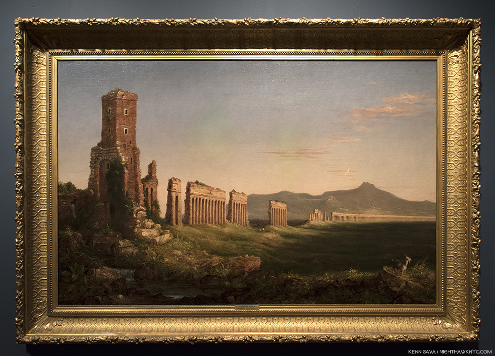
In 1831, he went to Italy, where he painted this-

Aqueduct near Rome, 1832, Oil on canvas. Intriguingly, both of these work show ruins, in this case, that left by a great empire.

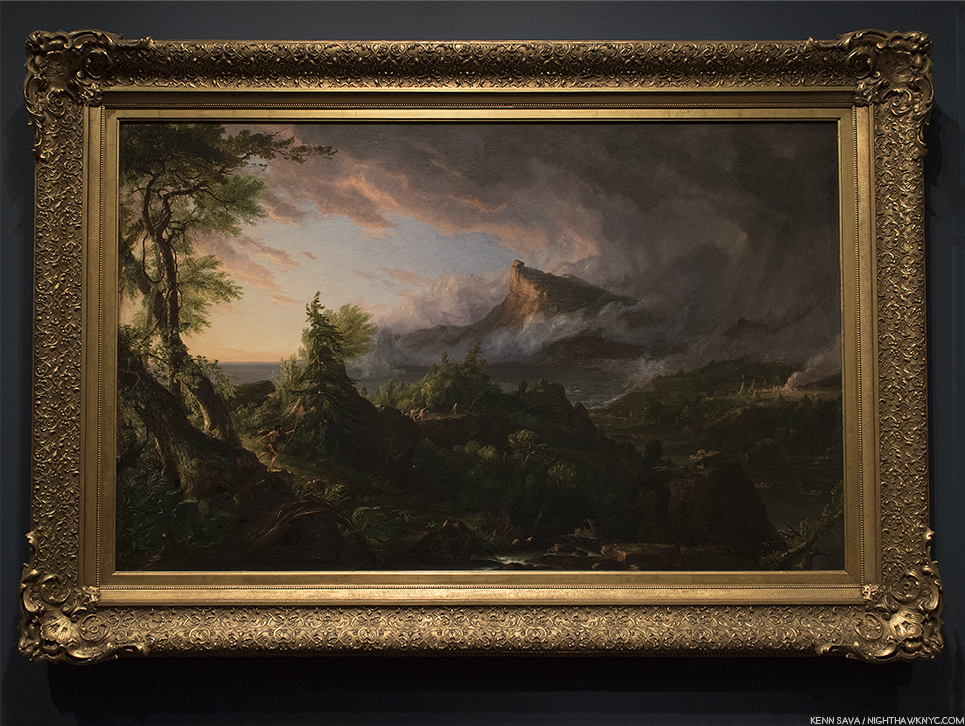
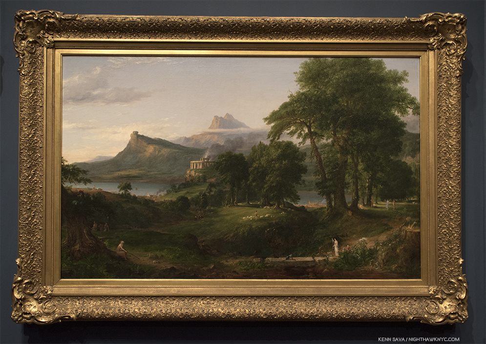
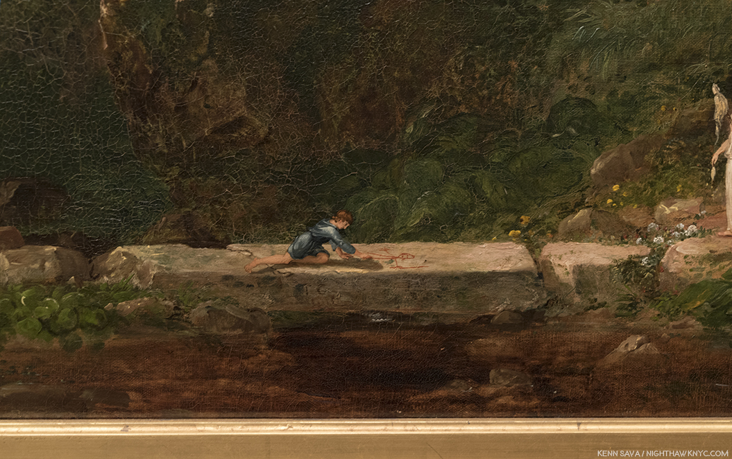
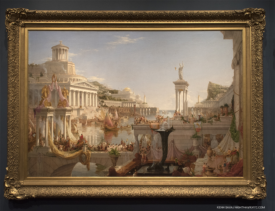
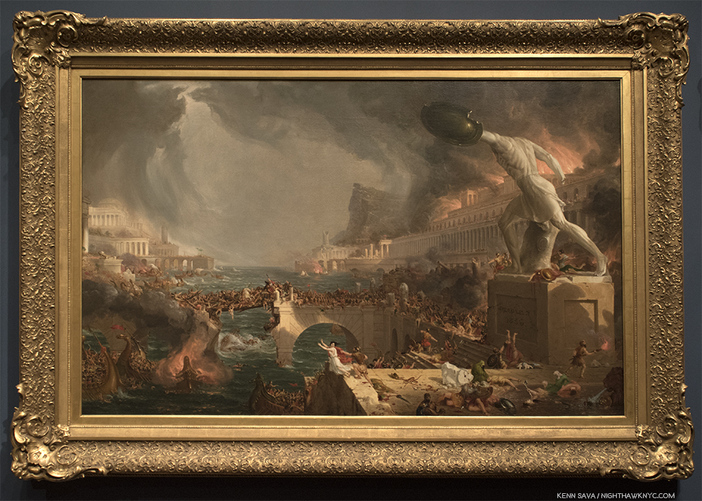
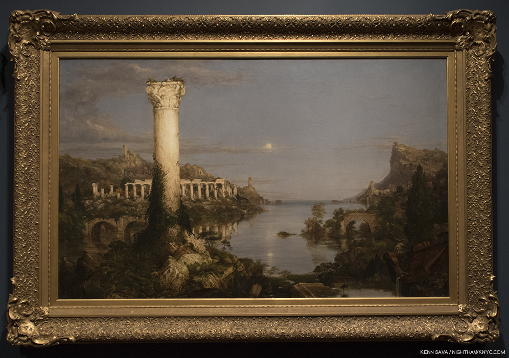
In Aqueduct near Rome, 1832, we see the ruins of a once great civilization, seen by Cole during his Italian trip and Painted from sketches he made of it. Among the ruins, we see a shepherd and his flock, a human skull, reminders of the passing of time and life going on. Looking at it in hindsight, it’s hard not to see it as something of a precursor for his masterwork, the 5 Painting series, The Course of Empire, 1934-36, the inclusion of which, on loan from the New York Historical Society, is one of the highlights of the show. Originally intended to hang over and around a fireplace by the gent who commissioned them, they seem much better hung as they are here, in a semi circular row where the endless detail in each can be better considered and appreciated. Interestingly, the largest of the five, designed to go in the center directly over the fireplace surrounded by the other four in vertical rows of 2 on each side, may well be the least “important.” At least, that’s a Met curator who spoke about the show in the galleries said.

Course of Empire, 1834-36, The rise and fall of civilization as seen from the same place. Notice the same distinctive mountain peak appearing in each Painting.

From The Course of Empire – The Savage State, 1834

From The Course of Empire – The Arcadian or Pastoral State, 1934.

Detail. In the center foreground, the Artist has included a Self-Portrait as a young man, Drawing, also showing the place of Art in this “ideal” world.

From The Course of Empire – The Consumation of Empire, 1836.

From The Course of Empire – Destruction, 1836.

From The Course of Empire – Desolation, 1836.

After Thomas Cole died in 1848, he was remembered by a number of Artists, including Frederic Church and Asher Durand, but his influence is ongoing. The London reinstallation of this show, at the National Gallery, is accompanied by a show of the work of the American Artist, Ed Ruscha, one of the most influential Artists of our time, who personally installed his own renowned Course of Empire series in a dialogue with one of his great influences. Mr. Ruscha traveled to NYC to speak about Thomas Cole at The Met on April 8th, and that fascinating conversation may be seen and heard here. In it, he speaks about visiting the New York Historical Society (“and not MoMA”) during his visits to the City because he wanted to see Cole’s The Course of Empire, who own the series, repeatedly.

Ed Ruscha, Jet Baby, 2011, lithograph. *Photo by Hamilton Press.

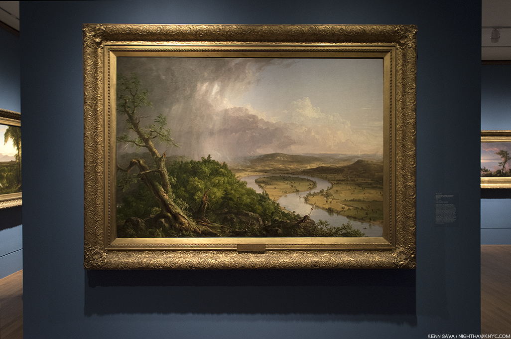
Many of Mr. Ruscha’s recent Paintings and prints have featured a mountain peak, often in snow, a constant reminder of the beauty and wonder of nature that was so close to Thomas Cole’s heart, and possibly a reference to the peak that recurs in each work of Cole’s The Course of Empire series. At The Met, Mr. Ruscha spoke about his love of nature in terms reminiscent of Thomas Cole. It speaks volumes that Mr. Ruscha would go to such lengths to bring Thomas Cole to a wider audience. But, he’s not alone. The string of Artists who’s work would seem to bear at least some debt to Thomas Cole is a very long one. Then there’s the line of Artist’s who’s work contrasts with Thomas Cole’s as they show us what man has done to the landscape in the years since, as he saw this beginning to happen in View from Mount Holyoke, 1836, below.

View from Mount Holyoke, Northampton, Massachusetts, after a Thunderstorm- The Oxbow, 1836, Oil on canvas.

Landscape Painting was joined by Landscape Photography, from about the 1850’s culminating in the work of Ansel Adams and Edward Weston in the first half of the 20th century. They were followed by Stephen Shore3, Lewis Baltz, Robert Adams, Joe Deal and others who were given a landmark show in 1975-76 at the George Eastman House, Rochester, called New Topographics: Photographs of a Man-Altered Landscape. The show’s theme was that the American landscape was no longer what it once was in the days of Ansel Adams,  Weston and Cole, that industrialization, commercialization and development had changed the landscape, and so, this new generation of Artists were bent on depicting the American Landscape they saw all around them.

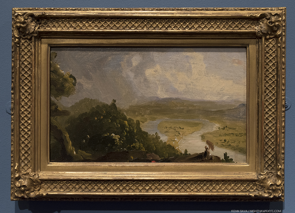
Sketch for View from Mount Holyoke, Northampton, Massachusetts, after a Thunderstorm (The Oxbow), 1936. Thomas Cole masterfully lays out his conception of the composition with a remarkable sparseness of brushstrokes, which only seems to lack the self portrait he included in the final masterpiece seen above. Instead, there is what appears to be a female figure to the lower right. Though in it’s permanent collection, I’ve never seen this remarkable 5 1/2 by 9 1 /2 inch Sketch on display in The Met before.

Painters, too, were hard at work doing the same thing- Painting the world they saw around them. Thomas Eakins painted the encroachment of the industrial world in The Champion Single Sculls (Max Schmitt in a Single Scull, 1871. In the 20th Century, the Regionalists, including Thomas Hart Benton and Grant Wood did their best to focus on the beauty of nature and the American Landscape, but even in their work, the modern world is encroaching. This was all presaged in Thomas Cole’s View from Mount Holyoke, Northampton, Massachusetts, after a Thunderstorm- The Oxbow, 1836, in which the Artist shows us undeveloped land, left, developed land to the right, as he, himself, looks back at the viewer from a crevice right in the lower center, a man caught between the past, the present and the future. In this work he gives us at least the first two installments of The Course of Empire, and, with his turned look at the viewer seems to be directly asking us “Whither to from here?”

“Nature has spread for us a rich and delightful banquet.
Shall we turn from it?
We are still in Eden;
the wall that shuts us out of the garden is our own ignorance and folly.”
(Quotes by Thomas Cole from the introductory video.)

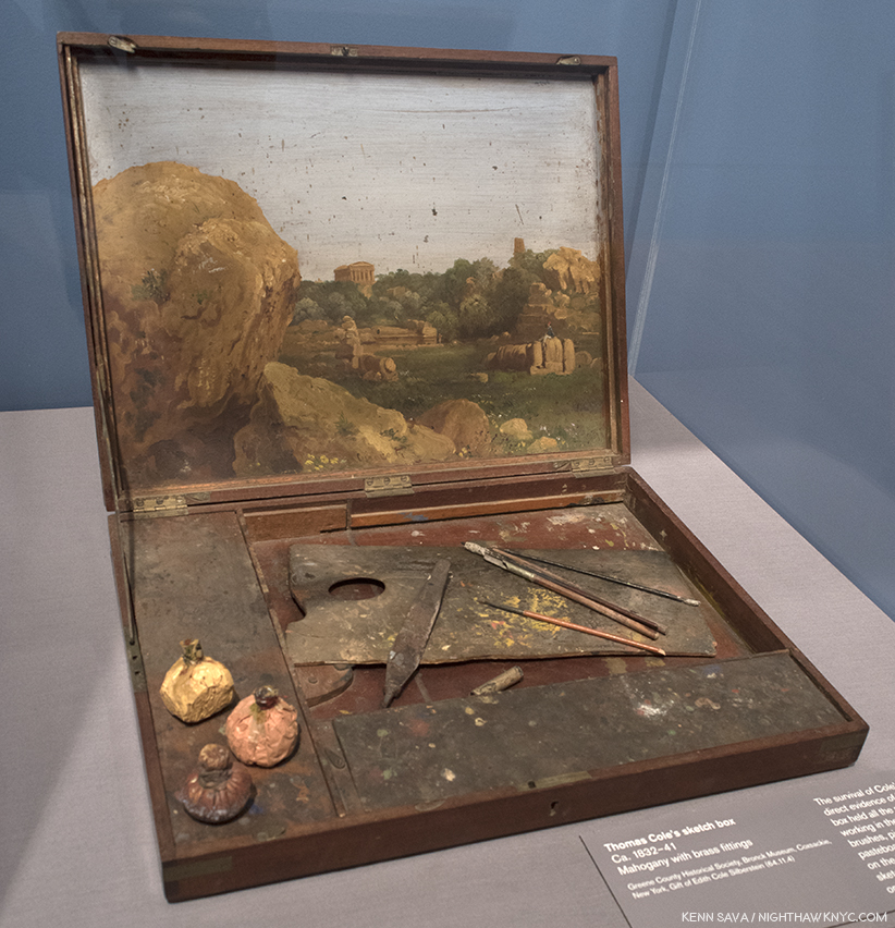
Thomas Cole’s Sketch Box, with added Italianate landscape, perhaps used for the Sketch, above.

The “Ash Can” School painted the harsh reality of American urban life as it rapidly expanded. Meanwhile, Georgia O’Keefe and Charles Sheeler were two Artists who walked the line between the traditionalists and the modern world, with the former gradually disappearing in Sheeler’s work (as both a Photographer and a Painter) as time went on, while Ms. O’Keefe added abstraction to her images of the natural world, while also Painting the city. Edward Hopper lived in both worlds for most of his life, splitting time between Manhattan and Maine. Hopper has been followed by Richard Estes, who also splits his time between Manhattan and Maine, and like Hopper, paints works that show the beauty of nature, in one thread, and the extremes of human development in his Paintings and “Urban Landscape” print series. 

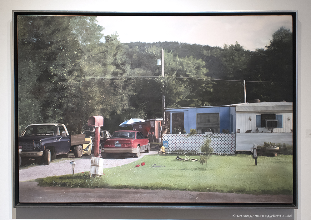
John Salt, Red Mailbox #2, 2015, Casein on linen, seen at Meisel Gallery, 2018.

Along with Mr. Estes, other Painters, including John Salt and Rod Penner, like Thomas Cole, were born elsewhere, yet give us landscape Paintings of contemporary American scenes, as do many Photographers, including Catherine Opie, below, while others, including Emmet Gowin, Edward Burtynsky and David Maisel, have taken to the air to create works based on some of the most extreme uses man has made of the earth…so far.

Catherine Opie, Untitled #7 (1999), 1999, C-print, seen at Lehmann Maupin, 2018.

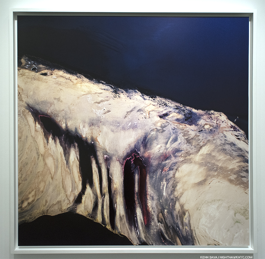
David Maisel, Termiinal Mirage 2, 2003, seen at Yancey Richardson Gallery. An aerial shot taken at the Great Salt Lake. The Artist calls the appeal of works like this “the apocalyptic sublime.”

Whether they have been influenced by Thomas Cole, or their work stands in contrast to his, somewhere in all of it lies a message (intentional or not) that is not all that dissimilar to that of Thomas Cole in one of the stages of The Course of Empire. The overriding question becomes- Which stage are we in?

*- Soundtrack for this Post is “Message in a Bottle,” by Sting and the Police.

NighthawkNYC.com has been entirely self-funded and ad-free for over 6 years, during which over 250 full length pieces have been published. If you’ve found it worthwhile, you can donate to keep it going & ad-free below. Thank you!

Written & photographed by Kenn Sava for nighthawknyc.com unless otherwise credited.
To send comments, thoughts, feedback or propositions click here.
Click the white box on the upper right for the archives or to search them.
For “short takes” and additional pictures, follow @nighthawk_nyc on Instagram.

Subscribe to be notified of new Posts below. Your information will be used for no other purpose.


  1. Like this piece in the New York Times
  2. George Jones Interior of Turner’s Gallery: The Artist Showing His Works, 1852, Oil on millboard, is here in this show on loan from the Ashmolean. My Photo of it appears in my Post on Ellen Harvey’s recent shows since her wonderful work, Arcadia is somewhat based on it. It may be seen here.
  3. The only one to show color work.

Stephen Shore: Beneath The Surfaces

Written & Photographed by Kenn Sava (except El Paso Street, El Paso, Texas, July 5, 1975 )

Let’s play “Curriculum Vitae Roulette.”

First, make a list of ages going down the left side of the page. Next, write down some amazing feats, then slice them up individually, put them in a hat and mix them up.

No cheating! Blindfold, please. Begin!

Pull them out one at a time and lay them in a row going down, one next to each age. Repeat step 5 until the hat is empty. We’ll start with a given- the birth year. Let’s say…”Born 1947.” Ok. Let’s see what we have.

Born- 1947
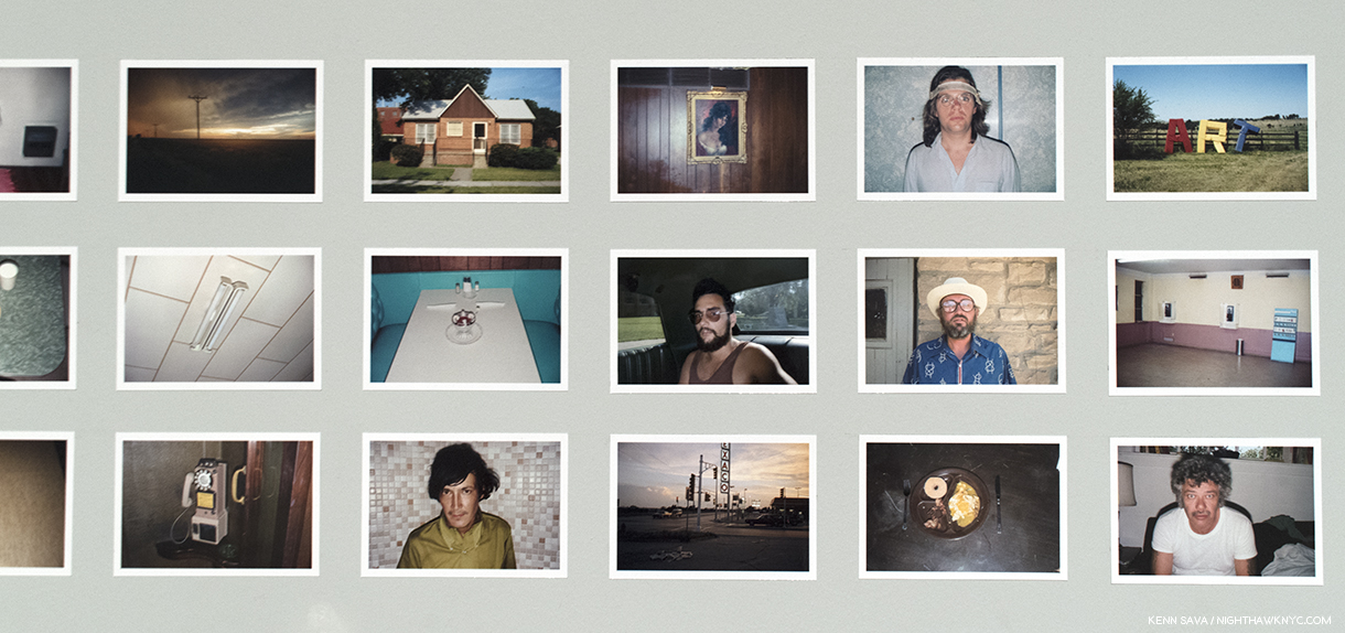
Age 6- Gets a gift of a darkroom kit. Proceeds to develop and print his family photos.
Age 8- Gets a 35mm camera. “I started photographing seriously. Before that, my real interest was darkroom work,” he would later say.
Age 10- Receives a copy of Walker Evans’ American Photographs, the catalog for Walker’s legendary 1938 MoMA show, perhaps, the first important American PhotoBook, which has a powerful and lasting impact on him. He would later call Evans “a kindred spirit1.”

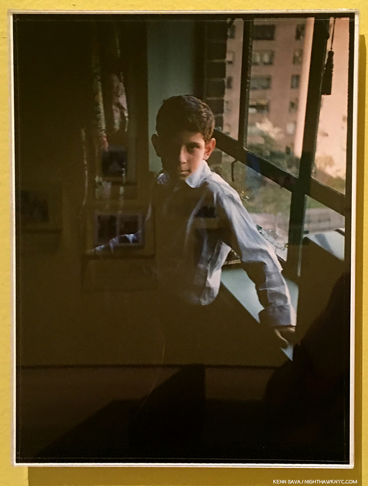
Our subject. Self Portrait, 1957. He was ten. TEN!! Click any Photo for full size. (See- “A Note About Glare In My Photos” in this footnote-2.

Age 11- Has a Leica and a Nikon. Begins doing street photography.
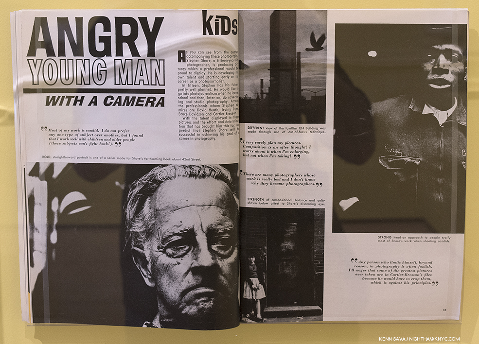
Age 14- 1962- Legendary Photographer, then Director of Photography at MoMA, Edward Steichen, acquires 3 of his Photographs for MoMA. They ask him what his personal philosophy is. “None,” he replies. “I’m only 14.”
Age 15- First article about his Photography is published.

Angry Young Man With A Camera, U.S. Camera Magazine, 1963.

Age 16 & 17- Takes Photos like these-

Untitled, New York, 1964. A forerunner of similar images to come in the next decade, and beyond.

Untitled, 1965. I can’t look at this without thinking of Richard Estes’ now classic reflections from the 1970’s, like Central Savings.

Age 17- Meets Andy Warhol and begins to frequent, and Photograph, Warhol’s Factory. Of how this came about, he later said- “I made a film Elevator, which is shown in this gallery (see below), and it was shown the same night that Andy Warhol showed a film called The Life of Juanita Castro, and I had the opportunity then to meet him. And I asked if I could come to the Factory and take pictures. He said, “yes3.”

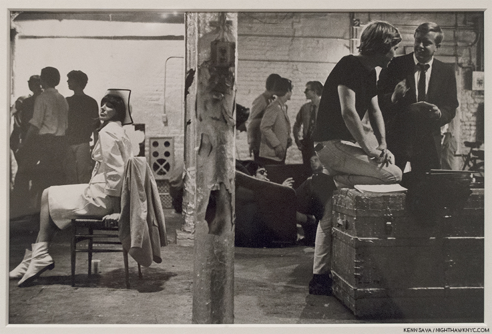
Ivy Nicholson, Chuck Wein, Peter Knoll, Danny Fields and Andy Warhol, the Factory, New York, 1965-67. I spent an evening hanging out with Ivy Nicholson, left in the white, in the early 2000’s. After a few drinks, she sold me one of her CD’s.

Age 24- 1971- First living photographer to have a one-man show at The Metropolitan Museum of Art.

Ok…I’m ROFLAICGU! (Rolling on the floor laughing, and I can’t get up!) Yeah…I know. Dumb exercise. NO ONE would believe that could actually happen, right?

But…Um? It did. It really did. ALL of it4! To ONE person. That’s actually the short list of the early life and career of Master Photographer Stephen Shore. REALLY!

Once I got over the staggering accomplishments Stephen Shore achieved by age 24, which I’m not sure I still have (bearing in mind that William Eggleston didn’t start seriously taking Photographs until he was 185!), I could start actually beginning to assess what the man’s achieved, and is still achieving. The former was gloriously on display in MoMA’s retrospective. The latter was, also, gloriously on display at 303 Gallery on West 21st Street earlier this year, in two shows simply titled Stephen Shore. In between, and every day since, there’s his Instagram page which is a veritable one Artist iPhone Photo Museum, that’s amended daily. As he passes age 70, Stephen Shore is one of the most respected, and influential, Photographers of our time.

He got there the hard way- by continually forging his own way, even though those often lay outside of the “accepted mainstream,” like color Photography was in the world of “Fine Art Photography” in 1972 when he started using it, as he has relentlessly sought new ways to solve “Photographic problems.”

Stephen Shore at MoMA was a terrific chance to get the big picture. Taking full advantage of its very generous six month run, I learned more than I have from any Photography show since William Eggleston: The Democratic Forest at David Zwirner in late 2016 led to a deep dive into the world of contemporary Photography.

Many, even most, of those familiar with his work know American Surfaces” or Uncommon Places long considered his classics, (the resulting PhotoBooks of each were cited in Martin Parr and Gerry Badger’s The Photobook: A History, Volume II). They may not be familiar with his earlier, or later work. Over such a long career, it’s impossible to cover everything Mr. Shore has done, but MoMA has done an exemplary job of hitting a good many of the high notes along the way, including many of his most familiar Photographs surrounded by a good many that are not so well known. Along the way, it seemed to me, the show manages to tie his many and varied projects into a running thread. For an Artist who’s work has continued to evolve for going on 60 years, that’s an accomplishment, and for work that some may look at and not understand, it’s a valuable insight, and perhaps a “way in.”

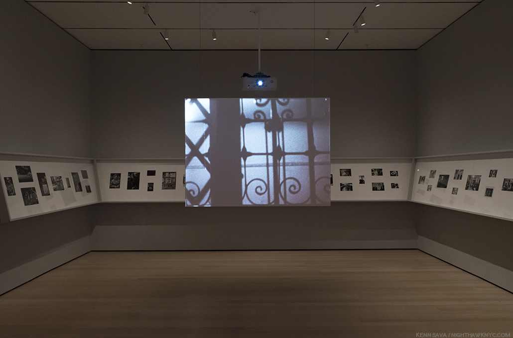
The first room features Stephen Shore’s earliest work, arranged counterclockwise. Which means that after you enter the gallery, to the right, you are presented with the latest works in the room, and you work your way to the earliest, on the left. Shouldn’t it have been the other way around? In the center of the room, Mr. Shore’s 16mm film, Elevator, 1964, the film Andy Warhol saw that led to him Photographing the Factory, is featured.

Fittingly, the first room begins with early work, and ends with his Photographs of Warhol’s Factory, while his short film, Elevator, 1964, plays in the middle of the gallery. It’s the film Warhol saw the led to Stephen Shore being invited to Photograph at the Factory. He would spend large parts of the next three years, from 1965-67 documenting it. It’s only recently that Stephen Shore has chosen to exhibit his Warhol/Factory work. “I rejected my Factory period for a long time. For so many of the others involved, it was the pinnacle of their lives. For me it just wasn’t. It was the beginning6.”

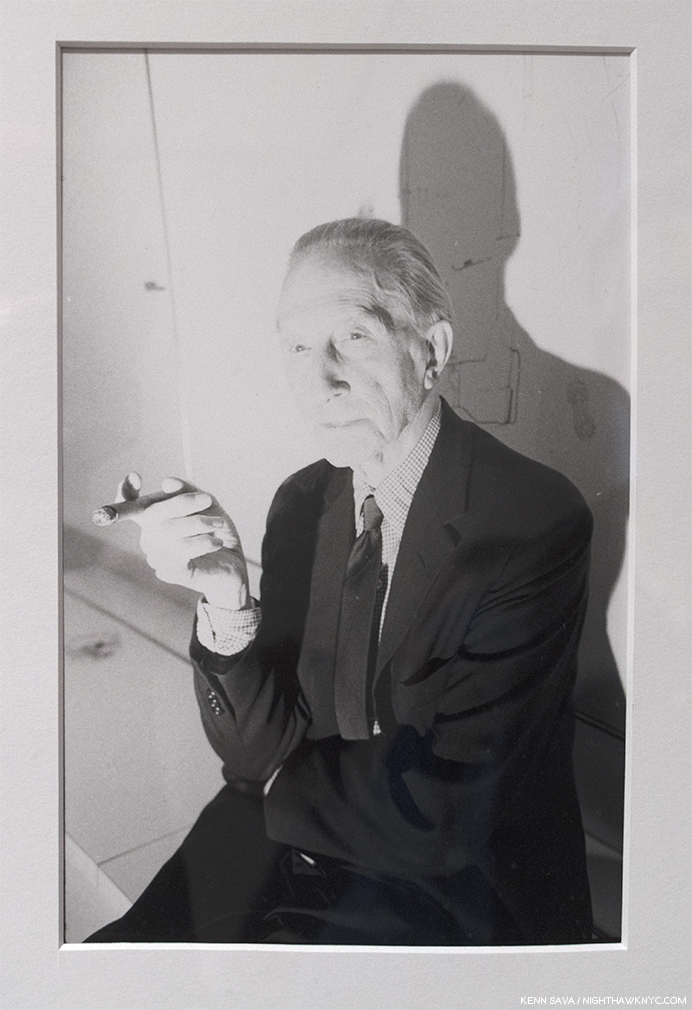
Marcel Duchamp, 1966, Photographed at Warhol’s Factory. With its evocative lighting, this unusual portrait was the final work displayed in the first gallery, though it’s actually the first Photograph viewers see after entering the show.

Lately, he’s seemed to come to terms with this work, as was seen in the 2016 Phaidon collection he was involved with, “Factory:Andy Warhol Stephen Shore.” Though different from all that came after that Stephen Shore has done, to my eyes, this is not only historically important work that documents the Factory as well as it has been. Each image brings unique elements- particularly the arrangement of the figures. Through it all, there is an intimacy on view that only a personal knowledge of the subjects can bring. It’s work that belies the youth of its creator and it more than holds its own as an historically important body of work that also holds up as Stephen Shore’s first “mature” body of work. At 17.

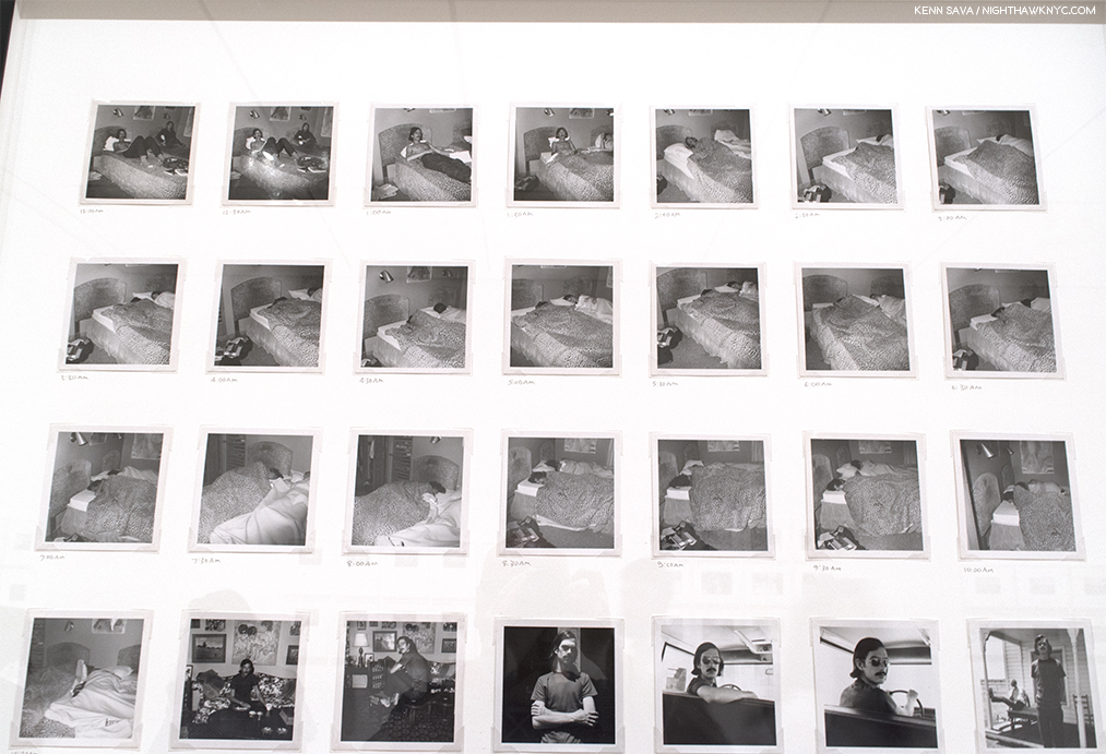
Detail of July 22-23, 1969, 1969. Stephen Shore Photographed a friend every 30 minutes for 24 hours. Even while his friend slept.

From there, Stephen Shore looked for new realms to explore, new problems to solve. He explored Conceptual and Serial Photography, which we see in the second gallery. The great Painter and Photographer, Ed Ruscha, had broken ground with his book Twentysix Gasoline Stations, 1963, a series of Photographs Mr. Ruscha took of gas stations from L.A. to Oklahoma City, which, influenced Stephen Shore deeply. As I walked through the rest of the show, I couldn’t escape the feeling that Conceptual and Serial Photography continues to influence his work- to this day. Ever since, most of the work he has done has been in series, whether in personal projects or commissions.

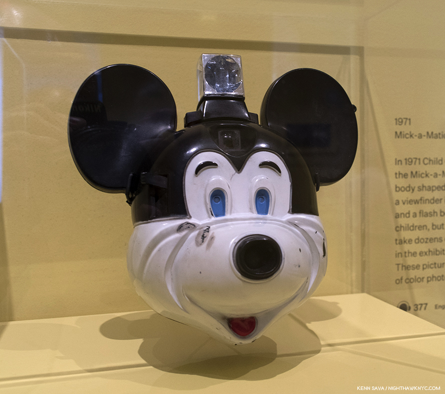
“Mick-a-Matic” Camera. Believe it or not, Stephen Shore used a Mick-a-Matic in 1971  to take his first color Photos, (some on view at MoMA, in the All The Meat You Can Eat section). He used it to get a “snapshot” feel, a pursuit he continued using a Rollei 35mm camera in his first landmark series, American Surfaces, in 1972-73.

In the 3rd gallery, we re-visit a show that Mr. Shore curated called All The Meat You Can Eat, 1971. On display were examples of the vernacular uses of Photography, with a few shots by Stephen Shore (apparently taken with the  “Mick-a-Matic”), but most taken by others. About it, he said, “I was just fascinated by how photography was used. I was interested, also, in the meaning conveyed by how it was used—that we see a snapshot differently than we see an art photograph, that we see an advertisement differently than we see a postcard7.” It was around this time that he became interested in color Photography. “Because postcards and snapshots, in 1971, were all in color, I had to begin examining color photography. In fact, most photography that an average person encountered at the time was color. While art photography, the photography that would be found in galleries, was almost always in black and white. That convention bothered me8.” Regarding his interest in the snapshot, he spoke about a certain quality that some of them had- “…it’s very hard to find the quality of the unmediated image(3. As quoted here. I amended the quote to “unmediated” with the input of Mr. Shore.].” All of this combined to lead him further down the road of Conceptualism, though with a better camera (a Rollei 35mm), and take him, literally on the road.

Installation view of 219 images from the over 300 that comprise American Surfaces as displayed in the 4th gallery at MoMA, recreating how they were first displayed.

He returned with American Surfaces, 1972-73. In keeping true to the snapshot model, he even sent his film to Kodak in New Jersey for processing, like every other snap shooter at the time was doing9. “It began as a road trip. My idea was to keep a visual diary of meals I ate, people I met, televisions I watched, motel rooms I slept in, toilets I used, as well as the towns I would drive through, and, through this visual diary and series of repeated subjects, build a kind of cultural picture of the country at the time10.”  The resulting series of over 300 35mm prints are in the familiar 3 1/16 by 4 5/8 inch snapshot size, though it’s debatable how many of them have that “unmediated” feel. Looking at them now, is a fascinating example of the impact of the passing of time. While the series was met with less than stellar reviews, most notably from the legendary head of MoMA’s Photo Department, John Szarkowski, The Metropolitan Museum of Art bought the entire series. It’s already hard for us to see them as they looked in 1973, but it’s not hard to find the innumerable examples of influence of this series in the work of others since…like in countless people’s social media feeds of every meal they eat, every place they visit, etc, etc. 40-odd years later? Stephen Shore has said that he found Robert Frank’s The Americans “too pointed11. That certainly cannot be said of American Surfaces, though the influence of Walker Evans, Ed Ruscha and Bernd and Hilla Becher, along with Andy Warhol, are to be found, if anything, it’s remarkably open.

Excerpts from American Surfaces, 1972-73, Stephen Shore’s now a classic groundbreaking first series, a visual diary of a road trip . Taken with a 35mm Rollei camera.

Mr. Szarkowski’s criticism of whether the semi-automatic Rollei had created the results, rather than Mr. Shore’s abilities, led the Artist to double down on his intentions. Realizing he couldn’t make 8 x 10 prints from the small negatives without too much grain, he decided to go on another road trip, with bigger cameras. He tried a 4 x 5 camera made famous by press Photographers like Weegee before settling on an 8 x 10 inch camera, which required a large tripod and for the Photographer to shoot under a black hood. The results were worth it. Uncommon Places retains every bit of its majesty and mystery. Though it reprises many of the themes familiar from American Surfaces- meals, motel rooms, architecture, and portraits, the results have a magic that have more than held up since Aperture first published them in 1982. They remain THE series people are referring to when they say something “looks like a Stephen Shore.”

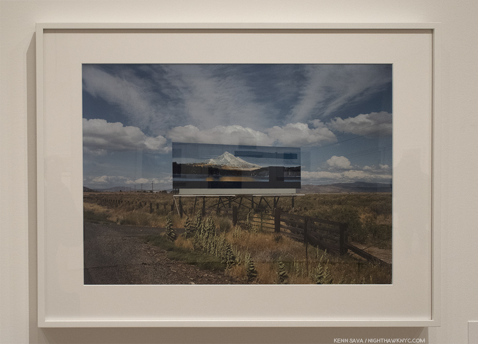
U.S. 97, South of Klamath Falls, Oregon, July 21, 1973. Ahh…the wide open spaces…that only an 8 x 10inch camera can provide.

Both American Surfaces and Uncommon Places are personal and impersonal at the same time. Personal because these are his trips. These are the meals he ate, the rooms he slept in, the people he met, the places he saw. Impersonal because the Artist himself is not seen, nor do we get any indication of what meaning any of these places, people or things have for him. In that sense, they are different from most tourist’s snapshots. The shots of places are like the Paris of Atget, or many of Walker Evans shots of America. The difference I see between American Surfaces and Uncommon Places is the former is marked by Photos that say “look at this,” whereas the latter creates “a little world that a viewer can move their attention through without (his) directing it12.”

Lookout Hotel, Ogunquit, Maine, July 16, 1974, 1974.

It’s up to the viewer to piece them together- individually and as a group, like William Eggleston’s “Los Alamos,” 1965-74, which is also a travelogue of sorts, who’s period partially overlaps.

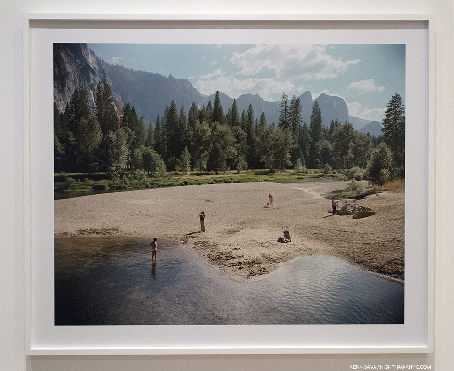
Merced River, Yosemite National Park, California, 8/13/79, 1979. The only work in the show to hang on a wall by itself would seem to lie at the heart of the show.

Merced River, Yosemite National Park, California, 8/13/79, 1979, strikes me as a bit of a rosetta stone when looking at much of Stephen Shore’s work. Intriguingly, it hangs on a wall by itself at something of the heart of the show. At first glance, it appears to be a fairly ordinary landscape view with some folks (perhaps a family) frolicking on the beach in the mid foreground. “…what I realized is that it renders the world in such detail that I don’t have to move into something close to make it clear in a picture. I can let it be a small part of a larger, more complex picture. And so, rather than the picture being, in a way, a view through my eyes, it becomes something else. It becomes a complex world where the viewer can move their attention13.”

The gallery of Print on Demand books, with a row of iPads displaying Stephen Shore’s Instagram page, right.

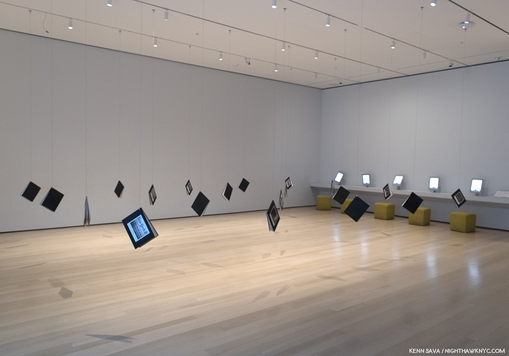
He demonstrates this in the gallery to its left, in a room full of hanging books, print-on-demand titles he created in the early 2000’s. Of the 20 books hanging in this gallery, one is devoted to Merced River.

The complete contents of Merced River, Yosemite National Park, California, 8/13/79, 1979, one of the print on demand books seen above.

In it, the Artist presents the master image as a series of sectioned images, showing us that each one could be a stand alone Photograph. While each proves fascinating on its own, for me, most interesting is the bottom left Photograph, in which we see a side view of the scene Ansel Adams shows us in his famous Photographs, Monolith, Face of Half Dome, 1927, and Moon And Half Dome, 1960.  Stephen Shore was one of the Artists included in the ground breaking 1975 exhibition titled New Topographics: Photographs of a Man-Altered Landscape, at the George Eastman House in Rochester. Mr Shore, along with Lewis Baltz, Robert Adams, Joe Deal and 4 other American Photographers were shown turning away from the classic landscapes of Ansel Adams and Edward Weston’s time and showing the American Landscape as it now existed- altered by man.

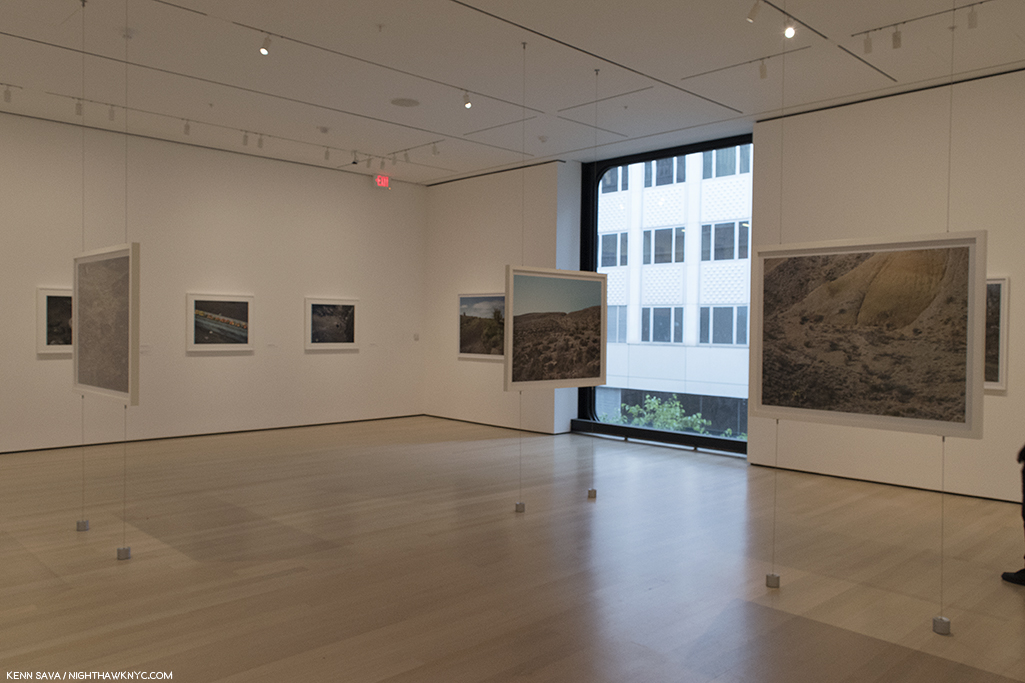
This gallery of landscapes taken in the Montana, Texas, Upstate New York and Scotland was something of a beautiful revelation. Complete with landscapes hanging in mid-air.

There’s a “calmness” that overrides almost everything I’ve seen by Stephen Shore. There’s very little “action.” Even in his commissioned Photographs of the New  York Yankees in Spring Training, not much is going on. Players sit in a group, or stand at the plate, motionless. What we’re almost always given to look at is a “surface” of some kind. But, what strikes me about Stephen Shore’s work is that it almost always leaves me pondering what’s under that surface.

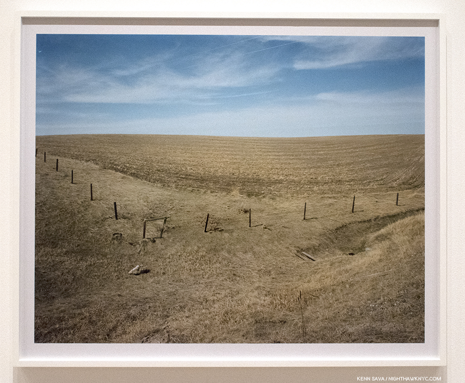
Gallatin County, Montana, April 18, 1981. The second time I met him, I asked Stephen Shore about Painters he liked. He replied, “Anselm Kiefer.” Then added, “I don’t think of Painters when I’m working.” That doesn’t stop me from thinking about them. Looking at this work, I’m reminded of Van Gogh’s immortal Wheatfield With Crows. Minus the crows.

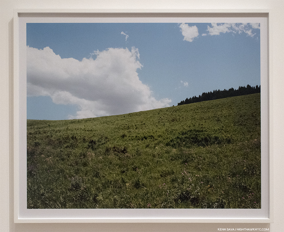
Gallatin County, Montana, August 2, 1983. Again in the gallery that I came to call “The Hall of Landscapes,” this one struck me as being a non-“New Topographic” landscape, and so is rare in his work. Here, there is no evidence of man altering the landscape. Instead, we see an image almost split in two between land and sky, though it’s hard to tell exactly how far off the crest of the hill is, and so it reminds me of Holden Street, North Adams, Massachusetts, July 13, 1974, from Uncommon Places, as a work in which distance and perspective are key elements. Along with the peaceful beauty.

I met Stephen Shore twice during the show’s very generous six and a half month run. I asked him how he felt about the show. “I’m thrilled,” he replied. Well, that might not sounds like an earth-shaking, newsworthy response. But, then I thought about Stephen Shore’s career, and how the initial reaction to his work was not always positive (see below). At MoMA, all these years later, with glories around every corner in every gallery, he’s been “proven right,” so to speak. The show is an unmitigated triumph.

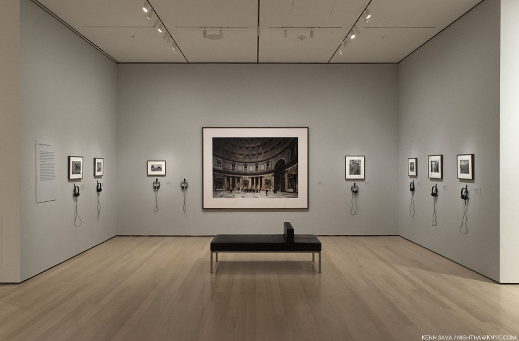
The central gallery devoted to his book, The Nature of Photographs, about looking at Photographic prints, features his work and the work of others he uses as examples in the book, like Thomas Struth, center.

Add to that, he’s been the Director of the Photography Program at Bard College since 1982, as well as the author of the highly respected primer on looking at Photographs, The Nature of Photographs,  which was first published in 1998 (See the “BookMarks” section at the end for my recommended Stephen Shore books…though you really can’t go wrong.). His influence on other Photographers is everywhere and already incalculable, and seems likely to continue indefinitely. There’s certainly a lot in 2018 for Stephen Shore to be “thrilled” about.

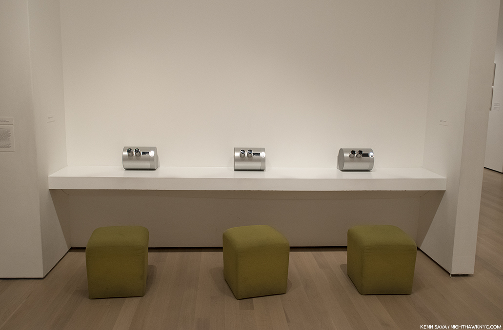
3 Stereoscopic viewers each containing 10 different Stereo Photographs Stephen Shore took in 1974 with a Studio-Realist 3-D camera.

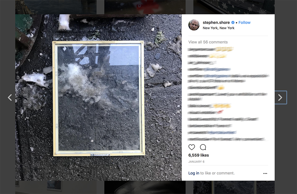
Stephen Shore’s Instagram page, January 6, 2018.

Stephen Shore has been posting virtually daily on Instagram since 2014. Of his approach, and some of the comments he’s received he wrote this on February 18, 2018-

  • stephen.shore “Shore seems intent on proving that anyone can photograph as well as he can, and I must admit he’s building an airtight case. The specific concept behind this exhibit is not readily apparent to me, which would make me feel old-fogeyish as all get-out if I weren’t still young enough to not give a fuck.” This is from a review (in the Village Voice) of a show of mine in 1972. This is how some people viewed the very work of mine that you now respect and perhaps view as “iconic” at the time it was made. It sounds very much like the criticism I’m hearing today – except you all are more polite and respectful. Every now and then I write about my use of Instagram and this seems like an appropriate time. Some photographers refer to their feed as their “gallery”; they see it as a means to make public their best work. There are also well known photographers who have an assistant go into their archives and post one of their best known images each day. My own approach is to post almost every day a picture I made with my phone with Instagram in mind. I see the pictures as a kind of visual jotting – similar to the way Walker Evans used the Polaroid SX-70 camera when he was about the same age as I am now. I’m definitely not defining how Instagram should be used, just stating my intentions. I want to thank all of you for taking the time to express your views. You might find this article of interest: http://stephenshore.net/press/Photograph_Dec_17.pdf

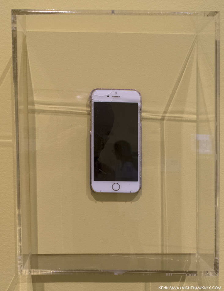
(One of) Stephen Shore’s iPhones. When I met him in January, as seen below,, he was holding a different one. Still, this one was most likely used for his Instagram page. Your results may differ.

While countless social media feeds now look eerily similar to American Surfaces when he first showed them in the fall of 1972, the show was “totally baffling then to almost everyone who saw it14.” Now, Stephen Shore uses Instagram in his own way, and after 4 years of doing so, with an iPhone, its influence can be seen in his other new work. In addition to the MoMA show, 2018 began with a show of new work by Stephen Shore at Cheslea’s 303 Gallery, his long time dealer. On view were recent Photographs taken with his new Hassleblad Digital  X1D camera, which features a touchscreen, much like an iPhone.

Stephen Shore arrives at the opening of his show at 303 Gallery, January 11, 2018. Moments later, this room was packed.

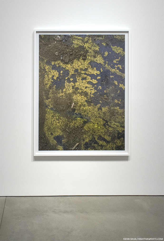
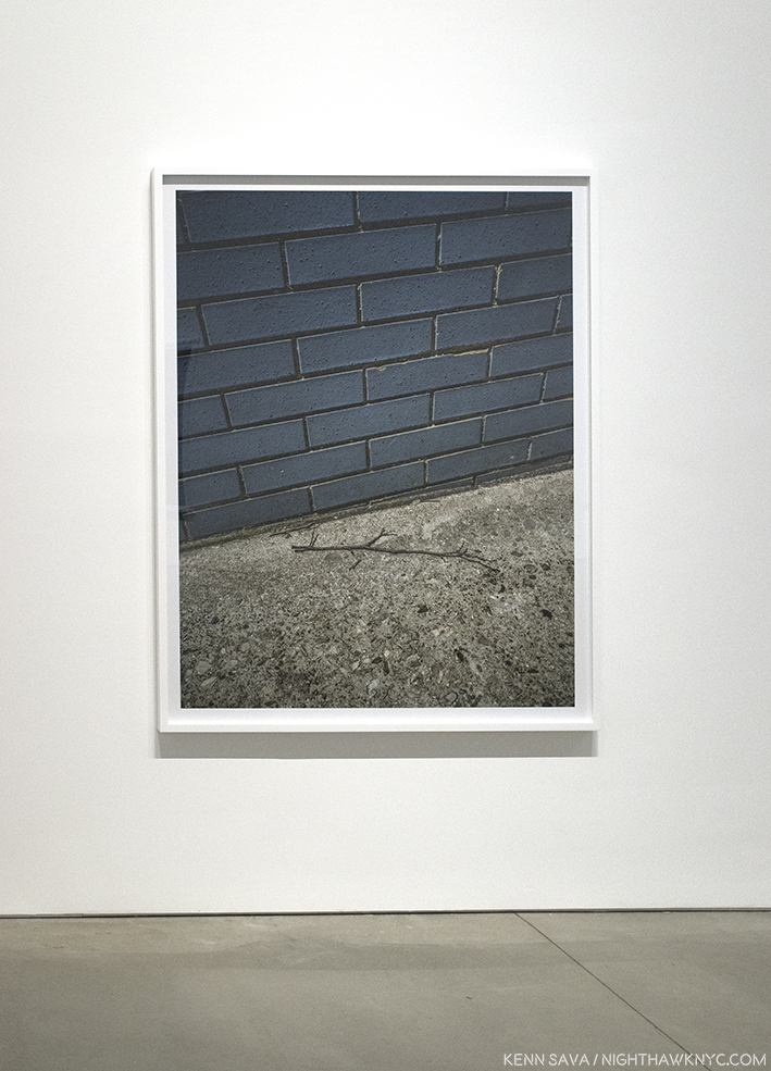
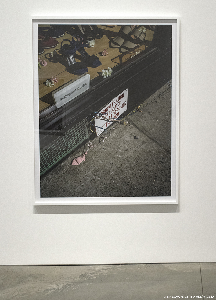
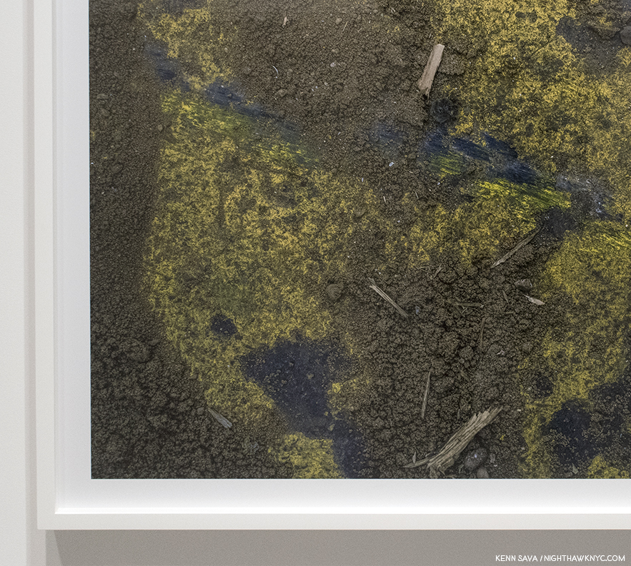
His recent work may look familar to anyone who’s seen his Instagram page. Mr. Shore explained that while he was out walking his dogs he did a lot of looking at the ground. He became interested in “details” he’d see of the ground or the street. More surfaces, yes, but looking through his past, pre-Instagram work, reveals the occasional image similar to these. Using the 50 megapixel Hasselblad X1D Medium Format Mirrorless Digital Camera, he’s able to take images that he can print at sizes of 5 feet, that are, he says, “more highly resolved than work from my 8 x 10 camera15.”

New York, New York, May 19, 2017, seen at 303 Gallery, January, 2018.

I find the results enthralling. Some of the 9 works on view at 303 reminded me of Aaron Siskind, but in the level of detail Mr. Shore brings to bear, they’re completely and entirely something else. Seeing details printed in such a scale presented a small world, where only an occasionally recognizable object, like a matchstick, would give a sense of scale.

New York, New York, May 19. 2017, left, and London, England, June 9, 2017, right, both seen at 303 Gallery, January, 2018.

New York, New York, May 19.2017, seen at 303 Gallery, January, 2018.

New York, New York, May 19.2017 seen at 303 Gallery, January, 2018.

New York, New York, May 20.2017, seen at 303 Gallery, January, 2018.

Without that familiar object, some almost look like a Photograph of the Earth, or some other planet, seen from space. In these works, he’s gotten closer to the surface than ever, about as close to it as possible.

Detail of New York, New York, May 19, 2017. Kinda, sorta looks like North America, no?

For most of his career he seemed to be striving to make big scenes big, possibly to have the impact of being there. These seems to be striving to also make small scenes big. In his latest work, he brings the viewer so close it’s almost as if he’s trying to see under the surface.

Back over at MoMA, there is a small room of works in which he has actually gone under the surface.

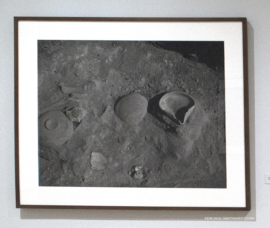
Ashkelon, Israel, 1996, at MoMA.

In 1990s Stephen Shore became fascinated by archeology. After reading extensively on the subject, he undertook projects at excavation sites, beginning with some ancient sites in Israel. Once again, as in a good deal of his earlier and later work, the images are without people. What he shows us here are ancient objects dug out from under the surface. In this case Stephen Shore shows us the surface and what literally lives under it. What we see are the remnants of human activity, life…their presence. In this case the remnants of a lost civilization.

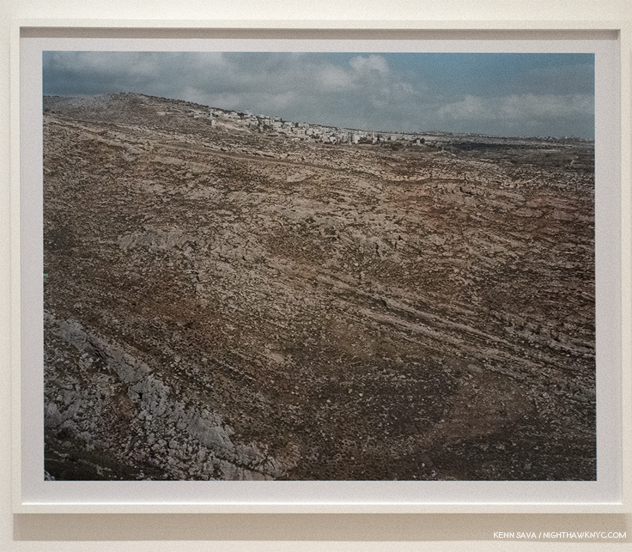
Beitin, West Bank, January 13, 2010, at MoMA.  It almost looks like the side of a large hill, with eons of geological strata facing us, with the current civilization on top, though it’s most likely a flat road or open space leading to the town in the distance.

While thousands of years have past since humans created and used these objects and places, in Ashkelon, Israel, and the other sites he Photographed, are they really all that different from what he shows us in American Surfaces, from 46 years ago? I’m sure a good number of those places are gone now, too. The main difference is that American culture is still here. What lies on the surface eventually gets covered over or is lost to time. One day there may be archeological digs going on here. “American Surfaces” is an unintentional piece of our cultural past, as are any vintage Photographs. In its case, it’s an artfully done series of over 300 works that taken together gives us a bigger sense of our culture in 1972. Much of the same can be said for Uncommon Places, since it continues many of the same themes. The larger 8 x 10 format is, perhaps, shown to best effect in the landscapes. In these, we see the effect that humans have had on the land- constructing buildings of various kinds, or otherwise modifying the land- the very crux of what was meant by “New Topographics,” Photographs of the man-altered landscapes.

“Lately I’ve been paper thin
So, why can’t I fly?
Why can’t I move with the wind on a whim?”*

Photographs are two dimensional representations on the surface of Photographic paper, of course. There is no “going underneath” the surface of a Photograph. Stephen Shore has long been something of an Archeologist Photographer, showing us our world as he finds it, a world teaming with evidence and artifacts of human presence, and so the resulting Photographs are often packed with so much information the temptation arrises to ponder what it “means,” what lies “under” the surface.

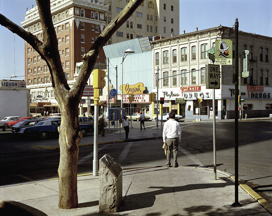
El Paso Street, El Paso, Texas, July 5, 1975 from Uncommon Places. This is one image I’ve literally spent hours looking at and thinking about. MoMA Photograph, and included in the Nature of Photographs section of the show.

Until, I came across this that he, himself, said. “…I was fascinated by what the world looks like when you pay attention to it, and I’m still interested in this act of attention. And so the pictures are reflective of the condition of a self, paying attention.”

Remember that game we played in the beginning? Stephen Shore’s real life C.V., now approaching book length, gets even more impressive every day. Exploring it serves to show me that one of the great lessons, and examples, of both shows is that over such a long and fruitful career, Stephen Shore has continually resisted repeating himself. There are other Photographers who have made a career out of attempting Uncommon Places-style work, but Mr. Shore has relentlessly moved forward, seeking new Photographic problems to solve and continuing to evolve as an Artist. Think about how few Artists have been able to do this. Among Musicians,  The Beatles, weren’t able to last more than 10 years before they broke up, and even among individual Musicians or Artists there are very few who have a similar track record. When considering Stephen Shore’s ongoing accomplishment, I look over this already long piece and the first thing I think about is how much I’ve left out. But, the joy of delving deeply into any great Artist’s work is that of discovery. I don’t claim to have “discovered” all that there is to discover in Stephen Shore’s work in 6 months. Particularly because- He’s going to surprise me, again, tomorrow.


BookMarks- (A series that looks at books related to the subject of this Post.)-

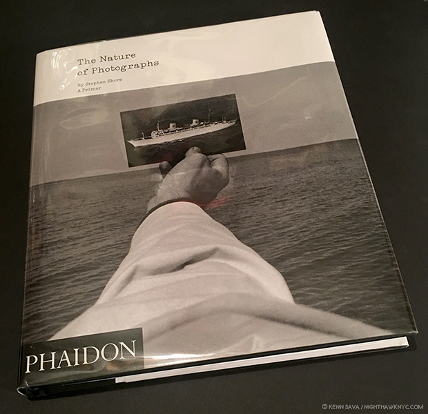
A copy of the Phaidon edition of Stephen Shore’s The Nature of Photographs: A Primer.

PhotoBooks have been a big part of Stephen Shore’s career. If you want to explore Stephen Shore’s work, the excellent Aperture Foundation has 2 books available that are both essential, in my view. Uncommon Places: The Complete Works, updates the original 1982 Aperture classic, Uncommon Places, (now out of print with first edition/first printing copies selling for about $900.00 at the moment). I recommend the Aperture’s 2015 update, Uncommon Places: The Complete Works, which lists for $65.00, because Mr. Shore added 20 rediscovered images, in what is now, as Aperture says, the “definitive edition,” of this unique and endlessly influential series.

Second, last year, Aperture released Stephen Shore: Selected Works, 1973-1981, which was one of my choices for the PhotoBook of the Year. Though a bit too large (note all the white space around the Photos), the concept of this book is brilliant. Aperture explains- “Over the past five years, Shore has scanned hundreds of negatives shot between 1973 and 1981. In this volume, Aperture has invited an international group of fifteen photographers, curators, authors, and cultural figures to select ten images apiece from this rarely seen cache of images. Each portfolio offers an idiosyncratic and revealing commentary on why this body of work continues to astound; how it has impacted the work of new generations of photography and the medium at large; and proposes new insight on Shore’s unique vision of America as transmuted in this totemic series.” Check out the list of the 15 contributors- Wes Anderson, Quentin Bajac, David Campany, Paul Graham, Guido Guidi, Takashi Homma, An-My Lê, Michael Lesy, Hans Ulrich Obrist, Francine Prose, Ed Ruscha, Britt Salvesen, Taryn Simon, Thomas Struth, Lynne Tillman.

American Surfaces, first released in 1999 with 77 Photographs, was reissued in an expanded, 300 Photograph edition, in 2005 by Phaidon, that came in a reproduction of a 1970’s Kodak film processing bag. it’s currently available (without the nifty bag) in a very good paperback edition that lists for 39.95, and is still essential for anyone interested contemporary Photography.

Stephen Shore has been Director of the Photography Program at Bard College, NY, since 1982, and The Nature of Photographs: A Primer, first published in 1998, and now republished by Phaidon, is as close as we have to his “textbook” on the subject. Not a “how to take great Photos” book, it’s more a study of looking at the end result- prints. Mr. Shore believes that aspiring Photographers should spend at least some time working with film, and that includes its end product- the print. As the world of Photography becomes more and more digital, and fewer Photographers have experience working with film and printing in a darkroom, this book becomes an ever-more valuable document from a master of the darkroom for over 64 years. In it, Mr. Shore talks about “the physical and formal attributes of a Photographic print that form the tools a Photographer uses to define and interpret…content,” such as flatness, frame, time and focus, each accompanied by classic images, the choice of which is fascinating on its own. Rembrandt never wrote a book about “The Art of the Print.” Ansel Adams did in the 1960s. Stephen Shore has for our time.

Finally, an under the radar book I recommend is Winslow Arizona: Stephen Shore (English and Japanese Edition),” 2014, published by Amana. It’s a collection of Photographs Mr. Shore took in one day in 2013 in the titular town he had first seen in 1972. The series was created for for a slideshow which was recreated at MoMA. I find it a beautiful collection of first rate later Stephen Shore images. Being that the entire collection was taken in one day may be intimidating for some who aspire to become Photographic Artists, it’s remarkable for the rest of us.

*- Soundtrack for this Post is “Surface” by Bonobo
*- Stephen Shore at MoMA is my NoteWorthy Show for May, 2018.
My thanks to Stephen Shore.
My previous Posts about Photography are here.

NighthawkNYC.com has been entirely self-funded and ad-free for over 6 years, during which over 250 full length pieces have been published. If you’ve found it worthwhile, you can donate to keep it going & ad-free below. Thank you!

Written & photographed by Kenn Sava for nighthawknyc.com unless otherwise credited.
To send comments, thoughts, feedback or propositions click here.
Click the white box on the upper right for the archives or to search them.
For “short takes” and additional pictures, follow @nighthawk_nyc on Instagram.

Subscribe to be notified of new Posts below. Your information will be used for no other purpose.


  1. MoMA Catalog, P.92
  2. “A Note About Glare in my Photos- Yes, I know. It’s annoying. It makes it very hard to see the Art or the Photo being displayed. I try very hard to minimize it in my Photos, even leaving out works where the glare is insurmountable (this was an especially BIG problem with MoMA’s great Frank Lloyd Wright show. For a while I thought I’d have no Photos to run of it.). Most galleries and museums don’t glaze their Art with non-reflective acrylic. For one thing, it’s quite expensive. For another, lighting in museums, particularly, is often less than ideal in spite of the efforts of some of the world’s best museum staffs. This is almost always an issue for any Art with glass or acrylic in front of it. Time and again I’ve pointed this out to curators who, much to my surprise, have actually agreed with me. Um? Then why isn’t it better? Add to this the proximity of other Art that is lit, and this is a problem for me in preparing these Posts. But? It’s also a problem for any show visitor. WHOEVER goes to the show is going to experience it- THIS is what they are going to see. So…I’ve thought about this problem long and hard in regard to the Photos I Post here. What I’ve decided, for better or worse, is that instead of using Photos of the Art from galleries or other sources, I’m running Photos of the Art as it actually appears in the show because this is how show attendees would most likely see it. My purpose is to give a sense of what the show was like and what it was about. To this end? I think this makes the most sense. In the “Self Portrait” Stephen Shore took at age 10, the glare was insurmountable, particularly in the large dark area to the lower left. I tried over numerous visits to minimize the glare, even trying different cameras, but given the yellow room, the bright lights and the proximity of the other frames reflected in it, it was just not possible. I decided that the reflections seem to auger the work to come in Mr. Shore’s illustrious future, and to “let it be.”
  3. MoMA Exhibiton AudioGuide https://www.moma.org/audio/playlist/45/706
  4. References for the list- UO Interview, and P.2 Tony Hiss/John Szarkowski stephenshore.net
  5. Thomas Weski, William Eggleston: From Black and White to Color, P. 177
  6. wallpaper July 26, 2007  https://wallpaper.com/art/Stephen-Shore-interview
  7. MoMA Exhibition AudioGuide https://www.moma.org/audio/playlist/45/715
  8. MoMA Exhibition AudioGuide https://www.moma.org/audio/playlist/45/715
  9. The first edition of the 2005 expanded version of “American Surfaces,” even comes in a recreation of a 1972 Kodak film processing bag.
  10. MoMA Audio Guide
  11. http://issuemagazine.com/a-ground-neutral-and-replete/8/#/
  12. http://www.tate.org.uk/whats-on/tate-liverpool/exhibition/sky-arts-ignition-doug-aitken-source
  13. MoMA Exhibition AudioGuide https://www.moma.org/audio/playlist/45/709
  14. https://newrepublic.com/article/115243/stephen-shore-photography-american-surfaces-uncommon-places
  15. Source for this paragraph is a video Stephen Shore made about the X1D https://www.youtube.com/watch?v=1BplS1MmZXk

William Eggleston’s Secret Lab

Set the Way Back Machine to December, 2016, when William Eggleston: The Democratic Forest was at David Zwirner Gallery, 537 West 20th Street, where all the trouble began. I had one of those “Dubliners” moments, where James Joyce’s Stephen Dedalus has an epiphany and his life (and the story) is forever altered.

My life hasn’t been the same since.

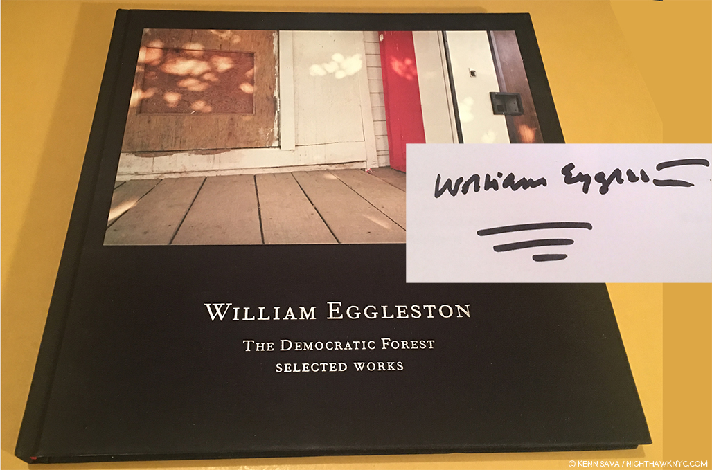
A signed copy of the catalog for the 2016 show, William Eggleston: The Democratic Forest: Selected Works, with William Eggleston’s characteristically vibrant signature, is all that remains to remind me…

As I walked through that show, revisiting the classic images on view (a total of 40, many in a larger size that I still haven’t gotten used to), I left with an overpowering realization that I needed to do a deep dive into the world of contemporary Photography, to catch up on it, Post-Robert Frank’s “The Americans,” 1958 (though Mr. Frank is still with us, of course, and still releasing great books with Steidl. Long may he wave!), and see what’s been going on. I also wanted to do this to gain some perspective on William Eggleston’s place in Photography and his accomplishment to date.

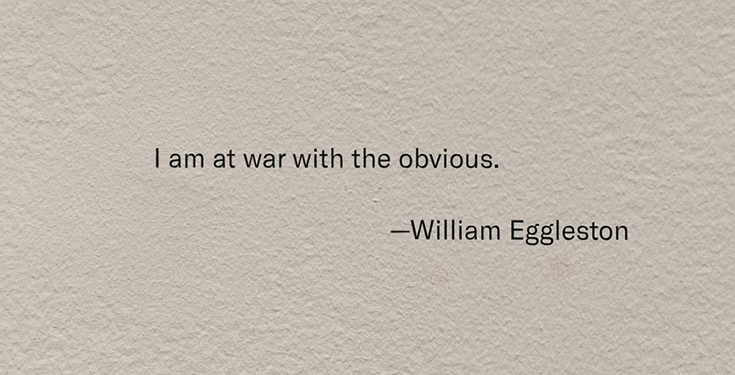
Henri Cartier-Bresson has his cryptic “decisive moment.” Robert Capa has “If your pictures aren’t good enough, you’re not close enough.” Eggleston has his own quote that will keep us guessing indefinitely.

Yes, I knew that famous quote, and William Eggleston’s work, but not in depth. Steidl’s 10 volume set of “William Eggleston: The Democratic Forest,” containing 1,010 images from this body of work, released concurrently with the show, was a sizable step towards addressing that. Never before (or since) had such a large body of color work been published in one set. Add to it the unrelenting quality of the images, and Mr. Eggleston’s extraordinary eye, and you’re face to face with a landmark body of work. From there, I went back to his prior Steidl sets, William Eggleston: Chromes, 2011, and Los Alamos Revisited, 2012, both of which contain his earliest color work (the former his early slides, the latter his early prints). At this point, there was no denying William Eggleston’s exceptional importance in the world of Photography, being one of the few to bring a new way of seeing to the world.

The question became- “Who else is important?” I’ve explored some of the others I’ve discovered in these pages since Mr. Eggleston’s David Zwirner show, this past year and a half, including 4 article looks at The Photography Shows, AIPAD, in 2017 and 2018. How times have changed here at NHNYC. William Eggleston: The Democratic Forest didn’t even get a full article to itself! The spark that started a bonfire. The journey continues.

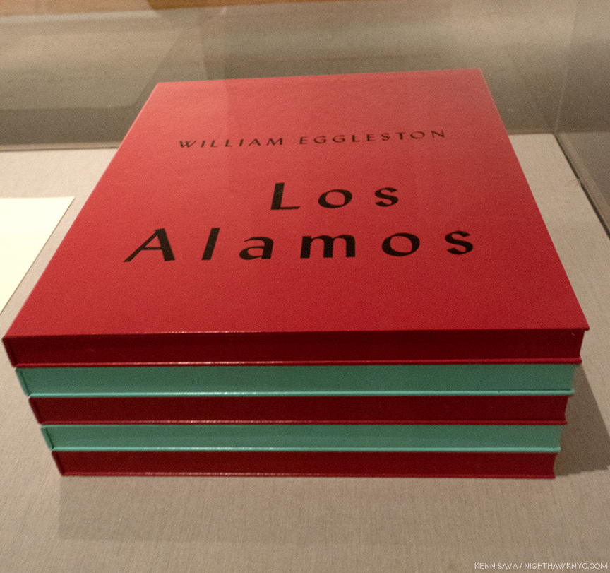
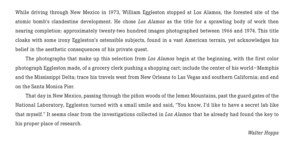
On the road, again. William Eggleston’s Los Alamos was shot on the road, over trips he took across the country between 1966 and 1974. When he, and his friend the curator Walter Hopps hit Los Alamos, NM, scene of the Atomic Bomb development in WW II, the Photographer commented about wanting “his own secret lab.” Click and photo for full size.

So, after literally hundreds of Photo shows seen, countless PhotoBooks perused and too many bought in the interim, here I was, once again, on the precipice of another William Eggleston show. This one at no less than The Metropolitan Museum of Art, featuring the recently promised gift of one of the seven Portfolios of “Los Alamos,” never previously seen as a set in NYC, containing the Artist’s earliest color print work. A sense of trepidation filled me- What new havoc would Mr. Eggleston wreck upon me now?

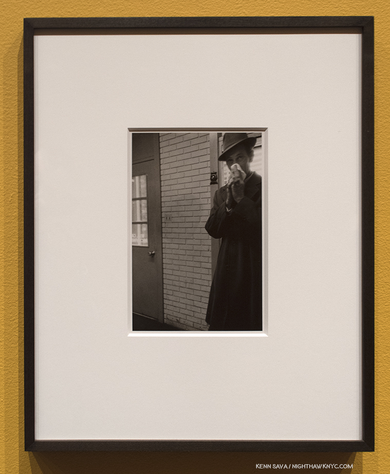
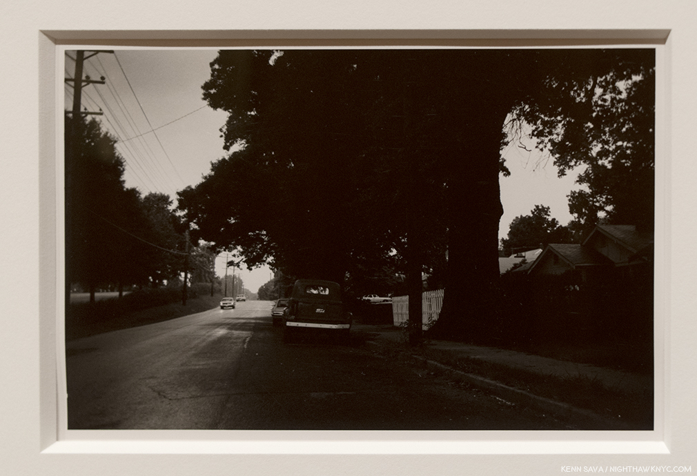
Untitled, 1967-74, Gelatin silver print. Perhaps a touch of the lingering influence of Henri Cartier-Bresson here?

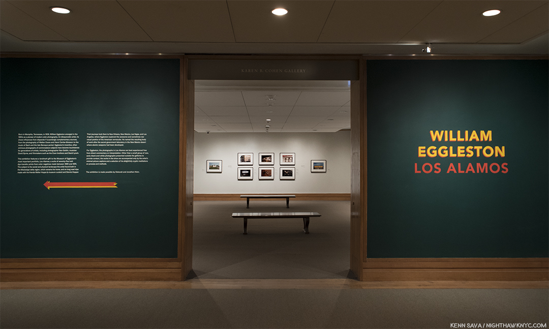
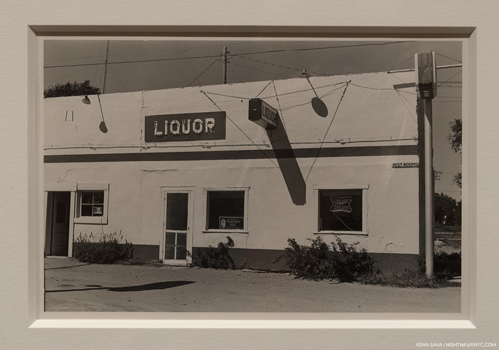
I didn’t have to wait long to find out. As I approached the show’s entrance, I realized The Met had decided to give us more. This monumental show of one of the landmark bodies of color Photography begins with two walls of William Eggleston’s comparatively little known black & white work(!), flanking each side of the show’s entrance  containing a total of 11 black & white Photographs created between 1959 and 1974 mounted on mustard walls! 11 Photographs might not sound like many but their subjects and styles are so varied they present a fascinating capsule look at where his work was before he turned to color film.

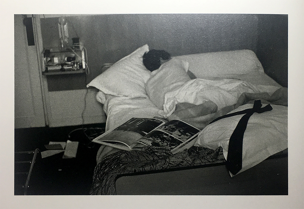
I’ve seen some of his black & white work in the two Steidl books centered on it1, to feel they are an overlooked realm of his work that deserves a closer look. But, such is the all-encompassing power of his color work that it has garnered only occasional attention.

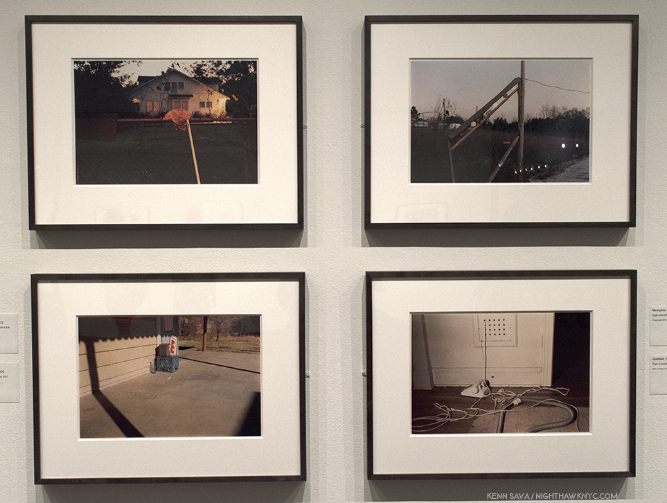
William Eggleston fell asleep reading Cartier-Bresson’s Les Europeans, Paris, 1964, shown here in this Photo by his wife, Rosa, as seen in William Eggleston: From Black and White to Color, P. 176. (Not in the exhibition. )

Early on, William Eggleston was captivated by the work of Henri Cartier-Bresson. He so worried about copying him that during a trip to Paris in 1964, where the French master lived and worked for many years, he didn’t take a single Photograph. Returning home, he realized that “foreign land” surrounded him right there in Memphis (including the new shopping malls and strip malls that were sprouting like weeds) and he set about Photographing it. That is what we see in these 11 black & white shots- a great Artist stepping beyond influences and beginning to trust his own vision. In the shots with human subjects, the influence of Cartier-Bresson’s infamous “Decisive Moment” would seem to be there, but he’s putting his own stamp on it. By the early 1970’s he was on his way.

Untitled, 1967-74, Gelatin silver print. Light & dark…day & night…this is one of the most “different” images by William Eggleston I’ve seen.

Moving beyond the images with people, some others show a fascination with a wider view, courtesy of a wide-angle lens, in landscapes where it’s hard to discern details of the scene (above). In these people-less works, compositionally, they’re still fascinating and still “democratic,” the term he used recurringly connoting nothing being more important than anything else in the frame. But, overall, they lack the laser focus that permeates Los Alamos, and much of what has followed.

Untitled, 1967-74, Gelatin silver print. This begins to call to mind any number of William Eggleston’s later color Photos, like Los Alamos.

The revelation from these earlier black & white Photos, for me, is they emphasize the Artist’s gift for composition (including a penchant for Photographing from unusual angles). But this really shouldn’t be a surprise. Like Cartier-Bresson and that other great master of early color Photography, Saul Leiter, William Eggleston is also a Painter. Turning to color film, however, he would also have to find his way. “I’d assumed that I could do in color what I could do in black and white, and I got a swift harsh lesson. All bones bared. But it had to be,” he’s quoted on a wall. The stage having been set, the main event beckoned.

Only SEVEN sets of this large 5 volume set were released in 2002, along with 3 Artist’s Proofs. This extraordinarily rare complete set, in, apparently, pristine condition, is a promised gift to The Met, who is showing the 75 Dye-transfer prints it contains, (15 per box) complete, for the first time ever, in NYC, along with 13 others from the extended series.

Walter Hopps’ Introduction to Los Alamos as it appears in the Steidl set. Photo courtesy of Steidl.

The first selection was shown at Museum Ludwig, Cologne in 20022, when this Portfolio was released, along with a catalog for the show, also titled, Los Alamos. The Portfolio consists of 75 dye transfer prints, in 5 boxes of 15, perhaps the most revered type of color print, as they possess a larger color gamut and tonal scale than any other process. Since Kodak stopped making the materials  for this process, they are rarely created today3 These images were known to me to now through Steidl’s three volume set,  Los Alamos Revisited, where they are supplemented by other images from the series. In the “Editorial Note” at the end of Volume 3, Gerhard Steidl says “Los Alamos is presented in its entirety in this three volume set,” though there are far fewer than the 2,200 images Mr. Hopps says was created, above. As good as Steidl’s books are, no book can match seeing a dye transfer print in person.

The first wall of William Eggleston: Los Alamos.

Along the show’s first wall, the second print is the image Mr. Hopps refers to as being William Eggleston’s first color Photograph.

Untitled, 1965, Dye-Transfer print, as are all the Photos that follow.

This man in this incredibly odd image, that would seem to be as far away from “Art” as one could imagine, is not pushing a shopping cart into a row of them. He’s pushing color Photography into the world of Fine Art Photography. Interestingly, 53 years later, for such a famous Photograph, seeing it in person in a dye-transfer print, it’s not a shot that screams with color, as so many others in Los Alamos do. It’s subtle relative to many of the others in the Portfolio. The colors emerge from shadows. Glimpses of light in a grey world. What strikes me are the subtle shades of silver in the carts- some of which are in the light, some are in shade. Then there’s the shadows. They echo the two figures we see, but the woman in the sunglasses isn’t one of them. They are the Photographer and the shopping cart man. The shadows are, almost, black and white images, something I’ve yet to see someone point out. As part of the “grey world” they wonderfully echo the black & white world he’s left behind in the “new world” of color Photography William Eggleston had embarked upon.

It almost looks like a black & white Photo. Detail of the left center showing William Eggleston, left shadow, taking the photo of the cart worker, on the right.

He would never go back.

Memphis, 1971-74

Memphis, 1965-68

William Eggleston began his career working in isolation “that was almost inconceivable.” “Photography wasn’t even born yet,” he said later. He even had no knowledge of the controversy the appearance of The Americans caused4. Going back before The Americans, it must be said that it seems to me that it’s hard to speak about ANY American Photographer of the 20th (or 21st) centuries without mentioning Walker Evans, though he did very little color work, and late in his career. It’s hard NOT to see the influence of Walker Evans everywhere in work created after his FSA works of the 1930’s. That includes the work of William Eggleston. I say that not to diminish his accomplishment by any means. I say it because almost every Artist in the western world has been influenced by someone who came before him or her. William Eggleston’s work has a rawness to it, akin to extremely proficient snapshots that I also see in some of Walker Evans’ work. William Eggleston knew the work of Walker Evans before he embarked on the work shown at The Met, but he proves himself over and over to be among the few who’s own vision is strong enough to overcome “echoes” of any influence. This was first seen in his controversial at the time, now landmark 1976 MoMA show Photographs by William Eggleston5,” and in much of what he’s shown us since.

Greenwood, 1971-74

Memphis, 1971-74

Santa Monica, 1974

Speaking of the continuum of influence, it’s hard to walk around this show and not see each image as a jumping off point for the work of so many others. Yet, the big mystery in them- “What do they mean?”- is only answered until you look at them again.

Mississippi, upper right and upper left, Memphis, lower left and lower right, all 1971-74

Part of their “charm” is how the cars, furniture, objects, and places look dated to us now. That’s inevitable with Photography as time goes on. Then, of course, there’s the power of his colors to seduce the eye like few others can.

Louisiana, 1971-74

While I’m eternally pondering the “What is he saying?” question myself, I always come back to studying, and admiring, his compositions. Their balance, or their off kilterness…in both cases, manage to retain interest.

Mississippi, 1971-74. Balance. Well? Almost. But, that’s life, right?

Greenwood, upper left,  Memphis, upper right, both 1971-74, Untitled (Bottle on Cement Porch), lower left, and Untitled (White Phone and Vacuum Cleaner, lower right, both 1965-74.

Images like the group of four above spawn countless “I could do that” comments. While I don’t deny the possibility someone could, what’s overlooked is the time and the context. These were taken over 45 years ago, when no one was “doing that.” When seen in the context of the history of Photography, they were, therefore, unprecedented, particularly in color. And yes, today? Countless people, and Photographers, are trying to “do that,” though we’re still waiting for the “next William Eggleston” to reveal him or herself, and so am I.

Louisiana, 1971-74

What to make of this image, with its carefully considered composition, shot from a low angle? I don’t know and my efforts at gaining insights reached a dead end. Ostensibly it’s here because it’s part of the complete portfolio, and as such, it’s now in The Met’s Permanent Collection. Though taken over a generation ago, it remains disturbing and offensive, and puzzling. In a 2004 interview in The Guardian, Sean O’Hagan quoted William Eggleston saying, “A picture is what it is, and I’ve never noticed that it helps to talk about them, or answer specific questions about them, much less volunteer information in words. It wouldn’t make any sense to explain them. Kind of diminishes them. People always want to know when something was taken, where it was taken, and, God knows, why it was taken. I mean, they’re right there, whatever they are.” As a result, I can’t help but think it calls into question the whole sense of “detachment” that exists in all of these works. At this point, it seems these questions are going to remain indefinitely.

The last wall at The Met includes the image taken during the plane trip home, far right, as if to put a “bow” on the project.

My current feeling about Louisiana, 1971-74, and the series as a whole, is that these are glimpses of America, moments that passed in front of the Photographer and his camera, that may, or may not, be gone forever, but will remain frozen in time. Taken as a whole, it’s as compelling a portrait of America as Jack Kerouac’s On The Road, (perhaps an inspiration for Mr. Eggleston), is, in my view, albeit in a completely different way. While Jack Kerouac inspired a generation of “Beatniks,” and countless others, Mr. Eggleston has inspired two generations of Photographers, and counting. In Los Alamos we see the mundane, the beautiful, the ugly, and the never noticed before, all seen by a man possessing one of the most singular eyes in Contemporary Art. If not in Art. Period.

Yes, William Eggleston went to “war with the obvious.” And he imposed his will upon it.

————————————

BookMarks- (A new feature regarding Art and/or PhotoBooks related to this Post). If you want to begin to explore the work of William Eggleston, William Eggleston’s Guide, published by MoMA is the place to start. After that, you really can’t go wrong with any Eggleston book published by Steidl or Twin Palms Publishers, though I would recommend considering William Eggleston: Los Alamos Revisited, next.

If you find yourself taken by Los Alamos, I highly recommend Steidl’s 3 volume box set.” Produced by William Eggleston, The Eggleston Artistic Trust and Gerhard Steidl, given the involvement of the Artist, it’s highly unlikely to be surpassed as a definitive document of this landmark series. The production is first rate in all respects. At Steidl’s booth at The Photography Show/AIPAD this year there was some question around how much longer copies of Los Alamos Revisited would be available. Released in 2012, I wouldn’t wait long to get one. Steidl’s previous William Eggleston Box set, Chromes, released the year before, is now out of print. The asking price for the cheapest USED copy known to me at the moment is $1,500.00.

*- Soundtrack for this Post are “Inventions & Sinfonias” by Johann Sebastian Bach as performed by Glenn Gould. Mr. Eggleston is, also, a Pianist, who recently released his first CD, William Eggleston: Musik (Vinyl). He lists J.S. Bach as his favorite composer. Something we agree on.

Update 5/22/18- Rewatching the fascinating documentary, The Colorful Mr. Eggleston, I saw what sure looks like one of the other sets of “Los Alamos.” At the 7 minute mark, Mr. Eggleston is speaking at what looks to be the Eggleston Artistic Trust, and behind him to the right, there are five similarly color boxes sitting on a shelf next to a “Coke” sign.

William Eggleston speaking in The Colorful Mr. Eggleston, with what looks to be a set of Los Alamos on the shelf behind him. Walker Evans, also, Photographed, and collected, Coke signs.

My thanks to Monika Condrea and Steidl for their assistance.

My previous Posts on Photography are here
You can now follow @nighthawk_nyc on Instagram for news and additional Photos!

NighthawkNYC.com has been entirely self-funded & ad-free for over 7 years, during which over 275 full length pieces have been published!
I can no longer fund it myself. More on why here.
If you’ve found it worthwhile, PLEASE donate to keep it online & ad-free below.
Thank you, Kenn.

Written & photographed by Kenn Sava for nighthawknyc.com unless otherwise credited.
To send comments, thoughts, feedback or propositions click here.
Click the white box on the upper right for the archives or to search them.
Subscribe to be notified of new Posts below. Your information will be used for no other purpose.

  1. William Eggleston: From Black and White to Color, and William Eggleston: Black and White the latter to be expanded in a reissue later this year. At that time it will serve as the best resource on his black & white work.
  2. The show then traveled through Europe before making 3 stops in the USA until it finally closed in January, 2005.
  3. More recently, the Eggleston Artistic Trust has begun producing larger (often 45 x 65 inch) pigment prints, which were shown in that 2016 David Zwirner show. Personally, I greatly prefer the original sizes in almost every case.
  4. William Eggleston: From Black and White To Color, P.183
  5. Immortalized by the show’s catalog, William Eggleston’s Guide,” 1976, one of the first essential books of color Photography, still in print.

What The Met Is Wearing To It’s Gala

“I would go out tonight
But I haven’t got a stitch to wear”*

Sorry. I care not one iota for “celebrities,” but I do care deeply about my second home, 1000 Fifth Avenue, NYC, aka The Metropolitan Museum of Art. So, while the rest of the world is ooohhhhinng and ahhhhhing over who’s wearing what (or not wearing what), I’m much more interested in what the building is “wearing” to tonite’s “Met Gala,” formally called the “Costume Institute Gala.” So? I thought I’d give you a look at it during the last moments the public was allowed in late Sunday, May 6th, as preparations for what is still widely called “the fashion event of the year” were winding up. The Met was closed today to allow for finishing touches…you know…nails and hair…

I don’t plan on covering this year’s Met Fashion Show, “Heavenly Bodies: Fashion and The Catholic Imagination.” I’ll leave that to my friend, the incomparable Magda. But, wow, the signage sure strikes me as being “loaded.” Click any Photo for full size.

After 1,600 visits these past 15 years, I still get goose bumps when I turn the corner and see this in front of me. Oh, look! They finally built me an apartment out front! Yes, the satellite trucks were there 24 hours before “opening step off.”

The view of the world famous stairs under the tent.

The view in Gallery 300, just south of the Grand Staircase, (aka Byzantium South). Yes, the “real” outfits are being hidden, but I do love how carefully so many of them are draped. Well? It’s The Met.

Gallery 304- Medieval Europe, with the figures going all the way back into the next galleries.

Gallery 305- Medieval Sculpture Hall. The Met’s famous Christmas Tree is installed right in front of the Spanish Choir Screen. The figures go all the way back, almost to the Robert Lehman Collection.

Alexander McQueen, partially seen in Gallery 306- Medieval Treasury.

The American Wing Courtyard seems to be the focal point of the evening’s festivities.

The riser with the chairs is over what is now the American Wing Courtyard Cafe. Before that, it used to be a Sculpture Court. I spent countless hours Drawing here in the ever-changing light, with Central Park to the immediate right, often spending Friday nights, Saturday and Sunday here. The Sculpture has been moved to the center of the Courtyard, or upstairs in the remodeled American Wing.

Looking towards the center of the Courtyard from the American Wing.

Gallery 305 Medieval Sculpture Hall

Gallery 300 now closed.

Gallery 301- Late Roman

Exiting the building at closing heading north.

As always, watch out for the fashion police! Even the concrete blocks were protected with shrink-wrap.

I wonder how many Gala attendees will opt to head to “Bar & Grille,” instead.

*- Soundtrack for this Post is “This Charming Man,” by Morrissey and Johnny Marr from “The Smiths,” 1984.

On The Fence, #19 . The Met Gala Edition”

This Post is dedicated to MQD and NSS.

NighthawkNYC.com has been entirely self-funded & ad-free for over 7 years, during which over 275 full length pieces have been published!
I can no longer fund it myself. More on why here.
If you’ve found it worthwhile, PLEASE donate to keep it online & ad-free below.
Thank you, Kenn.

Written & photographed by Kenn Sava for nighthawknyc.com unless otherwise credited.
To send comments, thoughts, feedback or propositions click here.
Click the white box on the upper right for the archives or to search them.
Subscribe to be notified of new Posts below. Your information will be used for no other purpose.

Danh Vo: Awakening From The Nightmare

“‘History,’ Stephen said, ‘is a nightmare from which I am trying to awake.’”
James Joyce, Ulysses, Episode 2.

Museum Mile, late winter, 2018. Guggenheim Museum ahead on the right. Click any Photo for full size.

A typewriter sits almost alone on the floor of a gallery on the Guggenheim Museum’s 5th floor.

I stood opposite it for a few minutes over multiple visits, considering the installation of this gallery and watching other visitors pass by.

Only a few stopped to read the wall card, above it to the right. For those that didn’t, I couldn’t help wonder what they were thinking. “A typewriter? What? Why? Is this “Art?”

The wall card.

A few days later, about 50 blocks south, I saw another typewriter sitting alone on display.

Tennessee Williams’ Olivetti Typewriter seen at Tennessee Williams: No Refuge but Writing, at The Morgan Library, April, 2018.

This one was one of the great Tennessee Willams’ two most cherished possessions, along with a copy of Hart Crane’s PoemsA typewriter can be a weapon of murder, of Art, and now in both cases, an “Art object,” with completely opposite impacts. At the Guggenheim, Danh Vo’s placing of the Unabomber’s typewriter, (with it’s keyboard turned towards the side, and so, not an invitation to the viewer to use it, but to look at it as an object), is rife with irony, and very subtle power. Seeing both machines reminded me that a typewriter is a typewriter is a typewriter- it’s the person using it that makes it a tool for timeless beauty, or for catastrophic destruction. 

Therein lies the crux of Danh Vo: Take My Breath Away, which fills Frank Lloyd Wright’s iconic rotunda. Along with Art that he (or his calligrapher father) makes by hand, to a large extent Danh Vo’s Art relies on carefully selected actual historical items who’s significance fit the three primary threads that run through his Art- the history of Vietnam (dating back to it’s colonial past), American history, and his personal & family history. The Artist chooses objects for their ongoing power to speak to us through the history they witnessed or participated in. They are now mute witnesses, but like possessions in one’s home, their sum a portrait of where the Artist “lives,” so to speak. Combined, and seen over a large show, these three histories (Vietnamese, American and personal) interweave and dialogue with each other. The national and global becomes personal. For viewers, they are pieces of histories that speak to us still, like events that happened before our birth are “pieces” that have real and lasting effects on our lives many years after.

Then, I moved to the right, and saw what was installed along the intervening gallery wall in the next gallery.

On the wall behind the Unablomber’s Typewriter, left, is part of We The People, 2011-16, Copper, right. Installed (ironically, or coincidentally) so they mirror each other.

It’s a work called We The People,. Well, it’s part of the work called We The People, which totals over 300 pieces in all, each one part of a full size replica of the Statue of Liberty!

Every American “knows” the Statue of Liberty. How many would recognize one of her hands if seen by itself? The front of her left hand, minus her thumb (which is lying on the floor just behind me).

Vo’s parents idolized the U.S. as a land of political freedom and economic power, values their son couldn’t help but pick up, though later he suffered from disenchantment. Danh Vo was inspired after finally visiting the Statue in person to have it painstakingly replicated in copper. Press two pennies together between your fingers. That’s how thick the skin is on both sculptures! He and his team used the same techniques used to craft the original (though in China, instead of France), each of it’s 300 body fragment parts serving as both a reminder of the whole and an autonomous sculpture on it’s own. “In taking the Statue of Liberty as subject, Vo appropriated the definitive symbol of not just America but of the abstract notion of freedom itself. The metaphoric fracturing of the American body politic in the literal body of Liberty not only suggests the fragility of the philosophy she enshrines, it also enacts a profound violence on the fabric of the national consciousness1.”  In the catalog for the show, curator Katherine Brinson speaks of the damage to the American psyche that would be done seeing the actual Statue in pieces, referring to nerve the 1986 campaign to restore the Statue struck in the American public. Showing a replica of it is brings none of that trauma and instead allows the viewer to see it anew.

“I thought it would be interesting to make something that people felt so familiar with, in all the different ways that people project on the sculpture, and try to destabilize your own thinking of it,” the Artist said in 2013.

From the start, Danh Vo never intended to assemble the pieces he made, but rather to distribute them around the world, so it’s effect would be international, allowing no single person or entity to own more than 8 pieces of it. While about 50 parts of We The People, were previously seen locally in a 2014 Public Art Fund show in Brooklyn Bridge Park and City Hall Park, having seen only 6 pieces of it I still found it utterly remarkable- A remarkable concept. Remarkable that someone could do it and do it so well. Remarkable that he or she would choose to recreate all of it and not assemble it. Remarkable that this Artist, Danh Vo, is not now and has never been, an American2.

Two pieces from We The People,, another view of the works seen adjacent to the gallery with Kaczyinski’s Typewriter.

Danh Vo (pronounced yon voh) was born in Ba Rja, Vietnam, 4 months after the Vietnam War ended. Nonetheless, as it does with countless others in innumerable ways, the War casts it’s long shadow over Danh Vo’s life and Art, directly and indirectly. As seen in Danh Vo: Take My Breath Away, the War, which ended 43 years ago this April 30th, occupies the center, a defining event in his life though he wasn’t even alive during it. After he was born, his family was among 20,000 resettled to Phu Quoc in far southwest Vietnam, and then to Ho Chi Minh City, as part of a government “reeducation” program. In 1979, when Vo was 4, his family fled Vietnam in a homemade boat with 117 others, and were rescued at sea by a Danish freighter.

After escaping Vietnam in a homemade boat and being rescued at sea, Vo, age 4, left, and his family were taken to a refugee camp in Singapore. Having left everything behind, they were gifted the items seen in this Photo by Christian missionaries, which the Artist has turned into a “Christmas card” long after the fact. “Untitled,” 2007, Photogravure.

After a winter in a camp in Singapore, the family was eventually resettled in Denmark, where Vo was raised. Today he lives in Berlin and Mexico City. “I don’t really believe in my own story, not as a singular thing, anyway. It weaves in and out of other people’s private stories of local history and geopolitical history. I see myself, like any other person, as a container that has inherited these infinite traces of history without inheriting any direction. I try to compensate for this, I’m trying to make sense of it and give it a direction for myself,” the Artist has said3.

Two pieces of “We The People-

In 2012, he won the Hugo Boss Prize, which resulted in his first show at the Guggenheim Museum, the remarkable I.M.U.U.R.2, (I am you and you are too), which consisted of about 4,000 Artworks and items that belonged to the late Painter, Martin Wong. It says quite a bit that Danh Vo would take his first opportunity of a show in one of NYC’s “Big Five” Museums and devote it to the work of another Artist. Martin Wong is someone who’s work Danh Vo has championed, as he owns at least one his Paintings. In that sense, it’s part of the thread of his personal history that his work continues to explore. It was also  a unique opportunity to walk around in the mind and life of the late Artist while it created an effect not unlike one of Martin Wong’s Paintings.  It also served to expose visitors (including myself) to the work of a terrific Painter, who died in 1999 at age 53. (For further information, I recommend “Martin Wong: Human Instamatic,” which was produced for a 2016 Bronx Museum of Arts show.)

Another piece of We The People, one of the last pieces fabricated. The hand that holds the tablet.

The exhibition catalog for Danh Vo: Take My Breath Away, surprisingly lacks any direct information about it. Instead, it provides excellent background and analysis of the individual Art works, with the bulk of the book consisting of an extensive, complete catalog of Danh Vo’s exhibition history prior to Take My Breath Away, with numerous, fascinating installation views of each show that allows the viewer to this show to consider most of the Art on view here in different combinations and in different installations. This served to heighten my respect for his gift of installation. At almost 350 pages, it’s the first full-length monograph on Danh Vo, and now stands as the go-to reference on the Artist and his work over the first part of his career.

Untitled, 2018. Adds “Fabulous Muscles” to the show’s title, Take My Breath Away, yes, the theme from the 1980’s film “Top Gun,” was etched on the glass window in the Museum’s rotunda floor by the Artist’s father, Phung Vo. It was almost impossible to get a full shot of it. This was as close as I got over innumerable attempts.

As for Take My Breath Away, it’s rare (and wonderful, I find) to walk into a large show and almost all of it feels “different,” unlike almost anything I’ve seen before. A classic case of this was Matthew Barney’s The Cremaster Cycle, in 2003, also, at the Guggenheim, where almost every single object felt like it had been created by beings from another world. Danh Vo uses, mostly, recognizable objects, but he often deconstructs them or combines them in new and totally unexpected ways and then displays them brilliantly in ways that are Zen-like, daringly unexpected, and fresh.

In another gallery, a different “statue” is seen. “Oma Totem,” 2009, consists of items that belonged to the Artist’s grandmother. After deciding to emigrate to Germany in 1980, upon her arrival, she was gifted a washing machine, a television and a refrigerator, by an immigrant relief program, along with a crucifix, gifted by the Catholic Church. Vo has turned them into his work, “Oma Totem.” At the Guggenheim, it/they also sit virtually alone in a gallery, turned sideways. They’re a monument to being a refugee, of leaving one culture behind, while another now stands before you. As the wall card says, “…the sculpture reduces its subject’s harrowing experience of war and exile to the set of archetypes- refugee, convert, and consumer- that were assigned to Vo’s grandmother by her new society.”

Oma Totem, 2009, Philips television set, Gorenje washing machine, Bomann refrigerator, wooden crucifix, and personal casino entrance card, with “Uro,” 2009, Keys on a chain, behind on the wall.

Partially hidden on the wall behind them, is Uro, 2009, which consists of keys left over from a past relationship. The chain that connects them is all that remains of the connection they once shared. 

“If you were to climb the Himalayas tomorrow,” 2006, Rolex watch, Dupont lighter, American military class ring. Three items his father, Phung Vo, cherished as signs of his “success” in his new country. The Artist hd to negotiate with him to get him to give these to him for this work. Displayed in a lit vitrine behind glass, like they would be in a fine jewelry store, the work’s title was taken from a Rolex ad campagin.


Beyond the image of America his parents had while he was growing up, it’s interesting how much American history is in his work. As with the typewriter seen earlier, not all of it pertains to Vietnam.

“She was more like a beauty queen from a movie scene,” 2009, Brass bugle, felt cap with velvet, bayonet sheath, field radio with wood and leather case, sashes, wooden drumsticks, fife, leather sword belt with gold and silver details, and 13-star American flag. The Artist purchased this at auction, exactly as it appears now, adding only the title. It was created to celebrate the 100th anniversary of the Declaration of Independence. It would seem to also stand for America in it’s ascendency to the country Vo’s parents idolized.

Taking his place in the now long line of Artists working with found objects, (primarily, though Danh Vo also makes Art by hand), with Marcel Duchamp appearing to be particularly inspiring for him, he brings new dimensions to this now 100 year old (at least) genre through the use of historic and personal items, his choice to disassemble them or leave them, and in the breathtaking way, in my opinion, that he installs them. .

A chandelier from the Grand Ballroom of the Hotel Majestic, Paris, where the Paris Peace Accords were signed, ending the Vietnam War.

Photo from the Exhibition Catalog, P.XXXIII

Even when these items are literally in pieces their parts are shown in surprising ways.

Untitled, 2009, Carry-on bag, fruitwood St. Joseph (Germany, late 16th century). Danh Vo acquired a wooden sculpture that was too big to transport by plane. So? He cut it into sections and put each into a bag so he could carry them on. At the Guggenheim, they were distributed, in their bags, with at least one also on a handcart.

At other times, the pieces are recombined in extraordinary new ways, as in these sculptures.

(Unpronounceable title uttered by the demon in The Exorcist), Poplar Virgin of the Annunciation, 2nd century, with Greek marble sarcophagus, ca 1350, left. Throughout the show, Vo displays sculpture that has either been broken up into parts (by the Artist or found that way), and displayed them either alone or with parts of a totally different sculpture, as seen here on the left, the lower half of which shows a lion devouring an antelope, “juxtaposing the sacred and the profane4,” though it’s also visually striking and unprecedented to my eyes, the effect only enhanced by it’s installation.

Untitled, 2018, Marble Eros (Western Europe, 2nd century CE) and sandstone eagle (Germany late 19th century). Notice the wooden shims left unpainted underneath it. Museum staff told me that the Artist stopped them from Painting them, something they would always do.

At the Guggenheim, the staff regaled me with stories of how the Artist laid out this show with almost Zen-like techniques. He left shims unpainted, chandeliers uncrated, and left other pieces where the handlers left them. I was told it was “unprecedented.”

16:32, 26.05  Late 19th-century chandelier. “Leave it just like that,” the Artist must have said to the Art handlers. Because they did. Open shipping crate on unpainted blocks and all.

I found the installation completely captivating, a model of taste and restraint, a breath of fresh air. Looking through the catalog (where those responsible for the display of the work in prior shows are not credited), I see a similar brilliance in the design of each show. Whatever one thinks of Danh Vo’s Art, he has a mastery of display that borders on showmanship.

Lady Gaga, live at Radio City Music Hall, January 20, 2010, her first major NYC Concert, in a show designed by the brilliant stage designer, Es Devlin. The stage was set inside a “frame” that goes all the way around it, with a screen in front of it that was never removed. Many of the designs for songs reminded me of Art works. It became obvious to me that either Ms. Devlin, Lady G, or both, were channeling Art history. This one, with the singer’s hair fastened to rings threaded through the pole the dancers hold on each side of her, and then moved around the stage, reminded me of Joseph Cornell.

I said “showmanship,” meant with respect, because the only other instance I can think of where I saw such amazing, beautiful display was at Lady Gaga’s first “big” NYC concert at Radio City Music Hall in January, 2010, in a show designed by the brilliant stage designer, Es Devlin5. At the time, I was completely floored by what I saw, though I immediately knew that whoever was responsible for it had gone to school on Art history. There were elements of Dali, Magritte, and especially Joseph Cornell throughout. Danh Vo, is adding display to the accomplishments of Duchamp, and Rauschenberg, making it an inherent and critical part of his Art.

Lot 20, Two Kennedy Administration Cabinet Room Chairs, 2013, right, and 08:43, 26.05, 2009, Late-19th century chandelier, left, behind Painted screen. At the Guggenheim, Danh Vo turned the museum’s “bays” into stage sets of a sort, some, like this one, behind transparent screens. Vo acquired 2 chairs from John F. Kennedy’s Administration that he proceeded to dismantle. The parts, and the fabric, are shown on their own elsewhere in the show. Here the frame of one chair is juxtaposed with parts of a chandelier, from the room the Vietnam War Paris Peace Accords were signed in a beautiful, haunting display. Like a memory, it’s both there and not there. In front of both is a thin curtain on which a beast, possibly a lion, is shown with an arrow sticking out of his shoulder. A reference to Kennedy being short down in 1963?

Frank Lloyd Wright designed the Guggenheim Museum to be seen from the top, down. He intended for viewers to take the elevator to the top and walk down the gently sloping ramp, something I always do. Yet, I have never seen a show laid out this way. Instead, each one insists visitors walk up the 6 ramps. Well, it is a small elevator. So, this gallery, above and below, was among the first I saw in this show, and created a powerful effect.

Detail showing part of the JFK Administration chair and the transparent screen in front of it.

Danh Vo is an Artist who’s also something of a cultural anthropologist, someone who’s attuned to the deeper significance of historic objects as part of history and histories. Like Ai Weiwei, he’s not bashful about deconstructing them to mine even deeper significance. It helps that he’s also blessed with a terrific sense of reconfiguring these objects and pieces of objects in stunning and fascinating installations that he varies greatly from show to show, creating unique experiences each time. Seen in pieces, they are often completely new experiences which cause the viewer to see them in new ways. From looking at the catalog’s compilation of these past shows, Danh Vo: Take My Breath Away is both a high watermark in the young Artist’s career and a “beacon” of a calling card that he is an Artist to watch. The Guggenheim took a chance with this show, and then took another chance in giving Danh Vo so much leeway in it’s installation. They, and he, have succeeded in creating a show that is rich in layers of meaning and relevance for the moment. The Guggenheim’s commitment to Danh Vo’s Art, going back to I.M.U.U.R.2, is something I believe NYC’s Big Museums should be doing, and doing more of.

At a time when the Vietnam War seems prime to slip from the consciousness of America and the world as it’s survivors age, pass on, and the world moves on, Danh Vo serves to show that the legacy of Vietnam is multi-generational in it’s effect and impact on the world. Something that is not news to anyone who was involved in it.

It also shows us that even Art can come from something so horrific. Art that has much to tell us now, lest we find our selves in another “nightmare of history” one day.

An unexpected Postscript-

It turns out that Danh Vo and I have someone in common. Or, we had.

Danh Vo speaks about his experiences with Tim Rollins at the Tim Rollins Memorial Celebration, SVA Theater, NYC, April 30, 2018, which also happened to be the 43rd Anniversary of the end of the Vietnam War, on April 30, 1975.

On April 30th, I went to the Memorial Celebration at the SVA Theater on West 23rd Street for my late friend, the Artist and educator Tim Rollins. Much to my surprise, Danh Vo was there, and was one of a number of well-known Artists, and friends, who spoke about Tim Rollins during the service! He also generously donated the flowers. Sitting way in the back, in the jam packed auditorium, I was taken by a group of them to the left of the stage.

One group of flowers donated by Danh Vo at the Tim Rollins Memorial Celebration, April 30th, 2018, at the SVA Theater.

The way they were half in the light, and half in shadow perfectly summed up the experience of the evening for me. Was Danh Vo responsible for the lighting? I tend to doubt it because the lights were for what was going on onstage. Such is my respect for his installations, he had me wondering.

*- Soundtrack for this Post is “I Want To Come Home For Christmas,” by Marvin Gaye and Forest Hairston in 1972.

My thanks to Kristina Parker and May of the Guggenheim Museum.

NighthawkNYC.com has been entirely self-funded & ad-free for over 7 years, during which over 275 full length pieces have been published!
I can no longer fund it myself. More on why here.
If you’ve found it worthwhile, PLEASE donate to keep it online & ad-free below.
Thank you, Kenn.

Written & photographed by Kenn Sava for nighthawknyc.com unless otherwise credited.
To send comments, thoughts, feedback or propositions click here.
Click the white box on the upper right for the archives or to search them.
Subscribe to be notified of new Posts below. Your information will be used for no other purpose.

  1. Exhibition Catalog, P. XLII
  2. As far as I know. He has lived here, though he does not now.
  3. Exhibition Catalog, P. XXIII
  4. Ibid P.39
  5. Seen in concert 6 months later, at MSG, all of the avant garde stage design had been replaced by a more traditional, over the top, arena extravaganza documented in an HBO Special. Unfortunately, as far as I know, the Es Devlin production, one of the most amazing concert productions I have ever seen, has not appeared on video.

The Photography Show, AIPAD 2018- Coverage Page

Let the show begin! Just after opening, Noon on Thursday, April 5th, 2018. Click for full size.

Once again in 2018, for the second year in a row, I’m proud to bring you THE most extensive coverage of The Photography Show, aka AIPAD, available anywhere. This page summarizes my coverage and contains links to the 4 Posts I’ve written on it in order-

#1-
The Photography Show- AIPAD, 2018

#2-
The Photography Show: Memorable Meetings, 2018

#3-
The Photography Show Discoveries: Jeanine Michna-Bales

#4-
The Photography Show Discoveries: Kris Graves

The Photography Show/AIPAD, 2018 is my NoteWorthy show for April.

My coverage of The Photography Show, AIPAD, 2017 may be found here.

NighthawkNYC.com has been entirely self-funded & ad-free for over 7 years, during which over 275 full length pieces have been published!
I can no longer fund it myself. More on why here.
If you’ve found it worthwhile, PLEASE donate to keep it online & ad-free below.
Thank you, Kenn.

Written & photographed by Kenn Sava for nighthawknyc.com unless otherwise credited.
To send comments, thoughts, feedback or propositions click here.
Click the white box on the upper right for the archives or to search them.
Subscribe to be notified of new Posts below. Your information will be used for no other purpose.

Edvard Munch: Between The Canvas & The Camera

Edvard Munch (1863-1944) is mostly known in the USA for The Scream, so, Edvard Munch: Between The Clock & The Bed, at The Met Breuer was something of a revelation, an all too rare chance to see a selection of his work, in this case 43 Paintings, and see a bit more of what the Norwegian Artist was all about. The fact that more than half of the works on view remained in his collection until his death gave it a personal feel. Munch, who never married, considered his Paintings to be his children. So, when he passed away in January, 1944, he bequeathed his collection to the city of Oslo- 1,100 Paintings, 4,500 Drawings and 18,000 Prints, now housed in the Munch Museum.

Installation view of the entrance at The Met Breuer.

The personal feeling was heightened by the fact the show included 16 self-portraits, created over the 6 decades he was active. And so, we get to see the changing face of Edvard Munch-

Self-Portrait, 1886, Oil on canvas. Age 23. The first work Munch signed, created using a spatula and by scratching the surface, in some areas, baring the canvas.

Self-Portrait with Cigarette, 1895, Oil on canvas.

The Night Wanderer, 1923-24, Oil on canvas.

Self-Portrait: Between the Clock and the Bed, 1940-43, Oil on canvas. In his last significant “self-scrutiny” as he referred to his self-portraits, he stands before the faceless clock and bed, in front of his Paintings, facing mortality, and immortality.

Munch’s journey saw him experiment with a variety of styles, including Impressionism. But, even early on, as seen in his “Self-Portrait,” 1886, above, he showed signs of breaking out and finding his own way. Once he did, there is a strain in his mature work that is, famously, characterized by a depth of feeling that regularly includes agony and isolation, which he expresses in a style uniquely his own. Those works are what is mostly seen at The Met Breuer, and they proved captivating in one of the best shows thus far in 2018.

Ashes, 1925, Oil on canvas. The anguished man..the sensuous woman, and the log in the rear turning to ashes, it’s flame apparently gone out…

In these works, he’s moved beyond “Impressionism,” and all that’s left is raw emotion, powerfully and poignantly expressed in unusual poses and striking compositions.

Sleepless Night: Self-Portrait in Inner Turmoil, 1920, Oil on canvas

In another Self-Portrait, Sleepless Night: Self-Portrait in Inner Turmoil, 1920, the walls, floors and table surfaces seem to vibrate, and fade into other dimensions, as if the spaces themselves are emoting. Here and in the later Self-Portraits, Munch has also moved past the great self-portraitist, Van Gogh, to reveal himself at seemingly odd and unexpected random moments. The loneliness in these self-portraits as an older man is still somewhat startling, something rarely seen in Art History to that point. Michelangelo’s, apparent, inclusion of himself as Nicodemus in The Deposition aka The Florentine Pieta,” and, of course, Rembrandt’s late Self-Portraits being two that come to mind.

Of course, any discussion of loneliness, pain and agony in Munch must include The Scream.

The Scream, 1895, Lithographic crayon. The inscription near the lower right, reads, “I felt a loud unending scream piercing nature.”

At The Met Breuer,The Scream was included in an 1865 version done in lithographic crayon, Interestingly, he has rendered virtually the entire composition in lines, except for the coats and the sides of the railing. But, the highlight of this show was the chance to see precursors of The Scream, which I had never seen before.

Sick Mood at Sunset: Despair, 1892, Oil on canvas. A precursor to the first version of The Scream, 1983, The wall card says Munch referred to this work as “the first Scream.”

On January 22, 1892, while in Nice, where he painted Sick Mood at Sunset: Despair, Munch recorded in his diary an event that took place years earlier in Norway, “I was walking along the road with two friends. The sun set. I felt a tinge of melancholy. Suddenly the sky became a bloody red. I stopped, leaned against the railing, dead tired and I looked at the flaming clouds that hung like blood and a sword over the blue-black fjord and city. My friends walked on. I stood there trembling with fright. And I felt a loud, unending scream piercing nature.”

Despair, 1894, Oil on canvas.

These two take an opposite, introverted approach to the famous Scream. As such, they seem much more in character with the Edvard Munch seen in the rest of this show (admittedly, a low single digit percentage of his Painted output), and so serve to sharpen the feeling that The Scream is that rare moment of extroverted outburst that so many of his other works keep just below the surface. All three works (counting the Painted “Scream,” not here) are marvelously original, with searingly burning skies that even Van Gogh might have envied. The two above are masterpieces in their own right, in my view.

Photo, circa 1870, showing the Ljaborveien road Munch depicts. Oslo is in the background.

The show also included an 1870 Photo of the Ljaborveien road Munch depicts. It was here that Munch “felt a loud, unending scream piercing nature,” which he would immortalize over two decades later.

Starry Night, 1922-24, Oil on canvas. Even this late in his career, the influence of Van Gogh remains, here as a jumping off point. Note the two shadowy figures.

As I moved through this marvelous show, while bearing in mind that these works are only a tiny percent of his oeuvre, I couldn’t help but feel that after he left Impressionism behind, the influence of Vincent Van Gogh lingered. Of the countless Artists who have been similarly influenced, Edvard Munch is one of the very few who’s work would make an interesting counterpoint if hung along side his.

“The Sick Child,” 1907, Oil on canvas. One of the seminal works in Munch’s career.

Whereas Vincent never shows us pain in an actual event, leaving us to feel it, and everything else, in the “quiet” scenes he shows us after, like in his Self Portrait with Bandaged Ear,or in the garden scenes of the hospital he’s in. Edvard Munch shows us the events, like The Scream, and his terminally ill sister in The Sick Child, 1907, and this seemingly inconsolable woman, below, in Weeping Nude, 1913-14, as if to let us feel what he’s feeling and see why. The deaths of his mother when he was 5, and then that of his beloved sister, Sophie, when Munch was 13, both from tuberculosis (despite the fact that his father was a physician), stayed with him the rest of his life. He created six versions of The Sick Child, (the one above is #3), using a different model, over FORTY years (between 1885 and 1927), such was it’s hold on him. Therefore, it’s hard to think Painting these scenes were “therapeutic” for him.

Weeping Nude, 1913-14, Oil on canvas.

Edvard Munch: Between the Clock and the Bed shows an Artist who stands apart. He found his own way, apart from everything else that was going on in the Art world during his time. In an Art world full of genres, I find it refreshing that his work doesn’t really belong in one, as a reminder that no Artist’s work does. And? As I discovered in an interesting satellite show, Like Edgar Degas, Thomas Eakins, and other Artists of the time who are generally considered Painters, it turns out that Edvard Munch was, also, an avid Photographer.

Edvard Munch, Self-Portrait on the Beach with Brushes and Palette in Warnemunde, 1907, Printed from a collodion contact print. Perhaps channeling Gauguin in Tahiti.

If his Painting is not as well known here as it should be, his Photography is completely unknown. Into the void came the Scandinavian House who mounted a thorough show of these works (along a few graphics, and his experiment with filmmaking), titled Edvard Munch: The Experimental Self, as a satellite to The Met Breuer’s show. Part of the reason his Photography is unknown is that his surviving Photographs are extremely fragile. So much so, they had to be scanned and reproduced to be displayed here.

Edvard Munch strikes what would turn out to be a familiar pose in the introduction to this surprising show of his Photography and Films.

As I’ve been exploring the world of Contemporary Photography intensely since December, 2016, one thing that’s become apparent to me is that a surprising number of Painters have, also, been Photographers of varying degrees of seriousness, and almost none of them have had their Photography taken seriously- either by the Art world or by the world of Photography. Edvard Munch is yet another Painter who explored Photography. In his case, “explored” might be the best term to characterize his approach.

Scandinavian House Installation view. 3 prints in the far gallery, Photographs in the near gallery.

Munch considered himself an amateur as a Photographer, though he was pleased with the results he got and said that he planned on preparing this work for display at some point. It is interesting that none of the Photographs on view were, apparently, studies for subsequent Paintings, even with, as in The Met Breuer show, so many Self-Portraits included.

Self-Portrait wearing glasses and seated, with two Watercolors at Ekely, 1930, Print after an original silver gelatin print. Munch, hauntingly, with parts of two of his works, in, perhaps, a double exposure?

Munch Photographed during two periods. First, between 1902 and 1910, a period that began with the tumultuous end of a relationship during which one of the Artist’s fingers was mutilated by a gunshot, and ended with a rest cure for “emotional turmoil,” and again between 1927 and the mid-1930s, a period that began with the success of retrospectives in Berlin and Oslo and ended with a hemorrhage that temporarily impaired his vision in his right eye.

4 Self-Portraits, all taken in 1930. Munch was, apparently, very fond of this very serious pose, taken by himself with an extended arm, or with a cable shutter release, as it appears over and over again at different times, as seen here.

The “revelations” I found in his Photography was that along with the fact that he was his own preferred model with a camera, his poses are more serious. This may be due to the need to hold still during the long exposure times, but it does offer an interesting counterpoint to the Edvard Munch we see in his Paintings and Prints, where he seems more “natural.” It also appears that Munch was one of the first Artists obsessed with the “selfie,” and given how many variations he made with the same pose makes one wonder if Andy Warhol knew about them.

Courtyard at Pilestredet 30B, 1902, Original contact print on silver gelatin paper. I prefer this interesting shot of one of his childhood homes. He moved the camera while the shutter was opened and he, too, apparently liked the results enough to sign it.

The Photographs don’t portray the isolation and loneliness, nor the depth of emotion and expression his Paintings do. Therefore, it seems to me they will be considered an appendix to his Paintings and Graphic work, of interest, primarily, to Munch specialists.

Detail of Munch and the faceless clock in Between the Clock and the Bed.

All in all, Edvard Munch has been a figure who’s notoriety largely rests on one work, The Scream. It’s a work that speaks to the depth of feeling that characterizes a good many of the rest of his Paintings seen at The Met Breuer. The show proved his Paintings retain their power to speak to us and they reward both close, and repeat, looking. Perhaps even more than the Impressionists, Edvard Munch, working away in isolation in Oslo, created Paintings & Prints that resonates with our time. Like that clock with no hands, the emotions he Paints are timeless.

Edvard Munch: Between the Clock and the Bed is my NoteWorthy show for March, though it ended on February 4th. Edvard Munch: The Experimental Self ended on April 7th.

*- Soundtrack for this Post is “Forlorn,” by Weather Report, which may be heard here.

NighthawkNYC.com has been entirely self-funded and ad-free for over 7 years, during which over 250 full length pieces have been published. As I face high expenses to keep it going, if you’ve found it worthwhile, please donate to keep it up & ad-free below. Thank you!

Written & photographed by Kenn Sava for nighthawknyc.com unless otherwise credited.
To send comments, thoughts, feedback or propositions click here.
Click the white box on the upper right for the archives or to search them.
For “short takes” and additional pictures, follow @nighthawk_nyc on Instagram.

Subscribe to be notified of new Posts below. Your information will be used for no other purpose.

Deana Lawson’s Rising Star

Recently, MoMA opened “Being,” it’s New Photography 2018 show featuring 16 Photographers born between 1974 and 1987. Walking through the show, I couldn’t help but remember that one of those included in their New Photography 2011 show was Deana Lawson. Being born in 1979, Ms. Lawson would fit right into the demographics of MoMA’s current show. But, she’s already made her “name” and her star is still ascendant. After being an Artist in Residence at Light Work in 2008 (from who you could buy an original Deana Lawson signed & numbered print for all of $300. as recently as January), Ms. Lawson’s work has continued to impress every time I’ve seen it. She has a remarkable way of creating unique works out of what seems to be standard portrait situations and poses, that in her hands become entirely her own.

On March 1st, Sikkema Jenkins & Co. opened what I believe to be the first NYC solo show of her work featuring 10 new pieces. An Artist who works, and produces work, slowly, each piece was characterized by the extraordinary intimacy I’ve admired in her earlier works.

Since each Photograph appears to have been taken in the subject’s home, they contain the “dual intimacy” of the subject in their space. The sense of family looms large in most of her work, which shouldn’t surprise as she has said she considers her subjects to be “family,” though the works in this show were taken in South Carolina, Swaziland, Jamaica, Soweto, South Africa as well as in Brooklyn, where the Rochester, NY native lives now.

As part of what makes her style already instantly recognizablly a “Deana Lawson,” many of her subjects are “cornered” in one way or other. Many are standing or sitting along a wall. They look at the camera at 45 degree angles. Above all, there’s an obvious level of comfort they feel with the Artist, which brings a level of openness to the picture that’s generally only seen in family snapshots or selfies, and is rare in Fine Art Photography. But, there’s more. As we look at them and their surroundings, her subjects look back at us.

Last year, I called Deana Lawson one of the “stars” of the 2017 Whitney Biennial, where her work was brilliantly shown in dialogue with that of Painter Henry Taylor. Before the Biennial, Ms. Lawson was commissioned to do the Photographs for Time Magazine’s piece on the June 17, 2015 Charleston, South Carolina massacre. The article, which shows another side of her work, may be seen here.

Flashback- May, 2017. Installation view of the Deana Lawson-Henry Taylor gallery at the 2017 Whitney Biennial.

Ms. Lawson, currently an Assistant Professor of Photography at Princeton, is also the subject of the solo show, Forum 80: Deana Lawson, which opened recently at the Carnegie Museum of Art in Pittsburgh through July 15.

Deana Lawson, left, talks with renowned Artist Kara Walker, right, who braved the freezing temperatures to attend the opening on March 1st in the same space where her latest show was this past fall.

Knowing I was going to write a piece on both Artists, unfortunately, I didn’t get a chance to ask Deana Lawson about Gordon Parks‘ possible influence on her. Then, this past week, word coincidentally came that the Gordon Parks Foundation has awarded the 2018 Gordon Parks Foundation Fellowship to her. As Ms. Lawson’s star continues to rise, the Aperture Foundation is preparing to release the first monograph on her work, with an essay by acclaimed English Novelist Zadie Smith, this fall. Among many other things, Aperture is renowned for publishing Diane Arbus’s first monograph in 1972. While I’m certainly not comparing Diane Arbus and Deana Lawson (or any creative beings or works), there are some interesting similarities in their work, particularly the striking level of intimacy they both achieve and the comfort level they elicit from their subjects. Stay tuned.

*- Soundtrack for this Post is “Family Portrait,” by Pink from Missundaztood.
NighthawkNYC.com has been entirely self-funded & ad-free for over 7 years, during which over 275 full length pieces have been published! If you’ve found it worthwhile, PLEASE donate to allow me to continue below. Thank you, Kenn.

You can also support it by buying Art, Art & Photography books, and Music from my collection! Books may be found here. Music here and here.

Written & photographed by Kenn Sava for nighthawknyc.com unless otherwise credited. To send comments, thoughts, feedback or propositions click here. Click the white box on the upper right for the archives or to search them. Subscribe to be notified of new Posts below. Your information will be used for no other purpose.

Grant Wood: The Wheat From The Chaff

Wait. What? My rough realization of what Grant Wood may have REALLY wanted “American Gothic” to look like. I’ll explain shortly. Click any Photo for full size.

There is no denying Grant Wood’s contribution to what is now called “American Art.” He was one of the staunchest advocates for this country developing it’s own style of Art. He did as much as anyone else from the late 1920’s on, towards making it a reality. He spoke, taught, and formed Artist’s communities. and created Art that received wide acclaim as being American. Yet, seventy-five years after his death, the image we have of Grant Wood, the man, as well as the common perception of his work, is not the whole picture.

Behind the show’s entrance, the first gallery is ominously dark, ostensibly to show off the work in the next Photo. It did “set a tone,” at least for this viewer.

Like Michelangelo, he carefully monitored his public image, and like Il Divino, this was no easy task given the unprecedented level of popularity “American Gothic”, um…the real one… received, literally overnight, when it debuted at the Art Institute of Chicago’s Annual Exhibition of Painting & Sculpture in October, 1930. It  pretty much never waned the rest of his life. Along the way, he carefully monitored his public image to keep out any inkling of homosexuality, which was, apparently his preference, though he married, once. Critics, and the public, have looked long and hard at his Art for “telltale” signs of it. I find very few passages that are even “suggestive.” That doesn’t mean he wasn’t homosexual1. That only tells me he was careful. Looking at the work, I find far more that would belie his image as the “Painter of Middle American values.”

Grant Wood, yes. Grant Wood, “Corn Cob Chandelier,” 1925, Copper, iron, paint. I can just hear Frank Lloyd Wright and Louis Comfort Tiffany, the two geniuses of American Design and Ornamentation of the time saying, “Now WHY didn’t I think of that??”

“Fire Screen Ornament,” 1929-30, Wrought iron. Grant Wood was accomplished at a wide range of things, including iron working, as here, jewelry making and he even designed and constructed a few houses. As seen here, he had his own style in these materials, that was different from the ornament created by Wright, Sullivan or the Europeans.

My initial walk through of the entire “Grant Wood: American Gothic & Other Fables’” 9 galleries over 3 visits to the Whitney Museum, left me with one overriding feeling. Though his mature period lasted barely 11 years, from 1930 to his death at age 50 in 1941, I found much of this work unsettling. Over my subsequent re-visits, I searched for why.

Overmantel Decoration,” 1930, Oil on composition board. Also displayed in the first, darkened gallery. Painted the same year as “American Gothic,” to go over the mantel of a couple’s new home, this “idyllic” scene bothers me to no end. Notice, half of the front lawn is covered by an ominous shadow (or a dying lawn2, the trees on the right look more like circular saws (not exactly welcoming), and the mother looks away from the man on horseback, who is going past her and what we assume are her children, given his horse’s leading hoof is already past the path they’re standing on. The tall tree to the right is brown- is it dead? In the background 2 dark clouds loom. The house is already being covered in vines. What, exactly, is going on here, and why are we “spying” on this scene from behind the plants across the road?

“Overmantel Decoration,” 1930, ostensibly fills it’s commission- Art to hang over the mantel of a family’s new home. Yet, I can’t help wonder if it’s “more.” The scene depicted, an almost ideal middle class life circa the late 1890’s, would be something almost impossible for an Arist to attain. Especially one in the mid-west, far away from where Art was trading hands for serious money at the time. Grant Wood well knew this. I can’t help but wonder if that’s why the scene is almost being evesdropped on. Most people would want to show their house from directly in front of it. Yet, we “spy” it from a 45 degree angle at a time when the front facade is in shadows. It’s as if the Artist is evesdropping on a life he’ll never know choosing to follow his creative star. Of course, any life is fraught with dangers, and maybe that’s why there’s so much of it, apparently, in this work, where one would expect the kind of bliss Currier & Ives made famous.

Detail. A strange “Welcome home” from the woman, IF this is her husband.

Grant Wood was born to a farmer and his wife in Anamosa, Iowa in February, 1891. His father was a very strict, my-way-or-the-highway kind of man, who wouldn’t hesitate to discipline if things weren’t done his way. He was a man’s man, and to his son Grant, more a God than a man, as he said in his autobiography. Plump and not blessed with physical strength, Grant (who was named after that paragon of manliness, U.S. Grant), was not cut out to follow in his father’s footsteps. His sense of inadequacy and his sense of striving to put forth a “manly” persona remained with him for the rest of his short life. (He died 2 hours short of turning 51 in 1941.) His father suddenly died when Grant was 10, forcing his mother to sell the family farm, and leaving Grant with issues that stayed with him the rest of his life, and I feel, are quite visible in his work. Yes, right there alongside the “wholesome,” American values so many see in his work.

“Market Place, Nuremberg,” 1928, Oil on canvas.

In 1920, he sailed to Europe on the first of 4 visits. In 1940, he explained, “when I told my friends in Cedar Rapids, Iowa that I was going ‘there’ to Paint, I immediately became an outcast. It wasn’t considered manly to be an Artist. Then I read H.L. Mencken’s articles, and decided I must leave the Bible Belt at once and go to Paris for freedom3.” During his 4th trip, in 1928, Grant Wood suddenly had an “epiphany” as he called it during a visit to Munich, Germany’s Alte Pinakothek, when he came upon works by the Northern Renaissance masters, particularly Hans Memling and Albrecht Durer. Virtually instantaneously, he abandoned the “Impressionistic” style he had been using (as seen above) in his non-commissioned work, for most of the 1920’s.

“Portrait of John B. Turner, Pioneer,” 1928/30, Oil on canvas. Almost on a dime, his work changed to this, sharply realistic style, that harkens back to Memling and Van Eyck, in a work that marks the beginning of his “mature” period. A number of portraits followed, this prize-winning work.

Returning home, almost immediately, his mature style debuted in the portrait of the father of the Artist’s patron, David Turner. Grant Wood was obsessed with the appearance of “manliness” throughout his life. David Garwood, who wrote the first biography of Grant Wood, said his father, Maryville (pronounced “Mervil”), “looked at Grant now and then and wondered how he happened to bring such a son into the world4.” For the rest of his life, Grant Wood would be so mindful of the impression he made he even adopted overalls when he worked and often when he was Photographed so as to not look like the stereotypical “Artist” of the day, which was associated with “unmanliness,” since Art making wasn’t considered “real work”. In “Portrait of John B. Turner, Pioneer,” the subject looks out at us as if to say, “I have secured my place in Iowa history. Can you measure up?” “The sitter appears to know” the answer, R. Tripp Evans, says. He also sees it as a “down payment on his debt to Maryville, whose death had freed him to become an Artist. Safely contained behind the mask of ‘Daddy’ Turner, as John Turner was familiarly known, Maryville sits before the map that will lead Wood back to his past- and to a new approach5.”

Continually using his family and friends as models, a series of portraits of them followed, Most notably this one-

“Woman with Plants,” 1931, Oil on composition board. The Artist’s mother in what was Grant Wood’s favorite of his own works.

It’s a portrait of his mother, Hattie Deette Weaver Wood, who Grant Wood lived with for the rest of her life after Maryville’s death in 1900, until her own death in October, 1935, partially perhaps, to shield him from the scrutiny and gossip surrounding him being a “bachelor Artist.” In it he depicts her as he remembered her looking on the day of her husband’s death. She wears an apron over a black long sleeve top, possibly in reference to the Artist’s comment regarding his change of styles, ” I spent twenty years wander around the wold hunting ‘arty’ subjects to Paint. I came back to Cedar Rapids, my home town, and the first thing I noticed was the cross-stitched embroidery of my mother’s kitchen apron6.” His eyes opened to the potential subjects all around him, the change would last the rest of his life. After the fact, he tried to alter the dating of these two works to make it appear that “Woman with Plants” had come first, and before “Portrait of John B. Turner, Pioneer,” but it had not. Though he dearly loved it, Hattie insisted he sell it. Sorrowfully, he did, but intended to do another portrait to replace it. When the idea for “American Gothic” came to him, after seeing the now famous small house with the upstairs Gothic window in Eldon, Iowa, he had an idea. His sister Nan, who posed for the young lady in the Painting, said this in an interview soon after-

“As he put together his composition for the house and two people while he was at the breakfast table that morning in 1930, he said he had models in mind—a man and a woman who would be just perfect. However, he was afraid to ask the woman, fearing she would be angry at the idea of being made something less than beautiful … Grant never told me whose place I took as the model, but I’m sure it was a spinster who had hounded him7.”

So, finally, he arrived at this-

The “real” “American Gothic,” 1930, Oil on composition board. On loan from the Art Institute of Chicago, who bought it for the outrageous sum of…three HUNDRED dollars!

How can ANYone stand in front of this and not feel uneasy? I, for one, don’t like having the business end of a pitchfork pointed at my eyes.

The Artist happened to drive by the house one day and was taken by the gothic window on the second floor, which reminded him of the Cathedrals he’d recently seen in Europe. Dr. Byron McKeeby, Grant Wood’s dentist, 62, by accounts an affable man, posed as the farmer. His sister, Nan, 30 at the time, posed as the lady who has been identified as either the farmer’s wife, or his daughter (Grant Wood is quoted calling her either at least once, though, like Michelangelo, he appears not to be above saying things for his own reasons, on occasion). The uneasiness this work invokes, along with a “Mona Lisa”-like enduring mystery about it’s “meaning,” hasn’t stopped it from becoming one of the most famous works of American Art of the 20th Century. My reading of it is that it has to do with the Artist’s feelings of confronting his father about his being an Artist and not a farmer.  That it’s his devoted sister, Nan, standing besides the father figure, says to me that she wants him to show him some understanding. It also expresses the Artist’s sense of feeling like an outsider in his native state. Those feelings may have been sharpened into irony (if not outright scorn of his neighbors) by his reading of H.L. Mencken8.

No, Grant Wood wasn’t a farmer. The closest he got to it was tending a garden. He was, originally, a Decorative Artist. He studied and worked at making silver jewelry and coffee and tea sets, he worked in iron, as seen earlier, and he did stage design. None of these were considered “manly” and most weren’t considered actual “work” by his father and others at the time in Iowa. Right up until the 1930’s, years after he had settled on being a Painter, he was still supporting himself designing, building and furnishing homes. He spent his whole life striving to overcome what he perceived was a lack of manliness in the perception of him by others, ingrained on him by Maryville.

Over 6 visits I made a point of carving out a few minutes each time to stand alongside viewers looking at “American Gothic.” I stood to the side so I could watch their expressions. Yes, quite a few posed for selfies with it, and in those cases, I looked at their faces, too. No one smiled. It seemed to me that the mood of the work was imparting something beyond the hype the work has received for 80 years as being an icon of the American Mid-west and it’s core values. I detected uneasiness in my fellow viewers as well. The power of the work begins in the eyes. R. Tripp Evans says the farmer’s eyes don’t make eye contact with the viewer, they look just past him/her. They bored right through me.

So…? What’s up with the image I posted up top?

The same R. Tripp Evans makes a strong case that the “woman who would be just perfect” was the Artist’s mother, Hattie. But, asking her to pose alongside another stern farmer other than her late hubsand would have been too close to home for her, and too painful. She would never had agreed. So, he posed Nan in her stead. Somewhat revealingly, Nan wears the same cameo (of Persephone) that Hattie wears in “Woman with Plants,” She wears long black sleeves under her apron, like Hattie does, both with pointed fringe and collar poking out up top, and, both women wear their hair back. Also, the potted sansevieria, which Hattie grasps with both hands on her lap in “Woman with Plants,” now appears on the porch over Nan’s right shoulder. Grant Wood never reused items that had appeared in one of his works in any other work ever again. Where there’s smoke? There’s fire. There’s quite a bit of “Hattie smoke” in Nan’s portrait here.

Is this the farmer’s wife, or daughter? She’s both. She’s made to look like Hattie, but she’s Grant Wood’s devoted sister, Nan, here taking his side, as usual. Note the sansevieria plant on the porch.

His father having passed away, his mother not being ammenable to posing, he did the next best thing. He asked his sister, Nan, to pose, and asked his dentist, Dr. Byron McKeeby to pose as the farmer. In his unfinished autobiography, “Return from Bohemia,” Grant Wood describes Maryville as “Tall and gaunt,” with a “solemn, stern, angular face9.” The affable Dr. McKeeby was able to capture the grim look Grant Wood wanted, aided in no small part by the fact that he is wearing Maryville Wood’s eyeglasses! The only item belonging to his father that Grant Wood kept. He liked them so much, he had a duplicate pair made for himself. All these things point to the Artist’s original intention to depict his mother and father in “American Gothic.” The  Artist, himself, is represented, I believe, by the European Gothic window- quite out of place in 1930’s Iowa, like Grant Wood felt he was, fittingly, with it’s curtain down, hiding what’s inside.

So? I’ve created a very rough idea of what “American Gothic” might have looked like if he had asked Hattie to pose and she agreed.  Taking her portrait from “Woman with Plants,” my job was made easier because there are so many similarities with Nan’s appearance in “American Gothic,” and her mother’s in “Woman with Plants,” as I’ve listed. The main visual difference being the disparity of their ages.

What this exercise showed me is the difference in the effect in switching Nan for her mother would be major. Of course, we have no idea how Grant Wood would have rendered Hattie had she agreed, and enabled the Artist to follow through on his yearning to replace “Woman with Plants.” If this had happened, it is interesting to ponder if the public would have responded to it the way they have to the “American Gothic” we have. That circles the question back as to why they have.

It’s ironic that it was his mother, who’s protective presence shielded him from unwanted public scrutiny, who inadvertently led to more of it than either of them could have ever imagined. Perhaps, only the Artist would have preferred it with his intended “perfect models,” and if he had gotten them, would he have remained a strictly local favorite Artist- a while longer, or permanently, as so many others have?

“Dinner for Threshers,” 1934, Oil on board, nearly 7 feet long. Ostensibly, a communal meal on “threshing day,” the day when the edible part of the grain was loosened from the husks and stalks (i.e.-the chaff). For Grant Wood, threshing day was “the big event of the year10.”

While most people who see “Dinner for Threshers” will take it at face value, as a meal after working in the fields, it harbors quite another level. Set in an open house, his childhood farmhouse near Anamosa, like a stage show, what we are seeing is nothing less than the Artist’s reimagining of his father’s last meal before he suddenly “dropped dead,” as the local newspaper headline read, in 1900 at the window in the center- the vanishing point of the work, in multiple ways, as Mr. Evans points out. It’s design is an apparent homage to Leonardo da Vinci’s “Last Supper,” complete with untanned foreheads instead of halos, 13 workers instead of 12 disciples, and features what might be the Artist, himself, three times on the far left, outside, and again at the table looking up at the woman, who may be Hattie, who appears as the other three women, to the right, according to Mr. Evans11. Since Wood said that “It includes my family…,” that leaves me wondering where Nan is. Maryville, appears in the center, taller than everyone else, with his back to the viewer, in the light shirt, in what would be the only time his son Painted him. So, what we are seeing here is nothing less than the end of one life, and the beginning of another- Grant Wood’s career as an Artist. In that sense, too, “wheat has been separated from the chaff.” Treshing day, indeed.

“Parson Weem’s Fable,” 1939, Oil on canvas.

In “Parson Weem’s Fable,” 1939, the fictitious fable about George Washington it depicts is not the only “fable” being told. Here, also, as late as 2 years before his death, Grant Wood is having it out with his father. By not wanting to become a farmer, he is ostensibly killing the cherry tree, i.e. his farm, which was sold after his sudden death in 1900. He refuses to return the axe, that is go back on his choice of an Artistic career. Grant Wood acknowledged that Washington’s attitude is his own[Ibid P.409]. The house in the back is his and his wife, Sara’s house, and the house where his mother would die. The red curtain the Parson opens is his mother’s curtain used in their prior Turner Alley sleeping quarters for a decade. Those would would classify Grant Wood’s work as Magic Realism, including Emily Braun in the show’s catalog (P.67), need to look no further, as what I believe they mean is seen in full effect here. No less than Gilbert Stuart’s portrait of the mature George Washington12, the one seen on the dollar bill, is morphed on to young George’s body, because, as he said, no portraits of the young Washington exist. Intriguingly, in the back of the scene a black woman and man tend to another cherry tree. Are they a couple? Mother and son? They do serve to remind us that both George Washington and Washington’s father owned slaves. They are the only African Americans to appear in Grant Wood’s work (as far as I know).

“Fall Plowing,” 1931, Oil on canvas

“Fall Plowing,” 1931, is an example of what others call “Magic Realism” (a term that Edward Hopper gets lumped into and I will never understand why), with it’s classic, surreal, Grant Wood  background. What strikes me is the unattended plow. While others (R. Trip Evans, “Grant Wood,” P. 204) see a sexual metaphor, there is no other way for me to “read” this work than to think it’s a very poignant homage to his father, Maryville and his sudden passing. He may well have left some farm implement right where he was working and using it. The plowed and planted fields rolling off into the distance speak of work accomplished, while the unplowed land in the immediate foreground speak of work to come and now left undone. I can picture the Artist coming across such a scene after his father died, so for me, this strikes closest to home among all of Grant Wood’s landscapes. It’s interesting how the only sign of other human life is way off in the distance, heightening the sense of isolation. In the most recent biography of Grant Woods, by R. Tripp Evans, which is full over very interesting biographical detail, the author goes to great length to sexualize this work, as he does too many times, in my opinion. Frankly, I just don’t get that at all standing in front of “Fall Plowing.” I also note that in the same year, he painted Portraits of his sister, Nan (“Portrait of Nan”), and his great-aunt, Matilda Peet, (“Victorian Survival”).,

“Victorian Survival,” 1931, Oil on composition board. Grant Wood’s maternal great-aunt, Matilda Peet, rendered, in a different style, from a 19th century family tin-type…with the addition of a “modern” telephone on the left.

Here there is, also, the overriding distance that is seen in most of Grant Wood’s mature landscapes. The scenes are seen from far away, leaving the viewer isolated, as in “The Midnight Ride of Paul Revere,” 1931, for one example. The feeling is not all that different from that in the work of Edward Hopper at about the same time.

The loneliness seen throughout Grant Wood’s work may be rooted in the isolation he and his family lived during his first decade, isolated on a farm near Anamosa, a village of less than 2,000, “as if we had been on an island in the ocean,” he said. “If the unique circumstances of Wood’s childhood- it’s profoundly rural setting, his father’s strict expectations, and his own emotional makeup- established early self-doubts concerning his masculinity, then the cultural context of his youth only compounded the problem…the most compelling element of his mature work- his selective reorganization of past experience-was present in his art from an early age, and appears to have served a deeply cathartic function13.”

“Death on the Ridge Road,” 1935, Oil on composition board. The only appearance of multiple motorized vehicles in this show.

Death is, obviously, an undertone that accompanies many of Grant Wood’s works, and a theme in his life. Even beyond his father’s death, Grant Wood, appears to almost be obsessed with it. He took walks in graveyards, he worked for at least two funeral homes, including his first job as a night watchman. He took various roles at David Turner’s Funeral Home, including designing casket biers, and after being given a studio directly behind it, he used a coffin lid as it’s front door. In this work, “Death on the Ridge Road,” 1935, he Paints it. Inspired, Nan says, by a close call a friend had but survived, here, the long sedan has no way out. At this time, Grant Wood was facing the eminent demise of his “we three” family unit he had been nurtured by for the past 25 years. Nan moved to Albuquerque and his mother, Hattie, was starting to go. She would die in October. Startlingly, on March 2nd Grant Wood, 44, finally married. Of course, some surmised, at the time and since, that his marriage was a “cover,” necessitated by Hattie’s demise. I have no idea. It ended in divorce some 3 and a half years later.

“Spring in Town,” 1941, Oil on Wood.

As the Nazis blitzkrieged across Europe, Grant Wood embarked on a series of works designed to show Americans what they stood to lose. “Spring in Town,” 1941, is one of the two he lived to finish before he died of pancreatic cancer on February 12, 1942. In the midst of the townspeople busy with their daily chores, I can’t help but notice the gent planting in the foreground. For me, this symbolizes much of Grant Wood’s Art. His work speaks for  him, and they do so on a number of levels, not all of them obvious. As this increasingly comes to light, the reassessment of Grant Wood is continuing. Just what is he really sowing in that ground, and in these Paintings? He had quite mixed feelings for Iowa, it’s citizens and their lifestyle, and some of his most famous works, including “American Gothic” were born out of his desire to poke fun at them in response to the way he felt he was treated as an Artist then and there. But more than that, seeing this many of his works together, it becomes obvious that Grant Wood was painting his childhood of the 1890’s, and not the mid-west of the 1930’s. He was painting what he lost, not what was disappearing as he grew older, and he was working out that most significant relationship of his life, that failed relationship with his father.

With 117 works on view by my count,  the show is larger than the Stuart Davis show. It does feel light on his early work (I saw one Painting from the decade of the 1910s, three dated 1920-25), which misses a chance to trace his development from nearer his beginnings. I doubt the overall impression would be much different. “Grant Wood: American Gothic & Other Fables” provides New York with a rare chance to see so many of the Artist’s works in one show (the last time, if I recall correctly, was also at the Whitney in 1983), given the overwhelming number of them permanently reside in Iowa, and most importantly, a rare chance to assess his work in light of all that has come after it, and to see what it has to offer to us today.

“The Return from Bohemia,” 1935, Pastel, gouache and pencil on paper. The cover for his unfinished autobiography shows the Artist surrounded by Nan, his early dealer, Ed Rowan, his patron, funeral home owner, David Turner, Hattie, and his younger self, left to right, looking over his shoulder. Mysteriously, each of their eyes are hidden from us.

When you begin to piece it all together, Grant Wood comes across as more of a “contemporary” American, who’s complex, had issues with his family and neighbors, and was a member of a sexual minority. He looked forward to, and did all he could to help establish, an American style of Art, while at the same time, his own Art seems fixed in time- the 1890s. In that sense he was “old-fashioned,” too. Having dealt with rejection from his childhood, by the time he achieved his breakthrough, Grant Wood was an expert at managing what he revealed to others. He edited his work relentlessly to make sure it presented the image he intended, and he destroyed what he thought didn’t. Therefore, it should be no surprise that looking for “proof” of his homosexuality (in things like the gent in “Spring in Town,” above, working without a shirt on, or in “Fall Plowing”) is a waste of time, in my opinion. He didn’t want it to be found because the results would have been disastrous, personally and professionally, and he knew his work better than anyone else ever will. Looking, instead, at his work for messages and intentions that lie beneath the surface may be a bit more fruitful, but, again, it seems to me that so much of what he did was known only to himself. We can find elements of it through a study of his biography, his interviews, the memoirs of his sister, Nan, and the unfinished autobiography he left. But, it seems to me, that the still un-tilled, “deeper” levels in Grant Wood’s work, (reminiscent of the planting going on in “Spring in Town”), which I believe are there, are purposely buried so deeply under it’s topsoil that only he knew where they are.

*- Soundtrack for this Post is “I Shall Be Released” by Bob Dylan, lyrics here, as performed with The Band and a cast of thousands in “The Last Waltz.”

References-

“Grant Wood: American Gothic & Other Fables,” by Barbara Haskell, Glenn Adamson, et al, Whitney Museum, 2018- Ms. Haskell and her team have done an excellent job with this 272 page catalog. The quality of the reproductions are excellent (180 color, 30 B&W), and include works not seen in the show, and different views of some that are, though some suffer loss of detail due to being across two pages. The essays are interesting, informative and even unusual, especially an entire essay about Grant Wood’s Homosexuality by Richard Meyer. Also included is a thorough Chronicle by Ms. Haskell, which includes a number of texts and additional Photos. Throughout rarely seen Photos add much to the book, which is now, the standard in Grant Wood monographs, admittedly a small field.

“My Brother, Grant Wood,” by Nan Wood Graham. I haven’t found an actual copy of this book, which is still in print, but the fact that she burned her brother’s letters after he passed would seem to indicate a protective slant. That being said, from the excerpts I’ve read of it, and interviews with her published elsewhere, I have no doubt it’s an essential resource.

“Grant Wood,” by R. Tripp Evans. Though marred by, what I consider to be, oversexualized interpretations of the Artist’s work, it is extremely well researched and adds countless key insights and details to his biography and background on his work.

My thanks to Danielle Bias and Veronica Brown of the Whitney Museum.
NighthawkNYC.com has been entirely self-funded & ad-free for over 7 years, during which over 275 full length pieces have been published! If you’ve found it worthwhile, PLEASE donate to allow me to continue below. Thank you, Kenn.

You can also support it by buying Art, Art & Photography books, and Music from my collection! Books may be found here. Music here and here.

Written & photographed by Kenn Sava for nighthawknyc.com unless otherwise credited. To send comments, thoughts, feedback or propositions click here. Click the white box on the upper right for the archives or to search them. Subscribe to be notified of new Posts below. Your information will be used for no other purpose.

  1. Writers, including R. Tripp Evans in the most recent biography of Grant Wood, provide details, and there is an entire chapter devoted to the subject, by Stanford Art History Professor, Richard Meyer, in the show’s catalog.
  2. Interestingly, “The Birthplace of Herbert Hoover, West Branch, Iowa,” 1931, also has a brown/dying lawn.
  3. R. Tripp Evans, “Grant Wood,” P.72
  4. Ibid P.33
  5. Ibid, P.103
  6. Ibid, P.122
  7. Ibid, P.144
  8. Ibid P.140
  9. Ibid P.146
  10. Ibid, P.249
  11. Ibid, P.255-6
  12. Throughout his work, Grant Wood, an astute student of Art History, quotes from the masters, often with humorous effect. See “Daughters of Revolution,” 1932
  13. Ibid, P.34