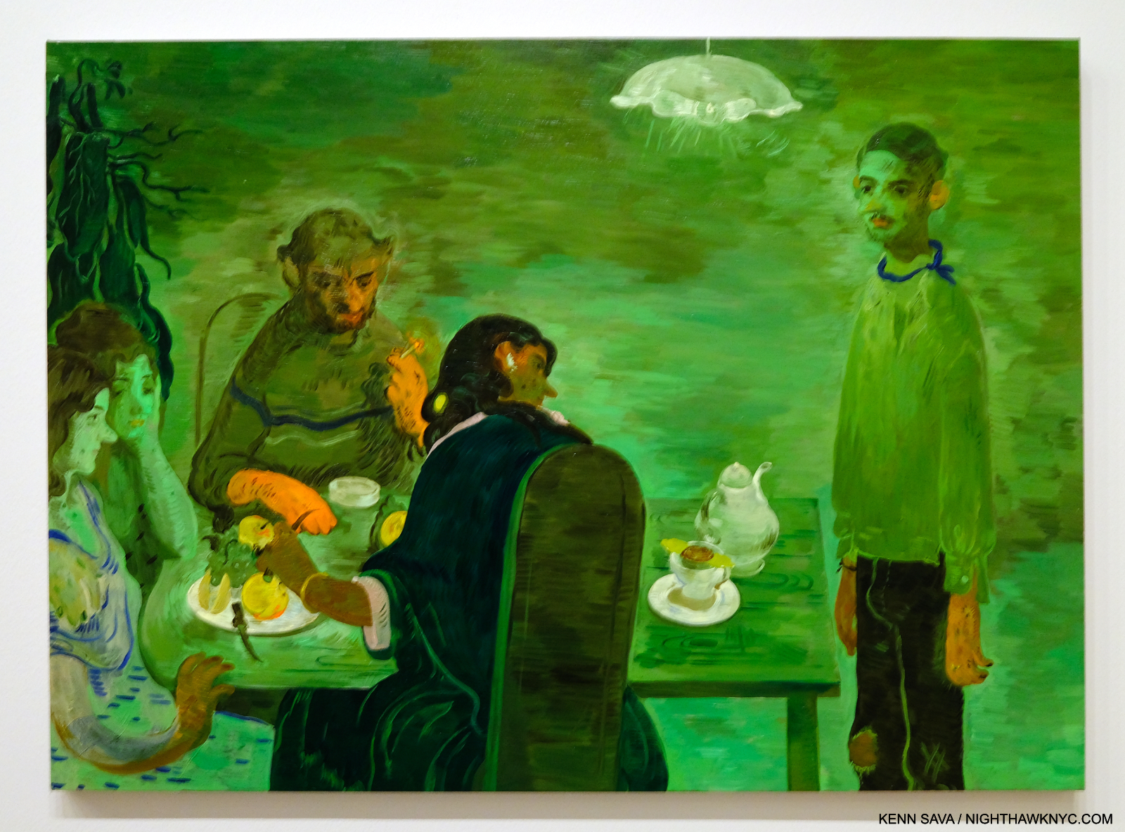
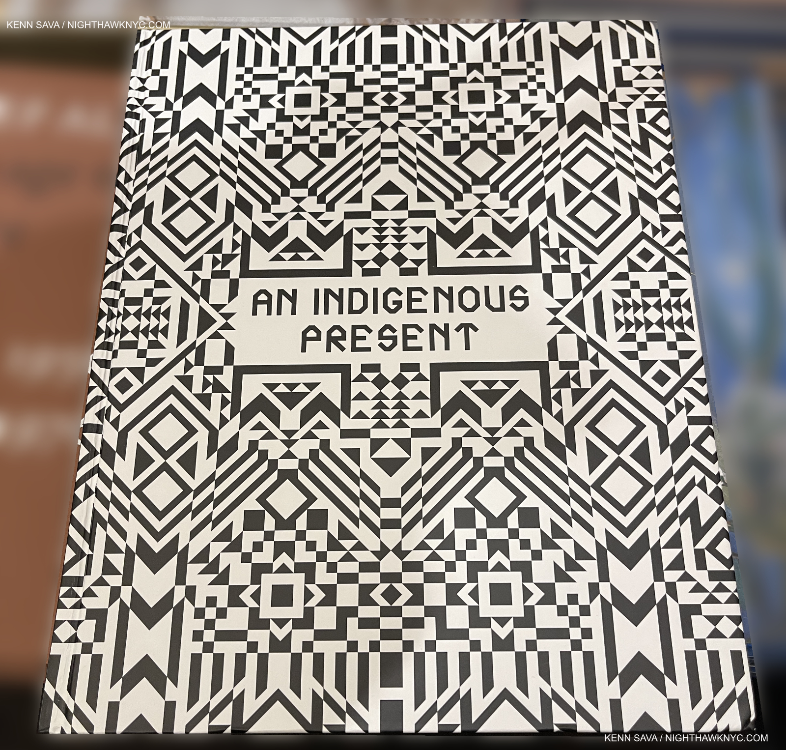
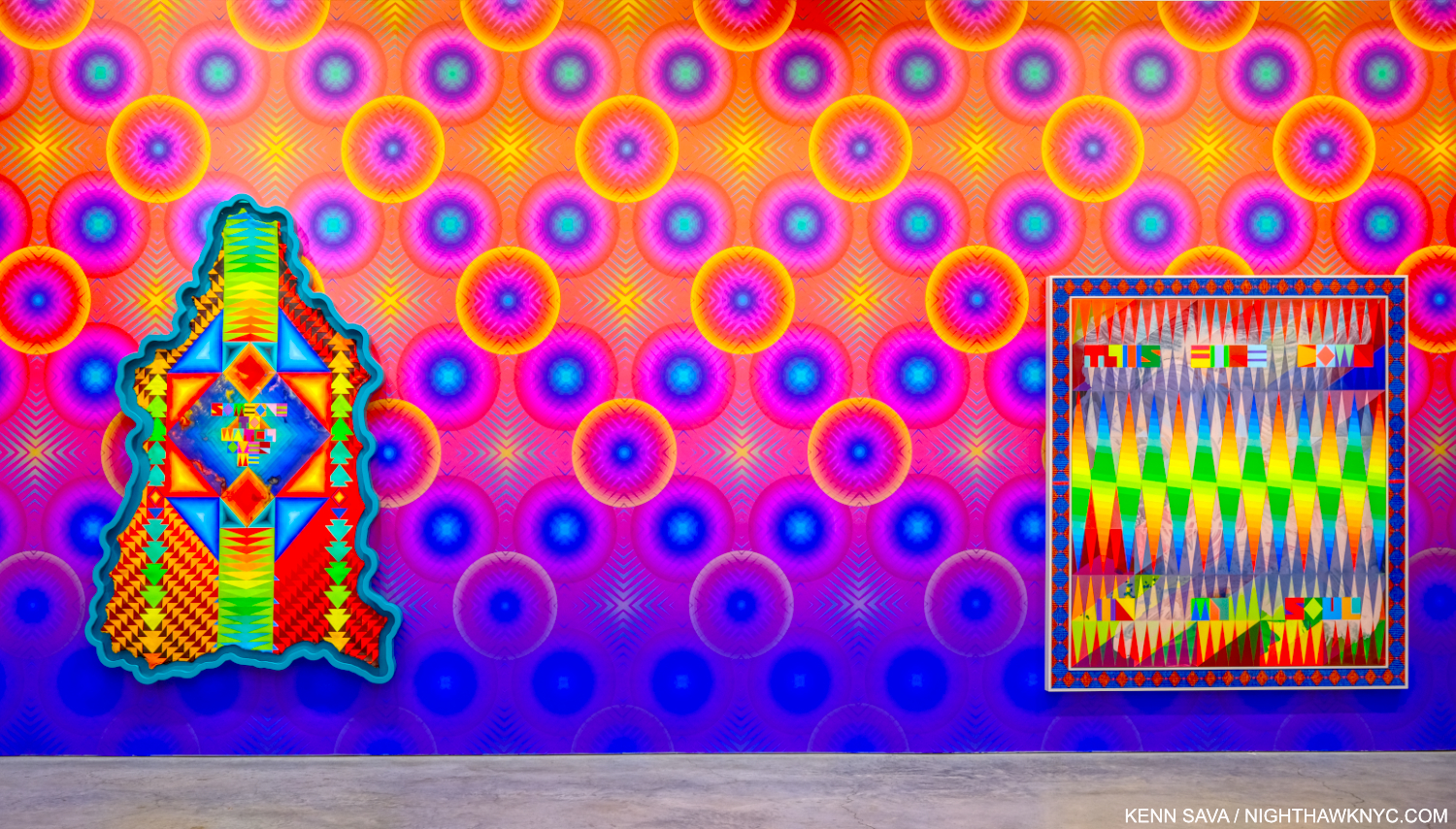
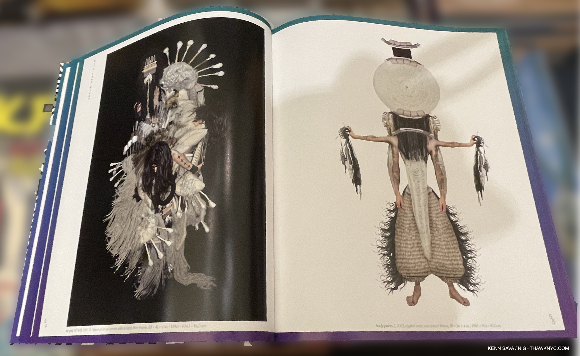
NoteWorthy PhotoBook of 2024: LaToya Ruby Frazier: Monuments of Solidarity

This site is Free & Ad-Free! If you find this piece worthwhile, please donate via PayPal to support it & independent Art writing. You can also support it by buying Art & books! Details at the end. Thank you.

Written & Photographed by Kenn Sava.

The NighthawkNYC.com NoteWorthy PhotoBook of 2024: LaToya Ruby Frazier: Monuments of Solidarity, Published by the Museum of Modern Art

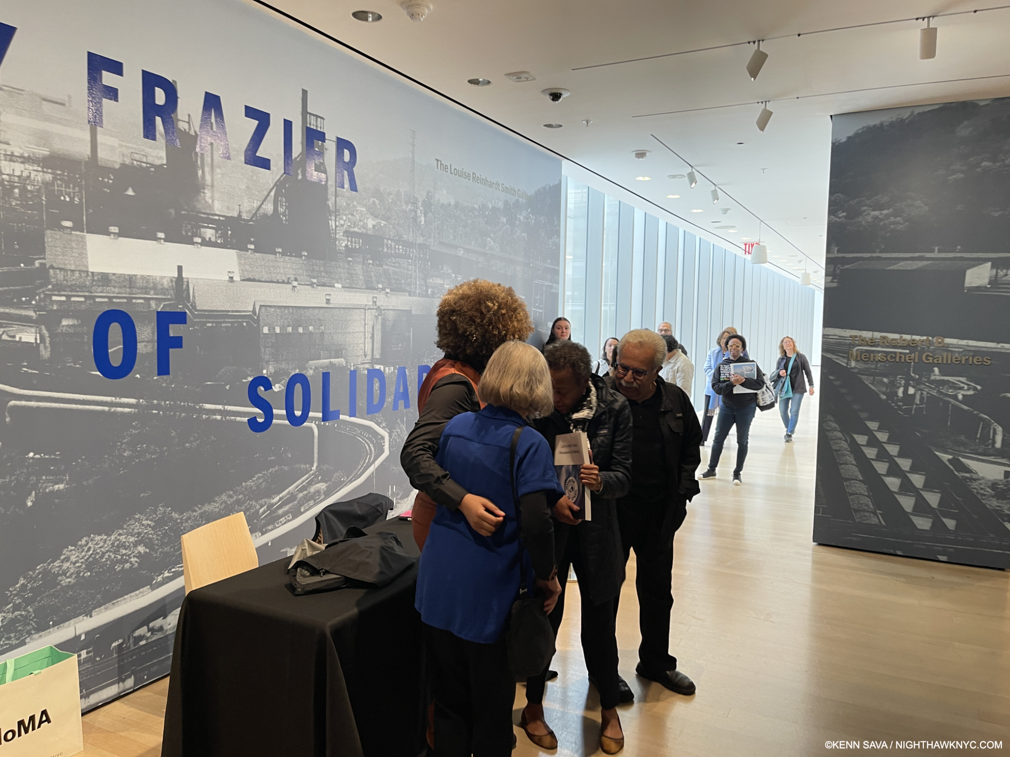
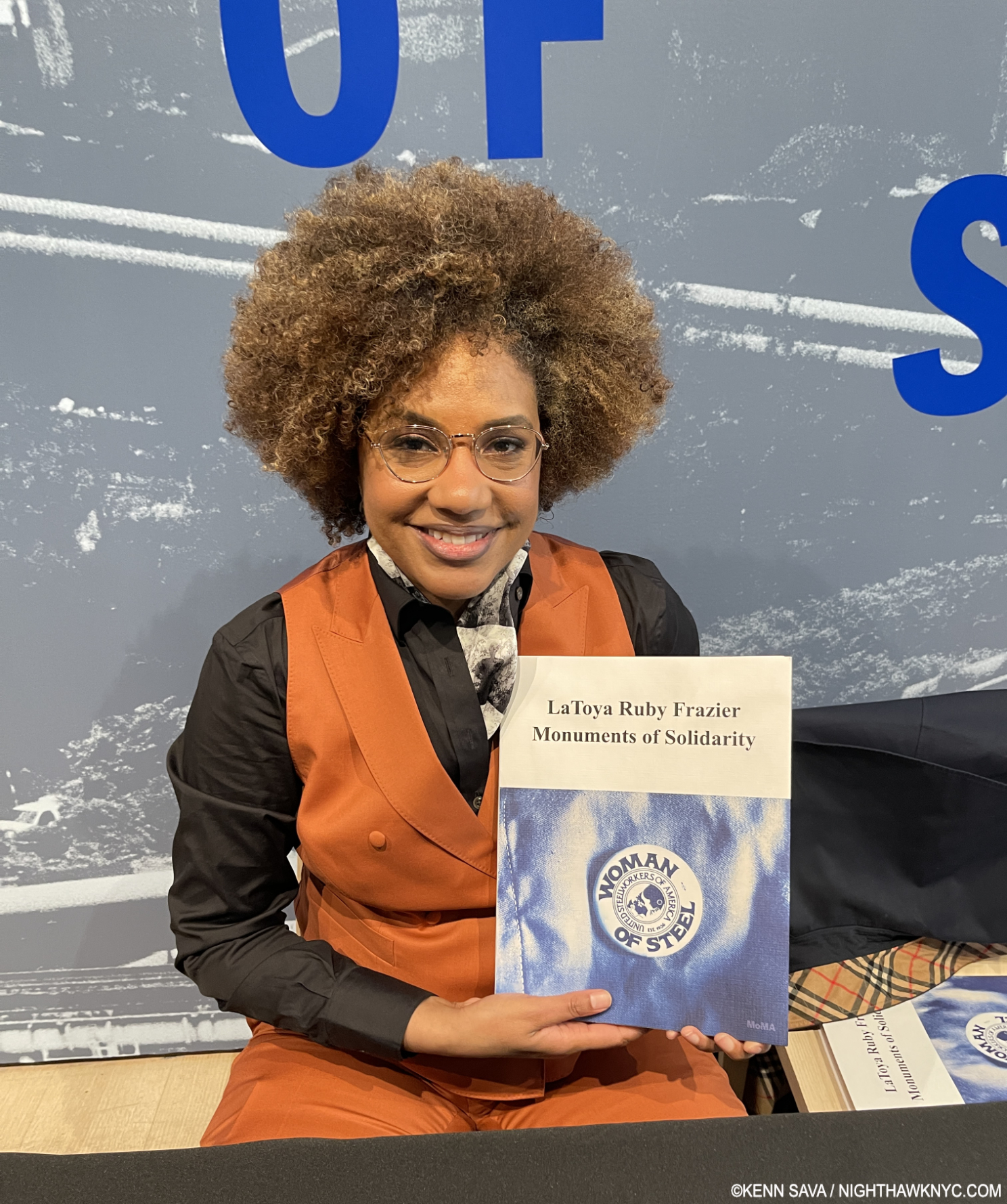
When I met her at the Museum of Modern Art on May 10th, at the Preview of her stunning early mid-career retrospective, I told Ms. Frazier her book, LaToya Ruby Frazier: Monuments of Solidarity, was my NoteWorthy PhotoBook of the Year. Yes, the year. Even though we’re barely half way through 2024 as I write this and there are still six full months to go). With all due respect to all the books not yet released as well as those I have not yet seen, Ms. Frazier  gets my 2024 Trophy as most recommended PhotoBook for her powerful & urgently important book, published to accompany and expand on the show of the same name. Frankly, she deserves a medal for the work she has done.

LaToya Ruby Frazier proudly showing me her new book, Monuments of Soilidarity at MoMA, May 10, 2024

Having begun taking Photographs at 16, she seemed to find her voice almost immediately. “I had decided when I was a teenager that I had to make work that was socially and politically conscious1,” she said.

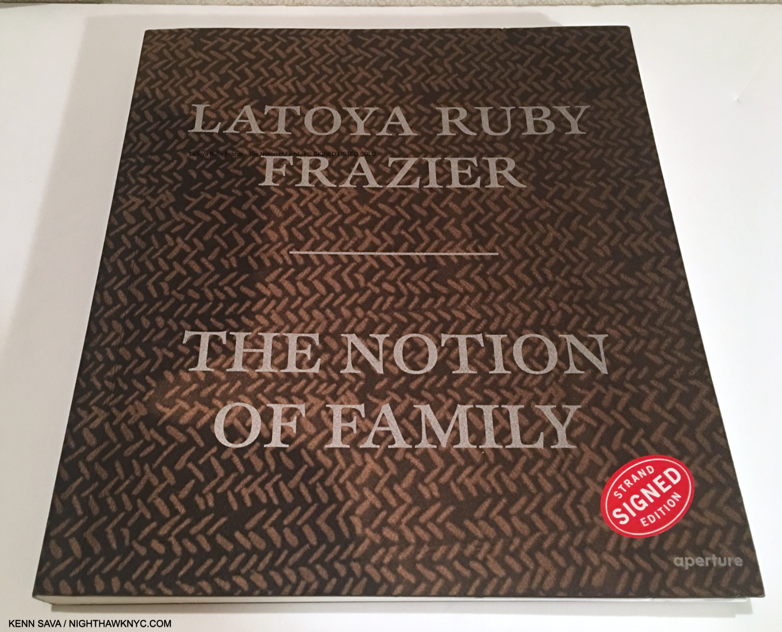
Auspicious beginnings. The Notion of Family, 2016.

Her early work focused on 3 generations of her family and life in her hometown of Braddock, PA in her debut PhotoBook, The Notion of Family, in 2016, which announced her arrival to the world in memorable fashion. She subsequently turned her attention to the coalminers in the Borinage, Belgium, in And From the Coaltips a Tree Will Rise, in 2017. Returning the U.S., she documented the closing of the G.M. plant in Lordstown, Ohio in The Last Cruze, 2019, and the man-made water crisis in Flint, Michigan in Flint Is Family In Three Acts, 2022 in book form. All four books are NoteWorthy in their own right.

MoMA, May 12, 2024

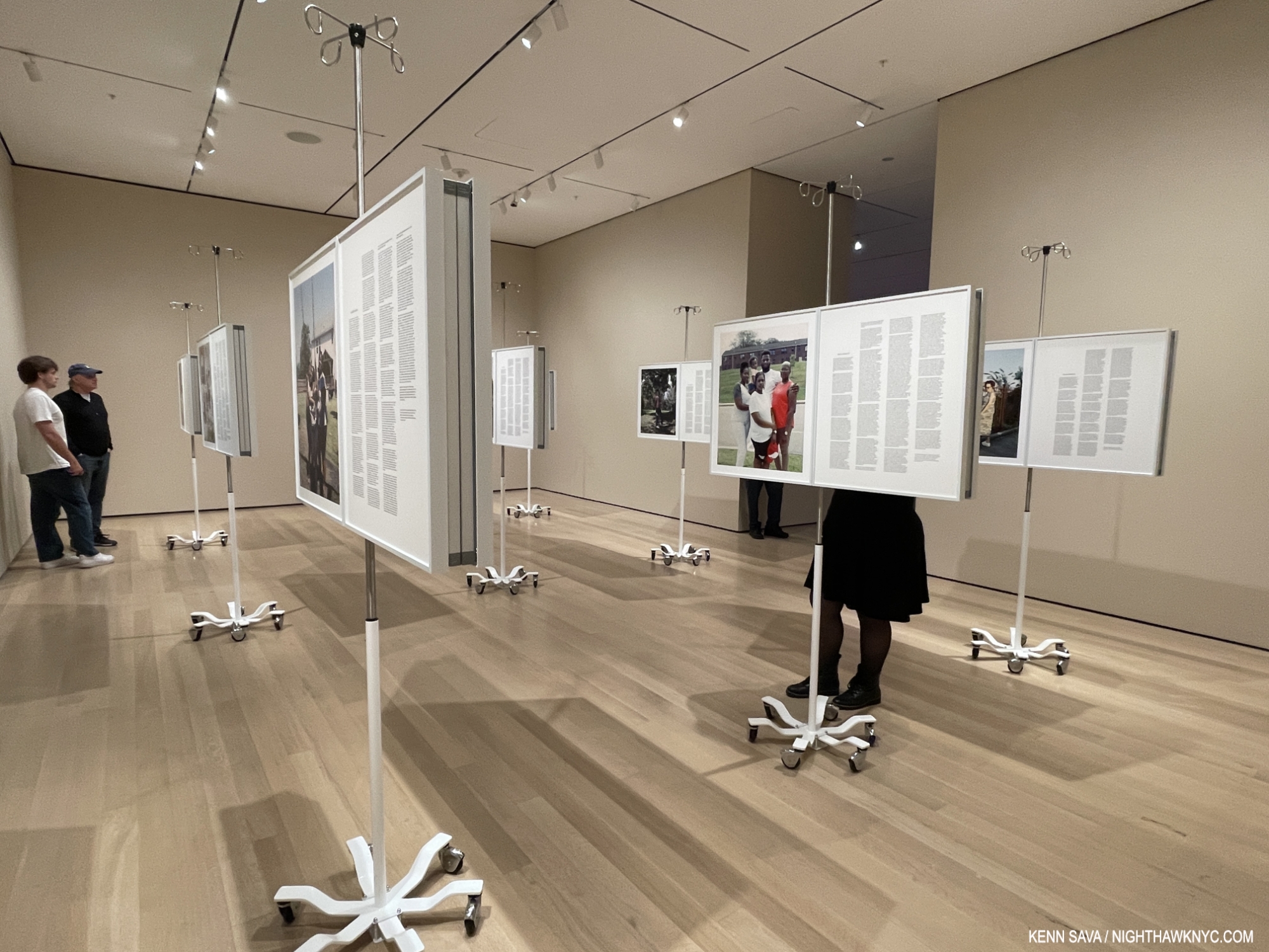
Monuments of Solidarity is an overview of LaToya Ruby Frazier’s work to date in what is a Show of the Year candidate along with Käthe Kollwitz, which happens to be installed right next to Monuments of Solidarity at MoMA. Monuments takes the viewer right up to the work shown in her most recent NYC gallery show, More Than Conquerors: A Monument for Community Health Workers of Baltimore, Maryland, 2021-22, which I wrote about here. The piece, which consists of 18 Inkjet panels on IV stands, was recently fittingly acquired by the forward-looking Baltimore Museum.

Partial installation view, More Than Conquerors: A Monument for Community Health Workers of Baltimore, Maryland, 2021-22, as installed at MoMA May 12, 2024. Each piece is in 2 parts. On the right-hand panel is a text written by the subject of her Photo on the left panel. You can see it installed at Gladstone Gallery in my look at it here.

There are a lot of great Artists in this country. You have your list. I have mine. There are also a lot of important Artists working here today. One thing that sets LaToya Ruby Frazier apart, in my view, is that, in addition to her poignant Photography, she brings her subjects right into her work. Though hers is the overall vision, the results feel collaborative. This serves to make the results unlike most of what’s come before.

Installation view. Flint Is Family section. May 12, 2024 including more compelling texts from her subjects accompanying her Photos.

After posing for the picture with her book, she asked me what I thought of her show. I told her I was very moved by the Photos she took with and about her Grandmother, now well-known images from her instant classic The Notion of Family. In them we see the Artist’s vision and talent were stunningly present from an early age, as if she was born with a camera in her hand, while we also get insights into her and her family’s life in her hometown. Braddock, PA, which in turn fueled her passion to inspire change and to right wrongs.

UPMC Braddock Hospital and Holland Avenue Parking Lot, 2011. The community hospital in ruins, where her grandmother passed.

After we see the passing of her Grandmother, the show took an immediate turn and from then on was focused on depicting crises effecting “everyday” citizens, working class people, and issues of race. 

MoMA, May 10, 2024

Monuments of Solidarity is not only a “PhotoBook.” It delves deeply into its subjects in a way I find every bit as powerful as her Photographs are. This is evidence of LaToya’s extraordinary way with people. Watching her at MoMA, she took the time to have an actual moment with everyone she encountered. Even me (we’d never met).

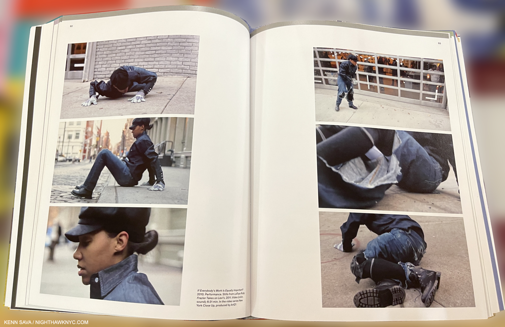
LaToya Ruby Frazier Takes on Levis, 2011, Stills from the Video which premiered on Art21. LaToya took issue with Levi’s after they featured her hometown, Braddock, PA, in an “Everybody’s Work Is Equally Important” ad campaign. As part of the campaign, Levi’s  opened a public Photo Workshop in SoHo. In response, LaToya put on a pair of Levi’s and in a performance in front of the Levi’s Photo Workshop, preceded to destroy them while wearing them. The intense Video is looped in the show. From the book, Monuments of Solidarity.

LaToya Ruby Frazier, the person, makes every bit as good, and memorable, an impression as her work does, though the intensity we see in pieces like her incredible Levi’s Performance Video remained under the surface.

MoMA, May 10, 2024

I think her people skills, which isn’t the right term for someone who is as genuine as Mr. Frazier is…make that her humanity, is a central reason why her Art is so powerful and so direct, project after project. LaToya gets to the heart of the issue and speaks to why it is important- for those directly involved, and for all of us, like very few Artists working today can.

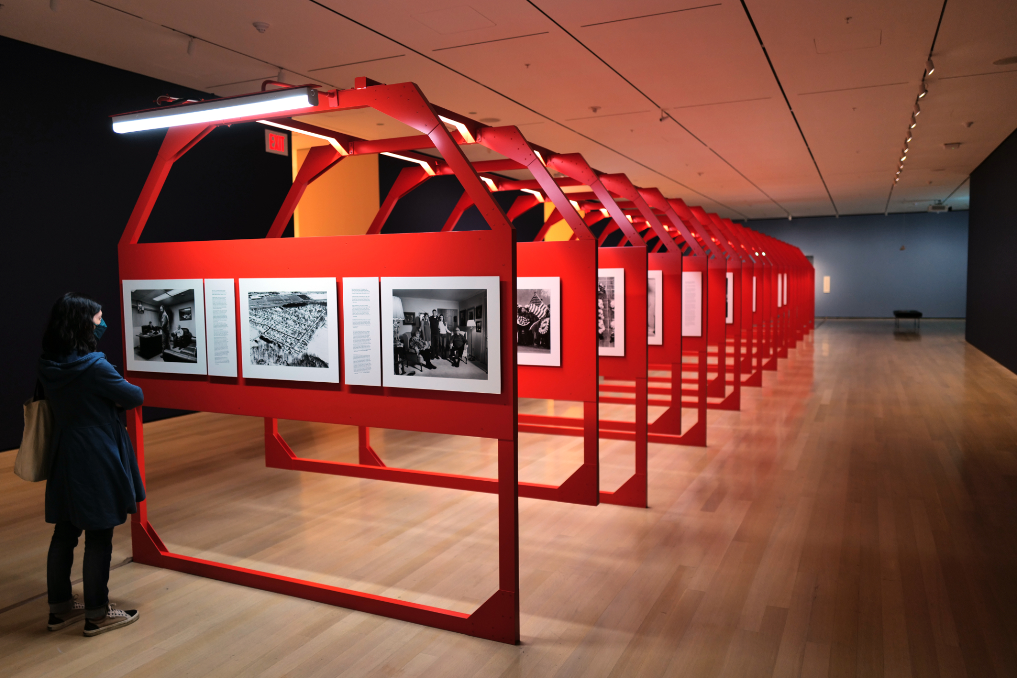
Partial installation view. The Last Cruze, 2019 (recently acquired by MoMA), looks at the last Chevy Cruze to be made in Lordstown, Ohio after G.M. halted production and closed the plant, throwing all the workers out of their jobs.

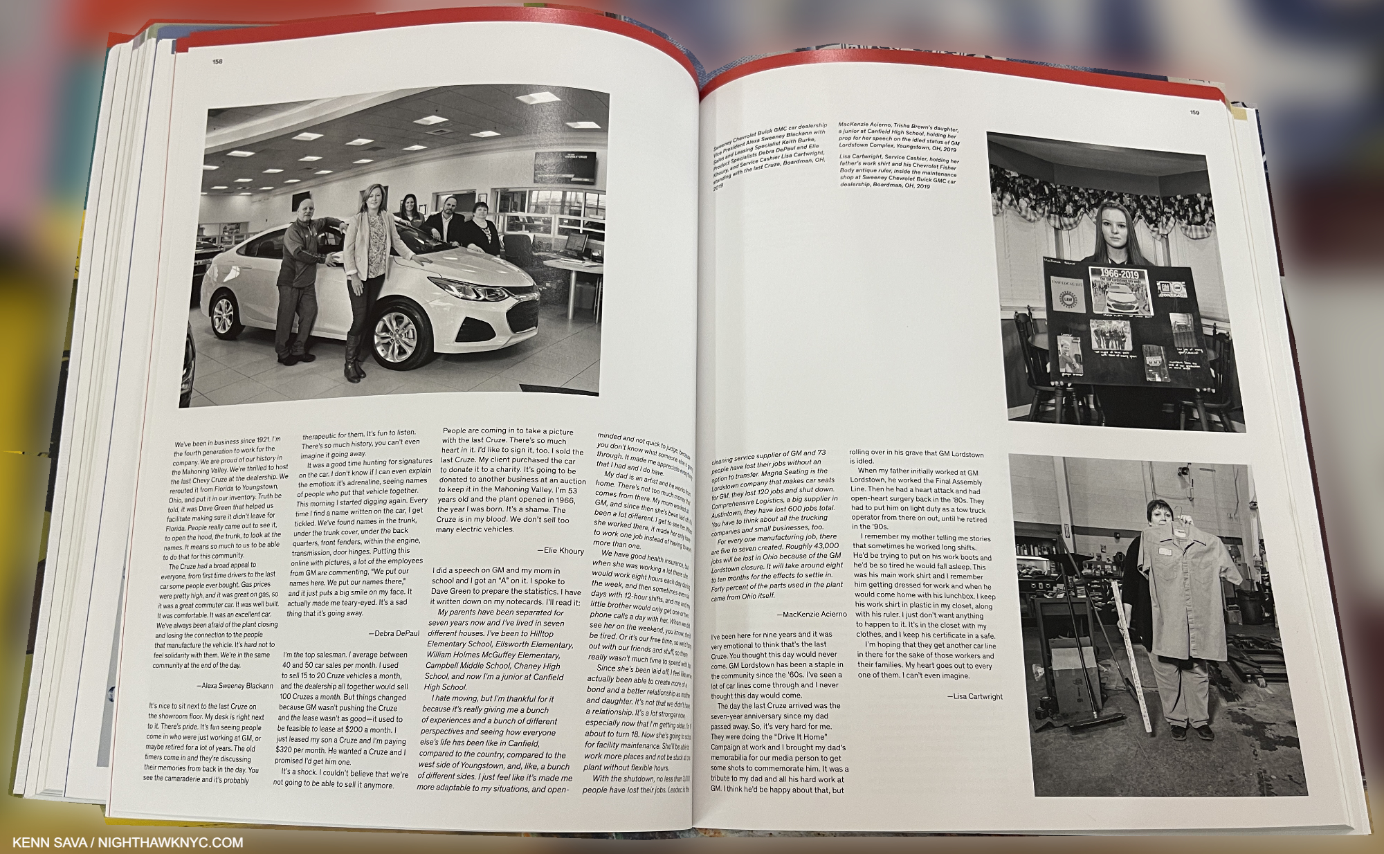
Ms. Frazier’s work is compared by some to that of the F.S.A. (Farm Services Administration) Photographers of the 1930s, including Dorothea Lange. As I ‘ve showed, one thing of many that sets her work apart is that she foregrounds the experiences of her subjects right alongside her Photographs in texts they authored; something the FSA Artists didn’t do. In fact, I can’t think of any Artist who has done it as consistently as LaTory Ruby Frazier has.

On this spread from The Last Cruze PhotoBook the subjects of Photos accompany them in pieces they wrote.

She gives many, maybe event most, of the actual people she depicts in her projects, their own voice. Quite often their words take up more space in her books and in this exhibition than her Photos do! I can’t say I’ve ever seen that before, either. In the literal sense, her work truly is a collection of  “moments of solidarity” between Artist and subject.

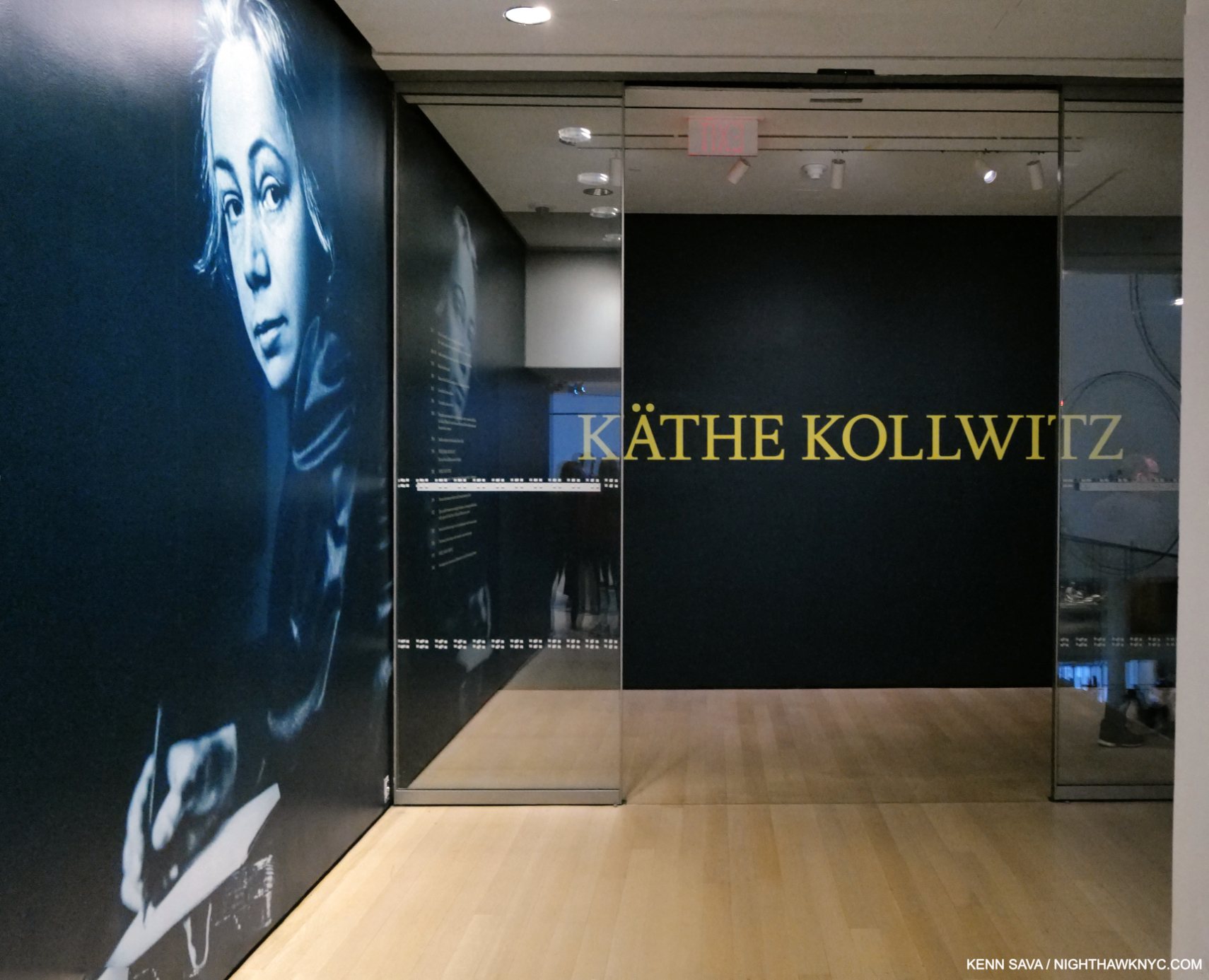
Entrance to at MoMA as seen on May 10, 2024. The show is up through July 20th.

Two asides- Two coincidences struck me while preparing this piece. First, LaToya Ruby Frazier – Monuments of Soilidarity is installed right across the hall from the equally terrific Käthe Kollwitz at MoMA. Walking through one, and then the other, it was impossible for me to ignore how much in common they share. I wish I had asked LaToya what she made of Ms. Kollwitz’s show. Both Artists have made the “Art of social purpose” the center of their work.

“I have no right to withdraw from the responsibility of being an advocate. It is my duty to voice the sufferings of men, the never-ending sufferings heaped mountain-high.” Käthe Kollwitz, 1867-1945, 2.

Her first major retrospective at an NYC museum (How is that possible?) makes an open and shut case for Käthe Kollwitz as one of the major Artists of her time, something that has been well-known in Germany and elsewhere, making it past time for the rest of the world to catch up.

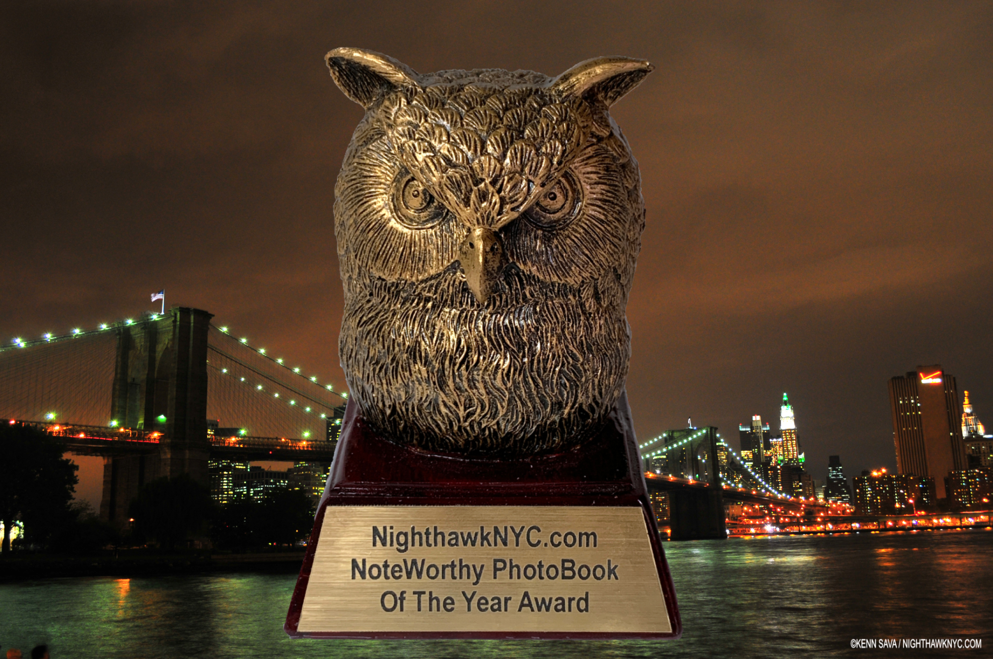
Preparing this piece also reminded me of another young woman Artist who I selected as my NoteWorthy Art Book of 2024: Es Devlin. Though they’re from different parts of the world, and work in different mediums, they’re both making extraordinary inroads into the world with their work. As I wrote in my look at Es’s book, An Atlas of Es Devlin, she’s garnered unheard of media acclaim. LaToya was just named one of Time’s “100 Most Influential People of 2024.” That’s pretty amazing, of course, but I bet it doesn’t come with a cool Owl statuette!  ; )

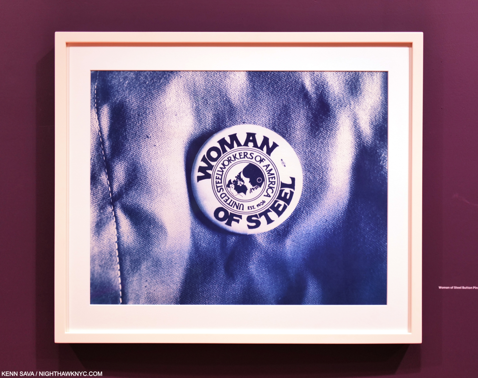
Woman of Steel Button Pin, 2017

“Woman of Steel” reads the button on the cover. Though she’s not a steelworker, she could easily wear one and it would completely suit her in the literal sense.

*-Soundtrack for this piece is “Poverty” by Yemi Alade, from her album, Woman of Steel, fittingly, performed here live-

NighthawkNYC.com has been entirely self-funded & ad-free for over 8 1/2 years, during which 320 full-length pieces have been published! If you’ve found it worthwhile, PLEASE donate by PayPal to allow me to continue below. Thank you, Kenn.

You can also support it by buying Art, Art & Photography books, and Music from my collection! Art & Books may be found here. Music here and here.

Written & photographed by Kenn Sava for nighthawknyc.com unless otherwise credited. To send comments, thoughts, feedback or propositions click here. Click the white box on the upper right for the archives or to search them. Subscribe to be notified of new Posts below. Your information will be used for no other purpose.

  1. “Latoya Ruby Frazier Takes on Levi’s,” Art21
  2. As quoted, here.

Ed Ruscha’s Wall Rockets

This site is Free & Ad-Free! If you find this piece worthwhile, please donate via PayPal to support it & independent Art writing. You can also support it by buying Art & books! Details at the end. Thank you.

Written & Photographed by Kenn Sava.

This is Part 2 of my look at Ed Ruscha/Now Then at MoMA. Part 1 is here, Part 3 is here.

From the late 1950s, through the early 1960s Ed Ruscha made regular trips back and forth between Oklahoma City, where he grew up, and L.A., his adopted home since the late 1950s. In 19621, he Photographed the gas stations that caught his eye on these journeys with his trusty Yashika Twin-reflex camera, taking 60 or 70 Photographs2. In an interview in 1973 he said, “What used to belong to the Navaho and Apache Indians now belongs to the white man and he’s got gas stations out there. So, I started seeing it as cultural curiosities.”

“I’d always wanted to make a book of some kind.”

He continues. “When I was in Oklahoma I got a brainstorm in the middle of the night to do this little book called Twentysix Gasoline Stations. I knew the title. I knew it would be photographs of twenty-six gasoline stations3.” “The first book came out of a play with words. The title came before I even thought about the pictures. I like the word ‘gasoline’ and I like the specific quality of ‘twenty-six4.'”  “Months went into the planning of that. I could have saved myself a lot of trouble by loosening up. You know, not gotten so concerned with how I wanted the thing to look. I changed the form about fifty times at the printer’s5.” He self-published Twentysix Gasoline Stations in 1963 (although the title page states 1962).

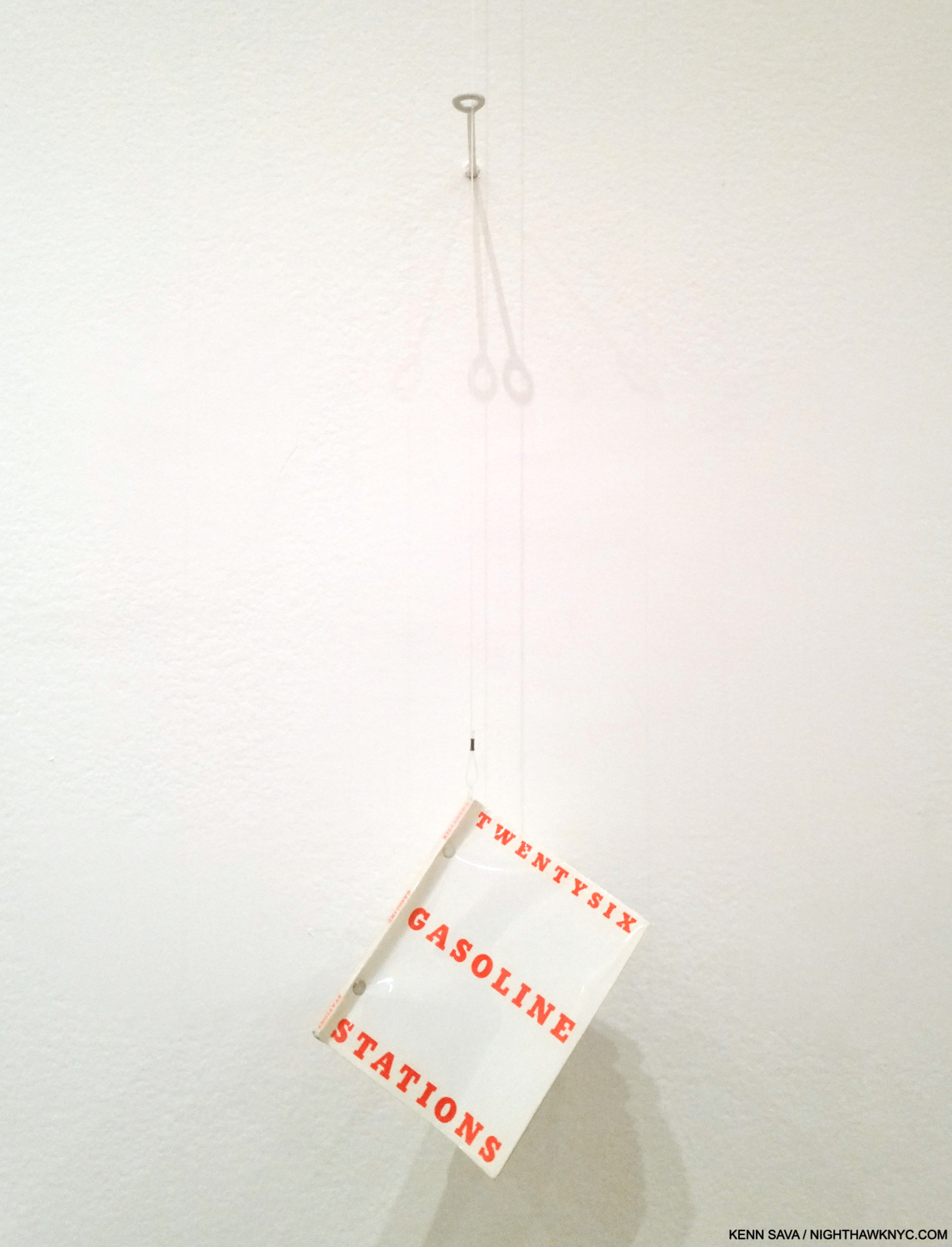
You’re looking at a revolution. Twentysix Gasoline Stations, 1963, revolutionized the Artist book, the PhotoBook, and street-side Phtography, with unique design, turning gas station Photography into a genre in the process. This copy was hanging for visitors to peruse, which was somewhat surprising as it’s now a rare book- even this second edition copy is worth hundreds of dollars. Knowing all of it from reproductions, this was the first time I was able to page through an actual copy of it. Pictures in this piece are thumbnails. Click on any for full size.

It’s an Artist’s book/PhotoBook whose influence is now incalculable.

Published in an edition of 400 copies, a case can be made that it ‘s the most influential PhotoBook of the contemporary period after Robert Frank’s The Americans (which the Artist acknowledges as an influence). Twentysix Gasoline Stations, with its “industrial” look and feel stood at odds with the frequently hand-made Artist’s book norm to the time. Virtually every aspect of the Artist’s book was reimagined, from the typography and text layout on the cover to the sparseness of the interior contents, with a lack of text save for image titles.

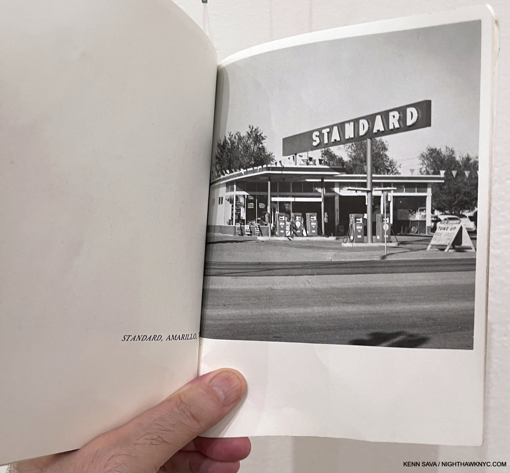
Believe it or not, this is one of the most influential Photographs in Modern & Contemporary Photography. STANDARD, ARMADILLO, TX, perhaps the key image in Twentysix Gasoline Stations, went on to have multiple lives of its own, inspiring numerous Ed Ruscha Paintings, Drawings & Prints, as well as the work of other Artists.

Speaking of the end result, he said-

“I realized that for the first time this book had an inexplicable thing I was looking for, and that was a kind of a “Huh?” That‘s what I’ve always worked around. All it is is a device to disarm somebody with my particular message5.”

Having immersed myself in PhotoBooks for the past 7 years, and Art books most of my life, it’s impossible for me to overstate the influence Twentysix Gasoline Stations has had, and continues to have, on the Art world. It turned Art & PhotoBook creation and publishing on its head, rewriting what a book could be and who could make one. He’s said he meant the pictures to be “like a collection of readymades7,” a term and genre Marcel Duchamp put on the Art map. Still, it received a mixed reaction when it was released, including famously being rejected by the Library of Congress.

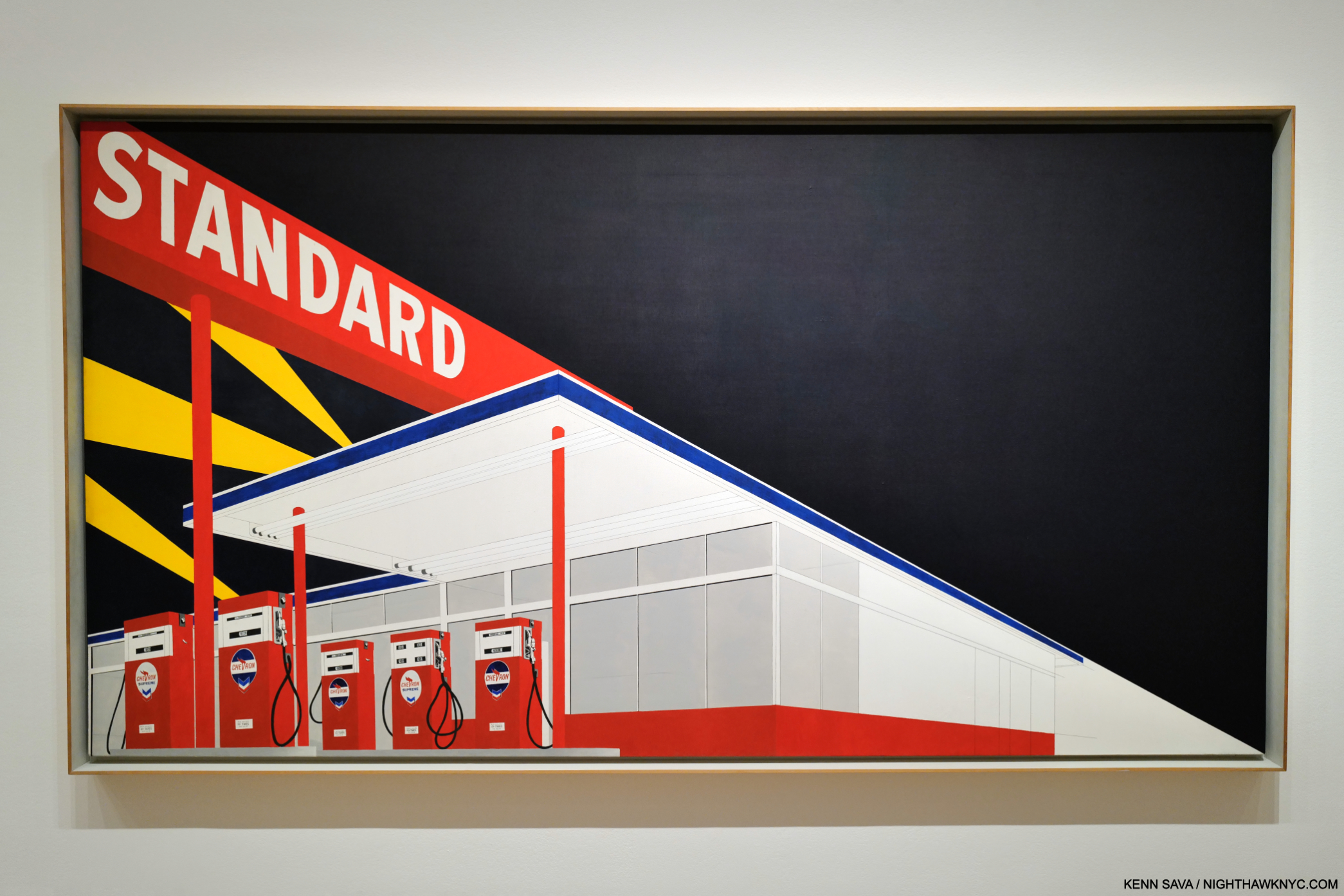
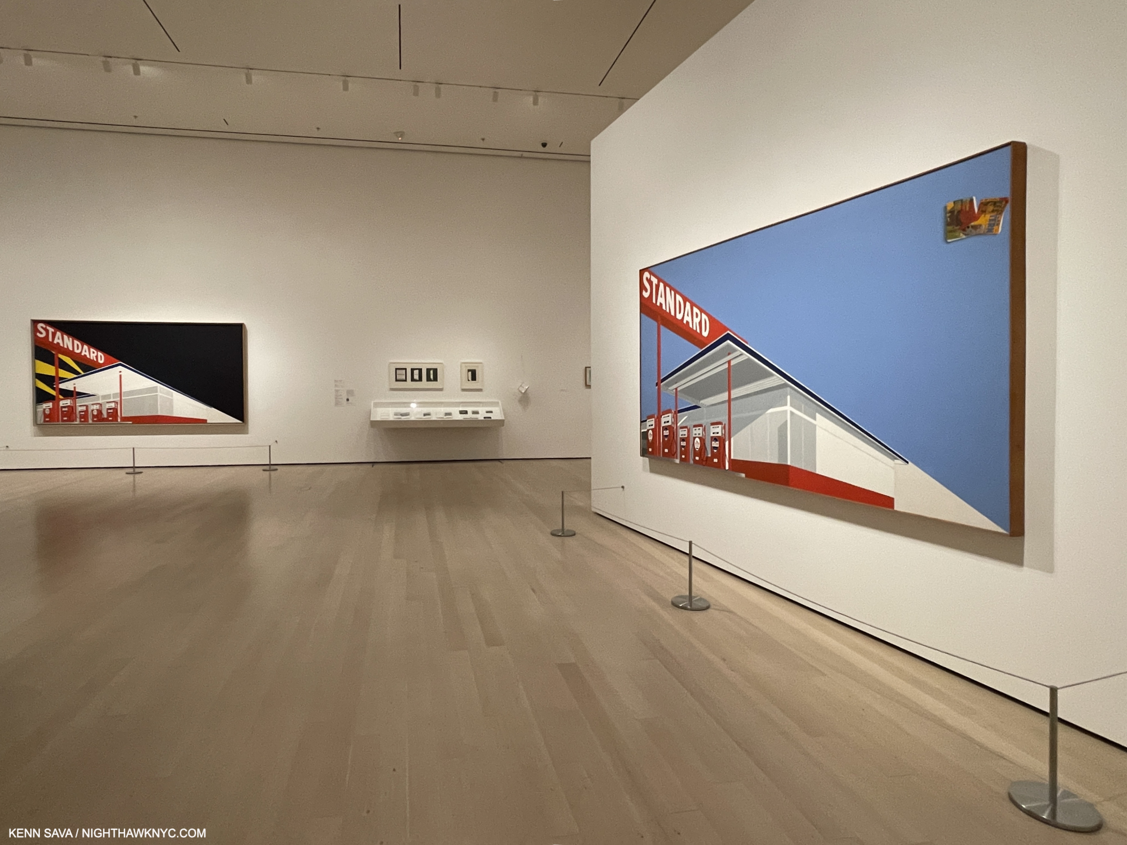
Standard Station, Amarillo, TX, 1963, Oil on canvas, 64 15/16 x 121 13/16 inches. The “locomotive” compositional device, seen in Large Trademark with Eight Spotlights, 1962, in Part 1, returns, splitting the composition in two, just the beginning of what’s fascinating about this.

“I would say I came to painting through photography,” Ed Ruscha8

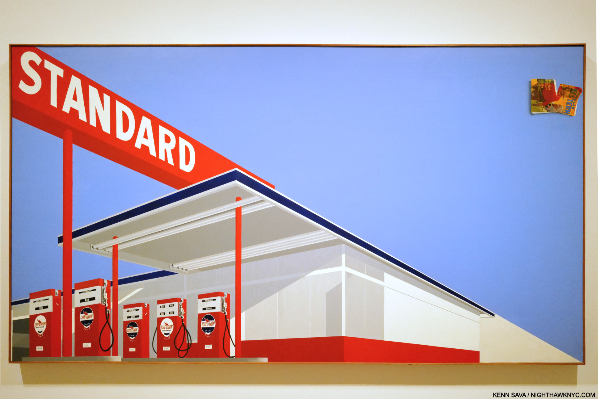
The STANDARD, ARMADILLO, TX, Photograph begat the Standard Station, Amarillo, TX Painting in 1963. Obviously, the Photo just shown has been reworked, reimagined, or he based this on another Photo. Whatever the case may be, the resulting composition seen here would subsequently take many forms and become iconic. Standard Station, Ten Cent Western Being Torn in Half, below, followed a year later.The Paintings begat Standard Station, Amarillo, TX Prints, with Standard Station, Amarillo, TX Drawings being created along the way. So ubiquitous did they become that gas station Paintings and gas station Photography are now, basically, his genres. Sooner or later, everyone who shoots or Paints a gas station is going to be compared to Ed Ruscha. Many, like Vik Muniz, openly acknowledge the influence.

What strikes me are the abstract elements, like the selective detailing- you can read the prices on the gas pumps, but detail disappears on everything behind them, creating a surreal experience (the “realistic” gas pumps offset against the featureless building behind them), under that big red sign whose white lettering, offset against the engulfing darkness, feels bold.

Standard Station, Ten Cent Western Being Torn in Half, 1964, Oil on canvas, 65 x 121 1/2 inches. Mr. Ruscha has likened  the comic flying off the canvas to the upper right to a “coda” in Music. For me, it looks like debris, garbage, pollution. In this piece, the featureless building has light and shadows added to it. Once again, the numbers and text on the gas pumps are very legible.

At the time, Ed Ruscha shot them, gas stations were bastions of the new found freedom of the open road and the catalyst of the massive post-war westward exodus that the Artist, himself, became a part of. Over time, gas stations would be seen differently as the toll of pollution and environmental decay mounted.

Ed Ruscha’s second most famous Artist book/PhotoBook. A copy of the legendary Every Building on the Sunset Strip, 1966, published in one long accordion fold. Ed Ruscha put a tripod on the back of a truck and went up and down Sunset Strip taking one Photo after another until he had shot every building on both sides of the street. Here, we get one direction on the top of the page, with what’s across the street synchronized and mirrored along the bottom.

Further books followed- 14 more to 1972, the most famous of which is Every Building on the Sunset Strip, 1966, another ground-breaking work. Ed Ruscha has stated that part of the reason he went west after high school, instead of east, was because of the glamour of L.A. Here, he shows the “glamour” of the famous Sunset Strip in all its “glory.” Then, in 1973, he shot all 12 miles of Hollywood Blvd. In 2004, he reshot Hollywood Blvd in color, and paired with the 1972 images, they became the book THEN & NOW in 2005. It’s one example of Ed Ruscha combining his love of the effects of time with revisiting his past subjects.

In all the acclaim he receives I almost never hear credit given the Artist for his exceptional Painting technique- the equal of anyone else’s of his time. Right from the start, Painting after Painting reveals sublime subtlety and under-appreciated skill.  Then Now provided a glorious chance to study his, often large, Paintings up close and marvel at his skill and taste. It also provides the extremely rare chance to see works of the same subject side by side, particularly two of his famous Standard Gasoline Station Paintings.

Shows present once-in-a-lifetime opportunities to see great works united from distant parts of the globe for a brief time. That’s why I waited over an hour for the crowds to part to get this shot. More than likely, I’ll never see these two great Standard Stations together again. Both of these also feature the “speeding locomotive” compositional device seen in the Large Trademark Painting, which adds to the somewhat surreal overall effect, wonder and mystery.

Further to the Large Trademark Painting, Ed Ruscha also began Painting the sights of L.A., which again seems to be his domain to the point that I can’t think of anyone who Painted the city before he did. (I’m sure there were. Right?)

“Being in Los Angeles has had little or no effect on my work. I could have done it anywhere.” Ed Ruscha, Leave Any Information at the Signal, Statement in “West Coast Style”

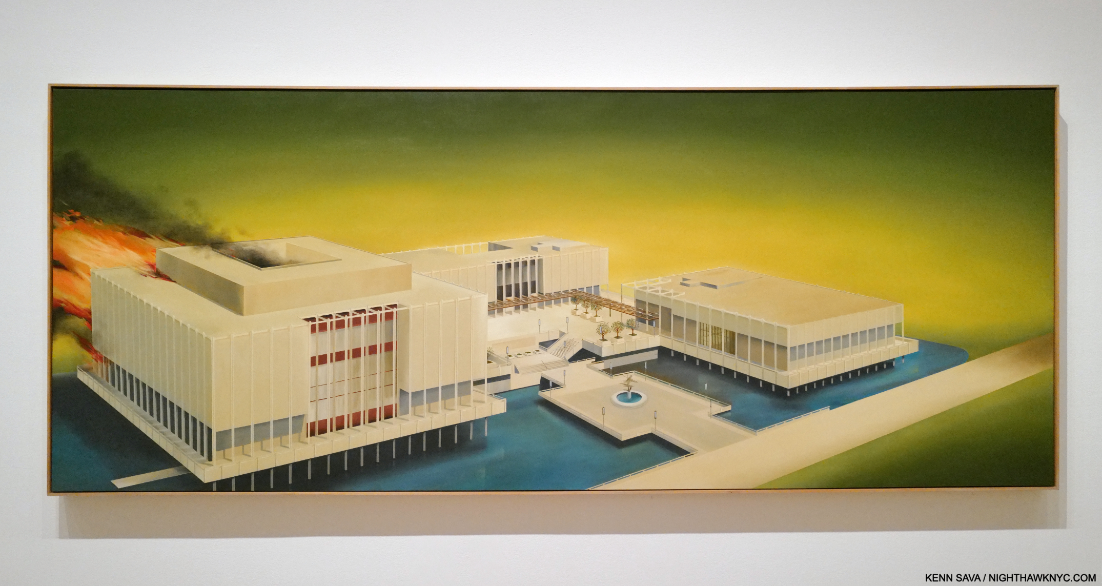
Los Angeles County Museum on Fire, 1965-8, 53 1/2 x 133. 1/2 inches. Fun fact- Guess where Ed Ruscha/Now Then reopened on April 7, 2024 after closing at MoMA? You’re looking at it.

Los Angeles County Museum on Fire, 1965-8, like most of Ed Ruscha’s work, has been the subject of endless conjecture. Over the years, the Artist has made a few statements about it, including this one, “… There’s no great message here. It’s just a picture to look at9.” That might be hard to believe. After graduating college, he took that trip to Europe I mentioned in Part 1, and came away disappointed at the lack of Contemporary Art on view in the museums. Back home, things weren’t much better. Contemporary Art was slow to gain admission to the hallowed halls of institutions here. Is it a stretch to think this was somewhere on his mind when he Painted this? I tend to think it was in there somewhere. The Watts riots had recently taken place. The Now Then Catalogue has this to say about it-

“Ruscha’s characteristic denial of content ignores the fact that not far from his studio in mid-August 1965, just a few months after the inauguration of the Los Angeles County Museum of Art, the city of Los Angeles was burning10.”

Ed Ruscha said, “The plain truth behind the Watts riots is that the riots themselves were good and beneficial and healthy regardless of loss of life. The Watts riots nationalized sympathy for a gigantic racial injustice11.”

He soon set a number of other sites on fire in his Paintings, including the an Amarillo Standard Station (which wasn’t in the show), and Norm’s, which was.

Norm’s, La Cienega, on Fire, 1964, Oil and pencil on canvas. The work features a complete lack of detail, save for the letters “ORMS” on the sign.  It’s interesting how the flames follow the “locomotive” line. Without those letters (which themselves are meaningless without the title), this Painting would be a completely abstract composition of shapes and lines.

For someone who’s so closely associated with L.A., and has been for over 60 years, it’s strange that some of his most well-known work shows L.A. landmarks being destroyed or in ruins. For example, he has continued to “destroy” the Hollywood sign, in different ways, over and over again throughout his career. Still, his fame continued to rise as did his association with the city. In spite of all this (and possibly because of it), in 1978, a six-story(!) tall mural (also referred to as the “Ed Ruscha Monument”) of the Artist was created by the Artist Kent Twitchell, for who Ed Ruscha was “the unorthodox hero of the art world.” Would anyone else be able to “destroy” a city’s landmarks and then become seen as the figurehead of that city’s Art community with a monument created for them? It didn’t happen for Nero. Unlike the emperor, Ed Ruscha didn’t actually destroy anything, except maybe in his mind and on some large canvases.

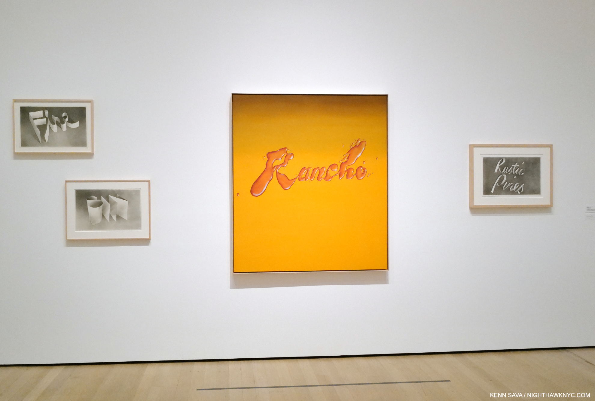
Rancho, 1968, Oil on canvas, which looks like it was made with a liquid, surrounded by Fire, Sin, Rustic Pines, each 1967, Gunpowder on paper, from left to right.

This calls to mind another thing Ed Ruscha doesn’t get enough credit for: innovation. In the 3rd, 4th and 5th galleries we see pieces made out of strange and unprecedented materials. Unhappy with the possibilities of paint or pencil, the Artist began exploring the possibilities of Drawing with gunpowder! The results, as seen above, are incredible. He found he had more control with it. In 1969, the Artist began going further, using unconventional materials in his Stains Portfolio of seventy-five substances ranging from L.A. tap water to egg yolk.

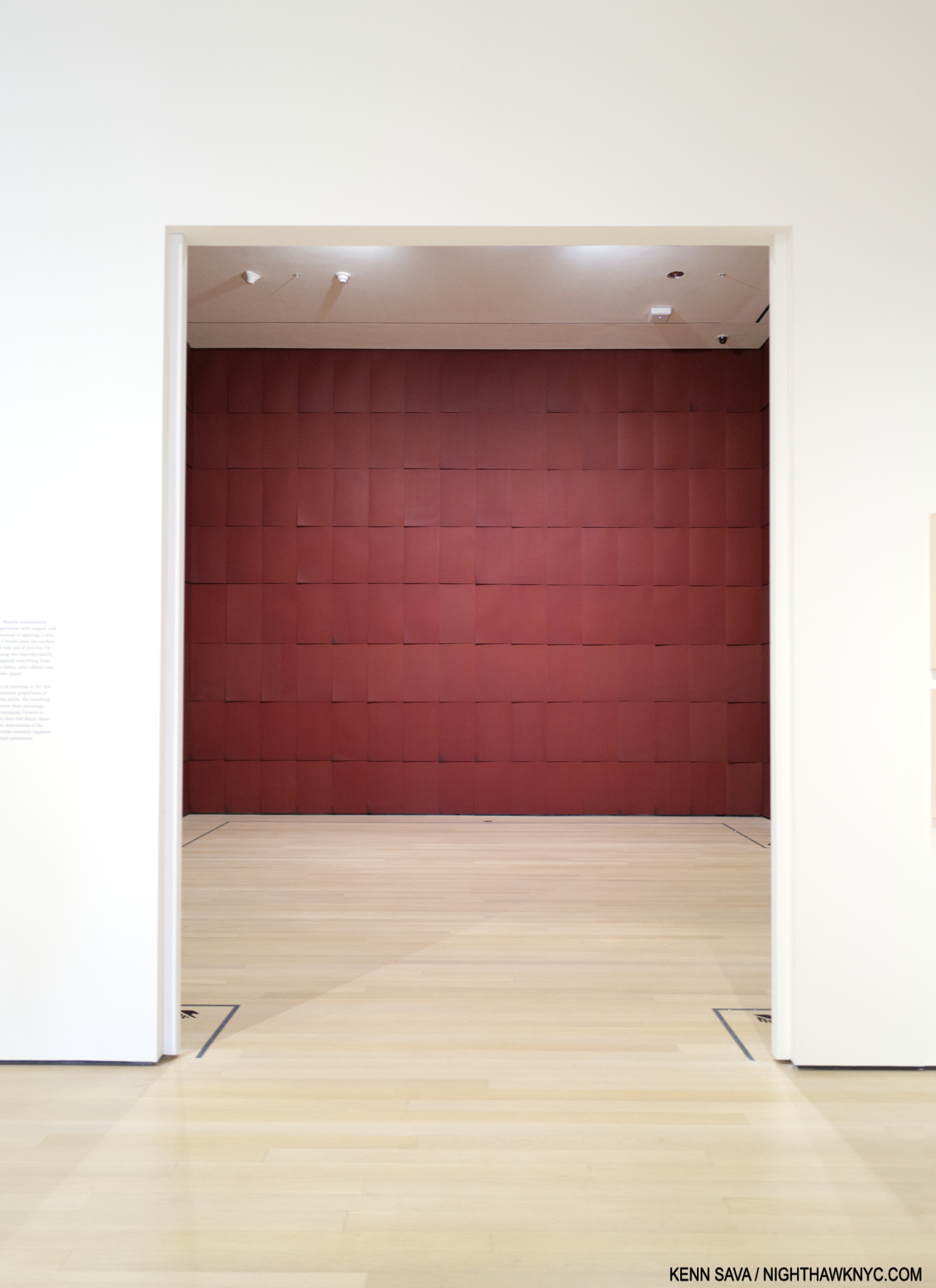
Installation view of Chocolate Room, 1971/2023, Chocolate on paper sheets.

His Chocolate Room for the United States Pavilion at the 1970 Venice Biennale, and recreated in a room of its own in Now Then, followed. After that, he began using a number of these “other” materials in his Word and Phrase Paintings.

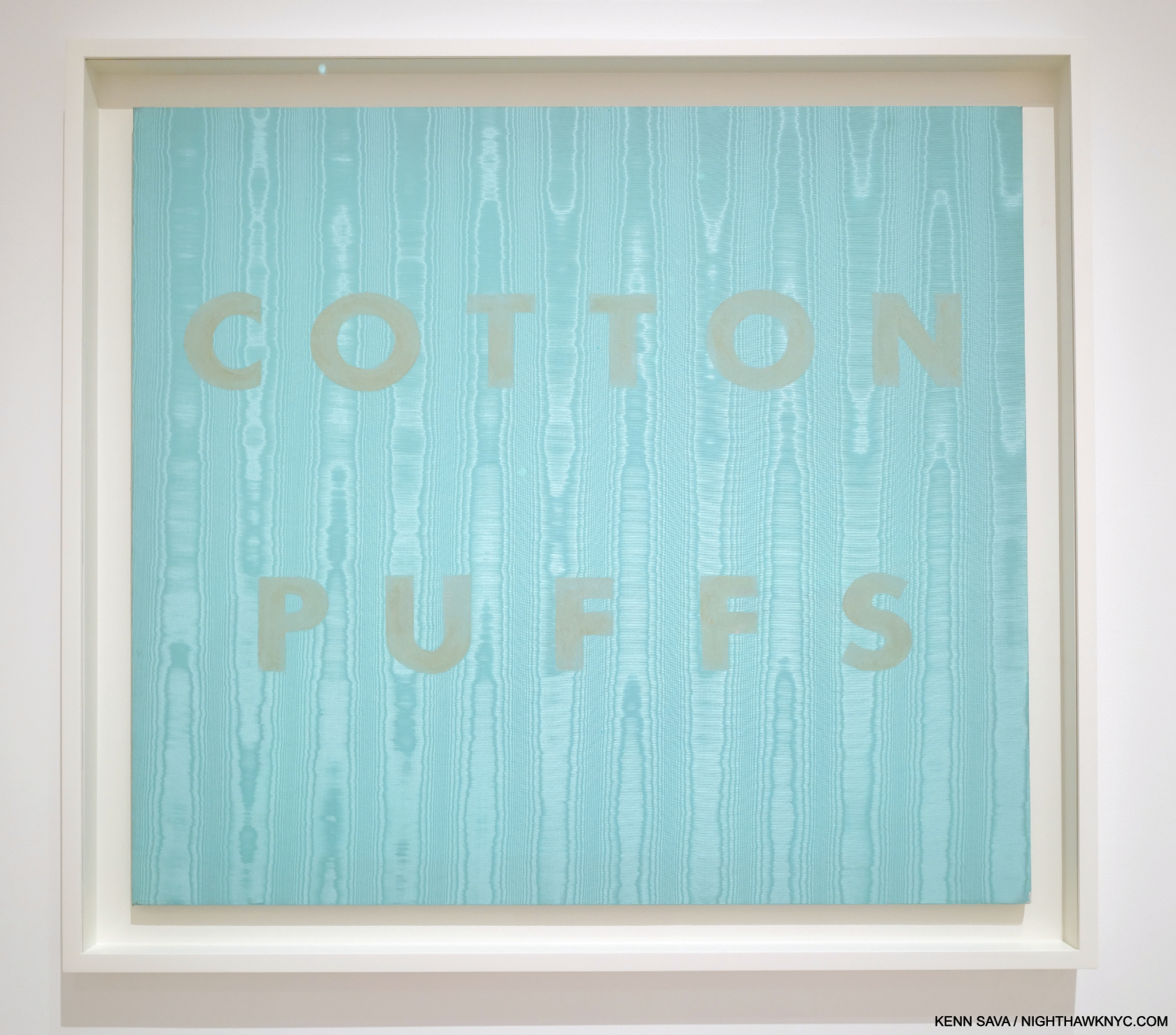
Cotton Puffs, 1974. Egg yolk on moiré fabric, 36 × 40″

Along with this constant experimentation came the inevitable failure, like the egg yokes in Cotton Puffs, 1974, fading quickly. Ed has been remarkably cool with these. Accepting them for what they are12. (And probably learning in the process.) Each has its place in his oeuvre, with all the examples on view seeming to hold up remarkably well over the years given they are experiments. By the mid-70s, he had gone back to pastel on paper13. Though the materials experiments were short-lived, it led me to peruse the 7 volumes of the Ed Ruscha: Catalogue Raisonne of the Paintings, published by Steidl (which is a bit ironic- or fitting- because Steidl has published the work of any number of Photographers who include gas stations in their work, including the entirety of the 3-volume set, Gas Stop, by David Freund), which revealed that this insatiable exploration of materials was only the tip of his creativity iceberg. Paging through it (which only goes up to 2011 at this point), I was amazed to discover that though he has created a number of works with ostensibly the same subject, no two are identical. The differences are obvious or subtle. Still, this speaks to Ed Ruscha’s seemingly endless powers of invention and refusal to repeat himself verbatim. I was stunned when I discovered this, which was completely unexpected (though I should have been tipped off by what his STANDARD STATION, ALBUQUERQUE Photograph became). Seeing this range and variety gave me a glimpse of insight into just what may be keeping him going and creating since the late 1950s.

Wall Rockets, 2000, Acrylic on canvas

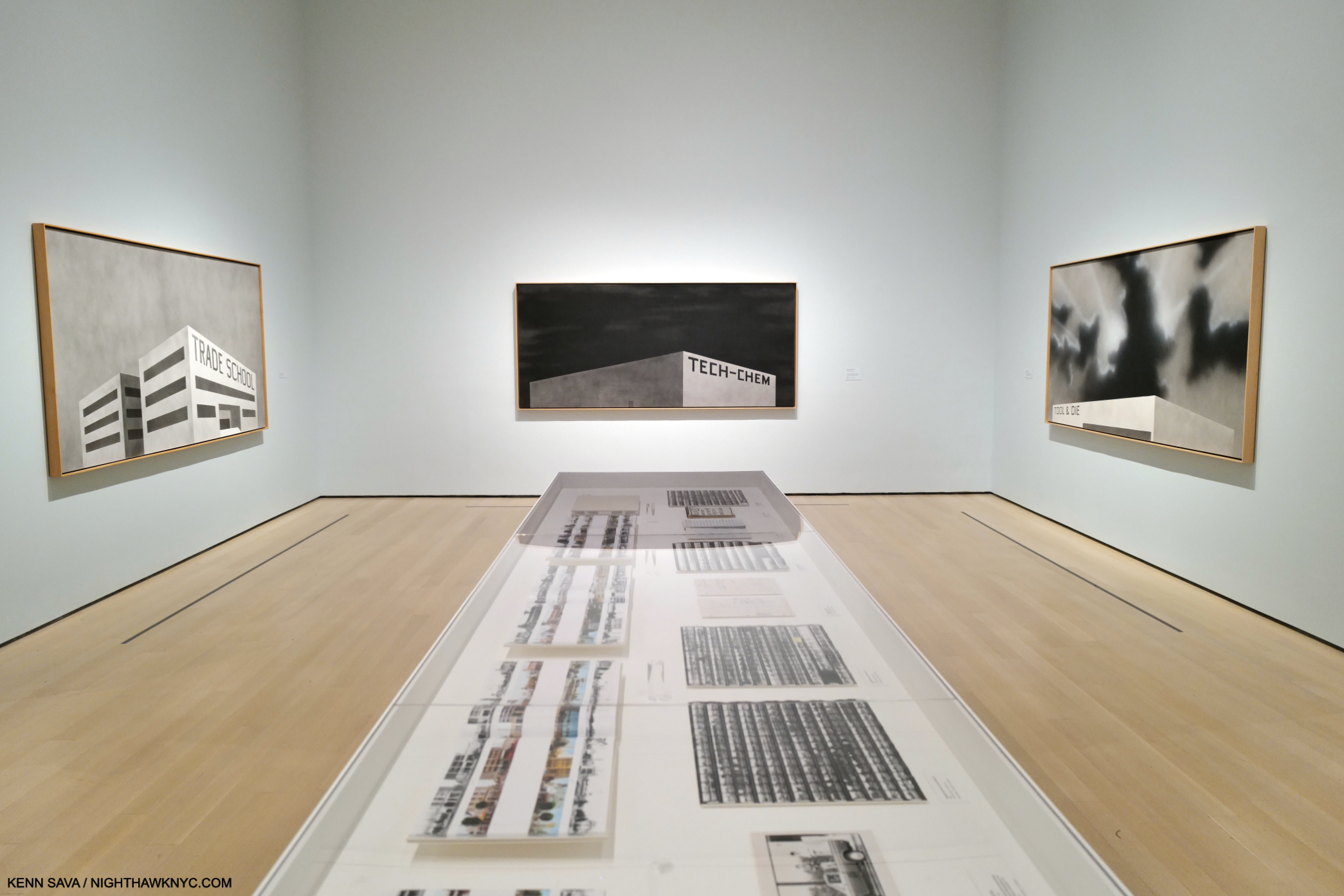
Perhaps THE highlight of Ed Ruscha/Now Then at MoMA for me was the chance to see 6 of the 10 Paintings from the Artist’s Course of Empire series. As I’ve looked at his work over the past 24 years of this century, these have fascinated me as much as any other work by Mr. Ruscha. Created for, and then debuted, at the 2005 Venice Biennalle, they subsequently travelled to NYC where they were on display at the Whitney in a show of the same name, the last important (though small) Ed Ruscha show in NYC until Now Then. Somehow, I missed them there, so seeing 6 might be as close as I get to seeing them all.

3 works from Ed Ruscha’s Blue Collar series, 1993, on the 3 facing walls.

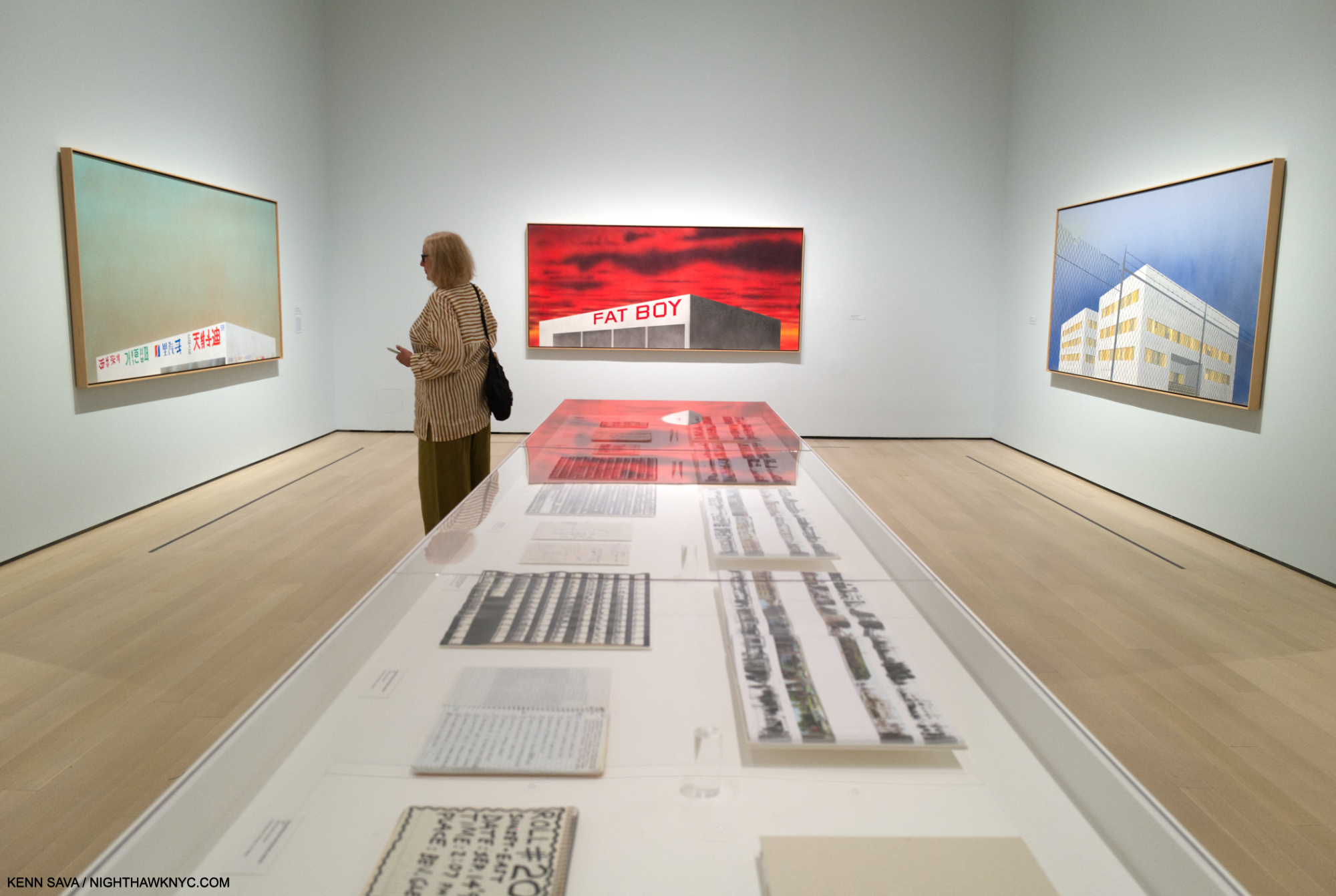
Occupying the large, penultimate gallery of the show, the Course of Empire Paintings strike me as serving as a touchstone for a number of Ed Ruscha themes. They also eerily presage what has been going on in much of NYC (and perhaps elsewhere) this decade, with a number of stores and businesses closing due to Covid, then more closing due to the realities of our post-Covid (if we are post-Covid) economy, many have changed hands in a short time. Others remain for rent. The shape, perspectives and lack of detailing on the one-story  buildings I find reminiscent of Standard Station, Ten Cent Western Being Torn in Half, seen earlier. In each, our point of view is the same, and the same as in that Standard Station Painting- they are seen from below.

At the opposite end of the gallery, the same scenes reappear in his Course of Empire series, 2005, now in color, though right and left are flipped. (The scene on the right wall is that depicted on the left wall in Blue Collar Photo, above this one. The scene on the left wall is the scene shown on the right wall of the Blue Collar series above this one.)

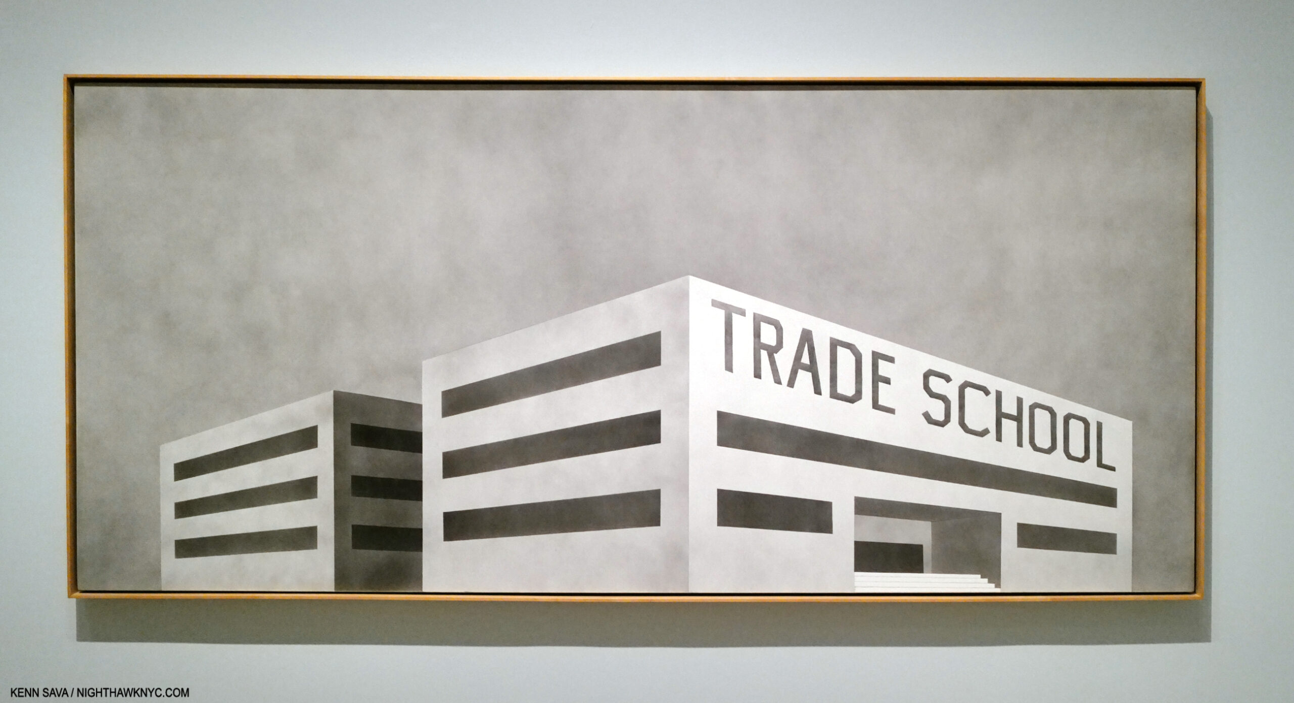
The series evolved over a period of 13 years, with Ed Ruscha Painting the 5 black & white pieces, titled Blue Collar, in 1992-

Blue Collar Trade School, 1992, Acrylic on canvas. The only multi-story structure in the series.

Returning to the subject and the same sites  in 2005, this time in color and showing the effects of time passing.

The Old Trade School Building, 2005, Acrylic on canvas

Perhaps, his most subtly powerful series, their under-stated compositions lead to open-ended interpretations.

Installation view of the complete Course of Empire, by Thomas Cole, 1834-36, as seen at The Met’s Thomas Cole’s Journey in 2018. The rise and fall of civilization as seen from the same place, with the same distinctive mountain peak appearing in each Painting.

Based on, and in homage to, Thomas Cole’s legendary Course of Empire series, 1834-6, (which I wrote about here), they are another instance of Ruscha revisiting earlier work, his Blue Collar series from 1992. These also highlight that alongside the humor in any number of his pieces, running parallel, is a real depth of concern. Concern for the country, the world, the environment.

Psycho Spaghetti Western #7, 2010-11, Acrylic on canvas

“It’s all just rape of the land for profit these days. It’s fairly sick. Southern California is all just one big city now. But what do you say about progress? … So something’s got to give, and the landscape’s the first thing that gives….There is a certain flavor of decadence that inspires me. And when I drive into some sort of industrial wasteland in America, with the themeparks and warehouses, there’s something saying something to me. It’s a mixture of those things that gives me some sense of reality and moves me along as an artist,” Ed Ruscha 14.

Taking full advantage of having such a long career, the Artist has revisited past themes, and places, fairly often to the point that it’s a running theme in his work. Change over time…for the better, or worse, is left to the viewer to decide. Ostensibly set in L.A., the structures in Blue Collar/Course of Empire could be literally anywhere. As such they have a universality to them (as do a number of other 21st century Ruscha’s) that sets them apart from his purely L.A. work, like his Hollywood sign pieces.

Our Flag, 2017, Acrylic on canvas. The last work in the show.

Thomas Cole influencing Ed Ruscha’s Blue Collar & Course of Empire series started me thinking about other possible influences on his work. I touched on some in Part 1. In Part 3, I’ll take a closer look at them, and then flip that coin over.

Part 3 is here

*- Soundtrack for this piece is “L.A. Woman” by The Doors, one of the ultimate L.A. bands, from the 1971 album of the same name. (Narrowly beating out “California Girls” by the Beach Boys from Summer Days (And Summer Nights), 1965.) Ed Ruscha was into “car culture” before moving to L.A., and after, among other things he has in common with the #1 L.A. band of its time. Notice the gas station Jim Morrison, “another lost angel,” to quote his lyric, stops in to about half way through-

NighthawkNYC.com has been entirely self-funded & ad-free for over 8 3/4  years, during which 320 full-length pieces have been published! If you’ve found it worthwhile, PLEASE donate by PayPal below to allow me to continue. Thank you, Kenn.

You can also support it by buying Art, Art & Photography books, and Music from my collection! Art & Books may be found here. Music here and here.

Written & photographed by Kenn Sava for nighthawknyc.com unless otherwise credited. To send comments, thoughts, feedback or propositions click here. Click the white box on the upper right for the archives or to search them. Subscribe to be notified of new Posts below. Your information will be used for no other purpose.
  1. Ed Ruscha: Catalogue Raisonne of the Paintings, Vol 7, P.476
  2. E.R., Tate, P.30
  3. Willoughby Sharp, ‘“… a kind of a Huh?”, An Interview with Edward Ruscha’, Avalanche, no.7, Winter/ Spring 1973, p.30.
  4. ER, Tate, P. 31
  5. https://www.tate.org.uk/art/artists/edward-ruscha-1882/ed-ruscha-and-art-everyday
  6. https://www.tate.org.uk/art/artists/edward-ruscha-1882/ed-ruscha-and-art-everyday
  7. Reading Ed Ruscha, P.50
  8. Ed Ruscha, Photographer, P.7
  9. Ed Ruscha quoted in Ed Ruscha/Now Then Exhibition Catalog, P.21
  10. Ed Ruscha/Now Then Exhibition Catalog, P.21
  11. Ed Ruscha, Leave Any Information at the Signal, P.5
  12. E.R., Tate, P.65
  13. Ed Ruscha/Now Then, P.170
  14. Leave Any Information at the Signal, P.18

A Writing Lesson With Paul Auster

This site is Free & Ad-Free! If you find this piece worthwhile, please donate via PayPal to support it & independent Art writing. You can also support it by buying Art & books! Details at the end. Thank you.

Written & Photographed by Kenn Sava.

December 3rd, 2018. The evening brought, perhaps, the worst rain storm I’ve seen since Hurricane Sandy. Yet, I decided to go out. On tap was something very special. Something I am now so glad I didn’t pass up. It seemed the gods were in my favor, as when I got outside into the full force of the gale, though instantly soaked, something miraculous happened. Something every New Yorker knows is impossible.

I got a cab in the rain!

I guess conditions were so bad that no one was out. I don’t know. I wasn’t about to look a gift cab in the mouth.

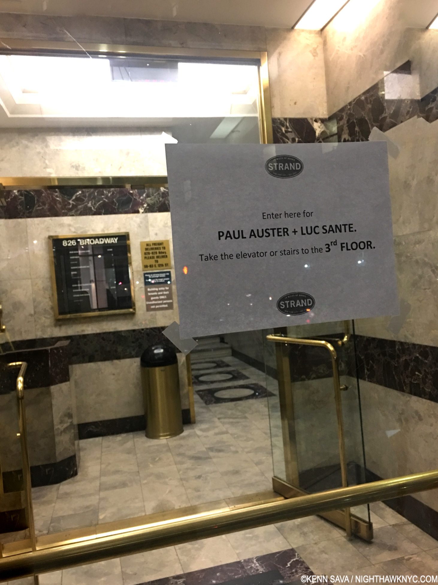
I climbed into the back seat and we headed south, I couldn’t see a thing out any of the windows- including the front windshield. Somehow, the driver found his way to Broadway & East 12th Street, and pulled up in front of The Strand Bookstore. The occasion: Paul Auster was releasing his New York Trilogy Manuscript, a fittingly oversized, slipcased limited edition, and speaking about it. I was interested because I thought it might provide insights into how he worked, and how such a distinctive set came to be. 

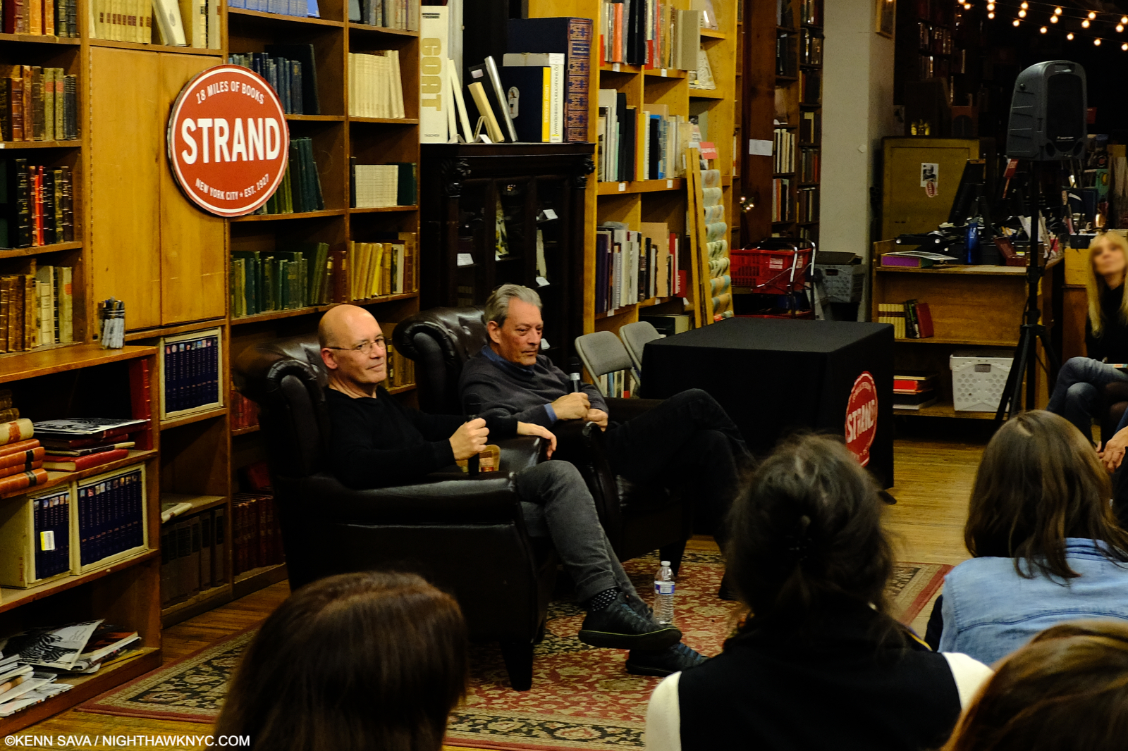
I got out and dashed from the cab to the door, then started the long process of drying off and out as I made my way to the 3rd floor and the Rare Book Room. I stood in the back as the proceedings got underway with writer Luc Sante handling the interviewer’s role. 

Paul Auster takes questions from the audience, with Luc Sante, left, at The Strand Bookstore, December 3, 2018.

I was transfixed as Mr. Auster spoke in a very low key manner with seemingly total recall taking my mind off my soaked pants. His road to the creation of the Trilogy was fascinating for any creative person to listen to, a real lesson in believing in your Art and perseverance. I related to his story about being told to “change the end.” When I was shopping a Jazz album I produced featuring the late, great Thomas Chapin, one label head offered me a very sizable sum if I agreed to let him change the drummer. It was a record recorded live in the studio. The drums bled into every mic in the room! You can’t change the drummer after the fact, I recalled feeling Mr. Auster’s pain. He turned down that ending change request (as I walked away from big money refusing to make the drummer change), and the book remained unpublished for so long that he began to feel that he would remain an unpublished author…

As it turns out, luckily, what transpired that evening was recorded! You can see it here-

Reliving it this evening, 2 days after Mr. Auster’s passing on April 30th, hearing him say “…part of me feels that I’m already dead…” about the book’s release, was chilling. It was just a year ago, in March, 2023, Siri Hustvedt, Mr. Auster’s wife, announced he had been diagnosed with lung cancer.  

After the talk, questions from the audience and the video ends, there was a signing. Both signed a paperback copy of the then current, umpteenth printing of Mr. Auster’s New York Trilogy paperback for me, with a cover by the great Art Spiegleman, and I sprung for the $200.00 Manuscript, which he also signed for me. In the intervening years, his 4 3 2 1, in 2017, and his final book, Baumgartner, released late last year, also impressed me with their singularity. Paul Auster’s ability to create such unimaginable scenarios with each book, while retaining familiar themes thrilled me, as Sir Salman Rushdie’s books do. I come away feeling that though Paul Auster is respected and lauded around the world, he is still underrated. 

Paul Auster, just to the right of center, after the event. December 3, 2018. My last look before I headed back out into the storm. It would be my last look at him, too. .

Whether he is, or not, is now up to the future to decide. Luckily, his books are here and all in print for us to explore, enjoy and be inspired by right now. For my part, hearing him speak so insightfully about his work, and briefly meeting him are indelible. 

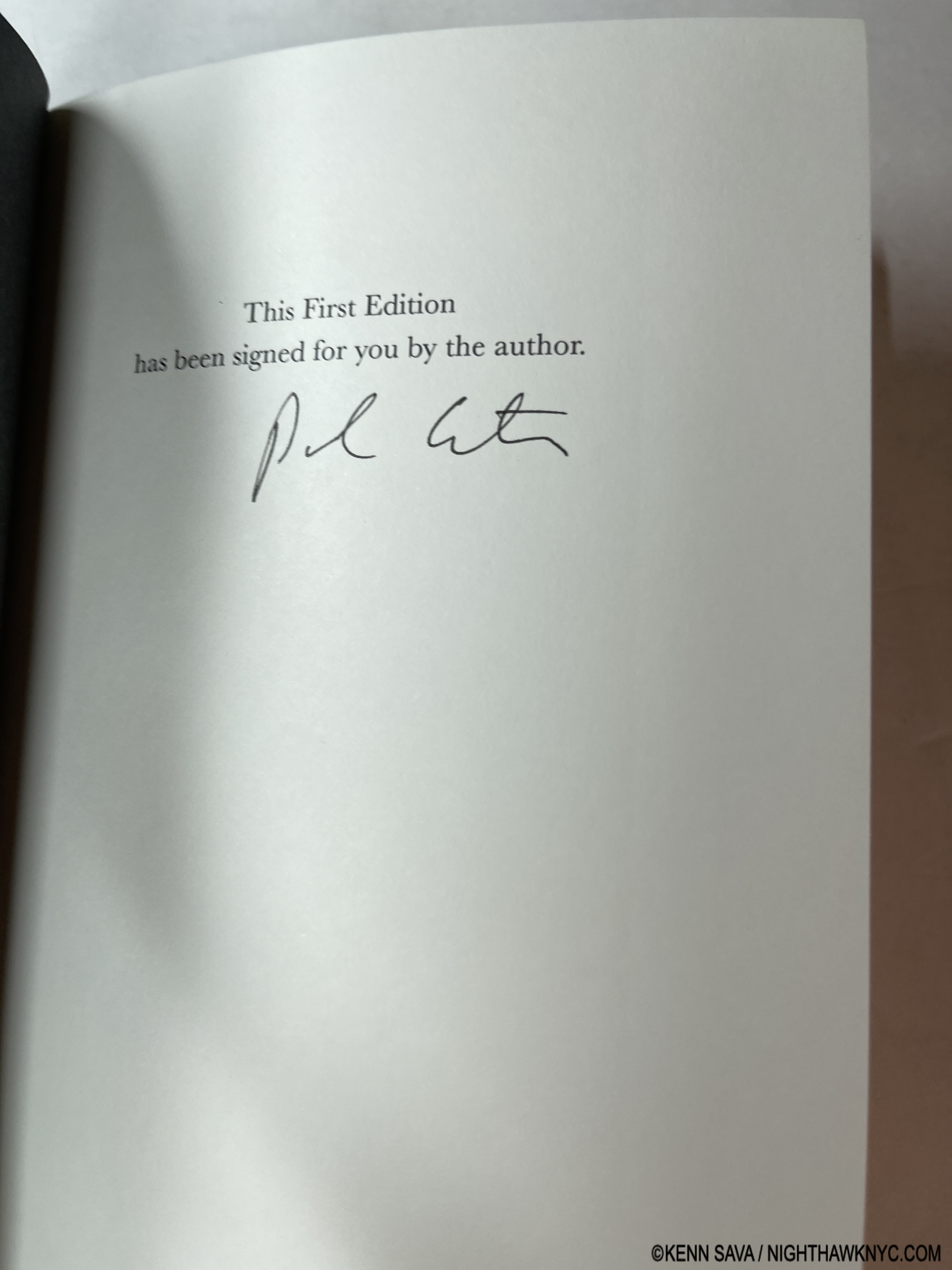
The signature page of a signed copy of his last book, Baumgartner, released in November, 2023.

Book signings are special events. They present the chance to bring you closer to the author and his or her work in more ways than one. Like this one, a number of them have lived long in my memory. Don’t pass one up the next time an author you’re interested in is having one. 

*- Soundtrack for this piece is “Watching the Detectives” by Elvis Costello from his classic debut, My Aim Is True-

NighthawkNYC.com has been entirely self-funded & ad-free for over 8 1/2 years, during which 320 full-length pieces have been published! If you’ve found it worthwhile, PLEASE donate by PayPal to allow me to continue below. Thank you, Kenn.

You can also support it by buying Art, Art & Photography books, and Music from my collection! Art & Books may be found here. Music here and here.

Written & photographed by Kenn Sava for nighthawknyc.com unless otherwise credited. To send comments, thoughts, feedback or propositions click here. Click the white box on the upper right for the archives or to search them. Subscribe to be notified of new Posts below. Your information will be used for no other purpose.
Kris Graves Receives the NighthawkNYC NoteWorthy PhotoBook of the Year Award

This site is Free & Ad-Free! If you find this piece worthwhile, please donate via PayPal to support it & independent Art writing. You can also support it by buying Art & books! Details at the end. Thank you.

Written & Photographed by Kenn Sava.

Over its 8 3/4 years of existence, the name Kris Graves has appeared in the pages of NighthawkNYC.com as much, and probably more often, than any other Photographer. Why? No one else is doing what he is doing.

On the one hand, he co-founded and runs one of the foremost Artist-owned publishing companies there is: Kris Graves Projects. Since its founding, KGP has given a voice to a remarkable list of Artists, releasing first-class publications at affordable prices, which lead to their books routinely selling out. More recently, he founded the Monolith imprint, “dedicated to showcasing work from artists of color across mediums that address issues of race, identity, equity, gender, sexuality, and class.” Exceedingly open to new talent, many of the Artists he’s published received their first opportunity to have a PhotoBook of their work published. Some are “names” now; a testament to his taste.

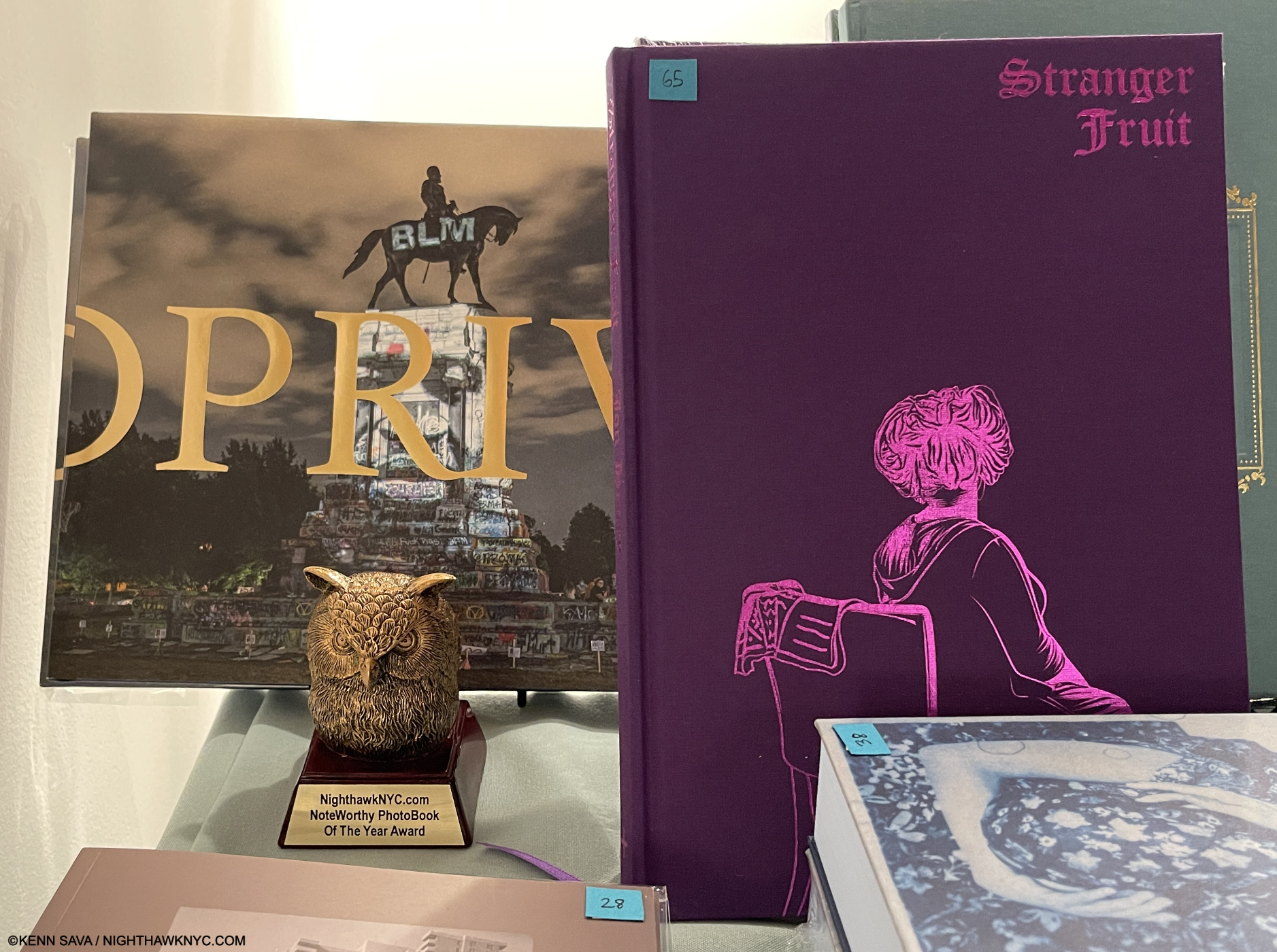
As if this isn’t enough, Kris Graves, himself, has created an important body of Photography that looks at our time, and the past, with a unique vision, one that foregrounds what it is to be Black in America today, while living with the past. The culmination of his work to this point is his 2023 book, Privileged Mediocrity (published by Monolith with Hatje Cantz), one of my two NoteWorthy PhotoBooks of 2023. He published the other, Jon Henry’s Stranger Fruit.

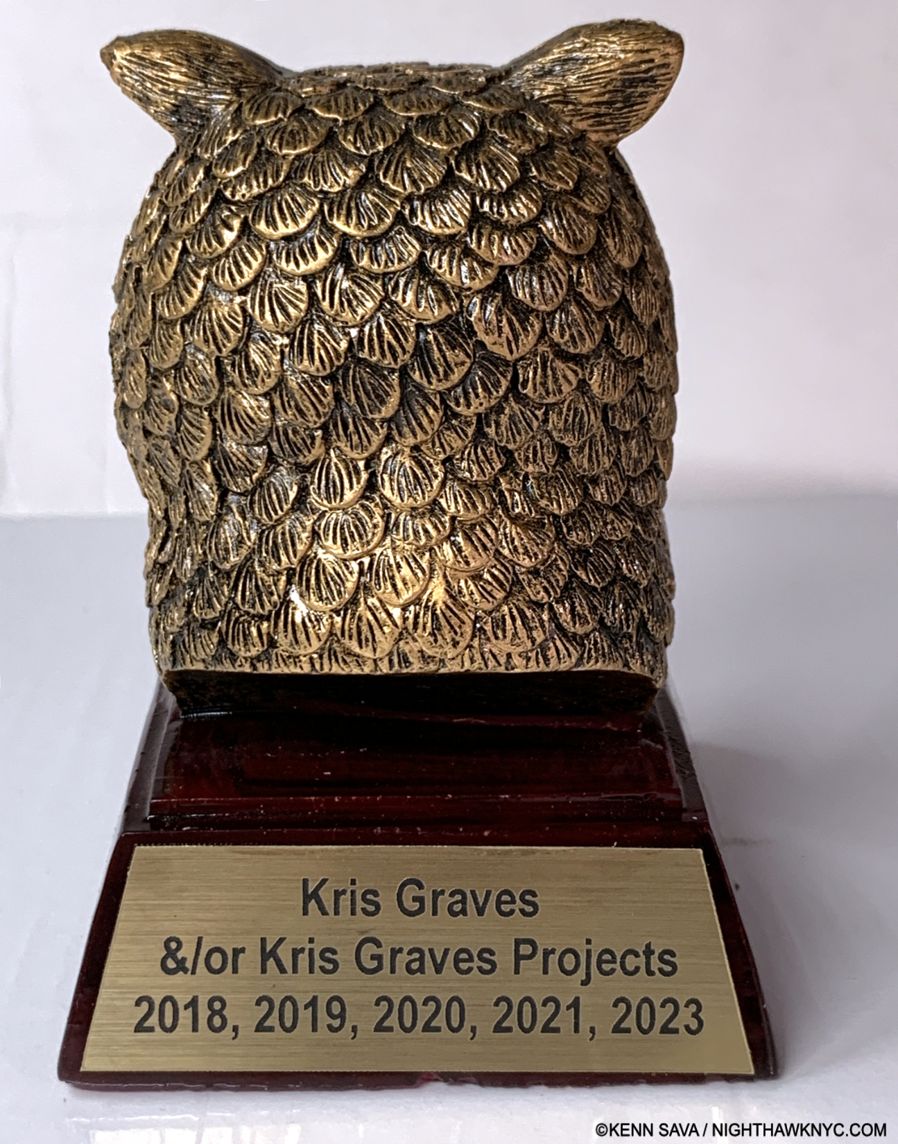
Since I don’t believe “best” exists in the Arts, I started publishing annual Noteworthy PhotoBook lists (and NoteWorthy Art Book lists) of the books I most highly recommend in 2018. Since that time, one of Kris Graves’s self-authored books, or one of the books he’s published has been one of my NoteWorthy PhotoBooks of the Year in 2018, 2019, 2020, 2021 and 2023! (I didn’t do a list in 2022.)

Verso.

Let’s break it down…

In 2018, Kris Graves Project’s 10-volume set, LOST, was one of my NoteWorthy PhotoBooks of 2018. The set includes Mr. Graves’s book Long Island City.

In 1019, KGP’s TWENTY-volume LOST II was one of my NoteWorthy PhotoBooks of 2019.  I wrote about the making of the set, which I called “monumental” at the time, here. It remains my personal favorite of the 4 LOST sets. LOST II includes The Bronx by Kris Graves.

In 2020,  Kris Graves Projects was my NoteWorthy PhotoBook Publisher of the Year for somehow managing to publish EIGHTEEN books during the height of the pandemic when working with ANYone else was extremely challenging to say the least. In addition, Mr. Graves took extensive trips documenting the Black Lives Matter Protests throughout the South, creating a body of work that would become the classic Privileged Mediocrity in 2023, at considerable personal risk. 2020 also saw him introduce the Monolith imprint.

2021 saw Electronic Landscape by Isaac Diggs & Edward Hillel, published by KGP, make the list under the “Excellent & Under the Radar” category. The book has since gone on to achieve legendary status.

After not doing a list in 2022 for personal reasons, Mr. Graves returned as the author/Photographer of one of the only two NoteWorthy PhotoBooks, 2023, and the publisher of the other, as I’ve said.

That’s pretty remarkable. And especially Worthy of Note, no?

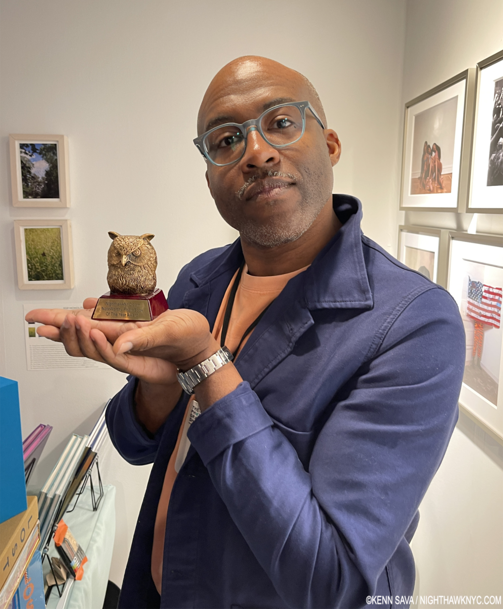
And the winner is…Kris Graves at his KGP booth at AIPAD: The Photography Show, April 26, 2024.

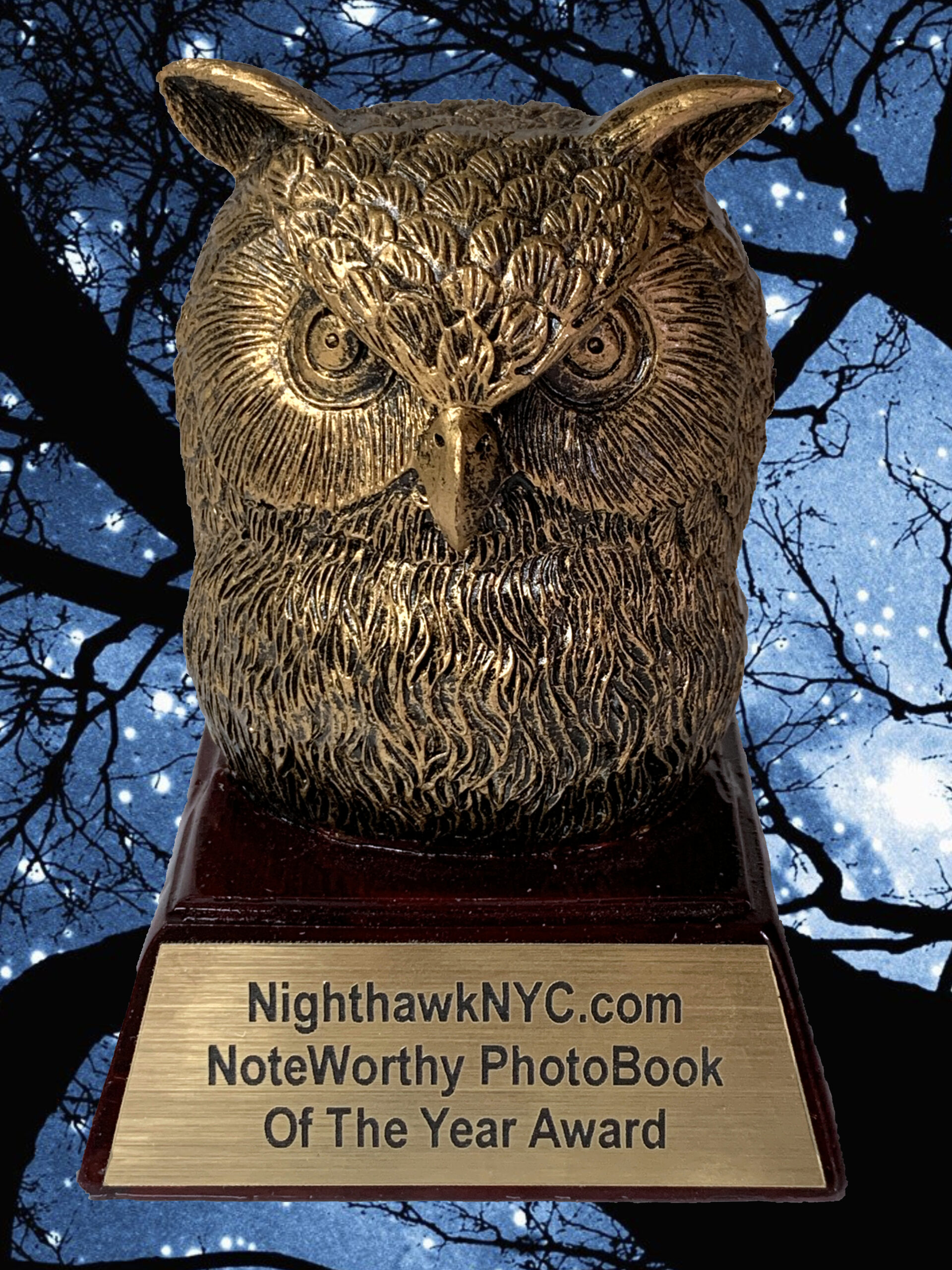
Informing him that the only two books on my 2023 list were his, I told him I should just give him the trophy, he’s been on my list so many times. “If there is one, I want it,” he replied. So, I decided to make him a NighthawkNYC.com PhotoBook of the Year Trophy, shown in the first picture, which I have nicknamed “The Golden Oof,” in honor of my avatar, Oof the Owl (What’s the deal with me and Owls? “Sava” means Owl). 

Kris Graves with team member & book designer, Caleb Cain Marcus.

On April 26th, I presented it to him at his booth at AIPAD: The Photography Show. Also present was his team member, the wonderfully talented book designer Caleb Cain Marcus, who designed both books on my 2023 list. In addition to being an Artist, himself, Mr. Marcus has designed a number of Kris Graves Projects recent books, including their newest release, the 10-volume LOST IV, among books for any number of others. 

Holding down the fort at AIPAD: The Photography Show, 2024, with both of the 2023 NoteWorthy PhotoBooks. What other PhotoBook Award gives an actual trophy?

In a world of many fine Art & PhotoBook publishers, Kris Graves’s work consistently stands out. He has something of John Hammond’s gift for finding new talent and often pairs them with more established Artists in his LOST series to democratic effect that lets their work speak for itself in beautiful and affordable books- even in the face of raging inflation. While his books regularly sell out, a sure sign of public acceptance, I’ve been surprised his work and accomplishments haven’t been more widely recognized. Privileged Mediocrity and Jon Henry’s Stranger Fruit are classic cases in point. Look through a copy of either and you’ll see what I mean.

“Propose a toast
Let’s hear it for the spirits and the ghosts
Rejoices for the voices in my gut and in my dome
Are why I never drink alone
I think that’s noteworthy”*

*-Soundtrack for this piece is “Noteworthy” by Queens own Homeboy Sandman from Dusty. KGP is based in Long Island City, Queens.

NighthawkNYC.com has been entirely self-funded & ad-free for over 8 3/4 years, during which 320 full-length pieces have been published! If you’ve found it worthwhile, PLEASE donate by PayPal to allow me to continue below. Thank you, Kenn.

You can also support it by buying Art, Art & Photography books, and Music from my collection! Art & Books may be found here. Music here and here.

Written & photographed by Kenn Sava for nighthawknyc.com unless otherwise credited. To send comments, thoughts, feedback or propositions click here. Click the white box on the upper right for the archives or to search them. Subscribe to be notified of new Posts below. Your information will be used for no other purpose.
NoteWorthy Art Book, 2024- Es Devlin…Lady Gaga, Kiss & Me

This site is Free & Ad-Free! If you find this piece worthwhile, please donate via PayPal to support it & independent Art writing. You can also support it by buying Art & books! Details at the end. Thank you.

Written & Photographed by Kenn Sava (*-unless otherwise credited)

Though I just teased some big names, I begin with the least known. There I was, in year 2 of my 5 on the road with a band, refugees from the disco mania which was sweeping all live Music and Musicians aside, all the way down in the Cutler Ridge section of Miami, FL. We pulled into the parking lot outside of this good sized venue, the Esquire Club, went it, met Al the owner, and began bringing in our gear. As we set up for what would be an extended stay, the assistant club manager came up, saw our stage clothes and my platform boots (Handmade by Jumpin’ Jack Flash, NYC, who had made Kiss’s legendary boots. Mine were a half-size too small, leading to permanent foot damage, an ever-increasing problem. Another Rock n’ Roll suicide.). Realizing that we were something different from what they had been presenting, he chatted me up about our “stage show.” Then, he suggested we add “flash pots” to our presentation.

Flash pots? 

He went away and came back with 3 pieces of wood, each about a foot and a half long by about 3 inches wide and 2 inches deep, some electrical cord and a few plugs. First, a rectangular cup about 3 or 4 inches long by a little less than 2 inches wide was cut into the top center of the wood. Next, he attached the the wire so the stripped bare end was in the hole. Then, he had me cut one side of the wire and install an on/off switch. Electricity, with a bare wire on a dark stage? Hmmmm… Then he showed me a grey, cylindrical container. Gunpowder. 

Gulp.

He scooped some of it and put it in the cutout. Plug in the wire and when I flip the switch? WHAM. Flash pot! The band covered by a cloud of smoke, and hopefully, only smoke! Ooohs and aahhs all around.

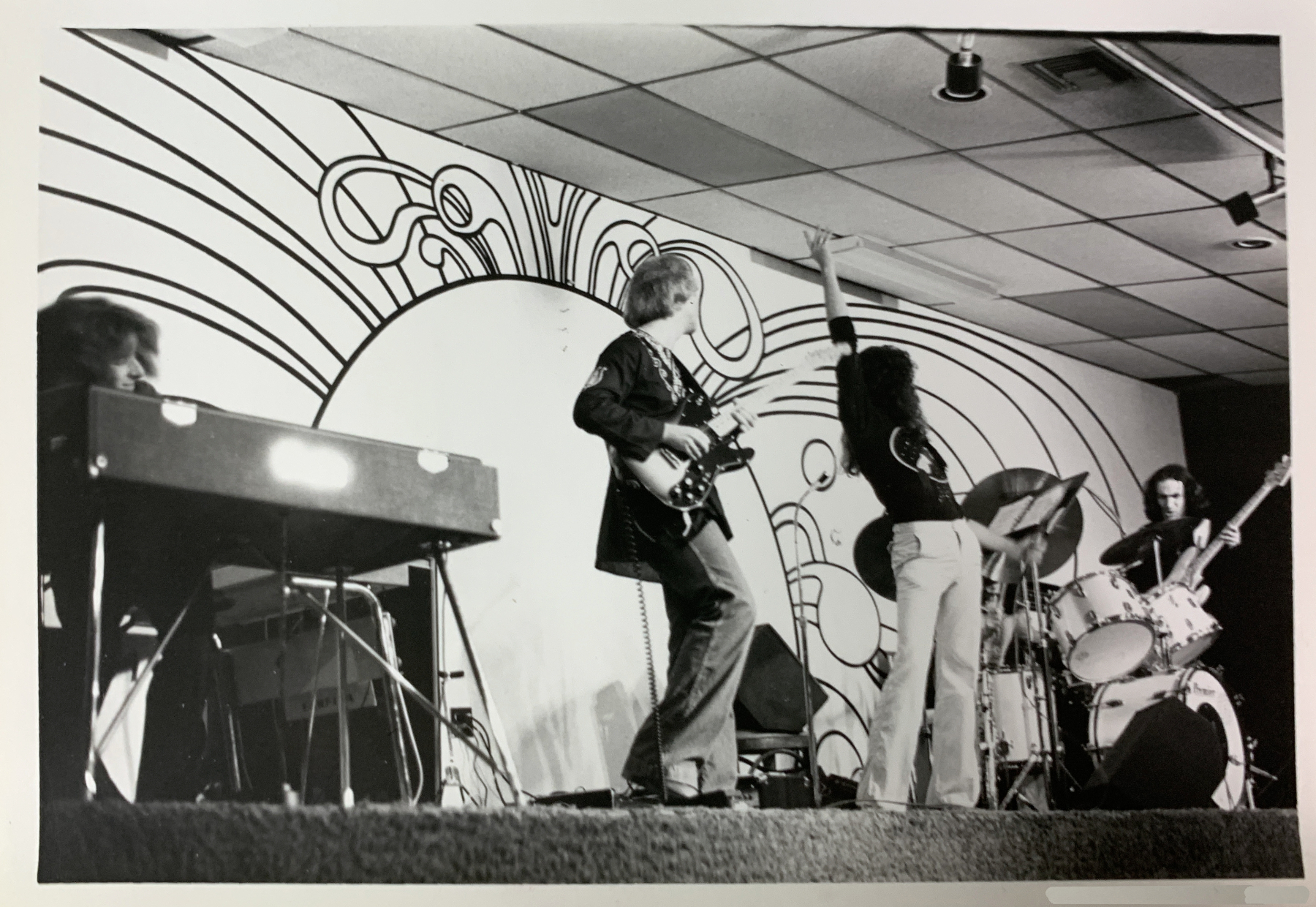
“Messiah,” Live at the Esquire Club, Miami, 1977. Left to right, T. Lavitz, keyboards, who would go on to fame after he joined The Dixie Dregs (aka The Dregs) the year after this was taken, before launching a successful solo career, Steve Smith, guitar, Bob Donzella, sax & vocals, Mark Smith, drums & vocals, and yours truly, Kenn Sava, bass & vocals. It’s about at this moment that I’d be tripping the flash pots. Gee, I wonder if that carpeting was fireproof… *-Photographer unknown. The pictures in this piece are thumbnails. Click any for full size.

We made three of them, each laid 1/3 of the way across the stage, all under my control, to be tripped at particularly “dramatic” moments during our set. Needless to say, never having done anything like this, especially while playing, it was a bit unnerving. Luckily, I managed to set them off a few times, without disastrous result. Phew! After a week or so, the regulars had gotten to know us, and everybody relaxed, so we dispensed with the “special effects,” or, they ran out of gunpowder, I forget. (The Esquire Club was destroyed by Hurricane Andrew in August, 1992.)

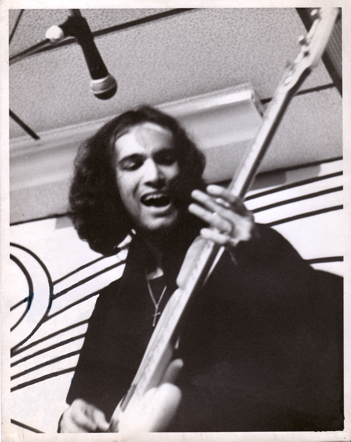
Yours truly, Kenn Sava, lve at the Esquire Club, Miami, FL. This is the first time I, or a former I, have appeared in the pages of  NighthawkNYC.com in its 8 1/2 years! *-Photographer unknown- a friend of Mark’s. I’ve grown quite fond of this picture as it shows me about as happy as I’ve ever been in my life, in spite of all we were dealing with at the time, including the poverty typical of bands like ours.

Such was “stage craft” in prehistoric times. Fast forward to January 20th, 2010.  

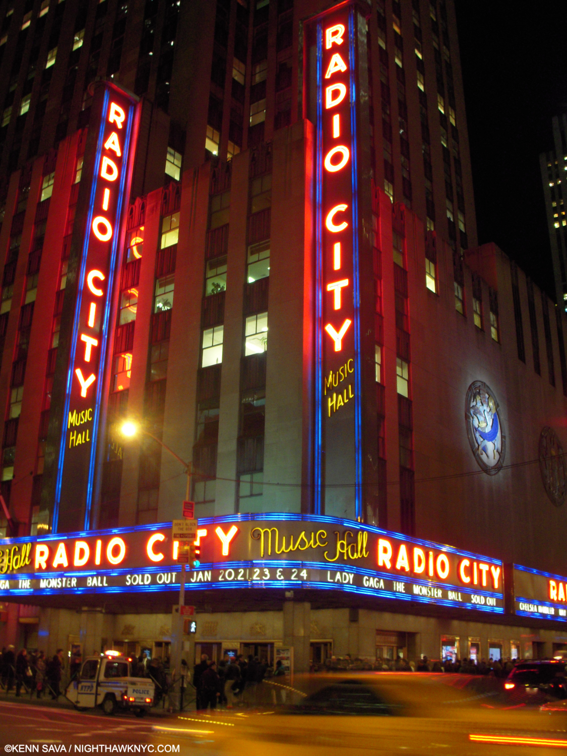
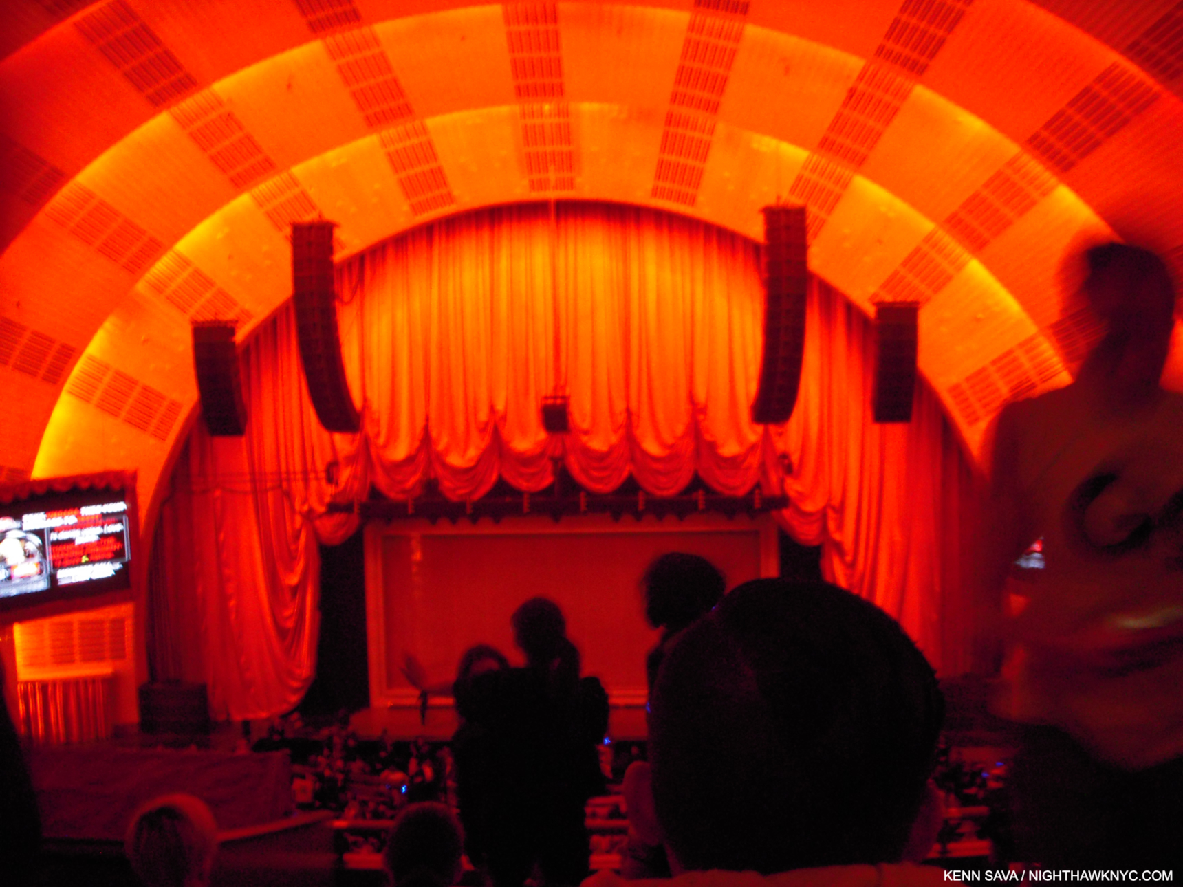
The Big Time. Radio City Music Hall, NYC, January 20, 2010. The night of Lady Gaga’s homecoming; her first NYC concert. Prior to this, she’d performed in clubs & bars, like I did.

There I am in the balcony for the NYC concert debut of an up and coming Artist who’s new hit singles, “Just Dance” and “Poker Face,” were all the rage, and her album, The Fame, was screaming up the charts. Intrigued, I managed to get a ticket for Lady Gaga’s New York homecoming show of her Monster Ball Tour at Radio City Music Hall, January 20, 2010, her first concert in her hometown1.

Down in front! Seated as far away as I was wasn’t ideal for picture-taking. Before it started, I took this because I was fascinated by the stage. Looking around the standees, you’ll notice a box-like frame and there’s a screen in front of it. Both things I hadn’t seen to that point. Something told me at that moment that this was going to be “different.”

As far as I know there hasn’t been an officially released video of what was the Monster Ball Tour, 1.0 that this show was a part of. I can only find pictures and videos shot by my fellow concert-goers, like this one of the opening. Poor quality, but it gives you a sense of it. ( Someone has posted a complete video of another stop on the tour. Again, it’s a far from ideal audience recording, but until something better appears, it’s the only record I know of of the complete show.)

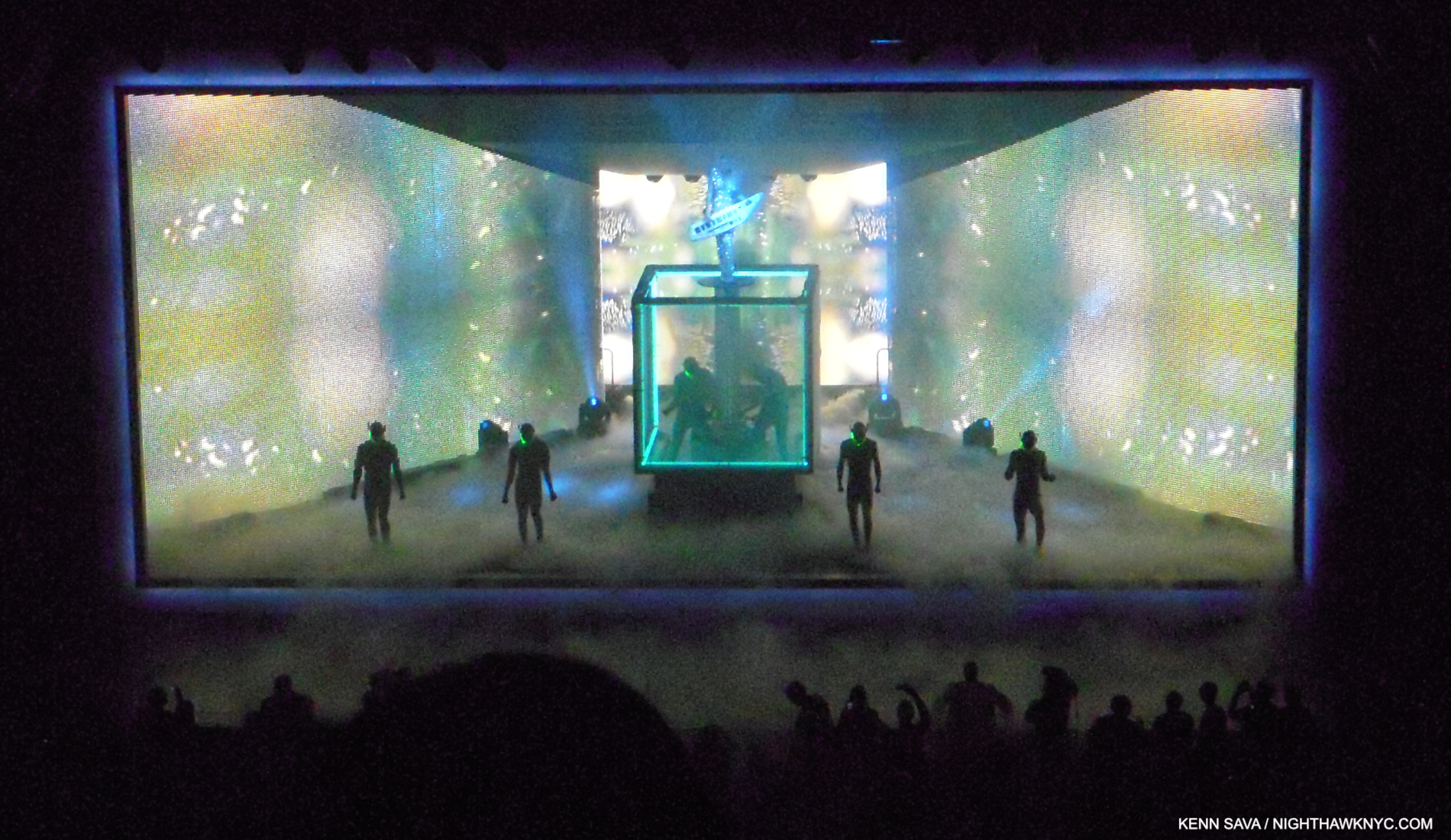
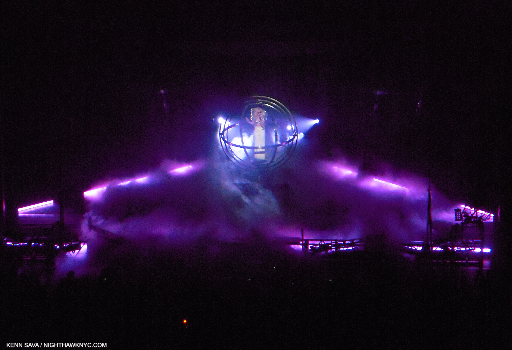
The show began with a matrix-like grid on that screen shown earlier with a filmed Lady Gaga (LG) projected on it revolving while warping time and space, apparently free of gravity, along with a 1 minute countdown clock to the show’s beginning. As it ticked down, the crowd amped up by the second. 00:00:00:00, and there she was behind the matrix screen, live, alone on the big stage in her hometown, wearing an outfit with lights on it and performing her classic, “Dance in the Dark.” Quite a moment. “Find your Kubrick,” indeed. Stefani Germanotta had escaped the clubs & bars and arrived in the big time, in full effect. 

“Just Dance.” LG performs with a Roland Shoulder Synth (I believe) on a riser extending to about 10 feet over the base of a rotating cube. The area around the black disc she’s standing on is open. Watch your step! Note the frame-like border.

“Dance in the Dark” segued into her mega-hit, “Just Dance,” without pause. The screens on the sides seen above covered the band, something I’d never seen before, leaving a large performing area. Looking back from 2024, it might be easy to look at this show and not see it as all that “revolutionary” given what’s come since. At the time, I’d seen nothing remotely like what I saw that night. It still remains a unique experience. Meanwhile, the irresistible “Just Dance” got the balcony moving up and down so wildly as hundreds of concert goers jumped in time that I was worried it might well come down! How do they test for that kind of stress? When the show ended without catastrophe, as I was walking to the subway to the sound of my fellow concert-goers bursting out in spontaneous chants of “Oh oh oh oh oh…Caught in a bad romance,” over and over and over from near and far…the one thought on my mind was “SOMEONE involved in staging that show has a DEEP knowledge of Art history!”

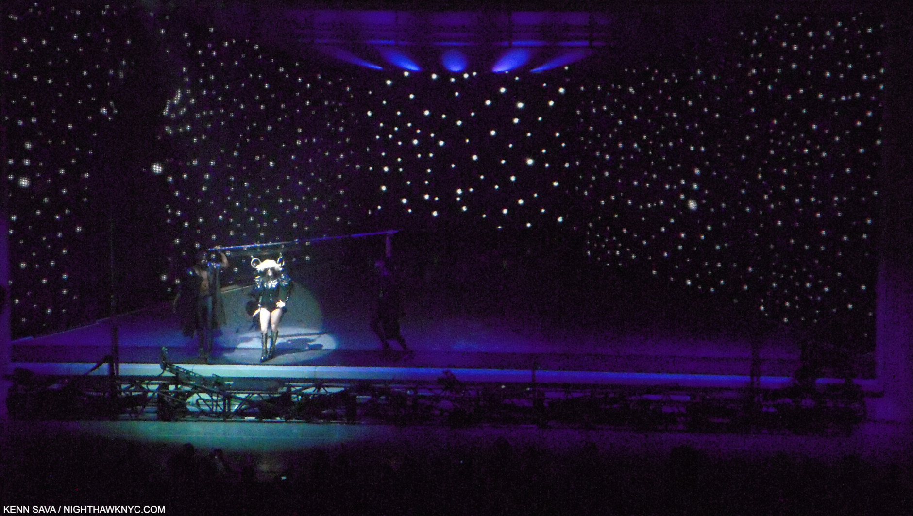
“Paparrazzi” with LG’s hair fastened to the overhead pole on both sides by rings while two dancers hold the ends of the pole.

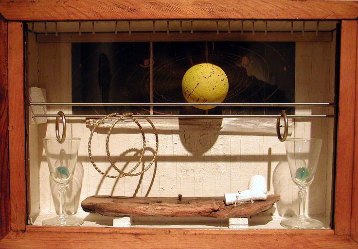
Time and again, I felt the influence of numerous Artists and Paintings. First, and foremost, the great Joseph Cornell was channeled as the entire stage was framed creating a box-like setting for the performance, as I show in “Just Dance.” Mr. Cornell, a revolutionary in a number of Artforms, is, perhaps, best known for his “Boxes.” The Cornell references continued during “Paparazzi” where Gaga’s hair was fastened to a horizontal pole with rings(!) while the dancers holding the ends moved/danced in step with the slightly helpless LG as she sang, right out of numerous Cornells that include a horizontal pole with rings attached, like Lunar Level #1, and Sun Box, below, among others. Joseph Cornell at a Lady Gaga show? Dali, Giorgio de Chirico, Magritte and Leonardo da Vinci also came to mind as the show went on. Of course, being Lady Gaga’s show, first and foremost, the credit goes to her.

Sun Box, (1956) by the incomparable Joseph Cornell, 1903-1972. One of many Cornell Boxes that include a horizontal bar (or two) with rings attached. Lady Gaga’s entire show felt to me like it was taking place inside a box.

Then, I saw her,  again, in July, 2010, at her Monster Ball Tour 2.0 at Madison Square Garden (her first MSG show); another big deal. It was a completely different show! It was very nice, very effective, but minus all the Art references. I assume that having a stage in a huge indoor arena called for a completely different presentation. Still, I missed the show I saw at Radio City, and at that point it made me realize how special it was. I was determined to find out more about it.

“Eh, Eh (Nothing Else I Can Say),” at Radio City. LG in a quasi-“gyroscope.” All those bars were continually in motion around her. A bit like Leonardo’s Vitruvian Man?

I found out that Lady Gaga had worked on the Radio City show, and her Monster Ball 1.0 Tour it was a part of, with a stage designer named Es Devlin. 

Who?

It tuns out that Esmeralda (“Es”) Devlin, born in London in 1971, is nothing short of a polymath, who, apparently, never sleeps. While I had been sleeping on her, in the interim, her reputation grew, then exploded. Meanwhile, the press had upped the hype quotient to seemingly impossible levels-

“Modern Britain’s answer to Leonardo da Vinci,” The Sunday Times (of London).

Leonardo?? I can’t say that in all my years of looking at and studying Art and Art history I’ve ever heard that said of ANY Artist.

Perusing her website, I discovered the roster of world-famous Musicians, bands, opera companies, playwrights, and corporations who have entrusted her with their stages is about as “A List” as it gets, and extraordinarily long. Oh, and the Super Bowl Halftime and the Olympics are on it, too. As for those Artistic deep waters, she’s staged a number of Shakespeare’s plays, including Hamlet, and a few of Mozart’s operas, including Don Giovanni, perhaps his ultimate opera. Snippets of all of these and more can be seen on esdevlin.com. I also discovered that Ms. Devlin did not do the stage design for that 2010 Lady Gaga Monster Ball Tour 2.0 MSG show. Hmmm…

But, Leonardo? One of the supreme geniuses in Art and world history, and one of my personal “Ultimate Artists?”

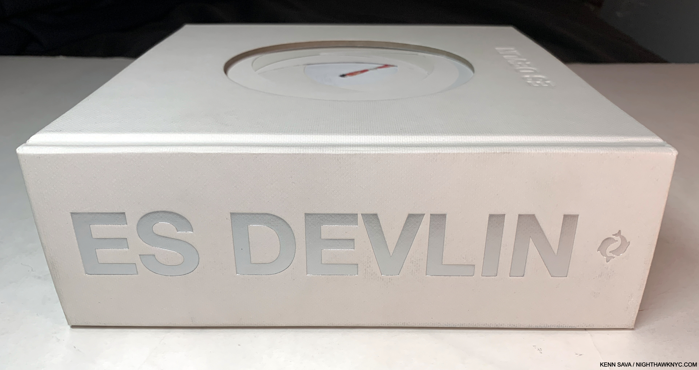
Back into the fast forward machine to 2024, Es Devlin is now the subject of a mid-career Retrospective at NYC’s Cooper Hewitt, Smithsonian Museum of Design. To accompany it, she, Cooper Hewitt and Thames & Hudson have combined to use the show as an opportunity to publish her first book, An Atlas of Es Devlin. When I first spotted a copy on a shelf with only “ES DEVLIN” in silver on its 2 1/2 inch thick(!?) white spine, I felt a tingle of anticipation. Suffice it to say, given all I’ve seen- in person and via research, and the weight of that Leonardo reference, my expectations couldn’t have been higher.

What we have is, well… I’ll let the Thames & Hudson PR staff tell you-

An Atlas of Es Devlin is a unique, sculptural volume of over 900 pages, including foldouts, cut-outs, and a range of paper types, mirror and translucencies, with over 700 color images documenting over 120 projects spanning over 30 years, and a 50,000 word text featuring the artist’s personal commentaries on each art work as well as interviews with her collaborators including Hans Ulrich Obrist, Bono, Benedict Cumberbatch, Pharrell Williams, Carlo Rovelli, Brian Eno, Sam Mendes, Alice Rawsthorn, and Abel “The Weeknd” Tesfaye. Each book is boxed and includes a die-cut print from an edition of 5,0002.”

PHEW!

HERE was the moment of truth. Will her body of work hold up to the close scrutiny such a comprehensive book provides?

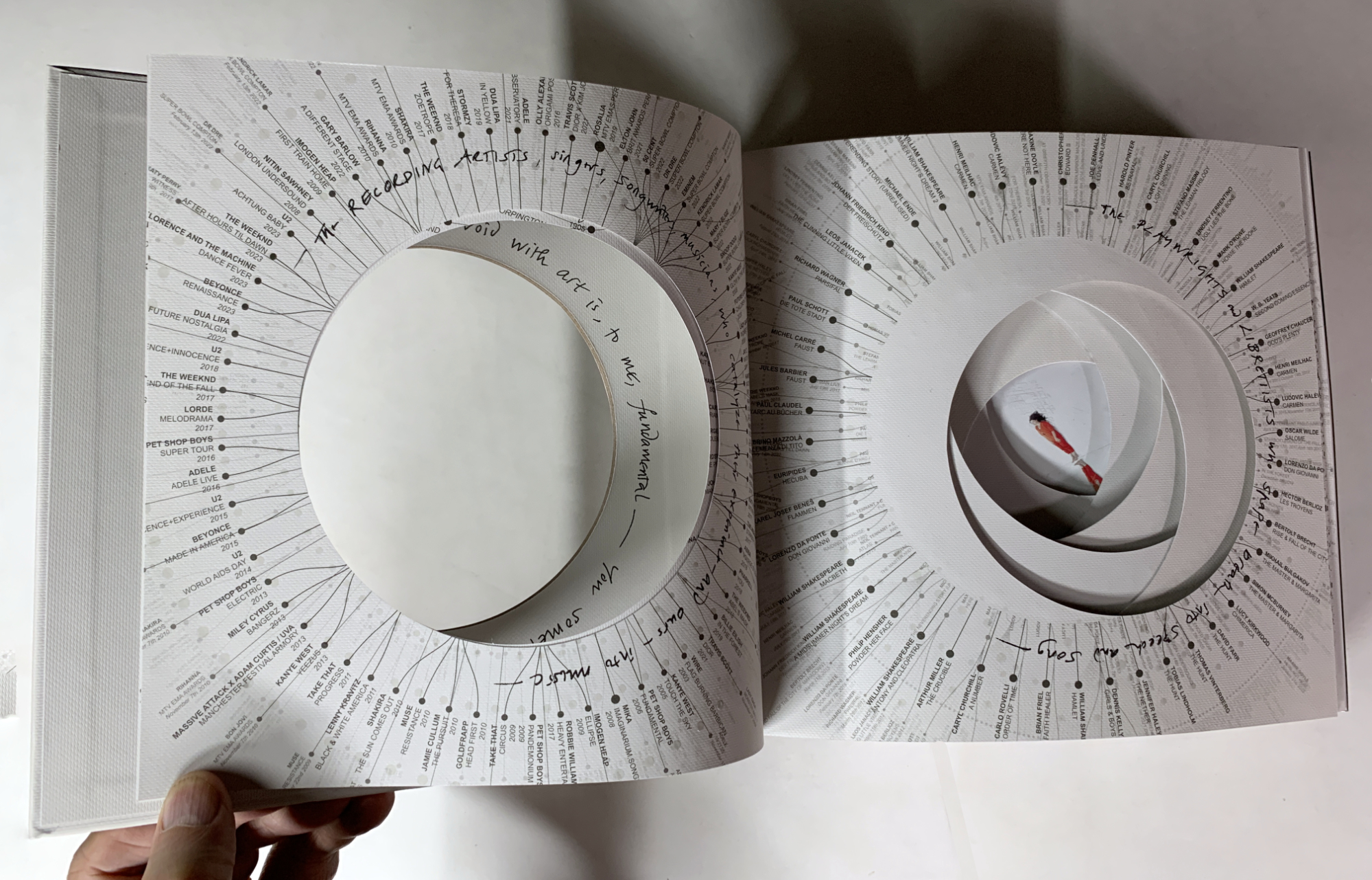
“The instinct to fill a void with art is, to me, fundamental.” Es Devlin, hand-written reproduction inside the cover.

Ever see a resume like this? Inside the cover, the list of Musicians she’s worked with, left, and Playwrights & Librettists, right, surrounding Es in the middle after more pages of credits and thank yous.

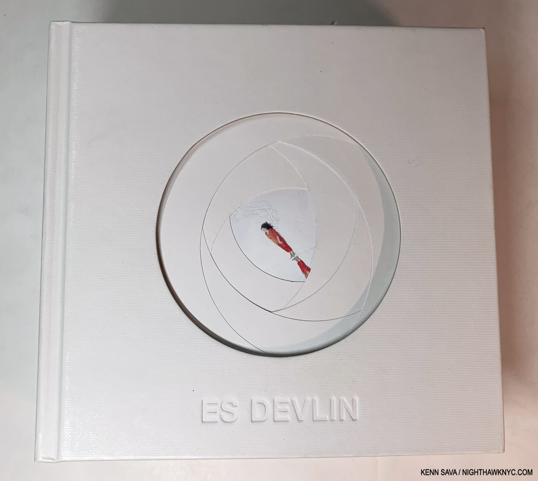
Holding a copy in my hand, it was immediately obvious that the book is a duality. At once it feels crafted with care at every turn, mirroring the personal feel of a very limited edition, yet it’s a mass-produced object published by a big publishing company. The cover, shown earlier, and the first 8 pages are die-cut to look like we’re peering into a camera lens. On each of these the opening is surrounded by credits, and there are many of them. They lead to a picture in the center (the aperture) of the Artist, herself, on the 9th page, standing obliquely between a white cityscape and white clouds, dressed in red; the “focus” of her own show, for once!

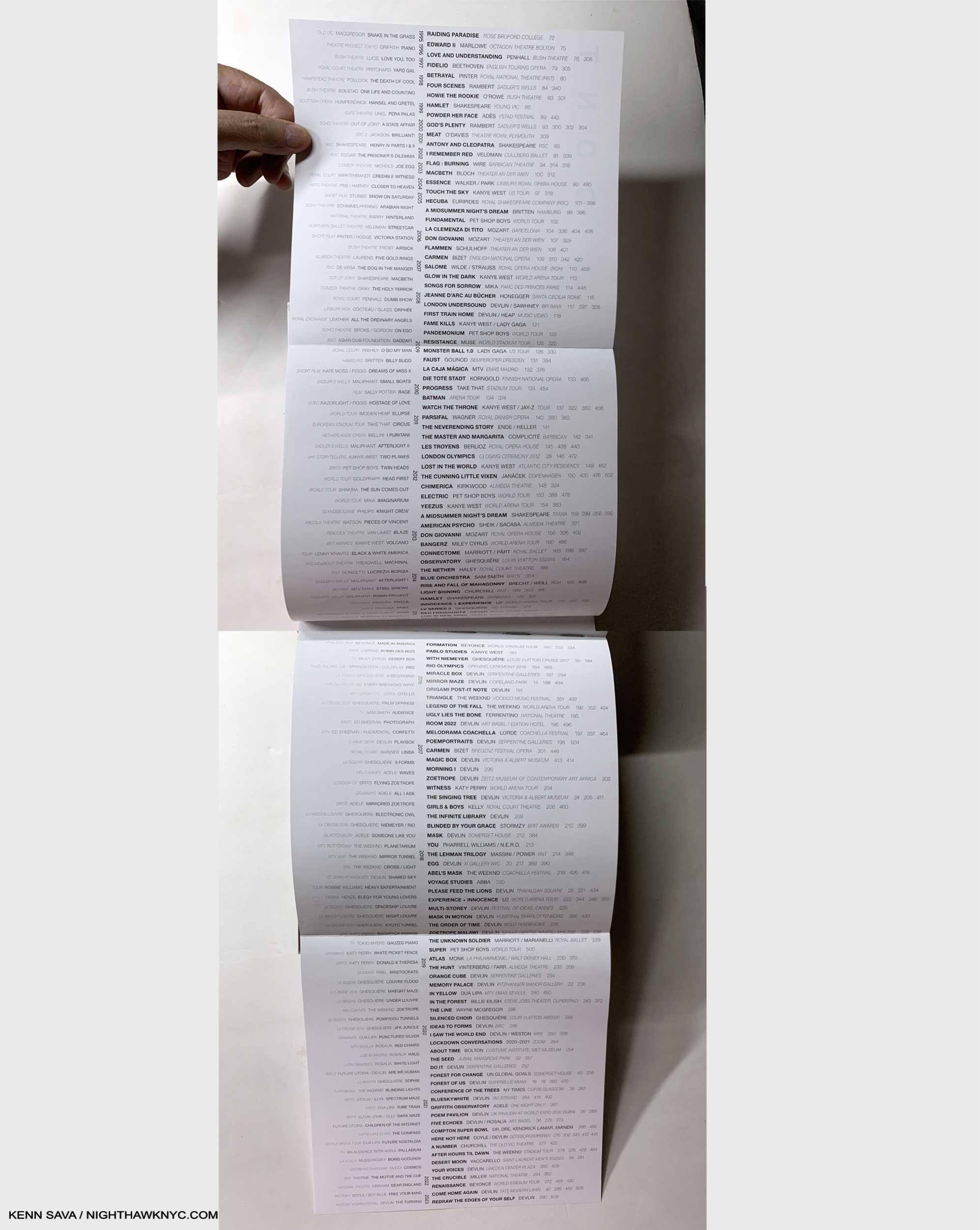
The Table of Contents opens up to the 4 page list of projects arranged chronologically- 1995 at the top, 2023 on the bottom. Those in the center in black are included in the book. Others, to the left in grey, are omitted. It’s shocking how many projects are listed. It took two pictures to get them all in.

Then we get the title page, the table of contents, which opens to a double gatefold listing her projects from 1993-2023. (Has she really been creating for THIRTY YEARS already?) Moving forward into the book proper, I quickly realized that the design was, yes, unique, and yes, stellar. Impressive for a first book, but, I’m here for more.

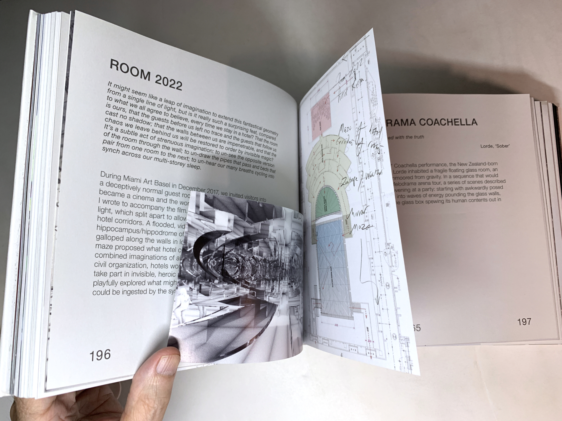
Each project typically gets 2 full pages delineating its genesis, though many have inserts that range between 2 and 40 additional pages.

Her innumerable projects get small chapters of their own (small because there are A LOT of them), and many feature a variety of half pages, fold outs, inserted booklets, and what have you, making them different and fresh from each other. Then, there is a large section of color Photos of the actual performances, followed by the texts mentioned by Thames & Hudson earlier.

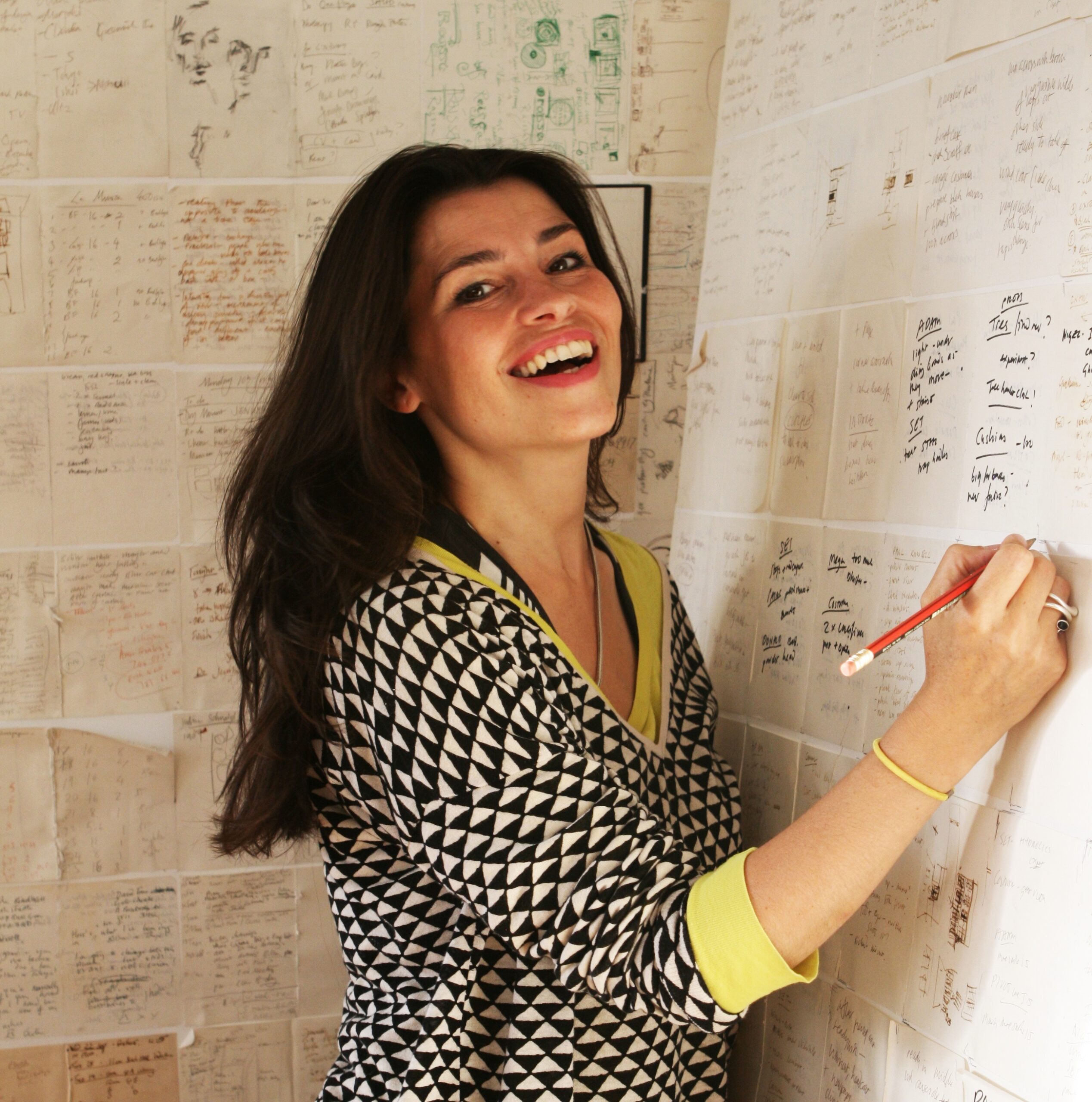
One of the world’s most remarkable Artists. What srtikes me about this Photo of Es Devlin in her studio is that she’s virtually surrounded by hand-written notes & Drawings. *-Photo by Tibby762

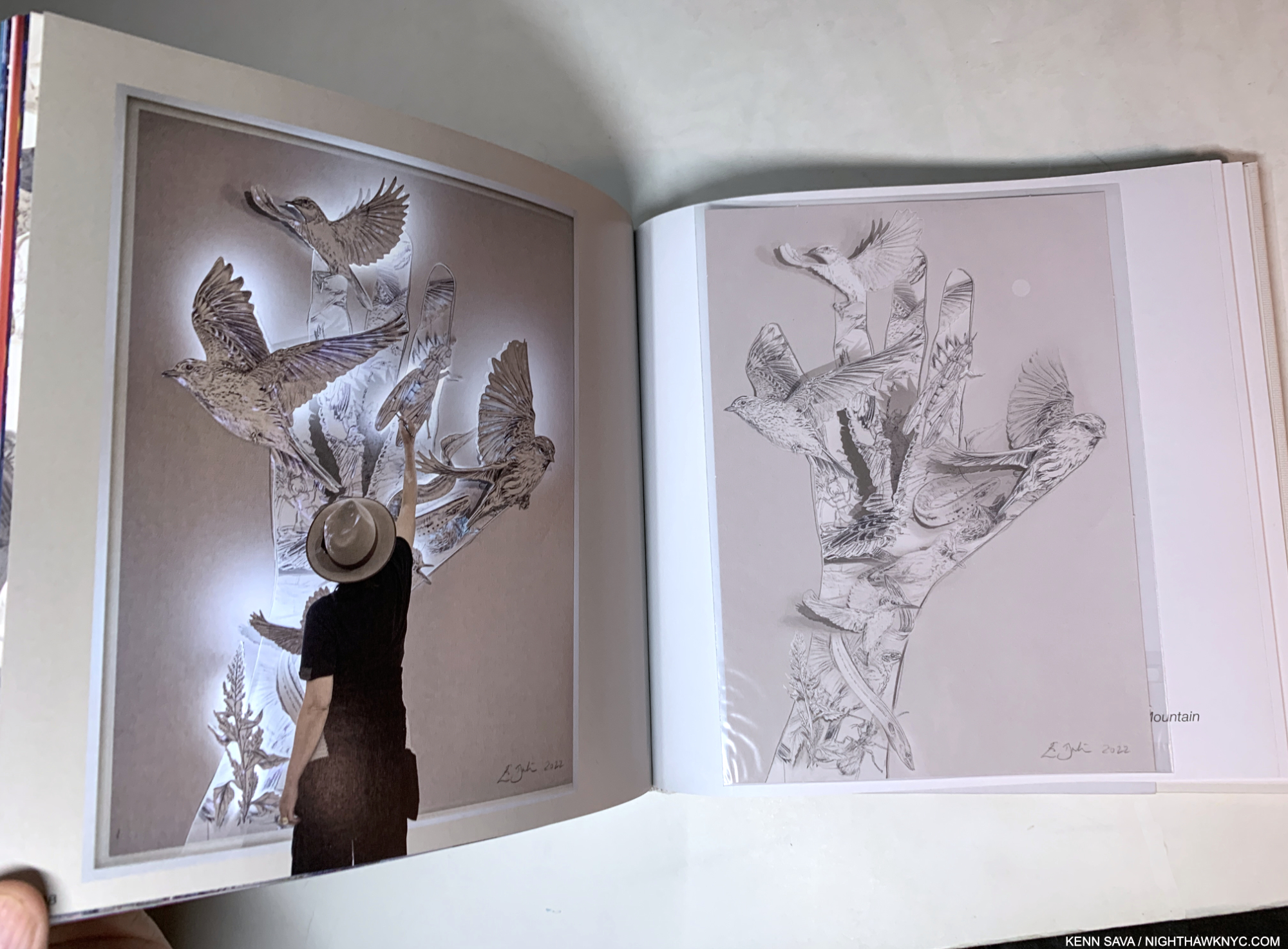
I was shocked to see that reproductions of countless Drawings on paper are included, which showed me that even Artists who’s work involves cutting-edge and innovative technologies continue to rely on Drawing on paper (something I have long considered to be an essential life-skill for everyone- whether it be on paper or digitally. I’m serious.) Then, another reveal- she relies on handwritten notes, which also fascinates me. When Sheena Wagstaff, the former Chair of Modern & Contemporary Art at The Met sat down next to me during a Nareen Mohammedi Symposium, I couldn’t help but notice that she, too, was taking notes by hand. Both commit their important notes and sketches to paper- not to a digital medium. (This is not mentioned as a criticism in any way of either highly esteemed lady.)

That’s not all. In addition to her devotion to Drawing, another pillar of her craft is reading. Page after page of An Atlas references something she read inspiring that project in some way. Reading this, I was struck with one overriding question-

“The woman is so incredibly prolific, creating project after seemingly impossible project steeped in infinitely complex details (in addition to having a family and a life): WHERE DOES SHE FIND THE TIME TO READ, and read so much?”


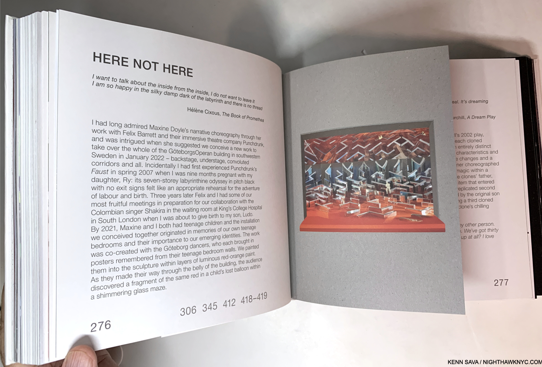
In the projects section inserts of all kinds are the norm, as in a hand-made book. The numbers “306 345 412 418-9” reference pages in the color Photos section where the realized project is pictured in its live performance.

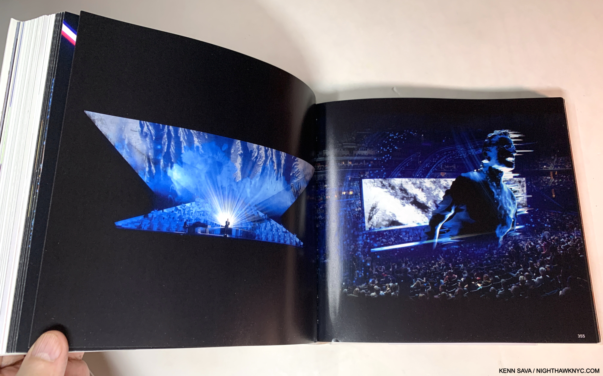
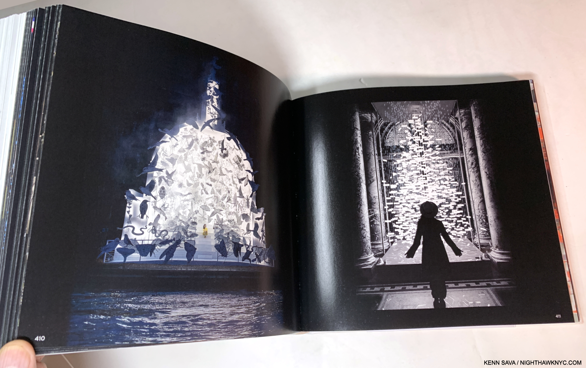
Deep into the concept section, titled “A Selection of Works, 2012-2022,” as my mind is melting over as each project passes in the form of sketches, models or in-progress images as I page turn, I begin to wonder- “Did she really get this made? What did this look like for real?” After the concepts, the large section of color photos shows each project as it was realized. Historic proof each existed. Oh! And get this- MOST of the Photographs included in this NINE HUNDRED page magnum opus are by, you guessed it: Es Devlin, herself.

Taking it all in, the thing that strikes me is that stage design is fleeting. It takes an immense amount of work to conceive, design, and create, but once the performance is over, it’s gone, probably for good, living on in the memory of those, like me, who witnessed one of her productions. There aren’t even that many videos circulating of them! In creating An Atlas, Es Devlin has struck back against this impermanence with a lasting record of her process in creating these works and their singular results.

Taken as a whole, An Atlas of Es Devlin is a staggering achievement- like many of her productions are. Es Devlin has burst forth onto the Art Book world with a debut monograph that will be hard to top: on many levels. It’s destined to find itself on the reference book shelves of Artists, Playwrights, Authors, Opera Directors, Stage Designers, Graphic Designers, Book Designers, as well as Art historians and her fans, for years to come.

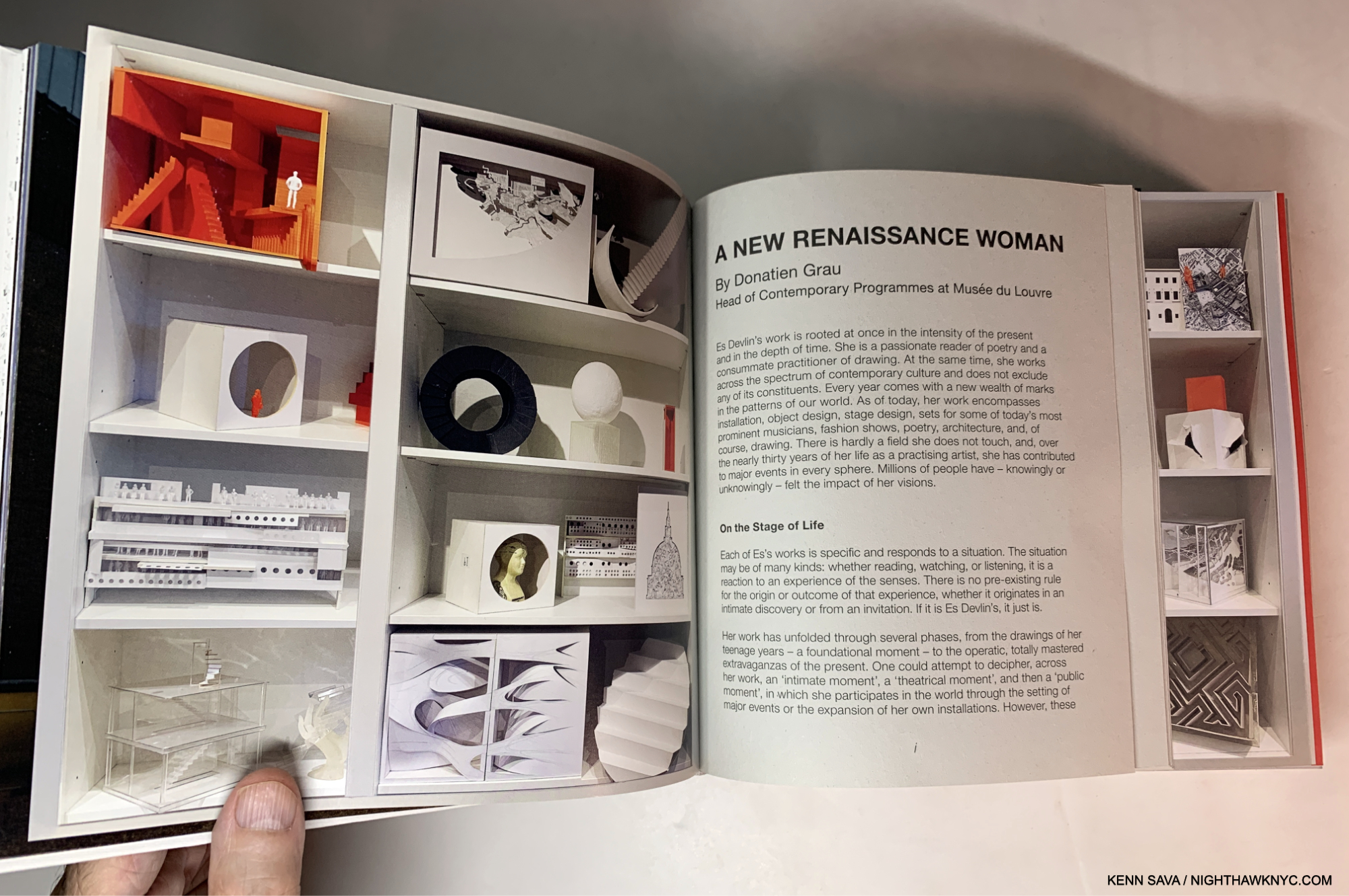
“A New Renaissance Woman.” Donatien Grau of the Louvre, no less, is on to something, I think.

Of his almost innumerable areas of exploration and invention, stage design was not one of Leonardo’s skills (as far as I know. Far be it from me to put ANYthing past him!). So, I wonder what he would make of Ms. Devlin and the Sunday Times’s comparison. We’ll never know. But, I can make this comparison- Leonardo did leave us some of the most astounding books any human ever created: his Notebooks. Though unpublished in his time, and no doubt created for his own use, they have subsequently become eternally important, extraordinarily prophetic and endlessly influential. Es Devlin has now published her Atlas. While I would never compare Arists, or say one is “greater” than any one else (such comparisons are meaningless), it would be endlessly fascinating to have Leonardo’s Notebooks next to a copy of Es’s Atlas, so one could page through both. While you would certainly feel the passage of time going back and forth, I have a feeling that you might still find some commonalities between Leonardo’s “books” and Es’s book. Endless imagination, endless creativity, the fruits of handmade marks on paper, and endless beauty, to name four; each steeped in a study of the craft of Art making and an insatiable curiosity to know more, to explore what’s possible and to take that next step forward. For those reasons, instead of Leonardo, if I were to compare Es Devlin to any Artist, living or dead, it would be Robert Rauschenberg. Each of her creations is THAT unique, one work from the next (and from what anyone else has done), and also THAT endlessly creative and innovative.

So, how’s THAT for a first book?

Es Devlin in the midst of creating, left, and a sealed Die-cut Print seemingly based on it, or a similar work, included with the first edition, right.

And, oh? The Lady Gaga show I saw at Radio City 14 years ago that wowed me so barely gets 4 pages of coverage out of the 900 in the book. THAT’S how vast Es Devlin’s work and achievement is. And she’s only in her mid-career.

Watch out, Leo!

An Atlas of Es Devlin is a NighthawkNYC.com NoteWorthy Art Book of 2024.

NighthawkNYC.com has been entirely self-funded & ad-free for over 8 1/2 years, during which 320 full-length pieces have been published! If you’ve found it worthwhile, PLEASE donate by PayPal to allow me to continue below. Thank you, Kenn.

You can also support it by buying Art, Art & Photography books, and Music from my collection! Art & Books may be found here. Music here and here.

Written & photographed by Kenn Sava for nighthawknyc.com unless otherwise credited. To send comments, thoughts, feedback or propositions click here. Click the white box on the upper right for the archives or to search them. Subscribe to be notified of new Posts below. Your information will be used for no other purpose.

  1. Prior to this, her two 2009 shows at Terminal 5 were her largest NYC shows
  2. Apparently, two printings of it have now sold out, so the total edition size remains unknown to me. It’s also to be re-released in the USA in May so put those edition size numbers down in pencil.

Contemporary Chinese Photography: New Directions

This site is Free & Ad-Free! If you find this piece worthwhile, please donate via PayPal to support it & independent Art writing. You can also support it by buying Art & books! Details at the end. Thank you.

Written & Photographed by Kenn Sava

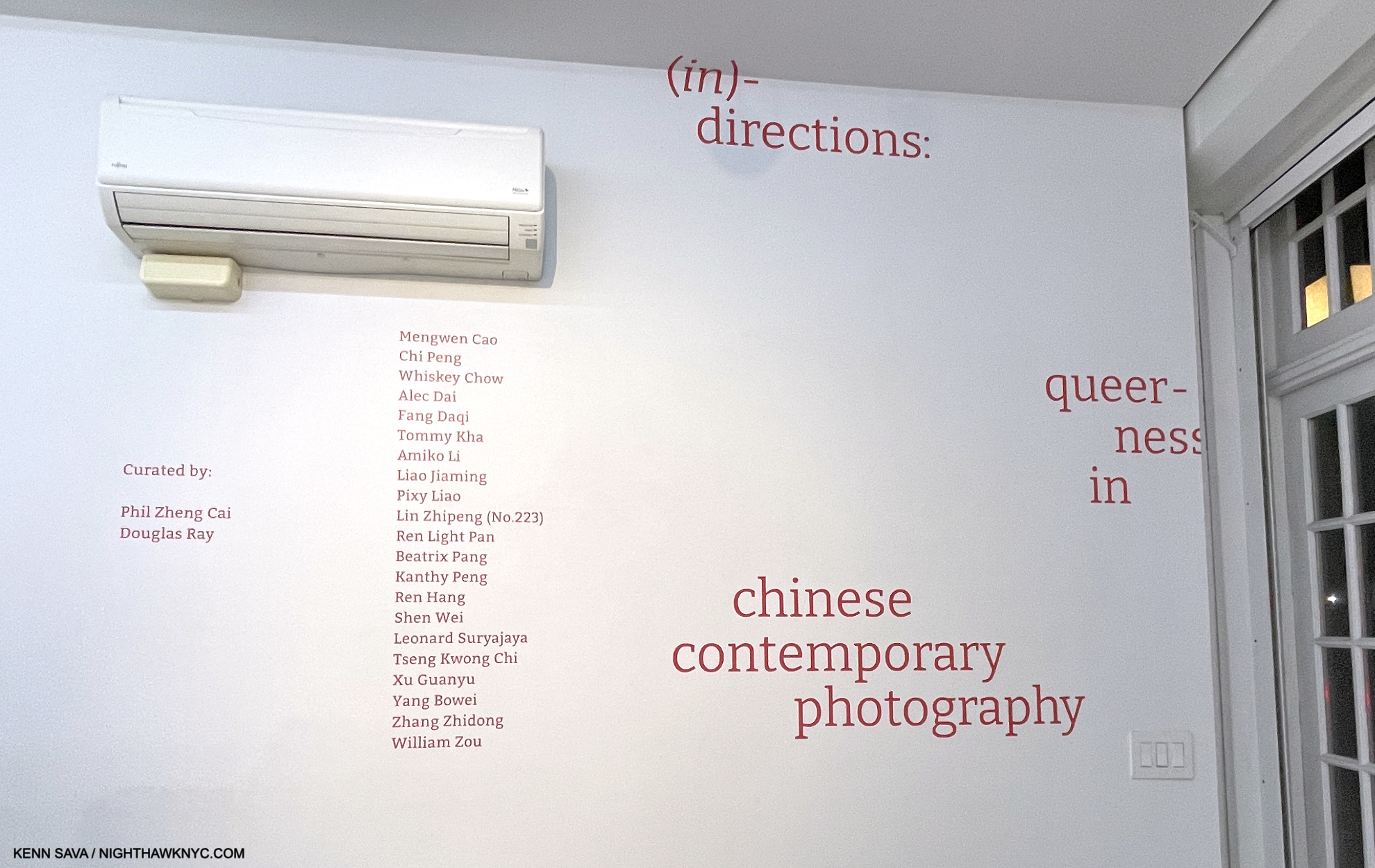
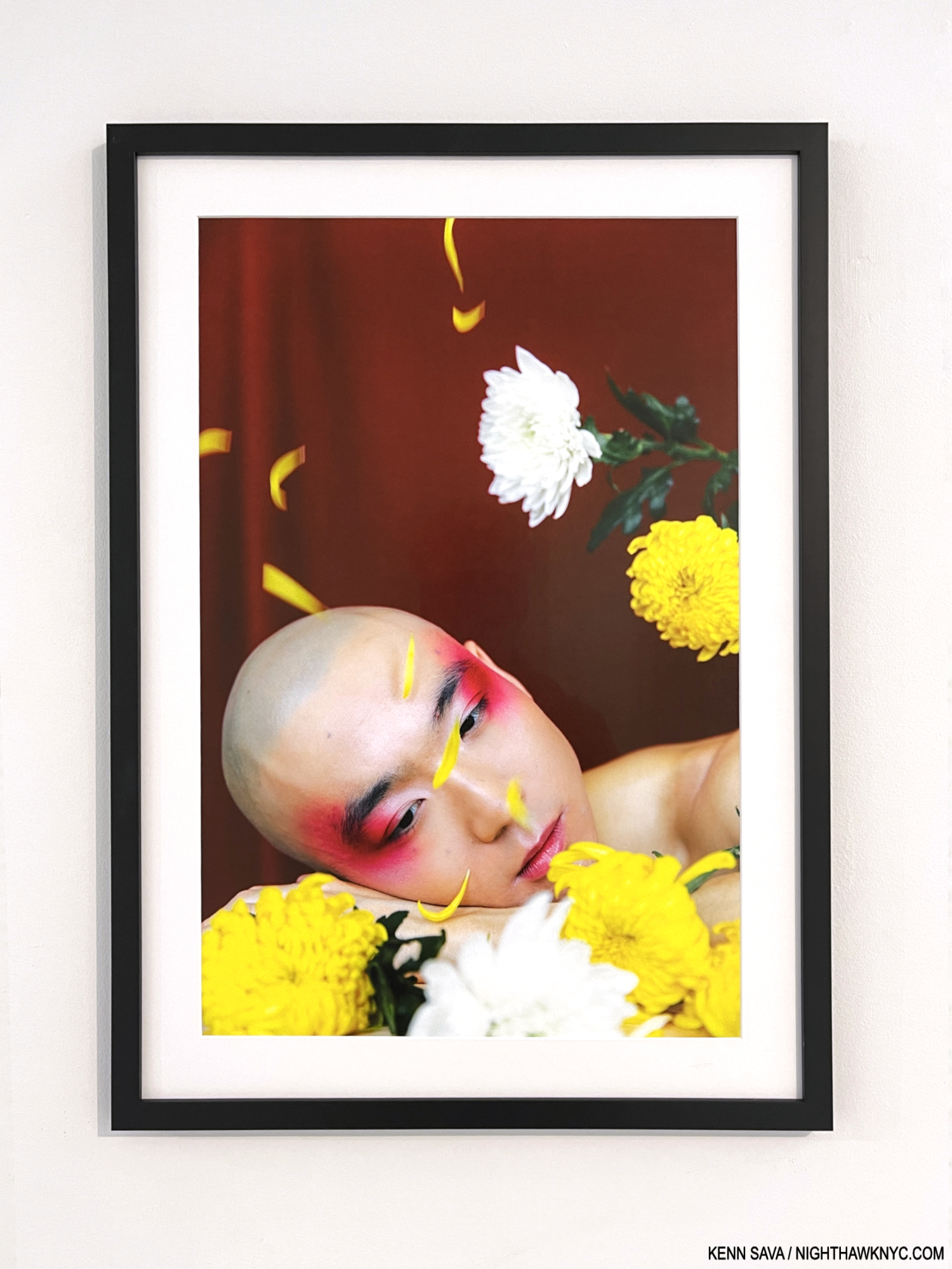
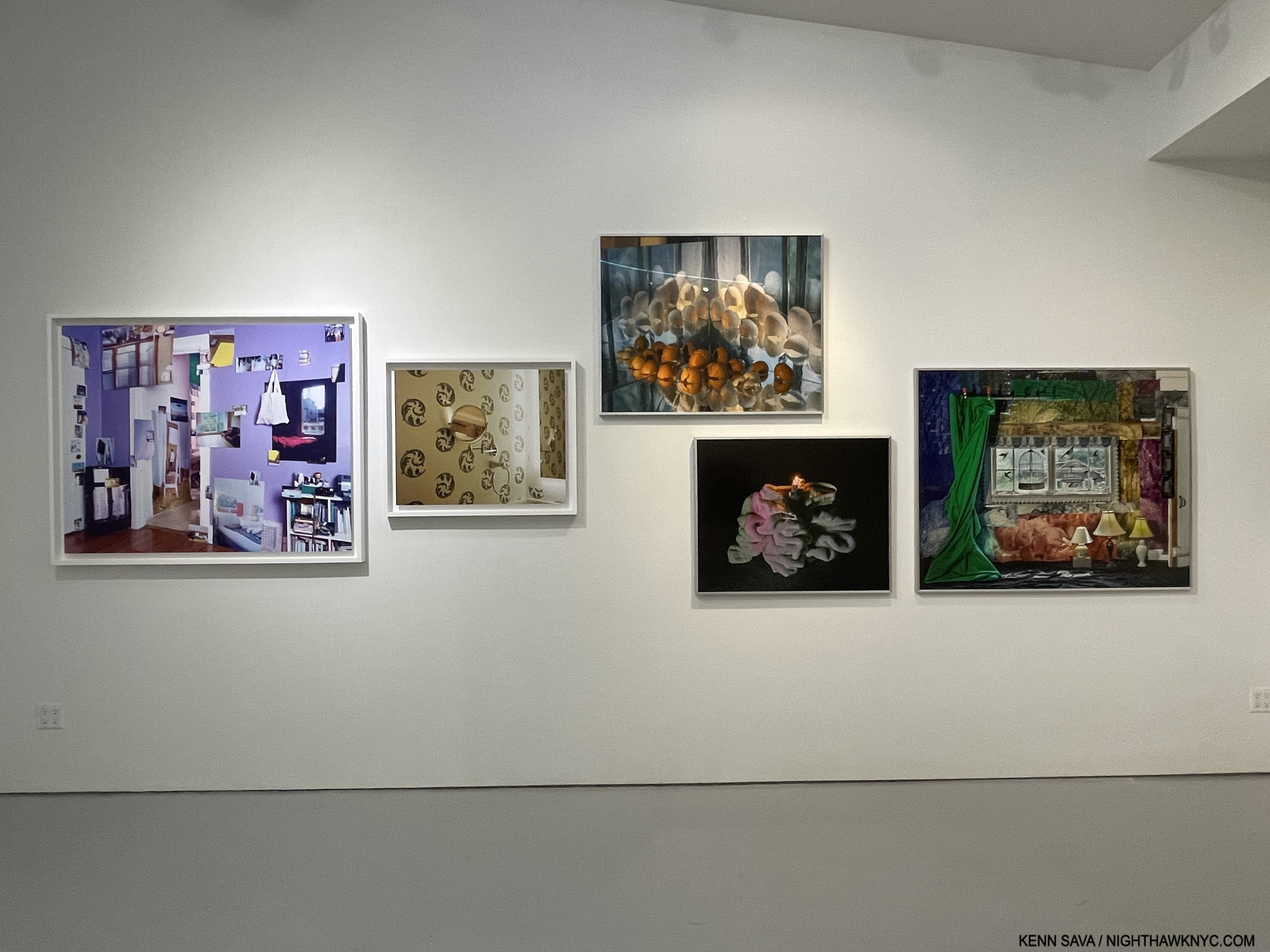
Many might not associate China with Artistic freedom and free expression, but a number of Contemporary Chinese Photographers are making their mark, creating work that breaks all sorts of boundaries, and quite a bit of it in stunning fashion. (in) directions: queerness in chinese contemporary photography, up through the end of January at Eli Klein Gallery, long a leader in cutting-edge Contemporary Chinese Art & Photography, is nothing if not an eye-opener. Wonderfully curated by Phil Zheng Cai and Douglas Ray, the show includes the work of Artists not well-known, along with some that are better-known, including Ren Hang (1987-2017) and former East Village resident Tseng Kwong Chi (1950-90).

Walking through the show with Mr. Cai, who is a walking encyclopedia of knowledge on Contemporary Chinese Art, much of that knowledge based in personal experience with the Artists, I was again taken by the freshness on view in virtually every piece. It’s so rare to walk into a Photography show and see very little, or virtually no, influence of Western Photography, save for an image or two that echoed Nan Goldin, (but that’s possibly what I’m bringing to seeing it). At almost every turn, I saw things that were new, fresh, and exciting. Actually? That’s what I’ve come to expect from Contemporary Chinese Art. In 2018, after seeing the landmark Guggenheim Museum overview, I began exploring it for the first time. Shortly after, at Eli Klein’s prior gallery, Klein Sun’s, amazing Cai Dongdong: Photography Autocracy I discovered  the work of Mr. Dongdong, now one of the best known Chinese Photographers. It was a wake-up call to what was going on in Chinese Contemporary Photography, and I wrote an extensive look at the show here.

Of course, (in) directions: queerness in chinese contemporary photography revolves around queerness, which I readily admit to not being an authority on. Whether that interests you or not, there is much to discover and enjoy, particularly the range of styles and creativity on display.

Cai Dongdong’s work never fails to surprise or break new ground. From (in) directions, it seems he’s far from alone in bringing that in Contemporary Chinese Photography. See for yourself-

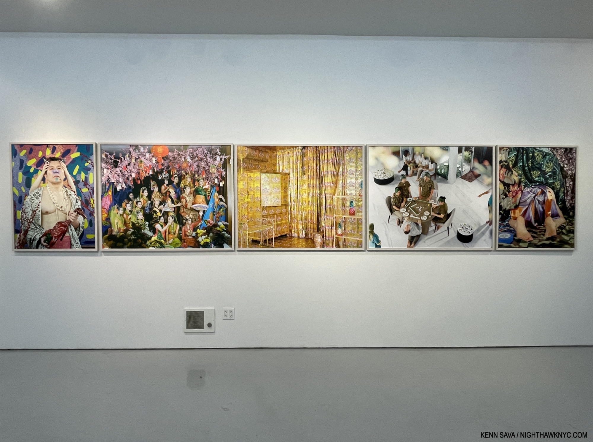
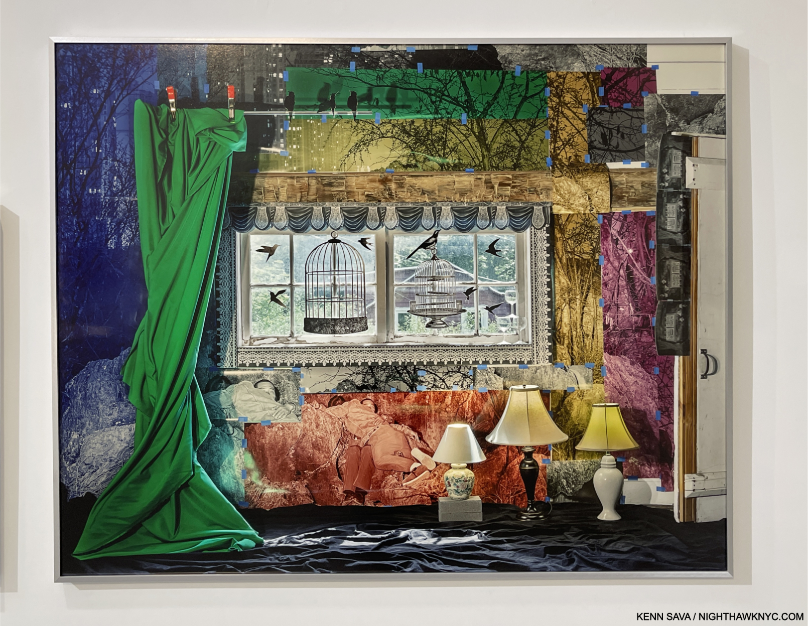
Leonard Suryajaya, Dead Duck, 2020, Arisan, 2017, Gold Condo Room, 2020, Sparrow, 2023 and Salem, 2014 from left. Archival inkjet prints.

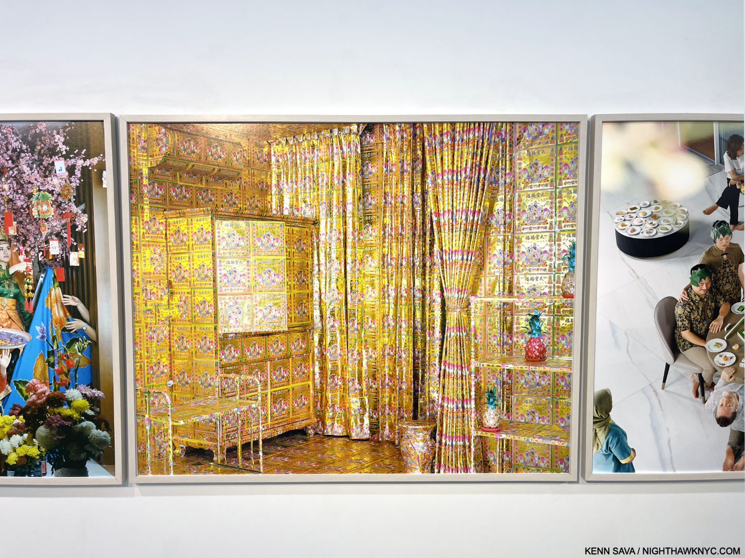
Leonard Suryajaya, Gold Condo Room, 2020.

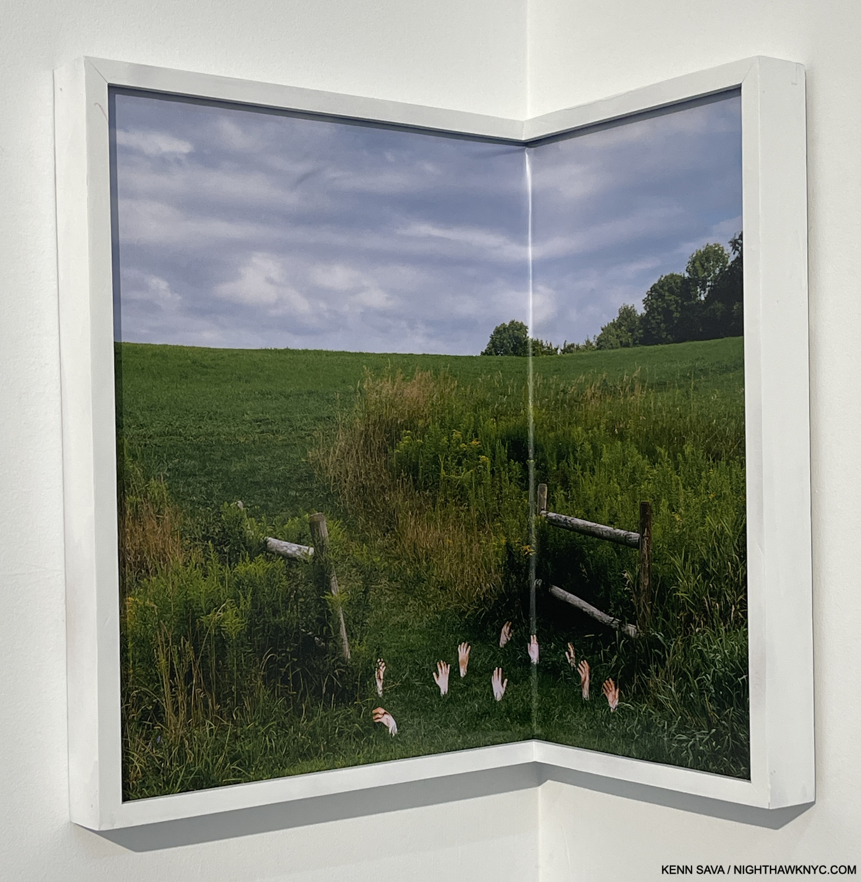
Tommy Kha, Stops (III) Oneonta, NY, 2020, UV print on vinyl.

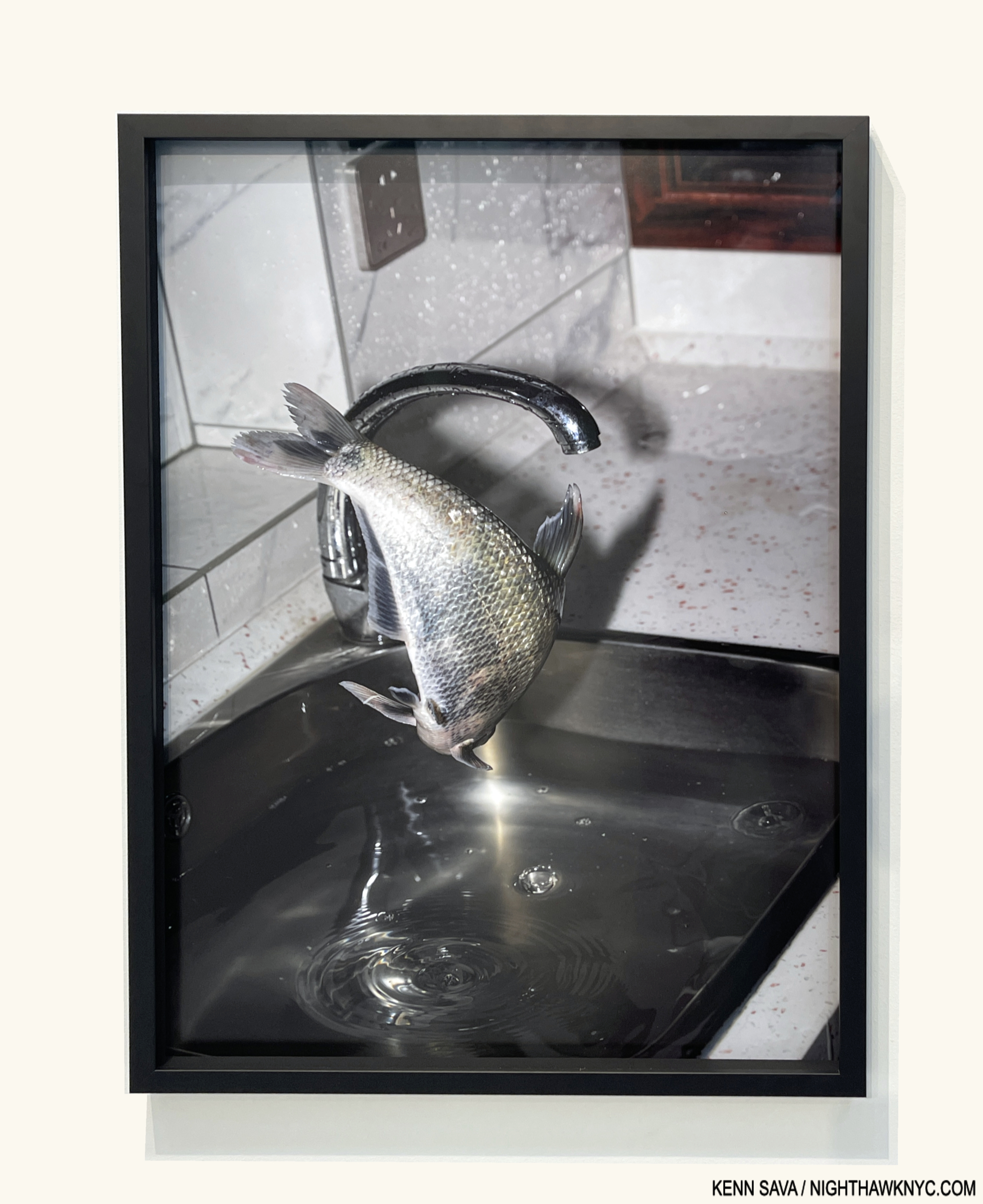
Fang Daqi, Untitled (Bream), 2020, Archival pigment print

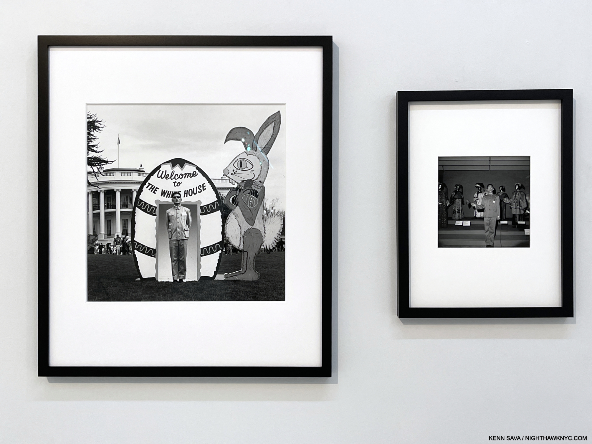
Tseng Kwong Chi, Washington, D.C., 1982, From the “East Meets West self-portrait series 1979-89,  and Tseng Kwong Chi with mannequins, 1980, From the “Costumes at the Met” series, right. Both Silver gelatin prints.

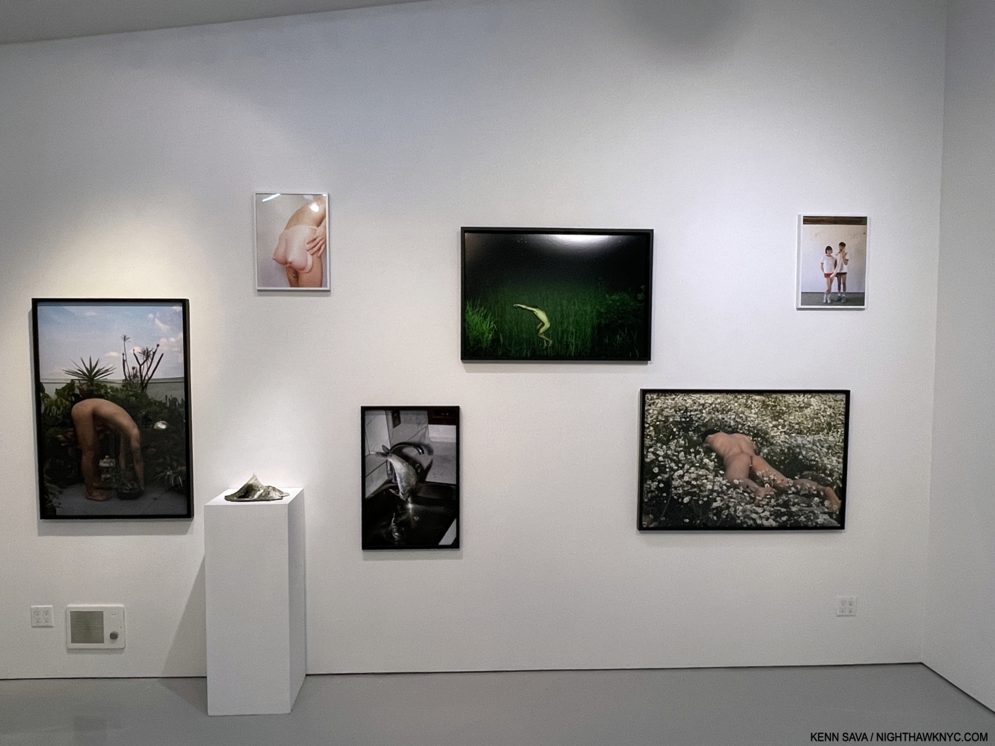
From left- Shen Wei, Bonsai, 2023, Chromogenic print, Blue Cave, 2023, Mixed media, Pixy Liao, Breast Ass, 2019, Digital C-print, Fang Daqi, Untitled (Bream), Untitled (Butterfly 2) both 2023, Shen Wei, Daises, 2022, Chromogenic print, Pixy Liao, Long Sausage, 2016, Digital C-print.

Zhang Zhidong, Object Lesson (II), 2023, Archival pigment print.

Mengwen Cao, Eddy, 2021, Archival pigment print.

From left, Xu Guanyu, SL-06172015-02112022, 2022, and Illumination, 2014, Zhang Zhidong, Reflection (II), 2023, Lumination, 2022 and Object Lesson (II), 2023, All Archival pigment prints.

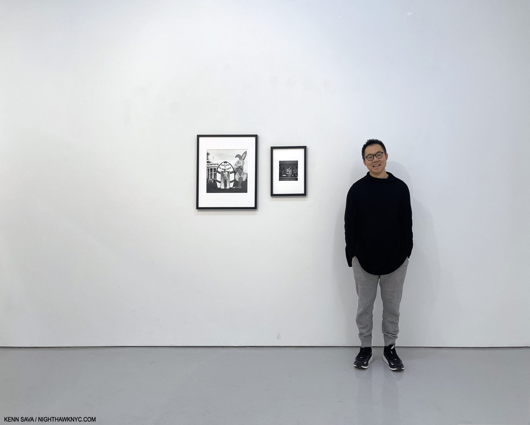
Co-curator Phil Zheng Cai with two of his favorites in the show by Tseng Kwong Chi.

My takeaway is that, regardless of where they’re from, their age, orientation or medium, it’s always exciting to see Artists doing something different. Doubly so when it’s well done. Japanese Contemporary Photography has been very well-known in the U.S. for decades now, and some of its leading lights, like Daido Moriyama and Araki, are Art stars around the world. Chinese Photography is nowhere nearly as well-known here. With Artists and work like those on view in (in) directions:, I suspect that is about to change.

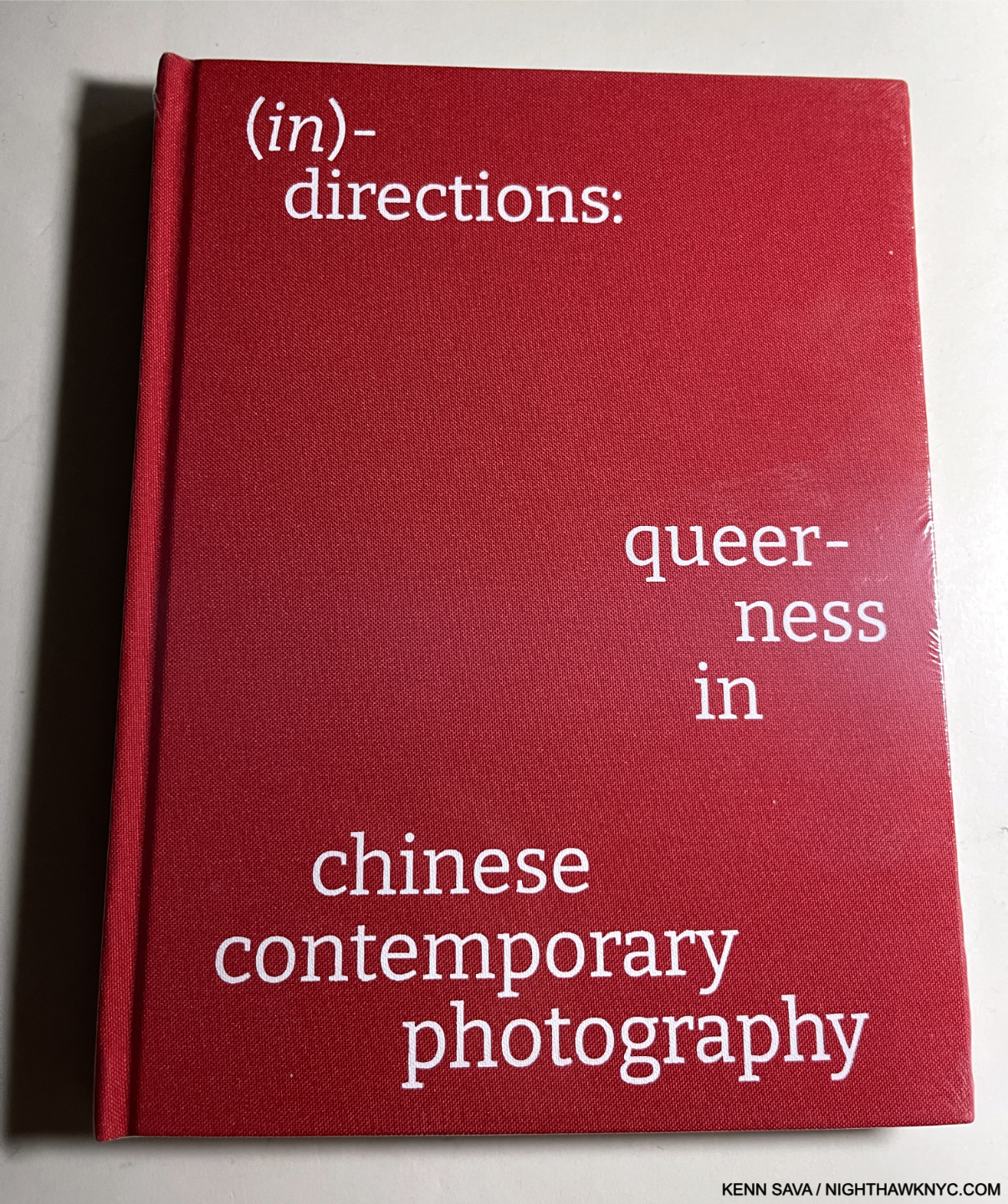
BookMarks- Books on Contemporary Chinese Photography are hard to come by here. Cai Dongdong’s 4 PhotoBooks (that I’m aware of) were all printed in small numbers (up to 300 copies each) and have all sold out. However, one new book that is available as I write is (in) directions:, the catalog for this show. It’s an excellent introduction to these Artists, often with texts in their own words, and including quite a few images of work not in the show (along with the work that is). Curators Cai and Ray, along with designer Mengyao Zhang, have done a very nice job of succinctly laying out quite a bit of material in a very accessible manner, producing a valuable upto-the-moment survery on 21 Photographers who deserve wider attention. Copies are available through Eli Klein Gallery.

*-Soundtrack for this piece is “Accept Yourself” by The Smiths from their classic Hatful of Hollow, seen here in a rare live, though grainy, video from the Hacienda, Manchester, on 6 July 1983-

NighthawkNYC.com has been entirely self-funded & ad-free for over 8 years, during which 300 full-length pieces have been published! If you’ve found it worthwhile, PLEASE donate to allow me to continue below. Thank you, Kenn.

You can also support it by buying Art, Art & Photography books, and Music from my collection! Art & Books may be found here. Music here and here.

Written & photographed by Kenn Sava for nighthawknyc.com unless otherwise credited. To send comments, thoughts, feedback or propositions click here. Click the white box on the upper right for the archives or to search them. Subscribe to be notified of new Posts below. Your information will be used for no other purpose.
NoteWorthy Art Books, 2023: Hughie Lee-Smith

This site is Free & Ad-Free! If you find this piece worthwhile, please donate via PayPal to support it & independent Art writing. You can also support it by buying Art & books! Details at the end. Thank you.

Written & Photographed by Kenn Sava (*- unless otherwise credited)

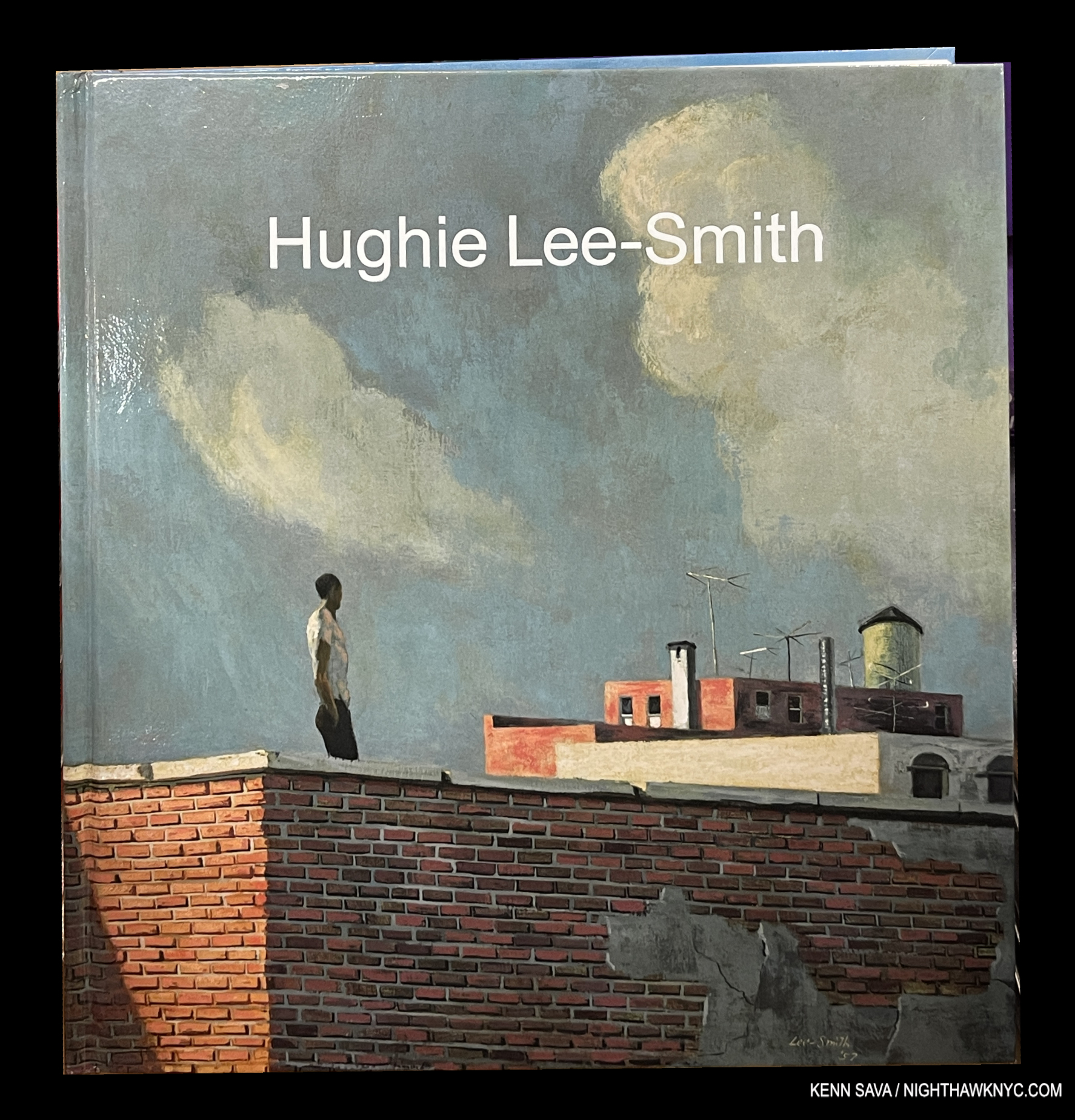
Hughie Lee-Smith, published by Karma, 2023, is an Also Recommended NoteWorthy Art Book for 2023. The rest of my list may be seen here.

Hughie Lee-Smith’s work was new to me when I walked into Karma in the East Village in August, 2022, where 34 of his Paintings ranging from early to late in the Artist’s six-decade long career were on display. Taken by what I saw, I wrote about the show in a piece titled “Hughie Lee-Smith: Leaving History Behind,” highlighting my feeling that “…time is going to be kind to Hughie Lee-Smith’s work,” as I said concluding it. Still, as good as the show was, it was hard to get a feel for his overall accomplishment. In the end, the show was an appetizer, instilling a desire to see more.

Click any picture for full size.

A year later isn’t the kind of “time” I was referring to, given it can take a hundred years1 or quite longer2 for the dust to settle on exactly what posterity considers to be “Art,” with a capital “A.” Yet, a little over a year later, the main course has arrived in the form of Karma’s massive six-plus pound, 400-page, Hughie Lee Smith monograph. It leaves me with the inescapable feeling that the late Mr. Smith (1915-1999) deserves to be in the ranks of the significant Painters of a 20th century that doesn’t realize it.

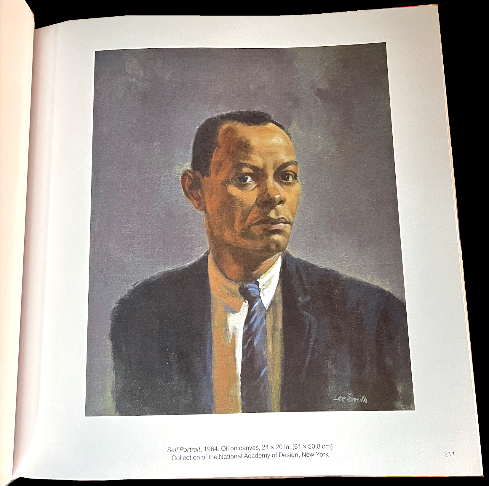
HIs 1964 Self-Portrait has a starkness that echoes that seen in much of his other work.

Well, the century’s only been over for 23 years. It’s still too early to write a definitive history of 20th century Art, in my view. In fact, I guarantee that someone still unknown or under-known to us will yet come to light and make his or her case for inclusion like the case being made for Mr. Lee-Smith is.

Hughie Lee-Smith is the third book known to me on the Artist, and the most comprehensive look yet at his larger body of work, and therefore important: qualities I’m featuring in my other NoteWorthy Art Books this year. The book itself is a bit less than ideal, but more on that later. The real point here is Hughie Lee-Smith shows the consistent high quality the Artist achieved and maintained over 6+ decades, in the process, making the most compelling case for his importance and place in Art history.

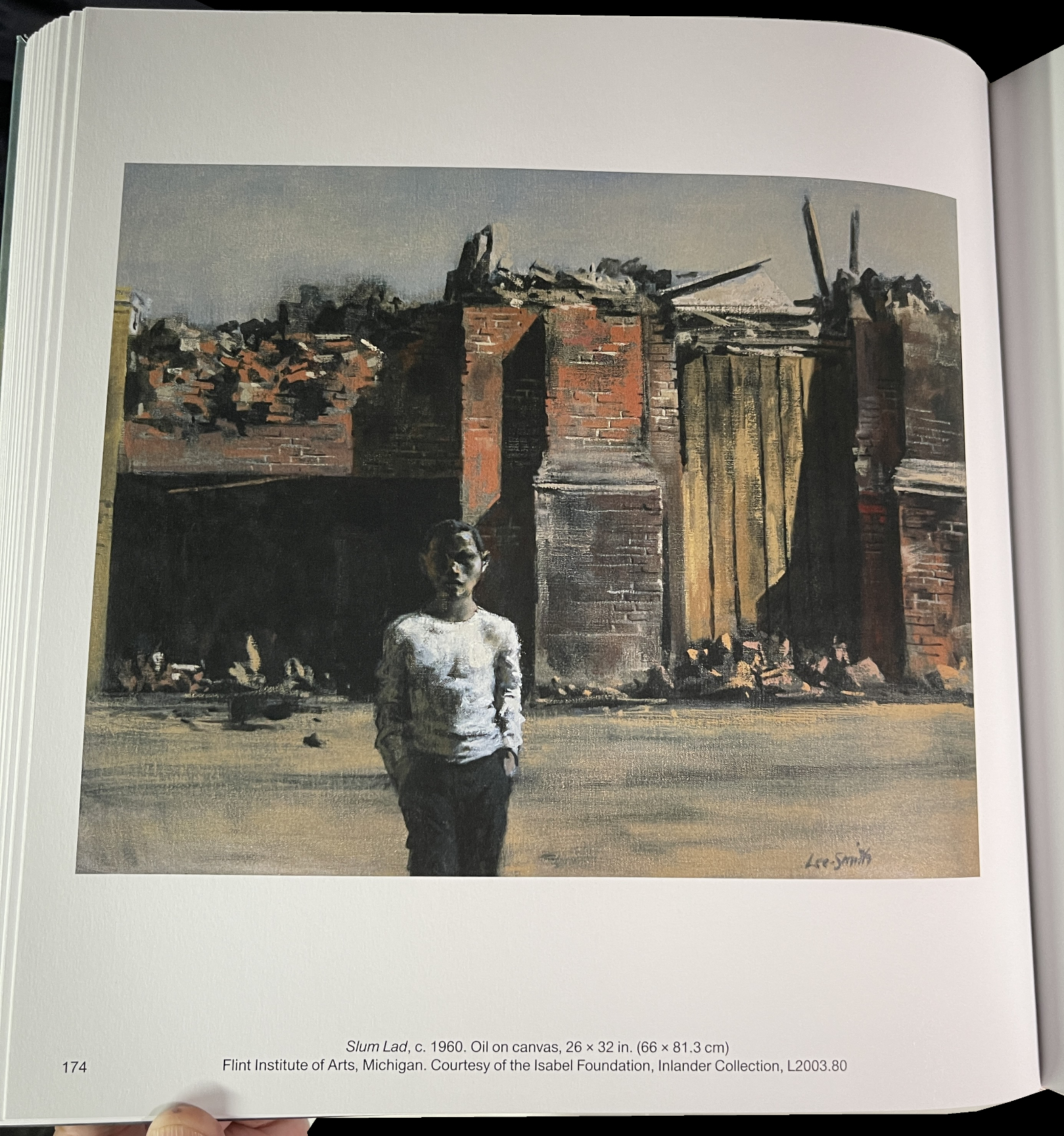
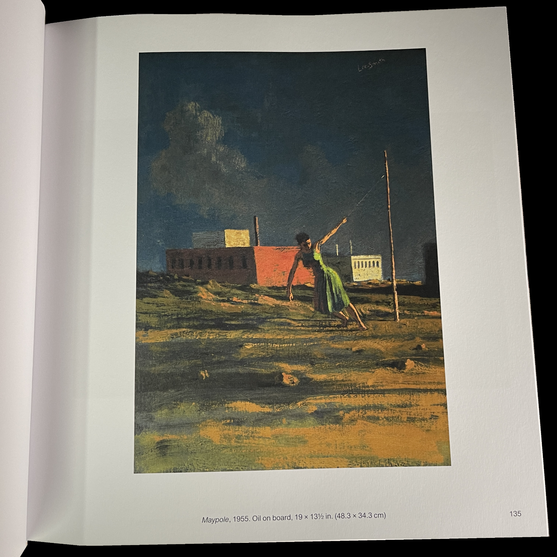
Hughie Lee-Smith’s work is many things, and probably many different things to the people who’ve seen it, as I glean from reading the essays. Among those things, I have yet to see the work of another Artist that can hit some of the same notes that Edward Hopper (1882-1967) is, perhaps, most famous for; what people call the “loneliness, “isolation” and “melancholy” of modern life (which I saw differently earlier this year). I think that’s remarkable in its own right, but it’s not the sum total of Mr. Lee-Smith’s Art.

Hughie Lee-Smith was in no way “doing” Edward Hopper. He was his own man. He Painted completely for himself, through his experiences and the way he saw the world, in a style distinctly his own. That’s plenty compelling enough and his work deserves to be seen on its own merits.

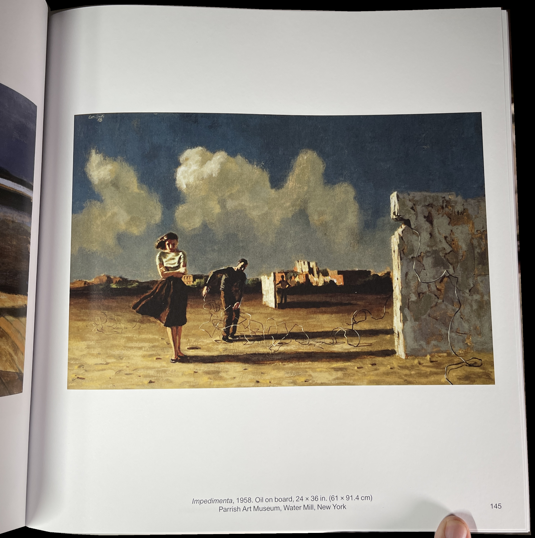
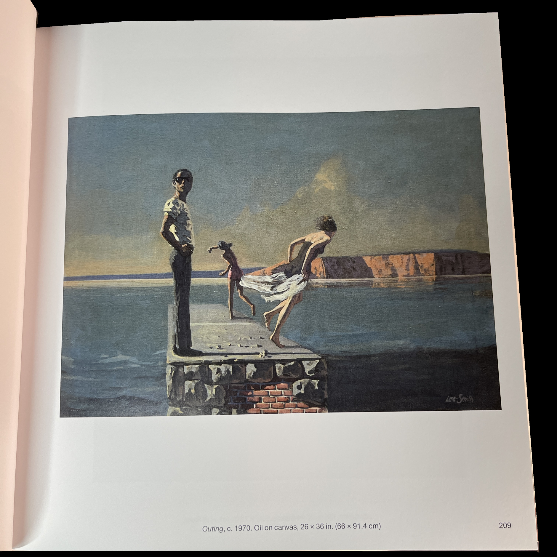
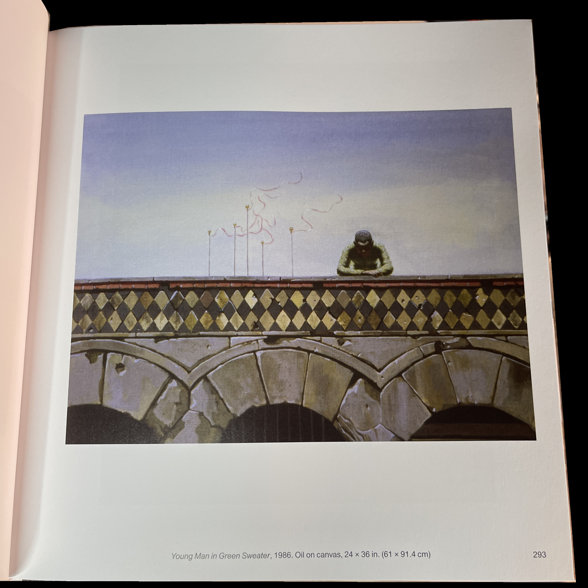
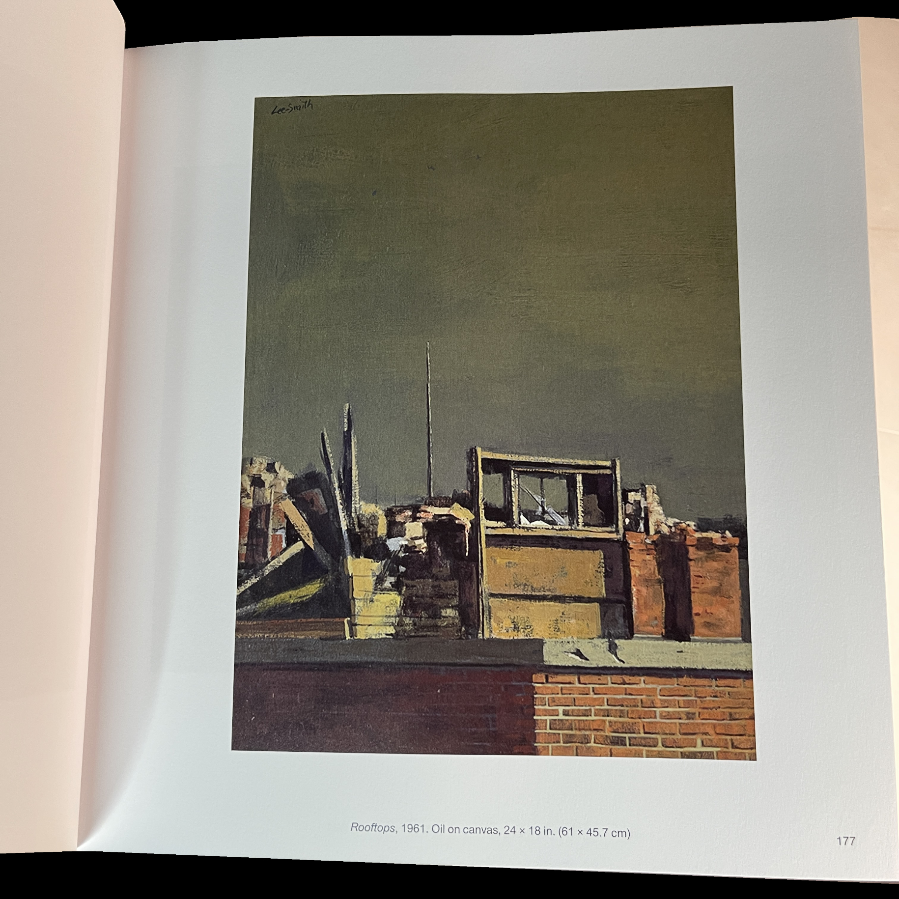
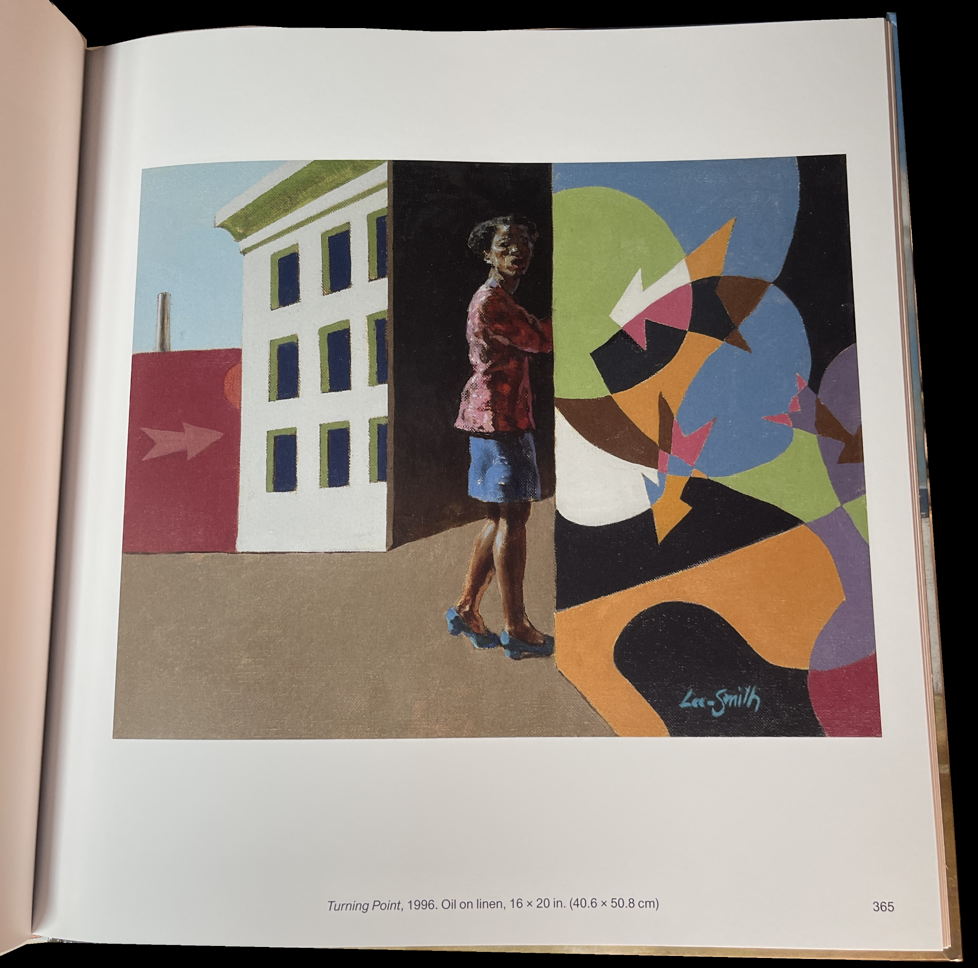
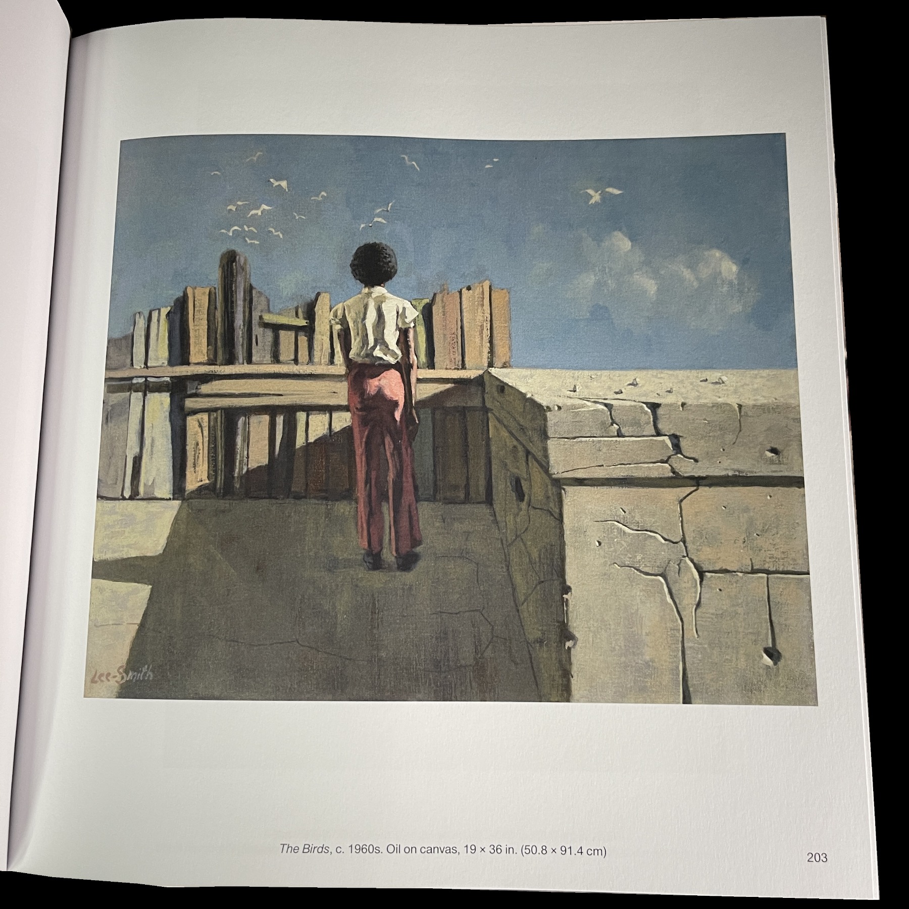
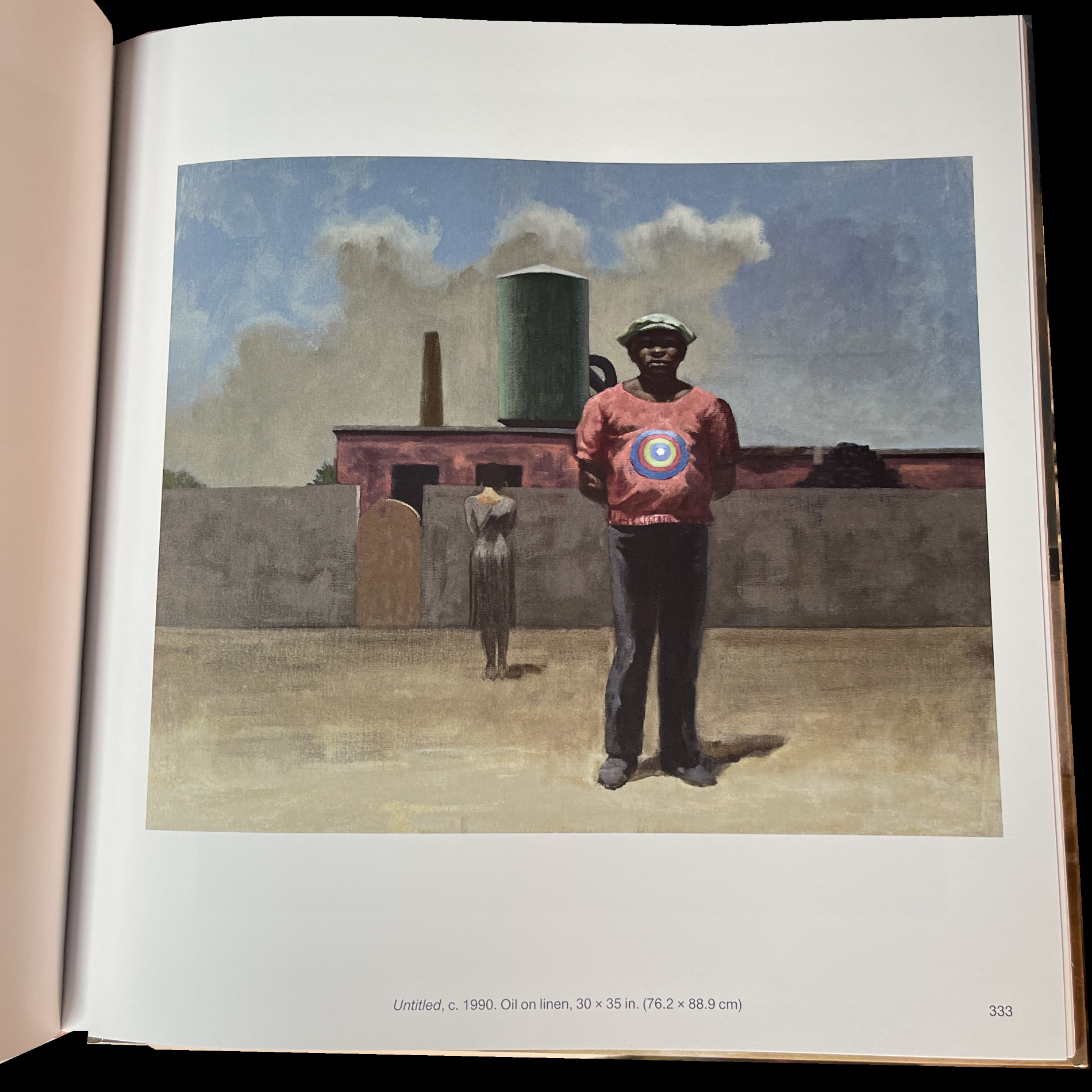
Though it’s not stated what percentage the included work represents of his total oeuvre, it must be a very substantial part. Seeing so many of his Paintings spanning sixty years, from 1938 to 1998, is revelatory. First, the quality of his work over those six decades, as shown here, never lets up, though his style evolves and solidifies into what becomes his trademark blend of urban realism, theater and character study. His figures often seem locked inside themselves, their own interior world, inside a world that looks like ours. Hopper’s figures seem to be locked inside of our world, or a world much like it to the point that so many viewers, apparently, can related to it to the point that he is now one of the most popular Artists in the world. Like Hopper, Mr. Lee-Smith’s figures are on the line between representational and nebulous in the just the right degree. As in Hopper, facial details can get softened adding to their mystery. Most of them are solitary- even when there are others present, then they’re all solitary, doing their own thing or experiencing place and time for themselves, as in Outing, c.1970 shown above. Has anyone else done this?, or done this so often? Balthus’s The Street comes to mind (save for that “problematic” interaction on the left side). In fact, this “alone togetherness” seems to me to be a continual running theme through Mr. Lee-Smith’s very long career right to the very last works shown.

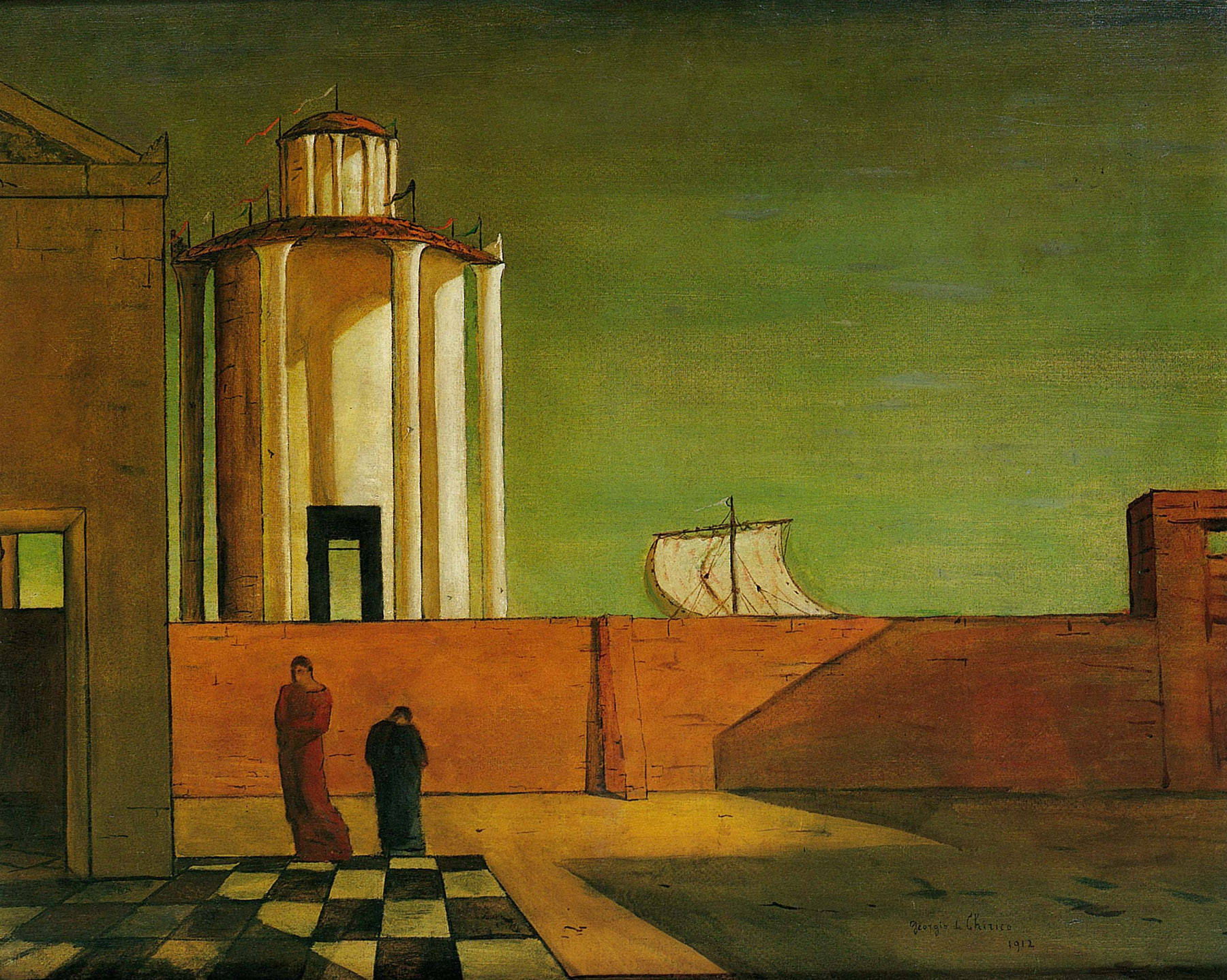
Giorgio de Chirico, The Enigma of Arrival and the Afternoon, 1912, Oil on canvas. To this point, de Chirico is most discussed for his so-called “Metaphysical” Paintings to about 1922. Rarely mentioned is that he lived another 56 years and continued to Paint at a high level until his death.

While Hopper may or may not be an influence, it seems harder to deny that Georgio de Chirico (1888-1978) wasn’t one. His possible influence feels continual. Figures isolated, or in small groups, in urban or suburban settings, and, perhaps, even more, the enigmatic atmosphere most of them share. It’s also interesting that a number of de Chico’s Paintings have streamer, pendants or flags flying, like the one above.

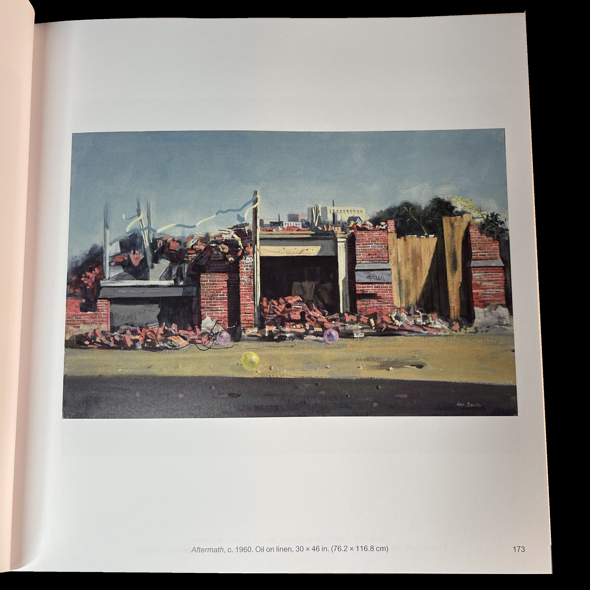
3 balloons on the ground, a long streamer up top…Aftermath…of what?

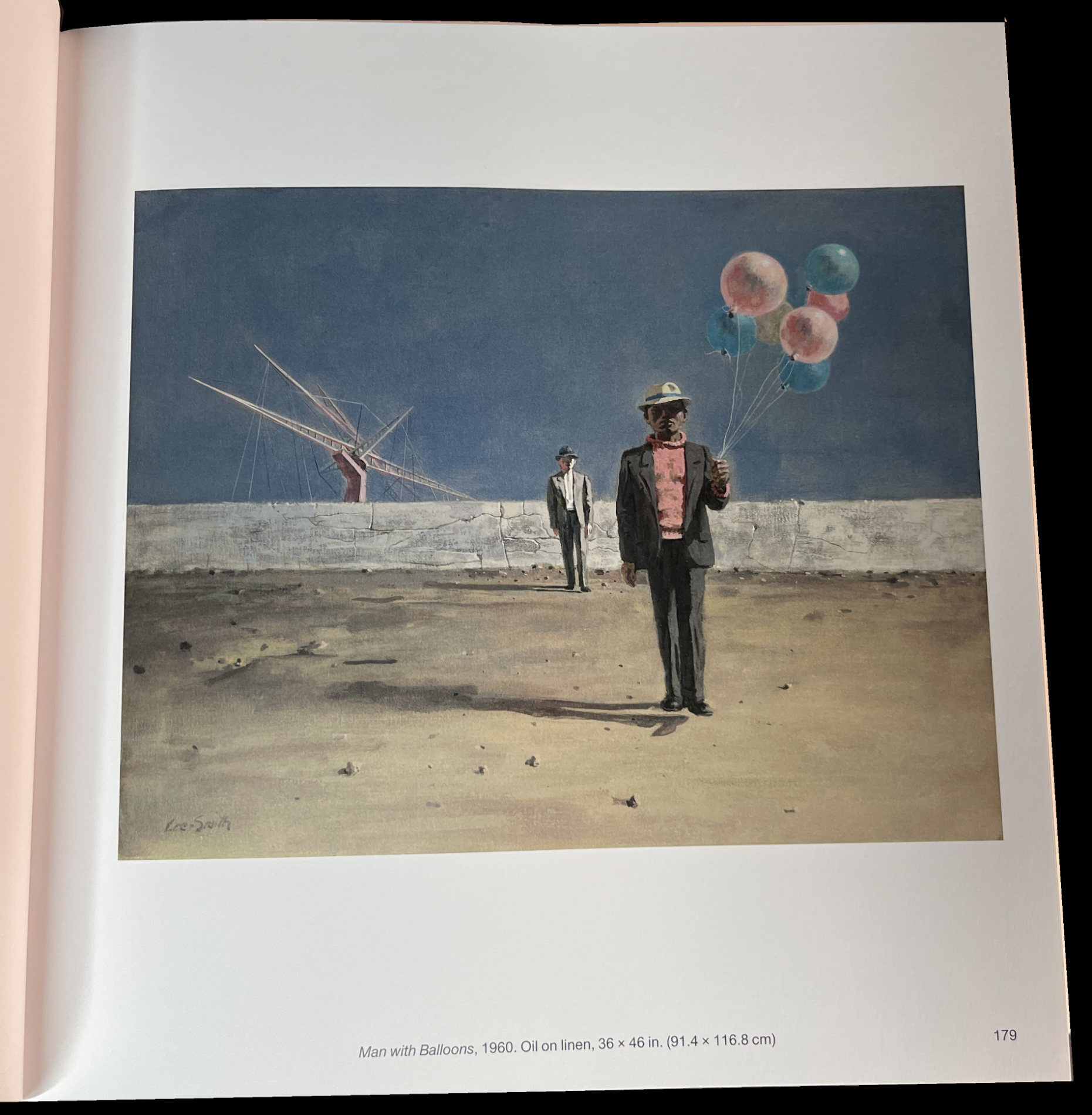
For someone new to his work, these seem a bit incongruous. Yet, they appear so often, it’s the kind of thing that makes one wonder why they’re there and what they “mean.” In this instance, their appearance may go back to his childhood. 

“During the years Lee-Smith lived with his grandmother in Atlanta, a visiting carnival would set up every year in a field across from his grandmother’s house. Although he was never allowed to attend, the carnival would have a lasting impact on his work. About the carnival, the artist said:

‘I was fascinated by the hauntingly dissonant sound of the calliope and the profusion of colorful ribbons, balloons, and pennants. However it was the denial of the pleasure of ever attending that carnival, owing to my grandmother’s perception of it as iniquitous, that established in my unconscious a life-long fascination with carnival life: some of the accouterments of which were to become characteristic elements of my painting many years later.'”3

The longer I look at them I wonder if his Landscapes without figures are all that different from his Landscapes with figures. They’re something of a tour de force in the sense that the Artist may still be expressing some of the same things as his Paintings with figures do. In these, the buildings look like individuals, who seem to be locked into themselves in a different sense than simply closing or locking a door. There’s often, though not always, an element of “other” in them: like a colored streamer, a balloon. Indicative, perhaps, of life going on in these places, or leftover memories of the Artist’s earlier days. Innocence hanging on in a time of new realities. 

Then, his late period shows the world something different, though not entirely: a different world. The settings are more imaginary, almost theatrical, yet the feeling remains meditative, the characters still inward looking. It all makes for a compelling whole of a very high quality throughout. Of so many Paintings, very, very few struck me as being “lesser,” and those only by comparison to the rest that are very strong.

A future “icon?”

It seems to me that Mr. Lee-Smith’s oeuvre contains a number of images that have the potential to become “iconic”: images that that have universal appeal they are seen often to the point of too often. The highlights are, frankly, too many to mention. 

All of this came as a shock to me as someone who had only seen 34 of his Paintings in the show last year. With every turn of the page, I felt the increased weight (heft) of his accomplishment adding up, and adding up, and adding up.

Though I’ve already published my NoteWorthy Art Books, 2023 list, I am amending it to add Hughie Lee Smith as a book I am “Also Recommending.” It’s likely to remain the most comprehensive book on his Art there is, and given what I feel will be his increasing importance and popularity, will be sought-after indefinitely. (The first edition is of 1 thousand copies, which will disappear if his star does continue to rise as I expect.) The production values are solid. Good paper, decent binding and boards, but this is not a perfect book. A number of the reproductions are blurry. Nothing is said in the book about this, so I don’t know why. Is this an artifact of the fact that his was work created over six decades and quality reproductions of some pieces were not available? Were some low resolution images that don’t enlarge well? Still, this shouldn’t dissuade anyone from checking Hughie Lee-Smith out. It’s likely to remain the best and only place to see most of his work. A good number of the Paintings included are in museums. It seems to me an increasing number will be.

All of this tells me that the time is here for a full-blown Hughie Lee-Smith Retrospective. Along with this book, such a show will go a long way to establishing his place once and for all.

*-Soundtrack for this piece is “Time Has Come Today,” by The Chambers Brothers, released in 1967, 3 years after Mr. Lee-Smith’s Self-Portrait, shown earlier, was Painted, and during the height of the Civil Rights Movement and the Vietnam War, though neither is directly referenced, performed here on the Ed Sullivan show in a truncated version-

NighthawkNYC.com has been entirely self-funded & ad-free for over 8 years, during which 300 full-length pieces have been published! If you’ve found it worthwhile, PLEASE donate to allow me to continue below. Thank you, Kenn.

You can also support it by buying Art, Art & Photography books, and Music from my collection! Art & Books may be found here. Music here and here.

Written & photographed by Kenn Sava for nighthawknyc.com unless otherwise credited. To send comments, thoughts, feedback or propositions click here. Click the white box on the upper right for the archives or to search them. Subscribe to be notified of new Posts below. Your information will be used for no other purpose.
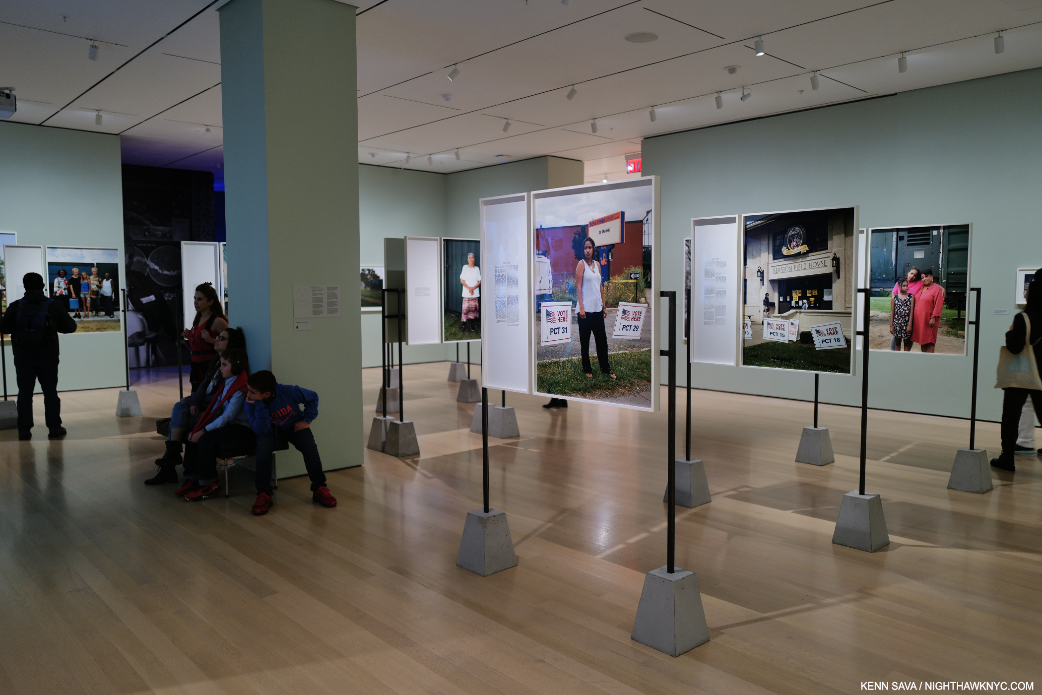
  1. in Francis Bacon’s view
  2. in my opinion
  3. P.29-30

Postscript: My Journey to Vincent 

This site is Free & Ad-Free! If you find this piece worthwhile, please donate via PayPal to support it & independent Art writing. You can also support it by buying Art & books! Details at the end. Thank you.

Written & Photographed by Kenn Sava (*- unless otherwise credited)

This is a postscript to my piece Van Gogh’s Cypresses: Art From Hell

“How will I know you when I see you
In the brightness of light”*

WHO are you, Vincent? Staring out at us with that laser beam-like gaze it almost seems like he could speak to us and tell us. If only getting closer to him were only that easy… A Self-Portrait on the back cover of Van Gogh: The Complete Paintings. Click any photo for full size.

As I said, I’ve been looking at Van Gogh’s Art for over 40 years. It’s taken almost as long to get closer to the man. Like many, perhaps, most people interested in Vincent Van Gogh (1853-1890), I read Irving Stone’s Lust for Life, and Dear Theo (which Stone, who never knew him, gallingly subtitled Vincent’s “Autobiography,”) and later saw the famous Film, Lust for Life, starring Kirk Douglas as Vincent, which was set in some of the actual sites. I bought it all as gospel. I read, but downplayed, the part where Mr. Stone mentioned that he had “made up” episodes to fill the gaps (paraphrased from recollection. I no longer have his books).

My collection of 45 Van Gogh postcards, bought in the early 1970s for 10 cents a piece. They served me well until I got a book on his work years later. Almost every single one depicts a work I hadn’t seen in person because they are in European collections, except for The Met’s Lilacs, in the lower left. Also included is Gauguin’s Portrait of Vincent, lower right. Two would appear in Van Gogh’s Cypresses decades later.

Captivated when I saw Vincent’s Art in The Met and MoMA on my very first Art museum visits as a young teen in the early 1970s, I bought 45 picture postcards from both at 10 cents each because they showed work I hadn’t seen. Most were from the new Van Gogh Museum, Amsterdam. I was intrigued, and it didn’t go away.

My set of The Complete Letters of Vincent van Gogh edited by Jo van Gogh Bonger, a later printing I’ve kept in its original open shrink wrap to protect the slip case. She first published her edition in 1914.

In the 1980s, I was gifted the 3-volume set of Vincent’s Letters, a set that happened to be edited by Jo van Gogh Bonger, wife of Vincent’s brother, Theo, for a year and a half before he died 6 months after Vincent. She inherited Vincent’s estate (i.e. his Art & discovered his Letters in Theo’s desk), but having no experience with Art, didn’t know what to do with it. After delving into the material, she realized that Vincent’s Letters, most of the surviving ones to Theo, were the key to getting people interested in his Art. She edited & published them, put together a large show of his work in 1905, and worked passionately to get his Art seen, even making a trip to the U.S. to assess prospects here.

Jo’s Preface to The Complete Letters, 1914, reproduced in my later printing. It’s one of the most remarkable accomplishments in Art history that, with no knowledge or background in Art, she was able to find a way to present Vincent so the world would “get” him, making him one of the world’s most popular Artists in the process. In so doing, she influenced how Artists have been presented to the public ever since.

I didn’t know any of that at the time I got her set. In it, I began to see that Irving Stone was selling fiction. So was the Film! Reading his own words, as Jo well knew, the real man came vividly to life in his exceptional prose. Vincent’s Letters are among the most compelling of any Artist yet published.

How’s this for “closer to Vincent?” Detail from The Starry Night, 1889, in Van Gogh’s Cypresses, shot without a zoom lens, as close as the guards would allow (a safe distance). Yin/Yang, maybe?

“How will lI know you when I see you
In the bareness of spring
I will know you by starlight
where the road’s echoes sing”*
“Many years passed before Vincent was recognized as a great painter,” Jo writes. She omits the fact that it was she that got him that status in the world. Jo van Gogh-Bonger put me, and countless millions before and after me, on the road to knowing Vincent better. If you love Vincent’s Art, you owe her your thanks. Thank you, Jo!

Van Gogh: The Letters, the Van Gogh Museum’s exceptional 5-volume set includes extensive annotations and many illustrations. Now sold out, it’s all available online, where it is updated as new information becomes available. One of my Desert Island Art Books. *- Van Gogh Museum Photo

The problem was that Vincent’s 902 Letters only cover part of his life, the earliest dating from September, 1872, when he was 19. Others have undoubtedly gotten lost over time, and some things were withheld by the family. Also in the 1980s, I saw 2 excellent Van Gogh shows at The Met, as I mentioned, Van Gogh in Arles and Saint-Rémy and Van Gogh in Auvres. and then the Drawings in 2005, each of which brought me even closer to Vincent’s Art. For those that missed them, the catalogs for each show are excellent and full of great information.

Bringing Vincent into closer focus. My copy of Van Gogh: The Life, just after I bought it new. I’ve raved about it repeatedly. Though it contains 958 pages, the footnotes are to be found on the book’s website. It will remain the definitive biography for at least the immediate future.

In 2011, the landmark 958-page exhaustively researched biography, Van Gogh: The Life by Steven Naifeh and Gregory White Smith was published along with the equally exhaustively researched & annotated five-volume set of Van Gogh’s Letters, both with the cooperation of the Van Gogh Museum and Foundation, which exists due to Jo, and then her & Theo’s son, Vincent Wilhelm Van Gogh, who donated Vincent’s Estate to the Dutch state who, in return, built the Museum. 

Vincent was a very astute lover of Art, with a cutting eye that quickly got to the essence of a piece, or Artist, under his consideration.Tthe new Van Gogh and the Artists He Loved, by Van Gogh: The Life’s co-author, Steven Naifeh’s, is an in-depth look at a subject that no one has covered, until now.

I wasn’t able to put Van Gogh: The Life down. It not only brings Vincent to life on an as close to a day-to-day basis as we’ve yet had, it takes the reader inside his thinking & decisions, his unceasing misfortunes & pain, and then, his illness. One of the most extraordinary biographies I’ve ever read, it completely rewrites our understanding of Vincent’s life and, quite controversially, his death. The Life is essential reading for anyone interested in Art1 or Vincent Van Gogh, in my view. This past year, The Life’s co-author, Steven Naifeh, published Van Gogh and the Artists He Loved, an in-depth look at Vincent’s life-long obsession with Art & Artists, which provides fascinating insights into his exceptional taste and the influences of other Artists on his work. 

Van Gogh: The Complete Paintings. In my view, any Van Gogh library begins here. Is it perfect? No. I dream of a book of just all the Paintings, each printed at optimal size on one page with details on the facing page. That’s not meant to denigrate the text, which has held up well. Still, all the Paintings are printed in color and the book lists for $25.00! Possibly the greatest value in Art books today.  This is the small, “Brick” size. Taschen has published a number of larger sizes, but has not released an XXL edition. No one else has published a Complete Van Gogh as far as I know. Its place on my Desert Island Art Books list was automatic.

“Walking by the sea
See the names floating by
Trying to find each other’s
Trails in the sky”*

All of this shows that over 133 years after Vincent’s passing researchers, authors and Art historians have continued to set the record straight and bring the world closer to the man and his life. Given all the “loose ends” that remain in his biography, I look forward to future discoveries & revelations that will bring us still closer.

The case that Vincent committed suicide and wasn’t murdered is not open and shut in my book.

Among those, I fervently hope the mystery around his death that Van Gogh: The Life reveals can be finally settled and the man left to rest in peace.

“How will I love you when I know you
In the greyness of mist
I will love you forever
Where sadness has kissed.”*

*- Soundtrack for this piece is “Folk Song” by Jack Bruce from his classic album Harmony Row, 1971. Which makes me realize I’ve been looking at Vincent for almost 50 years…

NighthawkNYC.com has been entirely self-funded & ad-free for over 8 years, during which 300 full-length pieces have been published! If you’ve found it worthwhile, PLEASE donate to allow me to continue below. Thank you, Kenn.

You can also support it by buying Art, Art & Photography books, and Music from my collection! Art & Books may be found here. Music here and here.

Written & photographed by Kenn Sava for nighthawknyc.com unless otherwise credited. To send comments, thoughts, feedback or propositions click here. Click the white box on the upper right for the archives or to search them. Subscribe to be notified of new Posts below. Your information will be used for no other purpose.
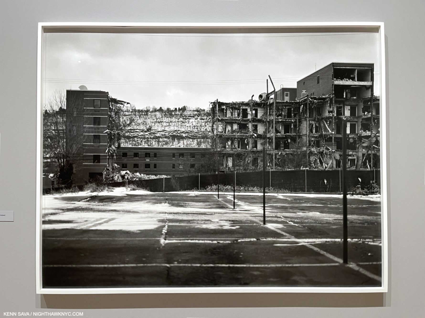
  1. Providing insights in to how he was able to succeed as an Artist though he began at age 27!

NoteWorthy Art Books, 2023

This site is Free & Ad-Free! If you find this piece worthwhile, please donate via PayPal to support it & independent Art writing. You can also support it by buying Art & books! Details at the end. Thank you.

Written & Photographed by Kenn Sava

Art books were one of my first passions. I was about 8 when I first fell under their spell. The chance to see an Artist’s whole body of work in one portable object enthralled me then as much as it still does. For the next decade they were the only way I could see and explore Art. When the pandemic hit they were, once again, the only way I could see and explore Art. Now, between researching for an upcoming piece, checking out new and older Art & PhotoBooks, and discovering Artists I previously didn’t know, I’m in bookstores on an almost daily basis. Suffice it to say I see a lot of Art & PhotoBooks…

This past year, which isn’t nearly over yet, four books stood out for me among all the Art Books I saw in 2023. Since I don’t believe the “best” exists in the Arts, I prefer to call them “NoteWorthy,” i.e. books I most highly recommend among all those I saw in 2023. These books would be on my list for 2023 whether the year was 9 months or 13 months long so I’ve decided to announce my list early.

My criteria are the importance of the work shown and how well the book has been executed. All four of the subject Artists are among the more note worthy in Contemporary Art. Two of the four books are the first in-depth look at their subject, hence their importance, and all four are likely to remain the “go-to” references on their subject for the foreseeable future. They are listed in no particular order.

NoteWorthy Art Books, 2023

Sarah Sze: Paintings. A sealed copy of the hardcover sitting on top of its brown shipping box. Click any image for full size.

Sarah Sze: Paintings, Phaidon
I’d been going to Sarah Sze’s one-of-a-kind “Sculpture” (which is too small a word for what she creates) shows for a few decades when, in 2020, I was astonished to discover that not only is she also a Painter, but she started out as a Painter (and then was a Painting and Architecture student in school). When I first saw her Paintings in person, which I wrote about here, I was stunned. She sprang an accomplished, fully formed and revolutionary style on me. Whoa! Here she was already one of the foremost Artists of our time, now, she’s also one of our major Painters.

Ghost Print (Black Ripple), 2019, Oil, acrylic, acrylic polymers, ink, aluminum, archival paper, diabond and wood, 16 x 20 inches.

This year, Phaidon, the leading Contemporary Art book publisher among the major Art book publishers, immortalized her accomplishment in an absolutely gorgeous huge book, the best designed Art book I saw this year from the major Art book publishers. When I heard rumors of it coming, I wondered- Does she have enough Paintings to do a book of them? Seeing it in person left me dumbfounded. Inside the slipcase was a FOUR HUNDRED PAGE hardcover, the whole weighing 10 pounds! Paging through I was quickly lost. From the infinite, to the minute, is something that runs through Ms. Sze’s installations and now through her Painting.

Gutters are one of the biggest problems with physical Art & PhotoBooks, one that an eBook should be able to solve. However, the vastly superior resolution of the printed page is still the only way to see Fine Art in print- decades after the invention of the eBook. Detail of Ghost Print (Black Ripple). Though I NEVER fully open a book and lay it flat, to preserve the binding. Even 3/4 open, as here, very little is lost to the gutter when compared with the Photo of the full piece, above.

Having Photographed her Paintings myself a number of times in two shows, even though the work is incredibly intricate, it’s hard to imagine the Photography of it in the book being improved on. It’s accompanied by a rock-solid binding, and top-notch attention to production detail throughout. Every copy is signed by the Artist & numbered. ALL of this I take as a sign of how closely Sarah Sze was involved in the making of this book. What more can anyone ask? Sarah Sze: Paintings is a state-of-the-Art Painting monograph.

Sarah Sze remains the only living Artist I’ve called a “genius” in the 8+ years of NighthawkNYC.  I did so in my look at her most recent NYC gallery show in 2020, here. My look at her mesmerizing Summer, 2023 Guggenheim Museum show, Timelapse, is in preparation. If I hadn’t called her a genius in 2020, I’d call her one now.

Martin Wong: Malicious Mischief, Walther Konig
Is Martin Wong (1946-99) the most overlooked Painter of the later 20th century? A very strong case could be made that he is. The museums are wising up. More and more of his work is showing up in their hallowed halls. Now, from 2022 through February, 2024, three European museums- The Camden Art Centre, London; Museo Centro de Arte Dos de Mayo (CA2M), Móstoles, Madrid, and the Stedelijk Museum Amsterdam are hosting a traveling exhibition, Martin Wong: Malicious Mischief, of over 100 works, the largest show of his work so far. The Met had the spectacular Martin Wong shown further below up in the Contemporary Wing where I saw it this past year, which I believe they have now lent to the show. As far as I know, he never saw a book published on his work during his lifetime.

Martin Wong, Attorney Street (Handball Court with Autobiographical Poem by Piñero), 1982-4, Oil on canvas, 35 1/2 x 48 inches. Seen at The Met in June, 2022, Though he didn’t live to see a book on his work, he did live to see his work in The Met, who acquired Attorney Street in 1984, just after he finished it. Those hands along the top of the faux frame and near the bottom are speaking in American Sign Language.

Now, there have been two. Martin Wong: Malicious Mischief, the book, published to accompany the show, is the largest and most comprehensive book on his work so far. The only other one known to me, Martin Wong: Human Instamatic, published to accompany the show of the same name at the Bronx Museum in 2016, is long out of print, i.e. “expensive.” I have it, but I recommend Malicious Mischief. Here, his case has never been more completely and more beautifully made.

The second and third page of the book, showing details from his Paintings by way of introduction.

Martin Wong was something of the unofficial “Poet of the Lower East Side,” but never got the recognition or attention his contemporaries Jean-Michel Basquiat or Keith Haring did even though he outlived both. Still, twenty-four years after his passing, his work has continued to hold up and fascinate. It’s, also, every bit as timely, now, as it was when he Painted it. Blessed with being able to work in a wide range of styles, his work is characterized by its freedom from piece to piece. Throughout, his Draftsmanship forms a rock-solid base, which he carries through with an extremely high level of attention to detail.

It’s a paperback, unfortunately, a cardinal sin in my view for a book this important, and the cover is a bit on the malleable side; the paper stock could be thicker. Still, its importance outweighs these drawbacks. At 339 pages and over 3 pounds it’s a good-sized book with 8 1/2 by 11 inch pages which show the copious and fascinating detail in Mr. Wong’s work to advantage. Imported catalogs for shows, like this, have a habit of not staying available indefinitely. So act soon to “avoid disappointment and future regret” as the informercials say. Which reminds me- the next time I regret not buying something from an infomercial will be the first time.

Rod Penner: Paintings, 1987-2022, The Artist Book Foundation
What more/else can I say about Rod Penner: Paintings that I didn’t say in my in-depth review of it is here? Actually, I can say that it was on my original draft of my Desert Island Art Books, along with the Martin Wong, above. Pretty remarkable when you look at the publishing dates for the books on the final list. Realizing my draft list was too long, I made the hard choice of focusing on older books that have stood up for me for years, and left off the two that were less than one-year old. While I didn’t put them on that list, they deserve to be on this one.

House with Skiff/Marble Falls,TX, 2022, Acrylic on canvas, 32 x 54 inches. The most recent work in the book shows that Rod Penner is still at the very top of his considerable game.

A full-length book on Rod Penner has been a long time coming. What we got is something unusual in my 50 years of Art book experience: a book that serves the dual purposes of being both a monographic overview of the Artist’s work these past 35 years, AND a Catalogue Raisonné containing everything the Artist has Painted through 2022. As such, it will serve those new to Rod Penner’s work, as well as collectors, curators and Art historians, well indefinitely.

My pieces on Rod Penner are here, including my recent look at his Spring, 2023 NYC show, where I said that Rod Penner is “the foremost Painter of small-town America working today.” I believe that after the distracting hype surrounding his remarkable technique dies down, and more people get down to looking at what he’s Painted, that that’s how this work will be thought of.

Nick Cave: Forothermore, Museum of Contemporary Art, Chicago/DelMonico
Nick Cave’s books are always gorgeous, and important. With only 10 published on his work so far (he says, though I’ve only seen 5), all are worthy of his extraordinary talent, and all worth seeking out. This is indicative of his involvement in them. Forothermore, the catalog accompanying his landmark mid-career retrospective at the Museum of Contemporary Art, Chicago, which traveled to the Guggenheim Museum earlier this year, is now my go-to choice among the 5 I’ve seen, a very hard choice to make. Of the show, I wrote, “I went in believing Mr. Cave is one of the more important Artists working today. I left speechless.”

I wrote extensively about Nick Cave’s famous Soundsuits, in my piece on the show and they are featured throughout the book. Here is some of his other work, Untitled, 2014. As for the wonderful design, I love how he’ll often get around the problem of the gutter by putting the full work on one side, and a compelling detail on the other.

Luckily, exhibition catalogs live on indefinitely after their subject show, and some enhance their value to readers by serving more than one purpose. This is one example. It’s gorgeously & lovingly produced and features large Photos of Mr. Cave’s work throughout his career, which allows for closer study & appreciation of the incredible amount of detail and subtlety in his work (just look at the cover and remember that is all hand-made).

Rescue, 2013

All of this makes Forothermore doubly important as both the exhibition catalog for the show and the go-to book with beautiful reproductions of the most comprehensive collection of Nick Cave Art over all of his career, including his recent work, among his excellent books. Speaking of them, if you want one Nick Cave book, I’d choose Forothermore right now, but do at least take a look at Until (2017); Epitome (2014); Meet Me at the Center of the Earth (2010); and Greetings From Detroit, (2015) if you want to see just how hard the choice is!

I Wouldn’t Bet Against It, 2007, Mixed media including vintage fabric, dice, and objects, 48 by 48 by 6 inches, as seen in the show, though it also appears on pages 154-5 of the Furthermore catalog.

Nick Cave is so unique, and so important, I can’t help thinking that we’re looking at someone who could very possibly become an Art “superstar.” Can you imagine his impact on the fashion world, if he chose to get involved in it? I also have the feeling that if and when “stardom” does happen for him, Mr. Cave would handle it with every bit as much class and purpose as he has everything else in his career.

My look at Forothermore, the show, is here. My look at Nick Cave’s just completed large NYC Subway Public Art Installation is here.

Also Recommended-

Salman Toor, No Ordinary Love, Baltimore Museum/Gregory Miller

I saw Salman Toor’s first solo museum show, How Will I Know, at the Whitney Museum in 2021, and put his name on my list. Still, I was not prepared for the depth and level of accomplishment his first book, No Ordinary Love, reveals. Published to accompany a show of the same name at the Baltimore Museum, both struck a nerve because the book evaporated (i.e. it’s already sold out). I’m really not surprised. His work is fresh, bold, sensual & beautiful with a unique sense of color, and in a style completely his own. His work echoes Paul Cadmus’s for me, but looks nothing like it. Stylistically, he seems closer to early and late Philip Guston and Lisa Yuskavage, but none of this is said in comparison. Salman Toor is, deservedly, the 2023 Art world phenomenon that previously touched Jordan Casteel and Jennifer Packer these past few years.

Tea, 2020, Oil on canvas. Seen at Salman Toor: How Will I Know, at the Whitney Museum on March 26, 2021.

Born in Lahore in 1983, and now American, Mr. Toor must have had (or will have) a terrific 40th Birthday after The Met bought one of his Paintings this year.

Jeffrey Gibson, et al, An Indigenous Present, DelMonico

Indigenous Artists have finally begun to get the attention they deserve.

Have you ever seen a canvas shaped like this? Jeffrey Gibson, SOMEONE TO WATCH OVER ME, 2023, Acrylic paint on elk hide inset in custom wood frame, 103 x 69 x 5 inches, left, THIS FIRE DOWN IN MY SOUL, 2023, Acrylic on canvas, glass beads, artificial sinew, inset to custom wood frame, 88 x 80 inches, right. “Wallpaper” by the Artist. Seen in Jeffrey Gibson: ANCESTRAL SUPERBLOOM at Sikkema Jenkins, September 22, 2023.

Jeffrey Gibson, who has a beautiful show up as I write at Sikkema Jenkins, NYC, Jeffrey Gibson: ANCESTRAL SUPERBLOOM (which I wrote about here) conceived this collection/overview of 60 of his fellow Indigenous Contemporary Artists. What an eye-opener! What impresses me is the vast depth of Artists who are doing their own thing, seemingly working outside the traditional model of Western Art, and instead basing their work on their traditions, heritage and experiences. “Ancestral,” to quote Mr. Gibson’s show title, is the key, apparently.

I find it a gust of fresh air.

I recently wrote about one Artist included, Jaune Quick-to-See Smith’s Witney Museum retrospective, and another, Wendy Red Star, in passing after Kris Graves published her first book in his Lost II set. What An Indigenous Present tells me is that we’re going to see much more from many other Indigenous Artists soon.

My final Also Recommended NoteWorthy Art Book of 2023 is Hughie Lee-Smith, published by Karma. I wrote about it here.

*-Soundtrack for this piece is “Conquistador” by Procol Harum from their great live album Live: In Concert with the Edmonton Symphony Orchestra, one of the first (if not the first) live albums paring a rock band with an orchestra, from around the time I first fell under the spell of Art books.

Also see the companion piece- NoteWorthy PhotoBooks, 2023, which includes a book by an Artist.

My previous NoteWorthy Art Book lists-

NoteWorthy Art Books (and Bricks), 2021

NoteWorthy Art Books, 2020

THERE ARE NO AFFILIATE LINKS IN THIS PIECE!

NighthawkNYC.com has been entirely self-funded & ad-free for over 8 years, during which 300 full-length pieces have been published! If you’ve found it worthwhile, PLEASE donate to allow me to continue below. Thank you, Kenn.

You can also support it by buying Art, Art & Photography books, and Music from my collection! Art & Books may be found here. Music here and here.

Written & photographed by Kenn Sava for nighthawknyc.com unless otherwise credited. To send comments, thoughts, feedback or propositions click here. Click the white box on the upper right for the archives or to search them. Subscribe to be notified of new Posts below. Your information will be used for no other purpose.
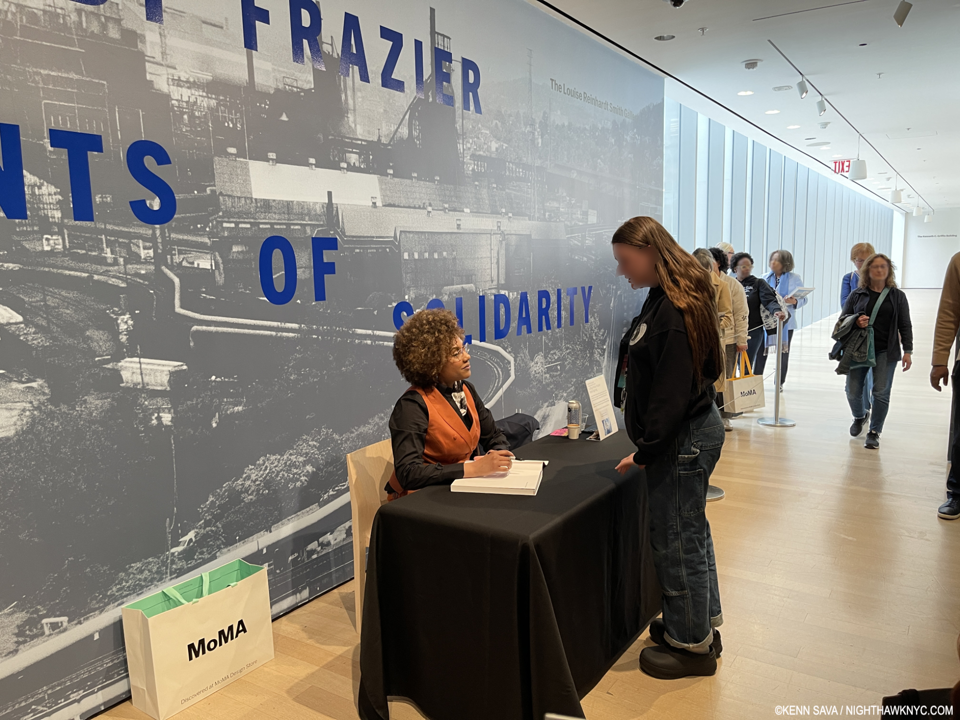
NoteWorthy PhotoBooks, 2023- Two Masterpieces

This site is Free & Ad-Free! If you find this piece worthwhile, please donate via PayPal to support it & independent Art writing. You can also support it by buying Art & books! Details at the end. Thank you.

Written & Photographed by Kenn Sava

PhotoBooks completely took over my life for over 6 years from 2016 through 2022, during which time I immersed myself in Modern & Contemporary Photography (which for me is the period after the publication of Robert Frank’s The Americans in 1958-9). After not publishing a NoteWorthy PhotoBooks list for 2022, two books stood out for me among the PhotoBooks I saw this year. Since I don’t believe the “best” exists in the Arts, I prefer to call them “NoteWorthy,” i.e. books I most highly recommend among all those I saw in 2023. Both are among the most powerful books I’ve seen in years. In my opinion, both books are masterpieces. Other recommended books follow them.
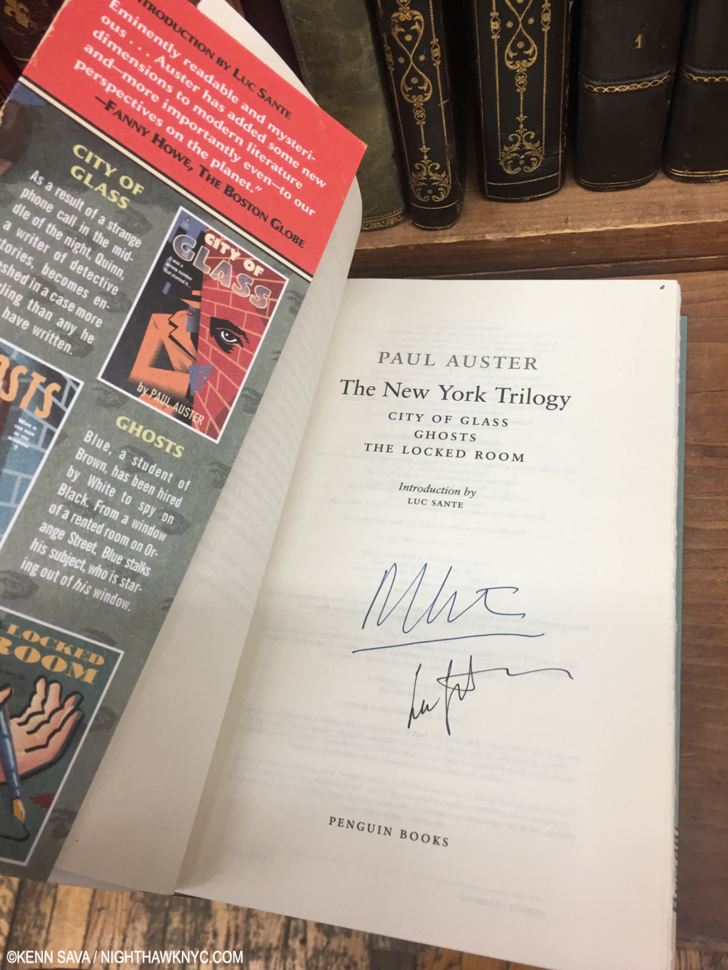
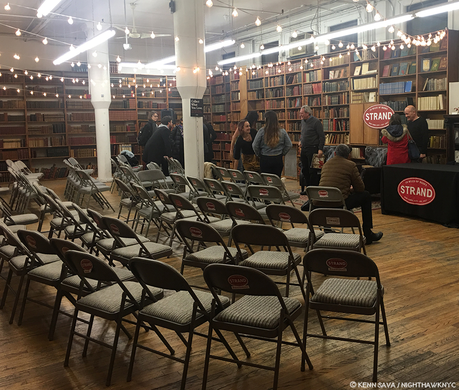
Both NoteWorthy PhotoBooks have two people in common. One, Kris Graves is no stranger to this list. His A Bleak Reality was a NoteWorthy PhotoBook of 2021. His publishing company Kris Graves Projects/Monolith Editions was the NoteWorthy PhotoBook Publisher of 2020 when they somehow managed to publish EIGHTEEN books during the pandemic! This year, Mr. Graves is the Photographer/Artist/Author of one of the two, and he and his Monolith Editions is the publisher of both books (co-publisher with Hatje Cantz of one). As a result, Kris Graves Projects/Monolith Editions are the NoteWorthy PhotoBook Publisher, again, for 2023.

NoteWorthy PhotoBooks, 2023

Jon Henry, Stranger Fruit, Monolith Editions

In a word: overwhelming.

Stranger Fruit was created in response to the senseless murders of black men across the nation by police violence. Even with smart phones and dash cams recording the actions, more lives get cut short due to unnecessary and excessive violence. Who is next? Me? My brother? My friends?” Jon Henry
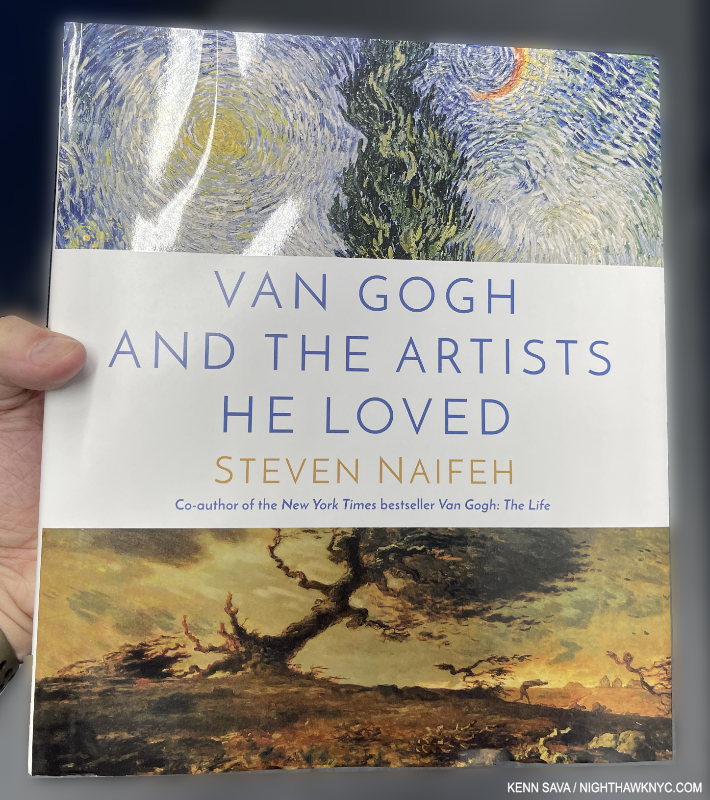
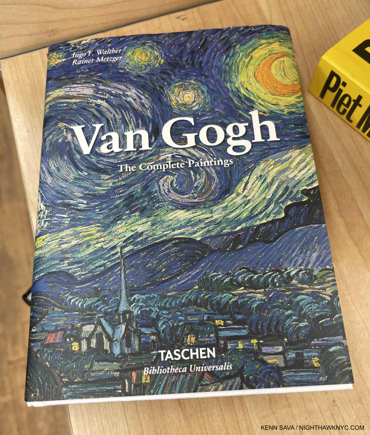
Mr Henry continues, “Lost in the furor of media coverage, lawsuits and protests is the plight of the mother. Who, regardless of the legal outcome, must carry on without her child. I set out to photograph mothers with their sons in their environment, reenacting what it must feel like to endure this pain. The mothers in the photographs have not lost their sons, but understand the reality, that this could happen to their family.”

The way Mr. Henry has chosen to depict these mothers and sons is in the form known in Painting and Sculpture as the “Pieta” (or pity). Traditionally, Jesus’s mother, Mary, holds her dead son on her lap after the Crucifixion. The “Pieta” has long been among the most powerful and poignant compositions in Western Art. To this point, and for the past 800 years, it’s been the exclusive realm of Painters and Sculptors (most famously Michelangelo).

Along comes Jon Henry, who shows that they can be every bit as powerful in Photography- even without a directly religious reference. He has chosen it to depict the unspeakable pain mothers of murdered Black sons must have experienced in the unique way of depicting mothers holding their living sons. I asked Mr. Henry how he came to use it in Stranger Fruit

 “I grew up studying painting and religious iconography by way of stained glass windows in the church I worked in, so I was very familiar with the motif.  There were more contemporary uses of the pieta, such as Dr David Driskell and Renee Cox, that really made me believe I could use this as the vehicle behind this project.
But everything really revolved around the mother.  I know that my work is not the first to speak about police brutality in the african american community but I felt the mothers were left out of the conversation.  Focusing on them through this mother/son relationship was why the pieta made so much sense for me.”

 In Stranger Fruit (which is named after the Abel Meeropol 1937 song, “Strange Fruit,” protesting the lynching of Black Americans, and immortalized by Billie Holiday) we also get to hear from them. Most of the images are accompanied by a text written by the mother.

I was stunned when I picked this book up for the first time. As far as I know, no one has done anything like this before. Yes, there are combat images from too many wars and conflicts already that are Pietas. Yet, I’ve never seen an entire book of them, and only them. I asked Kris Graves how he discovered Jon, this remarkable body of work, and came to publish Stranger Fruit. He said, “I met Jon some years before the pandemic and he was already hard at work on the project. I told him then that I’d love to publish the work when he felt it was complete. During covid, I founded Monolith and it was an even better fit for the ideals of Stranger Fruit. Soon after, we reconnected and started production.”

The 600 copies of the 1st printing of Stranger Fruit have sold out. I’m told the recently announced 2nd printing is selling quickly. I look forward to the time when it’s no longer vital as a document of immediate social import, to when it can just be appreciated as a work of Art.

Kris Graves, Privileged Mediocrity, Monolith Editions/Hatje Cantz

One of the most important PhotoBooks released this century, Privileged Mediocrity is Kris Graves’s masterpiece among his fine books thus far, in my opinion.

From Part I- The Murder of Alton Sterling, Baton Rouge

Years in the making, involving extensive stretches of travel during the height of the covid pandemic and the Black Lives Matter Protests, at what must have been considerable personal risk, in the days leading to the birth of his first child, it feels to me like this is the book his work has been building toward all along.

From Part I– Slave Market, Charleston

It’s divided into three sections: “Part I: Privileged Mediocrity & The Deceived Within,” “Part II: A Southern Horror, 2020,” and “Part III: A Latency, 2000-2022.” Though Part I sets the stage  with images from NYC, New York State and Boston as well as the South, the book is centered on the South in Parts II & III. Mr. Graves visited innumerable Confederate monuments throughout the South, and shows them before, during and after the protests.

From Part II

“Part II: A Southern Horror, 2020,” is gravely presented with black & white Photos on black paper in which Mr. Graves inventories many of these problematic monuments by state and their connection to racism, which is downright chilling to see on page after page- 46 pages in all- many with up to 8 sites on a page! “Part III Latency 2000-22” shows many of these sites during and after the protests.

From Part III- George Floyd Projection, Richmond, Virginia. National Geographic Magazine put this image on the cover of its “Photos of the Year, 2020” issue. I asked Kris what he remembers about taking this classic and historic image. He said, “A few days into my Richmond trip, I was introduced to the projectionist, who was working at the protests. On a clear night, he set up at the Lee Monument and I headed out around midnight. It was lively out there, but peaceful. The projections of dozens that were killed by police were displayed for about one second at a time. I asked him to slow it down a bit then made pictures for a few hours. Got a good one.”

Progress has been too long in coming. Part 1 of Privileged Mediocrity speaks to that. When the damn of patience finally burst after yet more murders of unarmed Black men and women, Kris Graves documented a fleeting turning point in American history powerfully, and in his own way. He focuses on the evidence to be seen on the land: scenes of murders and monuments that are offensive to many and a real part of the ongoing problems. A number of them are seen feeling the brunt of the resulting frustration and anger.

From Part III- John Lewis High School, Springfield, Virginia

After the protests, we see images of the raw beginnings of whatever it is we are in now. In John Lewis High School, Springfield, Virginia, the sign for the school’s former name, Robert E. Lee High School, has been flipped around under its new name. The question these image leave may be “Where to now?” For me, along with all the horror, they also represent moments of hope. The book is dedicated to his newborn son.

From Part III- Self-Portrait with Stonewall Jackson Shrine, Woodford, Virginia

The American edition of Privileged Mediocrity consists of just 300 copies. My piece on meeting Kris Graves in 2018 here.

I mentioned that both NoteWorthy PhotoBooks have two people in common. In addition to Kris Graves, they both feature the work of the same designer, the ever-creative Caleb Cain Marcus of Luminosity Labs. Mr. Marcus has outdone himself in both books, in my view. With the supreme taste & restraint he displays in Stranger Fruit, and in, what strikes me, as pulling out all the stops in Privileged Mediocrity, as he bends the style to match each section of the book, for which he even designed a font.

Also Recommended-

Chris Killip, Thames & Hudson

In 2018, Chris Killip’s former student, Gregory Halpern, turned me on to Mr. Killip’s work. Unfortunately, the book he most highly recommended, In Flagrante, from 1988, has long been out of print and expensive, so I only caught a glimpse of it when Mr. Halpern gave a tour of his book shelves. I managed to get In Flagrante Two, 2016. which is now also out of print.

New in print is this wonderful retrospective that Mr. Killip (who died in October, 2020) did not live to see published, unfortunately. It’s beautifully done. I particularly appreciate its size and design. It’s almost 12 1/2 by 10, big without being oversized. The design is both tasteful and fresh, with the use of red being a great contrast to the mostly (but not all) black & white images. Looking at his work, Mr. Killip’s Portraits and Landscapes often have qualities I find in Rembrandt, one of the highest compliments I can pay any Artist, which are enhanced by his use of “unconventional” poses only found in life. A model Photography retrospective, it fittingly includes an essay by Mr. Halpern.

Trent Parke, Monument, Stanley/Barker

Being a city boy I have a real weakness for books depicting city life. But, I’ve seen too many that just leave me cold, and no, I’m not going to name which. Few and far between are those that really speak to me. Trent Parke’s Monument is one. Whereas most of the others are a string of Photos “connected” (if at all) by place, Monument is a look at the “alien world” Mr. Parke says he discovered when he moved to Sydney, Australia from a small country town. Mesmerized by the endless procession of workers to and fro day after day, he likened them to the countless moths that he saw at night, and includes, that were drawn by the bright lights of Sydney Harbour Bridge. Drawn to their death. Such is life in far too many places on Earth in 2023.

Entirely in black & white, with its minimal text only in Braille (which you’ll need to know to determine if your’s is a copy of the sold out 1st printing, or the upcoming 2nd printing), it’s a book that captures the fractured light of modern life going by in a blur as human moths go about chasing their own flame of a dream. Apparently, these Photos were taken before the pandemic as no one wears a mask. It’s beautifully designed & produced with Stanley/Barker in an embossed leather cover. Though it’s in black & white, Monument is one of the very few PhotoBooks I can think of that can bear up against Saul Leiter’s Early Color, perhaps the masterpiece of City photography of the books I’ve seen, which is one one of the most essential PhotoBooks of the 21st century in my view.

Jim Goldberg, Coming and Going, Mack Books

Jim Goldberg’s magnum opus (no pun intended) is a unique, visual autobiography, another tour de force of book design, as all of his books are. Coming and Going is autobiographical, though in classic Jim Goldberg style. Though there is no running text narrative, he feels free to write, draw or annotate on the images as he sees fit which helps guide the reader/viewer along. And who’s to argue with his choice? He’s forged a trademark style doing it that doesn’t age or look dated. Containing 360 13 by 11 inch pages, most of the material I have never seen before. There are stories, some featuring familiar characters from his prior books, though they are contained on 2-page spreads, which makes them look more like an Art work than a text. The story of his life moves forward on the power of his images, and that’s as it should be with such a one-of-a-kind Artist. A good number of them depict members of his family with love, understanding and poignancy, as they grow or age, even pass away.

Coming and Going is a LARGE book weighing in at 6 1/2 pounds, I wish it was a hardcover, instead of the stiff boards is covered with, because it’s a book that’s sure to see lots of handling and page-turning. Already at an $85. list, that probably would have added at least $5 to the cost. Then again, his classic Raised by Wolves was a softcover, too. Wolves remains THE classic Jim Goldberg book, but long-time fans will find much to get lost in in Coming and Going. 

Jay DeFeo: Photographic Works, Jay DeFeo Foundation/ DelMonico

I could very well have listed this in NoteWorthy Art Books, 2023, but it’s here to make a point. Jay DeFeo (1929-89) is, perhaps, best known for her Painting, The Rose, 1969, and as a Painter. Though she passed at 60 from cancer in 1990, her star has continued to rise steadily since. Now comes the revelation that she was, also, a Photographic Artist, as this book, and the accompanying show at Paula Cooper Gallery, NYC, shows. Not only that, she was a formidable Photographic Artist.

The “point” I’m trying to make, yet again, is that Jay DeFeo is another on a list that gets longer all the time- a list of Painters who were also accomplished Photographers. To this point, they continue to remain overlooked by the larger Photography community, which continues to baffle me.

The two works shown above in the book as seen in the current show Inventing Objects: Jay DeFeo’s Photographic Work at Paula Cooper Gallery, September 22, 2023.

Right now at MoMA as I write, the great Ed Ruscha is the subject of a blockbuster retrospective, Now/Then. In 2016, Bruce Conner, Jay DeFeo’s close friend for many years, received one at MoMA, which I wrote about here. Yet, L.A. and San Francisco Artists who came to prominence in the 1960s and 1970s have been slow to receive the attention their East Coast counterparts have been enjoying for decades- particularly on the East Coast. Artists like Ed Kienholz quickly come to mind. Very near the top of the list, it’s way past time for the Jay DeFeo East Coast Retrospective.

Nan Goldin: This Will Not End Well, Steidl is my last Also Recommended NoteWorthy PhotoBook for 2023. I wrote about it here.

*- Soundtrack for this piece is “Strange Fruit,” by Billie Holiday.

Be sure to see the companion list to this one- NoteWorthy Art Books, 2023

My previous NoteWorthy PhotoBook lists-

NoteWorthy PhotoBooks, 2018

NoteWorthy PhotoBooks, 2019. And others

NoteWorthy PhotoBooks, 2020

NoteWorthy PhotoBooks, 2021


THERE ARE NO AFFILIATE LINKS IN THIS PIECE!

NighthawkNYC.com has been entirely self-funded & ad-free for over 8 years, during which 300 full-length pieces have been published! If you’ve found it worthwhile, PLEASE donate to allow me to continue below. Thank you, Kenn.

You can also support it by buying Art, Art & Photography books, and Music from my collection! Art & Books may be found here. Music here and here.

Written & photographed by Kenn Sava for nighthawknyc.com unless otherwise credited. To send comments, thoughts, feedback or propositions click here. Click the white box on the upper right for the archives or to search them. Subscribe to be notified of new Posts below. Your information will be used for no other purpose.