Edward Hopper’s Impressions of New York

This site is Free & Ad-Free! If you find this piece worthwhile, please donate via PayPal to support it & independent Art writing. You can also support it by buying Art & books! Details at the end. Thank you.

Written & Photographed by Kenn Sava (*-unless otherwise credited)

Show Seen: Edward Hopper’s New York @ The Whitney Museum
Part 1 of 3 Parts.

Introduction
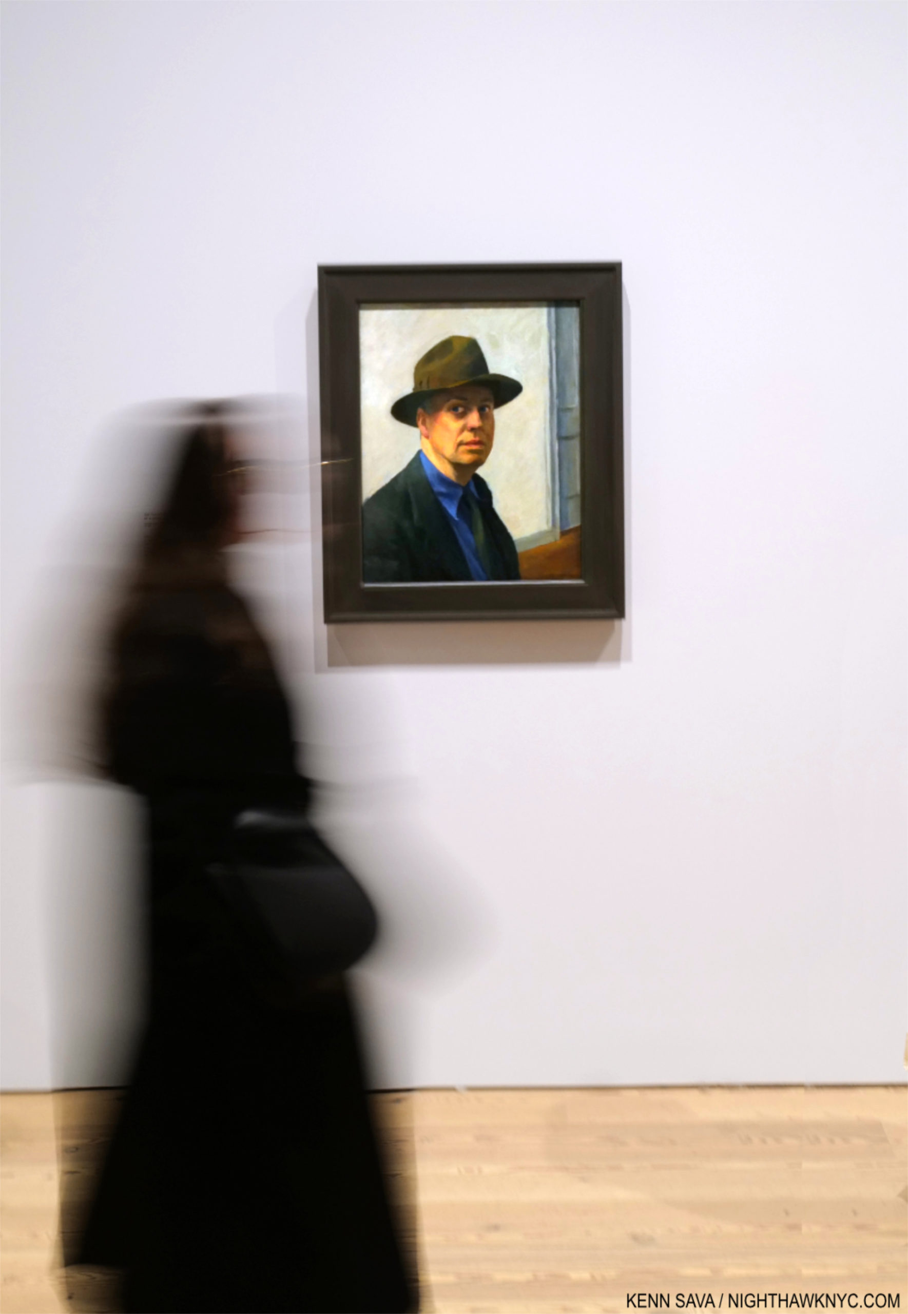
Smack dab in the heart of Edward Hopper’s New York, the Artist stares out at us in one of hs few Self-Portraits, one he began 98 years ago (1925-30). What would Edward Hopper make of his New York now? Click any picture for full size.

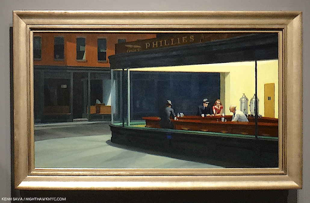
Edward Hopper. What more can I say about his Art? In 2015, I named this site after his masterpiece, Nighthawks, because of that figure with his back to us that no one ever talks about. I relate to him more than I do any other figure I’ve ever seen in a Painting because I’ve been that guy, alone in a bar, cafe or restaurant in Edward Hopper’s New York too many times to count.

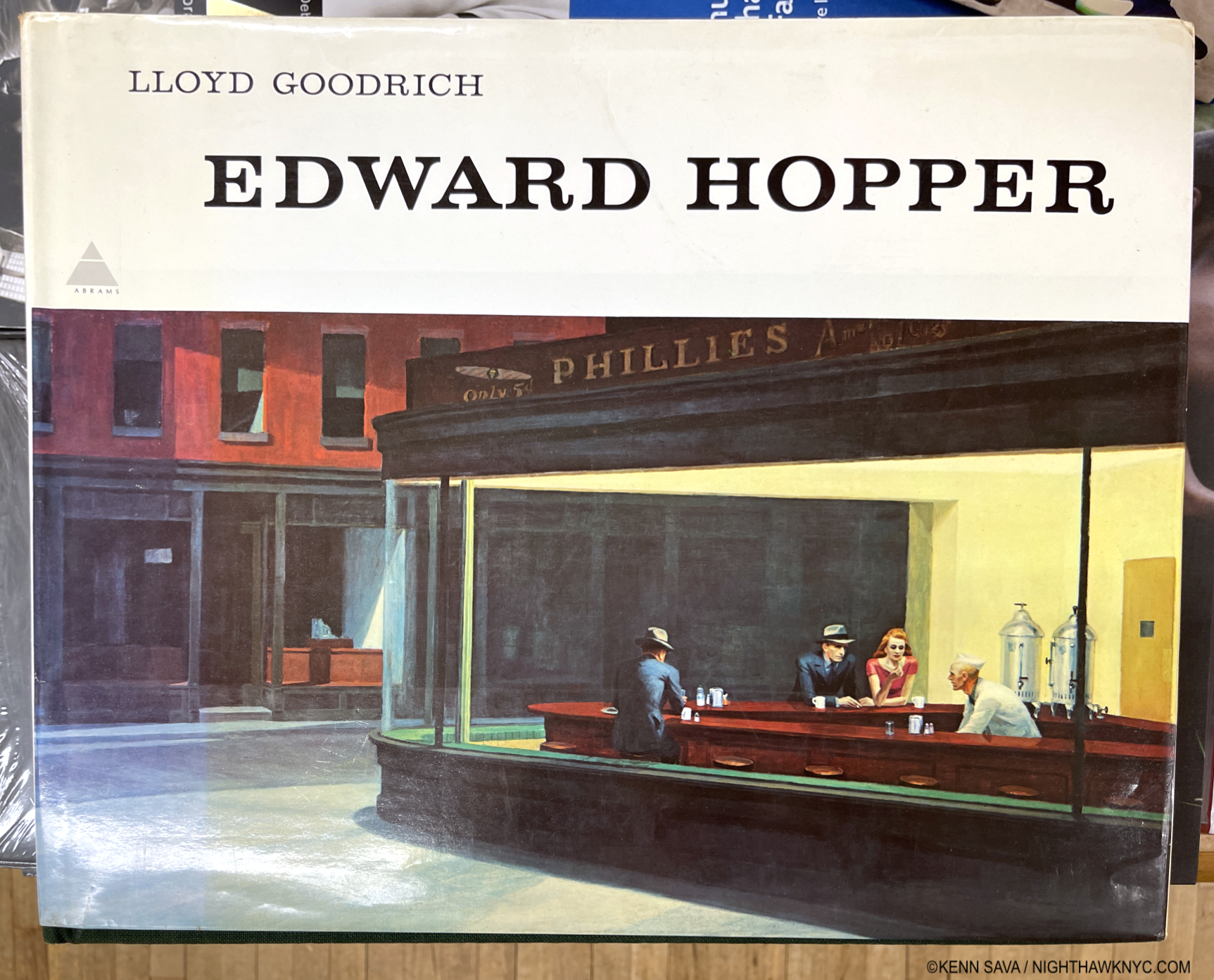
The first time I ever saw Edward Hopper’s work was in the late 1970s in a friend’s parent’s copy of this massive 10-pound, 16 by 13 1/2 inch, monograph by Lloyd Goodrich 1 published by Abrams in 1978, with 306 pages and 246 illustrations, but only 88 in color, unfortunately. One or other of his Paintings has been lingering somewhere on my mind since. My banner has been a continual homage to Nighthawks for the past 7+ years2.

Mister Hopper’s Neighborhood

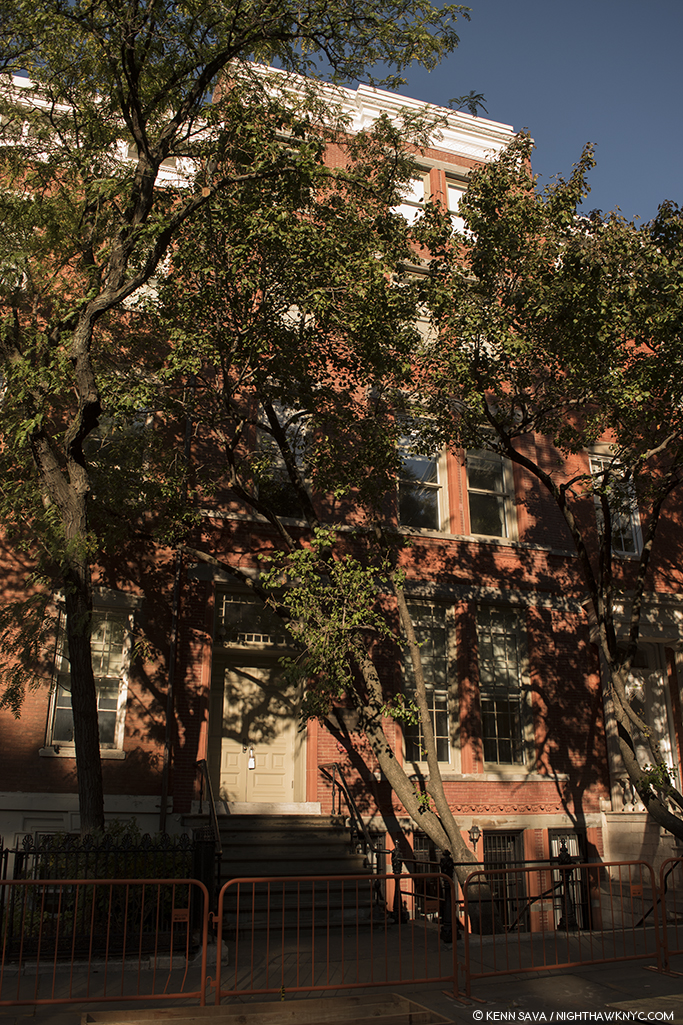
The heart of Edward Hopper’s New York for over 50 years: 3 Washington Square (center). Between them, he &  his wife Jo, lived on the top floor from 1913 to 19683. Beginning in 1947, they had to fight NYU, who took over the building in 1946, to stay. Today, the Hopper Studio has been preserved though the rest of the building is in active use by NYU, as it was when I shot this, November 16, 2022. Nighthawks, among countless other Hoppers, was Painted here4.
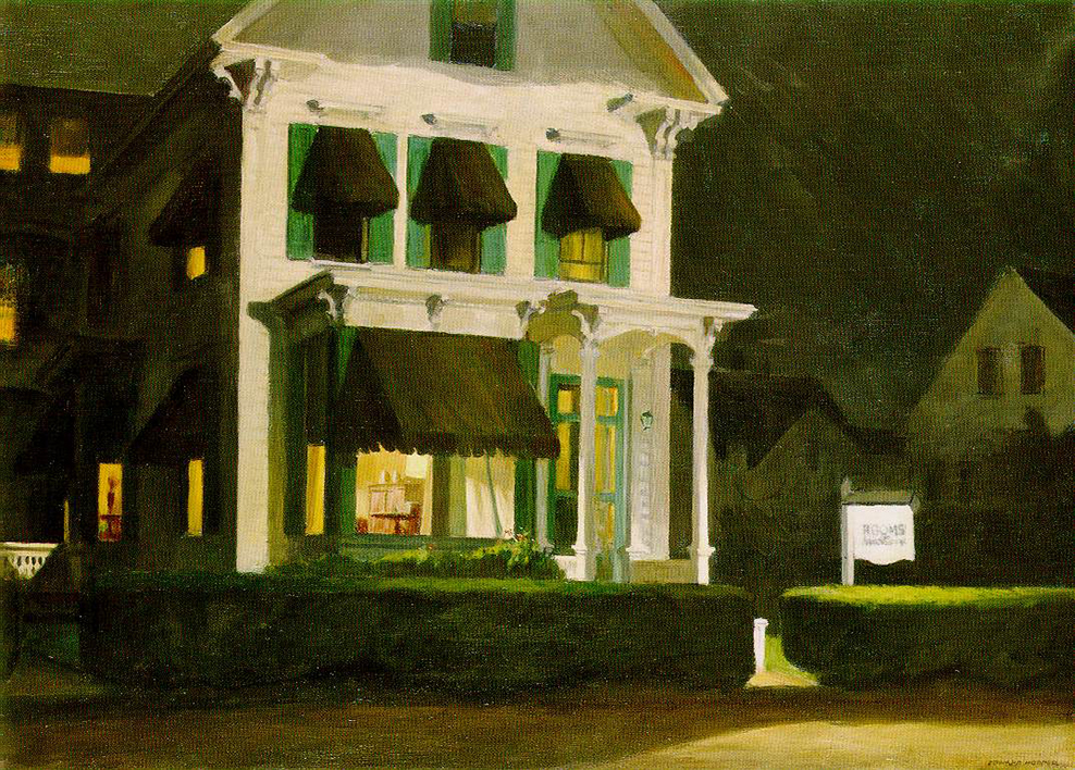
At this point, I have lived in what was his extended neighborhood for over 3 decades. I have sat in the Park right in front of his long-time home and wondered if he sat on this very spot. I’ve walked by numerous actual sites he Painted, and I spent a night in the Provincetown, Massachusetts  rooming house he Painted in Rooms for Tourists, 1945, while I was in Cape Cod fruitlessly trying to find his Truro summer house and drinking in the atmosphere of another area he Painted. Today, any number of times I’m reminded I’m literally walking in his footsteps on streets he is known to have walked. Living in his footsteps is probably more accurate.

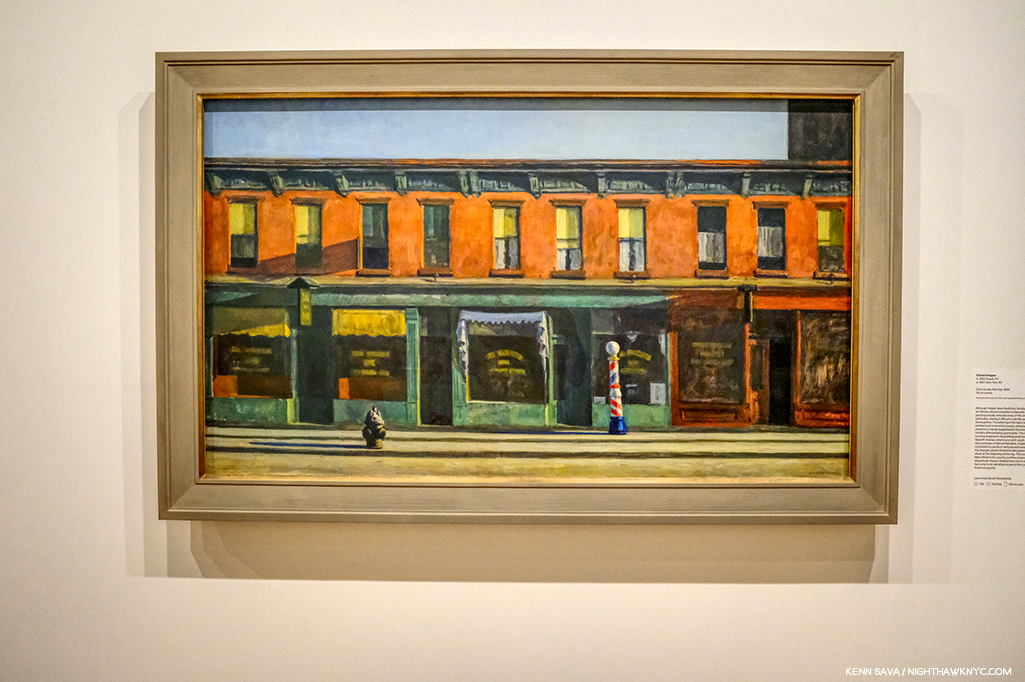
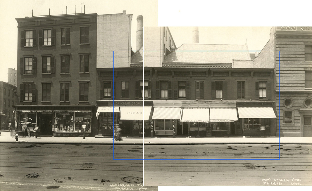
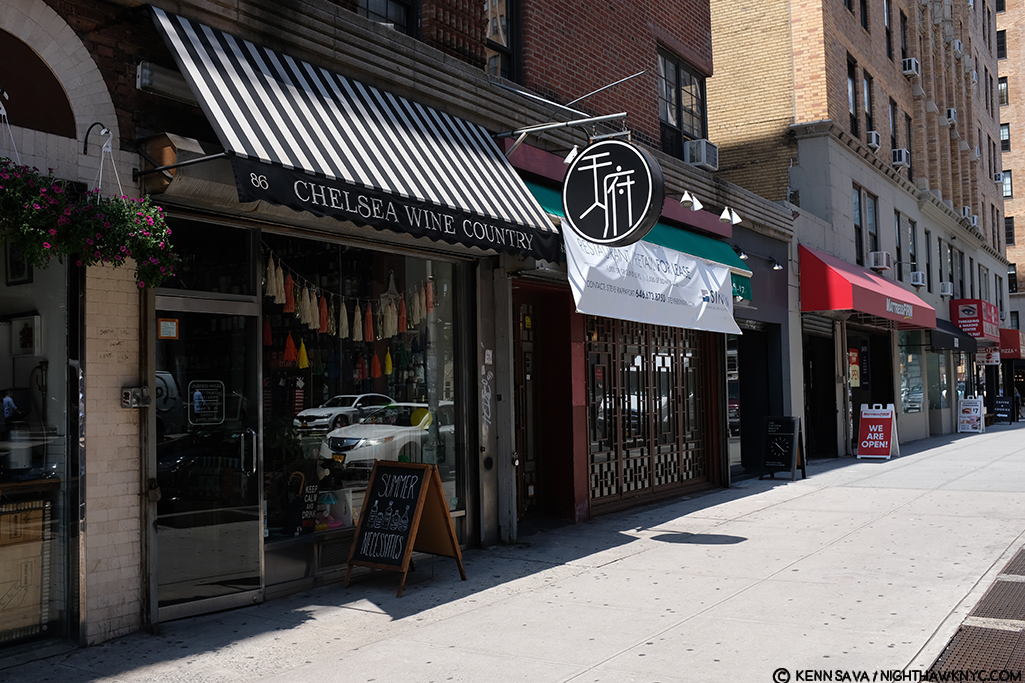
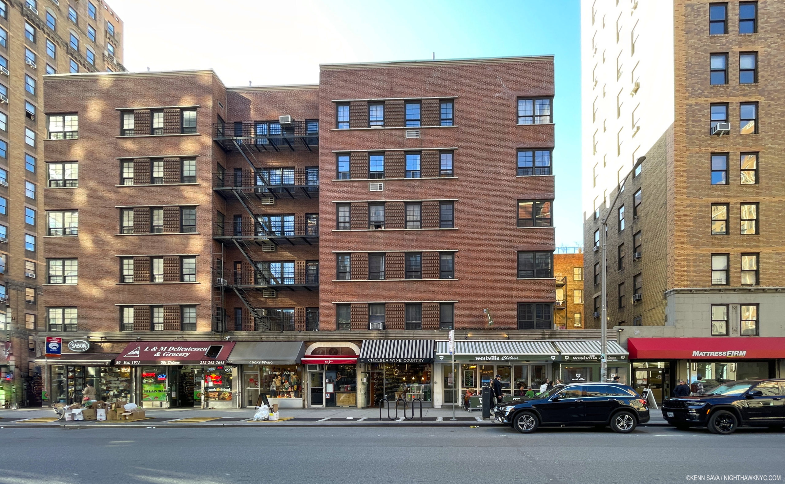
Early Sunday Afternoon, March 26, 2023. Does this scream “Edward Hopper Painting?” 93 years later, it’s hard to see Early Sunday Morning, 1930 (which I discuss in Part 2), in this scene in my neighborhood, but this is where it was on 7th Avenue between West 16 & 17th Streets. Only the building partly shown on the right is in the Painting. I had to wait for the sun to go behind the center building (to the west) to take this shot, its glare still bleaches out the wall of the building on the right, proving the direction the Sun shines in the Painting was “Artistic license.”

A bit of my passion for his Art comes from this “shared experience” of this part of Manhattan at different times, but most of it lies in the endless mystery at the heart of his Art. Mystery that no amount of looking seems to solve. Until I saw Edward Hopper’s New York, that is. 300 pieces in here on NighthawkNYC.com since July, 2015, except for a bit at tail end of “My Search for Edward Hopper’s Nighthawks Diner,” this is the first time I’ve written about his Art.

Setting the Stage
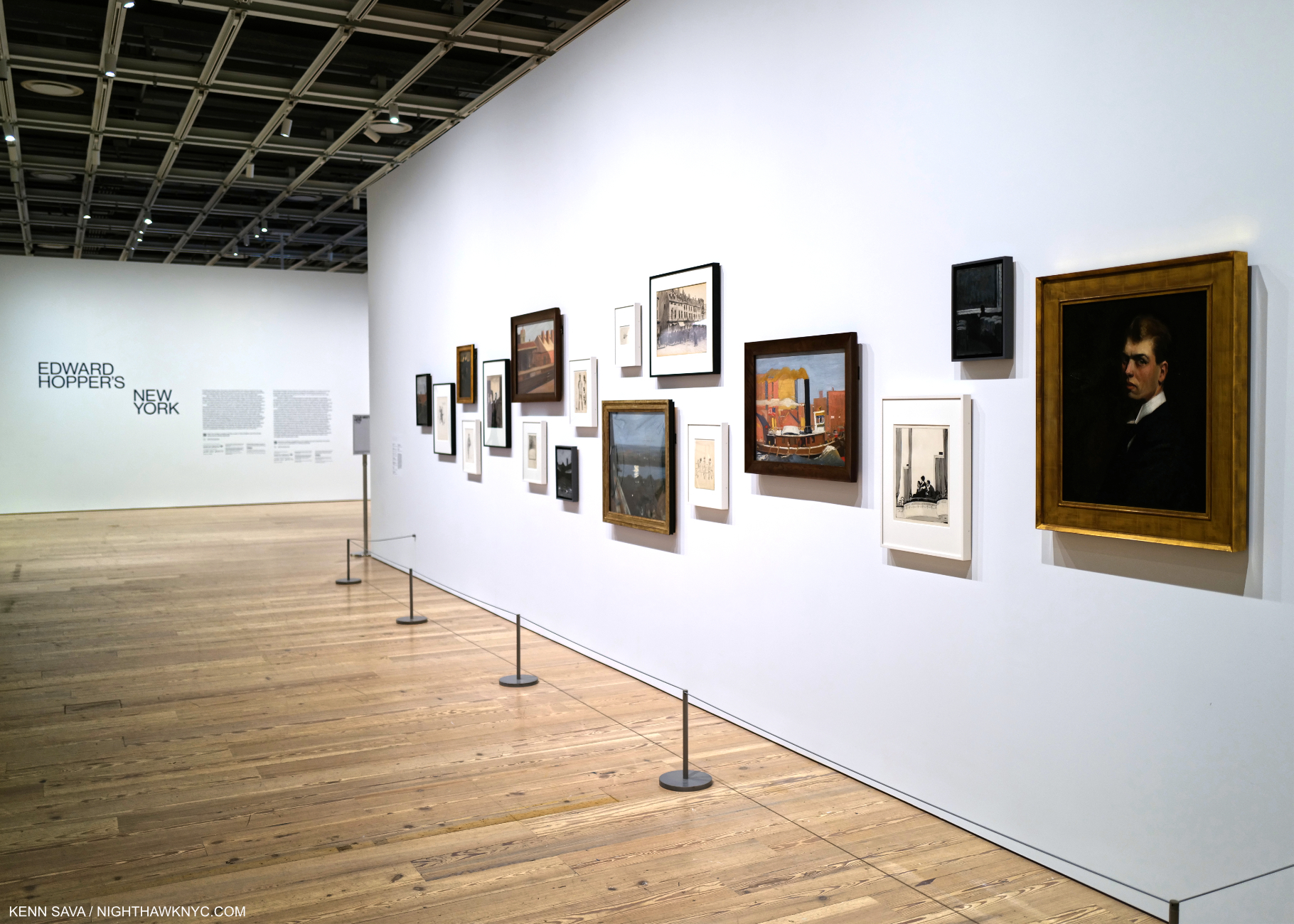
Before the crush. Edward Hopper’s New York Member’s Preview Opening Day, October 13, 2022. A wall of early work, including Self-Portrait, Oil on canvas (as all works featured are, unless specified), right, introduces the show. For Hopper, 1906 marks the beginning of his life as an Artist, the year he graduated from Art school, then embarked on his first trip to Paris. He would return twice before 1910, then return to NYC to get his Art career started.

While not a career retrospective (there has not been an Edward Hopper Retrospective in the U.S. since Edward Hopper: The Art & the Artist in 1980-81 5), Edward Hopper’s New York is a career-long look at what is, perhaps, his most famous subject- New York City, where he lived & worked for almost 60 years. I took the chance to see its 58 Oil or Watercolor Paintings6 by Hopper, among the 200 works and items of ephemera on view, 14 times between its opening day, above, and its closing day, below.
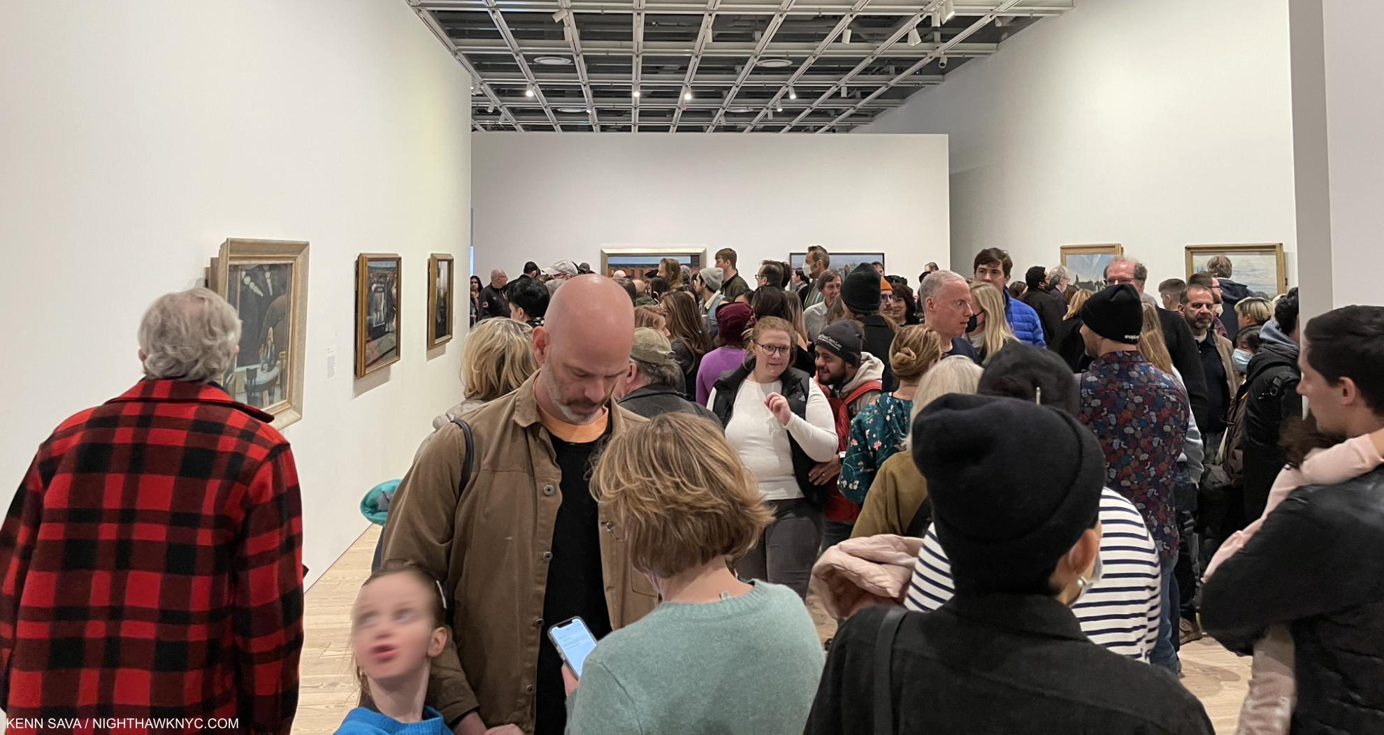
Now. Or never. This is about as crowded as an NYC Art show gets. 5pm, March 5, 2023. One hour to go on its final day. The final weekend was sold out.

Edward Hopper’s New York was the very first time  I’ve seen so many Edward Hopper Paintings in one place. I went 14 times because who knows when I’ll get another chance.

There’s how Hopper Painted, then there’s what he Painted. I’m going to attempt to look at both. In this part, I take a look at how he Painted, i.e. his style, and how, and if, it evolved. In Part 2, I look at what he Painted in a piece that is a personal reaction to what I see when I look at Edward Hopper now. Having the chance to see and study this many Hopper Paintings from early through late in his career Edward Hopper’s New York completely changed how I see his work. This is shocking to me because I’ve been looking at his work almost as long as I have anyone else’s- well over 40 years. To this point, I saw his work as one of the ultimate (and perhaps unsurpassed) expressions of modern loneliness and isolation of the century. Now, I see that as ancillary to other themes, themes that occur even when there are no human subjects. Themes that occur in his work in and outside of NYC.

One great thing about Art is that it’s there for everyone to see and make up their own minds what it says to them. I’m sharing here what it says to me. I hope everyone will look at Edward Hopper, and all Art, for themselves. 
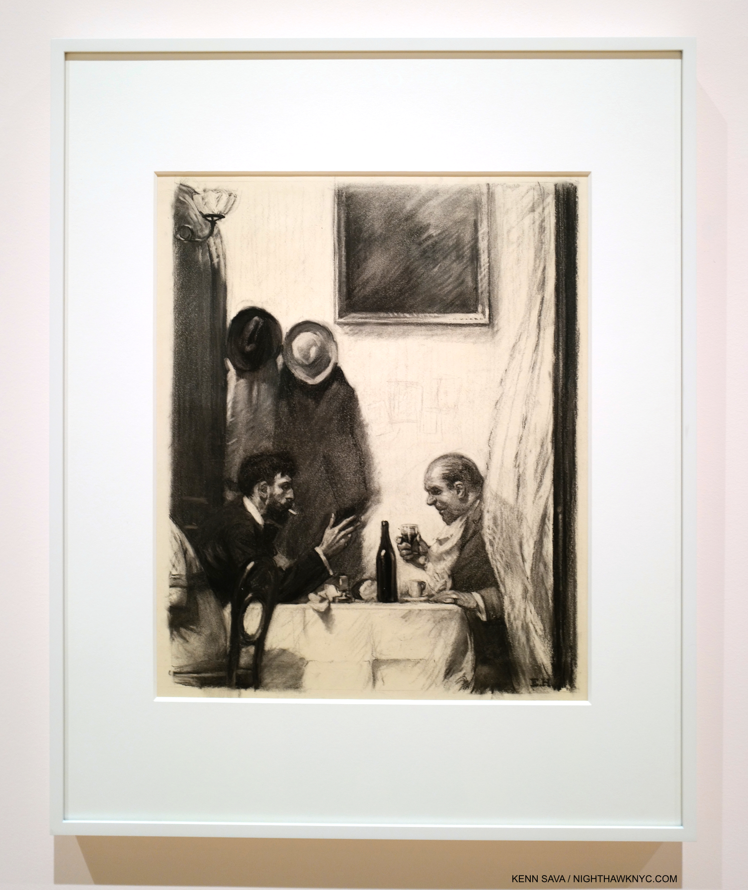
In a Restaurant, 1916-25, Charcoal on paper. For those who’ve criticized Hopper’s technique. He came by it honestly. 6 years in Art schools under esteemed Artist teachers. How they felt about his skill is evident in the fact that he was assigned to teach life Drawing, one of the hardest types of Drawing, before he graduated.

“In every artist’s development the germ of the later work is always found in the earlier. The nucleus around which the artist’s intellect builds his work is himself; the central ego, personality, or whatever it may be called. and this changes little from birth to death. What he was once, he always is, with slight modification. Changing fashions in methods or subject matter alter him little or not at all.” Edward Hopper7

Edward Hopper was born on July 22, 1882 in Nyack, NY, some 80 miles as the Owl majestically flies from the City. He visited the City as a child with his parents, then came here on a daily basis while attending Art school from 1899-19068. Towards the end of that time, he took up residence on West 14th Street, before taking three trips to Paris from 1906-10. After returning to the City, he lived at 53 East 59th Street9 before moving to 3 Washington Square in 191310.
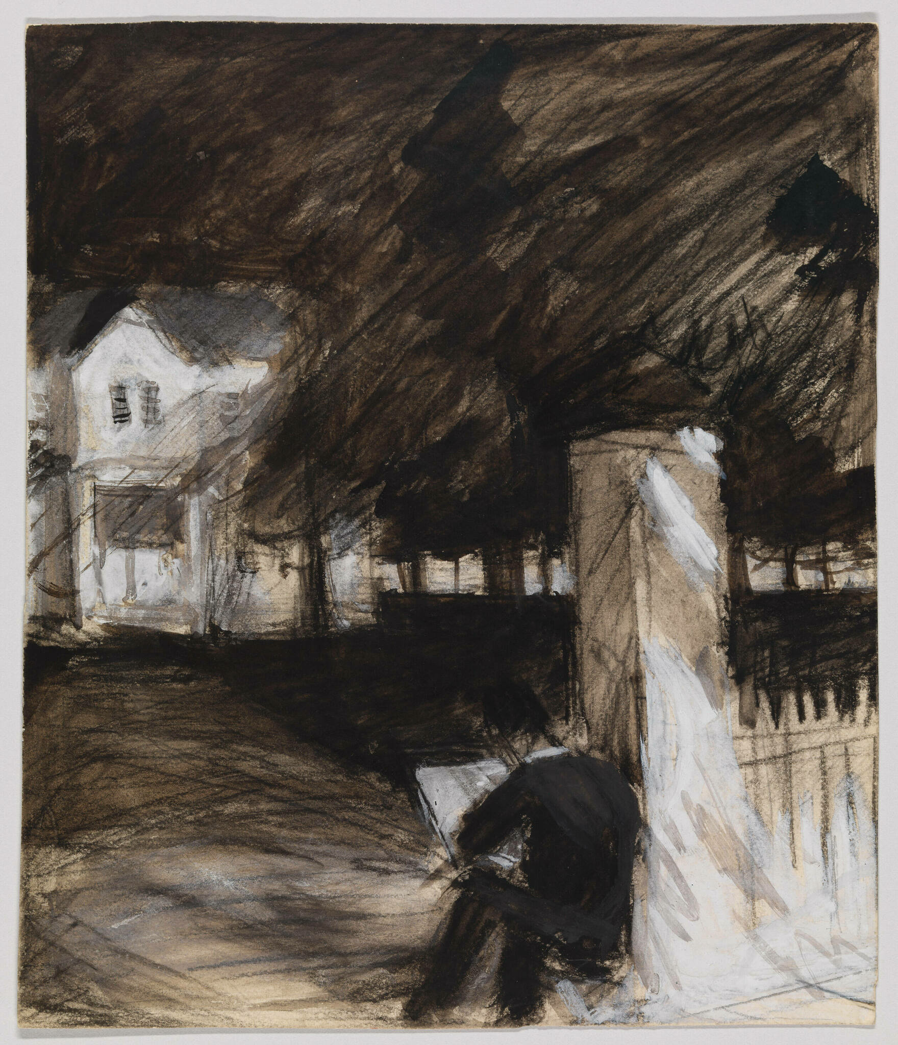
Untitled (Study of Man Sketching in Front of a House), c. 1900, Opaque watercolor, fabricated chalk and graphite pencil on paper (recto); Graphite pencil, pen and ink and opaque watercolor (verso). *-Whitney Museum Photo. Not in the show.

Seeing that introductory wall, shown earlier, sent me delving deeper into Edward Hopper’s Artistic beginnings (1895, at about age 15, to 1913, when he moved into 3 Washington Square at about 31) for the first time, looking to see when his themes began, how his style and technique changed over that time, and what they could tell me about his familiar later work. Most of Hopper’s early work is in the Whitney’s Permanent Collection, thanks largely to the 1970 Jo Hopper Bequest. It is, unfortunately, too rarely seen, and in my view, under-considered.

From the beginning, one thing that stands out to me is that Edward Hopper was a “traditional” Painter. That is, he relied on his preliminary Drawings & Studies as the basis of his Paintings, as Painters had been doing for as long as there had been Painters. Though Photography was making steady inroads into all aspects of life, and being used by an ever-increasing number of Artists & Painters during his lifetime, Edward Hopper never used Photographs as the basis of his work11. Untitled (Study of Man Sketching in Front of a House), from the year his Art school studies began, may be of a fellow student or be a de-facto Self-Portrait. In either case, it shows something I imagine Edward Hopper did regularly for the rest of his career. In addition to relying on long-standing traditional methods, Edward Hopper steadfastly remained true to his vision. He not only resisted Abstraction, but he uncharacteristically fought against it in print, in a publication titled Reality, which he contributed to.
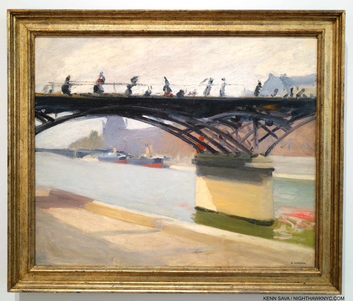
Le Pont des Arts, 1907. Edward Hopper Painted this outdoors near where he was staying on his first trip to Paris. So, it’s strange to see early on in a show devoted to his NYC work. Nonethelessless, it’s interesting for its style and for its content (see Part 2).

While in Paris, Edward Hopper saw shows of the work of the so-called “impressionists,” (a box I don’t subscribe to, so I will use “earlier French Painters” instead) but, apparently did not see the work of Picasso. It’s hard not to see their influence in this, but, at least for me, not that of any one Artist in particular stylistically. Under their spell, he seems to be doing his own take on it.

The question for me became- How far did this influence go, and how long did it last?

“It took me ten yers to get over Europe,he said.12. Ten years after Europe would be 1920. Looking at the show, a case could be made it lasted much longer.
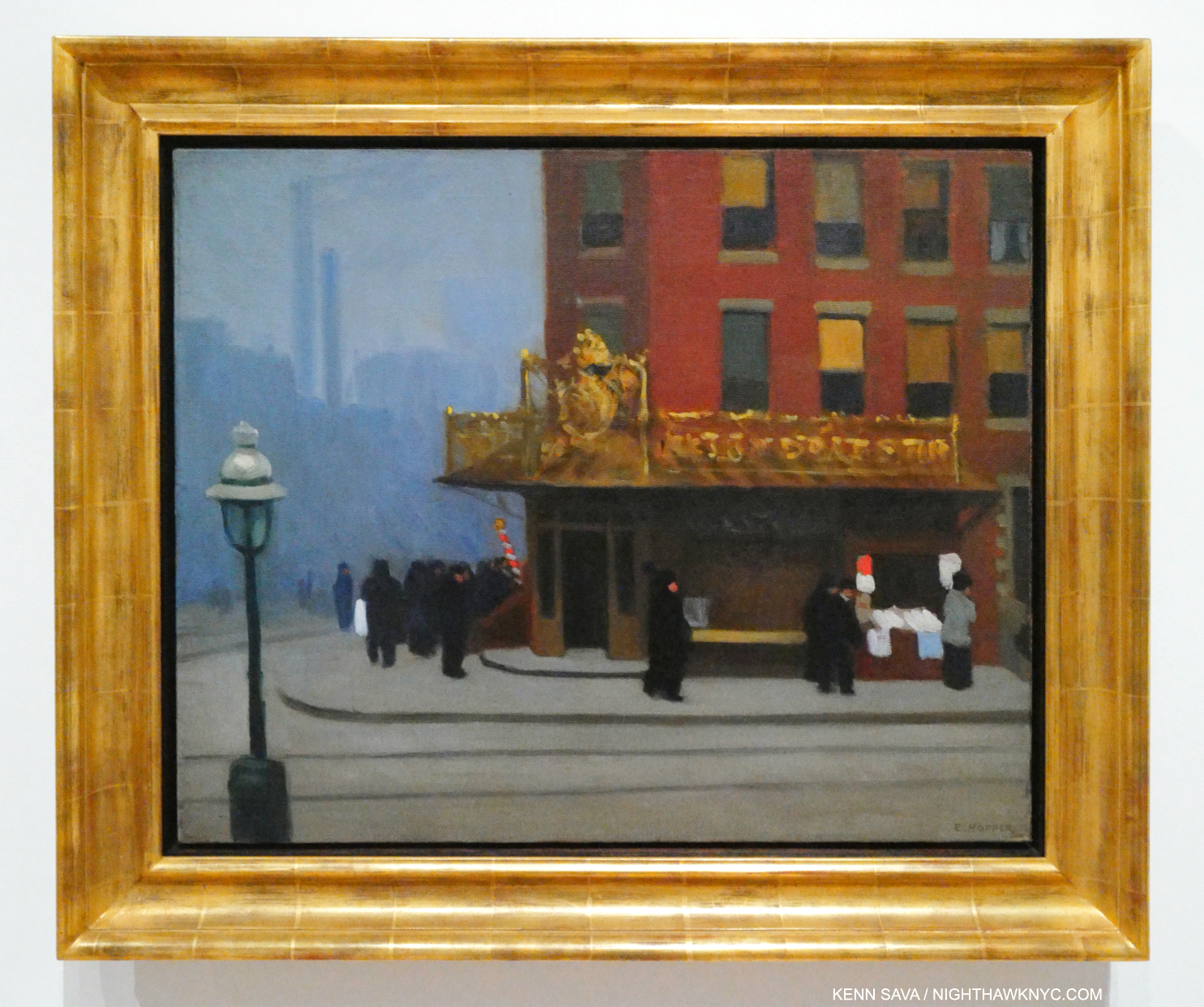
New York Corner (Corner Saloon), 1913 became a touchstone for me over my 14 visits. If it wasn’t for the familiar lamp post and the smoke stacks in the rear, you might think this is a corner in Paris. A charming and unique early New York work, it was in MoMA’s collection until at least 1981. At some point after, they sold it! A shortsighted mistake in my view.

After returning from Paris, the 28-year-old Artist set about surviving as one. To this end, his work as an Illustrator from 1917 to 1925 provided him with income until his work began to sell. His first show, at the Whitney Studio Club in 1920 (the predecessor to the Whitney Museum), with 16 Oils, produced no sales. In 1923, his Watercolors began to sell after they were shown at the Brooklyn Museum. Then, in 1925, The Met bought 15 Hopper Etchings. Later that year, he sold Apartment Houses to the Pennsylvania Academy, his first museum Painting sale. As his Paintings finally began to sell (mirroring the experience of Winslow Homer, to whom his Watercolors were compared, whose Watercolors also sold before his Oils began to13), in September, 1925, he was able to give up illustration14. Among his early Paintings, the wonderful New York Corner, 1913, caught my eye. It’s interesting to contrast it with this work by John Sloan, one of his teachers, Sixth Avenue and Thirtieth Street, 1907.
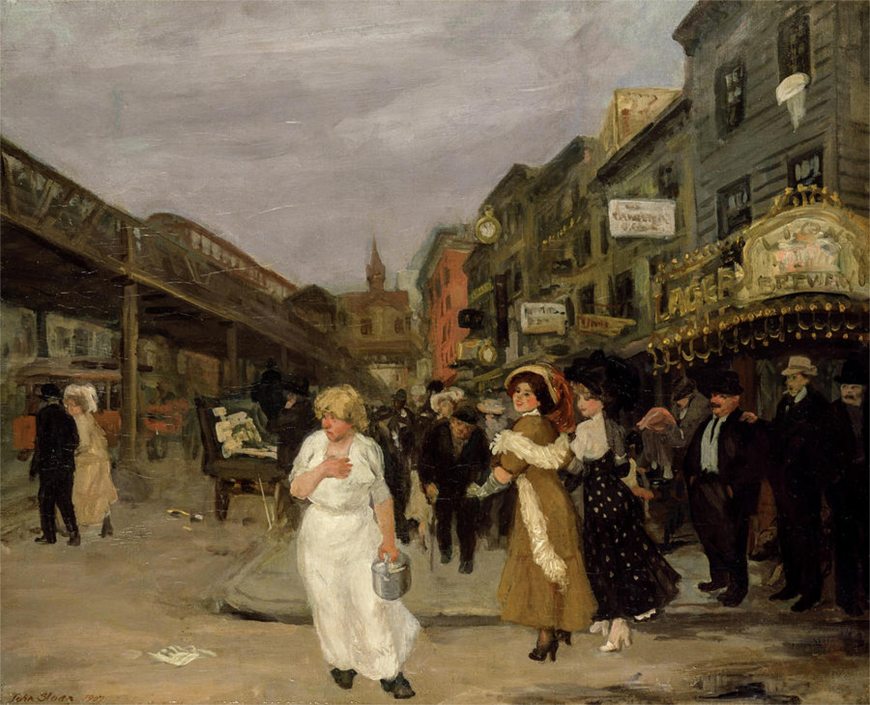
John Sloan, Sixth Avenue and Thirtieth Street, 1907. The Sixth Avenue elevated train, which Hopper frequented, runs to the left. The gold sign on the right reads “LION BEWERY,” which was the 6th largest brewery in the US in 189515. I believe this view may be looking downtown, if that’s the Jefferson Market Courthouse in the background. *-Photographer unknown.

New York Corner currently resides in the collection of the Canter Center, Stanford University. Upon acquiring it, their press release says, “New York Corner, created when the artist was 31 and considered the first work made in his representational style.” Wait. What?

“representational-noun 1. showing things as they are normally seen” Cambridge Dictionary

What’s “representational” about it?

In December, 1913, Edward Hopper moved into 3 Washington Square on the Park, where he would live for the rest of his life, so this may have been executed based on a scene near his East 59th Street home just before or just after his move (unless this is a scene on East 14th Street. There’s nothing like the background anywhere else in what would be his West Greenwich Village neighborhood.). When I look at New York Corner, I see an Artist who’s in transition. It seems to me Hopper is wrestling with the influence of his teachers Robert Henri & John Sloan, and what he’d seen in Paris. The top half (i.e. the building) is slightly more “representational,” slightly more resolved (especially in comparison to work he did in Pars, like River Boat or Le Pont Royal, both 1909, and American Village, 1912,), while the bottom half is entirely out of focus. The figures are more like shadows, the indistinct but distinctive gold signage is striking, and stands in stark contrast to the sign in the Sloan. It only adds more mystery to the feel of the whole piece. The upper two floors of the building feature windows that are not much different from those seen on the upper floor of Early Sunday Morning (which are more defined) or across the street from the diner in Nighthawks (ditto). He’s starting to get there.
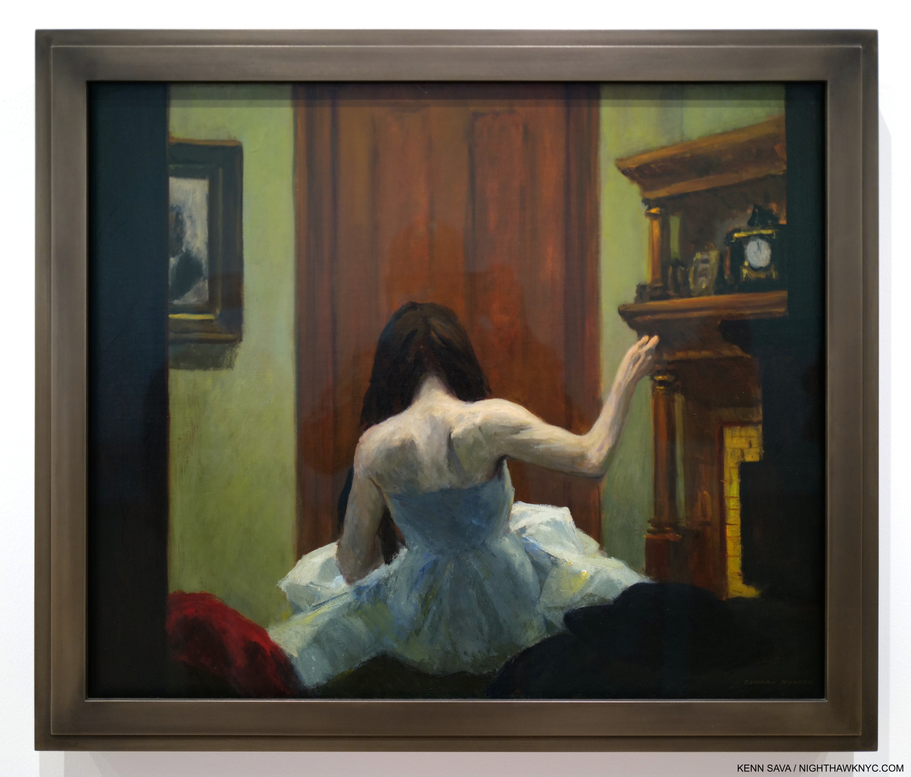
New York Interior, 1921. Seen through a window, this wonderful piece is one of a number of Hoppers that reminds me of Degas. See Night Windows, below. Notice the clutter on the mantel. Then compare this with Room in New York, seen further below.

As I’ve said, I don’t subscribe to most of the “-isms” that proliferate in Art, and the world, and that applies to putting Edward Hopper in anything other than the “Edward Hopper box.” As time goes on, putting him in the “realism” box he’s usually stuck in seems increasingly problematic. To wit- In Gail Levin’s massive 780-page Expanded Edition of her Intimate Biography of the Hoppers I couldn’t find one instance of Edward Hopper referring to his Art as “realism.”

“realism-noun 1: corcern for fact or reality and rejection of the impractical and visionary” Merriam-Webster
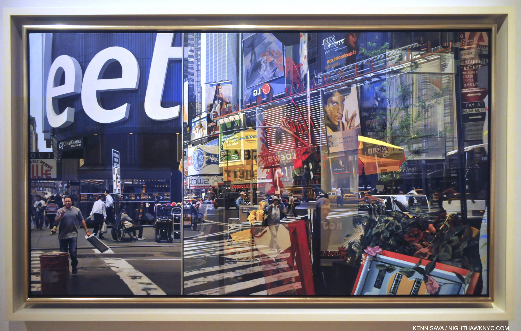
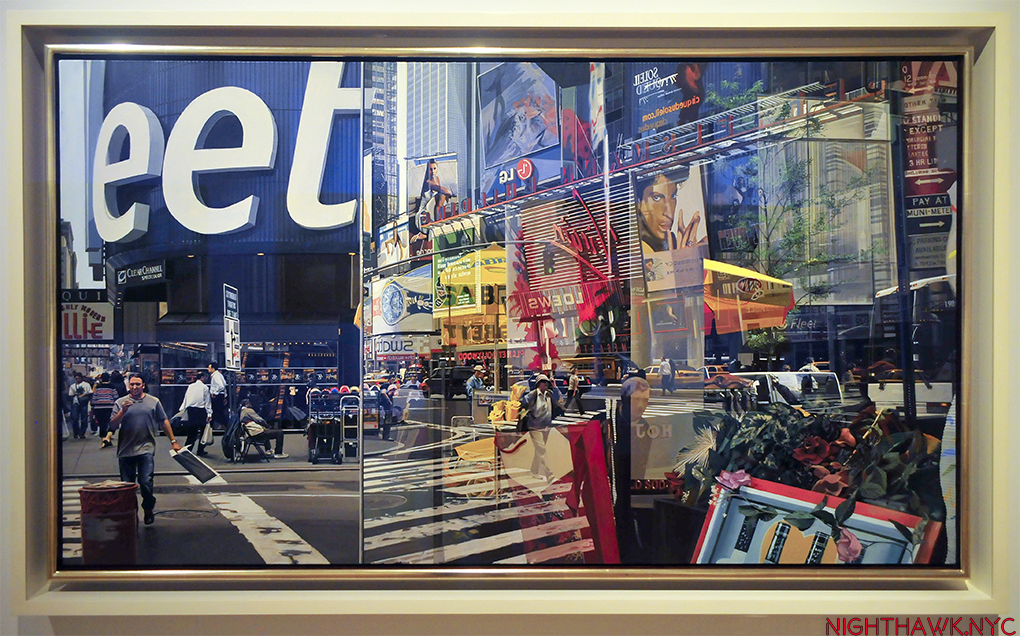
Richard Estes, Times Square, 2004, Paintings don’t come much more technically astounding than this. Unless, they’re by Jan van Eyck. Having stood on this spot before, during and after 2004, I can certainly verify the overwhelming visual noise that still is Times Square, something that has never been more faithfully realized than it is here.

I’m sorry, but when I look at his Art, it doesn’t fit that definition. For another thing, “realism” in Art is a term that began seeing heavy use in the 19th century, though I’ve seen the term applied to Artists like Caravaggio, 1571-1610. In all that time, things have changed. In 1966, the year before Edward Hopper died, Richard Estes began Painting New York in ways that redefined what had been called “realism,” making everything stuck in that box previously look, well, “different.” While Edward Hopper often Painted scenes looking through windows, Mr. Estes took the art of rendering their reflections to an entirely new level, while often Painting at the hyperfocal distance, which added new depth to his depictions of the world. Suddenly, the eye was free to go anywhere on the canvas and it was all rendered “democratically” (i.e. with apparent equal weight) and in focus. Others, including Rod Penner, followed, pushing the envelope of what had been done, all the while in the service of Art. There was suddenly more than one kind of “realism!” Since none of them have put their Art in a box in their interviews, I certainly don’t subscribe to the terms others ascribe to their Art. Therefore, Messers Hopper, Estes and Penner reside in only one “box” each: the one with their name on it. “Realism” has been used for over 125 years! it’s past time to retire it. It’s outlived its supposed meaning.
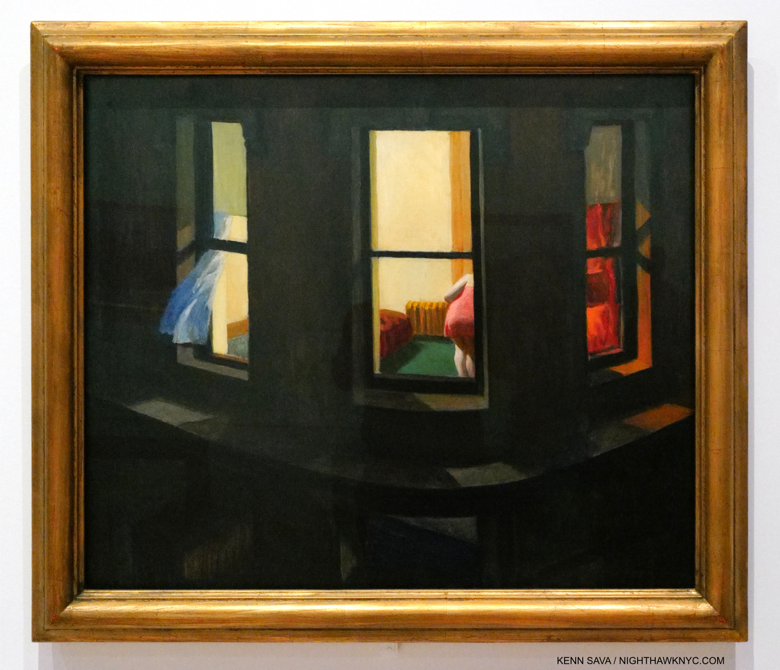
Night Windows, 1928. Among the earlier French Painters, Edgar Degas is someone I see in numerous Edward Hopper compositions. Perhaps more than I see any other Artist. Hopper seemed to share Degas’s voyeuristic streak. Many of both of their Paintings show women being observed apparently without their knowledge.

It’s pretty plain to see that these recent developments are at odds with Edward Hopper’s style. Then again, I don’t think he was ever out to win the realism race. Hopper authority Gail Levin said his work has “the suggestion of reality16.”

Finally, there’s this for all those who box Hopper as a “realist”-

“I think I’m still an impressionist…” Edward Hopper.

Edward Hopper didn’t say that in 1913 after Painting New York Corner. He said it in 1962, a mere five years before he died! He said it in an interview published in Katherine Kuh’s book The Artist’s Voice: Talks With Seventeen Artists, in 196217. That Edward Hopper, who never minced words, or used them without careful consideration (like the careful consideration he gave every detail of his compositions) especially in the very few interviews he did, would say this so late in his life and career HAS to be taken seriously. So far, it hasn’t been. The “realism” noise surrounding his work remains deafening. I came upon the “impressionist” quote after already being convinced by the visual evidence in Edward Hopper’s New York that he took what he learned from the earlier French Artists and used it in his own way. He was one of the Artists who forged what some call an “American style,” an important goal at the time. Yet, his influences remained in his work throughout his life to the extent he chose to use them, in varying degrees, to suit his purposes in each particular work.
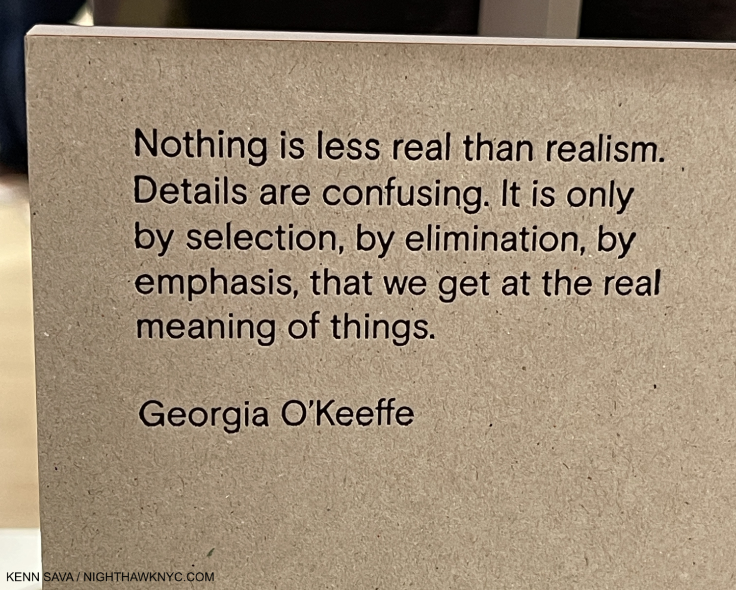
GeorgiaO’Keeffe quoted on the back cover of the catalog for her 2021 show at Museo Nacional Thyssen-Bornemisza.

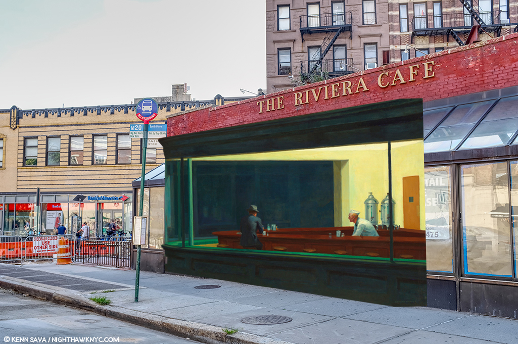
Part of that influence, I believe, was that as time went on, Edward Hopper began removing unnecessary objects from his Paintings. It seems to me his work lives on its mystery. Isn’t too much information an enemy of mystery? He also stopped using “real” settings, creating his own, possibly based on actual places combined with his imagination. In spite of my decades of looking for the “real” Nighthawks diner, this may well be what he really did: he based it on a place he saw then modified it in his imagination to suit his purposes (and he said as much). And that is the key: everything superfluous went out of his Art. That’s one thing that makes Nighthawks such a brilliant, timeless, nebulous work.

The result? For me, many of Edward Hopper’s New York Paintings are “impressions.”

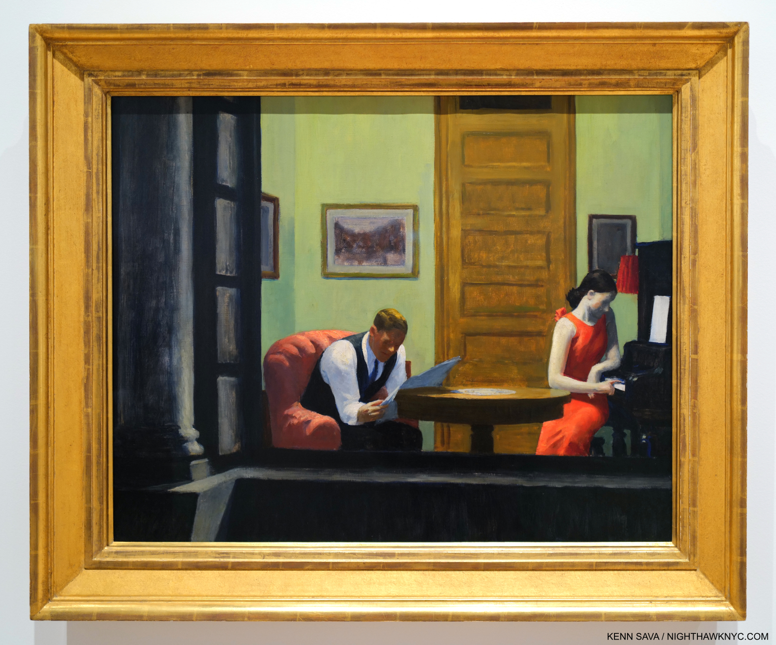
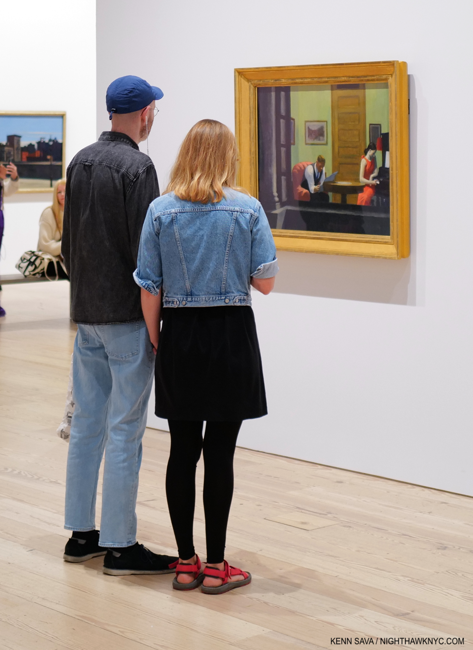
Room in New York, 1932.

I rest my case with Room in New York, from 1932. One of his masterpieces, in my view, it defies every single box Edward Hopper has been put in. It’s one of his many scenes looking into a window. Perhaps something he saw in a fleeting moment while riding the Sixth Avenue elevated train, or in passing as he walked, or maybe it’s a scene he imagined, possibly filtered through his own relationship experience. If, and it’s a huge “if,” this is (at least partially) filtered through his marriage, this may be as frankly as he ever depicted it. Look closer-
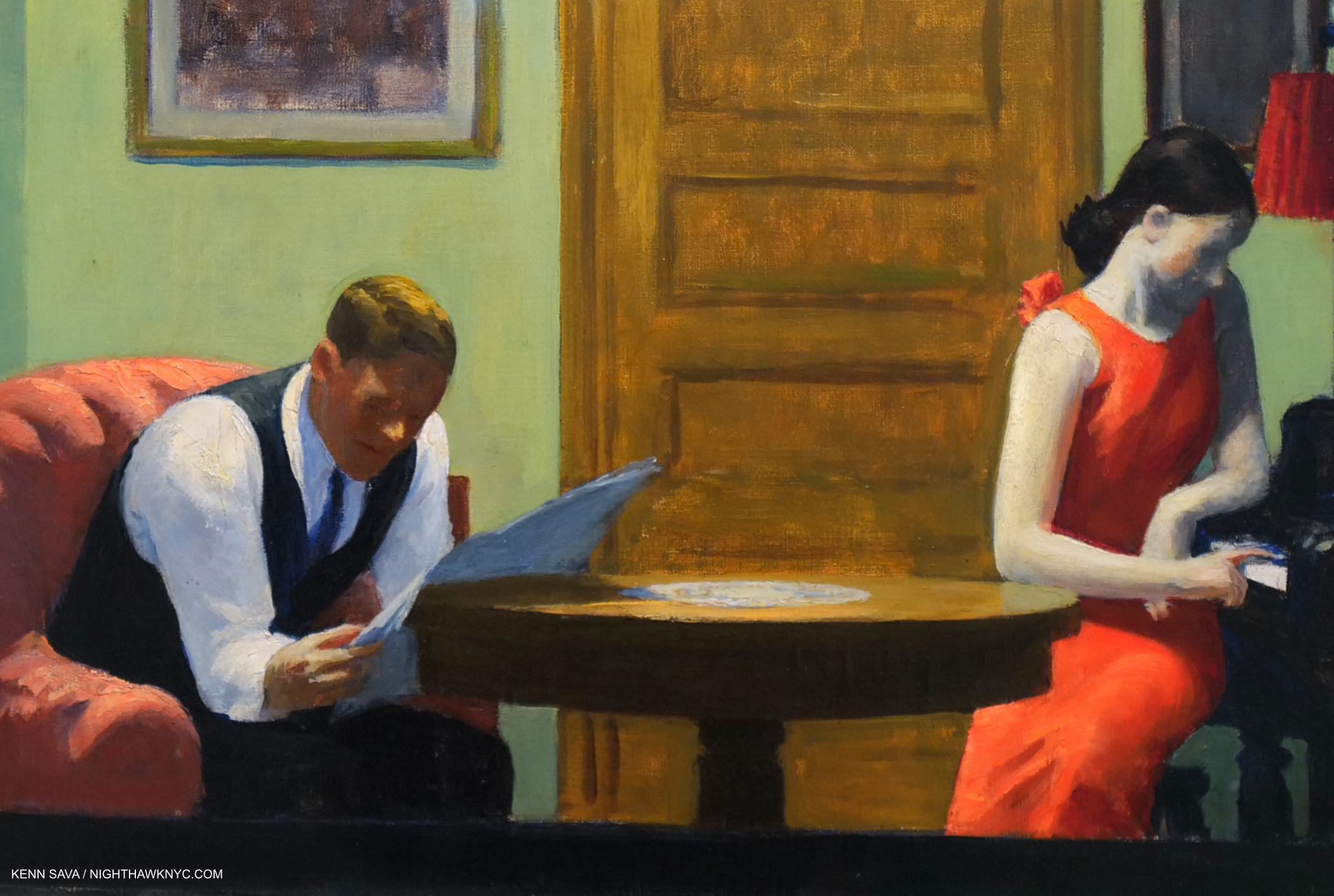
Edward Hopper’s “realism?” Bah humbug. A classic example of why I ignore boxes and just look at the work for myself!

Look! The faces have no details! This is by intent, of course. He obviously considered facial details to be unnecessary to what he was trying to express, or distracting from it. Is this what he meant when he said, “I think I’m still an impressionist…?” Isn’t this closer to the work of the earlier French Painters than anything else? No so-called “realist” Painted like this! Only George Seurat, among those earlier French Painters, Painted like this- on occasion (not all the time). In most Paintings that include humans, their faces and expressions carry the weight of the work. Not here in this scene that includes a woman and a man and not much else. How utterly daring! Without them, what’s a viewer to focus on? For me, all that’s left is the body language. And that red dress. “All dressed up with no where to go?” The woman in Nighthawks is also wearing a red dress. Could it be a pendant to Room in New York?

When people talk about the”genius” of Edward Hopper, for me, it’s on view in Room in New York, 1932. He had evolved through his education, his time overseas, his influences & experiences, and had arrived at the place of knowing, then executed it using his time-tested, traditional, methods. He knew what he wanted to say here, and had developed the confidence to leave out the non-essential (perhaps, inspired by seeing the earlier French Painters do it), including “minor details” like facial features! He created an impression of a scene, in my view, real or imagined, that mimics the fleeting moment that may have inspired it and somehow works perfectly, just as it is, without them.

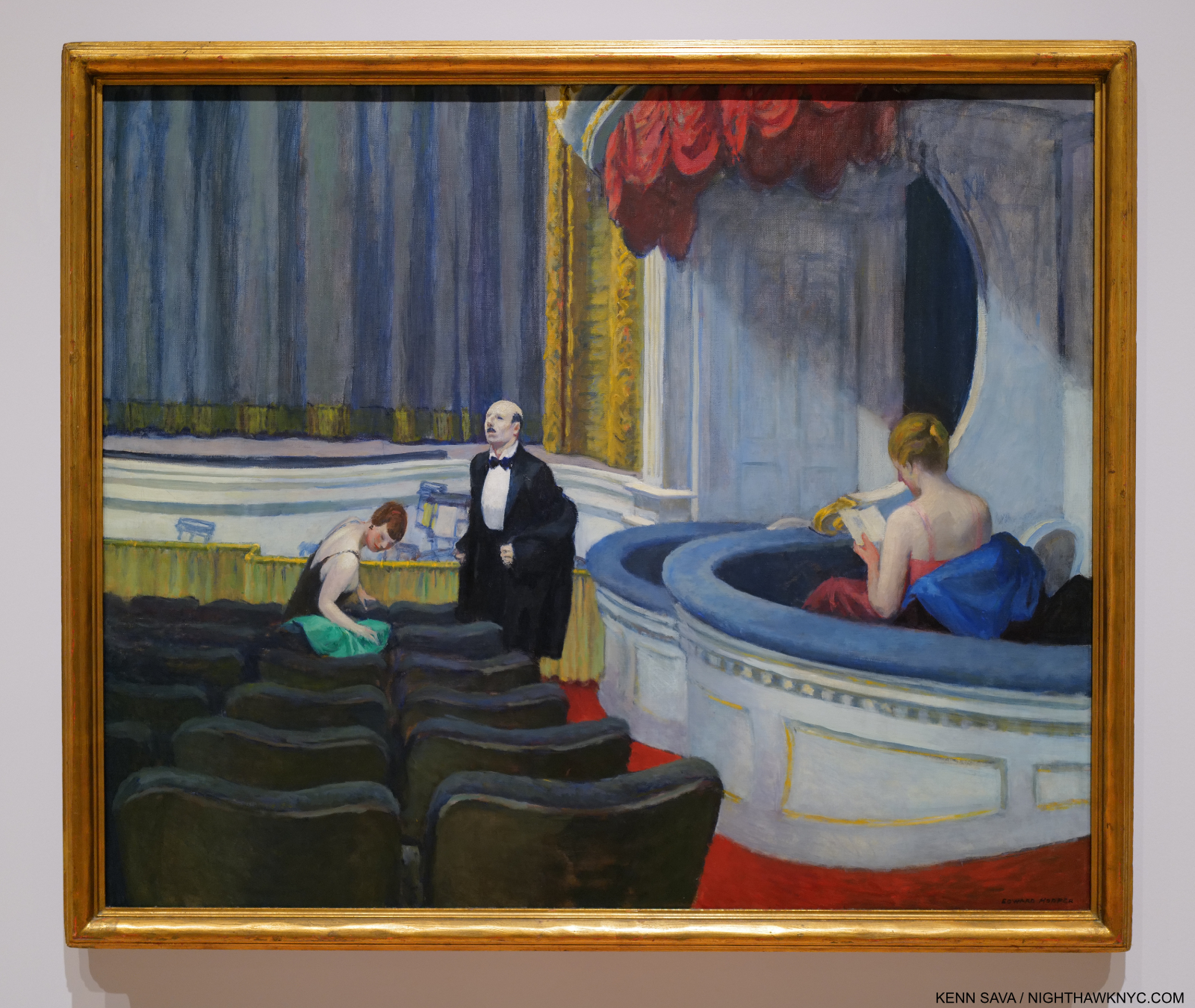
Two on the Aisle, 1927.

In Two on the Aisle, from 1927, five years before Room in New York, the faces are “incomplete,” but more “defined” than the two in Room in New York. Perhaps he became emboldened to go further after works like this. 

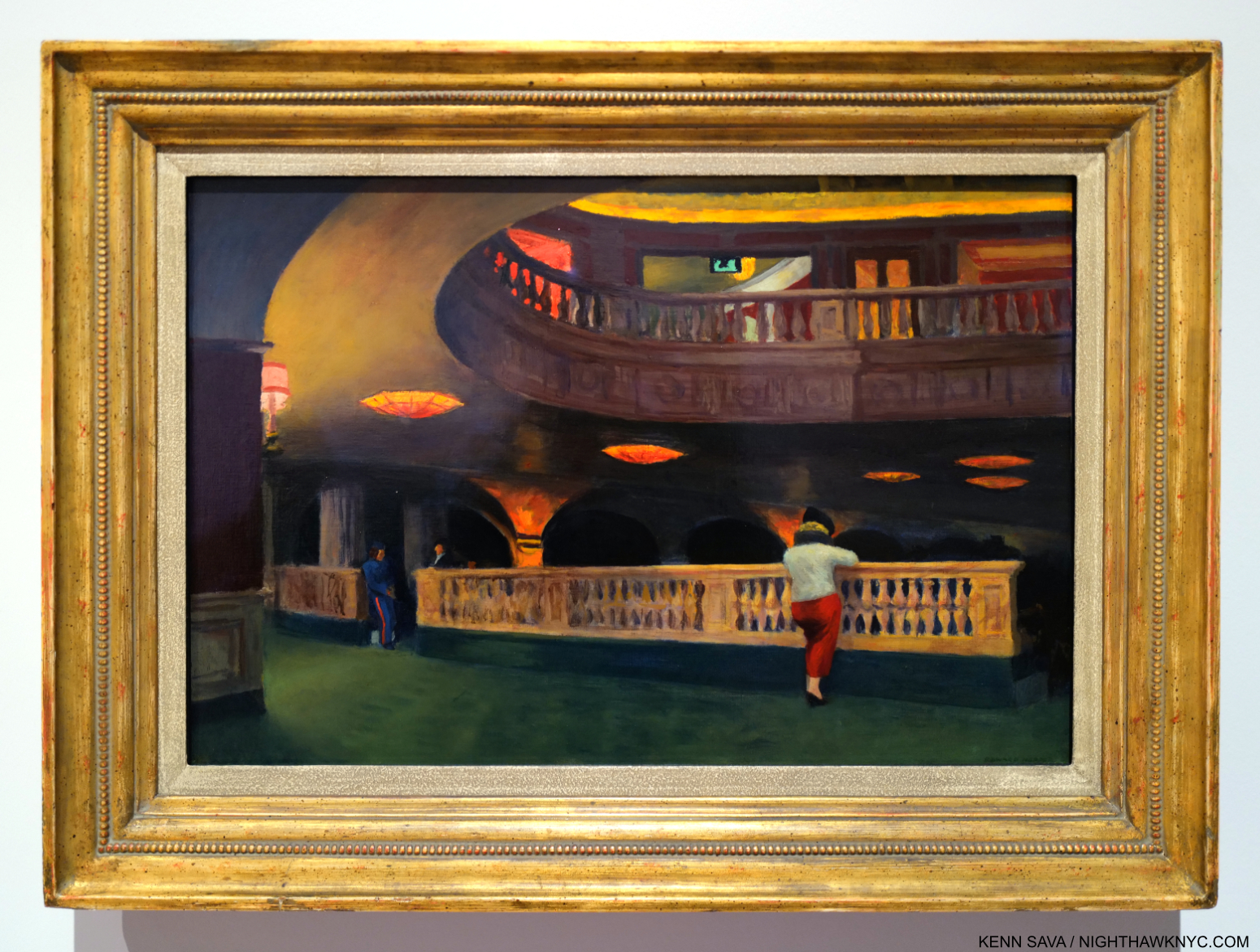
The Sheridan Theater, 1937.

In Sheridan Theater, nothing is in sharp focus.

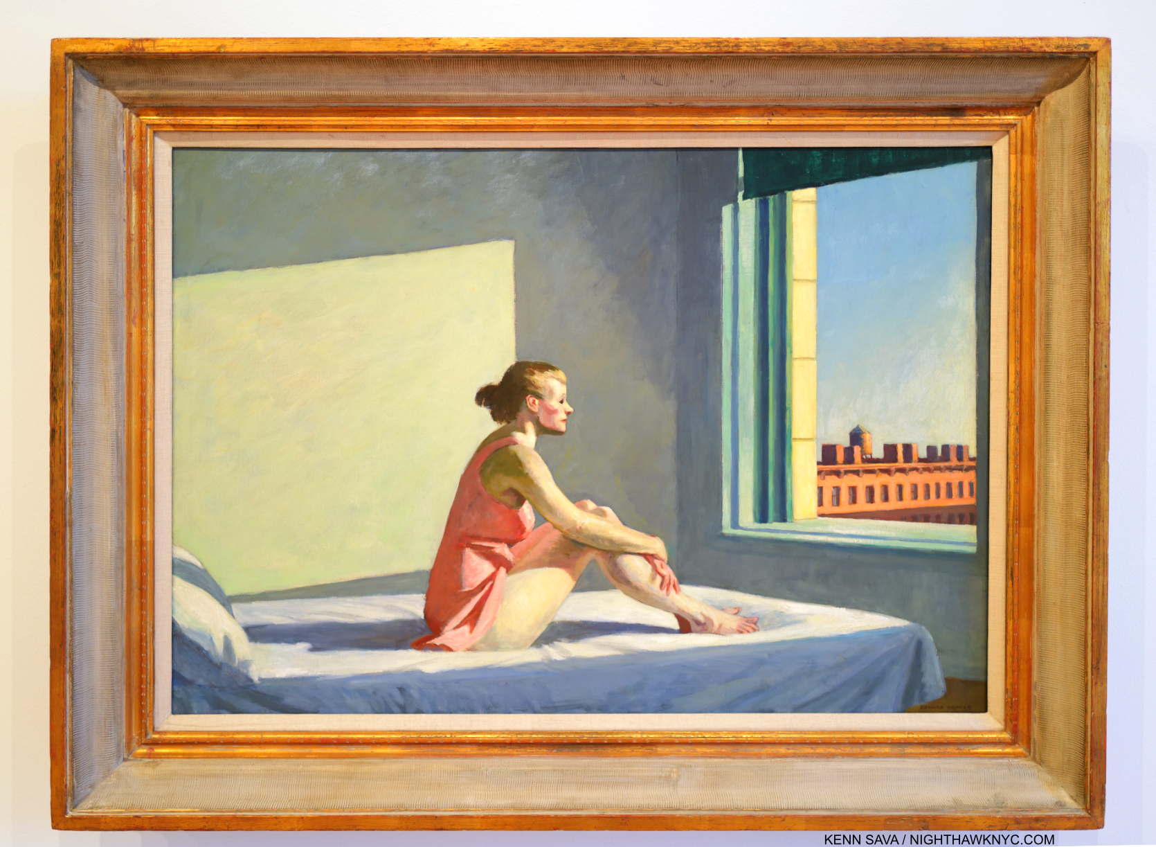
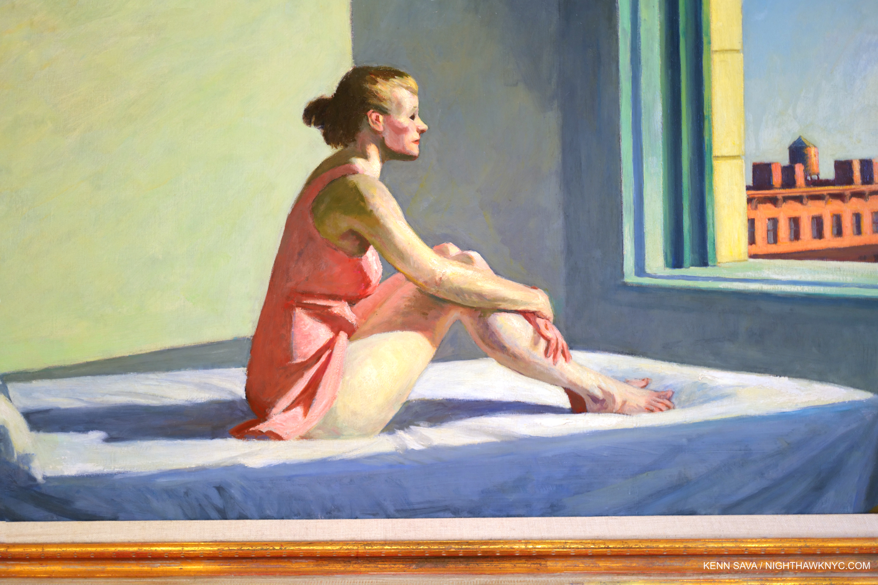
Then, in Morning Sun, 1952, the woman’s face (Jo was his model) is Painted so expertly (in my opinion) as to leave her expression ambiguous, making the work open to endless contemplation. These are just a few of the works that have “selective details,” i.e. details the Artist chose to include, or omit. In my view, this is always done to forward what he’s trying to express.

Boxes confine an Artist to one style. If the Artist says my work is in this box? So be it. It’s when other people put an Artist in a box that’s wrong in my view; for the Artist, and for not giving the viewer the chance to see the Art for themselves. Artists, being people, are free to change their minds, evolve, even move into other styles over time. Boxes don’t allow for this. Edward Hopper used his technique and the wide range of his skill as he saw fit in each work. A good number of them (i.e. many) strike me as “impressions,” and it’s their nebulosity that adds so much richness to considering them. There is enough detail in these to ring true with viewers, and enough vagueness to allow them to return to the work again and again. In other works, like Office at Night,1940, he chose to sharpen things up, but still managed to keep the mystery and the drama due to the brilliance of his composition and the realization it.

“Great art is the outward expression of an inner life in the artist, and this inner life will result in his personal vision of the world,” Edward Hopper18.

On the surface, these works may be “impressions” to my eyes. They are also transcriptions of the Artist’s “personal vision of the world.” Whatever you call them, they are as close as Edward Hopper got to making his inner world, “reality.”

*-Soundtrack for this piece is “An American in Paris” by George Gershwin, 1898-1937, a contemporary of Edward Hopper. Born 16 years after Hopper, he died, tragically of an undiagnosed brain tumor, 30 years before the Painter would. Hopper’s taste (if any) in Music is unknown to me, however as Edward Hopper’s New York points out in a room dedicated to it, he was an avid theater and movie-goer. As such, the name George Gershwin could not have been unknown to him. Gershwin, like Hopper, helped define what some call an “American style” of Music, as some say Hopper did for Art. Gershwin, who also Painted, was born in the City and spent most of his life here. Here “An American in Paris,” in homage to Hopper’s time there, is performed on a piano roll by George Gershwin, himself-

In Part 2, here, I take a look at what Edward Hopper’s Art says to me now, after immersing myself in Edward Hopper’s New York. Part 3 looks at some current issues surrounding Edward Hopper’s Art. 

NighthawkNYC.com has been entirely self-funded & ad-free for over 8 years, during which 300 full length pieces have been published! If you’ve found it worthwhile, PLEASE donate to allow me to continue below. Thank you, Kenn.

You can also support it by buying Art, Art & Photography books, and Music from my collection! Art & Books may be found here. Music here and here.

Written & photographed by Kenn Sava for nighthawknyc.com unless otherwise credited. To send comments, thoughts, feedback or propositions click here. Click the white box on the upper right for the archives or to search them. Subscribe to be notified of new Posts below. Your information will be used for no other purpose.

  1. The first Hopper authority, outside of his wife, the Artist Josephine Nivison Hopper aka Jo, and curator behind the 1950 Edward Hopper Retrospective and the 1964 Edward Hopper show.
  2. In saying all of the above I am not saying that Edward Hopper is my favorite Artist, or I think he’s “the best.” I don’t believe in qualitatively comparing creative beings or works.
  3. Edward passed in 1967. Jo, the Artist Josephine Nivison Hopper, continued to live there in failing health until she died in 1968.
  4. Hopper worked on Nighthawks during the beginning of World War II for the U.S., having started it around the time of Pearl Harbor. In the Logbook of Hopper’s work, Jo recorded it being completed on January 21, 1942, as I show here. Jo worried German bombs would be falling through their skylight. Edward was too busy working to seem to care, or maybe he was escaping into work (Gail Levin, Edward Hopper: An Intimate Biography Expanded Edition, P.348.)
  5. on 2 floors of the old Whitney, who have mounted smaller shows juxtaposing Hopper with other Artists, since, as well as the floor they gave him in their Full House show in 2005, and the Hopper Drawing show, which I saw in 2013, which had over 200 Drawings and some Paintings, including Nighthawks, on loan, as I partially showed in my very first piece in 2015.
  6. which does not include about 30 Illustrations whose media were not listed but many appear to include watercolor.
  7. from a letter from Hopper dated 1935 quoted in Gail Levin, Edward Hopper As Illustrator, P.1.
  8. Twice the length of time his teacher Robert Henri recommended.
  9. Gail Levin, Intimate Biography, P.84
  10. While spending summers in Maine and then in Truro, MA.
  11. The lone exceptions I’m aware of are his 2 Civil War-related Paintings which may have been based on Photographs he saw in a published collection of Civil War Photographs.
  12. Gail Levin, Edward Hopper: The Art & the Artist, P.126
  13. Gail Levin, Intimate Biography Expanded, P.171
  14. https://archive.artic.edu/hopper/chronology/
  15. https://en.wikipedia.org/wiki/Lion_Brewery,_Inc.
  16. Gail Levin, Intimate Biography Expanded, P. 441.
  17. P.135, as quoted in Sheena Wagstaff, “The Elation of Sunlight,” in Edward Hopper Tate Exhibition Catalog, 2005, P.25.
  18. Statement in Reality #1 as seen in the show.

Richard Estes: Painter. With No Prefixes.

This site is Free & Ad-Free! If you find this piece worthwhile, please donate via PayPal to support it & independent Art writing. You can also support it by buying Art & books! Details at the end. Thank you.

Written & Photographed by Kenn Sava (*unless otherwise credited)

Part 1 of a series looking at the work of Richard Estes in honor of his 90th Birthday, May 14, 2022. The next two parts are below this one.

Kenn Sava, Untitled, NYC, May 27, 2020 (Homage to Richard Estes). One example of how Richard Estes has effected how I see the world every day, taken a few days after his 88th Birthday. Click any image for full size.

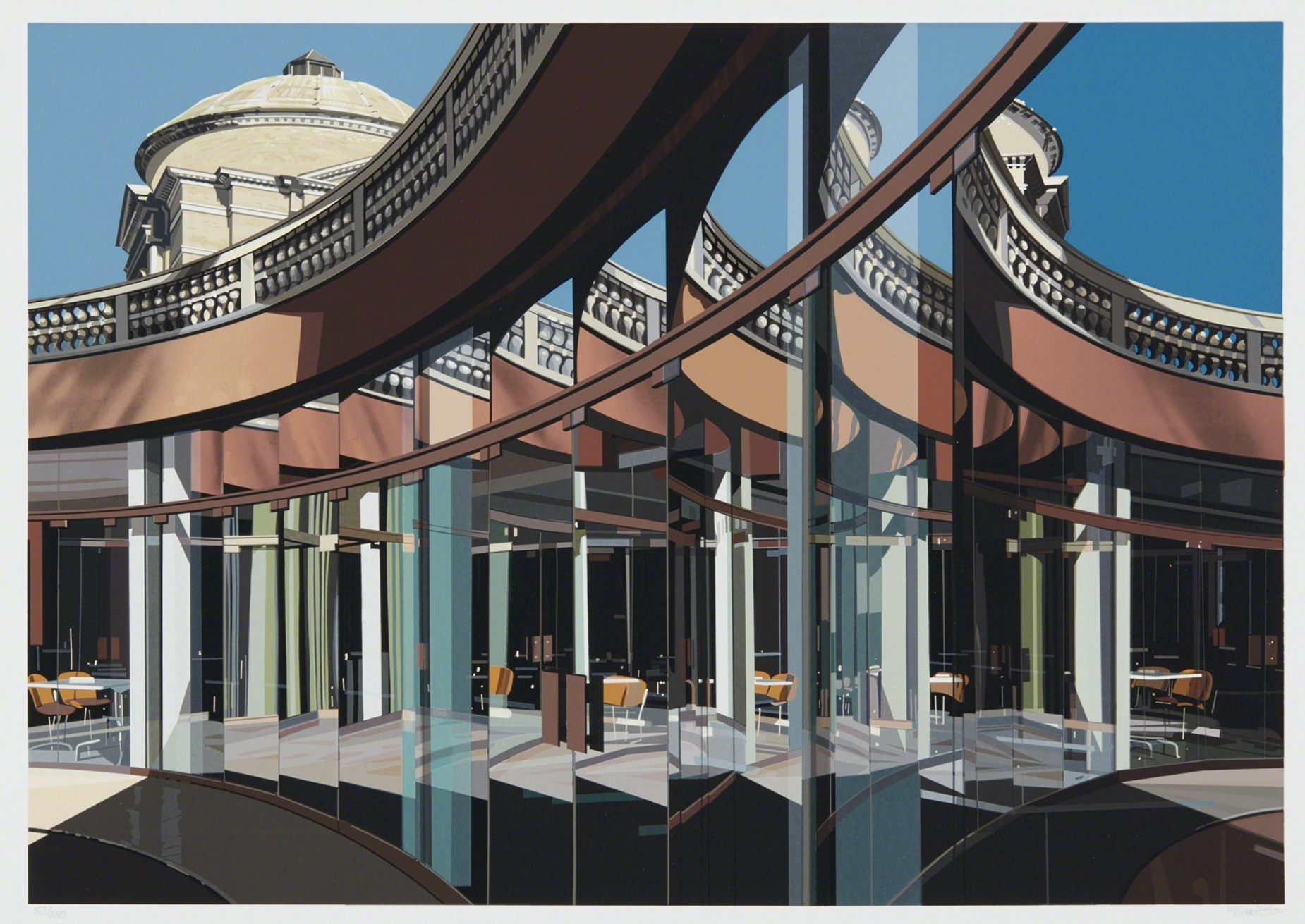
I fell under the spell of Richard Estes’s Paintings of New York City around 1985. In 1989, I bought his Cafeteria, Vatican screenprint from the publisher, Robert Feldman of Parasol Press downtown.

Richard Estes, Cafeteria, Vatican (from Urban Landscapes III), 1981, Screenprint, 14 1/8 x 20 1/8 inches. Over 30 years later, it speaks to me every bit as much as the first moment I saw it. Everyone is free to have their own opinion. Mine is this does not look like a Photograph. In fact, the differences between it and a Photograph are why I like it.

37 years on his work has lost none its hold on me. More importantly, I credit Richard Estes with teaching me how to really see the world around me through his Art. In honor of his 90th Birthday, May 14, 2022, I decided to take a closer look at his entire body of work to date, and, as importantly, the issues surrounding it that have held back its wider appreciation in a 3-Part series, this being Part 1. In this Part, I’ll address some of the issues surrounding his Art that have held back the wider appreciation of it.

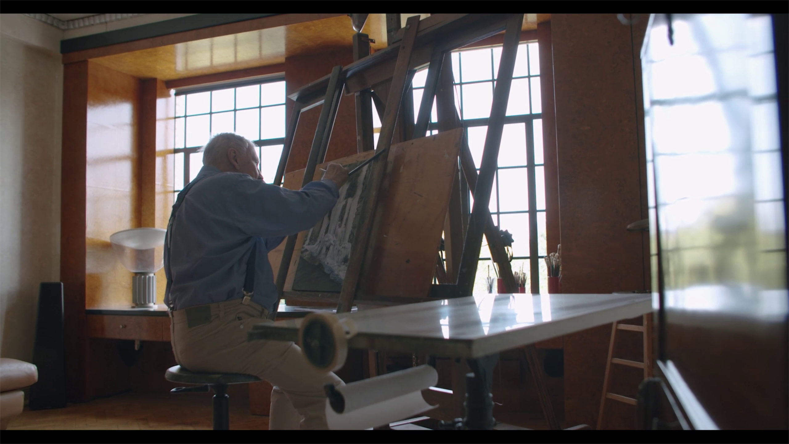
The Master in his workshop. Richard Estes seen at work in his apartment overlooking Central Park. It looks to me like he is working on a Painting with waterfalls, though it’s not one I recognize. Date and *Photographer unknown.

During these 37 years that I’ve been looking at the work of Richard Estes, the incessant hype about him is that he is supposed to be “the leader of the photorealists,” “the standard bearer of photorealism,” or words to that effect culminating with a form of the term, “photorealism.” Increasingly, I’ve been left to wonder…

Did anyone ever bother to ASK Richard Estes if he wants to be the “standard bearer of photorealism?1” Or, even if he even considers himself to be a “photorealist?”

In the book Richard Estes’ Realism, I found this answer-

“Estes dislikes all the titles given the artists working from photographs and thinks of himself strictly as a painter, with no prefixes2.”

“BINGO! Game Over. Please pass your scorecards to the front, and make sure your names are on them…” For what it’s worth, I do, too.

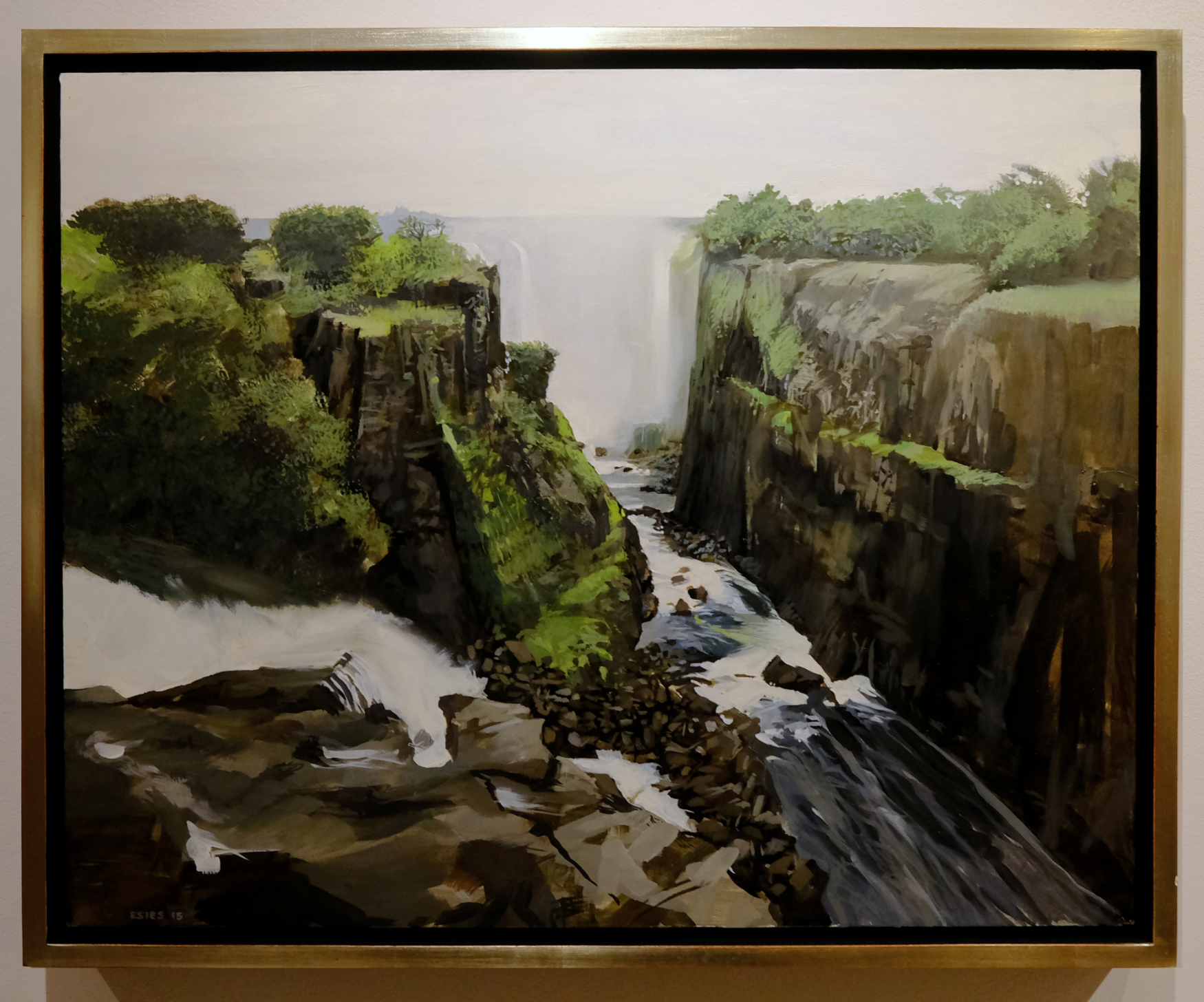
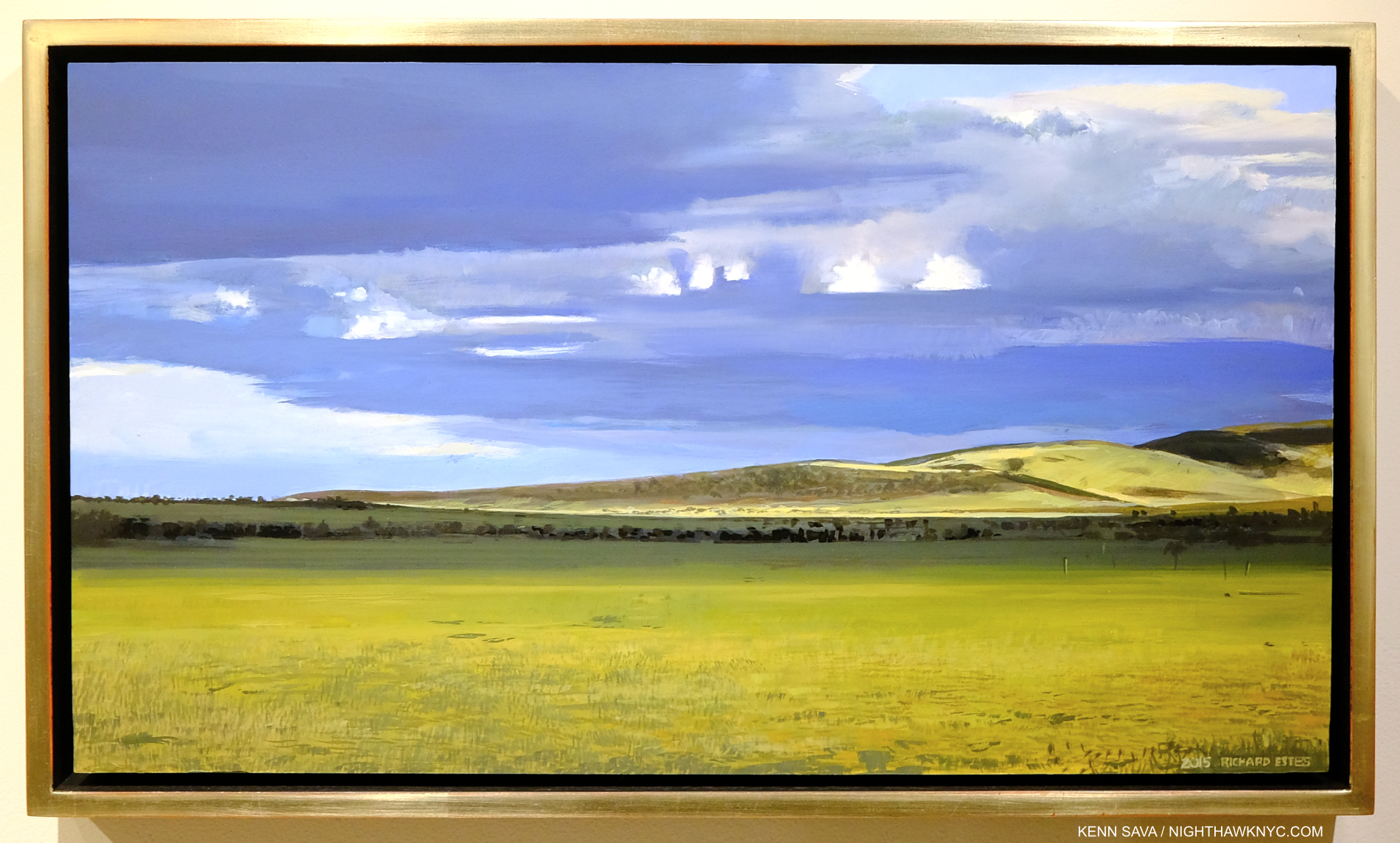
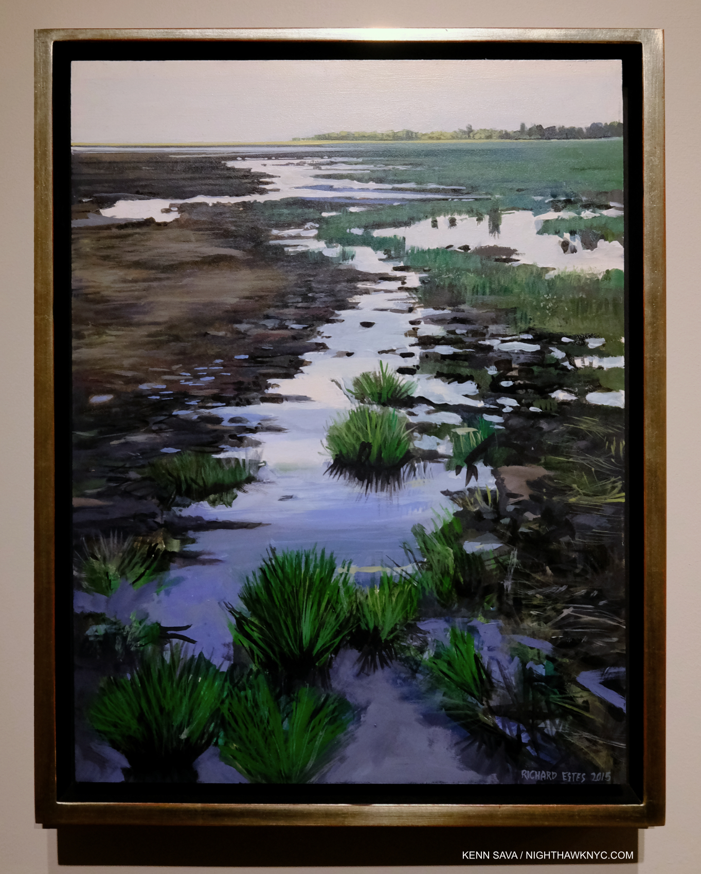
Victoria Falls II, 2015, Oil on panel, 16 x 20 inches. Show me one inch of this that looks like a Photograph. In this piece, I’m featuring examples of his work in “other” styles. Click for a closer look.

It galls me to no end that the Art press continues to ignore the words of Artists about their own Art!

They act like they know better than the Artist! Chuck Close was repeatedly on record stating in no uncertain terms that he did not want his work to be considered “photorealism.” He and I spoke about this twice and I was taken by the passion in his words rejecting it. It was obvious to me that this was something he had fought long and hard about. Yet, when he died last year, almost every obituary I saw, including that in The New York Times itself, where he had previously spoken against it in an interview, used this term in describing his work! Where is the respect? The same fate has befallen Richard Estes, and I believe a good deal of his work doesn’t come anywhere close to fitting into that box! I am featuring some of these Paintings (there are innumerable others) in this piece so you can see for yourself. It begs the question- Are the people who use these terms even looking at the Art?

Ngorongoro Crater II, 2015, Oil on panel, 12 x 22 inches. Is ANYthing in this work sharply detailed?

Why does this matter? It matters for a few reasons. First, I believe Richard Estes mis-association as a so-called photorealist has held back the full appreciation of his Art. That full appreciation reveals he is MUCH more talented than a mere mechanical Photo replicating machine, and he is much more diverse a Painter stylistically than has generally been acknowledged, or appreciated.

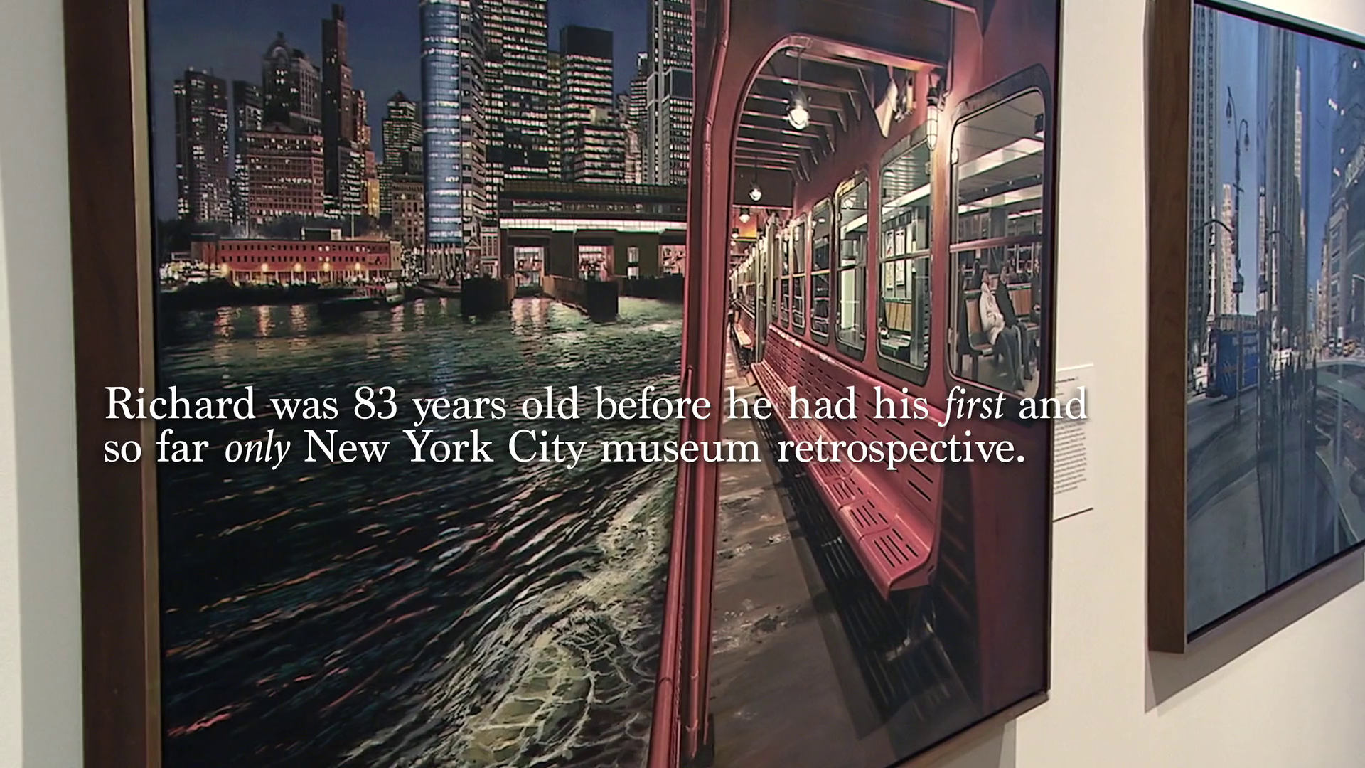
That would be the Museum of Art & Design show, 2015, where I met Mr. Estes at the opening. The show was a “retrospective” of his Paintings with NYC as their subject, only! It would be six years before his next NYC show, at a gallery in 2021. *Still from the Documentary Richard Estes: Actually Iconic.

Second, so-called “photorealism” has been dead for decades, at least to the powers that be in U.S. Art museums. Don’t think so? Ask yourself this- How many shows of Artists so boxed have been mounted in major U.S. museums in the past decade? Richard Estes got two, his first museum shows in multiple decades! (The “big 6” NYC major museums3 have never had an Estes show.) Not many others got any4. It seems to me that most people have stopped looking beyond the technique when they hear or read this term used about the Art they’re looking at. The “content” is something never discussed. Wait! Isn’t THAT what Art is supposed o be “about?” (However you want to define “about.”) Beyond this, putting any Artist, or person, in a box is limiting and just plain wrong, particularly creative people. Do you want to be in a box? I don’t. Putting Artists in boxes without their consent is to possibly damage their careers, and their livelihoods, as Artists have told me. Some are reluctant to speak out about it for fear of “making trouble” or being ostracized. If the public has been led to expect, say, “Cubo-rectilinear-obtustroism” from one Artist and he or she becomes a “Progo-constro-pressionist” the public is suddenly “disappointed!” Yes, I just invented “Cubo-rectilinear-obtustroism,” and “Progo-constro-pressionist” and why not? Non-artists were the first to apply many of these “ism” boxes to Artists. Yes, there are Artists who use terms like photorealism to describe their Art, and that’s perfectly fine, of course. I’m saying it’s wrong to lump Artists into boxes without their consent. In fact, I wouldn’t be surprised if an Artist sues someone who boxed them without their permission one of these days. That’s what the stakes are.

Ngorongoro Crater I, 2015, Oil on panel, 13. 3/4 x 11 7/8 inches.

“…but his (Richard Estes’s) work has never been strictly about the duplication of a photograph or about total adherence to his photographic sources,” Richard Estes’ Realism5.

A keyword for me in that statement is “NEVER.” For those of you not up on your meaningless/pointless Art terms (good for you!), a “photorealist” is, supposedly, an Artist who perfectly renders a Photograph, usually in paint. It seems to me that if Richard Estes wanted to perfectly render a Photograph, or if a Photograph perfectly captured a scene the way he sees it in his mind’s eye, he’d be a Photographer, and not a Painter! Like many of these terms, there is supposed to be a “movement” around it. Yet, I can find no evidence of any of the Artists so branded ever getting together around shared ideals and goals and deciding to begin such a movement! Regarding Richard Estes’s involvement in this imaginary “movement,” Richard Estes’ Realism says,“Before his affiliation with the Allan Stone Gallery in 1968, Estes knew no successful contemporary artists, and until mid-1969 he was unaware of the other contemporary US painters working from photographs who were then independently emerging on both coasts,[2 ibid].” The words “independently emerging” show the lie in the use of the word “movement” in this case. I believe the term “movement” is used by those coining the phrase preceding it to make others feel they’re “not in the know.” In 9 of 10 cases where this word is invoked in Art it has absolutely no other meaning. That’s right. In almost the case of every so-called Art “movement,” there was no group who got together about anything! Don’t believe the hype! Ignore it. Look at the work for yourself. I hope and believe these terms will eventually fade into antiquation and make every book that used them seem out of date, and “not in the know.” “Great grandpa, I’ve never heard this term before. What was a “photo realist?”

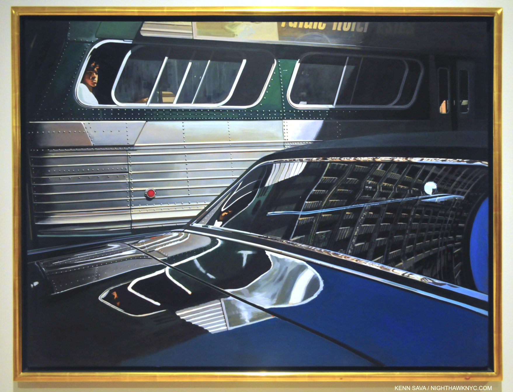
Bus With Reflection of the Flatiron Building, 1966-67, seen at Richard Estes: Painting New York City, in September, 2015. Richard Estes’s “mature” work begins here.

“I think I started using reflections to give more of an abstract quality to the paintings, to make them look less like a photo,” he said.6

Wait! That’s sheer photorealism blasphemy! The “movement” better have a meeting (their first) and pick a new “standard bearer!” Yes, Richard Estes begins with a reference Photograph or Photographs he took, but so what? Painters have been doing that for well over 100 years. That’s NOT the point!

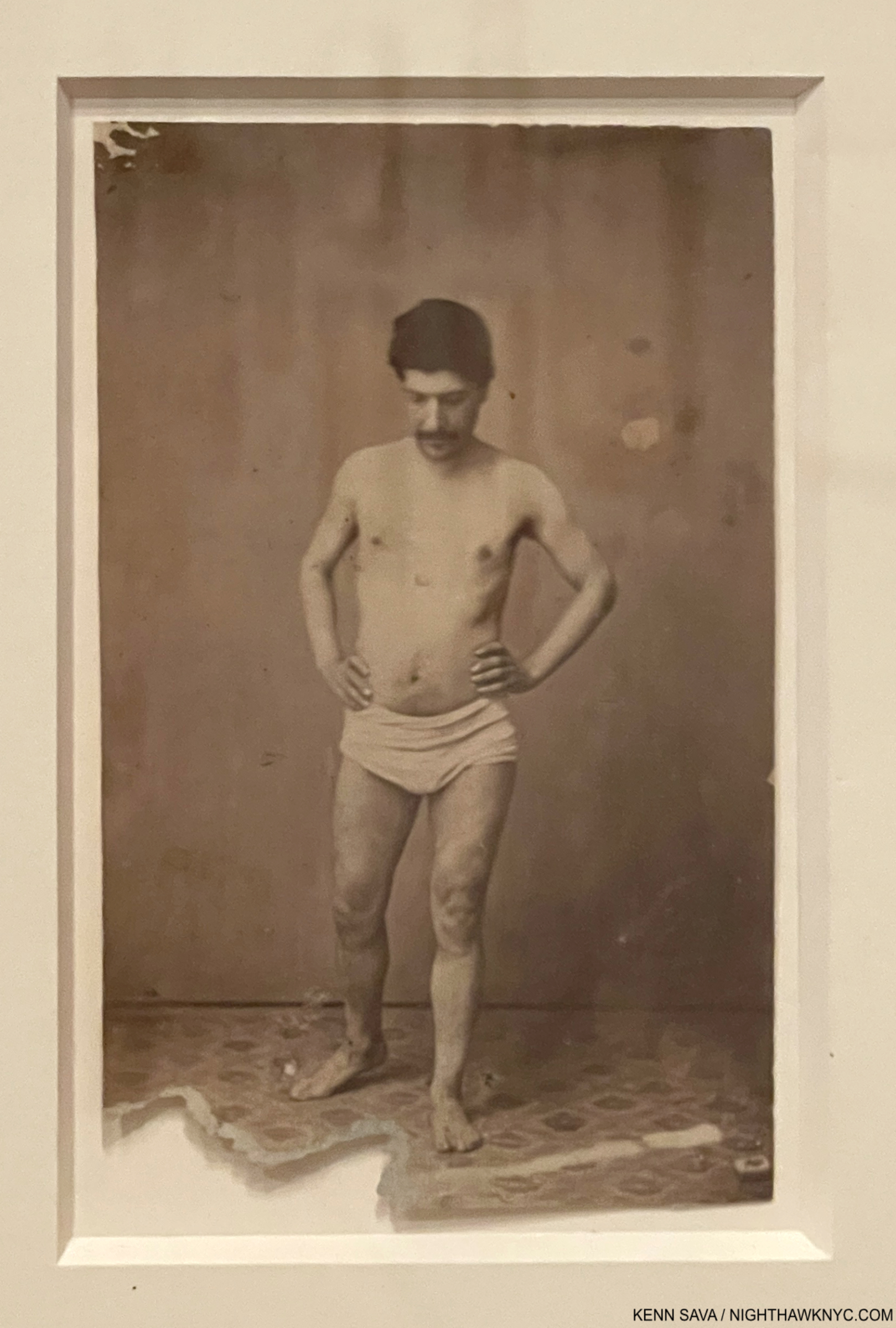
137 years in this case. Unknown Photographer, Untitled, Portrait of the Model apparently used by Cézanne for his Painting, The Bather, 1885(!), now in MoMA’s permanent collection. Seen in my piece on Cézanne Drawing.

Most of them, including Cézanne, Edgar Degas, Thomas Eakins, Charles Sheeler, Ralston Crawford, Francis Bacon, Rod Penner or Jordan Casteel, haven’t been stuck in this box. Richard Estes uses his Photographs as references but always at the service of what he sees in his mind’s eye and what he feels looks “right” on the canvas for his conception of a given scene. As a result, in Tower Bridge, London, 1989, he includes St. Paul’s Cathedral in a scene where it wouldn’t be seen in real life, in Brooklyn Bridge, 1991, Mr. Estes had to enlarge the background skyline from the Empire State Building south to Wall Street to make sure it was even seen, and in Hiroshima he literally moved mountains- those that are right of the city to the background. Once I knew that, I didn’t take anything I saw in his work literally. I threw the “photo baby” out with the bath water.

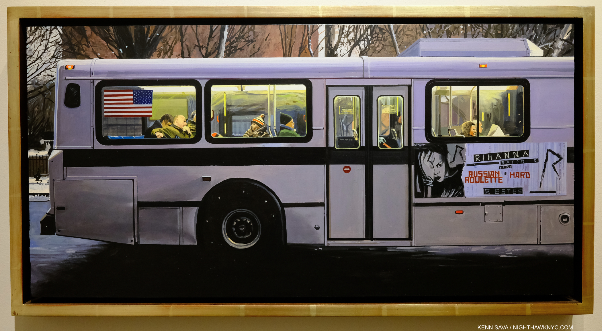
Rhianna, 2012, Oil on panel, 12 x 24 inches. While most of his Urban Landscapes are sharply detailed, this one isn’t. Almost nothing here, save for the lettering on the sign, is in sharp focus.

That helped open my mind, and my eyes, to seeing “more,” to begin to look deeper than his unsurpassed technical mastery. That led me to the unasked question when it comes to any so-called photorealist Art, and to Richard Estes’s Art- What is his Art about? I’ll get to my take on it in Part 2.

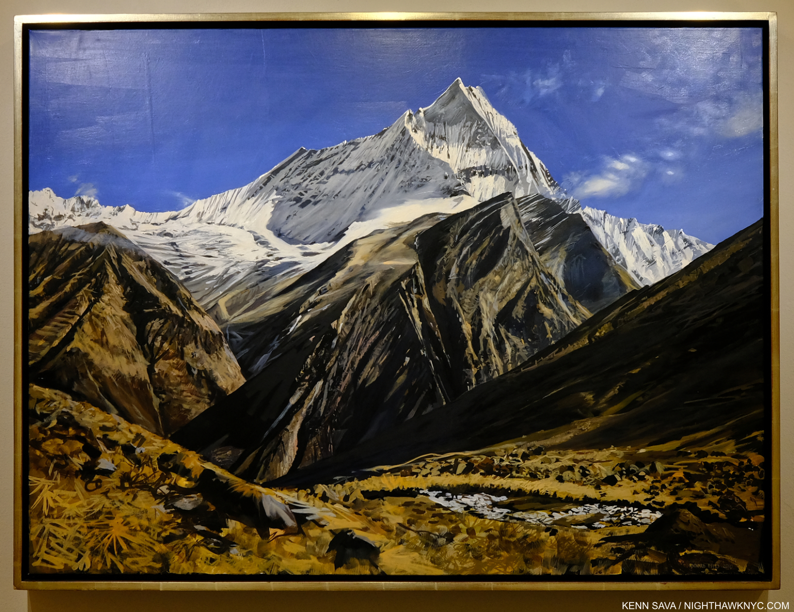
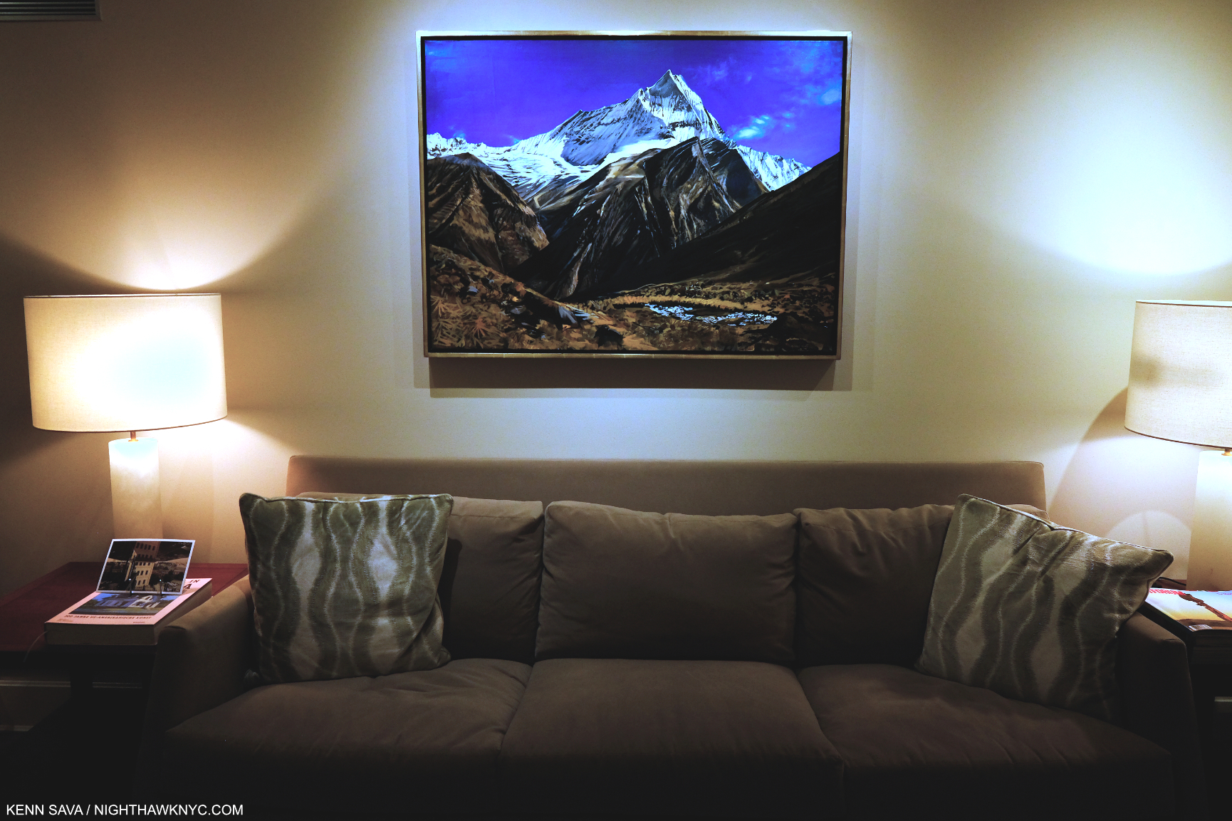
View in Nepal, 2010 Oil on canvas, 32 x 43 inches. This doesn’t look like this in “real life.” In this work, only the snow-capped peak might be in sharp detail. Given this work’s size, I think it was designed to be seen from a distance, assuming the viewer’s attention would be on that central peak. Therefore, it seems to me it’s Painted the way the eye would see the peak, with everything else out of focus. Richard Estes has Painted in this style frequently, ever since he began spending his summers in Maine. It’s completely different from his Urban Landscapes of NYC and elsewhere where everything is in sharp focus. Would anyone call this “photorealist?”

Now, I see an Artist who Paints in a number of different styles- some sharp edged and apparently representational, with everything in focus from the foreground to the very back, other pieces “soft” and down right impressionistic (used as an adjective, not as a form of the word often used to connote a group of French Artists in the 19th century that I’m still not convinced were an actual “movement.” They were grouped together by a writer because they had to sell their work outside of the official Salon which rejected it). And, in a good many of his Paintings there are passages of abstraction- some quite large. What this tells me is that Richard Estes in an extremely talented Painter who maintains the freedom to go stylistically where his muse and the subject at hand takes him, and NOT a mere replication machine who’s a slave to a Photograph. In Part 3, I look at two works that define this, for me.

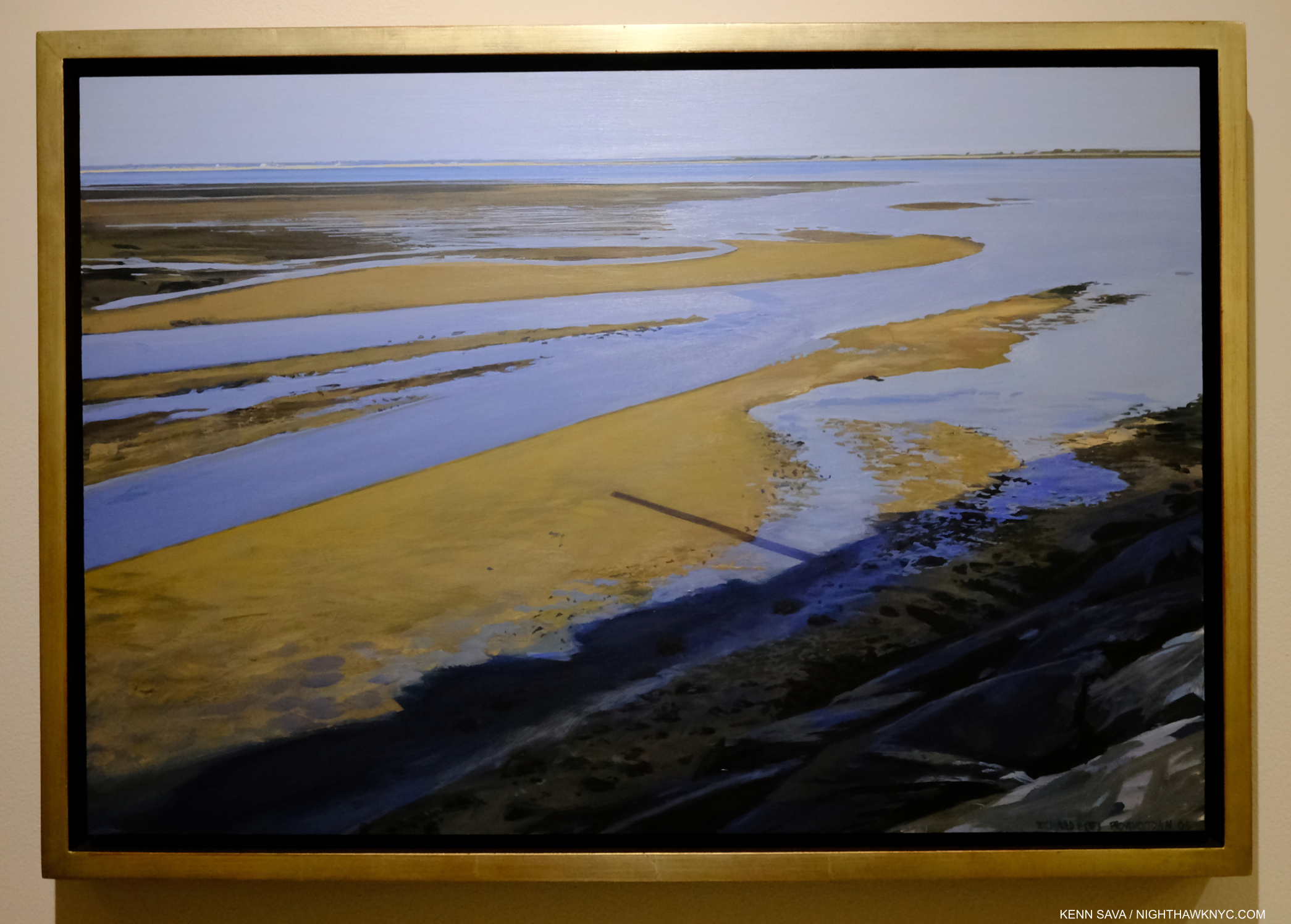
Late Afternoon Tide, Provincetown II, 2006, Oil on panel, 13 1/2 x 20 1/8 inches. When I look at this, I see an Artist under no pressure to create what’s “expected” of him. That’s just me.

Richard Estes gives us work based on Photographs that are translated through something no camera has- his human brain, with his unique intellect, to show what he wants us to see, as rendered through his remarkable hands and unique skill. This is what makes him that most human of terms- an Artist- something no device or machine is, at least to me. In his case, an Artist deserving more serious attention than he has received in his first 90 years. Of course, both his initial Photographs and the end Painting are the product of his eyes, and it is through these that he matches his original intention in taking his source Photographs with the resulting Painting, adding in, or changing, what was not present in the real world to match what he sees and feels inside. This is what differentiates him from a mere replicating machine.

Viva la différence!

-My observations based on 35 years of looking at Richard Estes’s body of work to date as a whole are in Part 2 of this series, below, or here
-The final Part 3 looks at two more recent Self-Portraits, which I feel stand apart from the rest of his work, here.
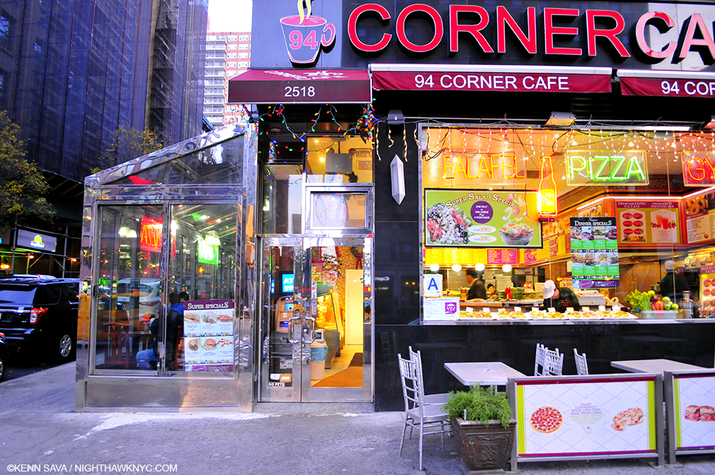
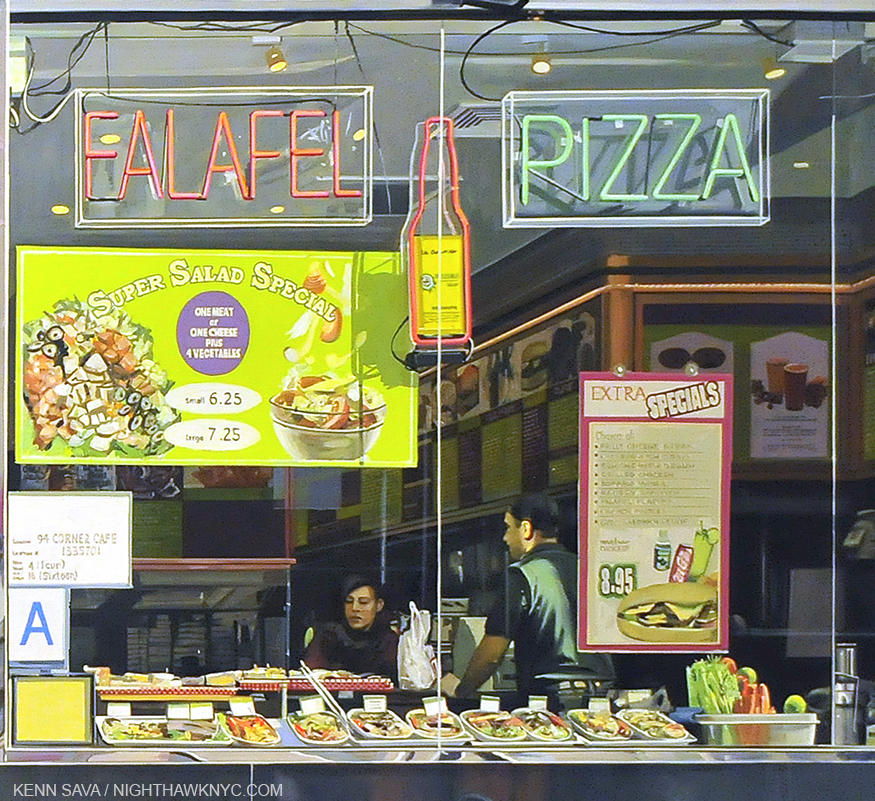
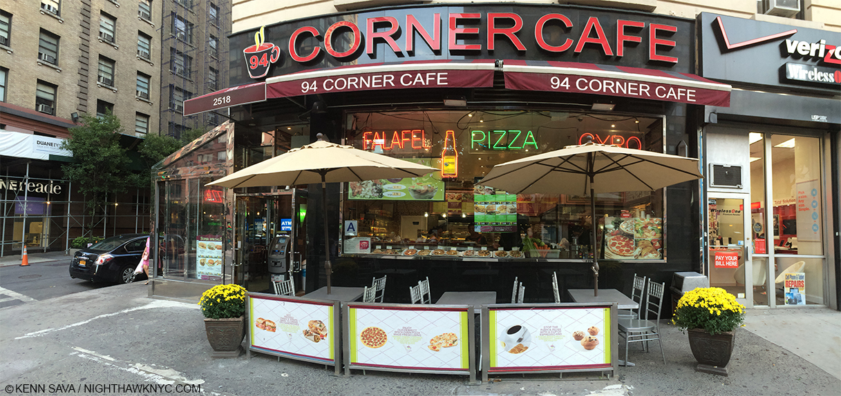
-My piece on Richard Estes’s Corner Cafe, 2013, may be seen here. 
My look at the 2015 Richard Estes: Painting New York City show at the Museum of Art & Design may be seen here.
-My piece “Death to Boxes!” is here.

*-Soundtrack for this Post is “Don’t Believe the Hype” by Chuck D & Public Enemy from It Takes a Nation of Millions to Hold Us Back, 1988.

“Don’t believe the hype
Don’t—
Don’t—
Don’t—
Don’t believe the hype*”

NighthawkNYC.com has been entirely self-funded & ad-free for over 8 1/2 years, during which 320 full-length pieces have been published! If you’ve found it worthwhile, PLEASE donate by PayPal to allow me to continue below. Thank you, Kenn.

You can also support it by buying Art, Art & Photography books, and Music from my collection! Art & Books may be found here. Music here and here.

Written & photographed by Kenn Sava for nighthawknyc.com unless otherwise credited. To send comments, thoughts, feedback or propositions click here. Click the white box on the upper right for the archives or to search them. Subscribe to be notified of new Posts below. Your information will be used for no other purpose.

  1. https://msfineart.com/viewing-room/33-richard-estes-voyages/
  2. Patterson Sims, Richard Estes’ Realism, P.10. Mr. Sims was apparently there when Mr. Estes said this. Yet, he calls his work “Richard Estes’ Realism,” substituting one box for another.
  3. The Met, MoMA, Guggenheim Museum, the Whitney, the New Museum and the Brooklyn Museum.
  4. I’m not counting Chuck Close for the reasons just stated.
  5. ibid, p.10
  6.  New York Times, March 8, 2015 

Richard Estes Art: What I See

This site is Free & Ad-Free! If you find this piece worthwhile, please donate via PayPal to support it & independent Art writing. You can also support it by buying Art & books! Details at the end. Thank you.

Written & Photographed by Kenn Sava.

This is Part 2 of my look at the work of Richard Estes on his 90th Birthday, May 14, 2022. Part 1 is above, or here. Part 3 is here

Over most of my 35+ years of looking at the work of Richard Estes, I’ve simply enjoyed looking at it, and it certainly lends itself to that. As I’ve already said in Part 1, one result of all that looking is that his Art has come to shape the way I see the world around me. As he turns 90, his Painting career has now spanned more than 55 years1! Recently, I began asking myself “What does it all mean?” This Part looks at what I see.

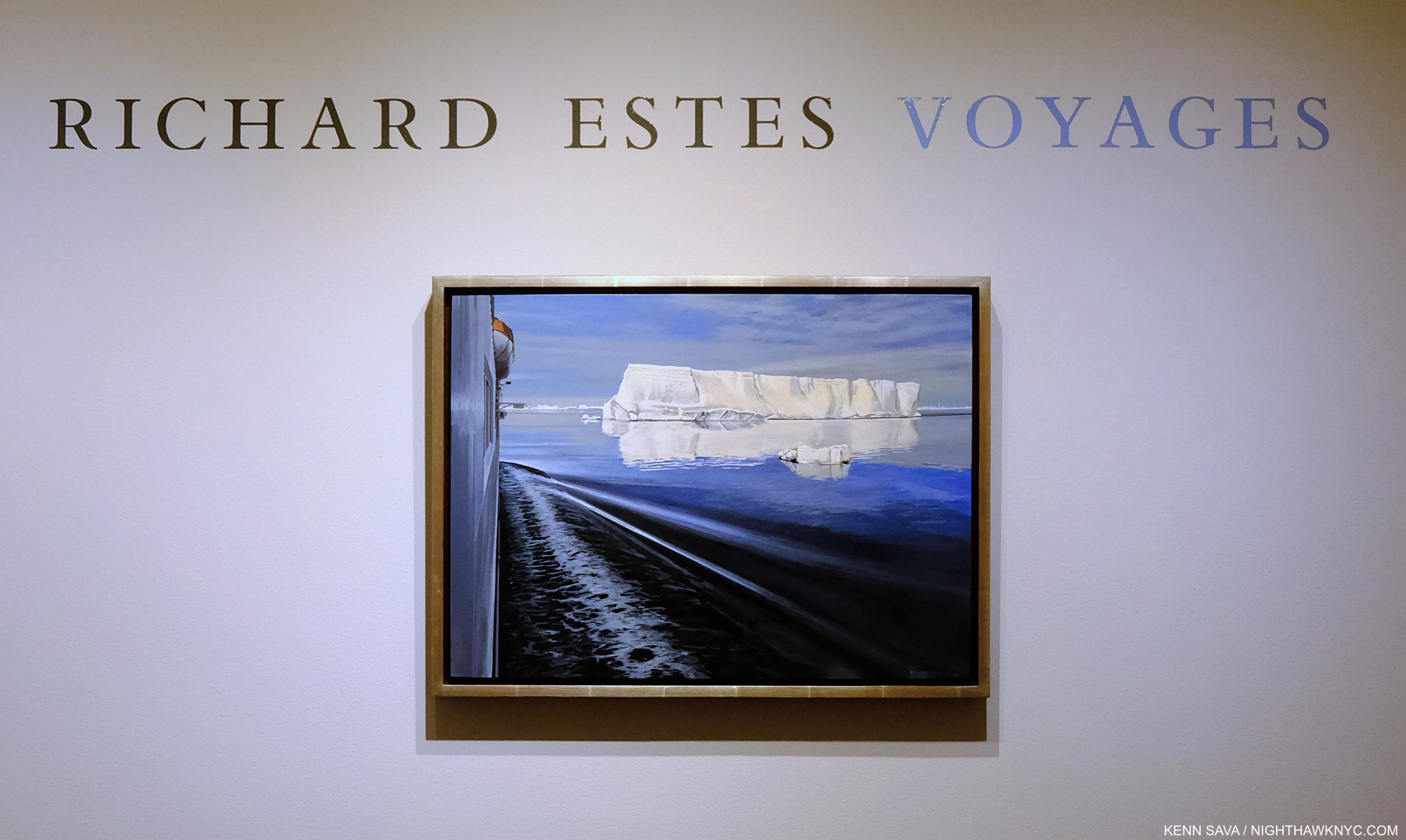
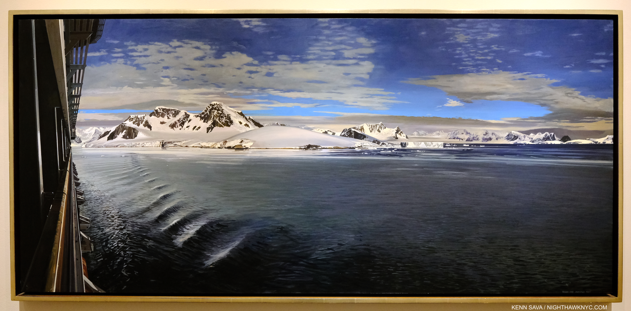
Richard Estes, Antarctica II, 2013, Oil on panel, 16 3/4 x 22 3/4, seen at the show’s entrance. Click for full size.

In Antarctica II from 2013, we see an iceberg floating in a large body of water with a smaller piece of ice, possibly broken off of it, floating on its own. To the left is the hull of the ship apparently containing the Artist on one of his many voyages to a far away land, with the side of a lifeboat visible above. The boat’s wake radiates out towards the berg as the boat moves towards it. One reading of this piece would be man’s impact on Antarctica, which has left it in a precarious state, represented by his alien vessel encroaching on the iceberg’s realm, its wake about to make contact with it.

Not so fast…

“Richard Estes avows that his realism has no hidden meanings, special messages, or stories to tell. Political positions and posturing about the human condition are alien to his art,” in a conversation with Patterson Sims per Patterson Sims, Richard Estes’ Realism2.

Given what I wrote in Part 1 about people disrespecting the Artist’s word on his own Art, though this is not a direct quote (something I address further on), I’m not going back on that now. It is impossible, however, for me not to see the effects of global warming in Antarctica II. How to reconcile this?

Unlike the blockbuster Jasper Johns: Mind/Mirror, which was originally scheduled to coincide with Mr. Johns’s 90th Birthday in 2020, before the virus closed everything, as far as I know at the moment (in early May, 2022), nothing is planned in the Art world to celebrate Richard Estes’s 90th Birthday. My series might be it! Seriously?

Richard Estes: Voyages installation view of View in Nepal, 2010, Oil on canvas, 32 by 43 inches. Part of the show was very nicely installed in the large office space. In Part 1, I wrote about how I believe this work is conceived. Installed like this makes standing close to it difficult, and so the eye is almost forced to the central, white, peak, causing everything in front of it to be out of focus. It’s really a marvelous and somewhat daring composition for this reason, and a stunning contrast to Richard Estes’s Urban Landscapes, like the one to follow…

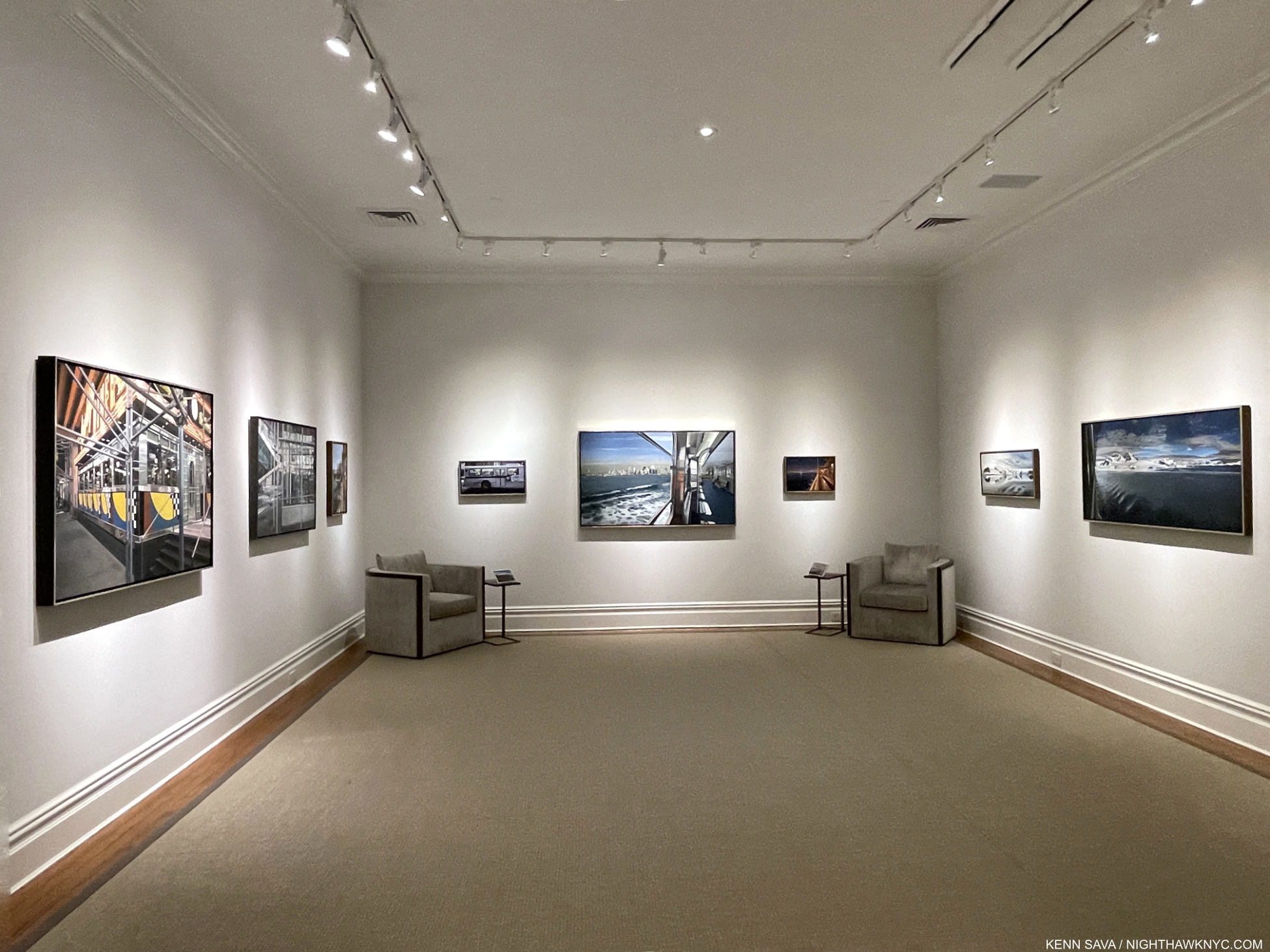
The closest NYC Art event that might qualify was Richard Estes: Voyages at Menconi & Schoelkopf in July, 2021, the first show of his work here since the Museum of Art & Design’s Richard Estes: Painting New York City in 2015, which I looked at here. Containing about 30 pieces covering the range of his subjects, Voyages featured more recent work. The theme of the show was ostensibly the annual trips and voyages Mr. Estes has taken over many years and the Paintings that have resulted from them, though these were juxtaposed with some of his iconic NYC Urban Landscapes3. An experienced world traveler at this point, his journeys have taken him to the far corners of the globe. At first, being completely taken by his views of NYC, I didn’t know what to make of the resulting views of forests, bodies of water, mountains and deserts that began emanating from his hand after his travels, first to Maine, then ever further afield. All the while, he still continued to give us his iconic Paintings of New York City, and other cities. When I walked into Voyages and saw the Urban Landscapes alongside African landscapes, Antarctic vistas, and deserts, I finally decided to sit down and do a reconciliation of his entire career and try and finally understand what, if anything, his whole body of work is saying to me.

First, Voyages reveals Richard Estes has been as busy Painting as ever. In 2021, at age 89(!), he Painted this-

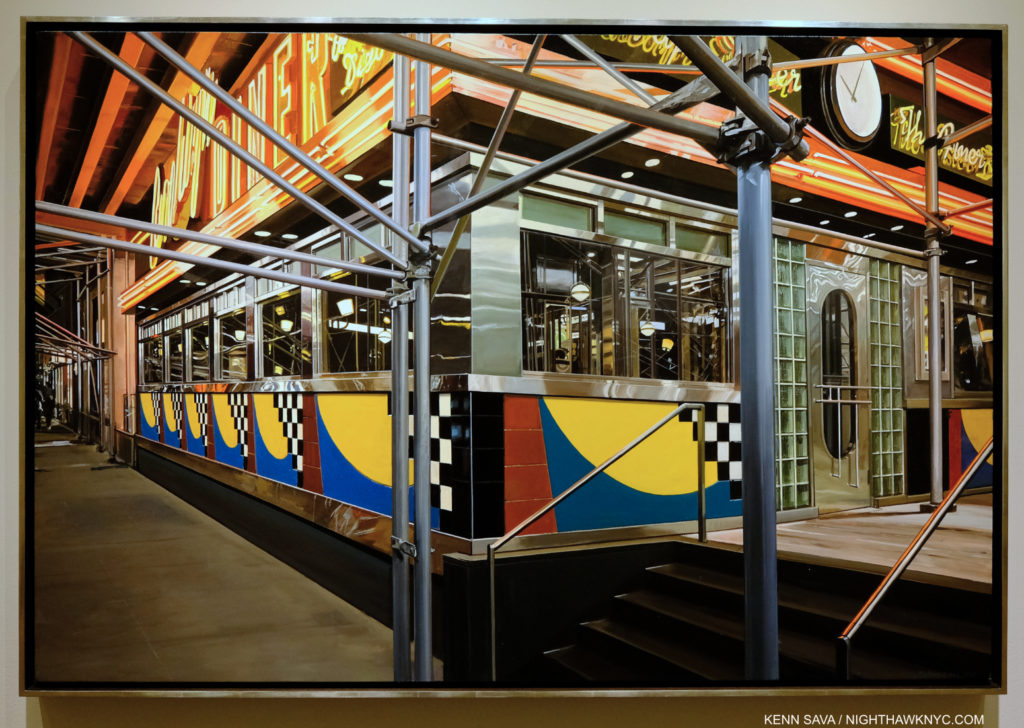
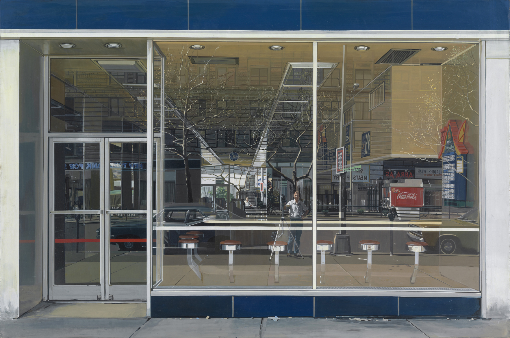
Brooklyn Diner, 2021(!), Oil on canvas, 37 x 55 1/4 inches. I was dumbstruck when I first saw this. I just hope I can still out of bed if/when I’m 89.

It’s a statement in more ways than one. First, it’s apparent even at a glance that he has lost none of his world-class technique! When I finally finished marveling at that, I began to ponder the unusual composition. I decided to take a look-see for myself. I jumped on the A Train and made a trip to the real Brooklyn Diner, which turned out to be a bit of an outlier on West 57th Street, to see what I could learn from the actual site.

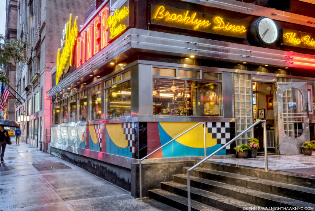
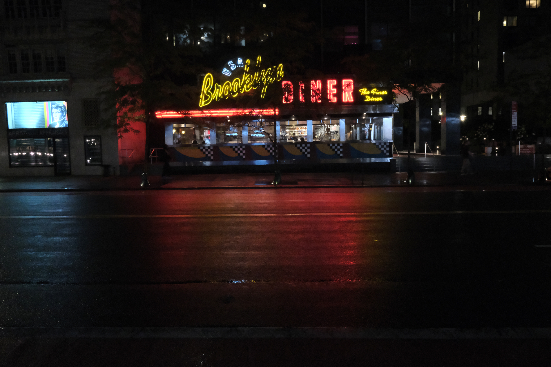
Brooklyn Diner seen from just behind the spot Richard Estes depicts. July 1, 2021. Notice how the “real” view lines up, or doesn’t line up, with the Painting. If I were standing closer, nearer that railing, as in the Painting, I wouldn’t be able to get the same view of the door, without a wider angle lens. The very wide 23mm lens I’m using here barely holds it, and I had to step back to get this! Suffice it to say I wasn’t able to take a Photo that exactly matches the Painting! Therefore, my Photo is not so-called “Paintingrealism,” to coin a box I hope no one uses. See important footnote-4.

Seeing it in person raised all sorts of questions about the Painting. Diner manager Guy told me the scaffolding, not to be seen now, was up from July to around Christmas, 2019, for HVAC work on the roof. Even though the scaffolding is gone, the building is exactly the same as it was. As you can see, I was unable to duplicate the view of the building in Mr. Estes’s Painting in a Photo in spite of using a wide-angle 23mm lens! Being the most colorful place in the area, and that area being Richard Estes’ extended neighborhood, I then wondered why he didn’t render it before or after the repairs. Then, I quickly remembered that over the last decade or so, Mr. Estes has Painted quite a few buildings fronted with scaffolding (another is shown further below).

Booklyn Diner, July 1, 2021. The trees in front of it make its signage a bit less commanding, partially hiding it, like the scaffolding in the Painting does. The trees are our of the frame to the left in the Painting.

Scaffolding adds yet another layer to the countless layers many of his street scenes already had- exterior, reflections, interior, rear exterior, which often adds another level of complexity to the geometry of the whole thing, not to mention another layer of technical difficulty. It also adds mystery. It’s interesting to me that here, the top of the building is cut off. On the main sign to the left, you cannot read “Brooklyn,” and “Diner” is hard to see fully. Neither is legible on the sign to the right. In fact, if he didn’t name the Painting Brooklyn Diner, you wouldn’t know what this place was! This “selective editing” makes me feel that the facade, with its candy color, distantly Art Deco echo, is not the point of the piece, though it’s what catches the eye when you see either the Painting or the actual Diner on the street. The ways he has changed the scene are fascinating. Again, I wonder “Why?” The only conclusion I can make from this is that Mr. Estes is making the scene into what he wants to express.

The Diner sits, incongruously, a half a block, but worlds away from, the glitz, glamour and Artistry of, Carnegie Hall, and directly across the street from the legendary & historic Art Students League. This location is not far from Mr. Estes’s NYC apartment, and that fact has led him to render innumerable sites in this neighborhood in Paint over his long career.

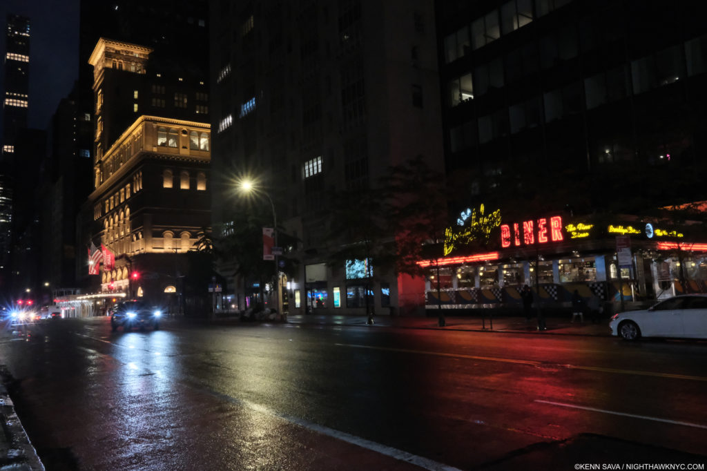
West 57th Street between 7th & 8th Avenues looking east. That’s Carnegie Hall, lit up left, Brooklyn Diner, behind the trees, right. My back is to the Art Students League. July, 2021.

In pondering why he chooses his subjects (which I still often do), I find something quite interesting about this location, and it’s shown in this photo- Richard Estes is a known lover of  Classical Music. Yet, he has never Painted Carnegie Hall, the most famous Classical Music concert hall in the country and one of the most famous in the world! In Brooklyn Diner, a glow of a light may be seen at the far left nearer the top. That may be from Carnegie’s lights as shown here. That’s as close as he’s gotten! It begs the question “With all the buildings he’s depicted in the area, why hasn’t he Painted Carnegie Hall?” As for this subject, he has given un an unorthodox view of Brooklyn Diner, putting the focus of this work in an odd place. I imagine that if 100 other Painters chose to paint the Booklyn Diner, this is not the view we would get. From the street, the neon sign is the most striking thing about the Diner. In Mr. Estes’s Painting, the sign is cut and is far away from the center/focal point of the work. Instead, front and center are details of the scaffolding. What to make of this?

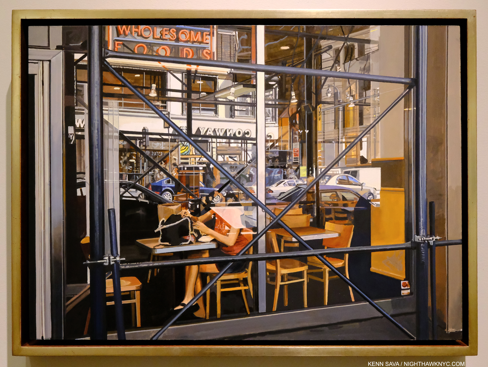
Wholesome Foods, #2, 2018, Oil on panel, 16 x 22 1/4 inches. Another of Richard Estes’s scaffolding Paintings, and another in which the scaffolding is font and center. The woman sitting behind it in the window is engulfed by the detritus of the modern world- glass, steel, wood, paper, cars, buildings, trees, and the materials she’s wearing. In this wonderful composition, which harkens back to, and updates, Edward Hopper’s similar scenes, and a store window reflection Photograph by Eugene Atget, which Mr. Estes has in his collection, she becomes just another element, or someone seen behind glass. I see this as a reminder of how the modern urban world forces its inhabitants to live, a scene that might look as odd to viewers in 300 years as Canaletto’s scenes of Venice look to us today. The geometry and depth of this piece is extraordinarily multi-dimensional, beautiful and ugly at the same time.

 “I don’t enjoy looking at the things I paint, so why should you enjoy it?…I’m not trying to make propaganda for New York, or anything. I think I would tear down most of the places I paint.’” 5.

Those are not idle words. Richard Estes started out to be an Architect before he became an illustrator, and finally a Painter. When I looked at Corner Cafe, 2014-15, from the Painting New York City show, his most recent work at that time, I found that Mr. Estes had not eaten there. I don’t know, but I would imagine the same might be the case for the Brooklyn Diner. So much for a Painting of a place from a personal experience. If we remove personal experience from his choice of subject here (hypothetically) we’re left with something about this site inspiring the Artist creatively. It’s hard for me to look at Wholesome Foods, #2, or Brooklyn Diner, or any of the scaffolding Estes and not think he’s (symbolically) “X”ing out what we’re looking at, given what he said. In the case of Wholesome Foods, #2, possibly with multiple large, literal “Xs.” “… I would tear down most of the places I paint,” leaves it up to the viewer to decide which places he means. Maybe that’s why he hasn’t Painted Carnegie Hall?

Times Square, 2004, Oil on canvas, 64 1/8 x 37 inches. Click on it to be fully engulfed. Seen at his 2015 Museum of Art & Design show, this may be the most technically astounding Painting I’ve ever seen, along with any Painting by Jan van Eyck. Having stood on this spot before, during and after 2004, I can certainly verify the overwhelming visual noise that still is Times Square, something that has never been more faithfully realized than it is here. Like most New Yorkers, including this one, maybe Richard Estes would like to see it torn down? Still, the Painting would live on as a reminder of how we actually lived here in 2004. “Progress” since the time of Canaletto (1697-1768)? It could also be read as a comment along those lines.

Overall, I see Richard Estes as a direct successor to the Artists he has named as influences- Canaletto, his nephew Bellotto, Thomas Cole, Frederic Church and Thomas Eakins. All of these Artists depicted the world around them without an ostensible “message,” though Thomas Cole also created the series The Course of Empire, in 1833-6, which I looked at here, that do appear to have a message. After the fact, Conservation has come to be seen as one interpretation of Cole, Church and their contemporaries, who were lumped in the Hudson River School box by someone else. That aside, I look at Richard Estes’s work the same way I look at any of theirs.

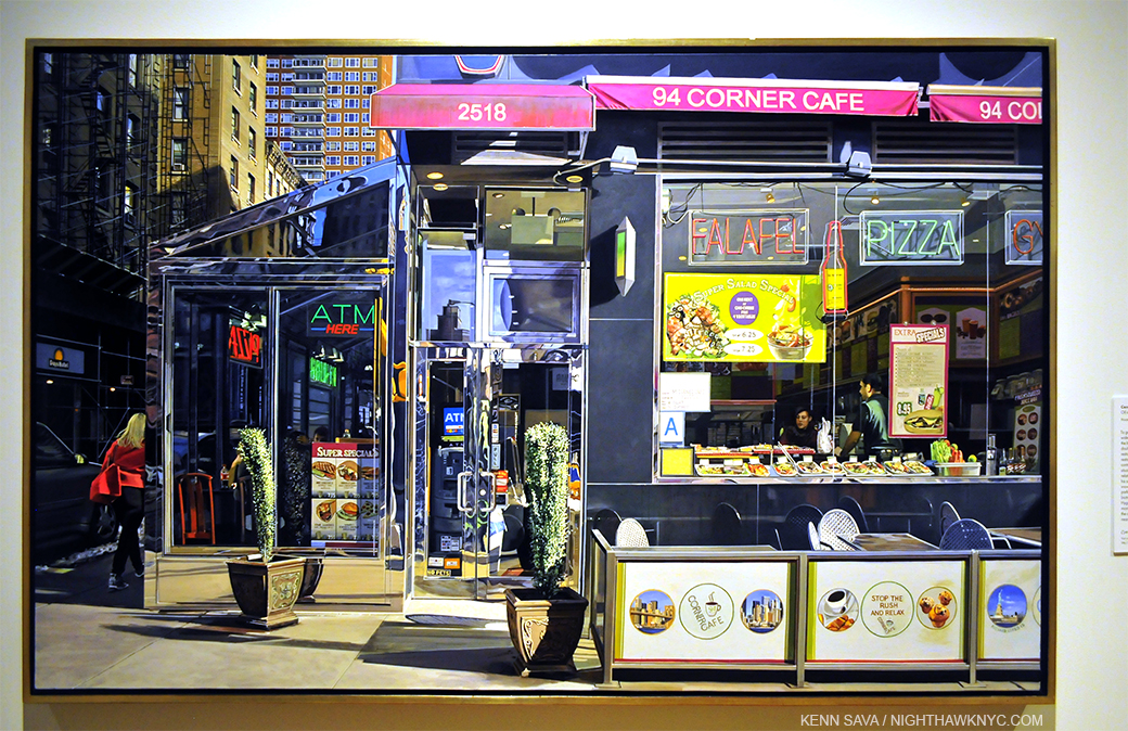
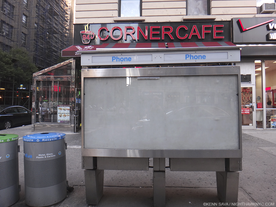
Richard Estes, Corner Cafe, 2014-15, the newest work shown in his Museum of Art & Design Painting New York City show, and seen there in 2015. Oil on Canvas. The Artist was only 83 when he Painted this. I visited the actual Corner Cafe shortly after seeing it. Interestingly, due to a large phone booth in the way, I again had great difficulty trying to duplicate the view seen in the Painting in a Photo, as you can see here!

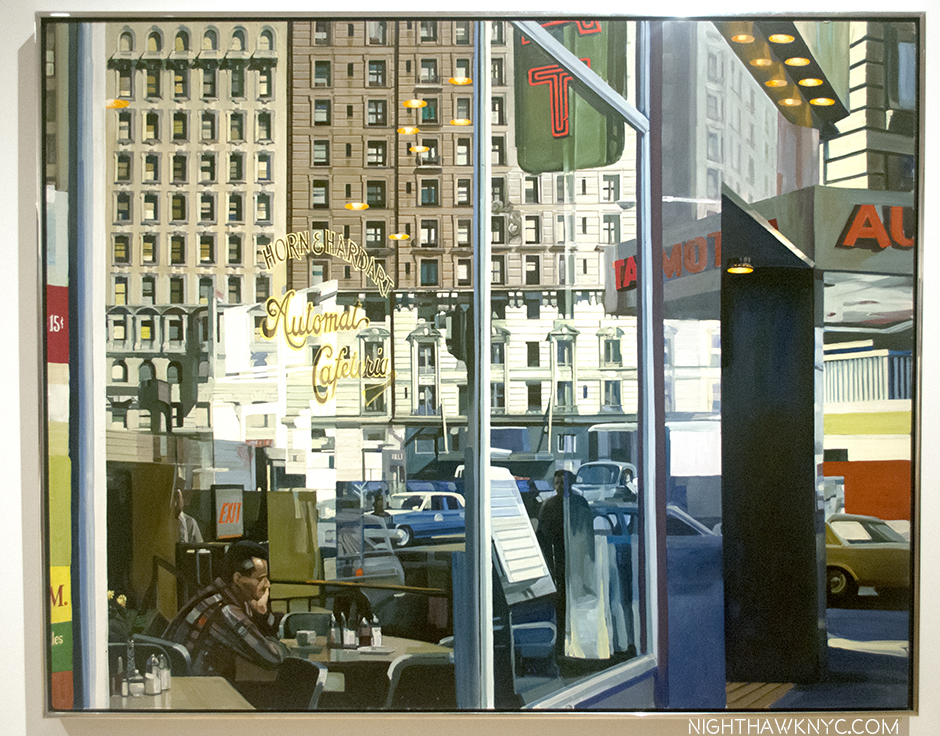
I get similar feelings looking at some of Mr. Estes’s Urban Landscapes, like Wholesome Foods, #2, Corner Cafe and Horn & Hardart, 1967 that I get looking at Edward Hopper’s urban scenes, including Nighthawks, as I said in my 2016 look at Mr. Estes’s Corner Cafe. This is incredibly rare. Though countless other Artists have tried to emulate Hopper, (which I am not saying Mr. Estes is) I can’t say I’ve felt that from any of them. Seven years after I first saw it, I still get that feeling when I look at Corner Cafe, which I now feel is a masterpiece.

When taken as a whole, the 55 year & counting body of Paintings & Prints he’s created, some interesting things become apparent. Looking back over more than a half century, Richard Estes’s Paintings show us two worlds.

Antarctica II, 2007. Oil on panel, 26 3/8 x 57 inches. Canaletto (1697-1768) lived 300 years ago. In 300 years, will people look at this as something they can relate to in their world, or something from the lost past?

First, the world he lives in and around in NYC, and to a lesser extent, the other cities he has visited & Painted around the world- i.e. his so-called Urban Landscapes6. The second is the world he lives in and around his second home in Maine, and the natural world he has visited on his many trips to other lands. Both groups can be summarized thus- 1) Works depicting the world built by man on the one hand, and, 2) Works depicting the unbuilt, natural world on the other. There is obvious intention in this. Mr. Estes has chosen each and every subject he has Painted. Outside of a handful of Portraits (some commissions, some gifts), I’m leaving nothing out of his oeuvre in saying this. It’s incredibly rare in Art history to find ANY Artist who’s entire body of work fits so neatly into two categories!

Voyages, installation view of the second gallery. NYC Urban Landscapes on the left wall, Antarctica Paintings on the right, one of each to the far left and far fright is cut off.

Seeing some of each of the categories on view face to face in Voyages brought this duality home for me in a convincing fashion. On one wall in the second gallery, left above, a rotating selection of Paintings of Manhattan faced a selection of Paintings of Antarctica on the opposite wall, right. For me, this summed up his career to date in a nutshell. The city scapes show the city (NYC, London, Paris, Madrid, Tokyo, etc) on typical days, much like the Venice Canaletto and Bellotto show us. Mr. Estes’s Paintings of the natural world seem to follow in the long tradition of landscapes by American Artists, including Thomas Cole, Church, et al, as well as Edward Hopper’s views of Maine (among many other Artists who have preceded Mr. Estes and lived & worked in Maine. Thomas Cole also Painted Mount Desert, Maine, the subject of a number of Mr. Estes’s Paintings).

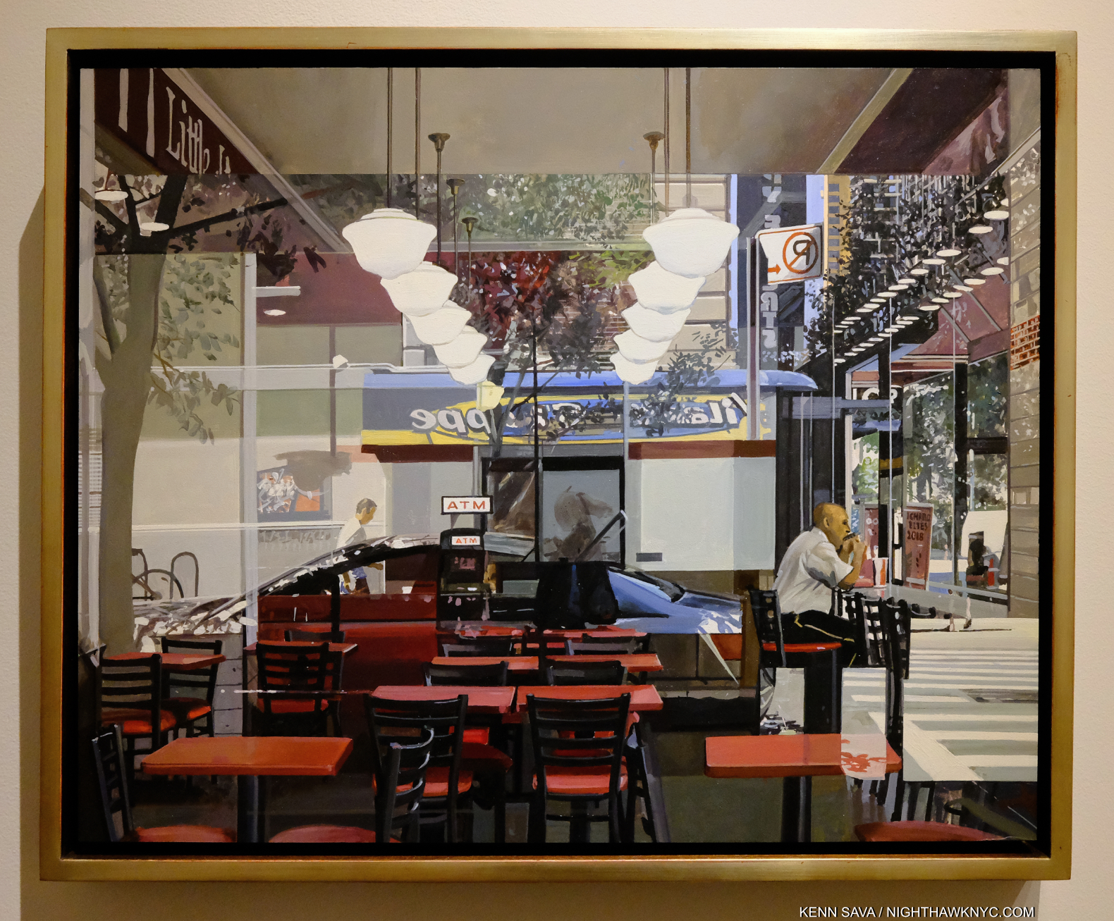
ATM, 2018, Oil on panel, 16 x 20 inches. In this marvelous Urban Landscape, it seems to me that only the three empty chairs in the mid foreground are in sharp focus, doing something Mr. Estes does in many of his pieces- de-emphasizing human subjects to avoid the narrative as I’ve heard him say- even when there are people present in the Painting. No Painter known to me Paints the modern city like Richard Estes. This Painting is hanging to the far left, just out of the frame in the prior picture.

His Paintings of the man-made world (i.e. his Urban Landscapes) might well be called New Topographic if they were Photographs because it seems to me  they see the world through the same lens as the legendary New Topographics Photography show at the Kodak Museum in Rochester in 1975, which focused on the “Man-Altered Landscape,” the show’s subtitle. Mr. Estes’s NYC Paintings predate this show by 7 or 8 years, though the Photographers included in it were working at the same time he was. I have no information that either Mr. Estes knew these Photographers or their work, then or now.

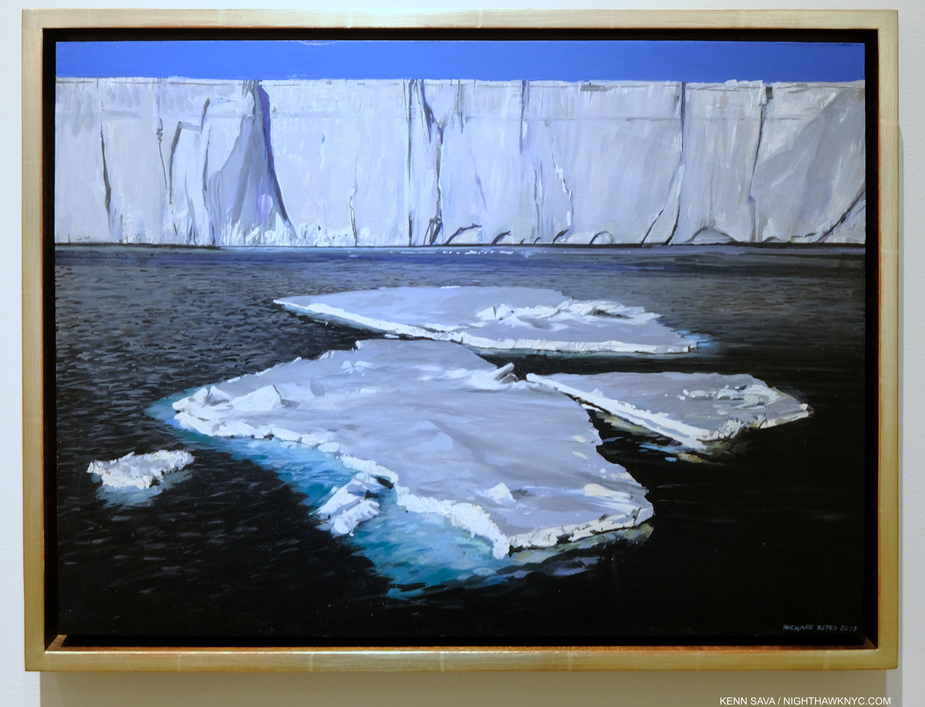
Antarctica I, 2013, Oil on panel, 14 3/4 x 20 inches. Another Antarctica Painting brings me back to what I said I saw in Antarctica II up top.

“Richard Estes avows that his realism has no hidden meanings, special messages, or stories to tell. Political positions and posturing about the human condition are alien to his art,7.”

So, how to reconcile what I said about in the beginning of this piece about Antarctica II with this? Mr. Sims’s words are not an actual quote, and so are less than ideal. As I said, Richard Estes has chosen to show us each and every one of these sites, so there is obvious intention in that. The two facing walls I showed in Voyages were in his show, so there is intention in that, too. Beyond this, he is directly quoted (shown earlier) saying that he would like to see many of the sites he has Painted torn down. Is he fearful of the loss of much of the natural world during his lifetime? He is known to be actively involved in conservation efforts, particularly in Maine. Is he recording both the man-made and the state of the natural world for future generations? Given the time he has spent studying Canaletto and Thomas Cole, even visiting sites they Painted, I would say it is possible. Yet, it must be admitted that Mr. Estes may simply be an observant onlooker at the ever-changing world he’s seen first hand near and far, then creating Paintings that express what he’s experienced. As I’ve demonstrated, these are NOT verbatim depictions. He’s an Artist, not a replicating machine, as I showed in Part 1. Regardless of the nebulous statement from Mr. Sims above, Mr. Estes intends exactly what he shows us, aided by a technique that is the equal of that only a very few Artists in Art history have had to render his intentions as clearly as is humanly possible. He also is well aware that every viewer will see in his work what they will, as he sees, has seen, and is himself influenced by, those he admires who have come before him.

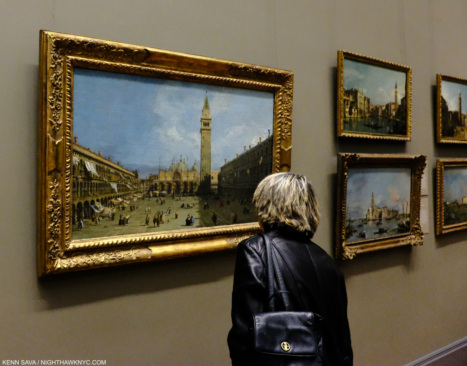
What will our world look like to people 300 years from now? A viewer looks at Canalellto’s Piazza San Marco, 1720s, in 2019, almost exactly 300 years after it was Painted, at The Met. While I have no doubt that Richard Estes, himself, has stood in this spot any number of times, this isn’t just any viewer. This is Lana Hattan, who pushed me to start NighthawkNYC in 2015. Seen here on one of the last times I’ve seen her, December 14, 2019. If you find this site worthwhile, you owe her your thanks. Without her push, it wouldn’t be here.

Richard Estes’s Paintings speak for themselves, and they should be allowed to- beyond boxes or other limitations.  The Artist doesn’t need to stand up and say, “This Painting is about _____.” They are what they are. Look for yourself at them and see what they say to you. 

“I see what I see,” as Frank Stella says. For me, Richard Estes has Painted the most compelling record of the New York City of my lifetime in it. He has also created a beautiful record of much of what’s left of the natural world. It’s a record of the world in his time- what’s been built by man, and and what’s left of the natural world, rendered through the hands and mind of an Artist. I see a “dialogue” going on when I look at both bodies of his work. In the end, intentionally or not, his work shows the condition of the world in his (and our) time. Including (again, intentionally or not), depictions of a number of key issues modern man faces and has created.

I can only wonder what viewers in hundreds of years will make of what he shows us. I have a sneaking feeling that Richard Estes has thought a lot about this, too.

-The 3rd, and final, Part of this series, “Richard Estes: Two Manifestos” is below this one, or here.
-Part 1 is here.
-My piece on Richard Estes’s Corner Cafe, 2013, may be seen here. 
My look at the 2015 Richard Estes: Painting New York City show at the Museum of Art & Design may be seen here.
-My piece “Death to Boxes!” is here.

*-Soundtrack for this Post is “Once in a Lifetime,” by David Byrne & Talking Heads, from Remain in Light, 1980, and performed here In Los Angeles in 1983, extracted from the Film Stop Making Sense

NighthawkNYC.com has been entirely self-funded & ad-free for over 8 1/2 years, during which 320 full-length pieces have been published! If you’ve found it worthwhile, PLEASE donate by PayPal to allow me to continue below. Thank you, Kenn.

You can also support it by buying Art, Art & Photography books, and Music from my collection! Art & Books may be found here. Music here and here.

Written & photographed by Kenn Sava for nighthawknyc.com unless otherwise credited. To send comments, thoughts, feedback or propositions click here. Click the white box on the upper right for the archives or to search them. Subscribe to be notified of new Posts below. Your information will be used for no other purpose.

  1. From Bus with Reflection of the Flatiron Building, 1967,  shown in Part 1
  2.  P.1. Wait. Shouldn’t it read “Richard Estes avows that his Art has no…?” Substituting the “realism” box for the “photorealism” box isn’t any better, in my view. Richard Estes is a Painter- with no prefixes, in my book, the point of Part 1 of this series. Death to boxes!
  3. Urban Landscapes is the title of 3 series of Screenprints the Artist has created. I showed one from my collection in Part 1. It was also the title of a show of Mr. Estes’s work in 1978 at the Museum of Fine Arts, Boston.
  4. After I finished this Part, I saw the book Richard Estes: Voyages. In it, Mr. Estes says that he now destroys his source Photographs because he doesn’t want them compared to the Painting. I understand and respect his decision. I saw a few of his source Photos in the 2015 M.A.D. Museum show and showed a few in my piece on Corner Cafe. To honor his feelings, I have revised that piece and removed them. I am publishing these because- a) they are not his source Photos, and b) because I feel they highlight the differences between actual locations and his Paintings, showing the lie to some of the hype around Richard Estes’s work, as I outlined in Part 1. It must be noted, and I think it is very interesting, that I was unable to replicate the view seen in both Brooklyn Diner, 2021, and Corner Cafe, 2014-15 when I visited both
  5. ibid, p.1
  6. I’m including his so-called “Still Life” Paintings in this since they depict objects seen in windows or on shelves and are not studio setups.
  7. In a conversation with Patterson Sims per Patterson Sims, Richard Estes’ Realism, P.1

Richard Estes: Two “Manifestos”

This site is Free & Ad-Free! If you find this piece worthwhile, please donate via PayPal to support it & independent Art writing. You can also support it by buying Art & books! Details at the end. Thank you.

Written & Photographed by Kenn Sava (*unless otherwise credited)

This is Part 3, the final part, of my look at the work of Richard Estes on his 90th Birthday, May 23, 2022. Part 1. Part 2.

As I look through the work of Richard Estes, two Paintings stand apart for me. Both are “Self-Portraits.” Though those words are in their titles, I put it in quotes though because you can’t really see the Artist in either one, only his shadow or ghost, and so they’re not typical Self-Portraits. Yet, that’s what the Artist has titled each. First, some context-

This ISN’T one of them. Double Self-Portrait, 1967, Oil on canvas, 24 x 36 inches. When I think of how Richard Estes taught me how to see, this is a prime example of it.  *Smithsonian Photo

Richard Estes has been given us a few Self-Portraits and de facto Self-Portraits dating back to 1967’s Double Self-Portrait, which is now in MoMA. In other Paintings, we see his shadow on the landscape, though these are not titled “Self-Portraits.” In 2015, at the Museum of Art & Designs, Richard Estes: Painting New York City show, which I wrote about here, I was taken by a Self-Portrait, dated 2013, one of the most recent Paintings in the show, hung near the end of it. I can’t say I’d seen anything like it in Richard Estes’s oeuvre to that point.

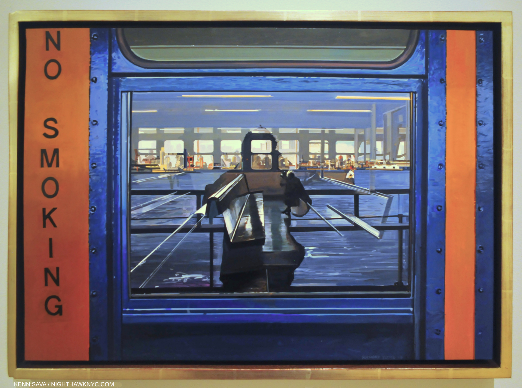
Self-Portrait, 2013, Oil.on board, 15 x 13 inches. The Artist “seen” on the Staten Island Ferry. Another work that further effected how I see the world. Seen in Richard Estes: Painting New York City at the Museum of Art & Design in 2015.

I put a picture of it up and I’ve looked at it often these past 7 years since I first saw it. In it, the body of the ferry is rendered in crystal clear and vibrantly colored detail. You can clearly see the texture of the paint on the ship, a Painting of paint by the Artist! The eye makes out the shape of a torso and we are to assume that this is the titular “Self-Portrait.” Apparently, the Artist is holding a camera, though the center of Mr. Estes’s head and upper chest, where the camera would be, is missing or hidden by reflections.

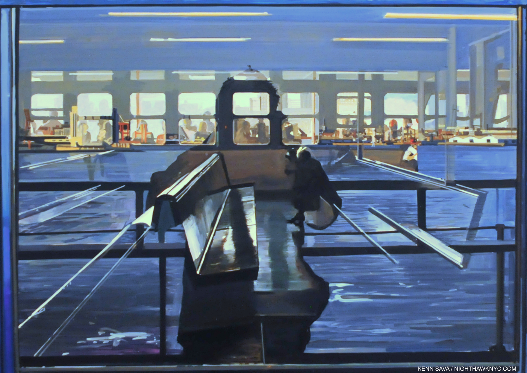
Detail of the “Painting inside the Painting.” The “abstract” Richard Estes in full effect- in the real world!

The window acts as a sort of frame for the main part of the composition. Inside that “frame” things are completely different. Nothing is in sharp detail, though everything is sublimely Painted. Silvery lines lead the eye further and further back to the NYC skyline lining what may be the “background,” though it’s hard to tell. It, too, is out of focus and indistinguishable to the point that I can’t identify any of the buildings. Richard Estes: Abstractionist? His work DOESN’T need another box!

What to make of this?

My personal view is that this may be something of a “manifesto.” In it, Mr. Estes shows that he is perfectly capable of Painting wonderfully in multiple styles, and he, represented by the mysterious partial shadow, won’t be “defined” by one, i.e. a sharply detailed Portrait, like we see in Double Self-Portrait up top. HOW can this be called so-called photorealism when you can’t even clearly see the “Self-Portrait” in a work titled just that? Yes, he can paint crystal clearly- when it suits him and his purpose, but he’s perfectly able, and apt, to Paint however he needs to to achieve his purpose.

Thinking about this further, Painting up until the beginning of the 20th century was strictly “representational.” Around the turn of the century, Artist like Hilma af Klint, Kandinsky, Monet and others, began exploring abstraction. Abstraction became the 2nd great type of Art in Art history. In Self-Portrait, 2013, I see both, side by side, as they appear in the real world.

In summing up the Art of Richard Estes, in my opinion, Richard Estes’s represents nothing less than a kind of culmination of the history of Painting in a way. He is among the first to combine representational and abstraction in his Art, even if he has done it unintentionally. This is what I see it when I look at his Art. In my view, THIS is something that should be receiving a lot more attention than it has gotten (i.e. almost none). It hasn’t because people are too busy being limited by what his work is “supposed” to be, as decreed by the box makers. They think that is all his Art is, as I said in Part 1! That’s because they’ve stopped looking at it. To wit-

In July, 2021, at Richard Estes: Voyages, I was stopped by another recent Self-Portrait, this one strategically installed half way through the show.

Self-Portrait in Copenhagen, 2019, Oil on panel, 16 x 20 inches. The Artist seen 52 years after Double Self-Portrait!

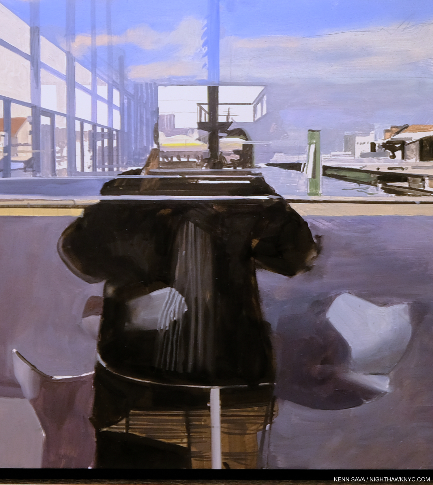
Again, this piece has been on my mind from the moment I first saw it. It shares some elements with the Ferry Self-Portrait, like the row of lines leading the eye further and further in, and the central titular dark shape with the “head” missing. This time, the “frame” of the outside world, that served to “ground” the Ferry Self-Portrait, to prepare the viewer (in a way) for the abstraction, has been removed. That means NOTHING in this piece is sharply rendered! EVERYTHING in it is nebulous. In that regard, it strikes as an “evolution” from the 2013 Ferry Self-Portrait- now, the whole Painting is that “Painting in a Painting” I showed earlier inside the Ferry Self-Portait(!). It is, perhaps, its logical culmination.

Detail of the center.

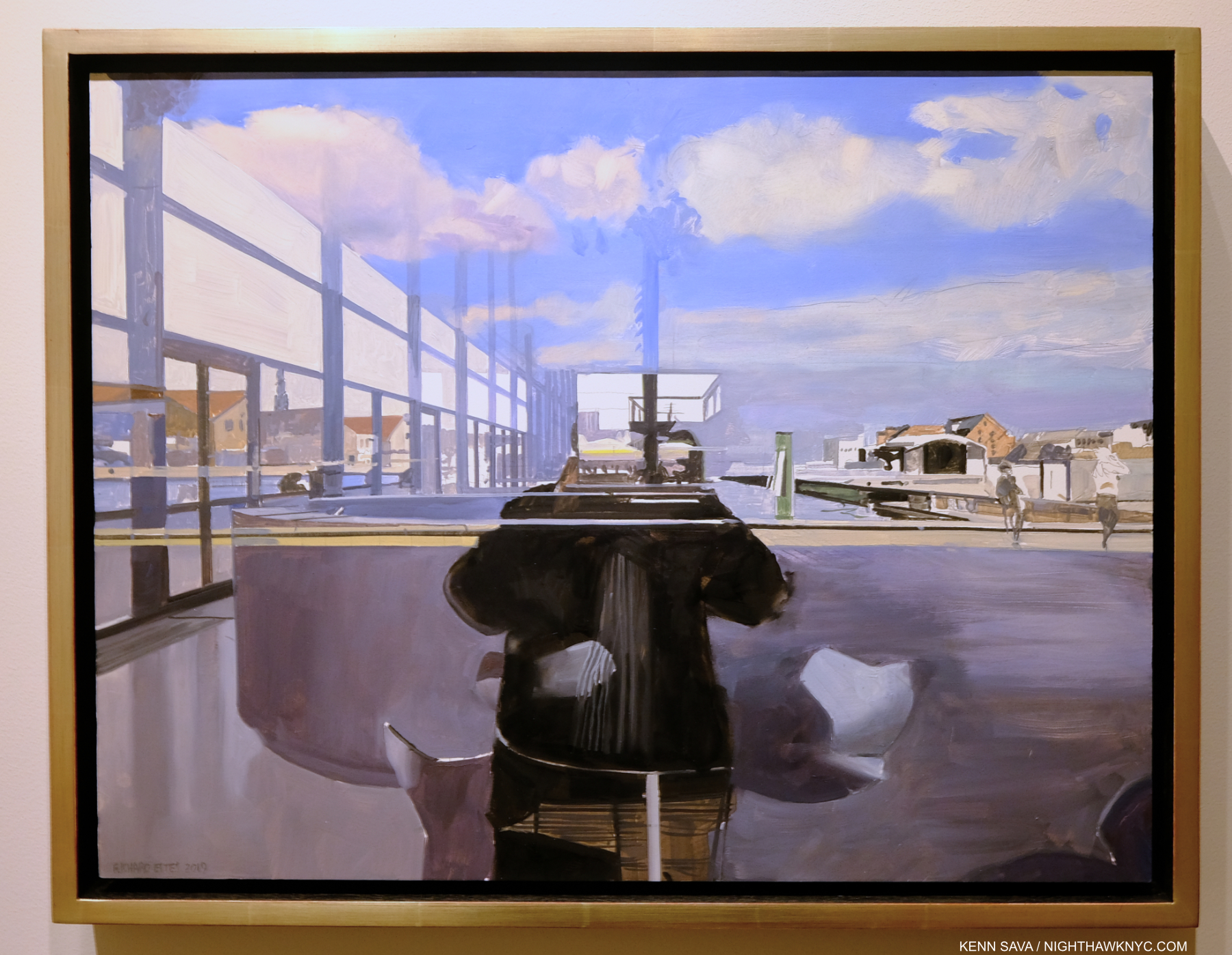
NOTHING in focus is downright shocking to see in a finished Painting by Richard Estes (which I assume it is since it was in his shows in NYC, London and Florida). To top it off, parts of it appear to be unfinished! Obviously, given its exhibition history, this is intentional. As a result, it’s hard for me to not see it as an extension of the “manifesto” of the 2013 Ferry Self-Portrait. Mr. Estes is showing us he will Paint as he pleases- without the expectations of anyone.

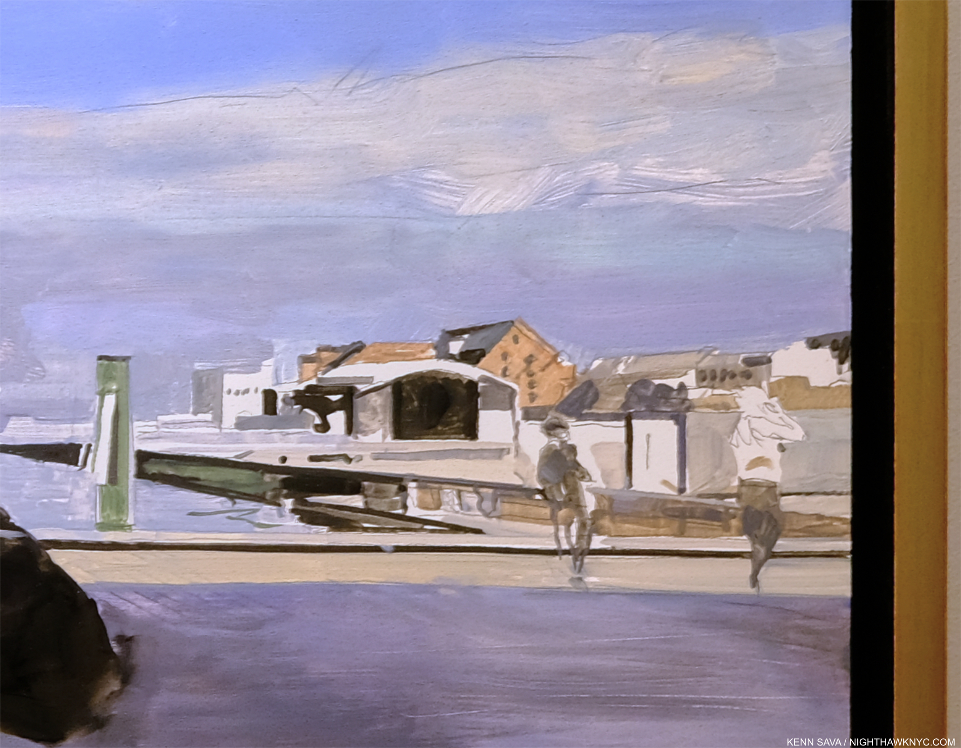
Detail of the right section. Note the figure exiting to the right. This section looks to me more like something by Neo Rauch than Richard Estes.

Look! That figure on the far right is only half Painted! His or her torso is only outlined! There is nothing like this in Richard Estes’s oeuvre since 1967!

A Self-Portrait is a Portrait created by an Artist of his or herself. If I read these last two Self-Portraits literally, they are how the Artist sees himself, and in my view, how he sees his Painting. In the 2013 Ferry Self-Portrait, he shows us his mastery of multiple styles and uses them to present representation and abstraction in the same piece (as I see it). In his 2019 Self-Portrait in Copenhagen we see the Artist completely comfortable in showing us only a “looser,” FREER (a keyword about this piece for me), uninhibited, and perhaps MORE PAINTERLY style than we have seen in an entire Painting since 1967.

This says to me “THIS is how I see myself, and my Painting.”

Many more, Mr. Estes!

*-Soundtrack for this Post is a wonderful, surprise, blending of Beethoven’s Eroica with Happy Birthday for Sir Roger Norrington on his 84th as performed by the SWR Symphonieorchester borrowed for the 90th of this fan of Classical Music-

NighthawkNYC.com has been entirely self-funded & ad-free for over 8 1/2 years, during which 320 full-length pieces have been published! If you’ve found it worthwhile, PLEASE donate by PayPal to allow me to continue below. Thank you, Kenn.

You can also support it by buying Art, Art & Photography books, and Music from my collection! Art & Books may be found here. Music here and here.

Written & photographed by Kenn Sava for nighthawknyc.com unless otherwise credited. To send comments, thoughts, feedback or propositions click here. Click the white box on the upper right for the archives or to search them. Subscribe to be notified of new Posts below. Your information will be used for no other purpose.

My Search For Edward Hopper’s Nighthawks Diner

Written & Photographed by Kenn Sava (*unless otherwise credited).

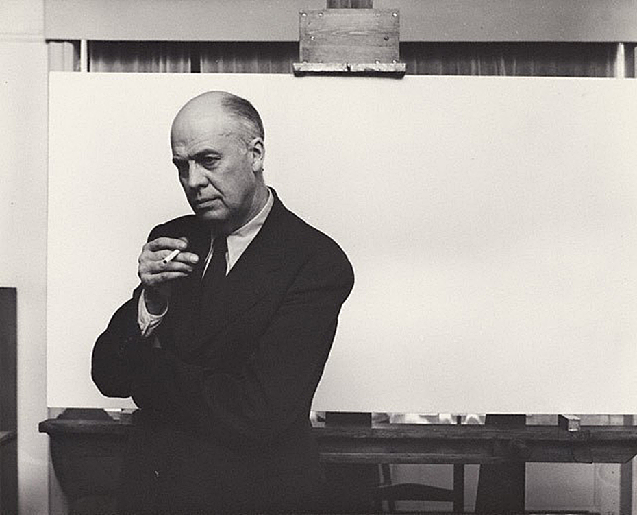
Arnold Newman, Edward Hopper in his New York studio, November 1, 1941, Gelatin silver print, *Arnold Newman Collection/Getty Images.

You’re looking at Art history.

After the fact, this may be one of the most historic Photographs in American Art. I’m not only talking about it being a wonderful portrait of Edward Hopper. It’s much more. The date is November 1, 1941. On January 21, 1942, the Artist’s wife, Jo Hopper, would record the completion of the work her husband created on that blank canvas he is posing in front of in the Artist’s Ledger of his work.

A section of Edward Hopper’s Ledger page for Nighthawks, from the book, Edward Hopper: Paintings and Ledger Book Drawings. It wound up in the Art Institute of Chicago almost immediately. Its sale netted Edward Hopper about $1,700.00.

In the intervening 81 days, Edward Hopper Painted the incomparable Nighthawks on that very canvas. We don’t know if Arnold Newman had any clue as to what Edward Hopper’s intentions were for that canvas. But we know now. The odds are that he had finished his preliminary work- the inspiration, the sketches, the reference Drawings, the sizing calculations he usually did, and ordered the stretcher and canvas we see behind him on his famous easel. Most likely? At this very moment, this masterpiece was all in his mind, and possibly on it, as Arnold Newman pressed his shutter release.

Click.

For the following 77 1/2 years (exactly, as I write this), and counting, the world has been fascinated by Nighthawks like they have few other Paintings created in the 20th Century. Some of us, including myself, are borderline obsessed by it.

Written on my soul. The last time I stood in front of Nighthawks. August 28, 2013, at Hopper Drawing at the old Whitney Museum.

I’ve stood in front of it twice in my life. The first time at The Art Institute of Chicago in 2005, the second at the old Whitney Museum in 2013. In July, 2015, I named this site after it and wrote about why in the very first piece I Posted here, “Welcome To The Night,” To commemorate the 4th anniversary of NighthawkNYC.com, I present My Search for the Nighthawks Diner.

Edward Hopper posed for Arnold Newman, and Painted Nighthawks here, on the top floor of 3 Washington Square North, just east of the Arch in Washington Square Park, in Greenwich Village, that it looks out on, where the Hoppers lived for over 50 years, from 1913 until the Artist’s death in 1967. This is a key point for a variety of reasons, and an intriguing one because Edward Hopper was the furthest thing from “bohemian” one could imagine. Yet, living here he, like most New Yorkers, walked regularly, probably daily, and so the areas he was able to walk to may have become the sites of, or the inspirations for, his Paintings. And so, for almost all of the past 77 years viewers have been asking the question-

“WHERE is the diner Edward Hopper Painted in Nighthawks?”

I’ve been trying to find it for the better part of my life. Having lived in the area for 28 years and having frequented it before I lived here, the Village is an area I’m as familiar with as I am any anywhere. During that time, as during the Hopper’s time here, change has been the only constant. Change has also been a constant enemy in the attempts to locate, for once and for all, the diner we see in Nighthawks. My search has been carried out using only a few tools. First, the extensive Hopper literature. Though very little of it is directly relevant to this search, much of it is indirectly relevant, providing a framework for how, when and where he created his extensive oeuvre of Paintings, Watercolors and Drawings. The books by Gail Levin, (the Hopper’s biographer and the author of numerous other books on the Artist and his work, including the 4 volume Catalog Raisonne), particularly her Hopper’s Places, Second edition and the catalog for the 2013 Whitney Hopper Drawing show have been the most referred to for this quest. Outside of this, I have relied on my own two feet, my cameras and, yes, my gut.

Once that “Could this be IT?” bell goes off, I research the possibility, beginning with “What did this place look like around 1940?” Is any of that here to be seen now (i.e. when I was standing there)? What does common sense tell me? In the case of Edward Hopper, “common sense” comes from studying his work. Hopper’s Places provides part of the basis for some of that “common sense.” In it, Ms. Levin shows us contemporary Photographs she, herself, has taken at various sites Edward Hopper Painted around the world- though not Nighthawks, “…to show how he both recorded and transformed” these places, she says in her “Preface to the Second Edition,” P.vii. On P. x, she adds, “Research for the biography also revealed that in his later years Hopper relied upon observing specific sites more often than anyone had previously realized.” Even though much has changed over time, I still get a bit of a sense of Hopper’s approaches to rendering actual places. Much is, also, to be learned by looking at and studying historic and contemporary pictures of places under consideration. In the case of Nighthawks, I used all of these tools in my search.

Rooms for Tourists, 1945. About 40 years later, I found this actual Rooming House this Painting is based on in Cape Cod, Mass., and stayed there. *Photographer unknown.

My gut has already helped me find one of “Hopper’s Places.” In the 1980s, I was traveling through Cape Cod and looking for a place to stay in Provincetown, Mass. I came upon a small Rooming House and instantly recognized it from the Hopper Painting, Rooms for Tourists, and so I just had to stay there. Part of my belief that Edward Hopper based Nighthawks on a real diner was finding that actual Rooming House in the 1980s when I visited Cape Cod.

I’ve spent most of my time searching in the West Village. For two primary reasons. First, this was the neighborhood Edward Hopper lived in and walked through regularly and most often. Second, as soon as one walks south of West 14th Street (the Village’s northern border) on 7th Avenue South, you’re faced with this-

Standing in 7th Avenue South at the intersection of Greenwich Avenue and West 11th Street, facing south, July, 2019. It HAS to be somewhere in this picture, right? No. There are countless triangular corners in the West Village, but this view is the most likely to contain it, I think. Click for full size.

As I stood in the middle of 7th Avenue South (NOT recommended) there were no fewer than TWELVE triangular corners around me! Those familiar with Manhattan know that almost all of it north of 14th Street is a grid made up almost exclusively of rectangles. Below 14th Street, “old Manhattan” streets wind seemingly with minds of their own, interrupted here and there with a semblance of uptown’s rectangular regularity. The triangular corners we see in Nighthawks are everywhere. WHERE to begin?

The former Two Boots Pizzeria, #11 in the picture above, is from the right period, but its building goes straight up, so I ruled it out quickly. Nothing feels “right” to me about it.

Mulry Square (in the foreground), #3 in the picture.

Perhaps no site has gotten more “hype” about it over time in regards to Nighthawks than Mulry Square, #3 in the picture. In spite of what many have said, I have seen nothing to indicate to me that this was the site of the Nighthawks Diner.

I would guess this would be  the early 1980s from the Rita Marley ads and Miles Davis ads, on the remnants of the hamburger place, which may be the remnants of the actual hamburger place that stood here in the 1940’s, which I show later on. Miles Davis came out of retirement in 1981. Is that a covered window along the left side? I haven’t been able to find out. *Photographer unknown.

The historical archives show a gas station with a small burger place at the time, but it looks more like a White Castle precursor to me than anything resembling the Painting’s diner. If anything, it may have been an inspiration for the “fishbowl effect”- where we are looking in through the glass at the customers. More on this later.

This is seen on the other end of Mulry Square, #4 in the picture, on another triangular corner, today. No viable candidates have been reported on this, also triangular, side of the Square, which is occupied by this too modern edifice today. I’ve also ruled it out.

#9. Max Gordon Corner, named in honor of the long time owner of the Village Vanguard.

Directly across the street from #4 is this building, #9 in the picture, which has been home to the world’s greatest Music club, in my opinion, the Village Vanguard since 1927. There is a pizza place on the corner and the windows go through to the back street, but at 2 stories, I’ve long ago ruled it out. However, Art history will remember this spot because another great Painter, Richard Estes, wonderfully Painted it. (Which reminds me- In 2016, I visited the known site of one of Richard Estes’ latest Paintings in a piece I ironically called “Richard Estes’ Dayhawks At The Corner Cafe.”)

Village Cigars, 7th Avenue South and Christopher Street, Greenwich Village, NYC, June, 2019.

The site of Village Cigars is not numbered in the picture, being further down 7th Avenue on the right past #8. It’s garnered surprisingly little to no attention in the Nighthawks searches I’ve seen to this point. It has some things going for it- the shape and the cigar sign (Nighthawks has a Phillies cigar ad over the diner) but in speaking with the manager, I was told it’s been here for over 100 years, but it’s been a cigar store the whole time. Also, it doesn’t have the curved front window, those dual subway entrances were most likely also there in 1940 and are not in the Painting, and the buildings behind it are too far away. I’ve ruled it out. The Stonewall Inn is a few hundred feet to the left.

Some believe the inspiration lay in movies of the period, like this one, Stranger on the Third Floor, 1940. The suggested diner down the street on the right looks nothing like it, in my opinion. Possibly another “fishbowl effect” inspiration.

I remain completely unconvinced by any and all suggestions of movies I’ve seen. Yes, Edward Hopper was taken by a short story, “The Killers,” written by Ernest Hemingway in 1929, but I, for one, have not seen the evidence of that in the setting in the Painting. In the figures and the mood? Much more likely. “The Killers” was also made into a film, but, in 1946, too late to be considered. Maybe the Painting influenced it, as it has countless movies since.

That leaves the contenders. Speaking of movies, Edward Hopper reportedly frequented the Lowe’s Sheridan Movie Theater (which stood where #12 is in the picture earlier, and is seen further below), and based a Painting inside of it. His walk to and from it is interesting to me and it has been suggested that a few locations along this route are candidates for the Nighthawks diner. I looked closely at these.

Yes, West Village Florist at 70 Greenwich Avenue is sort of triangular. The picture above was taken standing on the northern edge of Mulry Square, seen earlier. Yes, it was along one of Edward Hopper’s possible routes from his apartment to the Lowe’s Sheridan Theater, which was directly across 7th Avenue to the left of the picture.

This picture came to me dated 1938 and that would appear correct. Looking toward Mulry Square on the right shows the side of the White Castle-ish hamburger place seen earlier under the Esso sign. The place on the triangular corner, center, at the intersection of 7th Avenue South, Greenwich Avenue and West 11th Street, is now West Village Florist, shown here when it was a cigar/cigarette store. Whoever told this picture is standing on the curb outside of what was Too Boots Pizza, #11 in the panorama posted earlier, with the Lowe’s Sheridan Movie Theater directly to his or her left. Photographer unknown to me.

Yes, it housed a deli 20 years ago before becoming a flower shop the manager told me, and my research added a cleaner/tailor shop circa 1914, and a cigar store in the period of Nighthawks as seen in historical pictures (including in 1938, above), but it’s too small inside, the prow is also too small, and the corner lot too big in my reading of the Painting. Nowhere have I seen reference to it being a diner or coffee shop at any point. The buildings in the background are wrong now, and were wrong then, according to historical pictures.

Inside West Village Florist, standing just inside the door. I had room to stretch my arms out, with maybe an extra foot on each side, but the space quickly narrows, as you can see. It’s just too small. Stop by and see what you think. They are very nice people who have a beautiful assortment of plants and flowers.

There is little doubt he saw it, but as I showed earlier, there are countless triangular corners in the area that could have been a partial inspiration. At best, that’s all this is, and I doubt it was a big influence. I’ve ruled it out.

West Village Florist’s building has this unique, strange, angled shape to it seen from head on, July, 2019.

The serious contenders.

The intersections of Greenwich Avenue and West 12th Street with the Loew’s Sheridan Square Movie Theater, rear. Photograph by Percy Loomis Sperr (1890-1964), Manhattan: 12th Street – Greenwich Avenue, 1932, *NYPL Digital Archives.

In this 1932 picture of the intersection of Greenwich Avenue and West 12th Street, the low, triangular shaped building in front of the west side (the back) of the Lowe’s Sheridan Movie Theater is Crawford Lunch. There are historic pictures taken from Greenwich (on the right) that show customers in Crawford Lunch with West 12th Street seen behind them- which I reproduce further below. I think it is entirely plausible that Edward Hopper saw this, too, and this inspired his conception of a sort of “fishbowl” like setting. Here was an actual working diner/restaurant of the time. Today’s West Village Florist building is about 3/4 of the way down to the right of this picture.

Change is the only constant in New York. The same scene, today! I stood as close as I could to the spot the 1932 picture above was taken to take this in July, 2019- 87 years later!

It’s so different, 87 years later, as to defy anyone to guess this site had anything to do with Nighthawks. Therein lies a good deal of the problem finding its sources. It’s now The NYC AIDS Memorial Park at St. Vincent’s Triangle. Note- the brown building on the very far left. It does not look like what’s in the background of the Painting. More on this follows. The Whitney’s Hopper Drawing catalog suggests that Edward Hopper may have looked through Crawford Lunch and seen the “fishbowl effect” we see in the Painting.

Subway construction photograph of 88-86 Greenwich Avenue and West 12th Street, New York City, April 18, 1926. Identifier- 86446d_GreenwichAve_SubConst958. *Collection of the New York Historical Society.

Here, we see a revealing example of this “fishbowl effect” seen at Crawford Lunch in a picture taken on April 18, 1926. Notice how you can see into and through the restaurant, on the right, to West 12th Street behind the man in the dark hat under the word LUNCH on the window. The brown apartment building seen in the far left in the prior picture is about to be built seen straight ahead just across the 12th Street past Crawford. Note, also, the word “LUNCH” on the window for later. I believe this is the possible source of the effect given how close it is to the Lowe’s Sheridan Theater (next door). However, it could have as easily been something he saw somewhere else on his walks, in a place they, or anyone else I’ve come across has not considered. But, unlike most of the locations suggested to date, Crawford Lunch was an actual restaurant at the right time and in the, possibly, right place.

The almost identical view in the previous picture today at the former site of Crawford Lunch also approximates the view seen in Nighthawks. That brown brick apartment building, seen early in its construction above, has been here since the late 1920s, and hence, at the time of Nighthawks, making it wrong for the Painting. Seen in July, 2019.

That Crawford Lunch was an influence would seem to be confirmed by this-

Study for Nighthawks, 1941 or 1942. Fabricated chalk and charcoal on paper; 11 1/8 × 15 in. Given he finished Nighthawks on January 21, 1942, I doubt this was done in 1942. It seems he was still finalizing his ideas when this was done. *Whitney Museum collection & photo.

I can barely make out the word “LUNCH” on the widow above the man with his back to us in this study for the Painting. As we know, Edward Hopper did not include this in the final Painting, among other changes he made to what we see in this incredible and endlessly fascinating Drawing. It sure reminds me of the Crawford Lunch window and may be a give away of its source and, possibly, the source, once and for all, of this “fishbowl effect.”

Edward Hopper said little about the inspiration for Nighthawks and, frankly, I don’t know what to make of what he is reported to have said. In Katherine Kuh’s The Artist’s Voice, P.134, he says, the Painting “was suggested by a restaurant on Greenwich Avenue where two streets meet.” He adds, “I simplified the scene a great deal, and made the restaurant bigger.” Um, Ed? Could you be a bit more obtuse? “Greenwich Avenue where two street meet,” is said to mean West 12th Street & 7th Avenue South by Gail Levin (Hopper’s Places). Couldn’t “two streets meet” mean Greenwich & West 12th Street, where Crawford Lunch was? If it means Greenwich and two other streets, it has to be the triangles where West Village Florist and Mulry Square are. In any event, “…suggested…” I believe means a scene he saw at one of these places, the “fishbowl effect,” which I think he saw at Crawford Lunch, a confirmed restaurant at the time. But, Crawford Lunch doesn’t look like the diner in the Painting- even if he “…made the restaurant bigger.” Neither does the hamburger place on Mulry Square or West Village Florist. And that comment doesn’t specify it’s the same restaurant he mentions on Greenwich Avenue. It could mean “the restaurant we see in the Painting.” Intensely frustrated by this, I finally decided to continue on my own path. This meant looking a little further afield from the Greenwich Avenue vicinity. It turns out I didn’t have far to look.

Further down 7th Avenue South, not as far as Village Cigars, and still well within Edward Hopper’s walking neighborhood, I came across this-

“Oh. My. Gosh.”

The site of the now sadly defunct Riviera Cafe, which was open here for 48 years, from 1969 until August 31, 2017.

The former Riviera Cafe at 225 West 4th Street at 7th Avenue South.

When I came across this site, I had an “Oh. My. Gosh.” moment. Picture it without the modern “greenhouse” addition and it becomes much more like the diner in Nighthawks. Back in the day, I spent a few nights in this place, as I’m sure many reading this have, too, since it was centrally located right at the heart of the West Village. The building behind it to the left, while not exactly what we see in the Painting (I believe they are the same buildings that were standing on this site in 1940), at two stories, which fits all we can see in the Painting (they may go higher in Nighthawks, or they may be cut at two- we can’t tell), and they’re the right distance, though at a slightly different angle, from what we see in the Painting. If this is the location Edward Hopper used, why didn’t he use the buildings we see in the background? I believe it was because of the color. That long building which takes up a good portion of the back is too brightly colored to fit the mood he wanted in Nighthawks. So, possibly, he replaced them. More on this in a minute. I measured the depth of the greenhouse at 90 inches- 7.5 feet. If it were not there, it would have allowed me to stand closer to the building taking this shot. Thinking back to my visits here, there was a bar along the back wall then, and I believe there were tables behind the seats/stools facing the bar, approximately under where that brick wall would come down with the greenhouse gone. Would a horseshoe counter have fit here?

As I looked closer, I discovered this-

The front of The Riviera Cafe facing West 4th Street and giving it its address, 225 West 4th Street.

Lo and behold, there was something none of the other candidates I’ve discussed thus far have- a curved front window! And, it’s the same on both sides of that door! But, that door. Was it always there, or was the curve complete at one point, which would make The Riviera, minus the modern greenhouse addition, an almost perfect match for Nighthawks Diner?

The back of The Riviera Cafe on West 4th Street.

Stepping around to the back of The Riviera- more intrigue. What’s up with the right half of the wall, and what was there before they replaced it? A window? Also, that door to the left looks earily similar to the door in the Painting on the inside of the Nighthaks Diner. As I said, when I was here, I remember a long bar inside that wall and along it, meaning you’d probably be able to see the necks of liquor bottles in that rectangular window that’s still there, center. But, that’s now/more recently. What about in the past?

Intrigued, to say the least, searching further, I uncovered this-

1941! The year Nighthawks was Painted. Percy Loomis Sperr (1890-1964), Manhattan: 7th Avenue South – 4th Street (West), 1941, *NYPL Digital Archives.

In 1941, The Riviera was called Riker’s and it was a restaurant! It looks pretty new and shiny, too. Some encouraging things in this picture- there are retractable awnings instead of the permanent greenhouse, for one, but that troublesome front door is still there to the left, and it looks to be the same structure, with the curved windows on either side of it.

The Riviera Cafe occupies the biggest triangular space in this part of the West Village. It’s very accessible to the Hopper’s apartment (a few blocks to the east). Why has it never been properly considered as a candidate?

In 2013, during the Hopper Drawing show, the Whitney Museum came out and said the following-

“…has led art historians to cite the building’s prow as one of the influences…” What are the others? Seen in 2013.

They’re talking about the Flatiron Building, which is on West 23rd Street at the intersections of Broadway and 5th Avenue- no where near Greenwich Avenue, where that quote has caused most to look, and it’s not even in Greenwich Village! So, the museum has taken the same approach I did in this sense. Also, in the Hopper Drawing catalog they fail to publish the Kuh Hopper quote (above), only footnoting the page in her book it’s on (P.118, footnote 2)! Perhaps, they, too, find it as frustrating as I do? (I realized this only this past week, after my quest had been completed.) They state the Flatiron was “one of the influences,” but fails to name any others!?? “One of” means “more than one.” Well? I’m naming names here.

An installation of “Nighthawks” in the prow of the Flatiron Building by the Whitney Museum in 2013. The installation is 2D and only a few inches deep, as I show below. I shot it at this angle to show the problematic lining up of the buildings in the back on Broadway, across the plaza, which is not at all like what we see in the Painting. Seen on September 1, 2013.

Assessing the Flatiron’s candidacy, I discovered that at one point it was a cigar store (again, the Painting has a Phillies cigar ad on the top of the diner), but I did not find evidence of it having been a diner. Looking closer at the interior space, I discovered it ostensibly measures 10 feet wide, at its widest, to the right in the picture above, by 30 feet long. I’m no restauranteur, but that seems pretty narrow to me to get a horseshoe shaped counter inside, room for seating around it, room to navigate around those seats and room for the counterperson to work. Glare notwithstanding, here’s what the space looks like pressed against the front curved window-

A look at the installation of “Nighthawks” in the prow of the Flatiron Building on September 1, 2013.

Notice the radiator on the right, and how far it is from the window. There’s another one on the left which is hard to see in this picture. Both, and the room around them they require for safety and comfort, considerably cut into the amount of usable space here. Also notice the large column to the left rear of the photo, which serve to partially support the gigantic mass of the building above them, which also has a counterpart that’s hard to see because of the glare on the right side (see the picture of the whole prow, above it). The opening between them appears to be tight. How are people supposed to come and go here?

Then, there’s the site itself. It doesn’t feel to me like what we see in the Painting.

A panorama shows the distance between what would be the far side of the prow in the Painting and the buildings across the plaza and Broadway.

The buildings that would be in the background of the Painting are too far away and angled incorrectly- 23rd Street angles to the south east relative to the Flatiron at this point making the buildings begin too far back to be seen as they are in Nighthawks, in addition to being not at all like those seen in the Painting in the many existing historical pictures. Therefore, I believe the Flatiron’s prow isn’t what we see as the diner in the Painting, and this wasn’t the scene shown in the Painting. Of course, any Artist is completely free to do whatever they want, to make anything into anything else, whether it would fit in the “real” place, or not. (There is no such thing as “photorealism” in Painting, in my opinion, but that’s a battle for another day.) Edward Hopper, as per that quote, could have made West Village Florist or the Fatiron’s prow bigger, but their settings are still wrong, in my opinion, so I don’t believe he used either. However, like the Whitney, I believe the Flatiron’s prow was an influence.

Currently under renovation? Cleaning? Diner installation? Maybe I should wait and see what emerges before reaching a conclusion. (Just kidding.) July, 2019.

Looking at the Painting, one thing is undeniable- that curved window Edward Hopper includes. I’ve found it nowhere else besides on the Flatiron- either on existing buildings or in historical pictures. And, some of the ribs we see on the window in the Painting are present on the Flatiron’s prow today. In 1939, Edward Hopper exhibited at the World’s Fair1, and so he may have seen the Fair, but was certainly aware of it.

“Fishbowl effect” indeed. The history of glass making through the ages seen in glass bubbles at the Glass Incorporated Pavilion at 1939 World’s Fair, Queens, New York, New York, USA. Coincidence? Or influence? *Image by Peter Campbell/CORBIS

It was an Art Deco marvel. The Nighthawks diner has a decidedly Deco/Streamlined/Moderne feel to it. Though the Flatiron is a Beaux Arts building, the curved window of the prow has a decidedly Art Deco, streamlined, feel to it.

Early Sunday Morning, 1930, seen at the Whitney Museum, July, 2019. This looks uncannily similar to the background of Nighthawks to me.

Yet, what he depicts in the background of Nighthawks looks curiously not dissimilar to his Early Sunday Morning, 1930. It’s almost like he dropped those buildings into the background. But, 10 years after the earlier work a good many of those buildings were no doubt still everywhere around town, so they may as easily be generic. Whatever their origin, in this way he juxtaposes the old New York with the new world just seen in the 1939 World’s Fair, which showcased “modern” streamlining and the new flourescent lighting.

Early Sunday Morning is something of a “pendant” to Nighthawks as Carter E. Foster points out in the Hopper Drawing catalog (P.99). It’s the same size and shape and the two are bookends in some ways.

7th Avenue between Fifteenth and Sixteenth Streets, June 10, 1914. I’ve indicated the scene depicted in Early Sunday Morning, with a blue bounding line centering around 88 7th Avenue, seen in these two photos taken on June 10, 1914- 16 years before the Painting. The shutters on the windows are gone in 1930, so are the awnings, and there was only one barber pole. The hydrant was either to the left, or around the corner to the left. The center white line are the borders of the two photographs shown. All the buildings in these pictures have long ago been replaced. Subway Construction Photos modified from the Whitney Hopper Drawing website.

Interestingly, the inspiration for Early Sunday Morning were shops on 7th Avenue, but not in Greenwich Village. They have been located as being between 15th and 16th Streets in Chelsea, just north of the Village. Comparing the Painting to period pictures is fascinating. While it’s unlikely that Edward Hopper stood with a sketchbook and drew the scene, he did capture any number of correct details. But, he changed others- most notably the sunlight. The sun never shines on 7th Avenue at the angle he Paints it shining!

Mid-Sunday Afternoon. The site of Early Sunday Morning, seen in July, 2019. The original buildings have long ago been replaced. Notice how the shadows go in the opposite direction of those in the Painting.

7th Avenue runs North/South, not East/West, like the sun. In reality, the sun would be directly behind the viewer! So? Here’s a case of a found actual site and how Edward Hopper used creative license to mould it to his vision- even if that meant changing nature! What’s moving a curved window 20 blocks south compared to moving the sun?

My Conclusion-

I currently believe that Edward Hopper saw Riker’s about 1941 and those 2 curved windows in its front. I believe he, too, may have been frustrated by that front door and decided to “remodel” it. With a a paintbrush. So, he morphed the Flatiron’s prow’s curved window onto it and then created his own (though somewhat similar to the real) background on West 4th Street in the Painting.

Unless and until I find better candidates, THIS is what I believe Edward Hopper did.

Yes, I’ve used the original, 2015, NighthawkNYC.com banner, which removed the famous couple, leaving that figure I relate to in honor of NHNYC’s 4th Anniversary. On the same page she dated Nighthawks on in the Hopper Ledger, Jo Hopper refers to him as “sinister.” I love her, anyway. Before she died the year following Edward, she bestowed one of the greatest American Artistic Estates to the Whitney Museum (who promptly “rewarded” her incredible generosity by throwing out virtually all of her work, thereby denying Art historians and Art lovers a chance to assess her work on its own- forever2). And I used the banner because, yes- I once sat at The Riviera Cafe’s bar by myself, too.

But, beyond ALL of this, for me? Nighthawks is the first truly modern American Painting. It marks the beginning of all that came after. It captures the essence, the FEELING of living in a City- here, in New York, or anywhere, but even more, it captures the feeling of modern life, which has become more and more about isolation, and fleeting moments of connection- or not, since January, 1942. I always try and remember that Nighthawks, like many of Edward Hopper’s other works, is a voyeuristic moment seen by a pedestrian, who more than likely kept moving on, past this fleeting moment and this scene, wherever it was, and didn’t pause to ponder it indefinitely, like so many have since.

Moments exist as flashes of time.

Click.

Here right now, gone forever. Unless, you’re one of the great geniuses in American Art history, who has the vision, the power and the talent to make it last, and speak to us, indefinitely.

But, for me, at least, Nighthawks isn’t about capturing a fleeting moment magically, though it does.

The other reality that common sense dictates be mentioned is that 78 years later, a better explanation than mine, or a better real life candidate for the Nighthawks Diner may never be found. It may have existed only in his imagination, with a few pieces of real life thrown in- like the Flatiron prow’s window. And that, too, may be part of his point. Nighthawks, in one reading, may not be about place as much as it is the psychological, the inter-personal, and? 

Loneliness.  

Have two people in Art ever been closer together, yet further apart?

The woman in red is all dressed up to go HERE?, I can hear her mentally screaming. Her “companion” sits physically next to her, close to her, but, in my reading of it, their hands don’t quite seem to touch. Maybe you see it differently. For me? I can’t look at this and not think of God and Adam in Michelangelo’s Sistine Chapel Ceiling. There is no life giving, or love giving touch here. He has a cigarette in his hand- not her (left) hand, which remains empty. There is a distance that belies how close together they sit. All of this is, somewhat humorously, mimicked by the twin silver coffee urns to the right of them, that are, also, immobilized and frozen in time. At least they’re together for a common purpose! The same can’t be said of the immortal duo sitting at the counter. 

The gent, who’s nose Jo Hopper called a “Night Hawk” after the beak of the bird seems to be in a conversation with the counterman. About what? Here, he has this lady dressed to kill next to him and he’s ignoring her? Every time I’ve seen this happen in a bar or nightclub, instantly my antennae went up. Something’s not right here. If she’s not getting attention? Something’s wrong. But this is December, 1941. Pearl Harbor happened right in the middle of work on this Painting! 36 days after Arnold Newman took that Photo of Edward Hopper up top. It’s very hard not to think about that when looking at it, though it’s probably easier for many now that World War II was over 75 years ago. Are they discussing the War? Being drafted? Enlisting? A friend who has already been killed? Possibly another denizen of the diner? There are all those empty stools at the counter, after all. “Where is he?” “Oh. You haven’t heard?…” 

The War brought many things. It also brought separation, life without love, life without women, for men, and without men for women, or partners for the LGBT communities. 

Then? There’s my alter-ego. Frozen in paint. Immobilized. Alone forever. Perhaps the most isolated figure in Western Art. What appears to be a rolled up newspaper is under his left elbow. No doubt he knows the score. At least he’s possibly not leaving anyone behind. 

But, for a moment? Let’s forget World War II is getting off to a raging start around the world at this very moment, if we can. Edward Hopper probably conceived this work before Pearl Harbor. What’s striking to me is that of all the loneliness I’ve just mentioned, there’s still more of it I haven’t. 

Let me ask you this- Who is more lonely in the scene in this Painting? 

Any of those 4 people in the diner?
Or?
The person viewing this scene from outside the diner?

For me? Nighthawks remains the ultimate parable of loneliness.  

Maybe then, I shouldn’t be on such a mission to find the “real” place it depicts. Maybe then, it doesn’t need a real place to inhabit. It exists as a permanent condition of being alive inside each one of us, as it did inside of Edward Hopper. Maybe I look for it in the hope of finding the end of it.

*- Soundtrack for this Post is “I Saw You In A Dream” by Japanese House….

“I saw you in a dream
You had stayed the same
You were beckoning me
Said that I had changed”

NighthawkNYC.com has been entirely self-funded & ad-free for 9 years, during which 330 full-length pieces have been published! If you’ve found it worthwhile, PLEASE donate by PayPal below to allow me to continue. Thank you, Kenn.

You can also support it by buying Art, Art & Photography books, and Music from my collection! Art & Books may be found here. Music here and here.

Written & photographed by Kenn Sava for nighthawknyc.com unless otherwise credited. To send comments, thoughts, feedback or propositions click here. Click the white box on the upper right for the archives or to search them. Subscribe to be notified of new Posts below. Your information will be used for no other purpose.

For “short takes,” my ongoing “Visual Diary” series, and outtakes from my pieces, be sure to follow @nighthawk_nyc on Instagram!

  1. Hopper Drawing footnote 33, P.119
  2. Gail Levin, Edward Hopper: An Intimate Biography, P. xv-xvii

The Vermeer of Marble Falls, Texas

“Warm winds blowin’
Heat ‘n’ blue sky
And a road that goes
Forever…
I’m goin’ to Texas.”*

See the little square on the left? That’s Rod Penner’s Ranch View Motel, seen in an Installation View of a group show at George Adams Gallery in April, 2016.

Here, in the Big Apple, where there is ALWAYS too much Art for any one person to see, Rod Penner hasn’t been part of that problem. That’s because his work is almost never seen, or offered for sale, here. As a result, I only discovered him a year ago at the George Adams Gallery when I saw a tiny little painting that was smaller than a paperback book of a large hotel sign.


Rod Penner, Ranch View Motel, 6 x 6 INCHES!, 2013.

Right away I was enthralled by it. I enquired. But? It was not for sale. Once I saw it? I had to know more. It turned out that this little work is the veritable tip of a sizable iceberg of equally excellent paintings he’s done going back to 1992 (as can be seen here.) Rod Penner became mythic to me. I waited like the Titanic adrift on the Gallery seas of Manhattan to run into more of his ‘berg.

Seen a little closer still.

Tonite, a year later, under clear skies, completely by chance, I accidentally crashed into it. I happened to walk in to Ameringer McEnery Yohe in Chelsea just as a solo show of his work, Rod Penner,  was opening, without knowing it was there. Women & children, first! Too late. 8 of the 9 works on view had been sold before the opening bell.

What?

Small wonders. Installation View of all of Rod Penner at Ameringer, McEnery, Yohe, tonite. ALL of it! The “larger” works are 5 x 7 1/2 inches. The square ones are only 6 x 6 inches!

The only one available was a work he had just finished and had to overnight to the gallery so it could be framed in time for the opening. No doubt it’s been sold, too, by now. Ok, let me get this straight- Here’s an Artist, who lives and works in Marble Falls, Texas (pop. 7,154 in 2016), that very few seem to have even heard of. There were no books about him until the gallery released one today for this show. There’s very little about him online. His work is so rarely shown, that his last NYC solo show was in 2013! Still? His new work is virtually pre-sold. What’s going on?

Looking for insight, I stood watching visitors to the opening come in and listened to their reactions. Most responded like I did, with astonishment, and only a few seemed to know his work previously. Two or three asked out loud about the prices and availability of the paintings, something I just don’t see happening at shows (where business is generally conducted quietly), even though there was a printed price list at the desk. Hmmm…

Commie’s Tacos, 2017, all of 5 x 7 1/2 inches of it. Seen from afar, its streets and buildings.

Full of desolation, empty streets, crumbling, or abandoned buildings, or oddly decorated houses, all under grey skies and fronted by cracking pavement, these latest works all depict scenes the Artist observed in San Saba, Texas (the erst-while “Pecan Capital of the World,” which is a bit north of Marble Falls, which, in turn, is north of San Antonio). It’s a bit odd to find this work speaking to New Yorkers. I, for one, have never been anywhere near Texas, yet it speaks to me.

Close-up. Like peering through the looking glass, more and more details emerge, allowing the viewer to imagine a narrative.

Is it the isolation that’s an inherent part of modern living? The foreboding of our times? The nostalgia for small town life, or times gone by, many transplanted urban dwellers retain? Or? Is it they just appreciate amazingly good painting? I still can’t say. I probably fall into all of those groups. From my earliest days looking at Art Books when the uncanny micro-imagery of Jan Van Eyck astounded me (and still does), to Durer, Goltzius, Richard Estes and on and on, I’ve looked at a lot of work that has a level of technique some would label super-human. No one can deny that his “Oh my gosh” astonishment inducing level of technique is part of the charm of Rod Penner’s work. But, it goes much deeper.

The size of his work, which he speaks of being a response to large works he sees proliferating, is also a way of putting the world around us, and by extension even our own worlds, in perspective. Seen from a distance? The abandonment of some of the failed businesses is undiscernible, and hence, it’s impersonal, a bit like passing through a town in a moving car. Move closer and all of a sudden detail after detail after even more detail comes into focus. From then on, it’s up to you to decide. The effect of looking closely at such small paintings is not unlike looking closely through old family albums, where the photos are small, what’s in them looks “old,” even though, Mr. Penner is painting scenes that may still exist. It’s work that stands up to, and demands, repeated viewings. Up close viewing.

The gallery handout speaks of the “hope” in these works. I never see construction or new building going on. The skies look ominous to me. There is virtually no activity to be seen in any of these works, save for a lone car in the distance in a few of them. It’s hard to tell if people are even home in the house depicted below, with its two huge inflatables out among its Christmas decorations. Yes, humor, usually a little subtler, is in these works, too. Yet, the peeling paint on the house’s walls gives the feeling of “times are hard, but we’re celebrating Christmas anyways.” I don’t know if that’s hope, but it’s at least perseverance.

Yard Inflatables, 2016, 6 x 6 inches. Mr. Penner includes  humor surprisingly often. You can see “in-progress” shots of this work, here.

While William Eggleston shows details of southern scenes that grab him, Rod Penner takes a step back. Or 50 steps back, usually half way into the street. He casts a wide angled lens (figuratively, not photographically) on a tiny canvas. Many hundreds of years ago works this size by Duccio and others were meditation objects. In works like these, they still are.

Ok. But, Vermeer, Nighthawk? Perhaps THE most desired, and one of the most revered Artists in Art History? Seriously? Well, I don’t believe in comparing Artists qualitatively, but I see some similarities. Mr. Penner speaks in interviews about being into the Hudson River School and the early Flemish Masters, himself,  but consider this- Though Vermeer is famous to us, mostly, for his interior scenes, there are two outdoor works of his that we have- View of Delft, which is thought to have been painted when  the Artist was 28 or 29, relatively early in his short career, his last outdoor work known to us, now in Mauritshuis, The Hague, and his The Little Street, which is in the Rijksmuseum, painted a year or two before. Both, but especially the latter, remind me of Rod Penner.

Vermeer, The Little Street, 1657-58, Rijksmuseum, Amsterdam. It looks like Vermeer liked to stand in the middle of the street, too. Rijksmuseum Photo

The Little Street shows us what seems to be a typical doorway scene of daily life, with one door and one passage way open to show us the inside, turning this into a classic Vermeer “tease,” among another closed door and 19 windows that are either boarded up or dark preventing our seeing inside. Removing the two women leaves the cloudy (“Penneresque,” to copyright a term) sky, the similar state of the well lived-in buildings, and the cobblestone streets (roughly equivalent to Mr. Penner’s ever-present cracked pavement, which, as seen below, resembles cobblestone), are among the similarities I find between this Vermeer and Rod Penner’s new works at Ameringer, McEnery, Yohe. They’re an echo, let’s say, across 350 years and thousands of miles. Here’s one example, but I see elements in the other works by Mr. Penner on view here.

On another “little street.” Boarded up windows, a closed door (with “For Lease” sign), an “aged” brick building, the cracked street resembling cobblestones, under a “Penneresque Sky,” all rendered with exquisite skill. Rod Penner’s, The Studio, 2017, 5 x 7 1/2 inches, also speaks to hard times for the Arts everywhere.

But yes, there are no people in any of these Penners. In that sense, he may be part of another part of Art History, that of American 20th Century Artists Edward Hopper, Charles Sheeler, Ralston Crawford and Richard Estes, who painted many scenes without people, though, of course, Hopper painted many with them as well.

Who knew butane was ever that popular? Or? Is he pulling our leg? Rod Penner, San Saba Butane, 2017 6 x 6 inches

Another thing that Mr. Penner has in common with Vermeer is that his amazing technique is always painterly, it’s always put in the service of his message, and that message is NOT to replicate a photo. In addition to seeing more of the “iceberg,” I also had the equally unexpected privilege of spending a few moments speaking with the mythical Artist, himself, at the show’s opening tonite, and he spoke of waking a few weeks ago and feeling unhappy with the foreground pavement in his most recent work, View of San Saba, seen below, and so he changed it- In ways that had nothing to do with the reference photos he had of it. Then he mentioned that he also uses sketches, video and other mediums to capture his thoughts of his subject, though he doesn’t paint “en plain air,” or paint on the spot.

I hope not. These works take him weeks to complete, and that’s part of why there are so few of them being offered. This show represents this year’s work. The other part is that current owners are holding on to them.

I also asked him how he felt about the term “photorealism,” which gets applied to him, and others, like Richard Estes. He said he doesn’t like it, which I was happy to hear. He prefers “Photo-influenced.” There’s only one term to apply to Rod Penner’s work- Art. His work is masterful. It speaks to so much going on right now in our country, and in our world, yet it, also, speaks every bit as much to the past, and it’s all done in ways that are uniquely his own, though many people seem to relate to.


Rod Penner’s just completed View of San Saba, 2017, 5 x 7 1/2 inches, with its new foreground.

“He says he’s been to Texas
And that’s the only place to be
Big steaks, big cars, no trouble here
That’s the place for me.
I’m going to Texas (yeah, yeah)
I’m going to Texas”*

It’s interesting to me that Mr. Penner is a transplant to Marble Falls, Texas from Vancouver, (which must be as different as Marble Falls seems to a Manhattanite), because that reminds me of the work of another Vancouverite- Photographer Fred Herzog‘s, which I just saw at AIPAD. Is it a coincidence that both of these past & present (Herzog) Vancouver resident’s work has a universality that surmounts the place it depicts, and where it is seen?

He’s real! Rod Penner, in person, left, introduces his most recent work, View of San Saba, 2017, 5 x 7 1/2 inches, at Ameringer tonite.

Though the world is a very big place, Rod Penner’s work shows us that it’s really made up of a lot of small places.

My subsequent Q&A with Rod Penner is here. Further thoughts about this show are here.

*- Soundtrack for this Post is “Texas,” by Chris Rea, published by Warner/Chappell Music, Inc.

NighthawkNYC.com has been entirely self-funded and ad-free for over 6 years, during which over 250 full length pieces have been published. As I face high expenses to keep it going, if you’ve found it worthwhile, please donate to keep it up & ad-free below. Thank you!

Written & photographed by Kenn Sava for nighthawknyc.com unless otherwise credited.
To send comments, thoughts, feedback or propositions click here.
Click the white box on the upper right for the archives or to search them.
For “short takes” and additional pictures, follow @nighthawk_nyc on Instagram.

Subscribe to be notified of new Posts below. Your information will be used for no other purpose.


Richard Estes’ Dayhawks At The “Corner Cafe” (Revised)

This site is Free & Ad-Free! If you find this piece worthwhile, please donate via PayPal to support it & independent Art writing. You can also support it by buying Art & books! Details at the end. Thank you.

Written & Photographed by Kenn Sava (*- unless otherwise credited)

Update- 5/14/2022- In an interview with the Artist in the just-released book Richard Estes: Voyages, Mr. Estes says that he is now destroying his reference Photos because he does not want people to compare them with the finished Painting. As a result, and to respect his wishes, I have revised this piece to remove the Mr. Estes’s reference Photos I originally showed. It must be said that he included them in his Richard Estes: Painting New York City Museum of Art & Design show in 2015 . I cannot unsee what I saw in the show, but I have decided to remove them so that others won’t be influenced by them. The text of this piece remains unchanged. It is, simply, what I see. As always, I encourage everyone to look for themselves and let the Art speak to them. 

Appearing at the very end of the excellent Richard Estes: Painting New York City show at the Museum of Art & Design, which I looked at in my look at NYC Art Shows in 2015, the first-ever Estes show in an NYC  Museum, was a work depicting one of those all too common places to be found all over New York, and indeed much of the world, making it easy to overlook, to look through, or to see-but-not-really-see. Mr. Estes titled it Corner Cafe. It’s dated “2014-15.” Given that the Artist was born on May 14, 1932, that means that he was 82 or 83 years old depending on when he actually finished it. Situated as the show’s conclusion, Corner Cafe could be a make or break work for the entire show.

How VERY Daring.

Richard Estes, Corner Cafe, 2014-15. Oil on Canvas. I only hope I can still get out of bed when I’m 83.

To end a show that covers over 40 years of work with a piece created at 83 is certainly making a statement. Especially a show that is, among other things, a showcase of his amazing craft & technique and how it has evolved over time. In fact, his craft is such that this was the first ever solo show by a Painter at the Museum of Art & Design, who specialize in “craft.” A very close look reveals he has signed and dated it right under the very small Statue of Liberty near the lower right corner. An appropriate conclusion for a show entitled “Painting New York City.”

To my eyes, it’s every bit as good as anything he’s ever done- In this show or not. Technically, it’s flawless. Mr. Estes remains at the peak of his considerable powers in his 80’s. Remarkable! Compositionally it’s subtly fascinating,

In spite of the fact that the show was a first chance for me to see paintings by Mr. Estes that I’ve loved for 30 years and never seen in person before, since I first saw Corner Cafe at the show’s opening in March, 2015, I haven’t been able to get it out of my head.

Here’s what the “Real” Corner Cafe looked like in December, 2015. Mr. Estes hasn’t eaten here1, so why did he choose to paint it?

I’ve actually made a number of trips to the corner of West 94th Street and Broadway to ponder the “real” Cafe in situ, both to experience it for myself (I did not go in), to see if it screams out “PAINT ME!” and to see what, exactly Mr. Estes has altered, even though no less than 3 of his Reference Photographs hung very close by in the show. These Photos should serve once and for all to clear up many of the myths and fallacies about Mr. Estes work. Like-

He does not project Photographs onto his canvas and then Draw or Paint them2.

He does not paint his reference Photographs verbatim (as the evidence in the show proves).

He does not, apparently, even rely on a single Photograph when he feels it doesn’t contain all he wants.

This brings up my biggest pet peeve about the perception of Richard Estes work. That he is ENDLESSLY called a “photorealist” or “hyperrealist.” “Photorealism” is a term popularized by an Art dealer as a means of selling the work of a group of his artists, and then perpetuated in a series of now 4 books, each including Estes work. I’ve never heard what Mr. Estes, himself, feels about this term. As I’ve said, I believe that labelling artists by a one word term that is supposed to enable viewers or readers to pigeonhole them and their work for easy consumption is something that must end. Artists are unique beings. If their work looks like that of someone else (like Picasso’s Cubism did Braque’s Cubism), it’s by their choice, but it’s not necessarily indicative of the sum of their Artistic being. In Picasso’s case he went on to another style as soon as his last one was “named.” In the end? He is simply, “Picasso.” Artists, like Chuck Close, also included in the book series, have made no secret of not wanting to be considered a “photorealist.”

“The reason I never liked the word “realist” or “new realist” or “photorealist” was I was always as interested in the artificial as I was the real.  I’m as interested in the distribution of color on a flat surface as I am in the image it ends up making.  So it’s that tension as it works back and forth between marks on a flat surface and the image that it’s making that has always interested me.” Chuck Close

And, for the most part, he haven’t been since. This wanting to put Artists in a box is something that only serves to provide a “crutch” that may serve to make viewers feel they already “know” what a given Artist does and so they don’t need to actually look at their work for themselves. I feel it’s better to forget what anyone (besides the Artist) calls it, and just look at the work.

As I began to do that with Corner Cafe, I was quickly faced with two overriding questions-

Why This Scene?

What is this “about?”

First, I will say that what follows is entirely my opinion based on the feelings I get looking at it. That’s all. While the endless details Mr. Estes has so incredibly faithfully recorded are delicious to enjoy on their own- the reflections in the metal framing, the sample meals in the window, the latticework of the furniture, the surrounding buildings, the inside of the cafe and on and on. As wonderful as it is to enjoy these details (as it is in almost any of his work), as time has gone on, I’ve found myself considering it as a whole. Visiting the actual site a few times, something most viewers may not be able to do, one thing strikes me- Mr. Estes has chosen to leave out what is, perhaps, the most noticeable thing about the real Corner Cafe- its sign. Why? Many (most?) other Artists Painting this site would no doubt include it. But, whatever his reason is, it puts the focus of his Painting elsewhere. I think he did it because he didn’t want viewers to be distracted by it.

Over and over again, in thinking about the feeling I get from Corner Cafe, I was inescapably drawn back to something very familiar. And familiar to anyone reading this site. Look up above. That’s right. I’m reminded of Edward Hopper’s Nighthawks.

There are two people visible through the large front window (and parts of others inside on the left), and a woman in a red jacket disappearing stage left around the corner onto 94th Street. There’s a woman who appears to be a customer, a counter man, an employee of the cafe, and between them sits a white bag, its handles pointing up. Interestingly, these two appear quite a bit brighter in the Painting than in the Reference Photo, especially the female customer, who has gone from being completely in the shadows to being completely sunlit. They’re not looking at each other, though their mouths may both be open. Perhaps they’re speaking to each other. The woman is looking slightly to her right, whereas in the Photo she looks almost straight ahead. The woman in red walking down 94th Street appears in a different reference photo than the one with two people inside.

The real thing in December, 2015.

Mr. Estes has said that he consciously chose to omit people early on in his career to avoid the narrative element that comes with them. That is, no doubt, why most of his work feature people who are,  at best, “incidental.” Sometimes, however, my attention has been drawn to these “bystanders,” and I find it hard to believe that that is not intentional. The customer in line in Lunch Specials who gives us a look over his shoulder, for example, as if seeing what is going on when most others (ourselves?) do not. And, there are the guys on the payphone outside. A metaphor for talking to people who are not there, while those who are there stand in line not talking to each other? He’s right. It’s hard not to read into them when people are present.

What we’re seeing here is one of the countless, brief encounters we all have every day, encounters that are the hallmark of the modern world. A world that is clad is shiny surfaces, with neon signs and images and examples of what is to be found inside. (Things that have changed since the 1942 world of Nighthawks, which is almost distraction free, somewhere, possibly imaginary, possibly real, in the Flatiron or the West Village neighborhoods. My search for the real Nighthawks cafe is here.) Tables and chairs fill the right foreground, in case you want to bring what’s inside out, but no one has. Yes, it’s winter, given the snow seen on the left, but it’s a sunny day.

Like the woman in red disappearing3, these two will, most likely, probably end their encounter very soon, and move on with the rest of their days.

Am I making too much out of the “similarities” with Nighthawks? Maybe, maybe not. I’m responding to what I see. To quote Frank Stella in his recent Whitney Museum Retrospective, “What you see is what you see.”

Detail of the Painting.

I’m not saying that Mr. Estes was thinking of  Nighthawks when he painted Corner Cafe. I’m saying that I was reminded of it as I’ve looked at it. There is the same isolation. The same counter person-customer interaction. The same other random (single) person included. And both feature cafes that are located on a corner. For Mr. Estes, this scene may be reminiscent of everyday scenes of Venice rendered by Canaletto.

Interestingly, one detail Mr. Estes has omitted might seem to reinforce that Nighthawks connection- on top of the awning is a sort of logo that has the words “corner” and “cafe” at right angles to each other (which does appear, smaller, on the divider in front between the Brooklyn Bidge and NYC Skyline. My guess is the one over the awning was too large to not be “read,” or it would appear as a meaningless distorted mess given the angle of the scene), not all that much different from the somewhat sharper angles of Nighthawks cafe. Unlike the Hopper, the door is obvious and central. Are we being invited inside? It’s hard to say. There’s a tall, evergreen like plant (since replaced) “guarding” the front door, with an ATM machine looming right inside. It almost looks like the way into a different business. But, we known better. The overhead awning tells us it’s all the same place.

Inside, given too much choice, perhaps the customer is having trouble deciding on something else. Her eyes (which in the Reference Photo that she appears in- the only one of the 3- I almost thought she was wearing sunglasses), appear to be looking down at the items on the counter.

Mr. Estes has omitted the large “Corner Cafe” sign, with its preceding coffee cup, above the awning, which serves to focus our attention on the windows. We can barely see the bottom of the cup over the “2518” sign. Puzzlingly, he has added what appears to be a drop shadow for this sign above the rest of the awning, much larger than I saw it in real life.

Scrunched into the phone booth seen further below to take it all in on August 21, 2015. With the umbrellas open, it’s not nearly as interesting.

Almost everything else is there! The level of detail makes my head spin. You can get easily lost in it. When people talk about “pure Painting,” THIS is what I think they mean. Yet, every single detail has meaning and purpose here. They are all the means to an end.

The chairs are different now. They have square backs and don’t have that marvelous lattice work he masterfully shows. The signs in front of them are different, too. Gone are the NYC sights, two of which, the Brooklyn Bridge and the Lower Manhattan skyline, happen to be subjects of large, earlier Estes.

It just screams “Paint Me,” right? It took a bit of work to find a place to stand to even shoot it, Here, I’m standing in the middle of Broadway! August 21, 2015.

Also interesting, the apparent spot where Mr. Estes likely stood to capture this view of the cafe is a bit hard to get to. Now, there are 3 large circular recycling cans on the spot. I had to stand on the curb to shoot it. There is also a large telephone booth (remember them?) immediately to the right. So, even getting the photos he wanted may not have been exactly easy. The outdoor seating is closer to the front wall and neatly squared thanks to an additional divider on the left, and he’s cropped the lower part of the image to the very base of the outdoor divider.

The sun is high enough in the sky to the south to pass through all the intervening buildings along Broadway. There is only the woman exiting to be seen, along with the two large evergreen plants as outdoor signs of life.

Perhaps that is the point.

Unless you are “stuck” there, like the employee or the two potted plants, everyone is destined to come and go, like those who presumably once sat outdoors have already done, the woman in red is doing, and the female customer appears about to do.

Life, itself, is an endless series of comings and goings, too, with encounters of varying lengths in between.

Until it ends.

“Stop the rush and relax,” reads the sign below.

*-Soundtrack for this post is “Hello/Goodbye” by The Beatles and written by Lennon & McCartney, from their album “Magical Mystery Tour.”

NighthawkNYC.com has been entirely self-funded & ad-free for over 8 years, during which 300 full-length pieces have been published! If you’ve found it worthwhile, PLEASE donate to allow me to continue below. Thank you, Kenn.

You can also support it by buying Art, Art & Photography books, and Music from my collection! Art & Books may be found here. Music here and here.

Written & photographed by Kenn Sava for nighthawknyc.com unless otherwise credited. To send comments, thoughts, feedback or propositions click here. Click the white box on the upper right for the archives or to search them. Subscribe to be notified of new Posts below. Your information will be used for no other purpose.

  1. As was stated on the description card for the painting.
  2. As I heard him say in the interview he gave at the MAD opening.
  3. She may be there to distract the eye with her blonde hair and red coat, or to emphasize the “corner” element of the title, or as a means of visually breaking up the reflection to her right with the street scene to the left

Art Shows, 2015 – Who Keeps Your Flame?

“But when you’re gone,
Who remembers your name?
Who keeps your flame?”*

IMG_7838PNH

January, 2015. Goya: Order and Disorder @The Museum of Fine Arts, Boston. Neither snow, nor 5 hours on a train kept the Nighthawk from the Front Door of Great Art.

Since I don’t believe in comparing creative work or creative people, AND I believe that “awards” for “Best” whatever among the Arts (and Sports) are absurd 1, I thought I’d do a “List In No Particular Order” of 2015 Art Shows I saw (some opened in 2014) that may or may not have closed for good, but still continue to open doors in my mind, and that’s more important than any award I could bestow.

“Oh can I show you what I’m proudest of?”*

Goya: Order and Disorder (Museum of Fine Arts, Boston, MA. No photos permitted.) AND Goya:Los Caprichos (National Arts Club, Gramercy Park, NYC)- Two concurrent, excellent shows, 250 miles apart, one huge, the other “small” showing two views of  Goya- one all encompassing, filling the whole lower level of the MFA, one narrowly focused on a rare, complete set of his landmark 80 print, Los Caprichos,(once owned by Robert Henri, who reappears below) combined to show the enduring power, importance, relevance and eternal influence of the Spanish Master. Many saw the former, far fewer saw the latter, tucked away in a dining? lecture? room on the second floor of the NAC (Behind hundreds of chairs on one of my visits!). An artist of nightmares, both surreal and all-too-real, the likes of which perhaps only Bosch can equal, who can then turn around and paint with the utmost lyricism, Goya was all about what it is to be human. Take your pick- portraits, historical pieces, landscapes, the otherworldly or the underworldly, children, tapestries, or his graphic works that hold their own with dare-I-say-Rembrandt, he’ll blow your mind.

DSC07316PNH

Goya/MFA on the show’s elevator entrance, overlooking Dale Chihuly’s Tree.

Remember My Name. Goya’s Self Portrait casts his all-seeing eye on us 215 years later.

The Sleep of Reason Produces Monsters from The Caprichos” So? Stay up!

DSC07711PNH

Neither blizzard, nor the furniture(!), kept the Nighthawk from seeing all of Goya’s incredible Los Caprichos at the National Arts Club, but I think they tried to.

Richard Pousette-Dart (Pace 510 West 25th, Chelsea)- I walked in and was completely captivated by “abstract” Art the way I haven’t been since the Mark Rothko Show at the “Old” Whitney in 1998, which was one of the greatest shows I’ve ever seen. (That’s not comparing.) Don’t be fooled by the apparent geometric simplicity, there is an astounding subtlety to these works that at once feel microscopically considered, often freely rendered, yet globally cohesive. Pousette-Dart had a number of styles, and this show represented one, geometric style, from the 1970’s in both large oils and smaller drawings. For any of those who think that Abstract Expressionism is “easy” to do, go ahead and try creating one of these, the largest is almost 8 foot square, and then see if it has the “Presence” of Dart’s. The amount of work that went into each piece belies their seemingly “simple” composition, is matched by an extraordinary primacy of order, and second only to their transcendent impact. Here, we see Richard Pousette-Dart as the great, “under known” abstract artist. While Pollock & Rothko have grown larger in stature, Pousette -Dart’s name deserves to be right there with theirs. There is only one word to describe this show’s effect- Magical.

Then? There’s never a chair around when you want one. Pousette-Dart @Pace- Presence, Circle of Night, 1975-6, center, Black Circle Time, 1980, left and White Circle Time, 1980, 90″ square each.

Imploding Black, 1975, six feet square. Transcendent,

Detail.

Cerchio di Dante, 1986, six foot square

Detail of the left side.

“Let me tell you what I wish I’d known
When I was young and dreamed of glory
You have no control
Who lives
Who dies
Who tells your story?”*

Richard Estes: Painting New York City (Museum of Art & Design, NYC)- My favorite contemporary artist, and one of the greatest living realists, FINALLY gets an NYC Museum show, and it was worth the wait. A virtual time capsule of NYC from the mid 1960’s to 2015’s astounding Corner Cafe, showing the 83 year old Master is still at the height of his considerable power. Oh…Do NOT call him a “photorealist” in my presence! Estes shows us the world we live in as we do not see it, (more on this soon) and so follows in the footsteps of Edward Hopper and Charles Sheeler in advancing American realism while, perhaps, being the first to include the abstraction that is also a part of the real world. A misunderstood painter, in my eyes, who is only just beginning to be really seen, finally.

Horn & Hardart Automat, 1967. Not since Hopper has a work spoken to me of life in the City like this does.

Columbus Circle, Maine Monument, 1989. 500 years ago, or 100, they came by ship. Now? They come by bus. Frozen in time, side by side.

Times Square, 2004. Nothing captures the experience of the place better than this, though Robert Rauschenberg is capable of giving me a similar feeling (See below).

“I try to make sense of your thousands of pages of writings
You really do write like you’re running out of time.”*

Picasso: Sculpture (MoMA)- If he had never done anything besides paint, Picasso would be considered among the all time Masters. But, noooooooooooo… Picasso was, perhaps, the most unique genius in (known) art history in that his genius was among the most restless. He almost never stopped creating, and he never stopped seeking new outlets for his creative vision. Consider- PICASSO HAD NO TRAINING AS A SCULPTOR! NONE. Yet, that didn’t stop him from becoming, perhaps, THE most revolutionary sculptor up to his time. There is so much great work to see in this show, I don’t even know where to start talking about it. “Picasso: Sculpture” shows us the naked face of endlessly creative genius the like the world has never seen. I’ll sum it up by saying virtually all of it is wonderfully selected, though some of the Cubist works here don’t stand up to his paintings, in my opinion, and wonder- When will we see his like, again? The “other” takeaway, for me, is- Oh…MoMA. I miss you. About as much as I miss your “old” building.

Standing Figure in Wire, 1928. Unprecedented. Astounding.

Sylvette, 1954. “I see you slightly folded…in steel, my dear.” Picasso must have said.

America Is Hard To See (Whitney Museum)- I’m saving my thoughts on the “New Whitney” Building (UPDATE- They may be seen here.), but the opening show in the new place was a wonderful “Welcome Back” to one of the first 3 of NYC”s Big Four Museums and a reminder of its world class (and first anywhere) collection of American Art. My personal highlight? The first floor gallery featuring a selection of Hopper Drawings done at the Whitney Studio which predated the Museum, and the absolutely mesmerizing portrait of Museum founder, the indomitable Mrs. Gertrude V. Whitney (also an overlooked sculptor) that looked out at Gansevoort Street, and for my money? SHOULD HAVE BEEN LEFT RIGHT THERE- PERMANENTLY! It wasn’t.

IMG_0992PNH

Frozen in time. Mrs Gertrude Vanderbilt Whitney looks out on the new home of the collection she started.

Mrs. Gertrude Vanderbilt Whitney by Robert Henri, 1917, with her Study for the Head of her Titanic Memorial from 1922, right. Yes. She was a sculptor, too.

Before the First Whitney Museum opened in 1931, there was the Whitney Studio Club, where artists came to draw from the model. See that guy to the left of center rear with the light shining on his bald head? That’s Edward Hopper, a regular. That’s why his estate was left to The Whitney. Litho by Mabel Dwight, 1931.

America is hard to change. Excellent, rarely seen, works by Grant Wood, Study for Breaking the Prairie, 1939,…

…And Kara Walker, A Means To An End, 1995, struck me as serendipitous.

IMG_0967PNH

America: Seen everywhere. Inside- Rothko’s Four Darks in Red, 1958, Pollock’s Number 27, 1950, Chamberlain, Jim, 1962 & Guston’s Dial, 1956…

IMG_0940PNH

…And, Outside- sculpture from one of the countless roof decks.

“And I’m still not trough I ask myself,
what would you do if you had more time
The Lord, in his kindness
He gives me what you always wanted
He gives me more time.”*

I end this section honoring two endlessly creative American “painters,” featured in very very good shows. Like Richard Estes, these two artists also put that “more” time of a long life to superb use. Yes, despite evidence to the contrary, they both consider themselves to be painters. To me, the “lessons” of their lives, how they were able to survive following their star in this country for so long, may prove to be as important as their considerable artistic legacies.

Robert Rauschenberg- Anagrams, Arcadian Retreats, Anagrams:A Pun (Pace 534 West 25th, Chelsea)- Presaging Photoshop, the late, great Mr. Rauchenberg continues to speak to our times though he, unfortunately, left us almost 7 years ago. Light years ahead of his times, throughout his life,  Anagrams…, a show of Mr. Rauschenberg’s final development, shows that once again, his work will look “contemporary” for years to come, and more amazingly, I think it will be as relevant as what anyone else is doing at the moment! As I just said, he represents something of an American miracle- an artist who was able to spend virtually his entire life creating EXACTLY what he wanted to, answering to no one but himself. That sure must seem miraculous to today’s American artists. Interestingly, like Mr. Estes, the works here are based on Mr. Rauschenberg’s own photography, to very different results. Unlike Mr. Estes, Mr. Rauschenberg’s are directly transferred to the piece, though with such skill and subtlety they have the effect of melting into the others they’re surrounded by. A surprisingly fresh, visually rich, often beautiful show who’s spell will call me a few more times before it ends on January 16. And then, I will miss it, but it will have changed the way I see the world, like Richard Estes has.

Rauschenberg @ PACE. I just loved this show.

Frank Stella (Whitney)- An art mover’s nightmare of a show, the Artist’s helpful hand notated directional markings seen on some of the pieces notwithstanding, it must have been hard for Mr Stella, himself, to narrow his 50-some year career down to one floor at the New Whitney, handsomely displayed in the still-new space. With only one Moby Dick piece in sight, the take away for me is that here is a Triumphant overview of another rare American artist who continues to explore and evolve, fickle times and the “harpoons” of even more fickle critics & collectors be damned. Mr. Stella has devoted his career to the eternal pursuit of finding new possibilities, “new spacial complexities” 2, for the Art Form of painting. Some of these sure look like sculpture, but I’ll bow to what he says on one of the show’s signs- “Q- You still call these paintings? A- Yes. They are, in fact, paintings.” Remarkably, as he closes in on 80 this May 12, Mr. Stella continues to “start over,” as Richard Meier says on the audio guide, eternally following his muse, breaking painting out of 2 dimensions, to lord-only-knows-where-next. In this show’s case? The Journey IS The Destination. Mr. Stella strikes me as a master conceptualist with an endless font of making the unlikely, and especially the unthought-of, real. Forget this show’s afterthought of a catalog, for me, his value, “message” and influence lie in the sheer physical experience of his work- they simply must be seen, and often, walked around like sculpture to be fully appreciated. Who else “paints” like this? If you go, and you should, check out the great quotes from Mr. Stella on the wall signage- “What you see is what you see.” And then some. What I saw was a show to fire your creativity, and inspire you to see new possibilities in anything, if there ever was one. You still have a few days left to see it before it closes after February 7. Then, the art movers get to pack it up and move it out. I would pay to watch that.

50+ years of “starting over.”

“Toto, We’re Not On Canvas, Anymore.” Stella Busts Painting Out.

“Um..A Little Higher On The Right?”

And lest I forget…

Cubism (The Met No photos permitted.)- TM is on a mission to shore up its Modern & Contemporary Art holdings, as we will soon see at The Met, Breuer, but this show featuring works of a promised gift goes a very long way to solidifying TM’s Cubists holdings, and then some. So many strong works by the Masters of Cubism, Picasso, Braque, the underrated Juan Gris, and Leger abound, they made me wonder where TM is going to install them all when they finally get them!

Madame Cezanne (TM No photos permitted.)- Portraits are not the first thing most think of when they think of Cezanne. Many think of his groundbreaking landscapes and genius with color, but this show of his, no doubt long-suffering wife, says as much about this under known muse as it does about Cezanne. The hours she spent posing for him reminds me of “The Man in The Blue Shirt,” by Martin Gayford about sitting for Lucian Freud. The show is a striking look at another side of this master of impressionism, and gives us rare opportunities to see 4 versions of a painting reunited, and Cezanne’s actual sketchbooks. A rare treat for the lover of Impressionism, portraiture and great Art.

China Through The Looking Glass (TM)- Except for Picasso: Sculpture and Goya’s Los Caprichos, the above shows are painting shows, my true love, but CTTLG is in a category all its own. ANY show that can get TM to stay open till Midnight has to make the Nighthawk’s list. After setting the bar high with “Alexander McQueen: Savage Beauty,” TM’s Costume Institute topped themselves with a spectacle that the 800,000 who saw it will remember almost as long, and which will prove quite a challenge for 2016’s “manus x machina,” or MxM, as I’m calling it to equal, let alone top. I predicted 1 Million will attend it, so GO EARLY (or don’t say I didn’t warn you) & Stay tuned!

Francis Bacon- Late Paintings – (Gagosian No photos permitted.) – with one work, a triptych selling for 142 million, I can’t fathom how much 28 are worth, but here was a chance to see that many in one show, focused on the seemingly contemplative, other-worldly “late” Bacon,

DSC07520PNH

especially after seeing the following (Rembrandt show) on the same day, which brought to mind subtle, fascinating convergences- self-portraits, multiple views, or states, for Rembrandt, diptychs & triptychs for Bacon, among them.

Rembrandt’s Changing Impressions (Columbia U.)- In lieu of the “big one” I missed (see below), this was a closer-to-home chance to see 50 or so prints by the Master and a rare chance to see various “states” (versions) of works side by side. A bit light on the most well known of Rembrandt’s etchings, but very worth 4 visits none the less.

Not a triptych. Rembrandt creates 3 masterpieces from one composition.

Chuck Close Recent Paintings (Pace 534, Chelsea)- I met Mr. Close, briefly, but in spite of the fact that he is one of the greatest portraitists of the 2nd half of the 20th Century+, I know he won’t remember my face. He has Prosopagnosia. He’s ALSO paralyzed and in a wheel chair. I never cease to be absolutely astounded at what he achieves and what new ground he breaks. Already a Master before his brain aneurysm, which would have stopped 99.5% of anyone not named Chuck Close, he’s gone on to create ever new works that continue his life long exploration of his famous “grid technique.” These works add even new elements- new palettes, a new approach to focus and depth of field, and more.

Linda & Mary McCartney (Gagosian Books)- If they had taken down all the title cards, removed the iconic shots among Linda’s, and you walked in without knowing which work was by who- Linda McCartney, or her and Paul’s daughter, Mary, you’d never know. That’s how amazingly symbiotic the eyes of the two photographers are. They see as one. Walking out, and I say this with nothing but respect, it really felt like Linda had never passed away. That her work continues. I’ve never seen anything quite like it.

DSC07609PNH

The daughter reflects well on her famous mother.

George Caleb Bingham (TM)- The year’s “sleeper” pick. I don’t know if he ever met Mark Twain, but if Mr. T. ever wanted an artist to illustrate “Huck” or “Tom Sawyer?” G.C.B. would get my vote. His work captured what it was to live on the River the way only Twain, himself, has, and makes a contribution to laying the ground work towards defining a truly “American” style of painting, and by the Mid-Nineteenth Century? It was about time! TM’s show reveals him to be something of a predecessor for that other great American 19th C. portraitist, Thomas Eakins, but with a style and a power of his own that still holds up.

Araki (Anton Kern, NYC)- He lost his wife…he gets prostate cancer…he says he no longer has sex…Nothing stops the indefatigable, legendary Araki. Don’t let the “casual” taping of the photos to the wall fool you- I found this show striking, poignant, meditative and moving. The images flowed one to the next, sometimes in harmony, sometimes in dissonance, but all of them speak with that sense that only Araki has. Some will say he’s a misogynist. I’m not a woman but I disagree. I see beauty and poetry in his shots of women. Reading some of the press materials on hand, I was struck by his comment that he had sex with most of his models. I couldn’t help wonder- Does that include Bjork? Live long, and much health, Araki.

Also lingering in my mind, tormenting me with what I missed, are the ones that got away-

Late Rembrandt (Rikjsmuseum, Amsterdam)- I agonized about going. For months. Like I agonize about Frank Gehry at LACMA right now! (Hello, Sponsorship?)

Bjork (Moma)- Sold out when I went. Bad reviews be damned, I love Bjork.

Overall, it was a good, but not great year. Still, these 17 shows had real staying power and lasting influence. I’m grateful that in NYC, we still have so much to see. As I said a few posts back, I live in mortal fear of missing a great show- Like all those I missed this year because I never knew about them, and still don’t.

As I look back on 2015, the Idea of great Art is what lingers in the mind, inspires, even instructs. The experience, talent and creativity of a great Artist speaks to the highest & best of mankind, in ways the rest of us can, perhaps, relate to, learn from, and even aspire to. As Mr. Pousette-Dart cosmically said-


In these times of so much senseless hatred, violence and the worst of human kind on display, we need this more than ever.

*Soundtrack for this post is “Who Lives, Who Dies, Who Tells  Your Story?” from the 2015 album I listened to the most, “Hamilton– Original Broadway Cast Recording, by Lin-Manuel Miranda.

NighthawkNYC.com has been entirely self-funded and ad-free for over 7 years, during which over 275 full length pieces have been published. As I face high expenses to keep it going, if you’ve found it worthwhile, please donate to keep it up & ad-free below. Thank you!

Written & photographed by Kenn Sava for nighthawknyc.com unless otherwise credited.
To send comments, thoughts, feedback or propositions click here.
Click the white box on the upper right for the archives or to search them.
For “short takes” and additional pictures, follow @nighthawk_nyc on Instagram.

Subscribe to be notified of new Posts below. Your information will be used for no other purpose.

  1. Remember- Charlie Chaplin, Hitchcock, Fellini, Orson Welles, Akira Kurosawa, Ingmar Bergman or Stanley Kubrick, among others, never won an Oscar for Best Director! I rest my case.
  2. as is said on the audio tour, #508