Kenn Sava’s Desert Island Art Books

This site is Free & Ad-Free! If you find this piece worthwhile, please donate via PayPal to support it & independent Art writing. You can also support it by buying Art & books! Details at the end. Thank you.

Written & Photographed by Kenn Sava (*- unless otherwise credited)

A BookMarks Special. 

A reader writes, “Hey, Kenn. Leaving cost as a secondary concern, what are the Art books you’d take with you to that desert island?”

Wow…one of the hardest questions you could ask me. First, I’d never go to a desert, or any island without a museum, but I’m game. I’ll take “Art” to mean Paintings, Drawing, Sculpture, leaving Photography aside. (That way I’d get to take more books! Ha!) Well, cost is a PRIMARY concern for me, but I’ll make it secondary here. My criteria are 1) the importance & quality of the Art and 2) how well is it presented? Ok. After months of pondering it, here they are! (In no particular order…)

SPOILER ALERT! There are NO AFFILIATE LINKS in this piece! If you buy one of these somewhere, how about making a donation so I can keep helping you discover Art and books? 

Kenn Sava’s Desert Island Art Books

Filled with a lifetime’s fruits of observations, insights, and revelations. No Art lover should be without it, in my opinion.

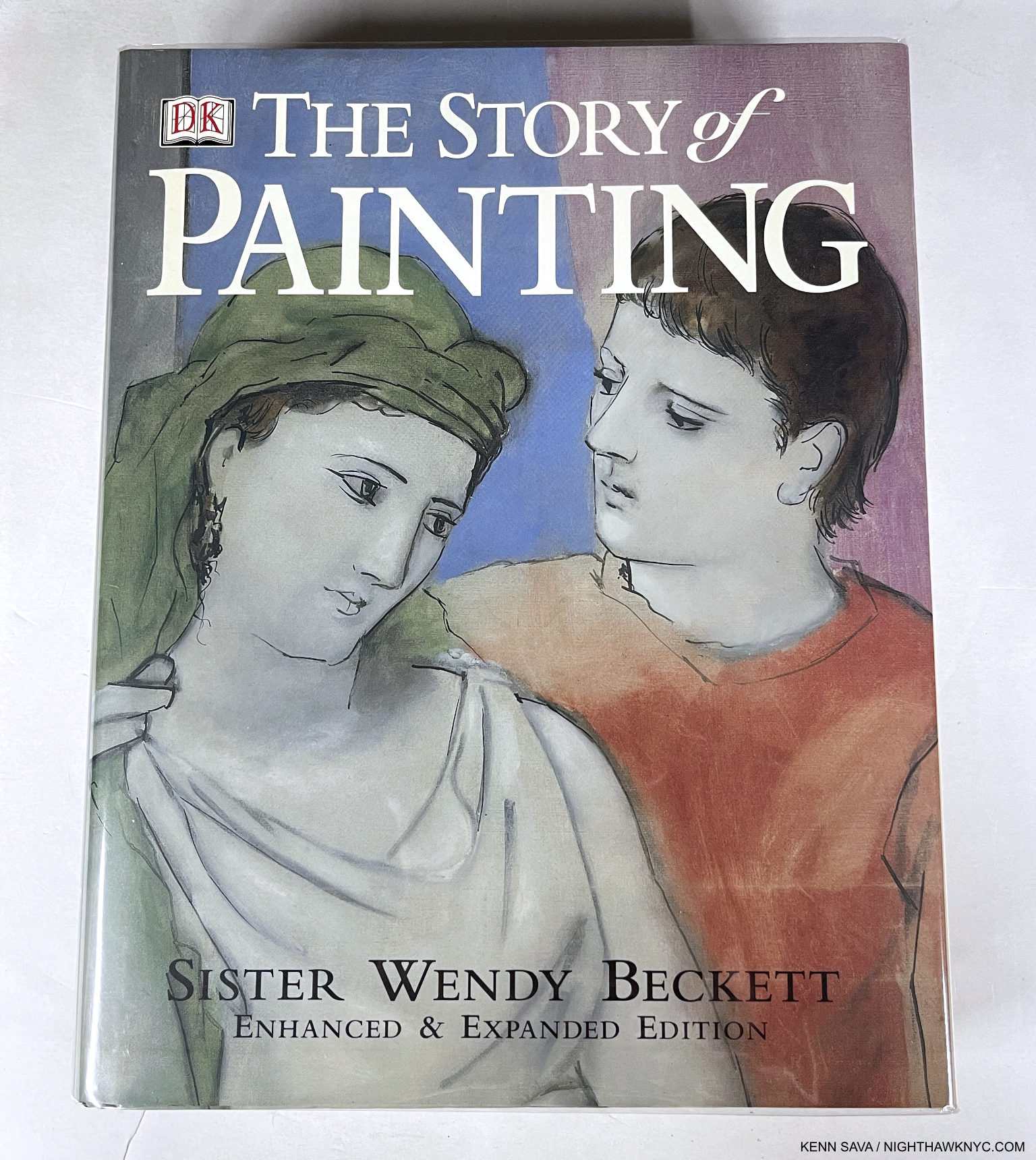
The Story of Painting, Sister Wendy Beckett, DK Publishing.
The first book I simply must mention is one that had a bit to do with inspiring me to start NighthawkNYC.com, which is about to begin its ninth year: Sister Wendy’s The Story of Painting. A phenomenal accomplishment, covering the history of Painting right up to very recent times, her observations are based in what she sees in the work itself! In so doing, Sister Wendy showed the world how to look at Art without the noise surrounding it from those who would tell you what you “should” see so you can see Art for yourself. I first read Sister Wendy Beckett back in her days as a contributor to the excellent Modern Painters Magazine, before her BBC & PBS TV Series make her world-famous. Still, at the moment, if you look for it (it’s out of print), The Story of Painting can be had reasonably. I prefer the hardcover, mine shown above, because I wore out my softcover copy years ago. Yes, some of the blown up details are out of focus, making me wonder about the editors, but’s that’s no reason for the slightest hesitation- most of the 450 images over 800 pages are fine. This is a book that should always be in print, so it’s past time for a new edition! There is an exceptionally well done TV Series of the same name that is available on DVD, and her other, lesser-known TV Series, like Sister Wendy’s American Collection, in which she visits 6 U.S. museums are also amazing. Seeing her in the same halls of The Met that I frequent always gives me chills. All her shows are essential and should be rerun as often as any show is. Luckily, there is a Complete Collection of her TV Series in a DVD box set. I missed her when she retired to live in seclusion in her trailer, as I wrote here, and more so since her passing, which I mourned here, but what she left us lives on in me, which I try and share here, and countless others. I hope it continues to inspire countless millions indefinitely.

Van Gogh: The Complete Paintings, Taschen
If I were to take only one Art monograph, you might be looking at it. I’ve looked at it more than any other Art book besides The Story of Painting. Vincent became an Artist late in life, at about 28, and his career barely lasted 9 years. Yet, the intensity of his dedication to his craft saw him create about 2,100 works, including about 860 Paintings! The evolution of his style is continual after his earliest, “dark” period. Meanwhile, his life was full of tumult, disappointment, and unimaginable pain & suffering. Currently the “Brick” edition, which measures about 6 by 8 inches, $25. list, and/or XL edition, $60. list, are in print. Virtually the exact same book in 2 different sizes. Large or small, either is an incredible value. I’ve got both and each sees steady use. Choose small, shown above, if you want a ready reference, perfect for your bedside or backpack. Choose XL if you want to see the Art in a larger size. My look at the reinstalled Van Gogh Paintings at The Met, pondering what Vincent would think, is here. I’ve begun a piece on Van Gogh’s Cypresses, currently at The Met.

With its NoteWorthy Art Book of 2020 designation.

Rembrandt: The Complete Paintings, Taschen XXL
The canon of the Master’s Oils seems to be changing daily, even 354 years after his death! It has already changed since this was published in 2019. Still, unless you hit the Mega Millions, or are able to fly around the world and see all the Rembrandts on view in the world’s museums, this is as close as you’ll ever get to seeing them all. Even if you were able to do that, you’d only see some of them because museums rotate/lend their collections and those in private hands are probably inaccessible to you. Still, even if you were somehow able to see all of them, you’ll never see them this close. Nuff said. My hope is they update it in a few more years. In selecting this, I must mention my other go-to Rembrandt book- The Rembrandt Book by the legendary Dutch Art specialist, NYC-born, Gary Schwartz. Aptly titled. Essential. My look at Rembrandt’s First Masterpiece at the Morgan Library in 2016 is here.

My sealed XXL before being “touched.” In this case, “XXL” equals 19 pounds!

Michelangelo: Complete Works,  Taschen XXL
Michelangelo’s canon doesn’t change nearly as often as Rembrandt’s does, but it does look different when his Art is cleaned or restored (like the Sistine, which looks incredible now, as seen in here, though I hope no damage was done to it in the cleaning). But as I mentioned for the Rembrandt XXL, you’ll never seen all of it, and never this close. Trust me- The Vatican is NOT letting you up on a scaffold in the Sistine! The XXL is out of print and goes for $500. and up in VG or better condition. The $60. XL is almost as good and is still in print as are the two Bricks that include this material- Michelangelo: The Complete Paintings, Sculpture and Architecture and Michelangelo: The Graphic Work for his Drawings, My look at the monumental Michelangelo Divine Draftsman and Designer, at The Met in 2018 is here. One of the top 3 or 4 Art shows I’ve ever seen, it brilliantly revealed for all-time that Michelangelo, the Draftsman and Designer, may be the most overlooked aspect of his super-human genius, and just possibly his most under-rated talent. The Met’s catalog accompanying Divine Draftsman and Designer is one of the very best books on Michelangelo there is- and I’ve owned a lot of them.

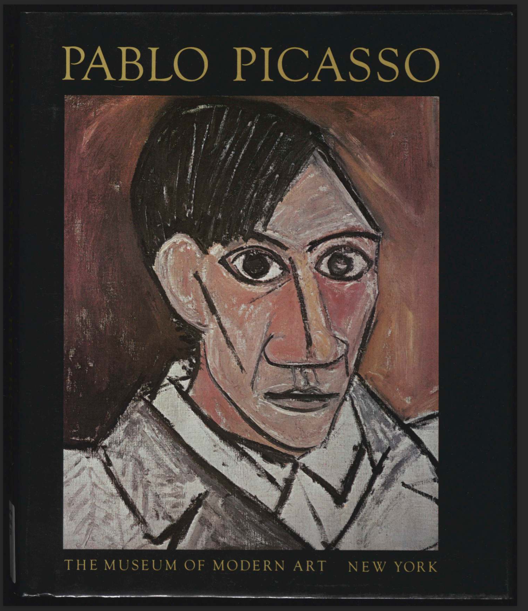
Pablo Picasso: A Retrospective, Museum of Modern Art
HOW could I do a list like this and NOT include a Picasso book? In 1980, I made two trips back to NYC while I was on the road with a band, just to see MoMA’s Picasso Retrospective. The hype leading up to it called in a “once in a lifetime, must-see show.” The reality was just WOW! It marked the beginning of my Art show-going life. If my Art-going career had ended then and there I really couldn’t complain; it’s never been topped by anything I’ve seen since. The show, which filled ALL of the “old” MoMA,  was just overwhelming…mind-boggling. Almost ONE THOUSAND Paintings, Sculptures, Drawings, Collages, Prints, Ceramics, etc., etc. MoMA lent 230 works to other institutions to make room for it. I’ll never forget seeing his earliest works, which the show began with, including Science and Charity, which he Painted at 15(!), and and already being staggered by his talent TWO GALLERIES in, with the entirety of MoMA (THREE FULL FLOORS!) still ahead of me! The catalog published to accompany the show is a classic as well. It’s still to be had quite reasonably in hardcover, like mine above, which I bought at the show, or softcover (check it for yellowing first. It’s 43 years old and my copy makes no mention of acid-free paper). It’s endlessly staggering to page through it and realize that ONE PERSON created ALL of this! If you said of it, “THIS was the ultimate testament of man’s creative accomplishment in the 20th century,” I, for one, couldn’t argue with you.

Kerry James Marshall: Mastry, Skira Rizzoli
THE Painting show of the 2010s among all those I saw lives on in the terrific catalog that accompanied it. It’s still one of the two best books on Mr. Marshall, one of the most important Painters working today, along with the Phaidon Contemporary Kerry James Marshall book. You need both, but in a pinch I’ll take Mastry. I wrote about the show here.
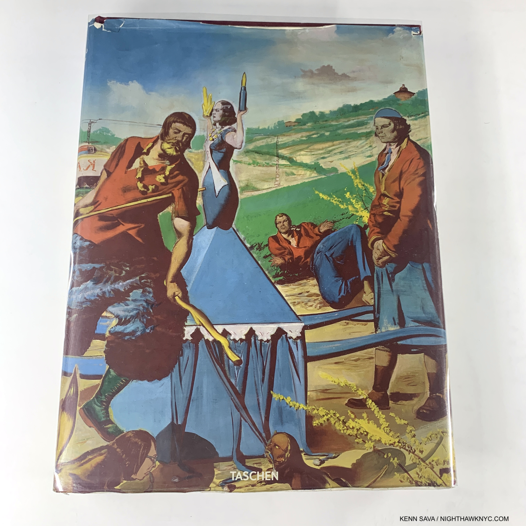
I bought my copy used so it was pretty much like this. Out of print for a long time, it’s very hard to find now in VG condition for less than $200.

Neo Rauch, Taschen XXL
Perhaps the world’s most enigmatic living Painter, Neo Rauch’s work continues to both baffle me and hypnotize me in equal measures. Leave it to Taschen to create the most stunning book on his work published so far, even though his bibliography is ever-expanding and the track is fast. 12-years-old at this point it sorely needs to be updated with the work he’s done since added though the essay remain excellent. Long out of print and commanding big bucks, I’d advise holding off on it now and hope Taschen gives us a new edition with all of his work for the past decade+ added. In fact, I spoke with Neo Rauch this spring about just that and he told me another Painting book is coming out next year. It didn’t sound like it would be an Updated Taschen Neo Rauch.

*- Estate of Francis Bacon Photo

Francis Bacon: Catalogue Raisonne, Martin Harrison, The Estate of Francis Bacon
It seems like the Francis Bacon bibliography gets bigger every few months, but this will ALWAYS be THE place to begin, and end, when it comes to seeing his work. Especially ALL of it! His 584 Paintings are beautifully shown in 800 illustrations over 1,500+ pages in five volumes. Text by the world’s foremost living Francis Bacon authority, Martin Harrison (who also contributed to Saul Leiter’s Early Color, one of THE essential PhotoBooks of the 21st century). Here’s the thing- the Estate has said that once it’s sold out, “it will never be reprinted.” Gulp.

The Complete Oil Paintings of Edward Hopper & The Complete Watercolors of Edward Hopper, both Norton
The 4-volume Edward Hopper Catalogue Raisonne by Gail Levin and published by the Whitney in 1995 is more well-known, but it sold out and copies currently BEGIN at $1,000. per. Lesser-known is that the Whitney then sold the two volumes of The Complete Paintings & The Complete Watercolors from the set as stand-alone volumes. At this point, they’re actually probably harder to find. Recently a reader asked me for a Hopper recommendation. It’s really strange that there isn’t a comprehensive book on Hopper’s Art over his whole career currently in print. (The Whitney’s catalog for Edward Hopper’s New York is good, but it’s focused on his NYC work.), as I recommended in Part 2 of my recent look at Edward Hopper’s New York, seek out Gail Levin’s Edward Hopper: The Art & The Artist, the catalog for the last Edward Hopper Retrospective at the “old” Whitney Museum in 1981. Just beware the book is 42 years old now. Look at it before you buy a copy and make sure the pages haven’t yellowed, which this book is very prone to, since that drastically affects the color of the Art.

Robert Rauschenberg: A Retrospective, Guggenheim Museum
By far the most comprehensive look at almost all of Robert Rauschenberg’s career to 1997. A show I saw and will never forget. Mr. Rauschenberg was involved in its making (there’s a great video online of a brief interview with him as he stands on Frank Lloyd Wright’s ramp). The Artist would go on to live & work for another 11 years, and I am particularly a fan of his late work. Still, this is a glorious book, one I have gone through 3 copies of. The essential visual reference to Robert Rauschenberg’s Art. He remains one of THE most influential Artists on the Art I see in 2023. My look at what I called “The Summer of Rauschenberg” in 2017 is here.

*-National Gallery of Art Photo

Georgia O’Keeffe: Catalogue Raisonne, National Gallery of Art, Washington
A “name” here at home, Ms. O’Keefe is only beginning to be better known around the world. I believe her stature is only going to grow and grow from here on. This book shows why. Her work is singular, always based in nature with her one-of-a-kind vision, and just plain gorgeous. As we’re seeing right now in her terrific MoMA show, Georgia O’Keeffe: To See Takes Time– her work holds up gloriously!

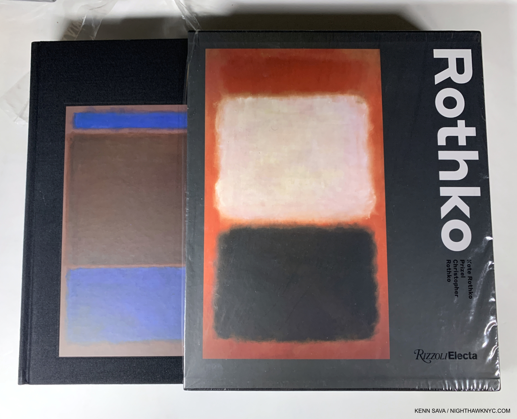
Rothko by Christopher Rothko & Kate Rothko Prizel, Rizzoli Electa
Runs, doesn’t walk, to the head of its class. Some may still prefer Yale’s Mark Rothko: The Works on Canvas, but it’s 25 years old now. Who better to write a book on their father than Mark Rothko’s son and daughter? They know whereof they speak on all things Rothko after spending their lives as closely involved with his work as anyone- not to mention actually living with the Artist. This all came home to me in spades when I met Kate and got to speak to her about a number of things Rothko-related. She thinks this is the better book, and when she told me that I didn’t get the feeling she was speaking out of bias. The handsome book in a slipcase includes an extremely wide range of work- on canvas and paper, from all periods. The 1999 Rothko Retrospective at the “old” Whitney changed my life, turning me back to being Art-centric from Music and made me a fan for life. My look at Mark Rothko: Dark Palette, 2016, is here.

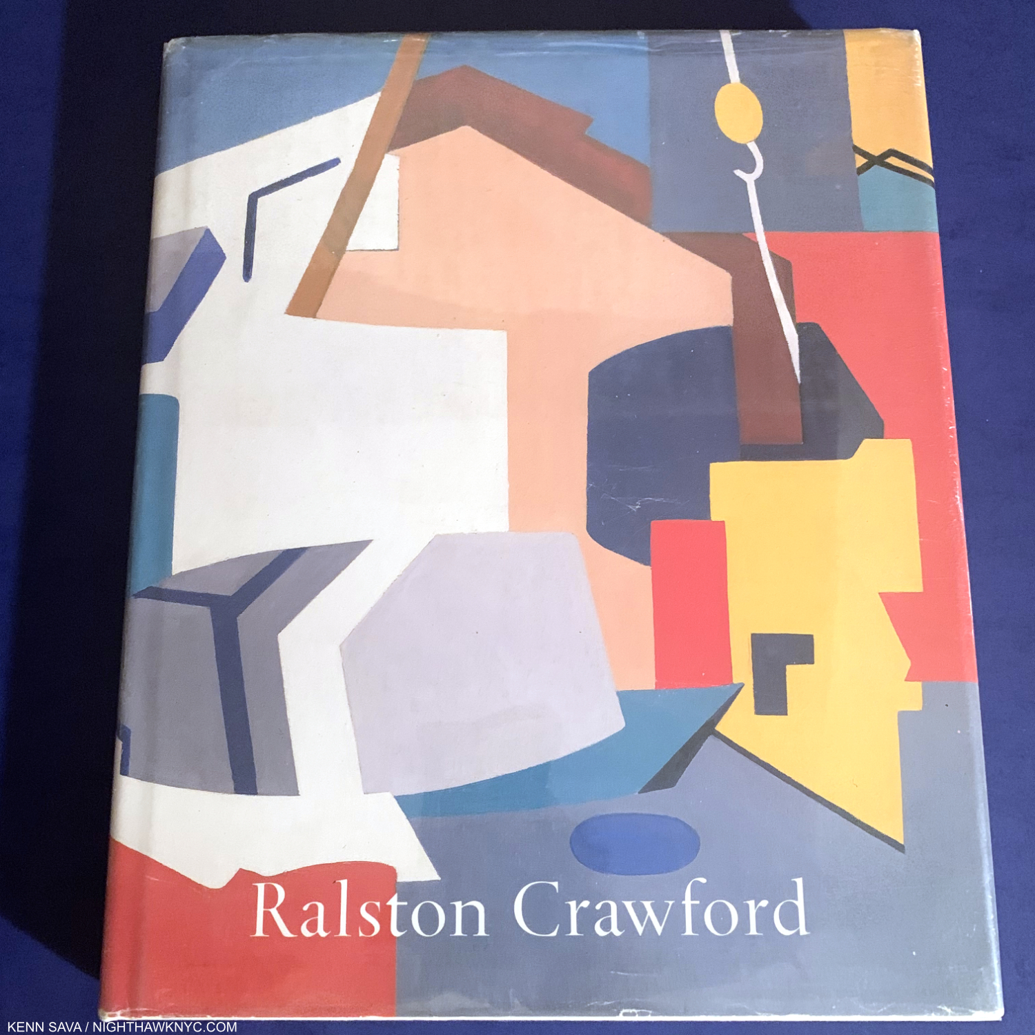
Ralston Crawford by William C. Agee, Twelvetrees Press
Ralston Crawford is one of the most overlooked Artists I can think of, and I’ve been obsessed with his work since the Whitney Retrospective more years ago than I care to think about. Though shows have been scarce, books have begun to appear over the past decade. This is still the best comprehensive overview, but I hope a REALLY worthy Ralston Crawford book will be coming. Oh, he was also a very talented Photographer, as Keith Davis’s fine book The Photographs of Ralston Crawford reveals.

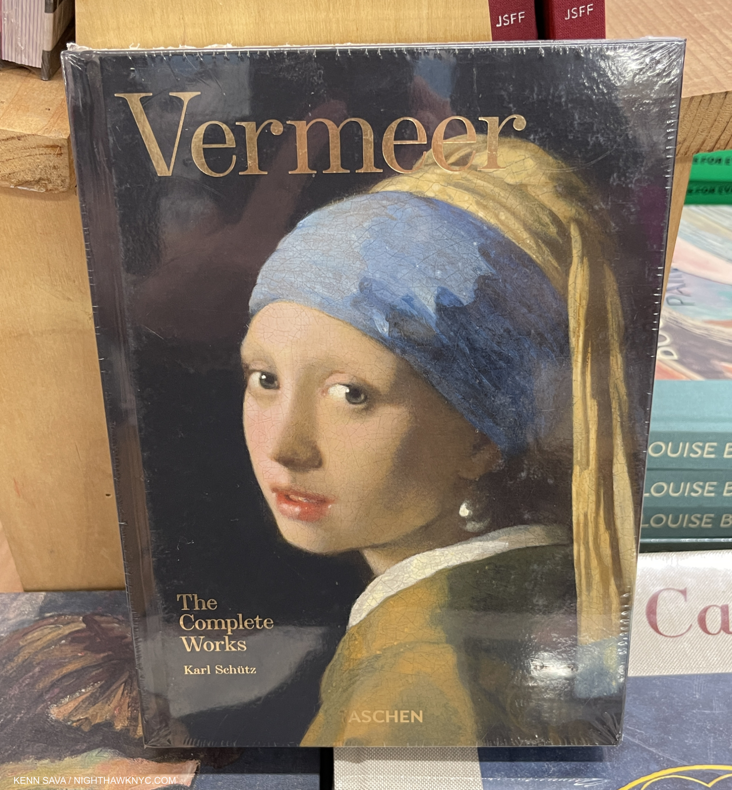
Vermeer: The Complete Works, Taschen
There are other excellent books of Vermeer’s complete Paintings, including those by Arthur Wheelock of the National Gallery, DC, and the late, lamented Walter Liedtke of The Met who was tragically killed in a train accident a while back. Both of those are excellent for their texts, the Taschen book is essential for its Photography. There hasn’t been an XXL-sized edition, but Vermeer: The Complete Works is now available in either the Brick size, pictured, or the XL size. You can’t go wrong either way- see my comment on Van Gogh: The Complete Paintings for why, though when it comes to Vermeer, you can’t get TOO close!

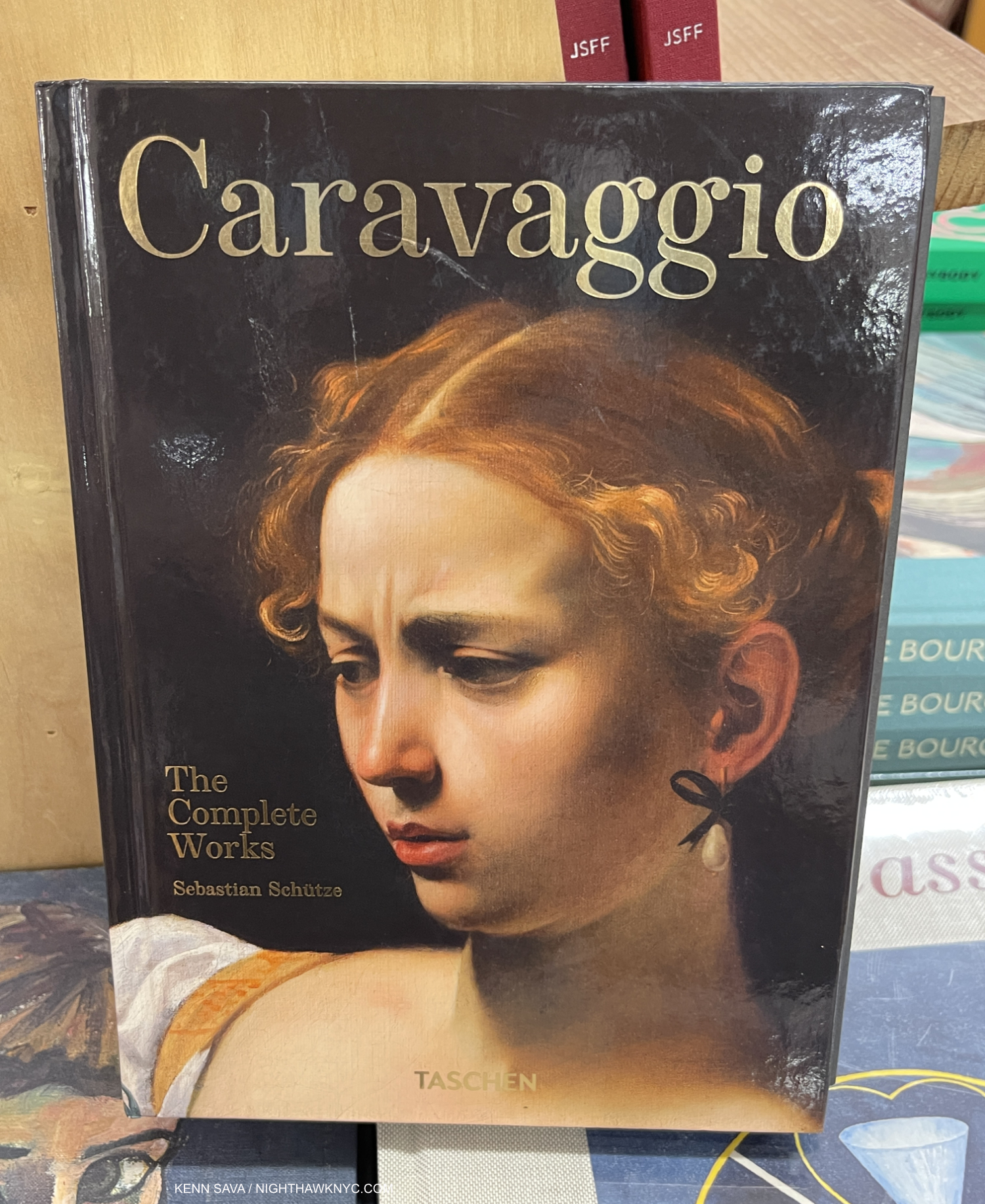
Caravaggio: The Complete Works, Taschen
The XXL is long out of print but seeing his work THAT large is an amazing experience if you can find one. The Brick and XL remain in print, and both work well. Caravaggio’s chiaroscuro has been infinitely influential, from Rembrandt on down, no less so today. And so his work remains essential for Photographers, those interested in Film, and of course Painters.

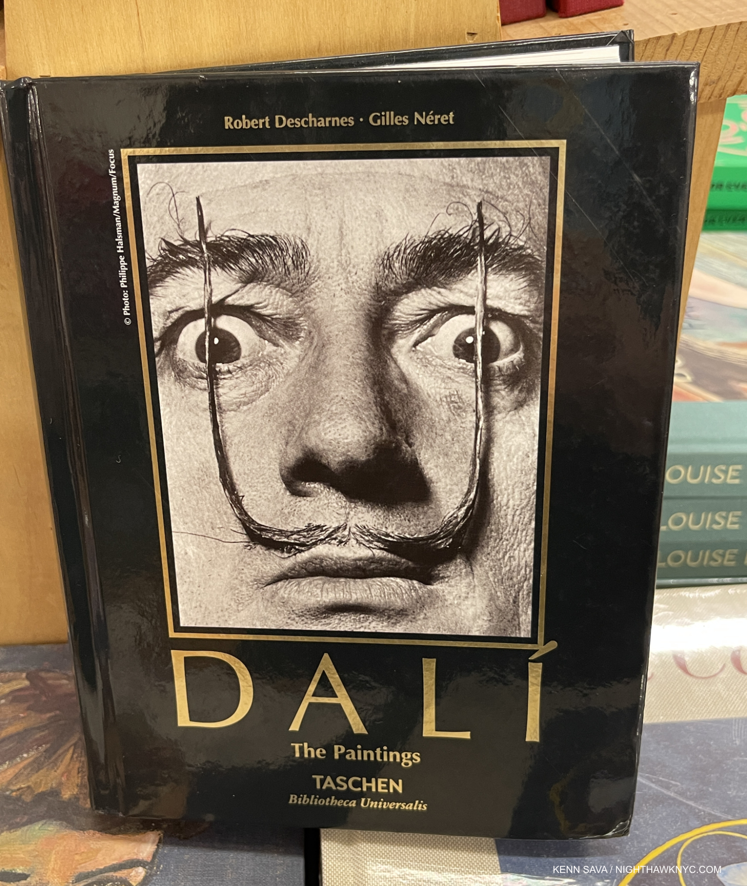
Dali: The Paintings, Taschen
Dali seems to be in a bit of eclipse these days, but anyone who saw the huge Dali Centennial Retrospective at the Philadelphia Museum in 2004-5 knows this is temporary. This remarkable book contains all his Paintings from a very long and very productive career that was marked by almost as many styles as his contemporary Picasso. Originally published as a Volume 1 & 2, now in one volume, available in the Brick or XL size. If you don’t think Salvador Dalí belongs on this list, look through a copy of this book and then tell me he doesn’t.

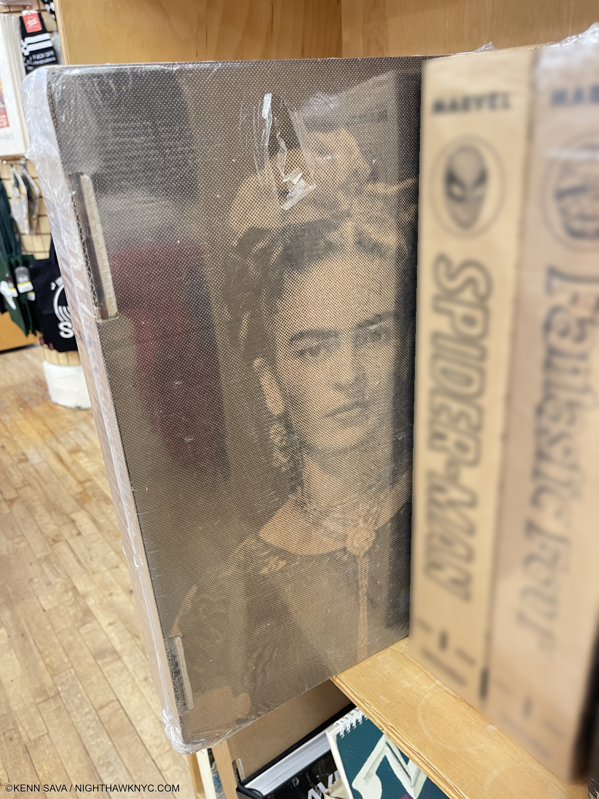
Getting harder to find- Frida Kahlo: The Complete Paintings, sealed, in its shipping box.

Frida Kahlo: The Complete Paintings, Taschen
Unless you’re besties with Madonna, this is likely to remain THE very best place to see the astounding, indelible work of the Mexican genius. What else is there to say? Oh! My money is that Taschen will re-release it in smaller sizes, but if you want to see her work in FULL effect, the XXL, the only edition of it thus far, which seems to be disappearing, is likely to remain THE BEST place to do that. I wouldn’t wait long.

Diego Rivera: The Complete Murals, Taschen
Completing the only husband/wife team on this list, this is a terrifically important concept beautifully realized. It’s hard to feel now what a revolution Diego Rivera and the other Mexican Muralists created when they began making Murals in Mexico. They later created them elsewhere and along the way influenced many of the great Artists of 20th and now 21st century Art, including Jackson Pollock. Available in the XL size, I would have my doubts about how good it would be as a Brick.  But in the XL you can study all the marvelous detail on each Mural in a generous size.
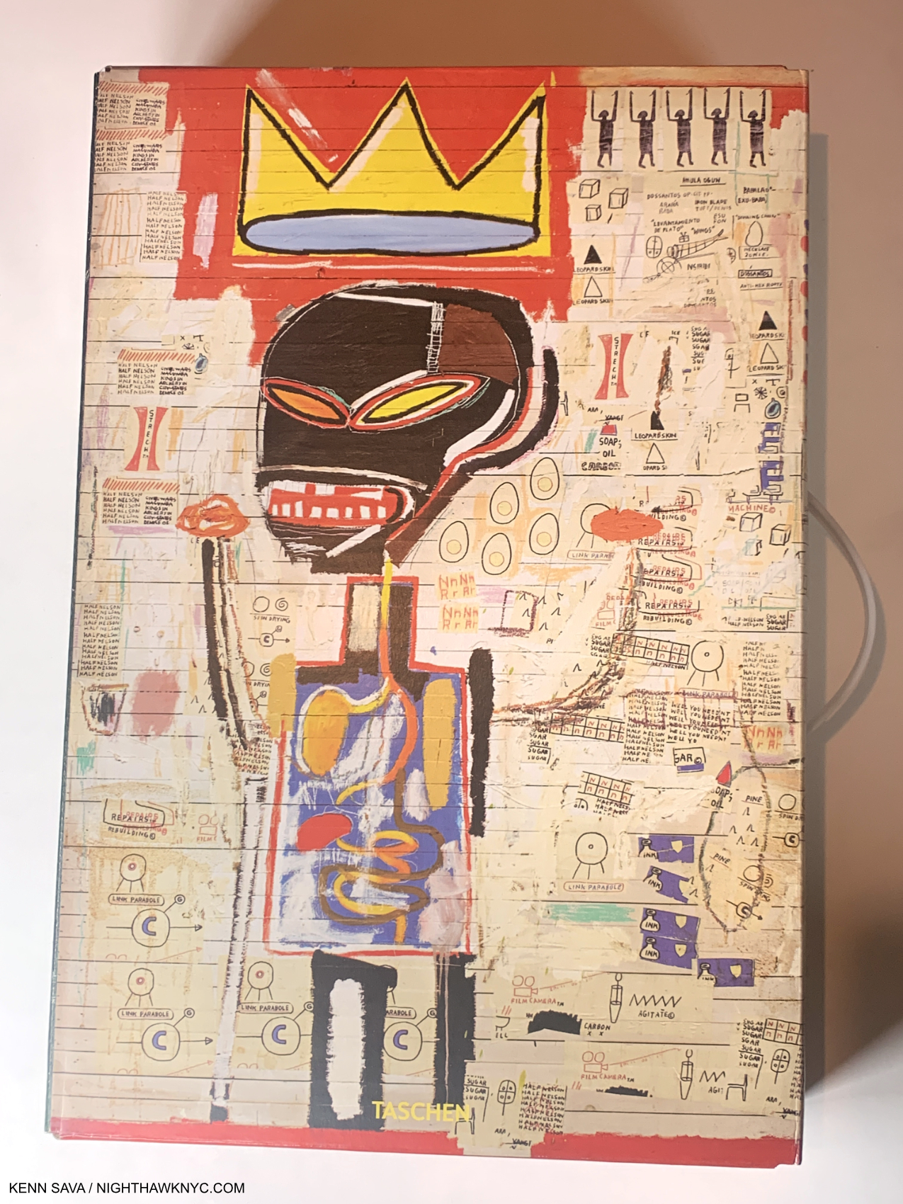
Basquiat XXL seen here in its original, printed, shipping box, which has been replaced with an all brown box in recent printings.

Basquiat, Taschen XXL
The XXL is likely to forever be THE best place to see the most Basquiat Art as close to life size. There is a Brick edition, part of Taschen’s 40th Anniversary series, which is slightly edited, but that’s the tradeoff for the deep savings ($30 for the Brick vs $200 for the XXL). Neither can be beat among ANY Basquiat book currently in print, in my opinion, and I’ve owned or seen most of the books published on his work to date while I was doing research for the numerous pieces I’ve written on the Basquiat shows in NYC in 2019 and 2022, which can be seen here.

UPDATE, July 15, 2023- In response to my list, a reader wrote, “Basquiat? Could you tell me why he’s on your list?” Sure. Jean-Michel Basquiat is the most compositionally diverse and compositionally inventive Artist I can think of- besides Robert Rauschenberg. As I pointed out in my piece, his compositions alway surprise me, and virtually no two are alike. That’s remarkable. Jean-Michel was ahead of his time in addressing many issues that are now foregrounded in Art, and in the world, today. This is the best book to experience all of that.

Yes, my choices are books that contain Art. As an Art writer, I want to see the Art- as much as I can by any particular Artist I’m interested in. I’m also interested in his or her biography and the circumstances surrounding the creation of the Art. I don’t read Art criticism for 2 reasons. 1) I’m planning on writing my own take on the work, and 2) with all due respect, I don’t want to be influenced by what anyone else says about it. I need to see the Art for myself and I encourage (and have always encouraged) everyone to see Art for themselves. That being said, among Art books that are primarily text (well, the Sister Wendy is both), three stand out for me-

*-Van Gogh Museum/Thames & Hudson Photo

Vincent van Gogh: The Letters: The Complete Illustrated and Annotated Edition (6 volumes), Thames & Hudson
A long time ago I was gifted the 3-volume set of Van Gogh’s Letters edited by Johanna (“Jo”) van Gogh-Bonger who, also wrote a Preface/Rememberance of Vincent. I still have them. This will forever be a very special set. If you love Van Gogh’s Art and don’t know the name Jo van Gogh-Bonger, get thee to a nunnery! Mrs. Van Gogh-Bonger was Theo’s bride, then quickly his widow when he died 6 months after Vincent in 1891. She inherited Vincent’s estate (i.e. virtually all his Art and Letters) after his tragic suicide or murder (in spite of everything, I remain unconvinced he wasn’t ((accidentally?)) murdered. See below..). She is THE person responsible for making Vincent van Gogh the world-wide phenomenon he is today. She believed his Letters were the key to understanding his Art. She was proved right. She edited a collection of them, which has stood until this expanded edition. Her passion for Vincent’s Art led to the creation of the Van Gogh Museum, after her son donated their collection to the Dutch state who agreed to build the building. The VG Museum undertook an updated edition of Vincent’s immortal Letters in 2009, an unparalleled body of writing in Art history, and authorized the publication of Vincent van Gogh: The Letters: The Complete Illustrated and Annotated Edition in six volumes. WORD!- It’s ALL available for free online, with updates, which the books don’t get! (I just saved you the thousands of dollars the set goes for on Amazon right now! PLEASE donate so I can keep turning you on to things like that. Thanks.)
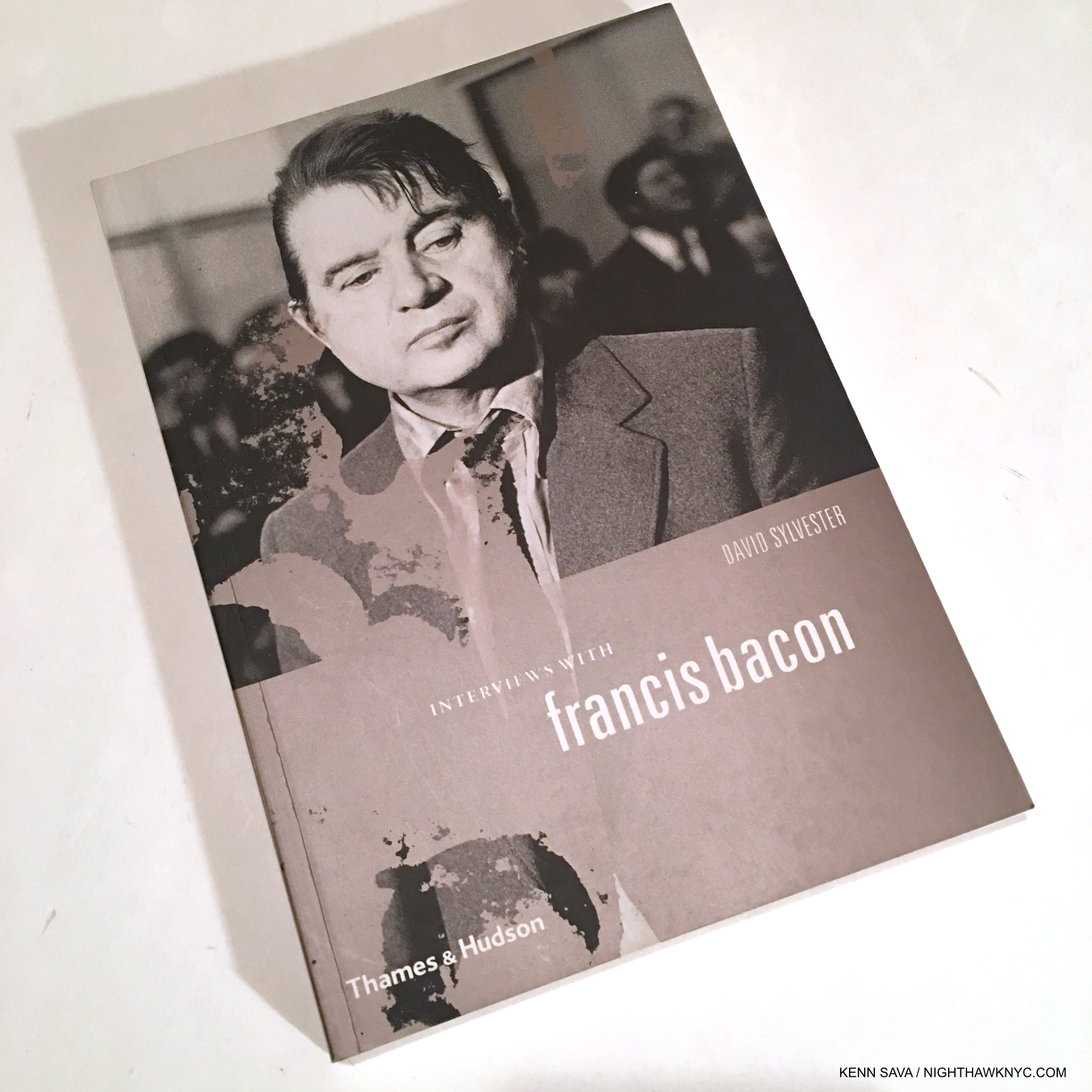
An older edition with black & white illustrations inside. Get the current edition. It has color illustrations.

Conversations with Francis Bacon by David Sylvester, Thames & Hudson
I’ve never read better interviews with an Artist. Period. Mr. Sylvester is Cecily Brown’s dad. I’ve met Cecily, but didn’t get to ask her if she met Francis…

Van Gogh: The Life by Steven Naifeh and Gregory White Smith, Random House
There are a lot of great Artist’s biographies out there, and some terrific Autobiographies, too. However, I just can’t put Van Gogh: The Life down. Like so many others, I grew up believing the fiction written by Irving Stone (Lust for Life, which became the equally fictionalized Film, though it was shot in some actual places, and his Dear Theo.). It’s way past time the record on Vincent’s life was set straight! After I discovered his Letters I began to get the picture. Here the gaps are completely filled in. The decade of research, with the help/permission of the Van Gogh Museum, shows on every page. There’s also a website especially for the book’s footnotes(!), and, unlike many/most Art biographies written by non-Artists, the Art commentary is spot on. Not an easy thing to do with someone like Van Gogh. BRAVO!  I recommend looking for the hardcover, which is out of print. The cover of the paperback is a little thin for an almost 1,000 page book, and this book is almost guaranteed to be the definitive Van Gogh biography for, at least, the foreseeable future. It includes an appendix in which the authors lay out their theory that Vincent DID NOT COMMIT SUICIDE- he was accidentally murdered!!! They followed this up with an equally insightful supporting article in Vanity Fair. I find their case compelling.

The big takeaway of all this will no doubt be that I’m a big fan of Taschen. When it comes to Art books, I’ve said as much before. TEN books listed here are published by the German firm. Their Photography books, however, are VERY hit or miss, and could use a few more “hits.” I’ve said a few times that the Taschen small “Brick” sized books (with the newest releases bearing the “40th Anniversary Edition” moniker) are THE best value in Art books today. You could build a terrific Art library out of just Bricks, to coin a phrase. Taschen books consistently feature the most color illustrations of the Art in the highest quality Photographs and publication using excellent paper and always have a rock solid binding. From the Bricks to the XL to the XXL editions (of almost the exact same book, but, be aware, though Taschen doesn’t mention this: my side-by-side comparisons reveal the Bricks may be edited down subtly from the XXL in places- that’s the trade off for saving 85% of the price!), you pick your price point, and the size you want, and you’re good to go on so many of the Artists they include. In fact, only Phaidon can compare with them in terms of the roster of Artists they have published in-depth monographs on. Phaidon stands alone when it comes to their superb Contemporary Artists monograph series. Taschen’s roster is mostly older Artists, though more Contemporary Artists are being included. 

*-Soundtrack for this Piece is “Desert Island Disk” by Radiohead from A Moon Shaped Pool, 2016, the title of which is a play on the BBC Radio show Desert Island Discs.

This piece is dedicated to The Strand Bookstore, where I’ve discovered more great Art (& Photography) Books than anywhere else the past 45 years. This year, The Strand celebrates their 96th year. My previous BookMarks pieces are here.

THERE WERE NO AFFILIATE LINKS IN THIS PIECE!

NighthawkNYC.com has been entirely self-funded & ad-free for over 8 years, during which 300 full length pieces have been published! If you’ve found it worthwhile, PLEASE donate to allow me to continue below. Thank you, Kenn.

You can also support it by buying Art, Art & Photography books, and Music from my collection! Art & Books may be found here. Music here and here.

Written & photographed by Kenn Sava for nighthawknyc.com unless otherwise credited. To send comments, thoughts, feedback or propositions click here. Click the white box on the upper right for the archives or to search them. Subscribe to be notified of new Posts below. Your information will be used for no other purpose.


The “New” MoMA, And The Gorillas In The Room

Written & Photographed by Kenn Sava (except *)

MoMA, 1st floor lobby sign, October 19, 2019. I’ve been through this before. The last time, it was a nightmare. How would this “new” MoMA be?

MoMA and I go a long way back. It’ll be 40 years next year. 

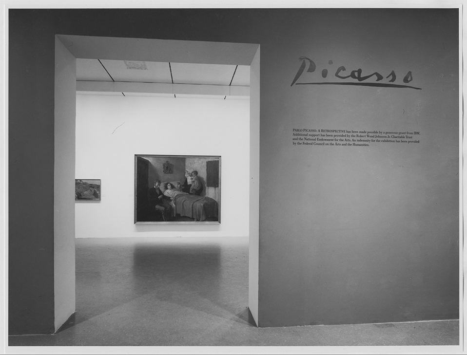
I can remember this like it was yesterday…The entrance to Pablo Picasso: A Retrospective at MoMA, 1980. My Art show attending career began when I walked through that entrance. *MoMA Photo.

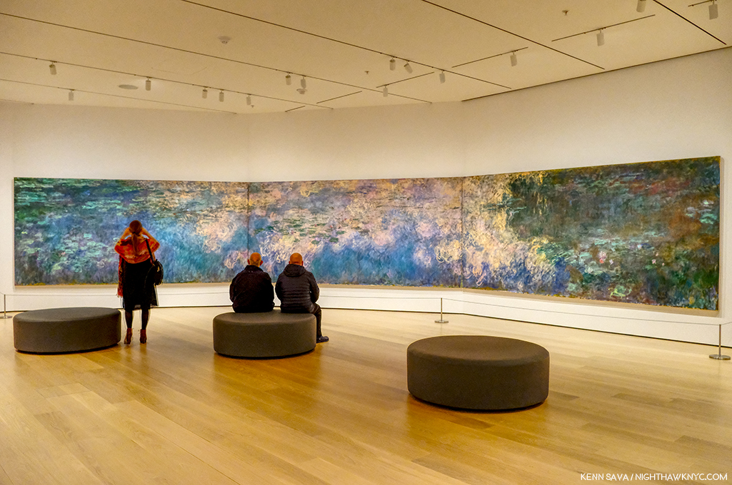
I first went to The Museum of Modern Art in 1980 for their incomparable Pablo Picasso: A Retrospective that took over the whole museum. I was on the road with a band at the time and I flew back to NYC twice to see it. Though it was not my first trip to a museum to see Art, it began my career of seeing Art shows and is burned indelibly in my mind since. While I came away feeling the late works were underappreciated, the earliest works which were new to me, like Science and Charity, 1897, Painted at age 15, seen through the entrance, above, particularly astounded me, and it never let up from there. An almost impossibly high bar had been set. I wasn’t able to attend MoMA regularly until after the 1984 renovation, which I call MoMA, 1984. Looking back on that MoMA now, I have quite fond memories of the building. I’ll never forget being in the gallery the museum dedicated to Claude Monet’s Water Lilies, 1914-26, long a very important bridge between representational Art and abstraction for me. As I recall, it was a small room, with a bench along the window overlooking West 53rd Street. You entered the room where panel 1 met panel 2, at about 10 o’clock as you faced it. You sat there and the three huge panels surrounded  you, making you feel like you were inside it. It was one of the greatest feelings I’ve ever had looking at Art. I didn’t think MoMA, 1984 was anything special at the time, but given how lacking MoMA, 2006, the most recent MoMA was, which of course, is still with us in the partially new MoMA, 2019, I now feel quite nostalgic for a building that was “adequate” at best, overall.

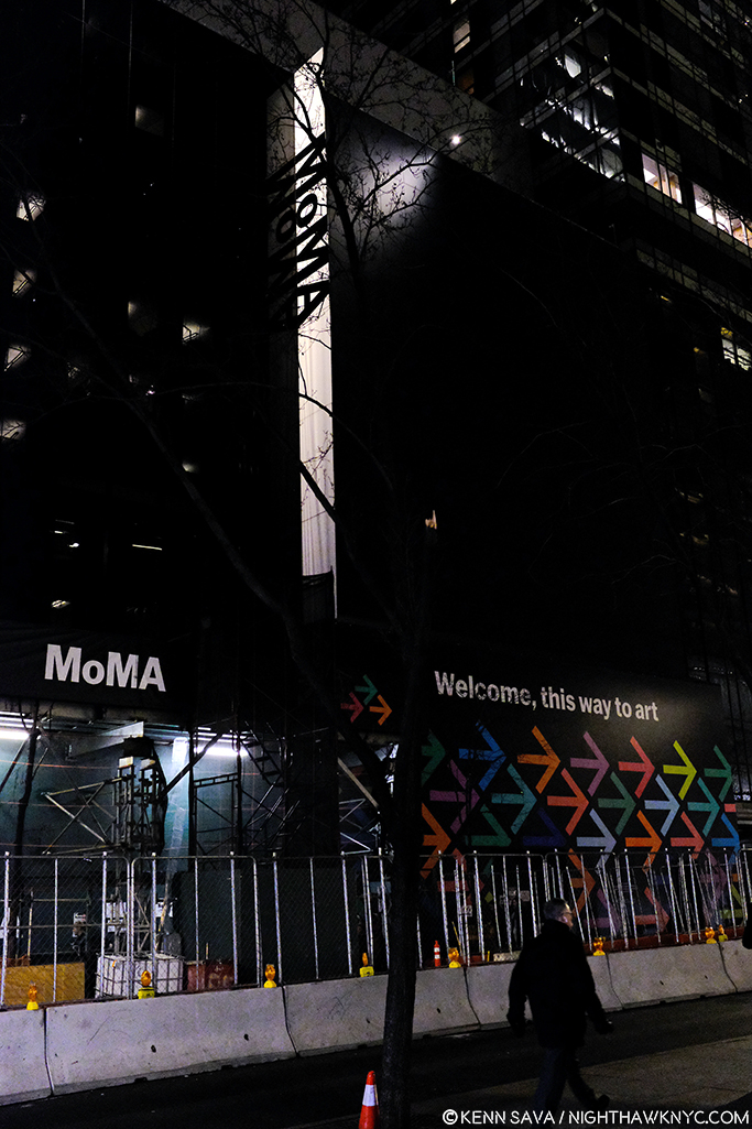
The heart of Art darkness. Construction for MoMA, 2019 in progress at the famous main entrance, behind the arrows pointing visitors to the temporary entrance, December 20, 2018.

I saw Matisse-Picasso at MoMA Qns in 2003, where MoMA was temporarily as MoMA, 1984 became MoMA, 2006, which I went to innumerable times (and have written about a number of its shows here on NYNYC), from it’s earliest days. MoMA, 2006, which opened that November, was terrible, in my opinion (I replaced a stronger negative). I remember standing in utter shock looking at Monet’s Water Lilies installed around the base of the huge, open space, they called the “atrium,” where they had no sense of their compositional continuity or unity. Barnett Newman’s Broken Obelisk, 1963-9, installed in the center of the space looked better there than anything I’ve seen there that came after it, which is not really saying anything all that positive.

The newly renovated main entrance. Opening day, October 21, 2019.

“The Shopping Mall of Modern Art,” I took to calling MoMA, 2006, the one we’ve been living with these past 13 years. I don’t live in the suburbs partially because I hate malls, yet, here we were given one. The Architect, Yoshio Taniguchi, said1 “The model for MoMA is Manhattan itself.“ He spoke about how Central Park is like MoMA’s Sculpture Garden in his concept. Apparently he felt the rest of Manhattan is one giant shopping mall, cause that’s the design we got- a department store, nothing more, nothing less, who’s floors/departments are connected by an escalator, as they always are. If MoMA had decided to move to an entirely new location instead of turning MoMA, 2006 into MoMA, 2019, whoever would have come into the building would have a virtual turnkey Macy’s II ready to go. “Contemporary on 2,” “This way to the Permanent Collection, and home fixtures…I mean Design”…

That brings me to the Gorillas in the room…Both of them.

“There’s a hole
In my life
There’s a hole
In my life”*

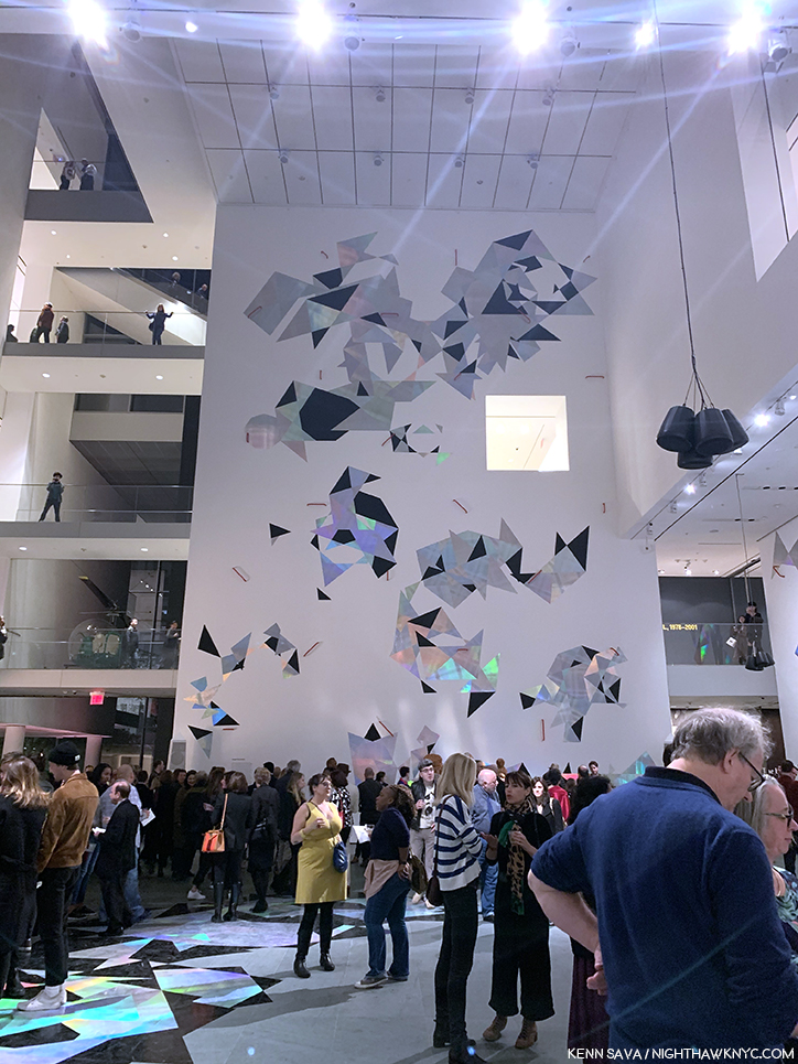
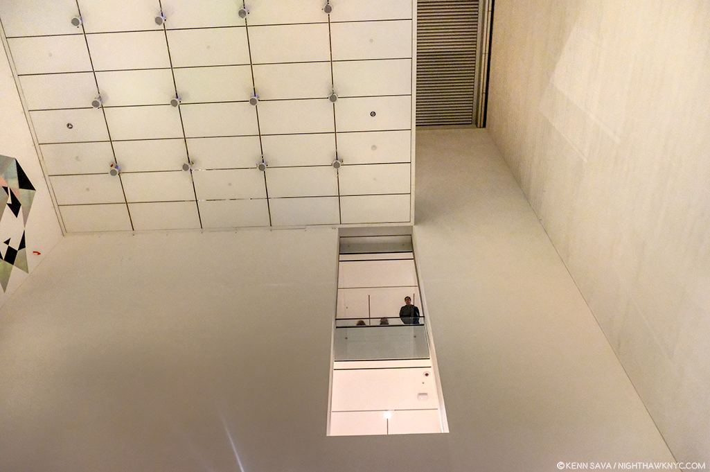
The “atrium,” Member’s Preview” for the “new” MoMA, October 19, 2019.

The first is that 110 foot tall gorilla in the building officially or unofficially called the “atrium.“ For some reason that I have not for the life of me been able to figure out over a few hundred visits these past 13 years, the Architect decided to drop a 110 foot tall atrium, (the “hole” I call it), smack dab in the middle of the building that, apparently, even some of the world’s great curators haven’t found a defining use for in almost one and a half decades2. I don’t blame them. I blame the Architect and whoever else thought this space was a good idea. I’ve never seen them use any more than the first 20 feet or so of its 110 until they mounted a decal-like iridescent work, seen above, on one of its walls for the opening of MoMA, 2019. And, I blame those who decided not to remove it in MoMA, 2019.  MoMA created MoMA, 2019, partially, because they “needed more space.” Well, guess what? You’ve got 7,700 square feet, or so, of completely useless space right smack dab in the middle of the building3, right in the middle of some of the most expensive real estate on earth. Instead of extending each of the floors as they should have been originally and filling that hole, they tore down an existing, good, museum, The American Folk Art Museum, formerly at 45 West 53rd Street next door!

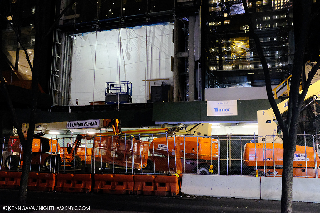
Construction of the new building for MoMA, 2019, where the American Folk Art Museum stood, seen on December 20, 2018.

“Shadow in my heart
Is tearing me apart
Or maybe it’s just something
In my stars”*

Frankly, all of this galls me.

“Soaring…””Majestic…””One of NYC’s great interior spaces…” Oh, sorry. I was reading about the Guggenheim. I can’t find anyone saying that about this.

Because of the atrium, the flow of every floor in MoMA, 2006 is broken up, causing headaches for visitors and curators. This goes right to the heart of the museum’s purpose- showing Art. A good number of the galleries in MoMA, 2006 felt strangely shaped, small, or lost. In this case, small doesn’t add “intimacy.” Instead, it serves to actually minimize the effect of the Art being shown in them, in my experience. The Brancusi show mounted before the summer, 2019 closure, and the new Betye Saar show both suffer from this, in my opinion, both being mounted in the same 2nd floor gallery, tucked off to the south side of the hole, behind sliding glass doors (which I also think are an annoying idea and an energy drain), unchanged between Moma, 20o6 and MoMA, 2019.

Apparently, given it’s still here in MoMA, 2019, MoMA is in denial that the atrium is a problem. For me, visiting MoMA, 2006 gives me the unmistakable feeling that I’m continually walking around, and working my way around, the hole, instead of the whole experience just flowing.

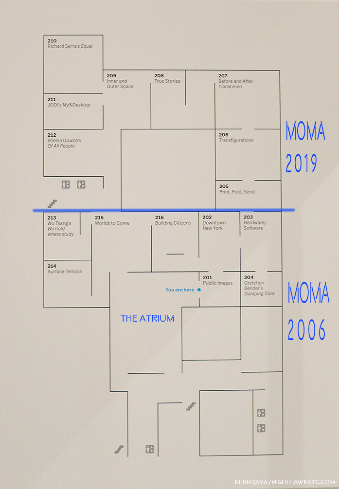
MoMA’s floor plan for part of the “new” 2nd floor. I’ve added notations in dark blue- a label for the atrium to point out where it is and how it needs to be navigated around. I’ve also labelled where MoMA, 2006 was (below the added blue line) and labelled where MoMA, 2019 is now (above the blue line) in the margin. Not shown- the other galleries on this floor, located in what MoMA now calls the “South” section (to the left and lower left.). All are effected by the “atrium.” Bear in mind- this is only ONE floor!

In fact, in MoMA, 2019, they’ve decided to double down. Keeping the hole, they’ve opted to extend the existing 2nd, 3rd, 4th and 5th floors the other way- to the west. I take this as an admission that the floors needed to be extended. We differ on how. You can see this in the 2nd floor floor plan, above. I’ve drawn a blue line to the left from gallery 205 and everything above that is the new building, what I call MoMA, 2019, below is what I call MoMA, 2006. It almost works. It does serve to minimize the “interference”/inconvenience of the hole, unless you’re in a section where you have to navigate around it. Alas, as soon as you are back in the “old” building, the MoMA, 2006 part, there it is, rearing its ugly head again, sending you to a floor plan trying to find your way. But, it also dramatically effects MoMA’s curators, and no doubt, every single show they mount in these spaces. WHY they just didn’t remove the atrium and extend the floors and make the 2nd, 3rd, 4th, and 5th floors full floors? (The 6th floor is a different matter, I believe due to the heights of the buildings. It already is a full, raw, space in the MoMA, 2006 building and a cafe has been installed on 6 on the MoMA, 2019 side (which I have not seen as yet. You can walk through from MoMA 2006 to MoMA 2019 on 2, 3, 4 and the 5th floor, but you can’t on 6. If you’re on 6 in MoMA 2006, you have to go down to 5, walk over to MoMA, 2019, and then go up to 6 on that side, or vice versa). That they didn’t remove the atrium is another, huge, mistake in my view. Alas, it’s too late for tears. And having been sad about MoMA’s building since MoMA, 2006 opened, I’m about cried out. Yes, MoMA, 2006 was so bad it actually kept me from going at times.

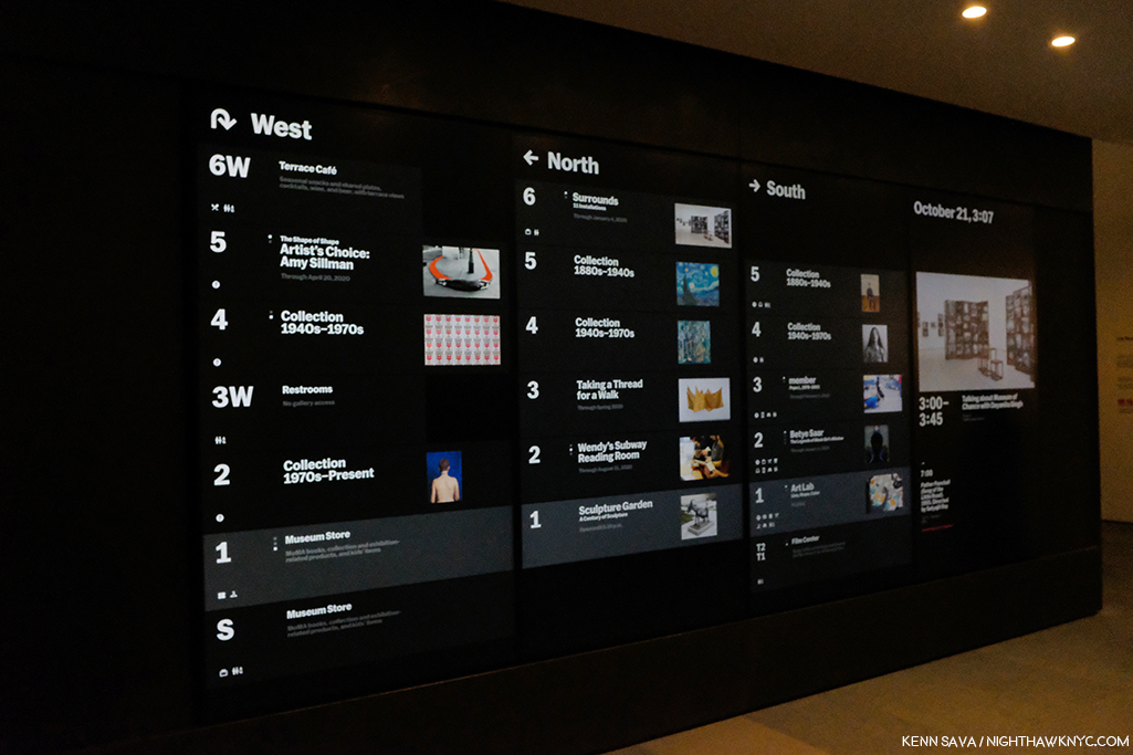
Where the heck am I going? Before going anywhere, it’s a good idea to check the “central scoreboard,” as I call it. West? North? South? What? Look quick! Those listings next to each floor change to show other things going on on that floor. Seen on the official opening day, October 21, 2019.

Another question for me is HOW do you redesign the building into MoMA, 2006, spending over 850 million dollars doing so, and not early on in the game ask, “WHERE are we going to put our most popular works?” Apparently, no one asked. Over the subsequent 13 years of the building, Monet’s Water Lilies and Van Gogh’s Starry Night, to name two, were continually moved, and never once looked to have found THE place for them. I lost count of how many places I saw the Water Lilies in MoMA, 2006, all the while with that indelible memory I recalled earlier in my mind.

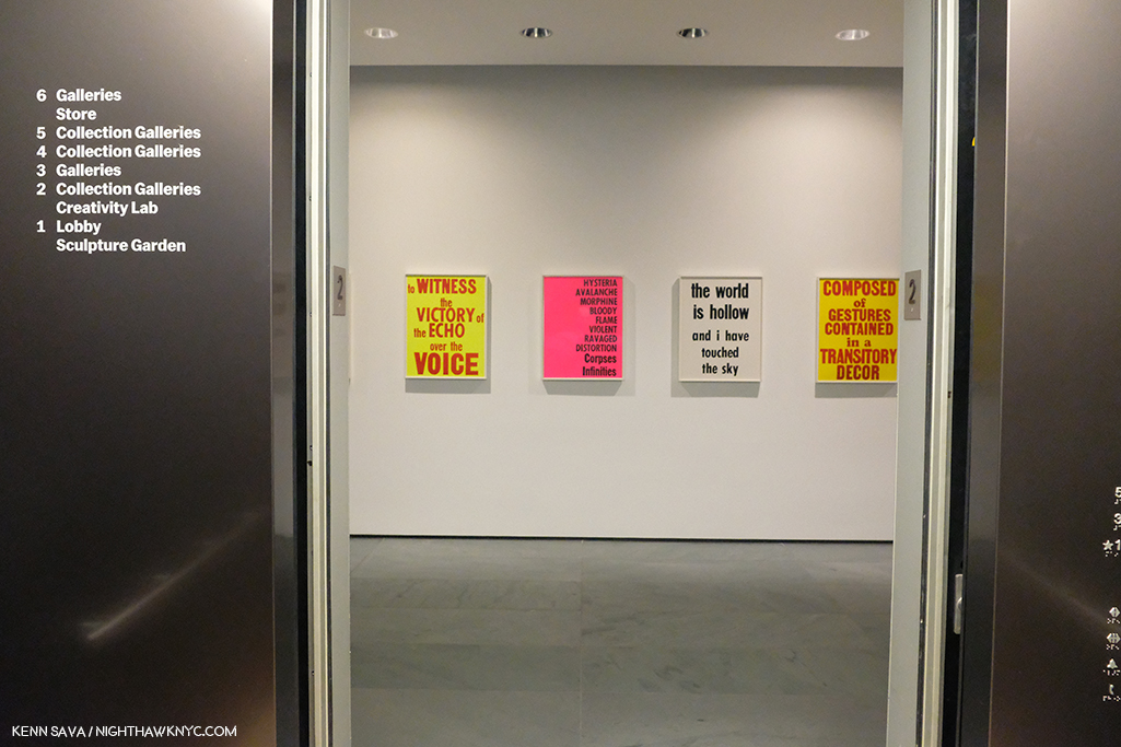
The brand new elevator doors open on my first visit to MoMA, 2019’s 2nd floor, October 19, 2019.

SURELY someone would ask that question when it came to designing MoMA, 2019! Two visits in? The answer is a decided…I’m not sure.

Home? At last? Monet’s Water Lilies, 1914-26, in a gallery devoted to his Water Lily Paintings (yes, they have others). We’ll see how long these stay here.

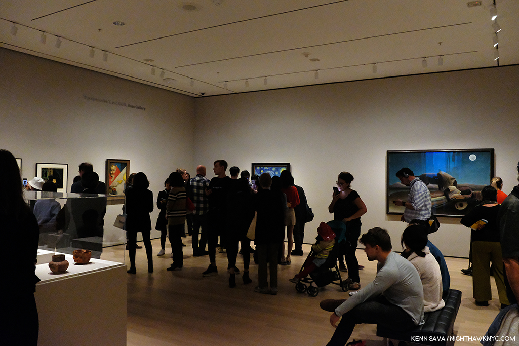
The Water Lilies seem to have been given some thought. They are decently situated in a gallery that contains only Monet Water Liliy works on an angled wall, similar to one of the installations they had in MoMA, 2006. You can scan the whole work continuously but it doesn’t give you a “wrap around” feeling. Starry Night fares far less well. It’s stuck in a corner(!?) at the end of a long gallery. I was shocked when I walked in and saw this. It’s just terrible.

Cornered! Vincent van Gogh’s beloved Starry Night, 1889 can be barely seen (as usual), though it’s now stuck in a corner. Seen on the official opening day, October 21, 2019

In this large gallery one other Van Gogh is installed half way down the wall to the left. I didn’t get the feeling of connection with the other works shown near Starry Night. Munch, who I greatly admire, is seen on the left hand wall, and while many pair him with Vincent, he gives me a completely different feeling, though l’ve wondered if Vincent may have been an influence on the Artist who was a decade younger. MoMA may have felt that putting other Van Goghs next to Starry Night might have created too big a crowd. I can live with seeing Munch next to Van Gogh’s. As seen in this gallery, due to the new arrangement of the galleries, multiple works by the same Artist are spread out, often across galleries.

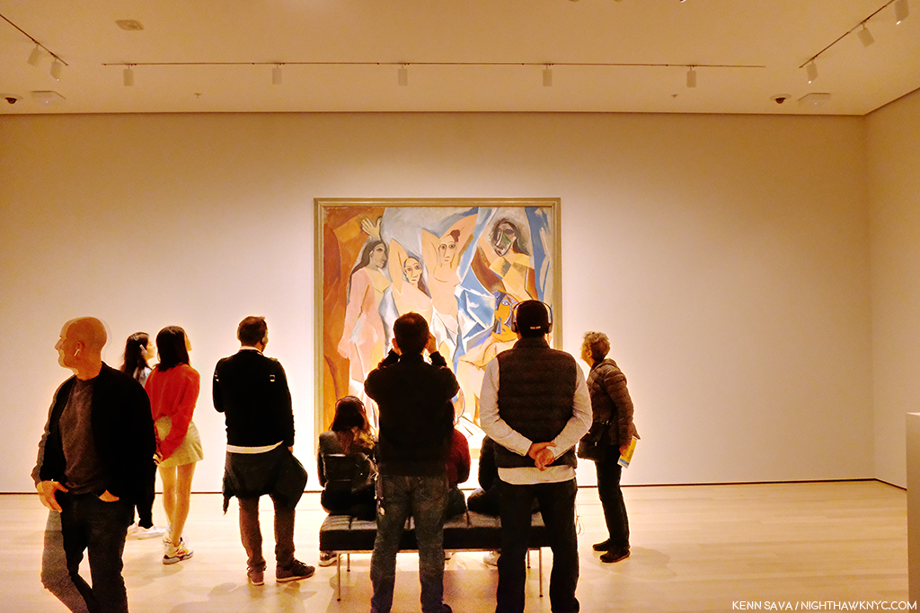
Picasso, Les Demoiselles d’Avignon, 1907.

That means that if you want to see, say, the Picassos, you have to plot a path to a number of rooms, where you might see one, or you might see 3 or 4. If you have multiple Artists on your hit list of pieces to see? You’re going to need a good chunk of time- just to plan your routes. Especially if they’re installed over multiple floors. I have mixed feelings so far about this arrangement, but I’ve been living with this collection for decades, and while I prefer seeing it chronologically so you can see how Art has evolved over time, mixing it up can be a nice change of pace and reveal new synergies. This “theme” strategy, which is more like that of a special exhibition, feels geared to people like me who have lived with the collection for a while and might welcome being surprised (if that’s what they feel). First time visitors, or those here with limited time, may feel differently.

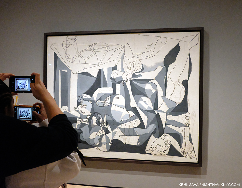
Picasso, The Charnel House, 1944-5. The iconic Guernica is a work Picasso Painted in 1937, in the early days of World War II. The Charnel House was Painted at the end of the War, bookending Guernica, though far less well-known. Guernica was part of MoMA’s collection until Picasso died. He stipulated in his will it be returned to Spain. So, including it in the 1980 Picasso Retrospective, where I was able to see both of them, was something of a farewell before Guernica went to Spain.

Picasso seems to fare better than Starry Night. At least three of his major works (Les Demoiselles d’Avignon, 1907, Three Musicians, 1921, and The Charnel House, 1944-5) get walls all to themselves- in different galleries.

The upper left corner of Dali’s, The Persistence of Memory, 1931 (aka the “Soft Watches”). Picasso watch- Girl before a Mirror, 1932, is partially seen in the rear to the right.

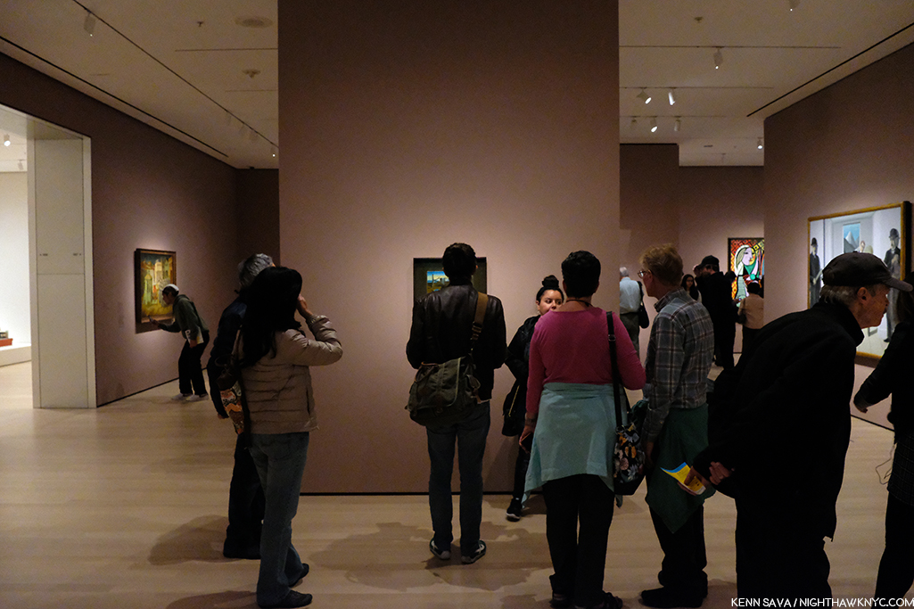
As for other works on the most popular list, one was easier to find. Dali’s The Persistence of Memory, 1931 (aka the “Soft Watches”) gets a pillar to itself front and center in gallery 517. And on the opposite side of the same wall is Frida Kahlo’s Self-Portrait with Cropped Hair, 1940. That was easy. I only had to ask once to find it. (The Water Lilies? I asked 3 times. I saw another visitor seeking them ask twice.)

I found the galleries to be well lit, as readers well know, lighting is one of my long standing peeves in most spaces I see Art. One gallery of 2 Hopper Paintings accompanied by a good many Photographs was a bit dark, I presume this was intentional for conservation purposes. The consistency of the lighting across the museum that I’ve seen thus far is to be commended.

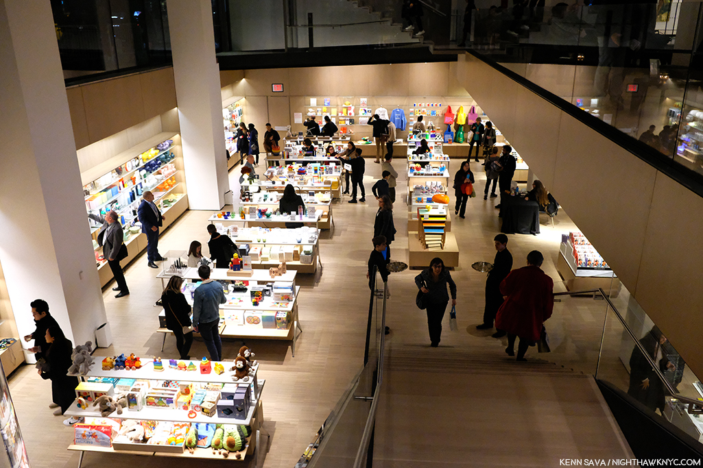
Lower level gift & book shop. One of at least 2 in the museum.

The first floor lobby felt like being in any of the faceless, large Times Square hotels nearby. It felt that a lot of money was spent here. Yet, I can never recall asking someone “How was your visit to such and such museum?” and getting the response, “Oh, the lobby was amazing!” I believe “sinking” the gift shop/book store is a mistake. Getting anywhere in MoMA, 2019 requires taking stairs and elevators. The last thing people may feel like doing is taking MORE stairs just to visit a shop. We shall see.

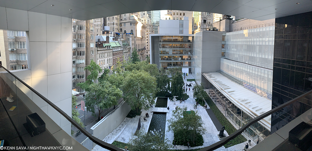
Not listed on the floor plan, the previous cafe has been replaced by a Brancusi gallery on 5 (gallery #500). Behind it, we now get free access to the outside patio overlooking the Sculpture Garden.

“There’s something missing from my life
Cuts me open like a knife
It leaves me vulnerable
I have this disease
I shake like an incurable
God help me please”*

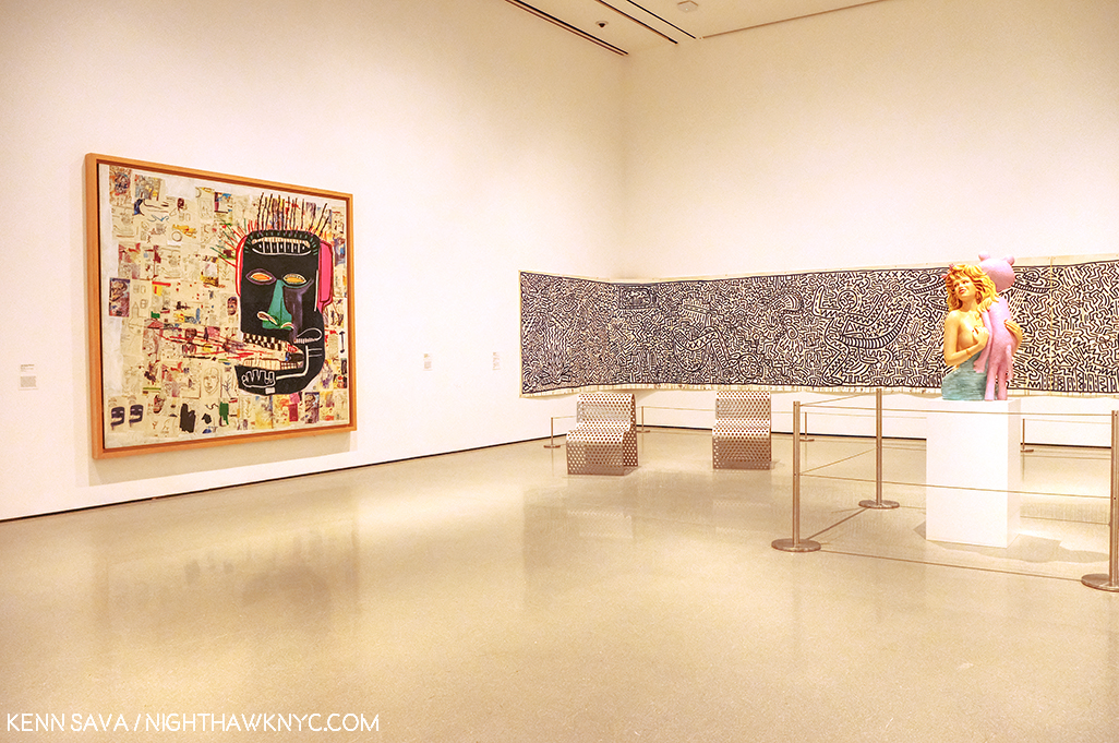
Jean-Michel Basquiat, Glenn, 1985, left, Keith Haring, Untitled, 1982, right.

Then there’s the other gorilla in the room at the “new” MoMA, 2019. My feeling is that MoMA, The Museum of Modern Art, is dangerously close (if it hasn’t happened already) to remaining just that, indefinitely. It’s not THE Museum of Modern & Contemporary Art many think it is. Their collection of the most important Contemporary Art is nowhere to the level of it’s preeminent collection of Modern Art (the period I consider to be approximately from Edouard Manet’s Le Dejeuner sur l’herbe, 1862, through 1979), or the collections of important Contemporary Art in LA, SF or Chicago, in the US. MoMA (and all the NYC museums) have fallen hopelessly behind in collecting important Contemporary Art. Jean-Michel Basquiat (J-MB) is a classic case, but he’s not alone. As they admitted, they didn’t collect his work early on and now it’s too late. I recently recounted MoMA’s history (or lack thereof) with J-MB in my series on the J-MB shows going on in NYC this year. Revealingly, only one of the 5 shows in NYC was mounted in a museum- The Guggenheim. Then, when I walked into the member’s preview for MoMA, 2019 on October 19th, low and behold there was a Basquiat front and center in the second gallery, above. It turns out they borrowed it from a private collection. This seemed to me to be a classic case of “smoke and mirrors,” of trying to hide this large hole in their Contemporary Art collection- and, after all these years (40 next year), possibly an admission they were “wrong” about Jean-Michel Basquiat.

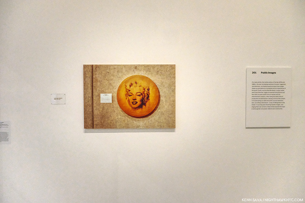
Louise Lawler’s Does Andy Warhol Make  Your Cry?, 1988, above, and a group of 24 Untitled Film Stills, by Cindy Sherman.

Elsewhere on the 2nd floor, the entire first gallery, titled “Public Images,” was made up of work by women Artists, as if to immediately counter the oft mentioned fact that a very small number of women Artists have been given retrospectives by MoMA. They have also installed a Betye Saar show, The Legends of Black Girl’s Window, across the atrium, centered around a recent acquisition by the museum of earlier work by Ms. Saar. It doesn’t include any of her more recent, powerful, work, some of which were presented in Washboards, 1997-2017, presented earlier this year at the New York Historical Society. While nothing will detract from her overdue appearance in a substantial show in another NYC museum, I was left wondering why they didn’t mount the long overdue full Betye Saar Retrospective, who is still going strong at 93, while she’s alive to enjoy it. Looking at MoMA’s permanent collection online, time and again, I found either a lack of any works by important Contemporary Artists (Ai Weiwei? Robert Frank’s Photographs? Leonardo Drew? Rod Penner? Gregory Halpern? Petra Collins?…None by any of them. The most recent work by Betye Saar, who was born in 1926, is from 1972- 47 years ago!), a lack of their important work, or a lack of depth of these works (2 works, each, by Henry Taylor, Francesca Woodman, 1 Painting and 10 Prints by Richard Estes, 2 Paintings, 2 Studies and 22 Drawings by Kerry James Marshall and Jean-Michel Basquiat– 0 Paintings, 2 Prints, 10 Drawings). A close look at what is installed in the Contemporary galleries on 2, which makes a point of being inclusive, strikes me as an attempt to rewrite MoMA’s perception in the face of criticism, and, some smoke and mirrors- how much will require more than 2 visits. In the meantime, go and make your own study.

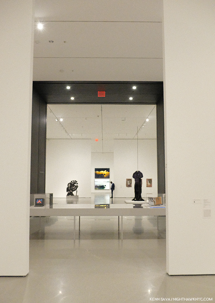
Before the crowds. Parts of 4 galleries, Contemporary Art, 2nd floor. Member’s preview, October 19, 2019.

Tourism is a big deal for MoMA, the other NYC museums, and NYC. If the Art going public begins to perceive the reality that NYC is not the place to go see important Contemporary Art, one of the most popular periods of Art there is at the moment, this would be a disaster, especially after having just spent over 450 million dollars on MoMA, 2019. Smoke and mirrors might buy them some time, but whether they can overcome the self-inflicted damage they’ve already done remains to be seen. MoMA was incalculably helped to become THE Museum of Modern Art by a visionary curator, Alfred Barr, during its formative years. More recently, those in charge didn’t believe in the work of these Contemporary Artists at the time, didn’t have the vision and foresight Mr. Barr did, and so they missed the boat.

Mark Bradford, James Brown is Dead, 2007, Torn-and-pasted printed paper, 47 3/4 x 267 inches. I’ve made no secret of my admiration for Mr. Bradford, who I consider one of today’s most important Artists. In fairness, since I’ve mentioned some of the Artists omitted from their collection, MoMA owns 4 of Mr. Bradford’s larger works, 1 Sculpture, 1 Video and about 17 Multiples. So, I find it interesting they chose this work for display.

They, and their counterparts at the other NYC museums, may well have cost NYC it’s world leading status as THE Art capital of the world, we shall see. It’s too late now. Only mass, and massive, donations will help to close that gap now.

Though I am a paying member, I dreaded going to see the “new” MoMA, 2019. Such is the level of disdain I have for MoMA, 2006, which I consider to be the worst major museum building I’ve ever been in, it actually keeps me from going to see the Art! Maybe I’m just too used to MoMA, 2006 that MoMA, 2019 actually feels “not so bad.” Well Let’s see. MoMA, 2006 cost 858 million dollars according to The Times. I’ve seen 450 million as the cost of MoMA, 2019. That’s at least 1.3 BILLION dollars to make something I just said was “not so bad.”

Well, in 10 years, when MoMA decides that they “need more space,” which you know they will, I know where they can get 7,700 square feet of it, without tearing down anyone else’s building. Let’s say by then it will cost another 500 million to create MoMA, 2029. Then, they’ll have a chance at actually making the building “decent.”

Gee…Wait a minute. Between MoMA, 2006 and MoMa, 2019, they’ve spent 1.3 billion dollars? If they spent that on Art back when MoMA decided to build MoMA, 2006? You might actually have a collection of important Contemporary Art on the level with MoMA’s collection of Modern Art.

Instead? We got one of the biggest Architectural design mistake in NYC in my lifetime, right up there with not allowing the world’s greatest Architects, beginning with Frank Lloyd Wright, who’ve tried to build here a chance to build more than one building each. More? That the powers that be at MoMA thought putting a gigantic hole in the middle of the most expensive real estate on earth was a good idea, and then less than 10 years later tear down an actually good museum saying they “need more space” is plain hubris.

On second thought, maybe that hole does signify something about Manhattan after all. It signifies the hole in the collections of Contemporary Art at MoMA, and the other Big 4 NYC Museums. Smoke and mirrors aren’t going to be able to cloud that realization from many for very much longer.

“Be a happy man
I try the best I can
Or maybe I’m just looking for too much?”*

*-Soundtrack for this Post is “Hole In My Life” from Outlandos d’Amour by The Police, performed live in Paris in 1979, here-

NighthawkNYC.com has been entirely self-funded and ad-free for over 6 years, during which over 250 full length pieces have been published. If you’ve found it worthwhile, you can donate to keep it going & ad-free below. Thank you!

Written & photographed by Kenn Sava for nighthawknyc.com unless otherwise credited.
To send comments, thoughts, feedback or propositions click here.
Click the white box on the upper right for the archives or to search them.
For “short takes” and additional pictures, follow @nighthawk_nyc on Instagram.

Subscribe to be notified of new Posts below. Your information will be used for no other purpose.
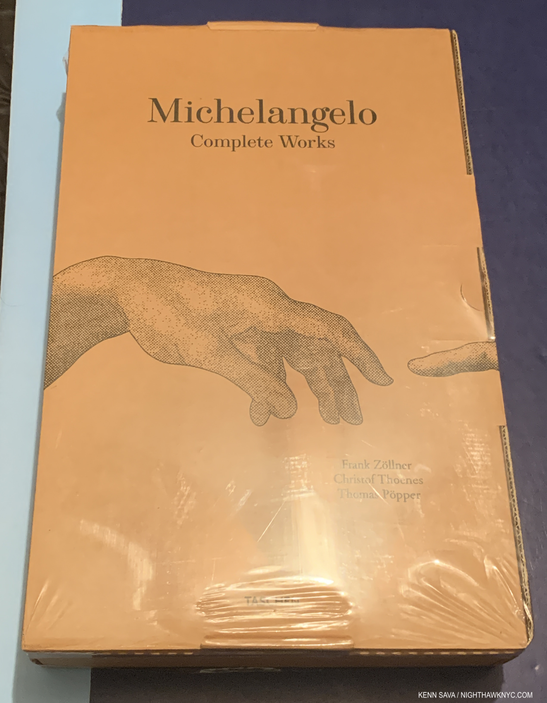
 

  1. In the same New York Magazine piece, the author, Alexandra Lange, concluded that MoMA, 2006, “…is a question, sublimely unanswered.” 13 years later, I’ve still got a few questions, which I ask in this piece. Living with them has been painful, not “sublime.”
  2. Yes, the Tate Modern in London did something a little similar, but dissimilar enough to make the difference, and they’ve continually found good uses for it since it opened around the same time as MoMA, 2006.
  3. Where did I get 7,700 square feet from as the size of this space? I’ve been unable to find out the official square footage of the atrium (interesting, no?). It hasn’t been published anywhere and those I asked at the museum didn’t know or wouldn’t tell me. So? I took it upon myself to calculate it. 110 feet is the published (known) height. I stepped off 35 paces from wall to wall and each of my paces is 24 inches. That’s 70 feet, and 7,700 square feet in total by my guesstimation.

NYC Art Shows 2016- Sheena Wagstaff Rules The Waves

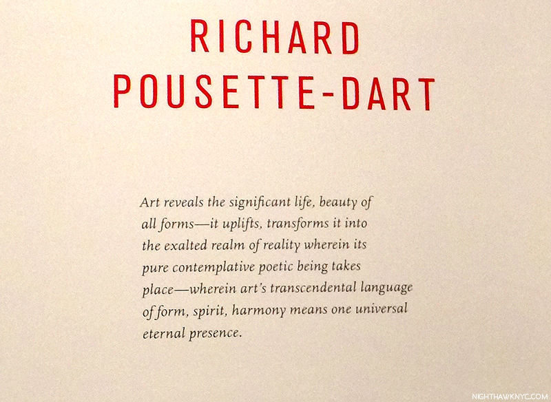
This year past, Manhattan Art was largely dominated by two themes. There was a seemingly continual string of shows by many of the bigger names in Abstract Expressionism (i.e. AbEx), one after the other, and I wrote about every one of them, beginning with Jackson Pollock @MoMA, Lee Krasner, Philip Guston (two- here and here), Richard Pousette-Dart, Joan Mitchell and Mark Rothko, along with a few excellent satellite compilation shows, each in a different venue, which, apparently is continuing into 2017 with Jackson Pollock set to open at the Guggenheim, completing the circle, for now. It was also a year of Women Artists getting important shows. Patti Smith, Nasreen Mohamedi, Diane Arbus, Cindy Sherman, Marilyn Minter1, June Leaf, Carmen Herrera, Nan Goldin, Mary Bauermeister, Carrie Mae Weems, Latoya Ruby Frazier, Krasner and Mitchell were only some of the highlights. Still? Artists weren’t the only women making a big impact on the NYC Art Scene in 2016. In fact, for my money, the biggest impact of all was made by another woman, The Met’s Chairwoman of Modern & Contemporary (M&C) Art, Sheena Wagstaff.

As far as I’m concerned, no other single person had the impact on NYC Art, all year long, that Ms. Wagstaff and her department did.

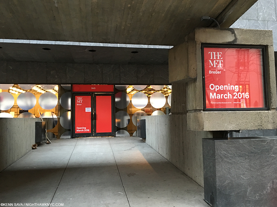
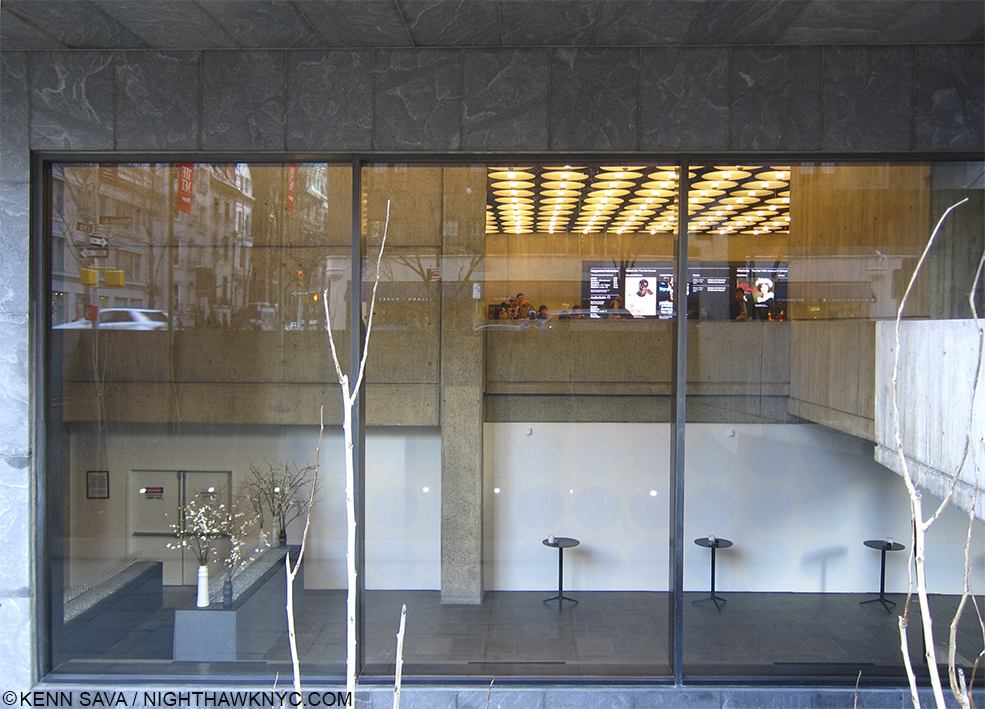
Sheena Wagstaff was named Chairwoman of TM’s M&C Department on January 20, 2012. Four years later, her 2016 began with putting finishing touches on TM’s new “branch Museum,” The Met Breuer (TMB), the first “branch” The Met has opened since The Cloisters in 1926! No pressure there. As it was about to open, ostensibly as the showcase for The Met’s “new” M&C Art iniatative, The Times’ Roberta Smith put the situation perfectly into perspective, speaking about the task Ms. Wagstaff faced/faces-

“But the Met is huge and old, with a history of treating contemporary art as an afterthought. Getting it to change is like turning around an ocean liner.” Roberta Smith, NYT, March 3, 2016.

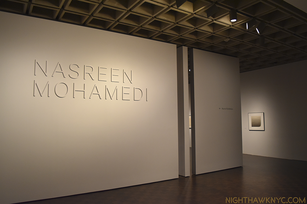
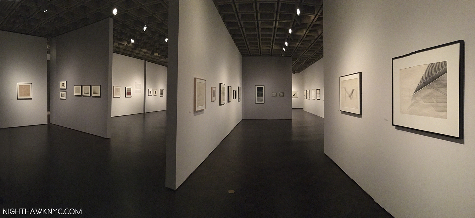
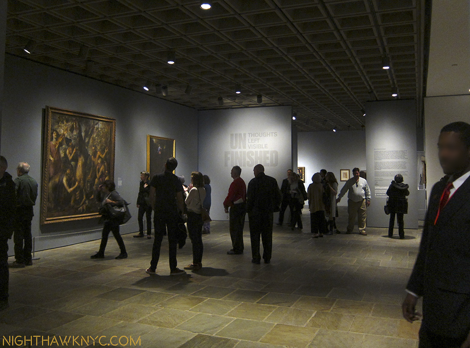
It sailed into it’s mid- March opening with 2 shows- Unifnished: Thoughts Left Visible, a veritable Museum in itself covering 2 full floors (the third and fourth), and, easy to overlook, tucked away on the second floor, Nasreen Mohamedi, the first American Retrospective of the Indian woman artist who passed away in 1990, aged 53. Wait…Who? Yeah. Me, too.

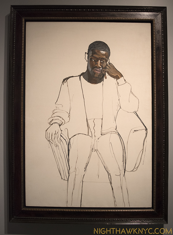
Met Breuer, Opening Lineup, March 8, 2016. 11 months on? The 5th Floor is now gallery space, the 1st Floor Gallery is now the Gift Shop. Those 2 shows? They live on, indelibly. Notice that for all of Art History that’s represented in Unfinished, the signature image chosen is by Alice Neel, a woman, of James Hunter Black Draftee.

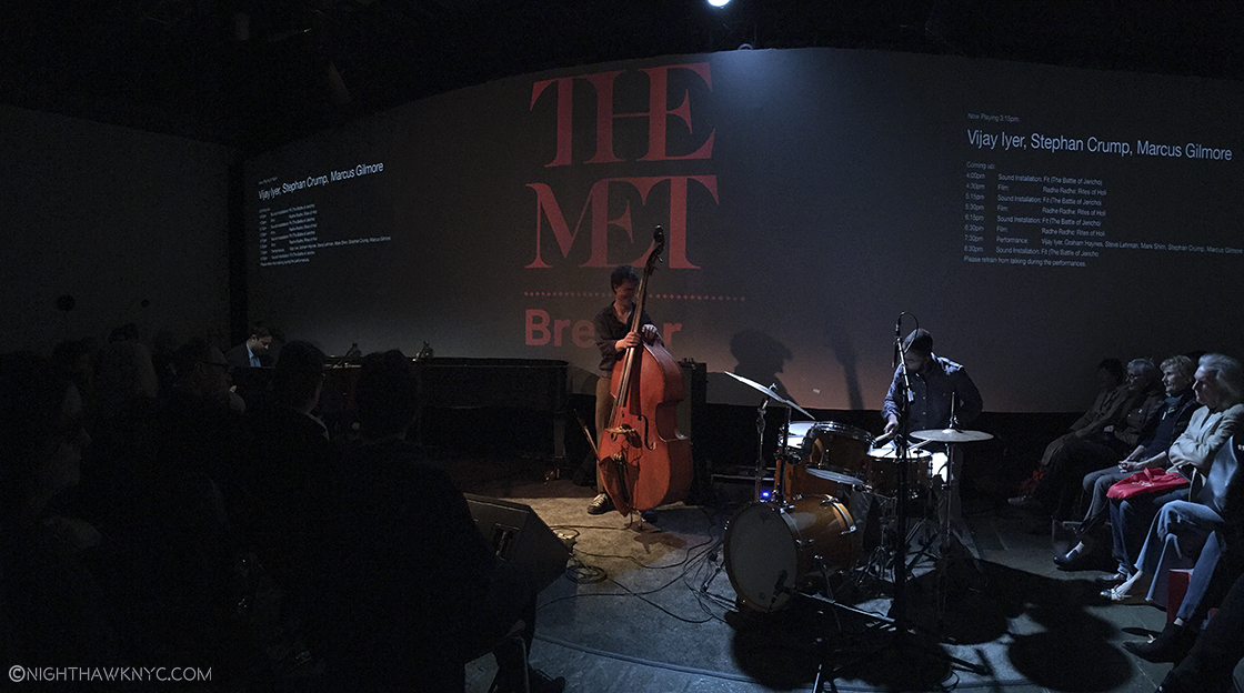
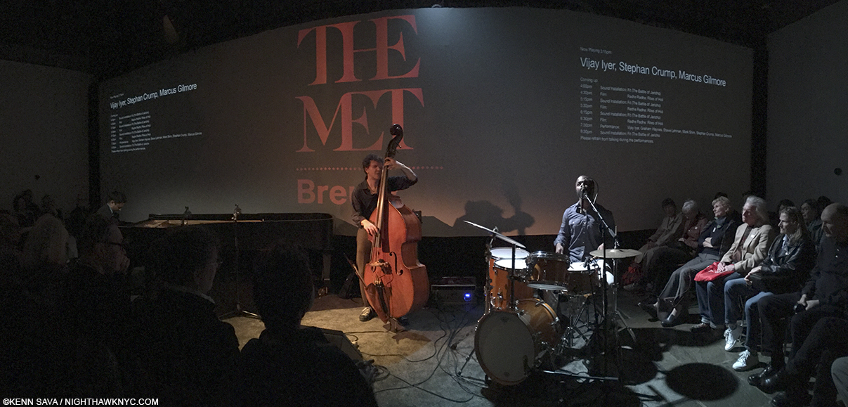
Vijay Iyer (piano, left) performs with his trio. Met Breuer, Member’s Opening Day, March 8, 2016.

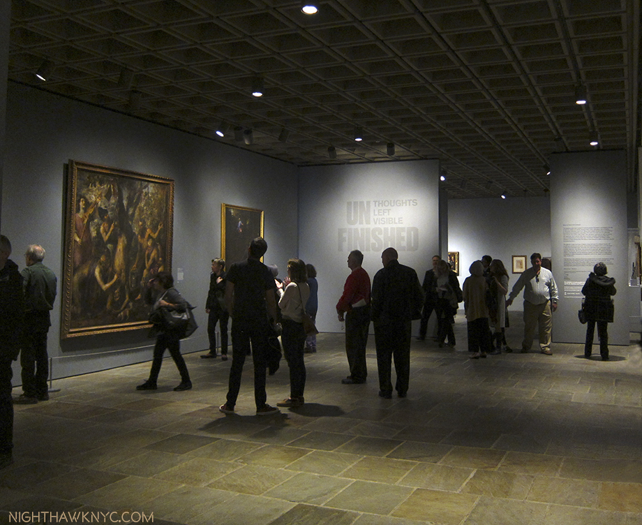
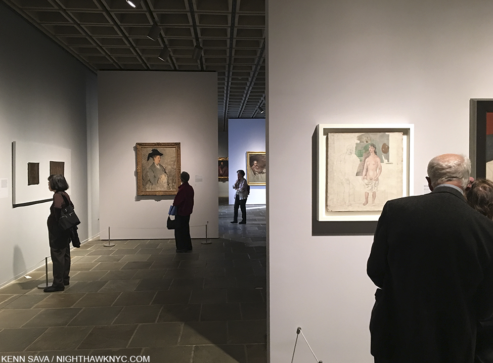
The first members of the public get to see Unfinished on March 8, 2016. That tiny drawing on the far opposite wall is by Michelangelo.

After over 15 visits later, to my eyes, “Nasreen Mohamedi” was nothing less than 1) an epiphany. Here was an Artist who was a Major figure in Art in the 20th Century who’s name exists in not one Art History survey that I know of.

I now haunt these galleries, in my memory.

2) Therefore, it was easily one of the best shows of the year, and 3) the more I think about it, for many reasons, it was one of the best shows I’ve seen in years.

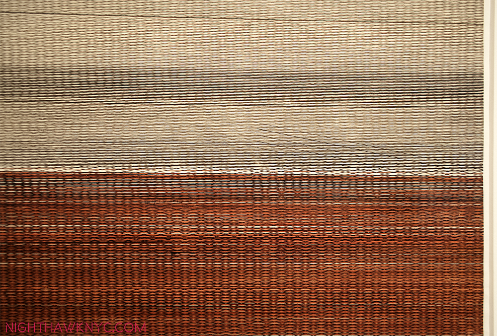
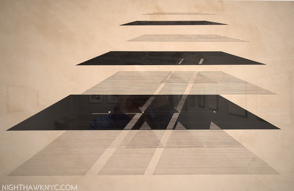
Most Memorable Art Work of the Year. Nasreen Mohamedi Untitled, circa 1970. When I first saw it, I thought it was a piece of fabric. Nope. This is a DRAWING.

Detail (about 10″ x 6″). Two amazing things about this- 1- The superhuman focus & manual skill on display. 2- The disease that would kill her would take these incomparable motor skills first, and shortly.

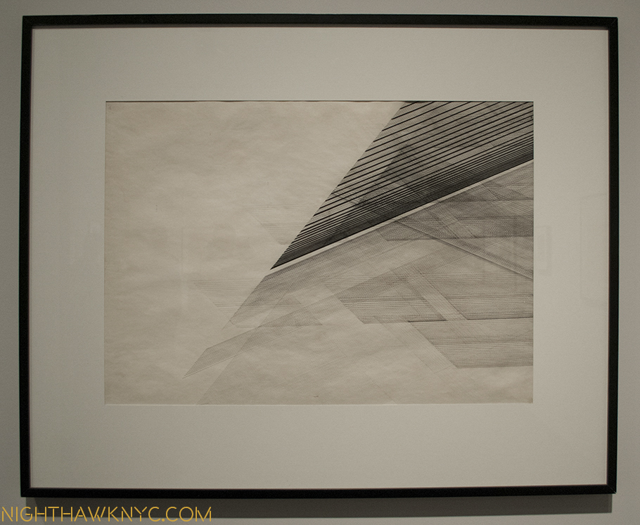
The subtlety, uniqueness and micro/macro impact of Nasreen Mohamedi’s drawings is seemingly without precedent. They speak to the “grand design” of the universe, while also giving the feeling that they are somehow familiar, though they are not.

Some call this work The Seven Planes of Existence. All her works were left untitled and undated, only 5 here were signed. Many were given to friends as gifts. She created most while dealing with an illness that would kill her family members, then rob her of her skills, and eventually kill her, as well.

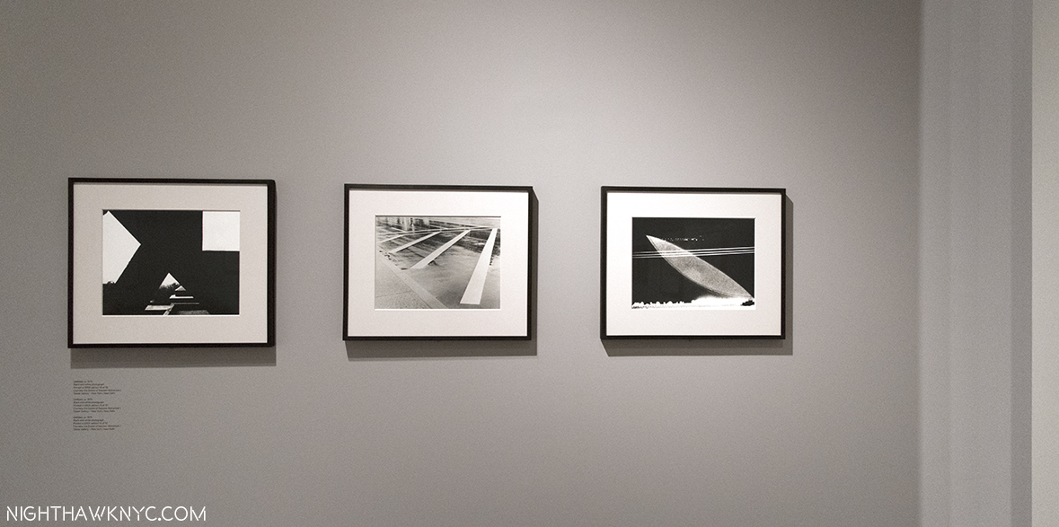
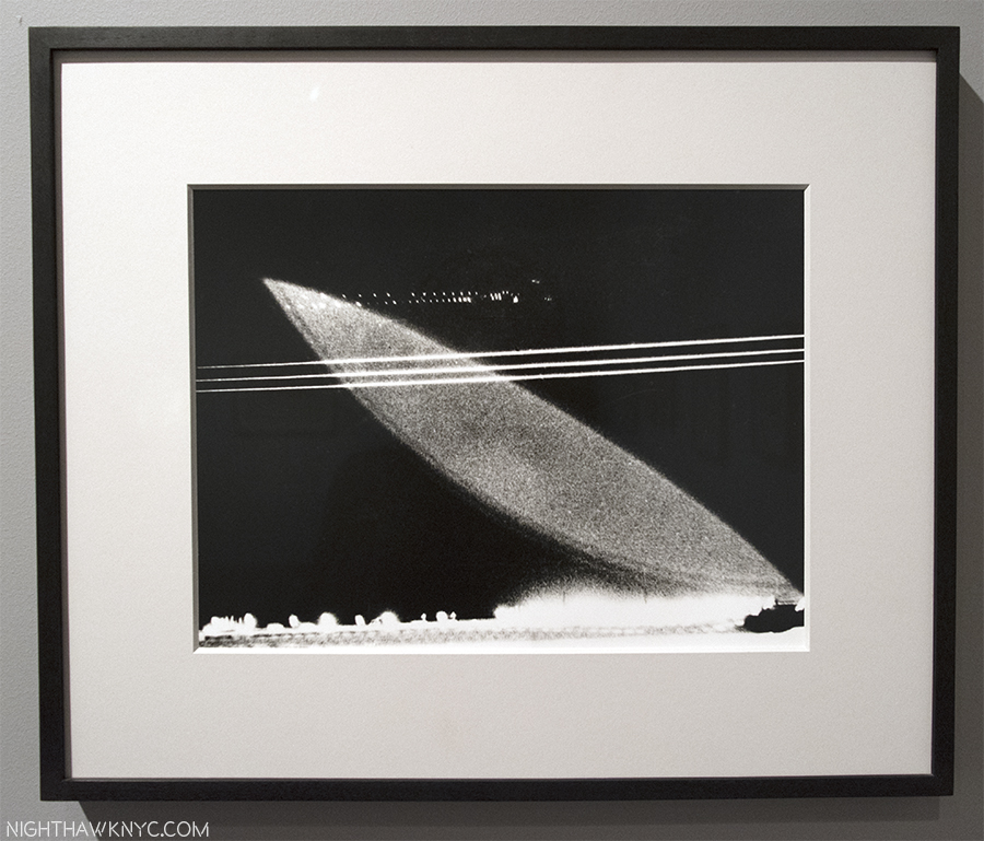
Also an accomplished photographer, I find her photos every bit as wondrous as her work in other mediums. Each Untitled, ca. 1970

Closeup of the photo on the right. What exactly are we looking at?

I spent an hour sitting right next to Sheena Wagstaff at a “Nasreen Mohamedi Symposium,” at The Met 5th Avenue in June. After it was over, I had the chance to speak to her. All I could say to her was “Thank you,” for Nasreen Mohamedi, which gave me the chance to discover her. Then, I told her she had made “the perfect choice” to begin M&C Art at TMB.

Sheena Wagstaff, right, Met curator Brinda Kumar, center, and an Artist who’s name I didn’t get, left, at the Nasreen Mohamedi Symposium, June 3 at The Met. Ms. Wagstaff then sat down immediately to my left.

Six month later, I stand by those words.

Think about how much guts it took to make that call. How daring it was. TMB famously costs The Met 15 million dollars a year to operate. The Met, reportedly, ran a deficiet in 2016, costing jobs.  To say “a lot” was, and is, riding on the success of TMB would be an understatement. Not to mention TM’s world leading prestige. Nasreen Mohamedi was followed by diane arbus: in the beginning. Perhaps it would have been “safer” to have run Diane Arbus first. Maybe. Probably. I’m glad it was Sheena Wagstaff’s call (along with the rest of TM’s powers that be), and they chose Nasreen Mohamedi.

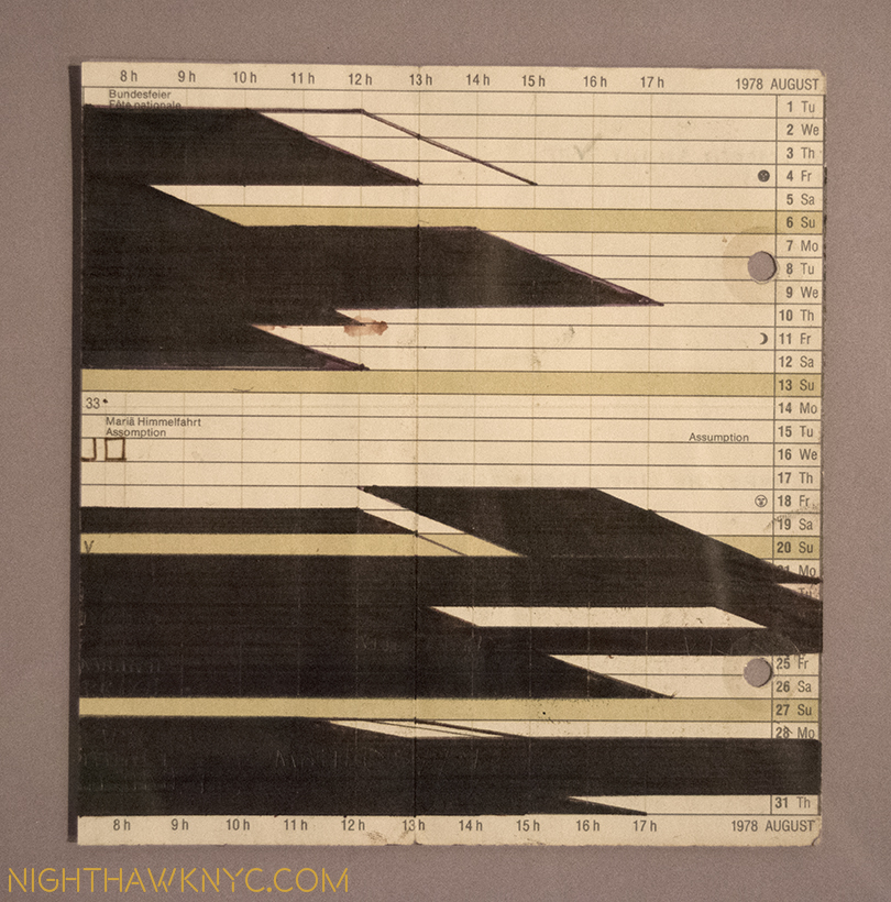
A page from one of her diaries. She blotted out much of what she had written. I wonder why. They left these patterns, reminiscent of her drawings.

The show was, apparently, a labor of love for Ms. Wagstaff. Hidden away in the very last gallery, in an iPad on the tables where visitors could peruse the now out of print and rare catalog, were some of the few extant photos from Ms. Mohamedi’s life. One of the last photos was a photo of Nasreen Mohamedi’s unmarked grave. I marvelled that someone had found it and photographed it. I looked for the credit to see who the photographer was. Sheena Wagstaff.

Nasreen Mohamedi was more than a terrific show. It was a statement. What was as easy to miss as the show itself was, as visitors made a bee line to see the copious treasures upstairs, it was more. It was the “answer” to the question about where Ms. Wagstaff was likely to steer The Met’s “new M&C initiative” going forward. As such, it was a shot over the bow of the future.

The future of M&C Art at The Met, and The Met Breuer, appears to be international, and inclusive. I expect more of the unexpected, more of the unknown and under-known. Bring it on. MoMA is running on all cylinders, putting on shows that are spectacular. It’s good for them, the Whitney, The Guggenhim, et al, to have some competition in M&C Art from The Met, and for us.

While Nasreen Mohamedi was blowing my mind on the 2nd floor, upstairs on 3 & 4, Unfinished was blowing everyone’s who saw it. Right off the elevator on 3, you make a right and in a small gallery you’re confronted by Leonardo da Vinci AND Michelangelo (all too rarely seen together in this hemisphere), AND Jan Van Eyck, and a few other works I can’t even remember because my mind was already overloaded. Oh yeah, some guy named Dürer did one. This was TM “showing off,” as I read Ms. Wagstaff say in an interview. Boy, did they. The rest of the show had a roster that would make 90% of all other whole Museums in the USA jealous.

For a New York Minute, Michelangelo, left, and two Leonardos were on display in “Unfinished,” as the show opened. The triumvirate was soon broken up, no doubt due to the fragility of the works.

So? Ok. This was a “fail safe” show. Ms. Wagstaff was by no means finished.

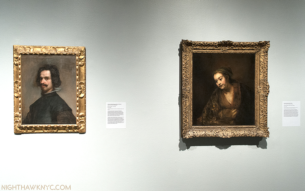
Rembrandt & Velazquez- the two greatest Painters who ever lived, according to many, very rarely seen side by side.

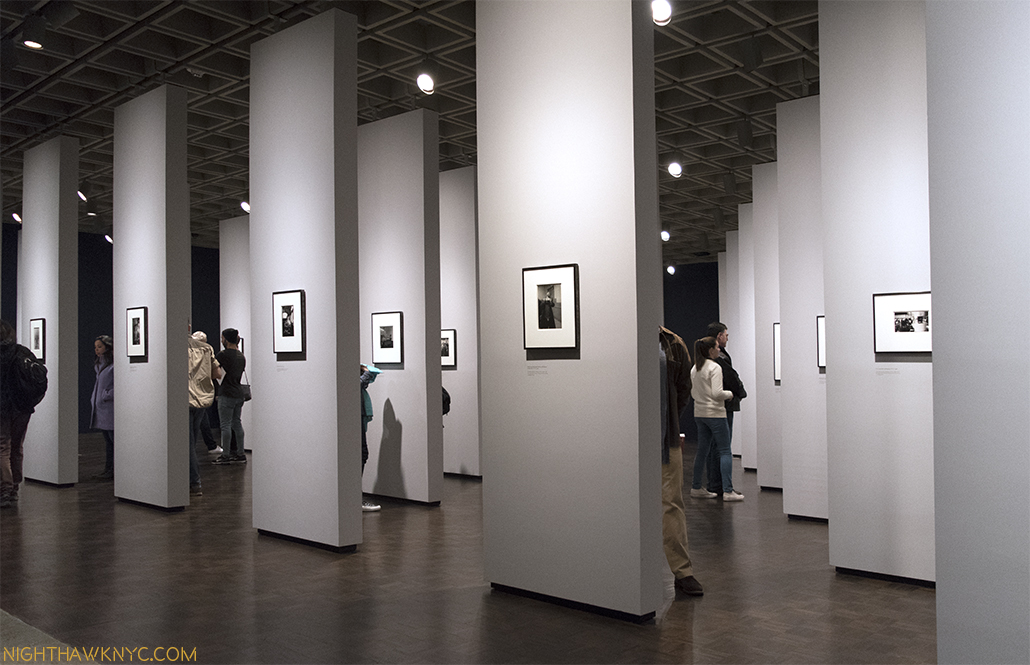
After Nasreen closed, diane arbus: in the beginning came in on 2, with an installation unique in art & photography shows in my experience. Every piece got it’s own wall. Yup. You read that right. Over 100 pieces. Over 100 walls. Amazing. No beginning. No ending. The point being that it was all her beginning.

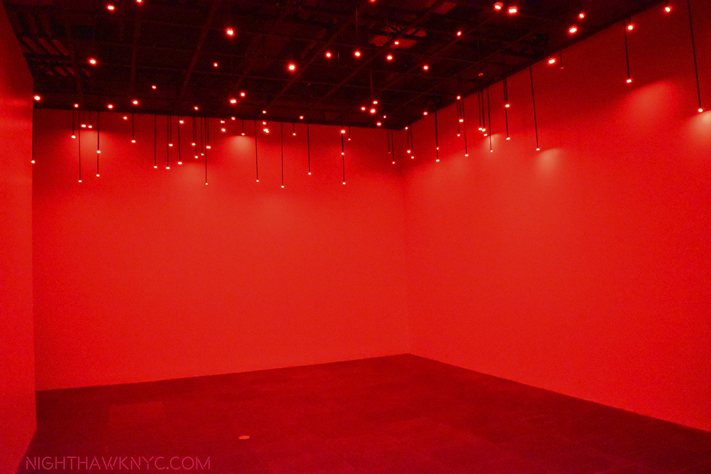
A rare shot of Tatsuo Miyajima’s Arrow of Time, on view in TMB’s first floor gallery. The only show to take place there before it became the gift shop.

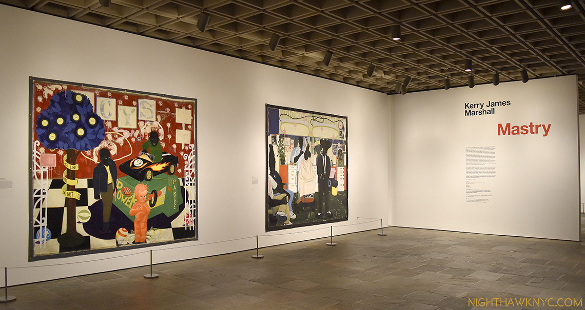
After “Unfinished,” the year at TMB ended with another blockbuster success- Kerry James Marshall: Mastry. This is the kind of show that makes you wonder WHY it took so long for Mr. Marshall to be so recognized. He’s been creating at a very high level for a long time. It was only 3 years ago that he was showing at the always excellent Jack Shainman Gallery in Chelsea. But? Not everyone was sleeping on KJM. Walking through this show it’s a sad feeling for a New Yorker to read the tags and see great work after great work that belongs to Chicago or Los Angeles. Not even MoMA has stepped up to a large degree with Kerry James Marshall. TM FINALLY got a major work of his last year.

The beginning of Kerry James Marshall: Mastry. In many ways, this was the show of the year.

Now? It’s probably too late.

This, unfortunately, highlights one area where much work remains to be done. The Met’s collection is sorely lacking the work of M&C Masters. As I recently pointed out, as far as I know, they own no work by Ai Weiwei. no work by Nasreen Mohamedi, and only one work (albeit a very, very good one) by Kerry James Marshall (and this was only acquired in 2015), to name but 3 cases. Frankly? I find this shameful. TM recently elected three new trustees, two of which are M&C specialists, so hope springs eternal for a little more wind to be added to those sails.

New York had until January 29 to enjoy seeing a lot of KJM in one place. (My piece is coming soon.) Now? It’s going to be a long wait. Los Angeles? You get your chance beginning March 12.

So? By my scorecard, that’s 4 shows in 9 months that will be remembered and talked about for a very long time, including no less than TWO that were major breakthroughs for the Artists- Nasreen Mohamedi and Kerry James Marshall2, putting both in the pantheon of the Artists who belong in our greatest Museums.

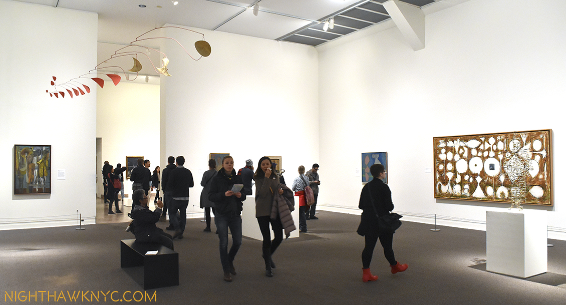
But? Ms. Wagstaff, who struck me as having so much energy, downtown NYC could have used her during the Hurricane Sandy Blackout, still wasn’t finished. Over at 1000 Fifth Avenue…(remember The Met’s Main Building?), she and her staff have also rehung TM’s M&C Galleries there, and done an amazing job.

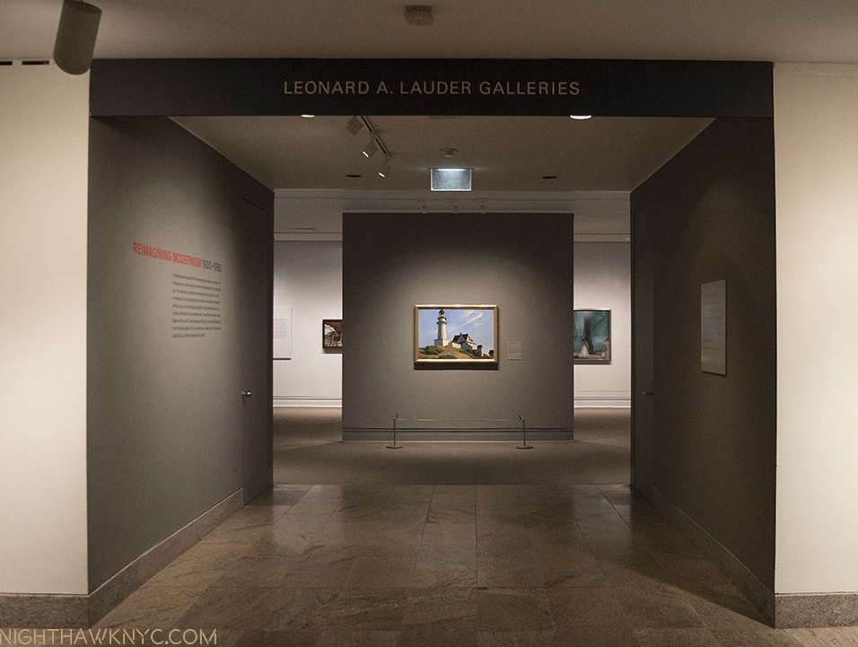
While at sea, mind the lighthouse! Edward Hopper’s iconic The Lighthouse at Two Lights, 1929, receives pride of place in TM’s newly rehung M&C Galleries. Which reminds me- Sheena Wagstaff edited the Tate’s 2004 Edward Hopper Show catalog.

Works have come out of storage that haven’t been seen there in…?, and some, thankfully, have gone there in their stead. The arrangements are new, too. Themes take the place of chronological arrangements in many rooms, while the AbEx Galleries still remain largely together, but subtly ammended. We get to see, what I consider to be, a major work by Philip Guston that I never knew TM owned! Other works are given new prominence, notably Edward Hopper’s famous The Lighthouse at Two Lights, and Richard Pousette- Dart’s Symphony No. 1- The Transcendental, (photo, here, further down the page.)

In this one gallery, I was shocked to discover works by Pousette-Dart (Path of the Hero, 1950, right) and Philip Guston (left, and below) that I didn’t even know The Met owned because they haven’t shown them!

Philip Guston, Performers, 1947. WHERE has this been? With one foot in his past, and one in his future, for my money, this is one of the most important periods of Guston’s career, and very few works from it exist, after he destroyed most. A major Guston.

The result is a veritable breath, no, wind of fresh air throughout. More wind for the sails of that S.S. Met Roberta Smith wrote about.

Sheena Wagstaff had a great year, in my book. Here’s to her. May the wind be at her back. That sound you heard in January was my giving a major sigh of relief at the news that we didn’t lose her when the Tate Museums chose a new Director (Ms. Wagstaff was Chief Curator at Tate Modern before she joined The Met).

P H E W…

Elsewhere, in the big City…

Other Museums and Galleries, of course, put on shows that linger in the memory, and I would be remiss in not including them. In addition to Nasreen Mohamedi’s, another Retrospective tried to make the case for it’s Artist’s place in the canon on 20th Century Art History, and wildly succeeded, in my opinion- Bruce Conner: It’s All True @ MoMA  Though he spent some time early in his career in NYC3, he, and his work, were rarely seen here after, and as a result, seeing this broad & in-depth look at his accomplishment over a mind-bending number of mediums was nothing less than a bombshell in it’s impact on myself, and I suspect many other New Yorkers. The depth, the staggering detail in the work (most famously in his films, but we see here it was carried over in most of his other work in other genres.), the mediums he probably invented, (like the music video), techniques he created or mastered, and on and on. This show was a capstone on a great year for shows at MoMA. Picasso Sculpture, Edgar Degas: A Strange New Beauty, were must see/won’t soon forget in their own right. Bravo, MoMA. Now? About that building and the new one on the way…

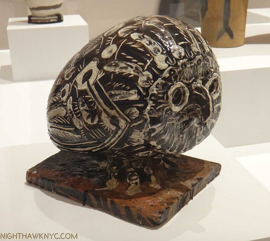
Picasso, Owl, seen in Picasso Sculpture. One sure way to make this list? Include an Owl in your show. ; – )

In the galleries, what lingers with me were Ai Weiwei’s return to NYC at long last with 4 concurrent shows, Mark Rothko: Dark Passage, Patti Smith: 18Stations, Philip Guston: Laughter in the Dark, Stuart Davis: In Full Swing, at the Whitney, and William Eggleston: The Democratic Forest (mostly for the chance to study his work at length, which only made me want to look again). And, I always enjoy the chance to be captivated by someone I previously didn’t know, like the amazing Sydney Cash at Heller Gallery, or the up and coming Robert Currie at Bryce Walkowitz- both of who share a fascinating ability to make you see things that aren’t really there.

Sydney Cash’s Split Selfie, 2016, oversees two of his other works that no photo can “capture,” at Heller Gallery. See them better here. When you watch, remember all that’s happening is the viewer moves slightly side to side.

And finally, personally, the chance to meet Patti Smith and Sheena Wagstaff, or run into Chuck Close, were things that remain rich, as much for the opportunity to speak with them as for what I learned from each encounter.

All of these experiences reminds me that in the final analysis? Art is personal. For every one of us.

*-Soundtrack for this Post is “Andy Warhol” by David Bowie (who we lost this year, and who is Ms. Wagstaff’s fellow countryman, and an Art collector), from his classic album Hunky Dory.

NighthawkNYC.com has been entirely self-funded and ad-free for over 6 years, during which over 250 full length pieces have been published. As I face high expenses to keep it going, if you’ve found it worthwhile, please donate to keep it up & ad-free below. Thank you!

Written & photographed by Kenn Sava for nighthawknyc.com unless otherwise credited.
To send comments, thoughts, feedback or propositions click here.
Click the white box on the upper right for the archives or to search them.
For “short takes” and additional pictures, follow @nighthawk_nyc on Instagram.

Subscribe to be notified of new Posts below. Your information will be used for no other purpose.
  1. in 3 shows- 2 in Manhattan, 1 at the Brooklyn Museum, as part of their “Reimagining Feminism” Series
  2. It must be noted that KJM: Mastry is a show organized by The Museum of Contemporary Art, L.A. the Museum of Contemporary Art, Chicago, and The Met.
  3. when legend has it he was denied entrance to MoMA for the opening of a show that included one of his works.

Unfinished. Auspicious.

Written & photographed by Kenn Sava

“Well, let me tell you ’bout the way she looked
The way she acts and the color of her hair
Her voice was soft and cool, her eyes were clear and bright
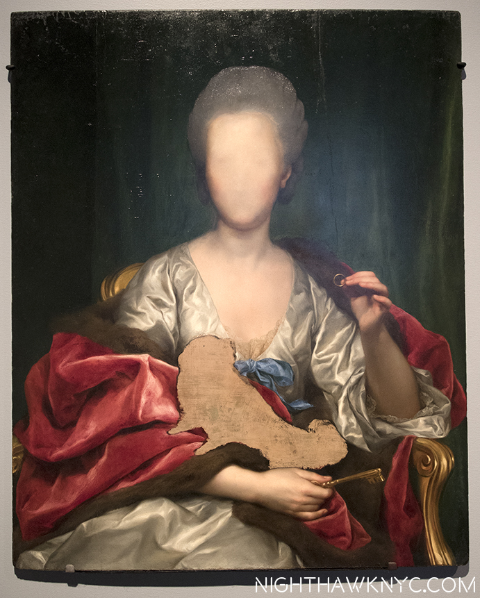
But, she’s not there.”*

"Portrait of Mariana de Silva y Sarmiento," 1794, by Mengs

“Portrait of Mariana de Silva y Sarmiento,” 1794, by Mengs

Leonardo da Vinci, Michelangelo, Titian, Van Eyck, Durer, Rembrandt, Velazquez, Manet, Monet, Degas, Van Gogh, Cezanne, Picasso, Pollock, Warhol, Mondrian, Basquiat, Whistler, Alice Neel, Lucian Freud, Klimt, Munch, Whistler, Robert Smithson, Cy Twombly, Gerhard Richter, and on and on. “Unfinished” is a mimi-Museum unto itself that probably rivals quite a few entire Museums. “Unfinished,” along with the “Nasreen Mohamedi” Retrospective, were the inaugural exhibitions at The Met Breuer (TMB), the first shows of two new eras- The Met’s new 8 year Breuer Building Lease (at a reported $17 million a year 1), and Sheena Wagstaff’s tenure as Chairwoman of The Met’s Modern & Contemporary (M&C) Department. No pressure there. It’s a show that leaves you wondering “Why didn’t anyone think of this before,” before you’ve even gotten to it’s second floor.

Opening Day of The Met Breuer. Member's Preview, March 8, 2016

Welcome to the future! Opening Day of The Met Breuer. Member’s Preview, March 8, 2016

Well, for one thing, though many of the works here come from other sources, not a lot of places have the resources The Met has, so yes, a part of this is “showing off.” They’ve chosen to install this in a brand new branch that previously held the entirety of one of the other “Big Three” Manhattan Museums, before the Guggenheim made it the “Big Four.”

If that’s not showing off? I don’t know what is.

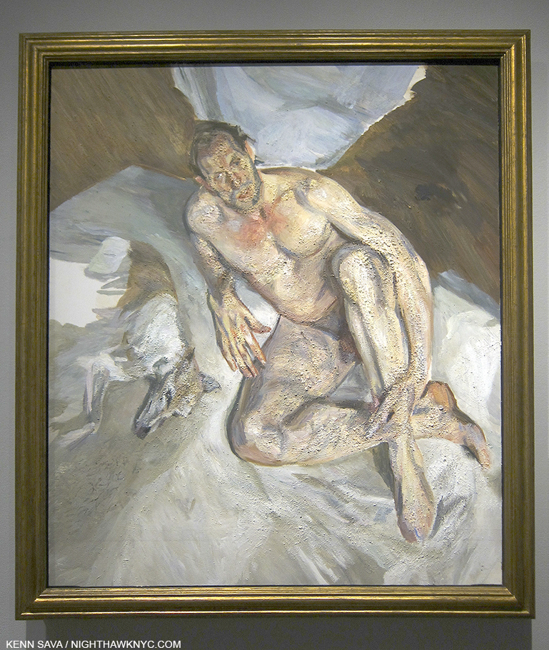
The rest is the pure joy of discovery, of seeing a curtain lifted and getting an all too rare chance to see some of what goes into making a masterpiece, a work of Art. And? The hits just keep on coming. The big names, that is, if not the most well-known work by any of those names. 197 works in all filling the 3rd & 4th Floors. While nothing here is “famous,” even in their, supposedly, incomplete state (either left unfinished on purpose, or not, in the case of Lucian Freud’s “Portrait of the Hound,” which was left as we see it on his easel when he died), these works hold up just as they are, making this a show jam packed with excellent, even important pieces. Yes, curating a show of “unfinished” work THIS well is also showing off The Met’s superb staff. Along with the pleasure of looking, they also provide fascinating, voyeuristic, even unique, insights into the Artist’s process- both working and thought. Some, as in Alice Neel’s “James Hunter Black Draftee’, 1965, are, perhaps, more evocative than it might have been had it been “finished.” Mr. Hunter never returned for additional sittings. We are left to wonder why not.

"James Hunter Black Draftee," 1965, by Alice Neel

“James Hunter Black Draftee,” 1965, by Alice Neel

The whole question of “When is a work of Art, finished?” comes front and center here as well, and no less than Rembrandt chimes in on it.

dsc_7639pnh

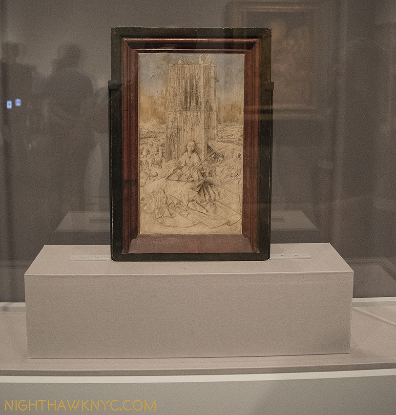
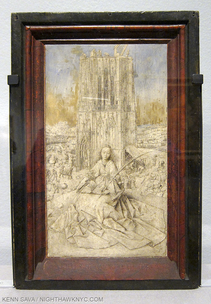
Highlights? I’ll list those that come to mind quickly because there are so many. For me, Jan Van Eyck was the very first Artist who truly captivated me as a kid. Shortly after getting my driver’s license, I drove the almost 6 hours each way just to see his “Annunciation” in Washington’s National Gallery, then drove right back. Seeing his underdrawing for his unfinished St. Barbara was just breathtaking. It’s truly unbelievable to think that something like this lies underneath his finished masterpieces, like The Ghent Altarpiece! While he is legendary for the extraordinary and exquisite detail of his painting, which has held me in disbelief for all these decades, apparently, he could also draw every bit as well2

Small wonder. "Saint Barbara," 1437, Jan Van Eyck. Barely 12 inches tall.

Small wonder. “Saint Barbara,” 1437, Jan Van Eyck. Barely 12 inches tall.

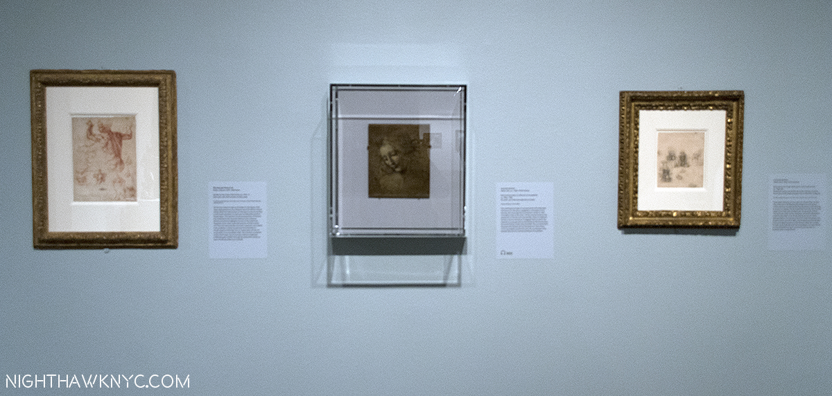
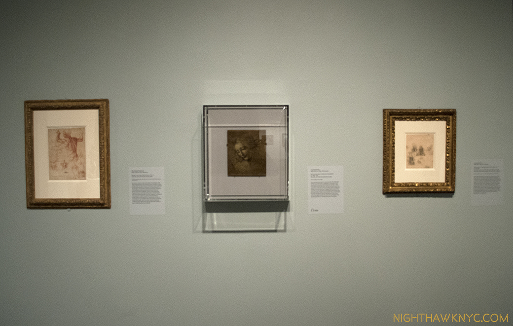
Just astounding. Oh, and sitting a few feet away was a da Vinci portrait profile that was positively otherworldly. When the show opened (along with the Met Breuer) in March, it was flanked by Leonardo’s “Sketches for the Virgin Adoring the Christ Child” and Michelangelo’s “Study for the Libyan Sibyl.” Since “Unfinished” was up for a very generous four and a half months, the later two were replaced after a while, no doubt due to their fragility. It seemed to me they may have been there in honor of TMB’s opening. Both works are in TM’s permanent collection. More showing off? (Slight smile)

Blink, and you missed it. Briefly on view, Leonardo, center and left, Michelangelo, right.

For a New York Minute, the two greatest figures in Western Art were on view together. Leonardo, center and right. Michelangelo, left. Has so much hunan genius ever been side by side than when work of these two are shown together? March 8, 2016.

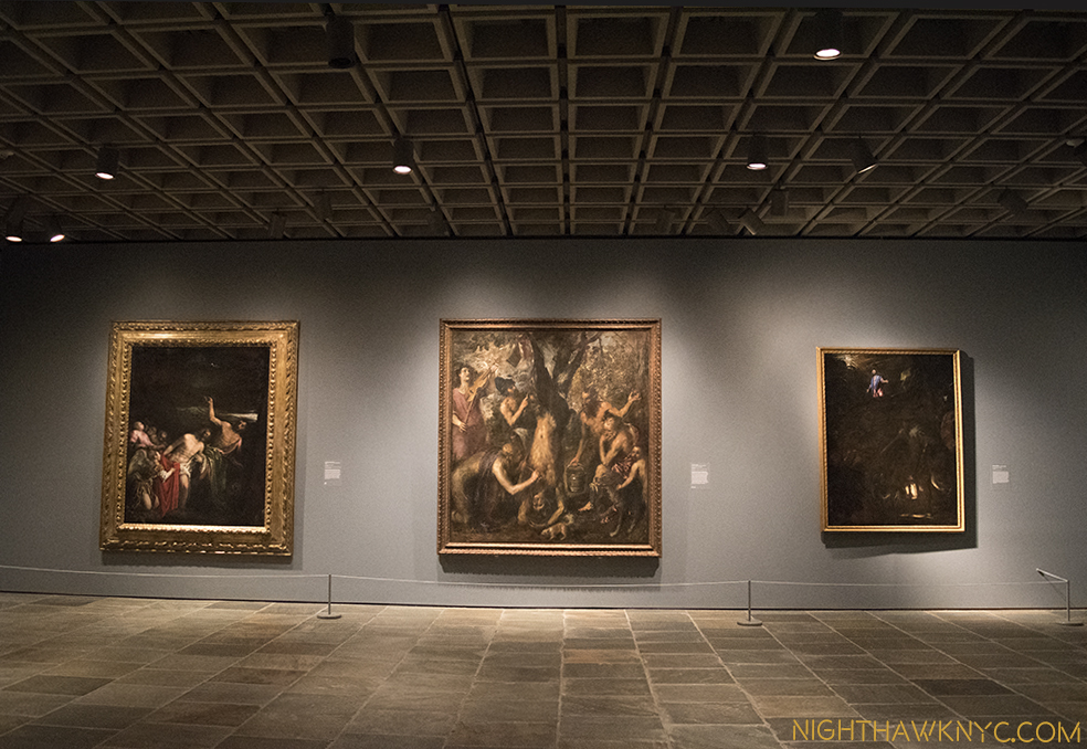
Oh, all of this is in the 2nd room. In the first room, upon getting off the elevator on the 3rd Floor, at the show’s beginning, you’re immediately faced with 2 large, powerful Titians that are guaranteed to stop you for a good long while, and a Jacopo Bassano.

This view once the elevator doors opened on 3 is one I'll long remember.

The opening salvo. This is the first thing many visitors to TMB saw after the elevator deposited them on 3. Bassano, left, with 2 Titians.

Rembrandt’s St. Bartholomew, a whole room of Turners, a beautifully selected print gallery, a very “different” Degas of a horse race, a Van Gogh who’s color filled the entire room, a stunning Munch self portrait…all on the 3rd floor, wowed me.

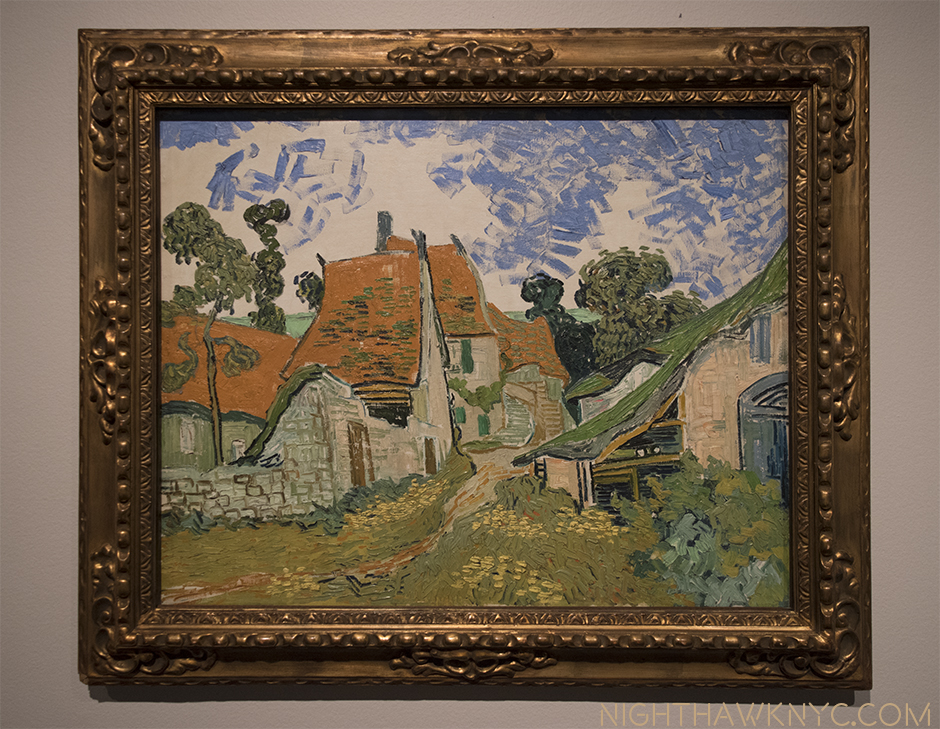
"Street in Auvers-sur-Oise," 1890. In the year he died, no dark clouds in this sky.

Life affirming. “Street in Auvers-sur-Oise,” 1890. The year he died, no dark clouds in this sky. I am among those who believe Van Gogh did not commit suicide.

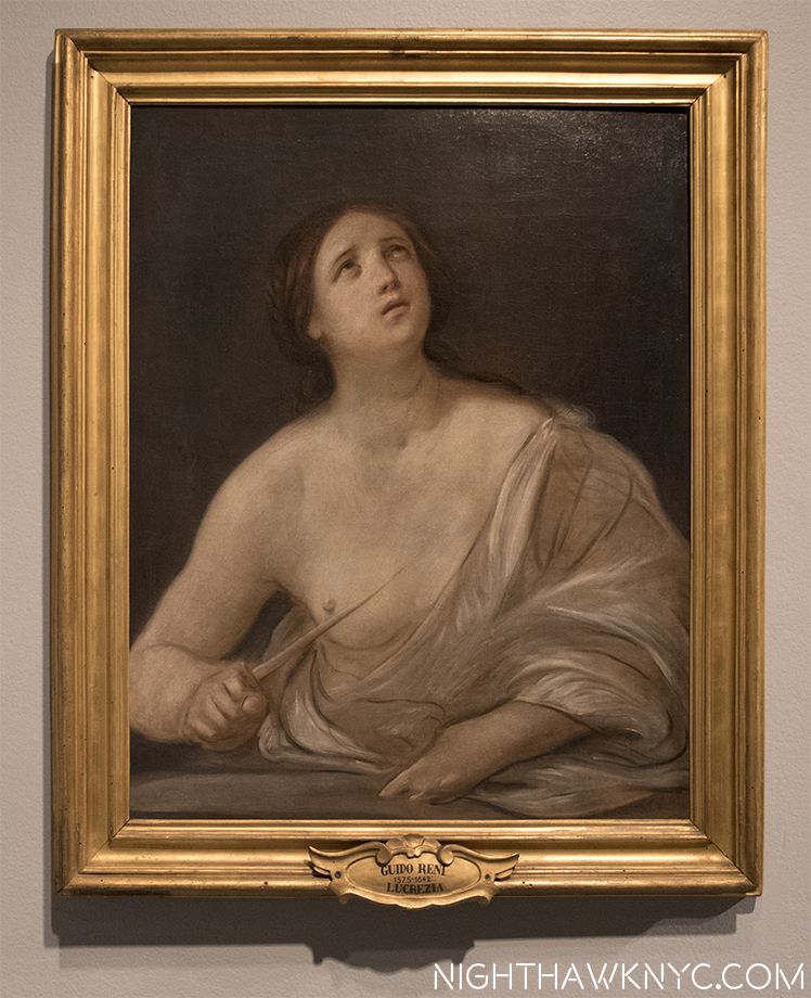
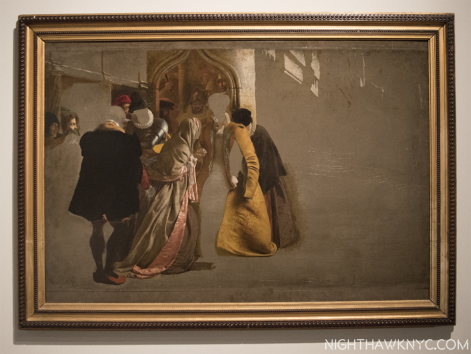
Finished, or Un? "Lucretia," 1642, by Guido Reni. Magnificent.

Finished, or Un? “Lucretia,” 1642, by Guido Reni. Magnificent.

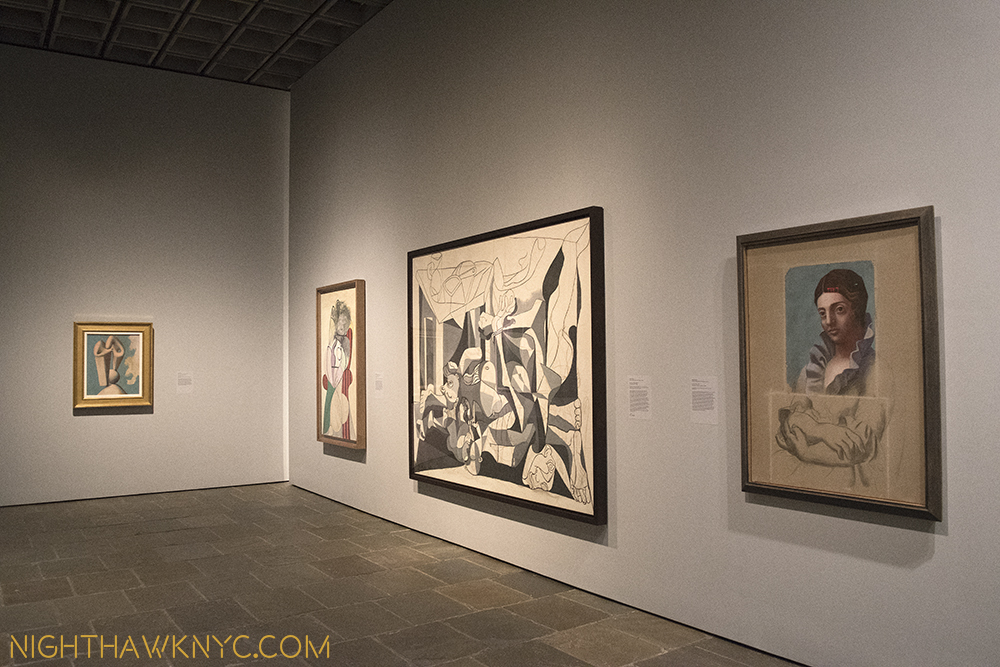
On the 4th Floor, getting off the elevator was no less dramatic. No less than 4 amazing Picassos greet you, one of which is “the Charnel House,” the work which bookends (with “Guernica”) his WW2 years. While “Guernica,” rightfully, is seen as one of the landmarks of 20th Century Art (and one I’m eternally thankful I got to see in person at Moma’s Picasso Retrospective in 1980 before it was moved to Spain as Picasso’s will required), here is a work that I think deserves more attention. It’s surrounded by 3 other pieces, in 3 other styles (in addition to 2 others in the next gallery, and a few more on the 3rd floor), that show Picasso in the process of thinking through the problems inherent in each work- each one in a different style. After the 1921 “Portrait of Olga,” right, below, he was inventing each of these styles. It’s akin to inventing a new language. There was no one else to help him or guide him. Some artists, like Jackson Pollock, have done this once. Picasso? There’s three in this one gallery, and it doesn’t even include Cubism.

Pick a style-any style. 4th Floor Lobby/Galley 1. Picasso 1921, '29, '31, '45.

Pick a style-any style. 4th Floor Lobby/Galley 1. Picasso 1921, ’29, ’31, ’45.

There was quite a bit of fanfare paid to The Met’s announcement of The Met Breuer as a “Contemporary Outpost,” especially during the years when the 5th Avenue Modern & Contemporary Galleries were to be undergoing the reconstruction they had also announced. Yet, in this co-inaugural show, we get quite a bit of what The Met is famous for, along with about two thirds of the 4th floor of more recent works. The size of many of these newer works seems to cut down on the number of pieces, however, making the show feel skewed towards older Artists. Of the 197 works in the show, I counted 74 works by Artists born after 1900, 12 by Artists born after 1950. (The youngest Artist represented is Urs Fischer, who was born in 1973, and who’s mysterious cast bronze “2,” from 2014 is also the newest work here by my reckoning.)

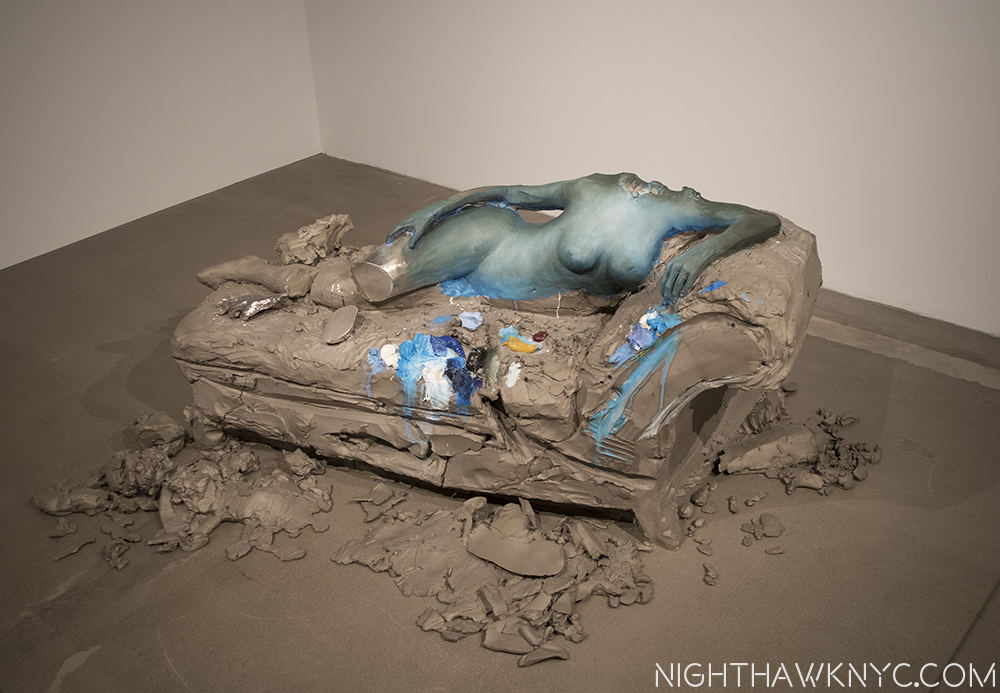
The day after at the NighhawkNYC offices? No. "2," 2014, by Urs Fischer.

The day after at the NighthawkNYC offices? I’ll never tell. Actually, this is “2,” 2014, by Urs Fischer.

“But it’s too late to say you’re sorry
How would I know, why should I care?
Please don’t bother trying to find her
She’s not there”*

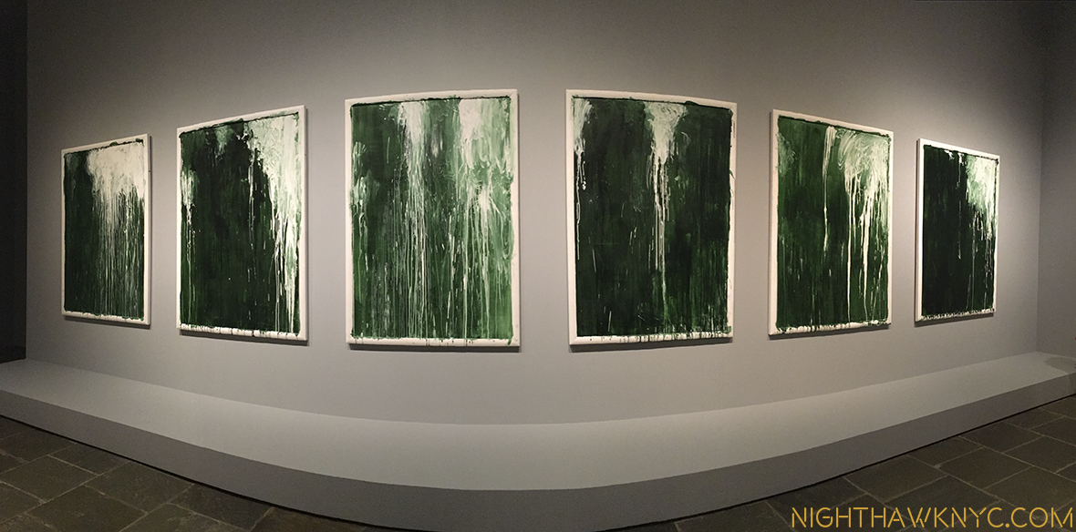
Yet, even among the M&C pieces here on the 4th floor, there are memorable pieces. In additon to Urs Fischer’s “2”, the unfinished Mondrian struck me as a revelation. Yayoi Kusama’s genre defying paintings of consecutive numbers gave pause for thought, as did Sol LeWitt’s amazing tour de force  “Incomplete Open Cubes” nearby  and, Kerry James Marshal’s “Untitled,” 2009, was a nice appetizer for his much anticipated “Mastry” show opening at TMB October 25. The show concludes with a wonderful selection of sculpture, including haunting works by Louise Bourgeois, “Untitled (No.2), 1996, and Alina Szapocznikow’s work about her own battle with breast cancer, “Turmors Personified,” 1971, in dialogue alongside 3 Rodins. The final gallery consisted of only one work- a series of 6 pieces by Cy Twombly, entitled “Untitled I-VI (Green Paintings), 1986, which provided a meditative, cleansing experience I found especially memorable.

The Cy Twombly Gallery closes the show seen in panorama.

Water works? It’s hard not to feel a sense of water in movement in this gallery of 6 Cy Twomblys, which closes the show, seen in panorama.

Overall, what I took from this show as a whole was a possible template for what The Met plans to do going forward, the kinds of Artists they may include in their “new initiative.” It’s something I plan to watch closely as it unfurls. I should say that I have been in the minority regarding The Met and M&C Art. I liked that they were taking their time and allowing time to give some perspective on Contemporary Art before jumping in. It’s always been an honor to be in The Met- they have the best of the the best across all cultures and all times. Yet, given the unprecedented popularity of M&C Art today, they have opted to move more fully into it. Ms. Wagstaff, who I met in June, seems to have a great sense for all of this, and if anything, “Unfinished,” is a show that consists of work across at least a few Met Departments. Being able to work, apparently, so well with the other Met Departments augers well for the future. After all, The Met has 2,000,000 items in it’s collection. Showing M&C Art along side of selected objects in their collection is something I am all for.

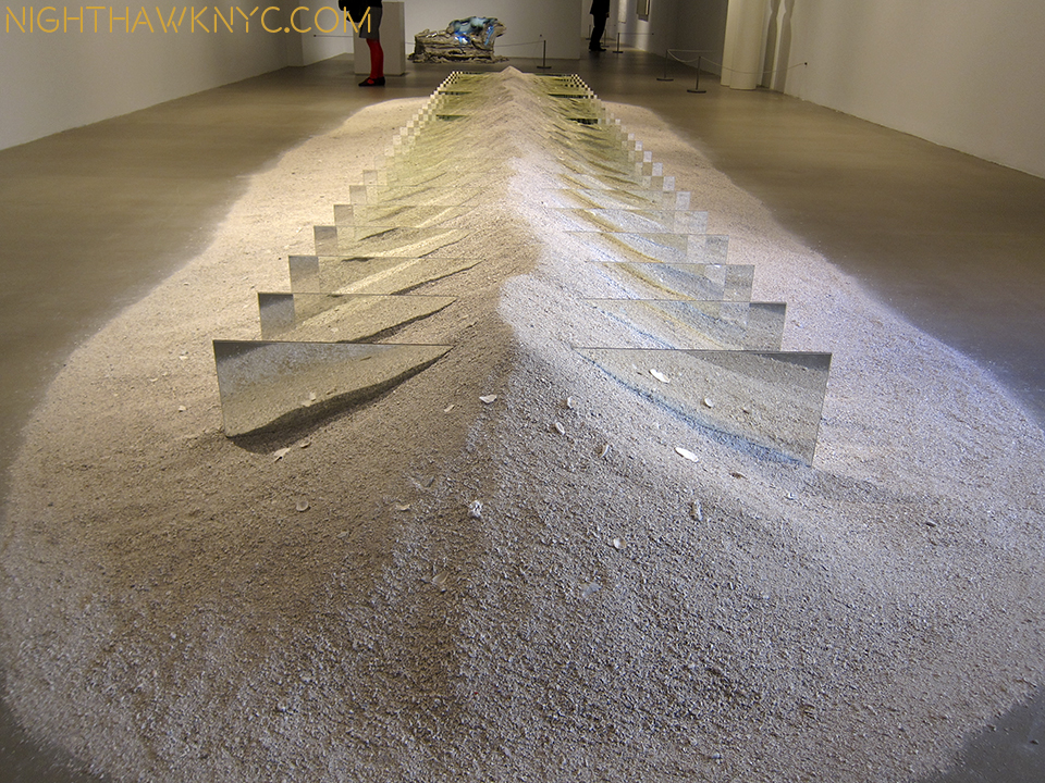
Floor beach. As close as I got to a real beach this summer.

Floor beach. “Mirrors and Shelly Sand,” 1970, by Robert Smithson. As close as I got to a real beach this summer. I shot this wearing shades.

For me? That’s what this show says- Here are (unfinished) works by many of the greats. This is where we are starting from. Let’s see how other work that may, or may not, have been influenced by them, looks alongside these. The show may be seen as a number of conversations between Artists they are displayed alongside- Leonardo with Michelangelo. Van Eyck and Durer, Rembrandt with Velazquez(!). Degas and Manet. Van Gogh and Whistler(!). Picasso and Cezanne. Pollock and Kusama. Smithson and Fischer. Marshall and Warhol. Szapocznikow and Rodin. Rauschenberg and Mondrian. And, Picasso, also…with himself, among them. I say bring it on!

Still, there’s no denying that The Met Breuer is a HUGE gamble. Who knows how long Contemporary Art will stay as “hot” as it is? For that matter, who knows how much longer record number of viewers will go to see Art, as they have these past few years? The Met is locked into this for 8 years, and they have already announced a budget deficit that caused them to put off the previously announced reconstruction of the Modern & Contemporary Galleries, and, more sadly, even forced an unknown number of lay offs.

When they return to better times, IF they decide to move forward with those reconstruction plans, they will, most likely, need additional space for the temporary display of their Modern & Contemporary holdings, and Special Exhibitions. What will they do? Extending the lease on the Breuer will be VERY expensive. So far? I have yet to see it’s galleries very crowded. The “Diane Arbus; In The Beginning” Show, which recently opened on the 2nd floor, seems to be drawing pretty well, and “Unfinished” was fairly crowded during it’s last weeks. Yet? They’ve already closed the 5th Floor Cafe & Bookstore and remodeled it as additional Gallery space, which indicates that they want to have more going on there for visitors to see, and their basement restaurant is scheduled to open in about a month, which will be open during some hours The Museum is not. Obviously, this is all new, and still in flux. The Met seems to be reacting fairly quickly, which is a good sign. They did away with late Thursday nights, which I seemed to be among the very few that went to, and changed to late Friday & Saturday nights, like TM, 5th Avenue.

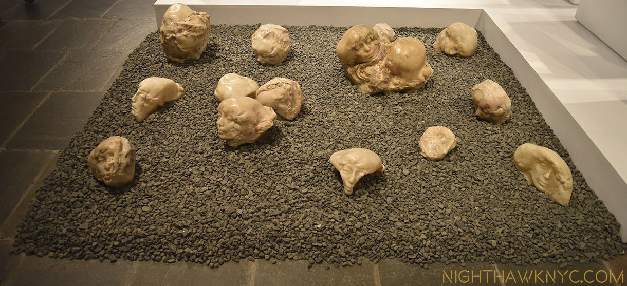
"Tumors Personified," 1971, by ALina Szapocznikow.

Survivor. “Tumors Personified,” 1971, by Alina Szapocznikow.

So far, on very little evidence, I like the direction TM is going at TMB, and with M&C Art. “Nasreen Mohamedi” was a revelation that struck me as the “perfect choice” to be the first M&C Show. “Unfinished” was an unexpected blockbuster the likes of which has never been seen before, which is somewhat startling given how long there have been painting shows. The Diane Arbus show is fascinating and features a ground breaking installation. Also, not to be lost is the reconfiguration of the M&C Galleries at TM on 5th Avenue- I love what they’ve done. The Art has been imaginatively rehung in fascinating new combinations, with some pieces given new prominence, like Edward Hopper’s majestic “The Lighthouse at Two Lights,”1929, and other pieces shown that have long been in storage. Along with this, Thomas Hart Benton’s “America Today” Mural appears to have now been permanently housed, at the center of supporting works and works that enter into interesting dialogue with it nearby. Other galleries are arranged by theme, instead of chronology.

So? There’s been a lot of action coming from new M&C Chairwoman Sheena Wagstaff and her Department. There’s a long way to go, but so far? It’s hard for me to give her less than an “A” for what she and they have accomplished.

Haunting, and then some.

Haunting, and then some. “The Return of Mary Queen of Scots to Edniburgh,” 1870, James Drummond.

Most of the Artists in “Unfinished” won’t get the chance to finish what they started. The Met will.

Stay tuned.

*-Soundtrack for this post is “She’s Not There,” by Rod Argent, recorded by The Zombies, and published by Marquis Songs, USA.

NighthawkNYC.com has been entirely self-funded and ad-free for over 7 years, during which over 250 full length pieces have been published. As I face high expenses to keep it going, if you’ve found it worthwhile, please donate to keep it up & ad-free below. Thank you!

Written & photographed by Kenn Sava for nighthawknyc.com unless otherwise credited.
To send comments, thoughts, feedback or propositions click here.
Click the white box on the upper right for the archives or to search them.
For “short takes” and additional pictures, follow @nighthawk_nyc on Instagram.

Subscribe to be notified of new Posts below. Your information will be used for no other purpose.

  1. http://www.nytimes.com/2016/03/05/arts/design/breuer-building-expands-the-imagination-and-the-budget-of-the-met.html?_r=1
  2. Yes, I saw “A New Look at a Van Eyck Masterpiece” at TM proper, which featured a drawing of the Crucifixion from Rotterdam that may, or may not be, by Van Eyck. I came away VERY impressed by it to be sure, but remaining to be entirely convinced.

Riffing On Miles Davis

This site is Free & Ad-Free! If you find this piece worthwhile, please donate via PayPal to support it & independent Art writing. You can also support it by buying Art & books! Details at the end. Thank you.

Written & Photographed by Kenn Sava (*- unless otherwise credited)

Here we go, again. Or, to quote the late, great Eddie Jefferson in “Moody’s Mood for Love”- “Here I Go, Here I Go, Here I Go, Again…”

The film, Miles Ahead, gives me cause for concern. No, I haven’t seen it yet. I’m not sure I’m going to see it. Why? Probably for the same reasons I didn’t go to see the Steve Jobs movie. While I’m all for artistic freedom and creative license, as time goes on it seems that “docudramas” that purport to be “about” someone real tend to paint incomplete pictures of their subject. They “riff” on them. Whether they are “good” movies, or not, whether they do any justice to the truth of their subject, or not, the public comes to base their opinions of their subjects on these films. Sometimes, (like Lady Sings The Blues “about” Billie Holiday, which “incongruously transforms Holiday’s messy, bisexual, masochistic romantic history into a glossy romance about a troubled, needy woman-child and the endlessly patient dreamboat who could slow but never entirely halt her march toward self-destruction,” according to Nathan Rabin of The Onion AV Club), even worse, they may leave them feeling there’s no need for them to look past the film for themselves. (Both Billie Holiday and Miles Davis wrote Autobiographies.)

This is very sad.

I’m hoping the film, whatever it’s “about,” will inspire viewers to want to hear more of Miles’ music, ideally, all of it, and that will be the primary result of it.

Last time I checked, very few Artists or Musicians had been canonized as saints, though in my personal Church of Art, they’re revered to me. They’re human. They had flaws. Some did very bad things. Allegedly committed crimes, even murder. Some did drugs, and weren’t exactly nice or easy people to know. Miles Davis has been accused of doing some bad things. Does creating great timeless Art or Music that effects millions of people make that Ok? That’s not for me to say.

Larger Than Life. Miles in a 4 foot poster from Tutu. From my collection.

I do know this-

Miles Davis was probably the most influential Artist in my life. While I never met him, his signature and mine actually did wind up on the same piece of paper once, a few inches apart, and I was fortunate enough to see him perform about 40 times. That’s as close as I got to him. But, his music, especially his albums? They’ve been closer- they’ve been a part of me since I learned how to work a record player.

When his album Bitches Brew came out, only the latest in a string of game changing albums he released every few years, it was so controversial, it led to the break up of the band I was in at the time. At that point I was playing electric bass in a friend’s blues band, and listening to jazz. After Bitches Brew, an unprecedented mix of jazz, rock, funk, avant garde, and what came to be called “world music,” and the first-shot-over-the-bow that something very new and different was going to be happening hence forth, a lot of us realized it was possible to play electric instruments and play jazz. So, I started looking around for a band to do that with, eventually found one, and went on the road with them for five years. They were all far more accomplished musicians than I was. Miles was a legend, even back then, to all of them, too. He has been as long as I can remember.

It’s hard to think about the impact that every single one of Miles’ albums had at the time it came out, going back to the Birth of the Cool, which is exactly what it was, in the late 1940’s . It must’ve been like Picasso creating a new work to the artists of his time. Miles had the ability to move mountains with every new album. Musicians would listen to them and think about them vis a vis what they were doing. Miles was always Miles beyond. In fact, all of his albums from the late 60’s bore the moniker “Directions in Music by Miles Davis.” That said it all. With Bitches Brew, people began to argue that it “wasn’t jazz.” If you had followed the thread of his music through the 1960’s, you could hear where he was going and you could also hear the same thing that always defined Miles, more than anything else- His sound.

No one could play a melody like Miles. And then, no one else had his sound.

He started the 1960’s fresh off what is widely considered the greatest jazz record ever made- Kind of Blue  in 1959. His 1960 group, now referred to as his “First Great Quintet” included that other great master of post war jazz improvisation- the tenor saxophonist, John Coltrane. The two couldn’t be more different, and made perfect foils for each other. Miles was the inventor of space- what Artists call “negative shapes,” that is, what isn’t there- in music’s case, silence. Miles could say more with less than any Artist in Jazz history- even with one note. (Even when I heard him in a concert late in his career, racked will illness and apparently having trouble moving on stage, there would be that one moment, that one note that would sear the night and make your jaw drop. The silence that inevitably followed making it infinitely more poignant.) John Coltrane was on his way to developing what became his signature “sheets of sound” style, would solo after Miles and his voluminous brilliance would serve to frame Miles the way black velvet sets off a diamond. Of him, Miles famously once said, “I had 7 Tenor players once.” Coltrane left to form his own group, but somehow Miles managed to put together another great group- his, so-called “Second Great Quintet” with Wayne Shorter on Tenor, Herbie Hancock on Piano, Ron Carter on Bass and Drummer Tony Williams. As the sum of its parts, this band of Masters, was, for me, the pinnacle. To this day, I revere every note I have heard them play in the slightly over 2 years they were together as I do no other group I have heard. No group has taken the art form of the acoustic jazz quintet further.

Then, it changed, again. He went from the Second Great Quintet to an increasingly more electric sound. This was the mid-1960’s and rock and funk were influencing him. Herbie and Wayne remained for the first few albums, and then they, too, left and were replaced by people like Keyboardists Joe Zawinul, Keith Jarrett & Chick Corea, Guitarist John McLaughlin, Bassist Dave Holland, Drummer Jack DeJohnette, and many others, quite a number of whom went on to have had long and important careers.

Today, Miles’ influence is everywhere. His legacy lives on. While many of his side men, like Hancock, Shorter, Corea, Jarrett, Holland, Marcus Miller, Mike Stern, et al, are still among the biggest names in jazz, his legacy is being handed down to their side men, and on it goes. For me, a day doesn’t go by that I don’t hear a piece of his.

So? Why do I dread this movie?

Because unless you grew up with this, it’s really hard to capture on film. Jazz was (and still is) a very hard way to make a living- mostly in small clubs in an environment filled with drugs, alcohol, crime, trouble and little to no money for most. Yes, there was  scandal and a lot of controversy in Miles’s life. It’s very easy to make a drama out of it. I hope that’s not all it does. To do so, would be to miss the point.

From here, to eternity. My other 4 foot "Tutu" Poster. This one, the cover shot.

From here, to eternity. My other 4 foot Tutu Poster by Irving Penn. This one, the classic cover shot of “The Prince of Darkness.”

It would be to miss why Miles is an Artist for the ages.

While I don’t believe in comparing Artists qualitatively, I do think it can be illuminating to see similarities and differences between them. Miles is often called “the Picasso of Jazz,” and I can understand why- Their lives largely overlapped (Picasso- 1881-1973, Miles 1926-1991. Miles also painted.) They both refused to be pigeonholed, and changed styles as frequently as it suited them. They both continued to grow and evolve as Artists literally right up to the very end. When I think about Picasso and Miles Davis, I wonder if the total number of pieces Picasso created may be very similar to the total number of performances that Miles Davis gave, when you consider live and studio performances. Though Miles was infrequently in the studio during large portions of his career, he was active as a live performer. Whatever the total numbers might be, the two are similar in that they were both extraordinarily prolific.

Picasso was very aware of the history of art and what was going on in and around him, witness his long relationships with Matisse, Braque, among others, Miles immediately sought out, then played with Charlie “Bird” Parker, the greatest musician of his time, soon after arriving in NYC to study at Julliard, and, startling to many, the  young unknown, barely out of his teens, was asked by Bird to join his group. Interestingly, as time went on, Miles, in turn, nurtured the careers (to varying degrees) of the likes of John Coltrane, Wayne Shorter, Joe Zawinul and Herbie Hancock among many others. He was also very aware of what people like Jimi Hendrix and later, Prince, were doing, and played with both.

Along with Frank Sinatra, Ella Fitzgerald, Louis Armstrong and a few others, his performances of standards define them.

Along with this, the kid from East St Louis, Illinois wound up sonically defining New York City. It’s impossible for me to listen to Kind of Blue, which may be the greatest improvisation in music history, without seeing a tone poem of New York City in my mind each time. (A live performance shortly after its recording, with John Coltrane-)

No one else I have ever heard, in any kind of music, has come closer to it. A couple of years ago the Village Voice  ran a list of the greatest New York City songs. Nothing from Kind of Blue, which was recorded on 30th Street in Manhattan, made the list. Someone is out of their mind. Kind of Blue celebrated its 50th anniversary in 2009. Get back to me on how some of the songs the Voice picked are doing in 50 years. The “cool” sound, style and attitude he created, and embodied, in the 1950’s became en vogue everywhere, nowhere more than right here.

Maybe one day I’ll see the film and feel my fears were for naught. Miles Davis made a unique and extremely valuable contribution to music, to American and World culture. Even though he didn’t die that long ago, this contribution is already in danger of beginning to be forgotten. This is not something to be taken lightly. His legacy is important- to me and countless others. I’m writing this to express how I feel about Miles (and “riff” about him the way the film may), and to say that I hope anyone interested in him hear as much of his music as you can1

You can also support it by buying Art, Art & Photography books, and Music from my collection! Art & Books may be found here. Music here and here.

Written & photographed by Kenn Sava for nighthawknyc.com unless otherwise credited. To send comments, thoughts, feedback or propositions click here. Click the white box on the upper right for the archives or to search them. Subscribe to be notified of new Posts below. Your information will be used for no other purpose.

  1. Miles created a long legacy of recorded music, and changes styles of music more often than almost anyone else has. Kind of Blue, seems to be where most people start. After that, I’ve written an entire piece called “Directions In Listening By Miles Davis”Directions In Listening By Miles Davis” with some thoughts on what to check out next. He also wrote an Autobiography. Soget to know him through those and make your own mind up about him. If you want to know what’s really important about Miles, do yourself a favor- Go to the source- start with his music. It’s a font that will be inspiring millions for as long as music is played.

    Yes, Miles Davis was a complex man by all accounts. Like Steve Jobs, people will be trying to understand him and tell stories, even make films about him for many years to come. Both were, by all accounts, incredibly complex men. That alone makes it very hard to do them justice in a 2 hour film. Some love Miles, some loathe him, many found him scary, difficult or impossible to deal with. All I know is that Miles, the Artist, is one of the greatest Artists in music- that’s what’s important, and the rest is, now, details. If you go and see the film, keep this in mind and try and imagine the effect his music had at the time and how often it changed the musical world. That doesn’t happen often. How many Artists take those kinds of risks anymore? How many risk losing their audience? And how many do it over, and over, and over, and over, again? That’s a big part of his legacy that shouldn’t be forgotten, and one I hope will be emulated by those still being influenced by him, those who want to get to the heart of what’s really important, like this-

    Next time you listen to Miles, listen for that one note that says more than words ever can- it’s there in every one of his performances, and then listen for the silence.

    *Soundtrack for this post is “It Never Entered My Mind” as performed by Miles on “Cookin’ & Steamin’ with the Miles Davis Quintet” (there are other versions), a long time personal favorite. It was written by Richard Rogers & Lorenz Hart and published by Warner Chappell Music, Inc.

    POSTSCRIPT- June 20, 2020- I finally did see Miles Ahead. I found Don Cheadle’s performance to be amazing. It’s obvious to me how much care and passion he put into this film. Herbie Hancock and Wayne Shorter appear onstage during the final credits, which makes me believe they had some level of awareness of the film’s content, though I am not saying they gave their approval to it- I simply don’t know. Still, it strikes me as a dramatization, and as such, it’s fine as an ancillary source. I still say- go to the source (if you’re looking for a visual source, check out the new documentary film, Miles Davis: Birth of the Cool, which ran on PBS’ American Masters series in early 2020), get familiar with Miles’ accomplishment, and his own words, and then, if you’re looking to see his life interpreted dramatically, riffed on, by someone else, check out the film. If not, you are selling Miles, and yourself, short, if the film is all you know about him. It reminds me of the dramas being done on Picasso, that other endlessly creative 20th century Artist. That they keep Miles’ and Picasso’s name in front of the public is good, I guess, but if that’s as far as the public’s interest goes, and they don’t discover who these people REALLY were for themselves? They are left with distorted views, which is what I feared when I wrote the above in March of 2016, and this is not good, in my opinion.

    NighthawkNYC.com has been entirely self-funded & ad-free for over 8 years, during which 300 full-length pieces have been published! If you’ve found it worthwhile, PLEASE donate to allow me to continue below. Thank you, Kenn. [paypal-donation

Live, From the New Met Breuer!

This site is Free & Ad-Free! If you find this piece worthwhile, please donate via PayPal to support it & independent Art writing. You can also support it by buying Art & books! Details at the end. Thank you.

Written & Photographed by Kenn Sava

It doesn’t officially open till March 18 but being The Met (TM) “regular” that I am, of course they let me in 10 days early. I wish. Actually, they’re letting Members in early, starting today March 8. I still feel special.

I can report the layout is unchanged, so muscle memory from visiting this place when it was the Whitney Museum still works just fine. Ah, the Breuer Whitney Museum. I was involved in the debate surrounding it’s proposed expansion/modification way back in 1987, but I’m saving that tale for my upcoming post about the “New” Whitney Museum, almost a year in the making. Stay tuned. In the meantime…

Think about this for a minute.

The Met announced it would take over the Breuer Building as it’s “outpost” for Modern & Contemporary Art in 2011. Seen here on December 18, 2015. I was told that the silver circles on the windows were meant to echo the lighting of the lobby inside.

This place was the entire Whitney Museum until a year and a half ago 1. The Met already runs the biggest Museum in the country at 1000 Fifth Avenue, AND The Cloisters way uptown. Now that the Whitney has moved downtown, TM has taken over the building, which is now known as The Met Breuer (TMB). By itself, TMB is as big as the Dallas Museum. To be operating 1000 5th Ave, the Cloisters and now to open a new, additional location of that size, a few blocks from 1000 5th, I find to be a “WOW!” moment.

They seemed to get it up and open pretty quickly (judging from how it looked when I passed by in December).

December 18, 2015. I was told the “Circle” Motif is a take off on the lobby’s ceiling lights. See next.

The same window. Member’s Preview Opening Day, March 8, 2016.

So? What’s new? What’s old? What’s borrowed? What’s blue?

Actually, nuptial euphemisms are not out of place here, since The Met & The Breuer building are “married” for at least the next 8 years, with an option to extend, which is longer than most marriages last between people, while TM’s contemporary galleries are undergoing complete renovations that will take a few years. I fully expect they will turn out to be as exemplary as the American & Roman Wings have. Though the layout of TMB made it instantly “familiar,” my first visit was not without some major surprises.

Members Only. It won’t look like this for long. Only 1 street vendor apparently got the word.

Apparently, I didn’t get the word, either. Since the contemporary galleries are those closing I was expecting ALL of TMB to be contemporary Art. Nope. 2 Floors are devoted to a superb show, Unfinished: Thoughts Left Visible featuring such well known “contemporary” artists as Rembrandt, Cezanne, Picasso, Van Eyck, Durer and Titian.

?

Apparently, TMB will be a “satellite” featuring Special Exhibitions AND contemporary Art. Hmmm… To say I’m surprised by this and why they’d do it is an understatement. Well? Unfinished is a VERY large show that handsomly fills Floors 3 & 4. Perhaps they see the Shows as the draw for getting a large number of people into the building, while they “also” display contemporary Art? There is a show, which I haven’t seen yet, by contemporary Indian artist Nasreen Mohamedi (1937-1990), but no display of works from the permanent collection of contemporary Art, at least to begin with. A cafe & bookstore will be on the top floor, which wasn’t open today. So? Three full floors can be devoted to shows, the small lobby gallery featured a live performance by Vijay Iyer and his trio today, which was well attended and sounded good throughout the adjacent lobby.

“Wake Up over there on the right!” It’s MacArthur “genius” grant recipient, Vijay Iyer, left on piano, performing with his Trio in the first floor Gallery.

Regardless, Unfinished turns out to be a surprise blockbuster, a wonderful chance to look over the shoulder of some of the greatest Artists in history, both Old & Modern Masters, as they create. Create, not created because for some reason, even death, they never “finished” the works in this show. The reasons vary. TM defines Unfinished as it applies to this show as- “This exhibition addresses a subject critical to artistic practice: the question of when a work of art is finished. Beginning with the Renaissance masters, this scholarly and innovative exhibition examines the term “unfinished” in its broadest possible sense, including works left incomplete by their makers, which often give insight into the process of their creation, but also those that partake of a non finito—intentionally unfinished—aesthetic that embraces the unresolved and open-ended.” However, what is here in nothing short of a chance to experience what it was like to visit the studios of these Artists. Processes and choices are laid bare as an astounding roster of names go by in the course of 197 works. Monet, Manet, Van Gogh, Degas, Turner, Jackson Pollock, Robert Smithson, Rauschenberg, Basquiat, Rodin (yes, there are some sculptures, too), David, Kerry James Marshall, Alice Neel, and of course, the “King of the Unfinished Work”- Leonardo da Vinci.

Unfinished, installation view.

Jan van Eyck, Saint Barbara, 1437. I was shocked to see this masterpiece in Unfinished.

Lucian Freud, Portrait of the Hound, 2011, left unfinished on the Artist’s easel at his death.

My initial reaction is that TMB is great for Art lovers. Another major location to see world class Art in the City, with TM’s unequalled expertise, resources and 2 million or so collected works behind it. Unfinished is a must see show, especially for Artists. it’s chock full loans from major Museums (60% of the show), which is rare these days.

How it will turn out for TM, financially2, though it also remains to be seen what, if anything, will be done with the contemporary Art collection in the interim.

One day in, that’s the big question for me- What TM’s full plans are for contemporary Art at TMB. I’m looking forward to seeing how they unfold. My gut tells me it’s going to surprise a lot of critics and give TM new cred in a realm it’s been denigrated in for years. Oh? But that new Met logo isn’t wearing well on me.

For now, it’s terrific to have Art back at the Breuer, and, Unfinished is an unmitigated why-hasn’t-anyone-thought-of-this-before joy- for lovers of painting, and Art. I’m pleased to be among the first to “Kiss the Bride.”

*-Soundtrack for this Post is “The Art of Fugue” by J.S. Bach, left unfinished at the Master’s death, as recorded by Glenn Gould. You can see Gould perform the final part of  it here, and the entire hour and a half long piece, here.)

NighthawkNYC.com has been entirely self-funded & ad-free for over 8 years, during which 300 full-length pieces have been published! If you’ve found it worthwhile, PLEASE donate to allow me to continue below. Thank you, Kenn.

You can also support it by buying Art, Art & Photography books, and Music from my collection! Art & Books may be found here. Music here and here.

Written & photographed by Kenn Sava for nighthawknyc.com unless otherwise credited. To send comments, thoughts, feedback or propositions click here. Click the white box on the upper right for the archives or to search them. Subscribe to be notified of new Posts below. Your information will be used for no other purpose.
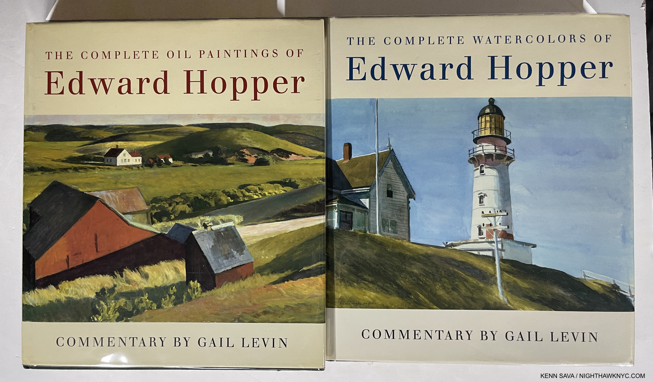
  1. The Whitney Breuer closed on October 19, 2014.
  2. It costs $17M a year to run per the NYT article linked above.}, is going to be something to watch. I’m hearing that by the 2 year mark it will be apparent where this is going long term, so we shall see. Yes, we’ve “lost” a little temporarily with the closing of TM’s contemporary galleries, but unlike when the American & Roman wings were closed for renovation, TM has more than made up for it with TMB[3. While TM didn’t open alternate spaces, beyond showing some works from the American Wing downstairs in the Lehman Galleries.

Art Shows, 2015 – Who Keeps Your Flame?

“But when you’re gone,
Who remembers your name?
Who keeps your flame?”*

IMG_7838PNH

January, 2015. Goya: Order and Disorder @The Museum of Fine Arts, Boston. Neither snow, nor 5 hours on a train kept the Nighthawk from the Front Door of Great Art.

Since I don’t believe in comparing creative work or creative people, AND I believe that “awards” for “Best” whatever among the Arts (and Sports) are absurd 1, I thought I’d do a “List In No Particular Order” of 2015 Art Shows I saw (some opened in 2014) that may or may not have closed for good, but still continue to open doors in my mind, and that’s more important than any award I could bestow.

“Oh can I show you what I’m proudest of?”*

Goya: Order and Disorder (Museum of Fine Arts, Boston, MA. No photos permitted.) AND Goya:Los Caprichos (National Arts Club, Gramercy Park, NYC)- Two concurrent, excellent shows, 250 miles apart, one huge, the other “small” showing two views of  Goya- one all encompassing, filling the whole lower level of the MFA, one narrowly focused on a rare, complete set of his landmark 80 print, Los Caprichos,(once owned by Robert Henri, who reappears below) combined to show the enduring power, importance, relevance and eternal influence of the Spanish Master. Many saw the former, far fewer saw the latter, tucked away in a dining? lecture? room on the second floor of the NAC (Behind hundreds of chairs on one of my visits!). An artist of nightmares, both surreal and all-too-real, the likes of which perhaps only Bosch can equal, who can then turn around and paint with the utmost lyricism, Goya was all about what it is to be human. Take your pick- portraits, historical pieces, landscapes, the otherworldly or the underworldly, children, tapestries, or his graphic works that hold their own with dare-I-say-Rembrandt, he’ll blow your mind.

DSC07316PNH

Goya/MFA on the show’s elevator entrance, overlooking Dale Chihuly’s Tree.

Remember My Name. Goya’s Self Portrait casts his all-seeing eye on us 215 years later.

The Sleep of Reason Produces Monsters from The Caprichos” So? Stay up!

DSC07711PNH

Neither blizzard, nor the furniture(!), kept the Nighthawk from seeing all of Goya’s incredible Los Caprichos at the National Arts Club, but I think they tried to.

Richard Pousette-Dart (Pace 510 West 25th, Chelsea)- I walked in and was completely captivated by “abstract” Art the way I haven’t been since the Mark Rothko Show at the “Old” Whitney in 1998, which was one of the greatest shows I’ve ever seen. (That’s not comparing.) Don’t be fooled by the apparent geometric simplicity, there is an astounding subtlety to these works that at once feel microscopically considered, often freely rendered, yet globally cohesive. Pousette-Dart had a number of styles, and this show represented one, geometric style, from the 1970’s in both large oils and smaller drawings. For any of those who think that Abstract Expressionism is “easy” to do, go ahead and try creating one of these, the largest is almost 8 foot square, and then see if it has the “Presence” of Dart’s. The amount of work that went into each piece belies their seemingly “simple” composition, is matched by an extraordinary primacy of order, and second only to their transcendent impact. Here, we see Richard Pousette-Dart as the great, “under known” abstract artist. While Pollock & Rothko have grown larger in stature, Pousette -Dart’s name deserves to be right there with theirs. There is only one word to describe this show’s effect- Magical.

Then? There’s never a chair around when you want one. Pousette-Dart @Pace- Presence, Circle of Night, 1975-6, center, Black Circle Time, 1980, left and White Circle Time, 1980, 90″ square each.

Imploding Black, 1975, six feet square. Transcendent,

Detail.

Cerchio di Dante, 1986, six foot square

Detail of the left side.

“Let me tell you what I wish I’d known
When I was young and dreamed of glory
You have no control
Who lives
Who dies
Who tells your story?”*

Richard Estes: Painting New York City (Museum of Art & Design, NYC)- My favorite contemporary artist, and one of the greatest living realists, FINALLY gets an NYC Museum show, and it was worth the wait. A virtual time capsule of NYC from the mid 1960’s to 2015’s astounding Corner Cafe, showing the 83 year old Master is still at the height of his considerable power. Oh…Do NOT call him a “photorealist” in my presence! Estes shows us the world we live in as we do not see it, (more on this soon) and so follows in the footsteps of Edward Hopper and Charles Sheeler in advancing American realism while, perhaps, being the first to include the abstraction that is also a part of the real world. A misunderstood painter, in my eyes, who is only just beginning to be really seen, finally.

Horn & Hardart Automat, 1967. Not since Hopper has a work spoken to me of life in the City like this does.

Columbus Circle, Maine Monument, 1989. 500 years ago, or 100, they came by ship. Now? They come by bus. Frozen in time, side by side.

Times Square, 2004. Nothing captures the experience of the place better than this, though Robert Rauschenberg is capable of giving me a similar feeling (See below).

“I try to make sense of your thousands of pages of writings
You really do write like you’re running out of time.”*

Picasso: Sculpture (MoMA)- If he had never done anything besides paint, Picasso would be considered among the all time Masters. But, noooooooooooo… Picasso was, perhaps, the most unique genius in (known) art history in that his genius was among the most restless. He almost never stopped creating, and he never stopped seeking new outlets for his creative vision. Consider- PICASSO HAD NO TRAINING AS A SCULPTOR! NONE. Yet, that didn’t stop him from becoming, perhaps, THE most revolutionary sculptor up to his time. There is so much great work to see in this show, I don’t even know where to start talking about it. “Picasso: Sculpture” shows us the naked face of endlessly creative genius the like the world has never seen. I’ll sum it up by saying virtually all of it is wonderfully selected, though some of the Cubist works here don’t stand up to his paintings, in my opinion, and wonder- When will we see his like, again? The “other” takeaway, for me, is- Oh…MoMA. I miss you. About as much as I miss your “old” building.

Standing Figure in Wire, 1928. Unprecedented. Astounding.

Sylvette, 1954. “I see you slightly folded…in steel, my dear.” Picasso must have said.

America Is Hard To See (Whitney Museum)- I’m saving my thoughts on the “New Whitney” Building (UPDATE- They may be seen here.), but the opening show in the new place was a wonderful “Welcome Back” to one of the first 3 of NYC”s Big Four Museums and a reminder of its world class (and first anywhere) collection of American Art. My personal highlight? The first floor gallery featuring a selection of Hopper Drawings done at the Whitney Studio which predated the Museum, and the absolutely mesmerizing portrait of Museum founder, the indomitable Mrs. Gertrude V. Whitney (also an overlooked sculptor) that looked out at Gansevoort Street, and for my money? SHOULD HAVE BEEN LEFT RIGHT THERE- PERMANENTLY! It wasn’t.

IMG_0992PNH

Frozen in time. Mrs Gertrude Vanderbilt Whitney looks out on the new home of the collection she started.

Mrs. Gertrude Vanderbilt Whitney by Robert Henri, 1917, with her Study for the Head of her Titanic Memorial from 1922, right. Yes. She was a sculptor, too.

Before the First Whitney Museum opened in 1931, there was the Whitney Studio Club, where artists came to draw from the model. See that guy to the left of center rear with the light shining on his bald head? That’s Edward Hopper, a regular. That’s why his estate was left to The Whitney. Litho by Mabel Dwight, 1931.

America is hard to change. Excellent, rarely seen, works by Grant Wood, Study for Breaking the Prairie, 1939,…

…And Kara Walker, A Means To An End, 1995, struck me as serendipitous.

IMG_0967PNH

America: Seen everywhere. Inside- Rothko’s Four Darks in Red, 1958, Pollock’s Number 27, 1950, Chamberlain, Jim, 1962 & Guston’s Dial, 1956…

IMG_0940PNH

…And, Outside- sculpture from one of the countless roof decks.

“And I’m still not trough I ask myself,
what would you do if you had more time
The Lord, in his kindness
He gives me what you always wanted
He gives me more time.”*

I end this section honoring two endlessly creative American “painters,” featured in very very good shows. Like Richard Estes, these two artists also put that “more” time of a long life to superb use. Yes, despite evidence to the contrary, they both consider themselves to be painters. To me, the “lessons” of their lives, how they were able to survive following their star in this country for so long, may prove to be as important as their considerable artistic legacies.

Robert Rauschenberg- Anagrams, Arcadian Retreats, Anagrams:A Pun (Pace 534 West 25th, Chelsea)- Presaging Photoshop, the late, great Mr. Rauchenberg continues to speak to our times though he, unfortunately, left us almost 7 years ago. Light years ahead of his times, throughout his life,  Anagrams…, a show of Mr. Rauschenberg’s final development, shows that once again, his work will look “contemporary” for years to come, and more amazingly, I think it will be as relevant as what anyone else is doing at the moment! As I just said, he represents something of an American miracle- an artist who was able to spend virtually his entire life creating EXACTLY what he wanted to, answering to no one but himself. That sure must seem miraculous to today’s American artists. Interestingly, like Mr. Estes, the works here are based on Mr. Rauschenberg’s own photography, to very different results. Unlike Mr. Estes, Mr. Rauschenberg’s are directly transferred to the piece, though with such skill and subtlety they have the effect of melting into the others they’re surrounded by. A surprisingly fresh, visually rich, often beautiful show who’s spell will call me a few more times before it ends on January 16. And then, I will miss it, but it will have changed the way I see the world, like Richard Estes has.

Rauschenberg @ PACE. I just loved this show.

Frank Stella (Whitney)- An art mover’s nightmare of a show, the Artist’s helpful hand notated directional markings seen on some of the pieces notwithstanding, it must have been hard for Mr Stella, himself, to narrow his 50-some year career down to one floor at the New Whitney, handsomely displayed in the still-new space. With only one Moby Dick piece in sight, the take away for me is that here is a Triumphant overview of another rare American artist who continues to explore and evolve, fickle times and the “harpoons” of even more fickle critics & collectors be damned. Mr. Stella has devoted his career to the eternal pursuit of finding new possibilities, “new spacial complexities” 2, for the Art Form of painting. Some of these sure look like sculpture, but I’ll bow to what he says on one of the show’s signs- “Q- You still call these paintings? A- Yes. They are, in fact, paintings.” Remarkably, as he closes in on 80 this May 12, Mr. Stella continues to “start over,” as Richard Meier says on the audio guide, eternally following his muse, breaking painting out of 2 dimensions, to lord-only-knows-where-next. In this show’s case? The Journey IS The Destination. Mr. Stella strikes me as a master conceptualist with an endless font of making the unlikely, and especially the unthought-of, real. Forget this show’s afterthought of a catalog, for me, his value, “message” and influence lie in the sheer physical experience of his work- they simply must be seen, and often, walked around like sculpture to be fully appreciated. Who else “paints” like this? If you go, and you should, check out the great quotes from Mr. Stella on the wall signage- “What you see is what you see.” And then some. What I saw was a show to fire your creativity, and inspire you to see new possibilities in anything, if there ever was one. You still have a few days left to see it before it closes after February 7. Then, the art movers get to pack it up and move it out. I would pay to watch that.

50+ years of “starting over.”

“Toto, We’re Not On Canvas, Anymore.” Stella Busts Painting Out.

“Um..A Little Higher On The Right?”

And lest I forget…

Cubism (The Met No photos permitted.)- TM is on a mission to shore up its Modern & Contemporary Art holdings, as we will soon see at The Met, Breuer, but this show featuring works of a promised gift goes a very long way to solidifying TM’s Cubists holdings, and then some. So many strong works by the Masters of Cubism, Picasso, Braque, the underrated Juan Gris, and Leger abound, they made me wonder where TM is going to install them all when they finally get them!

Madame Cezanne (TM No photos permitted.)- Portraits are not the first thing most think of when they think of Cezanne. Many think of his groundbreaking landscapes and genius with color, but this show of his, no doubt long-suffering wife, says as much about this under known muse as it does about Cezanne. The hours she spent posing for him reminds me of “The Man in The Blue Shirt,” by Martin Gayford about sitting for Lucian Freud. The show is a striking look at another side of this master of impressionism, and gives us rare opportunities to see 4 versions of a painting reunited, and Cezanne’s actual sketchbooks. A rare treat for the lover of Impressionism, portraiture and great Art.

China Through The Looking Glass (TM)- Except for Picasso: Sculpture and Goya’s Los Caprichos, the above shows are painting shows, my true love, but CTTLG is in a category all its own. ANY show that can get TM to stay open till Midnight has to make the Nighthawk’s list. After setting the bar high with “Alexander McQueen: Savage Beauty,” TM’s Costume Institute topped themselves with a spectacle that the 800,000 who saw it will remember almost as long, and which will prove quite a challenge for 2016’s “manus x machina,” or MxM, as I’m calling it to equal, let alone top. I predicted 1 Million will attend it, so GO EARLY (or don’t say I didn’t warn you) & Stay tuned!

Francis Bacon- Late Paintings – (Gagosian No photos permitted.) – with one work, a triptych selling for 142 million, I can’t fathom how much 28 are worth, but here was a chance to see that many in one show, focused on the seemingly contemplative, other-worldly “late” Bacon,

DSC07520PNH

especially after seeing the following (Rembrandt show) on the same day, which brought to mind subtle, fascinating convergences- self-portraits, multiple views, or states, for Rembrandt, diptychs & triptychs for Bacon, among them.

Rembrandt’s Changing Impressions (Columbia U.)- In lieu of the “big one” I missed (see below), this was a closer-to-home chance to see 50 or so prints by the Master and a rare chance to see various “states” (versions) of works side by side. A bit light on the most well known of Rembrandt’s etchings, but very worth 4 visits none the less.

Not a triptych. Rembrandt creates 3 masterpieces from one composition.

Chuck Close Recent Paintings (Pace 534, Chelsea)- I met Mr. Close, briefly, but in spite of the fact that he is one of the greatest portraitists of the 2nd half of the 20th Century+, I know he won’t remember my face. He has Prosopagnosia. He’s ALSO paralyzed and in a wheel chair. I never cease to be absolutely astounded at what he achieves and what new ground he breaks. Already a Master before his brain aneurysm, which would have stopped 99.5% of anyone not named Chuck Close, he’s gone on to create ever new works that continue his life long exploration of his famous “grid technique.” These works add even new elements- new palettes, a new approach to focus and depth of field, and more.

Linda & Mary McCartney (Gagosian Books)- If they had taken down all the title cards, removed the iconic shots among Linda’s, and you walked in without knowing which work was by who- Linda McCartney, or her and Paul’s daughter, Mary, you’d never know. That’s how amazingly symbiotic the eyes of the two photographers are. They see as one. Walking out, and I say this with nothing but respect, it really felt like Linda had never passed away. That her work continues. I’ve never seen anything quite like it.

DSC07609PNH

The daughter reflects well on her famous mother.

George Caleb Bingham (TM)- The year’s “sleeper” pick. I don’t know if he ever met Mark Twain, but if Mr. T. ever wanted an artist to illustrate “Huck” or “Tom Sawyer?” G.C.B. would get my vote. His work captured what it was to live on the River the way only Twain, himself, has, and makes a contribution to laying the ground work towards defining a truly “American” style of painting, and by the Mid-Nineteenth Century? It was about time! TM’s show reveals him to be something of a predecessor for that other great American 19th C. portraitist, Thomas Eakins, but with a style and a power of his own that still holds up.

Araki (Anton Kern, NYC)- He lost his wife…he gets prostate cancer…he says he no longer has sex…Nothing stops the indefatigable, legendary Araki. Don’t let the “casual” taping of the photos to the wall fool you- I found this show striking, poignant, meditative and moving. The images flowed one to the next, sometimes in harmony, sometimes in dissonance, but all of them speak with that sense that only Araki has. Some will say he’s a misogynist. I’m not a woman but I disagree. I see beauty and poetry in his shots of women. Reading some of the press materials on hand, I was struck by his comment that he had sex with most of his models. I couldn’t help wonder- Does that include Bjork? Live long, and much health, Araki.

Also lingering in my mind, tormenting me with what I missed, are the ones that got away-

Late Rembrandt (Rikjsmuseum, Amsterdam)- I agonized about going. For months. Like I agonize about Frank Gehry at LACMA right now! (Hello, Sponsorship?)

Bjork (Moma)- Sold out when I went. Bad reviews be damned, I love Bjork.

Overall, it was a good, but not great year. Still, these 17 shows had real staying power and lasting influence. I’m grateful that in NYC, we still have so much to see. As I said a few posts back, I live in mortal fear of missing a great show- Like all those I missed this year because I never knew about them, and still don’t.

As I look back on 2015, the Idea of great Art is what lingers in the mind, inspires, even instructs. The experience, talent and creativity of a great Artist speaks to the highest & best of mankind, in ways the rest of us can, perhaps, relate to, learn from, and even aspire to. As Mr. Pousette-Dart cosmically said-


In these times of so much senseless hatred, violence and the worst of human kind on display, we need this more than ever.

*Soundtrack for this post is “Who Lives, Who Dies, Who Tells  Your Story?” from the 2015 album I listened to the most, “Hamilton– Original Broadway Cast Recording, by Lin-Manuel Miranda.

NighthawkNYC.com has been entirely self-funded and ad-free for over 7 years, during which over 275 full length pieces have been published. As I face high expenses to keep it going, if you’ve found it worthwhile, please donate to keep it up & ad-free below. Thank you!

Written & photographed by Kenn Sava for nighthawknyc.com unless otherwise credited.
To send comments, thoughts, feedback or propositions click here.
Click the white box on the upper right for the archives or to search them.
For “short takes” and additional pictures, follow @nighthawk_nyc on Instagram.

Subscribe to be notified of new Posts below. Your information will be used for no other purpose.

  1. Remember- Charlie Chaplin, Hitchcock, Fellini, Orson Welles, Akira Kurosawa, Ingmar Bergman or Stanley Kubrick, among others, never won an Oscar for Best Director! I rest my case.
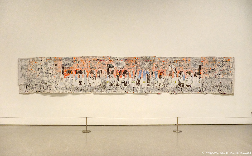
  2. as is said on the audio tour, #508

Picasso Sculpts The Next Dimension

This site is Free & Ad-Free! If you find this piece worthwhile, please donate via PayPal to support it & independent Art writing. You can also support it by buying Art & books! Details at the end. Thank you.

Written & Photographed by Kenn Sava (*- unless otherwise credited)

In the summer of 1980 I made 2 trips to New York specifically to see the Picasso Retrospective at Moma. Consisting of over 350 works (including the masterpiece “Guernica” in its farewell before being returned to Spain as Picasso requested in his will), it filled the entire building. I remember walking around the show in a daze. After the first floor, my brain had glossed over the way it does during mind-blowing sex. I staggered back out into the sunlight utterly overwhelmed…
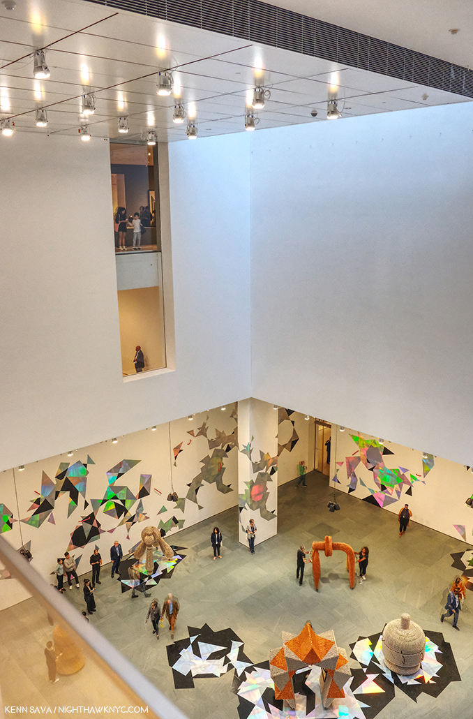
Here it ALL was. ALL of what “Modern Art” was, and is. What else did you need to see?

Being a working musician at the time, I didn’t give any thought to what it must have been like to have been an artist seeing it. It must have felt like I did the first time I heard Jaco Pastorius a few years before. As a bassist, I almost threw my Rickenbacker 4001 electric bass into Miami’s Biscayne Bay that night (for real)- there was almost nothing left to play on the bass. I sold my Rick and started playing the upright bass, double bass or bass violin as it’s variously known. Can you imagine being an artist and seeing this show? You must have left it feeling like I did after hearing Jaco-

“Now what? What’s left to do that he didn’t do?”

I was reminded of all of this while attending another Picasso blockbuster show at Moma today, 35 years after that one- Picasso Sculpture.

IMG_2666PNH

“Do not attempt to adjust the horizontal…the vertical…” or, your Absinthe Spoon.

Like many artists in all realms of the arts, and many “other” people (I’ll be there, too), Picasso may not be high on the list awaiting canonization as a saint. Yet, as an artist, his legacy is likely to astound and influence artists and art lovers alike for centuries to come. Had he “only” been a sculptor people would be talking about him being among the greatest, both in terms of his work and how many unique styles he invented or co-invented.

Hmmm…kinda like that Spanish painter. What’s his name? Oh yeah. Picasso.

It’s the name that stands like the gigantic monolith in “2001” in the middle of the road to the future of art, where everything that is or will be is built on the shoulders of what was.

IMG_2666P2NH

“Open the Pod Bay Doors, Pablo Ruiz.”

I feel for the artists of today, or tomorrow, who’s life and work lie along that road. What’s left? Indeed.

Even only viewing his work in one medium (if you can call it one)- sculpture, his achievement is almost beyond comparison. Amazingly, though his dad was an artist (a painter) AND an art teacher, Picasso had no training in sculpture. Perhaps this is why, after he found his footing in it, his work quickly achieved a freedom that had never been seen before. He had nothing to “unlearn.”

Then, he began his journey towards freeing his vision. That is what we see here.

Whether working in “traditional” materials (especially bronze- more on that in a moment), or using things that had never been used in sculpture before, what’s now called “found” materials, his endless creativity, often in this show in interpreting the human form, astounds. In spite of the fact that there may be more monographs on Picasso than any other artist of the 20th Century much of what’s on view was new to my eye. Unlike any art monograph yet published (Coco Rocha’s app “Study of Pose” possibly excepted), you can get a full 360 degree view by walking around almost all of the pieces on display on Moma’s 5th Floor. As much as anything else it is, sculpture is a 360 degree medium.

Scale makes no difference to the impact these works have, either. Some are a few inches tall, moquettes (models) for what became very large/monumental public sculptures, like the one in the Daley Center, Chicago. Thought startlingly tiny for those who have seen the monumental versions, they have a different effect, yet one that is every bit as compelling. They reminded me of the amazing show of Bernini’s original small clay models of many of his monumental masterpieces at TM a couple years ago. Like architects creating architectural models (and there happens to be an interesting show of them on the 2nd Floor in the drawings galleries), Picasso, also, proves to be a master of scale.

What would Michelangelo think?

The first thing Picasso changed was the definition of the word “sculpture.” Truth be told, a number of these pieces are not “sculpture,” in the traditional sense. Some are collages (an art form he co-invented), multi-media works, a few are constructions, plastic arts, and yes, some are traditional sculptures. But, as they are 3 dimensional works, they are being called sculpture under a broader than traditional definition.
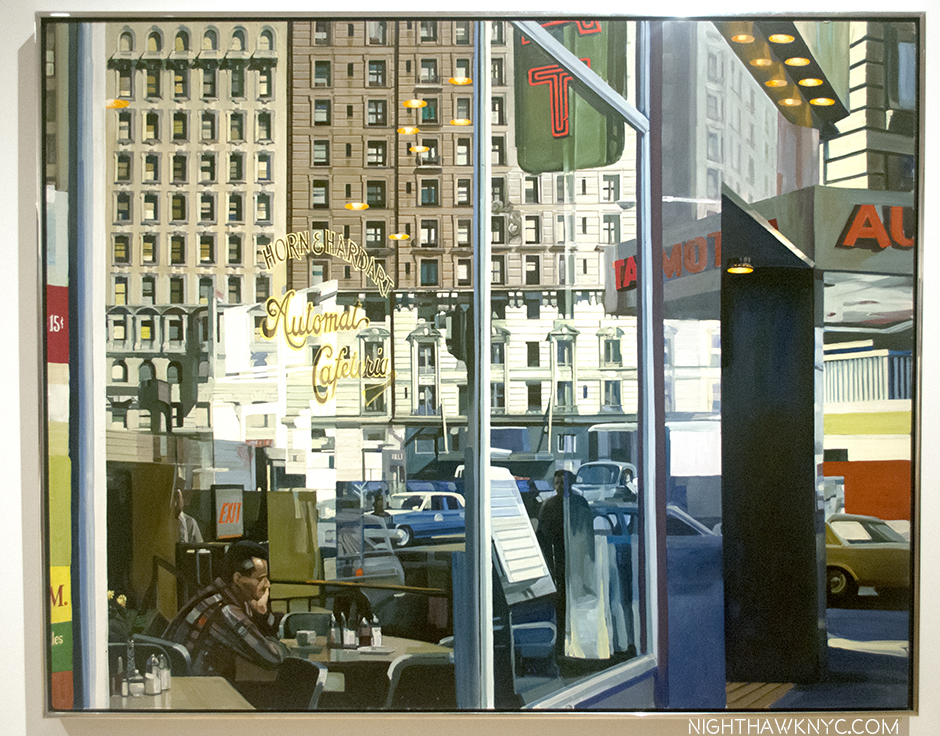
IMG_2666PNH3

Click, to enter another dimension.

The second thing he changed was the materials that could be used (including every day things like gloves, sand, upholstery fringe, absinthe spoons, nails, tin plate, and wire – all by 1930).

Most compelling for me among the traditional materials were the bronzes Picasso made while living in Paris during the Nazi occupation. They constricted bronze to military use only, but Picasso brazenly managed to get enough of it to  continue to work in it during the occupation. He, and his collaborators, no doubt risked death making these works in, of course, a style of art the Nazis had already branded “degenerate.” For me, the examples displayed are among the highlights of the show. (Since my posts to this point have been about shows that have ended, or were about to, and this one recently opened and runs until February 7, 2016, I’m not posting pics of the work to allow you to see it for yourself, which you should. Photos are allowed, and I’ll probably post some later.)

But, of course, the changes Picasso made didn’t end there. His creativity knew no bounds, and no one “style” could hold him for long.
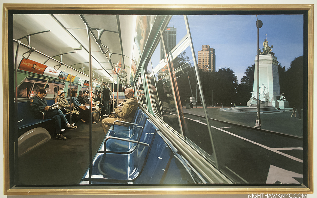
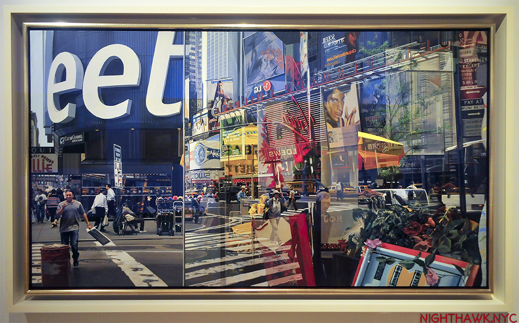
IMG_2666PNH4


Cubism, which he co-founded, the style of painting that plays with dimensional perception, in 2 dimensions, has to rely on different techniques as sculpture. This may be why this section of the show is more interesting than it is filled with his best work. In the case of the work on view, it’s more an appendage to the paintings.

As we move to the next chronological gallery, it seems that as Picasso moved ahead from Cubism, he moved past dimension to dismantling the human body in ways no one- not even the surrealists had considered. In these works, starting with his wire figures, a whole nother world suddenly opens.

It’s as if Picasso had finally achieved the goal he was after when he (Braque, Gris and Leger) started Cubism- to achieve an entirely new way of seeing that existed beyond the 3 dimensions he was “bending” with Cubism, one that existed only in the dimension of his imagination.

After this breakthrough, Picasso was finally free. He then proceeded to dip in and out of the styles he had created, or elements of them, as parts of the larger language he had compiled over all these years by the time of his oft misunderstood later works, and often in the service of depicting his current muse in ways that only he could see her.

And then? We could, too.

IMG_2666P5

Soundtrack for this post- “Kind Of Blue” by Miles Davis- the whole album, released in August, 1959. I’ve often called Miles “the Picasso of Jazz.” The similarities in their careers, personalities, bodies of work are fascinating and compelling.

NighthawkNYC.com has been entirely self-funded & ad-free for over 8 years, during which 300 full-length pieces have been published! If you’ve found it worthwhile, PLEASE donate to allow me to continue below. Thank you, Kenn.

You can also support it by buying Art, Art & Photography books, and Music from my collection! Art & Books may be found here. Music here and here.

Written & photographed by Kenn Sava for nighthawknyc.com unless otherwise credited. To send comments, thoughts, feedback or propositions click here. Click the white box on the upper right for the archives or to search them. Subscribe to be notified of new Posts below. Your information will be used for no other purpose.