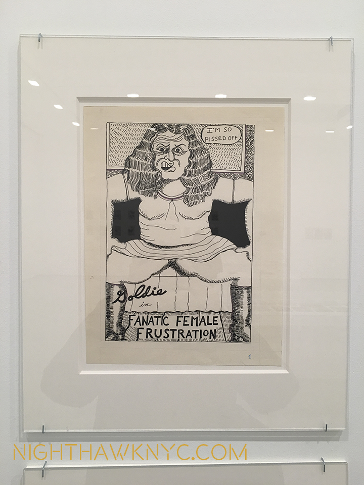
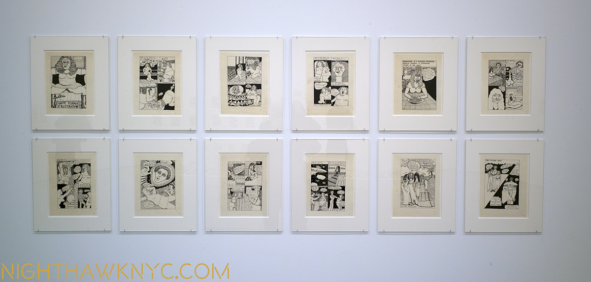
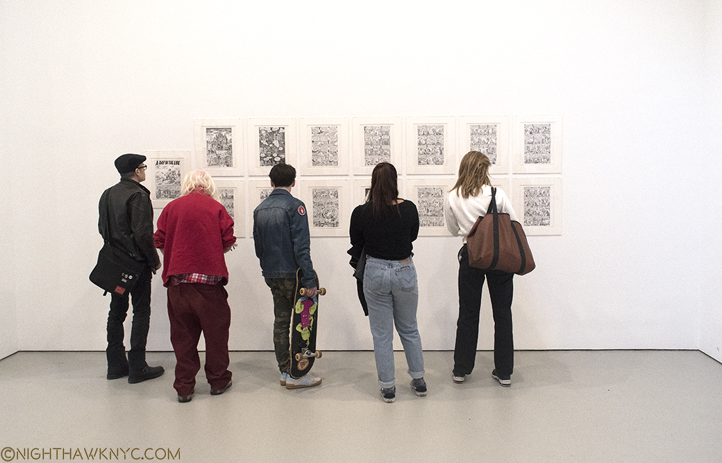
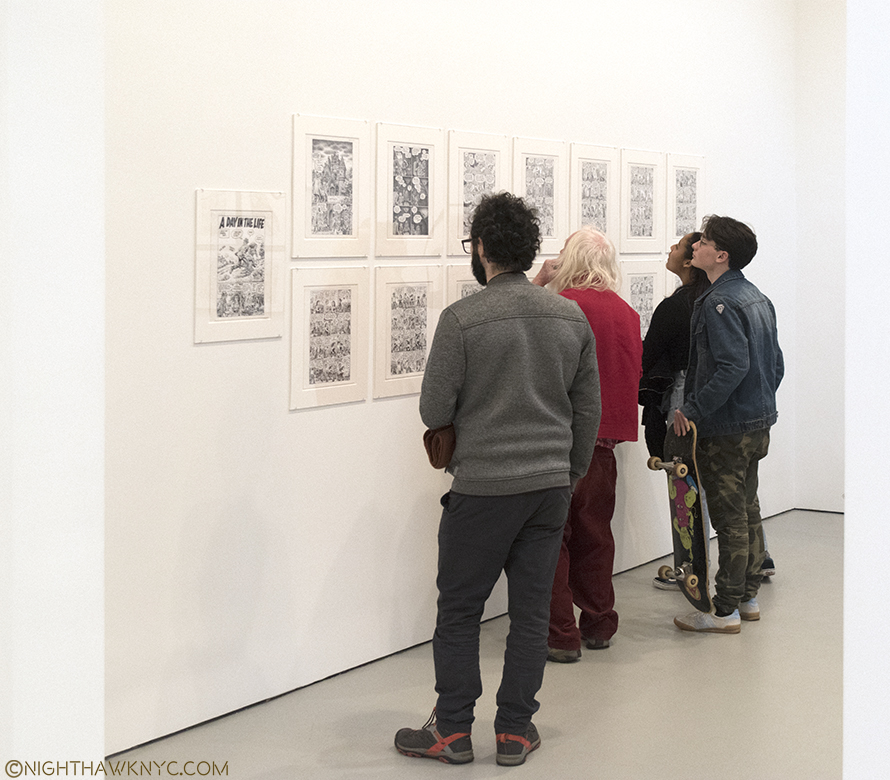
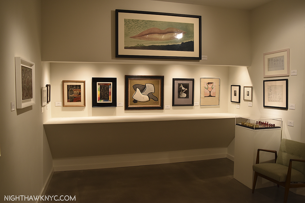
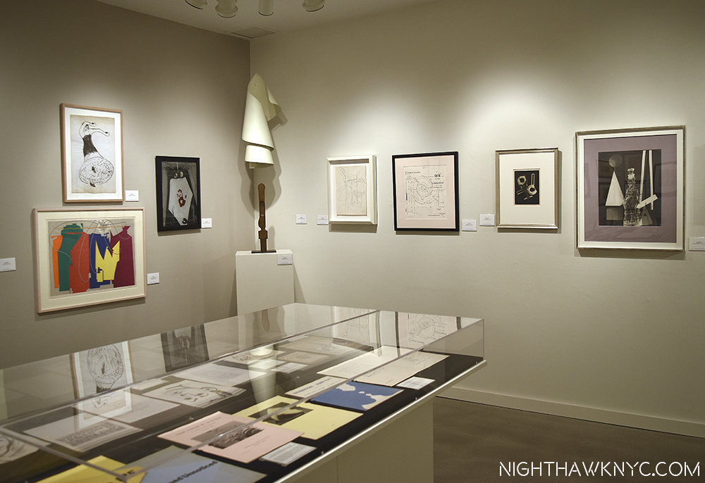
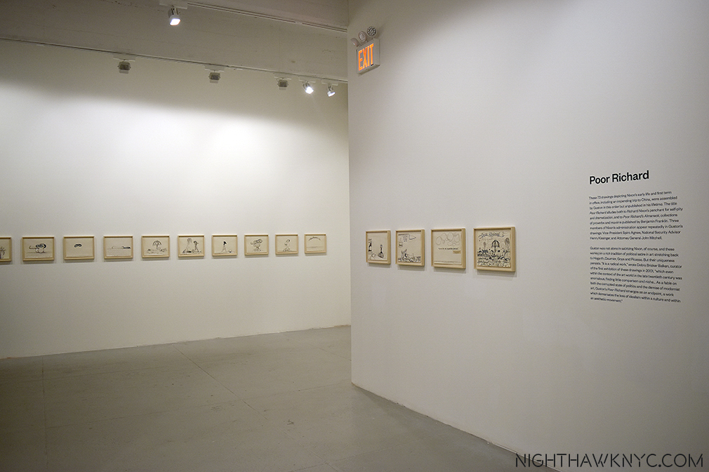
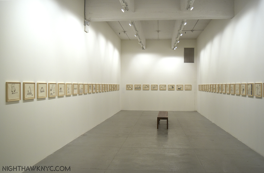
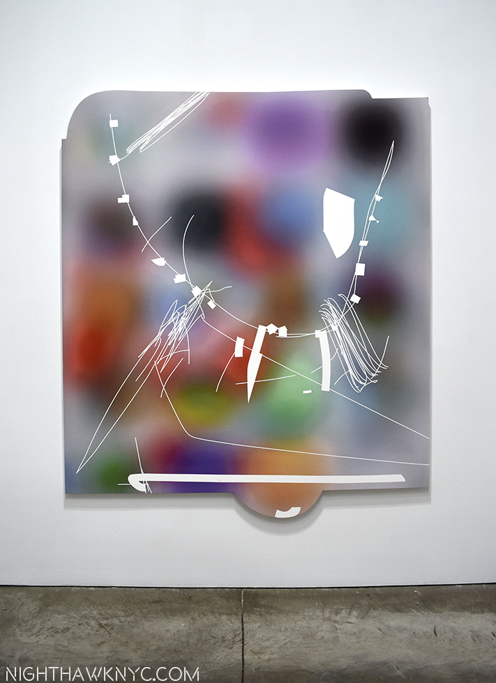
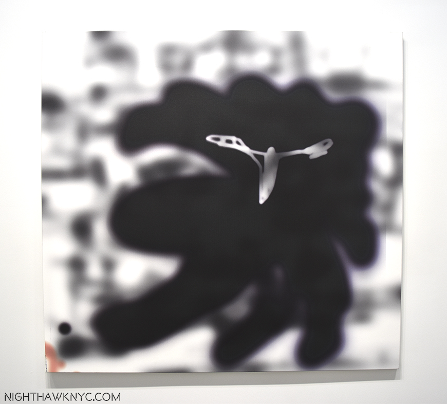
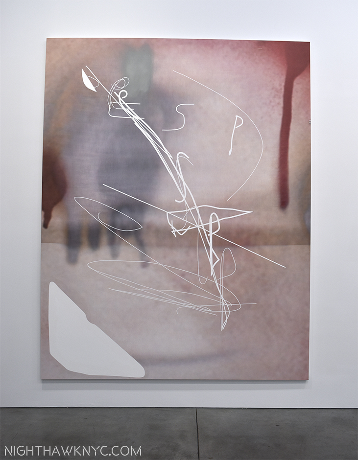
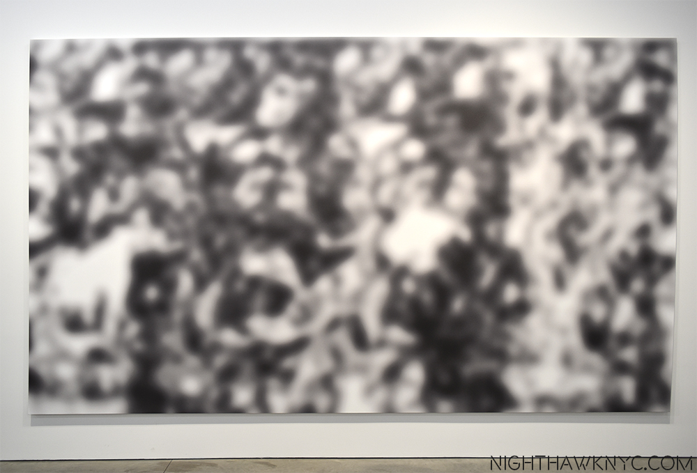
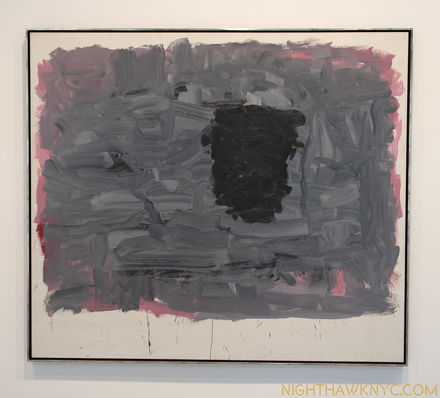
Philip Guston, George Segal, Jeffrey Gibson, Njideka Akunyili Crosby, Wade Guyton: NoteWorthy Shows, Summer 2023

This site is Free & Ad-Free! If you find this piece worthwhile, please donate via PayPal to support it & independent Art writing. You can also support it by buying Art & books! Details at the end. Thank you.

Written & Photographed by Kenn Sava

What do Philip Guston, George Segal, Jeffrey Gibson, Njideka Akunyili Crosby and Wade Guyton have in common? At least three things. One, they’re all Artists. Second, they each had a NoteWorthy Show up in NYC this summer. Third, I bring them together in my look at each of those shows here as part of my coverage of the busiest summer in the NYC Art world since before the pandemic began.

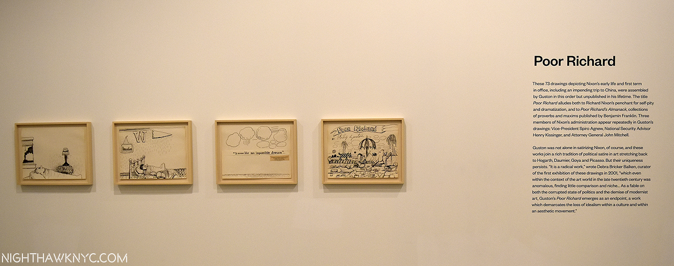
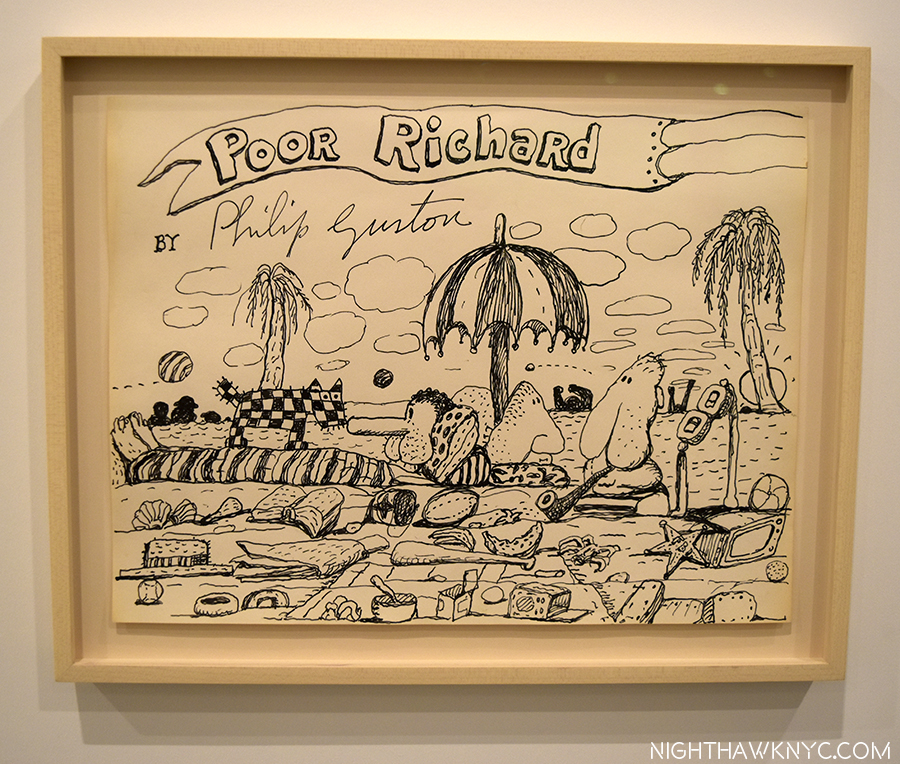
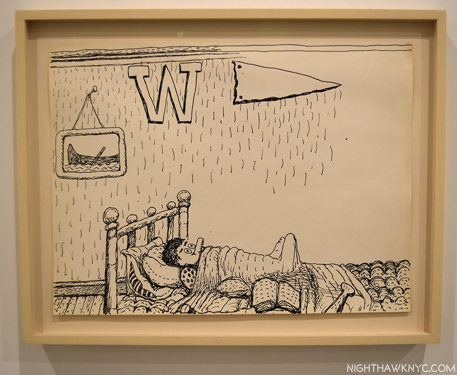
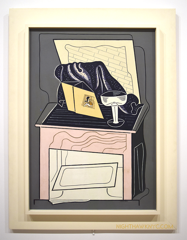
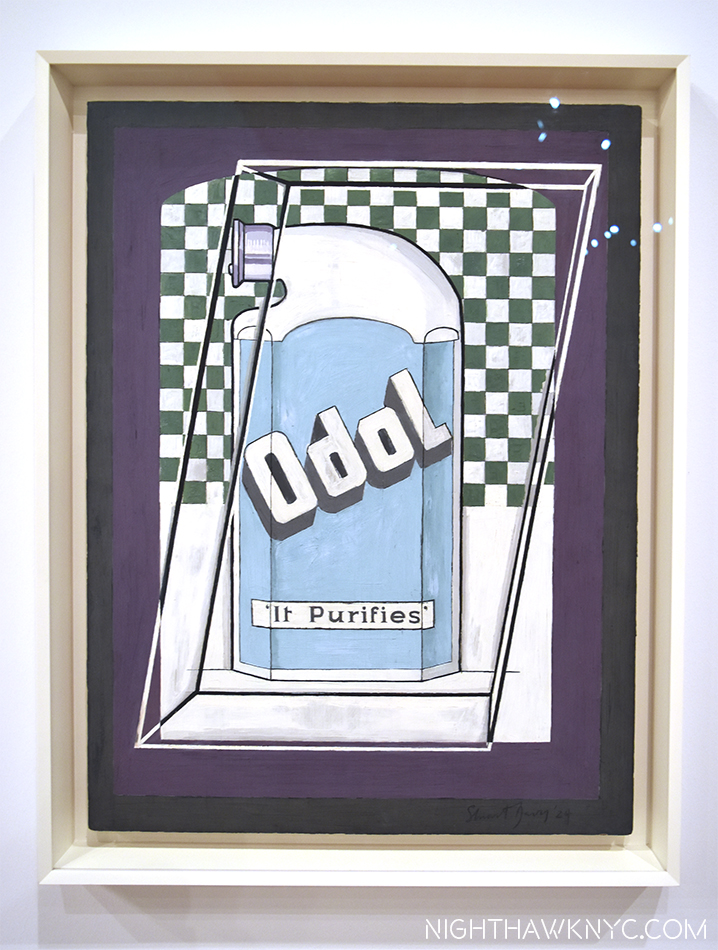
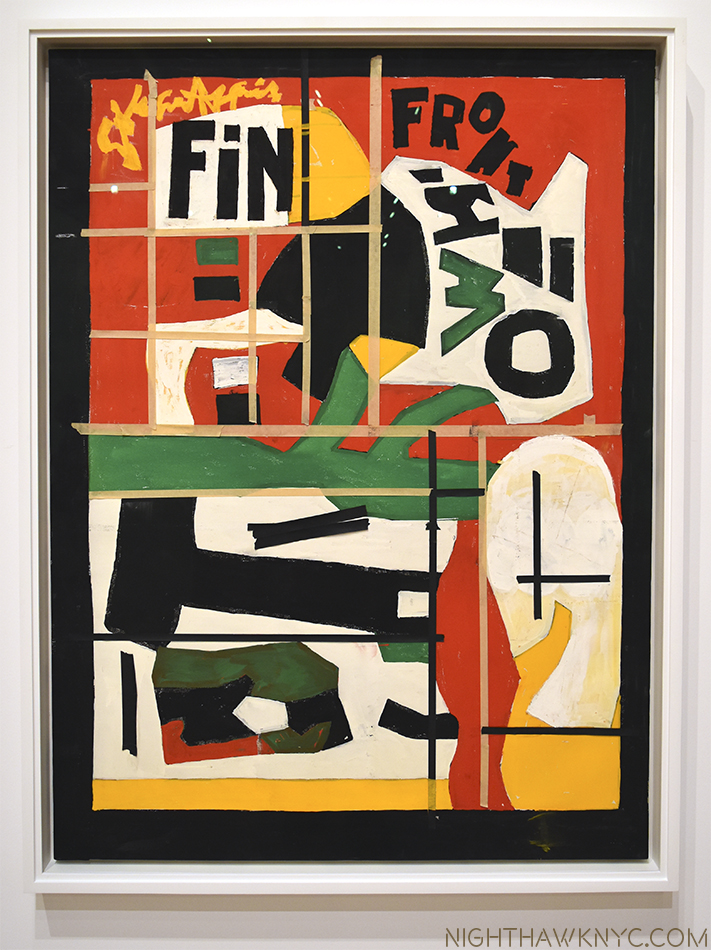
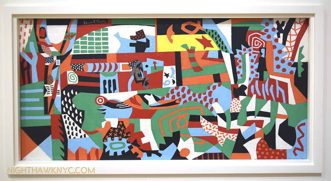
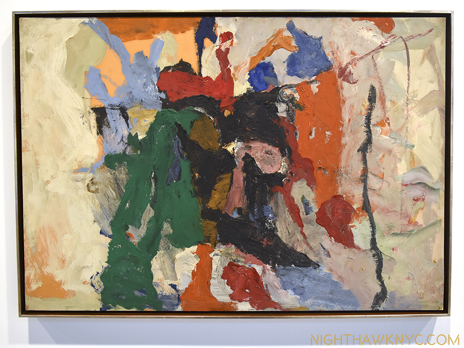
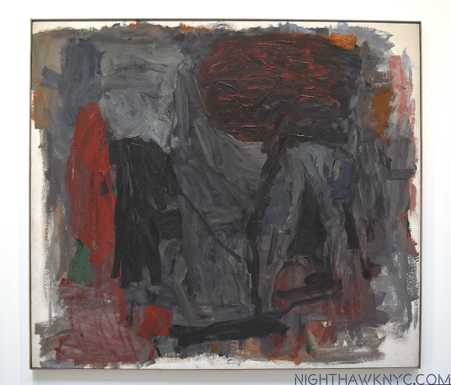
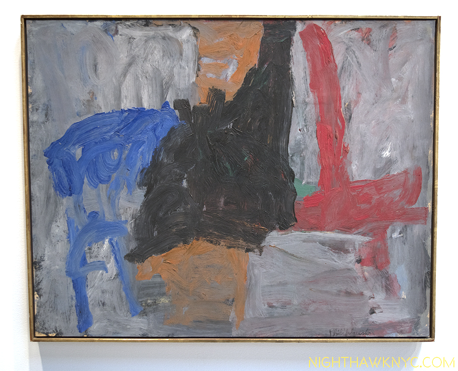
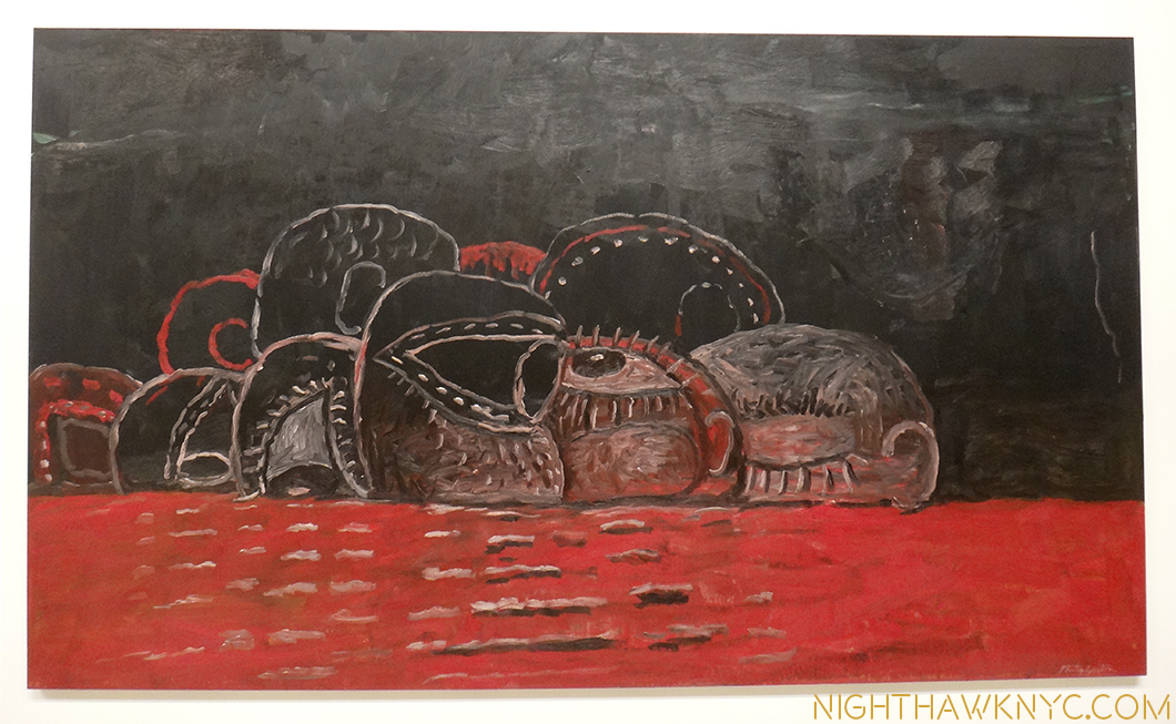
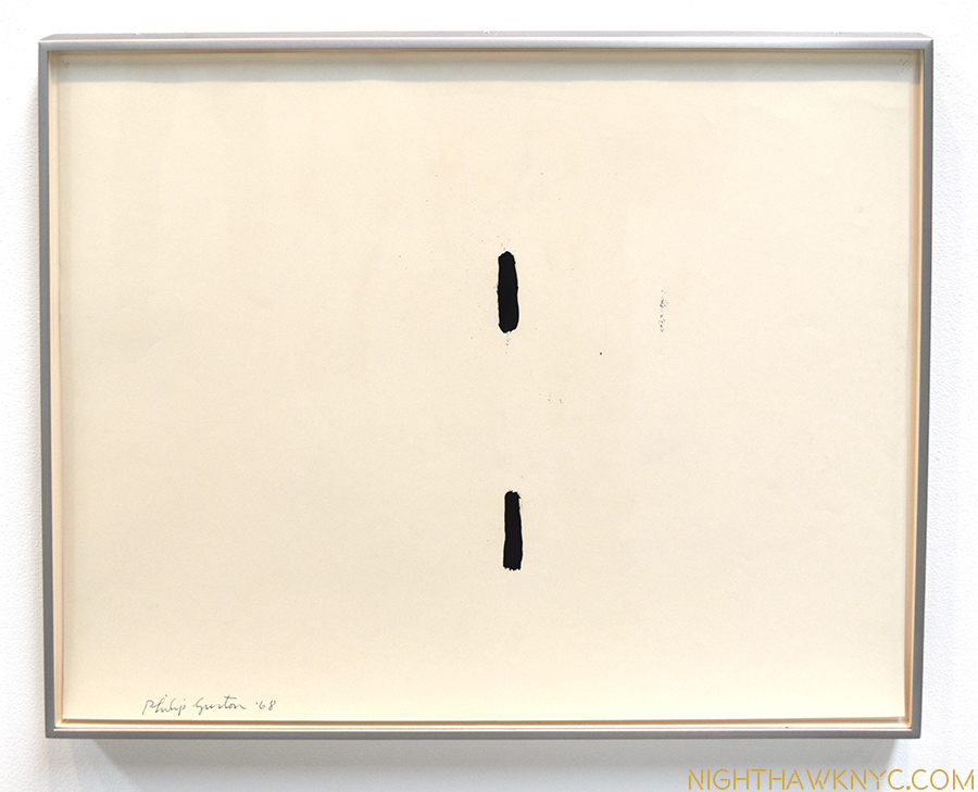
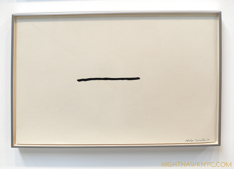
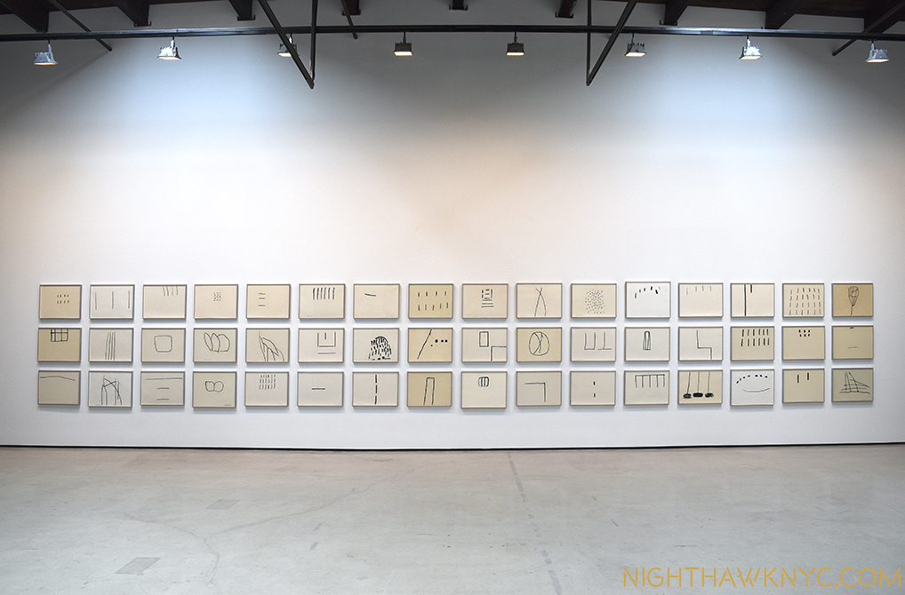
Philip Guston: What Kind of Man Am I? @ The Metropolitan Museum

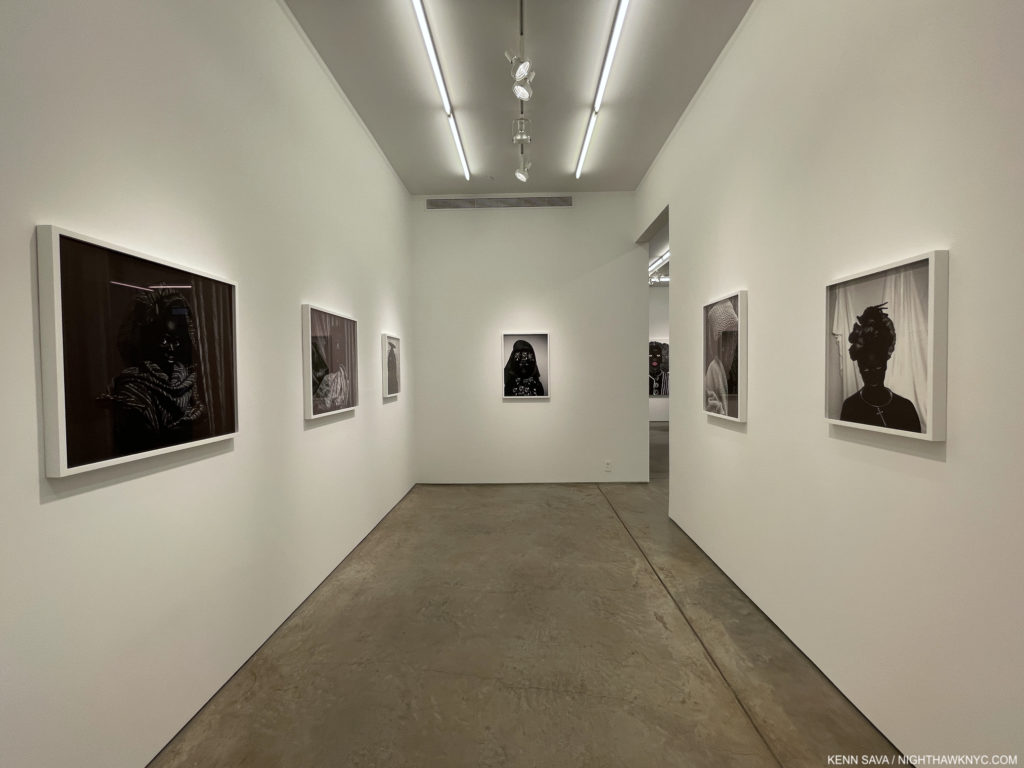
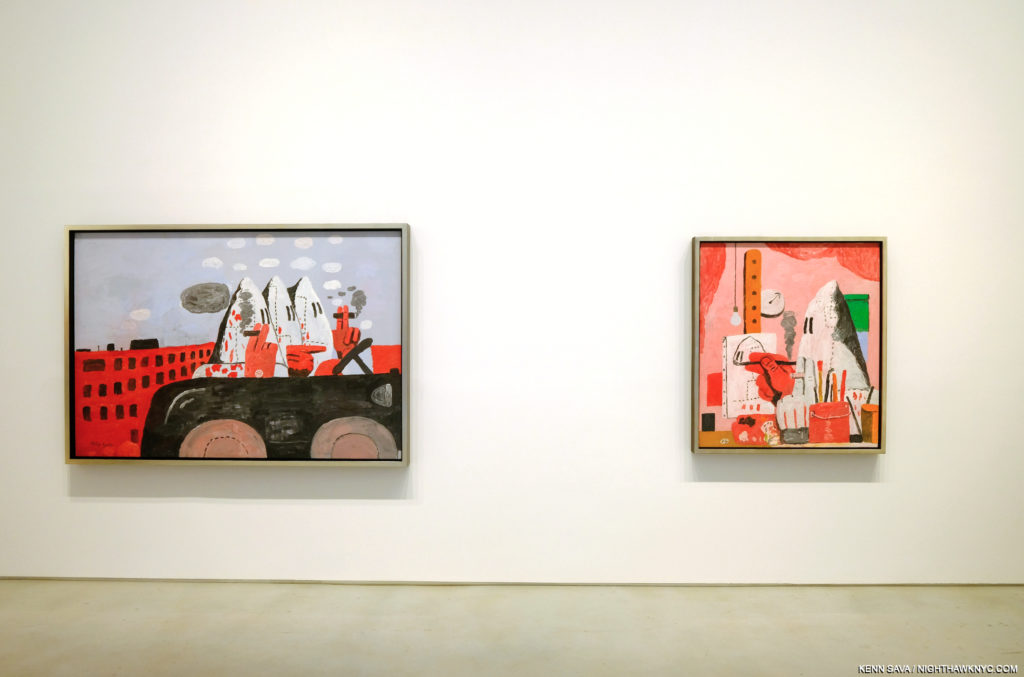
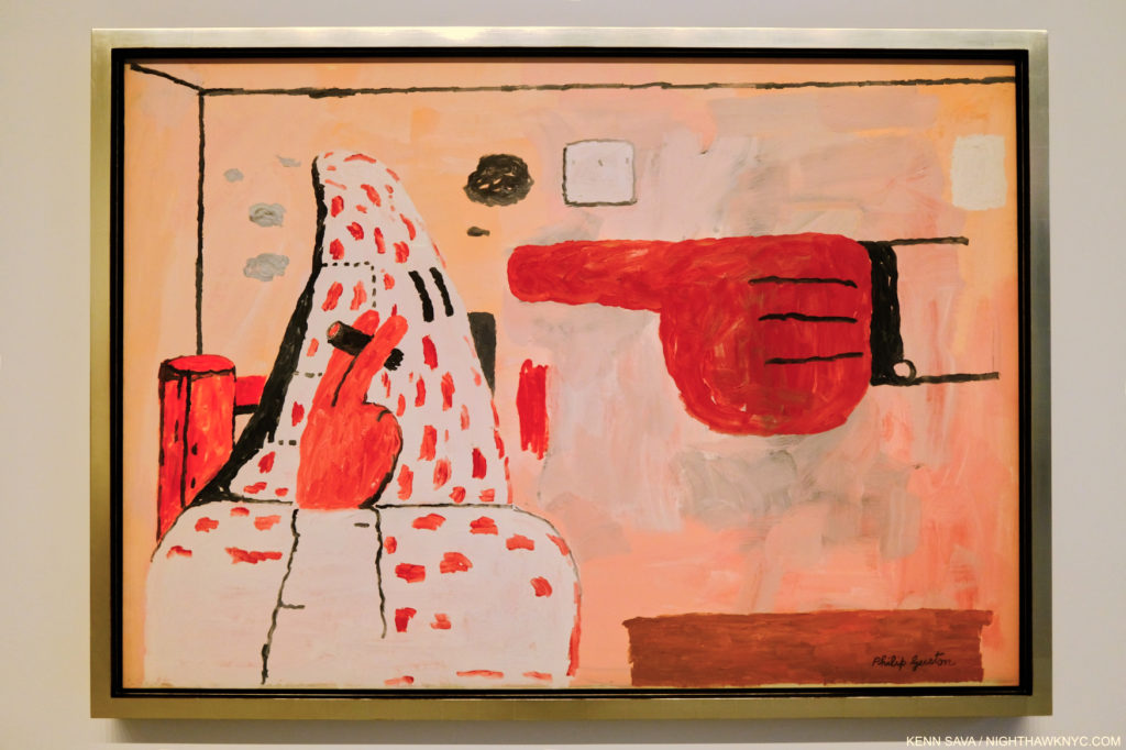
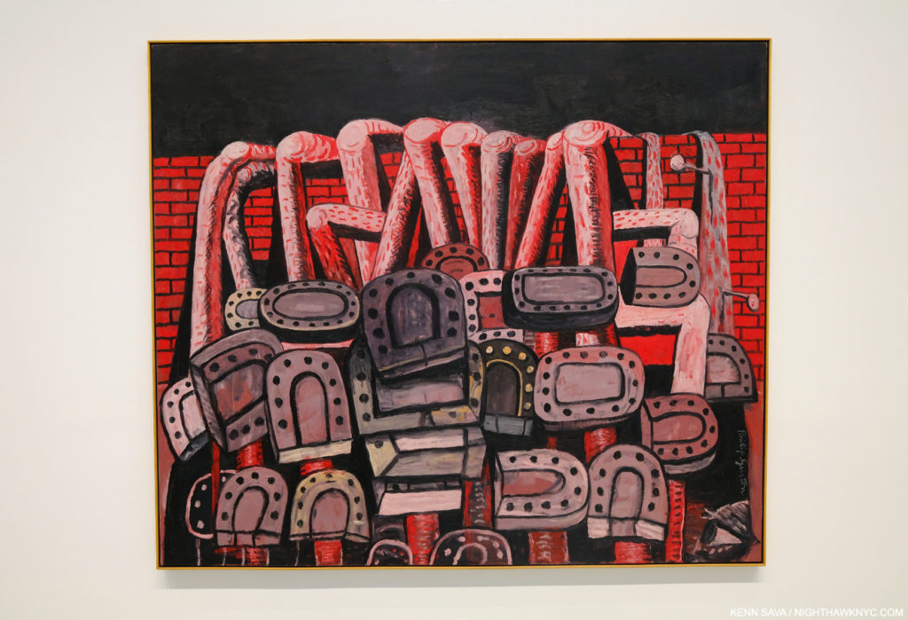
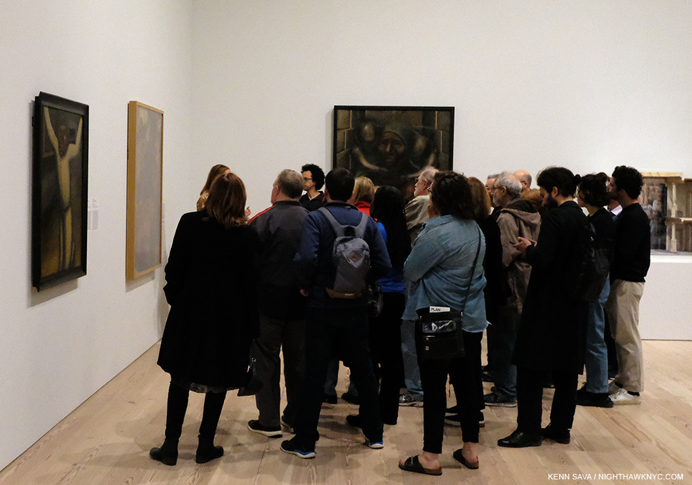
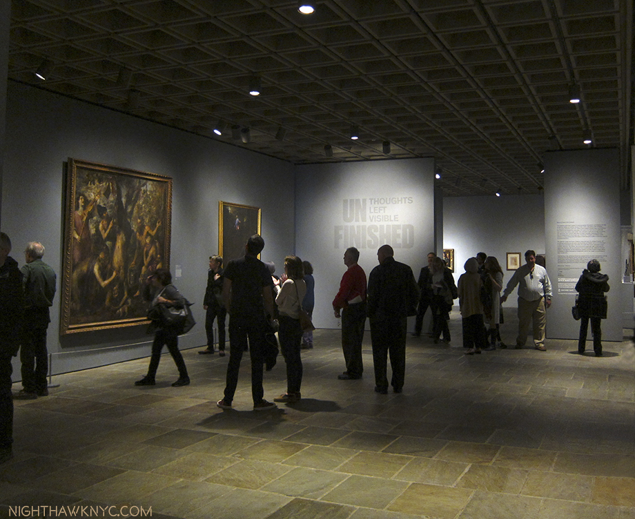
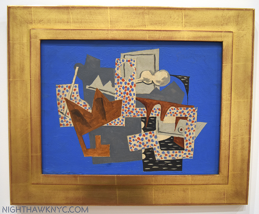
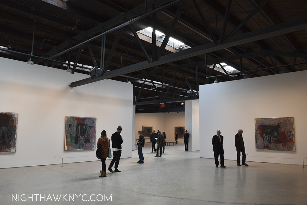
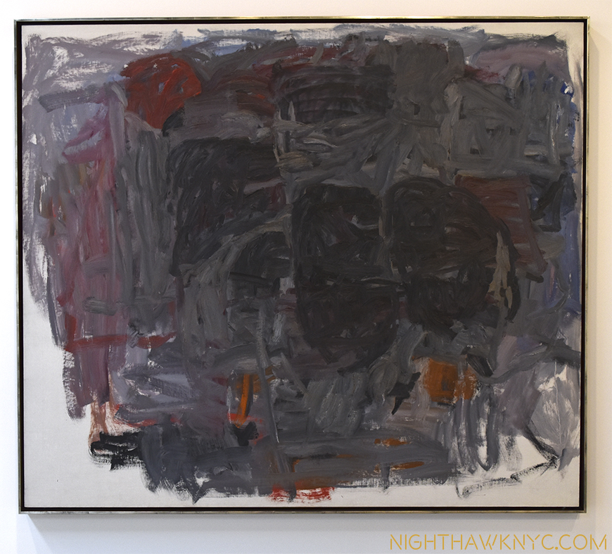
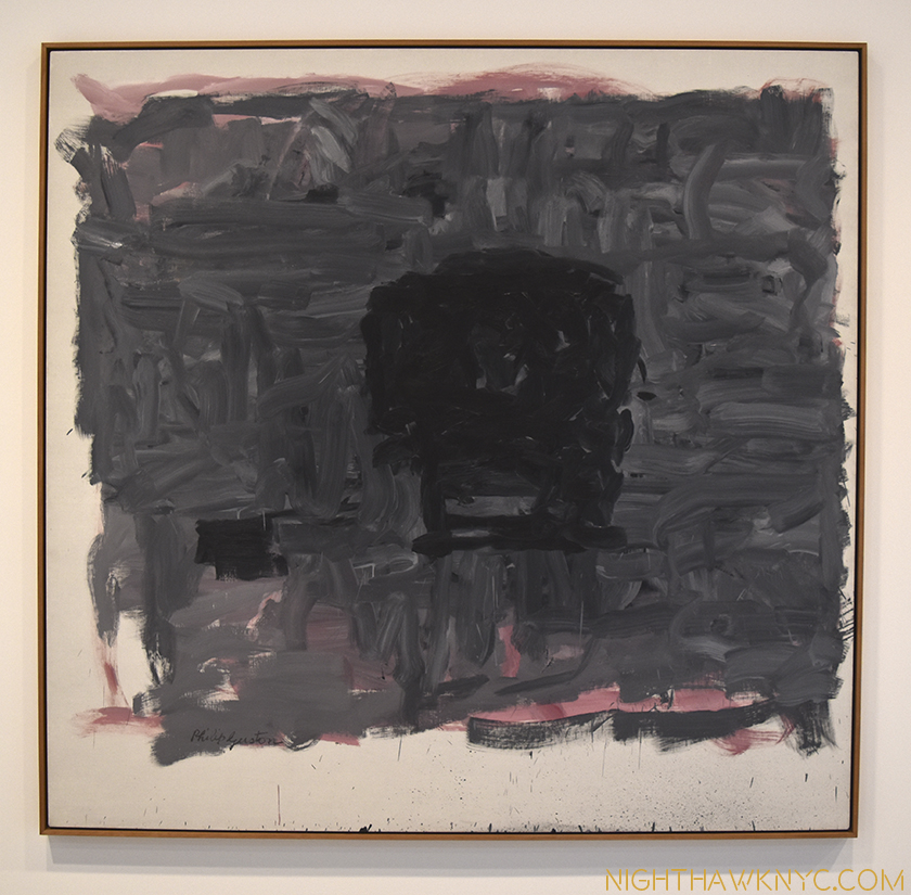
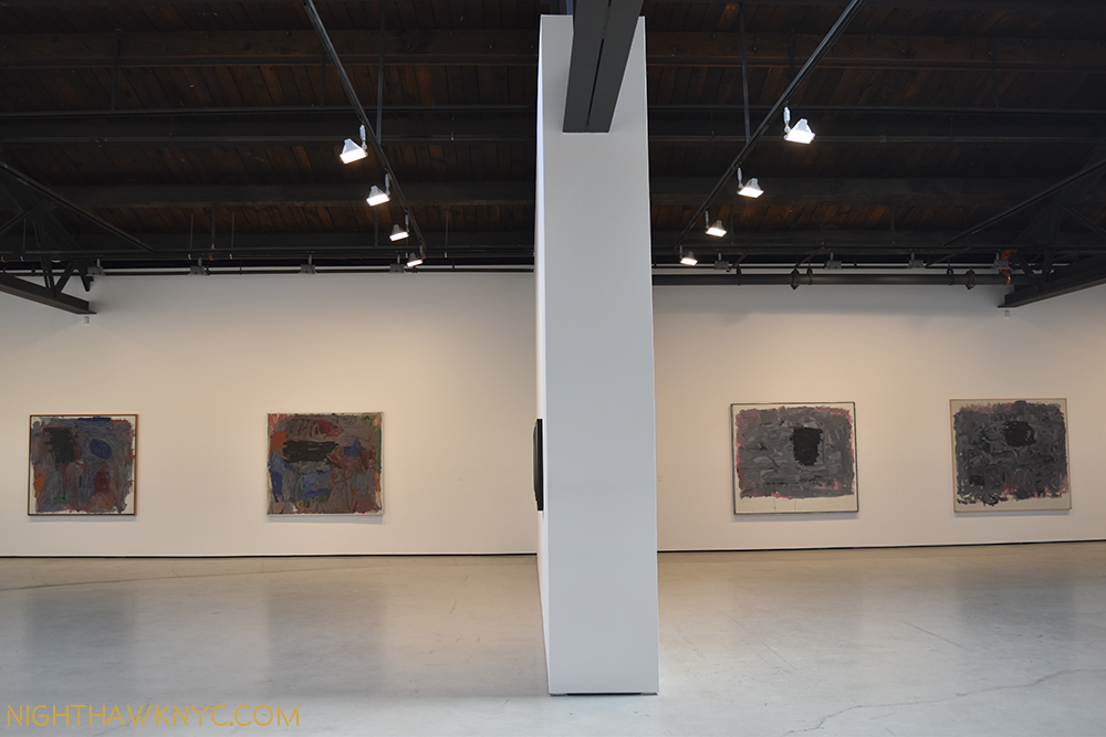
Installation view of 5 of the 8 works on view in this gallery gleaming under the just completed skylight project. Another work, one of his “abstractions” from the 1950s, which I wrote about here, was hung outside the door in the corridor to the Modern Wing to my right. Click any Photo for full size.

In Part 3 of my series on Edward Hopper’s New York I wrote about the Whitney Museum’s handling (mishandling?) of the extraordinary Jo Hopper Bequest in 1970. I mentioned that it was a lesson for other Artists going forward. In December, 2022, word came that Musa Mayer, daughter of Philip Guston (1913-80), had decided to donate 220 works by her father to The Met. As an American Artist (born in Canada), there’s little doubt the Whitney Museum of American Art (who currently own 3 of his Paintings, and 6 Drawings) was considered for this gift at some point (I surmise). Did their handling of the Jo Hopper Bequest (in which they the Whitney THREW OUT virtually all of Jo Hopper’s Art, and have recently sold a notable Edward Hopper Painting), enter into her decision?

Musa Mayer, the lady responsible for this extraordinary gift, discusses the finer points of one of her father’s Nixon Drawings @ Hauser & Wirth in January, 2017.

I don’t know. Ms. Mayer opted to make this exceptional & vitally important donation to The Met. 

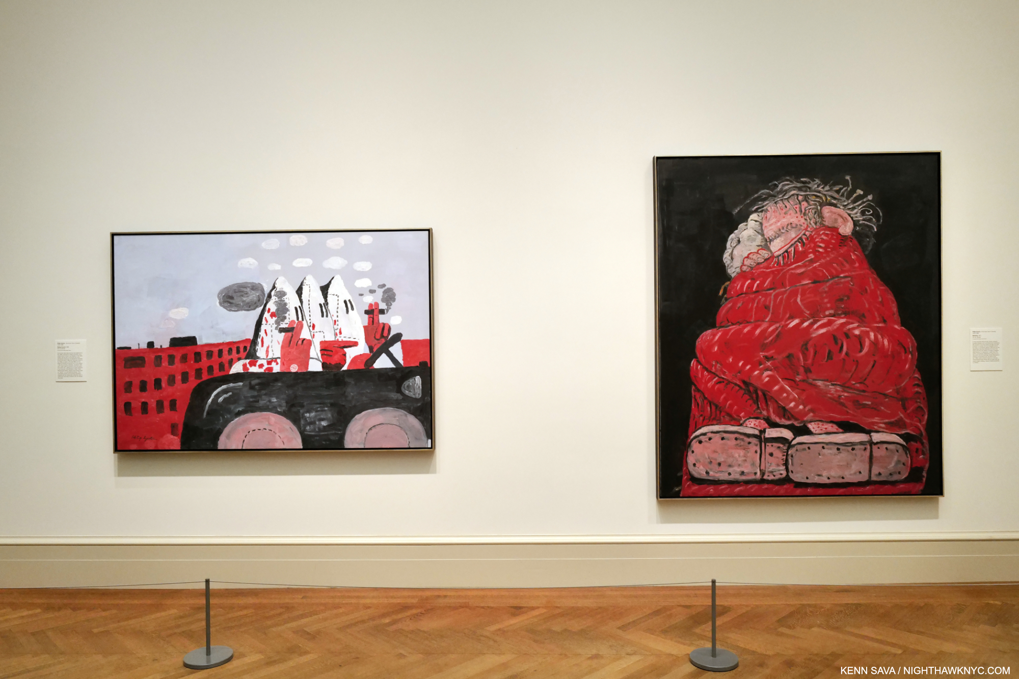
Riding Around, 1969, left, and Sleeping, 1977, right, both Oil on canvas.

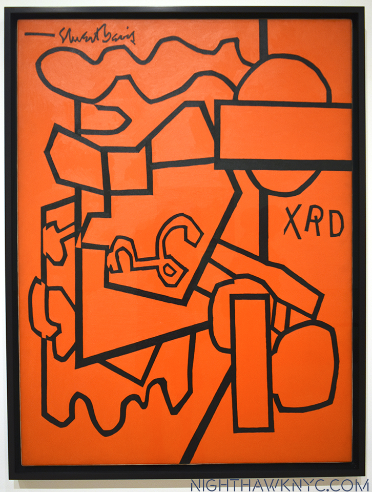
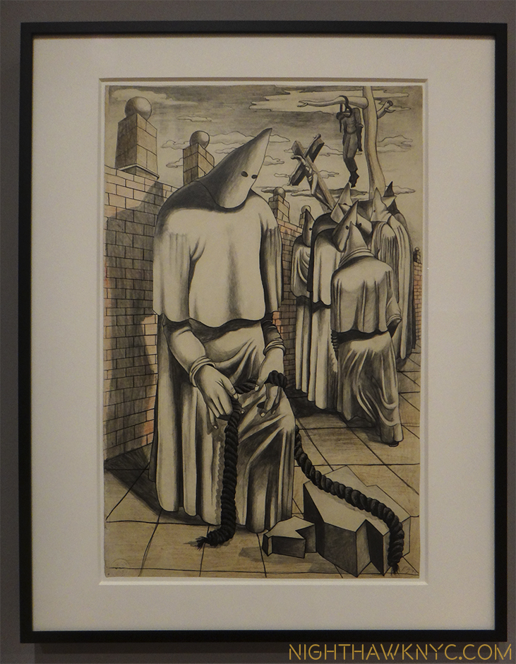
To mark the occasion, The Met mounted Philip Guston: What Kind of Man Am I?, a concise, but powerful show of 8 Paintings. The show focused on the last decade of the Artist’s work from 1969 to 1980 and includes nothing but major works, in my opinion, including one of his “Klan” Paintings (which I wrote about in depth here). His last decade has gotten more and more attention as time has passed, after initially puzzling many viewers. Installed near the Impressionist and Van Gogh galleries, and not in the Modern & Contemporary Galleries across the hall (where at least one Guston is usually on view), I took that as an indication of The Met “saying” that Philip Guston is an Artist for the ages. I bet he’d be proud. 

George Segal: Nocturnal Fragments @ Templon

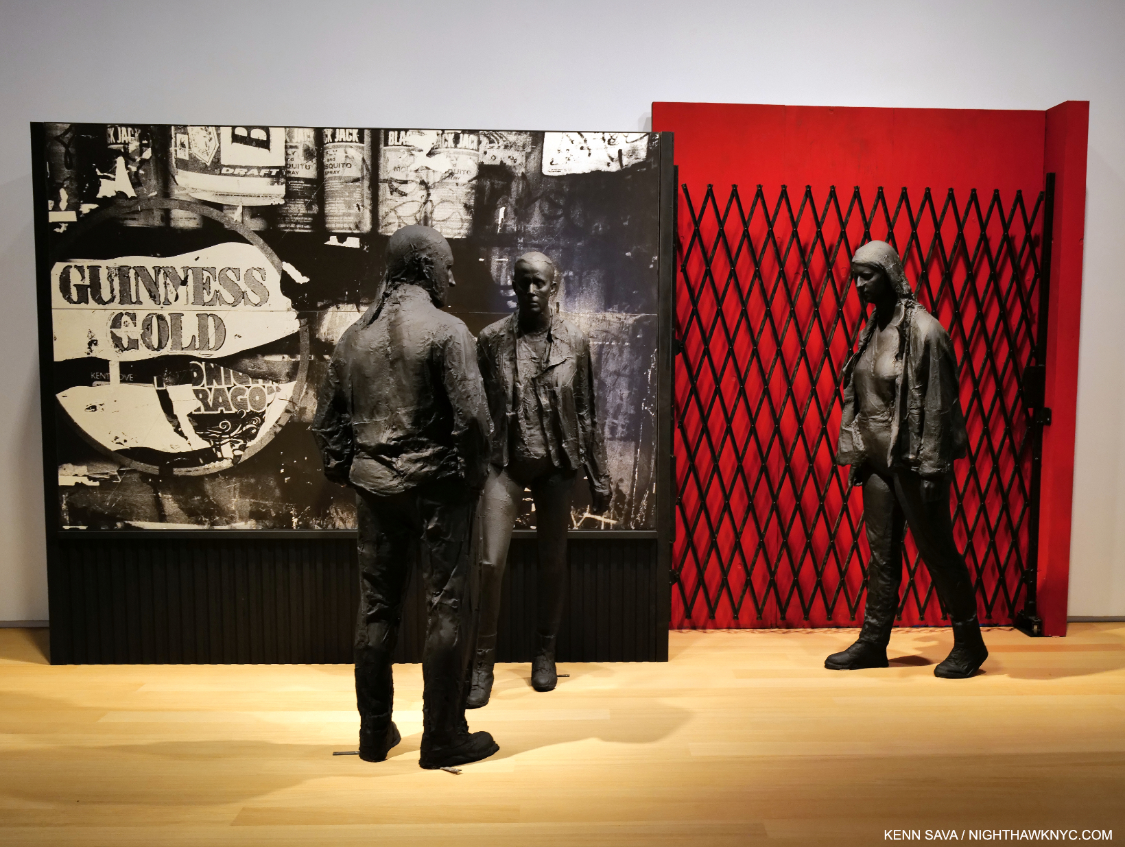
Guiness Gold, 1995, Plaster, wood, acrylic, silverprint, 96 x 64 x 45 inches.

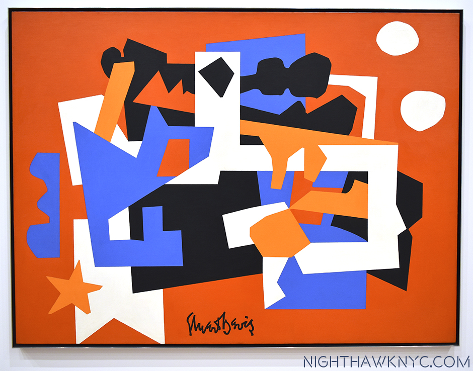
I can’t remember the last George Segal show I saw- if I’ve ever seen one. In fact, Mr. Segal (1924-2000), a contemporary of Philip Guston, may be best known to many New Yorkers through his Public Art installed in Port Authority Bus Station and his Gay Liberation Monument in Sheridan Square. Otherwise, it seems he has fallen into eclipse since he passed. So, George Segal: Nocturnal Fragments at Templon was a welcome surprise and an eye-opener. 

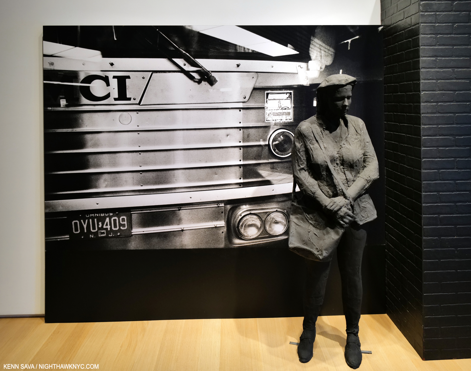
Bus Station, 1995, Plaster and mixed media, 96 x 175 x 33 inches.

Mr. Segal is, perhaps, best known for his meditative Sculptures, but he was also a Painter and installation Artist. To this point, I’ve only seen his work in public settings, where the Artist places his figures in the existing surroundings. In Nocturnal Fragments we get to experience the full George Segal “effect” in environments of his own creation. It’s something no other Sculptor does and it works wonderfully here.  The show provides a wonderful opportunity to experience the full effect of Mr. Segals’s skill over a generous period of time on two floors. I found it a breath of fresh air.

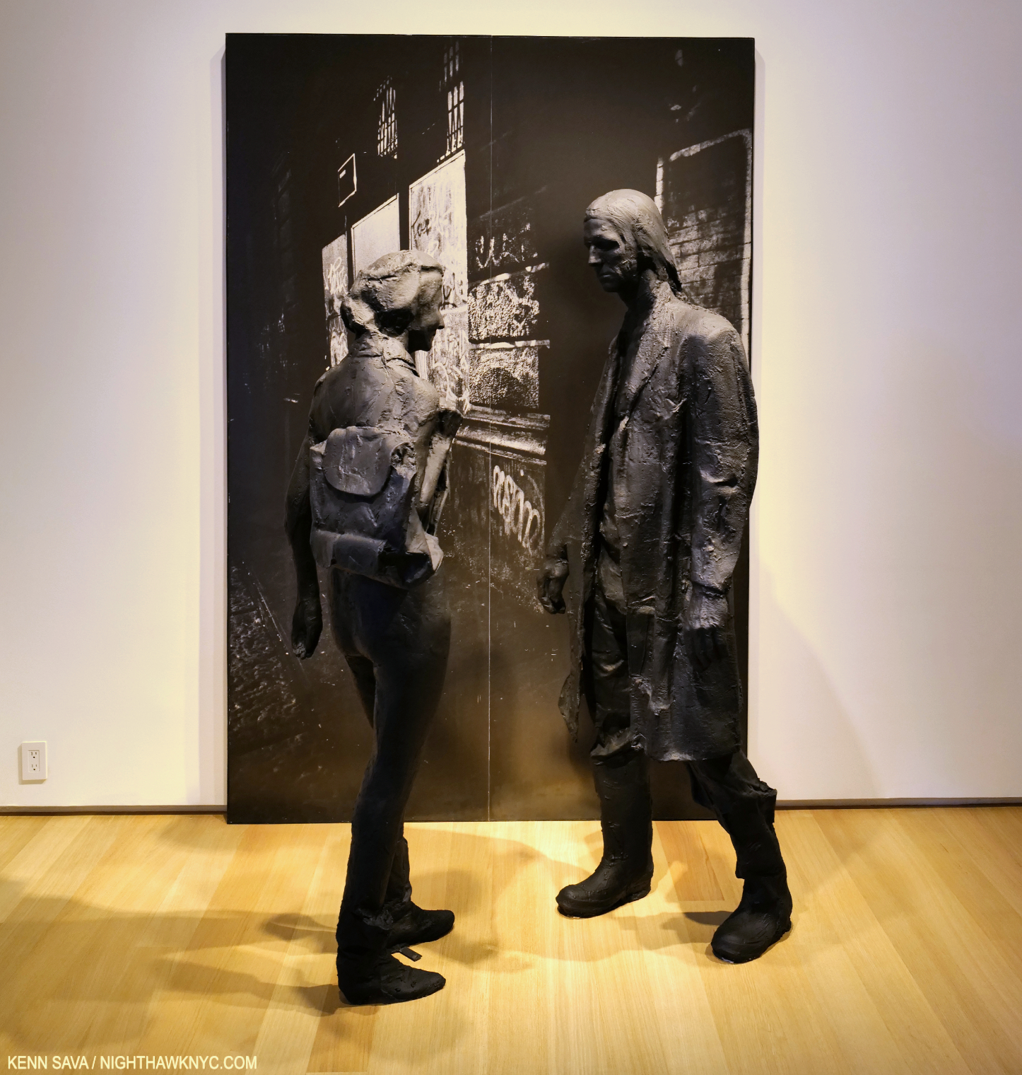
The Encounter, 1996, Plaster, wood, acrylic, silverprint 96 x 64 x 45 inches.

“Discovered” in a so-called “pop” Art show in 1962, Nocturnal Fragments shows, again, that Mr. Segal is much more and his work long ago outlived that tired box– if it was ever even in it!

Blue Woman Sitting on a Bed, 1996, Plaster, paint and wood, 96 x 96  x 83 inches. A different take on a scene that Edward Hopper mined often.

An influence on Duane Hanson and Ron Mueck, George Segal’s work has a unique mystery that reminds me more of Rodin than it does either of those two fine Artists. It seems to me it has more than held up since his passing, which should lead to his work being seen more often. I think a whole new generation of Art lovers will find much to like in George Segal’s work. 

Jeffrey Gibson: Ancestral Superbloom @ Sikkema Jenkins

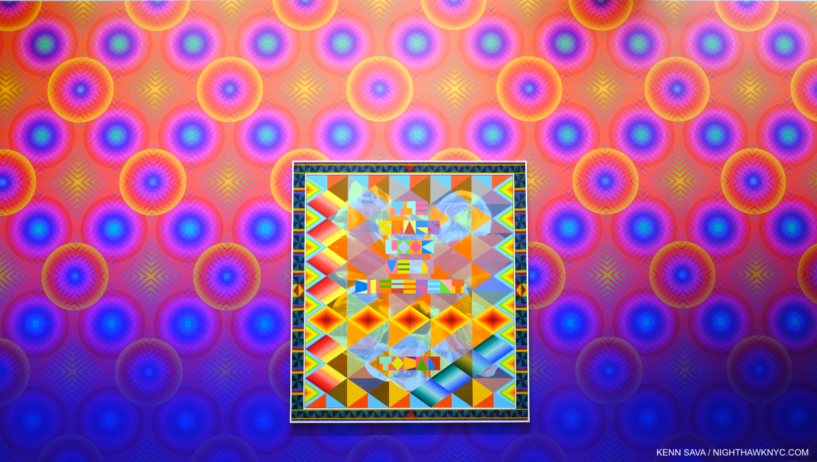
Have you ever seen a Painting shaped like this? SOMEONE TO WATCH OVER ME, 2023, Acrylic paint on elk hide inset in custom wood frame, 103 x 69 x 5 inches, hanging on the Artist’s Wallpaper (Untitled, I was told)  which had a 3-D effect up close.

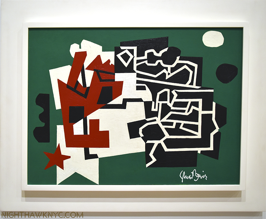
Jeffrey Gibson: Ancestral Superbloom was one of the most beautiful shows of recent memory, and aptly titled. A virtual supernova of color, most of the pieces centered on a quote from a popular song lyric, turning it into something of a mantra. 

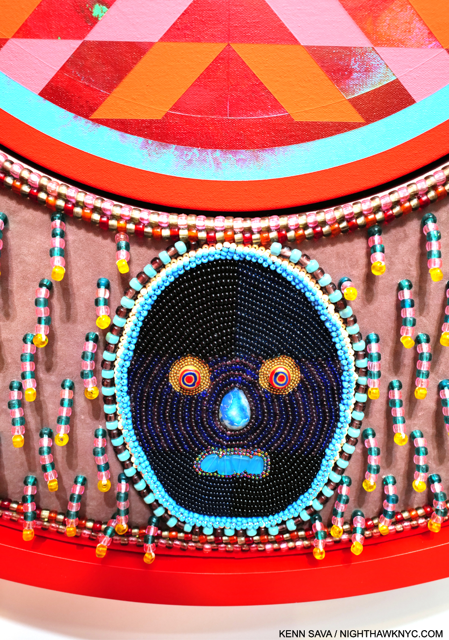
THINGS WILL NEVER BE THE SAME, 2023, Acrylic paint on canvas inset in custom frame, acrylic velvet, acrylic felt, glass beads, plastic beads, vintage pinback buttons, druzy crystal, artificial sinew, nylon thread, cotton canvas, cotton rope, 60 x 50 x 5 1/2 inches

His gifts with color are obvious at a glance, but it’s the clarity of his compositional conceptions and how extremely well he executes them that impress me, along with his fresh approach to, well, everything.

Detail of THINGS WILL NEVER BE THE SAME.

His work is incredibly detailed, requiring and rewarding viewers to work their way around each piece, with each detail adding to the richness and intricacy of the experience.

The show coincides with the publication of An Indigenous Present, a NighthawkNYC NoteWorthy Art Book of 2023, , conceived by Mr. Gibson, which features the work of 60 Indigenous Artists. It’s the best introduction to/overview of this work I’ve seen- an amazingly rich collection. 

THE STARS LOOK VERY DIFFERENT TODAY, 2023, Acrylic on canvas, glass beads, artificial sinew, inset to custom wood frame, 88 x 80 inches. A line from David Bowie’s “Space Oddity.”

Meanwhile, Jeffrey Gibson: Ancestral Superbloom continues to add to his stature and importance.

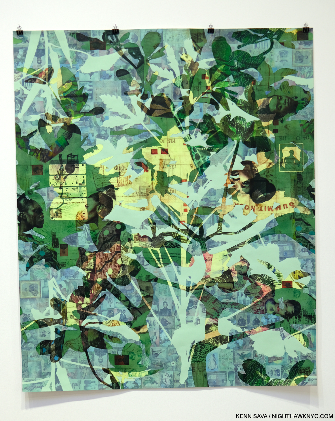
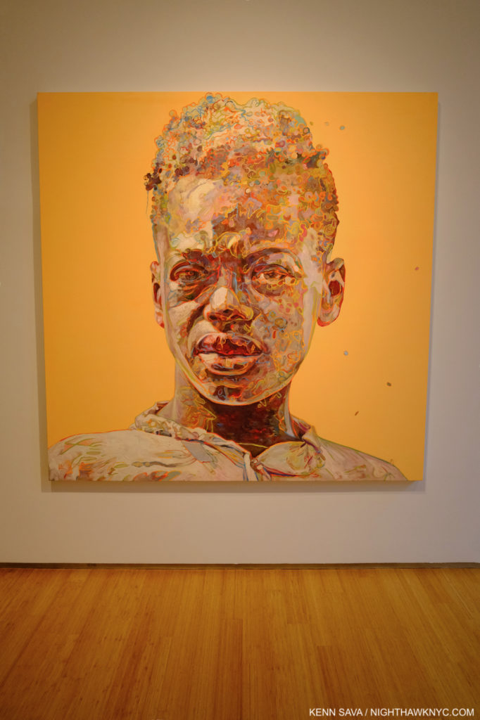
Njideka Akunyili Crosby: Coming Back to See Through, Again @ Zwirner

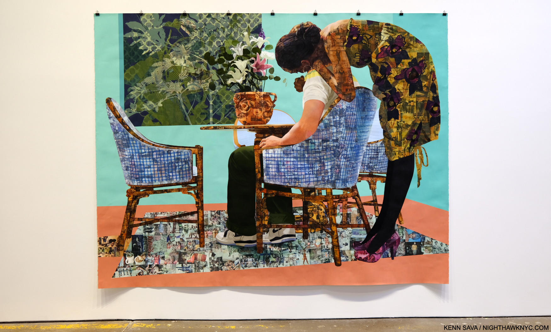
Blend in – Stand out, 2019 Acrylic, colored pencil, charcoal, and transfers on paper 95 3/4 x 123 3/4 inches

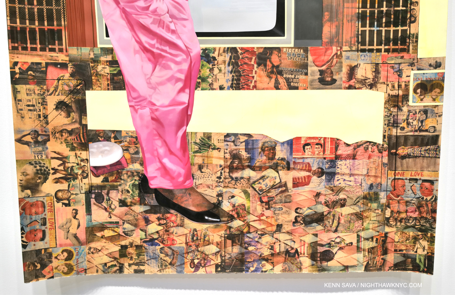
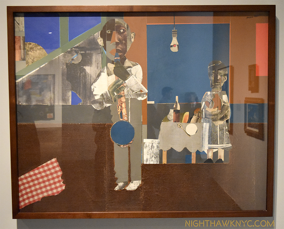
Njideka Akunyili Crosby’s NYC debut, which this was, has been a long time coming. Perhaps best known to most from the series of enthralling books published around shows elsewhere, her work is in the Permanent Collections of The Met, MoMA and the Whitney Museums. Pretty precocious for an Artist only born in 1983 (in Nigeria, living and working in L.A. this century). Her career has been in steady ascent. Her latest work shows an amazing juxtaposition of time and techniques through her use of transfers and paint. Frankly, looking as closely as I could, I couldn’t figure out how she does it.

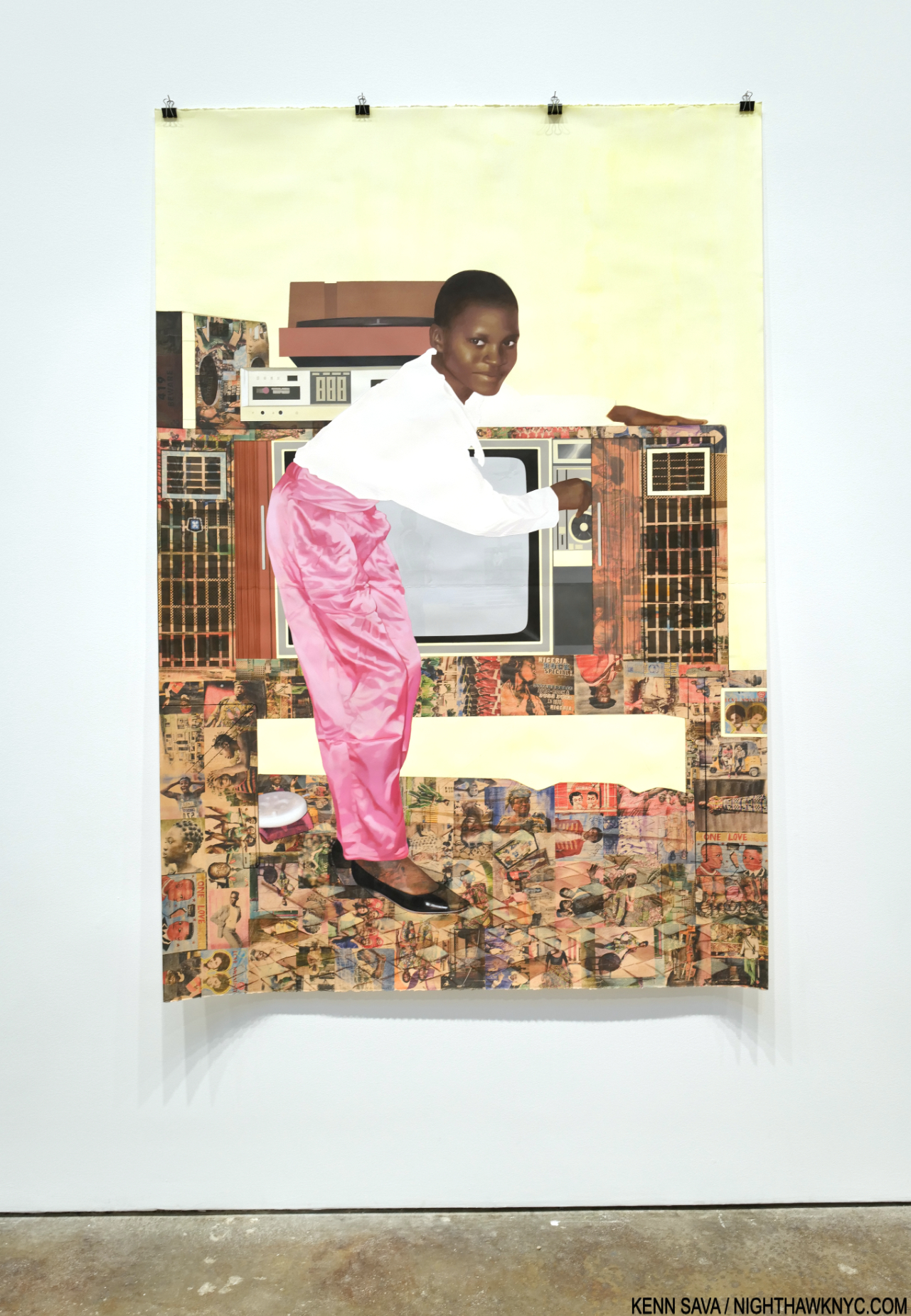
Potential, Displaced, 2021, Acrylic, colored pencil, and transfers on paper 72 1/4 x 60 inches

Layers of photo transfers are seamlessly combined with layers of paint. Each one increasing the depth and adding countless details to the story. Everything is rendered with such smoothness it was beyond me to discern layers that I knew were there. Her craft is as stunning as her Painting.

“The Beautyful Ones”Series #10: A Sunny Day on Bar Beach, 2022, Acrylic, colored pencil, pastel, charcoal, and transfers on paper, 78 1/2 x 53 3/4 inches.

It’s all in the service of her subjects, some she’s apparently related to, some not. They’re each treated with such compassion and understanding, it’s hard to tell which are which.

Detail.

Ms. Crosby’s work rewards the casual glance, and extended close study, while serving as something of a bridge from her life now (in the US since 1999), to her Nigerian upbringing. In the process, it helps others begin to understand it, as she presents it in a multifaceted memory standing on layers of time, history and place.

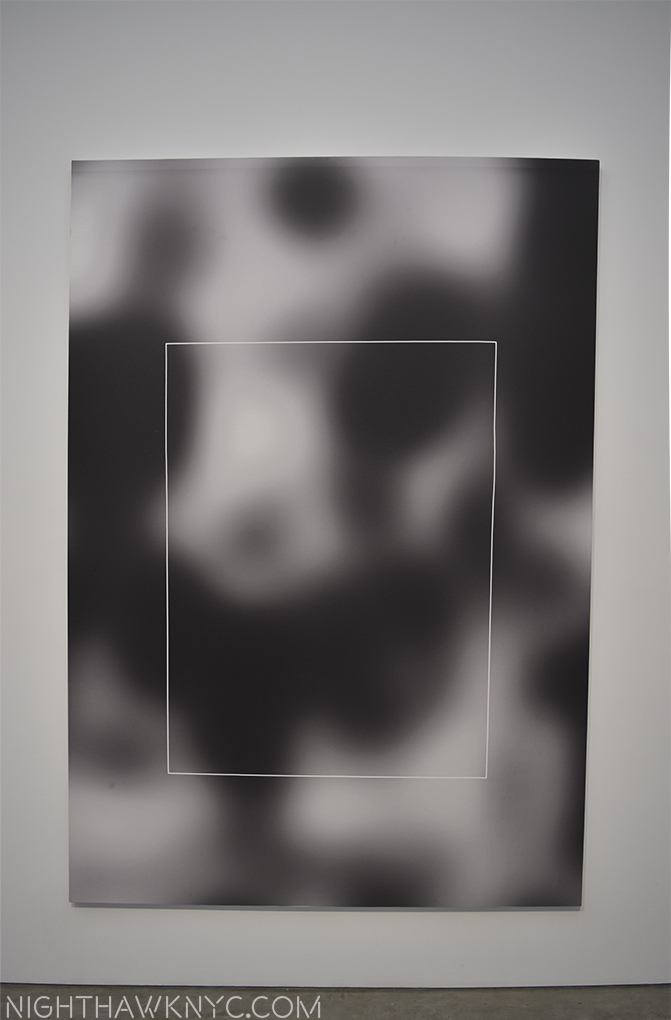
Wade Guyton @ Matthew Marks

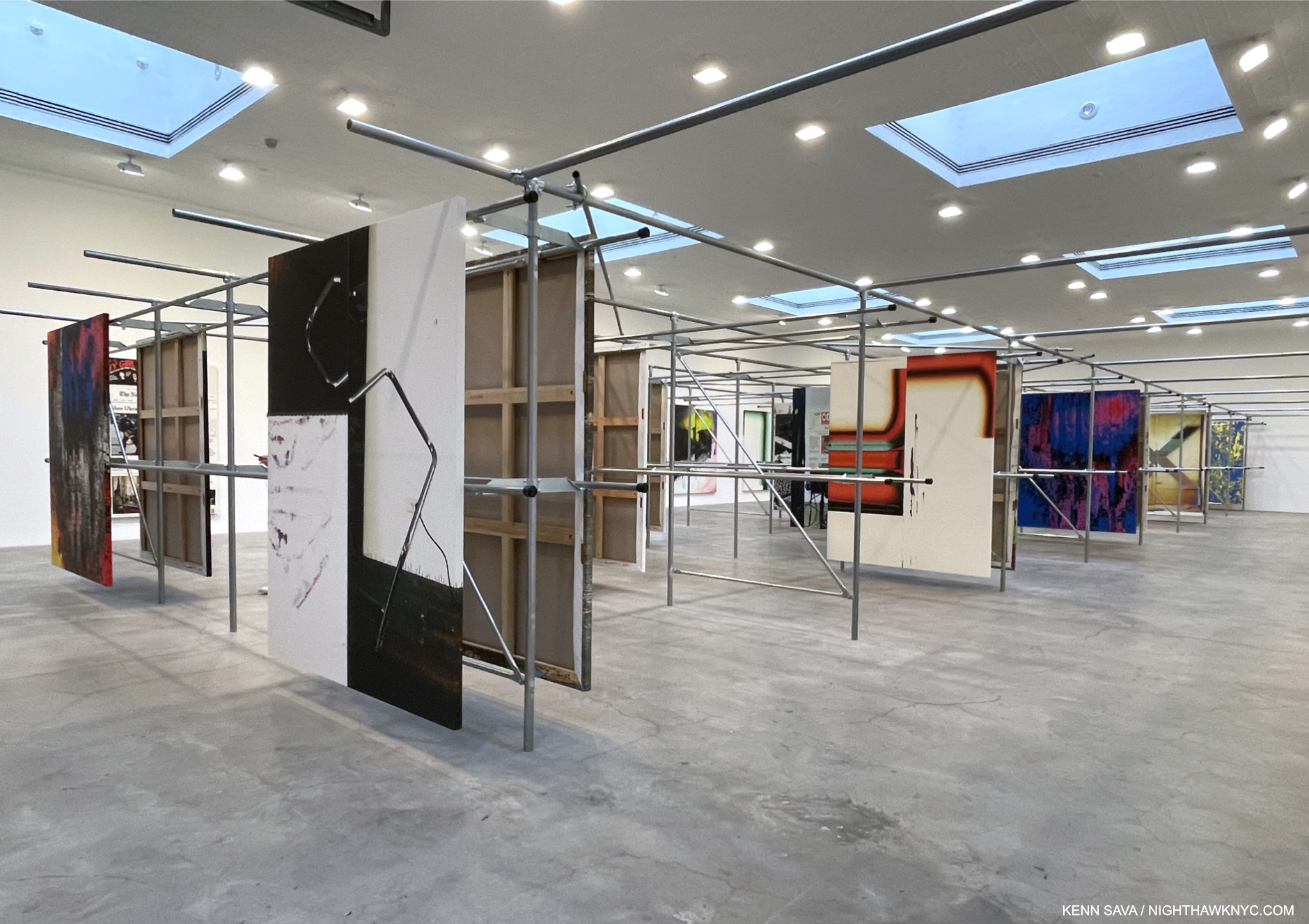
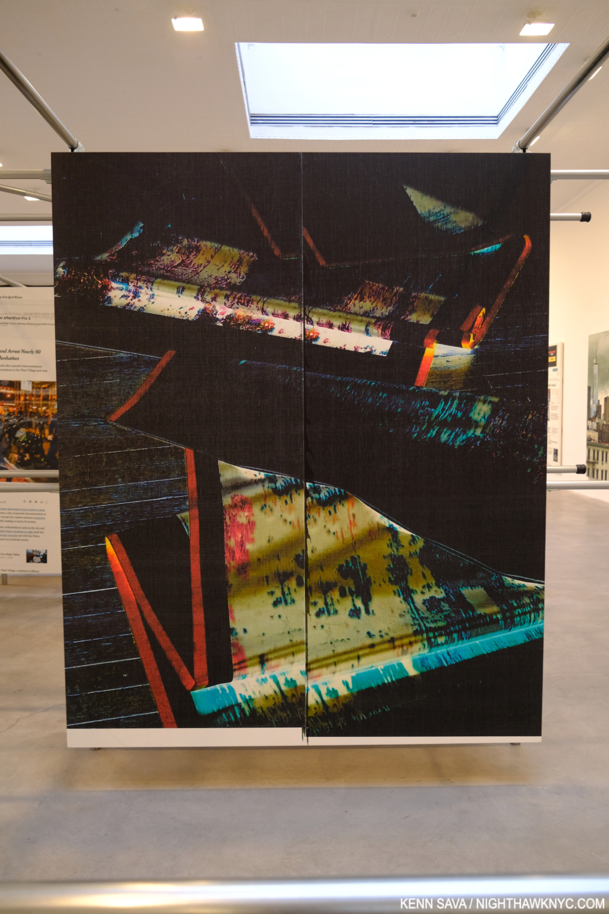
Installation view. All works are Epson UltraChrome HDX inkjet on linen 84 x 69 inches each.

Wade Guyton’s installations are always an interesting element of his entire show experience. In fact, his book Zwei Dekaden emphasizes just that aspect in over 200 installation views over two decades. It’s now like it wouldn’t be a Wade Guyton show without the installation. And so it was at Matthew Marks. The unique steel rack installation was explained thus- “In 2021 Guyton moved into another floor of his studio building that the previous tenant, a clothing company, had filled with metal hanging racks. Rather than remove the racks, he repurposed them to hang his paintings for storage. In the current exhibition, Guyton has duplicated this set of racks and installed paintings in the same manner,” per the press release.

I couldn’t resist making the installation part of seeing the work.

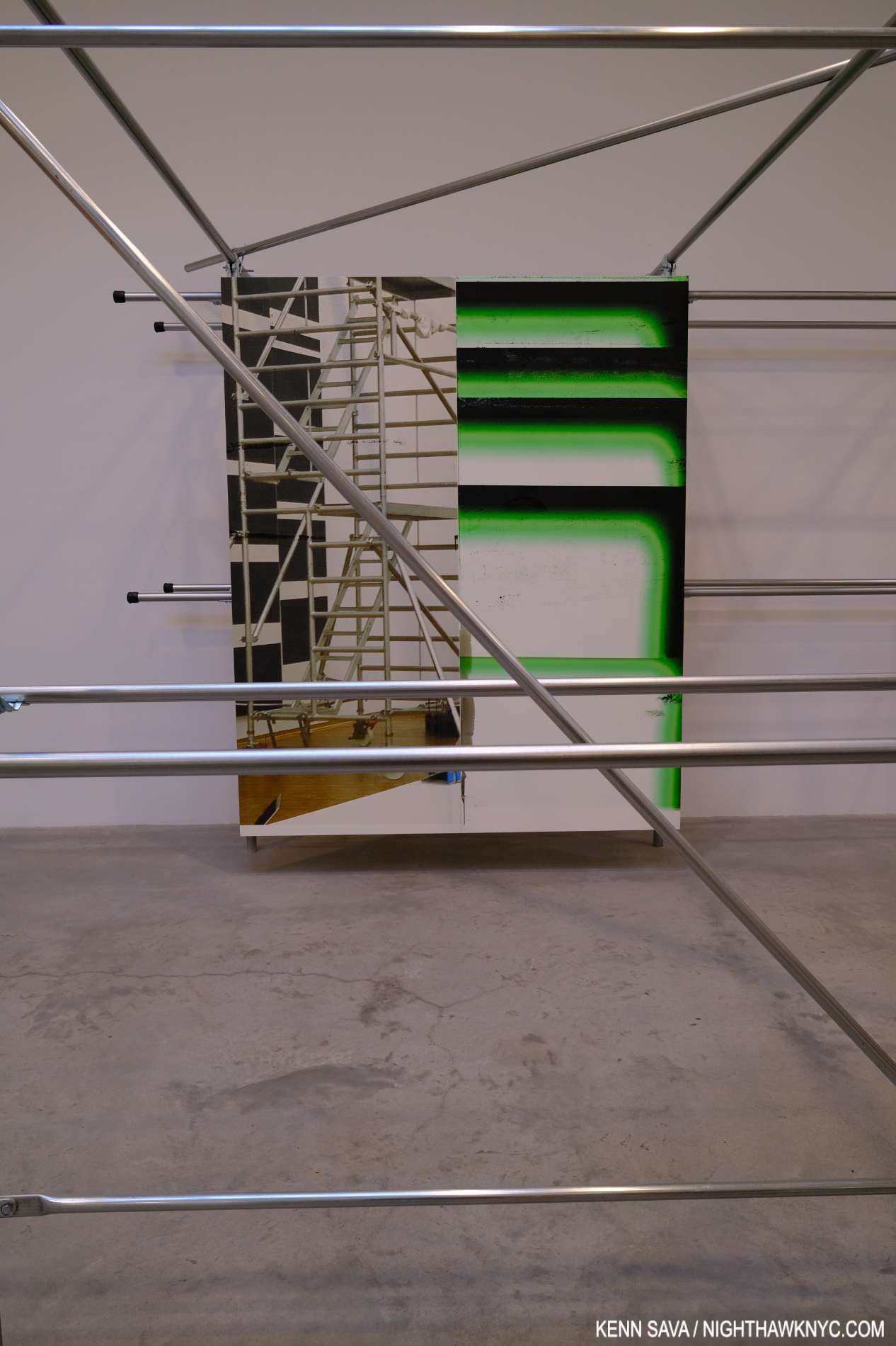
The work looked handsome on its mounts and the structures themselves provided for interesting “other” views of each piece as a visitor moved through the racks. Cross members added unexpected elements to works on the next row and provided a chance to see pieces at a bit of a distance.

Untitled, 2022, (WG5374)

But all of this is secondary to what’s being displayed. Wade Guyton has been at the forefront of combining Printmaking and Painting in interesting ways for a long time. Admirers will find new takes on some familiar themes, but there is also much that is new. The sense of being “somewhere else” was interrupted by pieces based on New York Times front pages; recent headlines jarring a visitor back to “reality.” I love how he incorporates images/Photos into his work, and some of the printing of others has a “squeegee” look that always reminds me of Jack Whitten. Here, it’s still fresh and it’s nice to see the Artist continue to find new possibilities. As he has, once again, with his installation. Both work extremely well together.

NighthawkNYC.com has been entirely self-funded & ad-free for over 8 years, during which 300 full-length pieces have been published! If you’ve found it worthwhile, PLEASE donate to allow me to continue below. Thank you, Kenn.

You can also support it by buying Art, Art & Photography books, and Music from my collection! Art & Books may be found here. Music here and here.

Written & photographed by Kenn Sava for nighthawknyc.com unless otherwise credited. To send comments, thoughts, feedback or propositions click here. Click the white box on the upper right for the archives or to search them. Subscribe to be notified of new Posts below. Your information will be used for no other purpose.

Art Is Back In Chelsea

Written & Photographed by Kenn Sava

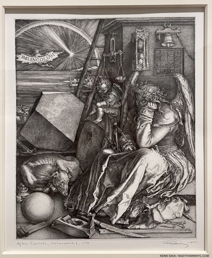
One of the most astounding works in Western Art history. Albrecht Dürer’s, Melencolia I, 1514, right? No! Read on…

There were some dark times in Chelsea’s (unofficial) Art district these past 18 months, like there was everywhere on planet earth. Some galleries went out of business, many gallery staffers lost their jobs, some galleries moved elsewhere. Early this year, things were slow. There were some shows here but not nearly as many as the pre-covid norm, and few here had been vaccinated at that point making it tricky for gallery staff and would-be visitors. I stayed away until I got vaccinated.

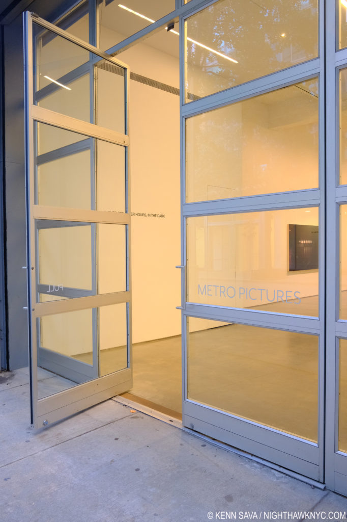
Going, going…Metro Pictures on West 24th Street. I have seen many memorable shows here, including the fine Louise Lawler show that’s up now inside that open door. They said they decided to close because of the globalization of the Art market, which doesn’t suit their model. I’ll miss them. Seen in October, 2021.

In March, legendary Metro Pictures on West 24th Street, an anchor of the neighborhbood since 1996, announced they would close this year, for reasons unrelated to the pandemic, they said1.

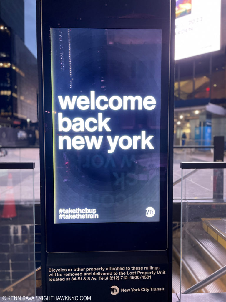
Don’t believe the hype. Real New Yorkers never went anywhere.

This whole summer there had only been two shows on my list- Richard Estes: Voyages and the blockbuster Cèzanne Drawing at MoMA, which I wrote about here. As the summer wound down I was curious to see what the fall season, the busiest of the year in Art, would bring. What would the “new normal” look like in the galleries & museums? Around Labor Day, I suddenly found myself with something I hadn’t had in 18 months- a list of shows, numbering 20, to see- carefully.

(Not) Coming (anytime) Soon. An abandoned sign outside a former Chelsea gallery on West 25th Street, October, 2021. A few of these on this block are an eerie reminder of what once was.

As I made my way down into the all too familiar West Side canyons very curious about what I would find, indeed, there was much that was different. Some familiar spots were gone, (most) others remain and virtually all of those were open, with varying degrees of precautions. Most surprisingly of all, a number of new galleries opened in spaces that had been under construction before the virus hit the fan around the High Line, and under it. Given I don’t generally attend openings (even pre-covid), and avoid going during the busier times (like weekends), I cannot attest to the level of foot traffic, a main reason galleries are here. 

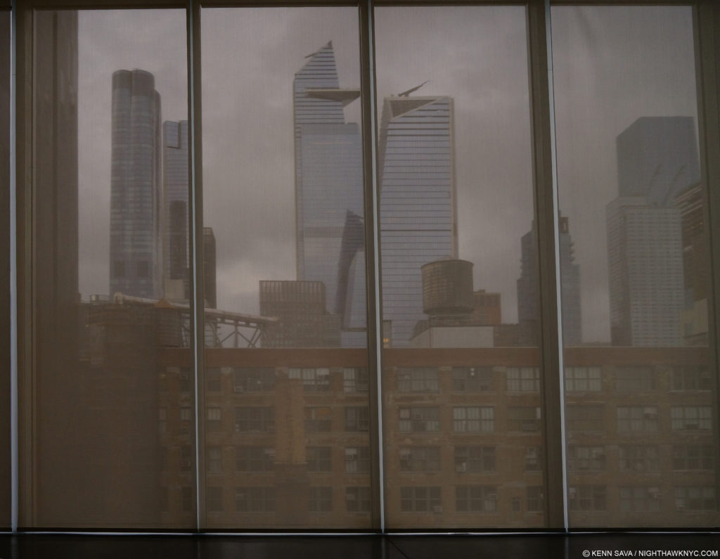
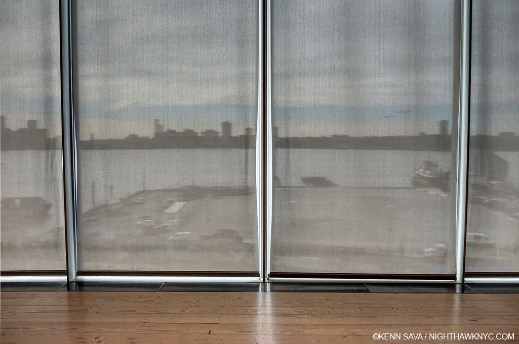
Forecast- cloudy. New and old on an appropriately grey day. The new skyline of Hudson Yards just north of Chelsea dwarfs the 100 year old buildings that have housed galleries for the past 30 years or so in better times, seen through the closed shades on the top floor of Pace’s new mega-plex gallery in October.

What I can say is that I notice there has been no slowing in the sheer mountain of new work that’s been created during these dark times, just as it was ever increasingly so as this new millennium has worn on. (Geez, it already feels like it’s worn on in 21 years?) Yet, in spite of the endless volume of Art for sale I have only seen a slight softening of prices, which I find surprising, and telling. Then again, these are usually “asking” prices. Actual “sold for” prices could be (and probably are) lower by an unknown amount. On the Art front, it turns out there are a number of good and very good shows up in Chelsea this fall. While there are still some on my list I haven’t gotten to see, of those I’ve seen thus far, some highlights include (in no particular order)-

Installation view. Untitled (The Cauldron), 2021, Charcoal mounted on paper, 70 x 120 inches, left.

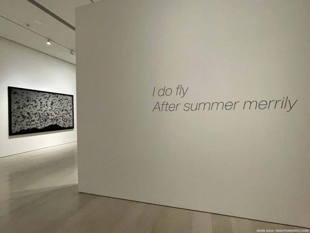
Robert Longo: I do fly / After Summer Merrily, at Pace, West 25th Street-

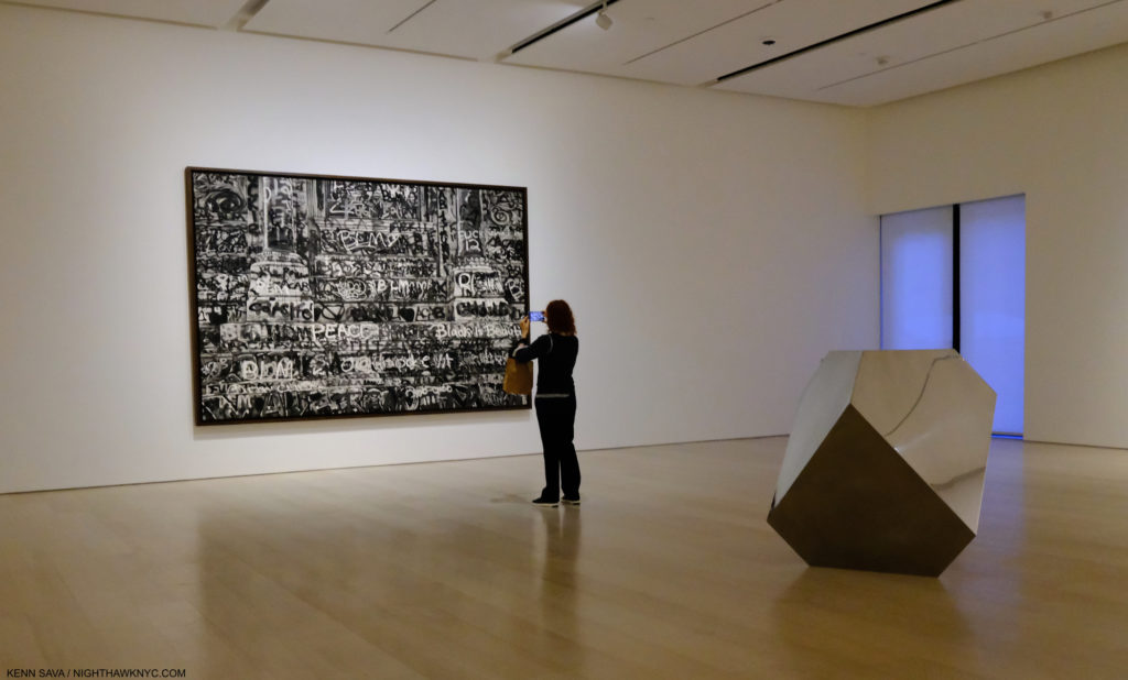
Untitled (Robert E. Lee Monument Graffiti, Richmond, Virginia), 2021, Charcoal mounted on paper, 96 by 146 inches, and Dûrer’s Solid, Stainless Steel, 2021. See following picture.

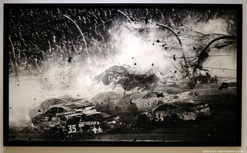
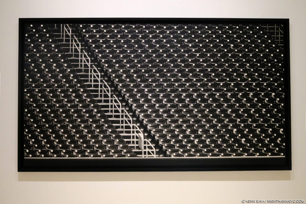
This is Robert Longo’s first show with Pace, after being represented by Metro Pictures for an unheard of 40 years, until they announced their plans to close. Famously part of the so-called “Pictures Generation” with Cindy Sherman, et al, Mr. Longo is one of the finest practitioners of the rapidly becoming lost Art of Drawing we have. I’ve been surprised with his choice of subjects, but always impressed by his new work with every succeeding show I’ve seen going back well over 20 years. They always leave me marveling.

Untitled (Nascar Crash, Daytona), 2021, Charcoal mounted on paper, 70 x 120 inches. Keep reminding yourself that these are Drawings.

His new show, I do fly / After Summer Merrily, kicking off a run of Robert Longo shows around the world over the next few years, is equally impressive. Most of his pieces are Drawings in charcoal, though in this show he also shows off his remarkable skill with graphite.

Robert Longo, Untitled (After Dürer’s, Melencolia I, 1514) 2021, Graphite on paper(!), 12 3/4 by 9 15/16 inches. You could have knocked me over with a feather when I first saw this. My jaw was open to the bottom of my mask.

In addition to creating new works often based on Photographs of recent events, the other thread in Mr. Longo’s work these past many years has been painstaking creation of his own versions of masterpieces of Painting, most notably his Gang of Cosmos works, monochromatic charcoal copies of Abstract Expressionist masterworks, which filled an entire show at Metro Pictures in 2014. Now, he has turned his eye and hand to Albrecht Dürer’s Melencolia I, 1514, which is an engraving. Mr. Longo has done his version in graphite! While the more unforgiving engraving may be the more challenging technique, to translate Dürer’s marvel to this level of detail is astounding. It appears every single line has been replicated, down to Dürer’s famous “AD” monogram signature in the shadow above the tools to the right. As if this wasn’t enough, he’s also created a Sculpture of his imagining of the famous “Solid” seen to the left of center, which was also on view a few feet away, as I showed earlier.

Untitled (Baseball Stadium, 2020), 2021, Charcoal mounted on paper, 78 by 125 inches(!)

After all the work shown in his Metro Pictures shows this century, as well as museum shows, like Proof: Goya, Sergei Eisenstein, Robert Longo, which opened at the Garage, Moscow, then travelled to the Brooklyn Museum, the time has come for a full Retrospective of his work in this country. The last one was at the Los Angeles County Museum of Art in 1989. One is opening in Europe in 2024. I hope it makes it here.

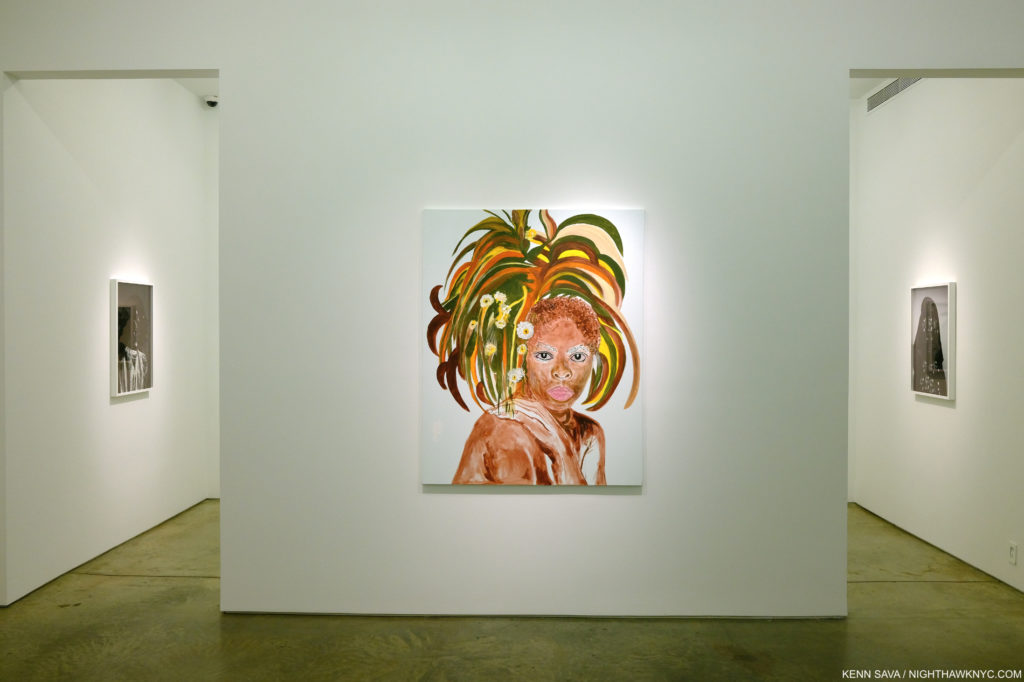
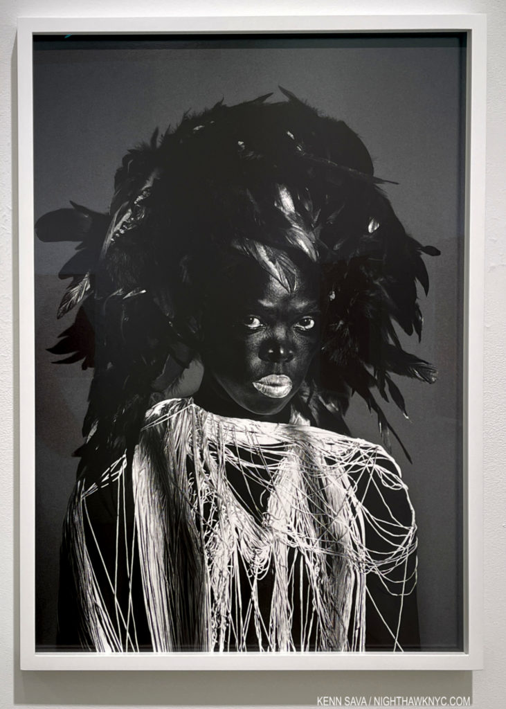
Zanele Muholi, Itha, 2021, Acrylic on canvas, from the first show to include her Paintings along with her Photographs in the second gallery.

Zanele Muholi, Awe Maaah! at Yancey Richardson- Zanele Muholi has established herself as one of the world’s great portraitists. Though she’s done far more, for my money that claim was sealed with Zanele Muholi: Somnyama Ngonyama, Hail the Dark Lioness, a book of Self-Portraits, published by Aperture in 2018, a masterpiece among PhotoBooks of the past decade. Now, for the first time, Awe Maaah! shows there is more to the renowned Photographer and visual activist. Stepping into the show, a fan of Ms. Muholi’s black & white Photographs might be shocked by seeing something new- color! It turns out she Paints, too! And quite well indeed as the debut selection of her Paintings in the show reveals.

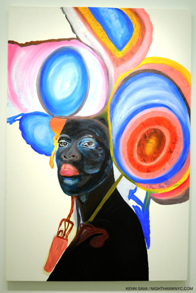
Somile, 2021, Acrylic on paper

Known for her gorgeous black & white Photographs, her Paintings are FULL of bright, vivid colors. Zanele turned to Painting during the pandemic when Photographing others was not possible. Though in color, her Paintings share familiar elements with her Photographs. First, these were all portraits, of one or two sitters. Second, in many of her Paintings, the Artist is depicted, like her Photographs, n a variety of guises. Then, the eyes are the focus of both bodies of work. In some of her Photographs, they almost look like they are Painted. Compositionally, they both feature empty backgrounds, though some of the Paintings were colored. I was impressed with the range of approaches. Each Painting is different. Quite an auspicious first showing.

Zimpaphe I, Parktown, 2019, Gelatin silver print

But, for anyone new to her work, or in need of a refresher as to why she is one of the most respected Photographers working today, all that was needed was to take a few steps into the second gallery.

The second gallery of Awe Maaah! contains 8 stunning Self-Portrait Photographs (the one just shown is behind me in this shot)

There, a gorgeously selected group of her Photographic Self-Portraits was all the reminder needed. Not surprisingly, the entire show was sold out. Already one of the most vital Artists working in Photography, today, Awe Maaah! announces there are more sides to Zanele Muholi to recon with than we’ve seen thus far.

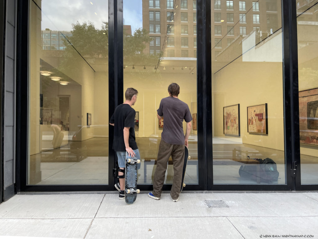
Looking in at a gallery of “hooded”/klan Paintings outside Philip Guston 1969-79 in October.

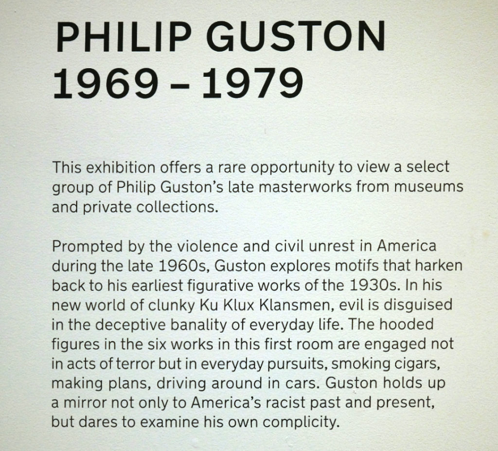
Philip Guston: 1969-79 at Hauser & Wirth- With a large, street-facing, gallery featuring Philip Guston’s “klan” Paintings I wondered if this show was a sort of “test balloon” after the controversial postponement of Philip Guston Now museum show. They certainly served to stop people on the street, who seemed perplexed as to what they were, and what they were about, from the conversations I heard walking past.

I think that many who are familiar with Philip Guston’s work wonder about them, too. Delving into their history sheds some light on them. I wrote about the history of Philip Guston’s hooded/klan (lower case, mine) works, saying- “I think it’s important to remember that they go back to when the Painter was about 18. In Philip Guston Retrospective, the backstory is relayed on pages 16 & 17. It begins by quoting Mr. Guston- I was working at a factory and became involved in a strike. The KKK helped in strike breaking so I did a whole series of paintings on the KKK. In fact I had a show of them in a bookshop in Hollywood, where I was working at that time. Some members of the klan walked in, took the paintings off the wall and slashed them. Two were mutilated. That was the beginning.'”

Riding Around, left, and The Studio, both 1969, Oil on canvas, left

“(The text then continues) ‘The Ku Klux Klan, also known as the Invisible Empire, had a significant membership in California in the 1930s and 1940s, and Los Angeles County was its most active Klavern. Guston and several other of his friends also painted portable murals for the John Reed Club on the theme of ‘The American Negro.’ Guston’s submission was particularly volitile. Based on the Scottsboro case, in which nine black men were sentenced (many said on false and circumstantial evidence) to life in prison for raping a white girl. Guston’s mural depicted a group of hooded figures whipping a black man. The murals were eventually attacked and defaced by a band of ‘unidentified’ vandals. The experience of seeing the effect of art on life and life on art never left Guston, and the unsettling image of the hooded figure was branded into his visual imagination.’ In the 1930s, in addition to strike breaking, the klan also targeted Jews. Philip Guston, originally Philip Goldstein, was Jewish. Of course, their main target were Blacks…Philip Guston lived long enough to see that racism was deeply embedded in the fabric of American life, possibly even in his own life.” (End quote.) So, circa 1970, when he moved away from pure abstraction, he began including hooded figures in his work again.

Scared Stiff, 1970, Oil on canvas. Shocking, damning, incredibly daring. and unprecedented in Art.

This time, it seems to me, he was looking inside for signs of prejudice in himself as well as society at large. And so, these are somewhat unique works in Art history. Not many other Artists have been as open, daring, or had the courage to lay themselves so bare as Philip Guston may have been doing in them. And, they are part of his enormously fresh late period, a real breakthrough for the Artist stylistically, which was met with puzzlement when they were new.

Ancient Wall, 1976, Oil on canvas

A very nice selection of “other” work from 1969-79 was on view in the large, second gallery. Today, they have become hugely influential, though the hooded figure works remain puzzling or misunderstood by some. (My pieces on prior Philip Guston shows in NYC are here, on the 1950’s abstractions, and here, on his Poor Richard Nixon Drawings.)

Hung Liu, Portrait: Sharecropper, 2018, Oil on canvas. Hung Liu lived and worked among country laborers for 4 years after being sent there by Mao Zeodong’s government for “re-education.” As a result, Hung Liu shared a special bond with the work of FSA legend Dorothea Lange dust bowl Photographs, upon who’s work Hung Liu based some of her Paintings. Ms. Liu emigrated to California in 1984, where she lived & worked for the rest of her life.

Hung Liu: Western Pass at Nancy Hoffman Gallery- Beautiful, and bitter sweet is the only way I can characterize this wonderful show, which the Artist worked on with Nancy Hoffman Gallery right before her tragic passing on on August 7th. It opened a month later, on September 9th. Along with the major retrospective up as I write at the National Portrait Gallery of the Smithsonian in Washington, it will serve as a fitting tribute to this terrific Artist who was just beginning to gain the wide recognition and acclaim I believe her work deserves when she passed away. Long a champion of the late Chinese-American Painter, Nancy Hoffman has been showing her work going back to at least 2010 as far as I can tell and they have published some exquisite catalogs for each of them which are still available.

Western Pass, 1990, Oil on canvas, silver leaf on wood, ceramics. I asked Phil Cai what was going on in this work. He spoke about how we’re seeing two prisoners about to be executed with an ancient Chinese poem between them. The poem speaks of having another glass of wine before you pass beyond the western pass where you won’t have any friends. Two empty wine bowls sit in front.

This show is a beautifully chosen selection of 31 years of her work, right up to earlier this year. It’s possible to watch her style change and evolve over time, a testament to her flexibility and talent. Her subject matter, however, doesn’t change. Like Alice Neel, “people come first” for Hung Liu, too, and much of what she shows us is based in the Photographs of Dorothea Lange, found Chinese Photographs, or her own Photographs taken during the 4 years after she spent in the countryside laboring in rice and wheat fields as part of her agrarian “re-eduction” under Mao Zeodong. So, it is easy for her to related to the FSA work of Dorothea Lange, and the lives of is based on her own personal experiences. Haunting and powerful work that effortless cuts across place, cultures and time. Work that will be around for the long haul, in my opinion. I was lucky enough to see this show with Phil Cai, Director of Eli Klein Gallery, who’s remarkable Cai Dongdong show I wrote about in 2018. Phil, one of the rising stars in the Art world, met Hung Liu and visited her studio in Oakland. He provided fascinating insights into her work that he has been looking at for almost a decade. “I hope to wash my subjects of their ‘otherness’ and reveal them as dignified, even mythic figures on the grander scale of history painting,” she wrote.

Leonardo Drew, Detail of Number 305, 2021, Mixed Media. Just one corner, plus, of this piece installed on all 4 walls of the large room.

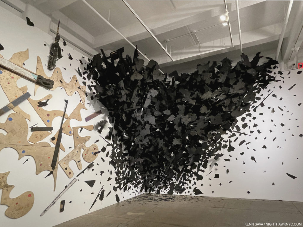
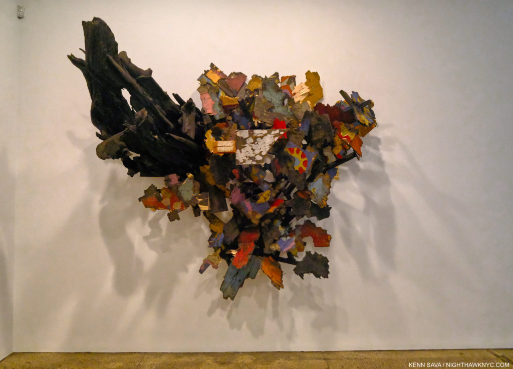
Leonardo Drew at Galerie Lelong- I wrote extensively about Mr. Drew’s last two NYC shows in 2019, during which I met and spoke with the Artist. He returns this fall with his first show since, with all the work on view created in 2021. It says a lot to say that it took 5 people 4 days to install this show! The endless details in his work is only equalled today in Contemporary “Sculpture,” in my experience, by the shows of his great contemporary, Sarah Sze. Mr. Drew continues to reinvent Sculpture and to push the limits and the boundaries of what it can be including another work that seems to explode from the corner as his last show here had one exploding from the rear wall. Both “explosions” frozen in time. Whereas in his last show, he introduced color to his sculpture, which had been black & white to that point, here, he continues that with supreme taste in works that almost look like a new take on Abstract Expressionism, if I believed in such terms. I don’t, so the only term that remains applicable to this major Artist remains- Leonardo Drew. And, if this wonderful show of terrific new work isn’t enough, Mr. Drew’s Prints are on view at Pace Prints nearby. I have not as yet seen them. 

Number 294, 2021, Wood, paint and sand

At this moment, I imagine that the “bleeding” is going to continue in Chelsea, as it is in far too many other places and in many other fields, for some time. More galleries will close, consolidate or move. Yet, it seems to me that the mega-galleries building their own buildings in the neighborhood may actually draw other galleries here, depending on the asking prices for space. Maybe things are at or near the bottom? It’s too early to tell. 

After what I wrote during the shutdown last year, it seems that at least things have begun to bounce back after a very slow spring. But, Art is not life. Many other things have to be in place for anyone to be able to, or want to, see Art. It’s taken a long time for many of those things to get back into place here. I hope things are getting better where you are.

*-Soundtrack for this post is “How Can You Be Sure?” a B-side by Radiohead from The Bends Collector’s Edition-

“Seen all the good things and bad
Running down the hill
All so battered and brought to the ground

[Pre-Chorus]
I am hungry again
I am drunk again
With all the money I owe to my friends

[Chorus]
When I’m like this
How can you be smiling, singing?
How can you be sure?
How can you be sure?”*

NighthawkNYC.com has been entirely self-funded and ad-free for over 6 years, during which over 250 full length pieces have been published. If you’ve found it worthwhile, you can donate to keep it going & ad-free below. Thank you!

Written & photographed by Kenn Sava for nighthawknyc.com unless otherwise credited.
To send comments, thoughts, feedback or propositions click here.
Click the white box on the upper right for the archives or to search them.
For “short takes” and additional pictures, follow @nighthawk_nyc on Instagram.

Subscribe to be notified of new Posts below. Your information will be used for no other purpose.


  1. https://www.nytimes.com/2021/03/08/arts/design/metro-pictures-gallery-close.html

NoteWorthy Art Books, 2020

Written & Photographed by Kenn Sava

While PhotoBooks have been an all-encompassing passion of mine these past four+ years (though of course I had some earlier), Art Books have been a passion ever since I first saw one, or, for over half a century. Before I could go to a gallery or museum, here was a way to see all, or a selection of, the work of an Artist or a group of Artists- in one portable package. I was instantly fascinated by that, and I still am. Yes, physical books because Art, or Photo, eBooks are few and far between- still. The quality of the physically printed Photo, or Photo of a Painting, is still unsurpassed. In 2020, museums and galleries were closed for much of the year all over the world. For me, and perhaps innumerable others, Art Books were there, 24/7, to provide a means of exploring, seeing and studying Art. Fittingly, as they were for me before I was able to go to shows in person, this year, in my world entirely without any other people for 11 months, Art & PhotoBooks were my sole companions.

Having presented my NoteWorthy PhotoBooks, 2020, (as well as in 2019, and 2018), this year,  I’ve decided to also present my thoughts on the Art Books I’ve seen in 2020 that I most highly recommend for the first time. All of these books, I highly recommend, so I’m not picking one out of them as “most highly recommended.” Here they are-

NoteWorthy Art Books of the Year, 2020

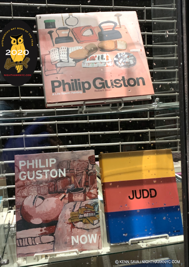
Philip Guston Now, DAP/National Gallery of Art, and
Philip Guston: A Life Spent Painting

After a gap of 15 years between retrospectives of his work, two excellent overviews of Philip Guston’s remarkable oeuvre are published in one year. Deciding which one to get is hard. Both have a lot going for them. For someone looking for one book with the most images in the largest size, along with one of the finest texts of Robert Storr’s career, Philip Guston: A Life Spent Painting is the choice. For someone looking for the only place to see the most controversial show of 2020, now postponed to 2024, along with an equally excellent text, Philip Guston Now is an excellent choice. For the serious Guston aficionado, the only choice is to buy both. For someone already familiar with Philip Guston’s work who wants to learn more about his work, either book will provide countless fresh insights.

Philip Guston: A Life Spent Painting may be the finest achievement in the long career of author Robert Storr. Yet, I give special credit to Philip Guston Now for being one of the most remarkable exhibition catalogs I’ve ever seen. Personally, I find its text by co-curators Mark Godfrey, Alison de Lima Greene and Kate Nesin, to be nothing short of brilliant both in its content and how it flows seamlessly from period to period through the Artist’s long career, treating the whole in a fresh way. This, alone, would be enough for a high recommendation, but the book is taken to another level by the addition along the way of pieces by 10 Contemporary Artists- William Kentridge, Glenn Ligon, Tacita Dean, Peter Fischli, Trenton Doyle Hancock, David Reed, Dana Schutz, Amy Sillman, Art Spiegelman and Rirkrit Tiravanija. Most provide unique insights into specific works by Philip Guston and a number of them directly address the “hooded”/klan works, the focus of the controversy around the show the book was published to accompany.

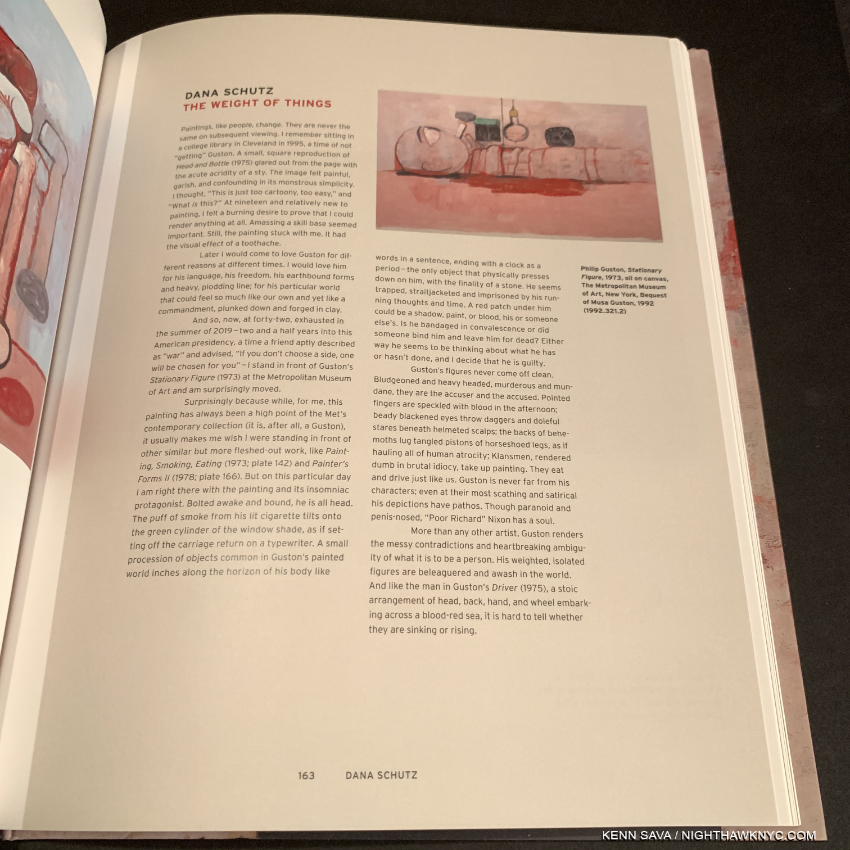
Dana Schutz’ Essay in Philip Guston Now.

The show, also titled Philip Guston Now, was first postponed due to covid to July, 2021, then  controversially postponed, again, to 2024 by the National Gallery of Art, Washington; the Museum of Fine Arts, Boston; the Museum of Fine Arts, Houston; and Tate Modern, London, where it is scheduled to be mounted. “We are postponing the exhibition until a time at which we think that the powerful message of social and racial justice that is at the center of Philip Guston’s work can be more clearly interpreted.1.” Like many others, I am at a loss to understand that statement. On the one hand, it denigrates the intelligence of visitors. On the other, what if 2024, isn’t that nebulous “time” the message speaks of under whatever unmentioned criteria they’re using to determine it? However, the show’s catalog did come out this year in anticipation of the originally scheduled opening. Its inclusion of the featured pieces by those 10 Contemporary Artists is exactly the kind of thing Art monographs need more of, in my view, as they struggle to remain relevant- given how many other books already exist on most Artists, and the large expense involved in creating them in what may be increasingly challenging times for museums who, largely, publish these books.

The reproductions of the Art in Philip Guston Now only adequate in terms of quality, in my opinion, are best used for reference to the points large and small being made throughout the text. Some of the Art is reproduced one image on a page with a copious border, others are 4 to a page. It does include new Photos taken in Philip Guston’s studio, which appears to be largely as he left it. The other big reason for getting this book is to see the works in, and to have a record of,  this important show, so you can prepare yourself to see it, IF it ever opens. Also important to note- many works will not appear in each of the four scheduled stops the show will make. So, the catalog is the only place to “see” the whole show.

The large 13.35 by 11.5 inch pages create an almost 27 inch spread making the images in Philip Guston: A Life Spent Painting the largest in any Guston book to date, and with over 850, the most images in any Guston book as well. This will make it a slam dunk choice for many, but take a look at both.

The illustrations are better and more numerous (850) in Philip Guston: A Life Spent Painting, whose 13 1/2 by 11 1/2 inch size is more accommodating close study. Get that book for the best current overview of the Art. As for its text, Robert Storr contributes one of his finest efforts, apparently the results of many years of work. As good as the text in Philip Guston Now is, Mr. Storr’s doesn’t take a back seat to any Guston book I’ve seen to date, which is why a recommendation for both books is the only one I can give at this point. They join Philip Guston: Retrospective, published by the Modern Art Museum of Fort Worth in 2003, to accompany the last major retrospective of his work and now out of print, my go-to Guston book to this point, as standard references to the work of this enduringly contemporary Master.

Drawing for Conspirators, 1930, Graphite pencil, pen and ink, colored pencil, and wax crayon on paper, seen at the Whiney Museum in July, 2015, in America Is Hard To See, the most recent showing of this work. A number of the essays in Philip Guston Now reference this work.

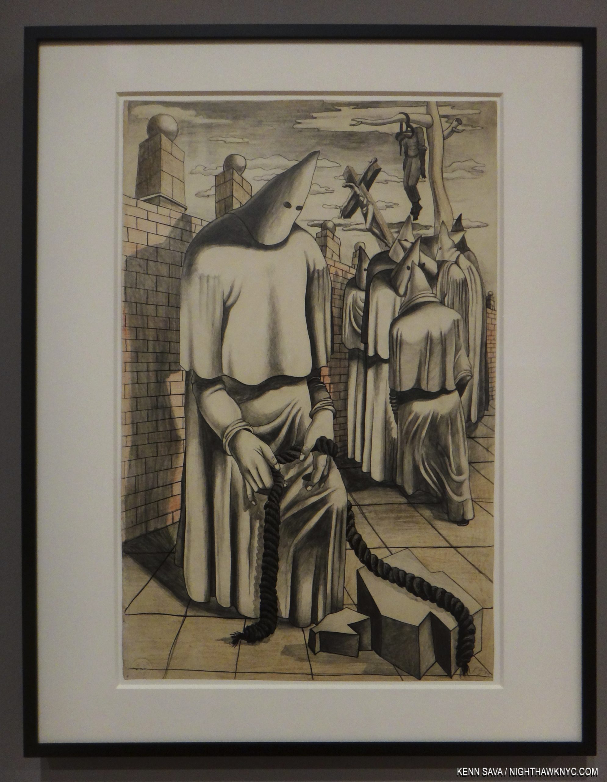
Before continuing, I feel I must briefly address the controversy centered around the show’s inclusion of Philip Guston’s klan Paintings. I’ve been somewhat surprised that the attention seems to focus on his late klan pieces. I think it’s important to remember that they go back to when the Painter was about 18. In Philip Guston Retrospective, the backstory is relayed on pages 16 & 17. It begins by quoting Mr. Guston-

I was working at a factory and became involved in a strike. The KKK helped in strike breaking so I did a whole series of paintings on the KKK. In fact I had a show of them in a bookshop in Hollywood, where I was working at that time. Some members of the klan walked in, took the paintings off the wall and slashed them. Two were mutilated. That was the beginning.”

(The text then continues) “The Ku Klux Klan, also known as the Invisible Empire, had a significant membership in California in the 1930s and 1940s, and Los Angeles County was its most active Klavern. Guston and several other of his friends also painted portable murals for the John Reed Club on the theme of ‘The American Negro.’ Guston’s submission was particularly volitile. Based on the Scottsboro case, in which nine black men were sentenced (many said on false and circumstantial evidence) to life in prison for raping a white girl. Guston’s mural depicted a group of hooded figures whipping a black man. The murals were eventually attacked and defaced by a band of ‘unidentified’ vandals. The experience of seeing the effect of art on life and life on art never left Guston, and the unsettling image of the hooded figure was branded into his visual imagination.”

In the 1930s, in addition to strike breaking, the klan also targeted Jews. Philip Guston, originally Philip Goldstein, was Jewish. Of course, their main target were Blacks.

Artists don’t live in the nebulous times those 4 museum directors speak of in their postponement statement. They live, work, and often respond to, the times of their lives. Philip Guston lived long enough to see that racism was deeply embedded in the fabric of American life, possibly even in his own life. I believe those are things that may have influenced his later hooded figure/klan works, though they are for each viewer to interpret for his or herself. If this ins’t the time for all of us to look inside at ourselves and see how we can be better, how do we know 2024 will be a better time to do so?

NoteWorthy Art Book of the Year, 2020

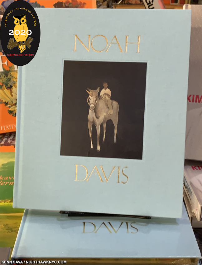
Noah Davis, David Zwirner Books. An early candidate for the most important new Art monograph of the new decade might be hard to top for that title in the next 9 years. Noah Davis passed away of cancer at the very young age of 32 on August 29, 2015. Still, the amount he accomplished and the work he created in such a short life will live on indefinitely. Editor Helen Molesworth was Mr. Davis’ personally chosen curator, and she curated the show that opened earlier this year in NYC, which  I wrote about before it moved to The Underground Museum, L.A.., which Noah Davis founded with his wife, the Artist Karon Davis. The text includes interviews with those who knew Mr. Davis, including legendary Painter Henry Taylor, Deana LawsonLindsay Charlwood, Dagny Corcoran, Daniel DeSure, Thomas Houseago, and Venus X by Ms. Molesworth. Only the second book on his work thus far, it will remain the standard reference for the time being, and a standard reference regardless of what else comes out on one of the most important Artists of  our time. It’s only too bad Mr. Davis didn’t live to see it. Noah Davis was not only an extraordinary Painter, he was one of the Artistic visionaries of our time. He showed it was possible to succeed as an Artist without gallery representation, and then he audaciously founded his own museum to serve audiences he felt were being left out by the existing museums. Generations to come will be influenced and inspired by his Art. Generations of Artists will be, also, influenced by his example. 

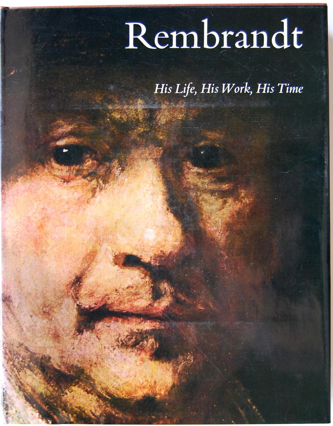
From 2020, let’s set the wayyyyy back machine back to the very first Art Book to captivate me when I was a kid was Rembrandt: His Life, His Work, His Time, by Bob Haak, published by Abrams in 1969. A large (13.5 by 11 inch), 348 page hardcover, with 612 illustrations including 109 hand-tipped color plates, it had these words on the front flap-

“There emerges, in this book, a Rembrandt who is human, fallible, majestic- a man who went through all the common vicissitudes of life and yet was determined to remain true to himself as an artist.”

I’d never seen anything like it. Here was an entire world, the entire life and work of an Artist that just exploded in front of me, singeing my mind as I turned each page, as Rembrandt’s wondrous turned painfully sad life went on, accompanied by the Artist turning his hand from Painting to Drawing to Prints, and back, each among the supreme works done in the medium by anyone, before or since. Most of all, it was the incredible humanity in his Art that has stayed with me to this day. He rendered everyone, from beggars to the exalted, babies and the very old, and foremost among them, he rendered himself, continually throughout his career, from early on, until near the end, creating a body of Self-Portraits, the like of which the world had never seen. Those words on the flap turned out to be the key! As the years went by, I began to understand where that unequalled humanity in Rembrandt’s work came from. Such is the power of a truly great Art Book.

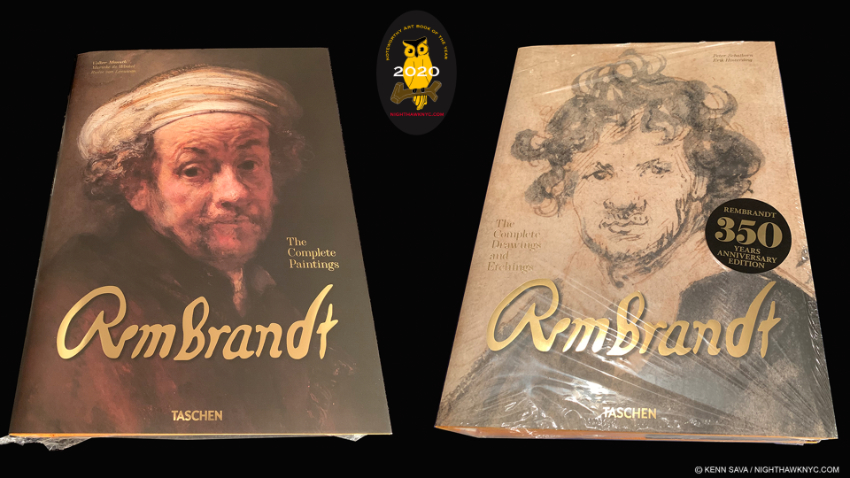
Fast forward a half century to 2020 and the release of 3 great books on the Master, each one of my NoteWorthy Art Books, 2020…

The heavyweight champions. The Complete Paintings weighs in at 17.78 pounds, The Complete Drawings & Etchings at 14.99 pounds.

Rembrandt. The Complete Paintings, Taschen XXL Series
Rembrandt. The Complete Drawings & Etchings, Taschen XXL Series
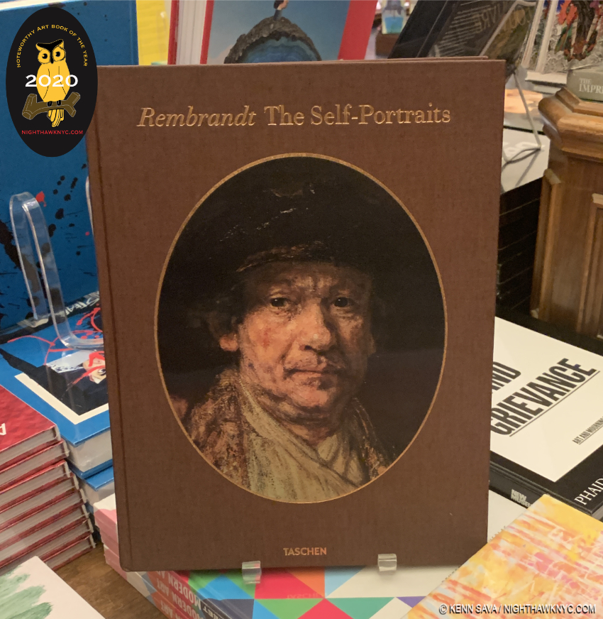
Rembrandt. The Self-Portraits. Taschen XL Series. Nothing more needs to be said- These will remain THE standard visual reference books for Art lovers on the work of the foremost Painter of humanity in this house for the foreseeable future or until the experts change their minds, yet again, on what is, and what is not, from the hand of the Master and deserves to be included. And you know they will (though not the last WORD, for that Gary Schwartz’ amazing books on Rembrandt will retain their prominence in this household). Again. In the meantime, bliss out in peace. Even Mr. Schwartz approves in an Amazon review2. With all due respect to the esteemed authors, in my opinion, these books would be closer to “perfect” if they had his contributions. Photography, paper, binding, finish are first rate all around. 

After all these years, well into the age of the selfie, this first body of Self-Portraits still remain at the top of my list of favorite Art works.

It’s a bit bold of Taschen to publish these books given the still in-flux state of what exactly is a Rembrandt, and given that the esteemed publishers have not yet issued a revised version of any of the XXL books. My guess is they felt the completion of the Rembrandt Research Project’s work, published in a six volume set, the last in 2014, provided an opportunity for a collection. I’ve recently heard of at least one change to the accepted canon, but for better or worse, anyone wanting to see the most Rembrandt in a large size will be left with these three books as the best option for the foreseeable future.

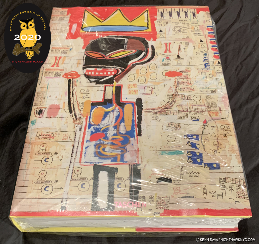
Jean-Michel Basquiat, Taschen XXL Series
As I just got through saying about the original Dutch Master, if you want to see as much of the work of the late New York Master, Jean-Michel Basquiat as possible in one volume, as LARGE as possible, Taschen’s XXL Jean-Michel Basquiat is the only book for you. Yes, another Taschen XXL on this list this year. Look at the $200. list price (for this and for each of the Rembrandt Paintings and Drawings books) this way- You’d have to spend a large fortune to travel to the world to see all the Art contained in one of these, IF the work happened to be on view. Even then, you won’t get to see it this close up in what is usually, very good to excellent Art Photography. And consider that much of the key work of Jean-Michel Basquiat is in private hands because the museums were slow to accept and buy his work. They missed the boat. Private collections rarely show or lend their work making the chances to see more than 5 Basquiat Paintings anywhere at any time extremely rare! That’s exactly why I spent so much time running around seeing the 5 Basquiat shows mounted here in NYC last year. My pieces on them are here. In all that effort, I still only saw about 130 or so pieces!

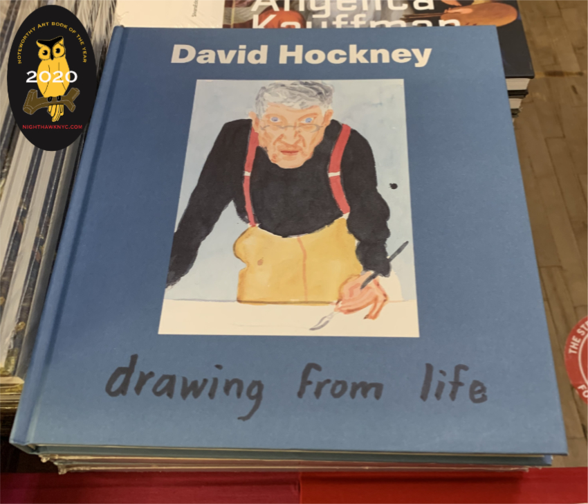
David Hockney: Drawing From Life, National Portrait Gallery, London
The incredibly prolific Mr. Hockney has had a life long obsession with Drawing. That alone makes him a man after my own heart. I’ve followed along with his Drawing evolution with empathy. He’s often spoken of the challenges of Drawing and man, could I relate to them, as I spent 3 days every week Drawing at The Met for about a decade. Sometimes, I’d look at his Drawings and I could see my own efforts. But, most times I looked, he was light years beyond me. His use of an incredibly wide range of Drawing tools and media is unprecedented among major Artists 0in Art History- everything from chalk to graphite to the iPhone and iPad. With each new tool he found his own way, and achieved remarkable results (like his huge, multi page iPad Yosemite Drawings) that are all the more remarkable for being instantly recognizable as David Hockneys. He’s also been proflic in the number of books published on his Art. Yet here is the first collection of part of his Drawing oeuvre this century (the David Hockney: A Drawing Retrospective, 1996, the last overview I can recall). It’s wonderfully done and ingeniously designed, with chapters following the Artist’s evolution of a single subject each, culminating in his Self-Portraits. Published to accompany the show of the same name at the National Portrait Gallery, London, it’s a remarkable book that due to its ingenious concept has an unexpectedly personal feel to it- as you turn the pages, you begin to feel you know each subject. It’s particularly recommended to Drawing students and lovers of the endangered Art of Drawing.

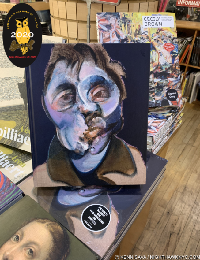
Francis Bacon or The Measure of Excess by Yves Peyre, a friend of Mr. Bacon’s, stands in front of the new monograph on Cecily Brown. Cecily’s father, David Sylvester, was also a long time friend of Bacon’s and gave us the enduring classic Interviews with Francis Bacon.

Francis Bacon or the Measure of Excess, Yves Peyre, ACC Art Books.
Slowly, steadily and continually, the late, great British Artist has now established himself in the upper echelon of Artists I am absolutely obsessed with. To the point that the LAST thing I need is ANOTHER Francis Bacon book. I’d never heard of Yves Peyre, though the cover says he “was a close friend of the artist.” He’s also a poet and has authored a book on Henri Michaux. Well, some of Mr. Bacon’s other friends have already given us books on Mr. Bacon, from David Sylvester (Cecily Brown’s dad, who’s Interviews with Francis Bacon remains most essential) and Michael Peppiatt, down, including another poet, Michel Leiris, and most of them are quite good and have held up for a few decades already. Some of them also offer quite good collections of reproductions of Mr. Bacon’s Art (something EVERY Francis Bacon books seems to need to give us). Yet, as a one volume overview of Francis Bacon’s career with excellent, full 11.73 by 9.83 inch page reproduction, Francis Bacon or the Measure of Excess is my current recommendation and personal choice as a one volume visual reference. The texts of the earlier books remain important, and recommended, summing in a nutshell why it’s VERY hard to have only one Francis Bacon book. Even if you have other books, Mr. Peyre shines the new light of a fresh approach to Bacon, which is somewhat remarkable given how many others have chimed in on his work already, during his life and since his passing in 1992. Of course, if you want THE Francis Bacon publication, the 5 volume Catalog Raisonne is still in print at 1,000 British Pounds a copy, plus shipping. I’ve seen it, and it is exceptionally, even remarkably well done, with Martin Harrison, the foremost authority on Bacon today, astoundingly uncovering 100 previously unseen works (Oh! To find just ONE in a flea market…). The Bacon Estate says it will never be reprinted, and so likely will never be “cheaper.”

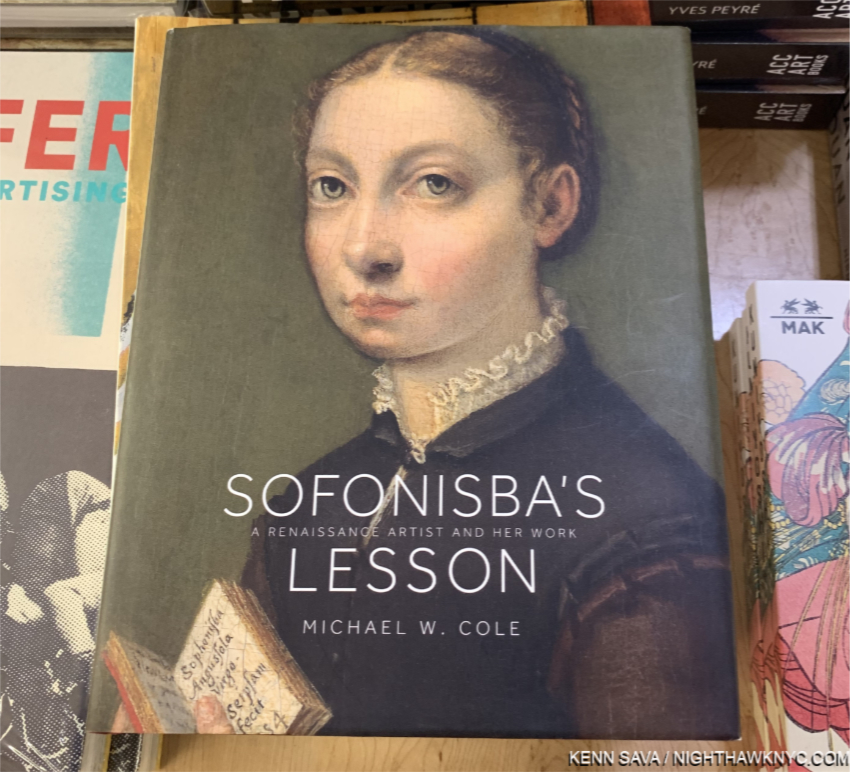
Sofonisba’s Lesson, Michael Cole, Princeton University.
Wait. What? Who? Sofonisba Anguissola, 1532-1635, was a female Painter & educator in the Renaissance. Believe it or not, a female Painter in the Renaissance. And a great one, in my view. To say her work has been in eclipse since would be an understatement. I, for one, was unfamiliar with her or her work until I saw this incredible, irresistible face staring out at me from the cover. I doubt I’m alone in that. The Met appears to have nothing by her. Neither does The Frick. Ah, but one person who immediately saw her talent was Il Divino himself, Michelangelo, who informally gave her advice! Nuff said. There is no possible higher recommendation in the Art world than that. Into the gap of knowledge for the rest of us mere mortals steps Michael Cole’s beautifully done, concise, monograph that goes a very long way towards putting her back on all of our maps, where she belongs to stay, in my view, henceforth, as the true Master Artist she was.

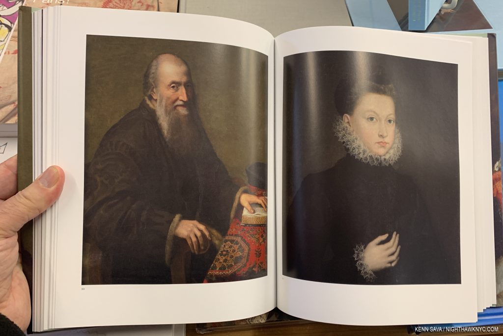
As you can see both of these Portraits are first rate, but look at the table covering, left, and the collars and cuffs on the right. For me, there are number of different techniques, even styles, on views in each work and that speaks volumes about the depth of her skill.

At 2.5 pounds, it’s not as big in size or as weighty as the Rembrandt or Basquiat XXLs on this list, yet I admire this book so much that if it weren’t for Noah Davis being released this year, it might well be my NoteWorthy Art Book for 2020. A lesson for all those Artists struggling for recognition today- Sofonisba’s Lesson comes 12 years before the 500th Anniversary of her birth in Lombardy in 1532. Better late, than never.

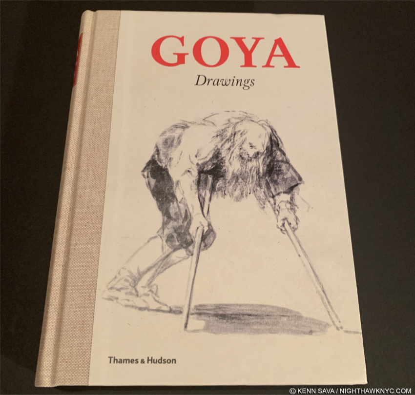
Goya Drawings, Thames & Hudson/Prado Museum.
Back in the day before Photography with chemicals ruled the world, Drawing & Painting were the primary means by which events of the day were recorded or, along with those past, recreated. Primary among the great Artists who recorded the events of their day remains Francisco Goya. While his The 3rd of May, 1808, is perhaps, his most well-known such work, though we have no way of knowing if the Artist actually witnessed this scene personally. He also created a large body of Drawings the scope of which, and the humanity of which, only Rembrandt’s can equal in my mind. Like the original Dutch Master, Goya’s Drawings magically capture a pose or an expression in an almost impossible economy of line, while looking for all the world like they were done quickly, without second thought. Ahh…Drawing at its most sublime. 

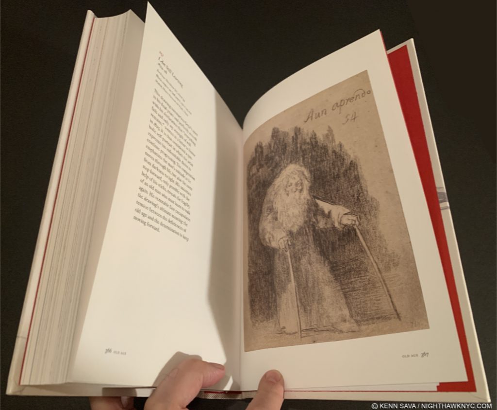
2020 saw the release (or at least the availability in this country) of two excellent Goya Drawings monographs, both of which are published by no less than the Prado Museum, home of the world’s finest & most comprehensive Goya collection, one of which is a NoteWorthy Art Book for 2020. Goya Drawings immediately becomes the choice resource for the lay reader, the Drawing or Painting student or Artist, and for the serious Goya student. A remarkable overview that does not scrimp on detail, insights, or the number of color images, in manages to stay concise and succinct. I picked it and didn’t know what to make of it from very generic front cover. “Goya Drawings”? That’s a huge subject for such a small book. Once I opened it I could not put it down. Sure enough, his Drawings over his entire career are covered, period by period in depth, and while not each and every one is covered, the overview is broad enough to convey the big picture  but can be dipped in to at any point for a closer study of any one work, which is written about on the page with its illustration- quite rare in a comprehensive book like this, and an indication of its superb design.

Finally, along with the other Goya Drawings book they published this year, Francisco de Goya: Cuaderno C (or Sketchbook C), which reproduces in facsimile one of his sketchbooks, both books are part of the Prado’s continued effort to make its Goya riches available to the public, online for free, and in these two modestly priced and superb books, Goya Drawings was released in honor of it’s 200th Anniversary in November, 2019. Bravo!

I Am Still Learning, c.1825-8, Lithographic crayon on grey laid paper,  on the next to final page. Goya was about 80 when he Drew this symbolic Self-Portrait. A fitting culmination to an immortal career, …and to this piece as words to live by.

Afterword/Forward to 2021

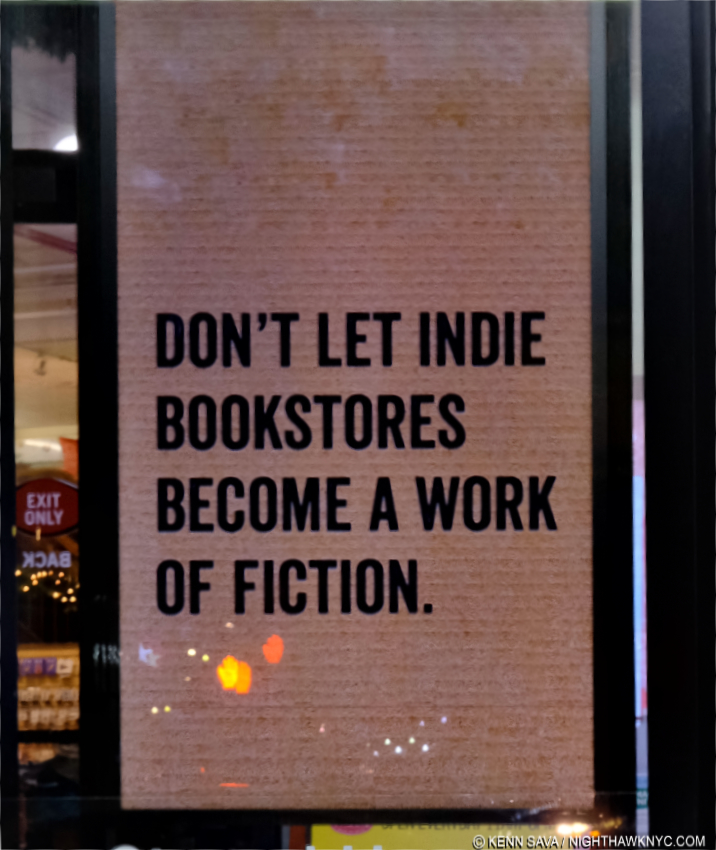
We’re not out of the pandemic woods yet. It might be a while before we are. I hope and pray not a long while. We shall see. Still, many smaller businesses have permanently left us. Many others are hanging on. I have been staying to myself this year, which means living in complete isolation for all of 2020. Yup. You read that right. I will only go into an enclosed space if I have to. Still, I have made very brief journeys into local bookstores, and peered in the window from the street of others, to see how busy they were. Frankly, what I’ve seen is very scary. Throughout the week, you could roll a bowling ball down the aisle of almost any bookstore here and hit no one. On the weekends, they’ve been closer to normal. Part of that is, no doubt, early holiday shopping. Still, the big takeaway for me is that the time is now- today and 2021, to support independent bookstores if you want them to survive. Many of the books and Artists I discover each year (and have my entire life) I’ve discovered browsing books in bookstores- including Rembrandt: His Life, His Work, His Time, by Bob Haak, shown earlier, 40 years ago. You can’t do that online. I’ve been waiting for eBooks to begin to replace physical Art & PhotoBooks for many years now. As 2020 closes, it doesn’t seem that we’re any closer to that than we were 5 or 10 years ago. A high quality eBook could replace most Art books published today- IF the image quality was comparable. They’re not. Screen image quality is nowhere near that of printed image quality. Then, there are Artist’s Books and PhotoBooks. Many of both are painstakingly crafted in every single detail, down to each material used, which no cyber experience can match. These books are often works of Art in themselves, and for many Artists & Photographers who don’t have gallery representation, they provide a primary focus for having their work seen on their terms, the way they intend it to be seen. Physical books in general have a charm and provide a tactile experience no eBook can match. If you value books, like I do, consider supporting your favorite local indie bookstore in person or online. While you can.

*-Soundtrack for this Post is “Better Days Ahead,” by Gil Scott-Heron & Brian Jackson from the album Secrets, 1978…

NighthawkNYC.com has been entirely self-funded and ad-free for over 6 years, during which over 250 full length pieces have been published. If you’ve found it worthwhile, you can donate to keep it going & ad-free below. Thank you!

Written & photographed by Kenn Sava for nighthawknyc.com unless otherwise credited.
To send comments, thoughts, feedback or propositions click here.
Click the white box on the upper right for the archives or to search them.
For “short takes” and additional pictures, follow @nighthawk_nyc on Instagram.

Subscribe to be notified of new Posts below. Your information will be used for no other purpose.


  1. Here.
  2. With a caveat on the Drawings volume, so he went ahead and created a concordance to ease referencing the new Schatborn reference numbers Taschen’s behemoth uses to refer to the work to the standard Benesch numbers, available here!

Vida Americana: Revolutionizing American Art

Written & Photographed by Kenn Sava

The museums and galleries will reopen.

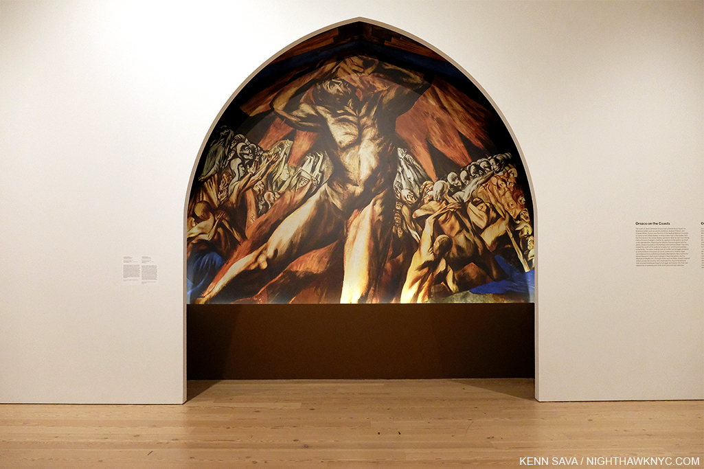
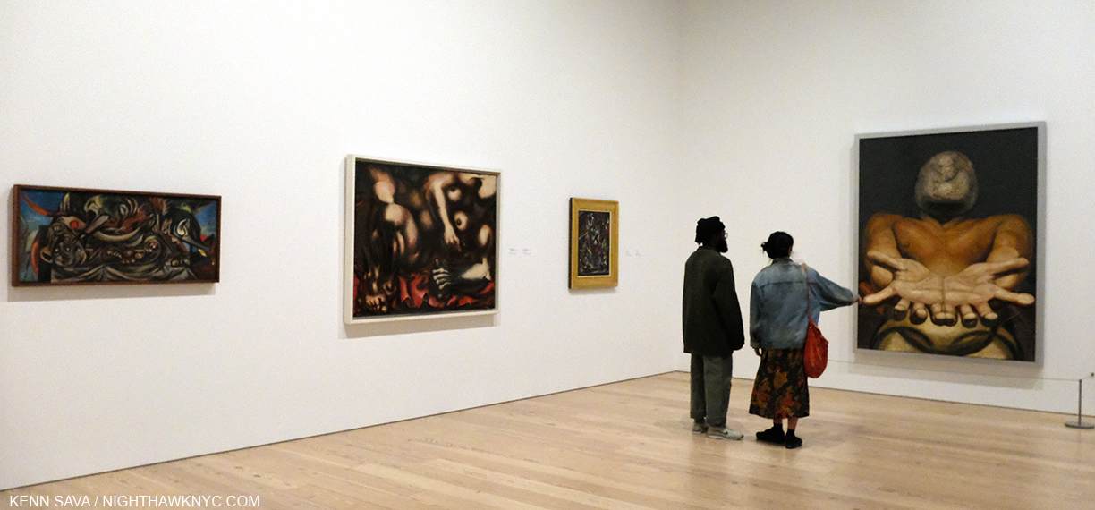
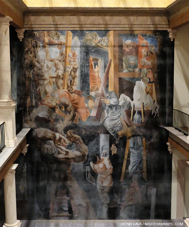
The revolution comes north. The first major work by one of Los Tres Grandes in the USA. José Clemente Orozco, Reproduction of Prometheus, 1930. Jackson Pollock made a trip to see it, then called it “The best painting in the contemporary world.” He  kept a picture of it on the wall in his studio throughout the 1930s1.

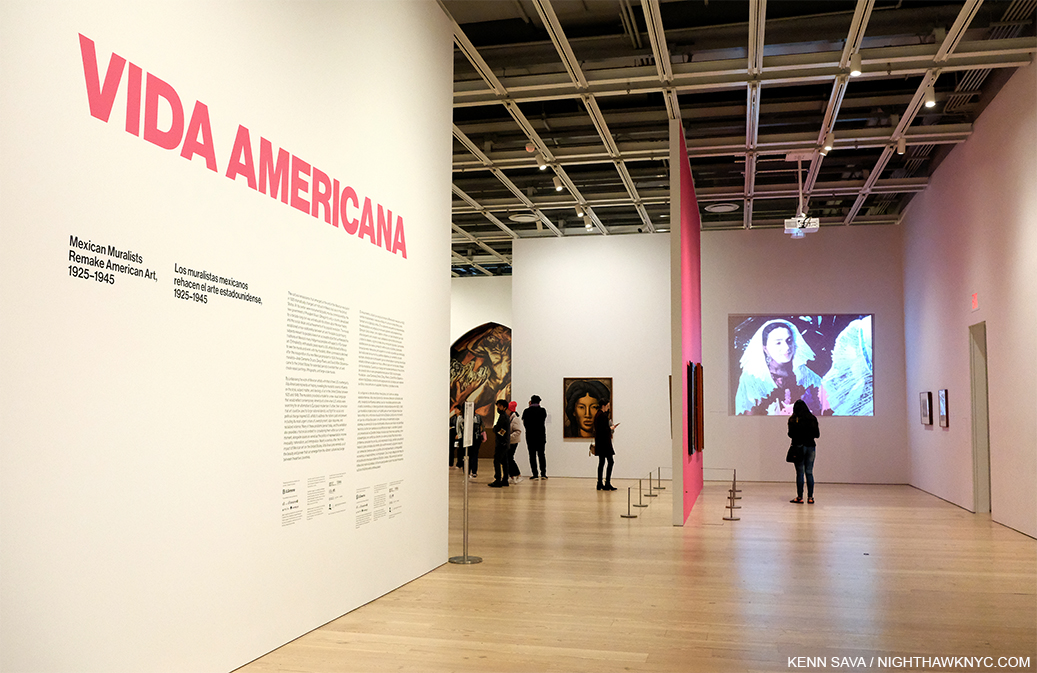
Exactly when that will be in NYC is unknown at moment. Near the end of the voluminous list of unfortunate and tragic occurrences resulting from the pandemic in NYC is that the Year in Art shows, 2020, had gotten off to an exceptionally strong start here. A number of very good and important shows were forced to close early in their run, meaning relatively few got to see them. Unfortunate, not tragic. I’ve already looked at the most NoteWorthy, as I’m fond of saying, gallery show I’ve seen thus far this year- Noah Davis at David Zwirner. The most NoteWorthy museum show I’ve seen in 2020 is the landmark Vida Americana: Mexican Muralists Remake American Art, 1925-1945 at the Whitney Museum, which opened on February 17th and “temporarily closed” on March 12th.

The entrance of Vida Americana (“American Life”), seen on March 11, 2020, the day before it “temporarily closed” for the coronavirus pandemic.

With over 200 works by 60 Artists, Vida Americana makes the heretofore overlooked case for the influence the Mexican Muralists, particularly Los Tres Grandes (“The Big Three”), Diego Rivera, José Clemente Orozco, and David Alfaro Siqueiros, had on American Artists & American Art between 1925 to 1945. It does so convincingly in side by side installations and bringing to the fore little studied connections a number of major American Artists had with their Mexican counterparts. 10 years in its planning and 4 in creation, Vida Americana succeeds in making its case in resounding fashion with wonders seen now and likely never again according to the show’s curator, the inimitable Barbara Haskell, who’s been at the Whitney since 1975 2.

Times are hard everywhere as I write this as April, 2020 comes to a close. In researching Vida Americana, I was reminded that a little over 100 years ago, in 1918, the “deadliest pandemic in history” (according to John M. Barry’s book The Great Influenza) left 100 million people dead worldwide. A sobering thought at this moment.

Things can always be worse.

300,000 Mexicans died. Luckily, the three Artists at the center of Vida Americana, Diego Rivera, José Clemente Orozco, and David Alfaro Siqueiros, were not among them.

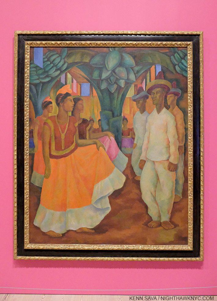
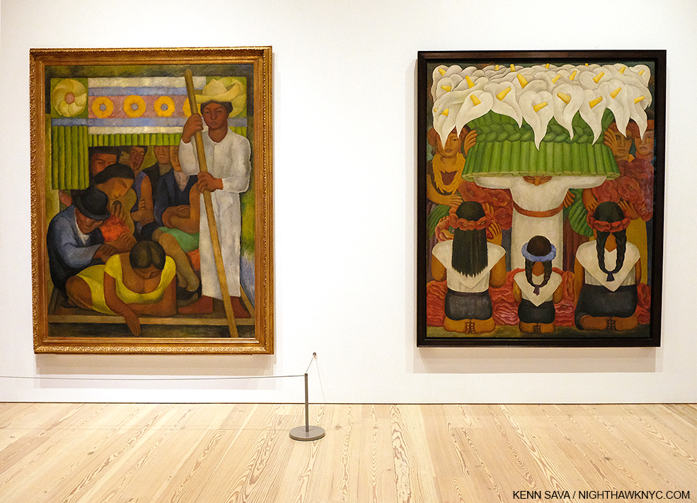
The first work in the show. Diego Rivera, Dance in Tehuantepec, 1928, Oil on canvas. Rightly famous for his incredible Murals, he was also a terrific easel Painter for his entire career, work that has yet to receive the attention on the level of his Murals. Are those some remnants of his passion for Cezanne, particularly in the clothes worn by the lead gentleman?

Though the decade-long Mexican Revolution ended 100 years ago in 1920, the final death toll may never be known. Today, estimates range between one million and three million, (not including that 300,000 who died in the 1918 pandemic). Diego Rivera spent the entirety of the Mexican Revolution studying in Europe on a grant from the governor of Veracruz to further his Art education. He precociously devoured the work of the great European Painters of the time, as can be seen in his easel Paintings that wonderfully echo El Greco and Cezanne, around 1913, and his adoption of Cubism, from 1914-18 or so. He knew Picasso and Georges Braque and was something of a competitor of theirs as he tried to make his own name, before finding his own style. In 1919, towards the end of his European period, Diego Rivera met David Alfaro Siqueiros, who was also in Europe on an Art scholarship. Vida Americana (American Life) takes its name from the sole issue of the journal Vida Americana that contained a manifesto of sorts written by Diego Rivera and David Alfaro Siqueiros.

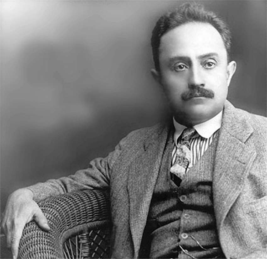
José Vasconcelos, date unknown. As minister of education, he commissioned Artists, including Los Tres Grandes, to Paint Murals. And so, he had a major influence on Mexican history, and unintentionally, American Art history,

Meanwhile, back in Mexico, after the Revolution ended in 1920,  a profound change swept across Mexican society. New president Alvaro Obregon’s government enacted progressive social reforms that empowered workers and farmers. This transformative project wasn’t so simple. “There was no shared culture. No sense of a Mexican national identity,” Barbara Haskell said3. “The Mexican Revolution led to the need for Art that depicted the history and everyday life of the people.” President Obregon appointed José Vasconcelos as director of the Universidad Nacional de Mexico (National University of Mexico). He reached out to Diego Rivera in Europe in hopes of recruiting him for the campaign to create a new national culture. Backed by a Mexican government stipend, Diego Rivera, took a trip to Italy to study the great Italian Renaissance frescoes during the winter of 1920 in Verona, Padua, Venice, Ravenna, Florence, and Rome, where he saw Michelangelo’s Sistine Chapel. After he was sworn in as Mexico’s minister of education in the fall of 1921, José Vasconcelos commissioned Artists, including Diego Rivera, José Clemente Orozco, and David Alfaro Siqueiros, to create grand public Murals depicting the history and everyday life of the nation’s people, and “Los Tres Grandes” were born. They rose to the challenge, and in the process, reintroduced the Mural to Western Art.

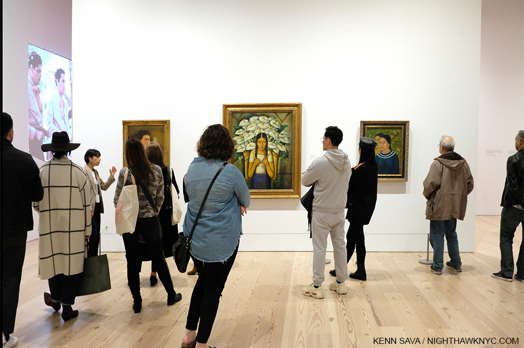
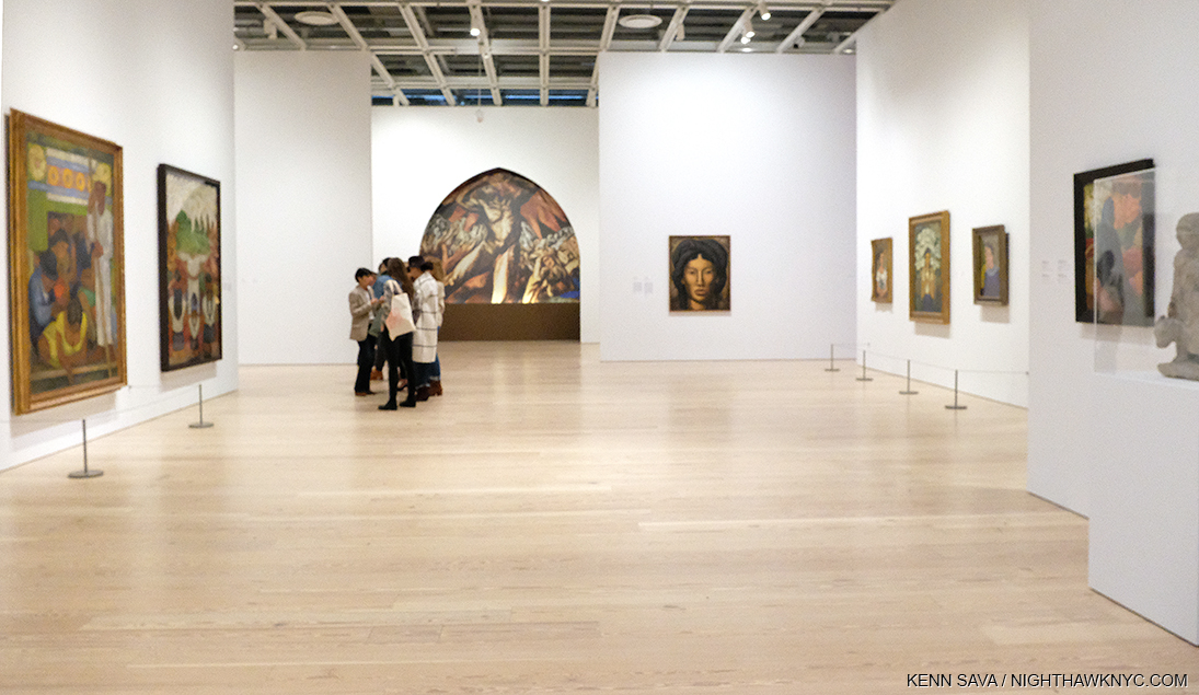
Installation View. My mission? Get this shot without people in front of the Art, which includes two rarely seen works by Frida Kahlo.

Vida Americana is so big, with so many pieces drawing one’s attention, so many connections leaving much to study and ponder, in the one visit I was able to make I had to focus on, first, seeing it all, and second, on how the Mexican Muralists directly influenced Jackson Pollock and Philip Guston, two Americans who’s paths have long intrigued me.

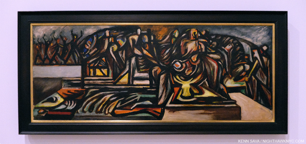
One example of how extraordinarily this show was hung throughout. Jackson Pollock, Untitled, c1938-41, Oil on linen, 22 1/4 x 50 1/4 inches, David Alfaro Siqueiros, War, 1939, Nitrocellulose on composition board, 48 5/8 x 63 7/8 inches, Jackson Pollock, Composition with Flames, 1936, 26 1/2 x 21 1/2 inches, David Alfaro Siqueiros, Our Present Image, 1947, 87 3/8 x 68 11/16 inches, Pyroxylin on fiberglass, 87 3/8 x 68 11/16 inches, left to right.

Fast forwarding from 1920 to my own teen years, Jackson Pollock and Edward Hopper were the two Artists who planted stakes in my mind for modern American Art, after centuries of European domination that culminated at the time with the all-encompassing brilliance of Picasso. Of course, they had come on the backs of almost 200 years of earlier American Artists before my time, yet American Art seemed to be playing second fiddle the Europeans until the post-Second World War years. It was easy to get lost in the Americanism of Messers Pollock and Hopper and easy for me to relate to them particularly since both spent most of their career in NYC. Greenwich Village was home for Edward Hopper for about 50 years, and Jackson Pollock legendarily frequented the Cedar Tavern and other bars in the area, while living with his wife, Lee Krasner, in Springs, Long Island, where I indelibly visited his studio in 1999. In looking through his career, it was well-known that he came here to study at the Art Student’s League with Thomas Hart Benton. “He drove his kind of realism at me so hard I bounced right into non-objective painting,” Jackson Pollock later said reflecting on studying with Thomas Hart Benton4.

Jackson Pollock, Untitled, 1938-41. This “pre-drip” period fo the Artist’s work remains understudied and under-appreciated in my view. Whereas the journey Mark Rothko took from figuration to abstraction is interesting, Jackson Pollock’s is downright fascinating. Here, in this stunning work, the figures break up with such intense rigor and stunning color, it really does make you wonder where it was all going to lead. It also makes me wonder how many other Artists would have been content to continue Painting just like this, a very brief period in Jackson Pollock’s brief career.

After leaving Thomas Hart Benton, what always mystified me was how Jackson Pollock became “POLLOCK” to quote the title of the film made some years back- the Artist who burst on the scene, with a never before seen style that revolutionized what Painting could be in the late 1940s and early 1950s before his tragic death on August 11, 1956 at 44. I even wrote a piece with that title after the most recent MoMA Jackson Pollock show in 2016, Jackson Pollock: A Collection Survey 1934-54. Truth be told, looking back on it, though there were some clues in that show, I remained puzzled at how the Artist came up with his style, which has been called everything from “dripping,” to “splash and dash” to fill in your own, here. We know now that all of these terms sell Jackson Pollock’s formidable technique very short, as is demonstrated here.

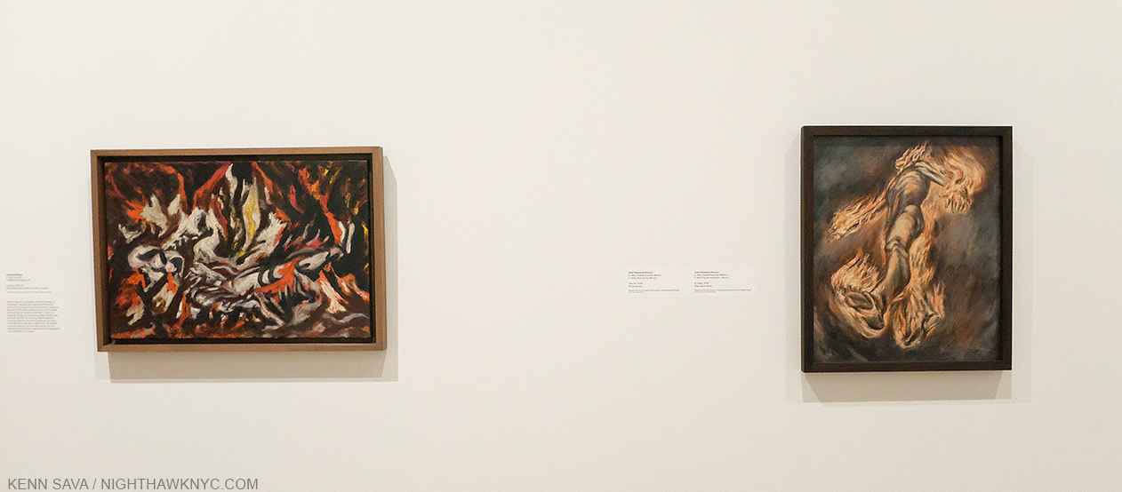
“I simply paint the life that is going on at the present—what we are and what the world is at this moment. That is what modern art is.” José Clemente Orozco

Jackson Pollock, The Flame, 1934-38, Oil on canvas mounted on fiberboard, left, and José Clemente Orozco, The Fire, 1938, Oil on canvas, right. Seeing these works side by side was an eye-opening revelation for me.

José Clemente Orozco was the first of Los Tres Grandes to visit the USA in 1917-19, living in NYC and San Francisco. In 1930, he was commissioned by Pomona College in Claremont, California to paint a mural in the student cafeteria. Prometheus became the first true fresco ever painted in the USA.  Jackson Pollock made a special trip to see it. He called it, “The best painting in the contemporary world5,” and kept a picture of it on the wall in his studio throughout the 1930s. At the Whitney, there is a large, though reduced, reproduction of Prometheus (see the first picture in this piece), along with a few other, smaller, works by José Clemente Orozco that are hung next to early works by Jackson Pollock. HERE was the long-awaited first eureka moment in my quest for insights into Mr. Pollock’s work. The similarities in elements, even styles, between  them when seen side by side were beyond compelling. They were revelatory.

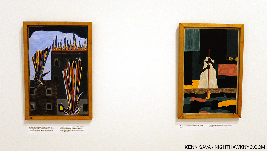
Jacob Lawrence, Selections from The Migration Series, 1940-1, Casein tempera on hardboard. On the wall card, it says, “Lawrence credited Orozco in particular with inspiring his ambition and his use of bold colors and architectonic forms.”

On an adjacent wall was an installation of selections of the work by Jacob Lawrence that seemed to take Mr. Siqueiros’ ideas in different and unique directions. I looked up to see if there was a now lit lightbulb hanging over my head. It wouldn’t be the last time.

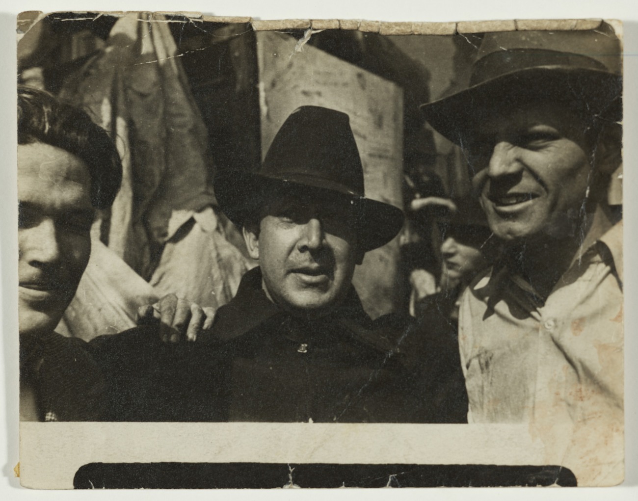
David Alfaro Siqueiros, center, and Jackson Pollock, right, in Union Square, NYC, 1936, Archives of American Art/Smithsonian Institution Photo.

David Alfaro Siqueiros was the last to arrive in the USA. While each of Los Tres Grandes were on the cutting edge, if not the edge, socially and politically, he took it further. He believed that revolutionary ideas required revolutionary materials and techniques. In 1936 he established the Siqueiros Experimental Workshop in Union Square, a stone’s throw from where I sit writing this, which he referred to as a “Laboratory of Modern Techniques in Art.” Some 30 years later another Artist would explore “new materials and techniques” when Andy Warhol moved his Factory to Union Square. Among the students at the Siqueiros Experimental Workshop was Jackson Pollock, who was about 24, and who had been without a teacher since Thomas Hart Benton moved from New York to Missouri in 1935. “One anecdote recalls Siqueiros constructing something resembling a Lazy Susan, filling it with paint, and spinning it atop a horizontal canvas ”a predecessor to Pollock’s later drip technique6.”

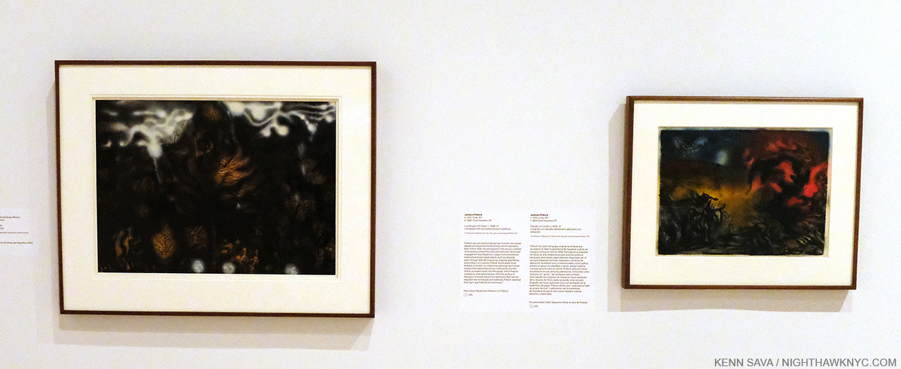
David Alfaro Siqueiros, The Electric Forest, 1939, Nitrocellulose on cardboard, 28 x 35 inches, left, Jackson Pollock, Landscape with Steer, c.1936-7, Lithograph with airbrushed lacquered additions, 15 7/8 x 22 7/8 inches.  It’s interesting that while David Alfaro Siqueiros’s works are often political, Jackson Pollock’s don’t appear to be.

Later in the show, Gallery 11 is devoted to the Siqueiros Experimental Workshop. Here, a David Alfaro Siqueiros was hung next to a Jackson Pollock, and now I could feel the figure breaking down even more. Complete abstraction is not far away. The technique was getting wilder and more experimental. Now, it wasn’t that big a jump at all in my mind from works like Landscape with Steer to a work like his 20 foot long Mural, 1943, in a genre that itself would appear to be a nod to the influence of Los Tres Grandes. For me, this was the biggest takeaway among many, from Vida Americana. But, the joys of the show weren’t solely technical or historical.

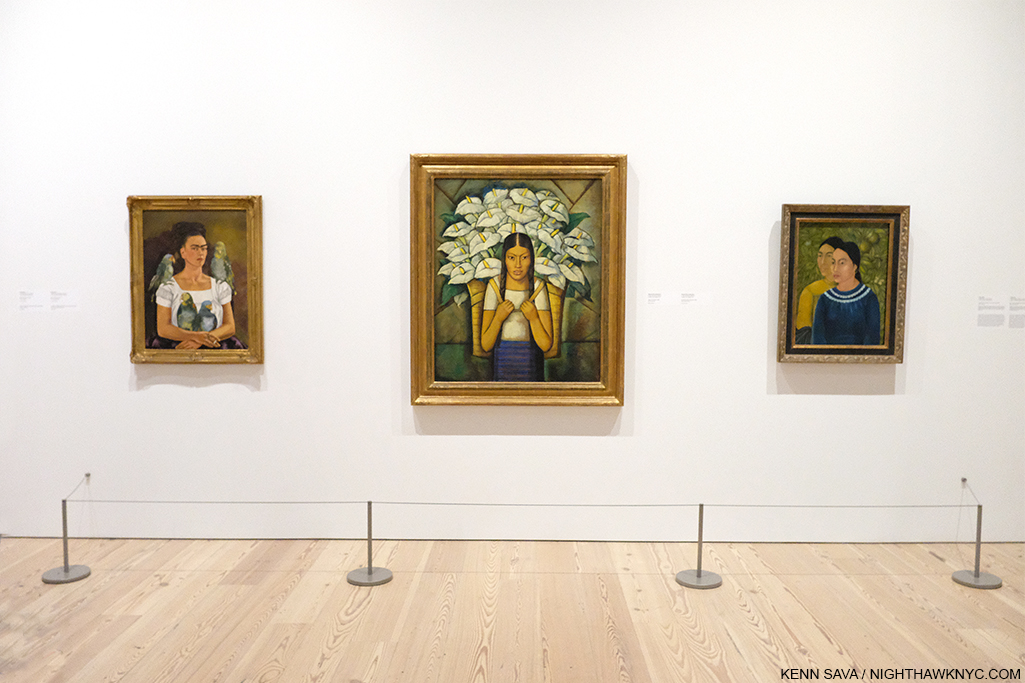
Finally! The scene shown earlier, sans viewers. Frida Kahlo, Me and My Parrots, 1941, 32 5/16 x 24 3/4, left, Alfredo Ramos Martinez, Calla Lily Vendor, 1929, 45 13/16 x 36 inches, center, and Frida’s Two Women, 1928, 27 3/8 x 21 inches, right. All three are Oil on canvas.

Walking through the show, all three Artists are well represented, as are a number of other lesser-known Mexican Artists of the period. Frida Kahlo is not one of them. Perhaps as popular, if not more popular, than any other Artist represented in the show, her possible influence on American Artists from 1925-45 is curiously not touched on. Perhaps, it’s taken for granted that her example and influence have never stopped influencing Artists and the general public?

Out of focus shot of the installation showing the 2 Fridas, far right, facing 2 works by Diego Rivera.

Even not as well known is that it was an American who was Frida Kahlo’s first important collector. In 1938, when she was still an unknown in the US, the actor and Art collector Edward G. Robinson visited Diego Rivera in Mexico City. After selecting some works by Mr. Rivera, the Artist led him into Frida’s workspace. He bought 4 Paintings from her for $200.00, each(!), her first major sale7. To that point she had often given her work away. After Edward G’s purchases she said, “This way I am going to be free.” She didn’t have to ask Diego for money. This American had had a real influence on this great Mexican Artist. 

Frida is represented here by two beautiful examples of her work, including the stunning Self Portrait Me and My Parrots, 1941, beautifully installed facing two large works by the husband she married twice, Diego Rivera.

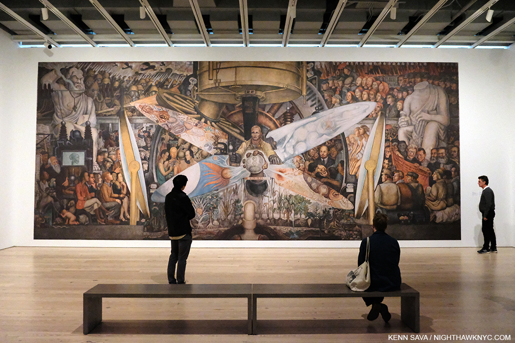
In looking at the work of Diego Rivera, it’s interesting to me that his figures seem to vary between the stereotyped and the specific and you’re likely to encounter either as you move from work to work of his. In both of these works, depicting specific people doesn’t seem to be his point. In many other works, including Man at the Crossroads, 1933, which he Painted for Rockefeller Centers, his inclusion of a portrait of Lenin, and his refusal to remove it, led to the work’s destruction. Elsewhere, he includes a number of his lovers, his wife, Frida Kahlo, and numerous other known persons, including Charlie Chaplin, and self-portraits.

Diego Rivera, Man Controller of the Universe, 1934, reproduction of the Mural at the Palacio de Bellas Artes, Mexico City.

None of the three members of Los Tres Grandes were strangers to controversy, with, perhaps, Diego Rivera’s Man at the Crossroads, 1933, Rockefeller Center commission being the most legendary incident. Man at the Crossroads was produced in a revised version as Man Controller of the Universe or Man in the Time Machine, at the Palacio de Bellas Artes (Palace of Fine Arts), Mexico City, in 1934. A stunning reproduction of it occupies the entire wall, and windows, that face the High Line, and is accompanied by a huge study.

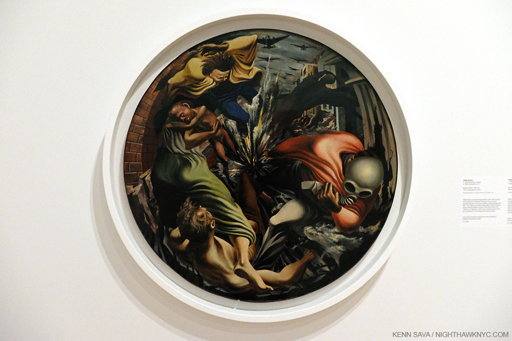
In Gallery 3, titled “Siqueiros in Los Angeles,” another of the highlights for me were two loans of major works by the great Philip Guston.

Philip Guston, Bombardment, 1937-8, Oil on canvas, 42 inches.

Bombardment, 1937-8, one of the Artist’s masterpieces, from the Philadelphia Museum It’s as near to a “perfect Painting” as one can imagine, unique in Art history, and a work that deserves even more attention than it already has, if one can say that about a masterpiece. Securing the loan of it for this show was a major coup. My look at Philip Guston: Painter at Hauser & Wirth a few years back proved a bit controversial, but I make no bones of my admiration for his work before and after his “abstract period,” which I have continued to try find a way in to. It’s gotten easier. But here, in Bombardment, we have a work that is a one of a kind. A rare modern circular Painting (harkening back to the Tondo in the Renaissance, one of Philip Guston’s favorite periods of Art) in which motion, energy, death and destruction find no resting place in a brilliantly orchestrated “explosion” of paint. A work like this would be impossible in a Photograph. It’s also hard for me to look at and not think of Picasso’s Guernica, a mural, also from 1937, and both inspired by the Spanish Civil War, though they couldn’t be more stylistically different. Stylistically, it does make one think about the possible influence of David Alfaro Siqueiros, who Philip Guston had served as an assistant for. Looking at it closely, though it’s “only” 42 inches in diameter it feels a bit like a mural, not unlike another major work by the Artist nearby. 

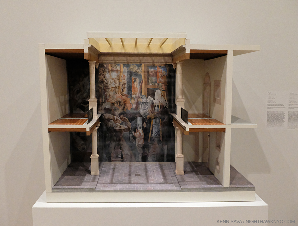
Philip Guston, Reuben Kadish, Jules Langsner, Reproduction of The Inquisition also known as The Struggle Against Terrorism, 1934-5, Dimenseions and materials not stated.

Here was an amazing model for Philip Guston’s legendary early Mural collaboration with Reuben Kadish and Jules Langsner, The Inquisition also known as The Struggle Against Terrorism, 1934-5, something I never even knew existed. Murals on walls are not tranportable. Yet, throughout this show the curators continually find innovative ways of “bringing” them here and making them a part of the show- like this, and like Prometheus, shown up top, and the study for one of Diego Rivera’s “Portable Murals” for MoMA seen further below. Amazing. 

Detail. I would guesstimate this space is about 12-14 inches tall. The real one is over 1,000 square feet.

Philip Guston and Reuben Kadish were both about 23 when David Alfaro Siqueiros called them “the most promising young painters in either the US or Mexico.” He urged them to come to Mexico where he helped them secure a 1,000 square foot wall where they Painted The Inquisition also known as The Struggle Against Terrorism in the courtyard of the University of Michoacan, Morelia. Due to controversy over its depiction of the catholic church, the Mural was hidden from view for 40 years until it was accidentally discovered in 1973, yet it languished for a further 30 years until efforts began to restore it. Though very small, the model gives the viewer a sense of wonder that the Artists could envision the daring and monumental composition they created.

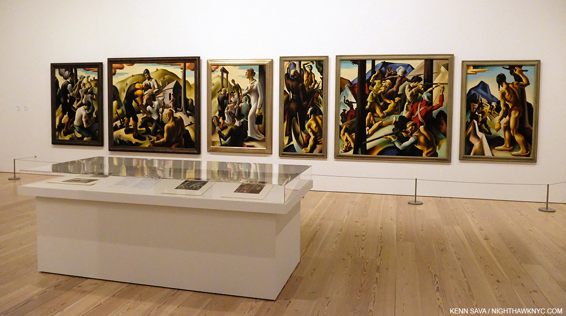
Thomas Hart Benton, Six Panels from American Historical Epic, 1920-28, Oil on canvas mounted on wood, varying sizes. Though panels, these terrific works were begun before Los Tres Grandes created their Murals, yet they share much in common, particularly its depiction of history. On the wall card it states, “Believing that art’s role was to tell the truth, Benton refused to sanitize history. Thus this mural cycle celebrates American history while also drawing attention its environmental and social injustices.” Exactly what we see in the work of the Mexican Muralists.

Diego Rivera, with his wife Frida Kahlo arrived in the US in November, 1930 to open a retrospective of his work in San Francisco, which was followed by one at the newly opened MoMA, NYC the following year. By that point, he was considered “the hero of the Western world, who embodies the spirit of the Mexican revolution8.” “His idea about creating a national epic (in his Murals) was something that would also be very influential on American artists,” Barbara Haskell added9.

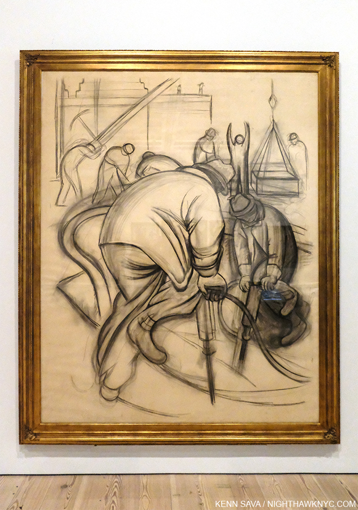
Diego Rivera, Pneumatic Drilling, 1931-2, Charcoal on paper, 97 1/4 x 76 7/8 inches. Apparently a full size Drawing for one of the Portable Murals the Artist did for MoMA in 1931. About this work, MoMA said in 2012, “The day after Rivera arrived in New York City, the New York Herald Tribune reported on his plans to “paint the rhythm of American workers.” Rivera later identified this scene as depicting preparations for the construction of Rockefeller Center, which was still in its early stages when he arrived in New York10.” These are the kinds of scenes many American Muralists would do in their WPA FAP Projects, commencing a few years later.

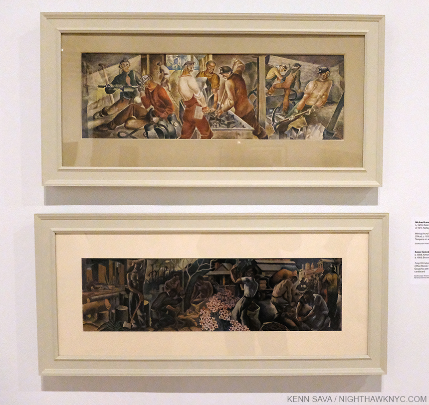
The influence of the Mexican Muralists on the WPA Federal Art Project, 1935-43 is another revelation of Vida Americana. Reintroducing the Mural in Western Art brought it out of the church and into the realm of Public Art. At its peak in 1936, the Federal Art Project employed 5,000 Artists, possibly double that over the 8 years it existed, producing 2,566 Murals and more than 100,000 easel Paintings. It’s obvious, to me, that in looking at the Murals they produced many of them seem to follow in the footsteps of their Mexican counterparts, stylistically, and in their content, many of the Murals belied the influence of the Mexican Artists who’s works were steeped in history and the life of everyday people and workers.

Michael Lenson, Mining (Mural Study for Mount Hope, West Virginia Post Office), c. 1933-34, Tempera on wood, top, Xavier Gonzalez, Tung Oil Industry (Mural Study for Covington, Louisiana Post Office), 1939, Gouache, pen and ink, on pencil on paper mounted on cardboard.

Once you start looking for the influence of the Mexican Artists included in Vida Americana, particularly that of Diego Rivera, José Clemente Orozco, and David Alfaro Siqueiros, you begin to find it turning up all over and in surprising places. Add to this the incalculable influence of Frida Kahlo, as an Artist, as a woman, and as an unconquerable human being, it turns out, as Vida Americana finally demonstrates, the influence of Mexican Art on American Artists from 1925-45 rivals that of any other.

March 11, 2020. A Whitney staff member speaks about “Siqueiros in Los Angeles.” It might be a while before we see this again.

It will be very interesting to see how the Whitney, and all the museums, handle their schedules, and the virus, when they reopen. Will shows that were up when they temporarily closed be extended? What will that do to their future exhibitions and loans? It all remains to be seen.

The curtains have been drawn. For how long? A view of the Hudson River from the fifth floor behind the show. The former Department of Sanitation complex directly across the West Side Highway, which I mentioned in my piece on the Whitney building, has now been dismantled in preparation of…? What will the future bring?

As I write this in early May, it looks like Vida Americana will reopen giving others a chance to see this landmark show, in my view, the first one mounted in the Whitney’s new building (Thus far, I’ve written about their new building, Andy Warhol, Frank Stella, Stuart Davis, Grant Wood, Laura Poitras, the 2017 Whitney Biennial, and other smaller shows). In the meantime, having the chance to see it once has given me much to think about during this pause. While the world on the other side of the pandemic will be different, so too will be the way I henceforth look at 20th century American Art history.

*-Soundtrack for this Post is “Mexico” by Morrissey from You Are The Quarry.

NighthawkNYC.com has been entirely self-funded and ad-free for over 6 years, during which over 250 full length pieces have been published. If you’ve found it worthwhile, you can donate to keep it going & ad-free below. Thank you!

Written & photographed by Kenn Sava for nighthawknyc.com unless otherwise credited.
To send comments, thoughts, feedback or propositions click here.
Click the white box on the upper right for the archives or to search them.
For “short takes” and additional pictures, follow @nighthawk_nyc on Instagram.

Subscribe to be notified of new Posts below. Your information will be used for no other purpose.


  1. Whitney Museum introductory video
  2. Comments from Ms. Haskell in this piece are excerpted from her remarks at the Press Preview, unless otherwise noted.
  3. Here.
  4. Here
  5. per Barbara Haskell
  6. Here
  7. Here.
  8. Whitney Museum video
  9. Here
  10. Here.

R. Crumb Meets His Match

This site is Free & Ad-Free! If you find this piece worthwhile, please donate via PayPal to support it & independent Art writing. You can also support it by buying Art & books! Details at the end. Thank you.

Written & Photographed by Kenn Sava (*- unless otherwise credited)

(This is, also, my NoteWorthy Show for January, 2017.)

I’ve been looking at R. Crumb for a very long time. At least 20 years. Of course, his work predates that by a further 35 years, and today I still find all of it compelling. Unfortunately, the chances to see a number of original works by R. Crumb remains all too rare. The chance to see the Artist himself, rarer still. So rare, I never have. I tried in vain to find out if he would be appearing at the opening for the show co-starring his wife of FORTY YEARS (in 2018), Aline Kominsky-Crumb, “Drawn Together,” on January 12, then decided to take a chance and swing by David Zwirner Gallery (most recently the scene of “William Eggleston- The Democratic Forest,” which pretty much turned my entire life upside down, launching my free-fall into a bottomless pit of research into Contemporary Photography. In fact, If I’m not careful, this will become a Photography Blog very soon!) and have a look see, anyway. I’m not one to attend Art Openings unless an Artist I’m interested in is making an appearance.

The Nighthawk At The Opening (Artist’s conception, cause I generally don’t attend them). Adapted from The New Yorker’s March 13, 2017 cover called “Opening Night.” I couldn’t resist. My Apologies to Artist Carter Goodrich, and the great editor Francoise Mouly (a friend of R. & Aline Crumb).

R. Crumb’s work occupies a unique place somewhere between what’s been traditionally the so-called “low-brow” world of comics and “Fine Art,” that’s been hard won. Bursting on the world’s awareness like a supernova in 1967, when he was there are the genesis (sorry) of what would come to be called “Underground Comics,” a genre of which he soon became the de-facto figurehead of, and, for many, it’s most important Artist. Over the years, his work has begun to be more fully appreciated beyond the world of Comics. The late Art Critic Robert Hughes called him “the Brueghel of our time.” Even that lofty observation barely scratches the surface of R. Crumb’s impact and influence. While I was walking the streets of Chelsea to the opening of this show, admittedly with Crumb on my mind, I found it quite hard not to see his influence in the work of a number of shows I passed by Artists who’s work has nothing to do with comics or graphic novels and even in the flared pants snd chunky shoes women seem fond of these days. While Crumb’s work remains under-appreciated by the Fine Art world, in my opinion1, his influence has barely begun to be seriously considered2.

Arriving, I walked in to a good sized crowd…and live music. As I made my way through the gallery to the rear, large room. Low and behold…

R. Crumb, himself.

Art, and Artist. R. Crumb on left-handed mandolin(!), appropriately on the far left, performing with the East River String Band, at the Opening, David Zwirner Gallery, West 19th Street, January 12, 2017.

…looking just like a comic of R. Crumb, himself. He was seated wearing a cap and playing a mandolin with a group, the “East River String Band,” who’s blonde singer and one of the musicians I immediately recognized from covers R. has drawn for the band’s albums. The music was lively and pleasant, but, frankly, it went right past me. I couldn’t get over the fact that here he was, a few feet in front of me. Every little move he made fascinated me- he plays left handed!? (he writes & draws lefty, too), how he interacted with the other musicians (he seemed to mostly follow), how he held his instrument, how he sat while playing it (slightly folding himself around it)…Partly, the former Musician in me was interested. Mostly, it was because R. is someone who seems to do everything he does deliberately, so this might reveal some small key to the Artist.

The set ended, and I moved a bit closer as the equipment was torn down. R., his instrument put away, remained in his chair. Carefully approached by a few (the legend of his not being a fan of his fans well-known to his, um, fans), only one, who he appeared to know, actually dared speak to him. He presented a book. It may have been one they collaborated on.

Alone in a crowd. R. Crumb after the set.

I watched the Artist reach into his inside jacket pocket and produce a white pen to sign it. I immediately recognized it as a Rapidograph pen, the pen he’s made famous, at least for me, because they are what he’s drawn with for lord knows how long now. I had never heard of them until I found out he used them a decade ago, and immediately bought a set for like 120 bucks. Then, I realized that drawing in ink is not for those squeamish at the site of their own blood. So? Back to graphite and my trusty eraser it was for me, leaving ink to Master Draughtsmen, like R. Crumb. To this day, It’s always funn to look at a Crumb original and see if there is any use of White Out Correction Fluid on it or not. He will do the most intricate cross hatching and there will be no White Out to be seen, anywhere. I don’t think I’ve drawn in ink since.

Happy Early 40th R. & Aline! HOW did you do it?? Maybe the gent in the back is wondering, too.

He looked a bit older than the last time I’d seen him on video, a bit frailer, perhaps, then he stood up, and with Aline alongside, made his way through the throng to the gallery’s offices, not to be seen again (at least while I was there). Due to the Opening Night crowd, I returned a number of other times to see the actual show.

What I saw was shocking.

As shocked as those at the opening may have been by the unannounced (as far as I know) appearance by the Artist, more may have been shocked by the excellence of the “other Artist” who shared the bill with R. Crumb, his wife of 40 years (next year. Sorry. I can’t stop saying that because it blows my mind), Aline Kominsky-Crumb.

Yes, excellence.

Anyone who can go toe to toe (not to mention parts more intimate, but no less appropriate to this show), with R. Crumb over the course of most of a show (and ALL those years of marriage) is someone who deserves an award. Well, at least recognition. It’s high time Aline Kominsky-Crumb be acknowledged, and accepted, and her considerable body of work be appreciated. “Drawn Together” made the case for that as well as it’s likely to be made.

The standard “knock” against her has to do with her draughtsmanship. Even she mentions it in a panel here. There are many cartoonists, graphic novelists, even Artists hanging in The Met, who’s draughtsmanship is “suspect,” (to be kind). It’s missing the point. The point of Art is to express and communicate, (even if the latter is “only” a byproduct). Those just happen to be Aline Kominsky-Crumb’s strongest suits.

But, yes, there are masterpieces by the Master of Underground Comics to be seen here, too. The ten page story, “Walkin’ The Streets,” wherein we witness a conversation between R. and his late brother, Charles, strikes me as one of his great(est) works.

R. Crumb’s “Walking The Streets,” with his dear brother, Charles.

Charles(left)? I was just saying the same thing, here, a few weeks back.

In fact, on the subject of draughtsmanship, it’s actually arguable who among the three Crumb Brothers, was/is the greatest. R. has spoke glowingly of Charles’ talents. He passed at age 50 from an OD of his prescribed drugs.

A page from an extremely rare surviving sketchbook by Charles Crumb reveals his obsession with “Long John Silver.” See Terry Zwigoff’s superb documentary “Crumb” for more, and seldom seen video of Charles and Maxon.

The other brother, Maxon’s, work is ingeniously intricate, and brilliantly executed, though both of those are matched by his penchance for obfuscation and symbolism. If you can fight through that, you will find an Artist who doesn’t fit into the “comic book,” or even graphic novel genre, but an Artist, who’s path is closer to that of a Fine Artist. While R.’s originals sell for up to six figures (before the decimal point), Maxon’s drawings sell for hundreds, maybe a thousand dollars, his scarcer paintings for maybe 10 to 15 grand. In my opinion, he is very unfairly overlooked, (a bit like Charles Pollock is to his brother, Jackson Pollock.) Look at this-

Maxon Crumb’s “Take Thy Beak From Out My Heart,” Ink. The intricacy of this work is just staggering. (This was not in the show).

Speaking of being overlooked, R. Crumb has been ever so gradually finding acceptance as a Fine Artist on his way to being recognized as a “great Artist.” Beyond his draftsmanship, the honesty in his work is something that might seem common now, in this age of so-called “reality” shows. R. Crumb is the original reality star in the sense of honesty depicting himself- “good,” and “bad.” This turned off many, and it, too, hasn’t “mellowed” much over time. Though things like his sexual preferences (and appetites) remain controversial, and retain the ability to shock, as does how nakedly he discusses his inner feelings and thoughts. His wife is no shrinking violet, either. She never hides what she’s thinking or feeling, about herself, or anyone else, either. As a result, she is, perhaps, the ideal collaborator and foil for R..

R. & Aline Crumb, “Should Oddball Types…,” ink. Just one example.

The results present countless fascinating insights into their lives and their long standing open marriage. Making it a family affair, daughter Sophie, now an adult Artist with children of her own, makes an appearance, too. Want to hear what the Crumbs think about having kids? How Aline knows that R. hasn’t left her? (Hint- It has to do with vinyl.) How much R.’s “Book of Genesis” was sold for by Zwirner? How sobriety has been going for Aline? The joys of owning a “vintage” refrigerator,” or, you just want to watch R & A get “50 Shades”-style kinky? It’s all here. In fact, what’s here, and unspoken, is that the two of them have quietly amassed a major body of work. Appearing, variously, under titles including “Self-Loathing Comics,” or “Dirty Laundry Comics” (what could be more appropriate?) it’s now, finally, collected in the 184 page catalog for the Cartoonmuseum Basel version of this show, entitled “Drawn Together.”

R., Aline & Sophie Crumb, “Dirty Laundry” Cover Art, Ink.

R. & Aline Crumb, “Self-Loathing Comics,” Cover. Ink. After the age of “superheroes,” R. ushered in the “reality” based Artist as anti-hero age, we’re still in the midst of. And, Aline will keep drawing her hair to prove it!

Highlights? For me? Aline’s “My Very Own Dream House,” which takes up almost the entire front gallery, and holds rapt attention over 33 pages.

Aline Kominsky-Crumb’s “My Own Dream House,” Ink, beginning.

Installation view of (almost) all of it.

Her “Goldie in Fanatic Female Frustration” in the main room, in a different drawing style, is sparser, but none the less engrossing.

Aline Kominsky-Crumb’s “Goldie,” ink. Even at a distance, the unique style of this terrific work grabs you, and perfectly conveys the fanatic frustration within.

Along with these, we get a case of R.’s classic underground comics, ranging from “Zap” #0 to “Fritz The Cat” to “Weirdo,” a case of early drawings and sketchbooks, including the very rare sketchbook of Charles’ shown above, and a collection of family photos.3

A Hall of Fame of Underground Comic Classics.

If Aline was the star of this show, if not a revelation for me, R.’s star now shines all over the world, as we see in their collaboration about their visit to Belgrade, where they were treated like “superstars,” Aline writes. At Zwirner, the range of folks coming in to see this show was striking. It was, literally, every kind of person imaginable. Young, old, male, female, black, white, hipster, hippie, businessman, writers, photographers and yes, Artists.

One thing that surprised me was how many of them took the time to read the works. It’s one thing to read a comic book or graphic novel in a book, it’s another to read a 10 or 20 page story hanging on a wall, especially when half of it is hung higher than eye level. Yet, I watched person after person read each panel before moving a foot to their right to read the next. Since comic Art or Graphic Novels aren’t often seen in galleries or museums, I found this an unusual, interesting and refreshing thing. Most people seem to spend 1/4 the amount of time in front of paintings.

Crumb shows are way too infrequent. The last NYC show, “The Book of Genesis,” was also at Zwirner in 2010! While I expect, and welcome, future Crumb gallery shows, the time has come for a Crumb show in an NYC Museum.

Any bets on who will be the first to step up? My guess is MoMA. I think it’s a matter of when, not if. It’s hard to imagine it not being a blockbuster show.

It would be nice if it happened while he’s still around to see it. That is, IF he decides to actually show up to see it.

*- Soundtrack for this Post is “Ball and Chain,” as recorded by Janis Joplin and Big Brother & The Holding Company (what else?), as recorded on “Cheap Thrills,” 1968(! FIFTY years ago next August), with an R. Crumb cover, one of the most classic album covers ever done, which might have made him as famous as anything else, and written by Big Mama Thornton.

NighthawkNYC.com has been entirely self-funded & ad-free for over 8 years, during which 300 full length pieces have been published! If you’ve found it worthwhile, PLEASE donate to allow me to continue below. Thank you, Kenn.

You can also support it by buying Art, Art & Photography books, and Music from my collection! Art & Books may be found here. Music here and here

Written & photographed by Kenn Sava for nighthawknyc.com unless otherwise credited. To send comments, thoughts, feedback or propositions click here. Click the white box on the upper right for the archives or to search them. Subscribe to be notified of new Posts below. Your information will be used for no other purpose.


  1. Though collectors paid large sums paid for his work at auction last fall.
  2. I have wondered if even the great Philip Guston’s late work may have been…?
  3. For those so inclined, The Strand somehow STILL has signed copies of Aline’s gorgeous, unique Autobiography/ScrapBook/Graphic Novel entitled “Need More Love,” which has long been out of print for all of TEN DOLLARS! Word.

NYC Art Shows 2016- Sheena Wagstaff Rules The Waves

This year past, Manhattan Art was largely dominated by two themes. There was a seemingly continual string of shows by many of the bigger names in Abstract Expressionism (i.e. AbEx), one after the other, and I wrote about every one of them, beginning with Jackson Pollock @MoMA, Lee Krasner, Philip Guston (two- here and here), Richard Pousette-Dart, Joan Mitchell and Mark Rothko, along with a few excellent satellite compilation shows, each in a different venue, which, apparently is continuing into 2017 with Jackson Pollock set to open at the Guggenheim, completing the circle, for now. It was also a year of Women Artists getting important shows. Patti Smith, Nasreen Mohamedi, Diane Arbus, Cindy Sherman, Marilyn Minter1, June Leaf, Carmen Herrera, Nan Goldin, Mary Bauermeister, Carrie Mae Weems, Latoya Ruby Frazier, Krasner and Mitchell were only some of the highlights. Still? Artists weren’t the only women making a big impact on the NYC Art Scene in 2016. In fact, for my money, the biggest impact of all was made by another woman, The Met’s Chairwoman of Modern & Contemporary (M&C) Art, Sheena Wagstaff.

As far as I’m concerned, no other single person had the impact on NYC Art, all year long, that Ms. Wagstaff and her department did.

Sheena Wagstaff was named Chairwoman of TM’s M&C Department on January 20, 2012. Four years later, her 2016 began with putting finishing touches on TM’s new “branch Museum,” The Met Breuer (TMB), the first “branch” The Met has opened since The Cloisters in 1926! No pressure there. As it was about to open, ostensibly as the showcase for The Met’s “new” M&C Art iniatative, The Times’ Roberta Smith put the situation perfectly into perspective, speaking about the task Ms. Wagstaff faced/faces-

“But the Met is huge and old, with a history of treating contemporary art as an afterthought. Getting it to change is like turning around an ocean liner.” Roberta Smith, NYT, March 3, 2016.

It sailed into it’s mid- March opening with 2 shows- Unifnished: Thoughts Left Visible, a veritable Museum in itself covering 2 full floors (the third and fourth), and, easy to overlook, tucked away on the second floor, Nasreen Mohamedi, the first American Retrospective of the Indian woman artist who passed away in 1990, aged 53. Wait…Who? Yeah. Me, too.

Met Breuer, Opening Lineup, March 8, 2016. 11 months on? The 5th Floor is now gallery space, the 1st Floor Gallery is now the Gift Shop. Those 2 shows? They live on, indelibly. Notice that for all of Art History that’s represented in Unfinished, the signature image chosen is by Alice Neel, a woman, of James Hunter Black Draftee.

Vijay Iyer (piano, left) performs with his trio. Met Breuer, Member’s Opening Day, March 8, 2016.

The first members of the public get to see Unfinished on March 8, 2016. That tiny drawing on the far opposite wall is by Michelangelo.

After over 15 visits later, to my eyes, “Nasreen Mohamedi” was nothing less than 1) an epiphany. Here was an Artist who was a Major figure in Art in the 20th Century who’s name exists in not one Art History survey that I know of.

I now haunt these galleries, in my memory.

2) Therefore, it was easily one of the best shows of the year, and 3) the more I think about it, for many reasons, it was one of the best shows I’ve seen in years.

Most Memorable Art Work of the Year. Nasreen Mohamedi Untitled, circa 1970. When I first saw it, I thought it was a piece of fabric. Nope. This is a DRAWING.

Detail (about 10″ x 6″). Two amazing things about this- 1- The superhuman focus & manual skill on display. 2- The disease that would kill her would take these incomparable motor skills first, and shortly.

The subtlety, uniqueness and micro/macro impact of Nasreen Mohamedi’s drawings is seemingly without precedent. They speak to the “grand design” of the universe, while also giving the feeling that they are somehow familiar, though they are not.

Some call this work The Seven Planes of Existence. All her works were left untitled and undated, only 5 here were signed. Many were given to friends as gifts. She created most while dealing with an illness that would kill her family members, then rob her of her skills, and eventually kill her, as well.

Also an accomplished photographer, I find her photos every bit as wondrous as her work in other mediums. Each Untitled, ca. 1970

Closeup of the photo on the right. What exactly are we looking at?

I spent an hour sitting right next to Sheena Wagstaff at a “Nasreen Mohamedi Symposium,” at The Met 5th Avenue in June. After it was over, I had the chance to speak to her. All I could say to her was “Thank you,” for Nasreen Mohamedi, which gave me the chance to discover her. Then, I told her she had made “the perfect choice” to begin M&C Art at TMB.

Sheena Wagstaff, right, Met curator Brinda Kumar, center, and an Artist who’s name I didn’t get, left, at the Nasreen Mohamedi Symposium, June 3 at The Met. Ms. Wagstaff then sat down immediately to my left.

Six month later, I stand by those words.

Think about how much guts it took to make that call. How daring it was. TMB famously costs The Met 15 million dollars a year to operate. The Met, reportedly, ran a deficiet in 2016, costing jobs.  To say “a lot” was, and is, riding on the success of TMB would be an understatement. Not to mention TM’s world leading prestige. Nasreen Mohamedi was followed by diane arbus: in the beginning. Perhaps it would have been “safer” to have run Diane Arbus first. Maybe. Probably. I’m glad it was Sheena Wagstaff’s call (along with the rest of TM’s powers that be), and they chose Nasreen Mohamedi.

A page from one of her diaries. She blotted out much of what she had written. I wonder why. They left these patterns, reminiscent of her drawings.

The show was, apparently, a labor of love for Ms. Wagstaff. Hidden away in the very last gallery, in an iPad on the tables where visitors could peruse the now out of print and rare catalog, were some of the few extant photos from Ms. Mohamedi’s life. One of the last photos was a photo of Nasreen Mohamedi’s unmarked grave. I marvelled that someone had found it and photographed it. I looked for the credit to see who the photographer was. Sheena Wagstaff.

Nasreen Mohamedi was more than a terrific show. It was a statement. What was as easy to miss as the show itself was, as visitors made a bee line to see the copious treasures upstairs, it was more. It was the “answer” to the question about where Ms. Wagstaff was likely to steer The Met’s “new M&C initiative” going forward. As such, it was a shot over the bow of the future.

The future of M&C Art at The Met, and The Met Breuer, appears to be international, and inclusive. I expect more of the unexpected, more of the unknown and under-known. Bring it on. MoMA is running on all cylinders, putting on shows that are spectacular. It’s good for them, the Whitney, The Guggenhim, et al, to have some competition in M&C Art from The Met, and for us.

While Nasreen Mohamedi was blowing my mind on the 2nd floor, upstairs on 3 & 4, Unfinished was blowing everyone’s who saw it. Right off the elevator on 3, you make a right and in a small gallery you’re confronted by Leonardo da Vinci AND Michelangelo (all too rarely seen together in this hemisphere), AND Jan Van Eyck, and a few other works I can’t even remember because my mind was already overloaded. Oh yeah, some guy named Dürer did one. This was TM “showing off,” as I read Ms. Wagstaff say in an interview. Boy, did they. The rest of the show had a roster that would make 90% of all other whole Museums in the USA jealous.

For a New York Minute, Michelangelo, left, and two Leonardos were on display in “Unfinished,” as the show opened. The triumvirate was soon broken up, no doubt due to the fragility of the works.

So? Ok. This was a “fail safe” show. Ms. Wagstaff was by no means finished.

Rembrandt & Velazquez- the two greatest Painters who ever lived, according to many, very rarely seen side by side.

After Nasreen closed, diane arbus: in the beginning came in on 2, with an installation unique in art & photography shows in my experience. Every piece got it’s own wall. Yup. You read that right. Over 100 pieces. Over 100 walls. Amazing. No beginning. No ending. The point being that it was all her beginning.

A rare shot of Tatsuo Miyajima’s Arrow of Time, on view in TMB’s first floor gallery. The only show to take place there before it became the gift shop.

After “Unfinished,” the year at TMB ended with another blockbuster success- Kerry James Marshall: Mastry. This is the kind of show that makes you wonder WHY it took so long for Mr. Marshall to be so recognized. He’s been creating at a very high level for a long time. It was only 3 years ago that he was showing at the always excellent Jack Shainman Gallery in Chelsea. But? Not everyone was sleeping on KJM. Walking through this show it’s a sad feeling for a New Yorker to read the tags and see great work after great work that belongs to Chicago or Los Angeles. Not even MoMA has stepped up to a large degree with Kerry James Marshall. TM FINALLY got a major work of his last year.

The beginning of Kerry James Marshall: Mastry. In many ways, this was the show of the year.

Now? It’s probably too late.

This, unfortunately, highlights one area where much work remains to be done. The Met’s collection is sorely lacking the work of M&C Masters. As I recently pointed out, as far as I know, they own no work by Ai Weiwei. no work by Nasreen Mohamedi, and only one work (albeit a very, very good one) by Kerry James Marshall (and this was only acquired in 2015), to name but 3 cases. Frankly? I find this shameful. TM recently elected three new trustees, two of which are M&C specialists, so hope springs eternal for a little more wind to be added to those sails.

New York had until January 29 to enjoy seeing a lot of KJM in one place. (My piece is coming soon.) Now? It’s going to be a long wait. Los Angeles? You get your chance beginning March 12.

So? By my scorecard, that’s 4 shows in 9 months that will be remembered and talked about for a very long time, including no less than TWO that were major breakthroughs for the Artists- Nasreen Mohamedi and Kerry James Marshall2, putting both in the pantheon of the Artists who belong in our greatest Museums.

But? Ms. Wagstaff, who struck me as having so much energy, downtown NYC could have used her during the Hurricane Sandy Blackout, still wasn’t finished. Over at 1000 Fifth Avenue…(remember The Met’s Main Building?), she and her staff have also rehung TM’s M&C Galleries there, and done an amazing job.

While at sea, mind the lighthouse! Edward Hopper’s iconic The Lighthouse at Two Lights, 1929, receives pride of place in TM’s newly rehung M&C Galleries. Which reminds me- Sheena Wagstaff edited the Tate’s 2004 Edward Hopper Show catalog.

Works have come out of storage that haven’t been seen there in…?, and some, thankfully, have gone there in their stead. The arrangements are new, too. Themes take the place of chronological arrangements in many rooms, while the AbEx Galleries still remain largely together, but subtly ammended. We get to see, what I consider to be, a major work by Philip Guston that I never knew TM owned! Other works are given new prominence, notably Edward Hopper’s famous The Lighthouse at Two Lights, and Richard Pousette- Dart’s Symphony No. 1- The Transcendental, (photo, here, further down the page.)

In this one gallery, I was shocked to discover works by Pousette-Dart (Path of the Hero, 1950, right) and Philip Guston (left, and below) that I didn’t even know The Met owned because they haven’t shown them!

Philip Guston, Performers, 1947. WHERE has this been? With one foot in his past, and one in his future, for my money, this is one of the most important periods of Guston’s career, and very few works from it exist, after he destroyed most. A major Guston.

The result is a veritable breath, no, wind of fresh air throughout. More wind for the sails of that S.S. Met Roberta Smith wrote about.

Sheena Wagstaff had a great year, in my book. Here’s to her. May the wind be at her back. That sound you heard in January was my giving a major sigh of relief at the news that we didn’t lose her when the Tate Museums chose a new Director (Ms. Wagstaff was Chief Curator at Tate Modern before she joined The Met).

P H E W…

Elsewhere, in the big City…

Other Museums and Galleries, of course, put on shows that linger in the memory, and I would be remiss in not including them. In addition to Nasreen Mohamedi’s, another Retrospective tried to make the case for it’s Artist’s place in the canon on 20th Century Art History, and wildly succeeded, in my opinion- Bruce Conner: It’s All True @ MoMA  Though he spent some time early in his career in NYC3, he, and his work, were rarely seen here after, and as a result, seeing this broad & in-depth look at his accomplishment over a mind-bending number of mediums was nothing less than a bombshell in it’s impact on myself, and I suspect many other New Yorkers. The depth, the staggering detail in the work (most famously in his films, but we see here it was carried over in most of his other work in other genres.), the mediums he probably invented, (like the music video), techniques he created or mastered, and on and on. This show was a capstone on a great year for shows at MoMA. Picasso Sculpture, Edgar Degas: A Strange New Beauty, were must see/won’t soon forget in their own right. Bravo, MoMA. Now? About that building and the new one on the way…

Picasso, Owl, seen in Picasso Sculpture. One sure way to make this list? Include an Owl in your show. ; – )

In the galleries, what lingers with me were Ai Weiwei’s return to NYC at long last with 4 concurrent shows, Mark Rothko: Dark Passage, Patti Smith: 18Stations, Philip Guston: Laughter in the Dark, Stuart Davis: In Full Swing, at the Whitney, and William Eggleston: The Democratic Forest (mostly for the chance to study his work at length, which only made me want to look again). And, I always enjoy the chance to be captivated by someone I previously didn’t know, like the amazing Sydney Cash at Heller Gallery, or the up and coming Robert Currie at Bryce Walkowitz- both of who share a fascinating ability to make you see things that aren’t really there.

Sydney Cash’s Split Selfie, 2016, oversees two of his other works that no photo can “capture,” at Heller Gallery. See them better here. When you watch, remember all that’s happening is the viewer moves slightly side to side.

And finally, personally, the chance to meet Patti Smith and Sheena Wagstaff, or run into Chuck Close, were things that remain rich, as much for the opportunity to speak with them as for what I learned from each encounter.

All of these experiences reminds me that in the final analysis? Art is personal. For every one of us.

*-Soundtrack for this Post is “Andy Warhol” by David Bowie (who we lost this year, and who is Ms. Wagstaff’s fellow countryman, and an Art collector), from his classic album Hunky Dory.

NighthawkNYC.com has been entirely self-funded and ad-free for over 6 years, during which over 250 full length pieces have been published. As I face high expenses to keep it going, if you’ve found it worthwhile, please donate to keep it up & ad-free below. Thank you!

Written & photographed by Kenn Sava for nighthawknyc.com unless otherwise credited.
To send comments, thoughts, feedback or propositions click here.
Click the white box on the upper right for the archives or to search them.
For “short takes” and additional pictures, follow @nighthawk_nyc on Instagram.

Subscribe to be notified of new Posts below. Your information will be used for no other purpose.

  1. in 3 shows- 2 in Manhattan, 1 at the Brooklyn Museum, as part of their “Reimagining Feminism” Series
  2. It must be noted that KJM: Mastry is a show organized by The Museum of Contemporary Art, L.A. the Museum of Contemporary Art, Chicago, and The Met.
  3. when legend has it he was denied entrance to MoMA for the opening of a show that included one of his works.

Cancer Saved My Life

This site is Free & Ad-Free! If you find this piece worthwhile, please donate via PayPal to support it & independent Art writing. You can also support it by buying Art & books! Details at the end. Thank you.

Written & Photographed by Kenn Sava.

I grew up in a pre-determined life.
An empty lot? No, this is the box I grew up in. Click any image for full size.

I existed to follow in my father’s footsteps. The problem was that I had absolutely no inclination, or desire to do so.  Right through high school graduation there was never one iota of thought or discussion given to thinking “he might want his own life” by my family. After I escaped, by going on the road with a band, my family actively worked against my efforts trying to force me to come back to their plan. I disowned them in 2005. Lots of lonely holiday seasons have followed. By then, the die had been cast. I wound up knee deep in a career I never wanted to be in just to survive.
I know how he feels.

Finally, I dug myself out and got back to having a career in music, which went very well, until I got fed up with the record business (back when there was a record business), but that’s a story unto itself. Then, in 2007, I was diagnosed with cancer. I got the news, the results of my biopsy done the previous week, over the phone while I was sitting in my office.

“How was your weekend?,” the doctor asked quite casually. “Good,” I said. “That’s the good news. The bad news is that you have cancer,” were his exact words.

Time stopped. The clock read a little after noon as I recall.

I could see the blurred shapes of my coworkers walking in front of the glass walls of my office who’s door was closed, but, after those words, that room symbolized how I felt. It felt like I was in this box surrounded by immediate circumstances- this diagnosis and my job. It felt like a room I’d never been in before. The world was going on outside of it, beyond the glass walls. I could see out the window across the hallway and see sunlight coming down the narrow street, shining on the windows on the other side, a few hundred feet distant.

I was in a different world now.
No stranger to spending a lot of time alone, I was now in a  world inside myself, more fully than I had ever been before.

After giving me my diagnosis on the phone, he said you really should come in to talk. “Yeah. I guess so,” I remembered saying. I was barely listening at this point. Disbelief is the first thing that hits you.

A few days later I went to meet with him, he sat down, and said to me “I had to show your slides to my colleagues. We’ve never this before.”

Huh?

What could possibly be worse? To get a diagnosis with cancer, THEN the doctor tells you “we’ve never seen this before.”

!?

Apparently all 15 of my biopsy cores came back with cancer. I asked “Are you sure those are my slides?” He said yes, and I don’t remember anything of the meeting after that. It was like a window shade rolled down over my mind after that, like it had been glazed over. I walked out of the hospital, in a daze and crossed insanely busy Park Avenue (which runs both ways) a few hundred feet north of 14th Street in the middle of the day without even looking to see if traffic was coming! Somehow I made it across to Union Square. To this day I have no idea how I got there. I walked back to work at 2 PM. My boss, Rob, who would become a good friend, and the only one I had told at work, came in and sat in my office, he looked at me and asked me if I was OK. I don’t remember responding, just sitting there in that space deep inside of myself still in shock.
Cancer? And? It’s bad?

I’ve never really been sick a day in my life. I’ve never had surgery. I’ve never spent the night in a hospital. There was no cancer in my family. I broke a bone in my hand once, I messed up my knee a little bit, I destroyed the hearing in my left ear playing in the band, and I destroyed my feet wearing rock ‘n’ roll shoes onstage made by the guys who made Kiss’s famous boots. That’s been the extent of my health issues in my life. To be diagnosed with cancer, and have to work your way through the biology, the medicine, the treatment options, the incredibly incomprehensible technology, and try to figure out, alone, what is the best treatment for you, is the hardest thing I’ve ever had to do.

Shock was the first stage for me, and it was quite a while before I got over it. Looking back now, it was years before I got over the shock that yes, I have cancer. Growing up, cancer was a death sentence. One thing I learned that even then, in 2007, most people I eventually told, treated me like I was going to die.
I was alone as I’ve ever been. Why is there even a light on?

Given all my responsibility at work, I didn’t say a word to anyone else there about any of this. A few days later my boss, Rob, came in and announced he was leaving. ! What? Are you serious? He got a better offer. The owner of the company, who still didn’t know, wound up giving me his job. He was the CFO of the 3 corporations with offices in 3 states! He was making $150,000 more than I was making. I was the Controller, but I wasn’t a CPA, which he was. And? I didn’t get a raise.

I had to deal with researching treatment options, not to mention the strain of being newly diagnosed with cancer, while learning his job, at the end of the year with a financial closing period looming for three corporations. I don’t know how I got through all of that. I had two full-time jobs. Learning about cancer, looking for doctors, and researching treatment options, side effects and outcomes, was the other full time job.

Well? At least I didn’t have to worry about “celebrating” the holidays!

I did my due diligence, learned as much as I could, got four opinions, and then decided on the treatment. And then? Every cancer patient’s worst nightmare happened. I picked the WRONG treatment. I chose to have hormone therapy followed by two types of radiation treatment. That’s 3 treatments. Why? Because I just didn’t want to have surgery. People die during surgery.

So, at peace with my choice, that I had avoided surgery, I went back to the hospital to begin my treatment. The doctor who had diagnosed me and called to give me the news sat nearby holding the needle with the hormones in it about 2 inches from my left arm. He said, “You know you’re not going to have any libido for twice as long as you’re going to be on this, right?” The treatment was scheduled to take 2 years. So? That was four years. “Um, what? No. I didn’t know that.” I had asked the question during the original meeting, but didn’t ask the right follow up question. Uggh!

I stopped him. He, basically, saved my life right there.

I went home devastated. After all of this, all of these opinions, all of this research I had made a mistake!
The writing on the wall SCREAMING at me. These letter are about as big as the mistake I made.

This treatment plan was chosen for the WRONG reason- basically, for my comfort. Since it wasn’t surgery, it was in my comfort zone. Ok. So? Now what, Kenn? The cancer is still here.

I had no choice but to start over. Square one.

Going to back to the beginning, I had to face that the most basic fact was the one I wasn’t focused on COMPLETELY. And that is-

Cancer was trying to kill me. This was WAR.

I then asked myself a hard, fundamental and essential question- What do you want to accomplish through treatment? There was only one answer. Get ALL the cancer out of my body as quickly as possible, via the means with the longest track record of proven results. By that I mean long term survival rates free of cancer.

A woman reached out to me online to tell me about her husband’s story. He had been treated and it hadn’t gone well. He had bad side effects after, and both of their lives were now negatively impacted, every day, by them. Then, she said, “If I had to do it over again, I’d insist he go to Dr. Samadi.” Who? He’s a surgeon. Since my treatment choice had turned out to be WRONG, I decided to consider surgery even though, yes, “people die during surgery.”

Umm..? People die from cancer, too, Kenn! MANY more people.

You want your best chance of getting cancer out of your body and possibly beating this horrible disease? Surgery was my best choice. (Mine. Every diagnosis is different. I am not a doctor and I am certainly not giving medical advice here. What worked for me may not for someone else. There are side effects from any treatment, and they are just one factor that needs to be carefully considered.) I was still young enough that if surgery didn’t work I could have radiation treatment(s) after. In my case, I couldn’t do it the other way around. I posted on a cancer support website asking who other patients thought was the best surgeon in NYC. About 20 people responded in 24 hours. Dr. Samadi got 3 votes. No one else got more than 1. The next day Dr. Samadi, himself, contacted me through the website.

“Hello. With your diagnosis, I can treat you and your prognosis will be excellent.”

Huh? What “good” doctor is on the internet looking for patients?

I didn’t respond. My bias against using the internet for this returned. What was I thinking looking for a cancer doctor ONLINE? The road to help, and an answer, felt endless…cold, lonely. It was November, outside and the dead of winter in my soul.
Life lies dormant on The HighLine in February. The path stretches far out ahead into the cold night…

About this time my friend, Fluffy, told me to try Columbia Presbyterian. President Clinton had been treated there. So? Being as Dr. Samadi was there, and with these other recommendations, I decided to call his office.

No one returned my call. ?

I decided to finally write back to him and tell him I tried. He said, “I’m leaving on a trip tomorrow at 1:30pm. Just come to my office and I will get you in.” Without an appointment? Again, irregular. But? Ok. I did. He did. Opinion #5.

I was impressed with every thing about him. He told me he could give me a triple golden outcome (i.e. be free of cancer with neither of the two most serious side effects, i.e. incontinence, impotence). An expert in the (then) new robotic surgery, he also had had state of the art training, and experience, in the two other, time tested types of surgery. Should the robot somehow fail, he could switch to one of them without missing a beat and complete the operation. No other doctor I knew of in NYC could do that. He had treated many patients successfully (I would speak to some). He seemed to have every base covered. The robotic surgery seemed to promise minimal incisions leading to a quicker recovery. I left feeling I didn’t want anyone else to touch me. I realized later that that feeling of ultimate confidence is something you MUST have in a doctor you choose to treat you! I decided then and there to make an appointment to have Dr. Samadi operate on me. I had done a 360 on surgery. Let’s go! It was the third week of November. The earliest appointment was in March!

What? Let me get this straight-

He’s booked FOUR MONTHS in advance AND still took time to find me online and offer his help (to me)? Wow. Now? I was in awe. It felt like a hand had come out of the sky and plucked me out of the worst nightmare of my life. “Just get on the schedule and I will move you up,” he said, as my condition required quicker treatment.

He operated on me on February 7, 2007. 10 years ago today.

4 hours later, my eyes partially opened. The bottom half of my closed eyes revealed light. I slowly opened them more. There were trees, branches and sunlight. Where was I? It was early February. This wasn’t winter. This was spring. Around this narrow opening of light, it was all darkness. Just a narrow rectangle of light in the lower center.  It didn’t look like the famous “tunnel” near death experience survivors speak about. But, there was a center section of light surrounded by blackness.
Passing this doorway this week uncannily reminded me of “waking up” that day.

I laid there for over an hour and a half before anyone came over. I was in the recovery room. At least that’s where I was told I was. The light was from an open window about 100 feet across from me. I wasn’t sure I was alive.

To this day? Part of me feels like I died on that operating table on February 7, 2007.

In many ways, my life did end that day. As I realized that, I started thinking of my “new life” as having begun that day, too.

So, today? I’m 10 years old.

The part of my life that DID die from cancer? Ok…

I had no wife, no girlfriend, no family, no kids, no one I could see on a daily basis, there was almost no love in my life. Most of my friends took off after I got sick. The girl I had been seeing did me three days before my surgery, then I didn’t hear from her for four months. Until she sent me a card. A card? You live two blocks away from me. You’re the closest person I know in the whole world to where I live. I’m getting through my recovery alone, in a 4th floor walkup, with no one to help me. And, you send me a card?

She wasn’t the only one.

My “best friend” of seven years pulled up shop in New York and decided to move home to Indianapolis, Indiana. She went to see a friend of mine at a bar the night of my surgery when I was lying unconscious in the hospital. She told him she was leaving in the morning. He asked her, “Are you going to say goodbye to Kenn?” She said “Yes.” She never did. She left town and never even said goodbye to me. I was hoping and expecting she would help me over the next couple of weeks.

One of the first things cancer taught me was it made me realize that the two or three friends I had left were my real Friends (cap, mine, as I am wont to do in this Blog). Forget the online nonsense of what people call “friends.” How dare they use that word! I KNOW what a Friend is. I learned the hard way. When push comes to shove, When the stuff hits the fan, and all bets are off, like the soldiers talk about “in their foxholes,” you’re lucky if you have two or three people by your side. That was the first major lesson I learned.

The doctor who diagnosed me told me I had a 20% chance of making it through year 1 after treatment without needing additional treatment. Today, I celebrate TEN YEARS without addtional treatment!

But? Early on? I was sure I was a goner. That 20% quickly flipped in focus to 80% against.

I decided to sell everything I owned and make preparations for “the end.” I lived like I was going to die. My assistant at work forced me out of my job while I was laid up in bed, so I left my job of 10 years, and the career I never wanted, to focus on my recovery. After I did, I took stock of my life.

Almost everyone was gone. My career was gone. My former boss, now friend, Rob used to ask me, “What are you doing in this job? You’re a creative guy.” It hit me pretty hard. I didn’t have an answer for him, until life handed me the answer. My cancer was gone (at least until my next test). What am I going to do now?

I decided to take care of myself. Complete my recovery, and live being myself- 24/7. Crazy, right? Who does that? 10 years later, I haven’t looked back. (Yet.) It’s pretty scary, though. I can’t say I don’t worry about the future. Then again? Who doesn’t?
Yes, someone is sleeping in the doorway of this gallery.

So? Yes, a fair amount of the life I knew did die on February 7, 2007.

The second big thing cancer taught me was what REALLY MATTERS in life.

Are you ready?

I realized that ALL that matters in life is Loving and being Loved.

Read that again. I’ll wait.

That’s all. Period. End of sentence. Goodnight! Get home safely.

But, having no love in my life? Being a “get it done” kind of guy. I decided I could “get it done” and find love. I spent most of the next 5 years looking for love- E V E R Y W H E R E. What I re-learned was that “finding love” is impossible. Love isn’t something you can “find.” It just happens. Or? It just doesn’t happen. Finally? I decided to love myself. It was all I had left.
“The words of the prophet are written on the subway wall,” Paul Simon once sang. Or? A block away.

Besides? If you don’t love yourself, who will?

Of course I’ve been very lucky, and have so very much to be thankful for. I have been trying to practice mindful giving thanks from moment to moment. Having cancer, also, puts you in touch with the cancer community. I heard a lot of stories. Many terrible. Many inspiring. It’s miraculous, to me, that anyone survives cancer, given how it was when I was growing up. I’ve watched some dear people die from it. I’ve talked to quite a few people who didn’t have good outcomes- either from complications from their treatment, or from cancer returning and spreading. The cancer community is, also a wonder. Survivors like the author Musa Mayer, (who is “also” the great Philip Guston‘s daughter) have forged new paths in cancer advocacy and given hope and support to countless others in ways that didn’t exist when I was diagnosed.
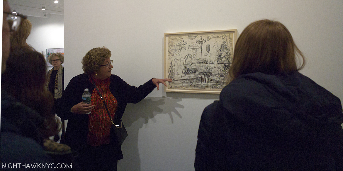
I was privileged to be in the presence of Musa Mayer a few weeks ago as she spoke about her father’s, Philip Guston’s, work in the Nixon Drawings show @ Hauser & Wirth.

Beyond them, to say I’m grateful to the doctors who treated me and saved me 10 years ago is a huge understatement. Recently, I had the honor to meet another one who’s on the front lines right now, Dr. Melissa Pilewskie at Sloan Kettering Memorial Cancer Center. Listening to her, I couldn’t help but marvel at her inner strength, and those of my doctors. She told me that as a surgeon she has treated 2,000 patients in 5 years. That’s 400 a year. There’s only 365 days in a year! Ok, Dr. Pilewskie is obviously a world-class doctor, with an extraordinarily rare skill set. I couldn’t help but wonder…where does this young lady get the inner strength to deal with cancer patients all day every day? Let alone to deal with them so well. It was a humbling experience that reminded me of the debt I owe the doctors who treated me. On my 10 year anniversary, it was also an insight into how far cancer treatment has come in my lifetime, and continues to progress, and a reminder of how many very special people are in there fighting tooth and nail to treat, beat, and even cure cancer. This isn’t a “job” to them. It’s their mission.

THANK YOU! And, bless you all.

If you get diagnosed with cancer (PLEASE, no!), you now have a great chance of being treated, and then get to go on with your life. My advice to you is- Get the best doctor your insurance will cover and get treated. Go for your follow up tests, religiously. For everyone else who doesn’t have cancer? Catching cancer early really is your best chance to beat it. Don’t miss those checkups! That’s how mine was discovered, my life saved.

The big reveal from my experience with cancer is that cancer wound up forcing me to have the life I always wanted to have.

Finally.

No one lives forever. I was living my life like I was going to live to be 200, and everything I REALLY wanted to do, I would get to one day. Well? One day is N O W. That’s why I have this site. That’s why I spend my life going to see Art 6 days a week, taking photos and listening to music. I can’t wait for “one day” anymore. Damn the expense (which goes up every minute)! Damn the later impact on my life (he says now)!

If I don’t do this NOW? WHEN am I going to do it? I don’t know if any of this would’ve happened if I didn’t get cancer.

After I started to recover, I had some of those plastic bracelets made for my site before this one. I was writing about my daily experiences with cancer, in an effort to give others who were newly diagnosed some information through sharing my experiences, because at the time no one else was doing it. On them, I had three phrases engraved. One was

Get tested

The second was

Get treated

And finally-
LIVE YOUR LIFE!

They were there as a reminder to myself, a mantra, as much as what I’d learned.
Close, and seeing this this week was a coincidence, and a reminder.

Early on my friend and cancer survivor, Stephanie 2, told me that cancer “would change my life in ways I could not imagine.” She was right. My experience with cancer challenged me in more ways than any other. In the end? It challenged me to face myself. To love myself and to be myself, fully, no matter what.

I’m not grateful for cancer. I HATE cancer. It’s taken the lives of friends, acquaintances, and many I’ve admired from afar. It’s cost me parts of my body I really didn’t want to lose.

In the end, I’m more grateful for life (than what it cost me to have it). For the chance to change the course of my life, and finally live the life I always wanted to have.

Ok, so cancer didn’t really “save my life.” Doctor Chuey, Doctor Dinlenc and Doctor Samadi did. I used cancer as a wake up call to save myself after they did.

So?
Life, in February. The High Line, February, 2017.

I hope you’ll join me in celebrating my 10th Birthday.

If I’m actually still alive.

———-

With my undying thanks to those who saved me-

-Dr. David Samadi

-Dr. Caner Dinlenc

-Dr. John Chuey

-Helen Petrocelli, RN

-The staff of Columbia Presbyterian Hospital

To those who stood by me-

-Fluffy

-Rob

-Kevin- Thanks for the ride home

And, with my thanks, and admiration to fellow cancer survivors, patients, and a professional-

-Stephanie 2

-Dave (R.I.P)

-Kitty

-Mrs. Kitty

-Mrs. Fluffy

-Musa Mayer

-Sv

And,

-Dr. Melissa Pilewskie

I took all the photos appearing in this Post over the first six days of February, 2017, except the photo of Musa Mayer, on January 10, 2017.

*- The Soundtrack for this Post is “Accept Yourself,” by The Smiths (who you can watch perform it in 1983!, below), written by Morrissey & Johnny Marr. Morrissey was 23, or 24 when he wrote this. Astounding. Its lyrics just fit-

NighthawkNYC.com has been entirely self-funded & ad-free for over 8 years, during which 300 full length pieces have been published! If you’ve found it worthwhile, PLEASE donate to allow me to continue below. Thank you, Kenn.

You can also support it by buying Art, Art & Photography books, and Music from my collection! Art & Books may be found here. Music here and here

Written & photographed by Kenn Sava for nighthawknyc.com unless otherwise credited. To send comments, thoughts, feedback or propositions click here. Click the white box on the upper right for the archives or to search them. Subscribe to be notified of new Posts below. Your information will be used for no other purpose.
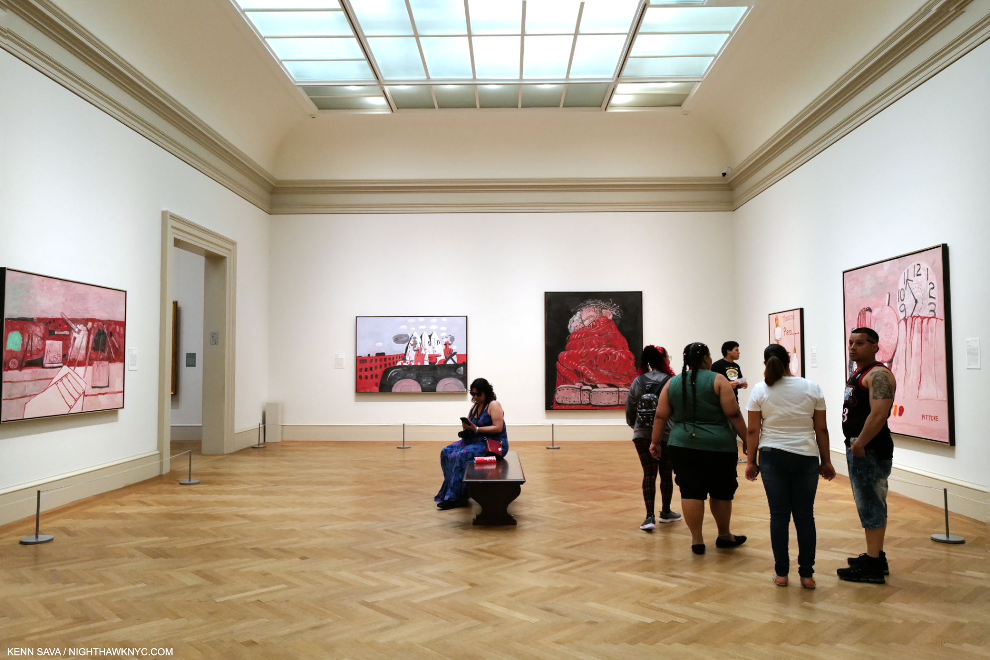
NoteWorthy Shows- November, 2016

This site is Free & Ad-Free! If you find this piece worthwhile, please donate via PayPal to support it & independent Art writing. You can also support it by buying Art & books! Details at the end. Thank you.

Written & Photographed by Kenn Sava (*- unless otherwise credited)

Things are reaching a fever pitch in the Galleries as the year end approaches, with nary a Black Friday Gallery sale in sight, allowing me to sleep in this year. Still, there was plenty to see and be Thankful for, along with the usual smattering of turkeys, but let’s get right to dessert, shall we? As in October, here’s my list, in no particular order, of what I found NoteWorthy in November. Once again, each one of these deserves a longer, in depth piece that I’m not going to have time to do, but I would be remiss in not mentioning them at all. November, also, marked the end of the world as we know it, so…

The world looks different…Brian Dettmer’s Western Civilizations 3, 2016. A “Book Sculpture.” More below.

Faberge from the Matilda Geddings Gray Foundation Collection @ The Met- Will the artist in modern history who is a greater craftsman than Carl Faberge please stand up and make yourself known to me? Thank you. While I’m waiting on that, this is the first show of the work of Faberge in New York since 2004. As small as one of the details on his timeless (and priceless) masterpieces, this show in a hallway at The Met is easy to miss (countless thousands do just that as they wait in line for the elevator to the roof, right in front of this very show). Ms Gray began collecting Faberge in 1933, when prices for his work were cheaper than they will ever be again. Money aside, Faberge combines the equally rare gifts of ingenuity, vision, craftsmanship and delight in works that are a century old but have lost none of their grace, beauty or charm. Scheduled to end on November 27, this show has been extended until 2021, giving you plenty of time to see it.

Imperial Lillies of the Fields Basket, 1896, Yellow & green gold, silver, nephrite, pearl, rose-cut diamond. This is considered THE most important Faberge piece in the USA. It was presented to the wife of Czar Nicholas at her visit to the Pan-Russian Exposition in 1896. This is only 7 1/2  x 8 1/2 inches!

Imperial Napoleonic Egg, 1912, gold, enamel, rose-cut diamond, platinum, ivory, gouache, velvet, silk. One of the infamous “Faberge Eggs,” this was presented by the Czar to his wife for Easter, 1912. Designed to commemorate the 100th Anniv of victory over Napoleon. This is 4 5/8 inches tall! The inside is solid gold, and holds…

a six-panel screen depicting paintings of six regiments she was an honorary colonel in.

Description in next photo. Click any photo in this Blog to see it larger.

Imperial Caucasus Egg, for Easter, 1893. This is 3 1/2 inches high!

Easy to miss, this is the whole show!

Joan Mitchell: Drawing Into Painting @ Cheim Read- Yet another good sized show of an Abstract Expressionist, “second generation” this time, and the most renowned female (Lee Krasner may be gaining on her) AbEx painter, right down the street from the blockbuster Mark Rothko: Dark Passage Show, it makes the perfect before or after bookend to it. I owned a Joan Mitchell print until a few years ago, so I lived with the energy and lyricism her work is known for. Looking around, her work is in most major museums, though it’s been 12 years since an American museum gave her a show. So, it’s been left to Cheim & Read to fill the gaps, and they’ve mounted Joan Mitchell shows every two years, or so, going back to the late 1990’s. This one does make for fascinating pairing with the Rothko show- they couldn’t be more different, while sharing what the scholars call Abstract Expressionism, I’ve heard some of the Artists, including Philip Guston, say they prefer the term “New York School.”

UNTITLED, 1958, oil on canvas

LA GRANDE VALLEE XVI POUR IVA, 1983, oil on canvas

UNTITLED, 1982. oil on canvas

Man Ray: Continued and Noticed @ Francis Naumann- It’s been too long between Man Ray shows. Readers already know my fondness for Man Ray. Francis Naumann Gallery opened 15 years ago with a Man Ray show, so they revisited him for this anniversary show and they did it in style. Man Ray was so prolific, and so prolifically diverse he can be hard to “sum up” in a gallery show, but this one was an out and out winner, a must see, especially for anyone who thinks of Ray as “only” a ground breaking photographer. While featuring a wonderful selection of his photos, portraits and “Ray-o-grams,” it also included his drawing, painting, sculpture, writing, and even no less than 2 Ray designed chess sets.

Paletteable, 1969

The great Man (Ray). Self-Portrait, 1948. A card under speaks of his concerns in his early work- “1) a defiance of artistic convention replaced by steadfast commitment to absolute freedom in the arts.” That says it all.

…and seen again. Autoportrait, 1917/70, Screen print on plexiglass. Really? Hmmm…

…and again. Self Portrait, 1914

Yes, that’s one of the chess sets Man Ray designed to the left of the chair.

Lampshade, center, surrounded by an astounding range of creativity.

Philip Guston: Laughter in the Dark, Drawings from 1971  & 1975 @ Hauser & Wirth- There was no more auspiciously timed show than this one which not only brings us the 73 drawings Philip Guston selected for his Poor Richard series but 100 additional drawings that didn’t make the cut and 3 wonderful paintings that are related or have relevance to them. Opening exactly 4 months after Hauser’s last Guston show, it would be very very hard to find work more different than those in seen in Philip Guston Painter, 1957-67, which I wrote about here, perhaps the “darkest” of his career, in many ways. Though the show’s title refers to the presence of “laughter” here, make no mistake it is more than tinged with darkness, especially because viewing them now, we know how things turned out for Nixon. These were dark times for the country, and many of these drawings were Guston’s “at the moment” reaction to unfolding events. Even before Watergate, the Nixon Presidency was not without a sizable opposition, for more reasons than the seemingly endless war in Vietnam. Everything about Nixon rubbed many people the wrong way, and provided a brilliant Artist ample fodder for “political satire” of the highest order. Most interestingly, for me, these are works in which Guston turns his focus outwards for, perhaps, the only time in his post 1940’s career. Poor Richard was published in 2001 and is still in print. You can see it here.

The 73 drawings that Guston selected for Poor Richard are shown, here (and below), together.

Title Page. Guston Depicts Nixon with VP Spiro Agnew (triangular skull), Attorney General John Mitchell (with his pipe) and Advisor Henry Kissenger (as glasses) as the cast of characters

Guston’s series begins with young Richard Nixon.

Jeff Elrod: This Brutal World @ Luhring Augustine- Chelsea & Brooklyn Galleries. It pains me not to write a longer piece on this. Jeff Elrod has been at the cusp of reinventing painting by combining digital drawing and computers with the end result of that stage outputted to canvas.where it may, or may not be combined with analog, old fashioned painting (at least those on display here). Dealing with blurriness from my recent eye treatment, my initial reaction was, “Hmmmm…If I close my right eye, my good eye, this is how the world looks to me these days.” But, I was drawn back repeatedly, even compelled to make the (unheard of for me) trip to Brooklyn to see the Bushwick segment of this show. In both locations, the effect was the same- I couldn’t get them out of my mind. They’re like something you see when you’re not really looking, or when you’re not fully awake after dreaming, or about to fall asleep…My initial reaction was “This looks easy to do on a computer. Take a photo, blur the heck out of part of it in Photoshop. Add a layer of a frenzied drawing and output to canvas. Then, I remember people say the same thing about Pollock and Rothko, yet no one else has done them. Some works remind me of passages of Monet, some of Yves Tanguay. But not really. They weren’t created like those were and so they don’t look like anything else. Mr. Elrod’s work commands some fancy prices. Ah well…They’re much too big for my place, anyways. If there’s a “cutting edge” in painting in 2016, Jeff Elrod’s work is the closest I’ve seen to being on it. I’m very much looking forward to seeing where this is going.

Auto-Focus, 2016 UV Ink on Canvas 9064 inches. Mystifyingly alluring.

Rubber-Miro, 2015 Acrylic and UV Ink on canvas. His uniquely shaped canvases give the work a different feel from most square/rectangular paintings.

Rake-Adaptable, 2016 UV Ink on FIscher canvas. The ghost of Robert Motherwell? “Haunting” is a word his work brings to my mind most often.

Under The Skin, 2016 UV Ink on canvas, 108 x 84 inches.

Plume, 2016 as seen in Bushwick, Brooklyn. 16 1/4 feet long by 9 1/2 feet tall.

After countless visits, I began to “see” “Jeff Elrods” everywhere I went. Like here-

Life Mirrors Art.

Brian Dettmer: Dodo Data Dada @ P.P.O.W. Mr. Dettmer creates “Book Sculptures,” something new to me. As far as I can tell, he takes a scalpel to a book, or books, and carves away all but what he wants to remain. I’ve never seen anything quite like it.

Funk and Wag, 2016. As in, the whole encyclopedia.

Ew Ass, 2016

PostScript.- And meanwhile, over at Gagosian, Richard Serra’s MASSIVE Every Which Way, 2015, all 16 slabs of it was coming down, making way for the next show there…

Richard Serra, Every Which Way, 2015 @ Gagosian

*-Soundtrack for this Post is “It’s The End Of The World (As We Know It)” by Michael Stipe, Mike Mills, Peter Buck and Bill Berry of R.E.M. and published by Warner/Chappell Music, Inc and Universal Music Publishing Group, from their 1987 album “Document.”

NighthawkNYC.com has been entirely self-funded & ad-free for over 8 years, during which 300 full length pieces have been published! If you’ve found it worthwhile, PLEASE donate to allow me to continue below. Thank you, Kenn.

You can also support it by buying Art, Art & Photography books, and Music from my collection! Art & Books may be found here. Music here and here

Written & photographed by Kenn Sava for nighthawknyc.com unless otherwise credited. To send comments, thoughts, feedback or propositions click here. Click the white box on the upper right for the archives or to search them. Subscribe to be notified of new Posts below. Your information will be used for no other purpose.
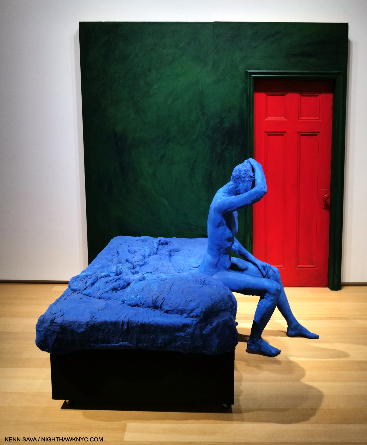
Stuart Davis- The King of Swing

This site is Free & Ad-Free! If you find this piece worthwhile, please donate via PayPal to support it & independent Art writing. You can also support it by buying Art & books! Details at the end. Thank you.

Written & Photographed by Kenn Sava (*- unless otherwise credited)

Try it yourself.

Walk into your local Art Museum and look for Stuart Davis. I bet they own at least one, and I also bet it’s on display. I’m making this wager based on my experience that every American Museum I’ve been to, including many smaller ones, owns at least one work by Stuart Davis, and that work seems to always be on view1. This is a testament to his wide, and ongoing, appeal. Stuart Davis’ Art still has a contemporary look and feel to it. Maybe that’s because so many Artists who have come after him, like much of “Pop Art,” have been influenced by him. Somehow, Davis is also an Artist who is rarely given a show. The last big one I know of was “Stuart Davis: American Painter” at The Met in 1991. It’s left me with years of longing to see more than one or two of his works at a time, so I was very excited when I heard about “Stuart Davis: In Full Swing,” June 10-September 25 at the Whitney.

dsc_6043pnh

It turns out to have been worth the wait. With 75 works ranging from 1923 until his final work left unfinished on his easel the night he died in 1964, we get to see much, if not all, of his accomplishment. The 1991 Met show featured 175 works, 31 before the earliest work in this show. While I’m a bit disappointed the show is missing the first decade of his work, (the title “Stuart Davis: In Full Swing” refers to his career being in full swing during the period of his work displayed), what’s included has been marvelously hung adding much insight into Davis’ process and development.

Davis' seminal 4 "Egg Beater" Paintings, 19__, rarely united

Davis’ seminal 4 “Egg Beater” Paintings, 1927-28, rarely united.

…I nailed an electric fan, a rubber glove and an eggbeater to a table and used it as my exclusive subject matter for a year.” Egg Beater No. 4," 1928

Breakthrough. “I nailed an electric fan, a rubber glove and an eggbeater to a table and used it as my exclusive subject matter for a year.2” Egg Beater No. 4,” 1928

Beyond this, it’s simply gorgeous to behold. Davis, the colorist, is  something not often  spoken about, and for me, is under-appreciated. His work needs to be seen in person, where his color makes a vibrant, stunning, often shocking first impression- even in 2016. Looking closer, it becomes apparent that though he uses relatively few colors and repeats them from piece to piece he is a master of color schemes. Has any American Artist used Yellows or Oranges the way Davis has?

"Cliche," 1955

“Cliche,” 1955

Having come out of the end of the era of  “Ashcan School,” Davis’s early work, often depicting street scenes of the greater New York area, shared their darker palette. Here and there he’d inject very bright passages of color, as in “Bleecker Street,” 1912. Soon, they would dominate as the influence of the Europeans, the Cubists 3, and Joan Miro took hold, his palette brightened. Matisse was also an early influence, and  even in the 1950s, Davis’ work features shapes that echo those found in Matisse’s late Cut-Outs.

dsc_2983nefpnh

“Midi,” 1954

The title “Stuart Davis: In Full Swing” is a double entendre, also referring to his love of Jazz- “swing” being the most popular form of the music in the 1920’s and 1930’s. Stuart Davis loved Jazz. As I wrote not all that long ago upon accidentally discovering where he lived for 20 years in Greenwich Village, it was, coincidentally or not, around the corner from some of the greatest jazz clubs in the world4.

DSC_7025P2NH

The plaque outside Davis’ home of 20 years where he created works that have “come home” to the nearby Whitney.

Looking at his work, it’s clear that he “gets” what it’s like to play Jazz, what goes on in the mind of the musician or singer, and it comes out of his hands, like it does for musicians, too.

Davis In Full Swing. "Swing Landscape," 1937

In Full Swing. “Swing Landscape,” 1938, over 14 feet long, the largest work here, originally intended for a Brooklyn Apartment Building.

Walking around, I spent quite a bit of time trying to associate Davis’ work with specific Jazz Artists. While I found there were many who came to mind for specific works, I came to feel that Davis’ work was ahead of it’s time, musically, as well as visually/Artistically. His shapes seem to anticipate the angular developments of Musicians like Thelonious Monk and Andrew Hill. Standing in front of a work like “Swing Landscape,” 1938, an endlessly fascinating blend of nautical visual motifs in a riot of color, the feeling is like listening to a great Big Band. Take Duke Ellington’s or Count Basie’s classic Big Bands that were chock full of unique soloists. each one with a recognizable solo voice. When Lester Young soloed on Tenor Sax for Basie, there was no doubt who was playing. Same for Johnny Hodges, “Tricky” Sam Nanton, Ben Webster, or Bubber Miley with Duke, not to mention Duke and the Count, themselves. Looking at “Swing Landscape,” is like hearing a big band to me, a band comprised of unique voices (colors on shapes), each playing their own part, but still a part of the whole. There is an overriding feeling of joy, and life. But, there were other works that looked to me more like the music of non-swing Masters Art Blakey’s Jazz Messengers and even early Ornette Coleman. Though I mixed them in, and many others, I found myself repeatedly returning to Duke Ellington, one of the greatest composers of the century, in any style of music, who also continually pushed and evolved his style, taking the Big Band to many other places musically, like Davis did with Cubism, as the soundtrack for my visits.

Stuart Davis with Duke Ellington, 1943, from the show's catalog.

Let’s talk about Jazz. Stuart Davis with Duke Ellington at a Davis show, 1943, from this show’s catalog.

Also like a Jazz Artist, Davis returned again and again to earlier compositions and “riffed” on them, as Patricia Hills said 5. Davis re-interpreted his earlier compositions the way Jazz Artists reinterpret standards- using his original theme as a jumping off point to create something entirely new.

Progress in the Process. All 3 of these works are based on the center work from 192_. Left, 195_ and 19__, right

Riffin’ on a Theme. All 3 of these works are based on “Landscape, Goucester,” center, as follows.

dsc_3001pnh

“Landscape, Goucester,” 1922…

"Colonial Cubism," 1954

Became this- “Colonial Cubism,” 1954

dsc_2996pnh

And then, this- “Memo, #2,” 1956

In terms of Jazz in Art, I can’t think of another Artist who has a similar effect on me. Other Artists listened to Jazz, during the same time and later, but Stuart Davis’ work looks like Jazz to me. I get that feeling from isolated works by other Artists, especially that of Romare Bearden, who Davis told to visualize the relationships between jazz and art in 1940, though his works are primarily collages, not paintings, but Davis’s whole body of work, with rare exception, gives me that feeling6.

Blue Note. "The Woodshed," 1969, collage by Romare Bearden. The "Woodshed," or "Shed" is where musicians hone their craft.

Blue Note. “The Woodshed,” 1969, collage by Romare Bearden, at The Met Breuer.. The “Woodshed,” or “Shed” is where musicians hone their craft.

Yet, there’s more going on here than Jazz.

Revolutionizing the still life. “Super Table,” 1924. For me, the earliest masterpiece in this show.

We watch Davis breaking through and coming into his own in works like “Super Table,” 1924, and the “Egg Beater” series of 1927-28, which were revolutionary takes on the Cubist “still life,” that proved to be the jumping off points for all his future work that would see him develop his own approach to Cubism, becoming one of the very few outside of the inventors of the style to do so. While he built upon the influences of others, he was very influenced by place and environment as well. His 1928 trip to Paris crops up again and again in his later work. His summers along the water in Gloucester, Mass supplied a life long reservoir of nautical imagery, as did, NYC, while Jazz provided inspiration. Products appear in Davis’ work, possibly evolving out of the still life works of the Cubists, but quickly becoming his own. He then takes words, first seen in ads and on products, and uses them in new ways, sometimes referencing the “hip” jargon of the time, sometimes cryptically, that only he really understands.

"Odol," 1924, a bottle of mouthwash, presaging Warhol by 35 years.

“Odol,” 1924, a bottle of mouthwash, presaging Warhol by 35 years.

A walk through the show reveals that Pop Art, and a number of it’s leading lights were creating work that featured elements Stuart Davis began using way back in the 1920’s. In fact, after seeing it, you may never look at Andy Warhol, Roy Lichtenstein, Jasper Johns or James Rosenquist quite the same again. Beyond his use of products, his use of words is something that many Artists since Davis, right up to Ed Ruscha, Jenny Holzer and Wayne White, have continued, some basing their entire Artistic output on them. While his influence is huge, it’s also interesting to me how different his work is from the work of the other Abstract Artists of his time, especially the Abstract Expressionists, who were then working right around him every day in NYC and it’s suburbs. Philip Guston speaks of knowing him 7. What about Jackson Pollock, (who was born, lived and work, then died during the time Davis was alive)? Did Davis know him? It would seem to me they must have met, especially since they both worked for the WPA (Works Progress Administration). It’s hard to imagine two more different Abstract Artists.

The end. "Fin," 1962-64, as it was left on his easel when he died.

The end. “Fin,” 1962-64, as it was left on his easel when he died. The yellow-ish lines are masking tape Davis used as guides.

dsc_2690pnh

“Arboretum by Flashbulb,” 1942

It must also be mentioned that Mrs. Gertrude V. Whitney was a substantial, and early, supporter of Davis, in a number of ways, both financially (buying his Art and advancing him funds) and through the Whitney Studio Club, the precursor of the Whitney Museum, where he got his “big break,” 8 with a 2 week retrospective exhibit in December, 1926. 90 years later, Davis returns to the latest incarnation of the Whitney Museum, a few minutes walk from where he once lived, something of a “champion” of American 20th Century Art, himself. His influence is ongoing. His achievement is still being considered. Yet? All in Stuart Davis’ Legacy is not painted in the bright colors he used so masterfully in his work.

"Little Giant Still Life," 1950, a box of "Champion" matches

“Little Giant Still Life,” 1950, a box of “Champion” matches.

While the joy, beauty and insights this show provides will stay with me for a very long time, it’s impossible not to also be reminded of the fact that 90 works by Stuart Davis were discovered to have been “looted” 9 from the Artist’s Estate by Laurence Salander of Salander-O’Reilly Gallery, the long time dealer for Stuart Davis’ Estate, in 2007. The court ruled that Salander owes Earl Davis and the Estate $114.9 million dollars, but being as Salander is behind bars on Riker’s Island no one knows if and when any of that money will be repaid. As bad as that is, perhaps even more tragically, to this day, I’m not sure that all of Davis’ works have been accounted for. The case led to the creation of new laws pertaining to Artist/Gallery dealings. That is the saddest part of what is otherwise the great and ongoing influence that is the legacy of Stuart Davis, one of America’s greatest, and most influential, Artists.

Even his beautiful signature, boldly featured in many of his works, has the peaks and valleys, the ebbs and flow, of a Jazz solo.

*-Soundtrack for this Post is “It Don’t Mean A Thing (If It Ain’t Got That Swing)” by Edward Kennedy “Duke” Ellington, the title of which appears on Davis’ painting “Tropes de Teens,” 1956.

NighthawkNYC.com has been entirely self-funded & ad-free for over 8 years, during which 300 full length pieces have been published! If you’ve found it worthwhile, PLEASE donate to allow me to continue below. Thank you, Kenn.

You can also support it by buying Art, Art & Photography books, and Music from my collection! Art & Books may be found here. Music here and here

Written & photographed by Kenn Sava for nighthawknyc.com unless otherwise credited. To send comments, thoughts, feedback or propositions click here. Click the white box on the upper right for the archives or to search them. Subscribe to be notified of new Posts below. Your information will be used for no other purpose.

  1. I’m not wagering “anything” on this, so if you find one that doesn’t have a Stuart Davis, write me and let me know and I’ll send this Post to them to hopefully influence their future purchases!
  2. Stuart Davis “Autobiography” in “Stuart Davis” edited by Diane Kelder, P.26
  3. Davis, 21, was the youngest artist to be included in the legendary Armory Show of 1913, the first modern art show in America, which marked the arrival of Cubism in New York.
  4. His parents had lived in the Hotel Chelsea, 11 blocks north.
  5. “Stuart Davis,” by Patricia Hills, P. 19
  6. I am only talking about Artists who were/are Painters first, so I am leaving out Musician/Artists like Miles Davis, Art Blakey, Tony Bennett, Muhal Richard Abrams, Anthony Braxton, Roscoe Mitchell, et al..
  7. Guston “Collected Writings” P.40
  8. according to Patricia Hills “Stuart Davis” P.73
  9. Artnews April 18, 2014

Having It Out With Philip Guston

This site is Free & Ad-Free! If you find this piece worthwhile, please donate via PayPal to support it & independent Art writing. You can also support it by buying Art & books! Details at the end. Thank you.

Written & Photographed by Kenn Sava (*- unless otherwise credited)

I had mixed feelings when I heard about “Philip Guston Painter 1957-67,” on view from April 29 to July 29 at Hauser & Wirth’s temporary Gallery in the former Roxy Nightclub space. On the one hand, large Guston shows are a rarity, on the other hand, I have long struggled with his works of this period. So, it was with a desire to have it out with them in a battle to the death, over the very generous 3 months it was up, and either, finally, “get” them, or not that I climbed their candy-cane striped stairs to enter a space I had known in it’s previous incarnation.

dsc_0434pnh

This space had a “colorful” past, in a different way. One that involved roller skates.

I am happy to report that July 30th dawned to find me still among the living.

The show is focused on paintings from 1957-1965, 8 of Guston’s most “abstract” years , and drawings dated from 1967-69, at the beginning of his return to “figurative” work.  The 1957-65 period of Guston’s paintings is, perhaps, his least known, possibly least loved, (according to one owner- Guston’s daughter, Musa Mayer’s, experiences when guests have seen it) 1, and least seen works by this Artist, who Hauser & Wirth calls “the preeminent 20th century American Artist” in their press release.

Really? I am very interested in his work, and have a lot of respect for him, but “the preeminent?” Hmmm…Comparing Artists qualitatively is against my religion, though some other candidates are here2. Still, a group of 35 of these is unheard of, and seems unlikely to be repeated any time soon.

While his early abstractions from 1950-55 are seen regularly and much admired, the works of his next period are very different. Gone were the luminous colors and shimmering qualities of the earlier works replaced by a darkness that feels to be continually encroaching as these 8 years progress.

What came before... "Painting," 1954, on view at Moma

What came before… “Painting,” 1954, on view at Moma

“What shall I paint but the enigma?”

A revealing quote from Philip Guston in 19693? Possibly. Guston, apparently, mis-translates, or misquotes a translation of the inscription on a “Self Portrait,” from 1911, by Giorgio de Chirico, a major lifelong influence, who he was speaking about when he uttered it. It’s de Chirico’s motto. The original reads- “Et quid amabo nisi quod aenigma est?” Most of the translations I’ve seen of it are- ‘What shall I love if not the enigma?’ Maybe it’s Guston’s interpretation of it?

It would, also, seem to be a fitting motto for this show.

This show begins. "Fable II," 1957,

The show begins… “Fable II,” 1957,

Guston came to abstraction very gradually, the end result of a period of consternation over his direction during which his work was gradually leaving figuration behind. In late 1948 he took a break from painting and armed with a Prix de Rome and a grant from the American Academy of Art and Letters, made a trip to Italy to see the works of his early Reinassance heroes, Piero della Francesca and Masaccio. To that point, the dissolution of the figure in his work can be traced through “If This Be Not I,” 1945 (perhaps my favorite work of his), to “The Porch I & II,” 1947, and especially in “The Tormentors,” 1947-48, his last work his trip to Italy. Upon his return, his “Red Painting,”1950, and “White Painting,” 1951, begin his “non-figurative” periods, from which the works on view eventually followed. He said,“The 1950-55 paintings, (see “Painting,” 1954, above), in general, were very diffuse lyrical pictures. About 1956 I began to become very dissatisfied. I began to feel a need for a more solid painting. I began to look at my earliest work with a kind of renewed interest, the solidity of that. I found it a terrific challenging problem, in my own terms, to create forms.” 4

"Traveler III," 1959-60

“Traveler III,” 1959-60

Then, in 1956, right on the cusp of the period in question, he told writer and friend, Dore Ashton, “I’m in love with painting.5” Looking around this show, that was the first thing that struck me- how painterly these paintings are. Guston’s brushwork has never been so nakedly at the forefront, even in the abstractions from 1950-55, as they are in every work here. It feels like it would be possible to follow each and every one in some of these works.

dsc_0432pnh

“Position 1,” 1965, Detail.

They have a freedom, a rawness, an energy that strikes me as being completely opposite from his earlier abstractions, someone dubbed “abstract impressionism,” a term he hated, works that are calm, subtle, delicate.These seem almost defiantly, perhaps reactionarily, different. They all contain shapes. At first, a mass of them, later individual shapes, and finally one shape, on a murky grey/blue with pink background. After all the depth of field has gone out, which began in his mid 1940’s work, completed from 1950, after the variety of color has gone out. The enigma remains.

"Turn," 1959

“Turn,” 1959

“There can be no adequate understanding of Guston’s life work unless we are prepared to go back over the whole road,” Dore Ashton wrote in 1990 6. In the earlier work, the enigma was different. It came with, and in the guise of persons, places and things. Guston’s work begins, as far as public collections go, in 1930. And? Talk about starting with a bang!

Guston was a lifelong creature of habit. Some of those, possibly, led to his early death at 66 in 1980. As a child, he retreated from the world to his closet, where he would read, and even paint, by the light of a single light bulb. He painted hooded KKK guys7, who he actually saw break up strikes. At age 13 he discovered his father, hanging, having committed suicide.(!) At age SEVENTEEN, he created this-

"Drawing for Conspirators," 1930, Whitney Museum

Drawing for “Conspirators,” 1930, at the Whitney Museum

There’s so much going on in this. First, note the figure hanging in the background. Then, the figure in the foreground handling rope. In the 1970’s when these hooded figures8 returned to his work, he said they were self-portraits9 Is this Guston pondering guilt over his father? Look at the abstraction of space- everything is enclosed in a very narrow area, which would reappear in the 1940’s, and again in the late work. The faceless head shapes, the narrow stage, and the brick wall are reminiscent of de Chirico. The angled cross from Piero della Francesca. Many of these elements, along with the single light bulb, his fascination with shoes, as well as many of the lessons he had picked up from his beloved early Renaissance Masters and, de Chirico, we see in the late work of the 1970’s. Also seen in the late work is Guston’s early love of comics. He reacted strongly when someone mentioned this to him, yet, I think it’s undeniable. As I wrote, I wonder what influence R. Crumb may have had on him. Though most of these are not readily apparent in the work in this show, they set me wondering how far away he ever got from them. After returning from Italy, his work shows an ever gradual reduction of elements, especially in his work from 1956-65, until he even stopped painting. Such was the effects of the admitted despair he was in, again, in 1966, as he was stuck before his next direction, which led to the outpouring of his final decade.

"Accord I," 1962

“Accord I,” 1962

Meanwhile, I was in the middle of my struggle with these works. It was on my 3rd visit, sitting in the nicely cavernous space that a key question hit me-

“Exactly HOW ‘abstract’ are these works?”

Look at the titles. “Painter,” “Actor,” “Alchemist,” “Vessel,” and “Portrait I,” among them. Guston commented that the titles were added after the piece had been completed. It’s rare for abstract works of the “New York School” Artists of this period to have such blatantly suggestive titles such as these. They make it impossible to give one’s imagination the completely free reign the usual “Untitled” does. In fact, they force one to attempt to “see” what the title “means” in the work. This brings you back to the way you experience figurative painting. Once this happened to me, I was never able to go back to seeing them as completely abstract again. I began to “suspect” the other works. More titles- “Rite,” “Traveler III,” “Turnabout,” “”The Room,” “Garden of M.” and “Inhabiter.” Without trying very hard, that’s 11 titles of the 36 paintings. Hmmm…


"Inhabiter," 1965

“Inhabiter,” 1965

“I think a painter has two choices: he paints the world or himself. And I think the best painting that’s done here is when he paints himself, and by himself I mean himself in this environment, in this total situation.’– Guston said in 1960.

The evolution during this period can be seen in this next photo. Note the differences between the works on the left, and those on the right. Color has largely gone out, forms have been reduced. The overall feeling becomes one of darkness and isolation.

Left- 2 works from 1960. Right- one from 1964, one from 1965

Left- 2 works from 1960. Right- two from 1965

This reduction would continue through 1965, until he was left with one dark form against a murky blue/grey over pink background, with (see “Portrait I,” 1965, below), now, the white of the naked canvas encroaches. After these, painting itself, went out. In 1967, he would start all over by drawing. But, he’d quickly come to see that this new direction offered insufficient room to grow. These zen-like drawings (see the 3 photos following “Cabal,” below) were their own end game. Shortly after, he would make yet another new start. Now, pieces of his past were everywhere to be plainly seen.  This would see him create his long misunderstood, now quite popular and influential final works, like “Cabal,” below.

"Cabal," 1977, The Met

“Cabal,” 1977, at The Met

While the “figure” went out of his work from 1950-1965 in works that are called “abstract” (a term he loathed), there is much in his work before, and after that is, also, “abstract”- even in his late work, where people and objects return. After all, isn’t this late work, which is called “figurative,” really “abstract?”

When you look closer at this hooded head in the foreground of “Conspirators,” above, with it’s two black eye holes in the white bedsheet, which somehow manage to be quite expressive. I couldn’t help but think about that when I saw this, “Untitled” drawing among those on the final wall at Hauser & Wirth.

"Untitled," 1968. Drawing.

“Untitled,” 1968. Drawing.

Then, again? With an “Untitled” work, the mind is free to go where it may, right?

Revisiting his subsequent later work while looking at the show of the Small Oils Guston did from 1969-73, that was up at the McKee Gallery in 2009, and you can see here, in addition to the hoods, shoes, single light bulb and other elements from his past, cigarettes, books, the modern city, and his wife, Musa, from his present, I suddenly see other connections (hindsight being 20/20). The same murky grey over pink backgrounds appear in a number of his smaller oils (“Cabal” has a dark background, too.). Some of these also have strange forms alone against this background. All of a sudden they don’t look like they were created by an entirely different Artist than the one who created the works in this show. Well, Philip Guston was a different Artist than the one he was in 1957-65, but he’s still Philip Guston. Since there is much that is common between his early and his late works, it makes me wonder about all of his work. That was my initial question before seeing this show- Would what came before, and after be evident here? Using hindsight you can see connections. How he didn’t completely forget this period. Parts of it remained in his work until the end of his life.

"Untitled," 1968 Drawing

Starting over, again, from the beginning. Abstract or figurative? A pencil? A line? A tightly sealed mouth? “Untitled,” 1968 Drawing

Guston was not considered a founding member of the Abstract Expressionists, nor does he appear in the famous “Irascibles” photo which defined the movement’s members for many. The Met now lists him among the 14 Artists they group in the first group, along with Lee Krasner (the circle is now complete)! I think that part of the reason he wasn’t initially considered part of the group was that he was moving in that direction slowly from 1945 to 1950 which made him miss the first round of fanfare these works received, and which subsequently “grouped” them as “Abstract Expressionists,” a term Guston loathed10. Rothko, himself had called it “their enterprise 11.” Philip Guston, eternally, followed his own star. Though Jackson Pollock was his closest childhood acquaintance and the two were expelled from Manual Artis High School12 together for calling out the fact that more money was being spent on sports than on the “Arts,” and someone who remained in his life until his death in 1956, Guston was his own man, who’s Art owed more to the early Italian Renaissance and Giorgio de Chirico than it did to Pollock, or Rothko, who he was on friendly terms with.

Zen Master. 48 "Untitled" Drawings, 1967-69.

Zen Master. 48 “Untitled” Drawings, 1967-69.

Philip Guston was never a painter of “realism.” It now appears to me that though the end results look different as his style changed and evolved, he was continually bluring the lines between figuration and abstraction all through his career, in the service of painting images that expressed himself as he evolved in his times and in his environment. It’s obvious that he never forgot his past, or the past masters who’s work he loved. The more I look at his work, from all periods, the more I see the impact of, perhaps, his biggest influence, Piero della Francesca, in it. Piero’s figures have the most inscrutable, almost deadpan expressions. Their faces, often, reveal little to nothing of what they are feeling. They take that crutch of reading a whole image from the face away from us. That feeling stays in my mind when I approach a work of Guston’s now, no matter if there are “figures” or objects in the work or not. (Many, even most, of his figures are hooded, or masked, anyway). “Reading” a Guston is a little like to trying to “read” a Piero (or de Chirico). It’s not the expression on the face, it’s the whole thing- the figure in it’s environment, to paraphrase Guston’s quote, above (in Piero’s case, each one is placed with utmost mathematical precision as part of the whole). Guston’s masks are akin to Piero’s inscrutables. We can’t read the expressions or the feelings of these figures. This makes them “abstract,” in another sense, too. I wonder about them. Since they are hooded, or masked, or a black form in his “Portrait I,” 1965, we’ll never know what they are feeling- like in Piero.

"Portrait I," 1965

“Portrait I,” 1965. As if hooded(?), in his environment.

It’s not only his 1957-65 paintings that mystify us.

“You see, I look at my paintings, speculate about them. They baffle me, too. That’s all I’m painting for.” “Philip Guston Talking” 1978, two years before he passed away.

Yet, he has left clues, along with the enigma.

(This is the third, and final, installment in my cycle of Posts on the recent, concurrent shows of Jackson Pollock, Lee Kranser & Guston- three Artists who’s lives are eternally intertwined, personally, and Artistically.)
*-Soundtrack for this Post is “For Philip Guston,” by his close friend, the brilliant composer Morton Feldman. If you have 4 hours to spare, check this out.

NighthawkNYC.com has been entirely self-funded & ad-free for over 8 years, during which 300 full length pieces have been published! If you’ve found it worthwhile, PLEASE donate to allow me to continue below. Thank you, Kenn.

You can also support it by buying Art, Art & Photography books, and Music from my collection! Art & Books may be found here. Music here and here

Written & photographed by Kenn Sava for nighthawknyc.com unless otherwise credited. To send comments, thoughts, feedback or propositions click here. Click the white box on the upper right for the archives or to search them. Subscribe to be notified of new Posts below. Your information will be used for no other purpose.
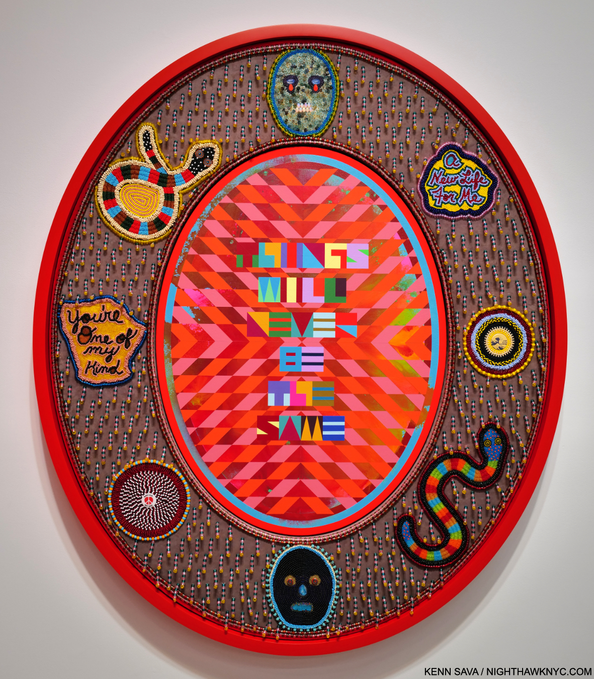
  1. Musa Mayer, “Night Studio,” Da Capo Press, P.102
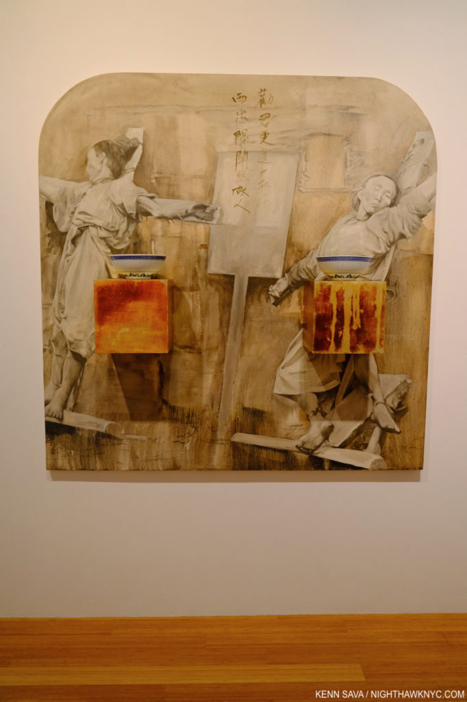
  2. Hopper, Stuart Davis, Pollock, Rothko, William de Kooning, Georgia O’Keeffe, Charles Sheeler, Rauschenberg, Frank Stella, Chuck Close, Richard Estes, insert your own.
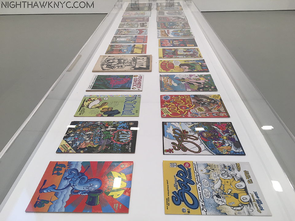
  3. Guston, “Collected Writings,” University of California Press, P.125
  4. Schimmel, Exhibition Catalog for this show, P.15
  5. Dore Ashton, “Philip Guston,” Grove Press, Inc.,1960 P.49
  6. Ashton, “A Critical Study of Philip Guston,” University of California Press, 1990,  P.9
  7. Ashton points out “At the time Guston was working on this painting it was estimated that there were more than 4.5 million members of the Klan in the United States, a great many of them residing right in Los Angeles, where they burned crosses and raised hell all during Guston’s childhood and youth.” Ashton, “A Critical Study,” P.7
  8. Ashton points out that hooded figures “not only recalling the Ku Kluxers of his early paintings but also the artists in the scriptoria of the medieval plague years who donned hooded gowns in the vain hope of avoiding the plague Ashton, A Critical Study, 1990, P.156
  9. Guston- “They are self-portraits. I perceive myself being behind a hood. In the new series of “hoods,” my intention is not really to illustrate, to do pictures of the KKK as I had done earlier. The idea of evil fascinated me… Guston, “Collected Writings,” P.282
  10. Schimmel, Show catalog, P.9
  11. Ashton, “Critical Study,” P.79
  12. Mayer, “Night Studio,” P.13