Nasreen Mohamedi’s “Simple” Perfection

Stop the Presses.

If you are an Author, or Publisher, of a book on the History of Art in the 20th Century? I’m sorry to say- you left out a unique, important, and great Artist.

Her name was Nasreen Mohamedi.

It’s ok. Until this past month, I, too, would have asked- “Who?”

She’s an Indian Artist who died in 1990 at the age of 53, without having sold a work, and who has had only 4 shows in New York (3 at the Talwar Gallery, the other at the Drawing Center).

Until now.

The Naked Face of Immortality?

Out of the shadows. Her Time Has Come.

It’s rare to spot a moment in time and say, “that was the moment when things changed.” Like a light coming on and what was hidden in the dark is made visible. What’s once seen may be very hard to forget. In the case of the Art of Nasreen Mohamedi that moment for those of us her work had remained unseen by happened on March 18 when when the lights came on and the doors opened on the 2nd floor of the new Met Breuer (TMB) for her Retrospective. It’s the “other” big show going on there (“Unfinished: Thoughts Left Visible” is on the 3rd & 4th Floor), together inaugurating the Met’s new outpost, 9 minutes away as the feet fly from their 1000 Fifth Avenue Mothership. While she is recognized, and her work eagerly sought after in Europe and Asia, (for up to $250,000., a piece), here, she has remained virtually completely unknown1. The “light” came on for me shortly after I walked through the doors to TMB’s 2nd floor on the eve of April 14.

Unbeknownst to me, at that very moment, Prince was giving what would, tragically, turn out to be his final performance in Atlanta.

By the time I was half way through the 8 galleries (containing about 130 works) that evening, I was completely & unalterably under her spell. After, I couldn’t get it out of my mind. I wanted to see more, and nothing else. Who was she? Where did this come from? 7 subsequent visits later, and counting, I am now borderline obsessed (there is a Part Two to this Post, the first time I’ve done it- link at the bottom). If I were about to have a daughter? I’d want to name her “Nasreen.” Such has been the impact of discovering the person, and her Art.

Mark my words. Well, mark one word, actually. “Nasreen.” I see her work only gaining in importance and influence as she becomes a world figure in Art. Her name will become part of the Art vocabulary. Luckily, it’s a beautiful name, of someone, who by all accounts, was an equally beautiful person. And, a name that’s as easy to remember as her Art is. Now, that word will be spread here, like it already is elsewhere, as more people experience it.

Experience what, exactly?

Her’s is very hard Art to write about, or talk about. The effect it has is, also, hard to describe. I’ve decided not to post pictures of it at the moment because it really needs to be seen in person. So, go and see it for yourself, if you can, and have that experience I love of seeing something new for the first time with fresh eyes, and I hope it is as rewarding for you as it has been for me. My feelings about it center on finding it beautiful- miraculously composed & gorgeously executed, spiritual in the sense that her works are meditation objects, not unlike a tree or a scholar’s rock. They reach for the inexpressible, yet somehow, inside, they resonate as being “true.” There’s a feeling to them of a foreign world that is somehow, strangely, not “alien.” Perhaps that is because there is no chaos in Nasreen’s work, only the most perfect order. There are no crooked lines, no jagged edges, no line out of place, in spite of the fact that she suffered from Huntington’s Disease from her 20’s on, which progressively robbed her of her motor skills, and then, took her life, as it had her siblings before her. Is it any wonder, then, that her work, and her efforts to pursue and develop it, are so intensely focused?

In that sense her Art is like Bach, perhaps, the ultimate genius of order and man-made perfection. In the “Fugue” of Nasreen’s work, the theme continues from piece to piece. As in a fugue, this time the dialogue between voices are only with her own. I found myself settling on Bach’s “Sonatas & Partitas for Solo Violin,” as performed by Nathan Milstein, as the Soundtrack to my visits. (I should also note that TM commissioned pianist/composer Vijay Iyer to compose a piece for this show, which ECM Records has released on the album, “A Cosmic Rhythm With Each Stroke,” which is the title of the piece dedicated to Nasreen. It features one of her drawings on the cover.) These are conversations she’s having with herself, as we see in her riveting, endlessly fascinating Diaries- works of Art unto themselves, which are generously stationed throughout the brilliantly designed show, that continue on in her paintings, and then in her photography, and finally in her drawings.

These are intensely private, personal works, but in a completely different sense than the work on view upstairs in “Unfinished.” (This show could have been titled “An Unfinished Life.”) Maybe they were therapeutic, physically and psychically for Nasreen. Maybe they were meant to prove to herself how “in tact” she still was as time, and illness, progressed. In any event, that they have come to speak to people in so many countries around the world, and for her to be given the high honor of not only a large show, that occupies an entire floor, by The Metropolitan Museum, but to be selected to be the FIRST Artist given a show, and a Retrospective at that, as part of their new Modern & Contemporary Art initiative at TMB says louder than just about anything else that she has arrived.

She certainly doesn’t seem to have been expecting “Art immortality.” In fact, she’s hasn’t made it all that easy on posterity, and that makes me wonder about how she viewed her own work. Curators don’t even know which way the works should be hung (only 4 works in the show are signed, one tell tale way of knowing which way to hang a work)…

DSC_0756PNEFP

they don’t know the names of the work (every single piece here has the same title- “Untitled.”)…they can only approximate when a work was created (you’ll see “circa” on all but three pieces that she signed and dated)…there is also some mystery to how she achieved some of the incredible effects she got in her work. She seems to have largely kept her work to herself, showing it to guests, but only publicly a couple of times before she passed. Instead of selling it, she gave some of her work as gifts to friends. What A Gift! 2

Nasreen’s (I Love saying her name) work seems basic. In fact, it’s hard to think of any Art that is more basic in concept than her work from 1970 on. She seems to have spent a good deal of her Artistic career continually simplifying, seeking the essence, the heart, the core of her vision. Whereas many Artists begin by drawing, then move to painting, Nasreen did the opposite. Having begun with painting, and collage, in color, most of her post 1970 work is pen with black ink and graphite on white paper. 3

I bet that 75% of all human beings have, at one point of their lives, put pencil or ink to paper and drawn something.

And? Most of hers is lines. Just lines. Or later, lines with circles or semi-circles- the most basic elements there are.

The rest of it is space (or “negative space” as Artists call it). Blank, white paper.

Been there. Seen it.

Ho hum.

Yawn.


Guess

Again.


Be prepared. Her work is among the most subtle you’ll ever see. “God Is In The Details,” van der Rohe famously said. If God is truly in the details, than Nasreen Mohamedi is the “Goddess of Line,” in my opinion (which I will expound on in the next part). In her hands, the “simple” line approaches the sacred. It transcends. It becomes “more,” “something else.” Look closer. Follow it’s course. Look a lot closer, spend some time with it. Live in the layers, the intersections, the distances- near and further. Come back and see it again.

It’s not going anywhere. I promise.

You’ll see something else.

I’ve spent much of the past few weeks looking for it but I have yet to find anyone who’s done what she did. I see a piece here or there that is kinda close (a Paul Klee, a Mondrian, a Ralston Crawford, a Malevich, and another, and yet another Malevich, an admitted influence, among them), but it’s isolated. Different.

Here is a consistent body of work4 that creates entirely new worlds that all speak the same language.

It’s the language of Zen.

of Poetry.

of Music.

of Structures hanging in space. (Don’t stars hang in space?)

It’s the channeling of superhuman perseverance into creating gorgeous works of visionary draughtsmanship in the face of terminal loss of motor skills, untold discomfort and pain.

it’s the language of essence, of purity, of unique beauty seen through the eyes of one uniquely beautiful person.

It’s the language of Art.

Even Timeless Art.

Whatever that is- I think this is it.

But, you can only see it at the new Met Breuer until June 5, then time’s up.

Given the scattered distribution of Nasreen’s approximately 200 surviving works- (as I said, she never sold a work, she gave some to friends), and the high prices being paid for one of her drawings, it may make it very hard for any museum to acquire a collection of them. In fact, in my past 14 years of Met attendance, I can’t recall one show where there wasn’t a single work that was not from The Met’s collection, before this one! It may, therefore, be unlikely a show of this size & comprehensiveness is seen here for a very long time. And that will make this a show that will be spoken about in legendary terms. You’ve been warned.

A tip of the hat, then, is very much in order to Chairwoman of The Met’s Modern & Contemporary Department, Sheena Wagstaff 5, her associate, Brinda Kumar & the powers that be at The Met for making THE perfect choice to begin their highly anticipated new Modern & Contemporary Art initiative at The Met Breuer. I’m in awe. I can’t begin to imagine how hard a choice this must have been- “Who to show first?” Can you say AUDACIOUS? AUSPICIOUS? I should be used to this, after all it’s The Met we’re talking about, but I’m not. And, oh? By the way? As I’ve said, the show upstairs ain’t bad either.

This is Part One of my Post on Nasreen. Part Two is here. I promise to take a deep breath soon.

*-The Soundtrack for this Post is J.S. Bach’s Sonatas & Partitas for Unaccompanied Violin as performed by Nathan Milstein on Deutsche Grammophon. (I look forward to hearing Vijay Iyer’s  “A Cosmic Rhythm With Each Stroke,” with Wadada Leo Smith soon.)

NighthawkNYC.com has been entirely self-funded and ad-free for over 6 years, during which over 250 full length pieces have been published. As I face high expenses to keep it going, if you’ve found it worthwhile, please donate to keep it up & ad-free below. Thank you!

Written & photographed by Kenn Sava for nighthawknyc.com unless otherwise credited.
To send comments, thoughts, feedback or propositions click here.
Click the white box on the upper right for the archives or to search them.
For “short takes” and additional pictures, follow @nighthawk_nyc on Instagram.

Subscribe to be notified of new Posts below. Your information will be used for no other purpose.

  1. At the moment, there is only one monograph on Nasreen Mohamedi in print- the superb catalog for this show, which was co-organized by the Museo Nacional Centro de Arte Reina Sofia, Spain in collaboration with the Kiran Nadar Museum of Art, New Delhi.
  2.  That night, 746 miles south, Prince was singing- “If I gave you diamonds and pearls, Would you be a happy boy or a girl, If I could I would give you the world, All I can do is just offer you my love” From “Diamonds & Pearls”, from the album of the same name, and published by Universal Music Publishing Group.
  3. Her photographs were black and white as well.
  4. I’m referring to the drawings, which are dated here from “circa 1970” until her death in 1990
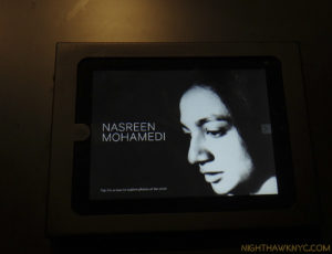
  5. If you look at the app on the iPad pictured above in the show’s reading room, it includes a picture of Nasreen Mohamedi’s unmarked grave, 18 miles south of Mumbai, taken by Ms. Wagstaff. A sign of the level of her personal dedication to this Artist.

How Jackson Became “POLLOCK” 

This site is Free & Ad-Free! If you find this piece worthwhile, please donate via PayPal to support it & independent Art writing. You can also support it by buying Art & books! Details at the end. Thank you.

Written & Photographed by Kenn Sava (*- unless otherwise credited)

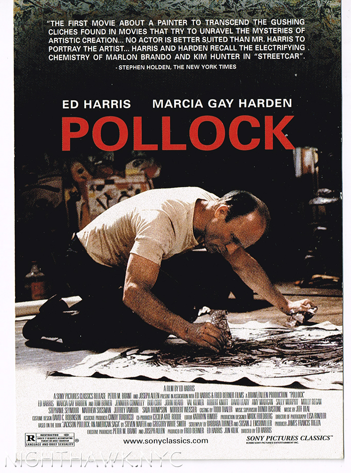
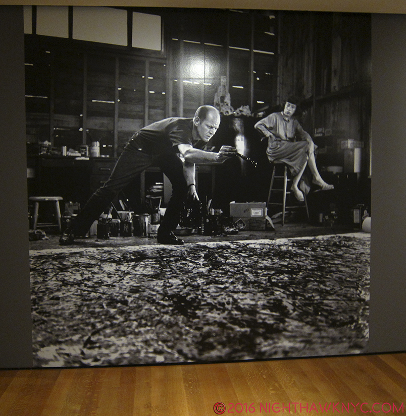
Jackson Pollock’s most famous works are so well known that many people think he painted using what’s (inaccurately) known as his “drip technique” his whole career. It seems there is always one of these radical, unprecedented works he created between 1947 through 1952 on display in about every large American Museum, works that garner as strong a reaction today as they did in the 1950’s. More recently, many probably came to him from the 2000 film, “POLLOCK”(all CAPS in red) with Ed Harris and Marcia Gay Harden, a personal labor of love for Mr. Harris that is quite well done, though it won’t give you a real sense of the road Jackson Pollock’s work traversed on the way to becoming “POLLOCK,” the one-name Icon the film takes for granted you know going in is JACKSON Pollock. The film’s poster (an homage to Hans Nemuth’s and Martha Holmes’ classic photos of the real Jackson Pollock at work in those later years) so memorably depicts the Artist hard at work, revolutionarily, on the floor and not at an easel, possibly in the act of creating one of those famous later works, that I often hear referred to as “Pollocks.” If you think that “Pollock” was “Jack The Dripper,” as Life Magazine called him, like most labels applied to Artists, it doesn’t tell the whole story about even those works, let alone what came before, and after.

A Postcard from the film’s release shows it’s poster. From my collection.

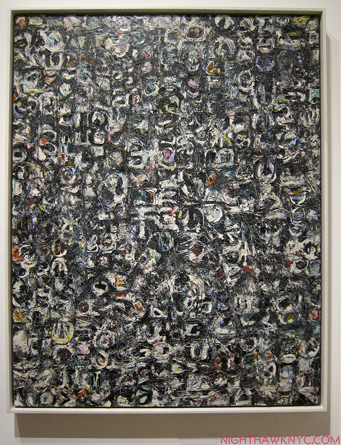
To see beyond the Icon, at MoMA’s Jackson Pollock: A Collection Survey, 1934-54, up through May 1, one is able to follow the outline, if not the detail, of his development in the space of only 3 galleries1, and see illuminating works before he achieved worldwide fame when Life Magazine famously asked- “Jackson Pollock: Is he the greatest living painter in the United States?” on August 8, 1949.

He began out west, hanging around with and taking classes with another late 20th Century American Master, Philip Guston2. After Pollock’s brother, Charles, also an aspiring Artist (and later an accomplished Artist in his own right), came to NYC and was studying at the New York Art Student’s League, still on West 57th Street, with no less than Thomas Hart Benton, he told Jackson about it which led to his moving here and joining him with Benton3 at the ripe age of 18.

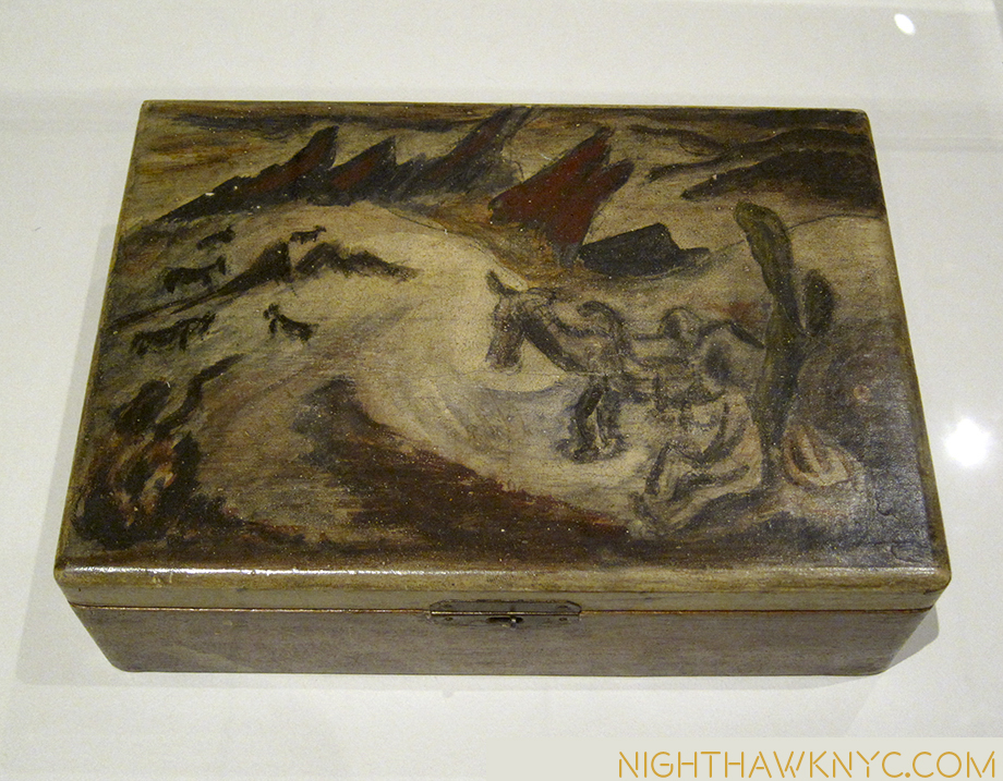
Untitled (Western Scene), 1930-33. It almost could be by Benton.


Breaking out. Untitled, 1938-41. Still don’t think he could draw?

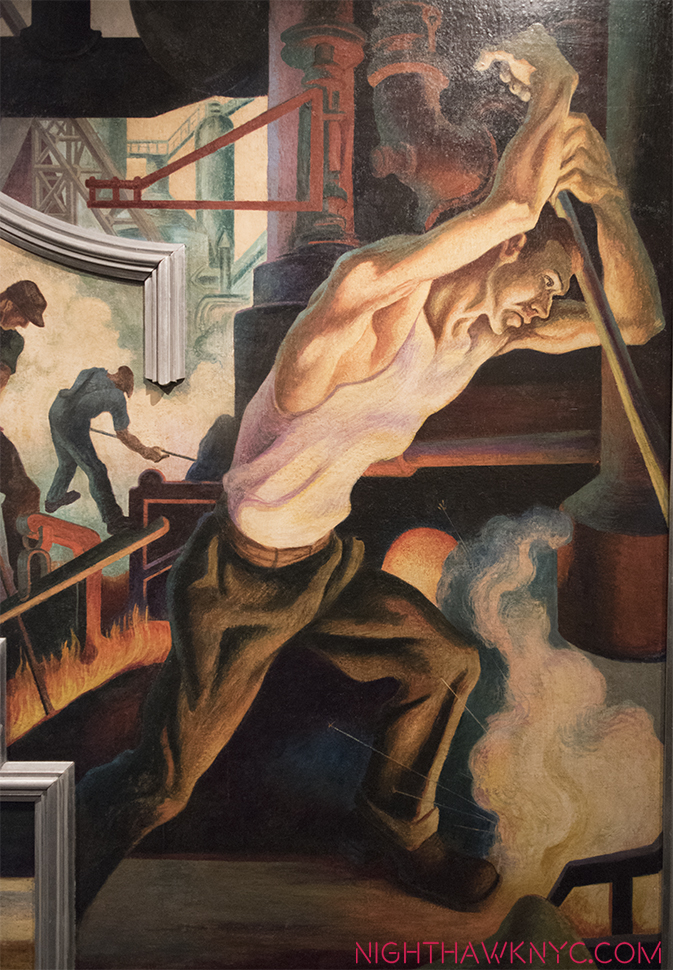
Benton went from being a fairly well known artist during his life to being eclipsed for most of the past 40 years or so (as was realism in Art in the age of Abstraction and Pop, thanks, in part, to his former student). Recently, Benton seems to be enjoying increased attention, helped by the return to view of his New School Murals after their donation to The Met, where they are now beautifully on display.

Yes, It’s 18 year old Jackson Pollock posing for his teacher, Thomas Hart Benton’s mural, America Today, now at The Met.

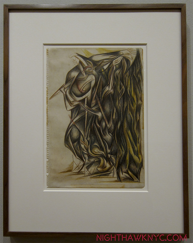
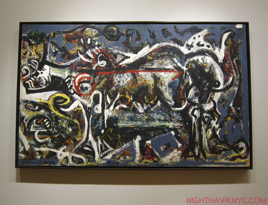
Benton was a resolutely figurative painter (I have seen one or two “abstractions” he did that may have been studies, and there are definitely elements of his “stretching” forms the way El Greco did that border on the fantastic if not the abstract. Some of these elements can be seen in the early Pollocks on display here). Pollock became, perhaps, the furthest thing from a Realist, Abstraction being the polar opposite of Realism4. Yet, early on, you can see fascinating traces of Benton’s influence in the developing student as he experiments with both mainstream and  “fantastic” elements of Benton’s work. The two share an interest in the West (JP was born in Cody, Wyoming) and Midwest, themes which occupy many of the early work seen here in the first room. Contrary, also, to the “Pollock myth,” Jackson Pollock was not always a New York City Proto-Beat (if he ever was one) dreamer/visionary. Gradually, the “known world” disintegrates and the figure soon follows. By the time of The She Wolf, from 1943, the last piece in the first room, “representational” Art is on the run to point that very close looking is required to see her.

The She Wolf, 1943.

What’s apparent to me, even early on, is that Pollock had the most amazing, even with Picasso notwithstanding, unprecedented freedom in his approach, and this skill(?), vision(?) became the center of all his future developments. As he broke free from the influence of Benton, he learned to trust his gut more and more, and this extended to virtually reinventing the technique of painting, sometimes from work to work, as he needed to, culminating in the sublime works from 1947-52, where he dripped paint from the can along with a wide range of other techniques- whatever it took to get his desired end.

“Oh I am a lonely painter
I live in a box of paints
I’m frightened by the devil
And I’m drawn to those ones that ain’t afraid”*

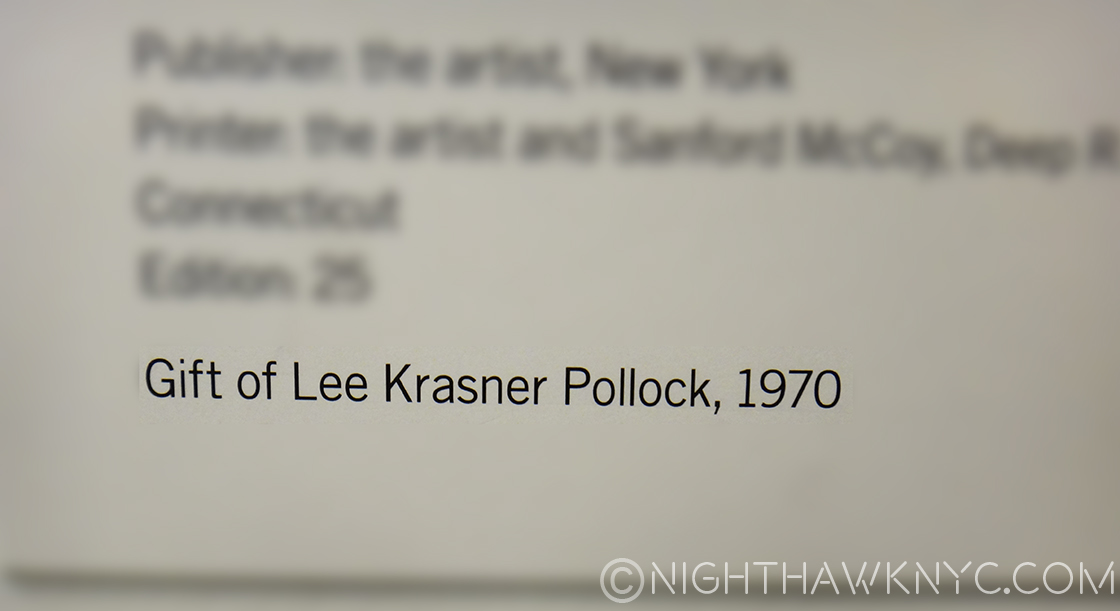
Having made so many trips to the New Whitney Museum, I’ve been face to face with the incalculably large debt Art lovers owe to, at least, two women there- founder (and overlooked Sculptor) Mrs. Gertrude V. Whitney, of course, and to Josephine Hopper, Edward’s spouse and widow, who facilitated her husband’s wish that his archives go to the Whitney (she also included hers of her own work). Here, at Moma, I’m struck, again, by a similar feeling- look closely at the tags and you’ll see that many of the works here are “The Gift of,” or from the “Bequest of” another woman, spouse and widow- Lee Krasner.

Thank you, Lee Krasner. Your day better be coming.

All 3 women were artists in their own right. Jo Hopper and to a large extent, Lee Krasner put their own creative lives on hold for their husband’s. Oddly, a wonderful Krasner is on view UPSTAIRS on 5. It’s from 1949, right in the time period of  many of these works.

Lee Krasner, Untitled, 1949. NOT in this show! It’s on view on the 5th Floor. I’m putting it where it belongs.

So? Why isn’t it in this show? Possibly because of space, but they might have mentioned it being on view. At least it hasn’t suffered the fate of (possibly) all of Josephine Hopper’s work that she gave to the Whitney, with Edward’s estate- It was discarded BY THE WHITNEY as being subpar!5 A search for her on the Whitney’s website turns up none of her Art. That’s an incalculably stupid move! Gone is the chance to gain the insights into their relationship they may hold, let alone any ongoing appreciation of her own accomplishment! That’s gratitude for you. Coincidentally, there is a biography of Krasner by Hopper’s biographer, Gail Levin.

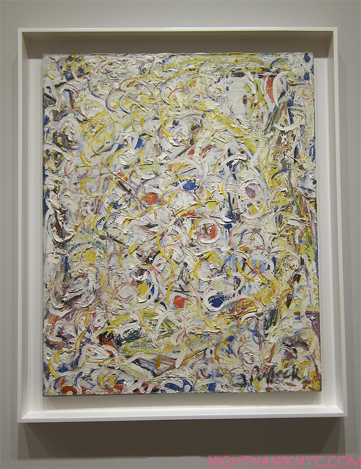
I bring this all up because I feel that Lee Krasner is the hidden star of the show. In addition to all the work that’s here largely because of her, it’s tempting to see the effect of Jackson Pollock’s having met her (in 1942) in his work. Turning the corner into Room 2 of the show you see something surprising, even shocking, yet apparent, at least to me- joy, light, happiness, even, even though Pollock’s work has become fully abstract. It’s Pollock’s Shimmering Substance from 1946-

“I met a woman
She had a mouth like yours
She knew your life
She knew your devils and your deeds
And she said
“Go to him, stay with him if you can
But be prepared to bleed”*

After they married in 1945 the two moved to Springs, near East Hampton, Long Island, to get away from the City. Having visited Pollock’s house and studio (an indelible experience) while walking the grounds, I was taken by something I’ve never heard mentioned regarding 1947-1952 Pollock, the so-called “drip” years. When you walk down along the water there and look at the sand, you’ll see the seaweed that’s been washed up on the shore form these black lines. Against the yellow/golden sand, they look uncannily like the “black poles” you see in many of these pieces. And when you walk through the tall grasses in the area, all sorts of seeds, bugs, dust, and who knows what gets disturbed and becomes airborne. To this day, I can’t look at these classic Pollocks and not see something very similar- all those dots and spots in the works so remind me of that experience and what it really looked like.

Being in that studio, about 50 year later, was an experience I can only characterize as spiritual. Oh! And there’s a Lee Krasner sighting! (At the show’s entrance)

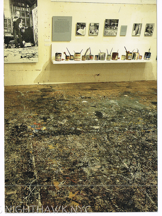
What does this remind you of? It’s Pollock’s Studio Floor, as it appeared when I was there in 1999. They provided these plastic booties, but there was no way I was going to walk on it- it’s a work of Art unto itself. Even in this picture (from a postcard I bought there), I think you can feel the aura of the place.

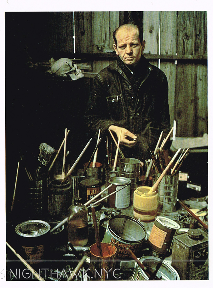
Jackson Pollock, looking Iconic, in his Studio by Arnold Newman, 1949. From a Postcard I got at the big Pollock Retrospective at Moma in 1998, the excellent website for  which is still up..

“I remember that time you told me you said
“Love is touching souls”
Surely you touched mine
‘Cause part of you pours out of me
In these lines from time to time
Oh, you’re in my blood like holy wine
You taste so bitter and so sweet

Oh I could drink a case of you darling
And I would still be on my feet
I would still be on my feet”*

So, for me at least, these Jackson Pollock classics have more of a sense of “realism” than they may for some.

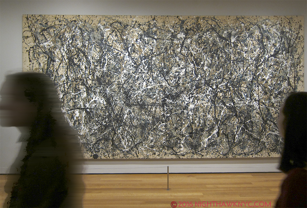
One: Number 31, 1950

“Just before our love got lost you said
“I am as constant as a northern star”
And I said “Constantly in the darkness
Where’s that at?
If you want me I’ll be in the bar”*

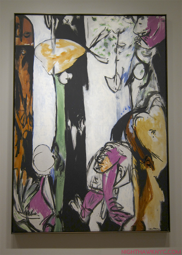
Unfortunately, the happiness and tranquility of their new life together wasn’t destined to last. Whatever the demons were (and they will probably be argued about for as long as Van Gogh’s have been), they manifested in his life, and in his work. Selden Rodman is quoted in the Pollock Anthology, Such Desperate Joy, talking about this period and the Artist’s struggles- “He had been trying to freshen up or diversify his style by reintroducing figures, or at least figurative patterns, in the maze of paint.6.” Though represented here with only a few pieces, it seems to me that Pollock “lost his fastball” after 1952. While the most common reaction to his classic period was famously “My 5 year old can do that,” (Really? Try it. It’s not THAT easy), after 1952, even Jackson Pollock seemed not to be able to do them any more. Or? He wanted to move on…but to what?

Easter And The Totem, 1953. Yes, this is also by Jackson Pollock.

Yes, his life ended tragically and far too early. I’m not interested in a tell-all about his demons, or scandals or the nights drinking at the Cedar Tavern, where I’ve spent a few myself. I’m interested in that incredible freedom you can see in almost all of his work. How was he able to make a composition hold together while continually creating new styles and using new techniques? Where did that come from?

“Oh but you are in my blood
You’re my holy wine
You’re so bitter, bitter and so sweet

Oh, I could drink a case of you darling
Still I’d be on my feet
I would still be on my feet”*

In the end, Jackson Pollock strikes me as one of the “most” American of painters in the 20th Century, if not ever. I’m not speaking of patriotism or anything nationalistic. I’m speaking about organically American. His work was born in the freedom of the wide open spaces of the west and midwest, but most importantly speaks to the freedom each of us has…


if we choose not to repress it, but to acknowledge it, nurture it, develop it and use it.

Interesting timing for such a show.

*-Soundtrack for this Post is “Case of You,” by Joni Mitchell, (who is also a Painter- FOR 69 YEARS, according to her website!), from her timeless album, Blue, 1971. Published by Sony/ATV Music Publishing.

NighthawkNYC.com has been entirely self-funded & ad-free for over 8 years, during which 300 full-length pieces have been published! If you’ve found it worthwhile, PLEASE donate to allow me to continue below. Thank you, Kenn.

You can also support it by buying Art, Art & Photography books, and Music from my collection! Art & Books may be found here. Music here and here.

Written & photographed by Kenn Sava for nighthawknyc.com unless otherwise credited. To send comments, thoughts, feedback or propositions click here. Click the white box on the upper right for the archives or to search them. Subscribe to be notified of new Posts below. Your information will be used for no other purpose.

  1. MoMA owns many more Pollocks not on view here.
  2. Their adventures are chronicled in Guston’s daughter’s, the Breast Cancer Activist, Musa Meyer’s book, Night Studio.
  3. For more on Charles & Jackson’s relationship and to see some of Charles’ work, check out American Letters: 1927-47, a collections of letters among the Pollock family. It’s a revealing document of trying to survive as an Artist in the Depression and on.
  4. Which reminds me that I heard Richard Estes say at MAD that “in abstract art there are no mistakes”
  5. “They arranged for some of her paintings to be given away; they simply discarded the rest.” Edward Hopper; An Intimate Biography by Gail Levin p. xvi
  6. p. 49

The Greatest German Reality Show Star, circa 1700

This site is Free & Ad-Free! If you find this piece worthwhile, please donate via PayPal to support it & independent Art writing. You can also support it by buying Art & books! Details at the end. Thank you.

Written & Photographed by Kenn Sava (*- unless otherwise credited)

“My mama told me when I was young
We are all born superstars”*

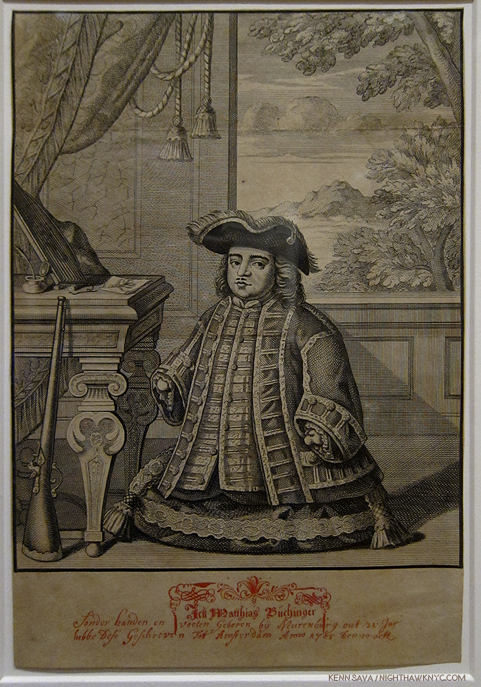
Portrait of Matthias Buchinger, 1705

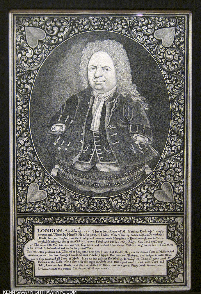
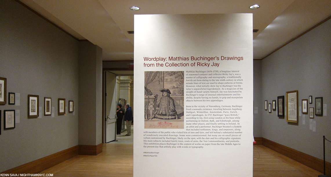
However you were born, the odds are you were more naturally capable right out of the box than Matthias Buchinger, who’s birth left him without hands or feet, and who stood a total of 29 inches (74cm) high. Yet, none of that stopped him from rising to the level of being called “The Greatest Living German” in 1726. Pretty darn lofty, for anyone. A Special Exhibition, Wordplay: Matthias Buchinger’s Drawings from the Collection of Ricky Jay, currently at The Met shows that, astoundingly, he nonetheless proves the equal of just about any other Artist in the entire Metropolitan Museum when it comes to technical proficiency. It will, also, give you pause for thought the next time you feel “incapable.”

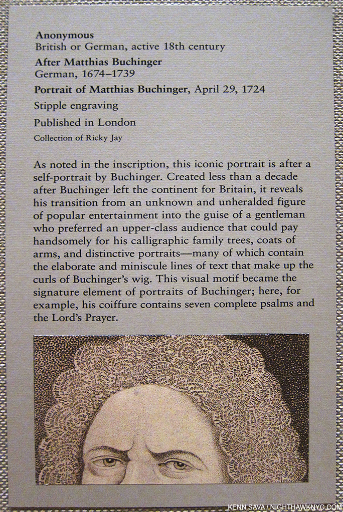
When you do? Consider this- Many of the works he created, which are now rare, but astutely collected by Master Magician, Ricky Jay over the past 30 years, are tiny to begin with. Add to this that Matthias Buchinger (MB) was so adept at holding his pen between his “stumps” he was able to write forwards, backwards, upside down or in the most minute sizes possible to the extent that he created drawings out of minuscule words, an Art called Micrography. A close up look at one small portrait of him reveals that his hair is made up of nothing but very tiny words- a couple Psalms and the Lord’s Prayer.  The entire show probably takes up 400 square feet- not even big for a gallery show. Yet rarely will you find so much packed into each square inch.

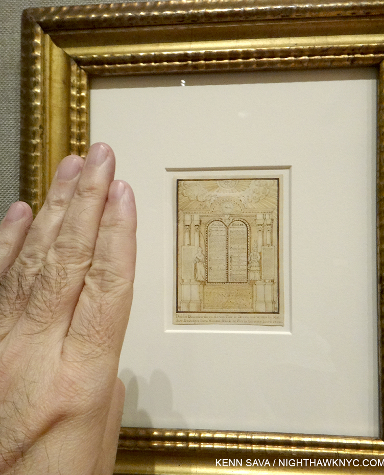
An index-finger sized rendering of The 10 Commandments by Mr. Buchinger is so small I couldn’t read it with the magnifier.

While his Art is being honored in this show, as amazing as it is, it barely scratches the surface of what MB was capable of.

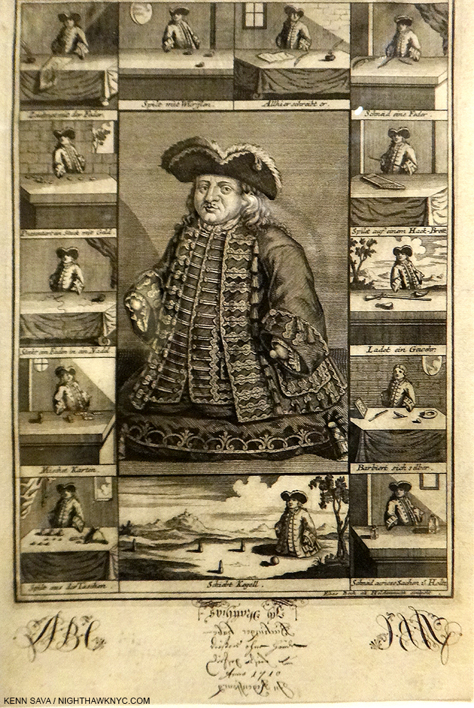
Buchinger surrounded by depictions of some of his skills.

He made his living touring Europe demonstrating the full range of his talents to the high & mighty as well as the common folk, in magic, calligraphy, making miniatures in bottles(!), threading a needle, loading a gun, shaving himself, playing music (he created some of his own instruments), playing games, among other things. Oh, and he was married 4 times and fathered 11 to 14 children!1

The second floor Drawings gallery, where the show is installed, is one of the must-see spaces in The Met. Shows change every 6-8 weeks here giving The Museum a chance to show off its extraordinary collection. Still, out of all the wonders I’ve seen in this space the past 14 years, I haven’t seen anything more consistently amazing than Wordplay.

I know what you’re thinking- today’s so-called “reailty” show stars wouldn’t even be good enough to apprentice on MB’s show!

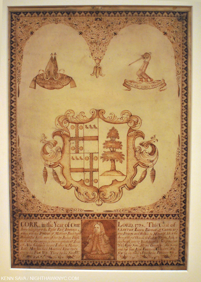
Coat of Arms, 1738, Pen and ink on vellum, the last known work by Matthias Buchinger includes a self-portrait and autobiographical paragraph in the lower margin. Bear in mind this entire work is about letter size.

“I’m beautiful in my way,
‘Cause God makes no mistakes
I’m on the right track, baby
I was born this way”*

Was he the greatest disabled Artist of all time? I have no idea. I’ve been blown away by the work of Chuck Close (brilliant before his brain aneurysm, continually evolving in ever new ways since), and Hendrik Goltzius, a Graphic Artist possibly on par with Durer despite having a severely deformed drawing hand, among others, and they are all beacons of what the human spirit is capable of, in the Arts as in so many other aspects of life. Yet, I can’t say I’ve seen anything quite like that of the Art of the “Little Man of Nuremberg,”

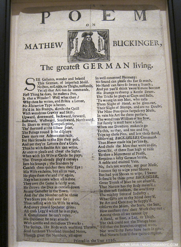
R-E-S-P-E-C-T. The Greatest German Living, a poem to Buchinger, 1726

“Don’t hide yourself in regret
Just love yourself and you’re set
I’m on the right track, baby
I was born this way, born this way”*

MB was, however, forced to turn to being a carnival side show act to gain appreciation for his abilities as an Artist as well as his many other skills, and to survive. The show includes a few works by other Artists of the same era who were also born without hands or feet, who made their living in the same manner. A “broadside” poster announcing the appearance of one is on view. MB would demonstrate his writing talents for show attendees for a fee and some of these souvenirs are on view here. (The Portrait of him surrounded by depictions of his skills bears his hand written inscriptions on the bottom margin.) Invariably, he always proceeds his signature with “Born without hands or feet…”

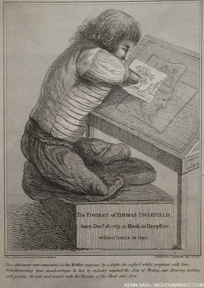
A portrait of Thomas Inglefield, also born without hands or feet, shows how Mr. Buchinger may have worked his magic.

Seeing all of this, and a smidgen of what life may have been like for these Artists in the 18th Century, it’s hard not think about the bigger picture.

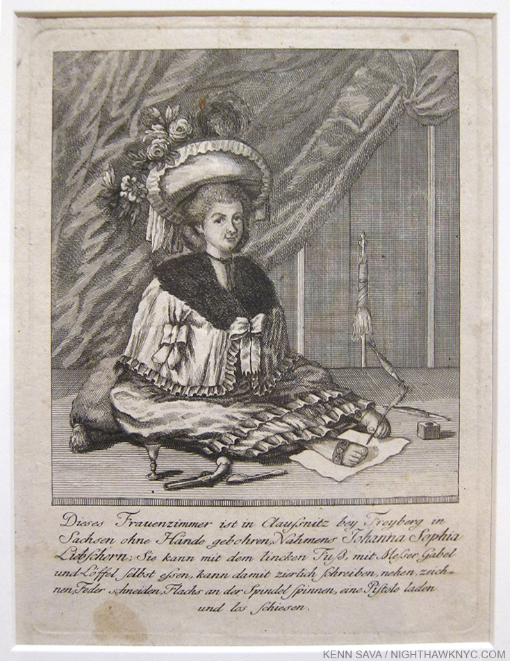
Anonymous, Portrait of Johanna Sophia Liebschern, ca.1780-90 the so-called “Fusskunstlerin,” or foot artist, as the piece is inscribed. It goes on to say, “she has no arms but is able to use knife, fork, and spoon with her left foot and feed herself, (and) is able to prettily write, sew, draw, cut a quill pen, load and shoot a pistol.” Like MB, Ms. Liebschern enjoyed considerable fame in her time, both voyeuristic and scientific.

“There’s nothin’ wrong with lovin’ who you are
She said, ’cause He made you perfect, babe
So hold your head up,
girl and you’ll go far”*

Thankfully, for the disabled, to my mind THE most overlooked group in our society, things seem to have gotten a little better. But, what do I know. I asked Magdalena Truchan, Fashion Guru, Designer, Artist and Blogger Extraordinaire over at her must read Blog, prettycripple.com, that very question- “Have things gotten better for disabled Artists?” She told me-

“I think lots of things have gotten better for disabled artists. They can make a living online as well and the world gets to see what they offer. There are so many groups out there that I come across who help disabled people. I read these things and smile. They have a better networking system today and while discrimination still exists people in the US don’t treat disabled people as lepers. Same in Europe. Life must have been hell for disabled people until the 70s in this country. Also, because of the the “bullying” problem for all people, now people are standing up to them and outing them on social media. So now it is un-PC to bully people. We have a long way to go but at least people have another avenue to voice themselves. You also see more disabled models and actors now. Although some disabled people on TV are not legit cripples. They are able bodied and stuck in chairs which sucks, but at least they are portraying disabled people.”

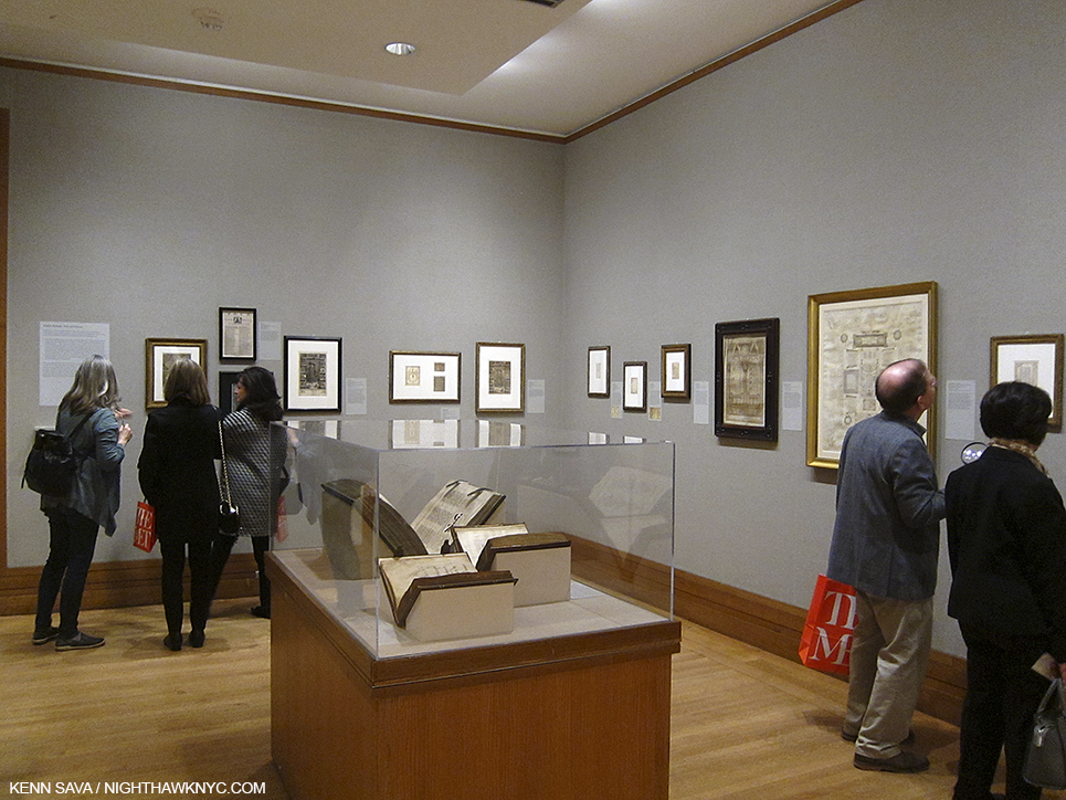
While it’s good to hear that, so much remains to be done for the disabled. I can’t help but wonder if part of the root of the cause of this slow progress might be that able-bodied people are secretly terrified of becoming disabled.? Even in this very show, the work is hung too high for wheelchair visitors to see, and though magnifying glasses are thankfully on hand, unless you are a bit over 6 feet tall, the higher works will still remain unavailable for close study, as you can see below. It must be a very frustrating experience for the disabled to come to this show. On the one hand they’ll be as impressed as anyone else by the work, but (unnecessarily) frustrated by the experience. What kind of message does this send?

The show is hung for the average size, or taller, standing adult.

That being said, this show is, also, a fascinating insight into the wondrous collection of Ricky Jay, renowned as the greatest living Sleight-of-Hand Artist and historian of its related arts, and who says that MB is “my flat-out favorite. I’ve been collecting materials on him for 30 years.2” Mr. Jay is someone who has spent his entire life mastering his craft, that way a great Painter or Musician does, all the while thoroughly exploring its history, researching its forgotten Masters, collecting rare books, artifacts and works of Art they created. This show is, therefore, is something of a byproduct of how he became who he is today. From what is on view here, the man has superb taste and a most discerning eye.

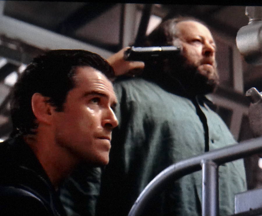
Be careful, Mr. Bond, or Ricky will turn your gun into a rabbit! Yes, that's the inimitable Ricky Jay in "Tomorrow Never Dies."

Be careful, Mr. Bond, or Ricky will turn your gun into a rabbit! Yes, that’s the inimitable Ricky Jay in the James Bond film Tomorrow Never Dies.

It leaves me eager to see more of his collection, so I hope it marks the beginning of a relationship between TM and the inimitable Mr. Jay. For more on him, check out the two excellent documentaries, Deceptive Practice: The Mysteries and Mentors of Ricky Jay, which airs as part of PBS’ American Masters series, and, Hustlers, Hoaxters, Pranksters And Ricky Jay, here on youtube.

Isle of View. Untitled by Rachel Harrison from her Perth Amboy Show at MoMA. Does Art Have to be this hard to see?

While “Wordplay” is a shining example of attention being paid to an extraordinary and overlooked Artist- disabled, or not, in a show that will inspire all, it’s one thing to honor this Artist, it’s another to make it largely inaccessible to disabled visitors. I’m not sure that helps inspire other disabled Artists, or disabled people, and that’s a shame. (Luckily, however, the excellent catalog for the show, by Mr. Jay, features beautiful, clear and full size reproductions of many of the works on display, along with Mr. Jay’s one-0f-a-kind insights. I found I could see the works better in the book than by actually looking at the real thing). It says to me that The Met’s interest here lies in the Art itself, and while I understand that, I think they missed a chance to include more of the Art going public, namely the group that includes these wonderful Artists, themselves.

*-Soundtrack for this Post is”Born This Way,” by Lady Gaga, written by NYC’s own Stefani Germanotta, Jeppe Laursen, Fernando Garibay and Paul Blair, from the album of the same title and published by Sony ATV Music Publishing, Warner Chappell Music Inc. and Universal Music Publishing.

NighthawkNYC.com has been entirely self-funded & ad-free for over 8 years, during which 300 full-length pieces have been published! If you’ve found it worthwhile, PLEASE donate to allow me to continue below. Thank you, Kenn.

You can also support it by buying Art, Art & Photography books, and Music from my collection! Art & Books may be found here. Music here and here.

Written & photographed by Kenn Sava for nighthawknyc.com unless otherwise credited. To send comments, thoughts, feedback or propositions click here. Click the white box on the upper right for the archives or to search them. Subscribe to be notified of new Posts below. Your information will be used for no other purpose.

  1. Ok..ok…I’ll insert the famous Groucho Marx joke- “I like my cigar, too, but I take it out once in a while.” Sorry.
  2. http://www.pbs.org/wnet/americanmasters/ricky-jay-collection/3649/

Zaha Hadid, And The “Rule Of One”

“I was taught to go
Where the wind would blow
And it blows away – away
Well, my eyes are full of stars
But I just can’t reach ’em… oh, how high they are”*

Once again this year, I’m very saddened to learn of the very premature passing of a visionary Artist, in this case, the great Architect, Zaha Hadid, who passed on Thursday. Rare are architects who marry vision with a unique syle in this world and create Art in the process. Rarer still when they are female. I happened to date one in the 90’s, who found it very hard to get work as an Architect because she was a woman and had to rely on work she got as an Engineer to suvive. Sometimes they had her do work which was really Architecture in the guise of Engineering because they couldn’t use the name of a woman as the Architect, and because, she said, they could pay her less. I’ll never forget going with her to a nightclub she designed near Dusseldorf, Germany that had a dance floor that could be raised and lowered using a system of locks, yes, with water, (like those used on the Panama Canal in miniature). The floor was clear so you could actually watch the water coming and going as you danced. As the water flowed in, the slowly floor rose until you were a few feet in the air. Amazing. She even designed the furniture in the place. As for Zaha Hadid, to this point, in New York, I have only been able to experience the terrific 30 year Retrospective of her work at the Guggenheim in 2006. It was a rare chance (along with the Frank Gehry Show there in 2000) to see the work of one great Architect inside that of another, Frank Lloyd Wright, of course.

While their work is very different, I have a feeling Wright wouldn’t have been too hard on Ms. Hadid. There is a futuristic organic-ness to her work that surprises at first glance, then seems to, somehow magically, fit her sites surprisingly & uniquely well. Plus, I think he would have gotten a kick out of the paintings she did for her design proposals. I know I did, having never seen them prior. I bought a set of two of them on refrigerator magnets to add to my extensive collection, and for inspiration!

DSC03371PNH

The white painting on the left echoes Wright’s Guggenheim Ramp’s Spiral!

Now, sadly, however, upon hearing the news of her passing, I was struck by a feeling I don’t like at all- It seems to me that this is another instance of what I hate to call, “The Rule of One.”

Meaning, it sure seems like great Architects only get to build one building, each, in NYC.

Witness-

Louis Sullivan, the “inventor” of the skyscraper, only built one in NYC, the beautiful Bayard Building in 1899 at 65 Bleecker Street.

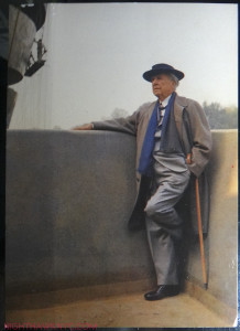
Frank Lloyd Wright, Sullivan’s great student, and, perhaps, the greatest Architect ever (per Frank Lloyd Wright, himself), has only the Guggenheim Museum (I’m not counting the Mercedz Benz Showroom on Park Avenue he designed because it’s a showroom, not a whole building, nor the pre-fab house he designed that was built on Staten Island). He lived to be 91, and it took that long to get a project approved, and past Robert Moses, who succeeded in blocking all the rest of his amazing NYC projects, like these. Eerily similar to Ms. Hadid’s contribution (see below), he didn’t live to see it completed, passing 6 months before it opened.

Wright, in my favorite picture of him, on the balcony of the Guggenheim, under construction, that he would not live to see open. Guggenheim postcard from my collection.

“If I can make it here…” Wright, in my favorite picture of him, on the balcony of the Guggenheim, under construction, 1959. Guggenheim postcard from my collection.

Daniel Liebeskind- Won the competition for the World Trade Center master plan, but so far, he hasn’t had anything of his own actually constructed. (I have no idea where things stand with his “Green Tower” for 1 Madison Avenue, proposed in 2008. Looks pretty wild to me!)

Santiago Calatrava- The infamous World Trade Center Transit Hub. (Like Liebeskind’s Tower, I have no idea what happened to Calatrava’s, too.)

Frank Gehry has, thankfully, outlived the Rule of One, with his gleaming tower downtown at 8 Spruce (nee Beekman) Street, (a work that includes Public Elementary School 397 that I don’t believe he designed), joining his beautiful IAC Headquarters Building at 555 West 18th Street.

Gehry's IAC Building- like sails on the adjacent Hudson River. Seen from the HighLine.

Gehry’s IAC Building- like sails on the adjacent Hudson River. Seen from the HighLine.

Though, like Wright, all of his most visionary works for NYC were never built. Mr Gerhy is still creating, and I hope he will still grace us with more projects, soon.

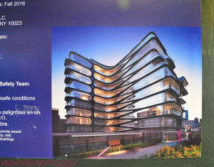
And now, Zaha Hadid, who’s only NYC building, she didn’t live to see completed. Well, here it is, 520 West 28th Street, about 10 blocks north of Frank Gehry’s gorgeous IAC Building, above, and right smack dab on the High Line.

It's scheduled to open in the Fall.

Rendering. It’s scheduled to open in the Fall.

From the rendering, above, it looks like a beautiful, surprisingly almost conventional design, yet one that will leave us appreciative of what it adds to our lives (even just walking past it), and of her amazing talents.

April 1, 2016. No work taking place today out of respect for Ms. Hadid's passing. A compilation from the HighLine.

April 1, 2016. No work taking place today out of respect for Ms. Hadid’s passing. From the HighLine.

“All I believe in is a dream
I haunt the Earth though I am fully seen
In all my years I’ve never felt more sure than now”*

Yet, everytime I see it, as it’s completed, and after it’s finished, I’ll be left with this overriding thought-

WHY is it that so many mediocre Architects get to build project after project here (I’m not naming names but just look around. They’re easy to spot.) and the best get ONE…IF THEY’RE LUCKY!, AND have to move figurative heaven and earth to get it? They’d much rather be moving real earth.1

While I’ll be eternally grateful we have it, as I am the others I just listed, in this City where we have the second most tall buildings (over 150 meters) in the world (236 to Hong Kong’s 380. Chicago has 118, the only other US City in the worldwide top 20), nowhere is the need for great architecture more desperate.

It does, also, make a real point for any struggling Artist in this City, if not beyond- It’s not easy to get your work done, seen, heard, or built here. Even being a world famous Master of the Art is not an Ezy Pass to opportunity here.

It also points out that our loss is all the more in that we don’t know what might have been, and therefore, what we might have lost.

I’ll say it, again…before it’s, god forbid, too late- let’s get Frank Gehry to give us the masterpiece the City needs to define it for the 21st Century. PLEASE?2

*Soundtrack for this post is “Rise To The Sun” by Alabama Shakes, from their album “Boys & Girls,” written by Steven William Johnson, Zachary Riley Cockrell, Brittany Amber Howard, Heath Allen Fogg, and published by Alabama Shakes Publishing.

NighthawkNYC.com has been entirely self-funded & ad-free for over 7 years, during which over 275 full length pieces have been published!
If you’ve found it worthwhile, PLEASE donate to allow me to continue below.
Thank you, Kenn.

Written & photographed by Kenn Sava for nighthawknyc.com unless otherwise credited.
To send comments, thoughts, feedback or propositions click here.
Click the white box on the upper right for the archives or to search them.
Subscribe to be notified of new Posts below. Your information will be used for no other purpose.

  1. I mentioned this here, not all that long ago.
  2. Yes, I notice that his 8 Spruce Street Tower is being used more and more in skyline shots behind the Brooklyn Bridge as seen from the Brooklyn East River shore, and that’s nice, but that darn Freedom Tower thing is in the background. The need remains!

Riffing On Miles Davis

This site is Free & Ad-Free! If you find this piece worthwhile, please donate via PayPal to support it & independent Art writing. You can also support it by buying Art & books! Details at the end. Thank you.

Written & Photographed by Kenn Sava (*- unless otherwise credited)

Here we go, again. Or, to quote the late, great Eddie Jefferson in “Moody’s Mood for Love”- “Here I Go, Here I Go, Here I Go, Again…”

The film, Miles Ahead, gives me cause for concern. No, I haven’t seen it yet. I’m not sure I’m going to see it. Why? Probably for the same reasons I didn’t go to see the Steve Jobs movie. While I’m all for artistic freedom and creative license, as time goes on it seems that “docudramas” that purport to be “about” someone real tend to paint incomplete pictures of their subject. They “riff” on them. Whether they are “good” movies, or not, whether they do any justice to the truth of their subject, or not, the public comes to base their opinions of their subjects on these films. Sometimes, (like Lady Sings The Blues “about” Billie Holiday, which “incongruously transforms Holiday’s messy, bisexual, masochistic romantic history into a glossy romance about a troubled, needy woman-child and the endlessly patient dreamboat who could slow but never entirely halt her march toward self-destruction,” according to Nathan Rabin of The Onion AV Club), even worse, they may leave them feeling there’s no need for them to look past the film for themselves. (Both Billie Holiday and Miles Davis wrote Autobiographies.)

This is very sad.

I’m hoping the film, whatever it’s “about,” will inspire viewers to want to hear more of Miles’ music, ideally, all of it, and that will be the primary result of it.

Last time I checked, very few Artists or Musicians had been canonized as saints, though in my personal Church of Art, they’re revered to me. They’re human. They had flaws. Some did very bad things. Allegedly committed crimes, even murder. Some did drugs, and weren’t exactly nice or easy people to know. Miles Davis has been accused of doing some bad things. Does creating great timeless Art or Music that effects millions of people make that Ok? That’s not for me to say.

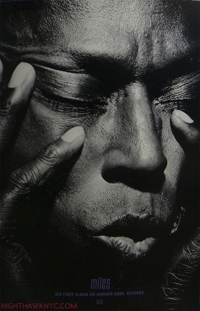
Larger Than Life. Miles in a 4 foot poster from Tutu. From my collection.

I do know this-

Miles Davis was probably the most influential Artist in my life. While I never met him, his signature and mine actually did wind up on the same piece of paper once, a few inches apart, and I was fortunate enough to see him perform about 40 times. That’s as close as I got to him. But, his music, especially his albums? They’ve been closer- they’ve been a part of me since I learned how to work a record player.

When his album Bitches Brew came out, only the latest in a string of game changing albums he released every few years, it was so controversial, it led to the break up of the band I was in at the time. At that point I was playing electric bass in a friend’s blues band, and listening to jazz. After Bitches Brew, an unprecedented mix of jazz, rock, funk, avant garde, and what came to be called “world music,” and the first-shot-over-the-bow that something very new and different was going to be happening hence forth, a lot of us realized it was possible to play electric instruments and play jazz. So, I started looking around for a band to do that with, eventually found one, and went on the road with them for five years. They were all far more accomplished musicians than I was. Miles was a legend, even back then, to all of them, too. He has been as long as I can remember.

It’s hard to think about the impact that every single one of Miles’ albums had at the time it came out, going back to the Birth of the Cool, which is exactly what it was, in the late 1940’s . It must’ve been like Picasso creating a new work to the artists of his time. Miles had the ability to move mountains with every new album. Musicians would listen to them and think about them vis a vis what they were doing. Miles was always Miles beyond. In fact, all of his albums from the late 60’s bore the moniker “Directions in Music by Miles Davis.” That said it all. With Bitches Brew, people began to argue that it “wasn’t jazz.” If you had followed the thread of his music through the 1960’s, you could hear where he was going and you could also hear the same thing that always defined Miles, more than anything else- His sound.

No one could play a melody like Miles. And then, no one else had his sound.

He started the 1960’s fresh off what is widely considered the greatest jazz record ever made- Kind of Blue  in 1959. His 1960 group, now referred to as his “First Great Quintet” included that other great master of post war jazz improvisation- the tenor saxophonist, John Coltrane. The two couldn’t be more different, and made perfect foils for each other. Miles was the inventor of space- what Artists call “negative shapes,” that is, what isn’t there- in music’s case, silence. Miles could say more with less than any Artist in Jazz history- even with one note. (Even when I heard him in a concert late in his career, racked will illness and apparently having trouble moving on stage, there would be that one moment, that one note that would sear the night and make your jaw drop. The silence that inevitably followed making it infinitely more poignant.) John Coltrane was on his way to developing what became his signature “sheets of sound” style, would solo after Miles and his voluminous brilliance would serve to frame Miles the way black velvet sets off a diamond. Of him, Miles famously once said, “I had 7 Tenor players once.” Coltrane left to form his own group, but somehow Miles managed to put together another great group- his, so-called “Second Great Quintet” with Wayne Shorter on Tenor, Herbie Hancock on Piano, Ron Carter on Bass and Drummer Tony Williams. As the sum of its parts, this band of Masters, was, for me, the pinnacle. To this day, I revere every note I have heard them play in the slightly over 2 years they were together as I do no other group I have heard. No group has taken the art form of the acoustic jazz quintet further.

Then, it changed, again. He went from the Second Great Quintet to an increasingly more electric sound. This was the mid-1960’s and rock and funk were influencing him. Herbie and Wayne remained for the first few albums, and then they, too, left and were replaced by people like Keyboardists Joe Zawinul, Keith Jarrett & Chick Corea, Guitarist John McLaughlin, Bassist Dave Holland, Drummer Jack DeJohnette, and many others, quite a number of whom went on to have had long and important careers.

Today, Miles’ influence is everywhere. His legacy lives on. While many of his side men, like Hancock, Shorter, Corea, Jarrett, Holland, Marcus Miller, Mike Stern, et al, are still among the biggest names in jazz, his legacy is being handed down to their side men, and on it goes. For me, a day doesn’t go by that I don’t hear a piece of his.

So? Why do I dread this movie?

Because unless you grew up with this, it’s really hard to capture on film. Jazz was (and still is) a very hard way to make a living- mostly in small clubs in an environment filled with drugs, alcohol, crime, trouble and little to no money for most. Yes, there was  scandal and a lot of controversy in Miles’s life. It’s very easy to make a drama out of it. I hope that’s not all it does. To do so, would be to miss the point.

From here, to eternity. My other 4 foot "Tutu" Poster. This one, the cover shot.

From here, to eternity. My other 4 foot Tutu Poster by Irving Penn. This one, the classic cover shot of “The Prince of Darkness.”

It would be to miss why Miles is an Artist for the ages.

While I don’t believe in comparing Artists qualitatively, I do think it can be illuminating to see similarities and differences between them. Miles is often called “the Picasso of Jazz,” and I can understand why- Their lives largely overlapped (Picasso- 1881-1973, Miles 1926-1991. Miles also painted.) They both refused to be pigeonholed, and changed styles as frequently as it suited them. They both continued to grow and evolve as Artists literally right up to the very end. When I think about Picasso and Miles Davis, I wonder if the total number of pieces Picasso created may be very similar to the total number of performances that Miles Davis gave, when you consider live and studio performances. Though Miles was infrequently in the studio during large portions of his career, he was active as a live performer. Whatever the total numbers might be, the two are similar in that they were both extraordinarily prolific.

Picasso was very aware of the history of art and what was going on in and around him, witness his long relationships with Matisse, Braque, among others, Miles immediately sought out, then played with Charlie “Bird” Parker, the greatest musician of his time, soon after arriving in NYC to study at Julliard, and, startling to many, the  young unknown, barely out of his teens, was asked by Bird to join his group. Interestingly, as time went on, Miles, in turn, nurtured the careers (to varying degrees) of the likes of John Coltrane, Wayne Shorter, Joe Zawinul and Herbie Hancock among many others. He was also very aware of what people like Jimi Hendrix and later, Prince, were doing, and played with both.

Along with Frank Sinatra, Ella Fitzgerald, Louis Armstrong and a few others, his performances of standards define them.

Along with this, the kid from East St Louis, Illinois wound up sonically defining New York City. It’s impossible for me to listen to Kind of Blue, which may be the greatest improvisation in music history, without seeing a tone poem of New York City in my mind each time. (A live performance shortly after its recording, with John Coltrane-)

No one else I have ever heard, in any kind of music, has come closer to it. A couple of years ago the Village Voice  ran a list of the greatest New York City songs. Nothing from Kind of Blue, which was recorded on 30th Street in Manhattan, made the list. Someone is out of their mind. Kind of Blue celebrated its 50th anniversary in 2009. Get back to me on how some of the songs the Voice picked are doing in 50 years. The “cool” sound, style and attitude he created, and embodied, in the 1950’s became en vogue everywhere, nowhere more than right here.

Maybe one day I’ll see the film and feel my fears were for naught. Miles Davis made a unique and extremely valuable contribution to music, to American and World culture. Even though he didn’t die that long ago, this contribution is already in danger of beginning to be forgotten. This is not something to be taken lightly. His legacy is important- to me and countless others. I’m writing this to express how I feel about Miles (and “riff” about him the way the film may), and to say that I hope anyone interested in him hear as much of his music as you can1

You can also support it by buying Art, Art & Photography books, and Music from my collection! Art & Books may be found here. Music here and here.

Written & photographed by Kenn Sava for nighthawknyc.com unless otherwise credited. To send comments, thoughts, feedback or propositions click here. Click the white box on the upper right for the archives or to search them. Subscribe to be notified of new Posts below. Your information will be used for no other purpose.

  1. Miles created a long legacy of recorded music, and changes styles of music more often than almost anyone else has. Kind of Blue, seems to be where most people start. After that, I’ve written an entire piece called “Directions In Listening By Miles Davis”Directions In Listening By Miles Davis” with some thoughts on what to check out next. He also wrote an Autobiography. Soget to know him through those and make your own mind up about him. If you want to know what’s really important about Miles, do yourself a favor- Go to the source- start with his music. It’s a font that will be inspiring millions for as long as music is played.

    Yes, Miles Davis was a complex man by all accounts. Like Steve Jobs, people will be trying to understand him and tell stories, even make films about him for many years to come. Both were, by all accounts, incredibly complex men. That alone makes it very hard to do them justice in a 2 hour film. Some love Miles, some loathe him, many found him scary, difficult or impossible to deal with. All I know is that Miles, the Artist, is one of the greatest Artists in music- that’s what’s important, and the rest is, now, details. If you go and see the film, keep this in mind and try and imagine the effect his music had at the time and how often it changed the musical world. That doesn’t happen often. How many Artists take those kinds of risks anymore? How many risk losing their audience? And how many do it over, and over, and over, and over, again? That’s a big part of his legacy that shouldn’t be forgotten, and one I hope will be emulated by those still being influenced by him, those who want to get to the heart of what’s really important, like this-

    Next time you listen to Miles, listen for that one note that says more than words ever can- it’s there in every one of his performances, and then listen for the silence.

    *Soundtrack for this post is “It Never Entered My Mind” as performed by Miles on “Cookin’ & Steamin’ with the Miles Davis Quintet” (there are other versions), a long time personal favorite. It was written by Richard Rogers & Lorenz Hart and published by Warner Chappell Music, Inc.

    POSTSCRIPT- June 20, 2020- I finally did see Miles Ahead. I found Don Cheadle’s performance to be amazing. It’s obvious to me how much care and passion he put into this film. Herbie Hancock and Wayne Shorter appear onstage during the final credits, which makes me believe they had some level of awareness of the film’s content, though I am not saying they gave their approval to it- I simply don’t know. Still, it strikes me as a dramatization, and as such, it’s fine as an ancillary source. I still say- go to the source (if you’re looking for a visual source, check out the new documentary film, Miles Davis: Birth of the Cool, which ran on PBS’ American Masters series in early 2020), get familiar with Miles’ accomplishment, and his own words, and then, if you’re looking to see his life interpreted dramatically, riffed on, by someone else, check out the film. If not, you are selling Miles, and yourself, short, if the film is all you know about him. It reminds me of the dramas being done on Picasso, that other endlessly creative 20th century Artist. That they keep Miles’ and Picasso’s name in front of the public is good, I guess, but if that’s as far as the public’s interest goes, and they don’t discover who these people REALLY were for themselves? They are left with distorted views, which is what I feared when I wrote the above in March of 2016, and this is not good, in my opinion.

    NighthawkNYC.com has been entirely self-funded & ad-free for over 8 years, during which 300 full-length pieces have been published! If you’ve found it worthwhile, PLEASE donate to allow me to continue below. Thank you, Kenn. [paypal-donation

Rachel Harrison & The Question of Faith

This site is Free & Ad-Free! If you find this piece worthwhile, please donate via PayPal to support it & independent Art writing. You can also support it by buying Art & books! Details at the end. Thank you.

Written & Photographed by Kenn Sava (*- unless otherwise credited)

IMG_3909PNH

“Your faith was strong but you needed proof”*

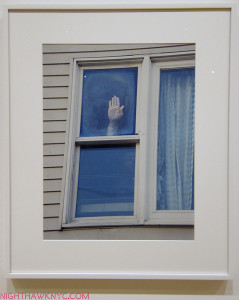
Perfectly timed for Easter is Rachel Harrison’s Moma show, “Perth Amboy,” a multi-media installation centered around a well-known series of photographs1, including “Untitled,” above, Ms. Harrison took in October, 2001 at a suburban house in Perth Amboy, New Jersey that had gotten wide attention when thousands of Christians began coming to see what they believed was the image of the Virgin Mary on a window on the house’s second floor. Her photos show some of those who were allowed in to touch the pane.

Could it REALLY be?

This is the question at the center of all religious faith.

“And the holy dove was moving too
And every breath we drew was Hallelujah

Hallelujah
Hallelujah
Hallelujah
Hallelujah

Maybe there’s a God above”*


*-Soundtrack for this Post is “Hallelujah” written by Leonard Cohen ( Published by Sony/ATV Music Publishing), in the version by Jeff Buckley on his mystical, magical and transcendent album, “Grace,” which has been seen 68 MILLION times. Thank God.

NighthawkNYC.com has been entirely self-funded & ad-free for over 8 years, during which 300 full-length pieces have been published! If you’ve found it worthwhile, PLEASE donate to allow me to continue below. Thank you, Kenn.

You can also support it by buying Art, Art & Photography books, and Music from my collection! Art & Books may be found here. Music here and here.

Written & photographed by Kenn Sava for nighthawknyc.com unless otherwise credited. To send comments, thoughts, feedback or propositions click here. Click the white box on the upper right for the archives or to search them. Subscribe to be notified of new Posts below. Your information will be used for no other purpose.

  1. There are examples from the series in the collections of The Met, The Whitney as well as Moma.

Richard Estes’ Dayhawks At The “Corner Cafe” (Revised)

This site is Free & Ad-Free! If you find this piece worthwhile, please donate via PayPal to support it & independent Art writing. You can also support it by buying Art & books! Details at the end. Thank you.

Written & Photographed by Kenn Sava (*- unless otherwise credited)

Update- 5/14/2022- In an interview with the Artist in the just-released book Richard Estes: Voyages, Mr. Estes says that he is now destroying his reference Photos because he does not want people to compare them with the finished Painting. As a result, and to respect his wishes, I have revised this piece to remove the Mr. Estes’s reference Photos I originally showed. It must be said that he included them in his Richard Estes: Painting New York City Museum of Art & Design show in 2015 . I cannot unsee what I saw in the show, but I have decided to remove them so that others won’t be influenced by them. The text of this piece remains unchanged. It is, simply, what I see. As always, I encourage everyone to look for themselves and let the Art speak to them. 

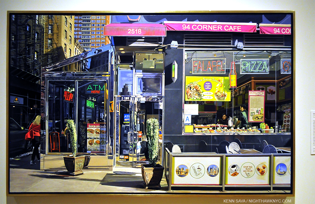
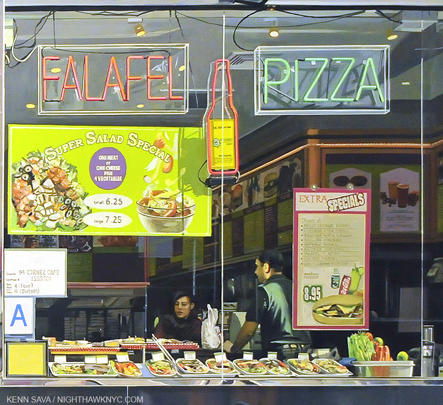
Appearing at the very end of the excellent Richard Estes: Painting New York City show at the Museum of Art & Design, which I looked at in my look at NYC Art Shows in 2015, the first-ever Estes show in an NYC  Museum, was a work depicting one of those all too common places to be found all over New York, and indeed much of the world, making it easy to overlook, to look through, or to see-but-not-really-see. Mr. Estes titled it Corner Cafe. It’s dated “2014-15.” Given that the Artist was born on May 14, 1932, that means that he was 82 or 83 years old depending on when he actually finished it. Situated as the show’s conclusion, Corner Cafe could be a make or break work for the entire show.

How VERY Daring.

Richard Estes, Corner Cafe, 2014-15. Oil on Canvas. I only hope I can still get out of bed when I’m 83.

To end a show that covers over 40 years of work with a piece created at 83 is certainly making a statement. Especially a show that is, among other things, a showcase of his amazing craft & technique and how it has evolved over time. In fact, his craft is such that this was the first ever solo show by a Painter at the Museum of Art & Design, who specialize in “craft.” A very close look reveals he has signed and dated it right under the very small Statue of Liberty near the lower right corner. An appropriate conclusion for a show entitled “Painting New York City.”

To my eyes, it’s every bit as good as anything he’s ever done- In this show or not. Technically, it’s flawless. Mr. Estes remains at the peak of his considerable powers in his 80’s. Remarkable! Compositionally it’s subtly fascinating,

In spite of the fact that the show was a first chance for me to see paintings by Mr. Estes that I’ve loved for 30 years and never seen in person before, since I first saw Corner Cafe at the show’s opening in March, 2015, I haven’t been able to get it out of my head.

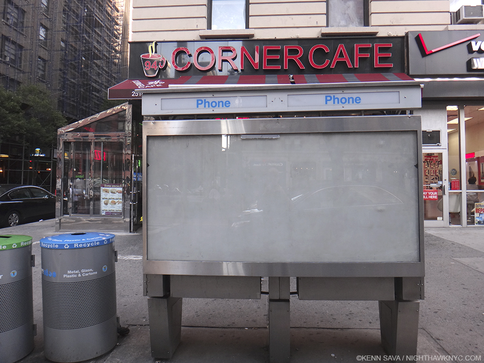
Here’s what the “Real” Corner Cafe looked like in December, 2015. Mr. Estes hasn’t eaten here1, so why did he choose to paint it?

I’ve actually made a number of trips to the corner of West 94th Street and Broadway to ponder the “real” Cafe in situ, both to experience it for myself (I did not go in), to see if it screams out “PAINT ME!” and to see what, exactly Mr. Estes has altered, even though no less than 3 of his Reference Photographs hung very close by in the show. These Photos should serve once and for all to clear up many of the myths and fallacies about Mr. Estes work. Like-

He does not project Photographs onto his canvas and then Draw or Paint them2.

He does not paint his reference Photographs verbatim (as the evidence in the show proves).

He does not, apparently, even rely on a single Photograph when he feels it doesn’t contain all he wants.

This brings up my biggest pet peeve about the perception of Richard Estes work. That he is ENDLESSLY called a “photorealist” or “hyperrealist.” “Photorealism” is a term popularized by an Art dealer as a means of selling the work of a group of his artists, and then perpetuated in a series of now 4 books, each including Estes work. I’ve never heard what Mr. Estes, himself, feels about this term. As I’ve said, I believe that labelling artists by a one word term that is supposed to enable viewers or readers to pigeonhole them and their work for easy consumption is something that must end. Artists are unique beings. If their work looks like that of someone else (like Picasso’s Cubism did Braque’s Cubism), it’s by their choice, but it’s not necessarily indicative of the sum of their Artistic being. In Picasso’s case he went on to another style as soon as his last one was “named.” In the end? He is simply, “Picasso.” Artists, like Chuck Close, also included in the book series, have made no secret of not wanting to be considered a “photorealist.”

“The reason I never liked the word “realist” or “new realist” or “photorealist” was I was always as interested in the artificial as I was the real.  I’m as interested in the distribution of color on a flat surface as I am in the image it ends up making.  So it’s that tension as it works back and forth between marks on a flat surface and the image that it’s making that has always interested me.” Chuck Close

And, for the most part, he haven’t been since. This wanting to put Artists in a box is something that only serves to provide a “crutch” that may serve to make viewers feel they already “know” what a given Artist does and so they don’t need to actually look at their work for themselves. I feel it’s better to forget what anyone (besides the Artist) calls it, and just look at the work.

As I began to do that with Corner Cafe, I was quickly faced with two overriding questions-

Why This Scene?

What is this “about?”

First, I will say that what follows is entirely my opinion based on the feelings I get looking at it. That’s all. While the endless details Mr. Estes has so incredibly faithfully recorded are delicious to enjoy on their own- the reflections in the metal framing, the sample meals in the window, the latticework of the furniture, the surrounding buildings, the inside of the cafe and on and on. As wonderful as it is to enjoy these details (as it is in almost any of his work), as time has gone on, I’ve found myself considering it as a whole. Visiting the actual site a few times, something most viewers may not be able to do, one thing strikes me- Mr. Estes has chosen to leave out what is, perhaps, the most noticeable thing about the real Corner Cafe- its sign. Why? Many (most?) other Artists Painting this site would no doubt include it. But, whatever his reason is, it puts the focus of his Painting elsewhere. I think he did it because he didn’t want viewers to be distracted by it.

Over and over again, in thinking about the feeling I get from Corner Cafe, I was inescapably drawn back to something very familiar. And familiar to anyone reading this site. Look up above. That’s right. I’m reminded of Edward Hopper’s Nighthawks.

There are two people visible through the large front window (and parts of others inside on the left), and a woman in a red jacket disappearing stage left around the corner onto 94th Street. There’s a woman who appears to be a customer, a counter man, an employee of the cafe, and between them sits a white bag, its handles pointing up. Interestingly, these two appear quite a bit brighter in the Painting than in the Reference Photo, especially the female customer, who has gone from being completely in the shadows to being completely sunlit. They’re not looking at each other, though their mouths may both be open. Perhaps they’re speaking to each other. The woman is looking slightly to her right, whereas in the Photo she looks almost straight ahead. The woman in red walking down 94th Street appears in a different reference photo than the one with two people inside.

The real thing in December, 2015.

Mr. Estes has said that he consciously chose to omit people early on in his career to avoid the narrative element that comes with them. That is, no doubt, why most of his work feature people who are,  at best, “incidental.” Sometimes, however, my attention has been drawn to these “bystanders,” and I find it hard to believe that that is not intentional. The customer in line in Lunch Specials who gives us a look over his shoulder, for example, as if seeing what is going on when most others (ourselves?) do not. And, there are the guys on the payphone outside. A metaphor for talking to people who are not there, while those who are there stand in line not talking to each other? He’s right. It’s hard not to read into them when people are present.

What we’re seeing here is one of the countless, brief encounters we all have every day, encounters that are the hallmark of the modern world. A world that is clad is shiny surfaces, with neon signs and images and examples of what is to be found inside. (Things that have changed since the 1942 world of Nighthawks, which is almost distraction free, somewhere, possibly imaginary, possibly real, in the Flatiron or the West Village neighborhoods. My search for the real Nighthawks cafe is here.) Tables and chairs fill the right foreground, in case you want to bring what’s inside out, but no one has. Yes, it’s winter, given the snow seen on the left, but it’s a sunny day.

Like the woman in red disappearing3, these two will, most likely, probably end their encounter very soon, and move on with the rest of their days.

Am I making too much out of the “similarities” with Nighthawks? Maybe, maybe not. I’m responding to what I see. To quote Frank Stella in his recent Whitney Museum Retrospective, “What you see is what you see.”

Detail of the Painting.

I’m not saying that Mr. Estes was thinking of  Nighthawks when he painted Corner Cafe. I’m saying that I was reminded of it as I’ve looked at it. There is the same isolation. The same counter person-customer interaction. The same other random (single) person included. And both feature cafes that are located on a corner. For Mr. Estes, this scene may be reminiscent of everyday scenes of Venice rendered by Canaletto.

Interestingly, one detail Mr. Estes has omitted might seem to reinforce that Nighthawks connection- on top of the awning is a sort of logo that has the words “corner” and “cafe” at right angles to each other (which does appear, smaller, on the divider in front between the Brooklyn Bidge and NYC Skyline. My guess is the one over the awning was too large to not be “read,” or it would appear as a meaningless distorted mess given the angle of the scene), not all that much different from the somewhat sharper angles of Nighthawks cafe. Unlike the Hopper, the door is obvious and central. Are we being invited inside? It’s hard to say. There’s a tall, evergreen like plant (since replaced) “guarding” the front door, with an ATM machine looming right inside. It almost looks like the way into a different business. But, we known better. The overhead awning tells us it’s all the same place.

Inside, given too much choice, perhaps the customer is having trouble deciding on something else. Her eyes (which in the Reference Photo that she appears in- the only one of the 3- I almost thought she was wearing sunglasses), appear to be looking down at the items on the counter.

Mr. Estes has omitted the large “Corner Cafe” sign, with its preceding coffee cup, above the awning, which serves to focus our attention on the windows. We can barely see the bottom of the cup over the “2518” sign. Puzzlingly, he has added what appears to be a drop shadow for this sign above the rest of the awning, much larger than I saw it in real life.

Scrunched into the phone booth seen further below to take it all in on August 21, 2015. With the umbrellas open, it’s not nearly as interesting.

Almost everything else is there! The level of detail makes my head spin. You can get easily lost in it. When people talk about “pure Painting,” THIS is what I think they mean. Yet, every single detail has meaning and purpose here. They are all the means to an end.

The chairs are different now. They have square backs and don’t have that marvelous lattice work he masterfully shows. The signs in front of them are different, too. Gone are the NYC sights, two of which, the Brooklyn Bridge and the Lower Manhattan skyline, happen to be subjects of large, earlier Estes.

It just screams “Paint Me,” right? It took a bit of work to find a place to stand to even shoot it, Here, I’m standing in the middle of Broadway! August 21, 2015.

Also interesting, the apparent spot where Mr. Estes likely stood to capture this view of the cafe is a bit hard to get to. Now, there are 3 large circular recycling cans on the spot. I had to stand on the curb to shoot it. There is also a large telephone booth (remember them?) immediately to the right. So, even getting the photos he wanted may not have been exactly easy. The outdoor seating is closer to the front wall and neatly squared thanks to an additional divider on the left, and he’s cropped the lower part of the image to the very base of the outdoor divider.

The sun is high enough in the sky to the south to pass through all the intervening buildings along Broadway. There is only the woman exiting to be seen, along with the two large evergreen plants as outdoor signs of life.

Perhaps that is the point.

Unless you are “stuck” there, like the employee or the two potted plants, everyone is destined to come and go, like those who presumably once sat outdoors have already done, the woman in red is doing, and the female customer appears about to do.

Life, itself, is an endless series of comings and goings, too, with encounters of varying lengths in between.

Until it ends.

“Stop the rush and relax,” reads the sign below.

*-Soundtrack for this post is “Hello/Goodbye” by The Beatles and written by Lennon & McCartney, from their album “Magical Mystery Tour.”

NighthawkNYC.com has been entirely self-funded & ad-free for over 8 years, during which 300 full-length pieces have been published! If you’ve found it worthwhile, PLEASE donate to allow me to continue below. Thank you, Kenn.

You can also support it by buying Art, Art & Photography books, and Music from my collection! Art & Books may be found here. Music here and here.

Written & photographed by Kenn Sava for nighthawknyc.com unless otherwise credited. To send comments, thoughts, feedback or propositions click here. Click the white box on the upper right for the archives or to search them. Subscribe to be notified of new Posts below. Your information will be used for no other purpose.

  1. As was stated on the description card for the painting.
  2. As I heard him say in the interview he gave at the MAD opening.
  3. She may be there to distract the eye with her blonde hair and red coat, or to emphasize the “corner” element of the title, or as a means of visually breaking up the reflection to her right with the street scene to the left

Live, From the New Met Breuer!

This site is Free & Ad-Free! If you find this piece worthwhile, please donate via PayPal to support it & independent Art writing. You can also support it by buying Art & books! Details at the end. Thank you.

Written & Photographed by Kenn Sava

It doesn’t officially open till March 18 but being The Met (TM) “regular” that I am, of course they let me in 10 days early. I wish. Actually, they’re letting Members in early, starting today March 8. I still feel special.

I can report the layout is unchanged, so muscle memory from visiting this place when it was the Whitney Museum still works just fine. Ah, the Breuer Whitney Museum. I was involved in the debate surrounding it’s proposed expansion/modification way back in 1987, but I’m saving that tale for my upcoming post about the “New” Whitney Museum, almost a year in the making. Stay tuned. In the meantime…

Think about this for a minute.

The Met announced it would take over the Breuer Building as it’s “outpost” for Modern & Contemporary Art in 2011. Seen here on December 18, 2015. I was told that the silver circles on the windows were meant to echo the lighting of the lobby inside.

This place was the entire Whitney Museum until a year and a half ago 1. The Met already runs the biggest Museum in the country at 1000 Fifth Avenue, AND The Cloisters way uptown. Now that the Whitney has moved downtown, TM has taken over the building, which is now known as The Met Breuer (TMB). By itself, TMB is as big as the Dallas Museum. To be operating 1000 5th Ave, the Cloisters and now to open a new, additional location of that size, a few blocks from 1000 5th, I find to be a “WOW!” moment.

They seemed to get it up and open pretty quickly (judging from how it looked when I passed by in December).

December 18, 2015. I was told the “Circle” Motif is a take off on the lobby’s ceiling lights. See next.

The same window. Member’s Preview Opening Day, March 8, 2016.

So? What’s new? What’s old? What’s borrowed? What’s blue?

Actually, nuptial euphemisms are not out of place here, since The Met & The Breuer building are “married” for at least the next 8 years, with an option to extend, which is longer than most marriages last between people, while TM’s contemporary galleries are undergoing complete renovations that will take a few years. I fully expect they will turn out to be as exemplary as the American & Roman Wings have. Though the layout of TMB made it instantly “familiar,” my first visit was not without some major surprises.

Members Only. It won’t look like this for long. Only 1 street vendor apparently got the word.

Apparently, I didn’t get the word, either. Since the contemporary galleries are those closing I was expecting ALL of TMB to be contemporary Art. Nope. 2 Floors are devoted to a superb show, Unfinished: Thoughts Left Visible featuring such well known “contemporary” artists as Rembrandt, Cezanne, Picasso, Van Eyck, Durer and Titian.

?

Apparently, TMB will be a “satellite” featuring Special Exhibitions AND contemporary Art. Hmmm… To say I’m surprised by this and why they’d do it is an understatement. Well? Unfinished is a VERY large show that handsomly fills Floors 3 & 4. Perhaps they see the Shows as the draw for getting a large number of people into the building, while they “also” display contemporary Art? There is a show, which I haven’t seen yet, by contemporary Indian artist Nasreen Mohamedi (1937-1990), but no display of works from the permanent collection of contemporary Art, at least to begin with. A cafe & bookstore will be on the top floor, which wasn’t open today. So? Three full floors can be devoted to shows, the small lobby gallery featured a live performance by Vijay Iyer and his trio today, which was well attended and sounded good throughout the adjacent lobby.

“Wake Up over there on the right!” It’s MacArthur “genius” grant recipient, Vijay Iyer, left on piano, performing with his Trio in the first floor Gallery.

Regardless, Unfinished turns out to be a surprise blockbuster, a wonderful chance to look over the shoulder of some of the greatest Artists in history, both Old & Modern Masters, as they create. Create, not created because for some reason, even death, they never “finished” the works in this show. The reasons vary. TM defines Unfinished as it applies to this show as- “This exhibition addresses a subject critical to artistic practice: the question of when a work of art is finished. Beginning with the Renaissance masters, this scholarly and innovative exhibition examines the term “unfinished” in its broadest possible sense, including works left incomplete by their makers, which often give insight into the process of their creation, but also those that partake of a non finito—intentionally unfinished—aesthetic that embraces the unresolved and open-ended.” However, what is here in nothing short of a chance to experience what it was like to visit the studios of these Artists. Processes and choices are laid bare as an astounding roster of names go by in the course of 197 works. Monet, Manet, Van Gogh, Degas, Turner, Jackson Pollock, Robert Smithson, Rauschenberg, Basquiat, Rodin (yes, there are some sculptures, too), David, Kerry James Marshall, Alice Neel, and of course, the “King of the Unfinished Work”- Leonardo da Vinci.

Unfinished, installation view.

Jan van Eyck, Saint Barbara, 1437. I was shocked to see this masterpiece in Unfinished.

Lucian Freud, Portrait of the Hound, 2011, left unfinished on the Artist’s easel at his death.

My initial reaction is that TMB is great for Art lovers. Another major location to see world class Art in the City, with TM’s unequalled expertise, resources and 2 million or so collected works behind it. Unfinished is a must see show, especially for Artists. it’s chock full loans from major Museums (60% of the show), which is rare these days.

How it will turn out for TM, financially2, though it also remains to be seen what, if anything, will be done with the contemporary Art collection in the interim.

One day in, that’s the big question for me- What TM’s full plans are for contemporary Art at TMB. I’m looking forward to seeing how they unfold. My gut tells me it’s going to surprise a lot of critics and give TM new cred in a realm it’s been denigrated in for years. Oh? But that new Met logo isn’t wearing well on me.

For now, it’s terrific to have Art back at the Breuer, and, Unfinished is an unmitigated why-hasn’t-anyone-thought-of-this-before joy- for lovers of painting, and Art. I’m pleased to be among the first to “Kiss the Bride.”

*-Soundtrack for this Post is “The Art of Fugue” by J.S. Bach, left unfinished at the Master’s death, as recorded by Glenn Gould. You can see Gould perform the final part of  it here, and the entire hour and a half long piece, here.)

NighthawkNYC.com has been entirely self-funded & ad-free for over 8 years, during which 300 full-length pieces have been published! If you’ve found it worthwhile, PLEASE donate to allow me to continue below. Thank you, Kenn.

You can also support it by buying Art, Art & Photography books, and Music from my collection! Art & Books may be found here. Music here and here.

Written & photographed by Kenn Sava for nighthawknyc.com unless otherwise credited. To send comments, thoughts, feedback or propositions click here. Click the white box on the upper right for the archives or to search them. Subscribe to be notified of new Posts below. Your information will be used for no other purpose.

  1. The Whitney Breuer closed on October 19, 2014.
  2. It costs $17M a year to run per the NYT article linked above.}, is going to be something to watch. I’m hearing that by the 2 year mark it will be apparent where this is going long term, so we shall see. Yes, we’ve “lost” a little temporarily with the closing of TM’s contemporary galleries, but unlike when the American & Roman wings were closed for renovation, TM has more than made up for it with TMB[3. While TM didn’t open alternate spaces, beyond showing some works from the American Wing downstairs in the Lehman Galleries.

Happy 86th Birthday, Sister Wendy! I Miss You.

This site is Free & Ad-Free! If you find this piece worthwhile, please donate via PayPal to support it & independent Art writing. You can also support it by buying Art & books! Details at the end. Thank you.

Written & Photographed by Kenn Sava (*- unless otherwise credited)

Today, February 25th, is Sister Wendy’s 86th Birthday…

In front of the trailer she now lives in, in seclusion. As seen in her 2006 book Joy Lasts published by Getty Publishing.

Remember Sister Wendy ? The English Nun who became the most unlikely Art expert & historian in the history of Public Television (and the BBC) in the 1990’s, and probably, the most famous Art expert in television history? To me, she’s a rare instance when “most popular” is also one of the best.1

I absolutely LOVE her!

Ok, I’m a failed Catholic and our spiritual worlds are an Atlantic Ocean apart, but I’ve never been so captivated listening to ANYONE, who isn’t an Artist, talk about Art as I have been listening to her. She has this amazing way of being true to herself and her beliefs while at the same time being honest and open minded about what she is seeing and, most importantly, the all too rare ability of making Art accessible to anyone. She accepts the “human-ness” of men (and women) in a surprisingly sensitive way. Her Love of God remains intact when viewing the work of the most “human” of beings, which depicts them doing the most “human” of things on a fairly regular basis. Hearing a (committed virgin) nun discuss nudity for example, or even sex, is at first shocking, until you listen to what she has to say. Otherwise, I would have turned her off in minutes.

If you’re looking to learn about Art History? I heartily recommend her videos and books. In either medium, start with “The Story of Painting,” which for me was just a magical experience. (Her other essential book, “1,000 Masterpieces,” strikes me as being the world’s-finest-Museum-in-a-book that comes with her uncanny insights on each work.) My copy of the book and the videos are still within easy access. Even if you know something, or a lot of things about Art & Art History, you’ll find her insights eye opening, her opinions unique. But don’t stop there. “Sister Wendy’s American Collection,” (SWAC) a 6 part tour of some of the finest American Museums, is also essential.

Not posed- This is really how they are in my apt. Her book sits between MIchelangelo’s Letters, Velazquez and Ingres. I need her more than they do.

Actually, looking at Met Director Thomas P. Campbell’s Instagram page, which I dipped into last week, I happened on this picture that reminded me of “SWAC.” A spoiler for the video on The Met- During her Tour of TM, SW makes a point of showing us her “favorite” works in the Museum! I’ve been there over 1,300 times. I knew most of the works she selected (Phew!), but I was left stunned by this fact- TM has over TWO MILLION works in their collection. I doubt ANYONE has seen them all. How does this 70-something Nun from England find a work like this-

which is small (less than 6 inches tall) and not exactly displayed front and center, in the middle of 4 City Blocks of Art? Next time you go? I dare you to find it, without asking. SW singled it out as one of the most beautiful works in TM. Wow! I just mean “WOW!” Yes, it is, but the sheer act of her choosing it among everything else will forever blow my mind, years before Thomas Campbell singled it out, above.

Think about that for one minute- Anyone who goes to a Museum goes with a list of things they want to see- favorite artists, works, special shows, and on and on. Very few go with an open mind to “just see.” What’s that old Zen Buddhist saying? ”In the beginner’s mind there are many possibilities. In the expert’s mind there are few.” SW is an expert, yet, she goes to TM with an amazingly open mind and sees. That is just so incredibly hard to do.

To this day, anytime I see it, that’s what I think about- “Sister Wendy chose this.” When I first saw this in her video, my jaw hit the floor. Seeing Mr. Campbell post it on Instagram reminded me of that video. It also reminded me of how much I, and I think many, many others, miss Sister Wendy. While I respect her 2001 decision to devote her life to living in seclusion and contemplation, ending her career on television, she has unique and all too rare Gifts- The Gift of being able to make ANY Art as human as the Artist did (maybe more so), and especially of making Art more accessible than most other critics & historians, and then for instilling her passion and sheer love and respect for great Art in her viewers and readers. She certainly did, and continues to do that for me! I’ll be eternally grateful to her for that. But? As I said recently, adult Art Education is sorely needed today- countless millions need her gifts as much now as ever! Fortunately, she has produced a fairly large body of videos and books. Unfortunately, some of the videos seem to be slipping out of print (Hello, BBC Video? I seriously hope not!). Lesser known are her early writings for Modern Painters Magazine, back when it was something special. That was where I first discovered her.

Modern Painters, Writer’s Issue, Autumn, 1992. Sister Wendy’s name doesn’t even make the list of writers on the cover! Before the year was over, she’d be the star of her own series on BBC TV, “Sister Wendy’s Odyssey.”

I’m not that close with “the Man Upstairs,” but just in case He or She happens to be a NighthawkNYC reader, or sees this Post in His or Her Omnipotence- Could You do the Art world a big favor and tell SW it’s “Ok” to come back to us? For the rest of us mere mortals, wherever or however you discover her, If you want to learn about Art History, or discover more about it, or if you just want to find out what makes Art worth your time and maybe “get” what all the Art fuss is about- I hope you’ll give her your time. I don’t know if there’s an afterlife, but I know one thing – For an Art Lover, or an aspiring one? Sister Wendy is blessing sent from Heaven.

HAPPY BIRTHDAY, SISTER WENDY, The Patron Saint of Art Lovers!

*- Soundtrack for this Post is “Happy Birthday to You”

Update 12/26/2018- I was very saddened to learn of Sister Wendy’s passing today. My R.I.P. for her may be found here.

NighthawkNYC.com has been entirely self-funded & ad-free for over 8 years, during which 300 full-length pieces have been published! If you’ve found it worthwhile, PLEASE donate to allow me to continue below. Thank you, Kenn.

You can also support it by buying Art, Art & Photography books, and Music from my collection! Art & Books may be found here. Music here and here.

Written & photographed by Kenn Sava for nighthawknyc.com unless otherwise credited. To send comments, thoughts, feedback or propositions click here. Click the white box on the upper right for the archives or to search them. Subscribe to be notified of new Posts below. Your information will be used for no other purpose.

  1. Along with Kenneth Clark, Robert Hughes, Simon Schama, maybe one or two others I forget off the top of my head…

Words To Live By From Man Ray

This site is Free & Ad-Free! If you find this piece worthwhile, please donate via PayPal to support it & independent Art writing. You can also support it by buying Art & books! Details at the end. Thank you.

Written & Photographed by Kenn Sava (*- unless otherwise credited)

“The conscious individual striving to experience all the sensations of life is forced by his physical and temporal limits to receive them in a more concentrated form. This concentration of life is offered by the expressive arts.”

Man Ray, “No. 6 The Conscious Individual” November, 1915 from “Writings On Art”, P.20 Published by Getty Research Institute

One of the most unique Artists in history, Man Ray is one of those people who seems to continually appear…as one of the most revolutionary photographers ever, a painter (his first love), a sculptor, a graphic artist, and on and on…and also as a writer. He’s in all the major museums, but rarely gets a show of his own. I’ve always admired his work, and continually been surprised by it, and his accomplishment (as in “That’s a Man Ray, too?”) Having published a fascinating autobiography, perfectly titled “Self Portrait,” which drips with both insight and intrigue, now comes a collection of his writings about art. It’s a book that even rewards random reading- almost every page has a fascinating example of his one of a kind mind.

I think they make wonderful meditations…

Soundtrack for this post is, what else? “Man Ray,” by the Futureheads from their 2004 self-titled album.

NighthawkNYC.com has been entirely self-funded & ad-free for over 8 years, during which 300 full-length pieces have been published! If you’ve found it worthwhile, PLEASE donate to allow me to continue below. Thank you, Kenn.

You can also support it by buying Art, Art & Photography books, and Music from my collection! Art & Books may be found here. Music here and here.

Written & photographed by Kenn Sava for nighthawknyc.com unless otherwise credited. To send comments, thoughts, feedback or propositions click here. Click the white box on the upper right for the archives or to search them. Subscribe to be notified of new Posts below. Your information will be used for no other purpose.