Now Is A Good Time To Join The Met- UPDATED 1/4/18

This is an update to my recent Post “Now Is A Good Time To Join The Met,” published on December 10, 2017.

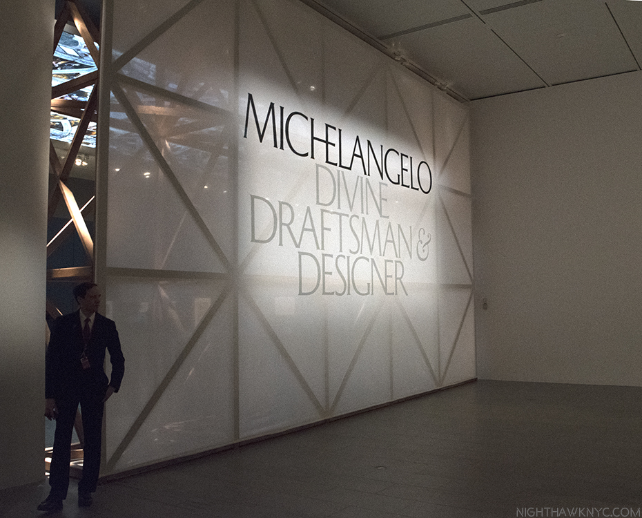
Incomparable. That’s one way to describe Michelangelo. The buzz for “Michelangelo: Divine Draftsman & Designer ” is that it’s “once in a life-time.” I’ve been anticipating it all year. With 133 of his Drawings(!). 3 Sculptures(!). His earliest Painting (The Met’s experts say it’s his. I’ve saw it in 2009 and it’s hard to argue with them)…That sounds about right. Here’s the sign at the entrance, fronting part of the scaffolding TM built to mimic Michelangelo’s own for the section on the Sistine Chapel. Click any Photo for full size.

Well? Anytime is a good time to join the country’s greatest Art museum. They can use the support. I’ve been a member of The Met since 2002, during which time I’ve gone over 1,400 times. It still truly feels like Home to me. Today, I renewed and a perusal of the shows up right now made me feel that it may be the most amazing lineup I can recall at one time.

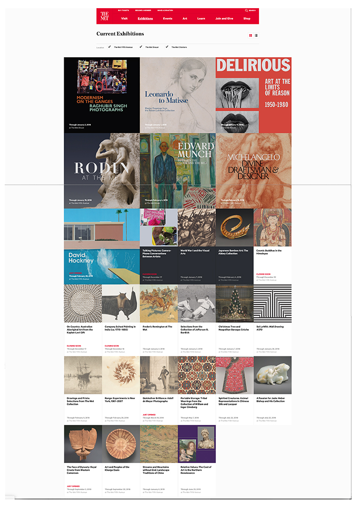
Here’s what’s there right now

The Met’s Current Exhibition page on December 8, 2017.

“He’s making a list
He’s checking it twice…*”

Let’s see…

Michelangelo: Divine Draftsman & Designer 

-the David Hockney Retrospective

Rodin At The Met

World War I and the Visual Arts

Leonardo to Matisse: Drawings from the Robert Lehman Collection

EACH one is a big show at 1000 Fifth Avenue. Depending on your stamina, seeing all of any one of those would make for a good visit to The Museum in itself. And? These smaller shows are also there-

Frederick Remington at The Met

Talking Pictures: Camera-Phone Conversations Between Artists

Cosmic Buddhas in the Himalayas

Company School Painting in India (ca. 1770-1850)

Japanese Bamboo Art: The Abbey Collection

And? Since too much is never enough in NYC-

Edvard Munch: Between the Clock and the Bed

Modernism on the Ganges: Raghubir Singh Photographs

Delirious: Art at the Limits of Reason, 1950-1980

Are up at The Met Breuer.

Yes. Santa came early for NYC Art lovers. Suffice it to say that I, also, bought a new pair of shoes cause I expect to be wearing my current pair out soon.

And then there was this…

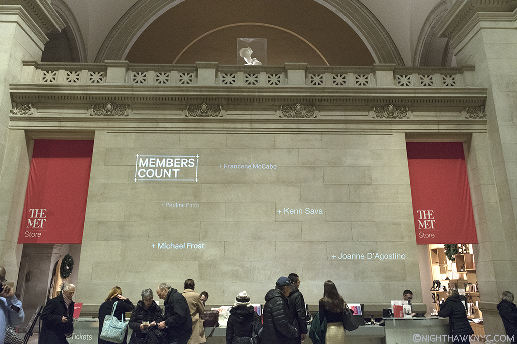
All I wanted for Christmas. My name up in lights on a wall in The Met! Actually, before I feel special, they do this for all new and renewing members. Pay attention. Your “immortality” lasts for 3 seconds.

Ahhhh…It’s good to be Home for the Holidays…

UPDATE– January 4, 2018. The world’s greatest Museum announced an “updated” admissions plan this morning. The gist of it is-

  • The “pay as you wish” policy will continue for all New York State residents.
  • This will be expanded to cover students from New Jersey & Connecticut.
  • Mandatory $25.(general)/$17. (seniors)/$12 (students) admission fee will be required henceforth for all of those from elsewhere/non-students from NJ & Ct.
  • All full-priced tickets will be honored for three consecutive days.
  • The “updated” policy will be implemented on March 1, 2018

This morning, Daniel Weiss, President of The Met, said-

“…The Met is a profoundly different place from that envisioned by its founders. Decades ago The Met made a decision to expand its operations and outreach and to become the Museum that we know today: a cherished institution that is both the top tourist destination in New York City and a world-renowned center of scholarship and learning.

Maintaining this level of excellence, and continuing to serve the New York region at the same high level, requires that The Met take stock and decide, once again, what kind of Museum we want to be for future generations. The world has changed dramatically in the almost 50 years since our admissions policy was last reviewed, and the way we budget and plan for the future needs to change as well.

What is clear is that our current pay-as-you-wish policy is no longer sufficient to meet the Museum’s daily operational demands. Paid admissions represent only 14 percent of our overall revenue, one of the lowest percentages among our New York City peers. Moreover, in the past 13 years the number of visitors who pay the full suggested admission has declined by 73 percent. We are now the only major museum in the world that relies exclusively on a pure pay-as-you-wish system or that does not receive the majority of its funding from the government.”

His full statement on the matter is here.

Personally? I’m for this. TM has an estimated 10 million dollar deficit. It’s the fifth consecutive year they’ve been in the red, with an 8.2 million shortfall in 2015-16. This at a time where they are the #1 most attended Art museum in the world.

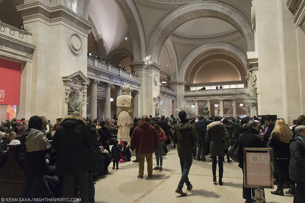
The Met’s Grand Hall, December 28th. I can’t recall ever seeing TM as crowded as it was this weekend. There were waiting lines to see Michelangelo & David Hockney.

What happens when the Art boom fades, or slows? Yes, it’s easy for me to say I support this since I could get in paying what I wish. I could have for the past few years. I’ve been a Met Member since 2002, and I will continue to be a member. Why? I believe, for any number of reasons I’ve outlined on NighthawkNYC over the past two years, like here, they are the best Museum in the world. And? They need my support. And your’s, too. Remember that if you are one of those effected by the new policy.

Or? You could just join. As I said, this is as good a moment as any.

*-Soundtrack for this Post is “Santa Claus is Coming to Town,” writer & publisher unknown to me. Ok. I’ve been naughty. Coal for me. I’m used to it…

NighthawkNYC.com has been entirely self-funded & ad-free for over 7 years, during which over 275 full length pieces have been published! If you’ve found it worthwhile, PLEASE donate to allow me to continue below. Thank you, Kenn.

You can also support it by buying Art, Art & Photography books, and Music from my collection! Books may be found here. Music here and here.

Written & photographed by Kenn Sava for nighthawknyc.com unless otherwise credited. To send comments, thoughts, feedback or propositions click here. Click the white box on the upper right for the archives or to search them. Subscribe to be notified of new Posts below. Your information will be used for no other purpose.

Gary Hume and The Long Goodbye

“Is it all in that pretty little head of yours?
What goes on in that place in the dark?
Well I used to know a girl and I would have
sworn that her name was Veronica”*

Too many people can relate to this.

Like cancer, almost everyone knows someone who’s suffering, or has suffered, from dementia or alzheimer’s disease. Gary Hume does. So do I. I mention it because that might make me, perhaps, not the most impartial viewer of Mr. Hume’s new show, Mum, at Matthew Marks Gallery. Mr. Hume’s Mum, Jill Henshaw, has dementia. The 14 works on view relate to his Mum, as seen by the Artist as a child, and as an adult. Mr. Hume said in a New York Times interview, “I just wanted to paint a picture of my mum, and I wanted to do it to honor her.”

Knowing the subject before I walked in, the show still blindsided me with its understated power. Though there is only 1 portrait of his Mum on display, the other works leaving it to the viewer to connect them with her, the real strength of the show comes in its sum effect.

It had me close to tears.

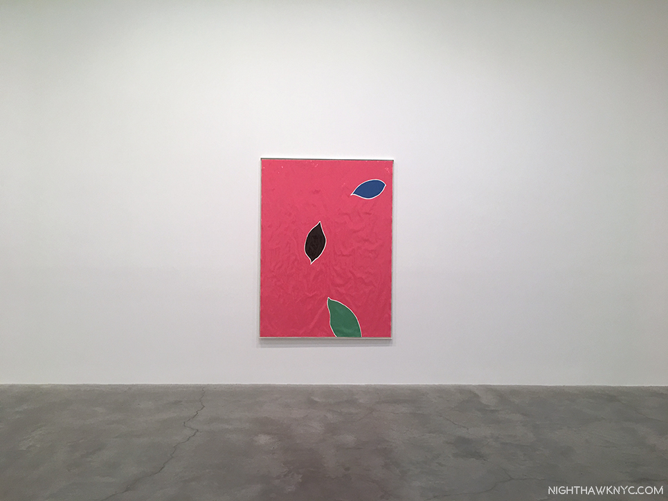
Three Leaves, 2016-17, Enamel paint on paper. Falling as part of the cycle of their life. Falling like tears. Or, they could be floating away on a river of rippled paper…Click any photo for full size.

Mr. Hume is part of the “Young British Artists” group that sprang out of the Freeze Sensation show in 1988, though he’s not as flamboyant as some of its other members who were his classmates, studying for their B.A.’s in Fine Art, at Goldsmiths College, London, at the time. Now 55, his choice of subject has led to Mr. Hume’s work taking something of a radical turn, resulting in his most personal show yet. While Artist’s mothers are certainly not an unusual subject in Art, dementia is, in my experience. In Art, perhaps it’s most been discussed by those wondering if they can “see” Willem de Kooning’s dementia in his work.

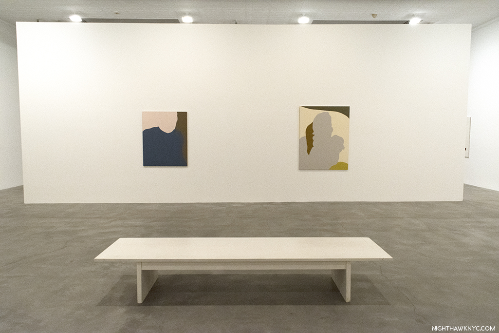
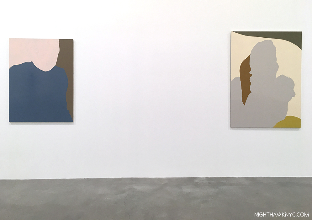
“Georgie,”(Mr. Hume’s wife), left, and “Mum on the Couch,” right, both 2017, Enamel paint on aluminum, and a perfect place for a bench.

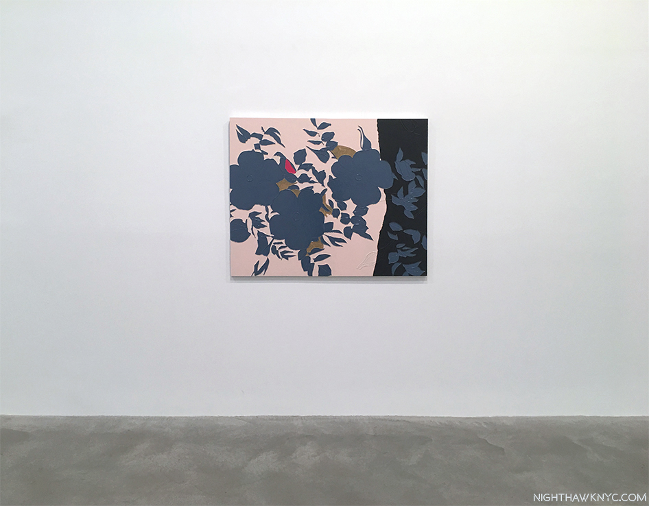
An initial visit to the show gives the impression that Mr. Hume’s Paintings share the quiet dignity of Ellsworth Kelly’s final Paintings that recently hung on these same walls. They also possibly share a similar technique with Mr. Kelly’s Plant Drawings that hung next door at the same time, both Artists being fond of rendering a plant in outline. (I wrote about both Ellsworth Kelly shows here.) But their apparently simple compositions and minimal palette are deceiving.

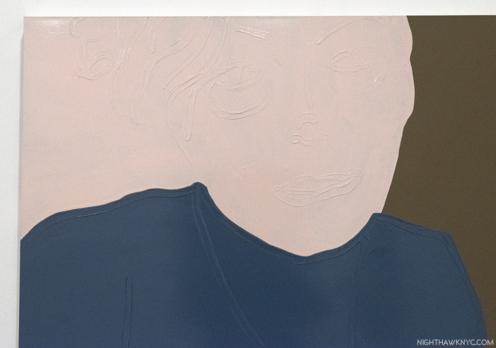
Mr. Hume has developed new techniques that he has mastered to the point that he can use them with wonderful subtlety. Raised lines of paint lie on the flat surface, and act like the lines in a Drawing, delineating and detailing shapes. Elsewhere these lines are smudged, possibly with a finger, into the shape of a mouth, or an eye. They are executed in the same color as the shape they appear on, making details hard to see clearly, requiring the viewer to stand close to the work to see them. This remarkable effect adds to the “there/not thereness” of the image. Paintings on paper became crinkled and wavy as the enamel house paint Mr. Hume uses (in colors pre-mixed in a hardware store) dries creating marvelous textures and effects. Other works on aluminum have very flat background surfaces, and reflect light making it even harder to see the detail. Using these techniques, and others, Mr. Hume does a remarkable job of making us feel both presence and absence in the same image. They are, also, a meditation on the nature of memories.

Even standing in front of the bench, the detail is hard to see.

Close-up of “Georgie,” reveals one of the “drawing” techniques Mr. Hume uses to add still nebulous “details” to these works.

The middle room of the show features Paintings of his Mum, and his wife, Georgie, surrounded by Paintings of plants, flowers and gardens, including this one.

Abstraction of another sort. “Grandma Looks at the Garden,” 2017, Enamel paint on aluminum

“Well she used to have a carefree mind of her
own and a delicate look in her eye
These days I’m afraid she’s not even sure if her
name is Veronica”*

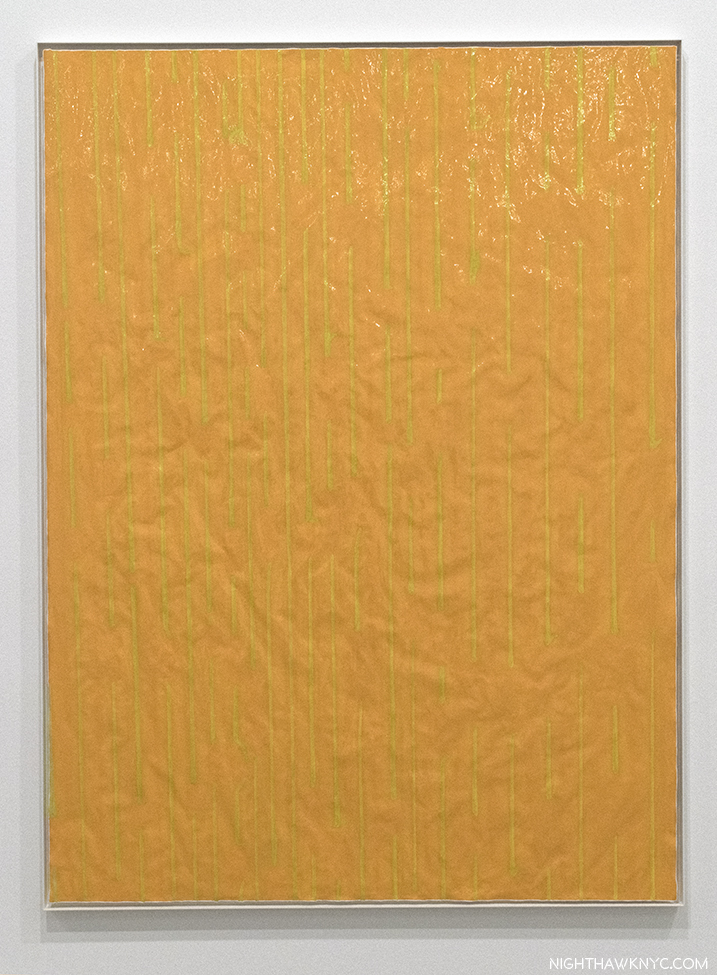
The third and final room seemed to be focused on life continuing. It includes a painting of yellow rain against an orange background that struck me as, possibily, a sunshower.

“Rain,” 2017, Enamel paint on paper. A seemingly “simple” idea that in the context of this show takes it entirely elsewhere.

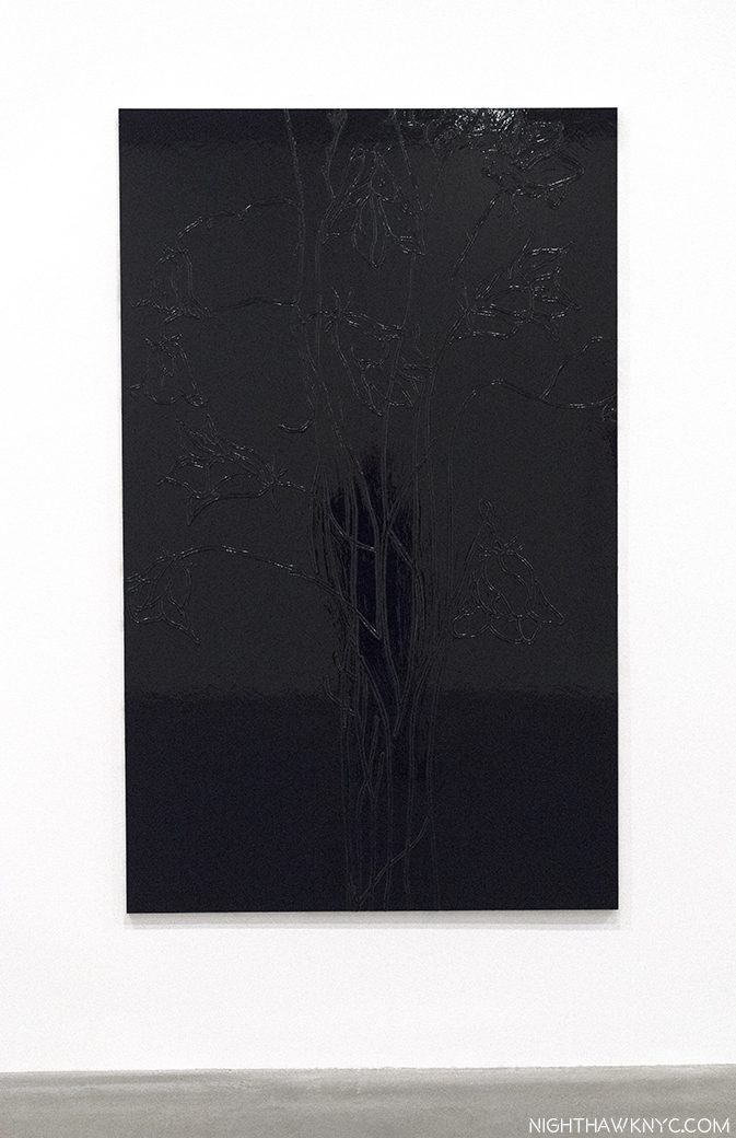
Contrastingly, next to it, is possibly a garden seen at night, where only the outlines of the plants are visible. Together, they emphasize loss, and memory, being something felt day and night, triggered by almost anything, and manifesting themselves in every situation and time.

“No Light,” 2016, Enamel paint on aluminum. Difficult to see clearly, like many memories are…

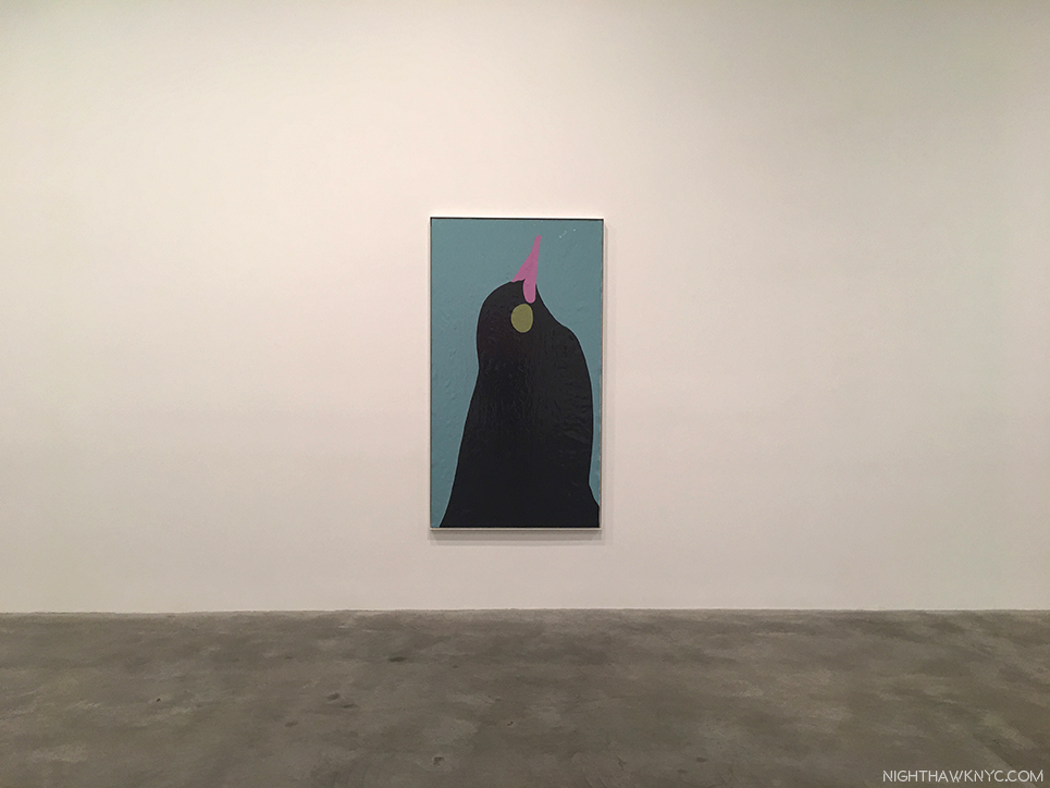
On an adjacent wall, a bird looks skyward, its beak closed, without a song.

“The Diver,” 2016-17, Enamel paint on paper.

And, finally in this room, one of two Paintings of berries, “Ripe,” below, bursting with life. (Whiter to, from here?)

“Ripe,” 2015, Enamel paint on paper. Bursting with so much life, the paper can barely contain it.

Meanwhile, the flowers in the show are mostly muted. After all, flowers are, often, symbols of beauty, and loss. Seen at both weddings and funerals.

“Mourning,” 2016, Enamel paint on aluminum

In her article about these works in the New York Times, Barbara Pollack said that Mr. Hume “recoils at any interpretation that reduces the work to merely being a response to his visits with his mother. He prefers to think about the relationship to subject matter as a process of ‘permissions.’…” The thing about Paintings, or Art, is that once it’s been created and put on public display, every person who sees it will have their own “interpretation” of it. I doubt these (especially my own) line up with the Artist’s very often.

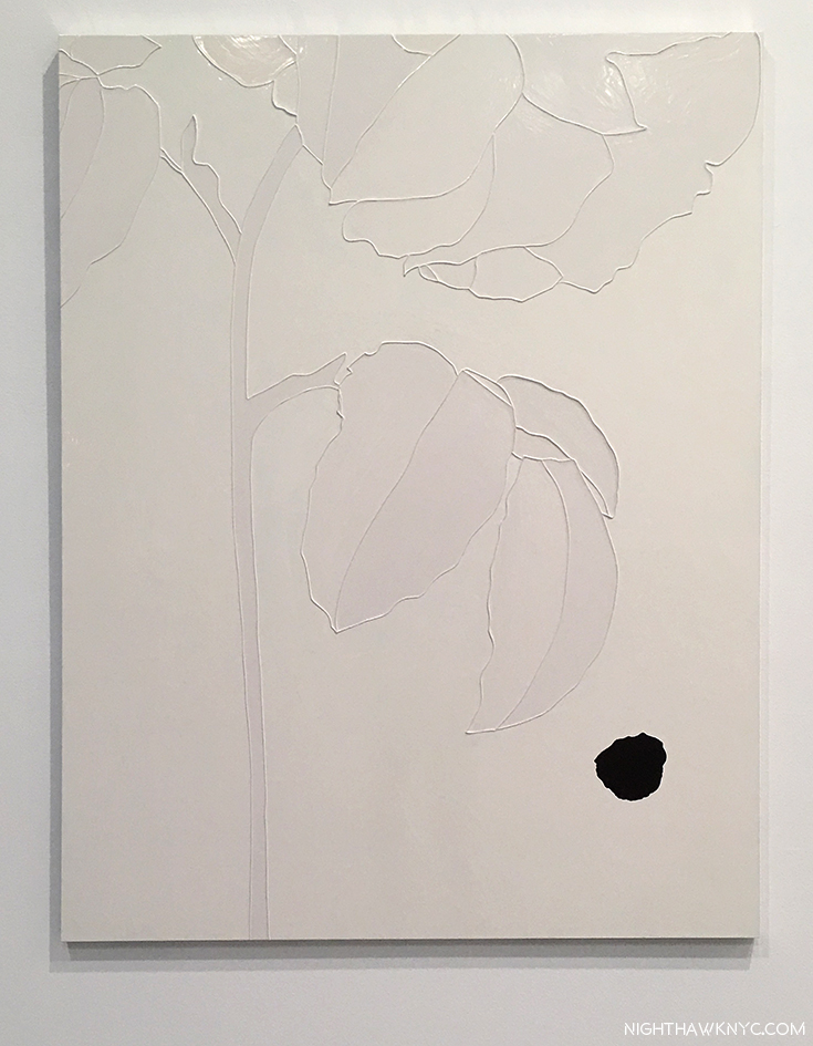
Perhaps nowhere here is this better summed up than in “Blind,” a 2016 Painting in the first room. Pale flowers are shown against a white background. A nut seems to be falling towards the lower right corner. Every time I see it, it speaks of something else, but it, also, speaks to loss/impending loss of a mother, with the seed, the harbinger of new life, symbolizing the offspring…himself.

“Blind,” 2016, Enamel paint on aluminum, seen in the show’s first room.

These “ridges” appear in a number of works (like the other flower Paintings above), and are interesting to contrast with the more often than the “softer technique he uses in “Georgie,””Mum on the Couch,” and “Rain.” I haven’t found out as yet how he creates them, but they are stunning and add much to the mystery, and beauty, of these works. The Artist has been trying to replicate them in his prints.

As I said, I may well not be impartial when looking at these works. Ironically, my Mom’s dementia first became apparent one Thanksgiving day. Ironically, this show happens to be up from November 4 to December 22. I was drawn back to it 3 times Thanksgiving week. Now, stepping back from myself, and thinking about the beauty and the power of “Mum,” and seeing other works that Mr. Hume has created recently in the show’s catalog, it seems to me that Gary Hume has made a breakthrough both stylistically, and in portraiture.

“Mum in Bed,” 2017, Enamel paint on aluminum, not on view in the show, from the show’s catalog.

“Do you suppose, that waiting hands on eyes,
Veronica has gone to hide?”*

Mr. Hume’s work has greatly evolved in the almost 30 years since the “Sensation” show brought him and the YBA’s to wide attention. For years known as the “quiet one” in that group, it’s hard for me not to feel he’s only now hitting his stride. Though I doubt that many will agree with me at the moment, Gary Hume may yet turn out to be the Artist the YBA’s are remembered for. While each work on view is uniquely beautiful on its own, its as a group where each plays a part in telling a larger story, a story of life, love and impending loss (“the long goodbye,” as it’s called), ironically, in slivers that are almost there…like memories.

Human memories may have a finite lifespan, even under the healthiest of conditions. It’s in translating them to other forms where they have their back chance to live on…indefinitely.

Gary Hume, “Mum,” is my NoteWorthy show for November. 
*- Soundtrack for this Post is “Veronica,” by D.P.A. MacManus (aka Elvis Costello) and Paul McCartney,  from “Spike,” published by Universal Music Publishing Group.

NighthawkNYC.com has been entirely self-funded & ad-free for over 7 years, during which over 275 full length pieces have been published! If you’ve found it worthwhile, PLEASE donate to allow me to continue below. Thank you, Kenn.

You can also support it by buying Art, Art & Photography books, and Music from my collection! Books may be found here. Music here and here.

Written & photographed by Kenn Sava for nighthawknyc.com unless otherwise credited. To send comments, thoughts, feedback or propositions click here. Click the white box on the upper right for the archives or to search them. Subscribe to be notified of new Posts below. Your information will be used for no other purpose.

Exclusive! A Visit to Raymond Pettibon’s Moscow Show

A retrospective of 400 works by controversial American Artist Raymond Pettibon in Moscow, Russia, of all places, in this tempestuous year of 2017?

This I gotta see.

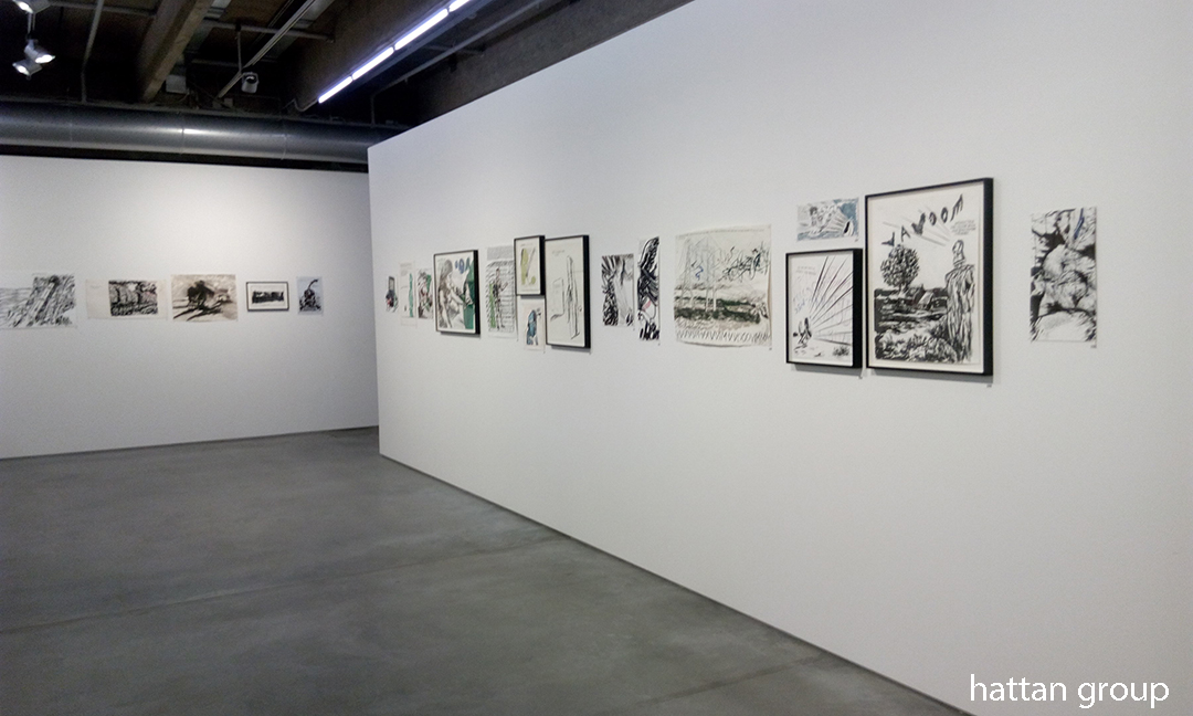
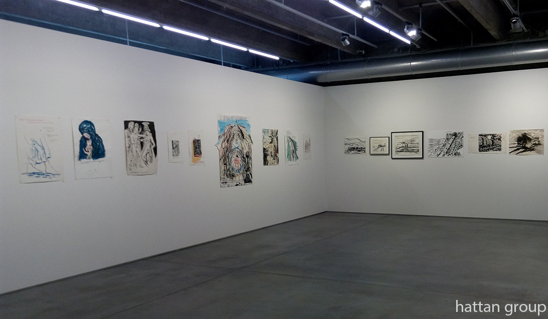
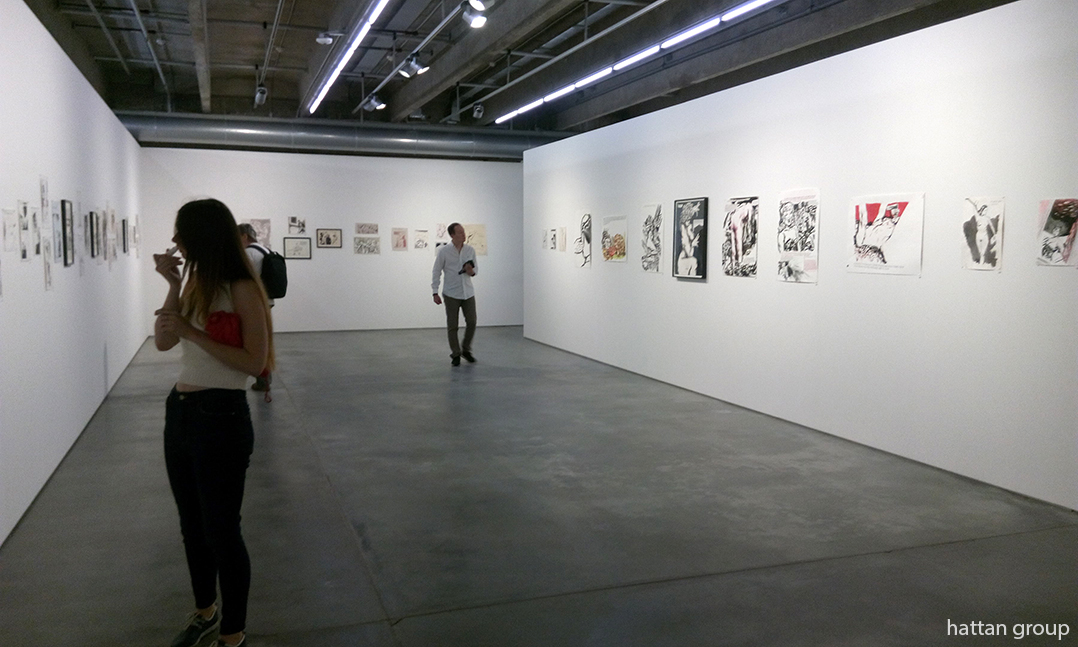
But, since the MTA doesn’t go to Russia, I missed it. Still, the idea of this Artist in this place at this time, what this show could include, and the reaction of local viewers left me scrambling to find out as much as I could. I even ran ads on craigslist in Moscow seeking reactions from show goers. To this point, I’ve found almost nothing about it in the media, save for this one article in the Russian press, in which writer Igor Gulin says, according to translation, that Pettibon is an Artist “who for a long time left the punk aesthetics of his youth, but did not lose a drop of rage.” Finally, my International Art Researcher friends over at the Hattan Group agreed to go and cover the show for me. So, thanks to their kindness, and efforts, I am able to present an exclusive look at what shaped up to be one of the most intriguing shows of the year, through their eyes and Photos.

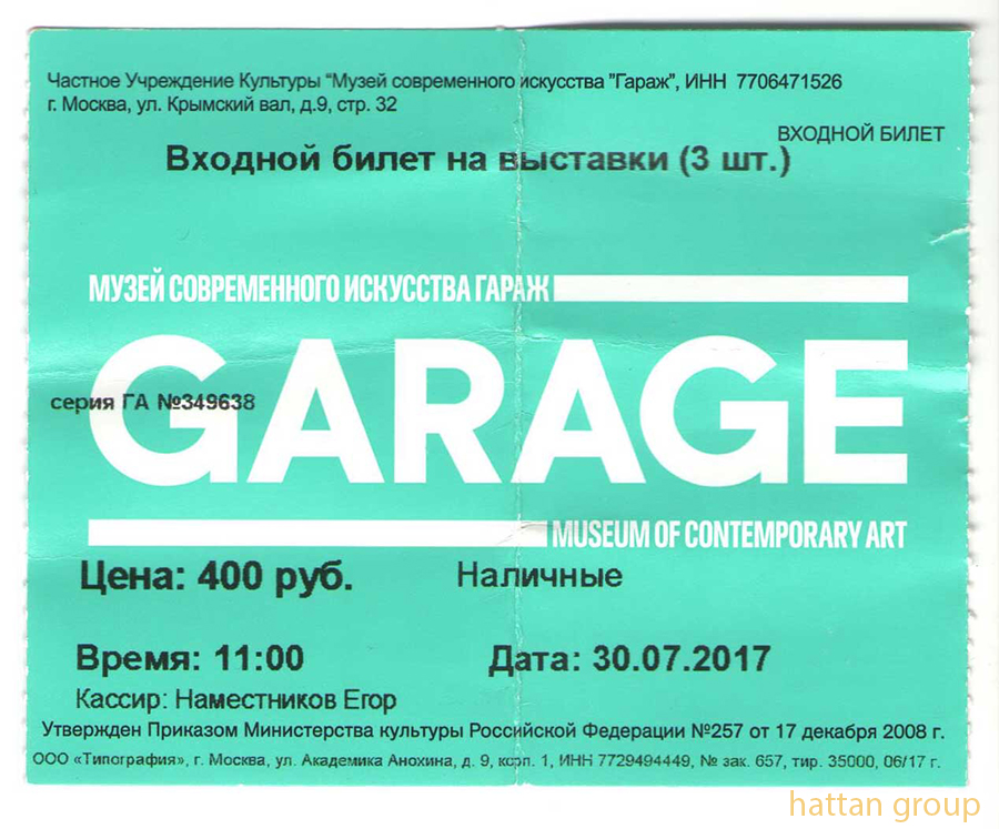
A ticket for the show. Let’s go in! All Photos courtesy of the Hattan Group. Click any for full size.

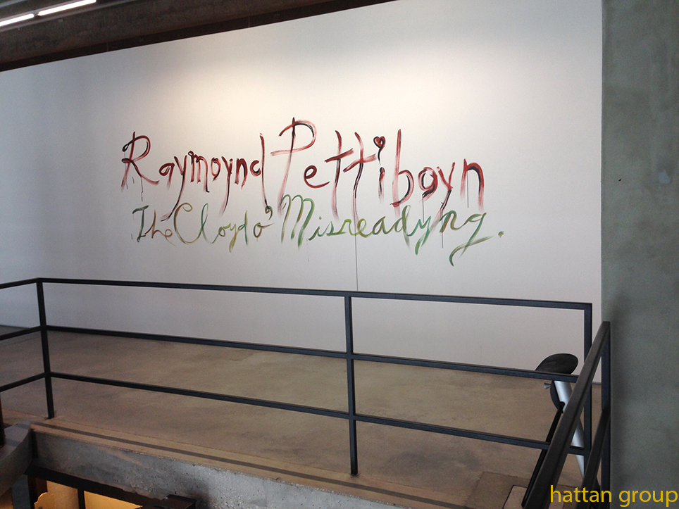
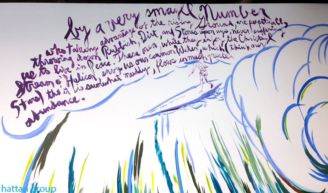
Midway through the run of the most recent NYC Pettibon show, “Th’ Explosiyv Shoyrt T” at David Zwirner, which I wrote about here, came word that a retrospective in Moscow called “The Cloud of Misreading” (on the website), or “The Cloyd o’ Misreadyng,” on Pettibon’s hand-painted mural, below, was due to open on June 7 in Moscow’s Garage Museum of Contemporary Art, and would include 400 pieces. Founded in 2008, by Dasha Zhukova and Roman Abramovich, Moscow’s Garage Museum is a fairly new, and rising, star on the global Modern Art scene. That it’s gotten off to a fast start can be seen in NYC, where as I write the show, “Proof: Francisco Goya, Sergei Eisenstein, Robert Longo,” that originated at the Garage in Fall, 2016, is now at the Brooklyn Museum. And, as if Moscow wasn’t enough Raymond Pettibon, the New Museum’s blockbuster retrospective, “A Pen of All Work,”  which I wrote about here, traveled to the Bonnefantenmuseum, in the Netherlands, where it opened on June 1, with 700 pieces. Phew…Raymond Pettibon and the curators are clocking some serious frequent flier miles. We’ll hear from one of them later.

The show’s entrance features one of Raymond Pettibon’s famous hand-painted murals. I hope the Russians are up on their “Pettibon English.”

Given all that’s gone on in the past year the timing of this show is most auspicious. Especially since Raymond Pettibon has never been an Artist to mince words, pull punches, or look at the USA (or anything or anyone else for that matter) through rose colored glasses.

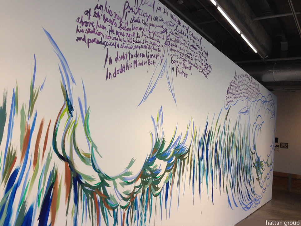
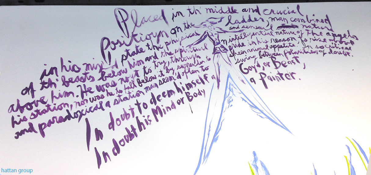
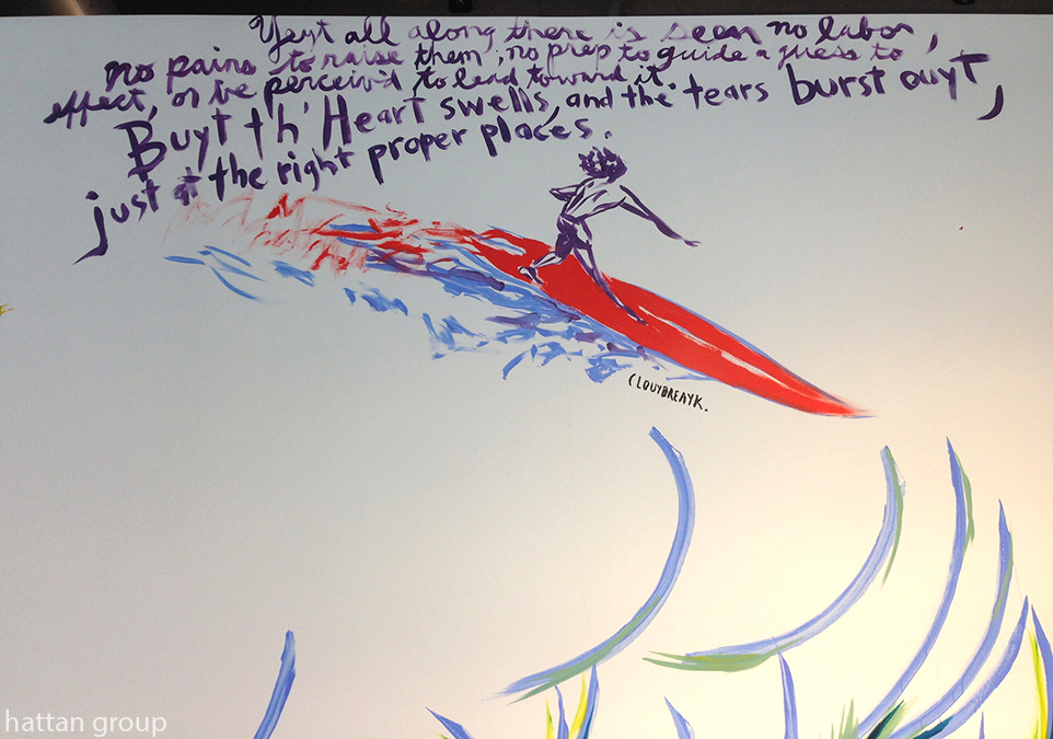
Pettibon’s large, hand-painted mural, seen here and in the following three details, features that most alien of sports to Russia- Surfing.

Pettibon’s murals are painted over at the end of the show they were created for. This one lasted until August 13.

Before it opened, I wondered if some of his “stronger” works, or topics, would be omitted. Certain of Pettibon’s long standing subjects, say, Surfing or Charles Manson (Note- I wrote this piece before word came down today, November 20th, that Manson died earlier today. I also note that Pettibon has been unusually silent on his Twitter page for the past week, so, he’s had no comment on it as yet.), would seem to have little resonance in Russia to this outsider. After the show opened, I was able to “visit” it online through the exhibition brochure, which includes color photos of all 400 works on view, and which can be downloaded here.

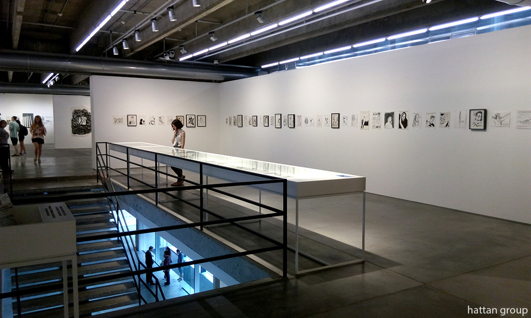
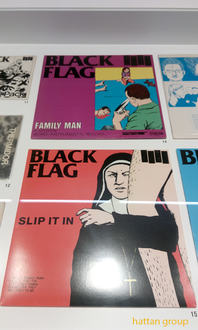
The center vitrine contains Pettibon’s early Zines, Record Covers and excerpts from his archives. On the wall to the right are works pertaining to drugs, death/murder, and the hippie sub-culture.

Pettibon’s world famous 4 Bar “Black Flag” logo, seen in the vitrine, speaks a universal language. Of it Igor Gulin says, “In 1977, he painted a logo for his older brother Greg’s Black Flag group. Four black bricks are a constructivist version of an anarchic flag, in which the rage of protest does not flare up, but crumbles. There is no integrity, vigorous unity, but there is a strained friction of the elements, frightening the rhythm between them.  In this seemingly elementary thing, one can see the prototype of Pettibon’s future work.”

The show was curated by Gary Carrion-Murayari, of the New Museum, NYC, & Massimiliano Gioni, Artistic Director of the New Museum, NYC, the team that curated the New Museum’s unforgettable 800 work “Raymond Pettibon: A Pen of All Work,” here, earlier this year. They are rapidly becoming major players in the larger Art World, in addition to raising the standing of the New Museum here in town.

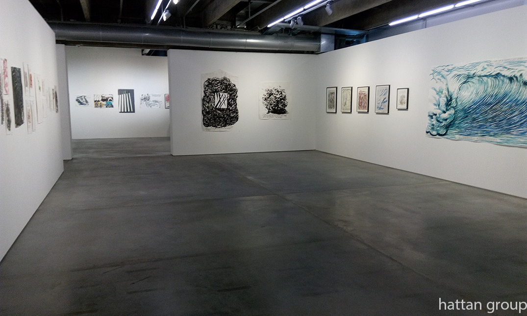
This room features works highlighting abstraction in nature. A wall of Pettibon’s classic Wave works, right, joins other works depicting marble, crystal, rocks. Notice that most of the works on these 3 walls, including the huge Wave piece, right (which may be worth upwards of a million dollars), are not framed, but simply tacked the walls. In the back room, straight ahead, are works pertaining to recent “US foreign policy.” As for Surfing in Russia? Here’s where the surf’s up.

Gumby and Vavoom, two of Pettibon’s alter egos are featured on the wall to the right. To the left are works depicting trains and locomotives.

Works pertaining to Christianity, left, with the other half of the train and locomotives wall, right.

On the back wall are works that include images of fighting, on the right works that include nudes. One visitor commented that the show contained “a lot of sex.”

Mr. Carrion-Murayari introduces Pettibon and the show this way– After becoming an underground legend, beginning with his work in early days of the L.A. Punk scene, he says, “The stark imagery and darkly humorous captions of these works made Pettibon an underground legend long before he came to the attention of the larger art world. By the early 1990s, Pettibon’s vision gradually expanded to encompass the breadth and complexity of American history and culture. The tenor of his work shifted from strident to poetic, with a gradual softening of his graphic style and expansion of his subject matter. In the past thirty years, he has created iconic series of drawings on subjects as varied as surfing, baseball, cartoons, natural history, love, war, and his own artistic aspirations and failings. The title of this exhibition evokes the creative use of language that has evolved in Pettibon’s work over the course of his career.”

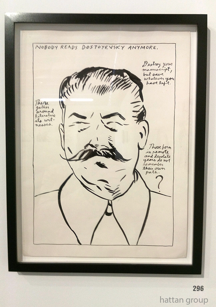
“No Title (Nobody Reads Dostoyevsky…),” 1986, Pen and ink on paper. Stalin also appeared in Pettibon’s David Zwirner show, where it looked like it had been used for target practice due to the paint splatters left on the wall from when Pettibon had worked in the gallery space.

Looking at the selection of works, I became fascinated by just which works were chosen and what they might reveal about any “message” in the show. I went through the show’s brochure and created a list of subjects and which works fell into them.What did this exercise tell me? Pettibon in Moscow is full-force Pettibon. No topic was “taboo.” All of the Artist’s, by now, well-known subjects are represented in depth.

Even more fascinated, I asked Mr. Carrion-Murayari what went into selecting the works for this show. He replied-

“In terms of the selection of the works, it was of course impossible to represent more than a small percentage of Raymond’s total oeuvre and even impossible to show all the variety of series or recurring images that he has produced over the years. We focused on three general areas of thought within his work: work on politics, work on the dark side of America and American culture; and work on creativity and the artistic or writerly temperament. We tried to represent some of his most iconic series and also demonstrate the way certain ideas and images pop up again and evolve over the duration of his career. We looked at thousands of drawings just to get to the final 800 or so that we included in the show, but even so, there were a number of early drawings that had appeared in books or zines that we searched for over the course of many months and were never able to track down. It’s entirely possible to imagine a dozen alternative Pettibon shows that would be equally as rich and surprising.”

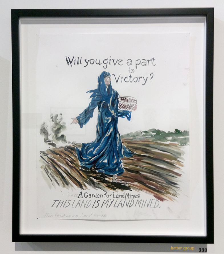
“No Title (Will you give…),” 2007. Pen and ink on paper.

I then asked him what role Raymond Pettibon played in the selection of works for this show, if any. Mr. Carrion-Murayari said-

“Raymond wasn’t so involved in the selection of the specific works for the show. He pretty much left it to us, as he has done for many of the museum shows he’s done over the years. For the show at the New Museum, he was most focused on creating a number of new drawings specially for the exhibition and then of course on making the fantastic site-specific wall drawings at the New Museum, the Bonnefantenmuseum, and the Garage.”

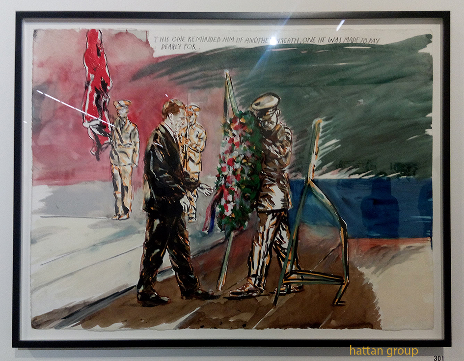
“No Title (This one reminded…),” 2008, Pen, ink and gouache on paper.

Not to mention that, as I noted in my piece on the Zwirner show, Pettibon was, also, holed up in David Zwirner’s 519 West 19th Street space for the first part of this year creating the works for “Th’ Explosiyv Shoyrt T,” which opened barely 2 weeks after the New Museum show closed. So far in 2017, Raymond Pettibon has had THREE museum shows, that featured 1,900 works, AND a gallery show of a further 100 NEW works, making an even 2 grand. Phew. And on the 7th day…

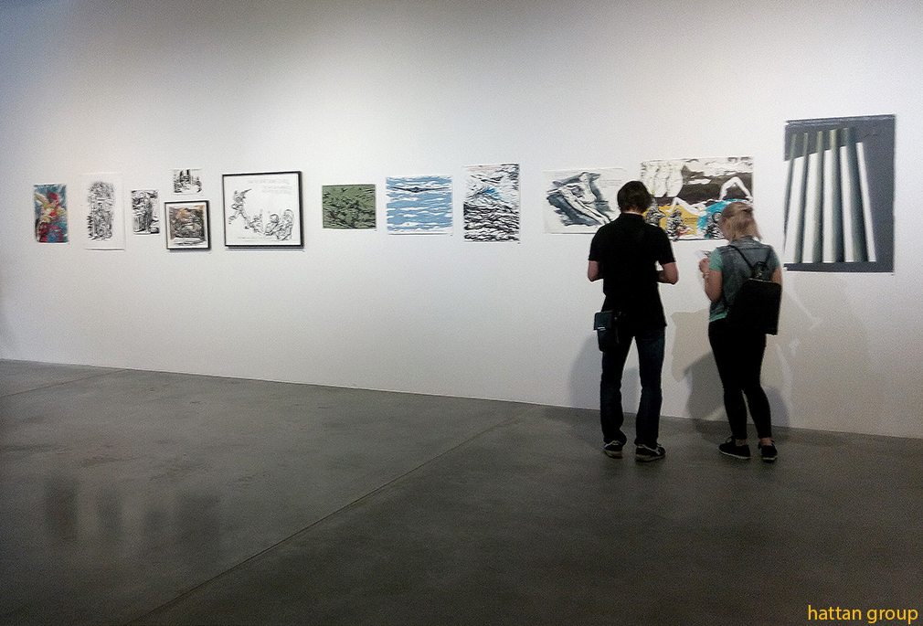
Here are some of the other works on view at the Garage-

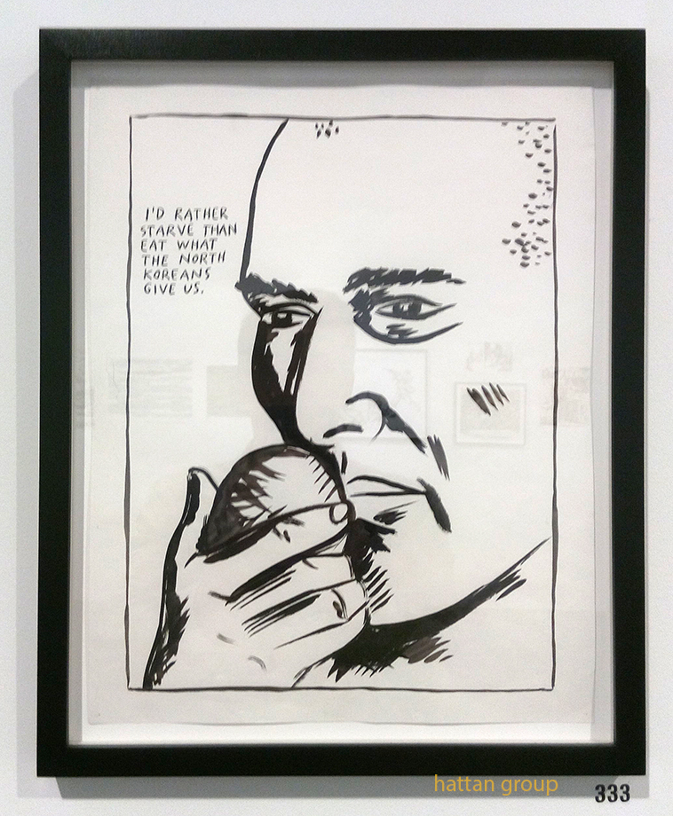
“No Title (I’d rather starve…),” 1987, Pen and ink on paper.

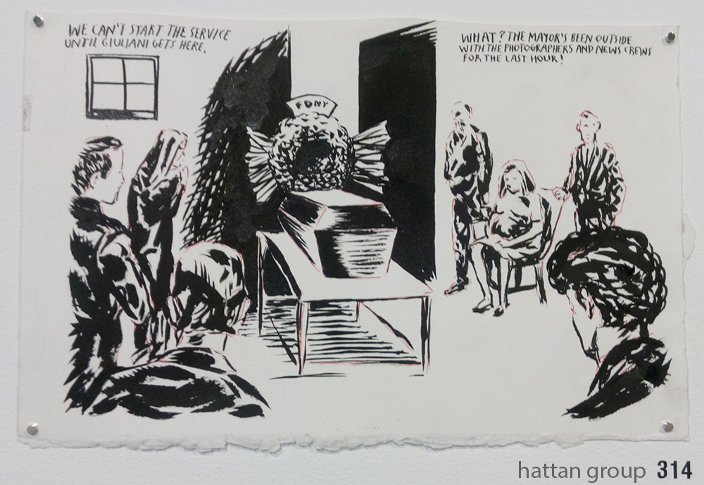
“No Title (We can’t start…),” 2012, Pen and ink on paper.

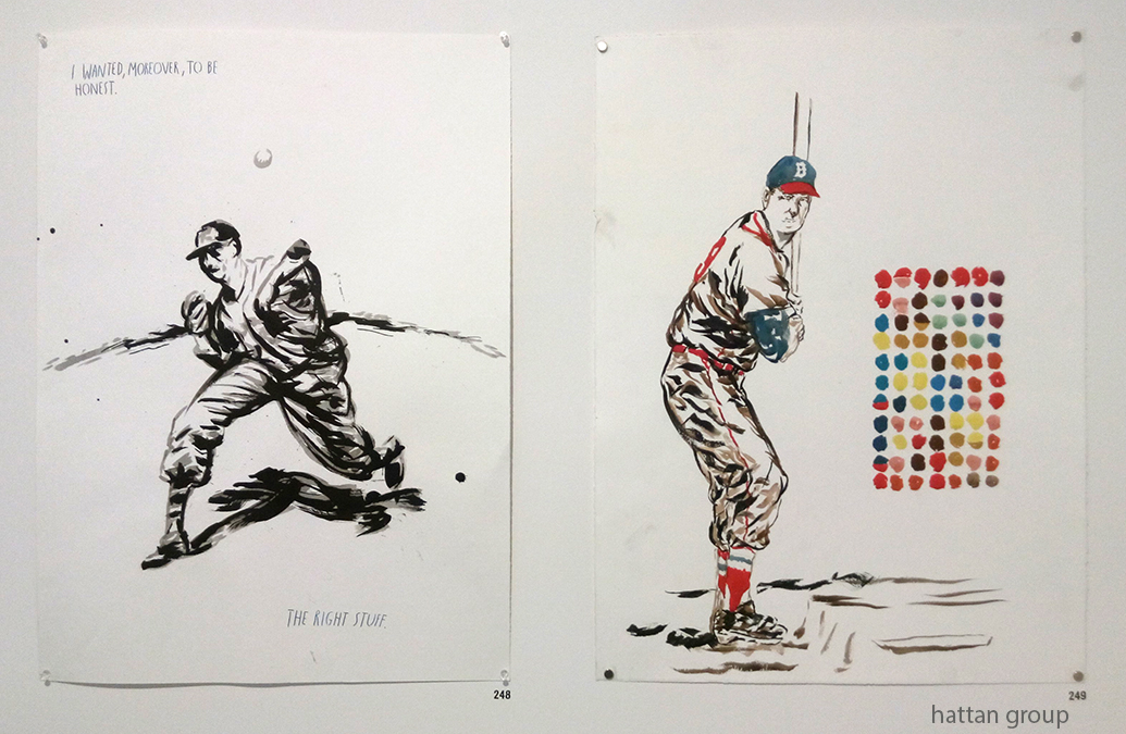
“No Title (I wanted moreover…),” 1999, left, and “No Title,” 2004, Both pen and ink on paper. Believe it or not, baseball appears to be gaining popularity in Russia.

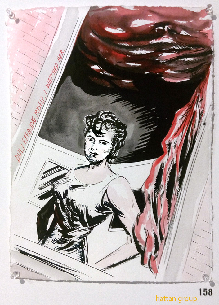
“No Title (Duly facing myself…),” 2000, Pen and ink on paper

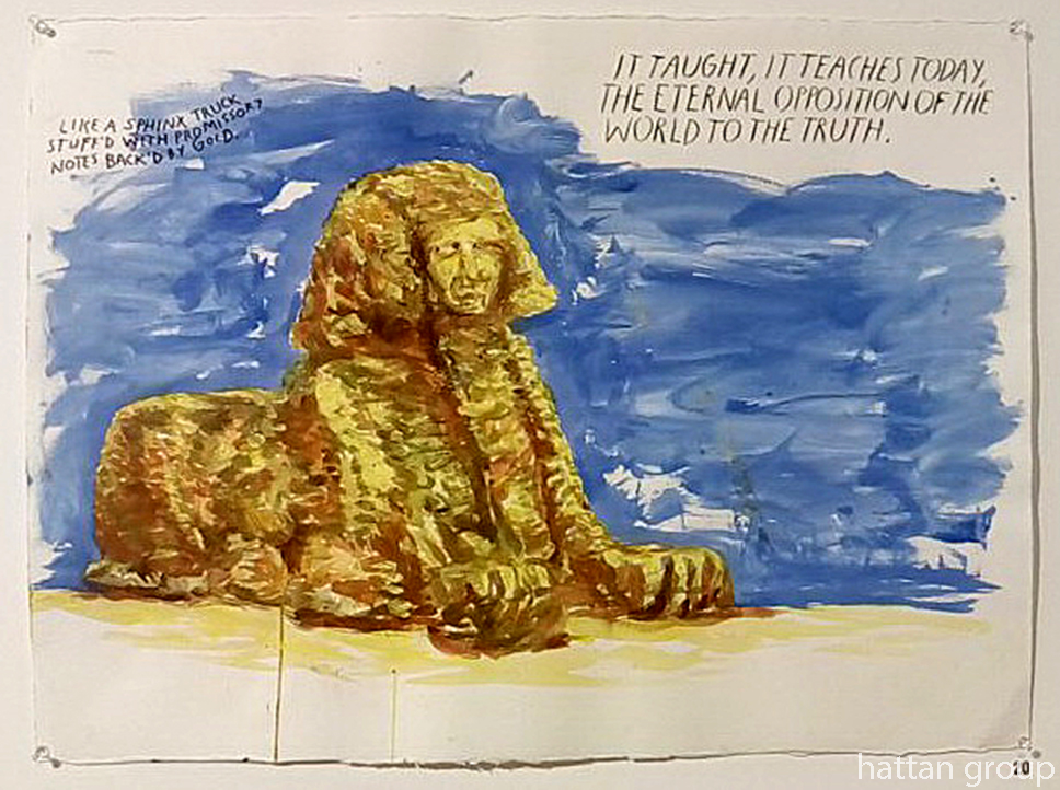
“No Title (It taught, it…),” 2003, Pen and ink on paper.

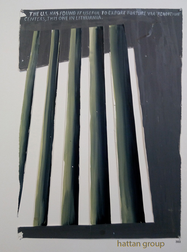
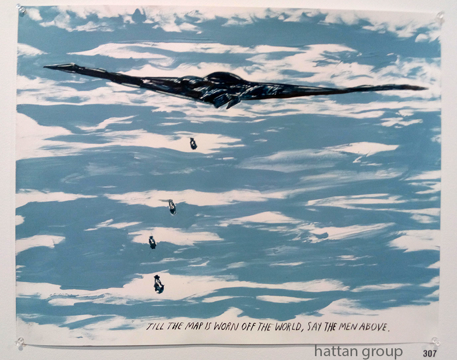
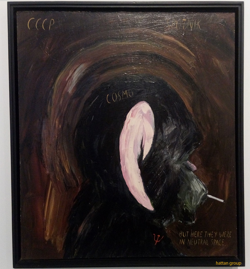
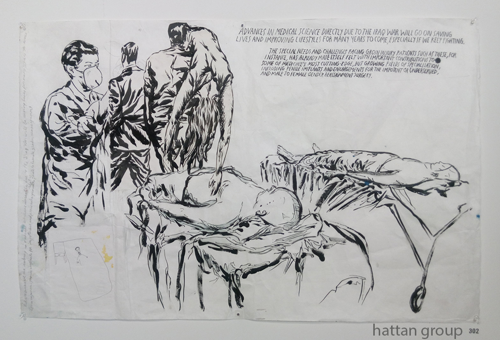
A closer look at a wall with works pertaining to US “foreign policy,” includes some of the following-

“No Title (The U.S. has…),” 2015, Ink and acrylic on paper.

“No Title (Till the map…),” 2008, Pen, ink and gouache on paper.

“No Title (CCCP, Sputnik, Cosmos…),” 1990, Acrylic on canvas. A rare Pettibon Painting.

“No Title (Advances in medical…),” 2007, Collage, pen and ink on paper.

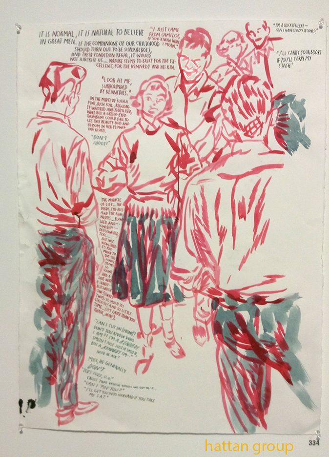
“No Title (It is normal…).” 2001, Pen and ink on paper.

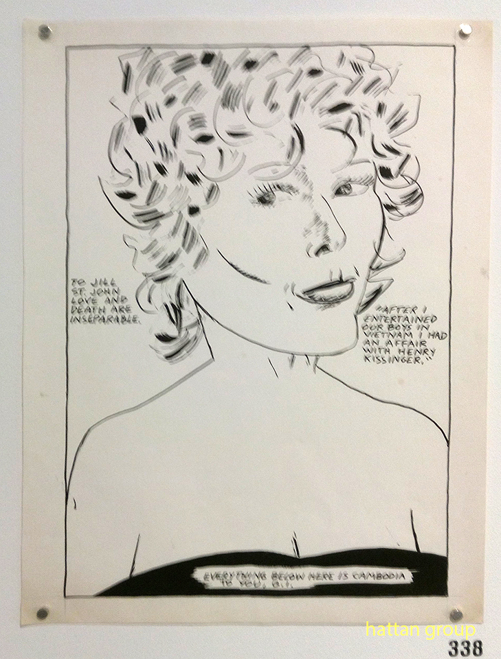
No Title (To Jill St. John…),” 1985, Pen and ink on paper.

This has been a year that would be extraordinary for any Artist. For the first 10 months of 2017 it was possible to see one, or three, major Raymond Pettibon shows somewhere in the world at any given moment. Since these shows are planned long in advance that they are happening (coincidentally ) at a time of such tumult in the country and in the world makes for one of the most auspicious run of shows in memory.

No matter the location, a highlight in each of these shows for many viewers are Raymond Pettibon’s Wave and Surfer works, which seem to lie at the center of his output these past 40 years. 4 of the 5 highest auction prices (1 million dollars, plus) for a Pettibon work depict one or both, for whatever that’s worth. Yet, they are a very small part of his huge output (numbering over 20,000 works as of earlier this year).

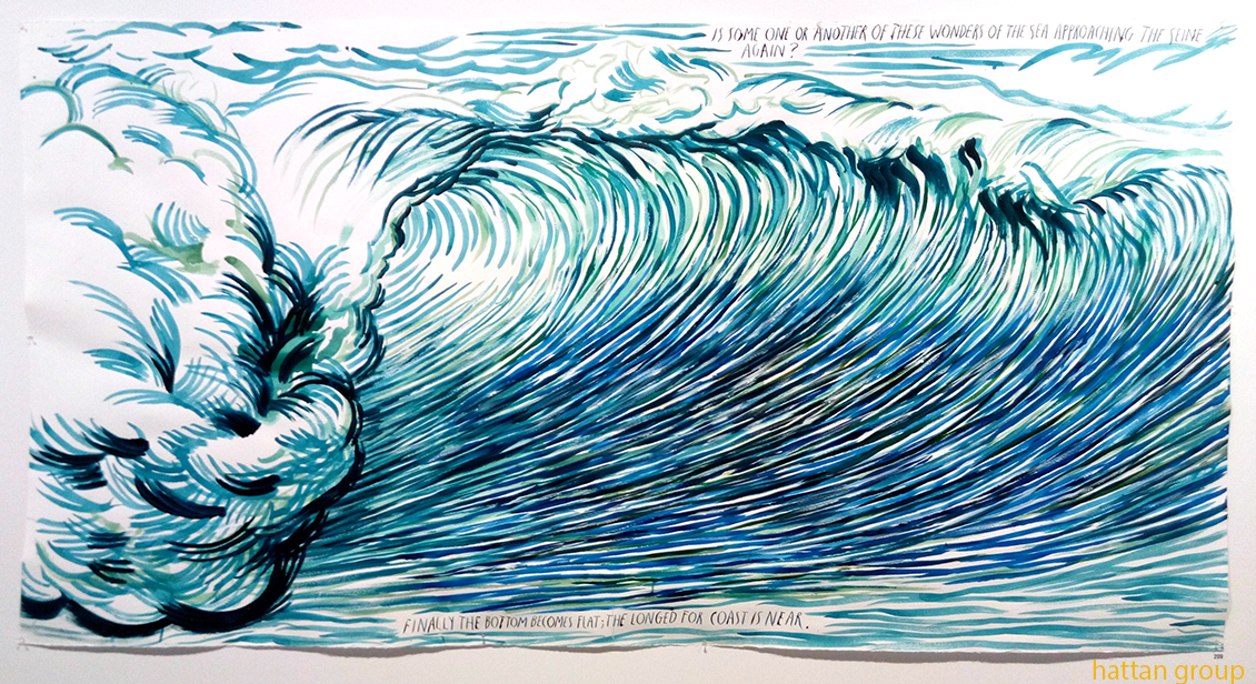
“No Title (Is some one…),” 2013, Pen and ink on paper…and tacked to the wall. Is doing so a remnant of “punk” attitude and street beginnings?

He could sit back and do them indefinitely and, no doubt, sell every single one he does. But, he doesn’t. In the last show of his new work, at David Zwirner, there was only 1 large Wave Drawing out of 100 works. In fact, the biggest one he’s done recently was the one for the wall painting for the Garage’s show, up top, which was painted over when the show came down. It’s far bigger than any of the 4 that sold for a million dollars or so at auction, yet it was done to only be on view for a short time.

It’s now gone…like the waves it depicts- a phenomena of nature, beautiful while it lasted. Like the mural (or the show), you had to be there to see it, and get it’s full effect. If you weren’t? You missed it.

*-Soundtrack for this Post is “Surfin’ USA” by Chuck Berry & Brian Wilson, and recorded by the Beach Boys.

My thanks to Gary Carrion-Murayari and Paul Jackson of the New Museum.
My thanks and gratitude to the Hattan Group for getting to the Garage show and allowing me to publish their photos.

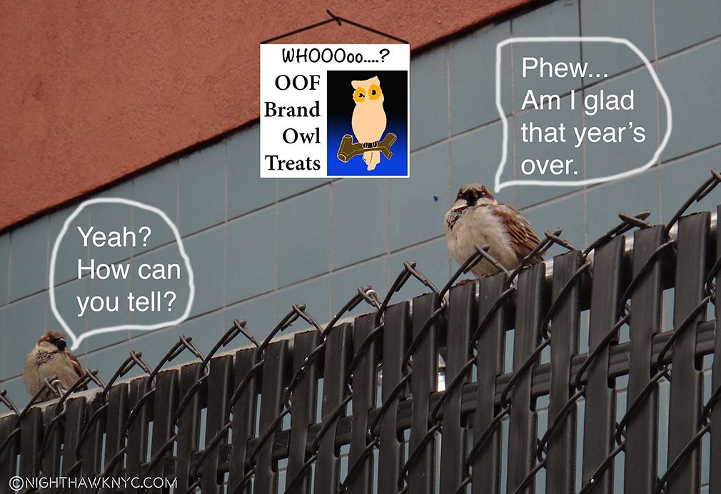
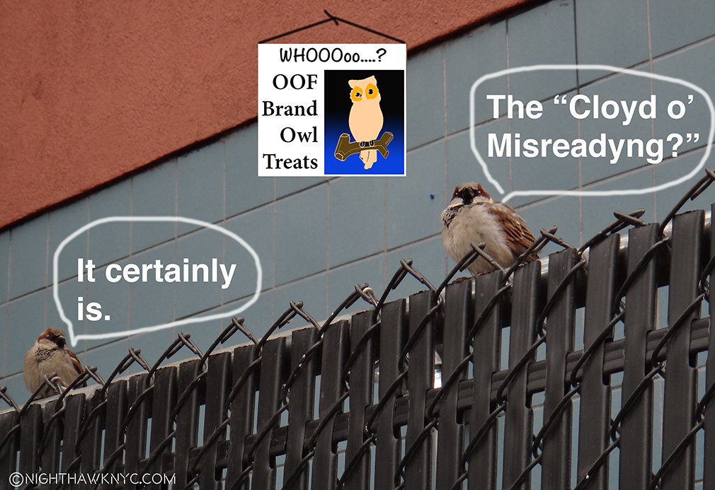
On The Fence, #15 , The Cloyd Woyd.”

NighthawkNYC.com has been entirely self-funded & ad-free for over 7 years, during which over 275 full length pieces have been published! If you’ve found it worthwhile, PLEASE donate to allow me to continue below. Thank you, Kenn.

You can also support it by buying Art, Art & Photography books, and Music from my collection! Books may be found here. Music here and here.

Written & photographed by Kenn Sava for nighthawknyc.com unless otherwise credited. To send comments, thoughts, feedback or propositions click here. Click the white box on the upper right for the archives or to search them. Subscribe to be notified of new Posts below. Your information will be used for no other purpose.

On The Frontiers of Photography: Trevor Paglen, Willa Nasatir, Caslon Bevington

Written & Photographed by Kenn Sava (*-unless otherwise credited)

While I’ve spent much of this year exploring the world of Photography, my focus has largely been on the period beginning with Robert Frank’s universally revered book The Americans, 1958. Most of those I’ve encountered work in fairly “traditional” realms- “Find a subject and shoot it.” Ah…the good old days. Of course, the world isn’t going to stand still for me while I look back, thank goodness, a point brought home by 3 concurrent shows this fall.

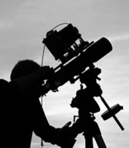
Unprecedented times call for extlraordinary means. Trevor Paglen at work on a prior project using equipment originally designed to see distant galaxies. Photo from his website.

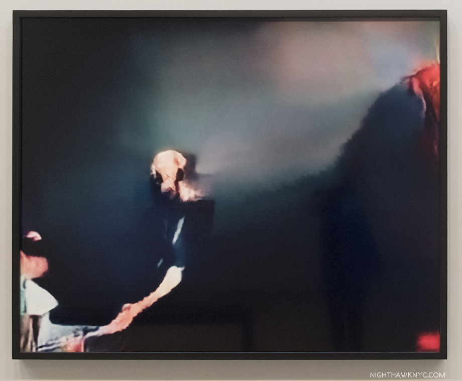
Trevor Paglen (B. 1974), who holds both an MFA from the Art Institute of Chicago’s School and a PhD in geography from Berkley is, perhaps, best known for his Photos of “black sites”- classified defense department/CIA/NSA installations. Those pictures are usually murky, because of the haze from the extreme distances he has to work from because of security, and legal, restrictions to shoot many of these places. He prefers them that way, usually foregoing clearer images because, as he told the New Yorker in 2012, his “aim is not to expose and edify so much as to confound and interest1.” In the same piece, he said that a clearer image would say “a little less, really,” adding “that blurriness serves both an aesthetic and an ‘allegorical’ function2.” “It makes his images more arresting while providing a metaphor for the difficulty of uncovering the truth in an era when so much government activity is covert,” writer Jonah Weiner concluded3. As a result, some of his more “atmospheric” work have been compared to Painters, including J.M.W. Turner and Gerhard Richter, by some.

So, I was somewhat surprised when I walked into his new show, A Study of Invisible Images, at Metro Pictures. Robert Longo’s The Destroyer Cycle had recently been up on these walls, featuring huge charcoal drawings deep with socio-political imagery. I was expecting more of the same from Mr. Paglen given his books of “black site” Photos.

That’s not quite what we get.

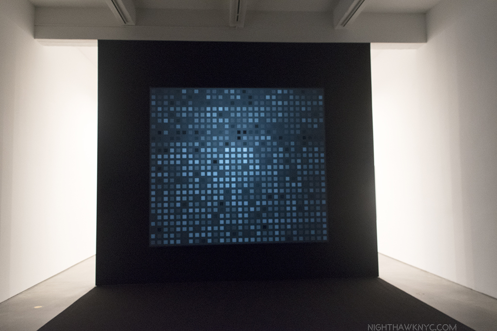
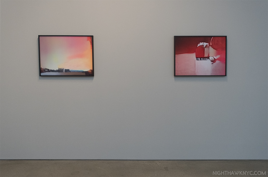
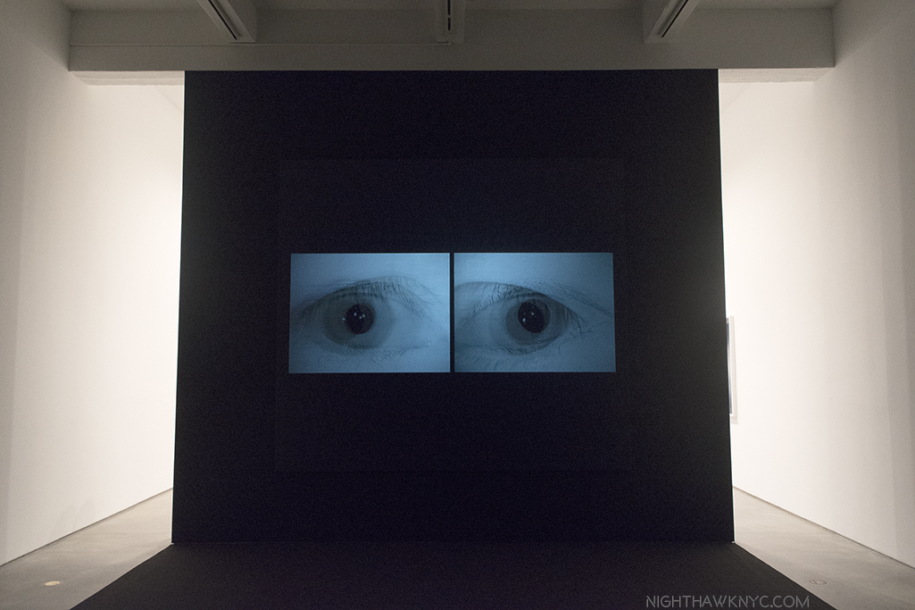
Installation view, with a still from his video, Behold These Glorious Times, 2017. Click any image for full size.

It’s about something different, though not entirely unrelated. It turns out that Mr. Paglen has, also, been deeply involved in studying computer learning, specifically, how computers see the world. As he explains in the “Artist’s Notes” for the show-

 “Over the past decade or so, something dramatic has happened to the world of images: they have become detached from human eyes. Our machines have learned to see. Without us.”

He goes on to talk about how smart airports, smart homes, even smart cities are becoming ubiquitous, with self-driving cars possibly on the way, before adding, “Most images these days are made by machines for other machines, with humans rarely in the loop. I call this world of machine-machine image making ‘invisible images,’ because it’s a form of vision that’s inherently inaccessible to human eyes. This exhibition is a study of various kinds of these invisible images.” They break down to three groups- “machine readable landscapes (landscape images overlaid with marks that show how they’re being interpreted by machines), training images (made by humans for machine eyes), and things that we might call ‘ghosts.'”

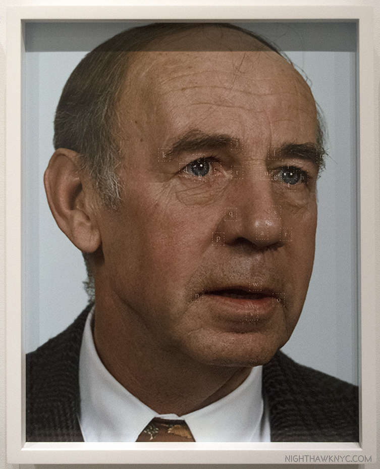
It Began as a Military Experiment, 2017, ten pigment prints

While the new iPhone X uses facial recognition technology instead of passwords or fingerprints, this technology is nothing new. The military wanted it developed back in the mid-1990’s, so the Defense Advanced Research Projects Agency (DARPA) began funding research. They quickly realized they needed to create a gigantic database of facial images and these folks, above, mostly military employees, were among the first of tens of thousands of photos it took and compiled into what was called the FERET database. Mr. Paglen then combed this database to arrive at this selection of faces. He then ran them through an algorithm to locate the key features of their faces. “One of the ways I think about these portraits is as a kind of super-structuralism in the sense that they are images not made for human eyes. They are meant for machine eyes. What’s more, these photos represent the original faces of human facial recognition- the ‘Adam and Eves’ that nearly all subsequent facial recognition research has been built upon,” he says in the “Artist’s Notes.”

Closeup of the fifth Portrait, shows the key points on his face.

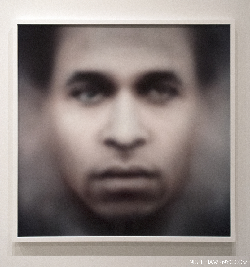
Recognizing one face out of this gigantic database first requires a “faceprint,” made out of all of the faces of a particular subject, aligned so their eyes and mouths are in the same place. Once you “average” them, you subtract the average image of all the other people in the database from the average of your subject. You’ll end up with a faceprint of your subject showing what distinguishes him form everyone else in the group. This portrait translates the faceprint of philosopher Frantz Fanon into an image that looks like a face to human eyes.

We’ve gone from the images seen just above- images that humans would recognize as people and faces, to this, an image constructed from computer to computer images so humans can recognize it as a face. Fanon”(Even the Dead Are Not Safe) Eigenface, 2017, Dye sublimation metal print. The Afro-Carribbean psychiatrist Frantz Fanon is the subject.

It gets stickier from there. The Artist’s Notes continue, “A.I.s (artificial intelligences) are taught how to recognize objects by giving them training sets….(which may) consist of thousands or even millions of images organized into pre-sorted classes that correspond to each of the kind of objects that the A.I. will eventually be able to distinguish. For example, if you want to train an A.I. to recognize all the objects in a kitchen, you might give it a thousand pictures of a fork, a spoon, a knife, a countertop, etc…Once that A.I. is trained, you can give it a picture of a fork it has never seen before and it should be able to recognize it as a fork. ” After mentioning that “every image posted to Facebook or other social media sites undergoes powerful artificial intelligence algorithms that can recognize the identities of people, the objects, the products, and even the place depicted in those images,” Mr. Paglen created his own “massive” training sets, “based on literature, philosophy, folk-wisdom, history, and other ‘irrational’ things, and taught the A.I. to recognize things from those ‘corpuses.'” The last half of the show consists of the results of these experiments, which are much more ethereal and evocative than literal, at least to this human’s eyes.

A Man (Corpus: The Humans) Adversarially Evolved Hallucinations, 2017, Dye sublimation print.

Mr. Paglen has groups this part under the broad heading of Hallucinations, or Adversarilly Evolved Hallucinations. These further break down into the subcategories, or Corpuses, which includes-
Corpus: Eye Machines (Fittingly)
Corpus: American Predators (The Artist’s notes include Mark Zuckerberg, who he lists as a “predatory machine,” reminding viewers that computers mine every image loaded to his site and are capable of reading a tremendous amount of information from them.)
Corpus: The Humans (As seen in the image above. Porn was included in the training sets, and another image depicts it as seen by a computer…or so the title says.)
Corpus: Omens and Portents
Corpus: Interpretations of Dreams (Examples of both are seen below.)

Rainbow (Corpus: Omens and Portents), left, False Teeth (Corpus: Interpretation of Dreams) both from Adversarially Evolved Hallucinations, 2017, Dye sublimation prints.

Trevor Paglen seems to like to push the boundaries of our perception while avoiding the sharp detail most Photographers live by, which, indeed, ventures into the domain of Painting. Now, he has gone beyond what humans can perceive, and into the realm of what is only “seen” by computers to create Art for humans. I wonder how long it will be before computers get around to doing that for us on their own.

Installation view, with another still from his video, Behold These Glorious Times, 2017.

These images are haunting, nightmarish, and beautiful, at the same time. In his Art Basel Conversation with Jenny Holzer, Mr. Paglen said the basis of his work can be summed up as- “How do you see the historical moment that you live in?” This show certainly provides answers to part of that question, though it raises others. Mr. Paglen’s new work is no less unsettling than his “black sites” and drone Photos. Perhaps most unsettling is not what’s in these images. It’s what they portend for the future.

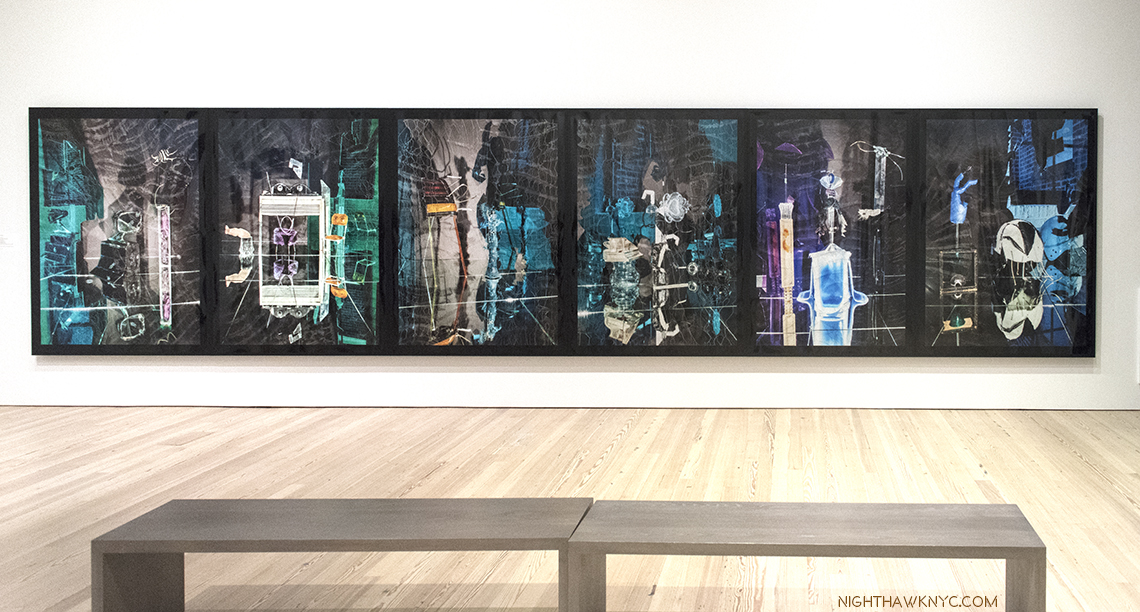
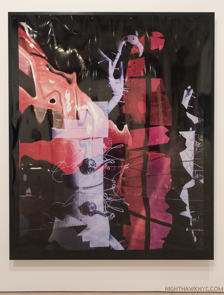
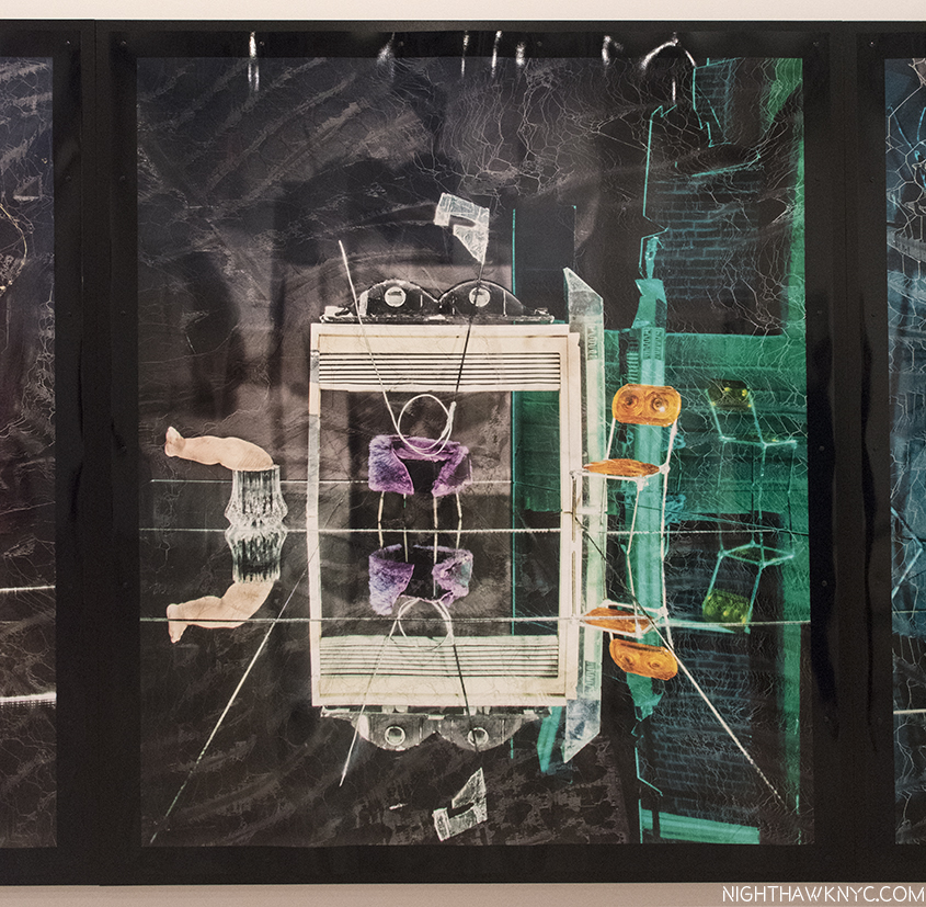
Willa Nasatir,R.V., The Green Room, Bird, Blue Girl, Sunbather, Conductor, 2017, Chromongenic print mounted on wood, from left to right. Installation view, Whitney Museum.

Unlike the other Artists featured in this piece, Willa  Nasatir (B. 1990) doesn’t use digital techniques to create her Photographs. That might be hard to believe after seeing her work. Her analog process involves creating props, often from found objects, shooting them, and then reshooting the resulting Photographs, which has sometimes been modified by fire, water, and any number of other things. The results, as seen in her revelatory Whitney Museum show, “Willa Nasatir,”achieve something of a 3D effect in a 2D work. Fresh from a show at the Knox-Albright Art Gallery, Buffalo, who owns one of her most stunning images, Ms. Nasatir shows herself to be at once a throwback, and a visionary.

The Red Room, 2017, Chromongenic print mounted on wood. The-Albright-Knox Art Gallery owns this one. They chose well.

Ms. Nasatir created the 6-part work, shown first in this section, especially for the Whitney’s long gallery wall, the unifying feature of which seems to be the color grey with green or blue. All of the works on view are dated 2017 and show a remarkably consistent unity of style and vision, and a somewhat daring use of color.  As for what’s going on in these, or any of her work? You’re on your own. The Whitney’s introduction to the show says, in part, “The resulting works are hand-manipulated images that become psychologically charged and difficult to discern; the viewer is left to parse out unresolved narratives that the image only implies.”

The Green Room, 2017. When I look at this, with it’s mirror reflection, even some of it’s props, I can’t help but recall Samara Golden’s work in this year’s Whitney Biennial.

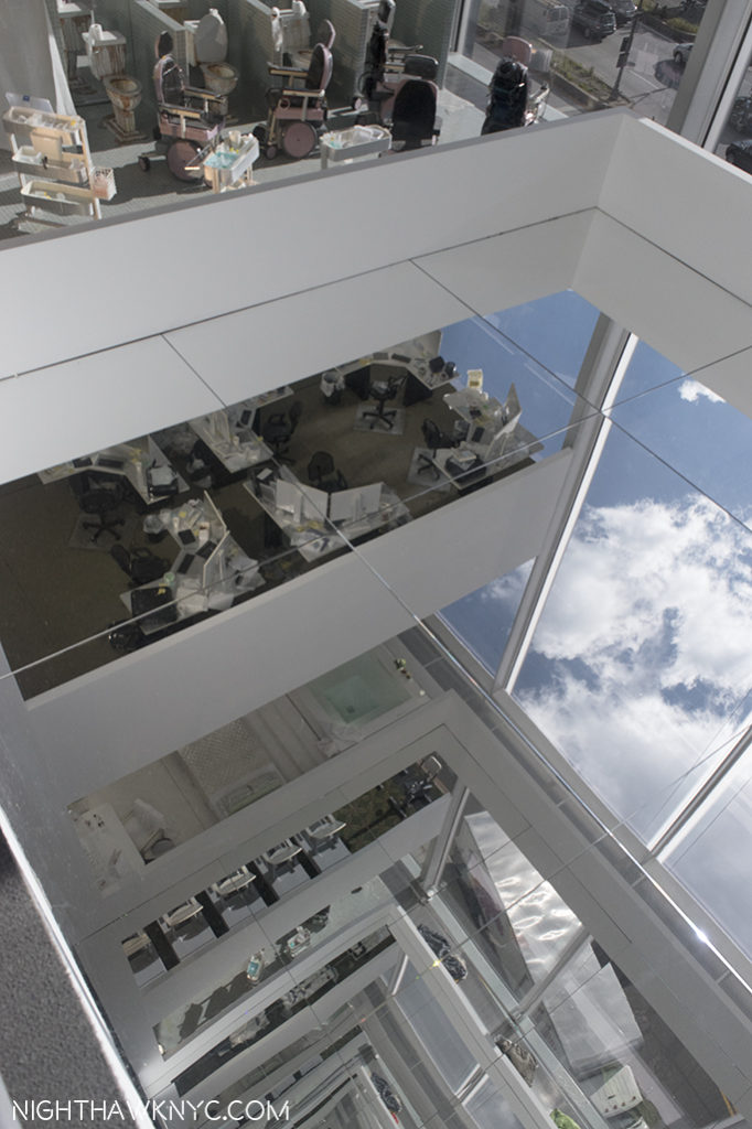
Hmmm…Where have I heard that recently? Her style shares some similar props and some of the effect of Samara Golden’s work, particularly The Meat Grinder’s Iron Clothes, 2017, which I felt was the show-stopper of this year’s Whitney Biennial. Ms. Golden’s work can look like “sets” that Willa Nasatir might base one of her Photographs on. Whereas I called Ms Golden’s astounding work in this year’s Whitney Biennial “unphotographable,” (as a whole), Ms. Nasatir’s Photographs are often impossible to locate in the real world. Both Artist’s works features elements of the “known world,” but place them in contexts which are unknown, mysterious, ominous.

Samara Golden’s The Meat Grinder’s Iron Clothes, (detail), 2017, at the Whitney Biennial earlier this year.

In thinking about precedents for Ms. Nasatir’s work, Man Ray once again comes to mind. Ray, of course, didn’t use digital techniques, either. He pre-dated them. The Dadaists, Marcel Duchamp, the German Expressionist filmmakers also come to mind, as do Robert Rauschenberg’s found objects. But, as with Samara Golden, it’s what these image stir in the mind, and the mind’s eye, that overcomes any attempt at reference- in the real world, or the historical one.

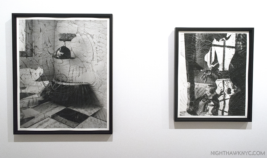
Willa Nasatir, Street Sweeper, right, Half Heart, Bus Depot, both 2017, Gelatin silver prints.

It all fades away as you ponder “What happened here?” Or, “What is about to happen?,” and then feel resonances in your mind and life. Oh, and by the way, there’s the beauty of her work, which I say as almost an afterthought, though it’s not, to their main impact- mystery.

Butterfly, 2017, Chromongenic print mounted on wood.

With two museums shows to her name by her mid-20’s, Willa Nasatir is an Artist who’s stock is rising pretty quickly. It will be interesting to see how her work evolves from here.

Caslon Bevington (B. 1992) is an up and coming NYC Artist I met during the run of the Raymond Pettibon show at David Zwirner. Her reaction to that show struck me, so I became interested in seeing her work. To this point, I had only seen what’s on view on her gallery’s, Apostrophe NYC’s, website.

One of the earlier pieces by Csalon Bevington I saw on Apostrophe NYC’s site. When I saw it in person, I guesstimated it at 12 feet tall. Photo courtesy of the Artist & Apostrophe NYC

My shock was palpable when I walked into her show, A Home for Formless Creatures: The Charisma of Fragmentation, at Apostrophe NYC’s studio & gallery space at Mana Contemporary in Jersey City, NJ. (Yes…I went to N.J.) to find she had spent the summer creating a new body of work that, at first look seemed quite different from what had come before. When I looked at the show of new work one word summed up the experience.

Qucksilver…

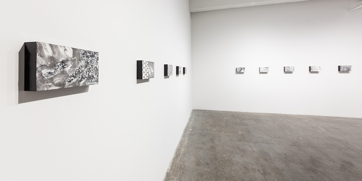
Installation view of Caslon Bevington’s show A Home for Formless Creatures: The Charisma of Fragmentation, shows her new, Translation, series, 2017. Photo by Roman Dean, courtesy of the Artist and ApostropheNYC

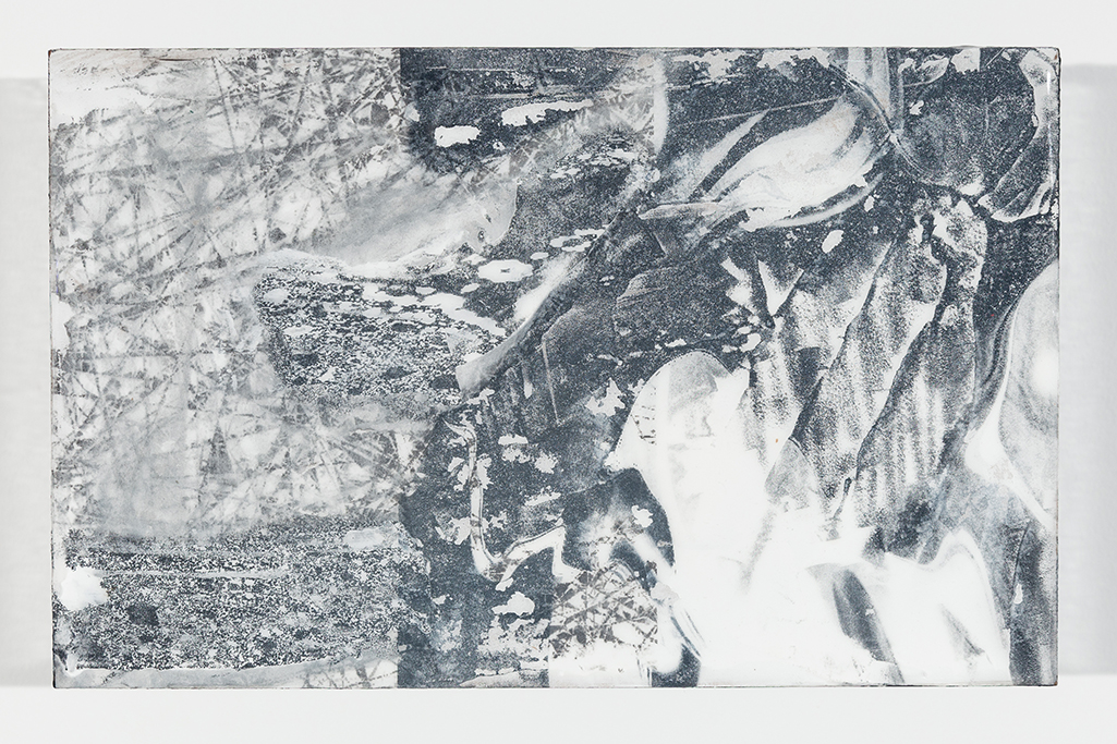
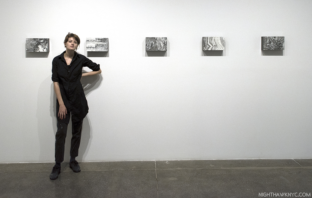
As fast as lightning, her work had altogether changed and, low and behold, there was an entire show of new work that was largely unlike any of her work I’d seen thus far. The show centered on a series of 10 works in which the Artist takes found and original images and processes them using more software programs than she could list for me, including some involving sound waves. The results were outputted to paper and then mounted on wood blocks with resin to create a series of black and white works titled “Translation” that are quite mezmerizing.

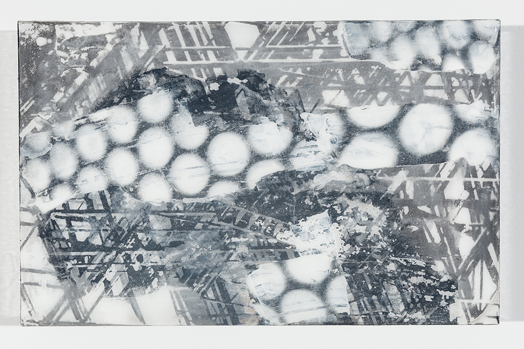
Caslon Bevington, Translation #8,, 2017. Photo by Roman Dean, courtesy of the Artist and Apostrophe NYC

They have the glossy surface of gelatin prints, but the images are mounted on blocks that extend 2 and a half inches out from the wall, jutting into the viewer’s space. Their rectangular shape and size (7 x 11 inches) is different from the usual sizes of Photographs, making them feel like something else. In them, images are juxtaposed- sometimes recognizable images (like fire escapes), with unrecognizable images, or repeating lines or waves, or abstract patterns or circles, leaving the viewer somewhere between reality and…?

Translation #10, 2017. Photo by Roman Dean, courtesy of the Artist and Apostrophe NYC.

They have a presence as a group, like a visit to another world that exists in multiple visual dimensions. Images explode out of some, interrupt others, or dialogue with each other, or mirror each other, while sharing not quite half of the work. There’s an elegance, an other-worldliness, and a haunting presence to these new works, especially, when seen in a group of them.

As for Quicksilver…What are the processes in an Artist’s mind that leads to such radical changes in their direction? Changes that seem “quick” to outsiders?

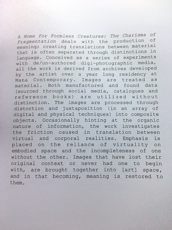
The Artist’s statement in the lovely catalog she produced, in conjunction with Apostrophe NYC, for the show.

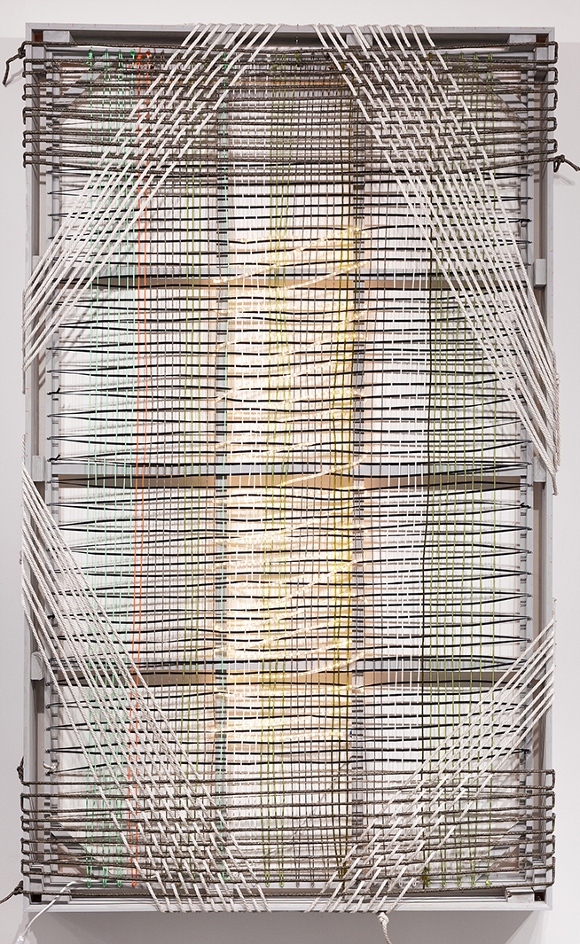
Later, she gave me a tour of her studio, and we looked at, and discussed, her earlier work. I was very surprised at the journey her work has taken. Having studied at the Art Student’s League and Parsons, the drawings she showed me were by no means academic. They explored geometric possibilities of color in abstraction. Later works all around were often complex weaves (literally) of painted cut strips of fabrics and canvas, in a square or rectangular grid. She then explored the possibilities of rope in patterns that freed the composition from the grid, and made the picture plane transparent, including one fascinating and intricate rope work of many layers on a large rectangular frame that looked to me to be about 12 feet tall (shown earlier). Ms. Bevington has also worked in metals bending strips of them onto a frame, delicately weaving each piece, and in fashion, creating a very cool T Shirt for the show.

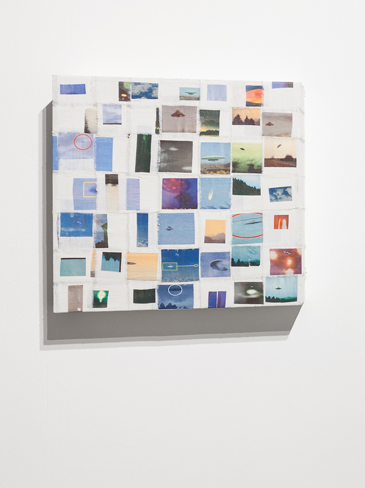
Flying Saucer Archive, 2017, Photo Transfer on Linen. Photo by Roman Dean, courtesy of the Artist and Apostrophe NYC.

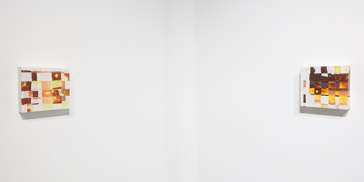
Along with these works, were some works, that also involved Photographs, on woven grids, that seem to bridge the woven grids seen in some of her prior work. One features found images of UFO’s, or what might be UFO’s. Two others featured images of sunsets shot from moving vehicles.

Photos of Sunsets Taken From Moving Cars #1 & 2, 2017, left to right. Photo by Roman Dean, courtesy of the Artist and Apostrophe NYC.

Whereas earlier she took abstract painted canvas cut into strips and imposed “order” on them by subjecting them to being woven into a rectangular or square grid, now she does the same thing using images. Along with these, also on view was an Artist’s Book she created from found images using all kinds of search algorithms- closeups of fabrics, rugs, and she only knows what else. Caslon tried to explain the process of finding and selecting it’s images to me, but I was lost looking at the pages go by as she turned them. Besides, knowing too much often steals some of the mystery. This beautiful object was produced in an edition of 9, while the other works shown were unique.

Yes, there was Painting, too. Static Painting, 2017, Oil on Wood. Photo by Roman Dean, courtesy of the Artist and Apostrophe NYC.

The Translation pieces struck me, among other things,  as creating successful, new, compositions out of the juxtaposition of existing images. Thinking about her new and earlier work, while she makes something “else” out of unexpected combinations (of materials or images), for this viewer, they share the common thread of having a “new order” brought to them.

Caslon Bevington seen with Translations #10, 11, 12, 13 and 14, 2017, left to right, at Apostrophe NYC’s gallery at Mana Contemporary, Jersey City.

Caslon Bevington is part of “Base 12,” “an experimental project…(that) groups together 12 emerging artists in a quasi-collective,” represented by Apostrophe NYC, which is run by the brothers Sei and Ki Smith, and has been in residency at Mana Contemporary. Given how rapidly Caslon’s work is evolving, seemingly like quicksilver, she’s an Artist who will be fascinating to watch. It will be interesting to see what she does next, and if she continues to explore this new realm of her work, or moves to another new frontier.

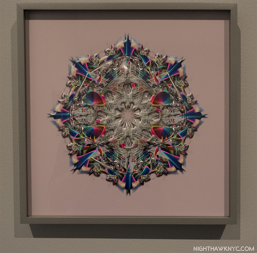
Bonus Show- Lucas Samaras (B. 1936) may be as familiar to many Art lovers as a subject for Chuck Close (like this one) as he is for his own work. At his new show, New York City, No-Name, Re-Do, Seductions, at Pace, 510 West 25th Street, all the works on view were digitally modified Photographs. The show  concluded with a large gallery of what he calls Kastorian Inveiglements, works that began as Photographs that depict “every day objects” subsequently manipulated in Photoshop into symmetrical abstractions.

Lucas Samaras, NO NAME (Kastorian Inveiglements), 2017, Pure pigment on paper mounted on Dibond

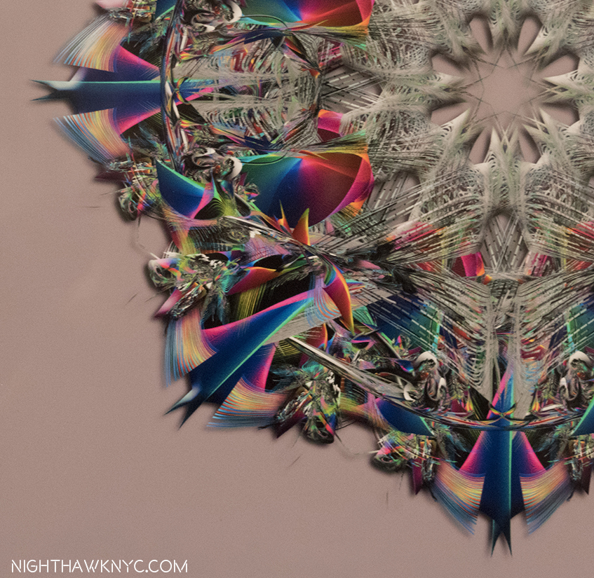
Detail of lower left quadrant.

Having seen other Artists experiment with these, though not to this level of complexity or accomplishment, I decided to try one myself to gain an understanding of the process. Here is my first experiment-

Kenn Sava, Symmetrical Abstraction 1, 2017, based on one of my Photos.

It shows that I’ve got a ways to go to match Mr. Samaras, as I do in getting up to speed on the frontiers of Photography, and Photo-based Art. Before it moves, again.

“Willa Nasatir” is my NoteWorthy show for October, though it ended on October 1.
*- Sundtrack for this Post is “X-Ray Visions,” by Clutch, from the appropriately titled album Psychic Warfare.

NighthawkNYC.com has been entirely self-funded & ad-free for over 7 years, during which over 275 full length pieces have been published!
I can no longer fund it myself. More on why here.
If you’ve found it worthwhile, PLEASE donate to keep it online & ad-free below.
Thank you, Kenn.

Written & photographed by Kenn Sava for nighthawknyc.com unless otherwise credited.
To send comments, thoughts, feedback or propositions click here.
Click the white box on the upper right for the archives or to search them.
Subscribe to be notified of new Posts below. Your information will be used for no other purpose.

  1. New Yorker, October 22, 2012, P.56
  2. ibid P.57
  3. ibid P.56-57

Up All Night With Frank Lloyd Wright

“Architects may come
Architects may go
and never change your point of view.
When I run dry
I stop awhile
and think of you.”*

Once, back in the day, I came home from work on a Friday evening and put that Simon & Garfunkel song on. Then, I hit the repeat button. “So Long, Frank Lloyd Wright” played all weekend, non-stop, until I had to go to work on Monday. Even while I slept.

Such was my life under the spell of Frank Lloyd Wright.

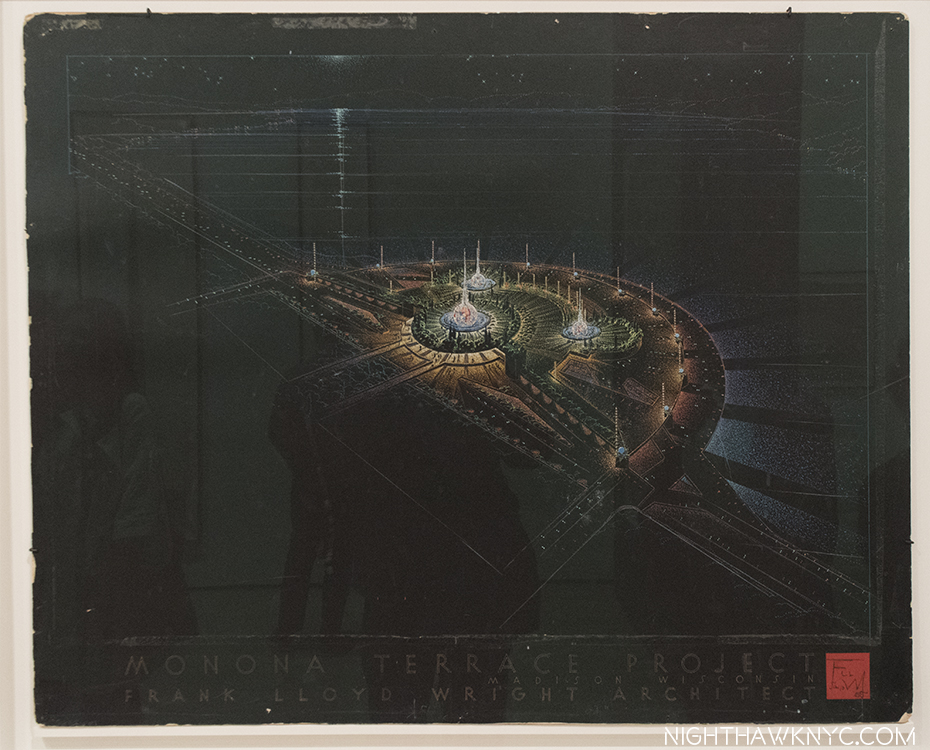
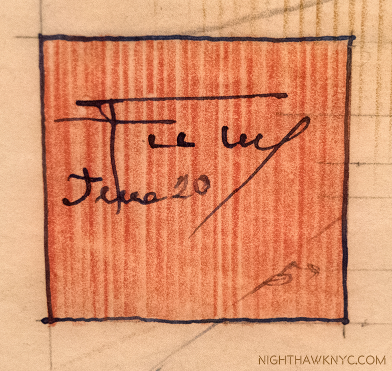
The mark of genius. Frank Lloyd Wright’s “symbol” (the red square) and his signature on the corner of one of his Drawings. “The color red is invincible. It is the color not only of blood-it is the color of creation. It is the only life-giving color in nature…1

I guess I hoped that playing this unique song from Bridge Over Troubled Water, with its unusual marriage of Brazilian rhythm and a string quartet under the ethereal vocals, would lend a different perspective on Wright and his work.

In the years after my father passed, Wright, became an all encompassing figure to me, something I didn’t realize until a German Architect I was dating pointed it out to me. She might have been (W)right. Looking back, though, I think it was the discovery of, and the falling in to, the seemingly bottomless pit of creativity that was Frank Lloyd Wright, and the enigma and charisma of the man, his ideas and his accomplishments (including the countless buildings he designed that were never built, or that were built and since lost). This passion took many forms in my life at the time. Along the way, I learned that the man was a great Artist in other ways beyond Architecture- as a Draughtsman and, in my opinion, as a writer. His writings often marry Art & Architecture and philosophy. He was, also, something of a “teacher,” or model, later in his life at his Taliesen Fellowship. His “teaching” seems to have greatly influenced some, and left others unhappy. Beyond all of this work, his personal life? Well…as I’ve said previously about others…is not for me to judge. My interest in is the Art, his creative ideas and the work.

Speaking of teaching & learning…Just outside MoMA’s show, in “The People’s Study,” the public was invited to create and experiment with a range of materials, including blocks, which Wright, himself, created with as a child. Along the windows, they were invited to design their own “Broadacre City,” Wright’s concept for urban/suburban development.

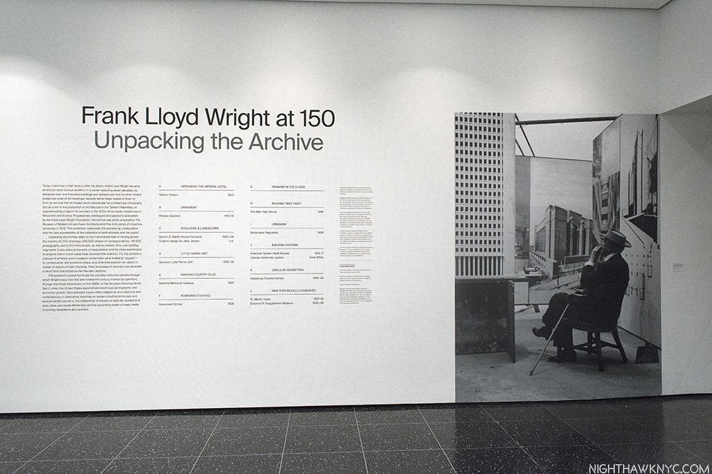
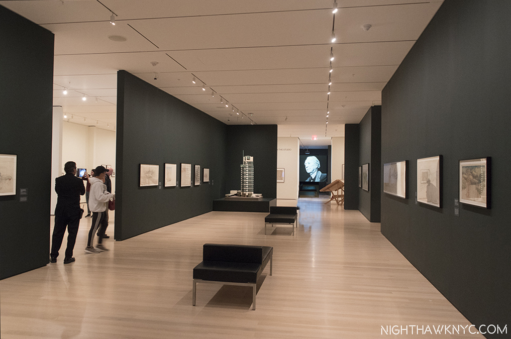
MoMA’s show, Frank Lloyd Wright at 150: Unpacking the Archive is a major event, honoring two major events.  First, it opened on June 12th, four days after Frank Lloyd Wright’s 150th Birthday. Second, it marks the joint acquisition by MoMA and the Avery Architectural & Fine Arts Library of Columbia University of Frank Lloyd Wright’s Archives. It’s a fascinating show, though, of course, it’s a mere sliver of the massive Archive that will keep scholars busy for decades Some of the early fruits of their labors were on view, particularly in short videos on display in each gallery where curators spoke of some of the highlights they’ve found so far. Parts of Wright’s Archives have been known to me through earlier shows at MoMA and the Guggenheim, and through books, most notably In His Renderings, the final volume of  the landmark 12 volume box set published by A.D.A Edita Tokyo in 1984, right in the middle of my Wright obsession2. The 200 Drawings In His Renderings included made the case for Wright’s Drawings being works of Art in themselves, and a good many of them are in MoMA’s show, which totals about 450 items. Indeed, they are right at home on the walls of the great museum.

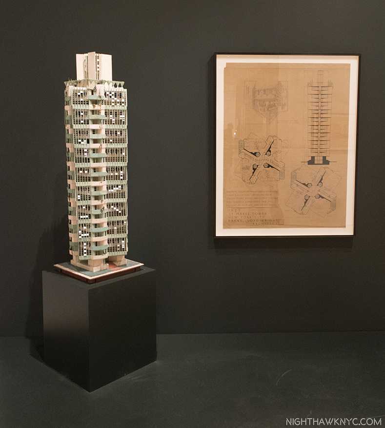
The show is made up of galleries devoted to individual projects and galleries devoted to aspects of his work. Of course, given his career lasted over 60 years, only selected Wright projects are here and they range from key buildings, like the Imperial Hotel, 1923, to some much less well known, like his design for the Rosenwald School for Negro Children, 1928, as it was labelled, as well as galleries devoted to Wright’s Ornamentation (an almost completely lost art in today’s Architecture), Urban projects, the role of landscaping in his projects, and built, and (mostly) unbuilt projects for NYC. There is also a gallery showing 2 rare videos of Frank Lloyd Wright- one an infamous interview with Mike Wallace in 1957, the other an appearance on the game show, “What’s My Line.” The long central, first gallery includes a range of Drawings, many masterpieces- both as Architecture and as Artworks, from a wide range of periods of Wright’s career, including the Winslow House, 1893, Unity Temple, 1908, Fallingwater, 1935, and the Marin County Civic Center, which opened in 1962.

Frank Lloyd Wright seen at the end of the first gallery as he’s interviewed by Mike Wallace in 1957, at age 90. Still sharp as a tack.

When Wright burst on the scene, after leaving his employer & mentor, the great Louis Sullivan3, the “Father of the Skyscraper,” (who he held in such high esteem, he referred to him as “Lieber Meister,” German for “Dear Master”), and began his own practice, there was no such thing as a truly “American” style of Architecture.

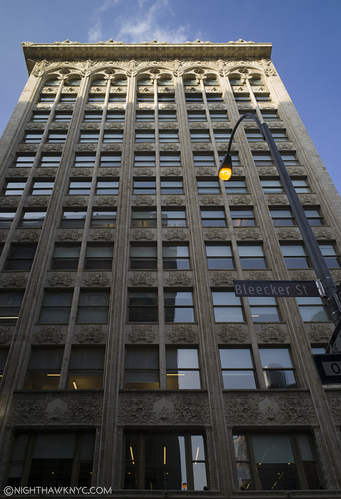
Louis Sullivan’s Bayard-Condict Building, 1898, on Bleecker & Crosby Streets, his only NYC building, was one of the first steel skeleton skyscrapers in NYC. As the columns between the windows rise, they lead to the parapet decorated with angels.

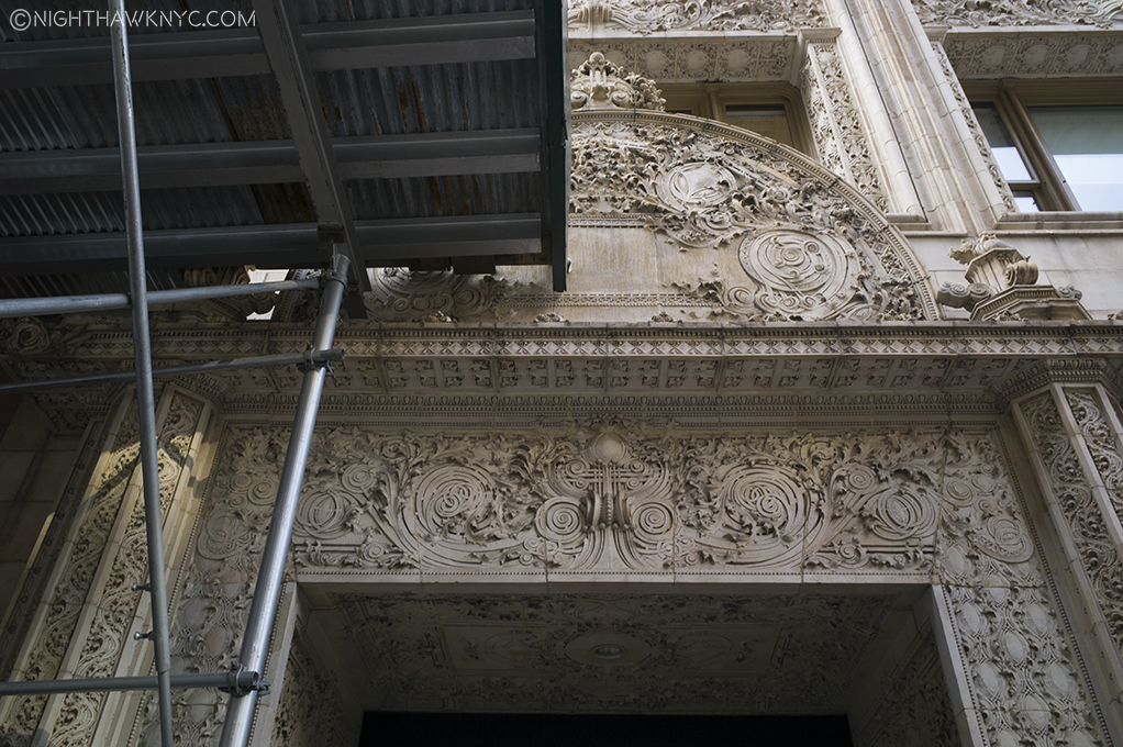
Even half-hidden by scaffolding the genius of Louis Sullivan’s ornament is impossible to miss, here on the entrance.

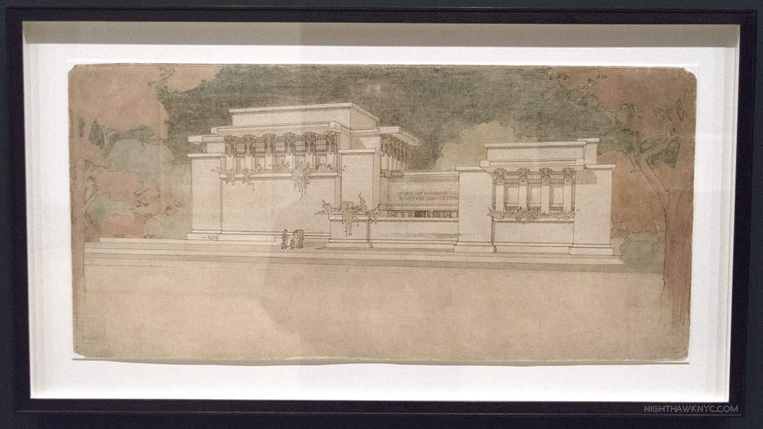
While Henry Hobson Richardson and Sullivan (both a bit under appreciated today), had taken steps towards creating an American style, Wright completed it with the introduction of his Prairie Style in the first decade of the 20th Century, like the “Unity Temple,” 1908, in Oak Park, IL, below.

Rendering of Unity Temple, Oak Park, IL, 1908, which still stands, an example of his “Prairie Style,” with its low, land-hugging profile. Wright, who’s church was “Nature,” went on to design churches for many religions.

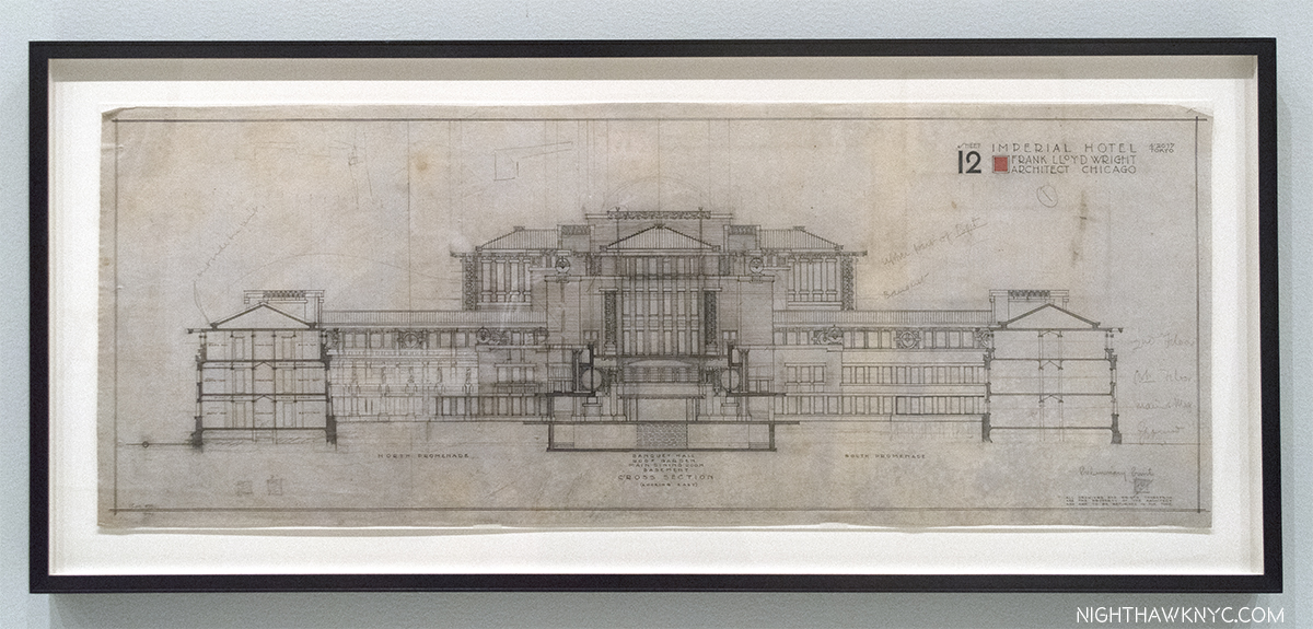
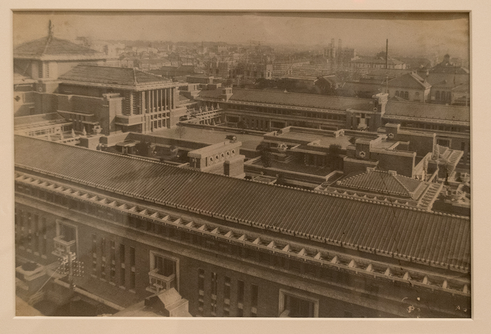
Off the central gallery, the first side gallery is devoted to Wright’s Imperial Hotel, Tokyo. Incredibly, it was dedicated on September 1, 1923, the very day of the devastating Great Kanto Earthquake that killed 100,000 people and leveled almost every other structure in Tokyo, except for Wright’s Masterpiece, which he had designed to withstand such an event. Instant world-wide fame followed. The genius in its floating concrete foundation below was also abundant in the superhuman amount of creativity above it.

Imperial Hotel, 1923, cross section.

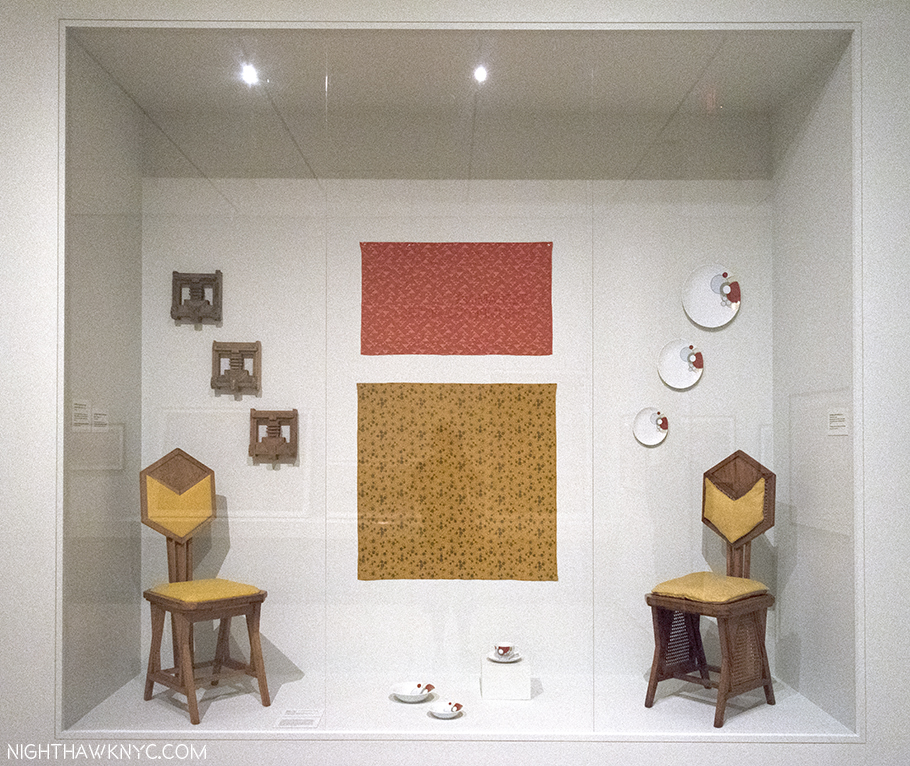
Wright designed the furniture, the windows, the lamps, the dishes- all of it. He created a massive building that was one unified composition from top to bottom, down to the smallest detail. I couldn’t get over it. Yet the Imperial Hotel was far from the only building he did this for. No other Wright structure has captured my fascination, and awe, more than the Imperial Hotel (which is saying something), perhaps because, though it was gigantic, so little of it remains- even in photographs, film or books (An amazing online collection of photos and relics of the “Imperial Hotel” I’ve seen is to be found here.). What is left teases the viewer to imagine the rest. I’ve tried to imagine walking around in it…what that must have looked like and felt like. It withstood what Nature (Wright capitalized it, since he said it was his “religion,” my inspiration for capitalizing “Art,” “Music,” “Painting,”etc., since Art is my religion) threw at it, and World War II, but it couldn’t withstand the rising value of Tokyo real estate leading to its tragic demolition in 1958 after standing for a mere 45 years! The facade was saved and reconstructed at Japan’s Meiji Mura Outdoor Architectural Museum, a few pieces of furniture are in The Met (which also has one of the Urns that was out in front of the entrance), and other items are in collections elsewhere.

Frank Lloyd Wright’s First Symphony. The Imperial Hotel, Tokyo. Imagine designing this, AND all the furniture, dishes, windows, lamps, and on an on. For my money, one of mankind’s supreme creative achievements. It’s so large it extends off the frame from across the street. Part of the entrance is barely visible to the right, center.

Fragments of the Imperial Hotel,  The two side chairs are on loan from The Met. The dishes are reproductions.

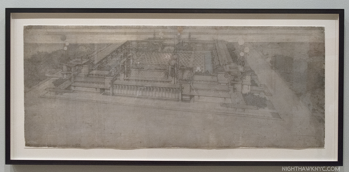
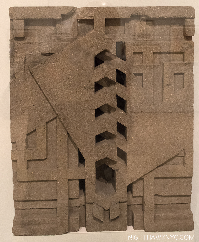
Wright’s other huge early masterpiece was Chicago’s Midway Gardens, 1914, an indoor/outdoor entertainment complex in the Hyde Park section. Again, Wright designed all of it, and once again, almost nothing remains. Either one of these two buildings would have been enough to secure his name, and his legend. Midway Gardens, stood for FIFTEEN years. The loss of both is a cultural tragedy that will echo on through centuries to come.

Like a vision of the past through a misty glass. Rendering of Midway Gardens, 1913, Chicago. Another early lost masterpiece.

Represented in MoMA’s show by this “Block for Midway Gardens,” 1914. Remnants of it are extremely rare. Photos of, and more about Midway Gardens, can be found here. (Scroll down.)

Gone forever was the chance for young Artists & Architects to experience and be directly influenced by them the way you only can from seeing Architecture, or Art, in person. Wright’s buildings require your presence in their space to fully appreciate them. He was fond of low corridors giving way to large open spaces, and this is just one of the experiences you can’t get from a book. Speaking of books, after one of my visits, I wandered into MoMA’s bookstore. A young couple next to me picked up a book on Wright and one said, “What did he build? Oh! He did the Guggenheim.” I thought everyone knew who Frank Lloyd Wright was. I don’t know if they went up to see the show or not, but I decided then and there to write this Post.

After these early masterpieces, Wright’s style evolved from the Prairie style, through the Mayan and Japanese influence seen in the Imperial Hotel and a number of houses he designed at the time, to his “Usonian”style of the mid-1930’s, to buildings beyond style, like the Johnson Wax Headquarters, Fallingwater, and eventually, The Guggenheim Museum. They would all fall under the umbrella of “Organic Architecture.” The “Usonian” houses began around 1936, and have a style which brings these houses even closer to the land than the “Prairie Style” houses, being almost universally a single storey, while featuring simpler materials, which, Wright believed, would make them more affordable. Though more “popularly priced”, he still designed all the furniture for them as well, and the chair I once owned came from a “Usonain” house. These “Usonian” houses, along with his “Broadacre City,” were part of his vision for urban and suburban landscape design, called “Usonia,” as in “U.S.-onia.”

Rendering of the Johnson Wax Headquarters, 1936. Its innovations are everywhere from the dendriform columns in the great workspace that rise from 9 inch bases to 15 foot “lily-pad” tops (see below), to the design of the furniture to expedite cleaning, to the use of glass tubes to block out the “urban blight” outside while creating a soft light inside. A sideshow of Photos of this incredibly beautiful building are here.

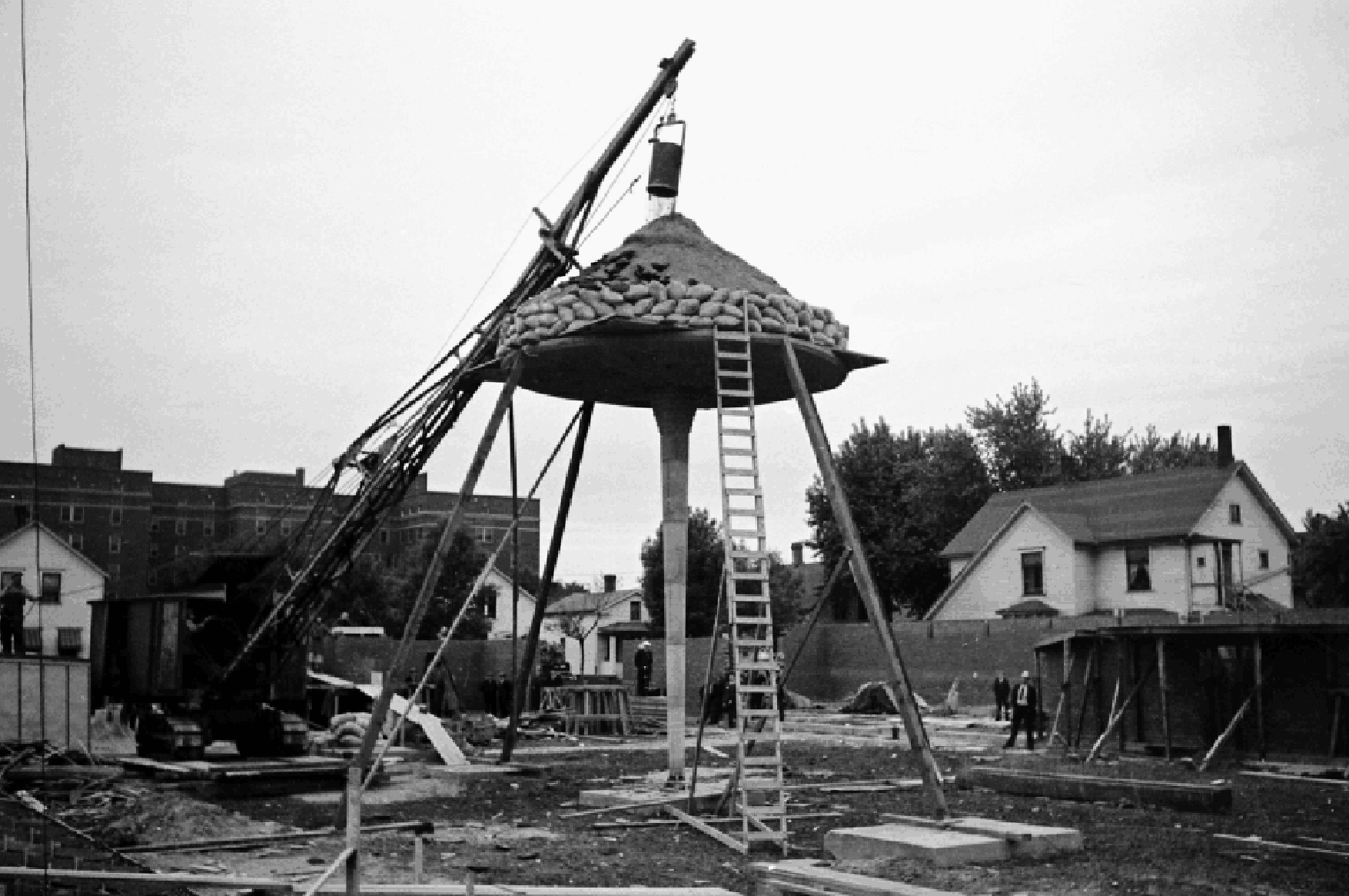
No one believed Wright’s slender columns for the Johnson Wax Headquarters could support enough weight to be practical. So, he staged this demonstration and piled 60 TONS on top of one! Photographer unknown. 81 years later? They’re still standing tall.

The later masterpieces while unique to themselves, still remain true to Wright’s core beliefs. Herbert F. Johnson, president of the S.C. Johnson Company hired Wright to build his company’s corporate headquarters in 1936 in Racine, Wisconsin. The resulting landmark, above, is a sheer wonder- a cathedral of capitalism. Though they encountered some problems, Mr. Johnson was so pleased with Wright that he contracted him to build a research tower on the property and then to design a large house for himself, known as Wingspread.

Within the year, he, also, created what may be the most famous private house ever built. Fallingwater, for Edgar J. Kaufmann, owner of Kaufmann’s department store.

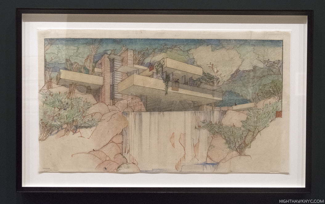
Rendering of Fallingwater, 1935. Legend has it that Wright had put nothing on paper though his client, Edgar Kaufman, was on his way from the airport to see the design of his house. Wright had it all in his head and put it down on paper in time for Mr. Kaufman’s arrival. This is probably not that Drawing.

Perhaps nowhere in Art is there greater harmony of Art & Nature than there is in Fallingwater, which may make it Wright’s ultimate expression of his “Organic Architecture.” In it, the Artist strives to achieve the ultimate- create something worthy of a spectacular natural site, a work that seems to grow out of it, and be integral to it. Mr. Kaufmann was expecting the house to be sited across from the waterfall so he could enjoy looking at it. Instead, Wright put the house directly on top of it, centering the living room on a rock the family liked to picnic on.

As a result of all of this, it shouldn’t come as a surprise that later in his career he spoke defiantly about the Architects of the new “International Style,” with their bland, impersonal boxes of steel and glass, that are about as far from “Nature” as anything could be. Here in NYC, as in many other places, a casual look around reveals they’re already dated, and many (most? All?) are plain eyesores. One thing MoMA’s show reinforces is that Wright’s work has a way of not going out of fashion. Perhaps it’s because it’s so tightly integrated with its surroundings- with nature. It also helps that most of what he built and remains is out in nature, i.e. not in a City. Then again, perhaps it’s because his endless, unique, creativity serves to constantly inspire. Like the song says. For myself, my now long-standing passion for the work of Frank Lloyd Wright leaves me wondering if he is not the greatest Architect who ever lived. I’m lucky. I don’t believe in qualitatively comparing Art or Artists. But if I did? That’s one statement I might actually make. Now, I’m content wondering.

“The tree that escaped the forest.” Like a tree, it looks different from every angle. Originally designed for Astor Place in Manhattan, after it was rejected, it was redesigned and became the only “skyscraper” Wright built during his lifetime, the Price Tower in, you guessed it- Bartlesville, Oklahoma.

Speaking of “not being in the City,” though Wright has only one building in NYC, that’s not because he didn’t try. Though he loathed cities, particularly this one, he did. He designed many structures that he wanted to have built here but he was shot down by the powers that be every single time4! Only when he had a client powerful enough to push through his project did the Guggenheim get built. MoMA’s show serves as a reminder of this nightmare as it shows us some of the projects he envisioned for the City, along with an in-depth look at the Guggenheim’s coming to be. It, therefore, serves to remind us that the travails of that other brilliant Architect named “Frank,”…Gehry, has had getting projects built here are nothing new. To date. Mr. Gehry, who has tried to get countless plans built that would have transformed the City, to date has only two. Between Wright & Gehry? Ohhhh…the City we should have had.

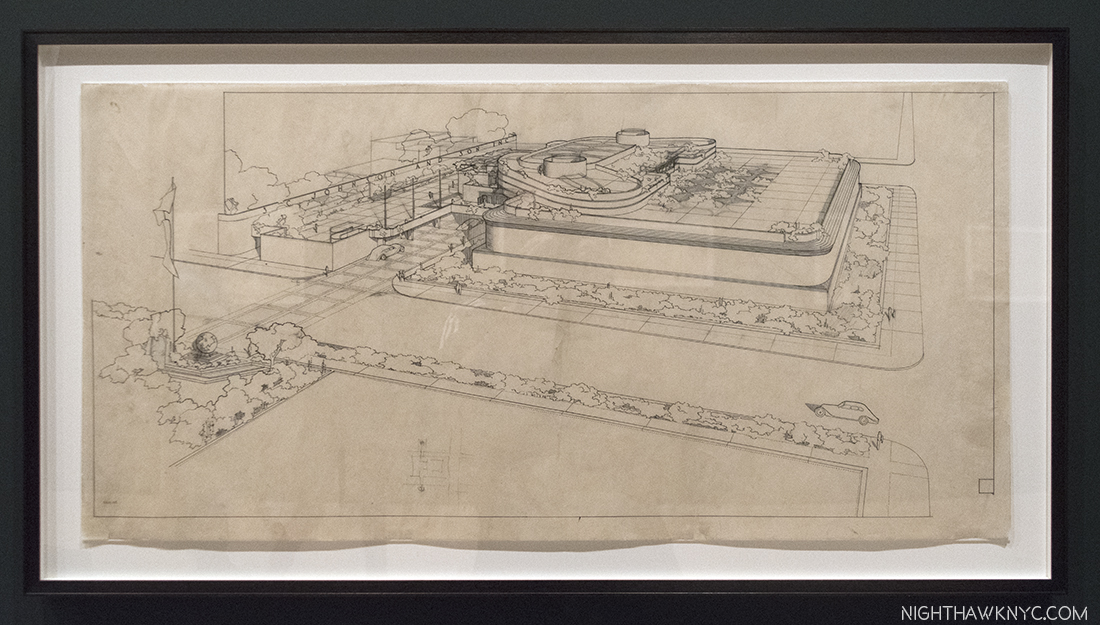
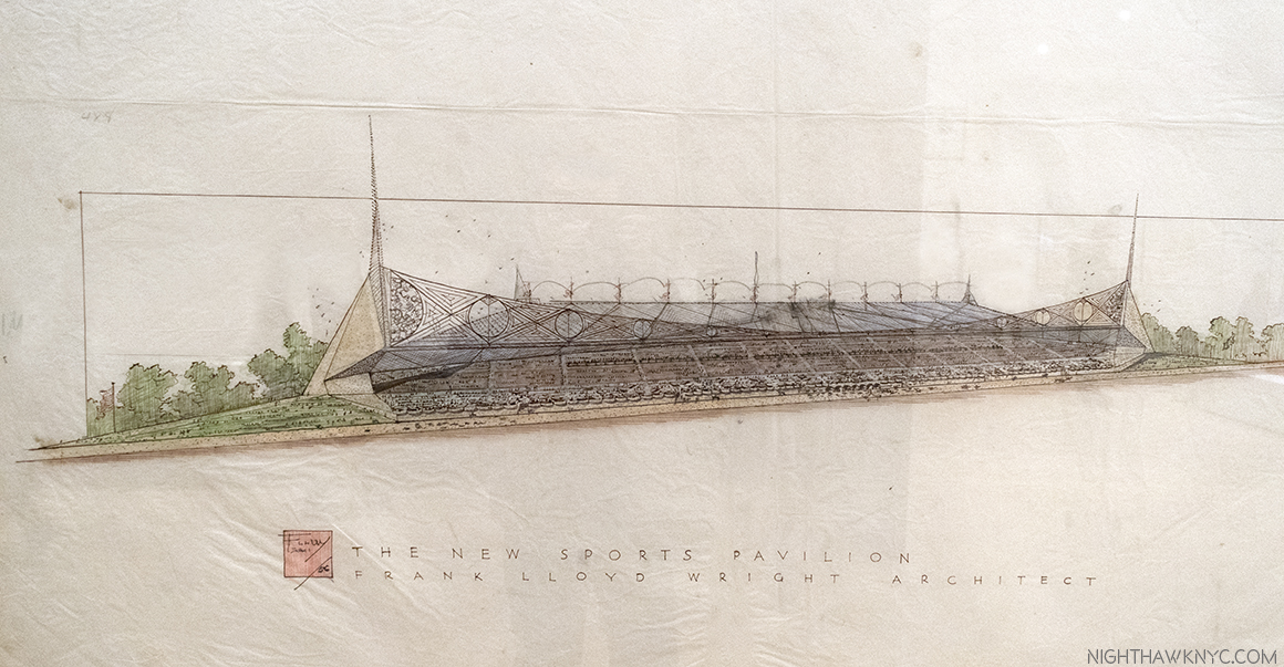
Rendering of the New York Sports Pavilion, for Belmont Park, 1956 , another of the countless structures Wright designed for Manhattan that were never built.

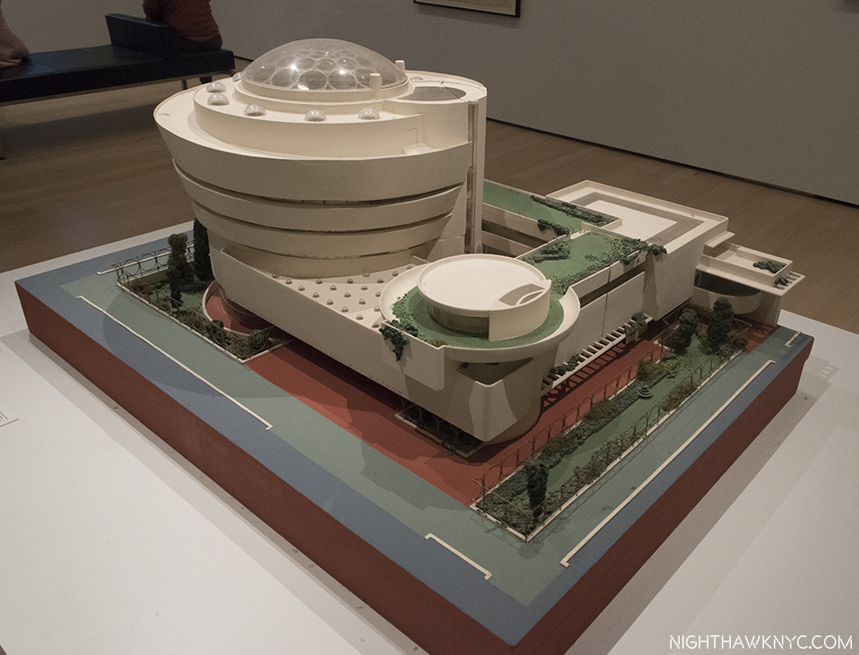
As his only NYC building, the Guggenheim Museum it is still able to inspire with its incredibly bold vision almost 60 years on. It echoes the trees across 5th Avenue in Central Park as a way of bringing a hint of Nature across the street into the City. But, lesser known is the building as we see it now went through quite a metamorphosis on the way. Take a look at this-

The Guggenheim Museum underwent extensive design modifications between this model and the finished building. Looking at it from the 5th Avenue side, very little is the same besides the ramp/rotunda (though here it’s located on the East 89th Street corner, instead of the East 88th Street corner, to the right, as it was built), and the lower overhanging floor. Everything else is different.

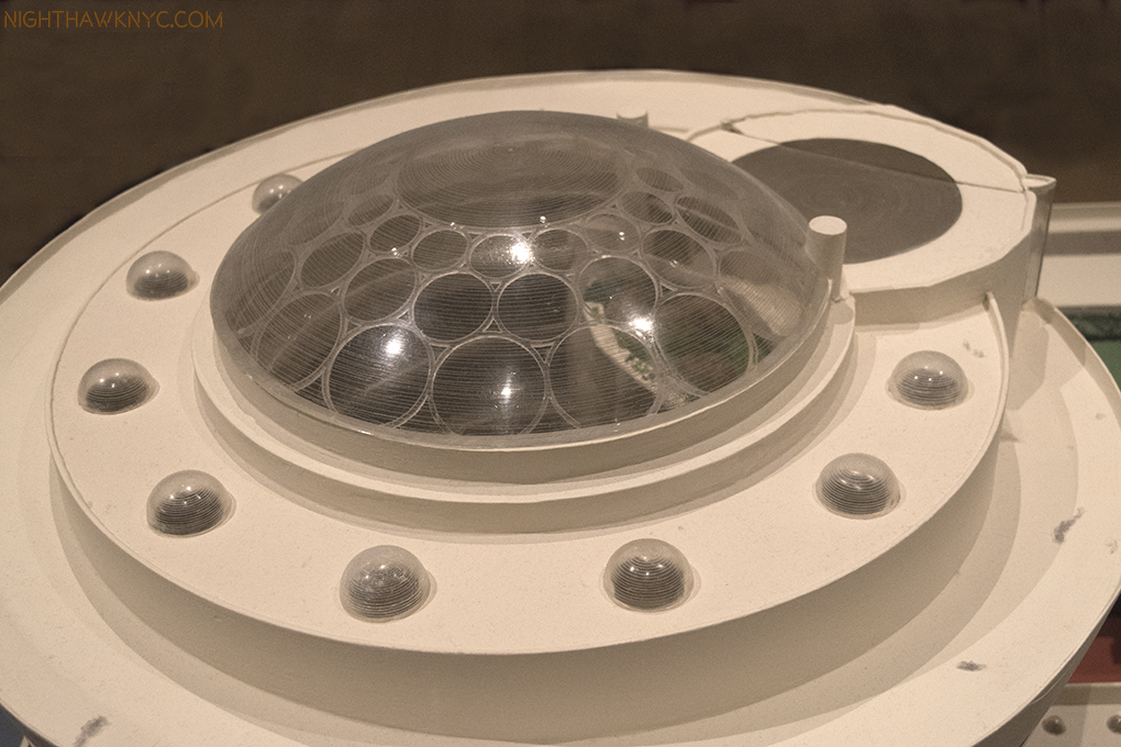
This detail fascinates me. It shows Wright’s rarely seen original design for the roof, most notably the skylight over the famous rotunda. The variously sized circles make much more sense to the overall composition than the grid that’s up there now, since so much of the composition involves circles (right down to circles being etched on the sidewalk out front). Of course, the Guggenheim chose to ignore all of this when they put a square building behind it. I wonder why this design was not used. Nor were the surrounding small domes.

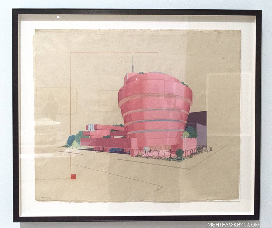
The rotunda is now on the right in this rendering, done to demonstrate how it would look in pink. Yes…pink! Still, along with the final color, so much about the building remained to be finalized even here.

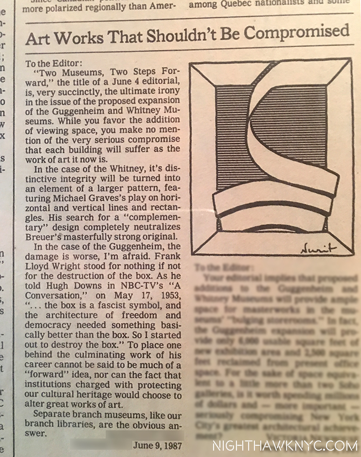
The Guggenheim didn’t follow through on all of Wright’s ideas when completing the building (which may, or may not explain the current skylight). So, perhaps, it shouldn’t be a surprise when the Guggenheim was altered in the early 1990’s, terribly in my opinion. I was actively involved in trying to prevent it, and the modification of the Breuer Whitney Museum (now, unmodified, it’s The Met Breuer). To that end, in June, 1987, my letter was published in the New York Times-

My letter in the NY Times Op-Ed page opposing the & Guggenheim & Whitney modifications, June, 1987. I love the very fitting Drawing they added.

“So long, Frank Lloyd Wright.
All of the nights we’d harmonize till dawn.
I never laughed so long.
So long.”*

Today, are there ANY Architects who are also designing the dishes, rugs, windows, lamps & furniture for their buildings on a regular basis? Having owned an original Frank Lloyd Wright chair I can attest to both the ingenuity of the design (though “impractical” most people who saw it said, its 3 legs required you to sit with both feet on the floor, or fall off. Wright teaching proper posture), and to the fact that it was in itself a miniature work of Architecture. When I thought of Wright, I thought of Brahms, Mahler or Anton Bruckner (all of whom were alive during Wright’s lifetime) or his beloved Bach & Beethoven. Wright was building symphonies in the physical world. The extraordinary attention to detail in his work- down to even designing the napkin rings at “Midway Gardens,” is something akin to the musical structure of any of those Composer’s compositions, where every note plays a role in the whole. Wright creates a unified physical structure that is hard to find in any other Architect’s work- before or after. Music was the only analogy I could think of for what he had done. At least for me. I think he may have agreed- music was always central to him, particularly chamber music, which he would have weekly performances of at his Taliesin homes. It was hard for me to understand my fascination & obsession with all things Frank Lloyd Wright until I realized what he was doing was creating buildings the way Bach, Mahler or Bruckner created “edifices in sound.” Wright loved music and the connection is something that needs closer study.

Like Picasso, or Miles Davis, he was not one to stay in the same place for long. They are the only two other 20th Century Masters who had multiple unique “periods.” Wright’s style continually evolved, but it were always true to his principles- using nature as the supreme guide, building in harmony with the site, and building “organically.”

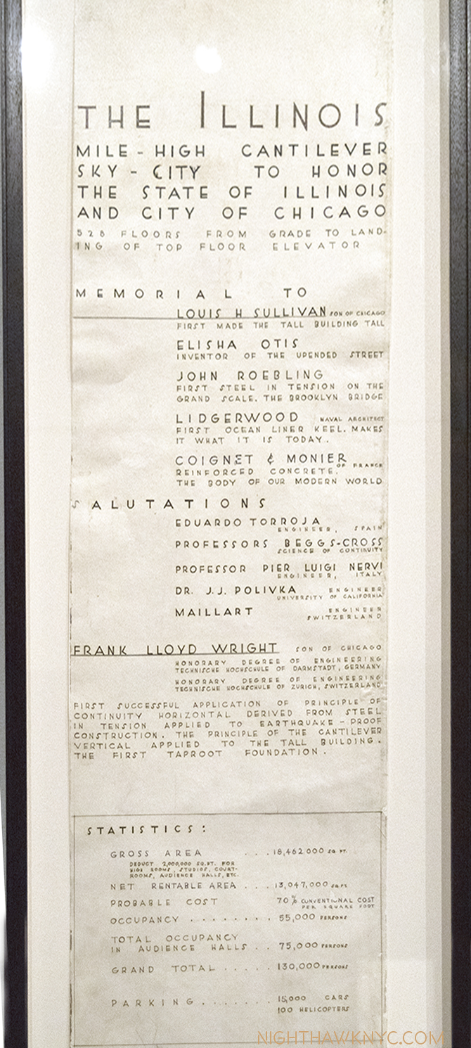
Approaching age 90, Wright unveiled one of his most daring ideas yet- “The Illinois,” perhaps better known as the “Mile High Skyscraper,” because that’s what it was- a mile tall. A number of Drawings related to it were on view at MoMA, five about 8 feet high each.

8 foot tall rendering of The Illinois, 1956. Wright’s “Mile High Skyscraper.” Designed to be made of concrete, some doubt its feasibility. It would have been FOUR times the height of the Empire State Building!

Interestingly, in one Drawing, the “Mile High” shares the sheet with extensive text. The curator’s video in the gallery says this Drawing is his second “Autobiography,” to the book of that title. On it, Wright pays tribute to his influences, and proceeds to list some of his accomplishments. As a result, it’s perhaps the most fascinating Drawing in the show. Its something of a testament. It’s hard for me to look at the “Burj Khalifa” in Dubai and not think its Architect, Adrian Smith of S.O.M., owes a serious debt to The Illinois. It’s “only” 2,722 feet tall, though, half of the proposed height of The Illinois.

Wright’s “salutations,” list of accomplishments, and building stats on the top half of another 8 foot tall Drawing of the “Mile High.”

One striking thing about Frank Lloyd Wright is that at the time of his death on April 9, 1959, Frank Lloyd Wright was exactly half as old as his country. (He was 91, the country was 182 years old.) Remarkable. When Wright started in Architecture, working for Joseph Silsbee in 1872, he did so in a Chicago that was still digging out from the Great Fire the previous year. There were no skyscrapers until his “Lieber Meister” Sullivan began to create them 20 years later. When he passed away in 1959, one of his final masterpieces, the Guggenheim Museum was about to open. Much had changed in the 87 years between. But, given that he stayed true to his core belief in “Organic Architecture,” (“building as nature builds,” he said), I’m not sure that Wright changed all that much as much as he evolved. As a result, in the final analysis, he showed us that his idea was infinitely pliable, and that creativity and imagination had a central role in it, something that seemed to go out of Architecture, increasingly, during that same period. While some of his greatest works are gone, his Archives contain an enormous wealth of materials that can bear witness to them, and the thousand or so projects he undertook (about 400 or so still stand). It was a lot for one life- even one that lasted 91 years.

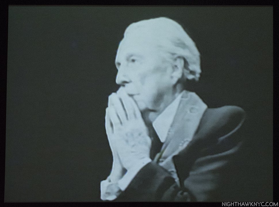
Frank Lloyd Wright during the “Mike Wallace Interview,” 1957, near the age of 90, two years before he passed away.

“So long, Frank Lloyd Wright.
I can’t believe your song is gone so soon
I barely learned the tune
So soon, so soon”*

As I left this show, filled with that same, familiar, head-shaking amazement, I was reminded of a quote of Wright’s- “The scientist has marched in and taken the place of the poet. But one day somebody will find the solution to the problems of the world and remember, it will be a poet, not a scientist5.” Whether the world will listen to the next poet is a question that remains to be answered. In the meantime, with regard to this poet, there is much still to learn.

“Frank Lloyd Wright at 150: Unpacking the Archive” is my NoteWorthy Show for September.

*- Soundtrack for this Post is “So Long, Frank Lloyd Wright,” by Paul Simon, which is, also, something of his farewell to Art Garfunkel as Garfunkel was about to leave to go to Mexico to shoot Catch 22, which marked the end of Simon & Garfunkel. Garfunkel majored in Architecture at Columbia, admired Wright, and suggested to Simon that he write a song about the Architect. Published by Universal Music Publishing Group.

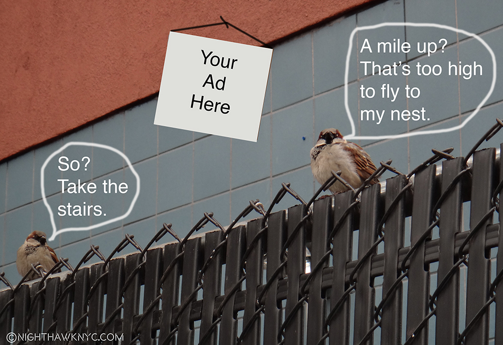
On The Fence, #14,” the Stair way to Heaven Edition.

You can now follow @nighthawk_nyc on Instagram for news and additional Photos!

NighthawkNYC.com has been entirely self-funded & ad-free for over 7 years, during which over 275 full length pieces have been published! If you’ve found it worthwhile, PLEASE donate to allow me to continue below. Thank you, Kenn.

You can also support it by buying Art, Art & Photography books, and Music from my collection! Books may be found here. Music here and here.

Written & photographed by Kenn Sava for nighthawknyc.com unless otherwise credited. To send comments, thoughts, feedback or propositions click here. Click the white box on the upper right for the archives or to search them. Subscribe to be notified of new Posts below. Your information will be used for no other purpose.

  1. Kliment Timiriazev
  2. Eight of the other eleven volumes are monographs dedicated to period of Wright’s career, the remaining 3 volumes contain preliminary studies, which I assume are part of his Archives. These books were the only way most of us could see these pieces of the Archives, except for occasional shows, until now.
  3. Controversy still surrounds whether he left or was fired by Sullivan for taking freelance commissions on the side.
  4. To read this very sorry tale, in detail, I highly recommend the book “Man About Town,” by Herbert Muschamp, who details Wright’s plans for Manhattan and efforts to overcome the powers that be. i.e Robert Moses.
  5.  As quoted in “The Star,” 1959, and “Morrow’s International Dictionary of Contemporary Quotations,” 1982, by Jonathon Green.

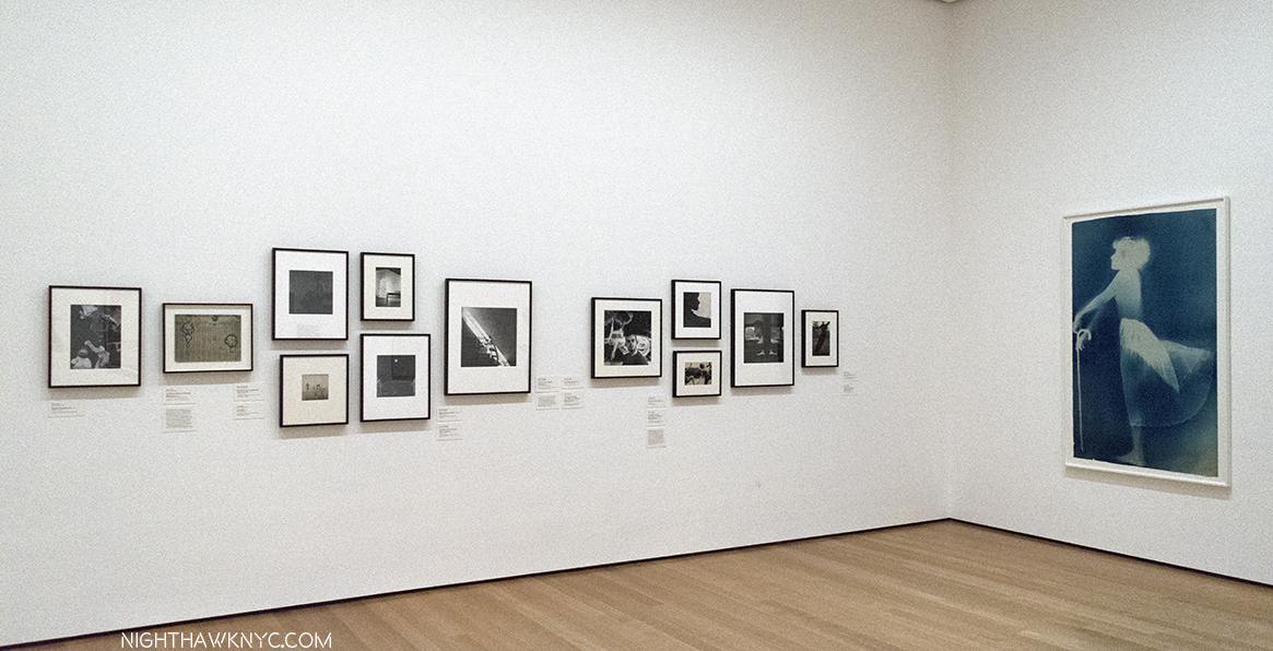
This Summer In “The Era of Rauschenberg”

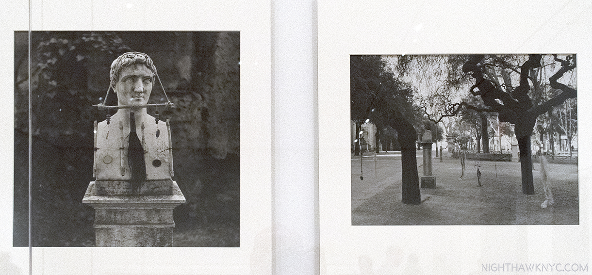
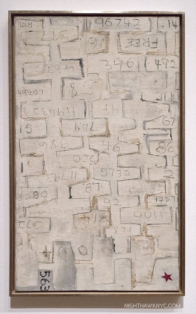
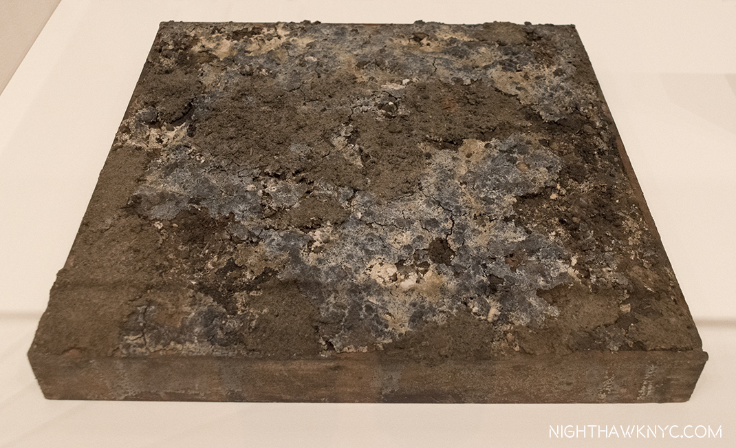
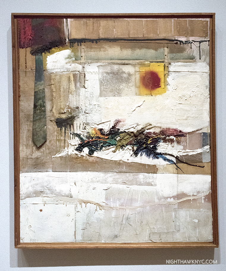
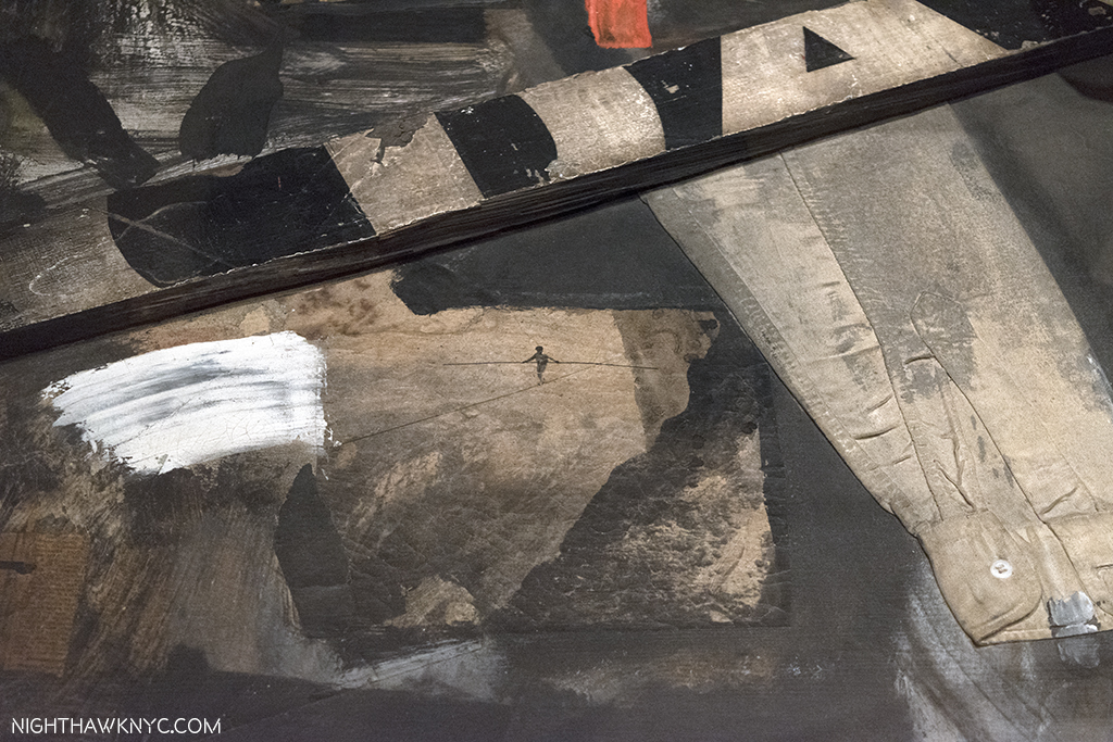
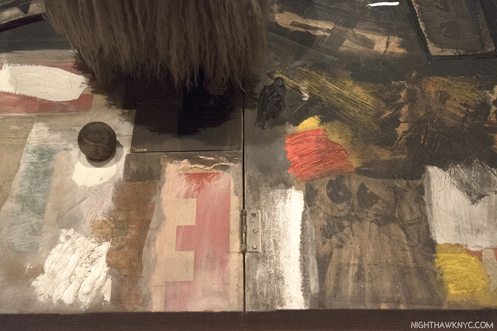
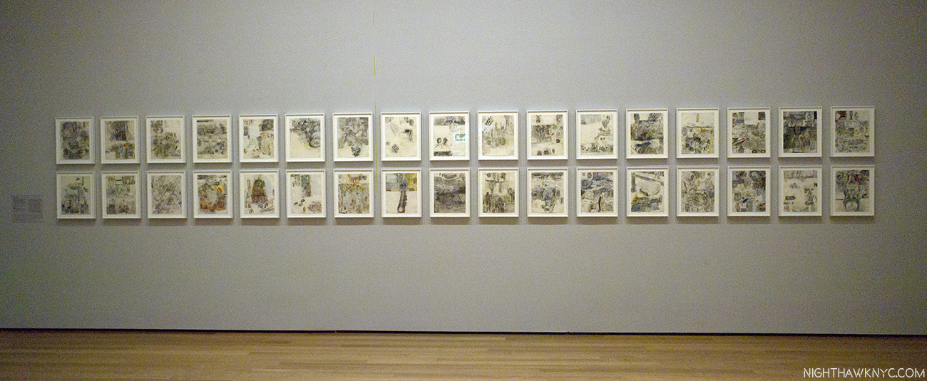
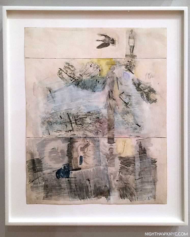
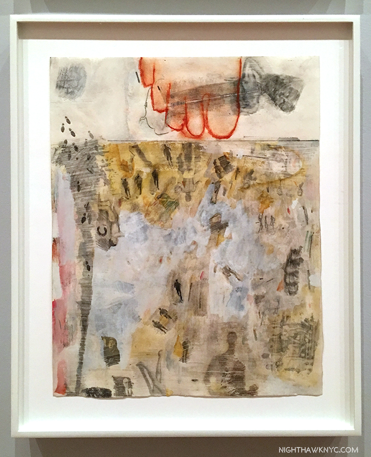
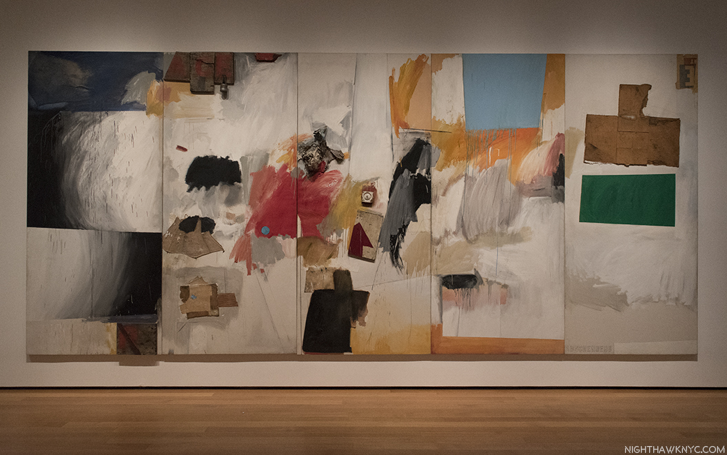
Everyone thought it was a joke, the gallery owner included, at his first show’s debut in Rome. Then, the respected reviewer of a show of work by a 28 year old Artist at its second stop at the Galleria d’Arte Contemporanea in Florence, Italy, called it a “psychological mess.” But, he wasn’t done. After continuing in biting terms, the reviewer concluded that the work should be “thrown into the Arno (River).” Shortly thereafter, the Artist sent the reviewer a note that read, “I took your advice.” Saving five or six works to bring home to NYC, he threw the rest, discreetly, into the Arno, finding a spot where he wouldn’t be caught in the act, and doing so in a manner to prevent their re-surfacing1.

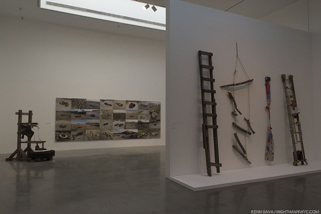
The Artist’s photos of his hanging works called Feticci personal, or Personal fetishes, displayed in his shows in Rome & Florence. One, left, shown hung on a bust. 9 of them shown hanging in a park, right. They seem to have disappeared since. Click any photo to view it full size.

His story continued…as the esteemed Calvin Tomkins tells it…

So branded an “Enfant Terrible,” “he had come back with two wicker trunks and five dollars in cash, and for a while that spring and summer he lived on the far edge of poverty. He found a loft on Fulton Street, near the fish market, a big attic space with twenty-foot ceilings but no heat or running water; the rent was fifteen dollars a month, but he talked the landlord into letting him have it for ten. A hose and bucket in the backyard served as his basin, and he bathed at friend’s apartments, sometimes surreptitiously, asking to use the bathroom and taking a lightning shower at the same time. His food budget was 15 cents a day, usually spent at Riker’s cafeteria, and supplemented by bananas he picked up on the United Fruit Company’s docks. Living that far downtown, he saw few other artists. Most of the New York artists lived in Greenwich Village then, or further uptown, and he could rarely afford the subway fare (still only a dime) to socialize.2” Shortly after, his NYC Dealer was not overly enthused about his latest paintings, so she dropped him.

So…You say you wanna be an Artist? Somehow, as bad as things got, he persevered when few would have.

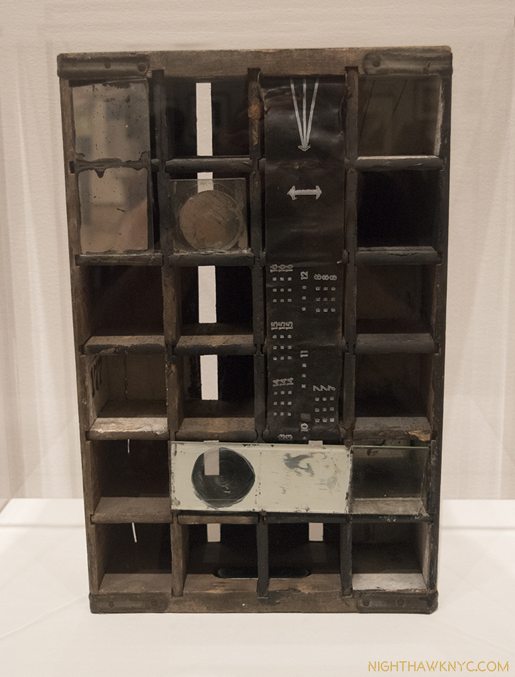
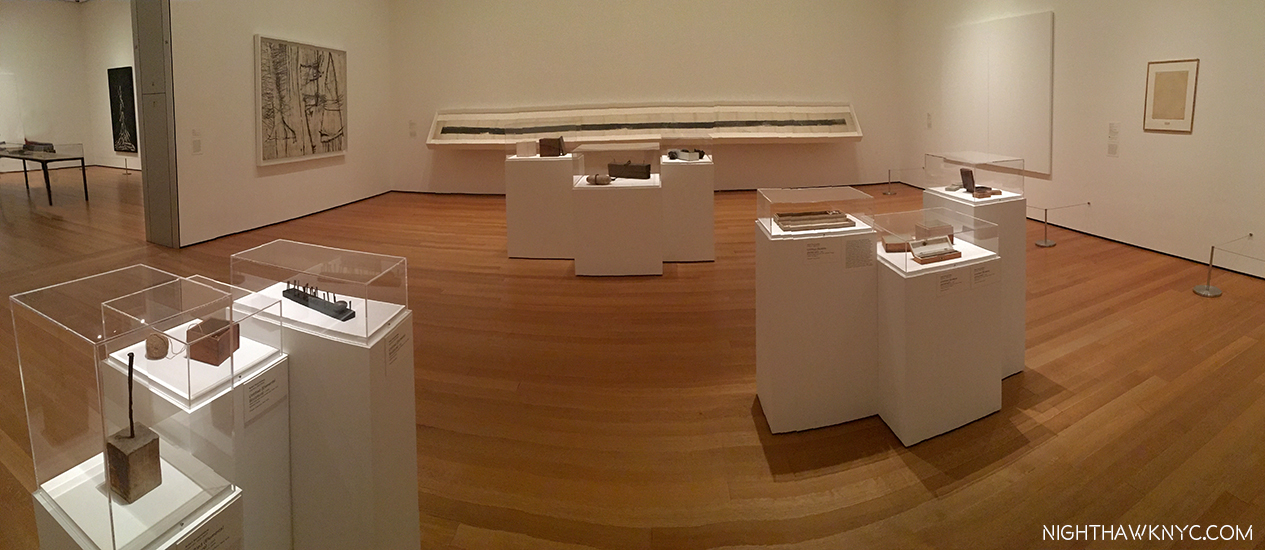
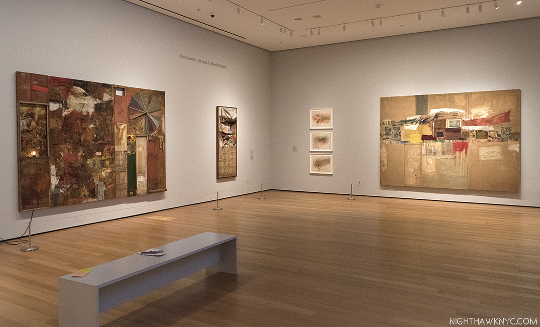
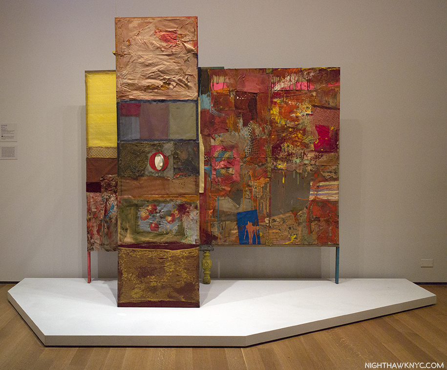
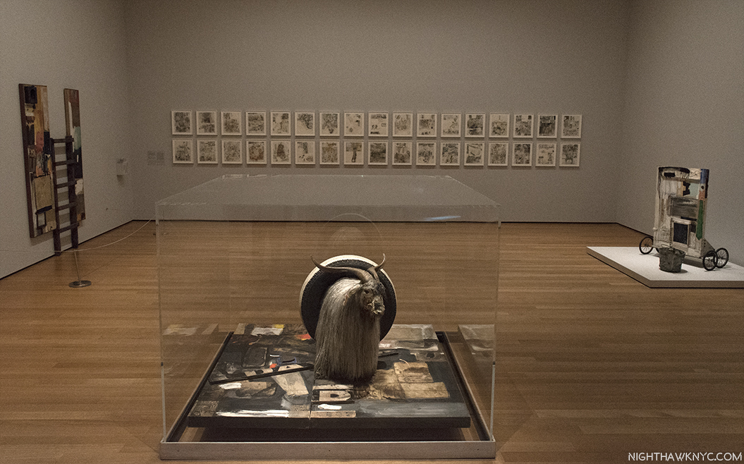
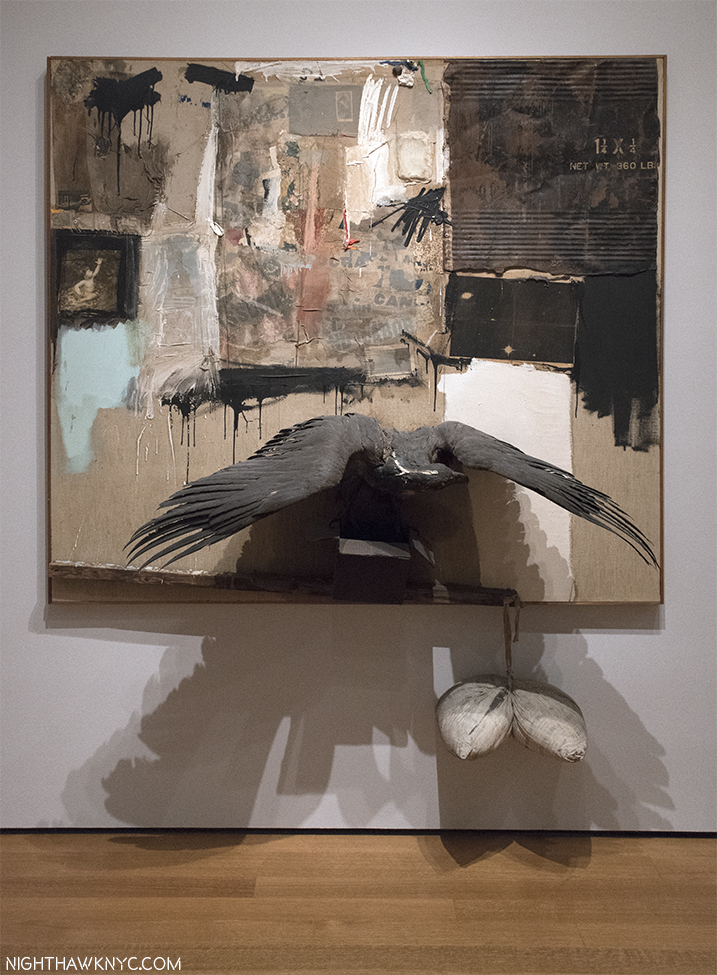
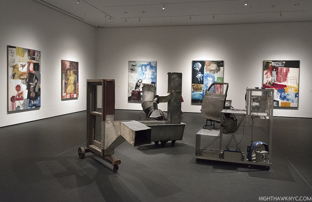
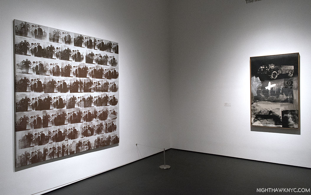
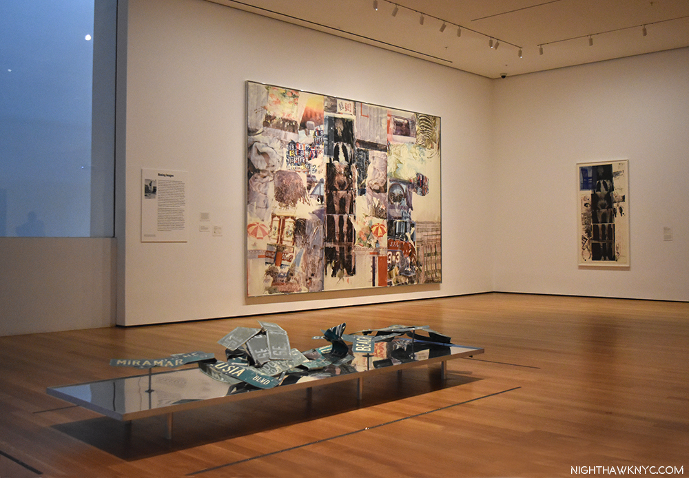
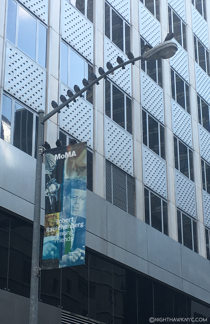
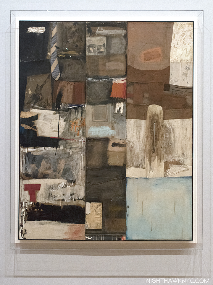
44 years later, in 1997, his work filled Frank Lloyd Wright’s Guggenheim Museum Building, spilled over to fill the Guggenheim Soho (its final show ever), the Ace Gallery downtown, and numerous other satellite shows in galleries around town simultaneously, in what was to my eyes at the time, and my mind since, a monumental and utterly overwhelming Retrospective, an effect not unlike seeing the incomparable Picasso Retrospective, which filled all of  MoMA in 1980, or the Rothko show at the Whitney in 1998. 64 years A.A. (After Arno), as I type, his work fills MoMA’s 4th floor (until September 17). No less than Frank Lloyd’s Wright’s just happens to fill the 3rd floor. Be careful walking by MoMA. With that much American creativity on view, the building might just levitate.

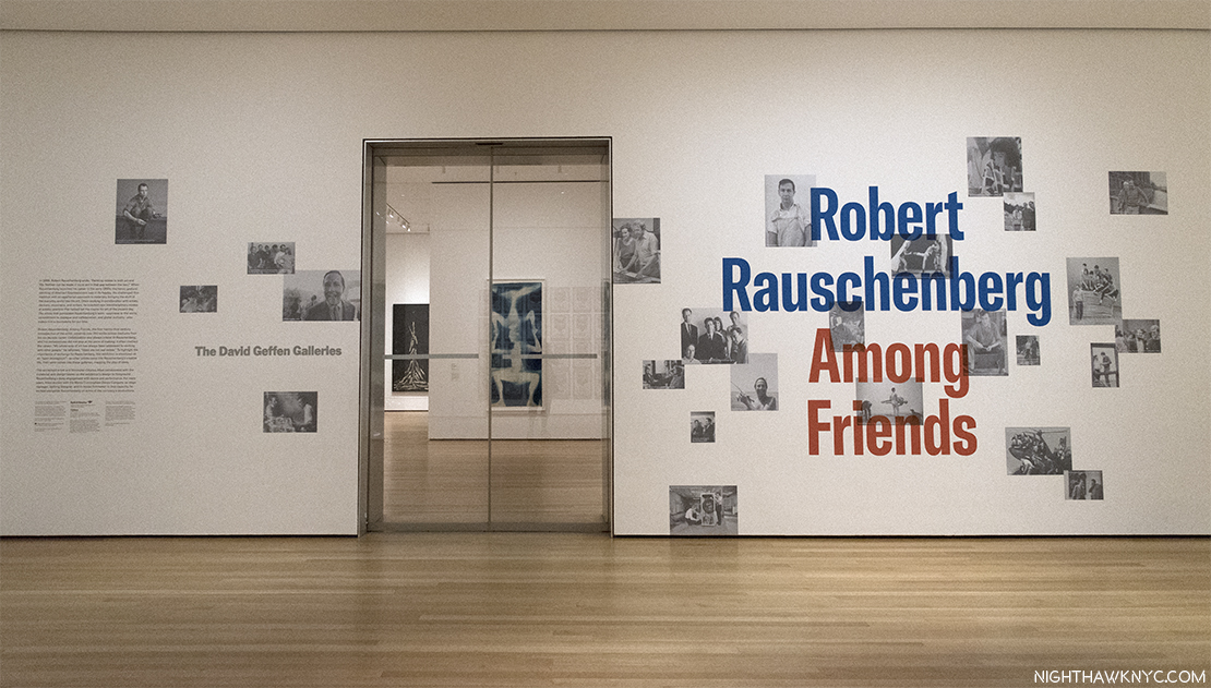
The entrance on MoMA’s 4th Floor.

Speaking about his achievement, Artist, and former partner, Jasper Johns once said he “was the man who in this century had invented the most since Picasso3.” In the Catalog for that Guggenheim Retrospective, Charles F. Stuckey wrote-

“Globally speaking artists and their audiences have been living since around 1950 in what might well be called the Rauschenberg Era (his cap). As we look toward the culture of the next millennium, our vantage is from atop his shoulders4.”

Wait. Stop the march of time for one second. WHO has an “Era?”

Michelangelo and Leonardo share the Renaissance, with Raphael, Titian and a host of other “Old Masters.” Rembrandt & Vermeer are part of the Dutch Golden Age of the 17th Century that includes literally hundreds of Artists still fondly considered almost 400 years on. The Impressionists were a group. So were the Surrealists and the first generation Abstract Expressionists (though Rothko had his own name for it). Perhaps Picasso (who, early on, shared Cubism with Braque and Juan Gris) comes closest, especially in recent times. Well, Picasso is Picasso.

How did Robert Rauschenberg get from being told to throw his work into the Arno, to having an “Era” that’s lasted 50 years (to 2000), and may well still be going on, even though he passed away in 2008? This, and other questions, were foremost on my mind, during the first of 17 visits to MoMA’s 250 work retrospective, Robert Rauschenberg: Among Friends, and half as many to the 4 satellite shows around town, in this “Summer of Rauschenberg,” as I saw a writer call it. The other questions included- Does the show finally make the “case” for his later work? Does it finally make one for him as a major Photographer? First, putting off a look at the other shows, let’s take a look at Robert Rauschenberg: Among Friends. Outside, on the entrance wall, Photos of Rauschenberg & his friends, seen above, reinforce the message that the show features his interactions, mutual influence and collaboration with his friends, many of who happened to be brilliantly talented Artists, themselves. This is the view immediately inside those Star Trekian automatic sliding glass doors. Beam me up, Bobby.

Partial installation view of the first gallery.Untitled (Double Rauschenberg), c.1950, Monoprint; Exposed blueprint paper, a collaboration with Sue Weil, center, White Painting (Seven Panel), 1951, left and Untitled (Black Painting), 1952-3, right, examples of the two bodies of work that were to come shortly after, once Rauschenberg had decided to become a Painter, not a Photographer. The White Paintings would inspire John Cage. Of the Black Paintings, which had newspaper collaged on them, painted over with black paint, he said- “I was interested in getting complexity without their revealing much. In the fact that there is much to see but not much showing. I wanted to show that a painting could have the dignity of not calling attention to itself, that it could only be seen if you really looked at it5.”

Untitled (Black Painting), 1952-3, Oil and newspaper on canvas, affixed to screen door.

The first room contains his earliest work (unlike the 1977 Rauschenberg Retrospective, which came to MoMA, and started with his newest work). On either side of the door, and facing it, are 3 of the Blueprint images he created with Artist, and future ex-wife, Sue Weil in 1950 & 51. They were as attention getting then as they are now, garnering the couple a 3 page spread in Life Magazine in April, 1951, in which they demonstrated their process. To the right, a wall of his early Photographs are collected, mostly done in his days at Black Mountain College, including two that were the first works by Rauschenberg to be acquired by MoMA, in 1952, six years before it would acquire anything else by the Artist.

To the right of the door, a wall of early Photographs, and the Blueprint, Sue, c.1950, make it easy to see why he had a hard time deciding whether to be a Photographer or a Painter. I’m not entirely sure he ever truly chose one.

To the left are his earliest non-photographic works, including his earliest surviving painting, 22 The Lily White, c.1950, one of very few survivors from his very first show at Betty Parsons Gallery in May, 1951.

22 The Lily White, c.1950, Oil and graphite on canvas. The earliest surviving Rauschenberg Painting. The red star mimics those galleries put near sold items. This one didn’t sell. Perhaps viewers thought it had already been sold.

Untitled, 1952, Mirrors and objects in Coca-Cola box. The shape of things to come..Perhaps his first effort at blurring the lines between Painting & Sculpture he would revisit in his “Combines.” Believe it or not, at this point, he had not seen the boxes of Joseph Cornell.

Behind the pillar displaying Double Rauschenberg, is a Seven Panel White Painting, left, and 3 of the Black Paintings, one shown above, which came next. In the center of the space is a vitrine containing, among other artifacts, the original “score” for John Cage’s infamous 4’33, which the “White Paintings,” which Cage was a vocal, and poetic, admirer of, were one of the inspirations for.

The most avant-garde piece of “music” ever “written”. The manuscript John Cage’s 4’33 1952-53,, partly inspired by Rauschenberg’s White Paintings. The cover is seen, left, and the actual “score,” right. Go ahead. Try it at home.

The first “performance” of Cage’s 4’33 consisted of pianist David Tudor walking on stage and sitting at the piano for 4 minutes and 33 seconds. Then, he got up and walked off. It’s hard to imagine a more “avant-garde” piece of “music.” Rauschenberg’s exploration of the possibilities of materials, beyond painting, now took center stage in his work. “He thought of his work as a collaboration with materials, as he put it. He was not interested in expressing his own personality through art- ‘I feel it ought to be be much better than that,6‘”

Dirt Painting (For John Cage), 1953, Dirt and mold in wood box. “Painting” doesn’t get more avant-garde than this (or, his White Paintings.). More on this subject later.

More of the second gallery showing “Elemental Sculptures,” Scatole Personali 0r Personal Boxes, both on pedestals, the Erased de Kooning Drawing, right, another White PaintingTiznit, 1953, Oil on canvas, by Cy Twombly, left corner, and the Automobile Tire Print, with John Cage, 1953, in the back.

At this point, he went to Italy with Cy Twombly, culminating with the shows mentioned at the beginning, after which he returned to NYC. He decided to commence a series of Paintings using red, because white, and then black “impressed  a lot of people as aggressive, ugly, and full of the anger of negation. So, Rauschenberg “thought he had better find out whether there was any truth to these charges. He would test his own motives by turning from black and white to red, for him almost aggressive, the most difficult, the least austere color in the spectrum. [7, “Off the Wall,” P.78]” These are featured in the 3rd gallery, which includes some of his most well-known and influential works.

Charlene, 1954, a “Combine Painting,” and the last Red PaintingBed, and Rebus, both 1955, left to right, with a column of 3 Untitled Drawings, 1954 by Cy Twombly in between.

On the facing wall is Minutiae, 1954, a Combine, created as a set for the Merce Cunningham Dance Company, which Rauschenberg served as set, costume and lighting designer for at the time.

Something happened to Robert Rauschenberg in 1954. A number of writers have tried to explain exactly what it was. I’m not sure I understand. Whatever it was, it led to a breakthrough. He started adding more to his collages, anything was game, he said, as in Bed, 1955, which uses an old comforter since he had run out of canvas. Then, Red went out and was replaced with the the more neutral tones seen in Rebus, 1955. He had been including newspapers in his works going back to the Black Paintings, in 1951-2. At some point, around this time, he also began including photographs- found images from magazines and newspapers, etc.7 As time went on, however, he started incorporating large found objects, including an Angora goat and a Bald eagle, which, of course, grab your attention before you get to any of the details the works also include. Among Friends, is a very rare chance to see the two famous works that feature them, Monogram and Canyon, together. 8

Reinventing Painting, Sculpture & Drawing. Monogram, 1955/59 on loan from the Moderna Museet, Stockholm, front, with Gift for Apollo, 1959, right, Winter Pool, left, both 1959, and 34 Illustrations for Dante’s Inferno, 1958-60, on the far wall. Some of the most revolutionary Art of the past 60 years.

Canyon, 1959, Combine. One of the masterpieces of post WW2 Art. Rauschenberg on the Ganymede myth, with a Bald Eagle standing in for Jupiter’s Eagle, and fascinating to compare with Rembrandt’s Abduction of Ganymede, 1635, down to the inclusion of Rauschenberg’s Photograph of his son Christopher, on the left.

Canyon, 1959, is my personal favorite among his Combines (the word denotes a work that is a “Combination” of Painting and Sculpture, or as Jasper Johns said, “It’s painting playing the game of sculpture9.”) The controversial American Bald eagle’s very strange “pose,” standing on the sides of an open cardboard box, notwithstanding. It audaciously revisits the Ganymede myth, as he was doing in the Dante Illustrations (bringing a contemporary interpretation to an ancient tale) and, creating something of his own mythology, enhanced by the presence of a Rauschenberg Photo of his young son, Christopher (now a Photographer and head of the Rauschenberg Foundation), and including the cardboard box, which would become a staple Rauschenberg material (from the days before acid-free papers, adding to the conservator’s nightmare this works is). It takes the concept he realized in his 34 Illustrations for Dante’s Inferno one step further, into a 3-D Combine. 58 years later, it’s still a thrilling, unique experience, that’s every bit as audacious as it must have been in 1959.

As they hadn’t in Italy in 1953, a sizable amount of the viewing public still didn’t take Rauschenberg seriously by the late 1950’s, and the Combines actually served to reinforce that. Standing near Monogram for 15 minutes on 3 different occasions, I noted the immediate reaction of at least 75% of viewers were smiles, or outright laughs. I don’t know what they wound up thinking of it after taking a closer look. Increasingly “troubled10”  by this reaction 60 years ago, in 1958, he decided to illustrate Dante’s Inferno. To do so would require nearly 3 years. The resulting series of “34 Illustrations,” displayed at the Leo Castelli Gallery in December, 1960, finally served to alter the public, and critical, perception of Rauschenberg. The complete series lines the back wall of this gallery, where they loom as something of a “spiritual center.” For me, their Artistic importance in his entire oeuvre cannot be overstated- so much of what was to follow can be seen in them. Including his use of Photographs, now as independent elements, standing in for many of the characters in the Inferno, in Rauschenberg’s unique, contemporary imaging of the story. I take a closer look at them in the “Highlights” Post, following.

The Combines and Combine Paintings lead us to a “central” gallery containing his classic Silkscreen Paintings of 1962-64, and Oracle, a five-part found object assemblage integrated with technology that he created with engineer Billy Klüver and 4 others between 1962-5. Rauschenberg discovered silkscreening during a 1962 visit to the studio of Andy Warhol, who had been working with the technique since 1961. Silkscreening provided the answer he had long sought- how to transfer images to canvas in good resolution. His Transfer drawing technique only taking him part of the way (though he would continue to use it when he felt it was needed through the years).

Oracle, 1962-65,a five-part assemblage, with wireless microphone system, concealed radios & speakers, washtub with running water, surrounded by 10 of his groundbreaking Silkscreen Paintings, 1962-64

His silkscreens look nothing like Warhol’s, as can be seen below. Especially early on, Warhol took a single image and replicates it and/or varies it, using a grid. While Rauschenberg may repeat the same image up to 4 times in a work (usually varying it), he never allows it to become the central “point” of the work.

Warhol’s Let Us Now Praise Famous Men (Rauschenberg Family), 1962, Silkscreen on canvas, along side Rauschenberg’s early Silkscreen Painting, Crocus, 1962

Rauschenberg’s insatiable creativity led him to move forward, so the period he made these Silkscreen Paintings lasted only from 1962-64. Though he used Abstract Expressionist techniques (his work is characterized by his use of everything & all techniques), they complete his moving beyond the style of Abstract Expressionism, something he began working towards doing in the early 1950’s, to Painting wholly in his own style, and along the way, freeing Art to move on. While these works include some of his own Photographs, the featured images are, primarily still found images. As such, as great as they are, they are another step, an important one, to what his work would eventually become.

Persimmon, 1964, Oil and silkscreen on canvas. There’s much to say about this revolutionary work, but notice the mirror in Ruben’s Venus, which I’ll get to. Interestingly, Ruben’s Venus appears in a number of the silkscreen paintings, and curator Roni Feinstein noted they seem to be a female counterpart to JFK, who appears many times.

After becoming the first American to ever win the grand prize in Painting at the 1964 Venice Biennale, he would soon largely stop painting and turn his focus to performances, and the marrying of Art & Technology.

Scaling the heights of Art. Rauschenberg performing in his Elgin Tie, in 1964 in Stockholm. From the Hardcover edition of the show’s excellent catalog.

The latter took place in both stand alone works, and in performances, particularly “9 Evenings,” which is marvelously explored here11, and includes Rauschenberg’s contribution, Open Score. (See my look at Early Networks in Part 3 of this series, here.) The massive Mud Muse, which I’ve seen described as an experience akin to a visit to Yellowstone, is one stand alone work that is certainly popular with younger viewers. A monumental feat of installation considering the work holds 8,000 pounds of “listening” Bentonite mud,  with embedded sensors that cause the mud to react with the music being played on the control unit nearby. On loan from the Moderna Museet, Sweden, it’s one of the most ambitious and technologically complex works Rauschenberg ever made, and is making its first NYC appearance since Rauschenberg completed it here in 1971.

Now, I’ve seen everything. Mud Muse, 1968-71, 8,000 pounds of Bentonite mixed with water, in action.

From there, the show moves through his Cardboards (sculptures made from found cardboard boxes), the famous Son Aqua (Venetian), 1973, with its water filled bathtub, and works inspired by trips to India, before getting to the penultimate, large gallery of later works.

Sor Aqua (Venetian), 1973, Water-filled bathtub, rope, metal, wood and glass jug. Rauschenberg continued to use found objects, like these, his entire career, even after he could afford traditional supplies. “Gifts from the Street,” he called them. After a while of looking at this, it hit me- There’s no drain in the bathtub. Maybe that’s why its owner threw it out, to become a Rauschenberg found object. A guard told me he called the metal on wood structure above, “The Angel.”

The large gallery of later works includes Hiccups, 1978, the horizontal rows, left & right, joined by zippers,Glacial Decoy, the collaboration with Trisha Brown (black and white photos, left), Triathlon, 2005, from Scenarios, the color painting, left of center, the latest work here, and For A Friend And Crazy Kat (Spread), 1976, along with a few examples from his Gluts series of found metal objects & signs. I will long wonder about what was omitted from this gallery.

The large gallery of later work, above, includes a very wide range of pieces that attest to some of the incredibly wide range of materials and styles Rauschenberg worked in. It highlights the fact that he continued to use found materials even when he could well afford art store materials. This was one of his ways of bringing “life” into his work, which he felt was essential in Art. Though not nearly as well known as the earlier periods of his work, there are a number of major works on view here, too. To my eyes, Mirthday Man, from his Anagrams series, Inkjet dye and pigment transfer on polylaminate (center, on the wall in the photo below), created on the Artist’s 72nd Birthday, in 1997, is one. Booster, a print from 1967, to its right, is as well.

Urban Katydid, (Glut), 1987, Riveted street signs on stainless steel,, front, Mirthday Man, 1997, Inkjet dye & pigment transfer created on his 72nd Birthday, center, and Booster, 1967, Lithograph & screen print, right, end the gallery of late works. The latter two feature almost life size X-rays of Rauschenberg. Both are among his major works in my opinion.

Partially seen in the last gallery photo, on the back wall to the left, and below, are black & white photos that form the backdrop for Rauschenberg’s collaboration with the late Trisha Brown called Glacial Decoy, 1979, in an installation by Charles Atlas, who worked with Rauschenberg. The piece comes closest to showing Rauschenberg’s later Photography, cleverly getting 620 examples of it in the show, though the images move one space from left to right every 4 seconds. The smaller color screen hanging in front shows video of a performance of the work from 2009 at BAM. All the way around, this is a terrific work, though if you want to focus on the Photos, you have 16 seconds to ponder each one before it disappears. The performance is, also, amazing. The installation? I’m not so sure. Sitting directly in front of the transparent hanging color screen, it’s a bit hard to make out everything that’s going on onstage since the large black and white photos on the back wall shine through. Though they are in the same sequence as they  are in the background of the performance, they’re in a different scale and so it serves to make it hard to see the screen. The resulting effect is somewhat strange. I found it better to see, standing quite a bit off to the side, as below.

Glacial Decoy, 1979, with 620 Photographs that scroll from left to right in 4 second segments & costumes by Rauschenberg, choreography by Trisha Brown. Interestingly installed by Charles Atlas, who worked with Rauschenberg.

The view directly in front of Glacial Decoy. The background of the on-screen performance is synched to the large Photos on the back wall, but they’re in a different scale, and they are both moving to the right every 4 seconds.

As with his fondness for found objects and Photography, Rauschenberg continued to refine and develop his techniques from the beginning to the end, as we see in Holiday Ruse (Night Shade), 1991, a captivating work, which has a look that seems to harken back to his “Black Paintings” (like Untitled (Black Painting), 1952-3, shown near the beginning), bringing them full-circle, with black images layered under black paint requiring a very close look to make them out.

Holiday Ruse (Night Shade), 1991, Screenprint chemical-resistant varnish, water and Aluma-Black

Also noteworthy, among the Gluts, works made of found street signs and other metal objects, Mercury Zero Summer (Glut), 1987, an electric fan with metal “wing,” an ecology-themed work, stood out. Finally, Triathlon (Scenario) 2005, Inkjet pigment transfer on polylaminate, from one of his final series, Scenarios, immediately “looks different,” than all that’s come before, with each of its Photos given their own place, and not being layered as earlier, with added prominence intriguingly given to white space, the overall effect is striking. Finally, Photos, in stunning clarity, stand to speak on their own as “characters” in the whole. The three images of the hand with the sphere, left, remind me of the repeated/slightly altered birds in Overdrive, and other Silkscreen Paintings, and masterfully unify the composition horizontally. Interestingly, since his right (Painting & Photographing) hand had been paralyzed in a stroke a few years earlier, and he could no longer take Photos, he had to, again, use the Photos of others (possibly under his direction at times), as he had done when he first started to use Photos, in the 1950’s.

Triathlon (Scenario), 2005, from 3 years before his passing is the latest work in the show.

The show concludes with a room dedicated to R.O.C.I., the Rauschenberg Overseas Culture Interchange, “a tangible expression of Rauschenberg’s long-term commitment to human rights and to the freedom of artistic expression,12,” a self-funded collaboration with Artists in 10 countries that Rauschenberg was extremely dedicated to, even mortgaging his homes, and selling his vaunted Art collection to fund. Rauschenberg took the term “action painting,” first coined to describe the technique of abstract expressionists Jackson Pollock, and others, literally. For him, it meant ethical action, as well. Thist took many forms during his career. As Barbara Rose said about him, he was “among the last artists to believe that art can change the world.13

The final gallery contains 12 Posters for R.O.C.I.- the Rauschenberg Overseas Culture Interchange, 1985-91, along with 3 videos shot in Mexico, Cuba and China. 10 countries are represented here.

Though work by Rauschenberg has been in 152 shows at the Museum, only ONCE before has MoMA presented a retrospective of his work- FORTY years ago, in 1977. That show originated at the National Collection of Fine Arts (associated with the Smithsonian) and was curated by its Walter Hopps. Among Friends, is co-produced by MoMA and the Tate Modern, London, where it appeared under the title Robert Rauschenberg. So, this is the FIRST large show devoted to Rauschenberg that MoMA has been credited with creating. In fact, of those 152 shows I mentioned, only 4 had his name in the title- this is number five14. For someone so important and influential, I find this most puzzling. In fact, it’s only been fairly recently that MoMA has begun to fill in some of the substantial gaps in their Rauschenberg holdings, acquiring Rebus, one of his most important Combine Paintings, Canyon, in 2012, one of the most important Combines, and the now classic Silkscreen Painting, Overdrive, 1963, (seen in far left in the photo of the Silkscreen Paintings with Oracle, above) in 2013.

Rebus, 1955, Combine painting. The info label says its a “promised gift,” but Calvin Tomkins says MoMA paid 30 million dollars for it. (Off the Wall, P.282) This would be most interesting as MoMA’s Alfred Barr was offered Rebus in 1963 but he declined. (ibid.).

My reaction to Among Friends was tinged with a bit of disappointment- Though the early galleries, up through the Mud Muse/’9 Evenings,” 1965, are extraordinary. Stories abounded of curators bringing in “people who were there” to recreate how works had been originally displayed, complimenting major loans, like Charlene, Monogram, among many more. After 1965, I felt the show “thinned out.” The huge, penultimate gallery of his late works (a period I believe is very under-appreciated), left me wondering why it had so much empty space. In fact, I can’t quite recall seeing anything like it in a major show. Part of the reason is Among Friends attempts to integrate larger videos of performances right in the show, as opposed to having separate rooms for them (as MoMA did with Bruce Conner: It’s All True, last year). The spot chosen for Glacial Decoy’s installation left a large corner completely dark and empty. As nice as it is to see all of Hiccups, 1978, a beautiful work consisting of 97 solvent transfers (an “update of his “Transfer Technique”) on paper panels held together by zippers, so it can be endlessly rearranged. (Rauschenberg may have employed his mother, Dora, to attach the zippers, David White told me.) Taking up the better part of 2 long walls, I was left feeling that space could have been put to better use, and Hiccups displayed in another manner, as it has been in the past.

Another view of the later works gallery shows a lot of open floor space, and on the middle right, behind Charles Atlas hanging video screen for Glacial Decoy, which is in the center of the room, a dark, empty corner. An interesting installation, I’m not sure was entirely successful, but should it have been mounted elsewhere?

Rauschenberg, perhaps more than any other Artist, established what it was to be an American Artist around the world, continually going seemingly everywhere, beginning in the early 1950’s, but his travel during his later years is not mentioned in the later works gallery, including his trip to China in 1982, where he collaborated with local paper makers, and others, the trip resulting in a typically large creative output, entirely absent here. That’s one example. The travel thread is picked up in the next, and final, R.O.C.I. gallery.

Whereas the show to this point had been chronological, this room is a bit all over the map, with works ranging from 1967-2005 on view. With the only large placard, the show uses to give context, next to Mirthday Man, one of the last works in the show all the way on the other side of the gallery, visitors here were left a bit hanging about what was going on in Rauschenberg’s Art and the path its development was taking, which its non-chronological display didn’t help. It’s a bit of a shame. While what’s included in this gallery may serve to pique the interest of viewers to investigate it further, the overall result, I feel, is a “sketch” of what the Artist created, achieved and accomplished in this period. The result is the show feels like it progressively winds down in the later galleries, and ends on somewhat “quiet” notes. A chance to shine new light on Rauschenberg’s late period was, I feel, missed. It should be noted that, not unlike Picasso, Rauschenberg’s later works have been largely overlooked by the Art world to this point, save for a few gallery shows (including this one I wrote about in 2015)15. (Though, they have not been overlooked by Artists.) So, the other possibility is, of course, that the show’s curators do not feel the rest of his later work is important enough to be here.

With the catalog for the 1997 Guggenheim Retrospective, one of the greatest shows I’ve ever seen, listing 480 items, almost double the amount here, I prefer to think of this show as an “overview,” being as it wonderfully selects key works from key periods through 1965. With an Artist as prolific as Rauschenberg was (Calvin Tomkins says he created over 6,000 works by 2005, not counting multiples), it’s probably not likely a full retrospective is even possible. But? I would LOVE for someone to try!

Still, Among Friends is, caveats aside, important in its own right because it does include so many works created at key moments in his career, and because it shines a light on the importance to his work, and accomplishment, of collaboration- with other Artists, Engineers & Performers, and with the materials he was working with16 It also allows a very rare chance to see, and experience, rarely seen works involving technology (collaborations with engineers), putting OracleMud Muse, and “9 Evenings” front and center, each one a major feat of museum installation. Alas, it, also leaves, until another day, a complete assessment of both his late period and his Photography (i.e. the body of Photographs he created). Regardless of what isn’t here, a careful examination of what does comprise the 250 works in Among Friends reveals there is no doubt whatsoever that this is an important show, a major event in Rauschenberg scholarship and appreciation, and one of the best shows of 2017.

In the early 2000’s, Rauschenberg suffered a stroke which paralyzed his right (Painting & Photography) arm. Nonetheless, he continued creating, having others take the photos, and signing his works, with difficulty, with his left hand, as here, on Triathlon, 2005, from Scenarios, one of his last series.

Speaking of friends and collaborators, another question lingers with me- As Among Friends beautifully details, Rauschenberg was friends early on with John Cage, Merce Cunningham, Morton Feldman, among others, who were among the most avant-garde creators of the 20th Century. HOW was it possible that Robert Rauschenberg, alone among them, escaped the “avant-garde ghetto” to achieve both fame and fortune, while holding on to his integrity? I well remember when avant-garde composer Pierre Boulez was named Musical Director of the New York Philharmonic, succeeding no less than Leonard Bernstein, and how audiences voted with their feet and voices in displeasure when he performed a modern & contemporary work, as you can plainly hear on recordings of the Philharmonic broadcasts at the time. Rauschenberg, as I mentioned earlier, was actually an inspiration for the most avant-garde work of music ever “written”- John Cage’s 4’33,” 65 years later, Cage is highly respected, but, still his music is sparsely performed. Among his other friends, Morton Feldman (a major composer who remains under-known, and who Rauschenberg gave his first public performance at one of his early shows), is a cult figure who shows signs of becoming more. Even Pierre Boulez, who passed last year, is, mostly, remembered for creating the most “definitive” body of recordings of 20th Century music we have thus far, while his own music is still sparsely performed. Meanwhile…during all of this, Robert Rauschenberg had, or has, an “Era,” and had a long career that was marked with a good deal of success, however you’d care to define it, including financial. Given the “edginess” of much of his work, a fair percentage of its components coming from the trash, and not art supply stores, I find it absolutely remarkable.

How was Rauschenberg able to avoid the “Avant-garde ghetto?” Walking through the show, I think it is possible to “experience” the answer. As Among Friends highlights, collaboration may well have been key to his success. Beyond collaborating with so many gifted Artists, across realms, and collaborating with his materials, as Calvin Tomkins said- “All his work, Rauschenberg increasingly felt, was a form of collaboration with materials. He wanted to work with them, rather than to have them work for him17.”

There is more. One of his most famous quotes is “Painting relates to both art and life. Neither can be made (I try to act in the gap between the two)18.” That gap also includes life being lived now…i.e. the viewer’s experience.

Have a seat. (No, Don’t!) Rauschenberg understood that his ultimate collaboration was with his viewers. He continually strove to bring them in to his works. Pilgrim, 1960, Combine Painting.

Rauschenberg’s most important collaboration may be with his viewers. He never forgot the experience of the viewer, something, it seems to me, most other avant-gardists of the period seemed to ignore, if not take a polar opposite approach to. Therein may lie the key. As one of them, John Cage, himself, wrote in Silence, “The real purpose of art was not the creation of masterpieces for the delectation of an elite class, but rather a perpetual process of discovery, which everyone could participate19.” It seems to me that this, as much as anything else, was at the heart of Rauschenberg’s approach during his entire career. As he said, “I don’t want a painting to be just an expression of my personality. I feel it ought to be much better than that20.” What’s “better than that?” He said that he wanted to create a situation  “in which there was as much room for the viewer as for the artist21.” This collaboration  takes an exceedingly wide range of forms. The “White Paintings” were intended to allow the shadows of viewers, and the atmosphere of the room to be “reflected” on their surfaces. Numerous other works, from  Charlene, in 1954, right through the late “Gluts” have reflective mirrors or surfaces that reflect whatever is in front to it, even the viewer themselves. This goes way back to the mirrors in the upper left corner of Untitled, 1952, pictured early on. And, in Persimmon, Ruben’s Venus holds a mirror so she can look out at us, though her back is turned.  Once you look for ways that Rauschenberg includes the viewer in his work, you’ll see it more and more- throughout his career. Like that welcoming chair in Pilgrim, 1960, above. But, don’t really sit in it. You know…

Another thing that becomes apparent- The more work of Robert Rauschenberg’s I look at, one thing strikes me above all others- While I loathe comparisons of anyone creative, I don’t think I’ve ever seen any Artist with a better “eye” than Robert Rauschenberg. “I have a peculiar kind of focus,” he once told an interviewer. “I tend to see everything in sight22.” He was, also, one of the most creative people I’ve ever come across. He broke all the rules, and used that eye to create his own world out of ours.

Collaboration with his viewers, itself, led to more. Some of those viewers became Artists, themselves. From what I see in the shows I attend, and have attended, particularly over the past 15 years, I would say we are still in the “Rauschenberg Era.” His influence is all around. “Bob is the wind, blowing through the art world for almost a century now, pollinating everything,” Arne Glimcher, founder of Pace Gallery said in the BBC Documentary “Robert Rauschenberg: Pop Art Pioneer.”

Regardless whether you think we are still in the “Rauschenberg Era,” or not, one thing strikes me as undeniable- Nearly 10 years after his 2008 passing, the full assessment of the achievement of Robert Rauschenberg is no where near finished. Among Friends is another piece, one that will be long rememeberd, towards that end.

*- The soundtrack for this Post is “Moon Rocks,” by Talking Heads, from Speaking in Tongues, 1983, which Robert Rauschenberg did the artwork for the limited edition release of, seen below. Another classic collaboration. NASA invited Rauschenberg to witness the launch of Apollo 11, in July, 1969.

Robert Rauschenberg’s Cover for the limited edition of Talking Heads’ Speaking in Tongues. No, it wasn’t in Among Friends, but it is in my collection.

“Robert Rauschenberg: Among Friends” is my NoteWorthy Show for August. 

A second Post, which follows below, looks at highlights from Among Friends. Between the satellite shows- Robert Rauschenberg: Rookery Mounds, and Selected Series from the 60s & 70s, at Gemini G.E.L. at Joni Moisant Weyl Gallery, Robert Rauschenberg: Early Networks at Alden Projects, Robert Rauschenberg: Outside the Box, at Jim Kempner Fine Art, and Susan Weil at Sundaram Tagore Gallery, there were, also, many highlights. The third Post, further below, focuses on them. 

January 8, 2018-All three Posts are dedicated to the memory of my friend, the late Artist Tim Rollins. Tim and I spoke about and compared notes on these shows both of the last two times I saw him. He told me that he knew Rauschenberg, and he agreed to give me a quote about Rauschenberg for this series. But, I never got around to getting one from him. R.I.P., my friend. I hope you like them.

“On The Fence, #10, The Rausch-and-Bird Edition.” (Sorry, Bob.)

NighthawkNYC.com has been entirely self-funded and ad-free for over 6 years, during which over 250 full length pieces have been published. If you’ve found it worthwhile, you can donate to keep it going & ad-free below. Thank you!

Written & photographed by Kenn Sava for nighthawknyc.com unless otherwise credited.
To send comments, thoughts, feedback or propositions click here.
Click the white box on the upper right for the archives or to search them.
For “short takes” and additional pictures, follow @nighthawk_nyc on Instagram.

Subscribe to be notified of new Posts below. Your information will be used for no other purpose.


  1. The story in this section is excerpted and paraphrased from Robert Rauschenberg’s work, Autobiography, and from Calvin Tomkins’ excellent biography of Robert Rauschenberg, Off The Wall, 2005, P. 72-4.
  2. “Off the Wall,” P.76
  3. Paul Schimmel Robert Rauschenberg: Combines, P.9
  4. Charles F. Stuckey in Robert Rauschenberg: A Retrospective, Guggenheim Museum, 1997, P. 31
  5. Tomkins Off The Wall, P.65
  6. Calvin Tomkins- “Master of Invention,” The New Yorker, Oct 13, 1997 P.92
  7. the Combine, Untitled, ca.1954, not in the show is the earliest work I’ve seen this in so far.
  8. MoMA had a chance to acquire Monogram early on, but Alfred Barr passed, fearing it might harbor vermin, among other reasons. Off the Wall, P. 282.
  9.  Everything In Sight,” Calvin Tomkins, The New Yorker, May 23, 2005
  10. Off the Wall, P.143
  11. and it’s also wonderfully displayed in Robert Rauschenberg: Early Networks at Alden Projects
  12. raushcenbergfoundation.org
  13. Barbara Rose, Rauschenberg, P.4
  14. Two of the those featured the 34 Illustrations for Dante’s Inferno as a set, in 1966 and 1988, the other featured his work Soundings, in 1969.
  15. To this point, the best overview of the later period works I’ve seen is in the Guggenheim Retrospective Catalog, one of the greatest exhibition catalogs- for any show, ever produced. The caveat to that is that when it was published in 1997, he would still work for a further 11 years.
  16. Guggenheim Retrospective Catalog, P.36-7.
  17. Tomkins in Off The Wall, P.79
  18. Rauschenberg’s statement in 16 Americans, MoMA Exhibition Catalog, 1959
  19. Off The Wall, P.62
  20. Off The Wall, P.66
  21. Off The Wall, P.xv
  22. “Dore Ashton, Art News, Summer, 1958, quoted in “Off The Wall,” P.8

Highlights From Rauschenberg At MoMA

Written & Photographed by Kenn Sava (*unless otherwise credited)

They flew in from all over for this one. Click any image for full size.

With upwards of 300 works by Robert Rauschenberg on view over 4 shows of his work, and a show of work by early collaborator and ex-wife, Susan Weil, there was too much that lingers in the mind to fit into one Post. My overview of MoMA’s Among Friends is above (here). Part 3, below (or here), looks at the 4 “satellite” shows going on around town. This Post will feature some works that struck me as important, both in terms of Art, and in terms of Rauschenberg’s Art, at Robert Rauschenberg: Among Friends, at MoMA.

Helado Negro,” with Roberto Carlos Lange, and…? outside in MoMA’s Sculpture Garden on August 31 are hoping there’s no lightning. No, Rauschenberg didn’t design those costumes. I headed upstairs to see what he did create after taking this.

Even on my 17th trip to the show, as with most great Art, I saw something new, and wondered how I missed it before. I’ll explain below. Apparently, I’m not the only one this happens to. In 1961, John Cage wrote this about looking at Rauschenberg. “Over and over again I’ve found it impossible to memorize Rauschenberg’s paintings. I keep asking, “Have you changed it?’ And then noticing while I’m looking it changes1.” His friend, Marcel Duchamp, once said about Paintings- “A painting had an active life of about 30 years; after that it died- visually, emotionally and spiritually2.” Try as I might, I don’t see that at all in Rauschenberg’s work. While I do see an evolution of styles, over the years,  a good deal of it looks like it could have been made this past month. Also, Mr. Rauschenberg’s career not only lasted over 60 years, he was one of the most prolific Artists of our time. Not having seen everything he did, it’s a given that some/many works I previously hadn’t known will seem revelatory. I can’t remember ever feeling, “That’s dated.” Discovery was the joy of these 5 shows for me (and, in looking at Art, in general). And, it was also a very rare chance to see works housed in distant collections, galleries and museums. Still, it was very hard to narrow down the works to those in this Post.

Sue, ca.1950, with Susan Weil, Exposed blueprint paper.

Sue, ca.1950, with Susan Weil, the first work in the show, continuously captivated viewers, as it has for over 65 years. Created with his first collaborator, later his wife and mother of his son, Christopher, and eventually his ex-wife. Early on, they used blueprint paper to create one of a kind works, where the subject would lie on the paper, while the Artist moved over them with a lamp exposing the paper and recording the image. The pair then moved to the bathroom they shared with others to fix the image in the shower. Unique and beautiful, it’s an early example of Rauschenberg’s love of found objects, as they got the paper for free because it came from rolls that had been partially exposed. The works quickly found an audience, being the subject of a 1951 Life magazine photo spread detailing their process, and even resulting in their inclusion in a 1951 MoMA show called Abstraction in Photography. Rauschenberg went on to passionately explore Photography, and Painting, before deciding to be a Painter. Susan Weil is still creating and her show at Sundaram Tagore Gallery this summer will be part of the next Post.

Monogram, 1955-59, Multi-media. Fascinating. From any angle.

Monogram, 1955-59, seen at MoMA, from the Moderna Museet, Stockholm. Ok. It’s famous. Everyone’s seen Photos of it. Seeing it in person is an entirely different animal. An animal that’s rarely seen on this side of the pond. It was last seen here 12 years ago at The Met’s excellent 2005 Rauschenberg Combines show. What made it even more special was it being displayed at MoMA near two survivors of the earlier “states” of the work, as Rauschenberg tried to find the ideal composition in which to incorporate the Angora goat he bought from a second hand store for 35 dollars. He put 15 dollars down on it, and according to Calvin Tomkins, intended “to go back and pay the balance, one day3.” The chance to imagine Rhyme, 1956, and the central panel of Summerstorm, 1959, as part of the work shows he made the right choice, though both are interesting on their own- particularly the inclusion of an image of animals at pasture near the top of that center panel of Summerstorm.

Rhyme, 1956, Combine Painting. In the first state of Monogram,”the goat was mounted right above the red circle. At that point, there was another part of it that extended higher from there.

Summerstorm, 1959. Originally, in the second state of Monogram, its center panel stood in back of the Goat. Later, it was reworked and became a part of this. Yes, that’s a zipper in the middle of the right side.

On my 17th visit I finally noticed this! Near the top of Summerstorm’s central panel, there’s a small image of animals grazing. Rauschenberg went from grazing animals in the second state of Monogram, to his Angora goat “grazing” on Art in the final work.

Then, I used this rare opportunity to study the Combine Painting the goat is mounted on, which is hard to do from photos of it in most books. Each angle of the base reveals new details- the sleeve of a white shirt, to the left of the Goat’s head, a heel from a shoe, part of signs that just can’t quite be pieced together into a word, images of a man looking up, astronauts (a new thing in the world beyond science fiction in 1959), and three small human footprints.

So, how does it feel to be an icon of Modern & Contemporary art? Rauschenberg added the paint on the face to cover damage.

Rolling down his sleeves and walking the high wire of Art. The view of the left front corner as seen from the left side.

View of the center back. Interesting placement of that tennis ball, right under the rump of the Goat, where it can be “read” as leaving a comment on Art. Also notice the two helmeted figures to the right that could possibly be astronauts.

Another thing about seeing Monogram in MoMA- It’s hard not to wonder about the possible influence Picasso’s famous She-Goat may have had on it. Created in 1950, out of found materials, it appeared in the May, 1953 Magazine of Art, which makes it possible Rauschenberg could have seen it. Also coincidentally, one of the two bronze casts Picasso subsequently made of it were acquired by MoMA in 1959, the year Rauschenberg decided to mount his on top of the Combine Painting it rests on to this day.

Pregnant with possibilities. Picasso’s (expectant) She-Goat, 1950, cast 1952 as seen outside in MoMA’s Sculpture Garden. Picasso’s original, coincidentally, was made of found objects, and now grazes in the Musee Picasso.

Ok. What does it “mean?” The goat was worshipped by the Ancient Egyptians, where the horns represented Gods & Goddesses, while also symbolizing fertility. In mythology the he-goat was Pan. The goat became the symbol of satanism. Take your pick there. “Animal energy” people say that the goat represents independence, stubbornness, a wild nature, and sexuality4. This last resonates with me. While I don’t know what was on Rauschenberg’s mind when he created it, reading what I have about his personality, journey and perseverance, the “independence” and “stubbornness” parts fit. The “wild nature” fits Rauschenberg’s work to this point as he broke every law of Painting, Sculpture, and Art he could. Beyond that, the best comments on Monogram I’ve seen thus far comes from critic Jerry Saltz who said, “Allegorically, Rauschenberg is a bull in the china shop of art history, a satyr squeezing through the eye of an esthetic/erotic needle. In early Christian art goats symbolized the damned. This is exactly what Rauschenberg was as a gay/bisexual man and an artist, at the time. “Monogram” is Rauschenberg’s credo, a line drawn in the psychic sands of American sexual and cultural values. It is a love letter, a death threat, and a ransom note. It is Rauschenberg carving his monogram into art history5.” As for that “eye of the needle,” the famous tire, Mary Lynn Kotz, a Rauschenberg biographer, points out that the tire is made of rubber, which is made from crude oil, which Port Arthur, Texas, where Rauschenberg was born and raised, was known for6. (If you’re wondering about Rauschenberg’s use of taxidermied animals in his work, he speaks about it here.) Finally, on page 17 of Rauschenberg’s book Photos In +  Out City Limits New York C. there’s a photo of what could be an East Village, or Lower East Side bar (given the beer sign in the window). Gina Guy of the Rauschenberg Foundation told me that “Bob didn’t title Photographs, he simply located them,” so this one is “titled”  New York City, and was taken in 1981. Intriguingly, it includes a fire hydrant with a tire wrapped around it.

New York City, 1981

34 Illustrations for Dante’s Inferno, 1958-60, seen at MoMA. For me, these are the key works in his Artistic evolution. Besides the new ground they break on their own, I believe it’s possible to see in them much of what came after in his work. Though Dante’s “Divine Comedy” has been illustrated by many Artists down through the centuries (including William Blake, Gustave Dore, Botticelli and Salvador Dali), Rauschenberg was the first to stage the 14th century classic in modern times. Here, he begins to incorporate Photographs culled from magazines and newspapers, not in collage, but by using the “Transfer Drawing” technique he had developed a few years earlier on a trip to Cuba. It’s a technique where an image is soaked with lighter fluid, placed face down on a piece of Strathmore 14.5 x 11.5 inch Drawing paper, and then rubbed with an empty ballpoint pen, which enabled him to get a shadowy copy of the Photo on to his paper, that he then enhanced using a variety of techniques. Rauschenberg described the end results as “Combine Drawings7.”He created them because he was feeling “increasingly troubled by those who saw his work as a joke8.” “The problem when I started the Dante illustrations was to see if I was working abstractly (previously) because I couldn’t work any other way or whether I was doing it by choice,” the artist explained to Dorothy Gees Seckler. “So I insisted on the challenge of being restricted by a particular subject where it meant that I’ve have to be involved in symbolism… Well, I spent 2 1/2 years deciding that, yes, I could do that9.”

Rauschenberg’s 34 Illustrations for Dante’s Inferno, 1958-60, Transfer drawing on paper, foreshadow much of what was to come. They are rarely seen as a group.

What he created was a way of bringing Dante’s tale of a man “midway in the journey of our life,” into the 20th century, using images he found in newspapers and magazines. They include contemporary figures, (including JFK and Adlai Stevenson), current events, and possibly, gay love. Rauschenberg cloistered himself for the better part of 3 years studying John Ciardi’s “Inferno” translation, communing with the muse, and crafting his remarkable, unique “Illustrations.” The entire set being on view was a highlight of Among Friends10. In the gallery where they were displayed, as I showed in the last Post, they were accompanied by other works with mythological references, including Canyon.

The narrator, Dante himself, is represented by a man with just a towel wrapped around his waist, which Rauschenberg found in an ad in Sports Illustrated for golf clubs. The narrator was 35. Rauschenberg turned 35 on October 22, 1960.

34 Illustrations for Dante’s Inferno, Canto II: The Descent, 1958, Transfer drawing on paper. Our hero, Dante, is at the top, slightly to the right, with a towel around his waist. Interestingly, many of the Illustrations are done in three sections, giving a feeling of being on a journey, and a reminder of the three levels of the afterlife, each given a volume in Dante’s Divine Comedy, The Inferno, being Volume 1..

Halfway through, he began to struggle with certain aspects of Dante’s narration. He decided he needed to work away from the distractions of NYC in the isolation he found in a storage room on Treasure Island, Florida, where he spent 6 months completing the set. “I was so irritated by his morality-the self-righteousness, the self-appointed conscience imposing guilt on old friends. He was the hero and the author….I wanted to show Dante the character in the story, and that forced me into isolation11.” Particularly troublesome for the Artist was reading Cantos XIV and XV, where Dante and his guide, the ancient Roman poet Virgil, encounter the Sodomites in Hell. Among them was an old teacher of Virgil. Virgil responds by taking it personally. “His (Dante’s) morality I treat objectively- the self-righteousness, the self appointed conscience imposing guilt on old friends. He was the author, the hero, and the man who made the world described. He ran into his teacher, and couldn’t imagine what he was doing in hell: It might not have bothered Dante, but it bothered me12.” Rauschenberg found a powerful way of expressing his feelings about this in his Illustration for Canto XIV.

34 Illustrations for Dante’s Inferno, Canto XIV That’s Rauschenberg’s foot traced in red, possibly indicating solidarity with the Sodomites who are condemned to wander hell eternally on burning sands.

In December, 1960, the set debuted at Leo Castelli Gallery, and their reaction served to, finally, establish Rauschenberg’s reputation as a serious Artist. Subsequently, Alfred Barr steered their acquisition by MoMA through an “anonymous” donation, that Calvin Tomkins says came from an architect undergoing a divorce in 1963. Seeing them now, their effect is akin to looking at glimpses of events unfolding through a misty glass, which perfectly fits the distance of 600+ years from the original. Rauschenberg makes the story contemporary, and it’s hard not to think that he might have identified with the central character being “midway in the journey of our life,” though the search for “autobiographical references” in it would be, it seems to me, largely conjecture. Subsequently, he continued to search for new and better ways to get these Photographs, and then his own Photographs, on to canvas, beginning with his Silkscreen Paintings in 1962, and through much of his subsequent career, eventually leading to his use of digital processing of images with computers in his series, Anagrams, through his final works.

Ace, 1962, Combine Painting. There are some objects attached to the painting, but, unlike in the Combines, they don’t dominate it.

Ace, 1962, Combine painting. After doing Combines for 8 years, Rauschenberg, not surprisingly, felt the urge to move on. As Calvin Tomkins put it, “his methods had become too familiar to him13.” On loan from Albright-Knox Gallery in Buffalo, Ace may be his Painted masterpiece. It’s certainly his most painterly work in the show, it also stands apart, first, for its size (108 x 240 inches, or 20 feet long), and because it was done right before the Silkscreen Paintings took him in a completely different direction. It, apparently, relates to the dancer Steve Paxton, his partner at the time, Ace being Mr. Paxton’s nickname. Though, it also includes some collaged elements, most notably cardboard, here he largely leaves the elements of Combine Painting behind.

The far left panel feels all about motion, told with Abstract Expressionistic/action brushstrokes and drips. That “R” on the bottom is a long way from the “auschenberg,” the rest of his signature, in the far right panel.

Still, almost all of the left-hand 4 panels have the feel of motion, yes, like a dancer in any one of a variety of movements, before we reach the 5th and right hand panel, which seems entirely without motion. Interestingly, it does feature a torso-like cardboard box, a material that would become more prominent in his work. That’s one interpretation. Take from it, as with everything else he created, what you will. In spite of the fact that as Roy Lichtenstein said, “the Combines marked the end of Abstract Expressionism and the return to the subject14,” Rauschenberg continued to use AbEx techniques throughout his career, consistent with his physical, “action” based manner of working.

Mirthday Man, (Anagram, A Pun), 1997, features an x-ray of Rauschenberg done 30 years before, which he called a “self-portrait of inner man.”

“I was the ‘charlatan’ of the art world. Then, when I had enough work amassed,
I became a ‘satirist’ – a tricky word – of the art world, then ‘fine artist’,
but who could live with it? And now, ‘We like your old things better’.”  Robert Rauschenberg, 197215

Not me.

Mirthday Man, (Anagram, A Pun), 1997, Inkjet dye and pigment transfer on polylaminate. (There’s that “transfer” word, again.) Rauschenberg’s later works are the most overlooked part of his career, in my opinion. Maybe it’s because he was so prolific (Calvin Tomkins estimated he had created 6,000 works by 2005, not including multiples16), or maybe it’s because some critics seemed to feel he ran out of ideas earlier on and stopped paying attention. Whatever the reason, the feeling seems to reach into Museums. In New York, it’s rare to see a later Rauschenberg on view in a museum. I think this will all change. To my eyes, his later works are among his most beautiful. While he still loves to finesse an image, and modify it in countless ways, he’s finally perfected getting Photographs into his works in excellent color & resolution-when he wants them that way. He began using Apple Macintosh computers circa 1991 or 1992, back in the day when they were still called “Macintosh.” He was an early adaptor of using digital technology with photographs, though the results of his earlier processes shows that he was getting some of the same layering and modification effects that many Artists now achieve in Photoshop, etc. back in the late 1950’s. In fact, what many Artists do today in Photoshop, etc. looks to me like what Rauschenberg was doing years before digital Photo manipulation. It’s interesting that in his very late work (like the series Scenarios,(an example from which I showed last time, and Runts, 2005-08) the photos are left entirely on their own to dialogue with each other. Mirthday Man, from his Anagram, A Pun series, (which I wrote about here), is a masterpiece of his later period. Created on a single day, the Artist’s 72 birthday in 1997, its images occupy their own spaces and are not layered. While he “modifies” them, the clarity of the base image still shines through. Because they seem scraped or cut up and used in sections, they have a collaged look. Slightly to the left of center is a full x-ray of Rauschenberg’s body from 30 years earlier. (It’s the common denominator with Booster, 1967, which hangs adjacent to it in the large later works gallery.) The images seem impossibly random, and white space is also beginning to come in. The front of an NYC Firetruck (taken near his studio on Lafayette Street), a spoked wheel and an umbrellas (images he’s used frequently), sports jerseys (with a lot of 9’s, 2’s, and 1’s. I looked long and hard, but I couldn’t make out his birthday out of these numbers- 10/22), Botticelli’s Birth of Venus (near the upper right corner. Strangely faded here, it’s an image he also used in Rebus, 1955. The Botticelli is as close as I got to a “birth day” reference…so far! Since most of them are Photographs he took, perhaps the work is a bit of a personal scrapbook, looking back on an extraordinarily eventful & productive 71 years in a way that looks like the way memory often works- in fragments. Whereas he called the x-ray a “self-portrait of inner man,” the rest of the composition is something akin to a portrait of where that man has been, seen in seemingly random moments in dream-like fragments.

He would still have 10 more birthdays to show us the inner man, and everything he saw outside of himself.

*- Soundtrack for this Post is “I’m Looking Through You,” by John Lennon & Paul McCartney of The Beatles.

Thanks to Gina Guy & David White, of the Robert Rauschenberg Foundation, for their assistance.

Oh! One final work…by request. It was in the show, but it’s not by Rauschenberg…

Bob Rauschenberg in Birdo, 1973, by Oyvind Fahlstrom. Per MoMA- “In this work, Fahlstrom affectionately reimagined Rauschenberg’s name in “Birdo,” a language he invented based on American bird sounds….”

I wonder who could have requested it…

On the Fence #11, Among (Feathered) Friends” Edition

This is Part 2 of my 3 Part series on the shows in this “Summer of Rauschenberg.” Part 1 is above this Part (or here). Part 3, which looks at the 4 “satellite” shows going on around town is below this one, here

NighthawkNYC.com has been entirely self-funded and ad-free for over 6 years, during which over 250 full length pieces have been published. If you’ve found it worthwhile, you can donate to keep it going & ad-free below. Thank you!

Written & photographed by Kenn Sava for nighthawknyc.com unless otherwise credited.
To send comments, thoughts, feedback or propositions click here.
Click the white box on the upper right for the archives or to search them.
For “short takes” and additional pictures, follow @nighthawk_nyc on Instagram.

Subscribe to be notified of new Posts below. Your information will be used for no other purpose.

  1. John Cage, “On Robert Rauschenberg,” in Silence. You can hear him read it here.
  2. Calvin Tomkins Off The Wall, P. 116
  3. Calvin Tomkins Off the Wall, P.124
  4. http://wildspeak.com/animalenergies/goat.html
  5. http://www.artnet.com/magazineus/features/saltz/saltz1-11-06.asp
  6.  https://www.nga.gov/content/ngaweb/audio-video/audio/rausch-ritch2.html
  7. Glenn Lowry in Robert Rauschenberg: 34 Illustrations for Dante’s Inferno, MoMA P.7
  8. Off the Wall, P.143
  9. Quoted in “Robert Rauschenberg: 34 Illustrations for Dante’s Inferno,” MoMA P.9
  10. It’s, apparently, a big deal even to MoMA, itself, who released a limited edition complete set of prints of them in 500 copies for as many dollars, in honor. Unfortunately, as nice as the limited edition is, comparing its prints to the real thing reveals the extremely subtle colors of the originals to be slightly off in the prints to my eyes.
  11. Off the Wall, P.146
  12. Calvin Tomkins Archives at MoMA.
  13. Off the Wall, P. 181
  14. https://www.villagevoice.com/2006/01/03/still-rabble-rousing/
  15. Independent Obituary, 5/14/2008.
  16. “Off the Wall,” P.283

Rauschenberg Around Town: Found Objects

This is the third, and final, part of my series on the “Summer of Rauschenberg”- 5 shows related to Robert Rauschenberg from May though September 30.

Written & Photographed by Kenn Sava (*unless otherwise credited)

Being New York, of course 250 pieces by Robert Rauschenberg on view at MoMA’s “Among Friends” (which I wrote about in Part 1 and Part 2) wasn’t going to be enough for many. Guilty. To the rescue came 4 satellite shows that provided a chance to see more, and even explore lesser known genres of the Artist’s prolific output. With “Among Friends,” they combined to create a fuller, if still not complete, picture of Rauschenberg’s accomplishment. The shows were (in no particular order)-

Robert Rauschenberg: Rookery Mounds, and Selected Series from the 60s & 70s, at Gemini G.E.L. at Joni Moisant Weyl Gallery,
Robert Rauschenberg: Early Networks at Alden Projects,
Robert Rauschenberg: Outside the Box, at Jim Kempner Fine Art, and
Susan Weil: Now and Then at Sundaram Tagore Gallery (Susan Weill was Rauschenberg’s first collaborator, and later his wife & mother of their son, Christopher. Divorced a few years later, she has continued her Art career to this day.)

Among these, too, highlights were plentiful. At Chelsea’s Gemini G.E.L. at Joni Moisant Weyl, it was more like a revelation.

Rauschenberg at Gemini G.E.L. at Joni Moisant Weyl.

As I’ve said in Part 1, I’ve been obsessed with Rauschenberg’s Photography, and was a bit disappointed it wasn’t given a more thorough assessment at Moma’s Among Friends, and so I continued to explore it’s progression as part of his work in the other shows. Rookery Mounds, a series from 1979, turned out to be as close as I got to a breakthrough.

5 of the 11 lithographs comprising Rauschenberg’s Rookery Mounds series, 1979. This was the first time the complete set has been on view since their debut at Leo Castelli Gallery in 1979

Rauschenberg finally started using his own Photographs, exclusively, in his collaboration with Trisha Brown, Glacial Decoy, 1979,  (which was on view at MoMA’s Among Friends, as I mentioned, and showed in Part 1 of this series. In that work, 620 Rauschenberg Photographs were displayed by themselves as the background for the dancers in a constantly changing series of 4 Photos). He subsequently used Photographs from the body of them he created for Glacial Decoy in the series Glacial Decoy Series Etchings and Glacial Decoy Series Lithographs. He also used them in the series Rookery Mounds, 1979, a gorgeous and very important series of 11 prints. These 3 series have a completely different look and feel, to me, from all that has come before. The Photos are shown pretty much on their own in groups, with minimal layering, and, apparently, no surface scraping, washes or other modifications, (besides tinting), and no painting over. They beg the question- “WHY didn’t he do this before?” It took a lawsuit for “borrowing” a Photograph by someone else, without permission, to get Rauschenberg, one of the most under-rated Photographers I can think of, to FINALLY feature his own Photographs in his work.

Hallejulah!

In Rookery Mounds, they are displayed in the most wonderful combination of wildly disparate images, that somehow…magically work together.

Level, left, Steel Arbor, right. Both, 1979, Lithographs from Rookery Mounds.

After looking at so much of his earlier work, the difference is immediately apparent, and startling. In these three series there is a new “clarity” that is different from most of what’s come before, and strikes me as (the beginning of) a new plateau where his Photographs, in higher resolution than ever,  allow him unprecedented image clarity, when he wants it (as here, and in the Scenarios, 2002-06, and Runts, 2007, series, at the end of his career), and, with layering, painting, and other modifications in the Anagrams, 1995-97, Anagrams (A Pun), 1997, and Arcadian Retreats, 1996, series, which I wrote about in 2015. Other series, like the Waterworks, 1992-95, straddle the line between modified/unmodified images. After watching his use of images progress from his Black Mountain Photographs in the late 1940’s, to the Blueprints and the mid-1950’s Combines and Combine Paintings, to the Dante Illustration transfer drawings through the Silkscreen Paintings, it feels like he finally found what he had been seeking all along. Am I saying these are “better” than works containing the Photos of others? No. I don’t believe in those kinds of comparisons. I’m saying that it feels the Glacial Decoy graphic works represent a new style of presentation in his work that is different from what came before, which usually used (more) layering, and I find it to be equally as valid, and to my eyes, perhaps even more beautiful. Those who feel that Rauschenberg ran out of ideas at some point may want to take a look at these.

Rookery Mounds-Crystal, left and Rookery Mounds-Masthead, right. Both, 1979, Lithographs from Rookery Mounds.

Given recent events, one of them, Level, shown above, struck me as ironically prescient…38 years later.

This could have been a real front page a few weeks ago. Detail of Level. It’s ironic that Rauschenberg put this image of water engulfing wood poles on the cover of the Fort Meyers News-Press, as Hurricane Irma, unfortunately, put much of the area under water. Rauschenberg’s studio & home complex on nearby Captiva Island, managed to escape major damage, I’m told.

Why at least one of these weren’t at MoMA in Among Friends, is a question I can’t answer. For the rest of his career he would use his own Photographs, until a stroke denied him the use of his right (Photographing & Painting) arm in the early 2000’s, requiring him to have others take Photos for him. Rookery Mounds is a shining example of why I feel his later work, AND his Photography, are under-appreciated. Rauschenberg was not only the master of the found object in the 2nd half of the century, he was also a master of capturing what I call the “found moment” in his Photographs. Most importantly, the Glacial Decoy project rekindled Rauschenberg’s love of Photography. In the late 1940’s he had agonized about whether to be a Painter of a Photographer. He chose to be a Painter. Now? He’d never look back. His “found moments,” and “found objects” would be central to his work for the rest of his career.

Rookery Mounds- Gray Garden, left, and Rookery Mounds-Night Tork, both 1979, right.

Along with Rookery Mounds, two other rooms featured other works from the 60’s and 70’s, and the discoveries continued. These include a number of Rauschenberg’s work in corrugated cardboard in a series he called Cardbirds, 1971, along side a series of pieces that LOOK every bit like cardboard but are, in fact, made of clay- the Tampa Clay Pieces 1-4, 1972-3.

No, this is not made of cardboard . Tampa Clay Piece 1, 1972-3, Fired clay with screen printed decal and soil patina.

Then there was a set of lithographs- supplementary plates for the deluxe edition of the 34 Illustrations for Dante’s Inferno from 1964. Completely entrhalled by the Dante set, as I wrote about in both prior installments of this series, seeing these darker, black & white works, added new dimensions to them. They share so much with both the Dante pieces, and also with his Screenprint Paintings, also from 1964. JFK appears here as well, among a number of contemporaries, which serves to really act as a bridge between two major series in Rauschenberg’s career.

Ark, from the deluxe edition of 34 Illustrations for Dante’s Inferno, 1964,

And, there was this-

Bellini, #4, 1988, Intaglio in 7 colors on Arches paper. Giovanni Bellini’s Allegory of Vanitas, c.1490 completely restaged.

Down in SoHo, a gem of a show featured rarely seen pieces in a well known but little studied genre of Rauschenberg’s work- Show Posters. Todd Alden and Alden Projects presented a fascinating array of Posters by Rauschenberg, and Artists in his “Early Network,” including Jasper Johns and Cy Twombly, in a show of the same title. The Posters include both unique designs and designs adopted from existing works, or Photographs. Little known is that Rauschenberg created show Posters, continuously, for most of his career. A very nice selection of them from 1959-72, along with an incredible selection of ephemera from the “9 Evenings” theatrical collaboration between Artists and Bell Labs engineers in 1966 was on view. Shows of Rauschenberg’s Posters haven’t happened often after they were included in the 1977 Rauschenberg show that Walter Hopps curated for the National Collection of Fine Arts, which travelled to MoMA.

Robert Rauschenberg: Early Networks at Alden Projects. Installation view. Left are Posters for shows by Jasper Johns and Rauschenberg from the early 1960’s.

Especially memorable were two wonderful Posters by Rauschenberg for his 2nd week of November, 1961 show at Leo Castelli and his first retrospective in 1963 at the Jewish Museum, curated by Alan Solomon. Both are revelations. The 1961 Castelli Poster is particularly brilliant.- wonderfully making sly reference to Rauschenberg’s love of the found object.

Poster for Leo Castelli’s November, 1961 show, showing folds which was the way it came. *Photo courtesy of Alden Projects.

What could be more Rauschenberg then to see the announcement for the show, and it’s title, among a pile of debris, where they, too, become “found objects”- like his materials? Not to mention it’s also a great Photograph, and appears as such in the book, Robert Rauschenberg: Photographs 1949-62 1, though it was, no doubt, taken with the intention of being used for show publicity.

The Jewish Museum piece is both historically important, being for the first ever Rauschenberg Retrospective (the Artist was all of 37), a major event being the first such show at the museum. It was followed by a similar show for Jasper Johns, who also created a wonderful “Flag” Poster which is included in the show, the next year.

Rauschenberg’s rare Poster for his now legendary Retrospective at the Jewish Museum in 1963 features a work unique to this Poster, and the accompanying lithograph..

An audacious work. Rauschenberg was in the middle of his Silkscreen Paintings period, yet this work seems to me to have even more rawness than they do. His handwriting has an edgy look, too. Speaking of “edgy,” stylistically, it presages “punk” rock posters by 13 years.  The lettering of his name on the top reminds me a bit of the “game” he played with his name in signing Ace, 1962, with the R separated from the “auschenberg” by 3 entire panels (see Part 2). Here he moves the “G,” and mirrors the first “R,” leaving “auschenber” looking a bit stranded. The mirroring of the “R” could be seen as mimicking his fondness for including mirrors of various kinds in his works. Given the historical importance of this show- the first retrospective of his work, in 1963, only 10 years after the Arno River incident I led off Part 1 of this series about, and the first retrospective presented at the Jewish Museum, it’s a remarkable piece all around. The only familiar image from the Silkscreen series Rauchenberg brought with him to this Poster appears to be the partially filled glass of water, which could be a reference to the fact that at the time, the Artist was only 37 and had been creating for about 13-15 years. He would go on to create for another 45 years. The glass of his career was barely 1/3 full by that point.

Prophetic. Rauschenberg “Art & Technology” Letterhead, from around the time of “9 Evenings” (1966), an epic series of theatrical collaborations between Artists & Bell Lab engineers at the 26th Street Armory. Rauschenberg’s piece was the infamous “Open Score” tennis match, used technologically enhanced rackets that controlled the lights in the Armory. One of the two players was Artist Frank Stella. “Open Score” may be seen here. *Photo courtesy of Alden Projects.

Over at Rauschenberg: Outside the Box, at Jim Kempner Fine Art in Chelsea, this large work served to be another example of Rauschenberg bringing the viewer into his work, something he does often, as I pointed out in Part 1. In this case, not only is there a chair as there is in Pilgrim, 1960, which I wrote about in Part 1, by 1990, Rauschenberg has become fascinated with reflective/shiny metallic surfaces, which, as seen below, reflect (mirror) whatever is in front of them, bringing the room, and the viewer into the work (and making Photographing it challenging).

Pegasits, from ROCI USA (Wax Fire Works), 1990, Screenprint, wax, polished steel with painted wood chair. 8 feet by 6 feet.

Susan Weil: Now and Then at Sundaram Tagore Gallery. The first collaborator of Robert Rauschenberg, as was beautifully shown at MoMA’s Among Friends, where Susan Weil is Rauschenberg’s collaborator, and subject, of their large blueprint piece, Sue, ca. 1950, (which I showed near the beginning of Part 2 of this series), married Rauschenberg in the summer of 1950. They had a child, Christopher, now the head of the Rauschenberg Foundation, but separated almost a year later, and divorced in 1953, though they remained close after separating. Sharing much of the same Art education background with Rauschenberg, including both going to Black Mountain College beginning in 1948, her Art career had a solid foundation. So, it’s no surprise that she has continued creating, now, for almost 60 years. Their romantic relationship now looks like a small part of her long career.

So, what has she been up to since? A selection of her work from 1972 to date was on view at Sundaram Tagore Gallery this past June, into July, though it was heavily slanted to newer work, with 12 of the 24 pieces on view being from 2016-17.

Susan Weil: Now and Then at Sundaram Tagore Gallery Installation view.

A number of recurring themes were included. Hands- seen in Leftovers, below, which extrapolates the hands from da Vinci’s Last Supper, and Percept Prespect, shows three views of a cupped hand in the shape of  triangles, with each succeeding one receding into space/getting closer to the wall. The effect is akin to falling into the open palm, complete with a sense of space within the work. Trees were, also, the subject of a few works. Her work often has a sculptural element to it, as if it is coming out from the wall to meet the viewer. Many of the works reveal a fondness for using unusual materials and taking images apart. Also on view was a vitrine containing a selection from her journals, which she has been keeping all along.

Susan Weil, Percept Prespect, 2015-16, Inkjet print mounted on paper mounted on Dibond, Each shape is set at different receding distances from the wall, large to small.

Susan Weil, Leftovers, 2015, Digital printing on acrylic sheeting and painted aluminum.

Coming full circle. As she had begun doing with Rauschenberg in the late 1940’s Susan Weil has continued making Blueprints. Here, Penumbrella, 2009, Blueprint. Umbrellas, also, appear frequently in Rauschenberg.

It might be tempting to look for Rauschenberg in her work, but that would be doing both of them a disservice. Susan Weil was “there at the beginning,” and they collaborated for a good many of both of their formative Artistic years. Personally, though there may be some “intriguing echoes” in her work, I don’t see anything more to it than that. She has continually stood on her own and followed her own path, and it was a rare pleasure to see such an interesting overview of her accomplishments.

In thinking about the “sum” effect (sorry) of these 5 shows, the name Man Ray came to mind. They have quite a few things in common. They both worked in an extremely wide range of mediums and broke boundaries in every one. Both had Artistic friends who were associated with various Art “movements,” yet they, themselves, remained beyond category. Both have areas of their achievement that is under-known. Yet, in all the research I did Ray’s name never came up as an influence, or, in fact, was never mentioned in the Rauschenberg interviews I’ve seen, though Man Ray only died in 1976. Of course, some have compared Rauschenberg to Picasso, also because of that wide range of mediums, and because of how innovative both were. While Rauschenberg saw Picasso’s work early on in Paris, and wanted to meet him, I don’t know if he ever did. Rauschenberg strikes me as an Artist who, primarily, especially early on, was living in the moment, perhaps as influenced by his creative friends (including older friends/acquaintances who were Abstract Expressionists) as by Art history (some of his works from the mid-1950’s on feature pieces of masterpieces from the past, like “Bellini #4, 1988, shown earlier, though there is more visual evidence to say that more recent Art history may have been an influence on him- as something to break away from, while he adapted some of it’s techniques). Though Man Ray worked in many mediums, and is, perhaps, best known for his Photographs, he, like Rauschenberg, considered himself a Painter. In 1961, Ray said this about Photography and Painting- “I paint what cannot be photographed, that which comes from the imagination or from dreams, or from an unconscious drive. I photograph the things that I do not wish to paint, the things which already have an existence2.” It’s hard not to see Rauschenberg in that, too..

Mind the gap. Say “Goodbye” to “the Summer of Rauschenberg.”

“Now I’m standing in a doorway with my overcoat on
It really feels like summer’s gone”*

Making 25 trips to these shows from June 1, though their closing on September 30th, these Posts could well be titled “What I Did This Summer.” Taken as a whole, I think these 5 shows could be summed up in one word- “Surprise.” One of the magical things about looking at a Rauschenberg is that you never really see all of it. Certain parts of it speak to you one time, something else the next. It looks different…new to you, each time you see it. Then, there are the works you’ve never seen, since he was so prolific for so long, that surprise you for being unfamiliar. On my first visit, and on my 25th visit there were surprises- new details that altered my thinking about a work, new connections with other works, recent or past, and, new possibilities from them for the future.

I’m not alone in seeing those “new possibilities.” Right now? I can’t think of another Artist who is more influential on other Artists based on what I see in shows these days than Robert Rauschenberg. Not even Picasso.

As the elevator doors closed on my final visit to a Rauschenberg related show this summer, as shown above, I was reminded of his quote from the 1959 MoMA catalog for the show 16 Americans, “Painting relates to both art and life. Neither can be made (I try to act in the gap between the two).” In that “gap” is where I spent my summer.

*-Soundtrack for this Post is “Summer’s Gone,” as recorded by The Kinks. Words & Music by Ray Davies, publisher unknown. R.I.P.-Tom Petty.

Thanks to Gina Guy & David White, of the Robert Rauschenberg Foundation, for their assistance

On the Fence,” #12, The Mind the Canyon” Edition. (The Postscript to this episode follows, below.)

NighthawkNYC.com has been entirely self-funded and ad-free for over 6 years, during which over 250 full length pieces have been published. If you’ve found it worthwhile, you can donate to keep it going & ad-free below. Thank you!

Written & photographed by Kenn Sava for nighthawknyc.com unless otherwise credited.
To send comments, thoughts, feedback or propositions click here.
Click the white box on the upper right for the archives or to search them.
For “short takes” and additional pictures, follow @nighthawk_nyc on Instagram.

Subscribe to be notified of new Posts below. Your information will be used for no other purpose.


  1. as item 109 on Page 217
  2. Undated interview, circa 1970s; published in Man Ray: Photographer, 1981.

Rauschenbird Postscript

“On The Fence, #13,” the Sail on Silverbirds Edition.* Continued from “On The Fence, #12,” here (scroll to the bottom). (In response to queries…Yes. The fence’s railing was recently painted silver. )

*-“Sail on silver bird…” is a paraphrase of “Sail on silver girl” from the Soundtrack for this Post- “Bridge Over Troubled Water” by Paul Simon.

NighthawkNYC.com has been entirely self-funded & ad-free for over 7 years, during which over 275 full length pieces have been published! If you’ve found it worthwhile, PLEASE donate to allow me to continue below. Thank you, Kenn.

You can also support it by buying Art, Art & Photography books, and Music from my collection! Books may be found here. Music here and here.

Written & photographed by Kenn Sava for nighthawknyc.com unless otherwise credited. To send comments, thoughts, feedback or propositions click here. Click the white box on the upper right for the archives or to search them. Subscribe to be notified of new Posts below. Your information will be used for no other purpose.

Chris Ware’s “Hurricane Harvey”

The latest issue of The New Yorker, ironically dated September 11th, features this timely, sad, and poignant cover by Chris Ware, titled “Hurricane Harvey.”

Click to enlarge this photo of my issue.

Mr. Ware went to school in Austin, as his long time readers know, and spoke about those days recently, here.

My thoughts are with readers, and everyone effected, or about to be, by Hurricanes Harvey & Irma. As I write this, Irma may be about to hit. I hope it makes a drastic last minute turn and heads out to the Atlantic Ocean. If not? Stay safe.

NighthawkNYC.com has been entirely self-funded & ad-free for over 7 years, during which over 275 full length pieces have been published! If you’ve found it worthwhile, PLEASE donate to allow me to continue below. Thank you, Kenn.

You can also support it by buying Art, Art & Photography books, and Music from my collection! Books may be found here. Music here and here.

Written & photographed by Kenn Sava for nighthawknyc.com unless otherwise credited. To send comments, thoughts, feedback or propositions click here. Click the white box on the upper right for the archives or to search them. Subscribe to be notified of new Posts below. Your information will be used for no other purpose.