Looking At The Past And Seeing The Future

Written by Kenn Sava

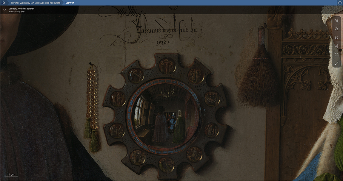
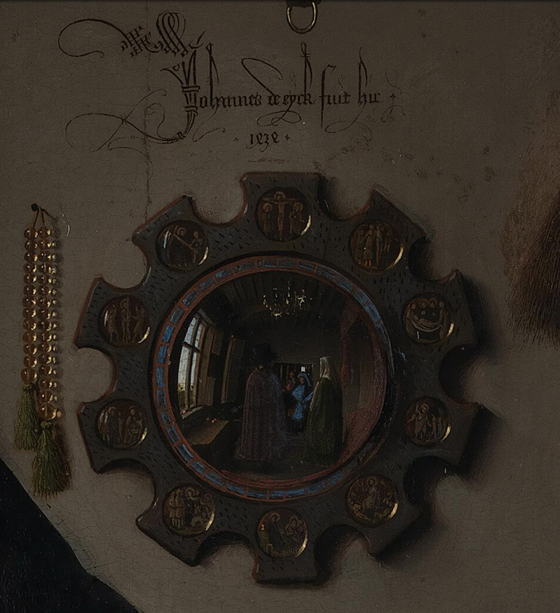
“Johannes van Eyck made this,” the inscription by the Artist reads in this detail from “The Arnolfini Portrait,” which he also dated 1434. Closer to Van Eyck Photo.

Is Jan van Eyck the “greatest” Painter ever?

“Wait? Kenn Sava call someone ‘the greatest’ anything? I thought he didn’t believe in qualitatively comparing Artists or Artwork?” I don’t. There’s no such thing as “the best” in the Arts. Yet, the work of Jan van Eyck seems to me to be beyond the boundaries of normal discourse. I’m asking technically now. In that sense, and instead of “greatest,” let’s put it this way- Does Jan van Eyck (and, possibly, his brother Hubert, who may or may not, have worked on some or many of his early pieces before passing away in 1426) remain unsurpassed among Painters? If you or yours know of a greater technician in the history of Painting, by all means, set me straight. I’d LOVE to see him or her. Still, technique is only a means to an end, right? On its own, it doesn’t make something “Art.”

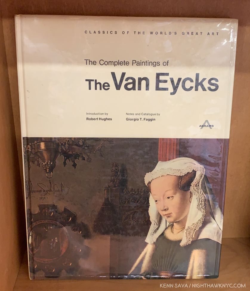
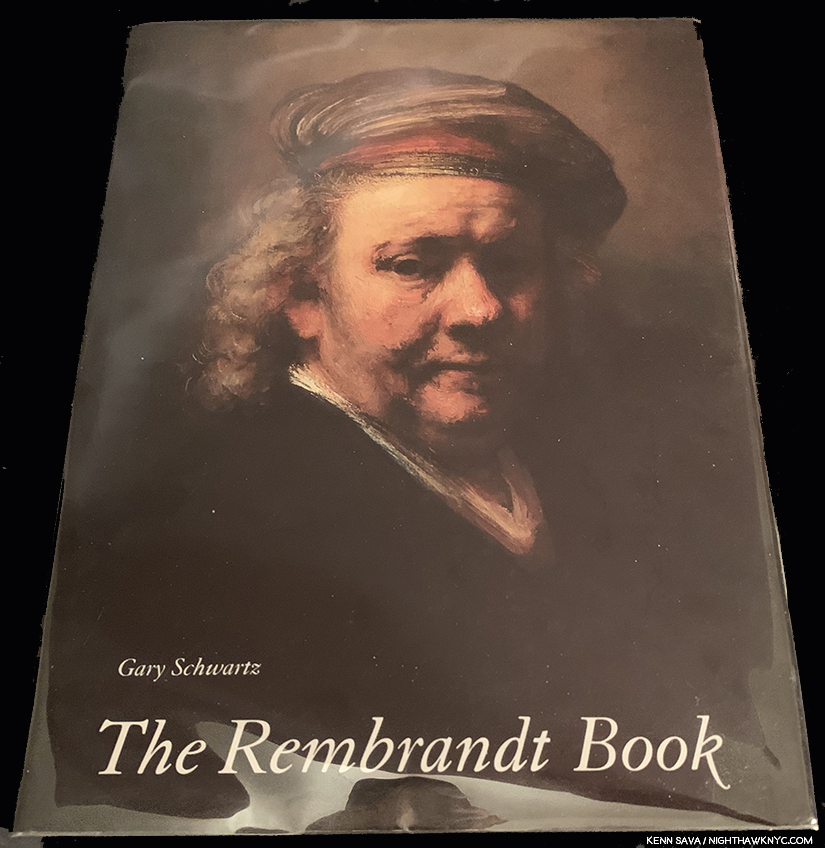
When I was a kid, freshly a teen, I discovered the work of Jan van Eyck (JvE) in this book-

I’d never seen anything like it. I still haven’t. There are a lot of ways you can discover an Artist you previously didn’t know today. Back then, coming across a book on him or her in a library, bookstore or a friend’s house, were the primary means for me. It’s now one of a number of primary means. In what was a black & white world at the time, impossible to imagine today, seeing this kind of color was part of the revelation. The closer I’ve looked over the decades, I’ve found his work is like the proverbial onion- There’s MUCH more going on in it than beautifully meets the eye at first look, with virtually every single detail carrying layers of meaning that have taken the intervening 600 years to begin to unravel.

On my 17th birthday, the first day I was eligible for it, I went to get my driver’s license- a big deal as we all know for anyone heretofore confined to riding bikes or walking. I went to take my eye test and the tester said, “Read the chart on the wall.” “What wall?,” I replied. Crushed. I had to go and get glasses. Finally, I passed and got the treasured document.

Freedom!

A week or two later,  bright and early one August Saturday morning, I took my first extended driving trip. I got in the family car and drove it to Washington DC by myself, a trip that took me well over 5 hours. I parked in front of the National Gallery of Art and went inside. I looked at one Painting for about 30 minutes, and left. I got in my car and drove all the way back.

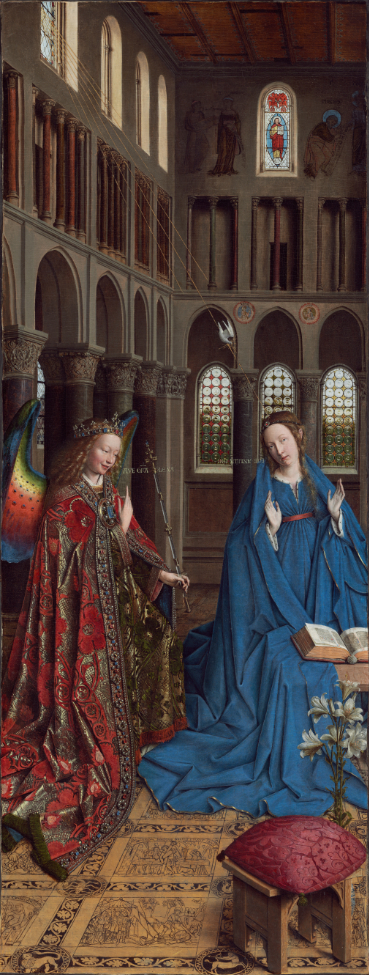
A few months later, I did the same exact thing, again. I went back to see Jan van Eyck’s The Annunciation a second time.

Jan van Eyck, The Annunciation, c. 1434/1436, Oil on canvas transferred from panel, 35 1/2 x 13 7/16 inches. National Gallery of Art, Washington, Photo.

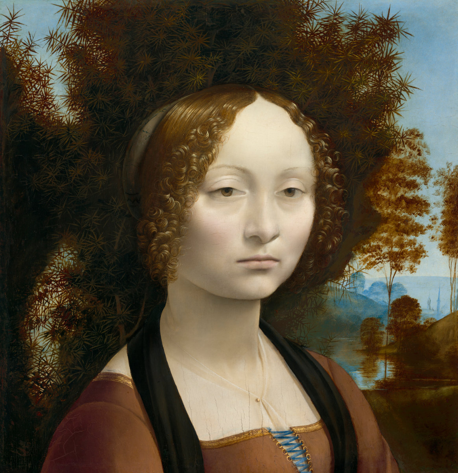
For me, this work summed up everything I loved about Painting, most of which I wasn’t able to put into words at the time. Only now, looking back on it decades later can I see in it the germs of any number of things that have continued to interest me since. This time, however, I looked at a second Painting, Leonardo da Vinci’s Ginevra de’ Benci, (c. 1474/1478, Painted only about 40 years later!1 to this day my favorite Leonardo (“favorite” does not mean “best”).

Leonardo da Vinci, Ginevra de’ Benci, c. 1474/1478, Oil on panel, 15 x 14 9/16. Historians believe that at one point this portrait had folded arms below what remains today. National Gallery of Art, Washington, Photo

I then stopped in the gift store and bought a poster of the Van Eyck, I got in my car and drove home.

Such was the effect Jan van Eyck’s work had on me. It still does.

These days, I don’t have to get in a car and drive almost 6 hours to see one of Van Eyck’s incomparable masterpieces. Now, I can see much of what the Master created that resides in museums all around the world without leaving my chair. In fact, I can now see them INFINITELY closer than even Mr. Van Eyck may have. How astounding is that?

Jan & Hubert van Eyck, Detail of the “Deity Enthroned” section from the Ghent Altarpiece, before restoration. Note the 1cm scale in the lower left corner. 1cm is .4 of an inch! Screenshot of Closer to Van Eyck Photo.

Closer to Van Eyck centers around the incomparable “Ghent Altarpiece” (as it is known today. The Artist’s name for the work is unknown) and its ongoing restoration- all 11.5 by 15.5 feet of its inside AND 11.5 by about 7 3/4 feet of its exterior (seen when the panels are closed)! 

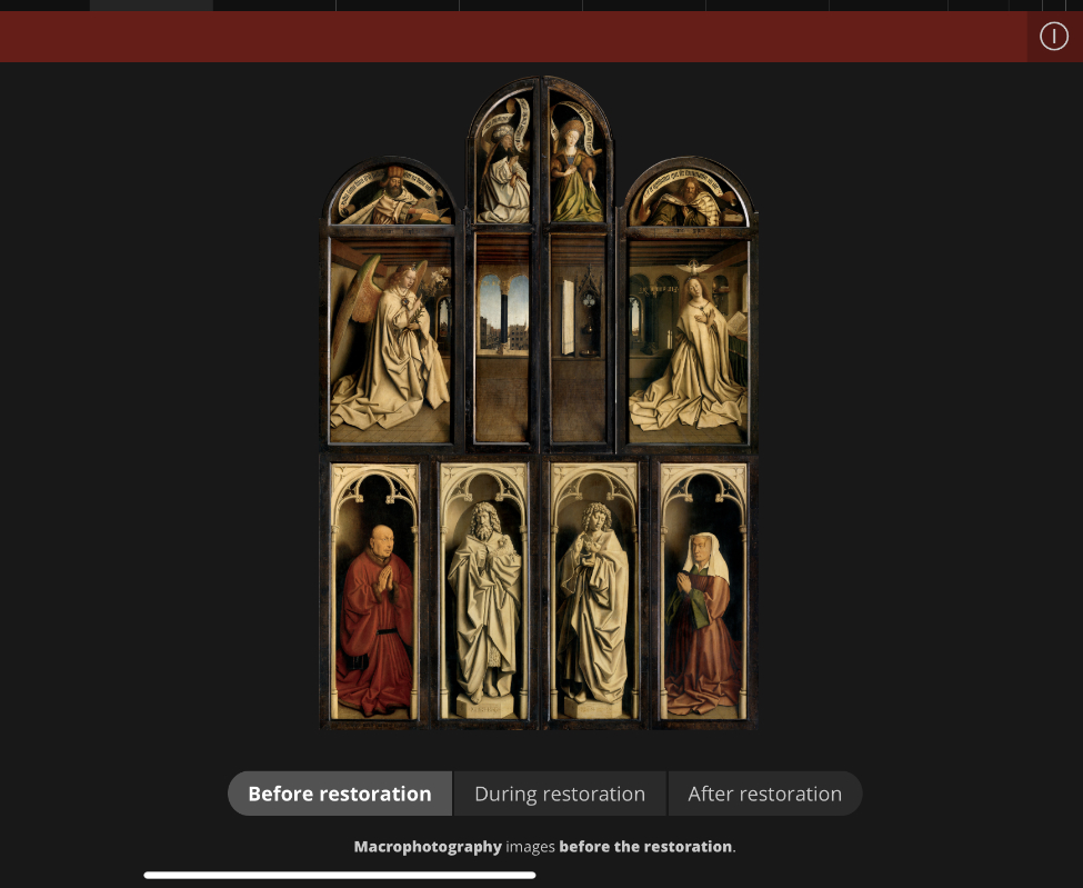
The 8 panels visible when the work is closed seen before restoration. Closer to Van Eyck Photo.

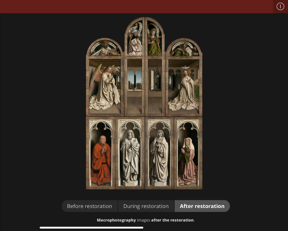
The same 8 panels seen closed after restoration. Closer to Van Eyck Photo.

Well, what we have of it after its six century journey that saw part of it looted by Napoleon’s armies in 1794, the whole stolen by the Nazis in WW2 and stored in a salt mine. One of its panels (the so-called “Just Judges,” seen in a copy in the lower left corner of the Photo below, which may contain a Self-Portrait) was later stolen by an incredibly selfish sacristan and has still not been recovered.

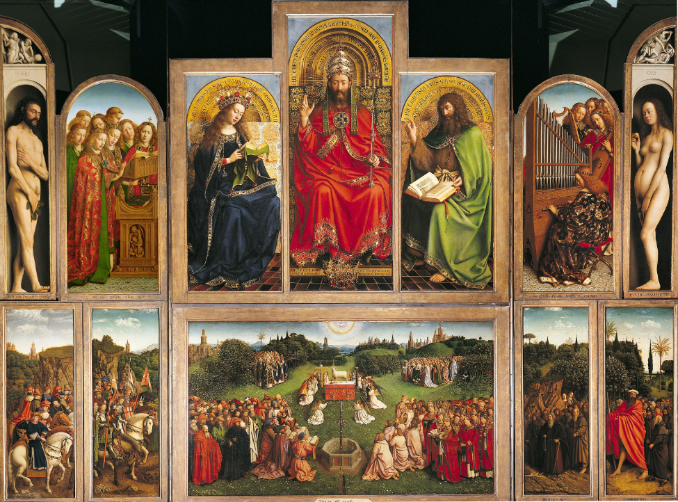
Hubert & Jan van Eyck, the “Ghent Altarpiece,” 11.5 by 15.5 FEET, mid-1420s to 1432, Oil on 24 panels, 12 seen here with open. In this Photo, the  work is seen prior to restoration which has begun with the exterior panels. NPR Photo.

For me, the Ghent Altarpiece is on the shortest of short lists of the supreme accomplishments of human creativity.

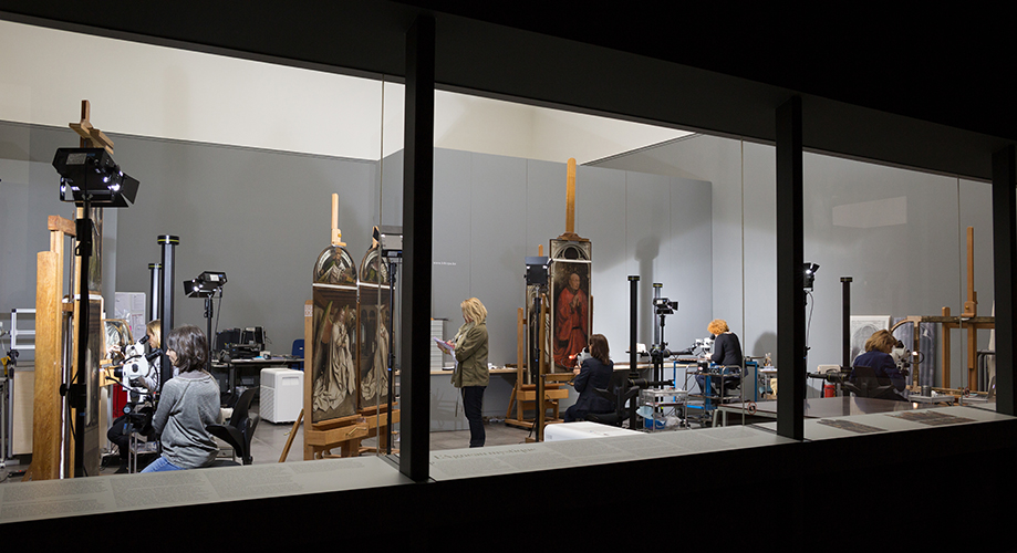
The public restoration of the exterior panels of the “Ghent Altarpiece” at the Museum of Fine Arts, Ghent (i.e this is the view museum visitors can have of the ongoing work). Photo: KIK-IRPA, Brussels. From Closer to Van Eyck.

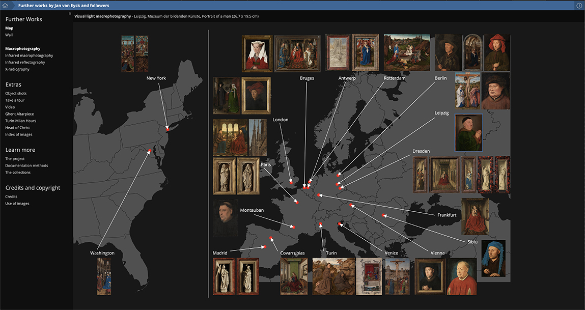
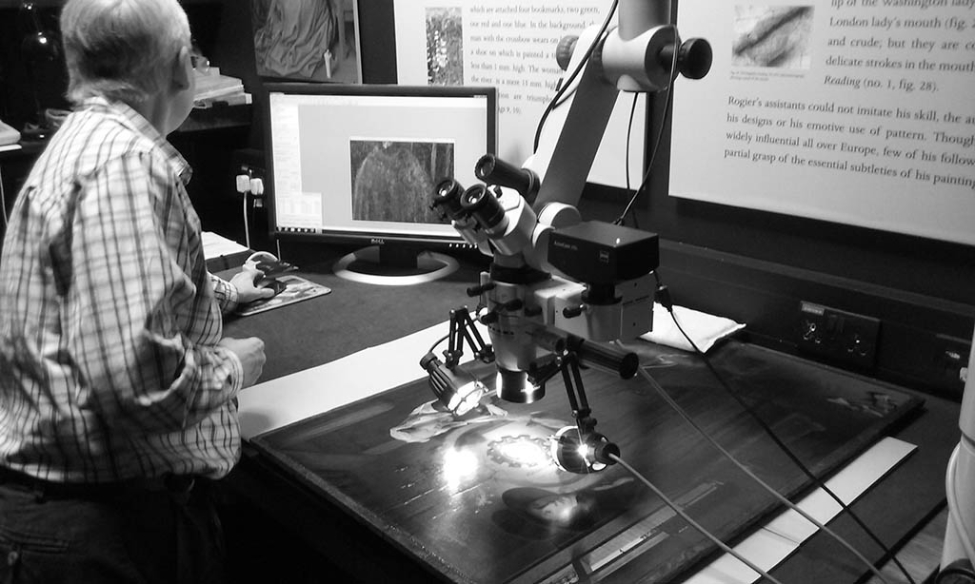
On Closer to Van Eyck you can study each of the 20 panels in the infinite detail of 100 billion pixels in macrophotography, infrared macrophotography, infrared reflectography and x-radiography. The Ghent Altarpiece would have been enough- MORE than enough to make Closer to Van Eyck one of the world’s most essential Art references, but it’s been continually expanded to the point that it now covers THIRTY SIX other works by, or attributed to, Jan Van Eyck from museums all over the world.

“Further works” above and beyond the “Ghent Altarpiece” by, or attibuted to, JvE that can be studied in extraordinary detail on Closer to Van Eyck, each one a masterpiece in its own right now numbers an incredible 36.

These include my old friend The Annunciation in DC. Good thing. I haven’t owned a car in over 20 years.

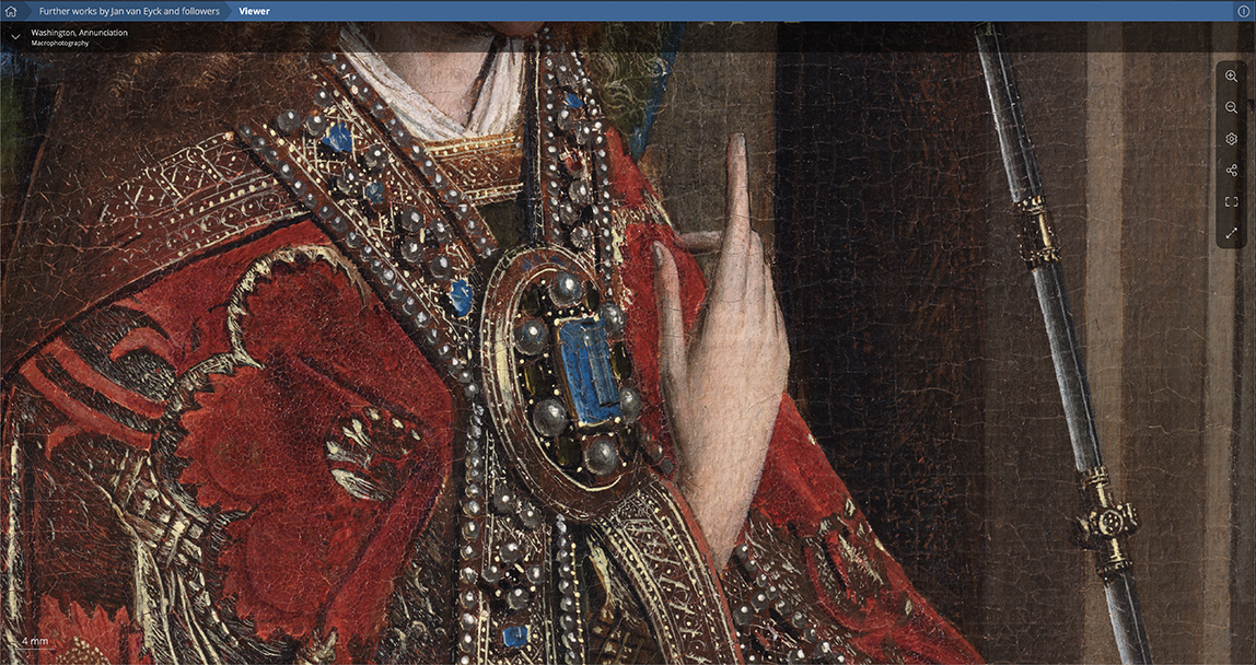
I didn’t see it like this. Detail of The Annunciation. Notice the scale on the lower left. 4mm is .15 of one inch! Closer to Van Eyck Photo

Having the chance to study Van Eyck to this degree should lead to countless new discoveries about his work and working methods. It may also help answer some long standing questions, of which there are too many to number. Beginning, perhaps, with this one. Even to this lay viewer, at normal magnification, it’s obvious The Annunciation is not the co-called “hyper-realism” or whatever other meaningless box some try to use to stick Artists in. For all of the astounding detail in The Annunciation, and other works by JvE, the figures of Mary and the Angel are oversized relative to the room they’re in. It goes without saying that for one of the supreme Masters of Painting this was intentional.

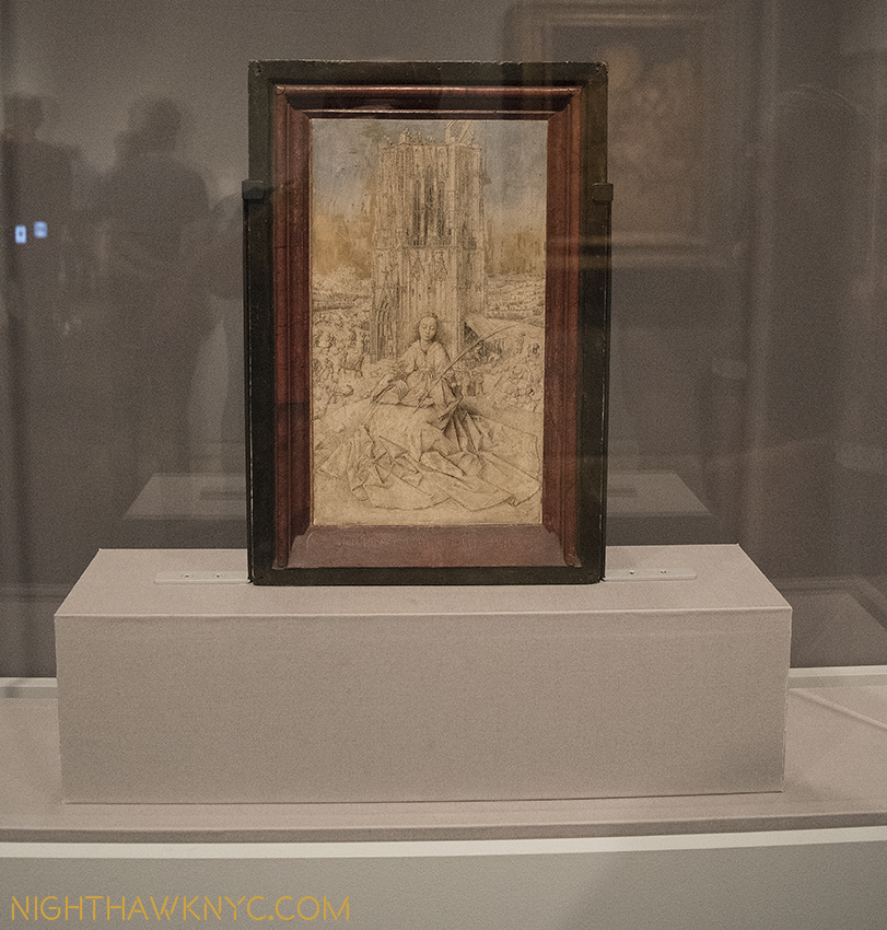
Small wonder. "Saint Barbara," 1437, Jan Van Eyck. Barely 12 inches tall.

This is as close as I’m ever allowed to study a Van Eyck in person. ” Saint Barbara“ looms larger than life here in this incredible Drawing by Jan van Eyck from 1437 that’s barely 12 inches tall. I don’t believe this is due to the Saint being closer to the viewer. From my piece on Unfinished at The Met Bruer in 2016.

Why did he choose to do this? David Hockney may provide an insight. In A Bigger Message: Conversation with David Hockney, by Martin Gayford, Mr. Hockney says, “If you look at Egyptian pictures, the Pharaoh is three times bigger than anybody else. The archaeologist measures the length of the Pharaoh’s mummy and concludes he wasn’t any larger than the average citizen. But actually he was bigger – in the minds of Egyptians2.” From there, you can look as closely and as deeply as you want. No matter how closely I look, the wonders never cease.

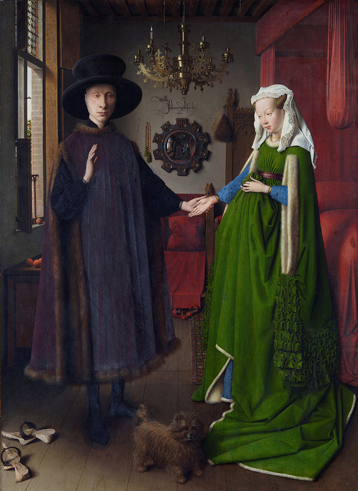
“The Arnolfini Portrait,” Full common title, “Portrait of Giovanni(?) Arnolfini and his Wife,” (Title given by the Artist is unknown), Signed(!) and dated 1434, 32 1/4 x 23.6 inches, National Gallery, London, Photo.

Two works recently added to Closer to Van Eyck are two of his most renowned masterpieces that reside at The National Gallery, London, home of “The Arnolfini Portrait” and “Portrait of a Man (Self Portrait?).“

Ready for its close up. “The Arnolfini Portrait” lying on the table to the right in September, 2017. Closer to Van Eyck Photo.

I spent an hour in the small gallery that contained them during my last trip out of NYC overnight in 2012 the day after I saw the once in a lifetime Leonardo da Vinci: Painter at the Court of Milan, at London’s National Gallery, the most complete display of Leonardo’s surviving Paintings ever mounted. It’s difficult for me to imagine a harder test than seeing the work of any Artist virtually side by side with that of Leonardo’s. Eight years later, the time I spent in that small gallery remains indelible. Seeing “The Arnolfini Portrait” in person was overwhelming. Then, I saw this-

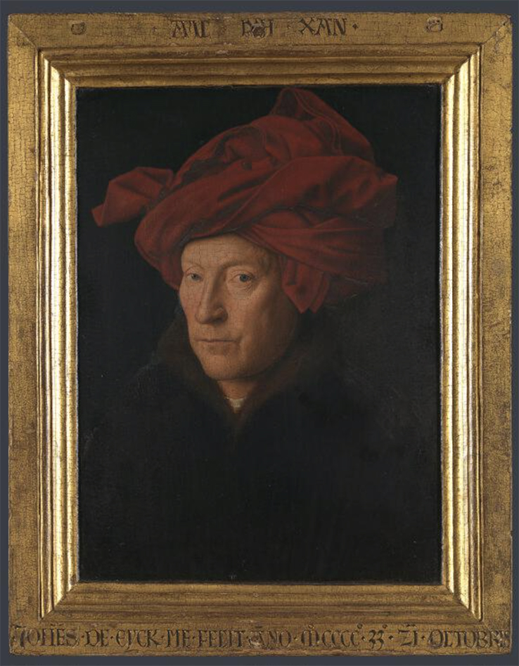
Portrait of a Man (Self Portrait?), 1433, Oil on oak, 10 1/4 x 7 1/2 inches. National Gallery, London, Photo.

Though I’d seen it in books countless times, standing right in front of it, all of a sudden, I was gripped by an unescapable feeling. This IS him! Why do I believe that Portrait of a Man (Self Portrait) is a Self Portrait? It doesn’t feel like the kind of portrait that would result from a commission- unless the commissioner was quite unconventional, and not one of the other portraits JvE did were “unconventional” in this sense. For one thing, he has a stubble. It’s too hard for me to believe that anyone commissioning a famous Artist (which he was) at the time would want to be immortalized with stubble. For another, the chaperon on his head is up on the sides. It looks positively sculptural- almost like a John Chamberlain. This has the look of someone who’s busy working on something that involves frequent turns of the head, often quick ones, and is keeping it out of the way by tucking it up on its sides. Compare this work with “Portrait of a Man with a Red Chaperon” in Berlin, also on Closer to Van Eyck. Here, the sitter has no stubble and his chaperon is very neatly positioned on his head. Also, the sitter looks straight ahead. In the London Portrait of a Man, he looks askance at the viewer- like he would if he were Painting himself by looking in a mirror- as David Hockney surmises in his revolutionary and essential book, Secret Knowledge: Rediscovering the Lost Techniques of the Old Masters. Finally, the sitter looks out at us over almost 600 years with a quiet confidence and surety that, along with that almost avant-garde chaperone on his head, convinces me that here is a very unique man, one with the confidence to show the world, and time immemorial, who he really is, doing what he loves doing. Jan van Eyck may have Painted himself in reflection in the famous mirror in “The Arnolfini Portrait,” and in one or two other works. These may provide some additional insight when looking at Portrait of a Man.

Jan van Eyck, Detail of the signature and the mirror immediately below the chandelier, seen further below, from “The Arnolfini Portrait.” It’s long been thought there’s a reflected “Self Portrait” in it of the Artist standing in the doorway in blue. Certainly an “unconventional” one, if it is. Velazquez borrowed this idea in Las Meninas, 222 years later in 1656. Notice the miniature scenes from the Passion of Christ around the mirror, and the reflected chandelier(!), all the while bearing in mind that when I measured this section in Photoshop, the entire mirror, with its frame, measured 3.85 inches in diameter! This is the closest we have been able to study this…until now. National Gallery, London, Photo

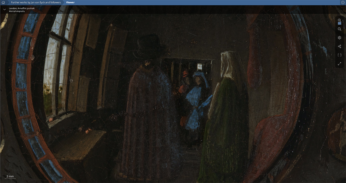
“The Arnolfini Portrait” has now been added to Closer to Van Eyck. The public has never seen it like this. Finally(!) we can see what is going on in the famous convex mirror. A number of historians believe JvE is in the blue coat. Seeing this, I now wonder if he wouldn’t be the gent in the back in the red. 2mm is .078 of one inch!

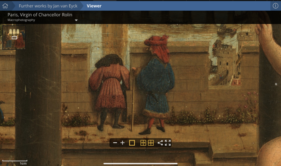
Among the others, perhaps most fascinating to me are the two figures in the middle distance of Virgin of Chancellor Rolin, the figure on the right in the red chaperone I suspect just might be a Self-Portrait of Jan with his mysterious brother Hubert to the left.

Detail of the middle distance of Virgin of Chancellor Rolin, in the Louvre, just one of the “other” works by/attributed to JvE that are included on Closer to Van Eyck. I’m stuck on the idea that this is a portrait of Jan and his brother, the virutally lost to history, Hubert van Eyck. Note the red chaperone and the nose on the figure I believe may be Jan, and compare both to Portrait of a Man. From Closer to Van Eyck.

IF this is a dual portrait of the brothers it would be the only one known of Hubert during his lifetime3 One of 5 surviving documents that mention him during his lifetime say he was a Painter “without equal.” Well, he was older than Jan. In it, we see the face of the man in profile showing a prominent nose, and his red chaperone is down as he is not working. Finally, in Portrait of a Man, we don’t see the sitter’s hands, as we do in a number of JvE’s other portraits. This leads me to believe they were busy Painting. All of these reasons, and a gut feeling, reinforce my feeling that the Portrait of a Man is a Self-Portrait. Interestingly, around the frame of that work (see Photo posted earlier), apparently in his own hand, is written “Als Ich Can,” JvE’s motto (“As I can,” with “Ich” a play on Eyck) along the top, and “Jan van Eyck made me on 21 October 1433” along the bottom. Of course, the experts have argued about this back and forth for almost 600 years. I’m convinced. Ok. Now, back to world peace…

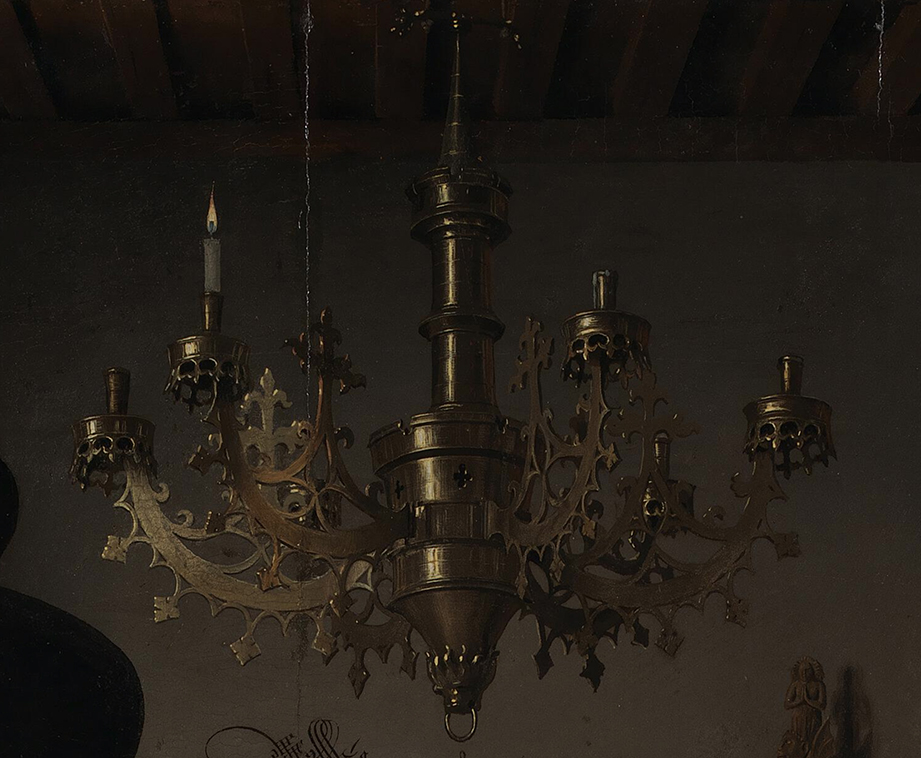
Detail of “The Arnolfini Portrait.” The section of the chandelier beginning at the top of the sole flame is about 5 inches tall by 6.7 inches wide. HOW could anyone paint this in 1434? The sole lit candle makes me believe this Painting is a memorial commissioned by the man, Giovanni Arnolfini, who JvE may have also Painted by himself, for his wife, Costanza Trenta, who died the year before, and who stands under extinguished candles. National Gallery, London, Photo

Part of me has been searching for “the next Van Eyck” my whole life. That is both unfair and unrealistic. Times were so different back in 1400 I’m sure I can’t begin to imagine it. Oil painting was, virtually, a brand new medium at the time, and for centuries it was said (by Vasari, apparently incorrectly) that Jan van Eyck had “invented” oil painting. If he didn’t, he was certainly among the very first to master it on the highest level. The craft and Art of Painting were different then, too, apparently. In Secret Knowledge, David Hockney sheds much light on what may, or may not, have been some of the techniques Artists from around JvE’s time, forward, including Vermeer, may have used to create some of these works which, like the chandelier in Van Eyck’s “The Arnolfini Portrait,” seem to border on the impossible. Optics. If they did use optics, in no way does that diminish the achievement, in m view.

The evidence for JvE’s candidacy for technical supremacy may never be presented better, or in more detail, than it is on Closer To. Leaving that pointless question aside leaves you free to look and marvel. You will never see it better in person- no matter HOW close they let you get to his work with your naked eyes. The ramifications of this are staggering to consider. Among them, this quickly came to my mind-

Is THIS the future of seeing Art?

It’s not hard to think that, one day, museums might follow suit doing something similar with works in their collections and posting amazing, super high resolution macrophotography on their sites. In 100 years, will ALL museums be online with sites like this, where, no doubt for a fee, you can visit any work in their collection and study it in virtually infinite detail? I’m not sure how many Artworks I’d want to study as closely as I want to JvE’s. Most Art is best seen from a comfortable distance. Yet given the difficulties in seeing Art in person now almost anywhere- glare, uneven or poor lighting, inferior glazing, etc., etc, it’s a situation crying out for something “better.” And, we may get “something else,” until that “better” is found- if it ever is.

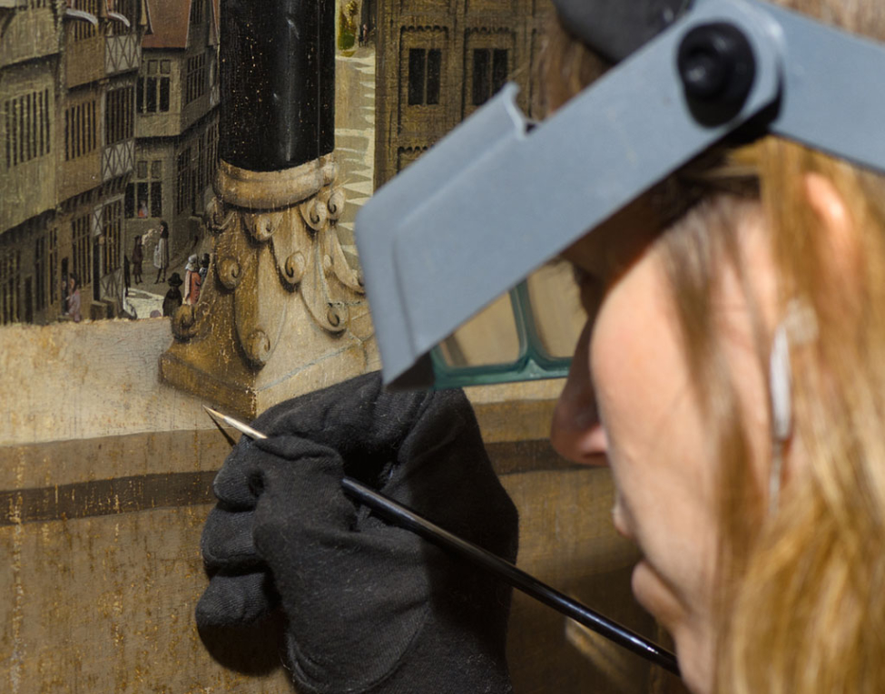
Panel XIV of the Ghent Altarpiece, during final inpainting. Saint Bavo Cathedral © Lukas-Art in Flanders vzw; photo: KIK-IRPA, Brussels. When I look at the Painting of this section, the miniature street scene in the background, only a small piece of it seen here, makes me wish JvE created more secular Art. From Closer to Van Eyck.

And so, for all of these reasons, I bestow the first NighthawkNYC Art Website of the Year Award on Closer to Van Eyck, which, like NighthawkNYC, is free- so far. In this one site, we get to see the distant past as never before. And, possibly, the future.

Rembrandt never left Holland during his lifetime. Closer to Van Eyck is making it possible for me to never leave NYC, again.

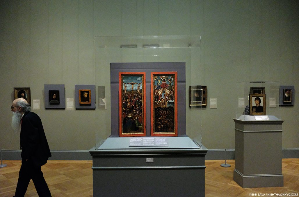
At least NYC is home to three works thought to be by “Jan van Eyck and Workshop,” as all three are labeled. “The Crucifixion” and “The Last Judgement” seen above at The Met (both may be seen on Closer to Van Eyck), and “The Virgin and Child with St. Barbara, Stl. Elizabeth and Jan Vos,” on view over at the Frick Collection. By the way, that gentleman existing to the left is the same Met Guard Fred Cray featured in his PhotoBook, Changing of the Guard! Well? It’s a small world, and getting smaller…

*-Soundtrack for this Post is “You Can Leave Your Hat On” by Randy Newman.

My thanks to Lana Hattan.

NighthawkNYC.com has been entirely self-funded and ad-free for over 6 years, during which over 250 full length pieces have been published. If you’ve found it worthwhile, you can donate to keep it going & ad-free below. Thank you!

Written & photographed by Kenn Sava for nighthawknyc.com unless otherwise credited.
To send comments, thoughts, feedback or propositions click here.
Click the white box on the upper right for the archives or to search them.
For “short takes” and additional pictures, follow @nighthawk_nyc on Instagram.

Subscribe to be notified of new Posts below. Your information will be used for no other purpose.


  1. It is reported that Jan van Eyck’s portraits were admired in Italy in the 1430’s. Is it possible Leonardo knew the work of Van Eyck?
  2. eBook version, P.61
  3. Some believe Hubert may have Painted this. Some others believe Jan may have contributed. I’m skeptical on both counts for any number of reasons. For starters, I can’t believe either would have been capable of the terrible geometry of the grave.

NoteWorthy PhotoBooks, 2019. And others

Written & Photographed by Kenn Sava

Three years in to my “deep dive” into the world of Modern & Contemporary Photography and PhotoBooks, I find myself at a crossroads. I’ve seen thousands of books, hundreds of Photography shows. I’ve answered most of the questions I had going into this exploration about Photography and its place in the larger Art world. Of course, there will always be more to see and more to learn. The joy of discovering a new (i.e. one previously not known to me) and terrific Artist continues to drive me. Though this past year this was balanced with something else. Frustration. Increasingly, I’m left with one inescapable feeling-

There are too many books!

Time and time again, I find myself holding a book with only one thought in my mind before I finish paging through it. “WHY was this book published??”

Paging through one of these becomes a mind-numbing blur…

99.5% of the time this happens to me with a “name” Photographer. The net result is wonder- I wonder what the process was that got this project to the point where I’m holding it in my hand. What was the publisher thinking? Who edited this material? Did anyone give ANY thought to the fact that at the end of the day, in many of these cases, only the historians are going to remember this book and they are going to use it when they assess said Photographer’s larger body of work, and it’s then going to serve to diminish his/her overall accomplishment.

With this looming on my mind, early this fall I had a dream. I dreamt the large PhotoBook publishers in the world took a year off during which they released no new books. Instead, they focused their efforts on making the public more aware of their existing, already published, PhotoBooks…particularly the really good ones that come out and quickly become afterthoughts when their next batch comes out.

But, wait. A REALLY good PhotoBook doesn’t have an expiration date! It continues to speak to those who pick it up indefinitely.

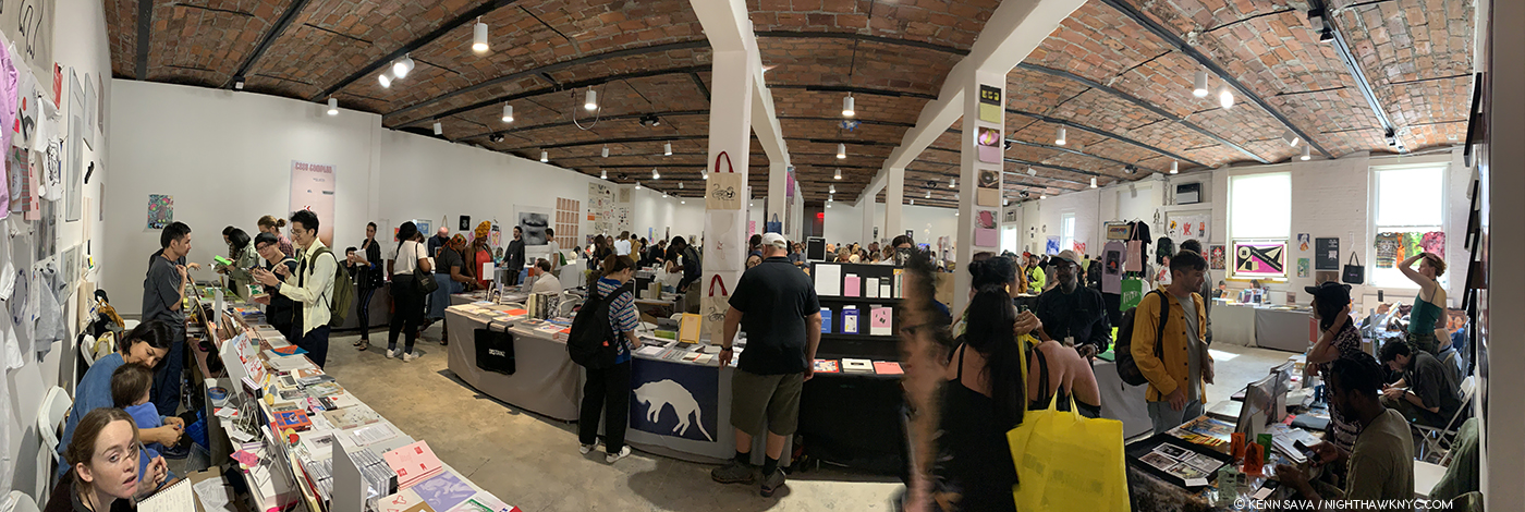
Before the crush. Early Saturday, September 21st in one of countless rooms at the New York Art Book Fair at MoMA PS1. In the afternoon, this room was so crowded I wouldn’t have been able to move my arms to get this shot.

Meanwhile, back in the hard light of the day, none of what I’ve said above applies to smaller PhotoBook publishers. For most Photographers, getting a PhotoBook published is the only way their work can be seen beyond their immediate circle. As a former (and soon to be again) independent Jazz record producer, I can relate to their realities. Some live from book to book, hoping to break even so they can release their next book. Others, like Michelle Dunn Marsh & Minor Matters, are using new models to realize books by making sure readers want them. And? A good many of the small PhotoBook publishers, like Kris Graves Projects, routinely sell out of their titles. This spring, during a chat with one of the most respected European PhotoBook publishers, he bemoaned to me the conditions in bookstores there, speaking of table after table of deeply discounted books that weren’t selling. Since I haven’t been out of NYC overnight since 2012, I’ll have to take his word for that, and I don’t know which books are sitting on those tables. But I can’t help wonder if that’s an indication that we’re reaching a tipping point…

NYC, Fall, 2019

Yet, of course there are still really good PhotoBooks being released.

As I’ve repeatedly said, I don’t believe in “winners” or “losers.” There is no such thing as “best” in the Arts. Whatever criteria you use, it seems to me, the results are subjective. So? Look for yourself and see what speaks to you. As it was last year, this piece is born out of a common question- “Which books would you most highly recommend of all those you’ve seen this year?” For those with limited funds, or those who don’t have space for a collection of PhotoBooks, these are books that have held up for me, that continually draw me back to them, and have left a strong impression that will continue after the year is over. For the record- I bought every book I write about (this year, like last year, I did receive one as a gift). No one sponsors me. As always, I have not read anyone else’s reviews or looked at anyone else’s list.

NoteWorthy PhotoBooks, 2019

In the approximate order of their release-

Mari Katayama, Gift, United Vagabonds
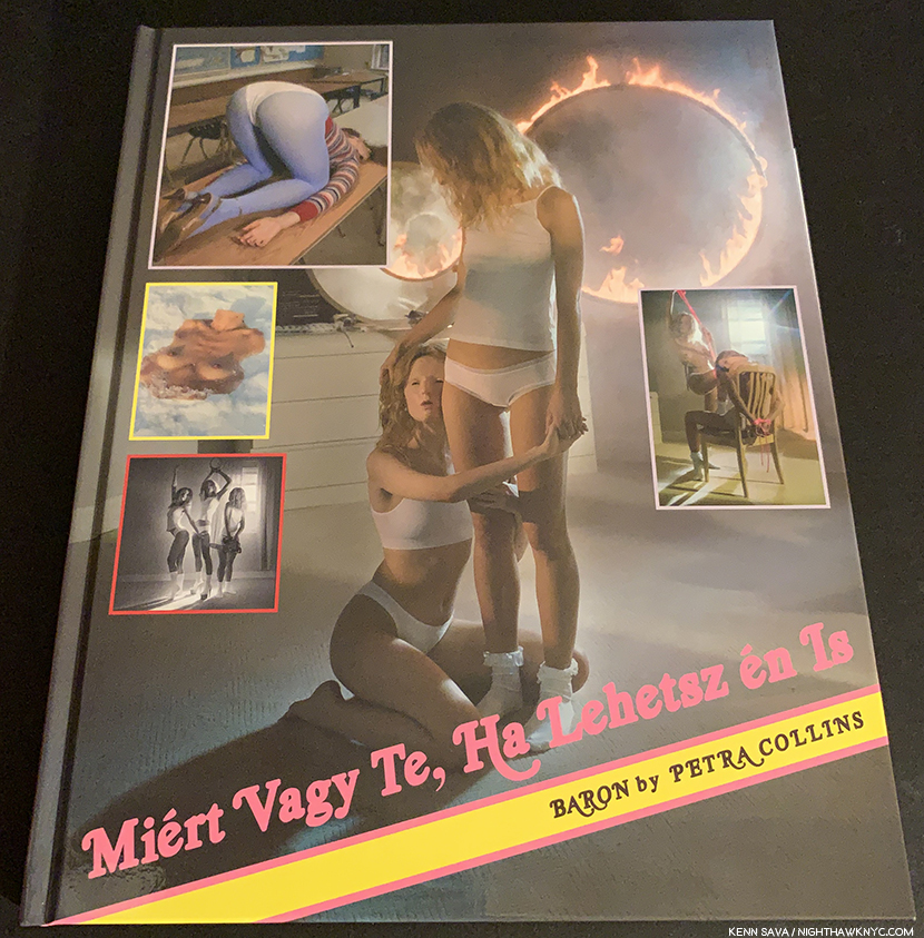
Petra Collins, Miert Vage Te, Ha Lehetsz en is? or Why be u, when u can be me?, Baron Magazine
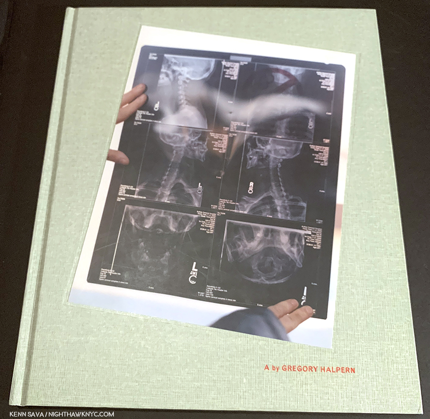
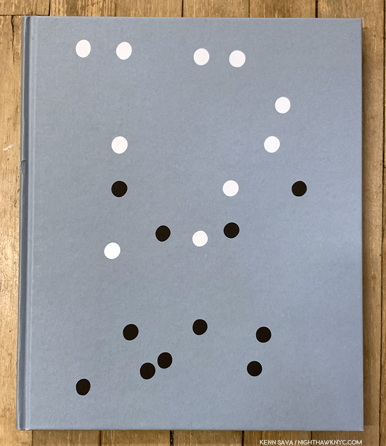
Gregory Halpern, Omaha Sketchbook, MACK Books

In Hungarian, where her family is from, Miert Vage Te, Ha Lehetsz en is? or in her English translation, Why be u, when u can be me?, Petra Collins’ latest is unique.

All three books break new ground. The first two, personally, the third both as a PhotoBook and for the way it looks at its subject. Gregory Halpern’s Confederate Moons was my most highly recommended book last year, when Petra Collins’ Coming of Age made my NoteWorthy First PhotoBook list. I recently looked at Gregory Halpern’s Omaha Sketchbook when I looked at Mr. Halpern’s body of PhotoBooks, and I deeply admire what Petra Collins is doing in helping to reclaim the world of imagery of women, particularly young women, in a male dominated world. Her work is even more remarkable when you consider she only picked up a camera for the first time in 2009. In 2019’s Why by u…? her work has grown so much it’s hard to believe it’s only been a year since Coming of Age, was published. And she’s taken her talents in multiple directions, including advertising, Music video and film. Yet, unlike many Photographers who have delved into those fields, so far, no matter what she’s turned her hand to it all feels like part of the whole to me, as can be seen in the second book she released in 2019, OMG! I’m being killed for Super Labo in Japan, which consists of unused (i.e. “killed”) advertising work. Why be u…? continues the threads she wrote about in Coming of Age– it’s deeply personal and startlingly revealing. I spoke with Ms. Collins twice this year and I asked her about the possible influence of Ralph Eugene Meatyard on Why be u…? She instantly, and firmly, said no. Instead she pointed to the opportunity to collaborate with the Artist & Sculptor Sarah Sitkin. The resulting Why be u when u can be me? is one of the most unique and remarkable Self-Portraiture projects of recent times, if not longer, in which she gives models, and herself the opportunity to pose wearing amazingly life-like masks of her face and other body parts. As she approaches one million followers online, I only hope the demons she’s written about so powerfully are in her past. The world needs her.

Mari Katayama is an Artist who’s barely known in the USA, thanks to a solo show this fall at the University of Michigan Museum. I have yet to find her terrific book, Gift, for sale here, so I spent the better part of the year seeking a copy. It so far exceeded my expectations and revealed one of the most remarkable Artists in the known world. Like Ms. Collins’ Why be you…?, it’s another utterly unique book of Self-Portraits. Her site says- “Suffering from congenital tibial hemimelia, Katayama had both legs amputated at age of 9. Since then, she has created numerous self-portrait photography together with embroidered objects and decorated prosthesis, using her own body as a living sculpture. Her belief is that tracing herself connects with other people and her everyday life can be also connected with the society and the world, just like the patchwork made with threads and a needle by stitching borders.” Mari Katayama (like my friend Magdalena Truchan, Christine Sun Kim and others), continue to show the world that disabled does not mean unable, particularly when it comes to Art. Gift leaves me wondering- While we live in a time that’s supposedly about inclusion, particularly in the Arts, why do so few disabled Artists reach the larger public?

NoteWorthy Photobook Publisher of 2019

Red Hook Books-
Sebastian Meyer, Under Every Yard of Sky
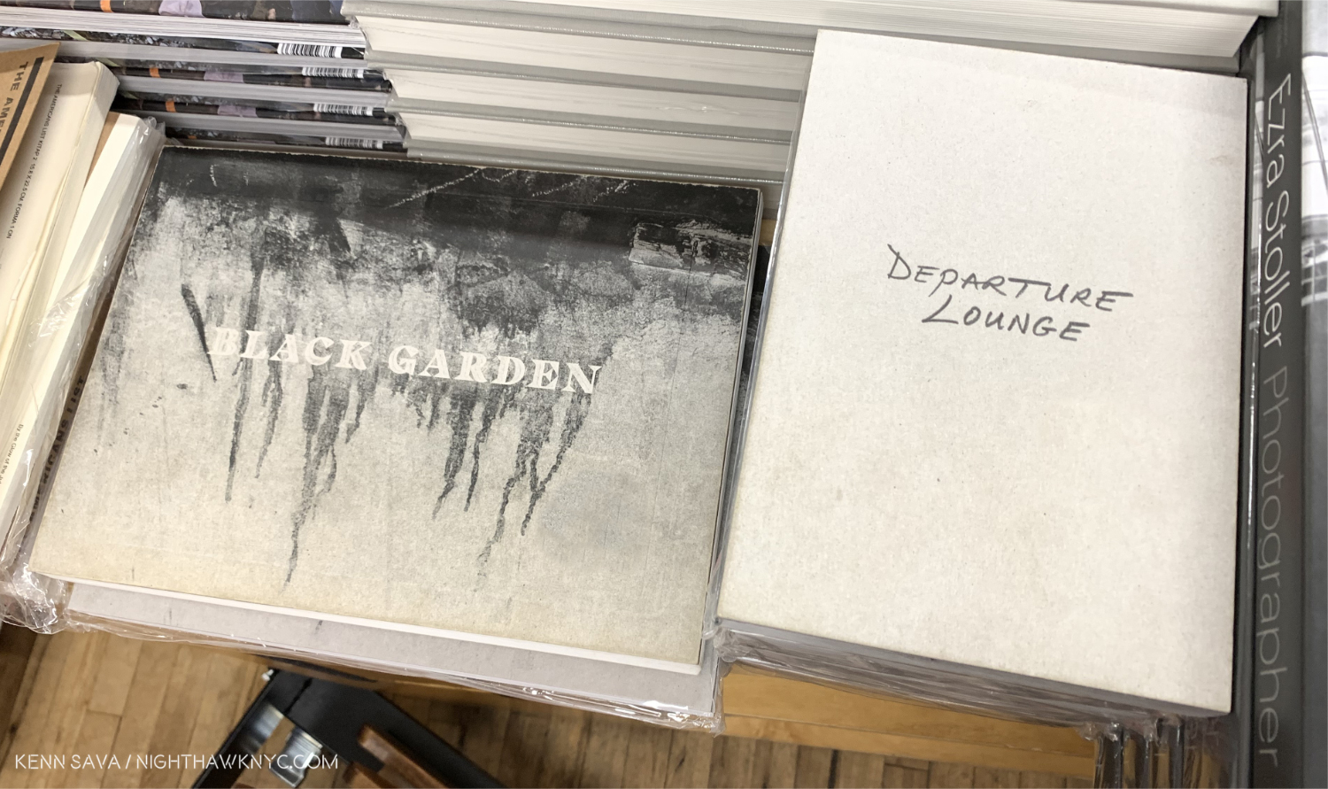
Jason Eskenazi, Departure Lounge, and Black Garden
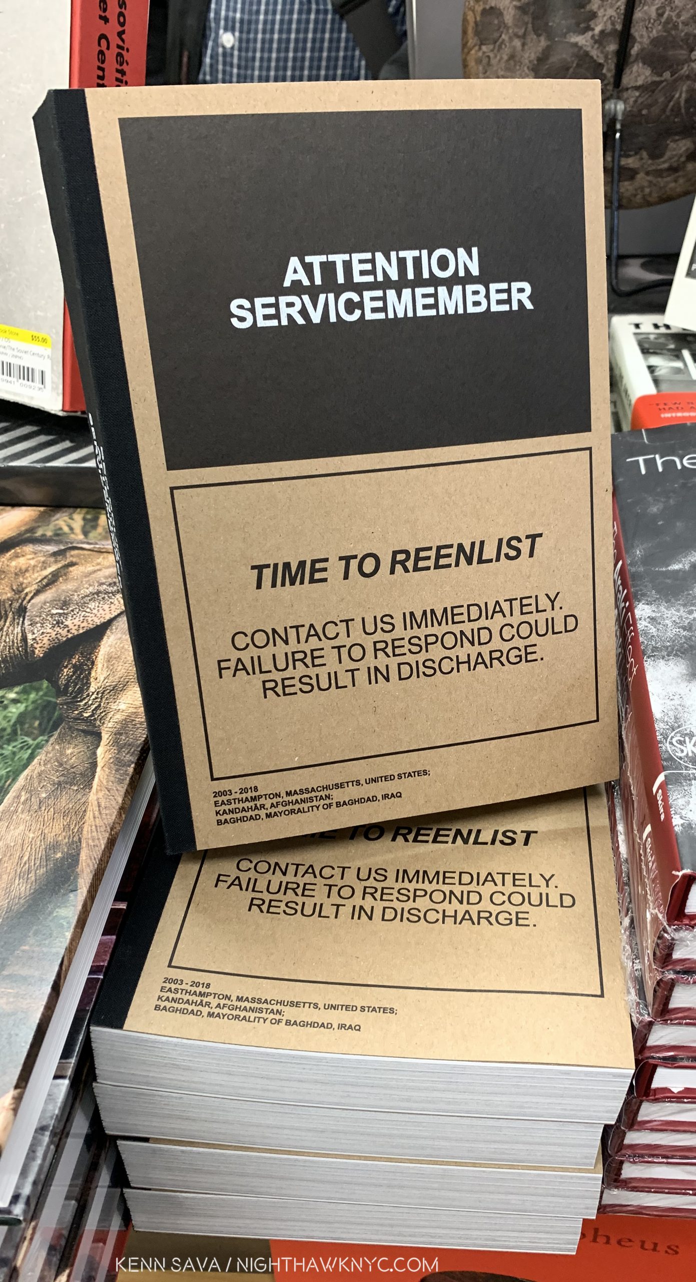
Ben Brody, Attention Servicemember

After a long wait, we got the last 2 parts of Jason Eskenazi’s trilogy this year. The wait was worth it.

As the year went on and more books came out from Red Hook, instead of singling out one of these, I opted to take the easy way out and cite them for their body of work this year. Red Hook is giving Artists who may not otherwise be heard from a voice and they’re executing each project with power. This became very apparent when I heard Sebastian Meyer discuss his book and the difficulties he faced getting magazine publishers to run some of this work. His new, first, PhotoBook serves a double purpose- it documents a decade’s worth of work he created in Iraqi Kurdistan, while it also tells the story of his best friend and associate, the Photographer Kamran Najn, who was captured/abducted by ISIS, and remains missing. With his two books, Jason Eskenazi has finally completed the trilogy of books he began with the now legendary Wonderland: A Fairytale of the Soviet Monolith, 2008. It turns out to be worth the wait, and with copies of Wonderland changing hands for 2 to 3 hundred dollars per these days in any condition, I wouldn’t wait long to buy its two brothers. My “Sleeper Recommdation of the Year” is Attention Servicemember by Ben Brody, a servicemember when he created this remarkable book, which, being a first PhotoBook, will be mentioned again.

NoteWorthy, no, Amazing Accomplishment in PhotoBook Publishing

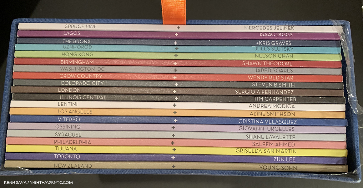
This view of a full set of Lost II in its slipcase shows the location on the left, which doubles as the title of each book, and the Photographer on the right. .

Various Artists, LOST II, Kris Graves Projects. Last year, Kris Graves Projects had 2 titles on my NWPH, 2018 List- LOST and A Bleak Realty, a total of 11 books. Pretty remarkable. Particularly for an Artist-run smaller company. This year, Mr. Graves Projects has one title, but a total of 20 books on this list! LOST II may be unique in the annals of PhotoBook history. Show me the other 20 volume set that is as consistently terrific as LII is. Chock full of established ”names” and soon to be “names,” each book in the series digs deeply beneath the surface to give the viewer a look at a place you couldn’t get even if you were there. I was privileged to get a look at the making of this series I called “monumental” before it had even been published. Now actually having it, I feel it’s a landmark set people are going to continue to reference indefinitely. Published in a ridiculously low number of complete sets (under 100). If you can find one, don’t wait. I doubt it’s ever going to be cheaper than it is right now.

NoteWorthy First PhotoBook

Mari Katayama, Gift, United Vagabonds- For the second year in a row a book is listed under NW 1st PhotoBook and NW PhotoBook of 2019. It is both. I have no words for the beauty, power, courage shown on every page of this book. Unless that word is transcendental.

Jack Davison, Jack Davison, Loose Joints- The first printing just vaporized and it’s easy to understand why. Mr. Davison is, perhaps, best known on this side of the pond for his stunning work in the New York Times Magazine (most recently in his cover piece for the current, December 15th, issue), but his eponymous first PhotoBook will shock those expecting those haunting portraits with something else again. A tiny bit Saul Leiter, a tiny bit Ralston Crawford, a tiny bit….virtually every image seems to almost recall someone else, but not really. Jack Davison is the real deal and one of the most exciting new voices in Photography in the recent past known to me.

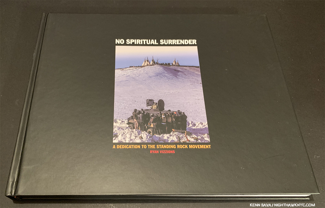
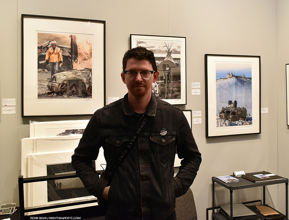
Ryan Vizzions, No Spiritual Surrender, Self-published- Here is a case of someone who finds a cause and is so taken with that cause that he sells all his stuff and moves clear across the country to document it. WOW! WHO does that these days? His cause was documenting indigenous power at Standing Rock, and the book is a collaboration with 6 women of the Oceti Sakowin, with over 100 of his Photographs from the 6 months he spent witnessing the NODAPL resistance.

Ryan Vizzions poses for me in front of a selection of his terrific work at Monroe Gallery’s booth at AIPAD on April 6, 2019 with his book on the shelf to the right.

Amazing work by a remarkable man I had the pleasure of meeting and speaking with this April that deserves to be much more widely seen. Mr. Vizzions announced on December 10th that all 2,200 copies have now been sold, and, he signed every single one of them. He didn’t have to. You can feel how personal this is for him on every single page.

Ben Brody, Attention Servicemember- Mentioned earlier, this is one of the most exceptional books depicting the US wars in Iraq and Afghanistan known to me. An extraordinary thing for a first PhotoBook who’s generous 304 pages still don’t feel like enough.

NoteWorthy Retrospective

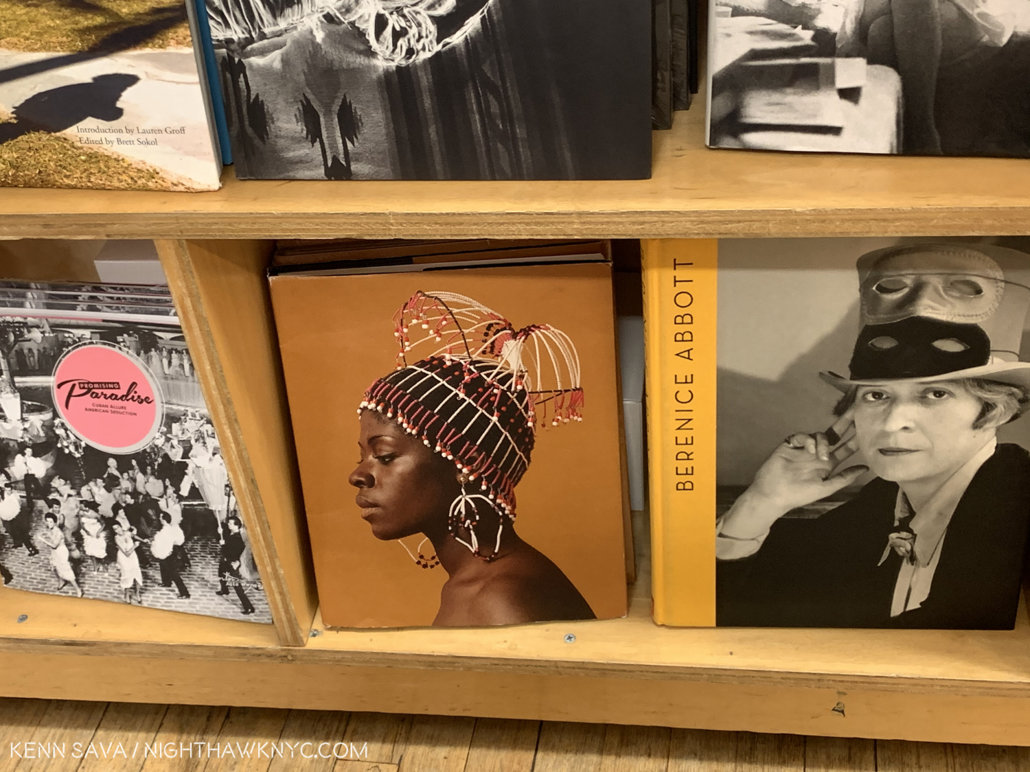
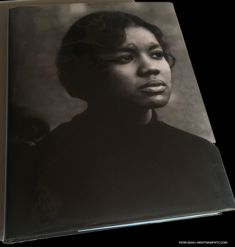
Kwame Brathwaite, Black Is Beautiful, Aperture

Kwame Brathwaite, Black Is Beautiful, Aperture
AND
Dawoud Bey, Seeing Deeply, University of Texas Press- WHY did it take SO long for retrospectives on these important Artists? There are other books with selections of Mr. Bey’s work, but none (known to me) of Mr. Brathwaite’s! Aperture and the University of Texas Press have both done terrific jobs with these making it worth the wait, but there’s no forgiveness (to the whole publishing world) for the delay.

Thomas Demand, The Complete Papers, MACK Books A remarkable book documenting a remarkable body of work that’s equal parts Sculpture and Photography. No. It’s more Sculpture, given how much work goes into creating each of his works- in paper! Beautifully rendered and realized in a majestic book that is only going to be more and more sought after as this unique Artist becomes better known in the USA.

NoteWorthy Exhibition Catalog

Dave Heath: Dialogues with Solitude

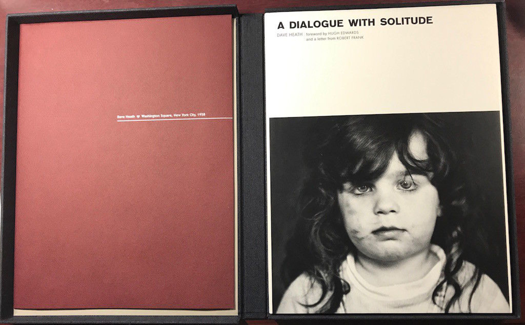
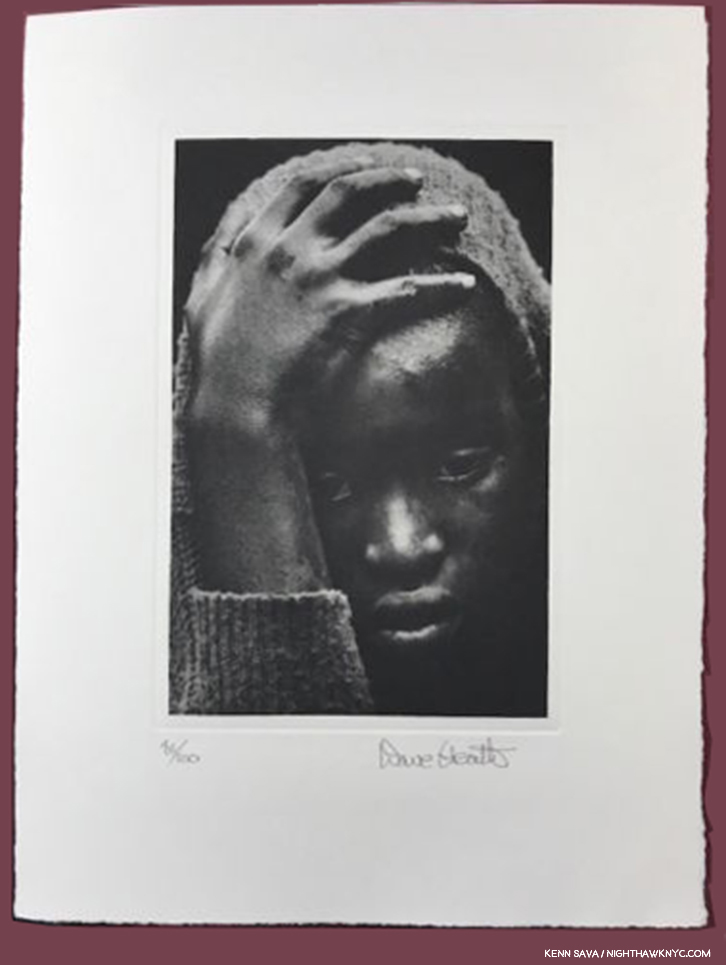
Dave Heath, Dialogues With Solitudes, Steidl- PLEASE don’t tell me this terrific book is already out of print! That’s what Steidl’s site says. So, RUN, don’t walk, and find a copy. It’s the best recent overview of the work of this wonderful Artist who has been in eclipse since his passing. This book was published in conjunction with the show at Le Bal, Paris last year. In my view, Dave Heath is one of the timeless masters of Photography. That he was, also, a master printer was proved for the ages when no less than the late Robert Frank asked him to make the prints for Mr. Frank’s first solo show at the Art Institute of Chicago after The Americans was released. Nuff said.

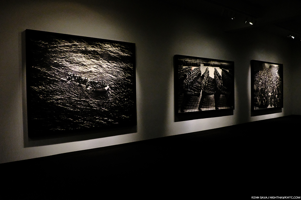
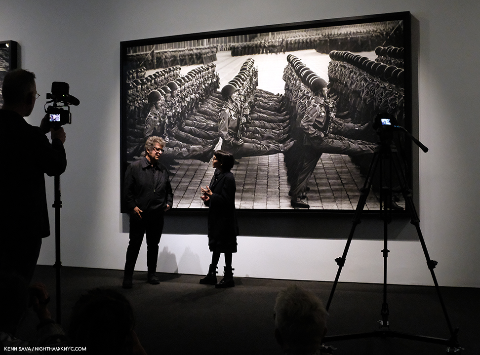
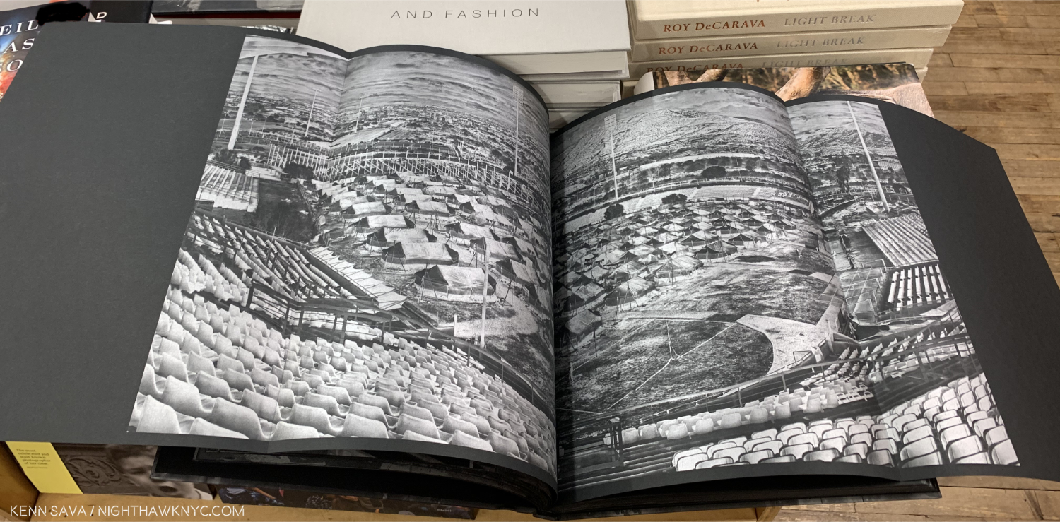
Richard Mosse The Castle, MACK Books- I saw Mr. Mosse’s show Heat Maps which included much of the work in The Castle at the renowned Jack Shainman Gallery in 2017 and it was mind-blowing- on any number of levels. For one thing, the pieces were SO big you could ponder them from a distance of 30 or more feet away, and then spend minutes, yes, minutes, walking along them at about arm’s length to inspect and appreciate the endless detail. Of course, the subject Mr. Mosse is addressing is the refugee crisis, and here it’s done using military grade technology in the aim of Art, instead of harm, and Art with the intent of bringing this gigantic crisis to wider attention in a book that includes 28 DOUBLE gatefolds. Each spread is preceded with a brief paragraph recapping the story of the place depicted and accompanied by large details on the outer panels.

The Castle.

This work is beautifully rendered in MACK’s edition of The Castle, who’s first edition promptly sold out. MACK used the opportunity of a second edition to bring Mr. Mosse in to fine tune the highlights. When I first heard this I wondered if it was a marketing ploy to get buyers to buy both editions. I had a chance to compare edition 1 and edition 2 side by side and yes, there is a difference. It struck me that the black point was brought down in the second printing, giving more emphasis to the silver highlights. Personally, I prefer the first printing, yet, it seems to me, that here is a case where you can’t go wrong with whatever edition you get. If you get the first, well then you have an out of print “collectible” by one of the more important Artists working today. If you get the second, you have a version that was overseen by the Artist. All of this is secondary to the fact that The Castle is one of the great achievements in PhotoBooks I saw in 2019.

Most NoteWorthy Book of 2018, Seen in 2019

Daniel Shea, 43-35 10th Street, Kodoji Press- PhotoBooks are a phenomenon and many of the best ones are published in such small quantities that once the word gets out the demand overwhelms the supply and they become impossible for the rest of us to see. Such was the case with 43-35 10th Street. It took me until February, 2019 to track down a copy, and I had to go to the titular address on the coldest day of the year to do so. I froze my butt off on the streets of Long Island City walking to and fro, but it helped me get a feel (once the feeling in my extremities returned) for the subject of this singular and gorgeous book, which is partially set there, a book that is so good had I seen it last year it would have been singled out with Gregory Halpern’s Confederate Moons as my most highly recommended. A year+ later, 43-35 10th Street is seen offered for sale increasingly less and less often. You can preview it on Daniel Shea’s site, and if you decide to go for it, don’t wait any longer.

NoteWorthy PhotoBook Designer, 2019

Morgan Crowcroft-Brown, MACK Books Head Designer- Richard Mosse’s The Castle. Gregory Halpern’s Omaha Sketchbook. Thomas Demand’s The Complete Papers. What do all three of these remarkable, and NoteWorthy, PhotoBooks have in common? Each one was published by MACK Books, and each one was designed by MACK Books Head Designer, Morgan Crowcroft-Brown. EACH of their designs is a significant part of the book’s effect, impact, and in the end, success. Bravo, Morgan!

NoteWorthy Overlooked Group of Photographers…Still!

Painters who Photographed.

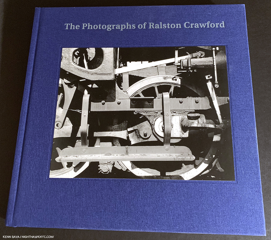
Ralston Crawford- The Photographs of Ralston Crawford, and Ralston Crawford Torn Signs– The great Undiscovered Land for the Fine Art Photography world is the work of Painters who were also Photographers. There are more of them than anyone seems to realize and ALL of them have been SERIOUSLY overlooked by the Fine Art Photography world. The list is long and getting longer all the time. Ralston Crawford (1906-78) is just the latest case in point to receive long overdue attention and I’m using the fact that two excellent books on his work were released this year to make the larger point.

NoteWorthy Photographer I Only Discovered This Year

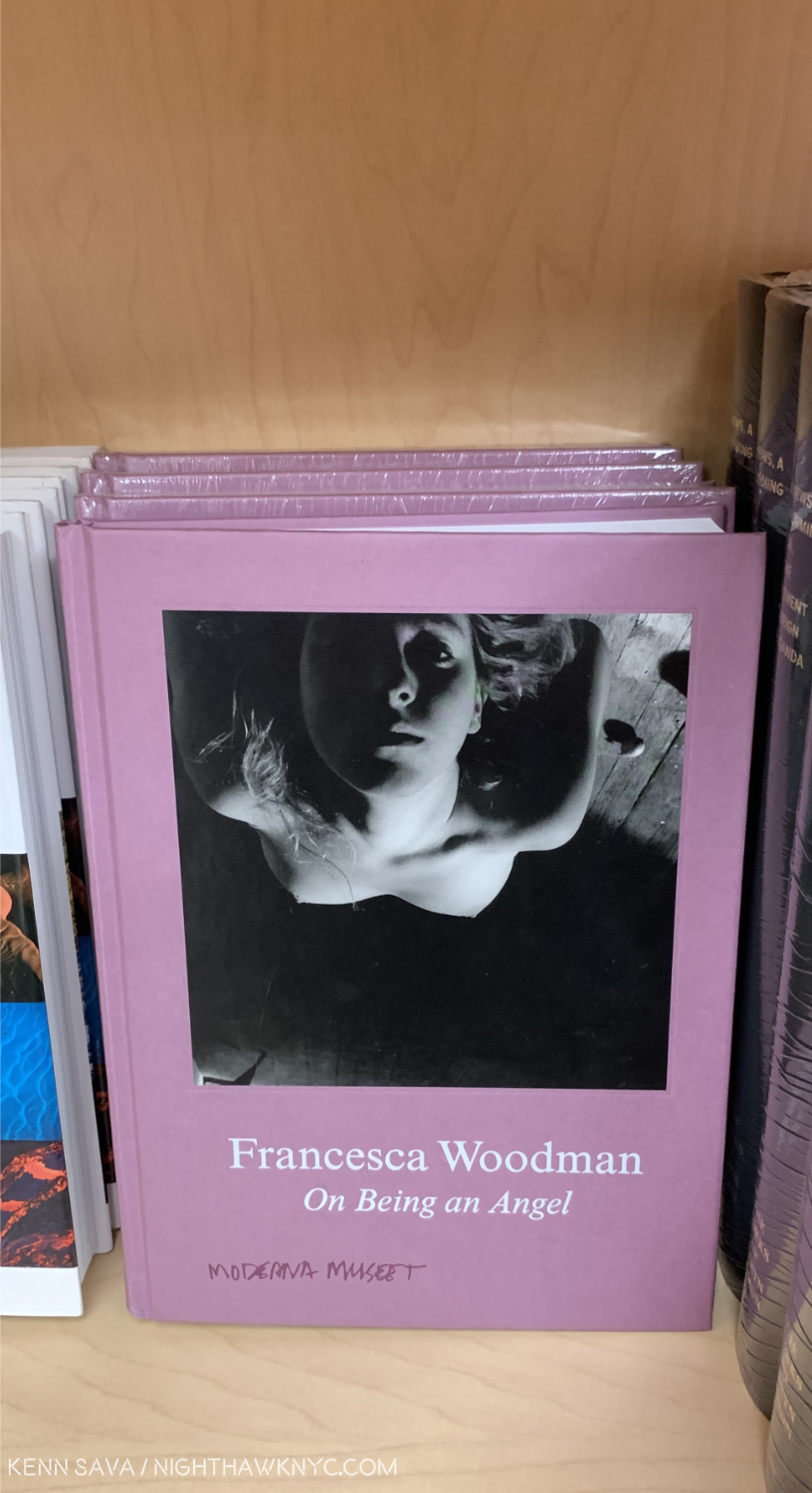
Ok, this is a tough one. Francesca WoodmanOn Being An Angel, Koenig Books (2016)- Well? She is one now, and has been, tragically, for going on 40 years. But, oh my gosh. Every single time I pick up a book of her work, I break down in tears.

Every. Single. Time.

What incredibly beautiful work! What a talent! What an unfathomable loss at just 22 years of age!

Now? It lasts for about 5 minutes, then, thankfully, it passes, and I’m able to continue looking at her impossible work that feels like a message from another world. Thank goodness she created as much she did in 8 or 9 all too short years, between the ages of 13(!) and 22. There are other books on Francesca, and a very good one came out this year, but I’m singling out this one for a few reasons. First, it’s just gorgeous. The kind of book you can get lost in. The collection of her work is excellent. Second, it’s a nice, smaller size (Hey, Publishers? Remember how to make a great, smaller book? We don’t all live in more than 500 square feet.) It’s perfect for someone new to Ms. Woodman, or someone who wants to delve into it on the train. When I first discovered her and her work, I thought “This is the greatest natural Photographic talent I’ve ever seen.” Then, I thought I was doing her skill a disservice saying that. Finally, I realized that she knew exactly what she was doing, what she wanted, and how to get it, so her technique became invisible. I read things that people write diminishing her saying we’ve only seen part of her archives, but I could care less. Isn’t that true of every Artist & Photographer? Michelangelo, “El Divino,” is reported burning Drawings shortly before his death so that nothing by him would be left that was less than perfect. Francesca Woodman didn’t live long enough to have a career, let alone edit it. Even if not one decent image exists in everything else she created that has not yet been seen (which I doubt), her position is unassailable, undiminishable. Perhaps some are so threatened by an Artist who created so fearlessly, so “maturely,” so young? I don’t know. Ignore them and look at her work for yourself. In my opinion, her work will live for as long as humans have eyes with which to see.

On Being An Angel may be one of the most daring titles ever given by an Artist or a Photographer to a Self-Portrait (in this case, a series of them). In the case of Francesca Woodman, there is, of course, no more fitting title. Art is my religion. That’s why I capitalize it, and its associated terms. I believe there should be some distinction between the Art of someone like Michelangelo and art created by someone learning. In my own, personal, “church” of Art, Francesca Woodman is an Angel.


*-Soundtrack for this Post is “Ask The Angels,” by Patti Smith, (a terrific Photographer in her own right, who released an Illustrated Edition of the book that won the NYC One Book Award this year, Just Kids, about her time with Photographer Robert Mapplethorpe this past year),  the first song on her album Radio Ethiopia. She gives it a wild reading here in 1977, while showing off some snazzy pants.

NighthawkNYC.com has been entirely self-funded and ad-free for over 6 years, during which over 250 full length pieces have been published. If you’ve found it worthwhile, you can donate to keep it going & ad-free below. Thank you!

Written & photographed by Kenn Sava for nighthawknyc.com unless otherwise credited.
To send comments, thoughts, feedback or propositions click here.
Click the white box on the upper right for the archives or to search them.
For “short takes” and additional pictures, follow @nighthawk_nyc on Instagram.

Subscribe to be notified of new Posts below. Your information will be used for no other purpose.


Gregory Halpern’s America

Written & Photographed by Kenn Sava (except *)
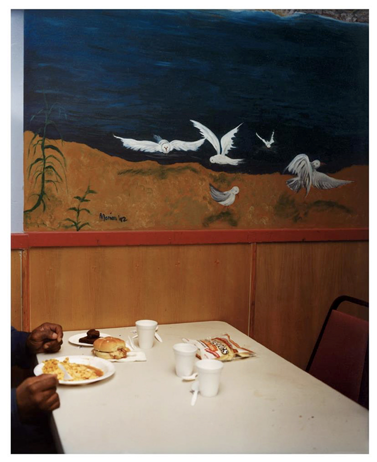
Late one March afternoon, winding up a long day of looking at The Photography Show/AIPAD, 20171, having seen thousands of Photographs and almost as many PhotoBooks, I was stopped in my tracks when I saw this at Aperture Foundation’s booth-

Gregory Halpern, Untitled (from Buffalo), 2017 *Gregory Halpern/Magnum Photos Photo

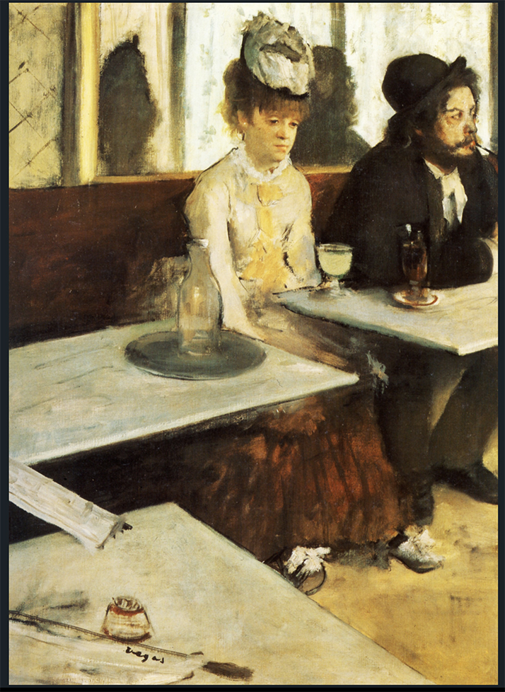
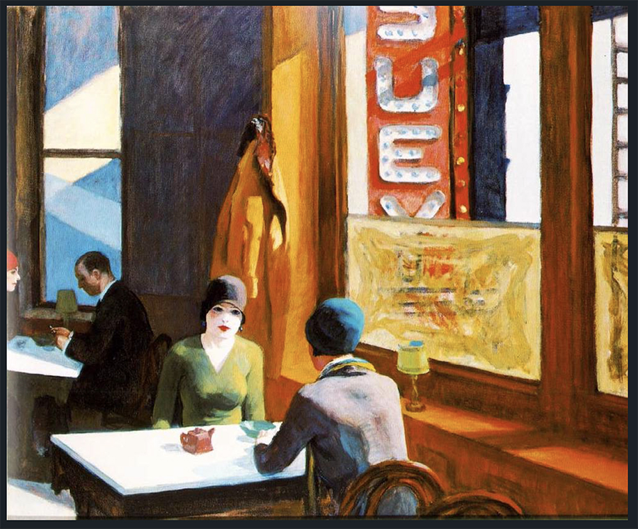
Who is Gregory Halpern, I wondered? That night I researched him and saw about 30 of his Photographs. While it’s not unusual to see 1, 2 even 5 pieces by an Artist unknown to me that catch my eye, once it gets to more than 10, the Artist has my attention. Here, were threefold that many and I hadn’t seen one that didn’t speak to me. I went back to AIPAD the next day and bought the piece. Mr. Halpern happened to be there and I got a chance to meet him and speak with him. Living with the work for almost 3 years now, I find myself as intrigued by it as I was the first moment I saw it. Everything about it compels me. But something nagged me about the composition. I must have seen this elsewhere, right? It’s ostensibly such a simple subject- what appears to be a man eats a meal at a table- it’s one of the more common subjects in Art History, and any number of Painters and Photographers have mined it. Then something a bit remarkable happened. Try as I might, to this moment, I haven’t found a direct predecessor for it in Art or Photo history.
There’s this by Edgar Degas-

Edgar Degas, The Absinthe Drinker, 1876, Oil on canvas *Photographer unknown

This by Edward Hopper-

Edward Hopper, Chop Suey, 1929, Oil on canvas *Photographer unknown

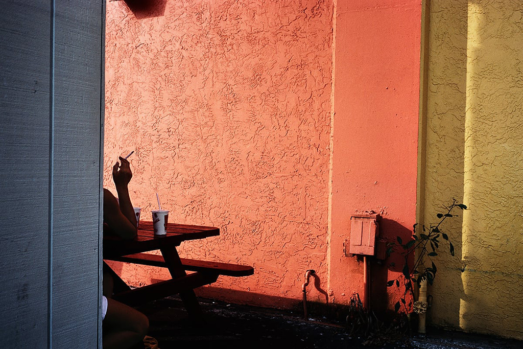
Though, perhaps these two Photographs by Constantine Manos of Magnum Photos (of which Mr. Halpern became a Nominee Member of in 2018) come closest of those known to me-

Constantine Manos, Fort Lauderdale, Florida, USA, 2000, Photograph *Constantine Manos/Magnum Photos

Constantine Manos, Miami Beach, Florida, USA, 2003, Photograph *Constantine Manos/Magnum Photos

A similar thing has happened to me with innumerable Photographs by Gregory Halpern since. Somehow, he manages to skate through Art history without repeating what’s already been done2. I’ve come to think this isn’t by accident. When I’ve spoken to him or read his interviews, I’ve found that he has a veritable encyclopedic knowledge of Photographers and PhotoBooks, and is an avid student of Art History as well.

15 years of work in Omaha, edited down to 150 images. Now? Sequence and arrange these into a classic PhotoBook.

While I was introduced to him as a “wall Artist,” he’s said the PhotoBook is the best medium for his work- “It definitely is. I love the space between images. The things that happen when you turn the page, when you are looking at a new image with the ghost of the previous image lingering in your mind… I love the feel of being swept up, as if by a stream, by a book of photographs.” So, after my introduction to Gregory Halpern, as a “wall Artist,” it was time to explore his PhotoBooks. I’ve spent the past two and a half years doing so.

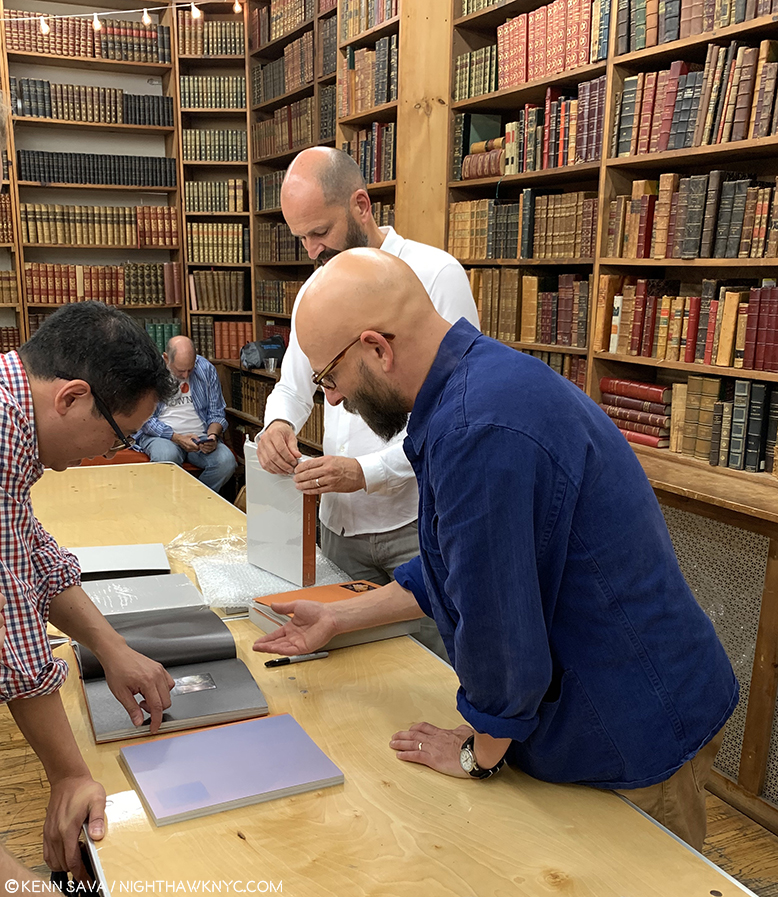
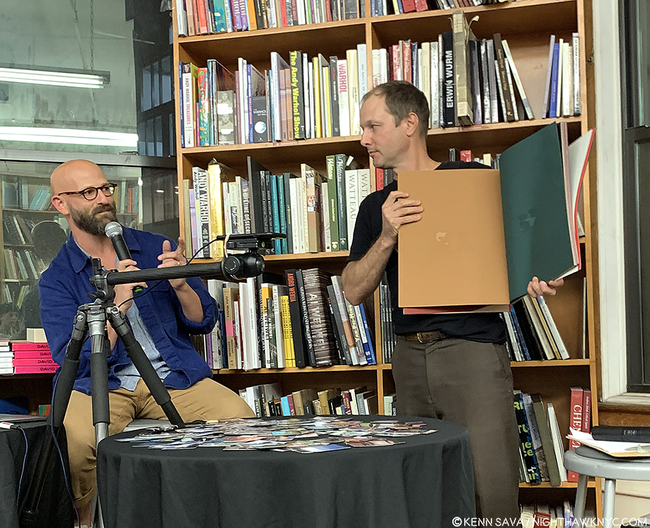
Gregory Halpern, front right, in his element, discussing a PhotoBook. Here, he happens to be introducing the limited “Book Edition” of his brand new Omaha Sketchbook, while publisher Michael Mack, behind him, unwraps copies of it for waiting customers during a signing at The Strand Bookstore, September 21, 2019.

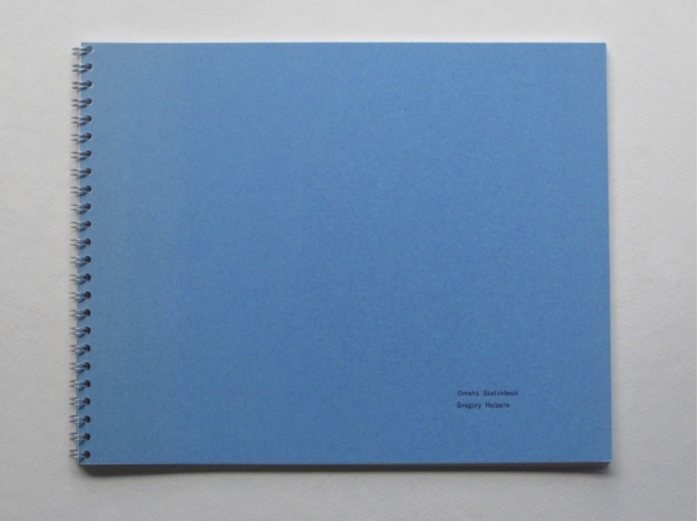
His latest PhotoBook, the MACK Books edition of Omaha Sketchbook, was released in September, completing a 15 year project that was initially published in a book of the same title in 2009 in an edition of just 35 copies by Jason Fulford’s J&L Books. As it was released, I was ready to dig into Omaha Sketchbook when a chance sighting at The Strand Bookstore got me thinking a bit more broadly.

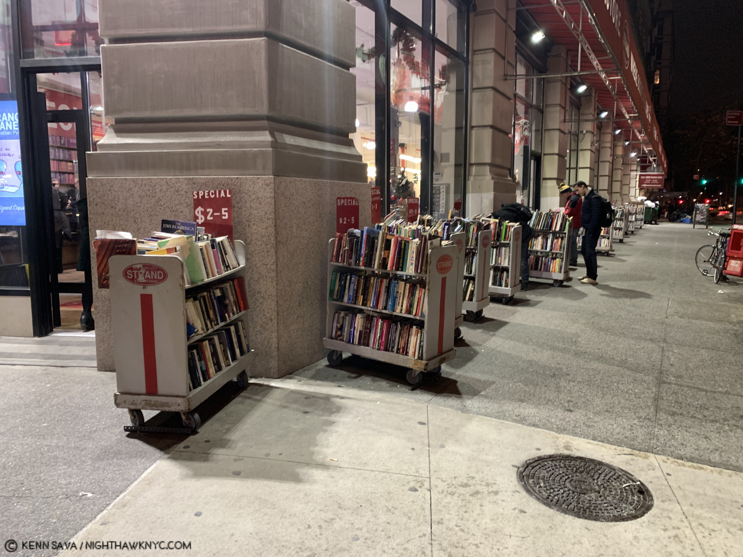
Strand Bookstore, September 25, 2019.

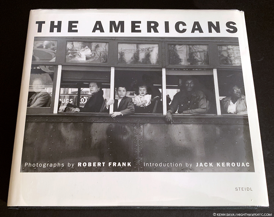
It was the day after Mr. Halpern had been back to the Strand speaking to an audience about the new MACK Books edition of Omaha Sketchbook, the timing of its September release was a bit unfortunately coincidental coming a few weeks after the passing of Robert Frank. There in front of me was an appropriately well worn display copy of Mr. Frank’s landmark PhotoBook, The Americans, next to The Photographer’s Playbook, edited by Mr. Halpern and Jason Fulford. It got me thinking about the last five PhotoBooks Gregory Halpern has now released3 particularly because the new MACK Edition of Omaha Sketchbook happens to bookend this (unofficial) body of five Photobooks, that includes A(2011), ZZYZX (2016), Confederate Moons (2018), and the original, 2009 J&L Books edition, of Omaha Sketchbook.

“Let us be lovers, we’ll marry our fortunes together
I’ve got some real estate here in my bag
So we bought a pack of cigarettes and Mrs. Wagner pies
And walked off to look for America.”^

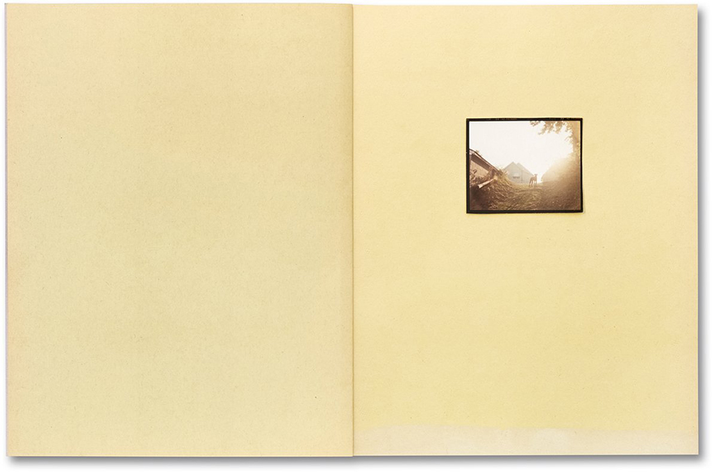
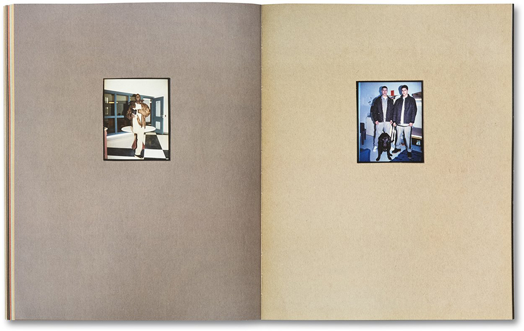
A dog stands watch silhouetted on the first spread in Gregory Halpern’s latest PhotoBook, Omaha Sketchbook, 2019, MACK Books. Interestingly, this was the final image in the J&L Books edition in 2009. If that’s not the definition of “open-ended,” I don’t know what is. Note the color of the paper, which changes with each turn of the page.

Pondering them, his five most recent PhotoBooks do have some things have in common with The Americans. Both Mr. Frank’s and Mr. Halpern’s books resulted from extensive travel through the country, though Mr. Frank’s is a concise look at America as a whole, in his inimitable style, and each of Mr. Halpern’s more local, and even taken in toto, doesn’t cover the country. A close comparison is not the intent of this piece. Besides, it’s dangerous to read too much into this. Mr. Halpern has said “there aren’t honestly any specific ‘models’ I could point to“ for Omaha Sketchbook, specifically referring to The Americans. Leaving aside any question of influence then, particularly after the exercise I undertook with Untitled (from Buffalo), above, I will say I find it utterly fascinating to look through The Americans and then look through each of Gregory Halpern’s books. Sixty years have passed since Robert Frank created the work in his classic book4, and yes, times have indeed changed, but how much has America, or Americans, changed? Have we gone forward, stayed in the same place, or gone backwards since the late 1950’s? This is one question I ask myself as I go back and forth between The Americans and Mr. Halpern’s books, particularly since his body of books now covers 15 years of work. 15 is one of those nice round numbers I like to use as a signpost to consider where we’ve been.

“Greg” Halpern, Harvard Works Because We Do, 2003, his first PhotoBook predates the books under discussion here. It features words(!) and Photos by Mr. Halpern for a cause. Harvard Works is an important book in my view, sadly, every bit as relevant today, Filled with excellent, black & white(!) portraits, like the one on the cover, Don’t miss it if you are interested in his work, or the cause.

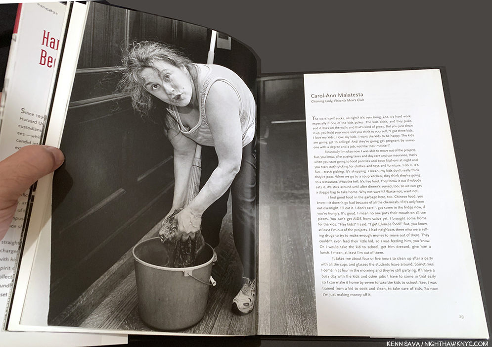
Actually, it’s worthwhile to go back one book further, to Mr. Halpern’s first PhotoBook, Harvard Works Because We Do, published by Quantuck Lane Press in 2003, which addressed the issue of the lack of a living wage for University food workers, custodians and security guards. For those who only know his later books, Harvard Works is a fascinating look at Mr. Halpern’s beginnings, one that holds up every bit today, including unfortunately, the importance of the issue he’s addressing, as can be seen in the fact that others, like the fine Artist Ramiro Gomez, have been focusing on the same subject. The book includes transcripts of interviews conducted by Mr. Halpern and edited down into concise statements accompanying the pictured subject. (By the way, I’m taking this as an opportunity to mention that Gregory Halpern is, also, one of the finest writers on Photography today known to me.)

“The work itself sucks, all right?,” so begins the statement of Carol-Ann Malatesta, accompanying her portrait in Harvard Works

For this overview of his work to date, the Photographic portraits are strong, straight forward, though, to my eyes, there are a number that show signs of the Artist within. It’s a significant book, both for the situation and conditions it documents, and centrally, those struggling with them it portrays, as well as for being Gregory Halpern’s first PhotoBook, and for both reasons, it’s a book that will remain important. “Greg” Halpern, as he is listed on the book, came away from Harvard Works feeling he wanted to take a more Artful, open-ended approach that would allow the viewer to react to the image in his or her own way. And this is what we see in each book he’s created since.

“‘Kathy,’ I said as we boarded a Greyhound in Pittsburgh
Michigan seems like a dream to me now
It took me four days to hitchhike from Saginaw
I’ve come to look for America”^5

An extremely rare pristine copy of the first iteration of Omaha Sketchbook, published in 2009 by J&L Books. *Photo from @Gregoryhalpern

Moving forward to 2009, with the publication of the original Omaha Sketchbook by J&L Books,  the stage was set for all that has come after in Mr. Halpern’s PhotoBooks. At The Strand on September 24th with Jason Fulford, he spoke about the genesis of the projectAfter winding up a teaching job in California, he cast around for residencies, finding one at the Bemis Center for Contemporary Art in Omaha. And so began a what would become a body of work that would take 15-years to complete.

Gregory Halpern, left, explains his working process and the creation of the original, large, construction paper book dummy for Omaha Sketchbook, which Jason Fulford holds. Note the spots on the pages from prints being mounted and removed as the Artist assessed them and possible arrangements. Strand Bookstore, September 24, 2019.

A few years in, after deciding to make a book dummy of the work he’d done, he went to an art supply store and looked at paper. Failing to find inspiration in the sterile white acid-free paper that was de rigueur, then and now, he discovered some faded construction paper in an abandoned school he was shooting in, and in a flash of inspiration realized he could use its rainbow of colors in a myriad of ways. He constructed a large book and mounted his prints- hand-cut from medium format contact sheets(!) with various sticky media that allowed him to place and remove the images and see how they “reacted to each other, for lack of a better word,” he said at The Strand. I find this whole idea ingenious.

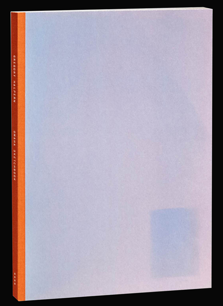
Omaha Sketchbook, 2019, MACK Books edition, front cover.

He discovered that when he removed an image after a few days, a “ghost” of that image remained on the paper. Over a decade later, that effect would be recreated on the cover of the new MACK Books edition. After making his book dummy on the colored construction paper, he showed it to publisher Jason Fulford who decided to publish it through his J&L Books imprint. The J&L edition was produced a short time later, on white paper for expediency’s sake, with the 2009 New York Art Book Fair looming. Though it only sold “a few copies,” at the show, Mr. Halpern spoke of his pride at having created an actual book. He hasn’t looked back. But, he’s gone back. Though three other excellent books followed over the next 9 years, he kept returning to Omaha. I find this absolutely remarkable when you consider that along with this, Gregory Halpern is married (to the terrific and terrifically underknown Photographer, Ahndraya Parlato), he’s a father with young children, a professor at Rochester Institute of Technology, a Nominee Member of Magnum Photos, the co-editor (with Jason Fulford) of The Photographer’s Playbook, a contributor to The New York Times, The New Yorker, California Sunday Magazine and Aperture Magazine (among others), an exhibiting Artist who’s mounted shows on two continents, has a “mid-career” Retrospective coming in 2020 at no less than SFMoMA (Hello, NYC Museums? Is this on?)- ALL while creating 3 of the most memorable PhotoBooks of recent years along the way (A in 2011, ZZYZX in 2016 and Confederate Moons, 2018)- each of which involved extensive travel, two took a number of years. My fingers got tired just typing that list. Time for a paragraph break.

Eventually, Gregory and Jason got what was about 4 years of work at the time down to the 37 images I counted on the 44 pages of the original Omaha Sketchbook (OS, 2009, henceforth) when I was lucky to be able to look through an extremely rare copy for a few minutes. There should be a term for “rarer than rare ” when you’re dealing with something THIS rare. I counted 18 images (about 50%) that do not appear in the MACK edition. That OS, 2009 is remarkably concise becomes apparent when you see the new MACK Books edition (which I call OS, 2019). I found the overall effect of the two books remarkably similar, even though we now get over 100 additional images and Mr. Halpern has been Photographing in Omaha for a further 10 years. How to feel about this? Is the place and its residents, apparently, so little changed? Even though we’re looking at 15 years in the new edition, both books feel like time capsules.

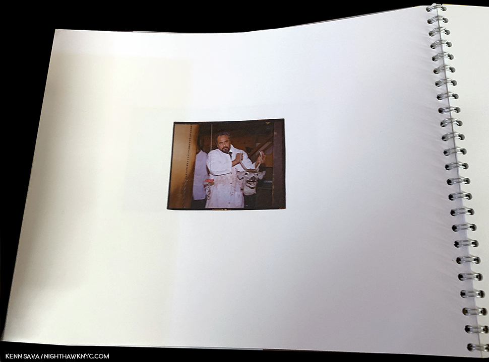
This startling image taken inside a meat plant is the only image in OS, 2009 taken indoors, one of 23 portraits I counted in this edition. Note the white paper.

OS, 2009‘s first 5 images include a house or apartment building, but there’s no “domestic” feel- we don’t go inside them. The feel is we’re visiting, passing through. Instead, the only interior shot in the book is in a meat processing plant. One thread I note in OS, 2009 that continues from Harvard Works– Gregory Halpern is a master portraitist. By my count no less than 23 Photos in OS, 2009 (more than half of the 37) are (or include) portraits, dual portraits, group portraits or “portraits” of animals.

“Laughing on the bus
Playing games with the faces
She said the man in the gabardine suit was a spy
I said “Be careful his bowtie is really a camera”^

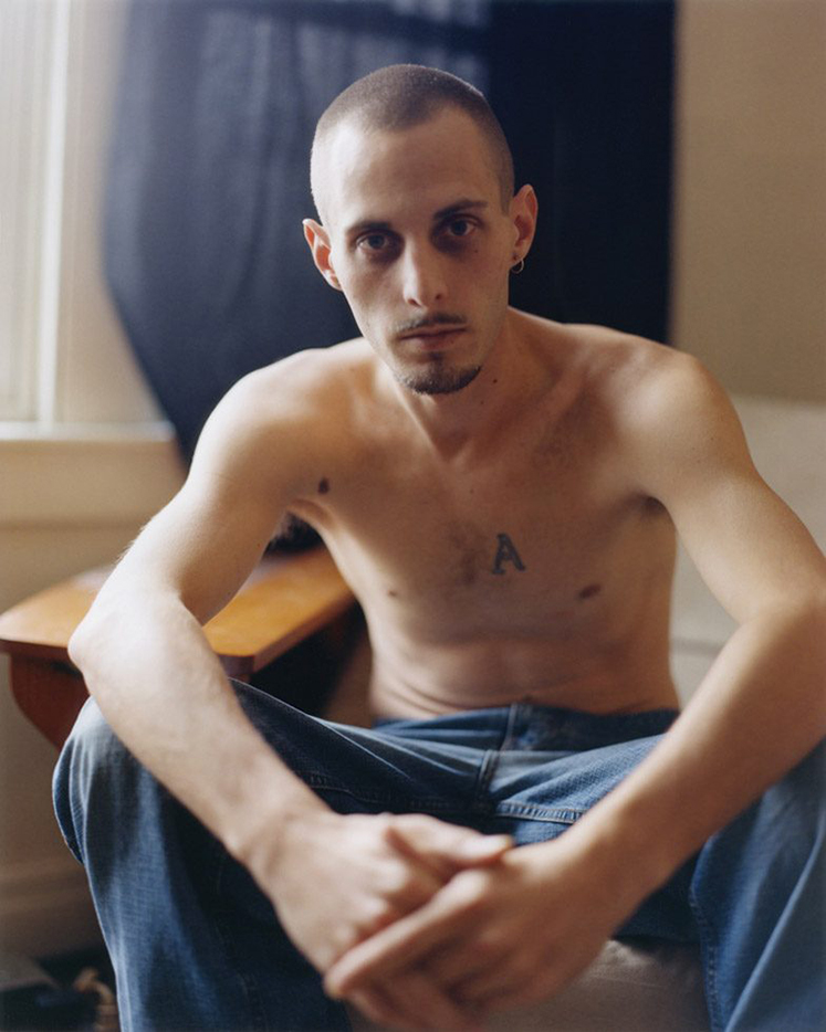
A, published in 2011 by J&L Books. A look at the “Rust Belt” in images taken from 2008-11.

This continued in his next book, A, also published by J&L Books, in 2011, consisting of work created in the American Rust Belt in cities like Baltimore, Cincinnati and Detroit, from 2008-11. Here, over 96 pages of large Photographs on its 9 1/2 by 11 3/4 inch pages, we see people and places who have seen better days, alongside some gleaming office buildings- greatly simplifying. A number of the portrait subjects look right into the camera, almost seeming to confront the viewer for a reaction.

From A, 2011. *Gregory Halpern/Magnum Photos

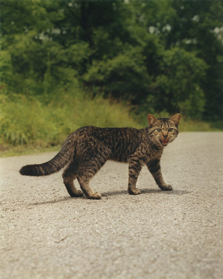
And, speaking of “confronting,” the animal “portraits” continue, too, like this memorable one, the first Photograph in the book.

The first image in A, 2011 *Gregory Halpern/Magnum Photos Photo

In my view, A is an overlooked classic. Perhaps, it’s only “overlooked” because its 1,000 copies have long since disappeared and those who have one aren’t parting with it because they appreciate how good it is So, the masses have yet to experience it. As a result, it’s a prime candidate among important contemporary Photobooks to be reissued. What began with OS, 2009, was furthered exponentially in A, before being carried even further, reaching a crescendo of sorts, with Mr. Halpern’s next book, the instant classic, ZZYZX, a look at Los Angeles and its vicinity shot between 2008 and 2015, published in 2016 by MACK Books.

“Toss me a cigarette, I think there’s one in my raincoat”
“We smoked the last one an hour ago”
So I looked at the scenery, she read her magazine
And the moon rose over an open field”^

ZZYZX, 2016, one of the most influential PhotoBooks of the decade, now in its 3rd printing in 3 years.

Is it only 3 years since ZZYZX was published? For a book I hear mentioned and referred to so often, it feels as if it’s been around much longer. Today, I can’t tell which is bigger- its influence or its popularity. From the incredibly succinct editing and tight sequencing, to the beauty of its images, it’s a true epic in the Hollywood sense, mirroring the time it took to create. (Speaking of Hollywood- A ZZYZX fun fact- There’s a film named ZZYZX, that’s directed by a gentleman named Halpern. Richard Halpern.)

From ZZYZX, 2016 *Gregory Halpern/Magnum Photos Photo

ZZYZX features more of Mr. Halpern’s memorable portraits, unexpected moments, like the one above, and something I can only describe with one word-

From ZZYZX. “And the moon rose over an open field”^*Gregory Halpern/Magnum Photos Photo

“Magic.”

There are any number of Gregory Halpern’s images that have a “magical” quality for me, including both of these shown above. I know. I was about to agree with you in questioning my own sanity, when I came across this image by his wife, Ahndraya Parlato-

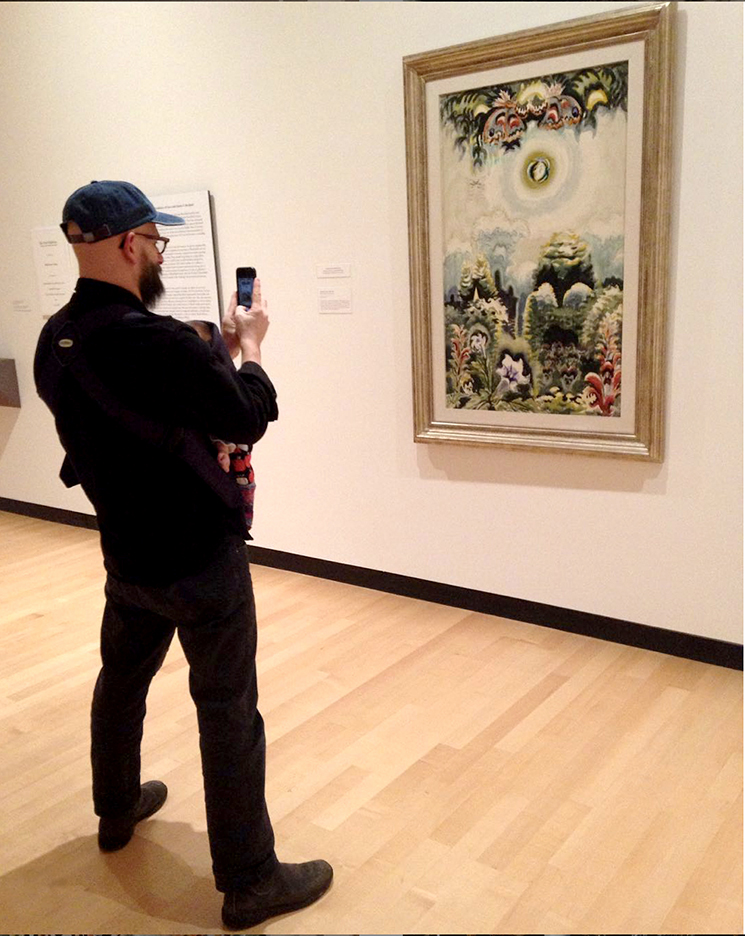
Gregory Halpern, youngster in tow, admiring Charles E. Burchfield’s Moonlight in a Flower Garden, 1961, Watercolor and charcoal on paper at the Burchfield Penney Art Center in his hometown of Buffalo, NY. *Photo by @ahndraya_parlato

Charles E. Burchfield (1893-1967), was an Artist Edward Hopper greatly admired, perhaps as much as any other contemporary, and said so when he was asked6. Mr. Burchfield was “best known for his romantic, often fantastic depictions of nature,” according to the Burchfield Penny Art Center site. Other words used to describe him are “visionary,””one of the most inventive American artists of the 20th century,” “fantastic,” mystically poetic.” It’s easy to imagine Mr. Halpern being influenced by Artists like Charles E. Burchfield, and Ms. Parlato’s image would seem to provide an insight as I try to understand these “fantastical” elements in his work.

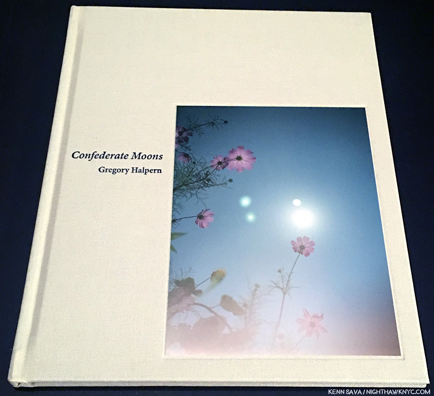
Like this one on the cover of Confederate Moons, 2018, TBW Books  Charles E. Burchfield might be proud of this shot. Incredibly beautiful, ethereal, and equally daring- he’s shooting directly into the sun, a professor “breaking the rules,” which he’s said film has the latitude to allow him to.

These images are even more present in his next PhotoBook, Confederate Moons, TBW Books, 2018, which I singled out as the one PhotoBook I’d recommend for 2018 in my roundup of books for last year, a year of very strong PhotoBooks. Issued as part of the 4-volume TBW Annual Series 6 in a limited edition of 1,000, it’s now sold out which may explain why I feel it’s a bit overlooked, too. Unlike his other three books, Confederate Moons was shot in North and South Carolina in just one month, August, 2017, the month of the solar eclipse.

From Confederate Moons. *Gregory Halpern/Magnum Photos

While created in a shorter span, and a shorter book than the others, don’t let its brevity fool you. It has every one of the elements that make his 2 preceding books classics and a good deal of experimentation to boot. Living with it since April, 2018, it’s every bit as open-ended as his other books. One time, I read it as a “reminder” that nature, in the form of the sun, is a much more powerful “controller” of life than anyone’s hopes, wishes, or agenda, coming at a time when the nation was as divided as it had been in years. Then, the next time through, I just marveled at how busy Mr. Halpern must have been during those few minutes of the eclipse! Still, it’s another important, and beautiful, book in my opinion, and one I wouldn’t want to be without.

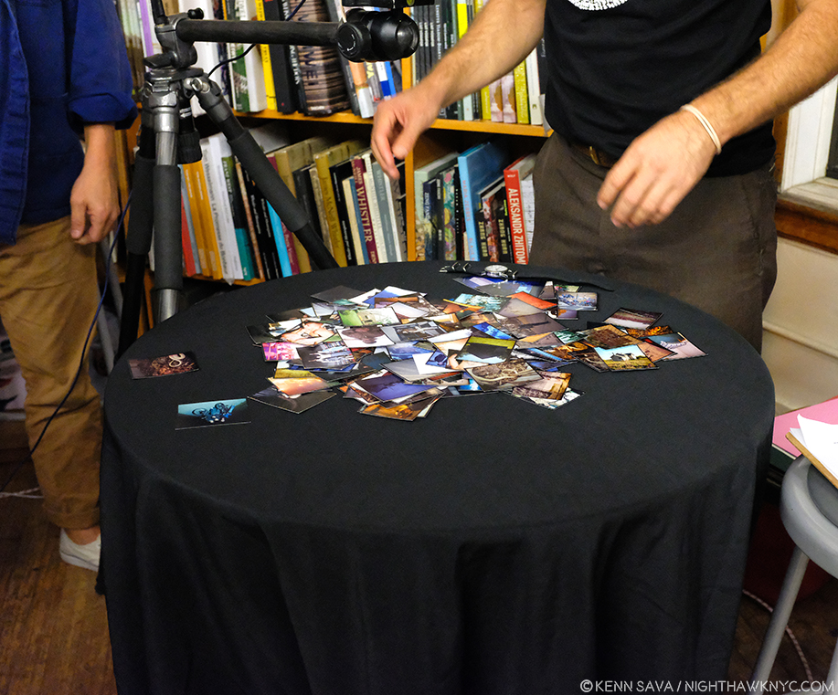
Gregory Halpern and Jason Fulford, with the wrist band, and a selection of the cut up contact sheet prints that appear in Omaha Sketchbook laid out for a talk on the book at The Strand on September 24th.

So, the stage was set for this unofficial set of books to be completed and come full circle when MACK Books announced a new edition of Omaha Sketchbook, now with a whopping 152 images. Also in my NoteWorthy PhotoBooks of 2018 piece, I singled out MACK Books for praise for their excellent series of reissues, which enables PhotoBook lovers to buy new editions of classic and now incredibly rare (prounced “expensive”) PhotoBooks in beautifully produced new editions at regular prices. Omaha Sketchbook is the poster boy of this program, given that only 35 or so people got to see it the first time around. Michael Mack and MACK Books Head Designer Morgan Crowcroft-Brown have done a beautiful job from A to Z with OS, 2019, leaving me with only one caveat- I page through it so often, I wish it was a hardcover. But, that would probably add $10. to its $50. list price…MACK’s limited “Book Edition” of OS, 2019, takes the influence of Mr. Halpern’s book dummy literally, hand mounting the 152 prints into a handmade book, in the spirit of the original. (100 signed/numbered copies, $750. per as I write).

Another spread from the MACK Omaha Sketchbook. *MACK photo.

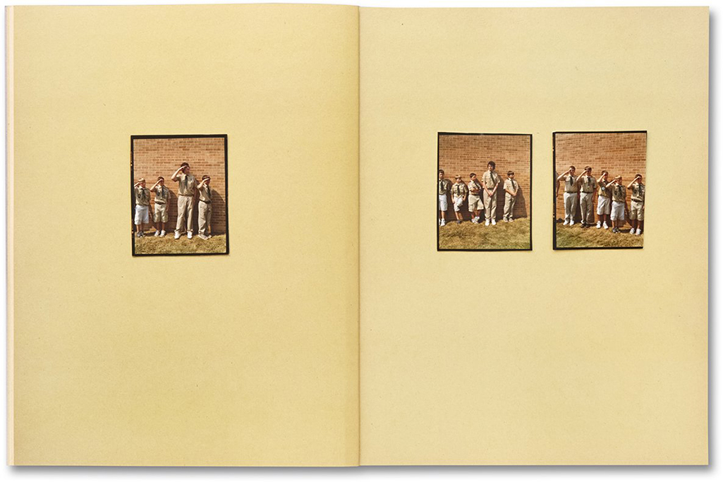
Immediately apparent as you dig into OS, 2019 are its revolutionary aspects- First, the ever-changing color of the pages, like the original book dummy shown earlier. I asked Morgan Crowcroft-Brown what we’re seeing here as I was curious about the paper in the regular edition. She told me, “They are actually scans of US construction paper. The paper was imperfect, covered with scuff marks and sun fading, but it made for an interesting backdrop to the contact prints. So these backgrounds were scanned then printed onto a textured offset paper, in an attempt to mimic the construction paper.” She, MACK and Mr. Halpern have given us the book as close as possible to what it was originally in the early days of the project, now at its completion with 152 images. It brings the project full circle in more ways than one. Given that they take up so much of the page relative to the images, the color is an element that’s impossible to ignore. It’s used in a wide variety of ways. First, to pick up a color in the Photograph, at other times a color that’s in a very small part of it. At still other times it reinforces or contrasts the mood of the Photo. Then there is the way OS, 2019 appears to be in sections- on light color paper in the beginning of the book, followed by a center section in red, leading to a gradual darkening in the last part. This gives the book a flow that reminds me of a Musical composition.

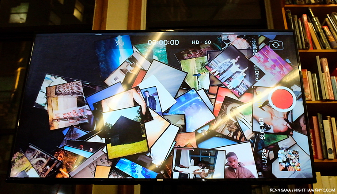
Projected overhead view of the table seen previously, with my ever-present nemesis, glare. During the talk Jason and Gregory created their own spontaneous 3 image arrangement from the pile and assessed how they “reacted” to each other, providing fascinating insight into their editing and sequencing processes. Mr. Halpern added that he would leave 2 and 3 image arrangements up on small shelves for, maybe, a week or a month to see how they worked.

Second- While there are numerous books of contact sheets, try as I might I can’t find another PhotoBook done using prints cut out of contact sheets! If you know of one, please let me know. If you look closely, you can see evidence of the prints being hand cut in their margins in things like uneven borders, which add to the “handmade” feel (the trade edition is, of course, not handmade). While some may prefer larger prints, I’m fine with them at this, smaller, size. Having just spent 5 months researching Jean-Michel Basquiat for a series of pieces on the 5 shows of his work going on around town this year, I recall he once said that he crossed out words to get people to look closer. I get the same feeling here. The small prints make you look closer.

Mr. Halpern has said the diptych on the right “exemplifies” the MACK Omaha Sketchbook for him. *MACK photo.

Another fascinating thing about OS, 2019 is though there are over 100 additional Photos, and though the body of work took 15 years to shoot, it’s impossible for me to tell when the Photos were taken. The only way I’ve found to tell if an image is earlier so far is if it appears in OS, 2009! In fact, if you didn’t know this was 15 years of work, I doubt you’d be able to tell that these weren’t all taken at the same time. Even more remarkably, as I’ve shown a taste of above, Mr. Halpern’s Photographic style has “changed” with each of his books, reaching its most experimental so far (to my eyes) in his most recent book, Confederate Moons. Yet, here, we are right back squarely in the same style he used in OS, 2009! All of these things add to the many levels in the book. Only a few weeks in, I’m sure there are more waiting to be discovered.

“Kathy, I’m lost,” I said, though I knew she was sleeping
I’m empty and aching and I don’t know why
Counting the cars on the New Jersey Turnpike
They’ve all come to look for America
All come to look for America
All come to look for America”^

From A. Taken in the American Rust Belt, this image has haunted me since I first saw it. Today, I find it extraordinarily beautiful, a subject countless Painters might dream of.

In the end, all of those levels help create a different experience, with new discoveries, each time you look at it. Yet, each time I page through it, one thing hasn’t changed. As an Art lover, I find beauty in his work, as I’ve said, in the “picturesque” images as well as in the “grittier” ones. There’s a good deal of both here. No matter what his subject is- portrait, landscape, building or object, I find a full range of beauty in his work, that calls me back to look at and ponder again and again. And yes…there’s that “Magic.”

I was about to look for the French Painter who created something like this when I stopped remembering this was done by an American, and not Monet, or the Camilles- Pissarro or Corot. Though in bright sunlight, it has an air that makes some of its exceptional beauty subtle, down to the way the left side of the roof is framed by the two trunks.

In the now three years this month of my “deep dive” into Modern & Contemporary Photography, which I define as being the period after the publication of The Americans, I have yet to find another Photographer who’s work speaks to me like Gregory Halpern’s does.

Some discuss whether or not he’s a “documentary” Photographer, and I’m blessed to have come to Photography years after that discussion was rampant. I’m glad I missed it. As always, I prefer to let the work speak for itself. Gregory Halpern is an Artist, one of the most compelling working today, in my view, so I approach his work the same way I would that of any other Artist- without the baggage of any “boxes” in the way. Though each of his books stand on their own, considered as a “body” they paint a fascinating picture of where he’s been so far- literally and creatively, where you can already see the growth and the amazing things the man has accomplished already, in 15 short years.

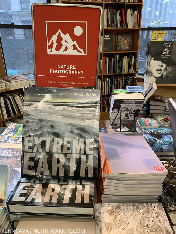
Omaha Sketchbook, now available in the “Nature Photography” section of your favorite store. ? Over 450,000 people live in Omaha. Looks like someone else, besides me, needs to get out of town and “discover America.” On behalf of whoever did this…Sorry, Omaha!

Whether it be Robert Frank, Paul Simon, Gregory Halpern, or any number of the rest of us. People have been “looking for America” for a long time. It seems to me that if it were that easy to find? “America” would have been “found” long ago. In The Americans, as well as in A, ZZYZ, Confederate Moon, and Omaha Sketchbook, you get the sense that it’s here. Hiding in plain sight.

^-Soundtrack for this Post is “America” by Paul Simon and recorded by Simon & Garfunkel from their classic album Bookends, released in 1968.

My thanks to Gregory Halpern, Kellie McLaughlin of Aperture Foundation and Morgan Crowcroft-Brown of MACK Books. 

My prior pieces on Photography are here.
You can now follow @nighthawk_nyc on Instagram for news and additional Photos!

NighthawkNYC.com has been entirely self-funded and ad-free for over 6 years, during which over 250 full length pieces have been published. If you’ve found it worthwhile, you can donate to keep it going & ad-free below. Thank you!

Written & photographed by Kenn Sava for nighthawknyc.com unless otherwise credited.
To send comments, thoughts, feedback or propositions click here.
Click the white box on the upper right for the archives or to search them.
For “short takes” and additional pictures, follow @nighthawk_nyc on Instagram.

Subscribe to be notified of new Posts below. Your information will be used for no other purpose.
 

  1. My complete coverage of AIPAD, 2017 is here, which includes more on Gregory Halpern.
  2. Yes, there are “echoes” in his work. In his new Omaha Sketchbook, I note works that show the influence of The Bechers’ isolated Water Towers, Walker Evans’ Main Street of Pennsylvania Town, 1936, Robert Adams and his former teacher, Todd Hido, among others. I take these as conscious referencing- echoes, as I like to call them.
  3. Not counting East of the Sun, West of the Moon, which he did with his wife, Photographer Ahndraya Parlato, since it is a collaboration.
  4. The Americans was first published by Robert Delpine in France in 1958, and in the USA by Grove Press in 1959.
  5. On the bootleg album entitled Village Vanguard, a collection of live recordings, in their performance of “America” in 1969, Simon & Garfunkel changed this line from “I’ve gone to look for America,” to “I’ve come to look for America,” which I opted to use here.
  6. Gail Levin, Edward Hopper: An Intimate Biography, P.265.

The “New” MoMA, And The Gorillas In The Room

Written & Photographed by Kenn Sava (except *)

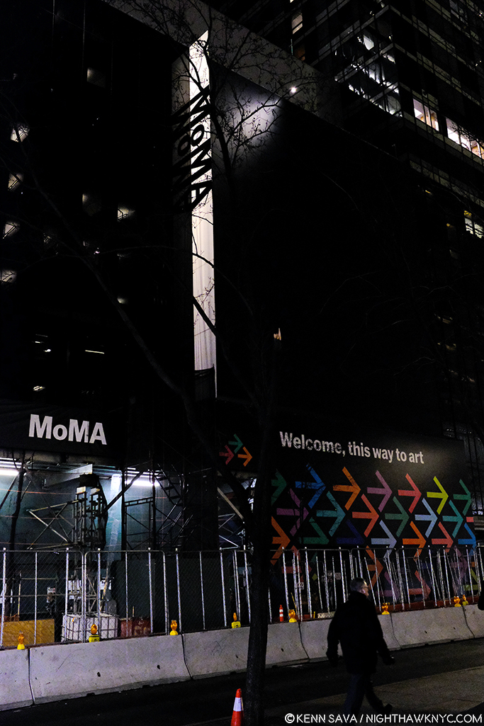
MoMA, 1st floor lobby sign, October 19, 2019. I’ve been through this before. The last time, it was a nightmare. How would this “new” MoMA be?

MoMA and I go a long way back. It’ll be 40 years next year. 

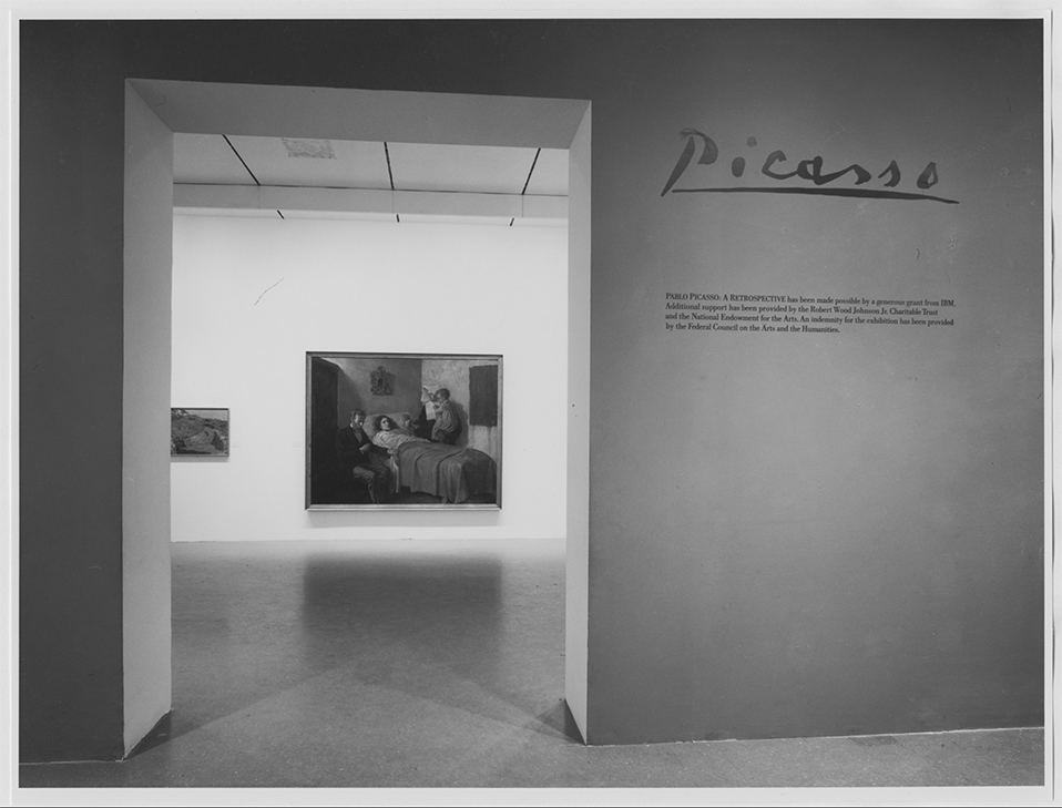
I can remember this like it was yesterday…The entrance to Pablo Picasso: A Retrospective at MoMA, 1980. My Art show attending career began when I walked through that entrance. *MoMA Photo.

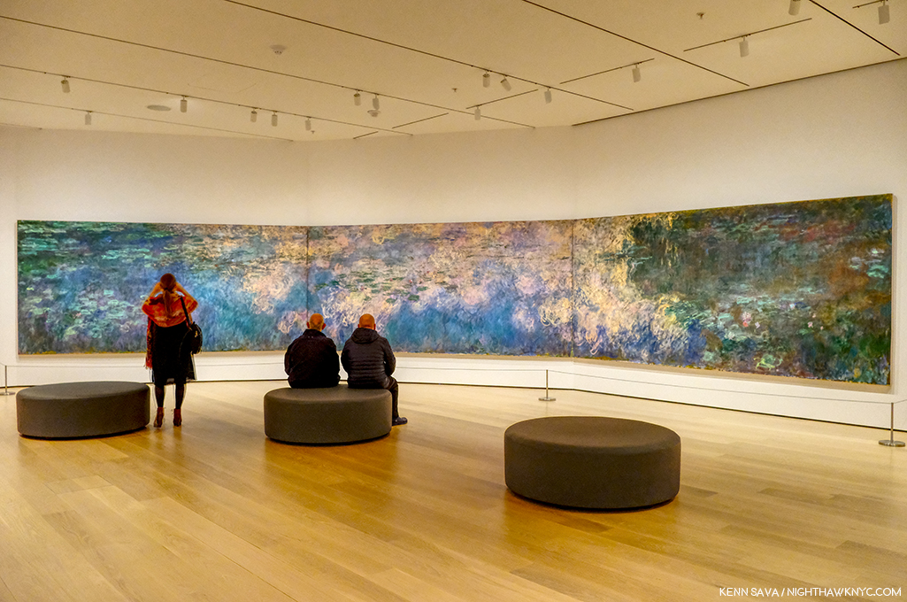
I first went to The Museum of Modern Art in 1980 for their incomparable Pablo Picasso: A Retrospective that took over the whole museum. I was on the road with a band at the time and I flew back to NYC twice to see it. Though it was not my first trip to a museum to see Art, it began my career of seeing Art shows and is burned indelibly in my mind since. While I came away feeling the late works were underappreciated, the earliest works which were new to me, like Science and Charity, 1897, Painted at age 15, seen through the entrance, above, particularly astounded me, and it never let up from there. An almost impossibly high bar had been set. I wasn’t able to attend MoMA regularly until after the 1984 renovation, which I call MoMA, 1984. Looking back on that MoMA now, I have quite fond memories of the building. I’ll never forget being in the gallery the museum dedicated to Claude Monet’s Water Lilies, 1914-26, long a very important bridge between representational Art and abstraction for me. As I recall, it was a small room, with a bench along the window overlooking West 53rd Street. You entered the room where panel 1 met panel 2, at about 10 o’clock as you faced it. You sat there and the three huge panels surrounded  you, making you feel like you were inside it. It was one of the greatest feelings I’ve ever had looking at Art. I didn’t think MoMA, 1984 was anything special at the time, but given how lacking MoMA, 2006, the most recent MoMA was, which of course, is still with us in the partially new MoMA, 2019, I now feel quite nostalgic for a building that was “adequate” at best, overall.

The heart of Art darkness. Construction for MoMA, 2019 in progress at the famous main entrance, behind the arrows pointing visitors to the temporary entrance, December 20, 2018.

I saw Matisse-Picasso at MoMA Qns in 2003, where MoMA was temporarily as MoMA, 1984 became MoMA, 2006, which I went to innumerable times (and have written about a number of its shows here on NYNYC), from it’s earliest days. MoMA, 2006, which opened that November, was terrible, in my opinion (I replaced a stronger negative). I remember standing in utter shock looking at Monet’s Water Lilies installed around the base of the huge, open space, they called the “atrium,” where they had no sense of their compositional continuity or unity. Barnett Newman’s Broken Obelisk, 1963-9, installed in the center of the space looked better there than anything I’ve seen there that came after it, which is not really saying anything all that positive.

The newly renovated main entrance. Opening day, October 21, 2019.

“The Shopping Mall of Modern Art,” I took to calling MoMA, 2006, the one we’ve been living with these past 13 years. I don’t live in the suburbs partially because I hate malls, yet, here we were given one. The Architect, Yoshio Taniguchi, said1 “The model for MoMA is Manhattan itself.“ He spoke about how Central Park is like MoMA’s Sculpture Garden in his concept. Apparently he felt the rest of Manhattan is one giant shopping mall, cause that’s the design we got- a department store, nothing more, nothing less, who’s floors/departments are connected by an escalator, as they always are. If MoMA had decided to move to an entirely new location instead of turning MoMA, 2006 into MoMA, 2019, whoever would have come into the building would have a virtual turnkey Macy’s II ready to go. “Contemporary on 2,” “This way to the Permanent Collection, and home fixtures…I mean Design”…

That brings me to the Gorillas in the room…Both of them.

“There’s a hole
In my life
There’s a hole
In my life”*

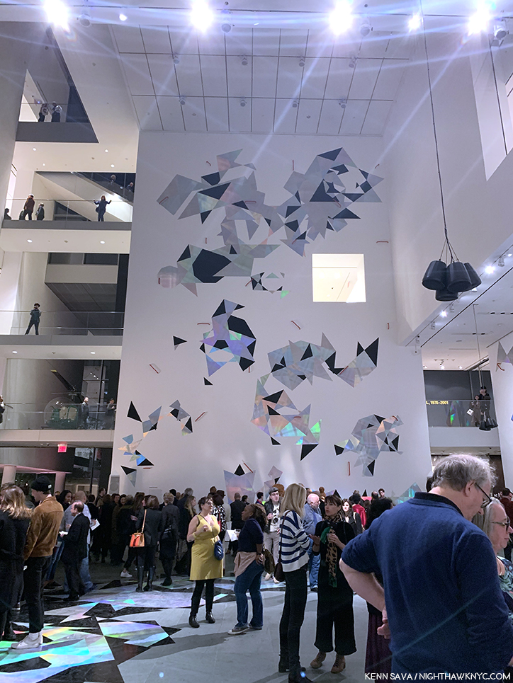
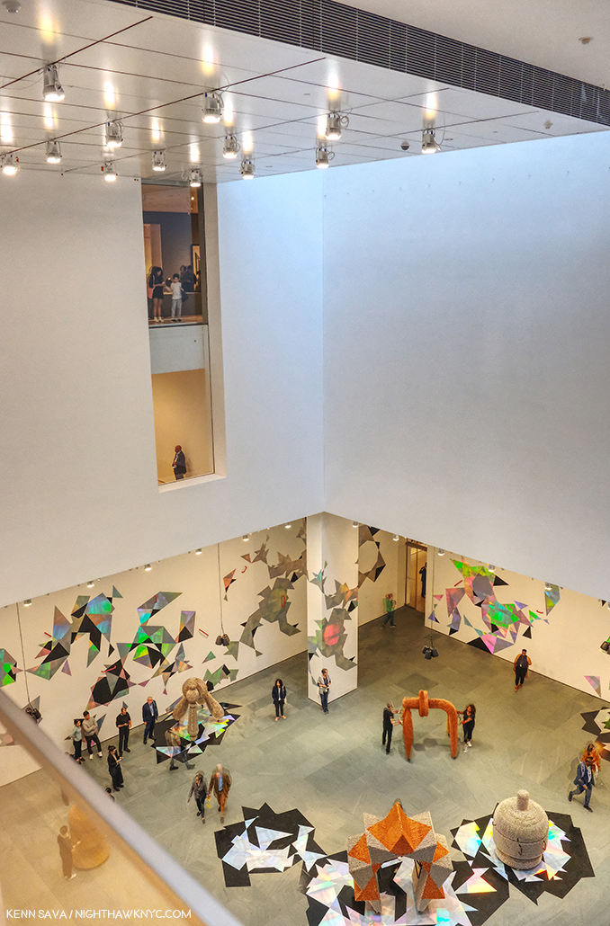
The “atrium,” Member’s Preview” for the “new” MoMA, October 19, 2019.

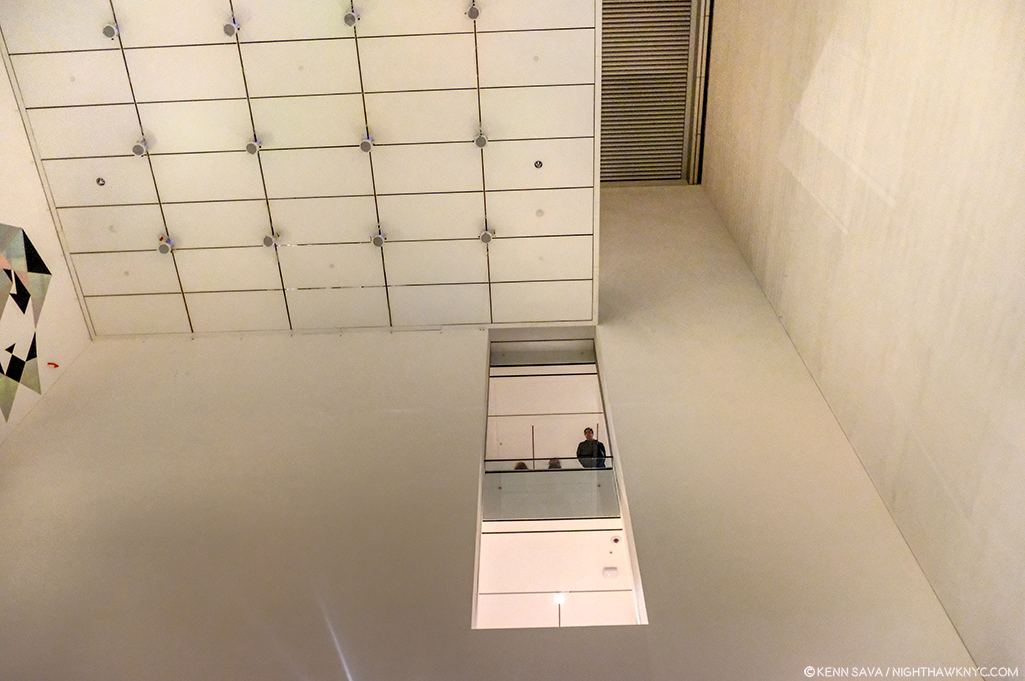
The first is that 110 foot tall gorilla in the building officially or unofficially called the “atrium.“ For some reason that I have not for the life of me been able to figure out over a few hundred visits these past 13 years, the Architect decided to drop a 110 foot tall atrium, (the “hole” I call it), smack dab in the middle of the building that, apparently, even some of the world’s great curators haven’t found a defining use for in almost one and a half decades2. I don’t blame them. I blame the Architect and whoever else thought this space was a good idea. I’ve never seen them use any more than the first 20 feet or so of its 110 until they mounted a decal-like iridescent work, seen above, on one of its walls for the opening of MoMA, 2019. And, I blame those who decided not to remove it in MoMA, 2019.  MoMA created MoMA, 2019, partially, because they “needed more space.” Well, guess what? You’ve got 7,700 square feet, or so, of completely useless space right smack dab in the middle of the building3, right in the middle of some of the most expensive real estate on earth. Instead of extending each of the floors as they should have been originally and filling that hole, they tore down an existing, good, museum, The American Folk Art Museum, formerly at 45 West 53rd Street next door!

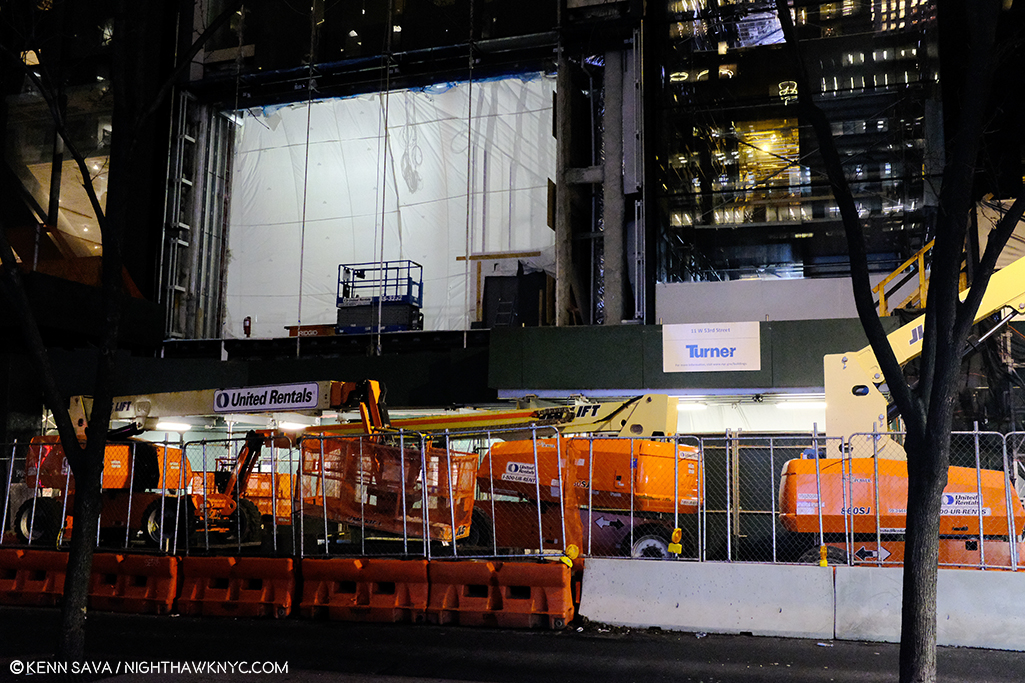
Construction of the new building for MoMA, 2019, where the American Folk Art Museum stood, seen on December 20, 2018.

“Shadow in my heart
Is tearing me apart
Or maybe it’s just something
In my stars”*

Frankly, all of this galls me.

“Soaring…””Majestic…””One of NYC’s great interior spaces…” Oh, sorry. I was reading about the Guggenheim. I can’t find anyone saying that about this.

Because of the atrium, the flow of every floor in MoMA, 2006 is broken up, causing headaches for visitors and curators. This goes right to the heart of the museum’s purpose- showing Art. A good number of the galleries in MoMA, 2006 felt strangely shaped, small, or lost. In this case, small doesn’t add “intimacy.” Instead, it serves to actually minimize the effect of the Art being shown in them, in my experience. The Brancusi show mounted before the summer, 2019 closure, and the new Betye Saar show both suffer from this, in my opinion, both being mounted in the same 2nd floor gallery, tucked off to the south side of the hole, behind sliding glass doors (which I also think are an annoying idea and an energy drain), unchanged between Moma, 20o6 and MoMA, 2019.

Apparently, given it’s still here in MoMA, 2019, MoMA is in denial that the atrium is a problem. For me, visiting MoMA, 2006 gives me the unmistakable feeling that I’m continually walking around, and working my way around, the hole, instead of the whole experience just flowing.

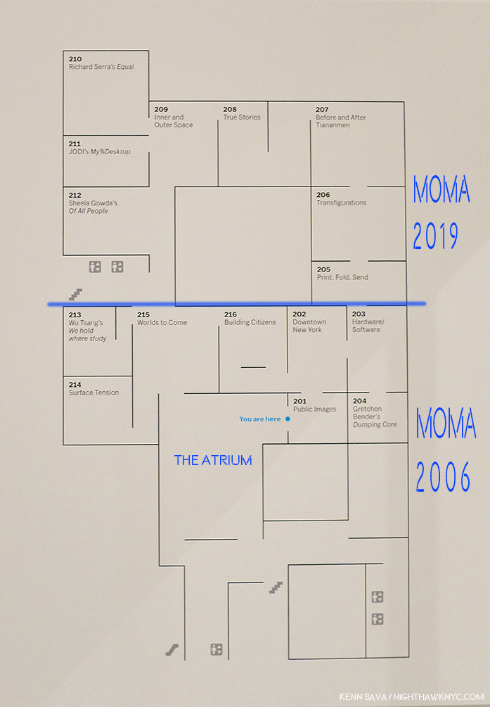
MoMA’s floor plan for part of the “new” 2nd floor. I’ve added notations in dark blue- a label for the atrium to point out where it is and how it needs to be navigated around. I’ve also labelled where MoMA, 2006 was (below the added blue line) and labelled where MoMA, 2019 is now (above the blue line) in the margin. Not shown- the other galleries on this floor, located in what MoMA now calls the “South” section (to the left and lower left.). All are effected by the “atrium.” Bear in mind- this is only ONE floor!

In fact, in MoMA, 2019, they’ve decided to double down. Keeping the hole, they’ve opted to extend the existing 2nd, 3rd, 4th and 5th floors the other way- to the west. I take this as an admission that the floors needed to be extended. We differ on how. You can see this in the 2nd floor floor plan, above. I’ve drawn a blue line to the left from gallery 205 and everything above that is the new building, what I call MoMA, 2019, below is what I call MoMA, 2006. It almost works. It does serve to minimize the “interference”/inconvenience of the hole, unless you’re in a section where you have to navigate around it. Alas, as soon as you are back in the “old” building, the MoMA, 2006 part, there it is, rearing its ugly head again, sending you to a floor plan trying to find your way. But, it also dramatically effects MoMA’s curators, and no doubt, every single show they mount in these spaces. WHY they just didn’t remove the atrium and extend the floors and make the 2nd, 3rd, 4th, and 5th floors full floors? (The 6th floor is a different matter, I believe due to the heights of the buildings. It already is a full, raw, space in the MoMA, 2006 building and a cafe has been installed on 6 on the MoMA, 2019 side (which I have not seen as yet. You can walk through from MoMA 2006 to MoMA 2019 on 2, 3, 4 and the 5th floor, but you can’t on 6. If you’re on 6 in MoMA 2006, you have to go down to 5, walk over to MoMA, 2019, and then go up to 6 on that side, or vice versa). That they didn’t remove the atrium is another, huge, mistake in my view. Alas, it’s too late for tears. And having been sad about MoMA’s building since MoMA, 2006 opened, I’m about cried out. Yes, MoMA, 2006 was so bad it actually kept me from going at times.

Where the heck am I going? Before going anywhere, it’s a good idea to check the “central scoreboard,” as I call it. West? North? South? What? Look quick! Those listings next to each floor change to show other things going on on that floor. Seen on the official opening day, October 21, 2019.

Another question for me is HOW do you redesign the building into MoMA, 2006, spending over 850 million dollars doing so, and not early on in the game ask, “WHERE are we going to put our most popular works?” Apparently, no one asked. Over the subsequent 13 years of the building, Monet’s Water Lilies and Van Gogh’s Starry Night, to name two, were continually moved, and never once looked to have found THE place for them. I lost count of how many places I saw the Water Lilies in MoMA, 2006, all the while with that indelible memory I recalled earlier in my mind.

The brand new elevator doors open on my first visit to MoMA, 2019’s 2nd floor, October 19, 2019.

SURELY someone would ask that question when it came to designing MoMA, 2019! Two visits in? The answer is a decided…I’m not sure.

Home? At last? Monet’s Water Lilies, 1914-26, in a gallery devoted to his Water Lily Paintings (yes, they have others). We’ll see how long these stay here.

The Water Lilies seem to have been given some thought. They are decently situated in a gallery that contains only Monet Water Liliy works on an angled wall, similar to one of the installations they had in MoMA, 2006. You can scan the whole work continuously but it doesn’t give you a “wrap around” feeling. Starry Night fares far less well. It’s stuck in a corner(!?) at the end of a long gallery. I was shocked when I walked in and saw this. It’s just terrible.

Cornered! Vincent van Gogh’s beloved Starry Night, 1889 can be barely seen (as usual), though it’s now stuck in a corner. Seen on the official opening day, October 21, 2019

In this large gallery one other Van Gogh is installed half way down the wall to the left. I didn’t get the feeling of connection with the other works shown near Starry Night. Munch, who I greatly admire, is seen on the left hand wall, and while many pair him with Vincent, he gives me a completely different feeling, though l’ve wondered if Vincent may have been an influence on the Artist who was a decade younger. MoMA may have felt that putting other Van Goghs next to Starry Night might have created too big a crowd. I can live with seeing Munch next to Van Gogh’s. As seen in this gallery, due to the new arrangement of the galleries, multiple works by the same Artist are spread out, often across galleries.

Picasso, Les Demoiselles d’Avignon, 1907.

That means that if you want to see, say, the Picassos, you have to plot a path to a number of rooms, where you might see one, or you might see 3 or 4. If you have multiple Artists on your hit list of pieces to see? You’re going to need a good chunk of time- just to plan your routes. Especially if they’re installed over multiple floors. I have mixed feelings so far about this arrangement, but I’ve been living with this collection for decades, and while I prefer seeing it chronologically so you can see how Art has evolved over time, mixing it up can be a nice change of pace and reveal new synergies. This “theme” strategy, which is more like that of a special exhibition, feels geared to people like me who have lived with the collection for a while and might welcome being surprised (if that’s what they feel). First time visitors, or those here with limited time, may feel differently.

Picasso, The Charnel House, 1944-5. The iconic Guernica is a work Picasso Painted in 1937, in the early days of World War II. The Charnel House was Painted at the end of the War, bookending Guernica, though far less well-known. Guernica was part of MoMA’s collection until Picasso died. He stipulated in his will it be returned to Spain. So, including it in the 1980 Picasso Retrospective, where I was able to see both of them, was something of a farewell before Guernica went to Spain.

Picasso seems to fare better than Starry Night. At least three of his major works (Les Demoiselles d’Avignon, 1907, Three Musicians, 1921, and The Charnel House, 1944-5) get walls all to themselves- in different galleries.

The upper left corner of Dali’s, The Persistence of Memory, 1931 (aka the “Soft Watches”). Picasso watch- Girl before a Mirror, 1932, is partially seen in the rear to the right.

As for other works on the most popular list, one was easier to find. Dali’s The Persistence of Memory, 1931 (aka the “Soft Watches”) gets a pillar to itself front and center in gallery 517. And on the opposite side of the same wall is Frida Kahlo’s Self-Portrait with Cropped Hair, 1940. That was easy. I only had to ask once to find it. (The Water Lilies? I asked 3 times. I saw another visitor seeking them ask twice.)

I found the galleries to be well lit, as readers well know, lighting is one of my long standing peeves in most spaces I see Art. One gallery of 2 Hopper Paintings accompanied by a good many Photographs was a bit dark, I presume this was intentional for conservation purposes. The consistency of the lighting across the museum that I’ve seen thus far is to be commended.

Lower level gift & book shop. One of at least 2 in the museum.

The first floor lobby felt like being in any of the faceless, large Times Square hotels nearby. It felt that a lot of money was spent here. Yet, I can never recall asking someone “How was your visit to such and such museum?” and getting the response, “Oh, the lobby was amazing!” I believe “sinking” the gift shop/book store is a mistake. Getting anywhere in MoMA, 2019 requires taking stairs and elevators. The last thing people may feel like doing is taking MORE stairs just to visit a shop. We shall see.

Not listed on the floor plan, the previous cafe has been replaced by a Brancusi gallery on 5 (gallery #500). Behind it, we now get free access to the outside patio overlooking the Sculpture Garden.

“There’s something missing from my life
Cuts me open like a knife
It leaves me vulnerable
I have this disease
I shake like an incurable
God help me please”*

Jean-Michel Basquiat, Glenn, 1985, left, Keith Haring, Untitled, 1982, right.

Then there’s the other gorilla in the room at the “new” MoMA, 2019. My feeling is that MoMA, The Museum of Modern Art, is dangerously close (if it hasn’t happened already) to remaining just that, indefinitely. It’s not THE Museum of Modern & Contemporary Art many think it is. Their collection of the most important Contemporary Art is nowhere to the level of it’s preeminent collection of Modern Art (the period I consider to be approximately from Edouard Manet’s Le Dejeuner sur l’herbe, 1862, through 1979), or the collections of important Contemporary Art in LA, SF or Chicago, in the US. MoMA (and all the NYC museums) have fallen hopelessly behind in collecting important Contemporary Art. Jean-Michel Basquiat (J-MB) is a classic case, but he’s not alone. As they admitted, they didn’t collect his work early on and now it’s too late. I recently recounted MoMA’s history (or lack thereof) with J-MB in my series on the J-MB shows going on in NYC this year. Revealingly, only one of the 5 shows in NYC was mounted in a museum- The Guggenheim. Then, when I walked into the member’s preview for MoMA, 2019 on October 19th, low and behold there was a Basquiat front and center in the second gallery, above. It turns out they borrowed it from a private collection. This seemed to me to be a classic case of “smoke and mirrors,” of trying to hide this large hole in their Contemporary Art collection- and, after all these years (40 next year), possibly an admission they were “wrong” about Jean-Michel Basquiat.

Louise Lawler’s Does Andy Warhol Make  Your Cry?, 1988, above, and a group of 24 Untitled Film Stills, by Cindy Sherman.

Elsewhere on the 2nd floor, the entire first gallery, titled “Public Images,” was made up of work by women Artists, as if to immediately counter the oft mentioned fact that a very small number of women Artists have been given retrospectives by MoMA. They have also installed a Betye Saar show, The Legends of Black Girl’s Window, across the atrium, centered around a recent acquisition by the museum of earlier work by Ms. Saar. It doesn’t include any of her more recent, powerful, work, some of which were presented in Washboards, 1997-2017, presented earlier this year at the New York Historical Society. While nothing will detract from her overdue appearance in a substantial show in another NYC museum, I was left wondering why they didn’t mount the long overdue full Betye Saar Retrospective, who is still going strong at 93, while she’s alive to enjoy it. Looking at MoMA’s permanent collection online, time and again, I found either a lack of any works by important Contemporary Artists (Ai Weiwei? Robert Frank’s Photographs? Leonardo Drew? Rod Penner? Gregory Halpern? Petra Collins?…None by any of them. The most recent work by Betye Saar, who was born in 1926, is from 1972- 47 years ago!), a lack of their important work, or a lack of depth of these works (2 works, each, by Henry Taylor, Francesca Woodman, 1 Painting and 10 Prints by Richard Estes, 2 Paintings, 2 Studies and 22 Drawings by Kerry James Marshall and Jean-Michel Basquiat– 0 Paintings, 2 Prints, 10 Drawings). A close look at what is installed in the Contemporary galleries on 2, which makes a point of being inclusive, strikes me as an attempt to rewrite MoMA’s perception in the face of criticism, and, some smoke and mirrors- how much will require more than 2 visits. In the meantime, go and make your own study.

Before the crowds. Parts of 4 galleries, Contemporary Art, 2nd floor. Member’s preview, October 19, 2019.

Tourism is a big deal for MoMA, the other NYC museums, and NYC. If the Art going public begins to perceive the reality that NYC is not the place to go see important Contemporary Art, one of the most popular periods of Art there is at the moment, this would be a disaster, especially after having just spent over 450 million dollars on MoMA, 2019. Smoke and mirrors might buy them some time, but whether they can overcome the self-inflicted damage they’ve already done remains to be seen. MoMA was incalculably helped to become THE Museum of Modern Art by a visionary curator, Alfred Barr, during its formative years. More recently, those in charge didn’t believe in the work of these Contemporary Artists at the time, didn’t have the vision and foresight Mr. Barr did, and so they missed the boat.

Mark Bradford, James Brown is Dead, 2007, Torn-and-pasted printed paper, 47 3/4 x 267 inches. I’ve made no secret of my admiration for Mr. Bradford, who I consider one of today’s most important Artists. In fairness, since I’ve mentioned some of the Artists omitted from their collection, MoMA owns 4 of Mr. Bradford’s larger works, 1 Sculpture, 1 Video and about 17 Multiples. So, I find it interesting they chose this work for display.

They, and their counterparts at the other NYC museums, may well have cost NYC it’s world leading status as THE Art capital of the world, we shall see. It’s too late now. Only mass, and massive, donations will help to close that gap now.

Though I am a paying member, I dreaded going to see the “new” MoMA, 2019. Such is the level of disdain I have for MoMA, 2006, which I consider to be the worst major museum building I’ve ever been in, it actually keeps me from going to see the Art! Maybe I’m just too used to MoMA, 2006 that MoMA, 2019 actually feels “not so bad.” Well Let’s see. MoMA, 2006 cost 858 million dollars according to The Times. I’ve seen 450 million as the cost of MoMA, 2019. That’s at least 1.3 BILLION dollars to make something I just said was “not so bad.”

Well, in 10 years, when MoMA decides that they “need more space,” which you know they will, I know where they can get 7,700 square feet of it, without tearing down anyone else’s building. Let’s say by then it will cost another 500 million to create MoMA, 2029. Then, they’ll have a chance at actually making the building “decent.”

Gee…Wait a minute. Between MoMA, 2006 and MoMa, 2019, they’ve spent 1.3 billion dollars? If they spent that on Art back when MoMA decided to build MoMA, 2006? You might actually have a collection of important Contemporary Art on the level with MoMA’s collection of Modern Art.

Instead? We got one of the biggest Architectural design mistake in NYC in my lifetime, right up there with not allowing the world’s greatest Architects, beginning with Frank Lloyd Wright, who’ve tried to build here a chance to build more than one building each. More? That the powers that be at MoMA thought putting a gigantic hole in the middle of the most expensive real estate on earth was a good idea, and then less than 10 years later tear down an actually good museum saying they “need more space” is plain hubris.

On second thought, maybe that hole does signify something about Manhattan after all. It signifies the hole in the collections of Contemporary Art at MoMA, and the other Big 4 NYC Museums. Smoke and mirrors aren’t going to be able to cloud that realization from many for very much longer.

“Be a happy man
I try the best I can
Or maybe I’m just looking for too much?”*

*-Soundtrack for this Post is “Hole In My Life” from Outlandos d’Amour by The Police, performed live in Paris in 1979, here-

NighthawkNYC.com has been entirely self-funded and ad-free for over 6 years, during which over 250 full length pieces have been published. If you’ve found it worthwhile, you can donate to keep it going & ad-free below. Thank you!

Written & photographed by Kenn Sava for nighthawknyc.com unless otherwise credited.
To send comments, thoughts, feedback or propositions click here.
Click the white box on the upper right for the archives or to search them.
For “short takes” and additional pictures, follow @nighthawk_nyc on Instagram.

Subscribe to be notified of new Posts below. Your information will be used for no other purpose.
 

  1. In the same New York Magazine piece, the author, Alexandra Lange, concluded that MoMA, 2006, “…is a question, sublimely unanswered.” 13 years later, I’ve still got a few questions, which I ask in this piece. Living with them has been painful, not “sublime.”
  2. Yes, the Tate Modern in London did something a little similar, but dissimilar enough to make the difference, and they’ve continually found good uses for it since it opened around the same time as MoMA, 2006.
  3. Where did I get 7,700 square feet from as the size of this space? I’ve been unable to find out the official square footage of the atrium (interesting, no?). It hasn’t been published anywhere and those I asked at the museum didn’t know or wouldn’t tell me. So? I took it upon myself to calculate it. 110 feet is the published (known) height. I stepped off 35 paces from wall to wall and each of my paces is 24 inches. That’s 70 feet, and 7,700 square feet in total by my guesstimation.

Jean-Michel Basquiat, At 59

Written & Photographed by Kenn Sava (except *)

Part 3 of a series…

In January, 1983, Henry Geldzahler asked Jean-Michel Basquiat- “Is there anger in your work now?
He replied, “It’s about 80% anger1.”

Jean-Michel Basquiat, at about age 20, walks with his clarinet at the intersection of East 88th Street and 5th Avenue across from the Guggenheim Museum, circa 1980-81 in a screenshot from the movie, Downtown ’81, directed by Edo Bertoglio and written by Glenn O’Brien. 39 years later the Guggenheim has mounted a show of work the Artist would create over the next few years. *

The Brant Foundation’s Jean-Michel Basquiat was the largest show of the five going on in NYC this year featuring the work of Jean-Michel Basquiat (J-MB, henceforth), or about him. Though it provided a rare opportunity to see a broad range of his Paintings through most of his career, there was no context to the show, beyond it being an exceptional, diverse, collection of his Paintings. My impression was the attention paid to presenting groups of work by theme consisted of a group of portraits in the rear gallery on the 4th floor, a room half full of Paintings of Boxers and a wall of Paintings with unusual stretchers, both on the second floor. The lack of a theme or themes is mitigated by the fact that in many of his works there are multiple themes present allowing viewers to piece together their own narratives in, and between, pieces. Yet, as time goes on, and the focus of J-MB studies turns away from the well-worn biography and more and more to the “less discovered land,” i.e. his work, some of the themes lying just beneath the surface are starting to finally get the attention they deserve.

In that same interview with Henry Geldzahler, J-MB said that “royalty, heroism and the streets” were his favorite subjects. Over on the sixth floor of the Guggenheim Museum, in Basquiat’s Defacement: The Untold Story, the only museum show of the five J-MB and J-MB related shows going on in NYC this year, all three of those themes were featured, with “the streets” perhaps most front and center. The show’s overriding focus was the death of Michael Stewart, a 26 year old Artist who died of injuries he received “on the streets,” after being arrested by the Port Authority Police on September 25th, 1983, for allegedly drawing or writing in the 14th Street L subway station two weeks earlier on September 15th.

The scene of a crime. The 1st Avenue Brooklyn bound L Subway Station, currently under construction. It’s a narrow platform as subway platforms go with nothing obstructing the view from one end to the other. The only entrance/exit, the one Michael Stewart must have entered and been removed through, is just to my right rear. Seen in October, 2019.

A public outcry and numerous protests ensued. The effect was immediate, deep and lasting, as the show reminds us, bringing us right back to the moment. The downtown community of Artists that Michael Stewart, J-MB, Keith Haring, and many others, were a part of, also responded with their creativity. In his “Chronology” in the Whitney Retrospective catalog, Franklin Sirmans writes, “Basquiat always conscious of racial realities is deeply effected by the death of Michael Stewart on September 15th…Basquiat, perhaps in fear, practices a form of denial. He consciously distances himself from the situation. No matter what his art world status might have been, incidents such as this were a constant part of his life2.” He continues, quoting Keith Haring, “One thing that affected Jean-Michel greatly was the Michael Stewart story…He was completely freaked out. It was like it could have been him. It showed him how vulnerable he was.” He then quotes J-MB as saying, “It could have been me. It could have been me3.” Michael Stewart died 8 months or so after J-MB said his work is “about 80% anger.”

Keith Haring’s Cable Building studio after Defacement was cut from the wall to the right of center, where he created it, 1985. *Keith Haring Foundation Photograph.

The show’s centerpiece is a work that has come to be called Defacement (The Death of Michael Stewart), 1983, that J-MB created on a wall of Keith Haring’s Cable Building studio at some point between September 29th and October 5th, 19834.

Keith Haring’s Bedroom, Greenwich Village, 1989. *Photograph by Nancy Elizabeth Hill, Keith Haring Foundation.

When he moved out of the Cable Building, Mr. Haring had it cut out of the wall and framed. In an indication of how he felt about the work, it hung over his bed, where it remained, apparently, until he died, in February, 1990, almost exactly a year and a half after J-MB.

Along with it, in the first gallery were 6 other Paintings and two limited edition prints by J-MB. In the second gallery, the rest of the show recounts the tragic story highlighted by vintage posters announcing protests, newspaper articles and ephemera, accompanied by Art by Keith Haring, David Hammons, George Condo, Lyle Ashton Harris and Andy Warhol. A moving highlight of the show is the inclusion of very rare examples of Michael Stewart’s work, which I have never seen before, from his family’s collection. At the time of his death, Mr. Stewart was planning his first show. Seeing these works now, the sense of lost possibilities remains undimmed 36 years later. Of him, Fred Brathwaite (aka Fab5Freddy) says- “Michael Stewart was a new artist making moves on the scene and one of the few people of color in the mix downtown at that time. He came from an intellectual educated family and wanted to find a place where he could express himself in a cool way around like-minded people….When he was killed and the police claimed he was writing his name on the wall in the subway-which was surprising and seemed unlikely to us- the media jumped all over the idea that he was a graffiti artist. …It was like a chill going through you, realizing that it could be me- it could be any of a number of people I knew. Even though we all knew that Michael Stewart was not the graffiti artist they were portraying him to be, it could clearly have been any person of color, particularly myself and the numerous others I knew who were making art and would occasionally tag a wall, or had that background. That was frightening5.”

Andy Warhol, Daily News (Gimbels Anniversary Sale), ca. 1983, Synthetic polymer paint on canvas, 24 x 16 inches.

Mr. Brathwaite’s testimonial is excerpted from an interview he gave for the show’s exceptional catalog, which deserves special mention. Informative new essays by curators are followed by almost 60 pages of recollections by Artists, journalists, and other figures were were part of this period in NYC history, each based on new interviews conducted by curator Chaédria LaBouvier in 2018 and 2019 that were edited into concise statements for this publication- an amazing list that includes Mr. Brathwaite (Fab5Freddy), Dianne Brill, Michelle Shocked, Kenny Scharf, Eric Drooker, Lyle Ashton Harris, Jeffrey Deitch, Annina Nosei, George Condo, Tony Shafrazi, ABC-TV reporter Lou Young (who did over 60 pieces on the Michael Stewart story), Ronald Fields (a member of the first grand jury in 1983) and Carrie Stewart, mother of Michael Stewart. Their contributions bring the reader, as the show does, right back to the place and time in the kind of detailed recollections only those who lived it on the front lines could relate. When I’ve spoken in Parts 1 & 2 about the need for those who knew the Artist to step up and speak, this is a shining example of what those with first hand knowledge to bring to the table. Anyone interested in Jean-Michel Basquiat, Michael Stewart and/or his tragic end should find their way to the catalog before it goes out of print. Many exhibition catalogs have a notoriously short shelf life after shows end.

Defacement (The Death of Michael Stewart), 1983, Acrylic and marker on plasterboard, 25 x 30 1/2 inches.

In the first gallery, a long, rectangular space leading to Defacement (The Death of Michael Stewart), 1983, as the work is now known, due to the fact the Artist has written “¿Defacement©? ” in the upper center, are other works by J-MB that revolve around the themes of the police, royalty and the death of kings. Defacement feels like a dream, or nightmare, due to the presence of “clouds” of blue, pinkish and black paint. Painted on a white background, the blue figures, with pink/red skin, of the police frame and tower over the central black figure, apparently seen from the back. There are parts of what appears to be two circles in black around the head of the center figure, who’s hands and feet are not visible. Apparently, some of the marks on the work may have been added by others, like the letters on the right side that appear to be (“ZERLOL”), but it appears these circles are under the blue paint and so may have been done by J-MB. One of the policemen appear to be looking out at the viewer.

Francisco Goya, The Third of May, 1808, Oil on canvas, *Prado Museum.

One thing that stands out to me is the composition in context of Art History, particularly, in works of Goya and Picasso. In Goya’s legendary The Third of May, 1808, the soldiers stand decidedly to the right- the same side as the viewer.

Picasso, Massacre in Korea, 1951, Oil on canvas, *Picasso Museum, Paris.

In Picasso’s Massacre in Korea, 1951, the viewer is placed right in the center, with the soldiers on the right, and the victims on the left, one or two of who look out at the viewer. In Defacement, J-MB has also placed the viewer in the center, between the policemen, and directly behind the black figure/Michael Stewart, who appears without hands or feet. The effect made me feel like being in line to run the gauntlet- like you’re next in line, in line with his reported feeling “It could have been me. It could have been me.” It’s hard not to take the Painted “¿Defacement©?” as a double entendre. Did Michael Stewart really deface the subway station? And, why are the police “defacing” him, removing his face from the world?

La Hara, 1981, Irony of a Negro Policeman, 1981, both Acrylic and oilstick on wood panel, both 72 x 48 inches, Untitled (Sheriff), 1981, Acrylic and oilstick on canvas, 51 1/2 x 74 inches, from left to right.

On the right hand wall are three Paintings featuring policemen. All three are different. One has a white officer, one a black officer, one a grey officer (the two in Defacement appear to be pink-ish red). Two have white backgrounds, one red. All three are extremely nebulous (at least to me), even in the nebulous work of J-MB. All three are terrifying, and so perfectly set the stage for, and compliment Defacement.

The prints Back of the Neck, 1983, 50 1/4 x 102 inches, which I saw 14 years ago at the Brooklyn Museum (See Part 1Part 1), who is is on loan from, and Tuxedo (1982-3), 102 1/4 x 60 inches, both prints are editions of 10.

On a wall facing it are the limited edition print, Back of the Neck, also from 1983, my old friend from the 2005 Brooklyn Museum Retrospective on loan from the museum, and another print, Tuxedo, 1982-3, a work that references kings. As others have pointed out, Back of the Neck could be a reference to the injuries sustained by Mr. Stewart.

CPRKR, 1982, Acrylic, oil stick, and paper collage on canvas, mounted on tied-wood support, 60 x 40 inches, Self-Portrait, 1983, Oil, acrylic and oil stick on two wood doors and wood panel, with graphite and ink on paper, 96 3/4 x 63 3/4 inches, and Charles the First, 1982, Acrylic and oil stick on canvas, three panels, 78 x 65 inches, left to right.

On the 4th wall are a stunning trio centered around the Self-Portrait, 1983, and two works that pay homage to another of J-MB’s “Kings,” Charlie Parker. Both of those relate to (his) death, and the death of kings. To the left is, perhaps, the most poignant work the Artist did referencing Bird, CPRKR. In it, he memorializes his death, listing the place and date, under a crown, with the moniker, “Charles The First” written below. And so, it fits with Defacement. Right next to it is the Self-Portrait, 1983, which in this show is impossible to think about without considering the year it was Painted, particularly since on its right-hand panel, the words “To Repel Ghosts” are Painted. To the right of these is Charles the First, 1982, with it’s equally haunting words “Most Young Kings Get Their Heads Cut Off” written along the bottom. Of the “young kings” referenced in this room, Michael Stewart died at 26, J-MB at 27 and Bird at 34. Charlie Parker turns 100 on August 29, 2020. Michael Stewart would be 61 today. As I pointed out in Part 2, J-MB should be 59 years old RIGHT NOW, in mid-career as the museums call it. Both should be living, vibrant, forces. Not ghosts.

Jean-Michel Basquiat, Untitled, 1987, Andy Warhol, Daly News (Gimbels Anniversary Sale), 1983, Keith Haring, Michael Stewart- USA for Africa, 1985, left to right.

Not mentioned anywhere that I’ve seen, this is the only time Jean-Michel Basquiat, Andy Warhol and Keith Haring, the three figureheads of the Art of their time in NYC ever addressed the same event, (as far as I know). I’m not saying Untitled, 1987, shown in the group above, seen in the second gallery, is a reference to Michael Stewart- I don’t know, but Defacement is. Describing the amazing Keith Haring work, the defunct website basquiatdefacement.com said, “It depicts a black man being strangled while handcuffed to a skeleton holding a key. People from all nations drown in a river of blood below, while others shield their eyes from the scene, and the green hand of big money oversees the scene6.”

Michael Stewart poses for Dianne Brill Menswear, 1983, from the show’s catalog. “Michael was buried in a suit I designed,” Dianne Brill writes in her piece in the catalog (P.107).*

Basquiat’s Defacement: The Untold Story is one of the most powerful, smaller shows I’ve seen in years. Though it depicts events that took place 36 years ago, its relevance was, I’m sure, not lost on a good number of its viewers.

Alexis Adler, Jean-Michel Basquiat (the exact title is unknown to me).

Two other shows, the last two I saw in the group of five7, document little seen sides of J-MB. In The 12th Street Experiment: Photographs of Jean-Michel Basquiat, the Photographs in question are by embryologist and former J-MB girlfriend and roommate, Alexis Adler, who lived with the Artist from 1979-80.

Alexis Adler speaks about Jean-Michel Basquiat and her Photographs of the Artist at The Bishop on Bedford Gallery, Brooklyn, May 18, 2019.

A veritable Portrait of the Artist as a Young Man, this was a show that, along with the items in Ms. Adler’s archive J-MB left behind in, and on, her apartment (on tour in museums shows elsewhere at the time, most recently at the Cranbrook Museum, The Museum of Contemporary Art, Denver and in Europe), form an important and unique collection. In my research, I’ve come to see that J-MB’s formative period after he left home for good has gone largely overlooked and understudied. Alexis Adler has stepped forward, sharing her experiences and her knowledge, in books, essays and traveling around the world speaking about her time with Jean-Michel Basquiat from 1979-80 and his Art, in addition to sharing her collection in the shows I mentioned. As she walked me through the show of her Photographs at The Bishop Gallery on Bedford, Brooklyn, I was amazed at both the J-MB work that Alexis has documented in Photographs and the range of experimentation the young Artist was undertaking- extending down to his continually evolving hairstyles! Lacking funds, he worked with whatever he found, whatever was at hand- including the doors, walls, and floor of the apartment, and whatever he found on the street, making him part of the line that includes Duchamp, Rauschenberg and Jasper Johns, among others.

A Performance piece that involved installing a television set in a refrigerator. J-MB wears one of his hand Painted helmets here in one of a series of Photographs documenting the performance.

There is an element of performance in a number of these Photographs and in the work, which took place at the time he was performing with his band, Grey (and he is seen practicing his clarinet). Personally, I find this work fascinating and remarkable- on its own and for what it anticipates. A good deal of it might surprise many only familiar with his Paintings and Drawings.  This period seems to me to be more than only “early experimentation,” as it contains the roots and beginnings of much that came after, including his Painting. That he was Painting on everything he could find (out of a lack of funds for traditional Art materials, no doubt), presages his later Paintings executed on doors, like Self-Portrait, 1983 in the Guggenheim show, to fence slats, like Gold Griot, seen at The Brant in Part 2, among others.

Alexis Adler, Basquiat in the apartment, 1981. Note the work by Bacon right behind his head. In another of Alexis Adler’s Photos, Burroughs’ Naked Lunch is seen attached to the wall. More evidence of J-MB’s Beat connection I mentioned in Part 1.

In addition, Ms. Adler said that J-MB studied her Art textbooks from the classes she was taking at the time. I found fascinating evidence of this in this Photo of hers, where a work by Francis Bacon is mounted on the wall. I wondered in Part 2 what Francis Bacon would think of J-MB’s Untitled, 1981. Here is the proof that J-MB knew of Francis Bacon’s work that very year.

Alexis Adler, Painted television in the apartment, c.-1979–1980. It’s amazing this Photo of the work exists, but I would love to see it in color because there’s nothing else like this in his subsequent Paintings!

Ms. Adler, who spoke about having her ear to the ground and priding herself on being aware of what was coming next, said she “knew” J-MB was an important Artist almost immediately. “He said he would. I was definitely the first one to believe him. Everyone else was like, ‘Sure Jean.’ He was brilliant. I could tell. His spirit — everything about him. He was an amazing person, a very deep-thinking individual.” It’s only because she acted on that feeling and bought a camera that we have a record of these works which would otherwise be lost to history.

Alexis Adler, Refrigerator in the apartment, ca. 1979-80, Untitled (Famous Negro Athletes), 1980-81, left to right.

Seeing the show, I came to feel that this early period of J-MB should be appreciated as a “period” of his work every bit as much as his later work has been broken down into periods. It stands apart. While it’s formative and precocious and different from what he’s “famous” for, it’s a part of the whole. It has the same spirit of freedom, of experimentation, the unexpected, of seeing new possibilities that characterize all his work.

Lee Jaffe was a Musician at the time who had just recorded and performed with Bob Marley when he met J-MB. The two struck up a friendship and traveled extensively together. In the fifth and last show I saw, Lee Jaffe’s Photographs of J-MB at Eva Presenhuber Gallery, show him in relaxed settings, where the Artist is just being himself. He’s seen as just another tourist, mugging with other tourists, and looking extremely at ease.

Lee Jaffe, Jean-Michel Painting in St. Moritz, 1983-2019, Dye sublimation on aluminum, 60 x 209 inches.

The highlight of Mr. Jaffe’s show for me was this fascinating montage showing J-MB creating a work in St. Moritz, virtually from start to finish, something I don’t recall seeing anywhere else.

Four Untitled works, 1985, far left, with three black & white works from 1984-2019. J-MB, as a real person. About two hundred feet behind that wall on the right, Jean-Michel Basquiat lived from 1983, until he died, on August 12th, 1988.

Somehow, these images felt jarring to me after reading so much drama-soaked biography and anecdote. Compounding this “reality,” ironically, the show was installed at 39 Great Jones Street, just a few doors west of 57 Great Jones Street, where J-MB lived, and died, which I showed at the very beginning of Part 1 of this series, bringing this five-month journey full circle.

Coincidentally, right around the corner from The Brant, on B and East 10th Street, is Charlie Parker Place, where Bird lived from 1950 to 1954, in the building to the right with the woman in white on the stairs. May, 2019.

A few weeks after seeing The Brant show, I took a trip to “Charlie Parker Place,” on Avenue B where Bird lived from 1950 to 1954. Taking stock of everything I’d seen, I sat across the street in Tompkins Square Park and listened to Bird, trying to hear him through J-MB’s ears. The soaring, unexpected majesty, the spontaneous “flights” of imagination, the beauty (much of it created in the sordid world of 1940s nightclubs, rife with drugs, crime and of course alcohol), the daring, the guts to be different, to be yourself…to be free, inside yourself, and then outside. I was sitting a mere 4 blocks from The Brant Foundation, and around the corner from where J-MB lived with Alexis Adler. As such, ironically, I was at a sort of center of this whole journey I’d been on, right across the street from Bird’s former residence, a man who’s been a part of my evolution, too.

I kept thinking back to the fact that J-MB lost his spleen, his (blood) filter, when he was hit by a car at age 6. That’s what his work looks like. It includes everything, everything around him, at the time, or in his experience. So much is going on in modern life, how else can you really depict it? The only “filter” in the work of Jean-Michel Basquiat is that of his unique eye and sensibility.

The Artist @OR1EL poses with his work which includes what appears to be a Portrait of Jean-Michel Basquiat next to his left knee. I note a J-MB Crown on his left shoe. Seen at the 8th Avenue L Station- 4 stations west of the L station Michael Stewart was arrested in, May 28, 2019.

Alas, Jean-Michel Basquiat isn’t 59 right now. He’s a ghost, a spirit. His Art is only 31 to 40 years old. It remains very much alive- speaking to, and moving, an extraordinary number of people. In the 31 years since his own tragic end his influence seems to still be increasing.

Charlie Parker Place, June 7, 2019.

As I left Charlie Parker Place that June day, I was startled to see what someone had written on a newspaper box right on the corner. Downtown 81 is the film that J-MB starred in made in 1980-81, a still from which I showed at the beginning of this piece. In the same style as the Film’s logo, someone had appended “DOWNTOWN 18.” Jean-Michel Basquiat learned from those who came before him, and today others are learning from him.

Portraits of Jean-Michel Basquiat and his associates Keith Haring and Andy Warhol flank Frida Kahlo at 22nd Street & 10th Avenue in Chelsea, looming over the Chelsea Art galleries behind me.

Art history is a continuum. Pass it on.

To answer that question I asked in Part 1– Over these past five months, five shows, all the books, and now three long pieces on his Art, I have come to side with the believers. I’ve come to believe that Jean-Michel Basquiat was, perhaps, the most important Painter known to me to emerge in the 1980s. His work is here to stay.

Postscript-
It turns out I’m not the only one who’s come around to the Art of Jean-Michel Basquiat. Tonight, I went the Preview for the “New MoMA.” And, lo and behold in one of the very first galleries on the 2nd floor, I saw this-

Well? They borrowed it from a “Private Collection.” But, that it’s here is a big statement, and possibly a reversal of their assessment I wrote about way back in Part 1. Now? It appears they feel it’s not only “worth the storage space,” his work is worth giving pride of place to, too. By the way? It’s clear that MoMA’s researchers need to take heed from J-MB’s own words that he was “not a graffiti artist,” which I quoted in Part 1. They also left out that Glenn O’Brien wrote the screenplay for Downtown ’81, which I showed a still from up top. He cast him in the Film after featuring J-MB regularly on his cable access show…which brings this piece full circle, too.

– Soundtrack for this Post is “Donna Lee’ by Charlie Parker as performed by the Charlie Parker All Stars featuring the legendary Bud Powell on piano and that other immortal of Music, Miles Davis, on trumpet. Miles was 21(!) when this recording was made, live, on August 5, 1947. In 1976, when I was coming up as a bassist, another genius, Jaco Pastorius, (to my mind, the “Jimi Hendrix of the bass), blew everyone’s minds by beginning his debut solo album with a performance of “Donna Lee” on his bass. Jaco, who I met and spoke with over the years, was tragically killed in September, 1987 at at 35, less than a year before J-MB’s death. Both performances are pillars of the Art of Music. Here’s Bird & Miles-

*My thanks to to Alexis Adler, May Yeung of the Guggenheim Museum, and to Lisa for pulling my coat to Alexis Adler’s talk.

This is Part 3 of my series on the five Jean-Michel Basquiat and related shows going on in NYC this year. Parts 1 & 2 are under this one, or here and here

NighthawkNYC.com has been entirely self-funded and ad-free for over 6 years, during which over 250 full length pieces have been published. If you’ve found it worthwhile, you can donate to keep it going & ad-free below. Thank you!

Written & photographed by Kenn Sava for nighthawknyc.com unless otherwise credited.
To send comments, thoughts, feedback or propositions click here.
Click the white box on the upper right for the archives or to search them.
For “short takes” and additional pictures, follow @nighthawk_nyc on Instagram.

Subscribe to be notified of new Posts below. Your information will be used for no other purpose.
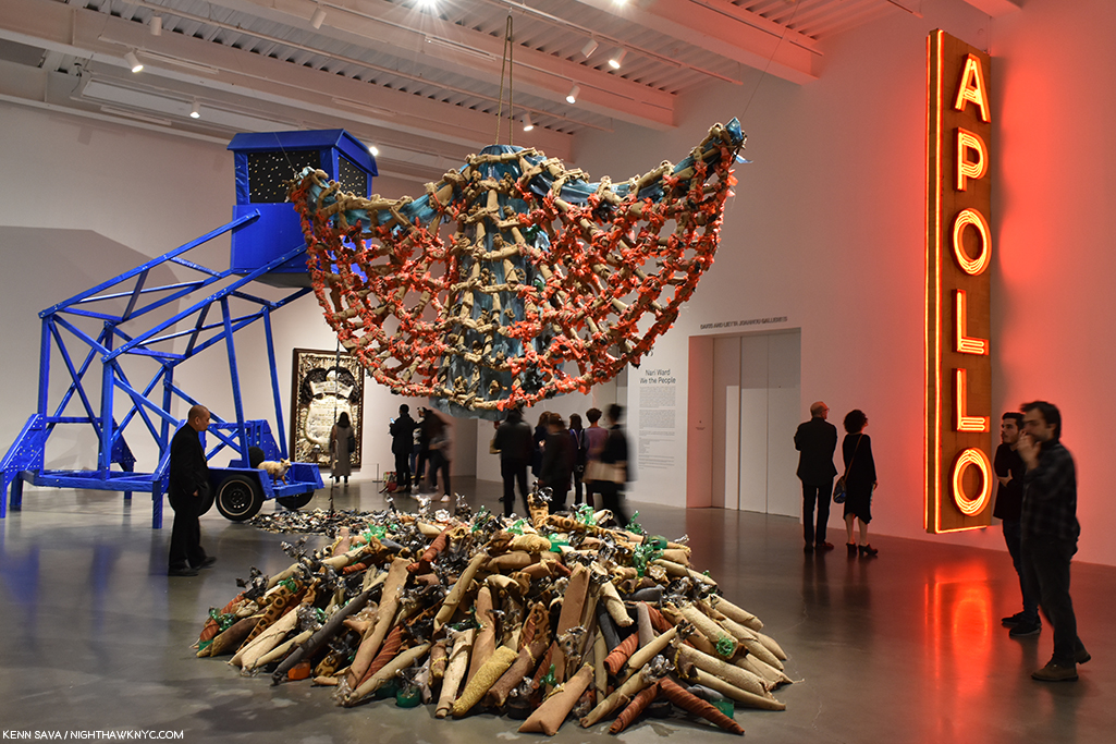
 

  1. Henry Geldzahler was the former Curator for American Art at The Met, later Commissioner of Cultural Affairs for NYC. He interviewed J-MB in January 1983, for Andy Warhol’s Interview Magazine, as reprinted in Jean-Michel Basquiat, published by Charta, 1999, P.LIX,
  2. Whitney Retrospective Catalog, P.243
  3. from an interview with Suzanne Mallouk.
  4. Defacement Exhibition catalog, P.19
  5. Defacement Exhibition catalog, P.104
  6. Here, footnote 22.
  7. I wasn’t able to get to the sixth show, Basquiat x Warhol, which was 3 hours outside of NYC.

Jean-Michel Basquiat At The Brant Foundation

Written & Photographed by Kenn Sava

This is Part 2 of my series on the five Jean-Michel Basquiat related shows going on in NYC in 2019. Part 1 is below, or here.

Outside looking in. The most important show in NYC known to me thus far this year was a show I would be extremely fortunate to see.

Jean-Michel Basquiat, the first exhibition at The Brant Foundation’s new East Village location is a NoteWorthy show because it is a major, museum-quality show mounted at a private institution of the work of a single major Artist with more Paintings on view than all the major NYC institutions, combined, could mount- multiplied twelve-fold. This led me to wonder- What other major Artist-Contemporary, Modern, or Old Master- has so much of their work, and so many of their major pieces in private hands?

The East Village, NYC, May 13, 2019. Looking towards the Empire State Building (rear, left of center). Bad weather, no ticket for the show, no sleep, no umbrella. It was going to take more than that to keep me from seeing this show, AND something close to a miracle to allow me to do so.

It’s easy to have mixed feelings about this. I’ve read some complain that it’s another case of the 1% at its worst; that this show is a case of the very rich showing off. On the other hand, it seems to me that there is a stronger case to be made admiring the vision, and the guts, of the collectors who stepped up and bought much of the work of Jean-Michel Basquiat (J-MB henceforth) when he needed it most, not to mention go through the trouble of sharing it with the public, who, in the case of Jean-Michel Basquiat’s Art, are largely dependent on them doing so to be able to see it. Showing off? Yeah. I guess.

Almost every Artist in the early stages of their career needs the support of buyers and collectors to survive and to continue to create. Yet, it’s also easy to forget that most of these  collectors possibly also bought Art by Artists that have long since been forgotten, (which is one reason I strongly believe in only buying Art you love– if it becomes worth less- even substantially less- than you paid for it? You can always display it and enjoy it.) And? As I wrote in part 1 of this series, the NYC museums, except the Whitney, collectively passed on his work at the time- and continue to do so. The only way they’re likely to fix that now is by gift or donation. The affordability train has long ago left the station for anyone else besides that 1%. The Big 41 had their chance. In the case of some institutions- chanceS, as I outlined.

Unnamed on the exterior, in classic East Village cool, The Brant Foundation, 421 East 6th Street, 10am, Monday, May 13, 2019. If I’m up at 10am, and not STILL up, you know there’s a special reason why. That cab exiting stage right is leaving with my umbrella. See ya.

At The Brant Foundation, a show of 70 Paintings and 1 Sculpture was on view, making it the largest show of Basquiat’s Paintings in NYC since the Brooklyn Museum’s Basquiat Retrospective in 2005, which I saw. Combined with the Basquiat work in the other five 2019 shows, the total approximately equals how many were shown in Brooklyn in 2005. The Brant show largely includes work in the collections of Stephanie and Peter Brant, alongside pieces on loan from the Broad Museum, (a private museum of the collection of another early collector, Eli Broad, who own at least of 13 of J-MB’s Paintings), among other significant loans. Since so much of his work is in private hands who knows how long it will be before we see a bigger or similar number of J-MB’s work here again. So, the six Jean-Michel Basquiat related shows in NYC and vicinity this year (counting the Warhol x Basquiat show going on in Kinderhook, NY, which proved too far for me to get to) might be the best chance I’m going to get to reassess and reconsider his work that it’s barely been 40 years since he began creating it.

The first order of business was getting in to The Brant show and actually seeing it. After all my efforts to get a ticket failed, I resorted to drastic measures. I took the unprecedented step of getting up with 3 hours sleep at 9am and going down to The Brant on May 13th, the last day the show was open, or the day before it closed- I’m still not sure. As I got there at 10am, right as it opened and visitors for the the first timed slots were arriving, I quickly realized this was going to take an act of fate. Compounding things, it was raining and I’d left my umbrella in the cab. I decided to take a Zen approach and stand off to the side, where that tree is to the left, above, and see what happened.

About 30 minutes later, Jessie, the on-top of everything Brant staff person manning the entrance, who knew I was casting my lot to fate, called me over from the door. A lady had arrived and told him she had an extra ticket. Really? A real-life Angel of Providence had appeared when I SERIOUSLY needed one. I walked over and met Lisa, and yes, she had an extra ticket that she was willing to let me use. Miracles really do happen. The fact this piece exists is solely due to her generosity. Seeing it over the 3 and a half hours I spent in it allowed me to flesh out the portrait of Jean-Michel Basquiat’s accomplishment that began for me at Xerox, adding the best look at his most important work I’m likely to get. Any assessment of J-MB’s work and achievement begins with his Paintings. I’d seen 100 works in 2005 at the Brooklyn Retrospective, but I hadn’t prepared to see them. Now IS the time. Lisa’s generosity not only enabled me to create this piece, it also permits me to create the multi-part series on 5 of the 6 Basquiat-related shows I wanted to do, now that she made it possible for me to see the “centerpiece” show of the group. I’m also grateful to Jessie for thinking of me. Due to both of their kindness and consideration, I am thrilled to be able to share what I saw with you.

For a while, it looked like I wasn’t going to get to see this. Standing at the entrance to the show- the lobby of the 4th floor, just after exiting the elevator 90 degrees to the right.  You can see the variance in the lighting in the main gallery from here. Outside, to the right of center is Untitled (Self-Portrait), 1982.

The elevator took us to the 4th floor, where everyone starts and then walks down to the floors below, the show being installed on all 4 floors. It should be said that the group of new visitors getting off the elevator each time on 4 was surprisingly small. The galleries were pretty sparsely filled- incredibly so for a major show on either it’s last day or next to last day. Well, there was well over 1 billion dollars of Art on display, so they opted to keep the crowd manageable.

Untitled (Self-Portrait), 1982, Oilstick and ink on paper, 30 x 22 inches. The first work in the show.

Though the urge might have been to hurry into the large, main gallery shown above, I was stopped in my tracks by the work hanging to the right just outside. There was Untitled (Self-Portrait), 1982, one of the most unique Self Portraits I’ve ever seen. I wondered what Picasso would have thought of it. The colors, and then particularly the black background fascinates me as I ponder at what stage J-MB added it. And then I wondered what Clyfford Still would think of it. Like a number of J-MB’s “heads” from 1981-2, he flattens everything to the picture plane, something not seen all that often in Art. 4 floors of J-MB still to go. What an auspicious start!

A real-life Angel of Providence. Lisa studying Self-Portrait with Suzanne, 1982, in the main gallery on 4.

It turns out that Lisa is a school teacher and an Art lover with superb, wide-ranging, taste that runs from Brancusi through Morton Feldman as I found out as we chatted while going in.

Self-Portrait with Suzanne, 1982. The compelling work Lisa studies above shows the artist with Suzanne Mallouk, the subject of Widow Basquiat, in 2010. It’s the only work known to me created by J-MB showing the Artist with one of his lovers. Beyond this, it’s fascinating to study the way he’s rendered himself here compared with the other “heads” and Self-Portraits from 1981-2.

Before I get too far into the show, I’ll say the building looked brand new, the restoration of the former Con Ed Substation being first class from top to bottom. I have mixed feeling about it’s suitability for the display of Art, but honestly, I get some of those feelings almost everywhere I see Art. In my experience, the #1 problem in seeing art is lighting, combined with the scarcity of truly non-glare glass or acrylic. As my friend, Corinne, co-owner of NYC’s legendary City Frame, tells me- currently, it’s expensive. Then again, not all Painting is glazed. Increasingly, Artists, including Raymond Pettibon and Kara Walker, and Photographers, including Gregory Halpern, have shown their work without frames, often just tacking it to the walls at the corners. Still, glazed or not, lighting- artificial or natural, is a problem that rears its head in almost every show I see. The same was the case at The Brant.

I don’t care how rich I was, I don’t think I’d install a pool over irreplaceable Art.

The fourth floor is the top floor and features a skylight, apparently, filled with water- unless this had collected from the rain? I don’t know. They must either have Lloyd’s of London insurance, 8 million tons of confidence in whoever installed it, or both, to hang a few hundred million dollars worth of one of a kind Art underneath it, including more than one of J-MB’s greatest works, in my opinion. But, beyond this, being a cloudy, rainy, day, the large skylight wasn’t letting in as much light as it might have at other times.

Hanging a few feet from the skylight/pool (as you can see in the installation view earlier) is Untitled, 1981, acrylic and oil stick on canvas, 81 x 69 1/4 inches, from The Broad, L.A., the upper half of which was in a shadow during my visit.

Typical of all the works on view in this room, the upper half of Untitled, 1981, on loan from The Broad in LA was in a shadow. Still, the power of seeing this work in person was staggering. I took all of it in from a distance when I first saw it, then walked over to see the other works in the room. Finally, I walked back over to look closely at it at length.

Detail of Untitled, 1981.

The difference in the experiences is remarkable, as you can see. But, no matter how closely I looked, minding the security rope you can see at the very bottom of the picture above, it was still drawing me closer. Like a Rembrandt, or Van Gogh, where I’d like to study each brushstroke for it’s content, here I was being drawn in to look at each detail. The feeling I got was that each small part of it was a world unto itself, yet irrevocably part of the whole. What, exactly, are we seeing? It’s not a skull because there are eyes and there is hair, at least part of a beard, and some teeth, though others are missing. And there are what appear to be stitches and possibly some letters over all of it- a cryptic message, like the figure, in a language no one had ever seen before. (Compare this to the work on view in Xerox that I looked at in the first Part! There, the details were, largely, words.) This is 1981- a year after the first show the work of J-MB appeared in. It’s a work from near the beginning of his post-SAMO© career as an Artist. And, it’s one of the most remarkable shots across the bow in Art history, possibly since Picasso’s Les Damoiselles or Duchamp’s Bride Stripped Bare. When I’ve seen it in books, I haven’t been able to stop looking at it. Seeing it in person it felt like I’d never really seen it. But, even saying that? There’s literally nothing like this in Western Art history to 1981. In his book, The Art of J-MB, Fred Hoffman makes a case for this being among J-MB’s “key” works. I don’t have a list, but I won’t argue with that. I just keep wondering if Francis Bacon, who outlived J-MB, passing away in 1992, saw it and what he thought, or would think, of it.

Per Capita, 1981

Across from Untitled was the incredible Per Capita, also from 1981, with it’s central figure in Everlast boxing trunks, a halo over his head and his outstretched left arm holding a torch that sure looks to me like that of the Statue of Liberty. Over the halo are the words, “E PLURIBUS…,” or, “out of many,” leaving out the equally famous, “UNUM,” or “one.” The title (which may or may not be the Artist’s title- I simply don’t know), “Per Capita,” means, “per unit of population; per person,” in one definition, per American Heritage Dictionary, and “equally to each individual,” in another. Along the left side appears to be the beginning of an alphabetical list of states with the per capita income of its citizen next to them. Even on a partial list, that manages to include states in 3 of the 4 corners of the country, the variance is striking. Fred Hoffman wrote at length about this piece in his essay in the catalog for the 2005 Brooklyn Museum Retrospective, where he also listed it among J-MB’s key works, where he says the central figure is Cassius Clay, as Muhammad Ali was known when he won the gold medal at the 1960 Olympics (The Art of J-MB, P.129.), which could also make that an Olympic torch.

As I looked at this fascinating work, I couldn’t help wonder if the “UNUM,” or “one” E PLURIBUS was seeking with its … was the solitary figure, as in “Out of many, THIS one.” J-MB’s love of boxers is well known and was to be seen in most of an entire gallery on the 2nd floor, as well as in his portrait (in which he wears Everlast boxing trunks) in the famous Warhol*Basquiat poster for their joint show a few years later in 1985 at Tony Shafrazi Gallery, which could also make this a Self-Portrait.

It’s hard to write about this show and not include every work in it- many are major, many others important for any one of a number of reasons, and they all deserve mention.

Untitled (Car Crash), 1980, Acrylic and lipstick on canvas with exposed wood supports. So much of J-MB’s story and his Painting begins in this work where he recreates the accident where he was hit by a car at age 6 that hospitalized him for a month and caused the loss of his spleen. Seen in the small rear gallery on 4.

On 4, there was also a small rear gallery along the rear of the building. Here, too, lighting was a question. The far wall was lined with a floor to ceiling window, which, you guessed it, let in a lot of light- even on this dreary day. I have no idea if they cover it/partially cover it in full sun.

Untitled, 1981, Oilstick on paper. Seen in the small, gallery in the back of the 4th floor. There’s so much that’s revolutionary in this extraordinary work, and at the same time it gives us another take on the two Untitled (Head) Paintings in the show, this time the “head” is seen from the front and not from an angle and has been flattened, like the picture plane. The right side is almost Cubist.

Down on 3, the lighting was better.

3rd floor. Installation view.

The main source of natural light being another picture window, but this time it was at the end of a large rectangular space and didn’t interfere with the most of the large works on view, including this one-

Untitled, 1982, now in the collection of Yusaku Maezawa, while on loan to the Jean-Michel Basquiat exhibition at The Brant Foundation, May 13, 2019.

In May, 2017, this Painting, Untitled, 1982, by Jean-Michel Basquiat sold at Sotheby’s for 110.5 million dollars. As someone who prefers to consider Art for what it is without the shadow of dollars, as much as possible, this fact gives even me pause for thought. Here it was, on a corner wall of the third floor, appearing as another work in the show as opposed to something “special.” I applaud this decision.

Do I think it’s “worth” 110.5 million dollars? Anything is worth only what someone is willing to pay for it (And, there were multiple bidders for it). Given that the question of whether something is, or isn’t “Art” won’t be settled during any of our lifetimes, only hundreds of years hence if the work continues to speak to people, the question of commerce- supply and demand, is what is rearing its head in Contemporary Art auctions, in my view. Jean-Michel Basquiat’s public career as an Artist only lasted a few months over 8 years, from June, 1980 to his death on August 12, 1988. Though he was extraordinarily prolific during that time, creating 1,000 Paintings and 2,000 Drawings2, included in it are only so many major works (a number that I personally feel is larger than some others seem to think), and Untitled, 1982, happens to be one, in my view. Looking at the lists of the highest prices paid at auction for Art reveals that many, if not most, of them are the best works available as most of the major work by established Artists of, say, Picasso’s time or earlier (considering he passed away in 1973), are in museums which are not likely to part with them. The works auctioned are certainly not the most important works by any of the Artists on the list, as I’m sure most would agree (perhaps not the purchasers), though it’s subjective. The $110.5 million for Basquiat’s Untitled, 1982, is for a major Basquiat, in my opinion.

But, the more astonishing thing for me to realize (Hey? It’s not my money) is that at the time of the auction, in May, 2017, Jean-Michel Basquiat would have been 56 years old! Untitled, 1982, is a work he Painted when he was 21 or 22 years old. People talk about this sale marking the highest price ever paid for a work by an African-American Artist. Others mention the highest price ever paid for a work by any American Artist.

They never mention that this sale makes Jean-Michel Basquiat the YOUNGEST Artist in HISTORY to have a work sell for over 100 million dollars- either by age at the time of the sale (56), or age when he created the work(21-22)!

At 56 in 2017, he would be considered to be in “mid-career” as the museums call it. At 58, right now(!), he should still be every bit the vibrant, revolutionary force in Art he was for the 8 short years of his career. That he already feels like such a part of history is indicative of it being already thirty-one years, this August 12th, since his passing.

Museum Security (Broadway Meltdown), 1983, left, Big Shoes, 1983, Hollywood Africans, 1983, right, a work on loan from the Whitney Museum. The two to the left are in private collections. In 1983, after they were created, these three works hung on the same wall (with other works) at Larry Gagosian Gallery, LA, as is shown in the Whitney Retrospective catalog, P.251

Also on 3 was this striking group of three works, each from 1982, which included a work from an NYC museum!- Hollywood Africans, from the Whitney. These were fascinating contrasts to the collaged work on view at Xerox, Museum Security and Hollywood Africans both featuring words more than image, but were done exclusively in paint, as far as I could tell.

Gold Griot, 1984, Acrylic and oilstick on wood, 117 x 73 inches. You can get a sense of how big it is in the installation view, above.

The somewhat monumental Gold Griot is a very well known work and is memorably recalled in Fred Hoffman’s The Art of J-MB (P.63) as having originated from slat fencing (possibly that referred to in Phoebe Hoban’s book, P.140, that his assistant Matt Dike had acquired from a fence behind Larry Gagosian’s LA house). Mr. Hoffman’s book includes a picture of J-MB creating the work where we see the Painted head looks to be about 8 times larger than his own. Mr. Hoffman references Andy Warhol’s Gold Marilyn, 1962, in speaking of the work’s “pop” influence, with the figure isolated from the gold background, before saying, “The figure is as much a divine apparition as a living human being. With its ethereal gold background surface, the figure of Gold Griot pays homage to sculptural representations of the divine in various sub-Saharan African cultures.3.”

Detail of Gold Griot, 1984.

Looking closer, it’s fascinating to see how J-MB’s depiction of the head has evolved in 2 or 3 years. Gold Griot reminds me of the innovations of Robert Rauschenberg and Jasper Johns, when it comes to Painting surfaces, though it’s resolutely its own work.

2nd floor. Installation view. The work on the immediate left is See Plate 3, 1982, Sculpture in two parts, Acrylic and oilstick on wood, canvas, mounted on wood, the only Sculpture displayed in the show.

The second floor is a bit of a strange space for displaying Paintings. A very tall space, which at first it seems more conducive to the work of monumental Sculptures, like Richard Serra’s, and lined with brick walls. The curators made it work, choosing to install the Paintings in a single row on the two side walls, then salon style on the third wall. While this made seeing the works in the top two rows challenging, it did allow for the maximum number of Paintings to be shown. As a result, I learned to live with it. In hindsight, I’d say they made the best use of the available space throughout the building, though I feel the building was less than ideal for this show because of the uneven lighting and the very high walls on the 2nd floor.

Untitled (Yellow Tar & Feathers), 1982, Pork, 1981, Discography II, 1983, left to right.

Along the sides, important works like Untitled (Yellow Tar & Feathers), 1982, were joined by others not as well known. Discography II contains a list of the details of a Miles Davis Allstars recording session which is historically noteworthy because Charlie Parker performed as a sideman for Miles for one of the only times in his career. To that point, Miles was exclusively a sideman for Bird.

Now’s The Time, 1985, Oilstick and acrylic on plywood, 92 1/2 inches in diameter.

While on the opposite wall, the work referencing Jazz continued with the very cool Now’s The Time, 1985, an homage to the 1945 Charlie Parker record hangs. It also compliments the work on the large wall hung salon style, being they all have unique, experimental stretchers holding their canvases.

On the salon style wall, one thing each of its 16 works share are the unusual stretchers. One thing about J-MB’s Paintings that you don’t hear much about today are his unusual mounts. Constructed for J-MB by his assistants, including Stephen Torton and Matt Dike, there were other examples on the upper floors, and they are another thing that makes his work unique.

Jean-Michel Basquiat, Dos Cabezas, 1982, a portrait of Andy Warhol and a Self-Portrait that presaged the Warhol- Basquiat collaborations in 1985.

The 2nd floor also included a rear gallery, which featured 4 portraits of boxers and 3 other very power portraits.

Rear gallery on the 2nd floor installation view.

J-MB had a deep fascination with boxers, and they appear both as Self-Portraits and as homages. Sometimes both. Sometimes it’s hard to tell which.

St. Joe Louis Surrounded by Snakes showed the boxer, one of Basquiat’s heroes, encircled by sharkish white managers. ‘That was Jean-Michel,’ said Suzanne Mallouk.” Phoebe Hoban. Basquiat, P.113. Early on, Paul Simon attempted to buy it for $8,000., but was thwarted by Rene Ricard. According to the iPad next to it, seen in the installation view, which served in lieu of wall cards, it now belongs to the Brants. (ibid, P.114).

Muhammad Ali changed his name from Cassius Clay in 1964. As Cassius Clay, he won the gold medal at the 1960 Olympics, becoming a hero to many, including J-MB, who references it, here, by using his name at the time, in this work from 1982.

Untitled (Boxer), 1982, Acrylic and oilstick on canvas, 76 x 94 inches. Fred Hoffman calls this immensely powerful work, “… the expression of the black man’s physical and spiritual attributes.” (The Art of J-MB, P.133)

I almost missed the works installed on the first floor. Luckily, I spotted the small sign pointing to them right as I was beginning to look for the exit. Thank goodness I didn’t as it included some of his largest and at least one of his most important works.

Unbreakable, 1987, Acrylic on canvas, 98 x 111 3/4 inches.

I’d never seen a J-MB work like Unbreakable prior to seeing it. Given it’s dated 1987, perhaps this is a glimpse into where his work was heading. In it, he synthesizes everything he’s been using- images, words, and color.

Grillo, 1984, Acrylic, oil, paper collage, oilstick and nails on wood, 96 x 211 1/2 inches- close to 20 feet by 8 feet!

What a powerful, stunning, incredible work Grillo is! It’s taken Robert Rauschenberg’s Combine Paintings in an entirely new direction. I love the juxtaposition of the two panels with figures (one left, one right of center) with the panels immediately to each of their right. I do wonder if this piece was meant to sit on the floor or be raised a foot as it is here.

Detail of the right of center panel.

As I looked closer at Grillo, I noticed a good many color Xeroxes collaged on. Yet, the two figures hold the key to it, I think. On the left is a figure holding a torch. Over his head there’s a pice of wood with nails sticking out of it. That sure could be interpreted as a “crown of thorns.” Around him are various repeated words, including- “Soap,” “Oil,””Butter,” Carbon,” and “Stretch,” along with at least two Bebop song titles- “Well You Needn’t,” by Thelonious Monk and “Half-Nelson,” recorded by Bird. What this figure represents I don’t know, but there are elements of the martyr and the heroic included. The other figure, apparently a king, wears a large crown, accompanied by small attendants to its right, and has his hands raised, like the boxers seen upstairs. He appears to be looking towards the left side figure, and both figures have their internal organs shown, perhaps yet another reference to Gray’s Anatomy.

And, there’s this- The left hand figure, how has a board with nails over his/her head, possibly a crown of thorns?, holds a torch…

The work speaks volumes about how J-MB’s Art has evolved in 7 short years, and the unlimited potential the future held for it, and for him.

…which reminds me of the one seen 3 floors up in Per Capita, 1981.

A few days later, Lisa shared her thoughts on the show. “I thought the Basquiat show was quite spectacular. There were so many works that I had never seen before. In particular, I was struck by the great thick black oil slicks. There is something about this sheen, like shoe polish, that you can’t truly appreciate unless you see the paintings in person. They give the works a lot of dimension and texture. They also remind me of Franz Kline – totally dynamic and emotive in gesture. The oil slicks are bold and grimy, like New York. His compositions tend to mimic graffiti on the street – throw ups, wheatpaste posters, and tags on a wall/single canvas.”

There was a bit of the feel that the show was something of an afterthought to the just completed Louis Vuitton show. A “Hey, we’ve got all this work assembled, why don’t we just put it up in NYC?,” kind of thing. I quickly moved past it, the lighting and other questions with the space I’ve mentioned. Nothing dulled the effect of seeing so much work that STILL looks fresh, vital, and contemporary, in spite of countless imitators, commercial “appropriations” of his symbols and the passage of over 30 years since he left. What I saw at The Brant was the work that has defined the legacy of J-MB- in quite a few of his more well known Paintings, works characterized by his characters, in which his words take much more of a back seat than they did over at Xerox. Thinking about J-MB at The Brant four months later, the show has become more monumental in my eyes.

While Peter Brant may represent what many call “the 1%,” so does Jean-Michel Basquiat. For me, J-MB represents that extraordinary, and extraordinarily rare, group of people who are able to overcome unfathomable difficulties- racially, socially, financially, educationally and, apparently, familial, and some difficulties that appear on the outside to have been self-inflicted (though quite possibly resulting from the others- I’m not a doctor or a therapist), then somehow surmount ALL of that and go on to rewrite Art history in about a decade. How many people can this be said of?

How ever many you choose to include? I’m not sure it would even equal 1%.

This Post is dedicated to Lisa, with my undying thanks. My gratitude is due to Jessie for his consideration. Anyone reading this owes them their thanks as well.

*- Soundtrack for this Post is “Bold As Love,” by another brilliant Artist who died at just 27, Jimi Hendrix, which concludes the timeless Axis: Bold As Love.

“Anger he smiles towering in shiny metallic purple armor…
My red is so confident that he flashes
Trophies of war and ribbons of euphoria
Orange is young, full of daring
But very unsteady for the first go around
My yellow in this case is not so mellow
In fact I’m trying to say it’s frightened like me
And all these emotions of mine keep holding me from
Giving my life to a rainbow like you
[Chorus]
But they’re all bold as love
Yeah, they’re all bold as love”

In lieu of the immortal Hendrix original recording here’s a cover to inspire you to seek out the original-

This is Part 2 of my series on the five Jean-Michel Basquiat related shows going on in NYC in 2019. Part 1 is below, or here.
My prior pieces on Painting are here

NighthawkNYC.com has been entirely self-funded and ad-free for over 6 years, during which over 250 full length pieces have been published. If you’ve found it worthwhile, you can donate to keep it going & ad-free below. Thank you!

Written & photographed by Kenn Sava for nighthawknyc.com unless otherwise credited.
To send comments, thoughts, feedback or propositions click here.
Click the white box on the upper right for the archives or to search them.
For “short takes” and additional pictures, follow @nighthawk_nyc on Instagram.

Subscribe to be notified of new Posts below. Your information will be used for no other purpose.
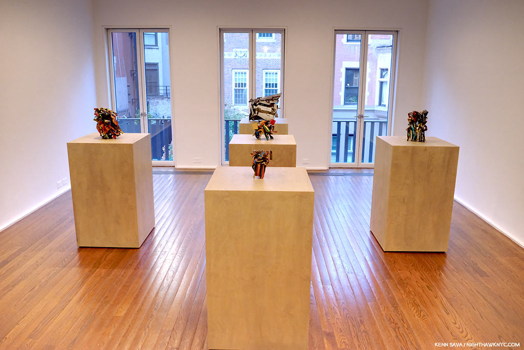
 

  1. I’m speaking of Manhattan’s museums, only, here and leaving off The New Museum who have no permanent collection.
  2. according to the Brant Foundation.
  3. ibid P.65

Jean-Michel Basquiat: Now’s The Time

Written & Photographed by Kenn Sava (except *)

Part 1 of a series.

It’s hard to believe that not even 40 years have passed since Jean-Michel Basquiat burst upon the Art scene, (after his career as part of the legendary graffiti duo SAMO©), when the month long The Times Square Show opened 39 years ago on June 1, 1980 at 201 West 41st Street. Just eight years, one month and eleven days later, on August 12, 1988, he would be found dead from a heroin overdose at the infamous age of 27 at his home and studio at 57 Great Jones Street.

What appears to be an anonymously applied silhouette of the late Artist looms large here at the one time stable at 57 Great Jones Street, NYC, seen in May, 2019. Back in the day, it was owned by Andy Warhol who rented it to Jean-Michel Basquiat, who lived here from 1983 until he died here on August 12, 1988. His studio was on the ground floor, his living quarters upstairs. By the way? In an interview with Becky Johnston and Tamra Davis, Jean-Michel Basquiat said, “I don’t really consider myself to be a graffiti artist, you know?1” That might surprise those attempting to cover every square inch of the building now.

He didn’t live to see the Art market crash (unrelatedly) the following year, from which it has since recovered and grown many, many fold larger than it was during the bubble of his day, nor did he live to see the end of the controversy around him and his Art. It’s never subsided-

He Was Crazy, 1979, Mixed media on canvas, all of 5 x 3 inches, the earliest and smallest work on view at Jean-Michel Basquiat / Xerox.

-Robert Hughes titled his obituary “Requiem for a Featherweight.”

-“He was essentially a talentless hustler…,” according to Hilton Kramer in a piece titled,  “He had everything but talent” in 1997.

-“Come on…Basquiat? Really? Sort of an art hoax. Just the incoherent rantings of a tortured soul obsessed with drugs and a deluded quest for acknowledgment, which he did achieve. Doesn’t make it good.” A direct quote from the comments more recently here.

Yes, there are still plenty of haters hating on the work on Jean-Michel Basquiat.

The now infamous cover of The New York Times Magazine from February 10, 1985 by Lizzie Himmel shows the Artist in his studio. The article, by Cathleen McGuigan, included a look at the Artist that seems surprisingly balanced today given all the controversy surrounding him at the time.”The extent of Basquiat’s success would no doubt be impossible for an artist of lesser gifts,” she wrote.

On the other hand, there are the countless other members of the Art viewing public for who Jean-Michel Basquiat’s work has continued to speak since he started making it, and Painting that speaks to people over time is what comes to be accepted as “Art” a few centuries on it seems to me. Yet, the Art viewing public is not the only group divided on the work of Mr. Basquiat. On page 44 of the book, The Art of Jean-Michel Basquiat. Fred Hoffman, one of the curators of the 2005 Brooklyn Museum Basquiat Retrospective and a man who produced prints with Jean-Michel Basquiat (J-MB henceforth) for 2 years, writes, “Herbert and Leonore Schorr offered the Museum of Modern Art the opportunity to choose a painting from their collection as a gift. The museum replied that having a painting by Jean-Michel Basquiat was not even worth the cost of the storage.” On May 26, 2017, this quote appears in the New York Times, “‘It’s an artist who we missed,’ said Ann Temkin, the chief curator of paintings and sculpture at the Museum of Modern Art, which does not own a single Basquiat work2. ‘We didn’t bring his paintings into the collection during his life or thereafter3.’”

6 year old Jean-Michel Basquiat’s membership card to the Brooklyn Museum. It’s not well known that J-MB was an avid museum goer, attending the Brooklyn Museum and later, frequenting The Met with his friend Fab5Freddy. Credit 2015 The Estate of Jean-Michel Basquiat/ADAGP, Paris, via ARS, New York; Hiroko Masuike, via The New York Times.

In fact, as I write this? Of NYC’s “Big five” museums, only the Whitney owns a Basquiat Painting- they own 3, according to their online collection catalogue (none are currently on view as of my last visit, this past month. Also, I should note that among the 5 Manhattan museums The New Museum has no permanent collection. By the way, The Brooklyn Museum owns one print, seen below, and a Drawing.)

None of those feelings were mine though I wasn’t a “fan” of the work of Jean-Michel Basquiat. Then, as now, I was focused on Artists I felt were overlooked. My feeling in the 1980s was that too much money was being spent on, and too much attention given to, Contemporary Artists with no track record. Artists whose work hadn’t stood the test of time, hadn’t stood up to critical, and historical, assessment, whose work wasn’t in major museums, and on and on. By default, though not in particular, that included the work of J-MB. Still, I’ve always kept an open mind. There are very very few Artists or Musicians who’s work I will never, ever love- no matter what. But, there are some. Hitler was a painter- lowercase “p” for once- remember?

May 12, 2005. The only picture I was able to get (quickly) just outside the Basquiat Retrospective at the Brooklyn Museum, since pictures were not permitted inside. Back of the Neck, 1983, Screenprint, right, seen in the lobby and the show’s poster to the left. Glare was a problem in 2005, too. You can see the show in official shots, here.

So, on May 12, 2005, I went to that Brooklyn Museum Basquiat Retrospective that Mr. Hoffman was a curator of. When I got home, I wrote, “His work still doesn’t speak to me, beyond the fact that I so admire his freedom. The show was very well done.” I also came away struck by his love of Jazz. Anyone who loves classic Jazz is OK with me. I also remember being surprised at how prolific he was in such a short time, which reminded me of Van Gogh, who’s Painting career lasted only about a year or so longer. Looking back on it now? My head was elsewhere. I was drawing on a daily basis in a representational style, and so I was lost studying Ingres, Hopper, Richard Estes and Rembrandt, who I had recently gone to Chicago to see a show of. But? Having bought one at the show, I began wearing T-shirts with Jean-Michel Basquiat’s Art on them. His work just fits walking around NYC.

Untitled, 1980, the white on yellow original of which is in the Whitney Museum’s collection, is a work that was shown at New York/New Wave in 1981 at MoMA PS1, now appears on a Uniqlo SPRZ NY Women’s T, seen in June, 2019.

Slight digression- I’m not for giving a free ad here, but I must give props to Uniqlo for putting the Art and cover Art of so many great Artists and Musicians4 on their SPRZ NY line of T shirts. Some of the Art line is co-sponsored by MoMA. In turn, Uniqlo pays for the free Friday nights at the MoMA, which countless thousands attend each week. Uniqlo has continually featured J-MB’s work on their clothes, in spite of the problematic history of Basquiat and MoMA. Fred Hoffman in The Art of J-MB (P.175, footnote 2) relates this story about Untitled, 1983, a limited edition print of 10 copies he did with J-MB- “Untitled was given to the Museum of Modern Art in 1984. After it was in the catalogue for the MoMA 1984 exhibition An International Survey of Painting and Sculpture, the work was completely overlooked by the museum, and excluded when the museum first put its collection online. It was not exhibited in the galleries until 2015. Only with the collaboration between MoMA and Uniqlo beginning in 2014, when a cropped image of Untitled was used as the signature image for the marketing of the ‘SPRZ’ collection of iconic artist images applied to clothes, did the museum finally recognize the work as part of its collection.” 2015! To this day? I still wear Uniqlo J-MB T’s, even though I wasn’t a “fan.” End digression.

Jean-Michel Basquiat appears to be admiring  Nick’s Basquiat tattoo in one of Alexis Adler’s Photos of him at Bishop Gallery. Nick is an Art Teacher.

Ok. So, who’s “right?” The haters, the non-believers, and the NYC museums, who, unanimously, minus one, passed on acquiring his Paintings? Or, the incalculable number of members of the Art loving public to who the Art of J-MB speaks, perhaps, like that of few other Artists today, judging by how often I see others wearing his Art and icons, along with the innumerable Artists who’ve been influenced by his work, and those few collectors who bought up the bulk of his best work shortly after he created it?

All I can show you- pictures were not allowed in the show.

Fast forward. On May 7th, 2019, I went to see Picasso’s Women at Gagosian on Madison. It’s one of those shows that, though small, reminds you, as if you need to be, why Picasso was one of the towering creative geniuses of 20th Century Art, in my view. Each and every work is in a different style, and most were masterpieces. Yet, it’s a show that will only live on in the memory of those who saw it as no photos were permitted. I walked out through the building’s lobby, my head spinning. Just before I exited, next to the front door, I spotted this-

Minutes after I saw this poster my mind began to change.

Jean-Michel Basquiat / Xerox. I asked the guard where it was. “On 3,” he replied. Still recovering from Picasso, I pondered if I could clear my head enough for about 5 seconds, then I went back in and went up to Nahmad Contemporary on 3.

3 hours later, I left, realizing I’d never really seen the work of Jean-Michel Basquiat before. I had missed it. In Xerox, the term “Painter,” all of a sudden feels too small, even for an Artist notorious for getting paint everywhere- including on his multi-thousand dollar Armani suits, as can be seen in the infamous cover of The New York Times Magazine shown earlier.

But, this is a show that features his under-known multimedia works that include photocopies- color Xeroxes being one of his favorite tools, one he loved so much, he bought his own color Xerox machine. (I’m sure there are many others, but right now? I can’t think of many Artists who made color Xeroxes as big a part of their work- particularly Painters.) As a result, here images recur- his own images, exclusively, which is down right refreshing in this age of copious “reappropriation.” Drawings or Paintings that the Artist has Xeroxed and pasted onto canvas which he then proceeded to add to and modify in any number of ways, including Paint on.

Installation view. I was completely unprepared for the depth and endless detail in this body of work I had previously not known.

As a result, in Jean-Michel Basquiat / Xerox, we see J-MB the collagist as much as we do the writer, or the Painter. Suddenly, his work looks different. The figures recede, words come to the fore. Many, many words.

Odours of Punt, 1983, Acrylic, oilstick and Xerox collage on canvas, 40 x 83 inches

Odours of Punt, 1983, was one of the first works in Xerox and it was one of the first works to get to me. A “non-fan” up to that moment, something clicked in me when I saw this. In it, J-MB borrows Painting techniques from all over Art History on his way to making something…else. The history of Painting from 1947, on, was staring me in the face, to the left, while something entirely new and different was vying for my attention on the right. On the left, I felt Clyfford Still being channeled underneath Cy Twombly and Jean Dubuffet yet what he created is something distinctly his own- a remarkable thing in itself. And extremely abstract, at least to my eyes. While its right side felt like it was coming from another world, made up of fragmentary images. Neither side would seem to “go” with the other at first glance, yet, somehow, as my eye and brain moved between the two “worlds” of the work, they manage to hold together almost miraculously well. This is something I’ve felt in the presence of the greatest works of Abstraction, including those by, say, Kandinsky, Jackson Pollock from 1947 to 52, Mark Rothko, Jack Whitten, and Mark Bradford today. It’s incredibly hard to do, which is evidenced by the fact that almost none of them (who’s careers have completed), except for Kandinsky, (who was 77 when he passed away, and Painting abstractly for about 35 years), were seemingly able to do it indefinitely. Jackson Pollock seemed “to lose his fastball” in his last few years and his style began to change, and Mark Rothko lost…his life (I’m not saying that’s related to his Art). Perhaps these are only coincidences. J-MB didn’t make it to 30 years of age.

Detail of the upper center.

On the right, equally abstract to me was what seemed to be a new creative language. “BIRD OF GOD,” “VENUS VII,” “COSTOXIPHOID,””BLUE RIBBON,” and on and on, accompanied by innumerable drawings and diagrams. Man, there’s A LOT to see in this! Even now, almost 4 months later? I feel like I’ve only begun to look at it. For only one example- Costoxiphoid is a ligament that connects the ribs. At age 6, J-MB was injured in a car accident. While he was hospitalized (his spleen, i.e. his “filter,” was removed), his mother brought him a copy of Gray’s Anatomy. It would be a sourcebook for his Art for the rest of his life, and possibly here for “1. Cranial Cavity, 2. Facial,…” to the left of center. The title (assuming this is the Artist’s title- many of his works were “named” by others) is also an enigma. “Odours” referring to “any property detected by the olfactory system,” per Merriam-Webster, and “punt” have multiple meanings, including “an open flat bottom boat with squared ends.”

Untitled, left, and Peter and the Wolf, both Acrylic, lipstick and Xerox collage on canvas, both 1985, both 110 x 114 inches, seen from about 15 feet away, the figures in these pieces are almost entirely swallowed up by everything else.

Walking through Xerox, it was impossible not to begin to understand that J-MB‘s work is deep. Deeper than just about anyone has even written about so far. These works contain a staggering, almost obsessive, amount of detail, and details that swallow up the figures, one of the things the Artist is most famous for. Figuring out what’s going on in all of this detail is going to take 2 things- #1, an expert, most likely one who knew the Artist, or #2- A long time.

Not having known Jean-Michel Basquiat, I, like those born after August 12, 1988, can only look at his work and see what it says to me. In a short time, my looking thus far has given rise to some threads that I am going to continue to study.

First among them is Jazz. Being a former Musician, who produced Jazz records and wrote for a national Jazz magazine for 4 years, perhaps I am pre-disposed to spotting them. Fair enough. While many people talk about J-MB and Hip-hop, looking at the work in this show, I failed to see even one reference to it. This struck me, particularly because one thing that stood out to me at Xerox to the point that I couldn’t overlook it was the CONTINUAL, and extraordinary number of, references to Jazz- be it Jazz Musicians, records or song titles. In fact, they were so prevailing, you’d have to look hard to find even one work here without a Jazz reference somewhere in it (which I may, or may not, have).

Untitled, 1985, Xerox collage mounted on panels, 48 x 85 inches.

In Untitled, 1985, a collection of color Xeroxes mounted on panels, the Jazz references are almost overflowing.

Almost right in the middle of Untitled is this portrait of Miles Davis, playing, or holding, his horn.

Fittingly, smack dab in the middle of it is this portrait of trumpeter and bandleader Miles Davis. Which reminds me of this still from a Miles Davis video from the late 1950s-

Miles Davis performing “So What” in a 1958 film called The Sound of Miles Davis in a group that also included the great John Coltrane.

And then there’s the work shown in the Xerox poster, King of the Zulus, 1984-5. “King of the Zulus” is, also, the name of a Louis Armstrong and his Hot Five record from 1926.

The work from the poster seen in the flesh. King of the Zulus, 1984-5, Acrylic, oilstick and xerox collage on paper mounted on canvas, 86 x 68 inches.

Detail of the lower left corner of King of the Zulus. This gives a little idea of the depth of what’s going on in this work.

The lower left corner of King of the Zulus includes a drawing of another Louis Armstrong record, “Potato Head Blues,” which some feel is at the top of the list of his finest recordings (those are some mighty brave folks. Miles Davis once said that Louis played everything you can possibly play on the trumpet. He would know. I’d never dare a guess at “greatest.” It doesn’t exist.). In his 1979 movie Manhattan, Woody Allen (who is also a Jazz Musician) has his character say that “Potato Head Blues” is “one of the reasons that life is worth living.”

Red Joy, 1984, Oilstick and Xerox collage on canvas, 86 x 68 inches.

Later, I came across the transcription of an interview with J-MB by Becky Johnston and Tamra Davis in which Becky Johnston asks him-

“BJ: What music do you like?

J-MB: Bebop’s I guess my favourite music. But I don’t listen to it all the time; I listen to everything. But I have to say bebop’s my favourite.”

Detail of the lower right corner of Red Joy. That’s a portrait of the great saxophonist and composer Charlie “Bird” Parker, with a musical quote from his composition “Red Cross” on the top.

“Bebop” was a revolutionary, new, style of Jazz that Bird, Dizzy Gillespie, Thelonious Monk and Charlie Christian developed in the late 1930s and early 1940s. Louis Armstrong predated and outlived Bebop (which peaked in the 1940s), so it’s obvious that J-MB listened to Jazz from other periods as well as Bebop. Regarding the work that might omit a Jazz reference? Interestingly, look as I might, I didn’t find any Jazz references in Odours of Punt, seen earlier, rare among the works in Xerox. Unless the repeated “BIRD OF GOD,” near the upper left is a reference to Charlie “Bird” Parker. What else could it mean? My guess is that it is- until an expert comes forward. When he died, it’s reported in Pheobe Hoban’s biography that crates of Jazz records belonging to the Artist were thrown out, along with a carton of copies of Ross Russell’s 1973 Parker bio, Bird Lives!5.

Jean-Michel Basquiat holding a copy of The Subterraneans by Jack Kerouac. He was reported seen carrying one around in Pheobe Hoban’s biography of the Artist. *Photographer unknown.

As for the second thread, the proliferation of words in the works included in Jean-Michel Basquiat / Xerox got me to look closer than I ever did before. Then, in my research, I discovered something interesting. Jean-Michel Basquiat had a love of the Beats. At various points he is reported to be continually reading William Burroughs Naked Lunch (a picture of him with a copy of it was taken by Alexis Adler was shown earlier- the picture with Nick’s tattoo, in which Naked Lunch is shown mounted on the wall behind J-MB) and Junky, as is reported in Pheobe Hoban’s Basquiat: A Quick Killing In Art, (eBook P.75). Later on, he is reported to be carrying around Jack Kerouac’s The Subterraneans, as is seen above. These struck me. Then, I discovered something more. J-MB knew both William Burroughs and Allen Ginsberg, and can be seen with both here! He was also Photographed by Allen Ginsberg, a terrific and still somewhat overlooked Photographer in his own right. While others make cases for J-MB being a member of this or that “group,” how crazy is it to make a case for J-MB as a descendant of the Beats? There’s more direct evidence for it than there is for some of the claims I’ve seen. Some have made the case for J-MB the Poet. From his SAMO© days to what we see in his Notebooks, he does have one of the most unique ways with the English language of any writer known to me.

Detail of the lower left section of Untitled, 1987, Acrylic, oil stick, and Xerox collage on canvas, 100 x 114 inches, reveals lists of song titles, under two semi-circular Drawings of record labels.

It’s become apparent to me that the cult of personality surrounding the Artist, and his fame (which, he longed for while he was homeless early on, and chased later, which makes him, at least partially responsible for) has, also, served to delay the serious critical assessment of his work. I’m not saying there isn’t any. There is. There are some very fine essays in the catalogues for the shows done so far, beginning with Richard Marshall’s excellent piece, “Repelling Ghosts,” in the catalogue for the very first J-MB Retrospective, at the Whitney Museum in 1992, and, as I said, Fred Hoffman has done a yeoman’s job of pointing the way to where Basquiat scholarship may be finally going, but the need for this is most urgent in my opinion, before the work is left to those who did not personally know the Artist. From what I’ve read thus far, Jean-Michel Basquiat’s Art was best “understood” by those who knew him. Some of them have already passed away, taking with them whatever they didn’t write down or share in interviews about the Artist and his work. Since the real critical assessment of his work has taken so long to get underway, there is, it seems to me, a real danger that if this continues to happen, J-MB‘s Art will remain an eternal mystery, like say, Vermeer’s, is to us today. Part of this is due to the fact that museums have been slow accepting J-MB‘s work, or even borrowing it to mount shows of it. Museum shows generally result in new scholarship published in the accompanying catalogs. The pace of museum shows has picked up over the past decade, both in the US and in Europe, but, in my opinion, when it comes to actually studying the work, the scholarship has been spotty so far. So? Anyone delving into the work of J-MB for the first time, as I am, is left with a lot of biography and a little Art criticism to fall back on- no matter how many books you see. As a result? I was largely left to make of it what I can- like viewers who weren’t alive in J-MB‘s time are.

Untitled, 1985-6, in front of Embittered, 1986, Graphite, paint and Xerox collage on wood.

Also apparent from some of the pieces written thus far that people fall all over themselves trying to “claim” J-MB for this school or that, from so-called “primitivism” to so-called “expressionism” to so-called “neo-expressionism,” to (more recently) so-called “conceptualism”- none of which J-MB, himself, used for his work, which is the only thing that matters, in my opinion, to hip-hop.

Jay Z, who did not know him, said this in his autobiography, Decoded, published in 2010, on page 95-“…People always wanted to stick B in some camp or another, to past on some label that would be stable and make it easy to treat him like a commodity. But he was elusive. His eye was always on a bigger picture, not on whatever corner people tried to frame him in. But mostly his was probably on himself, on using his art to get what he wanted, to say what he wanted, to communicate his truth. B shook any easy definition. He wasn’t afraid of wanting to succeed to get right, to be famous…”

The visual evidence in the work itself shows me, at least, something different from all the claims I mentioned before Jay Z. Jean-Michel Basquiat belongs in one “box,” and one “box” only- the “Jean-Michel Basquiat box.” Though he definitely belongs to the continuum of Art History, as Richard Marshall lays out in detail in his excellent essay in the Whitney Retrospective Catalogue, which probably surprises many, Jean-Michel Basquiat is unique unto himself. Period.

Kokosolo, 1983, Acrylic, oilstick, and Xerox on canvas, 43.3 x 82.6 inches.

Meanwhile, back at Xerox, I love the use of paint here. Jean-Michel Basquiat’s work is about layers and here it’s hard to know what’s on top and what’s on the bottom layer. J-MB spoke many times about his use of crowding out words and letters and said one of the reasons he did it was to make the viewer look closer. I can’t help wonder if he’s doing the same with the yellow here- making us look closer at what’s under the yellow. 

Galileo Galilei, 1983, Acrylic, oilstick, and Xerox on canvas, 78.75 x 51 inches.

In Galileo Galilei, 1983, I was struck by a number of things, first, from a distance, the circles, ostensibly the outline of the moon. But the circle is quartered, which is not like the moon. It’s something done in graphs and in Drawing. That reminded me- Drawing a circle is something that has a long and legendary history in Art. The great ancient Greek Painter, Apelles, and later the Renaissance master, Giotto, both used their ability to draw perfect circles freehand as calling cards.

Rembrandt, Self Portrait with Two Circles, c.1665, *Kenwood House, London.

I am one of those who believes Rembrandt followed suit, leaving his own “calling card” as their heir in his Self-Portrait with Two Circles.

Detail, or rather, Details. Note the multiple lines that make up the circles and the repeated list. I recognize these part words as being a list of songs from Charlie Parker’s Savoy recordings because I have these records. “Koko Take 1,” and so on. As for everything else going on in this work? I’m hoping someone who knew J-MB will come forward and discuss it.

Here, we happen to have two, or parts of three, drawn circles. Was J-MB aware of the Apelles/Rembrandt circles? 

This body of work is an example of one of the last vestiges of reproduction in Art before the digital age took hold. Seeing this now does really make it feel like more than 35 years have passed, yet, they don’t look dated. Nor do the beginnings of this work, the “(Anti) Product Postcards” he created, many with Jennifer Stein, who speaks about them here.

Early on, J-MB created Postcards, including these, many hand labelled “(Anti) Product” on the verso, which he sold for $1 each. Andy Warhol bought one when J-MB first met him while he was eating at a restaurant with Henry Geldzahler. They are among the earliest examples I’ve seen of J-MB’s collage. Some of these were collaborations with Jennifer Stein.

I returned to see Jean-Michel Basquiat / Xerox twice more since it proved to be a “personal rosetta stone” into the Art of J-MB. It was an extraordinary gallery show in many ways. The 33 works on view that ranged from He Was Crazy from 1979, shown earlier, through 1987, covering all but the final year of his Painting career and his life. Alas, even in three visits, I can only hope to scratch the surface layer of all that lies in these work by Jean-Michel Basquiat. But, there was something else. Alone with the security guard in the show for most of the 7 or 8 hours I spent there over 3 visits, I was struck by something else.

Silence.

A silence that was singing in a way that would bring a smile to John Cage’s face. If there’s been too much of any one thing around the work of Jean-Michel Basquiat to this point, it’s noise. A byproduct of his tragic death far too young is there are no more “Page 6” scandals, no more gossip, no more rumors. Only the work remains, hanging silently in these rooms. That silence said it’s time to let that Art speak for itself. And it’s time that those who knew and/or worked with the Artist to share what they know, and provide whatever insights they have before those, too, are lost forever.

Current and older books on Jean-Michel Basquiat and his work. Of these, the catalogs for the J-MB Retrospectives at the Brooklyn Museum (first, upper left) and the Whitney Museum, 2nd from left, front, were the two I referred to most often. The Unseen Notebooks (4th from the right, top) is also excellent. Fred Hoffman’s books are available for download from his website and are recommended. While it contains images of the most works available in print, I found the new Taschen XL, far right, problematic. A catalog for Alexis Adler’s traveling show, seen bottom left, of her collection is a revelation.

After I left Xerox for the last time, I, too felt the clock ticking. I immediately launched a deep dive into Basquiat monographs, in and out of print, and read everything I could get my hands on. As my research began, I quickly came upon a startling fact- Jean-Michel Basquiat: Xerox (which ran from March 12 through June 1st) is one of no less than SIX shows of Jean-Michel Basquiat’s work, or pertaining to the Artist, going on in the NYC vicinity in 2019!

The other five are-
Jean-Michel Basquiat at The Brant Foundation, March 6 – May 14th
The 12th Street Experiment: Photography of Jean-Michel Basquiat By Alexis Adler at Bishop on Bedford, Brooklyn, May 3 – June 13th
Lee Jaffe: Jean-Michel Basquiat at Eva Presenhuber, June 28th – July 28th
Basquiat x Warhol at The School/Jack Shainman Gallery, Kinderhook, NY, June 1 – September 7th
Basquiat’s Defacement: The Untold Story at the Guggenheim Museum, June 21st – November 6th
and…two Paintings from the collaboration of Jean-Michel Basquiat and Andy Warhol, along with ephemera from their collaboration, were on view in Andy Warhol at the Whitney Museum earlier this year, which I wrote about, here.

First? I wondered- Why six shows now?

Jean-Michel Basquiat was born on December 22, 1960 and died 31 years ago on August 12, 1988. 2020 will be a double anniversary for J-MB- 60 years since he was born, 40 years since The Times Square Show launched his career. 2019? No special significance, as far as I know, four months into my research. The Brant show shares the same curator (and many of the 120 works) with the Jean-Michel Basquiat show at the Foundation Louis Vuitton, Paris, which ended on January 14, 2019. The Brant’s opened on March 6th. So, beyond commemorating a “Basquiat anniversary,” the timing of that show may just have been fortuitous and practical, as in “we’ve got all these works together, why don’t we also show them in the new space in NYC?” As for the timing of the others? I have no idea.

Nola Darling lying on Jean-Michel Basquiat’s grave in She’s Gotta Have It.*

Between these six shows, the total number of works by Basquiat (counting those in collaboration with Andy Warhol) should total slightly more than the 120 shown in that Foundation Louis Vuitton, Paris, show, in addition to Photographs of J-MB by early roommate, Alexis Adler, and Musician and friend, Lee Jaffe. As such, these shows present the opportunity to see the most works by the Artist since the 160 pages from his Notebooks along with other works and some Paintings were shown in the Jean-Michel Basquiat: Unknown Notebooks show at the Brooklyn Museum in 2015, and the most Paintings by the Artist in NYC since that 2005 Basquiat Brooklyn Museum Retrospective. Unlike the “Summer of Rauschenberg,” which I covered extensively in 2017, where the satellite shows “revolved” around MoMA’s Robert Rauschenberg: Among Friends Retrospective, this time, the only museum show in the bunch, Basquiat’s Defacement at the Guggenheim, is a satellite show to the blockbuster Brant Foundation’s (a private organization) first public exhibition- Jean-Michel Basquiat, which included a whopping 70 Paintings and 1 Sculpture, the main act. Given that the vast majority of J-MB‘s best work resides in private collections, this brings home the fact that going forward, unlike with most Artists, the public is going to depend on the generosity of collectors displaying their work to see them, and researchers are going to depend on them to study it.

As a result, I quickly realized after that it might be now or never if I wanted to see a large body of Basquiat’s work and reassess it, and see WHO is “right”- the haters or the believers. With 39 years elapsing since J-MB‘s debut at the Times Square Show, enough time has elapsed to get a bit of perspective. So?

Detail of Now’s The Time, a Painting that looks like the classic 1945 Charlie Parker record of the same name, with “PRKR,” J-MB’s “shorthand” for Bird’s last name.

Now…is INDEED the time. It’s the time for the real assessment of Jean-Michel Basquiat’s Art to take over from the sensational biography. For me? Who knows when I’ll have the opportunity to see this much of his work in NYC again. It might be now, or never. NOW is my time, too.

My thoughts immediately turned to the Brant Foundation’s inaugural show in their new East Village location, Jean-Michel Basquiat, which was up and running and the clock was ticking on its run. NHNYC researcher Kitty, a Basquiat fan since she saw him in person back in the day at the Mudd Clubb, had seen it and gave a glowing report. I began scrambling to get a ticket. No luck online. The show had been completely sold out (though tickets were free) since it opened. Hmmm…HOW to see the most publicized and talked about show in NYC in early 2019? Or, would my glimpse at Xerox of what I had missed remain a lingering tease?

To be continued…

This piece is dedicated to my former friend, grae, who knew J-MB, and to Kitty, who was in the same room with him in the clubs back in the day, and who has patiently accepted his work not speaking to me all these years. My thanks to Nick. 

This is Part 1 of my series on the five Jean-Michel Basquiat shows going on in NYC this year. Part 2 may be found under this one, or here. Part 3 is here

*-Soundtrack for this Post is what else? “Xerox” by Julian Casablancas + The Voidz. If  you’re a Strokes fan, check this out, if you haven’t. Also, it doesn’t sound all that distant from J-MB‘s own band, Grey. Maybe they were an influence.?

NighthawkNYC.com has been entirely self-funded and ad-free for over 6 years, during which over 250 full length pieces have been published. If you’ve found it worthwhile, you can donate to keep it going & ad-free below. Thank you!

Written & photographed by Kenn Sava for nighthawknyc.com unless otherwise credited.
To send comments, thoughts, feedback or propositions click here.
Click the white box on the upper right for the archives or to search them.
For “short takes” and additional pictures, follow @nighthawk_nyc on Instagram.

Subscribe to be notified of new Posts below. Your information will be used for no other purpose.
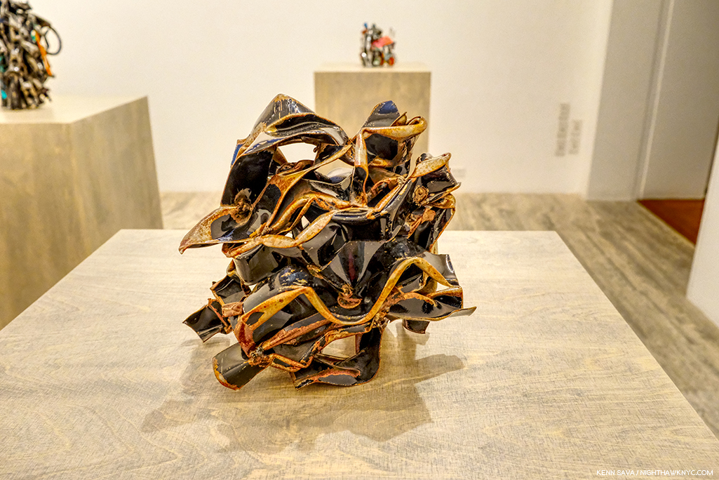
 

  1. Here. He repeated this elsewhere as well.
  2. By “work,” I believe they mean a Painting. According to its site, MoMA owns 12 prints and Drawings by Jean-Michel Basquiat. No Paintings.
  3. //www.nytimes.com/1985/02/10/magazine/new-art-new-money.html?searchResultPosition=1
  4. They were the only company in the world to acknowledge the 100th Anniversary of the 1st Jazz record in 2017, though the record in question is not what I call “Jazz,” and featured an astounding array of classic under-known Blue Note Record covers on T shirts.
  5. Both, Pheobe Hoban’s Basquiat: A Quick Killing In Art, eBook P.19

On Painting & Photography

Written & Photographed by Kenn Sava (except *)

Note- Robert Frank has been mentioned in many of my pieces over the past 3 years of my “deep-dive” into Modern & Contemporary Photography, a realm that he had a seminal role in creating with the publication of  The Americans. When the sad news came that he had passed away at 94 on September 9th, I was finishing yet another piece that he is a part of- one that summarizes some of my thoughts on Painting & Photography these past three years, and also marks the 60th anniversary of the American publication of The Americans. Too far along to change, I’ve left it as it was, and added this as my “R.I.P.”  That Robert Frank was, and remains, one of the most influential figures in Art of our time was already testified to within.

Subtitle- “On Rembrandt’s 350th, and Robert Frank’s 60th”

Rembrandt, Self-Portrait, 1660. The Artist is seen here in the last decade of his life. Seen on March 26, 2015 in The Met’s former European Paintings galleries.

When I look at Art, sooner or later, my thoughts involve Rembrandt for any one of a myriad of reasons. I do my best, however, to keep my thoughts about his death to a minimum, so this is going to be purposely short. Rembrandt was pretty poor the last decade of his life. His prior fame had deserted him as if he were a fad, or a “mania,” like tulips were in 1637 when he was 30, and combined with an extravagant lifestyle1 that he could no longer maintain, he lived in housing for the poor at the end2. When he died, at just 63, he was buried in an unmarked pauper’s grave. 20 years later, his bones were destroyed, as was the custom with the remains of such unfortunates. The church, where his unmarked grave was, finally got around to erecting a plaque, inside, in 1909. It redeemed itself some 30 years later when a young Jewish girl who was in hiding nearby from the Nazis took solace in the sound of the church’s bells. Today, there’s a statue of Anne Frank outside the church. His Art largely fell into eclipse, except for a few artists he influenced, for about 100 years, as hard as that is for us to imagine today. October 4, 2019, happens to be the 350th anniversary of his death.

Seen in situ. One of the glories of New York. Five of The Met’s Rembrandts seen in the European Paintings Galleries on June 10, 2017, before the current skylight renovations caused their relocation to the Robert Lehman Collection galleries. When I think of “home,” this gallery comes to mind.

I’ve remained passionate about the work of Rembrandt van Rijn since I was in my early teens and he is one of very very few Artists I can say that about. Almost no where else have I found the humanity, and the depth and range of humanity, I find in Rembrandt. Because of this, I find his Self-Portraits particularly fascinating. In the end, they show me that the Artist, himself, was every bit as human as anyone he ever depicted.

Rembrandt after Leonardo da Vinci, The Last Supper, ca.1634-5, Red chalk, 14 x 18 inches, From The Met’s Lehman Collection. Seen in 2016.

Few other Artists I’ve seen have the power to say as much with just a few strokes as can be seen time and time again in his Drawings- like this one, in which Rembrandt manages to capture the entirety of Leonardo’s masterpiece (and add some additional elements that may have come from a print of the Painting he saw- Rembrandt never left Holland) in so few strokes, you can almost count them.

Self-Portrait in a Soft Hat, 1631, Etching completed with black chalk. The Artist was about 25 at this point at the beginning of his career. Seen at the Morgan Library in September, 2016.

Today, he’s honored as Holland’s favorite son. Public places have been renamed in his honor. (“Rembrandt Square,” etc., etc.). In 2015, the country paid a record price for 2 portraits by the Master, 180 million dollars, splitting the cost with France (for the Louvre and the Rijksmuseum), partially (largely?) because of their value to tourism, (i.e. so they can continue to cash in on him). Pretty ironic given how he was treated near and at the end of his life.

The most Rembrandt Self-Portraits in one place I’ve yet been in were these five etchings seen at Rembrandt’s First Masterpiece at the Morgan Library in September, 2016. I was shocked to see them when I walked in. I had no idea they were included.

So, to me, his end is one of the most unfortunate, and saddest, chapters in Art history. I’m not so sure it’s a cause for all that much celebrating. The world of Art seems to agree. There’s only one museum (as far as I know) anywhere in the world mounting a show of Rembrandt’s work that might be construed as honoring/memorializing it anytime close to that date, with that one actually opening on October 4th3.

Nonetheless, the chance to put a big round number on the front of a marketing campaign seems to be all that’s required for Taschen to leap into the breach with three new volumes in their XL (aka “HUGE!”) series of books. Well? In 87 years, for the 400th anniversary of his birth in 2106, actual physical paper books may be a thing of the past4 Whether they arrive as physical books, ebooks, or whatever form books will take in 87 years, I won’t be here to see them. As I write this, the first of Taschen’s “trilogy,” Rembrandt: The Self-Portraits (R:TSPs, henceforth) is out and in wide distribution. It’s a handsome volume, with a nifty cover image that displays one of 6 different Rembrandt Self-Portraits depending on the angle you look at it. I picked it up in a store and passed, even though nothing Rembrandt did has held me more spellbound for so long as his Self-Portraits have. So, why did I pass on this complete collection of them?  I was extremely disappointed that the great Rembrandt scholar Gary Schwartz wasn’t involved in it, and from what I understand isn’t involved in the other two volumes either. That statement will serve as my protest since I subsequently bought R:TSPs. With all due respect to the scholars chosen, no one will replace Gary Schwartz for me when it comes to Rembrandt- or any other Artist he turns his unique skillset to (Dear Mr. Schwartz, If you happen to see this? Jan van Eyck, Please?). Suffice it to say that the renowned Professor, Simon Schama, host of the PBS series, The Power of Art, dedicated his own Rembrandt biography, Rembrandt’s eyes, to Gary Schwartz.

“I regard Rembrandt’s self-portraits less as assertions of a strong personal identity than as a means to help the artist, like Saint Paul, become more like other people. Behind them lies a man who depended on his art to offset imbalances in his life and his relations with others.” Gary Schwartz.

Focusing on what we do get, the book itself is large, oversized as they say in the trade, a full 10 x 13.5 inches and weighs about 4 1/2 pounds, very light for a true Taschen XL which generally weigh in around 20 pounds. Its 176 pages contain a succinct essay and the rest of the book is Rembrandt, in my view, at his best. The reproductions are very good5, with many being reproduced in actual size.

A publicity shot by Taschen. Rest assured the copies sold in the USA are in English.*

Rembrandt was the first Artist to create a body of Self-Portraits. Yes, the cheap headline is “Rembrandt Invented The Selfie,” which, without looking, I’m sure has already been used to death. That’s not true. He was not the first to do a Self-Portrait, just to create a body of them among Artists known to us today. And what a body of work they are! We don’t have his diary, but, though it’s dangerous to read too much into the SPs (unless you want to), they are not really “pure” autobiography beyond the fact that yes, they do indeed depict the Artist, and we get to see his famous visage evolve as the years and decades go by. Exactly what is going on in each of them has been the subject of much conjecture, and I suspect will continue to be for as long as people look at them. He created them in oil, in ink, and with an etching needle (in Paintings, Drawings and Etchings). Though I love everything the man did, for me, they have been THE supreme body of Art since I saw my first one, shown up top, at The Met way back when. If I had to live the rest of my days only being allowed to look at one work of Art (oh jeez), it would be a Rembrandt Self-Portrait. But, please don’t ask me which one. Right now, I would select his Self-Portrait with Two Circles in England, but that choice is often a factor of which one I’ve looked at last. I’d take any of them- Painted, Drawn or Etched. And in R:TSPs, we get to see every one of them (they say).

Two pre-release copies of Rembrandt: The Complete Paintings, left, flank a copy of Rembrandt: The Complete Drawings & Etching, which complete Taschen’s “trilogy.” As close as I’ve gotten- so far.

While I am very much looking forward to seeing Rembrandt: The Complete Paintings (TCP, henceforth), it should be mentioned that though The Rembrandt Research Project issued its latest volume of what it calls the “Corpus” of the Master’s Paintings in 2016, the controversy around what that body “should” consist of shows no signs of ending, and so? Buyer beware! What’s agreed upon as his complete Paintings will, very possibly, change in the near future. So, even 350 years after his sad demise, this will most likely not be the “final word” on the subject.

Still, there’s so much of what RvR has accomplished in his other work that can be seen in his Self-Portraits. You can trace a good deal of his development as an Artist in this work. And then? There is the incredible Painting! No matter how much Painting I’ve seen in the 40 year (next year6 I’ve been going to shows, my mind always comes back, for a variety of reasons, to “how Rembrandt Painted it.”

Ok. So, you’re wondering- What does all of this have to do with Robert Frank?

Robert Frank: The Americans, my copy of Steidl’s 50th Anniversary edition, 2008.

Questionable timing aside, for me, the real value of RvR:TSPs coming out now has been the bath of the icy cold water of “reality” it’s thrown on my deep dive into Modern & Contemporary Photography, by which I mean post-Robert Frank’s The Americans, the most seminal PhotoBook of our time. 2019 marks the 60th Anniversary of American publication of The Americans (and there’s been almost no fanfare about that- as far as I’ve seen thus far)7. This fall/winter marks 3 years of my “deep dive” into this realm of M&C Photography that I consider The Americans the first bookmark in, a beginning of, in a sense. I started from the place of believing that Photography had not, as yet, earned its place with Painting, Drawing and Sculpture. Looking at R:TSPs? I realized that after everything I’ve seen, I can’t say my mind has been changed all that much. For one thing, though, it’s still a very young medium- particularly when compared to thousands of years of Painting. After all, they’re marketing the 350th anniversary of Rembrandt’s passing, and he’s thousands of years after Artists started Painting. Jan van Eyck was one of the first to use oil paint in the early 1400’s. Photography (with chemicals) has been around since Sir John F.W. Herschel coined the word in his paper “On the Art of Photography; or the Application of the Chemical Rays of Light to the Purpose of Pictorial Presentation,” on March 14, 18398– 180 years. But, the more I look at both, there’s one thing that strikes me as a major difference between Painting and Photographs-

Time.

It takes time to create a Painting. Even if the Artist does one quickly. In most Paintings, it takes longer to apply one brushstroke than it does to create most Photographs.

I think I can see that. And, I think it’s telling.

I’m not the only one.

David Hockney, Don & Christopher, Los Angeles, 1982, Polaroid collage “Joiner.” Seen at David Hockney, The Met, January, 2018.

Earlier this year, while I was formulating my thoughts on this subject, before I saw R:TSPs, I came across 2 books by David Hockney, Cameraworks, 1984, and Hockney on ‘Art,’ conversations with Paul Joyce, published in 1999. In both of them, Mr. Hockney 9, a man who has created both Paintings and Photographs (since 196710), and innovated in both realms, put into words much of what I was thinking- uncannily. “During the last several months I’ve come to realize that it has something to do with the amount of time that’s been put into the image. I mean, Rembrandt spent days, weeks, painting a portrait. You can go to a museum and look at a Rembrandt for hours and you’re not going to spend as much time looking as he spent panitng- observing, layering his observations, layering the time.” “My main argument was that a photograph could not be looked at for a long time. Have you noticed that?,” David Hockney, Cameraworks, P.9. There. He just said it for me.

Recently, in these very pages, without any question from me or the knowledge that I was working on this piece, the Photographer Fred Cray said– “One of the concerns I’ve always had with photography is the way it holds up on the wall with paintings and other media. Photography often seems thin and quick compared to painting.”

Anytime I see a Photographic portrait, my mind (at times, unconsciously) always turns to Rembrandt’s Self-Portraits (though, much of what I’m saying here could also be said for almost all of his portraits, as Mr. Hockney inferred). Not as a way of qualitatively comparing them. As a means of gauging the impact. They are the benchmark for me. Most of the time, the impact of the Photography in question isn’t the same. I wondered why for most of the first two years of this dive. Early in 2019, it hit me. Time. Time is a key element in Painting. In so many ways. From the time each stroke takes to apply, to how long it takes to complete the work to the rendering of time, itself, in the work. These are not questions most Photographers have to face. They deal with questions of light and setting before the fact, then they’re finished- unless they modify it later in printing, or digitally.

Unknown Artist seen Painting on 7th Avenue, NYC, September, 2019. Yes, he got a parking ticket. Many Street Photographers would have been done long before this gentleman got set up.

Of course, Painters have ways of dealing with this question to ensure whatever level of consistency in the lighting they want. They can work in their studio, or they can work from a live subject, a still life, a Photograph, a Drawing, or what have you. Even au plain air, as the Artist above, is doing. Time is effecting the result in other ways. My feeling is it’s this passing of time, in this multiplicity of ways, that it takes the Artist to create the work that is manifesting itself in the work in subtle ways, maybe some of them are so subtle as to be subconscious, but that are nonetheless part of what the viewer experiences. With each brush stroke, time is passing, and in a real way, time is being layered on to the canvas. Time is absolute in a Photograph- it’s the same time at the top as it is at the bottom, unless you’re shooting with a time lapse, like Stephen Wilkes.

All of this also serves to remind me, again, of possibly why great Contemporary Painters, like Richard Estes, John Salt, Rod Penner, and David Hockney as well, among many others, use their own Photographs as part of their working process, but the reason they are Painters and not Photographers is because of what they find lacking in Photography- what it can’t present of their vision that Painting can. They’re not alone. The list of great Painters who also took Photographs at some point is long- ranging from Thomas Eakins, Edgar Degas and Edvard Munch, through Ralston Crawford and Robert Rauschenberg, and even Picasso. I find it telling that not a single one of them identified himself as a “Photographer.” Only Charles Sheeler was dually identified and that might be because his Photography earned him money to support his Painting.

Then, in the midst of all of these thoughts, a terrific new book was released by Steidl, Dave Heath: Dialogues With Solitude, the catalog for a show at LE BAL, Paris in 2018. It gave me pause for thought.

My copy of Dave Heath: Dialogues With Solitude, Steidl, 2019.

WHO is Dave Heath?

From Dave Heath: Dialogues With Solitude, Steidl, 2019. *Photo courtesy of Steidl.

It turns out that Mr. Heath was, not is, unfortunately, but his work struck me every bit as hard as any I’ve seen in this 3 year deep dive. Particularly, his portraits, and specifically his portraits of one subject not looking at the camera.

Dave Heath’s earliest body of work are Photographs he took while serving in Korea in 1953-4, including this one. From Dave Heath: Dialogues With Solitude, Steidl, 2019. *Photo courtesy of Steidl.

It turns out that he was not only a master with a camera- a master of the Portrait, he was, also, a master printer. To the point that no less than the aforementioned, esteemed, Robert Frank paid Mr. Heath to print his work for what I believe was his first solo show at no less than the Art Institute of Chicago in April, 1961, a byproduct of The Americans’ release here two years earlier. That says it all.

My copy of Dave Heath’s A Dialogue With Solitude in the 2000 Lumiere Press edition. The books is on the right. The print is in the sleeve to the left.

Captivated by what I’d seen in the Steidl book, which is very well printed, in my opinion, though, unfortunately, Mr. Heath, who passed away in June, 2016, was not involved in it, I learned that Dave Heath’s “masterpiece” is the PhotoBook, A Dialogue With Solitude, 1965, a subject I am quite familiar with. I hunted down a “reasonably” priced copy of the 2000 Lumiere Press limited edition reprint with a signed & numbered print. The reprinted edition includes a letter from Robert Frank. The print in my set is “Washington Square, New York City, 1958.”

Washington Square, New York City, 1958. A Photograph that leaves me speechless, and turns my thoughts to Rembrandt.

It’s one of the very greatest accomplishments in PhotoBooks I’ve yet seen. Given what I said about his printing, the inclusion of a signed & numbered print in the Lumiere Press edition is a key. When I saw it for the first time I had a feeling that was closest of any Photograph I can think of to that I get while looking at a Rembrandt Portrait. Of course, as always, your results may differ.

For some reason that I can’t fathom, the word is that “Mr. Heath’s work went out of style.” Well? Rembrandt, too, “went out of style,” for well over a century, as hard as that might seem to believe to us now. Now, with Steidl’s Dave Heath: Dialogues With Solitude, it seems to me that a show or a book that returns a great, overlooked or forgotten Artist to the world has done that world a great cultural service. I can’t think of a higher purpose for either.

David Hockney, Perspective Is Tunnel Vision, Outside It Opens Up, 2017, Acrylic on two canvases. David Hockney shows how the camera sees in “tunnel vision,” single point perspective,” versus how humans see with what he calls “reverse perspective,” with infinite vanishing points, born of driving through a 10 mile long tunnel in Europe then suddenly coming into the great outdoors in 198511.

Reading David Hockney further, which I highly recommend to anyone interested in Photography, he speaks time and again that cameras, while being great at reproducing two dimensional objects12, do not see the way humans do. He has devoted much of his subsequent Painting career (as seen in his fascinating recent shows) to challenging traditional perspective and exploring the innovations of both Renaissance masters and the masters of Cubism.

David Hockney, Grand Canyon I, 2017, Acrylic on canvas, 48 x 96″ hexagonal, seen in April, 2018. Outside, it, indeeds, “opens up.” The Artist has also begun cutting the corners off his canvases to reinforce his ideas.

In 1999, Mr. Hockney asked, “How many truly memorable pictures are there? Considering the millions of photographs taken, there are few memorable images in this medium, which should tell us something. There have been far more images made this way than the sum of all previous images put together.” (Paul Joyce, Hockney on ‘Art’, P.43.) One thing that’s changed since Mr. Hockney said those words is that there are now more cameras in the world then there are people. It seems to me that that’s going to be a factor in this. The sheer number of Photographers versus Painters is, and is likely to remain indefinitely, skewed incredibly. Incalculably. It makes the odds of a “great” Photograph out of the billions being taken incrementally greater. “Quality only comes with quantity,” legendary Photographer Daido Moriyama said explaining why he takes so many Photos, in How I Take Photographs, page 7313.

I’ve noticed that the rise of Photography has coincided with a relatively ”quiet period” in Painting, in some ways. While this has lasted a few decades, more recently, I don’t have to look any further than my own 200+ piece Archive. I’ve said a number of times that one of the reasons I decided to focus on Photography the past three years was the lack of Painting shows that spoke to me sufficiently to undertake the work these pieces require. I wonder how much longer this will last- Is this an anomaly, or is this the beginning of the way things are going to be? Will we see the number of painters going forward that we’ve seen for the past 500 years? Of course, sheer numbers, or the lack of them, don’t guarantee masterpieces or geniuses. Greater numbers only serve to increase the odds.

At the three year mark, I’m still not convinced that Photography will come to be seen as Art in hundreds of years when that question is decided, IF anyone still cares about Art then. But? If they do, my bets are that Rembrandt’s will still be among the work most highly appreciated.

A work like Dave Heath’s Washington Square, New York City, 1958, gives me hope that Photography may still get there. Is it, as Mr. Hockney said, an image in a billion? Or is it an indication of what might be possible in the medium? I will continue to look…

Meanwhile, on October 4th? I’ll just light a candle. To go with the one in memory of Robert Frank. While I continue my dialogue with Davids Hockney and Heath…

*-Soundtrack for this Post is “Grace,” written by Jeff Buckley and Gary Lucas from Jeff’s immortal album, Grace. I worked with Mr. Lucas, and I booked Music into the now legendary NYC Music Club/Cafe, Sin-E in 1993, shortly after Jeff had played and recorded there. And then? He was suddenly…gone. I never met him or heard him perform in person. One of the great regrets of my life.

BookMarks

My copy of The Rembrandt Book, (THE Rembrandt Book, or TRB, as I call it), by Gary Schwartz. In my opinion, it’s a model of everything a truly great Art monograph should be.

In addition to the books I referred to above, if someone were to ask me to pick one book on Rembrandt? I would choose The Rembrandt Book, by the aforementioned Gary Schwartz. It’s a book designed for readers both new to Rembrandt or expert on the Dutch Master, and so, it’s a book for a lifetime of enjoyment and research. Published in 2006 by Harry N. Abrams, it’s the SECOND full length monograph on Rembrandt by Gary Schwartz, and they couldn’t be more different (In a world where ANYone else would be thrilled to write one magnificent book on Rembrandt? HOW incredible is that?) or compliment each other better. TRB is oversized at 10 x 13 and weighs 6 pounds, but it is my bible on Rembrandt, and if I can’t find what I’m looking for there? I go to his prior monograph, the equally highly regarded, Rembrandt: His Life, His Paintings, 380 pages and 3.6 pounds, published by Viking in 1985 (and I believe this book has been reissued at least once). Both books can be found very reasonably (for less than they were originally published for) in very good condition. Along with my Sister Wendy books, they are the foundations of my Art library.

Another book that’s very relevant to this discussion, and has been essential for me- one I don’t see recommended nearly often enough, is Believing Is Seeing (Observations on the Mysteries of Photography) by the renowned Errol Morris. 

My prior pieces on PhotoBooks are here

NighthawkNYC.com has been entirely self-funded and ad-free for over 6 years, during which over 250 full length pieces have been published. If you’ve found it worthwhile, you can donate to keep it going & ad-free below. Thank you!

Written & photographed by Kenn Sava for nighthawknyc.com unless otherwise credited.
To send comments, thoughts, feedback or propositions click here.
Click the white box on the upper right for the archives or to search them.
For “short takes” and additional pictures, follow @nighthawk_nyc on Instagram.

Subscribe to be notified of new Posts below. Your information will be used for no other purpose.
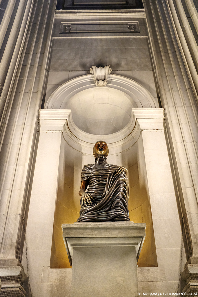
 

  1. You can still visit the beautiful, large, expensive house he bought at Jodenbreestraat 4, in Amsterdam.
  2. Excuse me for seeing a lesson for today’s Art world in this, but I do. If this could happen to one of the greatest Artists who ever lived? It can happen to anyone.
  3. The Wallfar-Richartz-Museum, Cologne, Germany is having a show of Rembrandt’s Graphic Work that opens on, yes, October 4, 2019. The Rijksmuseum, Amsterdam, is hosting a Rembrandt-Velazquez show that opens a week later.
  4. Gary Schwartz says there are some documents that raise the possibility that Rembrandt may have actually been born in 1605 or 1607  (Gary Schwartz, The Rembrandt Book, P.15). I don’t think a year on either side of 2106 is going to make a difference regarding my being around to see it.
  5. My one caveat being that they chose to reproduce only the detail of the early works in which RvR Painted himself as an onlooker in a crowd, denying the viewer the full context and setting.
  6. I consider the incomparable 1980 Picasso Retrospective at MoMA the real beginning of my “looking career” at shows. Looking at Art books predates that by about a decade.
  7. The Americans was first published in 1958 in France by Robert Delpire, and in 1959 by Grove Press in the USA.
  8. //iphf.org/inductees/sir-john-frederick-william-herschel/
  9. Who, in addition to being a world-famous Painter, has also authored two important books on Art & Art History- Secret Knowledge and A History of Pictures
  10. David Hockney, Something New Exhibition Catalog, 2018, P.6
  11. David Hockney, Something New Exhibition Catalog, 2018, P.5
  12. Afterall, what we have in Rembrandt: The Self-Portraits, and every other mass produced book of Paintings, are Photographs of Paintings.
  13. For much more on how Daido Moriyama feels about whether Photography is Art, see P.205-6 in the chapter titled “The Real Daido Moriyama,” in this same book, How I Take Photographs.

The Unique Fred Cray

Written & Photographed by Kenn Sava.
Works by Fred Cray Photographed by Fred Cray.

Maybe this has happened to you?

There you are, minding your own business, possibly looking through a book in a bookstore.

Like John Divola’s Vandalism, to the right on that middle shelf, for example.

And all of a sudden, you see this-

“What’s this Photo doing in here? Is this part of the book? Did someone vandalize John Divola’s “Vandalism?,” I wondered aloud? No answer.

Close up of the inserted 4 x 6 inch Photo.

Turning it over, I see this on the back-

Is this a “Unique Photo” of someone named Fred Cray?

Then, some months later, it happened to me again. I was looking through another PhotoBook, this one by Doug & Mike Starns, and whamo…

A dialogue? A commentary? A random act of kindness?

Seeing the name “Fred Cray” printed on the back both times it dawned on me that- no, it’s not part of the book. Fred Cray isn’t the author of either book I was perusing, the Artist either was about, and this time it’s not a portrait. The Photo must have come from elsewhere. Fred Cray is ANOTHER Artist- the Artist creating these “Unique Photos.” Maybe this Fred Cray, himself, put it in here? And, there’s more. Both times, the particular image being placed in this spot in the book spoke to me. I wound up purchasing both books because I wanted to keep that serendipitous synchronicity intact. I got it! He’s an Artist working with a publisher to help them sell books! Naw…

A Unique Photo included with a copy of Fred Cray’s An Incomplete Journey.

Having this happen to me a few times, the name Fred Cray was now somewhat known to me, though the man and his work remained an utter mystery. At first, like most others who accidentally come across his work, I didn’t know what to make of it. An isolated image here and there? It’s impossible to get a sense of anyone’s work, as you see. Then, by chance, I happened to spot “Fred Cray” on the list of my readers, so I chanced writing to him to ask if he was “THE Fred Cray?” He replied that indeed he was. Shortly after, I discovered that he self-publishes PhotoBooks of his work. Once I began to see his PhotoBooks, I got a sense of his work, and I got interested.

An unusual Unique Photograph by Fred Cray included in his book Conversations. Unusual because it’s a larger 6 x 9 size (4 x 6 being his “standard” size) and because it’s signed on the verso.

I met him in person a few months later at a book signing for another Photographer we’re both interested in, and as we spoke, I realized that he and I had probably been in the same gallery, museum or book store, countless times before. He’s as obsessed by Art & PhotoBooks as I am, and his taste is, unsurprisingly, from looking at his work, wide ranging. I find all of this interesting and a bit unusual. Many Artists, Photographers & Musicians I know don’t want to know what others are doing. They either don’t want to be influenced or are too focused on what they themselves are doing. Not Fred. Every time I have the pleasure of speaking with him or conversing with him by email, he’s up on whatever is going on at that moment. This show or that? The odds are he’s seen it, including a good many out of town, which I don’t get to. Chaos at the Whitney Biennial? He had just been there to see Nicole Eisenman’s work since it might have been leaving, though the announcement it might had only come a day or so before1 And, he just got back from over a month in Spain, where he “vandalized” (soft smile) both parks and the Prado Museum, blanketing the town with Unique Photographs, including some he hung in trees, he told me, with an impish grin. I would have loved to see a “candid camera” catching the reactions of those who discovered them. Taking stock of all of this, I wondered-

WHO gives away one of a kind works of Art?

A haunting Unique Photograph included with a copy of his book titled #. Being unique, need I say the Unique Photos included vary from copy to copy of his books?

As I began to get a sense of what he was doing, I mentioned to Fred that I had decided to write about him and his work. His first, and only, request was that I didn’t ask to follow him around as he distributes his Unique Photographs. The The New York Times had already done that. I can understand that, and I apologize, to him for leading with the Unique Photographs here at all. The Times reported that Fred had left some 30,000 Unique Photographs everywhere he’s been since about 2008. Has anyone in Art ever given away 30,000 unique works of Art? That means A LOT of people, like myself, who had never heard of him are discovering him and his work the same way I did- through finding those works by chance.

The earliest work I saw during my visit to Fred Cray’s studio- this Travel Diary, from the 1990s, above, when he was shooting film and black & white at that.Shortly after he returned from Spain for his annual out of the country summer trip, he invited me out to visit his studio in Brooklyn. Over the 4 hours we spent together, he told me that he has now distributed over 43,300 Unique Photos2! That, by itself, makes Fred Cray something of an NYC Urban Legend, but, as I found out, it’s really only the beginning of the story. Even after returning that night from seeing box after box of gorgeous full size (often very large), original works, the vast majority of them created in an edition of 1, i.e. unique, I realized that though we went through six or seven of the large boxes he had in his studio, he only showed me work dating back to 2017. Fred has been creating work since 1990!

Self-Portrait, 1994 *Fred Cray Photo

Frankly, I was shocked to see that everything he showed me was very good work, and much of it terrific in my opinion, all of it characterized by an exceptionally high consistency. Not only is Fred Cray one of the most interesting Artists using Photography working today, he’s, also, a very good editor. As we spoke, I discovered that anything that didn’t make his grade wasn’t saved. You see this very tight editing in his PhotoBooks, but when you’re looking through recent work in an artist’s studio, I generally expect to see some “work prints,” “pieces in progress,” or abandoned ideas. Not one.

Fred Cray showing me his work from 2017-9 in his studio, July 2019.

Yet? There’s more. As I got lost looking at work after work being passed in front of me for a few moments each, during these few hours, Fred was talking non-stop about the processes (plural) he used on these prints. At first I was stopped by terms like “Reprinted,” “Dissolve,” “Fragments,” and others, and when I backtracked and said, “What?,” I discovered he invented, and named, each process to realize his vision and create the numerous series his work is often grouped in to this point, as well as the multiple projects he’s currently working on. I counted at least 4 of these in various stages of completion. To go along with this, everywhere around the fastidiously neat and carefully organized studio are stack after stack of 4 x 6 inch Photographs- the size of the Unique Photos he distributes. Each pile was 5 to 6 inches tall. So? You tell me- how many photos would be in a 6 inch stack? Multiply that by at least 10 stacks. That’s about how many Unique Photographs Fred Cray had in his working piles. Maybe 5,000? Remember- each one is a one of a kind work of Art. That means it only exists that way on that print. Once he moves on and the files have been removed from his computer, he can’t duplicate it.

A Unique Photograph included with one copy of #. This one has hand punched small holes on it.

In 2019, many Photographers rely on their computers as the focus (sorry) of their workflow, their process, and indeed their work. Though Fred has couple of computers in his studio, I have no idea if they were even on. He never once went to one. He works off what he prints. Like everything else the man does- in his own way.

He’ll make these prints, then spread them out on his work table to study and assess them. From there, he’ll decide what the next step is. Does the print in question get modified? If so, how? Though he attended Painting classes at Yale, a survey of the techniques Fred uses to modify a print would be a study in an of itself, if not a book. Does he put it back in the printer(! Decidedly NOT recommended by most printer manufacturers I know of) and “reprint” it with another image or partial image over it?! Or, maybe he’ll modify it using the spectacular, and spectacularly fragile “dissolve” process he invented that he used to create the works in his 2017 show of the same name at Brooklyn’s renowned Janet Borden Gallery, his dealer since 1998. Some of this series may be seen in his book of the same name (the first 40 copies of which comes with an actual unique print from the Dissolve series).

I’ve never seen a Photograph that comes with its own warning label before. The glassine envelope the Unique Dissolve Photograph included with this copy of the book Dissolve.

To make these works, as I understand it, Fred prints the images on a surface that repels ink! After he does, the image, such as it is, or was, “dissolves” in front of his eyes, morphing into something else, possibly something useless, in moments. The Artist halts the process at the moment that speaks to him, freezing the image in the delicate and fragile state it every bit appears to be in from just looking at it.

The one of a kind Dissolve work inside.

By now, a pattern was emerging here.

Perhaps you, too, see a strong Buddhist influence is all of this (even before that last picture)- The giving away of one of a kind Art works reminds me of the Sand Mandalas created by Tibetan Monks over, in some cases, long days of arduous effort, only to then sweep them away after a ceremony. Impermanence is a core value in Fred Cray’s work- and it permeates his approach was from giving away original unique Art right down to the techniques he’s invented, like his “Dissolve” process, and his new, “Fragments” Series, he gave me a sneak peak at.

A haunting image of The Flatiron Building from the “Dissolve” series now appears in this work from Fred’s new “Fragments” series.

No need to get the science books out to understand this one. (Phew…My science book section totals zero. Unless David Hockney’s Secret Knowledge counts as science.) One day, Fred came home to discover his cats had decided to show him their “editing skills.” They had chewed up some of his work prints. Undaunted, and taking a philosophical approach, he decided to put them to work. He took the “scraps” they had left behind and mounted them on other images. Voila, “Fragments.” A large print of the Flatiron Building hung near his door and captivated me the moment I walked into his studio and saw it. Sure enough, a work from “Fragments.” Often, when he “reprints” a Photograph, or creates a work in his “Dissolve” series, he’s not sure, (exactly, or even at all) what he’ll get. In that regard, there’s a Zen element to his work as well.

And? To my shock (and the horror of the Art history lover in me), it turns out the impermanent nature of Fred’s work extends much further.

Monet in the 21st century? *A work from Fred’s “Dissolve” series.

Over the course of my 2 1/2 year “deep dive” into the world of Modern & Contemporary Photography (think post-Robert Frank’s The Americans), it’s become apparent to me that so-called Fine Art Photography is something of a wild west with no rules. Unlike Painting, a Photograph, in theory, can be reprinted ad-infinitum, indefinitely, for as long as the negative or the digital file exists. That some Photographers have taken to reissuing their work in second editions, something of a strict no-no to this point, and any number of estates have brought in others to print their Artist’s work (which, frankly, raises questions for me), says to me that it can be pretty scary to buy Photography for the big money being asked for it, and all Art, in these days at the top of an Art Market that hasn’t seen a price correction, or worse, in decades. Therefore, it seems to me that, as a by-product of his philosophical approach, Fred Cray is something of a “Photography collector’s dream.” Once Fred is finished working on a body of work, he removes it from his computer.

He keeps no archive!

Like that Unique Photo you found? Keep it safe because it cannot be duplicated or replaced. In this sense, his work is like that of a Painter’s. “Unique” means unique. Fred does create some editions as well, and his PhotoBooks are published in small editions of between 5 and 200 copies each. So fascinated by the PhotoBooks Fred has created over the past decade, I am devoting an entire piece, a Part 2, to look at them.

I looked at you tonite and you weren’t even there. An deeply personal work using found words in a large, editioned size, seen on the wall of his studio.

When I queried him on all of this (I don’t think he noticed my mouth opened as I grocked his replies), I asked him about the 4 x 6 Unique Photos he hands out- “Don’t you have an archive of them? I’d love to be able to look through them and see them all.” He picked up a half sheet of torn paper next to his work table. On it were columns of numbers going down, all but the last of which had been crossed out.

That’s it.

The sheet simply records the last number he had handwritten on a print so he would know which number to start with next time. When he reaches “9999,” he starts again at “1.” I’ll wait until you get up off the floor.

The universe is random. These 3 Unique Photographs that came with a copy of Changing of the Guard have consecutive numbers, something I haven’t seen before.

That means there are now 5 with the number “1” on the back, etc., but no way of telling which one is the “REAL” “1,” and which is ten thousand and “1.” No record. No hermetically sealed vault of originals. Just what you hold in your hand. On the subject, he told me- “I keep lots of images I’ve taken (or found) over the years hoping that they’ll resonate in new ways  when I go back through them. But every time I go through old files I try to delete a bunch. If I can find a way to remake an image in a new way I have no problem doing that. I wouldn’t want to go back and make the print as it was perhaps made before. But you are correct in saying I don’t keep an archive of the Unique Photographs that have gone out.” That sound you’re hearing are the voices of all the future Art Historians who will be fascinated by Fred’s work saying “Goodbye” to their dreams of trying to compile a “catalogue raisonne” of his Unique Photographs.

Splendor Solis, 2019 (Seen in progress.)

On August 22nd, Fred told me he had just completed his latest PhotoBook, Splendor Solis. After working on a series on the Sun for years, taking Photos of it in various ways, he finally came across the right means of collecting and displaying them. One day on 14th Street, he discovered a book he felt was the perfect instrument. He proceeded to buy up 35 copies of it, which were stacked on the floor next to his work table when I visited him in July. On the table, I noticed an array of rubber stamps and some watercolors. He explained to me that he’s going through the books one copy at a time, adding about 15 Unique Photographs (yes, different in each copy of the book) to 3 recurring Photos. Then, he’s customizing pages with a variety of media- the aforementioned rubber stamps, watercolors, etc. The project is loosely based on alchemy. As I looked at what he was showing me, Bruce Conner came to mind, briefly. But, there really isn’t anyone else I can compare Fred to- not Cristina de Middel. Not Ray Johnson (who may be closest in some ways). Not Henry Darger. Not Jim Dine, Gilbert and George, or Vik Muniz. His work is, also, unlike Robert Rauschenberg’s, not an easy thing to do.

Impermanence incarnate. The complete edition of Splendor Solis. 31 copies, plus 5 Artist’s Proofs. Now that he’s finished them, there’s a very good chance they will never be seen together again.

Earlier, I mentioned the Whitney Biennial, in progress as I speak until late September. (My look at the 2017 Biennial is here.) Once again, it leaves me with mixed feelings. On the one hand, it’s so hard for an Artist in this country to receive any recognition for their work, it’s good such things exist. I’m not taking anything away from anyone included when I say that each time the list is announced, my thoughts turn to all the great Artists who get left out.

Like Fred Cray.

The Artist holds one of his Unique Photographs with a selection of his books in front of him during an Artists’s Talk at a 10 x 10 Books Salon, May 16, 2019.

I told him this, and his reply caught me off guard. “Wouldn’t it be great if they had included a great Artist, like David Hammons?”

Undaunted, I’ll up the ante. Having had the chance to look closely at his work, albeit only from the past 3 years, (Fred, a 2003 Guggenheim Fellow, has been creating for almost 30 years now), I believe his work is going to receive more and more attention in the future- and in the near future, from collectors, and particularly from museums & their curators.

Why do I feel this way? Because, along with being continually innovative, the bottom line for me is his work is that good. And? Among all the Artists & Photographers known to me, there’s no one like Fred Cray. He’s unique.

-Soundtrack for this Post is “Changes” by David Bowie from his classic 1971 album Hunky Dory

“I watch the ripples change their size
But never leave the stream
Of warm impermanence and
So the days float through my eyes
But still the days seem the same”*

My thanks to Fred Cray. 

This is Part 1 of my 2 part look at the work of Fred Cray. Part 2 is a look at the PhotoBooks Fred has published over the past decade and may be seen immediately following below this, or here

NighthawkNYC.com has been entirely self-funded & ad-free for over 7 1/2 years, during which almost 300 full length pieces have been published! If you’ve found it worthwhile, PLEASE donate to allow me to continue below. Thank you, Kenn.

You can also support it by buying Art, Art & Photography books from my collection! Art & Books may be found here

Written & photographed by Kenn Sava for nighthawknyc.com unless otherwise credited. To send comments, thoughts, feedback or propositions click here. Click the white box on the upper right for the archives or to search them. Subscribe to be notified of new Posts below. Your information will be used for no other purpose.
  1. The situation seems to have been resolved in the following week, and the works will remain in the Whitney Biennial, as far as I know.
  2. Fred added, “Early on I didn’t number the photographs, so there are probably an additional 1,500 un-numbered. I started numbering them to reiterate the unique aspect of the photographs.”

The Complete PhotoBooks Of Fred Cray: 2009-2019

Written & Photographed by Kenn Sava & Fred Cray

This is Part 2 of my two part look at the work of Fred Cray. Part 1 may be seen above, or here

There’s been quite a bit of discussion about whether Photographs are best seen on the walls or in a book. The question goes much deeper, I think. For one thing, what kind of book are you talking about?

A Unique Photo by Fred Cray. Believe it or not, this was not taken in the NHNYC offices.

Photographs appear in, probably, well over half of all books published each year, I’d guess. Even in the world of Photography books, there are a number of different types of books published ranging from exhibition catalogs to retrospectives to monographs on a particular subject to biographies to how-to’s and on and on. And then there are what has come to be known as PhotoBooks. The PhotoBook is a book created by a Photographer in which they present one (as Paul Graham did in a volume of A Shimmer of Possibility) or more Photographs that are somehow related or connected in the mind and vision of the Artist, in an arrangement and design of the Artist, or under his or her direction. In a PhotoBook, unlike most other Photography books, every detail is part of the overall experience and effect. As a result, PhotoBooks are Artists’ Books and are often self-published due to their highly personal (i.e. limited market appeal) nature and often as close to hand-made feel as possible.

Self-Portrait from Self (2) by Fred Cray.

As I’ve explored the world of Modern & Contemporary Photography (post-Robert Frank’s The Americans, published in France in 1958, in the USA in 1959), I’ve discovered that PhotoBooks are something very much apart in the Art world and in the world of Art book publishing. They are an entirely different way of experiencing Photography besides seeing works on the walls in a show or in other types of Photography books.

Among the Photographers creating PhotoBooks today, Fred Cray’s books are one of the most continually creative bodies of work released in the past decade known to me. However, his first 10 books (his output up to 2013) were published in editions of just 5 copies each. Since then, his editions have totaled no more than 200 copies of a given title, and, to date none have been reprinted. As a result, only a small number of people have seen his books.

A selection of ten books by Fred Cray seen at a 10 x 10 Salon Fred spoke at in May, 2019. The two books in the lower left are display copies of titles that are now out of print.

As I wrote in Part 1 of this 2 part series on Fred Cray, after coming across a few of his Unique Photographs, I discovered Fred had been publishing his own PhotoBooks and began to see them. I found one here, one there, each one raising more questions and leaving me wanting to see more. As I began to look for them, I discovered that no one has as yet done an overview of them. I try and fill that gap here. As he hits the decade mark of self-publishing his own books in 2019, and as more and more people become interested in his work (which, as I said in Part 1, I expect will continue), I think it’s time for the first overview of this sui generis body of work. I am happy to say that I have had Fred’s help throughout, which I greatly appreciate. Still, responsibility for any errors or omissions lies with me, so if you have any corrections or additional information, please feel free to send it.

From Self, his first book, 2009.

Fred had been creating work for almost two decades when he decided to make his own book, as many Artists do who self-publish- as a way to see their work. The result was Self, a collection of black & white self portraits, five copies of which he published in 2009. On August 22nd, 2019, the Artist told me he had completed his latest and the most singular in a singular body of PhotoBooks, Splendor Solis, each of whose 35 total copies are hand modified on a page by page basis!

From Berlin.

Fred not only creates the work they include, he publishes the books, and then he gets out there and serves as his own distributor. Having been an independent Jazz record producer, I find it utterly remarkable that Fred, (as do innumerable other Artists, Photographers- like Kris Graves, who I’ve written about a few times, and Musicians, like Dave Fields), funds and produces each of these projects himself. Given the costs and the financial realities facing Artists in the big business world of books, I doubt his books are a money-maker for him. As with most Independent Publishers and Producers, they’re lucky if they break even so they can fund their next project.

Since he keeps no archive of his work, as I discussed in Part 1, his PhotoBooks are the only record of a good deal of his work, beyond what’s in the hands of collectors and museums (which currently includes The Museum of the City of New York, Middlebury College of Art, Smith College Museum of Art, and the Brooklyn Museum). Here, I’ll give a brief look at each book Fred has self-published to date. Many of the titles published from 2013 are still available, reasonably, at Printed Matter, Photo-eye, Amazon, AbeBooks or Dashwood. The books published from 2009-12, of which only 5 copies exist, begin at a thousand dollars per copy currently. Whether you find one of his Unique Photos out in the world, or buy one of his prints, Fred Cray’s PhotoBooks are portable works of Art in their own right. Over the past 10 years, they have become a very important part of Fred Cray’s Oeuvre. Here’s a look at each of them.

“No sleep til Brooklyn.” All of Fred Cray’s books to date have been created there. Here, a selection of Fred’s share a shelf with the Beastie Boys Book, the composers of that song, in February, 2018,

All books are listed chronologically from the earliest in the following format-
Year published- Title, Publisher (All titles are understood to be self-published. A few bear his “64” imprint1 so these have been noted), followed by the edition size. 
Next are pictures of the cover and sample contents, including Photos taken for this piece by Fred Cray as noted. These are followed by new comments from Fred and publisher’s statement at the time of the book’s release.

All of this is accompanied by my selections from “Song of Myself” by another Brooklyn Poet, Walt Whitman, from Leaves of Grass, as the Soundtrack for this Post.

The Complete PhotoBooks of Fred Cray: 2009-2019

2009, Self- (ISBN 97800984238729) Published in an edition of 5 hardcover copies.

Self. Fred Cray’s first book, copy #5 of 5 in existence is seen here. Photo by Fred Cray.

A collection of his early, black & white, Self-Portraits, a genre in which he has continued to this day, though in color. Fred told me this about Self in 2019- “The work in this book is black and white self-portrait images, usually large format, sometimes multiple exposure. I was transitioning back to photography being the primary or base medium I was working with. Painting, printmaking, iliterary influences and interests inform just about all my photographs from this point on. One main reason I was photographing myself was that I was working a lot of hours (70 plus per week) in the painting/construction trades. I’d get home late and it would often be easier to photograph myself than anything/anyone else. I’ve continued to photograph myself periodically with a primary intention of seeing how far I can transform the same figure, how far the boundaries can be pushed and still have it be the same self. The earlier self portraits followed a period where I had been making a few black paintings and wanted to make black photographs, so I painted the wall and myself black. These images stretched for a couple years into performative aspects (setting myself on fire, eating dirt – a Gabriel Marquez reference), buried, and tarred and feathers. I then moved into using silver body paint (white didn’t resonate for me).”

The first page of Self.

Fred never seems to spare himself in the pursuit of a good image- no matter what he has to endure to get it. From Self.

“I celebrate myself, and sing myself,
And what I assume you shall assume,
For every atom belonging to me as good belongs to you.”*1

2009, Words- (ISBN 9780984238705Published in an edition of 5 hardcover copies with Unique Photographs, letters, and other paraphernalia.

Words. Photo by Fred Cray.

Describing Words Fred Cray said in 2019, “A variety of images from different bodies of work that incorporated words. This includes Sequiturs, Travel Diaries, Unique Photographs, and some general street photography images. This book was intended mostly as a compilation of works with words to show the importance of words and thinking about art (with words vs. instinctual reaction which is a whole other thing). I’ve been observant of text since perhaps high school. The adding of text to a photograph was the first time I digitally altered photographs. To this day I still photograph random bits of text, particularly  when walking around. It’s interesting to me who text is intended for and when it involves people it was not intended for. A lot of what makes text interesting (for me) is context or out of place context. Once I went on vacation to Mexico without a photographic plan. As we walked on the ocean I thought of how waves could make new words. So I spent two or three days making hundreds of photographs where waves erase letters to make new words. For example by erasure tear can become tea. I only used a couple of those images in the book.”

From Words.

Publisher’s statement in 2009- “Book contains 56 images plus numerous original photographs. Also included in the book are signed letters from the artist. Several unscratched lotto tickets are included in the book, either directly visible or underneath original added in photographs. This book included images from several of the artist’s series including his Travel Diaries  and images with text added to create ambiguous meanings.”

2009, Uniforms- (ISBN 978098423871) Published in an edition of 5 hardcover copies.

Uniforms. Photo by Fred Cray.

Fred Cray in 2019- “This is a book with images begun shortly after 9/11 when people in uniforms became much more present in our lives. Police, military, and fire fighters were the primary focus. The uniform portraits initially began as both an inverted extension of my two minute self-portraits and as a slight form of aggression towards the police. The first portraits were hand held two minute photographs (quasi mug shots) of cops standing on duty. I’d never had a great love for cops so I started photographing them as angry cops. I expanded the series to include other military personnel but drew the line there. Over the course of the several years I was working on this project the portraits became much more sympathetic. I felt these people were just being used for agendas they might not like or understand. I believe this is reflected in the images themselves.”

From Uniforms.

Publisher’s statement in 2009- “This book contains 49 images taken over several years and shows the photographer’s changing attitude towards people in uniforms. Taken before and after 9/11 the photographs range from straight forward almost mugshot portraits to soft focus images, to computer altered portraits. Included in the book are several added in one of a kind photographs signed by the photographer.”

2010, Self (2)- (ISBN 97800984238729- It uses the same ISBN number as Self. Fred intended this to be a 2 volume set.) Published in an edition of 5 hardcover copies.

Self (2). Photo by Fred Cray.

Fred Cray in 2019-  “Self(2) contains later color self-portraits, starting with two minute self-portraits. Both (Self and Self((2)) had red cloth covers. The Self-Portraits are an ongoing series of work, and these two volumes were intended to compile a selection of the images to date. A fair number of new images with the self (in one form or another) have been made since then. I believe I started making color self-portraits around 1997. Most of the black and white self-portraits date from the late 1980s-1995. Early in the 90s I was working mostly on Travel Diary work (never did a book of those due to the dense nature of the work not reproducing well on a printed page). One of the concerns I’ve always had with photography is the way it holds up on the wall with paintings and other media. Photography often seems thin and quick compared to painting. The color self-portraits taken after 1997 were large format two minute exposures. I would paint the wall and then paint myself different colors. I could over the course of the two minutes draw or paint with myself. Other images in this book include a few singular Travel Diary  frames where I’ve included a self-portrait as one of the four layers in these multiple exposure works, collaged and rephotographed photographs, and other images that have led to recent work where I am physically breaking down photographs to make new photographs.”

From Self (2).

“Apart from the pulling and hauling stands what I am,
Stands amused, complacent, compassionating, idle, unitary,
Looks down, is erect, or bends an arm on an impalpable certain rest,
Looking with side-curved head curious what will come next”*4

2010, Red- (ISBN 9780984238736) Published in an edition of 5 hardcover copies.

Red. Photo by Fred Cray.

Fred Cray in 2019- “Photographs with red in them. Mostly, I was thinking about a different way of selecting/editing work, but was also aware that red played a role of potency in my images. Red is sort of a compilation project incorporating various series of works. It was more of an editing/concept book than something I went and made work for. Word, Porn, Self-Portraits, street photography all feature in it.”

“I used to lie on the floor. They used to kick me and say ‘the animal’s still alive.'” From Red.

Publisher’s statement in 2010- “Red contains 81 images plus several original unique added in photographs. In this book all the photographs contain some amount of red and cover the photographer’s wide range of work including street scenes, self-portraits, multiple exposures, and images with text.”

2010, Berlin- (ISBN 9780984238750) Published in an edition of 5 hardcover copies.

Berlin. Photo by Fred Cray.

Fred Cray in 2019- “I spent a summer there in 2010 out photographing all day every day. Berlin has been important for artists for quite some time. I wanted to experience the city and witness some of the art scene. These summer trips have been important for me to reside somewhere outside of NY and someplace relatively unfamiliar so I can see “more freshly” than perhaps I do during daily life in NY. There were interventions I photographed with words placed or written in situ. Much of what I ended up doing in Berlin could be considered minor interventions; some interventions were with words and some with objects such as bread crumbs and band aids. In a way these interventions are similar to the process of leaving Unique Photographs, though people wouldn’t want to collect the band aids or bread crumbs. I was in Berlin prior to my leaving lots of unique photographs, though I did leave a few (perhaps around 20). I wrote the words stoned and punk on rocks that were piled in construction sites around the city.”

From Berlin. Fred Cray, “On the plane ride over there I was eating a nondescript, at best, meal and started tearing up the roll. It occurred to me to leave bread crumbs throughout Berlin (similar to Grimm’s fairy tales (they’re buried in Berlin and there’s an image of the tombstone in this book)).”

Publisher’s statement in 2010- “Berlin contains images taken in that city during the summer of 2010. This book continues the photographer’s street work, works using words, multiple exposures, and works with objects. Not a visual description of the city but an impression of a place important to the art world.”

2010, Movies- (ISBN 9780984238736) Published in an edition of 5 hardcover copies.

Movies. Photo by Fred Cray.

Fred Cray in 2019- “I had (and still sometimes do) photographed movies as a source for images to work with. The Travel Diaries in particular contained layer after layer of movie images allowing me to mix elements of time and place. A friend at one point commented on frames within the Travel Diaries suggesting making blow up works from single frames. This book contains later (post Travel Diary) film images, usually two minute images where I hand held the camera for two minutes while the film was rolling. In retrospect, had I known I was going to make the Porn book which followed this book, I probably would not have made this book. The important element for me was the use of time lapse imagery and playing around with time. The Porn book really stretched the use of time lapse. Most of these images were just a few seconds of a film combined into one still photograph.”

From Movies.

2011, Porn- (ISBN 9780984238767). Published in an edition of 5 hardcover copies plus two artists proofs.

Porn. Photo by Fred Cray.

Fred Cray in 2019- “The Movies book contained a few porn images. A few friends who looked at the Movies book commented on how strong and resonant the pornography images seemed to be. They invoked a lot of different things to people.  I spent a couple months watching/photographing pornographic movies. The same time lapse technique was  used so each singular image contains at least two minutes of actual film footage. As I mentioned this came about after the Movies book. When I showed people the Movies book the porn images were commented on most. Talking about porn with people made me realize how prevalent it is and how little it is discussed compared to its prevalence. It turns out just on the world’s largest porn site 5.5 billion hours of pornography is consumed each year. I was buying disks so I could stop and fast forward the images. It seems people don’t mind talking about pornography privately, but they don’t want to talk about it publicly.”

From Porn.

2011, Rome- (ISBN 9780984238774) Published in an edition of 5 hardcover copies plus two artist proofs.

Rome. Photo by Fred Cray.

Fred Cray- “I had been to Rome once years before. I was wary of spending an extended amount of time there fearing there were so many brown monuments that I’d end up with a boring series of images. I took along gels to put in front of the camera lens and ended up with a good number of vivid color works , some of which were shown at Janet Borden for the first gallery exhibition of Unique Photographs. Referring to his annual summer trips, like the one to Madrid this past July, Fred added, “I try to make these summer trips long enough so that something new happens in the work. Generally that means at least six weeks in one place. I try not to leave the city chosen, so that I visit time and time again places and see them in different light and circumstances. Also by staying in the one city I’m making myself  think that there’s not something else or something better somewhere else I should be considering. I spent summers in Athens and Tokyo (which I want to revisit) but don’t want to make book after book about my summer in so and so city. In Rome I wandered into an antique store and found a replica skull. I bought it, spray painted it gold, and carried it around with me to photograph.”

From Rome.

Publisher’s statement in 2011- “This book contains images made in Rome during the summer of 2011. Many of the images are multiple exposures of the city’s monuments and ruins in saturated colors. Contrasting images show contemporary life and people attached to their digital devices. Several unique original photographs are included in this volume.”

2011, Devices- (ISBN 0984238794) Published in an edition of 5 hardcover copies plus two artist proofs.

Devices. Photo by Fred Cray.

Fred Cray in 2019- “For a few years starting perhaps 2008 I started photographing people with their electronic devices. I was particularly interested in the element of isolation in public that phones and headphones create. Many of these images were taken in museums in Rome and Berlin on various summer trips.”

NYC Street shot from Devices.

2013, Unique Photographs- (ISBN 9781617042010) Published by 64, Published in an edition of 200 copies, each containing 4 Unique Photos, and 22 Artist’s proofs.

Beginning with Unique Photographs in 2013, it and every subsequent Fred Cray book includes at least one Unique Photograph laid in.

Each copy comes with four, different, Unique Photographs.

Subtitled “Volume 1 of the Unique Photographs” Fred has distributed. From the publisher in 2013- “Since 2008 over 10,000 Unique Photographs have been left or hidden in unexpected places in New York, around the United States and in different parts of the world including Europe, Asia, Australia and South Africa. The photographs are printed, stamped and numbered. This artists’ book frames the ongoing project, includes many of the best photographs, photographs of them in situ and some emails from individuals who have felt the compulsion to contact the artist after the random encounter with his work. Each copy comes with four Unique Photographs.”

Fred showing pages from the Unique Photographs book at a 10 x 10 Salon, May 16, 2019.

2014, Changing of the Guard (Unique Photographs Volume 2)- (ISBN 9781617042027) Published by 64 in an edition of 200 hardcover copies.

Changing of the Guard, with the Unique Photographs that came with this copy.

Fred told me “The Guard” in question is one of The Metropolitan Museum’s Guards. I can vouch for that as I’ve seen him there a number of times. From the publisher in 2014- “Changing the Guard repeats the same image of a museum guard with 52 variations created by double printing. Fred told me that after publishing the book, he went back to The Met and, after some effort, located this Guard. He showed him the book and his reply was “You make money from this?” As you can already see, in this book, everything but the Guard, changes.

2014, Conversations- (ISBN 9781617042034) Published by 64 in an edition of 200 hardcover copies.

A copy of Conversations, left, with a Unique Photograph, right, found in Aubervilliers, France by Amouret Hugues of French TV in a Wolfgang Tillmans book, that appears to be a variation of cover image.

Publisher’s statement in 2014- “An artist’s book in which photographs of words have been interwoven with the monologue from a 1960s illustrated book, creating a discussion between today and the 1960s. Photographs by Fred Cray. 64 pages; 64 color plates; 9.25 x 11.5 inches.”

2015, Cray Cray- (ISBN 9781617042102) Published by 64 in an edition of 100 softcover copies, and “a few” collector’s copies with 7 unique prints included.

A sealed copy of the now sold out Cray Cray. It contains 1 or 2 Unique Photographs.

Publisher’s statement in 2015- “Cray Cray continues Fred Cray’s work with Unique Photographs. This book contains 36 double-printed images all of which use the same self-portrait as a constant. Each copy comes with at least one unique 4×6-inch double-printed self-portrait. “

2016, # – (ISBN 9781617042041) Self-published in an edition of 150 hardcover copies.

The cryptically titled # with the Unique Photos that came with this copy.

“Clear and sweet is my soul, and clear and sweet is all that is
not my soul.
Lack one lacks both, and the unseen is proved by the seen,
Till that becomes unseen and receives proof in its turn.”*3

2016, Silhouettes– (ISBN 9781617042096) Published by 64 in an edition of 100 softcover copies.  

Silhouettes, with the Unique Photo that came with this copy.

Publisher’s statement in 2016- “Silhouettes continues Fred Cray’s Unique Photographs project. In this book images are derived from scans of double printed works where silhouettes or their inverse are over-layed upon a variety of subjects.

2017, An Incomplete Journey- (ISBN 9781617042089) Published in an edition of 30 softcover copies, and “a few collectors’ copies.”

An Incomplete Journey with the Unique Photographs that came with this copy.

Of this book, in January, 2017, the Artist said that he was “finishing a very limited edition (30+ a few collectors’ copies) handmade book titled An Incomplete Journey. About an abbreviated trip to Kolkata, India last year. Trip was cut short by my mother’s death and title refers both to trip and her life. 8.5″ X 11″ inkjet printed on archival matte paper. Different handmade paper covers. Unique Photos inserted.”

2017, Dissolve- (ISBN 9781617042072) Published in a hardcover edition of 165 copies, the first 40 copies of which come with a Unique Photograph. There is also a Limited Edition of 4 signed copies with 48 Unique Prints, 4 x 6 each, contained in a rigid, 50-page notebook.

Dissolve. This being one the first 40 copies, its Unique Photo is below.

2018, Transparency- (ISBN 9781617042058) Published in an edition of 150 softcover copies bound with a carton staple(!) plus 15 artist’s proofs.

Transparency with the Unique Photograph that came with this copy.

In November, 2018, Fred Cray said of Transparency, “(The) book is a combination of images on paper and on acetate which swings back and forth between two pages. Not a narrative but an interpretation of a recent series where two images were printed on the two materials and then sewn together with thread. Book is printed in a small run of 150 plus 15 collector’s copies. Carton staple bound softcover. Many many thanks to Edition One Books for their extraordinary work and diligent patience with this project.” Elsewhere he added- “Transparency is another component to the Unique Photographs project. The book parallels but also deviates from the recent series of artworks where drawings were printed on acetate and then sewn together with photographic print underneath. For the book some of the drawings have been printed on acetate which flips between two printed pages. Other drawings are incorporated through the artist’s practice of double printing a variety of images with unexpected juxtapositions. The book deliberately aims to create more of a cacophonous experience than the prints did. The book is printed in a small edition of 150 (plus 15 collector’s edition copies). Softcover and carton staple bound. Each book contains at least one 4’x6’ double printed Unique Photograph from the Transparency series.”

The Transparency book features a variation on the larger prints he’s created that have an acetate sheet hand sewn on top of a Photograph. In the book, the acetate sheet is bound between pages, effecting the image on each side depending on how your turn the sheet as I show here, and below-

“Have you reckon’d a thousand acres much? have you reckon’d
the earth much?
Have you practis’d so long to learn to read?
Have you felt so proud to get at the meaning of poems?”*2

2019, Dark Dog- (ISBN 9781617042065) Self-published in an edition of 200 softcover copies. 24 pages, 11 images. Thread bound.

Dark Dog

In November, 2018, the Artist said, “Been working for a while on this series with a (usually dark) dog. I see it as a metaphor for our dark times. I tend not to engage directly in political art so this is as close as I come. Unique Photo pieces with fragments of other photo works.”

The Unique Photograph laid in to this copy.

“I have heard what the talkers were talking, the talk of the
beginning and the end,
But I do not talk of the beginning or the end.

There was never any more inception than there is now,
Nor any more youth or age than there is now,
And will never be any more perfection than there is now,
Nor any more heaven or hell than there is now.”*3

2019, Splendor Solis- (ISBN- Undetermined) Published in an edition of 31 copies with 4 Artist’s Proofs.

Splendor Solis, 2019 (Seen in progress.) This was a brand new book, as seen on the right, until the Artist “modified” it, left. He said, “I’m not sure that there are too many photography books that began by being smacked around with a hammer and then sanded with heavy grit sandpaper and having paint spilled on them.” Photo by Fred Cray.

In preparation as I worked on these two pieces, Fred told me he had completed Splendor Solis on August 22nd. Each copy contains 15 or 16 Unique Prints and 3 repeated prints that are are altered in a way that makes them unique. Each copy is hand modified using rubber stamps and hand-painted watercolor additions and modifications.

Past, present and the immediate future- Fred Cray in his studio, surrounded by his work as he ponders his next step in the creation of Splendor Solis, July 27, 2919. When you speak to him about work in progress, he continually speaks of his “next steps” and “where he can take things” from here.

In August, regarding Splendor Solis, Fred said, “I’d been photographing the sun for a few years. The NYPL picture collection has been a great source for my work. One day I was going through vintage advertisements and came across an image on how to take pictures. There was a drawing that instructed one to never photograph the sun directly but to keep it at one’s back. So that cemented the idea to continue directly photographing the sun (I’d been doing it for a number of years but not with the idea of making a series of it). Since last spring I knew I wanted to make some sort of book about this work. I was talking with a well known educator who also collects photography books. He mentioned he had lots of books he was happy to have but only looked at them once which was when he bought them. In the back of my mind I wanted to make a book that almost demanded multiple viewings. Another aspect to the sun series book was that I wanted each copy of the book to be different, to contain different Unique Photographs, a sort of challenge to myself to see if I could come up with about 400 decent unique photographs of the sun.”

The state of the art. A sample spread from Splendor Solis Fred provided on August 20th. In addition to the Photo on the left hand page, which I believe he took on his summer 2019 trip to Madrid, many of which can be raised from the bottom to reveal another image under, everything in color has been added by the Artist. To get an idea of the size of this project? Multiply this by many of the 104 pages in each book, times 35 books! Photo by Fred Cray.

He added, “One day earlier this summer I was looking for a book with drawings of the sun. I couldn’t find anything but did stumble across this book Splendor Solis which had a couple drawings of the sun in the context of alchemy. The book seemed ideal as a vehicle in which I could insert the Unique Photographs. I intended to insert them and call it quits. Once I started playing around with the insertion I realized something more was needed. I started painting the existing illustrations with water colors. The project grew out of control to the point where I estimate I’ve spent 12-14 hours per book, not including the time it took photographing the sun over the past five or so years, and not including the time it’s taken to make the prints. This book has really fulfilled the ideal I have at the best of times to not know how a project will turn out and to give a project room to grow out of its specific needs. Three of the images repeat in all books as a type of anchor but are altered with holes in ways that I consider to make them all unique. The edition of 31 is to relate to the lunar calendar- plus four. It’s been a time consuming monster, but has become a book I didn’t imagine – which is really the best part of making something.”

In mid-August, I got a first hand look at the level of the attention to detail Fred is bringing to this “monster” project. I accompanied the Artist to The Ink Pad in Greenwich Village.

Fred Cray holds a copy of Splendor Solis as he judges the suitability of rubber stamps to add to it at The Ink Pad, Greenwich Village on August 15th.

Surrounded by upwards of 1,000 rubber stamp designs of every subject under the Sun (sorry), Fred knew exactly what stamps he needed and exactly what kind and color of ink he would use them with.

As a last touch, Fred decided to add gold to the book. Here are the same pages in two different copies giving an idea of the similarity and the variance from copy to copy of Splendor Solis. Photos by Fred Cray.

On August 20th, he said this regarding the premise of the book- how to make gold- “I did come up with another twist/layer to the book in the middle of night last night. Since it’s a treatise on alchemy  and the reader can only be disappointed since gold can’t actually be made, I figured I should include some real gold as a consolation of sorts…I never imagined this project would expand like it did, but I’m glad it did. It’s that thing of staying with something for a while so it organically grows and goes in a certain direction, rather than just being an idea.”

“Stop this day and night with me and you shall possess the
origin of all poems,
You shall possess the good of the earth and sun, (there are
millions of suns left,)
You shall no longer take things at second or third hand, nor
look through the eyes of the dead, nor feed on the
spectres in books,
You shall not look through my eyes either, nor take things
from me,
You shall listen to all sides and filter them from your self.”*2

What I saw of Splendor Solis as it progressed revealed a book that, given all the hand applied elements it contains, in addition to recurring and Unique Photos, blurs the line between PhotoBook and Artist’s Book. If it doesn’t create something entirely new of its own. A fitting culmination to a decade publishing a unique body of books.

Addendum- Other publications on Fred Cray that he was involved in but did not publish himself-

2000, Fred Cray May 3- June 18, Exhibition catalog published by Tremaine Gallery, The Hotchkiss Gallery, Lakeville, CT, Edition size unknown. 12 pages with full page reproductions in color and black & white.

Fred Cray, 2000. An exhibition catalog is the very first publication devoted to Fred’s work.

The earliest publication of Fred’s work known to me. Published to accompany a show of his work at the Tremaine Gallery at the Hotchkiss School, in Lakeville, CT, which he graduated from in 1975, before moving on to get a BA from Middlebury College, studying at the Skowhegan School of Painting and Sculpture, both in 1979, and the Yale Graduate School of Painting, where studied Painting.

“Failing to fetch me at first keep encouraged,
Missing me one place search another,
I stop somewhere waiting for you.”*52

The Artist signing one of his books. May, 2019.

*-“Soundtrack” for this Post are quotes from “Song of Myself” included in the immortal Leaves of Grass by Walt Whitman, that he wrote between 1855 and 1881, along with the stanza number they appear in.

My thanks to Fred Cray.

NighthawkNYC.com has been entirely self-funded & ad-free for over 7 1/2 years, during which almost 300 full length pieces have been published! If you’ve found it worthwhile, PLEASE donate to allow me to continue below. Thank you, Kenn.

You can also support it by buying Art, Art & Photography books from my collection! Art & Books may be found here

Written & photographed by Kenn Sava for nighthawknyc.com unless otherwise credited. To send comments, thoughts, feedback or propositions click here. Click the white box on the upper right for the archives or to search them. Subscribe to be notified of new Posts below. Your information will be used for no other purpose.
  1. When I asked Fred about this, he said, “64 is a pun on a bar/restaurant a friend used to own up on an island (Vinalhaven ) in Maine.”