Written & Photographed by Kenn Sava (*-unless otherwise credited)
While I’ve spent much of this year exploring the world of Photography, my focus has largely been on the period beginning with Robert Frank’s universally revered book The Americans, 1958. Most of those I’ve encountered work in fairly “traditional” realms- “Find a subject and shoot it.” Ah…the good old days. Of course, the world isn’t going to stand still for me while I look back, thank goodness, a point brought home by 3 concurrent shows this fall.
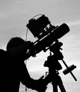
Unprecedented times call for extlraordinary means. Trevor Paglen at work on a prior project using equipment originally designed to see distant galaxies. Photo from his website.
Trevor Paglen (B. 1974), who holds both an MFA from the Art Institute of Chicago’s School and a PhD in geography from Berkley is, perhaps, best known for his Photos of “black sites”- classified defense department/CIA/NSA installations. Those pictures are usually murky, because of the haze from the extreme distances he has to work from because of security, and legal, restrictions to shoot many of these places. He prefers them that way, usually foregoing clearer images because, as he told the New Yorker in 2012, his “aim is not to expose and edify so much as to confound and interest1.” In the same piece, he said that a clearer image would say “a little less, really,” adding “that blurriness serves both an aesthetic and an ‘allegorical’ function2.” “It makes his images more arresting while providing a metaphor for the difficulty of uncovering the truth in an era when so much government activity is covert,” writer Jonah Weiner concluded3. As a result, some of his more “atmospheric” work have been compared to Painters, including J.M.W. Turner and Gerhard Richter, by some.
So, I was somewhat surprised when I walked into his new show, A Study of Invisible Images, at Metro Pictures. Robert Longo’s The Destroyer Cycle had recently been up on these walls, featuring huge charcoal drawings deep with socio-political imagery. I was expecting more of the same from Mr. Paglen given his books of “black site” Photos.
That’s not quite what we get.
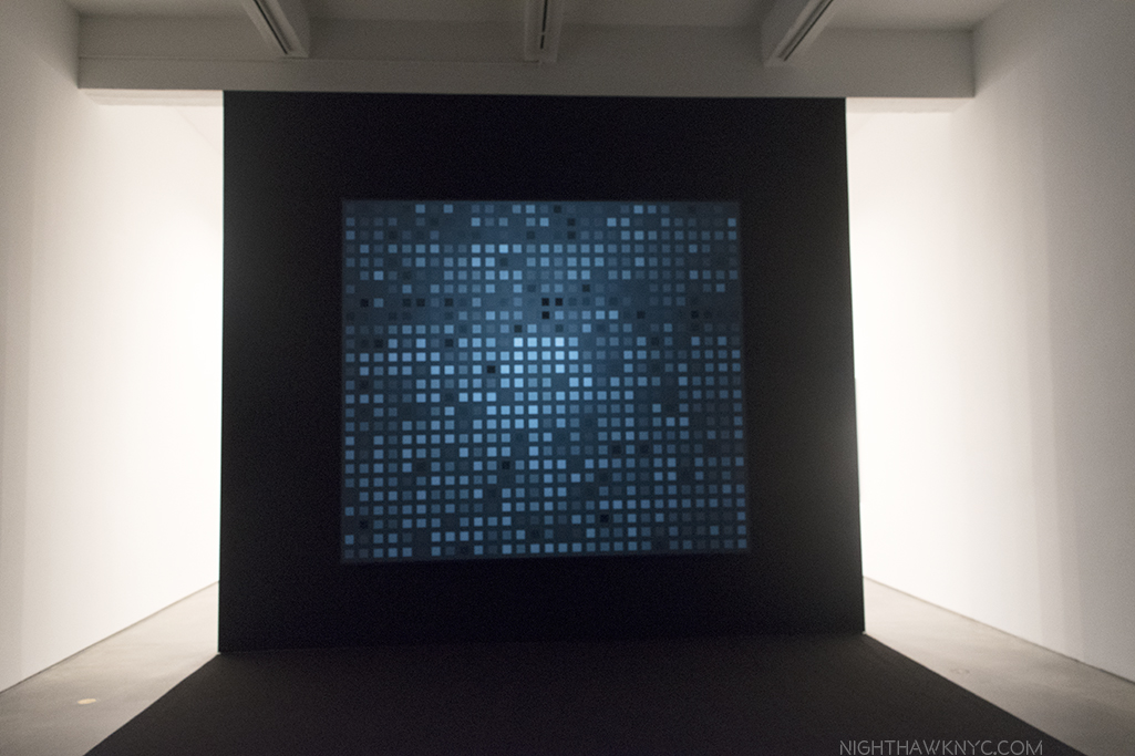
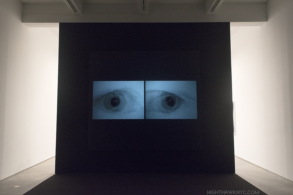
Installation view, with a still from his video, Behold These Glorious Times, 2017. Click any image for full size.
It’s about something different, though not entirely unrelated. It turns out that Mr. Paglen has, also, been deeply involved in studying computer learning, specifically, how computers see the world. As he explains in the “Artist’s Notes” for the show-
“Over the past decade or so, something dramatic has happened to the world of images: they have become detached from human eyes. Our machines have learned to see. Without us.”
He goes on to talk about how smart airports, smart homes, even smart cities are becoming ubiquitous, with self-driving cars possibly on the way, before adding, “Most images these days are made by machines for other machines, with humans rarely in the loop. I call this world of machine-machine image making ‘invisible images,’ because it’s a form of vision that’s inherently inaccessible to human eyes. This exhibition is a study of various kinds of these invisible images.” They break down to three groups- “machine readable landscapes (landscape images overlaid with marks that show how they’re being interpreted by machines), training images (made by humans for machine eyes), and things that we might call ‘ghosts.'”
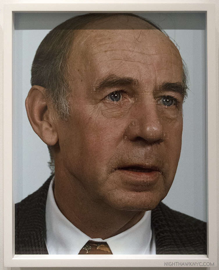
While the new iPhone X uses facial recognition technology instead of passwords or fingerprints, this technology is nothing new. The military wanted it developed back in the mid-1990’s, so the Defense Advanced Research Projects Agency (DARPA) began funding research. They quickly realized they needed to create a gigantic database of facial images and these folks, above, mostly military employees, were among the first of tens of thousands of photos it took and compiled into what was called the FERET database. Mr. Paglen then combed this database to arrive at this selection of faces. He then ran them through an algorithm to locate the key features of their faces. “One of the ways I think about these portraits is as a kind of super-structuralism in the sense that they are images not made for human eyes. They are meant for machine eyes. What’s more, these photos represent the original faces of human facial recognition- the ‘Adam and Eves’ that nearly all subsequent facial recognition research has been built upon,” he says in the “Artist’s Notes.”
Recognizing one face out of this gigantic database first requires a “faceprint,” made out of all of the faces of a particular subject, aligned so their eyes and mouths are in the same place. Once you “average” them, you subtract the average image of all the other people in the database from the average of your subject. You’ll end up with a faceprint of your subject showing what distinguishes him form everyone else in the group. This portrait translates the faceprint of philosopher Frantz Fanon into an image that looks like a face to human eyes.
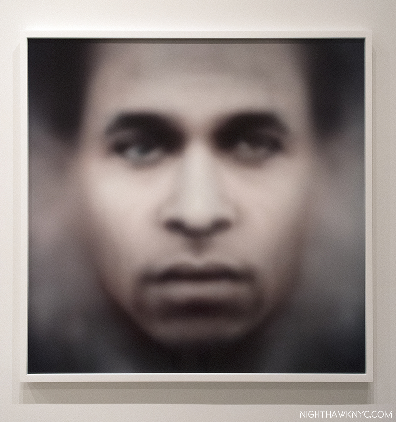
We’ve gone from the images seen just above- images that humans would recognize as people and faces, to this, an image constructed from computer to computer images so humans can recognize it as a face. Fanon”(Even the Dead Are Not Safe) Eigenface, 2017, Dye sublimation metal print. The Afro-Carribbean psychiatrist Frantz Fanon is the subject.
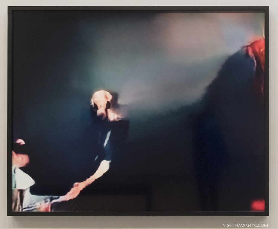
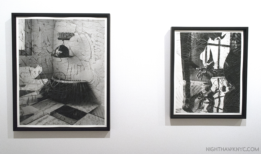
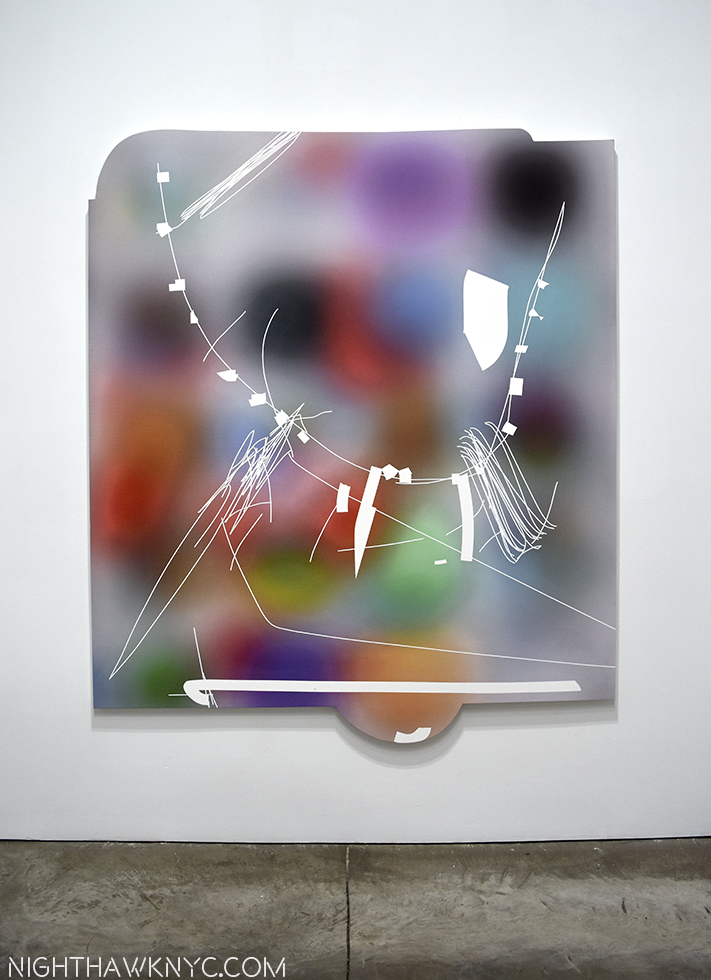
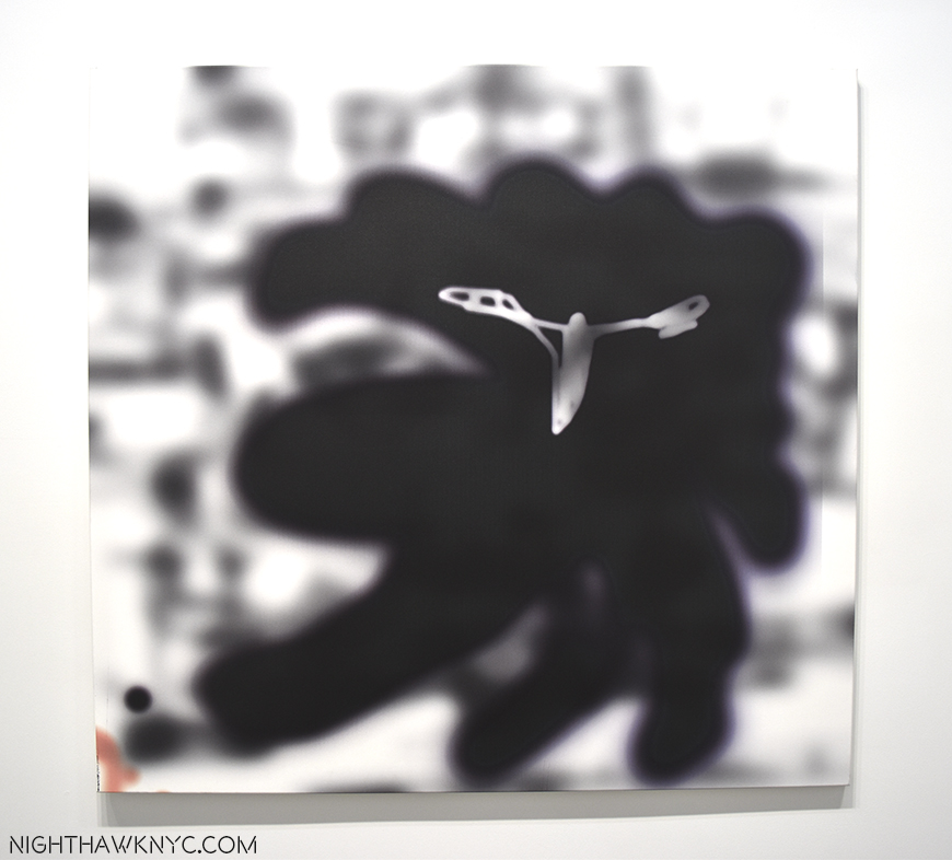
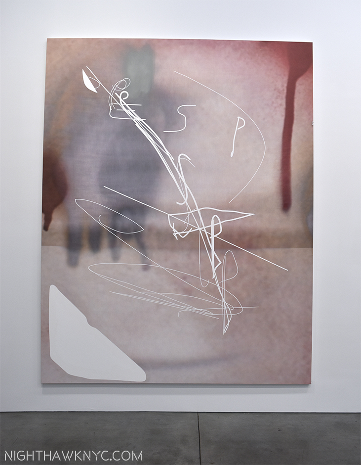
It gets stickier from there. The Artist’s Notes continue, “A.I.s (artificial intelligences) are taught how to recognize objects by giving them training sets….(which may) consist of thousands or even millions of images organized into pre-sorted classes that correspond to each of the kind of objects that the A.I. will eventually be able to distinguish. For example, if you want to train an A.I. to recognize all the objects in a kitchen, you might give it a thousand pictures of a fork, a spoon, a knife, a countertop, etc…Once that A.I. is trained, you can give it a picture of a fork it has never seen before and it should be able to recognize it as a fork. ” After mentioning that “every image posted to Facebook or other social media sites undergoes powerful artificial intelligence algorithms that can recognize the identities of people, the objects, the products, and even the place depicted in those images,” Mr. Paglen created his own “massive” training sets, “based on literature, philosophy, folk-wisdom, history, and other ‘irrational’ things, and taught the A.I. to recognize things from those ‘corpuses.'” The last half of the show consists of the results of these experiments, which are much more ethereal and evocative than literal, at least to this human’s eyes.
Mr. Paglen has groups this part under the broad heading of Hallucinations, or Adversarilly Evolved Hallucinations. These further break down into the subcategories, or Corpuses, which includes-
Corpus: Eye Machines (Fittingly)
Corpus: American Predators (The Artist’s notes include Mark Zuckerberg, who he lists as a “predatory machine,” reminding viewers that computers mine every image loaded to his site and are capable of reading a tremendous amount of information from them.)
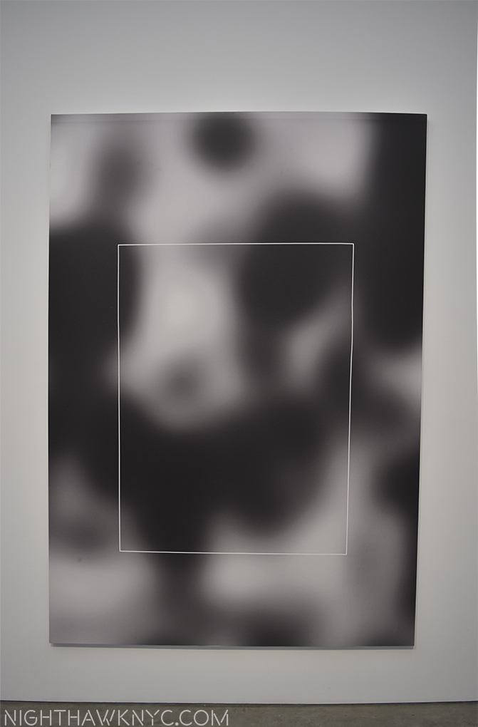
Corpus: The Humans (As seen in the image above. Porn was included in the training sets, and another image depicts it as seen by a computer…or so the title says.)
Corpus: Omens and Portents
Corpus: Interpretations of Dreams (Examples of both are seen below.)
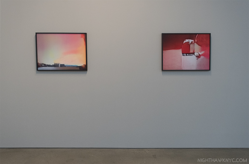
Rainbow (Corpus: Omens and Portents), left, False Teeth (Corpus: Interpretation of Dreams) both from Adversarially Evolved Hallucinations, 2017, Dye sublimation prints.
Trevor Paglen seems to like to push the boundaries of our perception while avoiding the sharp detail most Photographers live by, which, indeed, ventures into the domain of Painting. Now, he has gone beyond what humans can perceive, and into the realm of what is only “seen” by computers to create Art for humans. I wonder how long it will be before computers get around to doing that for us on their own.
These images are haunting, nightmarish, and beautiful, at the same time. In his Art Basel Conversation with Jenny Holzer, Mr. Paglen said the basis of his work can be summed up as- “How do you see the historical moment that you live in?” This show certainly provides answers to part of that question, though it raises others. Mr. Paglen’s new work is no less unsettling than his “black sites” and drone Photos. Perhaps most unsettling is not what’s in these images. It’s what they portend for the future.
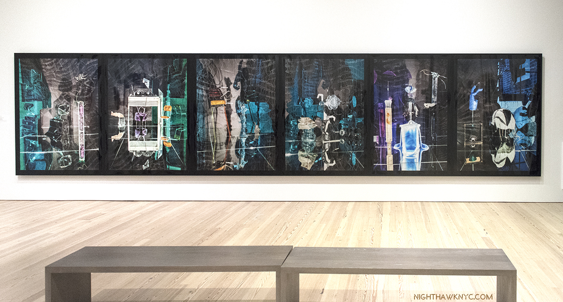
Willa Nasatir,R.V., The Green Room, Bird, Blue Girl, Sunbather, Conductor, 2017, Chromongenic print mounted on wood, from left to right. Installation view, Whitney Museum.
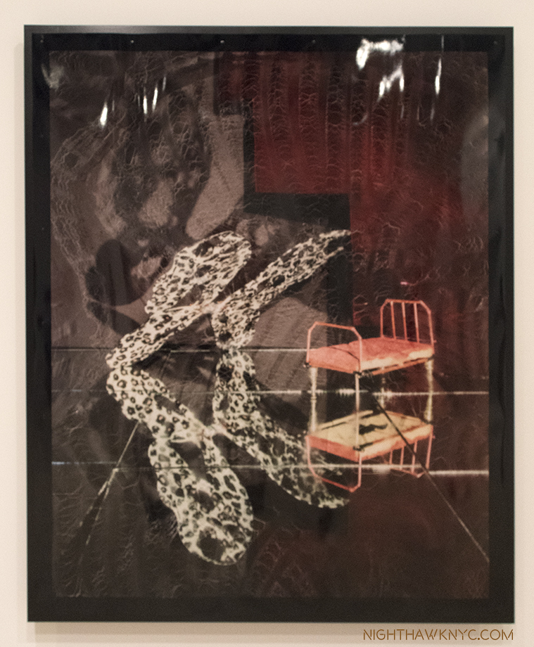
Unlike the other Artists featured in this piece, Willa Nasatir (B. 1990) doesn’t use digital techniques to create her Photographs. That might be hard to believe after seeing her work. Her analog process involves creating props, often from found objects, shooting them, and then reshooting the resulting Photographs, which has sometimes been modified by fire, water, and any number of other things. The results, as seen in her revelatory Whitney Museum show, “Willa Nasatir,”achieve something of a 3D effect in a 2D work. Fresh from a show at the Knox-Albright Art Gallery, Buffalo, who owns one of her most stunning images, Ms. Nasatir shows herself to be at once a throwback, and a visionary.
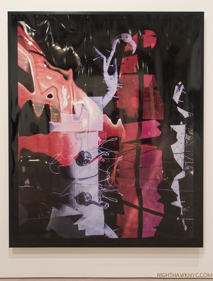
The Red Room, 2017, Chromongenic print mounted on wood. The-Albright-Knox Art Gallery owns this one. They chose well.
Ms. Nasatir created the 6-part work, shown first in this section, especially for the Whitney’s long gallery wall, the unifying feature of which seems to be the color grey with green or blue. All of the works on view are dated 2017 and show a remarkably consistent unity of style and vision, and a somewhat daring use of color. As for what’s going on in these, or any of her work? You’re on your own. The Whitney’s introduction to the show says, in part, “The resulting works are hand-manipulated images that become psychologically charged and difficult to discern; the viewer is left to parse out unresolved narratives that the image only implies.”
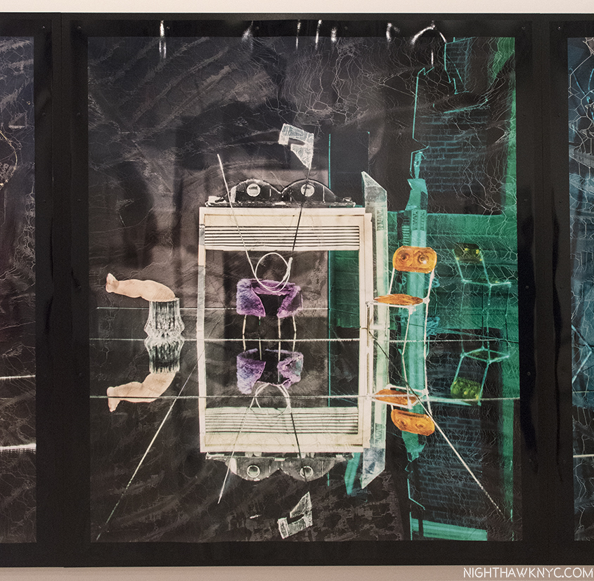
The Green Room, 2017. When I look at this, with it’s mirror reflection, even some of it’s props, I can’t help but recall Samara Golden’s work in this year’s Whitney Biennial.
Hmmm…Where have I heard that recently? Her style shares some similar props and some of the effect of Samara Golden’s work, particularly The Meat Grinder’s Iron Clothes, 2017, which I felt was the show-stopper of this year’s Whitney Biennial. Ms. Golden’s work can look like “sets” that Willa Nasatir might base one of her Photographs on. Whereas I called Ms Golden’s astounding work in this year’s Whitney Biennial “unphotographable,” (as a whole), Ms. Nasatir’s Photographs are often impossible to locate in the real world. Both Artist’s works features elements of the “known world,” but place them in contexts which are unknown, mysterious, ominous.
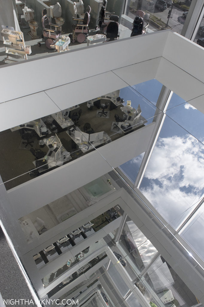
Samara Golden’s The Meat Grinder’s Iron Clothes, (detail), 2017, at the Whitney Biennial earlier this year.
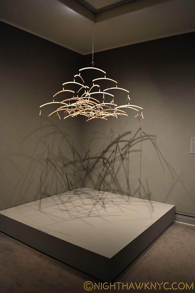
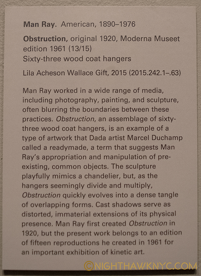
In thinking about precedents for Ms. Nasatir’s work, Man Ray once again comes to mind. Ray, of course, didn’t use digital techniques, either. He pre-dated them. The Dadaists, Marcel Duchamp, the German Expressionist filmmakers also come to mind, as do Robert Rauschenberg’s found objects. But, as with Samara Golden, it’s what these image stir in the mind, and the mind’s eye, that overcomes any attempt at reference- in the real world, or the historical one.
It all fades away as you ponder “What happened here?” Or, “What is about to happen?,” and then feel resonances in your mind and life. Oh, and by the way, there’s the beauty of her work, which I say as almost an afterthought, though it’s not, to their main impact- mystery.
With two museums shows to her name by her mid-20’s, Willa Nasatir is an Artist who’s stock is rising pretty quickly. It will be interesting to see how her work evolves from here.
Caslon Bevington (B. 1992) is an up and coming NYC Artist I met during the run of the Raymond Pettibon show at David Zwirner. Her reaction to that show struck me, so I became interested in seeing her work. To this point, I had only seen what’s on view on her gallery’s, Apostrophe NYC’s, website.
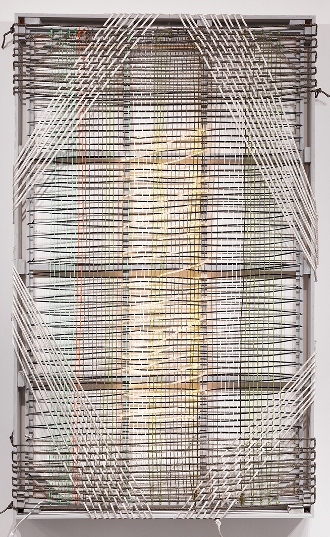
One of the earlier pieces by Csalon Bevington I saw on Apostrophe NYC’s site. When I saw it in person, I guesstimated it at 12 feet tall. Photo courtesy of the Artist & Apostrophe NYC
My shock was palpable when I walked into her show, A Home for Formless Creatures: The Charisma of Fragmentation, at Apostrophe NYC’s studio & gallery space at Mana Contemporary in Jersey City, NJ. (Yes…I went to N.J.) to find she had spent the summer creating a new body of work that, at first look seemed quite different from what had come before. When I looked at the show of new work one word summed up the experience.
Qucksilver…
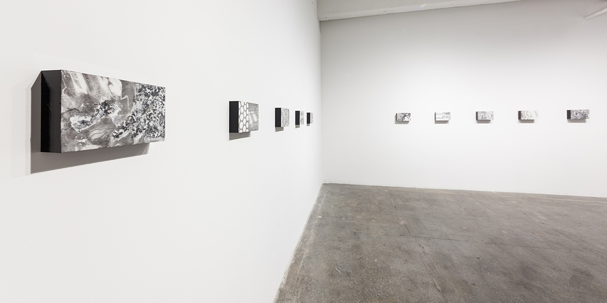
Installation view of Caslon Bevington’s show A Home for Formless Creatures: The Charisma of Fragmentation, shows her new, Translation, series, 2017. Photo by Roman Dean, courtesy of the Artist and ApostropheNYC
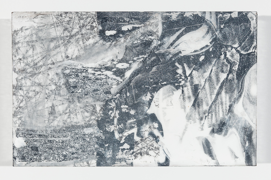
As fast as lightning, her work had altogether changed and, low and behold, there was an entire show of new work that was largely unlike any of her work I’d seen thus far. The show centered on a series of 10 works in which the Artist takes found and original images and processes them using more software programs than she could list for me, including some involving sound waves. The results were outputted to paper and then mounted on wood blocks with resin to create a series of black and white works titled “Translation” that are quite mezmerizing.
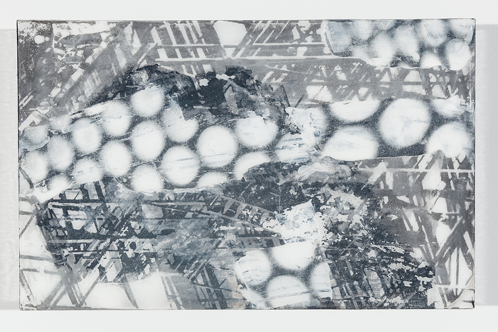
Caslon Bevington, Translation #8,, 2017. Photo by Roman Dean, courtesy of the Artist and Apostrophe NYC
They have the glossy surface of gelatin prints, but the images are mounted on blocks that extend 2 and a half inches out from the wall, jutting into the viewer’s space. Their rectangular shape and size (7 x 11 inches) is different from the usual sizes of Photographs, making them feel like something else. In them, images are juxtaposed- sometimes recognizable images (like fire escapes), with unrecognizable images, or repeating lines or waves, or abstract patterns or circles, leaving the viewer somewhere between reality and…?
They have a presence as a group, like a visit to another world that exists in multiple visual dimensions. Images explode out of some, interrupt others, or dialogue with each other, or mirror each other, while sharing not quite half of the work. There’s an elegance, an other-worldliness, and a haunting presence to these new works, especially, when seen in a group of them.
As for Quicksilver…What are the processes in an Artist’s mind that leads to such radical changes in their direction? Changes that seem “quick” to outsiders?
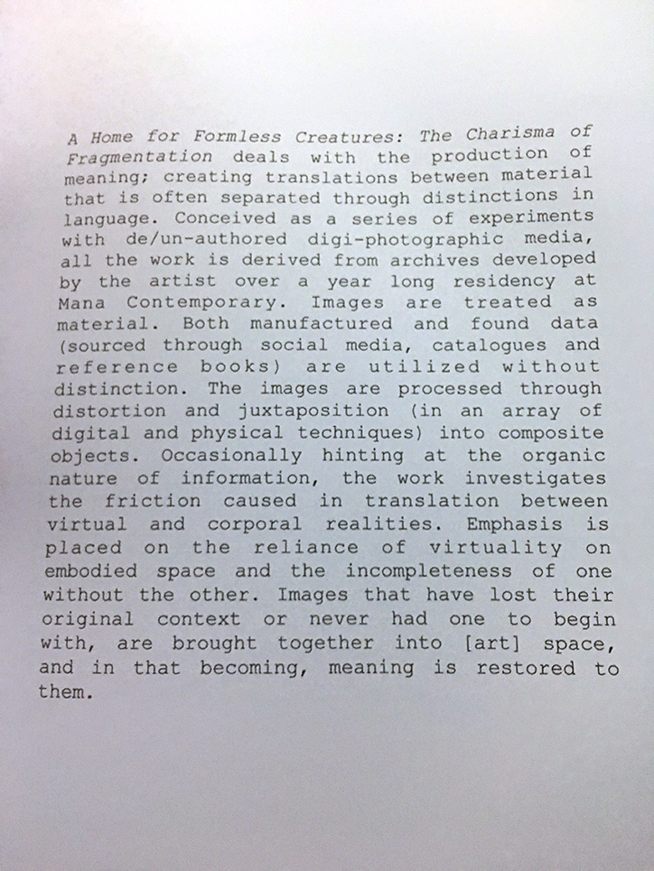
The Artist’s statement in the lovely catalog she produced, in conjunction with Apostrophe NYC, for the show.
Later, she gave me a tour of her studio, and we looked at, and discussed, her earlier work. I was very surprised at the journey her work has taken. Having studied at the Art Student’s League and Parsons, the drawings she showed me were by no means academic. They explored geometric possibilities of color in abstraction. Later works all around were often complex weaves (literally) of painted cut strips of fabrics and canvas, in a square or rectangular grid. She then explored the possibilities of rope in patterns that freed the composition from the grid, and made the picture plane transparent, including one fascinating and intricate rope work of many layers on a large rectangular frame that looked to me to be about 12 feet tall (shown earlier). Ms. Bevington has also worked in metals bending strips of them onto a frame, delicately weaving each piece, and in fashion, creating a very cool T Shirt for the show.
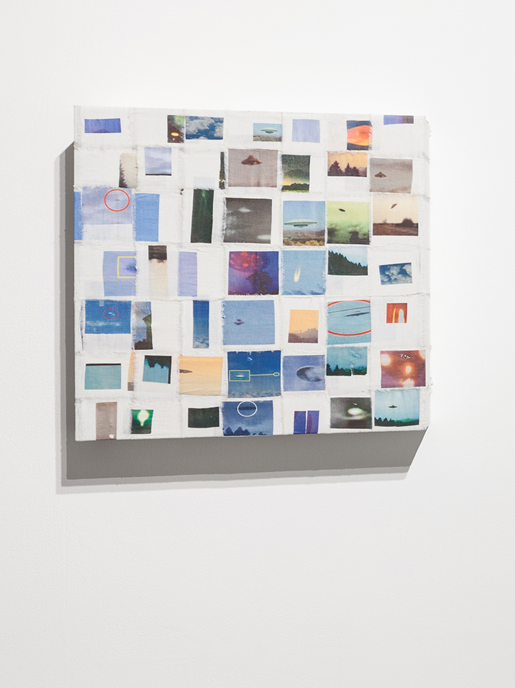
Flying Saucer Archive, 2017, Photo Transfer on Linen. Photo by Roman Dean, courtesy of the Artist and Apostrophe NYC.
Along with these works, were some works, that also involved Photographs, on woven grids, that seem to bridge the woven grids seen in some of her prior work. One features found images of UFO’s, or what might be UFO’s. Two others featured images of sunsets shot from moving vehicles.
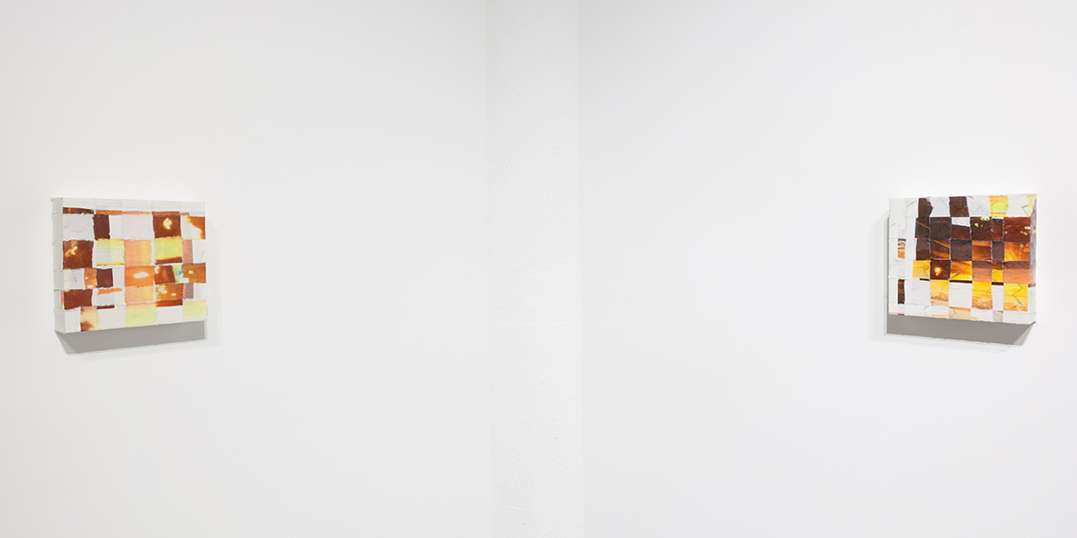
Photos of Sunsets Taken From Moving Cars #1 & 2, 2017, left to right. Photo by Roman Dean, courtesy of the Artist and Apostrophe NYC.
Whereas earlier she took abstract painted canvas cut into strips and imposed “order” on them by subjecting them to being woven into a rectangular or square grid, now she does the same thing using images. Along with these, also on view was an Artist’s Book she created from found images using all kinds of search algorithms- closeups of fabrics, rugs, and she only knows what else. Caslon tried to explain the process of finding and selecting it’s images to me, but I was lost looking at the pages go by as she turned them. Besides, knowing too much often steals some of the mystery. This beautiful object was produced in an edition of 9, while the other works shown were unique.
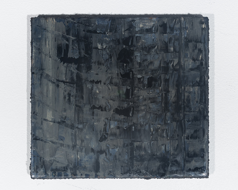
Yes, there was Painting, too. Static Painting, 2017, Oil on Wood. Photo by Roman Dean, courtesy of the Artist and Apostrophe NYC.
The Translation pieces struck me, among other things, as creating successful, new, compositions out of the juxtaposition of existing images. Thinking about her new and earlier work, while she makes something “else” out of unexpected combinations (of materials or images), for this viewer, they share the common thread of having a “new order” brought to them.
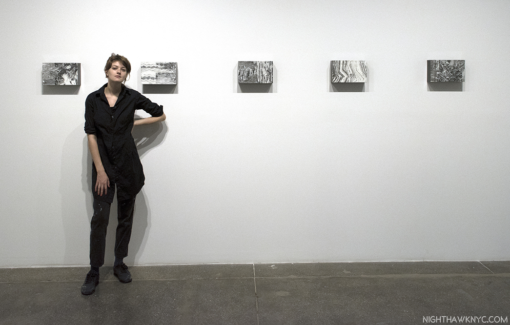
Caslon Bevington seen with Translations #10, 11, 12, 13 and 14, 2017, left to right, at Apostrophe NYC’s gallery at Mana Contemporary, Jersey City.
Caslon Bevington is part of “Base 12,” “an experimental project…(that) groups together 12 emerging artists in a quasi-collective,” represented by Apostrophe NYC, which is run by the brothers Sei and Ki Smith, and has been in residency at Mana Contemporary. Given how rapidly Caslon’s work is evolving, seemingly like quicksilver, she’s an Artist who will be fascinating to watch. It will be interesting to see what she does next, and if she continues to explore this new realm of her work, or moves to another new frontier.
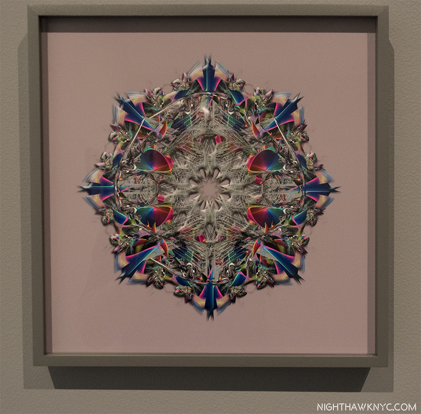
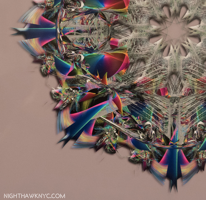
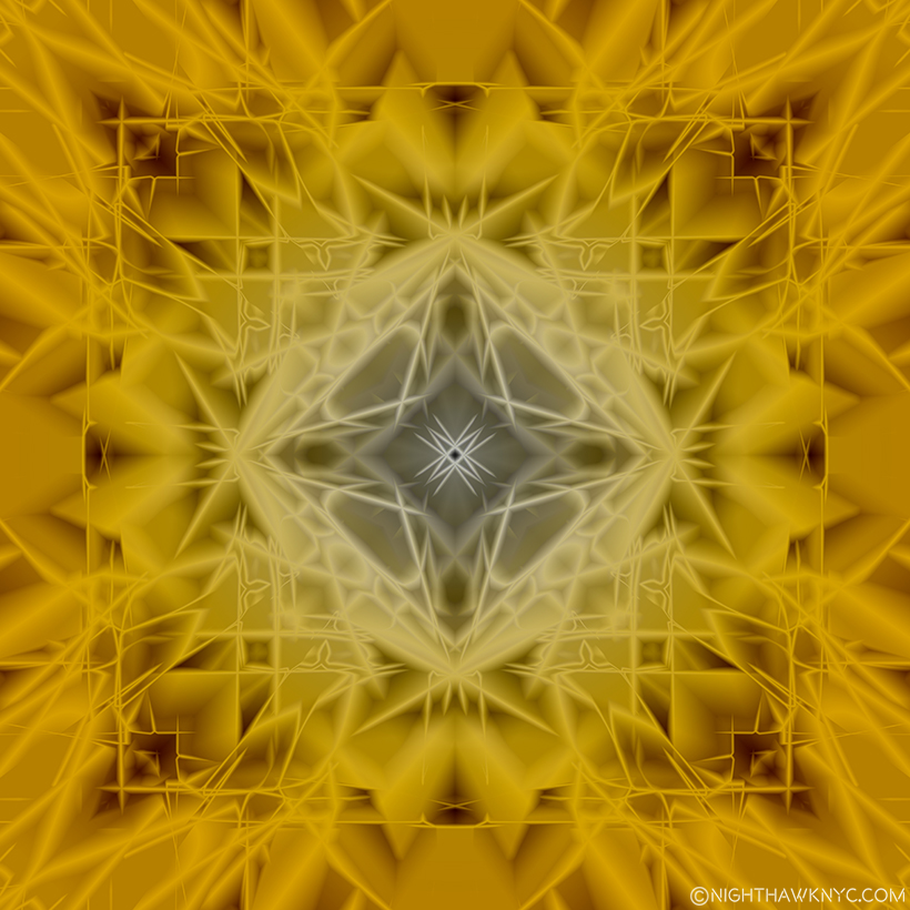
Bonus Show- Lucas Samaras (B. 1936) may be as familiar to many Art lovers as a subject for Chuck Close (like this one) as he is for his own work. At his new show, New York City, No-Name, Re-Do, Seductions, at Pace, 510 West 25th Street, all the works on view were digitally modified Photographs. The show concluded with a large gallery of what he calls Kastorian Inveiglements, works that began as Photographs that depict “every day objects” subsequently manipulated in Photoshop into symmetrical abstractions.
Having seen other Artists experiment with these, though not to this level of complexity or accomplishment, I decided to try one myself to gain an understanding of the process. Here is my first experiment-
It shows that I’ve got a ways to go to match Mr. Samaras, as I do in getting up to speed on the frontiers of Photography, and Photo-based Art. Before it moves, again.
“Willa Nasatir” is my NoteWorthy show for October, though it ended on October 1.
*- Sundtrack for this Post is “X-Ray Visions,” by Clutch, from the appropriately titled album Psychic Warfare.
NighthawkNYC.com has been entirely self-funded & ad-free for over 7 years, during which over 275 full length pieces have been published!
I can no longer fund it myself. More on why here.
If you’ve found it worthwhile, PLEASE donate to keep it online & ad-free below.
Thank you, Kenn.
Written & photographed by Kenn Sava for nighthawknyc.com unless otherwise credited.
To send comments, thoughts, feedback or propositions click here.
Click the white box on the upper right for the archives or to search them.
Subscribe to be notified of new Posts below. Your information will be used for no other purpose.


