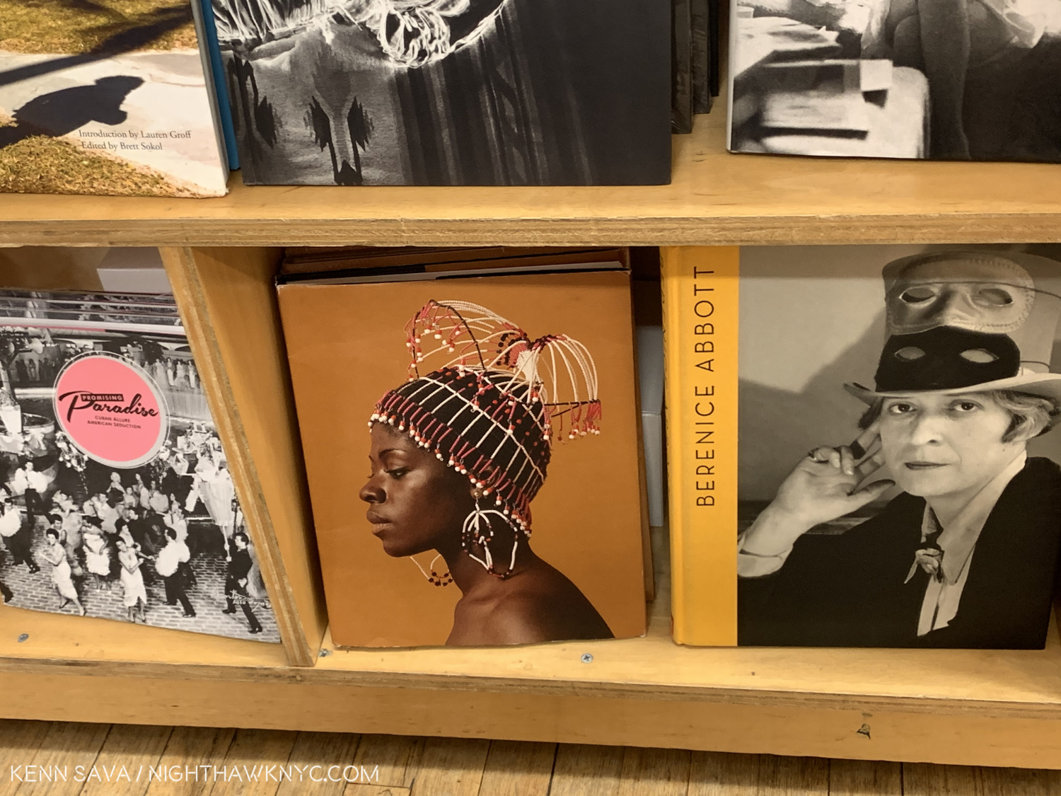
NoteWorthy PhotoBooks, 2020

Written & Photographed by Kenn Sava
As it has been in all realms of life, 2020 has been an extraordinarily challenging year to be a book publisher, particularly a smaller one. Working with anyone- from your team, to the subject Artist, right through to the printers and binderies- all had to be done remotely for almost the whole year. Shipping between many countries has been off and on, and off again. (As I write this, shipping between Japan and the USA is still down.) Finally, bookstores around the world have been closed for much of the year. Somehow, a good number of books were published in 2020, though a good many previously announced titles have been pushed back. Under the best of circumstances, it’s not easy to get a PhotoBook published. So, I congratulate any and everyone who has published one this year. Bravo!

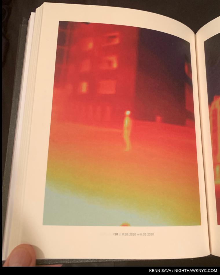
Antoine d’Agata, 17.03.2020 – 11.05.2020, page 158 from Virus, taken during the pandemic in Paris from March to May.

Since there’s no such thing as “best” in the Arts, I’ve opted to do a list of recommended “NoteWorthy” PhotoBooks the past 3 years. This year, due to the pandemic, I’ve seen fewer books than I had the past few years. Nonetheless, these books stood out for me among those I have seen, and I decided to do a list this year because I believe they would have been on it no matter how many more I had seen.

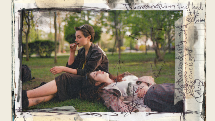
Josh Kern’s second PhotoBook, Love me, was released in 2020 and promptly sold out. In this spread from it the Photographer shows us his working notes. Along the top, it reads “There’s nothing that holds it together.” On the side, “Took a thousand pictures of this moment and not a single one is good.” This reminds me that as incredibly hard as it was to publish a book this year, the hardest parts of making a great PhotoBook happen long before it gets to be printed.

Most Photographers don’t have gallery representation, so, PhotoBooks are a primary means of reaching an audience for them. Without a dealer, they’ve taken on the job of building their own followings. Through diligence, a few of them even have upwards of 1 million followers on social media. For me, the accomplishments of these independent Artists is yet another indication that the gallery model is being bypassed by people who are not only creative Artistically. One example of how things are changing is young German Photographer Josh Kern, who I was among the very first in the US to discover last year. Josh did a Q&A with me as his first PhotoBook, Fuck me, was about to sell out of 1,100 copies. He has now sold out of 1,200 and 1,100 copies of his first two PhotoBooks respectively without help from Amazon, a gallery, or even a US book distributor. Remarkable for someone who was a 22 year old college student when he started, and another sign of where things are heading. 

As I’ve mentioned in the previous years I’ve done this list (2018 and 2019), reconciling publishing dates with the date books actually appear is a bit problematic. Some books published in 2019, even 2018, only reached stores here in 2020. I’ve seen a number of books listed as being scheduled to be published in 2020 that have not made an appearance in stores here yet. So, once again, I’m sticking to books I’ve actually seen become available in stores, or to purchase, this year.

NoteWorthy PhotoBooks, 2020
The All-Magnum Photos Edition

That’s right. Coincidentally, each of these books was created by a Member of Magnum Photos, the legendary world’s leading Photographer’s co-operative. If I were to recommend one book this year of all the books I saw, I’d be torn between these two-

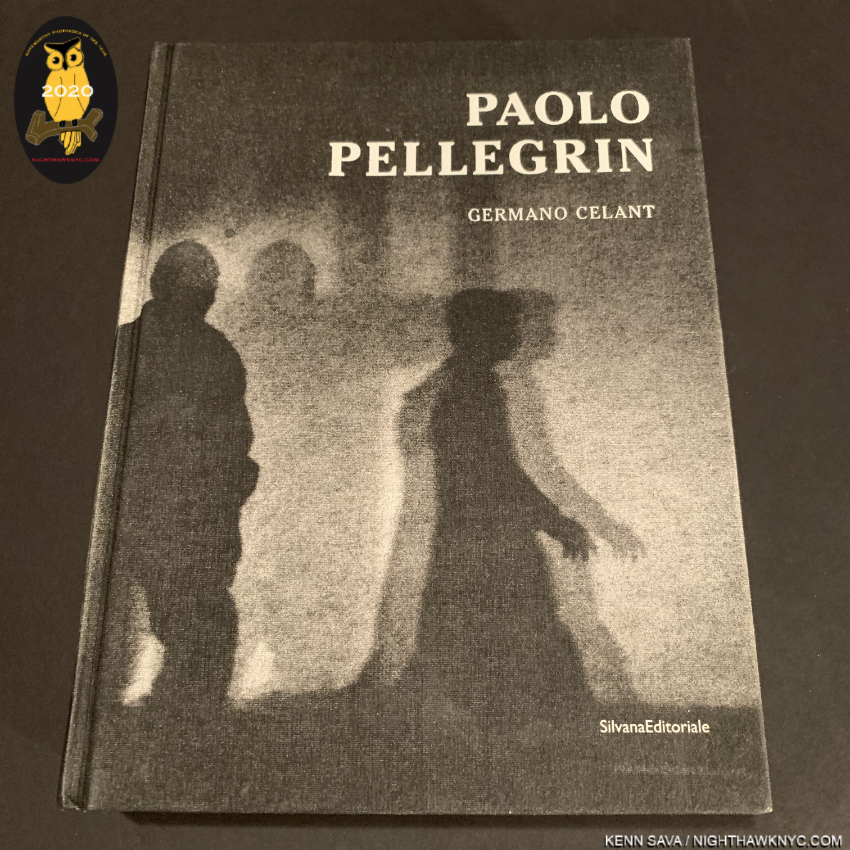
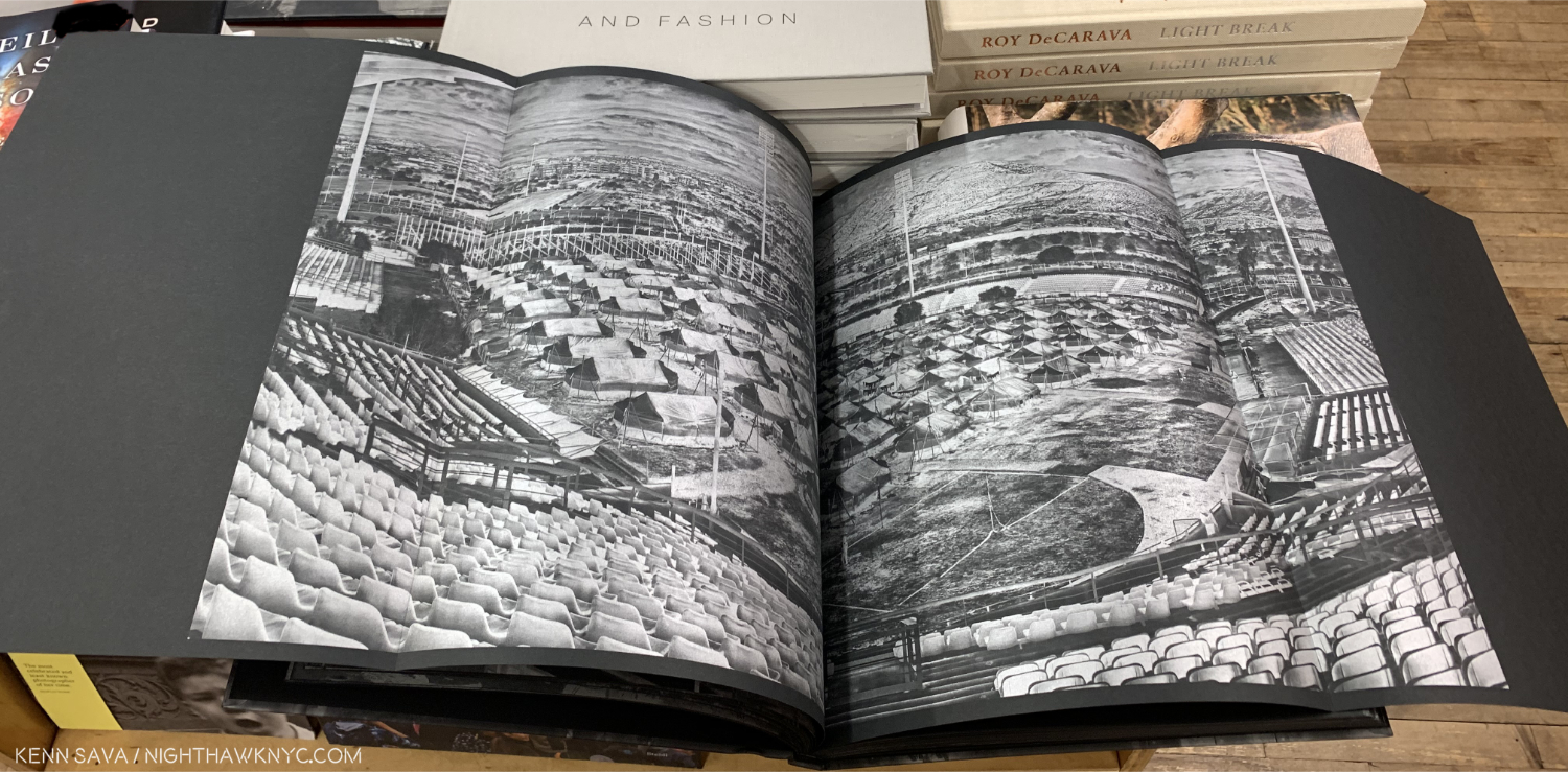
Paolo Pellegrin: Un’antologia, Silvana Editoriale. Ok. It says “2018” on the colophon, but how many people here have seen this? D.A.P. listed it as being available in the USA in Fall, 2019. I didn’t see it until late January, 2020. Un’antologia may be the most well-done retrospective I have ever seen. Perhaps, I shouldn’t be surprised. It was designed by a team headed by Yolanda Cuomo, who has designed countless wonderful books, including Diane Arbus, Revelations, the finest book on Ms. Arbus I have seen. Gorgeously produced and extremely thorough, this 6 1/4 pound, 742 page hardcover with over 1,000 illustrations accompanied the show of the same name at the Deichtorhallen, Hamburg, from October, 2019 to March, 2020, and as a career Retrospective- so far (c. 1960 to date). Yes, it ran to March, 2020, so I’m also using that to qualify if for listing here. Page after page is nothing short of stunning to the point that it becomes necessary to remind yourself that you’re looking at the work of one man- and Mr. Pellegrin, 56, is still a relatively young man, with hopefully, decades of work ahead, not someone looking back on a career that’s winding down. Nonetheless, it makes an open and shut case for Mr. Pellegrin as one of the world’s most important Photographers, just in case you didn’t already know that, with a legacy that’s already monumental. There’s an English edition in 1,000 numbered copies, and an Italian edition also numbered to 1,000 copies. That’s all! Un’antologia is also a fitting testament to curator Germano Celant, who passed away this year. Early on, he said to Yolanda Cuomo, “This is not a book by Paolo. It is a book about Paolo,” Don’t wait much longer. 

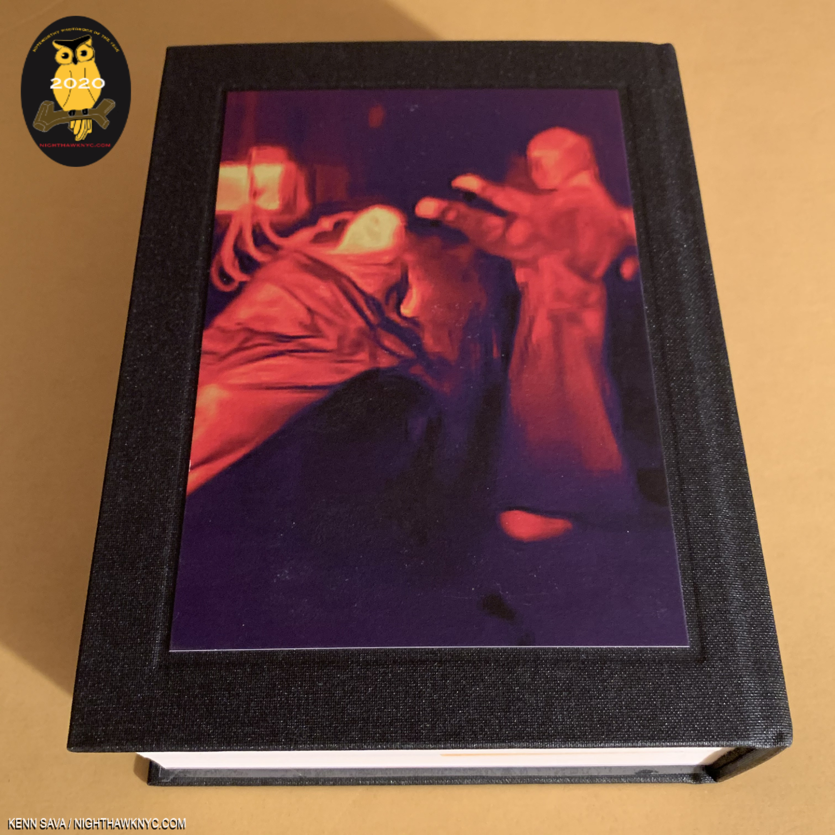
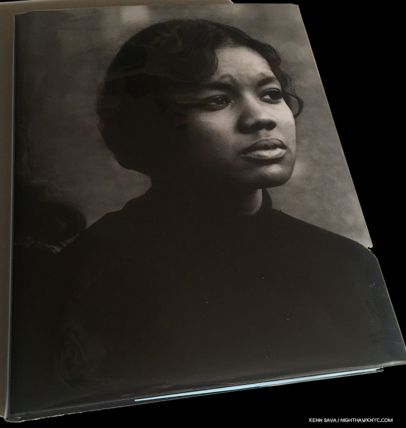
Virus, rear cover.

Antoine d’Agata, Virus, Studio Vortex. I thought I was a bit prepared to see this from seeing a number of these images on Mr. d’Agata’s social media pages, but no. I was staggered when I first paged through this massive tome. Mr. d’Agata who lives with no fixed address, lived and worked out of the Magnum Paris offices while producing this work (while Paris was shutdown). He also spent “countless” days and nights staying over in treatment centers. Wait. HOW many people are going to accept an offer to go and watch a covid19 patient being treated? Umm. No, thanks. Antoine d’Agata, as you can see above, said “Yes.” “My object is to get photography back to requiring true commitment, to being a language that is unique by its potential subtlety and rawness,” he said1. “True commitment,” in spades. The work he created, which number 13,000 images in the two months, ranges from “normal” Photographs to many taken with a thermal camera, like the image above, which produces shots that reveal things a normal camera wouldn’t. The results are often “painterly,” but unlike any Paintings I have yet seen. Going in to 2020, Francis Bacon was the Painter Antoine d’Agata’s work most reminded me of. With Virus, he’s created his own world, a world we’ve all lived in, alone together. The only other PhotoBook that came to my mind when thinking about Virus is Aftermath, Joel Meyerowitz’ equally massive look at Ground Zero after 9/11. Both Photographers had unique access. Both have succeeded in creating the most remarkable, historic and valuable documents of these horrific events. In the midst of the horrors the world has seen and continues to see during the pandemic, if I may say this, Virus also strikes me as also being a work of Art. There are images of medical professionals treating patients that have no less than a Pieta like feel to them. Just unforgettable. I look forward to the day when I can look through Virus and focus on its Painterly aspects and its qualities as a work of Art, and hope I get to see it. Virus’ 825 pages includes text by Mathilde Girard I admire quite a bit. There are just 325 copies of the English edition. As my co-most highly recommended PhotoBook of 2020, Virus is a staggering accomplishment.

There are two other books by Magnum Photos Photographers that especially stood out for me this year-

Gregory Halpern, Let the Sun Beheaded Be, Aperture. Ho hum…another year, another terrific Gregory Halpern book on this list. Let the Sun joins Confederate Moons and Omaha Sketchbook on this list in the three years I’ve been making one. I find all of his books have remarkable staying power. Meaning that the images linger in my mind long after I’ve closed the cover. That’s every bit the case with Let the Sun, which has more layers to it than it has pages (120), meaning different things are going to jump out to you with each perusing. Then there’s the remarkably intimate Conversation between Mr. Halpern and Stanley Wolokau-Wanambwa. Any place outside of NYC is foreign to me, but Guadeloupe is exceedingly hard for me to imagine. Yet, the shared history with slavery makes Guadeloupe not all THAT foreign and its unique experience with it makes it even more haunting. Somewhat quietly, Mr. Halpern continues to build a remarkably strong body of portraits, more of which lie at the heart of Let the Sun Beheaded Be. Remarkable when you consider the Photographer is not fluent in French and he communicates with his subjects before Photographing them.

Yael Martinez, La Casa sue Sangra (The House that Bleeds), KWY Ediciones. A 2020 Magnum Nominee, his work looks like no one else’s. He seems to have a unique way of getting inside the skin of those he portrays, his Photographs are so intimate. Of La Casa, Mr. Martinez says, “‘A people without memory is condemned to repeat their mistakes.’ Guerrero is one of the Mexican States that have been most affected by organized crime; It is the second poorest and most violent state in the country. I am thus trying to depict the situation which many families in this region face, which they live through daily, and which is one of the causes of the unraveling of Mexico’s social fabric.” La Casa focuses on the forced absence of beloved family members, each image with an overriding darkness and use of color that are both intimate and epic. His Photos bring you right there, capturing moments that often border on the magical. A house that bleeds could be a family or a community, he has said. He began with his family, before eventually expanding the project to include other family around Guerrero. The classic work of the Farm Security Administration Photographers, including Dorothea Lange (see below), came to my mind as a possible influence (though Mr. Martinez shoots in color). Printed in an edition of 1,000 copies, and still in print as far as I can tell, I spent most of 2020 seeking a copy of La Casa. Another marvelously unique Artist and powerful voice for Magnum Photos.

I don’t know how they do it, but year after year Magnum continues to find extraordinary Photographers to add to a roster that makes me ask the impossible to answer question- Is this THE greatest Magnum Photos Roster ever? Until I ask the same question, again the very next year. 

Other NoteWorthy PhotoBooks of the Year, 2020

Gordon Parks: The Atmosphere of Crime, 1957, and Gordon Parks X Muhammad Ali, both Steidl. Sadly, Gordon Parks left us in 2006, but his Foundation has been doing a strong job of keeping his legacy alive with shows (here in NYC at Jack Shainman Gallery), and a superb series of books published by Steidl. On the heels of the essential Gordon Parks Collected Works, (Steidl’s site says it’s Out of Print- you can still find it if you hurry), 2020 brought us The Atmosphere of Crime, 1957, and Gordon Parks X Muhammad Ali. Atmosphere seemed to strike a nerve with buyers when it came out, and garnered more attention, while GP X Ali benefits to no end of the close connection the two shared.

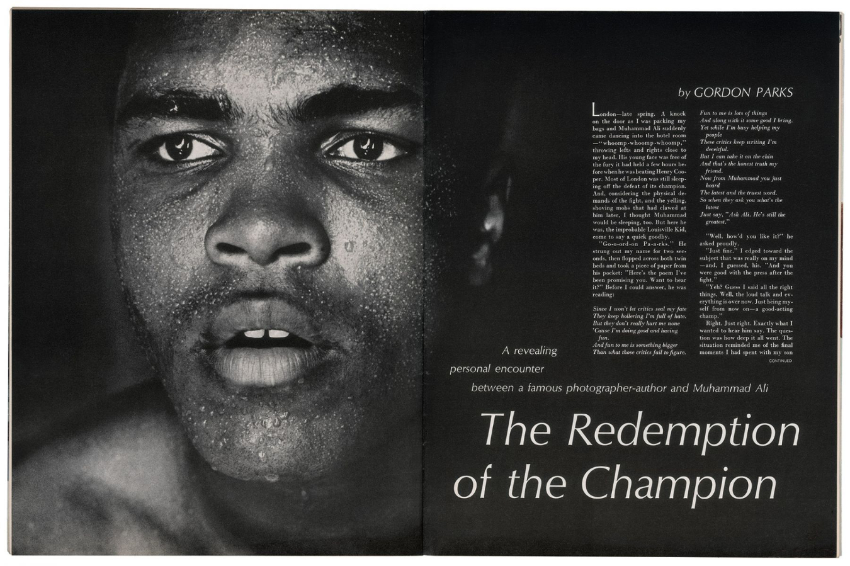
Atmosphere includes the original LIFE articles, like this one from September 9, 1957, and images never before seen.

Atmosphere of Crime is a brilliant look at the true complex nature of crime flying in the face of the mainstream media’s stereotypes, showing completely other sides to the American public with frankness and empathy. Unlike the work of Weegee, or even most of Gordon Parks’ prior Photographs, these are in color, which adds another dimension to both the you-are-there realism and the Artfulness of his timeless work. Powerful, raw, cinematic, Atmosphere paints a remarkably broad picture of the realities of crime in 90 images over 120 pages. It’s gives me the feeling of seeing a 1950s film noire in color. Of course, Mr. Parks later directed the classic Shaft in 1971- only 15 years later. It’s revealing to compare the two. Not to be missed.

One of the most important historical, and creative, records of The Greatest of All Time, Gordon Parks X Muhammad Ali, is centered around 2 assignments Mr. Parks was on to shoot The Champ in 1966 and 1970 for LIFE Magazine. The book is characterized by an intimacy that shows Ali in unguarded moments that are often incredibly poignant. While others, including Thomas Hoepker, have given us classic images of Muhammad Ali, Godon Parks’ stand out for me because they cut right to the heart of the man, which remains here, larger than life for all time.

Reproduction of the original opening spread of the 1966 LIFE article, with text also by Gordon Parks. The full articles are reproduced in both of these Gordon Parks books.

Gordon Parks Photographed The Champ at 2 key points in his life. First, in 1966, amid intense controversy over his becoming a Black Muslim, changing his name to Muhammad Ali, and being a conscientious objector to the Vietnam War. The resulting landmark LIFE Magazine article “The Redemption of the Champion,” also written by Gordon Parks, helped the public see the truth. I remember seeing it in a barbershop waiting for a haircut as a kid. The oversized magazine created a larger than life effect that cut right through all the noise. I believe the article helped start Muhammad Ali on the road to being the icon he remained for the rest of his life. 

Both are the multi-talented Gordon Parks near his considerable Photographic peak. Both speak for themself. Both will live on in your mind, indelibly. A show titled Gordon Parks X Muhammad Ali is scheduled to open at the Nelson-Atkins Museum in 2021. In 2020, I found it impossible to choose one between Atmosphere of Crime and Gordon Parks X Muhammad Ali. Good luck if you try to.

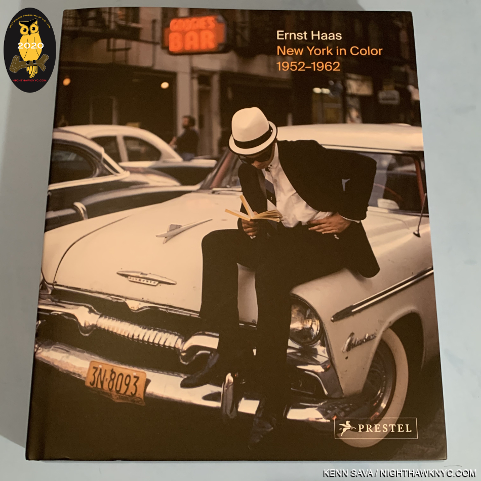
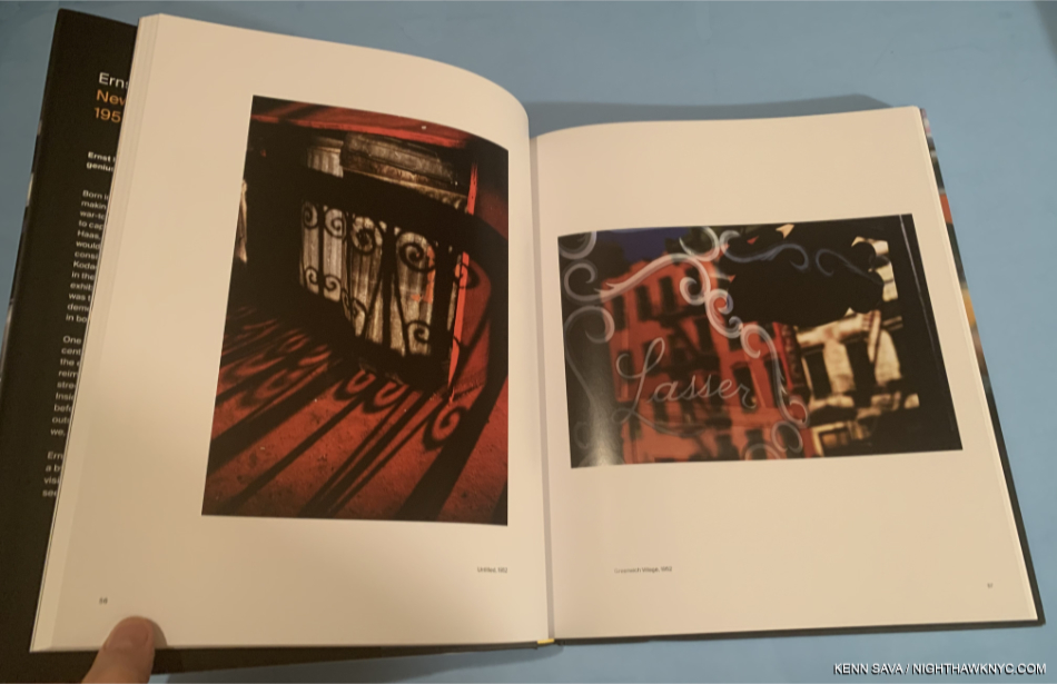
Ernst Haas: New York In Color, 1952-62, Prestel. During my now 4 year deep dive into post-Robert Frank’s The Americans Photography and PhotoBooks, I focused on exploring the history of early color Photography. I soon discovered that William Eggleston was NOT the first Photographer to have a solo show at MoMA. It was Ernst Haas, who’s Ernst Haas: Color Photography opened August 21st, 1962. FOURTEEN YEARS before Photographs by William Eggleston opened there on May 24, 1976. Mr. Haas’ estate has worked with Prestel to publish the wonderful Ernst Haas: New York In Color, 1952-62, which now serves to put Mr. Haas’ work into the same discussion with another legend of earlier color Photography- Saul Leiter, who’s color work in NYC, in the same period, has been held in unique esteem. Mr. Haas’ admirers already treasure Steidl’s classic Ernst Haas: Color Correction, which is to be reprinted.

Ernst Haas, NYC, 1952(!) Move over, Saul Leiter, and tell William Eggleston and Stephen Shore the news…

With the release of Ernst Haas: New York In Color, 1952-62, Mr. Haas goes toe to toe with Mr. Leiter on his own turf, in his own time! Lovers of Photography are the winners. NYC is plenty big enough for both of them. I recommend this book to anyone who loves Mr. Leiter’s Early Color, which I consider an essential PhotoBook of this century, as much as I do.

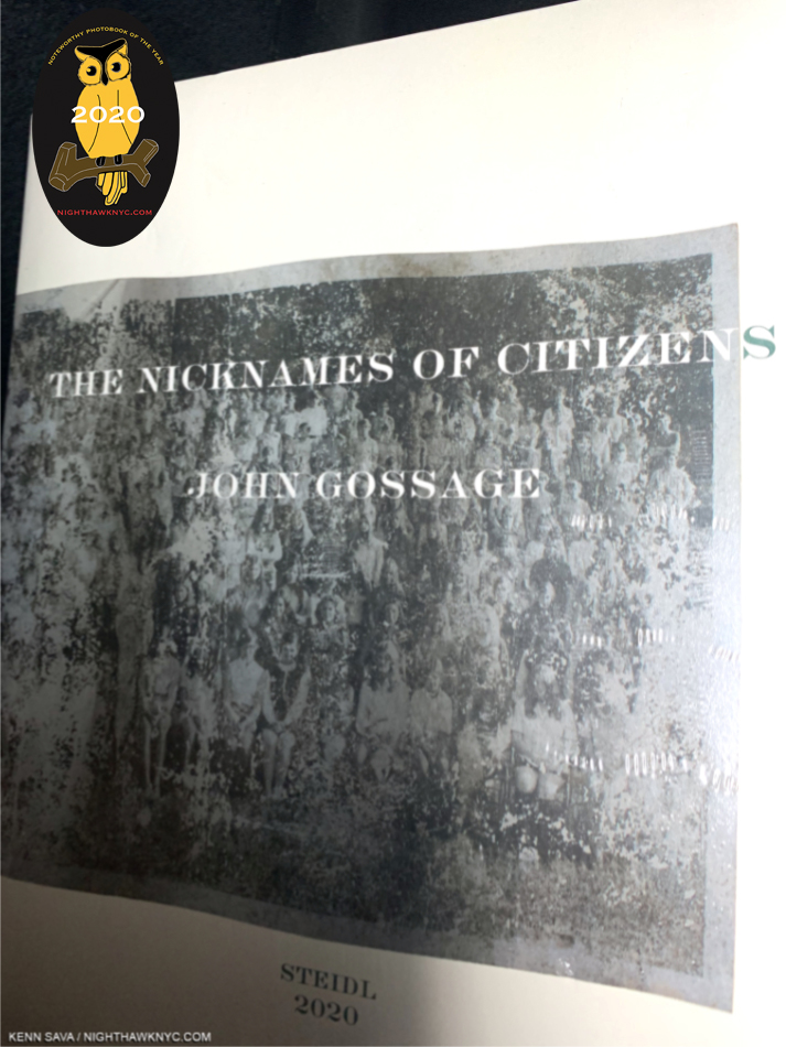
John Gossage: The Nicknames of Citizens, Steidl. The latest in the renowned Photographer’s “loving yet critical, generous yet ironic vision of America,” to quote the publisher, it follows Jack Wilson’s Waltz, published in 11/2019, Should Nature Change, 8/2019, and precedes I Love You So Much!!!!!!!!, forthcoming, all from Steidl. Picking up any one of these books is like taking one from a box of chocolates. Once you sample the poetry of Mr. Gossage’s images, you’re more than likely going to want to devour the others in the series. I’ve been so focused on exploring the history of color Photography these past 3 years that I was slow on the intake of this series. Nicknames is the first one I’ve gotten and I was immediately captivated by Mr. Gossage’s vision, and as Magnum Photographer Martin Parr said about another John Gossage/Steidl book he witnessed being created, Looking up Ben James- A Fable, “I am amazed that the collective vision of this volume is so familiar, but entirely alien. It restores my faith in photography to know that a mature and original photographer like John Gossage can see the things I just did not notice.” As I perused these books, another series on America came to mind- that of English Magnum Photos Photographer Mark Power’s, Good Morning, America. Mr. Power’s is in color and doesn’t include portraits per se, but the two ongoing series are fascinating to look at together, given one thing they do share- they both look at America during a similar time frame.


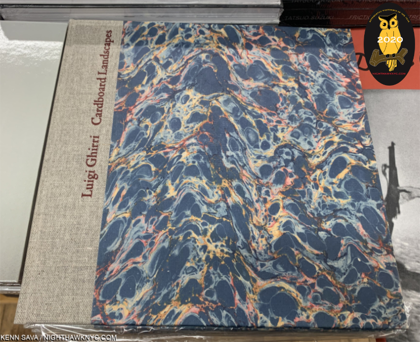
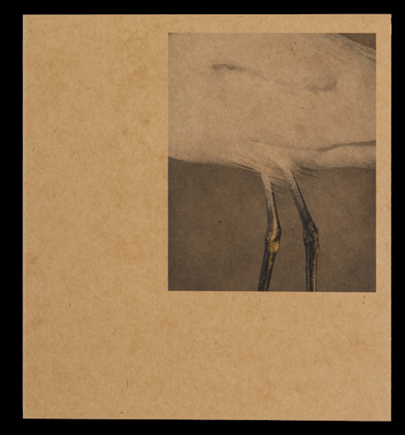
Luigi Ghirri, Cardboard Landscapes (Paesagge di cartone), Museum of Modern Art. This book was a gift from Luigi Ghirri to legendary MoMA Director of Photography, John Szarkowski, in 1975. It languished forgotten in the MoMA collection for decades until being recently rediscovered. Now reproduced faithfully for book lovers, it makes a stunning impression. Here, we get the full range of Luigi Ghirri’s considerable gifts, along with his gift of sequencing. The result is a breath of fresh air. The first half of the book is quite humorous. We sense the Artist’s personality shining through. The rest retains a bit of the feel of his recently ended career as a surveyor. In the end, it’s a book that is a serious work of Art that doesn’t take itself oppressively seriously. Still, it’s hard for me to look through it and not see a bit of the roots of Artists as diverse as Maurizio Cattelan, Stephen Shore, Richard Prince and Erik Kessels. Such is the net effect that, even though the Ghirri bibliography has exploded the past few years with some fine titles, Cardboard Landscapes gives us yet another entirely different side of this remarkable Artist.

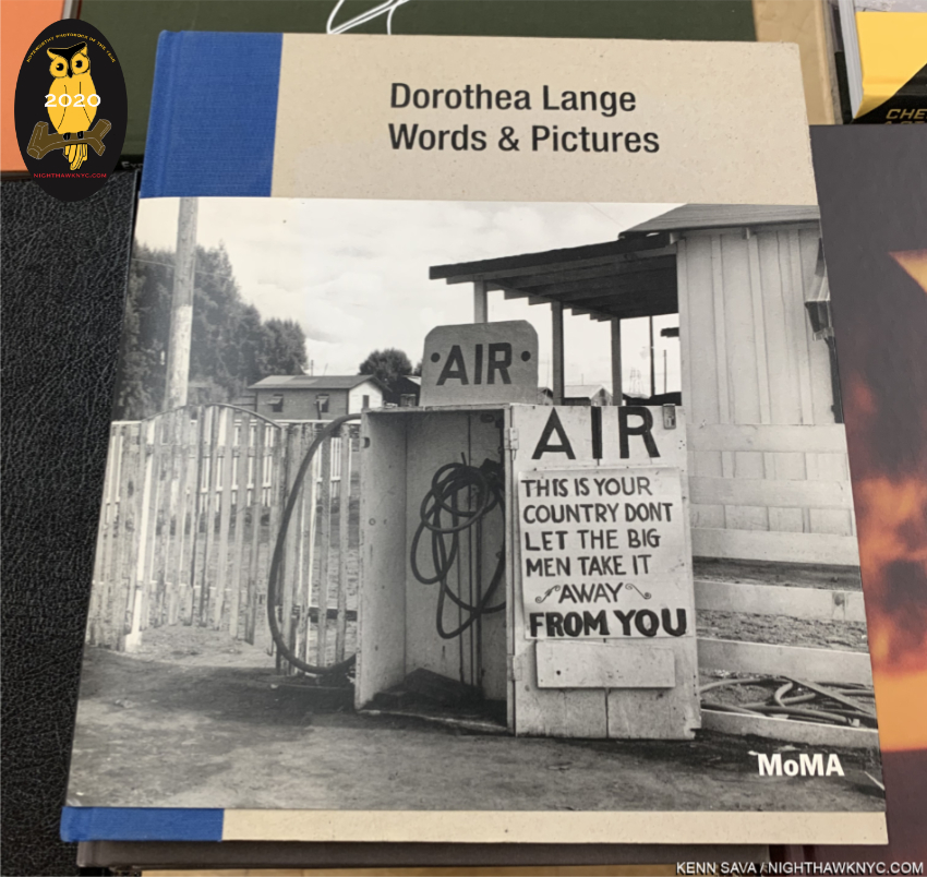
Dorothea Lange, Words & Pictures, Museum of Modern Art. “All photographs—not only those that are so called ‘documentary’…can be fortified by words2, Dorothea Lange said. Elsewhere she said, “Am working on the captions. This is not a simple clerical matter, but a process…They are connective tissue, and in explaining the function of the captions, as I am doing now, I believe we are extending our medium,” in a note that reveals the importance of captions (and words) in seeing her work. It’s so rare to gain major insights into major Artist who passed away 55 years ago, but that’s exactly what the show this book accompanied did. “Dorothea Lange, Words & Pictures, which opened barely a month before the NYC pandemic shutdown added a completely new dimension to our appreciation of the work of Dorothea Lange by focusing on the role her words play in their understanding. It lives on in this exceptional book that is a joy to look at as well as to read. In many shows where words play a part, they’re often hard to read due to glare on the glass and the numbers of other viewers.

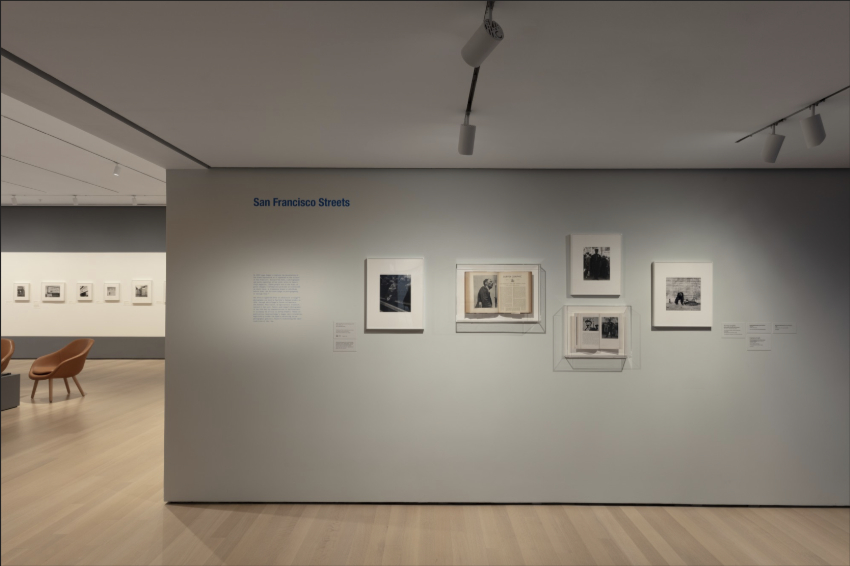
Dorothea Lange, Words & Pictures, Installation view, MoMA Photo.

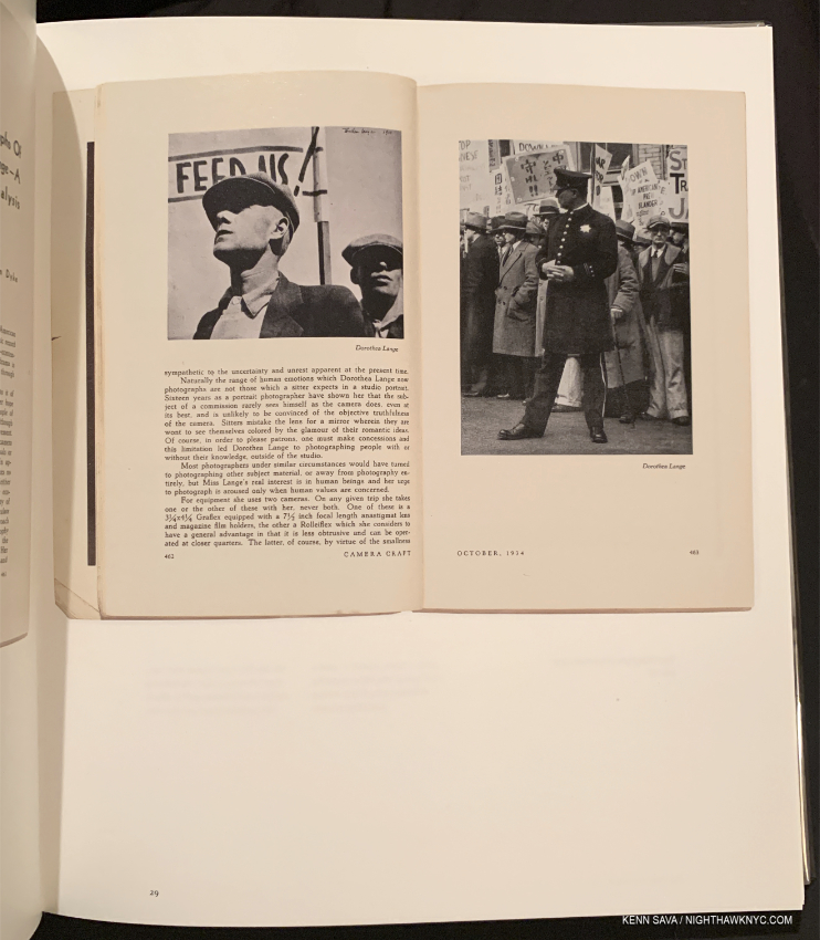
The open book seen in the lower center wall latrine above as reproduced in Words & Pictures.

Here, you can read them clearly without distraction, glare or others looking over your shoulder, while seeing Ms. Lange’s classic images in gorgeous reproductions printed on 150gsm Arctic Volume Ivory, which makes the book better, in some ways, than seeing the actual show! Also, among the essays is one by the legendary Sally Mann. Along with whatever other books you have on Dorothea Lange, like the excellent Dorothea Lange: The Politics of Seeing, this one is essential.

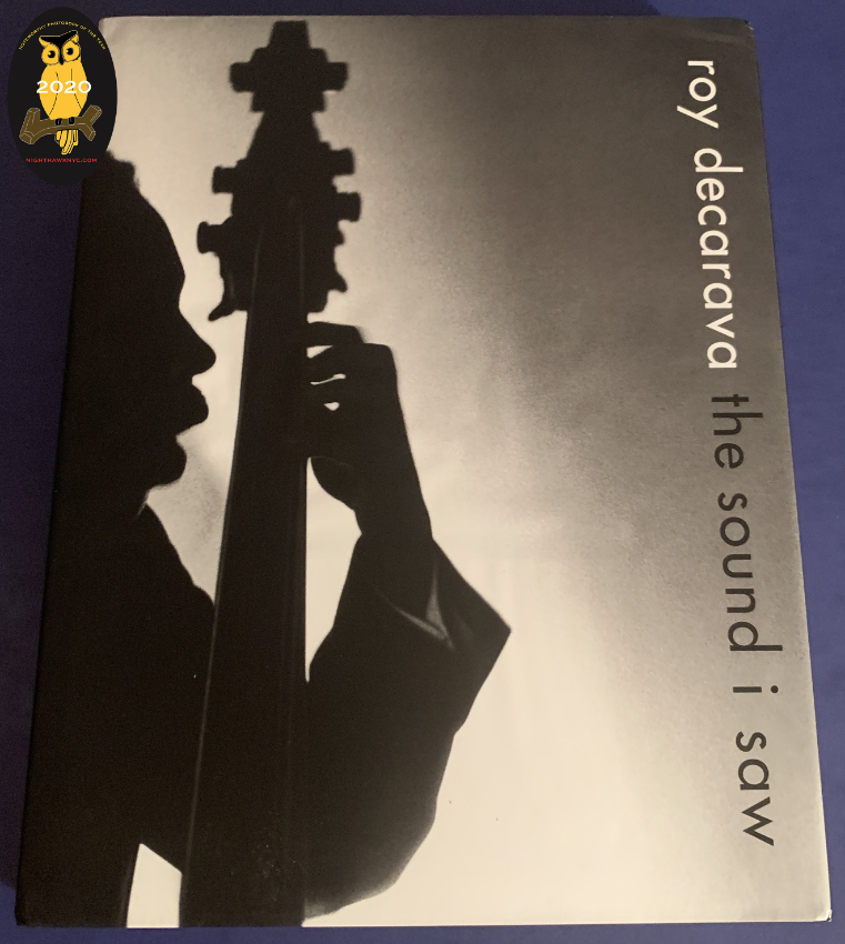
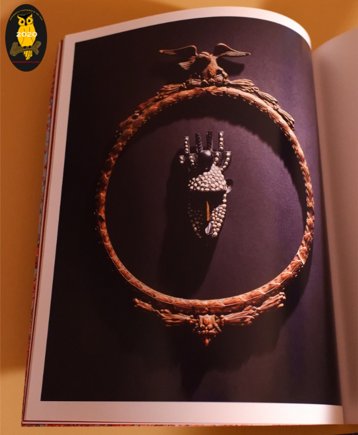
Roy DeCarava: the sound i saw, David Zwirner Books. Roy DeCarava has been in eclipse since his passing in 2009, just short of his 90th birthday. Due to his estate’s new relationship with Zwirner his work has returned to view in force, both in shows and in books. The classic The Sweet Flypaper of Life (with Langston Hughes) was finally reissued in 2018, and 2019 saw the rerelease of another out of print Roy DeCarava classic- the sound i saw, this time in a luxurious oversized edition which pairs his poetry with many classic images. Growing up studying Jazz through Lps, I wasn’t familiar with Mr. DeCarava’s work as I was with, say, Alfred Lion’s for Blue Note. The difference I see between Mr. DeCarava’s Jazz images and everyone else’s is that I can tell he knew his subjects personally. These images ooze personal connection, and that’s very rare in Jazz in this period. No. It’s uneqelled. I don’t know why more of his amazing images didn’t make it on to record covers, but here many of them are over 208 pages in this 5 pound collection, in addition to others that set the mood. If you love Music, and especially if you love Jazz, this is an essential book that features exceptional, intimate images of legends Mr. DeCarava well knew, including important images of John Coltrane, and Billie Holiday (seen smiling!), Ornette Coleman and Duke Ellington, among others. It is the finest book of Jazz Photography I have ever seen.

NoteWorthy PhotoBook Publisher of the Year, 2020

From Remember the South by Frank Frances, one of the first three auspicious releases on Kris Graves’ new Monolith Edition imprint.

Kris Graves Projects & Monolith Editions. I can’t imagine how hard it was, and is, to produce and sell books in 2020. In addition to the obstacles I listed near the beginning of this piece, once you get the physical books printed and in your hands, all the bookstores were closed for much of this year. And then customers, including this one, have been slow to return to indoor shopping. Yet, through the pandemic, the lockdowns and quarantines that are still going on around the world, book publishers have tried to maintain a sense of “business as usual.” For all of them- big and small, this must have been quite challenging. I’m sure we’ve lost a good many of them already. Yet, Artist-run, Kris Graves Projects has not only carried on, they’ve released a steady string of impressive titles, 18 in 2020, including the third set of LOST, with their usual high quality, and at popular prices. Kris Graves also debuted Monolith Editions this year, dedicated to publishing the work of BIPOC Artists, with three auspicious releases. I reached out to Mr. Graves trying to gain some insight on just how he’s done ALL of it during the hardest year of almost all of our lives. He said-

“This year allowed me to be home more than any other in recent memory, so I worked on making content and working with artists. I wanted to make less books this year but I guess I can’t stop myself. Only four of the books were ideas during the covid times, everything else was in the works. Also, with my photoshoot income diminished, I had to find ways to make some profit on books. I also had more time to let people know the books exist.”

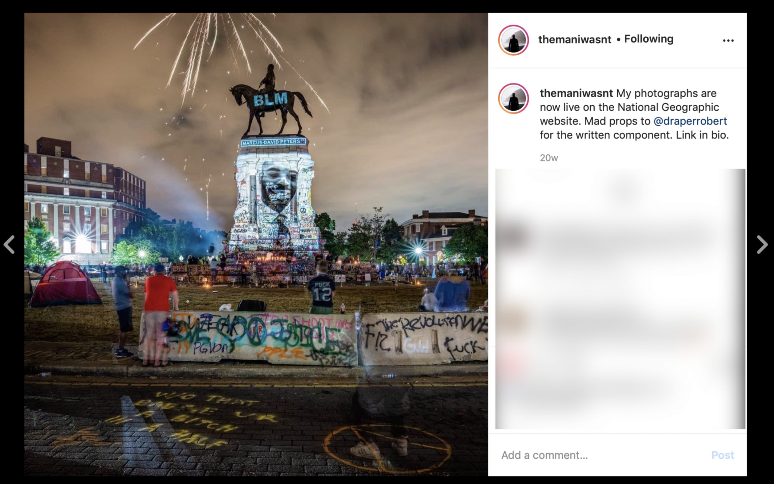
From @themaniwasnt

18 books in 2020 would have been a large output for ANY PhotoBook publisher, but he didn’t stop there. Kris Graves, himself, has created an exceptional, and exceptionally powerful, body of work in 2020, the result of incessant travels around the country, going to sites of monuments and protests, putting himself at considerable risk. It’s a body of work that captures the moment and will, I believe, be historically important. Though not yet published in PhotoBook form, some of this work may be seen on his Instagram feed, @themaniwasnt, and in National Geographic, January & February, 2021. About it, he said-

“As far as my own work, I have done about 30 days of traveling on National Geographic’s watch and dime, so that helped me make a ton of personal work. Without those trips I would not have shown much new work this year. Although, I now have four seasons of Cape Cod imagery and that is becoming a project now. I think that artists need to keep shooting until some magic occurs. If this winter is mild, I will take a bunch of bike rides around Queens to make some new images here also.”
It speaks volumes that at a time when many are stuck, stopped, or done, Kris Graves has not only maintained, he has continued to move forward- on multiple fronts, and produce important work, himself, along the way. 

Finally, this year I’m also listing some NoteWorthy Art Books for the first time. Stay tuned.

Addendum-

Two books I saw late in 2020 were subsequently added to my list, per my Instagram account, @nighthawk_nyc-

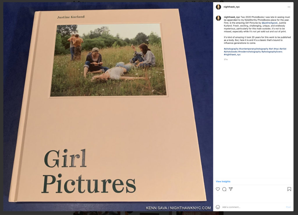
Justine Kurland, Girl Pictures, Aperture. My text reads- “Two 2020 PhotoBooks I was late in seeing must be appended to my NoteWorthy PhotoBooks piece for the year. First, is the amazing Girl Pictures by @justine4good, Justine Kurland. Fresh, exciting, challenging, unique, and endlessly mysterious, particularly for this male outsider, it’s not to be missed, especially while it’s not yet sold out and out of print.
It’s kind of amazing it took 20 years for this work to be published as a body. But, here it is and it’s a classic that’s bound to influence generations to come.”

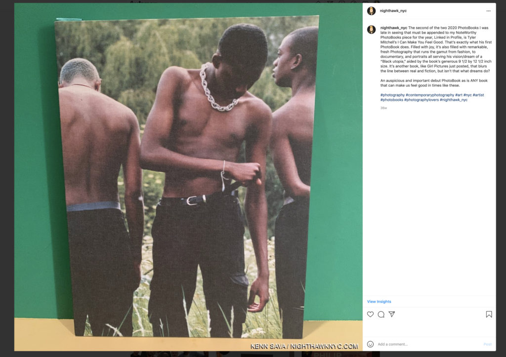
Tyler Mitchell, I Can Make You Feel Good, Prestel. My text reads- “The second of the two 2020 PhotoBooks I was late in seeing that must be appended to my NoteWorthy PhotoBooks piece for the year, Linked in Profile, is Tyler Mitchell’s I Can Make You Feel Good. That’s exactly what his first PhotoBook does. Filled with joy, it’s also filled with remarkable, fresh Photography that runs the gamut from fashion, to documentary, and portraits all serving his vision/dream of a “Black utopia,” aided by the book’s generous 9 1/2 by 12 1/2 inch size. It’s another book, like Girl Pictures just posted, that blurs the line between real and fiction, but isn’t that what dreams do?
An auspicious and important debut PhotoBook as is ANY book that can make us feel good in times like these.” (It should be noted that this is Mr. Tyler’s first PhotoBook for a major publisher. He previously self-published a book. )

NighthawkNYC.com remains ad-free! Yet, the costs are substantial, and have piled up over the past  five years. There are NO affiliate sales links here. If you would like to support what I’ve been doing since 2015, there is a Donations link accessible by clicking the white box at the upper right of the page where the archive lives, with my sincere Thanks.

*-Soundtrack for this Post is “Every Day Is A Miracle” by David Byrne, from American Utopia now a terrific concert film directed by Spike Lee.

NighthawkNYC.com has been entirely self-funded & ad-free for over 7 years, during which over 275 full length pieces have been published! If you’ve found it worthwhile, PLEASE donate to allow me to continue below. Thank you, Kenn.

You can also support it by buying Art, Art & Photography books, and Music from my collection! Books may be found here. Music here and here

Written & photographed by Kenn Sava for nighthawknyc.com unless otherwise credited. To send comments, thoughts, feedback or propositions click here. Click the white box on the upper right for the archives or to search them. Subscribe to be notified of new Posts below. Your information will be used for no other purpose.

  1. Magnum Photos profile
  2. The full quote reads, “All photographs- not only those that are so-called ‘documentary’, and every photograph really is documentary and belongs in some place, has a place in history- can be fortified by words.” Dorothea Lange, Words & Pictures, p. 12.

The Met Breuer: Hail, and Farewell

Written & Photographed by Kenn Sava

Part Two of a series.

2,197 days.

I’m about to enter it for what would turn out to be the last time, on what would turn out to be its very last day. I’ll miss it.

That’s how long The Met Breuer (TMB) was open. March 8, 2016 (Member’s preview) through March 12, 2020, when it “temporarily closed” for the pandemic shutdown1. With the calendar turning to July, The Met’s time in the Breuer Building has ended, as I outlined in Part 1, making March 12th the final day it was open to the public. I was there on both its first and last day, and some in between. Though I regretfully missed some of TMB’s shows, I saw the major shows and a good many of the others. 

The Met Breuer, March 12, 2020.

My interest in The Met Breuer was born in curiosity. In May, 2011, they announced they would be taking over the Breuer building at 945 Madison Avenue.

“With this new space, we can expand the story that the Met tells, exploring modern and contemporary art in a global context that reflects the breadth of our encyclopedic collections. This will be an initiative that involves curators across the Museum, stressing historical connections between objects and looking at our holdings with a fresh eye and new perspective. This project does not mean that we are taking modern and contemporary art out of the Met’s main building, but it does open up the possibility of having space to exhibit these collections in the event that we decide to rebuild the Lila Acheson Wallace Wing where they are currently shown…” Met Director, Thomas P. Campbell, in The Met’s press release May 11, 2011. 

Going up. The elevator doors open onto Jack Whitten: Odyssey in October, 2018, one of the true blockbuster shows mounted at TMB.

After decades of being in denial about Modern & Contemporary Art’s worthiness of being in The Met, this marked a gigantic turn. Of course, it came 40 years too late to acquire most of the major works (or ANY of the major works) of some of the most important Artists of the past 40 years. Truth be told, I for one, was in agreement with The Museum about M&C Art from 1980 until about 2014, when I felt enough time had passed to begin to assess what had been done. A LOT of money had been invested in renovations to, and an 8 year lease on, the building Marcel Breuer had designed at 945 Madison Avenue at East 75th Street fo the Whitney Museum (see Part 1 for more on the history). The pressure was on. The Met, under then Director Thomas Campbell, had decided to make its mark in Modern & Contemporary Art, and brought Sheena Wagstaff on board from the Tate Modern, London, in January, 2012, as Chairman of the Department. What approach would Ms. Wagstaff (who’s shows at the Tate ranged from Edward Hopper to Jeff Wall), her staff and The Met take to M&C Art and how would it hold up against shows up at the Guggenheim, MoMA, The New Museum, The Whitney and the Brooklyn Museums?

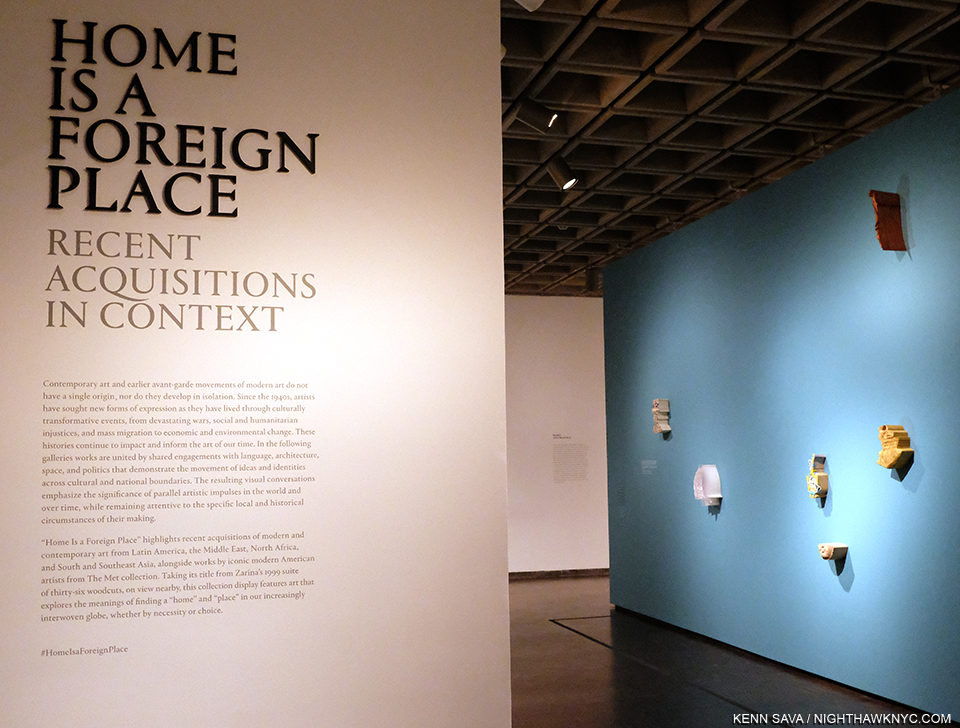
Home is a Foreign Place, one of the 3 shows that closed TMB, drawn from recent additions to the Permanent Collection showed how far The Met’s collection of M&C has come.

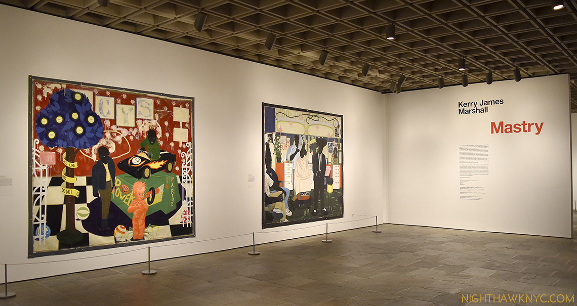
Going into the opening, the press was all about how The Met was “hopelessly behind” NYC’s other Big Five museums, let alone those elsewhere in the country, in Contemporary Art. 2,197 days later, The Met Breuer has done the remarkable- It’s put The Met on that map. It did so by mounting a number of the most important shows of the past four years. From Nasreen Mohamedi and Unfinished: Thoughts Left Visible, which opened TMB, to Gerhard Richter: Painting After All, which closed it. In between, Kerry James Marshall: Mastry, will remain it’s peak moment in my mind, though there were others. And there were a surprising number of revelations along the way.

Sol LeWitt was an Artist I never paid much attention to until I saw this work, 13/3, 1981, Painted balsa wood, in the Breuer’s show, , in December, 2017. Ever since, his work continues to fascinate me

Originally scheduled to be open as TMB until July 5th, it still would have closed with the Gerhard Richter and Home Is A Foreign Place: Recent Acquisitions In Context and From Gericault To Rockburne: Selections From The Michael & Juliet Rubenstein Gift, the final three shows on its 2020 schedule. While the legacy is complete, in terms of the shows mounted, the influence was cut short as countless thousands more would have gotten to see these shows over the approximately four months longer they would have remained open. 

For now, I look back at some Highlights from The Met Breuer. The name of each show, listed in no particular order, is linked to the piece I wrote about it at the time-

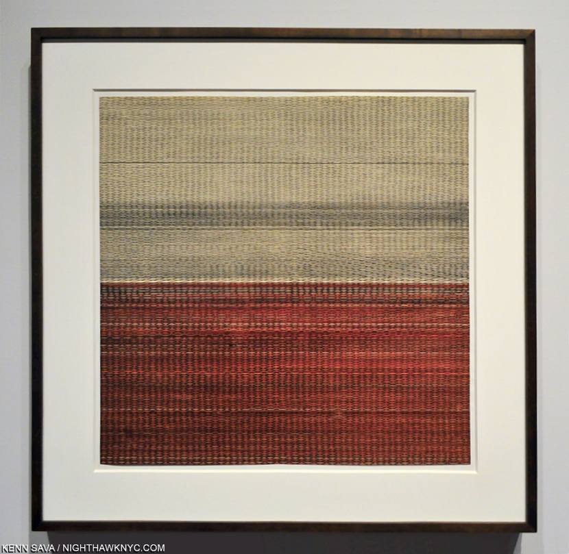
Approaching this work, I thought “What is a piece of textile doing here?” “Untitled, 1970s, Graphite and ink on paper,” the wall card read. Wait. What? This is a DRAWING? Then, all of a sudden, a loud click when off in my mind, and Art was never the same for me again.

Nasreen Mohamedi Revelations. That might be the word that lingers with me with I think about TMB. They began on Day 1…The first show I saw that first day at TMB remains my personal favorite of all the shows I saw there. I had no idea who Nasreen Mohamedi was when I got off the elevator that day on 2. But Sheena Wagstaff sure did.

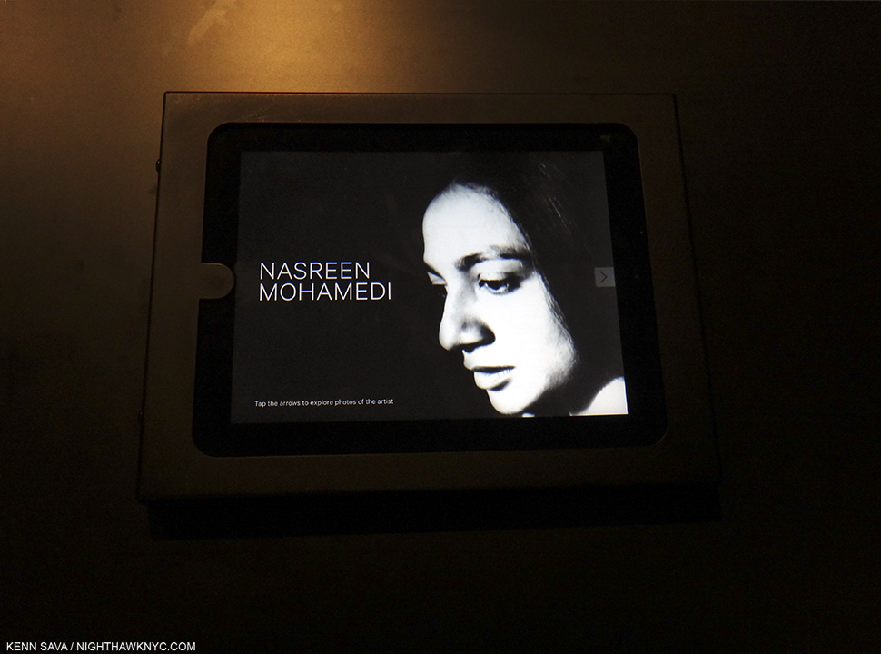
Incomparable is the word I now use to describe Nasreen Mohamedi, who lived in obscurity for 53 years and gave away her Art as gifts. Seen here in one of the handful of existing Photos of her, this one has lingered in my mind from the first moment I saw it, here in a slide show in the final gallery in March, 2016.

The show included Photos taken by Ms. Wagstaff of the area of Nasreen’s unmarked grave well off the beaten path in Kihim, Mumbai, India. THAT’S passion. THAT’S dedication. At that moment I saw them, I knew TMB would be one of NYCs most important cultural institutions. 

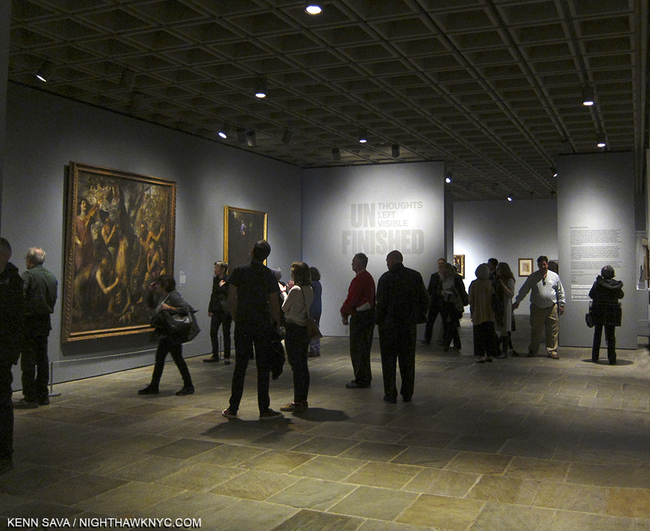
Unfinished, Member’s Preview. The first look at one of the most memorable shows to appear at The Met Breuer, March 8, 2016. Work by Titian, left.

Unfinished: Thoughts Left Visible. In the hundreds of years Art shows have been mounted, someone must have mounted one around this concept, right? I haven’t heard of it. If there was one, I doubt it was mounted as incredibly well and included rarely seen works by Michelangelo, Leonardo (the twin Kings of the unfinished work in the Renaisaance), Jan van Eyck, JMW Turner, and countless others. TMB’s first major blockbuster, and the other inaugural show in March, 2016, along with Nasreen Mohamedi. It belied The Met’s stated “mission” with TMB as “an outpost for Modern & Contemporary Art,” filling two floors, while the Nasreen got one. Given all the riches included, I have yet to hear anyone complain. Overall, over time, TMB was what The Museum said it would be.

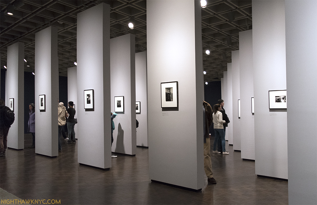
Diane Arbus: In The Beginning was a revelation, as well, as much for the work as for the amazing way the show was installed- each of the over 100 pieces got its own wall- another thing I’ve never seen before. It also included a portrait of a departed friend of mine, Stormé DeLarverie, who told me more than once that it was she whose scuffle with police had incited the Stonewall uprising (she disagreed with the use of the term “riot.”), and that she had posed for Diane Arbus in 1961. At the time, I took both claims with grains of salt. Now, the world knows that both are facts, and in her gorgeous portrait by Ms. Arbus, which I snuck a shot of and show in my piece, Stormé will forever live on in The Met. In In The Beginning, she, fittingly, got a wall to herself.

The beginning of Kerry James Marshall: Mastry.

Kerry James Marshall: Mastry. As great a Painting show as I’ve seen in years. Maybe decades. 

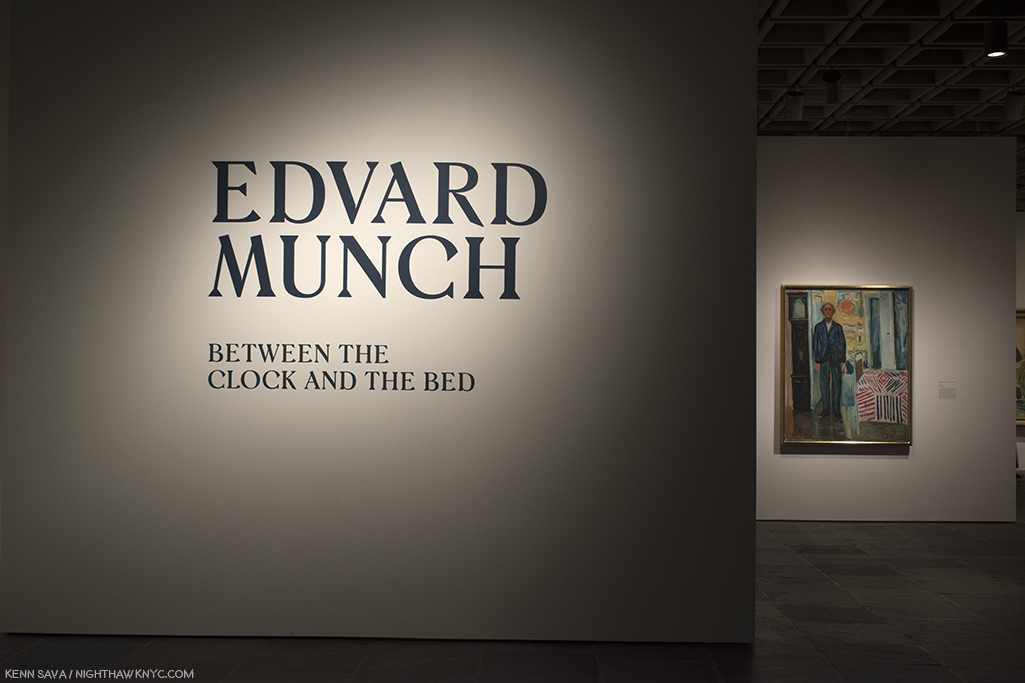
Edvard Munch: Between the Clock and the Bed. A welcome reminder of the enduring accomplishment of this wonderful Artist who’s rarely seen in a show here. Between showed Mr. Munch is one of the very few Artists to successfully use techniques, styles and colors in realms that had only been used by Vincent van Gogh, who he was only 10 years younger than, and who he outlived by 54 years. 

Lichnos, 2008, at the entrance. 100 feet into this show my jaw was on the ground. It stayed there throughout.

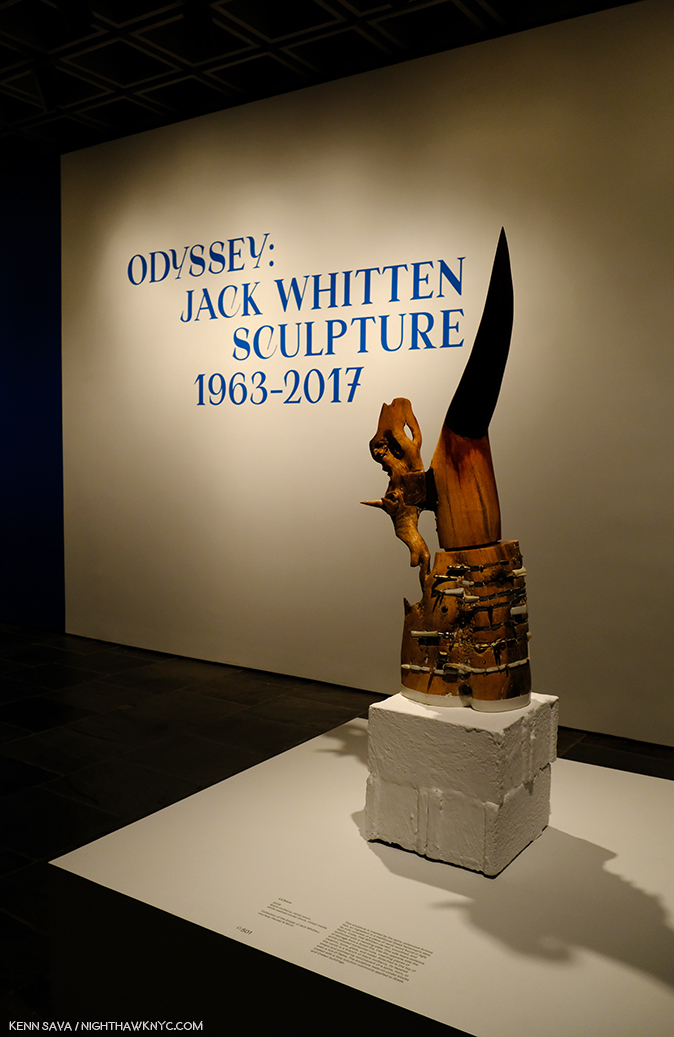
Odyssey: Jack Whitten Sculpture, 1963-2017. Quick. Who’s the other Artist who is a Master of one medium, and who kept his mastery of another from public view his entire career? One stunning revelation after another that never let up. More remarkable for such a large show.

As I said in my piece on the show- “TWO whole museum floors of about 100 Paintings? My idea of heaven…” Having five floors at The Breuer added different dimensions to any number of shows, allowing a good number of shows to fill two whole floors- the kind of space that would be VERY hard to have at 1000 Fifth Avenue. The space between works at Gerhard Richter: Painting After All was one of its most memorable features and gave it an entirely different feel, allowing each work “space to breathe,” rare in big shows, and something I’ll miss very much.

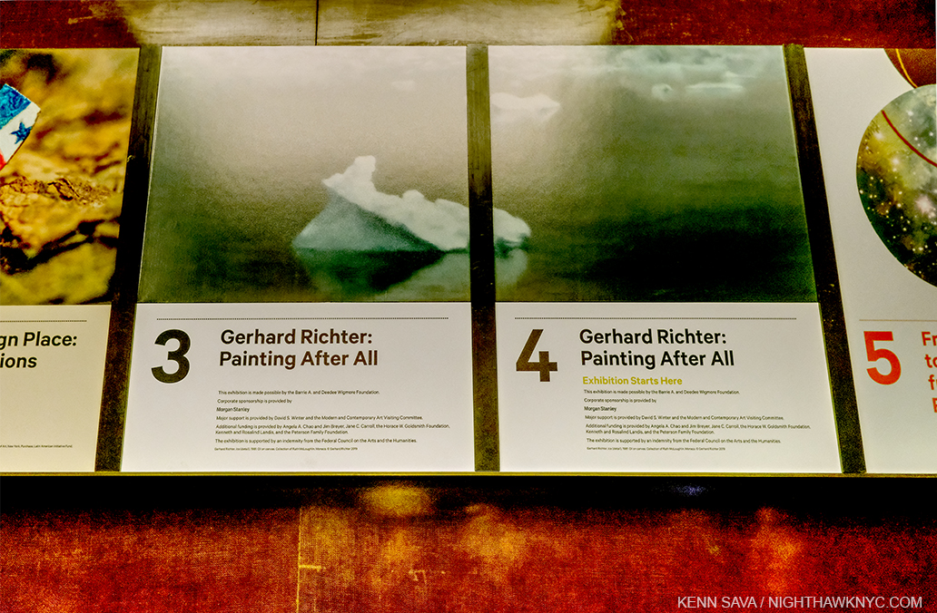
Gerhard Richter: Painting After All. Exquisitely selected and hung, somehow managing to condense almost 6 decades of work into a selection that while not a “greatest hits” included enough of them, along with a good many surprises, and a chance to see the monumental Birkenau works. Unfortunately, it was open for all of NINE DAYS! It turns out that I saw it on its final day, at considerable risk. 

Along with other memorable shows-

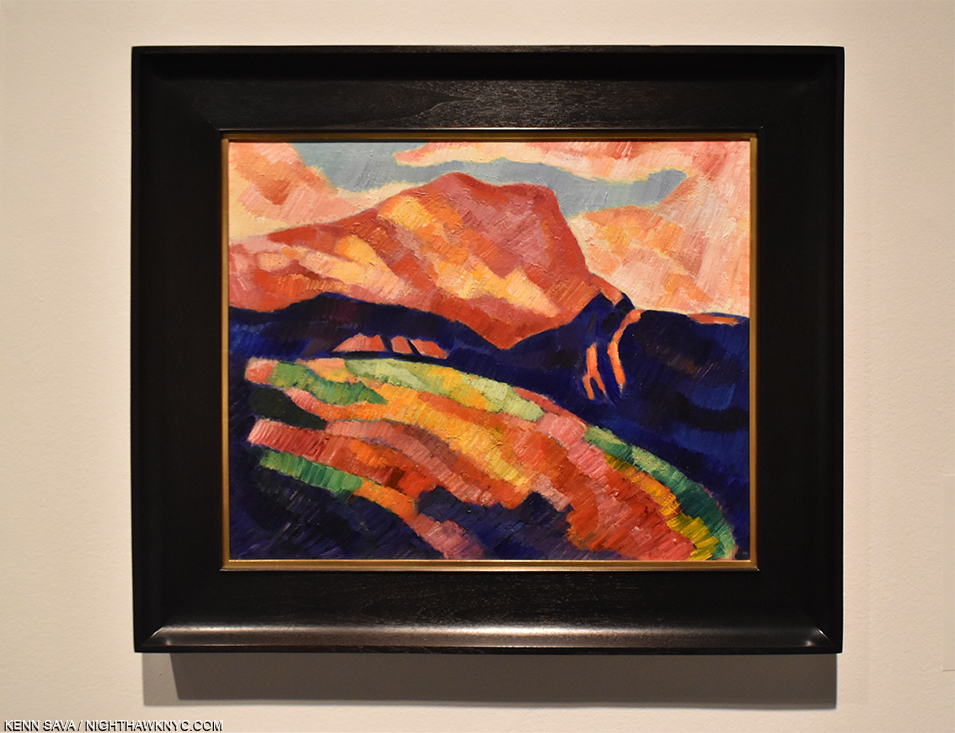
Marsden Hartley’s Maine Marsden Hartley was unique and an Artist, though steeped in what the Europeans had and were doing, found his own ways. This was a show that served to open the mind, even in 2017, to the possibilities of Painting seen through a very free eye and mind in often daring fashion. A real breath of fresh air.

Marsden Hartley, Mont Sainte-Victoire, c.1927. Pretty daring to go to Aix-en-Provence and go toe-to-toe with the Master, Cezanne, in the land he made iconic. This work, in a show about Marsden Hartley’s work in Maine, this work set the stage for his bold brushwork and use of color in what would come.

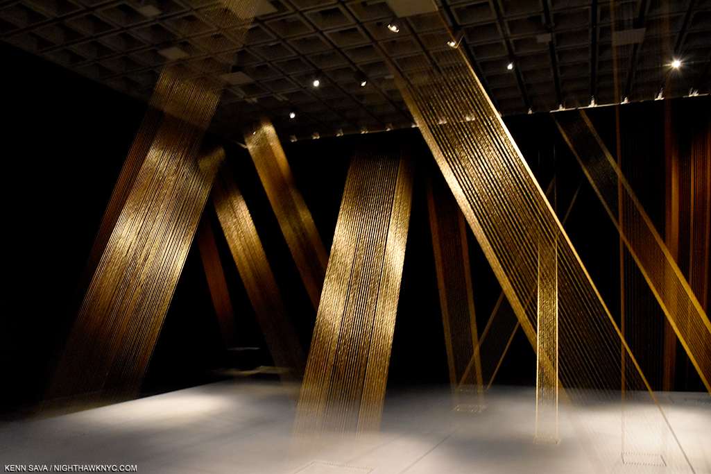
Lygia Pape:A Multitude of Forms  No one medium could hold Lygia Pape’s vision, so the visitor to A Multitude of Forms was met with an ever-changing presentation that delighted the eye as much as it captured the mind.

Lygia Pape, Tetia 1, C, 1976-2004, Golden thread, nails, wood, lighting, a work that wonderfully characterized the ephemeral nature of Ms. Pape’s work in a show remembered for its endless variety and surprise. Seen at Lygia Pape: A Multitude of Forms, her first major show in a US museum in June, 2017.

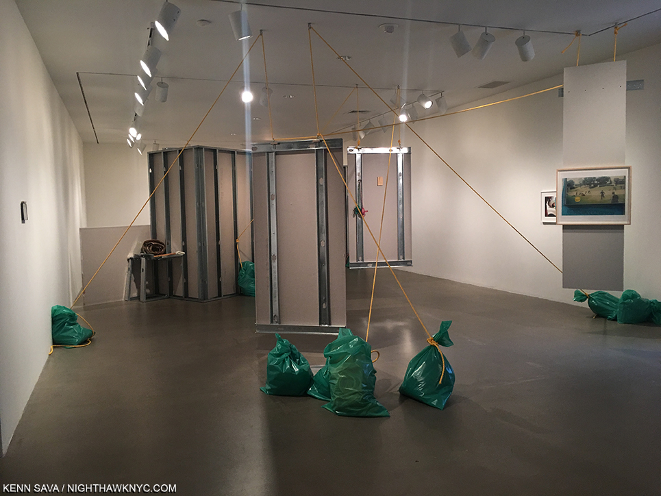
Everything is Connected: Art and Conspiracy-

Rachel Harrison, Snake in the Grass, 1997. A work inspired by the Artist’s trip to Dealey Plaza, sight of JFK’s Assassination. While I was captivated by it, NHNYC Researcher Kitty said this work reminded her of being in her father’s garage.

And shows consisting of work from The Met’s Permanent Collection including-

Obsession: Nudes by Klimt, Schiele and Picasso From the Schofield Thayer Collection. With only 9 by Klimt and the majority by Shiele- no complaints here.

Provocations: Anselm Kiefer At The Met Breuer-

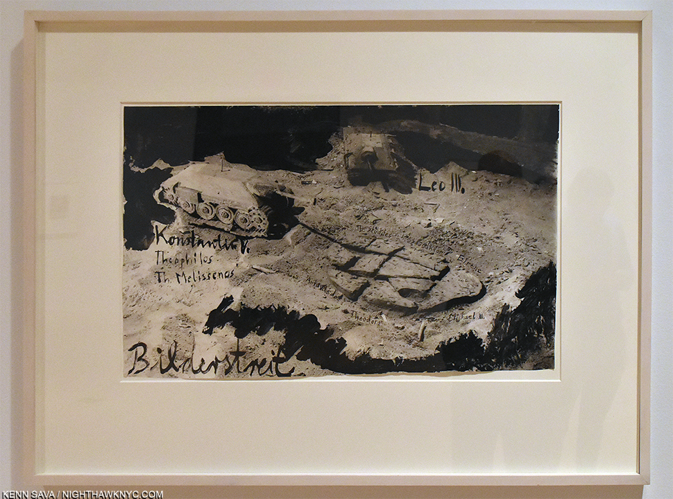
Anselm Kiefer, Iconoclastic Controversy, 1980, Gouache and ink on photograph, the wall card reads in part, “Rooted in the Second Commandment’s prohibition of graven images, the medieval debate involved the persecution of the artist-monks and the destruction of icons. Here he restaged the conflict in his studio with miniature versions of WWII tanks (one has destroyed a piece of clay in the shape of an artist’s palette)…The image links the iconoclastic battle to the Nazi’s attack on 
“degenerate art” in the late 1930s, which led to the destruction of hundreds of works of modern art.”

and Home Is A Foreign Place: Recent Acquisitions in Context. (Installation view of its lobby shown earlier)-

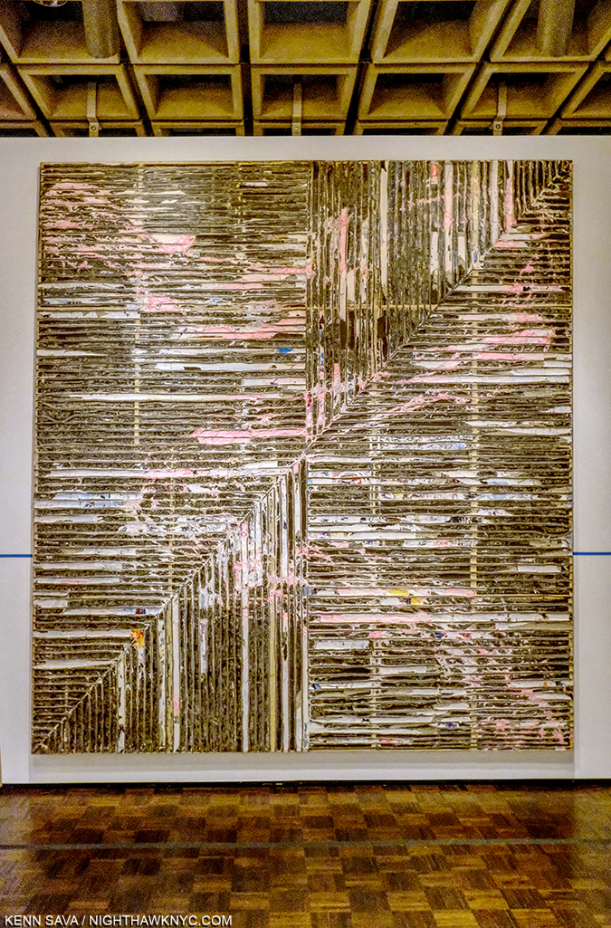
Mark Bradford, Crack Between the Floorboards, 2014. Can an Art writer have personal favorites? If he/she is a human being, it’s pretty hard not to. Mark Bradford is one of mine. So, I will long remember that this piece was the third to last work I saw on what turned out to be the closing day of The Met Breuer in the show Home Is A Foreign Place. The penultimate piece was Untitled, 1970, by Nasreen Mohamedi.

It’s fitting to end this piece with this show. Here, one could see just how far The Met’s Permanent Collection has come. Yes, there is a long way to go. Museums elsewhere in the US have built a lead in Contemporary Art that is, perhaps, insurmountable. But, The Met now has enough work in its own collection to mount fascinating shows like this. I was most impressed by the steps they’ve taken thus far as I looked at the acquisition dates on the items in Home Is A Foreign Place.

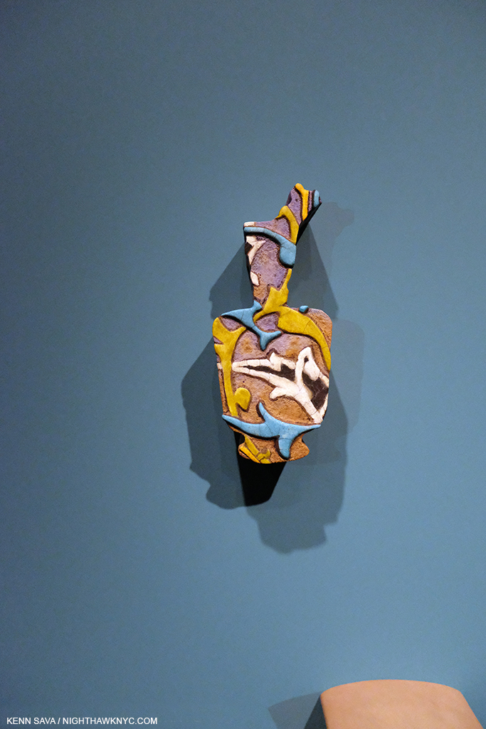
The very last work I saw at The Met Breuer is this piece from a series by Walid Raad, from 2014-5 in Home Is A Foreign Place. The wall card spoke about the Artist’s interest in the shadows these objects cast and how they enhance and expand the form. A bit like the shadow a museum visit casts…

And then, there were the shows I missed, like Vija Clemins. Phew…ALL of this in exactly 4 years! I think that’s a track record that can hang with what any of NYC’s other big museums- including The Met, 1000 Fifth Avenue.

Yes, there were a lot of very good, even great, shows at The Met Breuer during its four year run. You probably have your own list of favorites. Regardless of which show we’re talking about, the Breuer Building gave all of its shows the added dimension of space- often a whole floor, even two. There’s a lot to be said for that, and it will be very difficult to mount such shows at 1000 Fifth Avenue2. I’ll miss the place as The Met Breuer. I already cherish the days I got to spend there.

This is the Second part of my look back at The Met Breuer. Part 1 is here. Some thoughts on the “bigger picture” are coming.  

*- Soundtrack for this post is “Hail & Farewell” by Big Country. “Hail and farewell, Life begins again…”

You can now follow @nighthawk_nyc on Instagram.

NighthawkNYC.com has been entirely self-funded and ad-free for over 7 years, during which over 250 full length pieces have been published. If you’ve found it worthwhile, you can donate to keep it going & ad-free below. Thank you!

Written & photographed by Kenn Sava for nighthawknyc.com unless otherwise credited.
To send comments, thoughts, feedback or propositions click here.
Click the white box on the upper right for the archives or to search them.
For “short takes” and additional pictures, follow @nighthawk_nyc on Instagram.

Subscribe to be notified of new Posts below. Your information will be used for no other purpose.


  1. By my count. Subtract 10 days if you want to count from its official opening on March 18th.
  2. The huge China: Through the Looking Glass Fashion show in 2015 was mounted in different parts of The Met, which probably remains the only way to do it.

“Best” Doesn’t Exist In The Arts

For The Record #3. 

Third- I don’t believe in qualitatively comparing Artist or works of Art. There is no such thing as “Best” in the Arts. Qualitatively comparing Artists or Artworks is pointless. Whatever criteria you use are subjective. In my view, awards and “halls of fame” are pointless. Turn those halls of fames into museums.

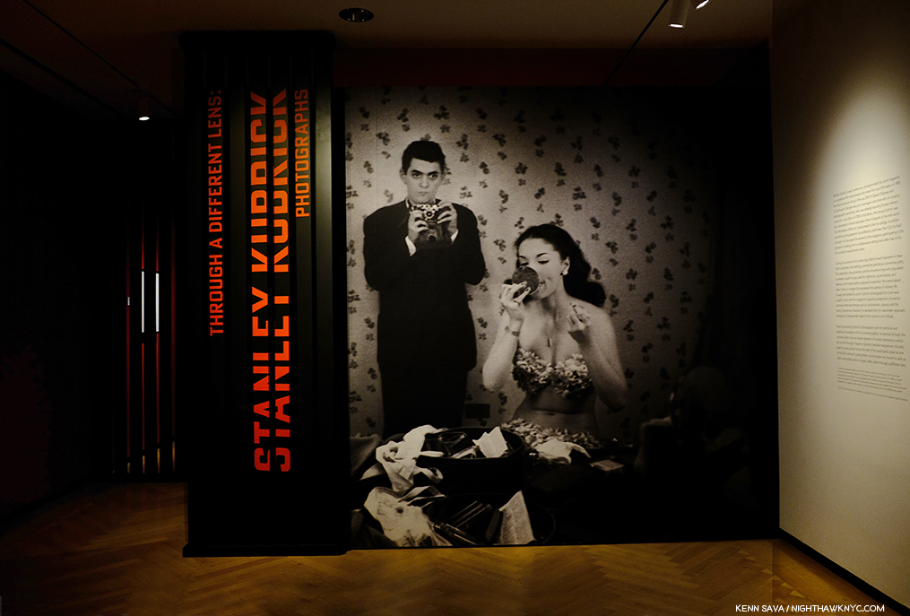
Stanley Kubrick, seen here in his 1946 Photograph with “showgirl” Rosemary Williams, at the entrance to the Museum of New York show of his Look Magazine Photographs  never won a “best director” oscar. Neither did Charlie Chaplin. Neither did Alfred Hitchcock. Neither did Orson Welles. Neither has every black, female, Hispanic, or Asian director, ever.

For every award “winner” there are countless others who can also be said to “deserve” to have “won.” I wish all awards would cease. For every “hall of fame” member there are countless others who could have been included. I think they should all be closed and museums opened in their place. All of this being said, I have no problem with those who win awards enjoying them. As contradictory as that may sound, acknowledgement of Artists in any form in this country, particularly, is very hard to come by. It’s not their “fault” they “won.” History shows that all of these awards have missed many others as deserving, and also shows that some of the most important Artists in their fields never won any award- until someone decided late in their career that they better try and “fix” their oversight. The hype and marketing surrounding awards and award winners is meant to make you feel theirs is the final word on the subject. There is NO such thing!

Experience the work for yourself and make up your own mind. See if it speaks to you, or not. At the end of the day, or of the year? That’s ALL that matters.

So, I’ve preferred to use the term “NoteWorthy,” to refer to Art, shows, and books that have lingered with me, have had the most impact, and which I think others should know about so they can make up their own minds about. I also use the term “favorite,” which does not mean “best,” to connote something I personally like, whether or not I think it’s “important” or “NoteWorthy.” We all have what I call “guilty pleasures”- like a song we know is going to be forgotten as soon as we can get it out of our heads!

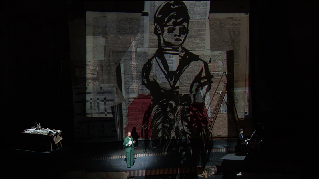
Screencap from The Metropolitan Opera’s broadcast of Alban Berg’s Lulu, with production design by the great William Kentridge, in 2015.

If something doesn’t speak to you…? Well, if something doesn’t speak to me I try and keep an open mind about it and revisit it one day, sometimes years later. I try and not say “I don’t like it.” I just let it lie with me, continue to think about it, and revisit it later, even years later. At that time, it still may not speak to me, but sometimes it does. In some of those cases the work and the Artist became very important to me. Like Alban Berg and his opera Lulu, which on first hearing may sound completely chaotic. As I listened to more and more Music in more and more styles, my ears opened up. Now, I only hear Mozartean beauty in Lulu, which has become my favorite opera. At other times, I’ve wrestled with Art or Music I just didn’t get. This involved digging deeper into the background of the work and looking or listening harder. Yes, harder. So, I try and always keep an open mind. That being said, there are some things I admit I will NEVER like or appreciate. Hitler was a painter (small ”p” intended), remember? It’s too bad he wasn’t able to get into school, become an Artist, and make a good contribution to the world, instead.

Instead of awards, perhaps give an Artist a grant, a commission, or buy their work, if you want to help them.

*-Soundtrack for this Post is “Award Tour” by A Tribe Called Quest from their immortal Midnight Marauders, 1993.

For The Record is a series of pieces that are about key/core subjects & beliefs that underly everything else I’ve written here. The first two parts are here

NighthawkNYC.com has been entirely self-funded and ad-free for over 6 years, during which over 250 full length pieces have been published. If you’ve found it worthwhile, you can donate to keep it going & ad-free below. Thank you!

Written & photographed by Kenn Sava for nighthawknyc.com unless otherwise credited.
To send comments, thoughts, feedback or propositions click here.
Click the white box on the upper right for the archives or to search them.
For “short takes” and additional pictures, follow @nighthawk_nyc on Instagram.

Subscribe to be notified of new Posts below. Your information will be used for no other purpose.


NYC: APRIL, 2020 – A SLIDESHOW BY KENN SAVA

Written & Photographed by Kenn Sava

The response to my previous piece, “The Sound of Silence,” has been a bit overwhelming. My thanks to all of you who have read it and especially to those who have taken the time to write. I’ve heard from people all over the world, all of who are also knee-deep in trying to get through the pandemic themself, so I deeply appreciate it. At times like these it’s important to feel we’re in this together.

NYC in April, 2020 has been a month like none I’ve ever experienced. As I write these words, over 18,000 are dead- just in NYC (as of today, May 1st, 2020, per the stats here, which are updated daily). It’s a very rare thing to find the streets of Manhattan empty for a few hours- even well after midnight. To find them that way day after day is something I’ve never seen here before. I began making trips (as safely as possible, usually on foot) to some of the major landmarks of NYC to document what it was like to be there. The experiences left me with a multitude of feelings, as I said in my prior piece, that I’m still processing.

Inspired by a suggestion I received, I’ve decided to expand the concept of that piece, and share more of the Photos I’ve taken in April, 2020, in a slideshow. Yes, after 4 1/2 years of writing about everyone else’s work, I’m sharing some of my own. In it, the title of my previous piece, “The Sound of Silence,” is taken literally since I don’t have permission to use it legally (Dear Paul Simon- May I?)- the soundtrack is silence. It’s designed to be watched fullscreen.

I hope that wherever this finds you, you and yours get through this in good health. Be well.

NighthawkNYC.com has been entirely self-funded and ad-free for over 6 years, during which over 250 full length pieces have been published. If you’ve found it worthwhile, you can donate to keep it going & ad-free below. Thank you!

Written & photographed by Kenn Sava for nighthawknyc.com unless otherwise credited.
To send comments, thoughts, feedback or propositions click here.
Click the white box on the upper right for the archives or to search them.
For “short takes” and additional pictures, follow @nighthawk_nyc on Instagram.

Subscribe to be notified of new Posts below. Your information will be used for no other purpose.


The Sound of Silence: The Slideshow

Written & Photographed by Kenn Sava

The response to my previous piece, “The Sound of Silence,” has been a bit overwhelming. My thanks to all of you who have read it and especially to those who have taken the time to write. I’ve heard from people all over the world, all of who are also knee deep in trying to get through the pandemic themself. At times like these it’s important to feel we’re in this together. I hope that wherever these words find you, you and yours get through this in good health.

There’s always Music going on in my mind. So, all of the 228 pieces I’ve written so far have a soundtrack that accompanies the words and the pictures. Never before have I taken one of those soundtracks and made it into a slideshow. Until now. At the suggestion of Lana Hattan, I’ve compiled some of the Photos I’ve taken this month (April, 2020, and only in April, 2020) into a slideshow, extending the concept of my piece, accompanied by the lyrics of the song.

As I completed it, I was shaken to hear of the tragic passing of Dr. Lorna Breen, Medical Director at New York-Presbyterian Allen Hospital yesterday. As an Emergency Room Doctor, she was on the front lines of fighting the coronavirus pandemic.

“She went down in the trenches and was killed by the enemy on the front line. She loved New York and wouldn’t hear of living anywhere else,” her father said.

My life was saved at New York-Presbyterian in 2007, so it is with the deepest respect that I dedicate this slideshow to Dr. Breen, and all those working to get us through this.

Be well.

*-Soundtrack for this Post is “The Sound of Silence” by Paul Simon and recorded by Simon & Garfunkel on their debut album Wednesday Morning, 3AM, 1964, with overdubs on the 1966 album, Sounds of Silence and live on Concert in Central Park, recorded in 1981.

Special thanks to Lana Hattan. 

NighthawkNYC.com has been entirely self-funded and ad-free for over 6 years, during which over 250 full length pieces have been published. If you’ve found it worthwhile, you can donate to keep it going & ad-free below. Thank you!

Written & photographed by Kenn Sava for nighthawknyc.com unless otherwise credited.
To send comments, thoughts, feedback or propositions click here.
Click the white box on the upper right for the archives or to search them.
For “short takes” and additional pictures, follow @nighthawk_nyc on Instagram.

Subscribe to be notified of new Posts below. Your information will be used for no other purpose.


Harry Gruyaert- In Living Color

Written & Photographed by Kenn Sava (except *)

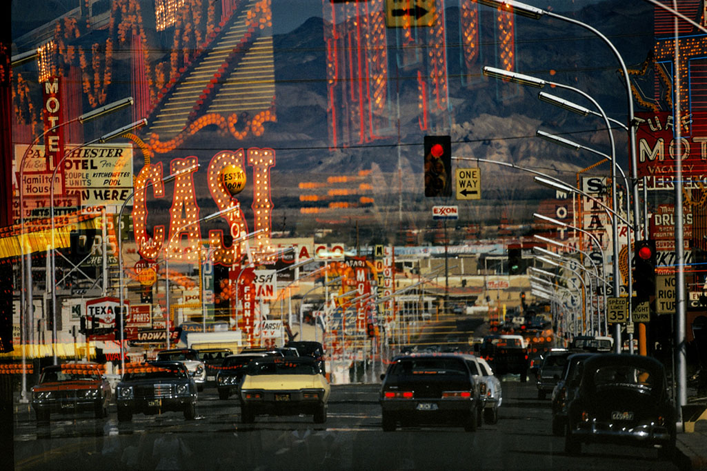
Freemont Street, Las Vegas. Nevada, USA., 1982. From West in the two-volume set East/West. *Photo by Harry Gruyaert, Magnum Photos.

Harry Gruyaert is one of any number of very fine European Photographers who are much better known at home than they are here. A good many of them have had long, accomplished, careers, and achieved substantial recognition on the other side of the pond. Here, in the USA, not so much. Last year, when I published my conversation with Harry Gruyaert, I was shocked to receive emails that said, “Thanks for introducing me to him.”

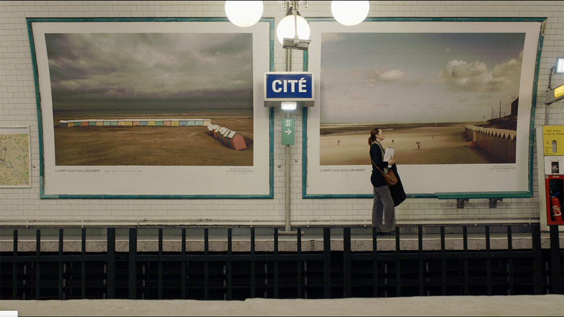
In 2017, 174 Harry Gruyaert Photographs were on view in eleven stations of the Paris Metro at the invitation of RATP, the Paris public transport operator. *Seen here in a still from the Harry Gruyaert: Photographer Documentary. Both of these Photographs may be seen in his recent book, Edges.

Really? Harry Gruyaert, who was born in Antwerp, Belgium in 1941, is one of the Photographers responsible for bringing color Photography to the mainstream Fine Art world, along with William Eggleston, Stephen Shore, Constantine Manos and others, after the early, pioneering though not as well known color work of Edward Steichen (going back to 1909!), Keld Helmer-Petersen, (in the 1940s), Saul Leiter and Fred Herzog (from the 1950s, on), and others. Harry was the subject of the recent Harry Gruyaert – Retrospective at FOMU Foto Museum in Antwerp, and the documentary film Harry Gruyaert: Photographer. He’s an Artist who’s work has appeared in eleven Paris Metro Stations and intriguing crops of his work have appeared on the cover of 68 Penguin Books Inspector Maigret detective novels by Georges Simenon. All of this is over and above the fact that he’s been a member of Magnum Photos since 1981 and is a former Vice President of the world’s foremost collective of Photographers.

What’s it going to take for some of these very accomplished Photographers to gain similar acclaim and following here?

The show’s entrance with Antwerp, Belgium, 1988, 13 1/8 x 19 3/4 inches. All prints in the show are Archival pigment prints; printed later.

Perhaps, in his case at least, the tide is beginning to change. Part of the reason Mr. Gruyaert hasn’t been better known here to this point may be that almost all of the PhotoBooks he released earlier in his career are long out of print making it very hard for anyone new to him to discover his work. Though I have had an interest in Mr. Gruyaert’s work, I’ve never seen any of his older books, like the legendary Morocco– even in rare book stores.

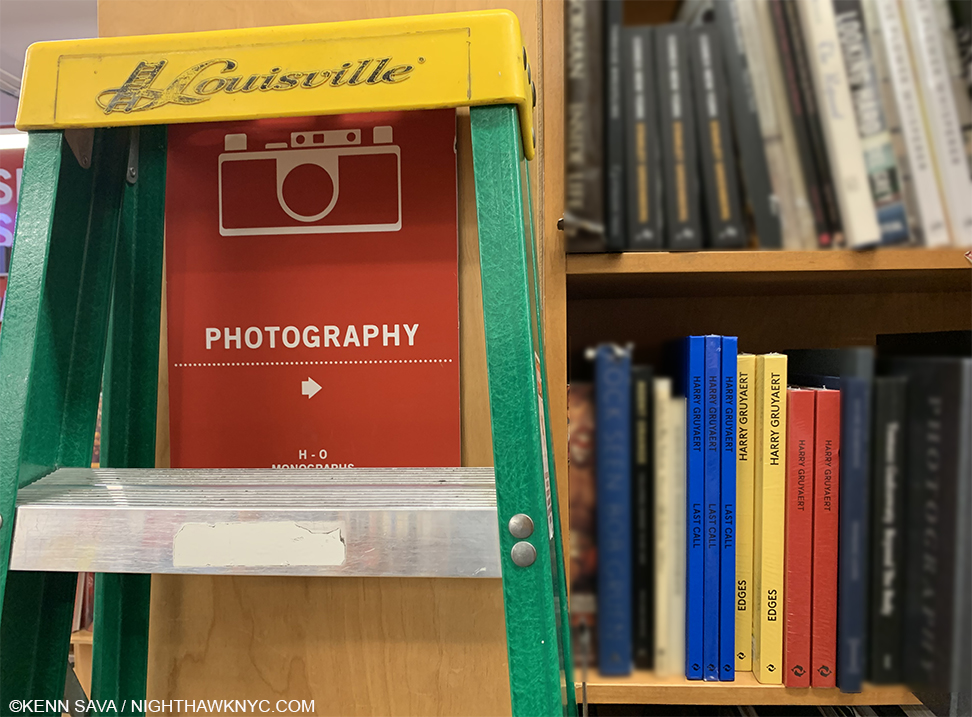
Blue, yellow and red- the colors of the covers of three of the most recent Harry Gruyaert monographs.

More recently, Thames & Hudson has released 4 new books over the past 5 years (Harry Gruyaert, 2015, a retrospective with the red cover, and best place to start exploring his work, the also excellent two-volume set East/West, 2107, Edges, 2019, and the just released Last Call, 2020), which are helping to bring his work back to the eyes of the PhotoBook world.

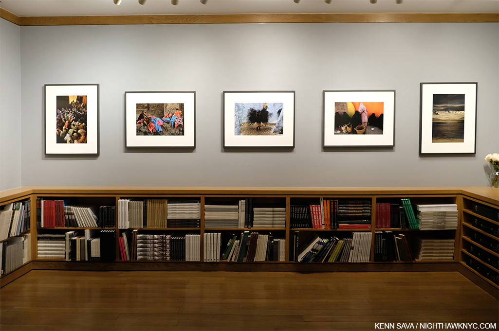
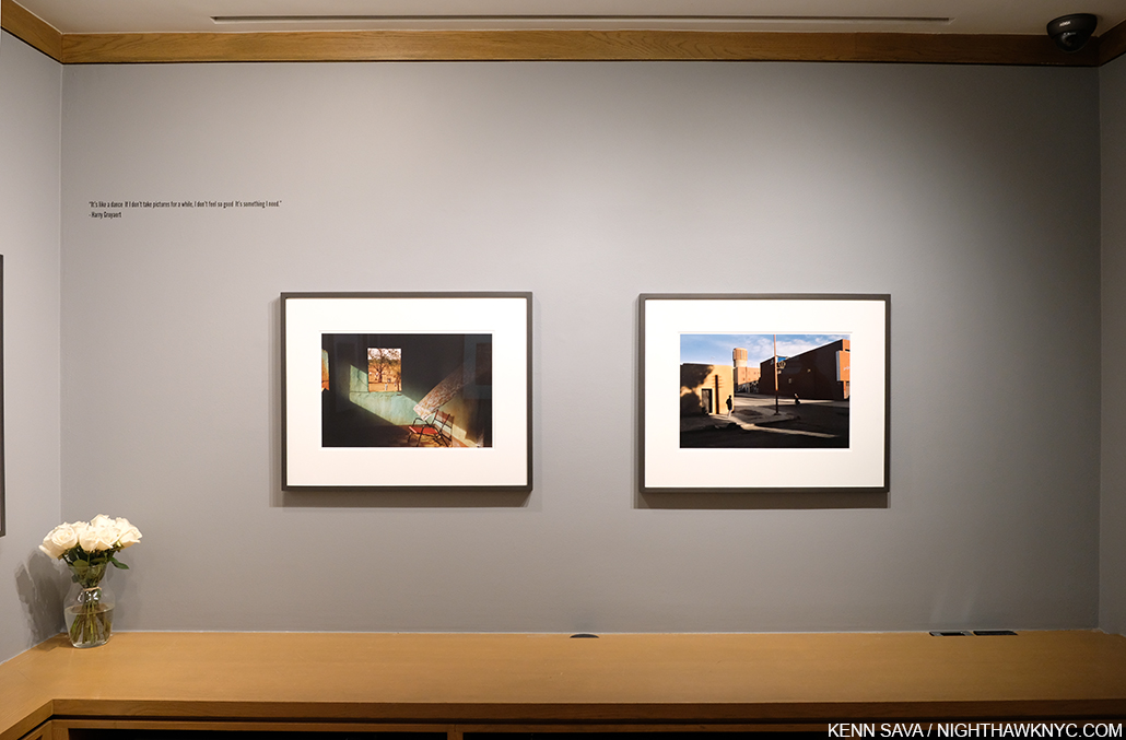
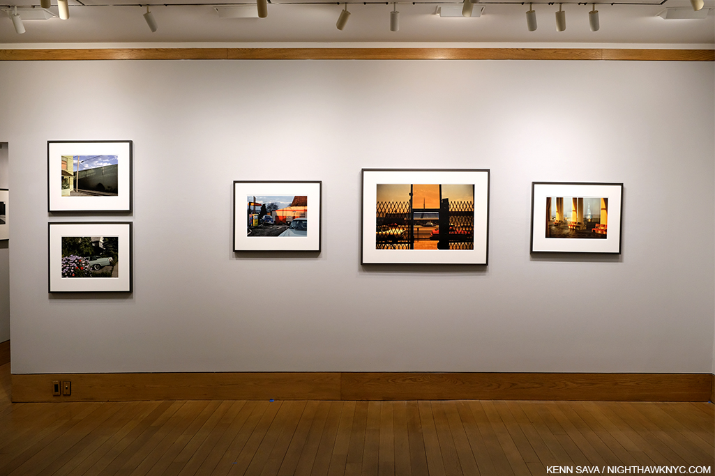
Harry Gruyaert at the Howard Greenberg Gallery, installation view. On the wall or in a book, Harry Gruyaert’s work tends to grab viewers at first sight.

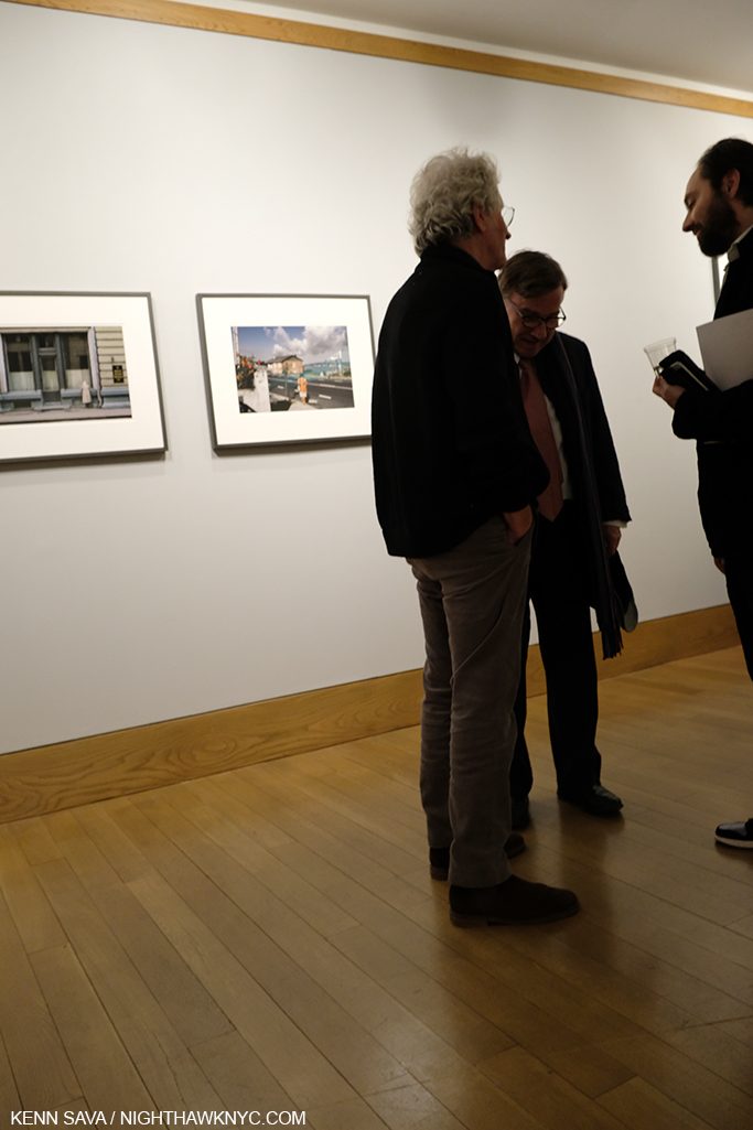
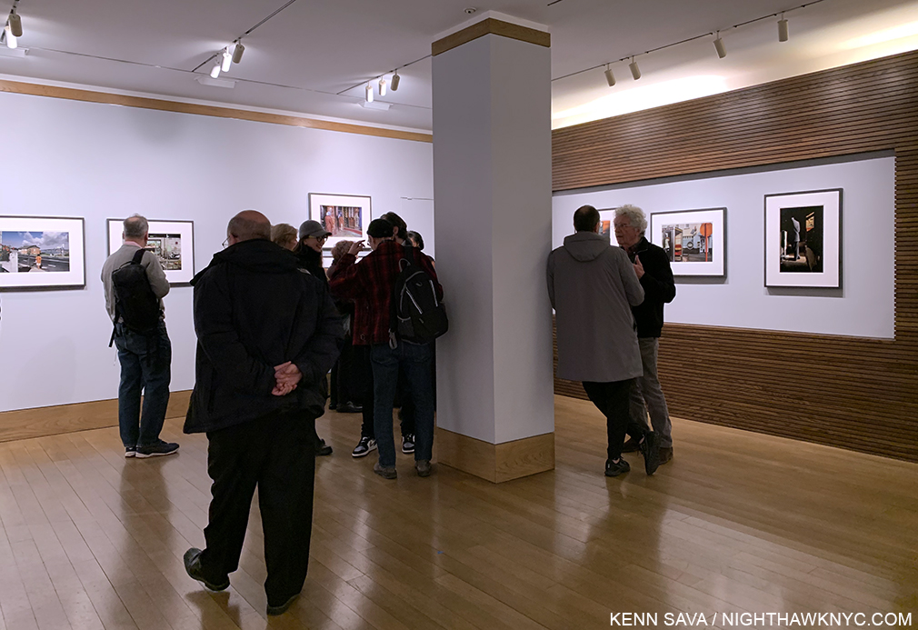
With Harry Gruyaert at the Howard Greenberg Gallery, his first show in the USA in decades, the next step has been taken. After our conversation  last year from Paris, I finally had the chance to meet Harry at the opening. There he was, with Roger Szmulewicz, Director of Gallery51, his European dealer, on January 23rd. Harry told me this was his first USA show since the release of Morocco, which was published in 1990! Then, in keeping with the spirit of Last Call, which he shot in airports, Mr. Gruyaert, still a frequent traveler, told me he was off to Japan in two days.

Harry Gruyaert, left, chatting with Roger Szmulewicz, Director of Gallery51 at the opening.

As I learned in our conversation last year, Mr. Gruyaert is a fascinating, multi-dimensional, man, who has had a remarkable career and life, which has been characterized by being in the right place at the right time, in the right light, as was to be seen in spades on the walls of Howard Greenberg.

Gao, Mali, 1988, 13 1/8 x 19 5/8 inches, left and the haunting Quarzata, Morocco, 1986, 13 1/8 x 19 3/4 inches, right.

Here and now, in the moment, a good many of Harry Gruyaert’s most familiar, and beautiful, pieces were on view.

Province of Brabant, near Wavre, Belgium, 1981, 13 1/8 x 19 5/8 inches

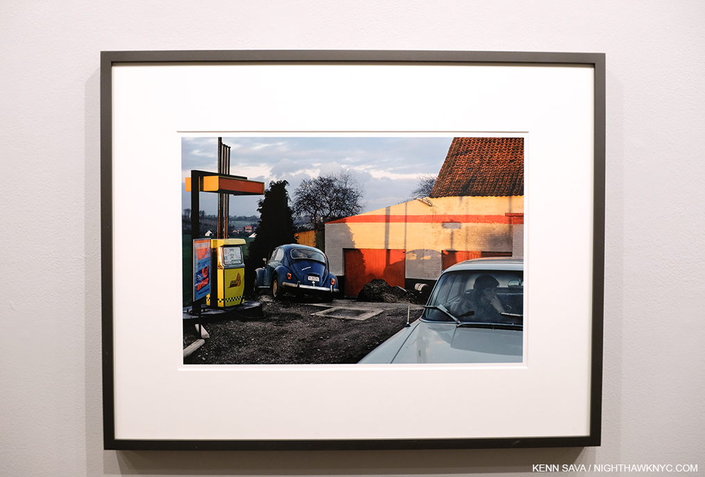
For me, the show felt like reuniting with old friends. Province of Brabant, near Wavre, Belgium, 1981, in particular has long been among my favorites. There’s so many levels to this composition- the colors and their interaction, the distant landscape, the play of geometric shapes and shadows, the jarring angle the VW Beetle sits at, and then you get to the woman sitting in the car. It’s like a still from a movie, an outtake from a Michelangelo Antonioni Film he never made. Mr. Gruyaert, a long-time fan of Michelangelo Antonioni, and a former TV Director early in his career, produced a film that showed clips from Antonioni Films interspersed with some of his Photographs in the show The Image to Come at Cinémathèque Française in 2009.

Installation view. To the right of center works from his East/West series hang next to each other. LA, USA, 1982, the larger piece and Ostend, Belgium, 1982, to its left.

A little known chapter in his distinguished career also saw him in the right place to document the work of the legendary Artist Gordon Matta-Clark during some of the semial years of that Artist’s career. Most of those shots, which are seen frequently when Mr. Matta-Clark’s work is discussed, don’t bear his name, since they now belong to Mr. Matta-Clark’s estate, but the fact that Harry was there at the right time, taking remarkable (black & white) Photos are yet another part of his legend.

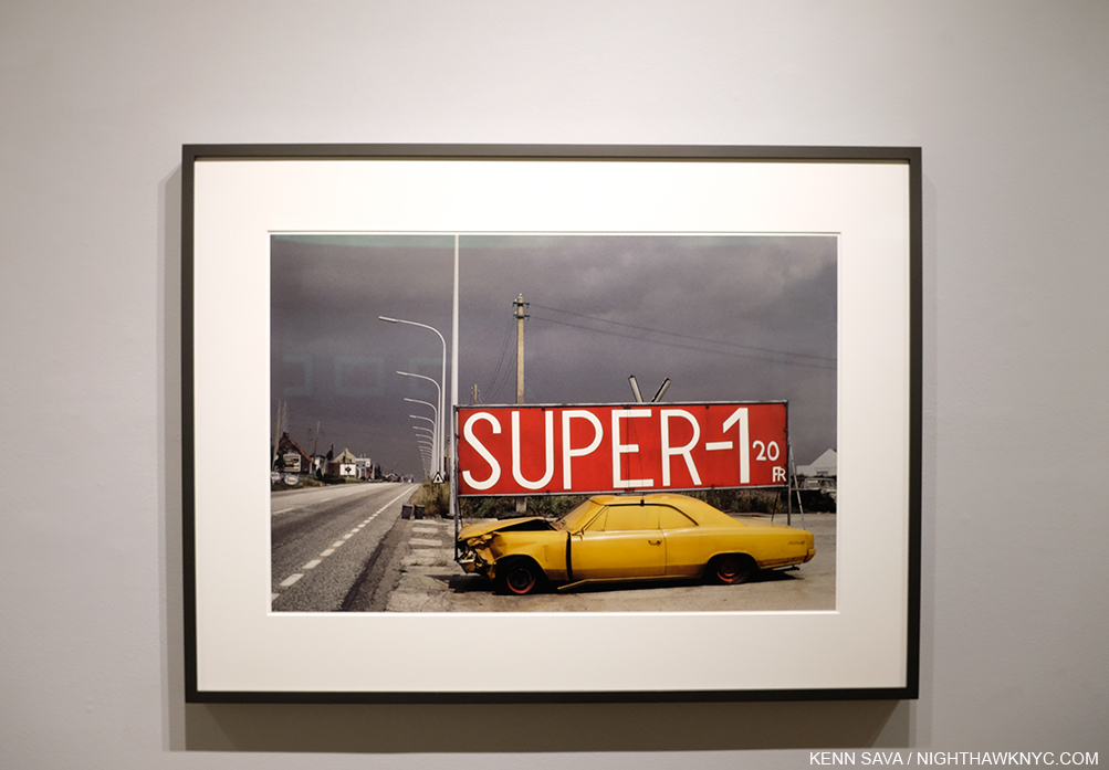
National Road #1, Boom, Province of Antwerp, Belgium, 1988, 20 7/8 x 31 1/2 inches

With such a long and distinguished career to dip into to mount shows from, here’s hoping there will be cause for many more Harry Gruyaert sightings on this side of Planet Earth.


Harry Gruyaert, far right, at the opening.

In person, in living color.

*- Soundtrack for this Post is “East West” by Morrissey from Kill Uncle.

NighthawkNYC.com has been entirely self-funded and ad-free for over 6 years, during which over 250 full length pieces have been published. If you’ve found it worthwhile, you can donate to keep it going & ad-free below. Thank you!

Written & photographed by Kenn Sava for nighthawknyc.com unless otherwise credited.
To send comments, thoughts, feedback or propositions click here.
Click the white box on the upper right for the archives or to search them.
For “short takes” and additional pictures, follow @nighthawk_nyc on Instagram.

Subscribe to be notified of new Posts below. Your information will be used for no other purpose.


Art- With A Capital “A”

For The Record #1. First part of a series.

Written & Photographed by Kenn Sava

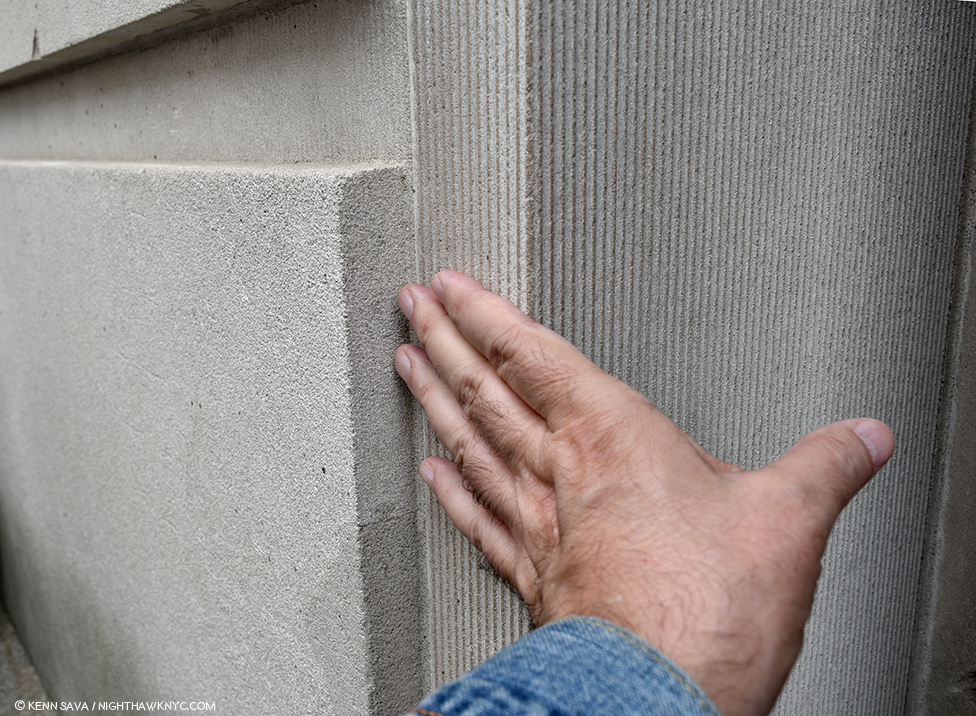
Back at The Met, May 6, 2018. The Museum, as it’s referred to, is one of the world’s great repositories of Art with a capital “A” with collections covering 5,000 years of it from all cultures in all its forms. It’s also one of the very best things about living in NYC. No. It’s THE best thing in my opinion. 1,700+ visits in since August 1, 2002, every time I turn the corner and see the building looming in front of me, I still get a chill down my spine. I touch the corner as I go in each time as a way of saying “Hello” to an old friend and to give thanks for each and every opportunity I get to do so.

To mark the 4 and a half year Anniversary of NighthawkNYC, during which I’ve published 225 pieces in 240 weeks (Phew…), I thought I’d take the opportunity to set the record straight on a few things that I feel are at the core of what I believe, and what I’ve written here. Perhaps I should have “explained” them at the beginning instead of letting those who’ve read these pieces (for which I Thank You) wonder, “What the heck?” Well, better late than never. Herewith the first installment in a brief series called For The Record. Consider them “footnotes” or “addendums” to every piece I’ve written.

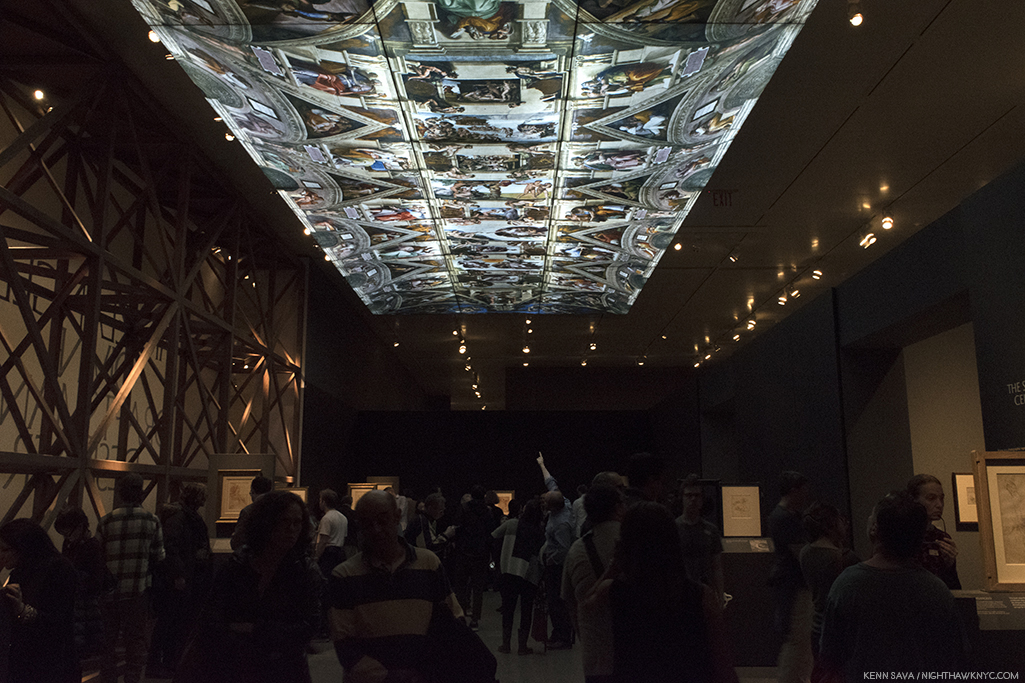
Michelangelo’s Sistine Chapel Ceiling reproduced as part of The Met’s staggering Michelangelo: Divine Draftsman & Designer, 2017-8, one of the sublime experiences of my life.

First- Art is of one of man and womankind’s supreme accomplishments in my view. I believe there should be some distinction between the Art of someone like Michelangelo and, say, the art of someone learning (said with all due respect).

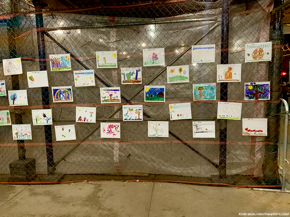
Various young artists, unknown titles. A display of children’s art beautifying an NYC public school under renovation.

That’s why I capitalize Art and its associated terms (Artist, Painter, Sculptor, Musician, Painter, Photographer, et al.). It’s my way of showing these people the respect I think they’ve earned and deserve. I’ve done this here since Day 1- July 15, 2015, and I’m sure there are some who frown at me for doing it, and some who disagree with me for doing it. Along the way, I’ve seen a few others doing it this way and frankly, I’m surprised it hasn’t become more widely adopted. I hope it does soon.

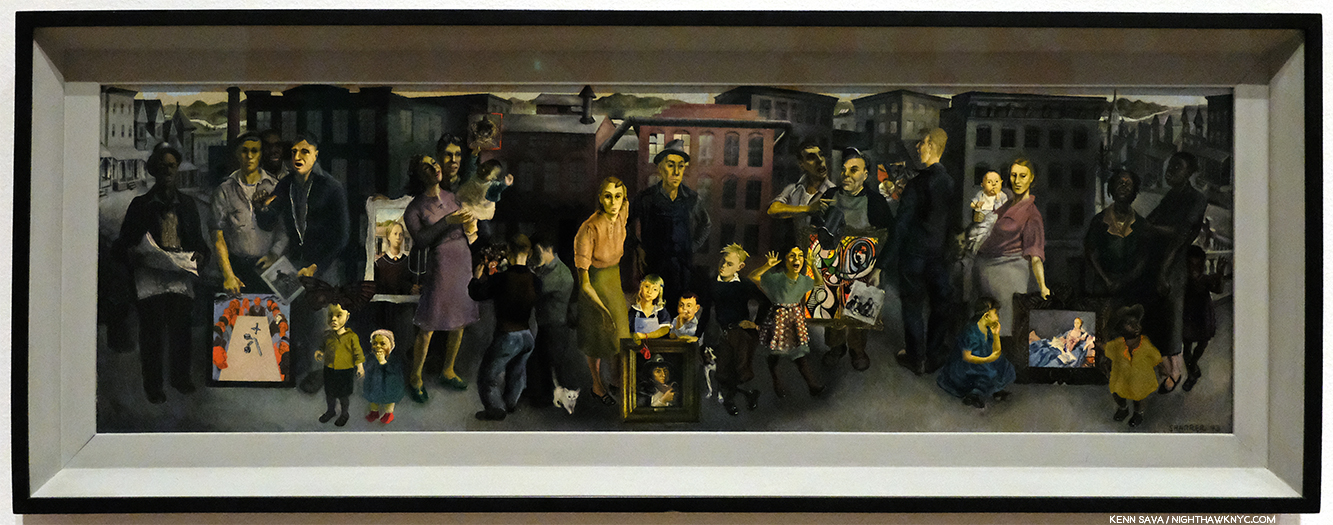
The terrific, and terrifically overlooked, Honore Sharrer’s, Workers and Paintings, 1943, Oil on board, seen at MoMA. Some of the Art she includes are Grant Wood’s American Gothic, Picasso’s Girl before a Mirror, and others by Jean-Francois Millet and Diego Rivera. Though this work and the originals of most of what she includes in it are 100 years old, +/-, for me, this and all of them are Art. Will the future agree? Time will tell…

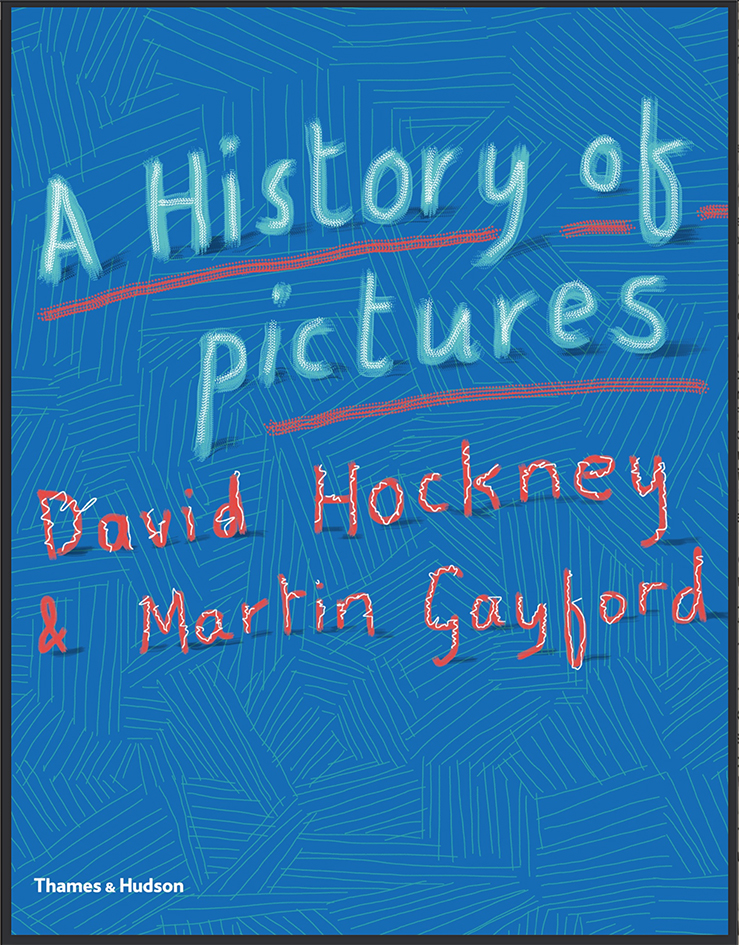
“What makes a work of art? I don’t know. There are lots of people who tell you they are making art. Maybe some of them are, but I’m not sure that’s true for all of them. Perhaps I’m old fashioned, but that’s not a phrase I would use. I’d prefer to say I’m making pictures – depictions.” David Hockney, A History of Pictures, with his capitalization, eBook P.2.

I’ve held David Hockney’s writings, and ideas, in the highest regard since his revolutionary, and eternally controversial, book Secret Knowledge came out in 2001, but I find it cumbersome to use the word “pictures” here in place of “Art.” Regarding what “makes a work of art?,” as he asks, it seems to me that it takes hundreds of years for the dust to settle on what’s being created in our time and for something, a “picture,” as Mr. Hockney says, to be considered “Art” (IF it continues to speak to people). None of us will be around when that bell rings. So, in the meantime, I’ve opted to use the term Art, capital “A,” respectfully, applying it to all working Artists, present or past.

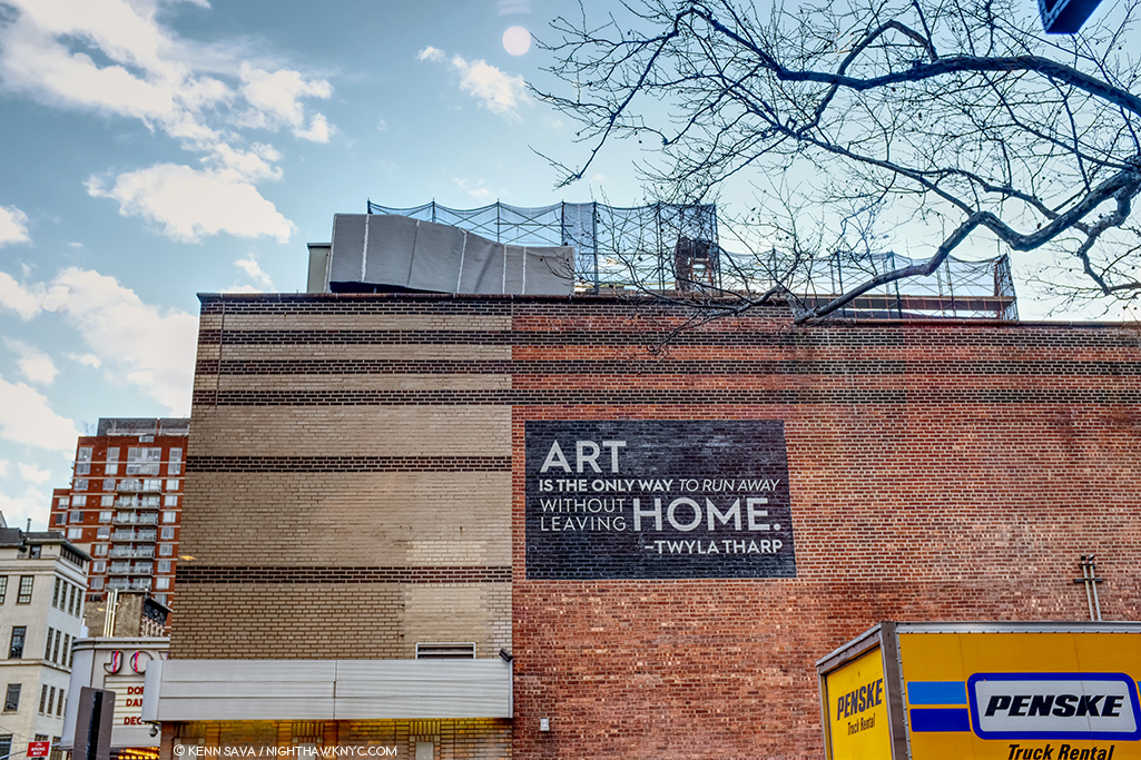
Thanks, Twyla. I couldn’t have said it better. And so, this scene has appeared in my Banner, sans moving truck, for the past year. If that truck is waiting for me, it may have a long wait. I haven’t been out of Manhattan overnight since February 4, 2012. The Joyce Theater, December, 2019.

The other reason I do it is because Art is my religion. Frank Lloyd Wright, who I consider to be an “ultimate Artist,” capitalized Nature since it was his religion. Art is mine.

Reach out and touch faith. For me, going to The Met is going to church, as I said early on. At this point in my life, it feels like Home. Back Home, again, late on December 22, 2018. Weather be damned. It’s always beautiful inside.

*-Soundtrack for this Post is ”Personal Jesus” by Martin L. Gore of Depeche Mode, from their 1990 album Violator. They perform it here on Letterman

For The Record is a series of pieces that are about key/core subjects & beliefs that underly everything else I’ve written here.

NighthawkNYC.com has been entirely self-funded and ad-free for over 6 years, during which over 250 full length pieces have been published. If you’ve found it worthwhile, you can donate to keep it going & ad-free below. Thank you!

Written & photographed by Kenn Sava for nighthawknyc.com unless otherwise credited.
To send comments, thoughts, feedback or propositions click here.
Click the white box on the upper right for the archives or to search them.
For “short takes” and additional pictures, follow @nighthawk_nyc on Instagram.

Subscribe to be notified of new Posts below. Your information will be used for no other purpose.


A Year of Art: 2019

Written & Photographed by Kenn Sava

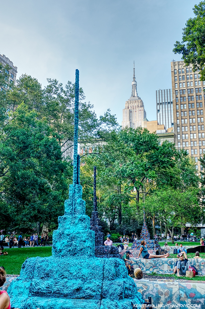
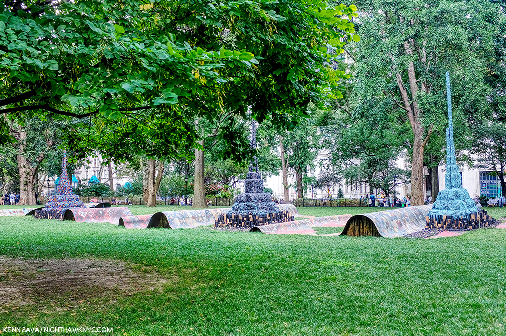
Detail of Leonardo Drew’s Public Art project, City in the Grass, 2019, seen in August in Madison Square Park, where it was on view from June through December. In conversation, Mr. Drew spoke of the influence of Indian Stupas, though the Empire State Building 10 blocks behind, might be one as well.

A strange year in Art in NYC ended a few weeks ago. A year that saw one of Manhattan’s “Big 5” museums (MoMA) close for four months, including the entire summer, while it remodeled, then reopen to mixed reviews (mine among them), while another one (The Whitney) faced an Artist revolt mid-Biennial, another (The Met) had what seemed to me to be a fairly “quiet” year on the show front as it adapted to the first full year under its new Director, Max Hollein, while the other two, the New Museum and particularly the Guggenheim, chugged along presenting top notch show after top notch show. Meanwhile, no less than 5 shows of the work of Jean-Michel Basquiat were mounted around town, and though I wrote a series of pieces on them I still don’t know “Why now?” While I’ve written about a number of other shows I found particularly NoteWorthy in 2019, already, there were some other excellent shows that linger in my mind, in the space freed up by the plenty of others that do not. If I were to sum of the year in Art seen, I will remember it as a year where Sculpture, long a very overlooked medium, though not here, struck back and broke through.

NoteWorthy Sculpture Shows-

Lingering closest to the front of my mind is the incredible Sarah Sze at Tanya Bonakdar Gallery, which I just wrote about, along with Jean-Michel Basquiat at The Brant Foundation, the most unforgettable shows I saw in 2019.

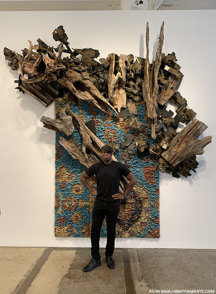
Leonardo Drew poses in front of Number 217, 2019, Wood, plaster and paint, on the last day of his show at Galerie Lelong, August 2, 2019

Leonardo Drew at Galerie Lelong and City in the Grass at Madison Square Park. Mr. Drew has achieved substantial success around the world, with work in the Permanent Collections of any number of museums, including The Met’s, yet he still seems to be something of a “well-kept secret” to the larger Art public. One of the most original, interesting and visionary Sculptors working today, I thought his show at Galerie Lelong was close to perfect.

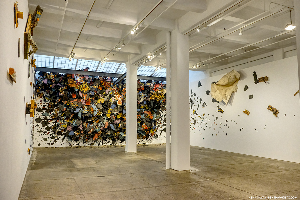
Number 215, 2019, Wood, paint and sand.

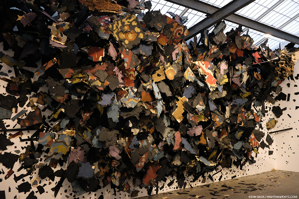
As with Sarah Sze, the show marked the introduction of Painting by the Artist, though not in the “traditional” sense. The Artist told me Number 215 began as a Painting (his), which he then deconstructed as if it had exploded.

Detail. The show also introduced color into Leonardo Drew’s work.

One monumental work in the large gallery accompanied by five others in the remaining space, each one selected with supreme taste to provide a wonderful group. While his show was up, Mr. Drew also debuted his first Public Art piece, a work commissioned for Madison Square Park.

City in the Grass seen on a day when the lawn was closed to be rested from the non-stop traffic it had been receiving. At the base of each of the three “Stupa”-like structures were wooden “cities” rendered in Mr. Drew’s typically extensive detail to the point that, up close, you could literally spend hours moving through them with your eyes.

In all my years of living in the City, and living here with Public Art, I’ve never seen a piece that was so quickly adopted by the public. Kids endlessly climbed all over it while their parents and other adults languished on other parts of the gigantic piece, as can be seen in the first picture above. Mr. Drew appeared in the Park at least twice to speak about the work and proved to be an extremely thoughtful speaker.

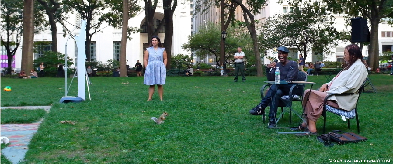
Such was the public acceptance of City in the Grass that even one of the Park’s permanent residents came by to hear the Artist speak about it in a public talk, with renowned writer (and Miles Davis Autobiography co-author) Quincy Troupe, right, on September 11, 2019.

In terms of precedents or influences, Thornton Dial and Jack Whitten (who rented space to Mr. Drew early on the Artist told me) come to mind, but not really. Leonardo Drew is an original. Before he’s done, many decades hence, I believe his work is going to wind up in as many museum as just about any other Sculptor of his generation. 

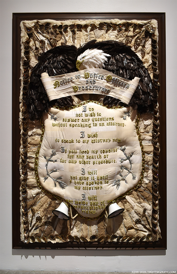
Nari Ward, Homeland Sweet Homeland, 2012, Cloth, plastic, megaphones, razor wire, feathers, chains and silver spoons, 96 x 60 inches. Along with everything else going on in this, the detail is incredible.

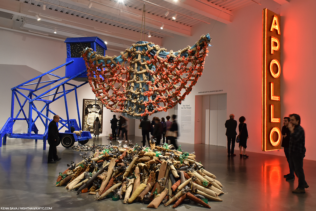
Nari Ward: We The People at the New Museum- Since the 1990s Nari Ward has been repurposing a very wide range of mundane, even humble, materials, often in staggering amounts, in new, surprising and exciting ways. We The People was another long overdue retrospective of the work of this exceedingly creative Artist.

Installation view of part of one of the three floors the show filled.

Occupying multiple floors of the building each work was strong, different from the one before, and shared an uncommon ability to linger in the mind. Another blockbuster show mounted by the terrific team of Massimiliano Gioni and Gary Carrion-Murayari for the New Museum, which continues to rise in stature in my eyes.

Installation view of the 2nd of 3 galleries.

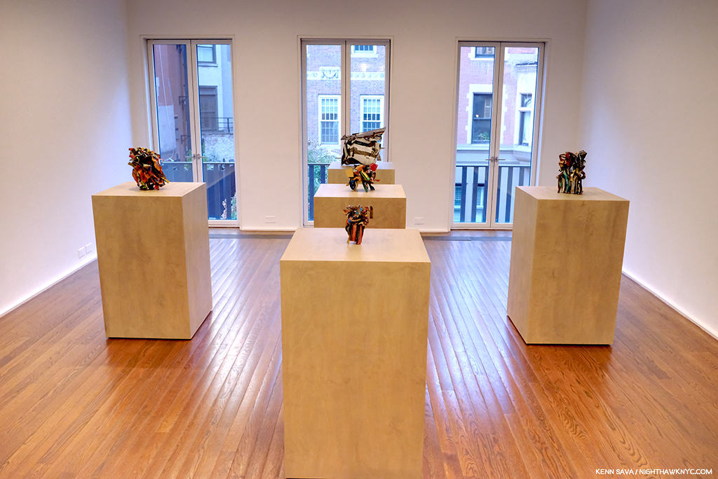
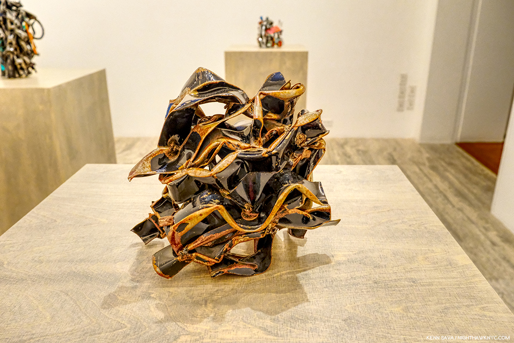
John Chamberlain: Baby Tycoons (with Eva Hesse Drawings) at Hauser & Wirth, East 69th Street- Lesser known work by two ground breaking, unique Artists/Sculptors, both no longer with us were paired in a beautifully installed show at Hauser & Wirth’s uptown outpost. While Ms. Hesse’s Drawings provided a fascinating insight into her career and process, Mr. Chamberlain’s gorgeous small works completely enthralled me.

While his classic larger pieces can look completely “accidental,” his smaller work shows the incredible attention to detail that he brought to bear in all of them. 

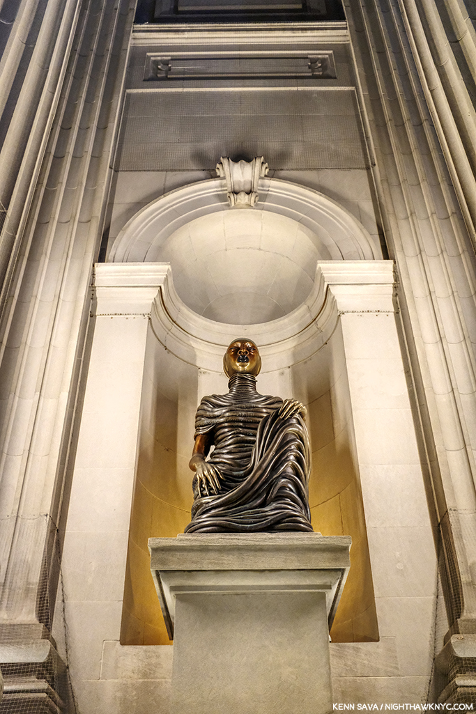
Wangechi Mutu, The NewOnes, will free Us, The Facade Commission outside The Met, 5th Avenue- The 5th Avenue Richard Morris Hunt Facade has long been a sore point for me. We’ve been living with it as it is for so many of its 117 years that most visitors fail to realize it remains unfinished! Being Landmarked, having neighbors and being in Central Park has kept TM from finishing what was started back 150 years ago and reached this form in 1902. I pray that one day they’ll be allowed to. It’s not like sticking a brand new pyramid in front of it! It’s just completing the existing facade. So, this year I was pleasantly shocked to see they found an extremely creative and Artful partial workaround. The Facade Commission as they call it bring us 4 terrific bronze Sculptures by Wangechi Mutu titled The NewOnes, will free Us that look superb in the heretofore empty niches outside facing 5th Avenue. On view 24/7 through this June 8th, don’t miss them on your next visit. 

As the year ended, all of this left me wondering- Are we in a “Golden Age of Contemporary Sculpture”?

Elsewhere, among the shows I haven’t written about-

NoteWorthy Painting Shows-

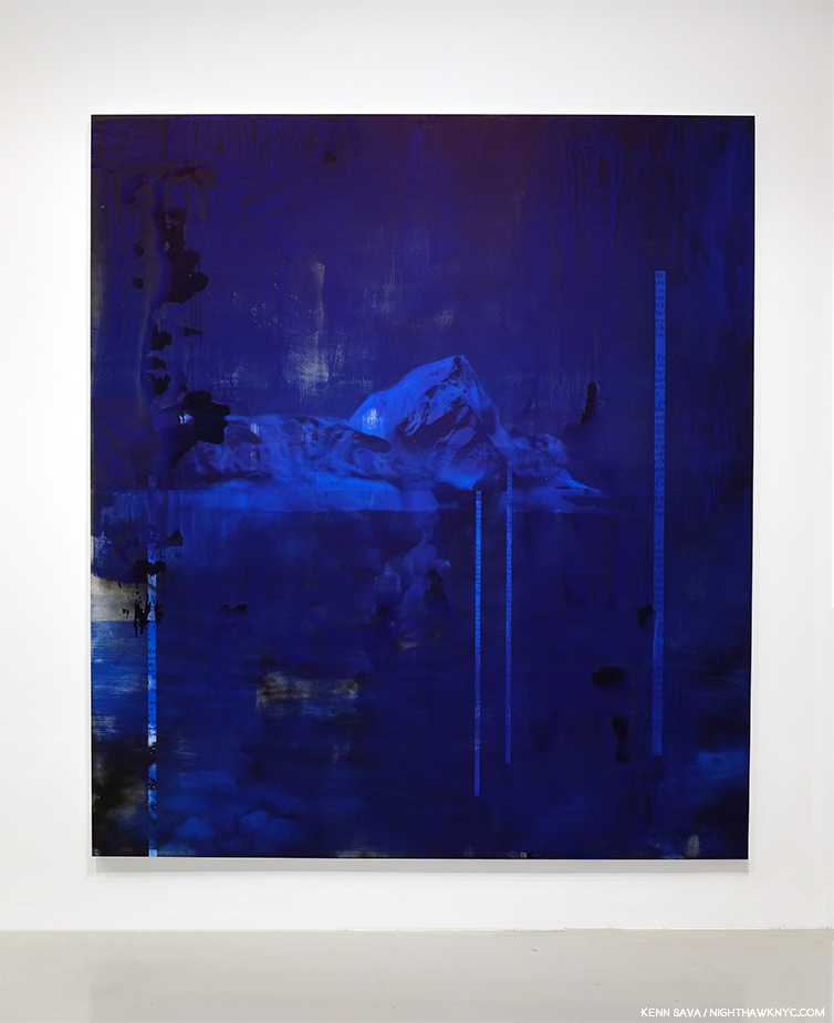
Lorna Simpson, Darkening, 2018, Ink and screen print on gessoed wood, 108 x 96 inches.

Lorna Simpson: Darkening at Hauser & Wirth, West 22nd Street- To this point I’ve been familiar with Ms. Simpson’s Photographs, works on paper and collages, but these Paintings came as a shock. Innovative, fresh, haunting, beautiful, the show felt like it came out of the blue, but I’m sure it didn’t. It struck me as a breakthrough. I returned to see it a few times and when it was over I was surprised it hadn’t received more attention than it got, and left me very much looking forward to see where she’s taking this next.

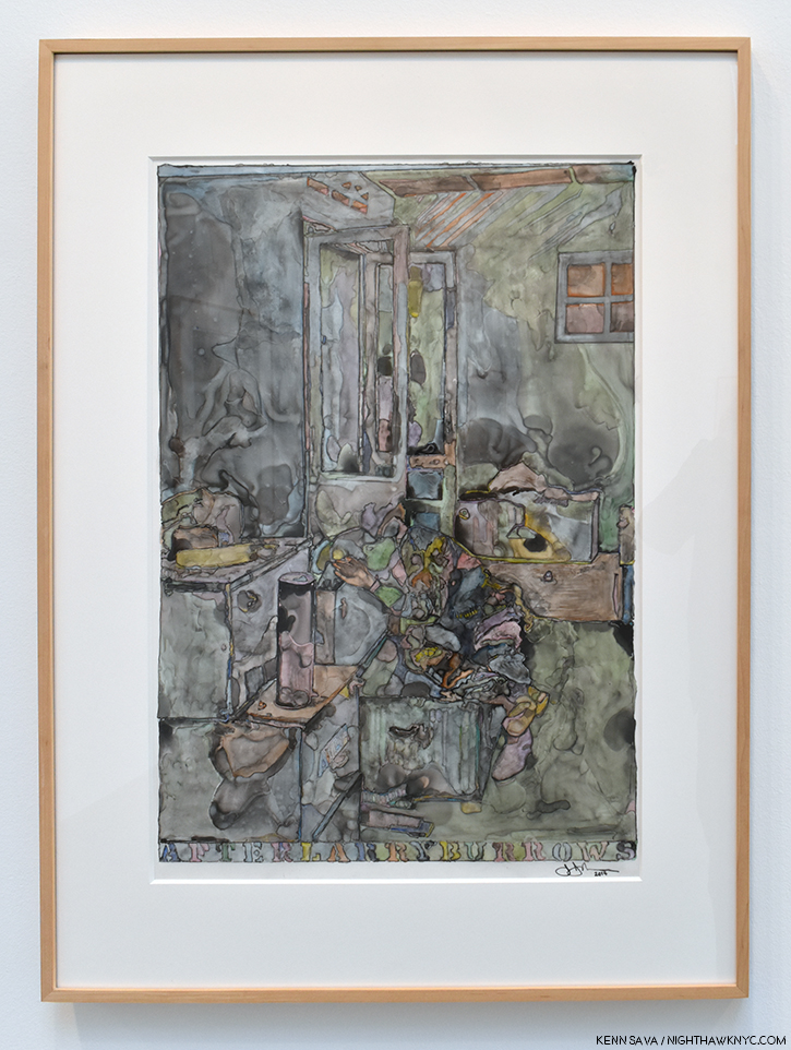
Jasper Johns, After Larry Burrows, 2014, India ink and water-soluble encaustic on plastic, 32 x 24 inches, one of a series of terrific works by the Artist based on this Photograph.

Jasper Johns: Recent Paintings & Works on Paper at Matthew Marks- Though he turns 90 in May, and a Retrospective is on the Whitney calendar, don’t begin to think Jasper Johns is done. One of the last Artists left to us (along with Susan Weil) from his group that included Robert Rauschenberg, Cy Twombly, Merce Cunningham, John Cage, Willem deKooning, et al, I didn’t know what to expect when I walked into Matthew Marks to see this show of recent works. I left determined to return as often as I could before it closed. I’ll admit that I haven’t followed Mr. Johns career as closely as I followed his one time close associate Robert Rauschenberg, who has had a major influence on the way I see the world, but it sure seems his work has continued to evolve and I, for one, found new surprises in this remarkable show. Too old to be drafted for the Vietnam War he was nonetheless deeply effected by it, as everyone living in this country at the time couldn’t help but be. A number of the works Mr. Johns showed were based on an extraordinary Photograph taken by Larry Burrows in Vietnam, a war that tragically produced too many indelible images, called Farley Breaks Down. Among countless others, Larry Burrows, also, lost his life in the war in 1971. While Photography has been the basis of countless Paintings, in these it was most subtle, almost like a memory, complete with the “haze” of camouflage-like coloring, yet its power was undiminished. Seeing these brought to my mind that one of the things that brought Mr. Johns wide attention early on were his Flag Paintings in the late 1950s.

Henry Taylor’s Mural at Blum & Poe, September 24th- before he modified it.

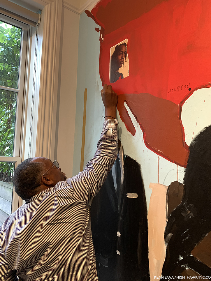
Henry Taylor: NIECE COUSIN KIN LOOK WHO LONG IT’S BEEN at Blum & Poe- It’s been 2 years since Mr. Taylor’s “New York Moment,” as I called it, when his mural debuted on the High Line concurrently with his being one of the “stars” of the 2017 Whitney Biennial, given both his prominent placement with a large work in the lobby on the 6th floor and an entire gallery he shared with his friend, Deana Lawson. His first solo show since showed that not even hip trouble, which sounded serious, could keep the Artist from traveling and continuing to work.

Henry Taylor uses my pen to modify his mural seen above, September 24, 2019.

The opening was highlighted, for me, by meeting Mr. Taylor, who proceeded to borrow my pen to modify the largest works in the show right in front of my eyes, and later proceeded to inscribe a message on the wall in the garden. Mr. Taylor seemed in fine form, not showing any lingering effects of his ailment and the work on view was classic Henry Taylor. A number of visitors approached Mr. Taylor asking for him to sign his recent monograph. I couldn’t help notice that he seemed to Draw in each book, something that indicated to me he’s another Artist who can’t stop Drawing. Of course, in my copy, he appended a sketch of my pen.

The social revolution… Installation view.

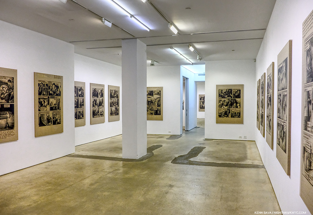
Meleko Mokgosi The social revolution of our time cannot take its poetry from the past but only from the poetry of the future and Pan-African Pulp at Jack Shainman Gallery, West 20th, West 24th Street, and The School, Kinderhook, NY- The now Brooklyn-based Artist is so prolific his latest work occupies no less than THREE of Jack Shainman’s spaces, including the entirety of The School in Kinderhook, NY, out of reach for this writer.

Pan-African Pulp installation view. In this series, Mr. Mokgosi uses source images from the 1960s South African photo-novel Lance Spearman “to examine the history of pan-Africanism.”

The two Chelsea shows I was able to see are marked by remarkable, continued, growth leading me to feel that Mr. Mokgosi is yet another Jack Shainman Artist, like Kerry James Marshall before him, on his way to museum collections. 

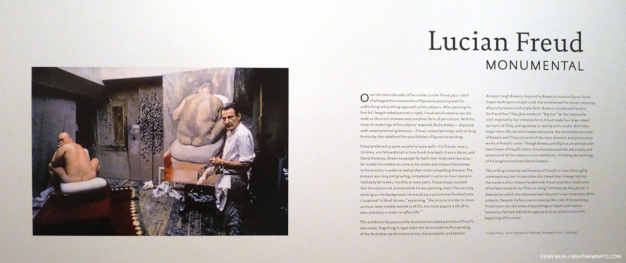
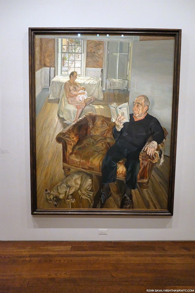
Lucian Freud: Monumental at Acquavella Gallery and Francis Bacon’s Women at Ordovas- Two shows that barely made the cut, with both ending in early January, served as a reminder that I didn’t really need of the fact that both Painters, one time friends, are towering figures in 20th century Art who’s influence remains strong. I couldn’t help wonder how the Freud show benefitted by the presence of legendary former Metropolitan Museum Director, Philippe de Montebello, now a Director of Acquavella Gallery, right across the street from his former and long-time 1000 Fifth Avenue home.

The show featured Mr. Freud’s nudes, emphasizing his extraordinary way of Painting flesh, the aspect of his work that has long fascinated me as much as any other. Here, the only clothed figure in the show.

Regardless, it was an exemplary, concise, museum quality gallery show of the work of an Artist who hasn’t had a show here in too long.

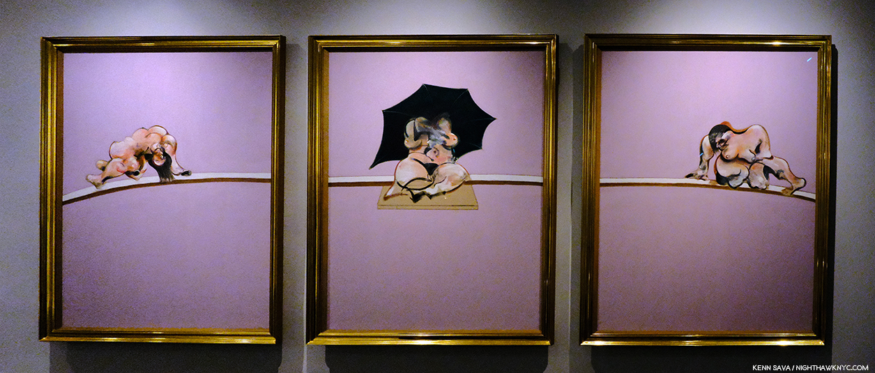
Among many other things, Francis Bacon reintroduced the Triptych to Painting.

Nearby, Bacon’s Women, a subject I can’t say I’ve ever heard broached before, was a revelation. The surprising concept was beautifully executed and mounted in Ordovas’ classic East 77th Street townhouse. Francis Bacon has proved to be an Artist who’s accomplishment has only grown more and more interesting and relevant as time has passed, and so, the rare chance to see some of his lesser seen work was not to be missed.

NoteWorthy Drawings Shows-

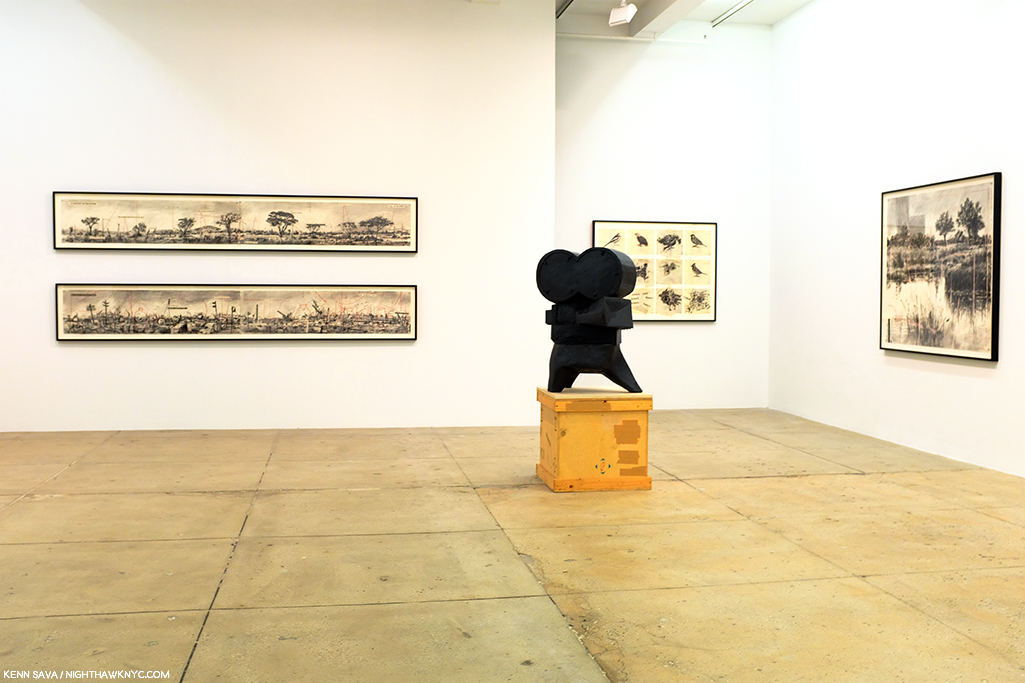
Installation view.

William Kentridge: Second-hand Reading at Marian Goodman- The legendary South African Artist returned to NYC with what seemed to me to be more innovations in his unique and powerful Drawings, along with a selection of his equally unique Sculpture, and Film, shown in the room behind his Projector Sculpture, above.

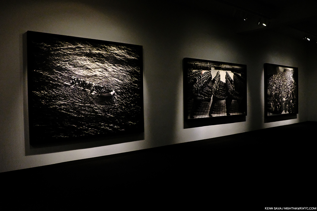
Installation view of 3 of the 7 monumental charcoal Drawings, yes Drawings, in the show by a contemporary master of the medium. Mr. Longo  told me it took 6 months to create the one on the right, 8 months for the one on the left.

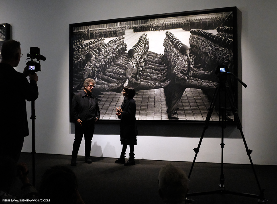
Robert Longo: Fugitive Images at Metro Pictures- During his Artist’s talk in the gallery on January 11th, Mr. Longo broke down discussing one of his pieces with Nancy Spector, Artistic Director of the Guggenheim Museum. I came away even more impressed with the Artist, who’s work I already hold in high esteem.

Robert Longo in conversation with Nancy Spector, Artistic Director of the Guggenheim Museum in front of a Drawing of North Korean soldiers.

Not one to miss a perfect segue…If I had to single out one person who had a great year in NYC Art in 2019, it would be Nancy Spector, who, along with her team, produced a steady string of very good shows at the Guggenheim, continuing their run these past few years, a number of which I’ve written about.

NoteWorthy Photography Show

Vik Muniz: Surfaces Installation View. These are called multimedia. A close look reveals the numerous layers of each work in which Mr. Muniz reinterprets 20th century abstract Paintings to fascinating effect. Garden Design, after Roberto Burle Marx, Pierrot, after Willys de Castro, Composition/Space, after Cicero Dias, Surfaces, 2019, Multimedia, left to right.

Vik Muniz: Surfaces and Museum of Ashes at Sikkema Jenkins & Co- Looking through the two volume Vik Muniz Catalogue Raisonne, the first thing that strikes me is that it’s arranged in sections according to the technique he used, something I can’t say I’ve seen before, and something even more remarkable when you consider that a good number of these techniques he invented. Along the way, he’s already created a substantial body of memorable pieces, which have gained him worldwide recognition.

Detail of the layers of Garden Design, after Roberto Burle Marx. As a result, each piece is unique.

He was at it, again, adding yet two more innovations, in his remarkable two part show at Sikkema Jenkins & Co. Beyond his endless inventiveness, technique being a means to an end, the results have continued to resound. No mean feat when you consider that one part of his show was based on famous masterpieces of Painting, above, in the Surfaces section of the show, the other based on “resurrecting” Art works lost in a fire, turning their very ashes into recreations, in the Museum of Ashes section. Surfaces was based on Paintings by Arthur Dove, Hans Hoffman, Stuart Davis, Carmen Herrera, Ellsworth Kelly, Marsden Hartley and Romare Bearden, among others, adding a new dimension to the perception of each of these works. Daring!

Vik Muniz recreated works from the Museu Nacional from their very ashes! Here he recreates its facade. Museu Nacional, Museum of Ashes, 2019, Archival inkjet print.

On September 2, 2018, the entire Museu Nacional in Rio de Janeiro burned to the ground, including all its collections amassed over the past 200 years. The museum was Muniz’ favorite cultural institution in the city, a place he visited often with his children. On the wall card to this section, Mr. Muniz said, “I cried upon learning of the fire as if I had lost something personal, some kind of string that held the insanity of my present together.”  The Artist proceeded to work with the archeologists sifting the ashes of the building and its contents and was provided with ashes and the exact location they were found.

Beetle, Museum of Ashes, 2019, Archival inset print.

He proceeded to reconstruct some of the objects that had been lost- in ash, which he then Photographed. The results speak for themself, and, amazingly, echo what has been lost.

As 2020 gets underway, there would seem to be a bit more stability on the horizon, but not entirely. Change, after all, is the only constant in the universe. The protests at the Whitney resulted in board resignations, and MoMA plans to be open for the full year, as far as I know now. Art in NYC, 2020, however, will already be remembered for two memorable events. The Met marks the 150th Anniversary of the opening of its iconic 5th Avenue location this year- with a closing. 2020 will also be remembered as the year the short-lived Met Breuer closed.

*- Soundtrack for this Post is “Restless Farewell” by Bob Dylan from the timeless The Times They Are A-changin’, 1964.

NighthawkNYC.com has been entirely self-funded and ad-free for over 6 years, during which over 250 full length pieces have been published. If you’ve found it worthwhile, you can donate to keep it going & ad-free below. Thank you!

Written & photographed by Kenn Sava for nighthawknyc.com unless otherwise credited.
To send comments, thoughts, feedback or propositions click here.
Click the white box on the upper right for the archives or to search them.
For “short takes” and additional pictures, follow @nighthawk_nyc on Instagram.

Subscribe to be notified of new Posts below. Your information will be used for no other purpose.


NoteWorthy PhotoBooks, 2019. And others

Written & Photographed by Kenn Sava

Three years in to my “deep dive” into the world of Modern & Contemporary Photography and PhotoBooks, I find myself at a crossroads. I’ve seen thousands of books, hundreds of Photography shows. I’ve answered most of the questions I had going into this exploration about Photography and its place in the larger Art world. Of course, there will always be more to see and more to learn. The joy of discovering a new (i.e. one previously not known to me) and terrific Artist continues to drive me. Though this past year this was balanced with something else. Frustration. Increasingly, I’m left with one inescapable feeling-

There are too many books!

Time and time again, I find myself holding a book with only one thought in my mind before I finish paging through it. “WHY was this book published??”

Paging through one of these becomes a mind-numbing blur…

99.5% of the time this happens to me with a “name” Photographer. The net result is wonder- I wonder what the process was that got this project to the point where I’m holding it in my hand. What was the publisher thinking? Who edited this material? Did anyone give ANY thought to the fact that at the end of the day, in many of these cases, only the historians are going to remember this book and they are going to use it when they assess said Photographer’s larger body of work, and it’s then going to serve to diminish his/her overall accomplishment.

With this looming on my mind, early this fall I had a dream. I dreamt the large PhotoBook publishers in the world took a year off during which they released no new books. Instead, they focused their efforts on making the public more aware of their existing, already published, PhotoBooks…particularly the really good ones that come out and quickly become afterthoughts when their next batch comes out.

But, wait. A REALLY good PhotoBook doesn’t have an expiration date! It continues to speak to those who pick it up indefinitely.

Before the crush. Early Saturday, September 21st in one of countless rooms at the New York Art Book Fair at MoMA PS1. In the afternoon, this room was so crowded I wouldn’t have been able to move my arms to get this shot.

Meanwhile, back in the hard light of the day, none of what I’ve said above applies to smaller PhotoBook publishers. For most Photographers, getting a PhotoBook published is the only way their work can be seen beyond their immediate circle. As a former (and soon to be again) independent Jazz record producer, I can relate to their realities. Some live from book to book, hoping to break even so they can release their next book. Others, like Michelle Dunn Marsh & Minor Matters, are using new models to realize books by making sure readers want them. And? A good many of the small PhotoBook publishers, like Kris Graves Projects, routinely sell out of their titles. This spring, during a chat with one of the most respected European PhotoBook publishers, he bemoaned to me the conditions in bookstores there, speaking of table after table of deeply discounted books that weren’t selling. Since I haven’t been out of NYC overnight since 2012, I’ll have to take his word for that, and I don’t know which books are sitting on those tables. But I can’t help wonder if that’s an indication that we’re reaching a tipping point…

NYC, Fall, 2019

Yet, of course there are still really good PhotoBooks being released.

As I’ve repeatedly said, I don’t believe in “winners” or “losers.” There is no such thing as “best” in the Arts. Whatever criteria you use, it seems to me, the results are subjective. So? Look for yourself and see what speaks to you. As it was last year, this piece is born out of a common question- “Which books would you most highly recommend of all those you’ve seen this year?” For those with limited funds, or those who don’t have space for a collection of PhotoBooks, these are books that have held up for me, that continually draw me back to them, and have left a strong impression that will continue after the year is over. For the record- I bought every book I write about (this year, like last year, I did receive one as a gift). No one sponsors me. As always, I have not read anyone else’s reviews or looked at anyone else’s list.

NoteWorthy PhotoBooks, 2019

In the approximate order of their release-

Mari Katayama, Gift, United Vagabonds
Petra Collins, Miert Vage Te, Ha Lehetsz en is? or Why be u, when u can be me?, Baron Magazine
Gregory Halpern, Omaha Sketchbook, MACK Books

In Hungarian, where her family is from, Miert Vage Te, Ha Lehetsz en is? or in her English translation, Why be u, when u can be me?, Petra Collins’ latest is unique.

All three books break new ground. The first two, personally, the third both as a PhotoBook and for the way it looks at its subject. Gregory Halpern’s Confederate Moons was my most highly recommended book last year, when Petra Collins’ Coming of Age made my NoteWorthy First PhotoBook list. I recently looked at Gregory Halpern’s Omaha Sketchbook when I looked at Mr. Halpern’s body of PhotoBooks, and I deeply admire what Petra Collins is doing in helping to reclaim the world of imagery of women, particularly young women, in a male dominated world. Her work is even more remarkable when you consider she only picked up a camera for the first time in 2009. In 2019’s Why by u…? her work has grown so much it’s hard to believe it’s only been a year since Coming of Age, was published. And she’s taken her talents in multiple directions, including advertising, Music video and film. Yet, unlike many Photographers who have delved into those fields, so far, no matter what she’s turned her hand to it all feels like part of the whole to me, as can be seen in the second book she released in 2019, OMG! I’m being killed for Super Labo in Japan, which consists of unused (i.e. “killed”) advertising work. Why be u…? continues the threads she wrote about in Coming of Age– it’s deeply personal and startlingly revealing. I spoke with Ms. Collins twice this year and I asked her about the possible influence of Ralph Eugene Meatyard on Why be u…? She instantly, and firmly, said no. Instead she pointed to the opportunity to collaborate with the Artist & Sculptor Sarah Sitkin. The resulting Why be u when u can be me? is one of the most unique and remarkable Self-Portraiture projects of recent times, if not longer, in which she gives models, and herself the opportunity to pose wearing amazingly life-like masks of her face and other body parts. As she approaches one million followers online, I only hope the demons she’s written about so powerfully are in her past. The world needs her.

Mari Katayama is an Artist who’s barely known in the USA, thanks to a solo show this fall at the University of Michigan Museum. I have yet to find her terrific book, Gift, for sale here, so I spent the better part of the year seeking a copy. It so far exceeded my expectations and revealed one of the most remarkable Artists in the known world. Like Ms. Collins’ Why be you…?, it’s another utterly unique book of Self-Portraits. Her site says- “Suffering from congenital tibial hemimelia, Katayama had both legs amputated at age of 9. Since then, she has created numerous self-portrait photography together with embroidered objects and decorated prosthesis, using her own body as a living sculpture. Her belief is that tracing herself connects with other people and her everyday life can be also connected with the society and the world, just like the patchwork made with threads and a needle by stitching borders.” Mari Katayama (like my friend Magdalena Truchan, Christine Sun Kim and others), continue to show the world that disabled does not mean unable, particularly when it comes to Art. Gift leaves me wondering- While we live in a time that’s supposedly about inclusion, particularly in the Arts, why do so few disabled Artists reach the larger public?

NoteWorthy Photobook Publisher of 2019

Red Hook Books-
Sebastian Meyer, Under Every Yard of Sky
Jason Eskenazi, Departure Lounge, and Black Garden
Ben Brody, Attention Servicemember

After a long wait, we got the last 2 parts of Jason Eskenazi’s trilogy this year. The wait was worth it.

As the year went on and more books came out from Red Hook, instead of singling out one of these, I opted to take the easy way out and cite them for their body of work this year. Red Hook is giving Artists who may not otherwise be heard from a voice and they’re executing each project with power. This became very apparent when I heard Sebastian Meyer discuss his book and the difficulties he faced getting magazine publishers to run some of this work. His new, first, PhotoBook serves a double purpose- it documents a decade’s worth of work he created in Iraqi Kurdistan, while it also tells the story of his best friend and associate, the Photographer Kamran Najn, who was captured/abducted by ISIS, and remains missing. With his two books, Jason Eskenazi has finally completed the trilogy of books he began with the now legendary Wonderland: A Fairytale of the Soviet Monolith, 2008. It turns out to be worth the wait, and with copies of Wonderland changing hands for 2 to 3 hundred dollars per these days in any condition, I wouldn’t wait long to buy its two brothers. My “Sleeper Recommdation of the Year” is Attention Servicemember by Ben Brody, a servicemember when he created this remarkable book, which, being a first PhotoBook, will be mentioned again.

NoteWorthy, no, Amazing Accomplishment in PhotoBook Publishing

This view of a full set of Lost II in its slipcase shows the location on the left, which doubles as the title of each book, and the Photographer on the right. .

Various Artists, LOST II, Kris Graves Projects. Last year, Kris Graves Projects had 2 titles on my NWPH, 2018 List- LOST and A Bleak Realty, a total of 11 books. Pretty remarkable. Particularly for an Artist-run smaller company. This year, Mr. Graves Projects has one title, but a total of 20 books on this list! LOST II may be unique in the annals of PhotoBook history. Show me the other 20 volume set that is as consistently terrific as LII is. Chock full of established ”names” and soon to be “names,” each book in the series digs deeply beneath the surface to give the viewer a look at a place you couldn’t get even if you were there. I was privileged to get a look at the making of this series I called “monumental” before it had even been published. Now actually having it, I feel it’s a landmark set people are going to continue to reference indefinitely. Published in a ridiculously low number of complete sets (under 100). If you can find one, don’t wait. I doubt it’s ever going to be cheaper than it is right now.

NoteWorthy First PhotoBook

Mari Katayama, Gift, United Vagabonds- For the second year in a row a book is listed under NW 1st PhotoBook and NW PhotoBook of 2019. It is both. I have no words for the beauty, power, courage shown on every page of this book. Unless that word is transcendental.

Jack Davison, Jack Davison, Loose Joints- The first printing just vaporized and it’s easy to understand why. Mr. Davison is, perhaps, best known on this side of the pond for his stunning work in the New York Times Magazine (most recently in his cover piece for the current, December 15th, issue), but his eponymous first PhotoBook will shock those expecting those haunting portraits with something else again. A tiny bit Saul Leiter, a tiny bit Ralston Crawford, a tiny bit….virtually every image seems to almost recall someone else, but not really. Jack Davison is the real deal and one of the most exciting new voices in Photography in the recent past known to me.

Ryan Vizzions, No Spiritual Surrender, Self-published- Here is a case of someone who finds a cause and is so taken with that cause that he sells all his stuff and moves clear across the country to document it. WOW! WHO does that these days? His cause was documenting indigenous power at Standing Rock, and the book is a collaboration with 6 women of the Oceti Sakowin, with over 100 of his Photographs from the 6 months he spent witnessing the NODAPL resistance.

Ryan Vizzions poses for me in front of a selection of his terrific work at Monroe Gallery’s booth at AIPAD on April 6, 2019 with his book on the shelf to the right.

Amazing work by a remarkable man I had the pleasure of meeting and speaking with this April that deserves to be much more widely seen. Mr. Vizzions announced on December 10th that all 2,200 copies have now been sold, and, he signed every single one of them. He didn’t have to. You can feel how personal this is for him on every single page.

Ben Brody, Attention Servicemember- Mentioned earlier, this is one of the most exceptional books depicting the US wars in Iraq and Afghanistan known to me. An extraordinary thing for a first PhotoBook who’s generous 304 pages still don’t feel like enough.

NoteWorthy Retrospective

Kwame Brathwaite, Black Is Beautiful, Aperture

Kwame Brathwaite, Black Is Beautiful, Aperture
AND
Dawoud Bey, Seeing Deeply, University of Texas Press- WHY did it take SO long for retrospectives on these important Artists? There are other books with selections of Mr. Bey’s work, but none (known to me) of Mr. Brathwaite’s! Aperture and the University of Texas Press have both done terrific jobs with these making it worth the wait, but there’s no forgiveness (to the whole publishing world) for the delay.

Thomas Demand, The Complete Papers, MACK Books A remarkable book documenting a remarkable body of work that’s equal parts Sculpture and Photography. No. It’s more Sculpture, given how much work goes into creating each of his works- in paper! Beautifully rendered and realized in a majestic book that is only going to be more and more sought after as this unique Artist becomes better known in the USA.

NoteWorthy Exhibition Catalog

Dave Heath: Dialogues with Solitude

Dave Heath, Dialogues With Solitudes, Steidl- PLEASE don’t tell me this terrific book is already out of print! That’s what Steidl’s site says. So, RUN, don’t walk, and find a copy. It’s the best recent overview of the work of this wonderful Artist who has been in eclipse since his passing. This book was published in conjunction with the show at Le Bal, Paris last year. In my view, Dave Heath is one of the timeless masters of Photography. That he was, also, a master printer was proved for the ages when no less than the late Robert Frank asked him to make the prints for Mr. Frank’s first solo show at the Art Institute of Chicago after The Americans was released. Nuff said.

Richard Mosse The Castle, MACK Books- I saw Mr. Mosse’s show Heat Maps which included much of the work in The Castle at the renowned Jack Shainman Gallery in 2017 and it was mind-blowing- on any number of levels. For one thing, the pieces were SO big you could ponder them from a distance of 30 or more feet away, and then spend minutes, yes, minutes, walking along them at about arm’s length to inspect and appreciate the endless detail. Of course, the subject Mr. Mosse is addressing is the refugee crisis, and here it’s done using military grade technology in the aim of Art, instead of harm, and Art with the intent of bringing this gigantic crisis to wider attention in a book that includes 28 DOUBLE gatefolds. Each spread is preceded with a brief paragraph recapping the story of the place depicted and accompanied by large details on the outer panels.

The Castle.

This work is beautifully rendered in MACK’s edition of The Castle, who’s first edition promptly sold out. MACK used the opportunity of a second edition to bring Mr. Mosse in to fine tune the highlights. When I first heard this I wondered if it was a marketing ploy to get buyers to buy both editions. I had a chance to compare edition 1 and edition 2 side by side and yes, there is a difference. It struck me that the black point was brought down in the second printing, giving more emphasis to the silver highlights. Personally, I prefer the first printing, yet, it seems to me, that here is a case where you can’t go wrong with whatever edition you get. If you get the first, well then you have an out of print “collectible” by one of the more important Artists working today. If you get the second, you have a version that was overseen by the Artist. All of this is secondary to the fact that The Castle is one of the great achievements in PhotoBooks I saw in 2019.

Most NoteWorthy Book of 2018, Seen in 2019

Daniel Shea, 43-35 10th Street, Kodoji Press- PhotoBooks are a phenomenon and many of the best ones are published in such small quantities that once the word gets out the demand overwhelms the supply and they become impossible for the rest of us to see. Such was the case with 43-35 10th Street. It took me until February, 2019 to track down a copy, and I had to go to the titular address on the coldest day of the year to do so. I froze my butt off on the streets of Long Island City walking to and fro, but it helped me get a feel (once the feeling in my extremities returned) for the subject of this singular and gorgeous book, which is partially set there, a book that is so good had I seen it last year it would have been singled out with Gregory Halpern’s Confederate Moons as my most highly recommended. A year+ later, 43-35 10th Street is seen offered for sale increasingly less and less often. You can preview it on Daniel Shea’s site, and if you decide to go for it, don’t wait any longer.

NoteWorthy PhotoBook Designer, 2019

Morgan Crowcroft-Brown, MACK Books Head Designer- Richard Mosse’s The Castle. Gregory Halpern’s Omaha Sketchbook. Thomas Demand’s The Complete Papers. What do all three of these remarkable, and NoteWorthy, PhotoBooks have in common? Each one was published by MACK Books, and each one was designed by MACK Books Head Designer, Morgan Crowcroft-Brown. EACH of their designs is a significant part of the book’s effect, impact, and in the end, success. Bravo, Morgan!

NoteWorthy Overlooked Group of Photographers…Still!

Painters who Photographed.

Ralston Crawford- The Photographs of Ralston Crawford, and Ralston Crawford Torn Signs– The great Undiscovered Land for the Fine Art Photography world is the work of Painters who were also Photographers. There are more of them than anyone seems to realize and ALL of them have been SERIOUSLY overlooked by the Fine Art Photography world. The list is long and getting longer all the time. Ralston Crawford (1906-78) is just the latest case in point to receive long overdue attention and I’m using the fact that two excellent books on his work were released this year to make the larger point.

NoteWorthy Photographer I Only Discovered This Year

Ok, this is a tough one. Francesca WoodmanOn Being An Angel, Koenig Books (2016)- Well? She is one now, and has been, tragically, for going on 40 years. But, oh my gosh. Every single time I pick up a book of her work, I break down in tears.

Every. Single. Time.

What incredibly beautiful work! What a talent! What an unfathomable loss at just 22 years of age!

Now? It lasts for about 5 minutes, then, thankfully, it passes, and I’m able to continue looking at her impossible work that feels like a message from another world. Thank goodness she created as much she did in 8 or 9 all too short years, between the ages of 13(!) and 22. There are other books on Francesca, and a very good one came out this year, but I’m singling out this one for a few reasons. First, it’s just gorgeous. The kind of book you can get lost in. The collection of her work is excellent. Second, it’s a nice, smaller size (Hey, Publishers? Remember how to make a great, smaller book? We don’t all live in more than 500 square feet.) It’s perfect for someone new to Ms. Woodman, or someone who wants to delve into it on the train. When I first discovered her and her work, I thought “This is the greatest natural Photographic talent I’ve ever seen.” Then, I thought I was doing her skill a disservice saying that. Finally, I realized that she knew exactly what she was doing, what she wanted, and how to get it, so her technique became invisible. I read things that people write diminishing her saying we’ve only seen part of her archives, but I could care less. Isn’t that true of every Artist & Photographer? Michelangelo, “El Divino,” is reported burning Drawings shortly before his death so that nothing by him would be left that was less than perfect. Francesca Woodman didn’t live long enough to have a career, let alone edit it. Even if not one decent image exists in everything else she created that has not yet been seen (which I doubt), her position is unassailable, undiminishable. Perhaps some are so threatened by an Artist who created so fearlessly, so “maturely,” so young? I don’t know. Ignore them and look at her work for yourself. In my opinion, her work will live for as long as humans have eyes with which to see.

On Being An Angel may be one of the most daring titles ever given by an Artist or a Photographer to a Self-Portrait (in this case, a series of them). In the case of Francesca Woodman, there is, of course, no more fitting title. Art is my religion. That’s why I capitalize it, and its associated terms. I believe there should be some distinction between the Art of someone like Michelangelo and art created by someone learning. In my own, personal, “church” of Art, Francesca Woodman is an Angel.


*-Soundtrack for this Post is “Ask The Angels,” by Patti Smith, (a terrific Photographer in her own right, who released an Illustrated Edition of the book that won the NYC One Book Award this year, Just Kids, about her time with Photographer Robert Mapplethorpe this past year),  the first song on her album Radio Ethiopia. She gives it a wild reading here in 1977, while showing off some snazzy pants.

NighthawkNYC.com has been entirely self-funded and ad-free for over 6 years, during which over 250 full length pieces have been published. If you’ve found it worthwhile, you can donate to keep it going & ad-free below. Thank you!

Written & photographed by Kenn Sava for nighthawknyc.com unless otherwise credited.
To send comments, thoughts, feedback or propositions click here.
Click the white box on the upper right for the archives or to search them.
For “short takes” and additional pictures, follow @nighthawk_nyc on Instagram.

Subscribe to be notified of new Posts below. Your information will be used for no other purpose.


Gregory Halpern’s America

Written & Photographed by Kenn Sava (except *)
Late one March afternoon, winding up a long day of looking at The Photography Show/AIPAD, 20171, having seen thousands of Photographs and almost as many PhotoBooks, I was stopped in my tracks when I saw this at Aperture Foundation’s booth-

Gregory Halpern, Untitled (from Buffalo), 2017 *Gregory Halpern/Magnum Photos Photo

Who is Gregory Halpern, I wondered? That night I researched him and saw about 30 of his Photographs. While it’s not unusual to see 1, 2 even 5 pieces by an Artist unknown to me that catch my eye, once it gets to more than 10, the Artist has my attention. Here, were threefold that many and I hadn’t seen one that didn’t speak to me. I went back to AIPAD the next day and bought the piece. Mr. Halpern happened to be there and I got a chance to meet him and speak with him. Living with the work for almost 3 years now, I find myself as intrigued by it as I was the first moment I saw it. Everything about it compels me. But something nagged me about the composition. I must have seen this elsewhere, right? It’s ostensibly such a simple subject- what appears to be a man eats a meal at a table- it’s one of the more common subjects in Art History, and any number of Painters and Photographers have mined it. Then something a bit remarkable happened. Try as I might, to this moment, I haven’t found a direct predecessor for it in Art or Photo history.
There’s this by Edgar Degas-

Edgar Degas, The Absinthe Drinker, 1876, Oil on canvas *Photographer unknown

This by Edward Hopper-

Edward Hopper, Chop Suey, 1929, Oil on canvas *Photographer unknown

Though, perhaps these two Photographs by Constantine Manos of Magnum Photos (of which Mr. Halpern became a Nominee Member of in 2018) come closest of those known to me-

Constantine Manos, Fort Lauderdale, Florida, USA, 2000, Photograph *Constantine Manos/Magnum Photos

Constantine Manos, Miami Beach, Florida, USA, 2003, Photograph *Constantine Manos/Magnum Photos

A similar thing has happened to me with innumerable Photographs by Gregory Halpern since. Somehow, he manages to skate through Art history without repeating what’s already been done2. I’ve come to think this isn’t by accident. When I’ve spoken to him or read his interviews, I’ve found that he has a veritable encyclopedic knowledge of Photographers and PhotoBooks, and is an avid student of Art History as well.

15 years of work in Omaha, edited down to 150 images. Now? Sequence and arrange these into a classic PhotoBook.

While I was introduced to him as a “wall Artist,” he’s said the PhotoBook is the best medium for his work- “It definitely is. I love the space between images. The things that happen when you turn the page, when you are looking at a new image with the ghost of the previous image lingering in your mind… I love the feel of being swept up, as if by a stream, by a book of photographs.” So, after my introduction to Gregory Halpern, as a “wall Artist,” it was time to explore his PhotoBooks. I’ve spent the past two and a half years doing so.

Gregory Halpern, front right, in his element, discussing a PhotoBook. Here, he happens to be introducing the limited “Book Edition” of his brand new Omaha Sketchbook, while publisher Michael Mack, behind him, unwraps copies of it for waiting customers during a signing at The Strand Bookstore, September 21, 2019.

His latest PhotoBook, the MACK Books edition of Omaha Sketchbook, was released in September, completing a 15 year project that was initially published in a book of the same title in 2009 in an edition of just 35 copies by Jason Fulford’s J&L Books. As it was released, I was ready to dig into Omaha Sketchbook when a chance sighting at The Strand Bookstore got me thinking a bit more broadly.

Strand Bookstore, September 25, 2019.

It was the day after Mr. Halpern had been back to the Strand speaking to an audience about the new MACK Books edition of Omaha Sketchbook, the timing of its September release was a bit unfortunately coincidental coming a few weeks after the passing of Robert Frank. There in front of me was an appropriately well worn display copy of Mr. Frank’s landmark PhotoBook, The Americans, next to The Photographer’s Playbook, edited by Mr. Halpern and Jason Fulford. It got me thinking about the last five PhotoBooks Gregory Halpern has now released3 particularly because the new MACK Edition of Omaha Sketchbook happens to bookend this (unofficial) body of five Photobooks, that includes A(2011), ZZYZX (2016), Confederate Moons (2018), and the original, 2009 J&L Books edition, of Omaha Sketchbook.

“Let us be lovers, we’ll marry our fortunes together
I’ve got some real estate here in my bag
So we bought a pack of cigarettes and Mrs. Wagner pies
And walked off to look for America.”^

A dog stands watch silhouetted on the first spread in Gregory Halpern’s latest PhotoBook, Omaha Sketchbook, 2019, MACK Books. Interestingly, this was the final image in the J&L Books edition in 2009. If that’s not the definition of “open-ended,” I don’t know what is. Note the color of the paper, which changes with each turn of the page.

Pondering them, his five most recent PhotoBooks do have some things have in common with The Americans. Both Mr. Frank’s and Mr. Halpern’s books resulted from extensive travel through the country, though Mr. Frank’s is a concise look at America as a whole, in his inimitable style, and each of Mr. Halpern’s more local, and even taken in toto, doesn’t cover the country. A close comparison is not the intent of this piece. Besides, it’s dangerous to read too much into this. Mr. Halpern has said “there aren’t honestly any specific ‘models’ I could point to“ for Omaha Sketchbook, specifically referring to The Americans. Leaving aside any question of influence then, particularly after the exercise I undertook with Untitled (from Buffalo), above, I will say I find it utterly fascinating to look through The Americans and then look through each of Gregory Halpern’s books. Sixty years have passed since Robert Frank created the work in his classic book4, and yes, times have indeed changed, but how much has America, or Americans, changed? Have we gone forward, stayed in the same place, or gone backwards since the late 1950’s? This is one question I ask myself as I go back and forth between The Americans and Mr. Halpern’s books, particularly since his body of books now covers 15 years of work. 15 is one of those nice round numbers I like to use as a signpost to consider where we’ve been.

“Greg” Halpern, Harvard Works Because We Do, 2003, his first PhotoBook predates the books under discussion here. It features words(!) and Photos by Mr. Halpern for a cause. Harvard Works is an important book in my view, sadly, every bit as relevant today, Filled with excellent, black & white(!) portraits, like the one on the cover, Don’t miss it if you are interested in his work, or the cause.

Actually, it’s worthwhile to go back one book further, to Mr. Halpern’s first PhotoBook, Harvard Works Because We Do, published by Quantuck Lane Press in 2003, which addressed the issue of the lack of a living wage for University food workers, custodians and security guards. For those who only know his later books, Harvard Works is a fascinating look at Mr. Halpern’s beginnings, one that holds up every bit today, including unfortunately, the importance of the issue he’s addressing, as can be seen in the fact that others, like the fine Artist Ramiro Gomez, have been focusing on the same subject. The book includes transcripts of interviews conducted by Mr. Halpern and edited down into concise statements accompanying the pictured subject. (By the way, I’m taking this as an opportunity to mention that Gregory Halpern is, also, one of the finest writers on Photography today known to me.)

“The work itself sucks, all right?,” so begins the statement of Carol-Ann Malatesta, accompanying her portrait in Harvard Works

For this overview of his work to date, the Photographic portraits are strong, straight forward, though, to my eyes, there are a number that show signs of the Artist within. It’s a significant book, both for the situation and conditions it documents, and centrally, those struggling with them it portrays, as well as for being Gregory Halpern’s first PhotoBook, and for both reasons, it’s a book that will remain important. “Greg” Halpern, as he is listed on the book, came away from Harvard Works feeling he wanted to take a more Artful, open-ended approach that would allow the viewer to react to the image in his or her own way. And this is what we see in each book he’s created since.

“‘Kathy,’ I said as we boarded a Greyhound in Pittsburgh
Michigan seems like a dream to me now
It took me four days to hitchhike from Saginaw
I’ve come to look for America”^5

An extremely rare pristine copy of the first iteration of Omaha Sketchbook, published in 2009 by J&L Books. *Photo from @Gregoryhalpern

Moving forward to 2009, with the publication of the original Omaha Sketchbook by J&L Books,  the stage was set for all that has come after in Mr. Halpern’s PhotoBooks. At The Strand on September 24th with Jason Fulford, he spoke about the genesis of the projectAfter winding up a teaching job in California, he cast around for residencies, finding one at the Bemis Center for Contemporary Art in Omaha. And so began a what would become a body of work that would take 15-years to complete.

Gregory Halpern, left, explains his working process and the creation of the original, large, construction paper book dummy for Omaha Sketchbook, which Jason Fulford holds. Note the spots on the pages from prints being mounted and removed as the Artist assessed them and possible arrangements. Strand Bookstore, September 24, 2019.

A few years in, after deciding to make a book dummy of the work he’d done, he went to an art supply store and looked at paper. Failing to find inspiration in the sterile white acid-free paper that was de rigueur, then and now, he discovered some faded construction paper in an abandoned school he was shooting in, and in a flash of inspiration realized he could use its rainbow of colors in a myriad of ways. He constructed a large book and mounted his prints- hand-cut from medium format contact sheets(!) with various sticky media that allowed him to place and remove the images and see how they “reacted to each other, for lack of a better word,” he said at The Strand. I find this whole idea ingenious.

Omaha Sketchbook, 2019, MACK Books edition, front cover.

He discovered that when he removed an image after a few days, a “ghost” of that image remained on the paper. Over a decade later, that effect would be recreated on the cover of the new MACK Books edition. After making his book dummy on the colored construction paper, he showed it to publisher Jason Fulford who decided to publish it through his J&L Books imprint. The J&L edition was produced a short time later, on white paper for expediency’s sake, with the 2009 New York Art Book Fair looming. Though it only sold “a few copies,” at the show, Mr. Halpern spoke of his pride at having created an actual book. He hasn’t looked back. But, he’s gone back. Though three other excellent books followed over the next 9 years, he kept returning to Omaha. I find this absolutely remarkable when you consider that along with this, Gregory Halpern is married (to the terrific and terrifically underknown Photographer, Ahndraya Parlato), he’s a father with young children, a professor at Rochester Institute of Technology, a Nominee Member of Magnum Photos, the co-editor (with Jason Fulford) of The Photographer’s Playbook, a contributor to The New York Times, The New Yorker, California Sunday Magazine and Aperture Magazine (among others), an exhibiting Artist who’s mounted shows on two continents, has a “mid-career” Retrospective coming in 2020 at no less than SFMoMA (Hello, NYC Museums? Is this on?)- ALL while creating 3 of the most memorable PhotoBooks of recent years along the way (A in 2011, ZZYZX in 2016 and Confederate Moons, 2018)- each of which involved extensive travel, two took a number of years. My fingers got tired just typing that list. Time for a paragraph break.

Eventually, Gregory and Jason got what was about 4 years of work at the time down to the 37 images I counted on the 44 pages of the original Omaha Sketchbook (OS, 2009, henceforth) when I was lucky to be able to look through an extremely rare copy for a few minutes. There should be a term for “rarer than rare ” when you’re dealing with something THIS rare. I counted 18 images (about 50%) that do not appear in the MACK edition. That OS, 2009 is remarkably concise becomes apparent when you see the new MACK Books edition (which I call OS, 2019). I found the overall effect of the two books remarkably similar, even though we now get over 100 additional images and Mr. Halpern has been Photographing in Omaha for a further 10 years. How to feel about this? Is the place and its residents, apparently, so little changed? Even though we’re looking at 15 years in the new edition, both books feel like time capsules.

This startling image taken inside a meat plant is the only image in OS, 2009 taken indoors, one of 23 portraits I counted in this edition. Note the white paper.

OS, 2009‘s first 5 images include a house or apartment building, but there’s no “domestic” feel- we don’t go inside them. The feel is we’re visiting, passing through. Instead, the only interior shot in the book is in a meat processing plant. One thread I note in OS, 2009 that continues from Harvard Works– Gregory Halpern is a master portraitist. By my count no less than 23 Photos in OS, 2009 (more than half of the 37) are (or include) portraits, dual portraits, group portraits or “portraits” of animals.

“Laughing on the bus
Playing games with the faces
She said the man in the gabardine suit was a spy
I said “Be careful his bowtie is really a camera”^

A, published in 2011 by J&L Books. A look at the “Rust Belt” in images taken from 2008-11.

This continued in his next book, A, also published by J&L Books, in 2011, consisting of work created in the American Rust Belt in cities like Baltimore, Cincinnati and Detroit, from 2008-11. Here, over 96 pages of large Photographs on its 9 1/2 by 11 3/4 inch pages, we see people and places who have seen better days, alongside some gleaming office buildings- greatly simplifying. A number of the portrait subjects look right into the camera, almost seeming to confront the viewer for a reaction.

From A, 2011. *Gregory Halpern/Magnum Photos

And, speaking of “confronting,” the animal “portraits” continue, too, like this memorable one, the first Photograph in the book.

The first image in A, 2011 *Gregory Halpern/Magnum Photos Photo

In my view, A is an overlooked classic. Perhaps, it’s only “overlooked” because its 1,000 copies have long since disappeared and those who have one aren’t parting with it because they appreciate how good it is So, the masses have yet to experience it. As a result, it’s a prime candidate among important contemporary Photobooks to be reissued. What began with OS, 2009, was furthered exponentially in A, before being carried even further, reaching a crescendo of sorts, with Mr. Halpern’s next book, the instant classic, ZZYZX, a look at Los Angeles and its vicinity shot between 2008 and 2015, published in 2016 by MACK Books.

“Toss me a cigarette, I think there’s one in my raincoat”
“We smoked the last one an hour ago”
So I looked at the scenery, she read her magazine
And the moon rose over an open field”^

ZZYZX, 2016, one of the most influential PhotoBooks of the decade, now in its 3rd printing in 3 years.

Is it only 3 years since ZZYZX was published? For a book I hear mentioned and referred to so often, it feels as if it’s been around much longer. Today, I can’t tell which is bigger- its influence or its popularity. From the incredibly succinct editing and tight sequencing, to the beauty of its images, it’s a true epic in the Hollywood sense, mirroring the time it took to create. (Speaking of Hollywood- A ZZYZX fun fact- There’s a film named ZZYZX, that’s directed by a gentleman named Halpern. Richard Halpern.)

From ZZYZX, 2016 *Gregory Halpern/Magnum Photos Photo

ZZYZX features more of Mr. Halpern’s memorable portraits, unexpected moments, like the one above, and something I can only describe with one word-

From ZZYZX. “And the moon rose over an open field”^*Gregory Halpern/Magnum Photos Photo

“Magic.”

There are any number of Gregory Halpern’s images that have a “magical” quality for me, including both of these shown above. I know. I was about to agree with you in questioning my own sanity, when I came across this image by his wife, Ahndraya Parlato-

Gregory Halpern, youngster in tow, admiring Charles E. Burchfield’s Moonlight in a Flower Garden, 1961, Watercolor and charcoal on paper at the Burchfield Penney Art Center in his hometown of Buffalo, NY. *Photo by @ahndraya_parlato

Charles E. Burchfield (1893-1967), was an Artist Edward Hopper greatly admired, perhaps as much as any other contemporary, and said so when he was asked6. Mr. Burchfield was “best known for his romantic, often fantastic depictions of nature,” according to the Burchfield Penny Art Center site. Other words used to describe him are “visionary,””one of the most inventive American artists of the 20th century,” “fantastic,” mystically poetic.” It’s easy to imagine Mr. Halpern being influenced by Artists like Charles E. Burchfield, and Ms. Parlato’s image would seem to provide an insight as I try to understand these “fantastical” elements in his work.

Like this one on the cover of Confederate Moons, 2018, TBW Books  Charles E. Burchfield might be proud of this shot. Incredibly beautiful, ethereal, and equally daring- he’s shooting directly into the sun, a professor “breaking the rules,” which he’s said film has the latitude to allow him to.

These images are even more present in his next PhotoBook, Confederate Moons, TBW Books, 2018, which I singled out as the one PhotoBook I’d recommend for 2018 in my roundup of books for last year, a year of very strong PhotoBooks. Issued as part of the 4-volume TBW Annual Series 6 in a limited edition of 1,000, it’s now sold out which may explain why I feel it’s a bit overlooked, too. Unlike his other three books, Confederate Moons was shot in North and South Carolina in just one month, August, 2017, the month of the solar eclipse.

From Confederate Moons. *Gregory Halpern/Magnum Photos

While created in a shorter span, and a shorter book than the others, don’t let its brevity fool you. It has every one of the elements that make his 2 preceding books classics and a good deal of experimentation to boot. Living with it since April, 2018, it’s every bit as open-ended as his other books. One time, I read it as a “reminder” that nature, in the form of the sun, is a much more powerful “controller” of life than anyone’s hopes, wishes, or agenda, coming at a time when the nation was as divided as it had been in years. Then, the next time through, I just marveled at how busy Mr. Halpern must have been during those few minutes of the eclipse! Still, it’s another important, and beautiful, book in my opinion, and one I wouldn’t want to be without.

Gregory Halpern and Jason Fulford, with the wrist band, and a selection of the cut up contact sheet prints that appear in Omaha Sketchbook laid out for a talk on the book at The Strand on September 24th.

So, the stage was set for this unofficial set of books to be completed and come full circle when MACK Books announced a new edition of Omaha Sketchbook, now with a whopping 152 images. Also in my NoteWorthy PhotoBooks of 2018 piece, I singled out MACK Books for praise for their excellent series of reissues, which enables PhotoBook lovers to buy new editions of classic and now incredibly rare (prounced “expensive”) PhotoBooks in beautifully produced new editions at regular prices. Omaha Sketchbook is the poster boy of this program, given that only 35 or so people got to see it the first time around. Michael Mack and MACK Books Head Designer Morgan Crowcroft-Brown have done a beautiful job from A to Z with OS, 2019, leaving me with only one caveat- I page through it so often, I wish it was a hardcover. But, that would probably add $10. to its $50. list price…MACK’s limited “Book Edition” of OS, 2019, takes the influence of Mr. Halpern’s book dummy literally, hand mounting the 152 prints into a handmade book, in the spirit of the original. (100 signed/numbered copies, $750. per as I write).

Another spread from the MACK Omaha Sketchbook. *MACK photo.

Immediately apparent as you dig into OS, 2019 are its revolutionary aspects- First, the ever-changing color of the pages, like the original book dummy shown earlier. I asked Morgan Crowcroft-Brown what we’re seeing here as I was curious about the paper in the regular edition. She told me, “They are actually scans of US construction paper. The paper was imperfect, covered with scuff marks and sun fading, but it made for an interesting backdrop to the contact prints. So these backgrounds were scanned then printed onto a textured offset paper, in an attempt to mimic the construction paper.” She, MACK and Mr. Halpern have given us the book as close as possible to what it was originally in the early days of the project, now at its completion with 152 images. It brings the project full circle in more ways than one. Given that they take up so much of the page relative to the images, the color is an element that’s impossible to ignore. It’s used in a wide variety of ways. First, to pick up a color in the Photograph, at other times a color that’s in a very small part of it. At still other times it reinforces or contrasts the mood of the Photo. Then there is the way OS, 2019 appears to be in sections- on light color paper in the beginning of the book, followed by a center section in red, leading to a gradual darkening in the last part. This gives the book a flow that reminds me of a Musical composition.

Projected overhead view of the table seen previously, with my ever-present nemesis, glare. During the talk Jason and Gregory created their own spontaneous 3 image arrangement from the pile and assessed how they “reacted” to each other, providing fascinating insight into their editing and sequencing processes. Mr. Halpern added that he would leave 2 and 3 image arrangements up on small shelves for, maybe, a week or a month to see how they worked.

Second- While there are numerous books of contact sheets, try as I might I can’t find another PhotoBook done using prints cut out of contact sheets! If you know of one, please let me know. If you look closely, you can see evidence of the prints being hand cut in their margins in things like uneven borders, which add to the “handmade” feel (the trade edition is, of course, not handmade). While some may prefer larger prints, I’m fine with them at this, smaller, size. Having just spent 5 months researching Jean-Michel Basquiat for a series of pieces on the 5 shows of his work going on around town this year, I recall he once said that he crossed out words to get people to look closer. I get the same feeling here. The small prints make you look closer.

Mr. Halpern has said the diptych on the right “exemplifies” the MACK Omaha Sketchbook for him. *MACK photo.

Another fascinating thing about OS, 2019 is though there are over 100 additional Photos, and though the body of work took 15 years to shoot, it’s impossible for me to tell when the Photos were taken. The only way I’ve found to tell if an image is earlier so far is if it appears in OS, 2009! In fact, if you didn’t know this was 15 years of work, I doubt you’d be able to tell that these weren’t all taken at the same time. Even more remarkably, as I’ve shown a taste of above, Mr. Halpern’s Photographic style has “changed” with each of his books, reaching its most experimental so far (to my eyes) in his most recent book, Confederate Moons. Yet, here, we are right back squarely in the same style he used in OS, 2009! All of these things add to the many levels in the book. Only a few weeks in, I’m sure there are more waiting to be discovered.

“Kathy, I’m lost,” I said, though I knew she was sleeping
I’m empty and aching and I don’t know why
Counting the cars on the New Jersey Turnpike
They’ve all come to look for America
All come to look for America
All come to look for America”^

From A. Taken in the American Rust Belt, this image has haunted me since I first saw it. Today, I find it extraordinarily beautiful, a subject countless Painters might dream of.

In the end, all of those levels help create a different experience, with new discoveries, each time you look at it. Yet, each time I page through it, one thing hasn’t changed. As an Art lover, I find beauty in his work, as I’ve said, in the “picturesque” images as well as in the “grittier” ones. There’s a good deal of both here. No matter what his subject is- portrait, landscape, building or object, I find a full range of beauty in his work, that calls me back to look at and ponder again and again. And yes…there’s that “Magic.”

I was about to look for the French Painter who created something like this when I stopped remembering this was done by an American, and not Monet, or the Camilles- Pissarro or Corot. Though in bright sunlight, it has an air that makes some of its exceptional beauty subtle, down to the way the left side of the roof is framed by the two trunks.

In the now three years this month of my “deep dive” into Modern & Contemporary Photography, which I define as being the period after the publication of The Americans, I have yet to find another Photographer who’s work speaks to me like Gregory Halpern’s does.

Some discuss whether or not he’s a “documentary” Photographer, and I’m blessed to have come to Photography years after that discussion was rampant. I’m glad I missed it. As always, I prefer to let the work speak for itself. Gregory Halpern is an Artist, one of the most compelling working today, in my view, so I approach his work the same way I would that of any other Artist- without the baggage of any “boxes” in the way. Though each of his books stand on their own, considered as a “body” they paint a fascinating picture of where he’s been so far- literally and creatively, where you can already see the growth and the amazing things the man has accomplished already, in 15 short years.

Omaha Sketchbook, now available in the “Nature Photography” section of your favorite store. ? Over 450,000 people live in Omaha. Looks like someone else, besides me, needs to get out of town and “discover America.” On behalf of whoever did this…Sorry, Omaha!

Whether it be Robert Frank, Paul Simon, Gregory Halpern, or any number of the rest of us. People have been “looking for America” for a long time. It seems to me that if it were that easy to find? “America” would have been “found” long ago. In The Americans, as well as in A, ZZYZ, Confederate Moon, and Omaha Sketchbook, you get the sense that it’s here. Hiding in plain sight.

^-Soundtrack for this Post is “America” by Paul Simon and recorded by Simon & Garfunkel from their classic album Bookends, released in 1968.

My thanks to Gregory Halpern, Kellie McLaughlin of Aperture Foundation and Morgan Crowcroft-Brown of MACK Books. 

My prior pieces on Photography are here.
You can now follow @nighthawk_nyc on Instagram for news and additional Photos!

NighthawkNYC.com has been entirely self-funded and ad-free for over 6 years, during which over 250 full length pieces have been published. If you’ve found it worthwhile, you can donate to keep it going & ad-free below. Thank you!

Written & photographed by Kenn Sava for nighthawknyc.com unless otherwise credited.
To send comments, thoughts, feedback or propositions click here.
Click the white box on the upper right for the archives or to search them.
For “short takes” and additional pictures, follow @nighthawk_nyc on Instagram.

Subscribe to be notified of new Posts below. Your information will be used for no other purpose.


  1. My complete coverage of AIPAD, 2017 is here, which includes more on Gregory Halpern.
  2. Yes, there are “echoes” in his work. In his new Omaha Sketchbook, I note works that show the influence of The Bechers’ isolated Water Towers, Walker Evans’ Main Street of Pennsylvania Town, 1936, Robert Adams and his former teacher, Todd Hido, among others. I take these as conscious referencing- echoes, as I like to call them.
  3. Not counting East of the Sun, West of the Moon, which he did with his wife, Photographer Ahndraya Parlato, since it is a collaboration.
  4. The Americans was first published by Robert Delpine in France in 1958, and in the USA by Grove Press in 1959.
  5. On the bootleg album entitled Village Vanguard, a collection of live recordings, in their performance of “America” in 1969, Simon & Garfunkel changed this line from “I’ve gone to look for America,” to “I’ve come to look for America,” which I opted to use here.
  6. Gail Levin, Edward Hopper: An Intimate Biography, P.265.