Bruce Conner- “The Most Important Artist of the 20th Century”

This site is Free & Ad-Free! If you find this piece worthwhile, please donate via PayPal to support it & independent Art writing. You can also support it by buying Art & books! Details at the end. Thank you.

Written & Photographed by Kenn Sava (*- unless otherwise credited)

“In my opinion, Bruce Conner is the most important Artist of the 20th Century.”

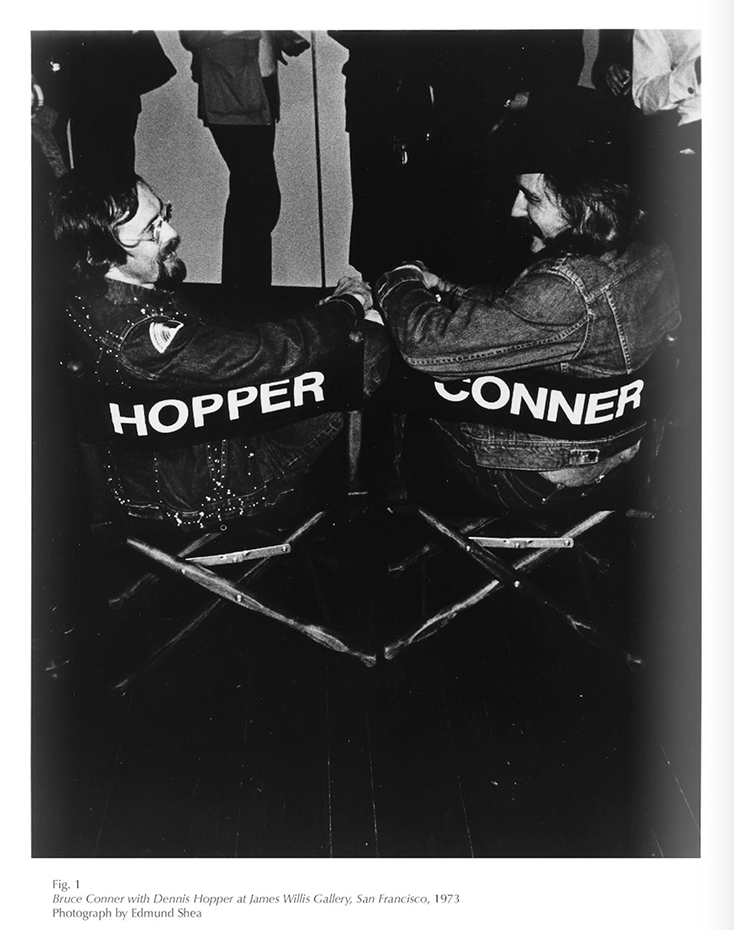
And all this time I thought it might have been Picasso. Before you put fingers to keyboard to email me- I didn’t say that. Dennis Hopper did. Here-

In addition to being a fine Actor, Director and Photographer, Hopper was a major, and an astute, collector of Contemporary Art. Sharp enough to attend Andy Warhol’s first show and buy one of his “Soup Can” Paintings for 75.00. He was also a long time friend of Bruce Conner.

You've got to have friends. Bruce Conner, left, with Dennis Hopper.

You’ve got to have friends. Bruce Conner, left, in Hopper’s chair, with Dennis Hopper from the Senior & Shopmaker show catalog.

Still? That’s a pretty big statement, Mr. Hopper.

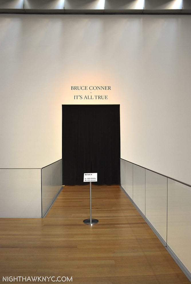
The Magic Curtain. Like a black hole to new universes within.

The entrance. Walk through this black curtain and it’s like entering a black hole to new universes within.

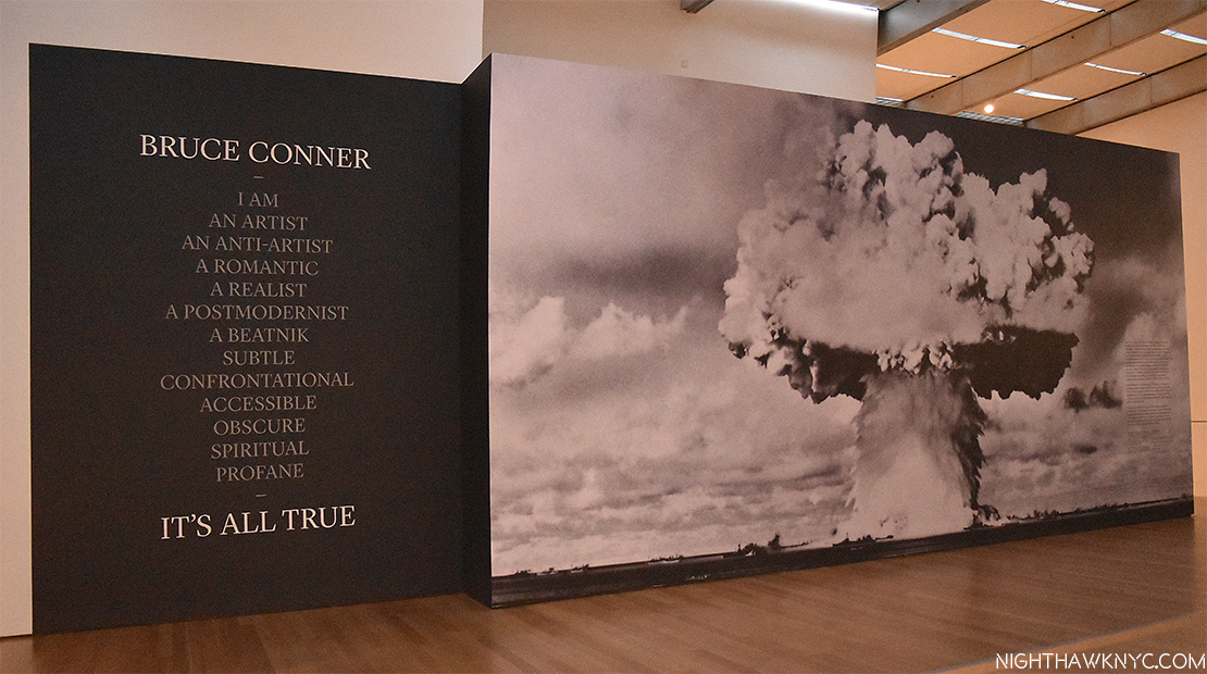
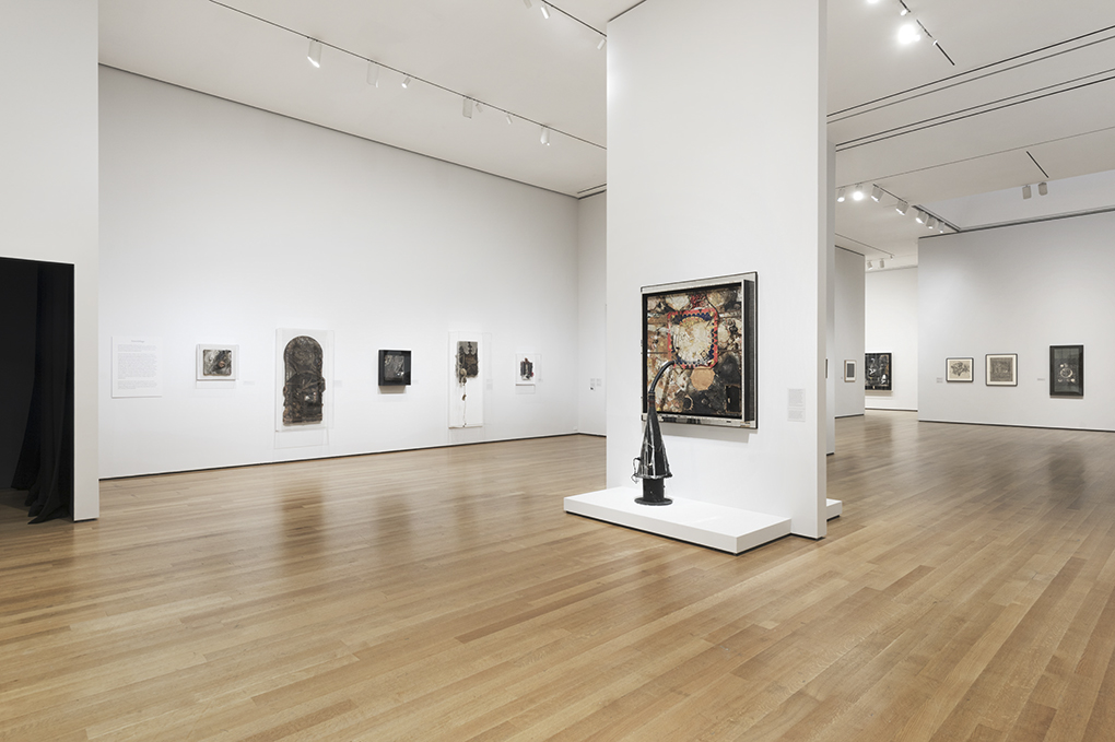
Though I don’t believe in qualitatively comparing Artists, there are, no doubt, many other differing opinions on the question of who was the most important 20th Century Artist. But, there was some quite compelling evidence in favor of Mr. Hopper’s opinion on view over 20 rooms at “Bruce Conner: It’s All True,” the first posthumous retrospective of the Artist, at MoMA from July 3 through October 2, and now at SFMOMA until January 22, 2017. (You can revisit MoMA’s Show  in amazing detail here.) In fact, it makes Hopper’s case about as well as it is possible to make it. With 250 pieces this show is one mind bend after another after another and after another that doesn’t stop until you’re back outside of it, in the lobby of MoMA’s 6th Floor. It’s like Groucho Marx’ joke delivery style- You don’t like that one? Here’s another. And another, and another, and another until he finally gets you. Having never even heard of Bruce Conner, he got my attention pretty quickly on my first visit.

How my head felt after. Show's Lobby.

“It’s All True’s” Lobby. The show’s title comes from a letter Conner wrote in 2000, paraphrased on the left.

By my third visit, I was obsessed. For me, “Bruce Conner: It’s All True” sets a bench mark for Retrospectives of a Contemporary Artist. Pick a genre- drawing, painting, collage, photography, film, assemblage, Bruce Conner’s work in it can hang with anyone else’s. Here are some things I noticed that could be used to support Mr. Hopper’s claim-

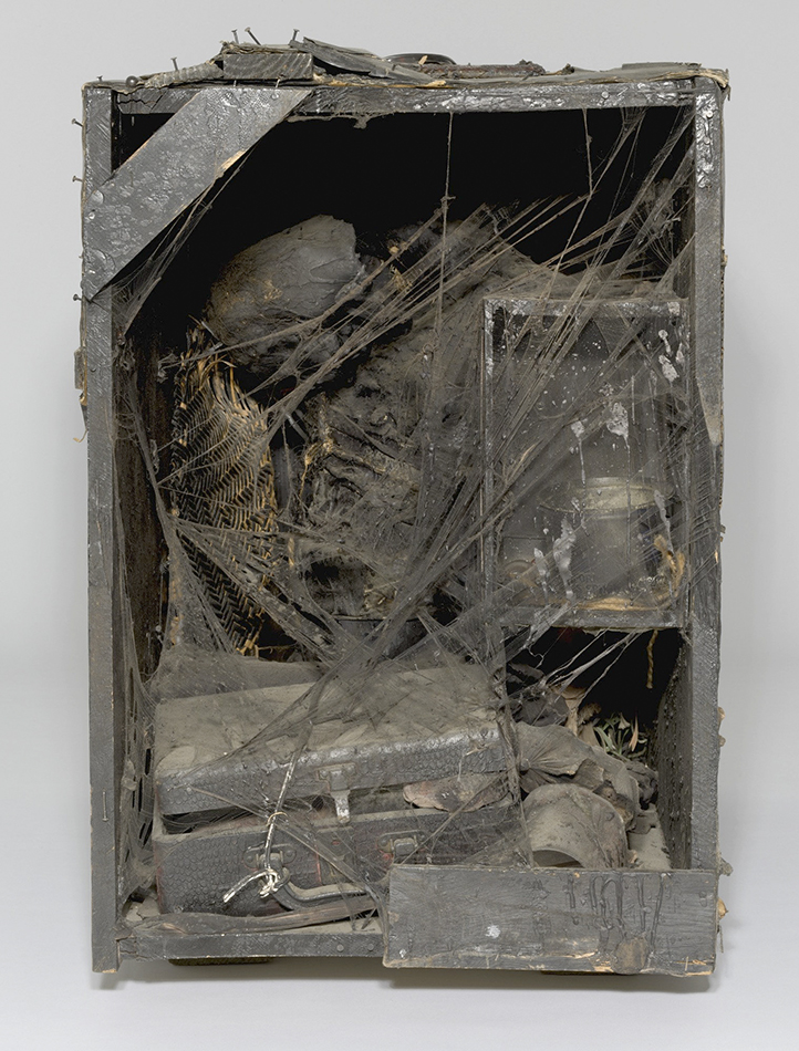
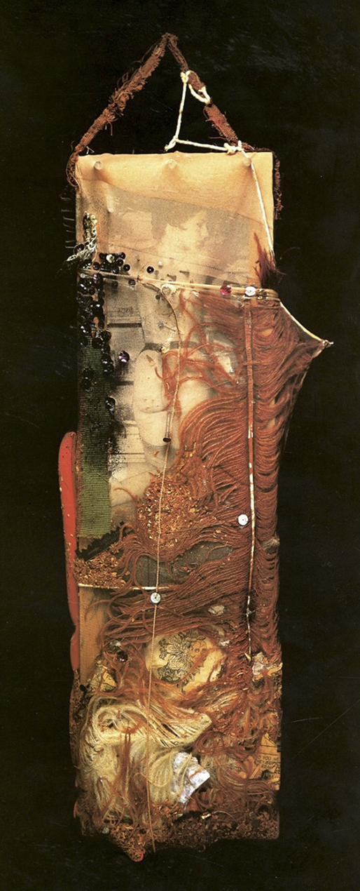
-He was an assemblage Artist every bit as inventive and creative as the great Robert Rauschenberg during the same period. In fact, one of Conner’s assemblages was selected for the 1961 Moma show, “the Art of Assemblage,” when he was 28, where it was shown alongside works by Malevich, Magritte, Miro, Man Ray, Picasso and Rauschenberg. Conner, himself, was denied entry to MoMA on opening night, but that’s a story unto itself.

"THE BOX," 1960 Photo ©MoMA

“THE BOX,” 1960. Dennis Hopper actually preferred this work to Picasso’s “Guernica” as an anti-war statement because it is “not cloaked in pleasing forms.”1 Photo ©MoMA

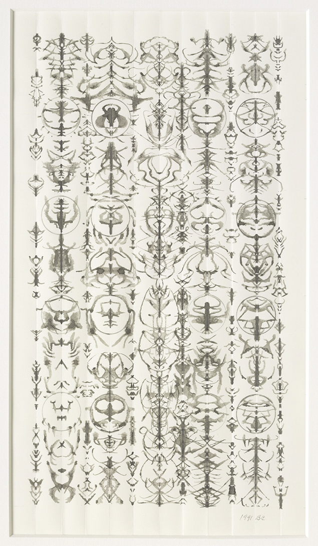
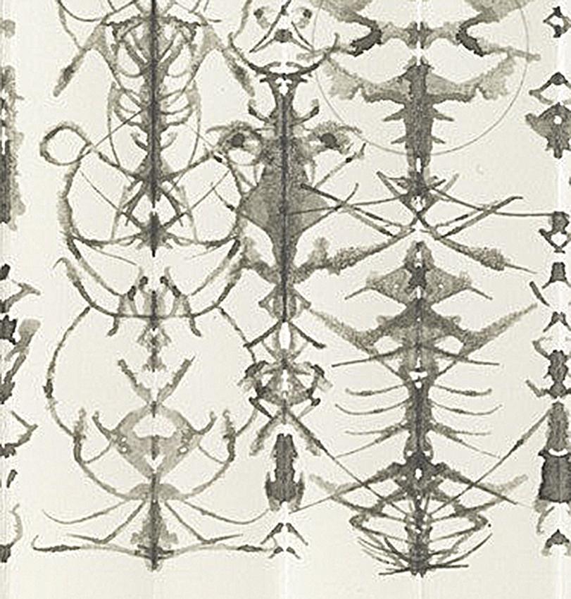
-While he drew for much of his career, with fascinating results, he created an entirely new and unprecedented type of drawing, made out of inkblots (yes, you read that right) that contain from 1 or 2  upto 494 inkblots in a single work that, I believe, people will spend years trying to figure out how he did them. Even once they do, they are going to have a very hard time achieving his level of mastery with their manipulation.

inkblot-drawing-8-17-1991p

HTF? “INKBLOT DRAWING,” August 17, 1991. See a Detail of this further down. Photo ©MoMA

-His groundbreaking first film, “A MOVIE.” was a work that was hugely influential, credited by the same Dennis Hopper with inspiring the acid scene in his own film “Easy Rider.”

Blowing Minds. "Crossroads," 1976 at Moma. Photo ©Moma

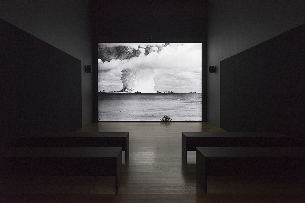
“CROSSROADS,” 1976. Mushrooms, of all kinds, even atomic clouds as here, are a running theme. Yes, all of his titles are in CAPS. *-Photo ©MoMA

“CROSSROADS,” 1976, a 36 minute film that struck me as being part horror film, part meditation on the power of the unseen forces in the universe, showing the unimaginable devastation an atomic explosion unleashes, while at the same time showing it as a force of nature to which it gradually melts into, as we watch the surrounding clouds become indistinguishable from the atomic cloud. The end result is summed up in what writer William C. Wees calls the “Nuclear Sublime2.” Showing multiple views of the atomic blast at Bikini Atoll on July 26, 1947, which Conner selected from the over 500 cameras that filmed the event (some at speeds of up to 8,000 frames per second), and juxtaposes the images with, first, actual sounds of the event, and then soundtracks created by synth master Patrick Gleeson and avant garde composer Terry Riley. Forty years later it’s hard to see this film becoming irrelevant any time soon. It’s a film that everyone involved in the military or government of any nation around the world, or those with the power to vote for or select them should see. Conner’s other films (totaling over 20) were no less creative or groundbreaking, and are increasingly being studied, and recognized.

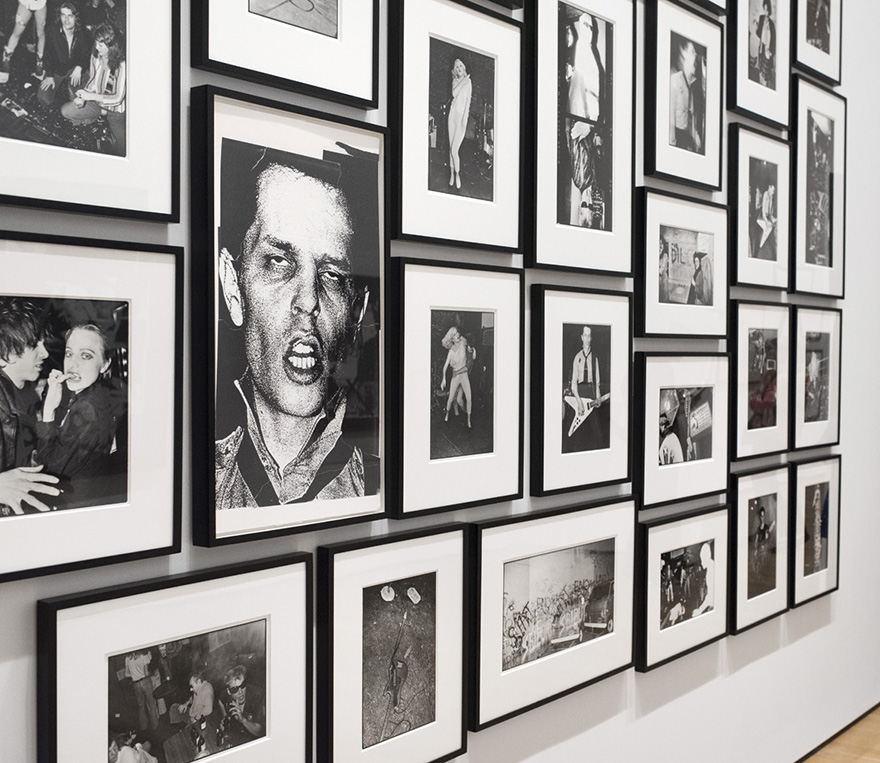
-He took some of the greatest photos of punk musicians and punk bands ever taken.

MoMA_Bruce Conner_June 2016

Up against the wall! A wall of his punk photos shot at the Mabuhay Gardens Club in L.A. *-Photo ©MoMA

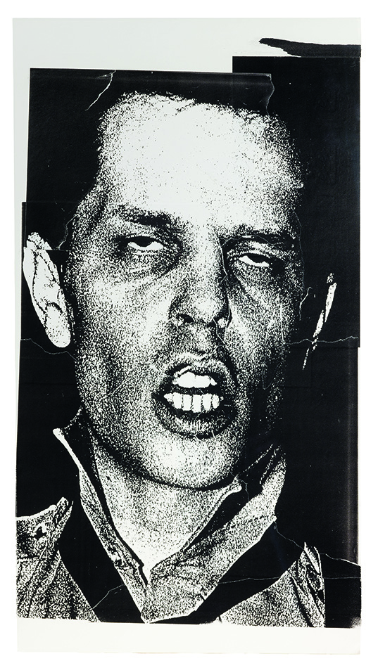
Frankie Fix of "Crime," 1977. Photo ©Moma

FRANKIE FIX of the band “Crime,” 1977. *-Photo ©MoMA

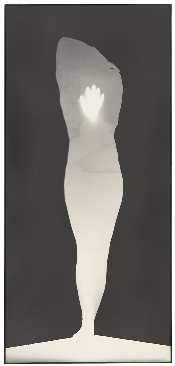
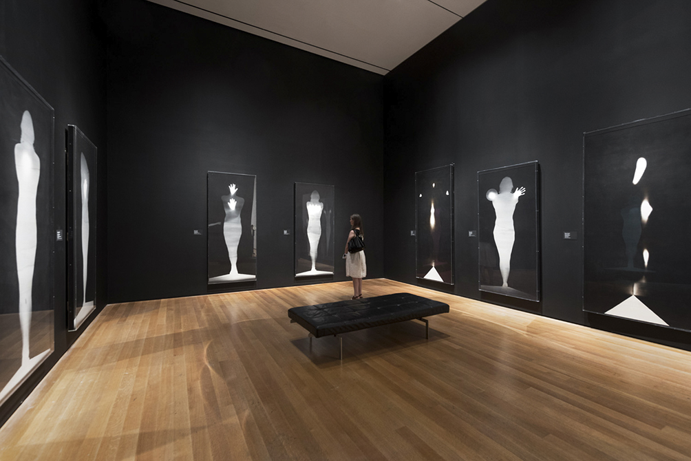
-He created unique portraits he called “photograms” using his own body that are unlike any “selfie” ever taken (actually, Edmund Shea photographed them) and are so ethereal he titled them “Angels.”

Spiritual Side "Sound of One Hand Angel," 1974, Photo ©MoMA

“SOUND OF ONE HAND ANGEL,” 1974, *-Photo ©MoMA

"Angels" by Bruce Conner. Photo courtesy of Moma.

A Room full of “ANGELS.” *-Photo ©MoMA

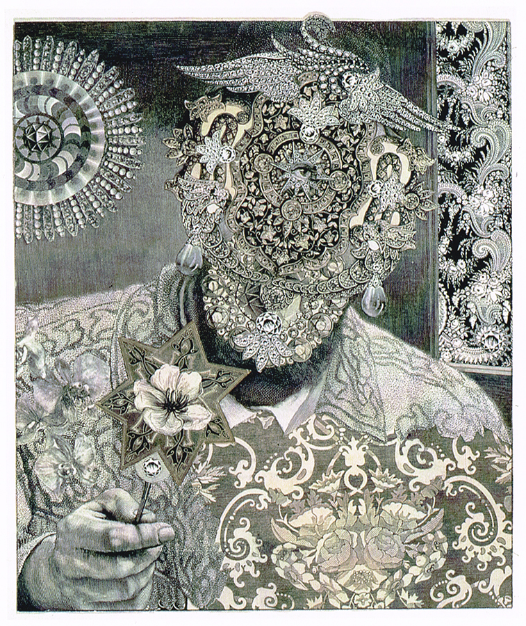
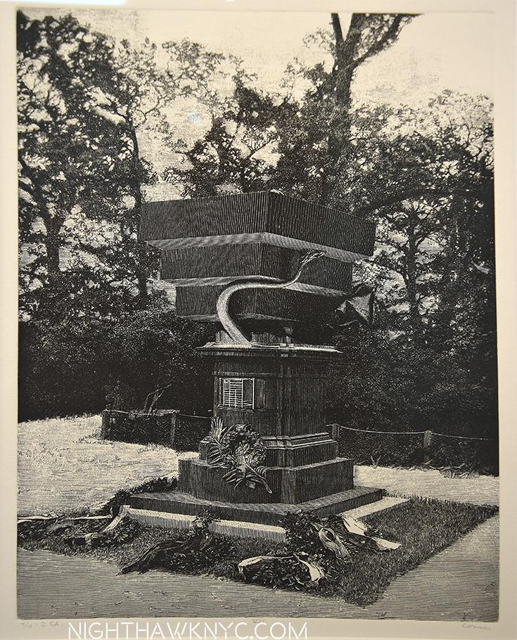
-His collages are every bit as surreal as any by Max Ernst, the Surrealist Master of the Collage.

"PSYCHEDELICATESSEN OWNER," 1990 collage from engravings. Photo ©MoMA

“PSYCHEDELICATESSEN OWNER,” 1990, collage from engravings. *-Photo ©MoMA

-Being as he was the first Artist to put film to contemporary music, he is considered to be the “Father of Music Video,” with his “COSMIC RAY,” in 1961, then “BREAKAWAY,” with Toni Basil (see above). His subsequent work with David Byrne and Brian Eno on videos for their 1981 album “My Life In The Bush of Ghosts” presaged and anticipated MTV’s “Music Videos.” Having his innovations and techniques aped without credit was not something he accepted well. I put this lower on the list because the music video seems to be fading in importance.

And, he ran for office (a seat on the Board of Supervisors in San Francisco), in 1967, actually garnering a few thousand votes.

So?

Why haven’t more people heard about Bruce Conner? Why isn’t he listed and discussed in 20th Century Art History Books?

"Untitled" from Mandalla Series, 1965, felt tip pen on paper. 10x10 inches

“UNTITLED” from MANDALA SERIES, 1965, felt tip pen on paper. 10×10 inches. *-Photo ©MoMA

Detail of left side

Detail of left side

Bruce Conner was something of af an “anti-artist.”  He didn’t like the art establishment, and that came out in his dealings with galleries and museums, including a bizarre encounter with the Security staff at MoMA, at that opening in 1961, alluded to above. In this show he is quoted questioning the need for an Artist to put his name on a work, and near the end of his career works that are undeniable Bruce Conners began appearing with other names, like “Emily Feather,” or “Anonymouse” attached to them. It seems it was a conscious effort to avoid inclusion. He claimed he hired these Artists, but today, they are assumed to all be by him. He once said having work out in the public under his own name made him nervous.

Women's World. Form Left- Pinups on the back of "Untitled," 1954-61, "Spider Lady," & "Spider Lady Nest," 1959, Homage to Jean Harlow," 1963,

Women on his mind. Form Left- Pinups on the back of “UNTITLED,” 1954-61, “SPIDER LADY,” & “SPIDER LADY NEST,” 1959, “HOMAGE TO JEAN HARLOW,” 1963, “WEDNESDAY,” and “LADY BRAIN,” both 1960. Entrance to “BREAKAWAY,” right. *-Photo ©MoMA

Contemporary Art of any time is supposed to break all the rules that had been set in place before it. In Bruce Conner’s case, he broke the rules in every medium he created in, and he broke the rules for being an Artist in the “Art World,” which he loathed. It’s interesting to me that there is so much craft in his films- including dripping ink on them, punch holes seemingly randomly, that make them Art Pieces in themselves. This is part of a duality in his nature that sees him pay attention to the minutest of details like these films, his collages, or his ink drawings where countless minute lines are drawn in pen that somehow never intersect with each other, contrasted with the hugeness of “Crossroads,” horrible, yet strangely beautiful, and contrasted with the “spirituality” of works like the “Angels” and his final work, “Easter Morning.” Bruce Conner may have been many things, it’s all true (as he says in a letter that is the basis for the show’s title), but one thing he was not is easy to categorize. Unless that word is “Artist.”

The first gallery featuring Assemblages. Photo ©MoMA

After seeing “A MOVIE,” you exit the door at left and enter the first gallery featuring Assemblages. *-Photo ©MoMA

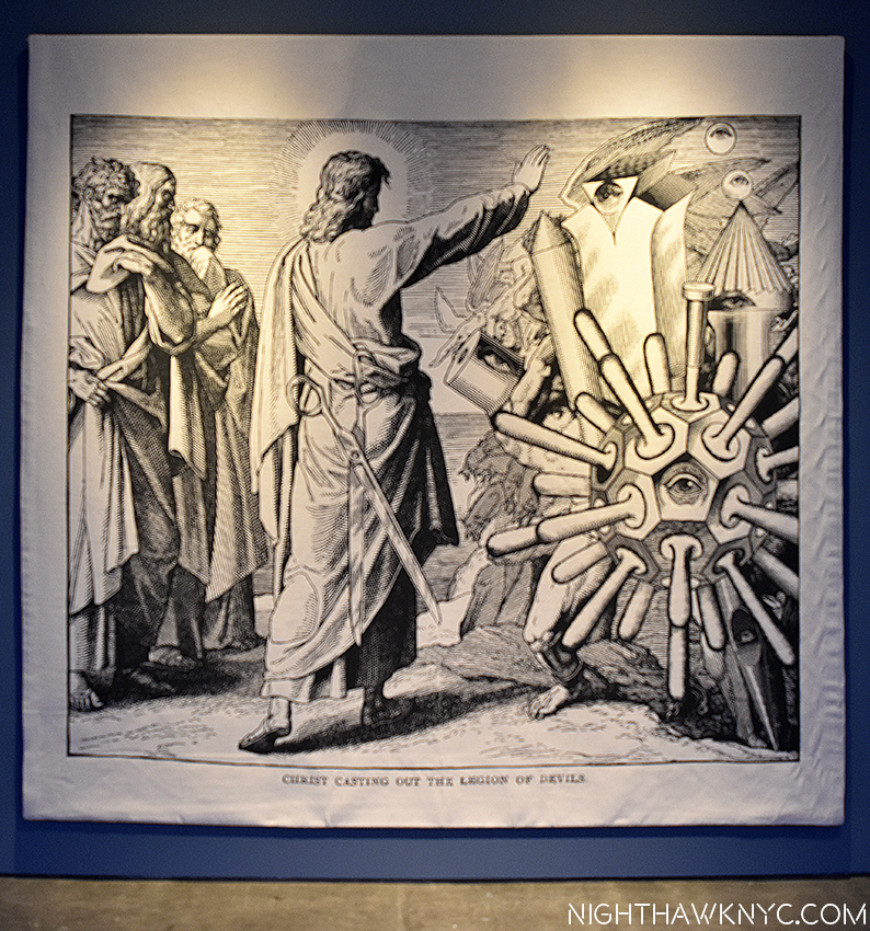
Walking around “It’s All True,” as well as no less than three very good satellite shows going on around town, of Conner’s trippier collages and tapestries at one Paula Cooper, unique works at the other, and prints and drawings at Senior & Shopmaker Gallery. I found that every time I look at one of his works, I’m left with the same question-

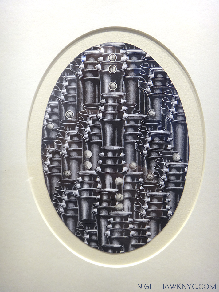
"Tocatta & Fugue," 1986, engraving collage

“TOCATTA & FUGUE,” 1986, engraving collage

"Christ Casting Out The Legion Of Devils," Tapestry from engraving collage. Both seen at Paul Cooper Gallery

“CHRIST CASTING OUT THE LEGION OF DEVILS,” Tapestry from engraving collage. Both seen at Paula Cooper Gallery

“HTF?”

That’s “How” inserted instead of the W in WTF? As in- HOW did he do that?” No matter which genre of his work I’m considering, that question hits me. I stare at his drawings, for example, including one with hundreds of lines where no two intersect (like “UNTITLED,” above) and wonder “How did he do that?” I’m face to face with a pseudo Max Ernst collage, like the one above, and wonder “I can’t see anything cut out and applied on top of something else. It’s all seamless, and this was before scanning, photoshop and all the rest. How did he do that?” I look at his movies, “BREAKAWAY,” (above) and wonder the same thing. “How? The editing and the way it’s complied is beyond the technology of the time.” I’m not alone in saying this. In fact, no less than Harvard put on a film series of Bruce Conner’s films in 2008 that THEY called “Bruce Conner, the Last Magician of the 20th Century.” (Mr. Conner passed away in 2008). Then, there’s the “Inkblot” drawings, in which each inkblot is a perfect, unique, miracle of beauty, like a snowflake.

Detail of "INKBLOT DRAWING, August 17, 1991" seen above in full. Photo ©MoMA

Detail of “INKBLOT DRAWING, August 17, 1991” seen above in full. *-Photo ©MoMA

“How the…” Don’t ask.

As near as I can tell, Conner folds the paper (vertically in the image above) then applies the drop of ink. How he manipulates it after that to get these seemingly miraculous results is the mystery. Artist David Hockey wrote a fascinating book titled “Secret Knowledge,” about the lost techniques of the Great Masters of Painting going back to the mid 1400’s. He makes a downright riveting case, via reverse engineering, for some of the optical “tricks” and methods some of the greatest Painters ever used. I think someone is going to need to do a Volume 2 of “Secret Knowledge” and include Bruce Conner. MoMA’s curator, Laura Hoptman, said at the Press Opening, “For Bruce Conner there is always the acknowledgement of the viewer, especially in the drawings you can not only admire the steady hand and the attention to detail but it’s also on us to look so carefully and closely as possible to divine the meaning and also the intensity of the work.” While I agree that looking closely reveals wonders, I also wonder how much Conner really wanted us to see and understand3, how much of Bruce Conner, the Artist, was about making (some) works for himself, works that defy understanding by others because they aren’t meant to be. Unless his wife, Jean, also a very fine Artist, tells us, it looks like we’ll never know.

"Black Dahlia," 1960 Photo © Moma

“BLACK DAHLIA,” 1960. Inspired by an unsolved sex-murder case in L.A. His Assemblages require, and reward, very close looking. You’ll even see a nude, from the back. *-Photo ©MoMA

One of the themes of some bigger NYC Art Shows this year has been a revisiting of the Art History of the 20th Century. “It’s All True” does it again and makes such an emphatic case, as “Nasreen Mohamedi” did earlier this year inaugurating TMB, that I would be shocked if either Artist is omitted going forward.

From the "Dennis Hopper One Man Show," Print after engraving collage as seen at Senior & Shopmaker Galleri

From the “Dennis Hopper One Man Show,” at Senior & Shopmaker Gallery, a partial reconstruction of a Bruce Conner show honoring Dennis Hopper. Limited Edition print after engraving collage.

Beyond that, Dennis Hopper’s opinion will live on. I’m glad he expressed it before he passed of prostate cancer in 2010. Is Bruce Conner “The most important Artist of the 20th Century?” I don’t know if it matters. What matters is that his Art is being seen more and more, and so it will grow in appreciation and influence. Bruce Conner may have had reasons for being an “Anti-Artist,” and “Anti Art World” during his life, but one thing that is apparent- Now that he’s unfortunately no longer with us, his work is going to continue to speak for him, while it is seen far and wide in the 21st Century. Where he will continue to blow minds…like mine.

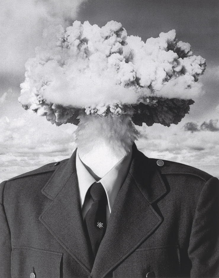
"BOMBHEAD," 2002

“BOMBHEAD,” 2002. Based on a Self Portrait. *-Photo ©MoMA.

*-Soundtrack for this Post is “In C” by Terry Riley, the soundtrack for Bruce Conner’s final film, the gorgeous masterpiece, “EASTER MORNING,” 2008, which struck me as a farewell to life, and is the final work in “It’s All True.”

NighthawkNYC.com has been entirely self-funded & ad-free for over 8 years, during which 300 full length pieces have been published! If you’ve found it worthwhile, PLEASE donate to allow me to continue below. Thank you, Kenn.

You can also support it by buying Art, Art & Photography books, and Music from my collection! Art & Books may be found here. Music here and here

Written & photographed by Kenn Sava for nighthawknyc.com unless otherwise credited. To send comments, thoughts, feedback or propositions click here. Click the white box on the upper right for the archives or to search them. Subscribe to be notified of new Posts below. Your information will be used for no other purpose.

  1. SFWeeky
  2. Wees’ excellent piece on “CROSSROADS,” in which he coins the term, is here.
  3. Very very few are going to get to examine the film strips of his movines to see the attention to detail he lavished on them.

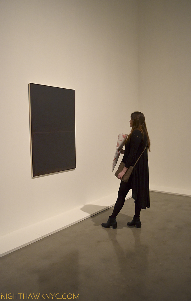
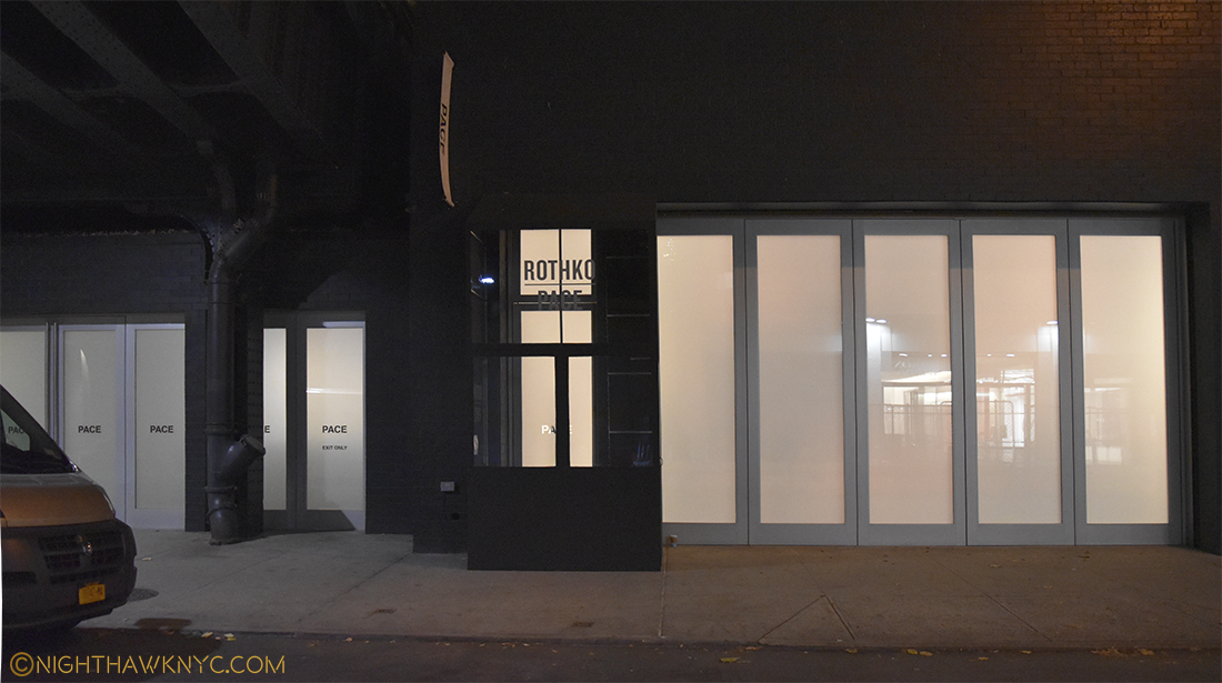
The Rothko Chapel, Chelsea

“I became a painter because I wanted to raise painting to the level of poignancy of music and poetry.” Mark Rothko.

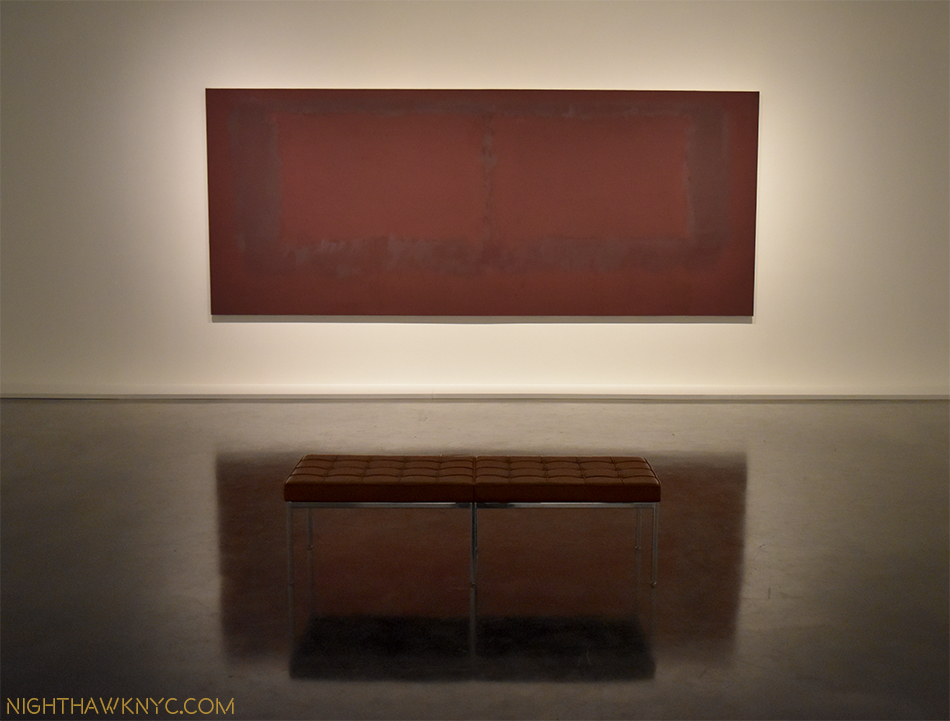
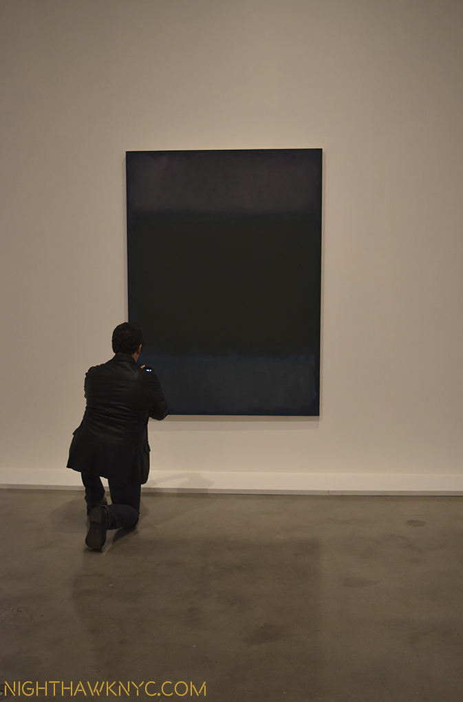
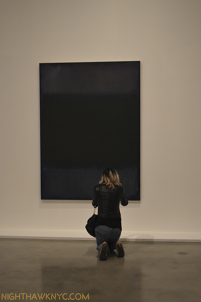
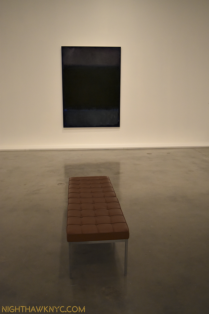
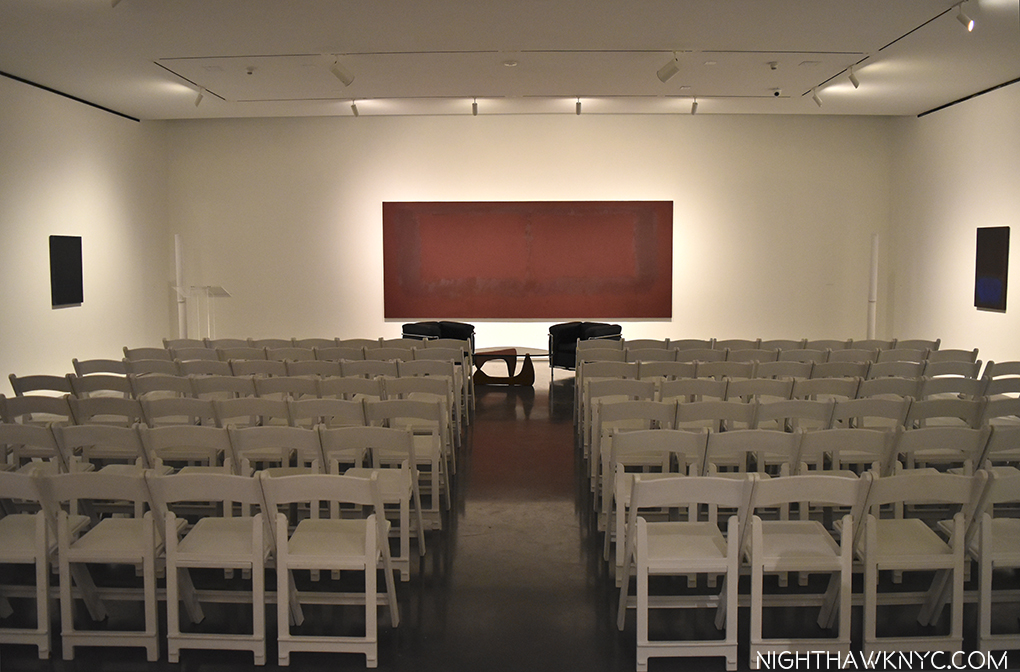
I could sit there for a month. One of the infamous "Seagrams Murals," 1959. Rarely seen.

Seagrams Murals, Section 6, 1959. One of the infamous murals for the 4 Seasons Restaurant, but never installed there.

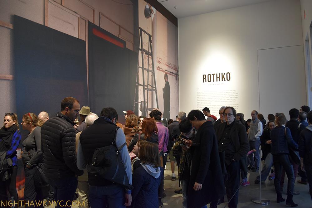
Lines to get in are nothing new in New York, or in Chelsea, home to some of the most “happening” nightclubs in the City. But a line to get in at 2 or 3pm in the afternoon is rare anywhere in NYC. Even rarer are lines to get into an Art Gallery at that hour- unless it’s late in the run of a “must-see” show. But, the line filled the lobby and extended out the door at the extraordinary Mark Rothko: Dark Palette show which only opened the day before at Pace on West 25th Street. Five years in the making, and focused on exploring one aspect of his work, don’t bother asking for the price list, it’s also unusual for a gallery show because none of the work is for sale. Darn! What will I do now with that spare 90 million dollars?? Maybe I’ll open some grocery supermarkets with reasonable prices most neighborhoods in Manhattan desperately need.

3pm November 5. The crowd in the lobby waits.

3pm November 5. The crowd waiting to get in fills the lobby. Buckle up! It’s only going to get more crowded.

When it comes to writing about the work of Mark Rothko, I have to say up front that it’s very hard for me to be unbiased. Mark Rothko’s Art changed my life. In 1999 I saw his Retrospective at the Old Whitney (now TMB) the final weekend it was there. It was one of the unforgettable experiences I’ve ever had at an Art show, and it was perfect timing, given the roadblock I had hit with record companies in trying to get my records released unaltered, I then decided to turn (back) to Art History, my first love. Thank you, Mark Rothko.

dsc_0040pnh

dsc_0113pnh

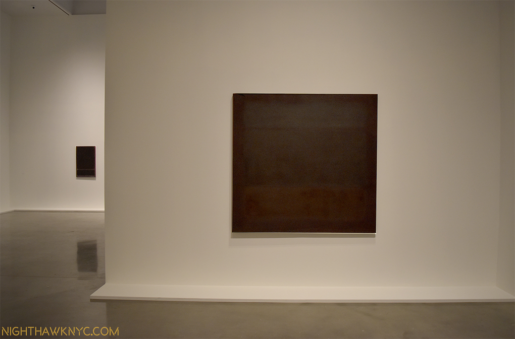
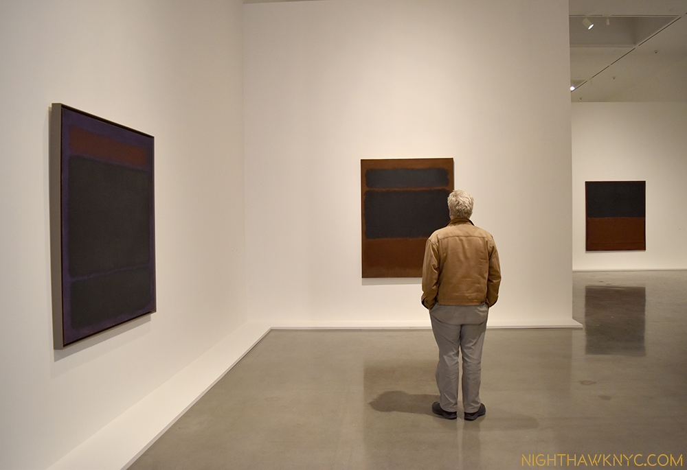
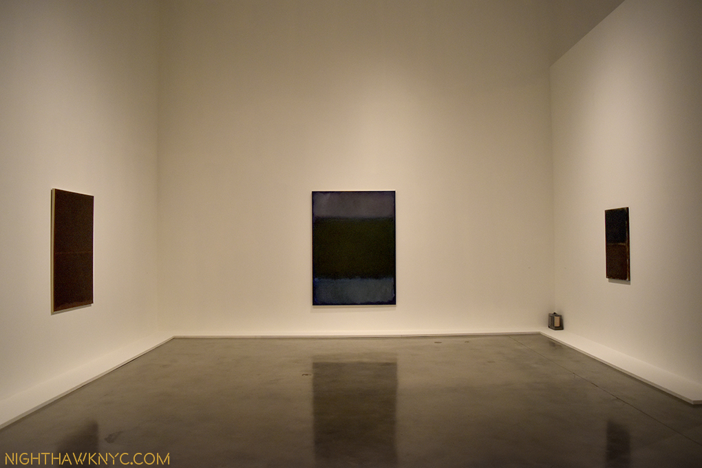
Let’s get lost. This is how I prefer to see Rothko. Each work can be seen on it’s own. Getting close to feel engulfed by the work is good, too.

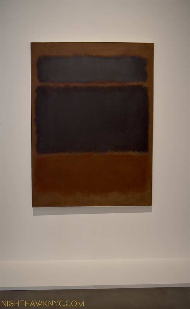
There have been Rothko shows in NYC since 1. But, none of them have yet matched the feeling I got from the 1999 show- aided in no small part by the way the works were hung, the way the show moved through his career. I’ve longed for that feeling ever since. At long last, here it is. The “dark” works have a unique mystery among Rothko’s work, and are a terrific choice for a theme. While some see them as “depressing,” (including a lady mentioned in the show’s introduction card who rejected one that Rothko had painted for her for that reason), I find them to be among his most powerful, subtle, even, yes, poignant pieces. While it’s always great to encounter a Rothko in a Museum, they’re usually hung among the work of others, which I find a bit distracting, For me, Rothko needs to be seen and experienced in a “vacuum,” or with only Rothkos nearby. Few institutions have that many Rothkos, and given their popularity, it is very hard for them to part with them and disappoint their visitors, even for a couple of months.

Worshipping at the altar?

Worshipping at the altar?

Luckily, two of the very few people who do have some, the offspring of Mr. Rothko, Dr. Kate Rothko Prizel and Dr. Christopher Rothko, have gone above and beyond to support this show. A number of the works on view come from their collections- by my count, no less than 4 from Kate’s and 2 from Christopher’s, in addition to “Seagrams Mural, Section 6” which they jointly own. That’s 7 of the 21 works on view- one third. (Christopher Rothko, by the way, is the author of one of the very best books on his father there is- Mark Rothko: From the Inside Out.). To help facilitate the loans of 3 pieces from major Museums, the Rothko “kids” loaned the institutions works from their own collections so the institutions would still have Rothkos to show their visitors, and enable them to part with the works requested for this show. Remarkable. Dad would no doubt be proud. With 21 “dark” works, the majority of which are out and out masterpieces in my estimation, including some stunning works on paper mounted on canvas, the results are as close as there has been to a truly “must see” show in Chelsea in years.

Someone else...

Someone else…

That said, it was only a year and a half ago that another show in this same space left me transfixed and provided many hours spent in sheer meditative bliss- by Richard Pousette-Dart. This one is very similar in it’s effect, as we explore the history of Rothko’s use of dark colors in his “sectional” works. I can’t categorize what these works say to me because it’s different each time I see them. Sometimes it’s spiritual. Sometimes poetic. Sometimes I feel like I’m standing on a foreign landscape looking at distant horizons. But, it’s that experience they give, the pure joy of looking, seeing and letting them in that transfixes me.

"Black in Deep Red," 1957. The day will come where these works will be as famous as Monet's are now, in my opinion.

Black in Deep Red, 1957. The day will come when Rothko’s work will be as ubiquitous as Monet’s are now, in my opinion.

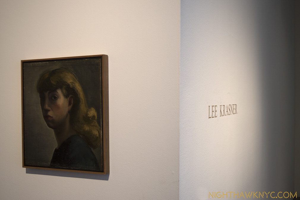
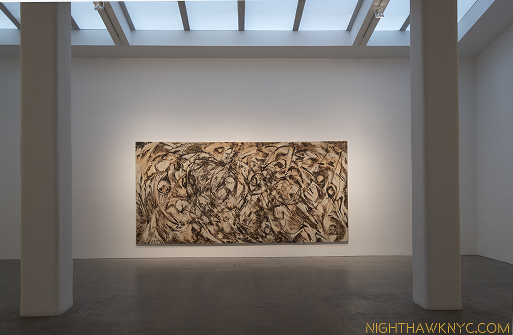
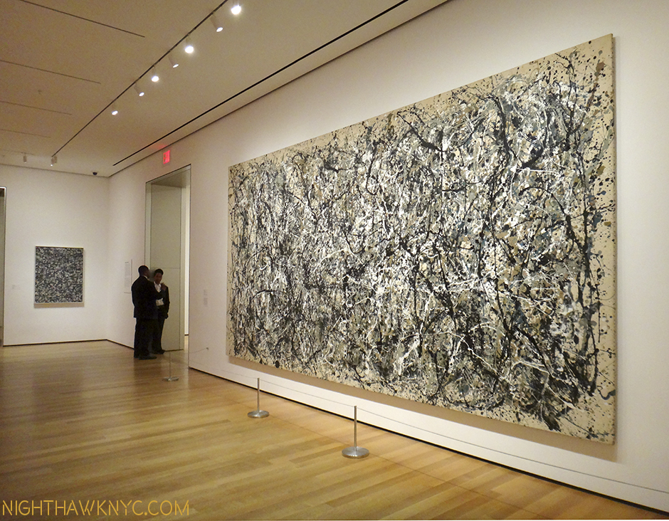
This has been a year full of big New York School Abstract Expressionist Shows. First, there was the biggest “name” in AbEx, Jackson Pollock, at MoMA, then concurrent shows of his wife, Lee Krasner, and long time friend, Philip Guston. A very nice smaller show of New York School Artists is going on at Allan Stone Projects that includes two marvelous Joseph Cornell Boxes (Ok, he’s not an AbEx Artist, but his work is wonderfully abstract, and he was a New Yorker), alongside works by Abstract Expressionists2 de Koonjng, Arshile Gorky and Clifford Still. There’s also a nice Joan Mitchell show that’s about the same size as the Rothko show going on very nearby it, AND there’s the Centennial show of Richard Pousette-Dart, for my money the most under appreciated of the lot, going on right now at Pace uptown!

"Untitled," 1955 the earliest work here has never been displayed in the country before.

Untitled, 1955, the earliest work here, has never been displayed in the country before.

Phew…

I didn't bring flowers, so this will suffice as my "bouquet."

I didn’t bring flowers, so this Post will have to suffice as my “bouquet.”

For me, though, this show will be the high point. Short of going to the “real” Rothko Chapel in Houston, Texas or the Seagrams Room at the Tate, London, this is the only, and best, chance you’ll get to get that feeling…until the next big Rothko show. Unlike most of my Art Show Posts, this show only opened this past Friday, November 4, so you have until January 7, 2017 to experience it.

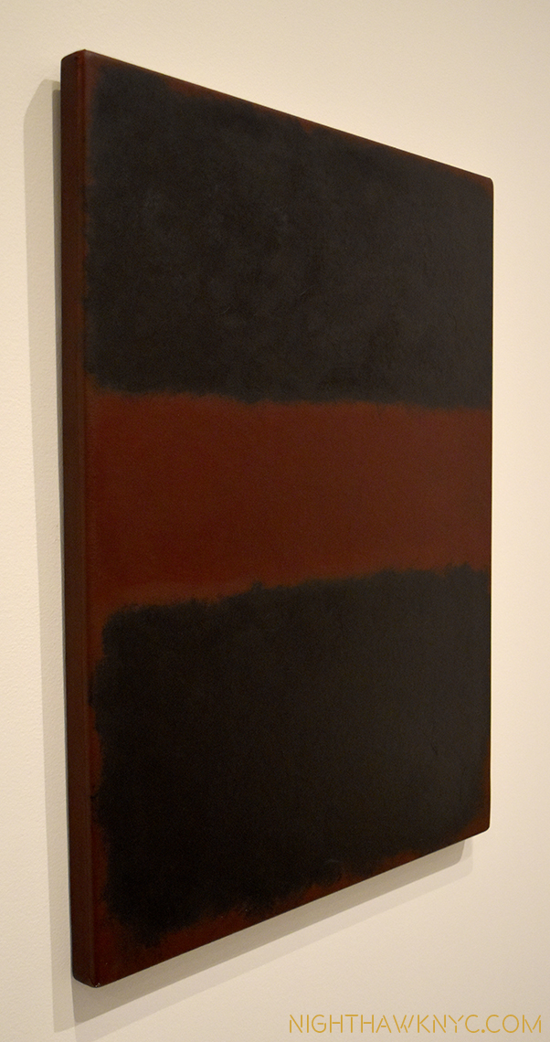
"Untitled," 1968, one of a few acrylic on paper, mounted on panel pieces here, seen from an angle.

Untitled, 1968, one of a few wonderful acrylic on paper, mounted on panel pieces here, has fascinating sides.

dsc_0328p2nh

After that? You’re stuck being like me- Praying for the next one.

dsc_0358pnh

*-Soundtrack for this Post is “Rothko Chapel” by Morton Feldman.

NighthawkNYC.com has been Free & Ad-Free for over 7 years, during which over 275 pieces have been published! If you’ve found it useful, please support it so I can continue.
I’m pleased to announce you can now support it by buying Art, ArtBooks and PhotoBooks! I’ve curated a selection of 400 books & pieces of Art from my collection, offered through my partnership with eBay seller GallerieK. Featured items of particular interest to my readers may be seen here. The complete selection is here now!

Or, you can donate to help keep NighthawkNYC.com online & ad-free below. Thank you!

Written & photographed by Kenn Sava for nighthawknyc.com unless otherwise credited.
Comments, thoughts, feedback or propositions? Click here.
Click the white box on the upper right for the archives or to search them.
Subscribe to be notified of new Posts below. Your information will be used for no other purpose.
  1. Mark Rothko: The Watercolors in 2014, shining light on his seldom seen work in the medium, and Mark Rothko: A Painter’s Progress, The Year 1949 in 2004, focused and fascinating, both excellent, and both at Pace, East 57th Street.
  2. according to a list The Met has published

Stuart Davis- The King of Swing

This site is Free & Ad-Free! If you find this piece worthwhile, please donate via PayPal to support it & independent Art writing. You can also support it by buying Art & books! Details at the end. Thank you.

Written & Photographed by Kenn Sava (*- unless otherwise credited)

Try it yourself.

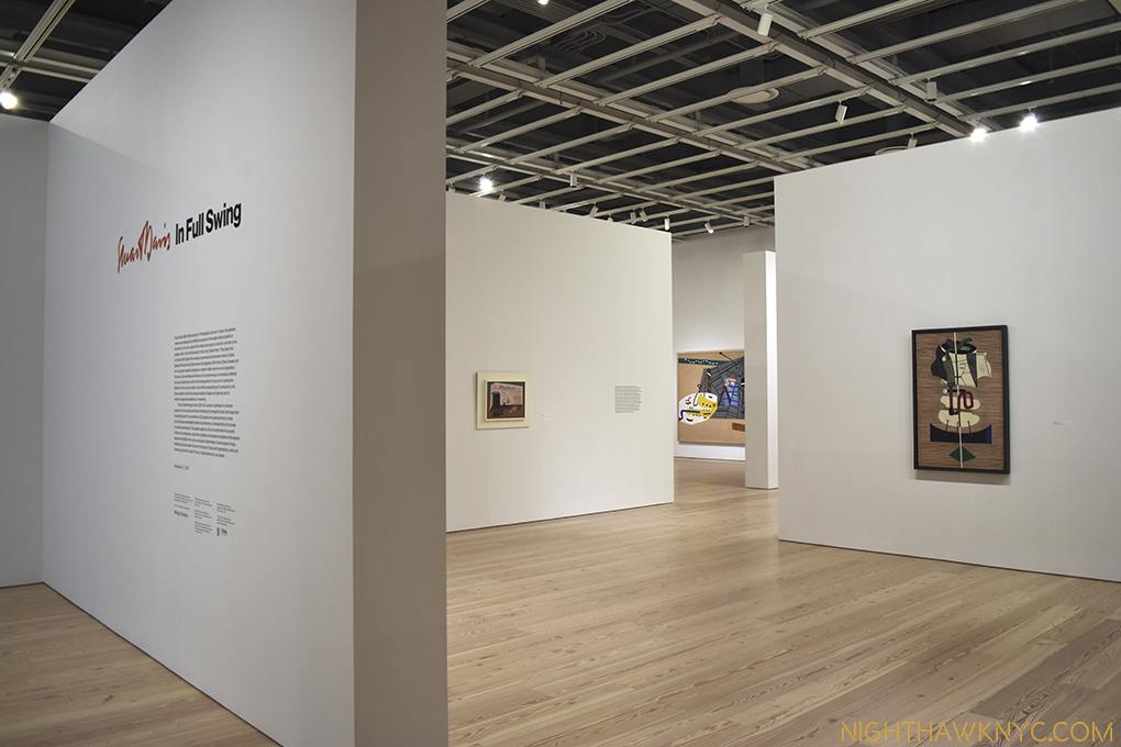
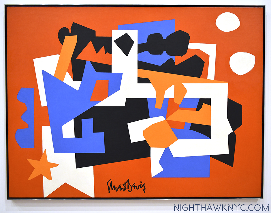
Walk into your local Art Museum and look for Stuart Davis. I bet they own at least one, and I also bet it’s on display. I’m making this wager based on my experience that every American Museum I’ve been to, including many smaller ones, owns at least one work by Stuart Davis, and that work seems to always be on view1. This is a testament to his wide, and ongoing, appeal. Stuart Davis’ Art still has a contemporary look and feel to it. Maybe that’s because so many Artists who have come after him, like much of “Pop Art,” have been influenced by him. Somehow, Davis is also an Artist who is rarely given a show. The last big one I know of was “Stuart Davis: American Painter” at The Met in 1991. It’s left me with years of longing to see more than one or two of his works at a time, so I was very excited when I heard about “Stuart Davis: In Full Swing,” June 10-September 25 at the Whitney.

dsc_6043pnh

It turns out to have been worth the wait. With 75 works ranging from 1923 until his final work left unfinished on his easel the night he died in 1964, we get to see much, if not all, of his accomplishment. The 1991 Met show featured 175 works, 31 before the earliest work in this show. While I’m a bit disappointed the show is missing the first decade of his work, (the title “Stuart Davis: In Full Swing” refers to his career being in full swing during the period of his work displayed), what’s included has been marvelously hung adding much insight into Davis’ process and development.

Davis' seminal 4 "Egg Beater" Paintings, 19__, rarely united

Davis’ seminal 4 “Egg Beater” Paintings, 1927-28, rarely united.

…I nailed an electric fan, a rubber glove and an eggbeater to a table and used it as my exclusive subject matter for a year.” Egg Beater No. 4," 1928

Breakthrough. “I nailed an electric fan, a rubber glove and an eggbeater to a table and used it as my exclusive subject matter for a year.2” Egg Beater No. 4,” 1928

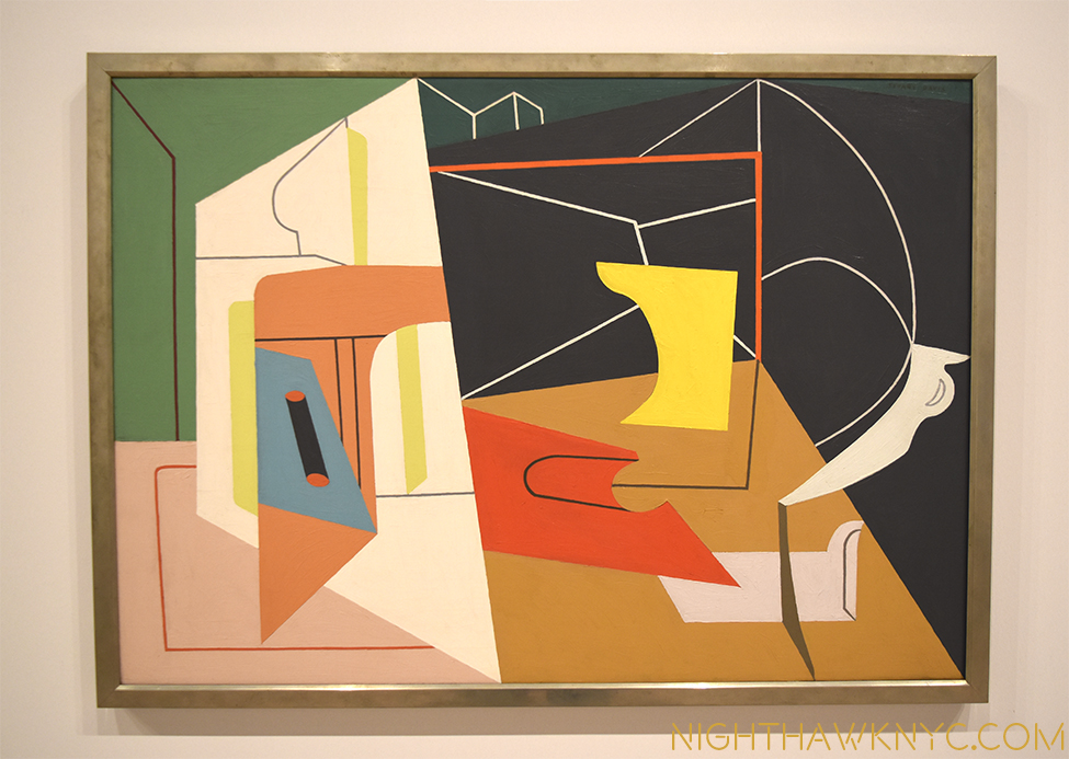
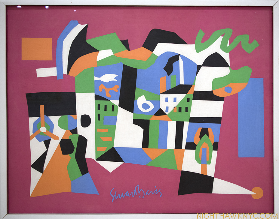
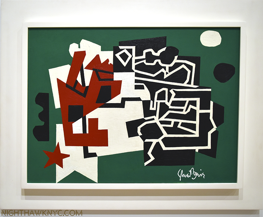
Beyond this, it’s simply gorgeous to behold. Davis, the colorist, is  something not often  spoken about, and for me, is under-appreciated. His work needs to be seen in person, where his color makes a vibrant, stunning, often shocking first impression- even in 2016. Looking closer, it becomes apparent that though he uses relatively few colors and repeats them from piece to piece he is a master of color schemes. Has any American Artist used Yellows or Oranges the way Davis has?

"Cliche," 1955

“Cliche,” 1955

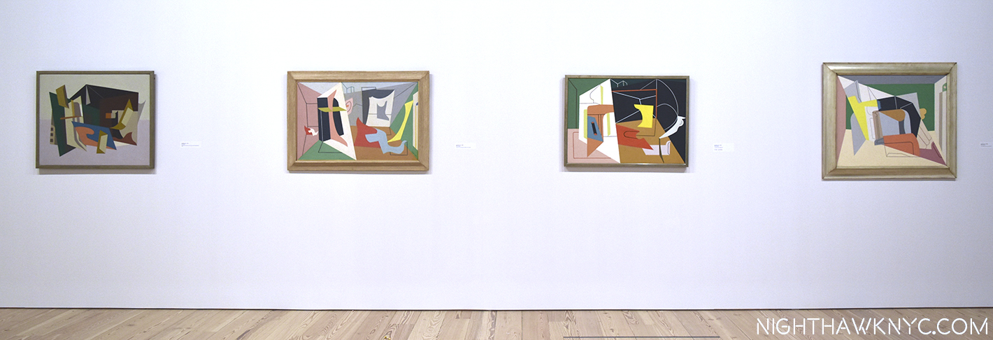
Having come out of the end of the era of  “Ashcan School,” Davis’s early work, often depicting street scenes of the greater New York area, shared their darker palette. Here and there he’d inject very bright passages of color, as in “Bleecker Street,” 1912. Soon, they would dominate as the influence of the Europeans, the Cubists 3, and Joan Miro took hold, his palette brightened. Matisse was also an early influence, and  even in the 1950s, Davis’ work features shapes that echo those found in Matisse’s late Cut-Outs.

dsc_2983nefpnh

“Midi,” 1954

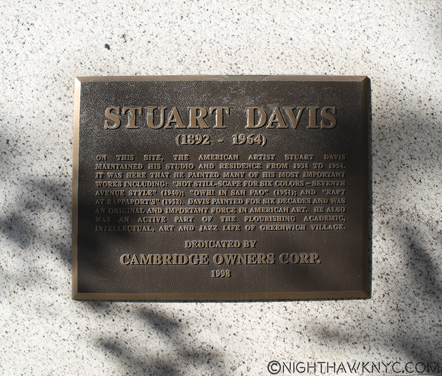
The title “Stuart Davis: In Full Swing” is a double entendre, also referring to his love of Jazz- “swing” being the most popular form of the music in the 1920’s and 1930’s. Stuart Davis loved Jazz. As I wrote not all that long ago upon accidentally discovering where he lived for 20 years in Greenwich Village, it was, coincidentally or not, around the corner from some of the greatest jazz clubs in the world4.

DSC_7025P2NH

The plaque outside Davis’ home of 20 years where he created works that have “come home” to the nearby Whitney.

Looking at his work, it’s clear that he “gets” what it’s like to play Jazz, what goes on in the mind of the musician or singer, and it comes out of his hands, like it does for musicians, too.

Davis In Full Swing. "Swing Landscape," 1937

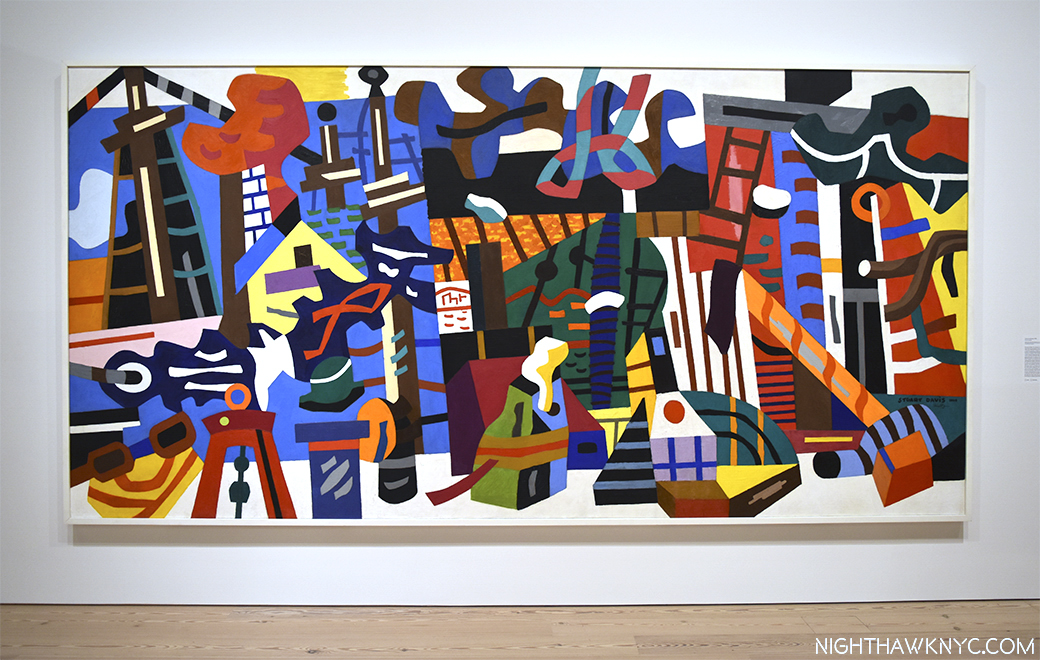
In Full Swing. “Swing Landscape,” 1938, over 14 feet long, the largest work here, originally intended for a Brooklyn Apartment Building.

Walking around, I spent quite a bit of time trying to associate Davis’ work with specific Jazz Artists. While I found there were many who came to mind for specific works, I came to feel that Davis’ work was ahead of it’s time, musically, as well as visually/Artistically. His shapes seem to anticipate the angular developments of Musicians like Thelonious Monk and Andrew Hill. Standing in front of a work like “Swing Landscape,” 1938, an endlessly fascinating blend of nautical visual motifs in a riot of color, the feeling is like listening to a great Big Band. Take Duke Ellington’s or Count Basie’s classic Big Bands that were chock full of unique soloists. each one with a recognizable solo voice. When Lester Young soloed on Tenor Sax for Basie, there was no doubt who was playing. Same for Johnny Hodges, “Tricky” Sam Nanton, Ben Webster, or Bubber Miley with Duke, not to mention Duke and the Count, themselves. Looking at “Swing Landscape,” is like hearing a big band to me, a band comprised of unique voices (colors on shapes), each playing their own part, but still a part of the whole. There is an overriding feeling of joy, and life. But, there were other works that looked to me more like the music of non-swing Masters Art Blakey’s Jazz Messengers and even early Ornette Coleman. Though I mixed them in, and many others, I found myself repeatedly returning to Duke Ellington, one of the greatest composers of the century, in any style of music, who also continually pushed and evolved his style, taking the Big Band to many other places musically, like Davis did with Cubism, as the soundtrack for my visits.

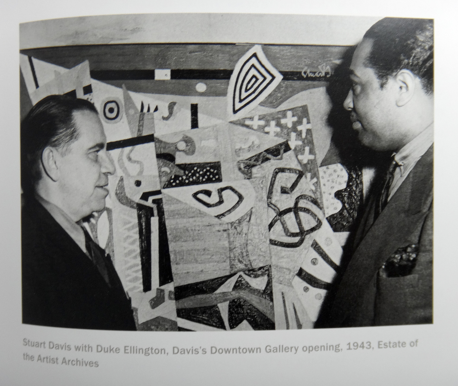
Stuart Davis with Duke Ellington, 1943, from the show's catalog.

Let’s talk about Jazz. Stuart Davis with Duke Ellington at a Davis show, 1943, from this show’s catalog.

Also like a Jazz Artist, Davis returned again and again to earlier compositions and “riffed” on them, as Patricia Hills said 5. Davis re-interpreted his earlier compositions the way Jazz Artists reinterpret standards- using his original theme as a jumping off point to create something entirely new.

Progress in the Process. All 3 of these works are based on the center work from 192_. Left, 195_ and 19__, right

Riffin’ on a Theme. All 3 of these works are based on “Landscape, Goucester,” center, as follows.

dsc_3001pnh

“Landscape, Goucester,” 1922…

"Colonial Cubism," 1954

Became this- “Colonial Cubism,” 1954

dsc_2996pnh

And then, this- “Memo, #2,” 1956

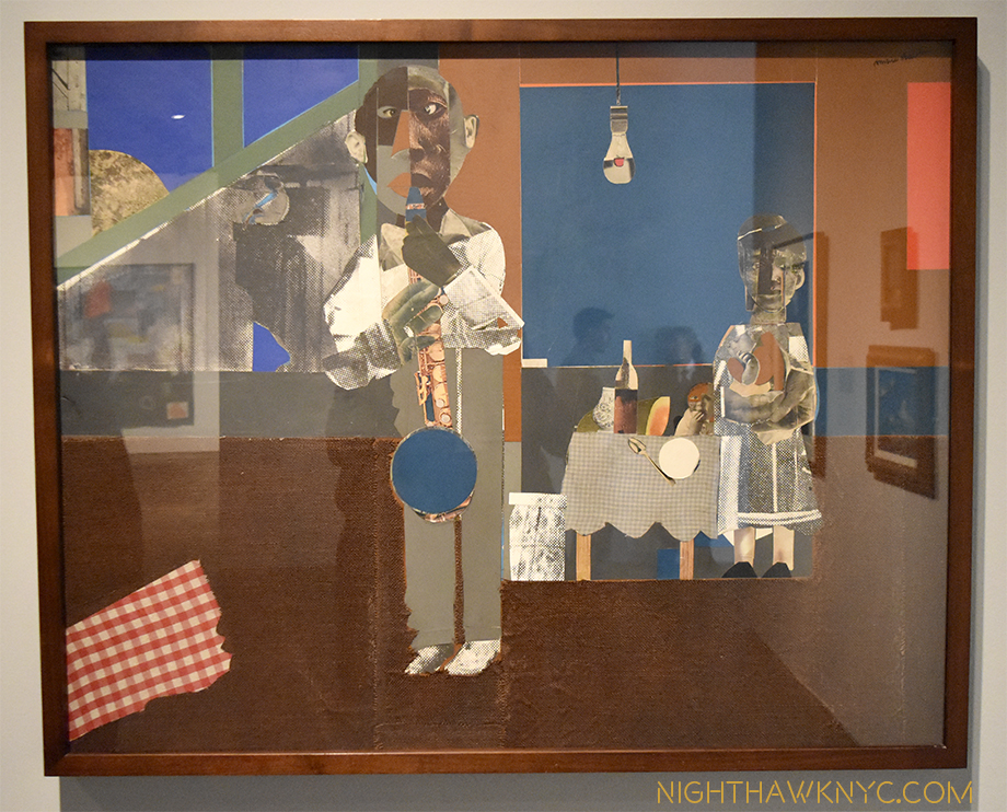
In terms of Jazz in Art, I can’t think of another Artist who has a similar effect on me. Other Artists listened to Jazz, during the same time and later, but Stuart Davis’ work looks like Jazz to me. I get that feeling from isolated works by other Artists, especially that of Romare Bearden, who Davis told to visualize the relationships between jazz and art in 1940, though his works are primarily collages, not paintings, but Davis’s whole body of work, with rare exception, gives me that feeling6.

Blue Note. "The Woodshed," 1969, collage by Romare Bearden. The "Woodshed," or "Shed" is where musicians hone their craft.

Blue Note. “The Woodshed,” 1969, collage by Romare Bearden, at The Met Breuer.. The “Woodshed,” or “Shed” is where musicians hone their craft.

Yet, there’s more going on here than Jazz.

Revolutionizing the still life. “Super Table,” 1924. For me, the earliest masterpiece in this show.

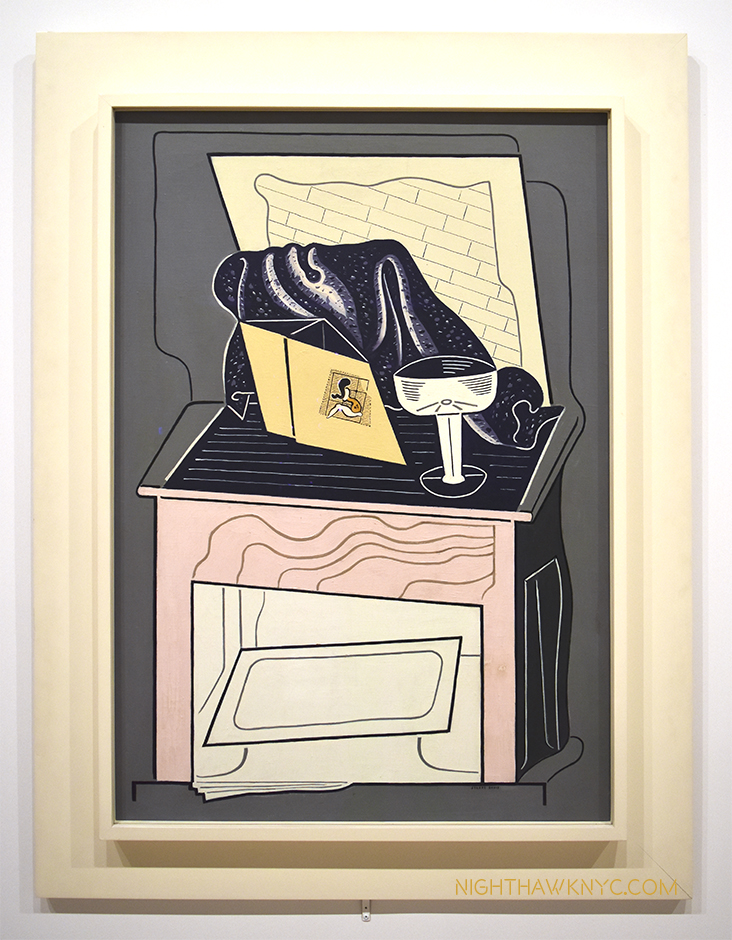
We watch Davis breaking through and coming into his own in works like “Super Table,” 1924, and the “Egg Beater” series of 1927-28, which were revolutionary takes on the Cubist “still life,” that proved to be the jumping off points for all his future work that would see him develop his own approach to Cubism, becoming one of the very few outside of the inventors of the style to do so. While he built upon the influences of others, he was very influenced by place and environment as well. His 1928 trip to Paris crops up again and again in his later work. His summers along the water in Gloucester, Mass supplied a life long reservoir of nautical imagery, as did, NYC, while Jazz provided inspiration. Products appear in Davis’ work, possibly evolving out of the still life works of the Cubists, but quickly becoming his own. He then takes words, first seen in ads and on products, and uses them in new ways, sometimes referencing the “hip” jargon of the time, sometimes cryptically, that only he really understands.

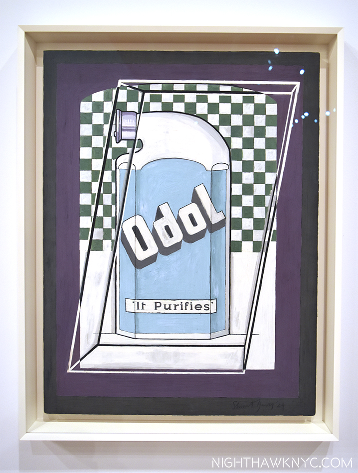
"Odol," 1924, a bottle of mouthwash, presaging Warhol by 35 years.

“Odol,” 1924, a bottle of mouthwash, presaging Warhol by 35 years.

A walk through the show reveals that Pop Art, and a number of it’s leading lights were creating work that featured elements Stuart Davis began using way back in the 1920’s. In fact, after seeing it, you may never look at Andy Warhol, Roy Lichtenstein, Jasper Johns or James Rosenquist quite the same again. Beyond his use of products, his use of words is something that many Artists since Davis, right up to Ed Ruscha, Jenny Holzer and Wayne White, have continued, some basing their entire Artistic output on them. While his influence is huge, it’s also interesting to me how different his work is from the work of the other Abstract Artists of his time, especially the Abstract Expressionists, who were then working right around him every day in NYC and it’s suburbs. Philip Guston speaks of knowing him 7. What about Jackson Pollock, (who was born, lived and work, then died during the time Davis was alive)? Did Davis know him? It would seem to me they must have met, especially since they both worked for the WPA (Works Progress Administration). It’s hard to imagine two more different Abstract Artists.

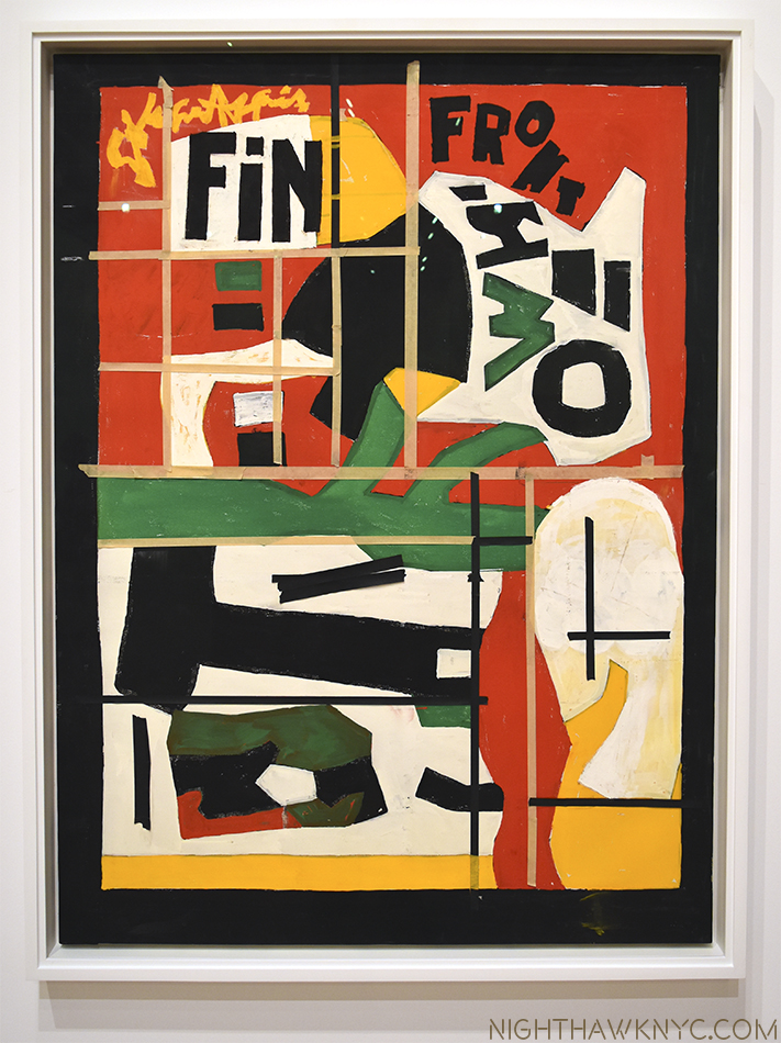
The end. "Fin," 1962-64, as it was left on his easel when he died.

The end. “Fin,” 1962-64, as it was left on his easel when he died. The yellow-ish lines are masking tape Davis used as guides.

dsc_2690pnh

“Arboretum by Flashbulb,” 1942

It must also be mentioned that Mrs. Gertrude V. Whitney was a substantial, and early, supporter of Davis, in a number of ways, both financially (buying his Art and advancing him funds) and through the Whitney Studio Club, the precursor of the Whitney Museum, where he got his “big break,” 8 with a 2 week retrospective exhibit in December, 1926. 90 years later, Davis returns to the latest incarnation of the Whitney Museum, a few minutes walk from where he once lived, something of a “champion” of American 20th Century Art, himself. His influence is ongoing. His achievement is still being considered. Yet? All in Stuart Davis’ Legacy is not painted in the bright colors he used so masterfully in his work.

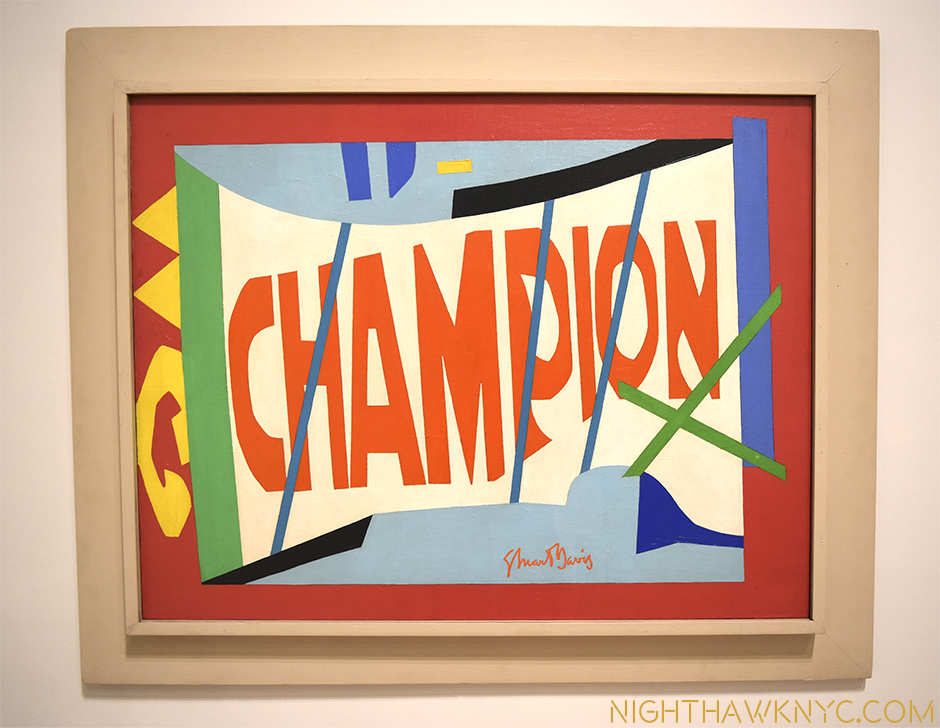
"Little Giant Still Life," 1950, a box of "Champion" matches

“Little Giant Still Life,” 1950, a box of “Champion” matches.

While the joy, beauty and insights this show provides will stay with me for a very long time, it’s impossible not to also be reminded of the fact that 90 works by Stuart Davis were discovered to have been “looted” 9 from the Artist’s Estate by Laurence Salander of Salander-O’Reilly Gallery, the long time dealer for Stuart Davis’ Estate, in 2007. The court ruled that Salander owes Earl Davis and the Estate $114.9 million dollars, but being as Salander is behind bars on Riker’s Island no one knows if and when any of that money will be repaid. As bad as that is, perhaps even more tragically, to this day, I’m not sure that all of Davis’ works have been accounted for. The case led to the creation of new laws pertaining to Artist/Gallery dealings. That is the saddest part of what is otherwise the great and ongoing influence that is the legacy of Stuart Davis, one of America’s greatest, and most influential, Artists.

Even his beautiful signature, boldly featured in many of his works, has the peaks and valleys, the ebbs and flow, of a Jazz solo.

*-Soundtrack for this Post is “It Don’t Mean A Thing (If It Ain’t Got That Swing)” by Edward Kennedy “Duke” Ellington, the title of which appears on Davis’ painting “Tropes de Teens,” 1956.

NighthawkNYC.com has been entirely self-funded & ad-free for over 8 years, during which 300 full length pieces have been published! If you’ve found it worthwhile, PLEASE donate to allow me to continue below. Thank you, Kenn.

You can also support it by buying Art, Art & Photography books, and Music from my collection! Art & Books may be found here. Music here and here

Written & photographed by Kenn Sava for nighthawknyc.com unless otherwise credited. To send comments, thoughts, feedback or propositions click here. Click the white box on the upper right for the archives or to search them. Subscribe to be notified of new Posts below. Your information will be used for no other purpose.
  1. I’m not wagering “anything” on this, so if you find one that doesn’t have a Stuart Davis, write me and let me know and I’ll send this Post to them to hopefully influence their future purchases!
  2. Stuart Davis “Autobiography” in “Stuart Davis” edited by Diane Kelder, P.26
  3. Davis, 21, was the youngest artist to be included in the legendary Armory Show of 1913, the first modern art show in America, which marked the arrival of Cubism in New York.
  4. His parents had lived in the Hotel Chelsea, 11 blocks north.
  5. “Stuart Davis,” by Patricia Hills, P. 19
  6. I am only talking about Artists who were/are Painters first, so I am leaving out Musician/Artists like Miles Davis, Art Blakey, Tony Bennett, Muhal Richard Abrams, Anthony Braxton, Roscoe Mitchell, et al..
  7. Guston “Collected Writings” P.40
  8. according to Patricia Hills “Stuart Davis” P.73
  9. Artnews April 18, 2014

Does Humor Belong In Art? Ask Wayne Whiter

This site is Free & Ad-Free! If you find this piece worthwhile, please donate via PayPal to support it & independent Art writing. You can also support it by buying Art & books! Details at the end. Thank you.

Written & Photographed by Kenn Sava.

In 1986 the great Frank Zappa released an album who’s title asked “Does Humour Belong In Music?” The same year Wayne White was working as set designer, puppet creator & operator on the ground breaking, now classic, avant-garde TV show, “Pee-Wee’s Playhouse,” for which he won 3 Emmy Awards. Not content with that, 1986 also saw him win a Billboard Magazine award for best Art Direction for Peter Gabriel’s music video “Big Time.” He followed that up with an MTV Music Video Award for designing the Smashing Pumpkins video “Tonight, Tonight” in 1996-

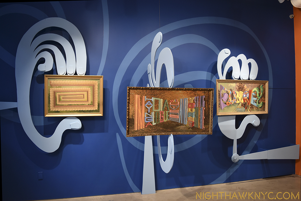
20 years later I caught up with what he’s doing now over at his show, “I”m Having A Dialogue With The Universe And You’re Just Sitting There,” at the Joshua Liner Gallery, in the shadow of the new Zaha Hadid Building still going up on West 28th street. (They’ve added her name in very large letters at the very top, looking not unlike one of Wayne White’s “Word Paintings,” though it’s temporary…I assume.) As for Wayne White, he’s moved on from Pee-Wee to this-

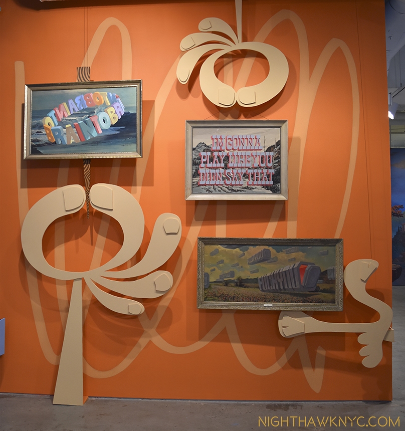
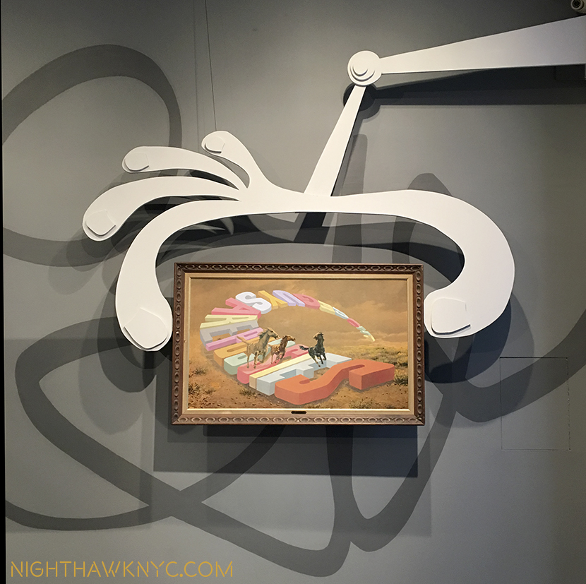
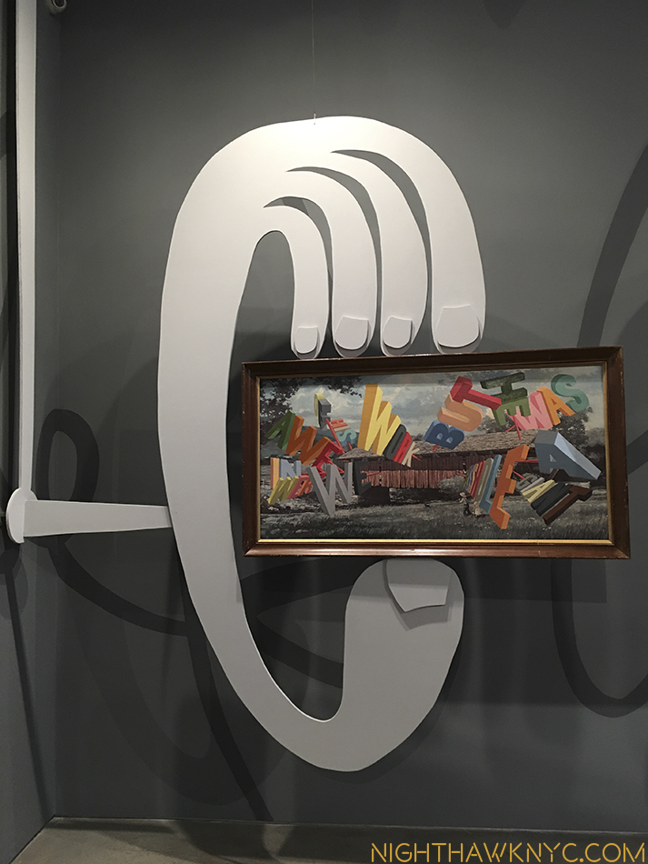
3 Works in Wayne's custom hand holders.

Wayne White’s “set-like” installation for 3 of his “Word Paintings.”

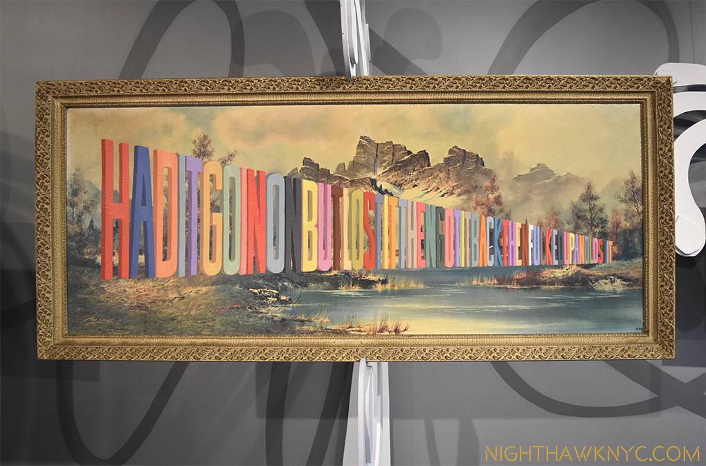
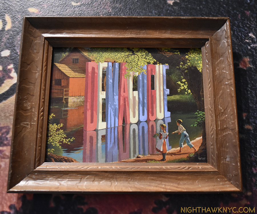
The endless sailboat is now the endless covered wagon above on the left, below, and is joined by a series of Wayne’s “Word Paintings,” which consists of words and phrases he paints on top of old lithographs he finds in thrift stores, and one sculpture.

"I'm Having A Dialogue With the Universe And You're Just Sitting There," 2016

“I’M HAVING A DIALOGUE WITH THE UNIVERSE AND YOU’RE JUST SITTING THERE,” 2016

It turns out that all the while (actually, most of his life) Wayne White has been drawing incessantly, as can be seen in the 400 page monograph edited by designer Todd Oldham entitled, “Wayne White: Maybe Now I’ll Get The Respect I So Richly Deserve.” But even this only covers some of his creative work. Yet, he is clear on what he wants to accomplish.

“My mission is to bring humor into fine Art. I’m not talking about coy art world funny. I’m talking about real world, Richard Pryor funny. Humor is our most sacred quality. Without it, we are dead,” he says.

dsc_8839pnh

“HAD IT GOIN ON BUT LOST IT THEN GOT IT BACK THEN FUCKED UP AND LOST IT,” 2016

"DEMAGOGUE," 2016

“DEMAGOGUE,” 2016

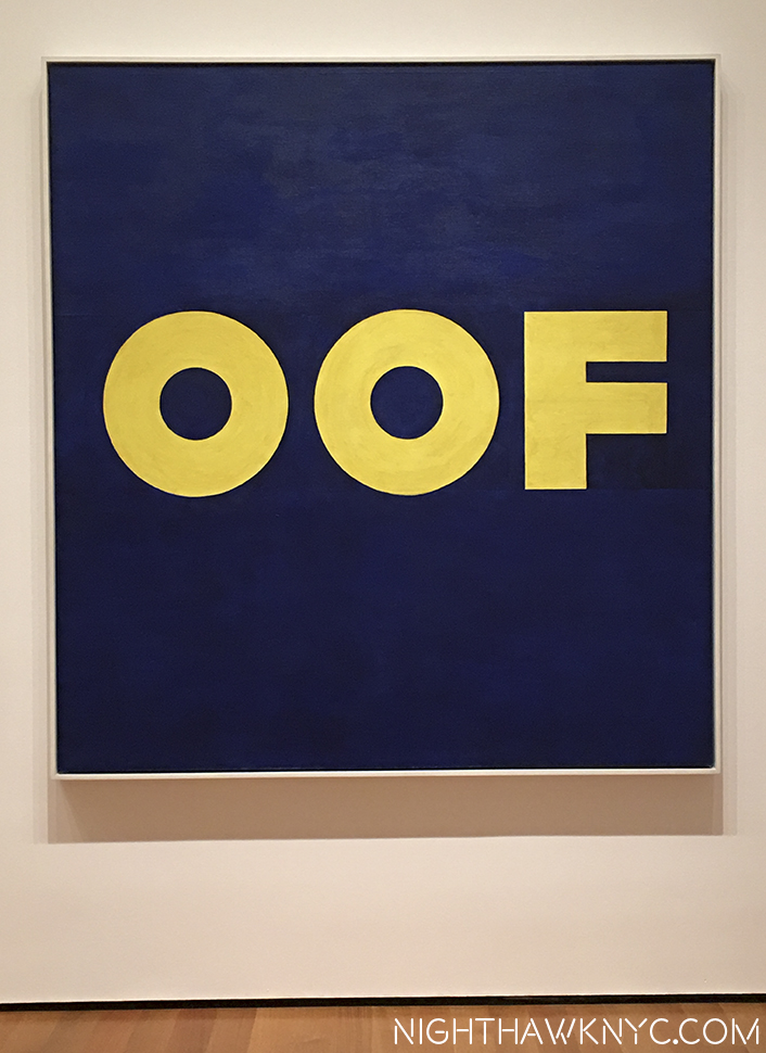
Is this Art? Hmmmm….Time will tell. There is a history of “word art” in museums, from Stuart Davis through Jasper Johns, Warhol, Ed Ruscha, Jenny Holzer and Barbara Kruger.

Ed Ruscha's "OOF," 1962, at Moma, one of the most beloved works in Western Art at the NighthawkNYC Offices (It's an inside joke.)

Ed Ruscha’s “OOF,” 1962, at Moma, a favorite here at the NighthawkNYC Offices.

There is the whole question about the ethics of taking someone else’s art and painting over it, though Mr. White only paints on lithographs, not paintings, so he’s not defacing a one of a kind, like Hans-Peter Feldman, who happened to have a show right around the corner, does. There is recent precedent for this in Ai Weiwei’s “Coca-Cola” painted on an antique Chinese Urn, among others, but I am not an intellectual property lawyer.

dsc_8826pnh

I find it ironic that he did the Art Direction for Gabriel’s Big Time…

whose lyrics now seem prophetic-

“The place where I come from is a small town
They think so small, they use small words
But not me, I’m smarter than that,
I worked it out
I’ll be stretching my mouth to let those big words come right out”*

Born and raised in Chattanooga, Tennessee, his life changed when he discovered the underground comics of Art Spiegelman and R. Crumb. He hunted down Spiegelman and took his cartooning class at the School of Visual Arts. After graduating, Pee-Wee, and the music videos, a studio accident led to his putting words on found art, and his “Word Paintings” were born. Over a decade later, they are becoming iconic- most of those on view are sold, some for as much as $25,000.00. But, they are only one side of the man’s talent. I yearn to see a more complete showing of his range- his more abstract Word Paintings, as well as his other paintings which are not based on found lithographs, his sculpture, his puppets, and on and on. The breath of his talent is both mind-bending and mind-opening.

Mr. White is, also, quite a self-promoter, which he accomplishes with both southern charm and his trusty banjo in hand. There is no better sample of, or introduction to him, than this-

And? If you want to see more of him, there’s a new documentary on him called “Beauty Is Embarrassing,” that was a hit at the festivals and is now out on DVD.

Also of note is the installation- a set design, itself. Along with the “art holders,” White has collaborated with a Brooklyn company to create his own “Waynetopia” wall paper, which in installed in the back half of the show. You can buy it for 11.00 the square foot.

img_6659nh

The rear half of the show features White’s “Waynetopia” wallpaper, available at $11. the sq foot, and a windmill word sculpture.

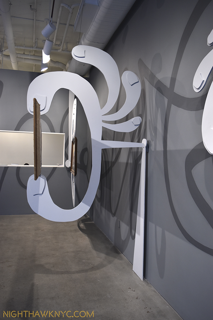
Side view of one of White's Art Holders.

Side view of one of White’s Art Holders. LOVE the painted faux shadow lines on the wall..

High above the show are his initials, as he signs his patintgs.

High above the show are his initials, as he signs his paintings.

dsc_9251pnh

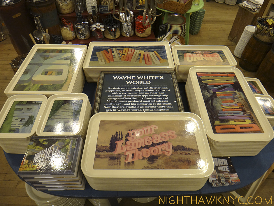
Oh! And lest I forget- If you don’t have a spare $20,000. laying around for a painting, you can always head over to the wonderful Fishs Eddy who have collaborated with him on a collection of serving trays. Yes, serving trays. At popular prices. I guess with a couple of hooks you could hang one on your wall, and take a trip around the world with the savings. (I’ve got my eye on the “Luv Hurtz” tray myself, though “Beauty Is Embarassin’!” is a close second.)

Wayne White Serving Trays in collaboration with Fishs Eddy, NYC

Wayne White Serving Trays in collaboration with Fishs Eddy, NYC, seen in their Broadway store.

While I prefer his edgier work (surprise, surprise), Wayne White is so prolific, he’s like the weather in Miami- If you don’t like it now, wait 15 minutes- it’ll change. Meaning, he’s almost certainly got something in his oeuvre to wow you. He has begun to get shows where he’s been able to bring all of his talents to bear, (like “BIG LICK BOOM,” an installation at the Taubman Museum,Roanoke,VA. in 2012). He is yet another of the generation of Artists who have come up influenced as much by  R. Crumb’s “Zap” and Art Spiegelman’s “Raw” as by Raphael. Yet, I’ll give him this- Wayne White is, perhaps, funnier than Speigelman or Crumb (though both, assuredly, have many moments of their own, I don’t think humor is their primary goal.) Time will tell what Wayne White’s ultimate “goal” is. For now, he’s building a following and breaking barriers. It will be interesting to see where he takes things.

"THOSE GUYS ARE PUSSIES, 2016. I can see this hanging on some exec's wall.

“THOSE GUYS ARE PUSSIES, 2016. I can see this hanging on some exec’s wall.

WE WERE IN AWE OF HIS WORK BUT HE WAS A GIANT ASSHOLE, 2016

WE WERE IN AWE OF HIS WORK BUT HE WAS A GIANT ASSHOLE, 2016

As I left Joshua Liner, I came away thinking that it’s not often an Artist goes to such lengths to install a show, especially one that is only up for exactly one month. The work designing and creating this installation must have taken much much longer. As much as the work on display, I was impressed by what that says. It really was like walking around in a “Wayne White World.” It’s unique, wonderfully well thought out, and, ummmm, what’s that word I’m looking for? Oh yeah….FUN!

*-Soundtrack for this Post is “Big Time” by Peter Gabriel, from “So,” and published by Sony/ATV Music Publishing, LLC.

NighthawkNYC.com has been entirely self-funded & ad-free for over 8 years, during which 300 full length pieces have been published! If you’ve found it worthwhile, PLEASE donate to allow me to continue below. Thank you, Kenn.

You can also support it by buying Art, Art & Photography books, and Music from my collection! Art & Books may be found here. Music here and here

Written & photographed by Kenn Sava for nighthawknyc.com unless otherwise credited. To send comments, thoughts, feedback or propositions click here. Click the white box on the upper right for the archives or to search them. Subscribe to be notified of new Posts below. Your information will be used for no other purpose.
Clearing Up My Glaucoma…And, A Major Mystery In Art History

This site is Free & Ad-Free! If you find this piece worthwhile, please donate via PayPal to support it & independent Art writing. You can also support it by buying Art & books! Details at the end. Thank you.

Written & Photographed by Kenn Sava (*- unless otherwise credited)

1. The Treatment

“I’ve been through worse.”

That’s the Mantra. I learned that after surviving cancer, and cancer treatment, nine years ago. “If I can get through that? I can get through this.”

Whatever “this” is.

It works! At least? So far. After all, what could be worse than cancer? That’s what I tell myself.

Blindness is up there. I have anatomical glaucoma. In both eyes. So, the risk is I could become partially blind at any time in either, or both eyes. On my second opinion, I find a doctor who says with 2 laser treatments he can give me a 100% chance of fixing it permanently.

Those are my kind of odds.

Today is Round 1. I got up insanely early for the Nighthawk. 10:30am. Uggh. As hard as that was for me, my friend had a harder road. In fact, 3 hours of one, on the bus down from Upstate New York to come with me. She was more worried that I’d oversleep than anything else, she said. We walked over to a “leading New York Hospital” on a glorious September Monday to experience one of the great joys of modern medicine- the registration line ALL patients must wait in. No matter what, no matter I had been there twice in the past few weeks, and no matter neither my health insurance nor living address change that often. The line was half as long as last time, but twice as slow moving. A guard came over and asked for my info. ? Since when? He relented, but the ex-military guy behind me in line got a bit set off when he tried it on him, which led to him feeling one of the counter clerks didn’t want to serve him. He requested a supervisor, and the clerk’s name to file a complaint. Good luck with that. The supervisor listened to him complain that said counter woman “picked up and put down the same paper repeatedly so as not to serve him.” I found this a bit odd, since I was in front of him in the line, and I was still waiting.

I fnally got to see a clerk, who wound up giving me all the paperwork, including her copy. ? Ok…Onwards to treatment, glad to be done with this chaos.

Upstairs, in glaucoma, the woman behind the desk never even looks up from her phone call to acknowledge me. She was making her case to someone about something that had happened at work. I put my paper on the desktop and made sure my friend was seated. The woman looked up long enough to tell me to take my paperwork, calling me by name. ? How did she know who I was?

We settled into the empty waiting room. After a bit, she pulled out an Art History book, and we started looking through it, and discussing it. Unawares, little by little, the room filled up around us, and we became surrounded by a range of mostly older people of all races and languages. A number of them appeared to be suffering from various mental issues, some so incapacitated they had assistants to speak for them, in addition to whatever eyesight issues brought them to the glaucoma department. Yet, there we were, lost in making comments back and forth about Ingres, Michelangelo, Leonardo, Hopper (who’s “Nighthawks” was on the cover. Good choice! Wink), and her favorite Artist, Chagall.

About 45 minutes later, (45 minutes past my scheduled appointment), I was seen by a technician. He checked my vision, then I came back out and we continued looking at Art. An older gentleman came in with a walker, sat down and proceeded to sing in full voice. This elicited looks from the staff, but nothing more. No one said anything. I turned to my friend and said, “Welcome to New York.” Luckily, he was quickly called, and a semblance of silence resumed. A young man walked in with a large pizza and a soda. “He’s a doctor,” my friend said. Yup. He was. A man walked back and forth behind the counter, from time to time, saying nothing nothing to anyone, and accomplishing…? The woman behind the front desk put on a mask. Her boss came over and asked her “Why?” She muttered something then kept it on throughout. A woman sitting next to my friend began to snore. Somehow, she managed to hear the soft announcement calling her name.

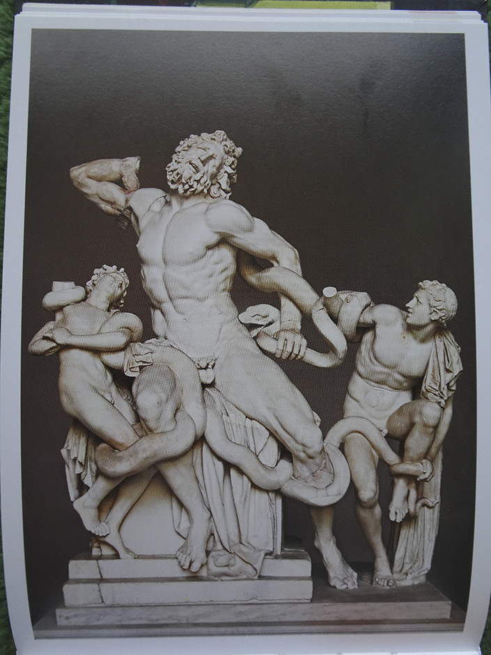
We continued looking at Art. Kandinsky, Monet, more Ingres, more Leonardo- the Mona Lisa looking wayyyyy better than you’d ever see it in person, and a few contemporary Artists I don’t know, capped off with Mark Rothko (the Rothko Chapel, important, but not representative as his only work shown) and Bridget Riley. There was also the Laocoon & his sons, in a full page photo. All of a sudden I had one of those Sherlock Holmes-“Wait a minute!” moments. “Oh My God. LOOK AT THAT! It’s a Michelangelo!,” I thought to myself when I saw it.

"Laocoon" from "When Art Really Works," published by Barron's

The photo in question from “When Art Really Works,” published by Barron’s.

“Hello? Can we put the glaucoma treatment on hold? I may have discovered a Michelangelo, right here in the waiting room!,” I said in thought. We paused and I said (out loud) to my friend that the Laocoon was a huge sensation when it was discovered, instantly recognized as a lost supreme ancient masterpiece, and that there was a theory that Michelangelo had secretly created it.

Hmmmm…

At that moment, I was called to have drops put in before the procedure. 30 minutes later, at 2pm, I was called back for the treatment. 2 doctors surrounded a machine with arms, scopes and all kinds of things sticking every which way. I carefully wiggled onto the odd stool I was to sit on, which required a bit of contorting, hoping I could hold my head steady sitting on it. After all, I didn’t want them to miss with the laser! A nurse was present to make sure I was who they thought I was. She asked questions only I would know, I guess- “Why are your Posts so long?” “Why do you stay up so late?” Ummm….Doctor 1 drew a dark mark on my head over my left eye in the dark room. “Chin up. Lean forward. Look at the yellow light.” Inside the machine I was bombarded by bright flashing red and green lights, a slight squeezing sensation and then it was over. “Perfect,” Doctor 1 said when I asked him how it went.

Phew. Exhale. I have been through worse. Score another one for the Mantra!

Back out to wait to get a blood pressure reading. “Am I bleeding,” I asked my friend. “No,” she said. I was bloodshot, and a bit sore. Things were very fuzzy out of that eye, like I was looking through an extremely smudged eyeglass. I saw the Doc again, scheduled the right eye, and we left, arm in arm because while I could see, I didn’t know how well yet. I felt ok, but quickly found that you can’t keep one eye closed very long. I immediately put my shades on. Lord, it was bright outside. Don’t they do these at night?

Later, maybe in the throes of the steroids I’d be on for a week, or the rush from having gotten through it, I was struck by how amazing the experience was. Not medically. Interpersonally. I’ve never had someone who shared my love of Art like this in my life. That’s part of the reason I have this Blog. I need to share it with someone. Later, while she was back on the long road home, I told her it was very special to me that we were sitting there together reading about Art, no matter what was going on around us.

She said that the other people there probably thought WE were the crazy ones.

Art is in the beholding.

2. The Fog Lifts

I had a cloudiness, then a darkness in my left eye that lasted all afternoon and evening. All day I’d been haunted by the picture in her book of the Laocoon Sculpture. An iconic work of early Ancient Art, dated at about 20 BCE, that had disappeared until it was rediscovered in 1506, it looked amazing for 2 thousand odd years old. The ancient historian, Pliny the Elder, had written about it, in his Natural History in 79AD. He said

“Such is the case with the Laocoon, for example, in the palace of the Emperor Titus, a work that may be looked upon as preferable to any other production of the art of painting or of statuary. It is sculptured from a single block, both the main figure as well as the children, and the serpents with their marvelous folds. This group was made in concert by three most eminent artists, Agesander, Polydorus, and Athenodorus, natives of Rhodes.”

With such a buildup, it’s no wonder it’s discovery was a sensation- among the public and among Artists. It was immediately acquired by Pope Julius, and it holds a place of honor in the Vatican to this day. That much is known. But? What about this theory I’d heard about it? Finally, around midnight I could see enough to read my computer screen. The first thing I did was look up this-

“Michelangelo Laocoon”

I came across two pieces in the NY Times within days of each other in 2005 (here, and here). The pieces talked about a Columbia University Lecturer, Dr. Lynn Catterson, and her theory that Michelangelo had created the Laocoon. i.e. Michelangelo had created a forgery of the Laocoon in Pliny and hid it so it could be “re-discovered” at long last- “All too conveniently,” as Dr. Catterson put it.

2005? Hmmm…Eleven years ago. Nothing since. That’s strange. No mountain of outraged PhD’s spewing vitriol at her and her claims? Now, I was VERY interested. My gut radar went off as it rarely does this morning. But, let’s get real- this is one of the most sensational claims there could be in Art. If true, it would rewrite Art History for BOTH the Modern AND Ancient worlds! Not to mention Michelangelo’s.

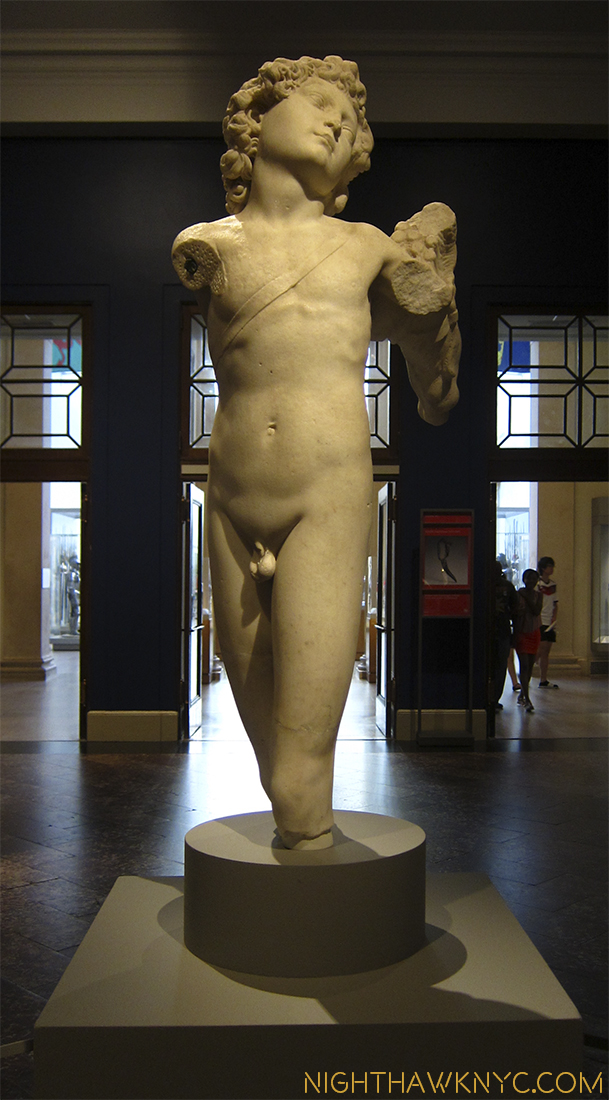
Then again, as Michelangelo specialist, author and educator, Professor William Wallace says in one Times piece, works supposedly by Michelangelo have appeared often- seventeen from 1996-2005. Even I have seen these claims in the past, and frankly, after checking a few of them out, you become numb to them. In fact, right now, at The Met there is a small sculpture on display- of Cupid (which they now call “Young Archer” on their website), on extended loan, that no less than The Met’s experts, who I hold in highest esteem, say is by Michelangelo! Not “Attributed to.” Not “Michelangelo and assistant.” It says, “Michelangelo” on the card, below, and on the web page. IF it is an original Michelangelo? It is the ONLY Michelangelo sculpture in the Western Hemisphere. Pretty big deal. But? Other experts disagree about it. Is THIS the forgery of a Cupid Michelangelo is known to have made? Now that it’s called “Young Archer” on their website does that mean the well-known Cupid forgery is ANOTHER work? Also, nothing is mentioned about WHY they think it’s a Michelangelo. After spending a good deal of time looking at it from every angle. I remain to be convinced it is a Michelangelo. Then again? Part of a forger’s work is to adopt another identity.

img_2318pnh

img_2319pnh

Michelangelo, “Cupid” & it’s card at The Met. Their website calls it “Young Archer.”

Though I remain unconvinced by the Cupid at The Met, I was more convinced by their “Michelangelo’s First Painting” show, in 2009, of a restored painting titled “The Torment of St. Anthony,” which was based on a print by the great Martin Schongauer. I drank their cool-aid, and I bought what they were selling about it. Interestingly, The Met didn’t buy this work, themselves, when they had the chance to! I’d love to know why not. It was bought by the Kimbell Art Museum, Fort Worth, Texas, who The Met restored it for. Very peculiar. Michelangelo changed Schongauer’s original, adding his own touches and putting his own mark on the work, which he created in color(!), compared to the black and white original print, they hung next to the painting. While he didn’t create this work as a forgery (as far as I know), Michelangelo has a history of creating forgeries and was caught making at least one. The risks were great. Yet, according to Dr. Catterson, he continued making them, even creating the Laocoon right along side the immortal Pieta also now in the Vatican.

Reading her full piece, Dr. Catterson makes a strong case. I urge you to check it out. Here are some highlights-
-The found Laocoon wasn’t in one block as Pliny said, but 7 connected pieces of marble, making transporting it to the site feasible
-Michelangelo had the money, marble, space and time to create it before it was “found.”
-It’s miraculously superb condition(! ?)(Walk around The Met and check out the condition of sculpture from that period, BCE. Oh, and count how many still have a whole nose!)
-The “rediscovery” of the Laocoon was, seemingly, “made to order”. Consider-
-No less than Michelangelo, himself, was called to be there when it was discovered.
-Michelangelo had only recently arrived back in the area.
-Michelangelo also worked on it after it was discovered
-There is a drawing by Michelangelo that matches up uncannily well with the rear of the sculpture when superimposed on it’s photo
-Michelangelo destroyed an unknown number of his drawings before his death. Why, if they didn’t reveal what works he forged?
-Michelangelo wrote a letter in which he speaks of the Pope killing him if he discovered something. What? Aside from the construction of the Pope’s tomb, the only other interaction they had at the time was the Pope recently acquiring the Laocoon.

That’s the shortlist.

“Last night I dreamed about you
I dreamed that you were older
You were looking like Picasso
With a scar across your shoulder
You were kneeling by the river
You were digging up the bodies
Buried long ago
Michelangelo”*

My question is “WHY?” Actually it’s a 2 part question-

-Why did he make these fakes, and then keep making them? And,
-WHY didn’t he ever come clean and take credit for them, especially the Laocoon, which instantly became iconic? Here is an Artist who, according to Vasari, snuck into the Vatican overnight to carve his name on the sash of the Pieta so everyone would know who created it! (Though, he regretted doing that, and swore to never sign a work, again. He didn’t.) To create a work that is, along with the Pieta, one of the greatest sculptures we have, at about the same time, and NEVER take ANY credit for it at all, even on his death bed? On the flipside, making, then hiding, something like this would seem to be extremely hard to keep secret. Someone else must have known. And yet, there is not a peep of this anywhere, until Dr. Catterson’s theory. Michelangelo was the first Artist to have a biography written during his lifetime (actually, 2). Why didn’t anyone, especially his enemies and rivals, “out” him? This puzzles me.

I await hearing what someone/anyone else has to say to negate, or substantiate her claims. Professor William Wallace, countering the initial outrage Dr. Catterson’s theory received, said– “…the intriguing thing is that nobody who studies classical art in a way wants the ‘Laocoon.’ They find it kind of a Hellenistic embarrassment, maybe because it really doesn’t look like anything else comparable in the history of classical art.” Why? As Dr. Catterson points out, Michelangelo used contemporary models, including Filippino Lippi, not ancient ones, when he created this.

As much as I love sculpture, I’ve never really paid much attention to the Laocoon. Why? I hate snakes! So, this is a pretty nightmarish image for me. Funny thing? My friend said the same thing Monday when we saw it! I have been, however, reading quite a bit about Michelangelo these past 5 or 6 years. I’ve read the 2 volume set of his Letters, a number of biographies, including Condivi’s and I’m in the midst of Martin Gayford’s “Michelangelo: His Epic Life” Biography right now. (He doesn’t mention Dr. Catterson’s theory, though his book was published in 2013.) I have some superb books of photos of his sculptures, including the XL Taschen monograph. I look at them frequently. Michelangelo is in my mind, like Leonardo da Vinci was that day in London in 2012 when I saw the “Salvator Mundi/Savior of the World”in the once in a lifetime Leonardo show in London’s National Gallery, after it had recently been credited to Leonardo. Seeing 7 of his other paintings that have been credited to him for much longer, immediately before.1, I came away believing it is a da Vinci, unlike the Shroud of Turin. So, when I suddenly saw the Laocoon Monday afternoon in my friend’s book, I was stopped dead in my tracks…

Michelangelo. I believe Dr. Catterson is right.

“We’ll never have the certitude a scientist gets,” Professor Wallace said, “It can only be tested by the weight of scholarly opinion and time.” And, I humbly suggest- your eye, and your gut.

“That the Laocoon was carved by Michelangelo explains why then, and now, its effect is mesmerizing.” Dr. Catterson’s piece coincidentally ends.

In at least two ways on Monday, the mist cleared, and now I see.

ONward to Round 2!

(For Sv.)
*-Soundtrack for this Post is “Michelangelo,” by Emmylou Harris, published by Universal Music Publishing Group.

This site is Free & Ad-Free! If you find this piece worthwhile, please donate via PayPal to support it & independent Art writing. You can also support it by buying Art & books! Details at the end. Thank you.

Written & Photographed by Kenn Sava (*- unless otherwise credited)

  1. You can see it exactly where I saw it, described by curator Luke Syson, who’s now at The Met, here.

Having It Out With Philip Guston

This site is Free & Ad-Free! If you find this piece worthwhile, please donate via PayPal to support it & independent Art writing. You can also support it by buying Art & books! Details at the end. Thank you.

Written & Photographed by Kenn Sava (*- unless otherwise credited)

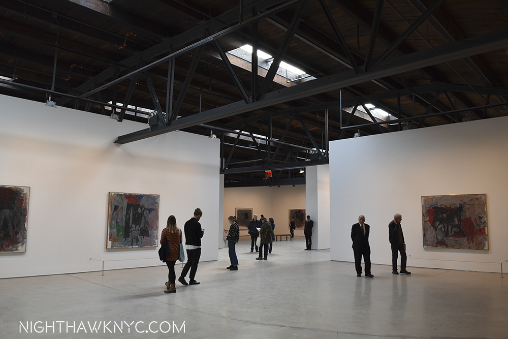
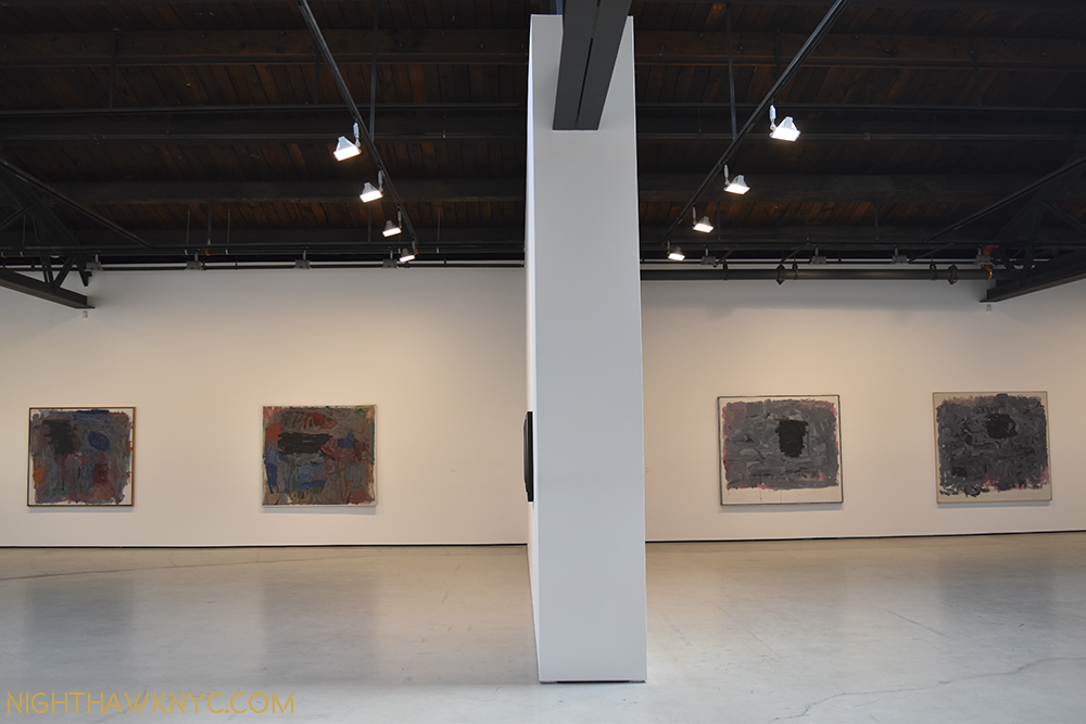
I had mixed feelings when I heard about “Philip Guston Painter 1957-67,” on view from April 29 to July 29 at Hauser & Wirth’s temporary Gallery in the former Roxy Nightclub space. On the one hand, large Guston shows are a rarity, on the other hand, I have long struggled with his works of this period. So, it was with a desire to have it out with them in a battle to the death, over the very generous 3 months it was up, and either, finally, “get” them, or not that I climbed their candy-cane striped stairs to enter a space I had known in it’s previous incarnation.

dsc_0434pnh

This space had a “colorful” past, in a different way. One that involved roller skates.

I am happy to report that July 30th dawned to find me still among the living.

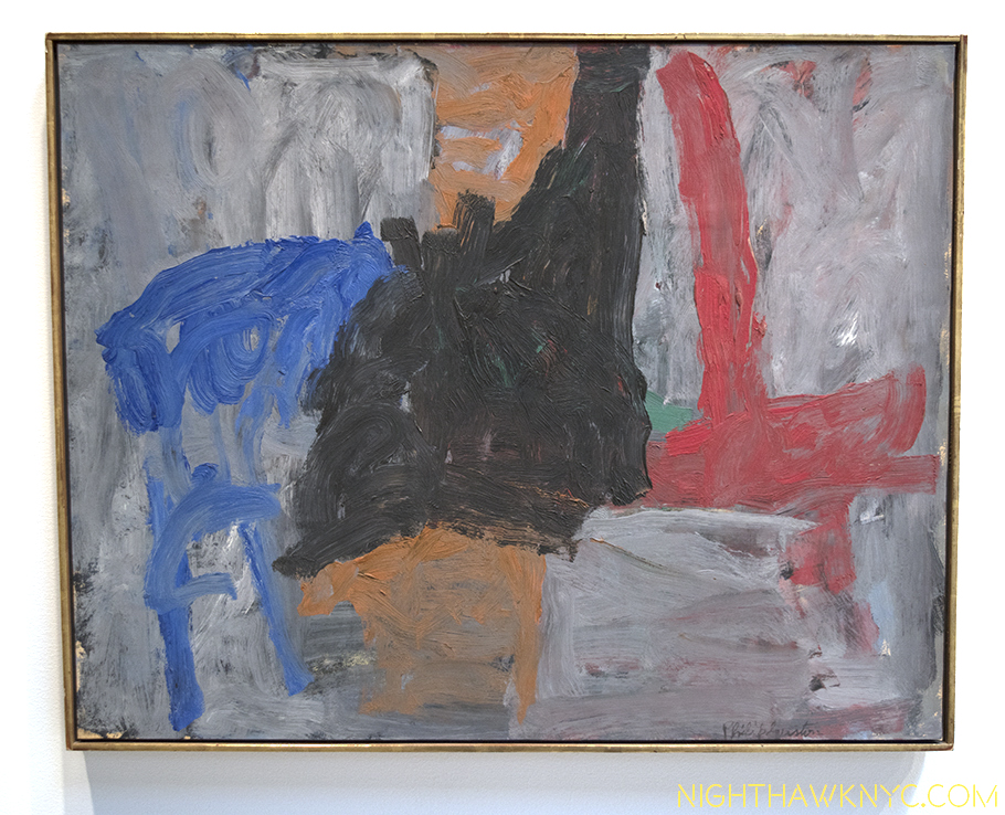
The show is focused on paintings from 1957-1965, 8 of Guston’s most “abstract” years , and drawings dated from 1967-69, at the beginning of his return to “figurative” work.  The 1957-65 period of Guston’s paintings is, perhaps, his least known, possibly least loved, (according to one owner- Guston’s daughter, Musa Mayer’s, experiences when guests have seen it) 1, and least seen works by this Artist, who Hauser & Wirth calls “the preeminent 20th century American Artist” in their press release.

Really? I am very interested in his work, and have a lot of respect for him, but “the preeminent?” Hmmm…Comparing Artists qualitatively is against my religion, though some other candidates are here2. Still, a group of 35 of these is unheard of, and seems unlikely to be repeated any time soon.

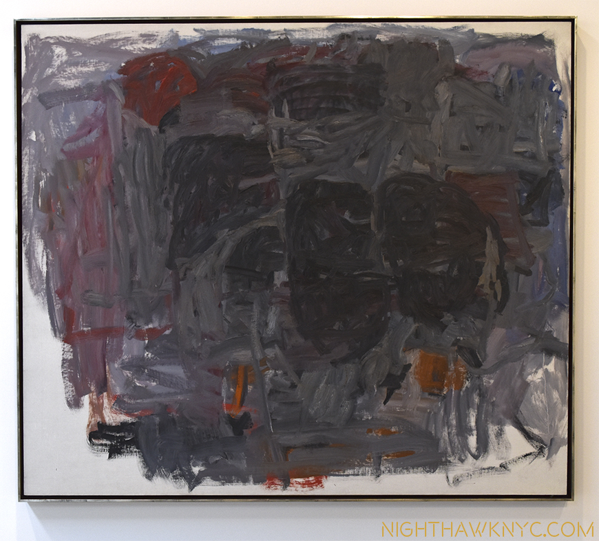
While his early abstractions from 1950-55 are seen regularly and much admired, the works of his next period are very different. Gone were the luminous colors and shimmering qualities of the earlier works replaced by a darkness that feels to be continually encroaching as these 8 years progress.

What came before... "Painting," 1954, on view at Moma

What came before… “Painting,” 1954, on view at Moma

“What shall I paint but the enigma?”

A revealing quote from Philip Guston in 19693? Possibly. Guston, apparently, mis-translates, or misquotes a translation of the inscription on a “Self Portrait,” from 1911, by Giorgio de Chirico, a major lifelong influence, who he was speaking about when he uttered it. It’s de Chirico’s motto. The original reads- “Et quid amabo nisi quod aenigma est?” Most of the translations I’ve seen of it are- ‘What shall I love if not the enigma?’ Maybe it’s Guston’s interpretation of it?

It would, also, seem to be a fitting motto for this show.

This show begins. "Fable II," 1957,

The show begins… “Fable II,” 1957,

Guston came to abstraction very gradually, the end result of a period of consternation over his direction during which his work was gradually leaving figuration behind. In late 1948 he took a break from painting and armed with a Prix de Rome and a grant from the American Academy of Art and Letters, made a trip to Italy to see the works of his early Reinassance heroes, Piero della Francesca and Masaccio. To that point, the dissolution of the figure in his work can be traced through “If This Be Not I,” 1945 (perhaps my favorite work of his), to “The Porch I & II,” 1947, and especially in “The Tormentors,” 1947-48, his last work his trip to Italy. Upon his return, his “Red Painting,”1950, and “White Painting,” 1951, begin his “non-figurative” periods, from which the works on view eventually followed. He said,“The 1950-55 paintings, (see “Painting,” 1954, above), in general, were very diffuse lyrical pictures. About 1956 I began to become very dissatisfied. I began to feel a need for a more solid painting. I began to look at my earliest work with a kind of renewed interest, the solidity of that. I found it a terrific challenging problem, in my own terms, to create forms.” 4

"Traveler III," 1959-60

“Traveler III,” 1959-60

Then, in 1956, right on the cusp of the period in question, he told writer and friend, Dore Ashton, “I’m in love with painting.5” Looking around this show, that was the first thing that struck me- how painterly these paintings are. Guston’s brushwork has never been so nakedly at the forefront, even in the abstractions from 1950-55, as they are in every work here. It feels like it would be possible to follow each and every one in some of these works.

dsc_0432pnh

“Position 1,” 1965, Detail.

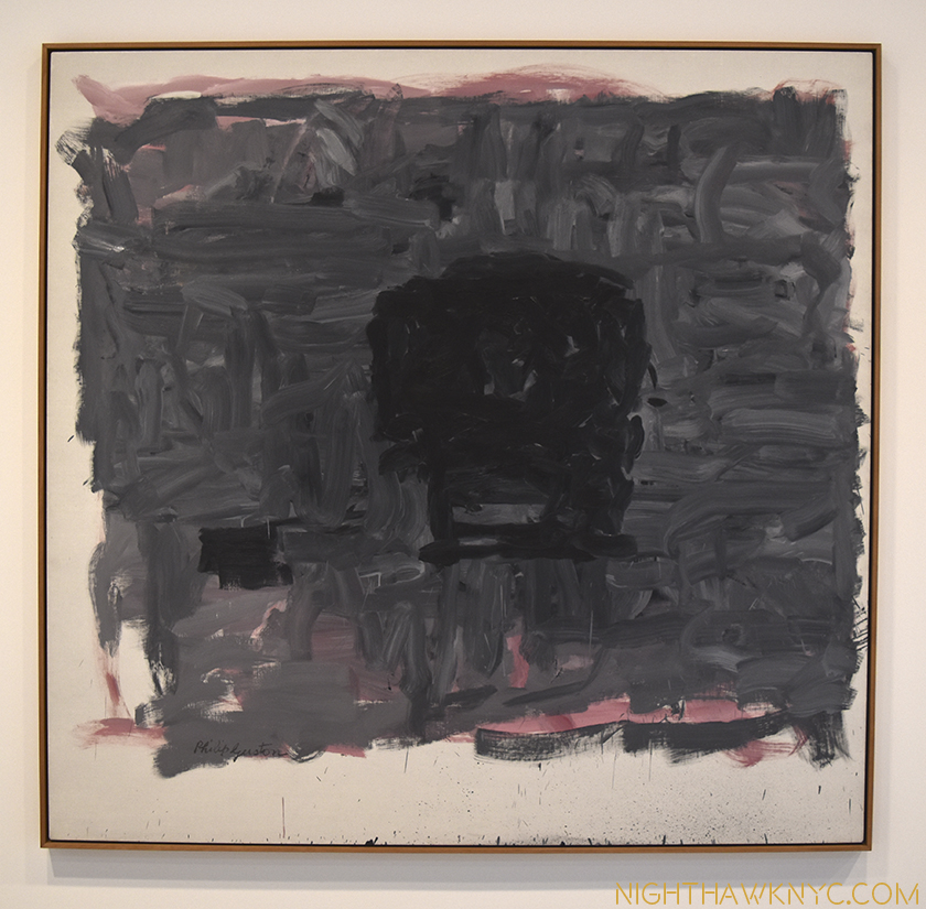
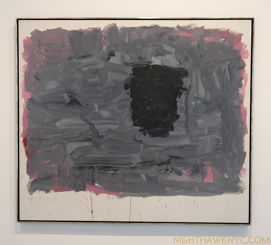
They have a freedom, a rawness, an energy that strikes me as being completely opposite from his earlier abstractions, someone dubbed “abstract impressionism,” a term he hated, works that are calm, subtle, delicate.These seem almost defiantly, perhaps reactionarily, different. They all contain shapes. At first, a mass of them, later individual shapes, and finally one shape, on a murky grey/blue with pink background. After all the depth of field has gone out, which began in his mid 1940’s work, completed from 1950, after the variety of color has gone out. The enigma remains.

"Turn," 1959

“Turn,” 1959

“There can be no adequate understanding of Guston’s life work unless we are prepared to go back over the whole road,” Dore Ashton wrote in 1990 6. In the earlier work, the enigma was different. It came with, and in the guise of persons, places and things. Guston’s work begins, as far as public collections go, in 1930. And? Talk about starting with a bang!

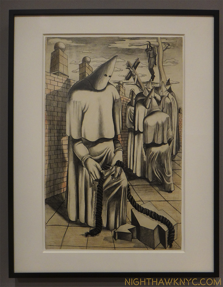
Guston was a lifelong creature of habit. Some of those, possibly, led to his early death at 66 in 1980. As a child, he retreated from the world to his closet, where he would read, and even paint, by the light of a single light bulb. He painted hooded KKK guys7, who he actually saw break up strikes. At age 13 he discovered his father, hanging, having committed suicide.(!) At age SEVENTEEN, he created this-

"Drawing for Conspirators," 1930, Whitney Museum

Drawing for “Conspirators,” 1930, at the Whitney Museum

There’s so much going on in this. First, note the figure hanging in the background. Then, the figure in the foreground handling rope. In the 1970’s when these hooded figures8 returned to his work, he said they were self-portraits9 Is this Guston pondering guilt over his father? Look at the abstraction of space- everything is enclosed in a very narrow area, which would reappear in the 1940’s, and again in the late work. The faceless head shapes, the narrow stage, and the brick wall are reminiscent of de Chirico. The angled cross from Piero della Francesca. Many of these elements, along with the single light bulb, his fascination with shoes, as well as many of the lessons he had picked up from his beloved early Renaissance Masters and, de Chirico, we see in the late work of the 1970’s. Also seen in the late work is Guston’s early love of comics. He reacted strongly when someone mentioned this to him, yet, I think it’s undeniable. As I wrote, I wonder what influence R. Crumb may have had on him. Though most of these are not readily apparent in the work in this show, they set me wondering how far away he ever got from them. After returning from Italy, his work shows an ever gradual reduction of elements, especially in his work from 1956-65, until he even stopped painting. Such was the effects of the admitted despair he was in, again, in 1966, as he was stuck before his next direction, which led to the outpouring of his final decade.

"Accord I," 1962

“Accord I,” 1962

Meanwhile, I was in the middle of my struggle with these works. It was on my 3rd visit, sitting in the nicely cavernous space that a key question hit me-

“Exactly HOW ‘abstract’ are these works?”

Look at the titles. “Painter,” “Actor,” “Alchemist,” “Vessel,” and “Portrait I,” among them. Guston commented that the titles were added after the piece had been completed. It’s rare for abstract works of the “New York School” Artists of this period to have such blatantly suggestive titles such as these. They make it impossible to give one’s imagination the completely free reign the usual “Untitled” does. In fact, they force one to attempt to “see” what the title “means” in the work. This brings you back to the way you experience figurative painting. Once this happened to me, I was never able to go back to seeing them as completely abstract again. I began to “suspect” the other works. More titles- “Rite,” “Traveler III,” “Turnabout,” “”The Room,” “Garden of M.” and “Inhabiter.” Without trying very hard, that’s 11 titles of the 36 paintings. Hmmm…


"Inhabiter," 1965

“Inhabiter,” 1965

“I think a painter has two choices: he paints the world or himself. And I think the best painting that’s done here is when he paints himself, and by himself I mean himself in this environment, in this total situation.’– Guston said in 1960.

The evolution during this period can be seen in this next photo. Note the differences between the works on the left, and those on the right. Color has largely gone out, forms have been reduced. The overall feeling becomes one of darkness and isolation.

Left- 2 works from 1960. Right- one from 1964, one from 1965

Left- 2 works from 1960. Right- two from 1965

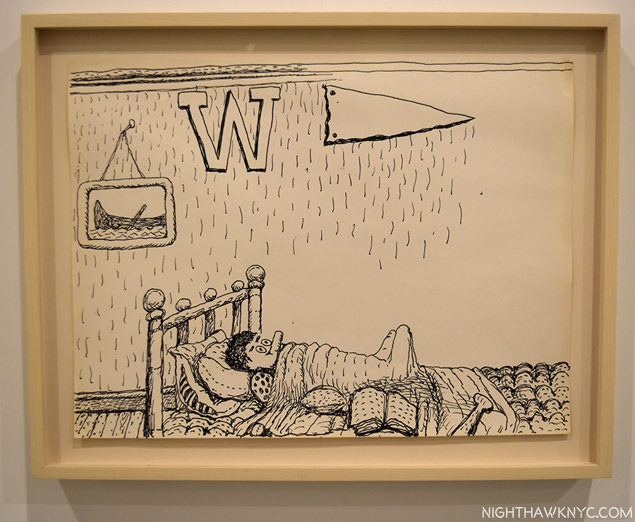
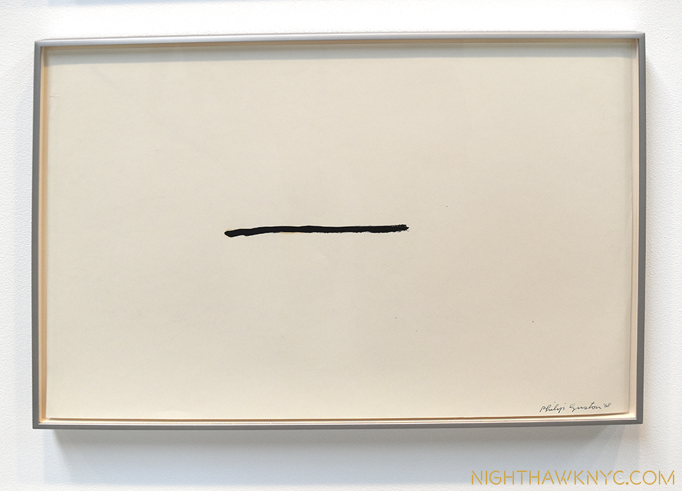
This reduction would continue through 1965, until he was left with one dark form against a murky blue/grey over pink background, with (see “Portrait I,” 1965, below), now, the white of the naked canvas encroaches. After these, painting itself, went out. In 1967, he would start all over by drawing. But, he’d quickly come to see that this new direction offered insufficient room to grow. These zen-like drawings (see the 3 photos following “Cabal,” below) were their own end game. Shortly after, he would make yet another new start. Now, pieces of his past were everywhere to be plainly seen.  This would see him create his long misunderstood, now quite popular and influential final works, like “Cabal,” below.

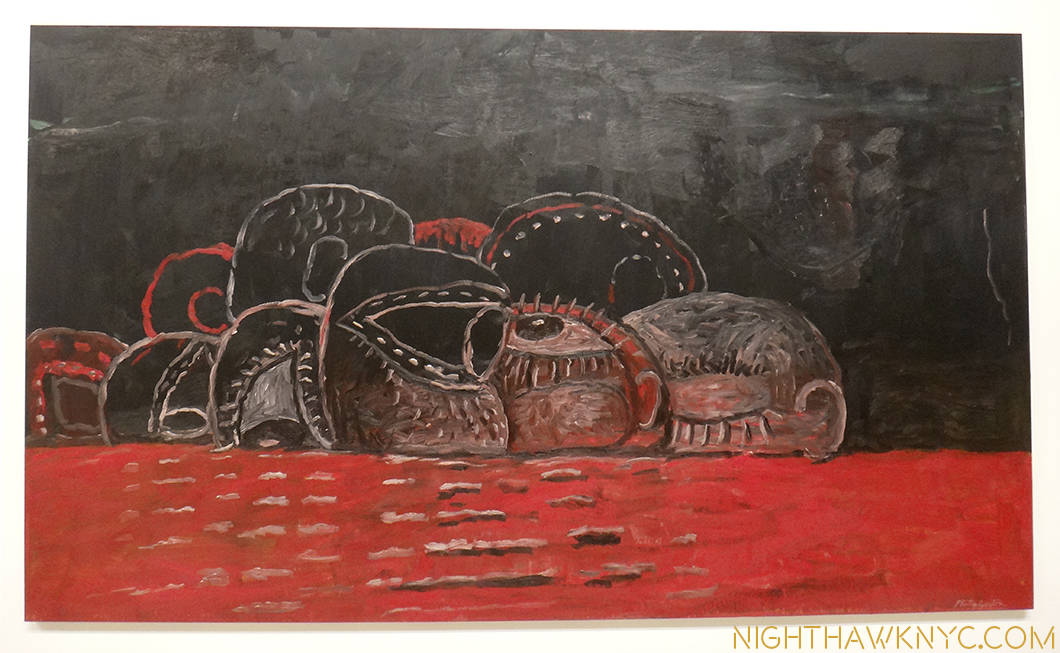
"Cabal," 1977, The Met

“Cabal,” 1977, at The Met

While the “figure” went out of his work from 1950-1965 in works that are called “abstract” (a term he loathed), there is much in his work before, and after that is, also, “abstract”- even in his late work, where people and objects return. After all, isn’t this late work, which is called “figurative,” really “abstract?”

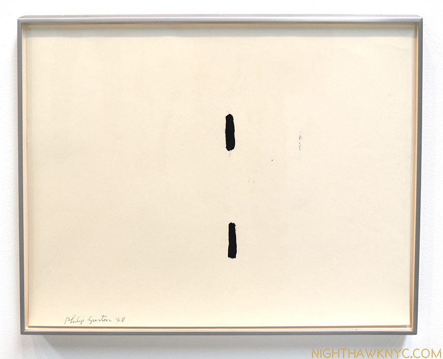
When you look closer at this hooded head in the foreground of “Conspirators,” above, with it’s two black eye holes in the white bedsheet, which somehow manage to be quite expressive. I couldn’t help but think about that when I saw this, “Untitled” drawing among those on the final wall at Hauser & Wirth.

"Untitled," 1968. Drawing.

“Untitled,” 1968. Drawing.

Then, again? With an “Untitled” work, the mind is free to go where it may, right?

Revisiting his subsequent later work while looking at the show of the Small Oils Guston did from 1969-73, that was up at the McKee Gallery in 2009, and you can see here, in addition to the hoods, shoes, single light bulb and other elements from his past, cigarettes, books, the modern city, and his wife, Musa, from his present, I suddenly see other connections (hindsight being 20/20). The same murky grey over pink backgrounds appear in a number of his smaller oils (“Cabal” has a dark background, too.). Some of these also have strange forms alone against this background. All of a sudden they don’t look like they were created by an entirely different Artist than the one who created the works in this show. Well, Philip Guston was a different Artist than the one he was in 1957-65, but he’s still Philip Guston. Since there is much that is common between his early and his late works, it makes me wonder about all of his work. That was my initial question before seeing this show- Would what came before, and after be evident here? Using hindsight you can see connections. How he didn’t completely forget this period. Parts of it remained in his work until the end of his life.

"Untitled," 1968 Drawing

Starting over, again, from the beginning. Abstract or figurative? A pencil? A line? A tightly sealed mouth? “Untitled,” 1968 Drawing

Guston was not considered a founding member of the Abstract Expressionists, nor does he appear in the famous “Irascibles” photo which defined the movement’s members for many. The Met now lists him among the 14 Artists they group in the first group, along with Lee Krasner (the circle is now complete)! I think that part of the reason he wasn’t initially considered part of the group was that he was moving in that direction slowly from 1945 to 1950 which made him miss the first round of fanfare these works received, and which subsequently “grouped” them as “Abstract Expressionists,” a term Guston loathed10. Rothko, himself had called it “their enterprise 11.” Philip Guston, eternally, followed his own star. Though Jackson Pollock was his closest childhood acquaintance and the two were expelled from Manual Artis High School12 together for calling out the fact that more money was being spent on sports than on the “Arts,” and someone who remained in his life until his death in 1956, Guston was his own man, who’s Art owed more to the early Italian Renaissance and Giorgio de Chirico than it did to Pollock, or Rothko, who he was on friendly terms with.

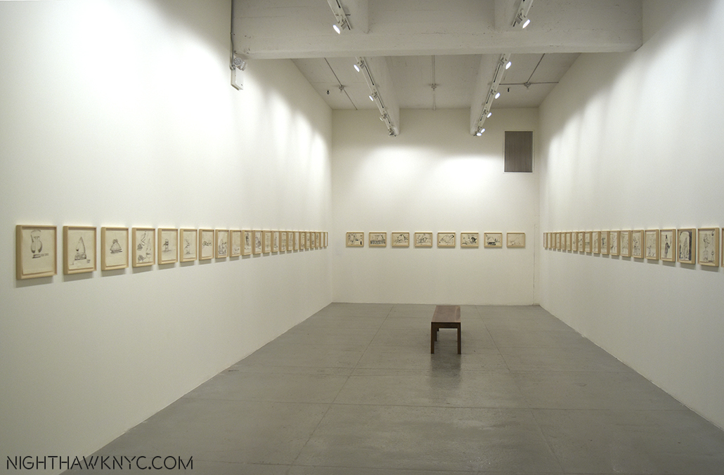
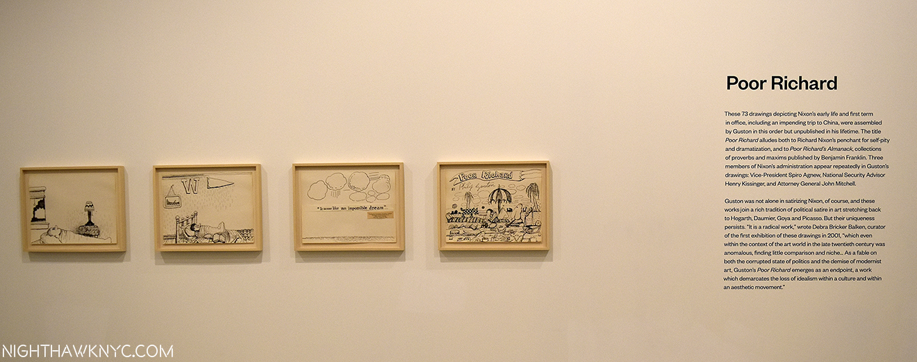
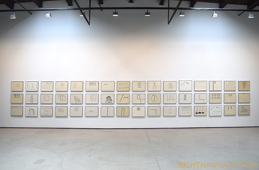
Zen Master. 48 "Untitled" Drawings, 1967-69.

Zen Master. 48 “Untitled” Drawings, 1967-69.

Philip Guston was never a painter of “realism.” It now appears to me that though the end results look different as his style changed and evolved, he was continually bluring the lines between figuration and abstraction all through his career, in the service of painting images that expressed himself as he evolved in his times and in his environment. It’s obvious that he never forgot his past, or the past masters who’s work he loved. The more I look at his work, from all periods, the more I see the impact of, perhaps, his biggest influence, Piero della Francesca, in it. Piero’s figures have the most inscrutable, almost deadpan expressions. Their faces, often, reveal little to nothing of what they are feeling. They take that crutch of reading a whole image from the face away from us. That feeling stays in my mind when I approach a work of Guston’s now, no matter if there are “figures” or objects in the work or not. (Many, even most, of his figures are hooded, or masked, anyway). “Reading” a Guston is a little like to trying to “read” a Piero (or de Chirico). It’s not the expression on the face, it’s the whole thing- the figure in it’s environment, to paraphrase Guston’s quote, above (in Piero’s case, each one is placed with utmost mathematical precision as part of the whole). Guston’s masks are akin to Piero’s inscrutables. We can’t read the expressions or the feelings of these figures. This makes them “abstract,” in another sense, too. I wonder about them. Since they are hooded, or masked, or a black form in his “Portrait I,” 1965, we’ll never know what they are feeling- like in Piero.

"Portrait I," 1965

“Portrait I,” 1965. As if hooded(?), in his environment.

It’s not only his 1957-65 paintings that mystify us.

“You see, I look at my paintings, speculate about them. They baffle me, too. That’s all I’m painting for.” “Philip Guston Talking” 1978, two years before he passed away.

Yet, he has left clues, along with the enigma.

(This is the third, and final, installment in my cycle of Posts on the recent, concurrent shows of Jackson Pollock, Lee Kranser & Guston- three Artists who’s lives are eternally intertwined, personally, and Artistically.)
*-Soundtrack for this Post is “For Philip Guston,” by his close friend, the brilliant composer Morton Feldman. If you have 4 hours to spare, check this out.

NighthawkNYC.com has been entirely self-funded & ad-free for over 8 years, during which 300 full length pieces have been published! If you’ve found it worthwhile, PLEASE donate to allow me to continue below. Thank you, Kenn.

You can also support it by buying Art, Art & Photography books, and Music from my collection! Art & Books may be found here. Music here and here

Written & photographed by Kenn Sava for nighthawknyc.com unless otherwise credited. To send comments, thoughts, feedback or propositions click here. Click the white box on the upper right for the archives or to search them. Subscribe to be notified of new Posts below. Your information will be used for no other purpose.
  1. Musa Mayer, “Night Studio,” Da Capo Press, P.102
  2. Hopper, Stuart Davis, Pollock, Rothko, William de Kooning, Georgia O’Keeffe, Charles Sheeler, Rauschenberg, Frank Stella, Chuck Close, Richard Estes, insert your own.
  3. Guston, “Collected Writings,” University of California Press, P.125
  4. Schimmel, Exhibition Catalog for this show, P.15
  5. Dore Ashton, “Philip Guston,” Grove Press, Inc.,1960 P.49
  6. Ashton, “A Critical Study of Philip Guston,” University of California Press, 1990,  P.9
  7. Ashton points out “At the time Guston was working on this painting it was estimated that there were more than 4.5 million members of the Klan in the United States, a great many of them residing right in Los Angeles, where they burned crosses and raised hell all during Guston’s childhood and youth.” Ashton, “A Critical Study,” P.7
  8. Ashton points out that hooded figures “not only recalling the Ku Kluxers of his early paintings but also the artists in the scriptoria of the medieval plague years who donned hooded gowns in the vain hope of avoiding the plague Ashton, A Critical Study, 1990, P.156
  9. Guston- “They are self-portraits. I perceive myself being behind a hood. In the new series of “hoods,” my intention is not really to illustrate, to do pictures of the KKK as I had done earlier. The idea of evil fascinated me… Guston, “Collected Writings,” P.282
  10. Schimmel, Show catalog, P.9
  11. Ashton, “Critical Study,” P.79
  12. Mayer, “Night Studio,” P.13

If You Ever Missed A Show At Moma? You’ve Just Been Reborn!

This site is Free & Ad-Free! If you find this piece worthwhile, please donate via PayPal to support it & independent Art writing. You can also support it by buying Art & books! Details at the end. Thank you.

Written & Photographed by Kenn Sava (*- unless otherwise credited)

dsc_6336nefpnh

“If I had my life to live over
I’d do the same things again
I’d still want to roam
Near the place we called home
Where my happiness would never end”*

This, today, from MoMA-

“THE MUSEUM OF MODERN ART LAUNCHES A COMPREHENSIVE ONLINE EXHIBITION HISTORY BEGINNING WITH ITS FOUNDING IN 1929

Installation Photographs, Archival Documents, and Catalogues of Exhibitions Now Available to Students, Researchers, Artists, Curators, and the Public

NEW YORK, September 15, 2016—The Museum of Modern Art announces the release of an extensive digital archive accessible to historians, students, artists, and anyone concerned with modern and contemporary art: a comprehensive account of the Museum’s exhibitions from its founding, in 1929, to today. This new digital archive, which will continue to grow as materials become available, is now accessible on MoMA’s website, at moma.org/history.

Providing an unparalleled history of the Museum’s presentation of modern and contemporary art on a widely available platform, the project features over 3,500 exhibitions, illustrated by primary documents such as installation photographs, press releases, checklists, and catalogues, as well as lists of included artists. By making these unique resources available at no charge, the exhibition history digital archive directly aligns with the Museum’s mission of encouraging an ever-deeper understanding of modern and contemporary art and fostering scholarship.

“The Museum of Modern Art has played a crucial role in the development of an audience for modern and contemporary art for nearly 90 years,” said MoMA Director Glenn D. Lowry. “In making these materials freely available, we hope not only to foster and enable scholarship, but also to encourage a wider interest in this important chapter of art history that the Museum represents.”

The exhibition history project was initiated and overseen by Michelle Elligott, Chief of Archives, and Fiona Romeo, Director of Digital Content and Strategy, The Museum of Modern Art. Over the course of the last two-and-a-half years, three MoMA archivists integrated over 22,000 folders of exhibition records dating from 1929 to 1989 from its registrar and curatorial departments, performed preservation measures, vetted the contents, and created detailed descriptions of the records for each exhibition.

The digital archive can be freely searched, or browsed in a more structured way by time period or exhibition type. Each entry includes a list of all known artists featured in the exhibition. Artist pages likewise list all of the exhibitions that have included that artist, along with any of their works in MoMA’s collection online. The index of artists participating in Museum exhibitions now includes more than 20,000 unique names.”


I almost fell over when I saw this. Now? You can revisit every show in the history of MoMA. Unprecedented! I’ve lost my day looking through this site. It’s absolutely unbelievable! Having the chance to FINALLY “see” shows I missed and only heard about, and shows I saw (like the 1980 Picasso Retrospective, possibly the greatest Art show ever), again, is just a dream come true! Here’s a sample, from Moma’s very first show titled “Cezanne, Gaugin, Seurat, Van Gogh,” in 1929!

Mom'a First Show! Installation view of the exhibition Cézanne, Gauguin, Seurat, Van Gogh, on view November 7, 1929 through December 7, 1929 at The Museum of Modern Art, New York. The Museum of Modern Art Archives, New York. Photographer: Peter Juley

MoMA’s First Show! Installation view of the exhibition Cézanne, Gauguin, Seurat, Van Gogh, on view November 7, 1929 through December 7, 1929 at The Museum of Modern Art, New York. The Museum of Modern Art Archives, New York. *Photographer: Peter Juley

To this point, Art shows have only lived on, after their closing, through exhibition catalogs and what’s been written or posted about them.

No more!

Here’s a chance to see how the show was hung, what works were grouped together or hung next to each other. Just Wow!

And? You can download catalogs, too!

Now? Of course I’m hoping The Met shocks me with something similar, and every other Museum in the world follows Moma’s groundbreaking example!

Don’t wait. Do not pass “Go.” Go here, now!

*-Soundtrack for this Post is “If I Had My LIfe to Live Over,” by Larry Vincent, Moe Jaffe and Henry H. Tobias, and performed by Doris Day.

NighthawkNYC.com has been entirely self-funded & ad-free for over 8 years, during which 300 full length pieces have been published! If you’ve found it worthwhile, PLEASE donate to allow me to continue below. Thank you, Kenn.

You can also support it by buying Art, Art & Photography books, and Music from my collection! Art & Books may be found here. Music here and here

Written & photographed by Kenn Sava for nighthawknyc.com unless otherwise credited. To send comments, thoughts, feedback or propositions click here. Click the white box on the upper right for the archives or to search them. Subscribe to be notified of new Posts below. Your information will be used for no other purpose.
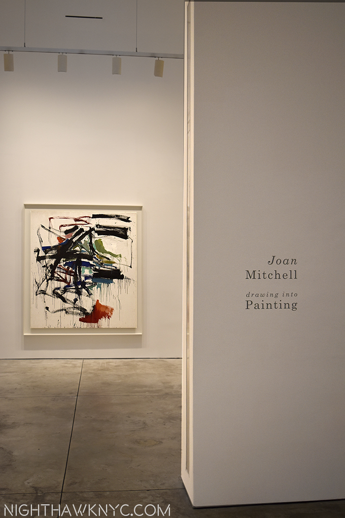
Unfinished. Auspicious.

Written & photographed by Kenn Sava

“Well, let me tell you ’bout the way she looked
The way she acts and the color of her hair
Her voice was soft and cool, her eyes were clear and bright
But, she’s not there.”*

"Portrait of Mariana de Silva y Sarmiento," 1794, by Mengs

“Portrait of Mariana de Silva y Sarmiento,” 1794, by Mengs

Leonardo da Vinci, Michelangelo, Titian, Van Eyck, Durer, Rembrandt, Velazquez, Manet, Monet, Degas, Van Gogh, Cezanne, Picasso, Pollock, Warhol, Mondrian, Basquiat, Whistler, Alice Neel, Lucian Freud, Klimt, Munch, Whistler, Robert Smithson, Cy Twombly, Gerhard Richter, and on and on. “Unfinished” is a mimi-Museum unto itself that probably rivals quite a few entire Museums. “Unfinished,” along with the “Nasreen Mohamedi” Retrospective, were the inaugural exhibitions at The Met Breuer (TMB), the first shows of two new eras- The Met’s new 8 year Breuer Building Lease (at a reported $17 million a year 1), and Sheena Wagstaff’s tenure as Chairwoman of The Met’s Modern & Contemporary (M&C) Department. No pressure there. It’s a show that leaves you wondering “Why didn’t anyone think of this before,” before you’ve even gotten to it’s second floor.

Opening Day of The Met Breuer. Member's Preview, March 8, 2016

Welcome to the future! Opening Day of The Met Breuer. Member’s Preview, March 8, 2016

Well, for one thing, though many of the works here come from other sources, not a lot of places have the resources The Met has, so yes, a part of this is “showing off.” They’ve chosen to install this in a brand new branch that previously held the entirety of one of the other “Big Three” Manhattan Museums, before the Guggenheim made it the “Big Four.”

If that’s not showing off? I don’t know what is.

The rest is the pure joy of discovery, of seeing a curtain lifted and getting an all too rare chance to see some of what goes into making a masterpiece, a work of Art. And? The hits just keep on coming. The big names, that is, if not the most well-known work by any of those names. 197 works in all filling the 3rd & 4th Floors. While nothing here is “famous,” even in their, supposedly, incomplete state (either left unfinished on purpose, or not, in the case of Lucian Freud’s “Portrait of the Hound,” which was left as we see it on his easel when he died), these works hold up just as they are, making this a show jam packed with excellent, even important pieces. Yes, curating a show of “unfinished” work THIS well is also showing off The Met’s superb staff. Along with the pleasure of looking, they also provide fascinating, voyeuristic, even unique, insights into the Artist’s process- both working and thought. Some, as in Alice Neel’s “James Hunter Black Draftee’, 1965, are, perhaps, more evocative than it might have been had it been “finished.” Mr. Hunter never returned for additional sittings. We are left to wonder why not.

"James Hunter Black Draftee," 1965, by Alice Neel

“James Hunter Black Draftee,” 1965, by Alice Neel

The whole question of “When is a work of Art, finished?” comes front and center here as well, and no less than Rembrandt chimes in on it.

dsc_7639pnh

Highlights? I’ll list those that come to mind quickly because there are so many. For me, Jan Van Eyck was the very first Artist who truly captivated me as a kid. Shortly after getting my driver’s license, I drove the almost 6 hours each way just to see his “Annunciation” in Washington’s National Gallery, then drove right back. Seeing his underdrawing for his unfinished St. Barbara was just breathtaking. It’s truly unbelievable to think that something like this lies underneath his finished masterpieces, like The Ghent Altarpiece! While he is legendary for the extraordinary and exquisite detail of his painting, which has held me in disbelief for all these decades, apparently, he could also draw every bit as well2

Small wonder. "Saint Barbara," 1437, Jan Van Eyck. Barely 12 inches tall.

Small wonder. “Saint Barbara,” 1437, Jan Van Eyck. Barely 12 inches tall.

Just astounding. Oh, and sitting a few feet away was a da Vinci portrait profile that was positively otherworldly. When the show opened (along with the Met Breuer) in March, it was flanked by Leonardo’s “Sketches for the Virgin Adoring the Christ Child” and Michelangelo’s “Study for the Libyan Sibyl.” Since “Unfinished” was up for a very generous four and a half months, the later two were replaced after a while, no doubt due to their fragility. It seemed to me they may have been there in honor of TMB’s opening. Both works are in TM’s permanent collection. More showing off? (Slight smile)

Blink, and you missed it. Briefly on view, Leonardo, center and left, Michelangelo, right.

For a New York Minute, the two greatest figures in Western Art were on view together. Leonardo, center and right. Michelangelo, left. Has so much hunan genius ever been side by side than when work of these two are shown together? March 8, 2016.

Oh, all of this is in the 2nd room. In the first room, upon getting off the elevator on the 3rd Floor, at the show’s beginning, you’re immediately faced with 2 large, powerful Titians that are guaranteed to stop you for a good long while, and a Jacopo Bassano.

This view once the elevator doors opened on 3 is one I'll long remember.

The opening salvo. This is the first thing many visitors to TMB saw after the elevator deposited them on 3. Bassano, left, with 2 Titians.

Rembrandt’s St. Bartholomew, a whole room of Turners, a beautifully selected print gallery, a very “different” Degas of a horse race, a Van Gogh who’s color filled the entire room, a stunning Munch self portrait…all on the 3rd floor, wowed me.

"Street in Auvers-sur-Oise," 1890. In the year he died, no dark clouds in this sky.

Life affirming. “Street in Auvers-sur-Oise,” 1890. The year he died, no dark clouds in this sky. I am among those who believe Van Gogh did not commit suicide.

Finished, or Un? "Lucretia," 1642, by Guido Reni. Magnificent.

Finished, or Un? “Lucretia,” 1642, by Guido Reni. Magnificent.

On the 4th Floor, getting off the elevator was no less dramatic. No less than 4 amazing Picassos greet you, one of which is “the Charnel House,” the work which bookends (with “Guernica”) his WW2 years. While “Guernica,” rightfully, is seen as one of the landmarks of 20th Century Art (and one I’m eternally thankful I got to see in person at Moma’s Picasso Retrospective in 1980 before it was moved to Spain as Picasso’s will required), here is a work that I think deserves more attention. It’s surrounded by 3 other pieces, in 3 other styles (in addition to 2 others in the next gallery, and a few more on the 3rd floor), that show Picasso in the process of thinking through the problems inherent in each work- each one in a different style. After the 1921 “Portrait of Olga,” right, below, he was inventing each of these styles. It’s akin to inventing a new language. There was no one else to help him or guide him. Some artists, like Jackson Pollock, have done this once. Picasso? There’s three in this one gallery, and it doesn’t even include Cubism.

Pick a style-any style. 4th Floor Lobby/Galley 1. Picasso 1921, '29, '31, '45.

Pick a style-any style. 4th Floor Lobby/Galley 1. Picasso 1921, ’29, ’31, ’45.

There was quite a bit of fanfare paid to The Met’s announcement of The Met Breuer as a “Contemporary Outpost,” especially during the years when the 5th Avenue Modern & Contemporary Galleries were to be undergoing the reconstruction they had also announced. Yet, in this co-inaugural show, we get quite a bit of what The Met is famous for, along with about two thirds of the 4th floor of more recent works. The size of many of these newer works seems to cut down on the number of pieces, however, making the show feel skewed towards older Artists. Of the 197 works in the show, I counted 74 works by Artists born after 1900, 12 by Artists born after 1950. (The youngest Artist represented is Urs Fischer, who was born in 1973, and who’s mysterious cast bronze “2,” from 2014 is also the newest work here by my reckoning.)

The day after at the NighhawkNYC offices? No. "2," 2014, by Urs Fischer.

The day after at the NighthawkNYC offices? I’ll never tell. Actually, this is “2,” 2014, by Urs Fischer.

“But it’s too late to say you’re sorry
How would I know, why should I care?
Please don’t bother trying to find her
She’s not there”*

Yet, even among the M&C pieces here on the 4th floor, there are memorable pieces. In additon to Urs Fischer’s “2”, the unfinished Mondrian struck me as a revelation. Yayoi Kusama’s genre defying paintings of consecutive numbers gave pause for thought, as did Sol LeWitt’s amazing tour de force  “Incomplete Open Cubes” nearby  and, Kerry James Marshal’s “Untitled,” 2009, was a nice appetizer for his much anticipated “Mastry” show opening at TMB October 25. The show concludes with a wonderful selection of sculpture, including haunting works by Louise Bourgeois, “Untitled (No.2), 1996, and Alina Szapocznikow’s work about her own battle with breast cancer, “Turmors Personified,” 1971, in dialogue alongside 3 Rodins. The final gallery consisted of only one work- a series of 6 pieces by Cy Twombly, entitled “Untitled I-VI (Green Paintings), 1986, which provided a meditative, cleansing experience I found especially memorable.

The Cy Twombly Gallery closes the show seen in panorama.

Water works? It’s hard not to feel a sense of water in movement in this gallery of 6 Cy Twomblys, which closes the show, seen in panorama.

Overall, what I took from this show as a whole was a possible template for what The Met plans to do going forward, the kinds of Artists they may include in their “new initiative.” It’s something I plan to watch closely as it unfurls. I should say that I have been in the minority regarding The Met and M&C Art. I liked that they were taking their time and allowing time to give some perspective on Contemporary Art before jumping in. It’s always been an honor to be in The Met- they have the best of the the best across all cultures and all times. Yet, given the unprecedented popularity of M&C Art today, they have opted to move more fully into it. Ms. Wagstaff, who I met in June, seems to have a great sense for all of this, and if anything, “Unfinished,” is a show that consists of work across at least a few Met Departments. Being able to work, apparently, so well with the other Met Departments augers well for the future. After all, The Met has 2,000,000 items in it’s collection. Showing M&C Art along side of selected objects in their collection is something I am all for.

Floor beach. As close as I got to a real beach this summer.

Floor beach. “Mirrors and Shelly Sand,” 1970, by Robert Smithson. As close as I got to a real beach this summer. I shot this wearing shades.

For me? That’s what this show says- Here are (unfinished) works by many of the greats. This is where we are starting from. Let’s see how other work that may, or may not, have been influenced by them, looks alongside these. The show may be seen as a number of conversations between Artists they are displayed alongside- Leonardo with Michelangelo. Van Eyck and Durer, Rembrandt with Velazquez(!). Degas and Manet. Van Gogh and Whistler(!). Picasso and Cezanne. Pollock and Kusama. Smithson and Fischer. Marshall and Warhol. Szapocznikow and Rodin. Rauschenberg and Mondrian. And, Picasso, also…with himself, among them. I say bring it on!

Still, there’s no denying that The Met Breuer is a HUGE gamble. Who knows how long Contemporary Art will stay as “hot” as it is? For that matter, who knows how much longer record number of viewers will go to see Art, as they have these past few years? The Met is locked into this for 8 years, and they have already announced a budget deficit that caused them to put off the previously announced reconstruction of the Modern & Contemporary Galleries, and, more sadly, even forced an unknown number of lay offs.

When they return to better times, IF they decide to move forward with those reconstruction plans, they will, most likely, need additional space for the temporary display of their Modern & Contemporary holdings, and Special Exhibitions. What will they do? Extending the lease on the Breuer will be VERY expensive. So far? I have yet to see it’s galleries very crowded. The “Diane Arbus; In The Beginning” Show, which recently opened on the 2nd floor, seems to be drawing pretty well, and “Unfinished” was fairly crowded during it’s last weeks. Yet? They’ve already closed the 5th Floor Cafe & Bookstore and remodeled it as additional Gallery space, which indicates that they want to have more going on there for visitors to see, and their basement restaurant is scheduled to open in about a month, which will be open during some hours The Museum is not. Obviously, this is all new, and still in flux. The Met seems to be reacting fairly quickly, which is a good sign. They did away with late Thursday nights, which I seemed to be among the very few that went to, and changed to late Friday & Saturday nights, like TM, 5th Avenue.

"Tumors Personified," 1971, by ALina Szapocznikow.

Survivor. “Tumors Personified,” 1971, by Alina Szapocznikow.

So far, on very little evidence, I like the direction TM is going at TMB, and with M&C Art. “Nasreen Mohamedi” was a revelation that struck me as the “perfect choice” to be the first M&C Show. “Unfinished” was an unexpected blockbuster the likes of which has never been seen before, which is somewhat startling given how long there have been painting shows. The Diane Arbus show is fascinating and features a ground breaking installation. Also, not to be lost is the reconfiguration of the M&C Galleries at TM on 5th Avenue- I love what they’ve done. The Art has been imaginatively rehung in fascinating new combinations, with some pieces given new prominence, like Edward Hopper’s majestic “The Lighthouse at Two Lights,”1929, and other pieces shown that have long been in storage. Along with this, Thomas Hart Benton’s “America Today” Mural appears to have now been permanently housed, at the center of supporting works and works that enter into interesting dialogue with it nearby. Other galleries are arranged by theme, instead of chronology.

So? There’s been a lot of action coming from new M&C Chairwoman Sheena Wagstaff and her Department. There’s a long way to go, but so far? It’s hard for me to give her less than an “A” for what she and they have accomplished.

Haunting, and then some.

Haunting, and then some. “The Return of Mary Queen of Scots to Edniburgh,” 1870, James Drummond.

Most of the Artists in “Unfinished” won’t get the chance to finish what they started. The Met will.

Stay tuned.

*-Soundtrack for this post is “She’s Not There,” by Rod Argent, recorded by The Zombies, and published by Marquis Songs, USA.

NighthawkNYC.com has been entirely self-funded and ad-free for over 7 years, during which over 250 full length pieces have been published. As I face high expenses to keep it going, if you’ve found it worthwhile, please donate to keep it up & ad-free below. Thank you!

Written & photographed by Kenn Sava for nighthawknyc.com unless otherwise credited.
To send comments, thoughts, feedback or propositions click here.
Click the white box on the upper right for the archives or to search them.
For “short takes” and additional pictures, follow @nighthawk_nyc on Instagram.

Subscribe to be notified of new Posts below. Your information will be used for no other purpose.
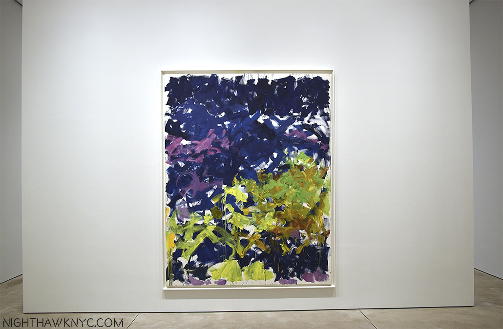
  1. http://www.nytimes.com/2016/03/05/arts/design/breuer-building-expands-the-imagination-and-the-budget-of-the-met.html?_r=1
  2. Yes, I saw “A New Look at a Van Eyck Masterpiece” at TM proper, which featured a drawing of the Crucifixion from Rotterdam that may, or may not be, by Van Eyck. I came away VERY impressed by it to be sure, but remaining to be entirely convinced.

Lee Krasner- Surviving Jackson Pollock, And An Oscar

This site is Free & Ad-Free! If you find this piece worthwhile, please donate via PayPal to support it & independent Art writing. You can also support it by buying Art & books! Details at the end. Thank you.

Written & Photographed by Kenn Sava (*- unless otherwise credited)

Recently, the Art Show Scheduling Gods smiled, and? Voila! A rare chance to see shows of three Artists with an intriguing connection (almost) side by side. I bowed to give them thanks for concurrent shows of Jackson Pollock (at MoMA), Lee Krasner (at Robert Miller Gallery) and Philip Guston (at Hauser & Wirth Gallery). The common thread being Pollock. One was married to him for 11 of the 14 years they knew each other. The other considered him his closest boyhood acquaintance. Pollock’s sudden death on August 11, 1956- 60 years ago this week as I write, left a personal and professional void in the lives of both. Then there was the “shadow” of Pollock’s legend they lived under the rest of their lives, which delayed full understanding and appreciation of their own accomplishment and importance. Delayed. Thankfully, not cancelled. Having already written about the Pollock show, this Post is about the Lee Krasner show, and a Post about the Philip Guston show follows.

Lee Krasner @ Robert Miller Gallery.

Lee Krasner @ Robert Miller Gallery. Click any photo in this Blog to see a larger image.

First, consider Lee Krasner’s Short “Curriculum vitae,” i.e.- some of what she had to overcome-

  • -Being an “Artist’s wife,” while married to Jackson Pollock from 1945-1956, a man she would remain devoted to from when they met in 1942, on.
    -Pollock’s rise from barely known to sudden fame in August, 1949. A fame he never adjusted to placing immense burden on her.
    -His death in a car crash (beside another woman, who later wrote a book about she and Pollock) while Krasner was away in Europe. She never remarried.
    -Pollock’s legend, gowing larger in death, helped in no small part by her own efforts, and it’s impact on her own career
    -Working as a Painter for 50 years- before, during and after him, in a somewhat similar realm
    -Knowing personally, and working among, many of the greatest “first generation Abstract Expressionists,” from which she was unfairly excluded.
    -Being a woman in a man’s field.

Sounds like a character in a movie. Lee Krasner had to overcome all of that, and yes…the movie. The movie being 2000’s “Pollock,” featuring Marsha Gay Harden’s Oscar winning portrayal of herself, which Krasner’s biographer, Gail Levin, summed up saying “Inaccuracy about Krasner’s life” was “endemic in the film.” 1 As I wrote about the recent Miles Davis film, and while I am al for artistic license and freedom in the Arts, not nearly enough respect gets paid to the lasting impact to historical persons in so-called “bio-dramas.” The effect of the damage these films do is real and long lasting. It makes me wonder what “good” they do. Most often, the subject is dead and can no longer do anything to defend themselves. Digging out from the wake of Jackson Pollock (who’s work she said first hit her “like an explosion”),  the man, the legend, and the shadow, has been a long, arduous and thorny road. It’s a jumble that is still being traversed, and reversed, as we speak.

"The Eye Is The First Circle," 1960, 70 x 109"

“The Eye Is The First Circle,” 1960, 70 x 109 inches.

In spite of having been an Artist before she met Pollock in 1942, and for the better part of 30 years after his passing, it must be made clear that Lee Krasner was in no small way responsible for his shadow having grown so large 2. She did more than anyone to further Jackson Pollock’s career and his Art, during and after his life, and, as a result, and with the assistance of many others holding her back, her own Art has had as hard a road to acceptance as almost any other Artist in the 20th Century. Much more so than even Pollock’s, who was considered the “ultimate outsider.”

Ever so slowly, but surely, her Art has grown in stature over time. Unfortunately, she died just months before MoMA gave her a retrospective in 1984, making her (still) one of the few women to have gotten one. In 2011, Gail Levin released the first full-length biography of her mentioned above. The auction market has been increasingly responsive to her work, as well. First, the Cleveland Museum bought “Celebration,” from 1960, for 1.9 million, then in May, 2008, her “Polar Stampede” sold for 3.1 million3. Based on how much the work of the other first group of Abstract Expressionists sells for, I think her market still has a ways to go. Beyond transactions involving Museums, I care not about how much anyone else pays for Art- it’s meaningless, IMHO, since individuals buy Art for personal or investment purposes, to discussions about “Art.” In Lee Krasner’s case, I merely point it out to show another wall coming down.

"Sundial," 1972

“Sundial,” 1972

In spite of all of this, I believe that Lee Krasner is, still, under appreciated- for her impact on the world of Art, as well as for her Art, which finally can be seen on it’s own, as it is here.

So, with all this in mind, my path still freshly worn, and my shoes, apparently, retaining their muscle memory of the way from the baker’s dozen visits I had just made to Robert Miller Gallery for “Patti Smith-18 Stations,” which had ended the week before, I returned to darken the doorway of this all too familiar space yet again. I will admit- it was a strange feeling to turn that corner half way down the gallery and not see Patti Smith’s chair & table (let alone, Ms. Smith, herself!) from Cafe ‘Ino and “M Train,” and not to see the handwritten pencil notations she’d written on the eastern wall (did they paint over them? Or are they possibly now hidden but protected behind a fake outer wall, like Leonardo Da Vinci’s long lost “Battle of Anghiari” may be?).

The room where Patti Smith's Table & Chair stood 1 week before. "Equilibrium," 1950, center

The room where Patti Smith’s Table & Chair stood 1 week before. “Equilibrium,” 1950, center, with “Lava,” 1949, left and “Untitled,” 1949, which seems to anticipate Jasper Johns, right Ms. Smith’s pencil inscriptions were to the right of the left rear corner pillar.

Yet, Ms. Smith was not entirely absent from this show. Even before the MoMA Retrospective, Lee Krasner’s influence had been felt by other artists, especially women artists- including Patti Smith, who wrote of her influence in the introduction to the show’s catalog-

“In 1967 I came to New York City, at twenty years old, with the knowledge of her reputation in tow. I sensed her strength of purpose and aspired to be like her one day. I also hoped, as she, to meet a fellow artist and work with him side by side. It would take, as attested by her choices, much personal strength to commit to the dual sacrifices required by art and love, yet it was my greatest wish.”

Completing the circle, a portrait of Lee Krasner by none other than Robert Mapplethorpe was also included in the catalog.

The show, simply titled, “Lee Krasner,” consists of 33 paintings, drawings and collages the Artist created over the FIFTY Years between 1931 and 1981. What struck me most was the dazzling array of styles it contained, beginning with a realistic Self Portrait, painted at about age 25 (1931-33). She seemed to be trying on painting styles the way other women try on fashion styles. Another interesting thing was that while some works were bursting with color, others were monochrome.  “Color, for me, is a very mysterious thing,” she told Barbaralee Diamonstein in 1978.

DSC_1843NEFPNH

“Lavender,” dated 1942, which is the year she met Pollock.

But what about that “shadow?” When asked about Pollock’s influence on her, here’s what she said (in two different interviews) in my transcriptions-

In one, she told Dorothy Seckler– ” Certainly a great deal happened to me when I saw the Pollocks. Now Pollock saw my work too – I couldn’t measure what effect it had on him. We didn’t talk art – we didn’t have that kind of a relationship at all. In fact, we talked art talk only in a shop sense, but never in terms of discussions about art, so to speak. For one thing, Pollock really felt about it. When he did talk it was extremely pointed and meaningful and I understood what he meant. Naturally he was seeing my work as I certainly saw his.”4

"Equilibrium," 1950. Right in the middle of her marriage to Pollock. Pretty hard to see him in this.

“Equilibrium,” 1950. Right in the middle of her marriage to Pollock. Pretty hard to see his style of the time in this.

While some of the works had elements of Pollock’s techniques, many others did not. Interestingly for me, except for “Lava” dated 1949 when they were married and living together in the Springs, Long Island, the works that had a bit of Pollock in them were from the 1960’s, well after Pollock’s passing. In fact, and most surprising, while I don’t see any works here that scream “Pollock,” there were works that were blatantly in the style of other Artists, including Mondrian, who she knew, and, perhaps most of all, Matisse, who she revered.

Mondrian? No! Krasner's "Untitled," c. 1939-40

Mondrian? No! Krasner’s “Untitled,” c. 1939-40

"Rose Red," 1958. Something of the feel of Matisse's recent Cut-outs.

“Rose Red,” 1958. Something of the feel of Matisse’s recent Cut-outs in this for me.

In the second interview, Barbaralee Diamondstein asked her directly in 1978- “What did you learn from Pollock’s work?”

“I don’t know. I just re…Let me put it this way. Other than what I’ve said before that the transition was as great…Let’s see. If we think of the Renaissance’s concept of space. …Where you are the artist up here, and whatever it is you are using perspective as your means. And you are making you, whatever you are doing with it…And if we go from that concept into cubism the thing is still there in the same sense. Nature is there. I am here as the artist. I observe the only thing is frontal now and that much has taken place. Now, in Pollock, once more there’s another transition. I can’t define it for you, sorry. It’s not my job.”

Lee Krasner's "Brown print variant," Lithograph, 1970

Lee Krasner’s “Brown print variant,” Lithograph, 1970

From what I’ve read, they worked separately. Krasner in a bedroom turned studio and Pollock out in back of the house in the amazing barn with the huge window on one side. I dont’ get the sense there was any collaboration. They would look at each other’s work, when asked to, but there was no direct “teaching” or anything like that. When asked (by Diamondsteen in the same interview)- “There are many who thought that all the while you were nurturing his career- you were not working. What were you doing during that period?” She said, again in my transcription- “I was working all the time. I doubt our relationship would have existed at all if I wasn’t working. In therms of what other people think, I can’t do anything about that. As long as I was able to work, I went about my business.”

"Bird Image," 1963

“Bird Image,” 1963

For me, at least, all of this puts this “shadow” myth to rest, once and for all. Here is an Artist that was left out of the first rank of Abstract Expressionists, many of who appeared in that infamous Life Magazine picture titled “The Irascibles,” which should have included her. She was there in the beginning, knew many of them (even introducing Pollock to de Kooning), and her work was known and respected by them, and, shown with theirs.

So, why did she change her style so often? What was she seeking?

She told Dorothy Seckler- “Well, I do find that I swing from the lyric, to the dramatic and it doesn’t – you know, I have no way of knowing which phase is going to take over.”

And-

“I think my painting is so autobiographical if anyone can take the trouble to read it.” 5.

"Self Portrait," 1931-33

“Self Portrait,” 1931-33

Hmmm…Based on the evidence at Miller, it’s very hard to read her work. Take “Rose Red,” dated 1958, 2 years after the death of her husband. It certainly doesn’t look it. It looks more like Matisse’s late cut-outs, full of life, joy, happiness and spring colors, interspersed with the titular red. Earlier and later works seems to be dialogues with other Artists- Mondrian, Matisse, as I said, maybe Paul Klee. (Untitled, 1949), but yes, there are elements of style that remind of Jackson Pollock, too. Yet, there are works that look ahead, as well. “Untitled,” 1949, as well as her “Hieroglyphic” works and “Little Paintings” of the same period now look like precursors of Jasper Johns. Her later collages, where she uses cut up, or torn pieces of figure study drawings (“Murdered,” she told Diamondstein) she had done in the 1930’s, casting them in a startling, unprecedented way, in a sort of new take on cubism, that also speaks to the amazing capabilities of her eye, first in seeing which drawings to reject, and then seeing this other possibility in them. Amazing.

Finally, there was this quote- “The one constant in life is change 6

Lee Krasner was a unique Artist, who was capable of as many styles as almost any other Artist. For me, the most amazing thing about the Miller show was that every single work, no matter it’s style, holds up as a composition, something I feel is the hardest thing to do in so-called “abstract” (a term she didn’t like) Art, or in any work of Art. Part of this may be because she destroyed the works that didn’t hold up, leaving only 499 works in her Catalog Raisonne, a very small number considering her 50 year career- 10 a year! What does this tell me? She has one HELL of a good eye, which, in the end, is what I admire most about her work, and her. Along with John Graham, and others, she was among the first to “see” Pollock, after all- something I rarely see acknowledged. Seeing this show, with it’s amazing range of styles, it’s clear that she dabbled with influences but all the while stayed on her own path, following her own star, and relentlessly digging deep inside herself. From watching and reading her interviews, it quickly becomes apparent that she had a “strong personality”7. No doubt, she also had a very strong character, which served her in good stead in the company of all the other great artists of strong personalities, like Pollock, she was surrounded with most of her life. I doubt she’d have survived and gotten to where she got in her life, and where she is now, without that inner strength.

"Past Conditional," 1976, A collage of older drawings she rejected..

“Past Conditional,” 1976, A collage of older drawings she rejected..

As I mentioned, Lee Krasner’s legacy lives on, additionally to her Art, through the Pollock-Krasner Foundation (which, since 1985, has awarded over 4,100 grants totaling over 65 million dollars to artists in 77 countries) and the Pollock-Krasner House & Study Center (their former home and studio), which I visited in 1999. It was, truly, an experience I will never forget, and one every Art lover should have on their bucket list. I was surprised how being in their environment gave me a completely new understanding of the Art they created there, which, all of a sudden, didn’t seem nearly as “abstract.”

In addition to this, there is the incalculable debt the world owes her for her generosity. A visit to the MoMA website revealed 49 works by Pollock alone that she gifted to them (making her the “unsung star” of their recent Pollock show, as I mentioned in my Pollock Post), a visit to The Met’s site yields about the same number, but who knows what the real total number of works of art that bear the source, “Gift of Lee Krasner Pollock” really is? Overlooked is that we are also increasingly indebted to her for giving her own work.

Taken in total, the shadow SHE now casts looms larger every day. As for the work? As she, herself, said, “I think the process of re-interpretation will continue and that many things will now be re-evaluated. I’m sharply aware of my own re-evaluation.8” This, also, applies to Philip Guston.

"Untitled" (Study for a Mural), 1941. her cubist beginnings echo.

“Untitled” (Study for a Mural), 1941. Echoes of her cubist beginnings.

On the 5th Floor of MoMA, her “Untitled,” 1949, hangs on a wall adjacent to “One: Number 31, 1950,” one of her husband’s most well known (and largest) masterpieces. On the wall on the other side of the door next to it hangs Mark Rothko’s “No. 3/No. 13,” 1949, another masterpiece. Facing them is Philip Guston’s “Painting,” from 1954, a shimmering masterpiece from his early “abstract” years.

Krasner, left, and Pollock

Krasner, left, and Pollock, at MoMA.

At The Met right now, another Krasner hangs right next to another early 1950’s Guston. Both works directly face another huge Pollock masterpiece, “Autumn Rhythm (Number 30),” 1950.

Lee Krasner, "Untitled," 1948, left with Philip Guston's, "Painting," 1952

Lee Krasner, “Untitled,” 1948, left with Philip Guston’s, “Painting,” 1952,  at The Met.

Detail, Lee Krasner, "Untitled"

Detail of Lee Krasner’s, “Untitled,” 1948.

For me? That is the ultimate test of any work of Art- Hang it next to some masterpieces and let’s see how it does.

To be hung within inches of masterpieces by Mark Rothko, Philip Guston and Jackson Pollock is about as hard as a test gets for American “abstract” Art of this period.

Lee Krasner has found her place.

At last.

*-Soundtrack for this Post is “Dream of Life,” by Patti Smith and Fred “Sonic” Smith.

NighthawkNYC.com has been entirely self-funded & ad-free for over 8 years, during which 300 full length pieces have been published! If you’ve found it worthwhile, PLEASE donate to allow me to continue below. Thank you, Kenn.

You can also support it by buying Art, Art & Photography books, and Music from my collection! Art & Books may be found here. Music here and here

Written & photographed by Kenn Sava for nighthawknyc.com unless otherwise credited. To send comments, thoughts, feedback or propositions click here. Click the white box on the upper right for the archives or to search them. Subscribe to be notified of new Posts below. Your information will be used for no other purpose.
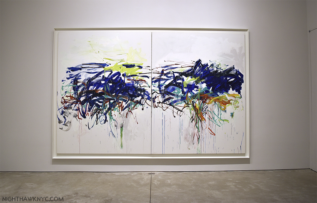
  1. Gail Levin, “Lee Krasner,” P.1
  2. Levin, P.269, etc
  3. Levin “Lee Krasner” P.4
  4.  Oral history interview with Lee Krasner, 1964 Nov. 2-1968 Apr. 11, Archives of American Art, Smithsonian Institution
  5. Levin, “Lee Krasner” P.11 Levin continues- “A few years later, she said, “I suppose everything is autobiographical in that sense, all experience is, but that doesn’t mean it’s naturalistic reading necessarily. I am sure that all events affect one…but I don’t think it means using a camera and snapping events.”
  6. Interview, 1977
  7. Longtime associate B.H. Friedman in his “Intimate Introduction” to Robert Hobbs’ “Lee Krasner” P.25
  8. Levin, “Lee Krasner,” P12

To- Whoever Owned This Book Before Me

This site is Free & Ad-Free! If you find this piece worthwhile, please donate via PayPal to support it & independent Art writing. You can also support it by buying Art & books! Details at the end. Thank you.

Written & Photographed by Kenn Sava (*- unless otherwise credited)

I don’t know who you are, but this Post is for you.

“This book” is an out of print exhibition catalog from the Stuart Davis show at The Metropolitan Museum in 1991. Another of the shows I missed and will forever be sorry I did. Thank goodness it lived on in this superb catalog. Show catalogs are an interesting thing. Widely available while the show is on, they soon go out of print and then become sought after by Artists, specialists and die-hard fans as time passes.  Though The Met said they were going to make all their older publications available as .pdf files online, some, like this one, have been skipped no doubt because it was co-published by a big commercial publishing house, who has a say in that, in this case Abrams.

12 years ago I bought a used paperback copy of it at the now defunct Academy Books and had worn it out. I’ve had my eye out for another copy, one in good condition at a reasonable price for a while. I need it now because I’m in the middle of a Post on the “Stuart Davis: In Full Swing” Show at the new Whitney Museum. My go-to (often) bookstore, The Strand, had one recently, but it wasn’t much better than the one I had, so I passed. A few days later, it was gone. So, I was driven to look online, and finally found this copy.

The Book. The catalog for The Met's 1991 Stuart Davis show, long out of print. Notice the cover Art.

The Book. The catalog for The Met’s 1991 Stuart Davis show, long out of print. Notice the cover Art.

I bought it online from a bookstore. When it arrived, unlike some of my recent experiences buying books online, I found it to be in better condition than I had hoped. People seem to want to upsell the condition of books, which is so shortsighted. Most buyers are going to notice an obvious flaw in something so why try and get over on someone and have it sent back to you and probably get some, deservedly, bad feedback in the process? To help keep it this way, I decided to put a book jacket on it. I’ve been looking through it, but I hadn’t looked inside the back cover. When I removed the dust jacket to wrap it, I did. I found Stuart Davis, himself, looking out at me from a 1912 Self Portrait he painted, apparently in New York, given the background, while he was living in Hoboken, NJ, at age 20. It was in an archival envelope. I opened it up to discover it was the first page of an article about Davis and the 1991 Met Show, carefully removed from an unknown magazine (circa 1991-2) and placed in this envelope to protect it, and so it wouldn’t discolor the book.

Stuart Davis, in his 1912 Self Portrait, looks out at us, 104 years later.

Haunting our City. Stuart Davis, age 20, in his 1912 Self Portrait (with NYC’s old Elevated Subway in the background) looks out at us, 104 years later, from inside the back cover. The original painting is here.

On the back of the last page of the article, someone had cut out and carefully taped the bibliography for the article. Impressive!

DSC00537PNH

This was something similar to what I’ve done for many years, myself. If you have eclectic taste and/or like Artists or Musicians that aren’t very popular it may be a long time before you find something in print about them. When I did? I’d read it over a few times, then cut it out and save it. I’d stick it inside a book about them (if there was one), inside a record jacket, or later, a CD jewel case.
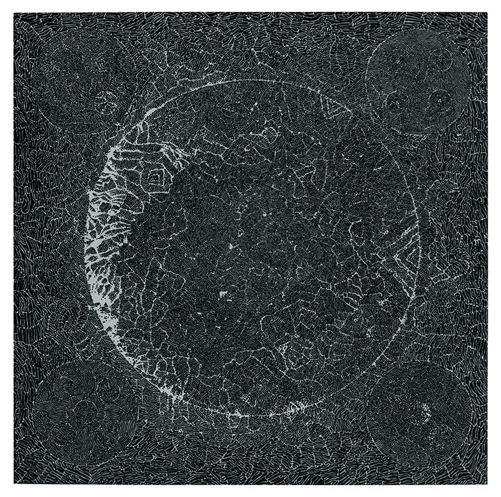
I buy used books often, since many books I’m interested in are now out of print. Sometimes, the unpleasant aroma of old cigarette smoke hits you, making you wonder if that finally led to this book being here. They don’t make the cut. Sometimes, they come with a previous owner’s name written inside. I usually don’t like anything written in a book. But this one time? I wish the owner had written their name in it.
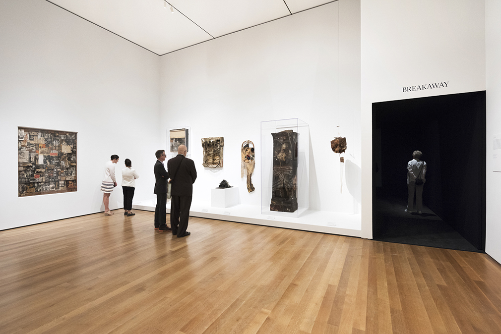
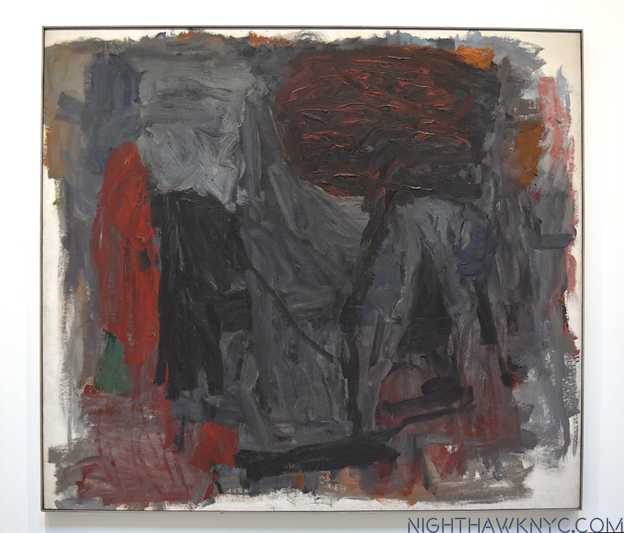
One day all too soon, physical Art Books will be a thing of the past, as soon as image quality in eBooks catches up with their printed counterpart in a reasonable file size. That might be a while yet. For me? It would be a mixed blessing. Mostly? I have too many large books, as I’m often reminded, so freeing up some space would make a big difference in my life. Beyond that, though, there is something beautiful about a physical Art Book, something that hooked me since I bought my first one, on Rembrandt by Bob Haak as a teenager, and still does. I suspect they will then trade among collectors, like Lp’s do now. No one will ever open an eBook and have this happen to them.

Finding this today? Here was a kindred spirit- someone like me. Someone I’ll never know who feels about Stuart Davis’ work the way I do. Though he didn’t write his name in it, it was personalized in a non-destructive way. Making it one’s own, but not like tattooing it with writing. There’s no need for that in this case- I get it.

That same afternoon, I went back to to see “Stuart Davis: In Full Swing” yet again, as my work continues. I had an errand to do first, so I wound up walking over to the Whitney a different way than I usually do. As I neared the corner of 7th Avenue on West 13th Street, I was stopped in my tracks, when I saw this on the wall.

DSC_7025P2NH

“…it was here that he painted many of his most important works including…”

What? Wow!

I have lived in and around NYC almost all of my life, and been in this neighborhood countless times. Yet, I’d never known he lived here! Around the corner is the Village Vanguard, for my money the world’s greatest Jazz Club, where it occupies the same basement it has since 1935. Being a lifelong Jazz lover, I bet he spent quite a few evenings there, as I have, as well. The original Whitney Museum was a short walk away on 8th Street, when he lived here (from 1934-54), as the new one is now in a different direction.

Reading the plaque, I could still feel Stuart Davis’s “Self Portrait” from inside the back cover of the book looking at me. Inside in the lobby hung a large, beautifully framed Stuart Davis Poster. Impressive considering he died 52 years ago, and it’s 62 since he lived here. Looking at the building, it looks like thousands of other buildings in New York, and, probably, the rest of the world. I stood outside pondering it. It wasn’t like the old Bowery that reeked of cheap booze and romantic Artist’s loft studio spaces, the long time homes of Allen Ginsberg, John Cage and othes from the same period, Keith Haring, Joey Ramone, among others, after. It was a nice, modern, kinda faceless apartment building. Nothing about it said that one of the greatest American Artists who has yet lived lived here, except it’s smack-dab in the middle of The Village location.

Then, I continued on, completing the short walk to the Whitney. Inside the show, I lingered in front of “Rapt At Rappaport’s,” from 1952, in it’s interesting frame.

Davis' "Rapt At Rappaport's," 1952, on view at The Whitney, now in the Smithsonian

Look familiar? Davis’ REAL “Rapt At Rappaport’s,” 1952, now on view at The Whitney, from the collection of the Smithsonian.

Davis painted it in the building I had just walked past, as the plaque confirms by name! I never knew that. I’ve seen it before, but now? I’m seeing it anew. It doesn’t depict the neighborhood (Greenwich Village) per se, in fact, it’s an “homage” to “Rappaport’s Toy Bazar,” a store his parents used to take him to as a child many years earlier. The store used polka-dotted paper to wrap gifts, hence, the polka-dots in the upper right, and the work’s title is also a pun on “wrapped.” But, on a different level, now everything about this says “Greenwich Village in the 1950’s.” The child became a man, and that man was an Artist. It drips of the Jazz he heard all around as The Village headed into it’s Jazz & Beat Glory Days. Even the title (using “Rapt” in place of “Wrapped,” for the wrapping paper) is a “Jazz-pun,” as in raptly listening. In addition to being a “souvenir” of his childhood, it’s also a little reminder, a little piece, of that more recent time, and place, The Village- from his then home there on 13th & 7th.

It also happens to be the painting chosen to be the cover Art for my new/old book.

Is this all a bunch of strange coincidences, neatly “Rapt” together with a bow on top? Covering (“wrapping”) the Davis book and being startled to see him looking out at me unexpectedly, as the prior owner had left him, lovingly curated…then accidentally discovering (uncovering?) the very place he painted it’s cover Art… and finally, seeing the original painting shown on the book’s cover. Hmmm…It feels like someone is sending me a message.

Now? Someone else lives in that apartment. Someone else owns this book.

Still? Parts of both live on from before. Very good parts.

Thank you.

*-Soundtrack for this Post is “You Can’t Judge A Book By It’s Cover,” written by Stevie Wonder, Sylvia Moy and Henry Cosby, and preformed by Bo Diddley.

NighthawkNYC.com has been entirely self-funded & ad-free for over 8 years, during which 300 full-length pieces have been published! If you’ve found it worthwhile, PLEASE donate to allow me to continue below. Thank you, Kenn.

You can also support it by buying Art, Art & Photography books, and Music from my collection! Art & Books may be found here. Music here and here.

Written & photographed by Kenn Sava for nighthawknyc.com unless otherwise credited. To send comments, thoughts, feedback or propositions click here. Click the white box on the upper right for the archives or to search them. Subscribe to be notified of new Posts below. Your information will be used for no other purpose.