December 8th, 1980-2020

Written & Photographed by Kenn Sava

Tales from Isolation. Day #322

Two Days In My Life

After my early young adulthood as an Art lover, and before I focused on Art, again, I spent about 15 years in Music. Early on, I was on the road with a band, based out of Miami, Florida, for five years. Towards the end of 1980, things were getting really bad in South Florida, inspiring the TV show “Miami Vice,” which after having lived through the reality, I found hysterical. It got so bad, the word was that there so many murders the only cases that were being investigated were when a cop was killed.

My Axe. My blonde 1976 Fender Jazz Bass. The color darkened from 4 years of playing in smoke-filled clubs, rests on my way worn Gig Bag.

Around this time, we took a gig playing a party in Coconut Grove. Not something we ever did- before or after, but it was for a friend of a friend who loved the band, and we liked the idea. “Hey, I’m having a big party and it would be so great if you guys came and played” kind of thing. He made it worth our while to take our gear off the stage of the club we were house band at on Miracle Mile, so what the heck. It was an afternoon outdoor job, and we were up on a hill looking down over the large lawn on a road between us and a row of houses lining the water. Suddenly, a group of police cars descended on the scene across that road. It was a raid. A drug bust. Then the host/our boss for this gig, came over and said “Keep playing.” When trouble starts in a club or a bar, the boss ALWAYS comes over and says “Keep playing,” (like I imagine the boss did on the Titanic) while everyone else is falling all over themselves rushing to get to the exit. “Keep playing.” Like when a riot broke out in a biker bar we were playing in. But that’s a different story.

My blonde 1978 Fender Fretless Precision Bass. I went Fretless after I met the late, great Jaco Pastorius, the genius of the Bass, and a Fretless player, in 1977.

It’s funny how the guys from the union, the AF of M, are never around at those times- only when someone playing was not a member. We looked at each other, the girls dancing in bikinis in front of us, glanced at our cars parked behind us, and then at the unfolding drama going on across the street in front of us. Don Johnson’s got nothing on me. I’m living vice in Miami. 

If gunplay broke out, we might well be in the innocent line of fire, like too many others, before or since. 

Luckily, it proceeded without bullets, a line of cops escorting suspects emerged, and that was the final scene on a long and eventful road trip, full of  unexpected turns, on my journey into full adulthood. Time to go. It so happens that Paul, a friend in another band I had worked with, called to say he was leaving and moving to NYC. He offered to take my stuff with him if I wanted to get out.  

Hmmmm…After some thought, and discussion with my then girlfriend, a local, I decided to take him up on it and move back. Paul and his girlfriend, who went from being a waitress a few years earlier, to being a member of an internationally known band (not her boyfriend’s) a few years later, pulled up with a large trailer hooked to their car and the three of us loaded all of my belongings into it, and off they went. 

A few days later, I got into my Porsche 914 and drove it from Miami to Orlando and we both got on the AutoTrain. I had made the complete 27 hour nonstop Miami to NYC drive too many times to do it once more. The ride was pleasant enough, though I didn’t get much, if any, sleep, and woke early on Monday, December 8th, 1980. After detraining near Washington, DC, I drove the rest of the 5+ hours to NYC, where the rest of my life would begin.

Shortly after I arrived at my parent’s house I heard the news that John Lennon had just been shot and killed in Manhattan, outside his home at The Dakota. 

WHAT??????!

Bob Gruen, John Lennon- Statue of Liberty, 1974, Magnum Photos.

It was just unfathomable. It still is. Even for someone who lived through JFK’s assassination, and saw Oswald get killed, live, on television. Someone who had heard RFK’s assassination live on the radio. Someone who had lived through the assassination of Martin Luther King. Someone who remembers Malcolm X getting murdered. Murder is not something you ever “get used to.” Murder of such great men, each cut down in their prime, is a crime against humanity.

And murder was exactly why I left Miami!

So began the rest of my life…

December 8th, 2020

I took the C train uptown and got off at West 72nd Street to go The Dakota to pay my respects. Arriving, I was greeted on the platform by Yoko Ono’s transformative Sky mosaic mural. The north side of the station, ironically, is directly underneath The Dakota, where Yoko still lives, I believe1.

Yoko Ono, Detail from Sky, Tile mosaic, West 72nd Street B,C Station, underneath The Dakota, December 8, 2020.

After admiring it and its “Imagine Peace” section, and thinking, “Gee, countless millennia of war hasn’t worked out so well, maybe it IS time to give peace a chance…?,” I headed up the stairs and was greeted by a sky that looked remarkably like the mural.

“…above us only sky…” Exiting the 72nd Street Station at Central Park West, with The Dakota looming on the left, December 8, 2020.

I turned the corner onto West 72nd Street and was greeted by no one. The sidewalk was empty. Down the block, in front of The Dakota, where it happened, stood two uniformed building employees, as usual. I stood for a few minutes on the sidewalk, taking in the scene, and thinking about what had happened 40 years ago today.

The Dakota, West 72nd Street, December 8, 2020.

It almost seemed like I was there on the wrong day. Then, I spotted one small bouquet left by a family.

Across Central Park West, looking into Central Park, I could see a long line of visitors waiting to enter the Strawberry Fields section of the Park, but no one else was here, allowing me a private moment in a place where many people live, but which has always reminded me of this day 40 years ago whenever I’ve passed it.

I walked down the street until I came to the spot. I stood there, briefly, alone with the 2 Dakota staff members.

The Dakota, West 72nd Street, December 8, 2020.

In NYC, particularly in Manhattan, everywhere you look and everywhere you walk, you’re walking on history. And the place is not nearly as old as any city in Europe or many other cities elsewhere. Here is one such spot. Passing it now, you’d have absolutely no idea something horrible and world changing happened right here, because it happened 40 years ago. 40 Years. John Lennon was born on October 9, 1940, during the Nazi Blitz of Liverpool. He had just turned 40 when he died. He’s now been dead for almost as long as he was alive.

My thoughts turned to another fact, as what had happened in all that time raced through my mind. Each and every time something’s happened, like 9/11, and all the rest, sooner or later, I wondered- “What would John Lennon say right now?” In addition to everything else he was, Liverpool’s John Lennon was one of our most prominent, and proud, New Yorkers, and a citizen of the world.

Bob Gruen, John Lennon, NYC, 1974. Magnum Photos. NYC in 1974 is light years from the NYC of 2020. It speaks volumes to me that he was so proud to live here then. This t shirt has been on sale here to this day, probably because of this Photo.

On December 8th, 1980, we were all denied knowing

for the rest of time. 

Now, as I sit here after getting back from West 72nd Street, I’m left to wonder- How would the world have been different? 

If you think that’s a questionable question, consider this- There are some who believe that The Beatles played a roll, perhaps the KEY role, in the collapse of the USSR2, in spite of all the countless billions spent to do it by other means, as seen in the PBS Documentary, “How the Beatles Rocked the Kremlin,” from 2009. A grainy video of Part 1, is below (Part 2. Part 3. Part 4. Part 5)-

If that’s not helping “give peace a chance,”  I’m not sure we’ve seen much else that is. It’s something that needs to be more closely studied, I think. If it’s true, then we’ve VASTLY underestimated the achievement of the Beatles, already the most revolutionary cultural force of my lifetime. And, we’ve completely ignored the lesson.

Even still, there are hundreds of millions who would have been very interested in what John Lennon had to say on any topic had he lived. Like there would have been to hear what JFK, RFK, MLK or Malcolm X would have said had they lived. 

If all of them had lived, I think this world would be quite a different place today. Along with John’s loss, today I mourn that. Again. 

Yoko Ono, Another detail from Sky, Mosaic, West 72nd Street B,C Station, underneath The Dakota, December 8, 2020.

December 8th, 1980 was a day my life, and the world, changed. Neither have been the same since. It’s up to those who remember those we’ve lost to keep their memory & their messages alive.

*- Soundtrack for this Post is “Imagine” by John Lennon.

You can now follow @nighthawk_nyc on Instagram for news and additional Photos!

NighthawkNYC.com has been entirely self-funded and ad-free for over 6 years, during which over 250 full length pieces have been published. If you’ve found it worthwhile, you can donate to keep it going & ad-free below. Thank you!

Written & photographed by Kenn Sava for nighthawknyc.com unless otherwise credited.
To send comments, thoughts, feedback or propositions click here.
Click the white box on the upper right for the archives or to search them.
For “short takes” and additional pictures, follow @nighthawk_nyc on Instagram.

Subscribe to be notified of new Posts below. Your information will be used for no other purpose.


  1. I greatly admire Yoko Ono, for many reasons, not the least of which is the supreme grace with which she handled John’s passing publicly. As an Artist, I believe she is still under-appreciated. My pieces on her work to date are here and here.
  2. Here,

NoteWorthy PhotoBooks, 2020

Written & Photographed by Kenn Sava

As it has been in all realms of life, 2020 has been an extraordinarily challenging year to be a book publisher, particularly a smaller one. Working with anyone- from your team, to the subject Artist, right through to the printers and binderies- all had to be done remotely for almost the whole year. Shipping between many countries has been off and on, and off again. (As I write this, shipping between Japan and the USA is still down.) Finally, bookstores around the world have been closed for much of the year. Somehow, a good number of books were published in 2020, though a good many previously announced titles have been pushed back. Under the best of circumstances, it’s not easy to get a PhotoBook published. So, I congratulate any and everyone who has published one this year. Bravo!

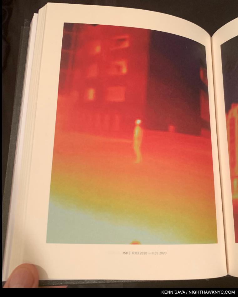
Antoine d’Agata, 17.03.2020 – 11.05.2020, page 158 from Virus, taken during the pandemic in Paris from March to May.

Since there’s no such thing as “best” in the Arts, I’ve opted to do a list of recommended “NoteWorthy” PhotoBooks the past 3 years. This year, due to the pandemic, I’ve seen fewer books than I had the past few years. Nonetheless, these books stood out for me among those I have seen, and I decided to do a list this year because I believe they would have been on it no matter how many more I had seen.

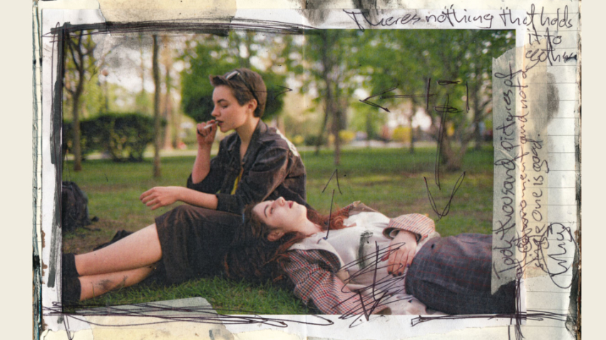
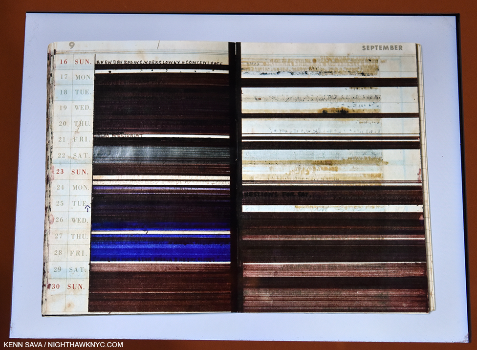
Josh Kern’s second PhotoBook, Love me, was released in 2020 and promptly sold out. In this spread from it the Photographer shows us his working notes. Along the top, it reads “There’s nothing that holds it together.” On the side, “Took a thousand pictures of this moment and not a single one is good.” This reminds me that as incredibly hard as it was to publish a book this year, the hardest parts of making a great PhotoBook happen long before it gets to be printed.

Most Photographers don’t have gallery representation, so, PhotoBooks are a primary means of reaching an audience for them. Without a dealer, they’ve taken on the job of building their own followings. Through diligence, a few of them even have upwards of 1 million followers on social media. For me, the accomplishments of these independent Artists is yet another indication that the gallery model is being bypassed by people who are not only creative Artistically. One example of how things are changing is young German Photographer Josh Kern, who I was among the very first in the US to discover last year. Josh did a Q&A with me as his first PhotoBook, Fuck me, was about to sell out of 1,100 copies. He has now sold out of 1,200 and 1,100 copies of his first two PhotoBooks respectively without help from Amazon, a gallery, or even a US book distributor. Remarkable for someone who was a 22 year old college student when he started, and another sign of where things are heading. 

As I’ve mentioned in the previous years I’ve done this list (2018 and 2019), reconciling publishing dates with the date books actually appear is a bit problematic. Some books published in 2019, even 2018, only reached stores here in 2020. I’ve seen a number of books listed as being scheduled to be published in 2020 that have not made an appearance in stores here yet. So, once again, I’m sticking to books I’ve actually seen become available in stores, or to purchase, this year.

NoteWorthy PhotoBooks, 2020
The All-Magnum Photos Edition

That’s right. Coincidentally, each of these books was created by a Member of Magnum Photos, the legendary world’s leading Photographer’s co-operative. If I were to recommend one book this year of all the books I saw, I’d be torn between these two-

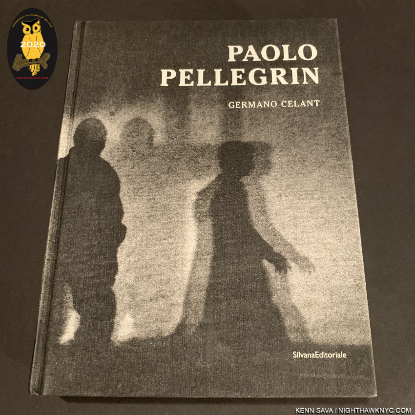
Paolo Pellegrin: Un’antologia, Silvana Editoriale. Ok. It says “2018” on the colophon, but how many people here have seen this? D.A.P. listed it as being available in the USA in Fall, 2019. I didn’t see it until late January, 2020. Un’antologia may be the most well-done retrospective I have ever seen. Perhaps, I shouldn’t be surprised. It was designed by a team headed by Yolanda Cuomo, who has designed countless wonderful books, including Diane Arbus, Revelations, the finest book on Ms. Arbus I have seen. Gorgeously produced and extremely thorough, this 6 1/4 pound, 742 page hardcover with over 1,000 illustrations accompanied the show of the same name at the Deichtorhallen, Hamburg, from October, 2019 to March, 2020, and as a career Retrospective- so far (c. 1960 to date). Yes, it ran to March, 2020, so I’m also using that to qualify if for listing here. Page after page is nothing short of stunning to the point that it becomes necessary to remind yourself that you’re looking at the work of one man- and Mr. Pellegrin, 56, is still a relatively young man, with hopefully, decades of work ahead, not someone looking back on a career that’s winding down. Nonetheless, it makes an open and shut case for Mr. Pellegrin as one of the world’s most important Photographers, just in case you didn’t already know that, with a legacy that’s already monumental. There’s an English edition in 1,000 numbered copies, and an Italian edition also numbered to 1,000 copies. That’s all! Un’antologia is also a fitting testament to curator Germano Celant, who passed away this year. Early on, he said to Yolanda Cuomo, “This is not a book by Paolo. It is a book about Paolo,” Don’t wait much longer. 
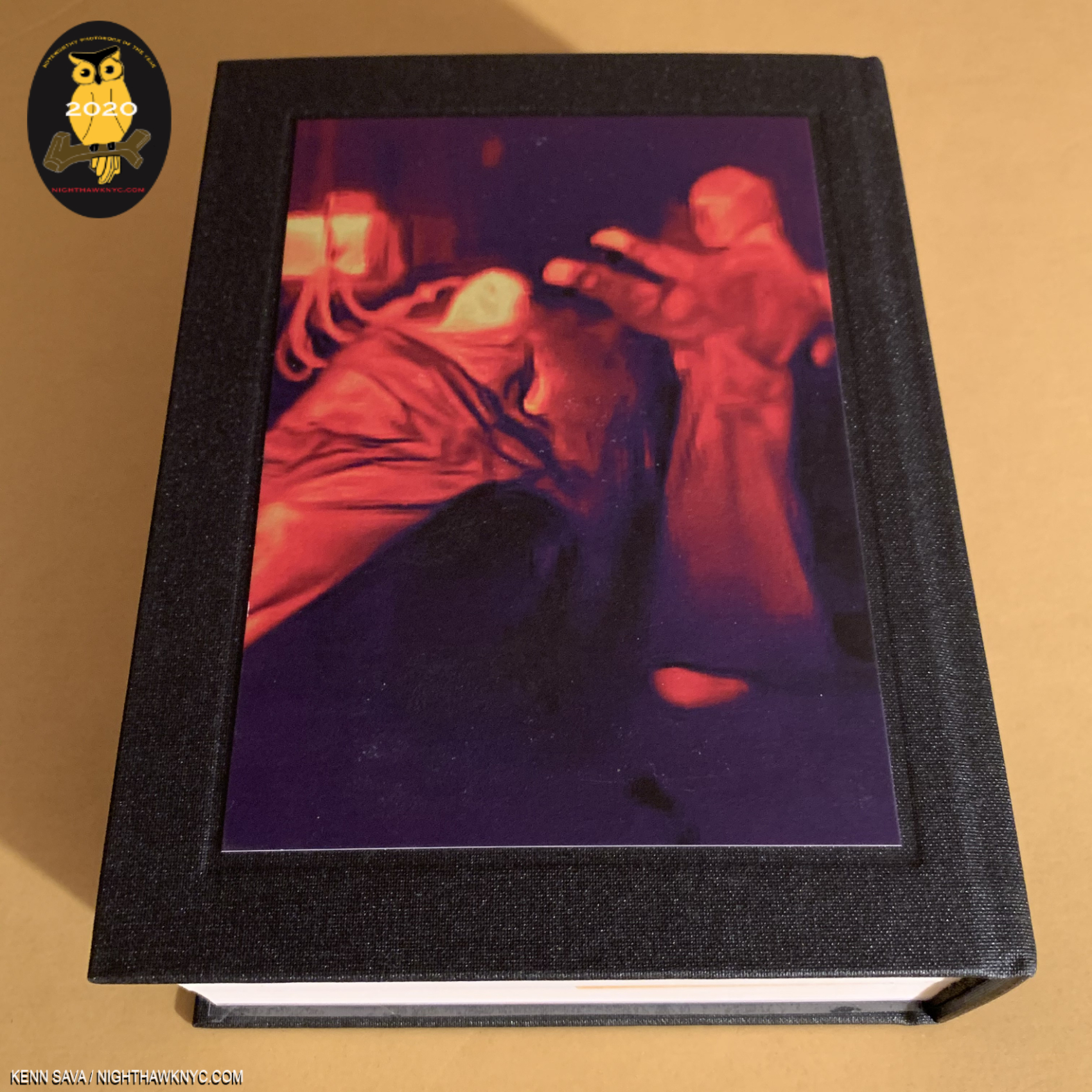
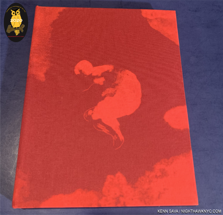
Virus, rear cover.

Antoine d’Agata, Virus, Studio Vortex. I thought I was a bit prepared to see this from seeing a number of these images on Mr. d’Agata’s social media pages, but no. I was staggered when I first paged through this massive tome. Mr. d’Agata who lives with no fixed address, lived and worked out of the Magnum Paris offices while producing this work (while Paris was shutdown). He also spent “countless” days and nights staying over in treatment centers. Wait. HOW many people are going to accept an offer to go and watch a covid19 patient being treated? Umm. No, thanks. Antoine d’Agata, as you can see above, said “Yes.” “My object is to get photography back to requiring true commitment, to being a language that is unique by its potential subtlety and rawness,” he said1. “True commitment,” in spades. The work he created, which number 13,000 images in the two months, ranges from “normal” Photographs to many taken with a thermal camera, like the image above, which produces shots that reveal things a normal camera wouldn’t. The results are often “painterly,” but unlike any Paintings I have yet seen. Going in to 2020, Francis Bacon was the Painter Antoine d’Agata’s work most reminded me of. With Virus, he’s created his own world, a world we’ve all lived in, alone together. The only other PhotoBook that came to my mind when thinking about Virus is Aftermath, Joel Meyerowitz’ equally massive look at Ground Zero after 9/11. Both Photographers had unique access. Both have succeeded in creating the most remarkable, historic and valuable documents of these horrific events. In the midst of the horrors the world has seen and continues to see during the pandemic, if I may say this, Virus also strikes me as also being a work of Art. There are images of medical professionals treating patients that have no less than a Pieta like feel to them. Just unforgettable. I look forward to the day when I can look through Virus and focus on its Painterly aspects and its qualities as a work of Art, and hope I get to see it. Virus’ 825 pages includes text by Mathilde Girard I admire quite a bit. There are just 325 copies of the English edition. As my co-most highly recommended PhotoBook of 2020, Virus is a staggering accomplishment.

There are two other books by Magnum Photos Photographers that especially stood out for me this year-

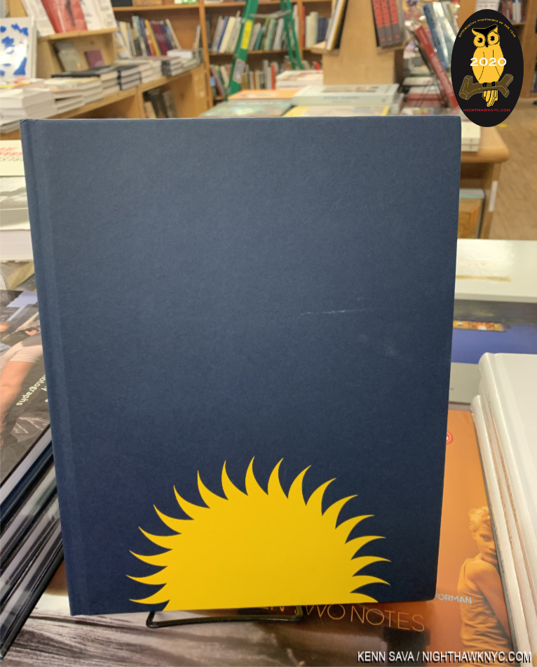
Gregory Halpern, Let the Sun Beheaded Be, Aperture. Ho hum…another year, another terrific Gregory Halpern book on this list. Let the Sun joins Confederate Moons and Omaha Sketchbook on this list in the three years I’ve been making one. I find all of his books have remarkable staying power. Meaning that the images linger in my mind long after I’ve closed the cover. That’s every bit the case with Let the Sun, which has more layers to it than it has pages (120), meaning different things are going to jump out to you with each perusing. Then there’s the remarkably intimate Conversation between Mr. Halpern and Stanley Wolokau-Wanambwa. Any place outside of NYC is foreign to me, but Guadeloupe is exceedingly hard for me to imagine. Yet, the shared history with slavery makes Guadeloupe not all THAT foreign and its unique experience with it makes it even more haunting. Somewhat quietly, Mr. Halpern continues to build a remarkably strong body of portraits, more of which lie at the heart of Let the Sun Beheaded Be. Remarkable when you consider the Photographer is not fluent in French and he communicates with his subjects before Photographing them.

Yael Martinez, La Casa sue Sangra (The House that Bleeds), KWY Ediciones. A 2020 Magnum Nominee, his work looks like no one else’s. He seems to have a unique way of getting inside the skin of those he portrays, his Photographs are so intimate. Of La Casa, Mr. Martinez says, “‘A people without memory is condemned to repeat their mistakes.’ Guerrero is one of the Mexican States that have been most affected by organized crime; It is the second poorest and most violent state in the country. I am thus trying to depict the situation which many families in this region face, which they live through daily, and which is one of the causes of the unraveling of Mexico’s social fabric.” La Casa focuses on the forced absence of beloved family members, each image with an overriding darkness and use of color that are both intimate and epic. His Photos bring you right there, capturing moments that often border on the magical. A house that bleeds could be a family or a community, he has said. He began with his family, before eventually expanding the project to include other family around Guerrero. The classic work of the Farm Security Administration Photographers, including Dorothea Lange (see below), came to my mind as a possible influence (though Mr. Martinez shoots in color). Printed in an edition of 1,000 copies, and still in print as far as I can tell, I spent most of 2020 seeking a copy of La Casa. Another marvelously unique Artist and powerful voice for Magnum Photos.

I don’t know how they do it, but year after year Magnum continues to find extraordinary Photographers to add to a roster that makes me ask the impossible to answer question- Is this THE greatest Magnum Photos Roster ever? Until I ask the same question, again the very next year. 

Other NoteWorthy PhotoBooks of the Year, 2020

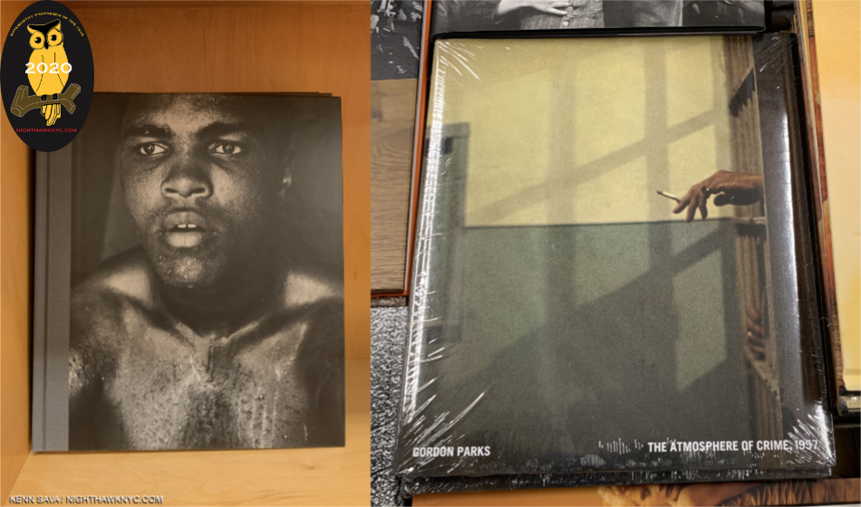
Gordon Parks: The Atmosphere of Crime, 1957, and Gordon Parks X Muhammad Ali, both Steidl. Sadly, Gordon Parks left us in 2006, but his Foundation has been doing a strong job of keeping his legacy alive with shows (here in NYC at Jack Shainman Gallery), and a superb series of books published by Steidl. On the heels of the essential Gordon Parks Collected Works, (Steidl’s site says it’s Out of Print- you can still find it if you hurry), 2020 brought us The Atmosphere of Crime, 1957, and Gordon Parks X Muhammad Ali. Atmosphere seemed to strike a nerve with buyers when it came out, and garnered more attention, while GP X Ali benefits to no end of the close connection the two shared.

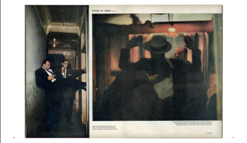
Atmosphere includes the original LIFE articles, like this one from September 9, 1957, and images never before seen.

Atmosphere of Crime is a brilliant look at the true complex nature of crime flying in the face of the mainstream media’s stereotypes, showing completely other sides to the American public with frankness and empathy. Unlike the work of Weegee, or even most of Gordon Parks’ prior Photographs, these are in color, which adds another dimension to both the you-are-there realism and the Artfulness of his timeless work. Powerful, raw, cinematic, Atmosphere paints a remarkably broad picture of the realities of crime in 90 images over 120 pages. It’s gives me the feeling of seeing a 1950s film noire in color. Of course, Mr. Parks later directed the classic Shaft in 1971- only 15 years later. It’s revealing to compare the two. Not to be missed.

One of the most important historical, and creative, records of The Greatest of All Time, Gordon Parks X Muhammad Ali, is centered around 2 assignments Mr. Parks was on to shoot The Champ in 1966 and 1970 for LIFE Magazine. The book is characterized by an intimacy that shows Ali in unguarded moments that are often incredibly poignant. While others, including Thomas Hoepker, have given us classic images of Muhammad Ali, Godon Parks’ stand out for me because they cut right to the heart of the man, which remains here, larger than life for all time.

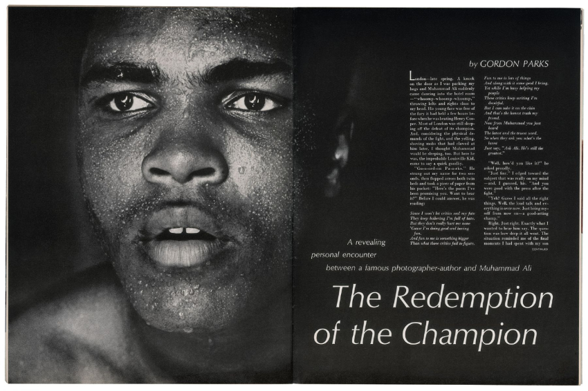
Reproduction of the original opening spread of the 1966 LIFE article, with text also by Gordon Parks. The full articles are reproduced in both of these Gordon Parks books.

Gordon Parks Photographed The Champ at 2 key points in his life. First, in 1966, amid intense controversy over his becoming a Black Muslim, changing his name to Muhammad Ali, and being a conscientious objector to the Vietnam War. The resulting landmark LIFE Magazine article “The Redemption of the Champion,” also written by Gordon Parks, helped the public see the truth. I remember seeing it in a barbershop waiting for a haircut as a kid. The oversized magazine created a larger than life effect that cut right through all the noise. I believe the article helped start Muhammad Ali on the road to being the icon he remained for the rest of his life. 

Both are the multi-talented Gordon Parks near his considerable Photographic peak. Both speak for themself. Both will live on in your mind, indelibly. A show titled Gordon Parks X Muhammad Ali is scheduled to open at the Nelson-Atkins Museum in 2021. In 2020, I found it impossible to choose one between Atmosphere of Crime and Gordon Parks X Muhammad Ali. Good luck if you try to.

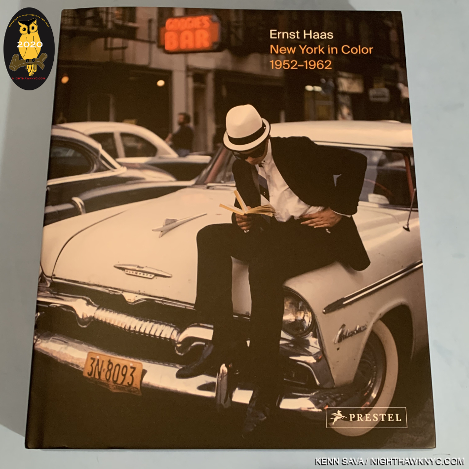
Ernst Haas: New York In Color, 1952-62, Prestel. During my now 4 year deep dive into post-Robert Frank’s The Americans Photography and PhotoBooks, I focused on exploring the history of early color Photography. I soon discovered that William Eggleston was NOT the first Photographer to have a solo show at MoMA. It was Ernst Haas, who’s Ernst Haas: Color Photography opened August 21st, 1962. FOURTEEN YEARS before Photographs by William Eggleston opened there on May 24, 1976. Mr. Haas’ estate has worked with Prestel to publish the wonderful Ernst Haas: New York In Color, 1952-62, which now serves to put Mr. Haas’ work into the same discussion with another legend of earlier color Photography- Saul Leiter, who’s color work in NYC, in the same period, has been held in unique esteem. Mr. Haas’ admirers already treasure Steidl’s classic Ernst Haas: Color Correction, which is to be reprinted.

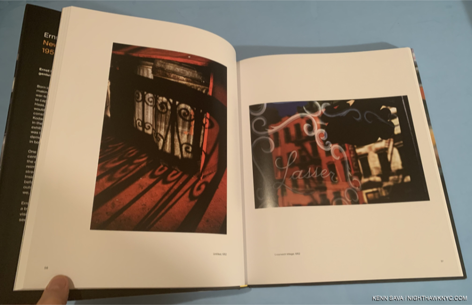
Ernst Haas, NYC, 1952(!) Move over, Saul Leiter, and tell William Eggleston and Stephen Shore the news…

With the release of Ernst Haas: New York In Color, 1952-62, Mr. Haas goes toe to toe with Mr. Leiter on his own turf, in his own time! Lovers of Photography are the winners. NYC is plenty big enough for both of them. I recommend this book to anyone who loves Mr. Leiter’s Early Color, which I consider an essential PhotoBook of this century, as much as I do.

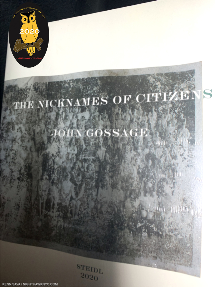
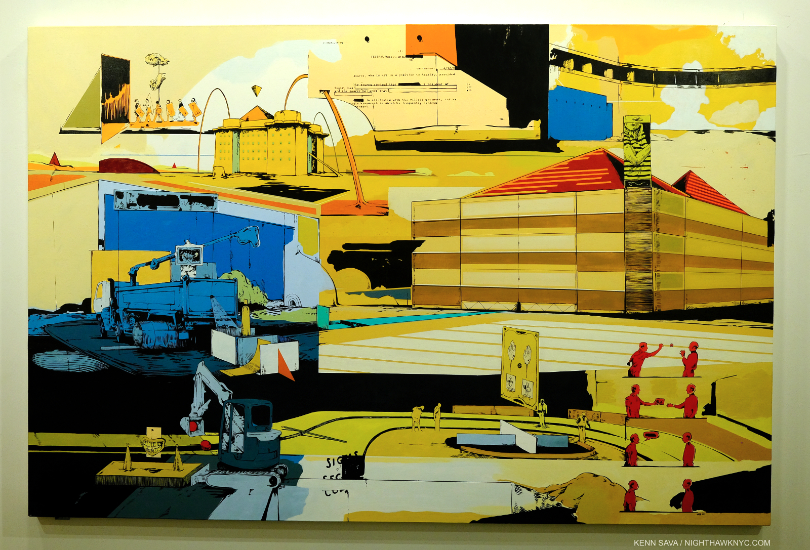
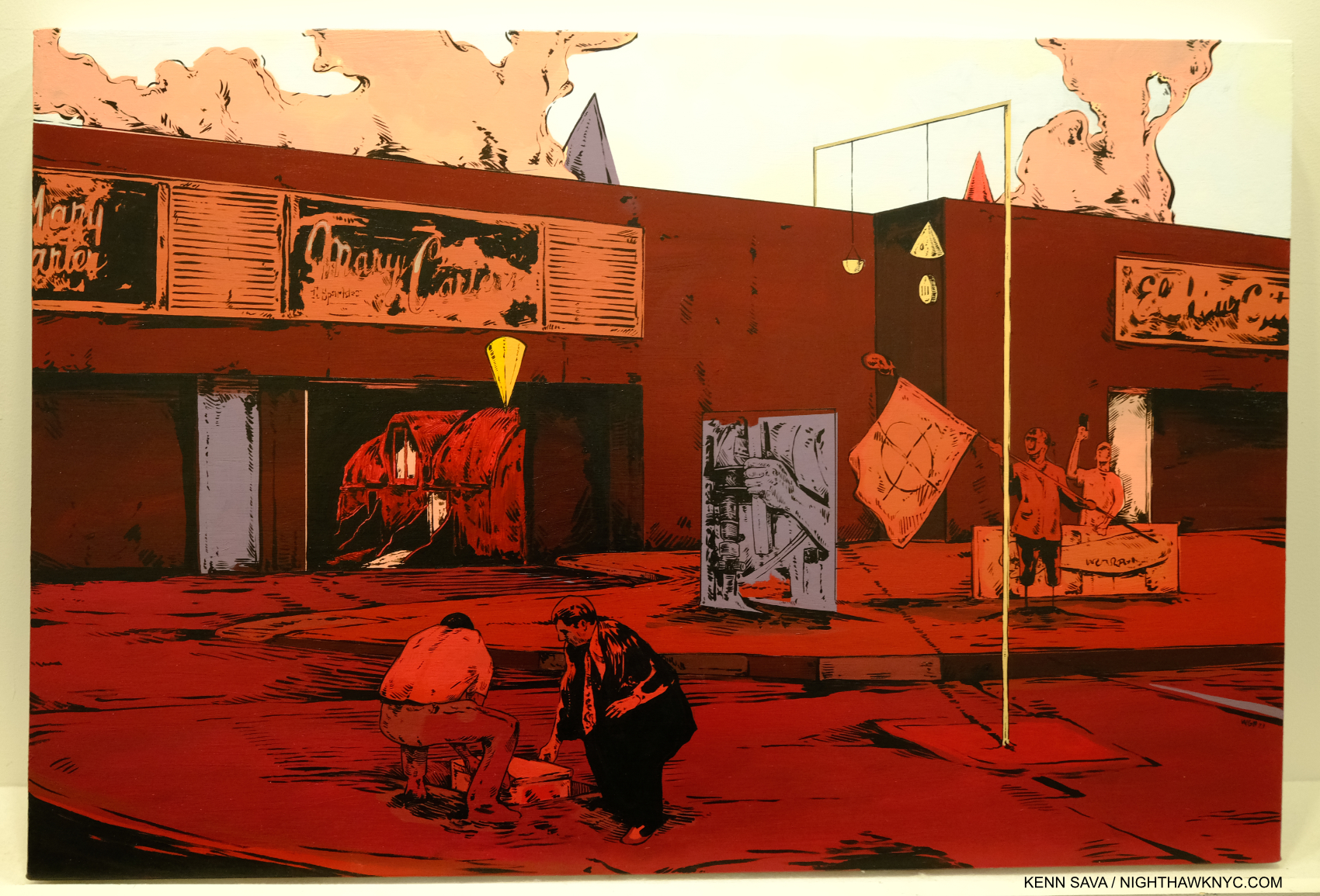
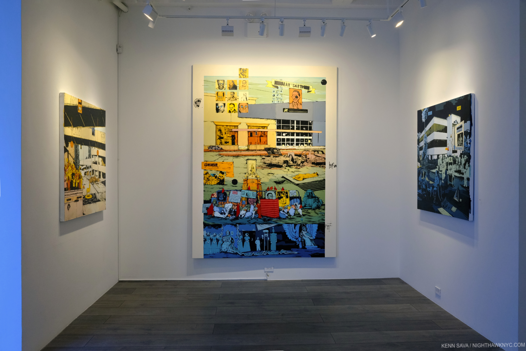
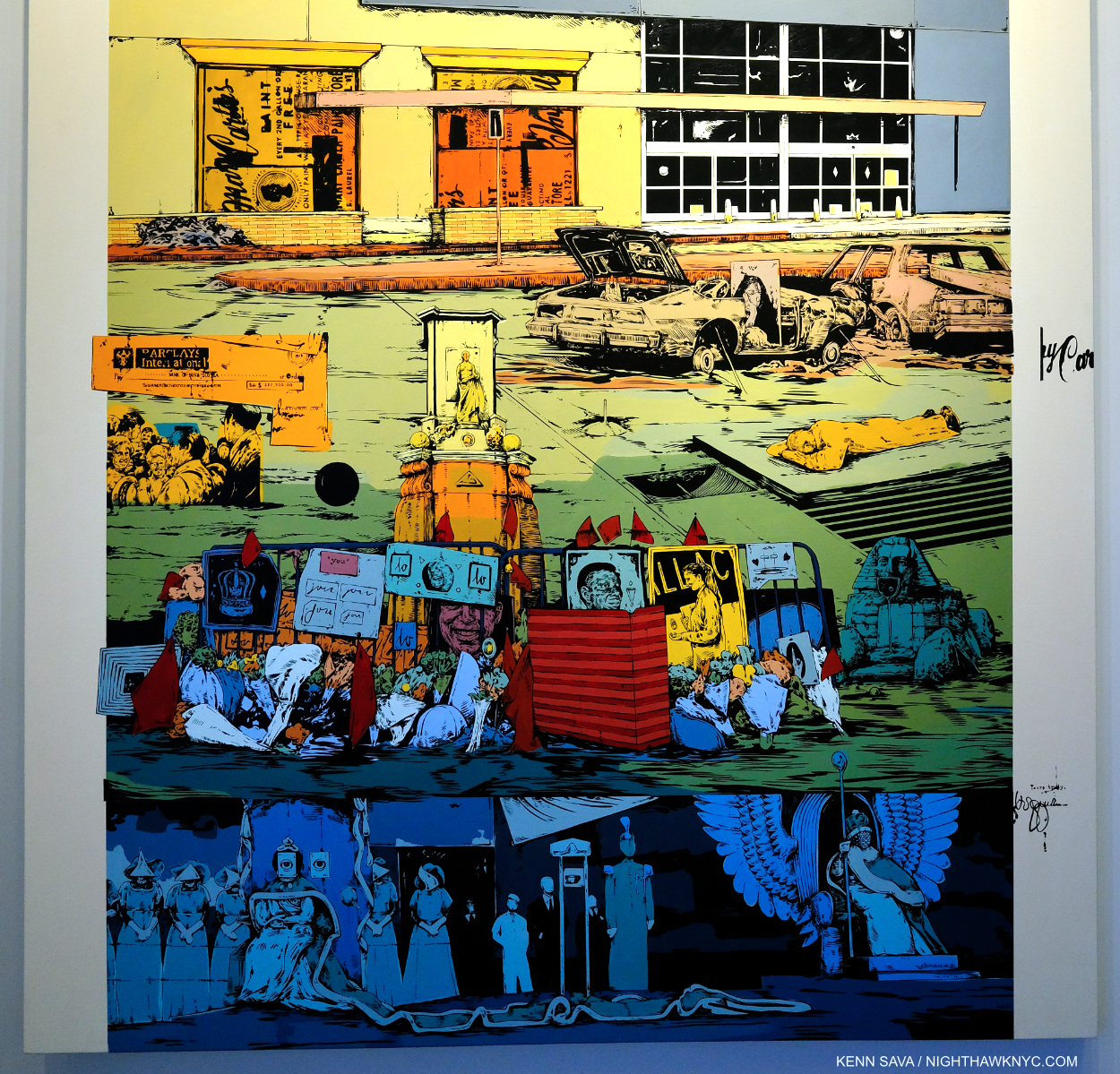
John Gossage: The Nicknames of Citizens, Steidl. The latest in the renowned Photographer’s “loving yet critical, generous yet ironic vision of America,” to quote the publisher, it follows Jack Wilson’s Waltz, published in 11/2019, Should Nature Change, 8/2019, and precedes I Love You So Much!!!!!!!!, forthcoming, all from Steidl. Picking up any one of these books is like taking one from a box of chocolates. Once you sample the poetry of Mr. Gossage’s images, you’re more than likely going to want to devour the others in the series. I’ve been so focused on exploring the history of color Photography these past 3 years that I was slow on the intake of this series. Nicknames is the first one I’ve gotten and I was immediately captivated by Mr. Gossage’s vision, and as Magnum Photographer Martin Parr said about another John Gossage/Steidl book he witnessed being created, Looking up Ben James- A Fable, “I am amazed that the collective vision of this volume is so familiar, but entirely alien. It restores my faith in photography to know that a mature and original photographer like John Gossage can see the things I just did not notice.” As I perused these books, another series on America came to mind- that of English Magnum Photos Photographer Mark Power’s, Good Morning, America. Mr. Power’s is in color and doesn’t include portraits per se, but the two ongoing series are fascinating to look at together, given one thing they do share- they both look at America during a similar time frame.


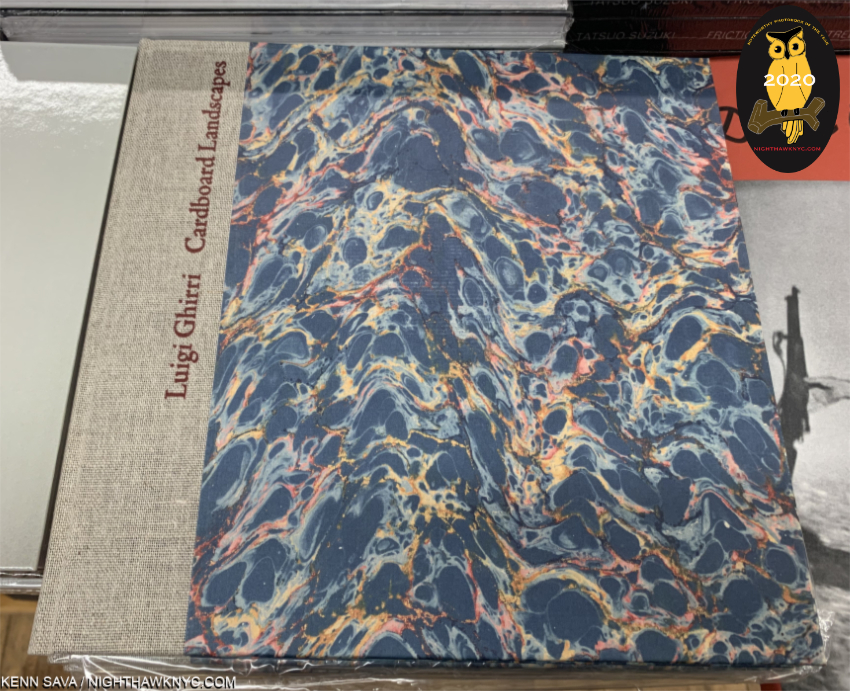
Luigi Ghirri, Cardboard Landscapes (Paesagge di cartone), Museum of Modern Art. This book was a gift from Luigi Ghirri to legendary MoMA Director of Photography, John Szarkowski, in 1975. It languished forgotten in the MoMA collection for decades until being recently rediscovered. Now reproduced faithfully for book lovers, it makes a stunning impression. Here, we get the full range of Luigi Ghirri’s considerable gifts, along with his gift of sequencing. The result is a breath of fresh air. The first half of the book is quite humorous. We sense the Artist’s personality shining through. The rest retains a bit of the feel of his recently ended career as a surveyor. In the end, it’s a book that is a serious work of Art that doesn’t take itself oppressively seriously. Still, it’s hard for me to look through it and not see a bit of the roots of Artists as diverse as Maurizio Cattelan, Stephen Shore, Richard Prince and Erik Kessels. Such is the net effect that, even though the Ghirri bibliography has exploded the past few years with some fine titles, Cardboard Landscapes gives us yet another entirely different side of this remarkable Artist.

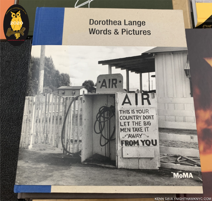
Dorothea Lange, Words & Pictures, Museum of Modern Art. “All photographs—not only those that are so called ‘documentary’…can be fortified by words2, Dorothea Lange said. Elsewhere she said, “Am working on the captions. This is not a simple clerical matter, but a process…They are connective tissue, and in explaining the function of the captions, as I am doing now, I believe we are extending our medium,” in a note that reveals the importance of captions (and words) in seeing her work. It’s so rare to gain major insights into major Artist who passed away 55 years ago, but that’s exactly what the show this book accompanied did. “Dorothea Lange, Words & Pictures, which opened barely a month before the NYC pandemic shutdown added a completely new dimension to our appreciation of the work of Dorothea Lange by focusing on the role her words play in their understanding. It lives on in this exceptional book that is a joy to look at as well as to read. In many shows where words play a part, they’re often hard to read due to glare on the glass and the numbers of other viewers.

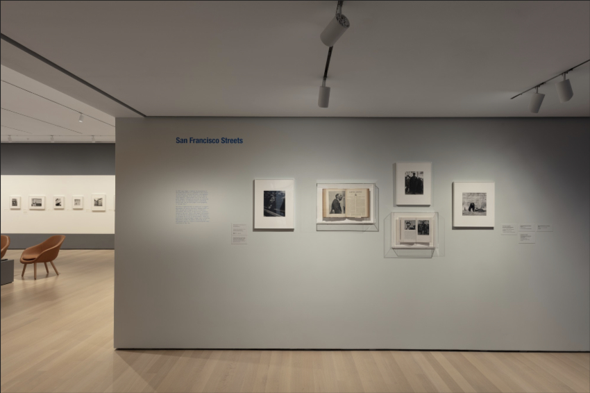
Dorothea Lange, Words & Pictures, Installation view, MoMA Photo.

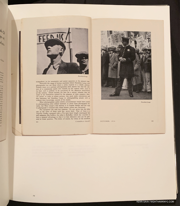
The open book seen in the lower center wall latrine above as reproduced in Words & Pictures.

Here, you can read them clearly without distraction, glare or others looking over your shoulder, while seeing Ms. Lange’s classic images in gorgeous reproductions printed on 150gsm Arctic Volume Ivory, which makes the book better, in some ways, than seeing the actual show! Also, among the essays is one by the legendary Sally Mann. Along with whatever other books you have on Dorothea Lange, like the excellent Dorothea Lange: The Politics of Seeing, this one is essential.

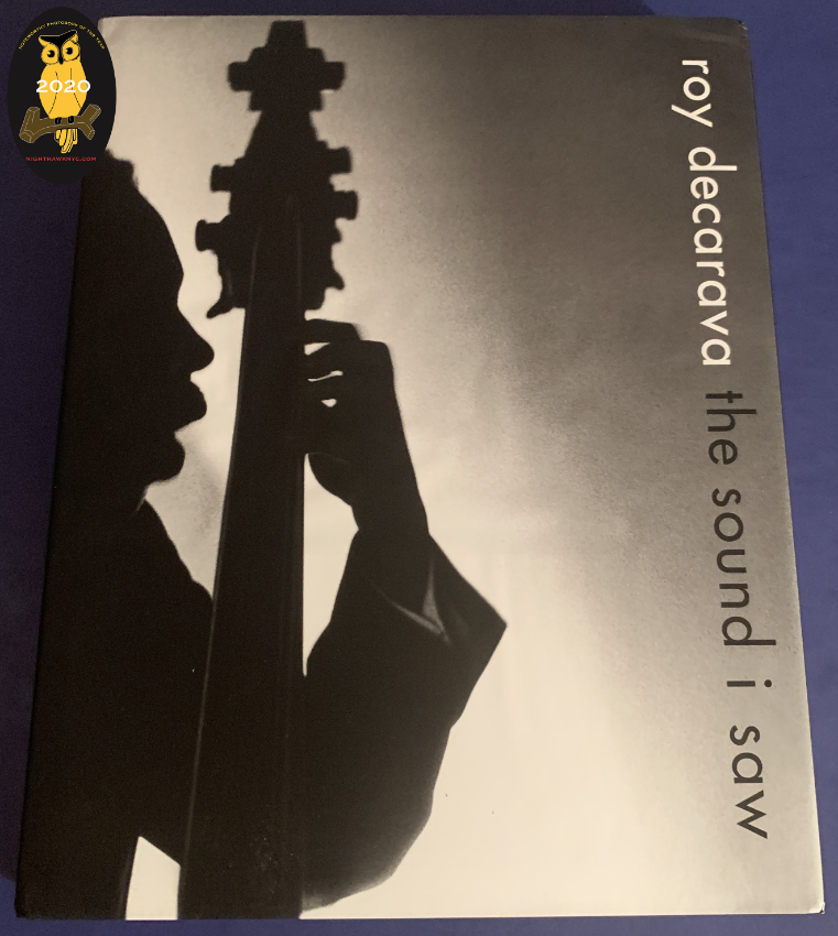
Roy DeCarava: the sound i saw, David Zwirner Books. Roy DeCarava has been in eclipse since his passing in 2009, just short of his 90th birthday. Due to his estate’s new relationship with Zwirner his work has returned to view in force, both in shows and in books. The classic The Sweet Flypaper of Life (with Langston Hughes) was finally reissued in 2018, and 2019 saw the rerelease of another out of print Roy DeCarava classic- the sound i saw, this time in a luxurious oversized edition which pairs his poetry with many classic images. Growing up studying Jazz through Lps, I wasn’t familiar with Mr. DeCarava’s work as I was with, say, Alfred Lion’s for Blue Note. The difference I see between Mr. DeCarava’s Jazz images and everyone else’s is that I can tell he knew his subjects personally. These images ooze personal connection, and that’s very rare in Jazz in this period. No. It’s uneqelled. I don’t know why more of his amazing images didn’t make it on to record covers, but here many of them are over 208 pages in this 5 pound collection, in addition to others that set the mood. If you love Music, and especially if you love Jazz, this is an essential book that features exceptional, intimate images of legends Mr. DeCarava well knew, including important images of John Coltrane, and Billie Holiday (seen smiling!), Ornette Coleman and Duke Ellington, among others. It is the finest book of Jazz Photography I have ever seen.

NoteWorthy PhotoBook Publisher of the Year, 2020

From Remember the South by Frank Frances, one of the first three auspicious releases on Kris Graves’ new Monolith Edition imprint.

Kris Graves Projects & Monolith Editions. I can’t imagine how hard it was, and is, to produce and sell books in 2020. In addition to the obstacles I listed near the beginning of this piece, once you get the physical books printed and in your hands, all the bookstores were closed for much of this year. And then customers, including this one, have been slow to return to indoor shopping. Yet, through the pandemic, the lockdowns and quarantines that are still going on around the world, book publishers have tried to maintain a sense of “business as usual.” For all of them- big and small, this must have been quite challenging. I’m sure we’ve lost a good many of them already. Yet, Artist-run, Kris Graves Projects has not only carried on, they’ve released a steady string of impressive titles, 18 in 2020, including the third set of LOST, with their usual high quality, and at popular prices. Kris Graves also debuted Monolith Editions this year, dedicated to publishing the work of BIPOC Artists, with three auspicious releases. I reached out to Mr. Graves trying to gain some insight on just how he’s done ALL of it during the hardest year of almost all of our lives. He said-

“This year allowed me to be home more than any other in recent memory, so I worked on making content and working with artists. I wanted to make less books this year but I guess I can’t stop myself. Only four of the books were ideas during the covid times, everything else was in the works. Also, with my photoshoot income diminished, I had to find ways to make some profit on books. I also had more time to let people know the books exist.”
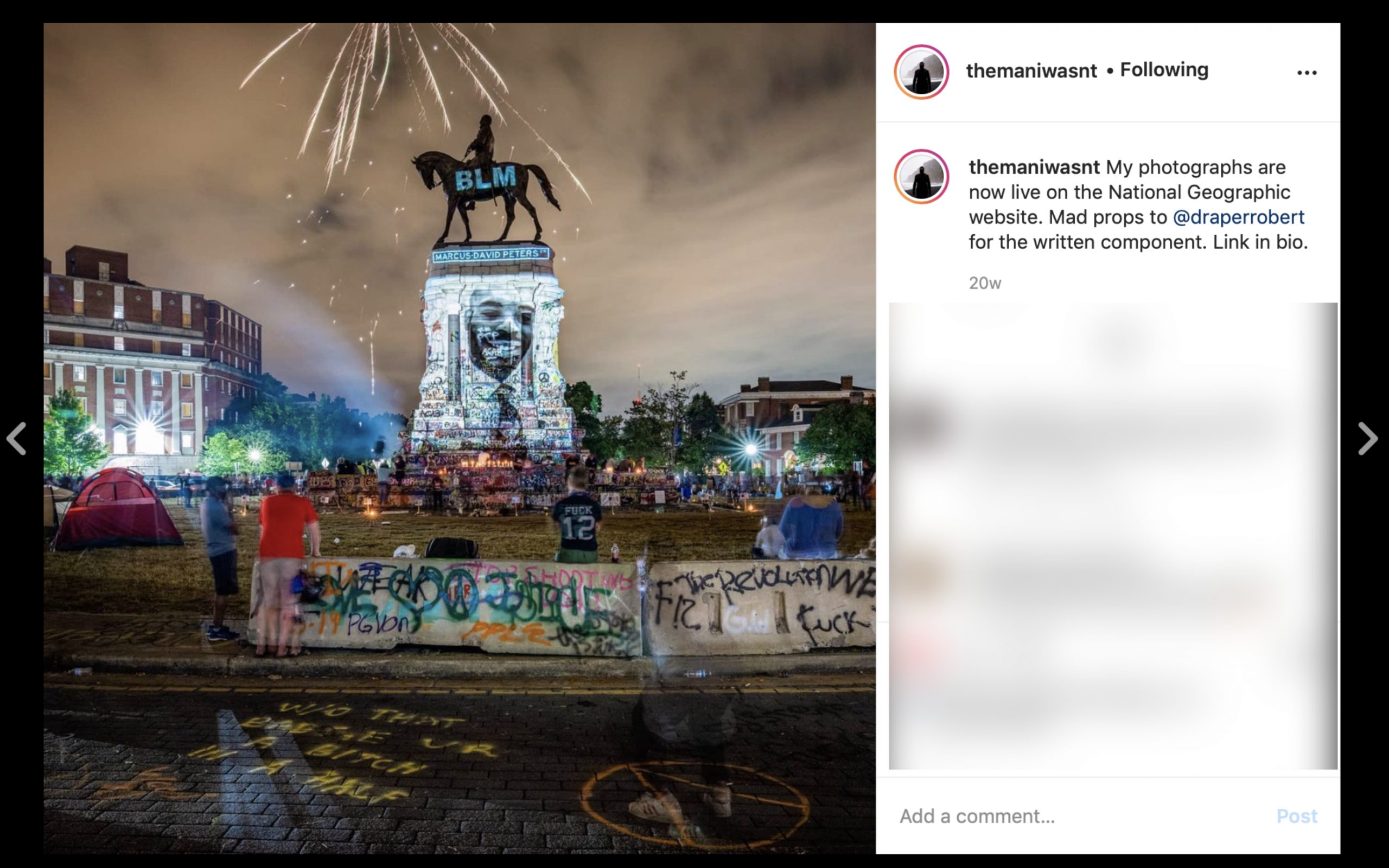
From @themaniwasnt

18 books in 2020 would have been a large output for ANY PhotoBook publisher, but he didn’t stop there. Kris Graves, himself, has created an exceptional, and exceptionally powerful, body of work in 2020, the result of incessant travels around the country, going to sites of monuments and protests, putting himself at considerable risk. It’s a body of work that captures the moment and will, I believe, be historically important. Though not yet published in PhotoBook form, some of this work may be seen on his Instagram feed, @themaniwasnt, and in National Geographic, January & February, 2021. About it, he said-

“As far as my own work, I have done about 30 days of traveling on National Geographic’s watch and dime, so that helped me make a ton of personal work. Without those trips I would not have shown much new work this year. Although, I now have four seasons of Cape Cod imagery and that is becoming a project now. I think that artists need to keep shooting until some magic occurs. If this winter is mild, I will take a bunch of bike rides around Queens to make some new images here also.”
It speaks volumes that at a time when many are stuck, stopped, or done, Kris Graves has not only maintained, he has continued to move forward- on multiple fronts, and produce important work, himself, along the way. 

Finally, this year I’m also listing some NoteWorthy Art Books for the first time. Stay tuned.

Addendum-

Two books I saw late in 2020 were subsequently added to my list, per my Instagram account, @nighthawk_nyc-

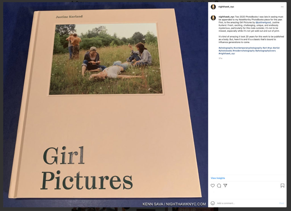
Justine Kurland, Girl Pictures, Aperture. My text reads- “Two 2020 PhotoBooks I was late in seeing must be appended to my NoteWorthy PhotoBooks piece for the year. First, is the amazing Girl Pictures by @justine4good, Justine Kurland. Fresh, exciting, challenging, unique, and endlessly mysterious, particularly for this male outsider, it’s not to be missed, especially while it’s not yet sold out and out of print.
It’s kind of amazing it took 20 years for this work to be published as a body. But, here it is and it’s a classic that’s bound to influence generations to come.”

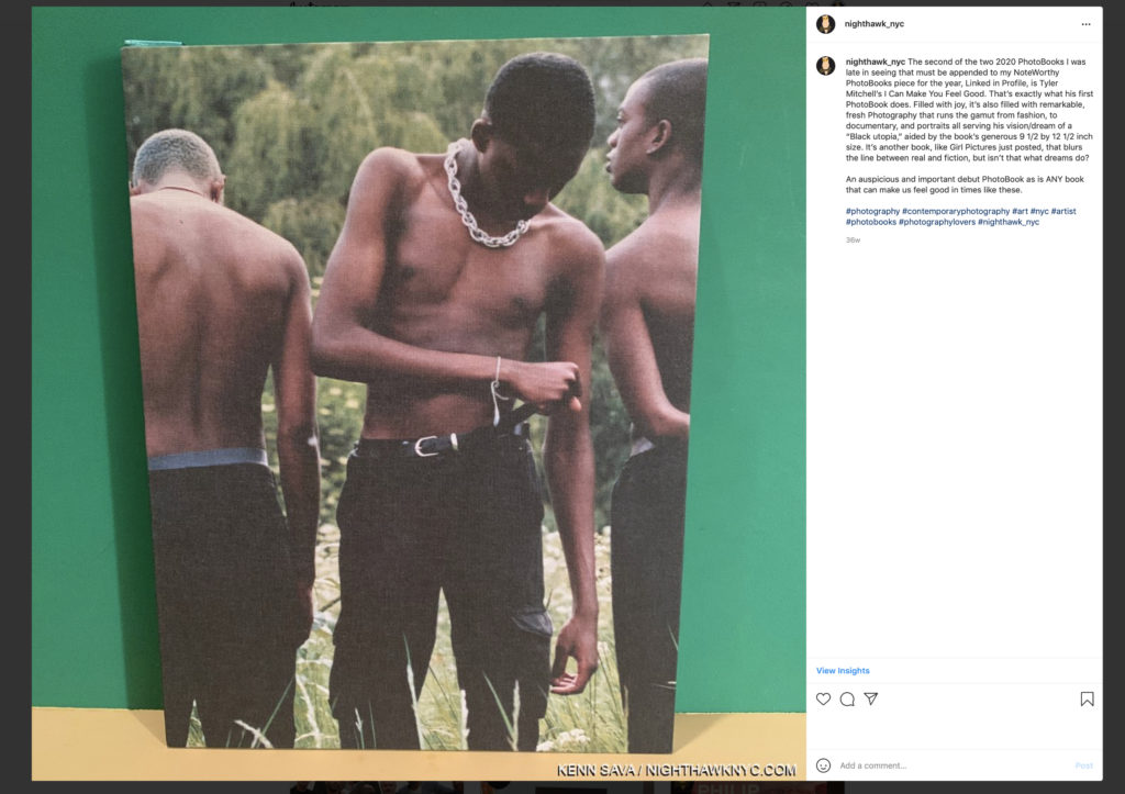
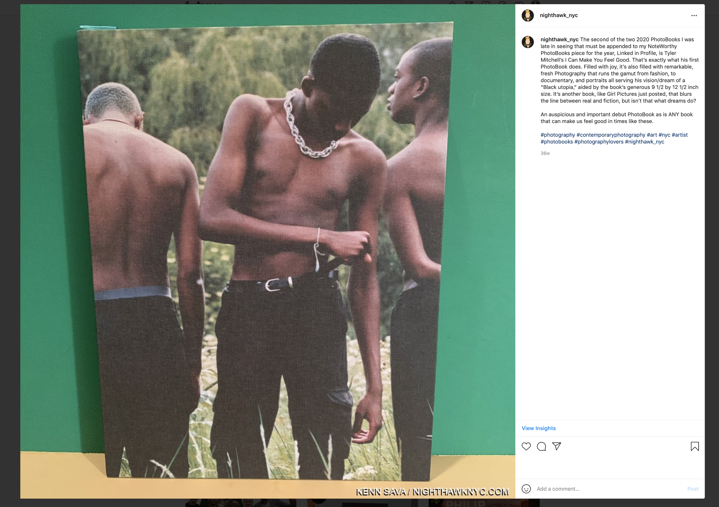
Tyler Mitchell, I Can Make You Feel Good, Prestel. My text reads- “The second of the two 2020 PhotoBooks I was late in seeing that must be appended to my NoteWorthy PhotoBooks piece for the year, Linked in Profile, is Tyler Mitchell’s I Can Make You Feel Good. That’s exactly what his first PhotoBook does. Filled with joy, it’s also filled with remarkable, fresh Photography that runs the gamut from fashion, to documentary, and portraits all serving his vision/dream of a “Black utopia,” aided by the book’s generous 9 1/2 by 12 1/2 inch size. It’s another book, like Girl Pictures just posted, that blurs the line between real and fiction, but isn’t that what dreams do?
An auspicious and important debut PhotoBook as is ANY book that can make us feel good in times like these.” (It should be noted that this is Mr. Tyler’s first PhotoBook for a major publisher. He previously self-published a book. )

NighthawkNYC.com remains ad-free! Yet, the costs are substantial, and have piled up over the past  five years. There are NO affiliate sales links here. If you would like to support what I’ve been doing since 2015, there is a Donations link accessible by clicking the white box at the upper right of the page where the archive lives, with my sincere Thanks.

*-Soundtrack for this Post is “Every Day Is A Miracle” by David Byrne, from American Utopia now a terrific concert film directed by Spike Lee.

NighthawkNYC.com has been entirely self-funded & ad-free for over 7 years, during which over 275 full length pieces have been published! If you’ve found it worthwhile, PLEASE donate to allow me to continue below. Thank you, Kenn.

You can also support it by buying Art, Art & Photography books, and Music from my collection! Books may be found here. Music here and here

Written & photographed by Kenn Sava for nighthawknyc.com unless otherwise credited. To send comments, thoughts, feedback or propositions click here. Click the white box on the upper right for the archives or to search them. Subscribe to be notified of new Posts below. Your information will be used for no other purpose.

  1. Magnum Photos profile
  2. The full quote reads, “All photographs- not only those that are so-called ‘documentary’, and every photograph really is documentary and belongs in some place, has a place in history- can be fortified by words.” Dorothea Lange, Words & Pictures, p. 12.

The End Of The Art World…As We Know It

Written & Photographed by Kenn Sava
This is Part 3 of my series on the end of The Met Breuer also concludes my look at what I saw before the March 12th “temporary closing,” Part 1 looked at some of the history of the Breuer building, Part 2 looked at some of the most memorable moments and its legacy. Part 3 looks at where we are now, and wonders about the future…

Forlorn. The Met two months deep into its “temporary closing,” seen on May 21st.

When the clock struck 6pm on March 12th and I walked away from The Met Breuer on my last visit, much was unknown. I didn’t even know it would be the last time I would visit it. Five months later, a few questions have been answered, but the answer to most of them remain unknown. As I wrote in Part 1 and Part 2, March 12th turned out to be the very last day of The Met Breuer, which remained closed until The Met turned the Breuer building over to The Frick Collection in July, ending the Gerhard Richter: Painting After All show, which I saw on its last day, with it. Now, looking back on The Met Breuer (TMB), it’s becoming clearer that more than it has ended. In the ensuing five months, among Manhattan’s Big 5 museums, and the Brooklyn Museum, only The Met has announced plans to “hopefully” reopen on August 29th, (after being closed for five and a half months- unprecedented in my lifetime, and losing TMB along the way, as they “celebrate” their 150th Anniversary). As the fall season in the NYC Art world rapidly approaches, it looks right now to be a non-event.

A number of people I’ve spoken to in the Art business have lost their jobs or are scaling back their operations. I’m sure they are the tip of the iceberg among Art business professionals who have been laid off or furloughed. The rest gamely soldier on, hopefully safely. The Art Fair world (including The Photography Show, which I’ve extensively covered the past three years) ever-increasingly a staple of the Art business, has virtually disappeared overnight world-wide. While some events and shows have moved online, I think most people would agree, it’s not the same. Yes, Art & Photography can be sold online, and it is in large amounts, but it’s not the same as seeing it in person. I look at as much Art as anyone does online, and with rare exceptions, like Closer to Van Eyck, which I wrote about in January, wondering if it was the future of seeing Art, it’s just not the same experience. For me, looking at most Art online can only give one an idea of the piece. 

So, whither to the Art world, and Art in NYC?

The shuttered Matthew Marks Gallery on West 22nd Street, received a small business Paycheck Protection Program loan from the Small Business Administration of between $350,000 and $1,000,000. Note- All loans quoted in this piece are sourced from the Small Business Administration, here. Seen in June, 2020.

Nothing has been heard from any of NYC’s “big 5” museums or the Brooklyn Museum about their plans since March, beyond The Met’s reopening announcement, which is dependent on City and State approval. Some galleries are open. Some galleries are “open by appointment only.” Some galleries here are not open. Some are gone, as in out of business. Email from the Art world has provided little to no additional insight. I began to look elsewhere for answers to some of the countless questions.

The American Alliance of Museums conducted a survey of its member museums and its findings are dated June, 2020. I found the report chilling but not surprising. The result that has gotten the most publicity so far is the answer to-

“Do you believe there is a significant risk of your museum closing permanently in the next 16 months, absent additional financial relief?”

16% of 648 responders answered “YES.” With Art museums making up 20% of responders, doing some extrapolations, I calculate that as being “YES” from 24 out of 152 US Art museums. Since there’s no way of knowing how (or if) the NYC museums responded, we still have no way of knowing how they stand. I, for one, would be very surprised if any of Manhattan’s “big 5” museums or the Brooklyn Museum were to permanently close in the next 16 months, but who knows.

As concerning as the survival question, very surprising to me is the response to the question- “Months of Operating Reserves Remaining?” 56% of all US museums have 6 months OR LESS of operating reserves on hand. 67% of all museums responding have LESS than 1 year on hand (as of June, 2020, presumably). Again, I doubt the “big 5″+ Bklyn are among them. But, I am starting to wonder what their “staying power” is.

Each of them has been spending money like it’s going out of style this century- but not on Art, leaving each of their collections lagging those elsewhere in Modern & Contemporary Art! Consider-

The Brooklyn Museum seen on August 7, 2014, during its terrific Ai Weiwei: According to What? show, 10 years after its new entrance opened.

In 2004, The Brooklyn Museum remodeled at a reported cost of $63,000,000., which included adding this new entrance and outdoor plaza, a new lobby, a boardwalk, and “Vegas-style fountains with jets of water that dance1.”

In 2006, MoMA moved their exhibitions, including the historic Matisse-Picasso show, to their storage facility in Queens, dubbed MoMA Qns, while they undertook an $858,000,000. renovation.

In 2006 the Morgan Library and Museum opened their 90,000 square foot expansion of their 225 Madison Avenue campus designed by Renzo Piano. Cost= $75,000,000[1 Here.]. 

In 2007-8, the Guggenheim Museum spent $29,000,000. renovating their immortal Frank Lloyd Wright building that I tried to help save in 1984 from their dubious expansion2. (Though we’ve been living with it since, yes, I still consider it dubious.) 

The New Museum presents an attention grabbing silhouette that contrasts with the rough and tumble history of the Bowery at the expense of the gallery spaces inside. There are too many odd, small and strangely placed galleries that are easy to miss and must be very problematic for their excellent curators. Seen here in April, 2017.

December 1, 2007, the New Museum opened its new 50,000 square foot building on the Bowery. Cost= $50,000,000.3

The Whitney, seen shuttered on May 27th. What is it with NYC museums and Renzo Piano? And WHY? Five years after this building opened, it still says absolutely nothing to me. Inside, the lobby is useless and the galleries just “Ok” in my opinion. My bet is that over time, the 13,000 square feet of outdoor space will come to be seen as a mistake. The big question so far, beyond the Whitney’s board, is why have so many of its major shows felt truncated or petered out? Vida Americana is the first one that doesn’t

October, 2014, The Whitney Museum’s final show closed at the building Marcel Breuer designed for it at 945 Madison Avenue and that they occupied since September, 1966, almost 50 years. In 2015, they reopened on Gansevoort Street in a building also designed by Renzo Piano. Cost= $442,000,0004.

MoMA’s famous main entrance shuttered during the protests, seen on June 27th.

The second “new” MoMA of this century was open, officially, from October 21, 2019 through March 12th, 2020, at a cost this time of $450,000,000. (400 million for new construction, 50 for renovation of the last “new” MoMA)5. Total cost of 21st century MoMA renovations and expansion= $1.3 BILLION. Though I referred to “the gorillas in the room” in my look at the “newest” MoMA, beyond spending that $1.3B on Art, there is another gorilla they could have spend it on.

The sun is setting on the New Museum building, seen here in April, 2019, in more ways than one. Plans have been announced to expand into the building to its right, once that building is torn down, with a design that has nothing to do with its existing design, and once again, leaves me scratching my head. As we just saw with MoMA- getting it right the first time would have been much smarter. Ever notice how this never happens to The Met, the kings of museum renovations? Nonetheless, the New Museum have had a run of excellent shows, including unforgettable retrospectives of Raymond Pettibon and Nari Ward. For those of you keeping score at home, Renzo Piano has nothing to do with this expansion- as far as I know.

In June, 2019, the New Museum announced plans to expand the building they only opened in 2007. Cost- $63,000,000.6 Their total 21st century building & renovation costs= $113,000,000. Note- The New Museum has no permanent collection. Under the Paycheck Protection Program, The New Museum received $1,000,000. to $2,000,000. in loans.

Fotografiska – New York across Park Avenue, seen on August 15th.

December 14, 2019, the Fotografiska- New York, a new Photography museum opened on Park Avenue South. Cost not known to me. They renovated an entire landmarked six story building, so it wasn’t cheap. They were open for 3 months before the shutdown.

The Met. Not exactly how they drew up celebrating the 150th Anniversary of their founding. They’re probably hoping to get another chance on the 150th Anniversary of the 1000 Fifth Avenue building in another couple of years. Hopefully, they’ll have a better logo then, too. From a distance, this looks like “15C,” no? Seen May 21, 2020.

And, all this while The Met has done countless renovations including the entire Greek & Roman Wing and the entire American Wing. When the closure hit, they were also knee deep in their European Paintings Skylight renovations. In 2011, Thomas Campbell, then Director, announced a renovation to their Modern & Contemporary Wing using TMB as a satellite for shows in the 8 year interim, at a cost of $800,000,000, plus renovations and rent of the Breuer, only to see The Museum fall on financially hard times, in spite of record attendance due to a legal loophole changing the admissions policy. Mr. Campbell resigned, and the plan was scrapped. On September 22, 2018, The Met announced it had made a deal to ‘sublease” the Breuer building to The Frick Collection in July, 2020, so The Frick could renovate their own building. Daniel Weiss, President/CEO. said The Met would save $45 million under the deal7. Cost of renovations to The Frick Collection is reported to be $160 million. It’s unknown if that includes whatever they’re paying to The Met for their “sublease” on the Breuer building8. I don’t think it does since this figure was published before The Met and Frick agreement was made public. 

The Met’s plaza under reconstruction to install fountains seen in May, 2014. Their $65,000,000 cost was paid for by David H. Koch, who’s name was controversially installed in gold letters on both fountains when they opened in September, 2014, to protests.

In November, 2018, Daniel Weiss and new Director Max Hollein announced a $70,000,000. plan to renovate the Africa, Oceania and the Americas Wing and a $600,000,000 dollar plan to renovate their Modern & Contemporary galleries (down from the $800,000,000 original plan,) “now that the museum is on track to balance it’s $320,000,000. annual budget by 2020,” according to the NY Times, November 18, 20189. There has been no word yet on whether their budget will still be in balance this year, or on the status of announced renovation plans. 

Why all of this building, renovating and huge outlays of capital?

2019 Visitors per the Art Newpaper
Metropolitan Museum- 6,479,548
Museum of Modern Art- 1 ,922,121 (MoMA was closed for renovation for 4 months)
Guggenheim Museum- 1,283,209
Whitney Museum- 1.030,945
Other NYC Art museums- less than 1,000,000 each.

The museums were in a race to compete with each other for visitors. It seemed like each and every year new attendance records were set in NYC. The museums felt the need to go bigger and better to keep up and keep drawing record numbers (and to lure donations of money, naming rights, and Art- particularly since they have now been priced out of buying many of the masterpieces of Modern & Contemporary Art they missed when they were new). These seemed to feed on each other in an unprecedented cycle of museum building and renovations this century.

Then, on March 13, 2020, the music suddenly stopped. Only Daniel Weiss, it seems to me, was left with a chair. In September, 2018, a year and a half before the pandemic, he saved The Met $45,000,000. by getting The Frick to sublease the Breuer building. Wait. What? An NYC museum getting OUT of an expensive expansion project? We didn’t know it then, but that may have marked the beginning of the end of these projects. Between that and how deftly he has handled The Met’s precarious finances to this point, he has earned a job for life, in my opinion. Still, looking back on March 13th from the vantage of five months it seems obvious to me that that was the day the Art world, as we knew it10, ended.

The closed front doors of the Whitney Museum, May 27th. It looks like when these doors do reopen, the blockbuster Vida Americana will as well. The Whitney & The Guggenheim each received between $5,000,000 and $10,000,000. in small business loans under the Paycheck Protection Program. The Met and MoMA received nothing under this program.

Five months later, the best that can be hoped for in 2020 is these museums were open for a total of 6 1/2 months- from January 1st through March 12th and September 1st through December 31st (the best case scenario at the moment). If so, they will be EXTRAORDINARILY lucky to reach half of 2019’s numbers. Given a new reality of fewer open days, shorter hours and admissions limits, that would appear to be extremely unlikely. The bigger question is WHEN will the big numbers return to the museums? The biggest question is- What happens if they don’t soon? Or ever?

It’s possible we are heading into dark times. Given scarce public funding, philanthropy fills in the gaps for  the museums. Despite the fact that sources of museum funding has come under closer scrutiny, in the near future there may be too many places in need of funding for those willing to fund. That closer scrutiny may give way to necessity. That before most of them reopen 16% of museums (of all kinds- not only Art museums) say there is a “significant risk” of permanent closure is a number that may or may not rise as things develop. NYC’s Art museums may be a bit more insulated than most, but they have made some huge decisions that may prove to be very shortsighted. 

One building that won’t be open soon is the new Hauser & Wirth behemoth on West 22nd Street towering over and horribly out of place among its residential neighbors. Frankly, it’s already an eyesore. As numerous small galleries go out of business around it, Hauser received $1,000,000.-$2,000,000. in Paycheck Protection Program loans in July. Yet, they have the money to build this?

Of course, ALL of this leaves out one very important group- living Artists. Most Artists (not named Jeff Koons, who received a PPP loan of $1,000,000. to $2,000,000.) are largely left on their own, and, whether they have gallery representation or not, are relying on the internet to sell their work. When you consider the workforce as a whole, they are a bit “lucky” to even have that outlet. Many others have no ability to work or earn without physically going to a  workplace.

Still, I’m sure there are many Artists around the world who are beginning to wonder “If this gallery isn’t showing my work to people in person, what am I paying them for?,” adding even more fuel to the “We NEED a new model!” movement I’ve heard from countless Artists & Photographers these past five years, from which there is no going back. The vast majority of Artists in the world don’t have gallery representation and have been making their own way in the Art world for their entire careers. In my opinion, and in my experience, this movement is only going to continue and grow.

Since no one yet knows how long this is likely to last, it’s also unknown if those loans are sufficient to tie over those who received them. (Full disclosure- Amount given/loaned/granted or donated to NighthawkNYC= $0.) For the rest of the Art world, as it is for the rest of us, it’s “God Bless the child who’s got his own,” as Billie Holiday sang in 1941. Right now, I can’t help but wonder- Will the day come when any or all of the museums who’ve spent tens, hundreds of millions, or billions of dollars on renovations or new buildings come to rue the day they did? As they presumably prepare to enter the “brave new world” we all face, wherever we are, IF  they are among the 34% of museums who told the AAM they have 4 months of Operating Revenue Remaining as of June? They will.

It seems to me in their race to outdo each other, they may be in danger of shortsightedly overlooking the REAL race. The most important race. The race to survive. 

*-Soundtrack for this Post is “It’s the End of the World as We Know It” by R.E.M. from Document, 1987 seen here in their official video, brilliantly Directed by James Herbert-

NighthawkNYC.com has been entirely self-funded and ad-free for over 6 years, during which over 250 full length pieces have been published. If you’ve found it worthwhile, you can donate to keep it going & ad-free below. Thank you!

Written & photographed by Kenn Sava for nighthawknyc.com unless otherwise credited.
To send comments, thoughts, feedback or propositions click here.
Click the white box on the upper right for the archives or to search them.
For “short takes” and additional pictures, follow @nighthawk_nyc on Instagram.

Subscribe to be notified of new Posts below. Your information will be used for no other purpose.


The Met Breuer: Hail, and Farewell

Written & Photographed by Kenn Sava

Part Two of a series.

2,197 days.

I’m about to enter it for what would turn out to be the last time, on what would turn out to be its very last day. I’ll miss it.

That’s how long The Met Breuer (TMB) was open. March 8, 2016 (Member’s preview) through March 12, 2020, when it “temporarily closed” for the pandemic shutdown1. With the calendar turning to July, The Met’s time in the Breuer Building has ended, as I outlined in Part 1, making March 12th the final day it was open to the public. I was there on both its first and last day, and some in between. Though I regretfully missed some of TMB’s shows, I saw the major shows and a good many of the others. 

The Met Breuer, March 12, 2020.

My interest in The Met Breuer was born in curiosity. In May, 2011, they announced they would be taking over the Breuer building at 945 Madison Avenue.

“With this new space, we can expand the story that the Met tells, exploring modern and contemporary art in a global context that reflects the breadth of our encyclopedic collections. This will be an initiative that involves curators across the Museum, stressing historical connections between objects and looking at our holdings with a fresh eye and new perspective. This project does not mean that we are taking modern and contemporary art out of the Met’s main building, but it does open up the possibility of having space to exhibit these collections in the event that we decide to rebuild the Lila Acheson Wallace Wing where they are currently shown…” Met Director, Thomas P. Campbell, in The Met’s press release May 11, 2011. 

Going up. The elevator doors open onto Jack Whitten: Odyssey in October, 2018, one of the true blockbuster shows mounted at TMB.

After decades of being in denial about Modern & Contemporary Art’s worthiness of being in The Met, this marked a gigantic turn. Of course, it came 40 years too late to acquire most of the major works (or ANY of the major works) of some of the most important Artists of the past 40 years. Truth be told, I for one, was in agreement with The Museum about M&C Art from 1980 until about 2014, when I felt enough time had passed to begin to assess what had been done. A LOT of money had been invested in renovations to, and an 8 year lease on, the building Marcel Breuer had designed at 945 Madison Avenue at East 75th Street fo the Whitney Museum (see Part 1 for more on the history). The pressure was on. The Met, under then Director Thomas Campbell, had decided to make its mark in Modern & Contemporary Art, and brought Sheena Wagstaff on board from the Tate Modern, London, in January, 2012, as Chairman of the Department. What approach would Ms. Wagstaff (who’s shows at the Tate ranged from Edward Hopper to Jeff Wall), her staff and The Met take to M&C Art and how would it hold up against shows up at the Guggenheim, MoMA, The New Museum, The Whitney and the Brooklyn Museums?

Home is a Foreign Place, one of the 3 shows that closed TMB, drawn from recent additions to the Permanent Collection showed how far The Met’s collection of M&C has come.

Going into the opening, the press was all about how The Met was “hopelessly behind” NYC’s other Big Five museums, let alone those elsewhere in the country, in Contemporary Art. 2,197 days later, The Met Breuer has done the remarkable- It’s put The Met on that map. It did so by mounting a number of the most important shows of the past four years. From Nasreen Mohamedi and Unfinished: Thoughts Left Visible, which opened TMB, to Gerhard Richter: Painting After All, which closed it. In between, Kerry James Marshall: Mastry, will remain it’s peak moment in my mind, though there were others. And there were a surprising number of revelations along the way.

Sol LeWitt was an Artist I never paid much attention to until I saw this work, 13/3, 1981, Painted balsa wood, in the Breuer’s show, , in December, 2017. Ever since, his work continues to fascinate me

Originally scheduled to be open as TMB until July 5th, it still would have closed with the Gerhard Richter and Home Is A Foreign Place: Recent Acquisitions In Context and From Gericault To Rockburne: Selections From The Michael & Juliet Rubenstein Gift, the final three shows on its 2020 schedule. While the legacy is complete, in terms of the shows mounted, the influence was cut short as countless thousands more would have gotten to see these shows over the approximately four months longer they would have remained open. 

For now, I look back at some Highlights from The Met Breuer. The name of each show, listed in no particular order, is linked to the piece I wrote about it at the time-

Approaching this work, I thought “What is a piece of textile doing here?” “Untitled, 1970s, Graphite and ink on paper,” the wall card read. Wait. What? This is a DRAWING? Then, all of a sudden, a loud click when off in my mind, and Art was never the same for me again.

Nasreen Mohamedi Revelations. That might be the word that lingers with me with I think about TMB. They began on Day 1…The first show I saw that first day at TMB remains my personal favorite of all the shows I saw there. I had no idea who Nasreen Mohamedi was when I got off the elevator that day on 2. But Sheena Wagstaff sure did.

Incomparable is the word I now use to describe Nasreen Mohamedi, who lived in obscurity for 53 years and gave away her Art as gifts. Seen here in one of the handful of existing Photos of her, this one has lingered in my mind from the first moment I saw it, here in a slide show in the final gallery in March, 2016.

The show included Photos taken by Ms. Wagstaff of the area of Nasreen’s unmarked grave well off the beaten path in Kihim, Mumbai, India. THAT’S passion. THAT’S dedication. At that moment I saw them, I knew TMB would be one of NYCs most important cultural institutions. 

Unfinished, Member’s Preview. The first look at one of the most memorable shows to appear at The Met Breuer, March 8, 2016. Work by Titian, left.

Unfinished: Thoughts Left Visible. In the hundreds of years Art shows have been mounted, someone must have mounted one around this concept, right? I haven’t heard of it. If there was one, I doubt it was mounted as incredibly well and included rarely seen works by Michelangelo, Leonardo (the twin Kings of the unfinished work in the Renaisaance), Jan van Eyck, JMW Turner, and countless others. TMB’s first major blockbuster, and the other inaugural show in March, 2016, along with Nasreen Mohamedi. It belied The Met’s stated “mission” with TMB as “an outpost for Modern & Contemporary Art,” filling two floors, while the Nasreen got one. Given all the riches included, I have yet to hear anyone complain. Overall, over time, TMB was what The Museum said it would be.

Diane Arbus: In The Beginning was a revelation, as well, as much for the work as for the amazing way the show was installed- each of the over 100 pieces got its own wall- another thing I’ve never seen before. It also included a portrait of a departed friend of mine, Stormé DeLarverie, who told me more than once that it was she whose scuffle with police had incited the Stonewall uprising (she disagreed with the use of the term “riot.”), and that she had posed for Diane Arbus in 1961. At the time, I took both claims with grains of salt. Now, the world knows that both are facts, and in her gorgeous portrait by Ms. Arbus, which I snuck a shot of and show in my piece, Stormé will forever live on in The Met. In In The Beginning, she, fittingly, got a wall to herself.

The beginning of Kerry James Marshall: Mastry.

Kerry James Marshall: Mastry. As great a Painting show as I’ve seen in years. Maybe decades. 

Edvard Munch: Between the Clock and the Bed. A welcome reminder of the enduring accomplishment of this wonderful Artist who’s rarely seen in a show here. Between showed Mr. Munch is one of the very few Artists to successfully use techniques, styles and colors in realms that had only been used by Vincent van Gogh, who he was only 10 years younger than, and who he outlived by 54 years. 

Lichnos, 2008, at the entrance. 100 feet into this show my jaw was on the ground. It stayed there throughout.

Odyssey: Jack Whitten Sculpture, 1963-2017. Quick. Who’s the other Artist who is a Master of one medium, and who kept his mastery of another from public view his entire career? One stunning revelation after another that never let up. More remarkable for such a large show.

As I said in my piece on the show- “TWO whole museum floors of about 100 Paintings? My idea of heaven…” Having five floors at The Breuer added different dimensions to any number of shows, allowing a good number of shows to fill two whole floors- the kind of space that would be VERY hard to have at 1000 Fifth Avenue. The space between works at Gerhard Richter: Painting After All was one of its most memorable features and gave it an entirely different feel, allowing each work “space to breathe,” rare in big shows, and something I’ll miss very much.

Gerhard Richter: Painting After All. Exquisitely selected and hung, somehow managing to condense almost 6 decades of work into a selection that while not a “greatest hits” included enough of them, along with a good many surprises, and a chance to see the monumental Birkenau works. Unfortunately, it was open for all of NINE DAYS! It turns out that I saw it on its final day, at considerable risk. 

Along with other memorable shows-

Marsden Hartley’s Maine Marsden Hartley was unique and an Artist, though steeped in what the Europeans had and were doing, found his own ways. This was a show that served to open the mind, even in 2017, to the possibilities of Painting seen through a very free eye and mind in often daring fashion. A real breath of fresh air.

Marsden Hartley, Mont Sainte-Victoire, c.1927. Pretty daring to go to Aix-en-Provence and go toe-to-toe with the Master, Cezanne, in the land he made iconic. This work, in a show about Marsden Hartley’s work in Maine, this work set the stage for his bold brushwork and use of color in what would come.

Lygia Pape:A Multitude of Forms  No one medium could hold Lygia Pape’s vision, so the visitor to A Multitude of Forms was met with an ever-changing presentation that delighted the eye as much as it captured the mind.

Lygia Pape, Tetia 1, C, 1976-2004, Golden thread, nails, wood, lighting, a work that wonderfully characterized the ephemeral nature of Ms. Pape’s work in a show remembered for its endless variety and surprise. Seen at Lygia Pape: A Multitude of Forms, her first major show in a US museum in June, 2017.

Everything is Connected: Art and Conspiracy-

Rachel Harrison, Snake in the Grass, 1997. A work inspired by the Artist’s trip to Dealey Plaza, sight of JFK’s Assassination. While I was captivated by it, NHNYC Researcher Kitty said this work reminded her of being in her father’s garage.

And shows consisting of work from The Met’s Permanent Collection including-

Obsession: Nudes by Klimt, Schiele and Picasso From the Schofield Thayer Collection. With only 9 by Klimt and the majority by Shiele- no complaints here.

Provocations: Anselm Kiefer At The Met Breuer-

Anselm Kiefer, Iconoclastic Controversy, 1980, Gouache and ink on photograph, the wall card reads in part, “Rooted in the Second Commandment’s prohibition of graven images, the medieval debate involved the persecution of the artist-monks and the destruction of icons. Here he restaged the conflict in his studio with miniature versions of WWII tanks (one has destroyed a piece of clay in the shape of an artist’s palette)…The image links the iconoclastic battle to the Nazi’s attack on 
“degenerate art” in the late 1930s, which led to the destruction of hundreds of works of modern art.”

and Home Is A Foreign Place: Recent Acquisitions in Context. (Installation view of its lobby shown earlier)-

Mark Bradford, Crack Between the Floorboards, 2014. Can an Art writer have personal favorites? If he/she is a human being, it’s pretty hard not to. Mark Bradford is one of mine. So, I will long remember that this piece was the third to last work I saw on what turned out to be the closing day of The Met Breuer in the show Home Is A Foreign Place. The penultimate piece was Untitled, 1970, by Nasreen Mohamedi.

It’s fitting to end this piece with this show. Here, one could see just how far The Met’s Permanent Collection has come. Yes, there is a long way to go. Museums elsewhere in the US have built a lead in Contemporary Art that is, perhaps, insurmountable. But, The Met now has enough work in its own collection to mount fascinating shows like this. I was most impressed by the steps they’ve taken thus far as I looked at the acquisition dates on the items in Home Is A Foreign Place.

The very last work I saw at The Met Breuer is this piece from a series by Walid Raad, from 2014-5 in Home Is A Foreign Place. The wall card spoke about the Artist’s interest in the shadows these objects cast and how they enhance and expand the form. A bit like the shadow a museum visit casts…

And then, there were the shows I missed, like Vija Clemins. Phew…ALL of this in exactly 4 years! I think that’s a track record that can hang with what any of NYC’s other big museums- including The Met, 1000 Fifth Avenue.

Yes, there were a lot of very good, even great, shows at The Met Breuer during its four year run. You probably have your own list of favorites. Regardless of which show we’re talking about, the Breuer Building gave all of its shows the added dimension of space- often a whole floor, even two. There’s a lot to be said for that, and it will be very difficult to mount such shows at 1000 Fifth Avenue2. I’ll miss the place as The Met Breuer. I already cherish the days I got to spend there.

This is the Second part of my look back at The Met Breuer. Part 1 is here. Some thoughts on the “bigger picture” are coming.  

*- Soundtrack for this post is “Hail & Farewell” by Big Country. “Hail and farewell, Life begins again…”

You can now follow @nighthawk_nyc on Instagram.

NighthawkNYC.com has been entirely self-funded and ad-free for over 7 years, during which over 250 full length pieces have been published. If you’ve found it worthwhile, you can donate to keep it going & ad-free below. Thank you!

Written & photographed by Kenn Sava for nighthawknyc.com unless otherwise credited.
To send comments, thoughts, feedback or propositions click here.
Click the white box on the upper right for the archives or to search them.
For “short takes” and additional pictures, follow @nighthawk_nyc on Instagram.

Subscribe to be notified of new Posts below. Your information will be used for no other purpose.


  1. By my count. Subtract 10 days if you want to count from its official opening on March 18th.
  2. The huge China: Through the Looking Glass Fashion show in 2015 was mounted in different parts of The Met, which probably remains the only way to do it.

A Look Back At The Met Breuer

Written & Photographed by Kenn Sava

First part of a series. 

I was there when it opened (to Members) March 8, 2016, and now I find I was there when it closed on March 12, 2020.

First look. Approaching The Met Breuer for Member’s Preview, March 8, 2016.

With the calendar turning to July, what had been a “temporary” closing due to the pandemic has become permanent with the turning over of The Met’s lease on the building Marcel Breuer designed at 945 Madison Avenue at East 75th Street to The Frick Collection. Originally commissioned by The Whitney Museum, who occupied it for almost 50 years after it opened in September, 1966, The Met (TM, henceforth) rechristened it “The Met Breuer,” (I promptly christened it TMB). The Frick Collection will now move in.

There was no press release or official announcement when The Met’s (TM) turned the Breuer building over to The Frick Collection, effective July. There was a mention on TM’s Instagram page, and now only this on the Visitors page on TM’s website.

In mid-July, the status of Gerhard Richter: Painting After All, which was had been open for just 9 days, and which I saw March 12th, its last day, was clarified when its listing along with those of the two other shows that were open at the time of the “temporary” closing, were moved to the “Past Exhibitions” section of The Met’s website.

After checking every day since March, the show appeared on the “Past Exhibitions” page on July 17th. I’ve enlarged the date section for legibility and added the red text to their listing.

So, with the status of its final chapters finally clarified, the book is now closed on The Met Breuer. It’s time to begin to assess it and its legacy. In Part 1 of my look back, I’ll look at the beginning and the end of TMB. Part 2 will look at some of the highlights of the intervening four years. Part 3 will include some thoughts on the “bigger picture” and what it may “mean.”

Back to the future. March 7, 2015

After trying to get approval for a remodeling of the Breuer Building failed1, the Whitney then decided to build a new building downtown in the Meatpacking District, and so moved out of the Breuer Building in October, 2014. It’s seen here empty in March, 2015, almost exactly a year before The Met Breuer would open here.

The Met announced it would take over the Breuer Building as it’s “outpost” for Modern & Contemporary Art in 2011. Seen here on December 18, 2015. I was told that the silver circles on the windows were meant to echo the ceiling lighting of the lobby inside shown further below.

Looking down at the lower level, December 18, 2015. See the next picture.

The same window. March 8, 2016, Member’s Preview Opening Day. The white wall on the lower level is in front of a bar that had not been completed. The circular ceiling lights are partially seen upstairs.

Member’s Preview, March 8, 2016. Close-up of the sign to the right follows.

On the sign are the two inaugural shows that are both now legendary in my book- Nasreen Mohamedi and Unfinished: Thoughts Left Visible both unseen when I took this shot before going in.

The original Marcel Breuer lobby lighting seen in October, 2018.

The building remained largely unchanged by The Met, except for extensive renovations to the lower level, where they installed the Flora Bar and Cafe. Over the years, I’ve warmed up a bit to the design of this building, which is generally described in unattractive terms, including “brutalist.” I’ve always wondered how Marcel Breuer felt about this term being applied to his work. I characterize the building as “overly cold.” To me, now, it feels like it’s keeping a secret close to its vest, one that even an exploration of all its floors does not reveal. There are some details of the design I’m quite fond of- the windows, particularly the large front facing window, and the lobby ceiling lighting. Both of which strike me as “warm” touches in the midst of the unrelenting cold stone inside and out. Even the seating is stone.

“Wake Up over there on the right!” It’s MacArthur “genius” grant recipient, Vijay Iyer, in the shadows, left, on piano, performing with his Trio for Members during their preview in the first floor Gallery, March 8, 2016.

Being in this space, listening to Vijay Iyer’s Trio, reminded me that my very first exposure to the work of the great Joseph Cornell was the Joseph Cornell: Cosmic Travels show, 1995-96 I saw in this space when it was the Whitney2. I’ve been a big fan ever since.

A rare shot of Tatsuo Miyajima’s Arrow of Time, on view in TMB’s first floor gallery seen in 2016. The only show to take place there before it became the gift shop.

The same space seen in October, 2018, soon after it became the Store, as it would remain.

After various attempts at showing Art in this space, it became the gift shop.

Nasreen Mohamedi, lobby installation view.

The first two shows got TMB off to an “auspicious” start, as I called my piece on Unfinished: Thoughts Left Visible. I had no idea the impact Nasreen Mohamedi would have on me, creating an open and closed case for her place among the great Artists of the 20th century. I returned to see it thirteen times, and I still walk around it in my mind.

Chairs in the final room of Nasreen Mohamedi with one of Marcel Breuer’s unique windows.

Unfinished: Thoughts Left Visible, installation view that first day.

Scenes from The Last Day of The Met Breuer…

Back for what turned out to be the last time, March 12, 2020.

The Met 150th Anniversary banners flying on the corner on what would turn out to be the last day of The Met Breuer strike me as being quite ironic. Unfortunately, they have not had much to celebrate this year. The Met Breuer was closed on the 150th Anniversary of The Met’s founding, April 13th, and then permanently when the calendar turned to July. Losing a branch is a memorable event, but (considerable financial savings aside) not something to celebrate. What it was, is, in my view.

Last call. The sign on the final day lists three very good shows, the other two open for a bit longer than the scant 9 days Gerhard Richter: Painting After All was.

Three very good shows were up that final day, including Gerhard Richter: Painting After All, which will be remembered among all the Artist’s many shows, I believe. I saw all three that day. My look at the Gerhard Richter show that final day is here. At the time, NYC had little idea about the virus that would soon devastate us, how it was spread and what precautions to take. I wasn’t wearing a mask, March 12th. I didn’t have one. A number of the guards were. I didn’t realize then how big a risk I was taking going to The Met Breuer that day, or seeing the other shows I ran around to see just before the March 13 shutdown.

Gerhard Richter, 4,900 Colors, 2007, Enamel paint on aluminum.

A number of pieces I saw that day also spoke to the conditions looming in the City, and the world. Looking at Mr. Richter’s 4,900 Colors it was hard not to feel that the future was fuzzy and out of focus. It still is.

A final look at the lobby counter before leaving for the last time.

I stood outside for a few minutes as the clock approached the 6pm closing, just taking in the scene. When would TMB reopen? There were no thoughts, then, that it wouldn’t, though of course I had TM’s announcement of the summer hand off to The Frick in the distant back of my mind. Summer was a long way off in late winter. As I was leaving, I overheard two staff members say to each other “See you June 1st,” and I wondered if they knew something I didn’t. June 1st? Wow. They’ll be closed for TWO AND A HALF MONTHS! It would turn out to be four and a half months, and never reopen. The Met announced in early July “tentative plans” to reopen at 1000 Fifth Avenue on August 29th. By then, it will be five and a half months.

Last look. It’s 5:50pm, March 12, 2020, as I’m leaving. The Met Breuer is “temporarily closing” in 10 minutes, yet this intrepid staff member is busy cleaning the front doors. It would never reopen to the public, and so this remains my last memory of it.

I’m left with the feeling that when The Met Breuer’s doors closed March 12th, something else may have closed with them. I’ll address that in Part 3. Next, I’ll look at what I saw between March 8, 2016 and March 12, 2020.

*- Soundtrack for this post is “Soundwalk 9:09” by John Luther Adams, commissioned by The Met for The Met Breuer’s opening, that takes its title from the amount of time it takes to walk from 1000 Fifth Avenue to The Met Breuer, in two parts. “Uptown” for listening while walking from TMB uptown to TM, and “Downtown” for the reverse. Both pieces may be heard here.

NighthawkNYC.com has been entirely self-funded and ad-free for over 6 years, during which over 250 full length pieces have been published. If you’ve found it worthwhile, you can donate to keep it going & ad-free below. Thank you!

Written & photographed by Kenn Sava for nighthawknyc.com unless otherwise credited.
To send comments, thoughts, feedback or propositions click here.
Click the white box on the upper right for the archives or to search them.
For “short takes” and additional pictures, follow @nighthawk_nyc on Instagram.

Subscribe to be notified of new Posts below. Your information will be used for no other purpose.


  1. I was active in trying to get it, and the proposed Guggenheim Museum expansion at the time, stopped, with mixed results, as I recounted here.
  2. For some reason the Whitney doesn’t list this show on their site. Though I don’t have pictures of it, I know it was there- I still have the exhibition brochure, and so do these folks.

Hiroki Tsukuda: Drawings From Another World

Written & Photographed by Kenn Sava

Drawing is the beating heart of Hiroki Tsukuda’s Art. Hear, hear.

Voice from the O 05 2020. All works are Charcoal, acrylic ink, and pencil on paper, wood panel, with silkscreen printed acrylic frame, and dated 2020, unless otherwise stated. This work is 24.09 x 30.39 1.54 inches.

Even better, what he does with his Drawing is what makes his Art NoteWorthy, in my view. As I wrote recently, I worry about the decline of Drawing in today’s world. I mentioned the paucity of Drawing shows by contemporary Artists as being one symptom. So, I was pleasantly surprised when I walked into Petzel on West 19th Street on March 6th to see They Live, Hiroki Tsukuda’s second NYC show. Part inspired by the natural world, part seemingly by Architectural Drawing, part by visionary sci-fi, and the rest by his wide-ranging imagination, his work doesn’t stay in one place. Instead, each piece is a mixture of many parts that would seem to be at odds with each other until they came together in the Artist’s mind, and then under his hand.

Very few people got to see They Live, which was open publicly for nine days. I was able to see it twice.

So impressed was I by what I saw on March 6th, I returned on March 7th. Unfortunately, due to the coronavirus pandemic, which has now left over 23,000 people dead in the City alone!, the show, which opened on March 5th, was forced to close on March 14th. I have learned it will not reopen, a fate shared by innumerable shows around the world, a minor thing, in the scope of the incalculable loss suffered by so many.

Wasteland 01, 2020, Charcoal, acrylic ink, and pencil on paper, wood panel, with silkscreen printed acrylic frame.

They Live is nicely installed in the foyer + 3 room Petzel space, which is a somewhat unforgiving for some work, and smaller pieces have a tendency to be swallowed up by it. Mr. Tuskuda has come up with a wonderfully creative workaround for his smaller pieces, installing them in settings with natural objects including tree branches, small plants, and rocks, creating environments for the work that, often, echo the composition, with the work mounted on richly patterned wood walls and shelves that created an effect not unlike that of small “shrines.”

From Wasteland 02, 2020, The text elements along the bottom harken back to Architectural Drawings.

As you look, you may find yourself repeatedly reaching for the checklist. Next to each work therein, the description reads “Charcoal, acrylic ink, and pencil on paper, wood panel, with silkscreen printed acrylic frame,” and almost all are dated 2020, Yes, these are Drawings! They look like collaged elements printed out on sheets and mounted together. But, no. “I have drawings and different calligraphic elements that I’ve created over time, as well as pictures that I’ve personally taken and saved as well. I also collect images form the web. From there, I collage together different elements on the computer where 80% of the work is done. Then, it’s just drawing the work out,” the Artist said in 2016. Mounted in acrylic frames, a number of them have layers to them of varying transparency, adding to the pleasure of repeated looking.

Wasteland 02, 2020, left, Voice from the O 05, right.

The terrain his works encompasses is vast, and so he works in a few different styles. On first look, his pieces are often jarring, rendered in monochrome so the emphasis is on line and shape rather than color. Some, particularly his larger works, speak to the chaos of modern life, while others, mainly the smaller ones, seemed to me to have a foot in the natural world, echoed by their installation.

Neon Demon, 2019, Charcoal, ink and pencil on paper, wood panel, with acrylic frame 94.49 x 141.73 inches. The shape of the pieces adds yet a “false” perspective that marvelously makes it feel that this flat piece is falling away from you, or that you’re looking into a vast space, though perspective inside Mr. Tsukuda’s work is often “false.”

One of the most remarkable things about Hiroki Tsukuda’s work is his sense of composition. Each work, no matter how diverse its elements, somehow manages to come together in a unified whole. In the more abstract works…well, that’s one of the tricks to making “good” abstract Art, right? A composition that manages to hold together, something evident in the work of all of the masters of abstraction from Kandinsky through Pollock and Rothko to Jack Whitten and Mark Bradford. Mr. Tsukuda adds elements seen in some of the surrealists, like Miro and Dali, In the ostensibly more representational works, “objects” are treated as geometric elements in the whole composition, which frees the Artist to not be bound by their traditional meaning. Instead, he is now free to explore with them, and the viewer’s preconceptions.

When I reached the third and final gallery, things took a decided turn. I suddenly came face to face with a group of 4 pieces that screamed Hajime Sorayama’s “Gynoids,” works featuring beings that are part female, part robot, to me. Though Mr. Tsukuda’s are more “female,” and less robot, than Mr. Sorayama’s.

The legendary Hajime Sorayama stands in front of one of his newer works, seen at the opening to his last NYC show in October, 2016.

Sure enough, in researching him later, Mr. Tsukuda lists the famous Japanese Artist among his many influences. I had the pleasure of meeting Mr. Sorayama in 2016, and since I owned one of his works at the time, we quickly bonded, though the language barrier was never in danger. If imitation is the sincerest form of flattery, Mr. Sorayama has found an Artist who fully understands his “Gynoids” and has the facility and vision to take them in his own direction. Quite daring considering Mr. Sorayama is alive and working away. While they were a bit jarring with the “natural” feel of the first two rooms, (compared with the steel frame “cells” here) the Artist made it work, as characteristic traits of Mr. Tsukuda’s own style became familiar as one look further at them.

Vol. 31, left, with Vol. 13, Wasteland 03, right of center, and Your God, 2019, far right.

The show’s title, They Live, reverberates as you move through it. Among the installations, only the few plants included are actually “living.” Does ink on paper “live?” Not in the biological sense, but in the sense that Art continues to speak to people, it “lives” on in other ways. They Live, also, has a sci-fi ring to it (think of films like Them!), and in that sense serve to make us feel that Mr. Tsukuda’s creations, perhaps particularly the “enhanced females” seen in the third gallery, live. These are probably his “ultimate” manifestation of this combination of the natural and the technological fantastic.

Vol. 44, right, Vol. 91, Abyssal Grid, left of center, Your God, 2019, far left.

The “designs of nature” beautifully enhance, reinforce and dialogue with Mr. Tsukuda’s Drawing style, which borrows techniques seen in Abstract Expressionism and the rigor of Architectural Drawing, like those of Zaha Hadid, as displayed in her marvelous Guggenheim Retrospective in 2006, combining them in fresh and exciting ways.

Wasteland 02

The natural settings also reinforce Mr. Tsukuda’s upbringing “surrounded by abundant nature,” he told freundevonfreunden in 2013. This serves to ground his work, which quickly and effortlessly takes flight to…somewhere else. “You only start to appreciate its beauty once you’ve grown up and experienced city life. Always had a strong desire to travel to another realm outside of this world, even from a young age. It’s not that I hated reality and wanted to escape; it was more like I wanted to take a peek into the parallel universe that exists on the other side of this world. So hen seeing a landscape or buildings, I always imagined that there was a spacecraft launching pad in the mounters or was convinced that the building was actually a secret research lab.” I came across those words after getting that exact feeling seeing work like this-

In 2018, MoMA purchased Hiroki Tsukuda’s work Great Distortion, 2016, Ink and charcoal on paper, believe it, or not. 86 5/8 x 159 7/16 inches. MoMA Photo (not in this show).

While I may be new to Mr. Tsukuda’s work, his star has been rising on a number of fronts. In fact, Uniqlo is currently selling a T Shirt that features one of his Drawings, and in researching this piece, I discovered that in 2018, MoMA acquired one of his larger works, Great Distortion, 2016. While I have been harsh on MoMA’s acquisitions, here is an instance of the kind of vision that made MoMA the leader in Modern Art, a title NYC’s “big 4 museums” have relinquished to L.A., Chicago and elsewhere when it comes to collecting Contemporary Art1. It hasn’t been on view yet when I’ve been there (well, they’ve been closed for 10 months since 2018), so I look forward to seeing it in person.


Abyssal Grid

There are elements of the fantastic seen in Surrealism. the joy of patterns found in industrial design, like we’re lost in some fantastic industrial junk yard of the future. Ominous. Possibly threatening, without a clue as to how to get out, or how to “get” anywhere. Or even where we are. Here and there something looks vaguely familiar, but it’s promptly lost in a wash of other elements. I was left with only questions like these, and few answers. I find his Art fresh, very daring, and yes, spectacular. His work feels completely free and entirely unpredictable. They don’t look like the Drawings of many Artists I’ve seen.

Hiroki Tsukuda continues to expand the boundaries of what Drawing is and where it can take us. “Science fiction” is about giving us a vision of the future. Seeing They Live did that, too.

*-Soundtrack for this post is “Yoshimi Battles The Pink Robots Pt. 1” by The Flaming Lips from the 2002 album of the same name.


NighthawkNYC.com has been entirely self-funded and ad-free for over 6 years, during which over 250 full length pieces have been published. If you’ve found it worthwhile, you can donate to keep it going & ad-free below. Thank you!

Written & photographed by Kenn Sava for nighthawknyc.com unless otherwise credited.
To send comments, thoughts, feedback or propositions click here.
Click the white box on the upper right for the archives or to search them.
For “short takes” and additional pictures, follow @nighthawk_nyc on Instagram.

Subscribe to be notified of new Posts below. Your information will be used for no other purpose.


  1. The fifth of Manhattan’s Big 5, the New Museum, has no permanent collection.

Draw!

Written & Photographed by Kenn Sava

 For The Record #4.

Is Drawing becoming a lost skill in today’s world?

Michelangelo, Archers Shooting at a Herm, Red chalk, seen at The Met’s unforgettable Michelangelo: Divine Draftsman & Designer in 2018.

That would be tragic. For any number of reasons, perhaps the foremost being that I believe Drawing is an essential life skill. The cellphone camera seems to be replacing Drawing for many people, and I think this is shortsighted1. Drawing is a fundamental way that humans have communicated and expressed themselves for many tens of thousands of years. No doubt, even before the advent of writing and language. Its value to Art and Artists over the centuries can be seen in any museum. Beyond Art, Drawing is an important way of putting ideas down, or mapping out your thoughts. It’s an important means of thinking visually that nothing known to me can replace.

An Artist who Draws almost exclusively, Chris Ware’s fold-out cover for the hardcover edition of Jimmy Corrigan: The Smartest Kid on Earth took Drawing in entirely new directions in 2000. It’s part map, part story, part Art, part mind map, yet somehow, it all holds together. And, it also gives one an idea of what the amazing 380 pages inside are like. Is it any wonder the book was seven years in the making?

When I first tried to paint, I immediately realized I needed to work on my drawing, first, to paint the way I wanted to paint (yes, small letters. No Art with a capital A in this case). I proceeded to draw, daily, for the next decade. I still haven’t gone back to painting. Drawing became an obsession for me, both doing it and studying it’s amazing history in Art.

Ingres, Portrait of a Lady, 1815-17, seen at The Met in 2012 in very low light to protect it. I spent the better part of a decade trying to figure out HOW Mr. Ingres created incredible Drawings like this. In Secret Knowledge, David Hockney surmises that he may have used a camera lucida to draw the head from life, then sketched the rest fairly quickly. Regardless, it borders on the miraculous.

As time has gone on, particularly over the past decade, though there have been some monumental museum Drawing shows of work by the masters, I’ve seen fewer and fewer Drawing shows by Contemporary Artists.

An exception. Raymond Pettibon, No Title (It sounds powerful…), Ink, acrylic and collage on paper, 60.5 x 101 inches, seen at Zwiner in 2017.

Along with really looking, and learning to see, Drawing is invaluable in developing an eye. Try drawing anything. It forces you to really see and to really be clear about what you see so you can render it. I spent a few years drawing Sculpture in The American Wing Courtyard in The Met three times a week. One of the great things about that space is that it is faced and covered with glass. The light constantly changes, and if you sat there long enough, which I did countless times, day changed to evening and then to night. This is a real challenge to anyone trying to render an object with a pencil, like it would be to someone Painting outdoors. It forced me to learn how to look hard and fast, before the light I was trying to render changed. Of course, I could have drawn from a Photograph, but I found I learned much more trying to draw a Sculpture on the spot. 

Vincent Van Gogh, Harvest in Provence, 1888, Reed pen, quill and ink over graphite on wove paper, from Vincent Van Gogh: The Drawings. Vincent was one of the first Artists to fascinate me in my early teens when I discovered him in an early visit to MoMA. As time has gone on, I’m still amazed at how he saw the world, which you can really see in his incredible Drawings. Here, he almost Draws in shorthand. Look at the sky, and the way he renders most of the scene using lines and dots. There’s so much to look at, the figures almost disappear. The only thing he’s darkened is the cart in the center. Once you compare this with  the Painting he did of this scene, it might be apparent why.

When I’m first exploring an Artist, I want to see their Drawings. If they haven’t created any, I look into why not. Maybe they can’t Draw? Many Painters, like Richard Estes and Rod Penner, Draw their work directly on their canvases, creating an “Underdrawing,” as have countless Painters for centuries before them, and so don’t make standalone Drawings. If they have created Drawings, I want to see what role Drawing plays in their work, and I want to see what their Drawings reveal about it. Yes, there are Artists I admire who either don’t make separate Drawings or don’t Draw per se, but I’ve come to realize that they are in the minority. 


Frank Lloyd Wright’s Drawing of the Winslow House, 1893-7. The actual house may still be seen in Chicago. Drawing seen at MoMA in 2017.

Any number of Architects have made Drawings, often to present their ideas to their clients- Presentation Drawings, like the one above by Frank Lloyd Wright, that are now considered Art. Beyond their beauty, these Drawings serve any number of other purposes from showing an idea to a client, to helping engineers, landscape designers and urban planners understand the project.

Nasreen Mohamedi used Drawing both as the primary discipline of her Art and also for other reasons in other ways, as in her diary, two pages of which appear above, seen at The Met Breuer’s landmark, opening, show of her work in 2016. She, apparently, went back and colored out most of the lined pages but left words or sentences here and there legible. Did she do this for Artistic reasons? As a reminder of things left undone or to be remembered? Or…?

David Byrne, Tree Drawing, from Arboretum.

In 2003, the Musican & Artist David Byrne published his book of “tree drawings,” Arboretum. The fascinating Drawings inside show other ways in which Drawing can be used. He discussed them here. Three are shown here.

David Byrne, Drawing, from Arboretum.

Some border on graphs.

David Byrne, Music Tree, 2002, from Arboretum.

Others on maps.

Three iPad Drawings by David Hockney, seen at The Met’s David Hockney show in 2018.

On the positive side, Technology has brought new ways one can Draw into the world. David Hockney is among the many using the iPad to create museum level Art.

Nasreen Mohamedi Untitled, circa 1970, seen at The Met Breuer in 2016.

In some ways, it’s akin to her Drawings, her primary medium after her early work, and in other ways, it’s not. When I first saw “Untitled,” circa 1970, above, I thought it was a piece of fabric. I stood in front of it for almost 30 minutes in utter disbelief that it was a Drawing, and one of THE most amazing I’ve ever seen. I subsequently christened the late Ms. Mohamedi, “The Goddess of Line.” It was said that “She was one person who was always in tune- life, work, the way she dressed, how she talked, behaved- each always totally in tune with the other, one straight line2.” During her lifetime, she was largely unknown, and so she gave many of her pieces away as gifts. Eventually, a crippling illness robbed her of her ability to Draw, before tragically taking her life at just 53 in 1990.

Ms. Mohamedi taught, and those she came in contact with have continued to spread her name and influence. Thankfully, currently and in the recent past, there are other Artists, like Mr. Hockney, William Kentridge, Raymond Pettibon, Marcel Dzama, Kara Walker, Jean-Michel Basquiat, R. Crumb and Chris Ware for whom Drawing is central to their Art. My hope is they, and all the other Artists who Draw, inspire the next generations of Artists to continue Drawing, if schools continue to stop teaching it. The Met, MoMA and many other museums have Drawing workshops, but beyond Art, institutions in other realms, and businesses, benefit from Drawings to no end. They have a stake in this, too. It’s going to take many people and organizations from all walks of life who realize what’s at stake take action to reverse the direction things seem to be taking. Human creativity has always found ways to express itself. I’m hoping that continues to find popular expression in Drawings. The time is NOW! to make sure. Before it’s too late.

Today, there are infinitely more Drawing tools, and ways to Draw, available than ever before. So, pick up a pencil, or use whatever device you’re reading this on, express yourself, nurture your creativity and ideas, and Draw!

For The Record is a series of pieces that are about key/core subjects & beliefs that underly everything else I’ve written here. The first three parts are here. 

NighthawkNYC.com has been entirely self-funded and ad-free for over 6 years, during which over 250 full length pieces have been published. If you’ve found it worthwhile, you can donate to keep it going & ad-free below. Thank you!

Written & photographed by Kenn Sava for nighthawknyc.com unless otherwise credited.
To send comments, thoughts, feedback or propositions click here.
Click the white box on the upper right for the archives or to search them.
For “short takes” and additional pictures, follow @nighthawk_nyc on Instagram.

Subscribe to be notified of new Posts below. Your information will be used for no other purpose.


  1. David Hockney, the legendary Artist who has Painted, Drawn and Photographed, has spoken at length about the shortcomings of the camera. Over the past three years, I’ve come to agree with him.
  2. Here

Gerhard Richter’s Met Blockbuster: Open For Just 9 Days!

Written & Photographed by Kenn Sava

UPDATE- July 16, 2020- The Met now lists Gerhard Richter: Painting After All on its “Past Exhibitions” page1, meaning it will NOT reopen!

After checking every day, the show appeared on the “Past Exhibitions” page on July 17th. I’ve enlarged the date section for legibility and added the red text…My original look at the show follows-

What if they mounted a blockbuster and nobody got to see it? 

Ahhhh….A major show covering TWO whole museum floors with about 100 Paintings? My idea of heaven…

As I write this in early June, 2020 what is known is that Gerhard Richter: Painting After All will be remembered as the last major show to be mounted at The Met Breuer (TMB) before The Met’s lease on the Marcel Breuer’s Madison Ave at East 75th Street building ends in July and The Frick Collection moves in while the renovations of their 1 East 70th Street home take place. What’s still unknown is how long the show ran for. It opened on March 4th, then “temporarily closed” after I saw it on March 12th, due to the coronavirus shutdown. That’s all of NINE days! The Met’s site says “Closing Date To Be Announced” on its listing, but what are their options for reopening it? With The Met’s lease on the Breuer Building ending in July, reopening it there would seem to have to come in June, which we are half-way through. On May 19th, Met CEO Daniel Weiss said that The Met “hoped” to reopen on August 15th, “or a few weeks later.” His announcement made no mention of TMB, but that timeframe would seem to rule out a TMB reopening. Moving it to 1000 Fifth Avenue might seem to be an option, terms of loans and space requirements for shows previously planned permitting. That might also put any number of employees at risk of the virus, though. Then, there’s this-

The X Factor. The show’s listing in the coming attractions section of MOCA’s site with a start date of August 15th.

This show was scheduled to open at MOCA, LA, on August 15th. So, there remains a chance Gerhard Richter: Painting After All (GR:PAA, henceforthwon’t reopen in NYC. IF that does come to pass, its 9 day run will be the shortest for a major show at a major museum here in my memory. That would be a shame considering the last major Gerhard Richter show in NYC was 20 years ago, a chance missed to assess how his older work looks now and see his more recent work. I started looking closely at Mr. Richter shortly after that NYC show, so in the past 20 years I’ve seen his gallery shows (of mostly new and recent work), but I’ve never seen 100 of his Paintings in one place. Being that Mr. Richter is 88, this may be the last major show of his work during his lifetime. The Artist did not attend the opening, though members of his family did, I was told by Met staffers.

Installation view, showing part of Strip, 2013, in the final gallery, seen on March 12th- hours before the show “temporarily closed.”

SPOILER ALERT! Since The Met’s site still says “Closing Date to be Announced” for this show, my hunch is that they will find a way to reopen it, especially because The Met originated GR:PAA (which is co-curated by Met Modern & Contemporary Art Chairman Sheena Wagstaff), and so has a sizable investment in it. My bet is that they will get an extension on the Breuer lease and use that to give this show a proper run, and The Met Breuer the fitting end I think it deserves. So, if you don’t want a peek at it yet, you may want to wait before proceeding. This piece will still be here when it doesn’t reopen! In which case, you’ll have to go to L.A. to see it, and I will be among the very few to have seen it here.

Installation view of the lobby on the 3rd floor, the concluding floor of the show. Surprisingly for a show called “Painting After All,”  works in glass greet the visitor on both floors. Mirror, 1986, shown here, right.

Installed on the 3rd and 4th floors of the Breuer, and beginning on 4, GR:PAA is not a retrospective and not a “greatest hits.” It lies somewhere between the two. It covers the whole of his career and juxtaposes many very familiar works, alongside some that are barely known to many here. I can’t help but wonder about the Artist’s involvement in GR:PAA, because the selection and arrangement of it has a bold feel to it. For a show that covers such a long period of time, it also has a bit of a sparseness, the work is not crowded together. Each piece has space to breathe. In the documentary Gerhard Richter: Painting, the Artist and his staff are shown using mockups of exhibition spaces and miniatures of each Painting as they work out and assess the placement of each. It’s hard for me to think that something similar didn’t take place with GR:PAA, though Ms. Wagstaff and her staff have repeatedly shown they are more than capable of mounting extraordinary shows without the Artist’s involvement, so in wondering, I mean to take nothing away from their achievement here, which is yet another Met Breuer show that will live on in memory and in discussion. Here, you have a major, living Artist. If you can get his involvement in your show, why wouldn’t you use it2? Whatever the case is, the selection and arrangement of the work take GR:PAA to another level.

“Art requires freedom…in dictatorships there is no art, not even bad art.” Gerhard Richter.

He would know. Gerhard Richter has lived in two countries where there was no freedom. He was born in Dresden in 1932, 11 months BEFORE Adolf Hitler became chancellor of Germany. His father was drafted into the Wehrmacht in 1938 and sent to the horror of the Eastern Front. The elder Richter didn’t return to Germany until 1946. Gerhard finished growing up in East Germany before managing a crafty defection to West Germany in 1961. He’s lived in Nazi Germany, Communist East Germany, West Germany and (the Federal Republic of) Germany in his lifetime.

Table, item #1 in the Gerhard Richter Catalogue Raisonne, though not his first work. In the Catalogue, this is listed under “Household Icons” in the “Photo Paintings” section of his site, yet, with its abstract elements it seems to straddle the fence between the two categories of Paintings his work is broken down into there.

These experiences have continually informed his work3 be it in the people, places and things he’s encountered in them, or in things that went on while he was living there that he didn’t personally encounter (like the Holocaust) in a career that is closing in on 60 years. Officially, the first work listed in his Catalogue Raisonne (CR 1), Table, is dated 1962, 58 years ago. Among works that pre-date Table are a Mural he Painted in 1955, and the work Elbe, included in this show in a Print version, was created in 1957.

September, 2005, Oil on canvas, 20 1/2 x 28 3/8 inches. Painted four years after 9/11, it’s one of the more haunting works done relating to the tragedy I’ve seen, perhaps because it mimics the view I had of 9/11 from my window. Placed in the show’s first gallery, it greeted this viewer like a cold smack in the face. It’s also the only work that references NYC in the show. Mounted on the same wall with Table, it’s another work that abstracts reality, from 40+ years later, reinforcing the fact that Photographs have been one source of Mr. Richter’s Paintings for at least 5o years.

In the intervening years, Gerhard Richter’s work has been marked by a variety in output that has ranged from Prints, Drawings, Artist’s Books, Sculptures, Films and Paintings. On his website, his Paintings are broken down into two main groups- “Photo Paintings” (further broken down to 36 categories!), and “Abstracts” (in 8 groups by date and 6 other groups).

Self-Portrait, 1996, Oil on linen, 20 1/16 x 18 1/8 inches. It’s been a while since I’ve looked at Gerhard Richter’s work. Now, his Photo-Paintings, to use his term, like this one, look fresher to me than I had remembered and fresher than a number of his Abstracts.

“To talk about painting is not only difficult but perhaps pointless, too. You can only express in words what words are capable of expressing, what language can communicate.
Painting has nothing to do with that.” Gerhard Richter, 1966, quoted in the Documentary Gerhard Richter Painting.

Eight Student Nurses, 1966, Oil on canvas, refers to the mass murder of 8 young women by Richard Speck in Chicago, 1966. These are from his Grays, which evoke the effect of black & white Photographs.

As I walked through Painting After All, I was struck by how fresh the Photo Paintings looked…

S. with Child, 1995, (both)

which I didn’t get from a number of the Abstracts.

Seven Abstract Paintings, 2016, Oil on wood, each 15 3/4 x 11 13/16 inches. In these later abstractions, it looks like the Artist is using other techniques besides only the “squeegee” to modify the paint he had applied.

Part of the latter feeling may stem from the discovery that the late Jack Whitten had been extensively mining the squeegee technique Mr. Richter’s Abstracts are known for a full decade before he did. I’ve seen reference to Mr. Whitten using a squeegee in 19694, but he may have started before that5. The earliest Gerhard Richter squeegee work I seem to be able to find is from the mid 1980s.

Jack Whitten, Siberian Salt Grinder, 1974, Synthetic polymer paint on canvas, seen at MoMA in 2019.

Still, some of the Abstracts did stand out.

Three of the six Cage Paintings, 2006, each Oil on canvas, 9 1/2 feet square, which get their own room, the other three facing these.

The legendary Cage Paintings were much more stunning in person than in the book of the same name, especially in a group of all six of them, set off in a central gallery of their own on the 4th floor. Seeing them, and being able to be able to walk right up to them and see the details of their layers was one of the highlights of the show.

Four Birkenau Paintings, 2014, Oil on canvas, each 8′ 6 3/8 x 78 3/4 inches faced four Prints made from them in the next to last room of the show.

The other highlight, among the Abstracts, and of the whole exhibition, was the chance to see his recent Birkenau series of Paintings and the Prints he made after them. Installed in the show’s penultimate room along with the only four existing Photographs taken by Sondernkommandos surreptitiously in the titular Nazi Birkenau death camp, Gerhard Richter had wanted for decades to do something regarding the Holocaust. He originally started by using the Photographs as the basis for his work, but soon started over from scratch, abstractly. The results are remarkable and unforgettable. They, literally, drip with pain, bloodshed and horror.

4,900 Colors, 2007, Enamel paint on aluminum.

And there were other “kinds” of abstractions, like 4,900 Colors…

Strip, 2013, Inkget print on fine art paper between acrylic and aluminum.

And Strip, 2013.

Strip began here. Abstract Painting, 1990, seen on the 4th floor, was digitally manipulated in Photoshop hundreds, maybe thousands of times until the thin bands of color we see in Strip are achieved. These would have to be magnified to see an actual image.

This version of Strip, seen in the show’s last gallery on the 3rd floor, began life as Abstract Painting, 1990, seen on the 4th floor. The process Mr. Richter used to create the works in his Strip series is outlined in the Artist’s book, Patterns, in which he took his Abstract Painting (CR: 724-4) and manipulated it in Photoshop, using a mirroring process, he then repeated over and over until the results were reduced to the fine lines of color seen in Strip.

My results after Step 1.

Using his process, I took Abstract Painting, 1990, which I just showed, and began to create my own Strip from it.

My results after Step 2.

I got to the third stage.

My results after Step 3.

Already you can see where this is going, given a few hundred, or more, steps. Even these preliminary results made me feel that this exercise was fascinatingly making some sort of order out of the seeming “chaos” of abstraction.

Installation view of the 4th floor, with the lobby, where the show begins to the right.

Or course, it will be a long time before the final assessment of Gerhard Richter’s work is done, and hopefully, a long time before he stops creating it.

Early, and recent work. Here, early, Four Panes of Glass, 1967 in front of Elbe, 1957/2012, along the back wall, Originally paint roller on paper, 1957, eprinted as inkjet prints in 2012.

“In 2020, art can be made from literally anything. So why still paint?” Met Museum Primer for GR:PAA

Recent. Installation view showing House of Cards (5 Panes), 2020, Glass and steel, the most recent work in the show. That’s the view across Madison Avenue coming in through Marcel Breuer’s window to the left, reflected in the glass.

Though works in other medium are included, as seen above, even with these forays, his Painting have continued, and continued to be the main focus of his work. Highlights from many of the major categories of Painting that Mr. Richter has worked in are included, including his hugely influential landscapes, like Seascape, 1975.

Seascape, 1975, Oil on canvas, 78 3/4 inches by 9 feet 10 1/8 inches. I was stopped by this work when I came across it.  It spoke to me of so much going on at that moment- the looming covid shutdown, which would begin for Art in NYC a few hours later, and along with it, the status of this show. How the world would be different after…Are the clouds clearing, or is a storm coming? Is that light a dawn, or a sunset?

For me, the title Gerhard Richter: Painting After All  has multiple meanings. It can be read as a statement that Gerhard Richter has continued to Paint, or gone back to Painting, after exploring other mediums, his entire career. It can also be read as a statement about all the tumult that has gone on in the Arts over his lifetime, during which time Painting has received unprecedented challenges from Photography and other mediums which have attempted to take it’s prime place among the visual Arts. Regardless of how I, or anyone, feels about a work here or there, the one thing that remains is that Gerhard Richter has consistently shown what Painting can do, what it’s capable of giving us, that other mediums can’t- including Photography, to this point. In doing so, he has set signposts for other Painters to follow to continue to mine what Painting is uniquely capable of.

It can, also, be read as a statement about the survival, and ongoing importance of Painting. After all.

Particularly after my 3+ year immersion in Modern & Contemporary Photography, I’ll go with that one.

*- Soundtrack for this Post is the album Richter 858 by Bill Frisell, that was originally released along with a volume of Gerhard Richter’s Abstract Pictures 858-1 through 858-8. In 2005, then rereleased on Soundlines.

NighthawkNYC.com has been entirely self-funded and ad-free for over 6 years, during which over 250 full length pieces have been published. If you’ve found it worthwhile, you can donate to keep it going & ad-free below. Thank you!

Written & photographed by Kenn Sava for nighthawknyc.com unless otherwise credited.
To send comments, thoughts, feedback or propositions click here.
Click the white box on the upper right for the archives or to search them.
For “short takes” and additional pictures, follow @nighthawk_nyc on Instagram.

Subscribe to be notified of new Posts below. Your information will be used for no other purpose.


  1. Here
  2. This is probably discussed and clarified in the show’s catalog. Due to the shutdown, which has closed all bookstores, I have not seen the catalog. I may update/correct this when I do.
  3. In works in the show, like Uncle Rudi and others, and work that are not here, like the intriguing October 18, 1977 series.
  4. Here
  5. In his remarkable book, Notes From The Woodshed, Mr. Whitten, a master woodworker, writes about  the making of the tools he used to make them- “The Developer” he called a large one.

“Best” Doesn’t Exist In The Arts

For The Record #3. 

Third- I don’t believe in qualitatively comparing Artist or works of Art. There is no such thing as “Best” in the Arts. Qualitatively comparing Artists or Artworks is pointless. Whatever criteria you use are subjective. In my view, awards and “halls of fame” are pointless. Turn those halls of fames into museums.

Stanley Kubrick, seen here in his 1946 Photograph with “showgirl” Rosemary Williams, at the entrance to the Museum of New York show of his Look Magazine Photographs  never won a “best director” oscar. Neither did Charlie Chaplin. Neither did Alfred Hitchcock. Neither did Orson Welles. Neither has every black, female, Hispanic, or Asian director, ever.

For every award “winner” there are countless others who can also be said to “deserve” to have “won.” I wish all awards would cease. For every “hall of fame” member there are countless others who could have been included. I think they should all be closed and museums opened in their place. All of this being said, I have no problem with those who win awards enjoying them. As contradictory as that may sound, acknowledgement of Artists in any form in this country, particularly, is very hard to come by. It’s not their “fault” they “won.” History shows that all of these awards have missed many others as deserving, and also shows that some of the most important Artists in their fields never won any award- until someone decided late in their career that they better try and “fix” their oversight. The hype and marketing surrounding awards and award winners is meant to make you feel theirs is the final word on the subject. There is NO such thing!

Experience the work for yourself and make up your own mind. See if it speaks to you, or not. At the end of the day, or of the year? That’s ALL that matters.

So, I’ve preferred to use the term “NoteWorthy,” to refer to Art, shows, and books that have lingered with me, have had the most impact, and which I think others should know about so they can make up their own minds about. I also use the term “favorite,” which does not mean “best,” to connote something I personally like, whether or not I think it’s “important” or “NoteWorthy.” We all have what I call “guilty pleasures”- like a song we know is going to be forgotten as soon as we can get it out of our heads!

Screencap from The Metropolitan Opera’s broadcast of Alban Berg’s Lulu, with production design by the great William Kentridge, in 2015.

If something doesn’t speak to you…? Well, if something doesn’t speak to me I try and keep an open mind about it and revisit it one day, sometimes years later. I try and not say “I don’t like it.” I just let it lie with me, continue to think about it, and revisit it later, even years later. At that time, it still may not speak to me, but sometimes it does. In some of those cases the work and the Artist became very important to me. Like Alban Berg and his opera Lulu, which on first hearing may sound completely chaotic. As I listened to more and more Music in more and more styles, my ears opened up. Now, I only hear Mozartean beauty in Lulu, which has become my favorite opera. At other times, I’ve wrestled with Art or Music I just didn’t get. This involved digging deeper into the background of the work and looking or listening harder. Yes, harder. So, I try and always keep an open mind. That being said, there are some things I admit I will NEVER like or appreciate. Hitler was a painter (small ”p” intended), remember? It’s too bad he wasn’t able to get into school, become an Artist, and make a good contribution to the world, instead.

Instead of awards, perhaps give an Artist a grant, a commission, or buy their work, if you want to help them.

*-Soundtrack for this Post is “Award Tour” by A Tribe Called Quest from their immortal Midnight Marauders, 1993.

For The Record is a series of pieces that are about key/core subjects & beliefs that underly everything else I’ve written here. The first two parts are here

NighthawkNYC.com has been entirely self-funded and ad-free for over 6 years, during which over 250 full length pieces have been published. If you’ve found it worthwhile, you can donate to keep it going & ad-free below. Thank you!

Written & photographed by Kenn Sava for nighthawknyc.com unless otherwise credited.
To send comments, thoughts, feedback or propositions click here.
Click the white box on the upper right for the archives or to search them.
For “short takes” and additional pictures, follow @nighthawk_nyc on Instagram.

Subscribe to be notified of new Posts below. Your information will be used for no other purpose.


Vida Americana: Revolutionizing American Art

Written & Photographed by Kenn Sava

The museums and galleries will reopen.

The revolution comes north. The first major work by one of Los Tres Grandes in the USA. José Clemente Orozco, Reproduction of Prometheus, 1930. Jackson Pollock made a trip to see it, then called it “The best painting in the contemporary world.” He  kept a picture of it on the wall in his studio throughout the 1930s1.

Exactly when that will be in NYC is unknown at moment. Near the end of the voluminous list of unfortunate and tragic occurrences resulting from the pandemic in NYC is that the Year in Art shows, 2020, had gotten off to an exceptionally strong start here. A number of very good and important shows were forced to close early in their run, meaning relatively few got to see them. Unfortunate, not tragic. I’ve already looked at the most NoteWorthy, as I’m fond of saying, gallery show I’ve seen thus far this year- Noah Davis at David Zwirner. The most NoteWorthy museum show I’ve seen in 2020 is the landmark Vida Americana: Mexican Muralists Remake American Art, 1925-1945 at the Whitney Museum, which opened on February 17th and “temporarily closed” on March 12th.

The entrance of Vida Americana (“American Life”), seen on March 11, 2020, the day before it “temporarily closed” for the coronavirus pandemic.

With over 200 works by 60 Artists, Vida Americana makes the heretofore overlooked case for the influence the Mexican Muralists, particularly Los Tres Grandes (“The Big Three”), Diego Rivera, José Clemente Orozco, and David Alfaro Siqueiros, had on American Artists & American Art between 1925 to 1945. It does so convincingly in side by side installations and bringing to the fore little studied connections a number of major American Artists had with their Mexican counterparts. 10 years in its planning and 4 in creation, Vida Americana succeeds in making its case in resounding fashion with wonders seen now and likely never again according to the show’s curator, the inimitable Barbara Haskell, who’s been at the Whitney since 1975 2.

Times are hard everywhere as I write this as April, 2020 comes to a close. In researching Vida Americana, I was reminded that a little over 100 years ago, in 1918, the “deadliest pandemic in history” (according to John M. Barry’s book The Great Influenza) left 100 million people dead worldwide. A sobering thought at this moment.

Things can always be worse.

300,000 Mexicans died. Luckily, the three Artists at the center of Vida Americana, Diego Rivera, José Clemente Orozco, and David Alfaro Siqueiros, were not among them.

The first work in the show. Diego Rivera, Dance in Tehuantepec, 1928, Oil on canvas. Rightly famous for his incredible Murals, he was also a terrific easel Painter for his entire career, work that has yet to receive the attention on the level of his Murals. Are those some remnants of his passion for Cezanne, particularly in the clothes worn by the lead gentleman?

Though the decade-long Mexican Revolution ended 100 years ago in 1920, the final death toll may never be known. Today, estimates range between one million and three million, (not including that 300,000 who died in the 1918 pandemic). Diego Rivera spent the entirety of the Mexican Revolution studying in Europe on a grant from the governor of Veracruz to further his Art education. He precociously devoured the work of the great European Painters of the time, as can be seen in his easel Paintings that wonderfully echo El Greco and Cezanne, around 1913, and his adoption of Cubism, from 1914-18 or so. He knew Picasso and Georges Braque and was something of a competitor of theirs as he tried to make his own name, before finding his own style. In 1919, towards the end of his European period, Diego Rivera met David Alfaro Siqueiros, who was also in Europe on an Art scholarship. Vida Americana (American Life) takes its name from the sole issue of the journal Vida Americana that contained a manifesto of sorts written by Diego Rivera and David Alfaro Siqueiros.

José Vasconcelos, date unknown. As minister of education, he commissioned Artists, including Los Tres Grandes, to Paint Murals. And so, he had a major influence on Mexican history, and unintentionally, American Art history,

Meanwhile, back in Mexico, after the Revolution ended in 1920,  a profound change swept across Mexican society. New president Alvaro Obregon’s government enacted progressive social reforms that empowered workers and farmers. This transformative project wasn’t so simple. “There was no shared culture. No sense of a Mexican national identity,” Barbara Haskell said3. “The Mexican Revolution led to the need for Art that depicted the history and everyday life of the people.” President Obregon appointed José Vasconcelos as director of the Universidad Nacional de Mexico (National University of Mexico). He reached out to Diego Rivera in Europe in hopes of recruiting him for the campaign to create a new national culture. Backed by a Mexican government stipend, Diego Rivera, took a trip to Italy to study the great Italian Renaissance frescoes during the winter of 1920 in Verona, Padua, Venice, Ravenna, Florence, and Rome, where he saw Michelangelo’s Sistine Chapel. After he was sworn in as Mexico’s minister of education in the fall of 1921, José Vasconcelos commissioned Artists, including Diego Rivera, José Clemente Orozco, and David Alfaro Siqueiros, to create grand public Murals depicting the history and everyday life of the nation’s people, and “Los Tres Grandes” were born. They rose to the challenge, and in the process, reintroduced the Mural to Western Art.

Installation View. My mission? Get this shot without people in front of the Art, which includes two rarely seen works by Frida Kahlo.

Vida Americana is so big, with so many pieces drawing one’s attention, so many connections leaving much to study and ponder, in the one visit I was able to make I had to focus on, first, seeing it all, and second, on how the Mexican Muralists directly influenced Jackson Pollock and Philip Guston, two Americans who’s paths have long intrigued me.

One example of how extraordinarily this show was hung throughout. Jackson Pollock, Untitled, c1938-41, Oil on linen, 22 1/4 x 50 1/4 inches, David Alfaro Siqueiros, War, 1939, Nitrocellulose on composition board, 48 5/8 x 63 7/8 inches, Jackson Pollock, Composition with Flames, 1936, 26 1/2 x 21 1/2 inches, David Alfaro Siqueiros, Our Present Image, 1947, 87 3/8 x 68 11/16 inches, Pyroxylin on fiberglass, 87 3/8 x 68 11/16 inches, left to right.

Fast forwarding from 1920 to my own teen years, Jackson Pollock and Edward Hopper were the two Artists who planted stakes in my mind for modern American Art, after centuries of European domination that culminated at the time with the all-encompassing brilliance of Picasso. Of course, they had come on the backs of almost 200 years of earlier American Artists before my time, yet American Art seemed to be playing second fiddle the Europeans until the post-Second World War years. It was easy to get lost in the Americanism of Messers Pollock and Hopper and easy for me to relate to them particularly since both spent most of their career in NYC. Greenwich Village was home for Edward Hopper for about 50 years, and Jackson Pollock legendarily frequented the Cedar Tavern and other bars in the area, while living with his wife, Lee Krasner, in Springs, Long Island, where I indelibly visited his studio in 1999. In looking through his career, it was well-known that he came here to study at the Art Student’s League with Thomas Hart Benton. “He drove his kind of realism at me so hard I bounced right into non-objective painting,” Jackson Pollock later said reflecting on studying with Thomas Hart Benton4.

Jackson Pollock, Untitled, 1938-41. This “pre-drip” period fo the Artist’s work remains understudied and under-appreciated in my view. Whereas the journey Mark Rothko took from figuration to abstraction is interesting, Jackson Pollock’s is downright fascinating. Here, in this stunning work, the figures break up with such intense rigor and stunning color, it really does make you wonder where it was all going to lead. It also makes me wonder how many other Artists would have been content to continue Painting just like this, a very brief period in Jackson Pollock’s brief career.

After leaving Thomas Hart Benton, what always mystified me was how Jackson Pollock became “POLLOCK” to quote the title of the film made some years back- the Artist who burst on the scene, with a never before seen style that revolutionized what Painting could be in the late 1940s and early 1950s before his tragic death on August 11, 1956 at 44. I even wrote a piece with that title after the most recent MoMA Jackson Pollock show in 2016, Jackson Pollock: A Collection Survey 1934-54. Truth be told, looking back on it, though there were some clues in that show, I remained puzzled at how the Artist came up with his style, which has been called everything from “dripping,” to “splash and dash” to fill in your own, here. We know now that all of these terms sell Jackson Pollock’s formidable technique very short, as is demonstrated here.

“I simply paint the life that is going on at the present—what we are and what the world is at this moment. That is what modern art is.” José Clemente Orozco

Jackson Pollock, The Flame, 1934-38, Oil on canvas mounted on fiberboard, left, and José Clemente Orozco, The Fire, 1938, Oil on canvas, right. Seeing these works side by side was an eye-opening revelation for me.

José Clemente Orozco was the first of Los Tres Grandes to visit the USA in 1917-19, living in NYC and San Francisco. In 1930, he was commissioned by Pomona College in Claremont, California to paint a mural in the student cafeteria. Prometheus became the first true fresco ever painted in the USA.  Jackson Pollock made a special trip to see it. He called it, “The best painting in the contemporary world5,” and kept a picture of it on the wall in his studio throughout the 1930s. At the Whitney, there is a large, though reduced, reproduction of Prometheus (see the first picture in this piece), along with a few other, smaller, works by José Clemente Orozco that are hung next to early works by Jackson Pollock. HERE was the long-awaited first eureka moment in my quest for insights into Mr. Pollock’s work. The similarities in elements, even styles, between  them when seen side by side were beyond compelling. They were revelatory.

Jacob Lawrence, Selections from The Migration Series, 1940-1, Casein tempera on hardboard. On the wall card, it says, “Lawrence credited Orozco in particular with inspiring his ambition and his use of bold colors and architectonic forms.”

On an adjacent wall was an installation of selections of the work by Jacob Lawrence that seemed to take Mr. Siqueiros’ ideas in different and unique directions. I looked up to see if there was a now lit lightbulb hanging over my head. It wouldn’t be the last time.

David Alfaro Siqueiros, center, and Jackson Pollock, right, in Union Square, NYC, 1936, Archives of American Art/Smithsonian Institution Photo.

David Alfaro Siqueiros was the last to arrive in the USA. While each of Los Tres Grandes were on the cutting edge, if not the edge, socially and politically, he took it further. He believed that revolutionary ideas required revolutionary materials and techniques. In 1936 he established the Siqueiros Experimental Workshop in Union Square, a stone’s throw from where I sit writing this, which he referred to as a “Laboratory of Modern Techniques in Art.” Some 30 years later another Artist would explore “new materials and techniques” when Andy Warhol moved his Factory to Union Square. Among the students at the Siqueiros Experimental Workshop was Jackson Pollock, who was about 24, and who had been without a teacher since Thomas Hart Benton moved from New York to Missouri in 1935. “One anecdote recalls Siqueiros constructing something resembling a Lazy Susan, filling it with paint, and spinning it atop a horizontal canvas ”a predecessor to Pollock’s later drip technique6.”

David Alfaro Siqueiros, The Electric Forest, 1939, Nitrocellulose on cardboard, 28 x 35 inches, left, Jackson Pollock, Landscape with Steer, c.1936-7, Lithograph with airbrushed lacquered additions, 15 7/8 x 22 7/8 inches.  It’s interesting that while David Alfaro Siqueiros’s works are often political, Jackson Pollock’s don’t appear to be.

Later in the show, Gallery 11 is devoted to the Siqueiros Experimental Workshop. Here, a David Alfaro Siqueiros was hung next to a Jackson Pollock, and now I could feel the figure breaking down even more. Complete abstraction is not far away. The technique was getting wilder and more experimental. Now, it wasn’t that big a jump at all in my mind from works like Landscape with Steer to a work like his 20 foot long Mural, 1943, in a genre that itself would appear to be a nod to the influence of Los Tres Grandes. For me, this was the biggest takeaway among many, from Vida Americana. But, the joys of the show weren’t solely technical or historical.

Finally! The scene shown earlier, sans viewers. Frida Kahlo, Me and My Parrots, 1941, 32 5/16 x 24 3/4, left, Alfredo Ramos Martinez, Calla Lily Vendor, 1929, 45 13/16 x 36 inches, center, and Frida’s Two Women, 1928, 27 3/8 x 21 inches, right. All three are Oil on canvas.

Walking through the show, all three Artists are well represented, as are a number of other lesser-known Mexican Artists of the period. Frida Kahlo is not one of them. Perhaps as popular, if not more popular, than any other Artist represented in the show, her possible influence on American Artists from 1925-45 is curiously not touched on. Perhaps, it’s taken for granted that her example and influence have never stopped influencing Artists and the general public?

Out of focus shot of the installation showing the 2 Fridas, far right, facing 2 works by Diego Rivera.

Even not as well known is that it was an American who was Frida Kahlo’s first important collector. In 1938, when she was still an unknown in the US, the actor and Art collector Edward G. Robinson visited Diego Rivera in Mexico City. After selecting some works by Mr. Rivera, the Artist led him into Frida’s workspace. He bought 4 Paintings from her for $200.00, each(!), her first major sale7. To that point she had often given her work away. After Edward G’s purchases she said, “This way I am going to be free.” She didn’t have to ask Diego for money. This American had had a real influence on this great Mexican Artist. 

Frida is represented here by two beautiful examples of her work, including the stunning Self Portrait Me and My Parrots, 1941, beautifully installed facing two large works by the husband she married twice, Diego Rivera.

In looking at the work of Diego Rivera, it’s interesting to me that his figures seem to vary between the stereotyped and the specific and you’re likely to encounter either as you move from work to work of his. In both of these works, depicting specific people doesn’t seem to be his point. In many other works, including Man at the Crossroads, 1933, which he Painted for Rockefeller Centers, his inclusion of a portrait of Lenin, and his refusal to remove it, led to the work’s destruction. Elsewhere, he includes a number of his lovers, his wife, Frida Kahlo, and numerous other known persons, including Charlie Chaplin, and self-portraits.

Diego Rivera, Man Controller of the Universe, 1934, reproduction of the Mural at the Palacio de Bellas Artes, Mexico City.

None of the three members of Los Tres Grandes were strangers to controversy, with, perhaps, Diego Rivera’s Man at the Crossroads, 1933, Rockefeller Center commission being the most legendary incident. Man at the Crossroads was produced in a revised version as Man Controller of the Universe or Man in the Time Machine, at the Palacio de Bellas Artes (Palace of Fine Arts), Mexico City, in 1934. A stunning reproduction of it occupies the entire wall, and windows, that face the High Line, and is accompanied by a huge study.

In Gallery 3, titled “Siqueiros in Los Angeles,” another of the highlights for me were two loans of major works by the great Philip Guston.

Philip Guston, Bombardment, 1937-8, Oil on canvas, 42 inches.

Bombardment, 1937-8, one of the Artist’s masterpieces, from the Philadelphia Museum It’s as near to a “perfect Painting” as one can imagine, unique in Art history, and a work that deserves even more attention than it already has, if one can say that about a masterpiece. Securing the loan of it for this show was a major coup. My look at Philip Guston: Painter at Hauser & Wirth a few years back proved a bit controversial, but I make no bones of my admiration for his work before and after his “abstract period,” which I have continued to try find a way in to. It’s gotten easier. But here, in Bombardment, we have a work that is a one of a kind. A rare modern circular Painting (harkening back to the Tondo in the Renaissance, one of Philip Guston’s favorite periods of Art) in which motion, energy, death and destruction find no resting place in a brilliantly orchestrated “explosion” of paint. A work like this would be impossible in a Photograph. It’s also hard for me to look at and not think of Picasso’s Guernica, a mural, also from 1937, and both inspired by the Spanish Civil War, though they couldn’t be more stylistically different. Stylistically, it does make one think about the possible influence of David Alfaro Siqueiros, who Philip Guston had served as an assistant for. Looking at it closely, though it’s “only” 42 inches in diameter it feels a bit like a mural, not unlike another major work by the Artist nearby. 

Philip Guston, Reuben Kadish, Jules Langsner, Reproduction of The Inquisition also known as The Struggle Against Terrorism, 1934-5, Dimenseions and materials not stated.

Here was an amazing model for Philip Guston’s legendary early Mural collaboration with Reuben Kadish and Jules Langsner, The Inquisition also known as The Struggle Against Terrorism, 1934-5, something I never even knew existed. Murals on walls are not tranportable. Yet, throughout this show the curators continually find innovative ways of “bringing” them here and making them a part of the show- like this, and like Prometheus, shown up top, and the study for one of Diego Rivera’s “Portable Murals” for MoMA seen further below. Amazing. 

Detail. I would guesstimate this space is about 12-14 inches tall. The real one is over 1,000 square feet.

Philip Guston and Reuben Kadish were both about 23 when David Alfaro Siqueiros called them “the most promising young painters in either the US or Mexico.” He urged them to come to Mexico where he helped them secure a 1,000 square foot wall where they Painted The Inquisition also known as The Struggle Against Terrorism in the courtyard of the University of Michoacan, Morelia. Due to controversy over its depiction of the catholic church, the Mural was hidden from view for 40 years until it was accidentally discovered in 1973, yet it languished for a further 30 years until efforts began to restore it. Though very small, the model gives the viewer a sense of wonder that the Artists could envision the daring and monumental composition they created.

Thomas Hart Benton, Six Panels from American Historical Epic, 1920-28, Oil on canvas mounted on wood, varying sizes. Though panels, these terrific works were begun before Los Tres Grandes created their Murals, yet they share much in common, particularly its depiction of history. On the wall card it states, “Believing that art’s role was to tell the truth, Benton refused to sanitize history. Thus this mural cycle celebrates American history while also drawing attention its environmental and social injustices.” Exactly what we see in the work of the Mexican Muralists.

Diego Rivera, with his wife Frida Kahlo arrived in the US in November, 1930 to open a retrospective of his work in San Francisco, which was followed by one at the newly opened MoMA, NYC the following year. By that point, he was considered “the hero of the Western world, who embodies the spirit of the Mexican revolution8.” “His idea about creating a national epic (in his Murals) was something that would also be very influential on American artists,” Barbara Haskell added9.

Diego Rivera, Pneumatic Drilling, 1931-2, Charcoal on paper, 97 1/4 x 76 7/8 inches. Apparently a full size Drawing for one of the Portable Murals the Artist did for MoMA in 1931. About this work, MoMA said in 2012, “The day after Rivera arrived in New York City, the New York Herald Tribune reported on his plans to “paint the rhythm of American workers.” Rivera later identified this scene as depicting preparations for the construction of Rockefeller Center, which was still in its early stages when he arrived in New York10.” These are the kinds of scenes many American Muralists would do in their WPA FAP Projects, commencing a few years later.

The influence of the Mexican Muralists on the WPA Federal Art Project, 1935-43 is another revelation of Vida Americana. Reintroducing the Mural in Western Art brought it out of the church and into the realm of Public Art. At its peak in 1936, the Federal Art Project employed 5,000 Artists, possibly double that over the 8 years it existed, producing 2,566 Murals and more than 100,000 easel Paintings. It’s obvious, to me, that in looking at the Murals they produced many of them seem to follow in the footsteps of their Mexican counterparts, stylistically, and in their content, many of the Murals belied the influence of the Mexican Artists who’s works were steeped in history and the life of everyday people and workers.

Michael Lenson, Mining (Mural Study for Mount Hope, West Virginia Post Office), c. 1933-34, Tempera on wood, top, Xavier Gonzalez, Tung Oil Industry (Mural Study for Covington, Louisiana Post Office), 1939, Gouache, pen and ink, on pencil on paper mounted on cardboard.

Once you start looking for the influence of the Mexican Artists included in Vida Americana, particularly that of Diego Rivera, José Clemente Orozco, and David Alfaro Siqueiros, you begin to find it turning up all over and in surprising places. Add to this the incalculable influence of Frida Kahlo, as an Artist, as a woman, and as an unconquerable human being, it turns out, as Vida Americana finally demonstrates, the influence of Mexican Art on American Artists from 1925-45 rivals that of any other.

March 11, 2020. A Whitney staff member speaks about “Siqueiros in Los Angeles.” It might be a while before we see this again.

It will be very interesting to see how the Whitney, and all the museums, handle their schedules, and the virus, when they reopen. Will shows that were up when they temporarily closed be extended? What will that do to their future exhibitions and loans? It all remains to be seen.

The curtains have been drawn. For how long? A view of the Hudson River from the fifth floor behind the show. The former Department of Sanitation complex directly across the West Side Highway, which I mentioned in my piece on the Whitney building, has now been dismantled in preparation of…? What will the future bring?

As I write this in early May, it looks like Vida Americana will reopen giving others a chance to see this landmark show, in my view, the first one mounted in the Whitney’s new building (Thus far, I’ve written about their new building, Andy Warhol, Frank Stella, Stuart Davis, Grant Wood, Laura Poitras, the 2017 Whitney Biennial, and other smaller shows). In the meantime, having the chance to see it once has given me much to think about during this pause. While the world on the other side of the pandemic will be different, so too will be the way I henceforth look at 20th century American Art history.

*-Soundtrack for this Post is “Mexico” by Morrissey from You Are The Quarry.

NighthawkNYC.com has been entirely self-funded and ad-free for over 6 years, during which over 250 full length pieces have been published. If you’ve found it worthwhile, you can donate to keep it going & ad-free below. Thank you!

Written & photographed by Kenn Sava for nighthawknyc.com unless otherwise credited.
To send comments, thoughts, feedback or propositions click here.
Click the white box on the upper right for the archives or to search them.
For “short takes” and additional pictures, follow @nighthawk_nyc on Instagram.

Subscribe to be notified of new Posts below. Your information will be used for no other purpose.


  1. Whitney Museum introductory video
  2. Comments from Ms. Haskell in this piece are excerpted from her remarks at the Press Preview, unless otherwise noted.
  3. Here.
  4. Here
  5. per Barbara Haskell
  6. Here
  7. Here.
  8. Whitney Museum video
  9. Here
  10. Here.