Cecily Brown At The Met: Bold, As Love

This site is Free & Ad-Free! If you find this piece worthwhile, please donate via PayPal to support it & independent Art writing. You can also support it by buying Art & books! Details at the end. Thank you.

Written & Photographed by Kenn Sava

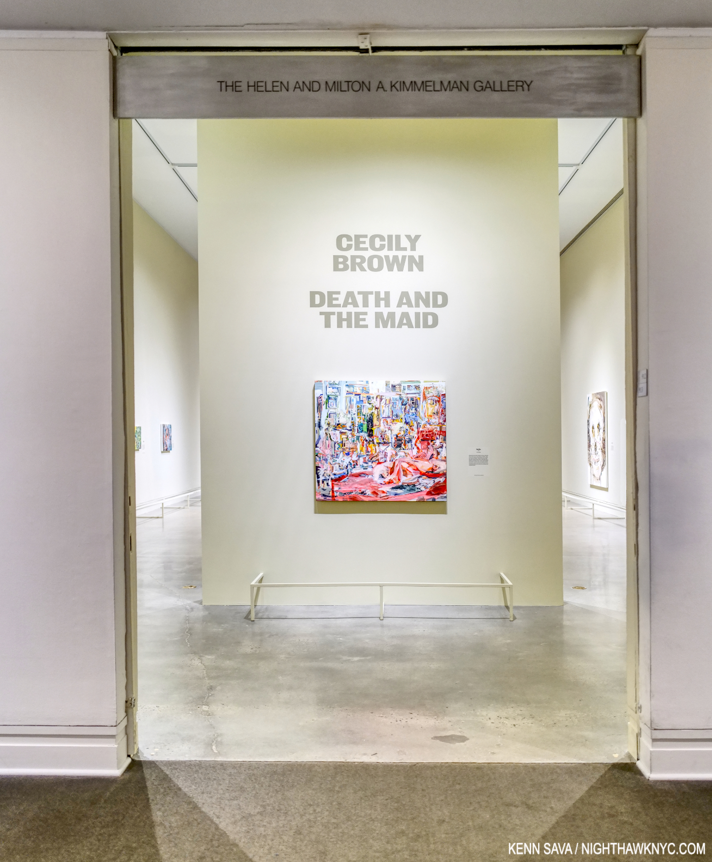
Show seen- Cecily Brown: Death and the Maid @ The Metropolitan Museum through December 3, 2023.

The show’s opening brought me to a dead stop. Click any image for full size.

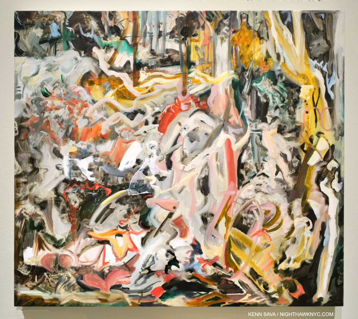
Over the course of its generous run, from April 4th through December 3rd, Cecily Brown: Death and the Maid  has had some VERY serious competition among great Art shows up in NYC’s museums for Art lover’s attention this year. Consider- MoMA had the excellent Georgia O’Keeffe: To See Takes Time (April 9th through August 12th), and now the equally excellent Ed Ruscha / Now Then (September 10th through January 13, 2024). The Whitney has Henry Taylor: B Side (October 4th through January 28, 2024). In addition to Death & The Maid, The Met had its summer blockbuster, Van Gogh’s Cypresses (May 22- August 27), and the just opened Manet/Degas (September 24th through January 7, 2024). Phew! While all of them deserve mention as “Show of the Year” candidates, in my opinion, Cecily Brown: Death and the Maid is the biggest breakthrough Painting show in a NYC museum since Jennifer Packer: The Eye Is Not Satisfied With Seeing, 2021-2, which I wrote about here. It provided the first opportunity we’ve had to see an overview of her work outside of books. Seeing 50 of her Paintings, Drawings, and Monotypes in person left me feeling that the show is a game-changer that will rewrite the Art world’s appreciation of Cecily Brown’s Art & her standing in Art– even though both are well-established. Her diligence and continual hard work over the past 25 years has paid off in spades. The fruits of her labors explode on the walls.

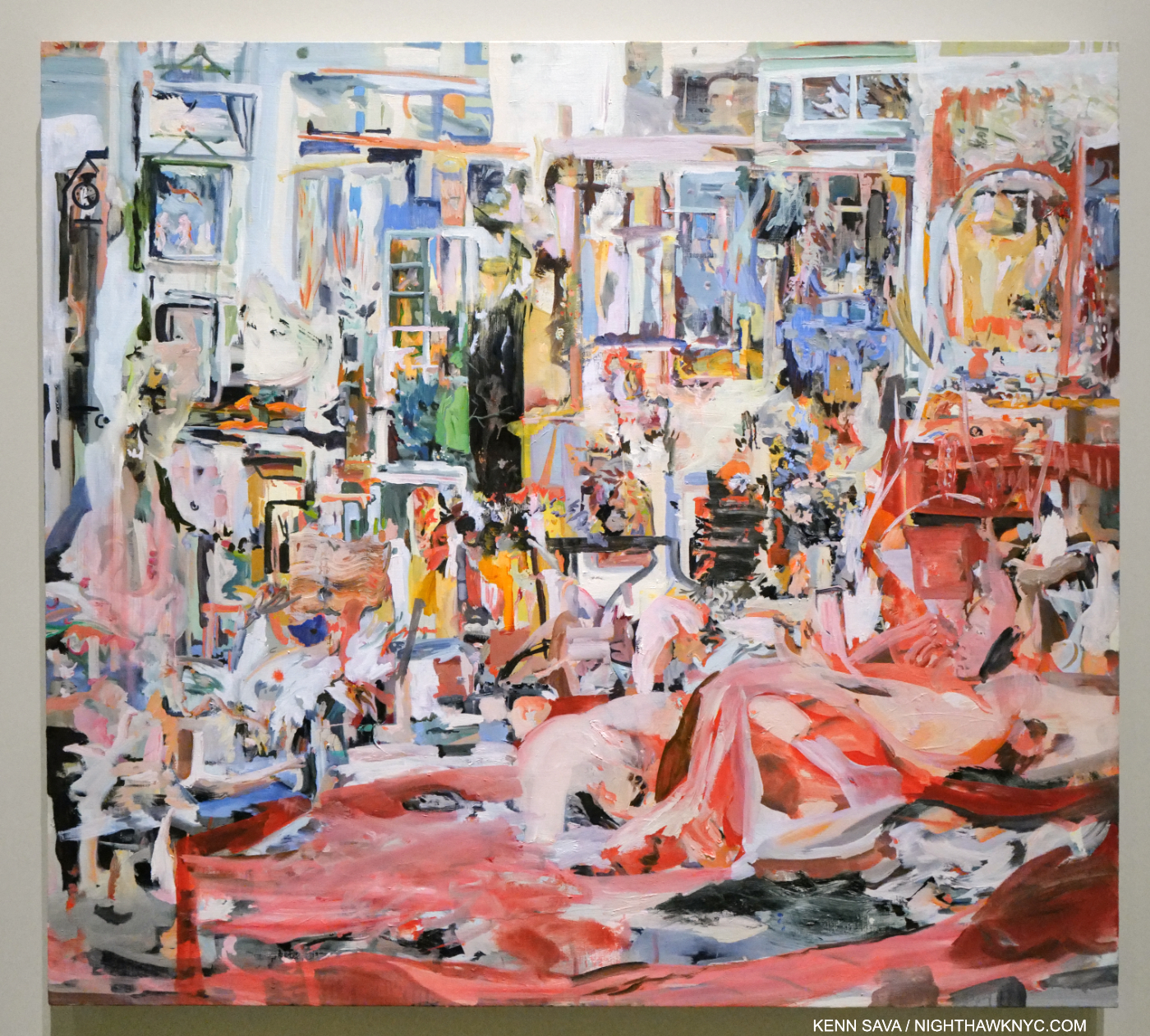
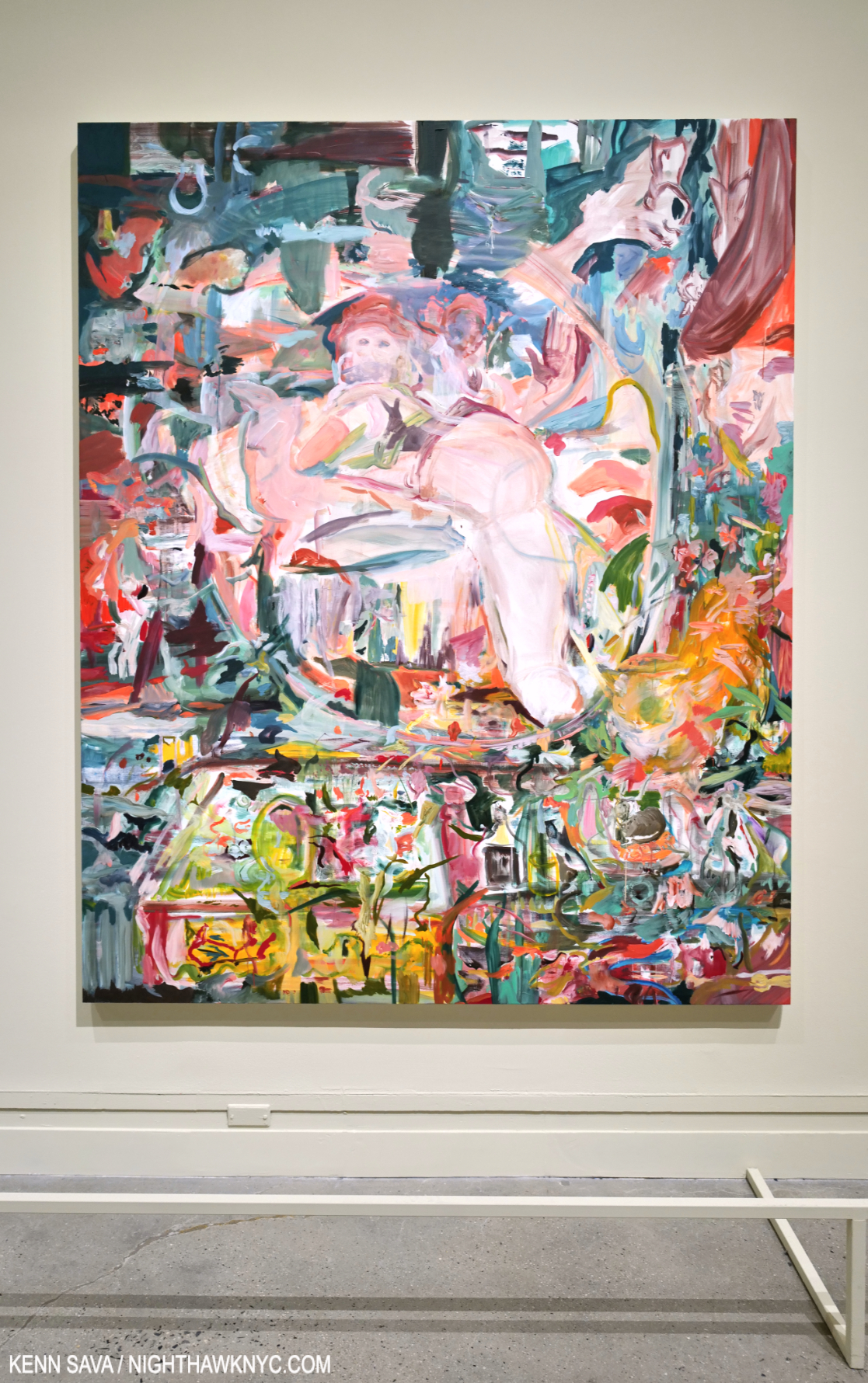
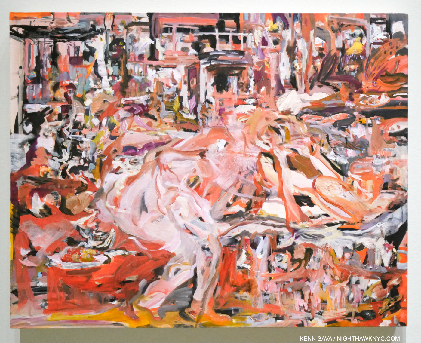
Time passes slowly. Painted during the initial outbreak of the pandemic, the stunning Selfie, 2020, Oil on linen, kept me transfixed at the entrance as minutes passed, mirroring in a small way the time the Artist spent creating it. In fact, mirrors are a key, recurring, element in the show. Anchored by the reclining figure to the right, and the vanity with the round mirror to the right rear, the whole has a feeling of claustrophobia, from too much time spent in the same place that every last detail becomes all-too-familiar. It’s perfectly chosen to begin the show in my view (or, end the show, depending on which end of the show you enter from) as it sets the stage for (or culminates) a show that covers about 25 years and includes very recent work.

One night in 2004, I met Cecily (who was born in London in 1969) when she and a date happened to sit down next to me at East of Eighth, the now-lost Chelsea bar/restaurant/Mother Ship on West 23rd Street a few doors west of the legendary Hotel Chelsea. At that point, the buzz around her was just forming. Days earlier, I had read an article about her in the Art press intrigued by the fact that she is David Sylvester’s daughter. Mr. Sylvester will always be remembered by Art history for being the interviewer in what is, perhaps, the most important Artist interview book yet- Interviews with Francis Bacon, (one of my Desert Island Art Books). A book that helped form my long-standing obsession with Mr. Bacon. It was right in the middle of my decade of drawing (small “d”) daily, which I was when she sat down. Recognizing her from the article, I quickly put my sketchbook away. I told her I had read the article and we chatted briefly, then I let her get back to her date.

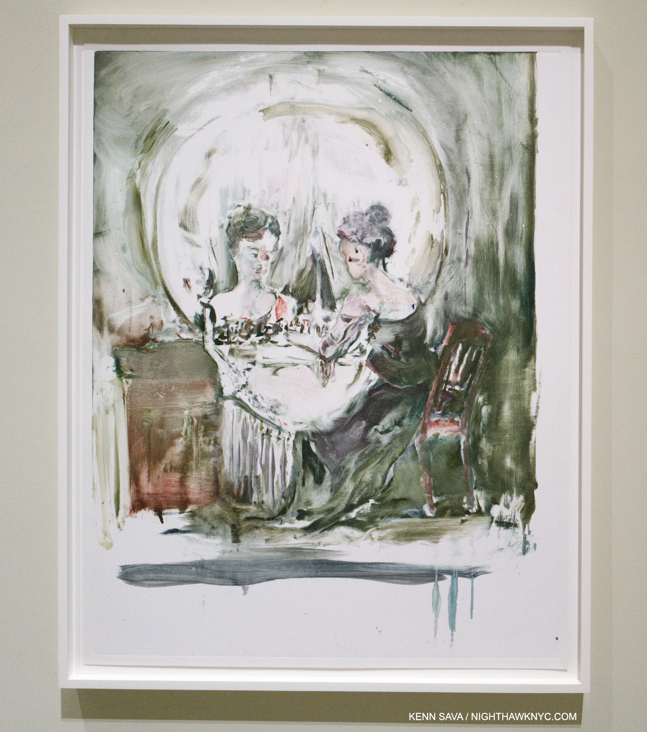
No You For Me, 2013, Oil on linen. The viewer looks into the mirror on a vanity at a figure in a room. It appears there’s a spanking going on. Perhaps as close as Cecily Brown comes to the realm of Francis Bacon isn’t that close at all.

I regret I didn’t get a chance to ask her if she met Bacon. Cecily’s Art has been influenced by his, I’ve read, and they both seem to me to be on the cutting edge of “abstracting” the portrait, yet the influence might be in spirit as opposed to a direct visual or stylistic influence as far as I can see. As many have pointed out, Cecily Brown lives on the edge between abstraction and figuration, more or less. Whereas “pure abstraction” leaves nothing “familiar” for the viewer to hold on to, Cecily Brown usually does, even if it’s just the title. In the work included in the show I felt there were “handles,” so to speak, in virtually all of the pieces that lead the viewer into her world.

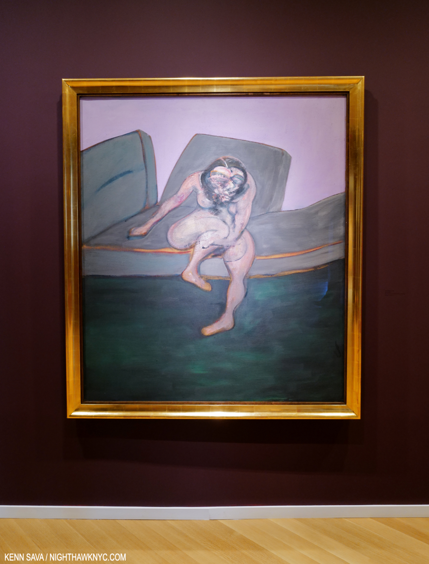
Francis Bacon, Seated Woman, 1961, Oil on canvas, which sold for $28 million in 2015, Oil on canvas, seen at Skarstedt, June 24, 2022.

In Bacon, the world (through his eyes) is represented to an apparent larger extent, but then the figure or figures are rendered with a selective fluidity that allows the Artist to mould them to his intentions. This often makes them seem out of place in their settings. In Cecily Brown’s work, even though many of her works depict interiors, there is no stylistic difference. Everything is rendered as part of the whole.

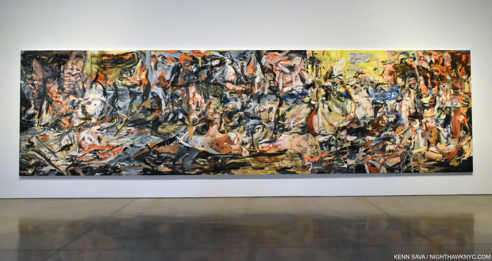
The moment I realized Cecily Brown had arrived as a Painter to be reckoned with. A Day! Help! Another Day!, 2016, Oil on linen, 109 x 397 inches (that’s just over 33 FEET long!) seen in Cecily Brown, A Day! Help! Help! Another Day!, Paula Cooper Gallery, October 31, 2017.

Since 2004, as I’ve followed her career and gone to her shows, her work has grown, and grown on me, continually. The record shows I’m not alone in that. Though she quickly gained major gallery representation, and shows in European museums, it seems to me the Art world has been slow to fully “get” her, like here, as incongruous as that may be to say for an Artist who has achieved her stature.

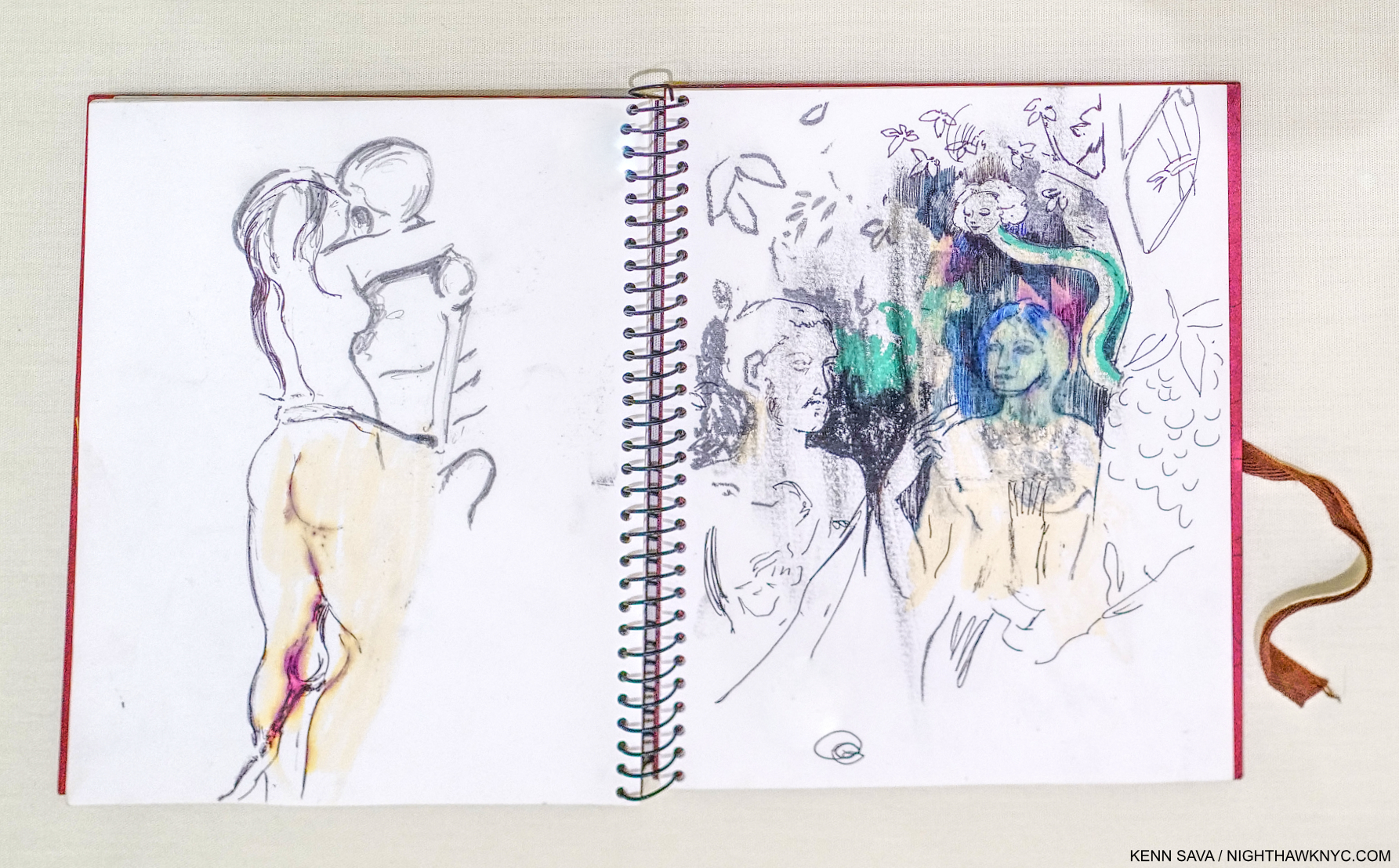
Sketchbook, 2004, Oil pastel, ballpoint pen and pencil on paper, from the year I met her. The image on the left is at the heart of the show. A woman embraces a skeletal figure, whose knee is between hers. Possibly a copy of Edvard Munch’s Death and the Woman, 1894-5, a Print in The Met’s collection, here, this motif appears in Cecily’s recent Painting Death & The Maid, 2022, shown below, revealing how long this subject has been on the Artist’s mind.

Early on, her work was quite sexually oriented, then it steadily opened up. As it did, more and more people began to see the breadth of her talent. The real turning point for me came on October 31, 2017l, when I walked into Paula Cooper Gallery and was face to face with A Day! Help! Another Day!, seen earlier, in Cecily Brown: A Day! Help! Help! Another Day!

Death & The Maid, 2022, Oil on linen. The title of the famous String Quartet #14 by Franz Schubert, “Death & The Maiden,” is shortened here to “Maid,” possibly as a reference to Ms. Brown’s time working as a maid to pay for Art school. The center of her Painting shows the titular figures embracing and Death’s leg extending to the left, climaxing the influence of Munch’s Death and the Woman, as seen above. “Death & The Maiden” is also the title of a Painting by Albrecht Dürer’s remarkable student & friend, Hans Baldung, from 1517, which can be seen here. That might be the earliest use of the title.

In April, almost exactly 19 years after I met her, Cecily Brown: Death and the Maid opened in the hallowed halls of The Metropolitan Museum, in the same gallery I saw Louise Bourgeois: Paintings in, an interesting coincidence (two European-born women Artists who settled in NYC for good a half-century+ apart). Having moved to NYC in 1994, after winning a plane ticket, it’s the first show she’s been given by an NYC museum. I think she might say the wait was worth it.

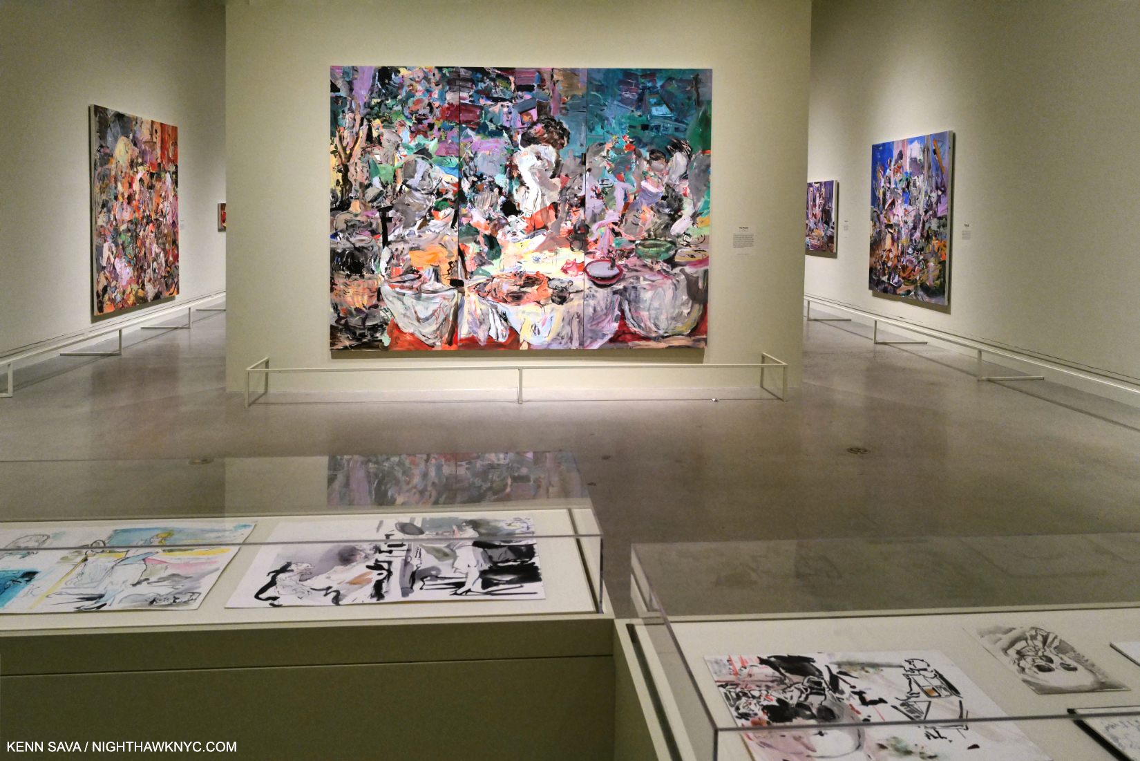
Installation view with The Picnic, 2006, Oil on linen in three parts, center, on the wall.

Brilliantly selected from the past three decades and installed (with the involvement of the Artist), it all hangs together seamlessly. Though her style has evolved over the years of her still-young career, the show really does all look like part of a whole. This is aided to no end by the continuity of themes- vanity, death, interiors, and influences & dialogues with Art history.

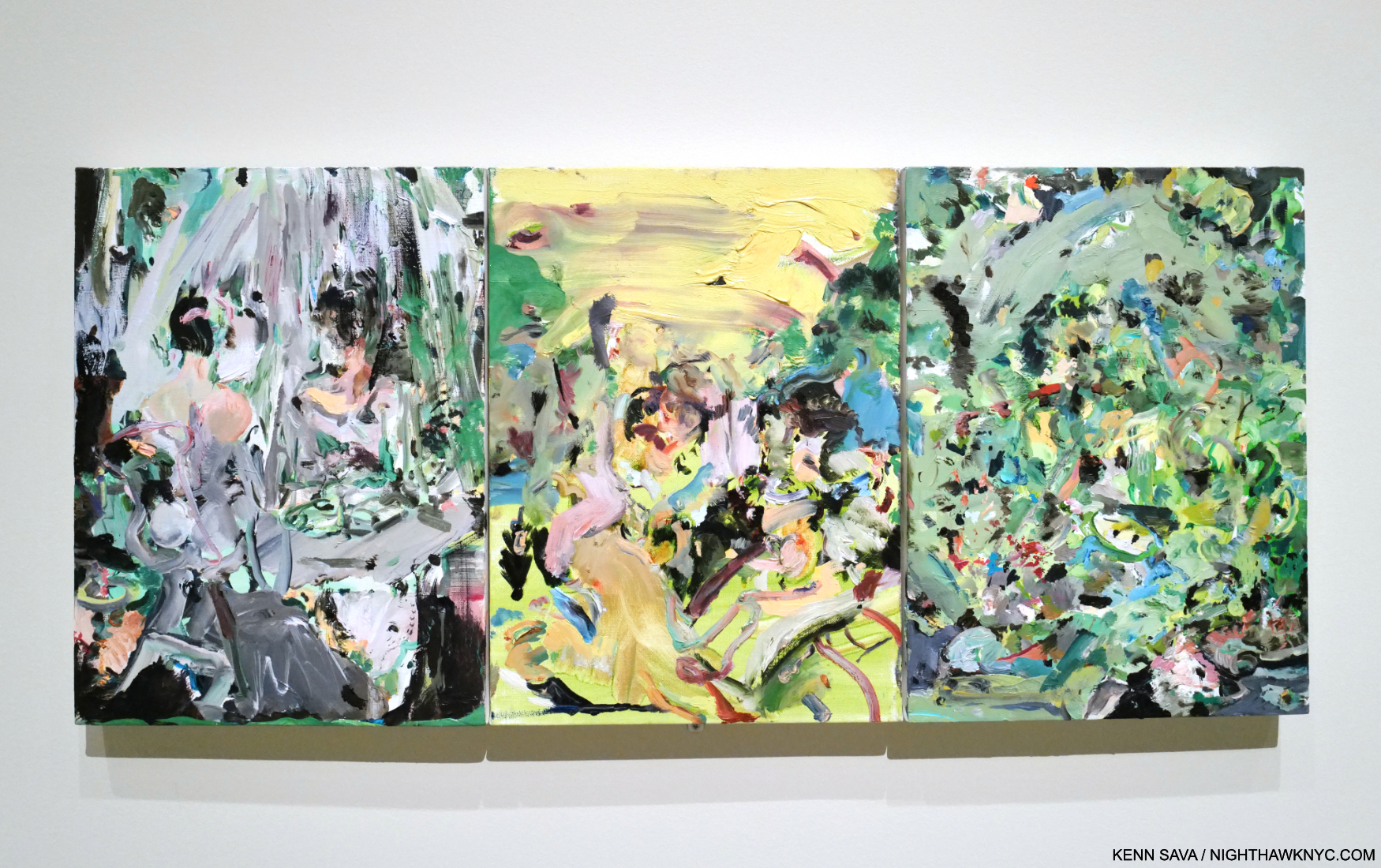
Full of Face, Full of Woe, 2008, Oil on canvas in three parts. With a title that comes from the “Monday’s Child” nursery rhyme, it’s the first Cecily Brown Painting in The Met’s Permanent Collection. It captivated me when I first saw it last year in the Modern & Contemporary Galleries, and again in the show. Note what appears to be a woman looking in a vanity mirror in the left panel.

The first thing that was apparent to me is how her work looks like no one else’s. She has achieved a style instantly recognizable as Cecily Brown. A major achievement in its own right. The second thing that stands out for me is how deeply and continually she mines Art history. There are references to Munch, Bruegel, Manet, Rubens, Hogarth, Gilbert, Frans Snyders, Dutch & Flemish Still Lifes, among others here, but the resulting work is completely her own no matter the origin, and provides for an interesting “conversation” over time. Filtered through a different viewpoint, experiences and century into nothing less than a striking personal vision, one that strikes me as unprecedented, though I do see a kinship to the work of her teacher, Maggi Hambling and occasional echoes of the late-50s work of Janice Biala.

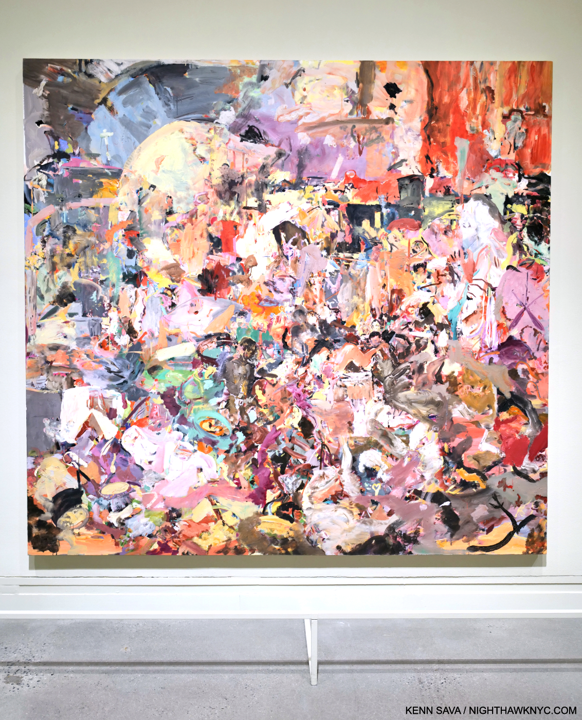
Blood, Water, Fruit and Corpses, 2017, Oil on linen.

“My red is so confident he flashes trophies of war
And ribbons of euphoria
Orange is young, full of daring
But very unsteady for the first go ’round
My yellow in this case is not so mellow
If fact, I’m trying to say it’s frightened like me
And all of these emotions of mine keeps holding me from
Giving my life to a rainbow like you.” *-  Jimi Hendrix, “Bold as Love”

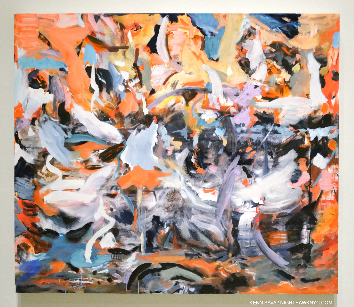
The third thing that’s instantly apparent is her color. For the past eight & 1/4 years, I’ve posted a piece of Music as the “Soundtrack” for each piece I’ve written here. As I walked through Death & The Maid, one song screamed at me from the walls: “Bold as Love” by Jimi Hendrix.

“Bold” sums up much of Cecily Brown’s work for me. In her daring and boldness lies energy and excitement.

As for “Bold as Love,” Hendrix “paints a vivid picture of the spectrum of human emotion using colors,” as genius.com puts it. Virtually every color Jimi writes about is powerfully featured at one point or other in the show. I’m not saying this is a literal interpretation, of course. It’s a reflection of the power of color as a language. The choice is not as arbitrary as it might seem. In the early years of the past decade, Ms. Brown was so taken with the cover image for Jimi’s 3rd album, Electric Ladyland, the last album he completed in his lifetime, that she did a series of Paintings based on the original cover Photo for the U.K. release that was banned for its U.S. release.

All is Vanity (After Gilbert), 2006, Monotype

Cecily Brown’s color strikes me as being that of life. Of being alive. As Adrian Piper pointed out in her brilliant MoMA show, A Synthesis of Intuition, in 2018, “Everything will be taken away.” In death, the colors of life are one the of the first things taken away. Here, it runs as a consistent and compelling counterpoint to the theme of death. It’s interesting that in some of the work that seems to be more centered on death (not all), the color is washed out.

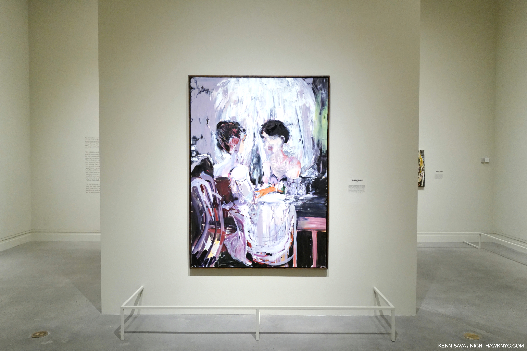
Untitled (Vanity), 2005, Oil on linen

The other thread is the the face/the temporality of youth/and the body (which takes many forms, including the frequent “looking in a mirror” works). Of course, any living body must confront the idea and the reality of death. In the show, it’s the central focus, but it has been one of her central themes, among others, virtually all along. This makes her unique among major Contemporary Painters. While many address it, I can’t think of anyone who makes it a main focus. The show is also interesting for a virtually complete absence of her earlier sexual work.

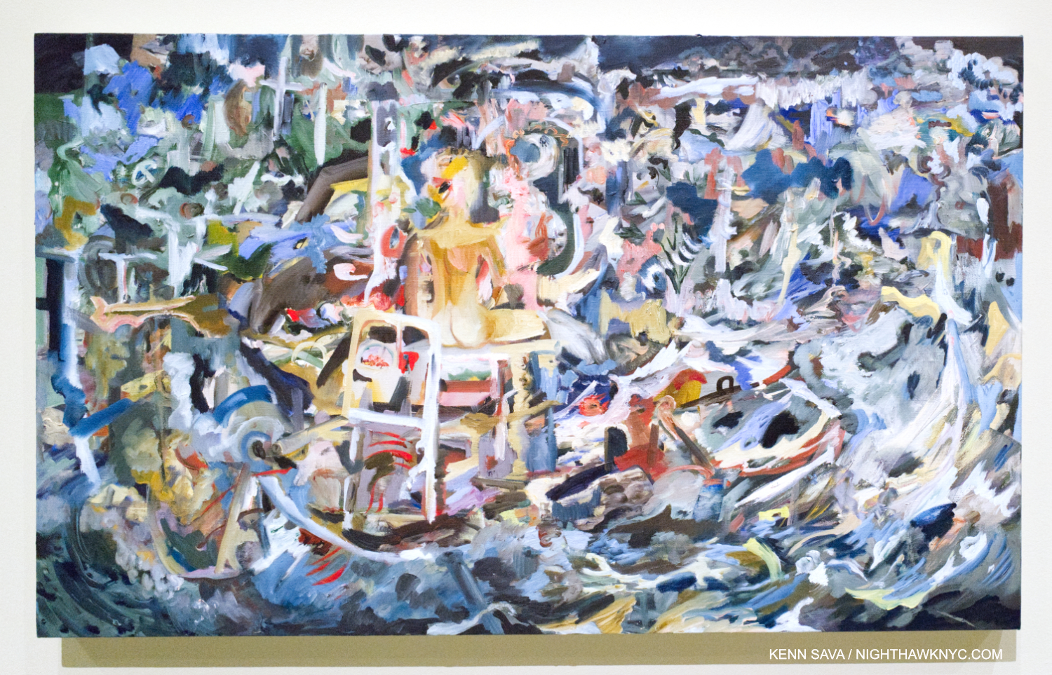
Vanity Shipwreck, 2021-2, Oil on linen

On the technical side, her compositions, she says, come together in the making. In a number of pieces, figures are in the center, and everything else happens around them. The same feeling occurs in Selfie, though the figure is in the lower corner, and in pieces like Carnival and Lent, below, where bits of figures pop up all over, virtually awash in all that surrounds them. “Abstraction?” What could be a more realistic representation of the chaos of contemporary life where everyone is continually bombarded from all sides, by everything?

“You start with something that’s say, a day old, and then you look at the different directions it can go. And in a way, you can argue that you’re never losing anything, because you try and always keep those things in mind. You have to be willing to lose it all. And that really does happen all the time in painting. And I always want to keep that possibility, just to go back to what kind of painter I am. That’s what I call being a painterly painter, and what’s kind of old-fashioned about it is that attitude that you can lose it all….the paint itself telling the story. The idea that paint can carry or contain a sort of life of its own. Paint traps energy1.”

Carnival and Lent, 2006-8, Oil on linen. Cecily Brown’s take on Pieter Bruegel the Elder’s Fight Between Carnival and Lent, 1559.

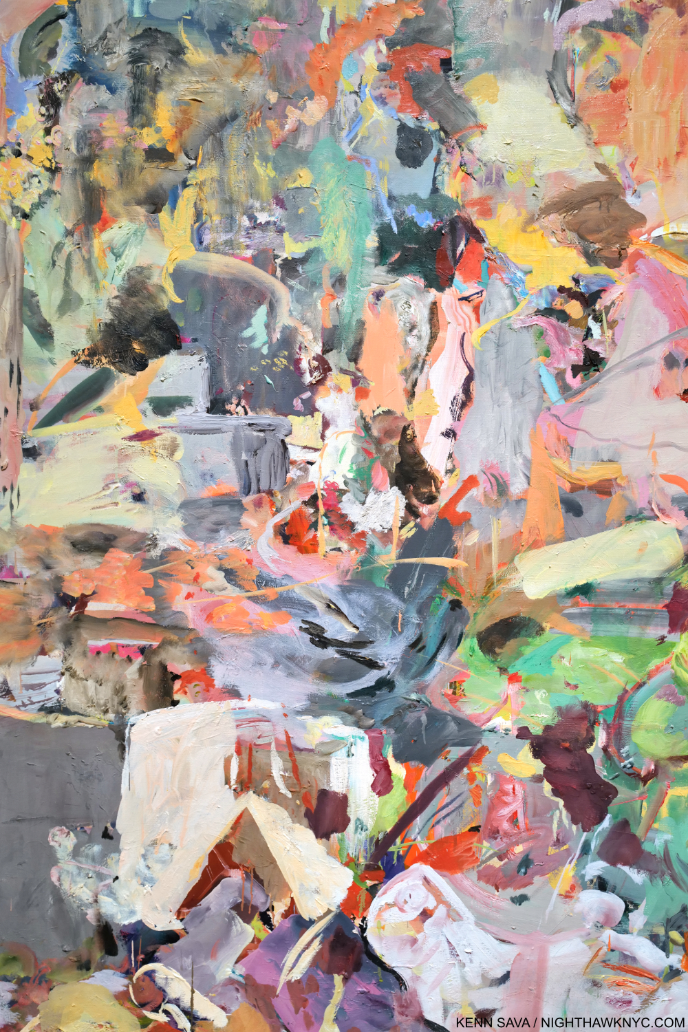
I’m struck by the fact that Jackson Pollock could only do his so-called “drip” Paintings from 1947-1952. Ms. Brown has been working in, and developing her style for almost 30 years. Then, there’s her technique, her brushwork. Whereas she said that “Paint traps energy,” her brushwork brings it. 

Detail.

It seems to me that the recent pieces included in Death and the Maid (particularly Selfie, the titular work shown earlier, and A Year on Earth, below) show her reaching a new level. Though her work probably looks very abstract to many viewers, including this one, almost all of them have titles that ground them in the “known world,” separating her from many abstract Artists (though she is not one. Cecily Brown’s work only belongs in the Cecily Brown “box“) who use “Untitled” most often. Titles which function as one of the “handles” I referred to earlier,

A Year on Earth, 2020-21, Oil on linen. Begun in the early months of the pandemic.

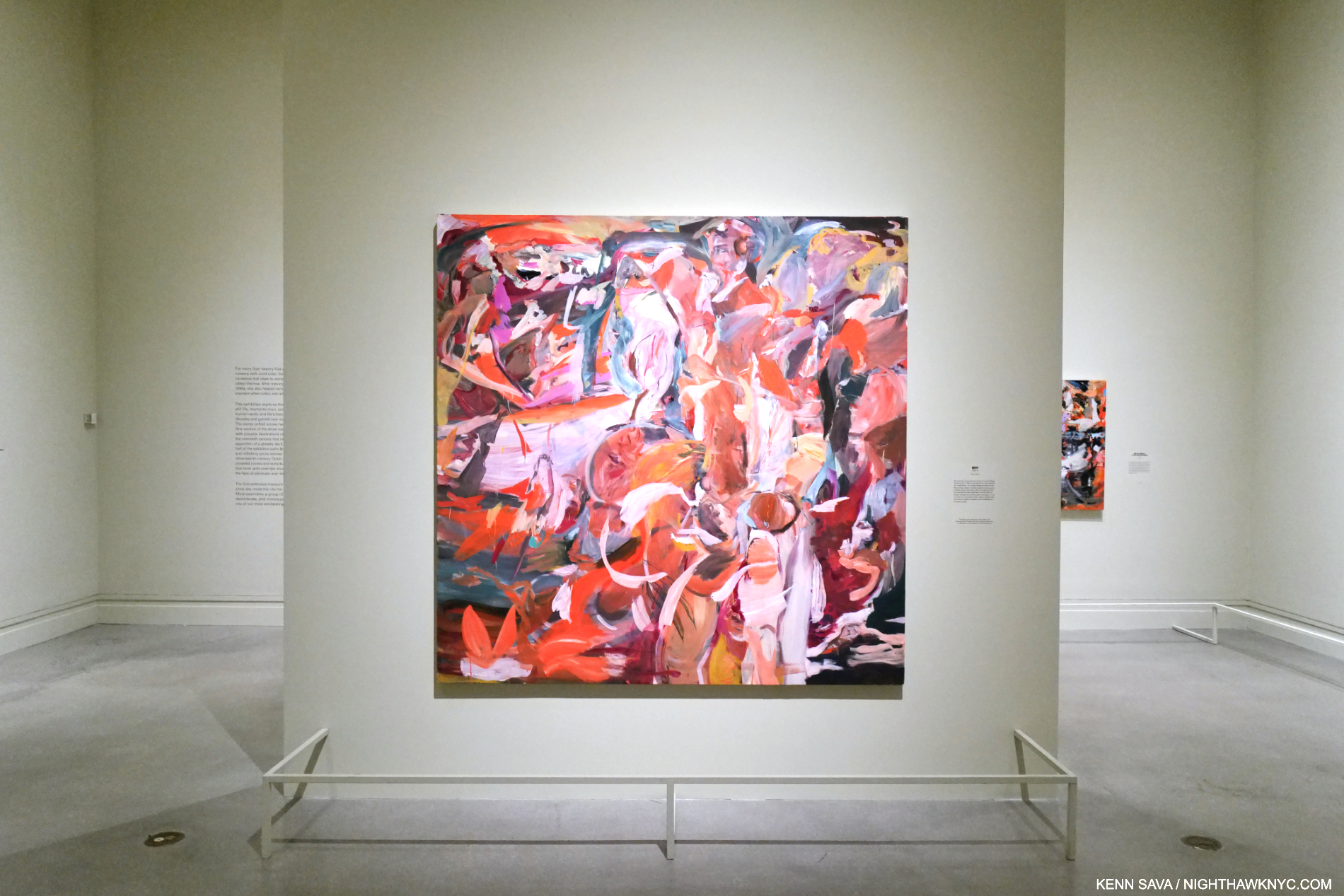
Mounted near the end of the show, it could be just me and my life these past 4 years, but I found her Painting BFF incredibly moving.

BFF, 2006-15, Oil on linen.

The wall card explains that Cecily’s teacher, the Artist Maggi Hambling, “once told her to make painting her best friend, as it would always be there for her.” It seems to me that’s not only true for the act of Painting for Painters, but also in the act of looking: Painting is always there for everyone!

There’s a feeling Cecily Brown: Death and the Maid gave me that made me just not want to leave it. I’ve thought about what that feeling is and why I had it since I did leave (to go see the gigantic Manet/Degas show- about 12 galleries worth!). One thing I can say is that it’s a feeling I live for. It’s not only being in the presence of great Painting- there’s plenty of that on view in Manet/Degas as well as everywhere in The Met. It’s the excitement of being in the presence of something alive, pulsing with energy and color with a vibrancy that jumps off the wall- and a lot of it! In Death and the Maid we get a first chance here to play catch up and take stock of 25 years of Cecily Brown’s Art and accomplishment, while getting set up to watch where she goes from here. That’s exciting, too.

This May, I ran into Cecily, again, when we were both leaving the opening of Rosa Loy’s wonderful new show (separately, of course), though I didn’t get the chance to speak to her. It said a lot to me that she was out and about seeing Art, even while her own show was up on the walls at 1000 5th Avenue. I took it as a sign she’s not slowing down or resting on her laurels; she remains fully engaged in the Art world around her, which has inspired her all along.

In the end, you just never know when that person who happens to sit down right next to you one night is going to wind up being one of the world’s major Painters less than 20 years later.

*- Soundtrack for this piece is “Bold As Love,” by Jimi Hendrix from his immortal album Axis: Bold As Love.

NighthawkNYC.com has been entirely self-funded & ad-free for over 8 years, during which 300 full-length pieces have been published! If you’ve found it worthwhile, PLEASE donate to allow me to continue below. Thank you, Kenn.

You can also support it by buying Art, Art & Photography books, and Music from my collection! Art & Books may be found here. Music here and here.

Written & photographed by Kenn Sava for nighthawknyc.com unless otherwise credited. To send comments, thoughts, feedback or propositions click here. Click the white box on the upper right for the archives or to search them. Subscribe to be notified of new Posts below. Your information will be used for no other purpose.

  1. Cecily Brown, Phaidon Contemporary, P.38

Philip Guston, George Segal, Jeffrey Gibson, Njideka Akunyili Crosby, Wade Guyton: NoteWorthy Shows, Summer 2023

This site is Free & Ad-Free! If you find this piece worthwhile, please donate via PayPal to support it & independent Art writing. You can also support it by buying Art & books! Details at the end. Thank you.

Written & Photographed by Kenn Sava

What do Philip Guston, George Segal, Jeffrey Gibson, Njideka Akunyili Crosby and Wade Guyton have in common? At least three things. One, they’re all Artists. Second, they each had a NoteWorthy Show up in NYC this summer. Third, I bring them together in my look at each of those shows here as part of my coverage of the busiest summer in the NYC Art world since before the pandemic began.

Philip Guston: What Kind of Man Am I? @ The Metropolitan Museum

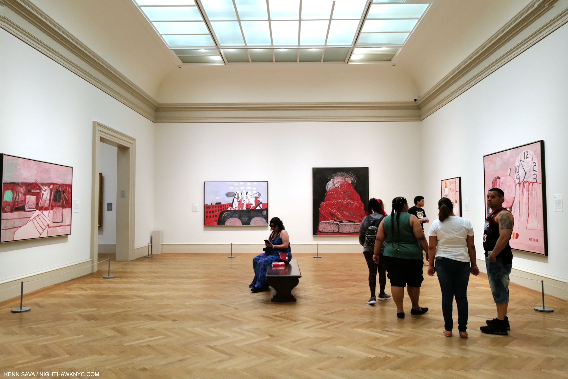
Installation view of 5 of the 8 works on view in this gallery gleaming under the just completed skylight project. Another work, one of his “abstractions” from the 1950s, which I wrote about here, was hung outside the door in the corridor to the Modern Wing to my right. Click any Photo for full size.

In Part 3 of my series on Edward Hopper’s New York I wrote about the Whitney Museum’s handling (mishandling?) of the extraordinary Jo Hopper Bequest in 1970. I mentioned that it was a lesson for other Artists going forward. In December, 2022, word came that Musa Mayer, daughter of Philip Guston (1913-80), had decided to donate 220 works by her father to The Met. As an American Artist (born in Canada), there’s little doubt the Whitney Museum of American Art (who currently own 3 of his Paintings, and 6 Drawings) was considered for this gift at some point (I surmise). Did their handling of the Jo Hopper Bequest (in which they the Whitney THREW OUT virtually all of Jo Hopper’s Art, and have recently sold a notable Edward Hopper Painting), enter into her decision?

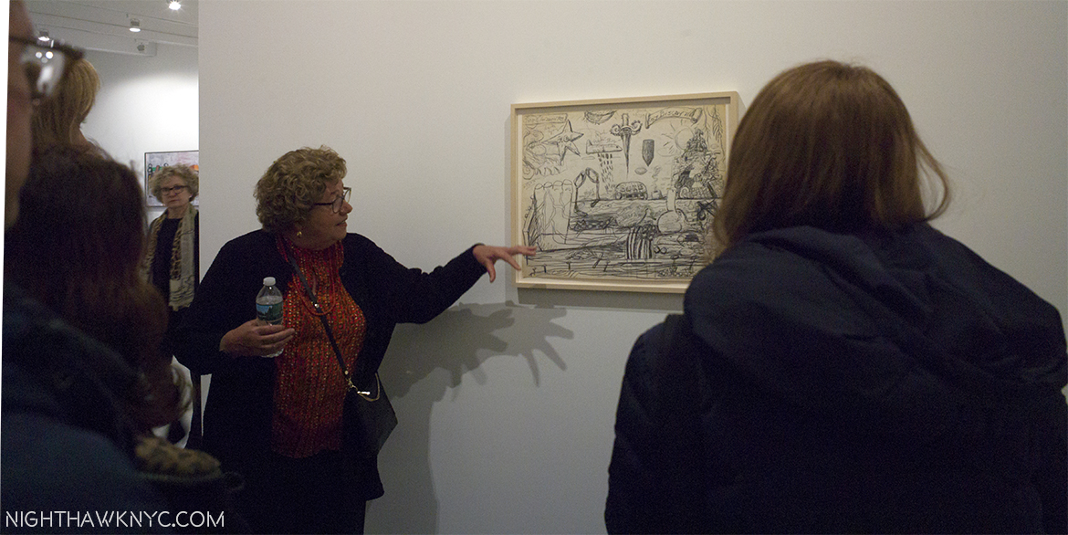
Musa Mayer, the lady responsible for this extraordinary gift, discusses the finer points of one of her father’s Nixon Drawings @ Hauser & Wirth in January, 2017.

I don’t know. Ms. Mayer opted to make this exceptional & vitally important donation to The Met. 

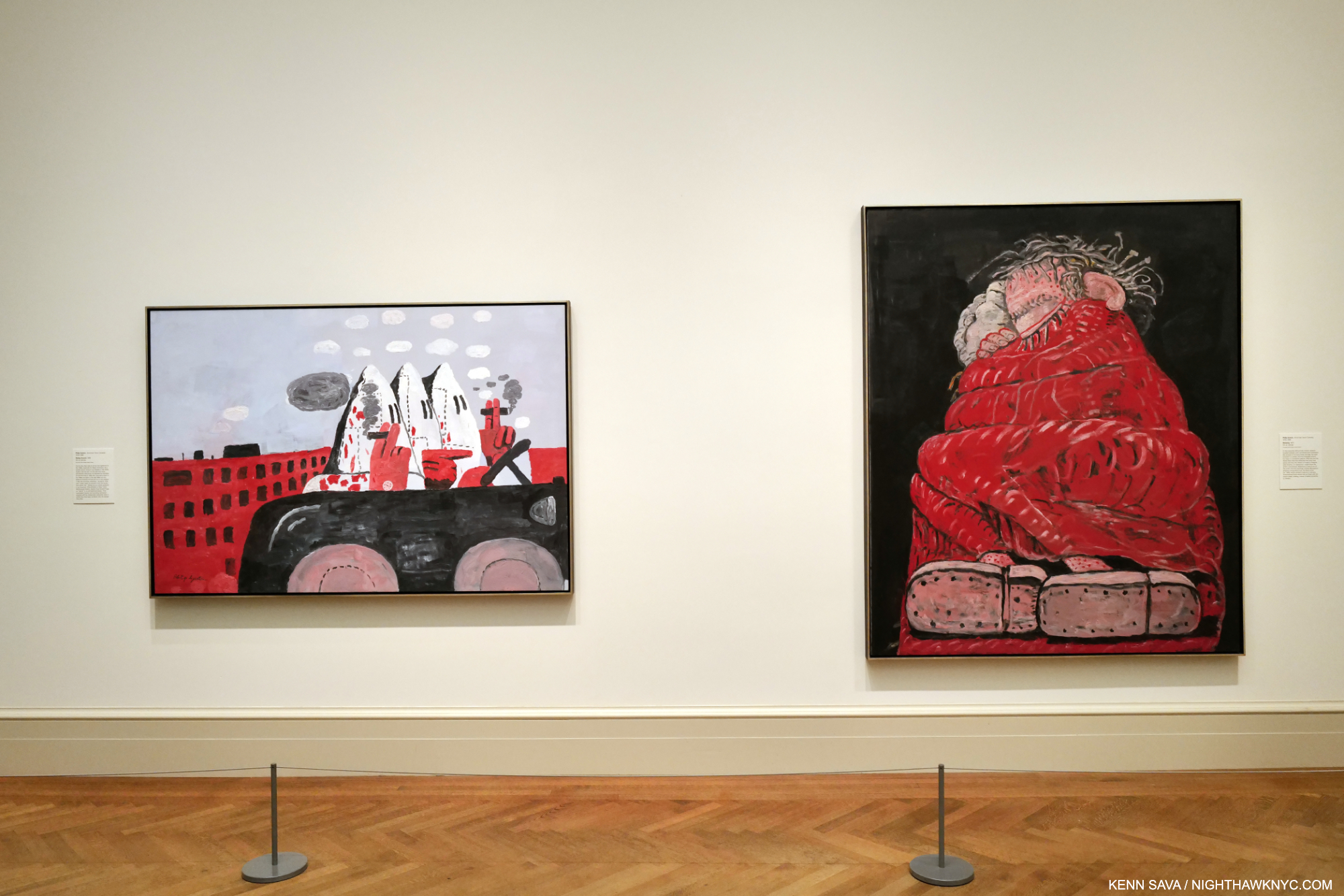
Riding Around, 1969, left, and Sleeping, 1977, right, both Oil on canvas.

To mark the occasion, The Met mounted Philip Guston: What Kind of Man Am I?, a concise, but powerful show of 8 Paintings. The show focused on the last decade of the Artist’s work from 1969 to 1980 and includes nothing but major works, in my opinion, including one of his “Klan” Paintings (which I wrote about in depth here). His last decade has gotten more and more attention as time has passed, after initially puzzling many viewers. Installed near the Impressionist and Van Gogh galleries, and not in the Modern & Contemporary Galleries across the hall (where at least one Guston is usually on view), I took that as an indication of The Met “saying” that Philip Guston is an Artist for the ages. I bet he’d be proud. 

George Segal: Nocturnal Fragments @ Templon

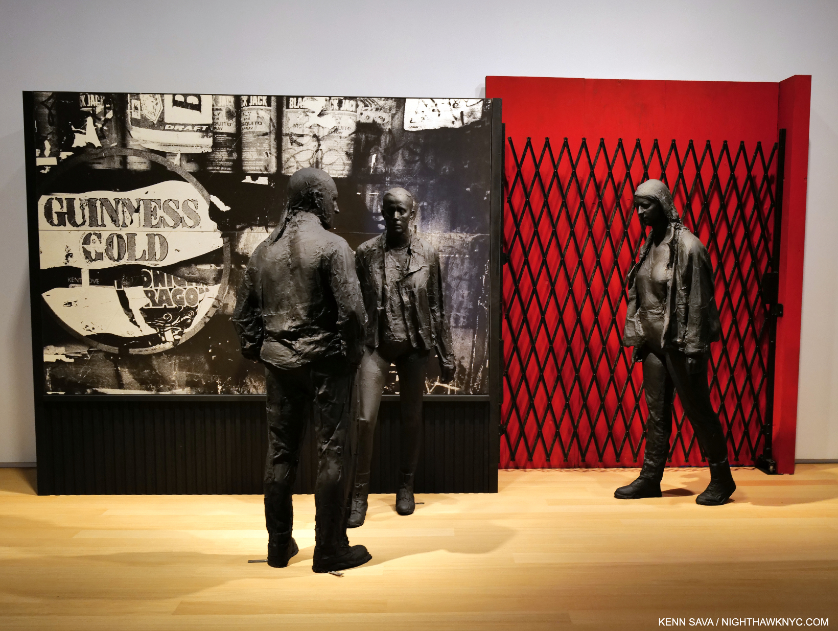
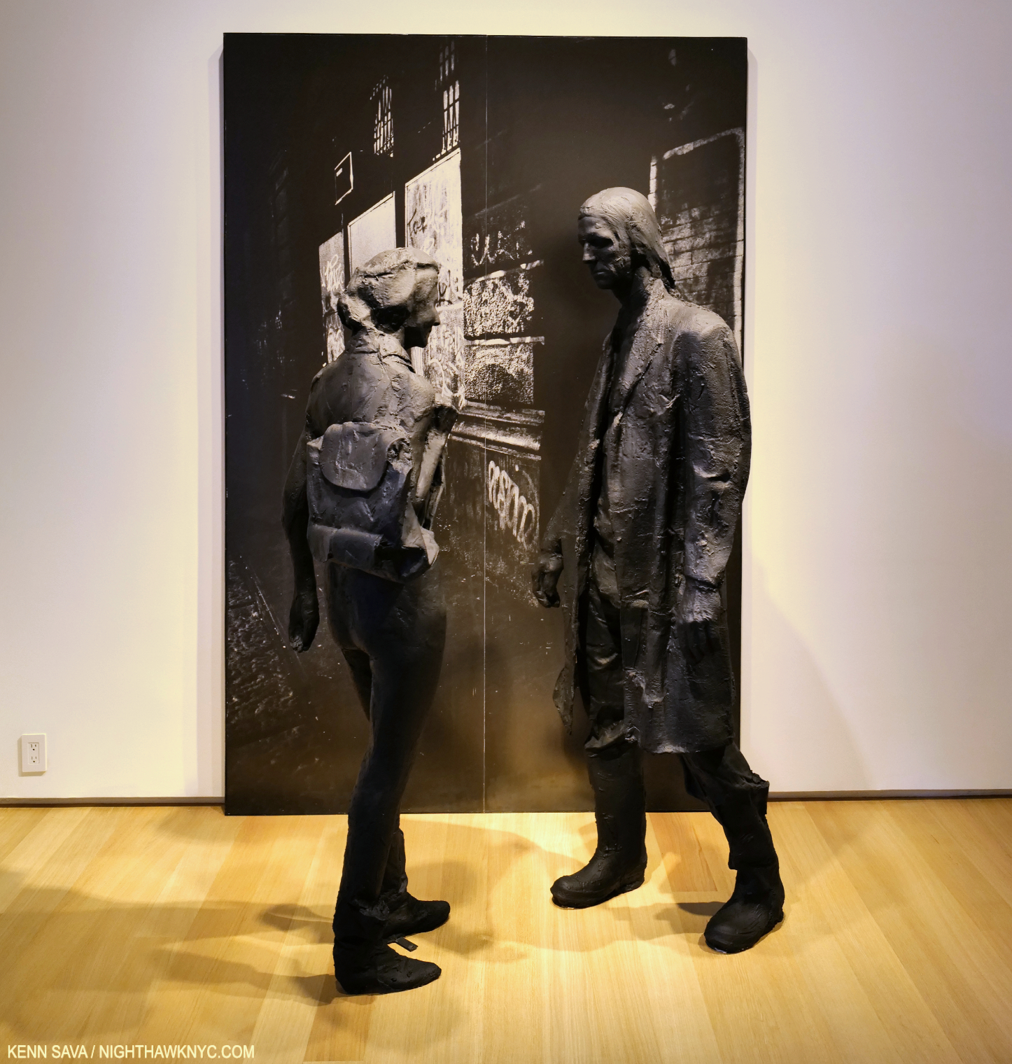
Guiness Gold, 1995, Plaster, wood, acrylic, silverprint, 96 x 64 x 45 inches.

I can’t remember the last George Segal show I saw- if I’ve ever seen one. In fact, Mr. Segal (1924-2000), a contemporary of Philip Guston, may be best known to many New Yorkers through his Public Art installed in Port Authority Bus Station and his Gay Liberation Monument in Sheridan Square. Otherwise, it seems he has fallen into eclipse since he passed. So, George Segal: Nocturnal Fragments at Templon was a welcome surprise and an eye-opener. 

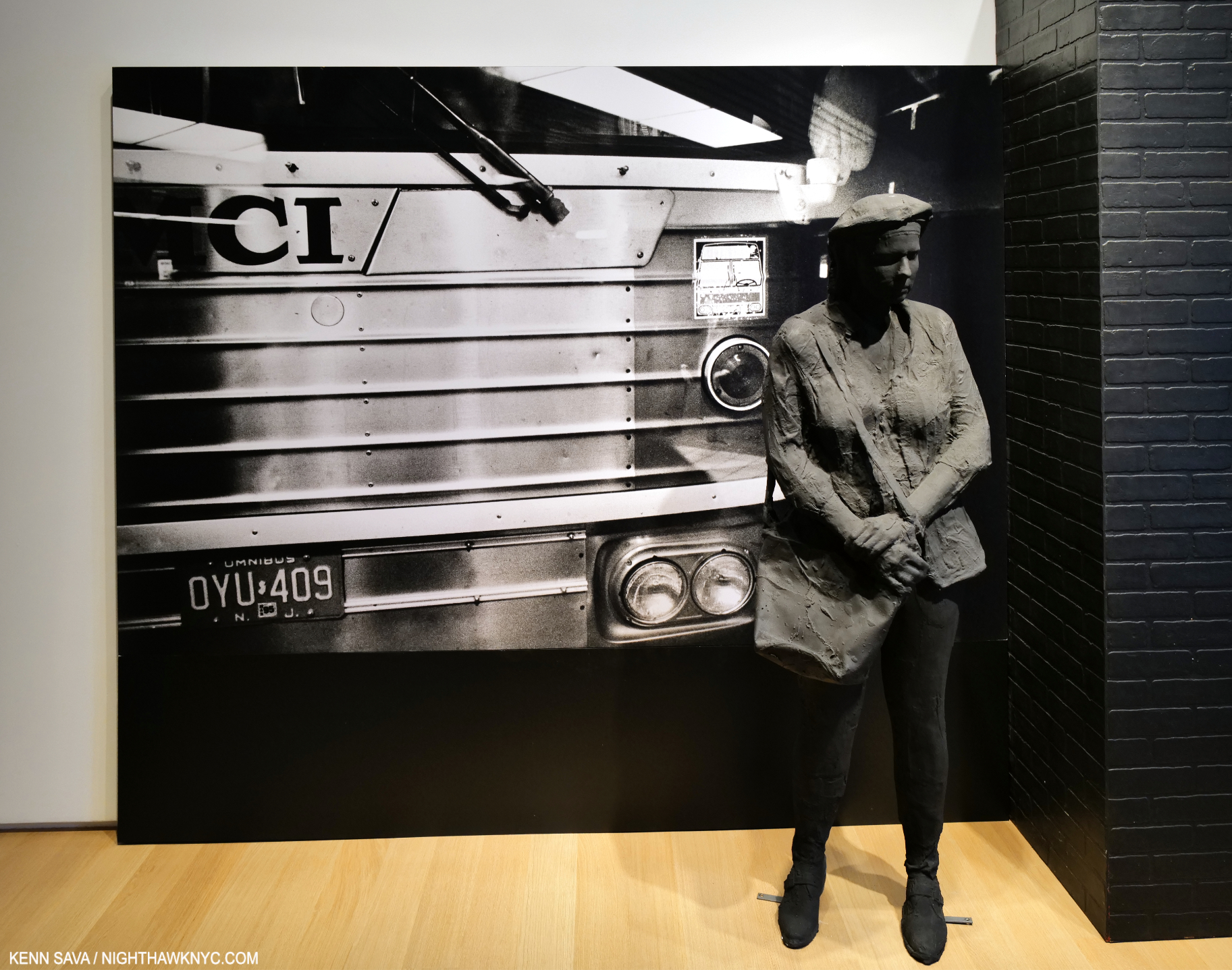
Bus Station, 1995, Plaster and mixed media, 96 x 175 x 33 inches.

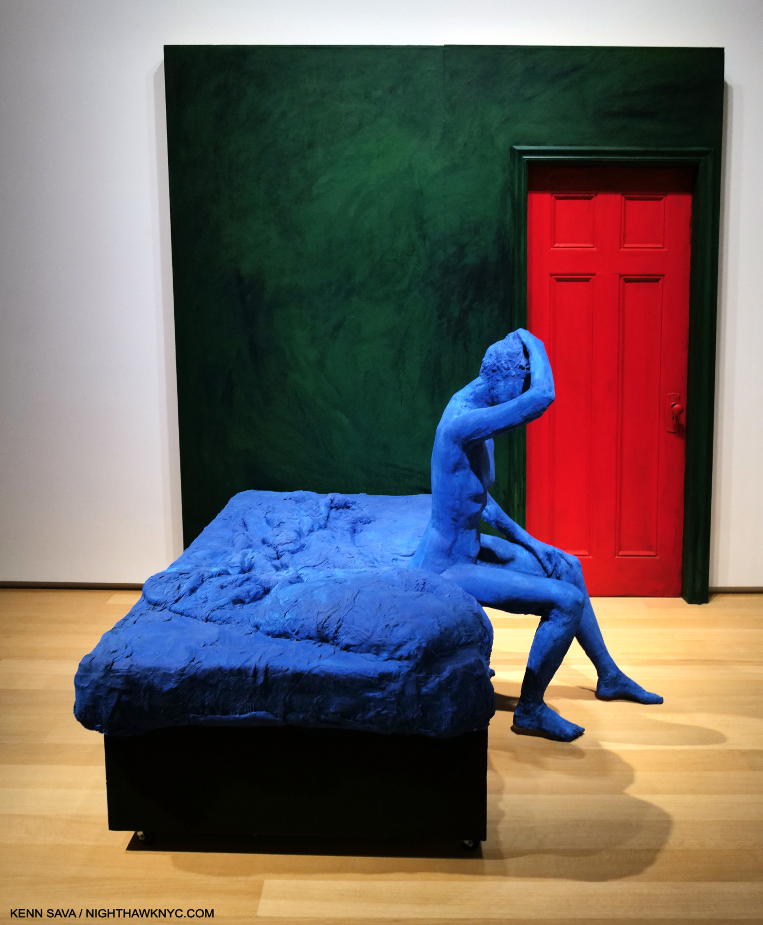
Mr. Segal is, perhaps, best known for his meditative Sculptures, but he was also a Painter and installation Artist. To this point, I’ve only seen his work in public settings, where the Artist places his figures in the existing surroundings. In Nocturnal Fragments we get to experience the full George Segal “effect” in environments of his own creation. It’s something no other Sculptor does and it works wonderfully here.  The show provides a wonderful opportunity to experience the full effect of Mr. Segals’s skill over a generous period of time on two floors. I found it a breath of fresh air.

The Encounter, 1996, Plaster, wood, acrylic, silverprint 96 x 64 x 45 inches.

“Discovered” in a so-called “pop” Art show in 1962, Nocturnal Fragments shows, again, that Mr. Segal is much more and his work long ago outlived that tired box– if it was ever even in it!

Blue Woman Sitting on a Bed, 1996, Plaster, paint and wood, 96 x 96  x 83 inches. A different take on a scene that Edward Hopper mined often.

An influence on Duane Hanson and Ron Mueck, George Segal’s work has a unique mystery that reminds me more of Rodin than it does either of those two fine Artists. It seems to me it has more than held up since his passing, which should lead to his work being seen more often. I think a whole new generation of Art lovers will find much to like in George Segal’s work. 

Jeffrey Gibson: Ancestral Superbloom @ Sikkema Jenkins

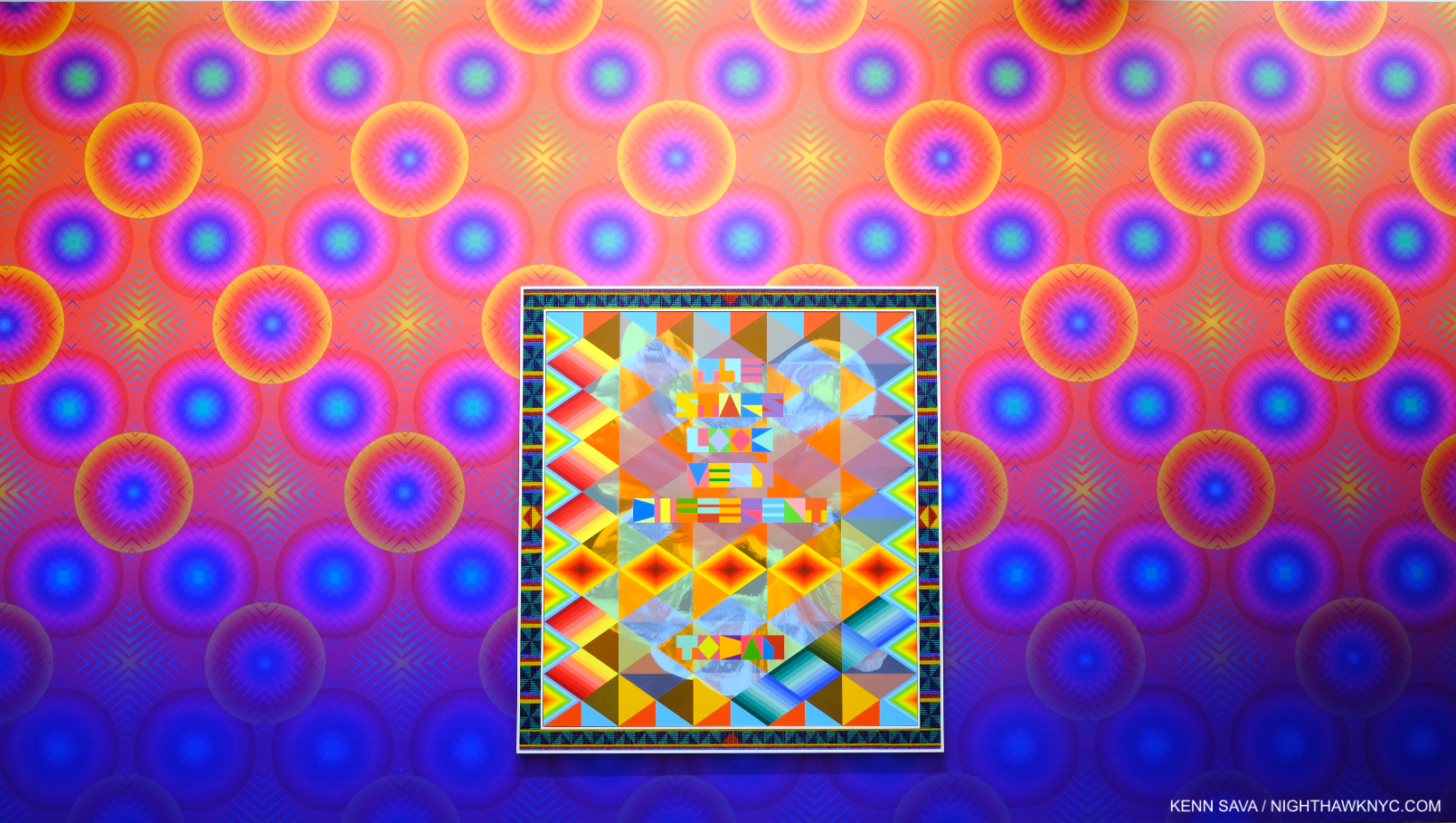
Have you ever seen a Painting shaped like this? SOMEONE TO WATCH OVER ME, 2023, Acrylic paint on elk hide inset in custom wood frame, 103 x 69 x 5 inches, hanging on the Artist’s Wallpaper (Untitled, I was told)  which had a 3-D effect up close.

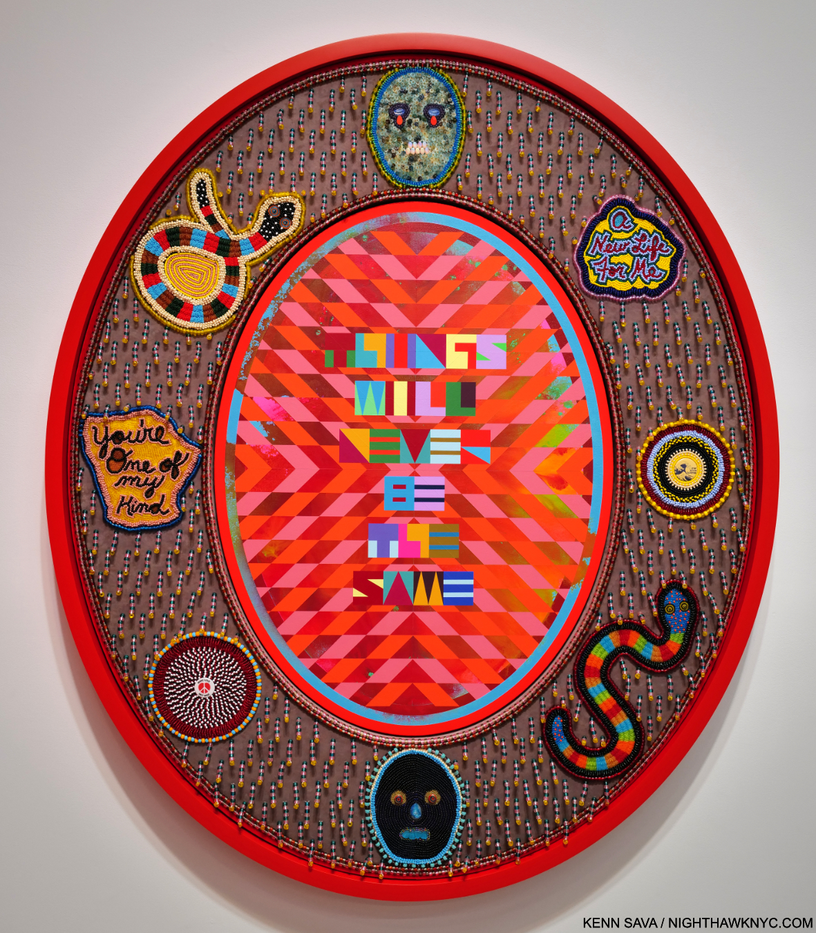
Jeffrey Gibson: Ancestral Superbloom was one of the most beautiful shows of recent memory, and aptly titled. A virtual supernova of color, most of the pieces centered on a quote from a popular song lyric, turning it into something of a mantra. 

THINGS WILL NEVER BE THE SAME, 2023, Acrylic paint on canvas inset in custom frame, acrylic velvet, acrylic felt, glass beads, plastic beads, vintage pinback buttons, druzy crystal, artificial sinew, nylon thread, cotton canvas, cotton rope, 60 x 50 x 5 1/2 inches

His gifts with color are obvious at a glance, but it’s the clarity of his compositional conceptions and how extremely well he executes them that impress me, along with his fresh approach to, well, everything.

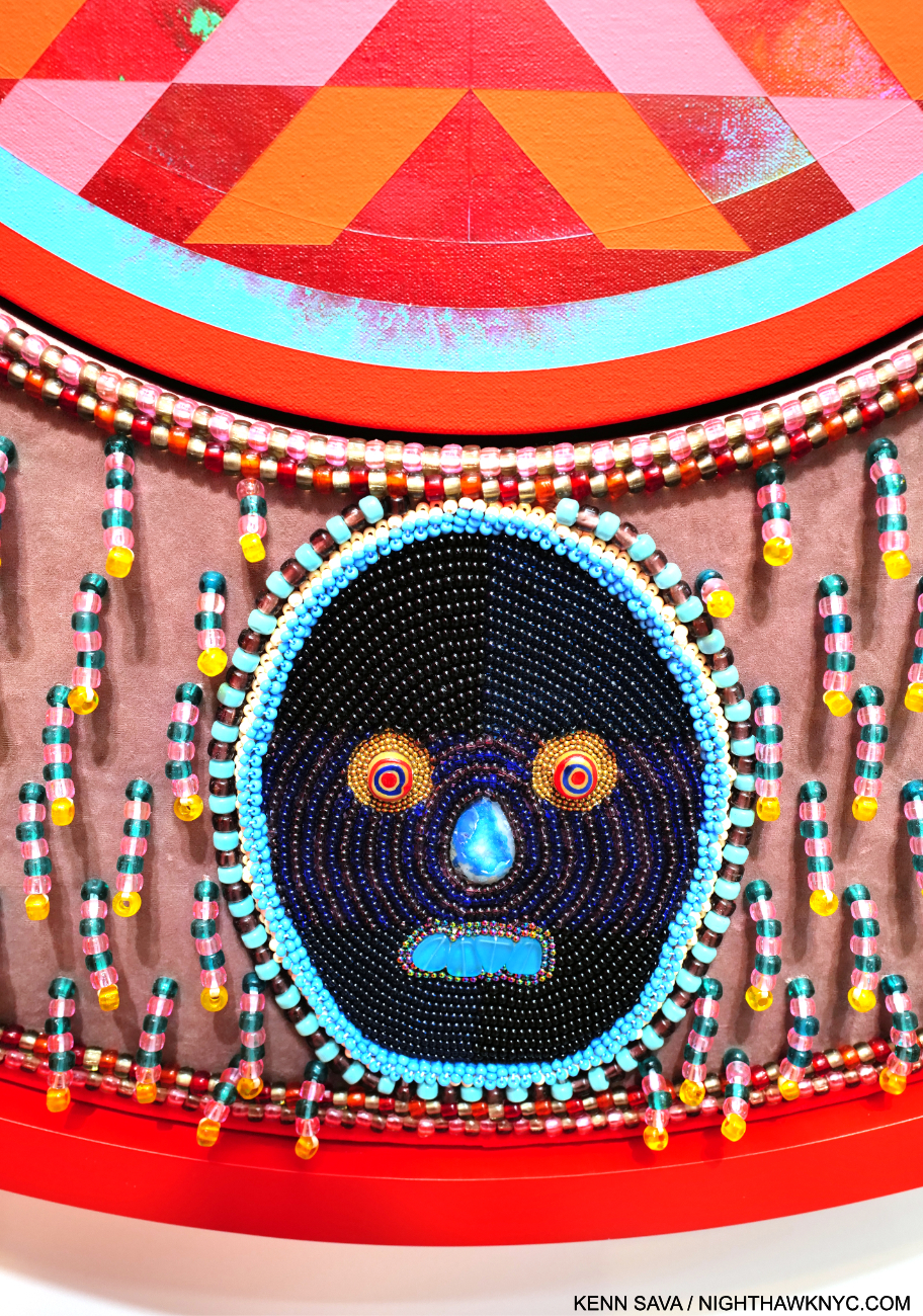
Detail of THINGS WILL NEVER BE THE SAME.

His work is incredibly detailed, requiring and rewarding viewers to work their way around each piece, with each detail adding to the richness and intricacy of the experience.

The show coincides with the publication of An Indigenous Present, a NighthawkNYC NoteWorthy Art Book of 2023, , conceived by Mr. Gibson, which features the work of 60 Indigenous Artists. It’s the best introduction to/overview of this work I’ve seen- an amazingly rich collection. 

THE STARS LOOK VERY DIFFERENT TODAY, 2023, Acrylic on canvas, glass beads, artificial sinew, inset to custom wood frame, 88 x 80 inches. A line from David Bowie’s “Space Oddity.”

Meanwhile, Jeffrey Gibson: Ancestral Superbloom continues to add to his stature and importance.

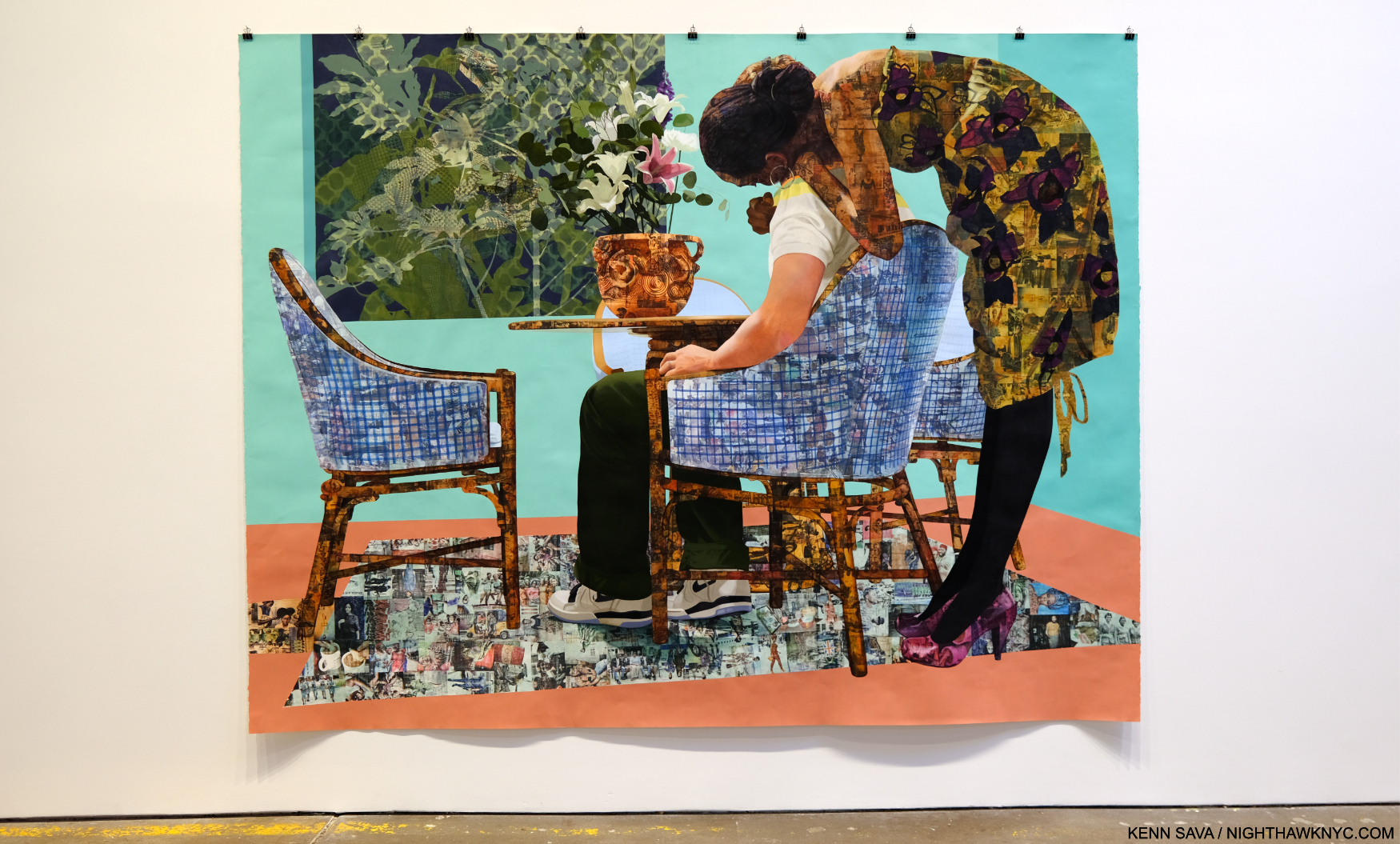
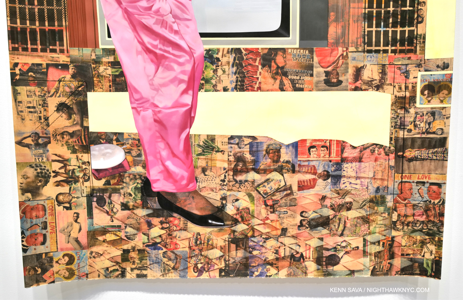
Njideka Akunyili Crosby: Coming Back to See Through, Again @ Zwirner

Blend in – Stand out, 2019 Acrylic, colored pencil, charcoal, and transfers on paper 95 3/4 x 123 3/4 inches

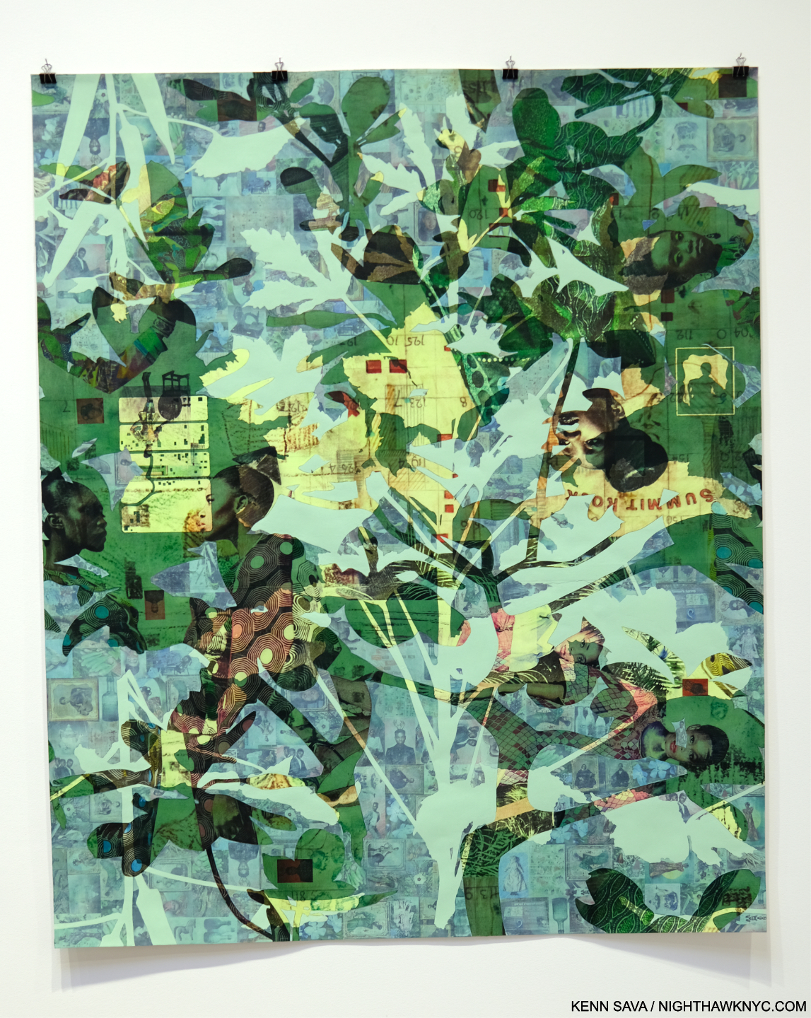
Njideka Akunyili Crosby’s NYC debut, which this was, has been a long time coming. Perhaps best known to most from the series of enthralling books published around shows elsewhere, her work is in the Permanent Collections of The Met, MoMA and the Whitney Museums. Pretty precocious for an Artist only born in 1983 (in Nigeria, living and working in L.A. this century). Her career has been in steady ascent. Her latest work shows an amazing juxtaposition of time and techniques through her use of transfers and paint. Frankly, looking as closely as I could, I couldn’t figure out how she does it.

Potential, Displaced, 2021, Acrylic, colored pencil, and transfers on paper 72 1/4 x 60 inches

Layers of photo transfers are seamlessly combined with layers of paint. Each one increasing the depth and adding countless details to the story. Everything is rendered with such smoothness it was beyond me to discern layers that I knew were there. Her craft is as stunning as her Painting.

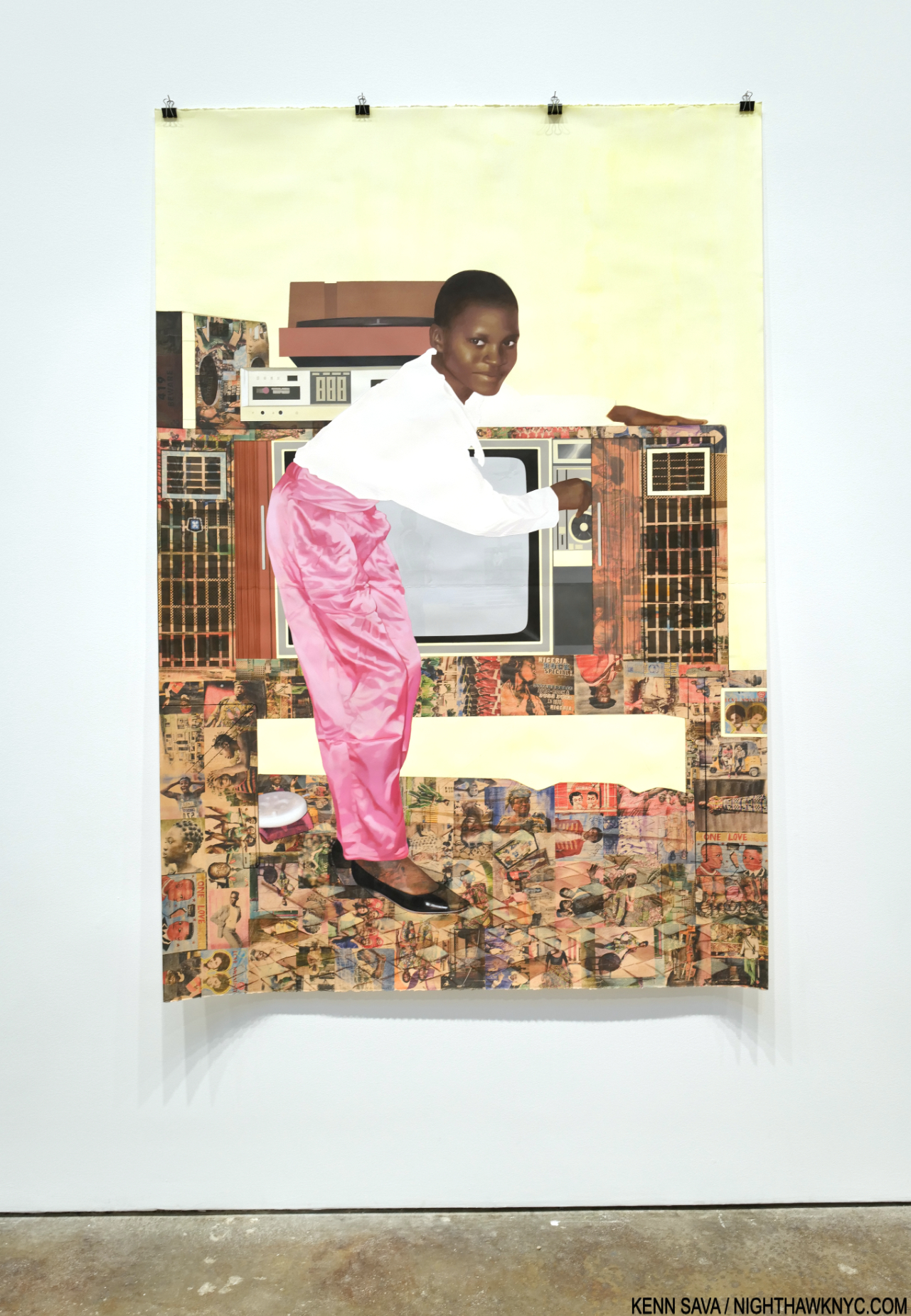
“The Beautyful Ones”Series #10: A Sunny Day on Bar Beach, 2022, Acrylic, colored pencil, pastel, charcoal, and transfers on paper, 78 1/2 x 53 3/4 inches.

It’s all in the service of her subjects, some she’s apparently related to, some not. They’re each treated with such compassion and understanding, it’s hard to tell which are which.

Detail.

Ms. Crosby’s work rewards the casual glance, and extended close study, while serving as something of a bridge from her life now (in the US since 1999), to her Nigerian upbringing. In the process, it helps others begin to understand it, as she presents it in a multifaceted memory standing on layers of time, history and place.

Wade Guyton @ Matthew Marks

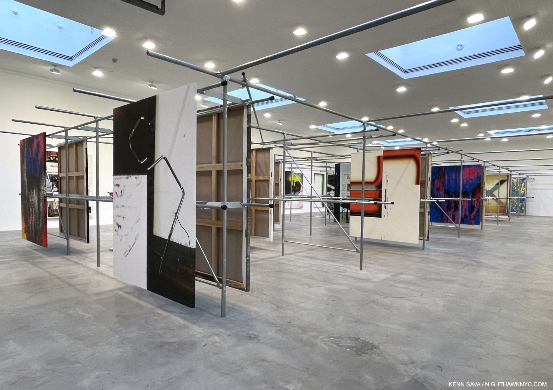
Installation view. All works are Epson UltraChrome HDX inkjet on linen 84 x 69 inches each.

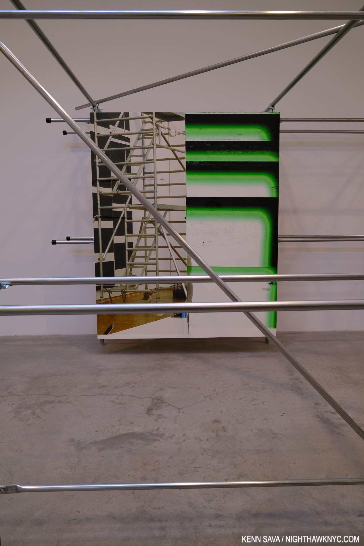
Wade Guyton’s installations are always an interesting element of his entire show experience. In fact, his book Zwei Dekaden emphasizes just that aspect in over 200 installation views over two decades. It’s now like it wouldn’t be a Wade Guyton show without the installation. And so it was at Matthew Marks. The unique steel rack installation was explained thus- “In 2021 Guyton moved into another floor of his studio building that the previous tenant, a clothing company, had filled with metal hanging racks. Rather than remove the racks, he repurposed them to hang his paintings for storage. In the current exhibition, Guyton has duplicated this set of racks and installed paintings in the same manner,” per the press release.

I couldn’t resist making the installation part of seeing the work.

The work looked handsome on its mounts and the structures themselves provided for interesting “other” views of each piece as a visitor moved through the racks. Cross members added unexpected elements to works on the next row and provided a chance to see pieces at a bit of a distance.

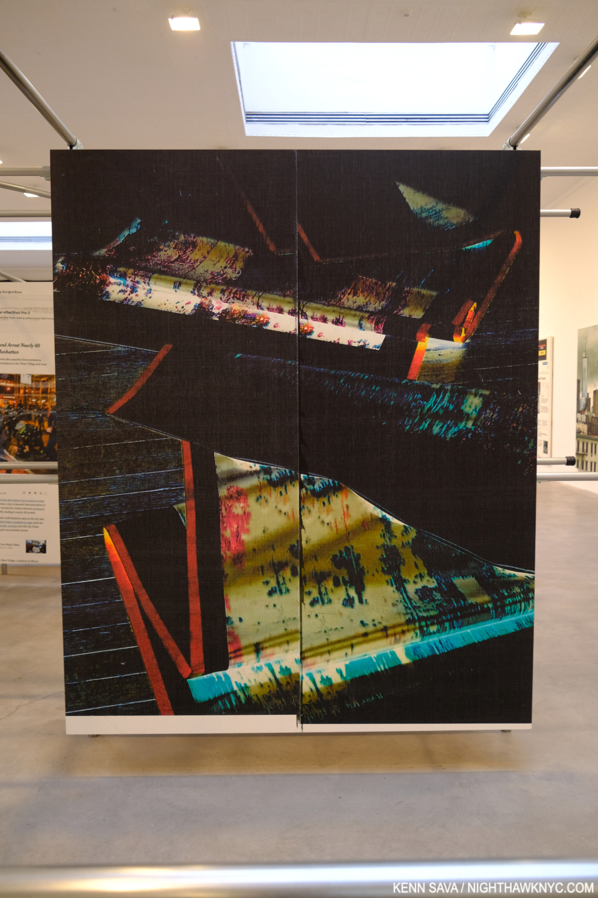
Untitled, 2022, (WG5374)

But all of this is secondary to what’s being displayed. Wade Guyton has been at the forefront of combining Printmaking and Painting in interesting ways for a long time. Admirers will find new takes on some familiar themes, but there is also much that is new. The sense of being “somewhere else” was interrupted by pieces based on New York Times front pages; recent headlines jarring a visitor back to “reality.” I love how he incorporates images/Photos into his work, and some of the printing of others has a “squeegee” look that always reminds me of Jack Whitten. Here, it’s still fresh and it’s nice to see the Artist continue to find new possibilities. As he has, once again, with his installation. Both work extremely well together.

NighthawkNYC.com has been entirely self-funded & ad-free for over 8 years, during which 300 full-length pieces have been published! If you’ve found it worthwhile, PLEASE donate to allow me to continue below. Thank you, Kenn.

You can also support it by buying Art, Art & Photography books, and Music from my collection! Art & Books may be found here. Music here and here.

Written & photographed by Kenn Sava for nighthawknyc.com unless otherwise credited. To send comments, thoughts, feedback or propositions click here. Click the white box on the upper right for the archives or to search them. Subscribe to be notified of new Posts below. Your information will be used for no other purpose.

Gregory Halpern In NYC

This site is Free & Ad-Free! If you find this piece worthwhile, please donate via PayPal to support it & independent Art writing. You can also support it by buying Art & books! Details at the end. Thank you.

Written & Photographed by Kenn Sava

Shows seen- Impressions @ Fotografiska, July 20, 2023 and
Immersion: Gregory Halpern, Raymond Meeks and Vasantha Yogananthan @ ICP, through January 8, 2024

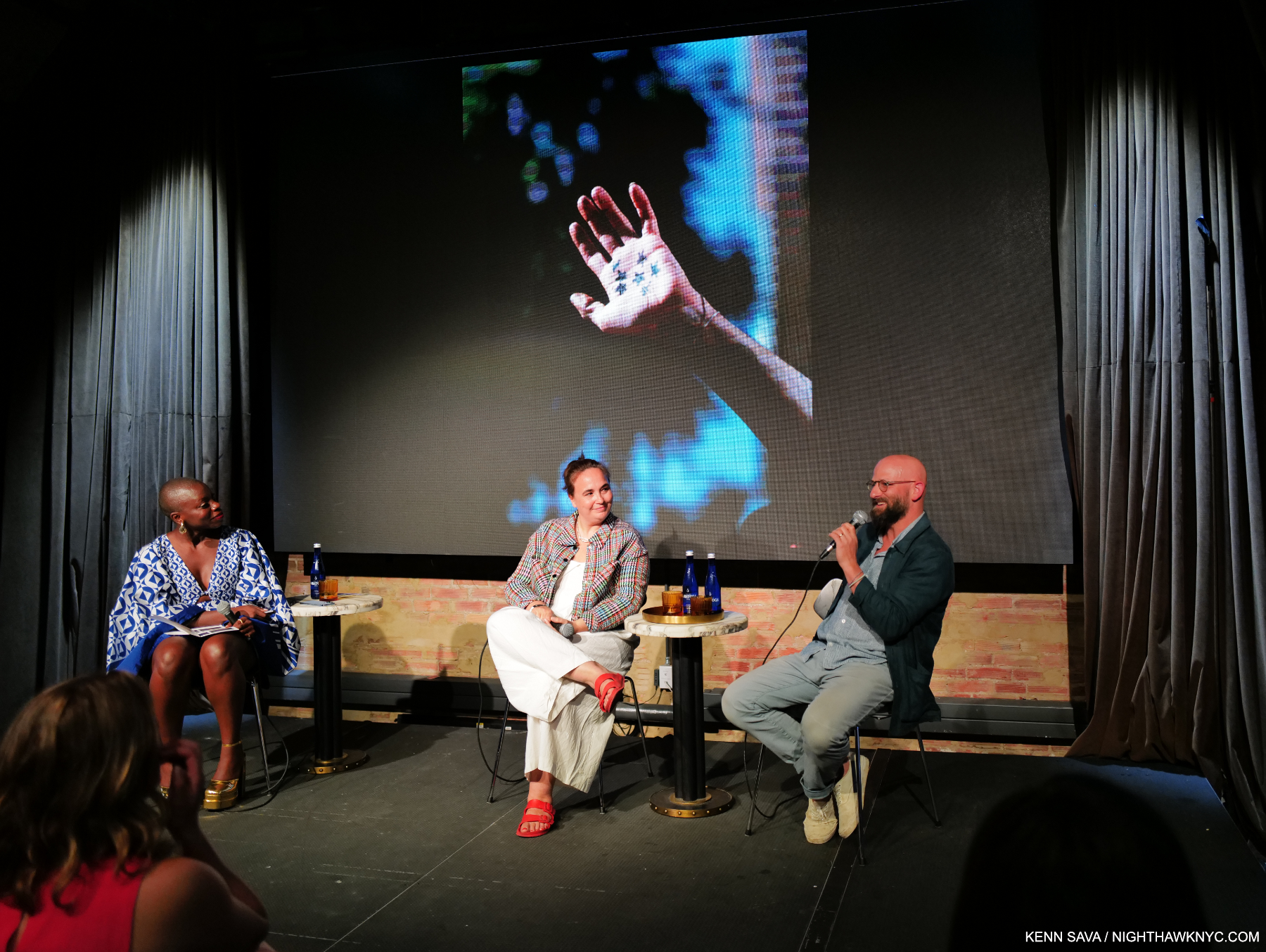
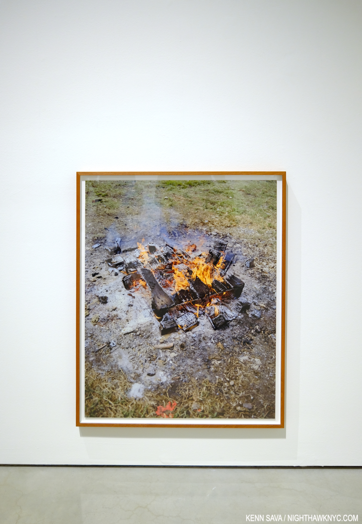
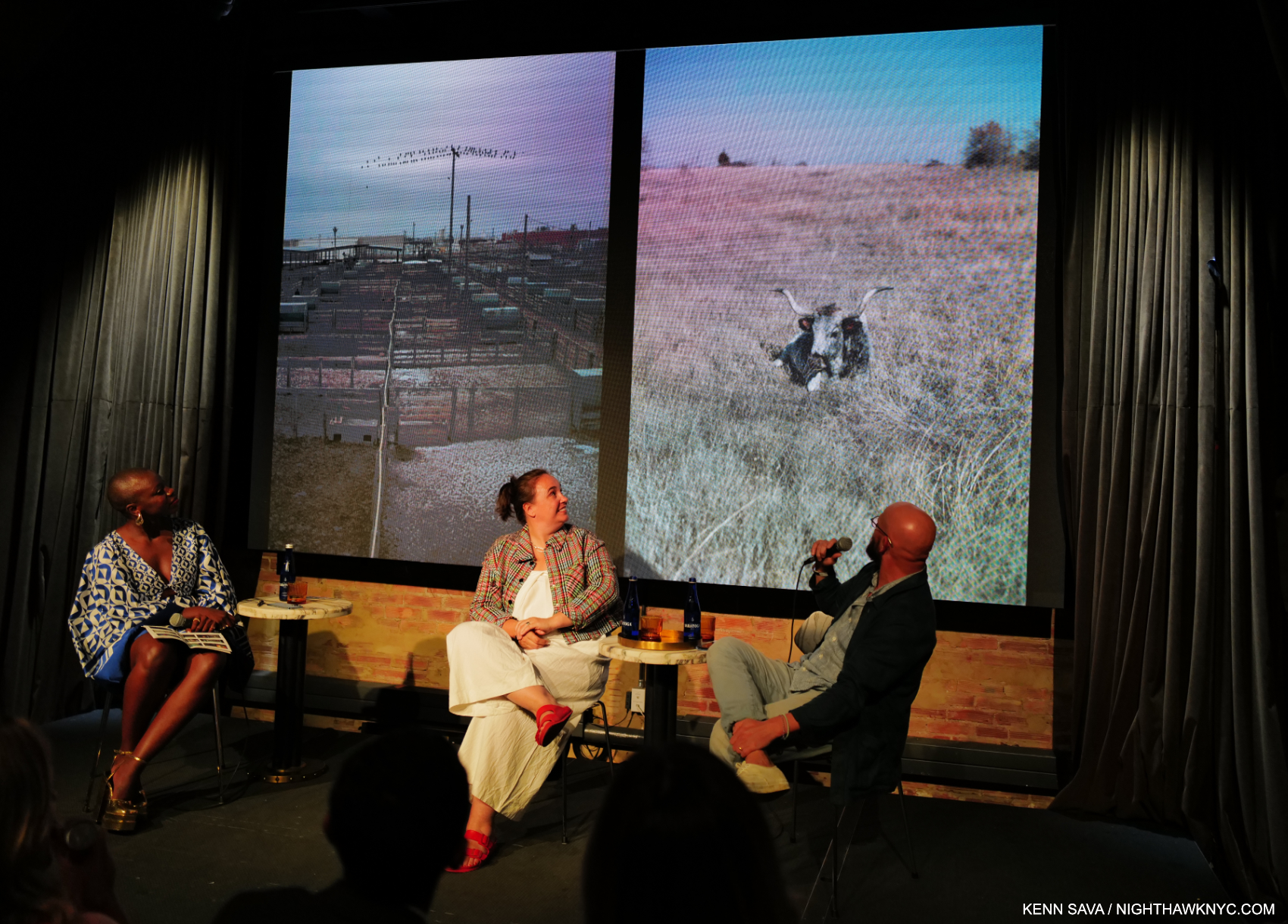
Gregory Halpern, right, giving a brief overview of his career to date as an introduction to his work including this well-known image from his PhotoBook,  ZZYZX, with Magnum Photos President, Photographer, and fellow exhibitor, Cristina de Middel, center, and narrator Jessica Nabongo at Impressions @ Fotografiska, July 20, 2023. Click any image for full size.

Two shows featuring the work of Gregory Halpern provided all-too-rare opportunities to see his work here in what were the NYC debuts of both his newest work, and his most recently published work. While familiar to most from his remarkable series of PhotoBooks this past decade as a “book Artist,” the shows provided the chance to see him as a “wall Artist.” Though neither was a Gregory Halpern solo show, they proved revelatory1.

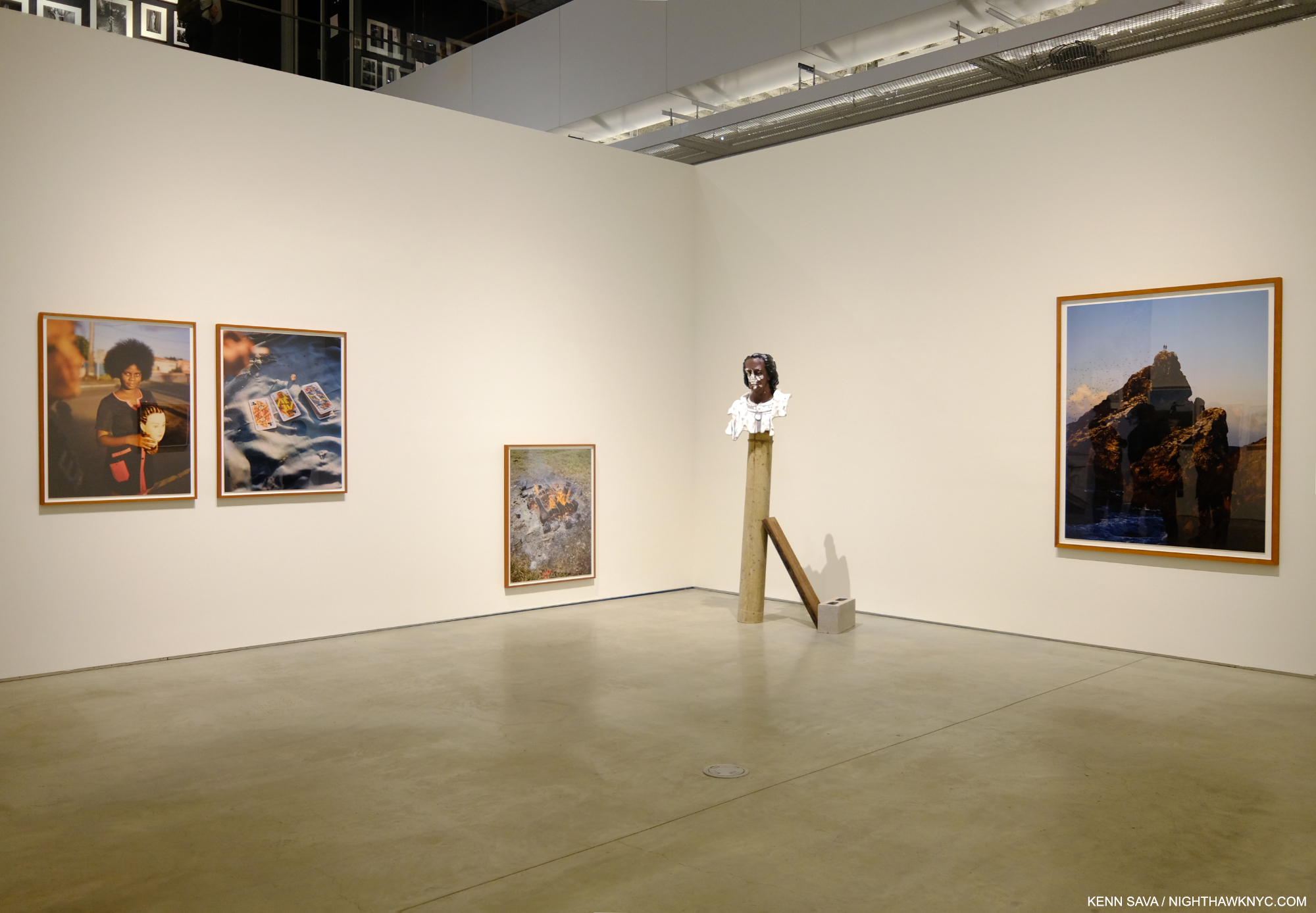
 Immersions installation view

On September 26th, Immersion opened at ICP, where I was last for William Klein: YES. Immersion is the name of a commission program involving an amalgamation of French and American organizations awarding selected Photographers, called laureates, a sponsorship to create a body of work either in France or the US. Gregory Halpern was a laureate in 2018. Raymond Meeks and Vasantha Yogananthan are the other two laureates included in the show. For his part, Mr. Halpern decided to go to Guadeloupe, a former French colony, a daring and somewhat ground-breaking choice (Raymond Meeks chose two regions in France, and Vasantha Yogananthan chose New Orleans).

So, why Guadeloupe?

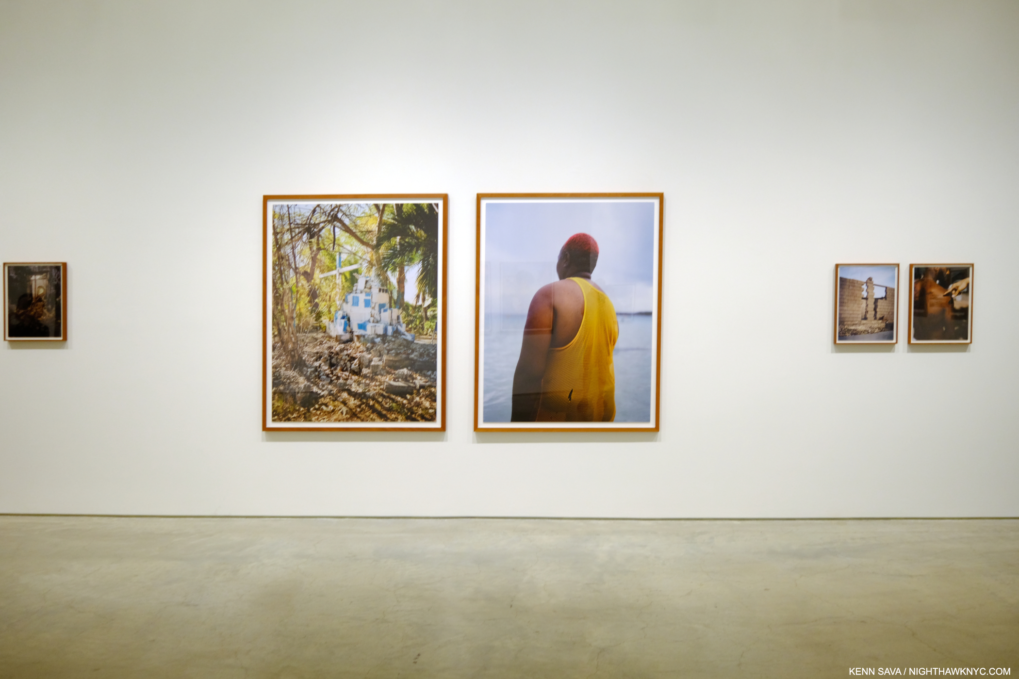
 Immersions installation view.

“I think I knew I would find a certain form of Surrealism there,” Mr. Halpern explained in an interview with Curator Clément Chéroux2.

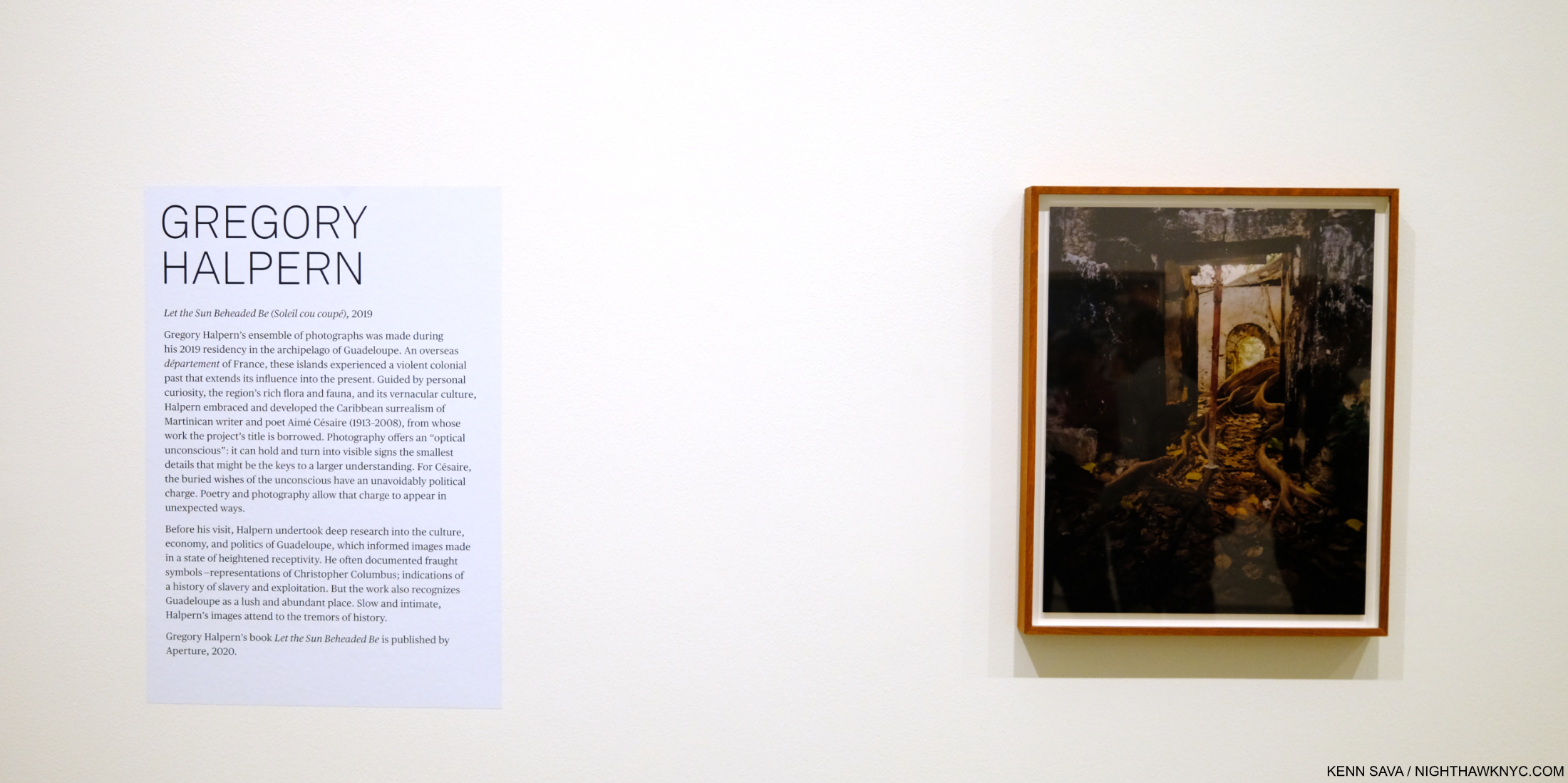
The stage set, after research and a number of trips to Guadeloupe to take the Photographs, he undertook the rigorous selecting and arranging process he outlined during a talk when I saw him last at The Strand Bookstore in September, 2019. Aperture published the resulting body of work, indeed perhaps his most surreal, in Let the Sun Beheaded Be (a NighthawkNYC Noteworthy PhotoBook of 2020). In Immersion NYC finally gets to see the work as Photographs.

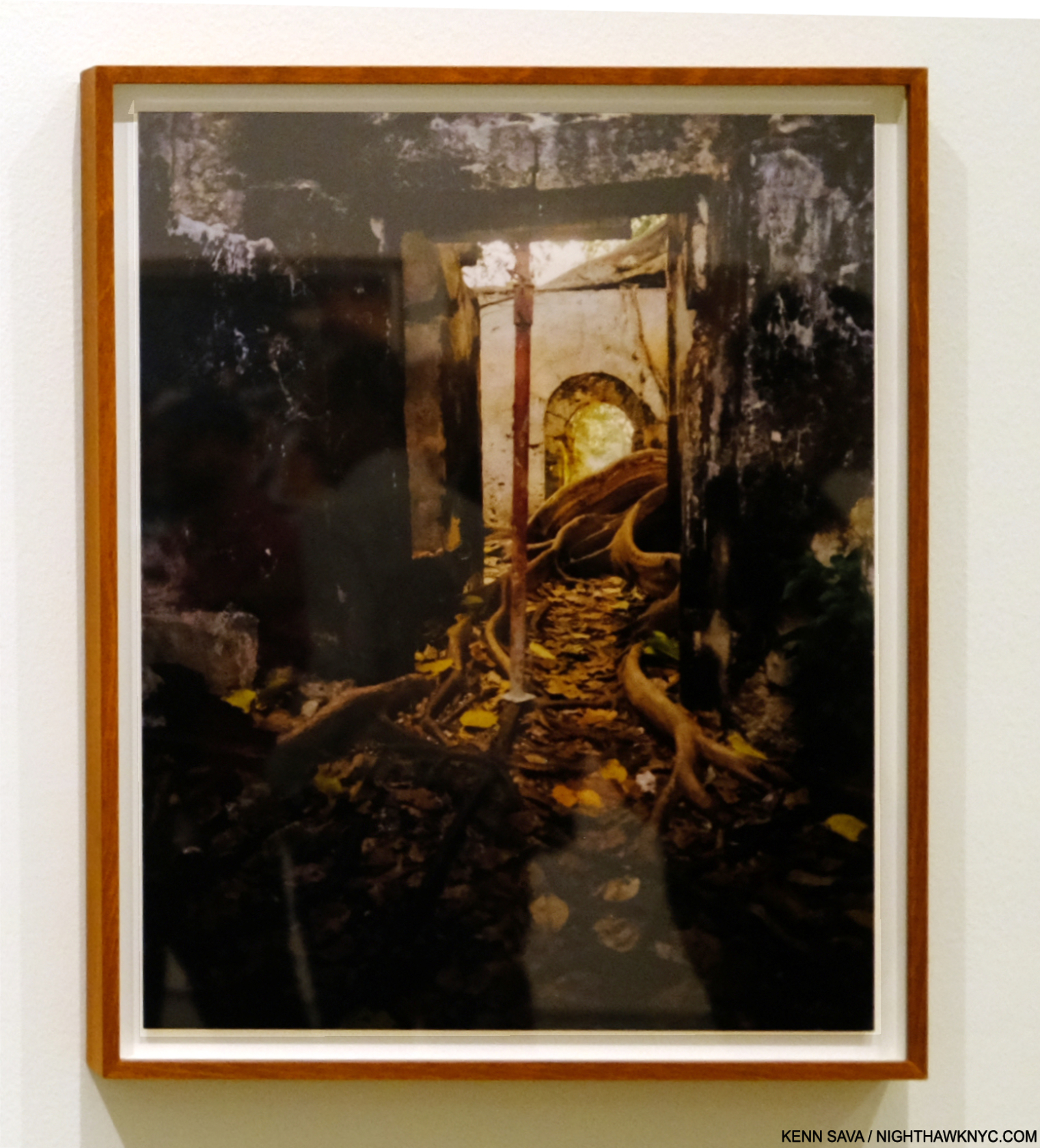
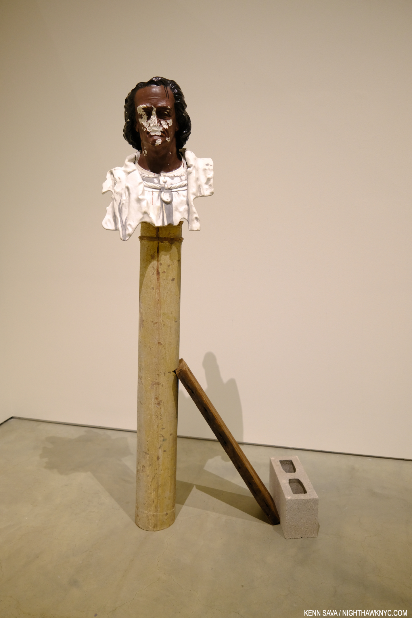
The show was concise, typically open-ended, and bookended by the Artist’s first foray into Video(!) and a stunning, leaning, Sculpture3. It opens with one of the most compelling images in the book.

Untitled, as all the images are in the book, is described by Mr. Chéroux- “Shot in a former slave prison in the town of Petit-Canal, northwest of Grande-Terre, it shows the tentacular development, right inside the building, of a tree commonly known as a strangler fig because the strength of its wide roots destroys everything on which it grows4.”

Christ Columb, 2023, Marble, cement, stainless steel, wood and cinderblock. An “exact replica of a bust of Christopher Columbus that currently stands in Guadeloupe,” per the wall card. “Exact” in that it even mirrors the vandalism to the real bust’s face.

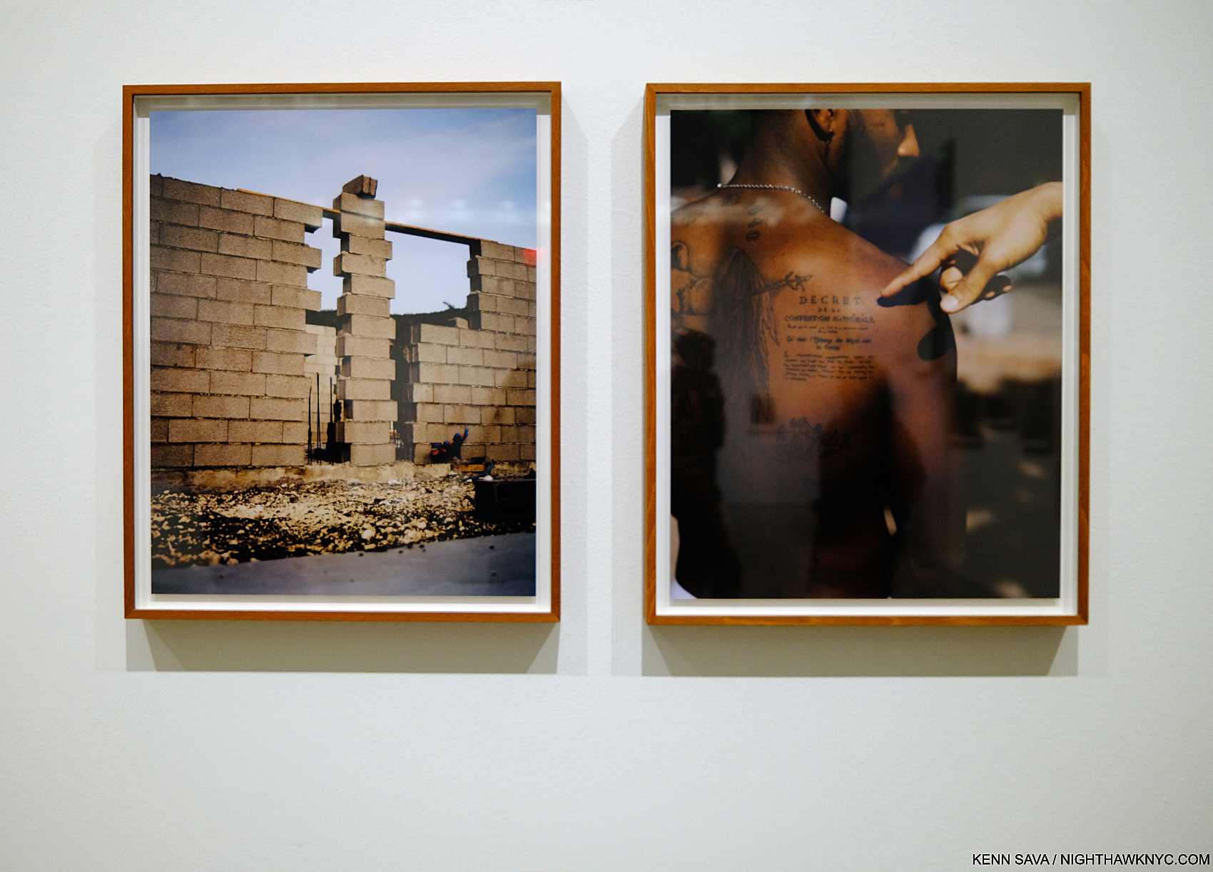
It serves to define his terms. In these Photos, Mr. Halpen consciously avoided tourist trappings, saying in the book’s conversation with Stanley Wolukau-Wanambwa that after seeing how the tourists acted and treated the locals, he realized his burden as another white outsider with a camera would be even heavier, especially because he wasn’t fluent in either French or creole. He chose instead to focus on the stormy history, the place, the human, the animal, and the vernacular, in what are the five unofficial “chapters” of the book.

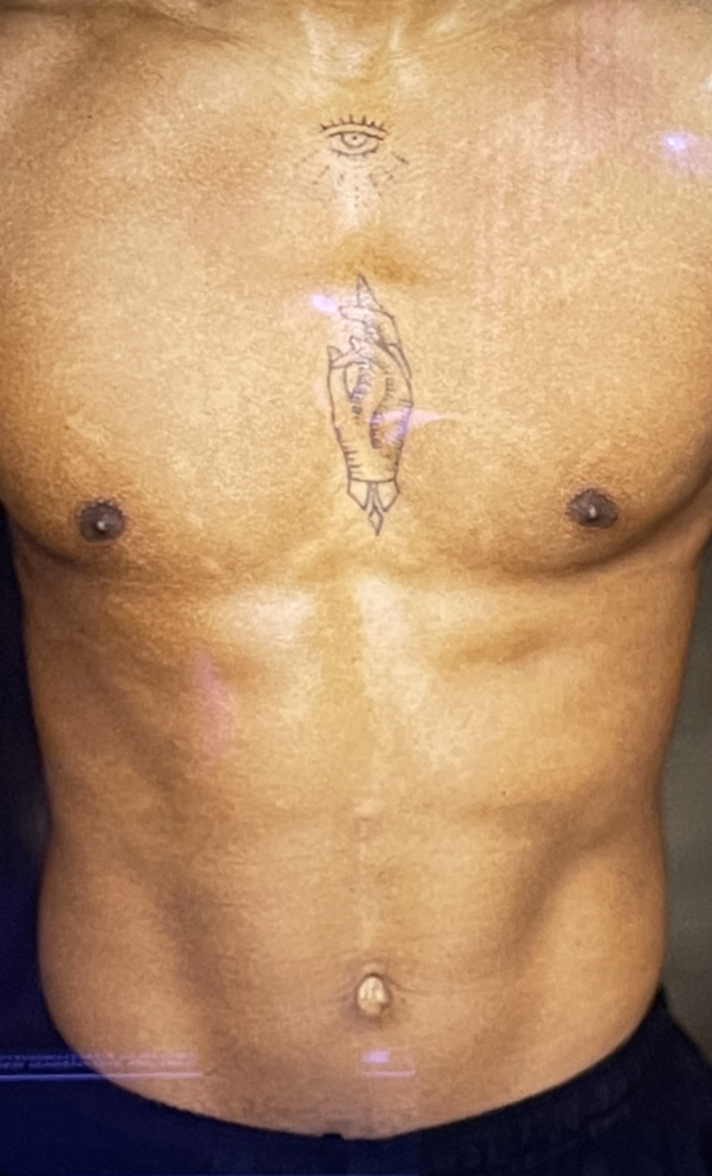
History/the place, the human…”The tattoo is a replica of the 1848 decree abolishing chattel slavery in Guadeloupe (the second, final abolition, after Napoleon reneged on his 1815 abolition,” from the wall card regarding the work on the right.

Surrealism runs throughout all of them, yet in Let the Sun it’s, perhaps, an overriding mood as much as it is actually on view. Possibly, this is due to the inherent surrealism Mr. Halpern said he was expecting to find, or perhaps it was also due to his reading material during his visits. The title “Let the Sun Beheaded be” comes from Soliel cou coupé (or Solar Throat Slashed) by Martinican poet Aimé Césaire, who was influenced by the concluding lines of “Zone,” the first poem in Guillaume Apolliinaire’s Alcools, 1913, “Adieu Adieu / Soliel cou coupé” (Farewell, farewell / Let the Sun beheaded be). Apolliinaire coined the term “surrealism” circa 1917. Césaire’s earlier work found its way into the hands of André Breton, one of the leading surrealist theorists, and the two became long-time friends. Speaking of Solar Throat Slashed curator Clément Chéroux points out in his essay the numerous connections between the guillotine, which was brought to Guadeloupe with the French after the French Revolution and put to extensive use in the colony, and Photography- down to the “guillotine shutter.” Thankfully, the guillotine shutter is the only use of the notorious device in the work, though death takes many forms.

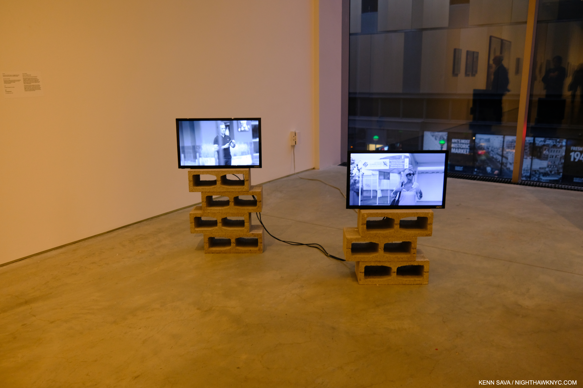
Stills from Triangulation, 2-channel video(!), duration 4:20.

Yet, after finishing his Photography, he subsequently returned to make a 2-channel Video titled Triangulation, which meditates on the coming and going of the cruise ships and their cargo. The Video, his first to be shown in public, startled me for having a different approach than his Photography does! Whereas he goes to great length to speak with his Photographic subjects, even collaborating with them to an extent in his Photo Portraits, in Triangulation, he’s an observer. Highlighting the risks of this, at one point, staged or not, a cruise ship employee with “Photographer” emblazoned on his shirt, ironically moves towards the camera making a “STOP” signal . The Video added a counterpoint to the show. At once showing that side of Guadeloupe most known to the outside world, but showing it not from the standpoint of the tourists, but almost from the viewpoint of the locals if and when they watch these foreigners arriving & disembarking on their island. 

Appropriately hung near the floor. Seeing it this size created a completely different impression than the image in the book.

Another thing that struck me seeing this work was size. Images have a tendency to live in our minds in the size they appear in in a book. Unlike a Painting or Drawing, we may tend to forget Photographs can be printed larger or smaller. I heard from readers when I named Mr. Halpern’s Omaha Sketchbook a NoteWorthy PhotoBook of 2019 who disagreed, saying they were unhappy with the size of all the images in it- each a reproduction of a Photo cut from a medium format contact sheet, done to remain true to his original mockup- a “sketchbook.” Let the Sun returned to full page images to stunning effect (I happened to love the daring in the design of Omaha and the sizes of the Photos therein). At ICP, the Prints ranged from slightly larger than page size to very large, probably 40 inches or larger. The added real estate enabling the images to begin to attain a “life-size” presence. 

“In Guadeloupe, slavery memorials are everywhere, so the weight of that history is much more perceptible than in the United States.” Gregory Halpern in the Conversation.

In my 2019 overview of his work, “Gregory Halpern’s America,” I wrote about his work’s hold on me. I still can’t think of any other living Photographer whose work speaks to me as much as his continues to. Given that his instant classic book ZZYZX is now in its 4th printing, and his three subsequent books have sold out, I’m apparently far from the only one it speaks to. I went in to Immersions believing that Let the Sun is somewhat underappreciated compared to his U.S. based books (i.e. all of his previous books). I came out feeling I may have underestimated it. Let the Sun is a book that could inspire change on a number of levels- from opening the eyes of people who’ve never been to Guadeloupe (like myself), to increased possibilities for the Photographic Portrait, to publishers who have neglected the Caribbean (& it’s Artists) to this point in Art & PhotoBooks, to the shame that the history of slavery in this country has been so ignored. For those reasons, it’s something of a landmark book in my view.

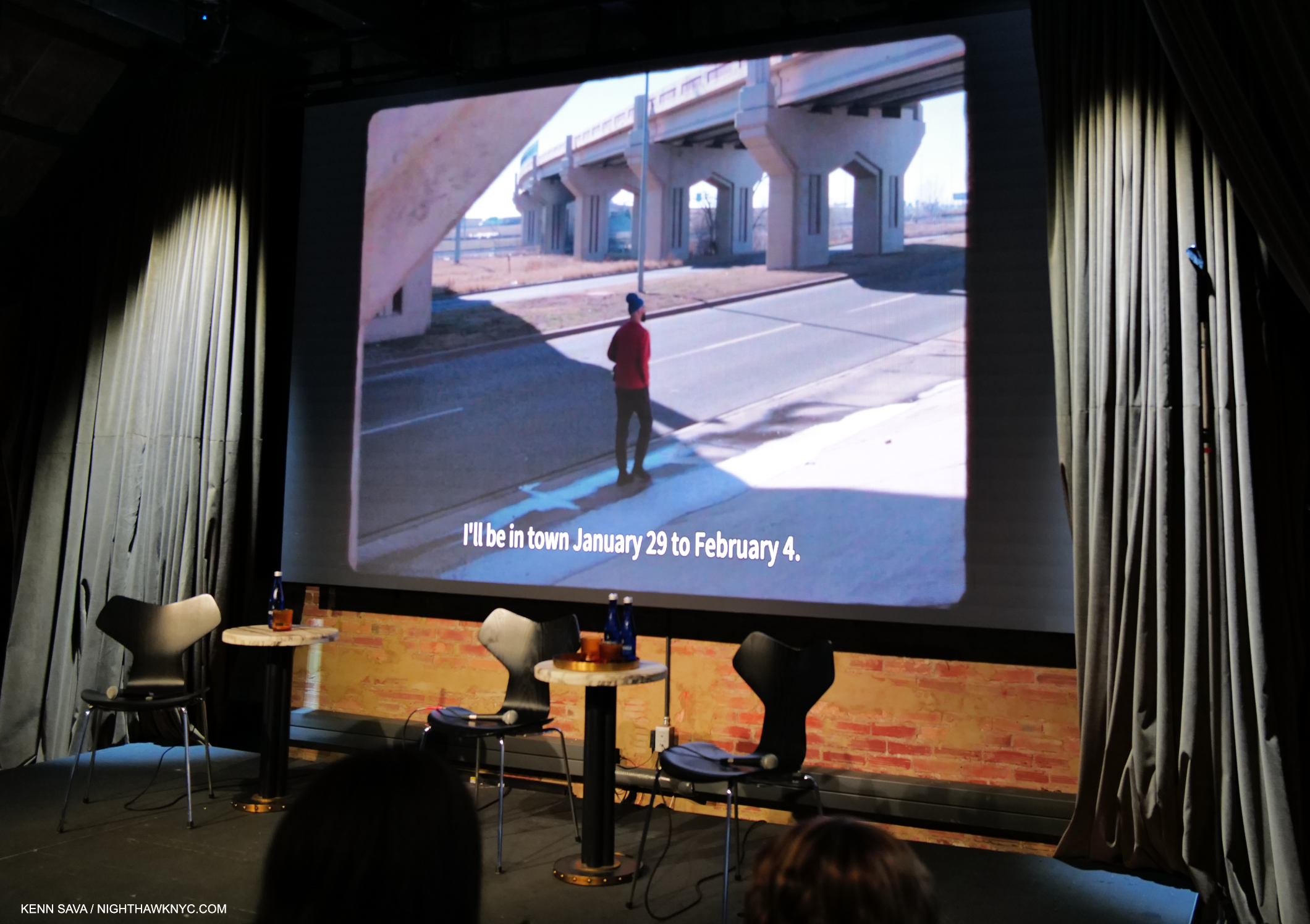
On the road, again. Gregory Halpern looking for subjects in Oklahoma City as he talks in the voice-over about his Instagram announcement seeking Portrait subjects. Still from a fascinating video short about his week in OKC at Fotografiska, July 20, 2023.

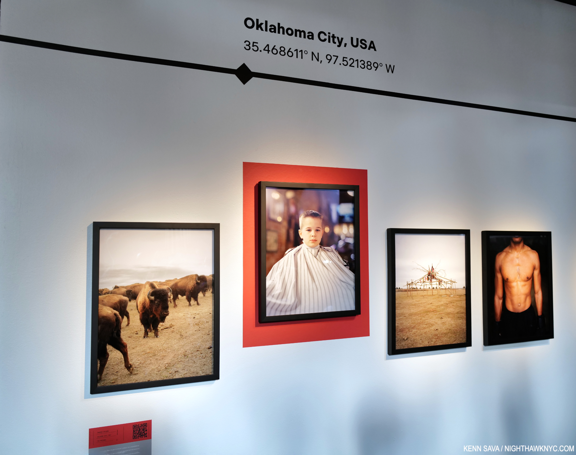
A few weeks earlier, at Fotografiska in the Flatiron on July 20th, Mr. Halpern was joined by 3 Magnum Photos Photographers, of which he is now also a full member, in a show sponsored by a hotel chain titled Impressions. The Photographers were ensconced in separate hotels around the world and asked to document what they experienced. Mr. Halpern went to Oklahoma City, and exhibited 4 Photos (as did each of the others- Cristina de Middel, Jonas Bendiksen, and Alessandra Sanguinetti) in what is the first new work I’ve seen of his since Let the Sun Beheaded Be, 2020.

Here is Mr. Halpern’s presentation-

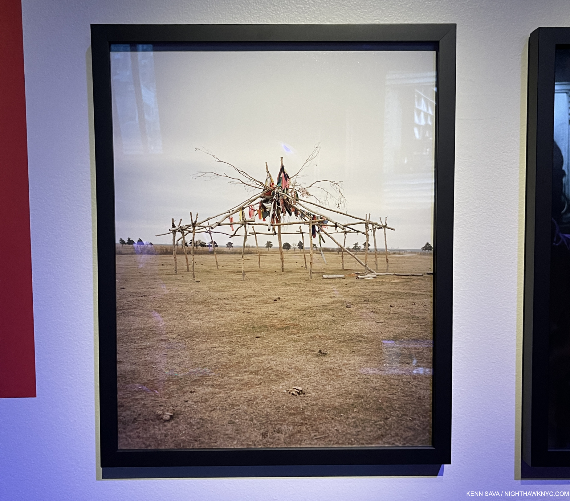
I find the arrangement particularly interesting. We see animals, a Portrait of a young man in a barber’s cloth, some sort of structure, and a torso bearing a tattoo. Looking at these, yes, Let the Sun came back to me. Each of the four images “represents” one of its unofficial themes- animals, a human, the evidence of the land/history, and another human. The surreal is also represented in all four (at least for me).

It would be easy to say they “harken back” to what we saw in Omaha Sketchbook. That book featured images of masculinity (along with images of animals, the land & history and other themes), like Douglas, Army Jurnior Reserve Officer Training Corps, Bellevue, 2005-18, to cite one example out of many; the young man getting a haircut harkens back to those societal expectations and traditions. Ostensibly, it’s a straight-ahead image of an event that parents are fond of documenting during childhood. Yet, there’s an air of mystery around it. The young man stares at the camera with a somewhat stoic look that gives away little. The barber cloth hiding anything the might tell us more about him. His haircut appears to be finished and he’s ready to face the world again. Yet, I’m reminded of Clément Chéroux’s essay in Let the Sun when he speaks about the guillotine, Guadeloupe, and the mechanics of Photography. He mentions Photographers refer to Portraits as “cutting heads.” Here we see just that twice- once with only the head (in a Print mounted on a red background), and once of a torso sans head. Notice how the Print of the young man is mounted higher than the others- at a height where the young man’s head just about “completes” the Portrait of the tattooed torso on the right.

Detail of the far right Photo, showing the tattoo. Speaking of recurring themes, t’s interesting to contrast this with the very first image in this piece from ZZYZX.

It reminds me of some of the games the Surrealists used were fond of playing, like the one Kerry James Marshall based his recent show on.

Mr. Halpern discussing two other images from his OKC series.

Of course, this is only my reading of it- your results may differ, as Mr. Halpern’s intentions may as well. In the end, I’m lucky I never have to leave NYC to find Surrealism. It finds its way here from all over the world.

*- Soundtrack for this piece is “Captains and Cruise Ships” by Owl City.

NighthawkNYC.com has been entirely self-funded & ad-free for over 8 years, during which 300 full-length pieces have been published! If you’ve found it worthwhile, PLEASE donate to allow me to continue below. Thank you, Kenn.

You can also support it by buying Art, Art & Photography books, and Music from my collection! Art & Books may be found here. Music here and here.

Written & photographed by Kenn Sava for nighthawknyc.com unless otherwise credited. To send comments, thoughts, feedback or propositions click here. Click the white box on the upper right for the archives or to search them. Subscribe to be notified of new Posts below. Your information will be used for no other purpose.

  1. As far as I know, there has not been a Gregory Halpern solo show in NYC since the auspicious Gregory Halpern: A at Clamp Gallery from January 5th to February 11th, 2012, as hard as that is to believe. If you know of one subsequently, please let me know.
  2. From 2019, per Clément Chéroux, “GH/971” in Let the Sun Beheaded Be.
  3. Which is not his first. He showed Sculpture for the first time earlier this year in Gregory Halpern: 19 Winters/7 Springs at Transformer Station, Cleveland.
  4. ibid

NoteWorthy PhotoBooks, 2023- Two Masterpieces

This site is Free & Ad-Free! If you find this piece worthwhile, please donate via PayPal to support it & independent Art writing. You can also support it by buying Art & books! Details at the end. Thank you.

Written & Photographed by Kenn Sava

PhotoBooks completely took over my life for over 6 years from 2016 through 2022, during which time I immersed myself in Modern & Contemporary Photography (which for me is the period after the publication of Robert Frank’s The Americans in 1958-9). After not publishing a NoteWorthy PhotoBooks list for 2022, two books stood out for me among the PhotoBooks I saw this year. Since I don’t believe the “best” exists in the Arts, I prefer to call them “NoteWorthy,” i.e. books I most highly recommend among all those I saw in 2023. Both are among the most powerful books I’ve seen in years. In my opinion, both books are masterpieces. Other recommended books follow them.

Both NoteWorthy PhotoBooks have two people in common. One, Kris Graves is no stranger to this list. His A Bleak Reality was a NoteWorthy PhotoBook of 2021. His publishing company Kris Graves Projects/Monolith Editions was the NoteWorthy PhotoBook Publisher of 2020 when they somehow managed to publish EIGHTEEN books during the pandemic! This year, Mr. Graves is the Photographer/Artist/Author of one of the two, and he and his Monolith Editions is the publisher of both books (co-publisher with Hatje Cantz of one). As a result, Kris Graves Projects/Monolith Editions are the NoteWorthy PhotoBook Publisher, again, for 2023.

NoteWorthy PhotoBooks, 2023

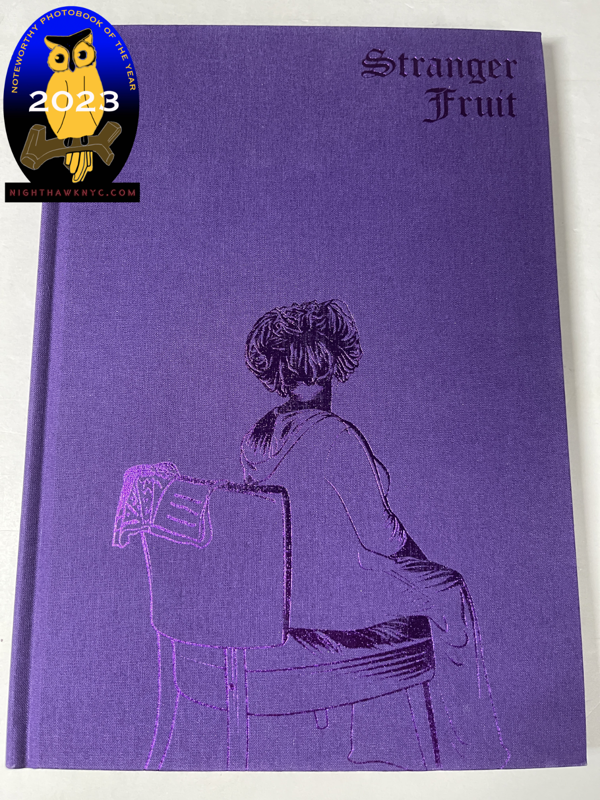
Jon Henry, Stranger Fruit, Monolith Editions

In a word: overwhelming.

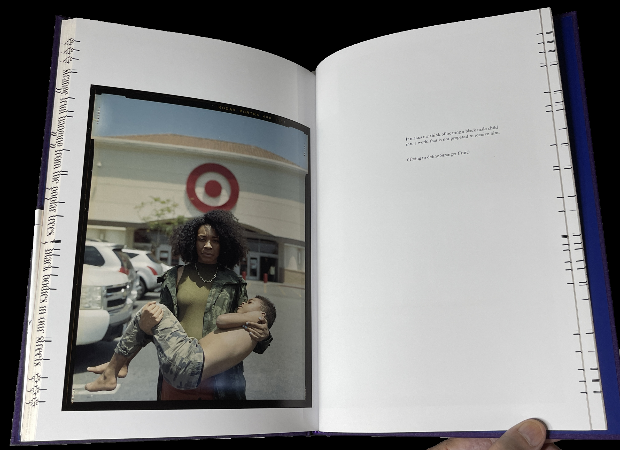
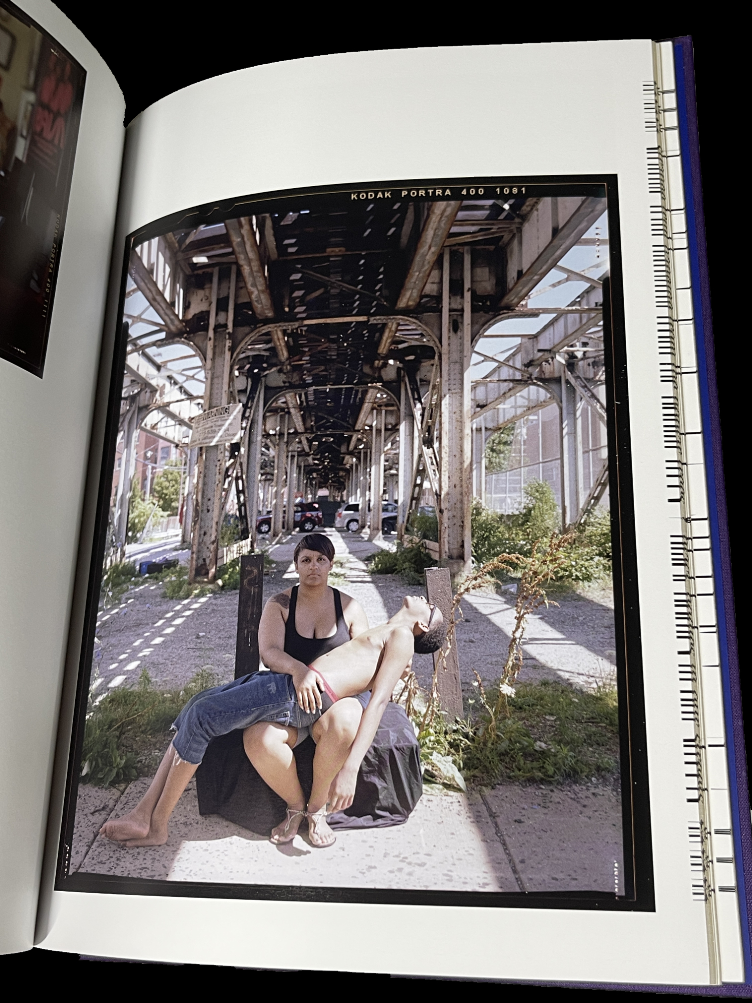
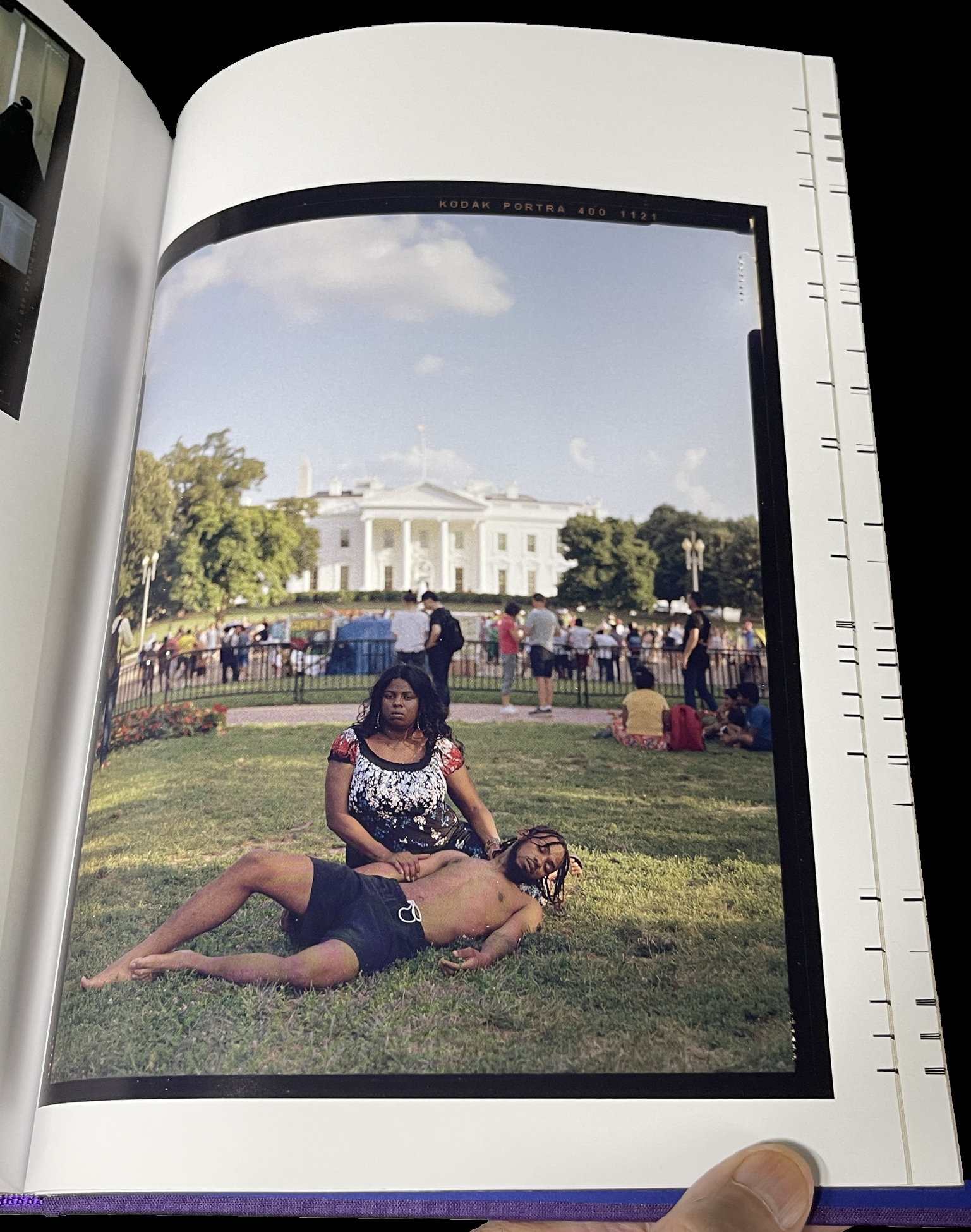
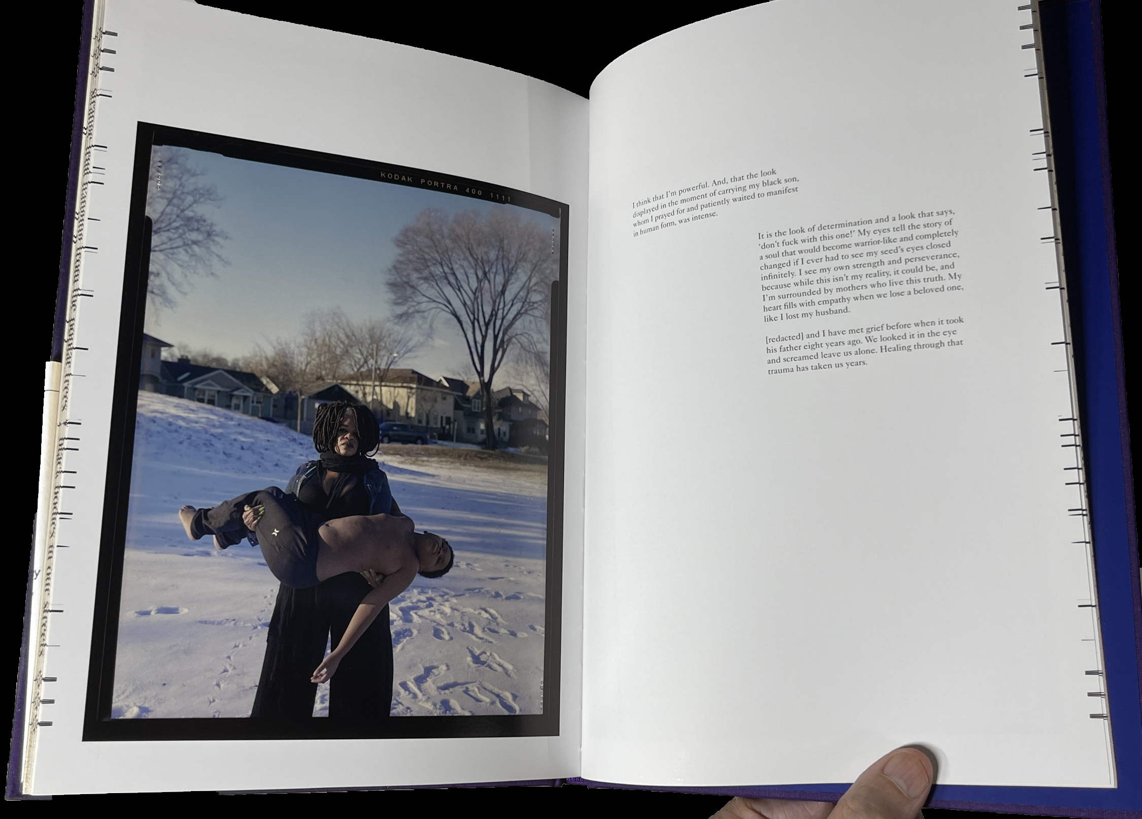
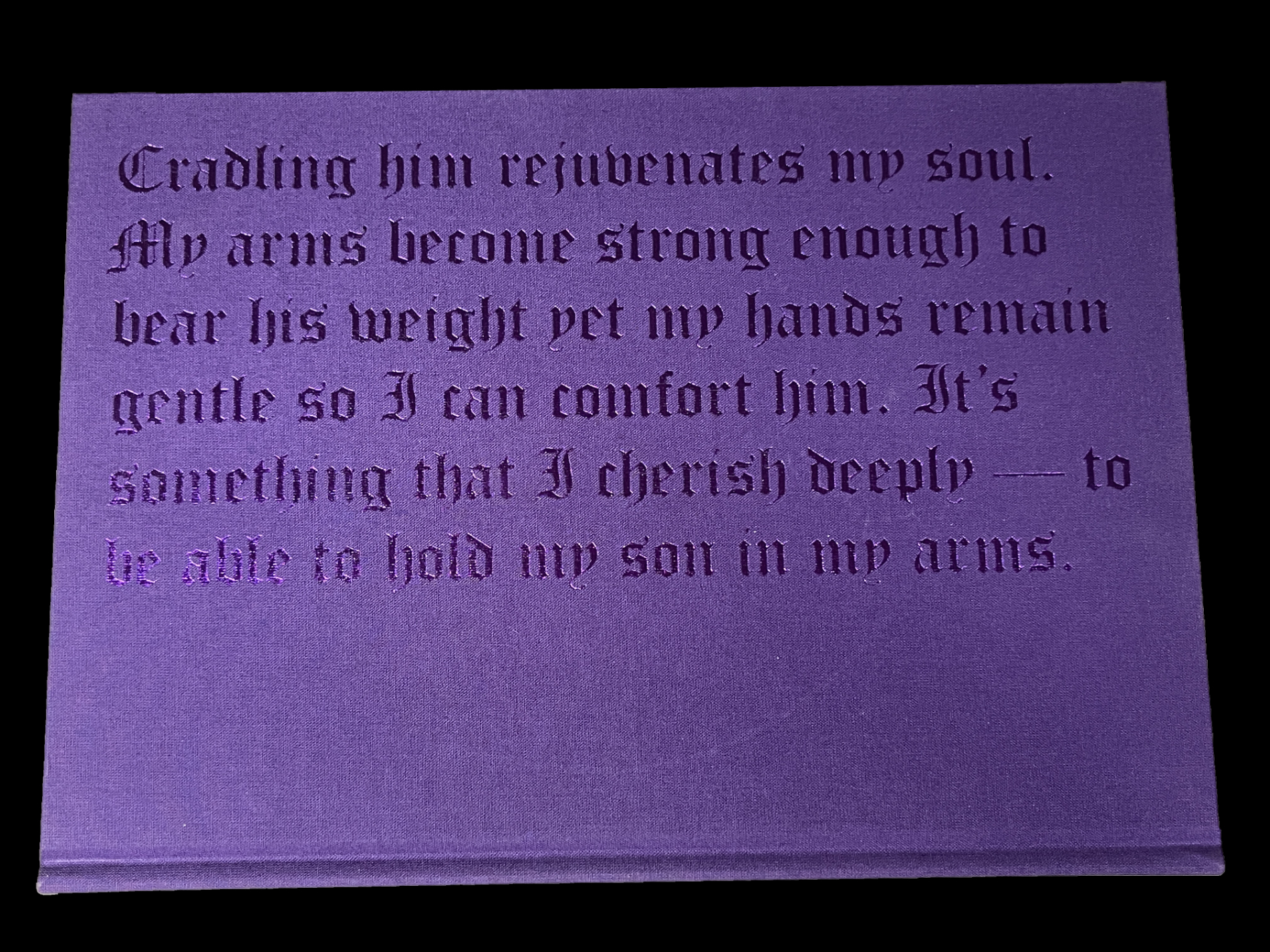
Stranger Fruit was created in response to the senseless murders of black men across the nation by police violence. Even with smart phones and dash cams recording the actions, more lives get cut short due to unnecessary and excessive violence. Who is next? Me? My brother? My friends?” Jon Henry

Mr Henry continues, “Lost in the furor of media coverage, lawsuits and protests is the plight of the mother. Who, regardless of the legal outcome, must carry on without her child. I set out to photograph mothers with their sons in their environment, reenacting what it must feel like to endure this pain. The mothers in the photographs have not lost their sons, but understand the reality, that this could happen to their family.”

The way Mr. Henry has chosen to depict these mothers and sons is in the form known in Painting and Sculpture as the “Pieta” (or pity). Traditionally, Jesus’s mother, Mary, holds her dead son on her lap after the Crucifixion. The “Pieta” has long been among the most powerful and poignant compositions in Western Art. To this point, and for the past 800 years, it’s been the exclusive realm of Painters and Sculptors (most famously Michelangelo).

Along comes Jon Henry, who shows that they can be every bit as powerful in Photography- even without a directly religious reference. He has chosen it to depict the unspeakable pain mothers of murdered Black sons must have experienced in the unique way of depicting mothers holding their living sons. I asked Mr. Henry how he came to use it in Stranger Fruit

 “I grew up studying painting and religious iconography by way of stained glass windows in the church I worked in, so I was very familiar with the motif.  There were more contemporary uses of the pieta, such as Dr David Driskell and Renee Cox, that really made me believe I could use this as the vehicle behind this project.
But everything really revolved around the mother.  I know that my work is not the first to speak about police brutality in the african american community but I felt the mothers were left out of the conversation.  Focusing on them through this mother/son relationship was why the pieta made so much sense for me.”

 In Stranger Fruit (which is named after the Abel Meeropol 1937 song, “Strange Fruit,” protesting the lynching of Black Americans, and immortalized by Billie Holiday) we also get to hear from them. Most of the images are accompanied by a text written by the mother.

I was stunned when I picked this book up for the first time. As far as I know, no one has done anything like this before. Yes, there are combat images from too many wars and conflicts already that are Pietas. Yet, I’ve never seen an entire book of them, and only them. I asked Kris Graves how he discovered Jon, this remarkable body of work, and came to publish Stranger Fruit. He said, “I met Jon some years before the pandemic and he was already hard at work on the project. I told him then that I’d love to publish the work when he felt it was complete. During covid, I founded Monolith and it was an even better fit for the ideals of Stranger Fruit. Soon after, we reconnected and started production.”

The 600 copies of the 1st printing of Stranger Fruit have sold out. I’m told the recently announced 2nd printing is selling quickly. I look forward to the time when it’s no longer vital as a document of immediate social import, to when it can just be appreciated as a work of Art.

Kris Graves, Privileged Mediocrity, Monolith Editions/Hatje Cantz

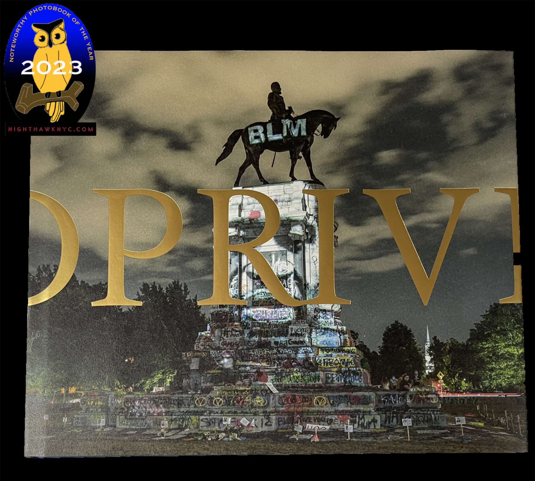
One of the most important PhotoBooks released this century, Privileged Mediocrity is Kris Graves’s masterpiece among his fine books thus far, in my opinion.

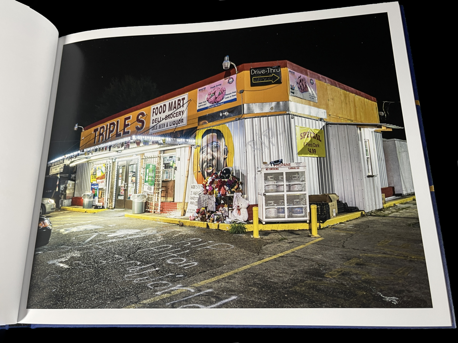
From Part I- The Murder of Alton Sterling, Baton Rouge

Years in the making, involving extensive stretches of travel during the height of the covid pandemic and the Black Lives Matter Protests, at what must have been considerable personal risk, in the days leading to the birth of his first child, it feels to me like this is the book his work has been building toward all along.

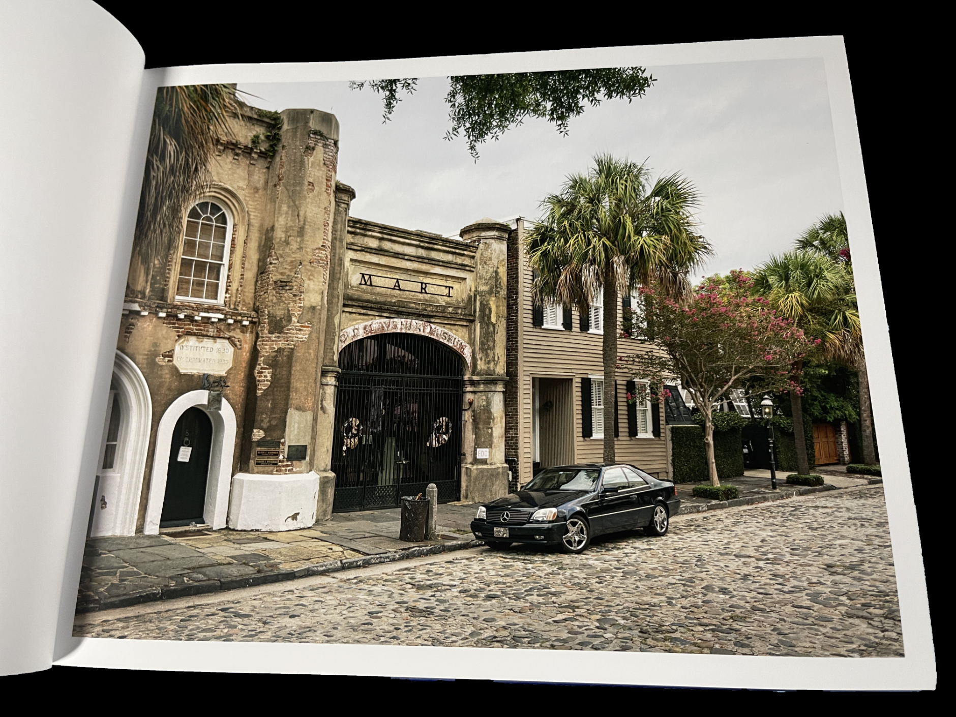
From Part I– Slave Market, Charleston

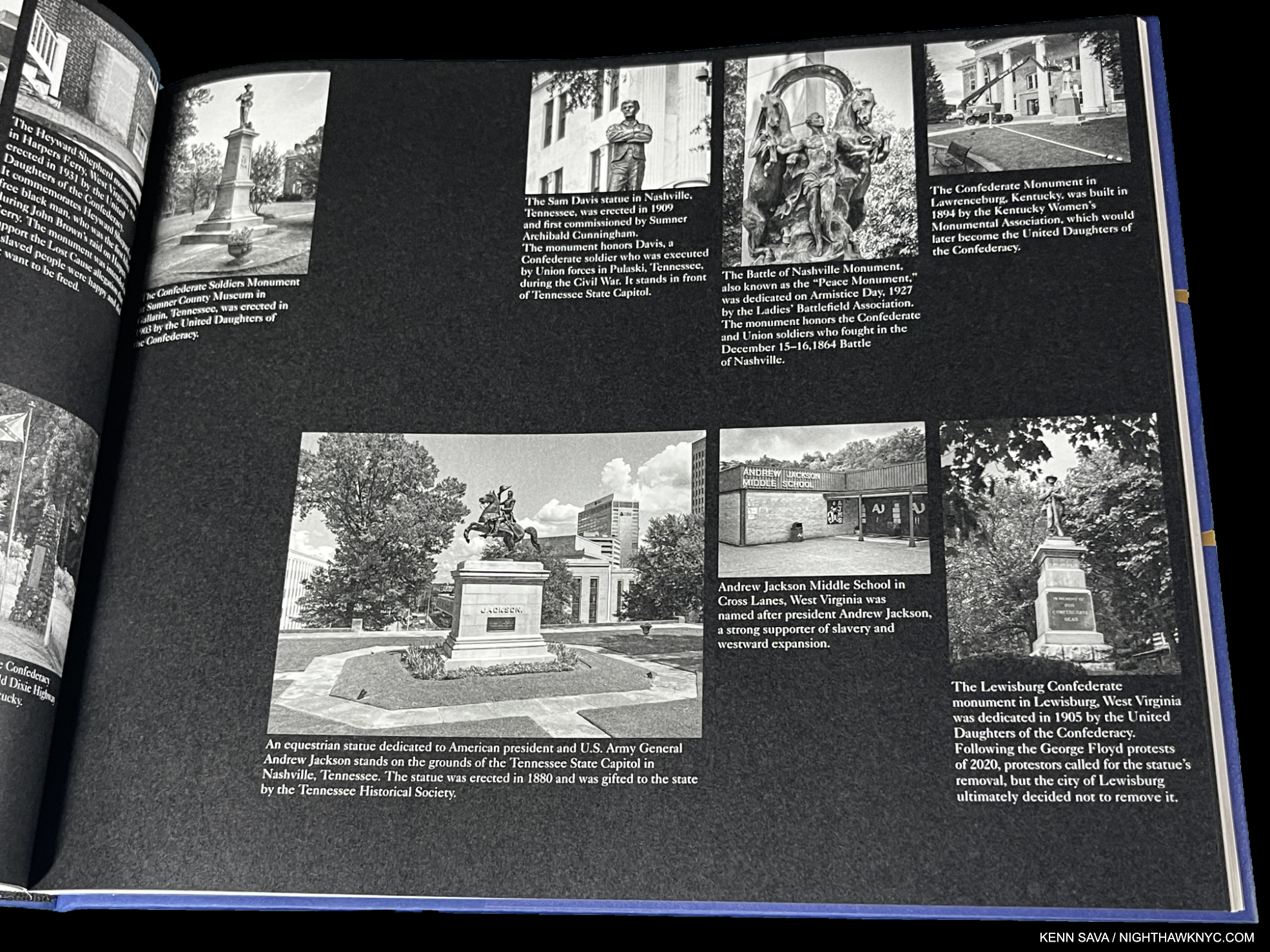
It’s divided into three sections: “Part I: Privileged Mediocrity & The Deceived Within,” “Part II: A Southern Horror, 2020,” and “Part III: A Latency, 2000-2022.” Though Part I sets the stage  with images from NYC, New York State and Boston as well as the South, the book is centered on the South in Parts II & III. Mr. Graves visited innumerable Confederate monuments throughout the South, and shows them before, during and after the protests.

From Part II

“Part II: A Southern Horror, 2020,” is gravely presented with black & white Photos on black paper in which Mr. Graves inventories many of these problematic monuments by state and their connection to racism, which is downright chilling to see on page after page- 46 pages in all- many with up to 8 sites on a page! “Part III Latency 2000-22” shows many of these sites during and after the protests.

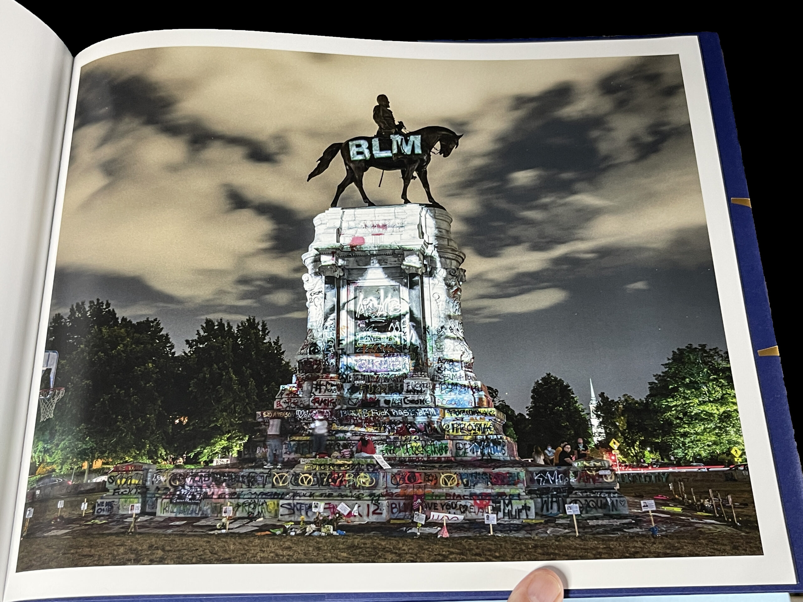
From Part III- George Floyd Projection, Richmond, Virginia. National Geographic Magazine put this image on the cover of its “Photos of the Year, 2020” issue. I asked Kris what he remembers about taking this classic and historic image. He said, “A few days into my Richmond trip, I was introduced to the projectionist, who was working at the protests. On a clear night, he set up at the Lee Monument and I headed out around midnight. It was lively out there, but peaceful. The projections of dozens that were killed by police were displayed for about one second at a time. I asked him to slow it down a bit then made pictures for a few hours. Got a good one.”

Progress has been too long in coming. Part 1 of Privileged Mediocrity speaks to that. When the damn of patience finally burst after yet more murders of unarmed Black men and women, Kris Graves documented a fleeting turning point in American history powerfully, and in his own way. He focuses on the evidence to be seen on the land: scenes of murders and monuments that are offensive to many and a real part of the ongoing problems. A number of them are seen feeling the brunt of the resulting frustration and anger.

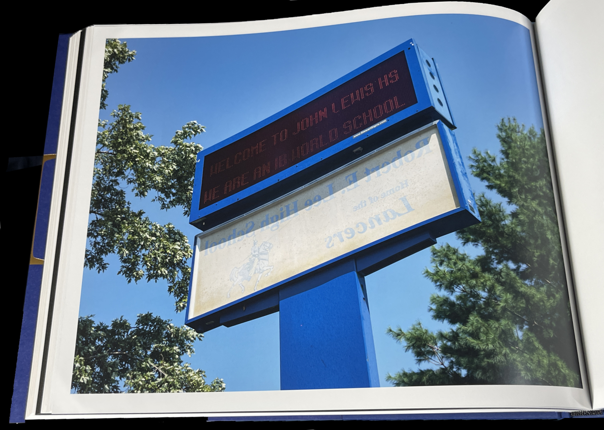
From Part III- John Lewis High School, Springfield, Virginia

After the protests, we see images of the raw beginnings of whatever it is we are in now. In John Lewis High School, Springfield, Virginia, the sign for the school’s former name, Robert E. Lee High School, has been flipped around under its new name. The question these image leave may be “Where to now?” For me, along with all the horror, they also represent moments of hope. The book is dedicated to his newborn son.

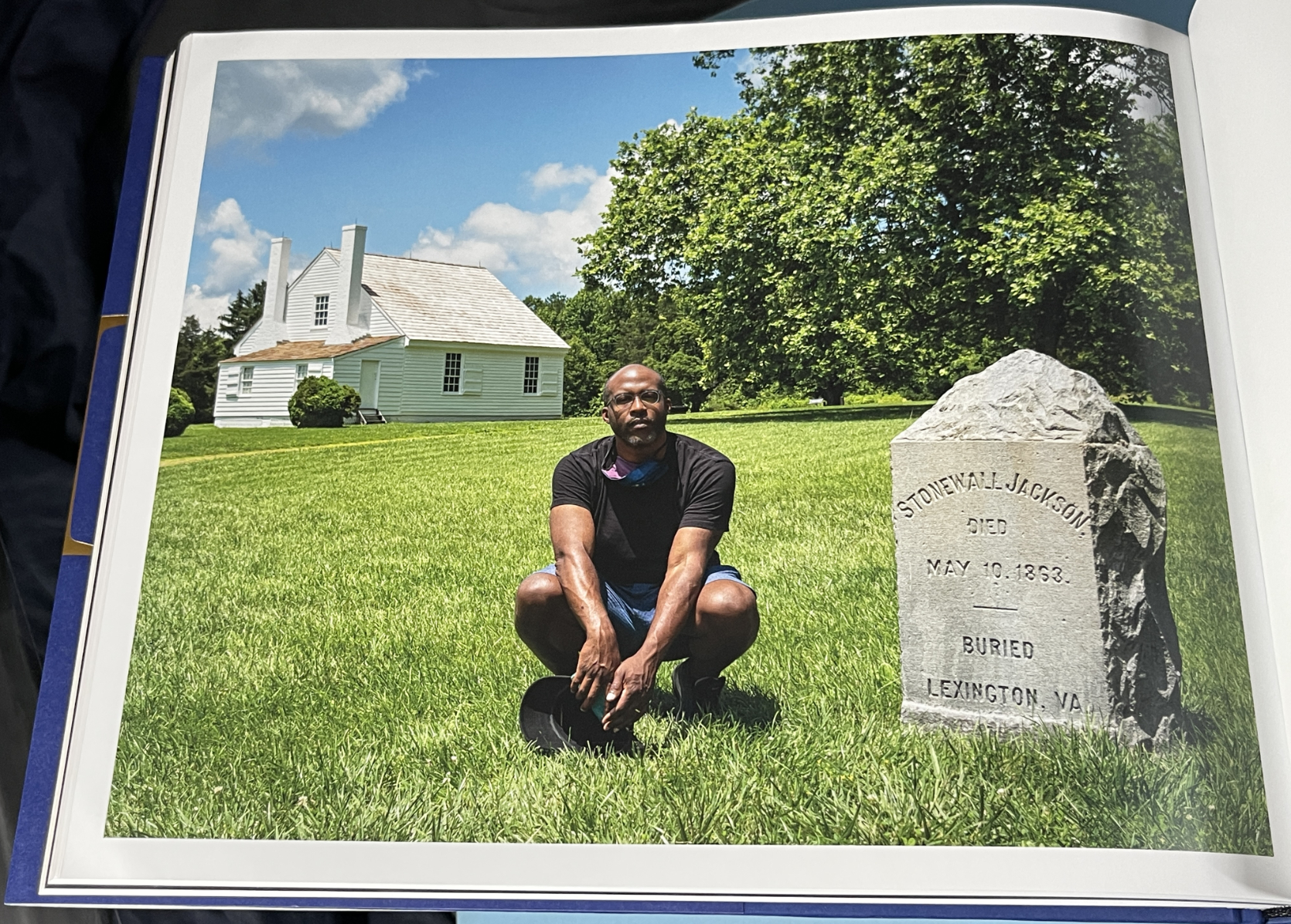
From Part III- Self-Portrait with Stonewall Jackson Shrine, Woodford, Virginia

The American edition of Privileged Mediocrity consists of just 300 copies. My piece on meeting Kris Graves in 2018 here.

I mentioned that both NoteWorthy PhotoBooks have two people in common. In addition to Kris Graves, they both feature the work of the same designer, the ever-creative Caleb Cain Marcus of Luminosity Labs. Mr. Marcus has outdone himself in both books, in my view. With the supreme taste & restraint he displays in Stranger Fruit, and in, what strikes me, as pulling out all the stops in Privileged Mediocrity, as he bends the style to match each section of the book, for which he even designed a font.

Also Recommended-

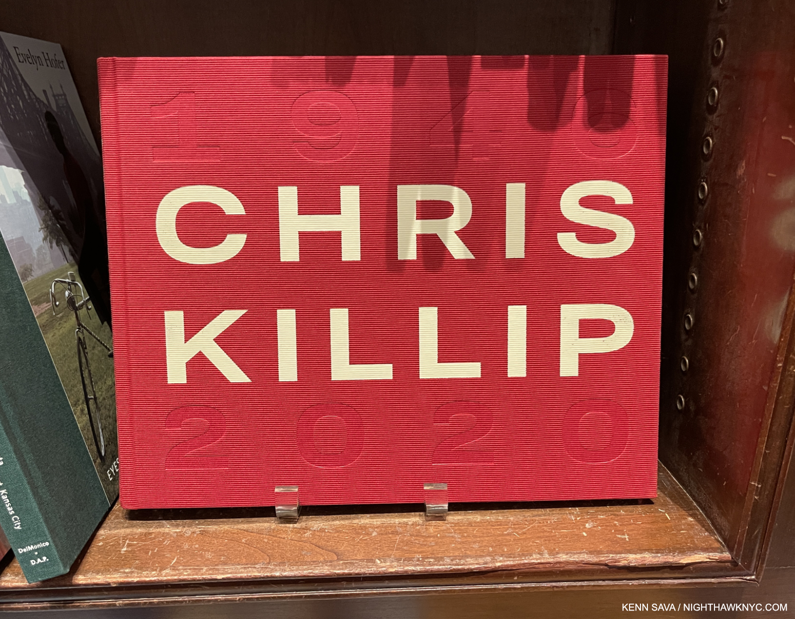
Chris Killip, Thames & Hudson

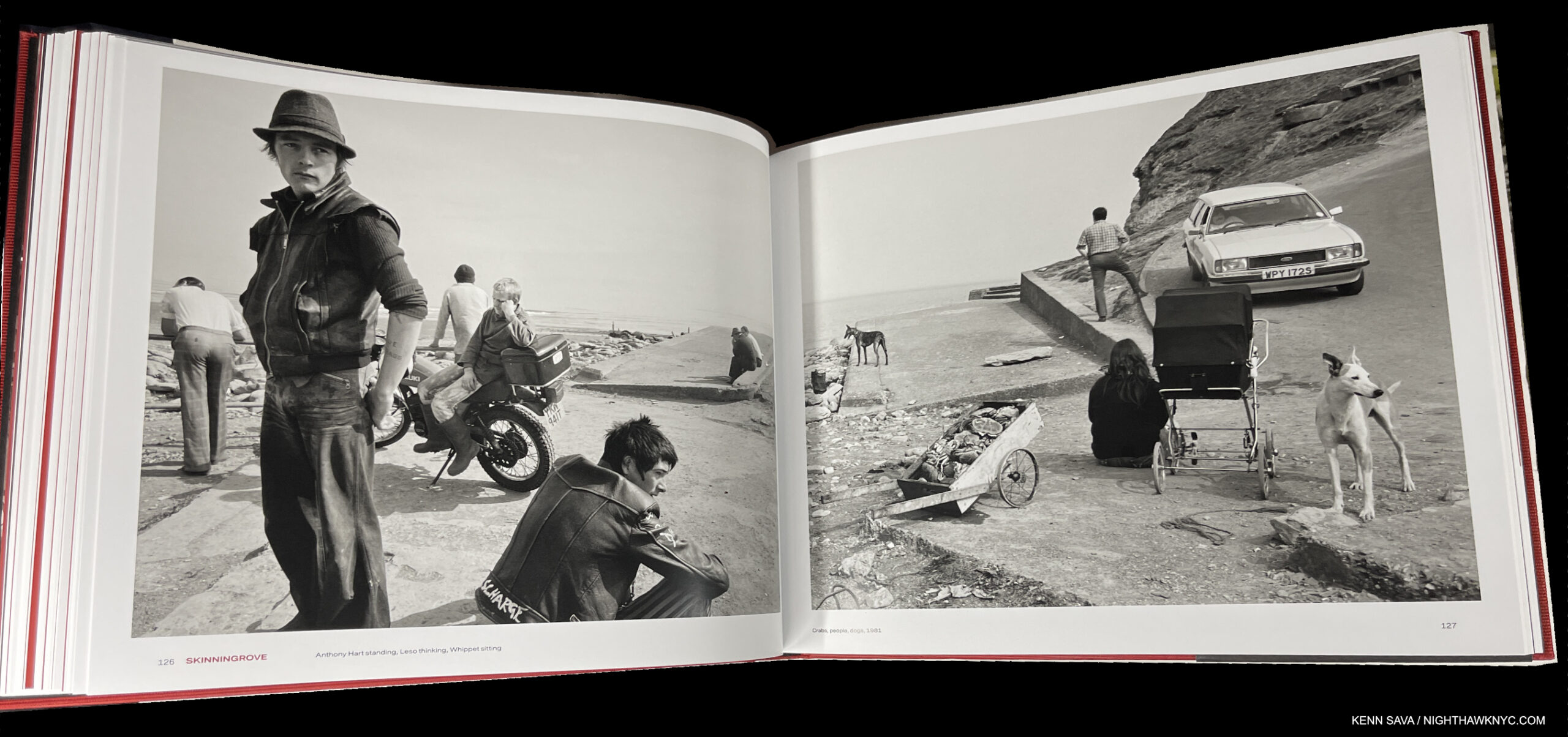
In 2018, Chris Killip’s former student, Gregory Halpern, turned me on to Mr. Killip’s work. Unfortunately, the book he most highly recommended, In Flagrante, from 1988, has long been out of print and expensive, so I only caught a glimpse of it when Mr. Halpern gave a tour of his book shelves. I managed to get In Flagrante Two, 2016. which is now also out of print.

New in print is this wonderful retrospective that Mr. Killip (who died in October, 2020) did not live to see published, unfortunately. It’s beautifully done. I particularly appreciate its size and design. It’s almost 12 1/2 by 10, big without being oversized. The design is both tasteful and fresh, with the use of red being a great contrast to the mostly (but not all) black & white images. Looking at his work, Mr. Killip’s Portraits and Landscapes often have qualities I find in Rembrandt, one of the highest compliments I can pay any Artist, which are enhanced by his use of “unconventional” poses only found in life. A model Photography retrospective, it fittingly includes an essay by Mr. Halpern.

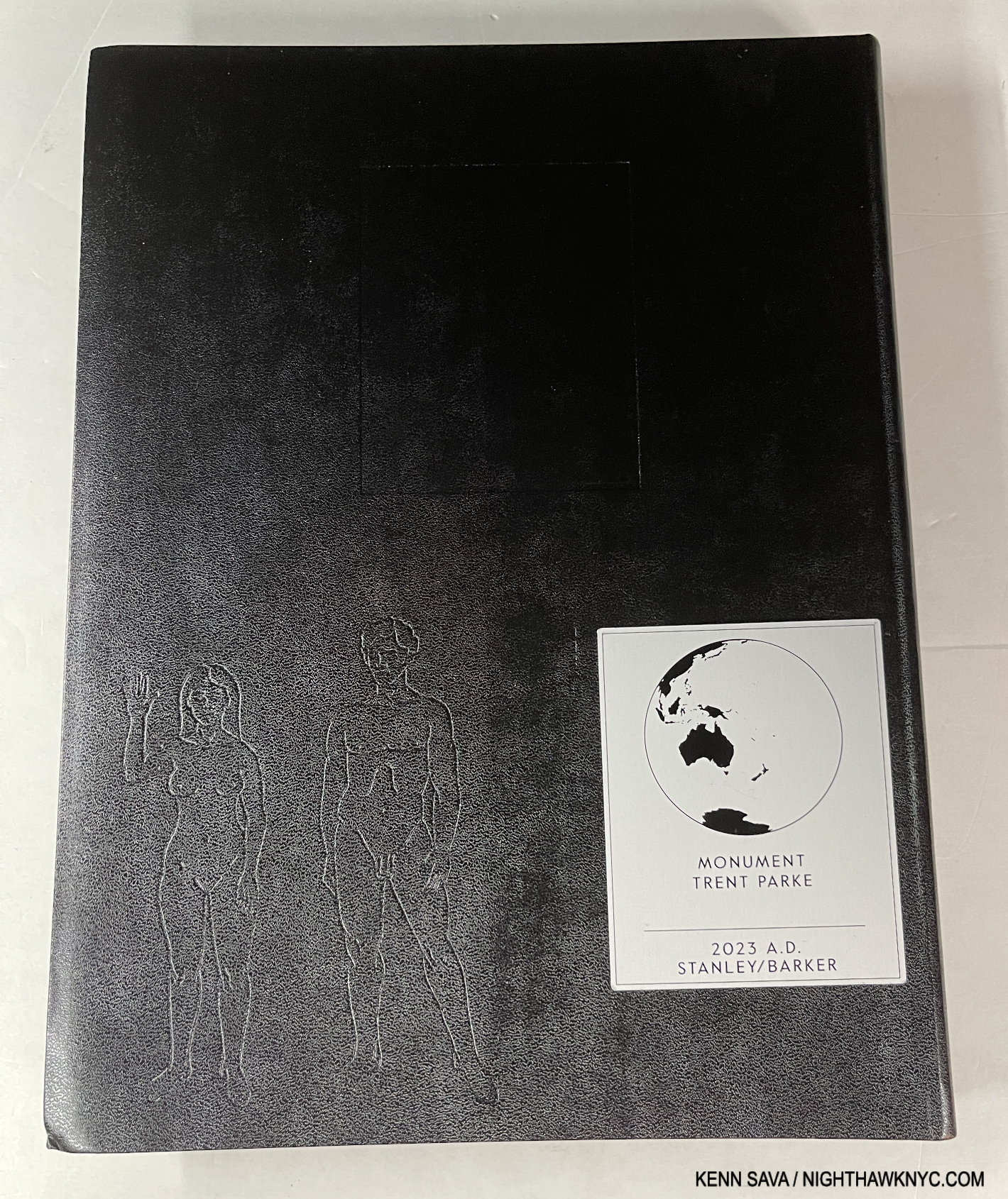
Trent Parke, Monument, Stanley/Barker

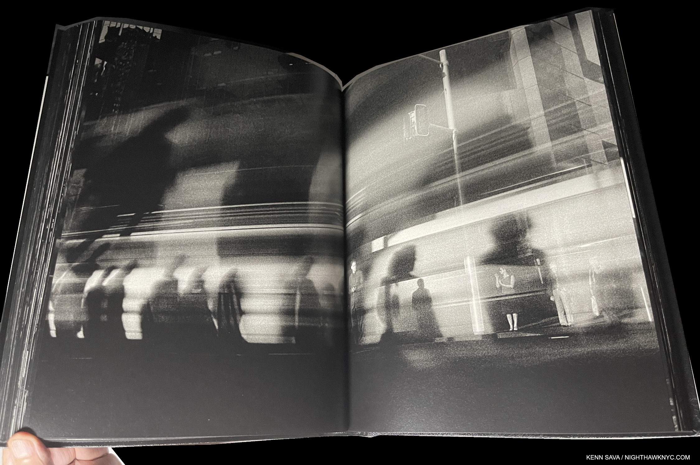
Being a city boy I have a real weakness for books depicting city life. But, I’ve seen too many that just leave me cold, and no, I’m not going to name which. Few and far between are those that really speak to me. Trent Parke’s Monument is one. Whereas most of the others are a string of Photos “connected” (if at all) by place, Monument is a look at the “alien world” Mr. Parke says he discovered when he moved to Sydney, Australia from a small country town. Mesmerized by the endless procession of workers to and fro day after day, he likened them to the countless moths that he saw at night, and includes, that were drawn by the bright lights of Sydney Harbour Bridge. Drawn to their death. Such is life in far too many places on Earth in 2023.

Entirely in black & white, with its minimal text only in Braille (which you’ll need to know to determine if your’s is a copy of the sold out 1st printing, or the upcoming 2nd printing), it’s a book that captures the fractured light of modern life going by in a blur as human moths go about chasing their own flame of a dream. Apparently, these Photos were taken before the pandemic as no one wears a mask. It’s beautifully designed & produced with Stanley/Barker in an embossed leather cover. Though it’s in black & white, Monument is one of the very few PhotoBooks I can think of that can bear up against Saul Leiter’s Early Color, perhaps the masterpiece of City photography of the books I’ve seen, which is one one of the most essential PhotoBooks of the 21st century in my view.

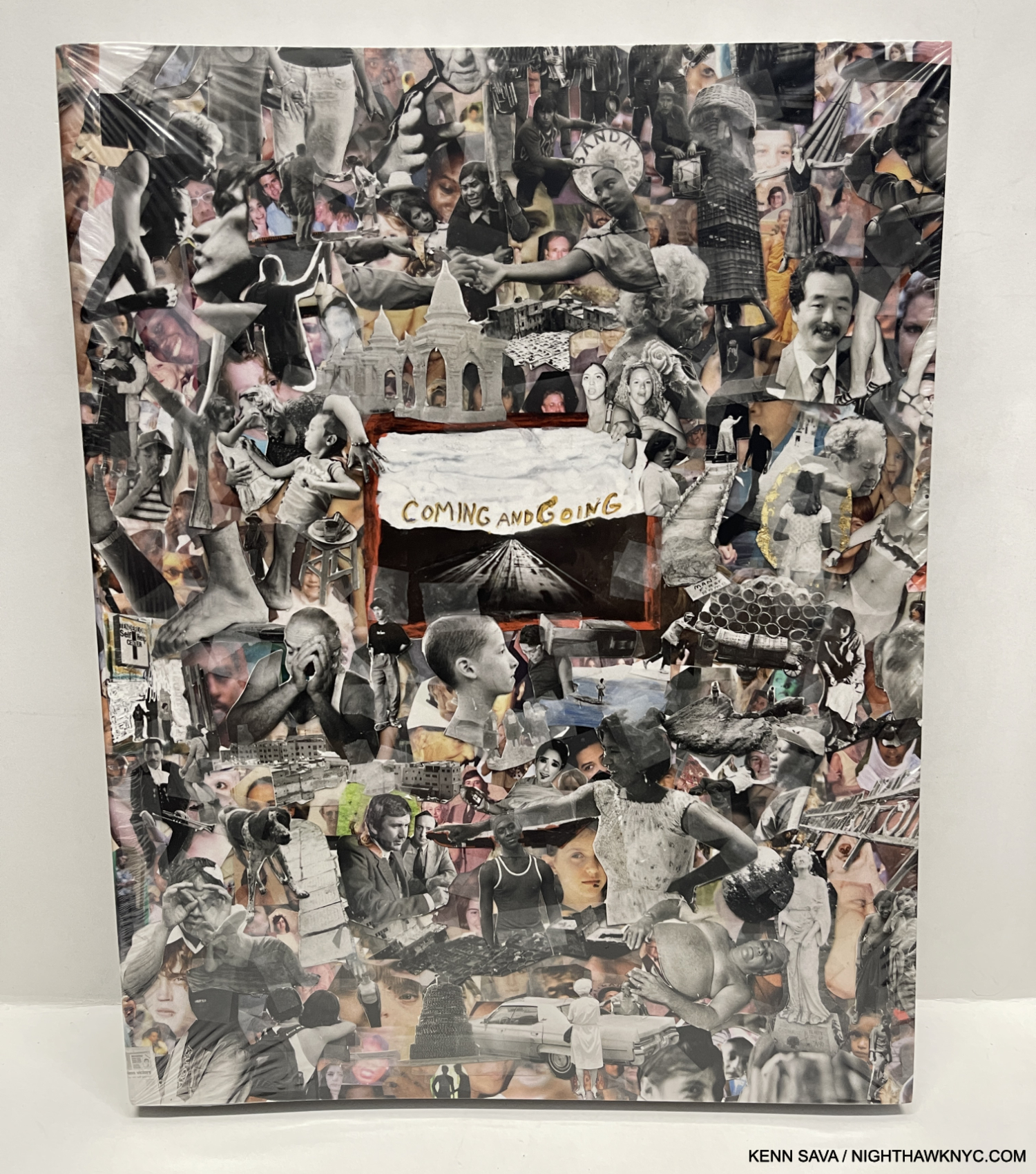
Jim Goldberg, Coming and Going, Mack Books

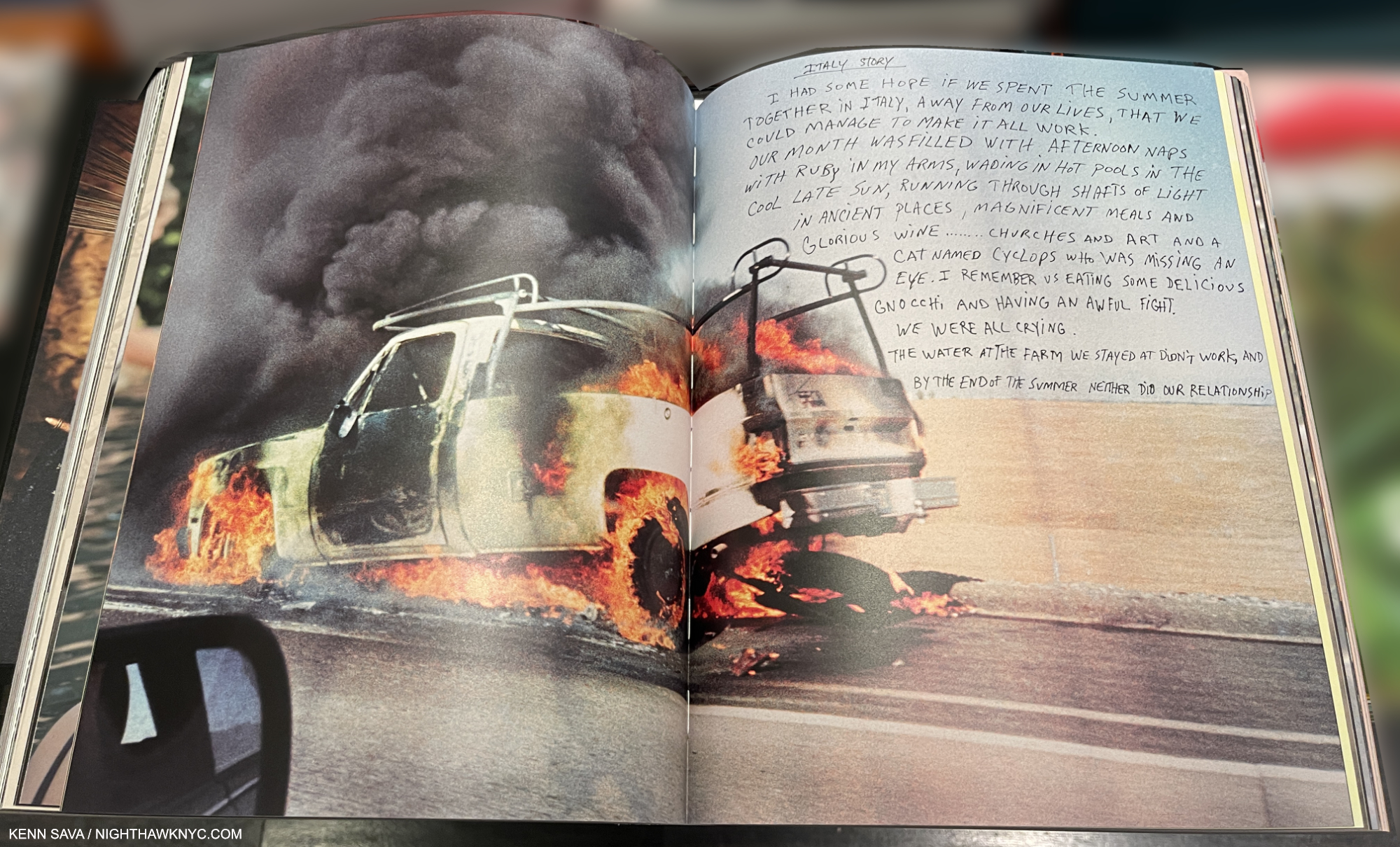
Jim Goldberg’s magnum opus (no pun intended) is a unique, visual autobiography, another tour de force of book design, as all of his books are. Coming and Going is autobiographical, though in classic Jim Goldberg style. Though there is no running text narrative, he feels free to write, draw or annotate on the images as he sees fit which helps guide the reader/viewer along. And who’s to argue with his choice? He’s forged a trademark style doing it that doesn’t age or look dated. Containing 360 13 by 11 inch pages, most of the material I have never seen before. There are stories, some featuring familiar characters from his prior books, though they are contained on 2-page spreads, which makes them look more like an Art work than a text. The story of his life moves forward on the power of his images, and that’s as it should be with such a one-of-a-kind Artist. A good number of them depict members of his family with love, understanding and poignancy, as they grow or age, even pass away.

Coming and Going is a LARGE book weighing in at 6 1/2 pounds, I wish it was a hardcover, instead of the stiff boards is covered with, because it’s a book that’s sure to see lots of handling and page-turning. Already at an $85. list, that probably would have added at least $5 to the cost. Then again, his classic Raised by Wolves was a softcover, too. Wolves remains THE classic Jim Goldberg book, but long-time fans will find much to get lost in in Coming and Going. 

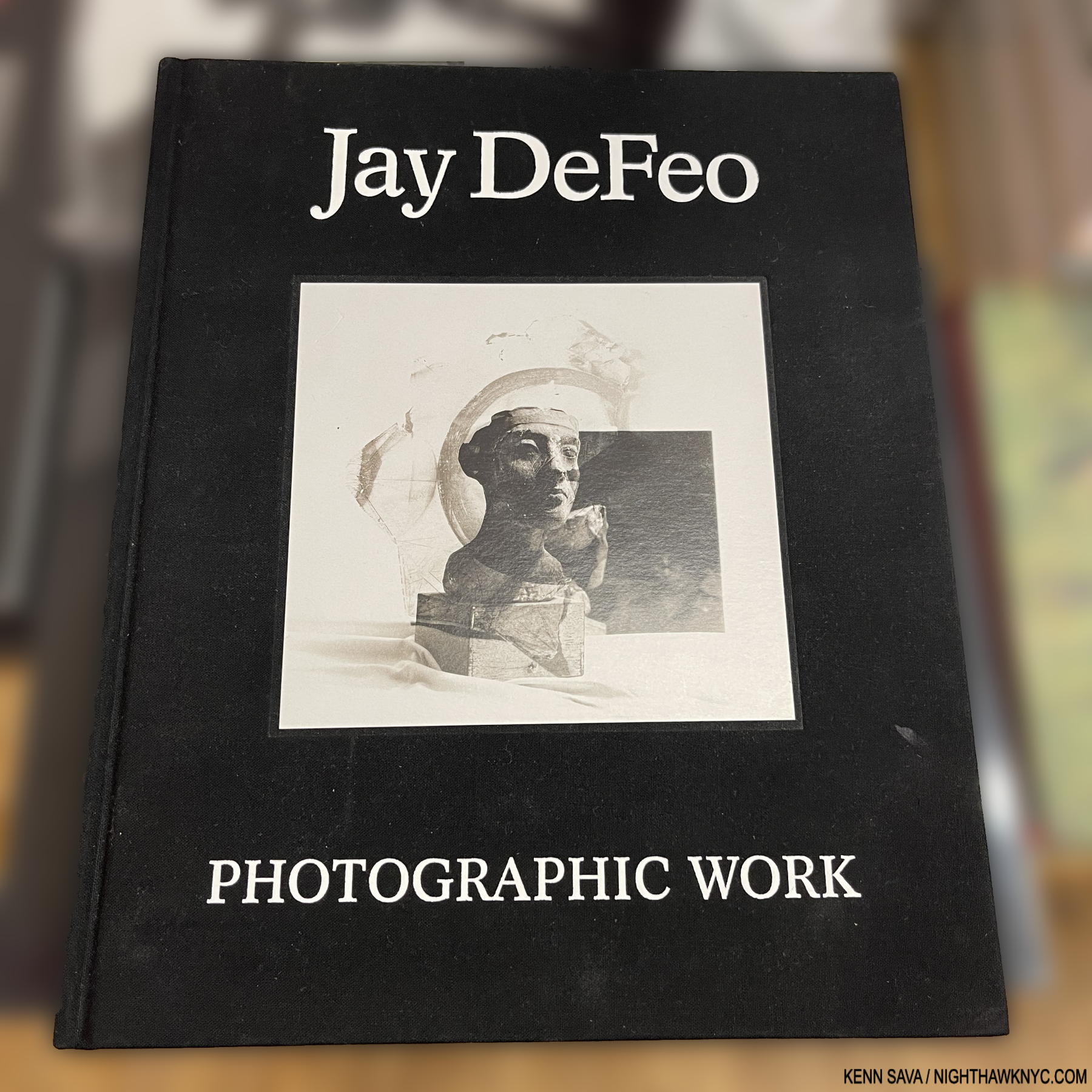
Jay DeFeo: Photographic Works, Jay DeFeo Foundation/ DelMonico

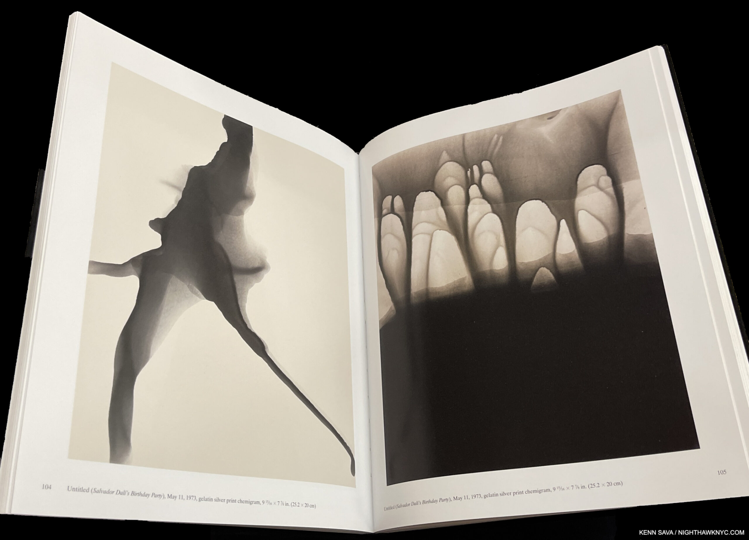
I could very well have listed this in NoteWorthy Art Books, 2023, but it’s here to make a point. Jay DeFeo (1929-89) is, perhaps, best known for her Painting, The Rose, 1969, and as a Painter. Though she passed at 60 from cancer in 1990, her star has continued to rise steadily since. Now comes the revelation that she was, also, a Photographic Artist, as this book, and the accompanying show at Paula Cooper Gallery, NYC, shows. Not only that, she was a formidable Photographic Artist.

The “point” I’m trying to make, yet again, is that Jay DeFeo is another on a list that gets longer all the time- a list of Painters who were also accomplished Photographers. To this point, they continue to remain overlooked by the larger Photography community, which continues to baffle me.

The two works shown above in the book as seen in the current show Inventing Objects: Jay DeFeo’s Photographic Work at Paula Cooper Gallery, September 22, 2023.

Right now at MoMA as I write, the great Ed Ruscha is the subject of a blockbuster retrospective, Now/Then. In 2016, Bruce Conner, Jay DeFeo’s close friend for many years, received one at MoMA, which I wrote about here. Yet, L.A. and San Francisco Artists who came to prominence in the 1960s and 1970s have been slow to receive the attention their East Coast counterparts have been enjoying for decades- particularly on the East Coast. Artists like Ed Kienholz quickly come to mind. Very near the top of the list, it’s way past time for the Jay DeFeo East Coast Retrospective.

Nan Goldin: This Will Not End Well, Steidl is my last Also Recommended NoteWorthy PhotoBook for 2023. I wrote about it here.

*- Soundtrack for this piece is “Strange Fruit,” by Billie Holiday.

Be sure to see the companion list to this one- NoteWorthy Art Books, 2023

My previous NoteWorthy PhotoBook lists-

NoteWorthy PhotoBooks, 2018

NoteWorthy PhotoBooks, 2019. And others

NoteWorthy PhotoBooks, 2020

NoteWorthy PhotoBooks, 2021


THERE ARE NO AFFILIATE LINKS IN THIS PIECE!

NighthawkNYC.com has been entirely self-funded & ad-free for over 8 years, during which 300 full-length pieces have been published! If you’ve found it worthwhile, PLEASE donate to allow me to continue below. Thank you, Kenn.

You can also support it by buying Art, Art & Photography books, and Music from my collection! Art & Books may be found here. Music here and here.

Written & photographed by Kenn Sava for nighthawknyc.com unless otherwise credited. To send comments, thoughts, feedback or propositions click here. Click the white box on the upper right for the archives or to search them. Subscribe to be notified of new Posts below. Your information will be used for no other purpose.

Nick Cave: Beauty Deeper Than Skin

This site is Free & Ad-Free! If you find this piece worthwhile, please donate via PayPal to support it & independent Art writing. You can also support it by buying Art & books! Details at the end. Thank you.

Written & Photographed by Kenn Sava

Show Seen- Nick Cave: Forothermore @ the Guggenheim Museum

No. Not THAT Nick Cave.

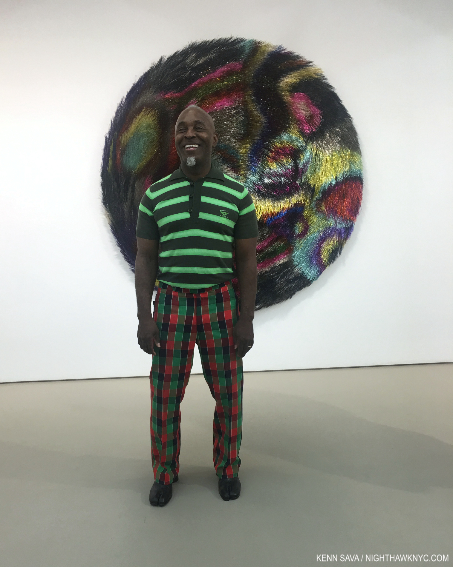
THIS Nick Cave. The Artist standing in front of Tondo, 2018, Mixed media including wire, bugle beads, sequined fabric and wood at the opening of Nick Cave: Weather or Not at Jack Shainman May 17, 2018 . Tondo was also on view in Fororthermore.

Nice Cave, the multi-dimensional Artist, that is, who deserves every bit as much notoriety as the other, rightly very well-known Nick Cave, whose work I also admire. This Nick was born in 1959 in Fulton, Missouri, and now lives & works in Chicago, where he has been creating beautiful heart-rending Art for over 30 years. Art, largely created as his response to the world around him marked by racism, profiling and the murders of unarmed Black men and women.

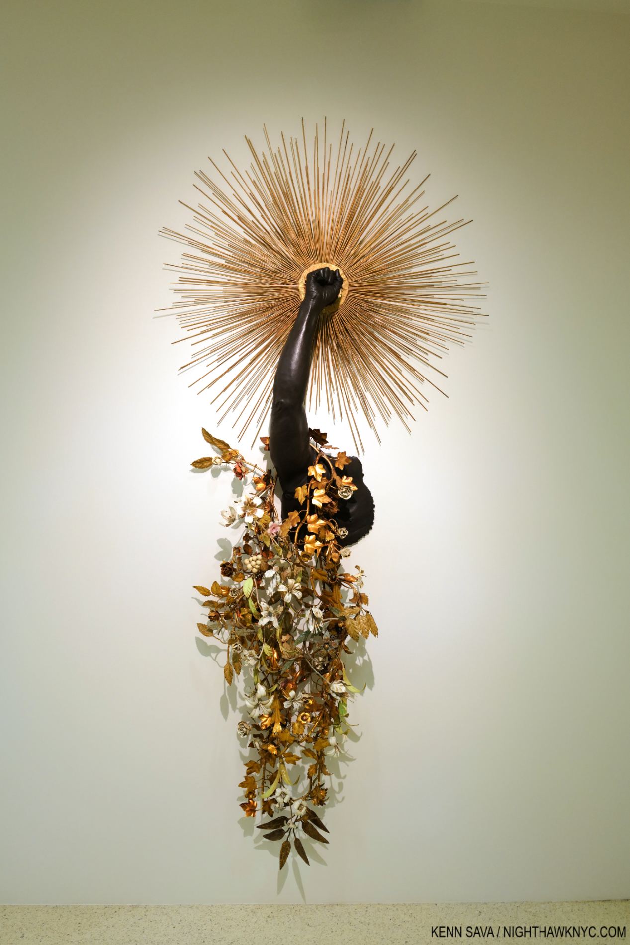
Arm Peace, 2018, Cast bronze, sunburst and vintage tole flowers 85 × 39 × 12 inches. (One of two pieces in the show named Arm Peace.) In my book, this deserves to be “iconic,” as do a number of other pieces in Forothermore.

Even though I had seen a number of his shows at Jack Shainman, his books, and I have been in his presence twice, I was completely unprepared for Nice Cave: Forothermore his mid-career Retrospective at the Guggenheim. I went in believing Mr. Cave is one of the more important Artists working today. I left speechless.

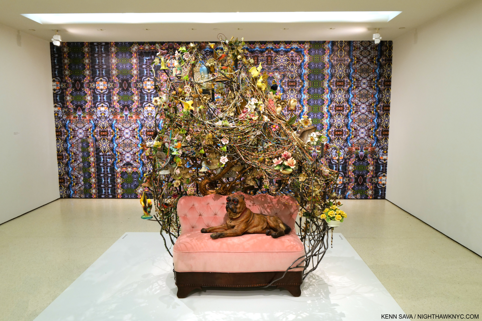
Rescue, 2013, Mixed media including ceramic birds, metal flowers, ceramic Pug, vintage settee, and light fixture 91 × 78 × 54 1/2 inches, front, Nick Cave in collaboration with Bob Faust Wallpaper Near Rescue Works (New Work), 2021, TBC, Dimensions variable, on the back wall.

As a result, I’ve decided to let Mr. Cave, who has a gift for expressing himself in words, to go with his extraordinary gifts for visual expression, do much of the talking in this piece. In Forothermore, a number of the pieces I’d seen over the years, and many others, came together as a startling whole of 49 pieces over three sections: What It Was, What It Is, and What It Shall Be, in 3 locations in the museum. I must admit that I am not a fan of the side galleries the Guggenheim added during their expansion of Frank Lloyd Wright’s masterpiece (which I fought at the time they announced them, and my argument was published in The New York Times, my first published writing). The newer galleries are oddly shaped, because Wright didn’t design these spaces to be galleries. In my view, they detract and distract from Wright’s original intention and design of Art in the Rotunda. That being said, Nick Cave: Forothermore was one of the more important shows in NYC so far this young decade, if not THE most important show I’ve seen. The Guggenheim deserves kudos for bringing it here.

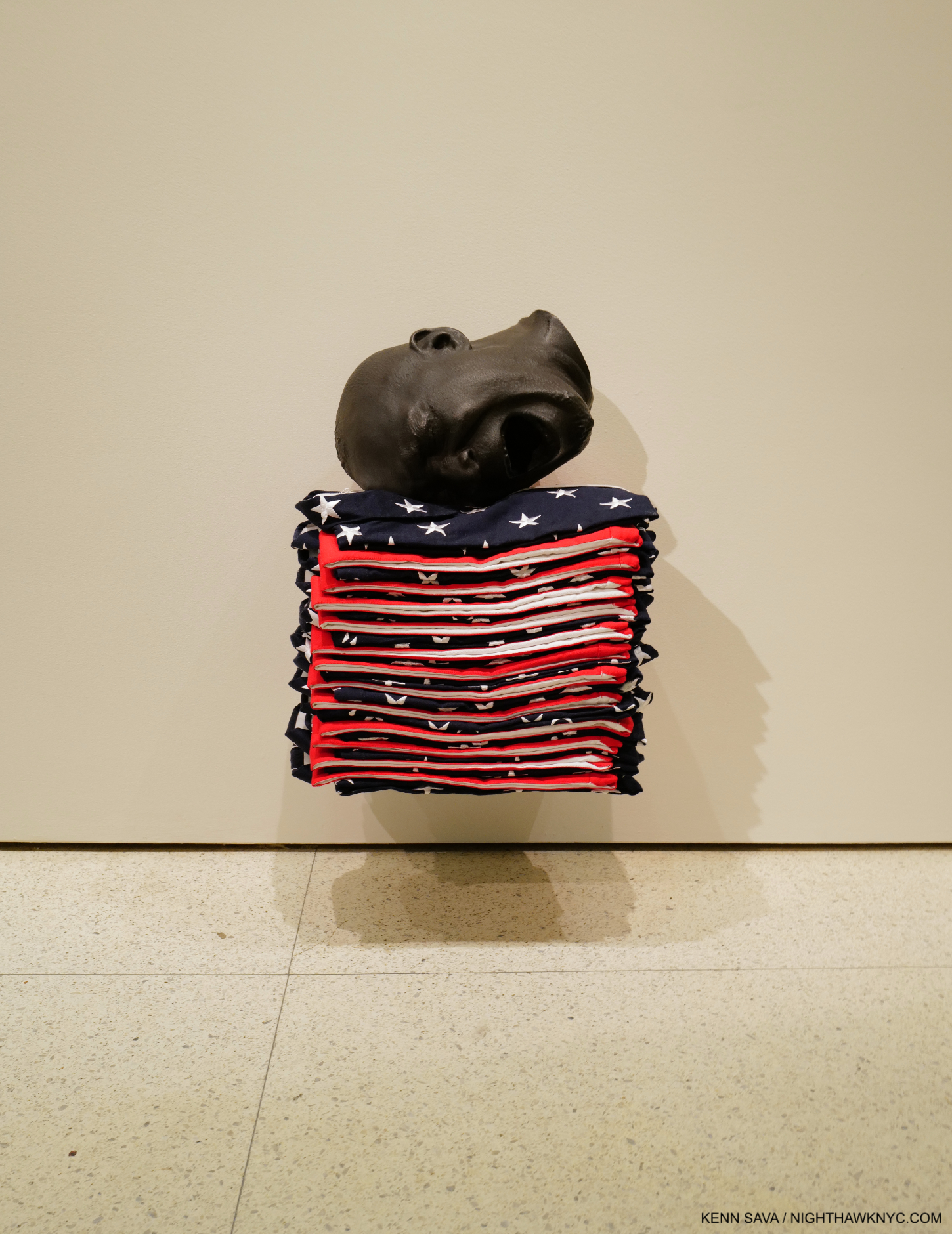
Untitled, 2018, Mixed media including a bronze head and 13 American flag shirts, 23 3/4 × 15 3/4 × 12 inches

At first glance, much of Nick Cave’s Art, particularly his famous Soundsuits, look otherworldly until a close look reveals virtually all of it consists of everyday or found items used in incredibly imaginative ways. Part Sculpture, part Music, part furniture, part Collage, part fashion, and partially created using textile production and jewelry-making techniques, there seems to be no limit to what Mr. Cave’s pieces are or fixed rules about how they’re made. Still, all of what we see now is part of his extraordinary response to the reality of his life and that of other Black men and women.

It started early…

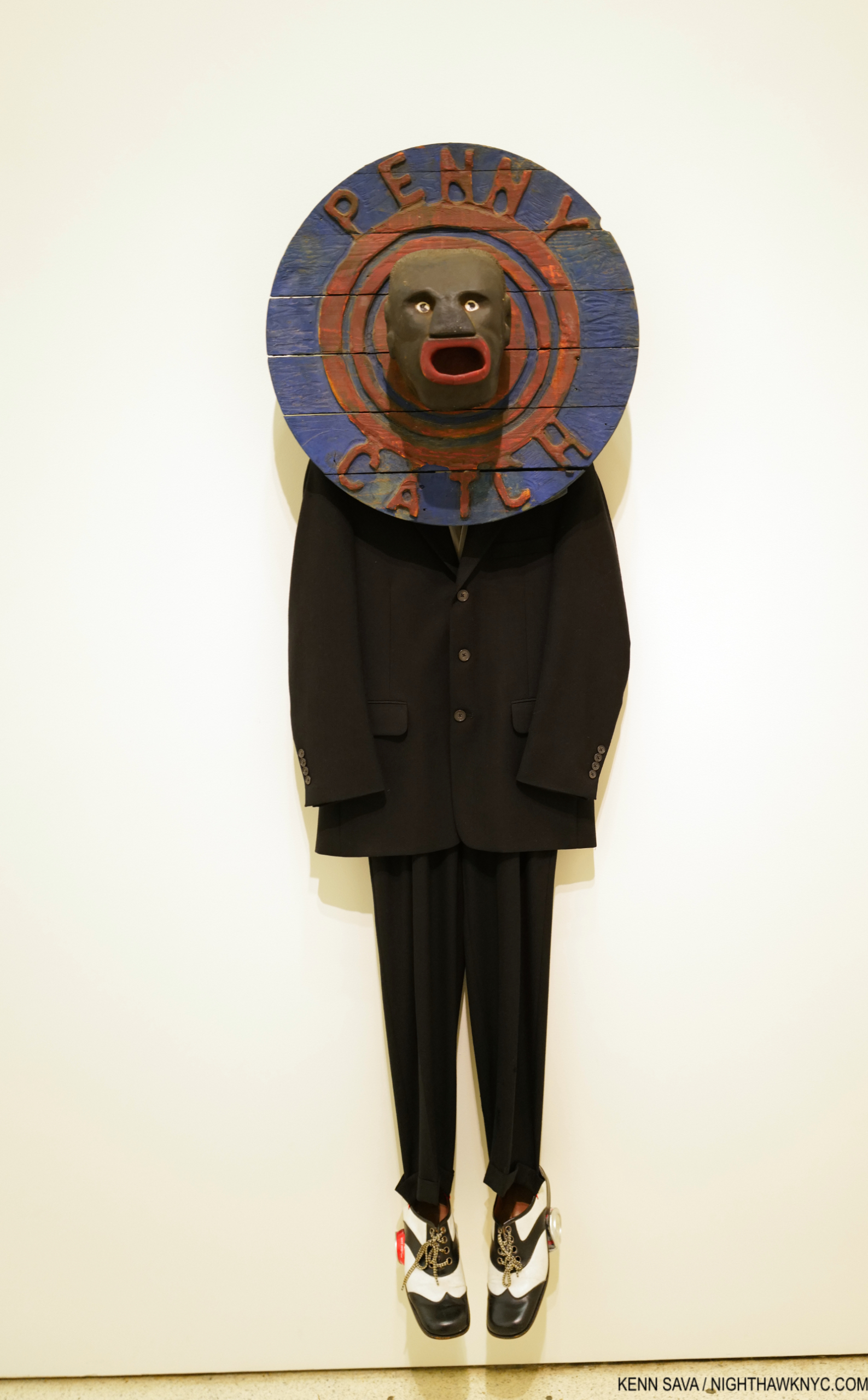
Penny Catcher, 2009, Mixed media including vintage coin toss, suit, and shoes 74 × 23 × 14 inches

“My mother told me when I was, like, eight years old, the complexity of what I would have to deal with. So knowing made me think, ‘I’ve got to build a thick skin. I’ve got to be able to operate in a world…that could work against me as opposed to for me. What do I do with that?'”1

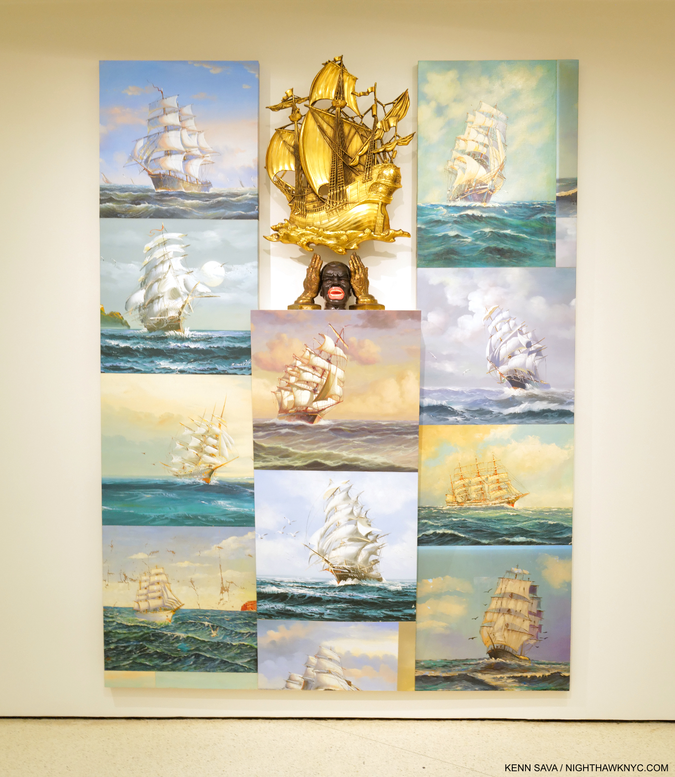
Sea Sick, 2014. Mixed media including oil paintings, ceramic container, cast hands, and plastic ship 96 × 72 × 10 1/2 inches. At 8 feet tall, with 11 Paintings of the kind of 17th century ships slavers used mounted salon-style, each shown in full sails, almost looking to be going back and forth, at angles to inspire sea sickness among those on board, with a striking head and hands in the center, as if screaming “ENOUGH!” The head was a tobacco holder that was later sold as a spittoon!

“I have been racially profiled. I’m walking home with my portfolio from teaching. I am pulled…surrounded by undercover cops saying, ‘Lie down on the floor’– because the convenience store was robbed down the street. That has been my reality. Get it together up here (points to his head). Psychologically, I have to really get it together. And I just have to get quiet–to put it in perspective and to not lash out into rage. And if I do, lashing out for me is creating this (a Soundsuit). All of that becomes the impulse to create.”2

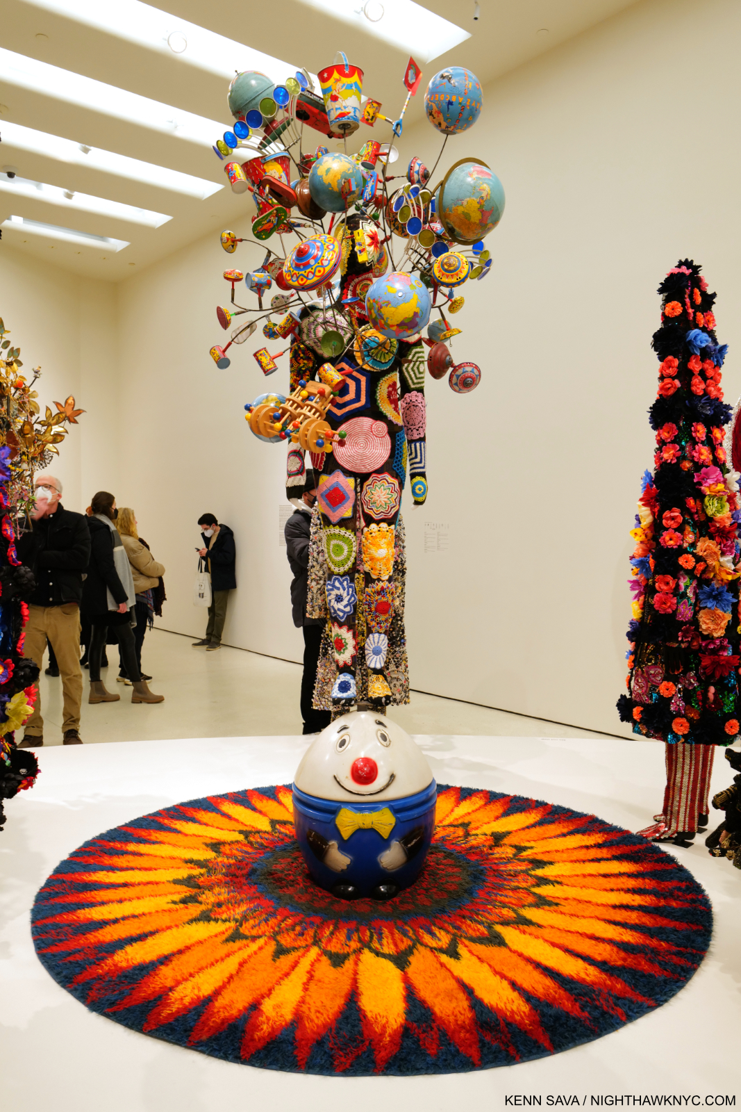
Soundsuit 2012 Mixed media including embroidery, fabric, vintage toys, rug, and mannequin Soundsuit: 127 × 98 × 93 inches

Best known to this point for his ongoing series of Soundsuits– works that combine all the processes listed earlier in an ultimate manifestation of that “thick skin” he referred to, that a performer then wears as one of many in  one of Mr. Cave’s joyous and bombastic performances. For display, the performer is replaced with a mannequin. The range of materials they have included over the years would fill a Sears Roebuck catalog. In spite of the long history of both fashion and theater, I have seen virtually nothing like them3. The Soundsuits brought him immediate fame. Their origin may be lesser known-

“The first Soundsuit was in ’92 in response to the Rodney King incident, the L.A. riots. I was sitting in the park one day  and just sort of thinking about, What does it feel like to be  discarded, dismissed, profiled?
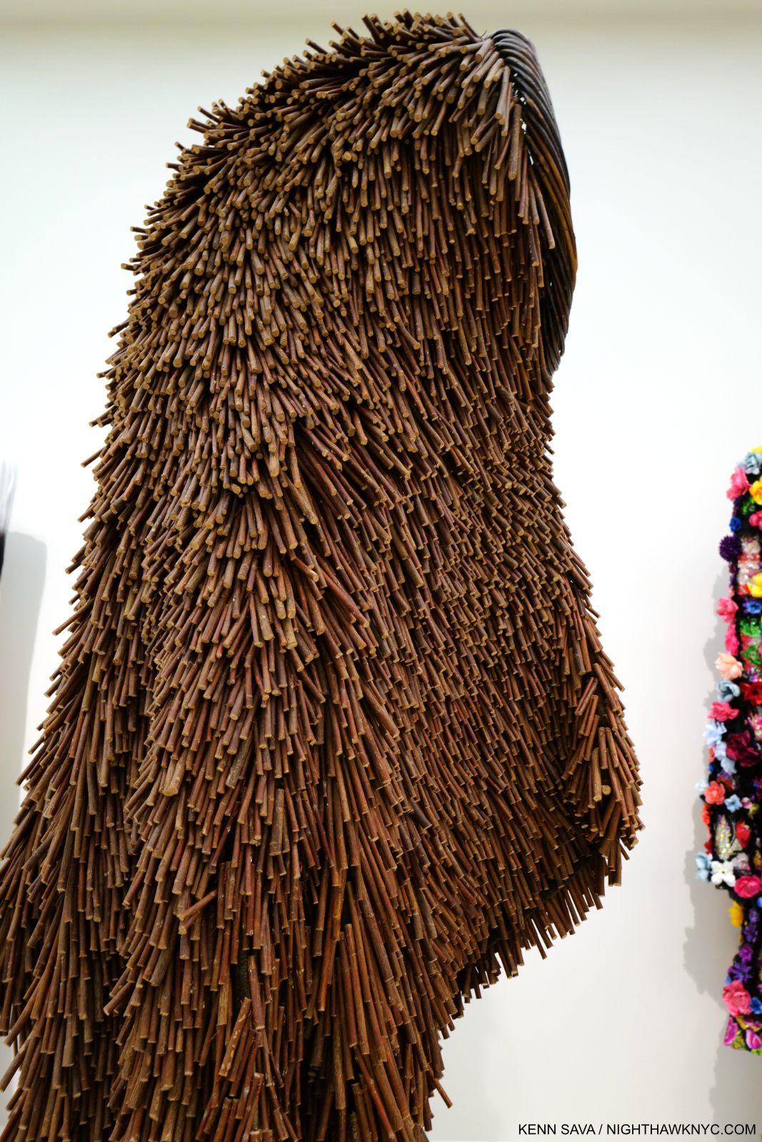
There was this twig on the ground. And I looked at that twig as something discarded. And then I proceeded to just start collecting the twigs in the park. And I brought them all back to the studio. And then I started to build this sculpture. I started to realize that the moment I started to move in it, it made sound. Then it just literally put everything in perspective. I was building this suit of armor, something that I could shield myself from the world and society. And so out of that came this sculpture-performative kind of work.”4

Detail of a Soundsuit made largely from twigs. Soundsuit, 2011, Twigs, wire, upholstery, basket, and metal armature, 83 × 27 × 40 inches. Seen in full from the side in the next picture.

That “discarded” and “forgotten” twig set a precedent for the materials he’s used in his Art since, a collection of objects and materials that seems encyclopedic, some of which speak to Mr. Cave of his childhood, when objects like figurines were cherished family possessions. This creates a duality whereby even though a number of the objects he incorporates are offensive, even disgusting (like the spittoon in Sea Sick), it’s very hard not to see “beauty” and “Art” in Nick Cave’s work, particularly in how masterfully he combines everything in ways that are reminiscent of Duchamp, Rauschenberg and Betye Saar, among others, though in entirely his own way. In so doing, he’s forged a style without having one style. Along with the beauty, there’s an undeniable joy in a good deal of his work, which reaches its zenith, perhaps, in his live performances with dancers performing in his Soundsuits in a communal celebration.

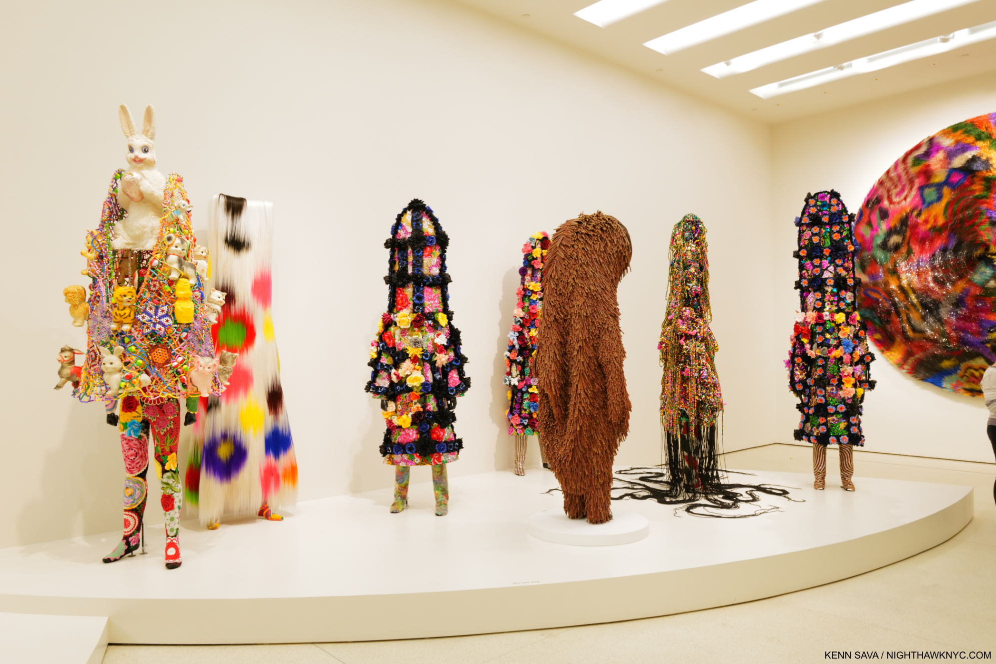
Soundsuits. From left, Soundsuit, 2022 with vintage bunny, Soundsuit, 2015 with synthetic hair, Soundsuit 9:29, 2021-2022, Soundsuit, 2011 shown in the prior picture, Nick Cave, Soundsuit 9:29, 2021, Soundsuit, 2019, and Soundsuit 8:46, 2021, far right.

Yet, in spite of their outward appearance, all is not joy with his Soundsuits. Mr. Cave reveals how he sees them-

“I don’t ever see the “Soundsuits” as fun. They really are coming from a very dark place. The “Soundsuits” hide gender, race, class. And they force you to look at the work without judgment. You know, we tend to want to categorize everything. We tend to want to find its place. How do we, sort of, be one on one with something that is unfamiliar?”5

“I think after the first Soundsuit, I had a different approach to art making. And I realized that I was an artist with a conscience. The moment I did was the moment that  my life literally turned upside-down. I think it’s just me kind of experimenting. It’s like, you know, a scientist  exploring alternative ideas.”6

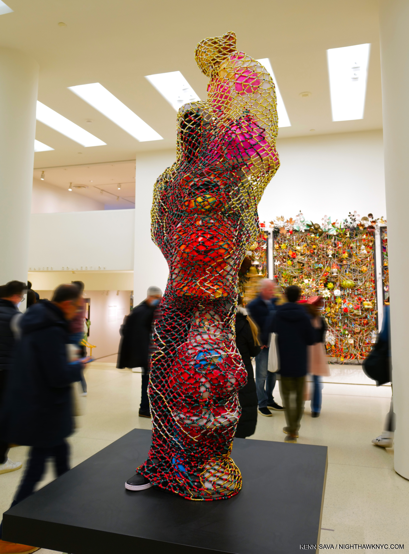
TM13, 2015. Mixed media including vintage blow molds, pony beads, pipe cleaners, mannequin, and garments, 89 × 48 × 49 inches. The Trayvon Martin Soundsuit.

Trayvon Martin is a new work  that was shown at Cranbrook. It’s made up of a Black mannequin dressed  in a hoodie and sneakers and jeans. And then surrounding its body  is these plastic blow molds. Which are, like sometimes at Halloween, there are these plastic forms  that are set out in yards. And so they are surrounding this  sort of figure almost as guardians. But then over top of the entire structure is  this web that’s constructed out of pony beads. So from a distance, it looks like this amazing sort of gold  sculptural form until you get up close and you realize that there  is someone trapped inside.” 7

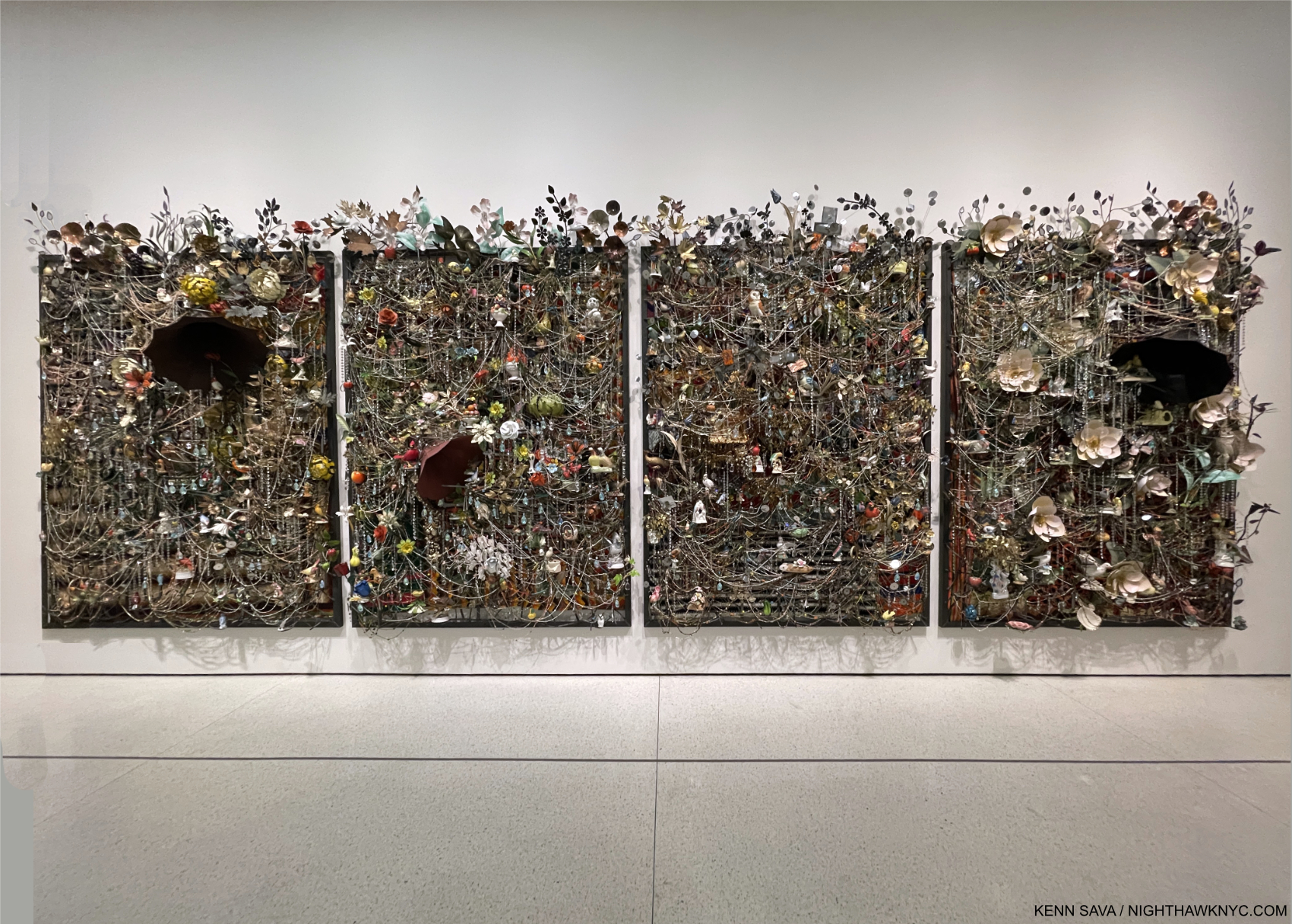
Wall Relief, 2013, Mixed media including ceramic birds, metal flowers, afghans, strung beads, crystals and antique gramophone
4 panels: 97 × 74 × 21 in., each. Perhaps the most complex work on view among many very complex pieces.

“The title (“Forothermore”) is a neologism, a new word that reflects the artist’s lifelong commitment to creating space for those who feel marginalized by dominant society and culture—especially working-class communities and queer people of color. The show both highlighted the development of Cave’s singular art practice and interrogated the promises, fulfilled or broken, that the late 20th and early 21st centuries offered to the ‘other,'” the Guggenheim said.

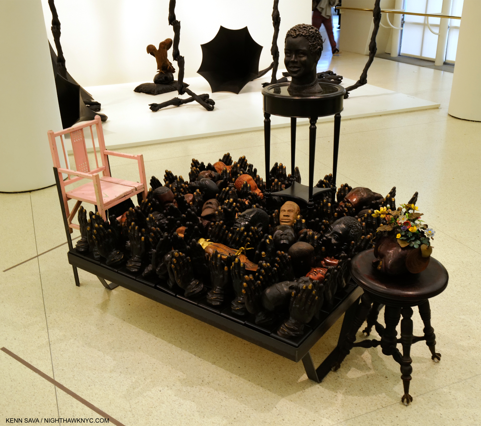
Untitled, 2018, Mixed media including round table, clay head, piano bench, carved head with vintage tole flowers, child pink chair, 19 carved heads, 1 carved eagle, cast polyurethane hands, 52 1/8 × 52 1/8 × 61 inches

“You know, I think at the end of the day,  it’s me giving back to the community  and being this sort of change agent. I want to change our way of  engaging with one another. I want to use art as a form of diplomacy. That’s why I’m in this state of urgency right now. And I don’t know. I just feel so unsettled. I’m doing what I’m doing, but I’m not sure if it’s happening fast enough.”8

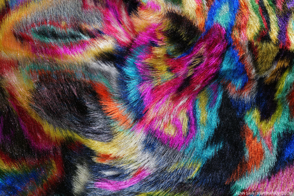
Detail of Tondo, 2022, Metal mesh, hardware cloth, bugle beads, wire, sequin fabric and wood.

Nick Cave is rewriting the power of Art, to paraphrase Simon Schama. He’s doing it by channeling horror and pain- both experienced by others, and by himself, into “lashing out” by creating. And, he’s doing so in ways never before seen. I see a lot of Art, and I see a lot of shows. It’s not often that I am awestruck by an Artist’s creativity, but I am by Nick Cave’s. Still, it’s hard to really get a full sense of Mr. Cave’s extraordinary gifts. If Nick Cave can produce such beautiful and powerful work in a world like this, I can’t help but wonder what he’d create in a world without racism.

*- Soundtrack for this piece is “Peace,” by Gil Scott-Heron, a Bonus track from the 2014 reissue of his 1971 album Pieces of a Man.

Thank you, Maddie.

SPECIAL ADDENDUM- The NYC MTA recently completed the installation of Nick Cave’s monumental, 4,600 square feet, 3-part, permanent Public Art piece, Each One, Every One, Equal All, in the subway under Times Square, the latest in their absolutely stellar on-going series of Public Art projects for the NYC subway. It rivals Sarah Sze’s entire subway station installation (which I showed here) for the largest Art work in the NYC subway system. It took multiple trips to fully see the whole thing, and my look at it can be seen here.

NighthawkNYC.com has been entirely self-funded & ad-free for over 8 years, during which 300 full-length pieces have been published! If you’ve found it worthwhile, PLEASE donate to allow me to continue below. Thank you, Kenn.

You can also support it by buying Art, Art & Photography books, and Music from my collection! Art & Books may be found here. Music here and here.

Written & photographed by Kenn Sava for nighthawknyc.com unless otherwise credited. To send comments, thoughts, feedback or propositions click here. Click the white box on the upper right for the archives or to search them. Subscribe to be notified of new Posts below. Your information will be used for no other purpose.

Nick Cave Brings Joy & Beauty to the Subway

This site is Free & Ad-Free! If you find this piece worthwhile, please donate via PayPal to support it & independent Art writing. You can also support it by buying Art & books! Details at the end. Thank you.

Written & Photographed by Kenn Sava

This is an addendum to my look at Nick Cave: Forothermore @ the Guggenheim Museum, here

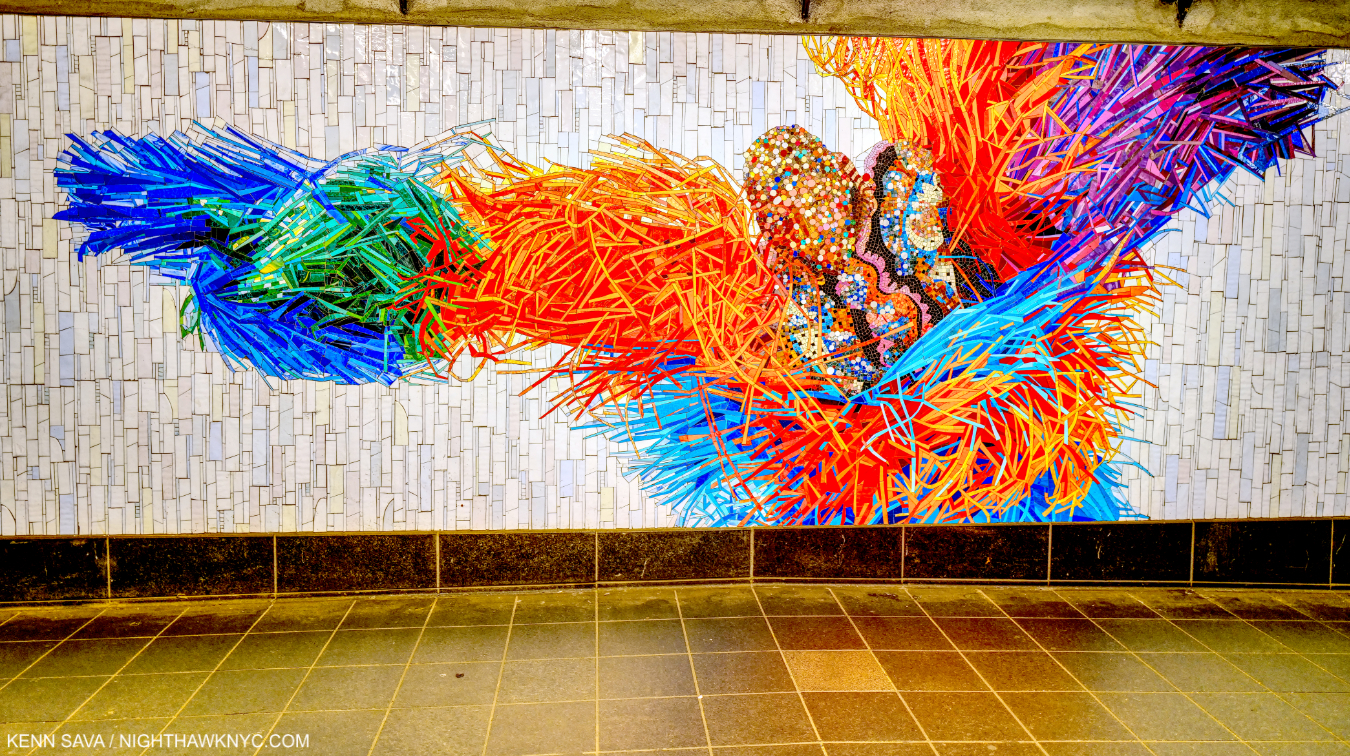
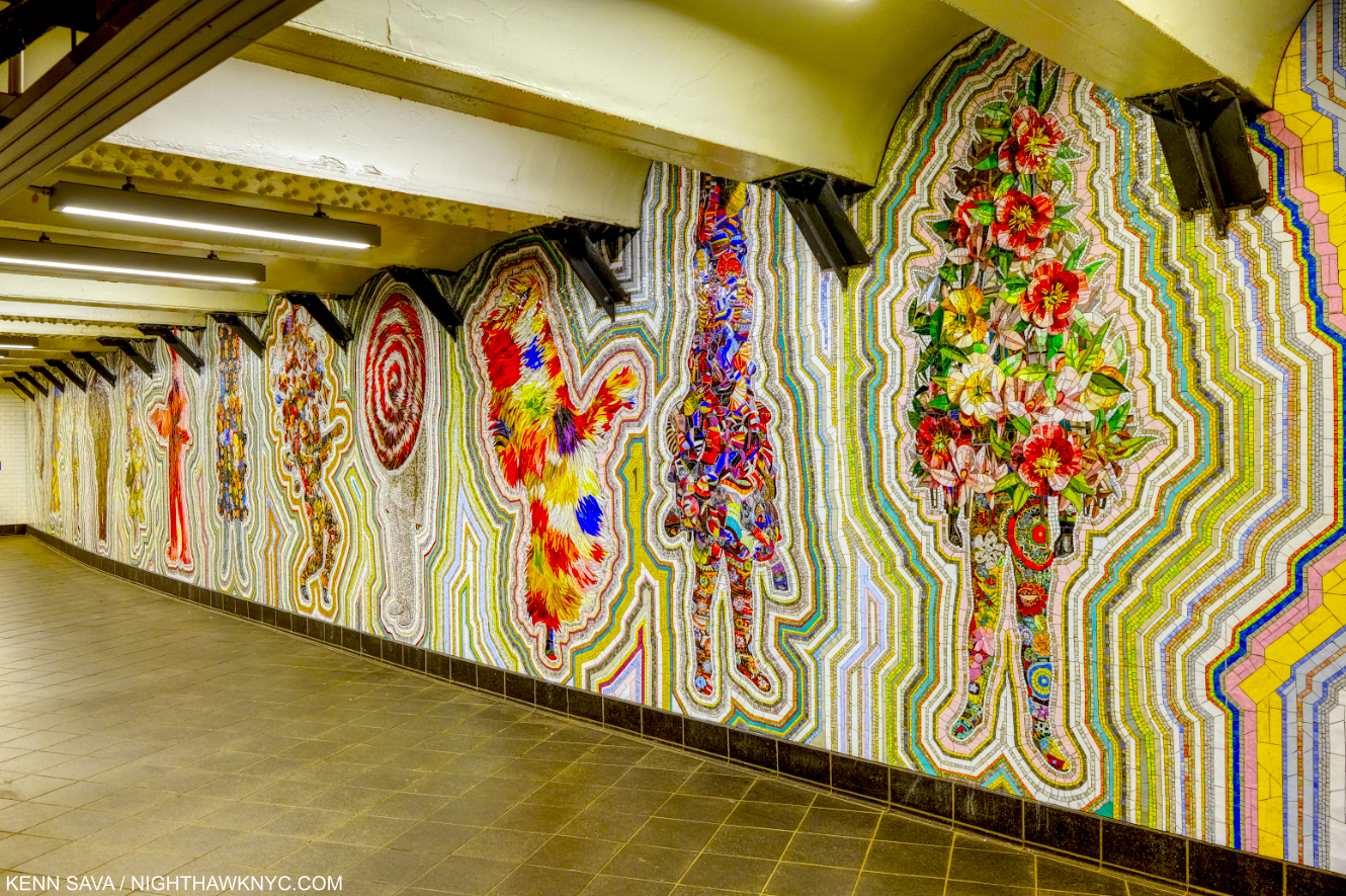
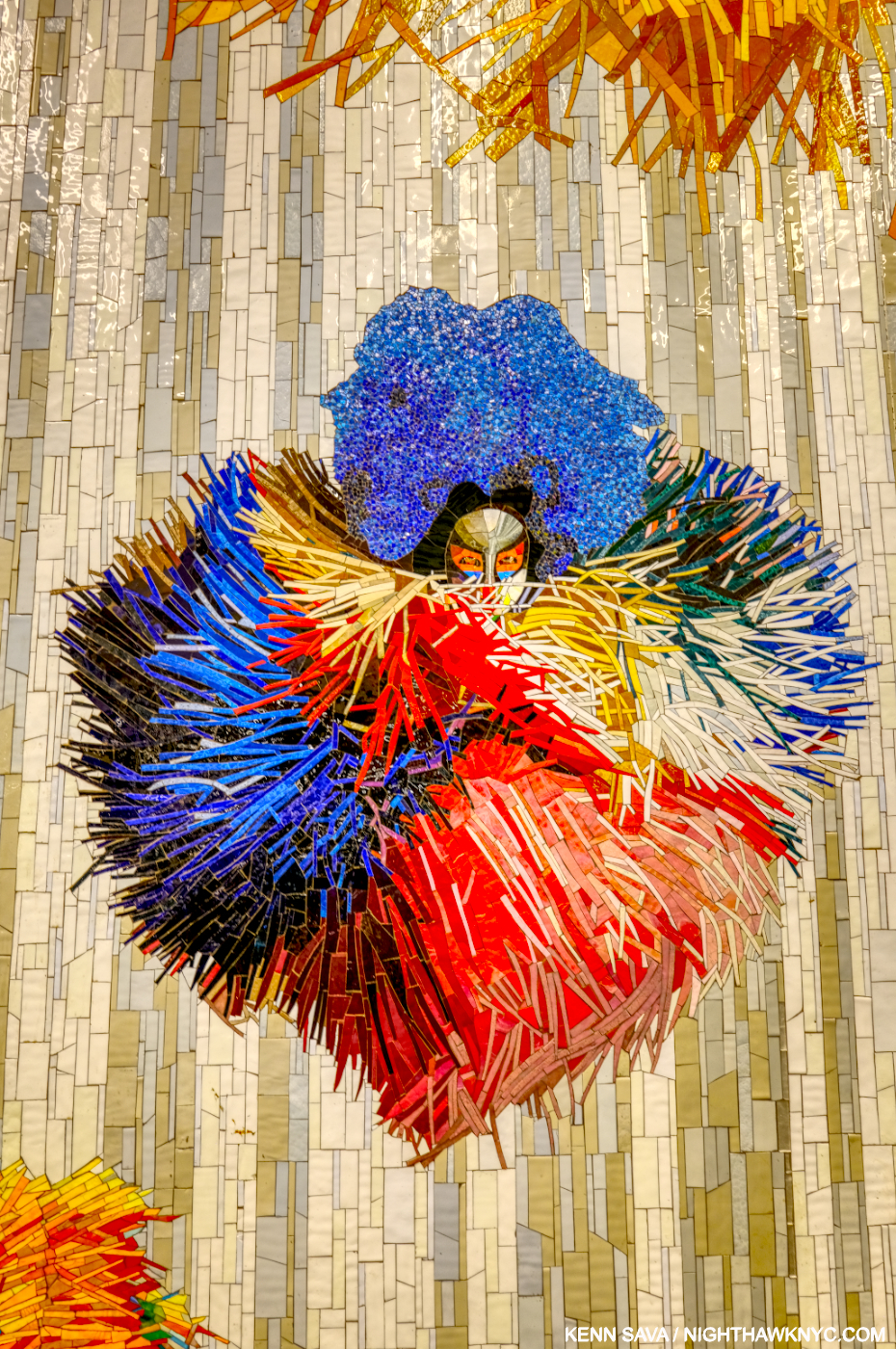
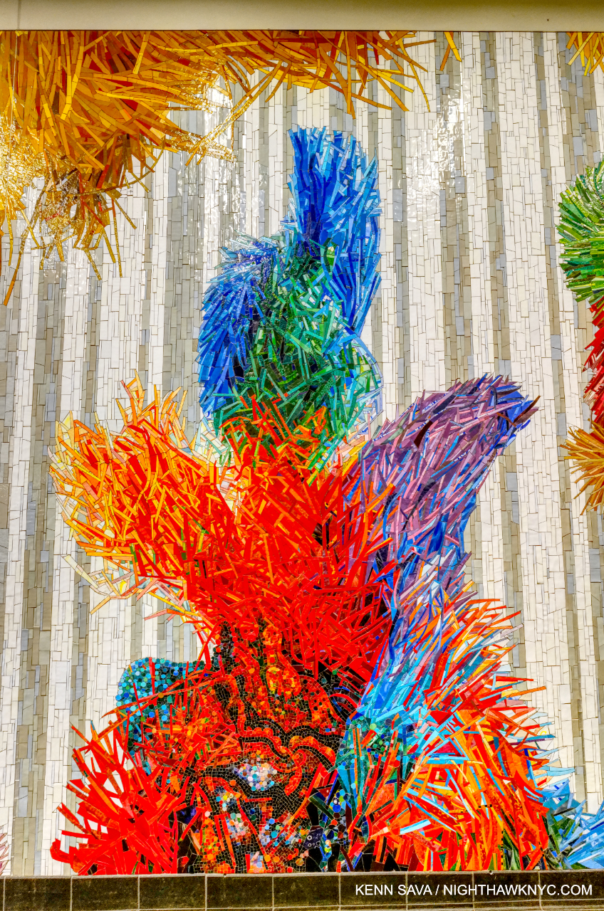
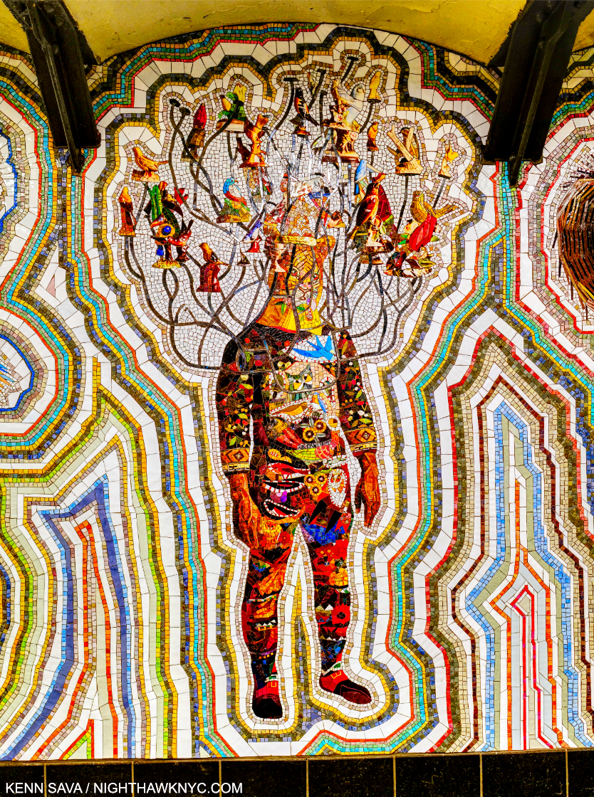
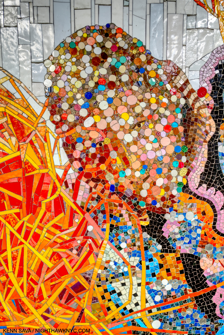
Who am I? Detail of one of the figures in the section titled Every One. All works shown are Glass mosaic tiles and dated 2022 unless stated. Click any photo for full size.

Some of the most spectacular Art in New York is free and available to see & experience 24 hours a day, 7 days a week, 365 days a year. All you need to do to see it is pay a subway fare. All around town, MTA Arts & Design has succeeded in bringing a world-class roster of Artists to the City’s subway riders that rivals that of any museum1. Created in 1985, MTA Arts & Design has been one of the most remarkable stories in NYC Public Art, if not Public Art anywhere.

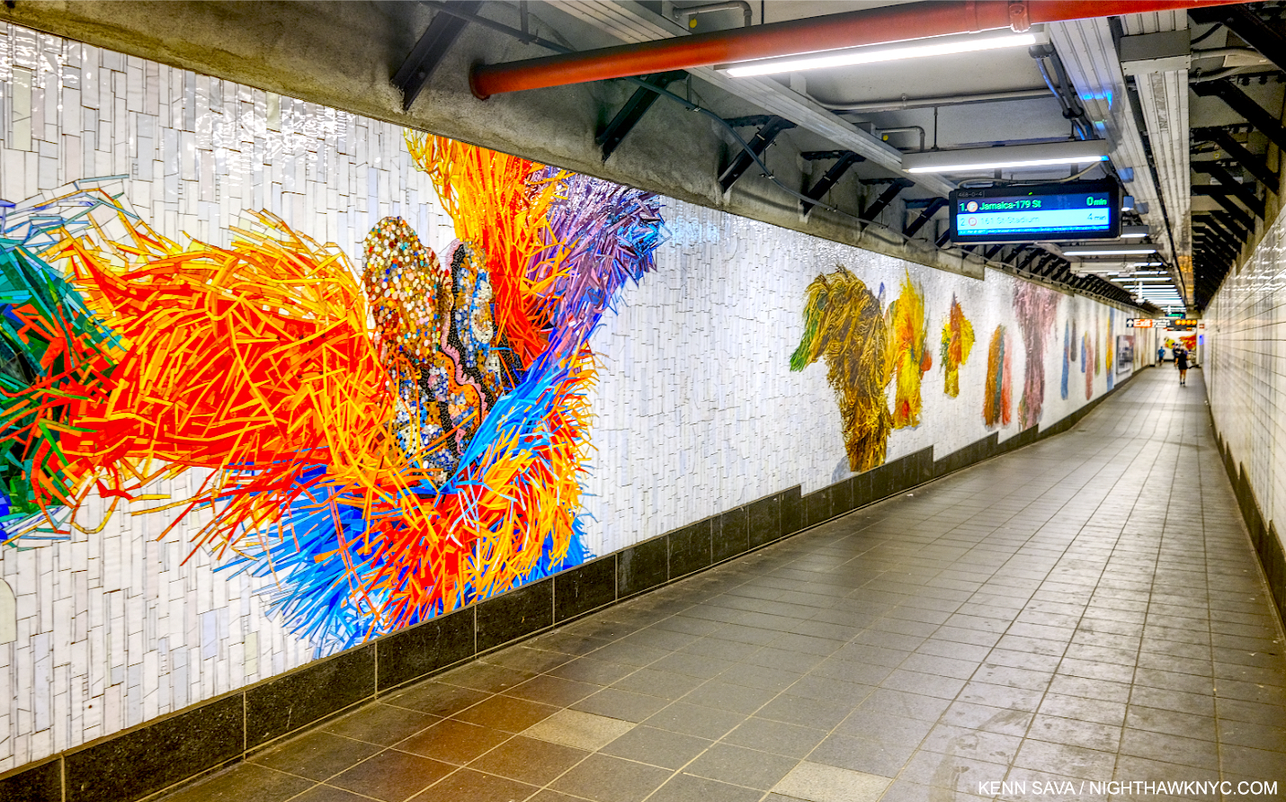
Installation view of the entire first section, Each One, installed just outside the turnstiles at the One Times Square Entrance.

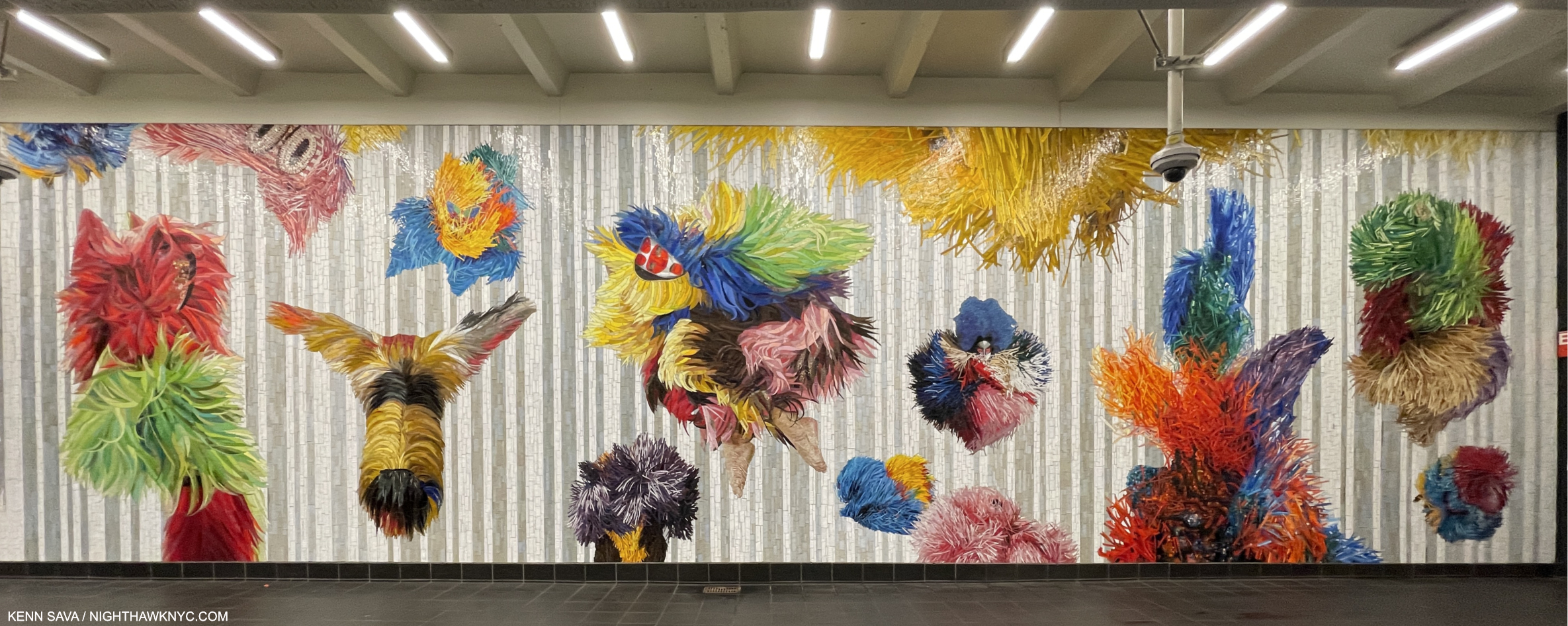
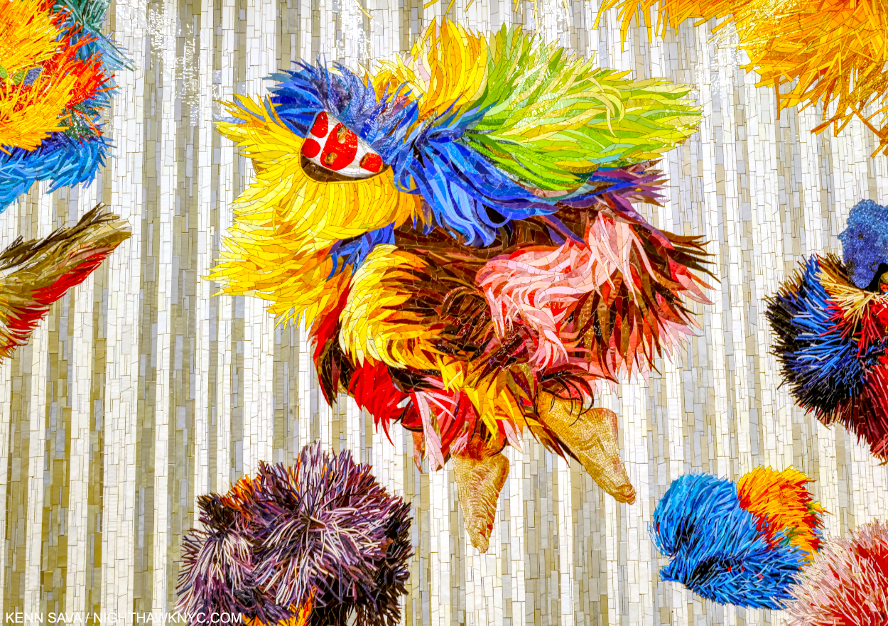
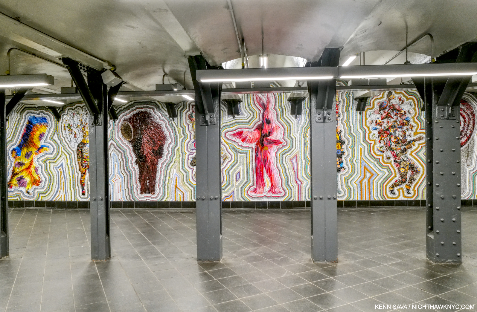
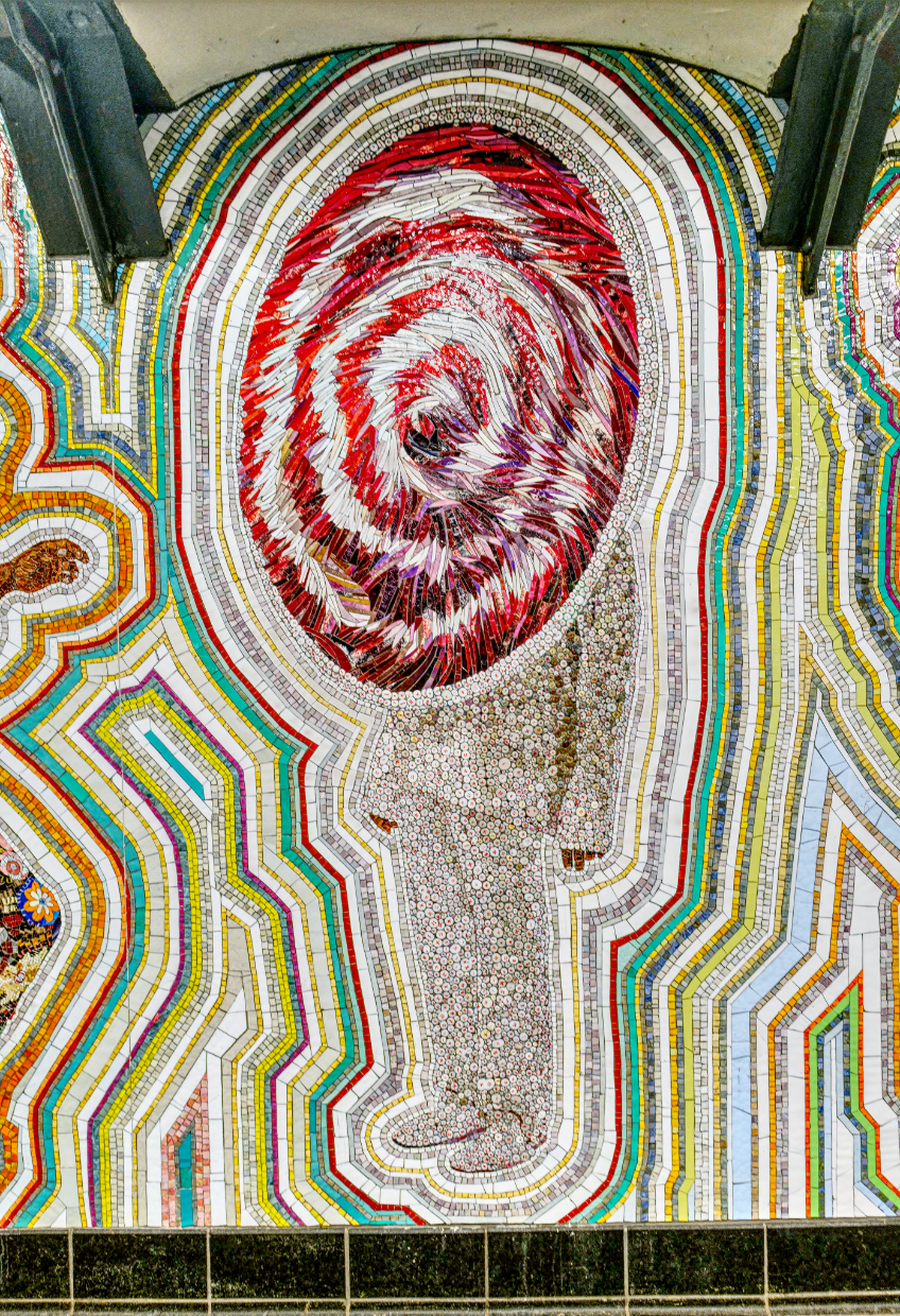
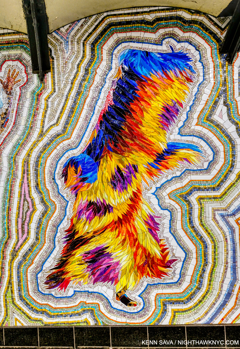
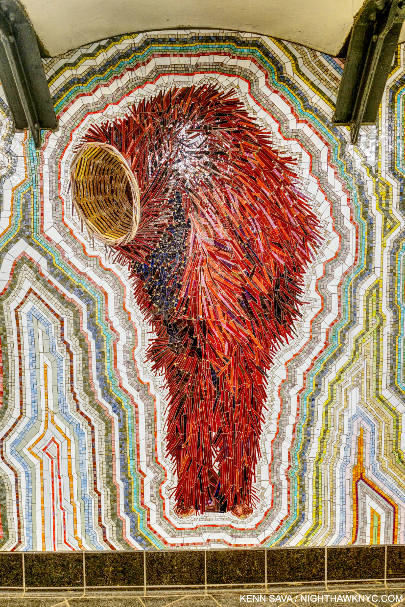
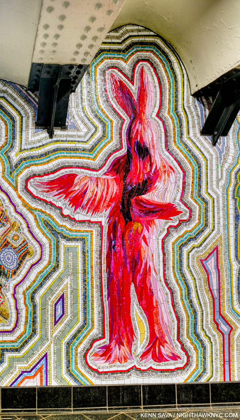
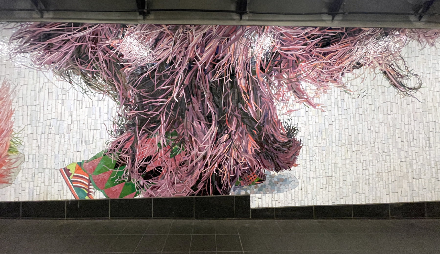
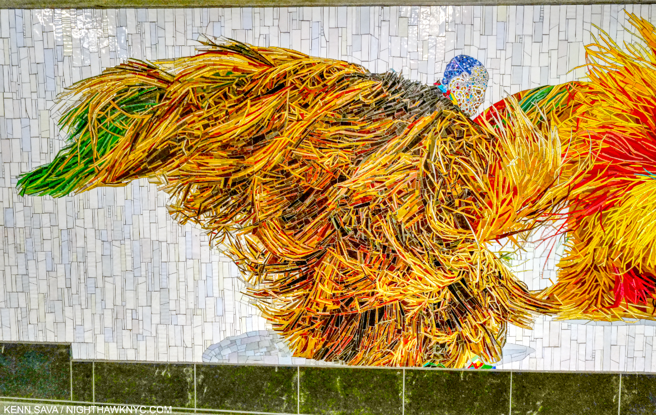
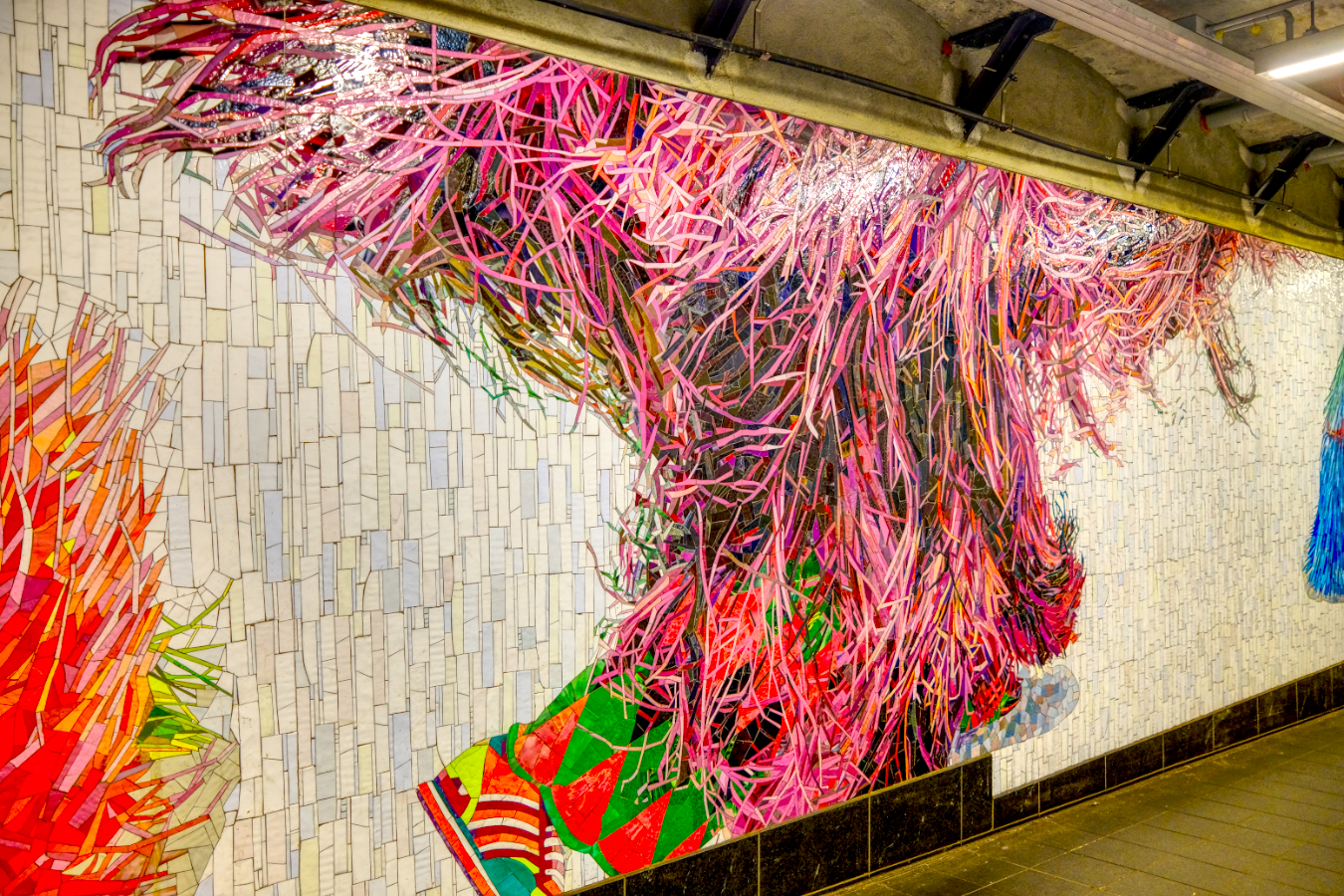
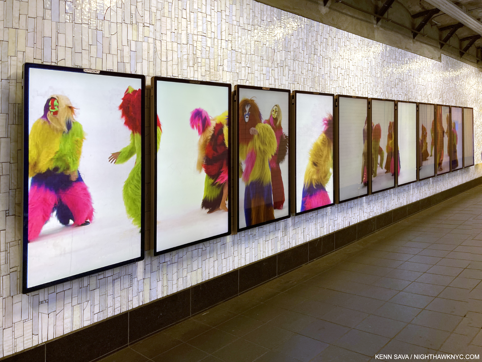
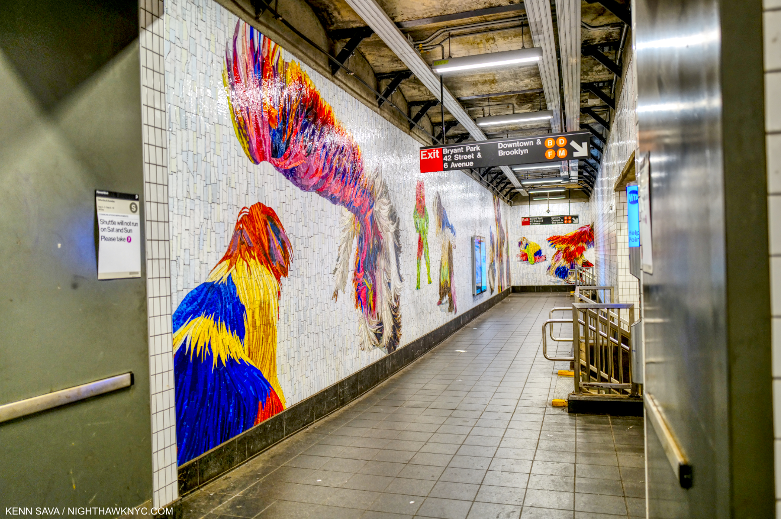
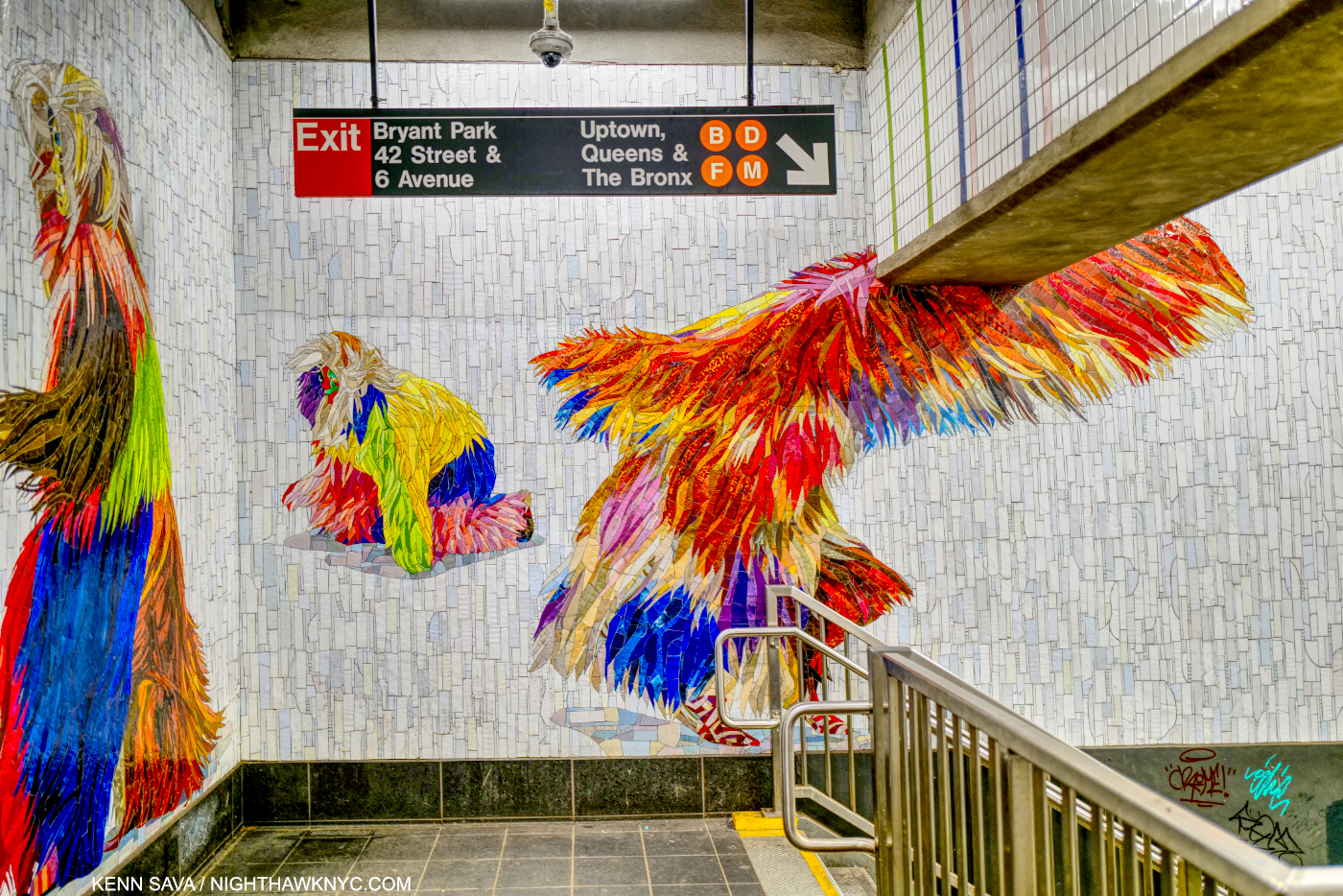
Recently, MTA Arts & Design completed the third and final section of Nick Cave’s monumental 3,200 square foot Permanent Public Art Work Under Times Square. Each One, Every One, Equal All, 2022 is installed in the 1,2,3,7,N,W & Shuttle station at 42nd Street & Times Square, perhaps the busiest station in the entire subway system. The project consists of a whopping FIFTY THREE figures2 wearing Mr. Cave’s famous Soundsuits, each made up of countless incredibly intricate and fabulously colored glass mosaic tiles. A number of the original Soundsuits they are based on were displayed in Nick Cave: Forothermore at the Guggenheim Museum last winter, and some appear in my look at the show. The mosaics were fabricated by world-renowned Mayer of Munich (aka Franz Mayer & Co., founded in 1870), and are augmented by a recorded performance displayed on 11 video monitors.

Equal All. Installation view of the entire second section installed at the 42nd Street Shuttle.

As stunningly beautiful as they are, beauty is not the beginning or the end of Nick Cave’s Soundsuits. “The first Soundsuit was in ’92 in response to the Rodney King incident, the L.A. riots,” Mr. Cave recalled. “I was sitting in the park one day  and just sort of thinking about, What does it feel like to be  discarded, dismissed, profiled? There was this twig on the ground. And I looked at that twig as something discarded. And then I proceeded to just start collecting the twigs in the park. And I brought them all back to the studio. And then I started to build this sculpture. I started to realize that the moment I started to move in it, it made sound. Then it just literally put everything in perspective. I was building this suit of armor, something that I could shield myself from the world and society. And so out of that came this sculpture-performative kind of work.”3

The Soundsuits “hide gender, race, class. And they force you to look at the work without judgment. You know, we tend to want to categorize everything,” the Artist said. “We tend to want to find its place. How do we, sort of, be one on one with something that is unfamiliar?”4

Every One. Installation view of most of the section installed in the 42nd Street Connector which continues all the way down the corridor then wraps around the far end of it.

Here are some highlights of each section beginning with Each One, shown in its entirety earlier, which is installed in the entrance before you reach the turnstiles-

As amazing as the individual figures are, the backgrounds are endlessly varied, and different in each of the three sections.

After paying your fare, the second section is installed to the left, “framed” behind pillars as you approach it just before you reach the Shuttle further to the right-

The background is noticeably different than that of the other two sections, and characterized by having more color and more of a pattern.

I believe the actual Soundsuit this is mosaic depicts is made of twigs, and it may have been on view in Nick Cave: Forothermore at the Guggenheim. It appears in two pictures in my piece on the show.

Some highlights of the third, and longest, section, Every One in stalled in the 42nd Street Connector past the Shuttle

Close-up of the head of the figure shown in the very first Photo in this piece.

This section includes 11 video monitors.

Screenshot of the Every One video featuring dancers wearing Soundsuits in a 3-minute video that is shown every 15 minutes, but you can see it in full below. Due to the fact it’s on 11 video monitors, the MTA had to compress the size of the video a bit-

Mosaics are one of the (if not the) most durable materials Art is made of. If you doubt that, visit The Met where you will see mosaics dating back to the 1st century BCE that retain every bit of their luster and beauty. The universe willing, the mosaics in the subway will outlive us all.

Installation view of the last section of Every One.

Displaying them in the subway, where the “melting pot” America is supposed to be all about, is on full display all the time- perhaps to a degree it is nowhere else in the country, is particularly poignant and powerful. It’s also very liberating to imagine oneself being one of these magical figures cavorting, dancing, leaping or flying all around us as we walk through them, anonymously.

The final figure of Every One, installed at the top of a staircase, looks like it’s about to take flight.

All of a sudden, a world where racism exists, doesn’t.

*-Soundtrack for this piece is “One Nation Under A Groove,” by George Clinton & Funkadelic from the 1978 album of the same name. Nick Cave has frequently mentioned George Clinton as an early influence.

NighthawkNYC.com has been entirely self-funded & ad-free for over 8 years, during which 300 full-length pieces have been published! If you’ve found it worthwhile, PLEASE donate to allow me to continue below. Thank you, Kenn.

You can also support it by buying Art, Art & Photography books, and Music from my collection! Art & Books may be found here. Music here and here.

Written & photographed by Kenn Sava for nighthawknyc.com unless otherwise credited. To send comments, thoughts, feedback or propositions click here. Click the white box on the upper right for the archives or to search them. Subscribe to be notified of new Posts below. Your information will be used for no other purpose.

  1. Think I’m kidding? Here’s a short list. Each of these Artists has created a PERMANENT installation. Listed by Artist’s name, with the subway line(s) @ which station-
    Chuck Close -Q@86th St
    Roy Lichtenstein -A,C,E,et al@42nd St & Times Sq
    Jacob Lawrence -1,2,3,7,N,R,W,S@42nd St & Times Sq
    Jane Dickson -1,2,3,7,N,R,W,S@42nd St & Times Sq
    Sol LeWitt -1,A,B,C,D@Columbus Circle
    Vik Muniz -Q@72nd St
    William Wegman -F,M@23rd St
    Yoko Ono -B,C@72nd St
    Elizabeth Murray -4.5.6,N,R,W@Lex & 59th St
    Faith Ringgold -2,3@125th St
    Alex Katz -F@57th St
    Leo Villareal -6,B.D,F,M@ Bleecker St./Broadway & Lafayette
    Jack Beal  -1,2,3,7,N,R,W,S@42nd St & Times Sq
    Al Held -E,M@Lex & 53rd St
    Eric Fischl -A,C.E@34th St & Penn Sta
    And, my personal favorite- Sarah Sze -Q@96th St. Sarah Sze’s Blueprint for a Landscape, 2017, was commissioned to design Art for the entire large subway station- 14,000 square feet! What makes this project even more unique is that, unlike most of the other stations in NYC, this was a station being built from scratch at the same time. I wrote about it here. As far as I know, it is the largest Public Art project in the subway. The MTA Arts & Design site lists them all, here.
  2. by my count
  3. “Nick Cave in Chicago,” Art21, 2016
  4. Nick Cave: Thick Skin” Art21

Rod Penner’s America: Small Town Nation

This site is Free & Ad-Free! If you find this piece worthwhile, please donate via PayPal to support it & independent Art writing. You can also support it by buying Art & books! Details at the end. Thank you.

Written & Photographed by Kenn Sava

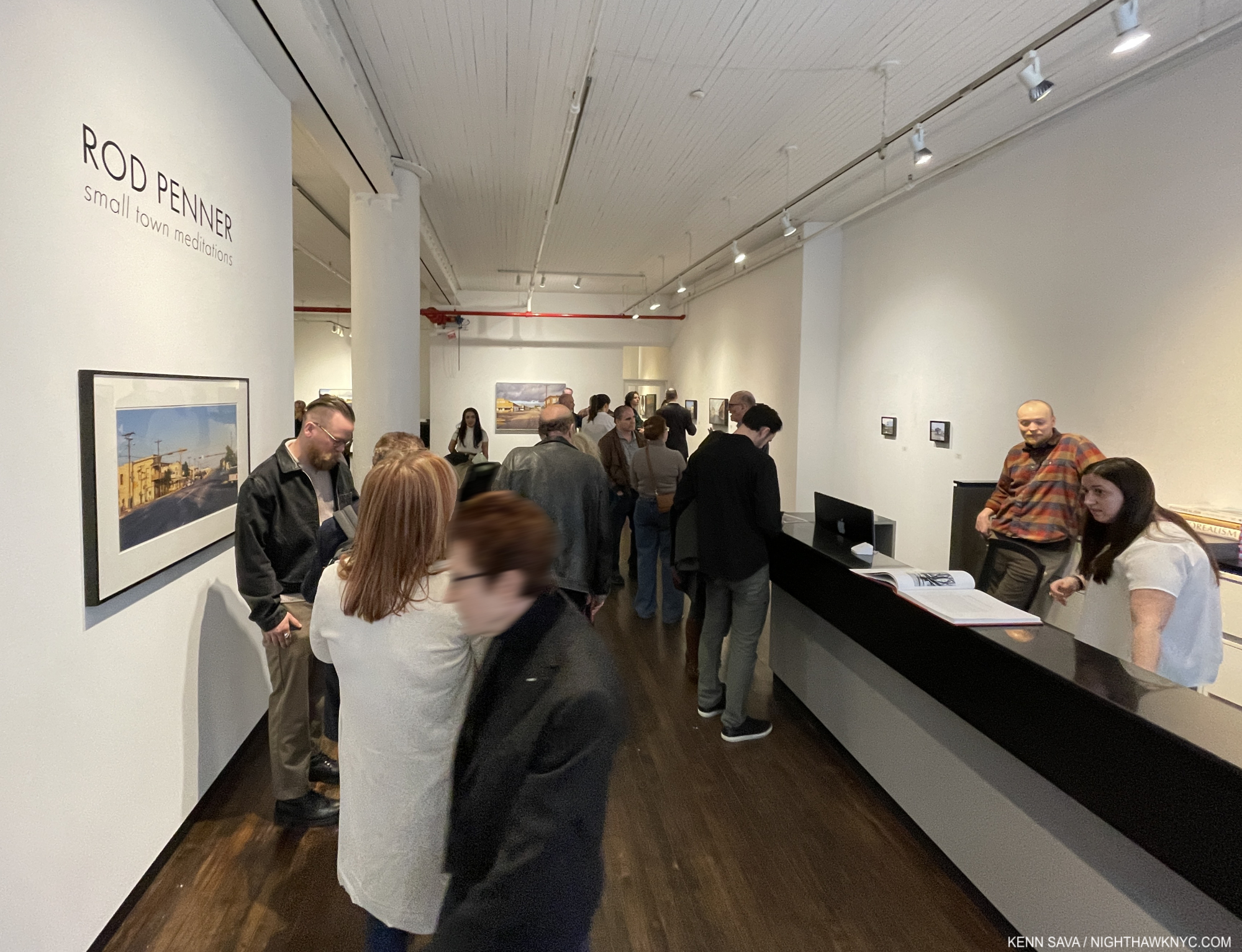
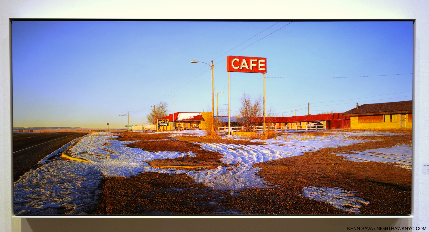
Show Seen- Rod Penner: Small-Town Meditations – Traveling exhibition seen in NYC @ Meisel Gallery

“America: A Nation of Small Towns”
Title of the 2020 United States Census Report.

Small towns in the big town. The opening, NYC, March 18. 2023.

I’ve already written as much, and maybe more, than anyone else has about Rod Penner’s Art over the past six years. Most recently, I wrote my fifth Penner piece, an extensive look and the first anywhere, at the first full-length book on his work, Rod Penner: Paintings, 1987-2022. If Mr. Penner’s work speaks to you and you haven’t seen a copy, make a point to. It accomplishes the rare double feat of being equal parts long-awaited full-length Monograph and Catalogue Raisonne, containing everything he’s Painted through 2022, in one volume. All of this being said, my pieces on his Art were based on seeing one show of smaller Paintings in 2017 and two works in a prior group show. This spring, I finally had a chance to see a show with a more representative overview of his work going back to 1998. I came away feeling I saw much in his work I hadn’t seen before.

My only previous Rod Penner solo show, in 2017, consisted solely of 6 by 6 inch and 5 by 7 inch Paintings, each jam-packed with detail. Though Sands Hotel & Cafe/Vaughn, MN, 2019, Acrylic on canvas, is a huge 31 by 64 inches (almost 5 1/2 feet long!), the detail is every bit as stunning, representing a staggering amount of work. I continually get lost looking at the fore and mid-ground in what strikes me as a bit of an unusual composition. But, of course, there’s much more to it. Click for full size.

Rod Penner: Small-Town Meditations consisted of a group of 17 Paintings that establish Mr. Penner as the foremost Painter of small town America working today, inheriting the mantle from John Salt, and Charles Sheeler & Edward Hopper before the late Mr. Salt (1937-2021).

John Salt, Red Mailbox #2, 2015, Casein on linen, 45 x 65 inches. Seen in 2018 in the same space occupied by Rod Penner: Small-Town Meditations. Casein is a water soluble medium that derives from milk casein, and is used masterfully here to create such a rich, yet mysterious, atmosphere.

Rod Penner was born & raised in Canada before marrying his wife, Debbie, and relocating to Texas in 1988, where the majority of his work is set. In the Q&A I did with him in 2017, the Artist said this about the beginning of his Painting career-

“Shortly after arriving in the Lone-Star State, I rediscovered the work of John Salt and felt an instant connection. I couldn’t drive past a trailer home (and there are many in Texas) without thinking “Salt.” At this point, I wanted to spend more time in the studio and less time searching out subjects to paint, so I started driving around the town we lived in and took photos of these tract houses that were everywhere. I found them visually interesting. As with all the streets and buildings that I paint, these homes, under certain weather and lighting conditions, became transformed. I painted my first tract house in 1989 and it sparked a series of paintings that were later shown at O.K. Harris in NY.”

614/House with Daffodils, 1998, 10 1/4 x 15 inches, Acrylic on board.

While people appear in very few of his Paintings, right from the beginning, virtually every piece he’s created is rich with their presence. First, there’s what people have built on the land that signifies them. Then there’s the condition of these structures, which are steeped in individual modifications and adornment. Some are in need of attention; perhaps a new coat of paint or repairs. It seems that the occupants are too busy living in them to do them right now. In addition to the building, we often see the evidence of human habitation: toys, tools or lawn implements in the yard; though vehicles are not seen nearly as often as they are in John Salt’s homestead works where they are one of his trademarks. Combined with the lived-in condition of the house all of this makes for a de facto “Portrait” of its inhabitants, in my view. His work is rich in character, one thing that sets him apart. Character adds an incalculable amount of depth to his Paintings. In a larger sense, his work is a “Portrait” of how, and where, many Americans lived in the last half of the 20th and early parts of the 21st centuries.

212/House with Snow, 1998, 36 by 54 inches, From here on, all works shown are Acrylic on canvas unless noted.

The idea of “home” looms large in Rod Penner’s oeuvre, striking me as one of his main themes, be it in actual houses or motels (temporary homes), like Sands Hotel & Cafe/Vaughn, MN, 2019, shown earlier. None of his homes are palatial. Rather, they are all well lived-in. The roofs and paint look weather-worn, as if they’ve survived countless storms or harsh winters. It’s easy to make this fit the “Portrait” analogy. A number of his Texas scenes include snow- something the rest of us may have trouble associating with one of America’s southern-most states, but the terrible storms they’ve had these past years are changing that. Snow makes these scenes look they could have been seen in many other places in the country. Yet, in spite of it all, they’re still standing, and much of the same can no doubt be said of whoever lives in them.

212/House with Snow, 1998, a masterpiece in my view, sums up so much about the broad and vague idea of “home.” For me, that doesn’t necessarily mean a place; A person could be “home” for someone, and much of what I see here, and the feelings it generates, would still apply. Like virtually all of Rod Penner’s Paintings 212 cries out to be seen up close.

How much you see in a Rod Penner Painting is only limited by how long you look at it.

A number of his House Paintings are set during the Holidays. In this detail from 212/House with Snow, we see the Christmas tree lying diagonally in front ready to go out with the trash & recycling. A poignant image by itself. It’s been there a little while given it’s snowed since it was put there. A toy bus (maybe a Xmas present?) pokes out from a red box with an intricate logo on it- all in this stunning little section, which is typical of all of Rod Penner’s Paintings. Oh! That’s before you get around to admiring the incredible detail on the Christmas tree branches, the tree trunk behind it, or the condition of the paint on the house and garage! Then, there’s the ground…

Yet here, as in all Rod Penner’s work, in my opinion, he puts the detail at the service of Art. The detail is revelatory, like a well-turned sentence in a great novel, or like the floor in Jan van Eyck’s The Annunciation in Washington. It never preaches. It never gives too much away, leaving it all to the viewer. In fact, when I first met Mr. Penner, he was reluctant to speak about his Art. He told me he wanted his Art to speak for itself. Personally, I’m glad he has softened that stance a bit and has spoken about his work, especially in his Artist’s Statement in his book. I only wish the Art media respected what the Artist says about his/her own work more than what anyone else says about it.

Bar-B-Q/Marble Falls, TX, 2022, 12 x 18 inches. The latest in a long and memorable series of roadside eateries and gas stations. Those foreshortened signs to the left must have been fun to Paint.

Another theme in his work is life on the move: gas stations and roadside eateries loom large here, in addition to motels.. This makes it apparent that the Artist gets around since every scene he renders he has visited in person. Sometimes, it’s hard to look at these and not smile. What may be Mr. Penner’s subtle sense of humor can be at once poignant, and again tack sharp. In person, the Artist is quick to smile, so it’s hard not to see that coming across in his work at times. At the March opening, two visitors were present who had traveled all the way from Marble Falls, TX for it. Well-familiar with the real-life Bar-B-Q back home, it must have been a strange, but welcoming, feeling to see its likeness hanging on the wall in a SoHo gallery thousands of miles from home.

Buy Pecans Here/San Saba, Tx, 2021, 31 by 52 inches.

Buy Pecans Here/San Saba, Tx, 2021 marks Rod Penner’s return to large Painting after his series of small San Saba pieces I saw in his last NYC solo show. When I look at this, I see an early 21st century “History Painting.” The Old Masters famously rendered scenes from history, usually in suitably large scale. Here, Rod Penner shows a number of stages of San Saba’s history in one scene in the recent past (2021). In the back, San Saba County Courthouse, 1911, peaks out of the trees and rooftops, surrounded by what man has built in the area in the following 110 years, including telephone poles and power wires, which may now carry the internet, including NighthawkNYC. San Saba is known as the “Pecan Capital of the World,” so the appropriately sized Pecan store sits stolidly on the earth occupying much of the right side as if anchoring that reputation. Further down the block on that side is G&R Grocery, behind the white pickup. Across the street in the rear the red brick of “Station” peaks out- that’s the only word left on its sign. Mr. Penner featured both of these buildings in his San Saba Series of small Paintings in 2016-7, which I showed here. Buy Pecans Here also got its own Painting. In the front left is another one, the former San Saba Butane Co., which he immortalized in a show-stopping small Painting of the same name, looking a bit more the worse for wear than it does even here. Yet, it’s still standing, seemingly waiting for what’s coming next. The ground weather and the skies add incalculably to the mood. An unfathomable amount of work must have gone into this Painting.

Like San Saba Butane, a number of the places he Paints are out of business. I don’t have to tell anyone how prevalent that is, wherever you are, in the age of the pandemic, before and “after.” Yet, it’s something rarely seen in Painting. Businesses opening, being active, and going out of business are part of the business cycle. That is the “history” I see in Buy Pecans Here/San Saba, Tx.

Bertram Supply Co., 2015-6, 31 by 52 inches.

Rod Penner Paints democratically. I’m not referring to politics. I’m using the word in its original meaning. That is that Rod Penner Paints everything he shows us with equal weight. Virtually everything, front to back, is in focus, like it is in many of Richard Estes’s Paintings. Everything is shown at the hyperlocal distance, as Photographers say1. Therefore, it’s up to each viewer to decide what’s important to the narrative they weave in their mind. It also allows for different scenarios at each viewing with different things standing out each time.

Compositionally, it seems to me that many, if not most, of Mr. Penner’s Paintings, and all those shown here, consist of three horizontal “bands” or areas. He presents the sky in a top band, the buildings/main subjects in the center band, and the ground weather in the lower/foreground band. One of the subtler joys of Rod Penner’s work is that he is a master of rendering the ground effects of weather (i.e. rain, snow, graupel, mud, or the baked naked earth), a bit like JMW Turner was a master or rendering skies (in a completely different way, of course). The ground weather is a unique, and often stunning, part of most of his Paintings, easy to overlook, but not to be missed. The detail they contain is astonishing and in addition to adding so much to the “narrative,” they also hint at how much time and thought went into every inch of his Paintings- regardless of size.

Welcome to PennerVille. A close look at Bertram Supply Co., reveals the Artist’s name on the street sign, with “Rod E.” foreshortened for the cross street sign under it, indicative that he’s put his name on this scene. It’s becoming his genre.

Rod Penner: Small-Town Meditations sums up in capsule form Rod Penner’s accomplishment. To me, that is nothing less than preserving the lives that countless Americans have lived these past 40 years in paint. Rod Penner is creating a body of work that defines and preserves what a good deal of America- small town America (which most of America consists of)- is and has been like these past 4 decades as much, if not more, than any other Artist has.

Having said that, I would also add that I’m not sure that that’s his point! It may be. Or, it may simply be what I’m seeing in his work. His Art is open-ended enough so that everyone is free to see in it what they will.

Rod Penner discussing how he created some of the detail in Yellow Light/Brenham, TX, 2004-5, 15 x 25 inches with a visitor behind him at the opening, March 18, 2023.

Saying all of this would seem to overlook the most obvious characteristic of Rod Penner’s Paintings: his world-class technique. His technical skill (readily seen in the details from Bertram Supply Co., or 212/House with Snow, above) approaches the level of the Old Masters. Yet, technique, by itself, does not make Art. In Rod Penner’s case, his technique is only the beginning of the story. Every time you look at his work, you get to write your own ending for it. 

*- Soundtrack for this piece is “Small Town” by John Mellencamp.

My prior pieces on Rod Penner are-

The Vermeer of Marble Falls, Texas,”April 28, 2017

“Rod Penner: Brilliance, Under Cloudy Skies,” June 10, 2017

Q&A With Master Painter Rod Penner,” June 14, 2017

Rod Penner’s Neighborhood,” August 3, 2017

and- “NoteWorthy Art Books- Rod Penner: Paintings, 1988-2022,” April 7, 2023.

NighthawkNYC.com has been entirely self-funded & ad-free for over 8 years, during which 300 full-length pieces have been published! If you’ve found it worthwhile, PLEASE donate to allow me to continue below. Thank you, Kenn.

You can also support it by buying Art, Art & Photography books, and Music from my collection! Art & Books may be found here. Music here and here.

Written & photographed by Kenn Sava for nighthawknyc.com unless otherwise credited. To send comments, thoughts, feedback or propositions click here. Click the white box on the upper right for the archives or to search them. Subscribe to be notified of new Posts below. Your information will be used for no other purpose.

  1. The focus distance at a given aperture on a lens where everything after that point is in focus, and somethings before are as well, depending on the settings and the lens.

Jaune Quick-to-See Smith’s Survival Map

This site is Free & Ad-Free! If you find this piece worthwhile, please donate via PayPal to support it & independent Art writing. You can also support it by buying Art & books! Details at the end. Thank you.

Written & Photographed by Kenn Sava

Show Seen: Jaune Quick-to-See Smith: Memory Map @ The Whitney Museum

Indian Madonna Enthroned, 1974, Mixed-media.

It took 83 years for Jaune Quick-to-See Smith to get her first NYC retrospective. As if that’s not notable enough, Jaune Quick-to-See Smith: Memory Map is also the “largest and most comprehensive show of her work to date,” the Whitney says of its installation of 130 of her Paintings, Drawings, Prints, and Sculptures covering almost 5 decades of her career on its 5th floor, where it follows Edward Hopper’s New York, and 3rd floors.

Self-Portrait, 1974, Pastel, graphite pencil and charcoal on paper. The Artist showing herself with 6 arms.

Born in 1940, a citizen of the Confederated Salish and Kootenai Nation, the show reveals Jaune Quick-to-See Smith to be an Artist of her time, one that is fluent with contemporary Art styles and techniques. An Artist, and a person, passionate about the well-being of her people and the world in which they, and we all, live. Yet, she’s also been ahead of her time in bringing many issues her people face to the Art world, which has only recently begun to be more open to Indigenous Artists.

Homeland, 2017, Oil and acrylic on canvas, radiates from the Confederated Salish and Kootenai Nation’s Flathead Reservation in Montana.

Indian Map, 1992, Oil, paper, newspaper and fabric on canvas.

Survival Map, 2021, Acrylic, ink, charcoal, fabric, and paper on canvas

As a result, it seems to me that her work has been on the line between being of its time and ahead of its time throughout her career, both in terms of style and content. She proves herself fluent in moulding the language developed by her peers to her purposes over her career while also creating as many of her own innovations.

Jasper Johns, Flag, 1954-55, Encaustic, oil, and collage on fabric mounted on plywood, three panels, seen at MoMA, 2017.

McFlag, 1996, Oil, paper and newspaper on canvas with speakers and electrical cord

Among the numerous Artists she references, including Magritte and Picasso, two names repeatedly came to mind, both at the forefront of the developments in American Contemporary Art of her time. Maps and Flags play a central role in the work on view, echoing Jasper Johns (B. May 15, 1930). Whereas Mr. Johns’s intentions for using the flag and maps remains, like most of his work, ambiguous, Ms. Quick-to-See Smith uses them to powerfully present the lives and issues faced by Indigenous People. 

Robert Rauschenberg, Gull (Jammer), 1976, Sewn silk, rattan poles, and twine, 1976, seen at MoMA in 2017.

Other works echo Robert Rauschenberg (Oct 22, 1925- May 12, 2008).

Ronan Robe #4, 1977, Oil, beeswax, charcoal and soot on canvas with lodgepole.

In 1985, the Artist got involved in efforts to save Petroglyph Park in New Mexico, creating what would become her Petroglyph Park Series, 1985-7, and marking the beginning of the appearance of current events in her Art.

Trade (Gifts for Trading Land with White People), 1992, Oil, paper, newspaper, and fabric on canvas with found objects on a chain. Perhaps a history of exploitation with “trinkets” being exchanged for land. A number of the sports teams whose ephemera hangs above the Painting, have subsequently changed their names, some have not. Other items shown remain in production, including children’s toys which cheaply knock-off Native American culture.

Historic events don’t escape her attention, either.

9 Monotypes from the Custer Series, 1993. The work next to the lower right is after Magritte. The text reads, “This is not a peace pipe.”

Wall card for the Custer Series.

The Confederated Salish and Kootenai Nation’s Flathead Reservation is located in Montana, site of the Little Bighorn. Canoes, often labelled “Trade Canoes” (except for the one above), are a recurring theme, each one rendered strikingly differently.

Trade Canoe: Making Medicine, 2018, Mixed media, foreground, Green Flag, n.d., on the back wall.

Detail.

Trade Canoe: Forty Days and Forty Nights, 2015, Oil, acrylic, oil crayon, paper and charcoal on canvas, introduces the show, and is seen to the left in the picture of the show’s lobby, seen further below.

In addition to having her eye on what’s going on around her, her Art also has a wonderful way of looking back to the rich history of her culture. Messages of protest are side by side with sage wisdom. Her Chief Seattle Series (or C.S. Series), 1989-91, does this wonderfully and adds a timeless element to her work. The Wall Card says-

The Garden (C.S. 1854), 1989, Oil, rubber hose, crushed tin and aluminum cans, and nails on canvas. C.S. is Chief Seattle and The Garden is part of Chief Seattle Series from 1989-91. It reads, “WE are part of the EARTH and it is PART of US, C.S., 1854.”

Jaune Quick-to-See Smith has created an important, innovative and powerful body of work that somehow all manages to remain of the moment no matter when she created it. On the one hand, that’s a sign the country hasn’t evolved faster and how much remains to be done. 

Memory Map shares the 5th floor with Josh Kline: Project for a New American Century, which is compelling in its own right. The shows overlap as both express concern over climate change and the impact of social, economic and technological change on the labor force.

On the other hand, it’s a testament to the Artist’s range, humanity, and perhaps above all, her perseverance. 

Celebrate 40,000 Years of American Art, 1995, Collagraph. A reminder that the ancient, original Art of our land has yet to be fully appreciated.

In some ways, the case of Jaune Quick-to-See Smith reminds me of Alice Neel, who didn’t see her first full-length monograph published until she was 83, the year before she died. Shows of, and books on, her work have increased ever since. I expect Ms. Quick-to-See Smith to also receive increasing attention as time goes on, and hopefully, she will still be around to see, and enjoy, it. Memory Map proves she deserves every bit of it. 

*- Soundtrack for this piece is “Now That the Buffalo’s Gone” by Buffy Sainte-Marie, who was born on the Piapot 75 Reserve in Saskatchewan, Canada. She announced her retirement from live performance earlier this month after 60 years of performing.

NighthawkNYC.com has been entirely self-funded & ad-free for over 8 years, during which 300 full-length pieces have been published! If you’ve found it worthwhile, PLEASE donate to allow me to continue below. Thank you, Kenn.

You can also support it by buying Art, Art & Photography books, and Music from my collection! Art & Books may be found here. Music here and here.

Written & photographed by Kenn Sava for nighthawknyc.com unless otherwise credited. To send comments, thoughts, feedback or propositions click here. Click the white box on the upper right for the archives or to search them. Subscribe to be notified of new Posts below. Your information will be used for no other purpose.

NoteWorthy Art Shows: Spring, 2023

This site is Free & Ad-Free! If you find this piece worthwhile, please donate via PayPal to support it & independent Art writing. You can also support it by buying Art & books! Details at the end. Thank you.

Written & Photographed by Kenn Sava.

As I celebrate the 8th Anniversary of NighthawkNYC.com on July 15th, my thoughts turn to some excellent shows I saw but didn’t get a chance to write about! I’ll take a brief look at a few I call NoteWorthy here…

Robert Rauschenberg: Spreads and Scales @ Gladstone Gallery-

Robert Rauschenberg has been one of my favorite Artists since I discovered his work in the 1980s. In 2017, I wrote an extensive series on the plethora of shows going on around town then during what I termed “The Summer of Rauschenberg.” Spreads and Scales was a concise but very interesting show of work I’ve never seen before reinforcing my belief that no matter how much of his work you’ve seen, even 15 years after his passing in 2008, there’s work of his that you more than likely still haven’t seen.

William Christenberry & RaMell Ross: Desire Paths @ Pace-

RaMell Ross, Sleepy Church, 2014, left,  and William Christenberry, Church, Sprott, Alabama, 1981, both Pigment print mounted on dibond.

An interesting, unexpected paring of the work of the late Photographer, William Christenberry, perhaps best known for his association with William Eggleston, and the Academy Award Nominated Filmmaker & Artist, RaMell Ross, who I last saw in a solo show at Aperture Foundation in June, 2018. Interesting became compelling in its final gallery.

RaMell Ross, Return to Origin, 2021. From the upper left- the Artist working away while in transit, sealed in the box; two video stills- the truck after unloading the box, simultaneous shot of RaMell inside; one of the panels showing the Artist’s inscriptions during transit; the box labelled “DRY GOOD.”

There, sitting on the floor was a very large box cryptically labelled “DRY GOODS” in a large stencil on the exterior, I looked at it, noticed there was writing all around the inside and then when I was about to move on I saw the accompanying video. It turns out RaMell Ross created & used the box to reenact Henry Brown’s legendarily daring act of mailing himself out of slavery to freedom in 1849! Mr. Ross shipped himself, sealed in this box, from Rhode Island to Hale County, Alabama. The trip took 59 hours, all the while the contents were unknown to the contracted truck driver whose gooseneck rig was carrying the crate. The journey, captured on the video, was being shown on that nearby monitor. In addition to reminding today’s viewers of Mr. Brown’s incredible feat (in a smaller box), it also reminds me of the preciousness of freedom. Something not fully appreciated, until it’s gone.

Uta Barth @ Tanya Bonakdar-

Frozen poetry. …and to draw a bright white line with light (Untitled 11.10), 2011, Inkjet Prints.

Compositions 5, 12 & 7, left to right, each Inkjet Prints from 2011, seen next to a street-facing picture window. Uta Barth’s work has had me deeply under its spell for the past three years.

Sundial (07.6), 2007, Mounted color Photographs.

In my opinion, Uta Barth is one of the most under-appreciated Photographers working today. I came across a copy of her retrospective The Long Now a few days before the pandemic shutdown and its poetry captivated me. With empty streets and empty rooms everywhere for the following months on end, I saw “Uta Barths” everywhere. Her spell has continued ever since. Artists who change the way I see the world are few and far between.

Installationv view of one section of ...from dusk to dawn, 2022, Mounted color Photographs with single-channel video monitor, includes an embedded video on one of these pieces that changes frames so subtly you may not see it change.

Finally having a chance to see her work in person @ Tanya Bonakdar Gallery, Uta Barth presented one, large, new piece, …from dusk to dawn, 2022, in multiple sections that nearly wrapped around the entirety of the downstairs main gallery and a curated selection of “classic” Uta everywhere else in the gallery. The new piece showed one location of Richard Meier’s Getty Center, L.A., over the course of a year, as it changed with time. Being in California, we don’t see the variety of weather we might in some other place, but with Uta Barth it’s always about the light. 

Tauba Auerbach: Free Will @ Paula Cooper Gallery-

One of the rising stars of the Art world, Tauba Auerbach’s latest, her first NYC show since her acclaimed early mid-career retrospective S v Z @ SF MoMA, 2021, didn’t disappoint while offering the usual surprise.

Foam, 2023, Acrylic on dibond. One of a series of Paintings(!) of foam as seen through a microscope.

“The exhibition is an expression of curiosity about spontaneously emergent structure, tendency and habit, and their intersection with the notion of free will. The work brings together historical rendering techniques like pointillism and midtone drawing with microscopy, algorithmic image processing, off-loom weaving, spraying techniques and mathematical surface modeling,” per the Press Release.

Org, 2023, Glass, nylon coated steel cord, 2 x 80 1/2 x 41 3/8 in.

New were incredibly detailed “pointillistic” (her term) Paintings accompanied by tables of intricate objects and a number of equally interesting sculptural works in the adjoining gallery. Both the objects in the main gallery and these “sculptures” reminded me that Tauba Auerbach has her own publishing company, Diagonal Press, which produces fascinating and intricate books and multiples.

Spontaneous Lace, 2023, Kiln-formed glass in aluminum

It might be premature for me to say this, but Tauba Auerbach reminds me a bit of Frank Lloyd Wright, to me one of the great Artistic geniuses of all time. Ms. Auerbach is not an Architect, as far as I know, but her work reminds me of the brilliance of Wright’s “ancillary” designs for his buildings: his fabric designs, dishwear, furniture and rugs. Frank Lloyd Wright continually pursued “building the way nature built,” i.e. “organically,” as he called it. Much of Tauba Auerbach’s work is inspired by nature and carries forward some of its techniques, as seen here in Free Will. Barely in her 4th decade, the high esteem attached to her name is well-deserved in my view, and she is definitely an Artist to keep a close eye on.

Ruby LaToya Frazier @ Gladstone Gallery-

Steadily, Ruby LaToya Frazier has been building a remarkable oeuvre, equal parts documentary and Art, in her own, unique, way. Her latest show, Ruby LaToya Frazier at Gladstone consisted of one major work– More Than Conquerors: A Monument for Community Health Workers of Baltimore, Maryland 2021-22, 2022 made up of 66 archival inkjet prints mounted on 18 stainless steel I.V. poles, which amounted to stations.

At each stop her Photographs were accompanied by personal statements from the subject that were every bit as riveting as Ms. Frazier’s work- no small feat. The show was a wonderful table-setter for Ms. Frazier’s mid-career retrospective set to open shortly at MoMA. An Artist & Activist who has focused so much of her work on groups and communities deserving wider attention it’s my hope the show will do just that for her work and career.

Nicole Eisenman Prince @ Print Center New York-

Beer Garden, 2012-7, Etching, acquatint, and drypoint with chine colle, A stunning 44 3/8 by 51 3/4 inches!

A fascinating and insightful retrospective of yet another side of her work: her seldom-seen prints. A wonderful presentation of 40 works, including new and rare works. A plethora of unique styles and compositions kept the show fresh and exciting, and I imagine would prove new even to those who know her Painting and Sculpture, which were seen to terrific effect in her New Museum survey in 2016, for which this show offered a marvelous, if delayed, addendum.

Machine Learning Kiss, 2018 Collagraph, 19 3⁄4 × 20 inches. *-unknown Photographer.

NighthawkNYC.com has been entirely self-funded & ad-free for over 8 years, during which 300 full length pieces have been published! If you’ve found it worthwhile, PLEASE donate to allow me to continue below. Thank you, Kenn.

You can also support it by buying Art, Art & Photography books, and Music from my collection! Art & Books may be found here. Music here and here.

Written & photographed by Kenn Sava for nighthawknyc.com unless otherwise credited. To send comments, thoughts, feedback or propositions click here. Click the white box on the upper right for the archives or to search them. Subscribe to be notified of new Posts below. Your information will be used for no other purpose.

NighthawkNYC.com Is 8! A Look Back…

This site is Free & Ad-Free! If you find this piece worthwhile, please donate via PayPal to support it & independent Art writing. You can also support it by buying Art & books! Details at the end. Thank you.

Written & Photographed by Kenn Sava.

As the world continued to emerge from the horrors of the pandemic, it was business as usual for the galleries while the museums breathed a sigh of relief as they welcomed back the numbers they had seen pre-covid, though foreign tourists have not returned to NYC in their pre-pandemic numbers. That probably won’t last forever. There was a steady stream of very good and excellent shows throughout the year. In case you missed some, I’ll look at some of those that stood out for me and that I wrote about here, and everything else I covered, as I take a look back at Year #8 of NighthawkNYC.com: July 15, 2022- July 14. 2023…

Through the glass darkly to revisit Year 8…You’d need a telescope to see The Gulf Stream, center, from the show’s entrance, which announces it as the centerpiece for the entire exhibition. There were a lot of very good Paintings before, and after, you got to it.

Not Your Father’s Winslow Homer – Published on August 8, 2022. An expansive show big enough to show the American master’s broad accomplishment while delving into his themes- well-known and lesser-known, beginning with the Civil War and its aftermath. Incalculably influential during his life and after, Winslow Homer: Crosscurrents at The Met showed the relevance of his Art continues.

Louise Bourgeois’s Guarantee of Sanity – Published on August 25, 2022. One of the final shows mounted under Sheena Wagstaff as The Met’s Chair of Modern & Contemporary Art, Louise Bourgeois Paintings proved to be a worthy culmination to a very memorable tenure. For those, like me, only familiar with her Sculpture and Installations, her Paintings proved every bit as compelling. The question for me became how have they been so overlooked for so long?

William Klein: A Thousand Times YES – Published on September 21, 2022. One of the most influential Photographers of our time and one of the most endlessly curious, William Klein’s long career (1948-2013. 65 years!) as seen in ICP’s William Klein: YES was continually fascinating. In such a long career, landmarked with classic PhotoBooks, great and/or important Films1, and countless indelible images, what I love most is that he began as a Painter. His Paintings are rarely seen, so, in addition to EVERYTHING else he did that was on view, this was a wonderful chance to see some of them.

Hughie Lee-Smith, Self-Portrait, 1964, Oil on canvas, 24 x 20 inches.

Hughie Lee Smith: Leaving History Behind – Published on September 30,2022. The “history” of Art is written way too quickly in my view. It takes at least 100 years for the dust to settle and for those looking to really appreciate what’s been done. As seen at Karma’s Hughie Lee Smith, Hughie Lee Smith is a classic example of someone who was overlooked in the initial rush to judgment. As a result, I expect his name will heard more and more often as time goes on and more people see his work. As a result, his place in the 20th century Art history books will then be secured.

You’re a Painter. You’re 32. Your Yvonne and James II, 2021, Oil on canvas, was bought by, and is hanging in The Metropolitan Museum of Art, directly opposite Kerry James Marshall’s show-stopping Untitled (Studio), 2014 in their largest Modern & Contemporary Art Gallery, #915. If that’s not a “Wow,” what is?  June 18, 2022.- My caption as it appears in the piece.

Jordan Casteel: Surviving the Buzz – Published on October 20, 2022. It’s been a while since a new Contemporary Painter shot to the level of universal acclaim that Jordan Casteel has during the pandemic. Her New Museum show, Jordan Casteel: Within Reach took the Art world by storm. Heady times for any Artist, let alone one barely 30 at the time. Needless to say, the NYC Art world turned out in numbers to see what she would do next. I attended the opening of her first show since Within Reach, Jordan Casteel: In Bloom at Casey Kaplan, something I don’t often do, for a look-see myself.

Detail from Untitled (That’s the way we do it), 2011/2020 Digital print on vinyl wallpaper, seen at David Zwirner. Over the past 50 years Barbara Kruger’s style has become iconic to the point where now A LOT of people wish they could design like Barbara.

Barbara Kruger: Red & White and Read All Over – Published on November 1, 2022. Though her influence is, literally, everywhere you look these days, her Art is not shown all that often in NYC. After I got over the disappointment that the MoMA PS1 half of the show, a retrospective, had been canceled due to covid, I made do with the MoMA Atrium installation of a new site-specific work, and her concurrent David Zwirner show, spread over 3 of their galleries.

Diane Arbus At 99 – Published on November 10, 2022 – I’ve seen numerous Diane Arbus shows over the years going back to the incredible Diane Arbus: Revelations at The Met in 2005, one of the greatest shows I’ve ever seen (DON’T MISS the Revelations Exhibition catalog! Either in The Met’s original edition or the recent Aperture reprint), but I hadn’t written about Ms. Arbus because pictures were not allowed to be taken in any of her shows. Finally, for the recreation of the legendary 1972 MoMA Retrospective at David Zwirner, they were. Many years of looking, and thinking about her work, had been simmering leading up to it.

Jane Dickson at the opening for her show at James Fuentes, April 7, 2022, while her work was also starring in the Whitney Biennial.

Jane Dickson: The Artist Laureate of Times Square – Published on December 8, 2022. Jane Dickson is something of an urban legend. By that I mean that she & her Art have been known for many years but it’s been a well-kept secret. Her latest show opened at James Fuentes while her work was starring in the Whitney Biennial showing that the word is finally getting out.

Endless compositional variety. Installation view of Jean-Michel Basquiat: Art and Objecthood @ Nahmad Contemporary.

Jean-Michel Basquiat: Now You See It, Now You Can’t – Published on December 22, 2022. One of the most amazing things about the Art of Jean-Michel Basquiat’s enduring popularity in 2022, for me, is that you can’t actually see his Art in person! Very, very few museums have him in their collections- still(!), and shows are infrequent. Curious to see if the real thing lived up to the hype, I’ve taken every chance I’ve had to see his Art in person going back a decade, now. In fact, I’ve now written about Mr. Basquiat more on NighthawkNYC than I have any other Artist! In 2022, I saw 2 more big shows of his work, Jean-Michel Basquiat: King Pleasure and Jean-Michel Basquiat: Art and Objecthood, bringing my total to 9 shows seen. In this piece I ponder “where to” with the Art of Basquiat in 2022, and the future.

Jeanine Heveaux and Lisane Basquiat, Jean-Michel’s sisters, at the book release in NYC on April 12th.

Jean-Michel Basquiat, At 62 – Published on December 22, 2022. The biggest Basquiat show of the past decade, by the number of pieces on view, 200, Jean-Michel Basquiat: King Pleasure marked the first time his family, who inherited his estate, showed their collection. While it included a few major pieces, most of the work on view was not quite up to that level (in my opinion). That’s not all that surprising since the Artist sold so much of his work right after he created it. Still, it was an important show for anyone with an interest in Basquiat, and very well installed. In the lead up to the opening, I met both of Jean-Michel’s sisters.

Business, as usual. A local record store in action.

What’s Left Unsaid About Remixed Classic Albums – Published on January 19, 2022. Records labels have a license to print money when it comes to reissues. Bonus extra tracks and other goodies are added to the package to get buyers, including many who already own the record, to buy it (again)! But, what exactly are you getting? I think more attention needs to be paid to just WHO is doing the remixing of classic albums, and even why! The Artists signed off on the original versions, and as time goes on, fewer and fewer of them are left to sign off on remixes or reissues! And, there’s little they can do about it if they’ve signed the rights to the recording over to the record company. This is my look at all of this: our Musical cultural heritage is at stake!

Kerry James Marshall: Return of the Mastr – Published on February 9, 2023. Kerry James Marshall returned with his first solo show after the legendary Kerry James Marshall: Mastry, which I wrote about here, the Painting show of the decade among those I saw.

If you don’t think he’s an “Artist,” try imagining The Little Prince without Saint-Exupéry’s Art.

Antoine de Saint-Exupéry: Artist – Published on March 21, 2023. Two shows at the Morgan Library made me wonder why no one even mentions Saint-Exupéry’s Art when discussing his timeless classic, The Little Prince. In honor of the 80th Anniversary of its publication, I look at just that.

Remember The Light: On The Passing of Wayne Shorter – Published on April 7, 2023. Wayne Shorter has been one of my Musical Gods for most of my life. I was lucky enough to see him perform quite a few times, and each was indelible. My thoughts on the passing of one of the great Musical geniuses of our time.

Rod Penner at his easel at work in the early stages of what would become Buy Pecans Here/San Saba, TX, in 2021 as seen in the book.

NoteWorthy Art Books: Rod Penner: Paintings, 1987-2022 – Published on April 7, 2023. 35 years coming, Rod Penner FINALLY gets a full-length book worthy of his Art. Not just that, it includes EVERYTHING he’s Painted. I took the first in-depth look at it anywhere!

Room in New York, 1932. Remember that song, “Eyes without a Face?” Well, this is “faces without eyes!”

Edward Hopper’s Impressions of New York – Published on May 5, 2023. I visited the Painting show of Year 8, Edward Hopper’s New York. at the Whitney Museum, fourteen times. As a result, it took three pieces, written over 9 months, to cover. Part 1 focuses on my problems with Edward Hopper’s Art being termed “realism.” I don’t see it that way. If the faces in Room in New York, above, don’t have eyes, how “real” can they be?

Early Sunday Morning, 1930. A block in my neighborhood 93 years ago. I now see it as an ominous warning.

Edward Hopper: The Last Traditionalist Faces Change – Published on June 5, 2023. Part 2 focuses on what I see when I look at Hopper now after seeing Edward Hopper’s New York.

Night Shadows, 1921, Etching. One of the first pieces by Hopper to speak to me. Looking at it, I wonder- who is the lonelier? The man walking on the street, or the observer? A similar experience is to be had with Nighthawks.
I chose this piece because it seems to me there are shadows encroaching on the Art of Edward Hopper in 2022-23. Seen at Edward Hopper’s New York.

Edward Hopper At The Whitney: Troubling Choices – Published on June 8, 2023. My 3-part Edward Hopper series concludes with a look at some troubling decisions the Whitney has made regarding the Art of Edward Hopper and the Josephine Hopper Bequest, the most extraordinary gift an American Painter has yet made to an American museum.

Performing Scarlatti…in a motorcycle jacket on the harpsichord. And, performing his 555 Sonatas(!) extraordinarily, with HIV.

Scott Ross: The Modern Ancient – Published on June 7, 2023. My look at the late Scott Ross, a true renaissance man and individualist, who’s best known for his marvelous recordings of Baroque Music…on the harpsichord, no less.

Filled with a lifetime’s fruits of observations, insights, and revelations. No Art lover should be without it, in my humble opinion.

Kenn Sava’s Desert Island Art Books – Published on July 12, 2023. After Months of agonizing over the final cuts, here they are! The Art books that have held up for me, while continuing to inform & inspire, that I can’t live without.

Counting this piece, I wrote TWENTY-ONE full-length pieces in Year 8! My Thanks to everyone who has read one, or more, of them, and my special thanks to all those who have book Art, books and Music from my collection, which I am selling off to help keep this site going. Your support is VERY appreciated, and still needed!

NighthawkNYC.com has been entirely self-funded & ad-free for over 8 years, during which 300 full length pieces have been published! If you’ve found it worthwhile, PLEASE donate to allow me to continue below. Thank you, Kenn.

You can also support it by buying Art, Art & Photography books, and Music from my collection! Art & Books may be found here. Music here and here.

Written & photographed by Kenn Sava for nighthawknyc.com unless otherwise credited. To send comments, thoughts, feedback or propositions click here. Click the white box on the upper right for the archives or to search them. Subscribe to be notified of new Posts below. Your information will be used for no other purpose.

  1. imdb lists him as the Director of 24!