To- Whoever Owned This Book Before Me

This site is Free & Ad-Free! If you find this piece worthwhile, please donate via PayPal to support it & independent Art writing. You can also support it by buying Art & books! Details at the end. Thank you.

Written & Photographed by Kenn Sava (*- unless otherwise credited)

I don’t know who you are, but this Post is for you.

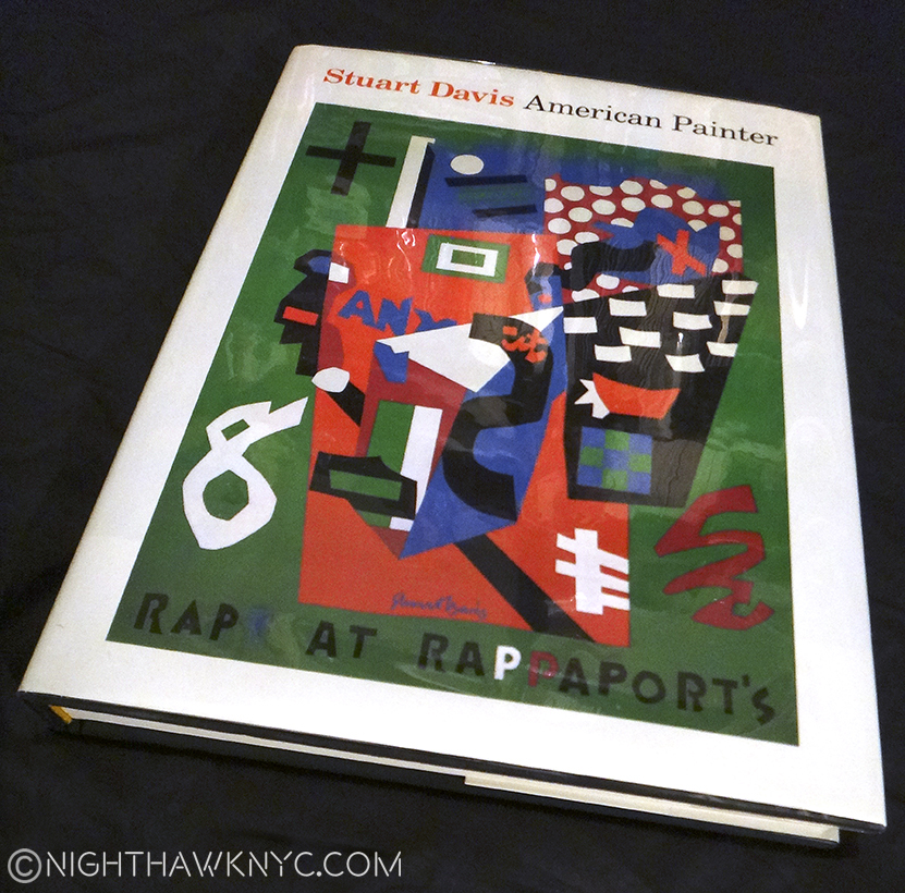
“This book” is an out of print exhibition catalog from the Stuart Davis show at The Metropolitan Museum in 1991. Another of the shows I missed and will forever be sorry I did. Thank goodness it lived on in this superb catalog. Show catalogs are an interesting thing. Widely available while the show is on, they soon go out of print and then become sought after by Artists, specialists and die-hard fans as time passes.  Though The Met said they were going to make all their older publications available as .pdf files online, some, like this one, have been skipped no doubt because it was co-published by a big commercial publishing house, who has a say in that, in this case Abrams.

12 years ago I bought a used paperback copy of it at the now defunct Academy Books and had worn it out. I’ve had my eye out for another copy, one in good condition at a reasonable price for a while. I need it now because I’m in the middle of a Post on the “Stuart Davis: In Full Swing” Show at the new Whitney Museum. My go-to (often) bookstore, The Strand, had one recently, but it wasn’t much better than the one I had, so I passed. A few days later, it was gone. So, I was driven to look online, and finally found this copy.

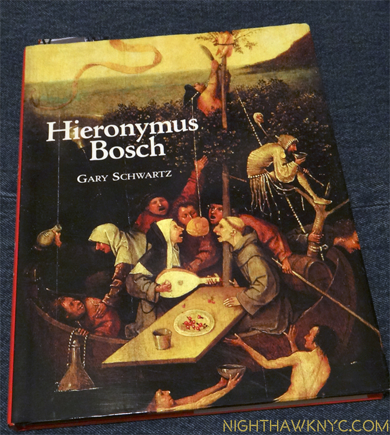
The Book. The catalog for The Met's 1991 Stuart Davis show, long out of print. Notice the cover Art.

The Book. The catalog for The Met’s 1991 Stuart Davis show, long out of print. Notice the cover Art.

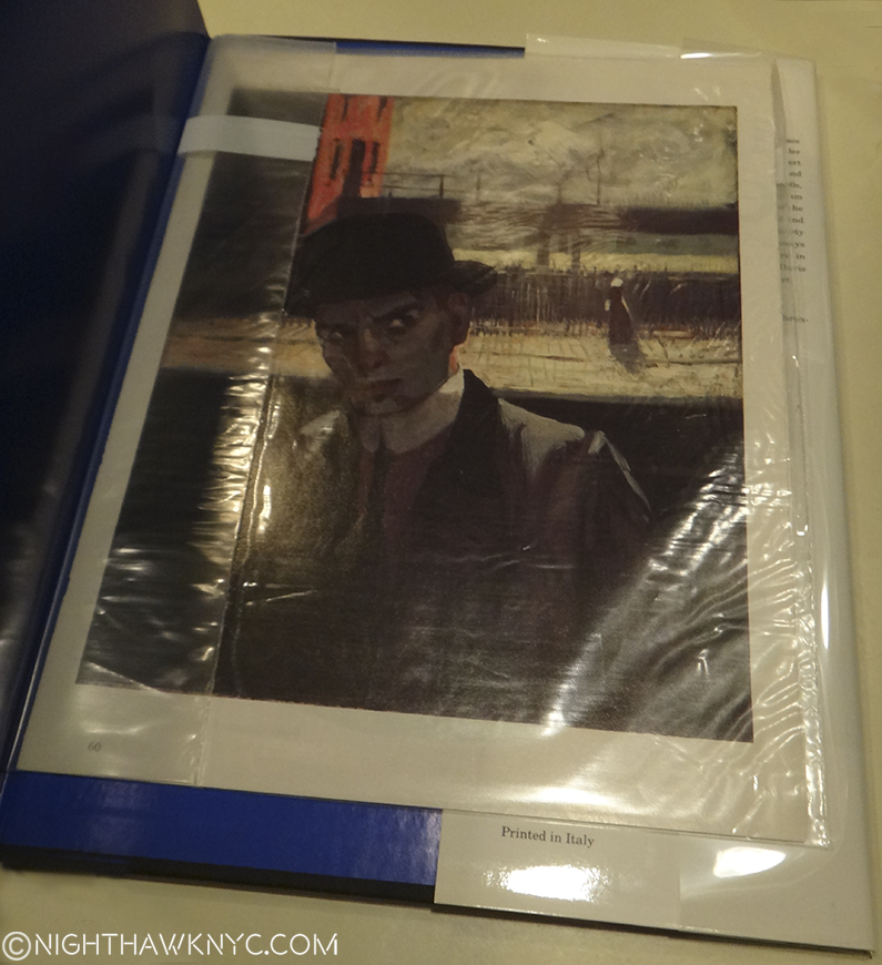
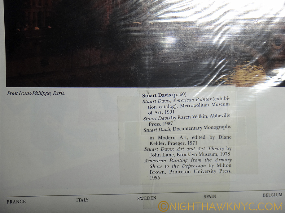
I bought it online from a bookstore. When it arrived, unlike some of my recent experiences buying books online, I found it to be in better condition than I had hoped. People seem to want to upsell the condition of books, which is so shortsighted. Most buyers are going to notice an obvious flaw in something so why try and get over on someone and have it sent back to you and probably get some, deservedly, bad feedback in the process? To help keep it this way, I decided to put a book jacket on it. I’ve been looking through it, but I hadn’t looked inside the back cover. When I removed the dust jacket to wrap it, I did. I found Stuart Davis, himself, looking out at me from a 1912 Self Portrait he painted, apparently in New York, given the background, while he was living in Hoboken, NJ, at age 20. It was in an archival envelope. I opened it up to discover it was the first page of an article about Davis and the 1991 Met Show, carefully removed from an unknown magazine (circa 1991-2) and placed in this envelope to protect it, and so it wouldn’t discolor the book.

Stuart Davis, in his 1912 Self Portrait, looks out at us, 104 years later.

Haunting our City. Stuart Davis, age 20, in his 1912 Self Portrait (with NYC’s old Elevated Subway in the background) looks out at us, 104 years later, from inside the back cover. The original painting is here.

On the back of the last page of the article, someone had cut out and carefully taped the bibliography for the article. Impressive!

DSC00537PNH

This was something similar to what I’ve done for many years, myself. If you have eclectic taste and/or like Artists or Musicians that aren’t very popular it may be a long time before you find something in print about them. When I did? I’d read it over a few times, then cut it out and save it. I’d stick it inside a book about them (if there was one), inside a record jacket, or later, a CD jewel case.

I buy used books often, since many books I’m interested in are now out of print. Sometimes, the unpleasant aroma of old cigarette smoke hits you, making you wonder if that finally led to this book being here. They don’t make the cut. Sometimes, they come with a previous owner’s name written inside. I usually don’t like anything written in a book. But this one time? I wish the owner had written their name in it.

One day all too soon, physical Art Books will be a thing of the past, as soon as image quality in eBooks catches up with their printed counterpart in a reasonable file size. That might be a while yet. For me? It would be a mixed blessing. Mostly? I have too many large books, as I’m often reminded, so freeing up some space would make a big difference in my life. Beyond that, though, there is something beautiful about a physical Art Book, something that hooked me since I bought my first one, on Rembrandt by Bob Haak as a teenager, and still does. I suspect they will then trade among collectors, like Lp’s do now. No one will ever open an eBook and have this happen to them.

Finding this today? Here was a kindred spirit- someone like me. Someone I’ll never know who feels about Stuart Davis’ work the way I do. Though he didn’t write his name in it, it was personalized in a non-destructive way. Making it one’s own, but not like tattooing it with writing. There’s no need for that in this case- I get it.

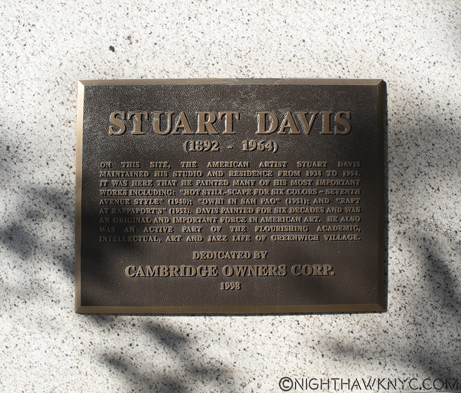
That same afternoon, I went back to to see “Stuart Davis: In Full Swing” yet again, as my work continues. I had an errand to do first, so I wound up walking over to the Whitney a different way than I usually do. As I neared the corner of 7th Avenue on West 13th Street, I was stopped in my tracks, when I saw this on the wall.

DSC_7025P2NH

“…it was here that he painted many of his most important works including…”

What? Wow!

I have lived in and around NYC almost all of my life, and been in this neighborhood countless times. Yet, I’d never known he lived here! Around the corner is the Village Vanguard, for my money the world’s greatest Jazz Club, where it occupies the same basement it has since 1935. Being a lifelong Jazz lover, I bet he spent quite a few evenings there, as I have, as well. The original Whitney Museum was a short walk away on 8th Street, when he lived here (from 1934-54), as the new one is now in a different direction.

Reading the plaque, I could still feel Stuart Davis’s “Self Portrait” from inside the back cover of the book looking at me. Inside in the lobby hung a large, beautifully framed Stuart Davis Poster. Impressive considering he died 52 years ago, and it’s 62 since he lived here. Looking at the building, it looks like thousands of other buildings in New York, and, probably, the rest of the world. I stood outside pondering it. It wasn’t like the old Bowery that reeked of cheap booze and romantic Artist’s loft studio spaces, the long time homes of Allen Ginsberg, John Cage and othes from the same period, Keith Haring, Joey Ramone, among others, after. It was a nice, modern, kinda faceless apartment building. Nothing about it said that one of the greatest American Artists who has yet lived lived here, except it’s smack-dab in the middle of The Village location.

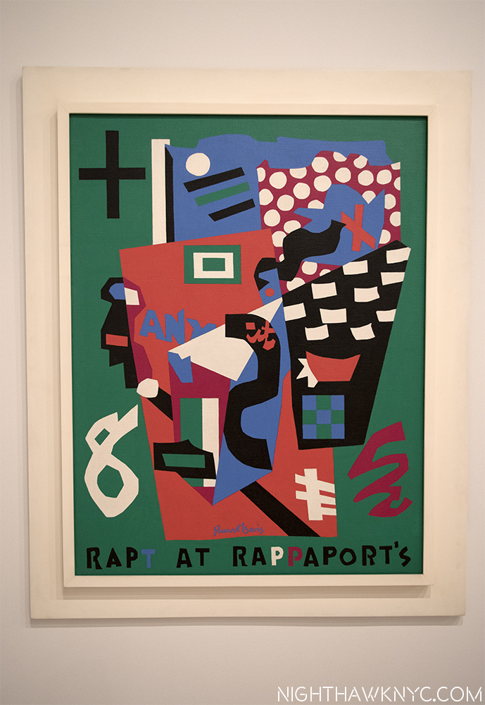
Then, I continued on, completing the short walk to the Whitney. Inside the show, I lingered in front of “Rapt At Rappaport’s,” from 1952, in it’s interesting frame.

Davis' "Rapt At Rappaport's," 1952, on view at The Whitney, now in the Smithsonian

Look familiar? Davis’ REAL “Rapt At Rappaport’s,” 1952, now on view at The Whitney, from the collection of the Smithsonian.

Davis painted it in the building I had just walked past, as the plaque confirms by name! I never knew that. I’ve seen it before, but now? I’m seeing it anew. It doesn’t depict the neighborhood (Greenwich Village) per se, in fact, it’s an “homage” to “Rappaport’s Toy Bazar,” a store his parents used to take him to as a child many years earlier. The store used polka-dotted paper to wrap gifts, hence, the polka-dots in the upper right, and the work’s title is also a pun on “wrapped.” But, on a different level, now everything about this says “Greenwich Village in the 1950’s.” The child became a man, and that man was an Artist. It drips of the Jazz he heard all around as The Village headed into it’s Jazz & Beat Glory Days. Even the title (using “Rapt” in place of “Wrapped,” for the wrapping paper) is a “Jazz-pun,” as in raptly listening. In addition to being a “souvenir” of his childhood, it’s also a little reminder, a little piece, of that more recent time, and place, The Village- from his then home there on 13th & 7th.

It also happens to be the painting chosen to be the cover Art for my new/old book.

Is this all a bunch of strange coincidences, neatly “Rapt” together with a bow on top? Covering (“wrapping”) the Davis book and being startled to see him looking out at me unexpectedly, as the prior owner had left him, lovingly curated…then accidentally discovering (uncovering?) the very place he painted it’s cover Art… and finally, seeing the original painting shown on the book’s cover. Hmmm…It feels like someone is sending me a message.

Now? Someone else lives in that apartment. Someone else owns this book.

Still? Parts of both live on from before. Very good parts.

Thank you.

*-Soundtrack for this Post is “You Can’t Judge A Book By It’s Cover,” written by Stevie Wonder, Sylvia Moy and Henry Cosby, and preformed by Bo Diddley.

NighthawkNYC.com has been entirely self-funded & ad-free for over 8 years, during which 300 full-length pieces have been published! If you’ve found it worthwhile, PLEASE donate to allow me to continue below. Thank you, Kenn.

You can also support it by buying Art, Art & Photography books, and Music from my collection! Art & Books may be found here. Music here and here.

Written & photographed by Kenn Sava for nighthawknyc.com unless otherwise credited. To send comments, thoughts, feedback or propositions click here. Click the white box on the upper right for the archives or to search them. Subscribe to be notified of new Posts below. Your information will be used for no other purpose.

Hallejulah! Calatrava’s Cathedral Opens (UPDATED)

This site is Free & Ad-Free! If you find this piece worthwhile, please donate via PayPal to support it & independent Art writing. You can also support it by buying Art & books! Details at the end. Thank you.

Written & Photographed by Kenn Sava

Santiago Calatrava’s new World Trade Center Transit Hub, which officially opened today, August 16, is an unabashed glory of Architecture, a breathtaking masterpiece. What I wasn’t expecting is that it’s, also, a true monument to Freedom.

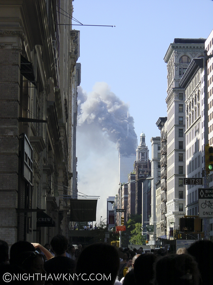
As far as I’m concerned it has more to do with Freedom than that other building with that term applied to it that stands close by. You know, the one that looks like a giant hypodermic needle. Having avoided the whole Ground Zero area (even though I grew up there), the way all New Yorkers avoid Times Square, mostly out of disgust with what has been erected there thus far, I of course knew about the WTC Transit Hub, but I was afraid something would happen at the last minute and it would have been quashed or horribly altered. As a result, I hadn’t seen this building in progress. When I turned the corner onto Dey Street this afternoon, and saw it before me, a shiver ran down my spine. I was struck by the unforgettable memory of seeing that still smoldering pile of the remains of the World Trade Center right where the Hub now stands. It’s almost 15 years ago, and I can see it like it was yesterday.

I shot this on 9/11 from 5th Avenue and 17th Street.

Yesterday…The World Trade Center on 9/11. I shot this from 5th Avenue and 17th Street.

I wiped my eyes.

“‘Twas in another lifetime, one of toil and blood
When blackness was a virtue the road was full of mud
I came in from the wilderness, a creature void of form
Come in, she said
I’ll give ya shelter from the storm”*

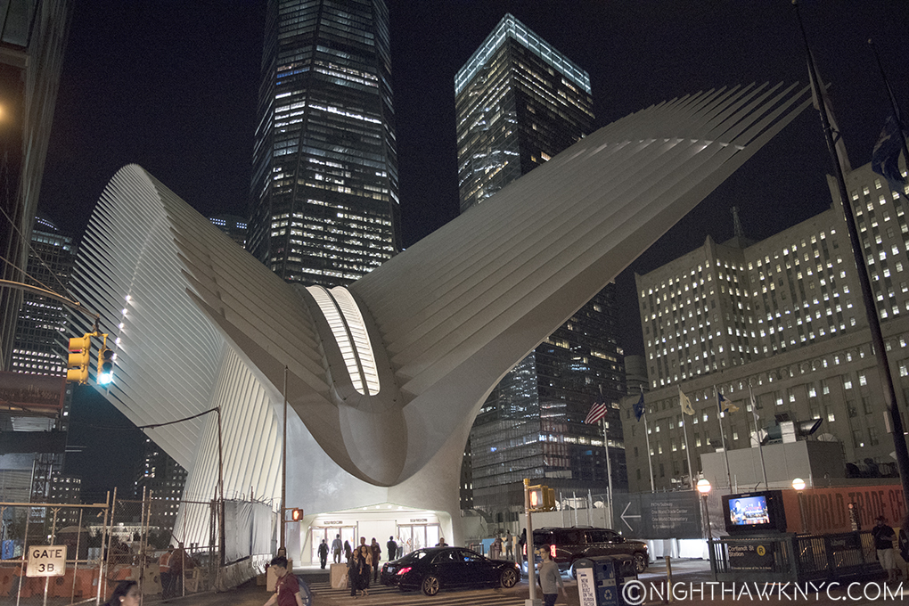
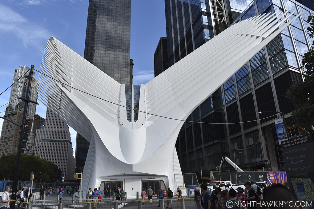
But no. Now? It looked like a big white bird was sitting there.

I had to wipe my eyes when I saw this to wipe away the memory of what I saw on this very spot 15 years ago.

It looked like a Phoenix rising from those very ashes.

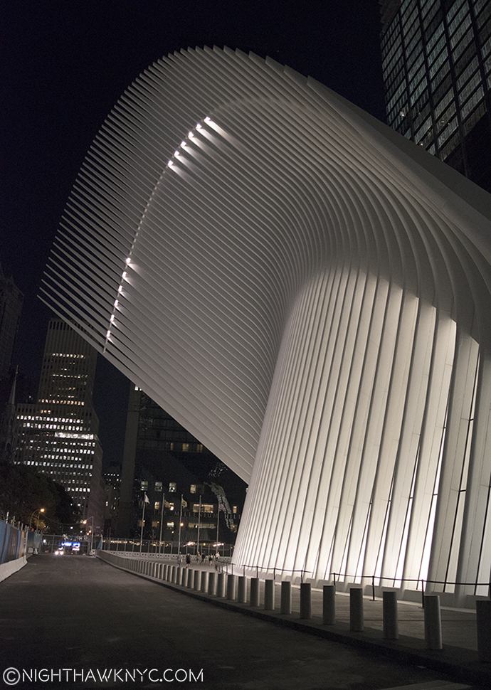
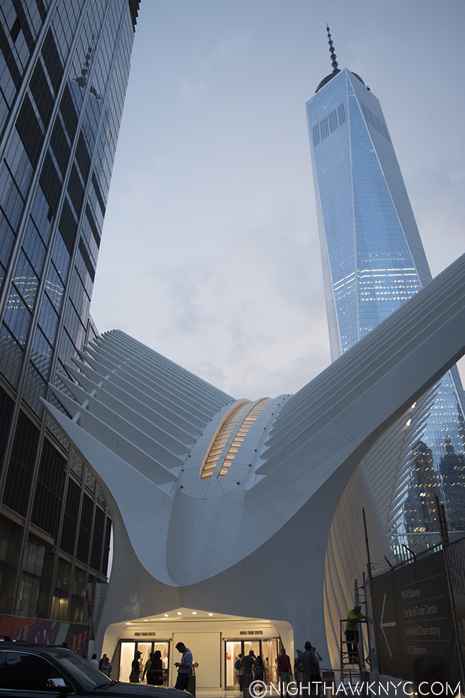
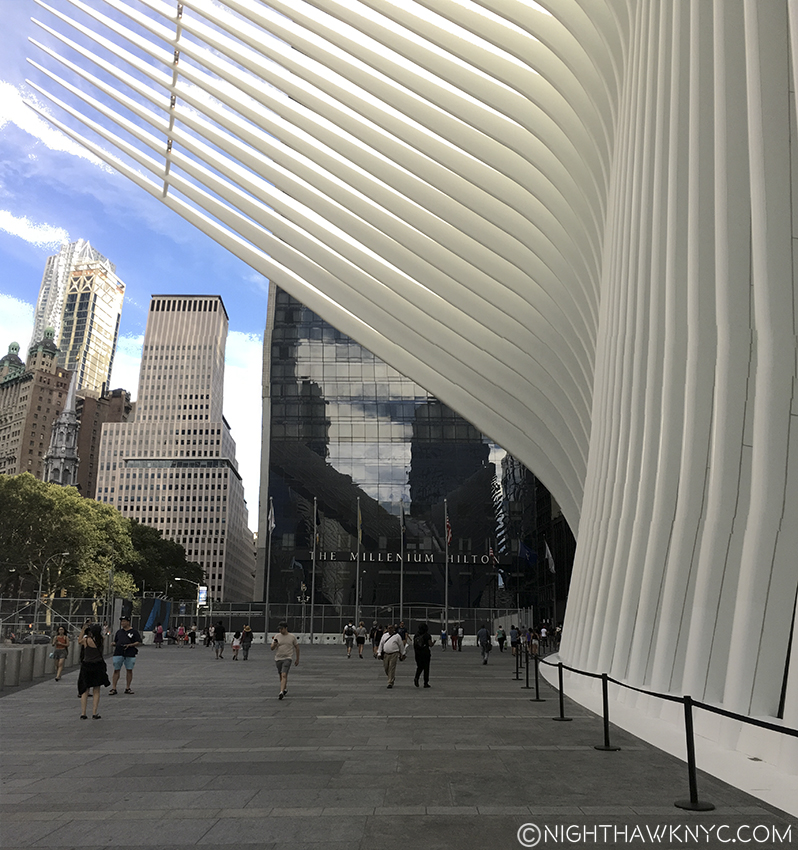
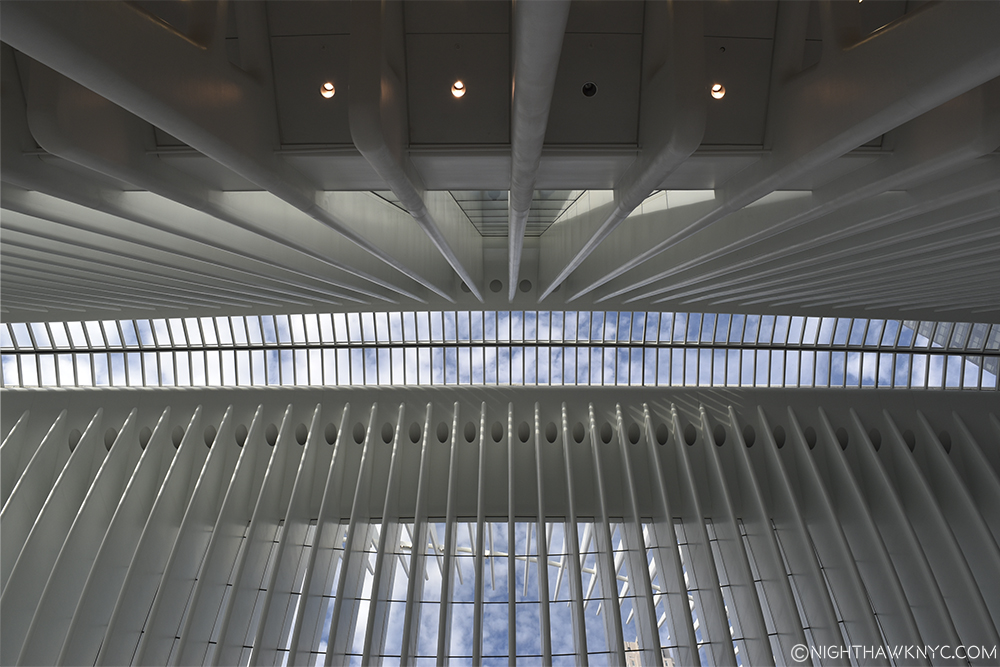
Calatrava’s new masterpiece looks like a glorious white bird (a Phoenix, or…ok, an Eagle, not that I’ve ever seen either in person) with GIGANTIC wings large enough to actually offer you a feeling of comfort, even protection (though they won’t even stop the rain), as you stand under them outside. That’s exactly how I felt when I did. The building is Angelic, and not only because it’s white all over- it has an air of something sacred that I can’t describe about it- inside and out. It’s downright Glorious. And? THOSE WINGS! Oh my god…

DSC_6807NEFPNH

A place of peace- unexpected and profound. Angels have wings, I hear.

“Not a word was spoke between us, there was little risk involved
Everything up to that point had been left unresolved
Try imagining a place where it’s always safe and warm
Come in, she said
I’ll give ya shelter from the storm”*

Nothing has had a healing effect on me thus far after that fateful day as seeing this. I don’t know what Santiago Calatrava’s intentions are with this work. I haven’t read anything he, or anyone else has said about it. All I know is that it speaks to me.

Think it's small? Look for the man walking along side about half way for scale.

Think it’s small? Look for the man walking along side to the right side for a sense of scale.

Outside, especially from the front, it looks small. Don’t be deceived. Only the dome is above ground. Inside? It’s HUGE.

DSC_6612PNH

“Set a course for…you know…out there….” Captain Kirk, Star Trek.

DSC_6525PNH

Below the Cathedral’s Dome, two levels of stores, food, etc, with more on wings extending off the sides.

IMG_5734PNH

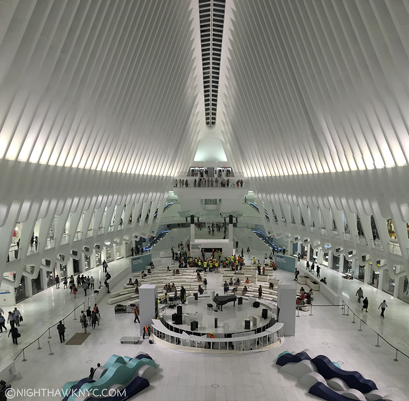
John Legend had just performed in the center of the floor.

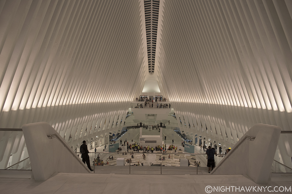
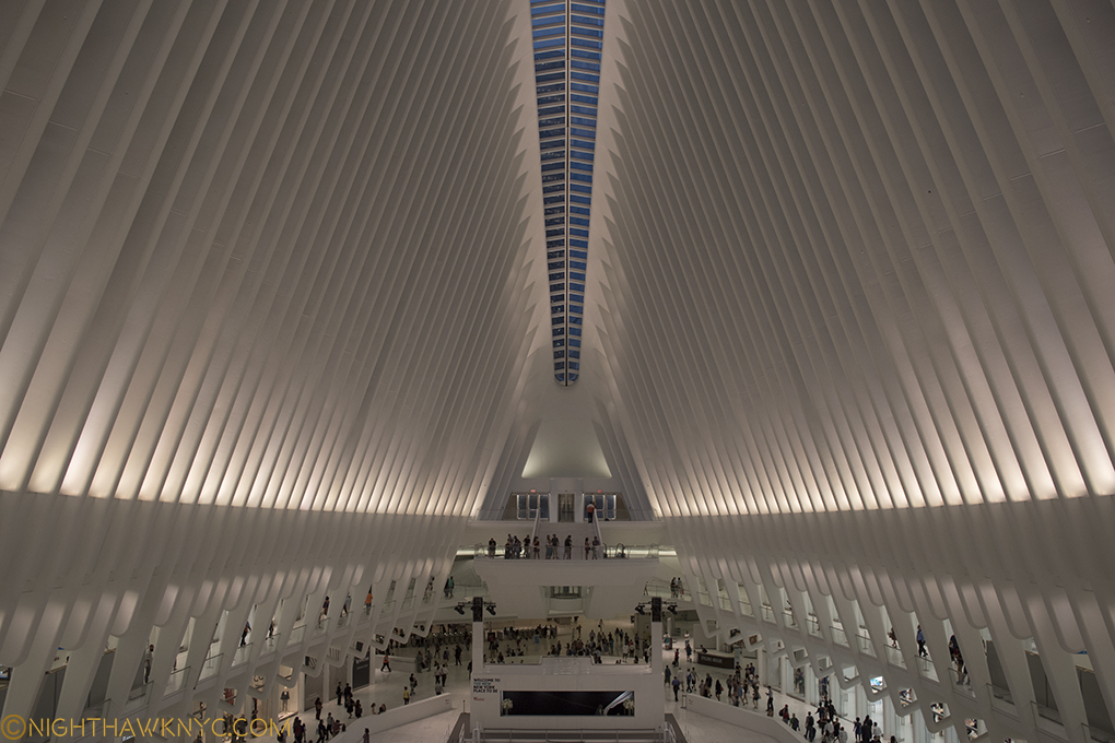
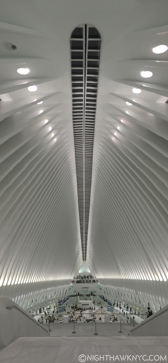
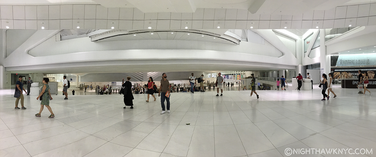
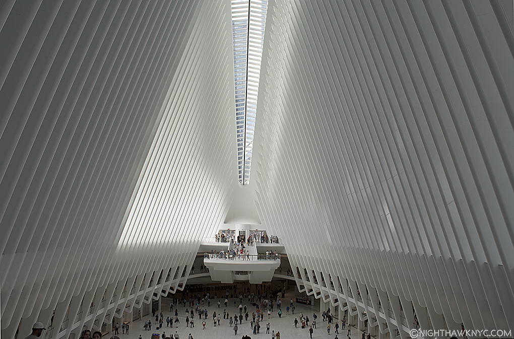
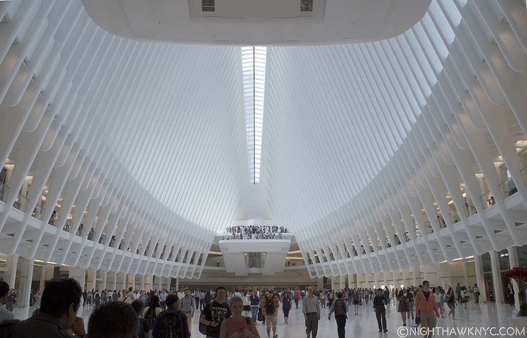
After you walk in, you are immediately presented with a vast football shaped interior. “Cathedral-like” was my first impression. The longer I looked, something struck me- While there are stores all along both levels that stretch out in front of you, you can’t really see them from the viewing platforms on each end! This serves to lessen the “cathedral of shopping” effect that pure shopping malls have, and puts the focus back on the building and it’s architect’s intended impact. (I’m not sure how the merchants feel about this, because it serves to make their shops less identifiable from a distance.) I spent three and a half hours walking in and around it tonite from all sides (yes, including visiting the brand new Apple Store, prominently located and having it’s grand opening today as well. It happens to be one of the 3 Apple Stores with their new store design. Some other stores were open but the complex stretches out in all directions, and I didn’t have a chance to explore all of it today). It may be comparable in size (or bigger?) to the underground mall that was under the World Trade Center and destroyed, as well, on 9/11.

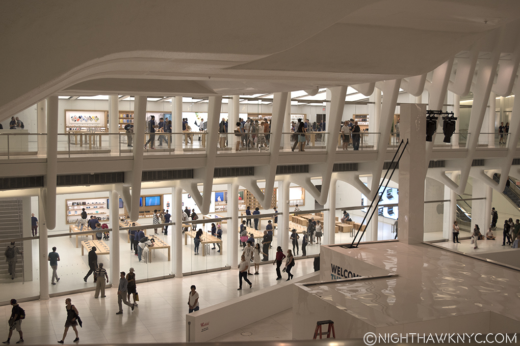
Opening Day for Apple's WTC Store- on both floors, it's 3rd with their new store design.

9pm. Closing time on Opening Day for Apple’s WTC Store- on both floors, it’s 3rd with their new store design. Like the rest of the stores, it’s a bit “hidden” by the building.

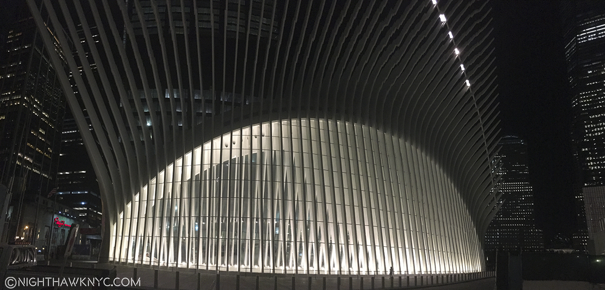
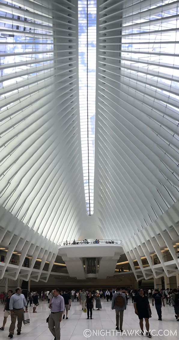
Everywhere, inside and out, this Cathedral is clad in pristine white, with copious amounts of white marble included. Just stunning. It’s pristine white glistens even in the dark (my preferred viewing time, of course. UPDATE- August 17- Scroll down to see daylight pics I took today.). The ribs of it’s twin wings soar majestically, impossibly high, providing the eye with a glorious thrill, while straining the neck to unnatural angles, as it traces their course, up, up and away. Wow. Careful! Look too much straight up and you may tip over. Unlike Calatrava’s vision, my feet need to remain on the ground.

img_5720p2nh

I bent over backward to get this shot. Imagine what it was like to install EVERY ONE of those MASSIVE ribs! Wow. (PS-Don’t call me when they need cleaning.)

Still? That THRILL is an important part of the feeling I want from architecture, Mr. Renzo Piano (who’s new Whitney Museum, which I recently wrote about)! Here is engineering, like the countless, huge ribs (as visible as Mr. Piano’s engineering is at the Whitney), that is both functional and endlessly beautiful to behold.

Even though it is far from completed, right now I’d say this is the greatest new public space in Manhattan since, perhaps, the old Penn Station in 1910. It seems to cast a respectful glance back to Grand Central Terminal (which also lets light in so magically along it’s ceiling and that glorious glass wall). Once completed, Calatrava may have given us a “Grand Central Terminal” for the 21st Century.

Path Train Station. Notice the 2 people looking up at the great hall before them!

Welcome To New York. The Path Train Station. Notice the expression of the 2 people looking up at the great hall before them!

I saw more people taking pictures of it in ten minutes than I have in 15 months take pictures of the new Whitney. Even the guard was proudly posing! Inside, everyone I spoke to from the security guards, to the construction workers taking down the stage from John Legend’s performance had a glow about them. There was actual pride in the voice of one guard I spoke to off in the corner by a staircase. “I don’t know anything about art,” he told me, “but someone came by and said I don’t understand what all the hoopla is about. I told him you have to have an artistic eye.” I shook his hand. Pride from someone who hasn’t even been on the job for 12 hours yet. Inside and out, people from all over the world were not only taking pictures of every angle of the place, they were posing in front of it, next to it, all over it for selfies and groups shots. They felt it, too.

A Security Guard, back to us, poses.

Take a bow! A Security Guard, back to us, poses. Working in a work of Art is it’s own perk.

For me? It’s a new masterpiece this City SORELY needs, ESPECIALLY in a public building. It makes arriving in Manhattan the special thing it is, again. Walking around today, it’s already a hit, less than one day in. I grew up downtown. My father had an office 2 blocks from the World Trade Center. I remember it being built, and I saw it destroyed. Looking around today, after a while of being away, I was just sickened at what’s gone up, like I am in most other areas of the City. While I’m glad the 9/11 Museum seems to be a big hit, I’ll never “get” the building they put it in, which I saw for the first time, and which is right next to Calatrava’s Hub. The Hub directly faces the Memorial Pools, where the Twin Towers stood. Being there today, I was struck by just how big the area is. When I was at the World Trade Center, as gigantic as they were, the surrounding area somehow felt small. Now, it feels big, and it feels like it’s a mishmash of ugly buildings, except this one, that don’t have anything to do with each other. Yeah, like the rest of New York, and that’s a shame. I say this with ultimate respect for all those we lost, and with pain that things haven’t turned out better down there. They deserve better, and so do we. At least we have one great building there, and one, that for me, also speaks to what happened there, as well as to our future.

DSC_6520PNH

Seen from the front, the ribs are short on one side, long on the other. Walk to the back, the short side is now long, the long side, short.

Along with everything else it says to me, it says that YES! It IS possible something great can be built in New York City in the 21st Century!

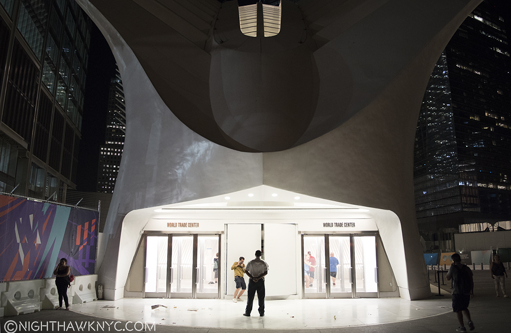
Quibbles? Well, it’s far from finished, so I’ll hold off getting very critical about it until it’s done, but I will say I don’t like the front doors, on either of the two entrances. Frankly? They look terrible. They feel to me like they weren’t Calatrava’s choice.

But? Given how hard (read that “impossible”) it is for great architects to get ANYTHING built in Manhattan, let alone something as monumental as this is, I’m absolutely thrilled! Best of all, it’s open 24 hours, so I can wander over there any time of day or night to enjoy it’s beauty, and let it continue to speak to me. It’s a dialogue I look forward to continuing. Maybe even in daylight. Well, let’s not get crazy.

I couldn’t help thinking the more it sunk in how great this is that it certainly sets the bar VERY high for the next Penn Station and Port Authority Bus Terminal! GOOD LUCK with that!

“Well, I’m livin’ in a foreign country but I’m bound to cross the line
Beauty walks a razor’s edge, someday I’ll make it mine
If I could only turn back the clock to when God and her were born
Come in, she said
I’ll give ya shelter from the storm”*

UPDATE- August 17- Due to a request I got, I went back to shoot it in the daylight-

DSC_6969PNH

To the left in the background is St. Paul’s Chapel, which somehow survived 9/11, and the top of Frank Gehry’s Apartment Tower in the far distant left.

IMG_5795PNH

DSC_6903PNH

IMG_5815PNH

dsc_6998p2nh

Looking up from the dead center of the floor.

All the paraphernalia that was on the floor last night was removed leaving a large, open glorious space. I hope it stays that way.

All the paraphernalia that was on the floor last night was removed leaving a large, open glorious space. I hope it stays that way.

 *-Soundtrack for this Post is “Shelter From The Storm” by Bob Dylan, published by Bob Dylan Music Co., from “Blood On The Tracks.”

NighthawkNYC.com has been entirely self-funded & ad-free for over 8 years, during which 300 full-length pieces have been published! If you’ve found it worthwhile, PLEASE donate to allow me to continue below. Thank you, Kenn.

You can also support it by buying Art, Art & Photography books, and Music from my collection! Art & Books may be found here. Music here and here.

Written & photographed by Kenn Sava for nighthawknyc.com unless otherwise credited. To send comments, thoughts, feedback or propositions click here. Click the white box on the upper right for the archives or to search them. Subscribe to be notified of new Posts below. Your information will be used for no other purpose.

Move Over Harry- Gary Schwartz Released A New Book!

This site is Free & Ad-Free! If you find this piece worthwhile, please donate via PayPal to support it & independent Art writing. You can also support it by buying Art & books! Details at the end. Thank you.

Written & Photographed by Kenn Sava

“Where your treasure is,
There will your heart be also.”*

As if I don’t have enough books, or enough books by Gary Schwartz (4, now 5), the release of his newest book is a cause for celebration around here. It’s as big a deal for me as the release of a new Harry Potter book is for the rest of the world. Mr. Schwartz’ new book is filled with more magic, sorcery, lost knowledge, and mystery than all the Potter books combined! Not to mention some of the greatest Art in the Western World.

The waiting line will be a lot shorter for this one.

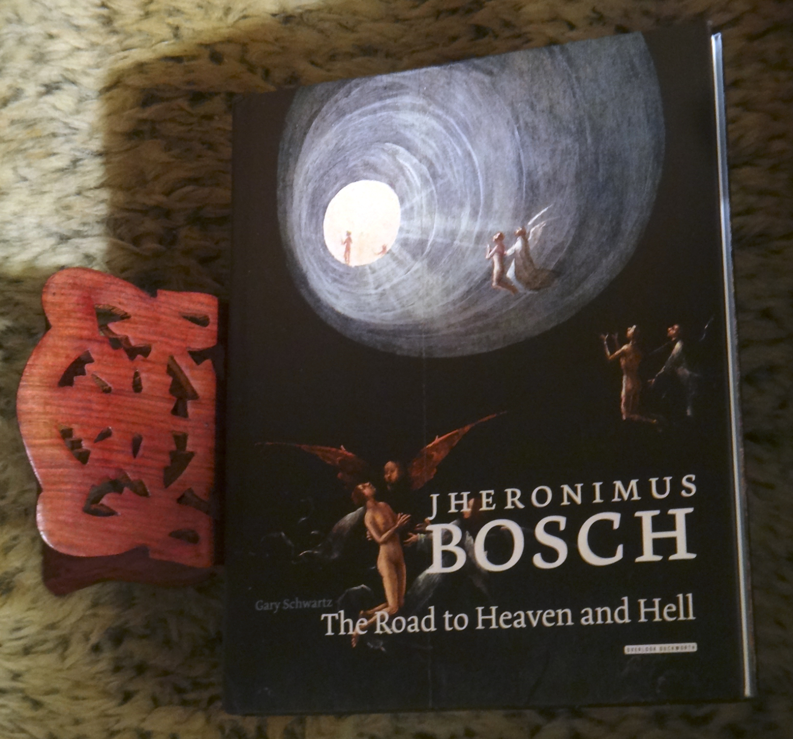
It’s subject is no less than Jheronimus Bosch, the birth name of the Artist better known as Hieronymus Bosch, one of the most mystical, unique and elusive Artists in Western Art. If anyone can track him down, my money is on Gary Schwartz. Track him down he does, going into extraordinary detail on his life, works and times, discussing each and every work in his inimitable way that almost no other Art Historian has- he gives you the technical details along with the humanity like he’s talking to “regular people,” and not a doctoral class in Art History. I marvel at his ability to do so. THIS is how Art should be taught, explained and passed on, IMHO.

I’ll sum up this book in 3 words- “Bravo, and Hallejulah!” Bravo for (another) classic & essential Art monograph, and Hallejulah we got another one by Gary Schwartz!

Given that this past week (August 9) marked the 500th Anniversary of his death, it’s already been a big year for Bosch. A show that I’m sorry I missed commemorated the anniversary in his former home town, Hertogenbosch in The Netherlands, then there was the release of the Bosch Catalogue Raisonne (and related Technical Studies) by the Bosch Research & Conservation Project (BRCP), 5+ years in the making, geared to establishing once and for all, which works the Master actually did create, and which he didn’t. Given all this hoopla, the timing of Mr. Schwartz’ newest book, “Jheronimus Bosch: The Road to Heaven and Hell,” couldn’t be more auspicious. It’s release seemingly makes it go head to head with the BRCP’s 2 books.

But, showing the true colors of his collegial spirit, Mr. Schwartz wrote the very first review posted on Amazon of the Bosch Catalog Raisonne, giving it 5 stars, saying both BRCP books were “Raising the bar.” Check it out. It may be the best review I’ve ever read on Amazon.

Gary Schwartz is the same man who had the audacity to write a book called “The Rembrandt Book” in 2006. There are, possibly, as many books devoted to Rembrandt as any other Artist in history. Was he saying, “Forget all of them, this is THE Rembrandt Book?” I wondered. Now? If I had to choose one Rembrandt book to take with me? That would it. And, I now actually call it “THE Rembrandt Book,” even though it was no less than his second full length monograph on the Dutch Master, following “Rembrandt – His Life, His Paintings,” from 1985. When I first looked them over side by side, my jaw hit the floor of The Strand. What most amazed me is that they were written 20 years apart, and they are completely different! Whoa. How much does he know about Rembrandt? I consider them both essential for Rembrandt lovers.

Essential, and sadly out of print. The Strand is asking 95.00 for a copy like mine, above. If you look hard, you can find a decent one for 30. online.

Now? He’s done it again. 19 years after releasing a 92 page book, called “First Impressions: Hieronymus Bosch” (1997), which as it’s title hints, is a fine introduction to Bosch,

Released in 1997, now out of print. A great introduction to Bosch. I got mine for 9. at The Strand late last year.

Jheronimus Bosch: The Road to Heaven and Helll” is a “The Rembrandt Book”-style monograph on Bosch. To my way of thinking it’s as close to “definitive” as we may be likely to see for some time, with all due respect to the BRCP’s Catalog Raisonne (which is for specialists, and while focused on the works in unprecedented depth using ground breaking techniques, doesn’t tie the work in with the biographical depth Mr. Schwartz does. Translation- I’m not a Bosch specialist.). Mr. Schwartz has an almost magical way of unearthing details about Artists that lived all these hundreds of years ago, and sifting through the existing documentation with knowing eyes that you just don’t get in other books. (He does include some of the BRCP’s findings, though it appears their work wasn’t completed while he was writing his.) Besides, there are so few works by Bosch, whoever’s word you take for it, that I know I’m not going to miss any either way.

I’ve come to trust Gary Schwartz when it comes to the “last word” on an artist. Mr. Schwartz has earned my trust, the hard way-with Rembrandt. But you don’t have to take my word for it- Simon Schama, of the superb Art Documentaries “Simon Schama’s Power of Art,” Art Historian & Professor of Art History at Columbia University, co-dedicated his excellent Rembrandt Biography, “Rembrandt’s Eyes,” to Gary Schwartz. After reading Mr. Schwartz’ Rembrandt books, which, coincidentally, came about during the work of another Research organization, the Rembrandt Research Project (RRP), who were also endeavoring to compile a verified canon of authentic works, and reading his assessment of their findings, I found myself in agreement with Mr. Schwartz on contested works like the Frick Collection’s “Polish Rider,” and others. I now trust his judgement about what’s what- no small thing when the world’s supreme experts are so vociferously at odds over things like what’s a real Bosch, or Rembrandt, and which isn’t. Hundreds of millions of dollars ride on the outcome of those arguments, not to mention the pride of the Museums home to these works. But? It’s not my money. (Phew.) I only care about learning about the Artist, trying to get a feel for his style and work and see if I can spot it in all these discussions, and how the work fits in with his life story. My guess is that Mr Schwartz appears to share similar motivations- he wants the truth. He’s not bashful about (respectfully) going against other experts if his research bears it out. He trusts himself- his own mind, and of course, a lifetime of research, experience and incomparable expertise.

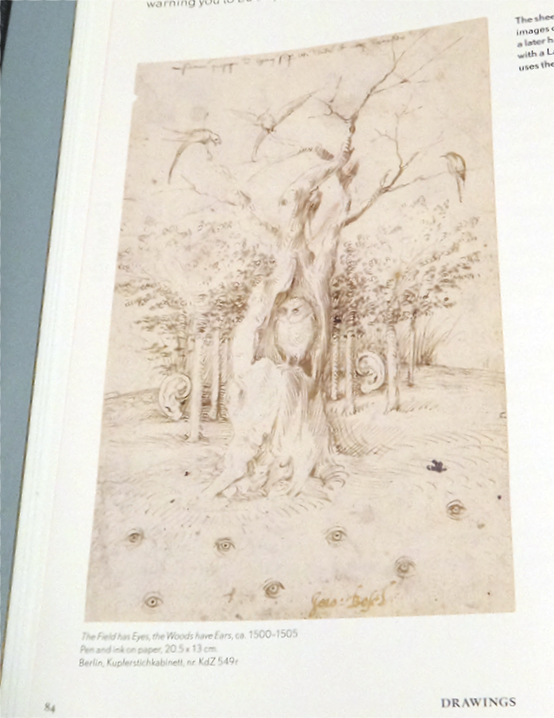
Owls appear all over Bosch’s work, so how can I not love him? Here’s one of my faves. Note the eyes and ears. It strikes me as a statement about the world right now.

While  you can read more of his writing on his website, and it’s all fascinating, unique and worth every bit of your while, getting a book like this is a rare gift, one that must have taken him years of very hard work to put together.

“You’ll stay with me?
Until the very end,’ said James.”*

So, the next time you’re in your better brick & mortar Bookstore, see if they have “Jheronimus Bosch: The Road to Heaven and Hell” by Gary Schwartz and published by The Overlook Press. Pick it up and thumb through it. I guarantee it will cast a spell on you, too.

PS- I only hope his next book is on Jan (or Jan & Hubert) Van Eyck…

*- Quotations from “Harry Potter and the Deathly Hallows” by J.K. Rowling, published by Arthur A. Levine Books, 2009. The first quote also appears in Matthew 6:19-24.

NighthawkNYC.com has been entirely self-funded & ad-free for over 8 years, during which 300 full-length pieces have been published! If you’ve found it worthwhile, PLEASE donate to allow me to continue below. Thank you, Kenn.

You can also support it by buying Art, Art & Photography books, and Music from my collection! Art & Books may be found here. Music here and here.

Written & photographed by Kenn Sava for nighthawknyc.com unless otherwise credited. To send comments, thoughts, feedback or propositions click here. Click the white box on the upper right for the archives or to search them. Subscribe to be notified of new Posts below. Your information will be used for no other purpose.

The New Whitney Museum- The Roofdeck of American Art

This site is Free & Ad-Free! If you find this piece worthwhile, please donate via PayPal to support it & independent Art writing. You can also support it by buying Art & books! Details at the end. Thank you.

Written & Photographed by Kenn Sava (*- unless otherwise credited)

DSC_3074PNH

“American Tune”
“We come on the ship they call the Mayflower
We come on the ship that sailed the moon
We come in the age’s most uncertain hour
and sing an American tune”*

Looking west on the 6th Floor Roof deck, Spring, 2016.

Looking west on the 6th Floor Roof deck, Spring, 2016.

Part 1- The New Whitney Museum…And I

We actually go way back…

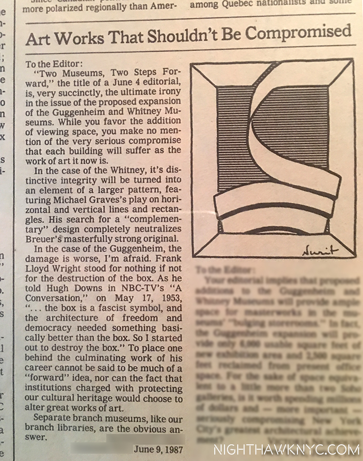
All the way back to June, 1987 when I had a letter published in the New York Times in opposition to the proposed expansion plans of the Guggenheim & Whitney Museums, after it was announced that both Museums wanted to modify & expand their existing buildings. I was outraged. How could you change these two singular masterworks without ruining them? I closed saying that “branch museums were the obvious answer” to modifying these Artworks of Architecture, in the Guggenheim’s case, Frank Lloyd Wright’s masterpiece was, perhaps, the greatest work of Art it owns. I went to the Community Board Meetings, but wasn’t directly involved beyond this letter. Mine was apparently chosen over the head of the opposition committee’s letter, much to his displeasure, I heard.

My letter in the NY Times Op-Ed page opposing the & Guggenheim & Whitney modifications, June, 1987. I love the very fitting drawing they added.

Almost 30 years later (wow…really?), how did “we” do?

Well, BOTH Museums took my “advice” and opened branch museums. The Whitney had a few around town, one across from Grand Central, another in Soho, while the Guggenheim opened what is, perhaps, the greatest Museum building since Wright’s enduring 5th Avenue masterpiece…by Frank Gehry in Bilbao, Spain of all places. It’s a “place” now, a true destination for culture vultures. They showed a model of another Gehry masterpiece they wanted to build downtown in the East River at the Guggenheim Gehry Retrospective in 2000. I bought a poster of it but, after 9/11, it was never mentioned again. ? They went ahead and remodeled Wright’s masterpiece, anyway, which I will never accept, AND continue to open branch Museums around the world as we speak. The Whitney, on the other hand, did not renovate Breuer’s unique original. Instead, we got something I never saw coming- They moved out and built an entirely new Museum.

Wow!

So? On my scorecard? I am one and a half out of 2.

The New Whitney opened in May, 2015 in the Meatpacking District, right at the southern end of the High Line. I’ve made frequent trips there so far studying the building from every angle I could, at night, and yes, even in day light. (Oh, the sacrifices I will make in the pursuit of Art.) The inaugural, and as I’ve said very good, show, in the new Renzo Piano building, “American Is Hard To See,” came and went. I also wrote about both the Frank Stella Retrospective and a show by filmmaker Laura Poitras that came and went, too, along with quite a few smaller shows. So, a few months after the 1 year Anniversary, I think I’ve finally had enough time and experience with the new place, over 45 visits, to have some thoughts coalesce. As always, I have not read any reviews of either the building or the shows mentioned.

Part 2- Renzo Piano’s Whitney Museum Building

U.S.S. Indianapolis. US Navy Photo

The U.S.S. Indianapolis, Why is this picture here? (U.S. Navy Photo.)

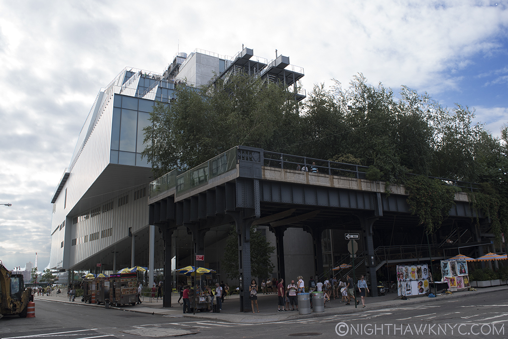
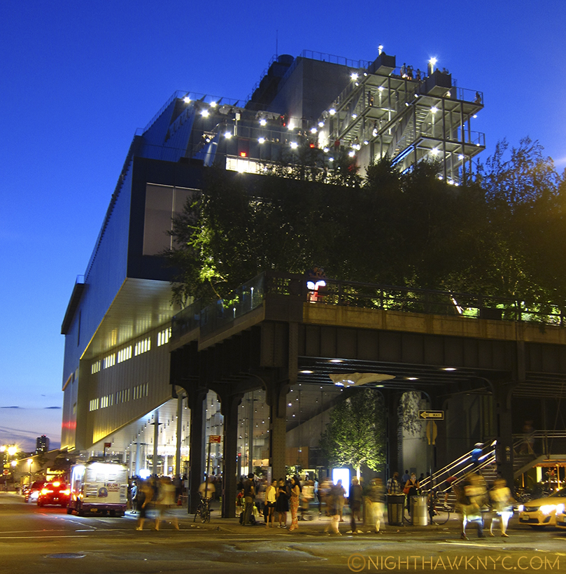
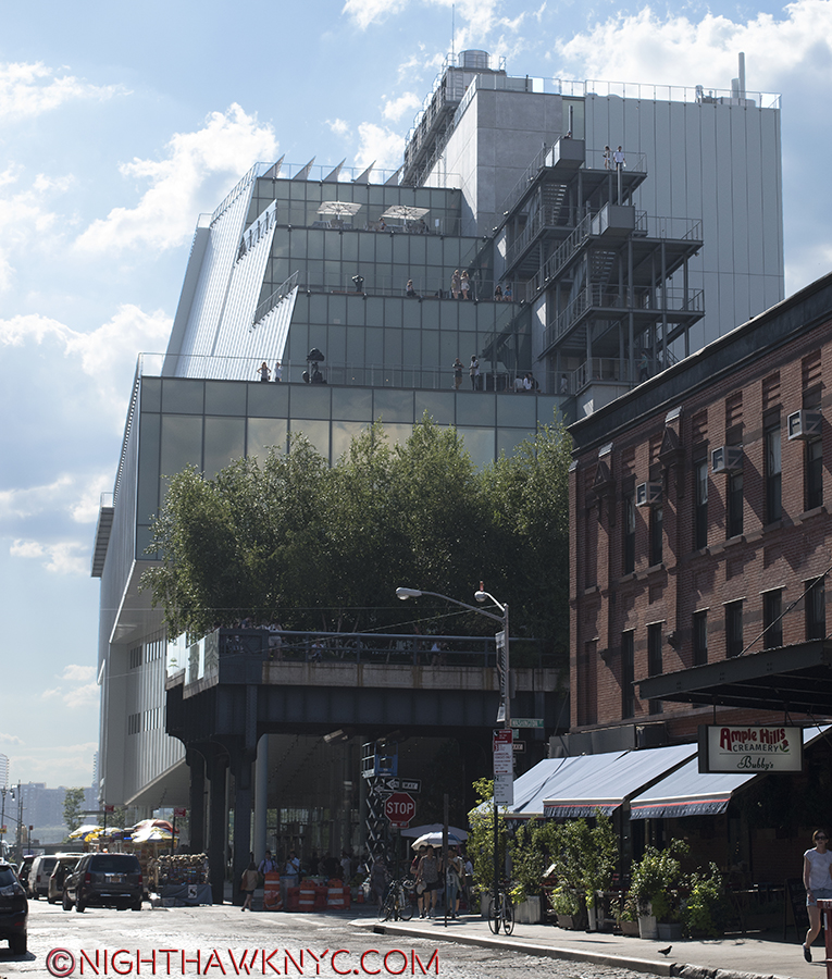
It’s only a year or so old, but I don’t think many will fall in love with the exterior of the building. I must say that in all my trips there so far, I have yet to see anyone else take a picture of it. Maybe (more) time will tell. In this City where location isn’t everything, it’s the ONLY thing, the new Whitney sits on a rather unique lot. How many places in Manhattan can you think of that have BOTH a River view AND a Park view? Situated directly across the West Side Highway from the Hudson River, to the west, and the southern end of the High Line to the immediate east, the Museum hit on a very rare Daily Double. Unfortunately for long time Whitney architect Piano, who came on board during the Museum’s “expansion” days, this lot has 4 sides. To the north, the rest of the block is occupied by one of the few remaining Meat Packing businesses that actually pack meat in what really was The Meatpacking District.1 Yes, trucks of raw meat park within inches of the Museum’s north wall every weekday.

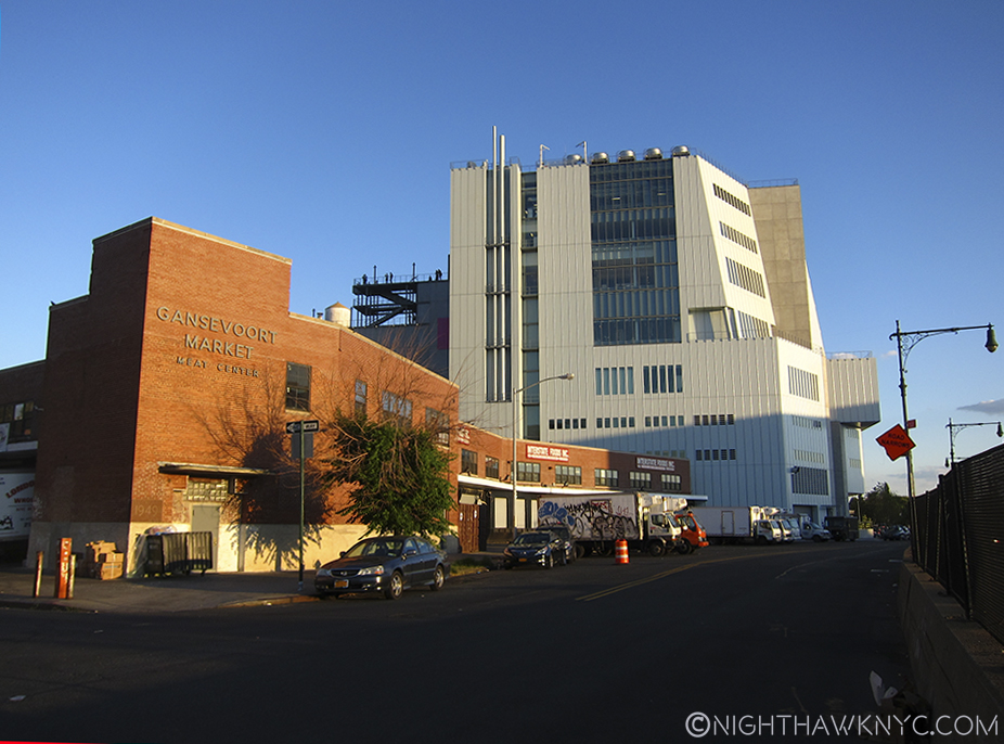
Yes, meat is still packed in the "Meatpacking District." Whitney's north side seen from West Street.

Yes, meat is still packed in the “Meatpacking District.” Whitney’s north side seen from West Street.

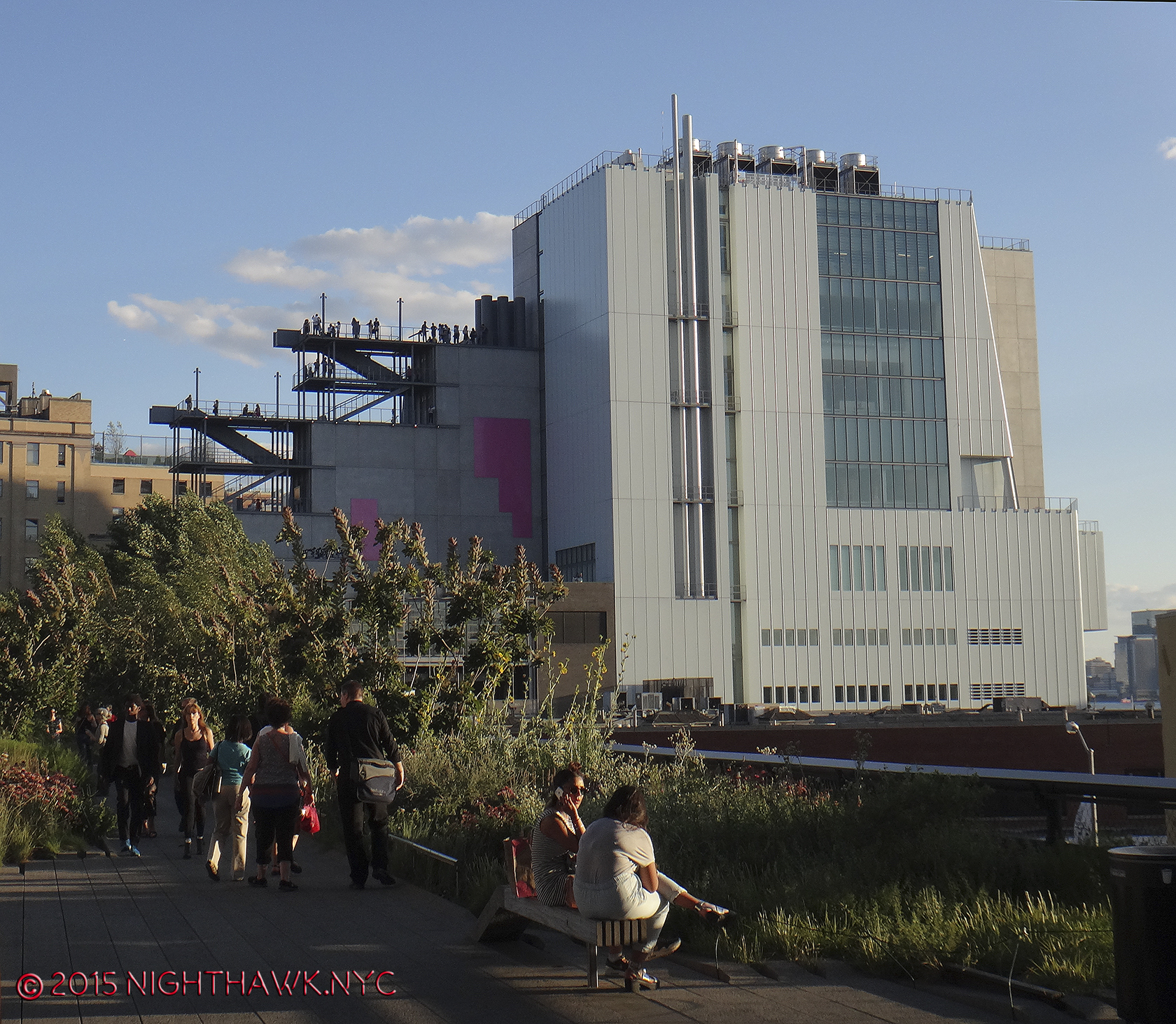
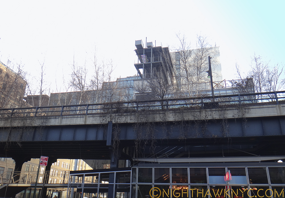
And, seen from the High Line.

And, seen from the High Line.

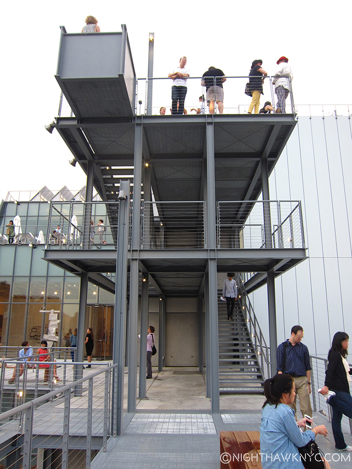
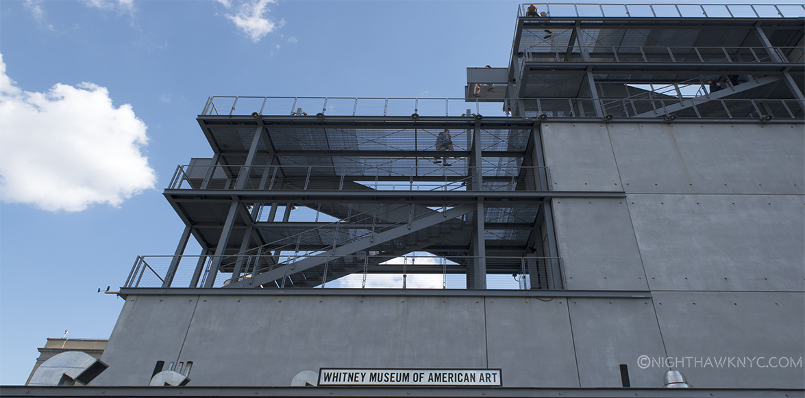
The two story meat complex provides a nearly unobstructed view of most of the north face of the Museum, from West Street or the High Line. I wonder what people who don’t know it’s the Museum think it is. I wonder how many of them will look at it and say, “Ah. A Museum.” My guess is not many. Maybe it’s an office building with not enough windows and a couple of long smoke stacks? A prison? It’s pretty non-descrip, making the stair cases that protrude from the rear of the building seem, well, odd. For myself, and probably countless others approaching the New Whit from the north, this is the first view they’ll get of it. The one defining feature of this side of the building is the exterior staircases. A cascade of them.

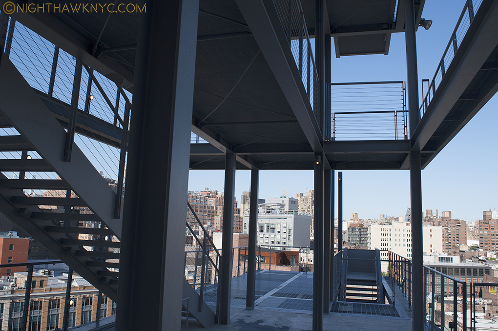
DSC_2948P2NH

Outdoor stairs as seen on the 7th Floor

To the south, across Gansevoort Street is a large, renovated apartment building, that also has Hudson River views on it’s western side. To put it mildly, this is a classic “high rent” district. Facing Gansevoort Street, the Museum presents visitors with an almost unbroken face of grey steel. Upon closer inspection, it also includes the Museum’s almost hidden entrance, which, until a sign was added recently, was only marked “Whitney Museum” on a glass window. Still, I can’t help wonder how the residents of that building across Gansevoort feel about paying those very high rents to look out their windows and see-

This, is their view.

This, is their view.

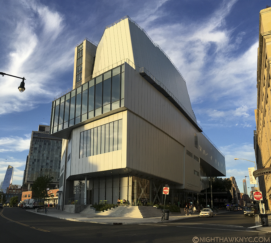
In fact, seen from the south, the building is so large that none of my cameras were able to get the whole thing in a shot from Gansevoort, including using an iPhone in Panorama mode. I had to go out into West Street to get one, which I don’t advise doing due to traffic coming randomly from 3 directions, not to mention my back being literally on the flimsy chain link fence bordering the West Side Highway with cars & trucks zipping around the bend at 60mph. Not a smart place to be standing with a camera. But this points out something interesting- there is no place where one can easily stand to get a good shot of the Museum- except, possibly, from a substantial distance. In fact, most of the shots of the building on the Whitney www site were taken from the rooftops of adjacent buildings. Maybe this is why no one takes pictures of it. Or? Maybe they don’t like it. ?

The closest I've come do death this year. The West Side Highway is inches behind me.

NOT to die for. I risked my life getting this shot. Southwest corner.

As we move to the western facade, with the large windows seen above (which reminds me of Zaha Hadid’s Library in Vienna), the upper one juts out at an angle seen from the north that vaguely reminds of the Breuer building’s Madison Avenue upper window.

DSC_5300PNH

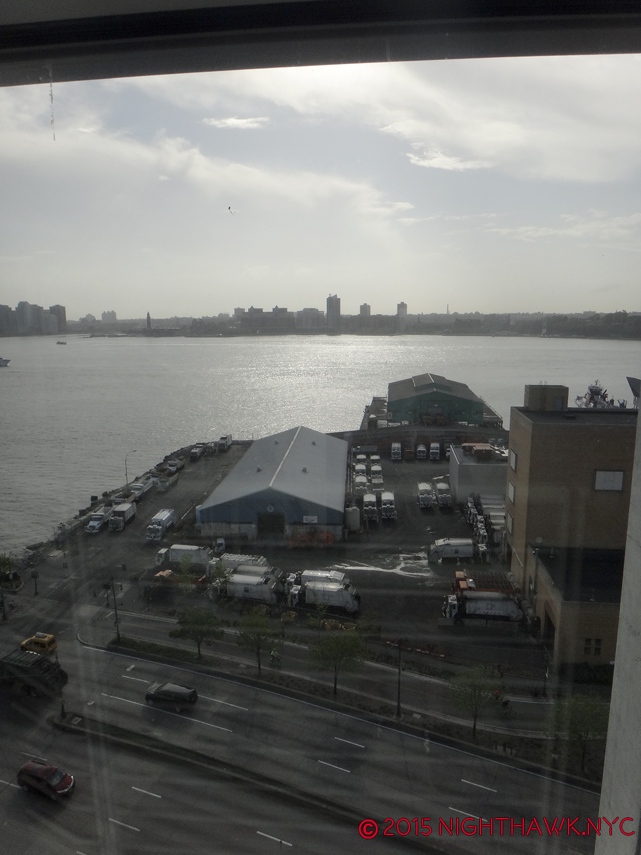
But more problematically, is a large Department of Sanitation complex smack dab right in front of it! “Holy Refuse Pile, Artman!” Garbage trucks coming and going all day and evening are not exactly what gives a “Riv View” it’s cache. (Feel free to insert your own wry joke about contemporary art here. I’ll wait…)

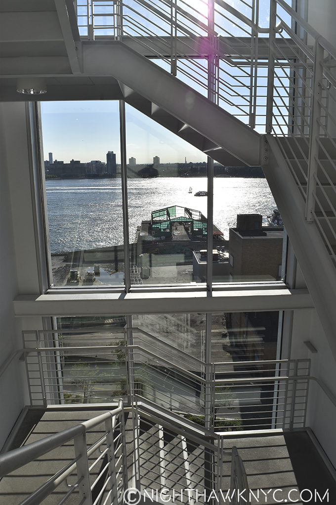
View of the Department of Sanitation from the 7th Floor stairs, 2015.

Riv View. Looking out at the Department of Sanitation from the 7th Floor stairs, 2015.

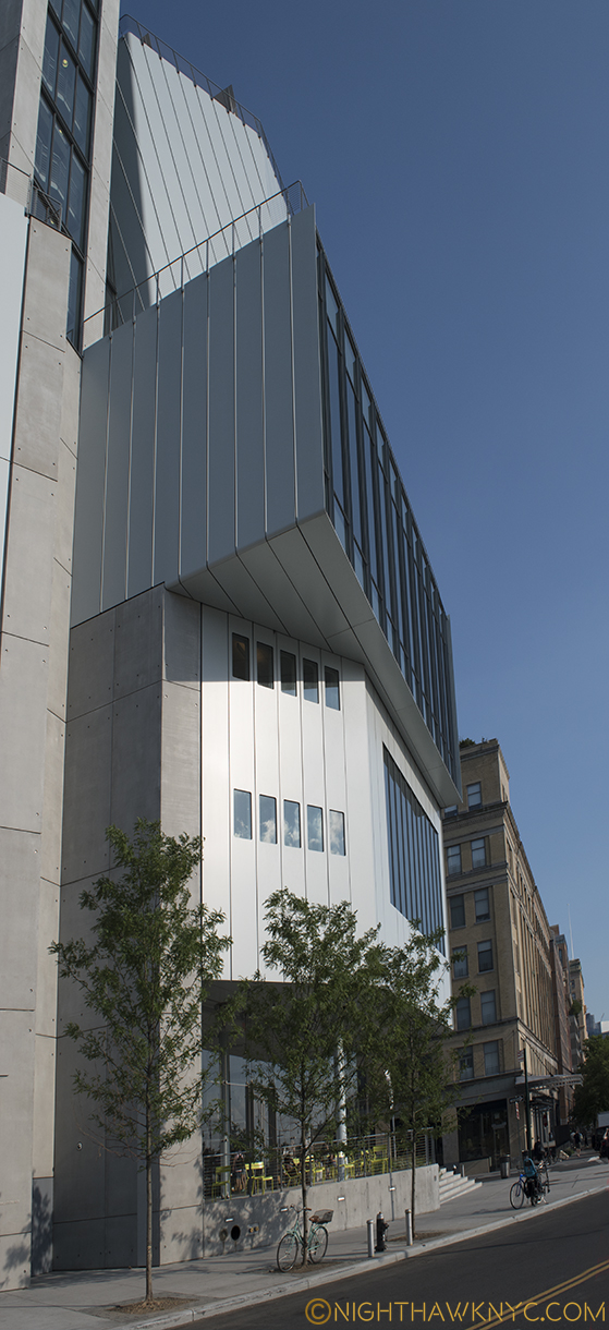
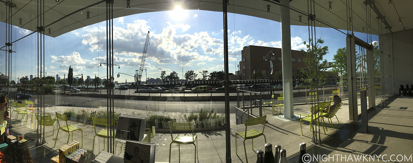
Mr. Piano has done his best to “minimize” the damage from the “offending” Department of Sanitation, and eternally busy West Side Highway, by opting to minimize the exposure of the western facade leaving a very narrow patio where, typically, only a few chairs usually are to be seen. It sits a few scant feet from the West Side Highway, after all, so it’s hard to imagine many people wanting to sit there for long. 3 trees have been planted along the curb in hope that one day they will provide some camouflage.

View from in front of the western facade, July, 2015, Being a tree in NYC is one helluva hard job.

View from in front of the western facade, July, 2016, Being a tree in NYC is one helluva hard job.

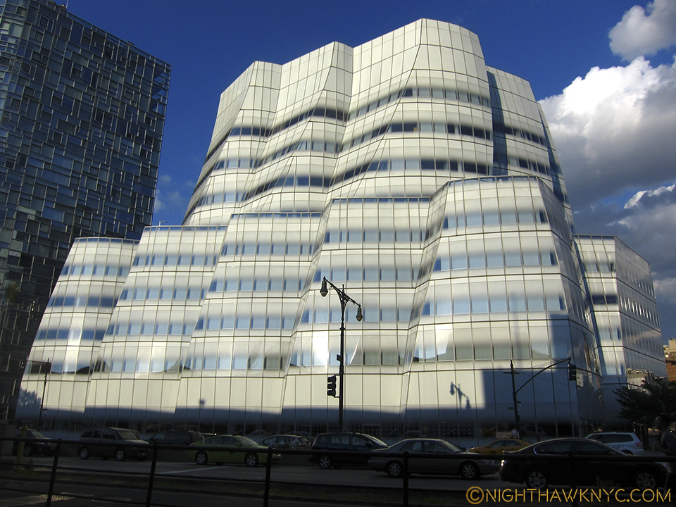
Regardless of the difficulties in seeing the building close up, it can be seen, for many blocks, both, to the north and south along the West Side Highway, and from across the Hudson River in New Jersey. Thanks(?) to the High Line there has been a boon in building in the area, with some very big name Starchitects (including, as I’ve written, the late Zaha Hadid’s only NYC Building going up at 520 West 28th Street, among many others) having new or recent projects in the area- some successful, some eyesores already. No less than Frank Gehry, the greatest architect of his time, in my book, himself, has a fairly new building about 6 blocks to the north of the New Whitney along the Highway, the gorgeous IAC Headquarters at 18th Street.

Like a sailboat on the Hudson, Frank Gehry's IAC Building is a gorgeous vision.

Like a sailboat on the Hudson it faces, Frank Gehry’s IAC Building is a shining example of the visionary architecture NYC needs more of, IMHO.

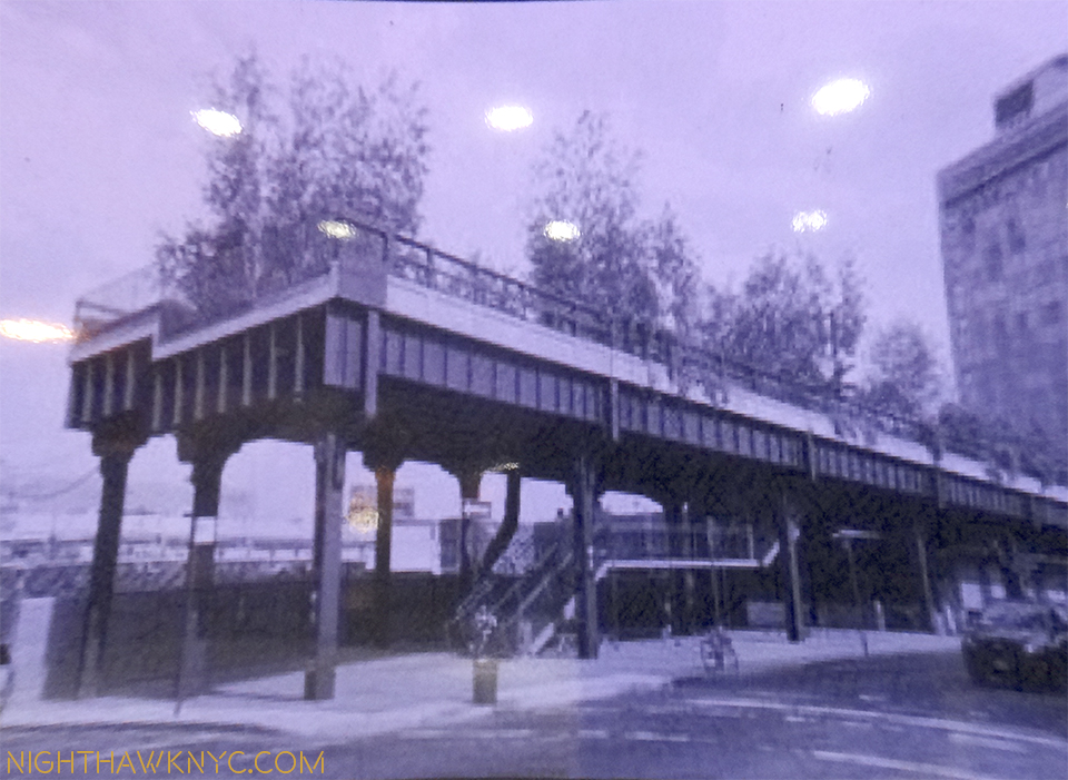
But, say what you want about this new Museum (don’t worry…I will), one thing that must be said is that the building isn’t obsessed with competing with it’s spectacular neighbor. Well? Not that spectacular neighbor, anyway. If anything, it sure feels to me like it’s competing with it’s OTHER “spectacular neighbor”- the High Line.

Southern terminus of the High Line, circa 2009. The new Whitney now occupies the space directly behind the left side.

Southern terminus of the High Line, circa 2010, early in the construction of the new Whitney directly behind on the left side. And today, and tonite…

DSC_6042PNH


IMG_1130P2NH

That brings us to the east side of the building, the side that abuts the High Line. Renzo Piano also designed the High Line Maintenance & Operations Building,

IMG_0782PNH

High Line Maintenance & Operations Building on the lot’s northeast corner.

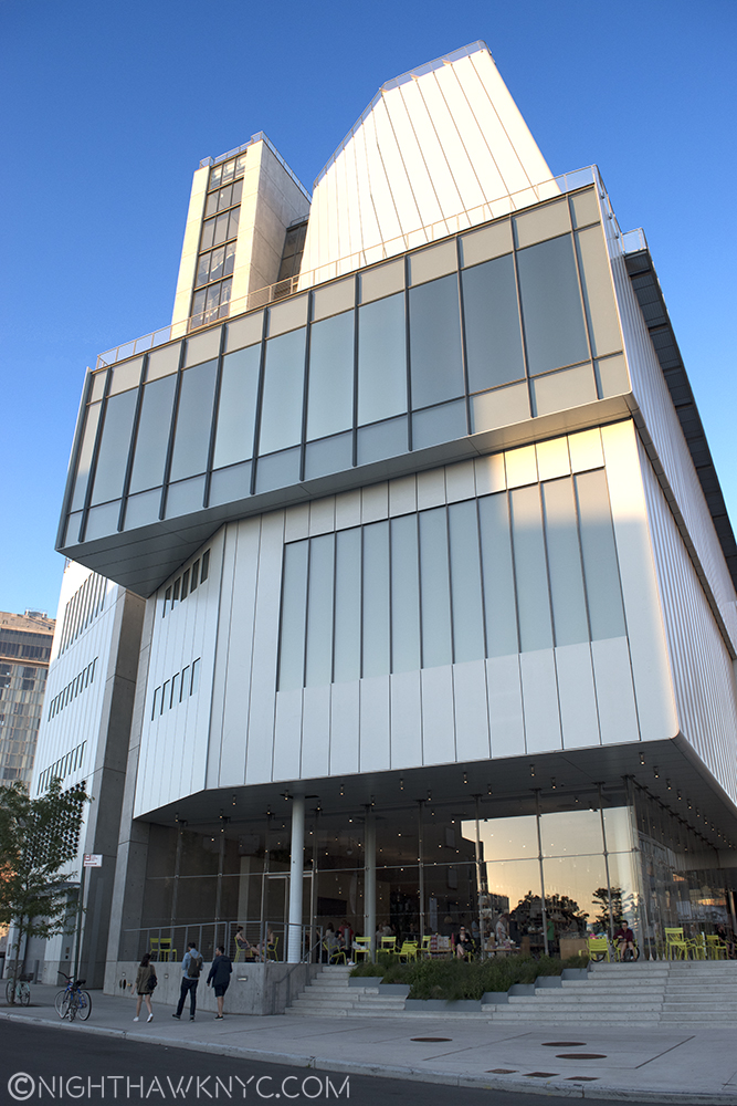
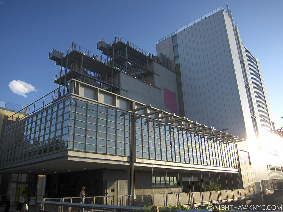
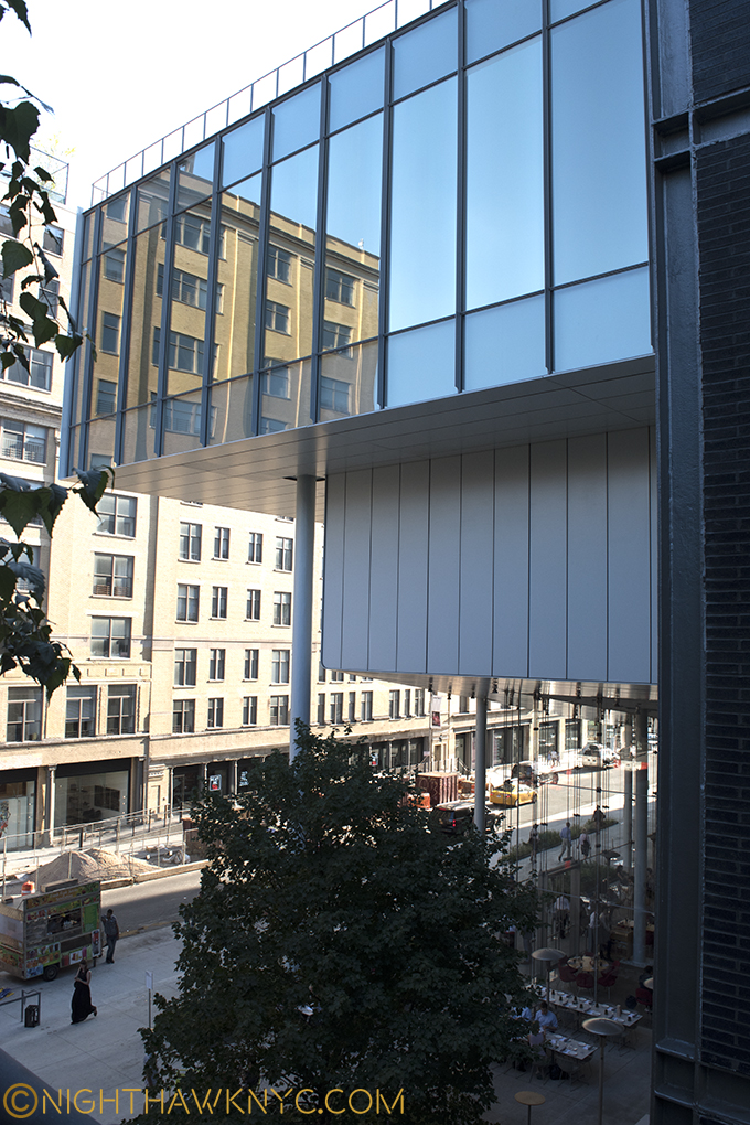
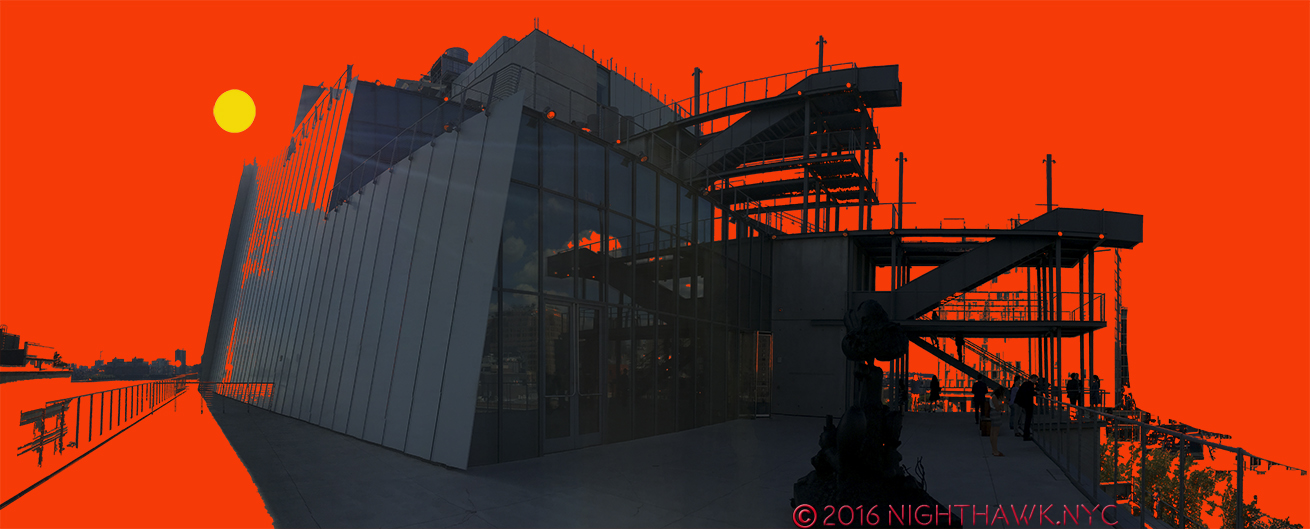
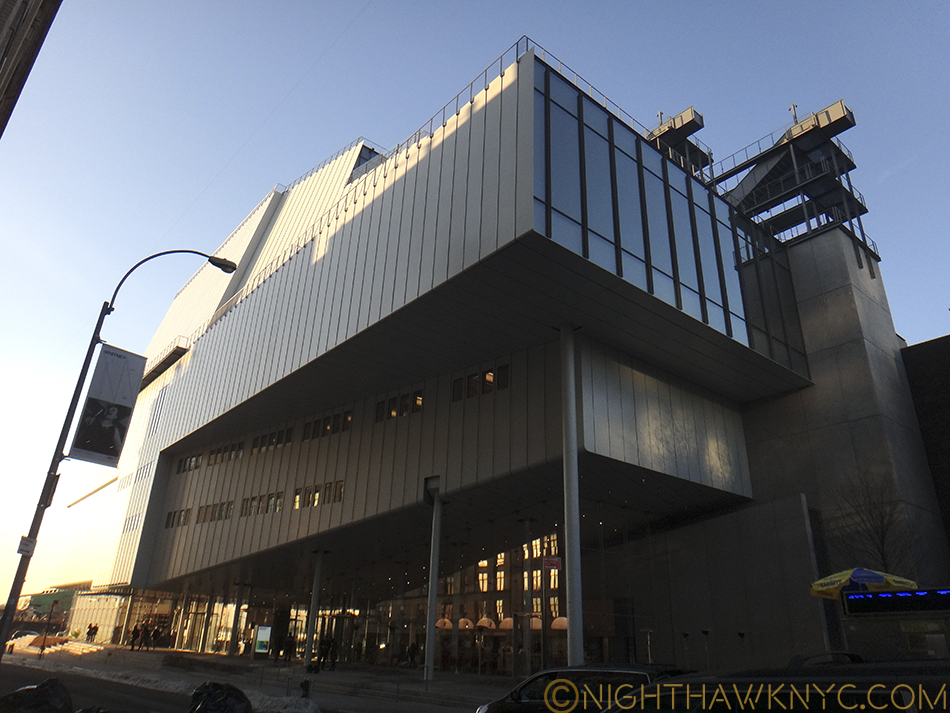
which looks like it’s part of the Whitney, occupying the north eastern corner of the lot. Next to that are a rectangular bank of windows of the 5th Floor Galleries. The lowest rectangle is cleverly cantilevered over the lower floors in a way that vaguely reminds of Wright’s Fallingwater. Above it are more rectangular rows of windows on the other gallery floors, which are accompanied by roof decks and outdoor stairs between floors.

Eastern face with 1st floor restaurant seen from the High Line.

Cantilevered lower eastern face with 1st floor restaurant seen from the High Line.

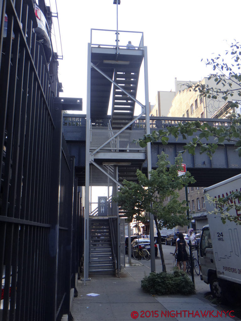
And, these are what raise my suspicion about purpose. So much outdoor space, and outdoor stairs in a place with the climate of Manhattan could be seen as highly questionable design. They are going to be unusable a good part of the year, so why do them? Aesthetically, to my eyes, the stairs look uncannily similar to the High Line’s access stairs. I wondered- Is this a case of “art snobbery” by an expensive to build, expensive to enter Museum trying to “upstage” a free & public park- a poorly thought out game of oneupmanship? An attempt to “blend in” with the High Line? Or?

Whitney Museum Eastern Facade Exterior Stairs close up

High Line Stairs at West 20th Street

High Line Stairs at West 20th Street

Other questions festered. Back along the south face. I spent a long time trying to think of what the shape of this building reminded me of. Hmmmm…Then one day, it hit me- From the south it looks like one of the US Navy’s newest ships- the USS Independence. From this side, it looks like it’s ready to go out to sea, well, out to the Hudson River. This feeling is hard to shake when you are looking at the few windows that look a bit like portholes, the “military—like” grey coloring, and the slightly sloping (i.e. “stealthy”) look of the upper floors. Add the rear decks and stairs to the Independence and the effect is so similar, it’s down right eerie.

Ok, flip the cantilever to the rear, and...? Eerily uncanny, no?

U.S.S. Indianapolis, again, with my highlighting. Ok, flip the cantilever to the rear, and…? Eerily uncanny, no?

Photo from Renzo Piano Building Workshop website.

Photo from Renzo Piano Building Workshop website. Note that all of the “neighbors” have been removed, except for the High Line.

Part 3- The Roofdeck of American Art

Bring sunscreen.

Want a tan with your art? 6th Floor deck, Spring, 2016.

Yes, that is what I’m calling the New Whitney- “The Roofdeck of American Art.” I think the decks are what people will remember most about the building. I only hope it’s not what they remember most about their visit. That will be up to the Museum’s curators and staff. But? As I will get to, I think other forces are at work, too.

With 4 roof decks, I bet some will come only to enjoy the view and get some sun. The Museum turns the face the vast majority of visitors will experience most to it’s “rear,” to it’s east side facing the High Line. Doing so gives Mr. Piano a very convenient out of his Sanitation Department dilemma, “Riv View” notwithstanding, and allows a wonderful panorama of Manhattan, from Chelsea Piers to the north, the Empire State in the center and the Statue of Liberty, distantly, to the south. The decks allow space for dining (8th floor), sculpture (5th floor and the others), seating, and that 21st Century phenomenon- selfie sticks.

IMG_4907PNH

8th Floor Deck.

It’s very nice. You’ll like it. Bring sunscreen.

IMG_4848PNH

I promise that top ramp won’t be bent when you visit the 7th Floor Deck.

Part 4- Inside. “Hey look! They have art here…too!”

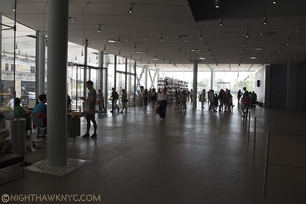
Inside, the first floor is the lobby, the most unsuccessful part of the entire interior- it’s an open space. The message here is “keep moving.” It’s about as unwelcoming a space as Moma’s lobby. (Actually, ALL of Moma, which for me stands for what it feels like- the “Mall of Modern Art,” feels unwelcoming!)

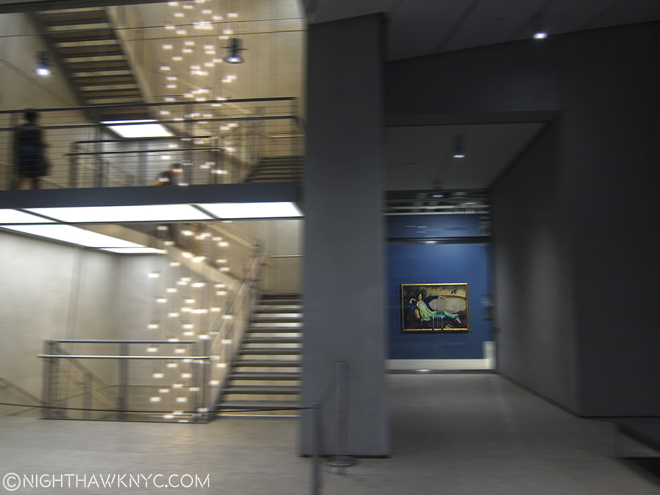
Welcome? No one will ever mistake the lobby for the Great Hall at The Met. Front door is opposite, where the black mat is.

Welcome? No one will ever mistake the lobby for the Great Hall at The Met. Front door is to the right of the nearest exposed column. Engineering made visible abounds. The free 1st floor gallery is to the immediate right, outside of the rope fence, which denotes you are in the Museum.

Once inside, here’s the routine I’ve settled upon, which probably sounds confusing- After entering as quickly as possible to minimize the time spent in the “lobby,” a short trip downstairs (don’t take the elevators- the wait is too long) brings you to the coatroom and the rest rooms (there are others restrooms on 3, 5, 7 and 8). The feeling here is 180 degrees from the lobby. This is completely designed. It makes you wonder what the hell happened upstairs. Take the stairs back to 1 and walk out past the rope line (keep your admission ticket handy) and visit the first floor gallery, which is free all the time. (Or, yes, you could visit the 1st floor gallery before paying to get in. I prefer to get my admission ticket first, which means I have to show it twice.) After that, show your ticket and get back in the Museum proper then take an elevator to the whatever floor you wish to see first- 3 (where the theater is for concerts, dance performances, etc), 5,6,7 or 8 (where the galleries are). Bear in mind there is no 2nd or 4th floor- they didn’t pay enough money to get those. No, at 422 million dollars, they did, but those floors are reserved for Museum staff and functions, so they’ve disappeared from the public elevator buttons.

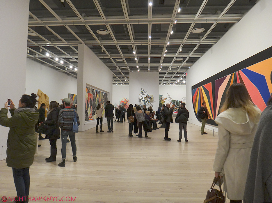
5th Floor seen during the Frank Stella Retrospective, Feb, 2016. The smaller walls can be moved to provide countless configuration possibilities.

5th Floor seen during the Frank Stella Retrospective, Feb, 2016. The smaller walls can be moved to provide countless configuration possibilities.

00Inside, the building is very sharp, clean and neat with natural wood floors and new, white walls all around. As the rectangular shape belies, form mostly follows function, and 4 of the floors are given over to large, rectangular galleries. The open space allows for movable walls can be easily repositioned to allow an extremely wide range of configurations. Each floor is very well lit, (something that is continually a problem at The Met). With 3 sets of stair cases, there are plenty of stairs . None go all the way from 1-8, however. On the western wall, as seen below, stairs go from the 3rd floor to the 8th. To the east of the elevators, stairs run from 5 to the 1st floor. And, there are the exterior stairs on 6,7 and 8. The stairs are good to familiarize yourself with, since there is almost always a wait, the elevators are best used for going from 1 to 8 or from 5 to 1. The entire building, inside and out, is wheelchair accessible.

Western stairs, Spring, 2016. They seem to be dismantling the Sanitation complex. The Whit might be hoping a tower doesn’t go up in it’s stead.

Renzo Piano strikes me as a Master Engineer more than as a brilliant Architect. I got that feeling when I first saw the Pompidou Centre in Paris, with it’s engineering on the outside, and again with his New York Times Building (which he inherited from Gehry). Yes, he has done some beautiful buildings, but I repeatedly get the feeling of Piano, the Engineer, when I look at his work, and that shouldn’t be the primary feeling I’m left with. There is quite a bit of engineering being shown off, here too, much of it on the first floor, some in the exposed gallery ceilings, and some on the roof decks.

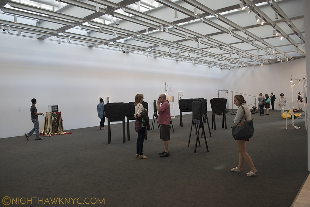
The 8th floor gallery lets in ambient sky light.

The 8th floor gallery lets in ambient sky light.

Now for the “nitty gritty.”

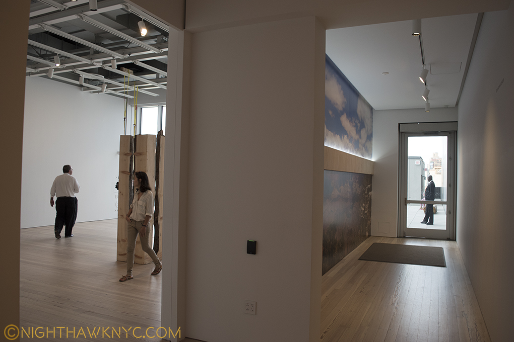
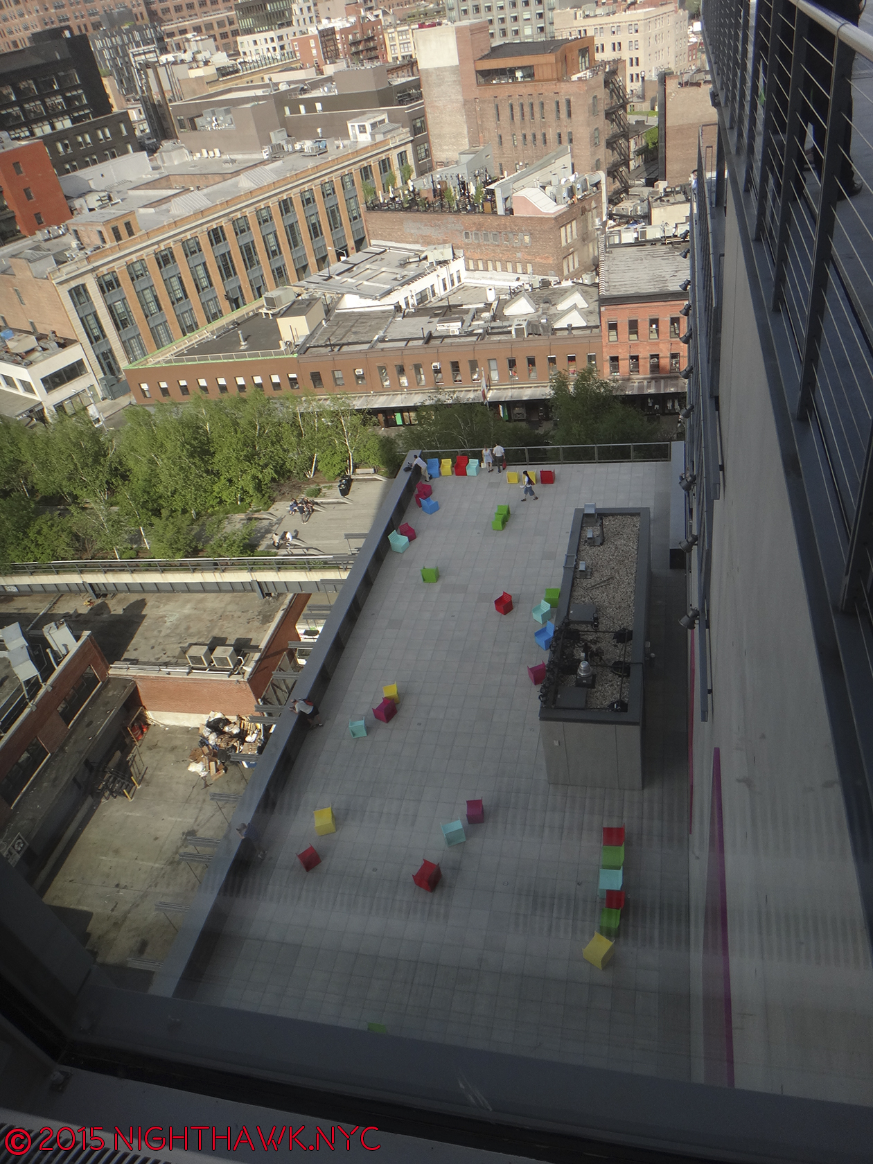
Given the luxury of having over a year to assess it, I’ve begun to wonder about the adequacy of the 50,000 square feet of indoor exhibition space, as nice as it is. “America Is Hard To See,” fit the whole Museum well, and showed it off to fine effect. Then, while the Frank Stella Retrospective was excellent, it only included 5 of his prints, and only 1 of his “Moby Dick” works. Was this because of hard decisions due to a prolific, 50+ year career, or due to a lack of space on the 5th floor? Currently, the otherwise excellent “Stuart Davis: In Full Swing” show feels unmistakably truncated. It shares the 5th floor with the “Danny Lyon: Message To The Future” show, (which may be overambitious). By comparison, The Met’s Stuart Davis show in 1991-92 had almost twice as many works, including over 30 that dated before the earliest work in the Whit’s show, like some from his “Van Gogh” period. While these have been going on indoors, I’ve been underwhelmed by what’s been installed thus far on the outdoor 5th Floor exhibition space. As time goes on, I’m starting to feel the 5th Floor may turn out to be a design mistake. Part of it is cut off to allow an entrance and exit corridor for the outdoor space, which is generally in shadow, and results in leaving a small indoor gallery on the other side of the outdoor gallery access corridor, which feels lost, and most importantly cuts down the size of the congruent 5th floor space. The other floors with outdoor decks run right up to the door leading outside with no corridor, etc.

The 5th Floor is cut to allow this exit corridor to the Roof Deck Gallery, leaving a small gallery to the left that feels lost.

The eastern end of the 5th Floor gallery is cut to allow this exit corridor to the Roof Deck, which leaves the small gallery to the left that feels lost.

The Whitney says there is 13,000 square feet of outdoor space, over 25% of the amount of indoor space. I’m left to ask the age old question…”Did they create enough INDOOR space to display Art?,” the prime purpose of a Museum. Time will tell, BUT? If they didn’t? This will be a disaster reminiscent of Moma’s inexcusably horrible current/new building, where they somehow managed to create a massive multistory hole right in the middle of some of THE most expensive real estate on Earth, then claim they “need more space,” 10 years later!

You can’t make this stuff up!!!

5th Floor Deck.

5th Floor Deck with installation. Yes, the colored seats are the Art work.

If the Whit needs more indoor space, well, the roof decks seem easy to enclose, and voila, 13,000 square feet more gallery space.

Or? PLEASE don’t tell me they’d have to expand this new building north, or up. I’m done writing letters. Besides, as much as I admire and respect Mrs. Gertrude V. Whitney and the collection built on hers, I have no attachment to this building.

And that brings me to this- Through it all, one thought stayed on my mind more than any other. I wonder what she would have thought of the place…

Part 5 – Gertrude Vanderbilt Whitney

“And I dreamed I was flying
And high up above my eyes could clearly see
The Statue of Liberty
Sailing away to sea
And I dreamed I was flying”*

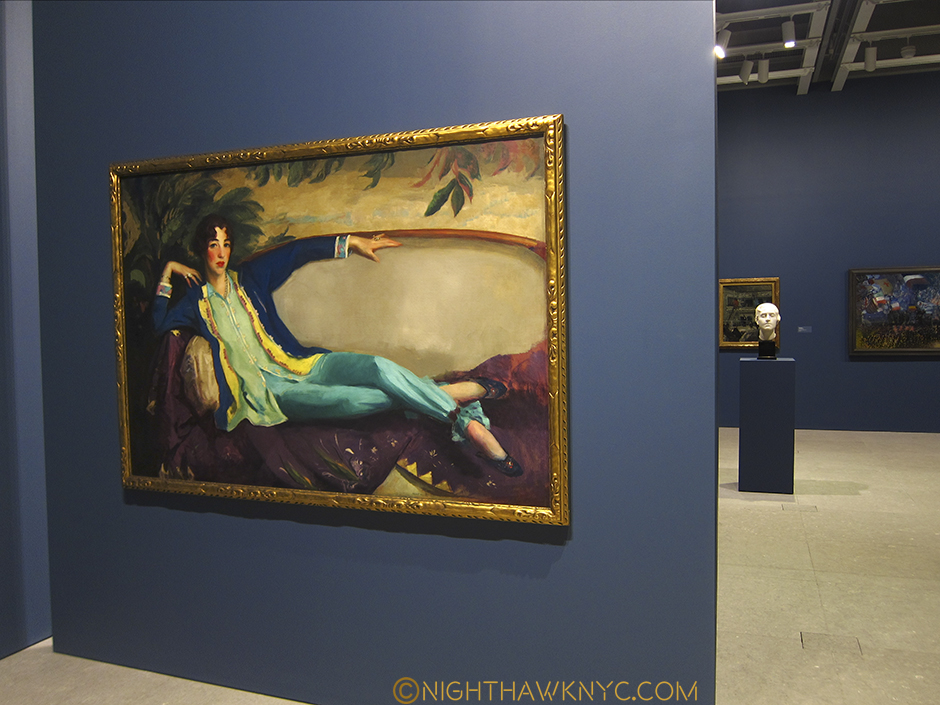
Portrait of Gertrude V. Whitney, 1917 by Robert Henri. Study for a Head for the Titanic Memorial by Mrs. Gertrude V. Whitney, in the background from "America Is Hard To See," 2015

Portrait of Gertrude V. Whitney, 1917 by Robert Henri. Study for a Head for the Titanic Memorial by Mrs. Gertrude V. Whitney, in the right background from “America Is Hard To See,” 2015

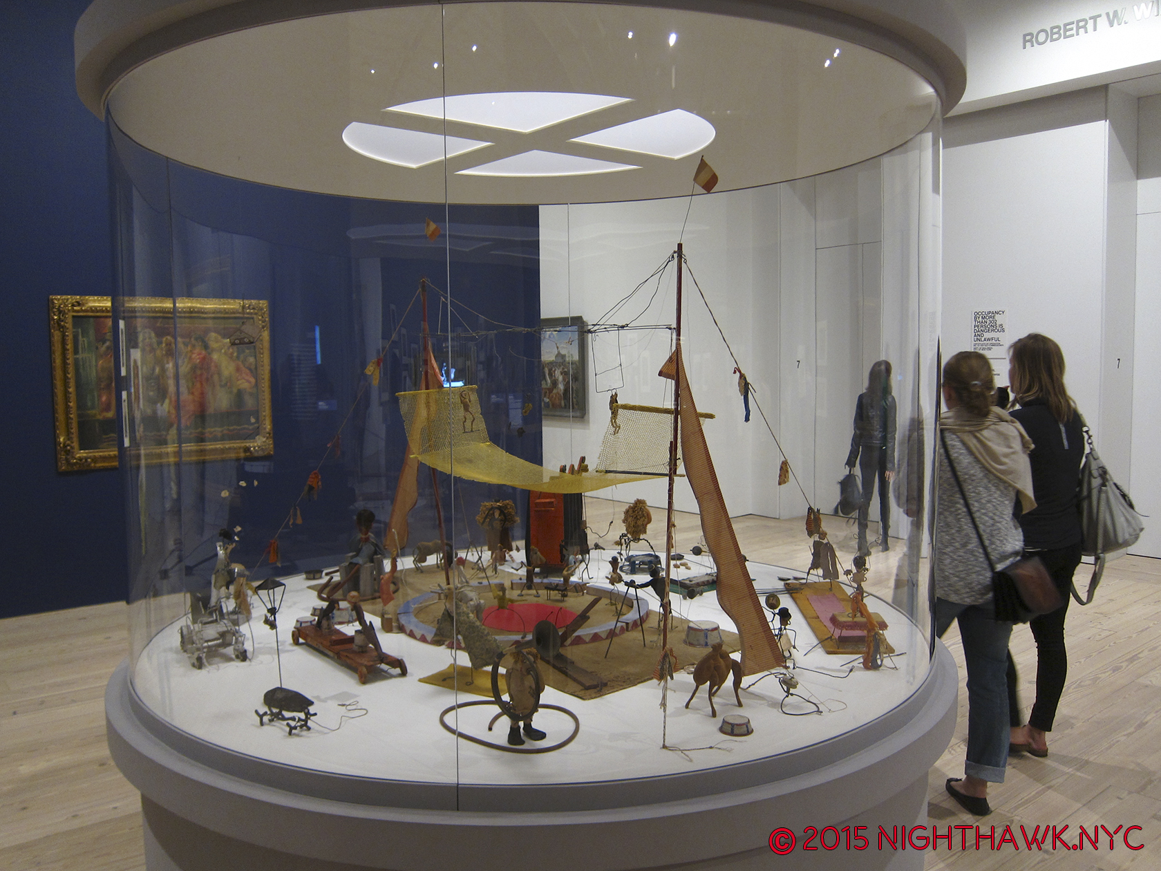
The founder of the Whitney Museum, as was beautifully demonstrated, remembered and honored in the first floor free to enter at all times gallery, where “America Is Hard To See” began was, also, a very accomplished sculptor2, in addition to being the greatest champion of American Art, perhaps ever. Immediately upon entering the first floor gallery, the first thing you saw was, fittingly, the wonderful portrait of her by Robert Henri that was perfectly placed facing the door, which also enabled it to be seen from outside the building, the only artwork that was. I wish it had been left right there. It wasn’t. As I write this, it’s upstairs as part of the “Human Interest: Portraits from the Whitney’s Collection” show. One of my pet peeves in Museum re-designs is how often they fail to answer this, seemingly basic, question- “Where are we going to put such and such major masterpiece?” Moma failed this miserably- How many times have they moved Monet’s “Waterlillies”, or Van Gogh’s “Starry Night”, in a vain attempt to find the right spot for each? This is unforgivable. While the Whitney has found a great spot for Calder’s Circus,

Calder's ingenious "Circus." When you go, be sure to see the accompanying video!

Home… at last. Calder’s ingenious “Circus.” When you go, be sure to see the accompanying video.

which was lost in the Breuer Building’s mezzanine, I’m left to wonder about Mrs. Whitney’s Portrait. Will it become their Waterlillies?

One of the very greatest figures in American Art History looks out on her domain, Portrait by Robert Henri, 1917. 1st Floor Gallery, seen from outside the building during "America is Hard to See," 2015. After? They should have left it right there.

One of the greatest figures in American Art History looks out on her domain. 1st Floor Gallery, during “America is Hard to See,” 2015. After? They should have left it right there.

Beyond her portrait’s place in the Museum, I wonder what she’d think of it. It’s still “her” Museum. They even, recently, put the name “Whitney Museum of American Art” on the southern facade. The new place is located a stone’s throw from the site of the first Whitney Museum that she opened in 1931 at 8 West 8th Street, and equally close to where Edward Hopper lived and worked on Washington Square. Edward & Josephine Hopper left their artistic estate to the Whitney, in honor of their long relationship with Mrs. Whitney. When the new Museum opened, there was a selection of Edward Hopper drawings from 1925 that he did at the Whitney Studio Club, which preceded the founding of the Museum, in the first floor gallery, adjacent to Henri’s Portrait of Mrs. Whitney, seen above. As time goes on, I think this gift will be seen as one of the greatest Art gifts of the 20th Century, even though it didn’t consist of many of Edward’s paintings. That’s when I try and forget the fact that the Whitney, tragically and unforgivably, discarded almost all of Josephine Hopper’s work that was included with it!

While we’ll never know what Mrs. Whitney would think of the new home of her collection, I know what I think.

DSC_5259P2NH

Oneupsmanship? “Hey you down there on the High Line- You think you’re high up? Ha!”

DSC_3674PNH

I’ve spent a year wondering- Why put 13,000 square feet of outdoor space in a building in a place with a climate like NYC?

5th Floor roof deck with a Frank Stella Sculpture & reflection, Feb, 2016

5th Floor roof deck with a Frank Stella Sculpture & reflection, in the snow, Feb, 2016

Part 6- 5,000,000 Reasons

As I said, real estate in NYC is all about location. That applies to the Art world, too. The Met & The Guggenheim are in, or near, Central Park, and there is now talk of The Met creating a Central Park entrance as part of their Contemporary Art Galleries reconstruction3. Moma has the heart of midtown, and now the Whitney has the High Line. In my opinion, the location was selected, and the New Whitney is designed, to be a destination for High Line visitors- It’s roof decks are meant to beckon High Liners with an even better view since they are higher. That’s one explanation for the stair designs looking similar- imitation that’s designed to make High Liners feel the Museum is part of the High Line. And so? Location also pays off by providing a potential mass audience delivered right to your door. How much is that worth to a Museum? Given that the High Line currently draws over 5,000,000 visitors a year, it’s hard not to see this as a conscious decision designed to attract visitors for an even better view, and oh yeah, some Art. Once inside? I’ve already come to feel that the gallery size is limiting. As the collection grows (do Museum collections ever shrink?), I am left to wonder how quickly they’re going to wish they had some of that 13,000 square feet that’s sitting outside, inside.

But? If I’m correct about their motivation, the outdoors stairs & decks exist to beckon people from the High Line, which, is open year round, come rain, snow, or shine.

DSC09546PNH

“We come on the ship they call the Mayflower
We come on the ship that sailed the moon
We come in the age’s most uncertain hour
and sing an American tune
But it’s all right, it’s all right
You can’t be forever blessed”*

Overall? I’m displeased by the outward appearance of the new Whitney. Over a  year of trying to warm to it, of giving it yet another chance to speak to me later, I still find it downright strange. As an Art Museum, the inside is nice, with the above caveats. As far as the Art is concerned? I’m glad to have the Whitney’s pre-eminient collection of American Art back, and “America Is Hard To See” was a wonderful “Welcome Back” celebration of it’s return after the move Downtown. The Whitney is, also, to be congratulated for the guts they’e displayed in the choices of their early shows- giving Laura Poitras her first Museum show, featuring the great Cecil Taylor for a week, and having the retrospectives of modern master Frank Stella and the vastly underrated Stuart Davis (who Mrs. Whitney, herself, believed in and financially supported early on), among others, all have made the first year of the New Whitney Museum’s exhibitions quite memorable, and yes, very Artistically successful.

Yet? How long will the waters stay calm for the U.S.S. New Whitney Museum? The big question of long term success and long term viability remain to be answered.

Epilogue – The Whitney’s 422 Million Dollar Gamble

DSC09557PNH

The Whitney’s move downtown isn’t about moving nearer the “New” Art neighborhood of Chelsea or the “Older” Art neighborhood of Soho. It strikes me as being a a case of seeing an opportunity and taking it. They found a lot at one of the 2 ends of the High Line and saw their opportunity to move to a potential audience- the 5,000,000 current visitors to the High Line, and they took it. I believe that’s why their stairs look like the High Line’s, as I said.

For the Whitney, this is a $430,000,000.00 (the cost of the new building) gamble that the High Line is not a flash in the pan and it’s popularity is here to stay. If the High Line fails? Well? The City was about to tear it down anyway before it was turned into a Park.

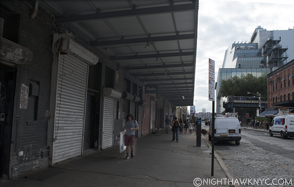
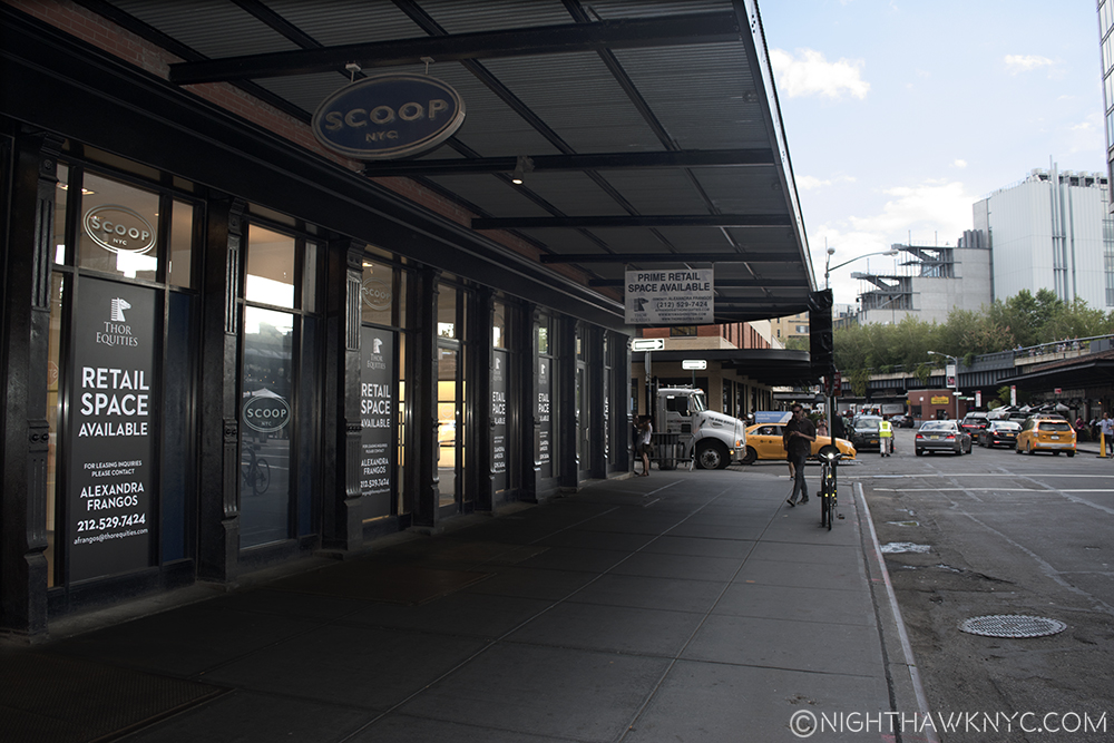
But, if the High Line does fail (which seems unlikely at the moment), or visitors come in substantially lower numbers (much more likely), the Whitney may find themselves stranded, with an out of the way Museum that is not easily accessible by either bus or subway in a neighborhood that has a history of being “the wild west,” home to meat packing, prostitution, cutting edge music, and sex clubs (Madonna’s notorious book “Sex” was photographed almost 25 years ago at one 3 blocks away) not all that long ago, that has been remade with extra glitz and top of the market rents. And what about that neighborhood? What if the new glitz doesn’t stick? What if it all turns out to be wishful thinking on the part of landlords looking to make a killing after years of squalor? Walking around the past few months, the area seems to be having a bit of trouble supporting many of it’s ritzy new tenants at these prices. And? This is over a year after the Whitney added even more oomph to the now completed High Line being here.

Empty storefronts on Gansevoort, one block east of the Whitney, August, 2016

Empty storefronts on Gansevoort fill 3/4 of the block, one block east of the Whitney, August, 2016

Is the “Meatpacking District” a fad destination that is about to fade? If so, what effect will this have on the new Whitney? Can it survive in a “not so fab” neighborhood?

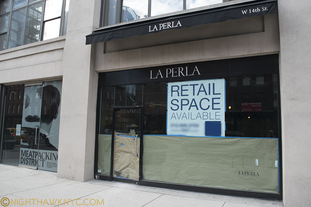
La Perla joins Alexander McQueen & Stella McCartney as former tenants of the Meatpacking District

Is the buzz over? La Perla joins Alexander McQueen & Stella McCartney as former tenants of the Meatpacking District who have moved elsewhere.

While collectors and investors throw unheard of sums at Contemporary Art these days (which strike me as “bets” given the largely unproven nature of the Art itself), here is a case of one of NYC’s “Big 4 Museums” placing an even bigger bet on a Park, that while it certainly is Contemporary Urban Art, hasn’t even been fully opened for TWO YEARS yet,. The Whitney placed their bet when the High Line was in it’s first of 3 phases. Phase 3, the final part, of the now completed High Line opened on September 20, 2014. This is not to mention that they bought in at the top of the market in a real estate market that (like the Art market) hasn’t seen a correction in over 25 years. Both will see corrections one of these days.

But when? This, is the 422 million dollar question.

“Still, tomorrow’s going to be another working day
And I’m trying to get some rest
That’s all I’m trying to get some rest”*

Around the corner on Washington Street, 4 now empty storefronts, one of which was the famous Hogs & Heifers Saloon (corner). August, 2016

In the Whitney’s shadow. Around the corner on Washington Street, 4 now empty storefronts in a row, one of which was the notorious Hogs & Heifers Saloon (where the white sign hangs). August, 2016

Well? If all of this goes south? They still stand a very good chance of being able to move back uptown in 8 years when The Met’s lease of the Breuer, their former home, is up. Given The Met’s own problems, it seems highly unlikely they’ll be extending that lease.

If the Whitney then wants to renovate it? It’ll be someone else’s problem.

*-Soundtrack for this Post is “American Tune” by Paul Simon. Published by Universal Music Publishing Group.

NighthawkNYC.com has been entirely self-funded & ad-free for over 8 years, during which 300 full-length pieces have been published! If you’ve found it worthwhile, PLEASE donate to allow me to continue below. Thank you, Kenn.

You can also support it by buying Art, Art & Photography books, and Music from my collection! Art & Books may be found here. Music here and here.

Written & photographed by Kenn Sava for nighthawknyc.com unless otherwise credited. To send comments, thoughts, feedback or propositions click here. Click the white box on the upper right for the archives or to search them. Subscribe to be notified of new Posts below. Your information will be used for no other purpose.

  1. In fact, the new Whit, itself, sits where one was.
  2. When will they have a show of HER work?
  3. Speaking of his vision in January, Met Director Thomas Campbell told the LA Times that “We are looking at an entrance, at terraces, at the roof garden.” Sounds like he’s visited the New Whitney.

Words To Live By From Man Ray #2

This site is Free & Ad-Free! If you find this piece worthwhile, please donate via PayPal to support it & independent Art writing. You can also support it by buying Art & books! Details at the end. Thank you.

Written & Photographed by Kenn Sava

“Originality is not sought after but imposed on a clear thinking mind by the exigencies  of the message to be conveyed. When that message is startling and different, the means to convey it become original and daring for others, although he who conceived, is not necessarily conscious of any kind of iconoclasm, but feels as if he is performing quite a normal act.”

Man Ray, “No. 72. Class (In Time) from “Writings On Art”, P.177. Published by Getty Research Institute


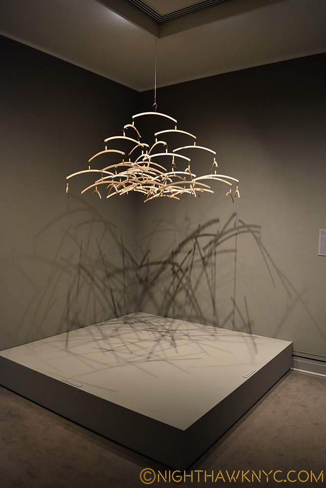
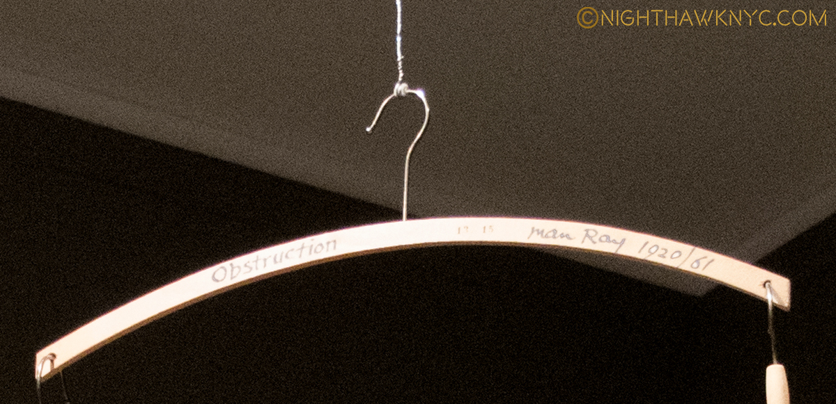
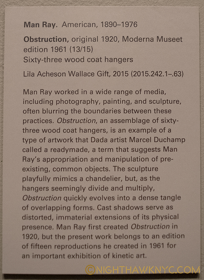
Man Ray, “Obstruction,” 1920/1961, Metropolitan Museum of Art-

DSC_5644PNH

DSC_5651NEFPNH

Close up on the top hangar.

DSC_5647PNH

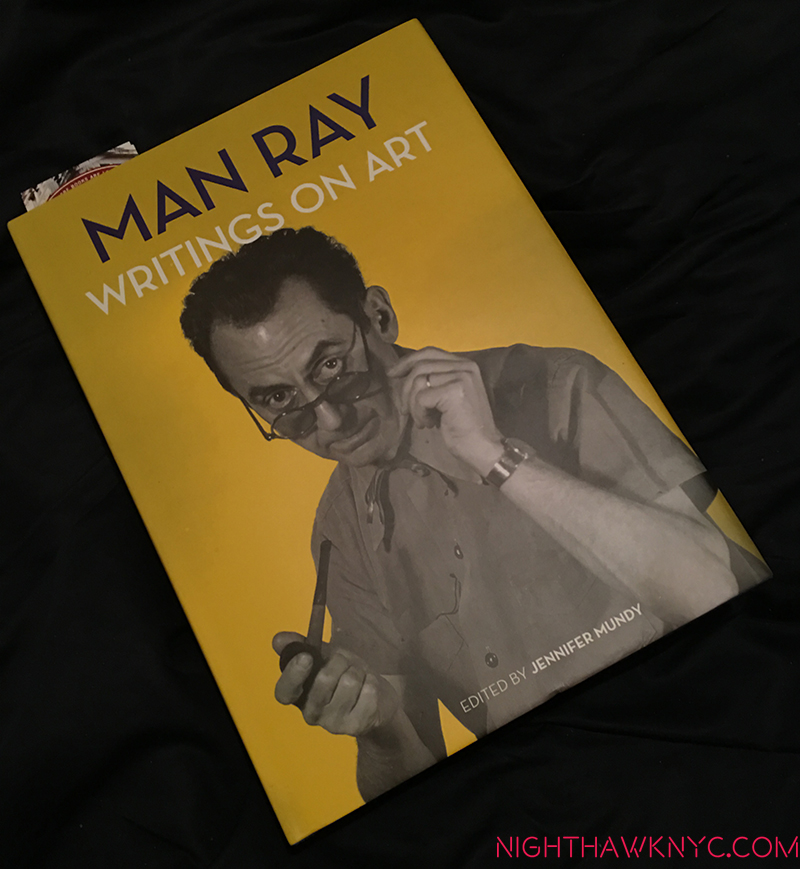
One of the most unique Artists in history, Man Ray is one of those people who seems to continually appear…as one of the most revolutionary photographers ever, a painter (his first love), a sculptor, a graphic artist, and on and on…and also as a writer. He’s in all the major museums, but rarely gets a show of his own. I’ve always admired his work, and continually been surprised by it, and his accomplishment (as in “That’s a Man Ray, too?”) Having published a fascinating autobiography, perfectly titled “Self Portrait,” which drips with both insight and intrigue, now comes a collection of his writings about art. It’s a book that even rewards random reading- almost every page has a fascinating example of his one of a kind mind.

I think they make wonderful meditations…The first entry in this series appears here.

Soundtrack for this post is, what else? “Man Ray,” by the Futureheads from their 2004 self-titled album.

NighthawkNYC.com has been entirely self-funded & ad-free for over 8 years, during which 300 full-length pieces have been published! If you’ve found it worthwhile, PLEASE donate to allow me to continue below. Thank you, Kenn.

You can also support it by buying Art, Art & Photography books, and Music from my collection! Art & Books may be found here. Music here and here.

Written & photographed by Kenn Sava for nighthawknyc.com unless otherwise credited. To send comments, thoughts, feedback or propositions click here. Click the white box on the upper right for the archives or to search them. Subscribe to be notified of new Posts below. Your information will be used for no other purpose.

“Patti Smith For President”

This site is Free & Ad-Free! If you find this piece worthwhile, please donate via PayPal to support it & independent Art writing. You can also support it by buying Art & books! Details at the end. Thank you.

Written & Photographed by Kenn Sava

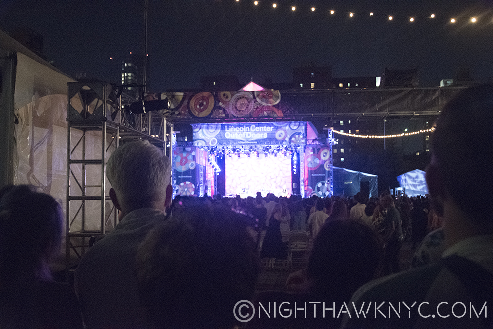
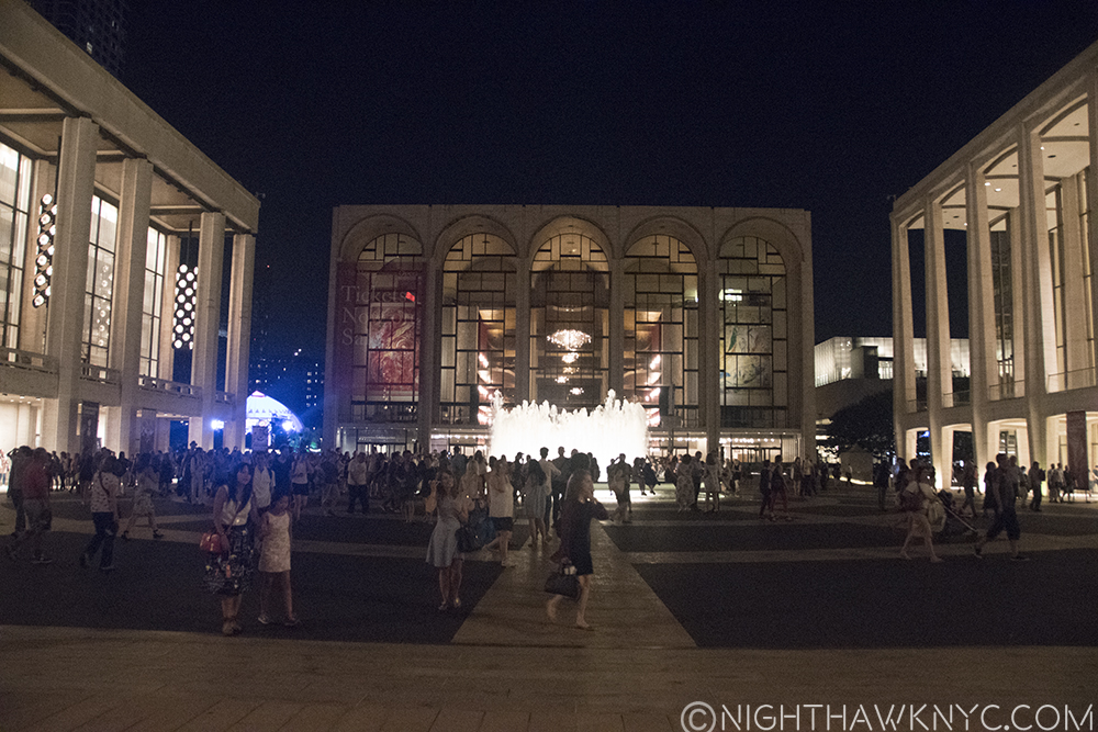
I’ve had the honor of meeting Ms. Smith, and wrote about it earlier this year, but I’ve never had the pleasure of hearing her perform live. (How is this possible??) The free concert she gave at Lincoln Center tonite, July 20th, presented a chance to rectify that at long last. It almost didn’t happen tonite either. I got there way early and got in fine. Then I went back out.

Don’t ask.

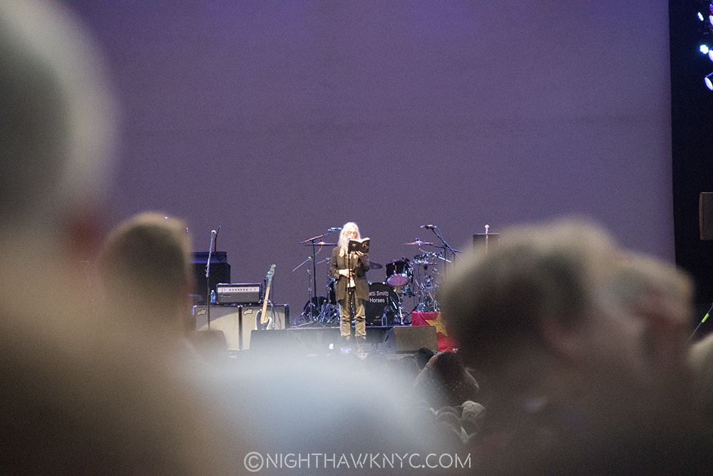
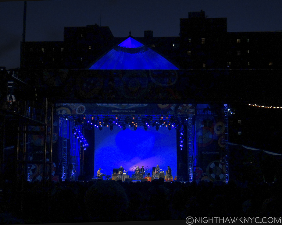
All of NYC had shown up in the meantime, so I had to wait on two ridiculously long lines to try and get back in. Luckily, I barely did but wound up about 350-400 feet away from the stage, as you can see below. Luckily, the sound system was excellent all the way to the back, so I could hear fine. Well, this is Lincoln Center for the Performing Arts, so that’s to be expected, right? Being that far away, though, if there is one tall person between you and the stage, you’re not getting a picture. There were 2- one on each side of me. So, I had to wait and wait and wait, finger on the shutter release, until I was finally able to get a few.

Ok, now! Before one of them moves!

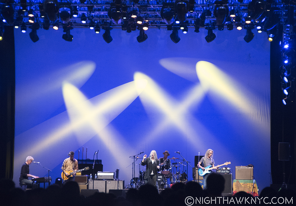
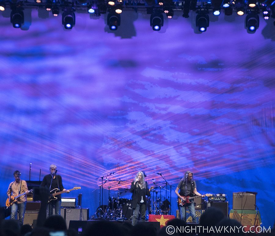
Patti, blissfully oblivious to my travails, and her band, augmented by her daughter, Jesse, on piano early on, tore the roof off roof-less Damrosch Park, under one of the biggest full moons I’ve ever seen, in the shadow of the Metropolitan Opera’s south fascade, as much with their music as with Patti’s “state-of-the-union” rebuttle comments as the generous 90+ plus minute set progressed.

She opened with reading poignant passages from Just Kids, her instant classic memoir that is chock full of them. Yes, she opened by reading from a book to a sold-out house of a few thousand folks, who had just heard some mariachi band(?) futiley try to get them to dance or clap for 45 minutes. While she read, it was so quiet you could hear a safety pin fall out of an earlobe.

How many authors read before this many fans?

As she slowly, and beautifully, built the set from there, about half way through, she did a wonderful rendition of Prince’s “When Doves Cry.” adding her own lyrics(!) towards the end. Shortly after starting it, she stopped, to let an intrusive photographer have it, and when she resumed things promptly took off to another level, and stayed there the rest of the night. Setlist, here. (Per Kitty, my go to source for all things Patti, she compiled her own and confirms it’s correct. Thanks, Kitty!).

“When Doves Cry”

Between songs, she then spoke about the Republican Convention, the lack of media coverage about the remarks made therein calling for the execution of the other party’s nominee(!), “enemies” in politics, and where things are really at for “the people.” While she stayed away from saying who she was backing or voting for, she made it very clear how she felt about the state of the rhetoric that seems to get a pass in the media these days. She said that she doesn’t get scared easily, but she is scared now. Form then on, she spoke about what is at stake for us and our children, “the future, and the future is now,” she said.

I found it stirring, and her call to “use your voice,” struck me, since, well? I have a voice. Though my focus is Art & Music, my cards also list “Life” as the third realm of NighthawkNYC. Along with some other things I’ve Posted under “Life” thus far, is this, during Pope Francis’ visit to NYC, questioning the prison-like installations along 5th Avenue, around the corner from Moma.

I think Patti is right. Things seem to be going to hell in a hand basket. It’s getting harder and harder to find sanctuary in the worlds of Art & Music when every single new day seems to bring some new horror to light, be it mass shootings,  or verbal violence, espousal of racism, and an increase in the “us versus them” vitriol to never before seen heights. How long will this go one before it spills over into actual physical political violence? Haven’t we been through all of this before?


I don’t care what side of the political coin you’re on, or if you’re like me, you’re on a totally different coin, i.e.- my own. I think we can all agree that this is going too far, it’s dangerous, and, as Ms. Smith said tonite, it’s un-American.

While I wasn’t around for World War 2, it seems to me that we fought that war to fight fascism, anti-semitism and racism. Talking about barring this or that group of people sure doesn’t sound like anything I was taught this country was about. As we also see daily, there are too many guns in the wrong hands, and too many guns only the police or the military should have, for anyone to feel safe, and no matter the horror unleashed NOTHING changes. And, along with this there are, also, too many questionable deaths happening at the hands of the law (Morrissey seemed to “warn” us about this in his last NYC show).

Too many things are amiss in our society, our systems and our government. I don’t know where this is going to end, but I fear it’s going to get even worse before it gets any better.

I’ve said that the reason to live in NYC is for the Art. One of the other great things about living here is the diversity. People from all over the world live here. I, for one, am proud of this. They enrich the City and all of our lives in countless ways, including culturally. And? People from 115 different countries died here on 9/11. Take a ride on the Subway and you see what America is supposed to be, right there in front of you- the “great melting pot.” I believe it when people here say- “Hatred is not one of our values.”

I like to believe that most people in this country feel that way, and they will be heard. We live in a very difficult world in a very challenging time. Yet? We have a say in where this goes. One of Patti’s closing songs was “People Have The Power.”

“And the people have the power
To redeem the work of fools”*

For me, and perhaps many others, Patti Smith IS New York City. She represents the best of what New York is. She came from nothing and became a star here, while remaining true to her self, and retaining and exuding cool. She’s both street smart & wise. She’s creative, multi-talented and constantly evolving, like NYC is. She takes no shit from anyone, while remembering the best of everyone. She warns us of the difficult road life is, while exalting all of us to the beauty and joy possible in life- big and small. She lives in the moment but never forgets the past. That she is also a touchstone in the guise of a Poet for so much of this City’s recent & glorious past is no small part of her mythology, and a blessing for those of us now living, and yet unborn. And? She’s Rock and Roll! She will kick your ass on stage with her band, or off it if you intrude on it. As New Yorkers like to say, she is “the real deal.” My respect for her continues to grow. As I learned tonite, she is one of those rare people that when you are in their presence, be it one on one in a room together, or 400 feet away among thousands of others, you FEEL you are in the presence of someone special, someone who has the “sacred knowledge” she’s gained  from both revered mentors, and on her own. And, someone who has the power to relate it, to transmit it to you, naturally, effortlessly, and poetically, like a zen master. As she travels the world (so I don’t have to), and meets countless people in countless other Cities, I know my City is in the best of hands. It’s like saying, “Here’s New York for you. Show me what YOU got.” I know, I know…good thing I stay home.

At one point, between songs, someone actually yelled out that Patti run for President! She replied “I’d rather be the janitor in any public school,” than be President.

This fall, if you’re still at a loss for a candidate? I feel your pain. It could still finally be time to make a woman President.

In spite of what she said? Write “Patti Smith” in, anyway.

There are far worse people you could vote for. What scares me most is- They are actually running.

“Because the night” is over. The crowd spills out. Lincoln Center- Left to Right- City Ballet, Damrosch Pk (Blue Dome), Metropolitan Opera, Lincoln Ctr Library, Geffen (Philharmonic) Hall.

*Soundtrack for this Post is “People Have The Power” by Patti Smith and Fred “Sonic” Smith, published by Druse Music, Inc.

NighthawkNYC.com has been entirely self-funded & ad-free for over 8 years, during which 300 full-length pieces have been published! If you’ve found it worthwhile, PLEASE donate to allow me to continue below. Thank you, Kenn.

You can also support it by buying Art, Art & Photography books, and Music from my collection! Art & Books may be found here. Music here and here.

Written & photographed by Kenn Sava for nighthawknyc.com unless otherwise credited. To send comments, thoughts, feedback or propositions click here. Click the white box on the upper right for the archives or to search them. Subscribe to be notified of new Posts below. Your information will be used for no other purpose.

Happy Anniversary To Me- Looking Back On Year One of NighthawkNYC.com

This site is Free & Ad-Free! If you find this piece worthwhile, please donate via PayPal to support it & independent Art writing. You can also support it by buying Art & books! Details at the end. Thank you.

Written & Photographed by Kenn Sava

Today, July 15, is the first Anniversary of my first Post! It remains a good introduction to me, this site, and what has come after. Approximately 80 Posts have followed so far- about one and a half per week. One year is a good time to take a breath, look back and celebrate getting this far. So? Join me and raise a glass!

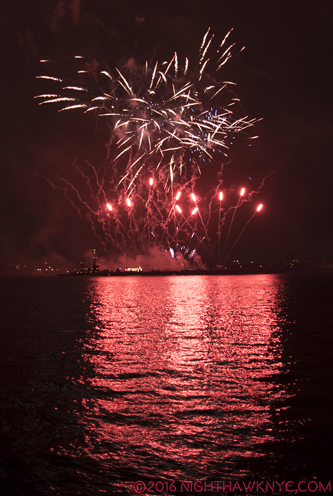
East River, NYC. July 4, 2016

CHEERS! Fourth of July Fireworks, 2016, East River, NYC

First, and last, THANK YOU! one and all for taking the time to stop in and read what I’ve written this past year! Thank you, especially, to Lana, who pushed me and pushed me until I started this Blog. I hope you’re happy now! I appreciate all the comments, corrections, suggestions and emails I’ve received very much as well. After all? Without you? I’m talking to myself. And, frankly, I get tired of doing that.

Looking back, this Blog has been quite a bit more work than I anticipated (though Magda tried to warn me), which surprises me because I’ve done this before- This is my 4th Blog (the other 3 are past tense).

"That shape is my shade, there where I used to stand." Steely Dan, from "Deacon Blues" quoted in my first post. The Nighthawk- hard at work.

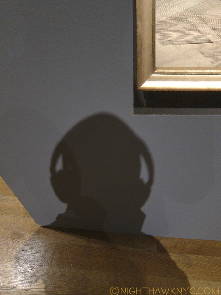
“That shape is my shade, there where I used to stand.” Steely Dan, from “Deacon Blues” quoted in my first post. Hard at Work at “Nasreen Mohamedi,” The Met Breuer.

One post required 100 versions before I was happy enough with it to put it up, and a few others have been revised over 80 times prior. Believe it or not, NighthawkNYC has become close to a full time pursuit at this point. That wasn’t part of my initial plan for it, so how did this happen?

“Woke up, fell out of bed
Dragged a comb across my head
Found my way downstairs and drank a cup
And looking up I noticed I was late
Found my coat and grabbed my hat
Made the bus in seconds flat
Somebody spoke and I went into a dream”*

While I’ve spent quite a bit of time looking at Art these past 15 years especially, I spent triple that time this past year. I should reiterate that while I usually do quite a bit of research on whatever topic or show I’m writing about,

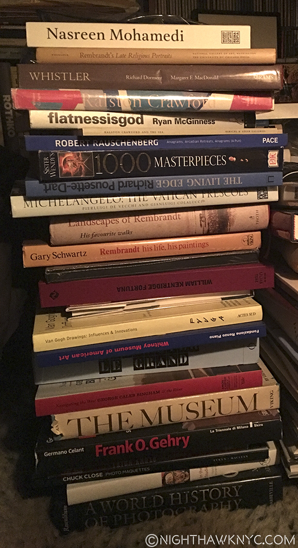
This shot was not staged.

This shot was not staged. Don’t try this at home, lest your house looks like mine.

I don’t read what anyone else has said about the show, sometimes even after I’ve finished writing about it. I’m aware that many writers see a show once, maybe twice and write about it. Most of them have deadlines to meet. I’m lucky. I don’t. I can spend as long as I need until I feel happy with a piece (My Post on the New Whitney Museum has been over a year in the works. I just hope I finish it before they go and build a newer one!) As I’ve hinted, I have a habit of basically moving in at a show I’m taken with. I’ve hit a dozen visits a number of times and this is for a show that may run 8-12 weeks. My thanks to all the security guards and employees who were at first like, “Him? Again??”, of these shows I’ve haunted. I like to “live” with the work so to speak and this is the only way I’ll ever be able to do that. Also, most good sized shows contain 100 to 200 works. They take time to study on any than a more than cursory level. Let’s face it, Good Art doesn’t yield all of it’s secrets in one viewing. And I, for one, especially value Art that says something different to me, or that I see something else (or new) in it with each viewing. IMHO, THAT is the Art you want to hang on your wall! Be it an original, for which we should all be so lucky, especially at today’s record prices, or a reproduction.

DSC_4150NEFPNH

As far as your mail goes, my Music Posts consistently generate more of it than my Art Posts, something that caught me by surprise, especially given the record numbers of people going to see Art. My Post on Patti Smith’s show “18 Stations” garnered the most interest. (Meeting Patti Smith, The Met’s Sheena Wagstaff, Artist Richard Estes, and others, were unexpected personal highlights of this past year. Another reason to ALWAYS have a camera on you.) I also got suggestions of shows or topics. While I always appreciate suggestions, it’s harder to answer if I will or won’t write about them. A certain amount of what I write about is dependent on the reaction I have to it. Most of the shows I see, frankly, leave me cold, and so you will never see them here. So, a show, musician, etc. that hits me and really speaks to me is where I begin. Yes, there have been other things besides Art & Music, here, too. What I call “Life.” They will continue. Along with “Life,” unfortunately, there have been WAY too many R.I.P. Posts this year, something I hope we are finished with for a long time. Beyond all of this, yes, there is a lot of freedom in being able to address people and/or things that I’d like to be able to talk about that I feel strongly need to be heard or seen. Ahhhh…such are the joys of paying all the bills, and having total freedom, even down to, finally, being your own editor. Also, it seems there is ALWAYS something unexpected going on that pulls me in it’s direction. Well? This is why I live in NYC, after all, right? Still, I am going to make a conscious effort to address Artists & Musicians I’ve been lucky enough to know, as well as more overlooked Artists (when I say Artists, I mean The “Arts,” not only the visual Arts, that are within my interest and experience). We shall see if the world of NYC Culture allows me to do that, or not. (I say this knowing that Moma is planning a B I G 2017.)

It goes without saying to anyone at all familiar with NYC that NO ONE could ever hope to see, hear or experience EVERYTHING that goes on here, even after so many irreplaceable cultural venues (especially live music clubs) have been lost over the past 20 years. Still? Even today, if I did nothing else but constantly go from one thing to the next, slept on the subway and buses and ate on the go 24/7, and wrote and shot this on my iPhone, It would still be impossible. It’s literally going on here from 9am until 4am seven days a week, at points in all 5 Boroughs, and beyond. Even if I were only to focus on The Met, which now also includes The Met Breuer, as well as the Cloisters way uptown (which I could get to via mass transit if I needed to, but it’s really a half-day trip all told), and focused on all their shows (about 25-30 at any given time), their concerts, lectures, special events, and on and on…it would be close to impossible for me. So? I have to be selective and choose things that speak to me and that I think more people should know about, or already have an interest in, and that I have some connection with, if possible. All of that being said, I have no immediate plans to leave Manhattan. Crazy, right? (Yes, I will probably hit Brooklyn, again at some point to be determined.) But leave the City? I’ll never say never- I almost went to Amsterdam for “Late Rembrandt,” and had a thought of going to Holland for the Jheronimus Bosch 500th Anniversary Show. But, after all the thinking about it, I realized that I am not a fan of travel. My life’s dream was to live in Manhattan and even though I know the world is full of great Art and Music, I’m content staying right here. Heck, It bugs me more that I still miss great things going on right here every single year!

On the other hand? We shall see how long this goes before I run out of things to say, or things to photograph. Hopefully, that won’t happen soon.

DSC_4116PNEFPNH

July 4, 2016 Fireworks Photos taken at Kitty’s Party. Thanks, Kitty, for the Party & your support!

And now for some news for Year 2-

I have been photographing Musicians since the 1970’s, including quite a few all-time greats, and recently I have begun looking through those shots and finding out that some have survived, and some have not. I stored most of my early digital photos from 1998-2000 on removable media- remember Zip and Syquest Drives?- that have since became obsolete, and so the cartridges they were on wound up in recycling because I no longer had any way to read them! The lesson in that is that no computer file format is likely to last for long, so be careful how you store your files less this happens to you. Some of my photos taken on film have been found, so I’m hoping I can share some “vintage” photos as time goes on, in addition to digital shots taken recently. Beyond this, progress is being made towards the re-release of my music projects. I hope to have more news on this, too, soon.

In the meantime, please keep those comments, suggestions, feedback, and especically, those propositions coming! As those who have written to me know- you’ll hear back from me.

And, again, Thanks for reading this, or anything I’ve Posted here.

“I saw a film today oh boy
The English army had just won the war
A crowd of people turned away
But I just had to look
Having read the book
I’d love to turn you on”*

Have a great Night,
Kenn.

cropped-cropped-NH-Banner-V2.0-FullPFINAL-1.jpg

NighthawkNYC Version 2.0, with my alter ego, “Oof.”

*-Soundtrack for this Post is “A Day In The Life,” by John Lennon & Paul McCartney, from  The Beatles “Sgt. Pepper’s,” published by Sony/ATV Music Publishing, LLC, Universal Music Publishing Group.

NighthawkNYC.com has been entirely self-funded & ad-free for over 8 years, during which 300 full-length pieces have been published! If you’ve found it worthwhile, PLEASE donate to allow me to continue below. Thank you, Kenn.

You can also support it by buying Art, Art & Photography books, and Music from my collection! Art & Books may be found here. Music here and here.

Written & photographed by Kenn Sava for nighthawknyc.com unless otherwise credited. To send comments, thoughts, feedback or propositions click here. Click the white box on the upper right for the archives or to search them. Subscribe to be notified of new Posts below. Your information will be used for no other purpose.

Edgar Degas: Beauty & Anarchy

“I saw you standing there
I saw your long, saw your long hair
Opened up my eyes, baby
You made me realize all I want to do now
Is look at you”*

Edgar Degas (1834-1917) didn’t see the world as you or I do. Many of us can’t see beyond the phones in our face to really see most of what is right in front of us (watch out for that bike), and remember even less of it. Not Degas.

I see you. Self Portrait, Etching and drypoint, 1857, aged 23.

Edgar Degas, seemingly, saw everything. Especially when it came to women. He even saw things that I’m not sure were intended to be seen let alone depicted. For that reason, I’ve considered him the “king of the hidden moment.” Some of those moments he chose to remember, and immortalize, were scandalous when he first exhibited them. 125 year later, they may still give us pause. He was a voyeur in the original sense of the word. meaning “one who looks,” but I am sometimes left to wonder if he was in the contemporary sense, as well- a “peeping tom.” Yet, he does it in ways that we can’t take our own eyes off of, “blinding us with science”- his talent and genius.

I see you, too.

I see you, too. Perhaps, only Degas would think of immortalizing this awkward moment. But, why? (Pastels applied to a Monotype, the core medium of MoMA’s show.)

He, thereby, makes us complicit after the fact in his voyeurism. Before the fact, the question is there to be asked- Why this moment? While I choose to respect the privacy he long sought and stay away from looking into the reasons he felt “the artist must live alone” (which he was his whole life) for insights to his work, I have come to blame it on that eye that never closes, and that sees all. While we admire his work, rightly among the greats, there are times when I wonder if having that switch in his brain that said, “Um? No.” might have been a good thing- once in a while.

It’s too late now. No one who owns one of those “questionable subjects” Degas depicted is relegating it to the trash bin. Most of them are in museums, or most likely will be one day. At the moment, 120 of Degas’s works are on view in Degas: A Different Beauty, the summer blockbuster at MoMA though July 24, a show centered around his rarely seen Monotypes, which are usually tucked away because many are too light sensitive for permanent display. Still they are Degas, and the more Degas I see, regardless of the medium he’s using, the more I’m struck by the moments he chooses. Of course, beyond “why?” there’s the “what does the work mean” question.

But, let’s back up. First…what’s a Monotype?

It’s a medium that combines drawing and printmaking that results in a one-of-a-kind work, hence “mono.” It’s created either by adding ink to a copper plate with a brush, or almost anything else, which is called the “Light Field” kind of Monotype, or selectively removing ink from the plate covered with it, again using a brush, etc., which is called the “Dark Field” kind of Monotype. The plate is sandwiched with a sheet a paper and then run through a press resulting in a print. Degas, of course, did both kinds, but as the show wonderfully shows us, he didn’t stop there.

One of Degas' first Monotypes- Dark Field.

One of Degass’s first Monotypes- The Ballet Master, Dark Field Monotype, 1876.

In addition to this  never closing eye, Degas had an incessantly exploratory nature and they combined in an eternally restless Artist, one who was, also, constantly searching for new outlets for his creativity. That led him to the Monotype, an infrequently seen medium in Art, at the suggestion of his friend, the Artist and Monotypist Ludovic Napoleon Lepic in the mid 1870’s. Later, it would lead him to Photography (1895). Degas threw himself into the Monotype with typical intensity. He learned the basics, and then pushed them. Soon, he was doing things like making a second print from the plate, which would naturally be faded as the image degrades after most of the ink had been spent on that first impression, to which he’d add Pastels on top of the black and white image creating shockingly “different” works from the two tone original. Some of these colored images are beautifully displayed side by side with the black & white first image, the pair are called “Cognates.”

Cognates

Cognates. “Woman in a Bathtub Sponging Her Leg” 1880-85. Monotype, and with pastels (right).

But, be warned- this isn’t “Degas 101,” or “Degas’s Greatest Hits.” It’s not even “Degas’s B-Sides”. It’s borderline “The Unknown Degas” (for the casual Degas lover), but that certainly doesn’t mean it’s “bottom of the barrel” Degas (whatever that is. If it exists, I’ll take it!). It means there is so much great Degas that little known works like his Monotypes can hold their own front and center in a big show, even without support from the inclusion of some much more famous paintings 1 But let’s not let the medium be the message here. For me, at least, it’s “still” Degas. What one sees in his paintings, pastels, sculptures and etchings, is also to be seen in his Monotypes. All his “big themes” are here, showing they never were far from his mind, regardless of medium, and giving the casual Degas fan plenty to enjoy, while they see something new. They include-

Beauty. In ANY sense of the word.

Beauty. In ANY sense of the word. Pastel over Monotype.

Ballet Dancers

Bathers

Portraits, and even a Self Portrait or two

Family life

Night Life and City Scenes

Yes. This is a Landscape by Degas, Pastel over Monotype in Oil, 1890

Yes. This is a Landscape by Degas. Pastel over Monotype in Oil, 1890

And? There are also landscapes, something that most Degasians may not be as familiar with2. A whole room of them that Degas called “imaginary landscapes,” inspired by a trip through Burgundy in 1890. They are shockingly different for Degas, who, much like me, preferred the City and found no end of inspiration therein, anticipating the edgy, quasi-abstract late work of Monet (i.e. the Waterlilies, etc) some 20 years later, and the Abstractionists over the rest of the 20th Century.

Oh.

I left out the Brothel Scenes. Well? That’s what the section card says they are. They sure don’t look like scenes from any brothel I’ve ever heard about. (Sorry. I cant’ say I’ve actually been in one, so I’m speaking third-hand.) Of all of these, the Brothel Scenes strike me as being the most intimate, especially because the Bathers are almost uniformly very dark works, where much is hidden in shadow or under water. The Bather rising from her tub, above, is in the Brothel section, and is typical of how well lit these scenes are. Which is good because it also serves to highlight some of the questionable scenes in this section, like the image of a woman either about to use a bidet or rising from one. ?

Then again, it also means there are those priceless moments of ballet dancers and ballet students caught unawares in beautiful, unique poses. Families doing the most mundane of things line one wall, while “everyday scenes” of a different nature abut them in an adjoining wall of brothel scenes. The bathers get the privacy of a room to themselves, as do the landscapes, and the dancers are pretty much everywhere else. Along the way, we see two Self Portraits (one, above), a series of Rembrandtian etching “states” and a somewhat odd scene of smoke stacks, looking somewhat lost, on a wall by itself, heightening it’s “out of place here” feeling.

The “Greatest Hits” collection of Degas themes notwithstanding, there is much to see here, and much that requires close scrutiny. The gorgeous strokes of pastels that seem to have been applied at once both spontaneously and effortlessly, all the while, sublimely, particularly struck me. It’s also fascinating to see how he’ll take a black and white monotype and colorize it. Having the very rare opportunity to see both, side by side is, for me, one of the highlights of this show- The effect is not like seeing a colorized black and white movie. Degas makes it something completely else. As a result, I was quite surprised to see him quoted on a sign to the effect that if it were up to him, he’d work only in black and white, but the public wants color. I, for one, am thankful we have both. While I would never dare to argue his preferences, I also have to say- What a loss to the world it would have been had he never worked in color! I came away with a new appreciation of Degas, the colorist, both in how he applies color to a given composition, (which can be quite bold, like a lightning bolt, as in the dancer, above, but also for his palette. If you get to see this show, or the very good catalog for it, be sure to look for these instances where you can see the Cognates, so you can make up your own mind. Here is one-

Bather. Monotype. First impression.

Bather. Monotype. First impression. A closer view of the Cognates, above.

Bather. Pastel over Monotype. (Second impression)

Bather. Pastel over Monotype. (Second impression)

Then there’s the question of meaning…

“…what is fermenting in that head is frightening.” Rene Degas (his brother), in a letter, April, 1864.3

Degas does not surrender his secrets easily. Anyone who has seen his early masterpiece, Interior, 1868-9, can attest to the mystery his works hold. Some see a rape in it, others see the depiction of a scene in Zola’s then recently published Madeleine Ferat. Personally? Having seen it in Philadelphia first hand, I see different things in it each time I see it, even now in pictures. Beyond its “meaning,” more importantly, right now, I see it as a precursor of Edward Hopper. It’s a classic example of what Jean Sutherland Boggs, in the catalog for a much earlier show at The Met, succinctly says- “The longer one reflects on the work of Edgar Degas, the more elusive it seems.” She continues, however, throwing us a lifeline of insight “…some key to the work, if not necessarily to the man, may be found in his fascination with equilibrium[ 4. Degas 1834-1917, Metropolitan Museum, 1988,  p. 23].” And, yes, beyond the voyeurism, which may take some time to see past, we do see that in the bathing piece above. Though it’s not to be seen in the physical sense in all his work (though it may be on the psychologoclgical sense) it becomes fascinating to look for- The dancers on one foot or bent over, or at the barre, and on and on. Degas is fascinated by man’s relationship to the ground, the earth, and with equilibrium.

DSC_2564PNH

The Met's Degas Sculpture Room. Notice that every single work depicts balance & equilibrium.

To research this further, I went to The Met’s Degas Sculpture Room. Notice how every single work depicts balance & equilibrium.

“Degas is an anarchist. But, in Art.” Camille Pissarro (Artist/Anarchist/Friend of Degas), in a letter.

This show is risky. Degas was exploring in his monotypes. The “beauty” on hand is sometimes “different,” in the sense that it’s, at times, not the beauty Degas is most revered for and that the masses of Art lovers, myself included, associate him with.

One of the most puzzling and "different" Degas I've yet seen. Monotype.

One of the most haunting, and “different,” Degas I’ve yet seen. Monotype.

It seems to me that when “looking for meaning” or trying to reconcile all of this, it pays to look back at Degas’s past. Degas didn’t start out a revolutionary. His early work showed “the classical beginnings, without any gesture of revolt4”  It was in the 1860’s that this would change. His anarchy lies in subverting the past/his past while he reinvents it, and seeks to add to or change his own working processes. Degas spent long hours copying in the Louvre and then in Italy for 3 years. Among the works he copied were an etching after a Michelangelo original of a man scrambling over a riverbank, i.e. climbing out of the water. Once you look for it, this image of a nude entering, or leaving, the water is one that reappears in his work- there’s a gorgeous pastel of one at The Met, here. Therefore, I think the image of the Bather Exiting the Bathtub, way up above, is, partially, another example of that interest, partially due to his interest in “equilibrium,” and partly sensual/erotic. It’s taking the classical idea of Michelangelo and turning it on its head, as an anarchist would be expected to do.

Anarchist Degas then shocked society in 1888 when he showed his nude drawings in an exhibition arranged by no less than Theo van Gogh, Vincent van Gogh’s brother. Vincent van Gogh was quite taken with Degas and was one of the few Artists around capable of understanding, and admiring, his isolation and celibacy. His comments on Degas & women in his Art are fascinating. Up until Degas, the nude was something drawn from models, who were aware of what was taking place and were party to it, even if they were depicted at their “toilette”, which goes back to the 1500’s in Art. With Degas you often have the feeling that neither of these “norms” were true, leaving us with that sense of looking through a door that has been cracked open. I haven’t been able to find out what the subjects thought of these works. Voyeur? Rule breaking visual anarchist? Though he, apparently, lived a sexless life, Degas created his fantasies in his Art (for what purpose I know not), and a number of them are on view here. He created them for himself, only showing the 9 he allowed Theo to exhibit in 1888 during his lifetime, and he kept them until he died. Why? I don’t know and I don’t think it matters. They subsequently came into Museums and private collections when his estate was sold after his death in 1918.

It speaks volume that he was so willing to continue to explore when he had discovered things, like the paintings of dancers, he could have continued to do forever and receive endless acclaim for. It takes a little bit of that same faith to follow him on his exploratory path to get to the gems that are not often seen due to their fragility. They are here, though the show includes works that are not. Some may be characterized as experiments, while others are byproducts of Degas’s refining his process. They are all Degas, though, and as such are precious, edifying and definitely worth seeing. MoMA is to be congratulated for taking the chance of going against the grain of what people know and expect from a Degas show, and for doing it without the “crutch” of including a number of their own very familiar paintings. Here we have Degas the artist who was restlessly exploring new mediums and new techniques, while adding his own steps to the processes he had been taught by others. In that sense, Degas: A Different Beauty is a fascinating insight into the mind of one of the greatest Artists of the past 150 years.

“When it happened
Something snapped inside
Made me want to hide
All alone on my own
All alone on my own”*

For me, this makes Degas a prototypical “Modern Artist” in every sense of the term, as much as anyone working today. Degas would be right at home in our time, with the expanded capabilities Artists have, pushing the possibilities of Photoshop, the iPad, video, or you name it, as he would have been at home, most likely, at ANY time in history. In that sense, like his great influence and forbearer, Rembrandt, and a great Artist he influenced, Picasso, Edgar Degas was an eternally “Modern Artist.”

*- Soundtrack for this Post is “Looking At You” by the MC5, written by Tom Robinson from their Lp Back In the USA. Published by Sony/ATV Music Publishing and Warner Chappell Music Inc. Degas’s brother lived “back in the USA” and Degas actually spent fruitful time in New Orleans in 1872.

NighthawkNYC.com has been entirely self-funded & ad-free for over 8 years, during which 300 full-length pieces have been published! If you’ve found it worthwhile, PLEASE donate to allow me to continue below. Thank you, Kenn.

You can also support it by buying Art, Art & Photography books, and Music from my collection! Art & Books may be found here. Music here and here.

Written & photographed by Kenn Sava for nighthawknyc.com unless otherwise credited. To send comments, thoughts, feedback or propositions click here. Click the white box on the upper right for the archives or to search them. Subscribe to be notified of new Posts below. Your information will be used for no other purpose.

  1. There are 7 Oil on canvas Paintings and 1 Oil on paper mounted on canvas, mostly in the show’s final room, but none are among his famous works.
  2. The Met had a show of Degas’s Landscapes in 1993.
  3. “Degas 1834-1917,” Metropolitan Museum, 1988, p.41
  4. Degas 1834-1917, Metropolitan Museum, 1988, p. 34

Jacob Collier- “I Don’t Want To Be A Saviour”

This site is Free & Ad-Free! If you find this piece worthwhile, please donate via PayPal to support it & independent Art writing. You can also support it by buying Art & books! Details at the end. Thank you.

Written & Photographed by Kenn Sava (*- unless otherwise credited)

There I was, this past Saturday, minding my own business, fresh from another visit to Degas at MoMA (here), braving the crowds at Summer Stage in Central Park on a gorgeous afternoon waiting to hear what would turn out to be an absolutely incendiary performance by Kamasi Washington & The Next Step, working my way ever so slowly towards the front of the throng, over 2 and a half hours, until I was 5 from the stage, when this kid came out to do the opening act.

By himself.

DSC_3296PNH

Uh oh.

I’d been thinking to myself that I felt sorry for anyone who got the opening gig slot ahead of Kamasi Washington, here in Central Park of all places. What it must feel like to be out there knowing that a mountain, this force of nature, this new movement of talent called the “West Coast Get Down” is about to fall on you, and probably obliterate every sign of you having been there. After all, when was the last time a group of very talented Musicians came out of the same place at the same time? “I just got off a plane from London,” he said, rocking “bedhead” hair. Oh, I know how taking that trip feels. My heart sank. Maybe I should turn around and watch for incoming bottles, like I had to do for the 6 hours of opening acts the crowd hated before The Clash at Bond’s Casino back in the day. I decided to settle in and give the kid some slack. What the heck. It was such a lovely early evening.

Hmmm....Crowd seems pretty peaceful...so far.

Hmmm….My fellow “Kamasi-ites” seem pretty peaceful…so far.

One hour later, this kid- Jacob Collier, left me thinking that he might very well be THE most talented young Musician on Earth.

“Hole on there, Nighthawk. Have you met EVERYONE on Earth, Mr. NightOwl?”

“Yes.”

“How is that possible when you never leave Manhattan?”

“Because sooner or later? They all come here.”

Jacob Collier is S I C K. And, not as in jet-lagged sick. Check this out-

On this new song, “Saviour,” he sings & plays everything. The video was filmed in ONE take, using 6 projectors.

Ok. Let’s start at the beginning. He’s got this keyboard that’s not a keyboard like any you or I have ever heard- the “Novation” he’s playing in the photo, above. An invention from this guy, Ben Bloomberg, (who he introduced. He was there doing his sound in Central Park), at the MIT Media Lab in Boston. As far as I could discern, it harmonizes his voice into the chords that’s he’s playing on it.

And wow. What chords!

No Novation on this- just his actual voices. Not to mention SICK Melodica playing! Oh, and no use of Autotune.

Young Mr. Collier apparently has been studying the hell out of Jazz harmony from Jelly Roll Morton up through Herbie Hancock and Joe Zawinul. He’s got a bit of at the jazz classicist to him, his harmony is never “outside,” or atonal. Rather, he uses extended harmonies, chords that go further than your basic triads, adding tones further and further away from the tonic, or tonal center- hence extended harmony. Musicians have long known that there is “gold in them thar harmonic hills,” in the form of incredibly rich sounds. But, it’s always been something you just don’t hear on the radio outside of on Jazz stations. Maybe now? We will. And, he’s not shy about singing EIGHT part harmony, or more(!), all with only his voice. THAT is unheard of in Jazz, or just about any other kind of Music these days.

Still? I’ll be the last guy to put Mr. Collier in a box. Yes, his Music, and Musicianship, has a lot of Jazz elements to it. It also has R&B elements (Stevie Wonder appears to be a big influence on him judging by how many Stevie classics he’s covered), classical, folk and pop elements, among other things. Heck, being 21 now (18 when he was discovered by Quincy Jones, who signed him to his label and manages him now, on youtube) and covering both rock tunes and the “Flintstones” bring “pop” elements.

Ok, so we’ve got a guy with a keyboard who sings and harmonizes with himself. Then, he’s also a terrific bassist- upright or electric, to the point that he’d  be getting cred right now if that’s “all” he was. Im not comparing them as bassists, though I’ll go as far as saying he’s got a bit of Jaco Pastorius’s swagger, and, apparently, his long fingers. I think Jaco would have liked him, and yes, I met Jaco a number of times, and heard him in person at “The Birthday Concert” among many other times over 8 years. Jacob has the ability to take has vision and realize it on whatever instrument is needed and bring his personality to it at the same time, which no hired sideman could do. He’s a whiz on traditional keyboards from piano through synthesizer, with chops most keyboardists would kill for, a more than good enough drummer and percussionist, he plays some guitar, and lord knows what else. Apparently, Mr. Bloomberg has designed his stage setup, too, so that somehow there are sequencer triggers set up all over the stage so he can go from instrument to instrument, play a few bars on it, then have the sequence played back in a loop, which he then layers, live, all without , seemingly, pressing any buttons. Oh! And he’s one hell of a melodica player. I mean absolutely ridiculous, as you hear, above. There are youtube videos where Musicians are already transcribing his melodica solos so they can learn them.

Here he is live, which is the closest I’ve found to what I experienced in Central Park, shot on someone’s iPhone 6S-

But? As amazing as all of that is? That’s not the point.

Music is the point, and that, above all the rest is what matters. As you can hear above, he’s got a completely unique approach to Music. No matter how outlandish what he’s doing seems, it’s always done in service to the song- he’s really not just showing off.

A completely unique approach?

I think so. What else does that sound like? His vocals may sound like a one-man Take 6 at times, then he’ll surprise you and make a left turn at the drop of a dime. His arranging, which strikes me as one of his strongest suits, is a tiny bit like Quincy Jones (Michael Jackson-era), on steroids. At times he reminds me of Joe Zawinul of Weather Report in terms of the boundaries he pushes. At other times, like a 21st Century Swingle Singers. None of that encapsulates it, of course. He’s taking what’s come before and building on it. Ok, I’ll try this-

Jacob Collier is a phenomenon.

DSC04497PNH

He’s better without a band, IMHO.

Already. And? HIs first album doesn’t come out until July 1. He’s been racking up big numbers on youtube since he was 18, and it’s easy to see why. And if all of this wasn’t enough? He directs and edits some of his own videos (like the one below).

He announced during the show that he had 50 copies of his debut album with him. Of course, I scooped one up. It’s funny how a number of the tunes that got my attention, and that of quite a few others around me, aren’t even on it. Very unusual for an artist with 1 album almost out, and who is all of 21 to boot. I’ve seen many new acts that had to repeat a song if they had to do an encore cause they played everything they knew. (You can watch a live stream of its release, hosted by Quincy Jones, here.)

His about to be released debut. I bet he was born doing just what he's doing on the right.

His about to be released debut. I bet he was born sitting at his workstation, as he’s doing on the right.

I left with the sense that here is, either, an old soul, or the reincarnation of one who had already mastered all of this!

He sings & plays everything on this astounding Quincy Jones/M. Jackson cover, except for Quincy’s cameo, and also filmed & edited it.

Jacob Collier is, already, a state of the Art 21st Century performer, who is on the cutting edge of so much of what it is to be a 21st Century Musician. Scouring the web since Saturday, I’ve come to feel that he’s “better” alone. Yes, he can play with other Musicians, it’s not that. It’s just that his thing by himself is just so unique, so strong, and so amazingly well arranged and constructed, that THAT is the best way to experience him, IMHO. It’s like being in a band with your brothers- no one else has that chemistry he has with himself. Different Musicians have different minds. When he plays everything himself, he knows what he wants. I don’t know what the his career path will be. Whether this means he winds up being a producer, or he can continue to reinvent himself over time, who knows. It will be fascinating to watch. But, for now, this is something unprecedented in Jazz, at least- a one man band. Where he goes from here we all shall see. His album is just him, recorded in his room at home, as its title, “In My Room,” announces. Check it out.

The fact that he’s being associated with Jazz is something I welcome. As I recently said, I’ve been hoping for a bunch of Artists to throw their hat into the ring to be “the Next One.” But? Jacob Collier, as his song, “Saviour,” which I quoted in the title to this Post, says, doesn’t want “to be a saviour.1

“…unless you can tell me something to change my mind,” he adds later.

I’m working on it, Jacob. I’m working on it.

*-Soundtrack for this Post is “In My Room,” by Jacob Collier, from the album of the same name.

NighthawkNYC.com has been entirely self-funded & ad-free for over 8 years, during which 300 full-length pieces have been published! If you’ve found it worthwhile, PLEASE donate to allow me to continue below. Thank you, Kenn.

You can also support it by buying Art, Art & Photography books, and Music from my collection! Art & Books may be found here. Music here and here.

Written & photographed by Kenn Sava for nighthawknyc.com unless otherwise credited. To send comments, thoughts, feedback or propositions click here. Click the white box on the upper right for the archives or to search them. Subscribe to be notified of new Posts below. Your information will be used for no other purpose.

  1. He might be singing “your saviour.” I can’t tell and there are no published lyrics available. It doesn’t matter.

Table For One – Patti Smith’s “18 Stations”

Written & Photographed by Kenn Sava

One of the small pleasures of going to The Strand Bookstore are the quirky, usually ironically humorous yellow signs one of the staff places in random books. This one was sticking out of a just released book one day last October- Patti Smith’s “M Train,” featuring its author looking incognito sitting at a corner table by herself lost in thought…

October 30, 2015. I bought one.

Patti Smith, who many years ago briefly worked one floor down in The Strand’s basement, is a living legend now, but, she’s not stopping there.

From here to… The Strand’s basement. Not one of the 18 Stations. The “Patti Smith section” is now down here.

Beyond her groundbreaking music career, she’s had a second career as an award winning writer of prose, which seems to grow in stature all the time. “M Train,” which she calls “a roadmap to my life,” is both similar, and different, to her previous book, the instant classic “Just Kids.” While also a memoir, like “Just Kids” was centered on her relationship with Robert Mapplethorpe, this time, it’s about her life before, during and after her late husband, Fred “Sonic” Smith, guitarist of the MC5. It differs, too, as her Polaroid photography is a central part of this book. While, she’s been doing photography for years, and books of them have been published, she seems liberated here by not having a brilliant photographer as the co-subject, one she felt a responsibility to, and who’s pictures of her are now classics. Her photos enhance the story and go hand in hand with her imaginative telling of it, which almost feels improvised (she mentions listening to John Coltrane’s 1964 album “Live at Birdland” at one point and that is how her writing here feels to me). The book serves to pique interest in this aspect of her creativity. Now, many of those photos, and others, are on view in her show, “18 Stations,” at Robert Miller Gallery on West 26th Street, through April 16.


3 of the “18 Stations.”

While rock stardom is rare, something few can relate to, along the way, she’s also become something many more can relate to- single, and on her own. The show arranges images from her seemingly never-ending travels from, and returns to her NYC homes, and her beloved Cafe ‘Ino, at 21 Bedford Street in the Village, (spoiler alert), which closes for good near the end of the book. At the figurative and literal “heart” of the show, half way back in the Gallery, in the first “Station,” is an installation of her real table and chair from Cafe ‘Ino (“My portal to where.”) flanked by a bulletin board containing what appears to be the genesis of this show on one wall, and pencilled notes hand written right on the adjacent wall, making me wonder if the show originated during her time there.

Table For One. The wall on the right is covered with her writing in pencil.

“It occurred to me I could preserve the history of ‘Ino…like an engraver etching the 23rd Psalm on the head of a pin.” The iconic first picture in M Train in a unique version with Patti’s pencil inscription in her caligraphic script.

“We seek to stay present, even as the ghosts attempt to draw us away.”

It’s as if the thoughts she was having while sitting there are now real before us, though she is absent.  The other 17 “Stations” tell the story of her journeys, partially with her late husband, “M Train” dedicatee, Fred “Sonic” Smith, but mostly alone.

2 more Stations.

Reading the book, one discovers quite a bit about the “real” Patti Smith- her unquenchable thirst for (good) coffee, her obsession with detective TV shows….which, of course, reminds me of a song. You know…”She’s filing her nails while they’re dragging the lake…”

…her amazing connectedness to her influences to the point of traveling to their homes, gravesites or other memorable places in their lives- like visiting the chess table Bobby Fischer played Boris Spassky for the World Championship in 1972 in Iceland (she then had a late night meeting with Mr. Fishcher, and subsequently visited his grave after he passed the following year). She remembers so many of her dreams! I don’t. She also has a love of birthdates and anniversaries. Along the way, we meet Tolstoy’s Bear, Herman Hesse’s typewriter, Frida Kahlo’s medicine bottles and Schiller’s portal. I mean oval table.

Schiller’s Table. This inscribed version is labelled Schiller’s Portal

If you’re curious about how she works, or how she goes about her daily life, this is the book for you. For the rest of us, its a book about honing in on what really matters to you, about persevering and continuing to do you work and hone your craft. We’re lucky to have it. I found myself wishing we had something similar by Da Vinci, to go along with his Notebooks, or Michelangelo, who left us about 500 letters and possibly ghost wrote a biography of himself, that is frustrating for many reasons, where Patti’s paints a vivid picture. The amount of detail she recalls is staggering (and perhaps a bit too much). Well? I can’t have it both ways, so I’ll opt for too much rather than not enough. It’s interesting to contrast this intense detailing in the prose with her photographs. Some are a bit blurry, some off center or kilter (see below) providing (purposely) less detail than you may want.

“Speak to me, speak to me heart
I feel a needing to bridge the clouds, softly go
A way I wish to know, to know
A way I wish to know, to know”*

While most of these Polaroids are silver gelatin limited edition prints of 10, a few of these remarkable and beautiful images are graced with her equally beautiful handwritten inscriptions creating one of a kind works, they all, consciously, have an old feel to them, belying the fact that some were taken barely 3 years ago, which gives them a dream-like, seen in a vision quality, which Ms. Smith says she likes about early photography. The effect strikes me as not unlike that achieved by the great graphic artists, like Rembrandt, Goya and Whistler.

Herman Hesse’s Typewriter. I would have guessed it was William Burrough’s.

It’s also interesting to ponder what isn’t- here, or in M Train. There is no Robert Mapplethorpe. There are no shots of the Hotel Chelsea, West 23rd Street or Chelsea. No CBGB’s (How many of you remember that Patti Smith was also the last Artist to perform there?). There are only a few (as far as I can tell) of Manhattan. The two shots of Cafe Imo, of course, a shot of the West 4th St Subway Station, a shot of her house, among them. In that sense, for someone who, (for me and perhaps quite a few others) is associated so strongly with New York City, this is a show (like the book) that is largely about the world “outside” of it. ‘Ino being the “portal” to it. Memories of people and places outside of Manhattan (even in the case of Ginsberg and Burroughs who spent so much time here).

“Speak to me, speak to me shadow
I spin from the wheel, nothing at all
Save the need, the need to weave
A silk of souls, that whisper, whisper
A silk of souls, that whispers to me”*

Among my dozen visits was one on April Fool’s when a few hundred of us were blessed to have our paths cross with hers at a reading here that served to highlight for me, at least, the conversational nature of both her recent books, then hearing her tell stories about them, and her life, in ways no “audio guide” ever could. I’ve heard a lot of Artists, and Musicians for that matter, speak about their work. Rarely have I felt like they were speaking of their children the way these stories felt. The memories behind each shot is so personally present, it lies as close to her skin as the image lies on the surface of the paper. Quite a few of the stories are told in the books, and hearing her read them changed the way I will re-read them. (I have not heard the audio books she’s done of them.).

I missed hearing Joyce read Ulysees, Kerouac read On The Road, Ginsberg read Howl, but…

I didn’t expect to hear her read from Just Kids, expecting this to be about M Train, but she did. I don’t know Patti, and didn’t know Robert Mapplethorpe, but I know well know the area much of the book inhabits, as well as some of the venues it takes place in, so the book lives in me, as few I’ve read do. Hearing her read it brought it alive, pulling it from the realm of “living history,” to something that, yes…really did happen. I pass by some of those places a few times a week.

Every single time I do I think about what happened there.

A fan’s tribute left leaning against the wall. April 15.

This is one of the most personal shows I’ve seen, certainly recently. I found myself returning to it over and over, like she did to Cafe ‘Imo. It’s like being able to walk around in someone’s memories, rather to get on a train and stop at each Station along her journey. Along the way, we encounter influences, living, passed and once living among you and now passed, objects that speak to a large meaning or significance, memories, hardship, distant places went to, seen and conquered. We see life being lived and places where it famously was lived. We see that life goes on, all the time, around us- everywhere, while weather happens, dirt gathers on graves, dandelions grow and stuffed bears eternally await calling cards.

M Train sweeps the dirt that accumulates on the many graves it visits, without need for tenders in traditional wear and using a literary broom to do so- the kind those buried within would possibly prefer. It’s a Testament to Life- surviving on your own, through deaths, Holidays without others, long trips, your birthday, sudden illness, blackouts, meeting legends, unexpected connections that prove life changing, and most of all, change. In the end, you can’t even go home any more.

___

Postscript, April 16-

Each of the dozen times I went to this show, I especially looked forward to seeing her table and chair from Cafe ‘Ino, which I show in the 6th photo above, and below.

Walking over there today for the last time, I asked myself – Why? Why do they “mean” so much to me?

I was never even in Cafe ‘Ino. I had to look it up on Apple Maps to even see where it was. I’d never met Patti Smith. I didn’t follow her music career very closely. I wasn’t aware of the extent of her work in photography.

?

I don’t get it.

I read Just Kids and loved it for many reasons, including those I mention above. One of those was the sense of the Manhattan that is now gone- both people and places lost, it so beautifully captures. Patti stands for that lost Manhattan for me for that reason and also because her music was a vital part of it. When I started reading M Train, all I knew about it was that it was about writing alone in a cafe. I could relate. I spent 10 years drawing alone in bars. Inside the book, the very first picture is of her table & chair in situ at Cafe ‘Ino. We’ve all lost a lot in our lives- it’s an inevitable part of living. Patti is no different. Neither am I. Neither are you.

When I reached the Gallery today, I walked down the hall and rounded the corner to visit their installation. When I looked in, I was stopped in my tracks completely in shock. The table and chair were taken.

Patti Smith was sitting there, alone, signing books.

At that moment, it hit me. What they say to me is that they speak for what’s been lost in her life. They, in ways even her pictures aren’t, are physical representatives of what’s been lost. They are still here. They are continuing with their “lives.” Like we all must- like Patti is.

For me? I feel so very lucky…so blessed. Getting to see her sitting in her chair at her table…NOTHING could have been a more fitting culmination to her show. Though, this was close…

Patti walks down memory lane one last time before her show ends. April 16.

“Speak to me heart
All things renew
Hearts will mend
‘Round the bend

Paths that cross
Cross again
Paths that cross
Will cross again”*

It is the ultimate “P.S.” to it.

As if the universe was saying to me- “P.S.- Life goes on.”

Hopefully.

*Soundtrack for this Post is “Paths That Cross” by Patti Smith, from her ablum, Land (1975-2002), written by Patricia Smith and Fred “Sonic” Smith, published by Druse Music. All other quotes in the text are from M Train by Patti Smith and published by Alfred A. Knopf.

January, 2019- This Post is dedicated to all the Patti Smith fans from around the world who’ve written to me about it. 

NighthawkNYC.com has been entirely self-funded & ad-free for over 8 years, during which over 300 full length pieces have been published!
If you’ve found it worthwhile, PLEASE donate to allow me to continue below.
Thank you, Kenn.

Written & photographed by Kenn Sava for nighthawknyc.com unless otherwise credited.
To send comments, thoughts, feedback or propositions click here.
Click the white box on the upper right for the archives or to search them.
Subscribe to be notified of new Posts below. Your information will be used for no other purpose.