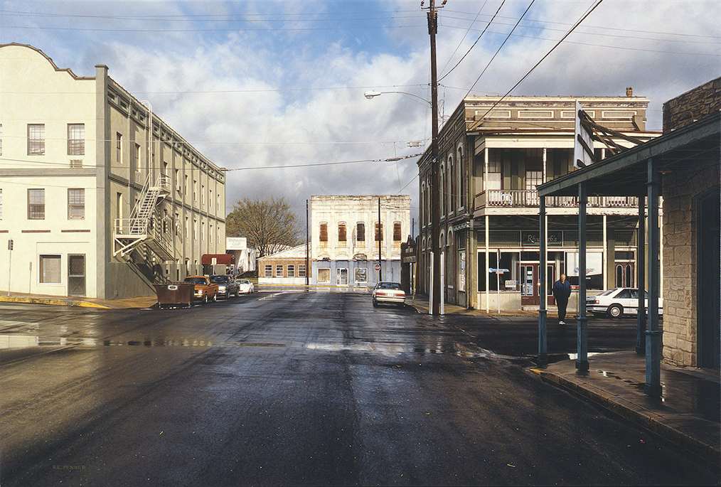
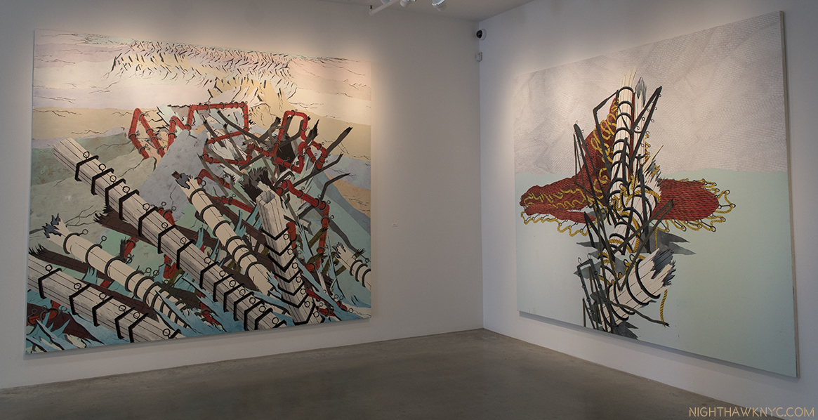
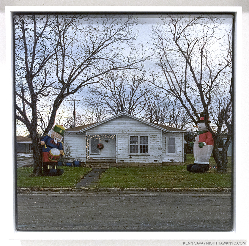
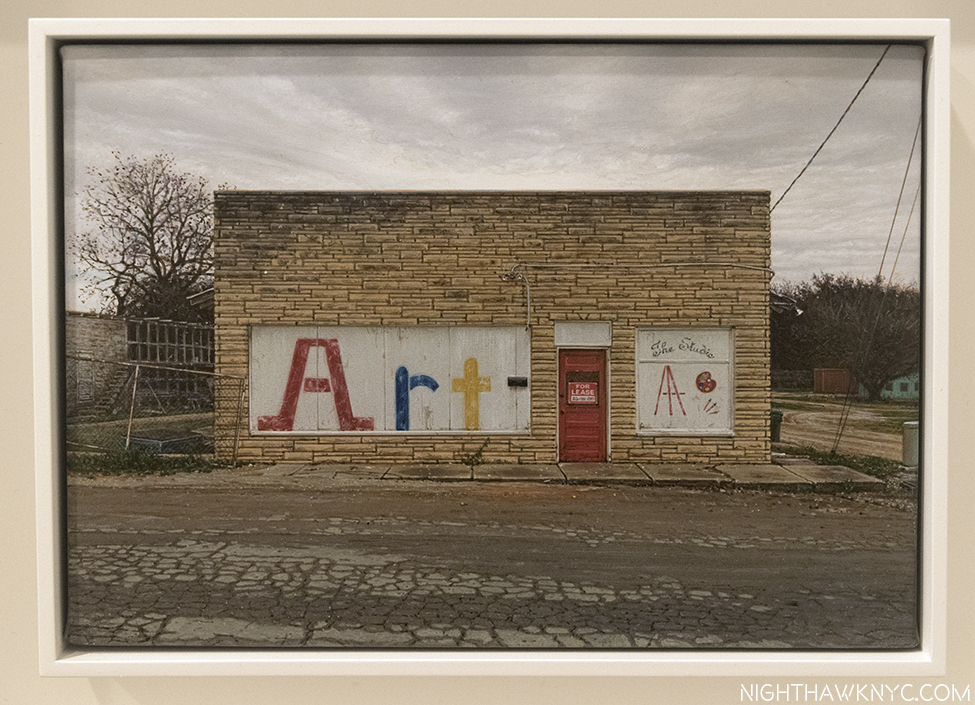
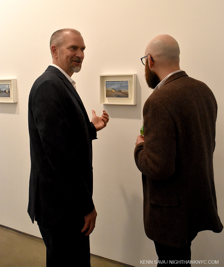
NoteWorthy Shows: March Through May, 2017

This site is Free & Ad-Free! If you find this piece worthwhile, please donate via PayPal to support it & independent Art writing. You can also support it by buying Art & books! Details at the end. Thank you.

Written & Photographed by Kenn Sava.

Catching up from my March computer meltdown. To recap, AIPAD-The Photography Show, was my NoteWorthy Show for March, “Raymond Pettibon: A Pen of All Work” at the New Museum for April, “Rod Penner” at Ameringer McEnery Yohe for May. Here are some other “NoteWorthy Shows” I saw from March through May (in no particular order). Better late than never…especially where these fine shows are concerned. 

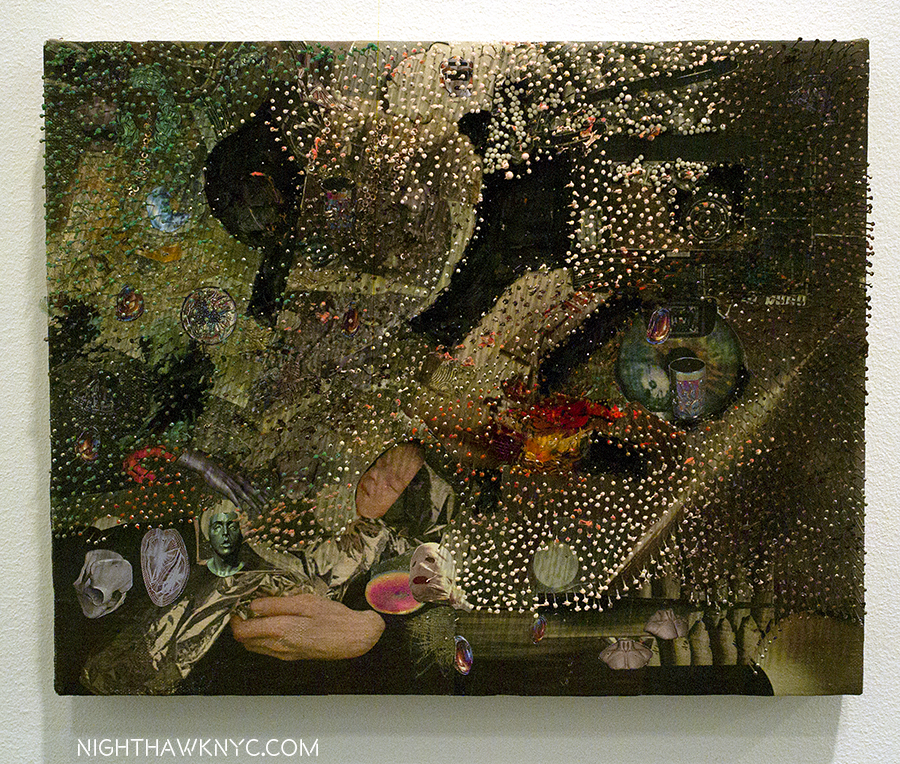
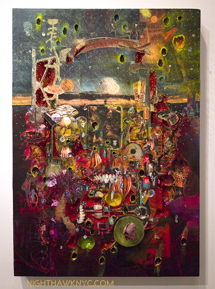
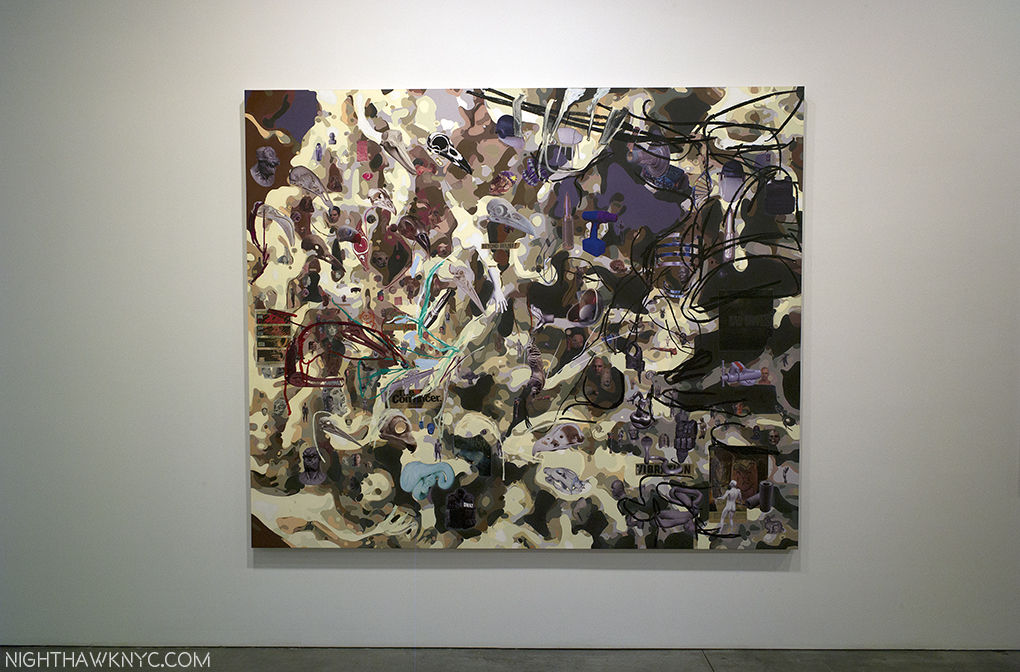
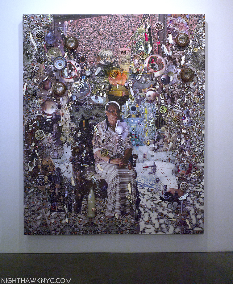
“Elliott Hundley: Dust Over Everything” (@ Andrea Rosen Gallery)- According to Siri there were 41 days between January 1 and February 10, during which Elliott Hundley must have been THE busiest man on the planet creating the 22 works for this show, which opened on February 10. He must not have eaten, slept, or gone to the food store, saving every second of every day to create what are the most intricate works I’ve seen in years, each one of which is dated “2017.”

“the song dissolves,” Paper, oil, pins, fabric, foam and linen over panel, 11 3/8 x 14 3/8 x 2 3/4 inches. Click any image to enlarge.

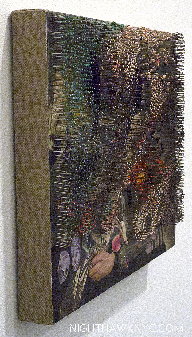
Side view.

Theatrical…Intimate…Grand…Microscopic…Bombastic…Quotidian…There are as many styles as there are works, and almost as many materials listed having been used on them. Ok. He probably had (some) help creating these. Practically? I get that. But, you can’t see it. Every single detail seems to spring from the same source- a seemingly boundless imagination that shows us a different side of it in each piece.

“Dust Over Everything,” Paper, oil, plastic, fabric, pins, foam and linen over panel. 36 1/4 x 24 1/4 x 6.

And the pins! I feel for whoever has to count them when these works wind up in Museums. “Countless” is how I’d describe them. It must have taken an army of acupuncturists a week to do even one of these works, because they are so extraordinarily well placed I found myself continually looking at the works from a 45 degree angle so I could appreciate them all. They’re such a tour de force as to be, a bit, distracting. I wondered what order they were placed in, which took away valuable moments I should have spent pondering the work as a whole (before getting to the details.) They are a bit like veil on a stage that you have to look through (after you’re done appreciating them) to ponder all that’s under them. But, they are not present in every work here. What’s under them struck me as being a whole life told in episodes, glimpses, memories and relics.

“Gallows Bird,” Oil and paper on linen, 80 1/8 x 96 1/4 x 1 7/8

Suffice it to say there’s, also, a life time’s worth of looking ahead for whoever buys these obsessive works- some of the freshest work I’ve seen in the first 65 days of this year, and among the densest work I’ve ever seen.

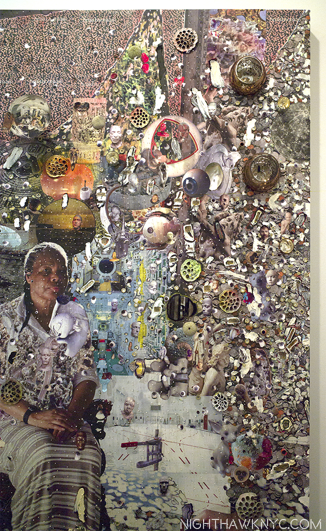
“Until the end,” Paper, oil, pins, glass, lotus, plastic, foam and linen over panel, 96 1/2 x 80 1/4 x 8 1/2

Detail of the right side. Mr. Hundley features friends & family in his work, giving them a personal depth he feels comes across to the viewer.

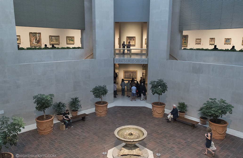
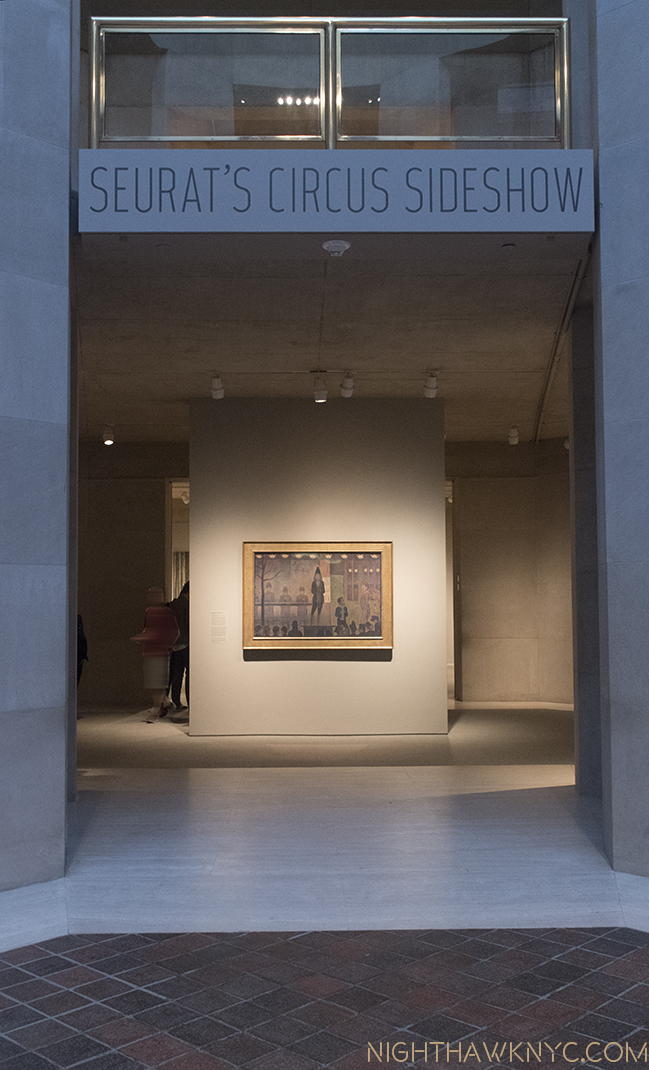
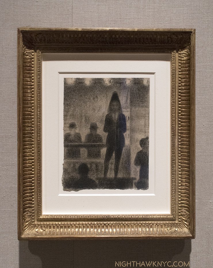
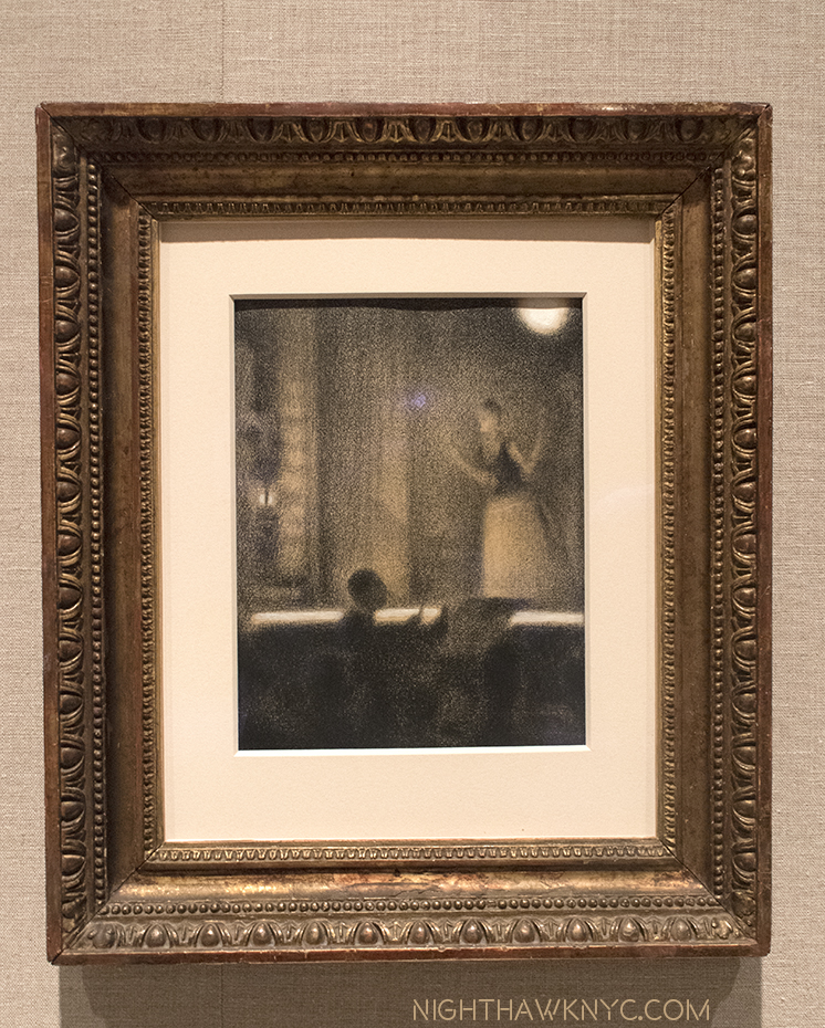
“Seurat’s Circus Sideshow” (@ The Met)- From the first time prehistoric man made a mark on a surface, countless billions of people down through the intervening millennia have drawn. Where is the OTHER one among them who draws, or drew, like Georges Seurat? Seurat only lived 31 years, so he didn’t get the chance to create either a lot of drawings, or a lot of paintings, so this was a very rare chance to see (mostly) his drawings, along with 2 paintings, and works by others, all more or less related to the theme of the circus, with Seurat’s “Circus Sideshow,” from The Met’s collection, as the centerpiece. How fascinating it must have been to watch him make one of these unique Drawings, let alone one of his even more remarkable paintings? So, even the otherworldly presence of Rembrandt’s “Christ Presented to the People” wasn’t enough to distract from focusing on the extremely rare opportunity to see a number of Seurat’s drawings in one place.

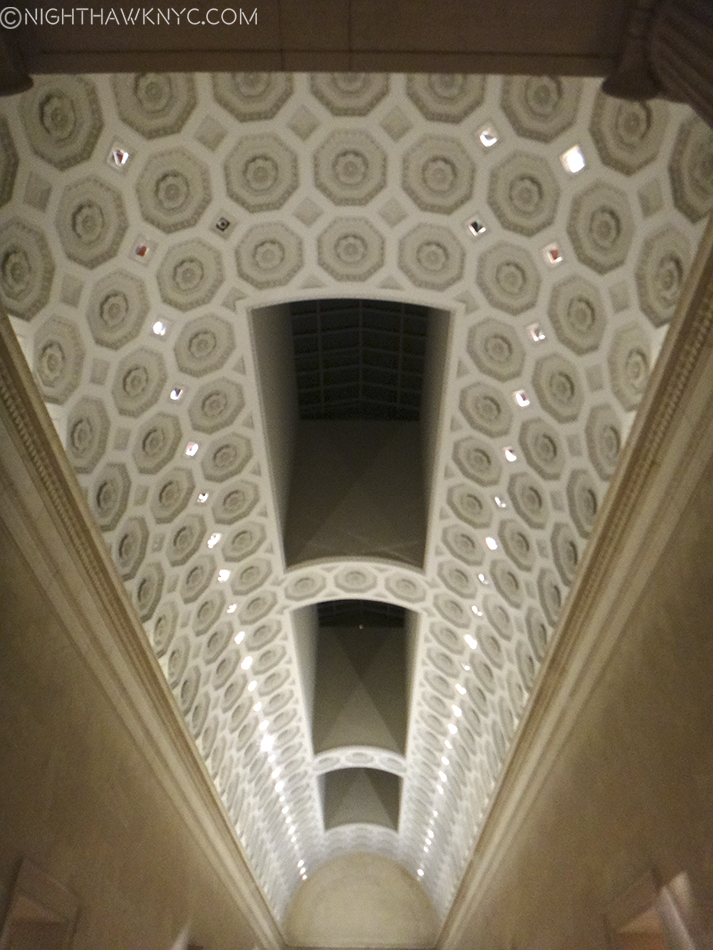
Looking down at the entrance for “Seurat’s Circus Sideshow”. Exactly one year ago this Robert Lehman Wing Courtyard was full of scaffolding for the false floor of the “Ghost Cathedral” of the Manus X Machina Fashion Show sat at the level of the upper floor here- a few hundred feet in diameter! Amazing.

“Seurat’s Circus Sideshow” entrance, features the titular work.

“Trombonist,” 1887-88, Conte crayon with white chalk

“At the Gaiete Rochechouart,” 1877-78, Conte crayon with gouache

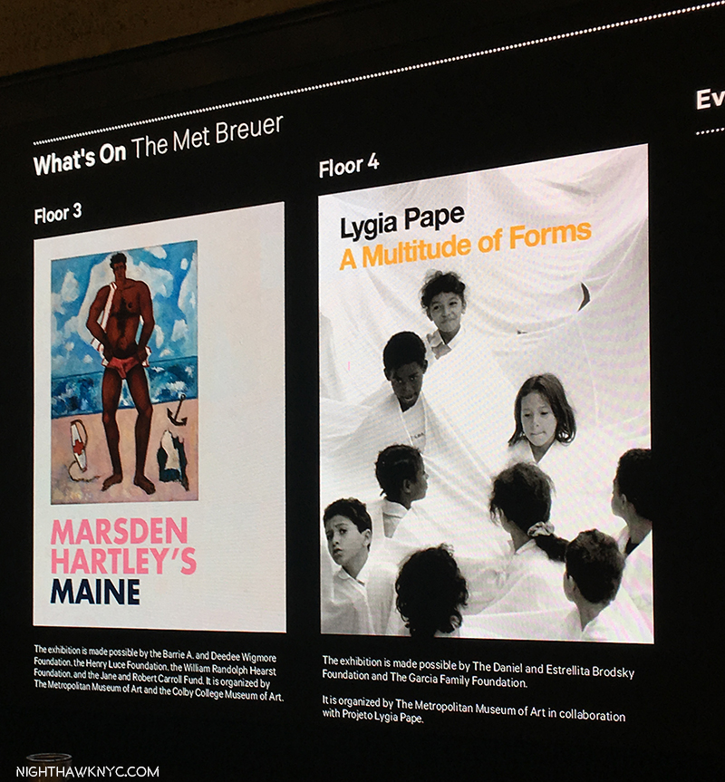
“Lygia Pape: A Multitude of Forms,” & “Marsden Hartley’s Maine” (@ The Met Breuer)-

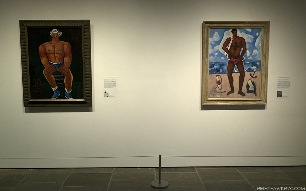
Meanwhile, across town, Sheena Wagstaff , The Met’s Modern & Contemporary Art Chairwoman, continues to give us unexpected shows of M&C Art at TMB, this time focusing on the late Brazilian female Artist, Lygia Pape (1927-2004), and American Painter Marsden Hartley (1877-1943)- two Artists who have almost nothing in common, except, perhaps, Ms. Wagstaff as a champion, and that neither has had a substantial show in NYC, for at least anytime in the recent past (as far as I know). I couldn’t escape the feeling that Ms. Pape has a style not all that unlike the great Nasreen Mohamedi, who Ms. Wagstaff chose to be the very first show of M&C Art at TMB. Mr Hartley, however, does not. “The Painter from Maine” has a strong, muscular style that is worlds away from the from the geometric abstraction Ms. Pape’s and Ms. Mohamedi’s works may seem to be at casual view. His in another part of the story of American 20th Century Art, one that is often, unfortuatley, overlooked, perhaps because it’s rare to see more than one of his works at a time. His place in the long line of important Maine Artists that runs from Thomas Cole to Winslow Homer (a key influence on Hartley) through Edward Hopper to the Wyeths and Richard Estes is assured. While the opportunity to see more of these interesting Artists was most welcome, for me, these shows were equally interesting for what “more” they might reveal of Ms. Wagstaff’s direction, which, given the state of flux The Met is in at the moment, I believe in supporting.

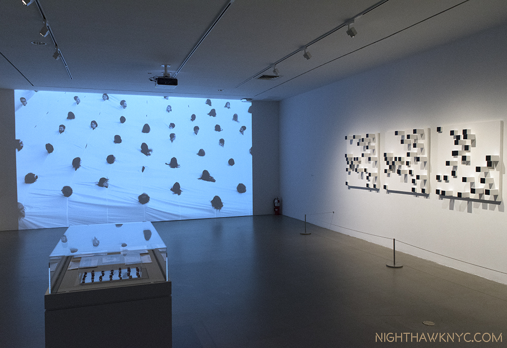
Lygia Pape’s vision extended from paintings to sculpture to people, as seen on the screen on the left,”Divisor (Divider), 1968, performed in 1990,, which seems to mimic the effect of the wall sculpture, “Livro dos caminhos (Book of paths),” 1963-76, paint on wood,  on the right.

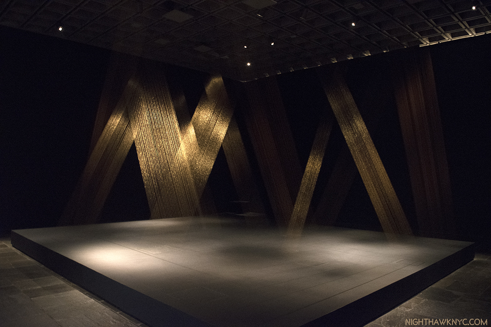
Lygia Pape, “Tteia, 1, C,” 1976-2004, Gold thread, light and a few staples create a haunting, shimmering vision.

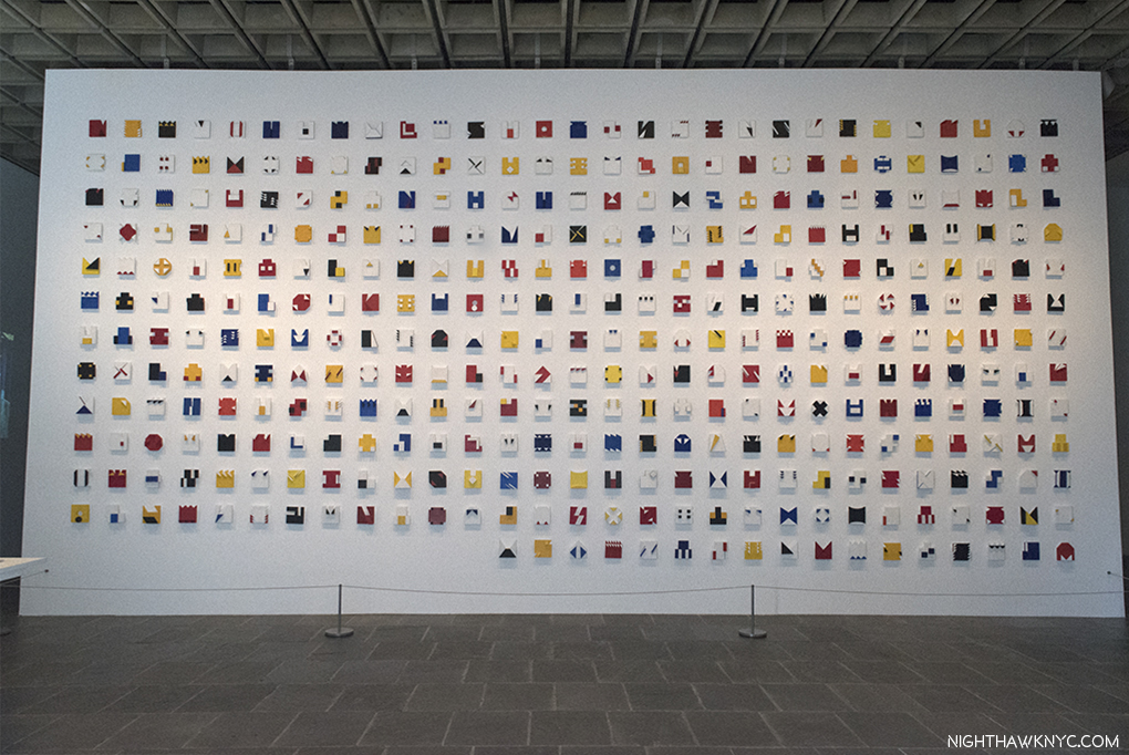
Lygia Pape, “Liver do tempo (Book of time),”1961-63, A tour de force of almost endless creativity & variety in 365 tempera and acrylic on wood pieces in relief.

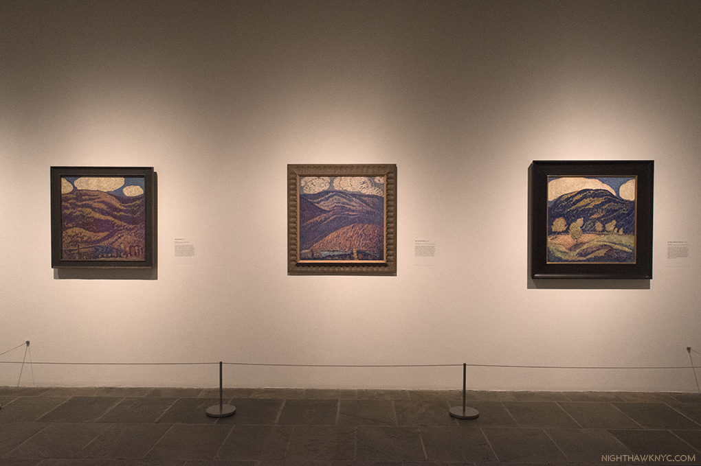
I particularly admire these 3 early Landscapes by Marsden Hartley done between 1907-09, with their unique, almost “Pointilistic” technique, (26 years after the Seurat’s death), which is much “softer” than his “muscular,” later landscapes, like the next one.

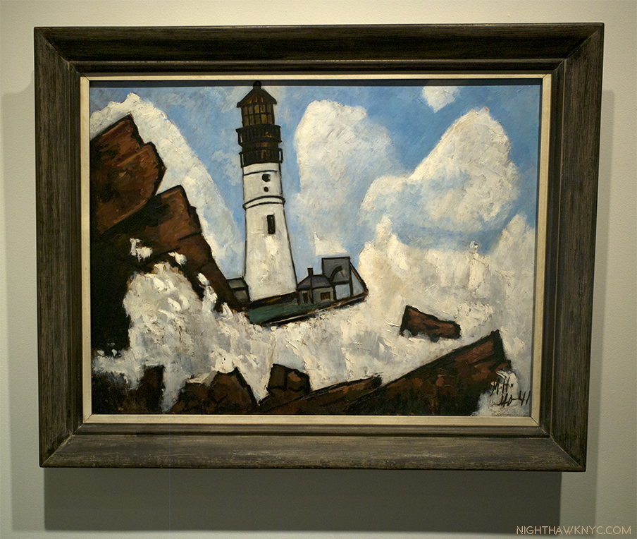
“The Lighthouse,” 1940-41, Oil on masonite

Perhaps the most “muscular” painting since the Mannerists.

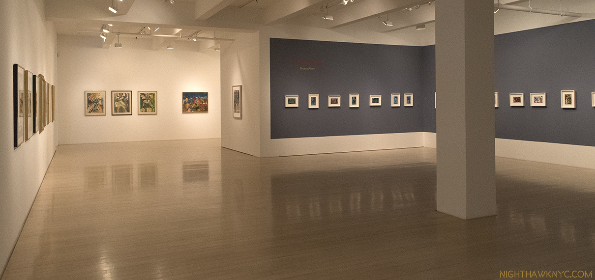
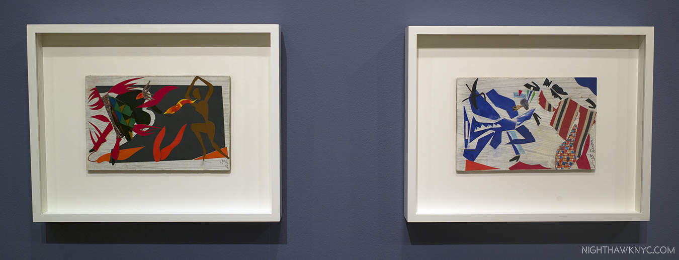
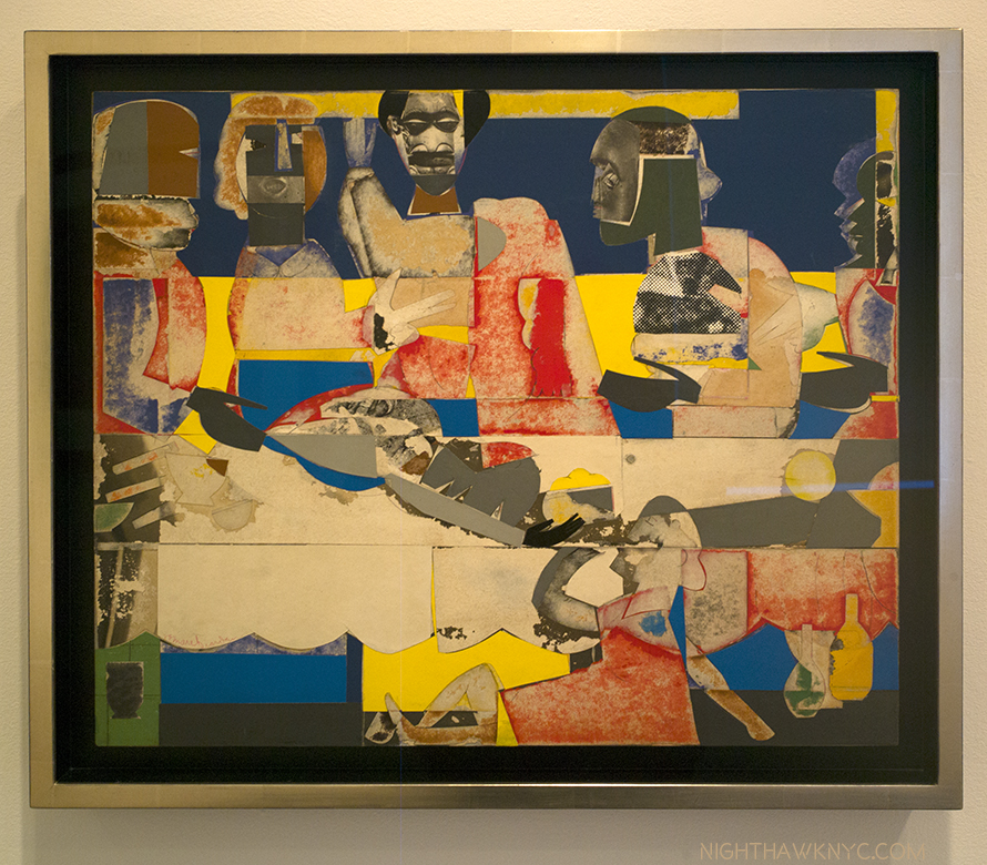
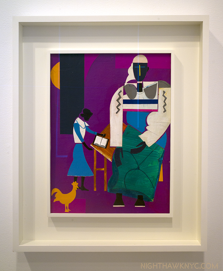
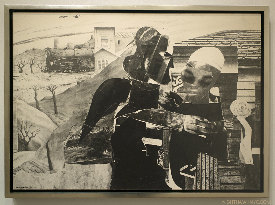
“Romare Bearden: Bayou Fever and Related Works” (@ DC Moore Gallery)- Highlighted by 21 collages from 1979 Romare Bearden (1911-88) created for a ballet entitled “Bayou Fever” that he hoped Alvin Ailey would choreograph, they confirm Mr. Bearden’s place as a master of collage who was ahead of his time. While some works have an overt Matissean influence, everything here is uniquely Bearden, an Artist who is not seen nearly often enough and never seems to fail to impress when he is seen. I mentioned him in in my Post on his friend, Stuart Davis, and my Post on Kerry James Marshall, who selected a piece by Bearden for his “KJM Selects” section of his excellent TMB Retrospective.

Installation view. The 21 collages from “Bayou Fever,” 1979, are seen to the right.

2 works from “Bayou Fever”- “Untitled (The Conjur Woman),” left and “Untitled (The Swamp Witch, Blue-Green Lights and Conjur Woman), both Collages from 1979

“Feast,” 1969 21 x 25,” Collage

“Noah Means A New Day,” No date, Collage

“Prevalance of Ritual/Tidings,” 1964, Gelatin silver print

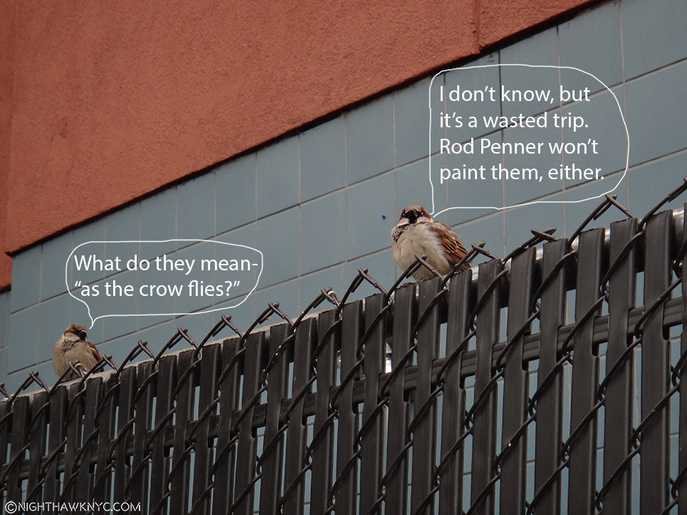
“Rat Bastard Protective Association” (@ Susan Inglett Gallery)- Who? The RBPA was “an inflammatory, close-knit community of Artists and Poets who lived and worked together in a building they dubbed ‘Painterland,'” in San Francisco, to quote the press release. As I wrote about last year, Bruce Conner was, somehow, new to me when I first walked through the black curtain at the entrance of the utterly amazing “Bruce Conner: It’s All True” at MoMA last year but, Susan Inglett had a long history with Bruce Conner, as I learned in speaking with her briefly, earlier this year. So, her (always excellent) gallery’s show of works by “The Rat Bastard Protection Association,” a group of San Fran Artists that included Mr. Coner was something special, and quite rare. In addition to the chance to see amazing work by Bruce Conner I’d never seen before, the show marked my first chance to see work by his Artist wife, Jean Conner, an important Artist in her own right. Add Jay DeFeo, Wallace Berman, Michael McClue to the roster and this was a small show that packed a punch, and pointed out, once again, that the East Coast needs to become much more familiar with this whole group of San Francisco based Artists, who were associated in the Rat Bastard Protection Association from the late 1950’s to early 1960’s. Up from April 27 to June 3, it anticipated the Robert Rauschenberg show now at MoMA and provides a reminder that these Artists were working strikingly similar veins at the same time, 2570 miles, as the crow flies, apart1.

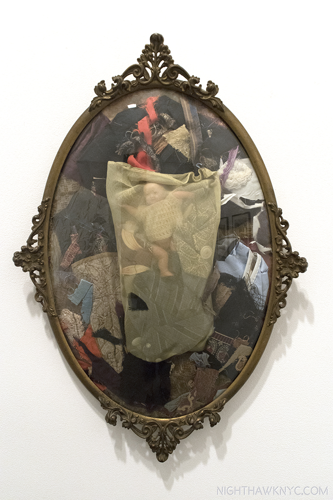
Bruce Conner, “THE EGG,” 1959, Mixed media assemblage in a convex brass frame. Even his extraordinarily wide-ranging MoMA Retrospective didn’t prepare me to see this.

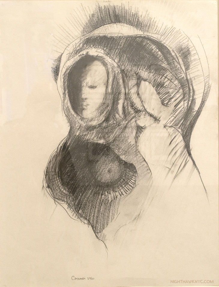
Bruce Conner “MARY, MOTHER OF GOD,” 1960, Charcoal on paper. Almost “conventional,” it shows little sign of the revolutionary drawings to come.

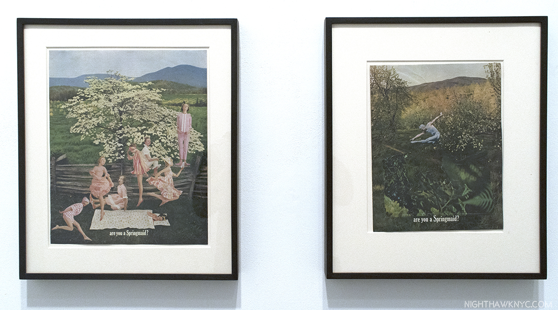
Two collages from 1960 by the overlooked Jean Conner, both titled “(ARE YOU A SPRINGMAID)

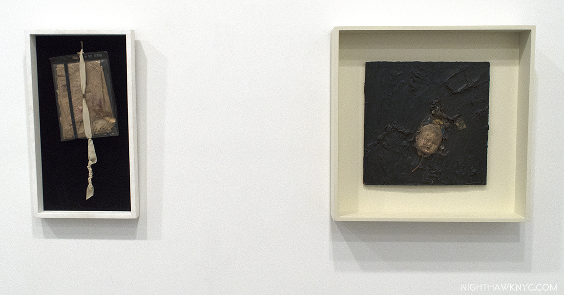
Two assemblages by Bruce Conner, “UNTITLED (DO NOT REMOVE),” 1960 and “FLOATING HEAD,” 1958-59

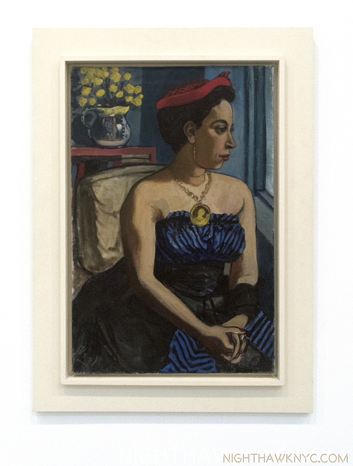
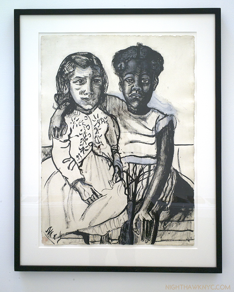
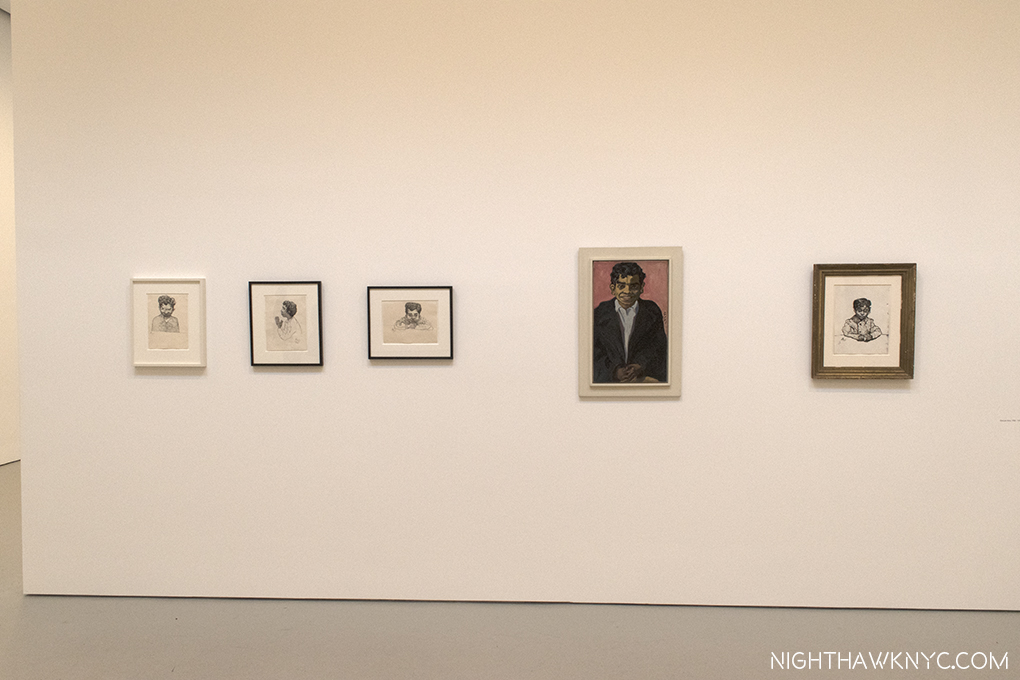
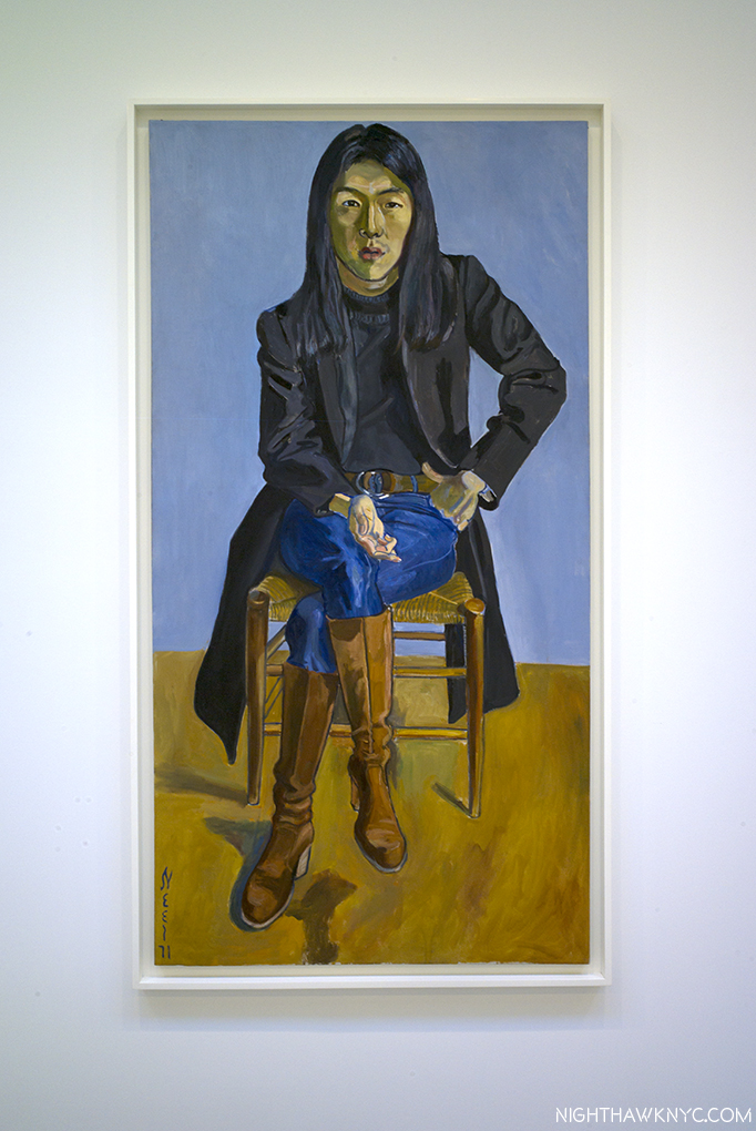
“Alice Neel, Uptown” (@ David Zwirner Gallery)- An increasingly beloved and respected New York Artist (she settled here at age 27, and lived here for over 50 years), her star continues to rise, though it’s taken a long time (she passed in 1984, at age 84). She always leads with her humanity, and it seems to me that that’s something that makes New York proud of her. Though one of her works was the featured/poster image for The Met Breuer’s 2016 blockbuster “Untitled: Thoughts Left Unfinished,” a perfect choice, IMHO, there hasn’t been an Alice Neel show all that recently, as far as I can recall. This one would still prove itself different even if there had been a few. For one thing it focused on work Ms. Neel did while she was living “Uptown,” in East Harlem (aka Spanish Harlem), from 1938 to 1962, and, as the press release says, it focuses on portraits of her family, friends and neighbors. The results are classic Alice Neel. Though not everything here is a major work, the breath of fresh air it provided only hints at how much pent-up longing I think there is to see more of her work.

The time has come!

The show has moved to Victoria Miro, London, where it can be seen through July 29.

Shown in two adjoining David Zwirner locations, this is one of the two entrances.

“Building in Harlem,” 1945, Oil on canvas. Ms. Neel lived in East (Spanish) Harlem from 1938-62.

“Alice Childress,” 1950, Oil on canvas. An actor who became a playwright and novelist when she found “little dramatic material that represented the lives of black women she knew,” per the show’s curator, Hilton Als.

“Two Girls,” 1954, Ink and gouache on paper.

Georgie Acre, a young Puerto Rican boy who often ran errands for Ms. Neel, seen in 4 Drawings and a Painting from 1950-58. In 1974, Mr. Arce was convicted of murder. He’s shown praying in the second Drawing from left.

“Ron Kajiwara,” 1971, Oil on canvas. A son of Japanese immigrants, he was detained in a California internment camp during WW2. He later became a design director for Vogue before dying of AIDS in 1990.

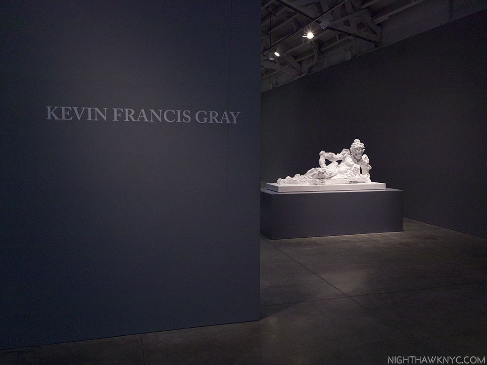
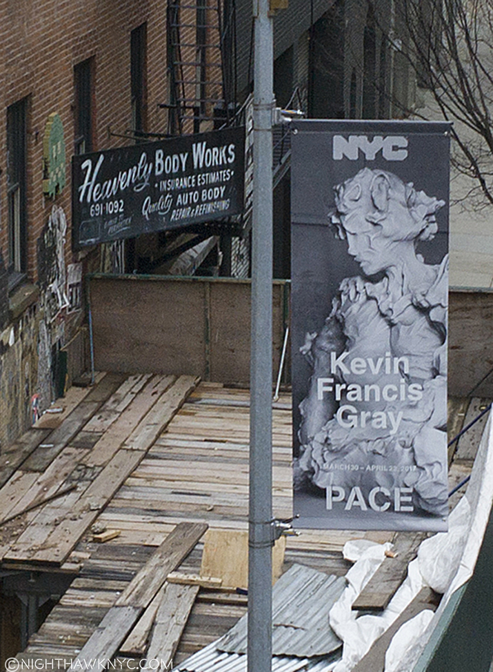
And finally, Kevin Francis Gray (@Pace, West 24th Street)- I can’t recall encountering anyone who’s doing what Mr. Gray is with “figurative” sculpture.

“Reclining Nude 1,” 2016, All works are Carrara Marble

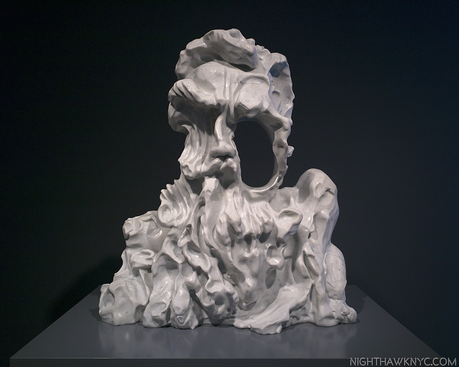
Does he use a secret laser ray? Has he discovered how to melt marble, then work it in it’s molten state? Somehow, he’s able to make Carrara marble attain the properties of clay!

“Salamander,” 2017

Ummmm…Yes, I had to remind myself continually, after tying my hands behind my back so I wouldn’t touch them to appease my wonder… These are MARBLE!

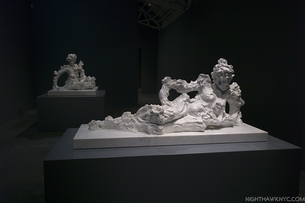
“Reclining Nude 1,” 2016, front, and “The Aristocrat,” 2017

I find it daring, exciting, and revolutionary. Along the way, he blurs the lines between the representational and the abstract, while adding all sorts of new levels of appearance, meaning, and possibilities to “portraiture.”

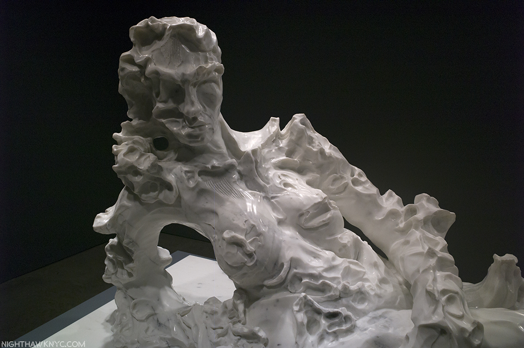
Detail of “Reclining Nude II,” 2017

While some of his past works, especially his “Twelve Chambers,” 2013, group of 12 life-sized figures vaguely reminded me of Rodin’s “Burghers of Calais“, these recent works appear, to me, to be a breakthrough. Is Kevin Francis Gray the successor to Rodin? He’s only 45. We’ll see where his new developments lead him. Stay tuned…he said, with bated breath.

“Heavenly bodies…”

*-Soundtrack for this Post is “It’s Quiet Uptown,” by Lin-Manuel Miranda, from “Hamilton.”

NighthawkNYC.com has been entirely self-funded & ad-free for over 8 years, during which 300 full length pieces have been published! If you’ve found it worthwhile, PLEASE donate to allow me to continue below. Thank you, Kenn.

You can also support it by buying Art, Art & Photography books, and Music from my collection! Art & Books may be found here. Music here and here

Written & photographed by Kenn Sava for nighthawknyc.com unless otherwise credited. To send comments, thoughts, feedback or propositions click here. Click the white box on the upper right for the archives or to search them. Subscribe to be notified of new Posts below. Your information will be used for no other purpose.

  1. My fine feathered friends (aka “The Birdies”) just smirked when I said that, again, and said they stand by their prior comment on the matter, here.

Drop What You’re Doing And Read The Story of Emil Ferris

This site is Free & Ad-Free! If you find this piece worthwhile, please donate via PayPal to support it & independent Art writing. You can also support it by buying Art & books! Details at the end. Thank you.

Written & Photographed by Kenn Sava (*- unless otherwise credited)

NOTHING stops Emil Ferris.

-Not the West Nile virus that left her paralyzed from the waist down at 40, while she happened to be the single mom of a 6 year old daughter.

-Not the resulting loss of the use of her right (drawing) hand.

-Not being so poor she learned to live on free bank coffee and food store samples.

-Not having to relearn how to use her hand and eventually even rising from her wheelchair to be able to walk, again, with the aid of a cane, or two on a “bad day”.

-Not even the loss of the entire run of her book when the Chinese shipping company transporting them went bankrupt resulting in their ship being confiscated at the Panama Canal.

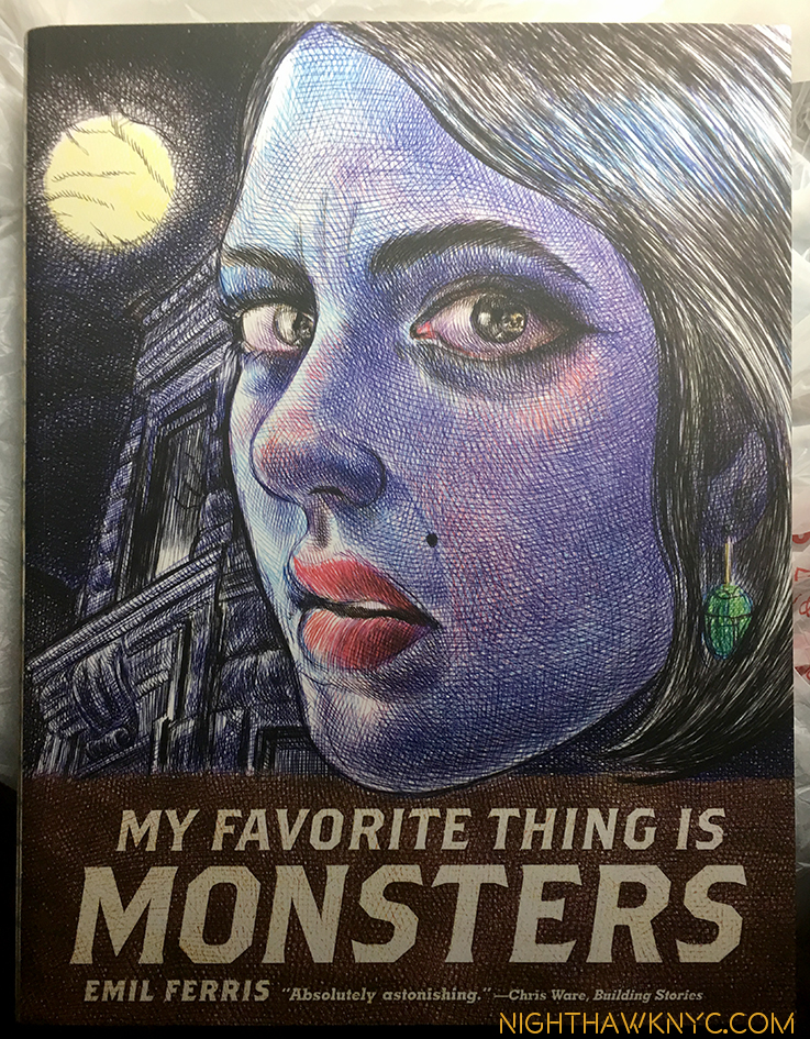
“‘I was also severely hunchbacked, which is why I loved monsters,” Ms. Ferris said. “‘Absolutely astonishing,’ Chris Ware,” is quoted at the bottom

Those are some bullet points. Ms. Ferris, herself, draws her story better than I can tell it—–> here. And, you can actually hang out with her while she draws, here. The Times wrote about her, here.

There are few, if any, stories in today’s Art world more compelling, and more downright remarkable than that of Emil Ferris. What this Artist has overcome to produce her riveting and extraordinarily well done first graphic novel, “Mr Favortie Thing is Monsters” is nothing short of astounding.

All 400 pages of it.

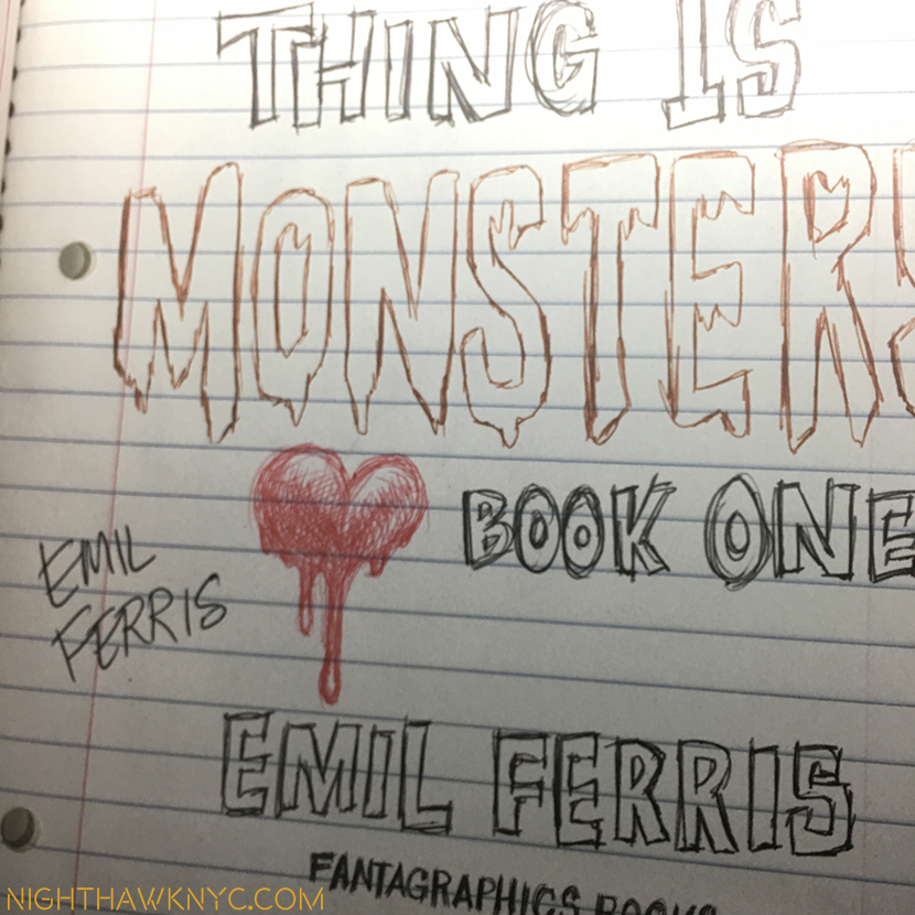
A signed copy.

Though I recently listed her among those I feel should have been included in the Whitney Biennial, I would be extremely remiss if I did not add my voice to the chorus lauding her accomplishment, unbelievable inner fortitude, unimaginable dedication, AND talent. But, my voice will not even register alongside those of the “father of the graphic novel,” Pulitzer Prize winner, Art Spiegelman (Ms. Ferris’ “hero.” She cried after he shook her damaged right hand in congratulations last winter), and the contemporary master of the graphic novel, fellow Chicagoan Chris Ware- both have heaped raves on Ms. Ferris and her book.

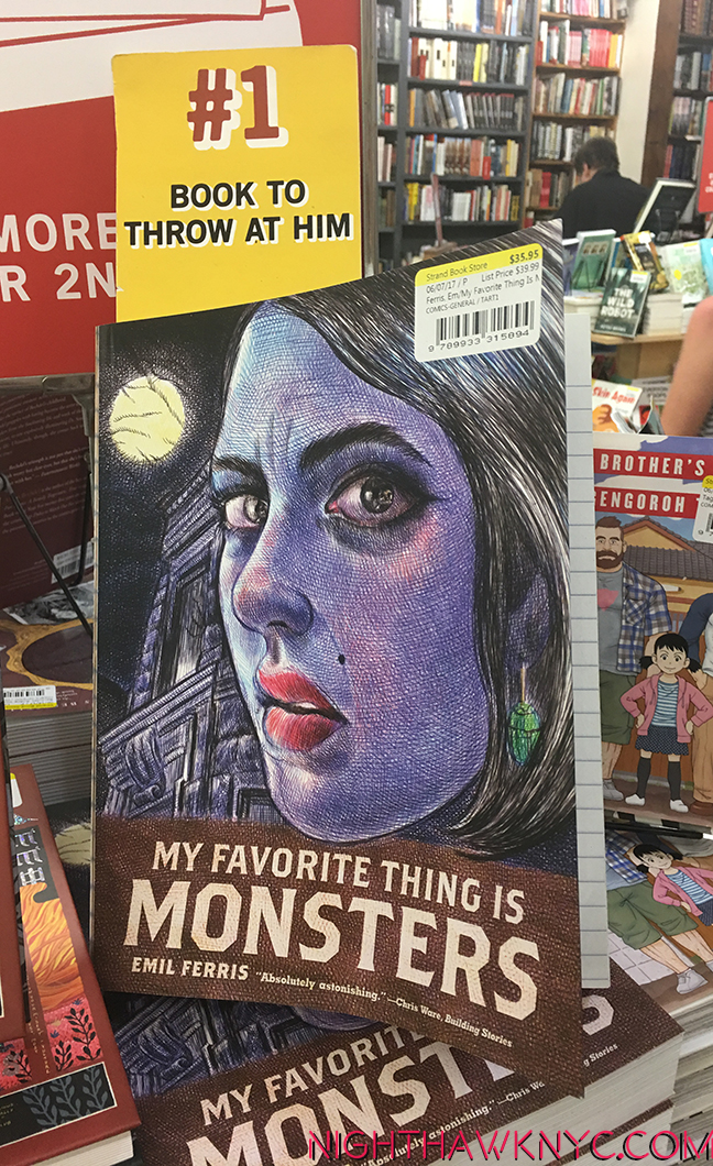
I’m not here to sell you anything, but if you were to go out and buy a copy of it from your favorite brick and mortar Bookstore, now that the second edition of it is out, you’d be supporting a very deserving Artist.

…like The Strand. I love Heather’s signs, but I don’t endorse violence…especially against Art books.

No matter what the rest of the year brings the Art World, 2017 will, also, be remembered as the year Emil Ferris overcame EVERYTHING, and, then astonished the world.

*- Soundtrack for this Post is “Shining Star,” by Earth, Wind & Fire.

Thanks to kitty for research assistance.

NighthawkNYC.com has been entirely self-funded & ad-free for over 8 years, during which 300 full length pieces have been published! If you’ve found it worthwhile, PLEASE donate to allow me to continue below. Thank you, Kenn.

You can also support it by buying Art, Art & Photography books, and Music from my collection! Art & Books may be found here. Music here and here

Written & photographed by Kenn Sava for nighthawknyc.com unless otherwise credited. To send comments, thoughts, feedback or propositions click here. Click the white box on the upper right for the archives or to search them. Subscribe to be notified of new Posts below. Your information will be used for no other purpose.

On The Beatles…and Sgt. Pepper’s 50th

This site is Free & Ad-Free! If you find this piece worthwhile, please donate via PayPal to support it & independent Art writing. You can also support it by buying Art & books! Details at the end. Thank you.

Written & Photographed by Kenn Sava.

Today, June 18th, is Sir Paul McCartney’s 75th Birthday. Happy Birthday, Sir Paul, and many more!

When it came out 50 years ago, on June 1, 1967, “Sgt. Pepper’s Lonely Hearts Club Band” was nothing less than the biggest tsunami in popular Music since, well…”Meet The Beatles.” A defining moment in modern music, splitting musical time into before, and after, it’s aftershocks have been so all-encompassing, it’s hard to listen to most of what’s come after and not hear some of it’s influence.

Though Traffic, the Beach Boys, The Who and the Jimi Hendrix Experience (who’s seismic “Are You Experienced?,” the first album I ever bought, was released on May 12, some 19 days before “Sgt. Pepper’s”) were doing wonderously creative things with expanding the boundaries of rock, nothing else sounded anything like it, really. It cut across genres and audiences. No matter what they had listened to before, everyone listened to it when it came out1. When you think about that, it’s downright amazing given how experimental, even avant garde, quite a bit of it was. “Avant garde” and “experimental” is almost always a ticket to popular failure. Producer Sir George Martin was behind some of it- both technically (managing the recording, and facilitating the Beatles’ ideas ), and musically (doing the string and brass arrangements). Drugs, the expansive cultural, spiritual and musical explorations of The Beatles, themselves, were the rest of it. Still, in spite of all the changes going on, personally, and in the music, the whole thing hung together perfectly- from the opening background noises to the final backward voices, ending the unprecedented, all too real/all too surreal “A Day In The Life.”

It was a product of the moment, becoming the soundtrack for the “Summer of Love,” one that, also, took music a big step forward, and showed us the future.

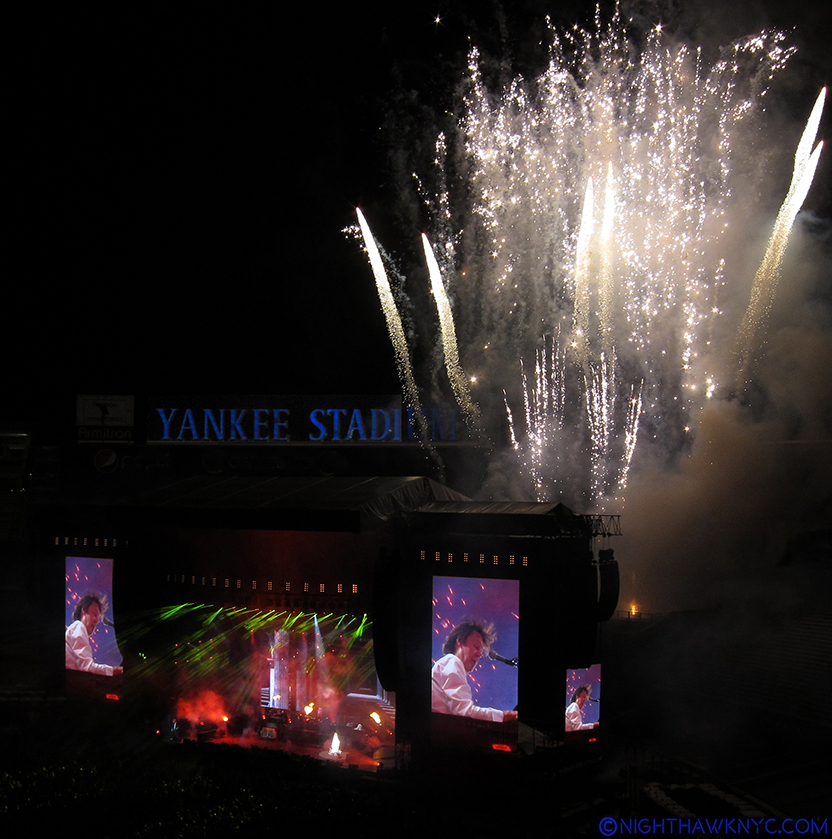
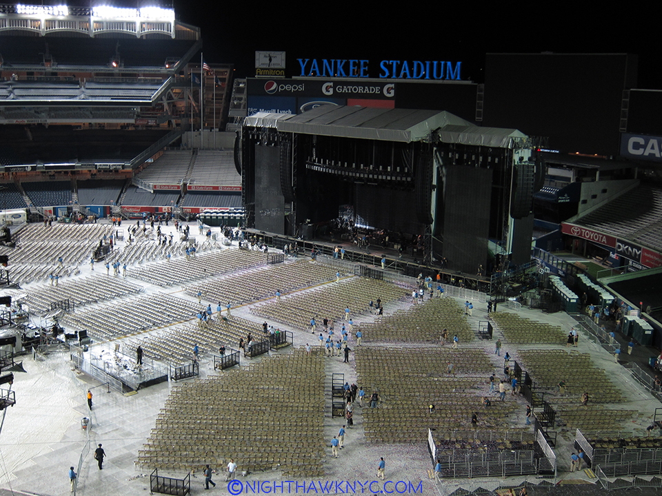
Sir Paul McCartney performing at Yankee Stadium, July 2011, on his original Hofner “Beatle Bass,” one of the most historic musical instruments in the world. He actually remains under-appreciated as a musician, as are some of his projects, like “The Fireman.” Click any image to see it full sized.

The “concept album” had truly arrived (with all due respect to “In the Wee Small Hours,” by Frank Sinatra, 1955, a staple over here at the NHNYC.com offices, “Pet Sounds” by the Beach Boys, released May, 1966, and a few others). As a result, to this day, when you put it on, I think it should be listened to it all the way through.

Now, with the release of the new 50th Anniversary “Deluxe Edition” Box Set, things are getting complicated. So, I need to specify what I mean by “it”- Listen to the 13 songs on the original album all the way through. Which brings me to what I feel is a little bit of a problem. The new “Deluxe Edition” is NOT (I feel) the best way to experience Sgt. Pepper’s for the first time. With all due respect to Giles Martin, who has (partially) remixed Sgt. Pepper’s for the Deluxe Edition, mixing his version from the original 4 track tapes. See footnote 2 for more details on this2 After a listen to the new mix, I prefer to stick with the original mix.

Giles’ Dad, Sir George Martin, was one of the greatest Producers in the history of recorded Music. You could make a very strong case and say he’s The Greatest, but I don’t believe comparing creativity, or creative people. In any event, his mix ain’t broke. Don’t “fix” it. I don’t think the “sonic upgrade” of the new stereo mix is that big to sacrifice something that was an integral part of the finished album, like this part of George Martin’s contribution was3. It was something he created WITH The Beatles. You’re dealing with master tapes that were recorded in 1967. There’s only so much that can be done to “improve them” sonically, and those come with tradeoffs-

Questionably “better” sound quality vs. losing some of the original experience, and, most importantly, the Artist’s intentions.

Sir Paul performs “Something,” on a Ukulele given to him by George Harrison.

Frankly, for those reasons, I prefer to stick with original mixes of just about every album ever made, and as reissues pile up, they get harder to find- you have to know what you’re looking for4. As a producer? I wouldn’t want anyone else messing around with my mix, and I was no Sir George Martin. “Technological advances” are a mixed blessing, bringing good and bad. Just ask anyone who prefers Lp’s to CD’s. (I’m not saying I do.)

Finally, the Deluxe Edition comes with a lot of extras. There are a seemingly infinite number of Beatles’ outtakes that have circulated among fans and traders over the years, and while many of them are fascinating, if you haven’t heard the original album, wait until you have it memorized before listening to them. The “Making of” Doc, included with the Deluxe Edition, sounds fascinating. I’m sure the book is good, too. All in all? It sounds like a supplement to having the original recording. NOT a replacement for it.

“Hey, Sir Paul! What do you think of the new Sgt. Pepper’s Mix?”

In all of this, I have not seen any mention of the involvement of Sir Paul and Ringo (who were directly involved with the original, of course, with due respect to Yoko and the Harrisons) in it. And, I haven’t been able to find out what Sir Paul thinks about the new mix. His website has him only commenting on the passage of time re: “Sgt. Pepper’s” 50th, but I found this comment critical-

“It’s crazy to think that 50 years later we are looking back on this project with such fondness and a little bit of amazement at how four guys, a great producer and his engineers could make such a lasting piece of art.”

I think that tells you all you need to know. He includes Sir George Martin and engineer Geoff Emerick, as part of the creative team5.

“I’m fixing a hole where the rain gets in,
And stops my mind from wandering
Where it will go.”*

I believe the integrity of all of their work should be respected, and preserved.

But? With the passing of time, there’s no way I’m going to win that fight. There’s too much money aligned on the other side in reissuing records- just beware of anyone who tells you it’s “new & improved.” This, unfortunately, goes on in Art, too. After Artists pass away, increasingly their estates are continuing to issue/reissue their work. I have very mixed feelings about this. I’ll go to Photo shows and see “recent prints” that just aren’t up to the level of the quality of prints made by the Artist during their lifetime. This hurts the Artist’s reputation, in my opinion. In music, we now stand at the precipice of whatever will be done regarding Prince’s unreleased Mt. Everest of material. If you don’t think that’s going to materially impact his legacy, think again. Quick- How many albums did Jimi Hendrix release during his lifetime6? I feel for any new listener to his music faced with the dauntless task of looking through the list of COUNTLESS albums with his name on them, which are STILL being released 47 years after his death, and trying to find them.

The message in all of this? Buyer beware. Luckily? After 50 years? Most people already have “Sgt. Pepper’s.” So? On the 50th Anniversary (month) of it’s release put it on and give it a listen. All the way through. It’s an Album. Remember them?

Many since have tried. There’s still nothing like it.

Finally? When all else has been said…Think about this for one minute…

How HARD is it to connect with even one person who becomes special in your life? I still marvel that The Beatles FOUND each other!

Never in the whole history of Western Music (1200 a.d. to 1900) have two musical Geniuses collaborated before (as far as I know).

J.S. Bach was too busy raising 10 sons (each of whom became a noted, or great, composer), writing, rehearsing AND performing a new cantata each week, performing his regular church duties, and writing the rest of his incomparable music to collaborate with Handel. Mozart and Beethoven? Never happened. Brahms and Schumann? Nope. Brahms and MRS. Clara Schumann…? Romance doesn’t count. This is a 20th Century phenomenon. George & Ira Gershwin…Bernstein & Sondheim…Miles Davis & John Coltrane…Miles & Wayne Shorter…My list may be different than your’s. Here you have John Lennon & Paul McCartney, two of the very greatest songwriters in the history of Music. Alongside them? George Harrison, no slouch (and continually under-rated) himself. Heck…Who WOULDN’T be “under-rated” next to those two? I often wonder what George must have felt (from time to time? often?). On the one hand he had people wanting a “better lead guitarist,” his friend, Eric Clapton, perhaps, to replace him in The Beatles. On the other hand, he was lucky to get 1 or 2 songs on each Beatles album, NO MATTER how good his songs were! (Witness the then unheard of THREE Lp set he released soon after The Beatles split, “All Things Must Pass.” Talk about being “pent up!” “Within You, Without You,” was his song on “Sgt. Pepper’s.”) But? He was the “perfect” guitarist for The Beatles, as Ringo was the “perfect” drummer for them. That the four of them found each other?

It’s miraculous, in my book.

If you don’t think so? Point out to me the LAST time this happened in any of the Arts.

The Beatles were a gift from the Universe.

*- Soundtrack for this is “Fixing A Hole,” by Lennon & McCartney, from “Sgt. Pepper’s Lonely Hearts Club Band,” and published by Sony/ATV Music Publishing LLC.

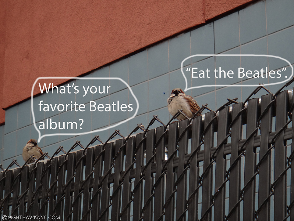
On The Fence,#8, The Birds & The Bees-tles” Edition.

NighthawkNYC.com has been entirely self-funded & ad-free for over 8 years, during which 300 full length pieces have been published! If you’ve found it worthwhile, PLEASE donate to allow me to continue below. Thank you, Kenn.

You can also support it by buying Art, Art & Photography books, and Music from my collection! Art & Books may be found here. Music here and here

Written & photographed by Kenn Sava for nighthawknyc.com unless otherwise credited. To send comments, thoughts, feedback or propositions click here. Click the white box on the upper right for the archives or to search them. Subscribe to be notified of new Posts below. Your information will be used for no other purpose.

  1. Myself included, and I wasn’t into The Beatles until “Strawberry Fields Forever” was released, on February 13, 1967, as a single, presaging “Sgt. Pepper’s”
  2. Sgt. Pepper’s was recorded on 4 tracks, which is astounding when you think about that today. In 1995, my version of “Strawberry Fields Forever” was recorded on 48 tracks. The Beatles would fill up 3 of the 4 tracks, then mix those down to the open 4th track. Then they’d repeat the process until they had filled all four tracks (I’m simplifying. There was more “bouncing” of tracks to open up other tracks involved.), the resulting tape was then mixed down to a final, stereo two track Master, which is what the records were made from- both in Stereo, and yes, in Mono. Both of those have been reissued, in the “Complete” Stereo and Mono Boxsets, and I prefer them, at the moment, among the recent incarnations of The Beatles albums.
  3. Giles Martin also did a 5.1 mix. You’re on you’re own there, since his dad didn’t do one, as far as I know. I have not heard it as yet.
  4. For example- Try finding the original mixes of Miles Davis’ Columbia albums, some of the greatest and most important music of the century, on CD. It’s hard. Early, now rare, Japanese import CD’s had them. Most likely you have to go back to the Lp’s for them, but make sure they’re vintage.
  5.  They did a Q&A with him about Sgt. Pepper’s BEFORE the Deluxe Edition was announced, here. Also, Pepper’s recording engineer Geoff Emerick said he “hadn’t heard it”, the new mix, in an interview
  6. The answer is 3 studio Lp’s- “Are You Experienced?,””Axis:Bold as Love”, and “Electric Ladyland,” and 3 live albums- the other 2 of which, besides “Band of Gypsys,” I’m not sure how much he had to do with.

Q&A With Master Painter Rod Penner

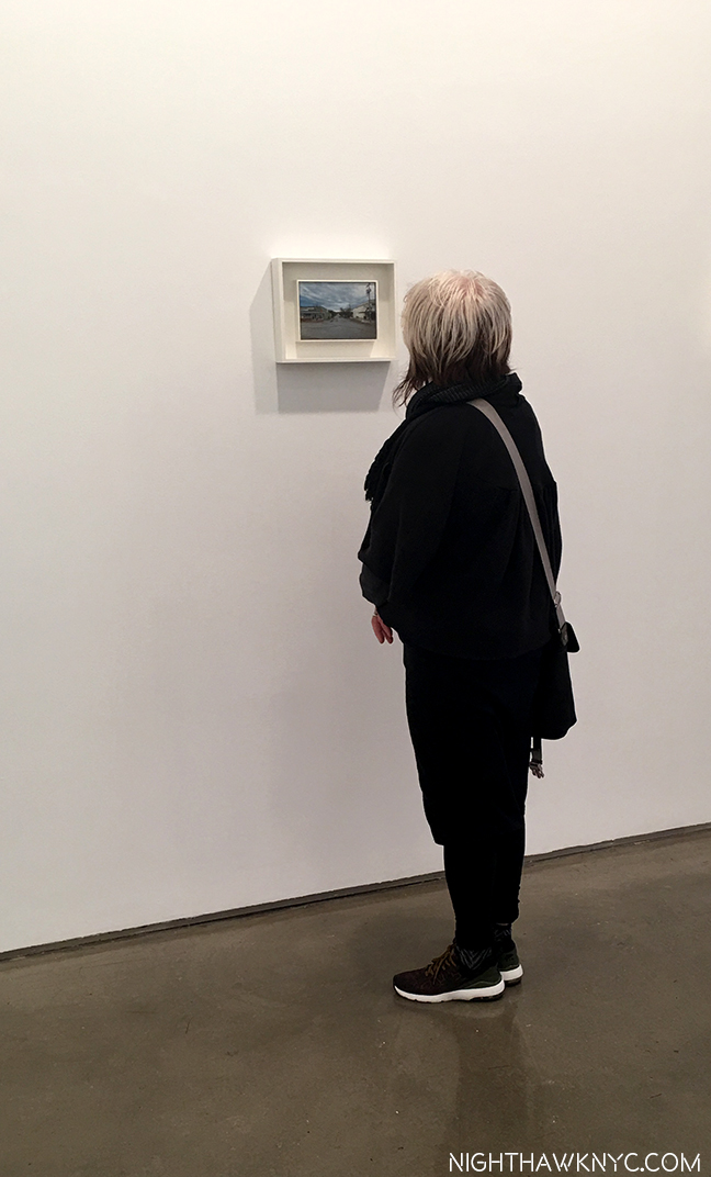
During the recent show, Rod Penner, at Ameringer McEnery Yohe, I was fascinated watching visitor’s reactions to the work.

While it was hard to know if they were familiar with Rod Penner’s work, most seemed taken, startled & impressed with his incredible technique. But then, they lingered. Often for quite a while. I well know that feeling. How well the Paintings are done is a hook that grabs your attention and pulls you in. What happens then? Well…That’s up to the individual viewer.


When you finally step back, you marvel that all of that took place in a space that’s 6 by 6 inches or 5 by 7 1/2 inches. When this first happened to me, in April, 2016, I was left with wonder. I wanted to know more about him and his art. Since I’ve now written about him and this show twice, perhaps others are curious, too. The AMY show answered some of my questions, primarily- Yes. He is THAT good. But, it raised others. I am very pleased to report that, after the show ended, and he arrived safely back in his now long time home in Texas, Rod Penner graciously agreed to answer some of my questions in a very rare Q&A. (For those interested in exploring his work still further, I’ve appended a list of resources known to me at the end of this Post. I welcome hearing about others I don’t know of.) What I’ve learned thus far has confirmed, at least to me, his place as a major Artist. That leaves the other question…

Who is Rod Penner?

“It’s your last chance
To check under the hood
Last chance
She ain’t soundin’ too good,
Your last chance
To trust the man with the star
You’ve found the last chance Texaco”*

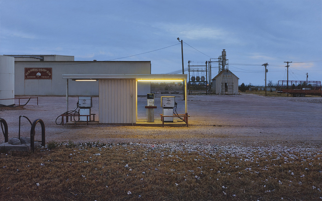
Having previously shown his recent, small Paintings, here’s one of his larger works. Farmers Co-op Gin/Anson, TX, 2012, 20 x 32 inches.  All works by Rod Penner, Acrylic on canvas, and are from rodpenner.com and amy-ny.com, unless otherwise noted.

Every work in virtually every show of Rod Penner’s work these past 25 years sold. Remarkable. Those owners are not parting with those pieces, which can be seen in his work not coming up at auction (as far as I know). 8 of the 9 pieces in this recent show were sold before the show opened. I believe the time has come for a closer look at what’s going on here.

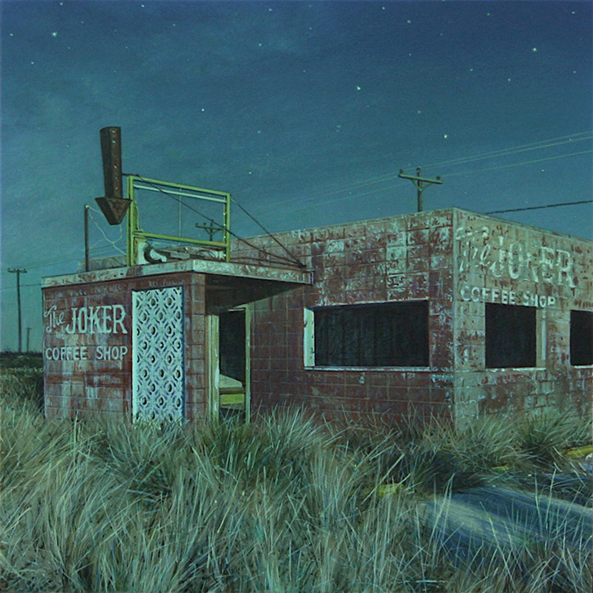
Joker Coffee Shop, 2016, 6 x 6 inches.

What’s going on here, succinctly, is that Rod Penner is quietly creating a remarkably excellent body of Paintings, one that provides all the proof needed that he is a Master Painter.

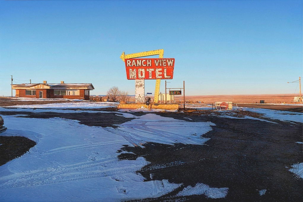
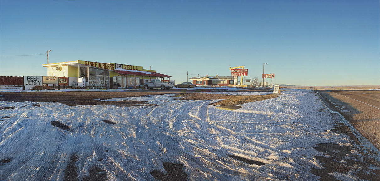
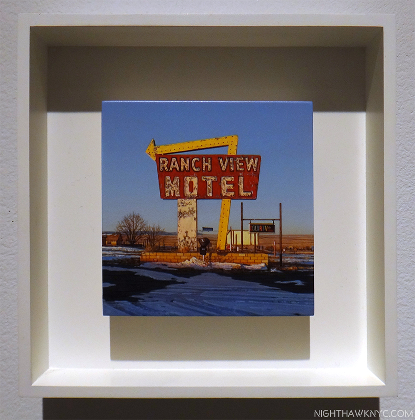
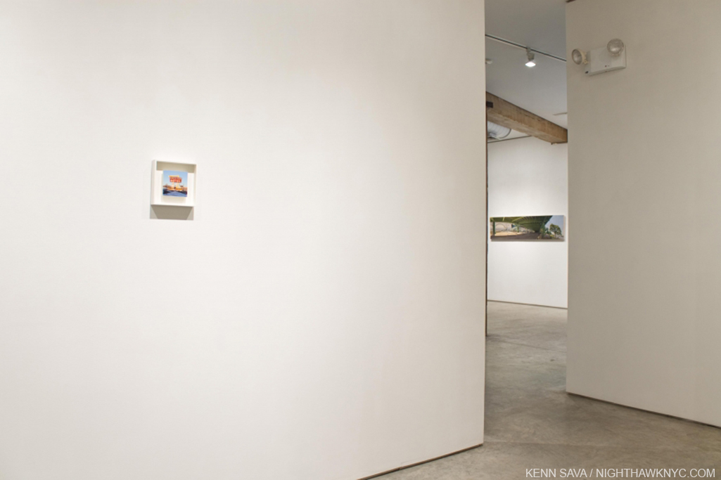
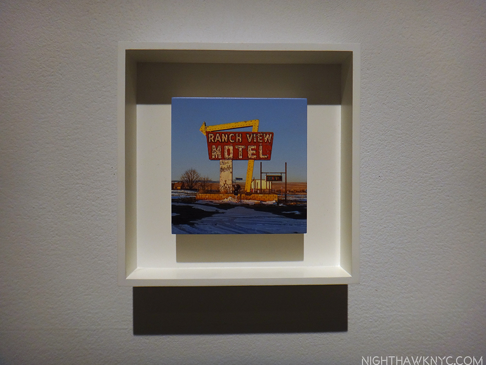
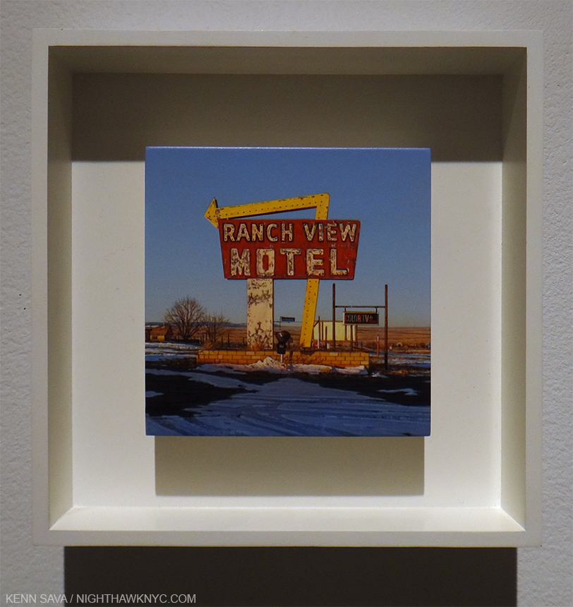
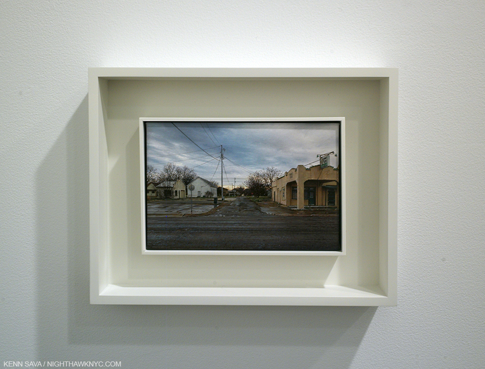
Ranch View, Vaughn MN, 2013, 12 x 18 inches. Compare this with the next two.

Not wanting to take up too much of Mr. Penner’s valuable time, with repetition of things John Seed has addressed in his 3 pieces about the Artist, my questions serve as supplements to those articles (linked at the end). What follows is about his life, and his Art, but I also felt it was important to ask this Master Painter about Art- What he looks for when he looks at Art. Mr. Penner has a deep knowledge of Art History and he is very open minded to styles & periods, perhaps surprisingly so to some. Typically, when I met him at the show’s opening, he told me he was off to The Met while he was in town to see “The Mysterious Landscapes of Hercules Segers.” So? Having a great interest in all of this, I also had to ask him which Painters and periods he feels go under-appreciated these days.

54 Grill, Vaughn, MN, 2016, 30.5 x 64 inches.

Ranch View, Vaughn MN, 2013, 4 x 4 INCHES! These three works show 3 views of the same place, something Mr. Penner would revisit, in a way, in his recent show. This is the work that hooked me- the first piece of Mr. Penner’s I saw in April, 2016. Previously, I associated scenes like this with William Eggleston. Now? I think of Rod Penner.

Kenn Sava (KS)- In reading about your background, you’ve mentioned your folks being supportive of your skill and development, but I haven’t been able to learn if you studied with someone, if you studied Art in school, or if you are self-taught, as well as what road your education and development as an Artist took. Were you Painting when you arrived in Texas? If so, were they the same (general) style as the work we see on your site from 1992, or did you ever work in a different style?

Rod Penner (RP)- Growing up, our family enjoyed camping, hunting, and fishing. I painted wildlife during this time, emulating the work of Robert Bateman and other Canadian wildlife artists.

After graduating from high school, I attended a local community college for one year and then transferred to Oral Roberts University in Oklahoma where I graduated with a B.A. degree in Studio Art, and while I found myself at odds with certain aspects of the theology, overall it was a positive experience. It was at ORU where I met my beautiful wife, Debbie, and we both made lifelong friends among the students and faculty.

Following college, we married in 1986 and moved to British Columbia. when I started intensely studying the work of Canadian realist painters, Christopher Pratt and Alex Colville. I had a lot of wildlife art commissions at this time and even started selling through a well-known gallery in Denver but the animals became less and less important in my paintings. In 1988, Debbie’s brother was killed in a biking accident, so we moved down to Texas to spend time with her family. We ended up staying and I welcomed the change as a way to start over with my art and break away completely from what I was doing. I got a part-time job teaching, but Debbie worked full time so I could paint. She has always believed in me and supported my efforts. The same year that our second child was born in 1991, my youngest brother died in a plane crash. Nine months later, I gained representation by Ivan Karp and his O.K. Harris gallery, allowing Debbie to quit work in order to stay at home to raise our children. I’ve supported our family ever since solely on the sales of my paintings.

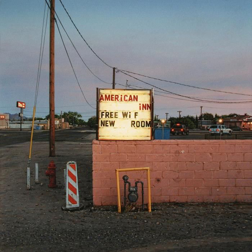
American Inn, 2011,  6 x 6 inches.

KS- What inspired you to get into Art? Who were the Artists you liked early on, and which influenced you early on?

RP- Shortly after arriving in the Lone Star State, I rediscovered the work of John Salt and felt an instant connection. I couldn’t drive past a trailer home (and there are many in Texas) without thinking “Salt.” At this point, I wanted to spend more time in the studio and less time searching out subjects to paint, so I started driving around the town we lived in and took photos of these tract houses that were everywhere. I found them visually interesting. As with all the streets and buildings that I paint, these homes, under certain weather and lighting conditions, became transformed. I painted my first tract house in 1989 and it sparked a series of paintings that were later shown at O.K. Harris in NY.

Pink House with Big Wheels, 1992, 36 x 54 inches, is the earliest work in his online Archive.

KS-Your last show at AMY was in 2013. Two of these pieces are dated 2016, the rest 2017. How do you feel your work has changed/evolved since your last show?

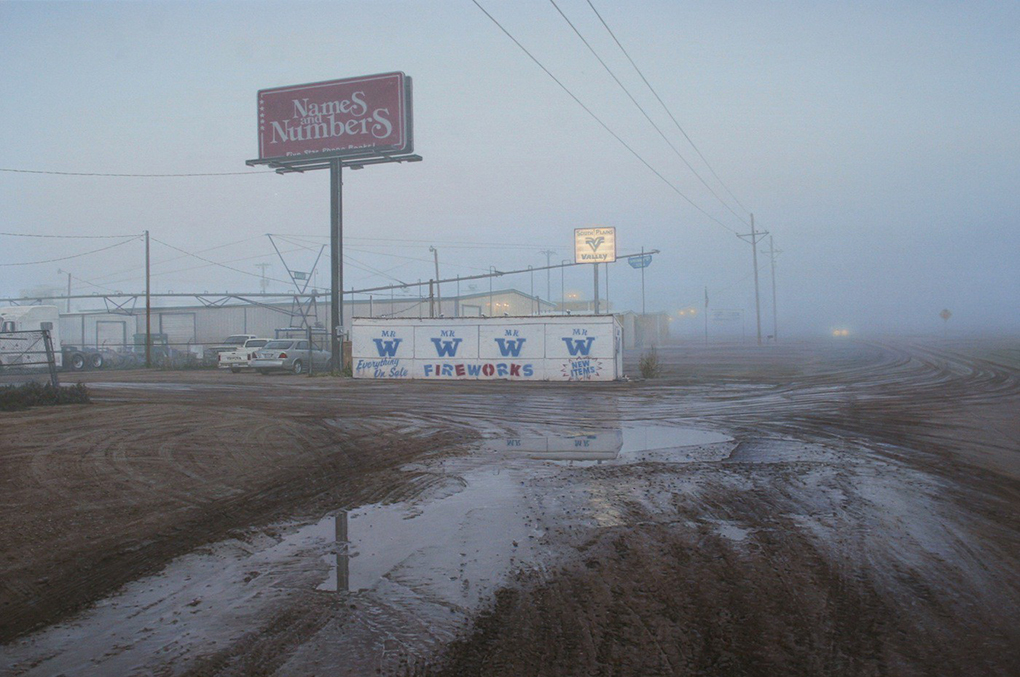
Mr W, Lubbock, TX, 2013, 12 x 18 inches, which appeared in his 2013 AMY, NYC show

RP- Up until 2016, all my previous “micro” paintings were square in shape, but for this show, most of the canvases have a 2:3 size ratio.

I’ve also been exploring more towns in New Mexico.

KS- The work on the catalog’s cover, which is dated 2015 (and is not in this show) appears to be part of this series- a fascinating, alternate view of San Saba Butane. Are there others works in this series?

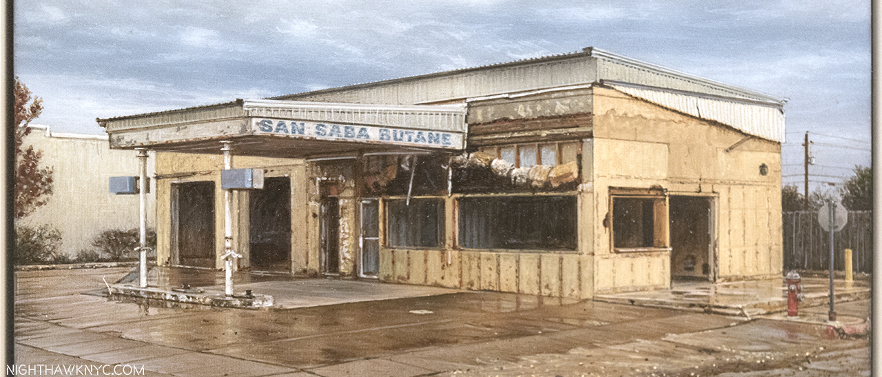
San Saba Butane, San Saba, TX, 2015, 12 x 18 inches, which appears on the recent show’s exhibition catalog’s cover, but which was not in the show. The Painting that was in the show is below.

RP- The painting you’re referring to measures 12 x 18 inches and is based on the photos I took for the series in my show. I’m currently working on a 10 x 15 inch painting of San Saba which will be my final painting in this series. These two paintings will be included in my next exhibit.

KS- I’ve seen you’ve done two views of a same scene in the past, but is this the first “series” of Paintings you’ve done (I know of 10 that are a part of it) of a relatively small area (which feels like it’s within a few blocks), with source material from the same time? Was this a conscious decision- to do a series? Or, is it just coincidental, and the works should be considered independently of each other. (I’m not sure I can do that!)

RP- This show is a first for me in the sense that it is a series of paintings based on photos taken on a single morning of a single town. Most of the locations are in and around the town square of San Saba, TX, and when viewed together they form a more comprehensive “portrait”, both of the town itself, and my personal experiences in this place. That being said, each painting is also meant to stand on its own.

KS- How is your work received locally? Especially in San Saba, if these have been seen there?

RP- I sent a news release for the exhibit, along with some jpegs of my paintings, to a local paper in San Saba but never heard back. Since I don’t show in my hometown of Marble Falls, and rarely in the state of Texas, my work is largely ignored and/or misunderstood. Texas residents have an understandable pride in their communities and my paintings don’t always portray these towns in a cheerful light. However, I’m not interested in painting a romanticized and sanitized version of small-town America. San Saba, along with every town I paint, has its own character, its own curiosities and quirks, its own grit, as well as its own beauty…

So many good memories have been made in this town, but it’s taken almost 16 years for everything to come together in order for me to paint it.

KS- I’m fascinated by San Saba Butane. Without giving away its mystery, is this a place you’re at all familiar with, or is your interest in it purely pictorial?

San Saba Butane, 2017, 6 x 6 inches, as seen in this show.

RP- I first photographed San Saba Butane around 15 years ago and have witnessed its slow deterioration over the years. Who owned it and what it was used for doesn’t interest me.

KS- We’ve discussed people calling your work “photorealism,” yet there is a lot of abstraction in your work- the clouds, the cracks in the pavement, the tree branches, patterns of bricks, peeling paint, and on and on. Of course you know its there. What role do you feel abstraction plays in so-called realistic or representational Art? Do people ever notice it? I also saw you mentioned John Zurier, and that makes me wonder if he’s influenced your skies.?

RP- The formalist qualities in my paintings are important. The placement and shapes of clouds, pavement cracks, branches, etc, is always intentional. I’m good at arranging these components within a picture plane while photographing, but afterward, I edit, so that these elements ultimately serve my purpose which is to create a certain mood and a strong composition. Also, you’ll find smaller engaging areas of abstraction within the paintings which I enjoy incorporating. I think this comes from studying and appreciating a range of different styles of painting.

Regarding Zurier, I’m not consciously thinking of his work while painting my skies, but I’m sure he’s influenced certain elements of my art. He creates this terrific sense of light and weather with just pure pigment and the mood in his paintings elicit a certain quiet meditative self-reflection.

Commerce St, Brenham TX, 2002, 24 x 36 inches. One of two Paintings I’ve seen of his with an actual person in it.

KS- You’ve been in Texas just about 30 years now, would you have been shocked if someone told you in 1988 you’d be here for (at least) 30 years? Does being originally from somewhere else (a city, no less) help you in Painting these scenes you’ve been doing all these years?

RP- The Texas Hill Country is a wonderful place to raise a family. Moving here from Canada allowed me to observe my surroundings with the objectivity of an outsider. I don’t have any memories of these locations before the age of 22; however, they do evoke memories from my childhood, but it has little or nothing to do wth a specific building or street. On the flip-side, living here for almost 30 years has endeared me to Texas, and prevents me from patronizing my subject matter.

KS- In the introduction to the show’s catalog, Mr. Seed mentions your reacting against big (large) Painting by others in these quite small works. What is it about big Paintings that you don’t like?

RP- I don’t dislike large paintings per se, only pretentious, self-serving large paintings that tell me what to think and feel, and much of the current art world seems to embrace that kind of work.

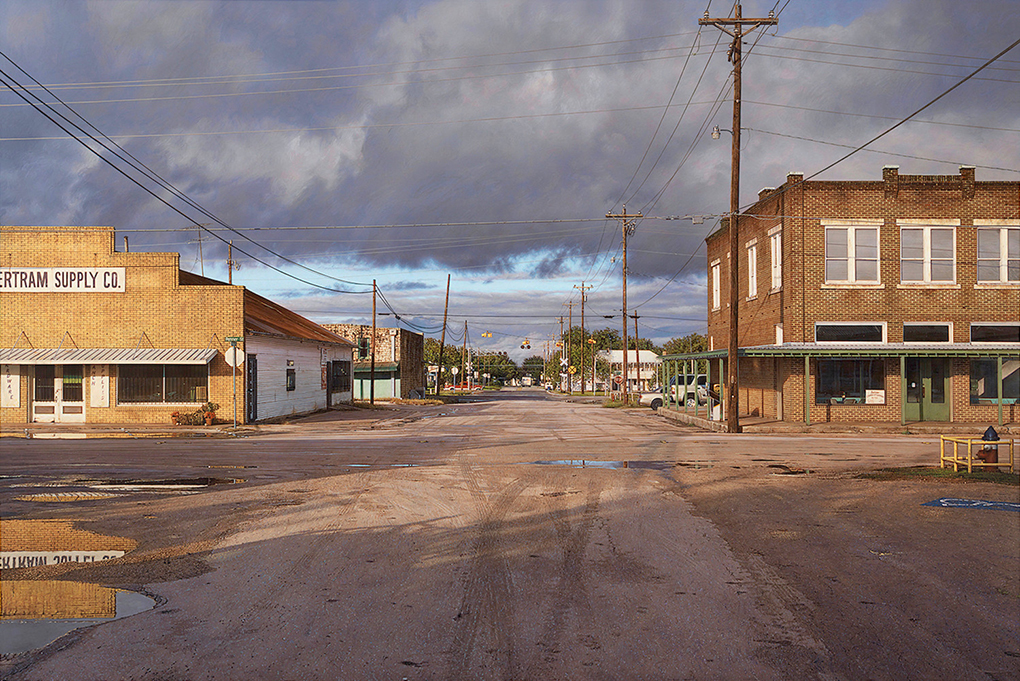
Bertram Supply Co, Bertram, TX, 2016, 36 x 54 inches. One of Mr. Penner’s larger works.

KS- Your taste in art is wonderfully eclectic, ranging from the Dutch & Flemish Masters to the Hudson River School to contemporary Artists including Andy Piedilato. Is there a common thread to the Art you like? When you look at Painting, what do you look for? What makes someone an excellent or great Painter in your book?

Ice Spine, 2015, 102 x 126 inches, left and Pinched Red Sail, 2016, 100 x 117 inches, right, by Andy Piedilato, seen at Danese Corey, NYC, in October, 2016

RP- Someone who has command of their medium and uses it to express mature ideas.

KS- What do you think of NYC? Has anything you’ve seen here ever grabbed you to paint it?

RP- NYC is our favorite place to visit but no, I have never felt an urge to paint it.

KS- Finally, if you were going to suggest to Art Lovers they look at one thing, one style, period or (I’m not a big fan of this word- “school”- unless the Artists themselves put themselves in that group), or the work of one Artist, that you feel has been overlooked, or is especially “important” today, what, or who, would it be?

RP- Perhaps the Tonalists; John Francis Murphy, Bruce Crane, and Birge Harrison are three of my favorites. Contemporary painter Catherine Murphy is in a class of her own. John Salt definitely deserves more attention and credit.

For anyone interested in knowing more about Rod Penner’s Art, as I write, the current resources are-
-Rod Penner has a website, which includes an Archive of his work that goes back to 1992, and includes links to his FB and Instagram pages.
-Ameringer McEnery Yohe has additional info, and details on the past shows they’ve held for Rod Penner here. They also published a catalog for this recent show, and copies of it may (keyword “may”) still be available through them. I’d hurry.
-John Seed’s two pieces may be found here, and here. He also wrote a piece for the AMY catalog.
(And, I have written about him twice previously so far, here and here.)

I’m grateful to Rod Penner for taking the time to answer my questions, for speaking with me at the very hectic opening of his show, and to his wife, Debbie, and their family, for allowing him to take some time away from them to do so. They’ve been married 31 years. I should have asked him what the secret to that is!

*-Soundtrack for this Post is “Last Chance Texaco,” by Rikki Lee Jones, from the classic album of the same name, and published by Rikki Lee Jones. You can see her perform it here.

NighthawkNYC.com has been entirely self-funded and ad-free for over 6 years, during which over 250 full length pieces have been published. As I face high expenses to keep it going, if you’ve found it worthwhile, please donate to keep it up & ad-free below. Thank you!

Written & photographed by Kenn Sava for nighthawknyc.com unless otherwise credited.
To send comments, thoughts, feedback or propositions click here.
Click the white box on the upper right for the archives or to search them.
For “short takes” and additional pictures, follow @nighthawk_nyc on Instagram.

Subscribe to be notified of new Posts below. Your information will be used for no other purpose.


Rod Penner: Brilliance, Under Cloudy Skies

“Rod Penner” at Ameringer McEnery Yohe is my NoteWorthy Show for May.

“Little darling, it seems like years since it’s been clear”*

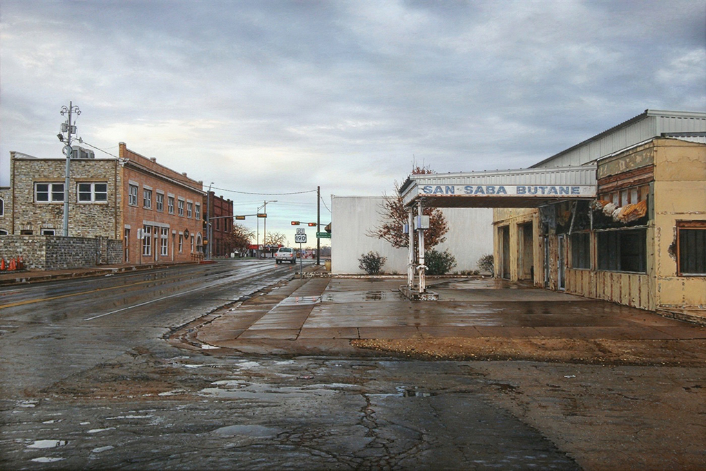
It turns out to have been more than worth the wait. The chance discovery of Rod Penner’s rarely seen work in April, 2016, left me eager to see more of it for the past year. Finally, that chance came. Yes, I wrote about this show’s opening, and my first impressions of it, a while back, when I was also lucky to meet Mr. Penner. Having returned to see the 9 remarkable Paintings that made up “Rod Penner” at Ameringer McEnery Yohe through May 26 (his first NYC show since 2013) a number of times after the April 27 opening, I realized I needed to also revisit it here because these are works that do not reveal all their secrets at first glance, and also because so little has been written about the work of Rod Penner, basically, three pieces by John Seed. Given the amazing & consistently high quality of his work, and the fact that he’s been a successful Painter for over 25 years, who’s shows routinely sell out (8 of these 9 were sold before the show opened), that’s hard to believe. This show is a great chance to get a closer look, as it represents most of the work he’s created in the past year, and because the works are related, they form a “series.” When I asked the Artist about this, he told me-

“This show is a first for me in the sense that it is a series of paintings based on photos taken on a single morning of a single town. Most of the locations are in and around the town square of San Saba, TX, and when viewed together they form a more comprehensive “portrait”, both of the town itself, and my personal experiences in this place. That being said, each painting is also meant to stand on its own.”

San Saba is about an hour north of Austin, almost smack dab in the middle of Texas. The resulting works are at once intricate and sublte, so deep, so brilliantly conceived and almost miraculously executed, I now have a feeling they will be revealing their “secrets” indefinitely.

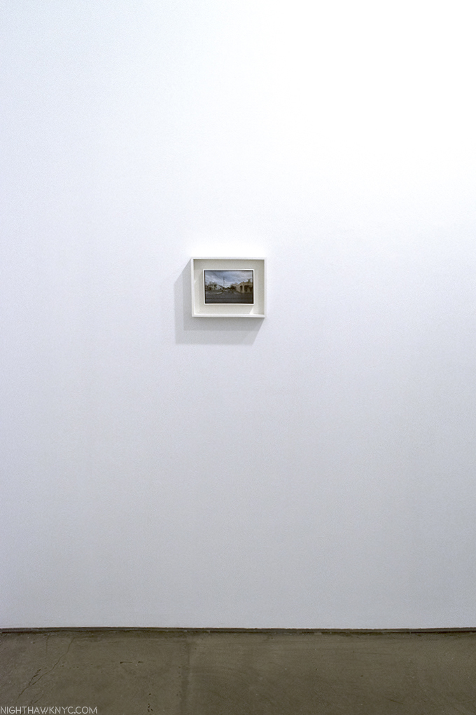
View of San Saba, also 5 x 7 1/2 INCHES. The “center” of Rod Penner’s painted “neighborhood.”All works by Rod Penner, 2017, Acrylic on canvas, unless specified, seen at Rod Penner at Ameringer McEnery Yohe.

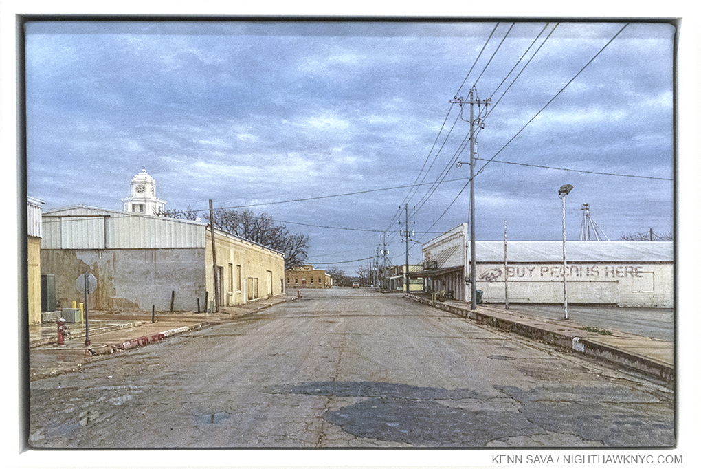
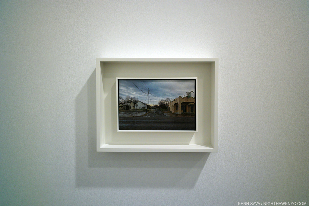
When I met Mr. Penner, he spoke about the newest work in the show, View of San Saba. So new, it wasn’t completed in time to appear in the show’s catalog, the first book ever published on Rod Penner (and available from Ameringer McEnery Yohe, as I write this). It’s a work that a quick glance fails. I wondered about the empty spaces in the foreground, left and right. Why is there so much of it in a work that’s supposed to be a “view” of a town? It scrunches the actual town into a narrow band that accounts for maybe one third of the Painting. These empty spaces along the sides give us a sense of perspective, a sense of space that is, after all, a trade mark of Texas, I hear, which would be missing if Rod Penner had cropped the view closer to the “BUY PECANS HERE” sign, and which would also give the sign an importance he, apparently, didn’t want it to have. The feeling would be completely different. Also, doing this “sets a stage” for the rest of the composition, something Mr. Penner seems fond of doing.

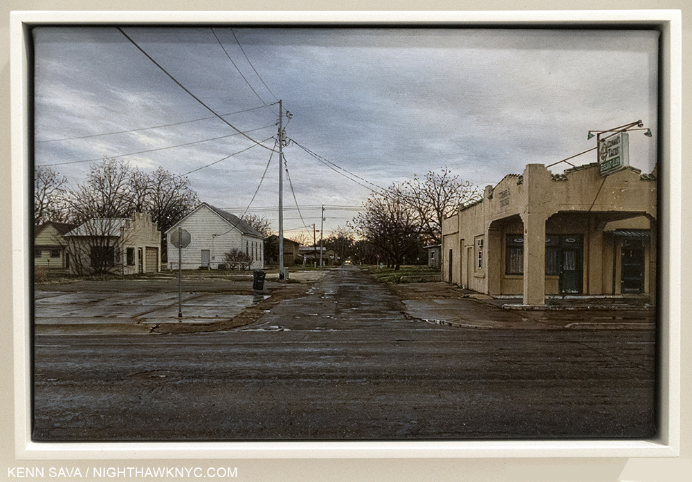
And? It turns out the foreground is an extraordinarily interesting part of the work. Ok, that’s coming from a die hard Manhattanite, a true connoisseur of pavement, street, curbs, and sidewalks, someone who never sees grass. Mr. Penner told me that as the work neared completion, he became unhappy with the pavement to the front left, so he redid it. Take that, everyone who thinks he’s a so-called “photorealist,” or “hyper-realist,” someone who paints exactly and only what’s in a reference photo. First, there’s a very unusual (in real life) crack that runs directly down the very middle of the street, which serves to draw us further and further into the painting.

Detail of the pavement in the foreground, larger than actual size, reveals almost endless details, down to the reflection of the back of the Stop sign in the puddle. Interestingly, every Stop sign in these works is seen from the back. Even in reflection.

It’s an old street. The curbs are worn, where they are still there. The pavement has been patched. Well, some of it has. Water pools in holes that still need to be. Yet, for the most part, the concrete is holding together. After all these years. After all these cars, trucks, people, and whatever else travels on the roads of San Saba, Texas have passed over them. Yes. You can still get there from here.

Beyond the technical tour de force of skill on view in this, and in everything in this show, more importantly, every centimeter of it drips with character.

The skies always seem to be ominous. Sometimes a small patch of sun is fighting to make its way through. Maybe it will. Maybe rain is on the way. (I call theses skies “Penneresque” now when I see one). Just as long as it’s not a tornado, right? The old County Court is still standing. You can see its tower to the left, in the first Photo up top. Interestingly, it’s not quite as tall as the phone pole1

When I look at the finished work, the feeling of isolation, life lived, the present time, and time past (as in the patched pavement to the right in the front), and the feeling of being an outsider is reminiscent of that in works by Edward Hopper or Charles Sheeler, but not specific works. Though he has a foot in Art History, Rod Penner is an original.

But we aren’t in San Saba. We aren’t in Texas. We’re 1,744 miles away by car or 1,513 miles as the crow flies at Ameringer McEnery Yohe Gallery on West 22nd Street in Manhattan, NYC. An entirely different world, right? We’re not even looking at Photographs, which seems to be a reaction of some who only see these works online in, yes, Photographs, and have trouble believing someone can really paint THIS well. We’re looking at Paintings. VERY small Paintings that are either 5 by 7 1/2 inches, or 6 by 6 inches each! Acrylics on canvas. In creating these works at paperback book size, I don’t believe the purpose was to show off his extraordinary skill (which happens as a byproduct). The size brings an intimacy that makes the viewer look closely to see, and once you start looking, you’ll see more and more, which can turn the experience into something of a meditation.

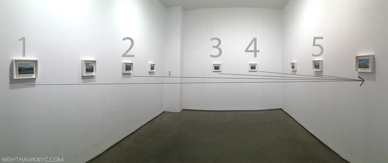
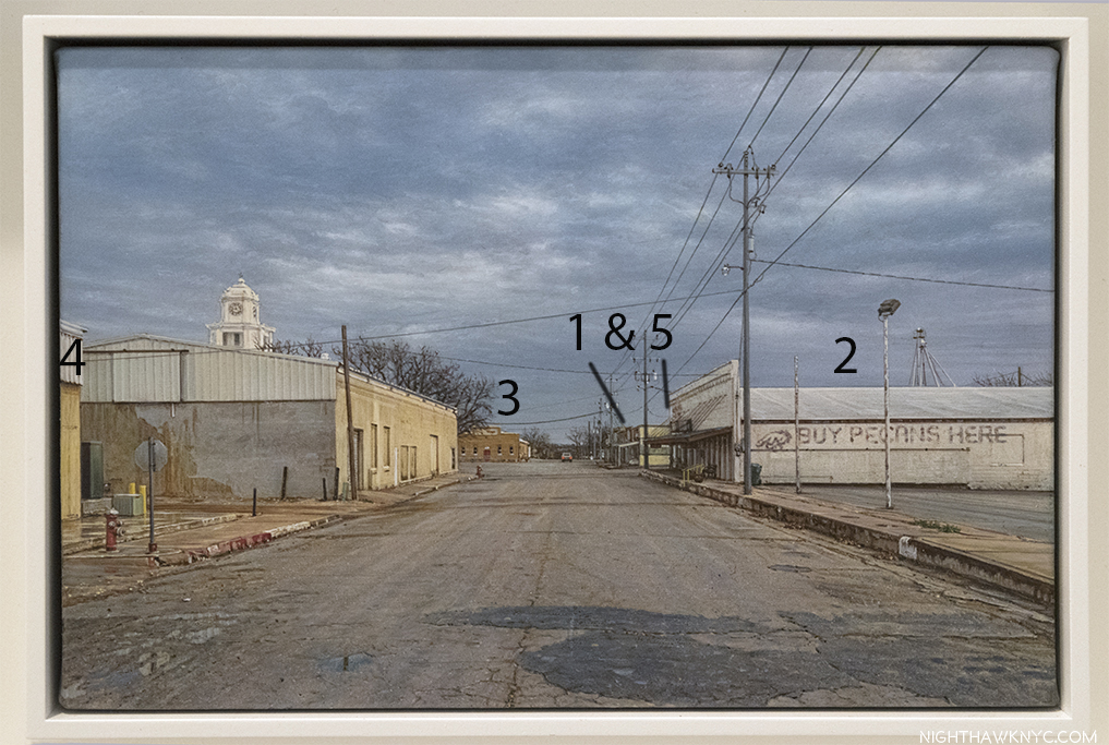
View of San Saba is installed on one of 3 walls where the paintings look out, and on to each other. Therein lies an additional element that becomes apparent when seen together. As Mr. Penner said, each work stands alone. Yet being at this show one can’t help noticing that there’s, also, a “little world” in these 9 Paintings that comes together in View of San Saba. Taken as a whole, this gives a feeling of walking around a small neighborhood (typically New York comment, right?), and based on View of San Saba, it is walkable. No less than 5 of the buildings featured in the 8 other works here reappear in it, making it something of a centerpiece of this “series” for me.  I constructed these maps to show what I mean,

Installation View of Rod Penner at Ameringer, McEnery & Yohe shows it’s a small neighborhood. The lines connect 5 individual works with View of San Saba, far right, where the same buildings are seen, again.

“Map” of View of San Saba showing the location of the 5 Buildings also shown in their own Paintings, which follows. The numbers are from the order they appear in the show, as seen in the prior Photo.

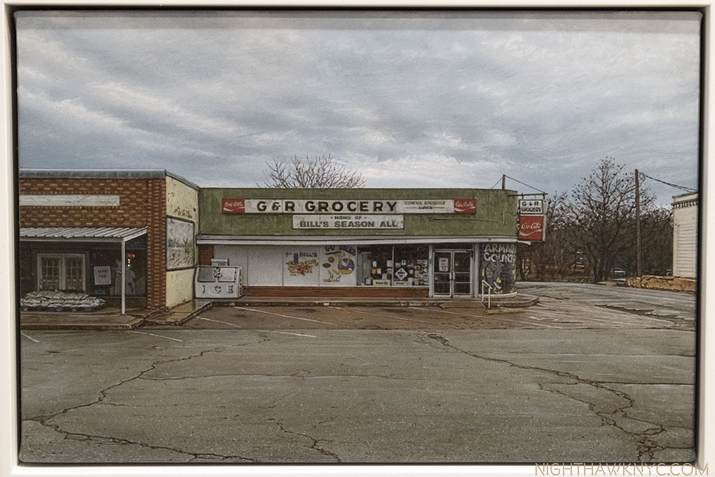
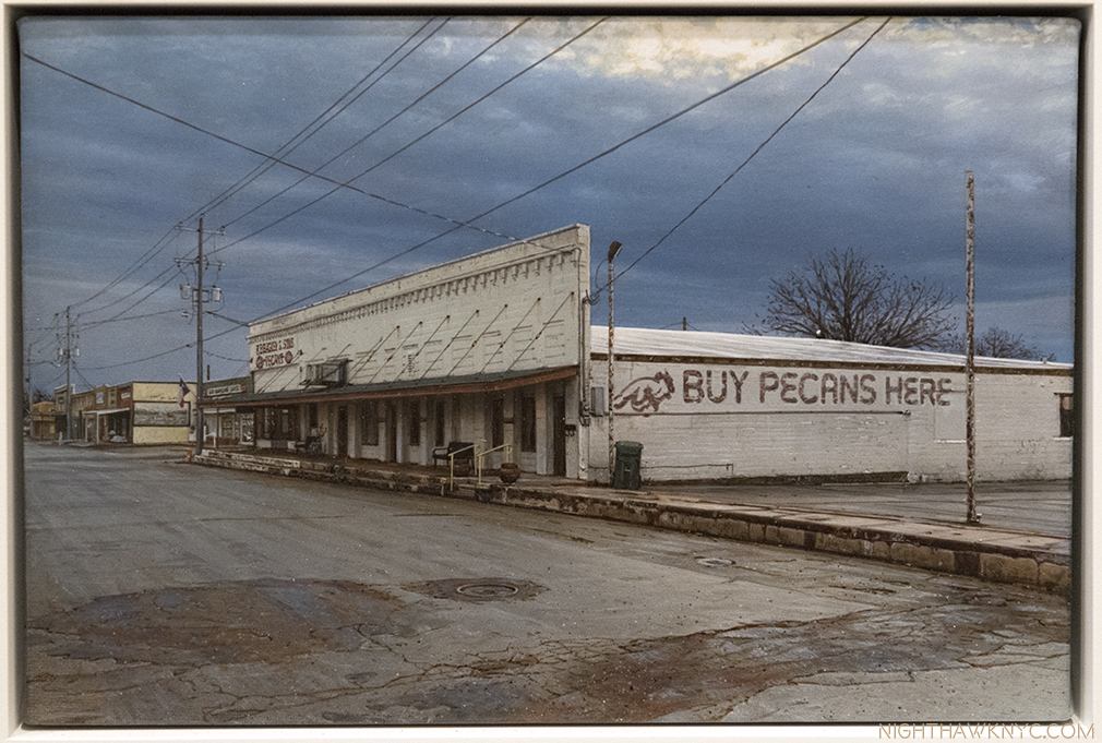
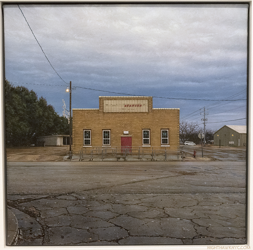
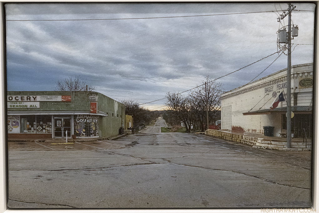
So, yes, as I said, “you can still get there from here,” if you walk straight down the street, following that center crack. Along the right, first, Buy Pecans Here, is the subject (and title) of a closer view of the same structure, below. Then, on its corner, and across the street on the right is G&R Grocery, which is seen in no less than two other works here- G & R Grocery, and Armadillo Country. And finally, a few blocks almost dead ahead (slightly left) is the building in The Station. Here are the five Paintings in question. There could be much to be said about each.

#1 in the “Map” above, G & R Grocery, 2016, 5 x 7 1/2 inches. That reminds me. G&R is also the home of Texas’ famous “Bill’s Season All,” as the sign says. I have to remember that when I need to reorder it.

NYC’s & Texas’ finest in the NighthawkNYC kitchen.

#2- Buy Pecans Here, 5 x 7 1/2 inches

#3 The Station, 6 x 6 inches. The foreground pavement endlessly enthralls me.

#5 Armadillo Country, 5 x 7 1/2 inches

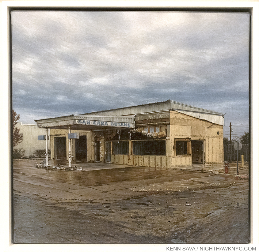
#4 does get a section to itself. My personal favorite among all of these works (not an easy call) is one I find endlessly fascinating, on a number of levels- “San Saba Butane.” All 6 by 6 inches of it. The right rear side of it is, also, #4 in the Map, above.

#4- San Saba Butane, 6 x 6 inches. Depending on the device you’re using, this photo may be close to the actual size of the Painting.

On one level, you could look at it and think about hard times, about a business that stood for a long time, carrying the hopes and dreams of its owner, until it finally moved elsewhere, or went under. There’s no indication of which here. What there is, it seems to me, is a masterpiece of realism in which abstract and realistic elements are weaved together so seamlessly, they achieve an almost perfect balance, each supporting the other. After all, when we see the world, our eyes see things that are abstract as well as “real” (be they reflections in windows or water, and on and on- they are everywhere once you look for them). It’a all based on a rectangular box seen at an angle that provides the basis of everything else that Mr Penner hangs on it or adds to it, and around it. One time I looked at this and thought “It’s a Robert Rauschenberg meets Anselm Kiefer structure under a “Penneresque” sky, as I named them last time, maybe with a hint of John Zurier in it, and with Lucian Freud pavement. Another time, I fancied that the historic “Battle of San Saba Butane” had been fought here, leaving Texas another monument, akin to the Alamo. But, alas, history records no such battle (as far as I know). There is, instead, a completely peaceful stillness to the building, though it’s surrounded by turbulent skies and pavement that appears almost liquified in places. To get to its door, you have to cross the rough, wet road in the foreground before arriving on the slightly surer footing of the (wet) pavement, and then to the “safety” of the awning, only to find the building it’s attached to is just an empty shell, and not a real “destination.” This “having to cross questionable or unstable ground in the foreground to get to the heart of the work” is present in many of Rod Penner’s works. It takes the eye on a journey, and makes it work to get to the core of the composition.

This section is about 3 inches tall by 6 inches wide in the Painting, shown here larger than actual size. Even the wear and tear on the sign’s lettering is brilliantly rendered.

Whatever struggle took place here, even the struggle of day to day business survival is over, and all is quiet in the building. In all its brilliantly rendered dilapidated glory, it’s still standing. Though it says “San Saba” on it, if you took the lettering off (but please don’t) this is another scene that can be seen in any state in the USA. Part of the lifecycle of a business- the part where one has ended and a new one may begin. In that sense, it could also stand for life & death, a tombstone for the business that was once here, and all the memories and history that went with it. Now, it’s a space where something new can begin. It’s real and surreal, intimate and repelling, liquid, solid and air, a place that it wouldn’t seem could possibly exist, somehow, except for that sign- “San Saba Butane” anchors the scene to earthen reality. I wondered about that sign at first, in my first Post, then thought- “No. It’s probably a real name. No one could make that up, right?”

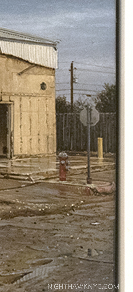
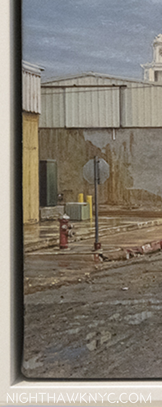
One look at San Saba Butane in comparison to how it appears on the extreme left of “View of San Saba” and you realize that there’s no building behind it now! The Artist, himself, pointed this out to me. The whole right side of San Saba Butane shows a different view than what’s behind it in View of San Saba.

Detail of the right side of San Saba Butane.

Detail of the left side of View of San Saba.

Mr. Penner said, “In San Saba Butane, I removed the building you see in View of San Saba. The area right of the station needed to be opened up some… too claustrophobic… in order to allow the eye more room to wander. The stop sign and hydrant are the same ones you see in “View of San Saba.” That sound you heard was a hammer putting the final nail in the coffin of “photorealism” in regards to the work of Rod Penner.

Well? If this is a real place? I don’t care one bit what it “really” looks like. I don’t want to know. Well, I do know this- As much as I dislike qualitatively comparing creative work. I can’t put it any other way- I can’t think of a better Painting I’ve seen in the past year than San Saba Butane.

The next one is right up there, too.

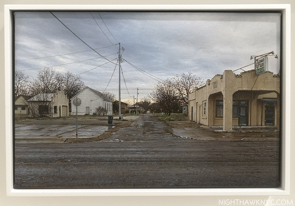
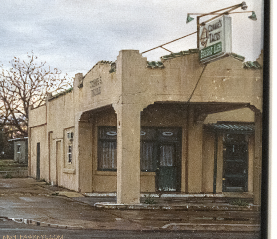
Commie’s Tacos, 5 x 7 1/2 inches.

“Why did we stop here?,” I can hear someone in the backseat saying.

After all, we’re stopped in the middle of the road. “The light’s red up ahead,” might be one reply. “Not much to see here,” might be the new complaint. Hmmm…..The longer I look at this, the more I disagree.

First, there’s the skill involved in depicting this in all of 5 by 7 1/2 inches of canvas.

The same Painting, Commie’s Taco’s, seen from only 6 feet away.

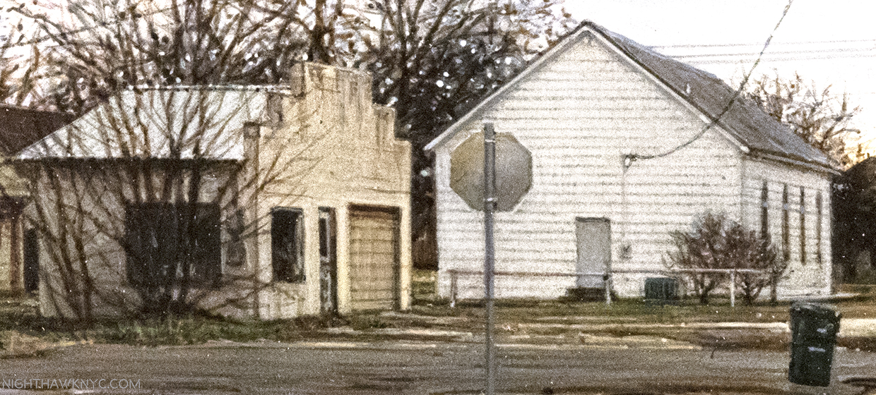
When I looked closely at this one, I marveled at the detail on the two buildings to the left of center. The more I looked at this, the more I see. Every last clapboard is perfectly rendered, but all of it has character. Check out the bands on the back of the Stop sign, and on and on…

Detail of about 2 and 1/2 inches of the left side seen with a zoom lens.

To the right is a tan building, with a Spanish Tile roof, which would be fitting for a business with the name of Commie’s Tacos, the work’s name-sake, which is painted at an angle, and cut off making me wonder if Commie would ever want to buy this work and display it in his/her’s fine establishment, since it’s not even showing the whole restaurant. In fact, we wouldn’t know what the name of it was if it wasn’t the work’s title!

Commie’s, itself, in about 2 inches, with incredibly detailed concrete.

Then, I stared straight ahead, down that beckoning road you see in the first photo, which is what the composition seems to want. The looming street seems a bit more uneven, a bit rougher, than the fairly level ground we’re on now, judging from the masterfully rendered pavement.

Detail of about 4 inches of the foreground. Mr. Penner frequently puts pavement right in the front of his work, which is both daring and serves to set the stage. It’s a stage so well executed it looks real, and used. Notice the wide variety of surfaces.

We’ll pass trash cans, Yield signs and the ever present telephone poles. Further on, past the white house, it’s hard to say what we’ll encounter, well, before that vehicle with its headlights on. If we were standing on either of those corners, maybe we’d think that vehicle was coming for us. But, in the middle of the intersection? All bets are off. It’s hard to tell if Commie’s is even open for business. As in every work here, no one else is around.

As a result? There are none of the distractions people in a painting bring. None of the drama. Uh oh. Speaking of drama…

On the Fence, #6- Crow-No-Lisa

Same with Commie’s. It’s painted at an angle and chopped off which serves to reduce its power and importance. The import, seems to me, to be in the feeling of place- of being here, now. Imagine for a moment what it must feel like to be a new resident to this street, seeing it for the first time, (as most viewers of this work are), and seeing the place you’ll now call home? What would living here be like? The residents are already connected to each other by wires, but you’re not. Would you be welcome? There’s rain on the ground, as there is in a number of these works, but the skies seem to be clearing. Keywords- seem to be. It looks to be a very typical street in a small town in Texas, in or near San Saba, but it could be almost anywhere. This scene could be in just about any one of the 49 states not named Hawaii.

Robert Frost talked about taking the road less traveled, “and that made all the difference.” What would he make of this road? Would he take it? Situated here, as we are, the answer isn’t clear, but if we are going down that side street, we’re in the wrong lane of traffic. Unless, we’re across the street at the other corner, waiting at a Stop sign there. Or, maybe it’s a scene seen in passing, or while stuck at a light to the left or right. One of those things we see for a minute, just long enough to wonder what’s down there? What it like down that street?

Seen from a normal distance, Commie’s Tacos, in its double frame.

Or? You could consider it a mediation on what once was on the corner, perhaps a house you grew up, that’s now gone. The level of detail enhances the “realism” of the work, and so, enhances the viewer’s ability to “experience” whatever he or she thinks and feels when they see it. Beyond the date the painting was done, we don’t know when this scene takes place (as we don’t in any of the works on view). It could be today, last year or 30 years ago. As such, it, and all the works here, are “portraits” of a place that’s beyond time and place. A place frozen in time that portrays an equally frozen moment that, the closer you look at it, you see “more” in. It raises more and more questions, or maybe even reminds you of a place and time, and brings back its feelings. Seeing this on the wall at Ameringer, in its interesting double frame, it’s a portal into a distant place that somehow doesn’t feel all that far away. A place somehow “known.”

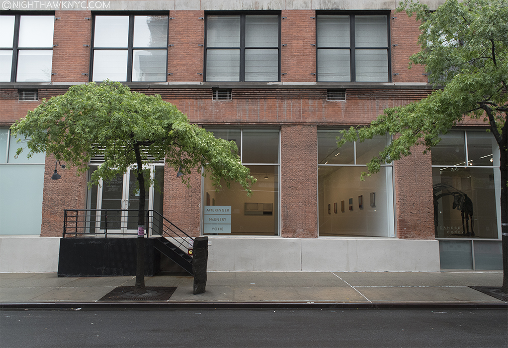
Ameringer McEnery Yohe, 525 West 22nd Street, NYC, seen during the run of the show, appropriately, from the middle of the street, with wet pavement, under “Penneresque” skies, that I hear came all the way from Texas.

I don’t know how the 2,783 residents of San Saba (in 2014) feel about these paintings, if they’ve seen them. More than likely, they prefer Mr. Penner paint other locations in their fine community. As someone who’s never been to Texas, when I look at them, as I’ve said, except for a sign here or there, I see places that could exist elsewhere. So, while they’re based on actual places in and around San Saba, as Mr. Penner said, they strike me as much as depicting America- places and things that could be seen anywhere in the country. I’m sure San Saba is a very different place than NYC is in a lot of ways. When I look at these Paintings? Not entirely different.

(My subsequent Q&A with Rod Penner is hereMy experience at this show’s opening and my initial impressions of it are here.)

*- Soundtrack for this Post is “Here Comes The Sun,” by George Harrison from Abbey Road by The Beatles.

NighthawkNYC.com has been entirely self-funded and ad-free for over 6 years, during which over 250 full length pieces have been published. As I face high expenses to keep it going, if you’ve found it worthwhile, please donate to keep it up & ad-free below. Thank you!

Written & photographed by Kenn Sava for nighthawknyc.com unless otherwise credited.
To send comments, thoughts, feedback or propositions click here.
Click the white box on the upper right for the archives or to search them.
For “short takes” and additional pictures, follow @nighthawk_nyc on Instagram.

Subscribe to be notified of new Posts below. Your information will be used for no other purpose.


  1.  Old Mother Pecan, one of the most unique trees in the world (I love trees), is still standing, too (thought not seen), not all that far away, 200 years later! Important for a place that calls itself the “Pecan capital of the world.”

Raymond Pettibon’s Burning Bush

This site is Free & Ad-Free! If you find this piece worthwhile, please donate via PayPal to support it & independent Art writing. You can also support it by buying Art & books! Details at the end. Thank you.

Written & Photographed by Kenn Sava.

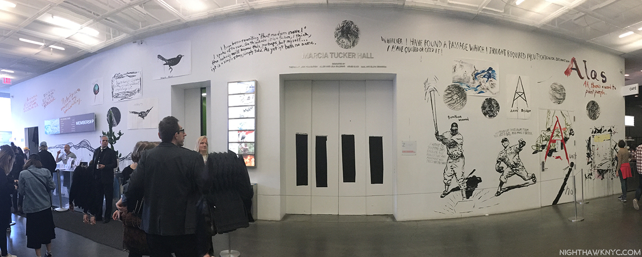
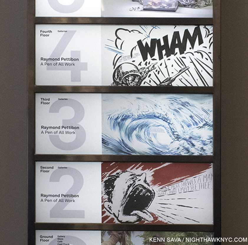
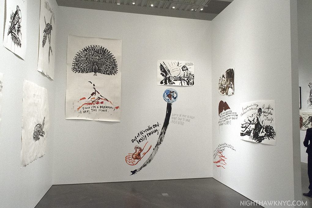
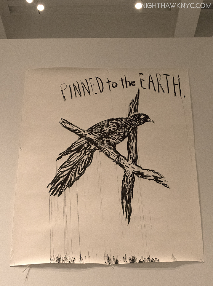
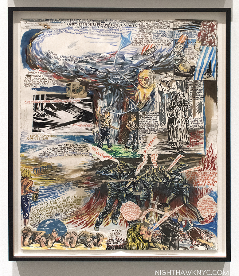
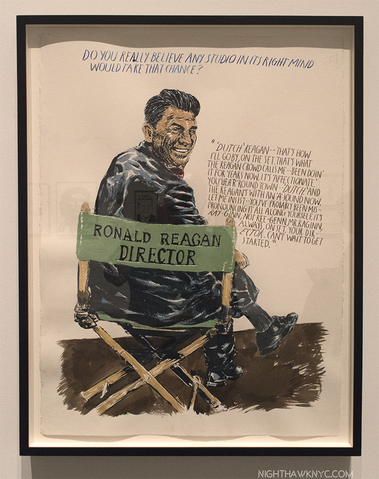
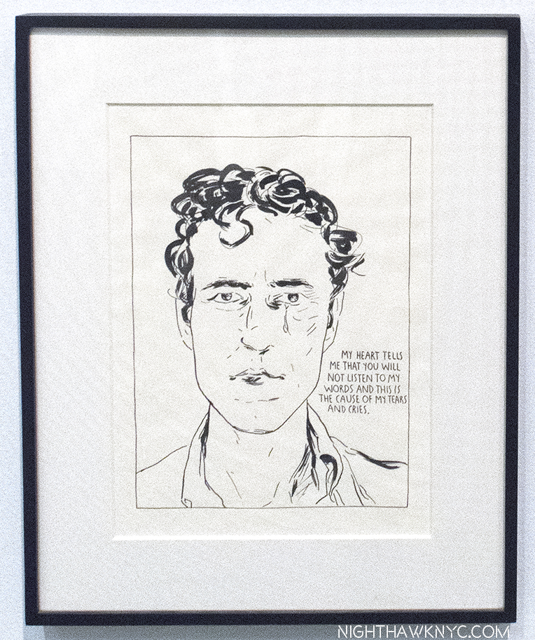
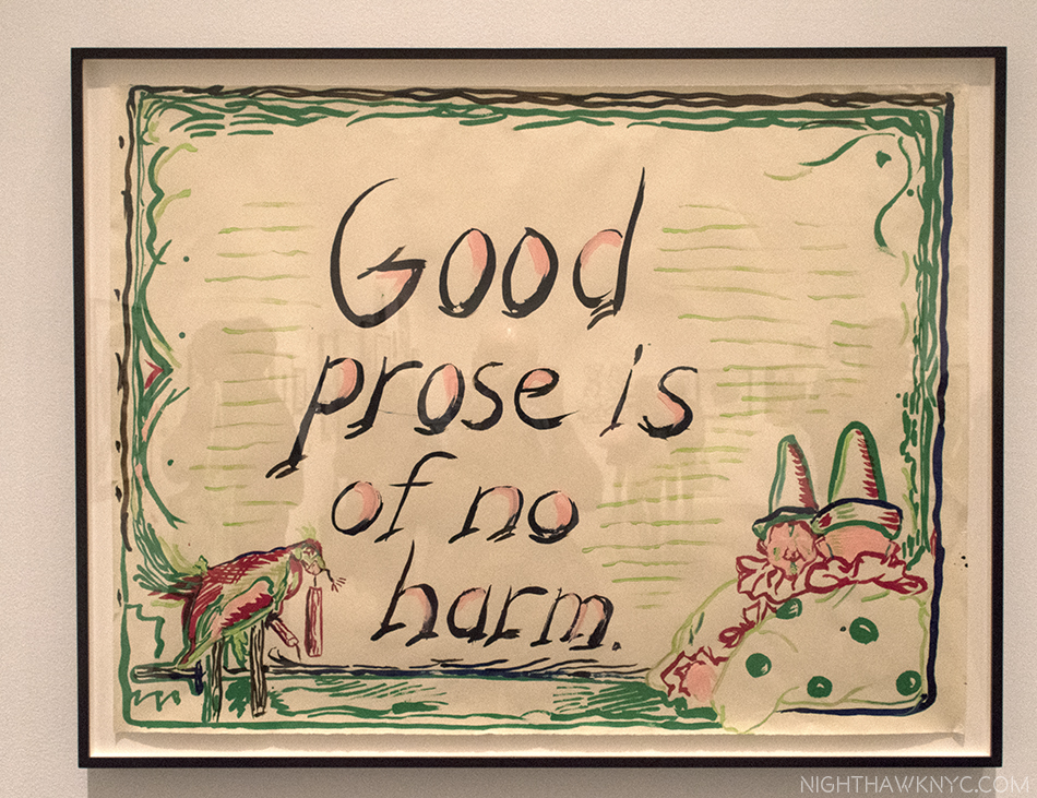
Raymond Pettibon: A Pen of All Work, at The New Museum featured a multi-faceted lobby Mural by the Artist that touched on long time themes, and added a few messages.

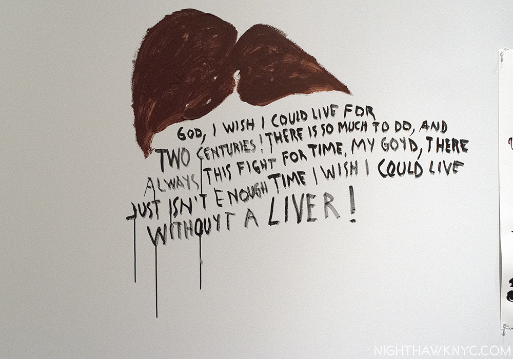
High above, to the left of center, the Artist painted these words…

“I have been rewriting ‘that modern novel’
I spoke of to you…On th’ whole it is a failure, I think,
tho nobody will know this, perhaps, but myself…iyt is a simple story, simply told. And yet iyt hath no name.”

This show fills THREE FLOORS of a quite prestigious Manhattan Museum. Please define “failure,” Raymond. Unless, you’re pulling our leyg…again?

Raymond Pettibon: A Pen of All Work, a Retrospective that also marked his first major NYC Museum show, closed at the New Museum on April 16. I was there almost to last call, drynking in as much as I could, though I was past being intoxxxicated on the 800 Drawings, fliers, album covers, ’zines, Artist’s Books and his films the museum displayed over those 3 full floors1, plus the fascinating, multifaceted mural he did in the lobby, seen above, and below.

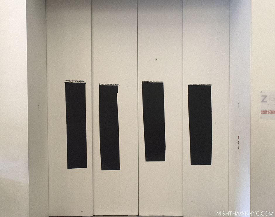
“Beyond it lays everything tht mattered.” That tells you right off how the Artist feels about this, the logo he designed for the legendary band HE named Black Flag, that featured his brother, Greg (who also founded SST Records, who sell Pettibon’s work to this day, without ever mentioning his name). The period it represents really is such a small part of his, now, 40 years of work. It’s (also) the #1 tattoo in the land, here painted on the Museum’s elevator doors. Still on the outs with his brother, he says he rarely draws it any more, so this time, he added very small text above each bar, which reads-“Doors nor windows.””Beyond it lays everything tht mattered.””He isn’t under there, he’s in the woods.” and “The last sentence is somewhat obscured to me.” from left bar to right.

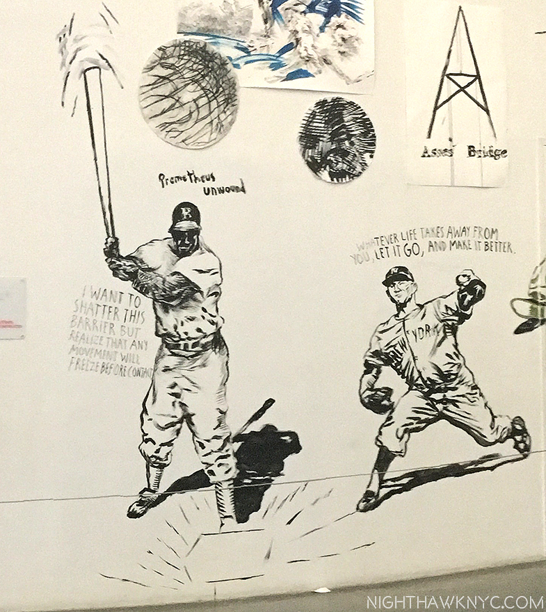
Homage to classic NYC Baseball. Another part of the mural (all since painted over) showed Brooklyn Dodger Jackie Robinson, waving a huge bat, and the Yankee star, Whitey Ford, right, in individual Drawings, not in action against each other.

It might be a while before you see this in a Museum, again. That elevator goes to THREE floors filled with Pettibon. Some “failure.”

Installation View of the 4th floor on its closing day, April 16. In the center is a room with work the Artist created for this show inside.

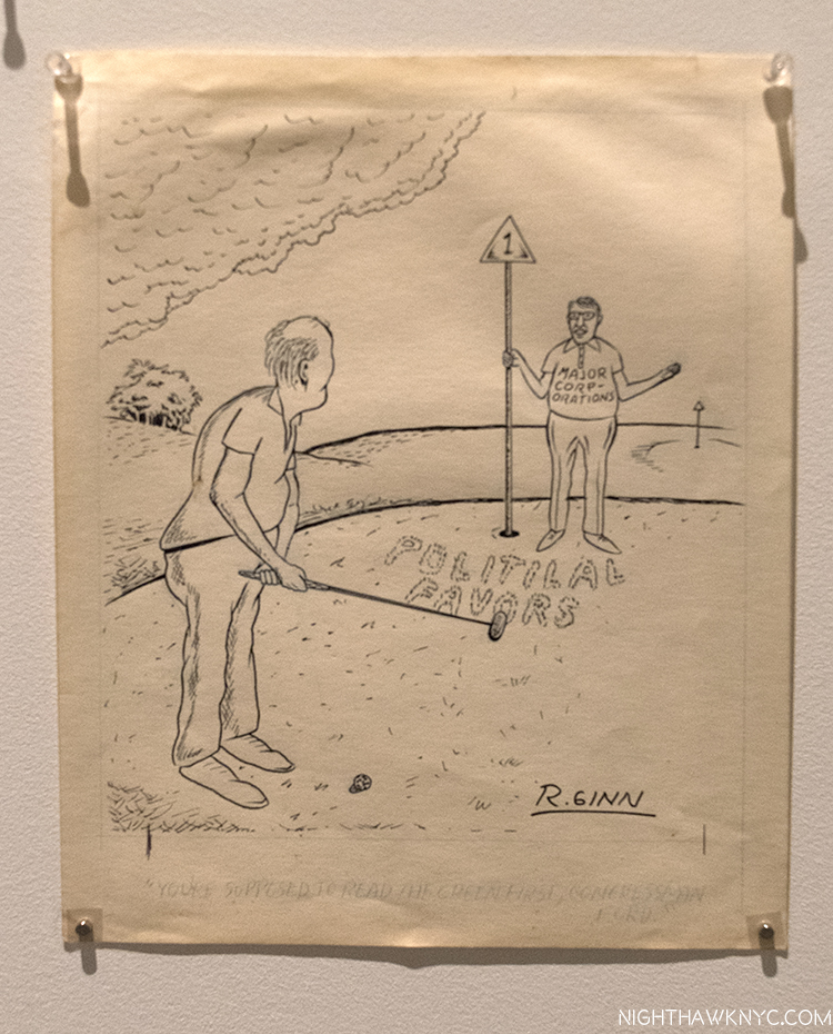
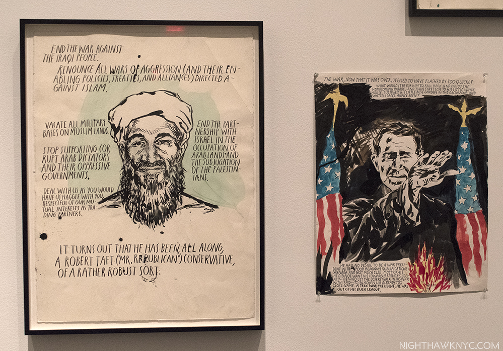
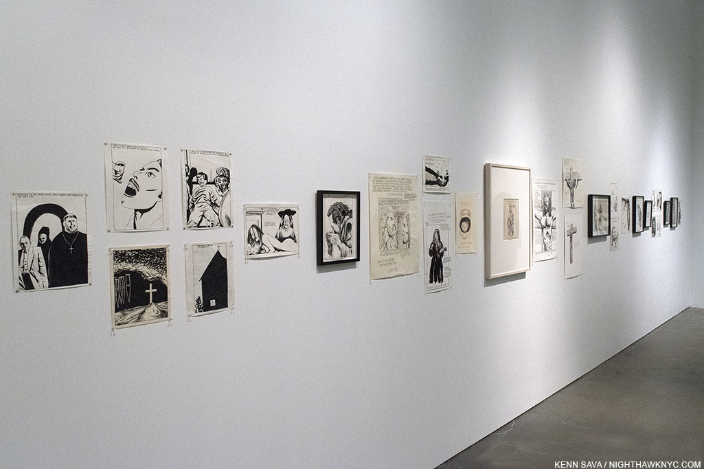
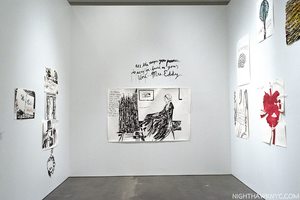
Barely, had I had time for this buzzz to peak when lo and behold…Here comes A-NOTHER Raymond Pettibon show, “TH’ EXPLOSIYV SHORT T,” at David Zwirner, 19th Street, with NINETY-NINE more, recent works, only a couple of which were in “A Pen…”(they were part of the lobby mural, tacked to the wall)! And? These 99 works were being shown in the very space where Raymond Pettibon had created them. Whoa! So, unless I completely overdose on Pettibon first, you might, as I’ve opted to do three pieces- because I think his work is that important and timely- one on each show, and a third piece that looks at the place Raymond Pettibon’s Art is now. Since the David Zwirner show, where I met Raymond Petitibon on April 29, still has some time to run before it closes on June 24, I’ll start with A Pen of All Work, my “NoteWorthy” show for April, before the trail grows cold on it, though for you lucky folks near Maastricht (correctly spelled), the Netherlands, it just reopened at Maastricht’s Bonnefantenmuseum, on June 2, with 700 works, where it will run through October 29. 2

Try everything, Do everything, Render everything, Ink on paper, date unknown. And? He proceeds to do just that…

Mr. Pettibon is somewhat unique in the Art world because of the way he got here, achieving legendary status through his work for bands before he got a Gallery to represent him. So? The Art world is not as familiar with the early work, while his early fans may not be as familiar with what he’s done lately (though, of course, he has many fans who have been with him the whole way, too). I’ll try to show a mix of work here, while trying to give a sense of what this remarkable show was like.

I have to think back to the Picasso Retrospective which filled ALL of the old MoMA in 1980 to recall a show of comparable size. Still, if there was a common theme to be found it was that “his entire body of work is very much a confrontation against ideologies,” to quote Massimiliano Gioni, the New Museum’s Artistic Director, on the excellent audio guide. Whatever you’ve got? Pettibon will confront it, and given how much confronting he’s done, everyone involved did a superb job of installing it, organizing all of these works by themes.

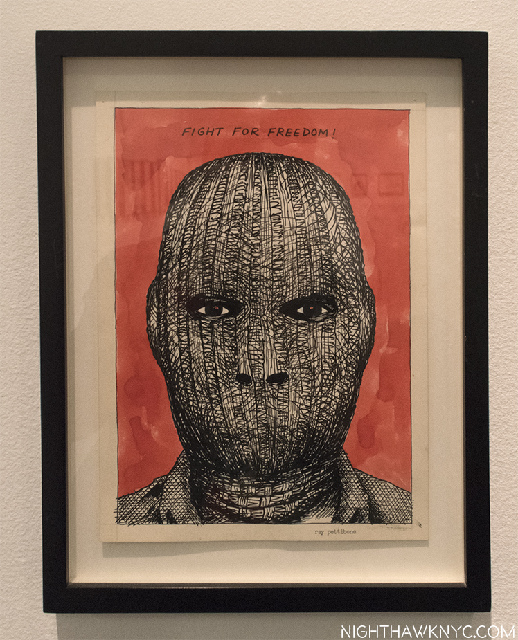
Timeless. Unfortunately. No Title (Fight for freedom!), 1981(!), Pen and ink on paper

The 2nd floor mostly focused on Pettibon, himself, looking at his early work with an eye on how he created his own “alternate media” in the form fliers, zines, record covers, Artist’s books, films & videos, et al, and how he goes about his craft, including samples from the archive he uses as source material, and to draw inspiration from on a daily basis.

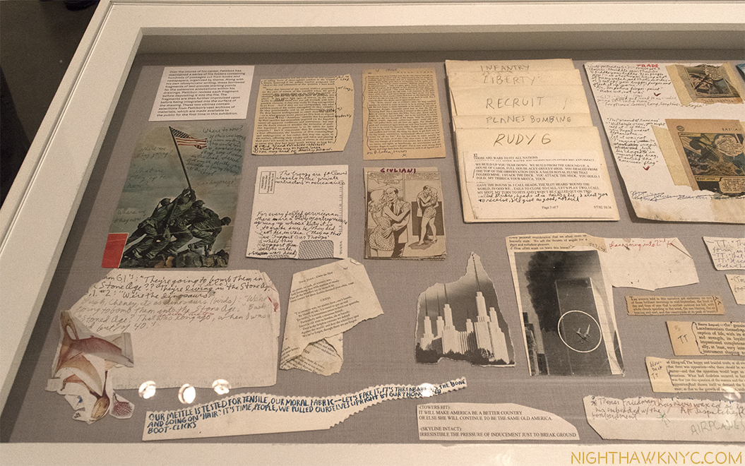
A bit of Pettibon’s never before seen archive of source material includes Iwo Jima, Giuliani, and 9/11.

Also on 2, along with a good part of his past, part of Pettibon’s current legacy was on view in full effect, as seen below. He forged his own way of getting his work seen, first on fliers, then on record covers, zines, Artist’s Books, and then added film and video, all before finding acceptance in the Art world, something he says was delayed by 10 years due to his association with punk. A visit to stores like New York’s Printed Matter feels like visiting the work of many of the “children” of Raymond Pettibon, as his example has been, and is being, followed by countless Artists, Photographers, Musicians and Writers right now. Including thiys one. Though, perhaps not the first Artist to work in any of those media, his methods, and his path, remain most influential.

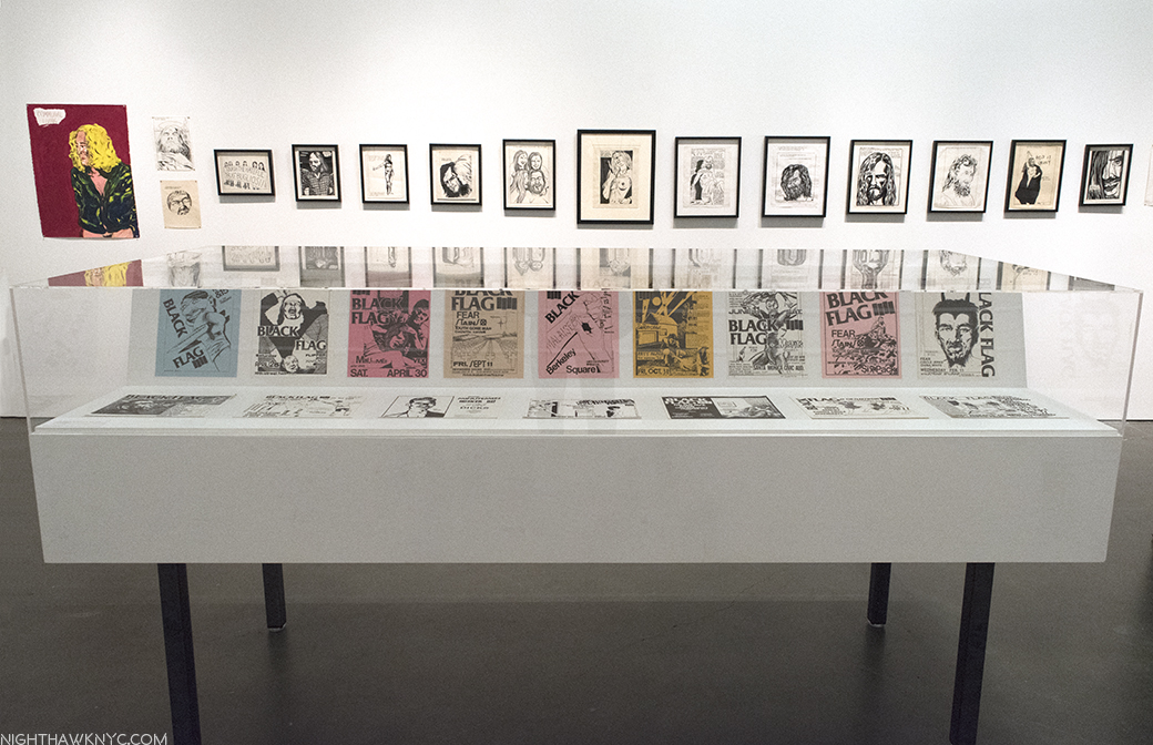
I had to cross the Framers Union picket line to see this show, who were on strike because Pettibon prefers to tack his work to the walls with straight pins. With 800 works in this show? That’s a LOT of lost work for framers. Ok…I’m kidding. I’m pulling your leyg now. Looking at this photo, you can see how very far Pettibon’s work has come. In the glass case are GORGEOUS copies of his (now rare) early gig fliers that were posted with no thought of posterity in the late 1970s. Behind them, on the wall are 2 tacked up drawings, and one painting(!), left, next to 13 framed drawings of no less than the Manson family. Out of the 20,000 Drawings Pettibon has done, only a small percent have been framed. With the prices being paid for his work? I’d bet that just about every piece that is tacked to the wall here is being seen that way for the last time. Framers? Get ready.

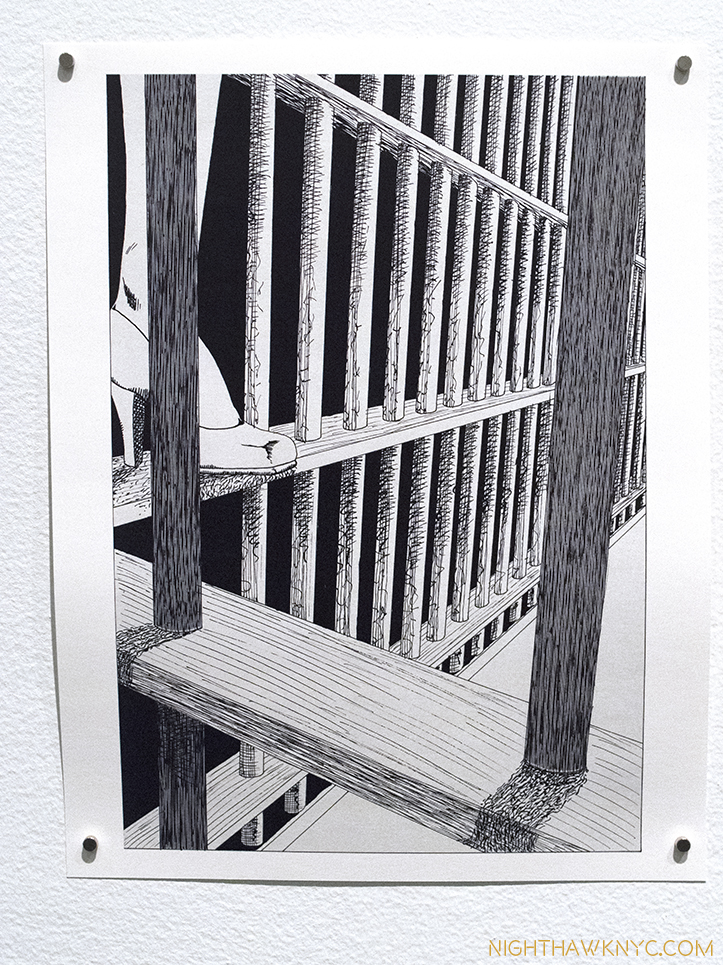
Also on the 2nd floor is the American premier of the virtually complete original art for his first book, Captive Chains, 1978, an homage to comic books/Texas Chainsaw Massacre/ Betty Page that is laced with S&M imagery as well as first rate drawings, different in style than what most of his fans may be familiar with. Pettibon has been quick to downplay/under-play/denigrayte his self-taught Drawing skills- including these! Captive Chains begs to differ. Sorry! No faylure here. These are both terrific, and now classic. Perhaps most interesting, a number of its pages are full page drawings with no text, something almost never seen in Pettibon’s work since. In fact, it seems to me his career has followed the trajectory of his work being more about image primacy early on to now when text and language have come more and more to the forefront. One indication of this is that many drawings lie unfinished in his studio at any given time while they await the inspiration of texts to complete them. Sometimes for years.

The complete original art for Captive Chains, 1978. 68, ink on paper Drawings seen in the USA for the first time, and yes, they’re tacked to the wall.

One page. Ugh…I’m sorry. Putting a tack in this is like putting one in my hand.

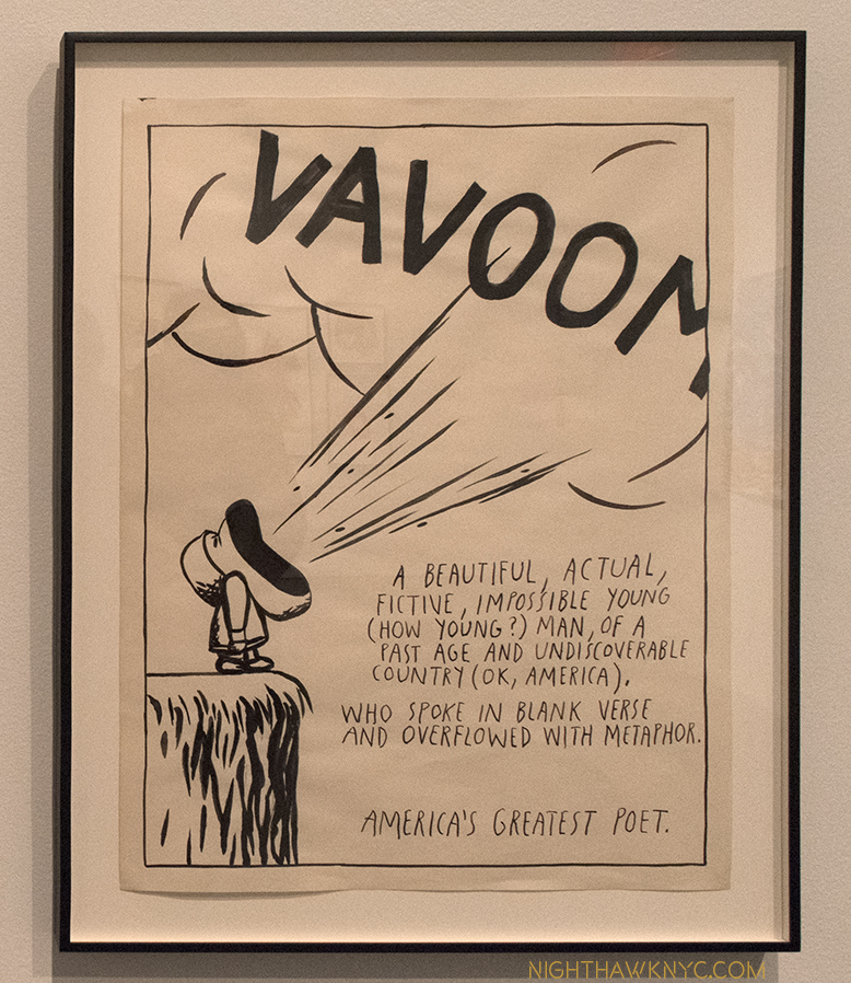
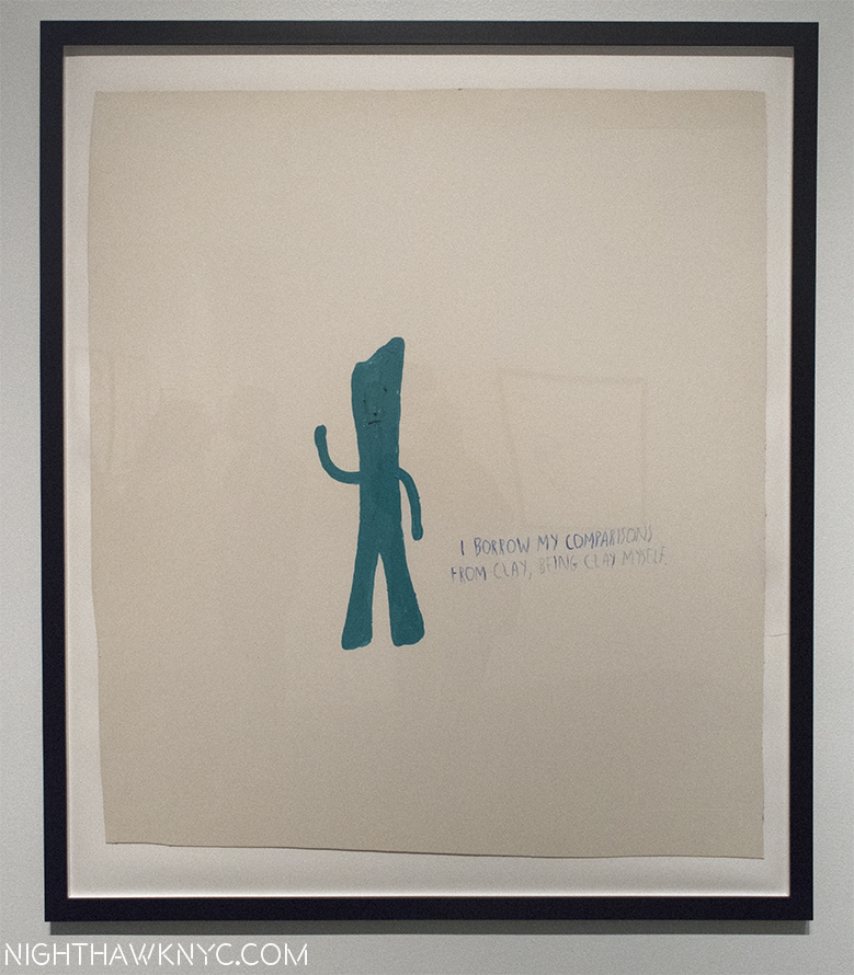
Pettibon is fond of recycling old characters from the comics and television, including Batman, Superman, Gumby and the obscure side-kick character, Vavoom. While Batman and Superman are famous, Gumby, a long time personal favorite, is in eclipse. A claymation character created by Art Clokey3, he was able to walk into books and live in them, as well as visit other times in history. Vavoom was a side kick on the Felix the Cat cartoon show, a character, who’s only vocalization was, literally, an earth shattering shout out of his own name. Both Gumby and Vavoom are alter egos of Pettibon, and stand-ins for the Artist. Very interesting choices, to say the least.

The old cartoon side-kick, Vavoom (seen here in No Title (A beautiful, actual…), 1987 ink on paper, only able to say his own name is an interesting alter ego for an Artist who is so intensely literate.

…so is Gumby. No Title (I borrow My…), 1990, Acrylic on board.

In a long, rear gallery on the 2nd floor, was an amazing selection of Pettibon’s superb Baseball Drawings.  Along with surfing, the Artist’s passion for Baseball is lifelong. As with his other work, unless you’re a Baseball Stat expert, like he may well be, it takes some digging to begin to understand why Pettibon is choosing to depict a certain player at a certain point in his career. (More on this in my Post on the Zwirner show.) While his early punk work continues to gets so much attention, other areas of his work live in neglect. If there’a another Baseball Artist in Pettibon’s league? I don’t know of him/her.

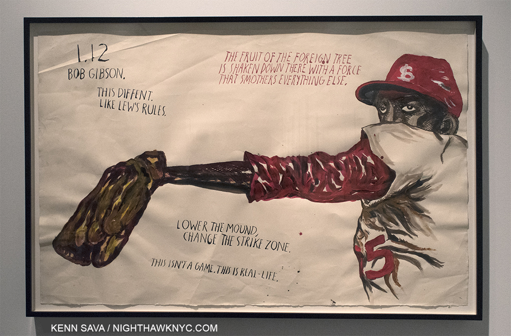
Against the world. No Title (1.12 Bob Gibson), 2015, Pen, ink, pencil, acrylic on paper. “1.12” was Bob Gibson’s E.R.A. in 1968, when he won 22 games and lost 9. His St. Louis Cardinals lost in Game 7 of that year’s World Series. Could anything better capture his intimidating presence than this?

The 3rd floor sees Pettibon looking at the various “tribes,” and subcultures in recent American history- surfers, hippies, punks, the Manson family, and musicians.

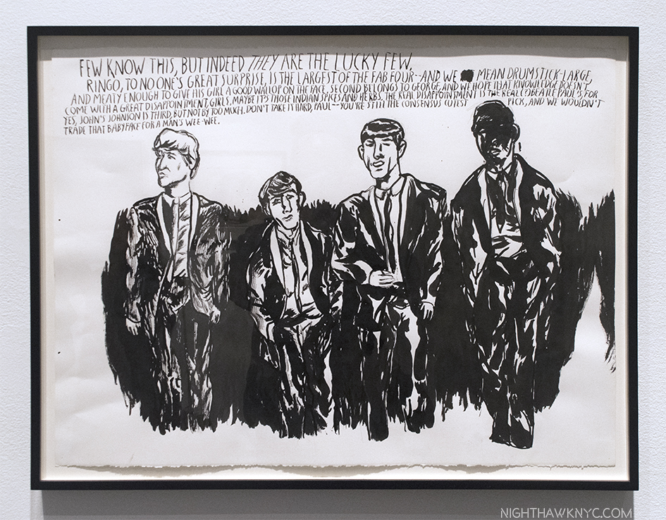
Even The Beatles “get Pettibon-ed,” to coin a phrase, about who is the “largest” member. No Title (Few know this…), 2015, Ink on paper. Pettibon continually revisits history (usually, American), often years later, as here. In the 2000’s, he began addressing events closer to “real time,” like the War in Iraq. One thing I haven’t figured out yet? His work’s “penis obsession.”

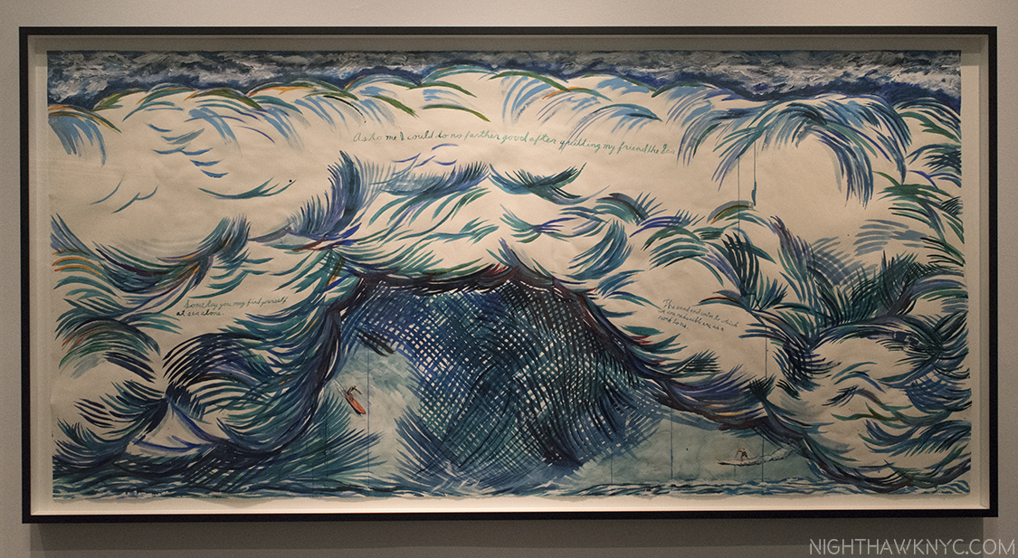
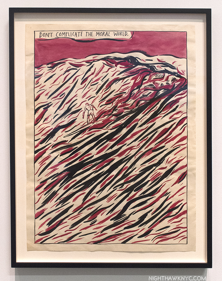
His Surfer and Wave works strike me as living at the center of his work, the heart of it. Beyond punk, Manson, religion, politics, war- all the rest of it. Here’s a world Pettibon knows intimately having grown up near the water in Malibu, where he indeed surfed, though, as he told Dennis Cooper in Raymond Pettibon, (Phaidon), “I don’t surf much any more, but I grew up with it. I was never a card-carrying surfer.” Usually, he depicts a solitary man in the middle of a gigantic wave, testing himself against nature, symbolically against the world, against the nature of things, against chance, and against himself. As his 2005 work, ”Man stands as in the center of Nature, his fraction of time encircled by eternity…”, which wasn’t in this show, sums up perfectly. At moments like those, the “truths” that present themselves (or rather, that Pettibon presents) are often zen-like koans- they’re ineffable. They can’t be distilled further. All but the tiny place where board meets water is out of his control. How long will the ride last? Will he survive? Be maimed? What goes through the mind while it does, and at times like those? It’s not just a man’s game, either. He shows us girls and women surfing, sometimes topless.

Monumental. No Title (As to me…), 2015, Pen ink, watercolor, acrylic on paper 55″ x 113″. Another of his large Surfer Drawings sold for 1.5 million dollars in 2013, “failing” to reach four times the high estimate.

No Title (Don’t complicate…), 1987, Ink and gouache on paper, 24″ x 18″, MoMA. If I could choose one work of his? This might be it…at the moment. You styll have 300 other Pettibons, MoMA.

The 4th floor sees Pettibon’s extensive, long-running, devastating and ever-timely political and war works, along with works relating to the power of media. Brace yourself- Pettibon doesn’t play favorites. Democrats and republicans come in for just about equal poundings- from JFK through Obama. It culminates, and the show concludes, with an inner gallery of work Pettibon created for A Pen of All Work.

Twas ever thus. No Title (You’re supposed to read the green first, Congressman Ford), 1976, Red, blue pencil on paper.  An early work about Gerald Ford by “R. Ginn.” The name “Pettibon” comes from his dad.

The layout of the 4th floor is interesting in the choice of having the most timely, most controversial and most “explosive” work including pieces regarding Ronald Reagan, Gerald Ford, Donald Trump (one from the 1980’s, and one from the 2016 campaign) and atomic explosions….

No Title (“End the war…), 2007, Pen, ink, gouache on paper, 30″ x 22,” left, seen with No Title ( The war, now…), 2008, Pen, ink, gouache,  acrylic on paper. Don’t worry. There was a whole wall about JFK, and yes, Obama got “Pettibon-ed,” as well.

A wall of work on religion, another ongoing theme.

surrounding an inner space, where the feeling is, surprisingly, both personal and intimate, it felt to me. Inside, the Artist pays homage to his mom, talks about his craft, and, apparently, nature, life, some of his wishes at this stage of his life (he turns 60 on June 16), all in works created for this room, and some on its walls.

The show includes some treasures. His mother, 95 as of last December, saved some of his childhood drawings from the 1960’s and 19 of them were on view that Pettibon has now added texts to! Pettibon pays homage to his Mom in a wonderful, Artful, way in this final gallery, which brings the show full circle.

Inside the final room on 4, containing works Pettibon did especially for iyt includes this version of Whistler’s Composition in Black and Grey, the Artist’s Mother, an homage to his own Mother, now 95, who he has says has always been his biggest fan, at times his only fan. The feeling this room gave felt like walking around in his head at the moment. He added the writing above it because, he thought, Whistler’s Mother looks like Mary Baker Eddy.

So…Moms? Hold on to your kids drawings!

A view of another part of the final room.

No Title (Pinned to the Earth), 2017, Ink on paper. In the final room, birds are featured since their feathers are used for quills- drawing instruments. Uh-oh. Someone else wants to chime in on this one…

“On The Fence, #5, Picking-A-Petite-Bone”

Painted on the wall of the final room.

PHEW. Some “failure!” It sounds HUGE, and it was, but it was a mere pittance (4%!) of the over 20,000 Drawings Mr. Gioni says Pettibon has created to date. And counting. He’s already added at least the 99 drawings in the David Zwirner show to the total. And? The one he did for me there.

No Title (When I see…), 2006. Pen, ink, collage on paper. Pettibon has been doing collages since around this time, and says one may include up to 70 drawings. As if his work wasn’t cryptic enough!

Beyond that, in a show that contains work that goes back to the 1970’s, it’s fascinating that nothing here feels “dated,” and virtually all of it holds up. Over 800 of any works is a pretty good indication of quality, even out of a body of 20,000. I’m still looking for a “bad” Pettibon.

No Title …(Do you really believe…), 2006, Pen and ink on paper.

After spending some weeks with these works, and Pettibon’s work in general, I find Mr. Gioni sums up the mystery of “understanding” Pettibon’s work the best I’ve found so far when he says on the audio guide, speaking of his political works, but I think it’s valuable to keep in mind, regardless of subject- “Pettibon plays with a variety of voices, in this case a cacophony of voices. The texts that are inscribed in the works of Pettibon are rarely a direct confessional expression of the Artist’s opinion, and they are instead a collection of what could be defined as the collective unconscious…” Proof of this is that we learn very little about the Artist, himself, from his work. Unless he comes out and tells us, directly, in interviews, and even then? Watch out for his “tall tales!” The point of the work is not personal (about the Artist, himself). It’s more about self, than “himself.”

My Heart Tells Me (Self Portrait), 1990, Ink on paper.

Personally? I felt like I was seeing the work of 800 Mensa members.  If you want to know why he is a major, and in my opinion, crucially important, Artist of our time, the “Pen,” and a pretty nice one, called the New Museum held your your answer. A wall card says the show’s title comes from a poem by Lord Byron. Ok. Another way to look at it is that the New Museums truly was A “Pen” (as in an enclosure) of All (well, A LOT) of his Work “that matters,” as he painted in the lobby.

No Title …(Good prose is…), 2013, has been turned into a styling Tote Bag by MZ Wallace, proceeds go, appropriately, to the New York Public Library.

I must also say that I feel that this show was a huge coup for the New Museum. As far as I’m concerned, this is the show that takes the New Museum to the next level. “Big 4” Museums? That sound you hear is someone breathing down your necks in contemporary Art. As for Mr. Pettibon, himself? I wonder. This show could have been held at MoMA (who, according to their site own over 300 of his works, on say, the whole 6th floor) or  it could have filled The Met Breuer (The Met lists 3 of his works online). Either would have, most likely, given him quite a bit more exposure, which might be critical given the timely nature of his work. I would love to know if either was ever an option, and why they passed if they were. Raymond Pettibon’s time is (still) now. Maybe MORE now than ever. Still, all of that having been said, I’m glad that it happened at all! I mean no disrespect to the New Museum. On the contrary, I heartily applaud them on doing such a superb job, on all accounts. Bravo! While I won’t compare qualitatively, “A Pen of All Work” will be one very hard show to top in NYC in 2017. Meanwhile, his Art continues to find favor elsewhere around the world. If you are anywhere near Maastricht, the Netherlands before October 29, don’t miss iyt! Raymond Pettibon also has a show about to open at the excellent Garage in Moscow, Russia. But? Sadly, this one is over.

“And the only sound that’s left
After the ambulances go
Is Cinderella sweeping up
On Desolation Row.”*

When I left A Pen of All Work as the show closed that last time, I walked out on to the Bowery, the erstwhile “Skid Row,” or “Desolation Row,”(hence, this Post’s Soundtrack), where C.B.G.B. used to stand a few hundred feet away, back in the day before gentrifucation. Yes, punk is long gone, but Raymond Pettibon’s “failed modern novel” gets more and more attention than ever, now worldwide. Pondering all of this, I felt that Pettibon seemed to be akin to a modern day biblical, or zen, prophet- complete with his own burning bush, wandering in the desert, speaking in tongues.

800 works in, I’m listening harder than ever.

*- Soundtrack for this Post is “Desolation Row” by Bob Dylan, from the classic Highway 61 Revisited, and published by Bob Dylan Music Co.

Special thanks to Kitty, who’s research assistance made thiys Post possible.

NighthawkNYC.com has been entirely self-funded & ad-free for over 8 years, during which 300 full length pieces have been published! If you’ve found it worthwhile, PLEASE donate to allow me to continue below. Thank you, Kenn.

You can also support it by buying Art, Art & Photography books, and Music from my collection! Art & Books may be found here. Music here and here

Written & photographed by Kenn Sava for nighthawknyc.com unless otherwise credited. To send comments, thoughts, feedback or propositions click here. Click the white box on the upper right for the archives or to search them. Subscribe to be notified of new Posts below. Your information will be used for no other purpose.

  1. 800 pieces, per the show’s audio guide, which you can still access, as I write this, here.
  2. Update- July 20- You can read my Post on “TH’ EXPLOSIYV SHORT T” here.
  3. (who passed in 2010. I wonder what he thought of these…

The Whitney Biennial Turns The World Upside Down

There’s more than “one way” to select a Biennial, and therein lies my rub…Click any photo to enlarge.

Ahh…The Whitney Biennial. That semi-annual whipping post, “they don’t make Art like they used to” kind of a show of Contemporary American Art by “young and lesser known Artists” that, frankly, I gave up on and stopped going to, missing the last one at the “old” Whitney (now The Met Breuer) in 2014. This new one, the first in their new building, ends on June 11.

Liberty by Puppies Puppies, 2017. “Give me your tired tourists, yearning for a selfie moment, rife with sociopolitical comment,” with an incomparable background. At various times, it’s a real performer, at others, it’s a mannequin. At no time will the Nighthawk go out on that deck.

Oh! What I do in the name of “Art!” Ummm…You need some gel or something for those spikes. That Torch seems to be slipping. And? Where is that big book? Whatever you do? DON’T look down!

If you have any interest in Contemporary American Art you should see it if you can. Is it a “must see?” My initial impression, which I Posted here on March 31 (which this Post replaces) left me feeling there was much to see and impressed by some of what I’d seen. Having made 10 visits thus far, however, my answer is “No.” Unfortunately, though there are a number of memorable pieces on view, and I think it’s highly likely you’ll discover some new names you’ll put on your list that you’ll want to explore further, overall, it’s not a must see, in my opinion. Let’s face it- there are so many really, really good shows going on here now. If you’d ask me what to see that’s up at the moment? I would say about the Biennial, “See it if you have time,” after seeing the others.

As always, it wouldn’t be the Biennial without some hair-pulling, teeth-gnashing, and “Wtf moments.” In this edition’s case they are there, and fairly serious negatives, in my opinion, mostly regarding the choices of what is included and what has been omitted.

True, but I’d at least like to survive this show. In the Wake, 2017, 2 of 16 Banners by Cauleen Smith.

As for my lists, after two visits, the name Samara Golden made mine of Modern & Contemporary Artists- of any age, to keep an eye on. After 10 visits? She’s still there. During each one, my wonder never ceased every time I experienced her work…ummm…installation….ummm….ok…creation, The Meat Grinder’s Iron Clothes, 2017. It is, literally, one of the most astonishing Art works I have seen since…? I honestly don’t know. Maybe, ever.

Check your expectations at whichever side door you choose to go in to enter Samara Golden’s work.

It’s so big with so much to see it may well be un-photographable. Hmmm…where have I heard that before?

“Your looks are laughable
Unphotographable
yet your my favorite work of Art”*

It, literally, turns your world upside down it’s so disorienting. Like I said about the unforgettable Bruce Conner Retrospective when it was at MoMA, “Htf?,” substituting “How” for “What,” this work takes that “How” to the “nth” degree. Unfortunately for me, it’s a work that uses height as a key element, (as does “Liberty,” above). Being deathly afraid of heights I was unable during either visit to get close enough to the preferred viewing areas to really even see most of it and get the full effect. This is as close as I’ve managed to get (thanks to the Whitney staff for nailing me to the floor)-

One little bit of Samara Golden working her magic. Ok. I’m looking down at the sky, and up at the street. Whatever is going on? I’m not sitting in that chair.

During one visit, a viewer turned away and said, “It’s an optical illusion.” I didn’t reply, but thought to myself- “Yeah? So is the Mona Lisa. There’s no real woman up there on that canvas. There’s only oil paint, and whatever Leonardo Da Vinci put under it, and what’s been put over it up there. It’s what the Artist does with his or her materials that makes the miraculous thing called “Art.” I don’t understand exactly how that translation occurs, but I’m always glad when I it does, as with Samara Golden’s “The Meat Grinder’s Iron Clothes.”

Taken as a whole, I heartily applaud the up to the minute, very politically and socially aware bend to the show, which leaves plenty to think about, which both honors, and continues, the Whitney’s long-standing tradition of being involved.

Occupy Museum’s piece, Debtfair, recounts the historic rise of the mounting debt Artist face, as shown in this graph, trying to survive & create.

Samara Golden’s work does this, too, except she gives you very different things to think about. The feeling that came to my mind was the so-called “trip” section of Stanley Kubrick’s 2001: A Space Odyssey, forever my favorite film. I don’t want to say more about it to give readers a chance to experience it for themselves without anyone else’s words in their head (and that’s also why I’m including only one of the photos I attempted at this time). Ok, and also because I still don’t know what to make of it myself. To help me, I bought the brand new MoMA PS1 book for her The Flat Side Of The Knife, 2014 show there (of the same title) for background. After 10 visits, I’m not sure the book, interviews with the Artist, or ANYthing will help me better understand this work. (Note to self- You haven’t even read the information card for this piece. In fact? You don’t even know where it is!) You’re on your own to make of it as you will, and frankly? I prefer it that way. I wish more Contemporary Art “needed” less explaining.

Elsewhere, the other highlights, for me, are- the brilliant choice of having Henry Taylor and Photographer Deana Lawson (who share a real life working dialogue) share a gallery (Mr. Taylor’s biggest work is in the lobby area just off the elevator on the 6th floor, as I wrote about, and pictured, in my Post on Henry Taylor). Deana Lawson is, undoubtedly, one of the stars of this Biennial. For weeks after the show opened,  I heard her name on people’s lips just about every where I went. Amazingly, you can still buy an original work of hers, in a signed and numbered limited edition of 50 on Light Work’s excellent site, here, for $300.00! They also have an excellent edition of Contact Sheet dedicated to her, which was available there for $12.00. Neither will last long.

Installation view of the Deana Lawson-Henry Taylor gallery.

Deana Lawson, Sons of Kush, 2016. Apologies for the glare.

The Artists, KAYA (Painter Kerstin Bratsch and Sculptor Debo Eilers), impressed me with their unique works, as Artists striving to bend boundaries between mediums, possibly following the path of Frank Stella, and they succeed to memorable effect in the works shown here.

SERENE, Processione (ALIMA), Processione (JAKE), Processione (TIN), all 2017, by KAYA (Painter Kerstin Bratsch and Sculptor Debo Eilers)

Painters Jo Baer, Aliza Nisenbaum, Celeste Dupuy-Spencer, and Dana Schulz stood out, for different reasons, but perhaps most importantly as far as I’m concerned, they show the ongoing vitality of Painting in 2017.

Veteran’s Day, 2016, Celeste Dupuy-Spencer, “looks at figures who engaged in meaningful resistance. These include the Abraham Lincoln Brigade, the international volunteers who fought against Franco in the Spanish Civil War, Muhammad Ali, and Karl Marx and Engels,” per the info card.

Paintings outdoors? At night? One of an interesting series of work by Ulrike Muller, yes, seen outside on the 5th Floor, at night.


Jo Baer, Dusk (Bands and End-Points), 2012

The Whitney & the Biennial’s curators have taken a fair amount of heat for the inclusion of Dana Schulz’ Open Casket. Further on the controversy front, an entire gallery was devoted to Frances Stark’s series Censorship NOW, which consisted of a series of huge, painted, double page reproductions (with underscores in blood red paint) from the 2015 book of the same name by musician, writer, D.J., etc. Ian F. Svenonius. While her/their point is fascinating, I was left wondering if she/they chose the right targets. As with the other works I’ve shown thus far, it’s worth seeing for yourself and making your own mind up.

Frances Stark, Censorship NOW, 2017, large, painted reproductions, with notations, of the book of the same name by musician Ian F. Svenonius.

I will say that a good deal of the Biennial I most likely won’t see because I’m not particularly drawn to film & video. As for the negative aspects of this Biennial. I’m quite puzzled by a good deal of what’s installed on the 5th floor. This wouldn’t be so frustrating for me except for the fact that I can’t understand why so many deserving Artists, who I feel should be here, are not.

Yes, there was snow on the ground as the Biennial opened as seen on the 5th floor roof deck. I have nothing to say about anything else in this photo.

In line with my ongoing policy against being negative about Art or Artists, I’m not going to get specific about the latter. With regards to the former, there is a long list of Painters and Photographers, especially, who I feel are serious omissions. Here’s a short list-

Painters (in no particular order)- Where is Andy PiedilatoJeff Elrod? Fahamu Pecou? Hope Gangloff? (Heck, Rod Penner is only 2-3 years older than Henry Taylor.)

Drawings-Ethan Murrow? Emil Ferris?

Photographers (By my count, there are only SIX in the show! Not counting, Artists, like Oto Gillen, who display stills from video. I don’t consider that Photography.)- Where is Gregory Halpern? Mike Brodie? (He’s 32, and though he says he’s “retired,” he deserves to be here.) Matt BlackAhndraya Parlato?

In closing there is one thing I will say about Samara Golden’s “Meat Grinder’s Iron Clothes.” Already, it’s apparent that no matter how many times in the years to come I visit the western end of the Whitney’s 5th floor I will think back to this work having been there, and marvel at how she did it…

“Hey,” I’ll say to no one in particular nearby in the future. “Did you see THAT?”

“Yeah,” someone I haven’t yet met will say. “They don’t make Biennials like they used to.”

On The Fence,” #4- Samara Golden Edition.

*- Soundtrack for this Post is “My Funny Valentine,” written by Rogers & Hart and published by Warner/Chappell Music, Inc.

NighthawkNYC.com has been entirely self-funded & ad-free for over 7 years, during which over 275 full length pieces have been published! If you’ve found it worthwhile, PLEASE donate to allow me to continue below. Thank you, Kenn.

You can also support it by buying Art, Art & Photography books, and Music from my collection! Books may be found here. Music here and here.

Written & photographed by Kenn Sava for nighthawknyc.com unless otherwise credited. To send comments, thoughts, feedback or propositions click here. Click the white box on the upper right for the archives or to search them. Subscribe to be notified of new Posts below. Your information will be used for no other purpose.

“Only God Sees This”

This site is Free & Ad-Free! If you find this piece worthwhile, please donate via PayPal to support it & independent Art writing. You can also support it by buying Art & books! Details at the end. Thank you.

Written & Photographed by Kenn Sava (*- unless otherwise credited).

As I continue to explore Contemporary Photography this year, I find I am increasingly drawn to the field of “PhotoJournalism.”
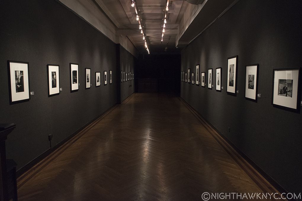
Is this the Early Magnum: On & In New York Show, or the Black Hole of Photography that has swallowed me whole in 2017. Or, both? Click to feel engulfed, like I do.

Or, what was called “PhotoJournalism.” As far as I can discern it was a term meaning using pictures to tell a story, report a story, or support a story. Was? Or is? It’s a term that I struggle to define today, in the dual print & cyber world. As I explore the field, I find that some Photographers have an issue with the term, too, while others still use it. Since I am someone who loathes “boxes” applied to work in any creative field of endeavor, or the creators, themselves, I’m going to use it (with those caveats) only for the sake of clarity, though I prefer to refer to the creators of this work as Photographers. For a number of reasons, I wonder if the term is on the verge of outliving it’s usefulness, though professionals, no doubt, may differ.

At a time when these Photographers are under seemingly ever-increasing threat, on many fronts, showing their work is one of the best means there is of combating that, and helping them because it brings this work more and more into the light and before more eyes. In making the rounds of shows and in doing my research, I’ve been surprised by the amount of Photographs I’ve seen documenting current and recent conflicts and crisis around the world- in gallery shows, at AIPAD, and in PhotoBooks. In most of these instances, they’re seen on their own, with almost no supporting text, save for the ever-popular small info card. This also makes me wonder- Without the “Journalism” (i.e. a text), is it still “PhotoJournalism?”
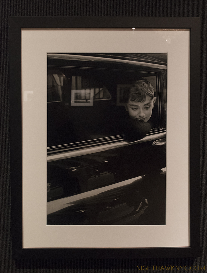
Speaking, without words. Dennis Stock of Magnum Photos, Audrey Hepburn during the filming of “Sabrina,” NYC, 1954. Standing there, it was hard for me not to think that she survived near-fatal starvation in Nazi Holland at the end of WW2, just 9 years before.

With all of that being said, I find I’m being drawn to “PhotoJournalism” for one overriding reason-

I believe these Photographers, especially those who work in what is called “Conflict Photography,” may well be the bravest creative people in the world today. To my mind, that gives them a leg up on being among the most compelling creators of our time. And, especially in these times, their work is critically, and increasingly, important. For all of us.

Robert Capa’s eight surviving photographs of Omaha Beach on D-Day (out of the 106 he’s said he took) were among the first works of what is called “Conflict Photography” to captivate me. Their story is tragic. I mean the story of his film being ruined, and only these precious few, now iconic, images surviving, is tragic. Yet, I’ve come to make peace with that, first, because there’s nothing to be done to change it, and second, because I’ve come to see them as symbolizing the larger experience- that not all of those incredibly brave fighting men who entered that living hell survived, either. They, and the ones that did survive, (though, with typical modesty, say otherwise in interviews), ARE Heroes, of what was the most important day of the 20th Century. That Mr. Capa lost his life almost exactly 10 years to the day after D-Day covering another battle in a far away land speaks to the dedication he had to his craft, and his life’s mission.

It truly was life and death to him. Every single time he stepped on to a battlefield- to do his job, “armed” with only a camera.
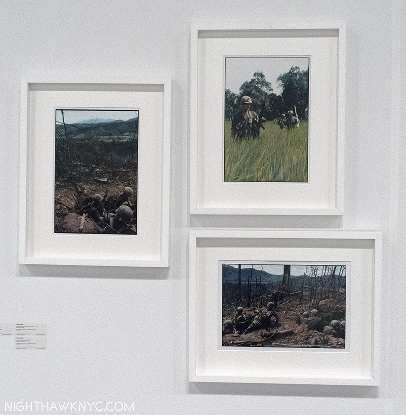
Giles Caron (APIS & Independent), 3 images from his Vietnam War Series, 1967. Mr. Caron was killed there 3 years later. Seen @ School Gallery, Paris, AIPAD Booth

But, before Robert Capa left us, he also left us Magnum Photos, which he was a co-founder of1, now the world’s leading Photo Agency. It’s a cooperative, an agency and an archive, owned by it’s Photographer-members. The list of past and present men and women who have been, or are, members is closer to staggering than impressive. Though of course, there are many Photographers who are not Magnum members who are doing/have done great and important work. Being as 2017 marks the 70th Anniversary of Magnum’s founding, I’m going to focus on Magnum Photographers, though begin with two “Independents,” the first, Giles Caron, above, who died in Cambodia at age 30 (I will note “Independent/Other Association” next to their names here).
Tony Vaccaro, center rear, seen with a wall of his masterpieces to his right. From the far right corner- Georgia O’Keeffe (2), Picasso, “The Violinist” directly behind his head, Hitler’s Eagles Nest (top, in front of him) and a fallen GI (bottom), at Monroe Gallery’s AIPAD Booth, in March.

I can’t go any further without mentioning, again, having recently been in the presence of the the second, the “Dean” of Photographers, 94 years young Tony Vaccaro, at Morgan Gallery’s booth at AIPAD, because it still feels like I imagined it. Like Mr. Capa, Mr. Vaccaro is today known for many other genres of photographs, especially portraits, besides his classic World War II photos, (which are the subject of a PBS Documentary), examples of all lined the wall behind him that day. Looking at these, like looking at Robert Capa’s “other” work (after putting down “Robert Capa: This is War!”), is fascinating because it provides insights into the man and, once in a while, his life. Sometimes it’s hard to remember these Photographers, who shoot War and Conflicts, are real people, with real lives.

Flesh and blood human beings.
Smile! Werner Bischof’s Magnum Photos Office, 1953. See that Magnum bottle of champagne on the left? That’s the inspiration for the name “Magnum.”

The recently ended show, “Early Magnum: On & In New York,” produced by Magnum Photos at the National Arts Club focuses on this “other” side, as we get to see Photos of NYC by Elliott Erwitt, Bruce Davidson, Cornell Capa, Erich Hartmann, Dennis Stock, Eve Arnold, Werner Bischof and others, along with candid early shots of the Magnum Offices in action.
(Another) Installation View of Early Magnum: On & In New York in the Grand Gallery of the National Arts Club, on Gramercy Park.

A good many of these are famous. As a group, they show the contribution Magnum has made to our culture in preserving memories and time, as well as to the Art of Photography by having so many terrifically gifted, and amazingly versatile Photographers as members. Their work is eternally of it’s time, timely for us now, and a good deal of it is still ahead of our time. There are pleasures, familiar and unexpected, throughout this well conceived and arranged selection, and it does a fine job of celebrating this part of Magnum’s achievement.
Dennis Stock’s haunting portrait of James Dean on Broadway in Times Square, in 1955, a block from Lee Strasberg’s Actors Studio, taken just months before his death that September.

While it was utterly fascinating looking at well-known images like this, or Sammy Davis in his hotel in 1959,
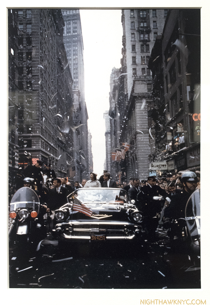
Cornell Capa (Robert’s brother), JFK in NYC, 1960, a month before the election.

or JFK campaigning in an open vehicle (poignant now, on it’s own) in an NYC Motorcade a month before the 1960 election by Robert Capa’s brother, Cornell Capa, it was images of people mostly forgotten to history that held me longest, like a group of shots from Bruce Davidson’s Brooklyn Gang, in 1959, which captures the lives of a Brooklyn gang so brilliantly that the images still look ahead of their time to me, like the second one below.
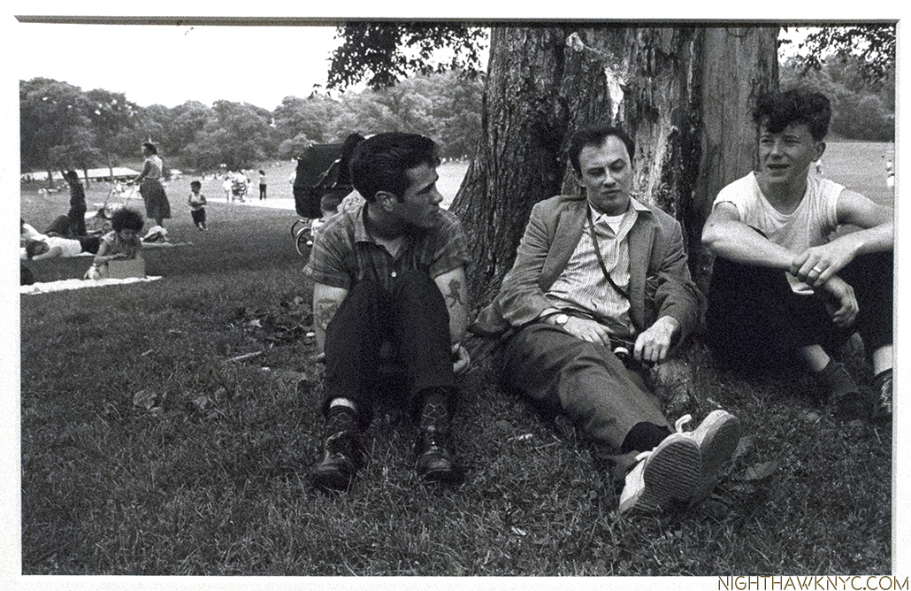
Styling. Bruce Davidson, center in 1959, with 2 members of the Brooklyn Gang.
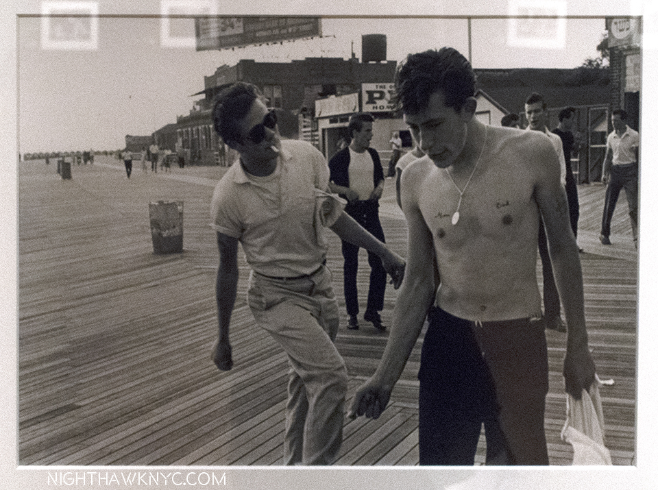
Bruce Davidson, Brooklyn Gang on the Boardwalk in Coney Island, 1959, the gent on the right is also on the right in the previous shot.

I previously mentioned asking Mr. Davidson, who I revere as the living Master of NYC Photography2, how he was able to survive shooting “Subway” in the dark days of 1980. He said “Because I looked like a photographer.” Looking at these “Brooklyn Gang” classics, taken in yet another environment not welcoming of outsiders, I again marveled he survived. I mean, just look at how he’s dressed! Part of the answer, and his disavowal of the term “PhotoJournalism” for his work, can be found here-

While all of this shows that “other” side I spoke of earlier very well, meanwhile, on the “Conflict Photography” front, I wondered many other things looking through another PhotoBook, a new one, about conflict, revolution, it’s effects and aftermaths. It’s “Discordia” by Moises Saman, a Spanish-American PhotoJournalist who’s been a full member of Magnum Photos since 2014, and consists of Photographs he took over four years of the “Arab Spring,” from 2011 to 2014, edited, and with collages, by Daria Birang.
Moises Saman, Discordia, 2016, Cover

It’s cover shows a silhouetted figure who’s, possibly, just thrown something?, or has just been hit by something? Either way, he seems to be off his feet, as if picked up out of the world and transported somewhere else, and lost in the world he’s collaged in over part of a static-covered TV Screen. It’s not an image you’d see in the “real world,” and it’s not an image you’d see on TV. Right off, “Discordia,” the name of the Roman goddess of strife, seems to be announcing it is walking the line between document and Art. After my first pursuing of  this self-published book, I asked myself…

How does someone become Moises Saman? Who, in addition to being a Magnum member, is a world-renowned Photographer, who’s work appears regularly in the New York Times, Time, National Geographic, among other places, and is a winner of a 2016 “Picture of the Year” Award. (“Discordia,” won the 2016 Anamorphosis Prize.) Do you just get on a plane with a camera, go somewhere where there’s a battle or revolution taking place and start taking photos? And, being someone who almost broke both of his knees a few weeks ago photographing on the High Line (I’ll wait for the laughter to subside…)…How do you learn to survive?”

And, if you do?- “What drives you to keep going back?”

All of these questions come to mind before the key question at the heart of the matter of this book- How do you get such amazing photos in the midst of utter chaos, bloodshed, even death going on all around you?

When I saw this one, of nothing less than a bomb maker actually making a bomb in Syria, I was struck by a thought-
Moises Saman, Magnum Photos “A bombmaker working for the rebels mixes chemicals in a makeshift bomb factory in a rebel-held district, Aleppo, Syria, 2013.” Quotes denote Magnum Photos caption.

“Who sees this?”

Yes, it raises questions that are beyond the scope of this site. So, I am not going to get into any of the “bigger” questions regarding the individuals photographed here. Hopefully, each viewer assesses the work for themselves and, after all, in a free society, that’s one of the key freedoms we have- to be able to do so. Another is the right to see such images. And that’s why whatever you call them- “PhotoJournalists,” “Conflict Photographers,” or “Documentary Photographers” (which Mr. Saman refers to himself as),  who’s jobs, and very existence, seems to get harder with every passing day, are so important to all of us. It will be up to the future to decide if it, like every thing else being created today, is “Art,” or not. For now, work that speaks (at least to me), and has importance, in my life, and the world, makes it “important” now. For myself, looking at this shot- the angle Mr. Saman chose, that light actually enters this room, and shines on the floor, the bomb maker himself- what he’s wearing and how he looks, what else is in the room. It’s familiar. It’s foreign. It’s everyday- (you want to think- “Ok. He’s preparing to paint the walls.”)..and it’s…not. It’s unimaginable. It’s impossible. And then? It’s unforgettable.
Or this? Moises Saman, Magnum Photos, “Seif al-Islam Qaddafi, son of Colonel Muammar Qaddafi photographed shortly before the fall of Tripoli, Libya, 2011.” Quotes denote Magnum Photos caption.

In looking through “Discordia,” the emphasis often seems so be on the posture and/or expressions of those depicted, which can be seen even on the cover. This brings a powerful human element to everts that often takes place in rubble, or completely or partially destroyed structures. We see leaders feeling the weight of their dilemma, fighters seen in the act, and, their families in the throes of dealing with their deaths, after. We see business people trying to maintain some semblance of “normal life,” traveling to and fro, one climbing over a wall with his pretzels to sell on his back, another navigating ever changing roads.
You think your commute is hard? Moises Saman, Magnum Photos, “Pretzel seller near Tahrir Square, Cairo, Egypt, January, 2013.” Quotes denote Magnum Photos caption.

These serve to remind that conflicts affect everyone in these towns, cities, or countries. Though “Discordia” documents 4 years of work, capturing the “Arab Spring” as it spread through the Middle East, there are no chapters separating one part of it from another. The effect is to show the basic nature of these revolts- their commonality. The struggle against and the resulting push back, before, during and after, and, most of all, the effect on lives. For those of us far far away from these lands we see the face of struggle, of revolution being born and fighting for life against the powers that be that want to remain being the powers that be. From afar, it seems as “alien” as the cover image. Mr. Saman appears to show us both sides, and while the names, places and background info he provides in the back of the book shed light on the photos, they’re still incredibly powerful without knowing any of this- just as pictures of people in a revolution, human beings in unimaginable circumstances, and in the process, presenting them this way “separates” the images from “traditional” PhotoJournalism,” especially since the only words to be found in the book are in a section in the back3. At least for me, this is a book about human beings, and their underlying humanity- the pain and suffering, and the struggle to overcome injustice, and the inevitable results of their actions, or the actions of others, in the midst of unbelievable situations and environments, that looks like another world.

Moises Saman, Magnum Photos, “Young protesters take shelter during clashes near Tahrir Square. Cairo, Egypt, January, 2013.” Quotes denote Magnum Photos caption.

Right from the silhouette on the cover, I was taken by the postures and expressions of those in the Photographs, which becomes a running theme in them, and, for me, their essence. Julian Stallabras, author of a book on Contemporary Art, Art, Incorporated, that I highly recommend, said, “Discordia shows the hopes, idealism and strength of rebellion against long-established dictatorial regimes, and also- with great clarity- the price paid for it.” Indeed. But what’s left (largely) unsaid, and not shown, is the price Mr. Saman paid. Only at the end of the plates, in a small section of text do we learn that the helicopter crash in 2014 that he shows us the aftermath of (below) was one that he, himself, survived! He makes no mention of whether he was injured, or not, and only shows us the reactions of others, that injured, or not, he kept on capturing!

Mosies Saman, Magnum Photos, “A boy whose mother was onboard the helicopter cries as he does not know the fate of his mother. (She survived.) An Iraqi Air Force helicopter on a rescue mission in the Sinjar Mountains crashed shortly after takeoff. Onboard the helicopter were dozens of Yazidi refugees stranded in the mountain for days unable to reach the safety of Kurdish-controlled areas of northern Iraq. Sinjar Mountains, Iraq, 2014.” Quotes denote Magnum Photos caption.

If that doesn’t tell you all you need to know about his commitment, nothing does.

Meanwhile, I also hear an undercurrent of talk about this work being “difficult” to look at, let alone buy or hang in homes. Is it because it’s a Photograph and not a Drawing or Painting? When I hear this, I’m reminded that many found Jackson Pollock’s work “ugly,” and while a good many, no doubt, still do, many more now accept it. With the number of excellent shows and PhotoBooks around, this may be changing for these Photos, too. Slowly. Renowned Photographer turned Photo collector, Harriett Logan, recently spoke to Magnum about building a collection of these works, which she started (I think astutely) only four years ago. It includes work by Robert Capa, Dorothea Lange and Matt Black, among others. She, through the Incite Project, supported the publication of “Discordia,” in return for prints by Mr. Saman. She said, “Like the tank man in Tiananmen Square, history stops at those still images, and the photographers that took those pictures did an incredible job of essentially isolating, for all of us, those moments of history.” Those isolated moments adds up. Ashley Gilbertson’s (of VII Photo Agency) “Refugees Disembark on Lesvos, Greece” at Monroe Gallery at AIPAD, provided “another chapter” to the story Ai Weiwei so movingly told in his show, Laundromat, about the Refugee Camps, which I wrote about recently. And there are others.
Ashley Gilbertson’s Refugees Disembark on Lesvos, Greece, 2015, at Monroe Gallery, AIPAD.

The always excellent Jack Shainman Gallery recently had a compelling show of Richard Mosse, and Sebastiao Salgado, (both former Magnum members), perhaps the best known “Concerned Photographer” alive, just had a show of his extraordinary Photographs of the 1991 Kuwaiti Oil Fires at the Tagore Gallery,

The legendary Sebastiao Salgado at the opening for his Kuwait 1991 show at  Tagore Gallery Show, March 30, 2017.
Sebastiao Salgado, Kuwait, 1991, at Tagore Gallery.

and, the Howard Greenberg Gallery had a show of the work of Magnum’s Alex Majoli, who’s chiarascuro  lighting has the power of a modern Caravaggio, with all the drama and theater of Grand Opera, without music or words, which included this-
Alex Majoli, of Magnum Photos, faced these Sao Paolo, Brazilian, Police in 2014, with just his camera, and took this Photograph. Seen at Howard Greenberg.

This past week, at the beautiful new show by the Artist Robert Longo, the Contemporary Master of Charcoal Drawing, I had a deja vu moment-
The Artist Robert Longo DREW this work, Untitled (Riot Cops), 2016, possibly inspired by a Photograph, in the safety of his studio, brought back memories of Mr. Majoli’s, above.

Or, two-
Robert Longo Untitled (Raft at Sea), 2016-17, (both works at Metro Pictures), totals 24 FEET wide. These are Drawings!

His show, “The Destroyer Cycle,” at Metro Pictures as I write this, consists of 12 powerful, typically brilliantly executed, black and white charcoal drawings. The press release states- “For each exhibited work, Longo has developed a technique that reflects the medium of the drawing’s source image.” Specifically about the one above, it says it is- “A composite image partially sourced from the cover of a Doctors Without Borders publication, the drawing depicts refugees on a raft amidst the vast, turbulent Mediterranean Sea.” Curious to learn more, I reached out to Doctors Without Borders/Médecins Sans Frontières (MSF, as they are known), who kindly provided me with what may be one of those “images partially sourced?” In any event, it’s an amazing photo in it’s own right, taken by Will Rose (of  Rose & Sjolander)-

Will Rose, of Rose + Sjolander, December 18, 2015

MSF provided this information about it-

“A Medecins Sans Frontiers (MSF) and Greenpeace rescue team responded to a sinking rigid inflatable boat carrying 45 Afghan refugees crossing from Turkey to the north shore of Lesvos, Greece. On arrival to the scene, the poor quality inflatable was taking on water. The people on board were having problems with the outboard motor as it was poorly fitted and could not be restarted. It was soon obvious to the Greenpeace/MSF crew that the sponsons were rapidly losing air and the lives of the people were in immediate danger…The women and children were grabbed first and transferred into two Greenpeace/MSF boats that were flanking both sides of the sinking boat. All people were successfully rescued and transferred to MolyvosHarbour in Greece, where response teams were on standby.” 

Snapping a camera’s shutter freezes a moment in time for all time. Part of what remains from December 18, 2015, beyond the memories of those who lived it, is Mr. Rose’s Photo, and the ongoing effect, and possibly inspiration, it has on all who see it. With shutters being snapped billions of times each day, it becomes easy to be overwhelmed by the number of images before us. Billions of people also draw, but very few of those wind up speaking to people over hundreds of years. Time will judge the lasting import, if any, of everything created today. That it has importance to us living now is undeniable, and what matters most, it seems to me.

Robert Longo’s amazing drawings are, rightly, in many of the world’s great Museums, including MoMA, the Guggenheim, and Whitney Museums4. Alex Majoli or Moises Saman are not in any of them (as far as I know.)

Why not?

The movements of NYC Museum Acquisition staffs remains a mystery to me, so I can’t answer that. I do feel that they will be there one day. In the meantime, their work needs to be seen by us, the people they risk their lives for to show us what they see. We miss it at our own peril.

While “PhotoJournalism” strikes me as a term in flux, Magnum co-founder, and legendary Photographer, Henri Cartier-Bresson said, “Magnum is a community of thought, a shared human quality, a curiosity about what is going on in the world, a respect for what is going on and a desire to transcribe it visually.” That might be the “other” definition I was looking for.

“Before you board that plane
I owe you a bottle of cold champagne
Yeah, cold champagne
I don’t know if we have coffee cups
Or plastic cups, I think Sonny has the cups-
Tonite we’re drinking straight from the bottle.”*

Happy 70th, Magnum Photos!

*- Soundtrack for this Post is “Champagne,” by Lin-Manuel Miranda from “In The Heights,” 2008. Publisher not known to me.

NighthawkNYC.com has been entirely self-funded & ad-free for over 8 years, during which 300 full length pieces have been published! If you’ve found it worthwhile, PLEASE donate to allow me to continue below. Thank you, Kenn.

You can also support it by buying Art, Art & Photography books, and Music from my collection! Art & Books may be found here. Music here and here

Written & photographed by Kenn Sava for nighthawknyc.com unless otherwise credited. To send comments, thoughts, feedback or propositions click here. Click the white box on the upper right for the archives or to search them. Subscribe to be notified of new Posts below. Your information will be used for no other purpose.
  1. Along with Henri Cartier-Bresson, David “Chim” Seymour, George Rodger, William Vandivert, Rita Vandivert, and Maria Eisner.
  2. He spent FOUR YEARS shooting in Central Park in creating his classic book of the same name.
  3. You can see other work by Mr. Saman, accompanied by text, i.e. more traditional “PhotoJournalism” here.
  4. The Met owns a print of his, though I recall seeing a series of his works on view there in the Great Hall during their “Pictures Generation show in 2009, so they may own others.

The Vermeer of Marble Falls, Texas

“Warm winds blowin’
Heat ‘n’ blue sky
And a road that goes
Forever…
I’m goin’ to Texas.”*

See the little square on the left? That’s Rod Penner’s Ranch View Motel, seen in an Installation View of a group show at George Adams Gallery in April, 2016.

Here, in the Big Apple, where there is ALWAYS too much Art for any one person to see, Rod Penner hasn’t been part of that problem. That’s because his work is almost never seen, or offered for sale, here. As a result, I only discovered him a year ago at the George Adams Gallery when I saw a tiny little painting that was smaller than a paperback book of a large hotel sign.


Rod Penner, Ranch View Motel, 6 x 6 INCHES!, 2013.

Right away I was enthralled by it. I enquired. But? It was not for sale. Once I saw it? I had to know more. It turned out that this little work is the veritable tip of a sizable iceberg of equally excellent paintings he’s done going back to 1992 (as can be seen here.) Rod Penner became mythic to me. I waited like the Titanic adrift on the Gallery seas of Manhattan to run into more of his ‘berg.

Seen a little closer still.

Tonite, a year later, under clear skies, completely by chance, I accidentally crashed into it. I happened to walk in to Ameringer McEnery Yohe in Chelsea just as a solo show of his work, Rod Penner,  was opening, without knowing it was there. Women & children, first! Too late. 8 of the 9 works on view had been sold before the opening bell.

What?

Small wonders. Installation View of all of Rod Penner at Ameringer, McEnery, Yohe, tonite. ALL of it! The “larger” works are 5 x 7 1/2 inches. The square ones are only 6 x 6 inches!

The only one available was a work he had just finished and had to overnight to the gallery so it could be framed in time for the opening. No doubt it’s been sold, too, by now. Ok, let me get this straight- Here’s an Artist, who lives and works in Marble Falls, Texas (pop. 7,154 in 2016), that very few seem to have even heard of. There were no books about him until the gallery released one today for this show. There’s very little about him online. His work is so rarely shown, that his last NYC solo show was in 2013! Still? His new work is virtually pre-sold. What’s going on?

Looking for insight, I stood watching visitors to the opening come in and listened to their reactions. Most responded like I did, with astonishment, and only a few seemed to know his work previously. Two or three asked out loud about the prices and availability of the paintings, something I just don’t see happening at shows (where business is generally conducted quietly), even though there was a printed price list at the desk. Hmmm…

Commie’s Tacos, 2017, all of 5 x 7 1/2 inches of it. Seen from afar, its streets and buildings.

Full of desolation, empty streets, crumbling, or abandoned buildings, or oddly decorated houses, all under grey skies and fronted by cracking pavement, these latest works all depict scenes the Artist observed in San Saba, Texas (the erst-while “Pecan Capital of the World,” which is a bit north of Marble Falls, which, in turn, is north of San Antonio). It’s a bit odd to find this work speaking to New Yorkers. I, for one, have never been anywhere near Texas, yet it speaks to me.

Close-up. Like peering through the looking glass, more and more details emerge, allowing the viewer to imagine a narrative.

Is it the isolation that’s an inherent part of modern living? The foreboding of our times? The nostalgia for small town life, or times gone by, many transplanted urban dwellers retain? Or? Is it they just appreciate amazingly good painting? I still can’t say. I probably fall into all of those groups. From my earliest days looking at Art Books when the uncanny micro-imagery of Jan Van Eyck astounded me (and still does), to Durer, Goltzius, Richard Estes and on and on, I’ve looked at a lot of work that has a level of technique some would label super-human. No one can deny that his “Oh my gosh” astonishment inducing level of technique is part of the charm of Rod Penner’s work. But, it goes much deeper.

The size of his work, which he speaks of being a response to large works he sees proliferating, is also a way of putting the world around us, and by extension even our own worlds, in perspective. Seen from a distance? The abandonment of some of the failed businesses is undiscernible, and hence, it’s impersonal, a bit like passing through a town in a moving car. Move closer and all of a sudden detail after detail after even more detail comes into focus. From then on, it’s up to you to decide. The effect of looking closely at such small paintings is not unlike looking closely through old family albums, where the photos are small, what’s in them looks “old,” even though, Mr. Penner is painting scenes that may still exist. It’s work that stands up to, and demands, repeated viewings. Up close viewing.

The gallery handout speaks of the “hope” in these works. I never see construction or new building going on. The skies look ominous to me. There is virtually no activity to be seen in any of these works, save for a lone car in the distance in a few of them. It’s hard to tell if people are even home in the house depicted below, with its two huge inflatables out among its Christmas decorations. Yes, humor, usually a little subtler, is in these works, too. Yet, the peeling paint on the house’s walls gives the feeling of “times are hard, but we’re celebrating Christmas anyways.” I don’t know if that’s hope, but it’s at least perseverance.

Yard Inflatables, 2016, 6 x 6 inches. Mr. Penner includes  humor surprisingly often. You can see “in-progress” shots of this work, here.

While William Eggleston shows details of southern scenes that grab him, Rod Penner takes a step back. Or 50 steps back, usually half way into the street. He casts a wide angled lens (figuratively, not photographically) on a tiny canvas. Many hundreds of years ago works this size by Duccio and others were meditation objects. In works like these, they still are.

Ok. But, Vermeer, Nighthawk? Perhaps THE most desired, and one of the most revered Artists in Art History? Seriously? Well, I don’t believe in comparing Artists qualitatively, but I see some similarities. Mr. Penner speaks in interviews about being into the Hudson River School and the early Flemish Masters, himself,  but consider this- Though Vermeer is famous to us, mostly, for his interior scenes, there are two outdoor works of his that we have- View of Delft, which is thought to have been painted when  the Artist was 28 or 29, relatively early in his short career, his last outdoor work known to us, now in Mauritshuis, The Hague, and his The Little Street, which is in the Rijksmuseum, painted a year or two before. Both, but especially the latter, remind me of Rod Penner.

Vermeer, The Little Street, 1657-58, Rijksmuseum, Amsterdam. It looks like Vermeer liked to stand in the middle of the street, too. Rijksmuseum Photo

The Little Street shows us what seems to be a typical doorway scene of daily life, with one door and one passage way open to show us the inside, turning this into a classic Vermeer “tease,” among another closed door and 19 windows that are either boarded up or dark preventing our seeing inside. Removing the two women leaves the cloudy (“Penneresque,” to copyright a term) sky, the similar state of the well lived-in buildings, and the cobblestone streets (roughly equivalent to Mr. Penner’s ever-present cracked pavement, which, as seen below, resembles cobblestone), are among the similarities I find between this Vermeer and Rod Penner’s new works at Ameringer, McEnery, Yohe. They’re an echo, let’s say, across 350 years and thousands of miles. Here’s one example, but I see elements in the other works by Mr. Penner on view here.

On another “little street.” Boarded up windows, a closed door (with “For Lease” sign), an “aged” brick building, the cracked street resembling cobblestones, under a “Penneresque Sky,” all rendered with exquisite skill. Rod Penner’s, The Studio, 2017, 5 x 7 1/2 inches, also speaks to hard times for the Arts everywhere.

But yes, there are no people in any of these Penners. In that sense, he may be part of another part of Art History, that of American 20th Century Artists Edward Hopper, Charles Sheeler, Ralston Crawford and Richard Estes, who painted many scenes without people, though, of course, Hopper painted many with them as well.

Who knew butane was ever that popular? Or? Is he pulling our leg? Rod Penner, San Saba Butane, 2017 6 x 6 inches

Another thing that Mr. Penner has in common with Vermeer is that his amazing technique is always painterly, it’s always put in the service of his message, and that message is NOT to replicate a photo. In addition to seeing more of the “iceberg,” I also had the equally unexpected privilege of spending a few moments speaking with the mythical Artist, himself, at the show’s opening tonite, and he spoke of waking a few weeks ago and feeling unhappy with the foreground pavement in his most recent work, View of San Saba, seen below, and so he changed it- In ways that had nothing to do with the reference photos he had of it. Then he mentioned that he also uses sketches, video and other mediums to capture his thoughts of his subject, though he doesn’t paint “en plain air,” or paint on the spot.

I hope not. These works take him weeks to complete, and that’s part of why there are so few of them being offered. This show represents this year’s work. The other part is that current owners are holding on to them.

I also asked him how he felt about the term “photorealism,” which gets applied to him, and others, like Richard Estes. He said he doesn’t like it, which I was happy to hear. He prefers “Photo-influenced.” There’s only one term to apply to Rod Penner’s work- Art. His work is masterful. It speaks to so much going on right now in our country, and in our world, yet it, also, speaks every bit as much to the past, and it’s all done in ways that are uniquely his own, though many people seem to relate to.


Rod Penner’s just completed View of San Saba, 2017, 5 x 7 1/2 inches, with its new foreground.

“He says he’s been to Texas
And that’s the only place to be
Big steaks, big cars, no trouble here
That’s the place for me.
I’m going to Texas (yeah, yeah)
I’m going to Texas”*

It’s interesting to me that Mr. Penner is a transplant to Marble Falls, Texas from Vancouver, (which must be as different as Marble Falls seems to a Manhattanite), because that reminds me of the work of another Vancouverite- Photographer Fred Herzog‘s, which I just saw at AIPAD. Is it a coincidence that both of these past & present (Herzog) Vancouver resident’s work has a universality that surmounts the place it depicts, and where it is seen?

He’s real! Rod Penner, in person, left, introduces his most recent work, View of San Saba, 2017, 5 x 7 1/2 inches, at Ameringer tonite.

Though the world is a very big place, Rod Penner’s work shows us that it’s really made up of a lot of small places.

My subsequent Q&A with Rod Penner is here. Further thoughts about this show are here.

*- Soundtrack for this Post is “Texas,” by Chris Rea, published by Warner/Chappell Music, Inc.

NighthawkNYC.com has been entirely self-funded and ad-free for over 6 years, during which over 250 full length pieces have been published. As I face high expenses to keep it going, if you’ve found it worthwhile, please donate to keep it up & ad-free below. Thank you!

Written & photographed by Kenn Sava for nighthawknyc.com unless otherwise credited.
To send comments, thoughts, feedback or propositions click here.
Click the white box on the upper right for the archives or to search them.
For “short takes” and additional pictures, follow @nighthawk_nyc on Instagram.

Subscribe to be notified of new Posts below. Your information will be used for no other purpose.
 

The “Other” Russian Revolution

This site is Free & Ad-Free! If you find this piece worthwhile, please donate via PayPal to support it & independent Art writing. You can also support it by buying Art & books! Details at the end. Thank you.

Written & Photographed by Kenn Sava (*- unless otherwise credited)

“I’m back in the USSR
You don’t know how lucky you are, boy
Back in the USSR”*

There was that “big” one…you know…the one that was in all the papers over here one hundred years ago, in 1917 – The “October Revolution,” or the “Russian Revolution.” Whatever you call it, 9 million people died in 5 years, and it resulted in the loss of freedom for countless more millions over the next 74 years, I’m no historian or political writer, but I hear it’s been fading in importance for quite a while now. While that one caused a big stir, meanwhile, off in what was then a quiet, small town (a city of 350,000 today) in the eastern U.S.S.R. (Belarus today), the seeds of another revolution were beginning to sprout. No one was killed in that one, as far as I know. The instigator of a good deal of it is a world famous Artist now, who, though a pioneer of modernism, is not often thought of as a revolutionary.

Today, he’s famous for flying lovers.

Marc Chagall is the most famous native son of that small town- Vitebsk, Belarus. In the early days after the “October Revolution” he accepted the Post of “Commissar of Visual Arts” for Vitebsk. He then founded the Vitebsk Arts College, and in 1919 invited a number of Artists to be its teachers. Among them were Kazimir Malevich, El Lissitzky and Yehuda Pen. Kazimir Malevich would soon become the fountainhead of a movement that crystalized in a group named “UNOVIS” ( or “Exponents of the New Art”), who, in the spirit of the larger revolution, shared credit for the works they created. At the core of this movement was Malevich’s “Suprematism,” a style of work that focused on basic geometric forms and colors, in the service of “pure artistic feeling.” This put him (stylistically) directly at odds with Chagall, who was, at heart, a classicist…

“On The Fence, #2: El We-sit-ski.” Click any image to enlarge, if you dare..

and when Lissitzky, who was on the fence between both camps (sorry!), sided with Malevich, Chagall soon left the school to continue his career elsewhere. 100 years later, Suprematism and the Russian Avant-Garde is still growing in importance and appreciation, as was plain to see in MoMA’s recent exhibition, “A Revolutionary Impulse: The Rise of the Russian Avant-Garde,” 1915-1932,  which featured, and grew out of, Malevich’s “Suprematism” movement. MoMA’s show, consisting exclusively of works from its own collection, is NOT to be confused with a show of a very similar title, “Revolution: Russian Art 1917-1932,” running concurrently at the Royal Academy, London, which included quite a few loans from Russia. While the show, and the movement, includes filmmakers, poets and other visual Artists, I’m focusing on the Painters, Photographers and Graphic Artists included. Many are, surprisingly, multi-threats (i.e. multi-talented). To quote MoMA about these Artists, they were “a group who was fed up with form, the way the “other” revolutionaries were fed up with 300 years of Czarist rule and decided to throw it all out, so to speak, and start over from the basics, giving a new hierarchy to basic forms, and basic (or non) colors, like black and white. (i.e. Suprematism. )1” Stalin’s 1933 decree led to the banishment of the Avant-Garde, in favor of “socialist realism,” which has already been forgotten, as we approach the 100th anniversary of the “Russian Revolution.”

While Chagall, himself, was not included in MoMA’s show (though he was in the Royal Academy’s), the headline highlight was an extremely rare opportunity to see so many works from MoMA’s incomparable (in the West) collection of Kazimir Malevich, the brilliant visionary who died only a few years after the period this show covers ends, 1932, passing in 1935 at 57. That New Yorkers are lucky enough to enjoy this superb collection is due to the foresight of another legend, Alfred H. Barr, Jr, MoMA’s first Director, who in 1929 had the prescience to secure many of Malevich’s works.

Shots across the bow of painting. An entire wall of rarely seen works by Kazimir Malevich, that are at the crux of the Revolution, featuring  “Suprematist Composition: White on White,” 1918, considered his masterpiece, center.

Close-up with Malevich’s “Suprematist Composition: White on White,” 1918.

At 26, in 1927-28, Mr. Barr went to Moscow, where he wrote in his diary, “Apparently, there is is no place where talent of artistic or literary sort is so carefully nurtured as in Moscow. Would rather be here than any place on earth.” This trip stayed with Barr when a year later he became the founding director of MoMA, as part of his vision of MoMA as a lab of critical inquiry analysis and communication1. MoMA went on to compile one of the most outstanding collections of Russian Modern Art outside of Russia under his stewardship, which lasted until 1969, part of which is on view in the 8+ galleries of this surprisingly large, and excellent, show. While I am showing selected highlights, you can see Installation Views and get a different idea of the experience towards the bottom of MoMA’s page for the show, here. To get an idea of the ongoing importance of Mr. Barr’s choices, while I was standing in front of what many consider Malevich’s Masterpiece, “White on White,“ 1918, complete strangers to each other had a moment after each posed for pictures in what they both announced was their “very favorite painting,” 99 years after its creation.

Two total strangers explain to each other why this Malevich is their “very favorite painting of all time.”

A case of early books by Malevich, including “Suprematism: 34 Drawings,” 1920, published by UNOVIS, Vitebsk, left.

Remarkable insights to genius. 4 charts Malevich made as visual aids for his European “Introductions to Suprematism” Lectures.

This blows my mind, so I’m showing a closer view of it. In this chart, we get an incredibly rare insight into how a founder of an Artistic movement (how many of them are there?) sees Art. We get to look over his shoulder as he recaps the development of Modern Art through Cubism and Futurism to Suprematism.

As impressive as Malevich’s works are, which is equalled by the ongoing importance of his ideas, for me the show’s biggest revelation came in two words- El Lissitzky. A student of Yehuda Pen’s at age 13, he then studied to become an Architect, before Chagall’s call summoned him to Vitebsk. There, he became convinced by Malevich (who he had known previously), and this led him to create “Suprematist” works that remain both fresh and incredibly inventive today.

Visionary, and then some. In 1920, UNOVIS staged a utopian opera in Vitebsk titled “Victory Over the Sun.” El Lissiztky created these designs for abstract, electromechanical dolls for it, which were never realized. Seen are 5 Lithographs from a set of 11 he did titled “Figurines: 3 Dimensional Design of the Electro-Mechanical Show ‘Victory Over the Sun,'” 1921.

MoMA owns the only complete copy known of what may be Lissitzky’s masterpiece, “Proun,” from 1920, a Portfolio of 11 lithographs, published in Vitebsk. MoMA’s curator called it a “project for the affirmation of the new.1” The exact definition of “Proun” is not known, or lost to us, but the work itself explores the creative possibilities of Malevich’s theories in startling, and beautiful, (yes, beautiful) ways.

3 photos above- El Lissiztky, “Proun,” 1920, a Portfolio of 11 lithographs, who’s title is untranslatable now. A masterpiece of invention & design, seen in the only complete set that includes the covers (top), detail of 4 prints, center, and the translation of its manifesto, bottom.

While his work is, strangely & unfortunately, absent from MoMA’s fine and surprisingly large show, behind the scenes looms the over-looked Artist, Yehuda Pen. Teacher of both Marc Chagall and El Lissitzky, his work is brilliant in its own right, to my eyes, though different from that of either of his students. Pen went on to teach at Chagall’s School, alongside Malevich, and Lissitzky.

The great Artist & Teacher Yehuda Pen, center, with friends in 1922.

Yehuda Pen’s studio in 1917, a few years after he taught El Lissitzky.

“Portrait of Marc Chagall,” circa 1915, by Yehuda Pen. More of his work is here.

Along with El Lissitzky, Aleksandr Rodchenko, impresses, on a number of fronts, including his attitude- ”I reduced painting to its logical conclusion,” he said, speaking of his three monochrome paintings- “Pure Red Color, Pure Yellow Color, and Pure Blue Color” in 1921, “I affirmed: it’s all over. Basic Colors. Every plane is a plane and there is to be no more representation4.”

Oh yeah? Rodchenko “Non-Objective Painting no. 80 (Black on Black),” 1918, his “answer” to Malevich’s square “White on White.”

Wow. Luckily, 96 years later, painting, itself can quote Mark Twain: “The rumors of my death have been greatly exaggerated,” thank goodness! I’m left to wonder what was in Rodchenko’s Borscht. Having buried his paintbrush, he got into Photography after buying a camera in Paris in 1925, four years after declaring the death of painting. He turned out to be a naturally gifted Photographer, a medium he never formally “studied.” His photography has, also, remained influential ever since.

Avant-Realism? Rodchenko “Pro eto. Ei i men (About This. To Her and to Me),” 1923, showing off his unique approach to photography, and graphic design.

There was a lot to see over 8+ galleries, in spite of the fact there was only one work by Kandinsky on view. It would have been most welcome to see more, but I never missed them, thanks to the many works by Rodchenko, and Lissitzky, who’s Photography was also shown, proving that he was, like Rodchenko, a very gifted (and underrated) Artist in that medium, too.

Remember my name (well, it’s there over the “XYZ”). El Lissiztky was, also, a naturally gifted Photographer. This amazing “Self Portrait,” 1924, Gelatin silver print, was made using SIX exposures.

Other Artists impressed, too (Lyubov Popova, Vladimir Tatlin and Olga Rozanova among them), yet regardless of how impressive this show was, more importantly, the names of many of the Artists on view have been increasingly coming from the lips of today’s important Artists, including Nasreen Mohamedi, hereWilliam Kentridge, and the late, great Architect, Zaha Hadid, who speaks about Malevich, here. Also, amazingly, the legacy lives on in Vitebsk, Belarus, something that astounds me given that the biggest battle of World War II, and possibly EVER fought, was fought in Belarus, with monumental horrific fighting in Vitebsk. Chagall’s former School, after somehow miraculously surviving, has been renovated and is to reopen as the Museum of the History of the Vitebsk People’s Art School later this year. Below is a photo of the restored building, courtesy of myrecentdiscoveries.com, the International Marc Chagall researchers, who visited the building, and wrote about its new life, here. A photo of its new lobby, which appears to pays homage to Malevich, can be seen here.

The Revolution Happened Here. Miraculously, Chagall’s School in Vitebsk, Belarus, survived the biggest battle ever fought, while everything around it was destroyed. Malevich, Lissitzky, Pen & Chagall taught here. UNOVIS was founded here. its being remodeled and reopened as the Museum of the History of the Vitebsk People’s Art School! Photo by, and courtesy of myrecentdiscoveries.com

They were kind enough to also put me in contact with the Director of the Vitebsk Modern Art Center, Andrey Duhovnikov, which includes the new Museum, above, and who is also an Artist in his own right. I asked Mr. Duhovnikov about whether UNOVIS will be represented in the new Museum of the History of the Vitebsk People’s Art School. He told me, “There will be 12 thematic sections, two of which will be dedicated to UNOVIS, where archival documents will be presented.” I’m not surprised by this. Chagall and Malevich’s influence & memory live on in Vitebsk, a city that continues to hold celebrations to mark anniversaries of milestone events, like the 100th Anniversary of Chagall’s wedding in 2015. In response to my question about whether Yehuda Pen is being forgotten, Mr. Duhovnikov explained that Yehuda Pens’ work is too fragile to travel, which prevents it from being better known outside of Belarus, however over 180 works by Pen can be seen today at the Vitebsk Art Museum, and a Museum dedicated to Pen is being discussed. Good news, indeed.

The process whereby Art goes from “Contemporary,” or “Modern,” to “Art” is endlessly fascinating to me as I look at what Artists are creating now, and wonder- “What, if ANY of this, will be considered Art one day?” Certainly influencing major Artists who come after (like Nasreen Mohamedi, William Kentridge, and Zaha Hadid) plays a part in that, so do visionaries, like Alfred Barr, who had the foresight to hand pick 21 works from Malevich’s 1927 Retrospective for MoMA, thereby giving countless future generations, including mine, the chance to see these works in shows like this one, (which is MoMA “showing off,” a bit, like The Met did with “Unfinished“). But, also, in there quietly working away are others, like Mr. Duhovnikov, and his associates, who feel and recognize the value & importance of the work, and are dedicated to sharing it, and making sure this legacy endures to influence more generations.

That’s how “Revolution” becomes evolution, and “Art History.”

My thanks to myrecentdiscoveries.com and Andrey Duhovnikov for their assistance.

*-Soundtrack for this Post is “Back in the USSR,” by John Lennon & Paul McCartney, published by Sony/ATV Music Publishing.

NighthawkNYC.com has been entirely self-funded & ad-free for over 8 years, during which 300 full length pieces have been published! If you’ve found it worthwhile, PLEASE donate to allow me to continue below. Thank you, Kenn.

You can also support it by buying Art, Art & Photography books, and Music from my collection! Art & Books may be found here. Music here and here

Written & photographed by Kenn Sava for nighthawknyc.com unless otherwise credited. To send comments, thoughts, feedback or propositions click here. Click the white box on the upper right for the archives or to search them. Subscribe to be notified of new Posts below. Your information will be used for no other purpose.
  1. From the MoMA LIVE Video- “The Russian Avant-Garde: Scholars Respond”, which can be seen here.
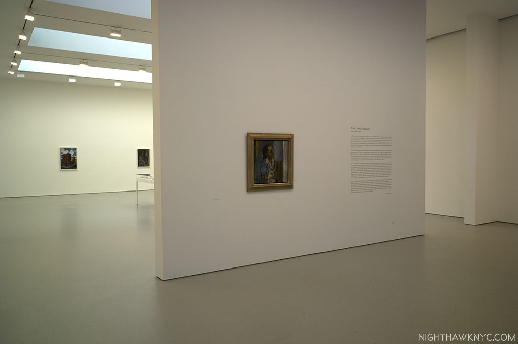
  2. From the MoMA LIVE Video- “The Russian Avant-Garde: Scholars Respond”, which can be seen here.
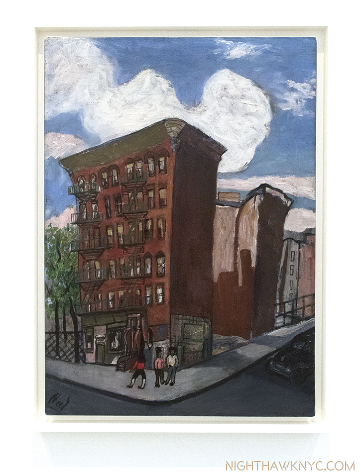
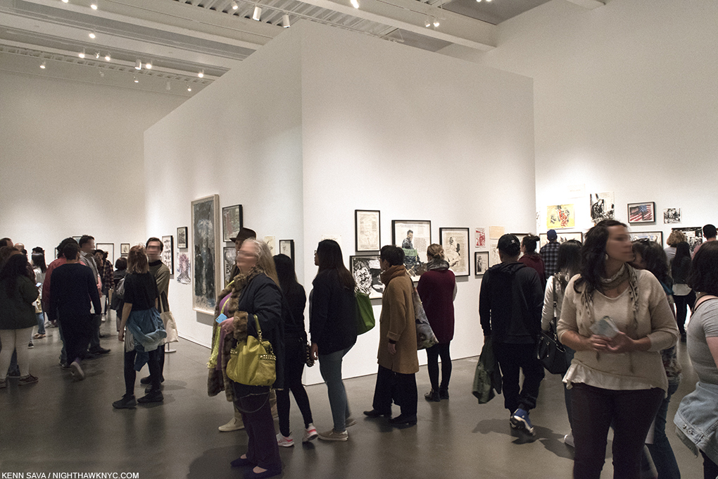
  3. From the MoMA LIVE Video- “The Russian Avant-Garde: Scholars Respond”, which can be seen here.
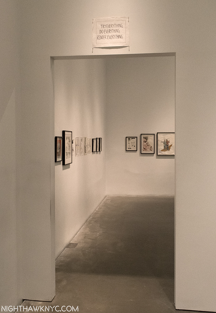
  4. //www.moma.org/interactives/exhibitions/1998/rodchenko/texts/death_of_painting.html