My Search For Edward Hopper’s Nighthawks Diner

Written & Photographed by Kenn Sava (*unless otherwise credited).

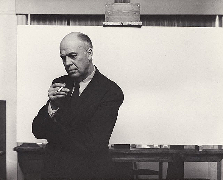
Arnold Newman, Edward Hopper in his New York studio, November 1, 1941, Gelatin silver print, *Arnold Newman Collection/Getty Images.

You’re looking at Art history.

After the fact, this may be one of the most historic Photographs in American Art. I’m not only talking about it being a wonderful portrait of Edward Hopper. It’s much more. The date is November 1, 1941. On January 21, 1942, the Artist’s wife, Jo Hopper, would record the completion of the work her husband created on that blank canvas he is posing in front of in the Artist’s Ledger of his work.

A section of Edward Hopper’s Ledger page for Nighthawks, from the book, Edward Hopper: Paintings and Ledger Book Drawings. It wound up in the Art Institute of Chicago almost immediately. Its sale netted Edward Hopper about $1,700.00.

In the intervening 81 days, Edward Hopper Painted the incomparable Nighthawks on that very canvas. We don’t know if Arnold Newman had any clue as to what Edward Hopper’s intentions were for that canvas. But we know now. The odds are that he had finished his preliminary work- the inspiration, the sketches, the reference Drawings, the sizing calculations he usually did, and ordered the stretcher and canvas we see behind him on his famous easel. Most likely? At this very moment, this masterpiece was all in his mind, and possibly on it, as Arnold Newman pressed his shutter release.

Click.

For the following 77 1/2 years (exactly, as I write this), and counting, the world has been fascinated by Nighthawks like they have few other Paintings created in the 20th Century. Some of us, including myself, are borderline obsessed by it.

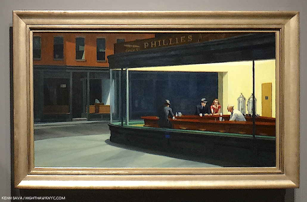
Written on my soul. The last time I stood in front of Nighthawks. August 28, 2013, at Hopper Drawing at the old Whitney Museum.

I’ve stood in front of it twice in my life. The first time at The Art Institute of Chicago in 2005, the second at the old Whitney Museum in 2013. In July, 2015, I named this site after it and wrote about why in the very first piece I Posted here, “Welcome To The Night,” To commemorate the 4th anniversary of NighthawkNYC.com, I present My Search for the Nighthawks Diner.

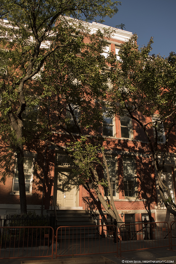
Edward Hopper posed for Arnold Newman, and Painted Nighthawks here, on the top floor of 3 Washington Square North, just east of the Arch in Washington Square Park, in Greenwich Village, that it looks out on, where the Hoppers lived for over 50 years, from 1913 until the Artist’s death in 1967. This is a key point for a variety of reasons, and an intriguing one because Edward Hopper was the furthest thing from “bohemian” one could imagine. Yet, living here he, like most New Yorkers, walked regularly, probably daily, and so the areas he was able to walk to may have become the sites of, or the inspirations for, his Paintings. And so, for almost all of the past 77 years viewers have been asking the question-

“WHERE is the diner Edward Hopper Painted in Nighthawks?”

I’ve been trying to find it for the better part of my life. Having lived in the area for 28 years and having frequented it before I lived here, the Village is an area I’m as familiar with as I am any anywhere. During that time, as during the Hopper’s time here, change has been the only constant. Change has also been a constant enemy in the attempts to locate, for once and for all, the diner we see in Nighthawks. My search has been carried out using only a few tools. First, the extensive Hopper literature. Though very little of it is directly relevant to this search, much of it is indirectly relevant, providing a framework for how, when and where he created his extensive oeuvre of Paintings, Watercolors and Drawings. The books by Gail Levin, (the Hopper’s biographer and the author of numerous other books on the Artist and his work, including the 4 volume Catalog Raisonne), particularly her Hopper’s Places, Second edition and the catalog for the 2013 Whitney Hopper Drawing show have been the most referred to for this quest. Outside of this, I have relied on my own two feet, my cameras and, yes, my gut.

Once that “Could this be IT?” bell goes off, I research the possibility, beginning with “What did this place look like around 1940?” Is any of that here to be seen now (i.e. when I was standing there)? What does common sense tell me? In the case of Edward Hopper, “common sense” comes from studying his work. Hopper’s Places provides part of the basis for some of that “common sense.” In it, Ms. Levin shows us contemporary Photographs she, herself, has taken at various sites Edward Hopper Painted around the world- though not Nighthawks, “…to show how he both recorded and transformed” these places, she says in her “Preface to the Second Edition,” P.vii. On P. x, she adds, “Research for the biography also revealed that in his later years Hopper relied upon observing specific sites more often than anyone had previously realized.” Even though much has changed over time, I still get a bit of a sense of Hopper’s approaches to rendering actual places. Much is, also, to be learned by looking at and studying historic and contemporary pictures of places under consideration. In the case of Nighthawks, I used all of these tools in my search.

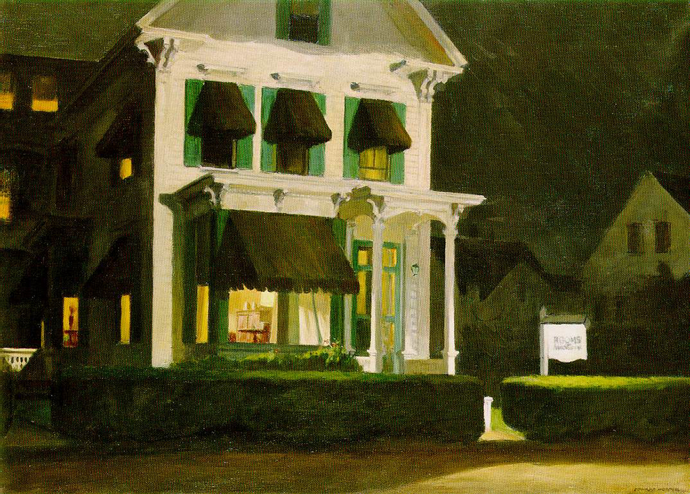
Rooms for Tourists, 1945. About 40 years later, I found this actual Rooming House this Painting is based on in Cape Cod, Mass., and stayed there. *Photographer unknown.

My gut has already helped me find one of “Hopper’s Places.” In the 1980s, I was traveling through Cape Cod and looking for a place to stay in Provincetown, Mass. I came upon a small Rooming House and instantly recognized it from the Hopper Painting, Rooms for Tourists, and so I just had to stay there. Part of my belief that Edward Hopper based Nighthawks on a real diner was finding that actual Rooming House in the 1980s when I visited Cape Cod.

I’ve spent most of my time searching in the West Village. For two primary reasons. First, this was the neighborhood Edward Hopper lived in and walked through regularly and most often. Second, as soon as one walks south of West 14th Street (the Village’s northern border) on 7th Avenue South, you’re faced with this-

Standing in 7th Avenue South at the intersection of Greenwich Avenue and West 11th Street, facing south, July, 2019. It HAS to be somewhere in this picture, right? No. There are countless triangular corners in the West Village, but this view is the most likely to contain it, I think. Click for full size.

As I stood in the middle of 7th Avenue South (NOT recommended) there were no fewer than TWELVE triangular corners around me! Those familiar with Manhattan know that almost all of it north of 14th Street is a grid made up almost exclusively of rectangles. Below 14th Street, “old Manhattan” streets wind seemingly with minds of their own, interrupted here and there with a semblance of uptown’s rectangular regularity. The triangular corners we see in Nighthawks are everywhere. WHERE to begin?

The former Two Boots Pizzeria, #11 in the picture above, is from the right period, but its building goes straight up, so I ruled it out quickly. Nothing feels “right” to me about it.

Mulry Square (in the foreground), #3 in the picture.

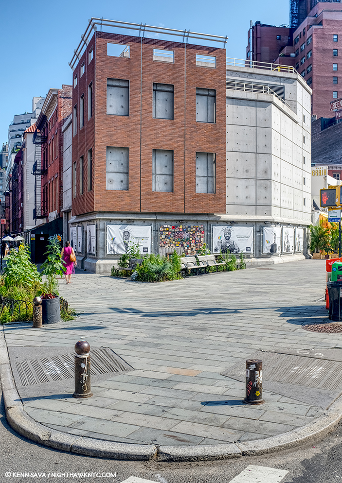
Perhaps no site has gotten more “hype” about it over time in regards to Nighthawks than Mulry Square, #3 in the picture. In spite of what many have said, I have seen nothing to indicate to me that this was the site of the Nighthawks Diner.

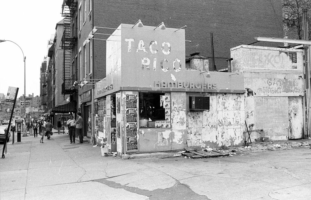
I would guess this would be  the early 1980s from the Rita Marley ads and Miles Davis ads, on the remnants of the hamburger place, which may be the remnants of the actual hamburger place that stood here in the 1940’s, which I show later on. Miles Davis came out of retirement in 1981. Is that a covered window along the left side? I haven’t been able to find out. *Photographer unknown.

The historical archives show a gas station with a small burger place at the time, but it looks more like a White Castle precursor to me than anything resembling the Painting’s diner. If anything, it may have been an inspiration for the “fishbowl effect”- where we are looking in through the glass at the customers. More on this later.

This is seen on the other end of Mulry Square, #4 in the picture, on another triangular corner, today. No viable candidates have been reported on this, also triangular, side of the Square, which is occupied by this too modern edifice today. I’ve also ruled it out.

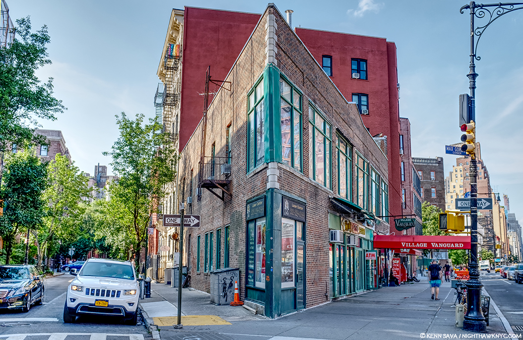
#9. Max Gordon Corner, named in honor of the long time owner of the Village Vanguard.

Directly across the street from #4 is this building, #9 in the picture, which has been home to the world’s greatest Music club, in my opinion, the Village Vanguard since 1927. There is a pizza place on the corner and the windows go through to the back street, but at 2 stories, I’ve long ago ruled it out. However, Art history will remember this spot because another great Painter, Richard Estes, wonderfully Painted it. (Which reminds me- In 2016, I visited the known site of one of Richard Estes’ latest Paintings in a piece I ironically called “Richard Estes’ Dayhawks At The Corner Cafe.”)

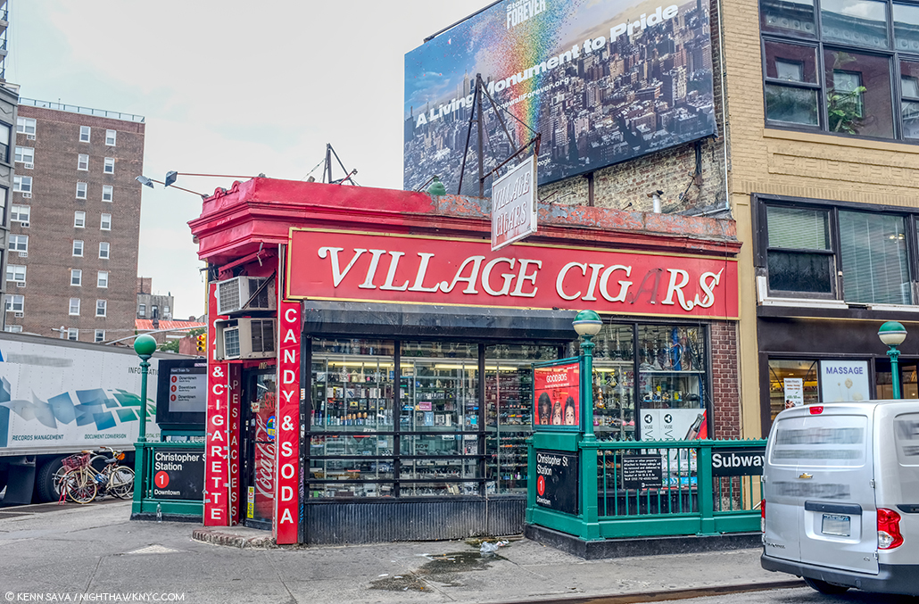
Village Cigars, 7th Avenue South and Christopher Street, Greenwich Village, NYC, June, 2019.

The site of Village Cigars is not numbered in the picture, being further down 7th Avenue on the right past #8. It’s garnered surprisingly little to no attention in the Nighthawks searches I’ve seen to this point. It has some things going for it- the shape and the cigar sign (Nighthawks has a Phillies cigar ad over the diner) but in speaking with the manager, I was told it’s been here for over 100 years, but it’s been a cigar store the whole time. Also, it doesn’t have the curved front window, those dual subway entrances were most likely also there in 1940 and are not in the Painting, and the buildings behind it are too far away. I’ve ruled it out. The Stonewall Inn is a few hundred feet to the left.

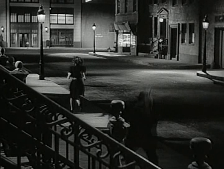
Some believe the inspiration lay in movies of the period, like this one, Stranger on the Third Floor, 1940. The suggested diner down the street on the right looks nothing like it, in my opinion. Possibly another “fishbowl effect” inspiration.

I remain completely unconvinced by any and all suggestions of movies I’ve seen. Yes, Edward Hopper was taken by a short story, “The Killers,” written by Ernest Hemingway in 1929, but I, for one, have not seen the evidence of that in the setting in the Painting. In the figures and the mood? Much more likely. “The Killers” was also made into a film, but, in 1946, too late to be considered. Maybe the Painting influenced it, as it has countless movies since.

That leaves the contenders. Speaking of movies, Edward Hopper reportedly frequented the Lowe’s Sheridan Movie Theater (which stood where #12 is in the picture earlier, and is seen further below), and based a Painting inside of it. His walk to and from it is interesting to me and it has been suggested that a few locations along this route are candidates for the Nighthawks diner. I looked closely at these.

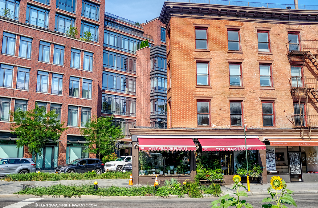
Yes, West Village Florist at 70 Greenwich Avenue is sort of triangular. The picture above was taken standing on the northern edge of Mulry Square, seen earlier. Yes, it was along one of Edward Hopper’s possible routes from his apartment to the Lowe’s Sheridan Theater, which was directly across 7th Avenue to the left of the picture.

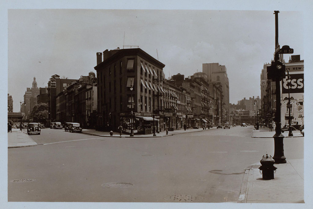
This picture came to me dated 1938 and that would appear correct. Looking toward Mulry Square on the right shows the side of the White Castle-ish hamburger place seen earlier under the Esso sign. The place on the triangular corner, center, at the intersection of 7th Avenue South, Greenwich Avenue and West 11th Street, is now West Village Florist, shown here when it was a cigar/cigarette store. Whoever told this picture is standing on the curb outside of what was Too Boots Pizza, #11 in the panorama posted earlier, with the Lowe’s Sheridan Movie Theater directly to his or her left. Photographer unknown to me.

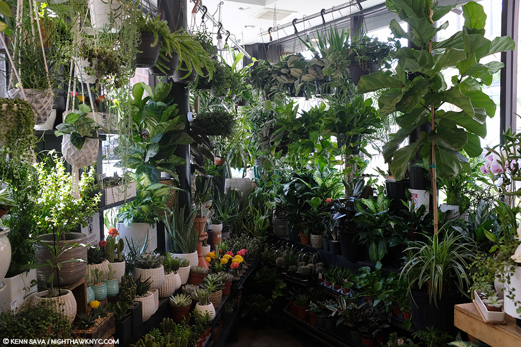
Yes, it housed a deli 20 years ago before becoming a flower shop the manager told me, and my research added a cleaner/tailor shop circa 1914, and a cigar store in the period of Nighthawks as seen in historical pictures (including in 1938, above), but it’s too small inside, the prow is also too small, and the corner lot too big in my reading of the Painting. Nowhere have I seen reference to it being a diner or coffee shop at any point. The buildings in the background are wrong now, and were wrong then, according to historical pictures.

Inside West Village Florist, standing just inside the door. I had room to stretch my arms out, with maybe an extra foot on each side, but the space quickly narrows, as you can see. It’s just too small. Stop by and see what you think. They are very nice people who have a beautiful assortment of plants and flowers.

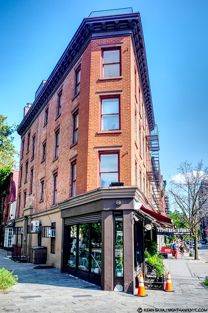
There is little doubt he saw it, but as I showed earlier, there are countless triangular corners in the area that could have been a partial inspiration. At best, that’s all this is, and I doubt it was a big influence. I’ve ruled it out.

West Village Florist’s building has this unique, strange, angled shape to it seen from head on, July, 2019.

The serious contenders.

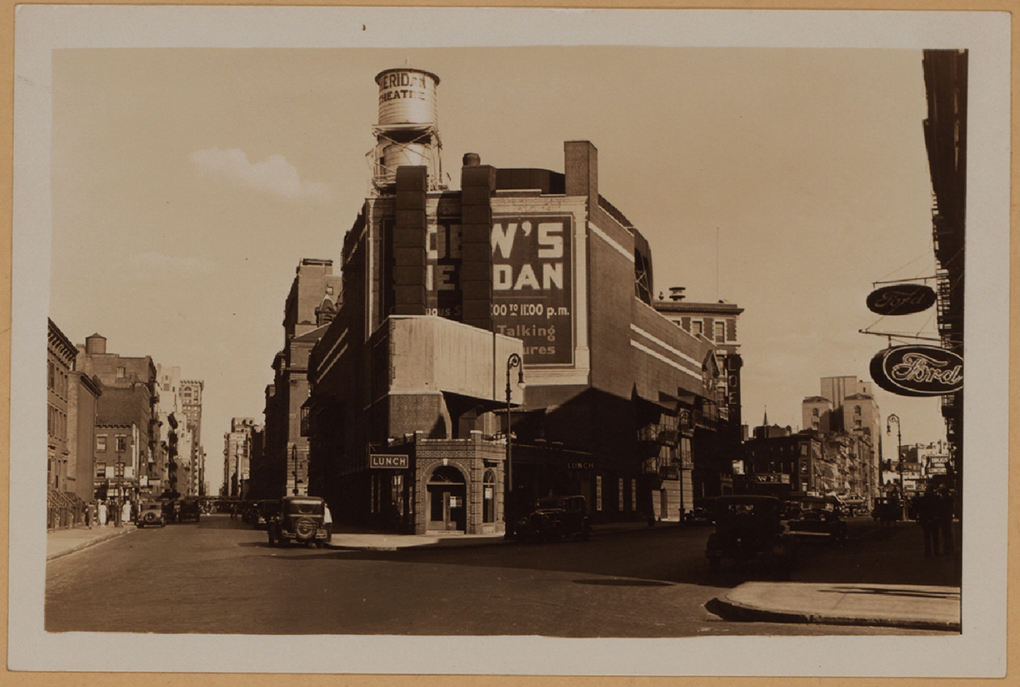
The intersections of Greenwich Avenue and West 12th Street with the Loew’s Sheridan Square Movie Theater, rear. Photograph by Percy Loomis Sperr (1890-1964), Manhattan: 12th Street – Greenwich Avenue, 1932, *NYPL Digital Archives.

In this 1932 picture of the intersection of Greenwich Avenue and West 12th Street, the low, triangular shaped building in front of the west side (the back) of the Lowe’s Sheridan Movie Theater is Crawford Lunch. There are historic pictures taken from Greenwich (on the right) that show customers in Crawford Lunch with West 12th Street seen behind them- which I reproduce further below. I think it is entirely plausible that Edward Hopper saw this, too, and this inspired his conception of a sort of “fishbowl” like setting. Here was an actual working diner/restaurant of the time. Today’s West Village Florist building is about 3/4 of the way down to the right of this picture.

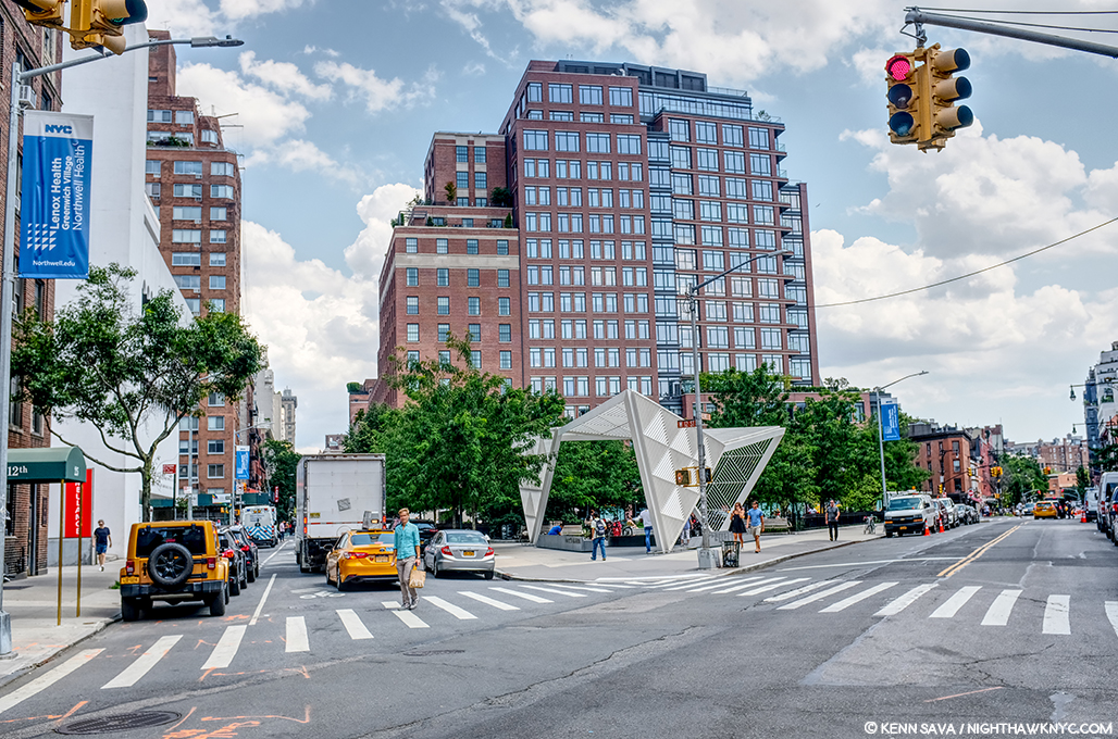
Change is the only constant in New York. The same scene, today! I stood as close as I could to the spot the 1932 picture above was taken to take this in July, 2019- 87 years later!

It’s so different, 87 years later, as to defy anyone to guess this site had anything to do with Nighthawks. Therein lies a good deal of the problem finding its sources. It’s now The NYC AIDS Memorial Park at St. Vincent’s Triangle. Note- the brown building on the very far left. It does not look like what’s in the background of the Painting. More on this follows. The Whitney’s Hopper Drawing catalog suggests that Edward Hopper may have looked through Crawford Lunch and seen the “fishbowl effect” we see in the Painting.

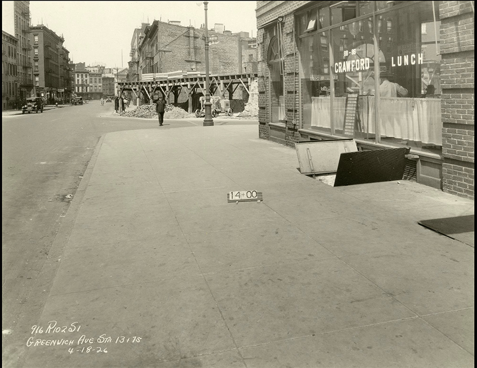
Subway construction photograph of 88-86 Greenwich Avenue and West 12th Street, New York City, April 18, 1926. Identifier- 86446d_GreenwichAve_SubConst958. *Collection of the New York Historical Society.

Here, we see a revealing example of this “fishbowl effect” seen at Crawford Lunch in a picture taken on April 18, 1926. Notice how you can see into and through the restaurant, on the right, to West 12th Street behind the man in the dark hat under the word LUNCH on the window. The brown apartment building seen in the far left in the prior picture is about to be built seen straight ahead just across the 12th Street past Crawford. Note, also, the word “LUNCH” on the window for later. I believe this is the possible source of the effect given how close it is to the Lowe’s Sheridan Theater (next door). However, it could have as easily been something he saw somewhere else on his walks, in a place they, or anyone else I’ve come across has not considered. But, unlike most of the locations suggested to date, Crawford Lunch was an actual restaurant at the right time and in the, possibly, right place.

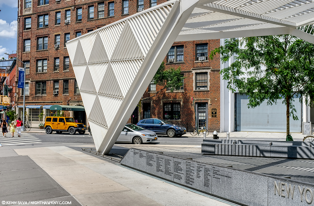
The almost identical view in the previous picture today at the former site of Crawford Lunch also approximates the view seen in Nighthawks. That brown brick apartment building, seen early in its construction above, has been here since the late 1920s, and hence, at the time of Nighthawks, making it wrong for the Painting. Seen in July, 2019.

That Crawford Lunch was an influence would seem to be confirmed by this-

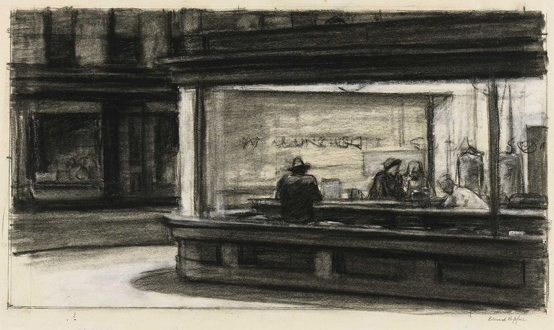
Study for Nighthawks, 1941 or 1942. Fabricated chalk and charcoal on paper; 11 1/8 × 15 in. Given he finished Nighthawks on January 21, 1942, I doubt this was done in 1942. It seems he was still finalizing his ideas when this was done. *Whitney Museum collection & photo.

I can barely make out the word “LUNCH” on the widow above the man with his back to us in this study for the Painting. As we know, Edward Hopper did not include this in the final Painting, among other changes he made to what we see in this incredible and endlessly fascinating Drawing. It sure reminds me of the Crawford Lunch window and may be a give away of its source and, possibly, the source, once and for all, of this “fishbowl effect.”

Edward Hopper said little about the inspiration for Nighthawks and, frankly, I don’t know what to make of what he is reported to have said. In Katherine Kuh’s The Artist’s Voice, P.134, he says, the Painting “was suggested by a restaurant on Greenwich Avenue where two streets meet.” He adds, “I simplified the scene a great deal, and made the restaurant bigger.” Um, Ed? Could you be a bit more obtuse? “Greenwich Avenue where two street meet,” is said to mean West 12th Street & 7th Avenue South by Gail Levin (Hopper’s Places). Couldn’t “two streets meet” mean Greenwich & West 12th Street, where Crawford Lunch was? If it means Greenwich and two other streets, it has to be the triangles where West Village Florist and Mulry Square are. In any event, “…suggested…” I believe means a scene he saw at one of these places, the “fishbowl effect,” which I think he saw at Crawford Lunch, a confirmed restaurant at the time. But, Crawford Lunch doesn’t look like the diner in the Painting- even if he “…made the restaurant bigger.” Neither does the hamburger place on Mulry Square or West Village Florist. And that comment doesn’t specify it’s the same restaurant he mentions on Greenwich Avenue. It could mean “the restaurant we see in the Painting.” Intensely frustrated by this, I finally decided to continue on my own path. This meant looking a little further afield from the Greenwich Avenue vicinity. It turns out I didn’t have far to look.

Further down 7th Avenue South, not as far as Village Cigars, and still well within Edward Hopper’s walking neighborhood, I came across this-

“Oh. My. Gosh.”

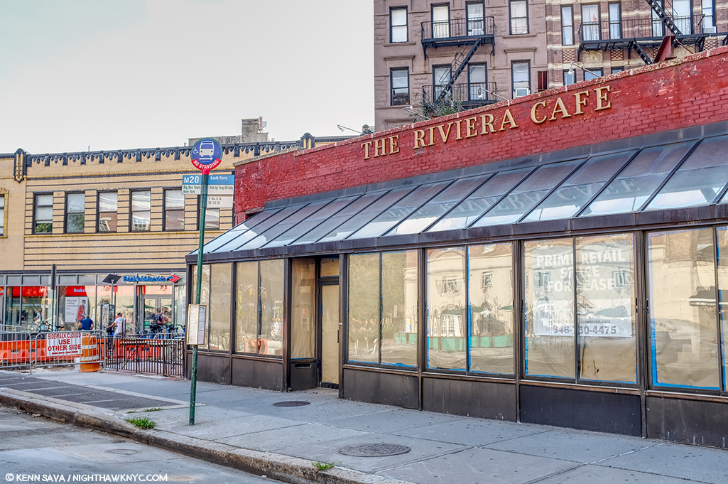
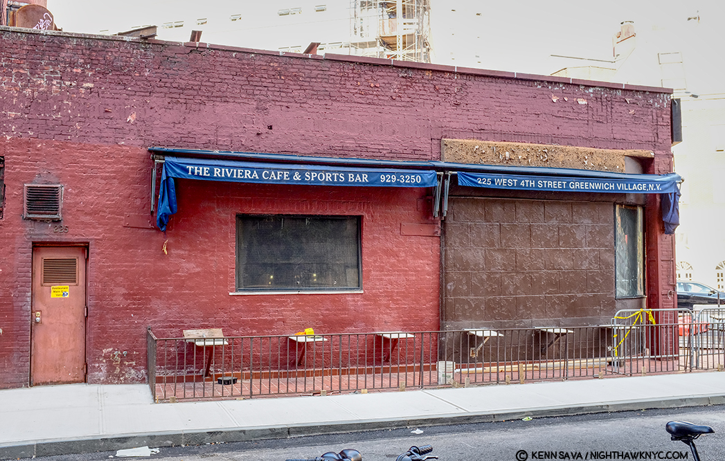
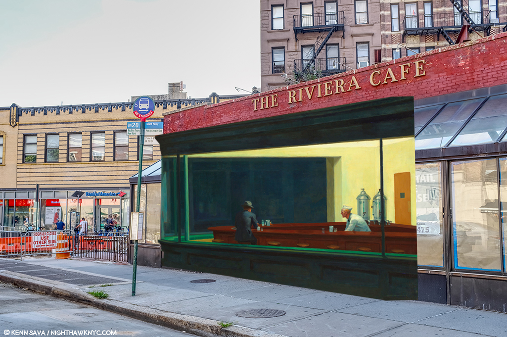
The site of the now sadly defunct Riviera Cafe, which was open here for 48 years, from 1969 until August 31, 2017.

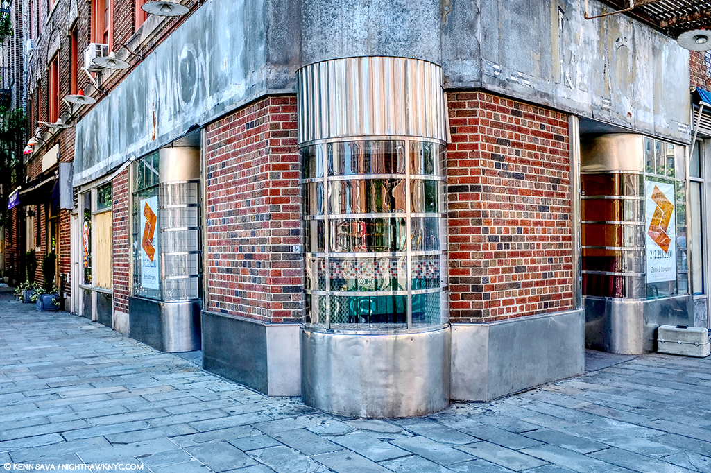
The former Riviera Cafe at 225 West 4th Street at 7th Avenue South.

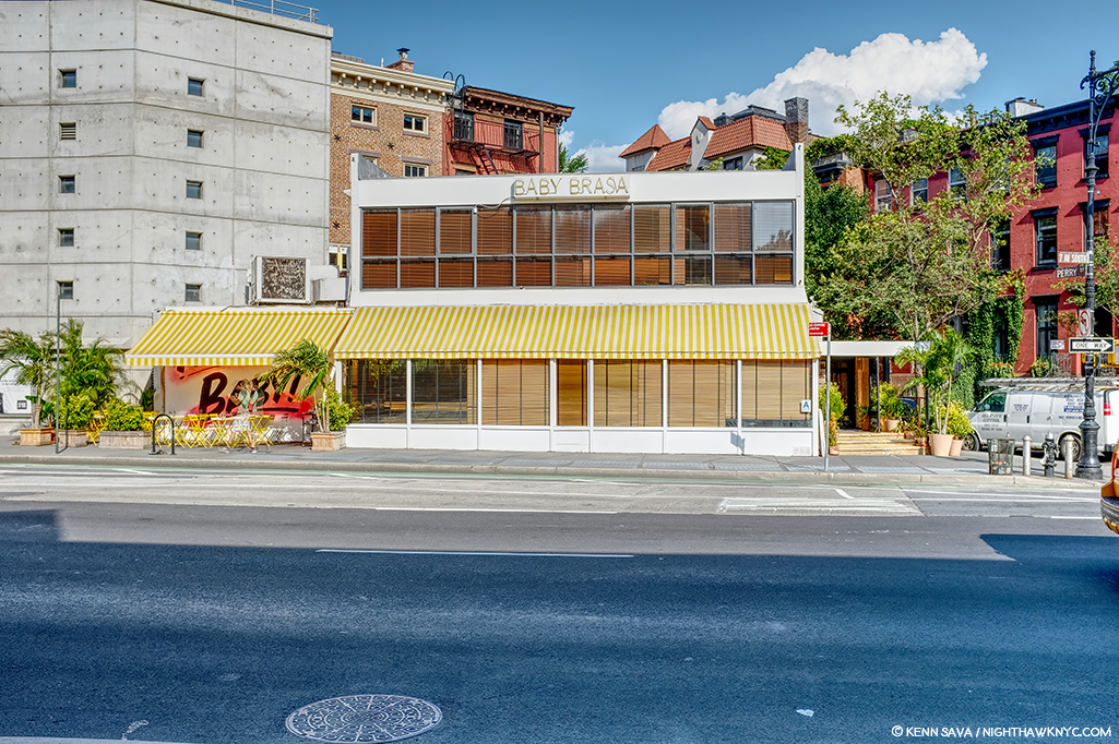
When I came across this site, I had an “Oh. My. Gosh.” moment. Picture it without the modern “greenhouse” addition and it becomes much more like the diner in Nighthawks. Back in the day, I spent a few nights in this place, as I’m sure many reading this have, too, since it was centrally located right at the heart of the West Village. The building behind it to the left, while not exactly what we see in the Painting (I believe they are the same buildings that were standing on this site in 1940), at two stories, which fits all we can see in the Painting (they may go higher in Nighthawks, or they may be cut at two- we can’t tell), and they’re the right distance, though at a slightly different angle, from what we see in the Painting. If this is the location Edward Hopper used, why didn’t he use the buildings we see in the background? I believe it was because of the color. That long building which takes up a good portion of the back is too brightly colored to fit the mood he wanted in Nighthawks. So, possibly, he replaced them. More on this in a minute. I measured the depth of the greenhouse at 90 inches- 7.5 feet. If it were not there, it would have allowed me to stand closer to the building taking this shot. Thinking back to my visits here, there was a bar along the back wall then, and I believe there were tables behind the seats/stools facing the bar, approximately under where that brick wall would come down with the greenhouse gone. Would a horseshoe counter have fit here?

As I looked closer, I discovered this-

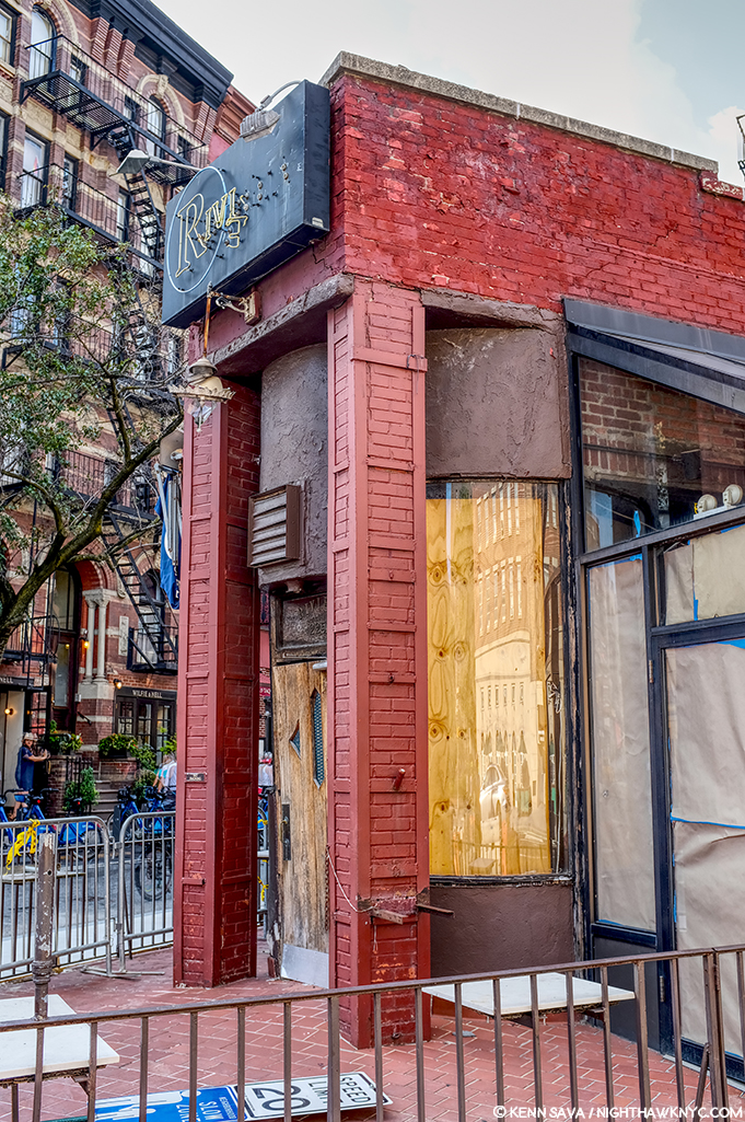
The front of The Riviera Cafe facing West 4th Street and giving it its address, 225 West 4th Street.

Lo and behold, there was something none of the other candidates I’ve discussed thus far have- a curved front window! And, it’s the same on both sides of that door! But, that door. Was it always there, or was the curve complete at one point, which would make The Riviera, minus the modern greenhouse addition, an almost perfect match for Nighthawks Diner?

The back of The Riviera Cafe on West 4th Street.

Stepping around to the back of The Riviera- more intrigue. What’s up with the right half of the wall, and what was there before they replaced it? A window? Also, that door to the left looks earily similar to the door in the Painting on the inside of the Nighthaks Diner. As I said, when I was here, I remember a long bar inside that wall and along it, meaning you’d probably be able to see the necks of liquor bottles in that rectangular window that’s still there, center. But, that’s now/more recently. What about in the past?

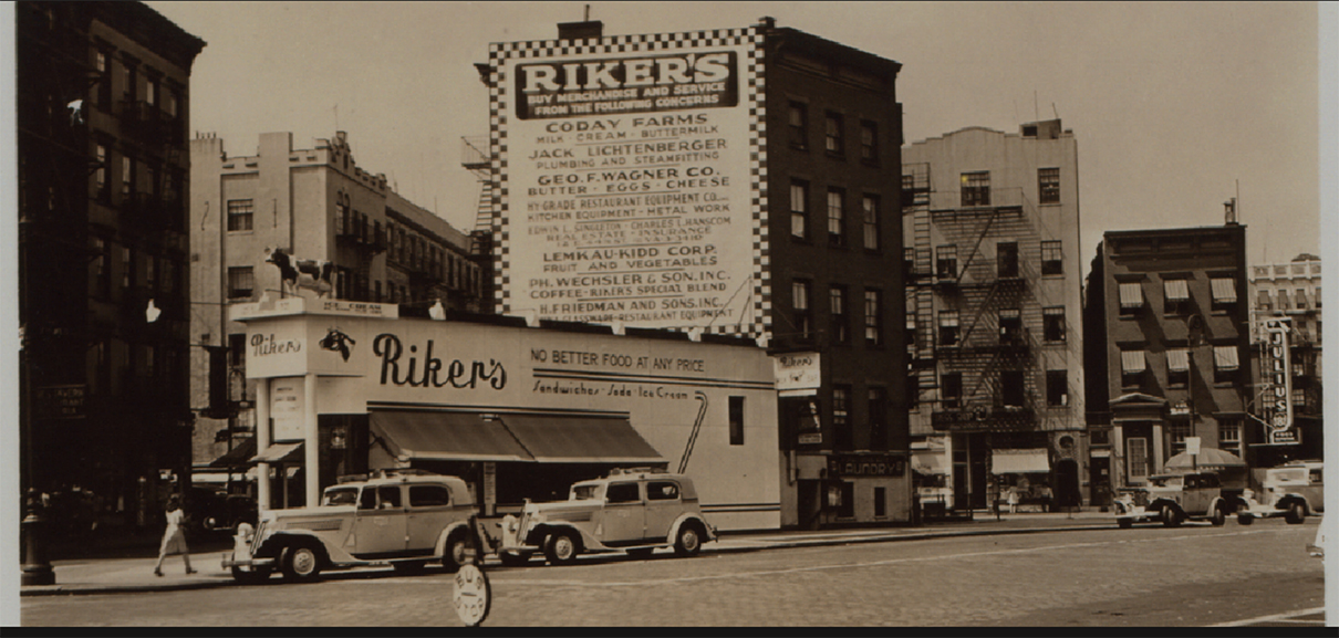
Intrigued, to say the least, searching further, I uncovered this-

1941! The year Nighthawks was Painted. Percy Loomis Sperr (1890-1964), Manhattan: 7th Avenue South – 4th Street (West), 1941, *NYPL Digital Archives.

In 1941, The Riviera was called Riker’s and it was a restaurant! It looks pretty new and shiny, too. Some encouraging things in this picture- there are retractable awnings instead of the permanent greenhouse, for one, but that troublesome front door is still there to the left, and it looks to be the same structure, with the curved windows on either side of it.

The Riviera Cafe occupies the biggest triangular space in this part of the West Village. It’s very accessible to the Hopper’s apartment (a few blocks to the east). Why has it never been properly considered as a candidate?

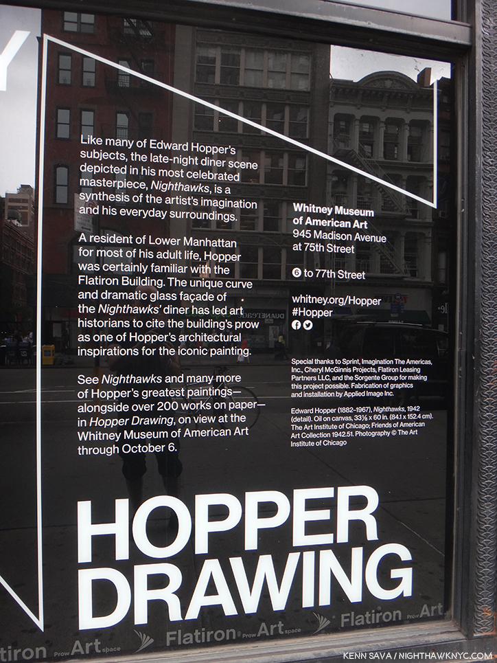
In 2013, during the Hopper Drawing show, the Whitney Museum came out and said the following-

“…has led art historians to cite the building’s prow as one of the influences…” What are the others? Seen in 2013.

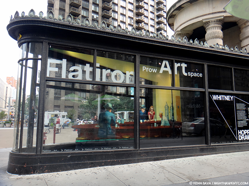
They’re talking about the Flatiron Building, which is on West 23rd Street at the intersections of Broadway and 5th Avenue- no where near Greenwich Avenue, where that quote has caused most to look, and it’s not even in Greenwich Village! So, the museum has taken the same approach I did in this sense. Also, in the Hopper Drawing catalog they fail to publish the Kuh Hopper quote (above), only footnoting the page in her book it’s on (P.118, footnote 2)! Perhaps, they, too, find it as frustrating as I do? (I realized this only this past week, after my quest had been completed.) They state the Flatiron was “one of the influences,” but fails to name any others!?? “One of” means “more than one.” Well? I’m naming names here.

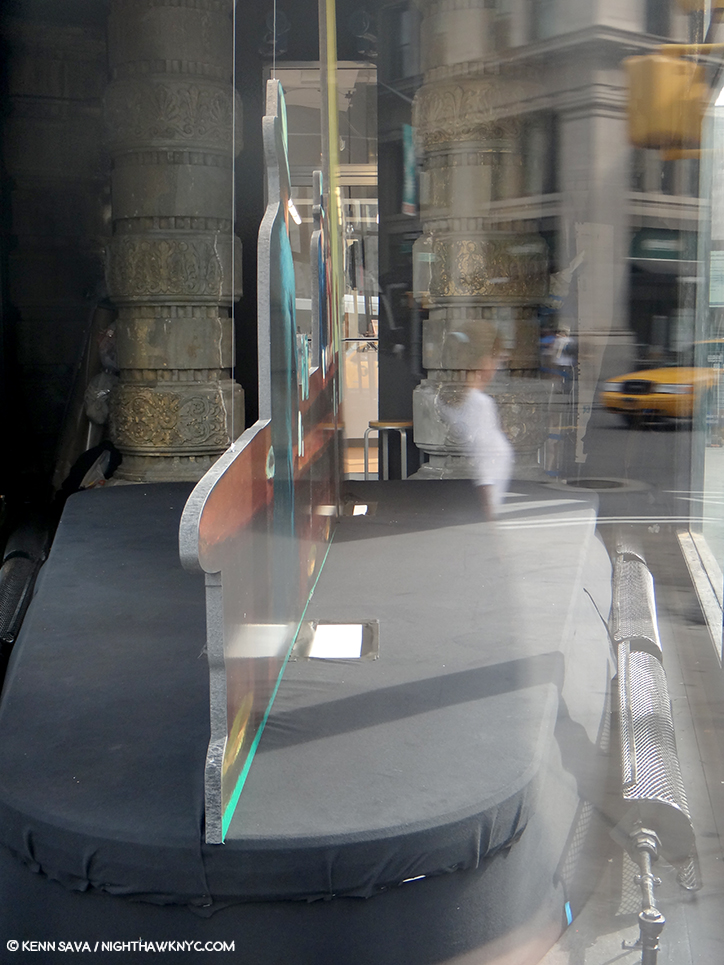
An installation of “Nighthawks” in the prow of the Flatiron Building by the Whitney Museum in 2013. The installation is 2D and only a few inches deep, as I show below. I shot it at this angle to show the problematic lining up of the buildings in the back on Broadway, across the plaza, which is not at all like what we see in the Painting. Seen on September 1, 2013.

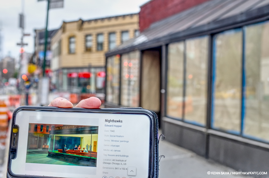
Assessing the Flatiron’s candidacy, I discovered that at one point it was a cigar store (again, the Painting has a Phillies cigar ad on the top of the diner), but I did not find evidence of it having been a diner. Looking closer at the interior space, I discovered it ostensibly measures 10 feet wide, at its widest, to the right in the picture above, by 30 feet long. I’m no restauranteur, but that seems pretty narrow to me to get a horseshoe shaped counter inside, room for seating around it, room to navigate around those seats and room for the counterperson to work. Glare notwithstanding, here’s what the space looks like pressed against the front curved window-

A look at the installation of “Nighthawks” in the prow of the Flatiron Building on September 1, 2013.

Notice the radiator on the right, and how far it is from the window. There’s another one on the left which is hard to see in this picture. Both, and the room around them they require for safety and comfort, considerably cut into the amount of usable space here. Also notice the large column to the left rear of the photo, which serve to partially support the gigantic mass of the building above them, which also has a counterpart that’s hard to see because of the glare on the right side (see the picture of the whole prow, above it). The opening between them appears to be tight. How are people supposed to come and go here?

Then, there’s the site itself. It doesn’t feel to me like what we see in the Painting.

A panorama shows the distance between what would be the far side of the prow in the Painting and the buildings across the plaza and Broadway.

The buildings that would be in the background of the Painting are too far away and angled incorrectly- 23rd Street angles to the south east relative to the Flatiron at this point making the buildings begin too far back to be seen as they are in Nighthawks, in addition to being not at all like those seen in the Painting in the many existing historical pictures. Therefore, I believe the Flatiron’s prow isn’t what we see as the diner in the Painting, and this wasn’t the scene shown in the Painting. Of course, any Artist is completely free to do whatever they want, to make anything into anything else, whether it would fit in the “real” place, or not. (There is no such thing as “photorealism” in Painting, in my opinion, but that’s a battle for another day.) Edward Hopper, as per that quote, could have made West Village Florist or the Fatiron’s prow bigger, but their settings are still wrong, in my opinion, so I don’t believe he used either. However, like the Whitney, I believe the Flatiron’s prow was an influence.

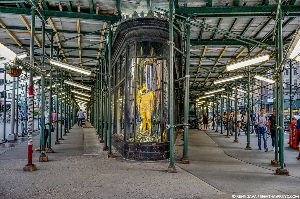
Currently under renovation? Cleaning? Diner installation? Maybe I should wait and see what emerges before reaching a conclusion. (Just kidding.) July, 2019.

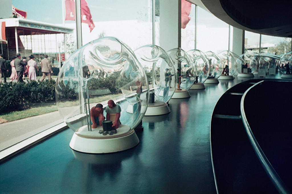
Looking at the Painting, one thing is undeniable- that curved window Edward Hopper includes. I’ve found it nowhere else besides on the Flatiron- either on existing buildings or in historical pictures. And, some of the ribs we see on the window in the Painting are present on the Flatiron’s prow today. In 1939, Edward Hopper exhibited at the World’s Fair1, and so he may have seen the Fair, but was certainly aware of it.

“Fishbowl effect” indeed. The history of glass making through the ages seen in glass bubbles at the Glass Incorporated Pavilion at 1939 World’s Fair, Queens, New York, New York, USA. Coincidence? Or influence? *Image by Peter Campbell/CORBIS

It was an Art Deco marvel. The Nighthawks diner has a decidedly Deco/Streamlined/Moderne feel to it. Though the Flatiron is a Beaux Arts building, the curved window of the prow has a decidedly Art Deco, streamlined, feel to it.

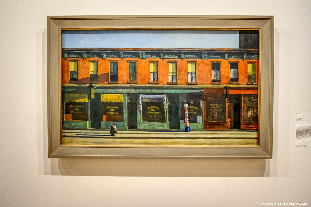
Early Sunday Morning, 1930, seen at the Whitney Museum, July, 2019. This looks uncannily similar to the background of Nighthawks to me.

Yet, what he depicts in the background of Nighthawks looks curiously not dissimilar to his Early Sunday Morning, 1930. It’s almost like he dropped those buildings into the background. But, 10 years after the earlier work a good many of those buildings were no doubt still everywhere around town, so they may as easily be generic. Whatever their origin, in this way he juxtaposes the old New York with the new world just seen in the 1939 World’s Fair, which showcased “modern” streamlining and the new flourescent lighting.

Early Sunday Morning is something of a “pendant” to Nighthawks as Carter E. Foster points out in the Hopper Drawing catalog (P.99). It’s the same size and shape and the two are bookends in some ways.

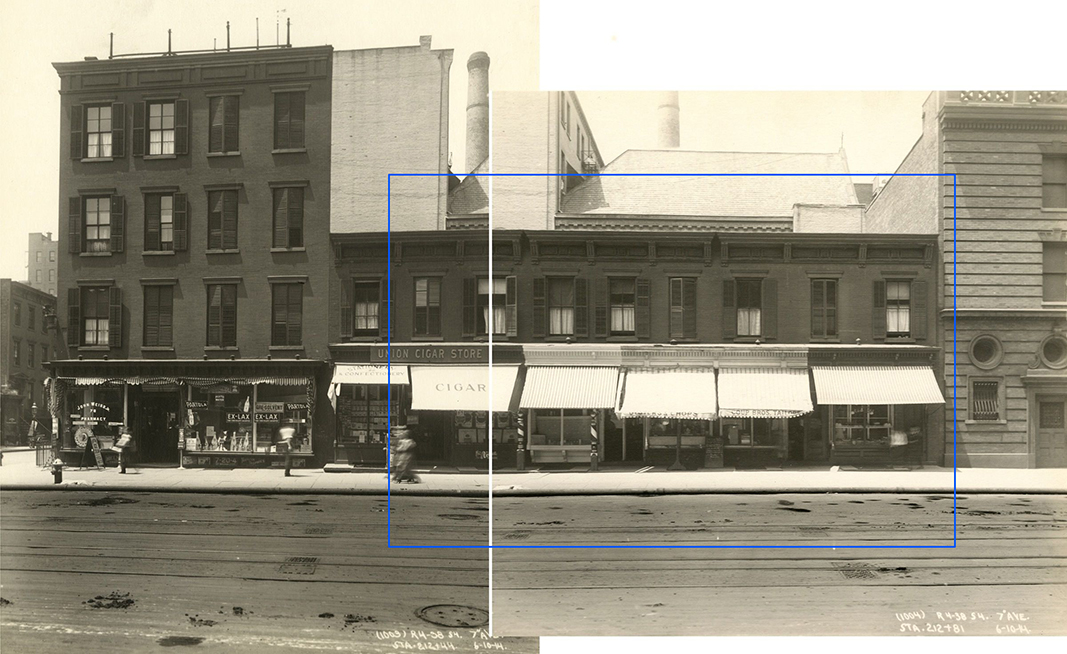
7th Avenue between Fifteenth and Sixteenth Streets, June 10, 1914. I’ve indicated the scene depicted in Early Sunday Morning, with a blue bounding line centering around 88 7th Avenue, seen in these two photos taken on June 10, 1914- 16 years before the Painting. The shutters on the windows are gone in 1930, so are the awnings, and there was only one barber pole. The hydrant was either to the left, or around the corner to the left. The center white line are the borders of the two photographs shown. All the buildings in these pictures have long ago been replaced. Subway Construction Photos modified from the Whitney Hopper Drawing website.

Interestingly, the inspiration for Early Sunday Morning were shops on 7th Avenue, but not in Greenwich Village. They have been located as being between 15th and 16th Streets in Chelsea, just north of the Village. Comparing the Painting to period pictures is fascinating. While it’s unlikely that Edward Hopper stood with a sketchbook and drew the scene, he did capture any number of correct details. But, he changed others- most notably the sunlight. The sun never shines on 7th Avenue at the angle he Paints it shining!

Mid-Sunday Afternoon. The site of Early Sunday Morning, seen in July, 2019. The original buildings have long ago been replaced. Notice how the shadows go in the opposite direction of those in the Painting.

7th Avenue runs North/South, not East/West, like the sun. In reality, the sun would be directly behind the viewer! So? Here’s a case of a found actual site and how Edward Hopper used creative license to mould it to his vision- even if that meant changing nature! What’s moving a curved window 20 blocks south compared to moving the sun?

My Conclusion-

I currently believe that Edward Hopper saw Riker’s about 1941 and those 2 curved windows in its front. I believe he, too, may have been frustrated by that front door and decided to “remodel” it. With a a paintbrush. So, he morphed the Flatiron’s prow’s curved window onto it and then created his own (though somewhat similar to the real) background on West 4th Street in the Painting.

Unless and until I find better candidates, THIS is what I believe Edward Hopper did.

Yes, I’ve used the original, 2015, NighthawkNYC.com banner, which removed the famous couple, leaving that figure I relate to in honor of NHNYC’s 4th Anniversary. On the same page she dated Nighthawks on in the Hopper Ledger, Jo Hopper refers to him as “sinister.” I love her, anyway. Before she died the year following Edward, she bestowed one of the greatest American Artistic Estates to the Whitney Museum (who promptly “rewarded” her incredible generosity by throwing out virtually all of her work, thereby denying Art historians and Art lovers a chance to assess her work on its own- forever2). And I used the banner because, yes- I once sat at The Riviera Cafe’s bar by myself, too.

But, beyond ALL of this, for me? Nighthawks is the first truly modern American Painting. It marks the beginning of all that came after. It captures the essence, the FEELING of living in a City- here, in New York, or anywhere, but even more, it captures the feeling of modern life, which has become more and more about isolation, and fleeting moments of connection- or not, since January, 1942. I always try and remember that Nighthawks, like many of Edward Hopper’s other works, is a voyeuristic moment seen by a pedestrian, who more than likely kept moving on, past this fleeting moment and this scene, wherever it was, and didn’t pause to ponder it indefinitely, like so many have since.

Moments exist as flashes of time.

Click.

Here right now, gone forever. Unless, you’re one of the great geniuses in American Art history, who has the vision, the power and the talent to make it last, and speak to us, indefinitely.

But, for me, at least, Nighthawks isn’t about capturing a fleeting moment magically, though it does.

The other reality that common sense dictates be mentioned is that 78 years later, a better explanation than mine, or a better real life candidate for the Nighthawks Diner may never be found. It may have existed only in his imagination, with a few pieces of real life thrown in- like the Flatiron prow’s window. And that, too, may be part of his point. Nighthawks, in one reading, may not be about place as much as it is the psychological, the inter-personal, and? 

Loneliness.  

Have two people in Art ever been closer together, yet further apart?

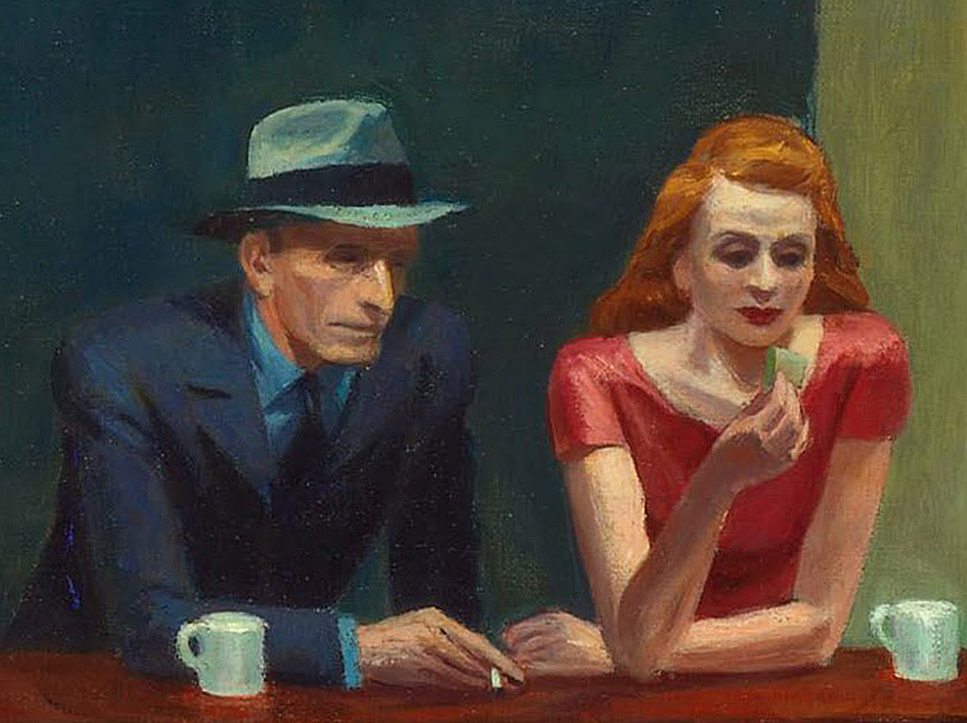
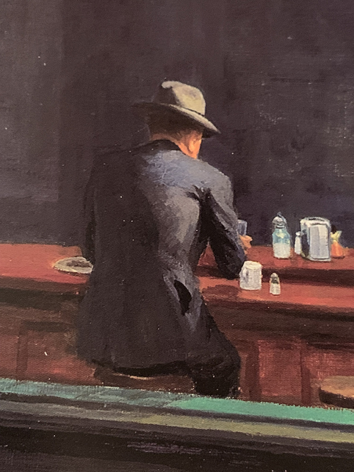
The woman in red is all dressed up to go HERE?, I can hear her mentally screaming. Her “companion” sits physically next to her, close to her, but, in my reading of it, their hands don’t quite seem to touch. Maybe you see it differently. For me? I can’t look at this and not think of God and Adam in Michelangelo’s Sistine Chapel Ceiling. There is no life giving, or love giving touch here. He has a cigarette in his hand- not her (left) hand, which remains empty. There is a distance that belies how close together they sit. All of this is, somewhat humorously, mimicked by the twin silver coffee urns to the right of them, that are, also, immobilized and frozen in time. At least they’re together for a common purpose! The same can’t be said of the immortal duo sitting at the counter. 

The gent, who’s nose Jo Hopper called a “Night Hawk” after the beak of the bird seems to be in a conversation with the counterman. About what? Here, he has this lady dressed to kill next to him and he’s ignoring her? Every time I’ve seen this happen in a bar or nightclub, instantly my antennae went up. Something’s not right here. If she’s not getting attention? Something’s wrong. But this is December, 1941. Pearl Harbor happened right in the middle of work on this Painting! 36 days after Arnold Newman took that Photo of Edward Hopper up top. It’s very hard not to think about that when looking at it, though it’s probably easier for many now that World War II was over 75 years ago. Are they discussing the War? Being drafted? Enlisting? A friend who has already been killed? Possibly another denizen of the diner? There are all those empty stools at the counter, after all. “Where is he?” “Oh. You haven’t heard?…” 

The War brought many things. It also brought separation, life without love, life without women, for men, and without men for women, or partners for the LGBT communities. 

Then? There’s my alter-ego. Frozen in paint. Immobilized. Alone forever. Perhaps the most isolated figure in Western Art. What appears to be a rolled up newspaper is under his left elbow. No doubt he knows the score. At least he’s possibly not leaving anyone behind. 

But, for a moment? Let’s forget World War II is getting off to a raging start around the world at this very moment, if we can. Edward Hopper probably conceived this work before Pearl Harbor. What’s striking to me is that of all the loneliness I’ve just mentioned, there’s still more of it I haven’t. 

Let me ask you this- Who is more lonely in the scene in this Painting? 

Any of those 4 people in the diner?
Or?
The person viewing this scene from outside the diner?

For me? Nighthawks remains the ultimate parable of loneliness.  

Maybe then, I shouldn’t be on such a mission to find the “real” place it depicts. Maybe then, it doesn’t need a real place to inhabit. It exists as a permanent condition of being alive inside each one of us, as it did inside of Edward Hopper. Maybe I look for it in the hope of finding the end of it.

*- Soundtrack for this Post is “I Saw You In A Dream” by Japanese House….

“I saw you in a dream
You had stayed the same
You were beckoning me
Said that I had changed”

NighthawkNYC.com has been entirely self-funded & ad-free for 9 years, during which 330 full-length pieces have been published! If you’ve found it worthwhile, PLEASE donate by PayPal below to allow me to continue. Thank you, Kenn.

You can also support it by buying Art, Art & Photography books, and Music from my collection! Art & Books may be found here. Music here and here.

Written & photographed by Kenn Sava for nighthawknyc.com unless otherwise credited. To send comments, thoughts, feedback or propositions click here. Click the white box on the upper right for the archives or to search them. Subscribe to be notified of new Posts below. Your information will be used for no other purpose.

For “short takes,” my ongoing “Visual Diary” series, and outtakes from my pieces, be sure to follow @nighthawk_nyc on Instagram!

  1. Hopper Drawing footnote 33, P.119
  2. Gail Levin, Edward Hopper: An Intimate Biography, P. xv-xvii

Louie Palu’s Tools of Remembrance

Written by Kenn Sava. Photos as credited.

“Another day in Kandahar
I must focus now
Think of the frame
Think of each side of the rectangle


Focus on the frame
Stay calm under fire
Focus your mind
Acknowledge the danger
And work
Everything happens so fast
I must control my mind
Relax
and get the shot”
Louie Palu in the opening voiceover in his documentary film, with a screenshot from, Kandahar Journals, 2015

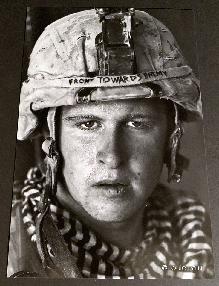
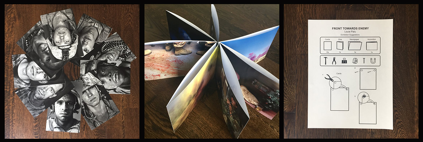
US Marine Lance Corporal Damon Connell, age 20, one of the series of soldier portrait cards included in Front Towards Enemy, by Louie Palu

A few years ago I met Rickey Rogers, as he was about to relocate to London to begin his new role as Global Photo Editor for Reuters. As we spoke, I was struck by his passion for what he called “conflict Photographers.” Though I’ve long had an interest in the work of Matthew Brady, Roger Fenton, Robert Capa, Don McCullin, Larry Burrows and Susan Meiselas among others, after meeting Mr. Rogers, I began looking closer at the work of  the contemporary Photographers who are putting their lives on the line to show us what’s going on in the world- even when it’s very hard to look at what they show us. It’s crucial we do.

Louie Palu is part of that rare breed.

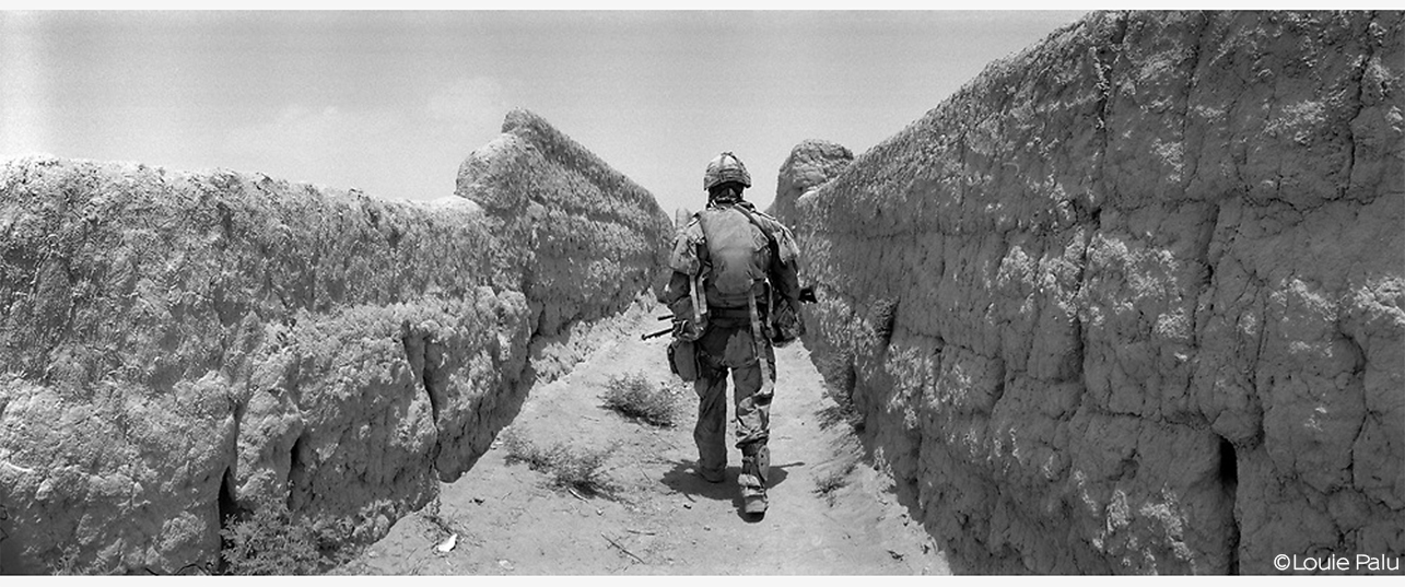
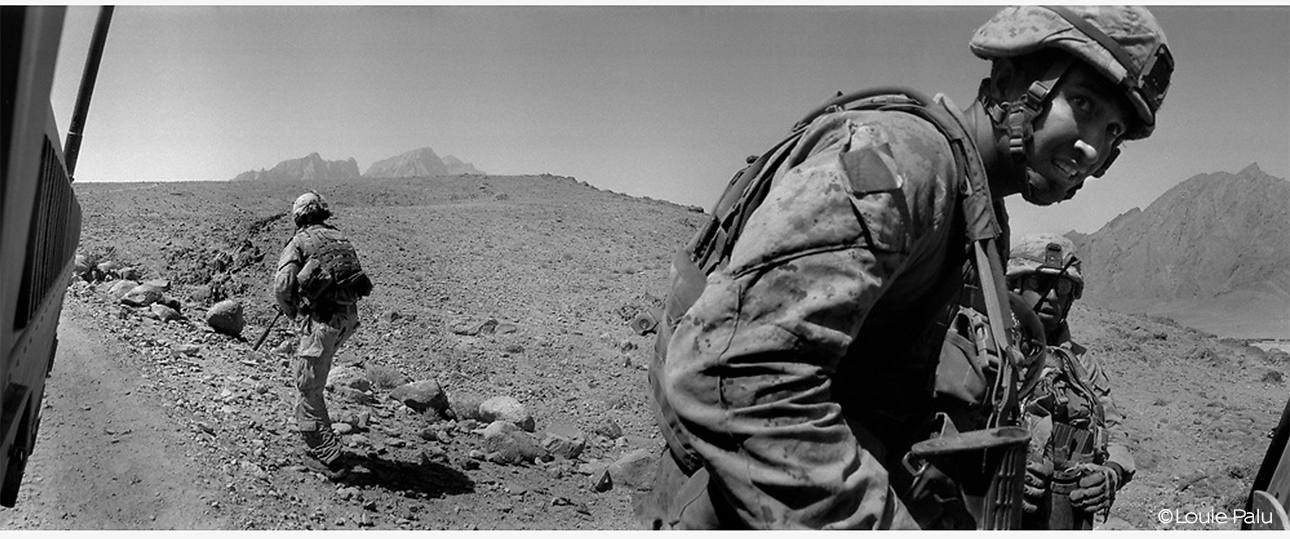
A Canadian soldier walks up a narrow path in what is known as “Route Nightmare” in a village in Kandahar, Afghanistan. The mud paths allow for easy planting of mines and road side bombs by insurgents. This image appears in the newsprint publication included in Front Towards Enemy.

Today, at a time when it’s possibly never been harder to do this job, which has never been “easy,” I’m often reminded of the fact that these Photographers have often turned their lenses to other subjects. Basically, they’ve turned them everywhere their lives took them, capturing a very broad range of the human experience in the process. Robert Capa also Photographed Picasso frolicking on the beach, Susan Meiselas captured Carnival Strippers and the secret world of an NYC S&M club, Mr. Palu’s fellow Canadian, Larry Towell, Photographed the Mennonites, and so on. Yet, because they were, also, present in war, and somehow managed to capture remarkable Photographs in the heat of those moments, their conflict images have become part of history- they are the ones these great Photographers have, largely, become best known for.

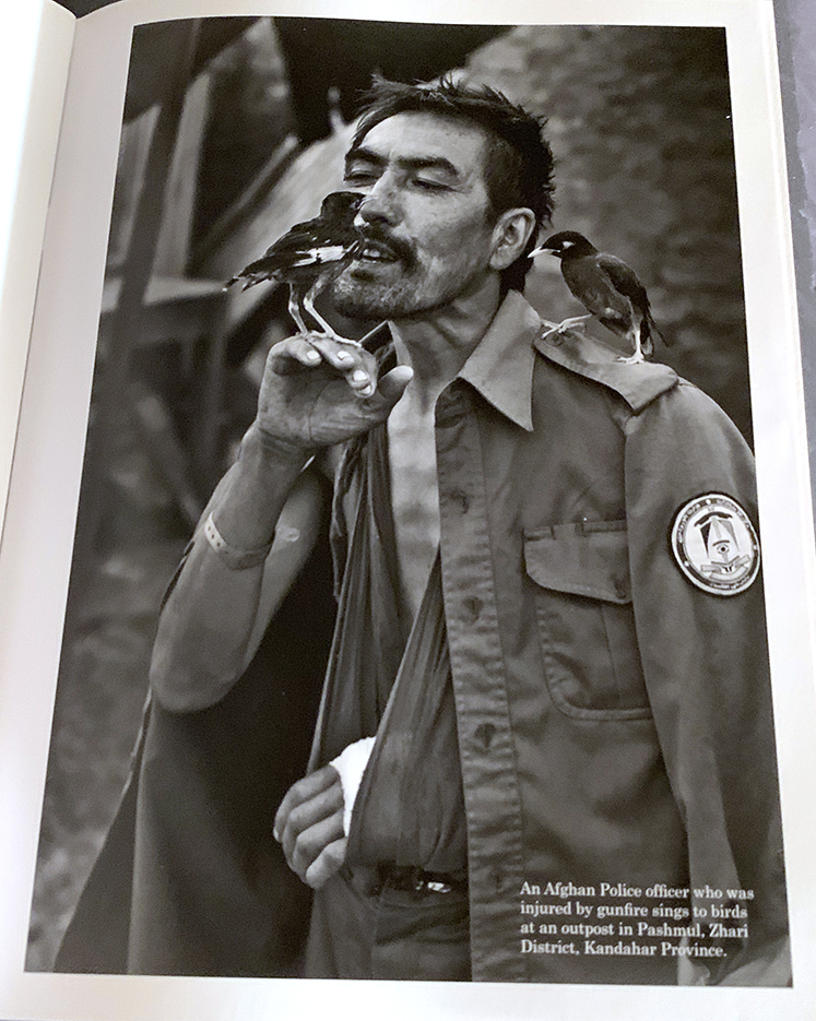
The caption reads, “An Afghan police officer who was wounded by gunfire sings to birds at an outpost in Pashmul, Zhari District, Kandahar Province,” from Front Towards Enemy. There is a timeless quality to this image that, save for the arm badge, could have been taken in any war.

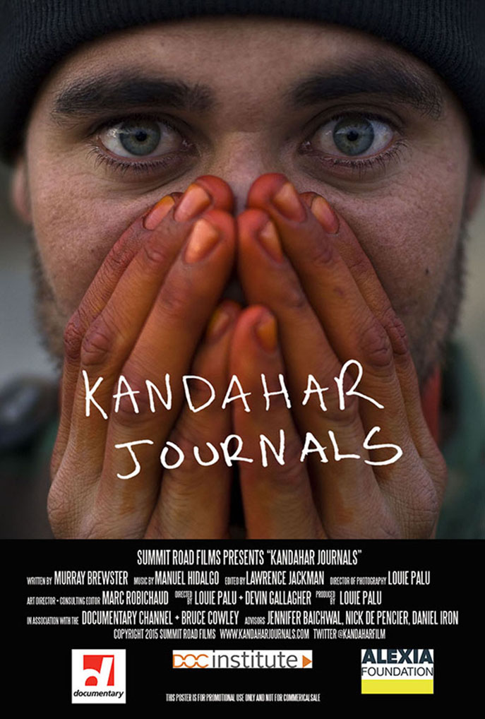
Though Louie Palu spent five grueling years in Afghanistan covering the war from 2006-10, which resulted in the thousands of Photographs and the award winning documentary, Kandahar Journals, he’s also created important work on a number of subjects away from war. That might be why Mr. Palu refers to himself, simply, as a “photographer.”

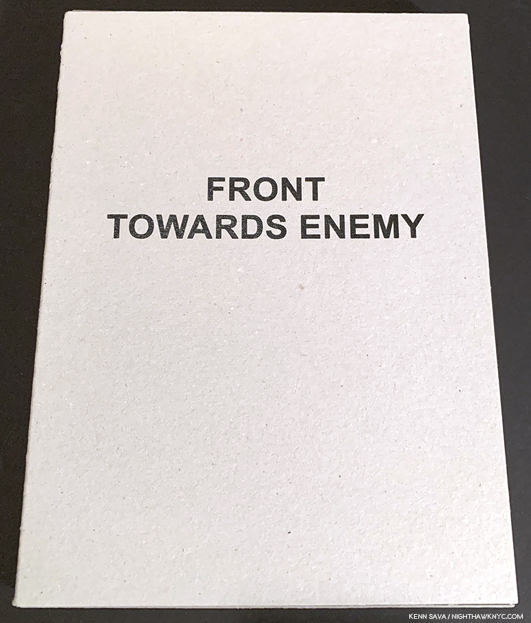
Front Towards Enemy is published in an edition of 750 copies by Yoffy Press, it contains about 60 Photographs and an essay by Rebecca Senf.

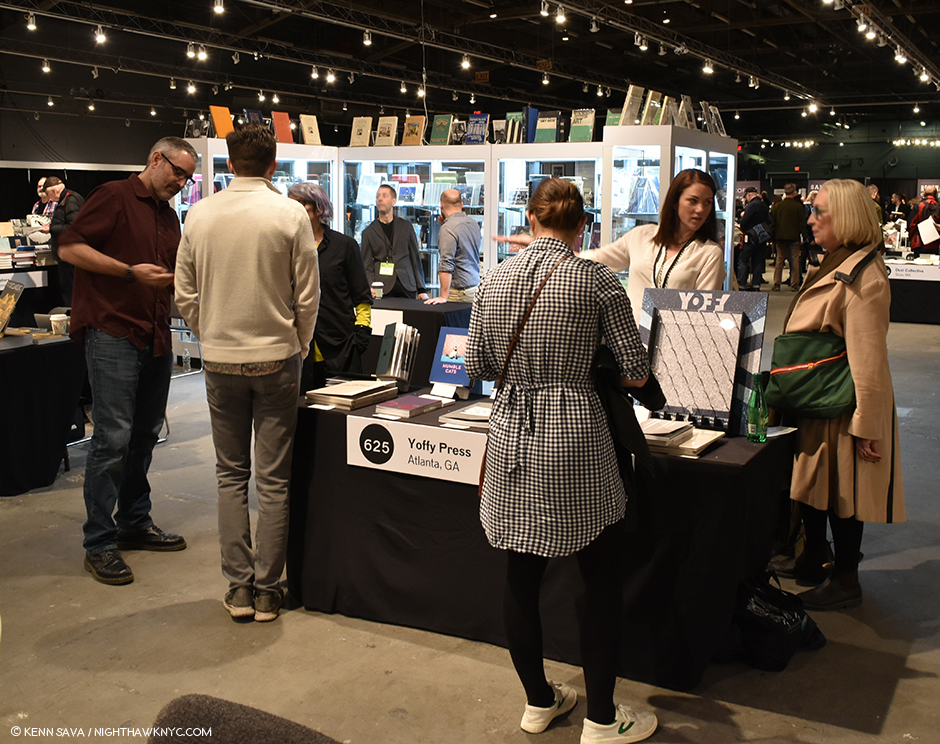
Still, I was unfamiliar with Mr. Palu until PhotoBook guru Jackson Charles pulled my coat to the Yoffy Press table in the PhotoBook Publisher’s area at AIPAD in April telling me I “HAD to see” Louie Palu’s latest two books, which Yoffy had just published. As usual, he was right. I was immediately engrossed in his Front Towards Enemy and A Field Guide to Asbestos.

A Field Guide to Asbestos

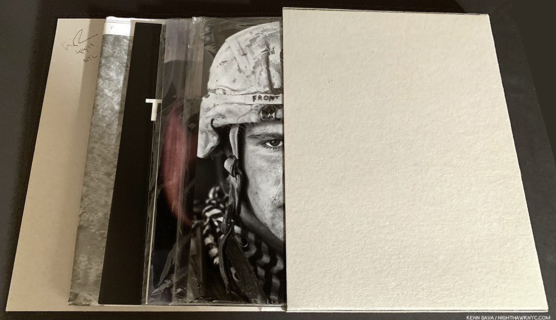
The design of each may gain your immediate attention (the former, which comes in a slip case/wrap that when opened reveals a variety of elements inside to be explored in any order the reader chooses, (a bit like Chris Ware’s Building Stories).

Front Towards Enemy’s slipcase opened to reveal its four components- a packet of soldier portraits, top,, an accordion fold image set, next, staple-bound zine and a newsprint publication, under. The entire publication can also exist as a pop-up exhibition. This copy is signed on upper left of the inside flap.

And the latter who’s front and back covers suddenly reappear in the center of a book that tells the rending story of two Canadian brothers who each died from mesothelioma after years of working in asbestos mines), but it is the depth of the dedication to the stories each contain that makes them unique & powerful. The first printing of A Field Guide to Asbestos almost immediately sold out.

In addition to being an extremely moving account of the lives of its two subjects, it’s, unfortunately, one of the very rare books (let alone PhotoBooks) about the epic and continuing Asbestos crisis.

Mr Palu happened to be sitting a few feet away at Yoffy’s table, so my first impression of his work was still flooding my brain as I spoke with him. In the succeeding weeks, he graciously found time in a very busy schedule and full life to answer some questions for me. Given that not nearly enough has appeared in the media about Front Towards Enemy and A Field Guide to Asbestos– two of the more compelling and important PhotoBooks of the past year in my view, I’m happy to be able to bring my Q&A with Louie Palu to you here.

Louie Palu, standing left, at the Yoffy Press table in the PhotoBook Publishers section of AIPAD, April, 2019.

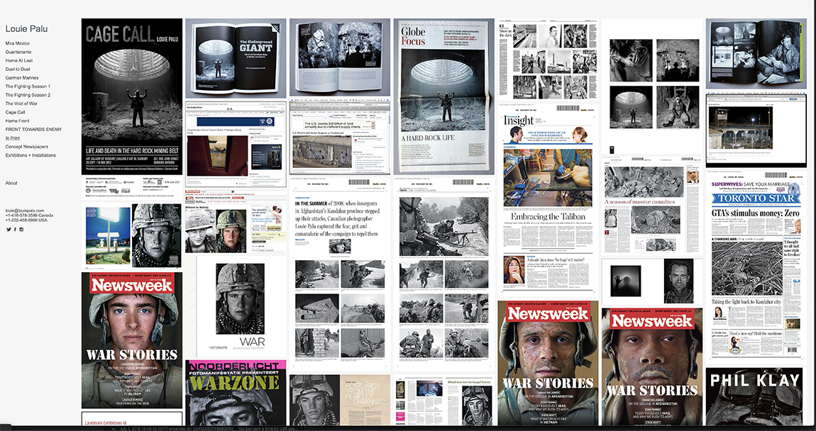
Though I always do my own research, here is one time I find it hard to top Wikipedia’s first line as a succinct introduction to Louie Palu- “Louie Palu, RCA, (born 1968) is a Canadian documentary photographer and filmmaker known for covering social-political issues, including war and human rights,” it reads. The RCA is Royal Canadian Academy of Arts, to which Mr. Palu was inducted in 2014. His work has appeared extensively in publications throughout North America and Europe including The Globe and Mail, Toronto (where he was on staff for 6 years) to The New Yorker, The Wall Street Journal, USA Today, The Washington Post, The New York Times, Newsweek and The Atlantic.

A screen shot of the “In Print” tab on Louie Paul’s site shows only a few of Mr. Palu’s images in print. As you scroll down the page, the powerful images just keep loading…

So, it’s highly likely his work is familiar to you even if his name is not. He’s been  exhibited by the Canadian War Museum and was included in the important show War/Photography: Images of Armed Conflict and Its Aftermath at the Museum of Fine Arts, Houston that travelled to Los Angeles, Washington and the Brooklyn Museum in 2012. He’s been honored with the Hasselblad Masters Award and Canadian Photojournalist of the Year Awards, both in 2008, a 2013 Pictures of the Year International Award and has received a Pulitzer Center for Crisis Reporting grant and a 2016 Guggenheim Foundation Fellowship.

The front cover of Cage Call by Louie Palu and Charlie Angus

His dedication and commitment to the issues he’s covered can be seen in the fact that a number of the projects he’s undertaken have lasted over a decade. To date, he’s focused on five- The Canadian Hard Rock Mining Belt, Guantanamo Bay, the Mexican Drug War, Kandahar, Afghanistan, and Asbestos. Counting the two new releases I mentioned, he has now released five PhotoBooks, with, first, Industrial Cathedrals of the North; second, Mirrors of Stone: Fragments from the Porcupine Frontier, and third, Cage Call: Life and Death in the Hard Rock Mining Belt (all three with Charlie Angus), preceding his two new books. In 2015, after a very successful kickstarter campaign, he released the documentary Kandahar Journals, in which he is featured, as well as co-directed and produced.

That’s not blood. The caption on this photo when it appeared in Front Towards Enemy reads, “An Afghan soldier warming his henna stained hands…” The poster for Kandahar Journals, 2015, featuring, co-directed by and produced by Louie Palu.

In Kandahar Journals, Louie spoke about what inspired him to cover war. “My reason for covering the war is related to my family history,” he said. “As a child my parents told me many stories about the war (in Italy in World War II) around the kitchen table. Their traumatic experiences have shaped who I am. One of the stories my father told me was watching his own father being taken away by soldiers at gunpoint. I needed to understand what he understood.” Louie went to Afghanistan, following US, Canadian and Afghan troops and American Medics (including going on 150 medevac missions with the 101st Airborne in 2010). He decided to take a different approach than those reporters who spent short periods there. Instead, he spent five years.

From Kandahar Journals.

Why did he chose this approach, and stay that long? He explained in an interview last year-

“I think there probably isn’t a single person in this room who wasn’t effected by 9/11 and I think that that was sort of the foundation of it, but it didn’t drive me to want to go there yet. When I got there I realized I couldn’t cover the war in the way I thought it should be covered (staying there for a short period)…I wanted to do a long term study. I wanted to keep looking at something over and over and over and over again because I think that things reveal themselves if you look at them over time.” He decided to leave his staff job, go out on his own, and return there. “I’m gonna stay here,” he continued. “When I figure out the story, then I’ll report it. I did sell stuff sort of on a per story basis. But over the years as the pictures started coming together, they started telling a new story, they started explaining things more than just the bombings and the bodies, they started explaining the culture, the place, its history, and I really think it became a unique story, a unique dialog about the place.”

From Kandahar Journals.

The pictures and the story did come together, in Kandahar Journals, and in the PhotoBook, Front Towards Enemy, released last fall, after many of his images from the war had appeared in numerous news outlets. Kandahar Journals is described as “the story of a photojournalist who reflects on the events behind his psychological transformation,” according to its site. It won the Dziga Vertov Award for Best Documentary Feature, 2017. When I saw it, I was struck by stylistic echoes of Apocalpyse Now. Mr. Palu’s voiceover, often reading from his journals, are reminiscent of Martin Sheen’s Captain Willard’s voice in the Francis Ford Coppola epic, but the whole effect of Mr. Palu’s documentary is also a journey into “the heart of darkness” not unlike that taken by Sheen’s Captain Willard, though here also we see him return from the war. Whereas Francis Ford Coppola was showing us a drama based on Joseph Conrad’s Heart of Darkness, Mr. Palu’s doesn’t have a fictional moment in it. The film wonderfully alternates Mr. Palu’s still Photographs, often seen in montage, with moving images, many taken in active combat situations. Known to this point for his still work, his and his team’s filmmaking show a flair for editing that is both taught and spontaneous. It deserves the kudos it’s received, and more viewers.

Seen at work in Kandahar Journals.

This fall, his work on the Arctic will appear in National Geographic, and his work has been selected to be included in the upcoming PhotoBook, On Death, by Jon Feinstein, Roula Seikaly in collaboration with the Humble Arts Foundation and published by Kris Graves Projects.

Kenn Sava (KS)- You’ve been involved in books about Canadian Mining and Miners, a book about the horrors of asbestos- a deadly product that just won’t go away, and, more recently, a film and book about your experiences in Afghanistan covering the war. What drives you? Where does it come from?

Louie Palu (LP)- All my drive comes from my emotional reaction to hearing my parents oral histories about the Second World War, poverty, workers and the experience of immigrants and refugees. My entire childhood neighborhood in the West side of Toronto is filled with a rich mix of migrant workers from the West Indies (mostly Jamaica), Italian, Bosnian, Crotian, Serbian, Indian, Irish and many more nationalities who came to Canada for a new start.

Louie Palu signs Front Towards Enemy, AIPAD, April, 2019.

KS- The public sees the books and the films- the end results of mountains of long, hard effort. The tip of the iceberg. What’s it like being you? Can you give us a bit of a sense of what goes in to being able to make these projects and then make them into a book or film?

LP- I don’t look at what I do as a job. There are conventional work and job-like tasks, but I take it on as a way of living, thinking and feeling about the world and the people around me. These projects are all very hard, no matter how long I have done this (28 years since college). When I start them it’s a real challenge, like the Cage Call project on the mines, that was like being out of breath non-stop because I was young and did not know what I was doing. I failed so many times, but that is how I got to where I am now, that helped me set the bar higher and higher. The difference from my first 20 years at this, and now, is I have the experience and confidence to clearly understand my process and not be afraid of failure now. I enjoy the process more. I was also lucky to have a few mentors come along and show me the way. I can’t say enough postive things about everyone finding a mentor.

On being me… I like being alone. Though work can be very consuming at times, I have found the places I fit in and exist in when I am not doing photography are usually places and events that have nothing to do with photography. Some of these actitvities involve extreme music like hard core punk and death metal. Additionally, alternative versions of theater, music and art are also therapeutic. I love cruising used book stores, actually I love books and places that sell vinyl, comic books and seeing art house films. I am also very active, I run bike, bike and fish. I like being in the woods alot alone and camping.

From Kandahar Journals.

KS- Was it hard to get the permissions you needed to be at the front documenting the war in Afghanistan for five years? Once you were there, was it hard to gain the acceptance of you and your cameras from the soldiers?

LP- It is hard to get access anywhere and always has been. My first project when I was 16-years old was on homelssness in the 1980’s in the East end of Toronto. I recall getting hit in the face by someone who did not want to be photographed on my first day on the street, I got some hard lessons early on. It can be hard to get access to politicians. Actually, that’s probably harder than getting access to a war zone. I have always figured out access and built relationships well with who I was photographing. Many of my indirect teachers for my values, after my parents, were the work of photographers like Peter Hujar, Mary Ellen Mark, Don McCullin, Susan Meiselas, Eugene Smith and many more.

Louie Palu on his way home. From Kandahar Journals.

KS- How did your years in Afghanistan change you? Did you suffer any of what many soldiers have coming back to Canada and United States in adjusting?

LP- Afghanistan was life changing. Everyday I wake up I am pretty positive. Afghanistan set a bar for me, which is if there are no suicide bombings, land mines to step on and I still have my legs I have nothing to complain about. I certainly struggled hard when I got home, but I rallied because I had good friends who made me go to therapy. Helping people can give you a sense of purpose, being a good person can help you help yourself.

KS- Front Towards Enemy is certainly a unique concept for a “photobook.” Why did you decide to make it this set of multiple parts, in different formats and on different papers, so the reader could put it together however they wished? 

LP- FTE is a deconstructed book, it can be taken apart and re-edited by the viewer. I think its good for readers of the news to understand process and editing. Photo editing is a key part of what we see and don’t see, thats what FTE is after, which is participation of the reader. FTE came out in the wake of and is part of a series of self published newspapers on the same concept. They are Mira Mexico (Mexican drug war) 2013, Guantanamo Operational Security Review 2014, Federal City (political identity in Washington DC) 2017. They can all be seen on the Photoeye website.

KS- With Kandahar Journals, released in 2015, you’ve added film to your photographs. Images from the film appear, also, in Front Towards Enemy. When did your film work begin? It seems like it must be hard to know in advance which camera to pick up since you can only guess what is about to happen, and the unexpected certainly happens all the time. Is this where your experience comes in, or do you prefer to stick with still photography for some things and film for others? 

Louie Palu at work on Capitol Hill, Washington, DC. From Kandahar Journals.

LP- I have always been interested in the moving image. I obssessed over several films as a child and felt that cinematography has an experiential quality that still photos do not, neither is better than the other. I think I watched Apocalypse Now fifty times (the original version is still the best), mostly because Vittorio Storaro and the soundtrack created this psychological space for Francis Ford Coppola’s directing that was rare in films. I never have a problem with which camera to use, I go by what I feel I should use. I have since made a short film on Ukraine and am now making a feature version of it among 3 films in development.

From A Field Guide to Asbestos.

KS- A Field Guide to Asbestos is one of the most grimly intense, and, unfortunately, still timely books I’ve seen recently. With reports this month in the NY Times and elsewhere about asbestos possibly making a comeback, it’s a book more people need to know about right now. How did it come about? What’s it going to take for the world to finally get rid of it, once and for all? 

LP- Sadly asbestos still exists and is used in homes and many other materials around the world. If you all only knew what I know, you would be horrified how this material is still very much everywhere. I think bans can be overturned, because they are usually writing. But photos of horrors are tools of remembrance. If we have books, photos and documents that are artifacts and evidence of what it does and people see them enough it will be hard to forget. This book came about because I began to hear the talk amongst some US policy makers that asbestos could be something that could be used again in construction.

The caption, which reads in part, “U.S.soldiers under rocket and small arms fire from insurgents…” neglects to mention that the Photographer, Louie Palu was, as well. From the newsprint publication in Front Towards Enemy.

KS- We live in a time where the truth is under attack, as the essay in Front Towards Enemy points out, and it’s, also, increasingly hard to do what you do- be a journalist/photojournalist/documentarian. What can readers do to help you and the others?

LS- Go to the website for the Commmittee to Protect Journalists and read the stories of journalists being jailed, murdered or attacked just for reporting the news. Help yourself understand and imagine what your mind would be like without a free press so that you could be informed on everyting from vaccinations to human rights or simply even a warning that some of the food you purchased has a serious health related issue or there is a rapist in your community. We would all be blind and worse off.

I met a person at a film festival recently who did not know what D-Day was, imagine if we start forgetting about the Bill of Rights and the Constitution? We would be a nation with no moral compass. The press is a key tool of oversight and a platform so that we don’t lose our way entirely, or at all.

Q&A Ends.

Can a PhotoBook change the world? It seems to me that Photographers like Louie Palu can make the pictures, get them published, and once in a while make PhotoBooks of them. It’s up to those who see them to take things from there.


BookMarks-

From Front Towards Enemy– the soldier portrait cards, the accordion fold image set and exhibition suggestion card, left to right. Photos by Yoffy Press.

Front Towards Enemy, was published by Yoffy Press in October, 2017 in an edition of  750 copies. Inside it’s cardboard slipcase are four components- a set of soldier portrait cards, an accordion fold image set, a newsprint publication, and a staple-bound zine. The entire publication can also exist as a pop-up exhibition, per the enclosed “exhibition suggestions.” It includes about 60 images and an essay by Rebecca Senf. It may be purchased here.

The first edition of A Field Guide to Asbestos sold out after its publication in April, 2019. A second edition is currently available. It’s a softcover of 72 pages, and is available here. You can get a $15 discount if you buy both, as I did, here.

Kandahar Journals is a first hand look at Louie Palu’s experiences in Afghanistan. What more need I say about it?

Lesser known (and not counted in the five books I mentioned earlier) are two additional newsprint publications self-published by Louie Palu, Mira Mexico, 2012, and Federal City, 2017, both 32 pages. The former consists of a group of his Photographs on the Mexican drug war, while Federal City, a haunting publication that looks at the “other Washington,” those who have no direct connection with the Federal government. Since they are not bound or stapled, both publications may be pulled apart and perused in any order the viewer chooses. Personally, I find both compelling and Federal City exceptional. As I write this, both are available through Photo-eye.

For further reading, Photojournalists on War: The Untold Stories from Iraq, by Michael Kamber, though about the war in Iraq, not Afghanistan, is an unprecedented collection of interviews with some of the other leading Photojournalists of our time, including two who were killed in conflicts after being interviewed. It’s a book I find impossible to put down after I pick it up, and its large size brings the words home with full size photographs reproduced throughout. An extraordinary, highly recommended book. I bought mine from Quinn and Tom of Housing Works Bookstore, who I thank.

*-Soundtrack for this Post is “I Believe In Miracles” by The Ramones from Brain Drain, 1989-


My thanks to Louie Palu and Jackson Charles.

My previous pieces on AIPAD 2019 are here, and on Photography are You can

NighthawkNYC.com has been entirely self-funded and ad-free for over 6 years, during which over 250 full length pieces have been published. If you’ve found it worthwhile, you can donate to keep it going & ad-free below. Thank you!

Written & photographed by Kenn Sava for nighthawknyc.com unless otherwise credited.
To send comments, thoughts, feedback or propositions click here.
Click the white box on the upper right for the archives or to search them.
For “short takes” and additional pictures, follow @nighthawk_nyc on Instagram.

Subscribe to be notified of new Posts below. Your information will be used for no other purpose.


Studio K.O.S. Carries On After Tim Rollins

Written & Photographed by Kenn Sava

I’ll always miss my late friend Tim Rollins who left us at just 62 years of age in January of last year1, but I can’t imagine how his “Kids” feel.

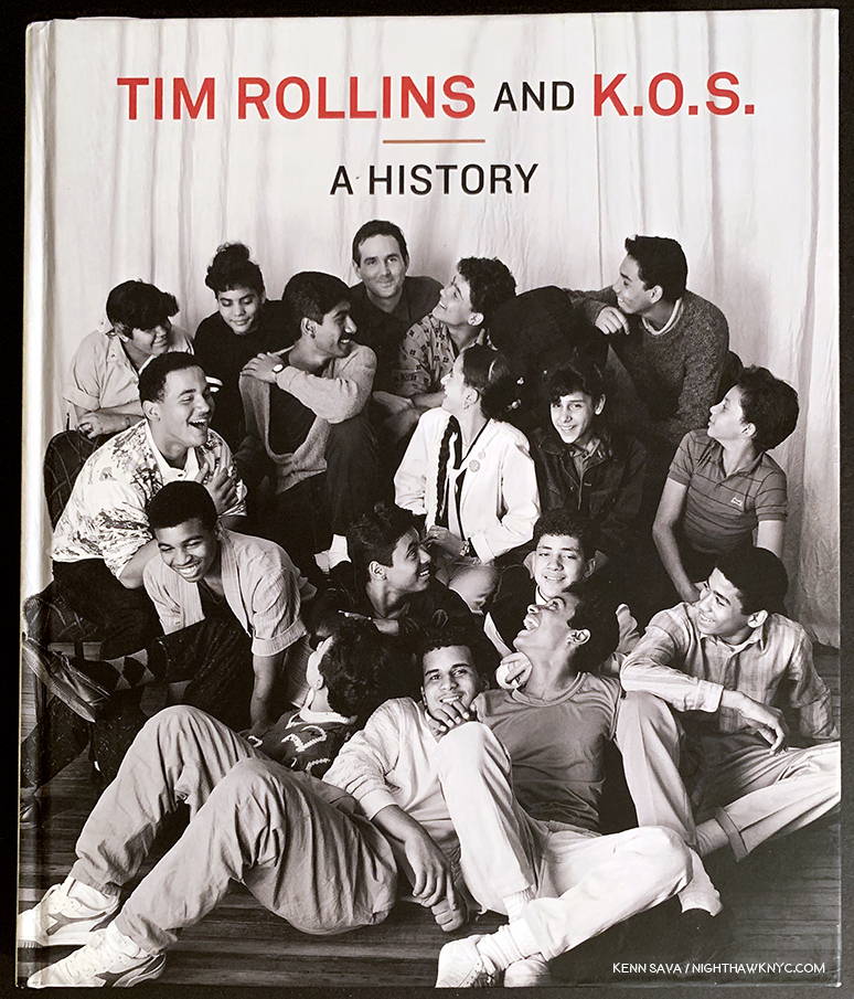
Tim Rollins & K.O.S.: A History. Published in 2009 to accompany the traveling retrospective of 25 years of their work. I’ll never forget seeing Tim with the phone book sized “draft” of this book in 2009, which he let me thumb through, in awe, while it was in preparation.

His Kids, better known as “Kids of Survival,” or K.O.S., a group of at-risk public school students, some barely in their teens, (as you can see in the Photo taken of them, above, by Lisa Kahane in the 1980s that appears on the cover of the retrospective on them), that Tim taught Art to that became the group “Kids of Survival” in 1984. When they began, he told them, “Today, we’re going to make art. We’re also going to make history.” With work in over 87 museums and public institutions (and counting)2, they’ve succeeded on both counts. In 2010, a terrific documentary film on Tim and K.O.S. was released entitled Kids of Survival: The Art and Life of Tim Rollins and K.O.S., which details the unprecedented journey both Tim and the members of K.O.S. took as they forged their own way into Art history. “History” is a word that keeps coming up in discussing Tim and K.O.S. in 2019, which is fitting because this year marks the 35th Anniversary of the founding of K.O.S..

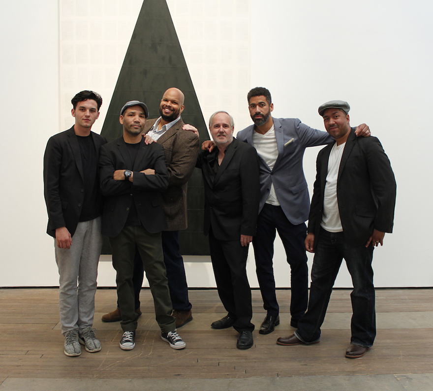
Boys to men. Together, they made history. Tim Rollins & K.O.S. in 2016. Steven Vega, Ricardo Savinon, Robert Branch, Tim Rollins, and brothers Angel & Jorge Abreu, left to right, at Lehmann Maupin Gallery, West 22nd Street. Lehmann Maupin Photo

“To dare to make history when you are young, when you are a minority, when you are working, or nonworking class, when you are voiceless in society, takes courage. Where we came from, just surviving is ‘making history.’
So many others, in the same situations, have not survived, physically, psychologically, spiritually, or socially. We were making our own history. We weren’t going to accept history as something given to us.” Tim Rollins.

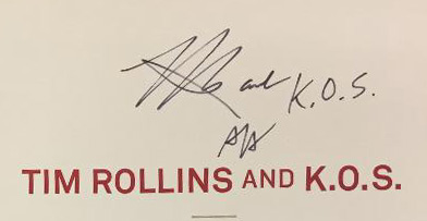
Tim even added “and K.O.S.” to his signature. Angel Abreu signed under it. From my collection.

While he taught them Art in school, with the goal of having them get into college, he also began naming everything he and the they created as being by “Tim Rollins & K.O.S.” Giving the students/apprentices equal status with the Artist as collaborators was unprecedented in the history of visual Art, as far as I know, as so much of what he did was unprecedented in Art education. Now, a year after Tim’s passing, K.O.S. have announced that they are going to continue as Studio K.O.S.. “History” becomes “living history.”

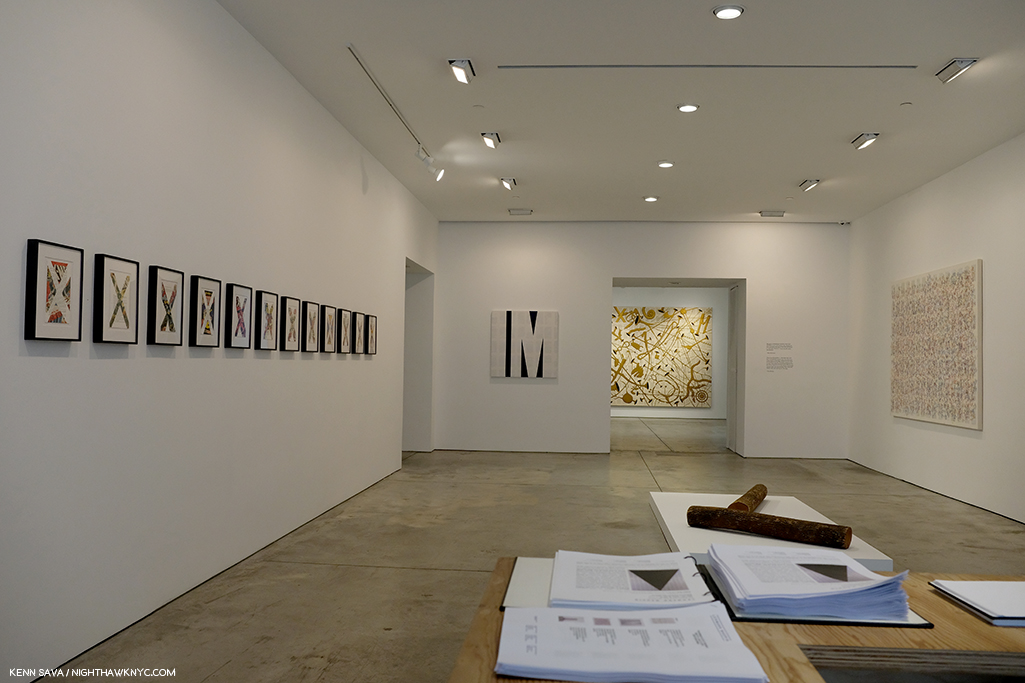
Curator Ian Berry, “Thinking about the increasingly important role of what Tim and K.O.S. did together over 30 plus years is so important for us to see now.” Installation view of Tim Rollins and K.O.S.: Workshop at Lehmann Maupin in May.

The past, the present and the future were the subjects of the show Tim Rollins and K.O.S.: Workshop at Lehmann Maupin in May and June, the first by Studio K.O.S. It included a “mini-retrospective” of their work curated by Ian Berry, who said of his selection, “The show’s called Workshop. I was thinking of works that really exemplified the idea of a group of artists sitting together around a table making work together. Sharing ideas. Thinking, reading, talking, seeing together. So each of the works is a very overt example of their hands and the imagery of the individual members on each of the works.”

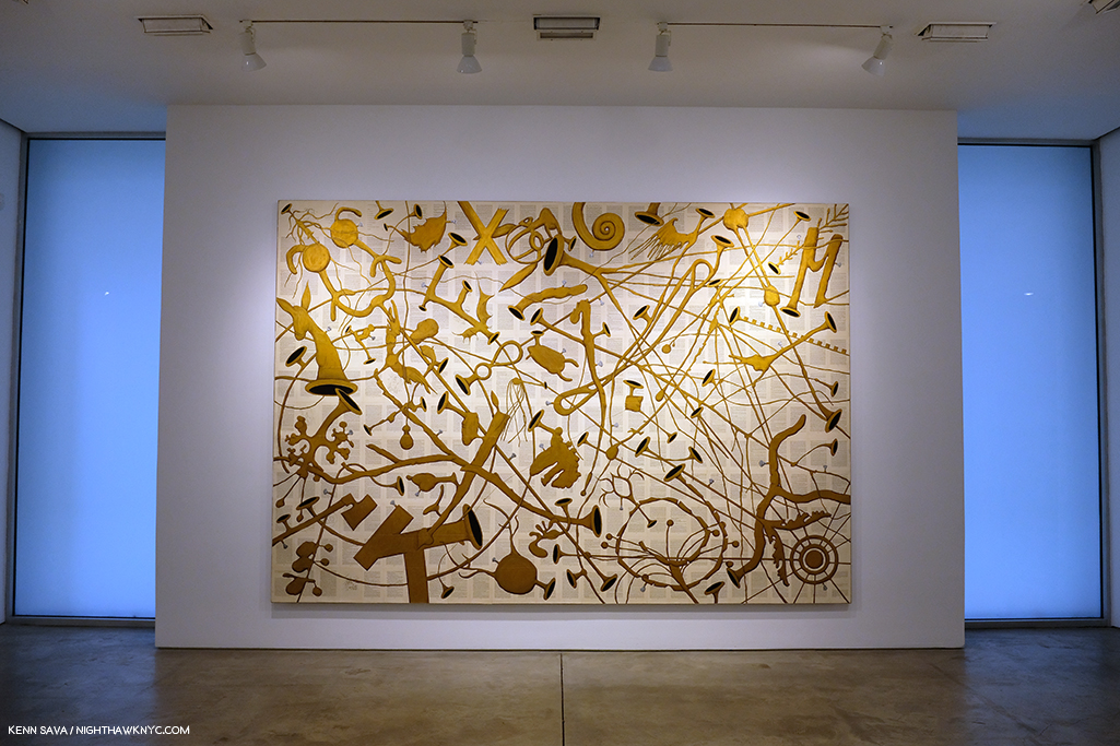
Amerika (For Karl), 1989, Watercolor on paper mounted on canvas, 97 x 132 inches

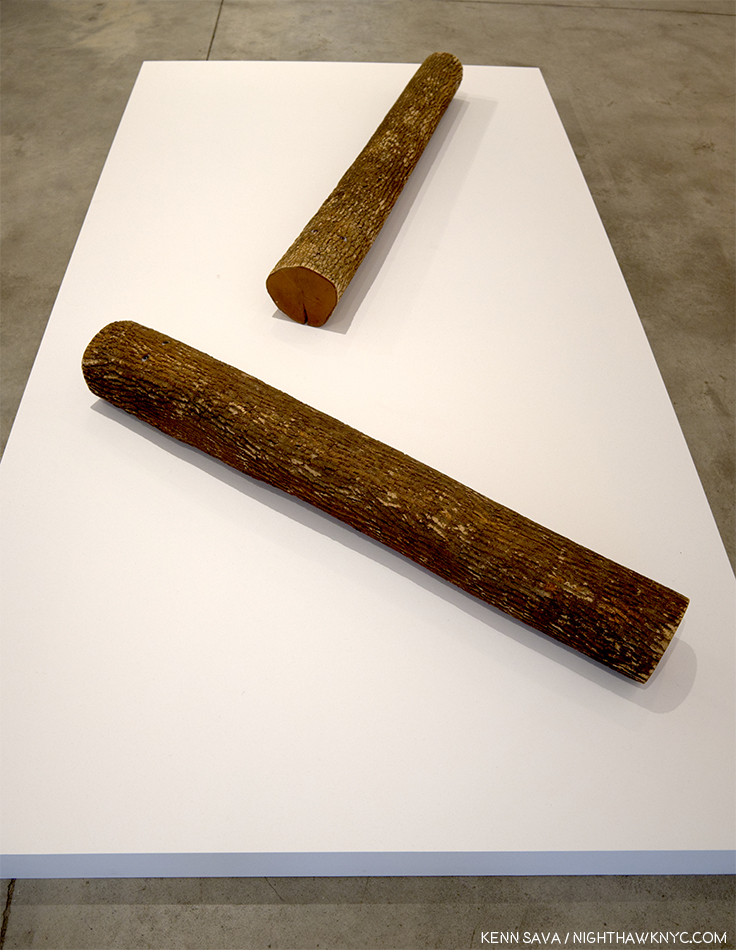
He continued, “And then, I’m thinking about the guys being in Studio K.O.S. without Tim, and I’m thinking about the crazy politics that we’re living in, and thinking about the increasingly important role of what Tim and K.O.S. did together over 30 plus years is so important for us to see now. I really value the idea of this show now. It’s so important to see education leading to justice. It’s so important seeing different versions of identity and self-empowerment and speech, that is so needed now. It’s great seeing these images of Pinocchio logs potentially waiting for birth. It’s great to see this really intense room of all black works, which I hope moves you to be engaged, and be active in thinking about what’s going on around you. It’s a history, but it’s also a workshop that we’re all hopefully invited to join in.”

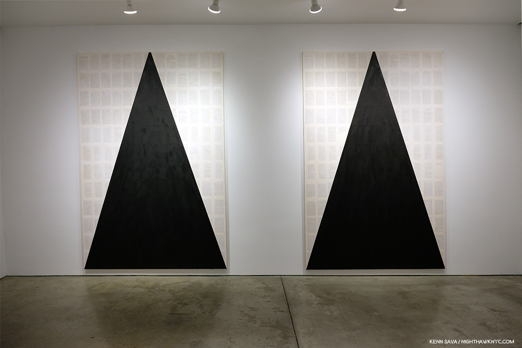
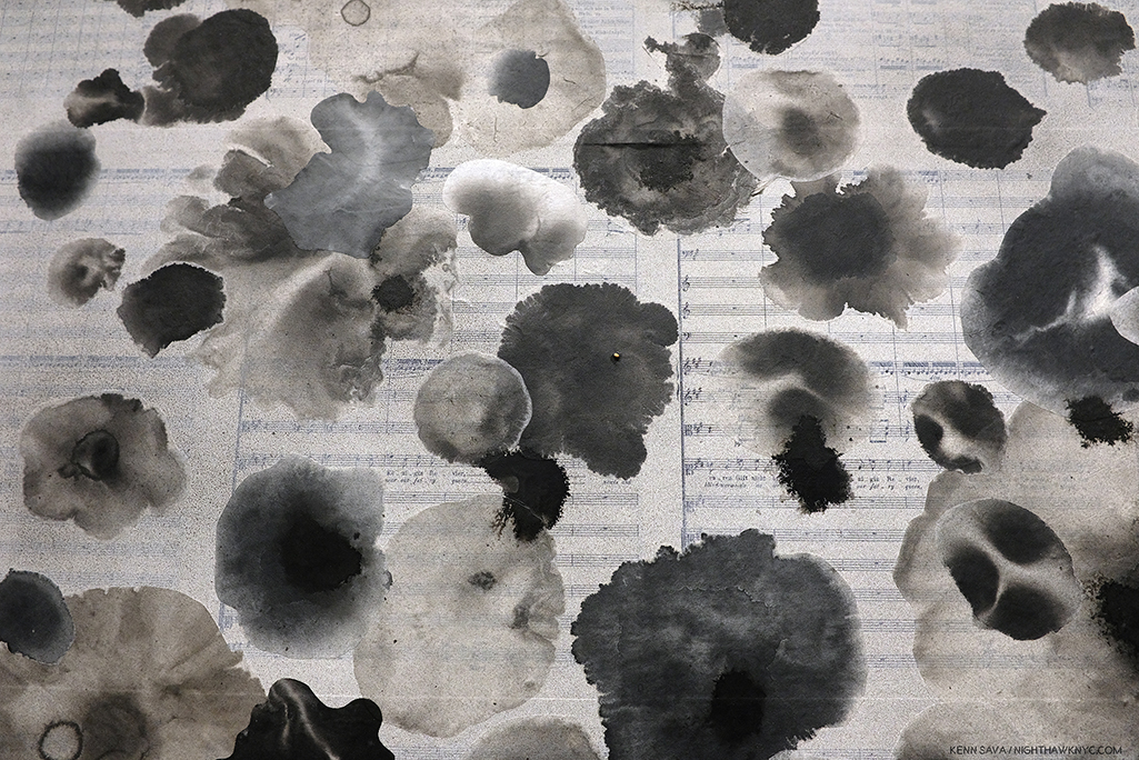
“It’s great to see this really intense room of all black works…” Two works from I see the promised land (after the Rev. Dr. Martin Luther King, Jr.), both 2008, Matte acrylic and book pages on canvas, 108 x 72 inches each.

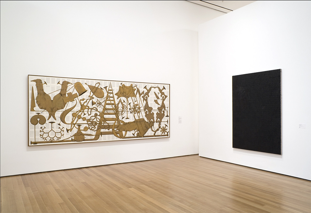
Walking through the show with as unbiased eyes as I could possibly muster, given my personal connection, I found myself in complete agreement with Mr. Berry when he spoke of “the increasingly important role of what Tim and K.O.S. did together over 30 plus years.” When I’ve seen their work over the years, it’s generally been a piece here or there, as in MoMA’s 2007 show What is Painting: Contemporary Art from the Collection, where the group’s Amerika VIII, 1986-7, was on view.

Installation view of MoMA’s 2007 show, What is Painting: Contemporary Art from the Collection, with Amerika VIII, 1985-6, left. MoMA Photo.

I remember standing in front of it and feeling overcome with joy- the joy of a beautiful work and my sense of all that had gone into, and all that had been overcome, achieving it- let alone having it wind up in the Permanent Collection of the Museum of Modern Art (An aside- To this day, MoMA owns NO Paintings by Jean-Michel Basquiat. That’s another story). Then, I walked over to the label you can barely see to the right of the work in the Photo. My jaw hit the floor. Here’s exactly what it said-

If you know of another Artist in Art history who included the names of his students or apprentices on his work, let me know. MoMA Photo.

I remembered standing there thinking- “Can you imagine being them, having overcome all they did, then seeing not just your work, but YOUR NAME on the wall at the Museum of Modern Art?” Angel Abreu was about 12 years old(!), Ricardo Savinon was about 15(!) when this was made.

Seeing a wonderfully chosen selection of their work today, it looks remarkably prescient. Beyond it being a landmark collaboration that marks fresh paths for Art education, their work doesn’t feel one bit dated, and, even more? I think it’s going to hold up; it’s going to continue to speak indefinitely to viewers, regardless of age. My recommendation is that the other museums & institutions not included in the current list of 87 above step up and acquire a work while they can.

The “Kids” are adults now who have forged their own successful careers in Art, and Tim lived to see it happen, something I’m sure gave him as much joy as anything else he experienced in his life. You can see just that on his face in the Photo of he and K.O.S. from 2016 I showed earlier. While each now has a successful career of their own, the legacy they embody and share is still every bit a vital part of their lives, and it sounds like it will continue to be going forward. There remains much to be done.

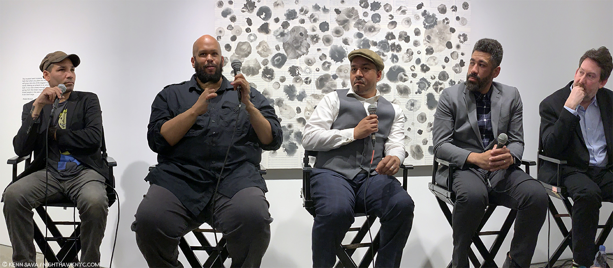
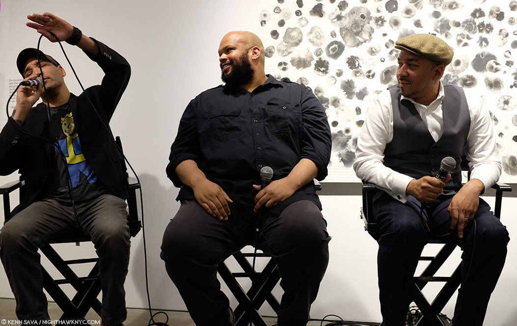
The legacy continues. Ricardo Savinon, Robert Branch, Jorge and Angel Abreu, members of Studio K.O.S., joined by curator Ian Berry, from left to right. Lehmann-Maupin Gallery, West 22nd Street, May 3, 2019.

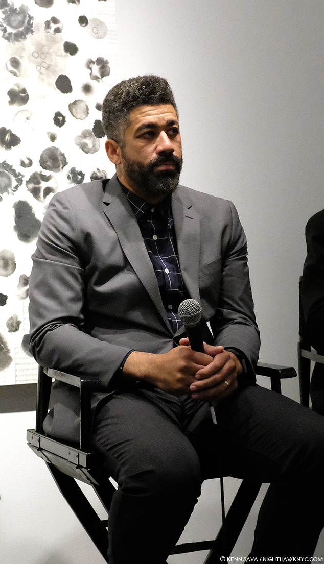
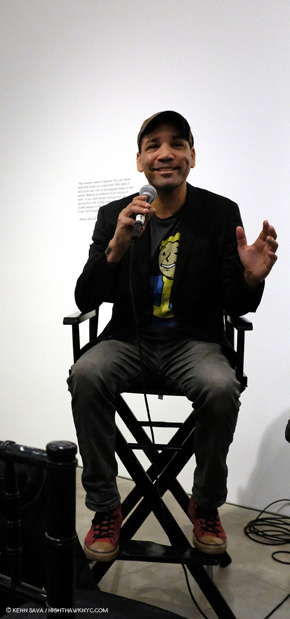
During the run of the show, a panel discussion was held on May 3rd in which Ian Berry was joined by four long standing members of K.O.S.- Ricardo Savinon, Robert Branch, and brothers Angel & Jorge Abreu, men that were very young men when they first met Tim and became members of K.O.S.. Surrounded by Art they created with Tim, each proceeded to tell his story- how he came to be part of the group and the journey they’ve taken over the years, that I’m sure felt like they passed way too quickly. Over the course of 90 minutes, the stories were powerful and joyful, each one a remarkable tale of perseverance and single-minded dedication on the part of students and teacher. Nary a tear was shed, instead laughter was free flowing throughout.

Ricardo Savinon is someone I’ve known for well over a decade. During that time, he was the person I saw most often with Tim. They struck me as having a closeness that truly was on that fine line between family members and close friends along with a very strong level of mutual respect. Rick, as he’s known, was extremely ill, hospitalized, and was reportedly near death himself, when Tim passed away. Thankfully, he recovered, but when I last saw Rick, at Tim’s Public Memorial Service last April, he looked very thin and gaunt. So, I was extremely relieved to see him now back to his usual full of life self, with his ever present sharp wit and even sharper mind in full effect. Rick joined K.O.S. in 1985 at about 14. He went on to study at the School of Visual Arts before becoming the interior designer, Art installer and curator he is today. Angel Abreu, who is about 3 years younger than Rick, met Tim and joined K.O.S. in 1986. He has worked on every major K.O.S. project and exhibition since he joined. Today, he’s a Painter and is on the faculty of the School of Visual Arts, where Tim, himself, studied between 1975 and 1977 and more recently was an SVA faculty member when he passed. His brother, Jorge, joined K.O.S. at age 12 about 1991, as he related in an unforgettable story I relay below. Today, he’s working on a poetry collection around growing up in the golden age of hip-hop. Robert Branch joined Tim and K.O.S. at 16, circa 1993. Today, he holds a BFA from Cooper Union and a masters from Teacher’s College, Columbia University. I had met both Angel and Robert in passing with Tim over the years.

Angel Abreu speaking about participating in a show at Saatchi Gallery in London at age 13, rubbing elbows with Ashley Bickerton and Jeff Koons.

Angel Abreu- “What I’d like to say before we get into this, is that if you can imagine, at 12, 13, 14, or 15 years old, we really didn’t know what was going on. But what we did know, at least I can speak for myself, is that I could not stay away. This was before cellphones, right. And there were many moments when we had, and again, Tim would tell us, ‘There’s no greater motivator than a deadline.’ We are so thankful that we had so many amazing deadlines.”

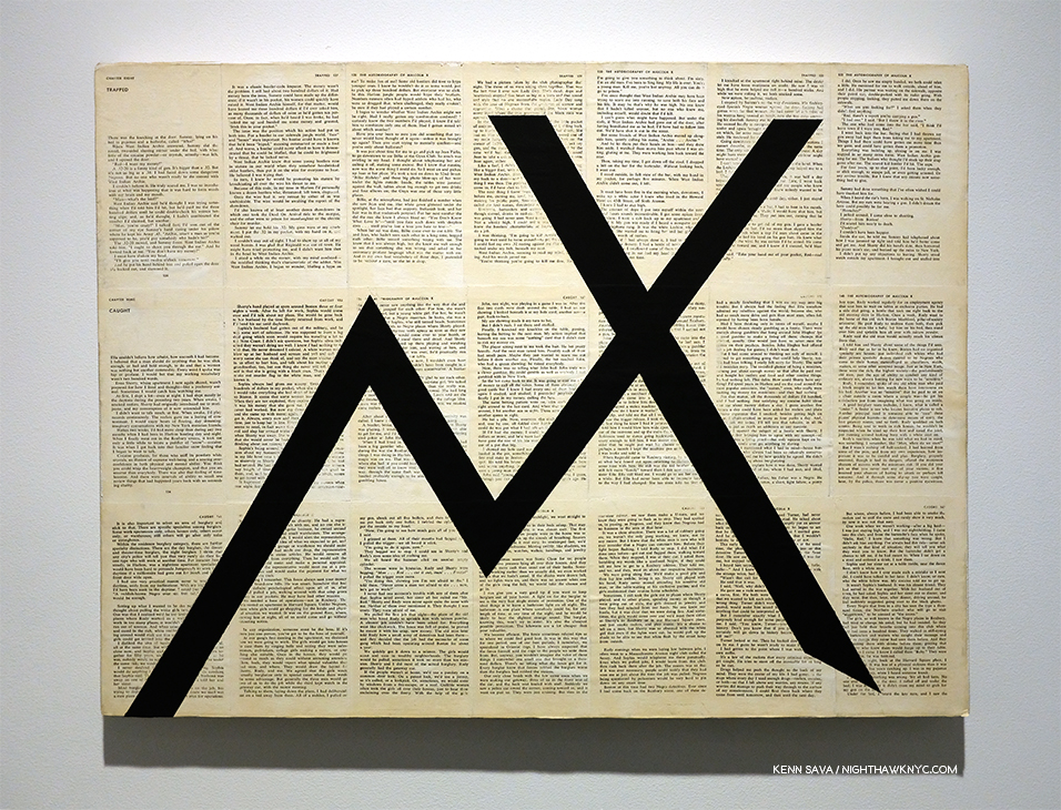
By any means necessary (Trapped/Caught), 1985-7, Black gesso on book pages mounted on canvas, 21 x 28 inches. From The Autobiography of Malcolm X.

“But we had no idea. It wasn’t really until later until I think we got into high school and into college where we realized how extraordinary this was that we were doing. But, really it was the day to day we’d go into the studio. And he’d say, ‘Ok, by the way, we just got included in the next Whitney Biennial.’ Alright, that’s cool, Tim. I have no idea what that is. Yeah, that’s good.”

Ricardo Savinon, “Tim was Professor X…”

Rick Savinon- “Also, I want to chime in. How impactful that us being part of the group and realizing that we were kind of outsiders with our families joining an outsider group. So, it was almost like the X Men where Tim was Professor X and he got together this group of mutants who didn’t know how to hone in their skills.”

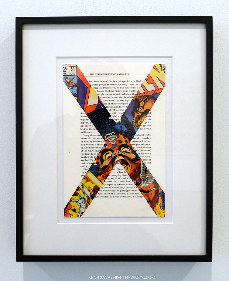
X-Men/Malcolm X (after Marvel Comics and Malcolm X), 1997, Comic book covers on rag board. 1 of 12 parts.

“But in the studio he taught us how. But, in doing so, we impacted so many people, Our peers, our families, our friends. I mean I remember probably after 15 years of being in the group, I have a friend of mine who was walking down the street and said, ‘I was taking Art History class and I saw a picture of you. What the hell’s going on? What are you up to?’ I just said well very calmly, ‘I’m glad that you’re pursuing art. I’m part of this art group for the past 20 years, and this is what we’ve been doing. And he was so proud because we managed to come from a situation where there’s a lot of poverty, violence and we together, we decided to do what was necessary for ourselves. And a lot of others, our peers, our friends that are still friends of mine. I’m very modest. ‘What are you doing right now?’ I’ll say ‘Well, I’m an artist.’ ‘Well, what kind of art, maybe graffiti?’ ‘No, no…’ And so, they’ve always been proud, my family’s been proud. That’s part of the reason my niece is studying engineering at this point because I’ve influenced her. In some subtle way, in the things that I’ve done. Not sitting her down and lecturing her. But just because she’s acknowledging what I’ve been doing. I’m sure that Angel and Jorge and Robert their family does the same…their kids.”

Jorge Abreu, “So, this was a tragedy for my family…”

Jorge Abreu- “Alright, so I’ve got a story to tell. So, just imagine seeing your older brother he’s going off to London (at age 12) and doing all these great things, and you’re home playing Nintendo 64, except it wasn’t Nintendo 64. No. We still had the Commodore. So, obviously this was ground breaking. The way I sort of came into the group was sort of an S.O.S. kind of thing. We had a summer vacation with my dad down to the D.R. We had a terrible car accident, the day before we were supposed to fly back to New York. I was unconscious for 2 weeks. Woke up. Before then I was a kind of straight A student. But, I woke up. Lost my memory. Didn’t recognize who my family was. Ended up staying in the Dominican Republic for a couple months after that rehabbing and recuperating.”

“So, this was a tragedy for my family. We lost my dad at that point, through the accident. Finally get back to New York. I couldn’t walk. One day I woke up. Had to do a whole lot of rehab. My memory was shot. So I went back to school. I believe it was the sixth grade. Really lost. Really intimidated. Really insecure. My mom had some concerns. But, I’d always been a writer as a younger child. I don’t know what happened, sort of a transformation. Now, I wanted to draw. I started drawing and doodling. Obviously my mom was a little concerned for me, so she sort of approached Tim. ‘He’s starting to draw. try to get him involved in the group.'”

Amerika, The Hotel Occidental, 2006, Acrylic and graphite on book pages on canvas, 72 x 59 inches.

“I remember the first day. I had known of Tim. When I went into the studio, I had my portfolio. Alright. And this portfolio consisted of many MLB team logos. Right? So, top notch stuff. So, Tim sort of laughed it off but he gave me a shot. I’m a true believer that this you can take from one of Tim’s great quotes from Amerika when Karl joined the utopian group that took him in right before he was going to leave America. That everyone is an artist. This skill can be developed. If you stick with it. It’s all about just doing it. So, I’m pretty sure Tim was kinda like, ‘This kid’s alright, but he’s not the best.’ But, I continued to come and kept coming and kept coming. I earned my spot. I’m definitely thankful for that. I didn’t know what I was joining. But hey, if it took this guy to London (indicating Angel), I want to be part of it. Next time I want to go, too. “

Robert Branch, “This was my one opportunity and I wasn’t going to let it go.”

Robert Branch- “So, I joined the group later on, I was 16 years old, I was at a High School in the Bronx. JFK. That doesn’t stand for ‘jail for kids.’ The only reason I was going to school was that I had these Dominican working parents. Listen, you either go to school or you get a job or dad’s going to kick your ass. My dad’s bigger than me, so…I was real lucky in that there was a dean who was real tough and he wouldn’t let me skip class.  I really wanted to be a comic book artist. Waiting to be the right age where I could bring my portfolio down to Stan Lee. Luckily, the Art teacher would make sure I attended school, he would call my dad. So, I had this kinda thing where they were really on me and they didn’t want me to fail.”

A Midsummer Night’s Dream (After Shakespeare and Mendelssohn), 2014

“I was really fortunate that the Art teacher brought me to the studio on a trip, walked past the Pinocchio on a freezing cold day, I come all the way down there to the Bronx and I’m like, ‘This is it.’ I’m coming to study here. I’m going to ask as many questions as I can. This is my one shot to figure out what it’s like to be an artist. Because, up to that point, I had not been able to take an art class until my junior year in high school. Think about that. New York City, one of the wealthiest cities in the world, and it had no opportunities to take art classes, and I was in a high school that had some resources, so you know I made the most of it. I was in the studio and I was like ‘What’s this? What do you do with this?’ I asked at least a dozen questions and Tim said, ‘Oh my god, he’s either really into art, or he’s going to come back and rob me.'”

In each work a seed is included- somewhere. In, this detail of A Midsummer Night’s Dream (After Shakespeare and Mendelssohn), as seen above, it’s a a mustard seed visible right in the center of this picture. A beautiful and fitting metaphor.

“So, it was just a wonderful experience because this was my one opportunity and I wasn’t going to let it go. Tim was deeply intuitive and he knew that I had this interest in making art. And that was the beginning of a journey that took me from…my dad…I ended up going to college and I would never have crossed that threshold  if it weren’t for the support and mentorship that Tim gave me. And you know what a college experience can mean to a person’s life. I wouldn’t have gone down that path.”

“Tim wasn’t just my friend, my first white friend, he was an authority figure. I remember dropping something off at his apartment. I had my nephew in the back. My dad drove us. I’m a real city kid- I don’t drive. So, my nephew asks, ‘Who’s that guy?’ My dad said, ‘Well, next to me, that’s the most important man in Robert’s life.’ And that’s the gift that Tim gave me with his friendship and consummate mentorship.”

Believe it or not, out of everything Tim & K.O.S. created thus far, this work, what appears to be simple logs laying on a gallery floor, speaks to me, personally, as much as anything they’ve created.

“Recognize the creative glimmer in others,” Tim said.

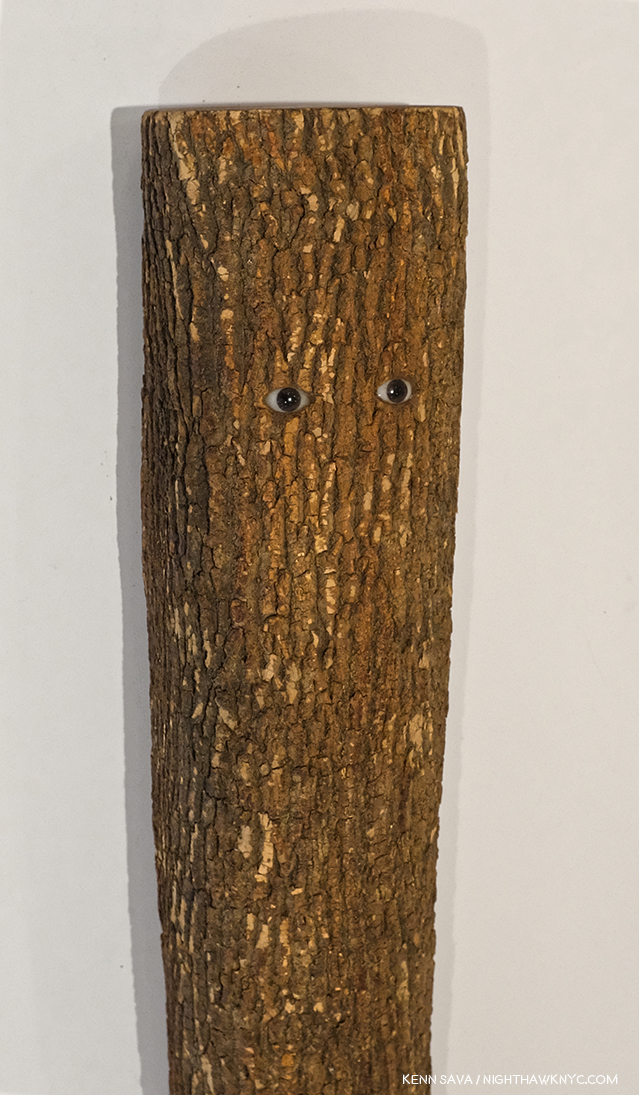
When you look closer…Detail of Pinocchio (after Carlo Collodi), as seen above, 1991, Wood, plastic, wax, tung oil, 43 x 6 x 6 inches.

As their work, Pinocchio shows, brilliantly in my opinion, locked inside each of us are whole untapped worlds of possibilities. Tim Rollins even saw mine.

*My thanks to Rick Savinon, Studio K.O.S., and Twice Sold Tales, Seattle, WA. 


BookMarks-

Tim Rollins and K.O.S.: A History by the aforementioned Ian Berry is the standard reference on the group’s work and history, as I mentioned published to accompany the traveling 25th Anniversary Retrospective. 220 pages, full of illustrations, stories and an interview with Tim. Highly recommended to anyone interested in exploring their amazing accomplishments and the even more amazing story of how it all came to be.

Kids of Survival: The Art and Life of Tim Rollins + K.O.S.. is an unforgettable documentary on Tim and the group, a must see for everyone- Art lover or not, in my view. It’s, also, an invaluable look at teaching Art today. Having known Tim and a few members around the time of it’s release, it gave me a “you are there” look at their incredible backstory, into them before I knew them, and even much, much younger. It’s somewhat miraculous that this story exists on film as much as it does, and it leaves me praying that there will be an updated version, given this was released in 2010.

*- Soundtrack for this Post is the X-Men Theme from the 1996 Television show.

NighthawkNYC.com has been entirely self-funded and ad-free for over 6 years, during which over 250 full length pieces have been published. If you’ve found it worthwhile, you can donate to keep it going & ad-free below. Thank you!

Written & photographed by Kenn Sava for nighthawknyc.com unless otherwise credited.
To send comments, thoughts, feedback or propositions click here.
Click the white box on the upper right for the archives or to search them.
For “short takes” and additional pictures, follow @nighthawk_nyc on Instagram.

Subscribe to be notified of new Posts below. Your information will be used for no other purpose.


  1. My Remembrance of Tim Rollins is here.
  2. Per the list, here.

The Jonas Wood Phenomenon

Written & Photographed by Kenn Sava (* unless otherwise credited)

Japanese Garden 3, 2019, Oil and acrylic on canvas, 88 x 98 inches. *Christie’s photo.

A few weeks ago, on May 17th, Jonas Wood’s Japanese Garden 3, 2019, (i.e. a very recently completed work), sold in a benefit “to conserve one of the wettest tropical forests in the Americas” for $4,928,500.00- almost 10 times the low estimate of $500,000.00! The high estimate of $700,000. would, also, seem absurd given the past few years of Jonas Wood’s market history. My estimates would have been $1,500,000. to 2,500,000., which would put him in the price range of some of the biggest names in Art and Art history. I don’t read too much into the prices paid for Art since people buy it (like they do everything else) for any number of reasons (and it was for the benefit of a good cause). Still, the price realized for Japanese Garden 3 is remarkable when one considers that Jonas Wood’s first one man gallery shows were at the Shane Campbell Gallery, Chicago, and at Anton Kern Gallery, here, in 2007.

Jonas Wood at the opening of his latest show at Gagosian, West 24th Street, April 24, 2019.

Already, Jonas Wood’s work is nothing less than a popular phenomenon in the world of Contemporary Painting. While I can understand his work being popular, how popular it is surprises me very much. I began to wonder what I’m missing.

And so, I have gone to each of Jonas Wood’s NYC shows since 2016 to see more and to gain a better understanding.

Anton Kern Gallery’s former West 20th Street, Chelsea location seen on October, 2016, during the run of Jonas Wood Portraits, with Frank Gehry’s gorgeous ICP Building looming in the back. The former Kern Gallery building has since been demolished, this view lost.

Jonas Wood first came to public attention, and may be still most renowned for his “Sports” series, a selection of which was collected in his first monograph, the extremely popular Sports Book in 2009 (See BookMarks following the piece for my List of Jonas Wood monographs & catalogues). In it, he gave us his version of sports cards and created portraits of athletes and venues, mining one of the world’s most popular subjects, which, surprisingly, very few Artists have, Raymond Pettibon being to my eye, the most compelling. Born in Boston, Mr. Wood features a number of Celtics and Boston Garden, though his selection ranges from the famous (Shaquille O’Neal and Yao Ming) to names only die-hard fans have even heard of, let alone are familiar with (Buddy Solomon…? Sherman Corbett?). His inclusion of the unfamiliar reminds me of Mr. Pettibon’s subjects.


To this day, a basketball doodle often accompanies Mr. Wood’s signature on books and posters as something of a personal trademark. Sports as a subject may have been the “hook” that got the attention of the Art loving public beyond those who saw his gallery shows, but his work covers a variety of subjects, with an emphasis on domestic scenes and portraits.

After solo shows at Anton Kern in 2008, 2011, and 2013 (and elsewhere in the US and Europe) followed that first 2007 show, Portraits, opened in September, 2016. By then, the buzz around Jonas Wood, and the show, was substantial.

Robot (Self Portrait), 2013/16, Oil and acrylic on linen, 29 x 22 inches, seen at Portraits in 2016.

On October 19, 2016, I went to see what it was all about. I found a Painter who’s work seemed was not shy in revealing its influences (Alex Katz, David Hockney, Picasso, Matisse), in Paintings with a homey feel- these were works that were as much about place, possibly his home, as portraits of people.

Rosy In My Room With His Cat, 2016, 68 x 68 inches, seen at Portraits in 2016.

They had a decidedly personal and intimate feel to them. They were “portraits” of a lifestyle. Perhaps, that’s what resonates most with his fans. (Perhaps the same can be said of Alex Katz’s and David Hockney’s work as well.) 

The series Four Majors, 2018, Multicolor screen print on Coventry rag paper, each 19 x 13 inches, seen at Prints in 2018.

From there, the buzz around Jonas Wood has only continued to increase. On April 19, 2018, I saw his Prints show at Gagosian, who has continued to represent the Artist.

8 Etchings, 2014, Ink on Japanese paper, each 16 x 14 inches, seen at Prints. One set, of the edition of 10, is in the collection of MoMA, who own 3 Drawings but no Jonas Wood Paintings. The Whitney owns two Paintings and two Drawings. The Met owns none of his work. Sseen at Prints in 2018.

Determined to get a better understanding on what is happening here, on April 24, 2019, I went to the opening of Jonas Wood, his current show at Gagosian, West 24th Street, since I rarely go to openings, primarily to see who his fans are and what I could learn from seeing how they interacted with his Art. I missed some of the “interaction.” Each and every work on view was sold before the show opened.

Jonas Wood was on hand, followed at every turn by a film crew.

A few days later, at the opening of Gagosian’s Jeff Wall show, I met and spoke with Mr. Wood about Drawing in his practice. And, I watched with fascination over multiple visits while others stood and pondered the work wondering, “What is it about Jonas Wood that everything he touches sells, and sells for BIG prices these days-even signed books and posters?”

My guess is that there’s a peace and a quiet in his work that looks good on the walls of his buyers. These days, with so much contention, stress, upheaval and ugliness in the world, Art that reflects peace, calm, beauty, color, harmony and exudes a sense of home, contentment and even happiness, would certainly find a big audience. His work reflects, apparently, his life, interests and people he knows- as legions of Painters have been doing for centuries. The vast majority of them never found buyers for their work.

Red Portrait Pot, 2015, 76 x 74, complete with faux Matisse signature en homage. Pots have been a recurring subject in Jonas Wood’s work. His wife, Shio Kusaka, is a porcelain Artist, who he has collaborated with.

While Jonas Wood’s work bears the influences of David Hockney as well as Alex Katz, as I mentioned, but perhaps no other Artist is more to be seen in it than Henri Matisse.

Detail of Matisse Landscape Pot, 2018, 118 x 76 inches.

Yet, once you look past them, he has developed his own style. His work featured views with unexpected planes (seemingly more often in his earlier work than in the new) that makes it both quirky and fresh. I can’t quite put my finger on a predecessor for this, though Cubism, Stuart Davis and (the incredibly overlooked) Ralston Crawford come to mind.

Kitchen on Palms, 2008, 70 x 72 inches, *Anton Kern Gallery Photo

He loves to play with perspective- removing shadow or any sense of depth, and will add layers that jar the viewer into looking closer to try and understand what’s really being shown (as in the almost Richard Estes-like Ovitz’ Library, 2013).

Ovitz’ Library, 2013, 100 x 132 inches, *Anton Kern Gallery Photo

Closer looking also reveals how much work goes into many of these works, many of which feature an almost obsessive amount of detail, as do their size. Finally, it is his choice of subjects that branches his work out from that of Alex Katz. Even David Hockney, who shares Jonas Wood’s love of color and domesticity hasn’t shown us the scenes Mr. Wood chooses, some of which feel like “interior still lifes.” It’s a bit miraculous, I think, that Jonas Wood has been able to balance so many influences so well and managed to produce work that is instantly recognizable as his own.

A mural seen at Starbucks on 8th Avenue and West 22nd Street, April, 2019.

In fact, that it does so so well makes it susceptible to being ripped off by advertisers and corporations, and I expect we will see it all over soon- if we’re not already.

On top of the (Art) world. Young Architect, 2019, 110 x 78 inches, seen in his current show, in a room “dedicated to a series of new paintings of architectural interiors and exteriors,” to quote the press release, that includes the next work as well.

Yet, the big question, at least in my mind, remains- What does it all “mean?”

Jersey City Apartment, 2019, 104 x 142 inches,

Jonas Wood’s Paintings often play with the existence of space. In some works, there is no perspective- everything is squashed right up against the picture plane (as in Japanese Garden 3), which, frankly, sometimes I find oppressive. In other pieces, there is perspective, but no shadows. This gives those pieces a surreal look. Most interestingly in his current show is Jersey City Apartment, 2019, Oil and acrylic on canvas, 104 x 142 inches, the work selected for the show’s poster. In it we see both perspective and shadows, yet no life, beyond plant life, in spite of the Art on the wall proclaiming “LIFE NEW LIFE” with the Sun over it. The apartment depicted empty, as is the landscape beyond the huge picture window (minus the Sun). On the impossibly balanced coffee table, with dual glass tops, rest seven globular “heads” with varying strange faces and expressions. The work depicts what I imagine to be the setting for a good many of Jonas Wood’s Paintings in the homes of their owners. It’s an interesting work when one considers that almost every other Jonas Wood landscape I’ve seen (partial landscape, here) takes place, apparently, in California. Perhaps? It shows the “life” of Art in the space where it has come to “live” when, possibly, its owners/residents are out working to pay the rent, the mortgage, or? The Art bill. Or, perhaps it’s a commentary of what passes for “life” today- a lonely space in the sky surrounded by steel, concrete and glass. Whatever it is, the Art in this space- the Painting, the sculptural objects on the coffee table, and the table itself, are stuck in this space, like the plants are. Together, they provide the only sign of “life” gong on here.

Jersey City Apartment, Gouache, ink, collage and collored pencil on paper, 24 x 31 inches

The show’s third gallery is full of “corresponding small-scale works on paper,” the press release informs us, one of each work shown in the rest of the show. Jersey City Apartment, for one, is fascinating to compare with the large Painting. In the small work, among other very slight differences, Jonas Wood has included an imitation Roy Lichtenstein portrait of a blonde on the column on the left, which is not included in the large work. Why not? It calls to mind what Richard Estes and Edward Hopper, among others, have said about the inclusion of people in a scene automatically drawing the viewer’s attention to them seeking a narrative reading.

In one sense, Jonas Wood is doing what Andy Warhol and the other so-called “Pop” Artists did- turning the everyday, the things that are parts of Art viewer’s every day lives, into Fine Art. He did this with sports, and he’s continued to do this, expanding into depicting a home life that, apparently, many viewers can relate to, it seems to me, in the process, elevating it to the status of “Fine Art,” as Andy Warhol, et al, did with soup cans, soap pad boxes and celebrities. And so? His is a different kind of “pop” Art. It’s Art based on what’s a part of the (equally familiar) everyday lives of his viewers. Of course, many other Artists do this. With his technique that has a rough, unfinished edge to it, bright colors, and a focus on the essential he picked up from Alex Katz, David Hockney and especially Mattisse, Jonas Wood struck a nerve. To the point that I now believe his work is here to stay. I’m not sure his market is going to stay at the 5 million dollar level (maybe he’ll surprise me), but I don’t see his popularity ending any time soon.

All of that said, how do I feel about the Art of Jonas Wood? It doesn’t speak to me, though I will keep looking. However, I am thrilled to see the work of a Painter being as popular as Jonas Wood’s is in this age of Photography and digital media seemingly taking over the world of Art. I can live with it. And maybe that’s why people buy everything the man Paints- as soon as he does. They can live with it.


BookMarks-

Jonas Wood- A List of Monographs and Catalogues

A few of Jonas Wood’s monographs and catalogues.

Jonas Wood’s books are, also, something of a phenomenon. They remind me of PhotoBooks in some ways- many are focused (sorry) on a specific body of work, they are highly collectible and eagerly sought after on the primary and secondary markets. A few are out of print and most are printed in relatively small numbers given his popularity today. So? It’s hard to calculate the impact they’ve had on the Jonas Wood phenomenon- a good many of those interested in Jonas Wood’s Art may have trouble finding some of these at reasonable prices. Most of these books have 48 pages, succinctly covering the title topic in a thin size, but the only book that could be considered an “overview” to date is one of the most recent- the catalog accompanying his retrospective at the Dallas Museum of Art, which is still “only” 108 pages and only includes 33 works. Into this void will step the ever interpret publishers Phaidon, who will release the first full length volume on Jonas Wood as part of their fine Contemporary Artists Series around Halloween.

Here is an overview of the monographs released thus far, listed chronologically from the date of the first edition. Title, followed by year of publication, followed by publisher, followed by information on subsequent editions. If you know of any details I’ve omitted, please let me know.

Sports Book, 2009, published by PictureBox, 2nd Edition- 2016, published by Anton Kern and David Kordansky Galleries. 

New Plants Los Angeles, 2010, Anton Kern, published for his first one man museums show at the Hammer Museum

A History of the Met: Vol 1, 2010, Paper Chase Press. 2nd Edition- 2013, Jonas Wood and Anton Kern. In speaking with Mr. Wood, he indicated to me there will be a Volume 2.

Pots, 2015, Gagosian

Paintings and Drawings, 2015, David Kordansky

Portraits, 2016, Anton Kern and David Kordansky

Interiors, 2012, PictureBox, 2nd Edition- 2016, Anton Kern and David Kordansky

Paintings & Drawings, 2015. Out of print and rarely seen.

Paintings & Drawings, 2015, David Kordansky (Out of print)

Blackwelder (with Shio Kusaka), 2015, published by Rizzoli and Gagosian. First edition printed by The Avery Group at Shapco Printing, Minneapolis, 2nd Edition- 2017, printed by C&C Offset Printing Co, Ltd, China

Clippings,  2017, Karma (Out of print)

Prints, 2018, Rizzoli and Gagosian

Jonas Wood, 2019, Gagosian Exhibition Catalog for the current show

Shio Kusaka & Jonas Wood, 1st Edition- date & details unknown, 2019, 2nd Edition published by Stichting Voorlinden & Gagosian

Jonas Wood, 2019, Dallas Museum of Art (the catalog accompanying his first museum retrospective)

Prices on all of these range from $40. to about 150.00, with first editions of Sports Book and A History of the Met costing more- unsigned. Of these, I find Portraits and Interiors the two I turn to most. There is a little overlap between them, and the 2nd edition of Interiors seems to suffer from being reproduced. For those looking for an introduction to Jonas Wood, I would recommend they start there, at least until the Phaidon book comes out. Of course, sports fans may find the Sports Book the most interesting. However, it can be a bit harder to find, and more expensive, than the others.

NighthawkNYC.com has been entirely self-funded and ad-free for over 6 years, during which over 250 full length pieces have been published. If you’ve found it worthwhile, you can donate to keep it going & ad-free below. Thank you!

Written & photographed by Kenn Sava for nighthawknyc.com unless otherwise credited.
To send comments, thoughts, feedback or propositions click here.
Click the white box on the upper right for the archives or to search them.
For “short takes” and additional pictures, follow @nighthawk_nyc on Instagram.

Subscribe to be notified of new Posts below. Your information will be used for no other purpose.

Jia Aili’s Transcendental Vision

Written & Photographed by Kenn Sava (*unless otherwise credited)

T-minus two months to 50 years ago human beings first set foot on the moon. I well remember following the trip on TV (though I have a friend who, though alive at the time, doesn’t believe it actually happened). With all the hoopla about to begin commemorating mankind’s greatest scientific achievement, I saw this relatively small Painting hanging on the wall at Gagosian, West 21st Street, and was suddenly struck by a different feeling. A feeling of what life, on earth, is like today.

Jia Aili, Astronaut, 2018. Oil on canvas, 23 1/2 x 19 11/16 inches.

Buckle up!

Watch your step!

Keep an eye on the sky and the other on where you’re about to put you next footstep.

And off you go into the great adventure called life in these increasingly challenging times. Heaven only knows where any of us will wind up. Back safely “home,” or…

But, this isn’t Neil Armstrong, Buzz Aldrin or John Glenn. The uniform is the wrong color. My associate, Lana Hattan, informs me it’s early Soviet space pioneer cosmonaut Yuri Gagarin, 1934-1968, the first human being to go into outer space, and so, ideology aside, a man who has earned his place among the bravest men who ever lived.

Yuri Gagarin in a possible source image. *Photographer unknown. 

Seeing this now, almost exactly 58 years after his flight (April, 1961), I was gripped by the metaphysical aspects of it- as a response to the twin questions of “What is there? What is it like?” Living in an age when technology is ever so gradually pushing us into “brave new worlds,” it takes courage on all of our parts to respond to what’s there and what it’s like, to take the leap of faith life today requires simply to survive. Oh, and make sure you have your pressure suit, gloves and helmet fully secured to survive the increased traffic of all kinds coming at you from all directions on the streets and even the sidewalks!

Untitled, 2012-14, 52 x 37 1/2 inches.

Protection suits…technology…nuclear explosions…lightning storms…apocalypse…desolation. All of these things loom as large in the Paintings of Chinese Contemporary Painter Jia Aili as seen in Jia Aili: Combustion at Gagosian, West 21st Street, as they do in the modern world- all over the world.

And? In the middle of all of this, there are a number of “humanoid” beings with their heads on fire.

Detail from Jia Aili’s Untitled, 2013, Oil on canvas, 47 1/2 x 81 inches.

A Painter at the peak of his or her talent can seem like someone with their head on fire. The wonderful canvases just seem to flow like a molten stream from their hand to the walls of galleries, museums or their collectors. That’s how I felt seeing this show spanning about a decade of Jia Aili’s Paintings. Completely enthralled, as I looked closer, there were so many passages in his Paintings that looked like they could be a work of their own. Combined, it seems to me, these passages create an entirely fresh style of composition. Take a look at this-

The gigantic Sonatine, 2019, 196 x 393 inches- 33 feet long!

Since there is so much to see in any one of these works, I’m going to focus on one in this piece. The huge, new, Sonatine, 2019, strikes me as the Artist’s most compelling work among the pieces I’ve seen on view here or in the monograph Jia Aili: Stardust Hermit, 2019. A sonatine  in Music, is a shorter sonata, both are musical compositions for one or two instruments in three, maybe four, movements, each in a different style, the whole may last about 40 minutes, more or less. Sonatine was also a 1993 Japanese gangster film. Which one of these is referred to here? Your guess is as good as mine, but I’m going with the musical composition definition, particularly because it has four panels and the mood seems to change between them.

“I almost never have a narrative in mind when I’m beginning a work, I start out from pure intuition. But quite a few viewers discover narratives, particularly in the larger-scaled pieces. That made me realize that narrative is about a way of reading-a visual narrative is produced by the order of vision,” Jia Aili1.

Sonatine begins, in my reading, in an unsettling, ominous, quiet in the far left of its four large panels, progressing to otherworldly utter chaos on the right. Along the way, there’s a fascinating mix of styles, references, shapes, images and partial images that take the mind in an any number of directions. First, regarding the huge scale, I’m reminded that Jia Aili studied billboard painting, like another great Painter who worked marvelously in huge scale, James Rosenquist, before changes in advertising in northeastern China brought the end of jobs for them. Yet, the motifs here have more to do with a kind of “personal language” than they do with anything that could be called “pop.”

Detail of Sonatine, its left hand panel.

Nothing I have read indicates Sonatine’s four panels should be considered individually. Yet, the more I looked at it, the more each took on a life of its own in my mind. Your results may differ. (Keep that in front of your mind throughout this.) In the left panel, I get the sense of being in a deserted or abandoned shopping center or commercial parking lot, but the odd triangular shape on the far left, almost seems to be sucking the atmosphere up and out of the Painting’s upper left corner. Looking very closely, I noticed that the line that extends down to the right, looking like a wall in perspective, faintly continues under the triangular shape. Well, whatever this white shape is, it reminds me of a wall. It leads the eye to a mysterious, distant horizon that contains a signpost or totem of sorts, under a threatening dark sky.

Sonatine, detail of the left hand panel.

Two figures appear, one shadowy about half way down the “wall” on the left, the other a dark shape, both possibly mounted on bikes, otherwise disconnected and at purposes unknown. The dark figure in the rear is being struck by lightning, a recurring meteorlogical motif in the skies of Jia Aili’s work. As I walked through the show, and noted more recurring motifs, I came to feel that these elements make up his dramatis personae. In Jia Aili’s case, the way he uses them almost seems like a sort of “code.”

From Jia Aili: Stardust Hermit

Back in the left center panel, another wall comes in diagonally from the right, serving to move the eye to the left panel’s background and then leading the viewer towards the center of the massive work, where things get extremely complicated. Still, i found myself repeatedly drawn back to the mysterious far left panel. I don’t know why,

*Curran Hatleberg, Waiting, 2012, Photograph.

The left hand panel eerily reminds me of this Photograph by Curran Hatleberg, who was selected to appear in the 2019 Whitney Biennial, taken in 2012, seven years before Jia Aili painted Sonatine.

Detail of Sonatine, its center left panel.

The sky suddenly clears at the top of the center left panel. Two figures, at least one who’s head is on fire, appear, shrouded in a triangular shape that almost entirely covers them. It almost looks like a black hole, possibly to another dimension. Is the second figure, which is grey and appears to be wrapping the flaming figure with a boney arm, a skeleton?

Sonatine, Detail of the far left and center left panels.

It’s hard to tell, yet in my reading of the work it is2. From looking at the works in this show featuring flaming figures, I came to regard them as living human beings- the flame represneting life, being alive, like that in a lit candle. From the direction of the flames, I believe the figure on fire is moving towards the center, though it’s main struggle appears to me to be with death, who’s desperately clinging to him, as again, a pair of shapes, this time jagged triangles, frame the two figures.

Sonatine, the center right panel.

In the center right panel things get sticky. It’s hard to tell exactly who is involved or what is going on. A white figure strains in the very center. Why and against what is nebulous at best- at least to me. Just behind him or her, is the figure of a woman holding a large bowl over her head, another recurring motif in the works on view here. Is the figure in white, who appears to be wearing a black helmet with, possibly, a horn protruding from the right top, a threat to her? Immediately to its left is the torso of another figure with a white hat or hood pointed in the same direction, towards the woman with the bowl. What is the woman carrying in the bowl? Life giving water, or food? There’s no way of knowing. She appears to be turned slightly to the left, though there’s no obvious way for her to move there. This makes me feel she’s not an actual “figure,” but a symbol- a piece of Jia Aili’s “code.” These three figures stand on another angled plane, this one seemingly beginning in mid air near the foreground and ending at a point in the mid background. All around them is a cacophony of shapes, colors and partial figures, at least one upside-down, which climaxes in the far right panel.

Sontaine, the right panel.

Dominating the far right panel is a large figure near the top with a naked torso and a mask. he’s sitting on a large white sphere with two horns at each side of the top. This sphere figure also recurs in quite a few places, in varying sizes, throughout the show. It looks to have two nostrils and a mouth with two large teeth extending down. They both appear to be watching what’s going on in the three left hand panels.

Sonatine, detail of the right panel reveals a quote from Edward Hopper’s Girlie Show, 1941.

Hiding near the center of the right panel is a small nude figure. On closer inspection, I realized it’s a quote from Edward Hopper’s Girlie Show, 1941. Why is it here in the midst of all of this chaos? There’s no way of knowing from the evidence before us. But, I wasn’t able to get it out of my mind for a number of reasons. It’s the most literal of any number of influences of other Western Painters that are hinted at in Jia Aili’s work.

Sonatine. Detail of upper center right panel.

The symphony of darkness and chaos reaches Sistine Chapel levels with ominous figures on the right looking down on the seemingly insignificant figures below. Except for one element. Taking flight in the middle of the center right panel, a lone balloon rises into the reappearing sunlight. The only person or thing that appears to be escaping, or having hope of doing so.

As I walked through the show, along with all the recurring motifs, I noticed the theme of “escape” recurring as well. It appears in a variety of means. There’s Astronaut, 2018, which Ms. Hattan believes is Yuri Gagarin. Then, there’s this-

The Engine, 2018. 118 x 157 1/2 inches. The means to escape, landlocked on a cart that needs some other means of moving. Seen from the show’s entrance.

And this angelic being leaving the scene of cataclizmic chaos to the left in Frozen Light, 2017-

Frozen Light, 2017, 125 1//4 by 100 3/4 inches.

Looking at Sonatine, or any work of Art is purely subjective and likely to change the very next time I look at it. See what it says to you.

What do you see? Producer and Art researcher, Lana Hattan, the person responsible for NighthawkNYC existing, pondering Hermit From The Planet, 2015-16, 157 1/2 by 236 1/4 inches on 3 panels, on March 15, 2019.

Part of the joy in looking at the work of Jia Aili is his sheer creativity and how much there is to see in each of his pieces.

Jia Aili, Blues, No. 49, 2018, Acrylic on canvas in 2 parts, 106 1/2 x 165 1/2 inches. The torso in red at the very center reminds me a bit of the anamorphic skull in Hans Holbein the Younger’s The Ambassadors, 1533.

In Sonatine and in Blues, No. 49, I’m continually drawn to thinking they’re autobiographical, “about” being an Artist working with the whole of Art History and dealing with the current condition of humanity. The light skies and bright colors, (which almost look like a Pantone chart in the right side of Blues, No. 49), alternate with dark, desolate landscapes populated sparsely.

This, and the following two stills below, are from the video produced for * Christie’s Shanghai 2015 Spring Auctions: The Art of Jia Aili.

Jia Aili grew up in Dandong, a city in the northeastern Chinese province of Liaoning, which directly borders, and faces, Sinuiju, North Korea(!) across the Yalu River.

Untitled, 2013, 63 x 47 inches. The entire, incredible, work, I showed a detail of early on.

The more I looked at it, I wondered if Untitled, 2013 was a pseudo- “Portrait of the Artist as a Young Man.” At least, that’s the image I have from reading about his upbringing. Frankly, it’s now hard for me not to think of it when I look at his work. But, it doesn’t end there, which is a good thing for someone who has never been to China. Jia Aili has gone to school on Art History as well and as thoroughly as almost any other Contemporary Artist I’ve come across recently. The more I looked at this show, which I returned to numerous times, drawn to its unearthly beauty, it’s universal imagery, and it’s subtle and not so subtle references to a whole plethora of Artists, it became hard not to feel that Jia Aili is “speaking” to, and possibly for, many, many human beings who are living in a nuclear world that’s becoming overwhelmed by technology that is just about beyond the ability of anyone to control. This is interesting because though many of the items he shows are familiar, their reality isn’t. Everything is slightly different, as in an alternate reality.

Of all the influences I saw and continue to see in Jia Aili’s work, perhaps none seems to be more present to me than that of the great Francis Bacon. How else to feel about this-

The earliest work in the show. Jia Aili was about 29 when he painted this. Untitled, 2008, Oil, acrylic, mirror, artist’s tape on canvas in 3 parts, 118 x 236 inches.

Jia Aili was new to me when I walked into Gagosian on March 5th. By the time I had finished the second room, and seen a total of 9 works, I was enthralled. I left kicking myself for having missed the Artist in town from Beijing at the opening the night before. Looking into him further, I discovered that Contemporary Chinese Art specialist, gallerist Eli Klein, of Eli Klein Gallery, was the first to show Jia Ailia in this country. I asked Mr. Klein how he discovered Jia Aili. He said, “I first heard about Jia Aili in speaking with a curator named Eli Zagury. I have a habit of picking the brains (and eyes) of those whom are working in contemporary Chinese art so I asked him which artists he was into. I can’t remember when and where this conversation took place, it must have been sometime in 2008. He may have mentioned a number of artists, but in my subsequent research Jia Aili was the only one who garnered my significant interest. I made it a point to set up a studio visit with Jia Aili the next time I was in Beijing. I met with him there for close to half a day, visiting two of his studios, including one airplane hanger-sized space containing a massive work he was painting which was acquired by the DSL Collection. The visit stuck with me and I kept a dialog open, finally inviting him to exhibit with my gallery in Miami the next December (2009).”

These early works, like Untitled, 2008, above, are particularly fascinating to me now, both to trace the evolution of Jia Aili’s work, to look for continuities, and to place it in his continuum. Much has changed, but not everything. Some of the motifs remain.

Jia Aili, who turns 40 this year, is now high on my list of Contemporary Painters anywhere in the world. I will be keeping an eye on where he and his Art goes from here. He’s already been receiving the attention of others. His Nameless Days 2 sold for 1.3 million dollars in 2015, though as I’ve said many times, auction results are meaningless to me when talking about Art- People buy Art for a lot of reasons. I will say, in his case, I think his work is going to be around. For a while. His work shows just what Painting can still achieve in the face of onslaughts from other Artforms and from technology.

Dust, 2016, 177 1/4 x 315 inches. Exactly what it looks like. From a destroyed world? Note the glass ball hanging near the upper left corner just in front of the canvas.

“What a painting expresses depends on more than its image alone. I don’t think my paintings are born out of the emotion or feeling of a certain moment; I hope their meaning emerges from a more complete level. For me, the action of painting involves facing specific, delicate matters. I rarely make overall cultural assumptions, I prefer to focus on the relativity and absoluteness of painting, on using color, shape, and structure to create transcendental vision.” Jia Aili3

Though Jia Aili comes from a place, and has grown up in an environment, so different from my experience that I can’t even begin to imagine them, his vision and talent is such that they enable the Artist, aided by his extensive knowledge of Western & Eastern Art History & techniques, to cut across space and place to speak to humanity- wherever it is. Jia Aili has achieved a universality that is rare in Contemporary Painting. While we live in a time when so much feels unsettled, contentious and downright terrifying. Jia Aili expresses all of this, while staying true to his roots, his influences and his experience.

It’s hard for me to think of a more exciting, more accomplished and more promising Painter aged 40 or under anywhere.

*- Soundtrack for this Post is “Bob Dylan’s Dream” by Bob Dylan from FreewheelinBob Dylan. When Jia Aili was in town for his show, he spoke to Gagosian Quarterly of being “in New York again, where Bob Dylan, F. Scott Fitzgerald and J.D. Salinger have all lived,” while telling a story of his life in 2007 when he moved to Beijing that reminded me of its lyrics-

[Verse 1]
While riding on a train going west
I fell asleep for to take my rest
I dreamed a dream that made me sad
Concerning myself and the first few friends I had
[Verse 2]
With half-damp eyes I stared to the room
Where my friends and I spent many an afternoon
Where we together weathered many a storm
Laughin and singin till the early hours of the morn
[Verse 3]
By the old wooden stove where our hats was hung
Our words was told, our songs was sung
Where we longed for nothing and were satisfied
Jokin and talkin about the world outside
[Verse 4]
With hungry hearts through the heat and cold
We never much thought we could get very old
We thought we could sit forever in fun
And our chances really was a million to one
[Verse 5]
As easy it was to tell black from white
It was all that easy to tell wrong from right
And our choices, they were few and the thought never hit
That the one road we traveled would ever shatter or split
[Verse 6]
How many a year has passed and gone
Many a gamble has been lost and won
And many a road taken by many a first friend
And each one I’ve never seen again
[Verse 7]
I wish, I wish, I wish in vain
That we could sit simply in that room again
Ten thousand dollars at the drop of a hat
I’d give it all gladly if our lives could be like that

*- My thanks to Lana Hattan, and to Phil Cai and Eli Klein of Eli Klein Gallery. 

NighthawkNYC.com has been entirely self-funded and ad-free for over 6 years, during which over 250 full length pieces have been published. If you’ve found it worthwhile, you can donate to keep it going & ad-free below. Thank you!

Written & photographed by Kenn Sava for nighthawknyc.com unless otherwise credited.
To send comments, thoughts, feedback or propositions click here.
Click the white box on the upper right for the archives or to search them.
For “short takes” and additional pictures, follow @nighthawk_nyc on Instagram.

Subscribe to be notified of new Posts below. Your information will be used for no other purpose.


  1. Interview in Gagosian Quarterly, Spring, 2019, P.138.
  2. This couple is repeated in what may be a study for Sonatine (my conjecture) included in the show, titled Angry Practice, 2018.
  3. Gagosian Quarterly, Spring, 2019, P.138.

Todd Hido- Back To Black

Written & Photographed by Kenn Sava (*unless otherwise credited)

Maybe it was an Lp or CD that had this effect on you. I’ve been there too many times to count. More recently, it’s been PhotoBooks that I’ve related to. 

Todd Hido, House Hunting, 2001.17 by 14 inches. 56 pages containing 26 “carefully selected” Photographs. One of only 4,000 copies. I spent 3 months hunting one. *Nazraeli Photo. Click any picture for full size.

When I first saw House Hunting, it went right through me. It was akin to an album that spoke to you in a formative part of your life- you connect with it when you feel almost no one understands.

Todd Hido, Untitled #7910, 2003, seen at AIPAD, 2017.

I’ve spent most of my life being behind that lone light burning all night long.

But it’s more than that, of course. It’s a nocturnal portrait of suburban American life as (mostly) seen from the outside, with its partially crumbling picket fences, hanging laundry, it-seemed-like-a-good-idea-at-the-time discount clapboarding slapped on structures that don’t meet the floor of anyone’s definition of “architecture,” and aging vehicles. Home sweet home. Like the Artist, I grew up there, too. I’ve learned since that I am far from being alone in connecting with it. His “Houses at Night,” series, the work that first brought the Artist to prominence when it was released in his first PhotoBook, House Hunting, in 2001, saw its two printings of 2,000 copies each disappear into the hands of 3,999 others. It wound up being selected by PhotoBook aficionados Martin Parr & Gerry Badger for inclusion in the third installment of their multi-volume rundown of PhotoBooks they find particularly notable, The Photobook, Volume III. It’s interesting to me looking back on it now that this work is so popular while not dissimilar work of his illustrious predecessors Robert Adams (Summer Nights, an acknowledged influence of Todd Hido’s) and Henry Wessel (Night Walk) have found only niche followings. Perhaps it was Mr. Hido’s use of color that explains his series popularity? Or, maybe it’s his series has more of those lone lit windows.

Old friends. 12 works from his “Houses at Night” series, published as House Hunting and Outskirts, include the former’s famous cover image, top row, third from left, with the cover image for the excellent Aperture mid-career retrospective, Intimate Distance to its left. Seen at Bruce Silverstein Gallery.

Outskirts, a veritable House Hunting, Volume 2 followed a year later, but then, with the release of Roaming in 2004, a book that purposely “has no homes in it,” it became apparent that Todd Hido was “no one trick pony1.” There were some dissenting voices that preferred their desolation with a single light burning in it. Roaming, a book who’s grey mood is characterized by its clouds and not a night sky, was the first inkling of what was to come, its title almost serving as a one-word summation of his subsequent creative journey. Todd Hido has not been one to stay in one place, artistically, or rest on his, now substantial, laurels. His work, as seen in his books and gallery shows, has continued to evolve, always in fascinating ways. Interiors, desolate landscapes (sans lights, except for his car headlights on occasion, maybe a rising or waning sun), and even portraiture, introduced, gradually, along the way, are now all part of his repertoire. He’s now, also, no stranger to appearing in the fashion and editorial media. In fact, when I met him earlier this year, Todd Hido was in town to shoot a series of New York Times Magazine covers, and there was the recent dual show of his work up with the fashion Photographer, Miles Aldridge.

*Todd Hido, One of a series of 4 New York Times Magazine covers he shot for its April 14, 2019 issue.

Each new monograph and each new subject brought new realms, both visually and in terms of the inner vistas Mr. Hido’s work stirs up in viewers. After beginning to work with models in 2004, his work with his beautiful and extremely versatile muse, Khrystyna, taking on something of the quality of his own version of Cindy Sherman’s Untitled Film Stills, has been a bit controversial, but for me, as in all of his work, it’s primarily interesting for what it reveals of the Artist. Excerpts from Silver Meadows, 2013, his last monograph until 2018, is a case in point. Though the titular street ran through his childhood neighborhood, the images include those from other places and other times- “surrogates,” as he called them. And that’s how I view all his subjects or actors & models- as surrogates.

“For me, I keep finding and exploring the same place no matter where I go. I draw from within, from my own history, as the basis of my work. All of the memories and experiences from my past come together subconsciously and form a kind of fragmented narrative2.”

Still? NONE of his past work prepared me for what I saw when I walked into Bruce Silverstein Gallery on an appropriately cold winter day to see new work featured in a book that hadn’t yet been released titled Bright Black World in a show of the same name. The press materials say these works, “are the results of Hido’s exploration of the northern hemisphere in the impenetrable depths of winter. The realities of climate change lurk behind in these – the threat of an eternal darkness looming large….Not just a political statement, Bright Black World is infused with Nordic mythology, Ragnarok, and the idea of Fimbulwinter – a winter that never ends3.” And so, the show, and this work, marks more firsts in the work of Todd Hido- work addressing the state of the world, as well as being the first time he’s travelled to another country to create it.

#11389-3087, 2014, 30 x 45 inches from Bright Black World seen at Bruce Silverstein Gallery.

As I looked at the new work, the first thing that struck me was how gorgeous the prints were. Instantly, THE Todd Hido quote that has stayed with more than any other came rushing back to me…

“I photograph like a documentarian, but I print like a painter4.”

Here? Though I own four Todd Hido prints (including Untitled #7910, seen earlier, alas, none at the size of these), in my opinion, he’s taken it to another level. The larger scale of many of them serves to engulf the viewer, who promptly gets lost in the overall feeling and the details. They’re extraordinary, and simply have to be seen to be appreciated.

The second thing that immediately stood out for me was that the character of the light has changed. I’ve never seen darkness quite like this.

“It’s been said that Inuits have many words to describe white. As the polar snow caps melt faster than we ever imagined, I wonder how long it will be before we have as many words to describe darkness,” Todd Hido5.

#11798-4172, 2017, 30 x 45 inches, is also the cover image for his new PhotoBook, Bright Black World.

And? My old friend, the night, makes a return appearance.

The return of the lone light burning at night. #11797-3252, 2017. Courtesy of Todd Hido and Reflex Amsterdam, where a sister show was up concurrently.

In the midst of his incredibly busy life, I am grateful that Mr. Hido found time to answer a few questions for me, both long-standing, and some brought on by his new work. I’ll intersperse them from here on. First, since I live my life at night, and have long been fascinated by the few Artists & Photographers who work at night, I had to ask him- What is it about the night that inspires you?

Mr. Hido replied, “I am inspired by the night for many reasons, but mostly it is because everything slows down and gets quiet. I find that that is when I am able to focus my attention and see the best. Also, there is an atmosphere at night that lends itself to creating the mood that I am interested in.”

#11793-9406, 2017, 20 x 30 inches. It could be a production still from countless horror movies.

Coincidentally, as I walked through the show, a random song started playing on my headphones…

“The windows of the world are covered with rain
Where is the sunshine we once knew?”*

#11801-1971, in particular, held me spellbound for minutes on end.

#11801-1971, 2017, a massive 59 x 88 inches, looks SO cold, even hanging it over the radiator isn’t going to make it feel warmer.

The sign of human intervention in the landscape disappears as the road turns left, leaving the viewer…? Standing there, I felt the ghost of the great James McNeill Whistler in it, among others, but at almost 7 1/2 feet long, it engulfs you in a sense of cold, and a resulting terror, that was unforgettable.

Hence, my second question- I’ve long wondered- Are there any painters who have influenced you?

Mr. Hido said,- “I am definitely influenced by Edward Hopper and Andrew Wyeth and of course I love Gerhard Richter, but one of my favorites is Marlene Dumas.”

#11756-269. That house looks to be the size of a stone.

These images are, therefore, characterized either by light that is fading, distant, faint, or has completely gone (though in some images it’s hard to tell if the sun is setting or rising). Whereas the air was, in my view, unthreatening and calm in the “Houses at Night”/House Hunting works, uneasiness, at least, is in the air in almost every one of these Bight Black World Photographs.

Exact locations for most of these Photos are not known, but it is known that for the first time Todd Hido went overseas, to Northern Europe, to create some of this work. It turns out that my brother from another mother, NYC guitar legend, Dave Fields, was, coincidentally, on tour in Norway the same day I saw this show. Without explaining why I wanted it, I asked him if he would step out of his hotel one evening and snap a picture of the sky. Maybe the amazing skies of Bright Black World are everywhere to be seen there. ? Here’s what he sent me-

*Dave Fields, Lystgaard Skjerstad, Norway, November 18, 2018. A career as a Photographer possibly awaits the brilliant guitarist and singer/songwriter.

There’ve been subtle differences in each of his landscape projects, from House Hunting & Outskirts through those appearing in his subsequent books. Bright Black World continues that progression. Everything I’ve admired about his more recent landscapes- their atmosphere, their “spontaneous” feel that often looks like the shot was taken through a car window (many were), while the car was still in motion (Doubtful. He’s a dad.), the almost miraculous combination of elements, enhanced by their “painterly” feel, are all in full effect here. For me, at least, the results are as beautiful, if not more beautiful, than anything I’ve seen that Todd Hido has done.

#11755-2192. Photographs like this begin to make you understand what J.M.W. Turner might have been seeing that inspired his unequalled sky scapes.

His new book, Bright Black World, published, as each of Mr. Hido’s now seven monographs have been, by Nazraeli Press, saw its entire 3,000 copy first printing sell out almost immediately. On the one hand this is a testament to how popular Mr. Hido has become, as well as to how well done the book is. On the other hand, it’s a bit of a shame that the book is not more readily available for the rest of the world to see, as with so many great PhotoBooks that have gone out of print and become very hard to find or see. It’s a huge book- just about 17 inches long by about 12 inches high, and weighing over 3 1/2 pounds, with 108 pages, but, unlike other large PhotoBooks, it’s size is entirely necessary to convey the intended feeling seeing the full size prints imparts, as well as a sense of all that is in these images.

#11692-492, 2014.

“The windows of the world are covered with rain
What is the whole world coming to?”*

After Aperture’s 2016 mid-career Todd Hido retrospective, Intimate Distance (see BookMarks at the end), the Artist felt it was time to begin anew.

#11599-5811, Kent, OH

Kenn Sava (KS)- It’s been 5 years since Excerpts from Silver Meadows, with the retrospective Intimate Distance intervening. You spoke about “closing that chapter,” (per reflexamsterdam’s site), with Intimate Distance. In Bright Black World there are elements of things from your past series- rooms in decay, the beautiful denuded trees in inclement weather, a portrait of a woman, and even one or two Photos of buildings with a single light on. Yet the feeling, now, is completely different. It’s more ominous, expectant throughout, in my reading. I’m wondering why you chose to end both Intimate Distance and Bright Black World with the same image (#11599-5811, Kent, OH)?

Todd Hido (TH)- Well, to answer your  question it made perfect sense because Intimate Distance was a survey and the last part of that book was of things I had never used in a monograph. That image you are speaking of as dark as it is, I find kind of hopeful.

KS- As a dad, was it hard for you to release a (beautiful) book that’s this dark, one that references Fimbulwinter and the end of days?

TH- As a dad it was crushing to read Cormack McCarthy’s The Road, which I happened to delve into when my children were young. They have always called me “Papa” and that is exactly what the child in book called his father. Whenever I read that it always hit home harder. In terms of my own book, I would say that every book I make helps my children. No matter what my outlook may be.

#11804-3243, 2017, 30 x 41 inches.

“The windows of the world are covered with rain
When will those black skies turn to blue?”*

BookMarks-

Bright Black World, 2019, published as each of his prior 6 monographs have been, by Nazraeli Press, in a first printing of 3,000 copies that sold out almost immediately. It’s generous 17 by 12 inch size wonderfully compliments the expansive nature of the work, as do its two vertical gatefolds. It’s a book full of dark wonders and the most compelling new book of landscapes I’ve seen so far this year. Copies are currently trading for about 150.00, 2 times list, on the aftermarket around the world. Waiting to see if there will be a second printing might be wise at this point, as I don’t think aftermarket prices are going to immediately rise much higher for perhaps a year, or until it’s apparent there won’t be a 2nd printing. I will update this paragraph if I get news of a second printing.

Todd Hido: Intimate Distance: Twenty-Five Years of Photographs, A Chronological Album, Aperture, 2016, is the best place to get an overview of the Artist’s career and accomplishment up to 2016. Given his classic books, House Hunting and Outskirts are both out of print and each going for upwards of 400.00, Intimate Distance is also the place I recommend to start. It’s a very good overview, “roaming” (sorry) over all the series of his work to that point, and so gives a real sense of what he’s done, and achieved, in each realm he’s worked in (in his monographs), thus far.

Ok, yes, House Hunting is one of the great PhotoBooks of the first part of this century, in my view. Published by Nazraeli in a first printing of 2,000 copies in 2001, they vaporized within weeks. The 2007 second printing of 2,000 copies also quickly sold out. Currently, you’re looking at 300.00, and up for a second printing, first printings starting at 425.00, both in very good condition in very good dust jackets.

For Outskirts, 2002, his excellent second book, which has only seen one printing thus far, copies start at 400.00 (in vg/vg). If you are trying to choose between getting either House Hunting or Outskirts, my vote would be for House Hunting, which is much more in demand and more likely to stay that way. 

A sleeper pick, a book that at first glance may seem to be aimed particularly at Photographers, is Todd Hido on Landscapes, Interiors, and the Nude: The Photography Workshop Series, Aperture, 2014. Since it contains the most extensive writing Todd Hido has done on Photography to date, it’s continually insightful for lovers of his work as well. The introduction is by no less than Gregory Halpern, a one-time student of Mr. Hido’s, who imparts a classic tale of his experience as one.

*- Soundtrack for this Post is “The Windows of the World” by Burt Bacharach and Hal David, performed by Dionne Warwick.

My thanks to Alison Crosby, Stefanie Williams, Gregory Halpern, Dave Fields, and Todd Hido.

NighthawkNYC.com has been entirely self-funded & ad-free for 9 years, during which 320 full-length pieces have been published! If you’ve found it worthwhile, PLEASE donate by PayPal below to allow me to continue. Thank you, Kenn.

You can also support it by buying Art, Art & Photography books, and Music from my collection! Art & Books may be found here. Music here and here.

Written & photographed by Kenn Sava for nighthawknyc.com unless otherwise credited. To send comments, thoughts, feedback or propositions click here. Click the white box on the upper right for the archives or to search them. Subscribe to be notified of new Posts below. Your information will be used for no other purpose.

  1. Todd Hido: Intimate Distance, P.108
  2. Todd Hido on Landscape, Interiors, and the Nude, P.8
  3.  Here.
  4. Todd Hido on Landscape, Interiors, and the Nude, P.53
  5. Here.

The Photography Show/AIPAD, 2019- Coverage Page

Written & Photographed by Kenn Sava

The Photography Show, Early afternoon, Saturday, April 6, 2019. My thanks to DeShawn for his assistance.

For the third year in a row, I’m proud to bring you the most extensive coverage of The Photography Show, 2019, aka AIPAD, anywhere! This page summarizes my coverage for easy reference. Please see the links below for the pieces I’ve written on the show- so far-

The Photography Show, 2019- The Galleries

The Photography Show, 2019- The PhotoBook Publishers

AIPAD Focus: Michelle Dunn Marsh

Louie Palu’s Tools of Remembrance

As I write this, I am planning on additional pieces. Stay tuned! This page will be updated as I add them.

My coverage of The Photography Show, 2018 may be found here.

My coverage of The Photography Show, 2017 may be found here.

NighthawkNYC.com has been entirely self-funded and ad-free for over 6 years, during which over 250 full length pieces have been published. If you’ve found it worthwhile, you can donate to keep it going & ad-free below. Thank you!

Written & photographed by Kenn Sava for nighthawknyc.com unless otherwise credited.
To send comments, thoughts, feedback or propositions click here.
Click the white box on the upper right for the archives or to search them.
For “short takes” and additional pictures, follow @nighthawk_nyc on Instagram.

Subscribe to be notified of new Posts below. Your information will be used for no other purpose.


AIPAD Focus: Michelle Dunn Marsh- Slinging Pictures With The Best of ‘Em

Written & Photographed by Kenn Sava (*unless otherwise credited)

If you love PhotoBooks, the name Michelle Dunn Marsh is either known to you or lurking somewhere in your home on the colophon of one, or more, of the books you own.

Click any picture for full size.

Michelle is one of the brightest lights in the world of Modern & Contemporary PhotoBooks, a curator of terrific, thought provoking and eye-opening Photo shows, and a self-described “picture slinger,” that is, one of the leading independent PhotoBook publishers in the world with the company she founded, Minor Matters. It’s a status she’s earned through relentless hard work over more than two decades. That’s the short list. For the bigger picture, here’s one summary of her career-

“Michelle Dunn Marsh has served in executive and creative roles for the last 25 years. As Executive Director at PCNW (Photographic Center Northwest) from 2013–2019, she also curated significant exhibitions including Terminal: On Mortality and Beauty, and Eugene Richards: ‘Enduring Freedom’, among others. She co-founded Minor Matters, a community publishing platform for contemporary art, and has published 14 books to date. Dunn Marsh spent fifteen years with Aperture Foundation in New York City, was senior editor of art+design at Chronicle Books in San Francisco; and was a tenured professor in graphic design at Seattle Central Community College among other professional endeavors. She has lectured nationally about visual literacy, publishing, and the history of photography. She holds a BFA from Bard College, where she serves on the Board of Governors, and an MS in Publishing from Pace University1.”

And on the day after tomorrow? She rested.

Chronicle Books published The Rolling Stones 1972, a 2012 best seller with a foreword by Keith Richards, and Photos by legendary Music Photographer Jim Marshall. It was edited and designed by Michelle Dunn Marsh, one of two test cases for her eventual launch of Minor Matters, she told me. *Chronicle Books Photo. 

When I first read about her, she struck me as someone who was a classic New Yorker: She works endlessly in more roles than you’d think one person could manage, let alone excel at, yet everything she touches is permanently marked by the passion she brings to it. It turns out I wasn’t far off. She splits her time between Seattle and NYC. Or, more likely? I think there may be two of her. But, I’ll leave that for future researchers to determine.

What I do know is that last year, she curated the special exhibition All Power: Visual Legacies of the Black Panther Party, honoring the 50th anniversary of the Seattle chapter’s founding, at The Photography Show/AIPAD 2018, where I discovered her. She was back this year behind Minor Matters’ table for all five days of the show, where, after having communicated by email, I finally had the pleasure of meeting her. There she was, proudly showing off some of the fruits of her, her team’s and her Artist’s labor. with a fine and typically diverse collection of PhotoBooks. The respect and esteem the world of Photography has for her was evidenced by the fact that she was continually joined by a steady stream of Photographers, and Photofolks every time I stopped by Minor Matters’ table, causing me to give up on getting a picture of her, alone!

So, I opted for this photo-op. Michelle Dunn Marsh, left, with the multi-dimensional Artist, Marina Font, who’s unique talents are on full display in her auspicious first book, Anatomy is Destiny, seen in the front, second from the right, on April 6, 2019.

However, I’m thrilled to say Michelle somehow found time to answer some questions for me, providing a rare opportunity to get some insights from one of the true movers and shakers in the world of PhotoBooks, and to learn more about this unique lady and her impressive career to date. Without further ado, I am proud to present the subject of my 2019 AIPAD Focus, Michelle Dunn Marsh!

Kenn Sava (KS)- First, I think of you as one of the busiest people I can imagine, a lady who wears many hats. You told me at AIPAD you’re making an effort to cut back. So, could you tell us what roles you’ve decided to focus on these days?

Michelle Dunn Marsh (MDM)- Over the last 15 or so years I have been in many roles highlighting many people in my effort to serve the medium of photography. While I am proud of so much of that work, I reached a point last year where instead of wonder and awe I mostly felt relief at the completion of any given activity (exhibition, publication, lecture, panel) and resignation at what still awaited me on the to-do list. That is not how I want to show up for the work.

So I gave up a fair amount of authority, power, platform, and countless responsibilities in the role I had at PCNW as Executive Director & Curator to take on a new role, Chief Strategist. I am focusing on potential real estate development of our property to secure longterm financial stability, providing oversight to the staff managing our re-accreditation process that happens every 10 years, and implementing new visual literacy programs focused on our mission to teach people how to see.

My activities and responsibilities for Minor Matters haven’t really changed—I have freed up more time to dedicate to them, and to myself. The last few years under the current president have been traumatic; I need to keep myself strong to continue to publish books, lecture, and teach.

Flashback: AIPAD, April, 2018. Michelle curated the special exhibition- All Power: Visual Legacies of the Black Panther Party, which was my introduction to her. In this piece, I’m going to revisit her show in pictures as our Q&A progresses for those who missed it.

KS- Speaking of your Executive Director & Curator time at PCNW, I discovered you last year at AIPAD where the terrific show you curated, All Power: Visual Legacies of the Black Panther Party, honoring the 50th anniversary of the Seattle chapter’s founding, debuted (I believe) before moving to Seattle. That’s quite a feather in your cap, curating a show at AIPAD. How did the show come about, and what was the experience like for you?

Carrie Mae Weems’s The Beginning of Afro-Chic, 2008 (Detail), appears on both the exhibition poster and the cover for the show’s Minor Matters catalog.

MDM- Minor Matters published the book in 2016 to coincide with the 50th anniversary of the founding of the Black Panther Party; the book served as a complement to the tremendous anniversary exhibit Rene deGuzman curated at the Oakland Museum of California. It was an emotional and exhausting and important project, given all else that was happening in the U.S the summer and fall of 2016. My friend and colleague Negarra A. Kudumu ended up co-editing the book with me, and I could not have completed it without her, and without the support of all the artists and contributors.

All Power Installation view. Work by Robert Wade, Gill Baker, Deborah Willis on the left wall, Unknown Photographer, Lewis Watts, and Maikoyo Alley-Barnes, right of quotes from the Black Panther Party Platform and Program.

I knew the Seattle chapter’s anniversary would be coming up in 2018, and that PCNW, located in what was once the Central District (the historically black neighborhood of Seattle) needed to engage in some way. I am very sensitive to conflicts of interest between my roles at PCNW, a 501 (c) 3 organization, and Minor Matters. So I went to the board and said that I could work with the nationally-oriented content I had already developed for the book, or we could develop a Seattle-specific exhibition or program for 2018, but that given the circumstances the decision should come from them so it could not be perceived that I was using my position at PCNW to promote Minor Matters. The board unanimously decided that I should develop an exhibition from the All Power book, which gave me an opportunity to add some artists I either didn’t know or wasn’t able to include in the book, including LaToya Ruby Frazier, Sadie Barnette, Ouida Bryson, Christopher Paul Jordan, Jasmine Brown, and someone you’ve gotten to know well, Kris Graves.

The “legacy” of All Power. I discovered Kris Graves, who I’ve written about since, when I saw these 4 pieces from his series, A Bleak Reality, 2016, revisiting the places where black men were murdered by police,  stopped me cold. The so-called “New Topographics” ends here. Installation view, April 7, 2018.

Simultaneous with the show’s development, I gave a copy of the book to my friend and colleague Steven Kasher (then of Kasher Gallery, now with David Zwirner). Steve has a wonderful history of exhibiting and publishing work related to the civil rights movement and other social justice issues, and I thought he would appreciate the book. He immediately said, “this needs to be seen in New York; would you want to show it at my gallery?” It was such an immediate and generous response. Many of the people in the book have representation through other New York galleries, so I wasn’t sure how that would work out, and said so. And then Steve thought of AIPAD, and asked that I send him the exhibit checklist. The special exhibitions had already been determined, but there was a possibility that one of them was not going to work out.

All Power Installation view of works seen elsewhere in this piece.

I sent him the information, and put the possibility out of my mind. And then in January 2018, I got an email from AIPAD saying they’d like to premiere the exhibition. We had just completed a very complex show in Seattle, Notions of Home, and were opening Jun Ahn: On The Verge. I’d told the exhibit coordinator that All Power would be a simple, straightforward undertaking. Instead in three months we were figuring out how to get the show to New York then back to Seattle with artists spread across the United States, what would be produced and framed where, how it could be crated, for the very small budget allocated. It was insane. And extraordinary.

“Extraordinary” is a word I use to describe the results- the show- one of the more memorable, thought provoking, shows I saw anywhere in 2018, which was full of amazing work- like this, Photographer Unknown, Black Panthers on the steps of the Legislative Building, Olympia, WA, February 28, 1969/2018, printed by Steve Gilbert of PCNW.

Not one to miss a perfect opportunity for a segue, when one is offered, to get another perspective on the show, I asked one of the Artists included in All Power, Kris Graves, Photographer and head of Kris Graves Projects, what the experience of being in All Power was like for him. From Portland, Kris said, “I am honored to have been part of the All Power exhibition. It is an important show that traveled a bit but deserved more air time. The world is not kind to artists of color.” A fellow publisher, in a statement that would seem to speak to why so many well known Artists (like Carrie Mae Weems, Hank Willis Thomas, and LaToya Ruby Frazier) along with a number of historic and newer Artists deserving wider attention (like Emory Douglas and Maikoiyo Alley-Barnes) appear in All Power, Mr. Graves added, “I wish Michelle lived in New York but I’m glad she’s doing good work in Seattle. She is what the art world needs more of. Caring individuals that understand issues of agency in our society. She makes strong projects and I’m inspired by her. One of her new books is with Eirik Johnson and it comes with a vinyl record filled with new music from him and his friends. That shit is awesome. I hope Michelle and I collaborate sooner than later. I’d do whatever she asked.”

Emory Douglas, Free the G.I.’s, 1973, as seen in All Power. 

KS- Michelle, before all of this, as you mentioned, you’ve had many roles. I see you were involved with the Aperture Foundation, one of the most important Photography orgs in the world. What did you take from that experience?

MDM- I will spend much of my future continuing to explore what I gained from Bard College, and from Aperture. Both were incredibly formative institutions for me. When my tenure there ended perhaps my greatest fear was that that would be the conclusion of my life in photography; thankfully it was not.

LaToya Ruby Frazier’s UPMC Professional Building Doctor’s Offices, 2011, from the series, “The Grey Area,” which documents the demolition of Braddock Hospital in her Pennsylvania home town, which she had been involved in trying to save, as seen in All Power. Ms. Frazier’s work in All Power were leant to the exhibition by Gavin Brown’s Enterprise.

I started working freelance for Aperture in the fall of 1996, and went on staff six months later, which began a 15-year pattern of full-time, part-time, and freelance employment as a designer, project manager, Co-Publisher of the magazine, Deputy Director of the foundation, and some titles I probably don’t even remember. I launched Aperture’s first website, in 1997, built with my graduate-school roommate Paula J. Freedman. I worked on its first in-house Macintosh computer to review files in the burgeoning transition to digital mechanicals and typesetting. I sequenced books on the floor of the Burden Gallery with exhibition prints that I later measured top and bottom, left and right, to calculate percentages for how the print needed to be squared and sized for reproduction. I learned from and argued with Michael E. Hoffman, Aperture’s impresario executive director, who once handed me a petal of a dahlia to convey what he wanted the jacket design of a book to feel like. I covered his office with an Amy Arbus photograph of a baby that I desperately wanted to be the cover of an issue of Aperture I was designing (he laughed, which was rare, but did not approve my cover).

I was most closely mentored by Stevan A. Baron, my thesis advisor in grad school and the head of production at Aperture. He took the reproduction of gelatin silver and platinum photographs as seriously as most great photographers took the photographs themselves. I learned about the past history of photography, and the history in the making through work we were publishing or exhibiting. I learned about, and felt, images that hurt to be seen and needed to be seen anyway. I learned the craft of fine bookmaking, from paper to binding to typography to physical size and how the photographs sit most comfortably on the pages. I learned that photography is a vehicle by which we explore the lives we live. Aperture’s mission and founders established strong ideals that still influence me, and my affiliation there opened many doors.

This will be an endless interview if I continue answering this question. I hope that the work I do today continues to illuminate what I gave to and gained from those years at Aperture.

All Power Installation view. LaToya Ruby Frazier, left, and immediately right of the corner and Emory Douglas, right.

KS- How did you get into the world of PhotoBooks? Where did your love of them come from?

MDM- I was raised Catholic. “In the beginning was the Word, and the Word was with God, and the Word was God.” Book of John. Gorgeous notion, even thousands of years later through who-knows-how-many translations. The Word was God. So, my love was first for books, because as I saw it books were manifestations of the divine. In college I learned that in ancient Irish culture poets had great power; I felt connected to that lineage as well through my father’s people. I was also concerned from a young age with the relationship between photography and memory. Did I love the photograph of my third birthday because it reminded me of that amazing experience? Or was that birthday my favorite memory because I often looked at a photograph of it? I was skeptical of the seductive nature of photography, while also drawn to it.

LaToya Ruby Frazier’s UPMC Global Corporation, 2011, from the series, “The Grey Area.” To get a sense of what it was like to live in Braddock, PA, at the time, check this out. As seen in All Power. 

I was introduced to significant photography through the Publications office at Bard, largely due to its director, Ginger Shore. She published portfolios by William Wegman, Thomas Struth, Cindy Sherman, not because they had any connection to Bard but because she wanted people to see their work. She used Wynn Bullock photographs to illustrate science articles. She had only two reactions to a proposed design for a poster or brochure or whatever else I was empowered to work on—”it looks great,” or “it looks like sh*t.” Elena Erber, the art director, slowly taught me about design, about letting a great photograph do the heavy lifting, about color theory and typography. Soon those women were advising me on what classes to take to further my knowledge—color theory, basic painting, history of photography, tutorials on the origins of modern type.

Andy Grundberg’s book Brodovitch triggered an awareness of design, printing, content—elements resulting in a whole greater than its parts. It is the only book I’ve ever contemplated stealing (I didn’t; it should still be in Bard’s library). And then Larry Fink’s Social Graces truly registered with me—the mysterious richness and tonality of the photographs, the warmth of the paper, the placement of the type. I was sitting on the floor of the college bookstore, and remember seeing “Design by Wendy Byrne” on the copyright page. The concept of “design” was still new to me, but I knew then that books could manifest from more than words alone, and whole new worlds opened.

KS- For a publisher making important and beautiful books, why the name Minor Matters?

MDM- There are two primary origin points to our name. The first is Minor White, and yes, I believe that Minor matters. He is a lesser-known figure in our pantheon, and that is unfortunate—his teaching, writing, editing, and photographs deserve greater attention in my opinion.

Given her history at Aperture, which Minor White was a cofounder of, I should have realized Minor Matters was a reference to Minor White. This gorgeously produced volume  is one of my favorite Minor White books, and I share her feeling that he is unduly overlooked today.

The second is that as a tri-cultural mixed race individual in America, I occupy an insider/outsider space, and from my privileged position I want to honor and lift up my and others’ fringe viewpoints.

I developed my expertise under the auspices of a very respected institution in the history of American photography, working with some of the most acclaimed practitioners. That has granted me great privilege. Yet within that space I have also been at various times a minority—because I am from the west coast; because I am a woman; because I am Caucasian; because I am brown; because I am confident; because I am smart; and mostly because I am polyvalent in a world that struggles to genuinely value multiplicity.

All Power Installation view of Sadie Barnette, Selections from My Father’s FBI File, Government Employees Installation, 2017

KS- Your pre-sale model of requiring 500 copies to sell at 50. plus 9.95 shipping before it goes into production would seem to serve a number of purposes. In this day of too many books and too much Art in the world, it helps to save our precious trees by making sure there’s a demand and desire for the work on the part of the public, while remunerating the Artist with 100 copies of a beautiful, well-produced book. What went into Minor Matters settling on this formula?

MDM- It evolved over 20 years in publishing—observing the joys and challenges at Aperture, at Chronicle, drawing from my graduate degree in the business side of the industry, talking to photographers, and honoring what Steve Baron taught me about manufacturing beautiful books for future generations to enjoy.

KS- The process retains a feel of a personal investment on the part of its audience. The first 500 get their names published in the book, and you consider them to be “co-publishers” of the book. That’s pretty cool! Once the book is finished, the “direct” feeling remains—you don’t sell on Amazon, preferring to “privilege and highlight the good taste of independent bookstores,” as it says on your site. I’m in bookstores almost every day and that’s where I discovered your books, after word of mouth told me to look out for them. Being able to physically hold and see a book is priceless, and the only way to fully appreciate all that’s gone into it, in my opinion. How have you managed to survive without depending on the biggest internet platform? What are the benefits you’ve discovered of doing it this way?

All Power Installation view. Robert Wade, upper left, Gill Baker, lower left and Deborah Willis, right.

MDM- When we launched in 2013 we kept getting asked what our “exit strategy” was. Steve comes from the start-up world, so he knew this was code for “when do you think you are successful enough to sell,” or “when do you think you have to pull the plug on your idea?” I had no idea why people kept asking us that. We knew we were not building something to sell! But we agreed that if we launched ten books and none of them made it into print, then maybe our concept wasn’t feasible. We published three of the first five titles we launched.

I am fortunate to have interacted with people like Leon Botstein, president of Bard College, Michael Hoffman at Aperture, Aaron Dixon captain of the Seattle chapter of the Black Panther Party, and so many incredible photographers, so my idealism does not feel isolated or out of keeping with the people around me I admire. I have also learned from all of them that you have to be willing to put in the time, and do the work.

Selling to bookstores it’s like any other sales situation. We have to establish relationships, keep in touch, follow through, be professional.  Thankfully our books do a lot of the work for us—people value them. And I have two decades of experience in publishing, which helps a lot. I know what terms I will offer, what is fair to the bookstores, what is mutually beneficial to them and to us.

Probably the greatest advantage to not being on Amazon is that our price stays the same wherever someone buys our books. That is important to me. We strive to over-deliver at our set $50 price point. I don’t want to see the book somewhere for $4.99 when we’ve collectively invested that many times over in resources of time, materials, and cash to create it. I think our audiences understand that, and likely appreciate that we take their purchase price seriously and don’t want to undercut it.

Taste, style, beauty, range and the unexpected…always. Those are qualities that define Michelle’s and Minor Matters books, for me. That steady stream of visitors continues in the background.

KS- You’ve seen and continue to see as many PhotoBooks in all stages of development for the last 2 decades as almost anyone else on earth. In that time, digital cameras, the increased use of computers and digital technology have brought about the biggest changes in the world of Photography. Has all of this led to better books in terms of a finished product in your view?

MDM- I respond to work that has clarity, a sense of craft of whatever the medium is being explored, and vision—the tools used rarely matter to me. There is a lot more work being produced in this digitized age, but I see a lot of work by people who are not necessarily curious about the history or future of the medium, and no, the photography, and the books resulting, are not necessarily better.

I think the advances in print-on-demand quality are extraordinary—anyone who wants to see their photographs in book form can do so. That’s such a gift to so many creative people! And yet I find that many people who could take great joy in utilizing these advancements are not satisfied by it. It’s too bad.

I am turning toward teaching the history of publishing as much as the history of photography, as my world embraces both, and publishing as an industry is still vague to many, or assumed to be “easy,” when it fact it long predates photography itself!

At this point, I reached out to the aforepictured multi-talented Artist, Marina Font, to learn more about what the experience of working with Michelle and Minor Matters was like for an Artist they published.

Marina Font, Anatomy is Dentiny, published by Minor Matters. *Marina Font Photo. 

KS- How did you come to know Michelle and how did your project get on her radar?

Marina Font (MF)- Michelle and my gallerist, Dina Mitrani, met in 2013 at the Photolucida portfolio review and became fast friends.  Because her involvement with Young Arts, Michelle would come often to Miami and was able to see my last two solo shows at the gallery.

We met for the first time in 2017 at AIPAD, and as the three of us sat over coffee, Michelle proposed the idea of collaborating on the publication of my first monograph. I could not believe it!  A year later the book went to print and I am very honored to share that Aperture selected Anatomy is Destiny to be on Aperture’s Photobook’s Spotlight at AIPAD.

KS- What was working with her making Anatomy is Destiny like for you?

MF- Working with Michelle on the realization of this book has been a dream. Her knowledge and professionalism are impeccable, as well as her openness and respect for the artist’s voice.

Marina Font, from Anatomy is Destiny. The Artist told me this about her background- “Back in Argentina (where she was born), I attended a Design School where I took multi-disciplinary classes, like sculpture, painting and design, and was introduced for the first time to photography. We started making photograms, and since that “magic moment” when I saw an image come to life in the developer tray, I fell in love with the medium. I later joined a local “Foto-Club” and continued to learn there. Once in Miami I completed my Master of Fine Arts in Photography at Barry University in 2009.” *Marina Font Photo. 

The realization of this book presented a couple of challenges: the works presented in the book are a selection of works from two consecutive series that challenge Freudian views of womanhood, and at the same time they challenge the notion of photography.  Here are a few reasons why:

– The entire book is made up of 75 works that depart from one single photograph. What makes each work unique is the manual intervention of each photograph with paint, thread and textiles.  We really wanted the “materiality” of the work to be properly reproduced in the book.

Marina Font, from Anatomy is Destiny. Marina told me this about her process- “In my latest series, I begin with a printed photograph, and then apply paint, textiles and embroidery to the surface of the image.” *Marina Font Photo. 

– The size of the works range from 8 x 6 inch pieces to works where the body is printed in real scale, so we wanted that to be easily read in the book as well.

Marina Font, from Anatomy is Destiny. *Marina Font Photo. 

-The title of the book needed to represent both series, “Dark Continents” and “Mental Maps” so we chose one of Freud’s quotes on gender, “Anatomy is Destiny” to open the conversation.

KS- Michelle, more people than ever before are taking pictures and, by extension, I’m sure that more people than ever before are dreaming of making a PhotoBook, as you touched on. What are the things you wished more people knew before they contacted Minor Matters in hopes of making a book with you?

MDM- I would suggest they take a look at who we’ve published (there are bios for the authors as part of each book description) and run their own resume or CV against one to three of our authors. Are you at a similar point in your career? Do you have multiple developed bodies of work? Is this your first book or the first in some time? Does your work reflect “the surface of life” today? How would you describe it in terms of that?

And why do you want to be published by us? That’s a good question to answer for any publisher you approach.

KS- What’s the percentage of books MM publishes versus the total number submitted to you? Has the number submitted been going up the past few years?

MDM- We read what is affectionately known as the “slush pile” monthly when I was at Chronicle; Aperture had two portfolio drop-off periods when I first started there, then one, and now it is a portfolio prize you apply for.

We actually don’t take submissions, though I am contemplating an annual opportunity to submit (and people send proposals anyway, but Steve fields most of that).

We do often get recommendations for projects through our authors, other photographers, or colleagues such as curators and gallerists.

All Power Installation view with Carrie Mae Weems, People of a Darker Hue, video, left, quotes from the Black Panther Party Platform and Program, right.

KS- At the risk of asking you to choose among your children, which books that you’ve published are you particularly fond of, or wish more people knew about?

MDM- Oh, I love them all, so much! You knew I wouldn’t answer that. I’ve been very verbose elsewhere so it’s good to be silent here.

KS- Since you mentioned freeing up some time for yourself, what “else” do you enjoy?

MDM- That’s a work in progress—The Highline Heritage Museum, nearby where I live, has asked to do an exhibition about me through the photographs I live with, which is stirring up all sorts of challenges. How do I sum up the last 25 years in 10–15 photographs? The exhibit is scheduled to open in June so I won’t be struggling with that too much longer.

In New York, I like to walk, to see the light bounce off buildings, to eat at my favorite haunts, see my friends, and take in the energy. In Seattle, I am caretaker to two old cars (the 1950 is mine, the 1968 is my sister’s) that I drive as often as possible in the summertime. I am also trying to bring the next generation into contact with those old beasts so they can learn to love them, too.

I still read books with words instead of photographs, and would like to do some writing about my family’s histories, which I find fascinating (though I might be an audience of one). What else? Music, good food. If I write much longer I’ll be back to talking about books or photographs…..

The sign reads “A book is not published until it is sold,” a quote from Professor Werner Linz of Pace University,

——–Q&A Ends——-

Minor Matters represents a breakthrough in a publishing business model that I think we will see more and more companies copying (as some have already in the six years since it she founded it). Emulating a business plan is one thing others can do, benefitting from the experience and hard-earned wisdom of PhotoBook veterans, like Michelle Dun Marsh, who have been doing it for multiple decades. But, to be successful, it seems to me, requires an element that cannot be copied- the taste, vision and eye of a leader who knows, who sees a project in its formative stages and has the experience, the skills, and the talent to see it through to becoming the best book it can be.

The companies consistently producing the best PhotoBooks each have one. Minor Matters has Michelle Dunn Marsh.

Influence casts an endless shadow. Minor White, These Images, 1950, from The Time Between: The Sequences of Minor White.

The next time Michelle and Minor Matters “sling pictures” your way, don’t duck- take them in. In the meantime, she’s building quite a legacy that’s becoming major, one that might make even Minor White, smile with pride.


BookMarks-

It’s hard to go wrong choosing among Minor Matters releases. Their catalog is full of quality, and the unexpected, showing a range that might make you wonder if one company published ALL of these books. Right there, in a nutshell, is why Minor Matters is a company to keep your eye on, pay attention to, and consider each one of their releases, like I do.

While you’re at it, why not become a co-publisher of one yourself?  In addition to getting a copy, if you pre-order your name will be printed as a co-publisher in the book! What better way is there of showing that your support matters? More information on doing just that is here.

A spread from Rolling Stones, 1972, *courtesy of Minor Matters.

*- Soundtrack for this Post is “How Can I Stop,” by the Rolling Stones. “How could I stop once I start.”

My thanks to Marina Font, Kris Graves, Margery Newman, and Michelle Dunn Marsh. 

NighthawkNYC.com has been entirely self-funded and ad-free for over 6 years, during which over 250 full length pieces have been published. If you’ve found it worthwhile, you can donate to keep it going & ad-free below. Thank you!

Written & photographed by Kenn Sava for nighthawknyc.com unless otherwise credited.
To send comments, thoughts, feedback or propositions click here.
Click the white box on the upper right for the archives or to search them.
For “short takes” and additional pictures, follow @nighthawk_nyc on Instagram.

Subscribe to be notified of new Posts below. Your information will be used for no other purpose.


  1. //pcnw.org/about-us/who-we-are/

At The Photography Show, 2019: The PhotoBook Publishers

Written & Photographed by Kenn Sava

PhotoBooks are a phenomenom.

The twin “holy grails” of American PhotoBooks. Signed first edition copies of Walker Evans’s American Photographs and Robert Frank’s The Americans. I knelt in silent homage for a few moments to center myself before venturing into the rest of the PhotoBook area. Seen at Harper’s Books. Many editions later? Both books are still in print.

As documented by Gerry Badger’s and Martin Parr in their The PhotoBook: A History (three volumes), or Andrew Roth in his The Book of 101 Books, a truly great PhotoBook is akin to a great album (Lp or CD), a great Film, even a great Novel. It took Walker Evans’ American Photographs, 1938, and then Robert Frank’s The Americans (published in France in 1958, the USA in 1959) to realize and reveal to many, particularly to other Photographers,  the infinite possibilities of the PhotoBook at its finest1, to turn it into a medium of expression, an Artform in itself. Echoes of their work reverberated throughout the Publishers and Organizations area of AIPAD.

Since Mr. Frank’s The Americans,  the PhotoBook has seemed to increasingly strike a chord in Photographers, book buyers, lovers of Photography and even the general public, to the point that most big bookstores now have a Photography/PhotoBook section that may even rival their Art section. There are stores that carry nothing but PhotoBooks here and dotted all over the world (I have bought from many of them). In an age when digital media seems to be usurping and replacing everything that’s come before, not one major PhotoBook publisher has abandoned physical books (and only a few also release eBooks)!

I love the smell of freshly printed PhotoBooks in the late afternoon. A view of the popular Publishers and Photo Organizations section of AIPAD, in its new location. Renowned indie TBW Books’ table is closest to my camera.

There’s some debate about whether Photographs are seen better on the walls of galleries and museums or in a PhotoBook. Interestingly, during his conversation at Sean Kelly on April 4th (while AIPAD was going on), Alec Soth referred to there being “book Photographers and wall Photographers.” He then said that he sees himself as a “book Photographer.”

“Book Photographer” Alec Soth’s show I know How Furiously Your Heart Is Beating of work from his new book of the same name seen up on the walls of Sean Kelly Galley. simultaneously with AIPAD, about 20 blocks south.

At AIPAD, you could walk through the galleries and then look through some PhotoBooks by many of the same Photographers to decide which you prefer for yourself. (By the way, Part 1 of my AIPAD coverage, focusing on the galleries, may be seen following this part, or here.) I see points on both sides and so I haven’t made up my mind. (Do I have to?) However, I will point out one thing that doesn’t help- as you can see in virtually every piece I’ve done on a Photography show, glare is a continual problem in both museums and galleries. What’s not debatable is that PhotoBooks provide countless Photographers a way to have their work seen- and for most of them, it’s the ONLY way their work will be seen. Getting gallery representation is a dream for many Photographers I’ve spoken to the past 2 years. It reminds me of my days in Music, when most Musicians I knew dreamt of getting a record deal. The few who did wound up in debt from having to pay back all monies spent on their behalf by the record company when their records failed to sell as many copies as they’d also dreamed. Be careful what you wish for might have been the takeaway from that experience. Later, as an independent record producer, I found myself in a position not unlike that of many of the PhotoBook publishers I meet and saw at AIPAD- independents who own and run businesses which require the laying out of sizable sums of money on their part to produce a book, who then work hard to sell it in hopes of breaking even and being able to make their next book. And yes, “breaking even” is the term I heard most often from those involved when the subject turned to the economics of publishing.

The Publishers were moved behind the galleries this year.

The big news this year for this group was their repositioning. Last year, they were in the front of the southern side of Pier 94. This year, they were in the back, directly behind the galleries and in front of a food section and seating. This meant you had to walk through the galleries to get to the book section.  It allowed for more space around each table, which made it easier for visitors to peruse the items on the tables. I asked a good number of the publishers how they felt about the change and the new location and the consensus was mixed.

Aperture’s booth was run by Director of Sales and Marketing Kellie McLaughlin, left, who was on hand for the entire show, while her terrific show, Aperture Photographs, tracing 50 years of Aperture’s print program, was up in their 27th Street gallery, a mecca in NYC Photography.

Straddling the line, in more ways than one, between the galleries, the publishers, as well as Photographers, was the legendary Aperture Foundation, founded in 1952, one of the most important and respected Photography organizations in the world. They provide support to Photographers in all phases of their careers, which extends into their gallery careers. For these reasons, Aperture’s presence at AIPAD is essential, in my view. They were back and their booth was located between the gallery and publisher areas, featuring books, prints and special editions, with their Director of Sales and Marketing, Kellie McLaughlin on hand all five days. If you have any PhotoBooks in your space, the odds are high you have at least one Aperture book among them.

Lesley A. Martin, right, one of the most well-known editors in Photography hosts Aperture’s popular PhotoBook Spotlight.

Meanwhile, Aperture’s Lesley A. Martin, the well known editor and publisher of the PhotoBook Review, hosted the popular PhotoBook Spotlight in the adjoining space.

Light Work packs em in.

Near Aperture was Light Work, from Syracuse, NY, another important Photo organization who boasts a staggering list of the Photographers who have done residences at the non-profit since 1973 that includes Cindy Sherman, Magnum Photo’s Matt Black and Gregory Halpern, Anthony Hernandez, Deana Lawson, Christian Patterson, Lucas Foglia, Carrie Mae Weems, and the “star” of AIPAD, 2019, Dawoud Bey, among hundreds of others.

10×10 PhotoBooks is another non-profit dedicated to fostering engagement with and among the global PhotoBook community. They also publish fine books of their own, including 10×10 Japanese PhotoBooks, which I have my eye on.

While non-profits Aperture and Light Work both featured books and prints, among the businesses, perhaps no presenter attending this year’s AIPAD straddled the line between gallery and publisher more evenly than Only-photography, of Berlin, Germany, run by Roland Angst.

Only-photography’s Roland Angst, to the right of center, in his firm’s booth surrounded by classic Photographs and state of the art books, right.

In the gallery section, where Only-photography was situated, Mr. Angst’s firm showed off a terrific range of first rate, even historic, PhotoBooks, AND a stunning selection of original prints by the likes of Luigi Ghirri(!), and rare, vintage portfolios by Daido Moriyama and Issei Suda, who, sadly, passed away barely a month earlier, on March 7th, 2019, one month short of his 80th birthday.

The real deal. These original, signed prints by Luigi Ghirri which stopped me in my tracks at Only-photography, were among the highlights of the entire show.

Only-photography is the only publisher known to me who have signed & numbered copies of books by Ray K. Metzker, who passed away in 2014, and Mr. Suda still available (Hurry!). At AIPAD, they debuted their newest book, the beautiful America Revisited, by the esteemed Swedish Photographer Gerry Johansson, in a signed & limited edition of 500 copies.

Roland Angst, left, shows Ray K. Metzker Unknown to legendary gallerist, Laurence Miller, Mr. Metzker’s friend, dealer for two decades, and one the leading authorities on the work of Ray K. Metzker.

Mr. Angst also proudly showed off his new Ray K. Metzker Unknown, released in 333 numbered copies containing images selected by Mr. Angst that appeared to be moving briskly. (My recent look at Ray K. Metzker at Howard Greenberg Gallery is here.)

A wall of Only-photography’s exceedingly collectible books includes titles that are already rising in price.

All the other publishers were in the Publishers and Photo Organizations section.

34 publishers or organizations were on hand this year, down slightly from last year, but that was impossible to tell without a head count as the new space around each table made the area, in total, feel very big. The main complaint I heard were from those with tables near the back of this space, feeling that they received less visitors than those closer to the front, though steady traffic headed to the back to the food area right behind.

The back row of the PhotoBook area.

I witnessed the back tables being “less busy” repeatedly over the 5 days I was there. However, MACK Books was positioned near the back row and their space was continually busy. Then again? For my money, MACK’s recent offerings may be pushing the company to #1 in the world right now. (At least among those books that continually, actually, get released in the USA.) Apparently, a good many others agree, and made a point of stopping by their table. They were rewarded with surprises! Shockingly, among the recent releases on display were copies of Per Strada by Guido Guidi and The Castle by Richard Mosse, both sold out and currently commanding 200% markups on the aftermarket. Also tucked in the display were two out of print books by Alec Soth, including a SEALED COPY of the extremely rare Open Manual, the first time I’ve seen a copy in person. (MACK’s asking price? US$2,000.00. Their copy does not include the hollowed out old book),.

Look! It’s an extremely rare copy of Alec Soth’s classic Broken Manual hiding between copies of the also out of print Gathered Leaves, at MACK.

Right next to it were two copies of his wonderful compilation Gathered Leaves, which has been out of print a few years now. MACK super-staffer Morgan Crowcroft-Brown smiled when she replied to my shock saying they were from “MACK’s secret vault,” and smiled, again, when I asked if I could visit it. The two vintage Alec Soth titles were right next to signed copies of Mr. Soth’s brand new MACK release, I Know How Furiously Your Heart Is Beating, all of which had disappeared the very next time I looked.

Chris Pichler, founder and publisher of the renowned Nazraeli Press, one of the leading independent publishers since 1989 was on hand to meet customers and answer enquiries.

Due to the finances involved, most PhotoBooks are printed in very small editions- 1,000 copies of any given book is a lot, and most books printed in editions of that size and larger are left to the bigger publishers, who have the best distribution, to produce. Smaller companies may make 300-500 copies of a book (often less), quickly sell out of it and immediately move on to their next project. You have to be quick if you want to get one of these, and AIPAD is part of a network of book fairs around the world during the year that provide a primary means of keeping up to date with the latest releases. For NYC, the Publishers and Photo Organizations section of AIPAD is the best opportunity all year long in the City to see the largest number of PhotoBook publishers and their wares in one place2

“These guys,” the gent belonging to the arm on the right was saying as I shot this picture of Satoshi, left, and Takashi, of Akio Nagasawa, one of the leading contemporary Japanese Photobook publishers who have a longstanding, close relationship with the legendary Daido Moriyama, among many others.

Many familiar faces from the first two years of the publisher participation in AIAPD returned in 2019, led by big names Germany’s legendary Steidl, D.A.P., and MACK Books, London,  along with Damiani, Nazraeli Press and TBW Books, among the leading independents, renowned Japanese publisher Akio Nagasawa, as well as TIS Books, Yoffy Press, Minor Matters, Kris Graves Projects, Converyor Editions and Japan’s Super Labo. There was so much to see in the Book Dealers, Publishers, and Photography-Related Organizations, I spent about half of my time over my 5 days here, resulting in their own piece in my coverage of AIPAD, 2019.

Keep your eye on TIS Books. Co-Publishers & fine Artists in their own rights, Tim Carpenter, left and Nelson Chan, have gotten off to a most auspicious start, which includes books of their work and Rose Marie Cromwell’s El Libro Supremo De La Suerte, a sensation which made my NoteWorthy PhotoBooks, 2018 list . Both Messers Carpenter & Chan also have wonderful books in the new LOST II, seen below.

Any number of Photographers made appearances, once again, at publisher tables supporting and signing their recent and brand new releases. Along with that, company principles were actually on hand during some or all of the run of the show! These included Michael Mack of MACK Books, Michelle Dunn Marsh founder of Minor Matters, Paul Schiek and Lester Rosso, heads of TBW Books, Monika Condrea, Head of Business Development and Communications of Steidl, Nelson Chan and Tim Carpenter of TIS Books and Kris Graves of Kris Graves Projects, providing a unique opportunity to “talk to the boss,” make a pitch, get firsthand backstories, or give product feedback.

Karine Laval holds a freshly signed copy of her first PhotoBook, Poolscapes, which presents her decade long study of pools in the USA and Europe, revealing their abstract and representational possibilities in a uniquely difused, vibrant palette, and published by no less than Steidl on April 5th.

Among the Photographers I saw signing books in this area were Karine Laval, at Steidl, Marina Font at Minor Matters,  Louie Palu at Joffy Press, Jules Slutsky, Zun Lee, Nelson Chan, Tim Carpenter and Kris Graves signing their books from LOST II and Mikhail Mishin, signing Endless Bridge all at Kris Graves Projects. There were numerous signings at MACK and others at Steidl that I missed.

Carlo Brady of Photo-eye, Santa Fe, NM, who brought a very nice selection of both new and limited edition books, and also hosted book signings. They had a second booth where they showed prints by Reuben Wu.

Barbara Bosworth proudly signs her majestic new PhotoBook The Heavens at Photo-eye on April 6th. I was lucky to pick up a copy of her wonderful Moonlight, for Rosemary, which also features her ethereal skyscapes.

In a space with so many very good books to consider, a few new ones stood out to me. Among the especially NoteWorthy PhotoBooks I saw, the highlight for me was finally getting to see the actual, physical, 20 volumes of Kris Graves Projects LOST II, after having written about it at length while it was in production, the first time I’ve ever written about books I hadn’t actually seen.

THE highlight of the new PhotoBook releases at AIPAD, 2019 was the debut of LOST II, the 20 volume set(!) published by Kris Graves Projects, almost all of it is seen here, along with its spiffy slipcase.

Having called the set “monumental,” I uttered an audible sigh of relief when the actual books impressed me every bit as much as the previews I’d seen. At this point? I strongly feel it’s a landmark set for KGP, and I believe it’s going to be the most highly sought after publication KGP has yet released, one that will be trading for multiples of the $350.00 issue price in no time, given only 60 complete sets are being released. Also, if you are interested in the individual volumes? Fewer than 100 copies of each will be available, and after the five days of AIPAD AND the three days of the LA Art Book Fair the week after? I doubt many remain.

Publisher & Photographer Kris Graves proudly holds a slipcased complete set of the 20 volumes of LOST II. Get a good look at it now because with only 60 sets published? You will rarely see it in the future.

Joffy Press got my attention with two new and recent books by documentary Photographer and Filmmaker Louie Palu, Front Towards Enemy and A Field Guide to Asbestos, two of the most intense and important new books I saw at AIPAD. Both books also stood out for their unique conceptions and production. Mr. Palu was on hand over parts of 2 days to talk about his book and sign copies, and he cordially agreed to answer some questions for me about them. So, I’m thrilled to say that Mr. Palu will be featured in my AIPAD Discovery piece for 2019, along with an AIPAD Focus feature piece on Michelle Dunn Marsh, founder of Minor Matters publishing company, and the woman who curated the All Power: Visual Legacies if the Black Panther Party special exhibition at AIPAD in 2018! Ms. Marsh is a lady who has worn many hats in Photography and PhotoBook publishing over her 20+ year career and is one of those I continually look to for what’s new in Photography. I’ve been wanting to write about her for over a years, so I’m thrilled to be able to bring her to NHNYC readers shortly!

Among other NoteWorthy new releases I saw, TBW Books, Oakland, debuted the new book, Arena, by Jeff Mermelstein, a large book that documents the first 350 events taking place at Brooklyn’s Barclays Center and Steidl previewed the new collaboration by Teju Cole and Fazal Sheikh titled Human Archipelago.

Books were included in some of the gallery spaces, as I touched on in my gallery piece. Danny Lyon signed at Etherton Gallery’s booth and Ryan Vizzions signed his new book, NO SPIRITUAL SURRENDER- A Dedication to the Standing Rock Movement at Monroe Gallery. While Mr. Lyon’s books are well known to PhotoBook lovers, I will mention, again, that Ryan Vizzions’ book is particularly NoteWorthy and one to be sought out while copies are available. In his book, Mr. Vizzions Photos are paired with texts written by 6 women of the Oceti Sakowin, who were the first organizers of the movement, adding a depth that no writer who wasn’t there could achieve.

Once again, the Publishers and Photo Organizations section of AIPAD proved to be a must-see section for all the reasons I’ve touched on. Beyond the extremely varied and essential work the Organizations do, PhotoBooks provide an essential compliment to and extension of the galleries, (some of who are involved in the publication of catalogues and monographs on the Photographers they represent and show), enhancing and adding to the images hanging on their walls. When you add in all the other Photographers who don’t currently have gallery representation that appear in PhotoBooks, they also serve to complete a picture of what’s going on in Modern & Contemporary Photography today.

Therefore, the gallery section and the Publishers and Photo Organizations sections of AIPAD work together in ways that, it seems to me, benefits both of them.

*- Soundtrack for this Post is “Photograph” by Ed Sheehan.

As I did in 2017 and 2018, I’m pleased to present extensive coverage of The Photography Show, 2019, aka AIPAD. This is part 2 of my coverage of the 2019 show. Part 1, which focuses on the galleries, is here. Two to three more parts are coming. Stay tuned!

My thanks to all the Photographers, publishers and galleries who appear in this Post, and to Monika Condrea and Margery Newman for their assistance. 

NighthawkNYC.com has been entirely self-funded and ad-free for over 6 years, during which over 250 full length pieces have been published. If you’ve found it worthwhile, you can donate to keep it going & ad-free below. Thank you!

Written & photographed by Kenn Sava for nighthawknyc.com unless otherwise credited.
To send comments, thoughts, feedback or propositions click here.
Click the white box on the upper right for the archives or to search them.
For “short takes” and additional pictures, follow @nighthawk_nyc on Instagram.

Subscribe to be notified of new Posts below. Your information will be used for no other purpose.


  1. Yes, as Messers Badger, Parr and Roth point out there are other Americans as well as Photographers in other countries who have made PhotoBooks of the highest quality and importance.
  2. Printed Matter’s MoMA PS1 NY Art Book Fair is bigger but it is exactly that- it includes Art Books of all kinds, of which PhotoBooks are a relatively small part.

At The Photography Show, 2019: The Galleries

Written & Photographed by Kenn Sava (*unless otherwise credited)

I love The Photography Show.

AIPAD, 2019, stretches as far as the eye can see- in all directions. There’s A LOT to see, and I’m here to see ALL of it. The view early Saturday afternoon, April 6, 2019. My thanks to DeShawn for his assistance with this shot. Click any picture for full size.

After all, the Association of International Photography Art Dealers, who present it, and I, have a core value in common- a passion for Fine Art Photography.

The Photography Show entrance at Pier 94 on the Hudson River, April 7, 2019.

More commonly referred to as AIPAD (as I will henceforth), the show is the only chance all year in NYC for a large segment of the Fine Art Photography world here, or able to get here, to get together. That alone makes it a must attend event for anyone involved in Photography, for anyone interested in seeing the widest range of Fine Art Photographs presented in one place at one time in town all year long, and for anyone looking for something to hang on their wall that they will want to keep looking at indefinitely.

And? AIPAD is so B I G, there really is something for every taste hanging inside Pier 94.

In 2019, the show was noticeably smaller, though, as you can see, it was still plenty large enough that it really required at least two visits to see all of it, and that’s not counting  the AIPAD Talks (which included Dawoud Bey, Sarah Greenough, Stephen Shore, and Harry Benson, separately, this year), Aperture’s Photobook Showcase, and various book signings and Photographer booth visits, which were ongoing over the weekend. If you wanted to take in some or all of those, too, attendance for the full five day run was the only way. Taking my own advice, over my five long days of attendance, I believe I saw all of it, though I was so busy with the gallery and PhotoBook areas I missed all the talks this year, much to my chagrin.

I love the smell of freshly hung Photographs in the morning.

For me, and I think for most other visitors, no matter how many Photographers you’re familiar with? You’re guaranteed to add a few new names to your list- and “new names” has nothing to do with their age.

The legendary Danny Lyon, subject of a solo retrospective at The Whitney Museum in 2017, takes a break during his book signing on Saturday, April 6th at Etherton Gallery’s booth in front of a collage he created between 2016 and 2018.

Most of all? I love getting to see and meet Photographers. Maybe even get a book signed. After all? If it wasn’t for the Photographers? There’d be no show. 

The closing day crowd at SoPhoto Gallery’s booth, who came all the way from Beijing, China, to show Yaqiang Chen.

In the gallery booths, the range and variety of work on view was the best thing about the show. As I was in 2017 and 2018, I was most impressed by the displays of Photographers not as well known in NYC, or in the USA for that matter, as they are elsewhere shown by galleries who traveled long distances to attend, like SoPhoto and PeterFetterman Galleries.

8 evocative Untitled works by Noell Oszvald, a Hungarian Photographer still in his 20’s, seen at Peter Fetterman Gallery, Santa Monica, CA.

Others paid homage to the host City with classic reminders of our Photographic past.

All the way from Munich, Germany, Galerie f5.6 brought beautiful and interesting work, as well as these two classic slices of vintage NYC from one of its favorite sons, Saul Leiter.

The NYC Galleries were also in the house, of course, and well represented by long standing big names like Laurence Miller Gallery-

Ray K. Metzker’s extraordinary Nude, 1966-74, one of his legendary Composites highlighted his long time dealer, Laurence Miller Gallery’s, presentation.

Howard Greenberg Gallery-

Dave Heath, a new discovery for me in 2019, who quickly became one of my favorites for his powerful, poingent portraits and his superb printing. Seen here at Howard Greenberg.

Edwynn Houk Gallery-

A gorgeous Sally Mann portrait, Virgina #42, 2004 flanked by The Trombone Player #6, 2018, by Paolo Ventura, left, and American Dream, Self-Portrait with Alex, 2018, by Erwin Olaf at NYC’s Edwynn Houk Gallery.

Yancey Richardson Gallery-

Zanele Muholi beautifully filled all of Yancey Richardson Gallery’s space.

Bruce Silverstein-

Rosalind Fox Solomon, Selected Photographs, 1975-2011, featuring a number of images from her recent MACK Book, Liberty Theater, which made my NoteWorthy PhotoBooks, 2018, list. Ms. Solomon and Dawoud Bey were announced as winners of the ICP 2019 Infinity Award in February. Seen at Bruce Silverstein.

and newer names, including Elizabeth Houston Gallery-

Nico Krijno at Elizabeth Houson Gallery.

who displayed a fascinating group of pieces by the talented and versatile Nico Krijno.

Dawoud Bey, Untitled #17 (Forest), from Night Coming Tenderly, Black, 2017, at, and *Photo courtesy of, Stephen Daiter Gallery

But, the consensus “hit” of the show, from all those I spoke with- Photographers, publishers, visitors and other gallerists, was undoubtedly the the work of Dawoud Bey shown by Stephen Daiter Gallery, Chicago. The group of new landscapes from his Night Coming Tenderly, Black, series based on an imagining of the flight of passage along the Underground Railroad, were singled out more than anything else on view by those I spoke with, and his group of four portraits dating from 1989-90 were almost as frequently mentioned. This continues the recent overdue attention given to this 40 year veteran Photographer’s work, along with the concurrent show at the Art Institute of Chicago of 25 works from Night Coming Tenderly, Black, and the February announcement of Mr. Bey as a recipient of the 2019 International Center of Photography Infinity Award.

Portraits by Dawoud Bey, from left to right, Young Man at a Tent Revival, 1989, A Woman at Fulton Street and Washington Avenue, 1989, Couple in Prospect Park, 1990, and A Girl With A Kinfe Nosepin, 1990at Stephen Daiter Gallery

As mentioned earlier, Etherton Gallery devoted their main space to a mini-retrospective of the work of Danny Lyon, titled Danny Lyon: For the Record. 

On view were works from all of his most well-known series, The Bikeriders and Conversations With the Dead, and The Destruction of Lower Manhattan.

Along side others not as well-known

Two works that hint at the range of Danny Lyon over what has been a long and acclaimed career.

Monroe Gallery, returned to us from Sante Fe, New Mexico, showing the work of Tony Vaccaro, graced by the presence of the Dean of all Photographers once again, looking as spry as ever at NINETY-SEVEN! (Tony, WHAT’S your secret??)

97 years young, Tony Vaccaro sits in front of a wall of his historic work at Monroe Gallery on April 6th. Off frame, to the left, he and I are surrounded by a crowd filling the space to see & hear the legend, who I had the honor of speaking with last year.

As joyful as it always is to see Mr. Vaccaro, the discovery for me at Monroe Gallery was the work of independent Photojournalist Ryan Vizzions.

Ryan Vizzions, Protestors face off with police and the National Guard on February 1, 2017, near Cannon Ball, North Dakota, 2017. *Courtesy Ryan Vizzions.

I happened to walk into Monroe Gallery’s booth when Mr. Vizzions was there signing his brand new PhotoBook, No Spiritual Surrender: A Dedication to the Standing Rock Movement and discussing both the work on view and his background, both of which held me rapt. Shortly after his father’s passing, he quit his job and armed with a Nikon D3300, he headed west to document the Standing Rock Protests, one of the largest in American History, taking place at Standing Rock Reservation in North Dakota from April, 2016 to March, 2017. After an initial 3 week visit to Oceti Sakowin camp, he was so taken with what he found that he went home, sold everything and headed back. He stayed from late October through the winter and came away with an amazing body of work that, in my opinion, follows right in the footstep of the finest tradition of PhotoJournalism.

Ryan Vizzions poses in front of a selection of his powerful work at Monroe Gallery’s booth at AIPAD on April 6, 2019.

I subsequently found that I’m far from the only one taken by this young man’s work. Ryan has already won multiple “Photo of the Year” Awards- in 2016 from People, Artsy.net, and Mic.com. In 2017, from the Guardian and ABC News. He’s also had his life threatened. Now, he’s represented by Monroe Gallery. More on Ryan and his story, here. Ryan’s book, No Spiritual Surrender: A Dedication to the Standing Rock Movement  is highly recommended.

Elsewhere around the show, here are some other highlights-

Mary McCartney, Tracey Emin as Frida Kahlo, London, 2000, seen at Staley Wise Gallery

A selection of classic Henri Cariter-Bresson prints seen at Augusta Edwards Fine Art, London, UK.

Brian Clamp, the tall gentleman, center, seen at his ClampArt booth, showing cutting edge work, as usual.

One of the leading Photography gallerists in the South, Atlanta’s Arnika Dawkins, left, of Arnika Dawkins Gallery Photographic Fine Art, presented one of her latest finds, Ervin A. Johnson’s mixed media portraits, and Jeanine Michna-Bales, who I featured in an AIPAD Discoveries piece last year.

Imogen Cunningham Agave Design 1, 1920. Seen at Edwynn Houk Gallery.

Installation view- A Room for Solace: An Exhibition of Domestic Interiors Curated by Alec Soth

A discussion of highlights has to include the exhibition curated by world renowned Magnum Photographer Alec Soth, fresh off the release of his newest book, I Know How Furiously Your Heart Is Beating, and the opening of his solo show of the same work at Sean Kelly Gallery.

This section consists of Wayne F. Miller, Rebecca Norris Webb (who’s married to Alex Webb) and Harry Callahan, left to right.

Mikael Levin, Onus, 2000, Sirkka Liisa Konttinen, Emma Dowds (Step by Step series), 1982, Unknown, Interior of an American Home, c.1900, Marie Cosindas, Sailors Key West, 1966, Bill Owens, We’re really happy, 1972, from Suburbia, Walker Evans Kitchen in Floyd Burrough’s Home, Hale County, Alabama, 1936

Osamu James Nakagawa, Curtain, Tokyo, Spring, 2003, From the series Kai

Mr. Soth selected a fascinating variety of Photographs around the theme, A Room for Solace: An Exhibition of Domestic Interiors. His selections  from the galleries attending the show was continually fresh and surprising, made all the more fascinating in his carefully considered hanging. Couches and tables in the space added a “homey” touch, but most of all, I was excited to see a Photographer have a chance to select and lay out at least one section of AIPAD, and Alec Soth did a terrific job, in my opinion.

Observations-

I really can’t say that over the five days in the gallery section, I heard any complaints. The only issue seemed to be with the carpeting in the booths, which was lumpy in places throughout the show, and seemed to be a bit tricky for those wearing certain types of shoes. I witnessed one stumble that could have been disastrous (for the visitor and the Art), except for a quick extended hand keeping a stumble from being a fall. Outside of that, the only question I heard more than once, and I heard it each day, was where “Where can I get coffee?” (The only spot I found was in the very back, behind the publishers.) Those minor issues aside, I think it’s safe to say that AIPAD was a well-run machine this year and that any issues from prior years were addressed for this year’s edition (this, the opinion of some returning booth holders I spoke with, and some I pointed out in the past). The staff was friendly, cordial yet focused, and professional throughout, regardless of the role they had. Security was exceedingly well handled, from a visitor’s perspective, both entering and leaving the show. I didn’t encounter anyone who had an issue with a staff member throughout the run of the show.

Of course, the biggest issue remains Pier 94, itself. It’s in one of the least convenient areas of mid-town Manhattan, barely serviced by mass transit, which makes it hard to get to, or leave, particularly in any kind of inclemency. Here’s one esteemed visitor’s experience getting there this year. My feeling is this must cut down on attendance dramatically. Perhaps 33 to 50%? Of course that needs to be weighed versus the added cost and size limitations of a different location, something I have no doubt has been considered long and hard. When I asked a variety of those I encountered about the location, all agreed about its inconvenience, but none were willing to sacrifice the size for convenience. I agree with them.

In conclusion-

Any piece such as this can only hope to show only a sample of the many thousands of Photographs on display. The work on view was only a portion of what the galleries actually brought to the show- a good number brought a fair amount of stock with them that wasn’t actually hanging on the walls as well. As I walked through the galleries each day, it seemed to me the attendance was steady and the galleries were busy. From the telling “red dots” I saw on name cards, and from the wrapped pieces I saw being carried out, my sense was that business was as good as it was last year. Prices seemed to have edged up, particularly for the “big names” in Modern & Contemporary Photography, but there was plenty of work I saw by Photographers who are well known today that were to be had at quite affordable prices, (and almost all of it was in signed & numbered editions this year, after seeing a number of open editions in prior years).

Alec Soth chose to end his show with Fred Herzog’s My Room, Harwood Street, 1958, a work that has special resonance for me. After seeing the display of his work at Equinox Gallery’s booth, I bought my Fred Herzog at AIPAD in 2017.

Considering the length of the history of Photography, the increasing international exposure for Photographers from all over the world by galleries, PhotoBooks, and the internet, the range and the quantity of Fine Art Photographs available for sale has never been greater. The Photography Show was a terrific opportunity to see a good deal of it in one place, to learn more about Photographers you’re interested in and discover new ones, to see how the work of different Photographers looks hanging side by side, to compare prices, and to walk away with something new to hang on your walls.

And I have.

For the third year in a row, I’m pleased to present extensive coverage of The Photography Show presented by AIPAD. As I did in 2017 and 2018, this will include a portfolio of pieces, each focused on a segment of the show. The next part looks at the PhotoBook Publishers, Book Dealers and Organizations area. Two subsequent pieces consist of an “AIPAD Focus” close up look at a leading light in Photography, and at least one (and I am hoping two) AIPAD Discovery piece(s), reprising a popular feature I inaugurated last year, that will focus on a particularly NoteWorthy Photographer previously not known to me. Hopefully, two. Stay tuned!

*- Soundtrack for this Post is “Take Me To The River” by Al Green.

My thanks to Margery Newman. 

NighthawkNYC.com has been entirely self-funded and ad-free for over 6 years, during which over 250 full length pieces have been published. If you’ve found it worthwhile, you can donate to keep it going & ad-free below. Thank you!

Written & photographed by Kenn Sava for nighthawknyc.com unless otherwise credited.
To send comments, thoughts, feedback or propositions click here.
Click the white box on the upper right for the archives or to search them.
For “short takes” and additional pictures, follow @nighthawk_nyc on Instagram.

Subscribe to be notified of new Posts below. Your information will be used for no other purpose.