NYC: APRIL, 2020 – A SLIDESHOW BY KENN SAVA

Written & Photographed by Kenn Sava

The response to my previous piece, “The Sound of Silence,” has been a bit overwhelming. My thanks to all of you who have read it and especially to those who have taken the time to write. I’ve heard from people all over the world, all of who are also knee-deep in trying to get through the pandemic themself, so I deeply appreciate it. At times like these it’s important to feel we’re in this together.

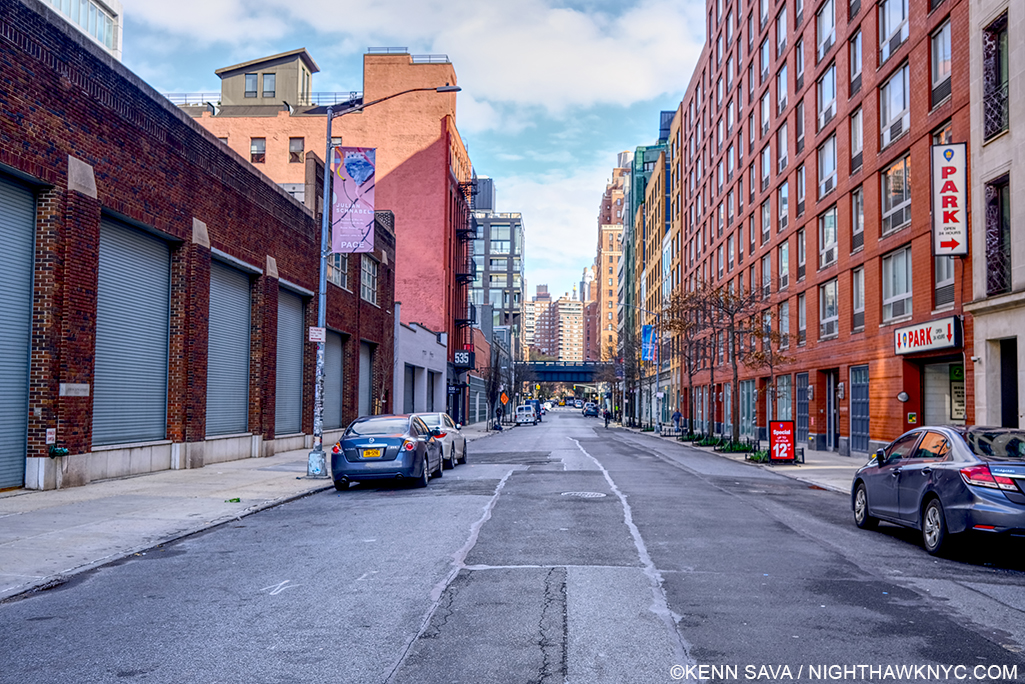
NYC in April, 2020 has been a month like none I’ve ever experienced. As I write these words, over 18,000 are dead- just in NYC (as of today, May 1st, 2020, per the stats here, which are updated daily). It’s a very rare thing to find the streets of Manhattan empty for a few hours- even well after midnight. To find them that way day after day is something I’ve never seen here before. I began making trips (as safely as possible, usually on foot) to some of the major landmarks of NYC to document what it was like to be there. The experiences left me with a multitude of feelings, as I said in my prior piece, that I’m still processing.

Inspired by a suggestion I received, I’ve decided to expand the concept of that piece, and share more of the Photos I’ve taken in April, 2020, in a slideshow. Yes, after 4 1/2 years of writing about everyone else’s work, I’m sharing some of my own. In it, the title of my previous piece, “The Sound of Silence,” is taken literally since I don’t have permission to use it legally (Dear Paul Simon- May I?)- the soundtrack is silence. It’s designed to be watched fullscreen.

I hope that wherever this finds you, you and yours get through this in good health. Be well.

NighthawkNYC.com has been entirely self-funded and ad-free for over 6 years, during which over 250 full length pieces have been published. If you’ve found it worthwhile, you can donate to keep it going & ad-free below. Thank you!

Written & photographed by Kenn Sava for nighthawknyc.com unless otherwise credited.
To send comments, thoughts, feedback or propositions click here.
Click the white box on the upper right for the archives or to search them.
For “short takes” and additional pictures, follow @nighthawk_nyc on Instagram.

Subscribe to be notified of new Posts below. Your information will be used for no other purpose.


The Sound of Silence: The Slideshow

Written & Photographed by Kenn Sava

The response to my previous piece, “The Sound of Silence,” has been a bit overwhelming. My thanks to all of you who have read it and especially to those who have taken the time to write. I’ve heard from people all over the world, all of who are also knee deep in trying to get through the pandemic themself. At times like these it’s important to feel we’re in this together. I hope that wherever these words find you, you and yours get through this in good health.

There’s always Music going on in my mind. So, all of the 228 pieces I’ve written so far have a soundtrack that accompanies the words and the pictures. Never before have I taken one of those soundtracks and made it into a slideshow. Until now. At the suggestion of Lana Hattan, I’ve compiled some of the Photos I’ve taken this month (April, 2020, and only in April, 2020) into a slideshow, extending the concept of my piece, accompanied by the lyrics of the song.

As I completed it, I was shaken to hear of the tragic passing of Dr. Lorna Breen, Medical Director at New York-Presbyterian Allen Hospital yesterday. As an Emergency Room Doctor, she was on the front lines of fighting the coronavirus pandemic.

“She went down in the trenches and was killed by the enemy on the front line. She loved New York and wouldn’t hear of living anywhere else,” her father said.

My life was saved at New York-Presbyterian in 2007, so it is with the deepest respect that I dedicate this slideshow to Dr. Breen, and all those working to get us through this.

Be well.

*-Soundtrack for this Post is “The Sound of Silence” by Paul Simon and recorded by Simon & Garfunkel on their debut album Wednesday Morning, 3AM, 1964, with overdubs on the 1966 album, Sounds of Silence and live on Concert in Central Park, recorded in 1981.

Special thanks to Lana Hattan. 

NighthawkNYC.com has been entirely self-funded and ad-free for over 6 years, during which over 250 full length pieces have been published. If you’ve found it worthwhile, you can donate to keep it going & ad-free below. Thank you!

Written & photographed by Kenn Sava for nighthawknyc.com unless otherwise credited.
To send comments, thoughts, feedback or propositions click here.
Click the white box on the upper right for the archives or to search them.
For “short takes” and additional pictures, follow @nighthawk_nyc on Instagram.

Subscribe to be notified of new Posts below. Your information will be used for no other purpose.


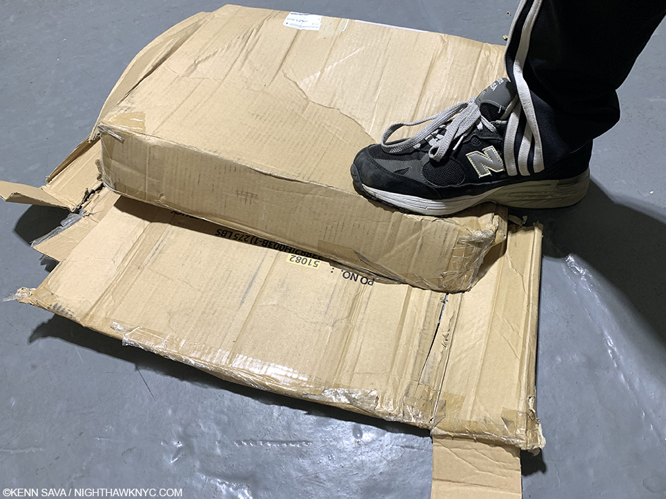
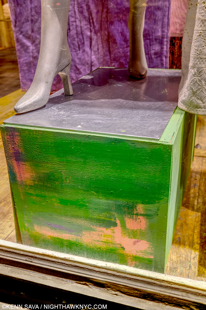
Death To Boxes!

Written & Photographed by Kenn Sava (except *)

For The Record #2.

Boxes Must Die!

In the Arts, that is.

Doing my part.

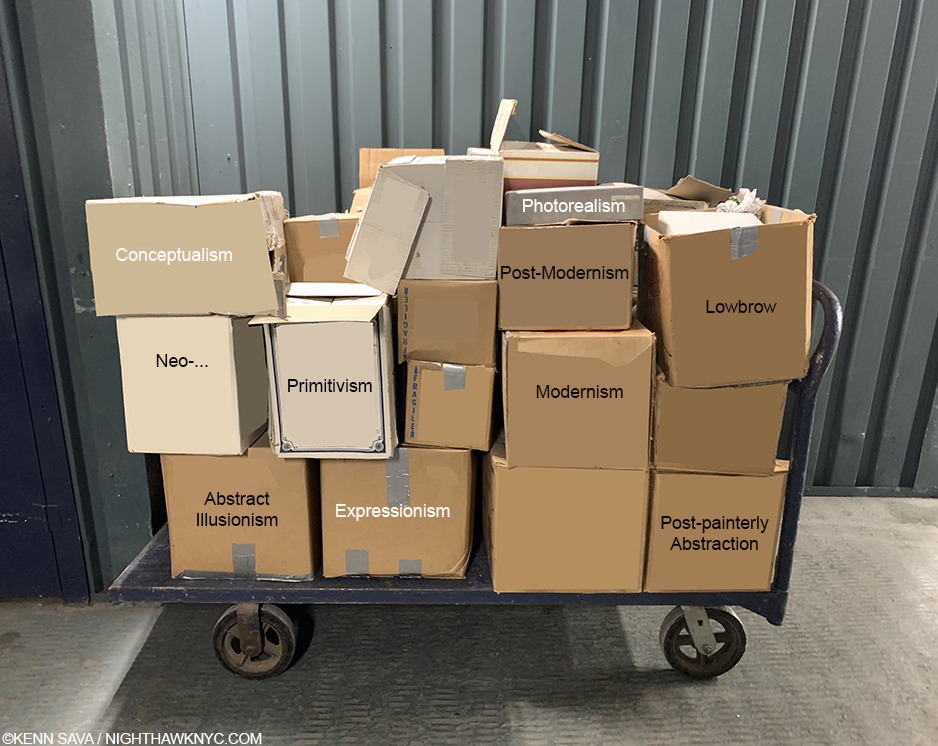
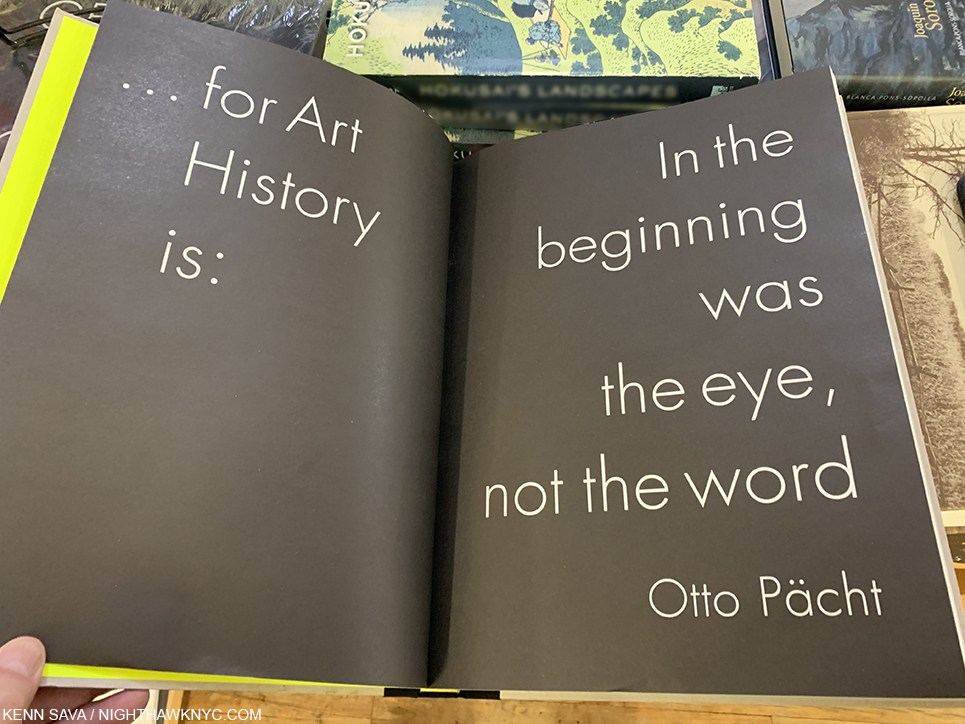
Artists are people. Like anyone else, you can’t put an Artist in a box (i.e. a so-called “style”,“school” or “movement”) UNLESS he or she puts themself in one, and that distinction is critical. No one else can, in my opinion, and that includes Art historians, gallerists, or yes, writers. Over the years I’ve spent studying and researching Art history, it seems the vast majority of the time, these labels get stuck on Artists by someone else, often someone with something to sell or someone attempting to write about the Artist. Whoever else does it, I believe they do more harm than good. It seems to me that all these terms serve to do is to keep you from looking at the Art for yourself and making up your own mind. They’re a kind of shorthand for “this is that.” They want you to think- “Oh. I already know what ‘this’ is, so I ‘know’ what that is.”

Really?

Now, press a little harder.

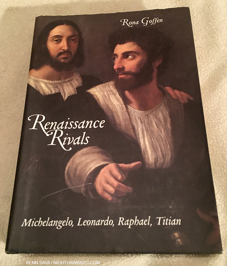
How many “schools” or “movements” have there really been in Art history among museum level Artists? Both imply the Artists were organized around shared beliefs. Most Artists I’ve met tend to be solitary beings who work alone (or, with their assistants, if they have them). The Renaissance is often listed as a “movement.” This brings an upside down smile to my face. While there were a number of Artists and others who turned their attention to the work of the ancients, which they “revived” in their own way, the term implies a unity that might not have been the case. Many of the leading Artists of the 15th century (particularly Leonardo da Vinci, Michelangelo and Raphael) were rivals who competed for jobs and, as far as is known, never “got together around shared beliefs.”


My copy of Rona Goffen’s Renaissance Rivals. Check this out if you want to get a taste to what life for these Artists may have really been like.

Raphael is reported visiting Leonardo’s studio, but there is no report that Leonardo was actually there at the time. Perhaps, the only time we may surmise that Leonardo and Michelangelo may have been in the same place at the same time was they were both commissioned to create frescoes on opposite walls of the same building. I wonder what they would think of being lumped together by posterity. It seems to me that what is known as “the Renaissance” in Art may be also be characterized as “the optical revolution,” since, as David Hockney’s Secret Knowledge points out, the fifteenth century seems to be the period when optics were introduced into Painting, “The Romantics?” While images of a period of group love pre-dating the hippies by 200 years might be a nice thought, there was no banding together among Artists, only others who see common threads in their work. In fact, the actual 1960s hippies were more of an actual “movement,” though they are not thought of as an “Art movement”…yet. “The Impressionists?” In 1874 thirty Artists showed their work in the space formerly occupied by the Photographer Nadar in a show titled The Anonymous Society of Painters, Sculptors, Engravers, etc. This show included work by Monet, Degas, Renoir, Pissarro, Cezanne, Berthe Morisot among others. It wasn’t until their third show in 1877 that the term “Impressionists,” which had been coined by a critic, after the work Impression, Sunrise, 1873, by Monet, was “accepted” by the group. They held a total of eight shows through 1886. Not one bore the word “Impressionist” in its title. It seems to me a “bad habit” had begun. Ever since, dealers, critics and historians have continually fallen all over themselves trying to put names (i.e. boxes) on whatever has been done since, in a criminally short sighted “rush to judgment” naming competition. Very rarely since, however, have the Artists involved agreed to have their work so “boxed.”

It’s one thing to have a lack of imagination yourself, but to foist it on others, including possibly, many who have not seen the Art under discussion is doing them, and the Art, a real disservice.

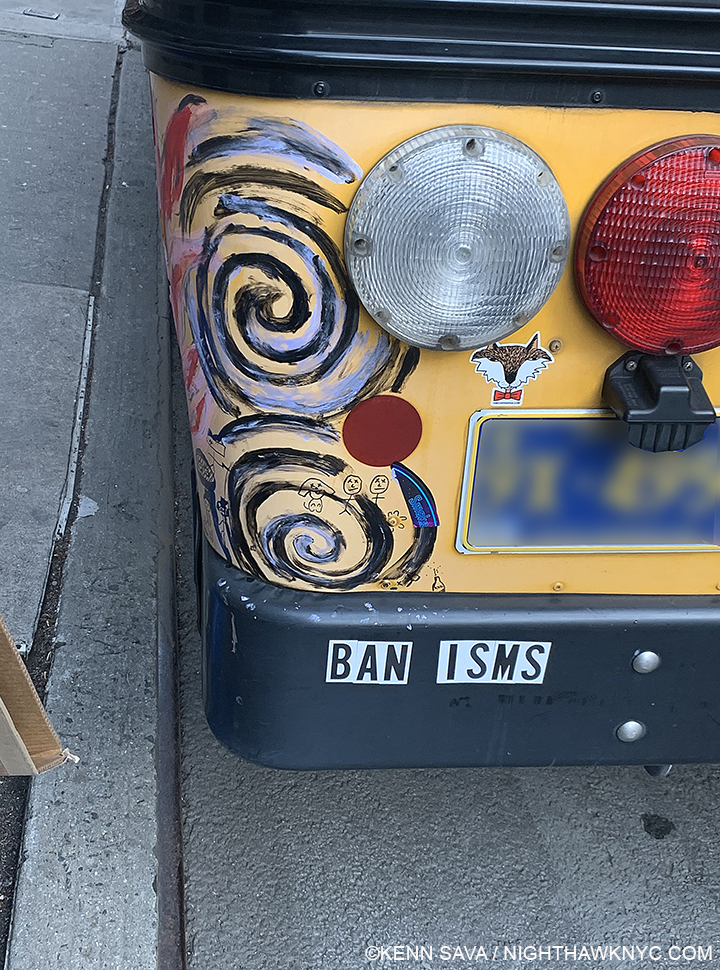
I’m this close to agreeing with this sentiment, in the Arts, though I’m sure there must be at least one “ism” that’s “ok,” right?

Beyond this, the practice speaks of a terrible lack of responsibility on the part of those naming and using boxes to speak about Art. Do these people who come up with these boxes ever stop to think about the ramifications of putting someone in a box? Short term? Long term? Longer term? Once in such a box, getting out is extremely hard, if not impossible. In many (if not most) cases, living Artists in such a situation would be risking their financial survival and their careers to fight back. I’ve spoken with a number of Artists who have expressed their frustration with this to me. As a result, I’ve come to feel they represent the tip of the proverbial iceberg in the high seas of the Art world. Unlike some others, this iceberg isn’t melting nearly fast enough.

When you come across one of these terms, take a quick look back into what the Artist has said about his or her work and see if he or she ever used the term themself in speaking about their Art, or if they really aligned themselves with others in the broader sense of a “school” or “movement.” My bet is that if you do this often you’ll become unsurprised to find that 90% of the time, or more, no such arrangement ever existed. IF it did, most of the time it didn’t last for more than a decade of their career. As far as “styles” go, I laugh when I see someone other than the Artist try and name an Artist’s style. For me, it’s like “naming” a wave in the ocean. “That wave seems angry. That’s the ‘expressionist’ wave. The wave that hit me in the face when I waded in was the ‘hyper-realistic’ wave…”

The common sense thing to do, in my opinion, when looking at Art is to let the Artist have some. Let him or her “speak” for themselves through their work. Look at it through your own eyes.

Being human beings, Artists, like the rest of the universe, are subject to change. Along with death and taxes, change is one of the universal laws of the universe, right? Many Artist’s styles change or evolve over time, some, like Picasso or Miles Davis, changed frequently, over the course of their careers. Then, whatever “box” the powers that be had put them in no longer applied. Now what? People coming to their work with one box in their head are now confronted with work nothing like it! Oops. Instead of coming to realize the obvious, scholars, critics and dealers struggle to put him or her in a new box.

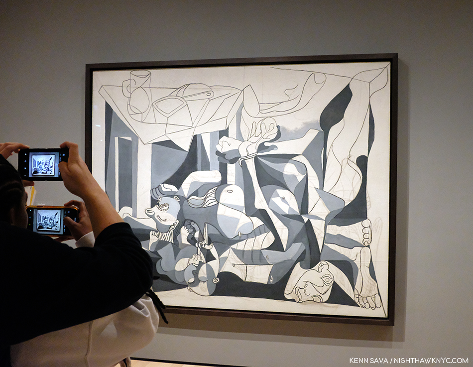
“Blue Period,” “Rose Period,””Cubism,” “Late Period,” and on and on. In the end, Picasso, is simply Picasso- a talent so broad it burst any and all categories in almost as many mediums. Unfortunately, his example wasn’t apparently enough for the practice to cease once and for all. Here, his The Charnel House, 1944-5, is seen at MoMA. While Guernica is world-famous as a work that was Painted in 1937, during the pre-WW II Spanish Revolution, The Charnel House bookends it from the end of the War after the discovery of the horror of the death camps.

Why didn’t they just take the “easy way” out? If you insist on using boxes, Picasso, Miles, EVERY Artist, in my view, belongs in one box- the one with their name on it. Aren’t people unique? So are Artists. So, WHY do some insist on lumping them together in a box?

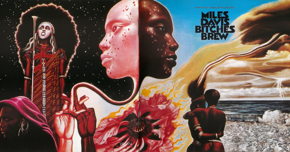
People tried to put Miles Davis in a box his whole life. FIFTY YEARS AGO, on March 30th, 1970, he permanently messed up their minds when he released this masterpiece. With a cast of Musicians who are now each legends in their own rite, it couldn’t have been more aptly titled. The cover art is perfect, too. *Sony picture.

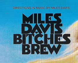
It seems to me that Miles Davis eventually “answered” those trying hopelessly to pigeonhole him. Later in his career, he started labelling his albums “DIRECTIONS IN MUSIC BY MILES DAVIS.”

Word. Put it right up top, in CAPS before anyone else can call it something else. Enough said. *Crop of the previous Sony picture.

Speaking of human beings, “women Artists”, “transgendered Artists,””disabled Artists,””Asian Artists,””black Artists”- these are boxes too! People are people and Artists are Artists. Let’s leave it at that.

Whatever the short term “gain” someone got from boxing an Artist, little thought appears to be given to the fact that Art is this Artist’s career, and so, something they’re going to have to deal with for the rest of it. Some, like Chuck Close and Todd Hido have been able to break out of the boxes they were initially put in and gone on to show other sides of their creativity. How did they do it? It seems to me that both of them were and are frequent interview subjects, and this allowed them to frame the conversation around their own work to the point that they “drowned out” any other voices about it. If you look around, you’ll find they are in the vast minority. It’s very hard to do. Both achieved enough popularity to garner frequent interviews where they were free to speak about their work on their own terms. I can’t help but wonder how many others have given up, or worse, possibly even ended their careers…or their lives.

Seriously.

When Art is your life, what else matters?

Perusing the new book Genealogies of Art, which has 448 other pages that try to trace the “lineage” of Art down through the centuries. Hmmm….Yes, most Artists have influences, but who’s to say how much anyone has been influenced by someone else? What about multiple influence? It seems to me drawing direct lines between and “connecting” them (which is on the other 448 pages) is pointless and meaningless. So far, these are the only two pages I agree with. Personally? I would have left it at this.

It’s way past time for this practice to end. STOP teaching this in Art history classes! Stop using boxes, “schools,” “movements” that Artists never joined, or bogus, imagined, “styles” that mislead and pigeonhole!

It’s time to look at the Art for what it is and for what it says to you (if anything), without prejudice or boxes, labels, imaginary “schools,” or “styles.” So, when you hear a meaningless marketing term like say, “photorealism,” do what I do. Ignore it!

Save a career. Maybe even save a life. Stop the insanity- NOW!

Of course, NighthawkNYC asks that you please dispose of boxes responsibly. Put them where they belong.

*-Soundtrack for this Post is “Bitches Brew” by Miles Davis from the aforementioned album of the same name. Here, Miles and most of the Musicians on the record including legendary Saxophonist Wayne Shorter, perform it in Copenhagen, 1969, shortly before the album’s March, 1970 release-

This Post in honor of the 50th Anniversary of the release of Bitches Brew, one of the great box-busting moments in 20th century Art, is dedicated to all those Artists I’ve spoken with who suffer with being stuck in boxes, and all of those who are that I haven’t. 

For The Record is a series of pieces that are about key/core subjects & beliefs that underly everything else I’ve written here. The first part is here. 

NighthawkNYC.com has been entirely self-funded and ad-free for over 6 years, during which over 250 full length pieces have been published. If you’ve found it worthwhile, you can donate to keep it going & ad-free below. Thank you!

Written & photographed by Kenn Sava for nighthawknyc.com unless otherwise credited.
To send comments, thoughts, feedback or propositions click here.
Click the white box on the upper right for the archives or to search them.
For “short takes” and additional pictures, follow @nighthawk_nyc on Instagram.

Subscribe to be notified of new Posts below. Your information will be used for no other purpose.


Noah Davis: The Art of Vision

Written & Photographed by Kenn Sava

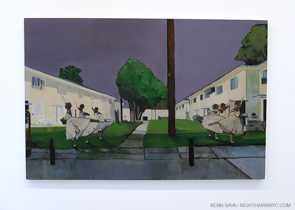
Art & Artists can come from anywhere at any time. Even from unexpected places, like a housing project. Pueblo del Rio: Arabesque, 2014, Oil on canvas, 48 x 72 inches. Pueblo del Rio, 1941-2,  is a housing project designed by Paul Williams at 52nd Street and Long Beach Avenue, Los Angeles, one of two works in the show set there. African-American Architect Paul Williams was a big influence on Noah Davis, according to his chosen curator Helen Molesworth, and he set other Paintings among Paul Williams buildings.

There is, sadly, no shortage of brilliant younger masters who left us far before their time. The tragedy endures but their Art prevails, and in the end, assumes a life of its own. In Contemporary Art, perhaps no one known to me seemed to do more as an Artist, curator, and visionary in as short a time as the late Noah Davis did before he passed from a rare soft tissue cancer at just 32 on August 29, 2015. Now thirteen years out from my own cancer treatment, the variety of cancers I hear and read about never ceases to astound me. One thing my journey through it taught me was that no two journeys are alike. Unlike mine, in Noah Davis’ case, cancer ran in his family, claiming his dad a few years before it took him. For some perspective (no comparisons intended)- Mozart died at 35. Raphael was 37. More recently, Jean-Michel Basquiat was 27. Music has Jeff Buckley, at 30, Jimi Hendrix, Kurt Cobain, both 27, among a long list of others. Photography has Francesca Woodman, at 22. Literature, and humanity, has Anne Frank, at just 15, and on and on…

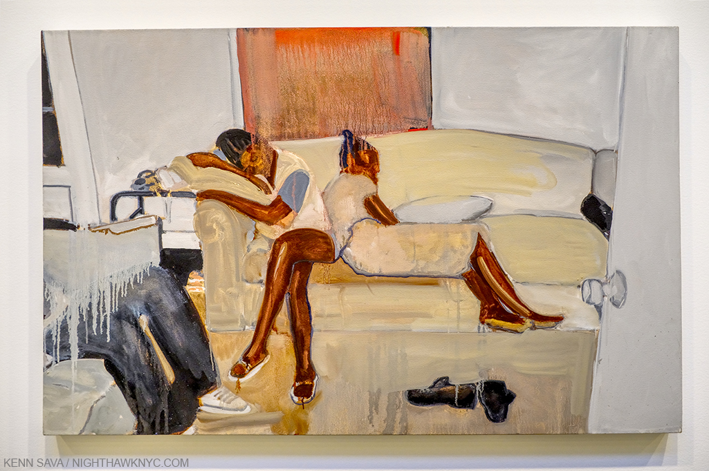
Untitled, 2015, Oil on canvas, 32 x 50 inches. Of this late work, show curator Helen Molesworth spoke about the line between the two women on the couch in her gallery talk. The separation and isolation between two so close together on barely half of the couch is compelling in a Hopperesque way, yet, I haven’t been able to summarize everything this fascinating piece says to me because every time I look at it, I see something else. I see some of what I see in Deana Lawson’s work, some of what I see in Kerry James Marshall’s, Francis Bacon, and there’s a Rothko-with-a-difference in the background, yet what strikes me most is that in this work, as in any number of other works on view Noah Davis is entirely on his own. He has studied, learned, assimilated, and then staked out his own turf as a wholly formed Artist to be reckoned with does. In the moment I shot this picture, the feeling that I was standing in front of a masterpiece was undeniable.

I’ve been blessed with knowing some, and working with some others, who left far too soon. I met the incandescent Jaco Pastorius in 1976 at the release of his now classic debut solo album at Peaches Records Store in Fort Lauderdale, Florida. I watched as he put his hands in wet cement on the store’s “walk of fame” outside along Sunrise Boulevard (which I believe is still there) that evening never imaging he would leave us a scant 11 years later. I spoke to him a number of times over those years and we both wound up (independently) in NYC shortly before his tragic murder at just 35. I worked with the late, brilliantly talented, Mark Ledford, and worked with the equally brilliant Thomas Chapin, on three albums, both of who passed at, or before, 40 in the early stages of the prime of their careers, and their lives. I think of all three of them every single day. Though the passage of time eases some of the pain, in my experience, loss is something that does not go away.

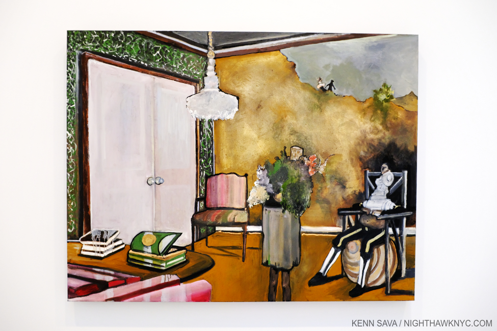
Waiting Room, 2008, Oil and acrylic on canvas, 80 x 65 inches. In many of his works, a space opens up that sometimes seems to be an abyss. Here, the abyss is above us and two figures in the upper distance appear to be looking down on the scene below. Is the Waiting Room an “abyss,” where the outcome (possibly to be revealed  behind those large white doors) is unknown as is the effect it might thave on life to come? It can also have that surreal, “Is this really happening?” feel to it. Like any work of Art, it’s open to whatever the viewer may see in it. This was, however, Painted at about the time Noah Davis was diagnosed with cancer, after his father was.

But, thank goodness we have what they created- their Art, their Music, their words, and what they taught us. Us. Everyone whose lives were touched by all of these Artists are part of their legacy.

I never had the good fortune to meet Noah Davis, who was born in Seattle, and studied at Cooper Union in Greenwich Village, becoming something of a sensation here about a decade ago before leaving without graduating around 2004 (because he felt that his education was no longer pushing him, it is said), and moving to L.A.. I was only casually familiar with his work until I walked into David Zwirner on 19th Street, where his Art and his legacy filled no less than three entire galleries.

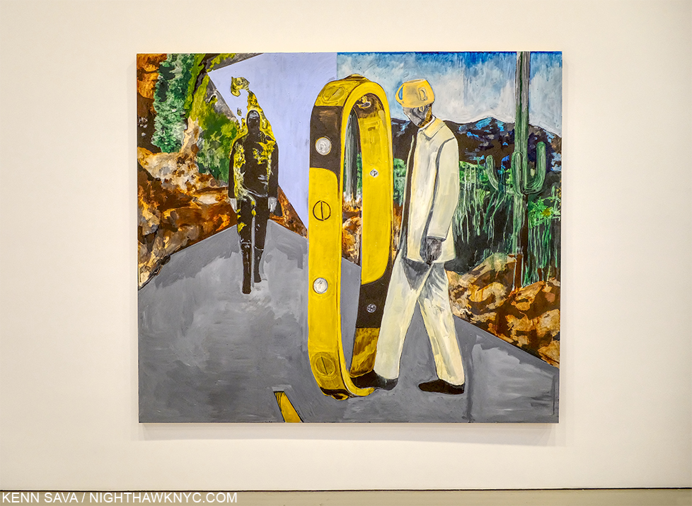
Imaginary Enemy, 2009, Oil on wood panel, 84 x 98 inches. Does the figure in white on the right, with what appears to be a cup on his head, have one foot on a portal? Or? The figure approaching on the left appears to be n flames. The strange, angular plane behind him has the effect of another dimension, as in Cubism. I’m still enjoying wrestling with this one, too, but I will say there are elements that remind me of Neo Rauch.

My mind was blown by all I saw. Noah Davis was, and is, a major figure in the Art of our time- in more ways than one.

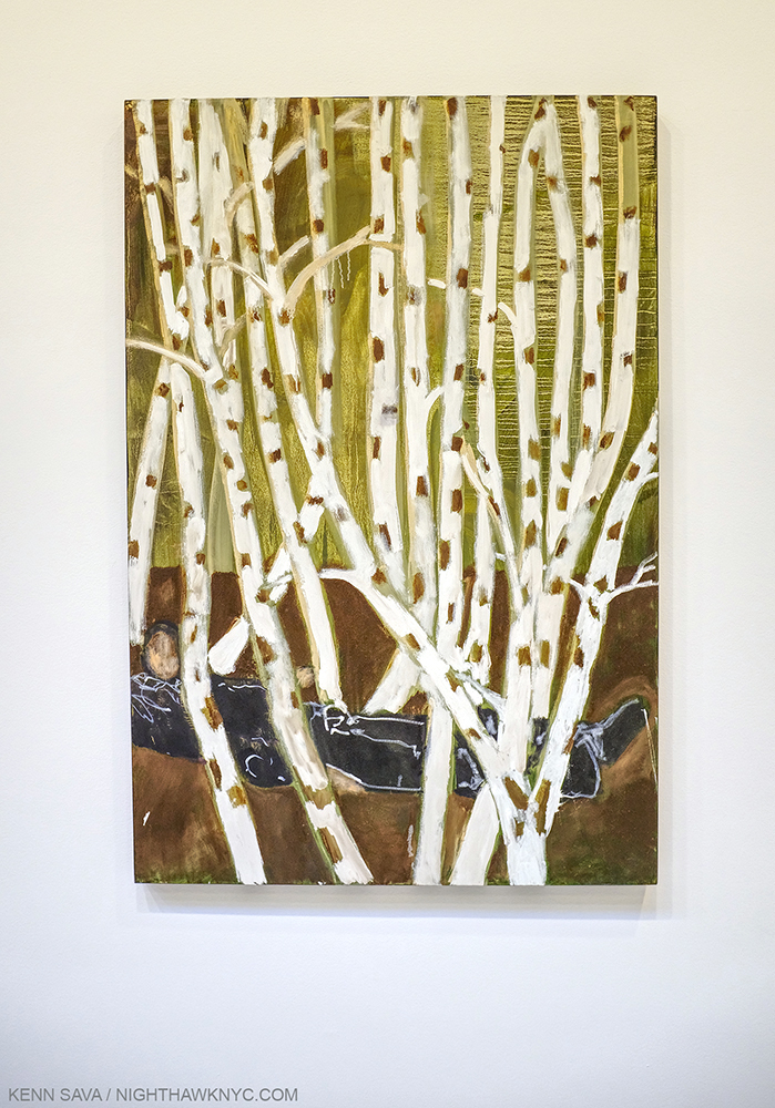
Untitled (Birch Trees), 2010, Oil on canvas, 54 1/2 x 36 1/2 inches. Many of Noah Davis’ Paintings include nebulous, mysterious faces and heads. Maybe I’ve been looking at too much Francis Bacon this past year, but I find them unique and surprisingly compelling, given their frequent lack of features.

My perception had been that at 32 he was still developing, pursuing his own style- as most Artists in their early 30’s are. Ha! As I moved from work to work, I saw an Artist who was completely in control of a full range of styles, which he could dip into at will and which only hinted at influences in tantalizing and intriguing ways, while being wholly his own. Work after different work. How is this possible? The range. The depth. The power. It was all there in the service of his vision.

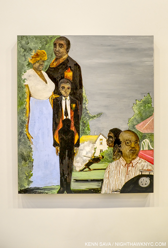
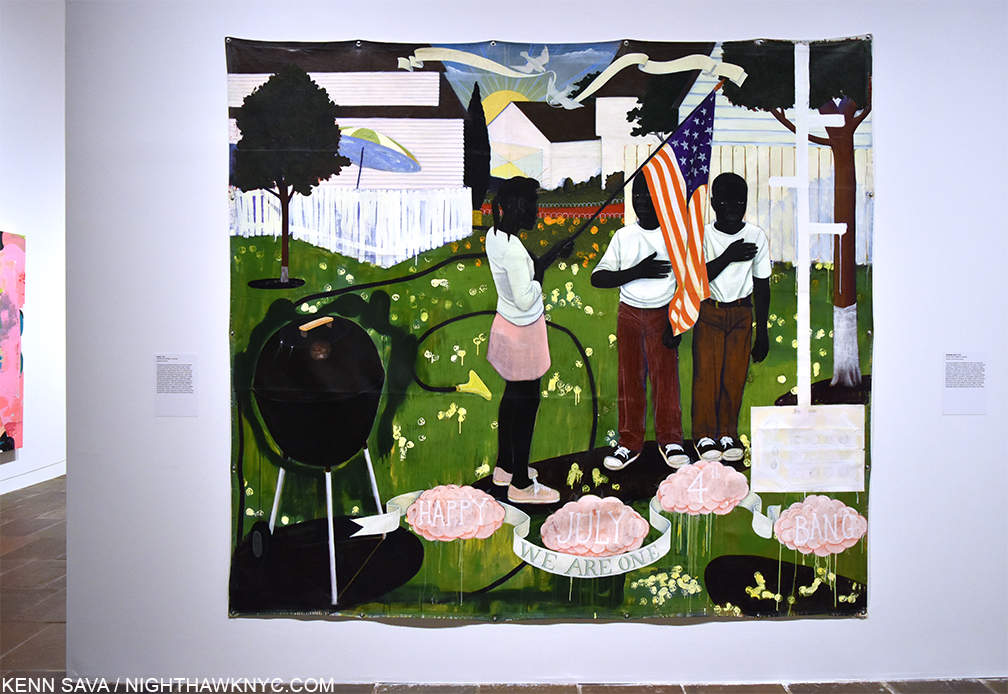
The Last Barbecue, 2008, Oil on canvas, 60 x 52 inches. Here, the faces are more defined. The group portrait on the left in countered by the odd triple portrait on the right behind the lid of the barbecue, and the scene in the center is surreal, disturbing and puzzling. It is an explosion, or? Looking at it, it was hard not to think of Kerry James Marshall’s Bang, 1994, a 4th of July barbecue scene.

Flashback- November 12,2016 at Kerry James Marshall: Mastry at The Met Breuer. KJM’s Bang, 1994, Acrylic and oil on unstretched canvas(! Notice that it’s tacked to the wall.), 103 x 114 inches.

Before he passed, Mr. Davis asked Helen Molesworth (who, a few years ago gave us the landmark Kerry James Marshall: Mastry Retrospective that I wrote about after its Met Breuer stop) to be his curator. The Zwirner show, which Ms. Molesworth has brilliantly selected and installed, is not arranged chronologically, which I am thankful for. It serves to downplay the “end” and the tragedy of Mr. Davis’ early loss and put the focus squarely on his Art and his accomplishment, where it belongs. (By my count, only 3 of the works did not have owners listed on the checklist.) Each work dialogs with other pieces from a few years later or earlier in ways only someone intimately familiar with the Artist and the work could bring us, which, by itself, sets this apart from most gallery shows of deceased Artists. Her work hasn’t ended here. Ms. Molesworth, who was controversially fired from her post at MOCA in 2018, has also been busy creating an upcoming monograph on Noah Davis, interviewing those who knew the Artist, due to be published this fall, which should be a slam dunk candidate for one of the most important Art books of the year, if not the decade.

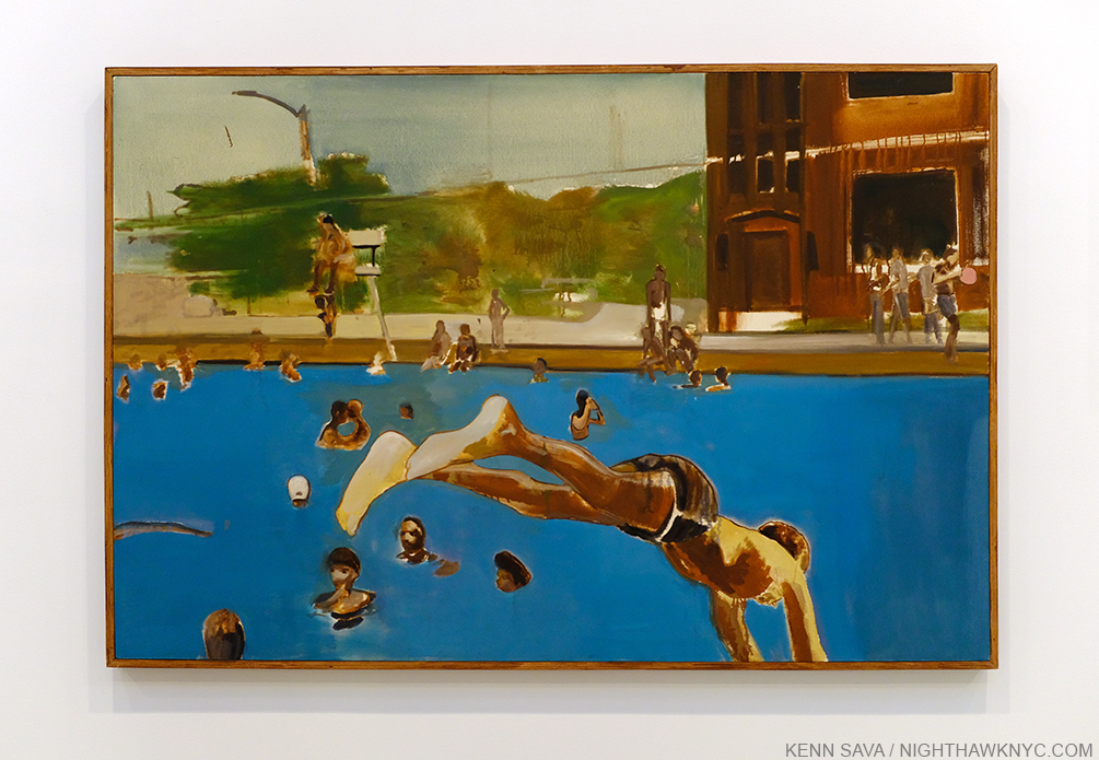
1975 (8), 2013, Oil on canvas in artist’s frame, 49 q/w x 73 1/2 inches.

The show featured “fantastical” work, like Imaginary Enemy, alternated with domestic and family scenes. 1975 (8), 2013, was based on a Photograph from the 1970s Davis Family Photo Archives. It reminds me of the mural his mentor and friend Henry Taylor did a few years ago for NYC’s High Line.

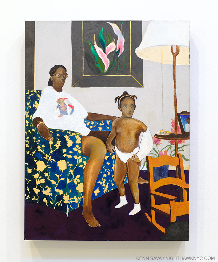
Single Mother with Father Out of the Picture, Date unknown, Oil, acrylic, and graphite on canvas, 40 x 30 1/4 inches. There’s an elegance and a timeless, haunting, beauty to this work, which though all too common in our world, I can’t recall having been the subject of a Painting before.

Mr. Taylor has written eloquently about his friend who was 30 years his junior and the effect and influence Noah had on him, his work and his career. One of the more important Painters of our time, reading his words is eye opening, an important testament to Noah Davis’ legacy.

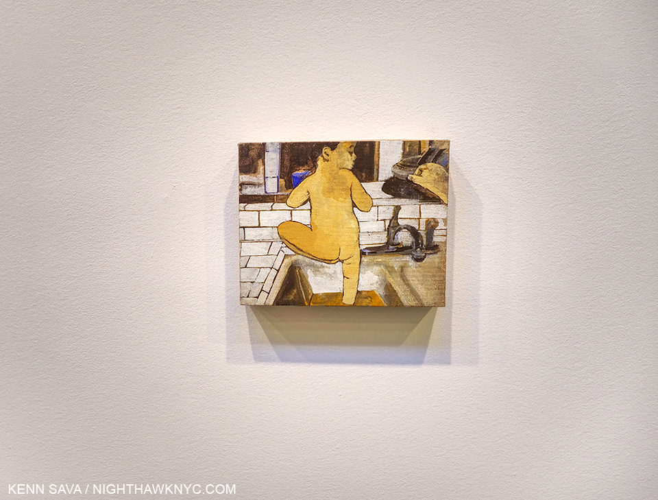
Untitled (Moses), 2010, Oil on linen on wood panel, 8 x 10 1/4 inches.

Perhaps none of these familial works is more poignant than the smallest Painting in the show, Untitled (Moses), 2010, 8 x 10 1/4 inches, showing his son, which may be based on another Photo from his family archives. In this remarkable, small, work, unique among Artist’s portraits of their children known to me, His son Moses has one foot in the water in the sink and one out, as if already leaving. The world shown in the window is dark.

But, as the remarkable, both precocious and fully formed mature works his Paintings are, there was more. Much more.

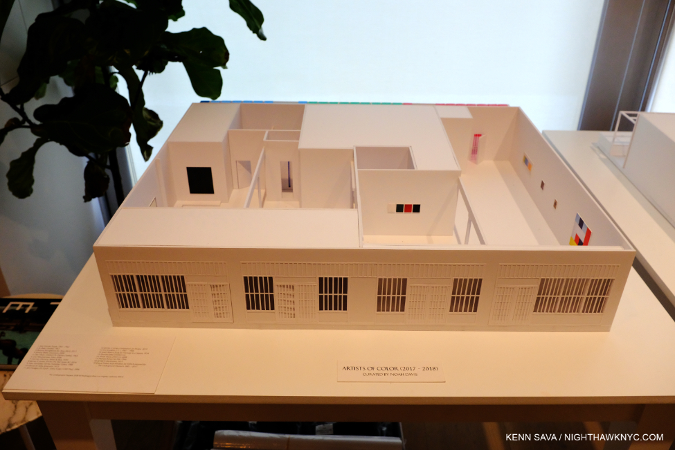
The Underground Museum is an ongoing Monument to the legacy of Noah Davis. Here, a model of it, showing its facade, with a mockup of the show ARTISTS OF COLOR, 2017-8, curated by Noah Davis. Mr. Davis left the plans for 18 shows for the UM, as it’s known, when he passed. After finding the space, Noah, his wife, Karon, and their baby, Moses, lived in the UM while it was under construction.

Having dealt with galleries early on, Noah Davis was one of those who came to feel the gallery model doesn’t work for them (something I’ve heard in innumerable conversations). Not an “established” Artist with big resources by any means, he nonetheless then dared to set out to forge his own path. With his wife, Sculptor Karon Davis, he took over 3 storefronts at 3508 West Washington Boulevard in the West Adams section of L.A., and opened what they christened the “Underground Museum” to bring museum quality Art, for free, to an area that was “underserved” by existing institutions.

“Noah wanted a space where he could show the work of himself and his friends. He wanted a space that could exist outside of the gallery/museum matrix,” Helen Molesworth said in a talk she gave at the opening.

The daring of that is only topped by his vision.

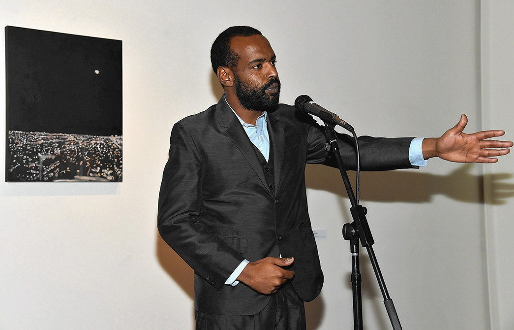
Noah Davis speaking in front of LA Nights, 2008, Oil on wood panel, 25 1/2 x 19 1/2 inches, which was also in this show. Photo by Alberto E. Rodriquez/WireImage.

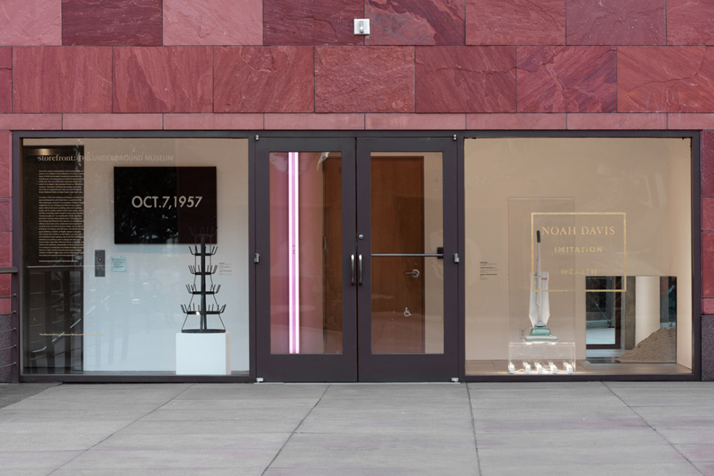
In the first show he mounted at the Underground Museum, Imitation of Wealth, Noah recreated well-known works of Art by Marcel Duchamp, Jeff Koons, On Kawara, Robert Smithson and others that he wasn’t able to borrow the originals of so that the people in this underserved area could experience them. For me, it’s another indication of wide-ranging his knowledge of Art history and his taste was. Robert Rauschenberg famously erased a De Kooning Drawing, but I can’t think of any other Artist who has done such a thing and created an entire show of “pseudo reproductions.” As a first show, Imitation of Wealth was both an auspicious “Hello,” and a shot across the bow of the Art world.

Noah Davis’ first Underground Museum show, Imitation of Wealth, reinstalled at MOCA’s Storefront space in 2015.  The imitation of a “date” Painting, Imitation of Om Kawara. Oct 7, 1957, left, happens to be his father’s birthday. Noah Davis’ Imitation of Marcel Duchamp, 2014 (Bottle Rack) is in front of it, Imitation of Don Flavin (lamp) behind the door, and on the far right, behind his Imitation of Jeff Koons (vacuum on a vitrine), and his Imitation of Robert Smithson with sand and mirrors to the far right LACMA Photo by Fredrick Nilsen.

Helen Molesworth, at the time, Chief Curator of MOCA was impressed enough with his idea to make a three year arrangement with UM to collaborate! An arrangement like this is unheard of. Tell me the other case where a world class museum has made an arrangement like this with an Artist in his early 30s to lend Art and work together to present shows in THEIR space. MOCA reinstalled Imitation of Wealth in their Storefront space in 2015, where it opened the day he passed away. He did live to see works from MOCA lent to the Underground Museum.

Noah Davis knew what was “right” for his Art, and as part of that he also had a vision of the future, of bringing Art to the people, for free. But even by 32, he moved past the vision to create the reality. Today, the UM is an important venue, one that has featured the work of Kerry James Marshall, William Kentridge, Henry Taylor, Kara Walker, and Deana Lawson, Kahlil Joseph, Noah Davis’ brother, among others.

Of all the works in the show, Painting for My Dad, 2011, is the most haunting for me- perhaps the most unforgettable Painting I’ve seen in years. It was Painted while his father was in hospice with terminal cancer. We see his Dad about to embark into an unknown, dark, land with a lantern. The landscape, which strikes me as being distantly descended from Cezanne (which I also felt in Imaginary Enemy, shown earlier) in Noah Davis’ own way, is typical of how Mr. Davis took influences from across Art history and made them his own.

It’s fascinating (and something you can’t help but notice) to spot the possible influences from Art history in Noah Davis’ Paintings, and where he’s taken them. Kerry James Marshall’s Paintings set in projects, Henry Taylor’s way with figures, Francis Bacon’s nebulous portraits, Surrealism, and on and on. Every time I look at his work I see more of them, but in each and every instance he has made them his own. He’s not showing off a copious knowledge of Art history, he’s building on what others have done in the service of expressing himself with his own voice. Henry Taylor, Kerry James Marshall, Francis Bacon- these aren’t mentioned by way of comparison- I don’t believe in qualitatively comparing Artists, but just the fact that you can mention Noah Davis in the same sentence with those older masters says quite a bit about the man’s work. Walking through these rooms and looking at his work, even the selection of it shown here, I see someone who was, already, a master Painter, who’s work is going to remain important, in my view. Not only that, Noah Davis hung their work in his shows! In fact, he was one of those who take credit for “discovering” the now renowned Photographer Deana Lawson in 2009, when Mr. Davis served on a jury for a prize that Ms. Lawson submitted for. Ms. Lawson was subsequently featured in the show Deana Lawson: Planes at the UM.
The world not only lost a great Artist when he passed, it lost a budding brilliant curator, one who might have help fill the huge gap that exists in bringing Art out of the galleries and museums to the people. It also lost someone who broke the mould of the Artist/gallery matrix and found his own way. Whatever you think of his Paintings, his example is an enduring, important model for Artists today and in the future. That he was able to make his own way at such a young age has got to inspire countless people who come after him- maybe not to establish their own museum, but to find what works for them1. In the end, that on its own is an amazing, and major, legacy.

February 22, 2020. Closing day in the third gallery, designed to look a bit like the office at the UM, visitors watch videos and films by Kahlil Joseph, Noah’s brother, and others. I’m holding the camera above my head. Such were the crowds, it took me five minutes to navigate from this spot to the door to the right.

As I sit here now that this unforgettable show has closed, I’m left to wonder. What will last longer…what will have the bigger impact on the future- Noah Davis’ Art, or his example, manifested in the Underground Museum? His vision is their common thread. In the example he set, it seems to me that there is much for Artists to learn-now and in the future.

Letting the UM flag “fly high,” as Jimi Hendrix once said on the closing day in gallery 3. Long may it wave.

You can support the Underground Museum here, or by visiting it. The Noah Davis show is scheduled to open there “soon.”

*- Soundtrack for this post is “Bold As Love,” From Axis: Bold As Love, by Jimi Hendrix.

NighthawkNYC.com has been entirely self-funded and ad-free for over 6 years, during which over 250 full length pieces have been published. If you’ve found it worthwhile, you can donate to keep it going & ad-free below. Thank you!

Written & photographed by Kenn Sava for nighthawknyc.com unless otherwise credited.
To send comments, thoughts, feedback or propositions click here.
Click the white box on the upper right for the archives or to search them.
For “short takes” and additional pictures, follow @nighthawk_nyc on Instagram.

Subscribe to be notified of new Posts below. Your information will be used for no other purpose.


  1. As many are, and have been doing in their own ways, all around the world.

NYC’s Museums Are “Temporarily Closed”- UPDATED

Written & Photographed by Kenn Sava

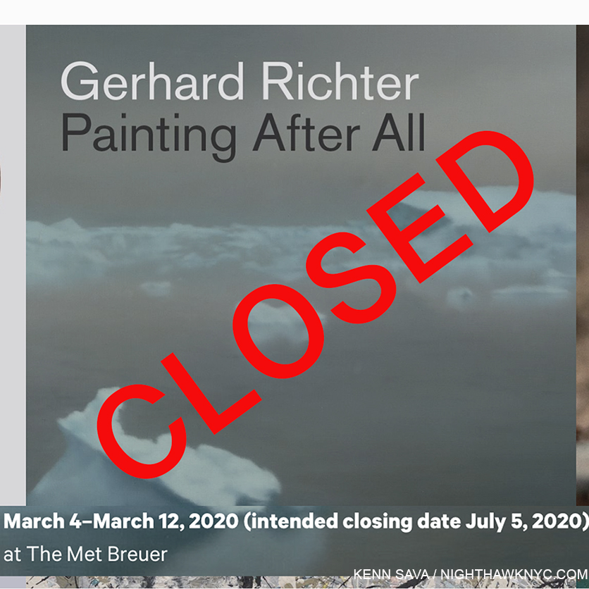
Tonite, as I write, all of Manhattan’s “Big Five” Art Museums and the Brooklyn Museum are “temporarily closed” due to concerns over the coronavirus, marking the first time this has happened since 9/11.

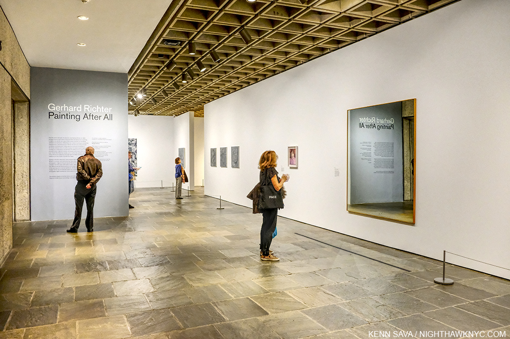
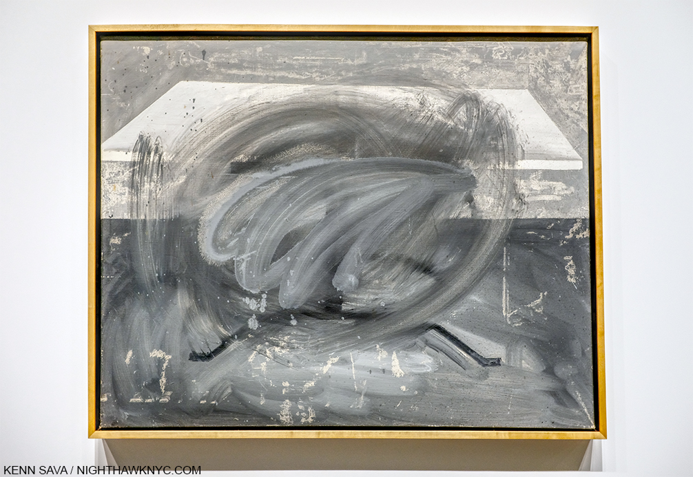
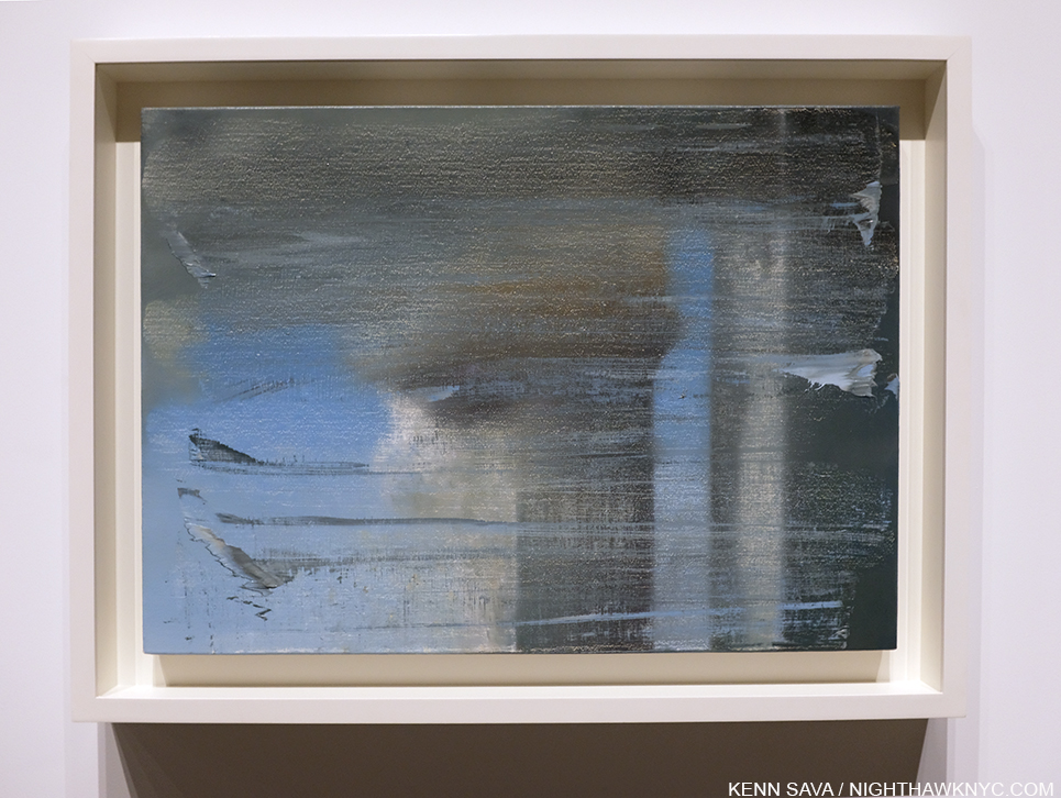
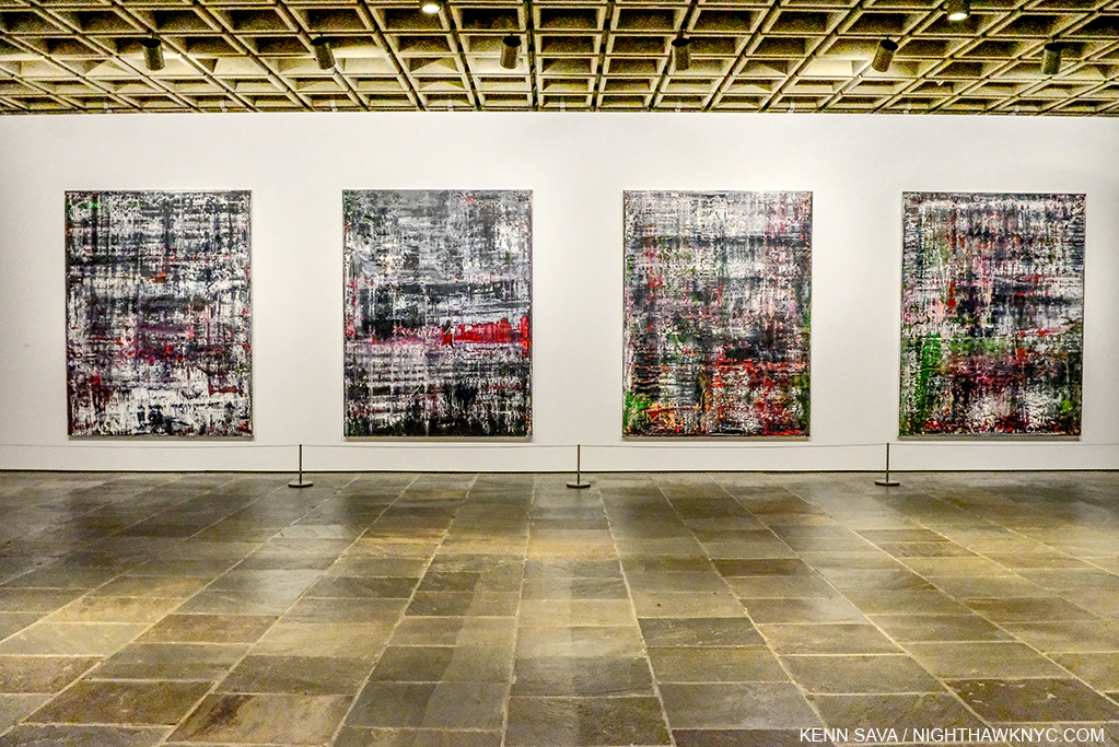
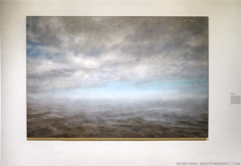
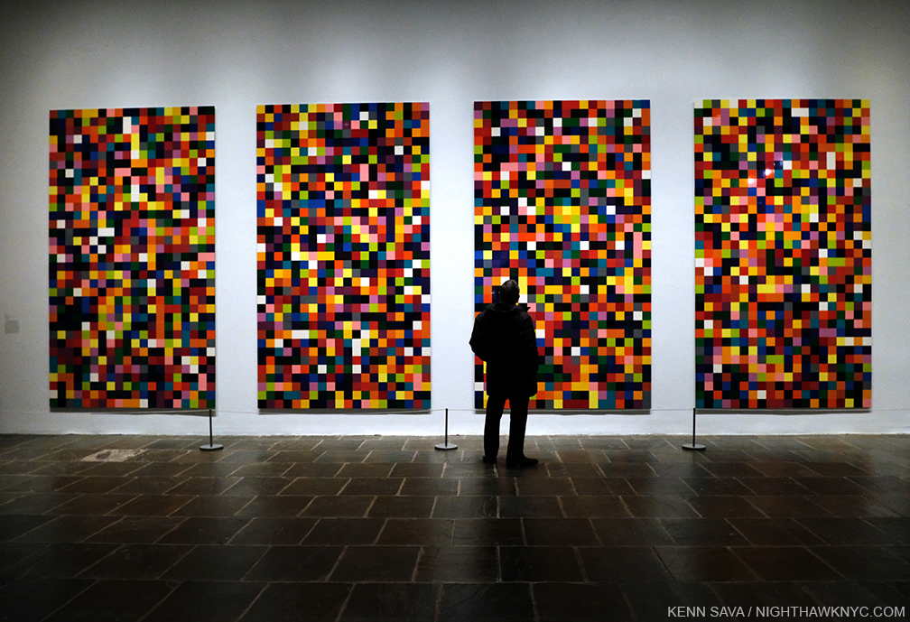
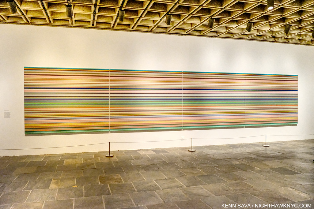
Gerhard Richter, September, 2005, Oil on canvas. The Artist created this four years after 9/11. Seen at Gerhard Richter: Painting After All on March 12, 2020, the final day The Met Breuer was open before its “temporary closing.”

Extraordinary measures for extraordinary times. 

Unfortunately, this comes at a moment when there are a number of important shows going on including-

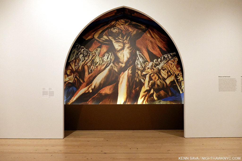
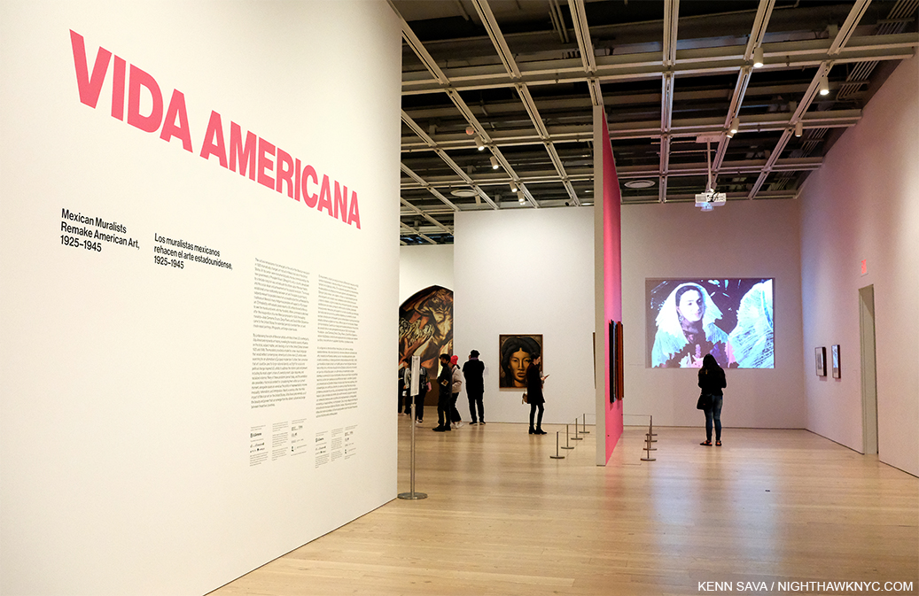
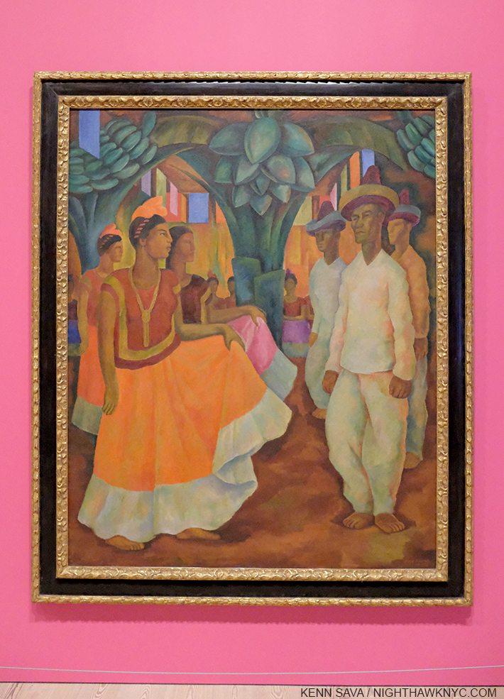
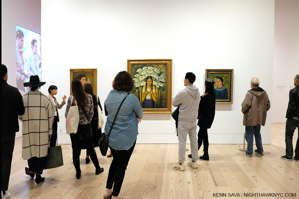
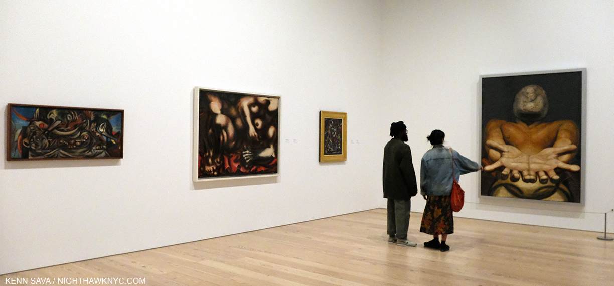
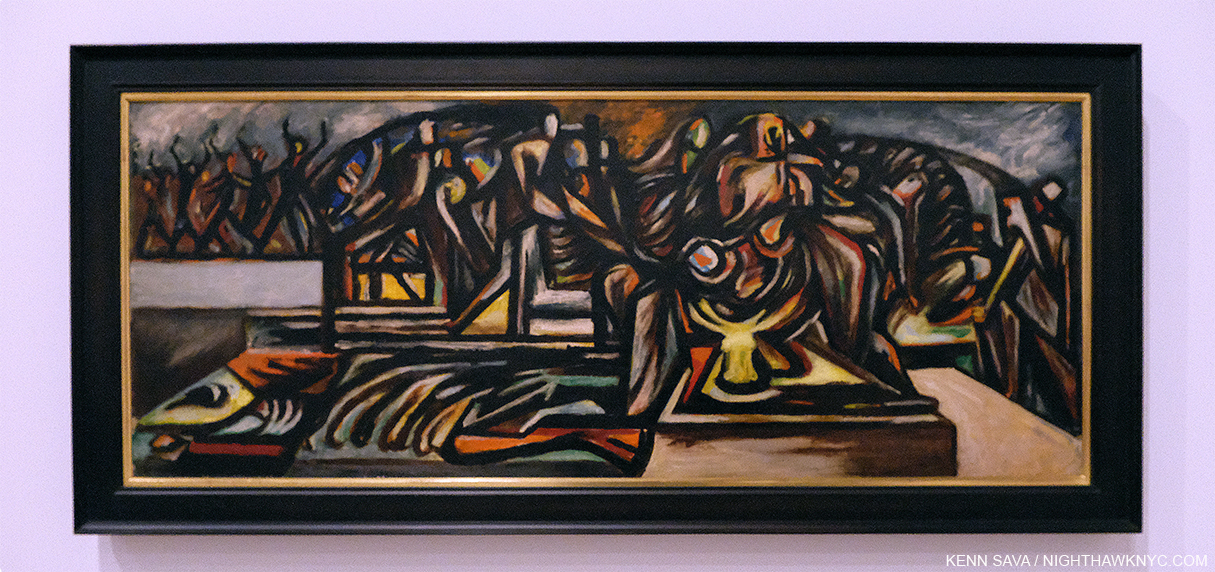
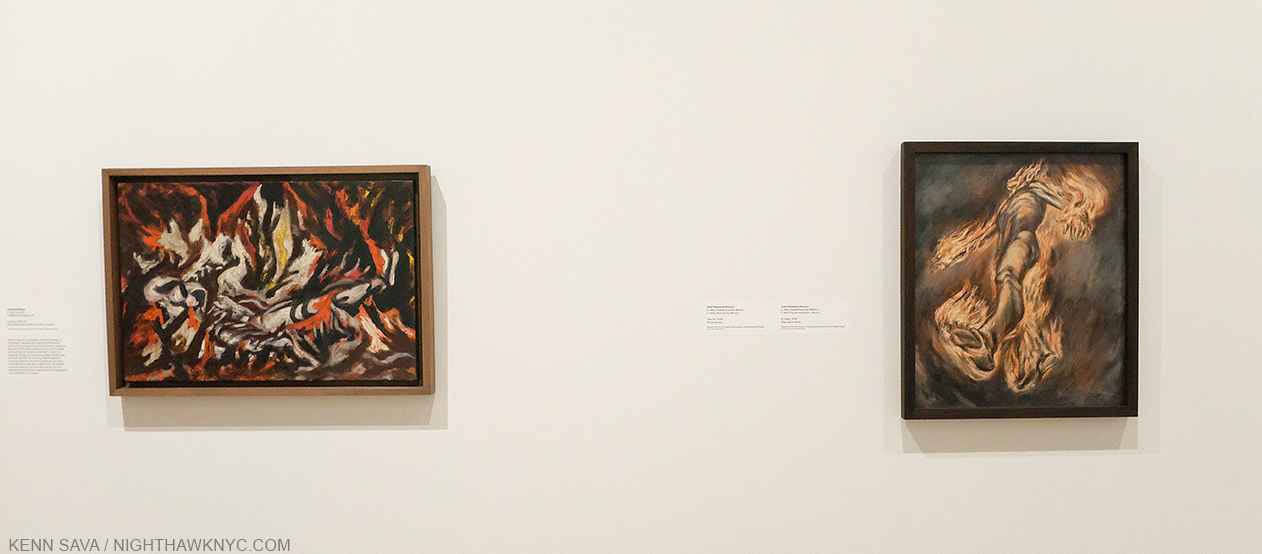
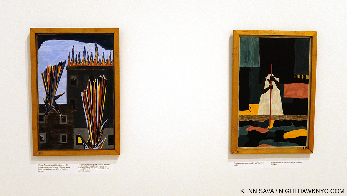
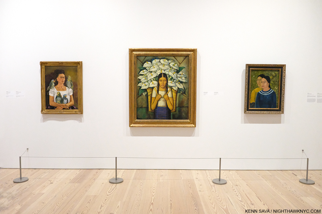
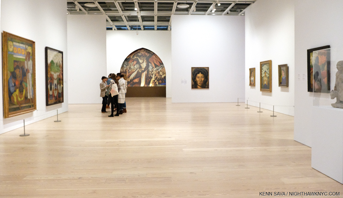
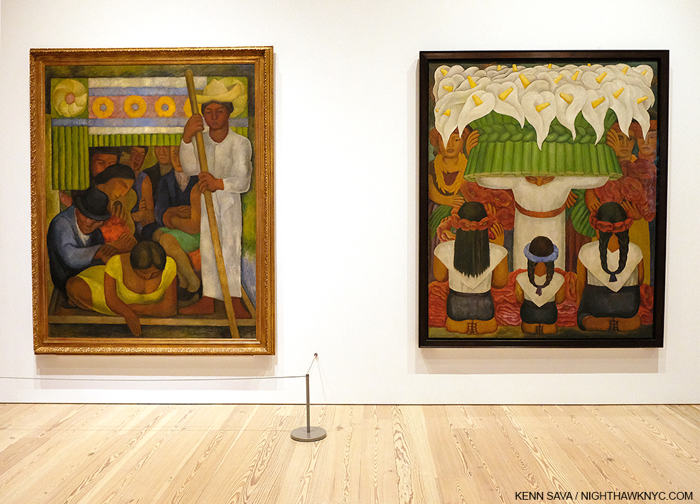
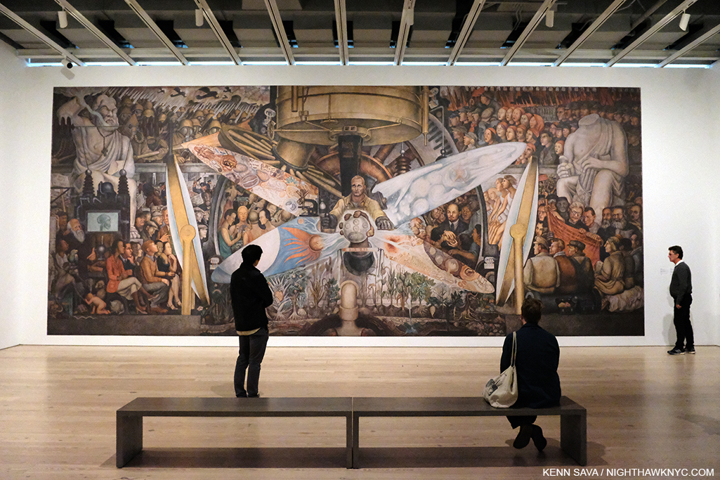
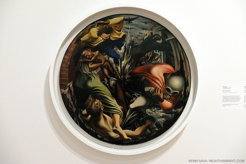
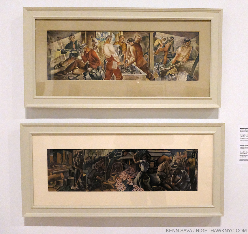
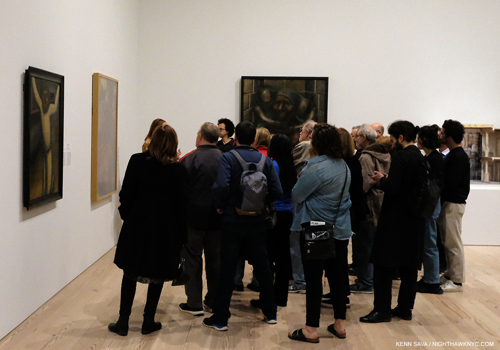
Vida Americana: Mexican Muralists Remake American Art, 1925-1945 at the Whitney Museum

Dorothea Lange and Donald Judd at MoMA

Jordan Casteel and Peter Saul at the New Museum

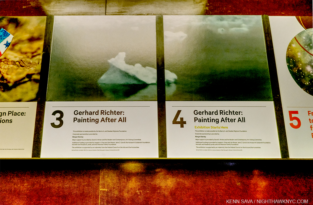
Gerhard Richter: Painting After All at The Met Breuer

each of which only recently opened. 

I was able to see both Vida Americana and the Gerhard Richter this week before their sudden closings, which came without notice, and while I mull them over, I will say it would be a real shame if the closures turn out to be extended and prevent more people from seeing both of these shows, though of course, the health and wellbeing of visitors and staff must come first. In particular, Vida Americana is, perhaps, the most important Painting show I’ve seen in an NYC museum since Kerry James Marshall: Mastry graced The Met Breuer in late 2016 to 2017. 

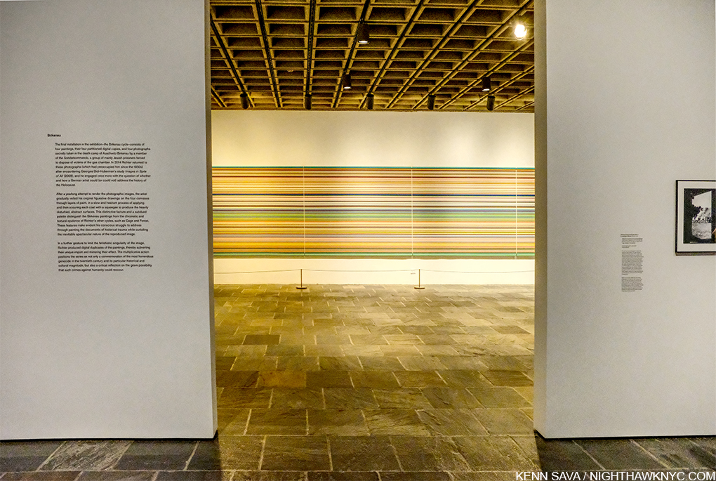
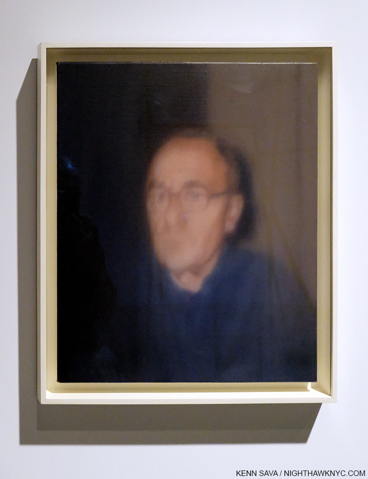
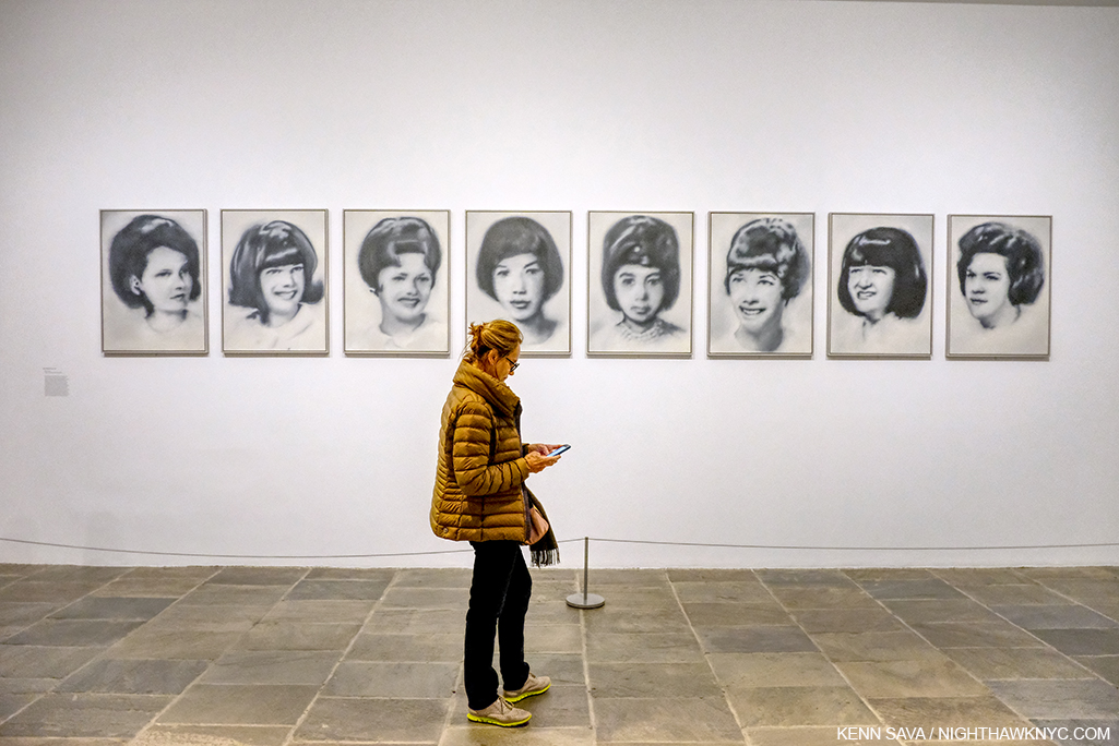
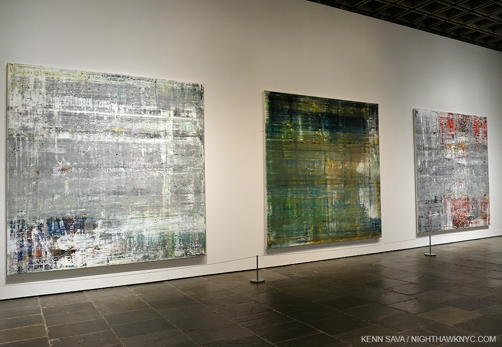
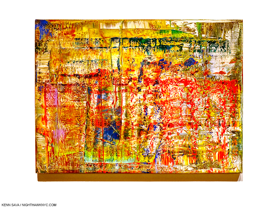
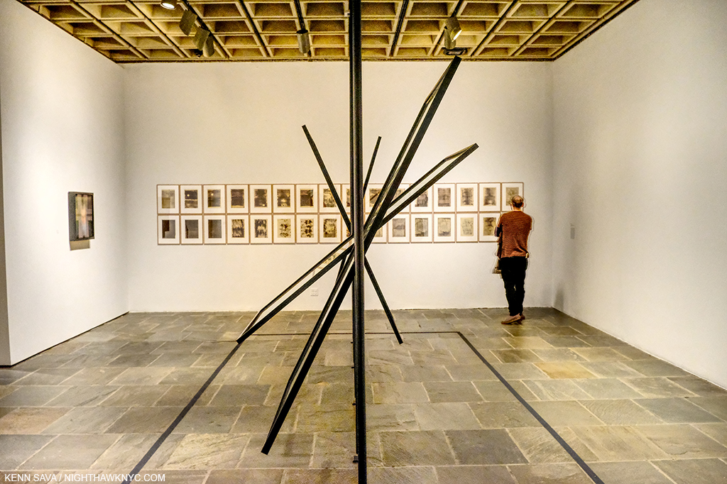
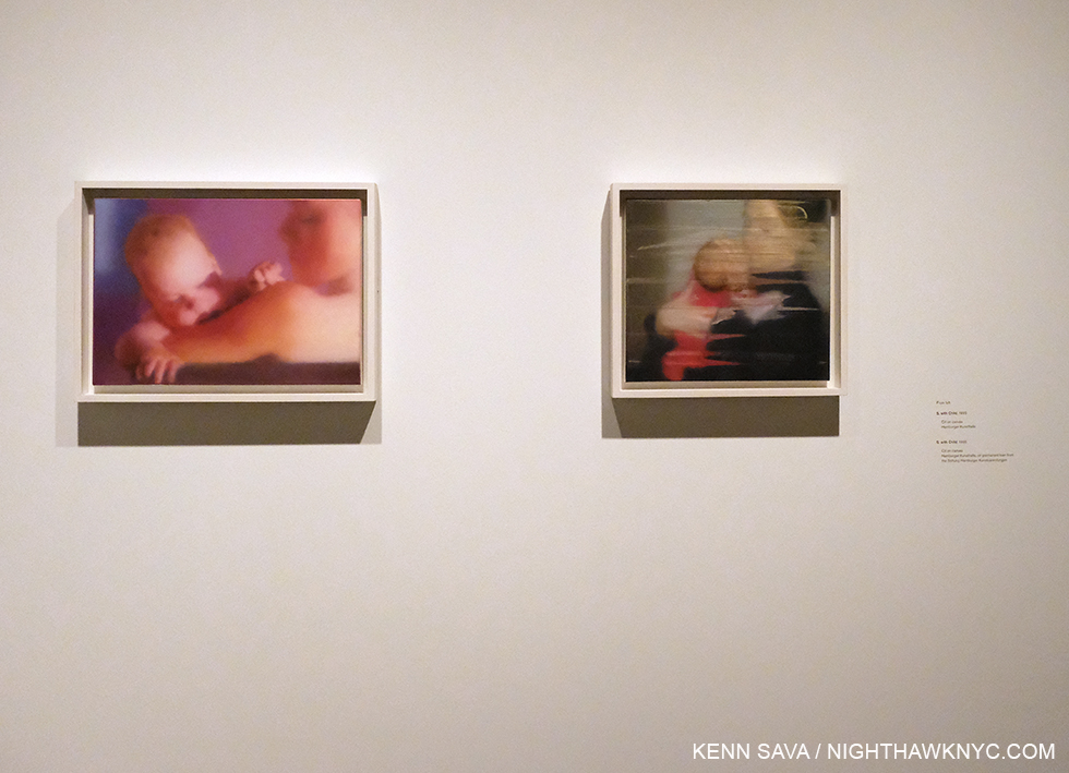
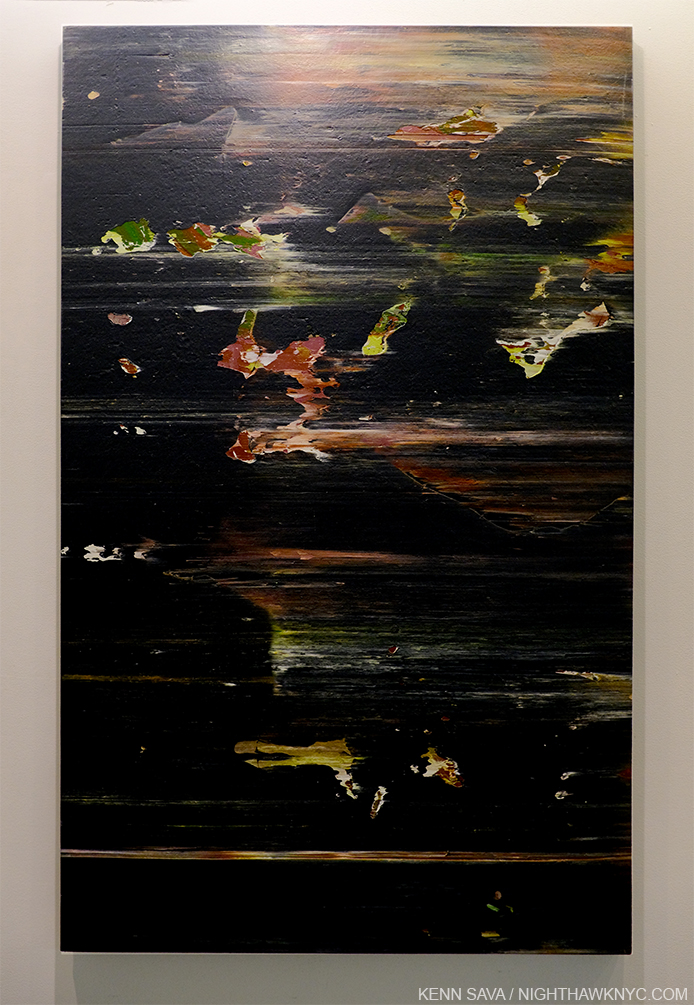
The Gerhard Richter show, while a terrific feat of curating by Sheena Wagstaff and her team in bringing in major works from all over which are very handsomely hung, offers an opportunity to see his work through the eyes of our time and in light of both what has come since, as well as what has been discovered about what was done before and during his time by Artists who were in eclipse for too long. In my opinion, Mr. Richter, perhaps a bit like Andy Warhol, winds up with quite a few works that don’t seem to have aged all that well and it will be interesting to see if the future finds these works speak to them. There are other works who’s gravitas is plain- like the exceptional Birkenau series, (unforgettably installed adjacent to 4 incredibly rare surviving Photos taking inside Auschwitz II Birkenau by a member of the Sonderkommandos), the beautiful Forest series, and a number of fine works that seem to have been overlooked thus far. This show is a great opportunity for each viewer to assess, or reassess, for themself.

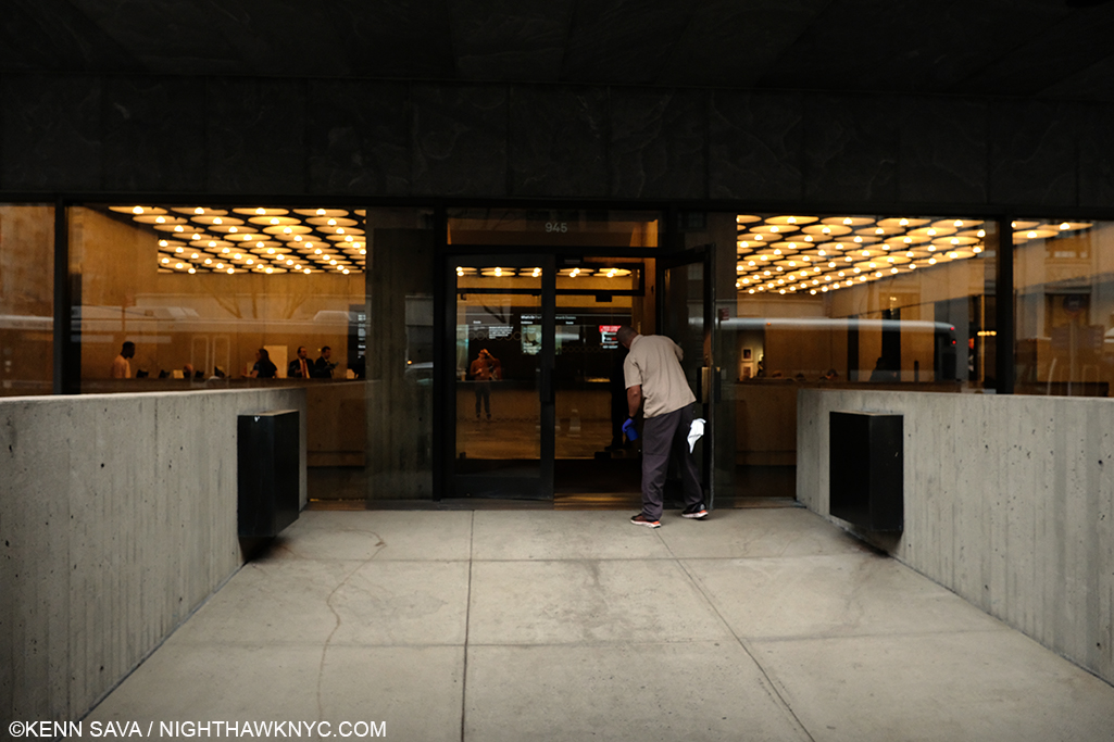
5pm, March 12, 2020. Minutes before closing at The Met Breuer, a staff member is still busy cleaning the doors. When they’ll get opened again to the public is anyone’s guess. I heard one guard say to another, “See you May 1st.” Was that his guess? The Gerhard Richter show is scheduled to open at MOCA, L.A. on August 15th, making it unlikely to be extended in NYC.

Here’s hoping the closings will be brief. But, if they are not, and, with the postponing of a number of Art & Photography shows this past week around the country, how long will it be before the galleries follow suit? In addition to any and all of the other effects it may have, all of this makes me wonder what the effect of the coronavirus may wind up being on the Art world, and the Art market, which has seen an unabated, meteoric, rise over the past three decades. 

In the meantime, stay healthy out there.

Mid Tuesday afternoon, March 17, 2020. Normally, West 24th Street in the gallery district of Chelsea would see a steady stream of foot and vehicular traffic going to the galleries lining both sides of the street from end to end. Today? I could have safely laid down to take this shot.

UPDATE- March 13th, one day later. Many, even most, of the NYC galleries have announced either closures or “open by appointment only.”

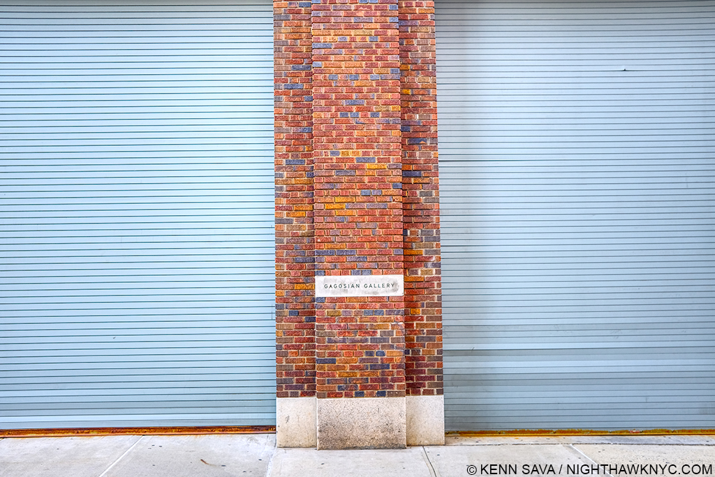
Gagosian on West 24th Street, scene of Jonas Wood’s latest NYC show, would normally be open.

While I expect many other non-Art businesses to close temporarily in the near future, a good many, especially smaller, businesses would be in extreme financial peril if they were to close for an extended time, particularly in the never more expensive NYC business environment.

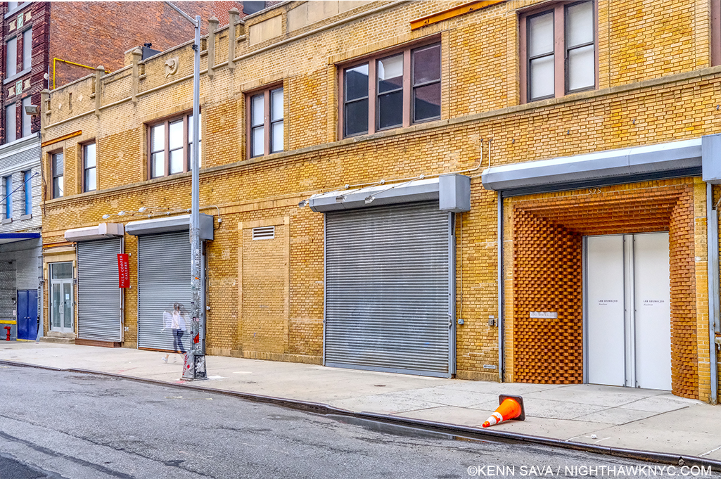
The scene over on West 21st Street. The terrific Sarah Sze show was here late last year. Today, that jogger doesn’t have to worry about running into anyone, and the street looks like it did before the galleries came here.

It’s hard not to think about how that reflects on the “Art business.” It also makes me wonder how these “appointment only” galleries know the health status of whoever they are choosing to let in, among other things.

NighthawkNYC.com has been entirely self-funded and ad-free for over 6 years, during which over 250 full length pieces have been published. If you’ve found it worthwhile, you can donate to keep it going & ad-free below. Thank you!

Written & photographed by Kenn Sava for nighthawknyc.com unless otherwise credited.
To send comments, thoughts, feedback or propositions click here.
Click the white box on the upper right for the archives or to search them.
For “short takes” and additional pictures, follow @nighthawk_nyc on Instagram.

Subscribe to be notified of new Posts below. Your information will be used for no other purpose.


Harry Gruyaert- In Living Color

Written & Photographed by Kenn Sava (except *)

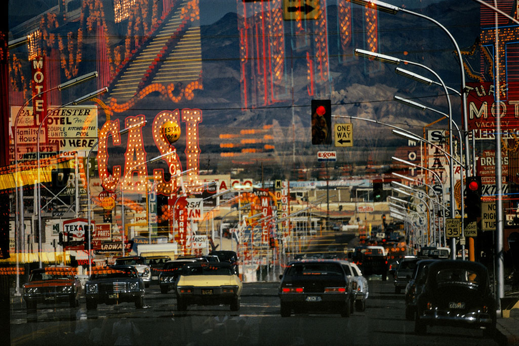
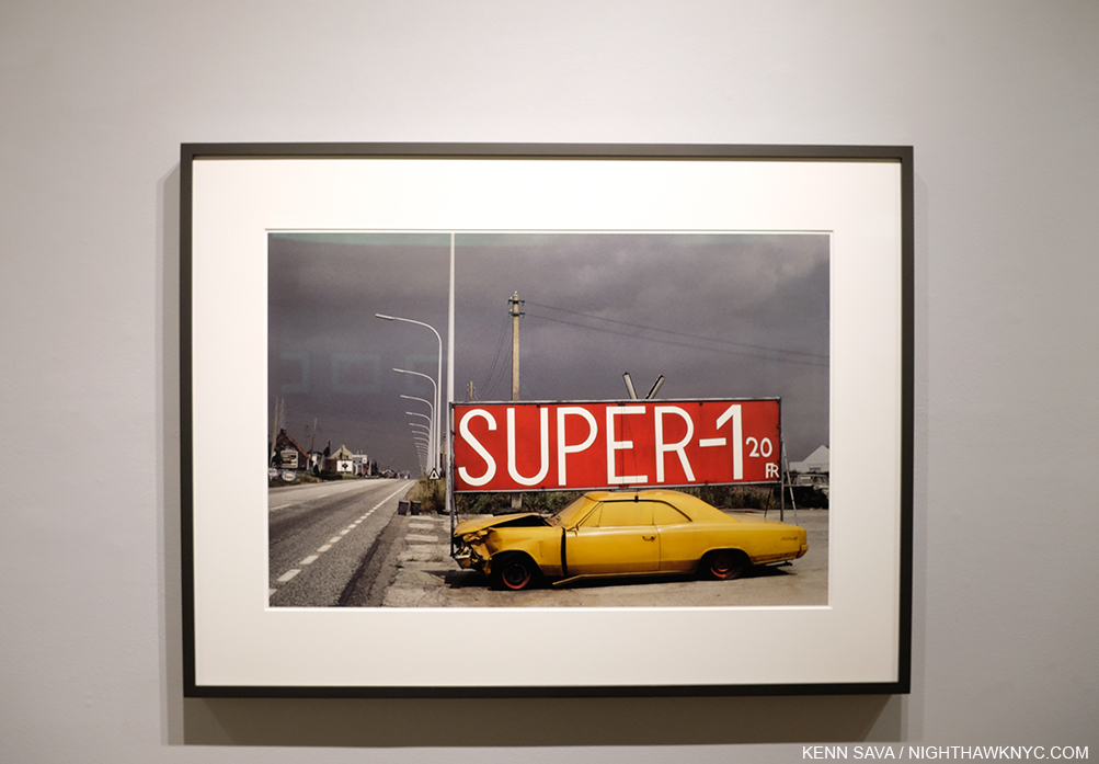
Freemont Street, Las Vegas. Nevada, USA., 1982. From West in the two-volume set East/West. *Photo by Harry Gruyaert, Magnum Photos.

Harry Gruyaert is one of any number of very fine European Photographers who are much better known at home than they are here. A good many of them have had long, accomplished, careers, and achieved substantial recognition on the other side of the pond. Here, in the USA, not so much. Last year, when I published my conversation with Harry Gruyaert, I was shocked to receive emails that said, “Thanks for introducing me to him.”

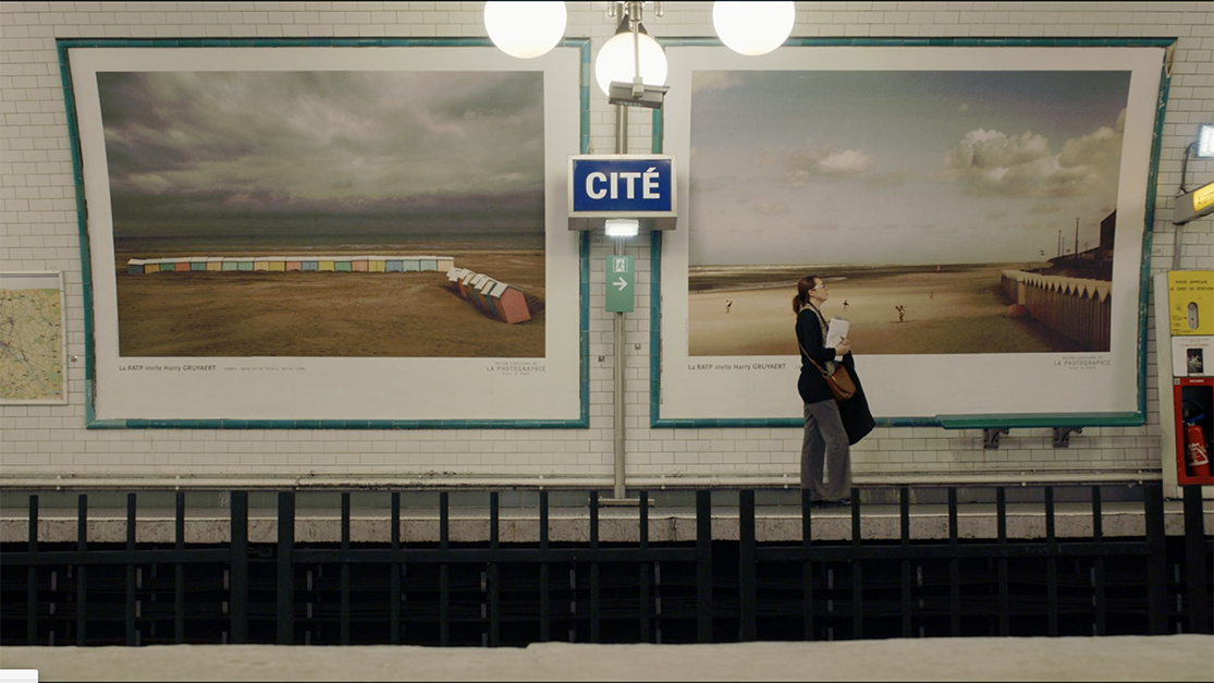
In 2017, 174 Harry Gruyaert Photographs were on view in eleven stations of the Paris Metro at the invitation of RATP, the Paris public transport operator. *Seen here in a still from the Harry Gruyaert: Photographer Documentary. Both of these Photographs may be seen in his recent book, Edges.

Really? Harry Gruyaert, who was born in Antwerp, Belgium in 1941, is one of the Photographers responsible for bringing color Photography to the mainstream Fine Art world, along with William Eggleston, Stephen Shore, Constantine Manos and others, after the early, pioneering though not as well known color work of Edward Steichen (going back to 1909!), Keld Helmer-Petersen, (in the 1940s), Saul Leiter and Fred Herzog (from the 1950s, on), and others. Harry was the subject of the recent Harry Gruyaert – Retrospective at FOMU Foto Museum in Antwerp, and the documentary film Harry Gruyaert: Photographer. He’s an Artist who’s work has appeared in eleven Paris Metro Stations and intriguing crops of his work have appeared on the cover of 68 Penguin Books Inspector Maigret detective novels by Georges Simenon. All of this is over and above the fact that he’s been a member of Magnum Photos since 1981 and is a former Vice President of the world’s foremost collective of Photographers.

What’s it going to take for some of these very accomplished Photographers to gain similar acclaim and following here?

The show’s entrance with Antwerp, Belgium, 1988, 13 1/8 x 19 3/4 inches. All prints in the show are Archival pigment prints; printed later.

Perhaps, in his case at least, the tide is beginning to change. Part of the reason Mr. Gruyaert hasn’t been better known here to this point may be that almost all of the PhotoBooks he released earlier in his career are long out of print making it very hard for anyone new to him to discover his work. Though I have had an interest in Mr. Gruyaert’s work, I’ve never seen any of his older books, like the legendary Morocco– even in rare book stores.

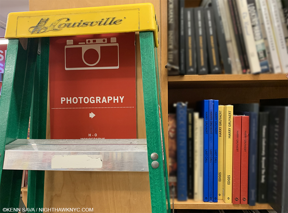
Blue, yellow and red- the colors of the covers of three of the most recent Harry Gruyaert monographs.

More recently, Thames & Hudson has released 4 new books over the past 5 years (Harry Gruyaert, 2015, a retrospective with the red cover, and best place to start exploring his work, the also excellent two-volume set East/West, 2107, Edges, 2019, and the just released Last Call, 2020), which are helping to bring his work back to the eyes of the PhotoBook world.

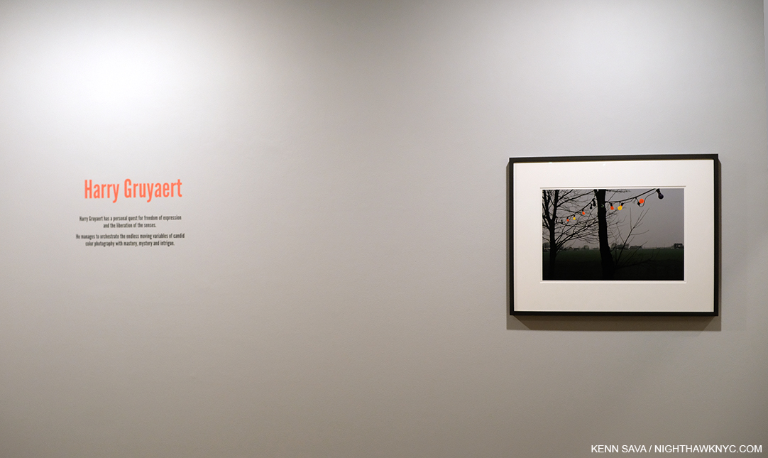
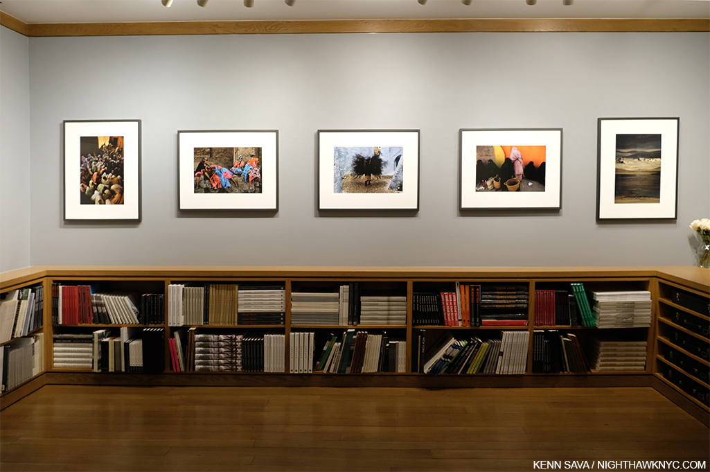
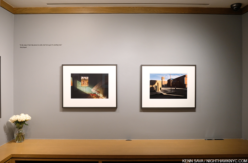
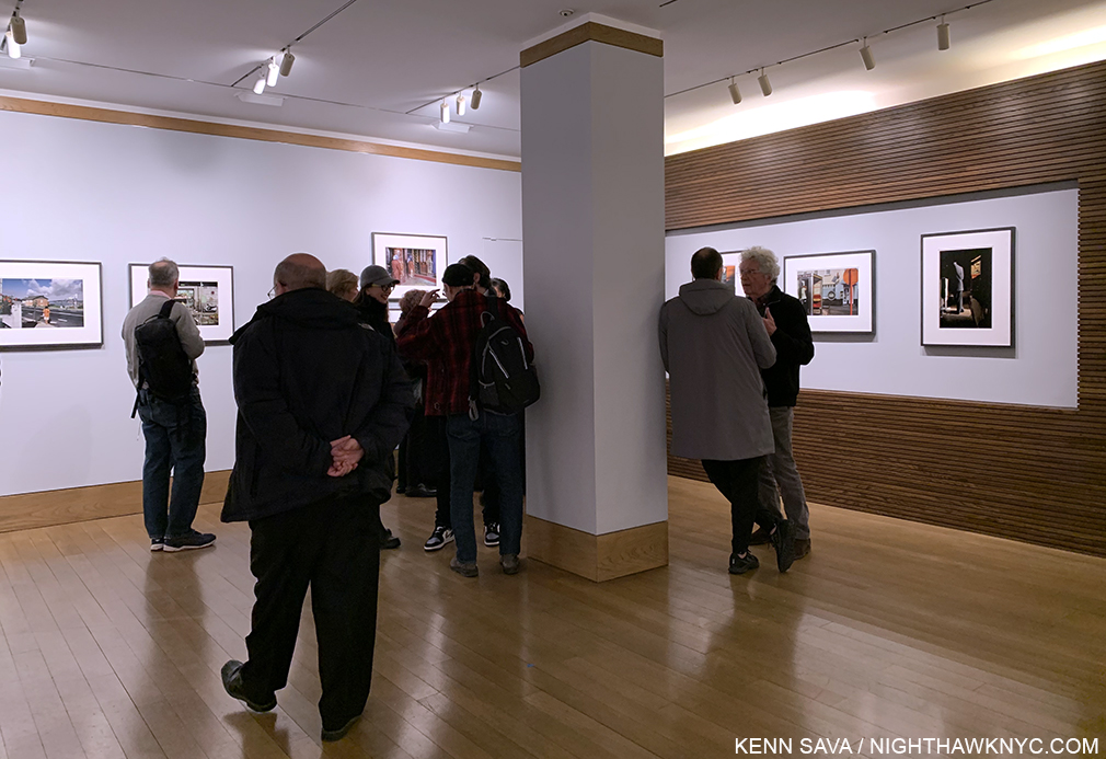
Harry Gruyaert at the Howard Greenberg Gallery, installation view. On the wall or in a book, Harry Gruyaert’s work tends to grab viewers at first sight.

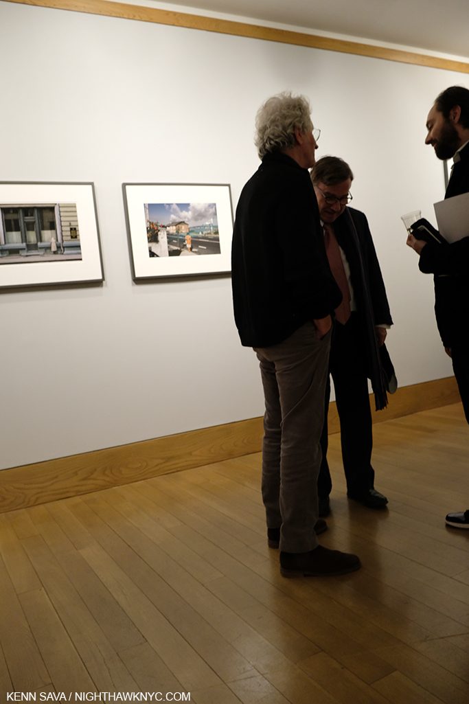
With Harry Gruyaert at the Howard Greenberg Gallery, his first show in the USA in decades, the next step has been taken. After our conversation  last year from Paris, I finally had the chance to meet Harry at the opening. There he was, with Roger Szmulewicz, Director of Gallery51, his European dealer, on January 23rd. Harry told me this was his first USA show since the release of Morocco, which was published in 1990! Then, in keeping with the spirit of Last Call, which he shot in airports, Mr. Gruyaert, still a frequent traveler, told me he was off to Japan in two days.

Harry Gruyaert, left, chatting with Roger Szmulewicz, Director of Gallery51 at the opening.

As I learned in our conversation last year, Mr. Gruyaert is a fascinating, multi-dimensional, man, who has had a remarkable career and life, which has been characterized by being in the right place at the right time, in the right light, as was to be seen in spades on the walls of Howard Greenberg.

Gao, Mali, 1988, 13 1/8 x 19 5/8 inches, left and the haunting Quarzata, Morocco, 1986, 13 1/8 x 19 3/4 inches, right.

Here and now, in the moment, a good many of Harry Gruyaert’s most familiar, and beautiful, pieces were on view.

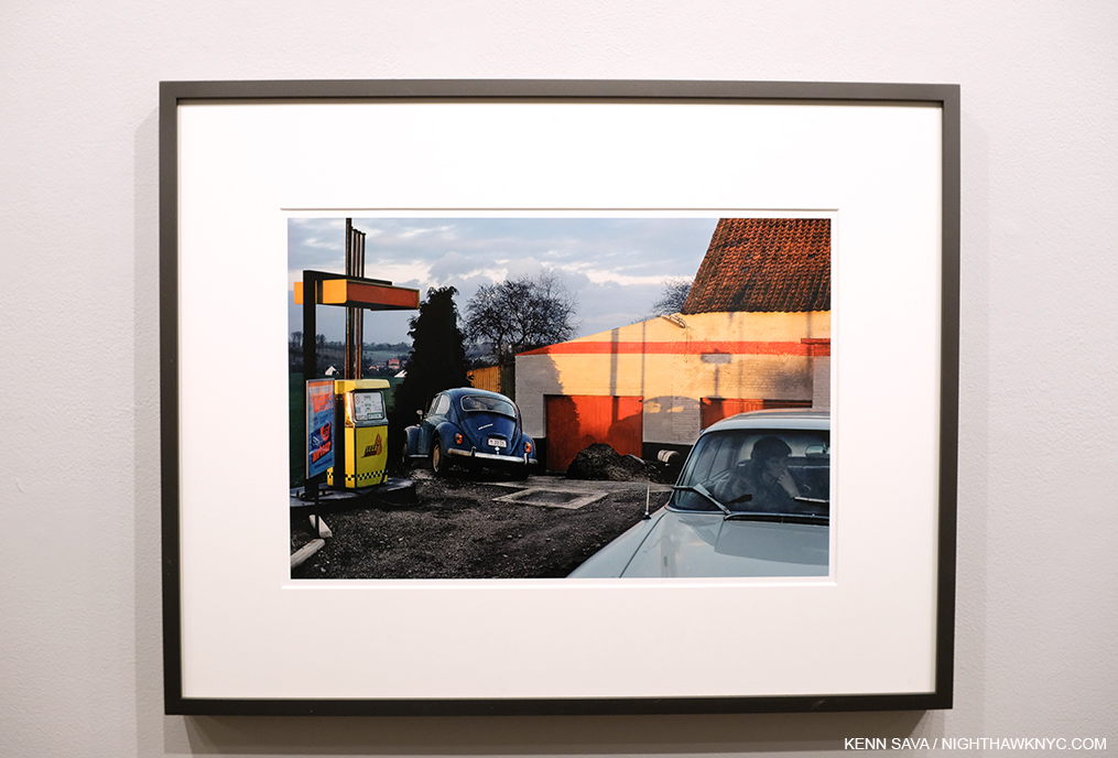
Province of Brabant, near Wavre, Belgium, 1981, 13 1/8 x 19 5/8 inches

For me, the show felt like reuniting with old friends. Province of Brabant, near Wavre, Belgium, 1981, in particular has long been among my favorites. There’s so many levels to this composition- the colors and their interaction, the distant landscape, the play of geometric shapes and shadows, the jarring angle the VW Beetle sits at, and then you get to the woman sitting in the car. It’s like a still from a movie, an outtake from a Michelangelo Antonioni Film he never made. Mr. Gruyaert, a long-time fan of Michelangelo Antonioni, and a former TV Director early in his career, produced a film that showed clips from Antonioni Films interspersed with some of his Photographs in the show The Image to Come at Cinémathèque Française in 2009.

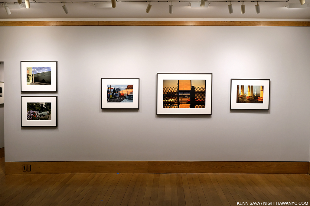
Installation view. To the right of center works from his East/West series hang next to each other. LA, USA, 1982, the larger piece and Ostend, Belgium, 1982, to its left.

A little known chapter in his distinguished career also saw him in the right place to document the work of the legendary Artist Gordon Matta-Clark during some of the semial years of that Artist’s career. Most of those shots, which are seen frequently when Mr. Matta-Clark’s work is discussed, don’t bear his name, since they now belong to Mr. Matta-Clark’s estate, but the fact that Harry was there at the right time, taking remarkable (black & white) Photos are yet another part of his legend.

National Road #1, Boom, Province of Antwerp, Belgium, 1988, 20 7/8 x 31 1/2 inches

With such a long and distinguished career to dip into to mount shows from, here’s hoping there will be cause for many more Harry Gruyaert sightings on this side of Planet Earth.


Harry Gruyaert, far right, at the opening.

In person, in living color.

*- Soundtrack for this Post is “East West” by Morrissey from Kill Uncle.

NighthawkNYC.com has been entirely self-funded and ad-free for over 6 years, during which over 250 full length pieces have been published. If you’ve found it worthwhile, you can donate to keep it going & ad-free below. Thank you!

Written & photographed by Kenn Sava for nighthawknyc.com unless otherwise credited.
To send comments, thoughts, feedback or propositions click here.
Click the white box on the upper right for the archives or to search them.
For “short takes” and additional pictures, follow @nighthawk_nyc on Instagram.

Subscribe to be notified of new Posts below. Your information will be used for no other purpose.


Art- With A Capital “A”

For The Record #1. First part of a series.

Written & Photographed by Kenn Sava

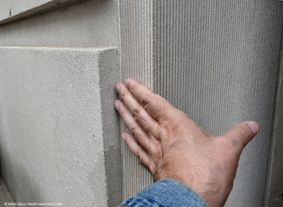
Back at The Met, May 6, 2018. The Museum, as it’s referred to, is one of the world’s great repositories of Art with a capital “A” with collections covering 5,000 years of it from all cultures in all its forms. It’s also one of the very best things about living in NYC. No. It’s THE best thing in my opinion. 1,700+ visits in since August 1, 2002, every time I turn the corner and see the building looming in front of me, I still get a chill down my spine. I touch the corner as I go in each time as a way of saying “Hello” to an old friend and to give thanks for each and every opportunity I get to do so.

To mark the 4 and a half year Anniversary of NighthawkNYC, during which I’ve published 225 pieces in 240 weeks (Phew…), I thought I’d take the opportunity to set the record straight on a few things that I feel are at the core of what I believe, and what I’ve written here. Perhaps I should have “explained” them at the beginning instead of letting those who’ve read these pieces (for which I Thank You) wonder, “What the heck?” Well, better late than never. Herewith the first installment in a brief series called For The Record. Consider them “footnotes” or “addendums” to every piece I’ve written.

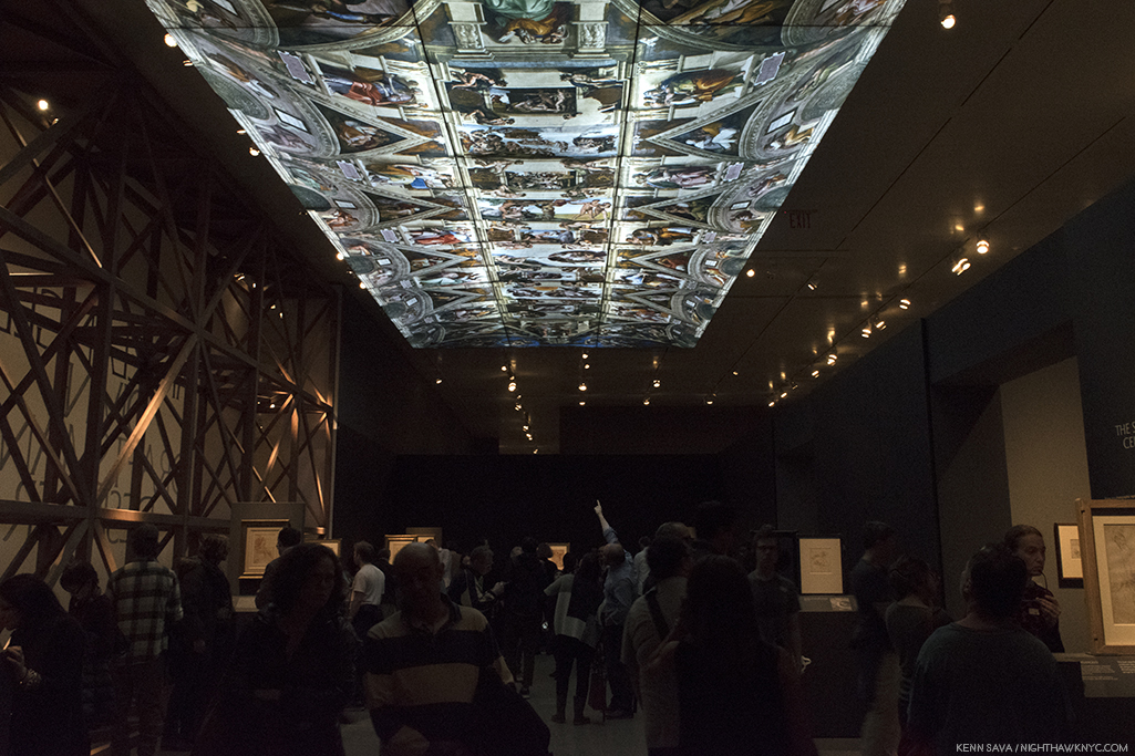
Michelangelo’s Sistine Chapel Ceiling reproduced as part of The Met’s staggering Michelangelo: Divine Draftsman & Designer, 2017-8, one of the sublime experiences of my life.

First- Art is of one of man and womankind’s supreme accomplishments in my view. I believe there should be some distinction between the Art of someone like Michelangelo and, say, the art of someone learning (said with all due respect).

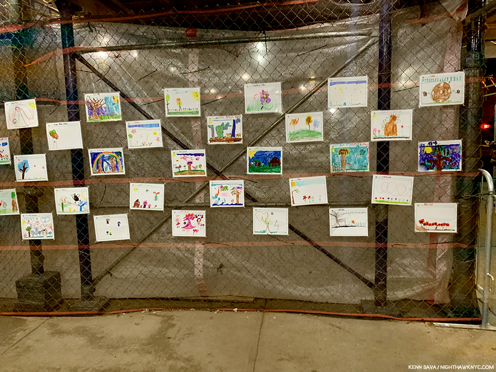
Various young artists, unknown titles. A display of children’s art beautifying an NYC public school under renovation.

That’s why I capitalize Art and its associated terms (Artist, Painter, Sculptor, Musician, Painter, Photographer, et al.). It’s my way of showing these people the respect I think they’ve earned and deserve. I’ve done this here since Day 1- July 15, 2015, and I’m sure there are some who frown at me for doing it, and some who disagree with me for doing it. Along the way, I’ve seen a few others doing it this way and frankly, I’m surprised it hasn’t become more widely adopted. I hope it does soon.

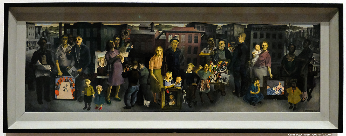
The terrific, and terrifically overlooked, Honore Sharrer’s, Workers and Paintings, 1943, Oil on board, seen at MoMA. Some of the Art she includes are Grant Wood’s American Gothic, Picasso’s Girl before a Mirror, and others by Jean-Francois Millet and Diego Rivera. Though this work and the originals of most of what she includes in it are 100 years old, +/-, for me, this and all of them are Art. Will the future agree? Time will tell…

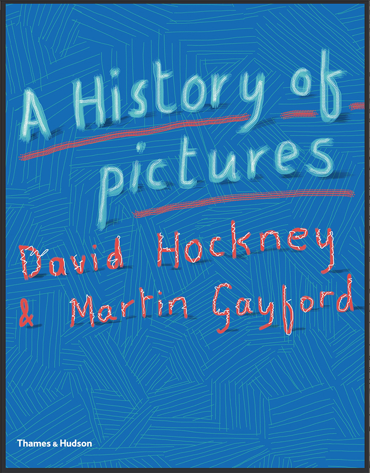
“What makes a work of art? I don’t know. There are lots of people who tell you they are making art. Maybe some of them are, but I’m not sure that’s true for all of them. Perhaps I’m old fashioned, but that’s not a phrase I would use. I’d prefer to say I’m making pictures – depictions.” David Hockney, A History of Pictures, with his capitalization, eBook P.2.

I’ve held David Hockney’s writings, and ideas, in the highest regard since his revolutionary, and eternally controversial, book Secret Knowledge came out in 2001, but I find it cumbersome to use the word “pictures” here in place of “Art.” Regarding what “makes a work of art?,” as he asks, it seems to me that it takes hundreds of years for the dust to settle on what’s being created in our time and for something, a “picture,” as Mr. Hockney says, to be considered “Art” (IF it continues to speak to people). None of us will be around when that bell rings. So, in the meantime, I’ve opted to use the term Art, capital “A,” respectfully, applying it to all working Artists, present or past.

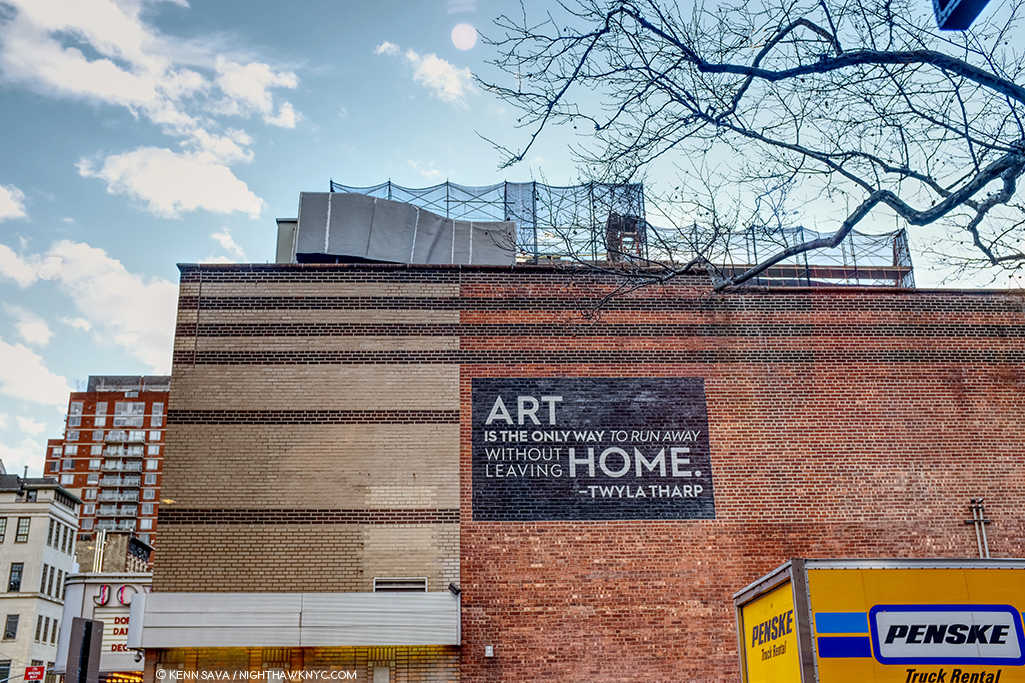
Thanks, Twyla. I couldn’t have said it better. And so, this scene has appeared in my Banner, sans moving truck, for the past year. If that truck is waiting for me, it may have a long wait. I haven’t been out of Manhattan overnight since February 4, 2012. The Joyce Theater, December, 2019.

The other reason I do it is because Art is my religion. Frank Lloyd Wright, who I consider to be an “ultimate Artist,” capitalized Nature since it was his religion. Art is mine.

Reach out and touch faith. For me, going to The Met is going to church, as I said early on. At this point in my life, it feels like Home. Back Home, again, late on December 22, 2018. Weather be damned. It’s always beautiful inside.

*-Soundtrack for this Post is ”Personal Jesus” by Martin L. Gore of Depeche Mode, from their 1990 album Violator. They perform it here on Letterman

For The Record is a series of pieces that are about key/core subjects & beliefs that underly everything else I’ve written here.

NighthawkNYC.com has been entirely self-funded and ad-free for over 6 years, during which over 250 full length pieces have been published. If you’ve found it worthwhile, you can donate to keep it going & ad-free below. Thank you!

Written & photographed by Kenn Sava for nighthawknyc.com unless otherwise credited.
To send comments, thoughts, feedback or propositions click here.
Click the white box on the upper right for the archives or to search them.
For “short takes” and additional pictures, follow @nighthawk_nyc on Instagram.

Subscribe to be notified of new Posts below. Your information will be used for no other purpose.


A Year of Art: 2019

Written & Photographed by Kenn Sava

Detail of Leonardo Drew’s Public Art project, City in the Grass, 2019, seen in August in Madison Square Park, where it was on view from June through December. In conversation, Mr. Drew spoke of the influence of Indian Stupas, though the Empire State Building 10 blocks behind, might be one as well.

A strange year in Art in NYC ended a few weeks ago. A year that saw one of Manhattan’s “Big 5” museums (MoMA) close for four months, including the entire summer, while it remodeled, then reopen to mixed reviews (mine among them), while another one (The Whitney) faced an Artist revolt mid-Biennial, another (The Met) had what seemed to me to be a fairly “quiet” year on the show front as it adapted to the first full year under its new Director, Max Hollein, while the other two, the New Museum and particularly the Guggenheim, chugged along presenting top notch show after top notch show. Meanwhile, no less than 5 shows of the work of Jean-Michel Basquiat were mounted around town, and though I wrote a series of pieces on them I still don’t know “Why now?” While I’ve written about a number of other shows I found particularly NoteWorthy in 2019, already, there were some other excellent shows that linger in my mind, in the space freed up by the plenty of others that do not. If I were to sum of the year in Art seen, I will remember it as a year where Sculpture, long a very overlooked medium, though not here, struck back and broke through.

NoteWorthy Sculpture Shows-

Lingering closest to the front of my mind is the incredible Sarah Sze at Tanya Bonakdar Gallery, which I just wrote about, along with Jean-Michel Basquiat at The Brant Foundation, the most unforgettable shows I saw in 2019.

Leonardo Drew poses in front of Number 217, 2019, Wood, plaster and paint, on the last day of his show at Galerie Lelong, August 2, 2019

Leonardo Drew at Galerie Lelong and City in the Grass at Madison Square Park. Mr. Drew has achieved substantial success around the world, with work in the Permanent Collections of any number of museums, including The Met’s, yet he still seems to be something of a “well-kept secret” to the larger Art public. One of the most original, interesting and visionary Sculptors working today, I thought his show at Galerie Lelong was close to perfect.

Number 215, 2019, Wood, paint and sand.

As with Sarah Sze, the show marked the introduction of Painting by the Artist, though not in the “traditional” sense. The Artist told me Number 215 began as a Painting (his), which he then deconstructed as if it had exploded.

Detail. The show also introduced color into Leonardo Drew’s work.

One monumental work in the large gallery accompanied by five others in the remaining space, each one selected with supreme taste to provide a wonderful group. While his show was up, Mr. Drew also debuted his first Public Art piece, a work commissioned for Madison Square Park.

City in the Grass seen on a day when the lawn was closed to be rested from the non-stop traffic it had been receiving. At the base of each of the three “Stupa”-like structures were wooden “cities” rendered in Mr. Drew’s typically extensive detail to the point that, up close, you could literally spend hours moving through them with your eyes.

In all my years of living in the City, and living here with Public Art, I’ve never seen a piece that was so quickly adopted by the public. Kids endlessly climbed all over it while their parents and other adults languished on other parts of the gigantic piece, as can be seen in the first picture above. Mr. Drew appeared in the Park at least twice to speak about the work and proved to be an extremely thoughtful speaker.

Such was the public acceptance of City in the Grass that even one of the Park’s permanent residents came by to hear the Artist speak about it in a public talk, with renowned writer (and Miles Davis Autobiography co-author) Quincy Troupe, right, on September 11, 2019.

In terms of precedents or influences, Thornton Dial and Jack Whitten (who rented space to Mr. Drew early on the Artist told me) come to mind, but not really. Leonardo Drew is an original. Before he’s done, many decades hence, I believe his work is going to wind up in as many museum as just about any other Sculptor of his generation. 

Nari Ward, Homeland Sweet Homeland, 2012, Cloth, plastic, megaphones, razor wire, feathers, chains and silver spoons, 96 x 60 inches. Along with everything else going on in this, the detail is incredible.

Nari Ward: We The People at the New Museum- Since the 1990s Nari Ward has been repurposing a very wide range of mundane, even humble, materials, often in staggering amounts, in new, surprising and exciting ways. We The People was another long overdue retrospective of the work of this exceedingly creative Artist.

Installation view of part of one of the three floors the show filled.

Occupying multiple floors of the building each work was strong, different from the one before, and shared an uncommon ability to linger in the mind. Another blockbuster show mounted by the terrific team of Massimiliano Gioni and Gary Carrion-Murayari for the New Museum, which continues to rise in stature in my eyes.

Installation view of the 2nd of 3 galleries.

John Chamberlain: Baby Tycoons (with Eva Hesse Drawings) at Hauser & Wirth, East 69th Street- Lesser known work by two ground breaking, unique Artists/Sculptors, both no longer with us were paired in a beautifully installed show at Hauser & Wirth’s uptown outpost. While Ms. Hesse’s Drawings provided a fascinating insight into her career and process, Mr. Chamberlain’s gorgeous small works completely enthralled me.

While his classic larger pieces can look completely “accidental,” his smaller work shows the incredible attention to detail that he brought to bear in all of them. 

Wangechi Mutu, The NewOnes, will free Us, The Facade Commission outside The Met, 5th Avenue- The 5th Avenue Richard Morris Hunt Facade has long been a sore point for me. We’ve been living with it as it is for so many of its 117 years that most visitors fail to realize it remains unfinished! Being Landmarked, having neighbors and being in Central Park has kept TM from finishing what was started back 150 years ago and reached this form in 1902. I pray that one day they’ll be allowed to. It’s not like sticking a brand new pyramid in front of it! It’s just completing the existing facade. So, this year I was pleasantly shocked to see they found an extremely creative and Artful partial workaround. The Facade Commission as they call it bring us 4 terrific bronze Sculptures by Wangechi Mutu titled The NewOnes, will free Us that look superb in the heretofore empty niches outside facing 5th Avenue. On view 24/7 through this June 8th, don’t miss them on your next visit. 

As the year ended, all of this left me wondering- Are we in a “Golden Age of Contemporary Sculpture”?

Elsewhere, among the shows I haven’t written about-

NoteWorthy Painting Shows-

Lorna Simpson, Darkening, 2018, Ink and screen print on gessoed wood, 108 x 96 inches.

Lorna Simpson: Darkening at Hauser & Wirth, West 22nd Street- To this point I’ve been familiar with Ms. Simpson’s Photographs, works on paper and collages, but these Paintings came as a shock. Innovative, fresh, haunting, beautiful, the show felt like it came out of the blue, but I’m sure it didn’t. It struck me as a breakthrough. I returned to see it a few times and when it was over I was surprised it hadn’t received more attention than it got, and left me very much looking forward to see where she’s taking this next.

Jasper Johns, After Larry Burrows, 2014, India ink and water-soluble encaustic on plastic, 32 x 24 inches, one of a series of terrific works by the Artist based on this Photograph.

Jasper Johns: Recent Paintings & Works on Paper at Matthew Marks- Though he turns 90 in May, and a Retrospective is on the Whitney calendar, don’t begin to think Jasper Johns is done. One of the last Artists left to us (along with Susan Weil) from his group that included Robert Rauschenberg, Cy Twombly, Merce Cunningham, John Cage, Willem deKooning, et al, I didn’t know what to expect when I walked into Matthew Marks to see this show of recent works. I left determined to return as often as I could before it closed. I’ll admit that I haven’t followed Mr. Johns career as closely as I followed his one time close associate Robert Rauschenberg, who has had a major influence on the way I see the world, but it sure seems his work has continued to evolve and I, for one, found new surprises in this remarkable show. Too old to be drafted for the Vietnam War he was nonetheless deeply effected by it, as everyone living in this country at the time couldn’t help but be. A number of the works Mr. Johns showed were based on an extraordinary Photograph taken by Larry Burrows in Vietnam, a war that tragically produced too many indelible images, called Farley Breaks Down. Among countless others, Larry Burrows, also, lost his life in the war in 1971. While Photography has been the basis of countless Paintings, in these it was most subtle, almost like a memory, complete with the “haze” of camouflage-like coloring, yet its power was undiminished. Seeing these brought to my mind that one of the things that brought Mr. Johns wide attention early on were his Flag Paintings in the late 1950s.

Henry Taylor’s Mural at Blum & Poe, September 24th- before he modified it.

Henry Taylor: NIECE COUSIN KIN LOOK WHO LONG IT’S BEEN at Blum & Poe- It’s been 2 years since Mr. Taylor’s “New York Moment,” as I called it, when his mural debuted on the High Line concurrently with his being one of the “stars” of the 2017 Whitney Biennial, given both his prominent placement with a large work in the lobby on the 6th floor and an entire gallery he shared with his friend, Deana Lawson. His first solo show since showed that not even hip trouble, which sounded serious, could keep the Artist from traveling and continuing to work.

Henry Taylor uses my pen to modify his mural seen above, September 24, 2019.

The opening was highlighted, for me, by meeting Mr. Taylor, who proceeded to borrow my pen to modify the largest works in the show right in front of my eyes, and later proceeded to inscribe a message on the wall in the garden. Mr. Taylor seemed in fine form, not showing any lingering effects of his ailment and the work on view was classic Henry Taylor. A number of visitors approached Mr. Taylor asking for him to sign his recent monograph. I couldn’t help notice that he seemed to Draw in each book, something that indicated to me he’s another Artist who can’t stop Drawing. Of course, in my copy, he appended a sketch of my pen.

The social revolution… Installation view.

Meleko Mokgosi The social revolution of our time cannot take its poetry from the past but only from the poetry of the future and Pan-African Pulp at Jack Shainman Gallery, West 20th, West 24th Street, and The School, Kinderhook, NY- The now Brooklyn-based Artist is so prolific his latest work occupies no less than THREE of Jack Shainman’s spaces, including the entirety of The School in Kinderhook, NY, out of reach for this writer.

Pan-African Pulp installation view. In this series, Mr. Mokgosi uses source images from the 1960s South African photo-novel Lance Spearman “to examine the history of pan-Africanism.”

The two Chelsea shows I was able to see are marked by remarkable, continued, growth leading me to feel that Mr. Mokgosi is yet another Jack Shainman Artist, like Kerry James Marshall before him, on his way to museum collections. 

Lucian Freud: Monumental at Acquavella Gallery and Francis Bacon’s Women at Ordovas- Two shows that barely made the cut, with both ending in early January, served as a reminder that I didn’t really need of the fact that both Painters, one time friends, are towering figures in 20th century Art who’s influence remains strong. I couldn’t help wonder how the Freud show benefitted by the presence of legendary former Metropolitan Museum Director, Philippe de Montebello, now a Director of Acquavella Gallery, right across the street from his former and long-time 1000 Fifth Avenue home.

The show featured Mr. Freud’s nudes, emphasizing his extraordinary way of Painting flesh, the aspect of his work that has long fascinated me as much as any other. Here, the only clothed figure in the show.

Regardless, it was an exemplary, concise, museum quality gallery show of the work of an Artist who hasn’t had a show here in too long.

Among many other things, Francis Bacon reintroduced the Triptych to Painting.

Nearby, Bacon’s Women, a subject I can’t say I’ve ever heard broached before, was a revelation. The surprising concept was beautifully executed and mounted in Ordovas’ classic East 77th Street townhouse. Francis Bacon has proved to be an Artist who’s accomplishment has only grown more and more interesting and relevant as time has passed, and so, the rare chance to see some of his lesser seen work was not to be missed.

NoteWorthy Drawings Shows-

Installation view.

William Kentridge: Second-hand Reading at Marian Goodman- The legendary South African Artist returned to NYC with what seemed to me to be more innovations in his unique and powerful Drawings, along with a selection of his equally unique Sculpture, and Film, shown in the room behind his Projector Sculpture, above.

Installation view of 3 of the 7 monumental charcoal Drawings, yes Drawings, in the show by a contemporary master of the medium. Mr. Longo  told me it took 6 months to create the one on the right, 8 months for the one on the left.

Robert Longo: Fugitive Images at Metro Pictures- During his Artist’s talk in the gallery on January 11th, Mr. Longo broke down discussing one of his pieces with Nancy Spector, Artistic Director of the Guggenheim Museum. I came away even more impressed with the Artist, who’s work I already hold in high esteem.

Robert Longo in conversation with Nancy Spector, Artistic Director of the Guggenheim Museum in front of a Drawing of North Korean soldiers.

Not one to miss a perfect segue…If I had to single out one person who had a great year in NYC Art in 2019, it would be Nancy Spector, who, along with her team, produced a steady string of very good shows at the Guggenheim, continuing their run these past few years, a number of which I’ve written about.

NoteWorthy Photography Show

Vik Muniz: Surfaces Installation View. These are called multimedia. A close look reveals the numerous layers of each work in which Mr. Muniz reinterprets 20th century abstract Paintings to fascinating effect. Garden Design, after Roberto Burle Marx, Pierrot, after Willys de Castro, Composition/Space, after Cicero Dias, Surfaces, 2019, Multimedia, left to right.

Vik Muniz: Surfaces and Museum of Ashes at Sikkema Jenkins & Co- Looking through the two volume Vik Muniz Catalogue Raisonne, the first thing that strikes me is that it’s arranged in sections according to the technique he used, something I can’t say I’ve seen before, and something even more remarkable when you consider that a good number of these techniques he invented. Along the way, he’s already created a substantial body of memorable pieces, which have gained him worldwide recognition.

Detail of the layers of Garden Design, after Roberto Burle Marx. As a result, each piece is unique.

He was at it, again, adding yet two more innovations, in his remarkable two part show at Sikkema Jenkins & Co. Beyond his endless inventiveness, technique being a means to an end, the results have continued to resound. No mean feat when you consider that one part of his show was based on famous masterpieces of Painting, above, in the Surfaces section of the show, the other based on “resurrecting” Art works lost in a fire, turning their very ashes into recreations, in the Museum of Ashes section. Surfaces was based on Paintings by Arthur Dove, Hans Hoffman, Stuart Davis, Carmen Herrera, Ellsworth Kelly, Marsden Hartley and Romare Bearden, among others, adding a new dimension to the perception of each of these works. Daring!

Vik Muniz recreated works from the Museu Nacional from their very ashes! Here he recreates its facade. Museu Nacional, Museum of Ashes, 2019, Archival inkjet print.

On September 2, 2018, the entire Museu Nacional in Rio de Janeiro burned to the ground, including all its collections amassed over the past 200 years. The museum was Muniz’ favorite cultural institution in the city, a place he visited often with his children. On the wall card to this section, Mr. Muniz said, “I cried upon learning of the fire as if I had lost something personal, some kind of string that held the insanity of my present together.”  The Artist proceeded to work with the archeologists sifting the ashes of the building and its contents and was provided with ashes and the exact location they were found.

Beetle, Museum of Ashes, 2019, Archival inset print.

He proceeded to reconstruct some of the objects that had been lost- in ash, which he then Photographed. The results speak for themself, and, amazingly, echo what has been lost.

As 2020 gets underway, there would seem to be a bit more stability on the horizon, but not entirely. Change, after all, is the only constant in the universe. The protests at the Whitney resulted in board resignations, and MoMA plans to be open for the full year, as far as I know now. Art in NYC, 2020, however, will already be remembered for two memorable events. The Met marks the 150th Anniversary of the opening of its iconic 5th Avenue location this year- with a closing. 2020 will also be remembered as the year the short-lived Met Breuer closed.

*- Soundtrack for this Post is “Restless Farewell” by Bob Dylan from the timeless The Times They Are A-changin’, 1964.

NighthawkNYC.com has been entirely self-funded and ad-free for over 6 years, during which over 250 full length pieces have been published. If you’ve found it worthwhile, you can donate to keep it going & ad-free below. Thank you!

Written & photographed by Kenn Sava for nighthawknyc.com unless otherwise credited.
To send comments, thoughts, feedback or propositions click here.
Click the white box on the upper right for the archives or to search them.
For “short takes” and additional pictures, follow @nighthawk_nyc on Instagram.

Subscribe to be notified of new Posts below. Your information will be used for no other purpose.


Sarah Sze: Creativity, Unbounded

Written & Photographed by Kenn Sava

“I bring together the materials I find around me. I gather them to try and create immersive experiences that occupy rooms, that occupy walls, landscapes, buildings, but ultimately I want them to occupy memory.” Sarah Sze, TED Talk.

Crescent (Timekeeper), 2019, Mixed media

In the 4 1/2 years of NHNYC I’ve never yet called a Contemporary Artist a genius. Until now. [Drum roll]

Sarah Sze is a genius in my opinion.

As I take stock of the Art I saw in 2019, along with Jean-Michel Basquiat at The Brant Foundation (which I looked at here), the most unforgettable show I saw this past year was Sarah Sze at Tanya Bonakdar Gallery. As I write this three months after it closed, it’s at the front of my memory of everything I saw last year.

Overflowing. Sarah Sze began on the outside(!) of the gallery’s doors and windows.

Detail of part of Images in Refraction (West) on the western part of the facade of Tanya Bonakdar Gallery (to the left in the previous picture) reveals the multimedia nature of what’s on view inside, and the multi-dimensional talent of the Artist. Painting, Sculpture, Collage, Engineering & Architecture, Photography, Film, Installation- you name it. You get it. And then some.

I’ve seen her gallery shows over the past decade, and each time, I left shaking my head. Part sculpture, part installation, part construction project, part hardware store free-for-all, they were always impossible to fully take in at one look. You saw their shape from a distance and admired the overall composition, and then learned the devil was in the detail, and the detail, and the seemingly endless detail. Still, I wasn’t prepared for her expansion into multi-media, including the debut of her Paintings, she presented on West 21st Street this fall where not even two floors, the reception area, the ancillary walls, both sides of the galleries windows, doors, or the space under the stairs were enough to contain her seemingly boundless creativity.


Looking out at the view seen previously of Images in Refraction (West), with installation on the wall, right, leading to the first gallery.

Not to mention 4 galleries filled with her trademark seemingly infinite detail.

Detail of the ever-changing projection that filled the walls surrounding Crescent/Timekeeper.

After the lead-in provided by entering the gallery and passing through the prelude in the reception area, Crescent (Timekeeper), 2019, turned the large gallery into a fully immersive experience from the moment you entered the space and tried to take it all in from about 25 feet away, as may be seen in the very first image above, like some alien craft in a pre-2001:A Space Odyssey 1960s sci-fi movie. “Yes. Something landed…and…it’s glowing! Moving in for a closer look. Tell Lana I love her…” Situated near one far corner allowed embedded rotating projectors to have much of the surrounding walls to themselves engulfing you as you enter the space.

Close up/Details of the center section of Crescent (Timekeeper). Stepladders are a recurring motif in Sarah Sze’s work. As she’s said, “Everything you need to make the piece is in the piece.”

As you approach between two “arms” extending out on the floor, you realize that the center section contains about 50 screens of varying size. Standing there for a few moments reveals each one of those screens contains projected images moving independently of each other. Yet, tracing them back, you find only a few overhead projectors. ? On one visit the work struck me as an almost nostalgic look at life on earth. Suffice it to say, you need to experience it for yourself.

To the stars…Gazing at the top of the “superstructure” of Crescent (Timekeeper), 2019, Mixed media.

With so much to see in just this work, I was somewhat shocked when I realized Crescent (Timekeeper) wasn’t the only “monumental” work on view!

Detail, part of one of 4 walls that makes up After Studio, 2019, with the work Surround Sound (After Studio), 2019, Oil paint, acrylic paint, acrylic polymers, ink, aluminum, archival paper, disband and wood, 103 1/4 x 130 inches, center. No Photo can begin to covey what it was like to be in this work, which is what visitors to this space were, but looking at the piece on the wall, center, the first “Painting” by Sarah Sze I’ve seen, might begin to.

In a smaller, rear, gallery on the first floor, I encountered one of the most amazing things I’ve ever seen in an Art show- what looked to be a complete (re)construction of one of her studios down to the last detail. A work titled After Studio, 2019. It appeared to me to center around a series of Paintings by Sarah Sze, the first I’ve ever seen, though they are as much Collage as Painting. ”In the age of the image, a painting is a sculpture,” Sarah Sze said in 2019.

Details of details from the right of center section of Surround Sound (After Studio) seen above.

That sentiment puts her in the direct line of Picasso & Braque’s Cubism, Marcel Duchamp, Joseph Cornell, Robert Rauschenberg, Jasper Johns, Jack Whitten, Frank Stella and, more recently, Mark Bradford and Julie Mehertu. With everything Sarah Sze includes in her Paintings, two things struck me as particularly interesting- her use of Photography (apparently her own), and her “use” of words. They’re there, if you look closely, but they almost exclusively appear to be “notes to self” rather than to others on “post-it” like notes. I was told that the Artist went back and replaced each one with archival equivalents as she completed the work. Yes Surround Sound (After Studio) is complete, and some very astute museum bought it.

The corner of the opposite and adjacent walls. Remind yourself- You’re in a gallery.

I returned to experience After Studio again and again and it felt to me like I was walking around in the Artist’s mind. Often when I see Art, especially landscapes, I close my eyes to feel the presence of place in the piece in my mind’s eye. Here was one “landscape,” I couldn’t keep my eyes open long enough to drink in. Nary a foot of After Studio, save for the center space to move around it, lacked vision or wonder. When I left if for the last time on October 17th, I was fully in awe1.

Another detail, this one interesting for showing some of the Photographs the Artist may, or may not, use, along with what may happen to them on the way.

On the 2nd floor, the large back gallery contained more Paintings, and a Painted floor. All told, nine Paintings were in the show. I guess I shouldn’t be surprised by the appearance of her Paintings, after all Sarah Sze studied to be a Painter for a decade before turning her attention to “make meaning of the things around us through materials2.” For me, as amazing as the installations are, the Paintings linger with me every bit as much. No small feat.

I am thrilled to see her interest in Painting return in stunning works like this. 12 Landscapes (After Object), 2019, Oil paint, acrylic paint, acrylic polymers, ink, aluminum, archival paper, disband and wood (triptych), 73 1/2 x 110 1/4 inches.

Detail of 12 Landscapes (After Object).

I was told the show took 2 1/2 weeks to install- for a show that only ran for 6 weeks!

Images in Translation, 2019, Mixed media.

Finally, upstairs in the Project Room, Images in Translation, 2019, was installed in the dark, making it very hard to get a shot of that comes close to doing it justice.

Detail.

Time to head downstairs and back outside.

Looking down from 2 flights above at Images in Refraction(East) under the stairs.

I then immediately started scrambling down West 21st Street to find the pieces of my exploded mind that had wound up on the ground. On September 21st, the opening day of the “New” MoMA, two days after Sarah Sze ended, I discovered this installed on the 6th floor-

Sarah Size, Triple Point (Pendulum), 2013, seen at MoMA, Opening day, September 21, 2019

Sarah Sze’s Triple Point (Pendulum), a work that was originally shown at the 2013 Venice Biennale when the Artist represented the USA, was on display, front and center, in the exhibition Surrounds: 11 Installations.

The immersive experience Sarah Sze gives us in Blueprint for a Landscape in the 96th Street 2nd Avenue Station is based on a fantasy of the construction of Hudson Yards, which is no where near it.

Though that show, too, has now ended, New Yorkers are able to see Sarah Sze’s work anytime- 24/7/365. Ms. Sze created the Art in the 96th Street Subway Station on the new 2nd Avenue line, which opened in 2017, making her one of a handful of Artists who’s work was installed during the creation of the brand new Subway Station it will be seen in permanently. I’ve lauded before the taste of those charged with selecting Art for the Subway, and here’s yet another instance of brilliant vision, in my opinion. Here’s a look for readers without a MetroCard. I can’t help thinking that in 100 years, people will treasure this remarkable video of both the construction of the Station and the Artist actually there, giving a walkthrough-

Sarah Sze is moving between Sculpture, Painting, Photography, Film, Installation and collage in new ways, creating results that have never been seen before. Her work is like the city, like the forest, like a home, and filled with elements, reminders, and the detritus of each. And, in a work like Crescent (Timekeeper), it’s full of what will be memories and associations in the form of images. To what end? As in all great Art, that’s left to each viewer to decide.

More details of After Studio

In my view, though the show marks something of a new “period” in her work, it’s seamless with what’s come before. Already a world famous Artist, could it be that she’s only scratched the surface of her talent? A year ago I’d be shocked to have said that about her work. Now? I’m ready to bet on it.

I have no idea how she conceives her pieces, but in each one of Sarah‘s shows- literally, never more than in her most recent show, I felt like I was walking around inside of her brain.

Ah…so this is what it’s like to be a genius…

*Soundtrack for this Post is “Aurora” by Bjork from Vespertine.

NighthawkNYC.com has been entirely self-funded and ad-free for over 6 years, during which over 250 full length pieces have been published. If you’ve found it worthwhile, you can donate to keep it going & ad-free below. Thank you!

Written & photographed by Kenn Sava for nighthawknyc.com unless otherwise credited.
To send comments, thoughts, feedback or propositions click here.
Click the white box on the upper right for the archives or to search them.
For “short takes” and additional pictures, follow @nighthawk_nyc on Instagram.

Subscribe to be notified of new Posts below. Your information will be used for no other purpose.


  1. I returned on October 19th, the show’s closing day, but there was a line to get into After Studio. I passed and left feeling fortunate to have spent a few hours in it by myself over the run of the show.
  2. Ted Talk

Looking At The Past And Seeing The Future

Written by Kenn Sava

“Johannes van Eyck made this,” the inscription by the Artist reads in this detail from “The Arnolfini Portrait,” which he also dated 1434. Closer to Van Eyck Photo.

Is Jan van Eyck the “greatest” Painter ever?

“Wait? Kenn Sava call someone ‘the greatest’ anything? I thought he didn’t believe in qualitatively comparing Artists or Artwork?” I don’t. There’s no such thing as “the best” in the Arts. Yet, the work of Jan van Eyck seems to me to be beyond the boundaries of normal discourse. I’m asking technically now. In that sense, and instead of “greatest,” let’s put it this way- Does Jan van Eyck (and, possibly, his brother Hubert, who may or may not, have worked on some or many of his early pieces before passing away in 1426) remain unsurpassed among Painters? If you or yours know of a greater technician in the history of Painting, by all means, set me straight. I’d LOVE to see him or her. Still, technique is only a means to an end, right? On its own, it doesn’t make something “Art.”

When I was a kid, freshly a teen, I discovered the work of Jan van Eyck (JvE) in this book-

I’d never seen anything like it. I still haven’t. There are a lot of ways you can discover an Artist you previously didn’t know today. Back then, coming across a book on him or her in a library, bookstore or a friend’s house, were the primary means for me. It’s now one of a number of primary means. In what was a black & white world at the time, impossible to imagine today, seeing this kind of color was part of the revelation. The closer I’ve looked over the decades, I’ve found his work is like the proverbial onion- There’s MUCH more going on in it than beautifully meets the eye at first look, with virtually every single detail carrying layers of meaning that have taken the intervening 600 years to begin to unravel.

On my 17th birthday, the first day I was eligible for it, I went to get my driver’s license- a big deal as we all know for anyone heretofore confined to riding bikes or walking. I went to take my eye test and the tester said, “Read the chart on the wall.” “What wall?,” I replied. Crushed. I had to go and get glasses. Finally, I passed and got the treasured document.

Freedom!

A week or two later,  bright and early one August Saturday morning, I took my first extended driving trip. I got in the family car and drove it to Washington DC by myself, a trip that took me well over 5 hours. I parked in front of the National Gallery of Art and went inside. I looked at one Painting for about 30 minutes, and left. I got in my car and drove all the way back.

A few months later, I did the same exact thing, again. I went back to see Jan van Eyck’s The Annunciation a second time.

Jan van Eyck, The Annunciation, c. 1434/1436, Oil on canvas transferred from panel, 35 1/2 x 13 7/16 inches. National Gallery of Art, Washington, Photo.

For me, this work summed up everything I loved about Painting, most of which I wasn’t able to put into words at the time. Only now, looking back on it decades later can I see in it the germs of any number of things that have continued to interest me since. This time, however, I looked at a second Painting, Leonardo da Vinci’s Ginevra de’ Benci, (c. 1474/1478, Painted only about 40 years later!1 to this day my favorite Leonardo (“favorite” does not mean “best”).

Leonardo da Vinci, Ginevra de’ Benci, c. 1474/1478, Oil on panel, 15 x 14 9/16. Historians believe that at one point this portrait had folded arms below what remains today. National Gallery of Art, Washington, Photo

I then stopped in the gift store and bought a poster of the Van Eyck, I got in my car and drove home.

Such was the effect Jan van Eyck’s work had on me. It still does.

These days, I don’t have to get in a car and drive almost 6 hours to see one of Van Eyck’s incomparable masterpieces. Now, I can see much of what the Master created that resides in museums all around the world without leaving my chair. In fact, I can now see them INFINITELY closer than even Mr. Van Eyck may have. How astounding is that?

Jan & Hubert van Eyck, Detail of the “Deity Enthroned” section from the Ghent Altarpiece, before restoration. Note the 1cm scale in the lower left corner. 1cm is .4 of an inch! Screenshot of Closer to Van Eyck Photo.

Closer to Van Eyck centers around the incomparable “Ghent Altarpiece” (as it is known today. The Artist’s name for the work is unknown) and its ongoing restoration- all 11.5 by 15.5 feet of its inside AND 11.5 by about 7 3/4 feet of its exterior (seen when the panels are closed)! 

The 8 panels visible when the work is closed seen before restoration. Closer to Van Eyck Photo.

The same 8 panels seen closed after restoration. Closer to Van Eyck Photo.

Well, what we have of it after its six century journey that saw part of it looted by Napoleon’s armies in 1794, the whole stolen by the Nazis in WW2 and stored in a salt mine. One of its panels (the so-called “Just Judges,” seen in a copy in the lower left corner of the Photo below, which may contain a Self-Portrait) was later stolen by an incredibly selfish sacristan and has still not been recovered.

Hubert & Jan van Eyck, the “Ghent Altarpiece,” 11.5 by 15.5 FEET, mid-1420s to 1432, Oil on 24 panels, 12 seen here with open. In this Photo, the  work is seen prior to restoration which has begun with the exterior panels. NPR Photo.

For me, the Ghent Altarpiece is on the shortest of short lists of the supreme accomplishments of human creativity.

The public restoration of the exterior panels of the “Ghent Altarpiece” at the Museum of Fine Arts, Ghent (i.e this is the view museum visitors can have of the ongoing work). Photo: KIK-IRPA, Brussels. From Closer to Van Eyck.

On Closer to Van Eyck you can study each of the 20 panels in the infinite detail of 100 billion pixels in macrophotography, infrared macrophotography, infrared reflectography and x-radiography. The Ghent Altarpiece would have been enough- MORE than enough to make Closer to Van Eyck one of the world’s most essential Art references, but it’s been continually expanded to the point that it now covers THIRTY SIX other works by, or attributed to, Jan Van Eyck from museums all over the world.

“Further works” above and beyond the “Ghent Altarpiece” by, or attibuted to, JvE that can be studied in extraordinary detail on Closer to Van Eyck, each one a masterpiece in its own right now numbers an incredible 36.

These include my old friend The Annunciation in DC. Good thing. I haven’t owned a car in over 20 years.

I didn’t see it like this. Detail of The Annunciation. Notice the scale on the lower left. 4mm is .15 of one inch! Closer to Van Eyck Photo

Having the chance to study Van Eyck to this degree should lead to countless new discoveries about his work and working methods. It may also help answer some long standing questions, of which there are too many to number. Beginning, perhaps, with this one. Even to this lay viewer, at normal magnification, it’s obvious The Annunciation is not the co-called “hyper-realism” or whatever other meaningless box some try to use to stick Artists in. For all of the astounding detail in The Annunciation, and other works by JvE, the figures of Mary and the Angel are oversized relative to the room they’re in. It goes without saying that for one of the supreme Masters of Painting this was intentional.

Small wonder. "Saint Barbara," 1437, Jan Van Eyck. Barely 12 inches tall.

This is as close as I’m ever allowed to study a Van Eyck in person. ” Saint Barbara“ looms larger than life here in this incredible Drawing by Jan van Eyck from 1437 that’s barely 12 inches tall. I don’t believe this is due to the Saint being closer to the viewer. From my piece on Unfinished at The Met Bruer in 2016.

Why did he choose to do this? David Hockney may provide an insight. In A Bigger Message: Conversation with David Hockney, by Martin Gayford, Mr. Hockney says, “If you look at Egyptian pictures, the Pharaoh is three times bigger than anybody else. The archaeologist measures the length of the Pharaoh’s mummy and concludes he wasn’t any larger than the average citizen. But actually he was bigger – in the minds of Egyptians2.” From there, you can look as closely and as deeply as you want. No matter how closely I look, the wonders never cease.

“The Arnolfini Portrait,” Full common title, “Portrait of Giovanni(?) Arnolfini and his Wife,” (Title given by the Artist is unknown), Signed(!) and dated 1434, 32 1/4 x 23.6 inches, National Gallery, London, Photo.

Two works recently added to Closer to Van Eyck are two of his most renowned masterpieces that reside at The National Gallery, London, home of “The Arnolfini Portrait” and “Portrait of a Man (Self Portrait?).“

Ready for its close up. “The Arnolfini Portrait” lying on the table to the right in September, 2017. Closer to Van Eyck Photo.

I spent an hour in the small gallery that contained them during my last trip out of NYC overnight in 2012 the day after I saw the once in a lifetime Leonardo da Vinci: Painter at the Court of Milan, at London’s National Gallery, the most complete display of Leonardo’s surviving Paintings ever mounted. It’s difficult for me to imagine a harder test than seeing the work of any Artist virtually side by side with that of Leonardo’s. Eight years later, the time I spent in that small gallery remains indelible. Seeing “The Arnolfini Portrait” in person was overwhelming. Then, I saw this-

Portrait of a Man (Self Portrait?), 1433, Oil on oak, 10 1/4 x 7 1/2 inches. National Gallery, London, Photo.

Though I’d seen it in books countless times, standing right in front of it, all of a sudden, I was gripped by an unescapable feeling. This IS him! Why do I believe that Portrait of a Man (Self Portrait) is a Self Portrait? It doesn’t feel like the kind of portrait that would result from a commission- unless the commissioner was quite unconventional, and not one of the other portraits JvE did were “unconventional” in this sense. For one thing, he has a stubble. It’s too hard for me to believe that anyone commissioning a famous Artist (which he was) at the time would want to be immortalized with stubble. For another, the chaperon on his head is up on the sides. It looks positively sculptural- almost like a John Chamberlain. This has the look of someone who’s busy working on something that involves frequent turns of the head, often quick ones, and is keeping it out of the way by tucking it up on its sides. Compare this work with “Portrait of a Man with a Red Chaperon” in Berlin, also on Closer to Van Eyck. Here, the sitter has no stubble and his chaperon is very neatly positioned on his head. Also, the sitter looks straight ahead. In the London Portrait of a Man, he looks askance at the viewer- like he would if he were Painting himself by looking in a mirror- as David Hockney surmises in his revolutionary and essential book, Secret Knowledge: Rediscovering the Lost Techniques of the Old Masters. Finally, the sitter looks out at us over almost 600 years with a quiet confidence and surety that, along with that almost avant-garde chaperone on his head, convinces me that here is a very unique man, one with the confidence to show the world, and time immemorial, who he really is, doing what he loves doing. Jan van Eyck may have Painted himself in reflection in the famous mirror in “The Arnolfini Portrait,” and in one or two other works. These may provide some additional insight when looking at Portrait of a Man.

Jan van Eyck, Detail of the signature and the mirror immediately below the chandelier, seen further below, from “The Arnolfini Portrait.” It’s long been thought there’s a reflected “Self Portrait” in it of the Artist standing in the doorway in blue. Certainly an “unconventional” one, if it is. Velazquez borrowed this idea in Las Meninas, 222 years later in 1656. Notice the miniature scenes from the Passion of Christ around the mirror, and the reflected chandelier(!), all the while bearing in mind that when I measured this section in Photoshop, the entire mirror, with its frame, measured 3.85 inches in diameter! This is the closest we have been able to study this…until now. National Gallery, London, Photo

“The Arnolfini Portrait” has now been added to Closer to Van Eyck. The public has never seen it like this. Finally(!) we can see what is going on in the famous convex mirror. A number of historians believe JvE is in the blue coat. Seeing this, I now wonder if he wouldn’t be the gent in the back in the red. 2mm is .078 of one inch!

Among the others, perhaps most fascinating to me are the two figures in the middle distance of Virgin of Chancellor Rolin, the figure on the right in the red chaperone I suspect just might be a Self-Portrait of Jan with his mysterious brother Hubert to the left.

Detail of the middle distance of Virgin of Chancellor Rolin, in the Louvre, just one of the “other” works by/attributed to JvE that are included on Closer to Van Eyck. I’m stuck on the idea that this is a portrait of Jan and his brother, the virutally lost to history, Hubert van Eyck. Note the red chaperone and the nose on the figure I believe may be Jan, and compare both to Portrait of a Man. From Closer to Van Eyck.

IF this is a dual portrait of the brothers it would be the only one known of Hubert during his lifetime3 One of 5 surviving documents that mention him during his lifetime say he was a Painter “without equal.” Well, he was older than Jan. In it, we see the face of the man in profile showing a prominent nose, and his red chaperone is down as he is not working. Finally, in Portrait of a Man, we don’t see the sitter’s hands, as we do in a number of JvE’s other portraits. This leads me to believe they were busy Painting. All of these reasons, and a gut feeling, reinforce my feeling that the Portrait of a Man is a Self-Portrait. Interestingly, around the frame of that work (see Photo posted earlier), apparently in his own hand, is written “Als Ich Can,” JvE’s motto (“As I can,” with “Ich” a play on Eyck) along the top, and “Jan van Eyck made me on 21 October 1433” along the bottom. Of course, the experts have argued about this back and forth for almost 600 years. I’m convinced. Ok. Now, back to world peace…

Detail of “The Arnolfini Portrait.” The section of the chandelier beginning at the top of the sole flame is about 5 inches tall by 6.7 inches wide. HOW could anyone paint this in 1434? The sole lit candle makes me believe this Painting is a memorial commissioned by the man, Giovanni Arnolfini, who JvE may have also Painted by himself, for his wife, Costanza Trenta, who died the year before, and who stands under extinguished candles. National Gallery, London, Photo

Part of me has been searching for “the next Van Eyck” my whole life. That is both unfair and unrealistic. Times were so different back in 1400 I’m sure I can’t begin to imagine it. Oil painting was, virtually, a brand new medium at the time, and for centuries it was said (by Vasari, apparently incorrectly) that Jan van Eyck had “invented” oil painting. If he didn’t, he was certainly among the very first to master it on the highest level. The craft and Art of Painting were different then, too, apparently. In Secret Knowledge, David Hockney sheds much light on what may, or may not, have been some of the techniques Artists from around JvE’s time, forward, including Vermeer, may have used to create some of these works which, like the chandelier in Van Eyck’s “The Arnolfini Portrait,” seem to border on the impossible. Optics. If they did use optics, in no way does that diminish the achievement, in m view.

The evidence for JvE’s candidacy for technical supremacy may never be presented better, or in more detail, than it is on Closer To. Leaving that pointless question aside leaves you free to look and marvel. You will never see it better in person- no matter HOW close they let you get to his work with your naked eyes. The ramifications of this are staggering to consider. Among them, this quickly came to my mind-

Is THIS the future of seeing Art?

It’s not hard to think that, one day, museums might follow suit doing something similar with works in their collections and posting amazing, super high resolution macrophotography on their sites. In 100 years, will ALL museums be online with sites like this, where, no doubt for a fee, you can visit any work in their collection and study it in virtually infinite detail? I’m not sure how many Artworks I’d want to study as closely as I want to JvE’s. Most Art is best seen from a comfortable distance. Yet given the difficulties in seeing Art in person now almost anywhere- glare, uneven or poor lighting, inferior glazing, etc., etc, it’s a situation crying out for something “better.” And, we may get “something else,” until that “better” is found- if it ever is.

Panel XIV of the Ghent Altarpiece, during final inpainting. Saint Bavo Cathedral © Lukas-Art in Flanders vzw; photo: KIK-IRPA, Brussels. When I look at the Painting of this section, the miniature street scene in the background, only a small piece of it seen here, makes me wish JvE created more secular Art. From Closer to Van Eyck.

And so, for all of these reasons, I bestow the first NighthawkNYC Art Website of the Year Award on Closer to Van Eyck, which, like NighthawkNYC, is free- so far. In this one site, we get to see the distant past as never before. And, possibly, the future.

Rembrandt never left Holland during his lifetime. Closer to Van Eyck is making it possible for me to never leave NYC, again.

At least NYC is home to three works thought to be by “Jan van Eyck and Workshop,” as all three are labeled. “The Crucifixion” and “The Last Judgement” seen above at The Met (both may be seen on Closer to Van Eyck), and “The Virgin and Child with St. Barbara, Stl. Elizabeth and Jan Vos,” on view over at the Frick Collection. By the way, that gentleman existing to the left is the same Met Guard Fred Cray featured in his PhotoBook, Changing of the Guard! Well? It’s a small world, and getting smaller…

*-Soundtrack for this Post is “You Can Leave Your Hat On” by Randy Newman.

My thanks to Lana Hattan.

NighthawkNYC.com has been entirely self-funded and ad-free for over 6 years, during which over 250 full length pieces have been published. If you’ve found it worthwhile, you can donate to keep it going & ad-free below. Thank you!

Written & photographed by Kenn Sava for nighthawknyc.com unless otherwise credited.
To send comments, thoughts, feedback or propositions click here.
Click the white box on the upper right for the archives or to search them.
For “short takes” and additional pictures, follow @nighthawk_nyc on Instagram.

Subscribe to be notified of new Posts below. Your information will be used for no other purpose.


  1. It is reported that Jan van Eyck’s portraits were admired in Italy in the 1430’s. Is it possible Leonardo knew the work of Van Eyck?
  2. eBook version, P.61
  3. Some believe Hubert may have Painted this. Some others believe Jan may have contributed. I’m skeptical on both counts for any number of reasons. For starters, I can’t believe either would have been capable of the terrible geometry of the grave.