This site is Free & Ad-Free! If you find this piece worthwhile, please donate via PayPal to support it & independent Art writing. You can also support it by buying Art & books! Details at the end. Thank you.
Written & Photographed by Kenn Sava.
This is Part 2 of my look at Ed Ruscha/Now Then at MoMA. Part 1 is here, Part 3 is here.
From the late 1950s, through the early 1960s Ed Ruscha made regular trips back and forth between Oklahoma City, where he grew up, and L.A., his adopted home since the late 1950s. In 1962, he Photographed the gas stations that caught his eye on these journeys with his trusty Yashika Twin-reflex camera, taking 60 or 70 Photographs. In an interview in 1973 he said, “What used to belong to the Navaho and Apache Indians now belongs to the white man and he’s got gas stations out there. So, I started seeing it as cultural curiosities.”
“I’d always wanted to make a book of some kind.”
He continues. “When I was in Oklahoma I got a brainstorm in the middle of the night to do this little book called Twentysix Gasoline Stations. I knew the title. I knew it would be photographs of twenty-six gasoline stations.” “The first book came out of a play with words. The title came before I even thought about the pictures. I like the word ‘gasoline’ and I like the specific quality of ‘twenty-six.'” “Months went into the planning of that. I could have saved myself a lot of trouble by loosening up. You know, not gotten so concerned with how I wanted the thing to look. I changed the form about fifty times at the printer’s.” He self-published Twentysix Gasoline Stations in 1963 (although the title page states 1962).

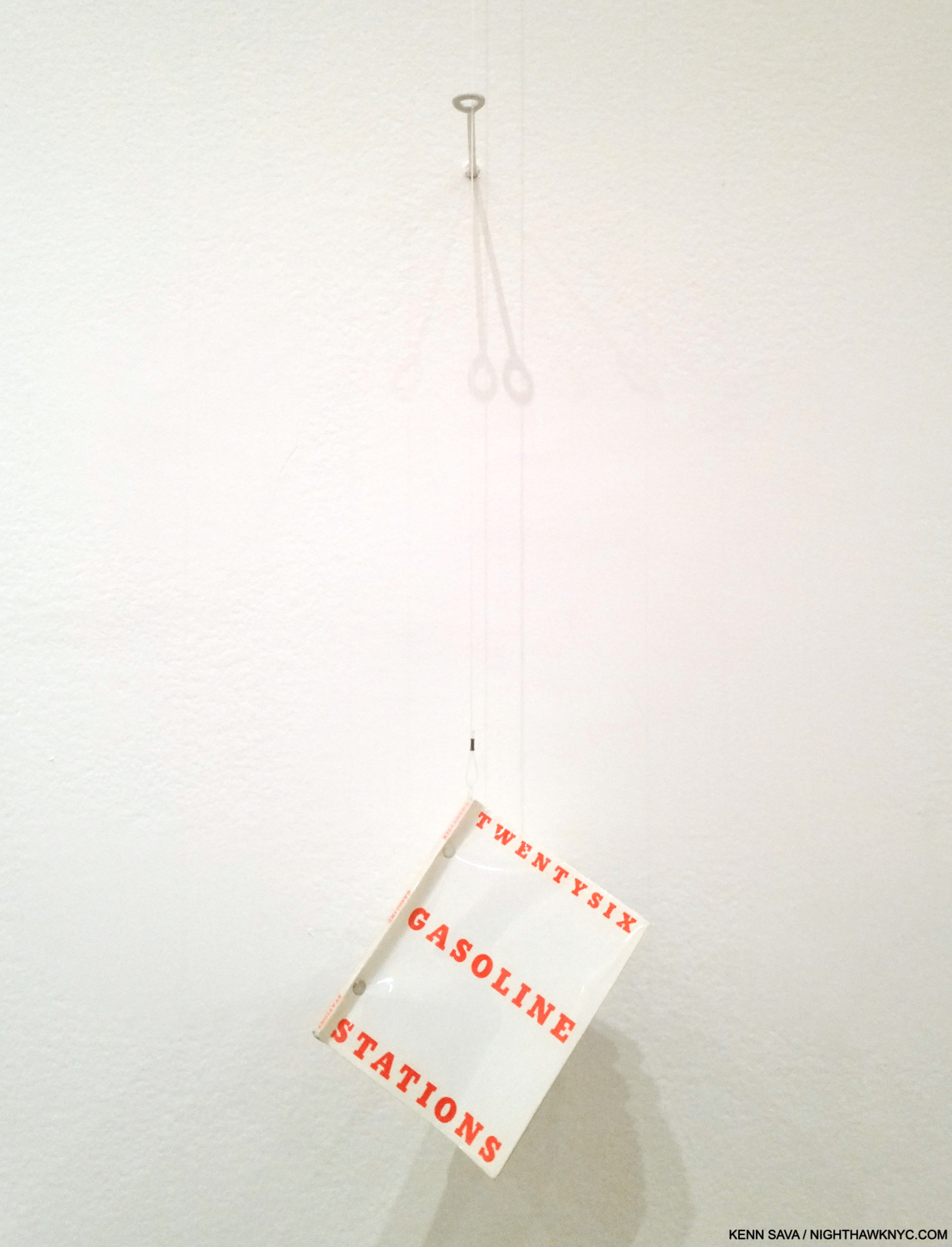
You’re looking at a revolution. Twentysix Gasoline Stations, 1963, revolutionized the Artist book, the PhotoBook, and street-side Phtography, with unique design, turning gas station Photography into a genre in the process. This copy was hanging for visitors to peruse, which was somewhat surprising as it’s now a rare book- even this second edition copy is worth hundreds of dollars. Knowing all of it from reproductions, this was the first time I was able to page through an actual copy of it. Pictures in this piece are thumbnails. Click on any for full size.
It’s an Artist’s book/PhotoBook whose influence is now incalculable.
Published in an edition of 400 copies, a case can be made that it ‘s the most influential PhotoBook of the contemporary period after Robert Frank’s The Americans (which the Artist acknowledges as an influence). Twentysix Gasoline Stations, with its “industrial” look and feel stood at odds with the frequently hand-made Artist’s book norm to the time. Virtually every aspect of the Artist’s book was reimagined, from the typography and text layout on the cover to the sparseness of the interior contents, with a lack of text save for image titles.

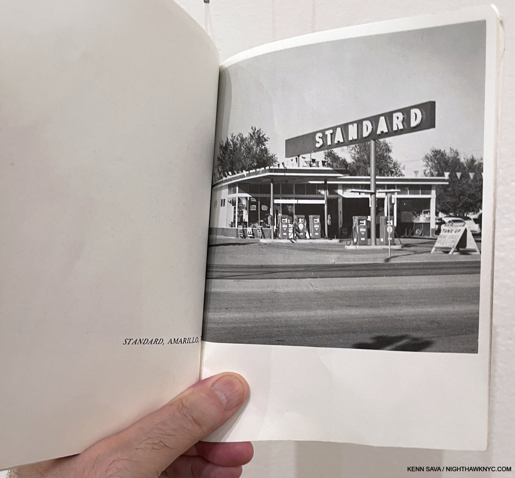
Believe it or not, this is one of the most influential Photographs in Modern & Contemporary Photography. STANDARD, ARMADILLO, TX, perhaps the key image in Twentysix Gasoline Stations, went on to have multiple lives of its own, inspiring numerous Ed Ruscha Paintings, Drawings & Prints, as well as the work of other Artists.
Speaking of the end result, he said-
“I realized that for the first time this book had an inexplicable thing I was looking for, and that was a kind of a “Huh?” That‘s what I’ve always worked around. All it is is a device to disarm somebody with my particular message.”
Having immersed myself in PhotoBooks for the past 7 years, and Art books most of my life, it’s impossible for me to overstate the influence Twentysix Gasoline Stations has had, and continues to have, on the Art world. It turned Art & PhotoBook creation and publishing on its head, rewriting what a book could be and who could make one. He’s said he meant the pictures to be “like a collection of readymades,” a term and genre Marcel Duchamp put on the Art map. Still, it received a mixed reaction when it was released, including famously being rejected by the Library of Congress.

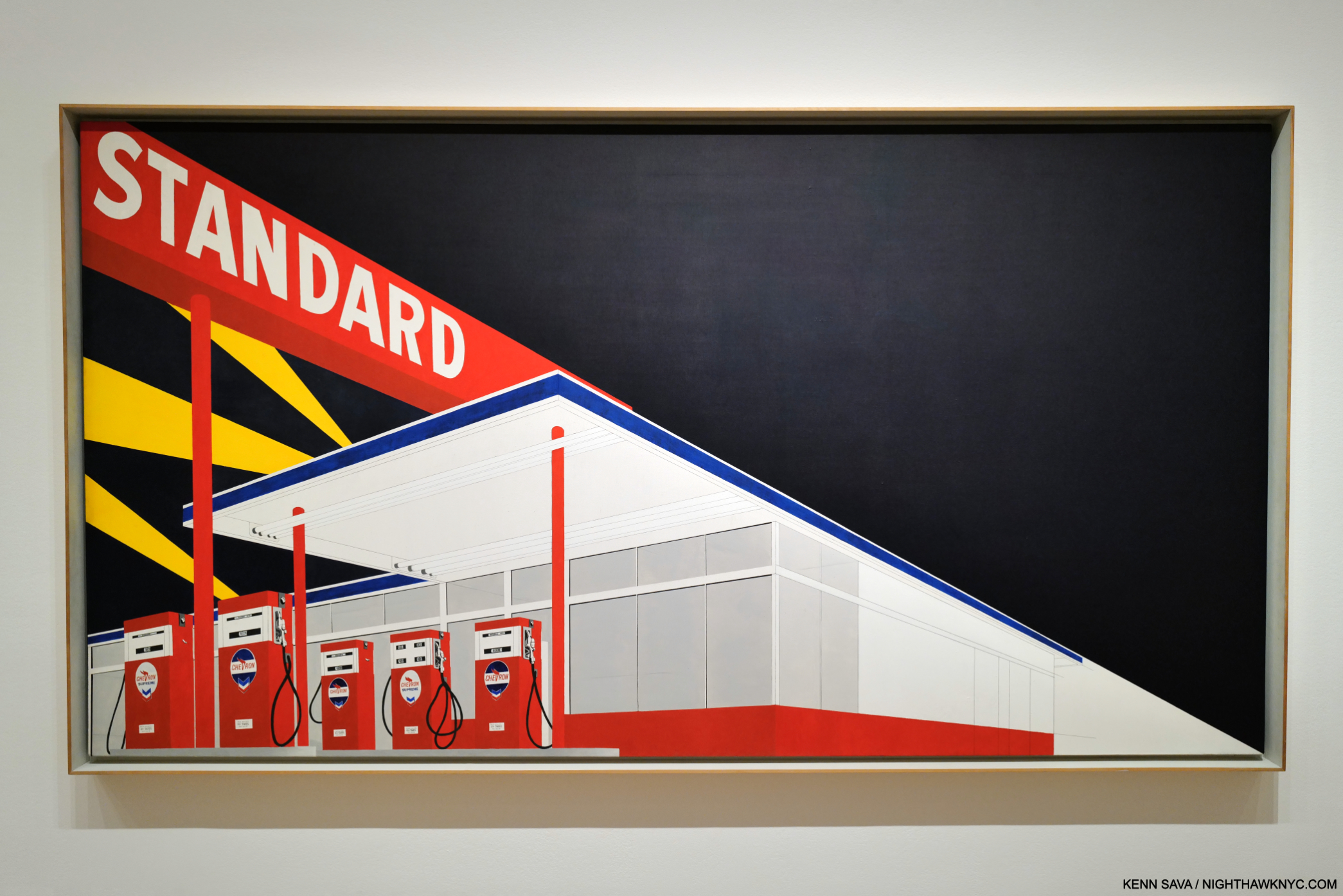
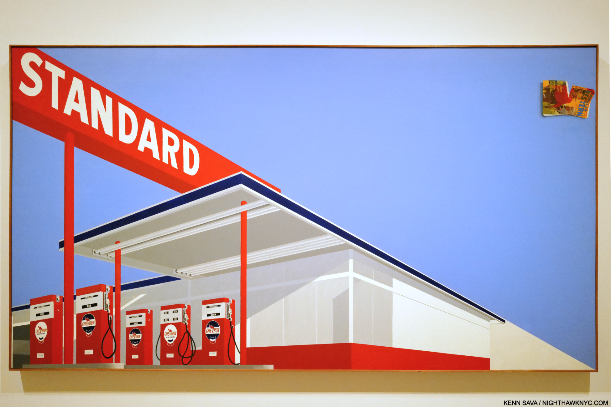
Standard Station, Amarillo, TX, 1963, Oil on canvas, 64 15/16 x 121 13/16 inches. The “locomotive” compositional device, seen in Large Trademark with Eight Spotlights, 1962, in Part 1, returns, splitting the composition in two, just the beginning of what’s fascinating about this.
“I would say I came to painting through photography,” Ed Ruscha
The STANDARD, ARMADILLO, TX, Photograph begat the Standard Station, Amarillo, TX Painting in 1963. Obviously, the Photo just shown has been reworked, reimagined, or he based this on another Photo. Whatever the case may be, the resulting composition seen here would subsequently take many forms and become iconic. Standard Station, Ten Cent Western Being Torn in Half, below, followed a year later.The Paintings begat Standard Station, Amarillo, TX Prints, with Standard Station, Amarillo, TX Drawings being created along the way. So ubiquitous did they become that gas station Paintings and gas station Photography are now, basically, his genres. Sooner or later, everyone who shoots or Paints a gas station is going to be compared to Ed Ruscha. Many, like Vik Muniz, openly acknowledge the influence.
What strikes me are the abstract elements, like the selective detailing- you can read the prices on the gas pumps, but detail disappears on everything behind them, creating a surreal experience (the “realistic” gas pumps offset against the featureless building behind them), under that big red sign whose white lettering, offset against the engulfing darkness, feels bold.

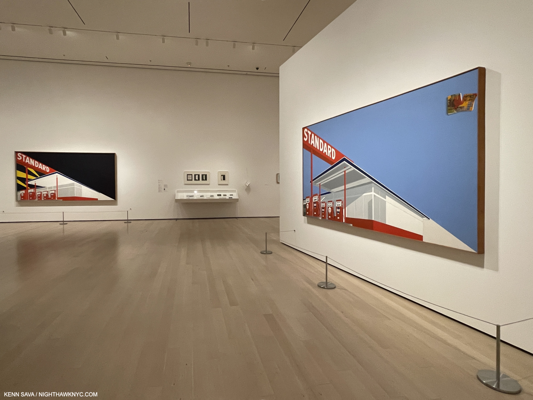
Standard Station, Ten Cent Western Being Torn in Half, 1964, Oil on canvas, 65 x 121 1/2 inches. Mr. Ruscha has likened the comic flying off the canvas to the upper right to a “coda” in Music. For me, it looks like debris, garbage, pollution. In this piece, the featureless building has light and shadows added to it. Once again, the numbers and text on the gas pumps are very legible.
At the time, Ed Ruscha shot them, gas stations were bastions of the new found freedom of the open road and the catalyst of the massive post-war westward exodus that the Artist, himself, became a part of. Over time, gas stations would be seen differently as the toll of pollution and environmental decay mounted.

Ed Ruscha’s second most famous Artist book/PhotoBook. A copy of the legendary Every Building on the Sunset Strip, 1966, published in one long accordion fold. Ed Ruscha put a tripod on the back of a truck and went up and down Sunset Strip taking one Photo after another until he had shot every building on both sides of the street. Here, we get one direction on the top of the page, with what’s across the street synchronized and mirrored along the bottom.
Further books followed- 14 more to 1972, the most famous of which is Every Building on the Sunset Strip, 1966, another ground-breaking work. Ed Ruscha has stated that part of the reason he went west after high school, instead of east, was because of the glamour of L.A. Here, he shows the “glamour” of the famous Sunset Strip in all its “glory.” Then, in 1973, he shot all 12 miles of Hollywood Blvd. In 2004, he reshot Hollywood Blvd in color, and paired with the 1972 images, they became the book THEN & NOW in 2005. It’s one example of Ed Ruscha combining his love of the effects of time with revisiting his past subjects.
In all the acclaim he receives I almost never hear credit given the Artist for his exceptional Painting technique- the equal of anyone else’s of his time. Right from the start, Painting after Painting reveals sublime subtlety and under-appreciated skill. Then Now provided a glorious chance to study his, often large, Paintings up close and marvel at his skill and taste. It also provides the extremely rare chance to see works of the same subject side by side, particularly two of his famous Standard Gasoline Station Paintings.

Shows present once-in-a-lifetime opportunities to see great works united from distant parts of the globe for a brief time. That’s why I waited over an hour for the crowds to part to get this shot. More than likely, I’ll never see these two great Standard Stations together again. Both of these also feature the “speeding locomotive” compositional device seen in the Large Trademark Painting, which adds to the somewhat surreal overall effect, wonder and mystery.
Further to the Large Trademark Painting, Ed Ruscha also began Painting the sights of L.A., which again seems to be his domain to the point that I can’t think of anyone who Painted the city before he did. (I’m sure there were. Right?)
“Being in Los Angeles has had little or no effect on my work. I could have done it anywhere.” Ed Ruscha, Leave Any Information at the Signal, Statement in “West Coast Style”

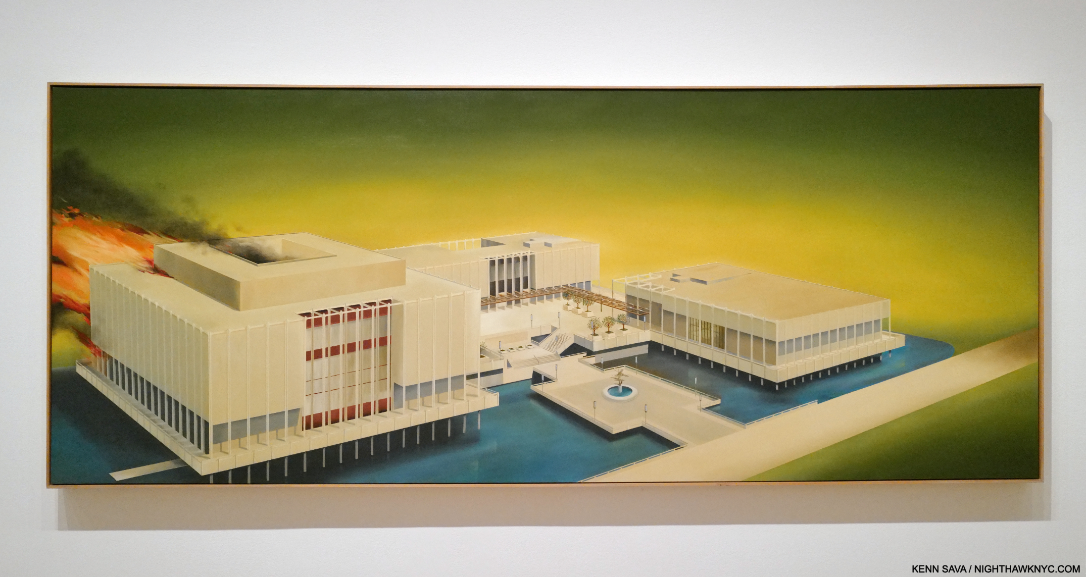
Los Angeles County Museum on Fire, 1965-8, 53 1/2 x 133. 1/2 inches. Fun fact- Guess where Ed Ruscha/Now Then reopened on April 7, 2024 after closing at MoMA? You’re looking at it.
Los Angeles County Museum on Fire, 1965-8, like most of Ed Ruscha’s work, has been the subject of endless conjecture. Over the years, the Artist has made a few statements about it, including this one, “… There’s no great message here. It’s just a picture to look at.” That might be hard to believe. After graduating college, he took that trip to Europe I mentioned in Part 1, and came away disappointed at the lack of Contemporary Art on view in the museums. Back home, things weren’t much better. Contemporary Art was slow to gain admission to the hallowed halls of institutions here. Is it a stretch to think this was somewhere on his mind when he Painted this? I tend to think it was in there somewhere. The Watts riots had recently taken place. The Now Then Catalogue has this to say about it-
“Ruscha’s characteristic denial of content ignores the fact that not far from his studio in mid-August 1965, just a few months after the inauguration of the Los Angeles County Museum of Art, the city of Los Angeles was burning.”
Ed Ruscha said, “The plain truth behind the Watts riots is that the riots themselves were good and beneficial and healthy regardless of loss of life. The Watts riots nationalized sympathy for a gigantic racial injustice.”
He soon set a number of other sites on fire in his Paintings, including the an Amarillo Standard Station (which wasn’t in the show), and Norm’s, which was.

Norm’s, La Cienega, on Fire, 1964, Oil and pencil on canvas. The work features a complete lack of detail, save for the letters “ORMS” on the sign. It’s interesting how the flames follow the “locomotive” line. Without those letters (which themselves are meaningless without the title), this Painting would be a completely abstract composition of shapes and lines.
For someone who’s so closely associated with L.A., and has been for over 60 years, it’s strange that some of his most well-known work shows L.A. landmarks being destroyed or in ruins. For example, he has continued to “destroy” the Hollywood sign, in different ways, over and over again throughout his career. Still, his fame continued to rise as did his association with the city. In spite of all this (and possibly because of it), in 1978, a six-story(!) tall mural (also referred to as the “Ed Ruscha Monument”) of the Artist was created by the Artist Kent Twitchell, for who Ed Ruscha was “the unorthodox hero of the art world.” Would anyone else be able to “destroy” a city’s landmarks and then become seen as the figurehead of that city’s Art community with a monument created for them? It didn’t happen for Nero. Unlike the emperor, Ed Ruscha didn’t actually destroy anything, except maybe in his mind and on some large canvases.

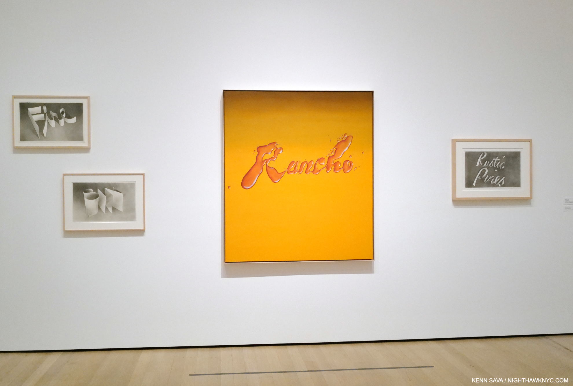
Rancho, 1968, Oil on canvas, which looks like it was made with a liquid, surrounded by Fire, Sin, Rustic Pines, each 1967, Gunpowder on paper, from left to right.
This calls to mind another thing Ed Ruscha doesn’t get enough credit for: innovation. In the 3rd, 4th and 5th galleries we see pieces made out of strange and unprecedented materials. Unhappy with the possibilities of paint or pencil, the Artist began exploring the possibilities of Drawing with gunpowder! The results, as seen above, are incredible. He found he had more control with it. In 1969, the Artist began going further, using unconventional materials in his Stains Portfolio of seventy-five substances ranging from L.A. tap water to egg yolk.

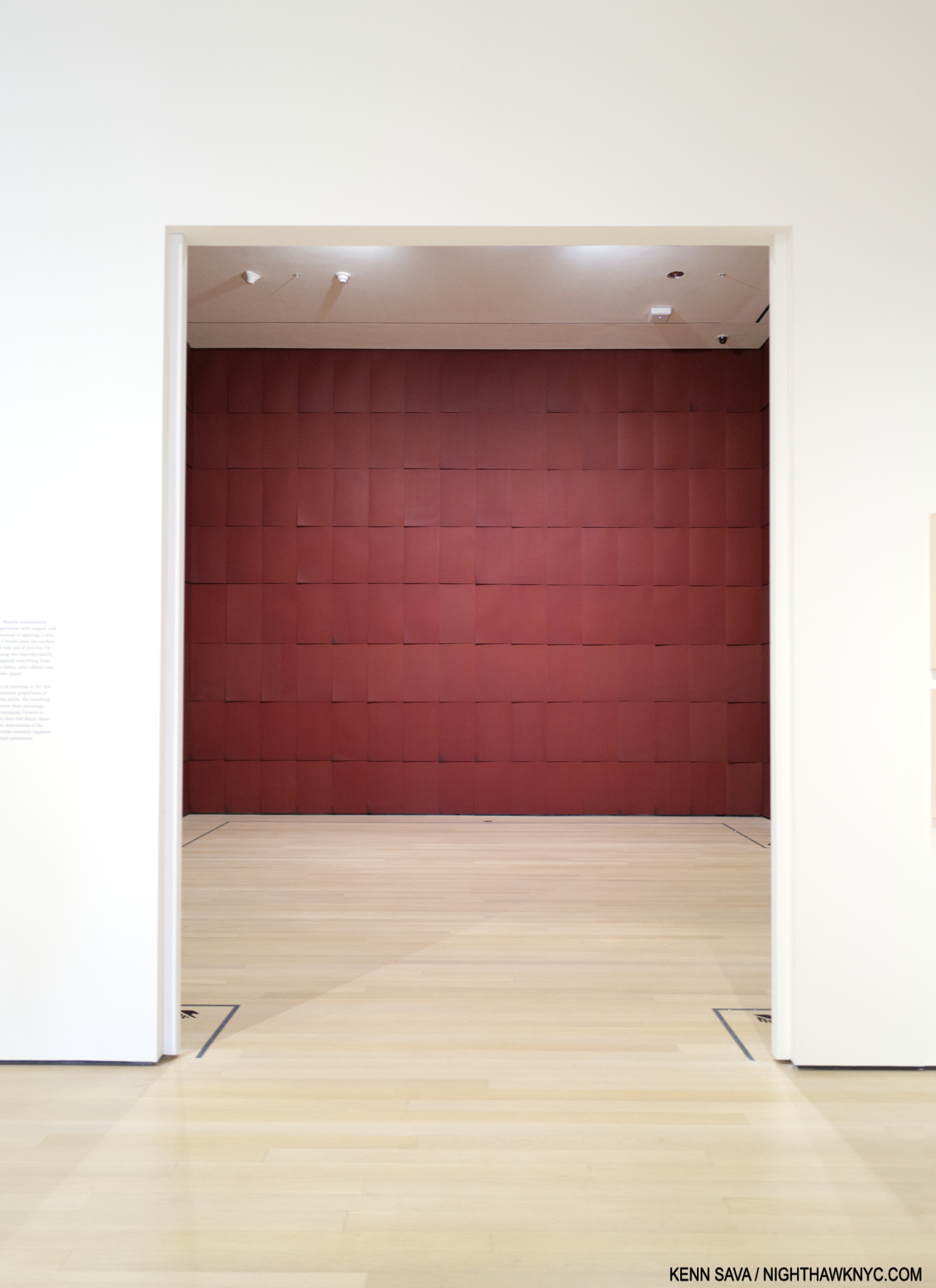
Installation view of Chocolate Room, 1971/2023, Chocolate on paper sheets.
His Chocolate Room for the United States Pavilion at the 1970 Venice Biennale, and recreated in a room of its own in Now Then, followed. After that, he began using a number of these “other” materials in his Word and Phrase Paintings.

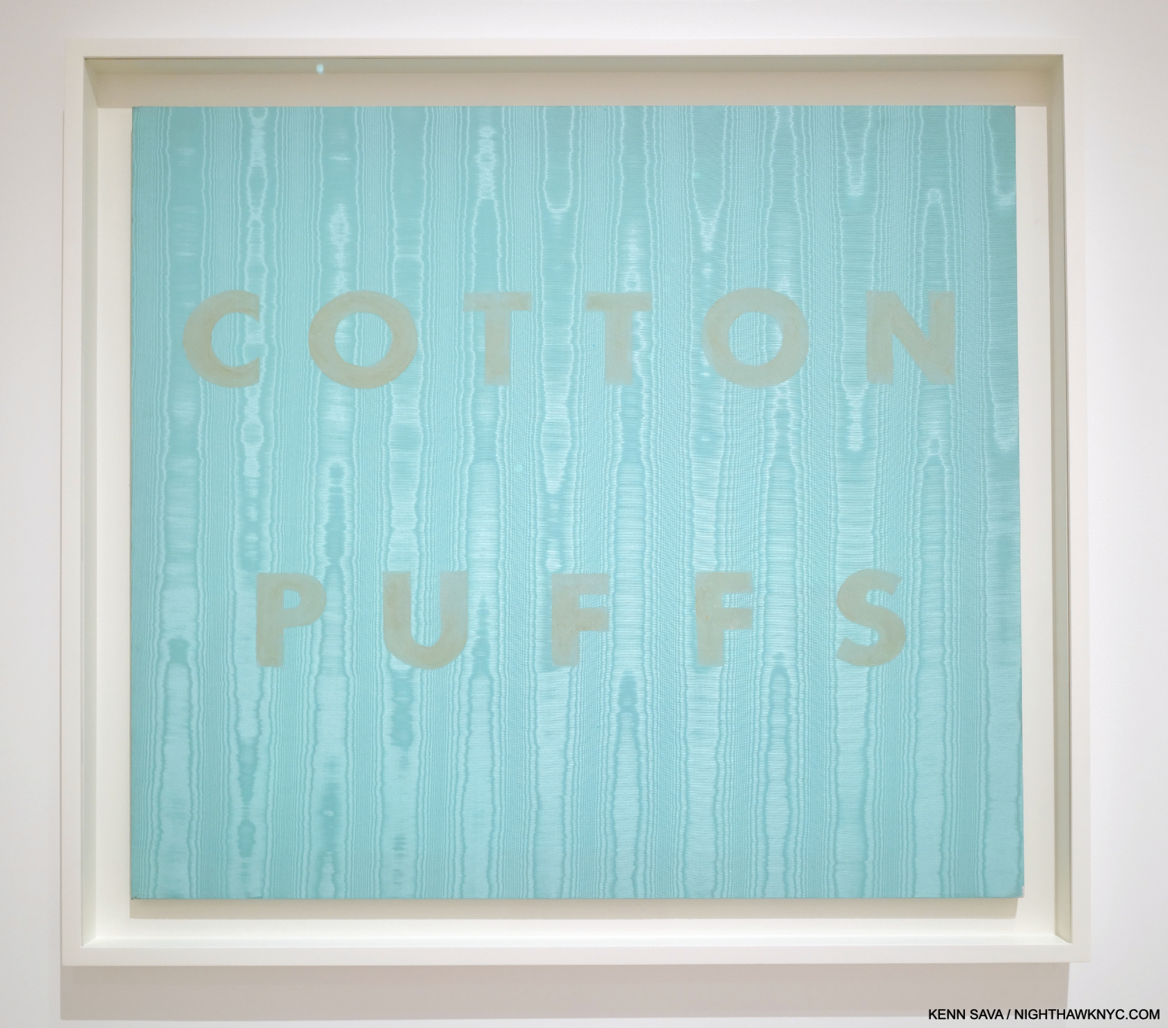
Cotton Puffs, 1974. Egg yolk on moiré fabric, 36 × 40″
Along with this constant experimentation came the inevitable failure, like the egg yokes in Cotton Puffs, 1974, fading quickly. Ed has been remarkably cool with these. Accepting them for what they are. (And probably learning in the process.) Each has its place in his oeuvre, with all the examples on view seeming to hold up remarkably well over the years given they are experiments. By the mid-70s, he had gone back to pastel on paper. Though the materials experiments were short-lived, it led me to peruse the 7 volumes of the Ed Ruscha: Catalogue Raisonne of the Paintings, published by Steidl (which is a bit ironic- or fitting- because Steidl has published the work of any number of Photographers who include gas stations in their work, including the entirety of the 3-volume set, Gas Stop, by David Freund), which revealed that this insatiable exploration of materials was only the tip of his creativity iceberg. Paging through it (which only goes up to 2011 at this point), I was amazed to discover that though he has created a number of works with ostensibly the same subject, no two are identical. The differences are obvious or subtle. Still, this speaks to Ed Ruscha’s seemingly endless powers of invention and refusal to repeat himself verbatim. I was stunned when I discovered this, which was completely unexpected (though I should have been tipped off by what his STANDARD STATION, ALBUQUERQUE Photograph became). Seeing this range and variety gave me a glimpse of insight into just what may be keeping him going and creating since the late 1950s.

Wall Rockets, 2000, Acrylic on canvas
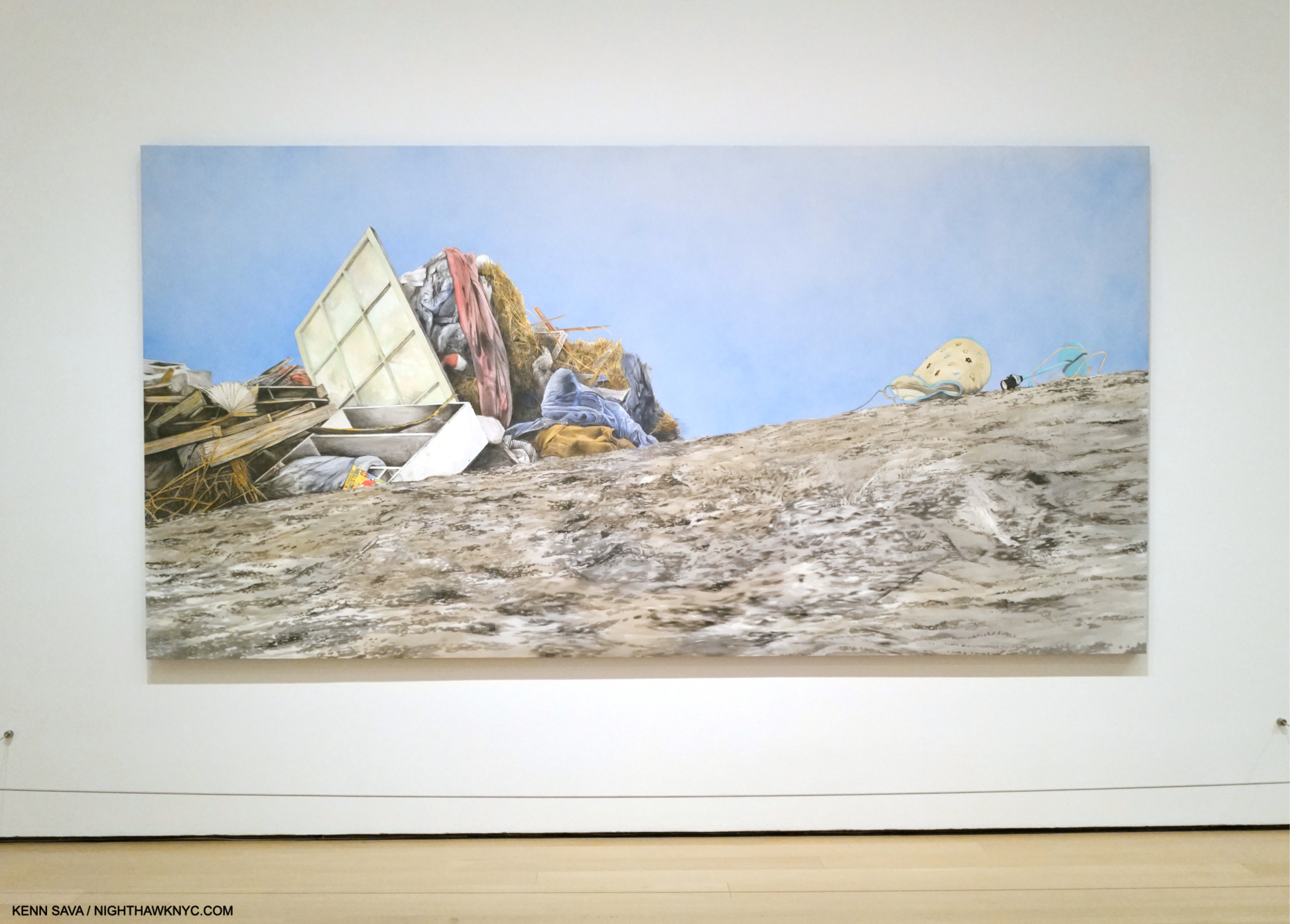
Perhaps THE highlight of Ed Ruscha/Now Then at MoMA for me was the chance to see 6 of the 10 Paintings from the Artist’s Course of Empire series. As I’ve looked at his work over the past 24 years of this century, these have fascinated me as much as any other work by Mr. Ruscha. Created for, and then debuted, at the 2005 Venice Biennalle, they subsequently travelled to NYC where they were on display at the Whitney in a show of the same name, the last important (though small) Ed Ruscha show in NYC until Now Then. Somehow, I missed them there, so seeing 6 might be as close as I get to seeing them all.

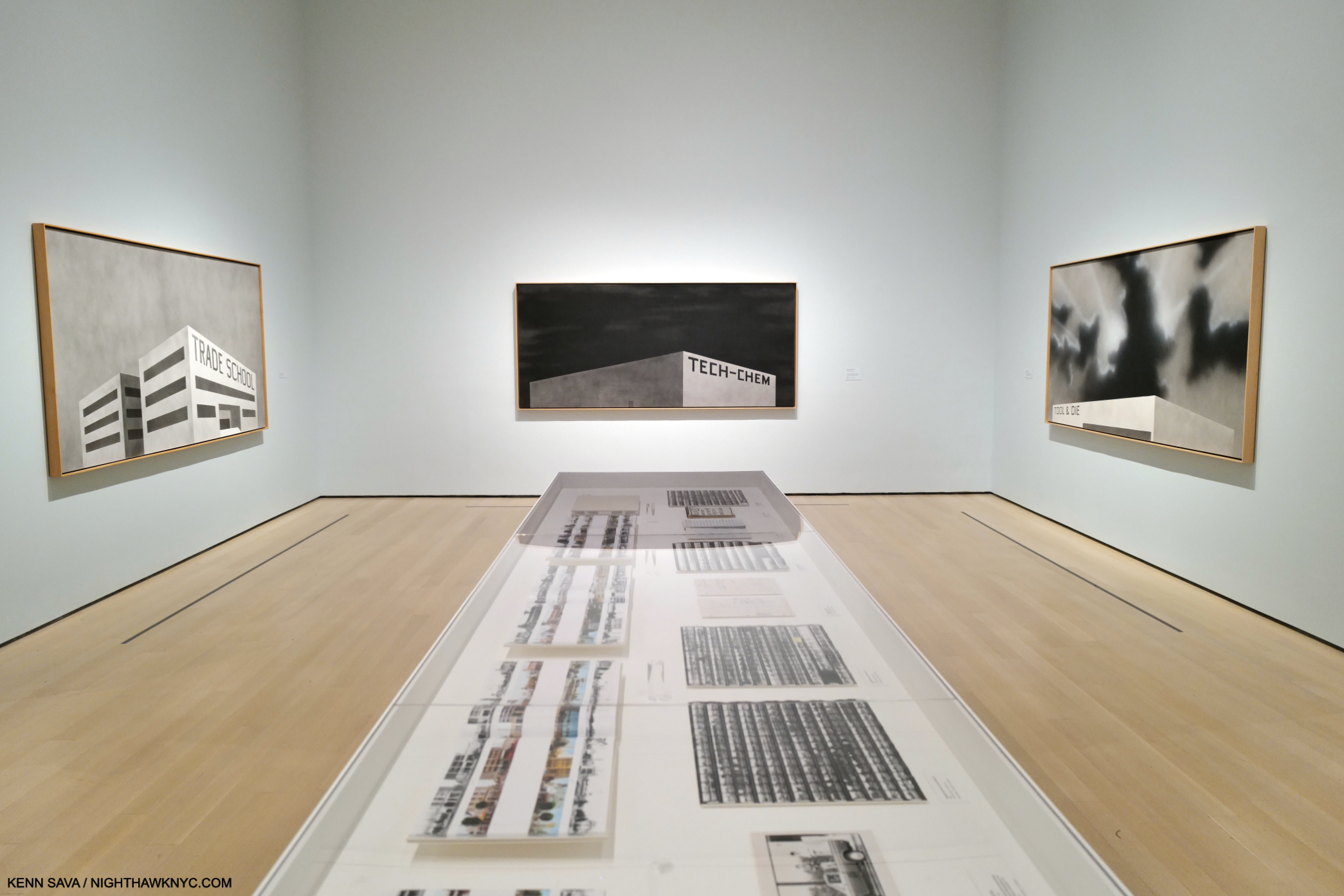
3 works from Ed Ruscha’s Blue Collar series, 1993, on the 3 facing walls.
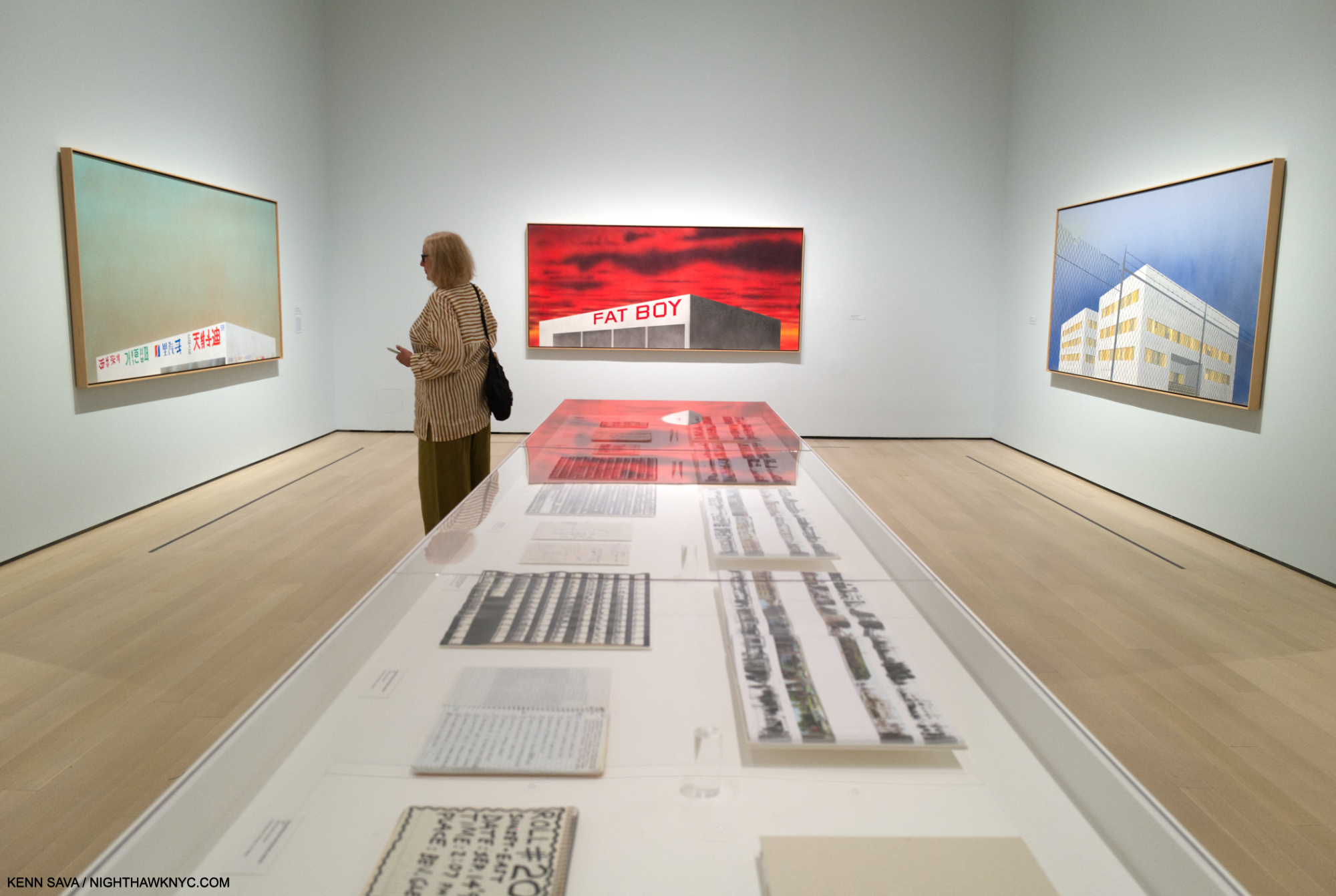
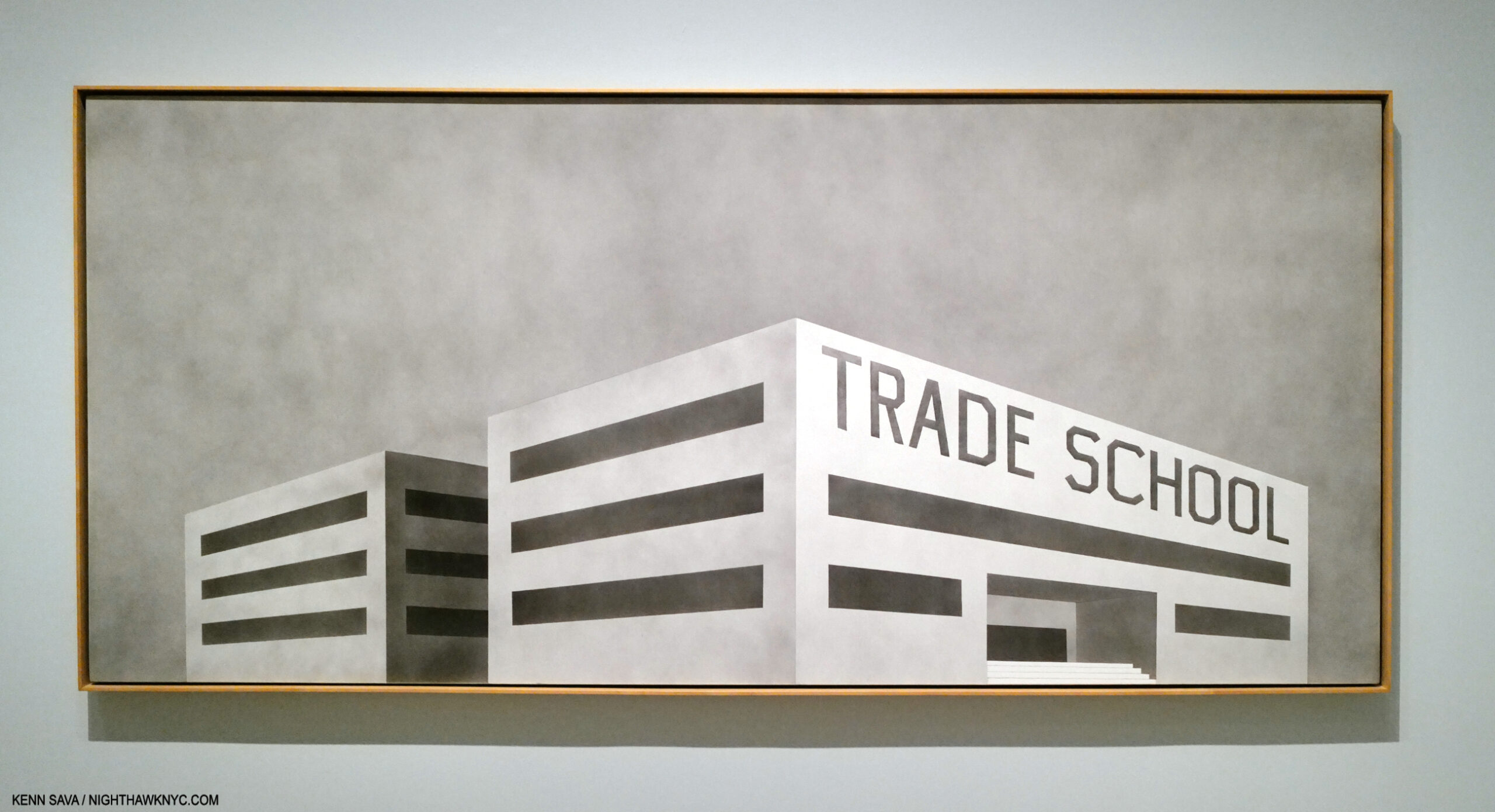
Occupying the large, penultimate gallery of the show, the Course of Empire Paintings strike me as serving as a touchstone for a number of Ed Ruscha themes. They also eerily presage what has been going on in much of NYC (and perhaps elsewhere) this decade, with a number of stores and businesses closing due to Covid, then more closing due to the realities of our post-Covid (if we are post-Covid) economy, many have changed hands in a short time. Others remain for rent. The shape, perspectives and lack of detailing on the one-story buildings I find reminiscent of Standard Station, Ten Cent Western Being Torn in Half, seen earlier. In each, our point of view is the same, and the same as in that Standard Station Painting- they are seen from below.

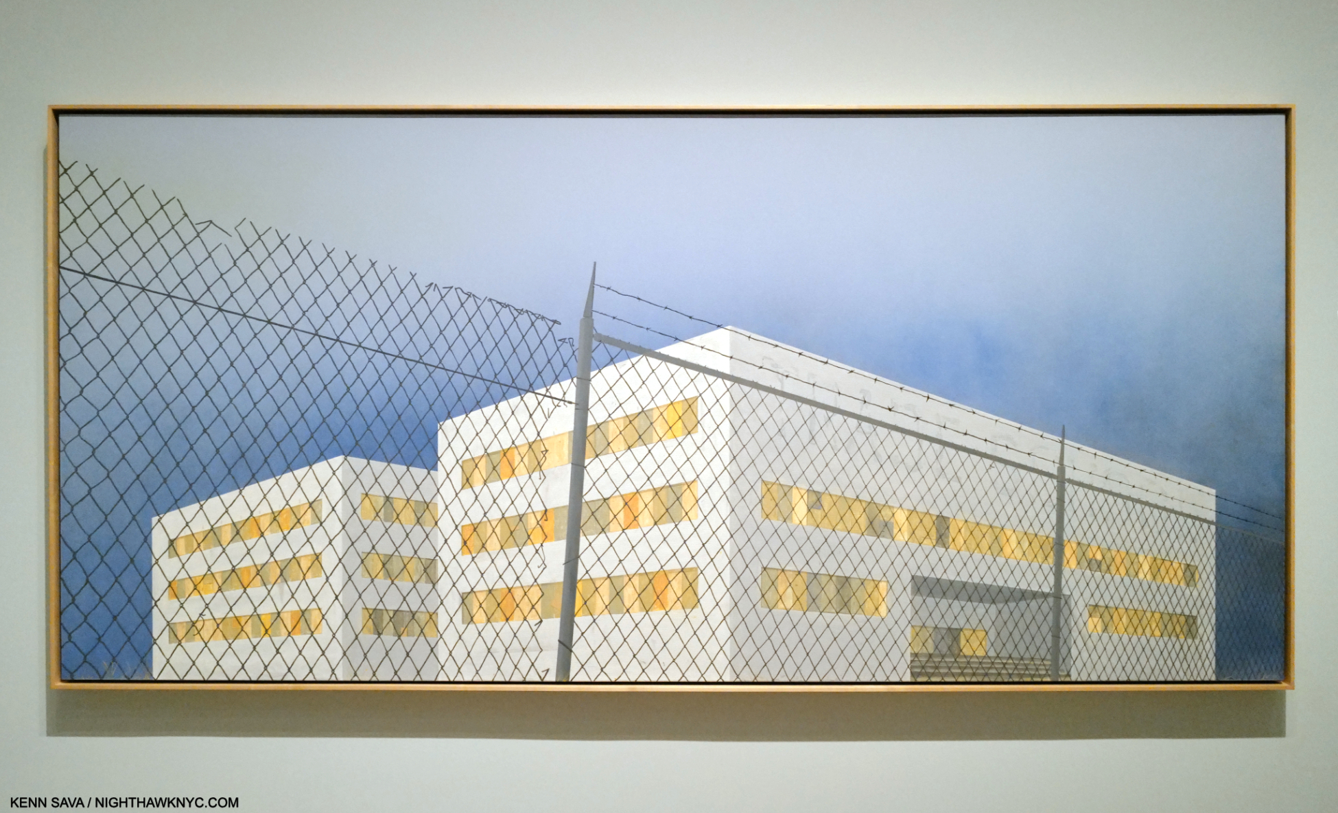
At the opposite end of the gallery, the same scenes reappear in his Course of Empire series, 2005, now in color, though right and left are flipped. (The scene on the right wall is that depicted on the left wall in Blue Collar Photo, above this one. The scene on the left wall is the scene shown on the right wall of the Blue Collar series above this one.)
The series evolved over a period of 13 years, with Ed Ruscha Painting the 5 black & white pieces, titled Blue Collar, in 1992-

Blue Collar Trade School, 1992, Acrylic on canvas. The only multi-story structure in the series.
Returning to the subject and the same sites in 2005, this time in color and showing the effects of time passing.

The Old Trade School Building, 2005, Acrylic on canvas
Perhaps, his most subtly powerful series, their under-stated compositions lead to open-ended interpretations.

Installation view of the complete Course of Empire, by Thomas Cole, 1834-36, as seen at The Met’s Thomas Cole’s Journey in 2018. The rise and fall of civilization as seen from the same place, with the same distinctive mountain peak appearing in each Painting.
Based on, and in homage to, Thomas Cole’s legendary Course of Empire series, 1834-6, (which I wrote about here), they are another instance of Ruscha revisiting earlier work, his Blue Collar series from 1992. These also highlight that alongside the humor in any number of his pieces, running parallel, is a real depth of concern. Concern for the country, the world, the environment.

Psycho Spaghetti Western #7, 2010-11, Acrylic on canvas
“It’s all just rape of the land for profit these days. It’s fairly sick. Southern California is all just one big city now. But what do you say about progress? … So something’s got to give, and the landscape’s the first thing that gives….There is a certain flavor of decadence that inspires me. And when I drive into some sort of industrial wasteland in America, with the themeparks and warehouses, there’s something saying something to me. It’s a mixture of those things that gives me some sense of reality and moves me along as an artist,” Ed Ruscha .
Taking full advantage of having such a long career, the Artist has revisited past themes, and places, fairly often to the point that it’s a running theme in his work. Change over time…for the better, or worse, is left to the viewer to decide. Ostensibly set in L.A., the structures in Blue Collar/Course of Empire could be literally anywhere. As such they have a universality to them (as do a number of other 21st century Ruscha’s) that sets them apart from his purely L.A. work, like his Hollywood sign pieces.

Our Flag, 2017, Acrylic on canvas. The last work in the show.
Thomas Cole influencing Ed Ruscha’s Blue Collar & Course of Empire series started me thinking about other possible influences on his work. I touched on some in Part 1. In Part 3, I’ll take a closer look at them, and then flip that coin over.
Part 3 is here.
*- Soundtrack for this piece is “L.A. Woman” by The Doors, one of the ultimate L.A. bands, from the 1971 album of the same name. (Narrowly beating out “California Girls” by the Beach Boys from Summer Days (And Summer Nights), 1965.) Ed Ruscha was into “car culture” before moving to L.A., and after, among other things he has in common with the #1 L.A. band of its time. Notice the gas station Jim Morrison, “another lost angel,” to quote his lyric, stops in to about half way through-
NighthawkNYC.com has been entirely self-funded & ad-free for over 8 3/4 years, during which 320 full-length pieces have been published! If you’ve found it worthwhile, PLEASE donate by PayPal below to allow me to continue. Thank you, Kenn.
You can also support it by buying Art, Art & Photography books, and Music from my collection! Art & Books may be found here. Music here and here.
Written & photographed by Kenn Sava for nighthawknyc.com unless otherwise credited. To send comments, thoughts, feedback or propositions click here. Click the white box on the upper right for the archives or to search them. Subscribe to be notified of new Posts below. Your information will be used for no other purpose.
