This site is Free & Ad-Free! If you find this piece worthwhile, please donate via PayPal to support it & independent Art writing. You can also support it by buying Art & books! Details at the end. Thank you.
Written & Photographed by Kenn Sava.
Show seen: Sarah Sze: Timelapse @ The Guggenheim Museum. This is Part 1, an overview. Part 2 looks at details from the show here.
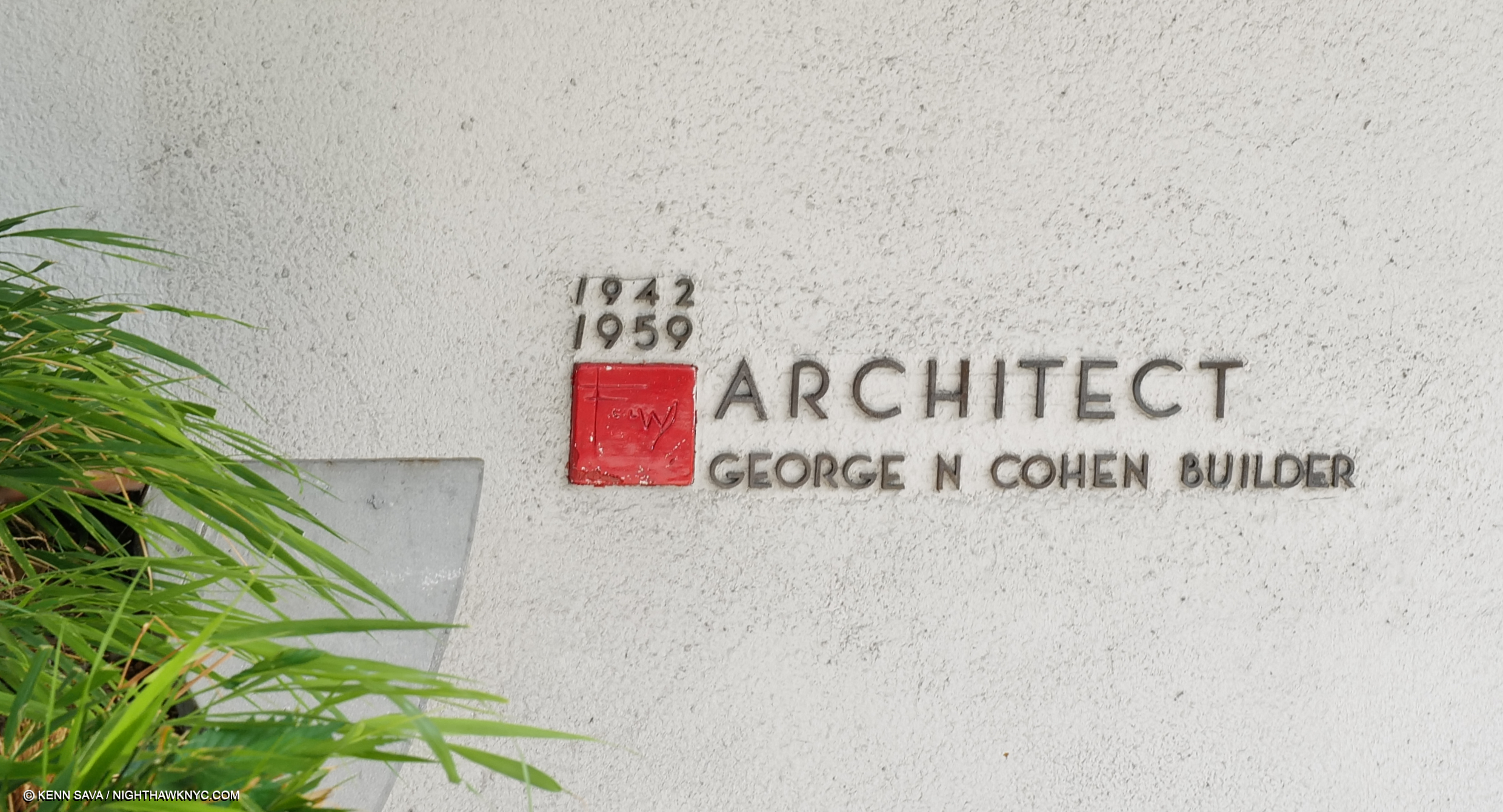
Written on my soul. Frank Lloyd Wright’s signature adorning his trademark red square “cornerstone” on his round building. The dates attest to how long it took to get this building approved & completed, which every other of his many NYC projects weren’t. Seen September 5, 2023. Click any image for full size.
Those who have seen elements of Architectural design in some of the fantastic structures Sarah Sze includes in her impossible to categorize shows over the past few decades might be left with a sneaking suspicion the Artist has a desire to be an Architect. She would actually come by that honestly. Her father was an Architect, and Sarah, who began as a Painter, studied Painting & Architecture in school before graduating with degrees in both from Yale in 1991. After shows and Public Art installations all over the world, this past summer she met her match. To create work that holds its own in Frank Loyd Wright’s iconic Guggenheim Museum has been a standing challenge for Artists since it opened 65 years ago.
“It’s really a building that frames a void….How do you take on the most incredible void created in recent time in Architecture and talk to it in the slightest way?” Sarah Sze.
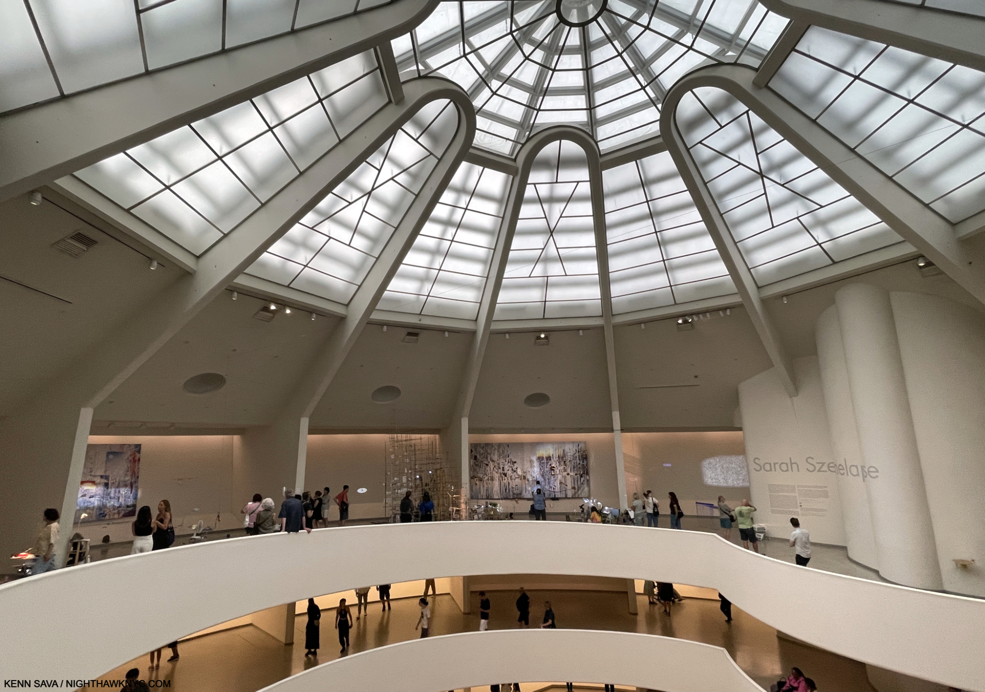
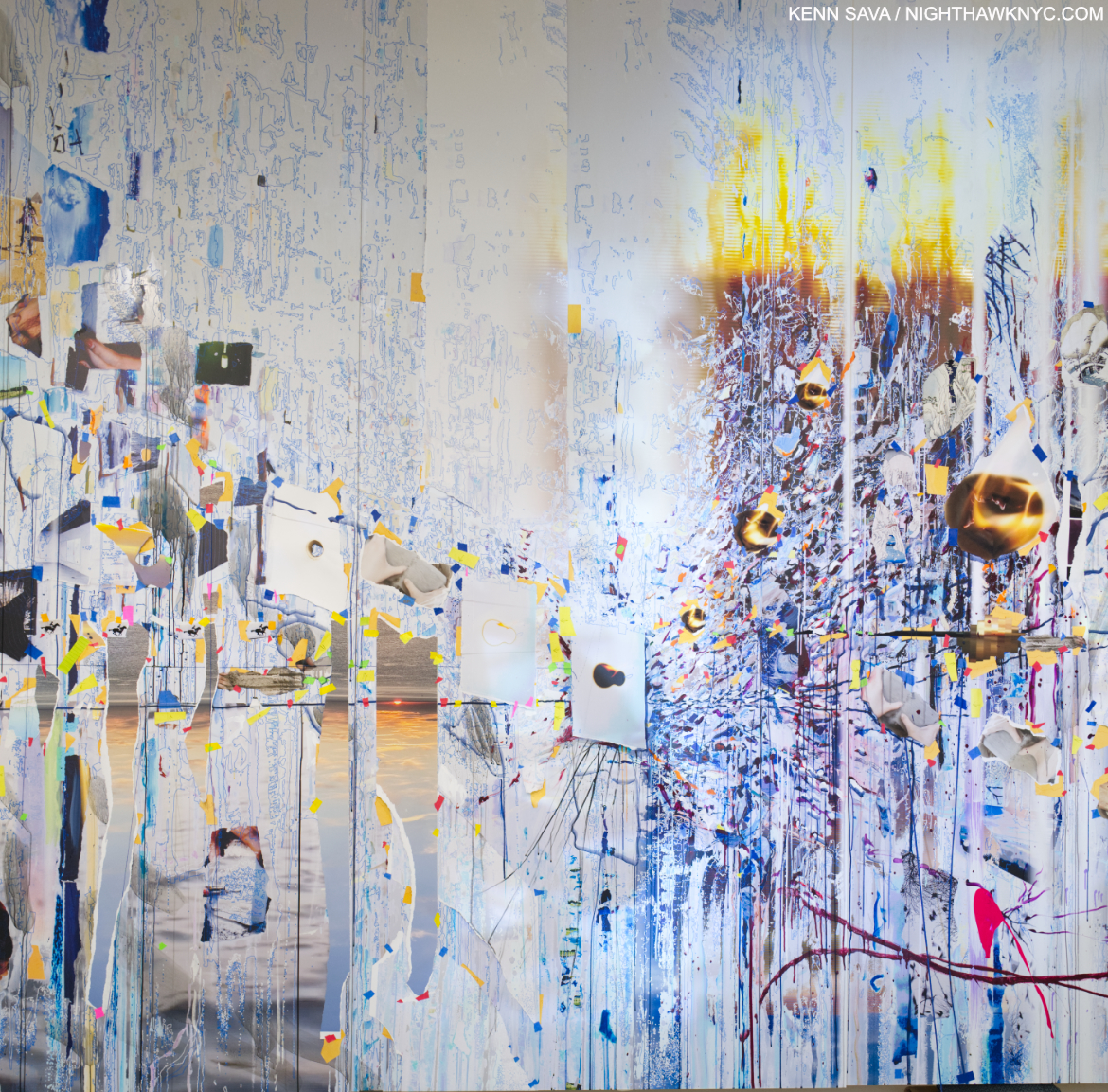
Installation view of 4 of the 8 Bays that made up the main section of Timelapse on the 6th (top) floor, September 5, 2023. Extra points if you see the very faint black string running from right to left against Wright’s Oculus (the skylight). It’s a unifying element of the show, though I’m not sure how many visitors spotted it as such. I’ll explain.
In Timelapse, Sarah Sze’s Art was installed outside and inside Wright’s masterpiece, the last major work of the Architect’s 7-decade career, and one that stands completely apart from everything else the he created, at least to my eyes. In it, she “dialogues” with Wright in the most innovative ways I’ve seen mounted in the Guggenheim, at least since Danh Vo’s spectacular show in 2018. Though the show “only” consists of projections on the building’s exterior, an installation in the ground-floor pool, 8 more installations in as many Bays on the Rotunda’s top floor, the freight elevator ramp, and the large rear gallery, I was told by a Guggenheim Staff Member it took five and a half weeks to install! That’s a long time for a significant part of the Museum to be closed. I can’t imagine the deinstallation was all that much quicker. Though it was up for only as many months (March 31 through September 10, 2023), it’s a show that’s hard to stop thinking about. Hence, it’s taken this long to complete this piece, which marks where I’m at in pondering it to this point.
“What I love myself about the experience of art is the sense of this moment of discovery when I’m seeing a work of art. And actually, that can happen a year after you see a work of art. You don’t always know how good a work of art is until you see it and you remember it in retrospect.” Sarah Sze.
Time is a river that flows on and on, through our lives. It may be that for most of us images mark time in our lives in any number of ways. We may remember our childhood & youth through a handful of images taken in the distant past, as we do so many significant events in our lives since. As time goes on, the pile of internal images gets edited down to those we feel are most significant. In a sense, this is something akin to “timelapse” Photography or Film/Video by which a succession of images are taken at intervals to record change over a given period, resulting in a simultaneously accelerated and collapsed sense of time. Timelapse considers “how we mark and measure time- constructing our own personal timelines of memory through images and fragments of experiences that are constantly evolving…a contemplation on how we mark time and how time marks us.” Sarah Sze (quoted in the press kit).
As such, it’s a show of Art that is focused on images. That marks an extraordinary transformation in the Art of Sarah Sze over her career. Early on, her work was object based and seemed to qualify as “Sculpture” to many people. Gradually, beginning with Media Lab, 1998, now in the Guggenheim’s collection, and almost hidden here in a corridor for the freight elevator, her work has come to include and feature images more and more, as I saw in her last NYC gallery show in 2019. The images start right away.
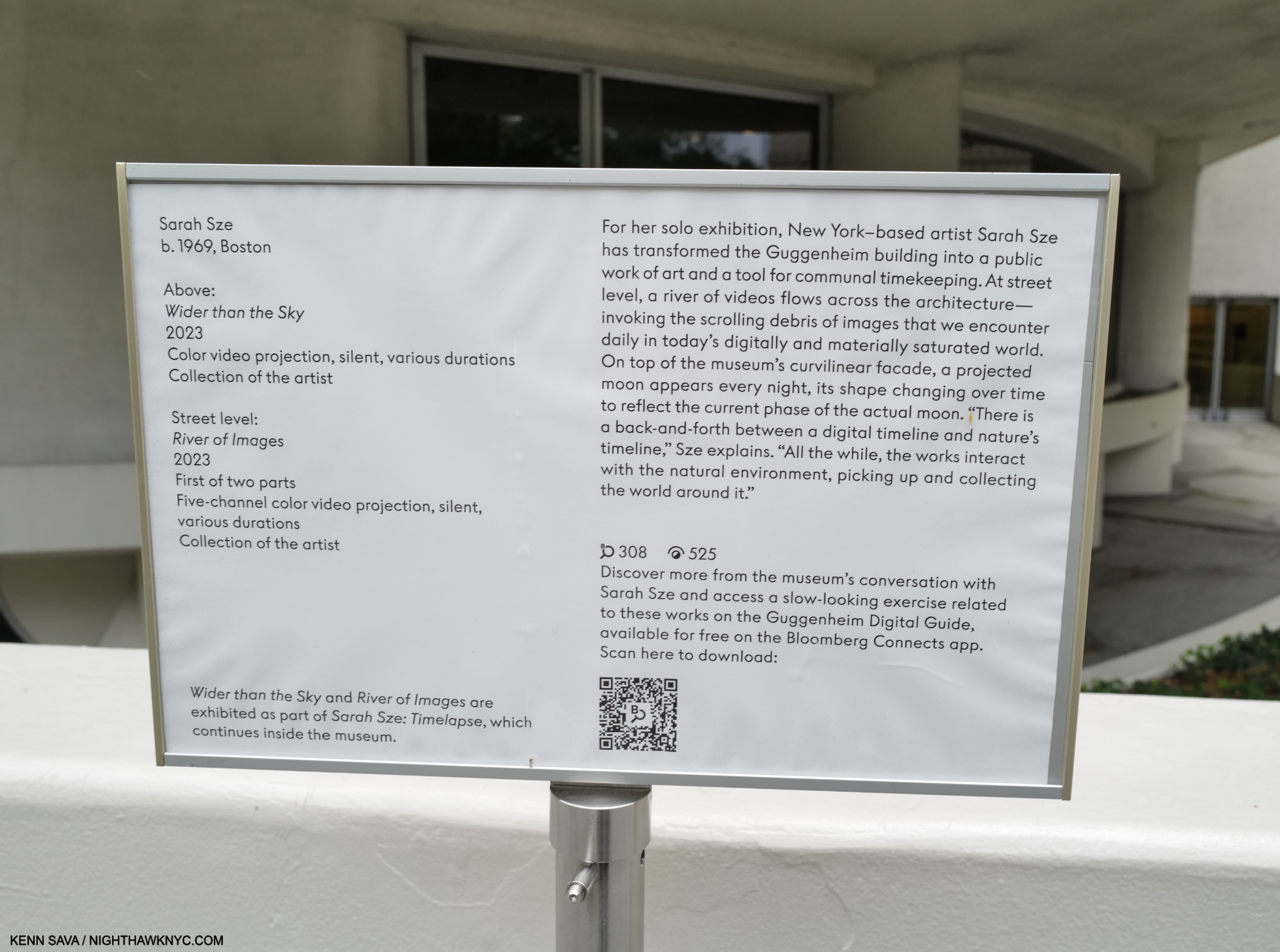
Timelapse begins with 2 video projections on the Museum’s exterior walls which I missed because the Museum closed at 6 and the sun wasn’t setting until 8 at the time. So, Timelapse started for me inside on the ground floor. The exterior projections turned out to be the first sign that images flow continually through all of Timelapse, showing how central they are to Sarah Sze’s work today. “Sculptor?” Good luck boxing her now!
“The Renaissance, the Baroque, everyone was doing painting, architecture, sculpture that was Bernini, Michelangelo, that was par for the course,” Sarah Sze1.
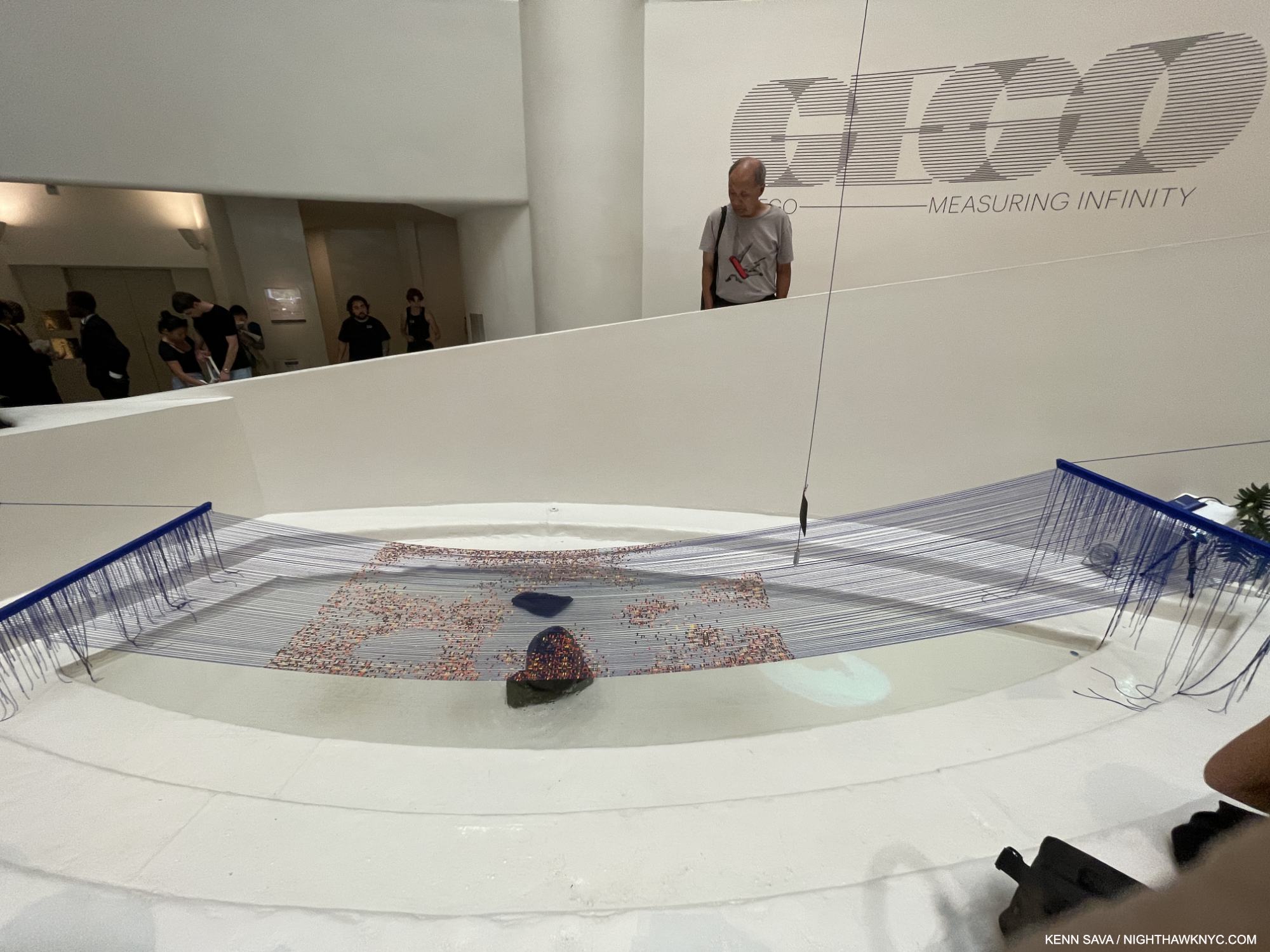
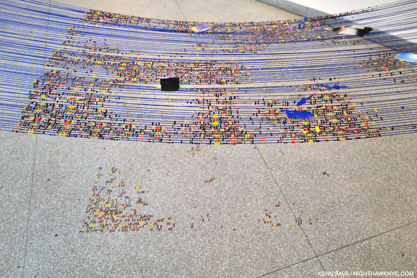
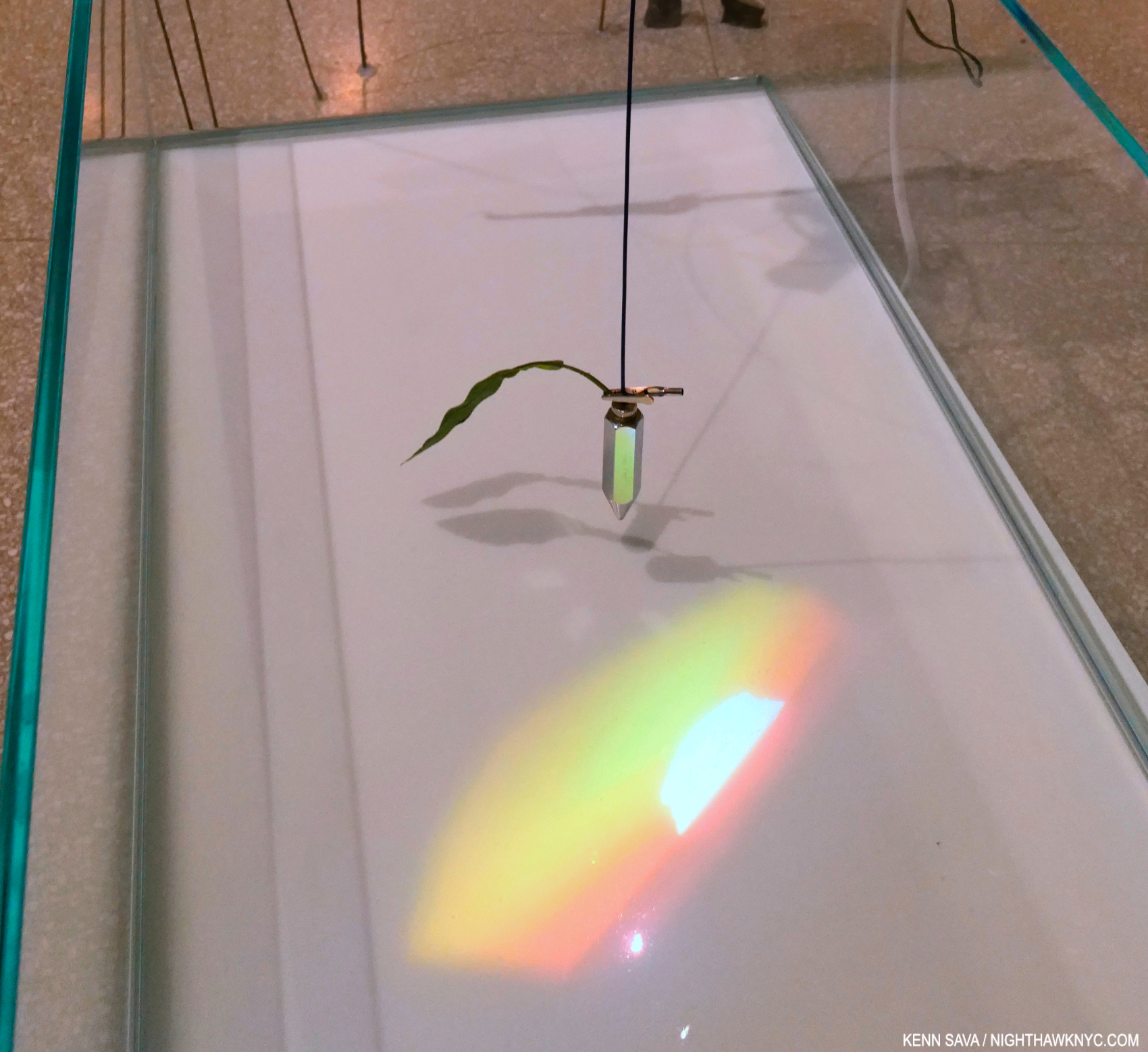
“When is there water in a museum?,” the Artist asks on the audio guide. Inside, Timelapse begins in Wright’s pea-pod shaped ground level pool. Diver, 2023, First of two parts, Multimedia installation, and The Night Sky is Dark Despite the Vast Number of Stars in the Universe, 2023, First of two parts, Acrylic paint, string, paracord, and wood. A pendulum hovers over the hammock & the pool with a video projected onto it of Sarah Sze’s finger stroking water (in blue above). Note the string extending up from the pendulum extending into the void. (Gego: Measuring Infinity filled the rest of the Rotunda.)
Installed over Wright’s pool, the “hammock” looks like a restful place from which to ponder the river of images playing continually in your mind. The first video inside is a projection on the pool of Sarah Sze’s hand stroking water, taking “dialoguing” with Frank Lloyd Wright literally and with sublime subtlety! A pendulum “points” to this area, beckoning the viewer to look at it. The pendulum is attached to a black string that extends up into the void, all the way to the top! Using this simple means of measuring with a plumb line, Sarah Sze at once measures the void, interacts with it, and leads the viewer to the main part of the show.
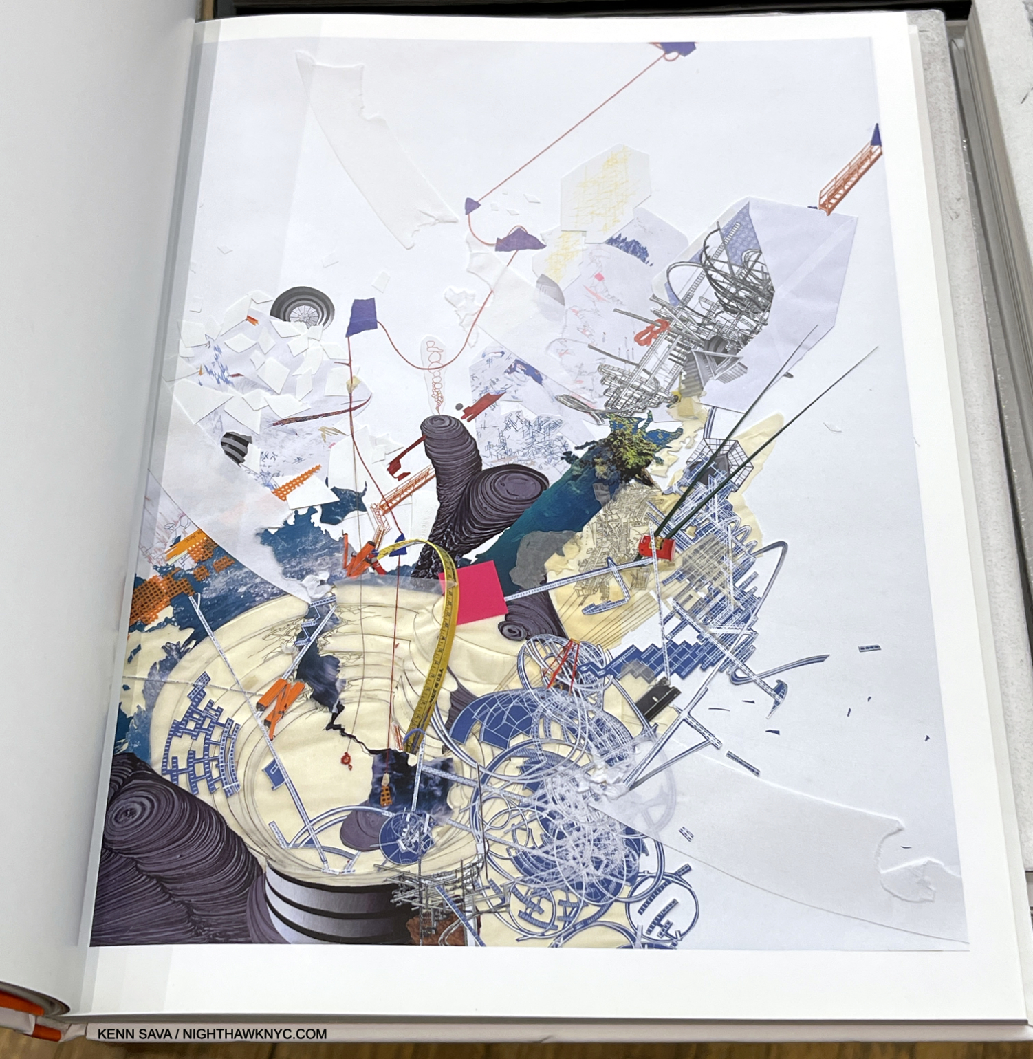
Sarah Sze, Guggenheim as a Ruin(!), 2009, Ink, string, collage on paper, 50 x 32 inches. (Exclamation mark mine.) An indication that Sarah Sze has been thinking about the Guggenheim for a long time. Notice the red string coming down from the top! It splits in two, and the right part seems to wind up over the ground floor pool, which has spilled on to the floor. Seen in the book Sarah Sze: Infinite Line. Not in the show.
“There is fragility in drawing a line through space; with this one simple powerful gesture, you can occupy an entire space.” Sarah Sze on the wall card.
The more I thought about it, though a mere speck compared to Wright’s huge open space, the string has come to “occupy” it in my mind.
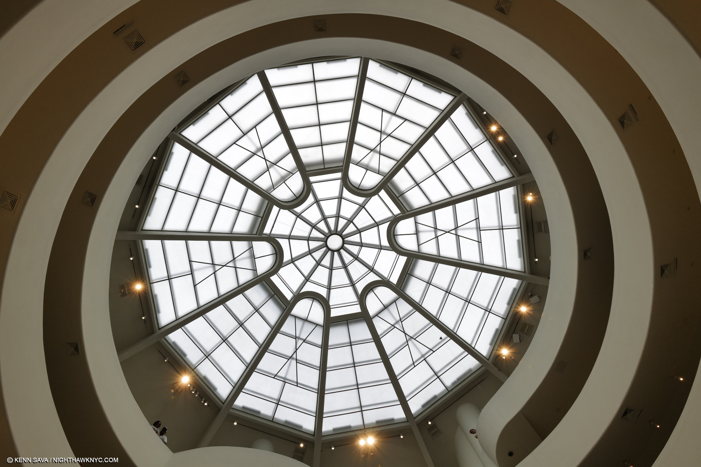
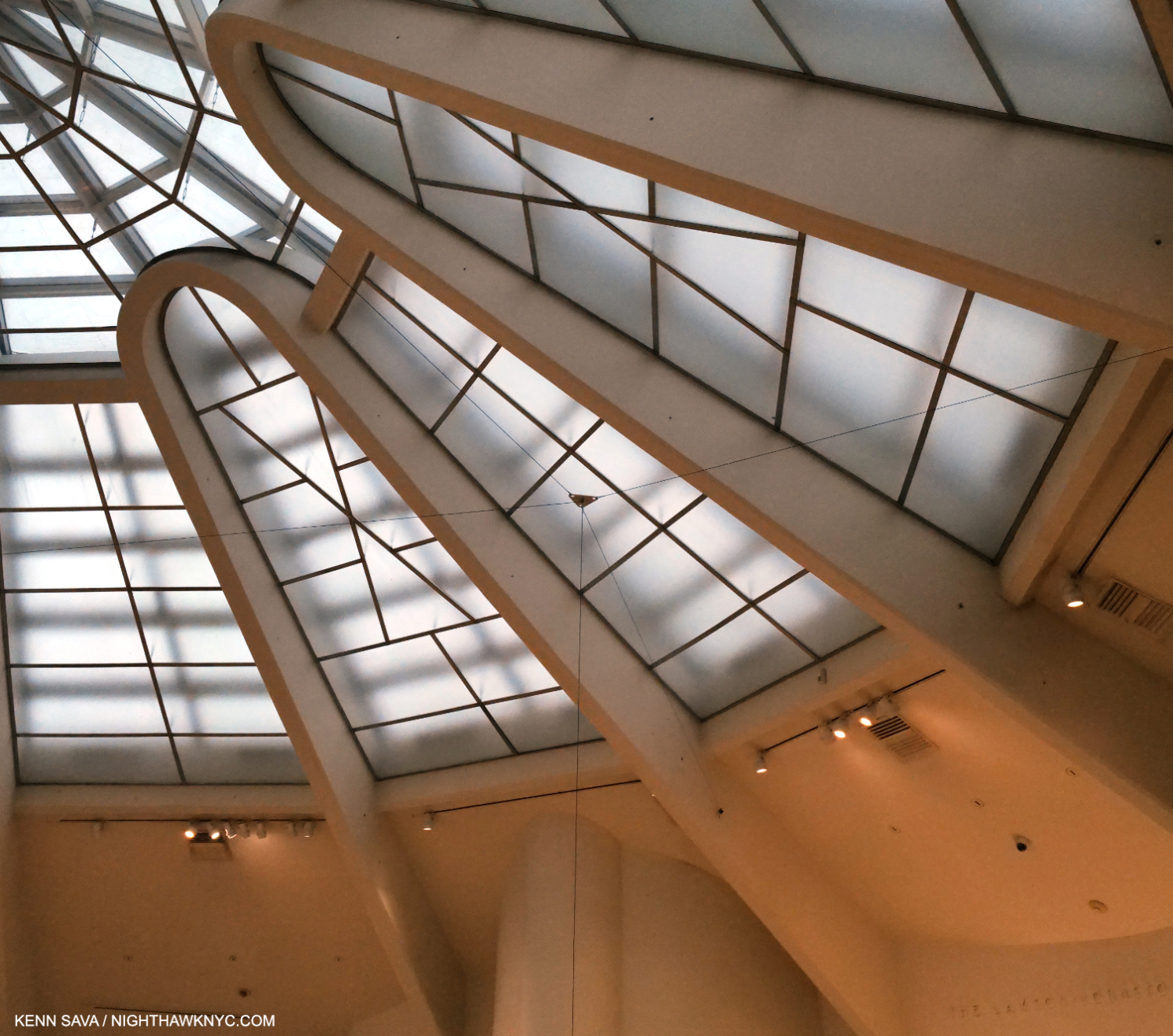
While you’re lying on your back in the hammock, here’s your (approximated) view of Wright’s Oculus. See that small speck just south of 5 o’clock on the white glass (and the faint line running down from it to the right)? That’s the hub where the black string’s rise culminates before sending it off across the void to the main installation of Timelapse on the other side, (as shown in the 2nd picture). There are countless amazing details everywhere you look in the show. Therefore, I’ve decided to present an overview of the show in this piece and show details in a Part 2.
Taking Wright’s unique elevator to the top (as he intended visitors to do) and walking down, (usually, actually up in this case), visitors find the black string already there waiting in front of them. Following it still higher, I noticed it was anchored to a hub that sent it to multiple points all the way across the void to the other side of the 6th floor.
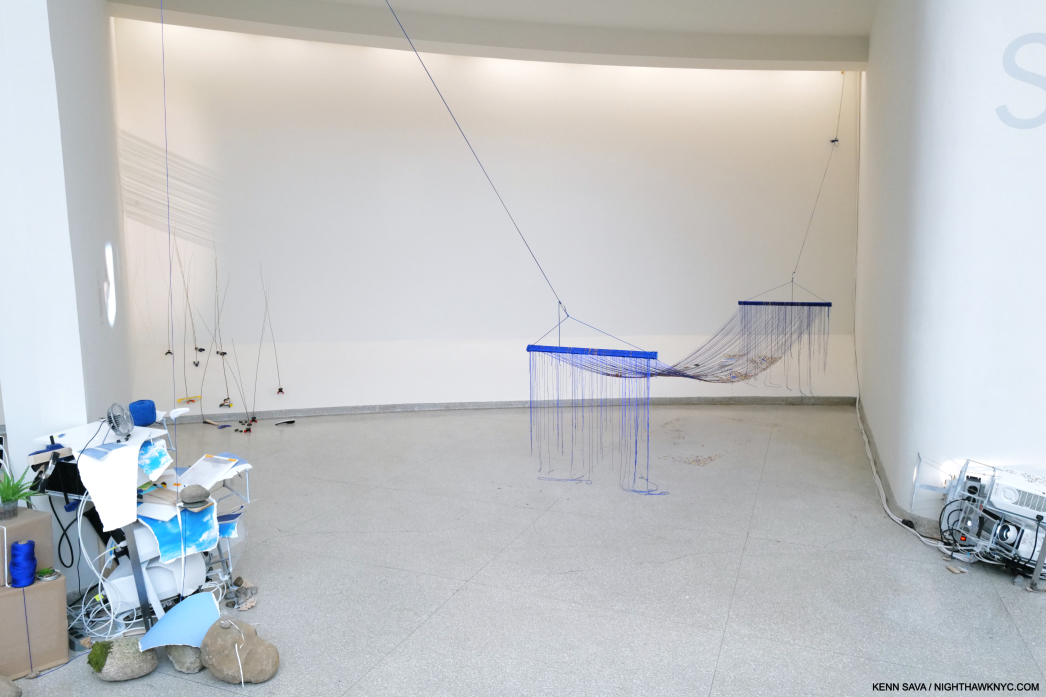
Bay 1. The Night Sky is Dark Despite the Vast Number of Stars in the Universe, 2023, Second of two parts, Acrylic paint, string, paracord, and wood and River of Images, Part two (white circle on the left). The near string holding the hammock is the continuation, and terminus, of the black string from the pea pod pool.
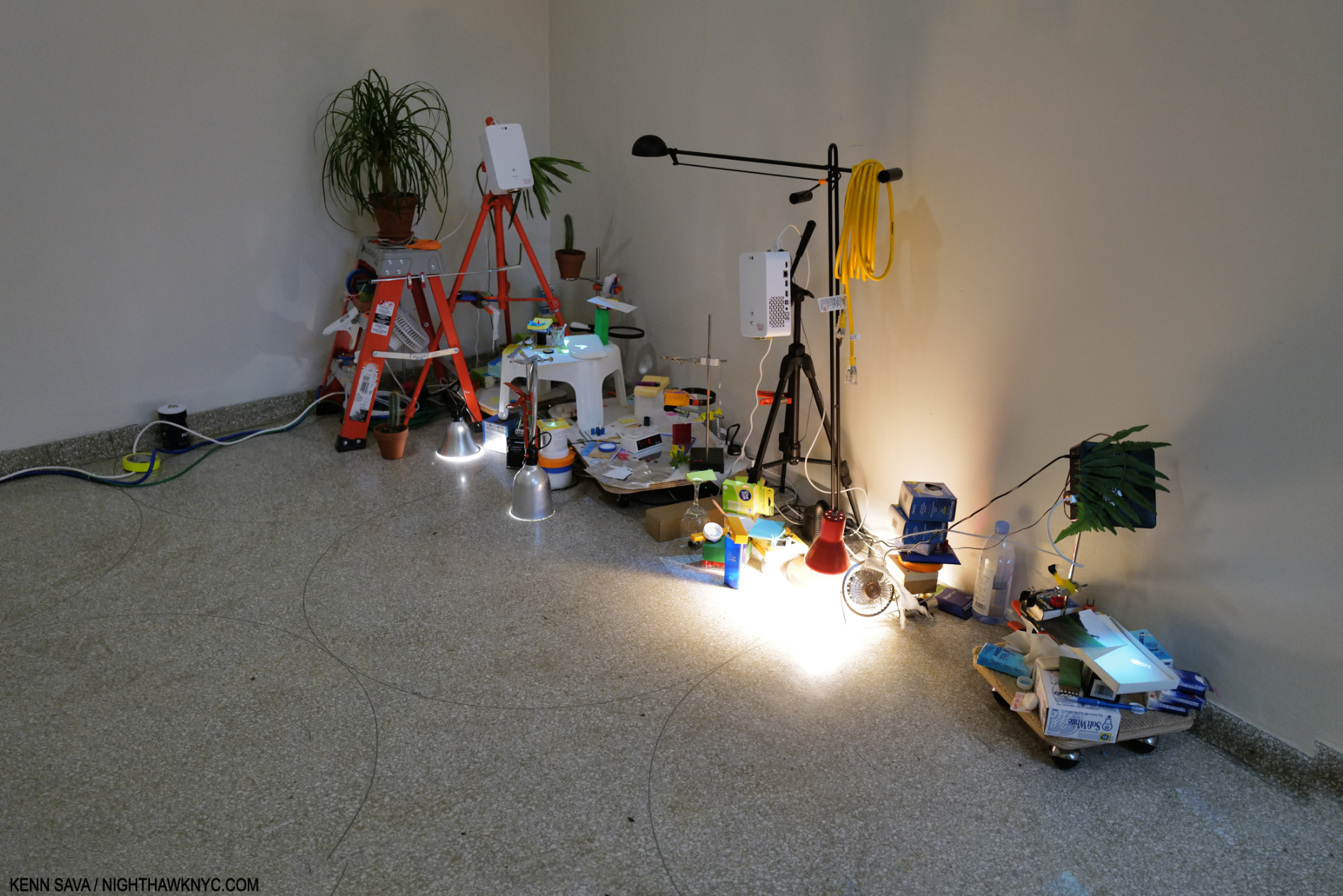
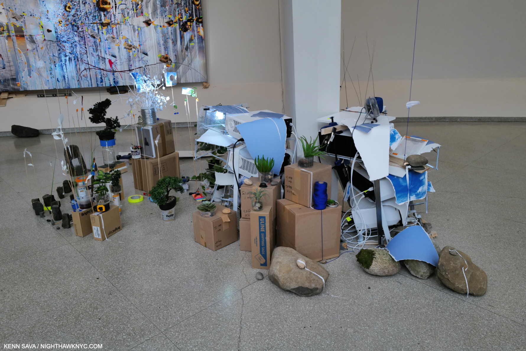
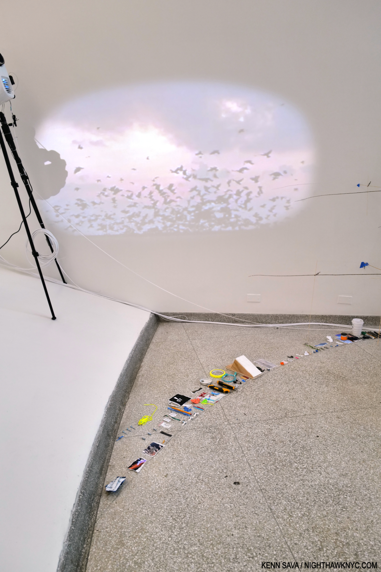
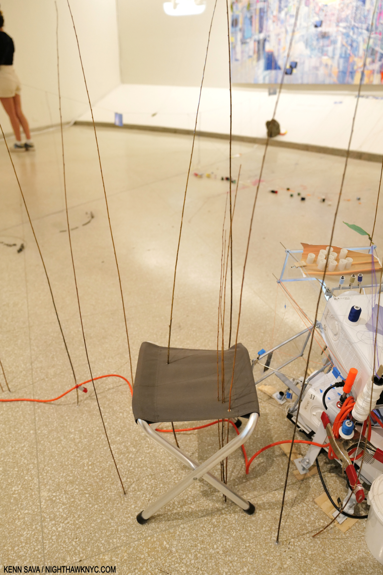
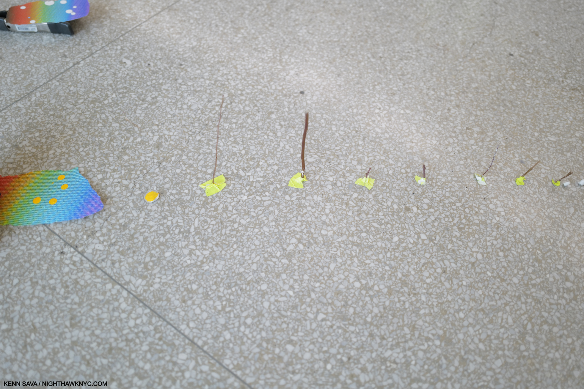
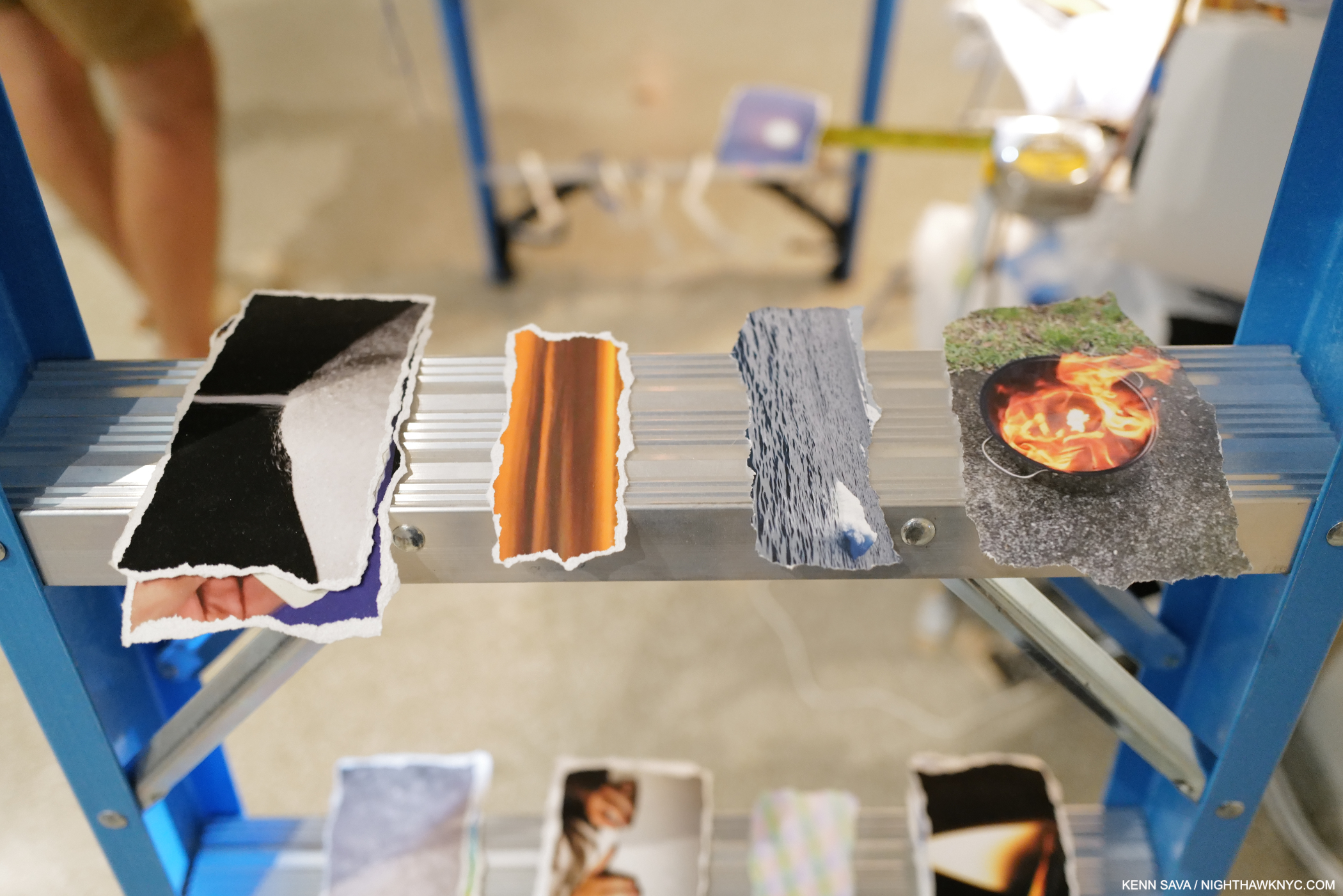
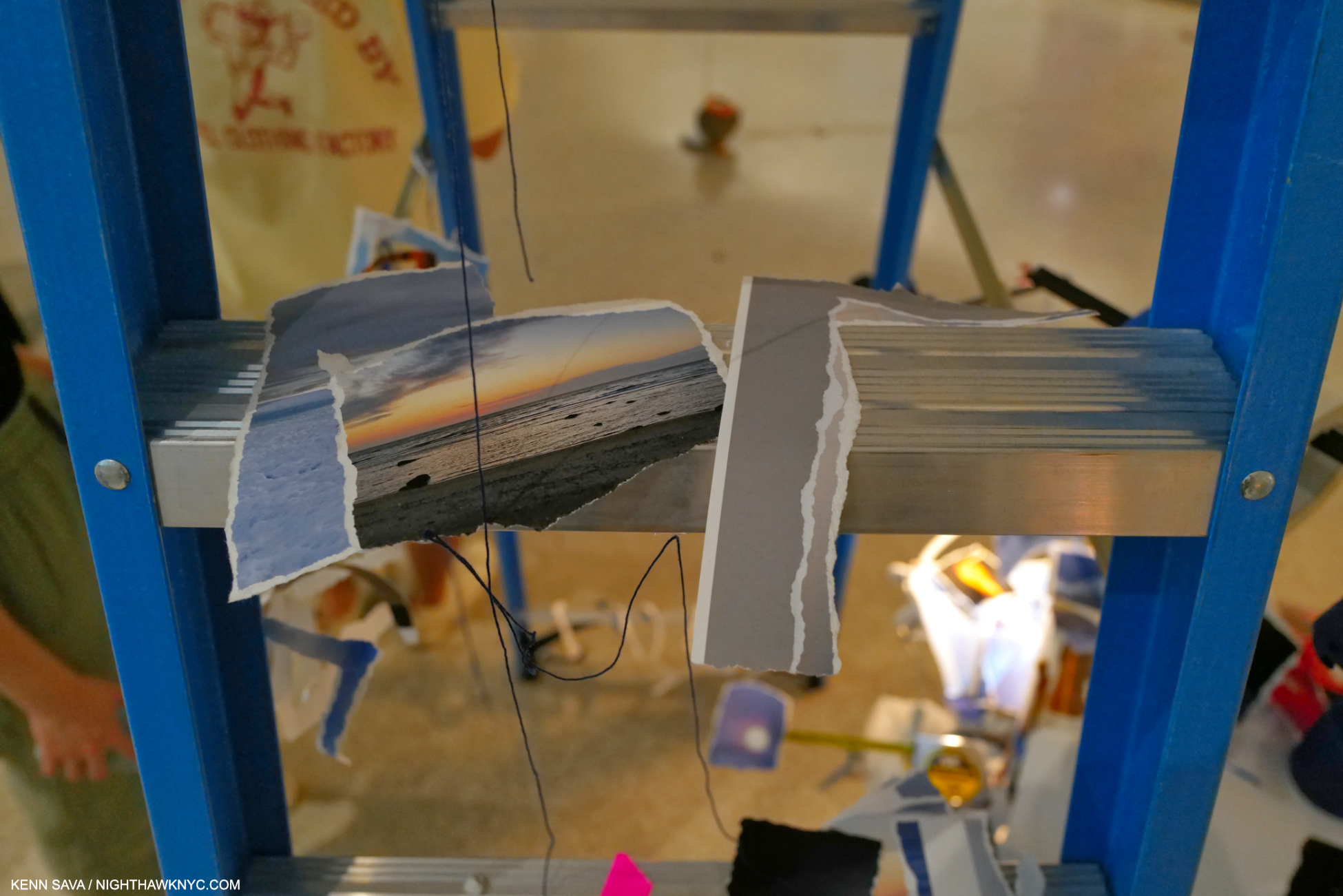
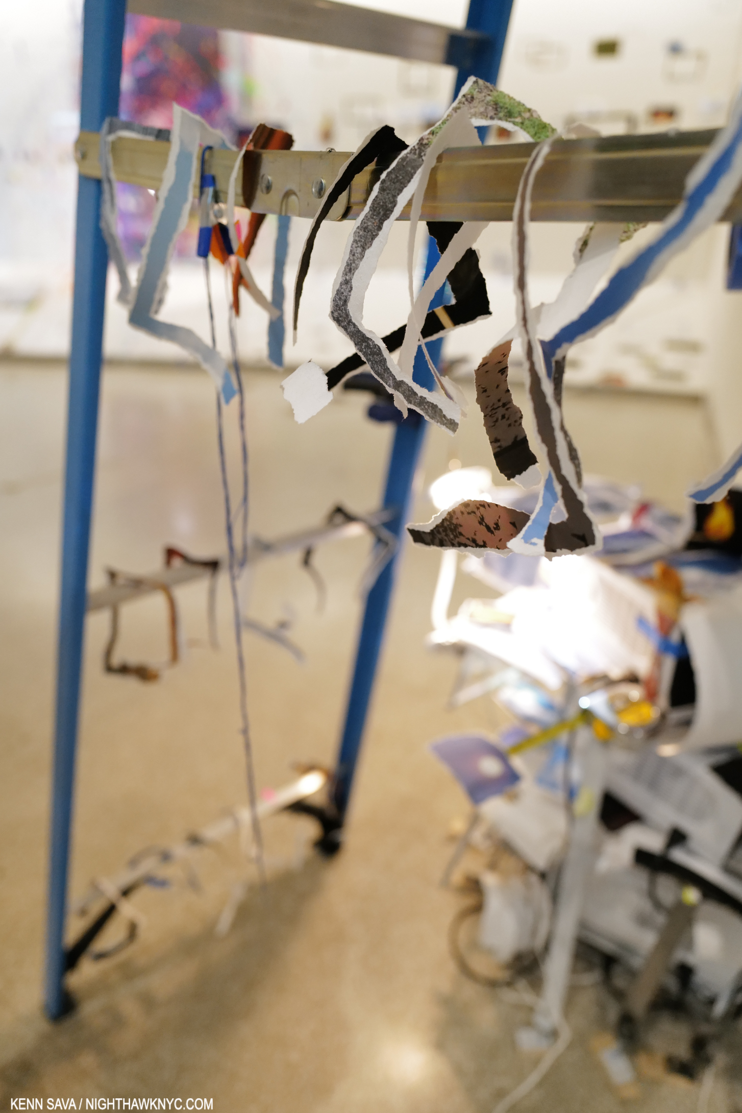
Walking to the beginning of Timelapse on 6, I had the deja vu experience of seeing another blue hammock, one end of which was anchored to the black string. Though dated 2023, the hammock and the one in the pea-pod pool are very similar to one she created in 2015 titled Hammock, down to the “confetti” on top of it (and similar to the one installed on the pool as we saw). Along side is a pile of A/V equipment, “enhanced” with torn analog Photographs, and a wide range of objects that make the viewer think, “Ah, this is not just A/V equipment, it’s part of the piece.” These equipment installations are to be seen at the beginning and end of each Bay, in varying degrees of complexity, and typically, with an inventory of a staggering number of items- generally her trademark common items, seen in most of her pieces, but also small, often very complex “Sculptures.” Since every Bay has a variety of these, they add a sense of unity and continuity to the entire floor as the viewer moves from Bay to Bay.
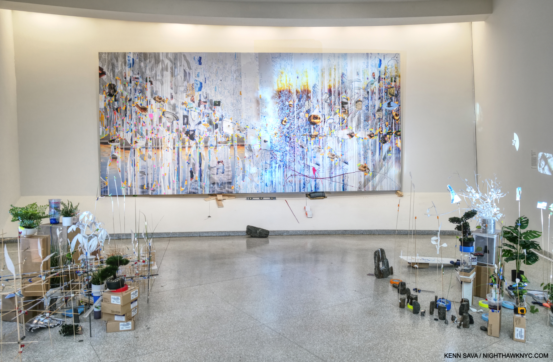
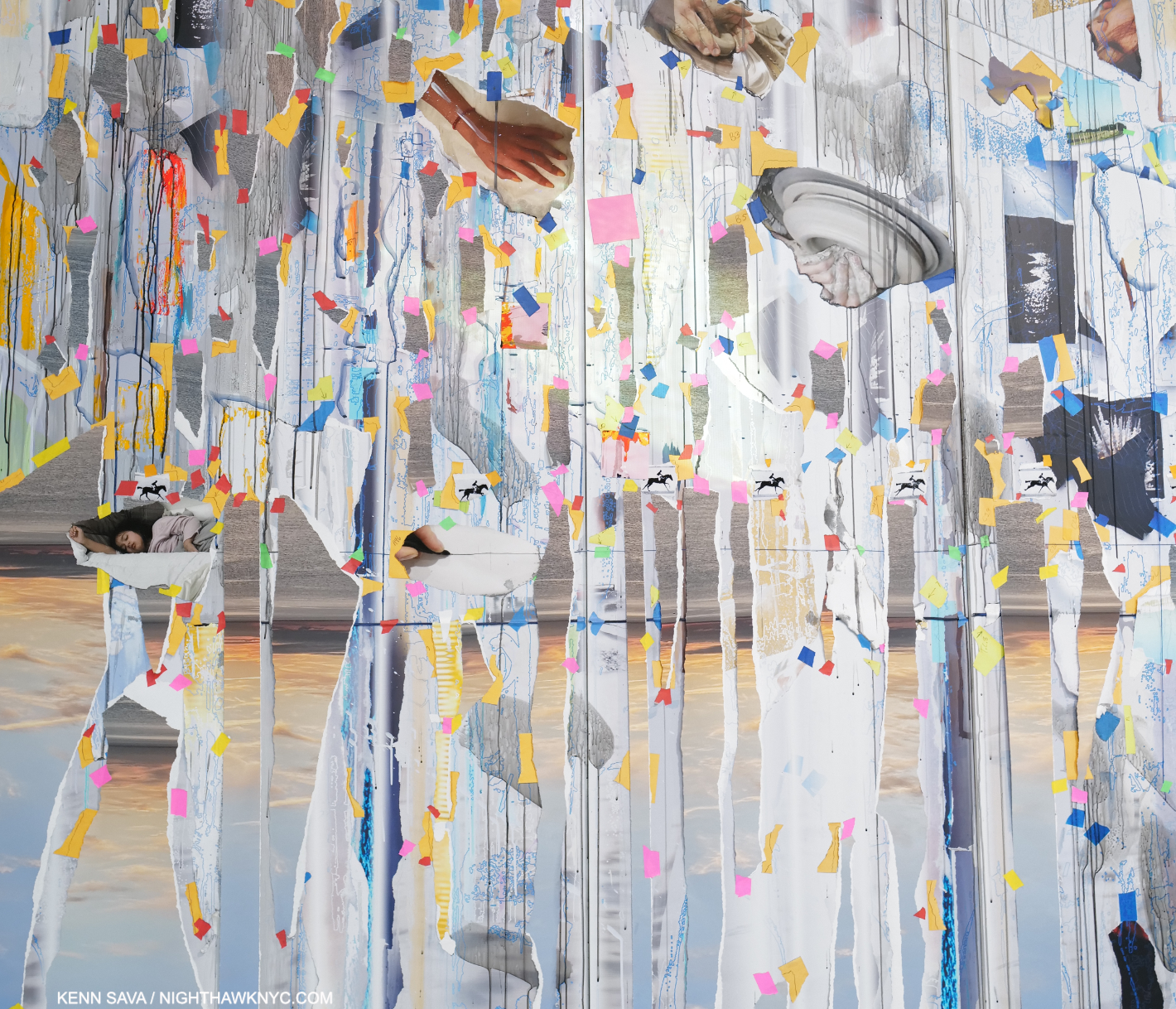
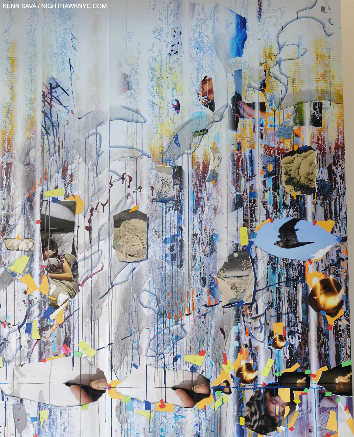
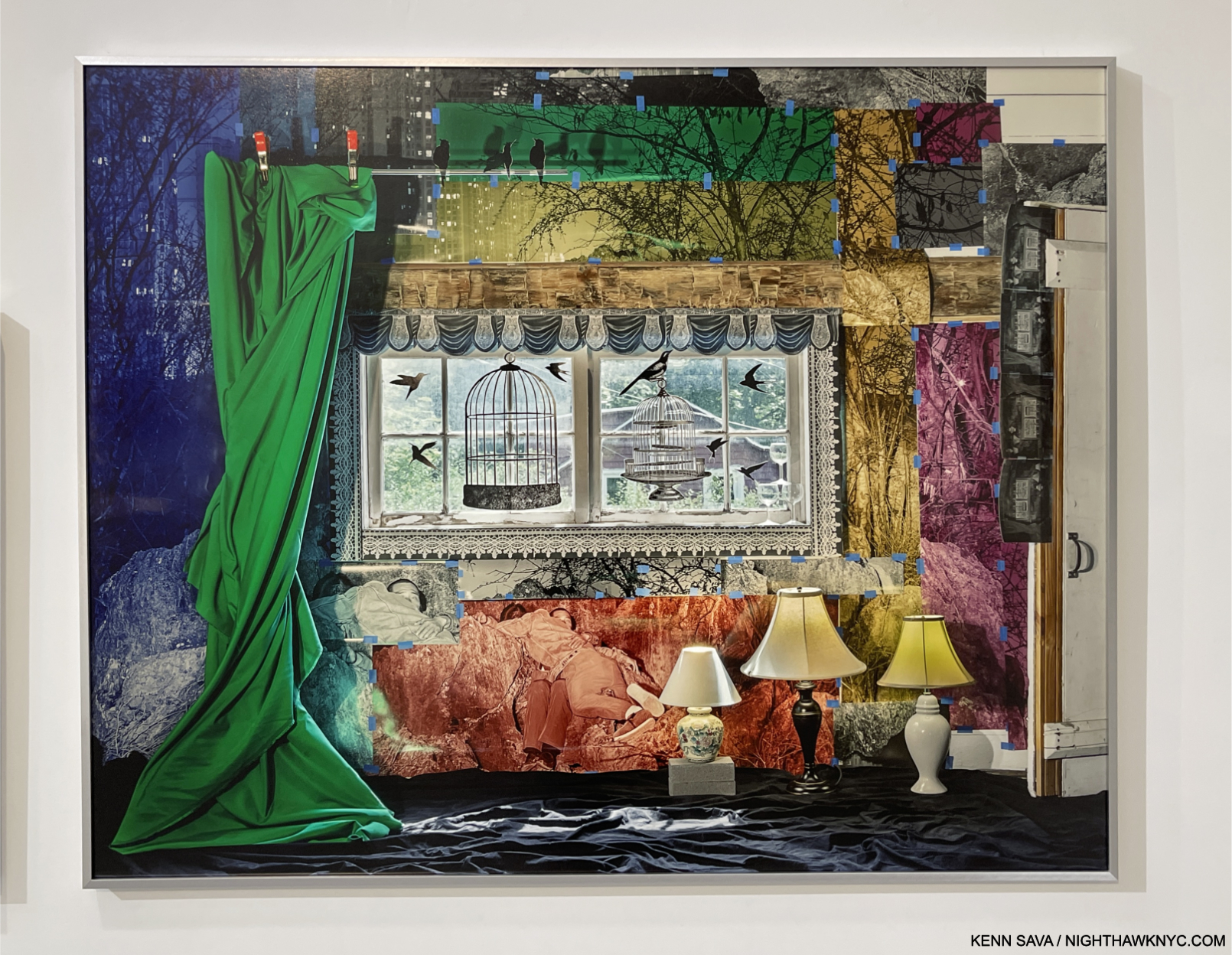
Bay 2, Travelers Among Streams and Cascades, 2023, Oil paint, acrylic paint, inkjet prints, acrylic polymers, string, and ink on Dibond, aluminum, wood and paper on 6 panels, 114 x 245 inches. All the pieces on the 6th floor are dated 2023- including the Paintings! Since the show started going in around April, that means Ms. Sze must have been unimaginably busy earlier this year. More than likely, the show was in the works during the pandemic.
In an interview, Ms. Sze hoped that Timelapse would inspire a “I didn’t know you could do that in a museum,” reaction in viewers (especially young Artists)1. Meanwhile, River of Images (Part two), a continuation of the exterior projection, moved along each wall on 6, flowing from Bay to Bay and across all the Art as you stood and looked at it.
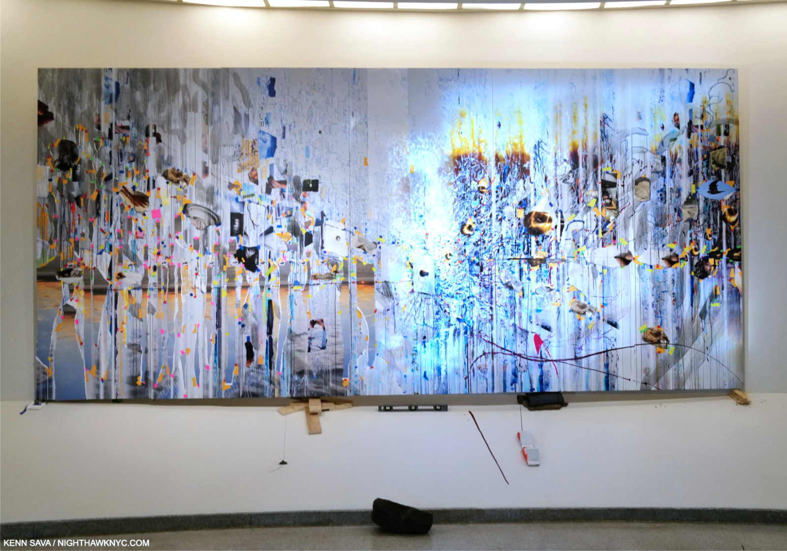
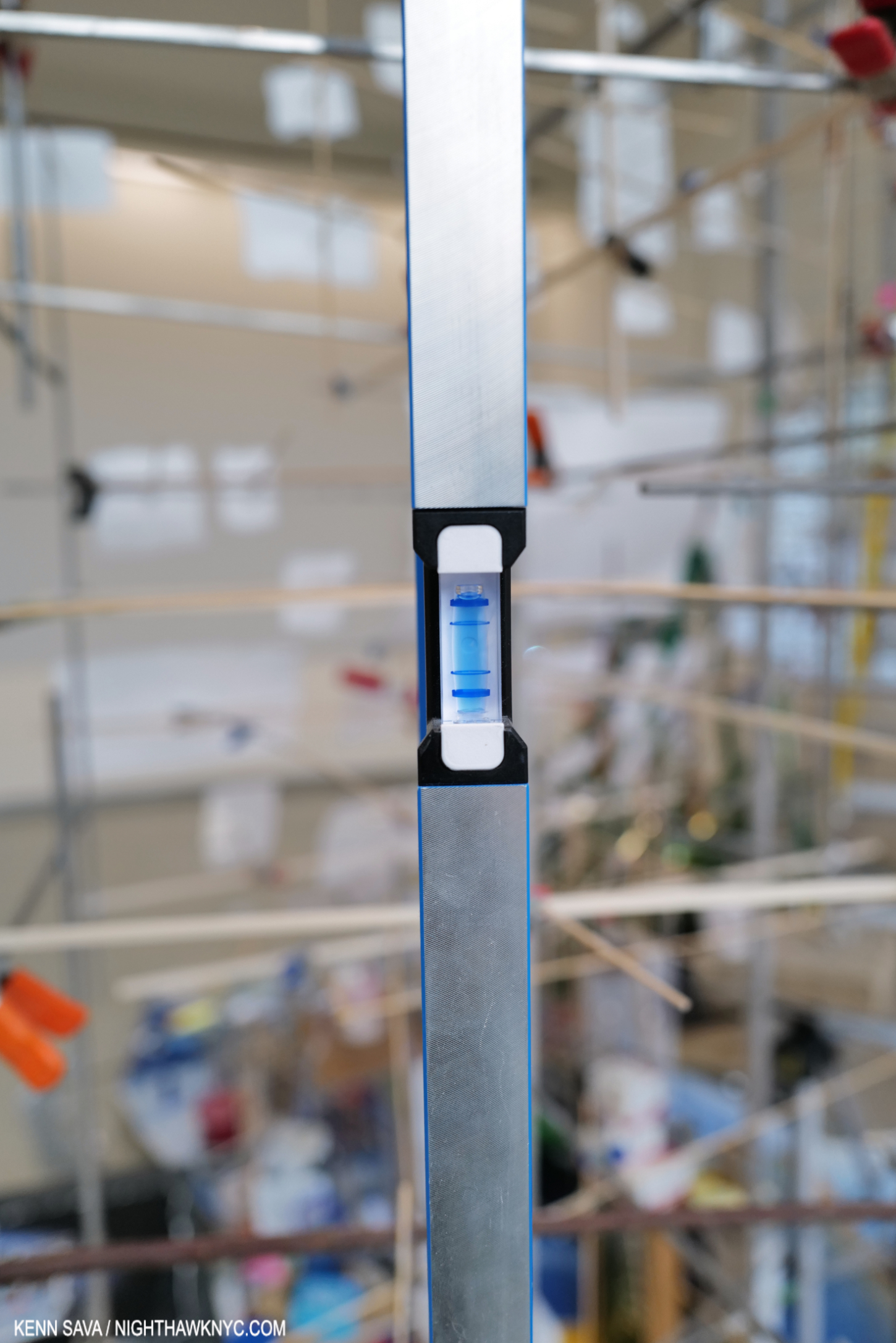
Closer to the extraordinary 20 1/2 foot Travelers Among Streams and Cascades, “mounted” on shims and a level, further reinforcing the “off-balance” experience of seeing Art in the Guggenheim. I wondered- Would Wright smile at this, or be offended?
Speaking of its focus on images, one thing I was extremely happy to see was that Sarah Sze has included four of her remarkable Paintings in Timelapse, each of which was dated 2023. Her style seems to have evolved since those seen in her landmark 400-page book, Sarah Sze: Paintings (a NighthawkNYC NoteWorthy Art Book of 2023). Though each Painting in Timelapse was quite strong, Travelers Among Streams and Cascades, in particular, struck me of attaining yet another level.
“The paintings for me are more about how I actually see in my head.” Sarah Sze1.
I was stunned when I heard her say that. In another interview, the Artist spoke of having them be a portal to the world beyond the walls. Given each piece in the show is newly created and site specific, it’s fascinating to ponder that when looking at the Paintings and how they’re installed. Each Painting is displayed in an exceptionally unique way. In fact, over the countless Paintings that have been exhibited in the entire, 65-year, exhibition history of Frank Lloyd Wright’s Guggenheim I seriously doubt that ANY of these installation scenarios have been seen before.
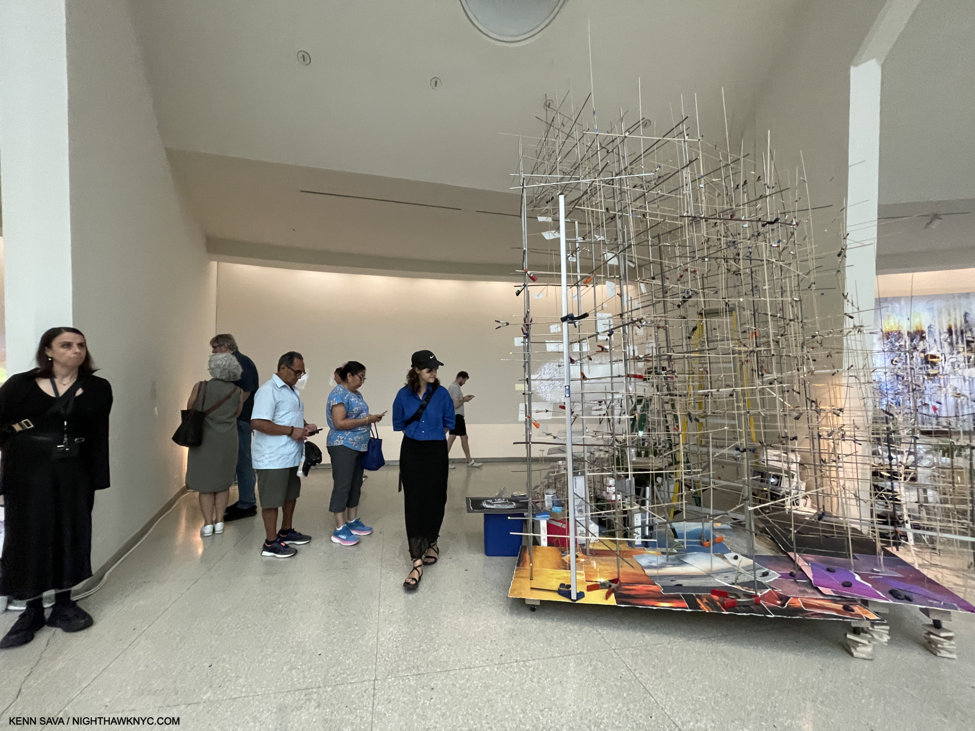
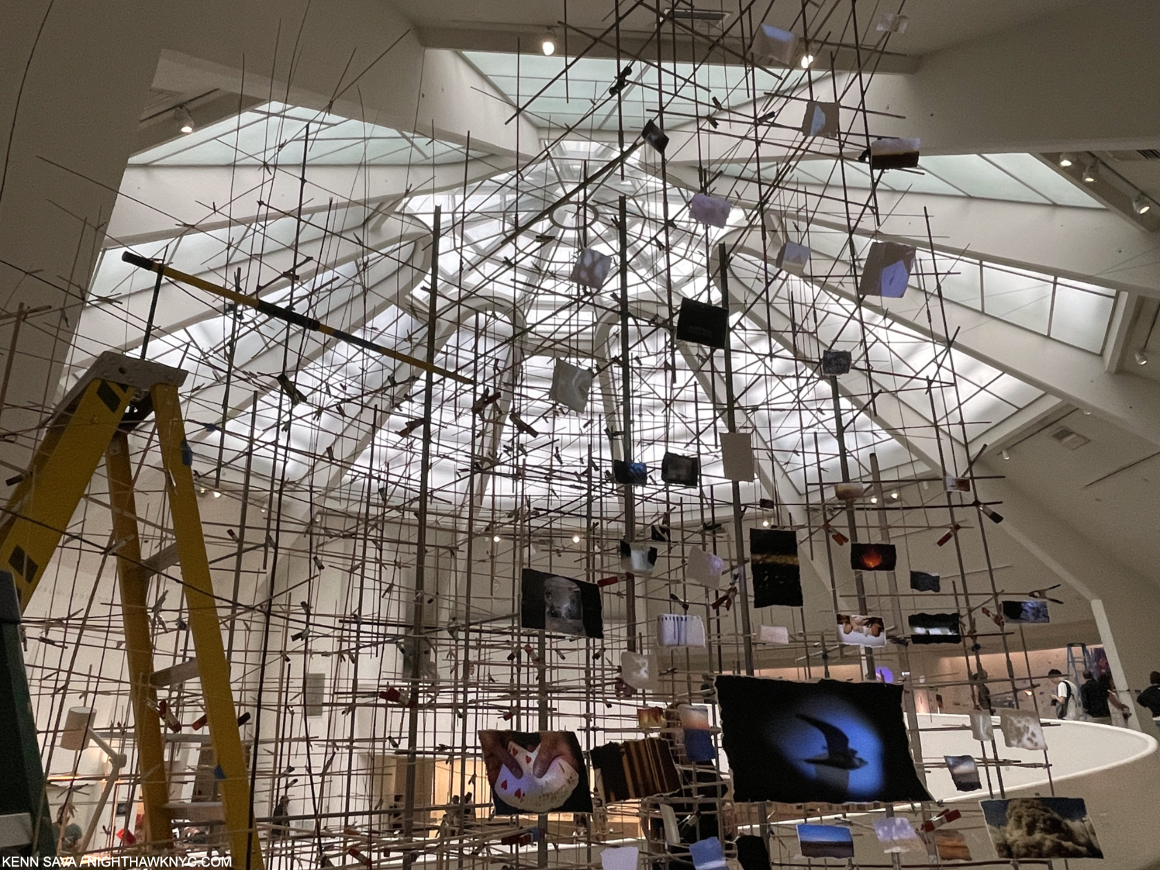
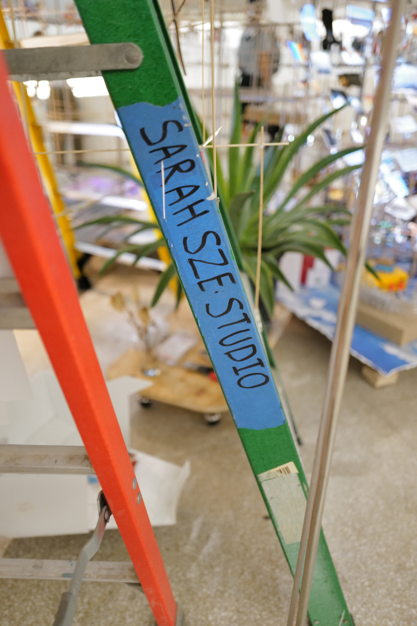
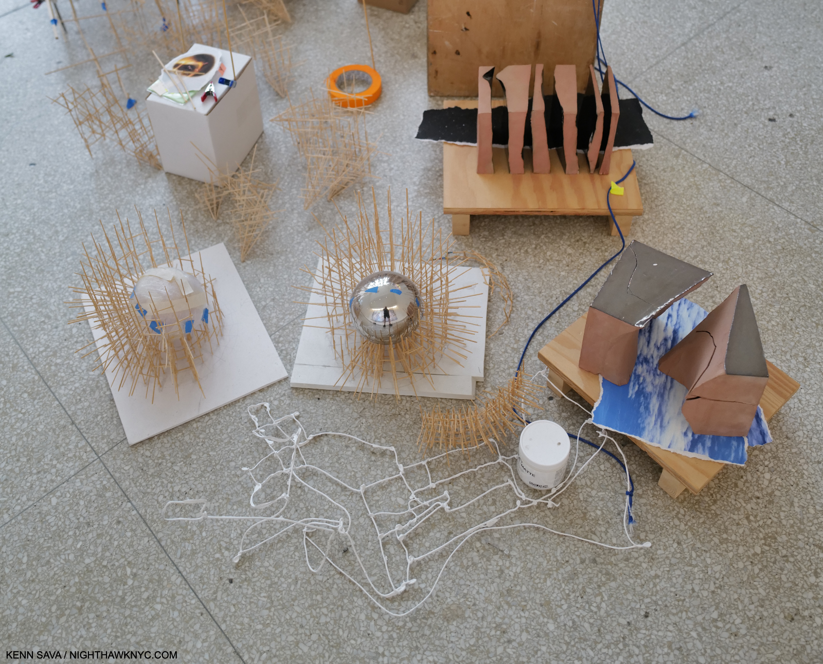
Bay 3. “Elements of Architectural design,” as I wondered in the first sentence? The massive and incredibly intricate Slice, approached from what turned out to be the back. In Timelapse, Ms. Sze continually plays on the “off-balance” feeling viewers have walking up and down Wright’s angled ramp. Here, notice the “shims” she’s placed under Slice to level it, which she’s chosen to leave visible for emphasis. Another way of dialoguing with Wright. Elsewhere, actual levels are seen are various points in the show. As in the prior picture, and as I show in Part 2.
Speaking of the installation, in spite of the numerous delicate assemblages and many small items installed on the floor, Sarah Sze reported during the run of the show that nothing had been broken, even after a weekend of 15,000 visitors. She attributed this to viewers moving slowly through the show.
Ms. Sze’s Art dialogues with Wright in numerous fascinating ways, while advancing her themes of time and memory in images. For one thing, as anyone who has been to the Guggenheim knows, the Rotunda’s Ramp is on a continual slope. Upward going up, and downward going down, creating a sense of being off-balance. “Tripping and catching yourself-a central idea of the Baroque1,” she said. Sarah Sze makes a point of showing the viewer how this affects her work, adding shims under parts of the huge Slice, or filling a large tank part way, making the fairly steep angle of the floor’s slope obvious . She equates this with creating a sense of being “off-balance” for the viewer who also often can’t tell if an image is digital or analog. “Equilibrium” is also reinforced by her use of 3 pendulums hanging from the black string at various points along its journey.
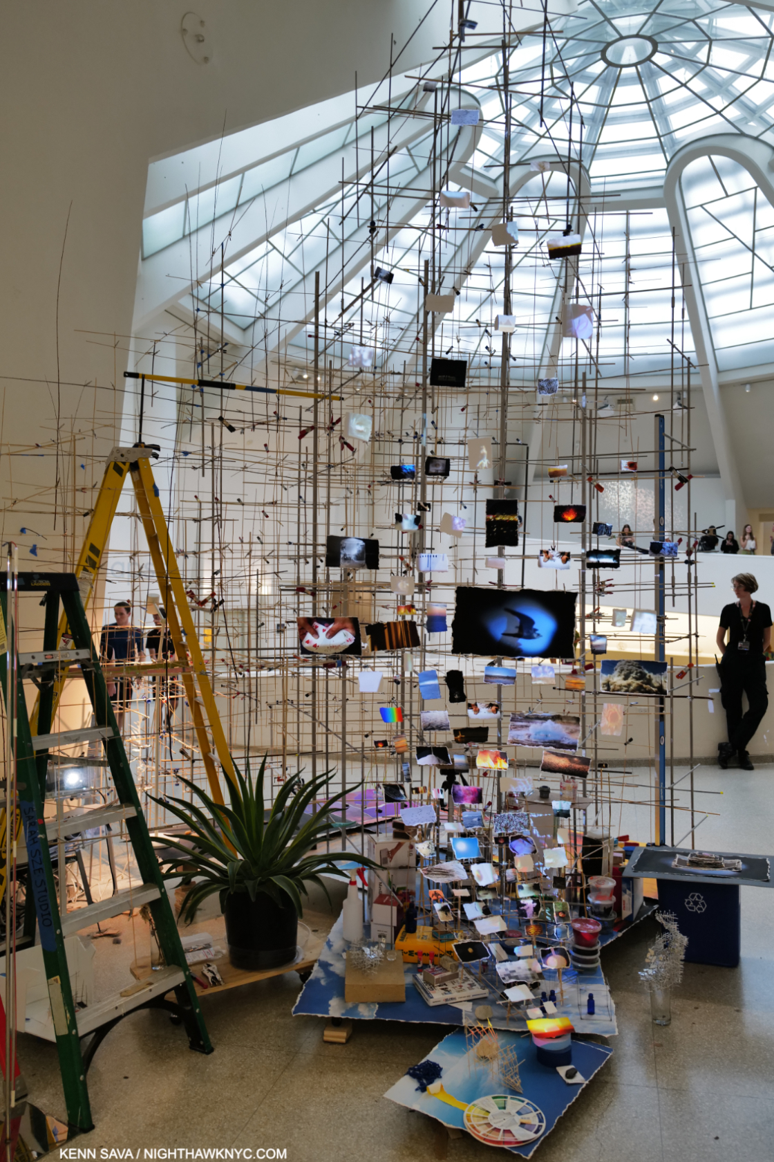
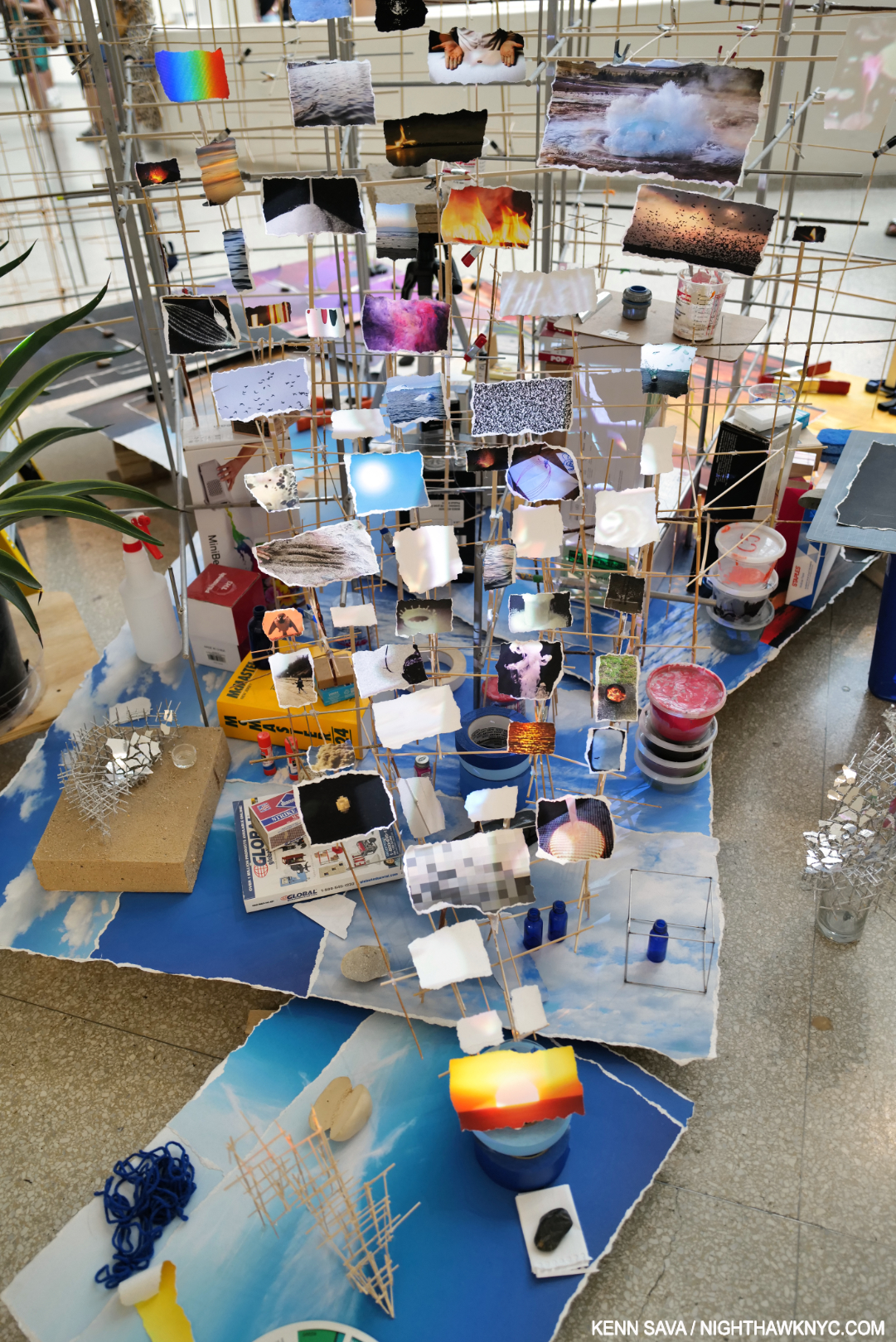
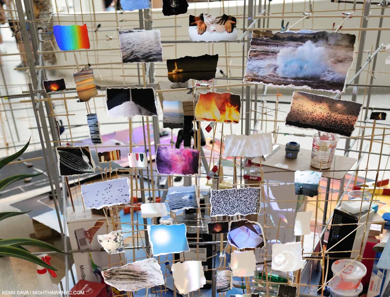
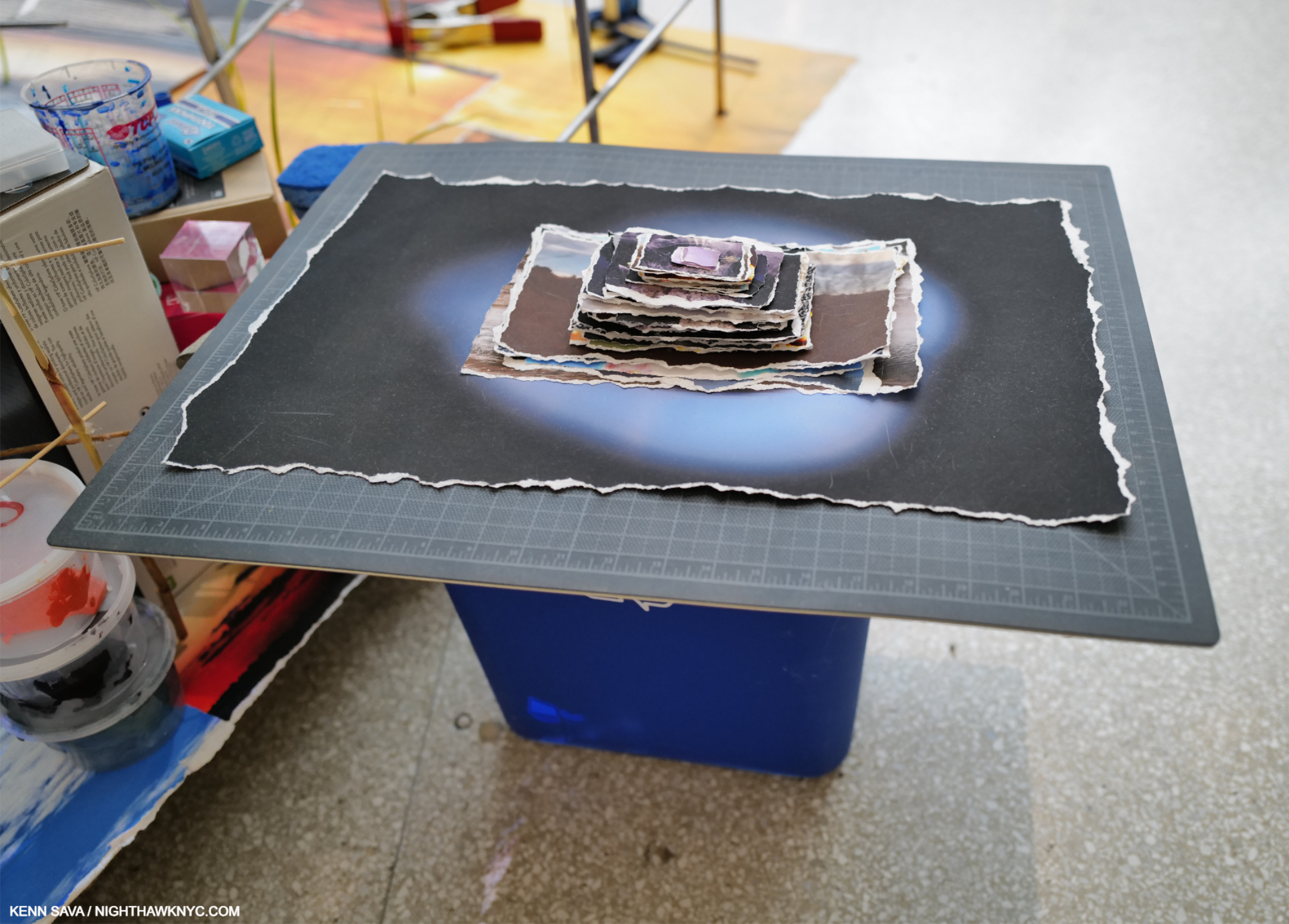
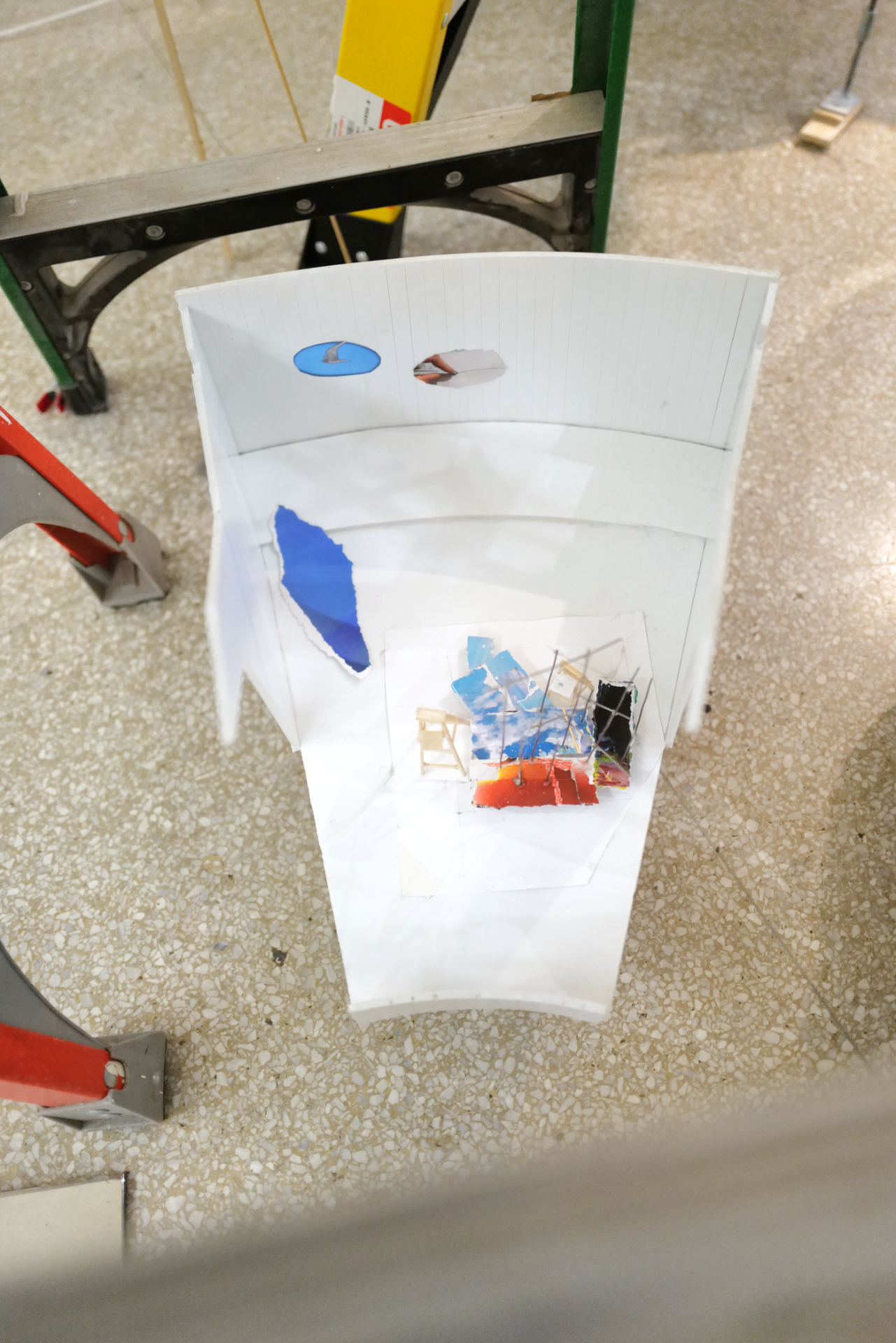
Slice, from its “front,” in dialogue with Wright’s Oculus. Barely visible behind the first step of the near ladder is her model of Slice in this Bay (which I show close-up in Part 2). I found the piece transcendent, and it wasn’t the only one that was. Timekeeper, 2016, installed in the large rear gallery, and displayed for the first time in NYC, seems to mark time on a grand scale. Here, the Artist dialogues with the building while giving us a “slice of time.”
As she has done in a number of recent works (like Crescent (Timekeeper), in her 2019 Tanya Bonakdar show), many of the images in Slice were actually miniature video screens so many of the images changed independently(!) as you watched. As for the images themselves, nowhere in the exhibition catalog, the check list, or the accompanying materials does it specify whose Photography we’re looking at. I’m assuming they’re by Sarah Sze.
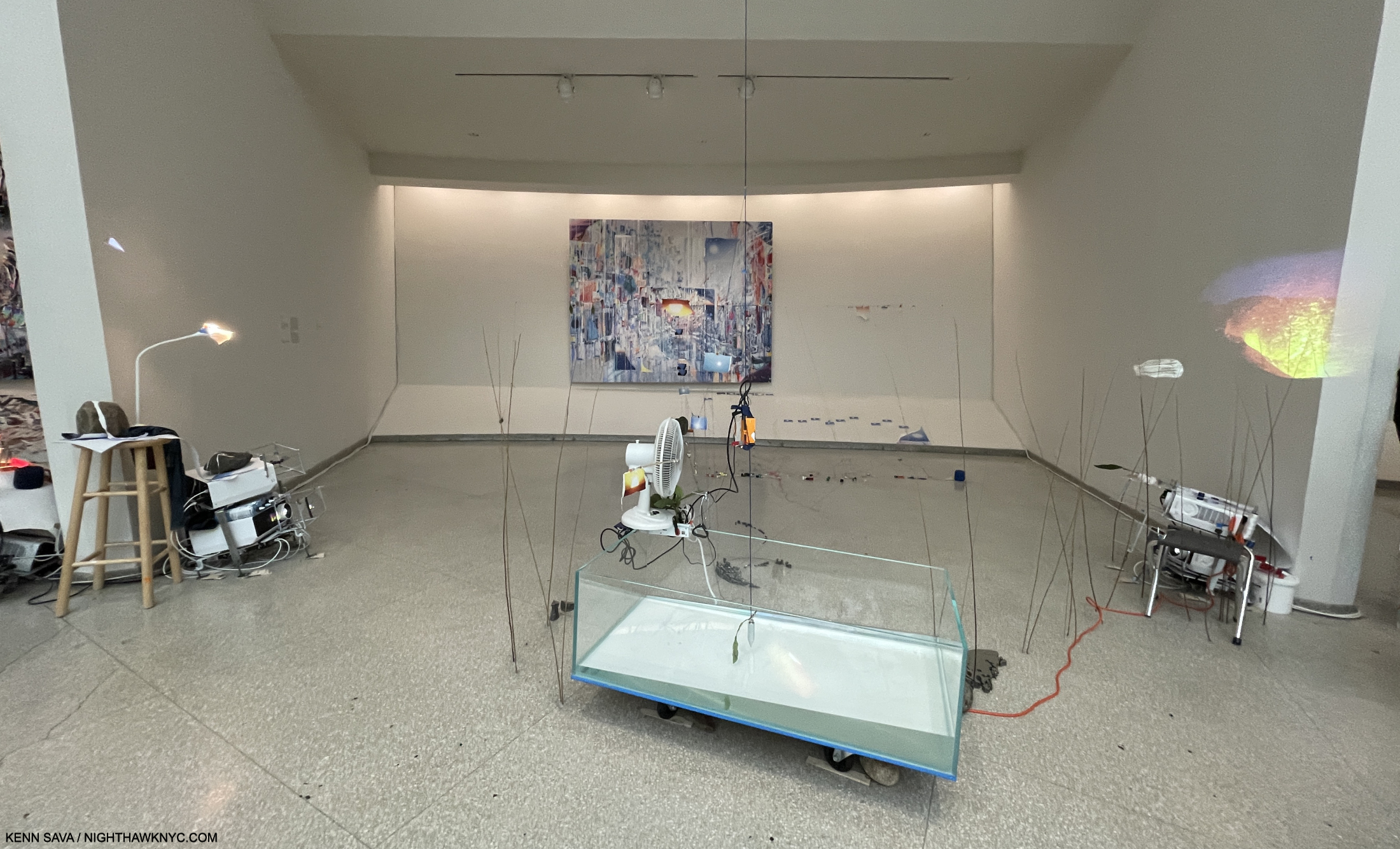
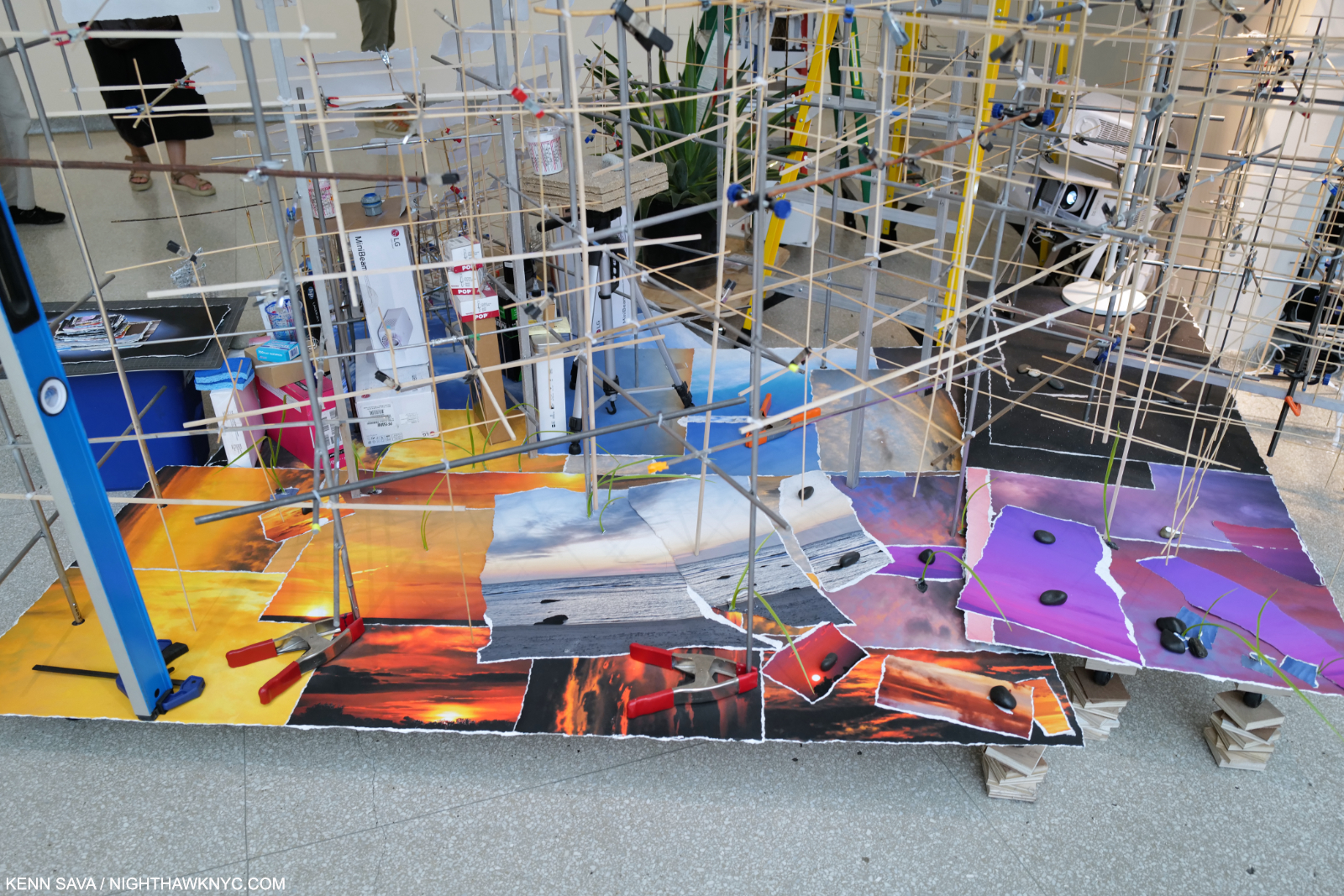
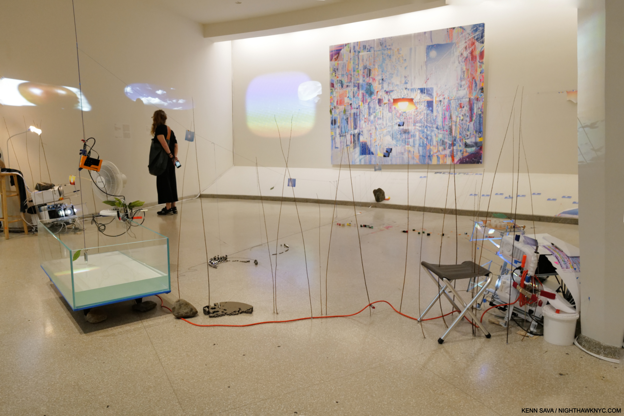
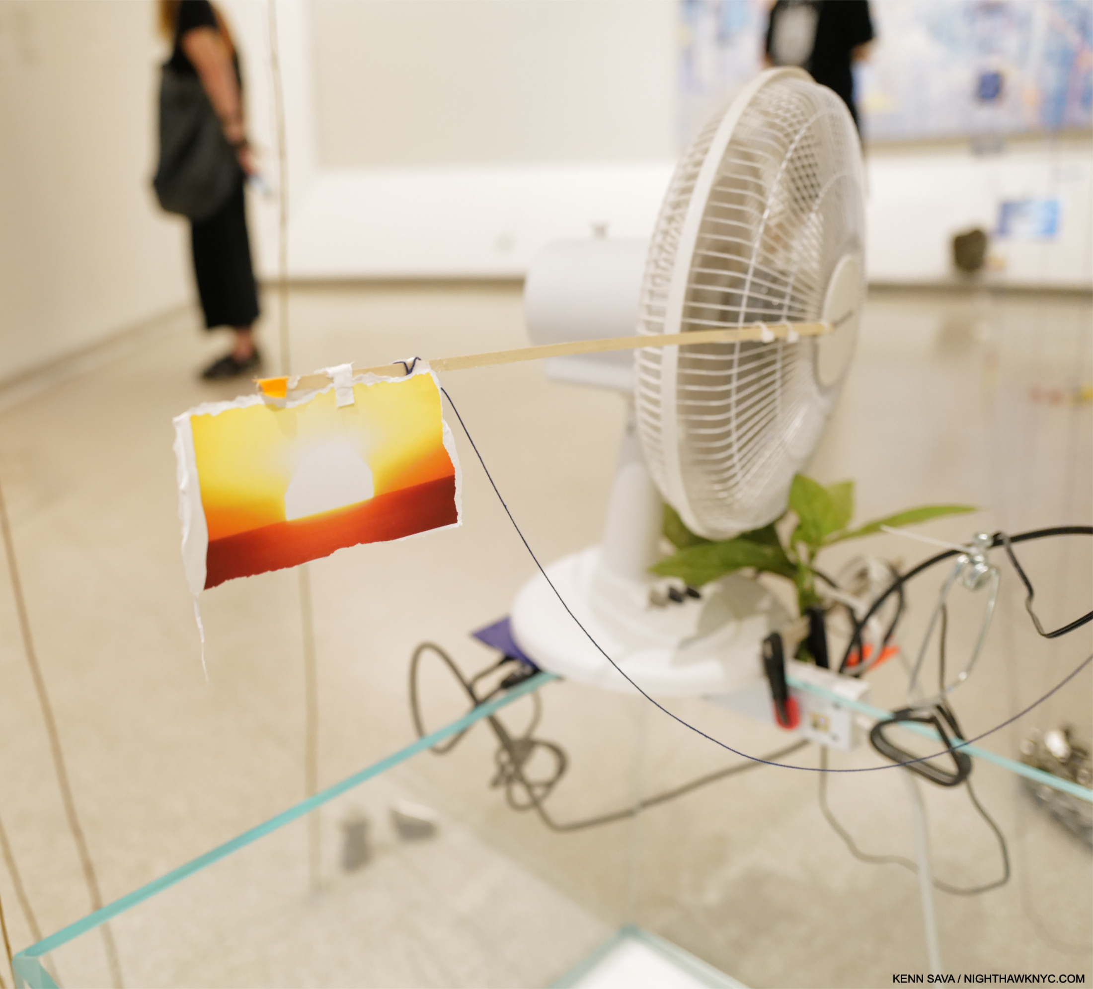
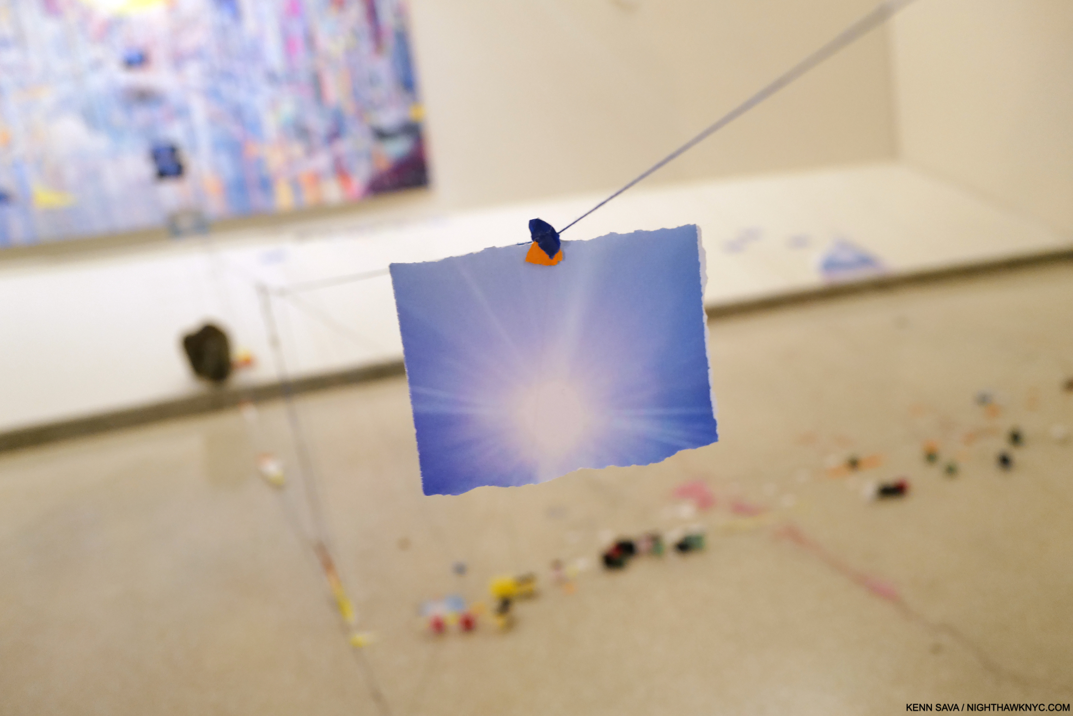
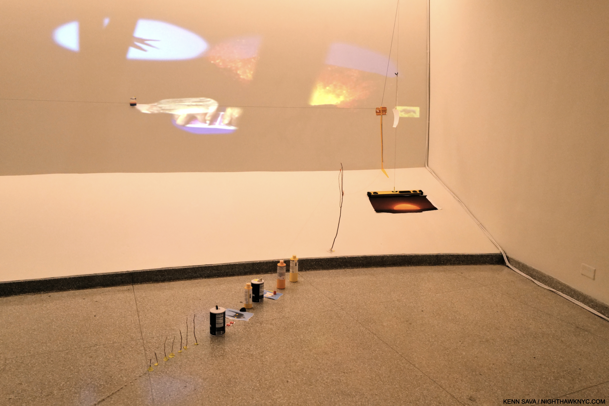
Bay 4, Diver, Second of two parts and Images That Images Beget on the back wall. In this work, there is a torn Photograph of the Sun, attached to the oscillating fan (shown close-up in Part 2). This image is followed by other images of the Sun on a a string that make a trail to Images That Images Beget, which has a Sun in its center, as you can see below. Note the slope of the water in the tank. “Water in a museum,” part deus. In her Drawing for this piece, the Artist had the water in the tank right up to the top on the right.
All four Paintings were installed uniquely in my experience of 43 years of going to Painting shows. Bay 6 was one of two Bays that used strings with Photos mounted on them as a compositional device that either led to the Painting on the back wall, or referenced it. Installing them this way created an entirely new way of experiencing a Painting as you can see here-
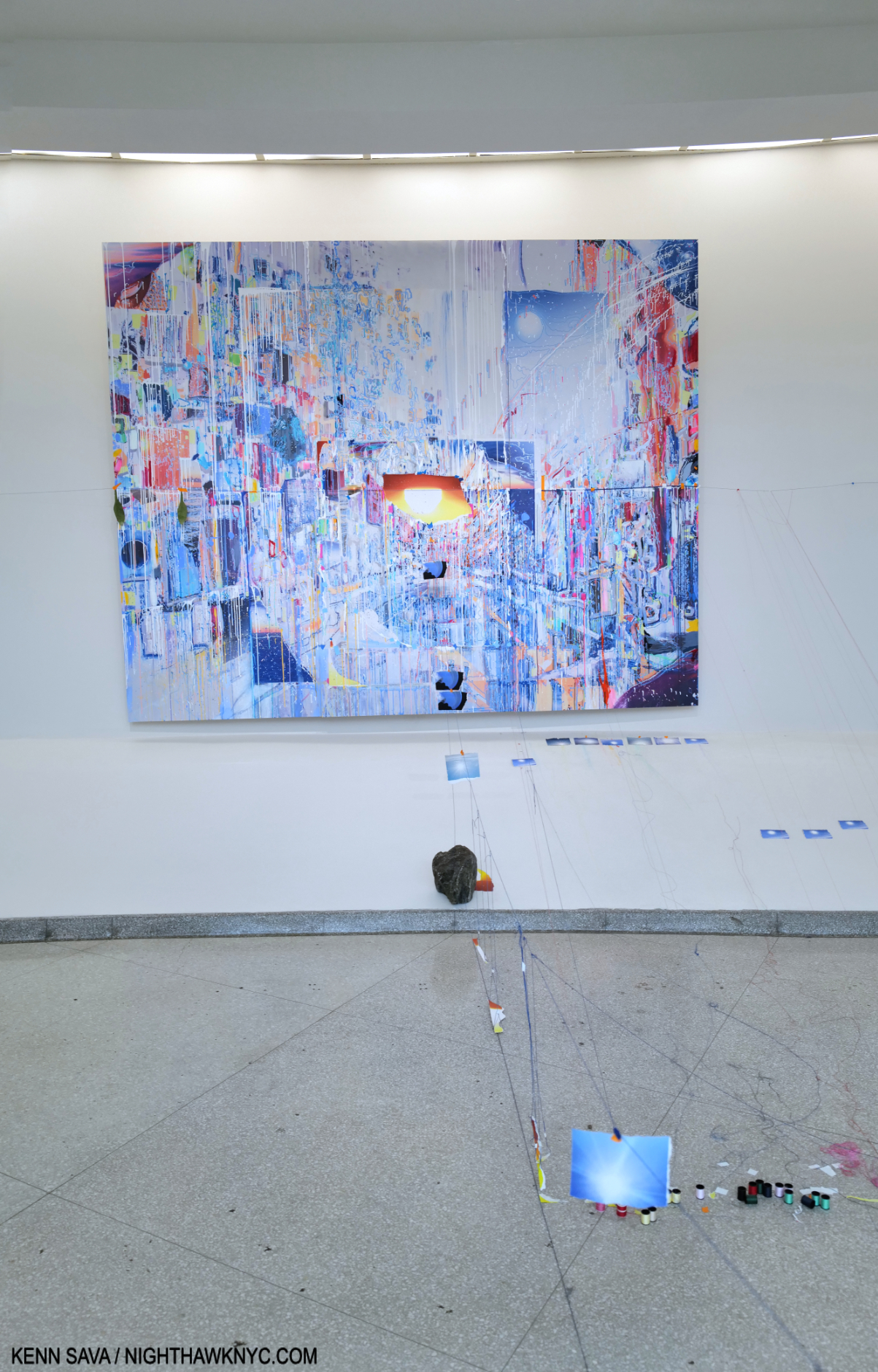
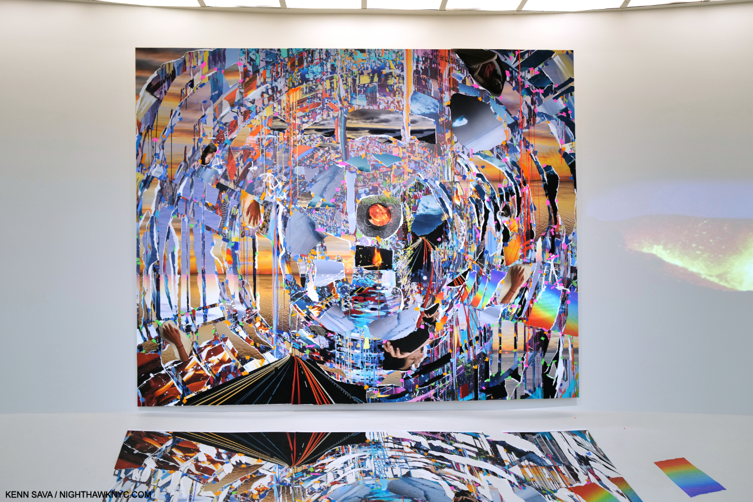
Following the Suns. Images That Images Beget, 2023, 129 x 103 inches, Oil paint, acrylic paint, inkjet prints, acrylic polymers, and ink on Dibond, aluminum, wood and paper, on 4 panels, with a string, containing Photos, leading to it from the tank.
I found this a fascinating way of drawing the viewer into the space and making him or her consider individual elements, like the Sun, and countless small objects installed on the floor, along the way to seeing the Painting. It also occurred to me that it’s a way of both measuring the space, occupying the space, as she said, and dialoguing with Wright. The whole idea of installing objects on the floor, which has been done many times, is taken to a new level here with countless small, even tiny, objects lying on the floor, some you can see in this picture (and more in Part 2). I wonder if that’s been done here before.
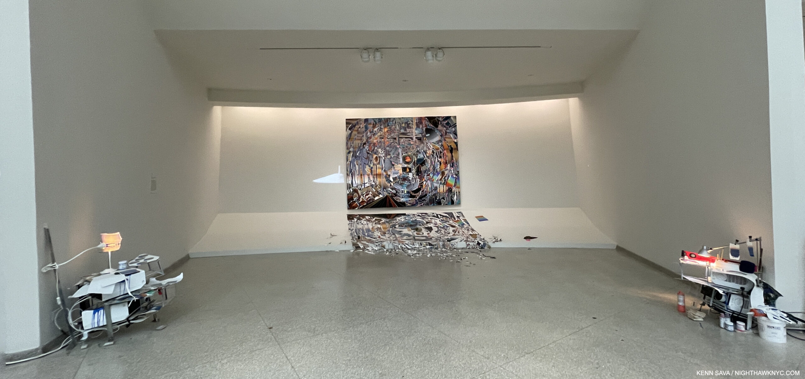
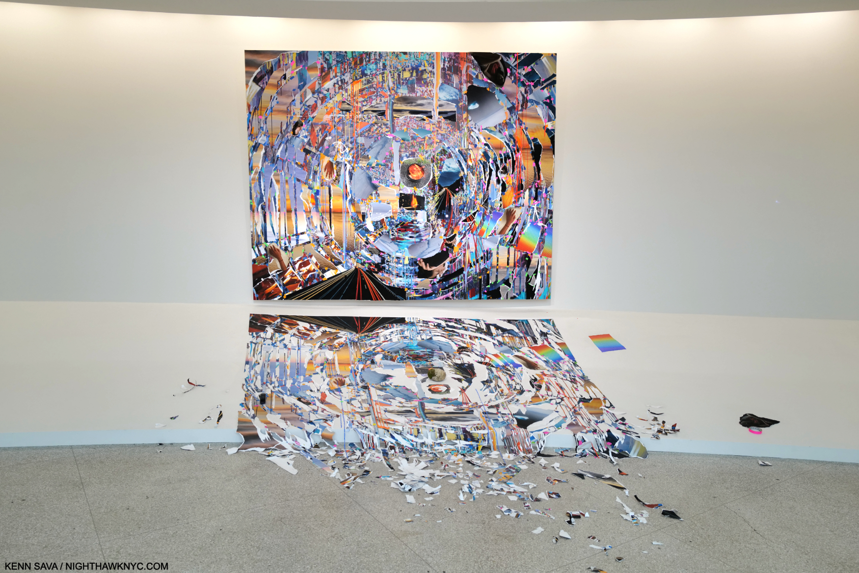
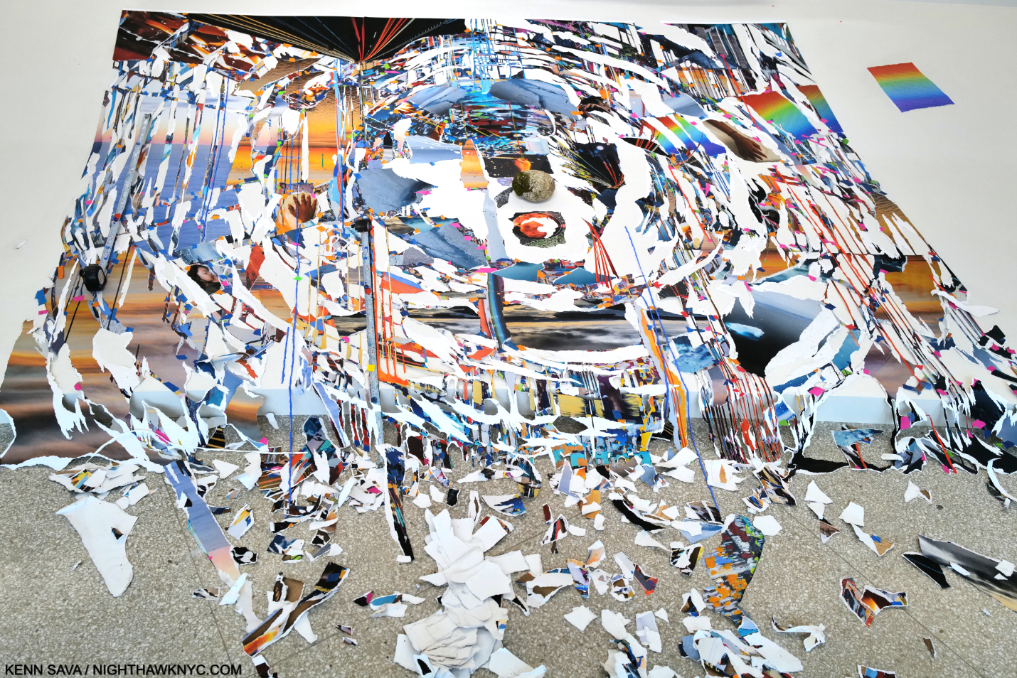
Bay 5, Times Zero, 2023, Oil paint, acrylic paint, inkjet prints, acrylic polymers, and ink on Dibond, aluminum, wood and paper, on three panels. Total dimensions, 97 × 120 1/2 × 3 inches.
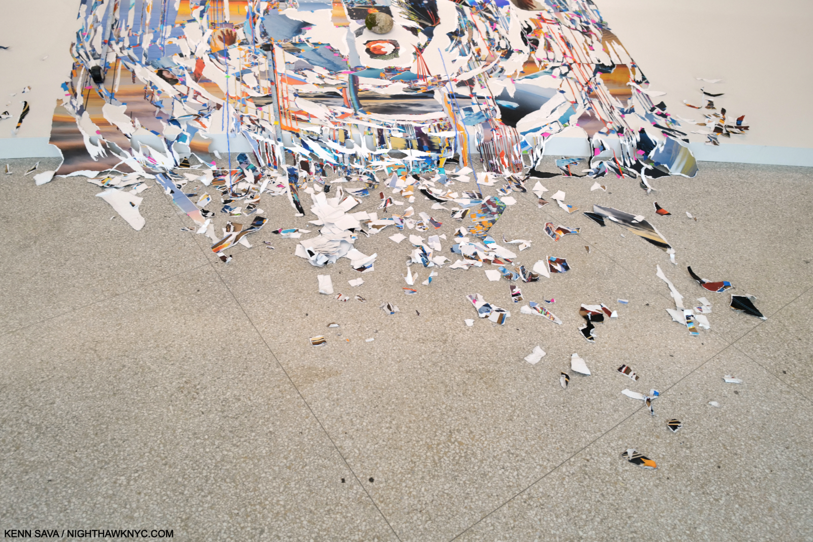
Regarding the Paintings in Timelapse, and specifically about Times Zero, the exhibition catalog says, “The paintings in this exhibition were created in Sze’s studio in New York, where the artist meticulously replicated the museum’s Bays in 1:1 scale, allowing her to work quasi-in situ. In the case of Times Zero, Sze was struck by the angle at which paint dripped on the sloping shelf that runs from the wall to the floor (familiarly referred to as the “apron”).”
Here the Painting itself is destabilized by having its mirror likeness begin to come apart. The catalog continues, “She later photographed the work and digitally manipulated it in perspective to the incline of the apron. The resulting full-scale print was then ripped and the shards arranged below the painting itself, like a reflection in water or an imprint; the debris was left to overflow at the edge like liquid5.” She will revisit this “overflowing” effect in a subsequent Bay.
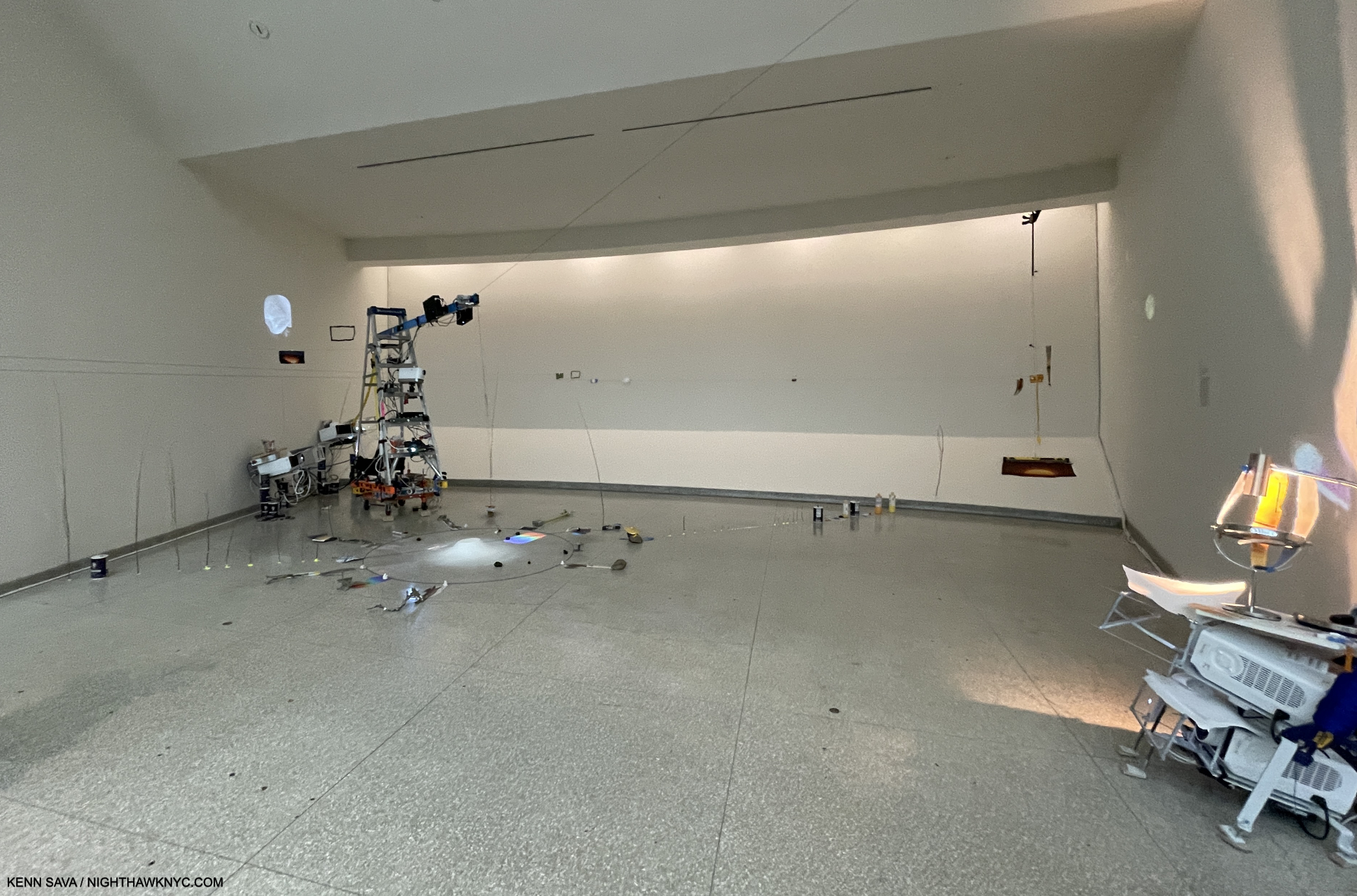
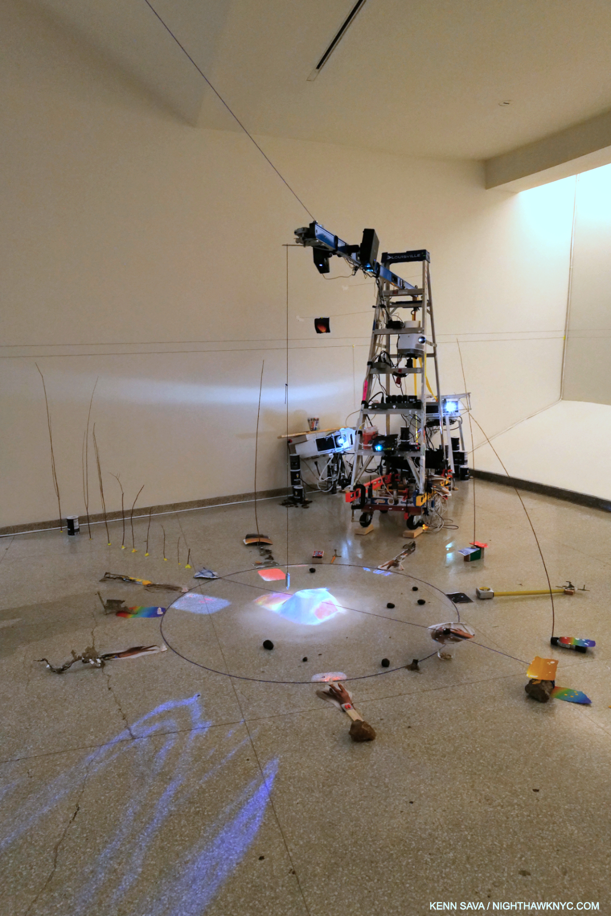
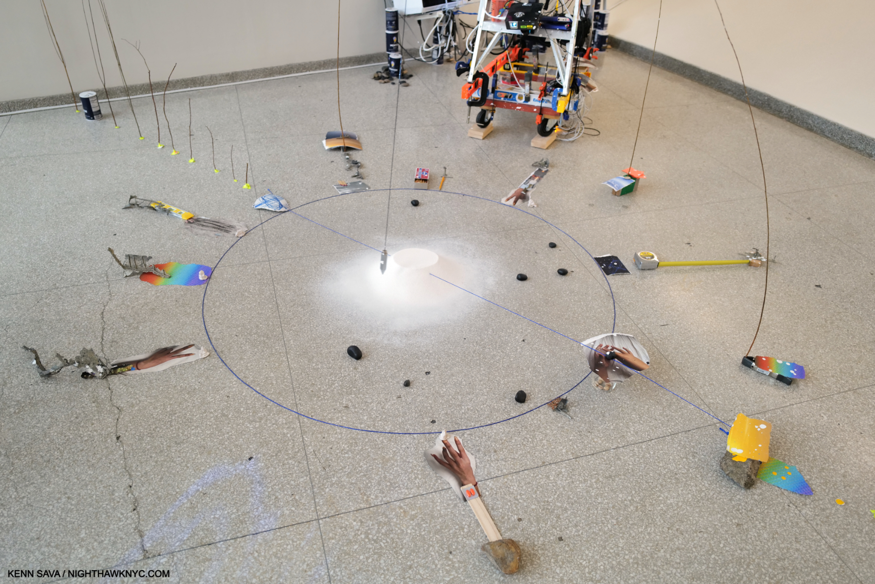
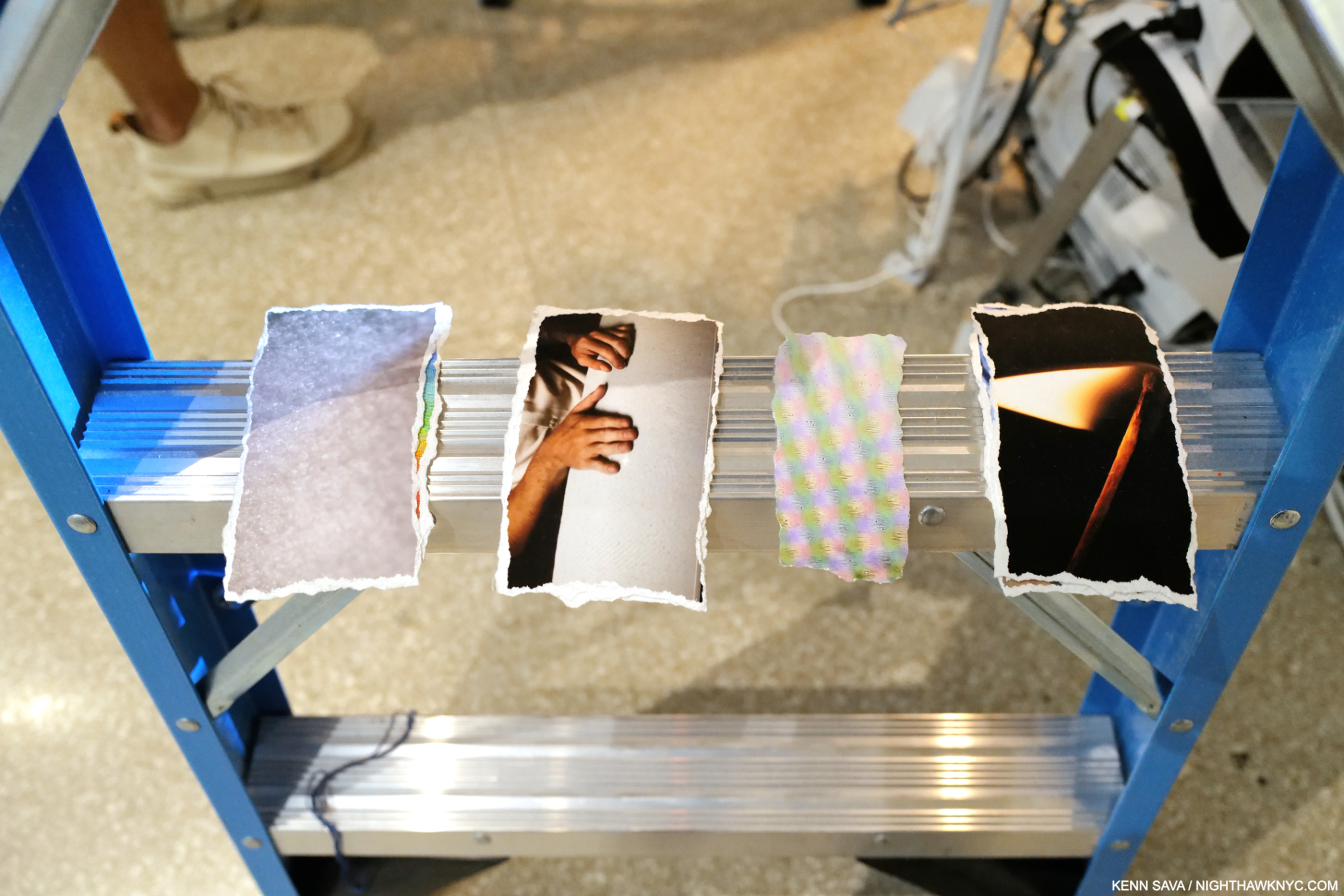
Bay 6, A Certain Slant, 2023, Multimedia installation, including two-channel color video projection, with sound, various durations; video projectors; inkjet prints; and metal pendulum. A number of the torn analog Photos lying around the circle are of hands and forearms, as I show close-up in Part 2. Hands being a running theme.
A Certain Slant reminded me of Sarah Sze’s piece Triple Point, which I saw at MoMA a few years back, in that it has a center pendulum suspended over a pile of unspecified material. In Triple Point, however, the pendulum makes a much wider arc seeming to threaten the surrounding objects. In A Certain Slant, it confines its arc to the area of the salt mound.
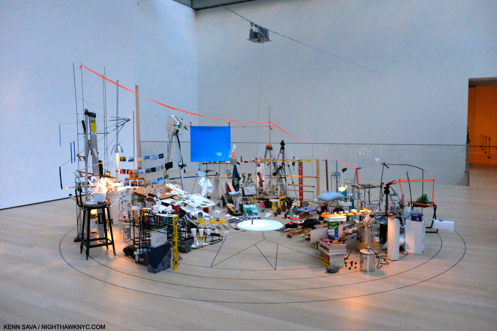
Sarah Sze, Triple Point, Multimedia, 2013, seen at the opening of the latest “new” MoMA, October 21, 2018. A work that represented the U.S. at the Venice Biennale that year. The title is a reference to the “triple point of water,” a state where it exists simultaneously as steam, ice and a liquid.
Seeing Triple Point at MoMA left me amazed that Sarah Sze’s work can be installed (in Venice in the case of Triple Point), disassembled and reassembled (at MoMA and elsewhere). Given that Timelapse is site-specific for the Guggenheim, however, it would seem extremely unlikely it will ever be reassembled in full again.
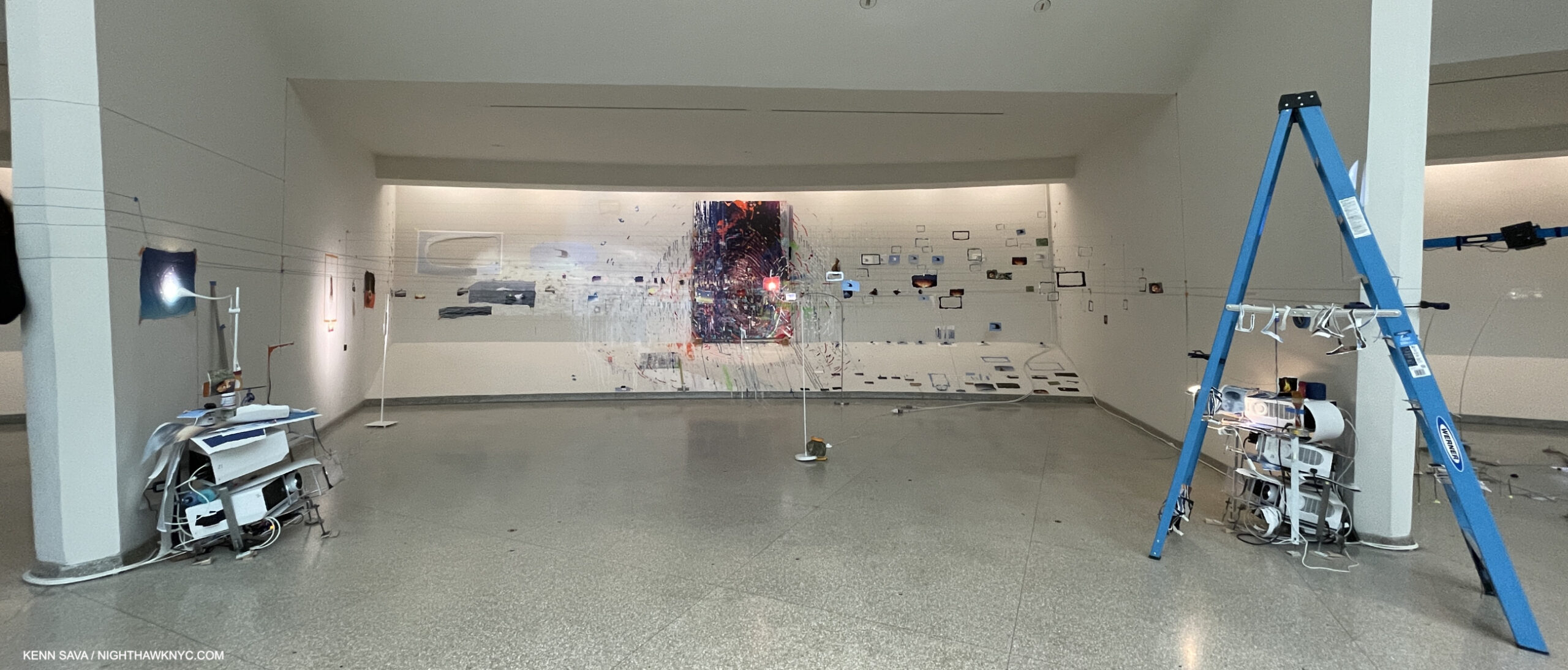
Bay 7. Last Impression (on the back wall), 2023, Oil paint, acrylic paint, inkjet prints, acrylic polymers, and ink on Dibond, aluminum, wood and paper
84 × 56 1/4 × 2 inches.
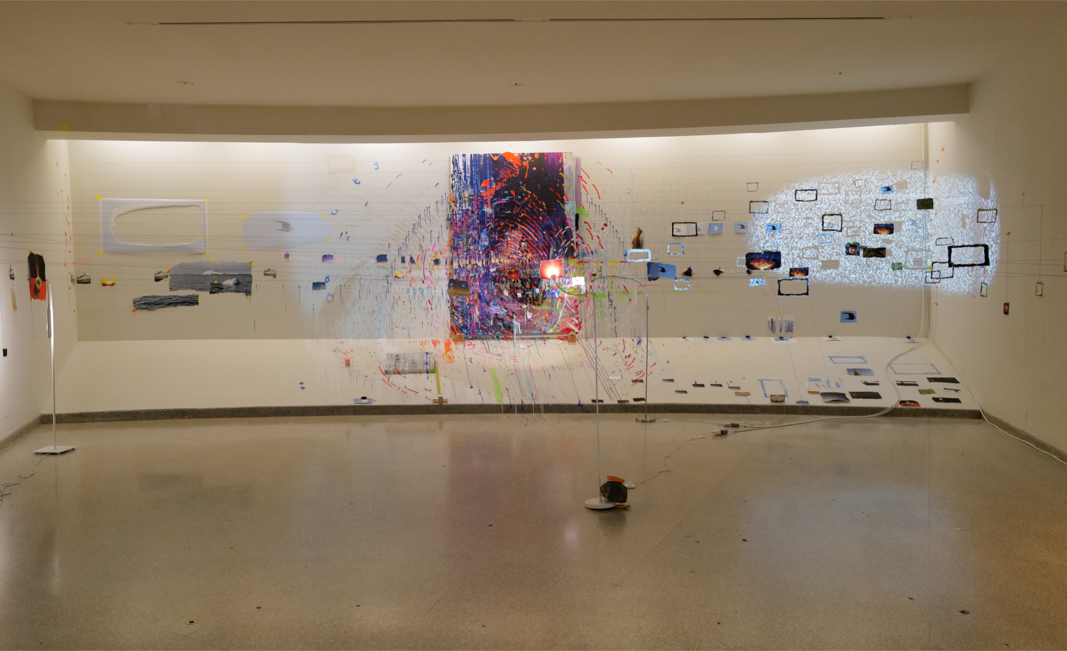
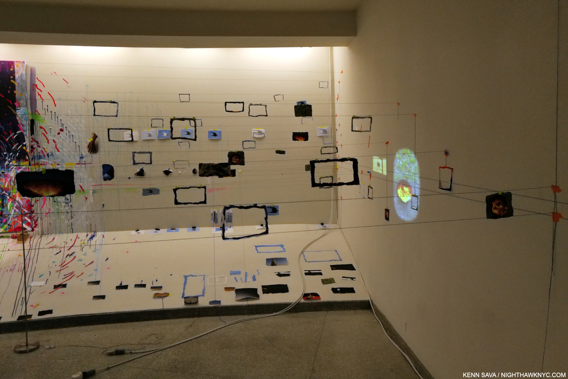
In Bay 7, one of the highlights of the show for me, the strings were installed across the Bay, preventing the viewer from moving past a certain point, as seen below. Along the series of strings, numerous empty frames were hung, which is interesting since the Painting is not framed. This continued on a unique installation on the large blue ladder nearby to the right, which I show in detail in Part 2.
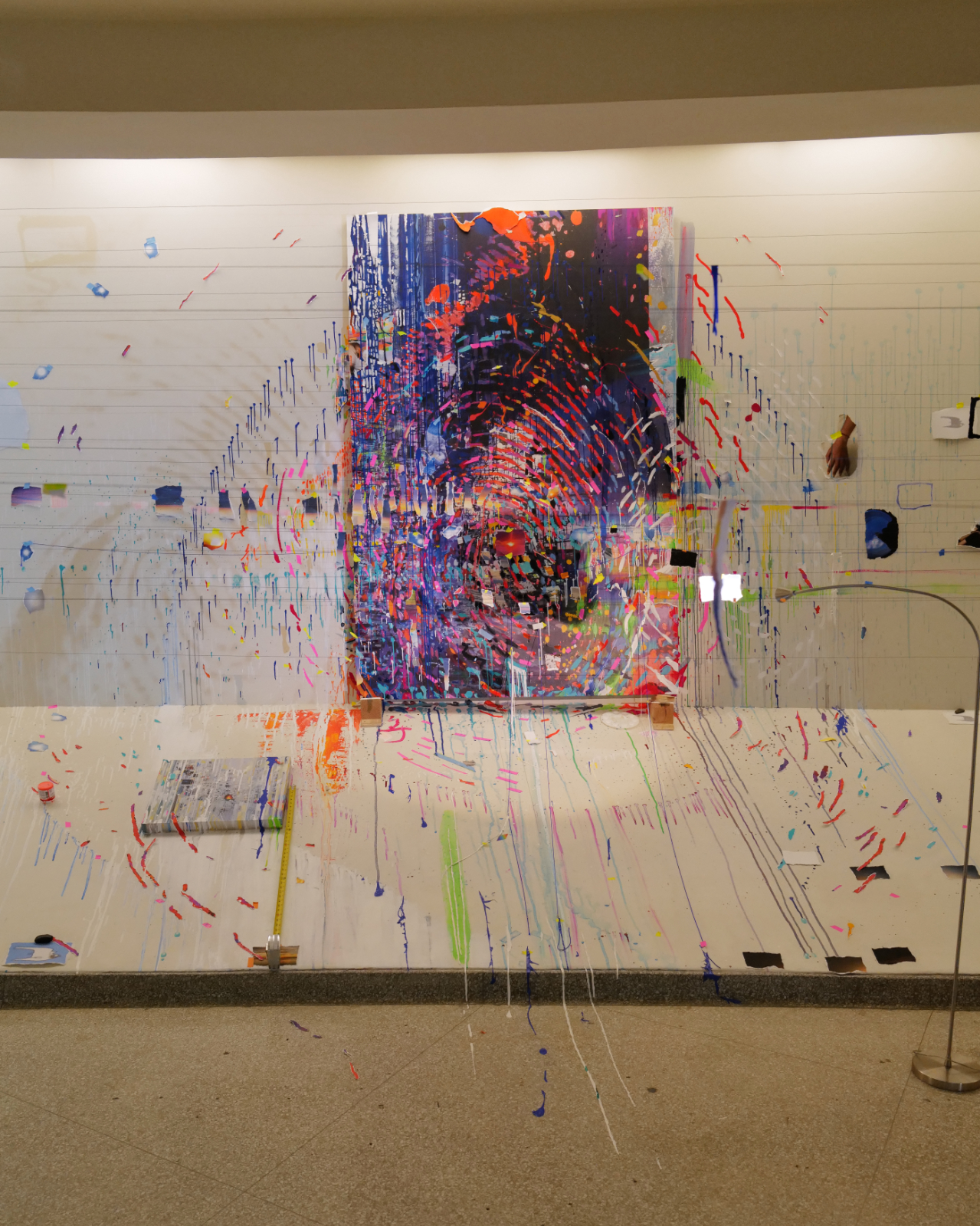
Closer. The strings strung across the bay limit how close the viewer can get to the Painting, which looks like it could contain an enlarged fingerprint. I’ve also never seen a Painting installed on/lying on the ramp, as the small one to the left is.
The Painting, installed on the back wall, was also accompanied by numerous drips and marks that appear to be on the wall, again mimicking a studio situation as in Bay 6. Unlike the “overflow” seen in Bay 5, Times Zero, this time it appears paint runs down the apron and on to the floor. It made me wonder if Ms. Sze was allowed to Paint on the walls and apron, or if this is part of the installation as well, though that is paint on the floor.
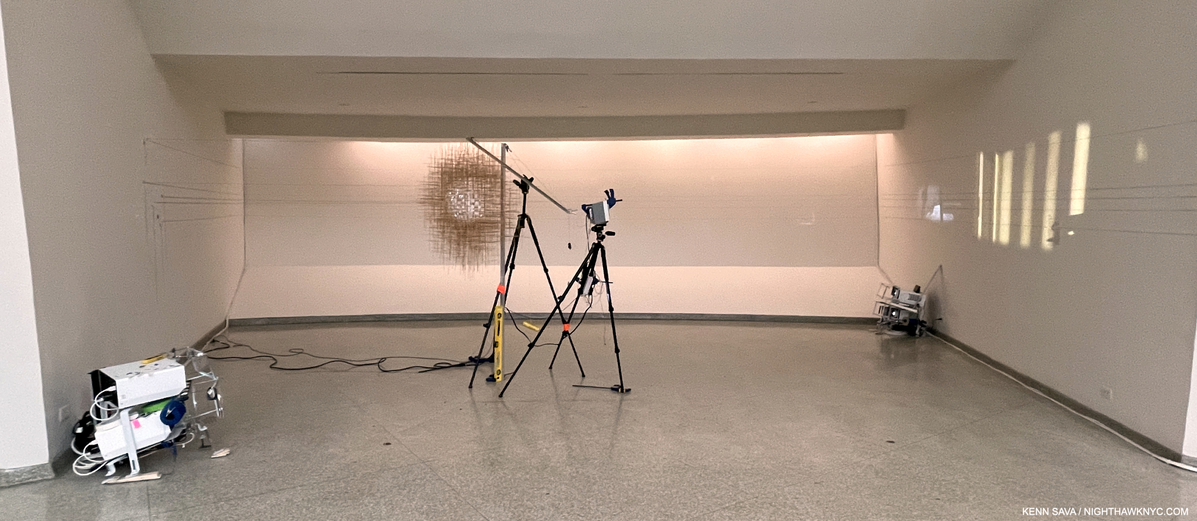
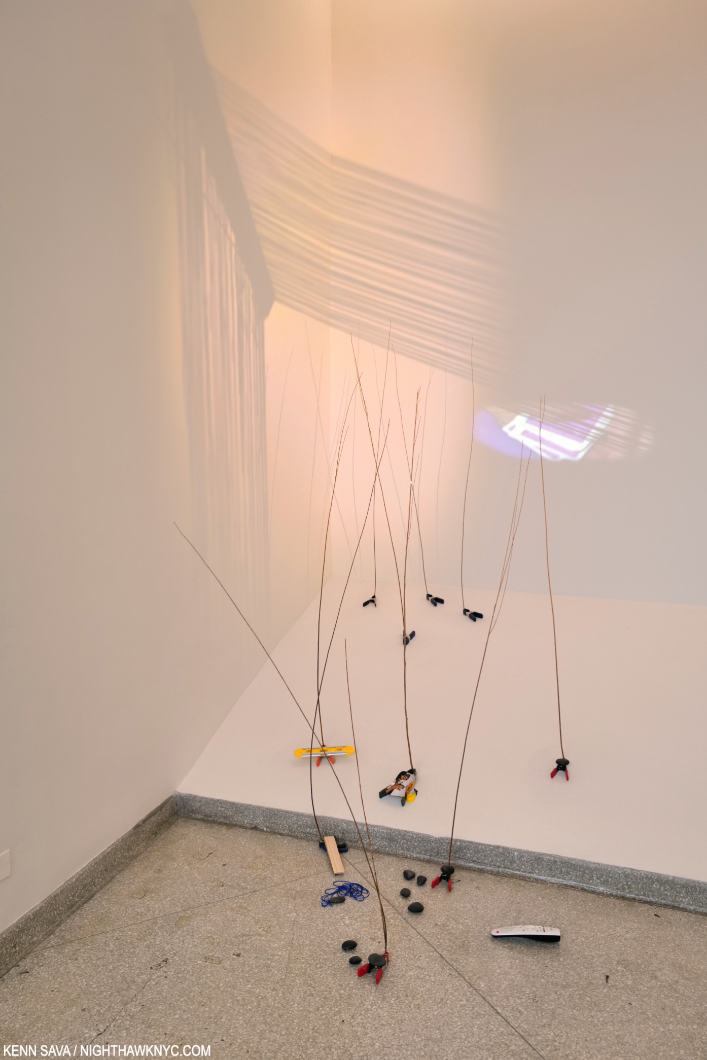
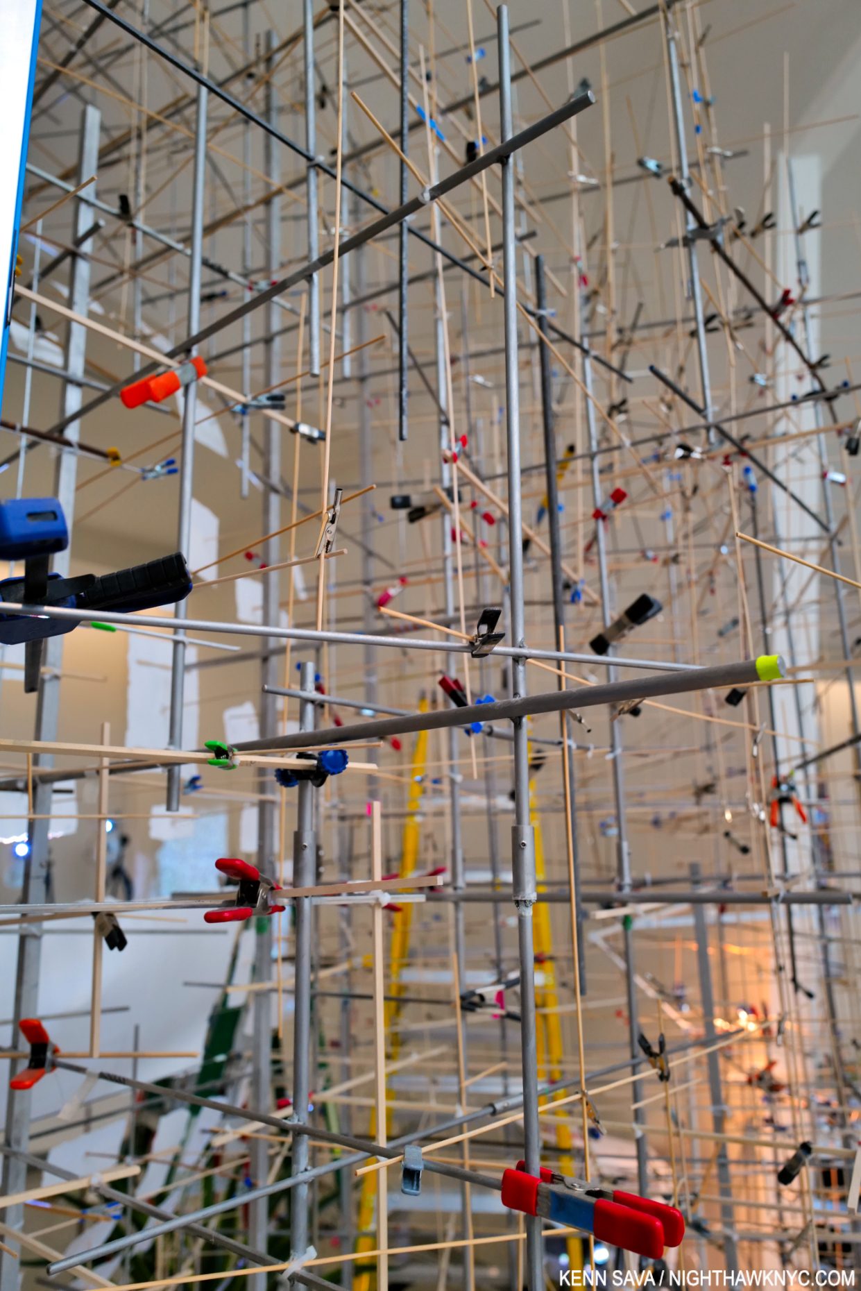
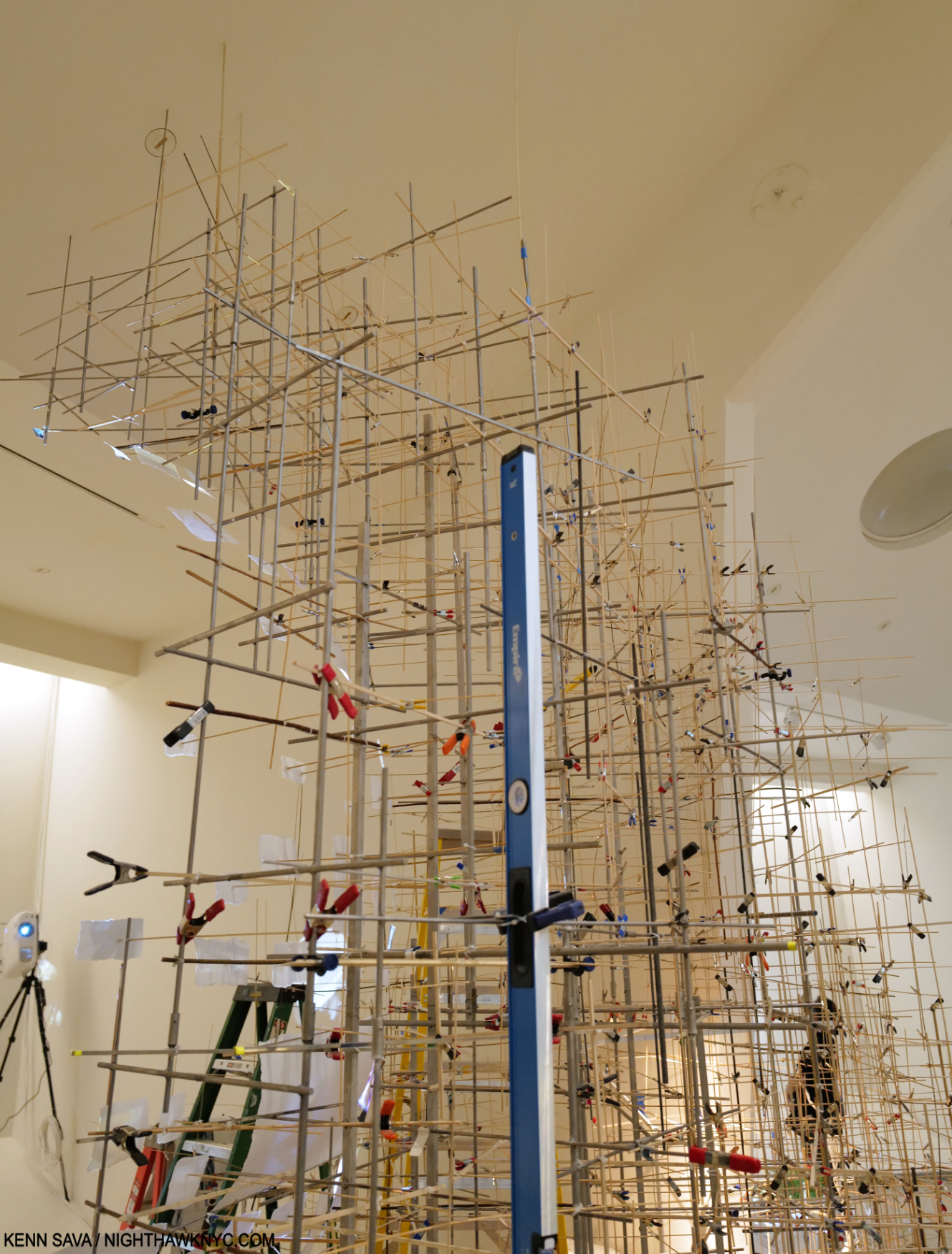
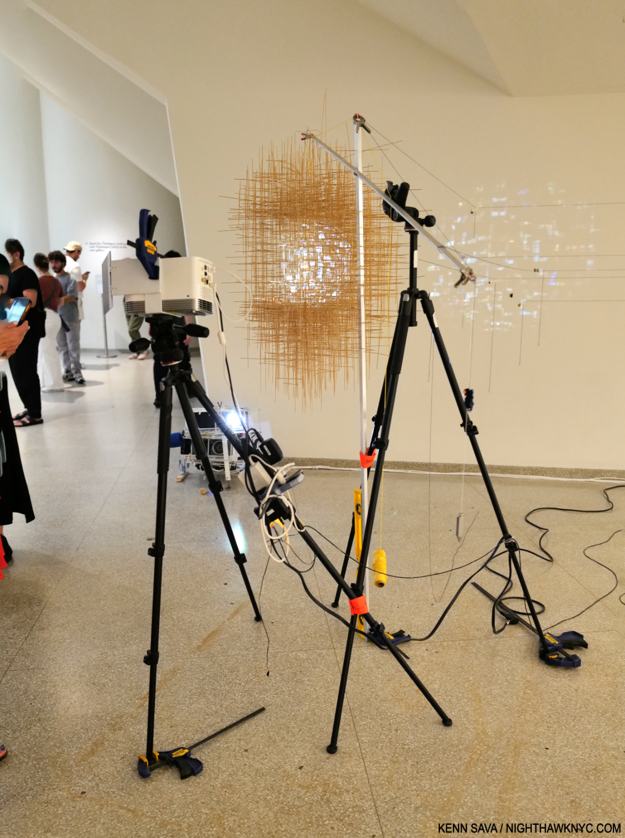
The final Bay, 8, Things Caused to Happen (Oculus), 2023, Multimedia installation, including color video projection, with sound, various durations; video projectors; wood; stainless steel; inkjet prints; toothpicks; clamps; ruler; and tripods. The natural light obscures the light from the projection which shines on the central structure then leaks on to the wall on the left, with strings running to it, indicating the breaking up of digital images. I show this in Part 2.
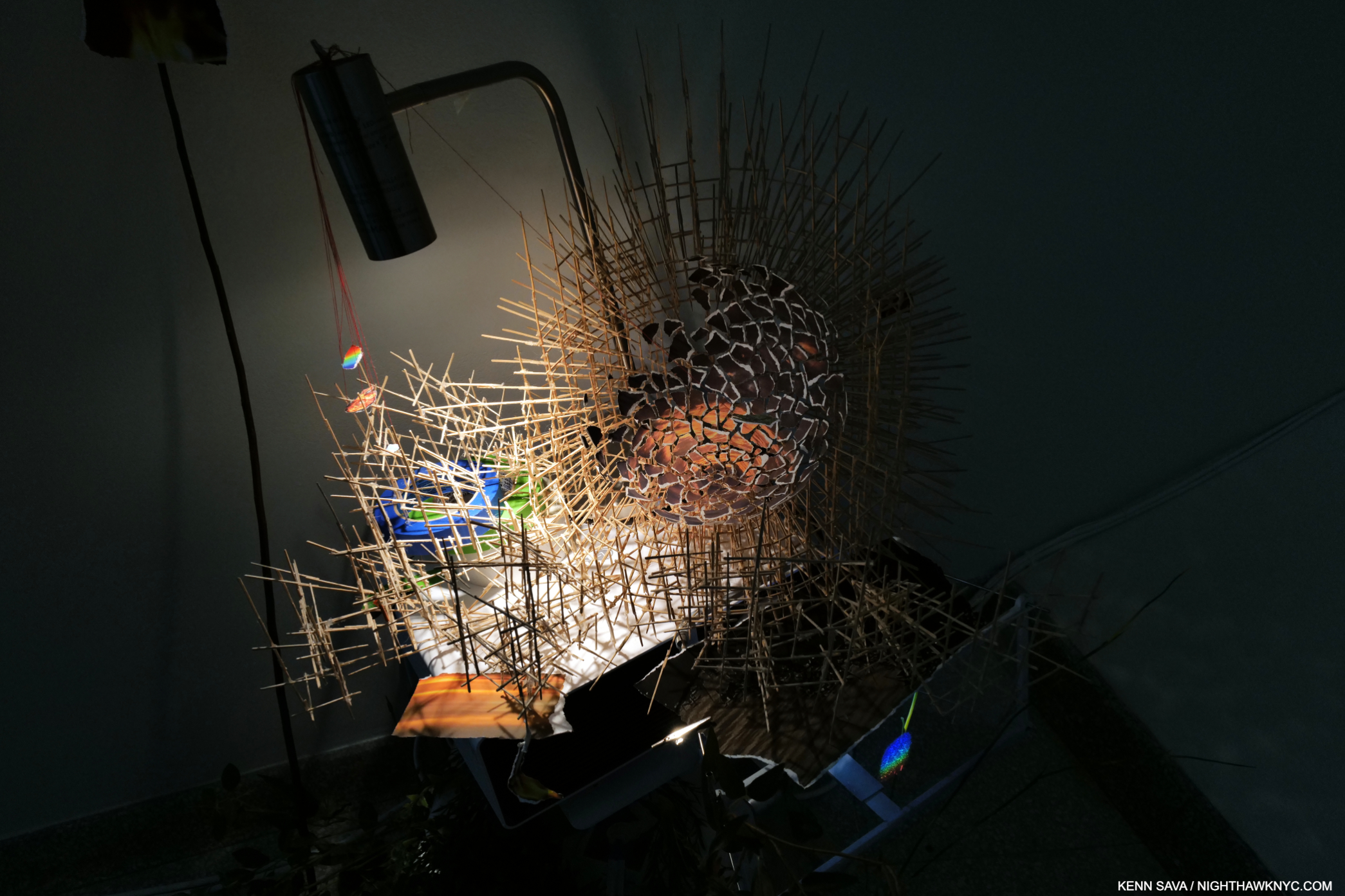
The showstopper was Things Caused to Happen (Oculus), installed in Bay 8, the final Bay on the 6th floor. Seen from a distance, above, it looked like an alien craft hovering in the space surrounded by cameras.
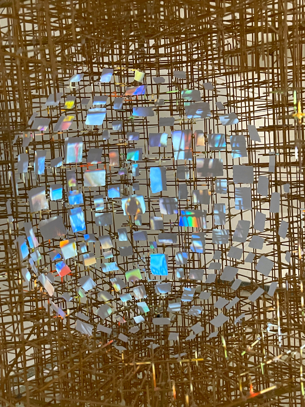
Close up. Each little square and rectangle appears to be a screen with images projected on each independently! How, I don’t know. I show a short video clip of this in Part 2.
Closer up, it seemed to mimic a human head, possibly imitating a number of images continually playing inside of one. I don’t know about you, but I only have one screen playing in my head at any given time. Once again, as in Slice, somehow, these tiny images changed as you watched- independently. Some appeared to be slide shows, some appeared to be video.
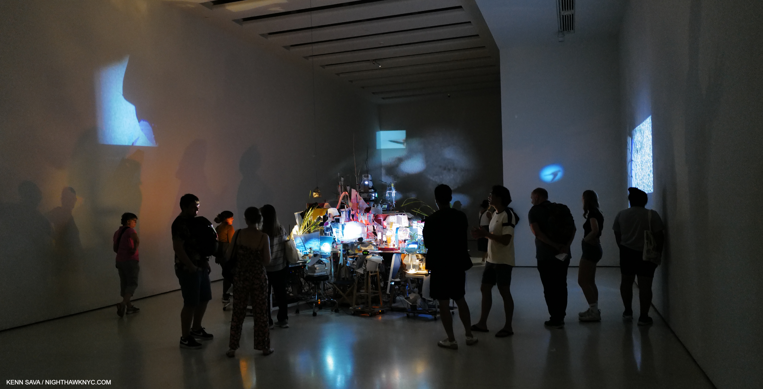
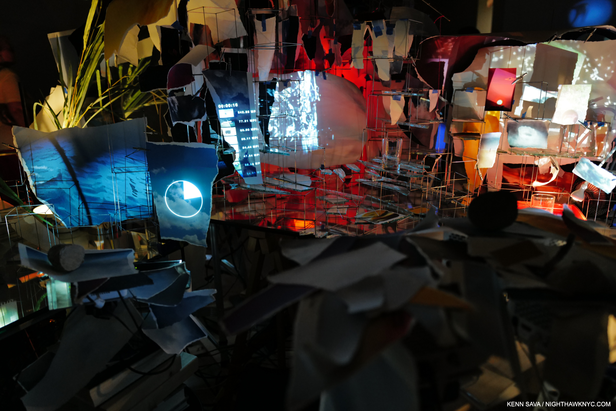
In the large rear gallery, which became a gallery as part of the non-Frank Lloyd Wright expansion, Sarah Sze’s monumental and monumentally complex Timekeeper, 2016, was on view.
Also included in the show were two older pieces; Media Lab, the Artist’s first piece to include video was kind of hidden on the ramp of the freight elevator, shown earlier, and the large Timekeeper, 2016, making its NYC debut. It was installed in the large rear gallery off the 6th floor, a space not designed by Wright to be a gallery, and like all the other spaces added in the controversial expansion (which I fought at the time, resulting in my first published Art writing in The New York Times, and which I remain no fan of), I find seriously lacking as gallery spaces. Her huge Timekeeper, now a part of the Guggenheim’s collection, was installed in the center of the darkened room and its video projections moved across all four walls. Between Media Lab, 1998, to Timekeeper, 2017, to Timelapse, 2023, the viewer can trace how long Sarah Sze has been interested in time, how images mark time, and memories, how long she has featured images in her work, and how her work has evolved.
When Timekeeper was installed in Brandeis University’s Rose Art Museum in 2016, their Press Release said that it, “blurs the line between organic and mechanical structure, its lifecycle marked by clicking and whirring and flickering images. It keeps a form of eccentric time that is entirely its own, remembering moments over and over again as time slips by. In this sense, Timekeeper has no relationship to the mechanical devices we use to mark the literal passing of time, but instead to the way we recall and replay our lives, in selected fragments that, strung together, account for the passage of years.”
In my February, 2020 piece on her most recent NYC gallery show, I called Sarah Sze a “genius,” the only time I’ve used that term on a living Artist in the 8 1/2 years of NighthawkNYC.com. I should point out that this was BEFORE I saw the Sarah Sze: Paintings book, OR her spectacular recent Laguardia Airport installation. Exactly 4 years since I wrote that, I’ve seen nothing to change my mind.
“I didn’t know you could do that in a museum,” she said, thinking of how viewers, particularly young Artists, might react to Timelapse, before adding, “now you take that ball and run.”
Part 2 of my look at Timelapse looks at some of the countless details in the show, here.
*-Soundtrack for this piece is “I’ve Seen It All” by Bjork, another of the world’s most gifted Artists. If I were to use that “g” word on a living Musician, she might well be the one I use it on. She performs it here in Dancer in the Dark–
For Lana, whose favorite is building the Guggenheim Museum, and for Ben, a passionate lover & student of Wright’s Art.
NighthawkNYC.com has been entirely self-funded & ad-free for over 8 years, during which 300 full-length pieces have been published! If you’ve found it worthwhile, PLEASE donate to allow me to continue below. Thank you, Kenn.
You can also support it by buying Art, Art & Photography books, and Music from my collection! Art & Books may be found here. Music here and here.
Written & photographed by Kenn Sava for nighthawknyc.com unless otherwise credited. To send comments, thoughts, feedback or propositions click here. Click the white box on the upper right for the archives or to search them. Subscribe to be notified of new Posts below. Your information will be used for no other purpose.

