Cecily Brown At The Met: Bold, As Love

This site is Free & Ad-Free! If you find this piece worthwhile, please donate via PayPal to support it & independent Art writing. You can also support it by buying Art & books! Details at the end. Thank you.

Written & Photographed by Kenn Sava

Show seen- Cecily Brown: Death and the Maid @ The Metropolitan Museum through December 3, 2023.

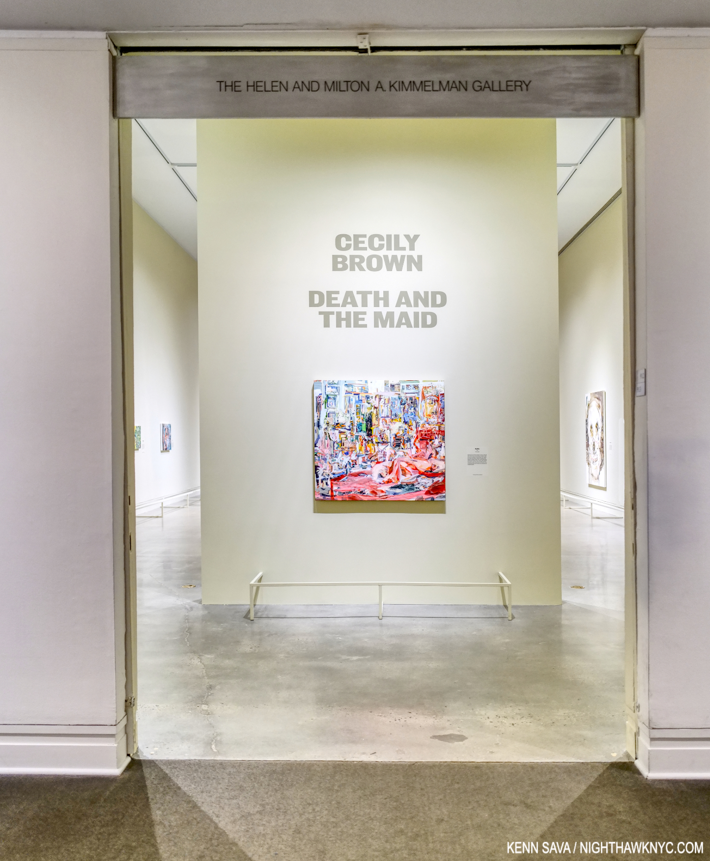
The show’s opening brought me to a dead stop. Click any image for full size.

Over the course of its generous run, from April 4th through December 3rd, Cecily Brown: Death and the Maid  has had some VERY serious competition among great Art shows up in NYC’s museums for Art lover’s attention this year. Consider- MoMA had the excellent Georgia O’Keeffe: To See Takes Time (April 9th through August 12th), and now the equally excellent Ed Ruscha / Now Then (September 10th through January 13, 2024). The Whitney has Henry Taylor: B Side (October 4th through January 28, 2024). In addition to Death & The Maid, The Met had its summer blockbuster, Van Gogh’s Cypresses (May 22- August 27), and the just opened Manet/Degas (September 24th through January 7, 2024). Phew! While all of them deserve mention as “Show of the Year” candidates, in my opinion, Cecily Brown: Death and the Maid is the biggest breakthrough Painting show in a NYC museum since Jennifer Packer: The Eye Is Not Satisfied With Seeing, 2021-2, which I wrote about here. It provided the first opportunity we’ve had to see an overview of her work outside of books. Seeing 50 of her Paintings, Drawings, and Monotypes in person left me feeling that the show is a game-changer that will rewrite the Art world’s appreciation of Cecily Brown’s Art & her standing in Art– even though both are well-established. Her diligence and continual hard work over the past 25 years has paid off in spades. The fruits of her labors explode on the walls.
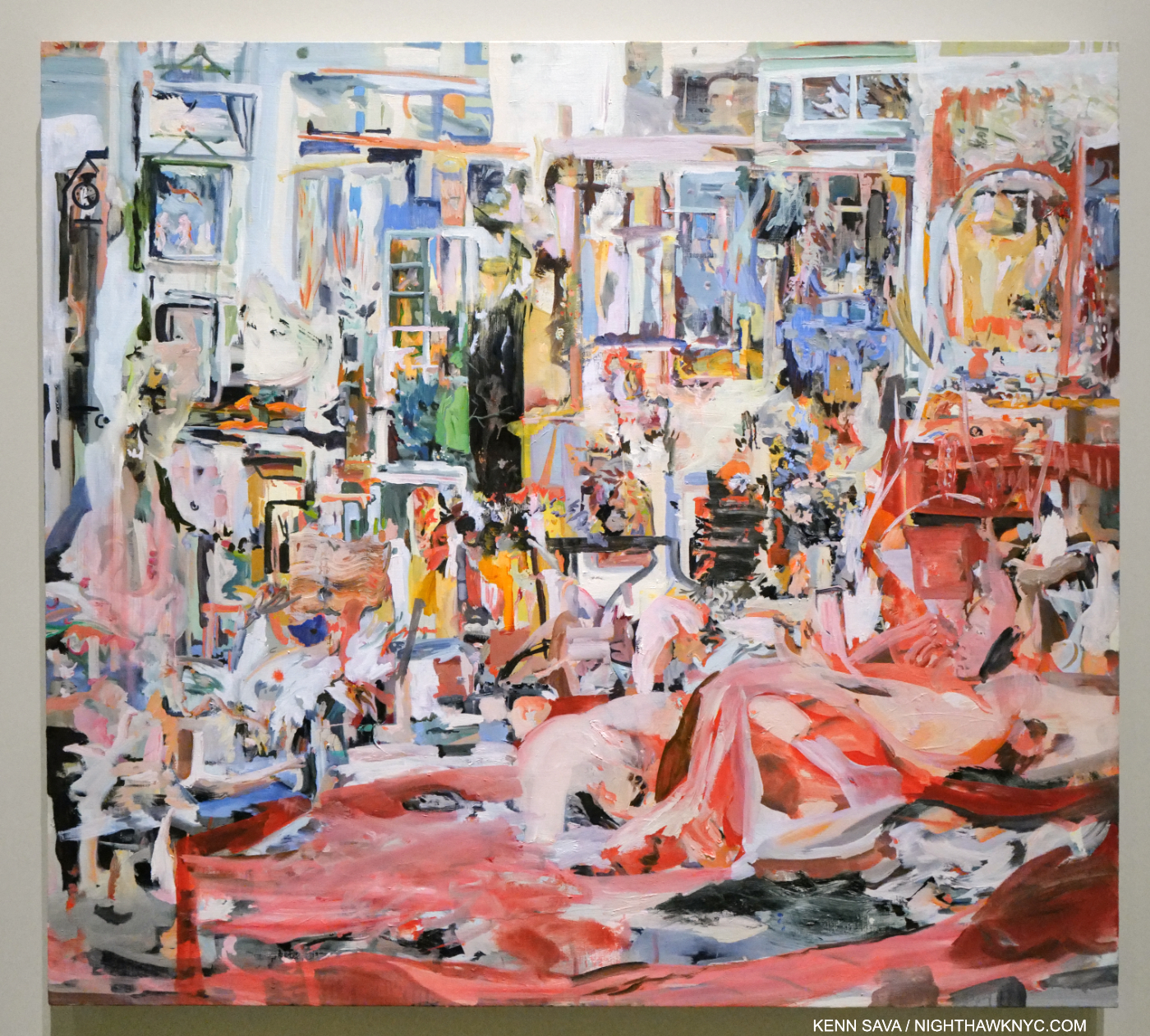
Time passes slowly. Painted during the initial outbreak of the pandemic, the stunning Selfie, 2020, Oil on linen, kept me transfixed at the entrance as minutes passed, mirroring in a small way the time the Artist spent creating it. In fact, mirrors are a key, recurring, element in the show. Anchored by the reclining figure to the right, and the vanity with the round mirror to the right rear, the whole has a feeling of claustrophobia, from too much time spent in the same place that every last detail becomes all-too-familiar. It’s perfectly chosen to begin the show in my view (or, end the show, depending on which end of the show you enter from) as it sets the stage for (or culminates) a show that covers about 25 years and includes very recent work.

One night in 2004, I met Cecily (who was born in London in 1969) when she and a date happened to sit down next to me at East of Eighth, the now-lost Chelsea bar/restaurant/Mother Ship on West 23rd Street a few doors west of the legendary Hotel Chelsea. At that point, the buzz around her was just forming. Days earlier, I had read an article about her in the Art press intrigued by the fact that she is David Sylvester’s daughter. Mr. Sylvester will always be remembered by Art history for being the interviewer in what is, perhaps, the most important Artist interview book yet- Interviews with Francis Bacon, (one of my Desert Island Art Books). A book that helped form my long-standing obsession with Mr. Bacon. It was right in the middle of my decade of drawing (small “d”) daily, which I was when she sat down. Recognizing her from the article, I quickly put my sketchbook away. I told her I had read the article and we chatted briefly, then I let her get back to her date.
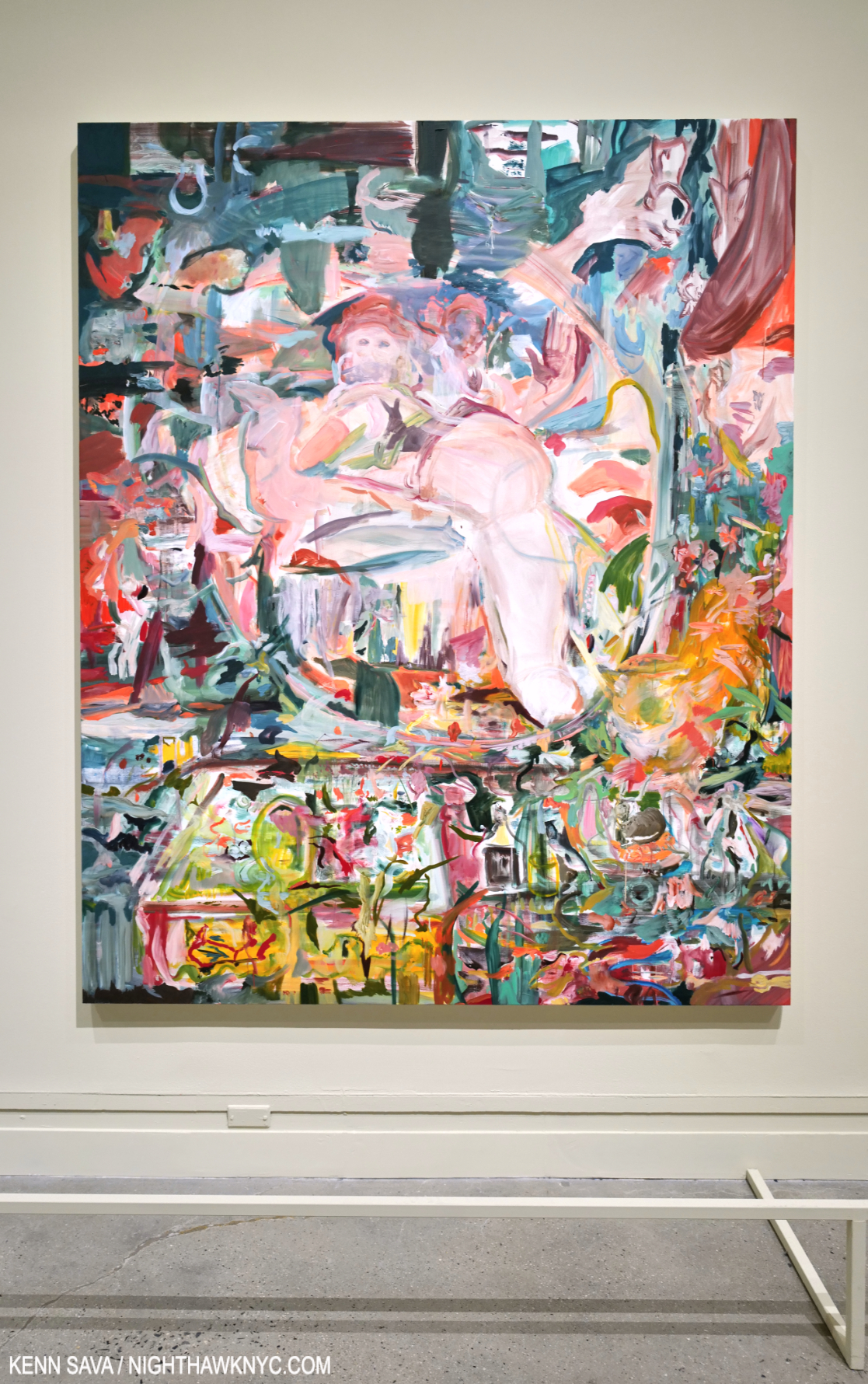
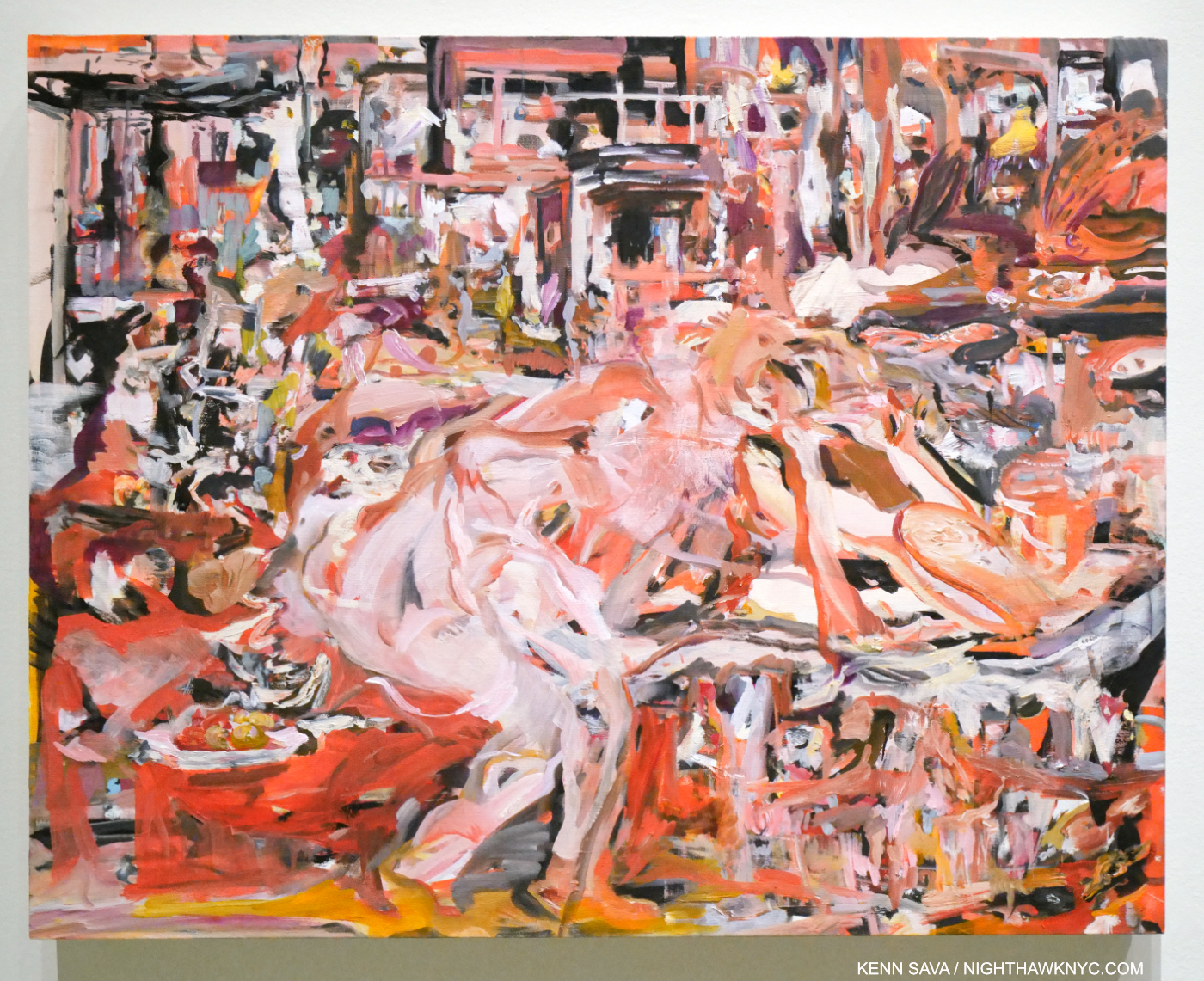
No You For Me, 2013, Oil on linen. The viewer looks into the mirror on a vanity at a figure in a room. It appears there’s a spanking going on. Perhaps as close as Cecily Brown comes to the realm of Francis Bacon isn’t that close at all.

I regret I didn’t get a chance to ask her if she met Bacon. Cecily’s Art has been influenced by his, I’ve read, and they both seem to me to be on the cutting edge of “abstracting” the portrait, yet the influence might be in spirit as opposed to a direct visual or stylistic influence as far as I can see. As many have pointed out, Cecily Brown lives on the edge between abstraction and figuration, more or less. Whereas “pure abstraction” leaves nothing “familiar” for the viewer to hold on to, Cecily Brown usually does, even if it’s just the title. In the work included in the show I felt there were “handles,” so to speak, in virtually all of the pieces that lead the viewer into her world.
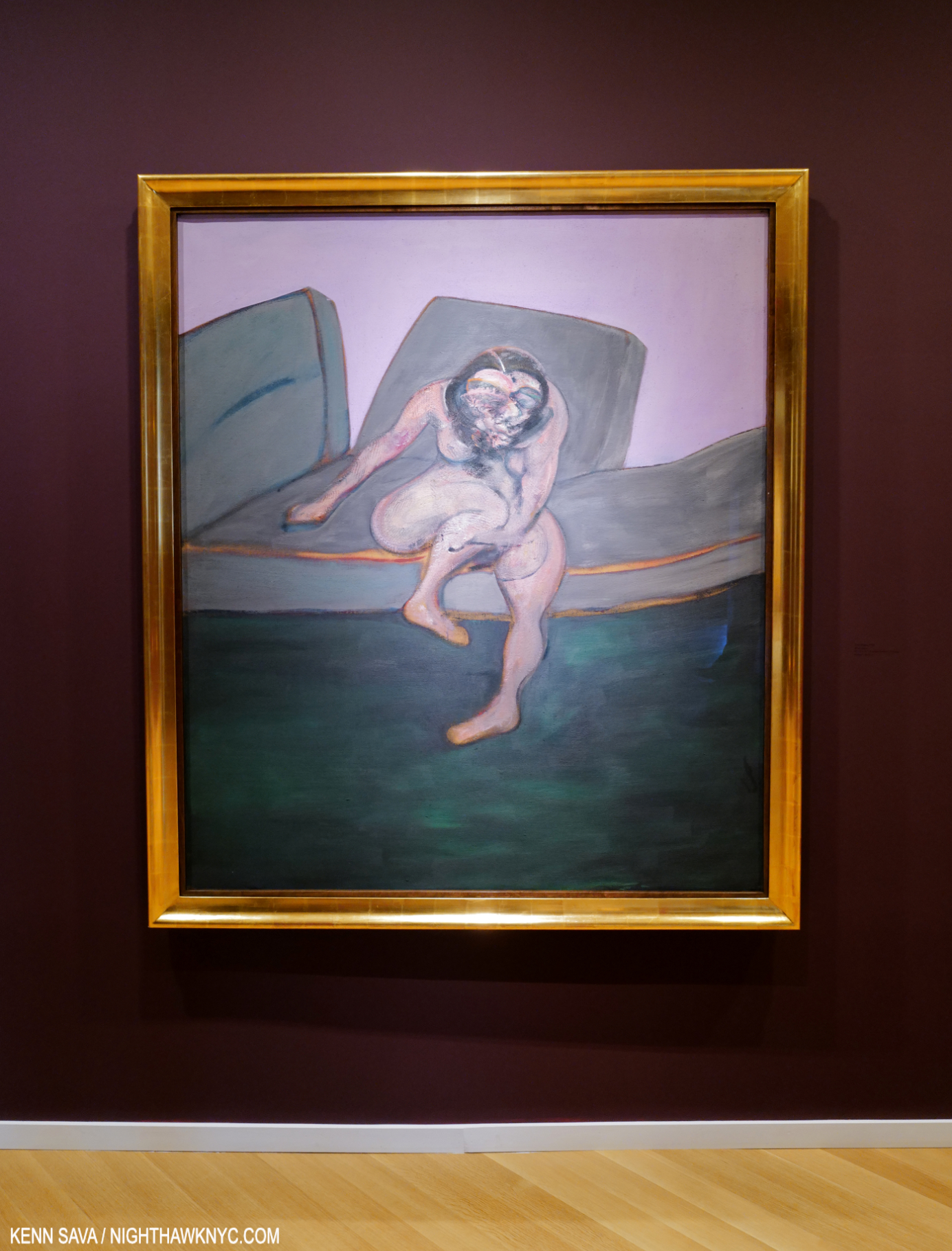
Francis Bacon, Seated Woman, 1961, Oil on canvas, which sold for $28 million in 2015, Oil on canvas, seen at Skarstedt, June 24, 2022.

In Bacon, the world (through his eyes) is represented to an apparent larger extent, but then the figure or figures are rendered with a selective fluidity that allows the Artist to mould them to his intentions. This often makes them seem out of place in their settings. In Cecily Brown’s work, even though many of her works depict interiors, there is no stylistic difference. Everything is rendered as part of the whole.
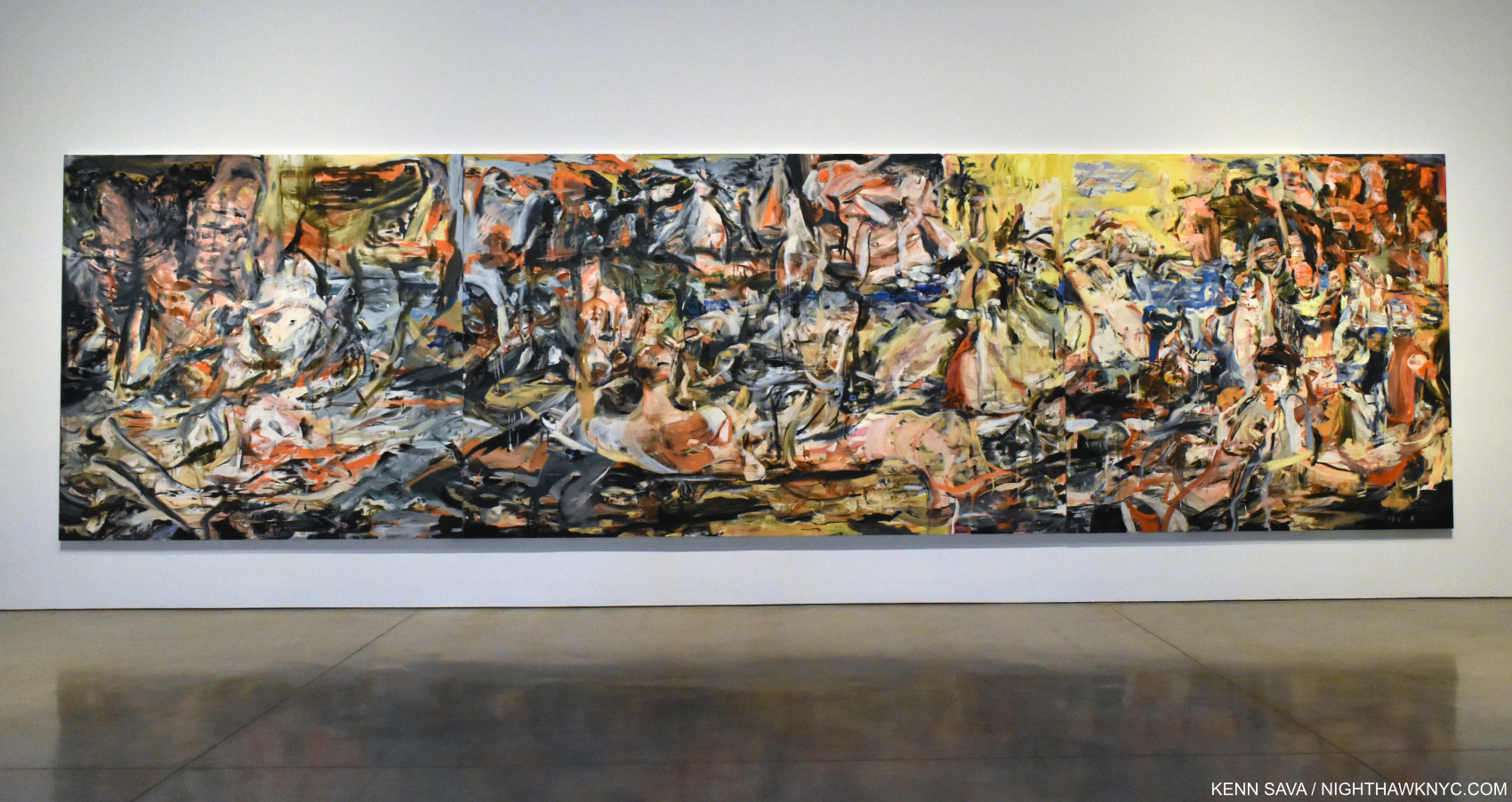
The moment I realized Cecily Brown had arrived as a Painter to be reckoned with. A Day! Help! Another Day!, 2016, Oil on linen, 109 x 397 inches (that’s just over 33 FEET long!) seen in Cecily Brown, A Day! Help! Help! Another Day!, Paula Cooper Gallery, October 31, 2017.

Since 2004, as I’ve followed her career and gone to her shows, her work has grown, and grown on me, continually. The record shows I’m not alone in that. Though she quickly gained major gallery representation, and shows in European museums, it seems to me the Art world has been slow to fully “get” her, like here, as incongruous as that may be to say for an Artist who has achieved her stature.
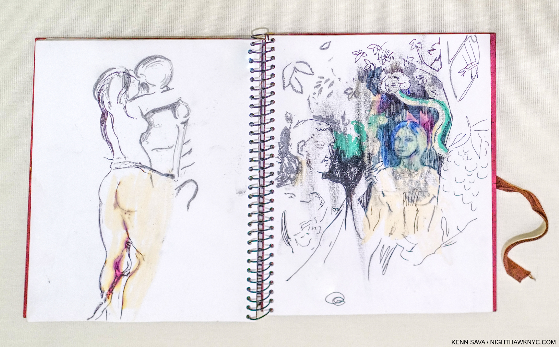
Sketchbook, 2004, Oil pastel, ballpoint pen and pencil on paper, from the year I met her. The image on the left is at the heart of the show. A woman embraces a skeletal figure, whose knee is between hers. Possibly a copy of Edvard Munch’s Death and the Woman, 1894-5, a Print in The Met’s collection, here, this motif appears in Cecily’s recent Painting Death & The Maid, 2022, shown below, revealing how long this subject has been on the Artist’s mind.

Early on, her work was quite sexually oriented, then it steadily opened up. As it did, more and more people began to see the breadth of her talent. The real turning point for me came on October 31, 2017l, when I walked into Paula Cooper Gallery and was face to face with A Day! Help! Another Day!, seen earlier, in Cecily Brown: A Day! Help! Help! Another Day!
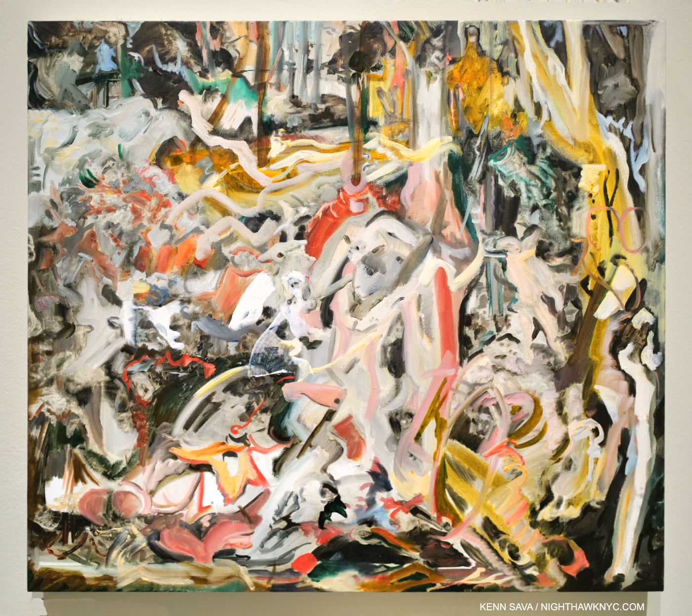
Death & The Maid, 2022, Oil on linen. The title of the famous String Quartet #14 by Franz Schubert, “Death & The Maiden,” is shortened here to “Maid,” possibly as a reference to Ms. Brown’s time working as a maid to pay for Art school. The center of her Painting shows the titular figures embracing and Death’s leg extending to the left, climaxing the influence of Munch’s Death and the Woman, as seen above. “Death & The Maiden” is also the title of a Painting by Albrecht Dürer’s remarkable student & friend, Hans Baldung, from 1517, which can be seen here. That might be the earliest use of the title.

In April, almost exactly 19 years after I met her, Cecily Brown: Death and the Maid opened in the hallowed halls of The Metropolitan Museum, in the same gallery I saw Louise Bourgeois: Paintings in, an interesting coincidence (two European-born women Artists who settled in NYC for good a half-century+ apart). Having moved to NYC in 1994, after winning a plane ticket, it’s the first show she’s been given by an NYC museum. I think she might say the wait was worth it.

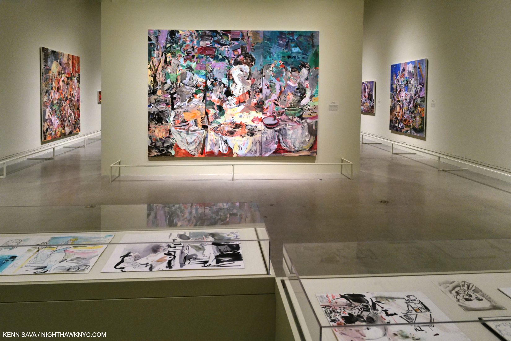
Installation view with The Picnic, 2006, Oil on linen in three parts, center, on the wall.

Brilliantly selected from the past three decades and installed (with the involvement of the Artist), it all hangs together seamlessly. Though her style has evolved over the years of her still-young career, the show really does all look like part of a whole. This is aided to no end by the continuity of themes- vanity, death, interiors, and influences & dialogues with Art history.
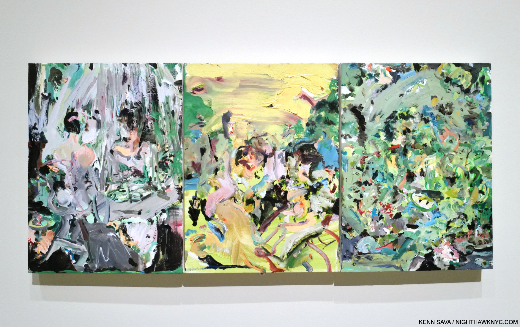
Full of Face, Full of Woe, 2008, Oil on canvas in three parts. With a title that comes from the “Monday’s Child” nursery rhyme, it’s the first Cecily Brown Painting in The Met’s Permanent Collection. It captivated me when I first saw it last year in the Modern & Contemporary Galleries, and again in the show. Note what appears to be a woman looking in a vanity mirror in the left panel.

The first thing that was apparent to me is how her work looks like no one else’s. She has achieved a style instantly recognizable as Cecily Brown. A major achievement in its own right. The second thing that stands out for me is how deeply and continually she mines Art history. There are references to Munch, Bruegel, Manet, Rubens, Hogarth, Gilbert, Frans Snyders, Dutch & Flemish Still Lifes, among others here, but the resulting work is completely her own no matter the origin, and provides for an interesting “conversation” over time. Filtered through a different viewpoint, experiences and century into nothing less than a striking personal vision, one that strikes me as unprecedented, though I do see a kinship to the work of her teacher, Maggi Hambling and occasional echoes of the late-50s work of Janice Biala.

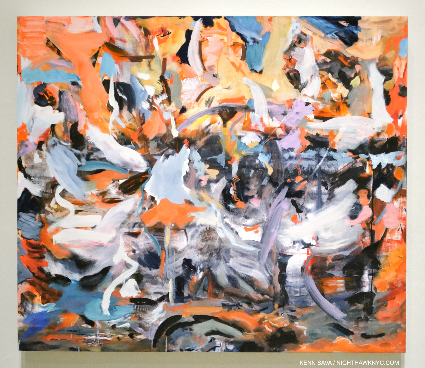
Blood, Water, Fruit and Corpses, 2017, Oil on linen.

“My red is so confident he flashes trophies of war
And ribbons of euphoria
Orange is young, full of daring
But very unsteady for the first go ’round
My yellow in this case is not so mellow
If fact, I’m trying to say it’s frightened like me
And all of these emotions of mine keeps holding me from
Giving my life to a rainbow like you.” *-  Jimi Hendrix, “Bold as Love”

The third thing that’s instantly apparent is her color. For the past eight & 1/4 years, I’ve posted a piece of Music as the “Soundtrack” for each piece I’ve written here. As I walked through Death & The Maid, one song screamed at me from the walls: “Bold as Love” by Jimi Hendrix.

“Bold” sums up much of Cecily Brown’s work for me. In her daring and boldness lies energy and excitement.

As for “Bold as Love,” Hendrix “paints a vivid picture of the spectrum of human emotion using colors,” as genius.com puts it. Virtually every color Jimi writes about is powerfully featured at one point or other in the show. I’m not saying this is a literal interpretation, of course. It’s a reflection of the power of color as a language. The choice is not as arbitrary as it might seem. In the early years of the past decade, Ms. Brown was so taken with the cover image for Jimi’s 3rd album, Electric Ladyland, the last album he completed in his lifetime, that she did a series of Paintings based on the original cover Photo for the U.K. release that was banned for its U.S. release.

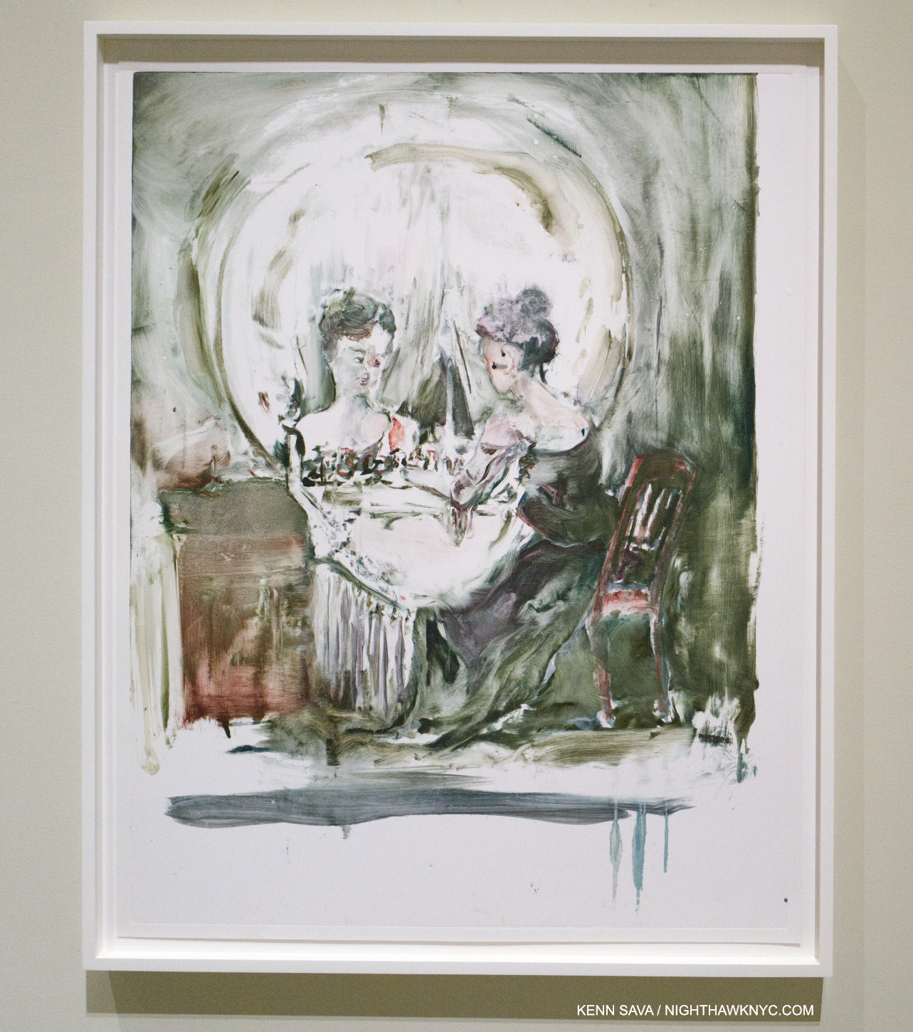
All is Vanity (After Gilbert), 2006, Monotype

Cecily Brown’s color strikes me as being that of life. Of being alive. As Adrian Piper pointed out in her brilliant MoMA show, A Synthesis of Intuition, in 2018, “Everything will be taken away.” In death, the colors of life are one the of the first things taken away. Here, it runs as a consistent and compelling counterpoint to the theme of death. It’s interesting that in some of the work that seems to be more centered on death (not all), the color is washed out.

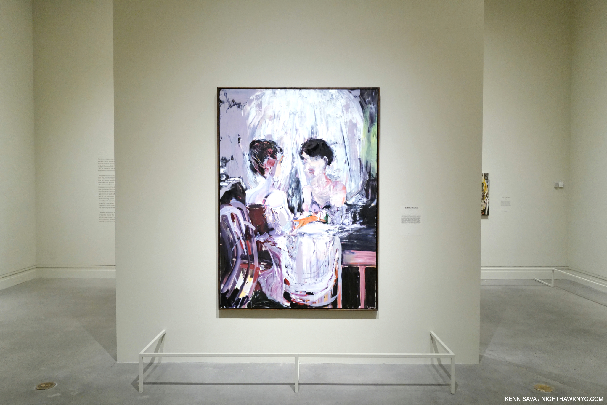
Untitled (Vanity), 2005, Oil on linen

The other thread is the the face/the temporality of youth/and the body (which takes many forms, including the frequent “looking in a mirror” works). Of course, any living body must confront the idea and the reality of death. In the show, it’s the central focus, but it has been one of her central themes, among others, virtually all along. This makes her unique among major Contemporary Painters. While many address it, I can’t think of anyone who makes it a main focus. The show is also interesting for a virtually complete absence of her earlier sexual work.

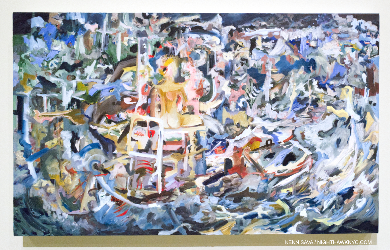
Vanity Shipwreck, 2021-2, Oil on linen

On the technical side, her compositions, she says, come together in the making. In a number of pieces, figures are in the center, and everything else happens around them. The same feeling occurs in Selfie, though the figure is in the lower corner, and in pieces like Carnival and Lent, below, where bits of figures pop up all over, virtually awash in all that surrounds them. “Abstraction?” What could be a more realistic representation of the chaos of contemporary life where everyone is continually bombarded from all sides, by everything?

“You start with something that’s say, a day old, and then you look at the different directions it can go. And in a way, you can argue that you’re never losing anything, because you try and always keep those things in mind. You have to be willing to lose it all. And that really does happen all the time in painting. And I always want to keep that possibility, just to go back to what kind of painter I am. That’s what I call being a painterly painter, and what’s kind of old-fashioned about it is that attitude that you can lose it all….the paint itself telling the story. The idea that paint can carry or contain a sort of life of its own. Paint traps energy1.”
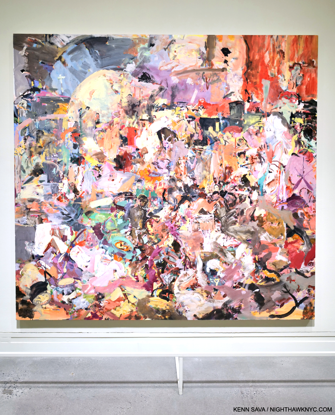
Carnival and Lent, 2006-8, Oil on linen. Cecily Brown’s take on Pieter Bruegel the Elder’s Fight Between Carnival and Lent, 1559.

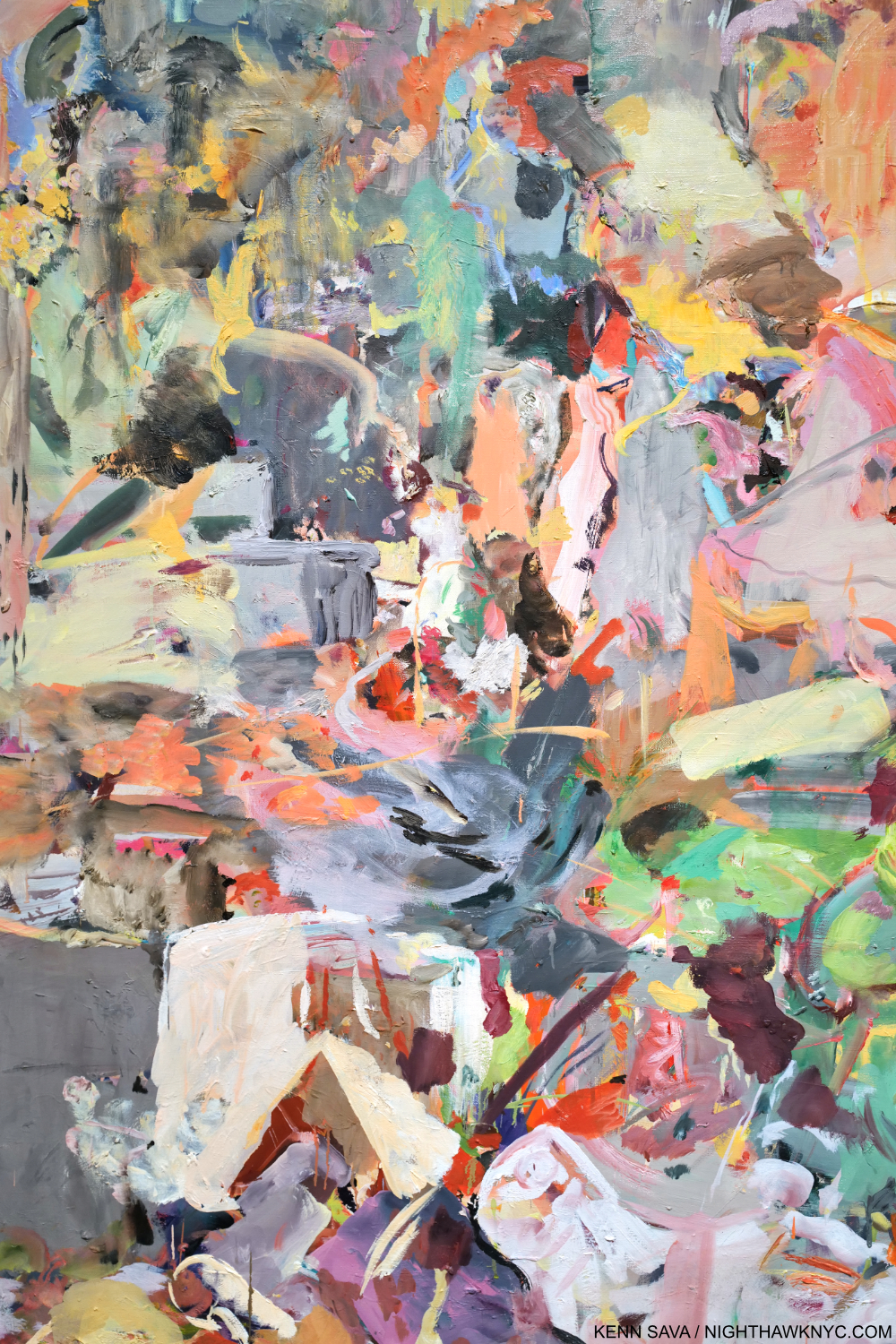
I’m struck by the fact that Jackson Pollock could only do his so-called “drip” Paintings from 1947-1952. Ms. Brown has been working in, and developing her style for almost 30 years. Then, there’s her technique, her brushwork. Whereas she said that “Paint traps energy,” her brushwork brings it. 

Detail.

It seems to me that the recent pieces included in Death and the Maid (particularly Selfie, the titular work shown earlier, and A Year on Earth, below) show her reaching a new level. Though her work probably looks very abstract to many viewers, including this one, almost all of them have titles that ground them in the “known world,” separating her from many abstract Artists (though she is not one. Cecily Brown’s work only belongs in the Cecily Brown “box“) who use “Untitled” most often. Titles which function as one of the “handles” I referred to earlier,

A Year on Earth, 2020-21, Oil on linen. Begun in the early months of the pandemic.

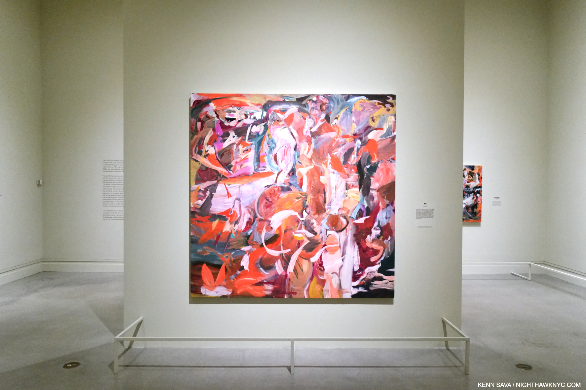
Mounted near the end of the show, it could be just me and my life these past 4 years, but I found her Painting BFF incredibly moving.

BFF, 2006-15, Oil on linen.

The wall card explains that Cecily’s teacher, the Artist Maggi Hambling, “once told her to make painting her best friend, as it would always be there for her.” It seems to me that’s not only true for the act of Painting for Painters, but also in the act of looking: Painting is always there for everyone!

There’s a feeling Cecily Brown: Death and the Maid gave me that made me just not want to leave it. I’ve thought about what that feeling is and why I had it since I did leave (to go see the gigantic Manet/Degas show- about 12 galleries worth!). One thing I can say is that it’s a feeling I live for. It’s not only being in the presence of great Painting- there’s plenty of that on view in Manet/Degas as well as everywhere in The Met. It’s the excitement of being in the presence of something alive, pulsing with energy and color with a vibrancy that jumps off the wall- and a lot of it! In Death and the Maid we get a first chance here to play catch up and take stock of 25 years of Cecily Brown’s Art and accomplishment, while getting set up to watch where she goes from here. That’s exciting, too.

This May, I ran into Cecily, again, when we were both leaving the opening of Rosa Loy’s wonderful new show (separately, of course), though I didn’t get the chance to speak to her. It said a lot to me that she was out and about seeing Art, even while her own show was up on the walls at 1000 5th Avenue. I took it as a sign she’s not slowing down or resting on her laurels; she remains fully engaged in the Art world around her, which has inspired her all along.

In the end, you just never know when that person who happens to sit down right next to you one night is going to wind up being one of the world’s major Painters less than 20 years later.

*- Soundtrack for this piece is “Bold As Love,” by Jimi Hendrix from his immortal album Axis: Bold As Love.

NighthawkNYC.com has been entirely self-funded & ad-free for over 8 years, during which 300 full-length pieces have been published! If you’ve found it worthwhile, PLEASE donate to allow me to continue below. Thank you, Kenn.

You can also support it by buying Art, Art & Photography books, and Music from my collection! Art & Books may be found here. Music here and here.

Written & photographed by Kenn Sava for nighthawknyc.com unless otherwise credited. To send comments, thoughts, feedback or propositions click here. Click the white box on the upper right for the archives or to search them. Subscribe to be notified of new Posts below. Your information will be used for no other purpose.

  1. Cecily Brown, Phaidon Contemporary, P.38

Philip Guston, George Segal, Jeffrey Gibson, Njideka Akunyili Crosby, Wade Guyton: NoteWorthy Shows, Summer 2023

This site is Free & Ad-Free! If you find this piece worthwhile, please donate via PayPal to support it & independent Art writing. You can also support it by buying Art & books! Details at the end. Thank you.

Written & Photographed by Kenn Sava

What do Philip Guston, George Segal, Jeffrey Gibson, Njideka Akunyili Crosby and Wade Guyton have in common? At least three things. One, they’re all Artists. Second, they each had a NoteWorthy Show up in NYC this summer. Third, I bring them together in my look at each of those shows here as part of my coverage of the busiest summer in the NYC Art world since before the pandemic began.

Philip Guston: What Kind of Man Am I? @ The Metropolitan Museum

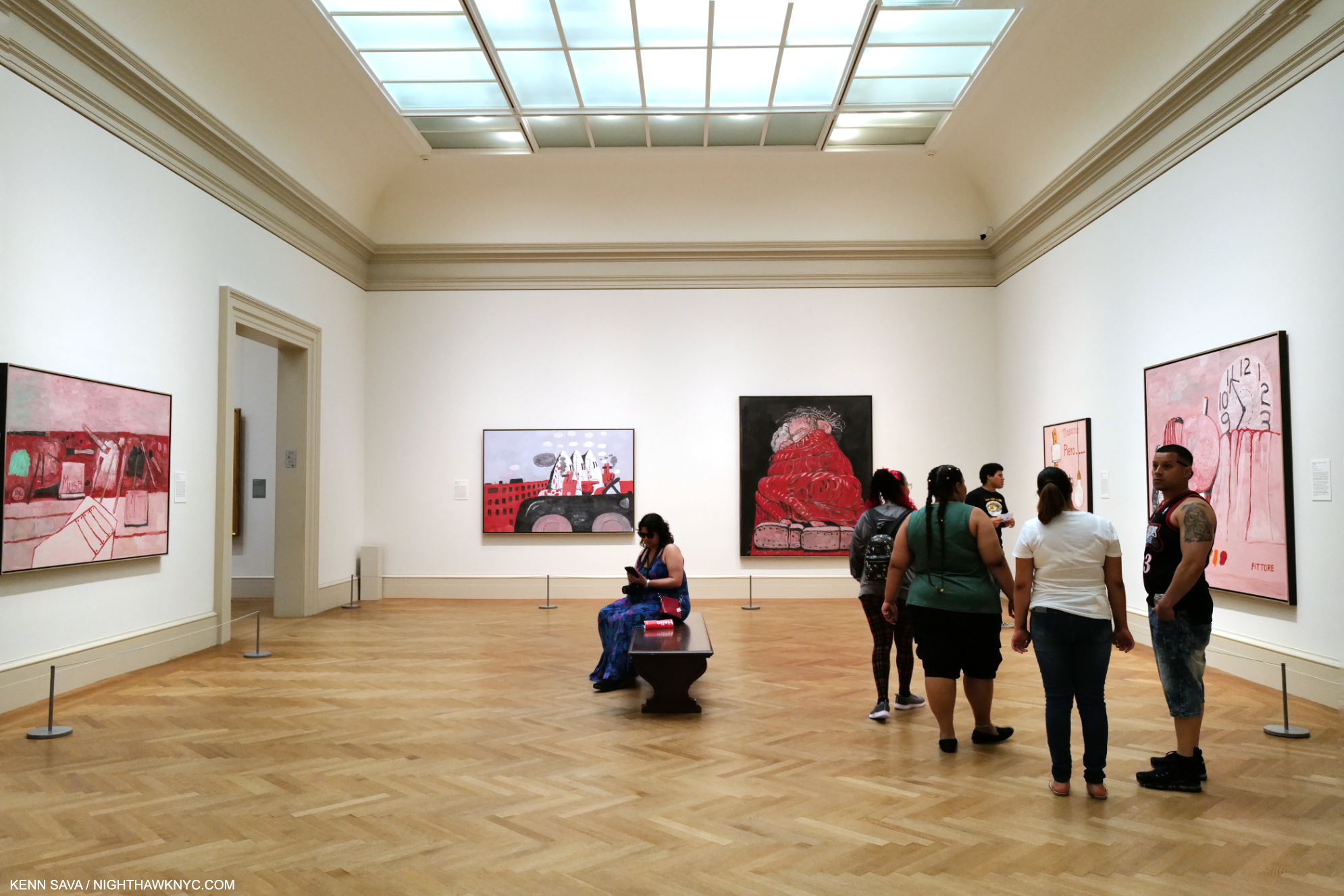
Installation view of 5 of the 8 works on view in this gallery gleaming under the just completed skylight project. Another work, one of his “abstractions” from the 1950s, which I wrote about here, was hung outside the door in the corridor to the Modern Wing to my right. Click any Photo for full size.

In Part 3 of my series on Edward Hopper’s New York I wrote about the Whitney Museum’s handling (mishandling?) of the extraordinary Jo Hopper Bequest in 1970. I mentioned that it was a lesson for other Artists going forward. In December, 2022, word came that Musa Mayer, daughter of Philip Guston (1913-80), had decided to donate 220 works by her father to The Met. As an American Artist (born in Canada), there’s little doubt the Whitney Museum of American Art (who currently own 3 of his Paintings, and 6 Drawings) was considered for this gift at some point (I surmise). Did their handling of the Jo Hopper Bequest (in which they the Whitney THREW OUT virtually all of Jo Hopper’s Art, and have recently sold a notable Edward Hopper Painting), enter into her decision?

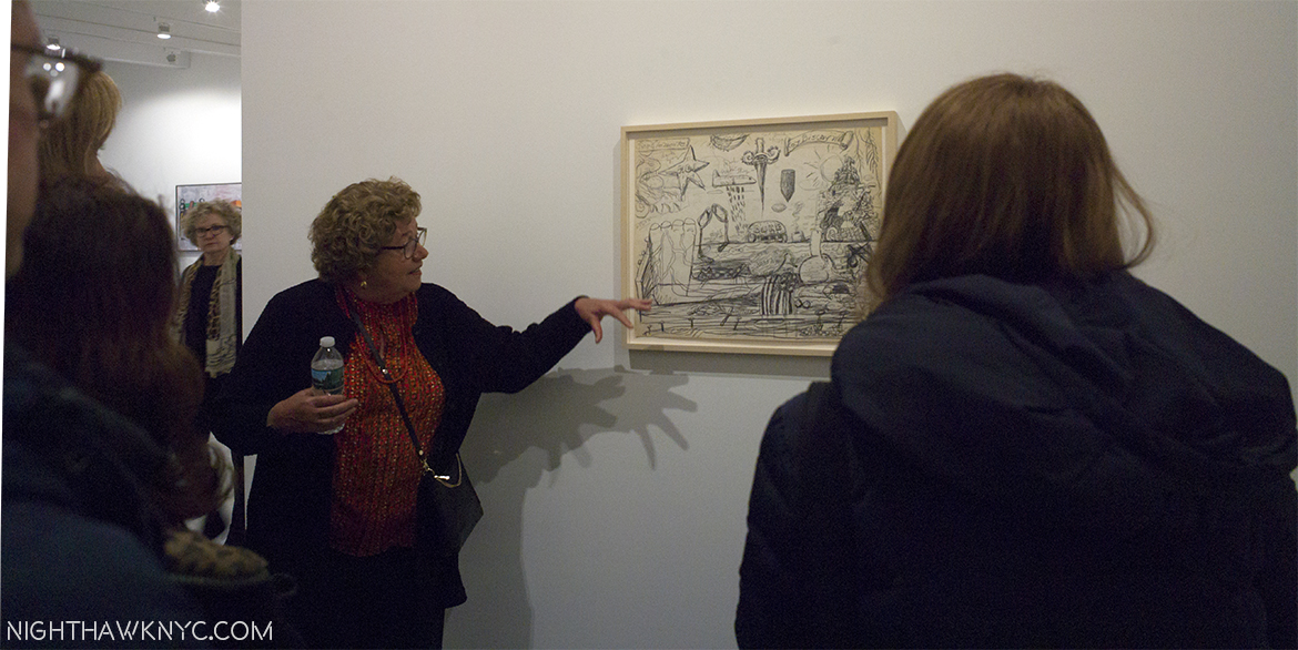
Musa Mayer, the lady responsible for this extraordinary gift, discusses the finer points of one of her father’s Nixon Drawings @ Hauser & Wirth in January, 2017.

I don’t know. Ms. Mayer opted to make this exceptional & vitally important donation to The Met. 

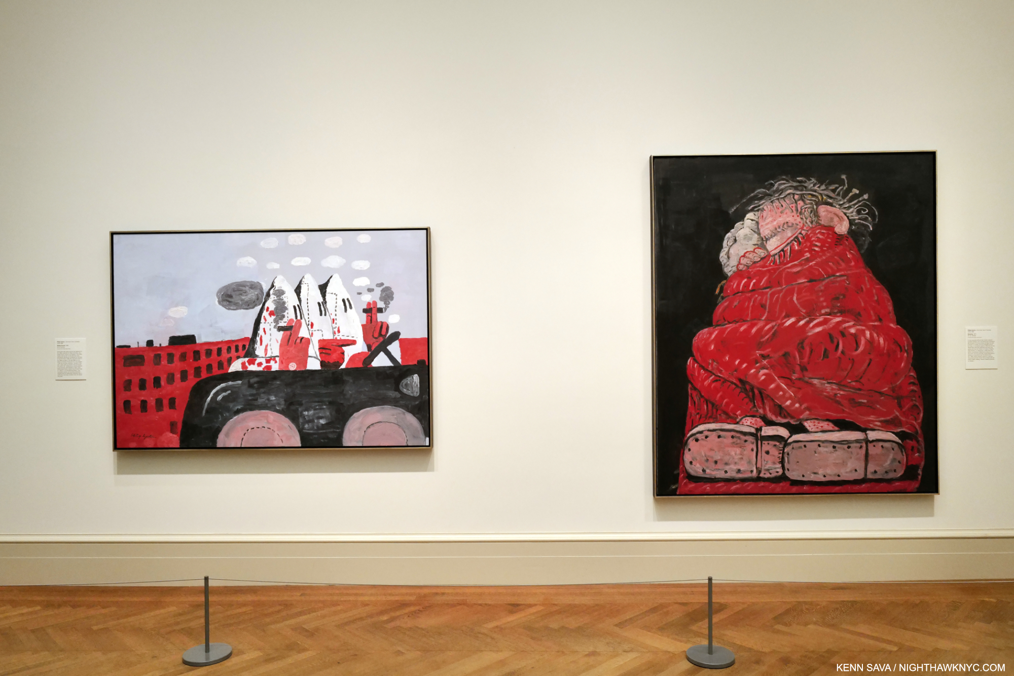
Riding Around, 1969, left, and Sleeping, 1977, right, both Oil on canvas.

To mark the occasion, The Met mounted Philip Guston: What Kind of Man Am I?, a concise, but powerful show of 8 Paintings. The show focused on the last decade of the Artist’s work from 1969 to 1980 and includes nothing but major works, in my opinion, including one of his “Klan” Paintings (which I wrote about in depth here). His last decade has gotten more and more attention as time has passed, after initially puzzling many viewers. Installed near the Impressionist and Van Gogh galleries, and not in the Modern & Contemporary Galleries across the hall (where at least one Guston is usually on view), I took that as an indication of The Met “saying” that Philip Guston is an Artist for the ages. I bet he’d be proud. 

George Segal: Nocturnal Fragments @ Templon

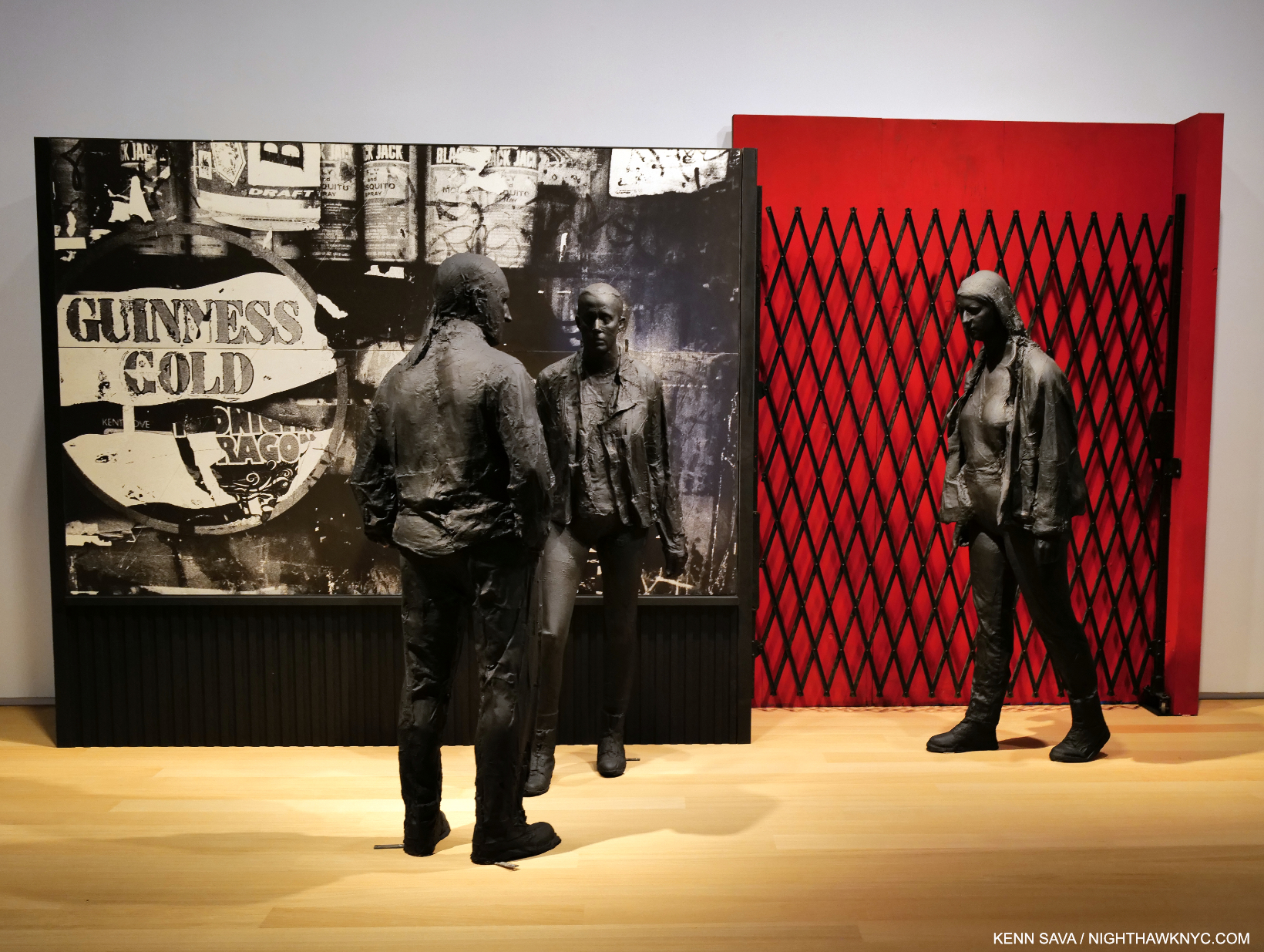
Guiness Gold, 1995, Plaster, wood, acrylic, silverprint, 96 x 64 x 45 inches.

I can’t remember the last George Segal show I saw- if I’ve ever seen one. In fact, Mr. Segal (1924-2000), a contemporary of Philip Guston, may be best known to many New Yorkers through his Public Art installed in Port Authority Bus Station and his Gay Liberation Monument in Sheridan Square. Otherwise, it seems he has fallen into eclipse since he passed. So, George Segal: Nocturnal Fragments at Templon was a welcome surprise and an eye-opener. 

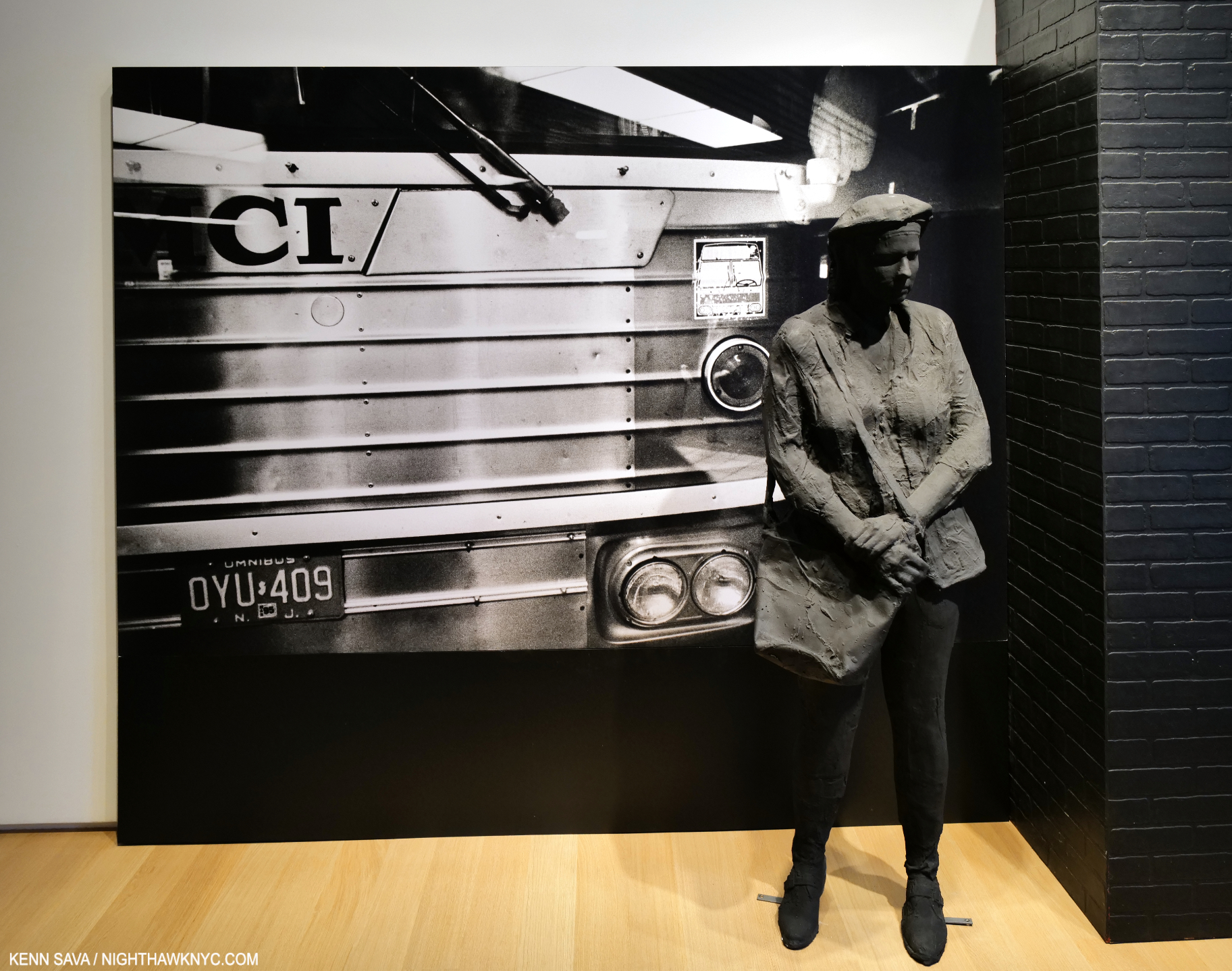
Bus Station, 1995, Plaster and mixed media, 96 x 175 x 33 inches.

Mr. Segal is, perhaps, best known for his meditative Sculptures, but he was also a Painter and installation Artist. To this point, I’ve only seen his work in public settings, where the Artist places his figures in the existing surroundings. In Nocturnal Fragments we get to experience the full George Segal “effect” in environments of his own creation. It’s something no other Sculptor does and it works wonderfully here.  The show provides a wonderful opportunity to experience the full effect of Mr. Segals’s skill over a generous period of time on two floors. I found it a breath of fresh air.

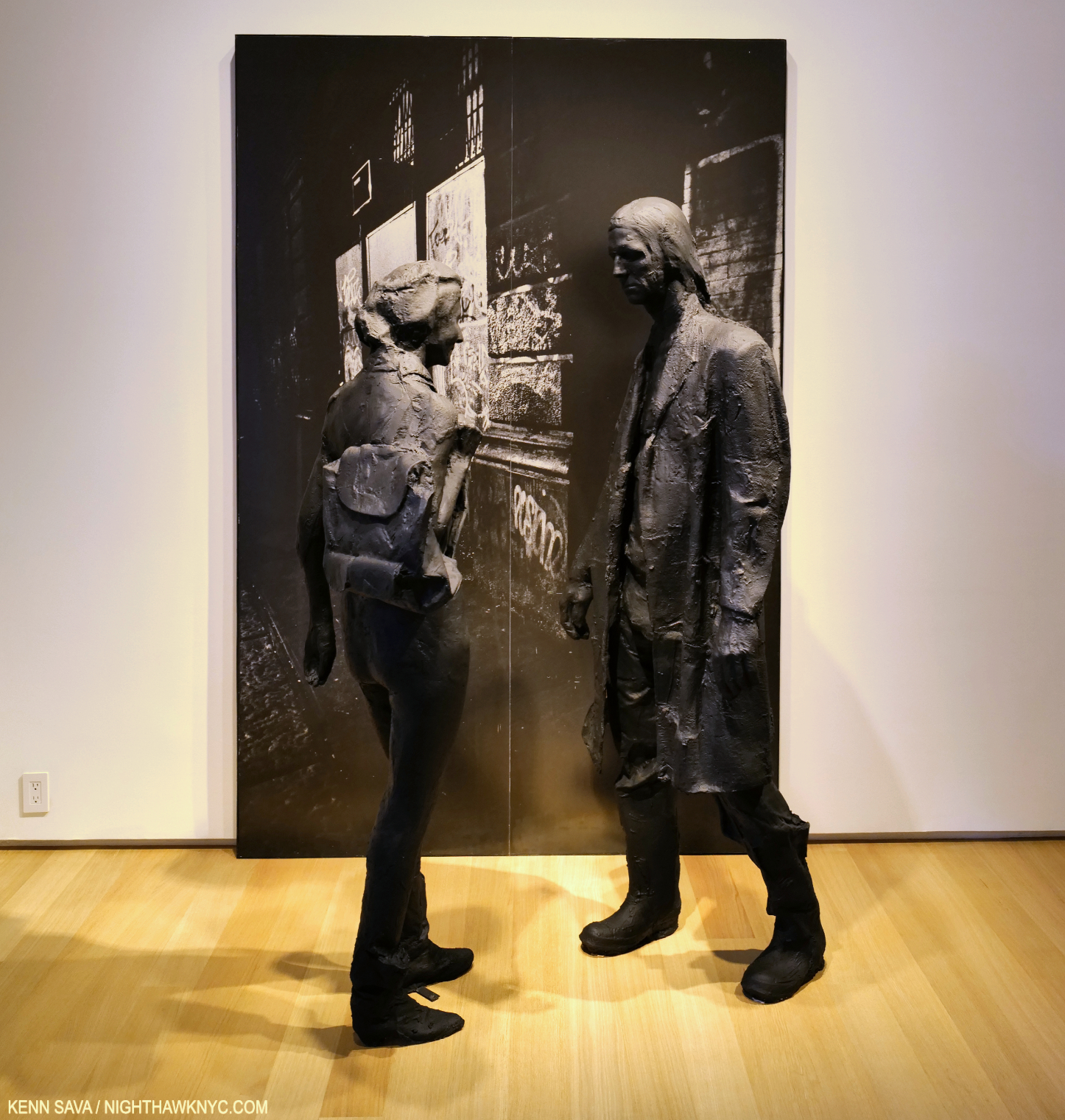
The Encounter, 1996, Plaster, wood, acrylic, silverprint 96 x 64 x 45 inches.

“Discovered” in a so-called “pop” Art show in 1962, Nocturnal Fragments shows, again, that Mr. Segal is much more and his work long ago outlived that tired box– if it was ever even in it!

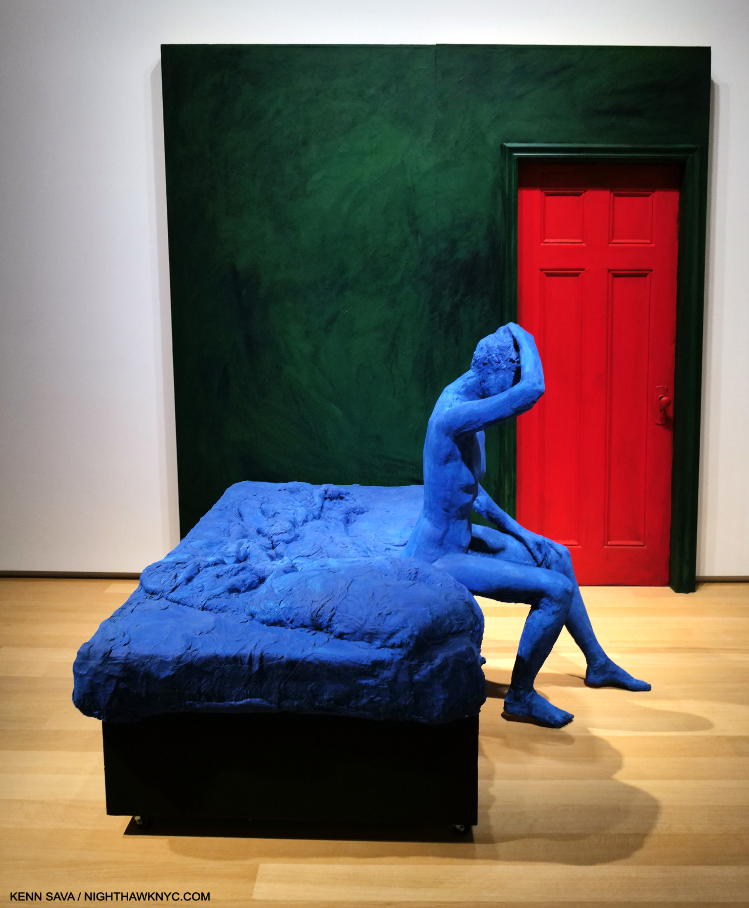
Blue Woman Sitting on a Bed, 1996, Plaster, paint and wood, 96 x 96  x 83 inches. A different take on a scene that Edward Hopper mined often.

An influence on Duane Hanson and Ron Mueck, George Segal’s work has a unique mystery that reminds me more of Rodin than it does either of those two fine Artists. It seems to me it has more than held up since his passing, which should lead to his work being seen more often. I think a whole new generation of Art lovers will find much to like in George Segal’s work. 

Jeffrey Gibson: Ancestral Superbloom @ Sikkema Jenkins

Have you ever seen a Painting shaped like this? SOMEONE TO WATCH OVER ME, 2023, Acrylic paint on elk hide inset in custom wood frame, 103 x 69 x 5 inches, hanging on the Artist’s Wallpaper (Untitled, I was told)  which had a 3-D effect up close.

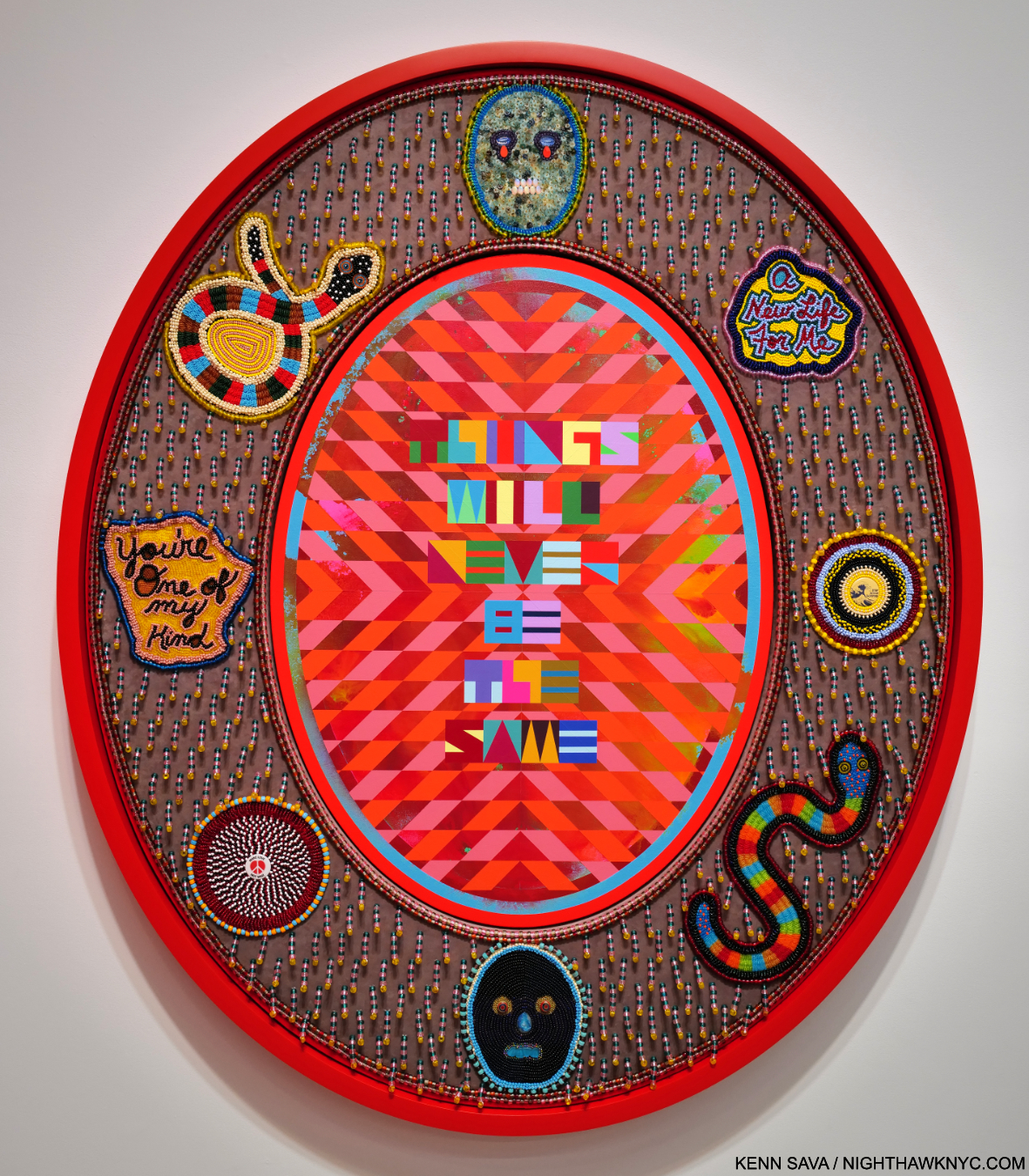
Jeffrey Gibson: Ancestral Superbloom was one of the most beautiful shows of recent memory, and aptly titled. A virtual supernova of color, most of the pieces centered on a quote from a popular song lyric, turning it into something of a mantra. 

THINGS WILL NEVER BE THE SAME, 2023, Acrylic paint on canvas inset in custom frame, acrylic velvet, acrylic felt, glass beads, plastic beads, vintage pinback buttons, druzy crystal, artificial sinew, nylon thread, cotton canvas, cotton rope, 60 x 50 x 5 1/2 inches

His gifts with color are obvious at a glance, but it’s the clarity of his compositional conceptions and how extremely well he executes them that impress me, along with his fresh approach to, well, everything.

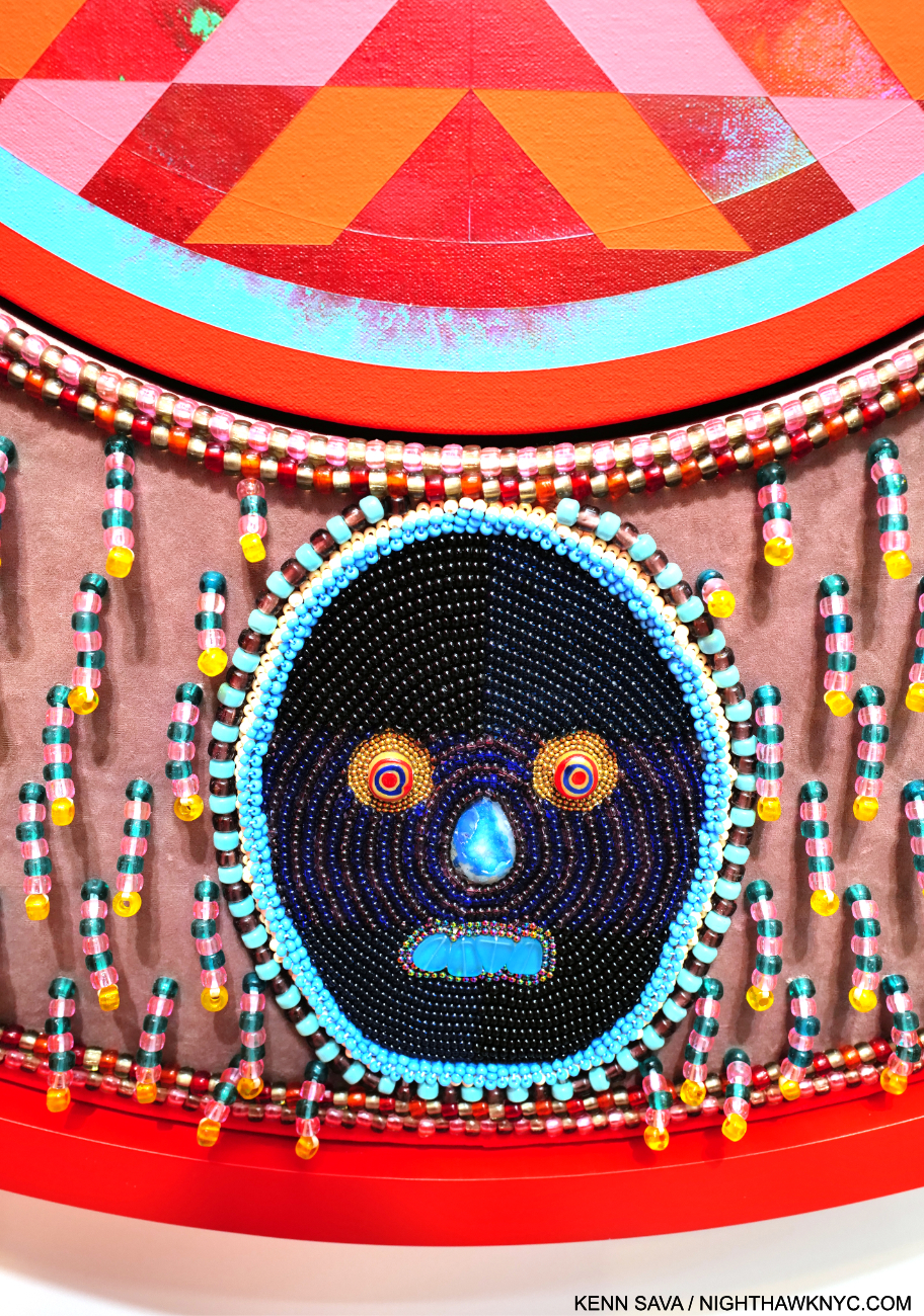
Detail of THINGS WILL NEVER BE THE SAME.

His work is incredibly detailed, requiring and rewarding viewers to work their way around each piece, with each detail adding to the richness and intricacy of the experience.

The show coincides with the publication of An Indigenous Present, a NighthawkNYC NoteWorthy Art Book of 2023, , conceived by Mr. Gibson, which features the work of 60 Indigenous Artists. It’s the best introduction to/overview of this work I’ve seen- an amazingly rich collection. 

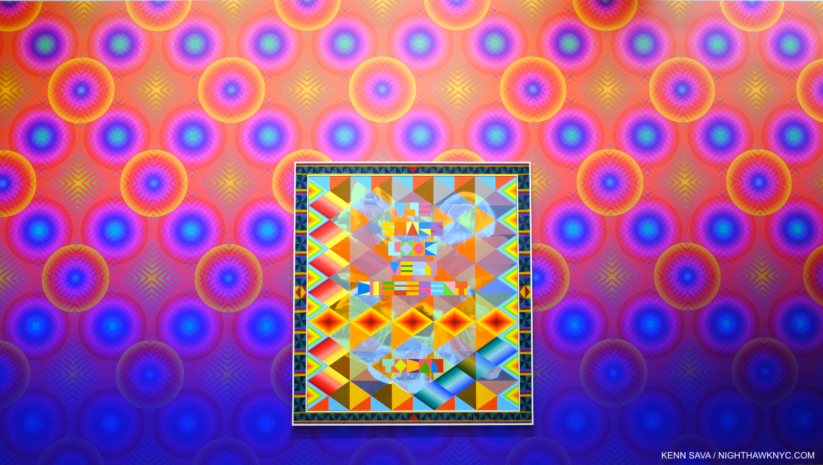
THE STARS LOOK VERY DIFFERENT TODAY, 2023, Acrylic on canvas, glass beads, artificial sinew, inset to custom wood frame, 88 x 80 inches. A line from David Bowie’s “Space Oddity.”

Meanwhile, Jeffrey Gibson: Ancestral Superbloom continues to add to his stature and importance.

Njideka Akunyili Crosby: Coming Back to See Through, Again @ Zwirner

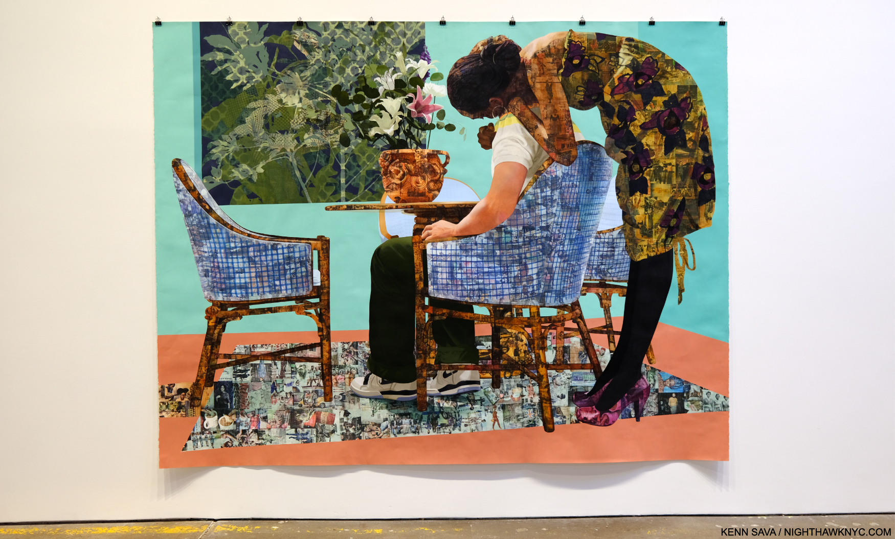
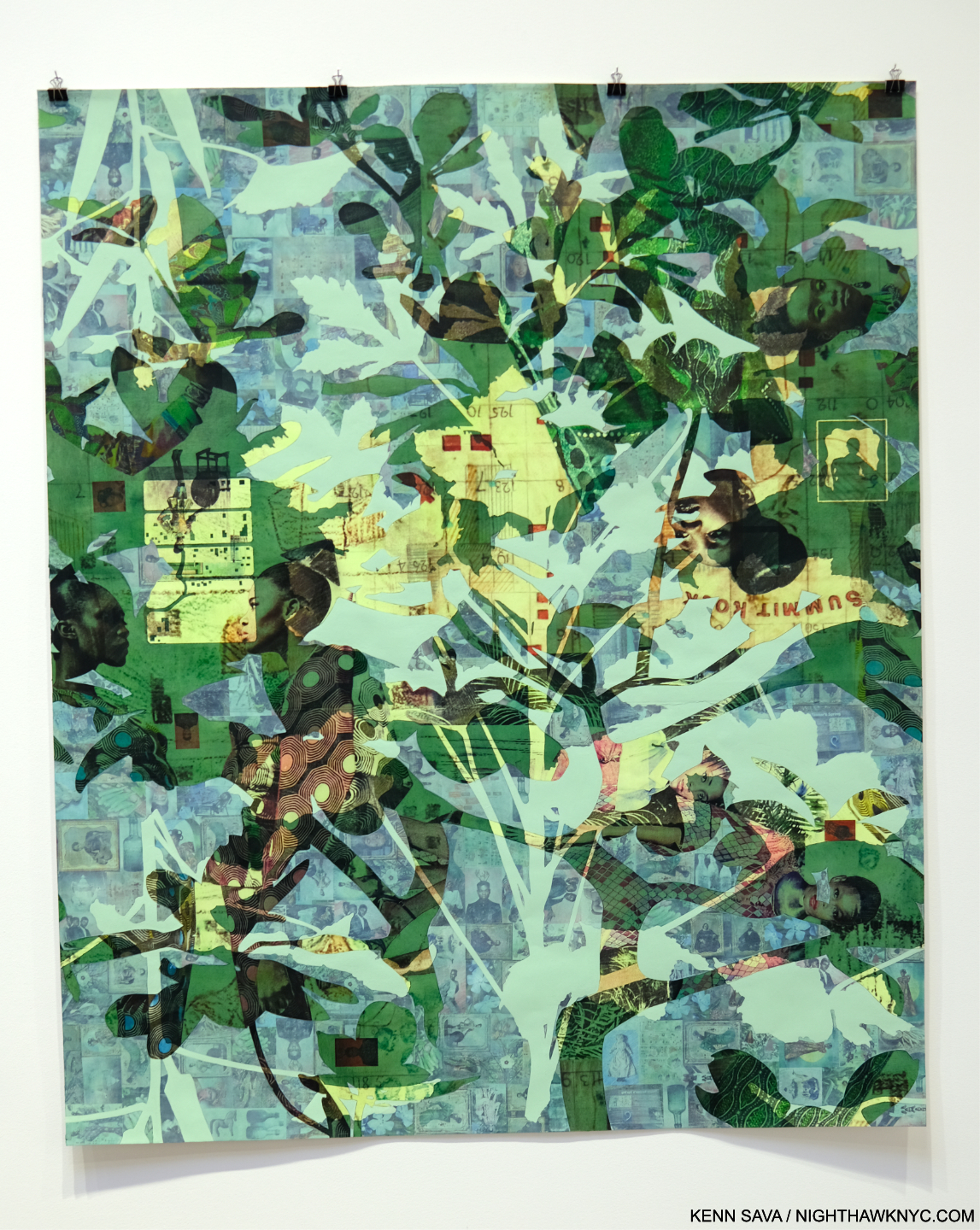
Blend in – Stand out, 2019 Acrylic, colored pencil, charcoal, and transfers on paper 95 3/4 x 123 3/4 inches

Njideka Akunyili Crosby’s NYC debut, which this was, has been a long time coming. Perhaps best known to most from the series of enthralling books published around shows elsewhere, her work is in the Permanent Collections of The Met, MoMA and the Whitney Museums. Pretty precocious for an Artist only born in 1983 (in Nigeria, living and working in L.A. this century). Her career has been in steady ascent. Her latest work shows an amazing juxtaposition of time and techniques through her use of transfers and paint. Frankly, looking as closely as I could, I couldn’t figure out how she does it.

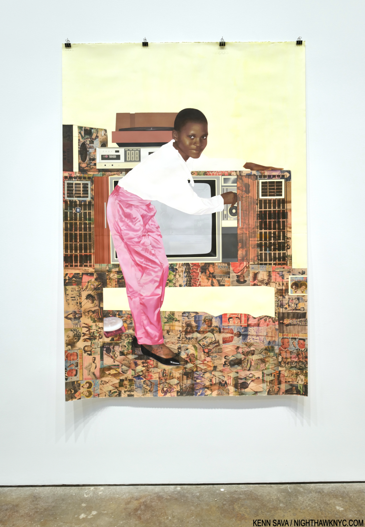
Potential, Displaced, 2021, Acrylic, colored pencil, and transfers on paper 72 1/4 x 60 inches

Layers of photo transfers are seamlessly combined with layers of paint. Each one increasing the depth and adding countless details to the story. Everything is rendered with such smoothness it was beyond me to discern layers that I knew were there. Her craft is as stunning as her Painting.

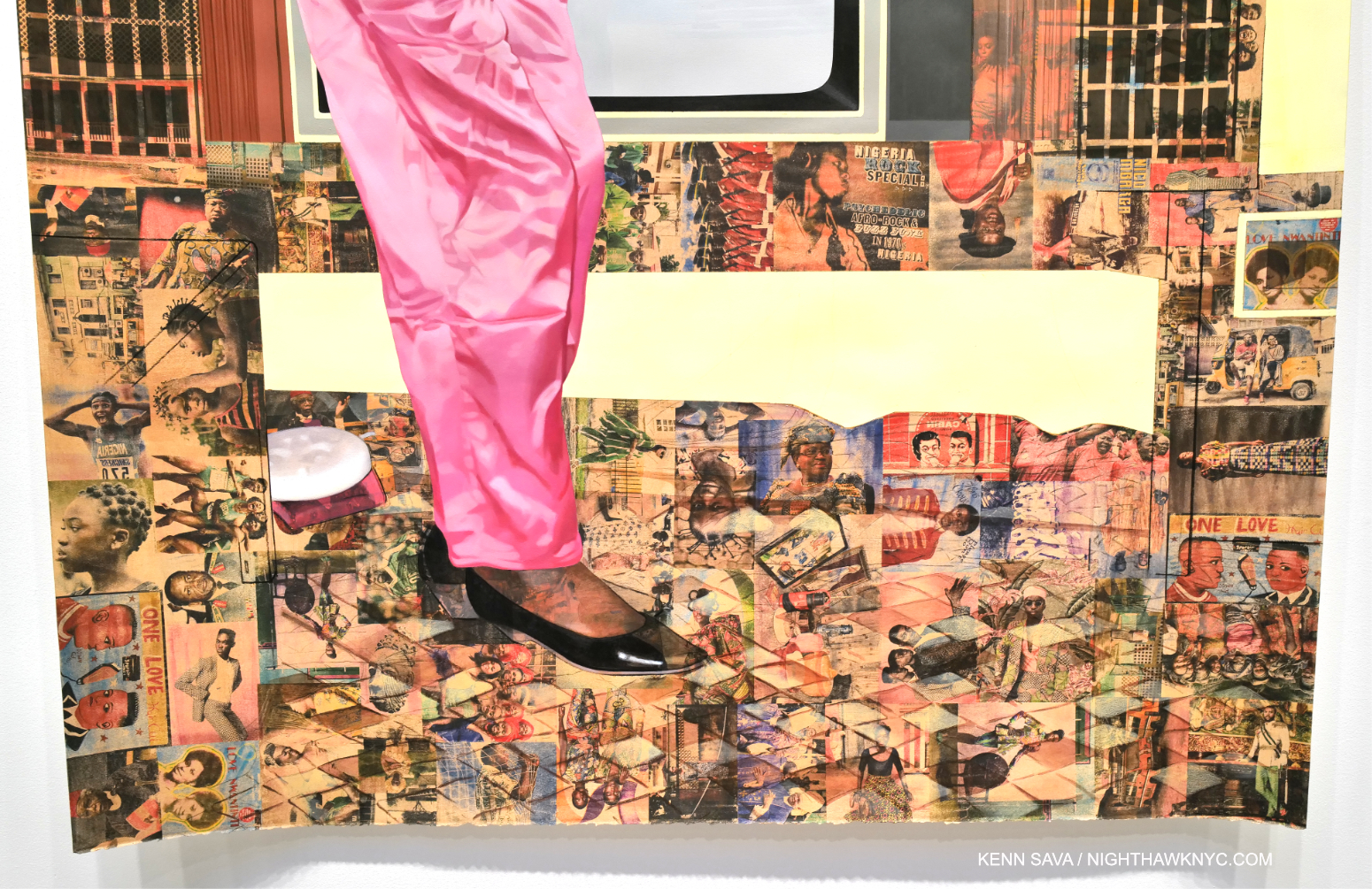
“The Beautyful Ones”Series #10: A Sunny Day on Bar Beach, 2022, Acrylic, colored pencil, pastel, charcoal, and transfers on paper, 78 1/2 x 53 3/4 inches.

It’s all in the service of her subjects, some she’s apparently related to, some not. They’re each treated with such compassion and understanding, it’s hard to tell which are which.

Detail.

Ms. Crosby’s work rewards the casual glance, and extended close study, while serving as something of a bridge from her life now (in the US since 1999), to her Nigerian upbringing. In the process, it helps others begin to understand it, as she presents it in a multifaceted memory standing on layers of time, history and place.

Wade Guyton @ Matthew Marks

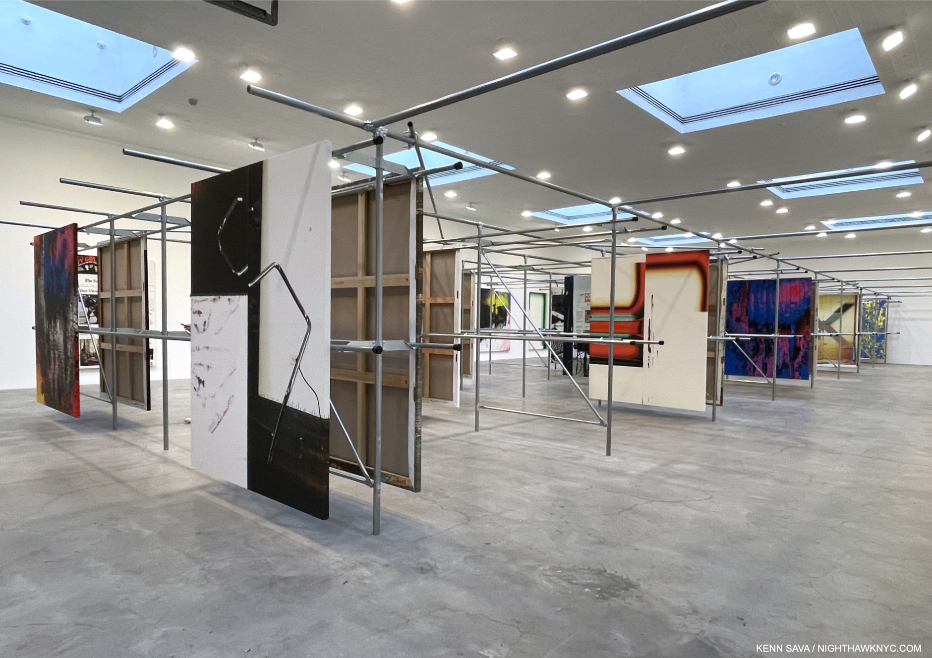
Installation view. All works are Epson UltraChrome HDX inkjet on linen 84 x 69 inches each.

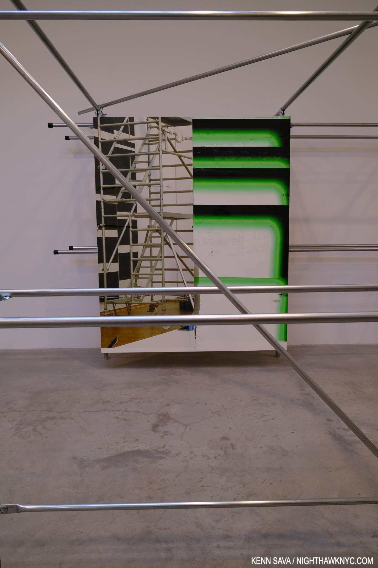
Wade Guyton’s installations are always an interesting element of his entire show experience. In fact, his book Zwei Dekaden emphasizes just that aspect in over 200 installation views over two decades. It’s now like it wouldn’t be a Wade Guyton show without the installation. And so it was at Matthew Marks. The unique steel rack installation was explained thus- “In 2021 Guyton moved into another floor of his studio building that the previous tenant, a clothing company, had filled with metal hanging racks. Rather than remove the racks, he repurposed them to hang his paintings for storage. In the current exhibition, Guyton has duplicated this set of racks and installed paintings in the same manner,” per the press release.

I couldn’t resist making the installation part of seeing the work.

The work looked handsome on its mounts and the structures themselves provided for interesting “other” views of each piece as a visitor moved through the racks. Cross members added unexpected elements to works on the next row and provided a chance to see pieces at a bit of a distance.

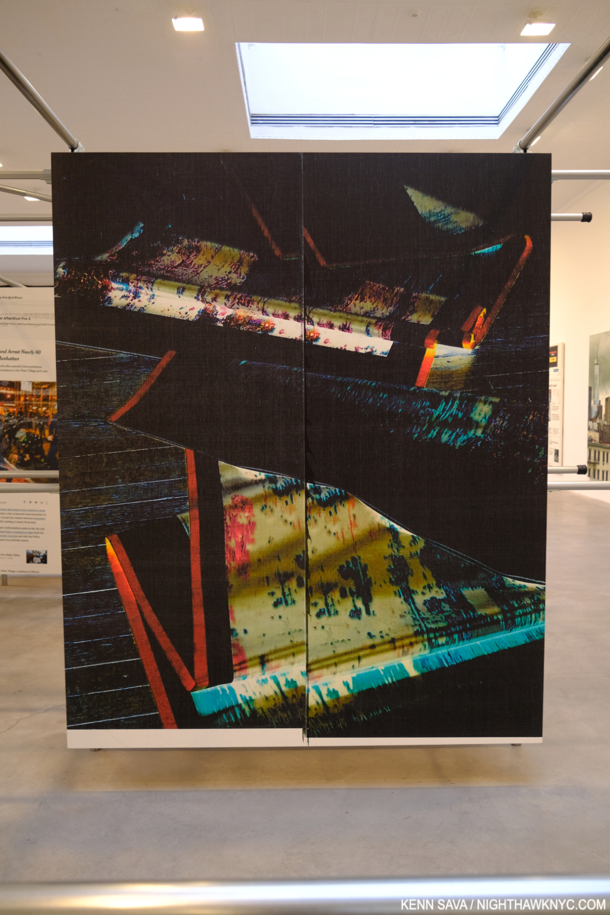
Untitled, 2022, (WG5374)

But all of this is secondary to what’s being displayed. Wade Guyton has been at the forefront of combining Printmaking and Painting in interesting ways for a long time. Admirers will find new takes on some familiar themes, but there is also much that is new. The sense of being “somewhere else” was interrupted by pieces based on New York Times front pages; recent headlines jarring a visitor back to “reality.” I love how he incorporates images/Photos into his work, and some of the printing of others has a “squeegee” look that always reminds me of Jack Whitten. Here, it’s still fresh and it’s nice to see the Artist continue to find new possibilities. As he has, once again, with his installation. Both work extremely well together.

NighthawkNYC.com has been entirely self-funded & ad-free for over 8 years, during which 300 full-length pieces have been published! If you’ve found it worthwhile, PLEASE donate to allow me to continue below. Thank you, Kenn.

You can also support it by buying Art, Art & Photography books, and Music from my collection! Art & Books may be found here. Music here and here.

Written & photographed by Kenn Sava for nighthawknyc.com unless otherwise credited. To send comments, thoughts, feedback or propositions click here. Click the white box on the upper right for the archives or to search them. Subscribe to be notified of new Posts below. Your information will be used for no other purpose.

Gregory Halpern In NYC

This site is Free & Ad-Free! If you find this piece worthwhile, please donate via PayPal to support it & independent Art writing. You can also support it by buying Art & books! Details at the end. Thank you.

Written & Photographed by Kenn Sava

Shows seen- Impressions @ Fotografiska, July 20, 2023 and
Immersion: Gregory Halpern, Raymond Meeks and Vasantha Yogananthan @ ICP, through January 8, 2024

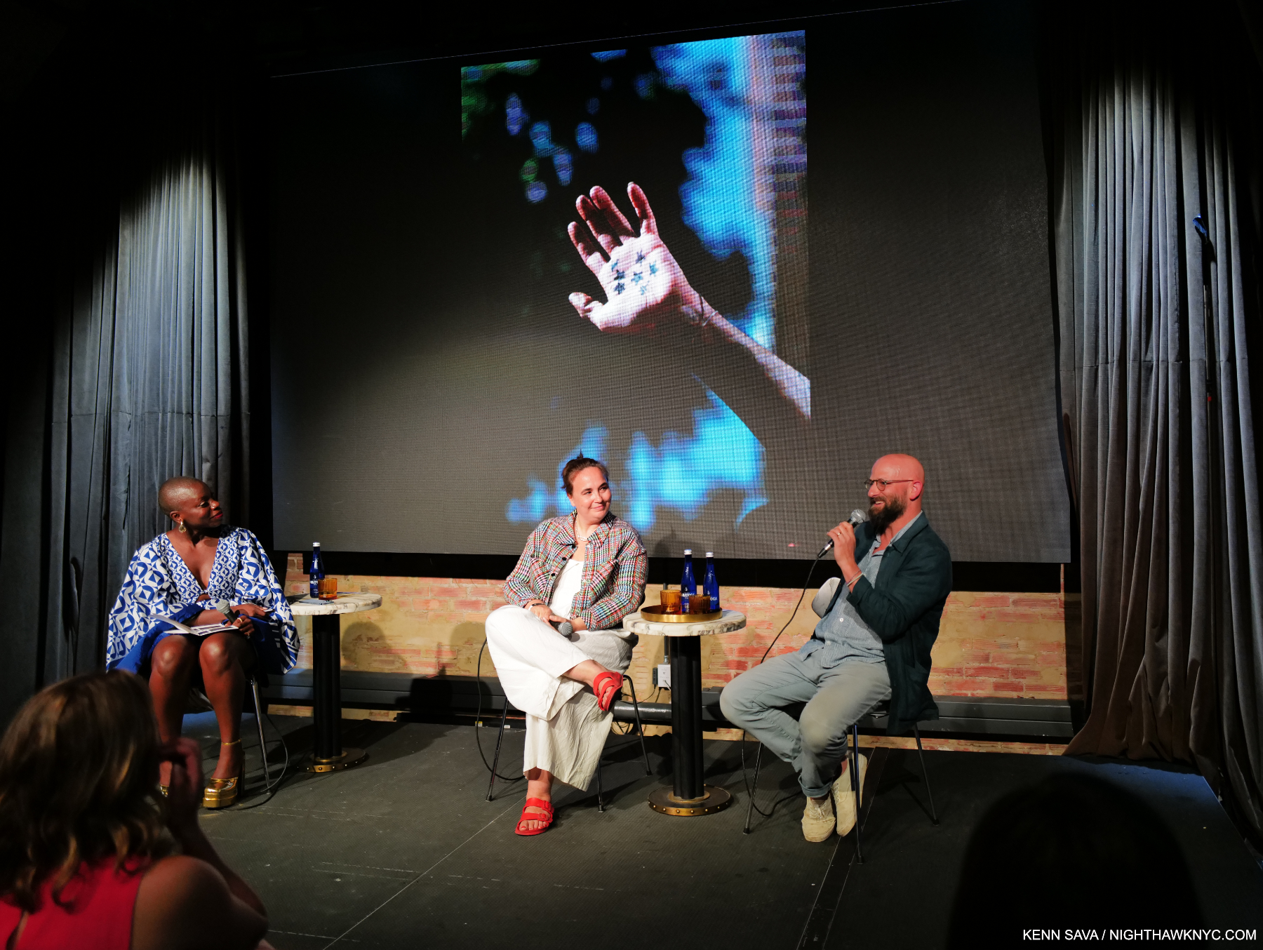
Gregory Halpern, right, giving a brief overview of his career to date as an introduction to his work including this well-known image from his PhotoBook,  ZZYZX, with Magnum Photos President, Photographer, and fellow exhibitor, Cristina de Middel, center, and narrator Jessica Nabongo at Impressions @ Fotografiska, July 20, 2023. Click any image for full size.

Two shows featuring the work of Gregory Halpern provided all-too-rare opportunities to see his work here in what were the NYC debuts of both his newest work, and his most recently published work. While familiar to most from his remarkable series of PhotoBooks this past decade as a “book Artist,” the shows provided the chance to see him as a “wall Artist.” Though neither was a Gregory Halpern solo show, they proved revelatory1.

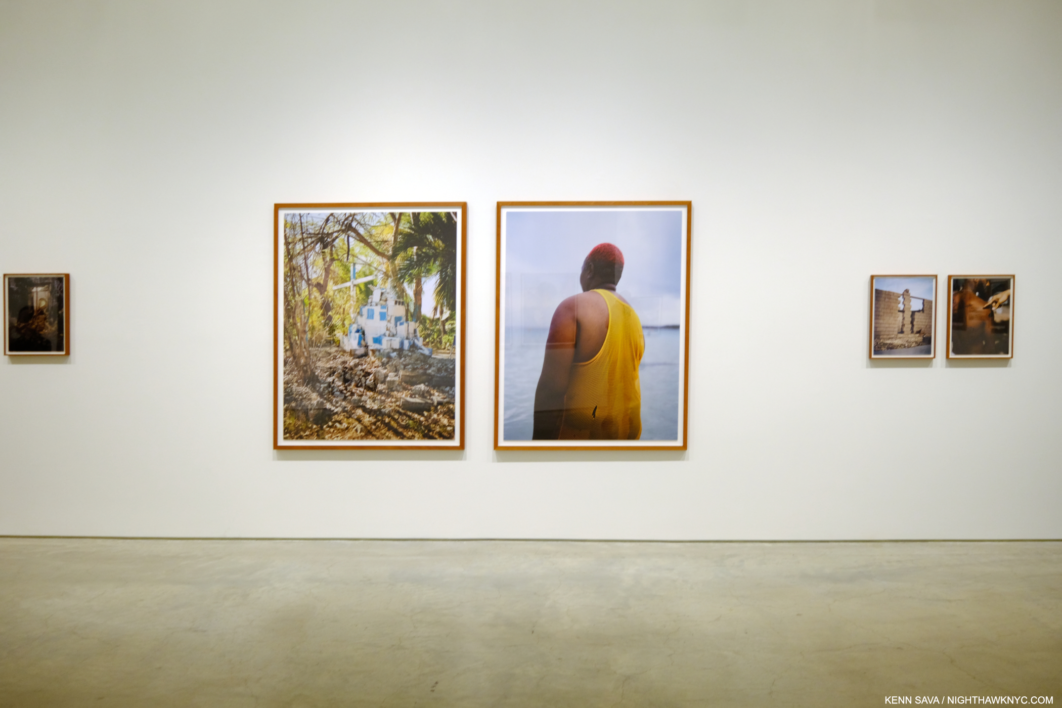
 Immersions installation view

On September 26th, Immersion opened at ICP, where I was last for William Klein: YES. Immersion is the name of a commission program involving an amalgamation of French and American organizations awarding selected Photographers, called laureates, a sponsorship to create a body of work either in France or the US. Gregory Halpern was a laureate in 2018. Raymond Meeks and Vasantha Yogananthan are the other two laureates included in the show. For his part, Mr. Halpern decided to go to Guadeloupe, a former French colony, a daring and somewhat ground-breaking choice (Raymond Meeks chose two regions in France, and Vasantha Yogananthan chose New Orleans).

So, why Guadeloupe?

 Immersions installation view.

“I think I knew I would find a certain form of Surrealism there,” Mr. Halpern explained in an interview with Curator Clément Chéroux2.

The stage set, after research and a number of trips to Guadeloupe to take the Photographs, he undertook the rigorous selecting and arranging process he outlined during a talk when I saw him last at The Strand Bookstore in September, 2019. Aperture published the resulting body of work, indeed perhaps his most surreal, in Let the Sun Beheaded Be (a NighthawkNYC Noteworthy PhotoBook of 2020). In Immersion NYC finally gets to see the work as Photographs.

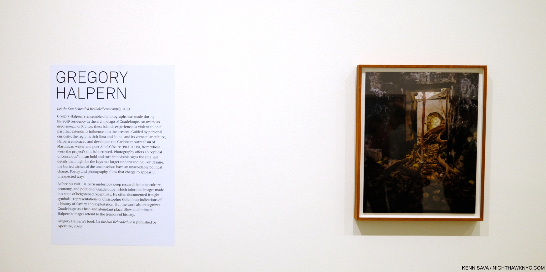
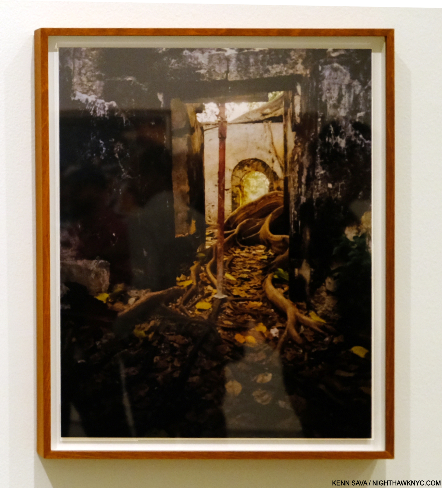
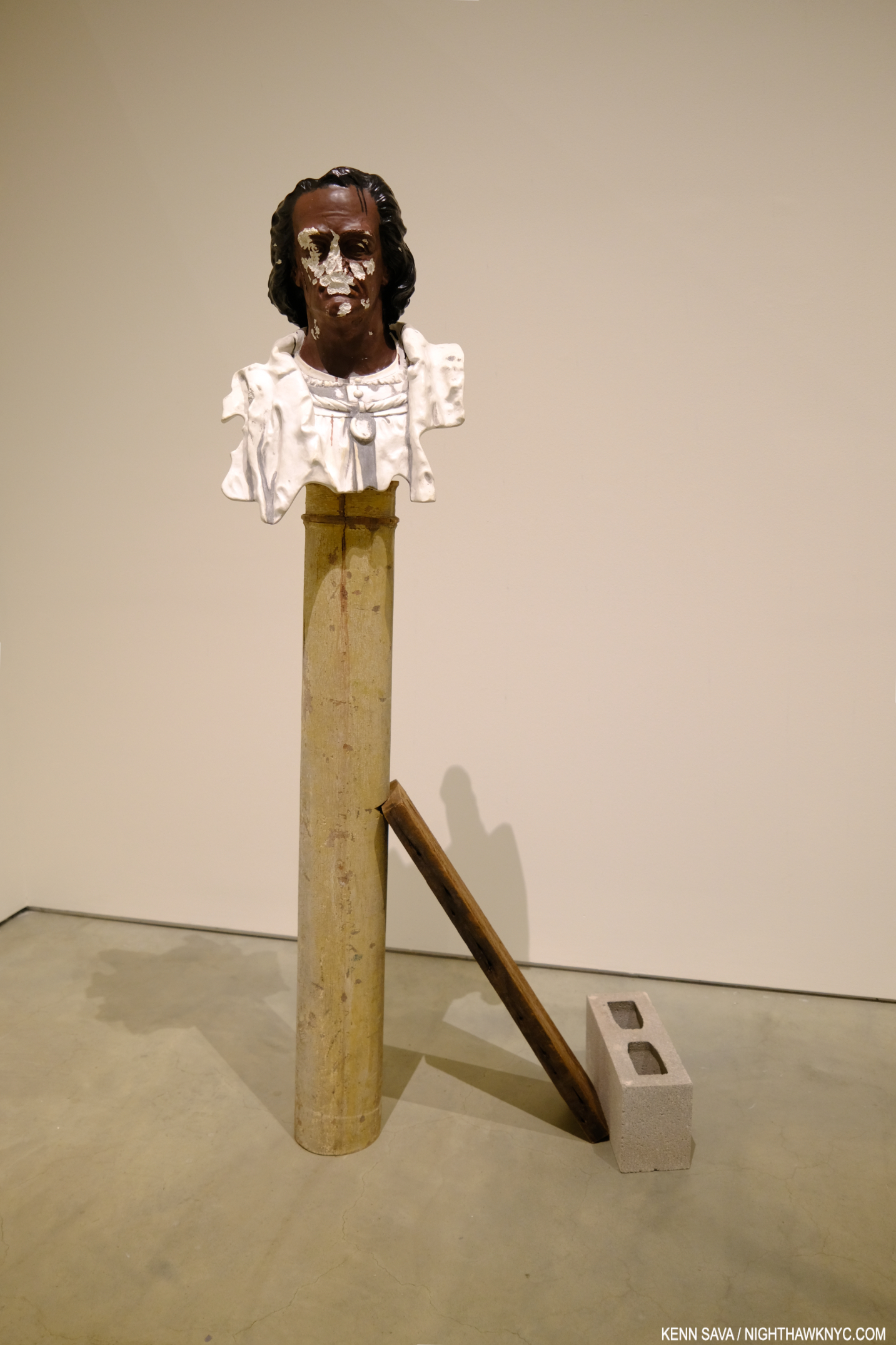
The show was concise, typically open-ended, and bookended by the Artist’s first foray into Video(!) and a stunning, leaning, Sculpture3. It opens with one of the most compelling images in the book.

Untitled, as all the images are in the book, is described by Mr. Chéroux- “Shot in a former slave prison in the town of Petit-Canal, northwest of Grande-Terre, it shows the tentacular development, right inside the building, of a tree commonly known as a strangler fig because the strength of its wide roots destroys everything on which it grows4.”

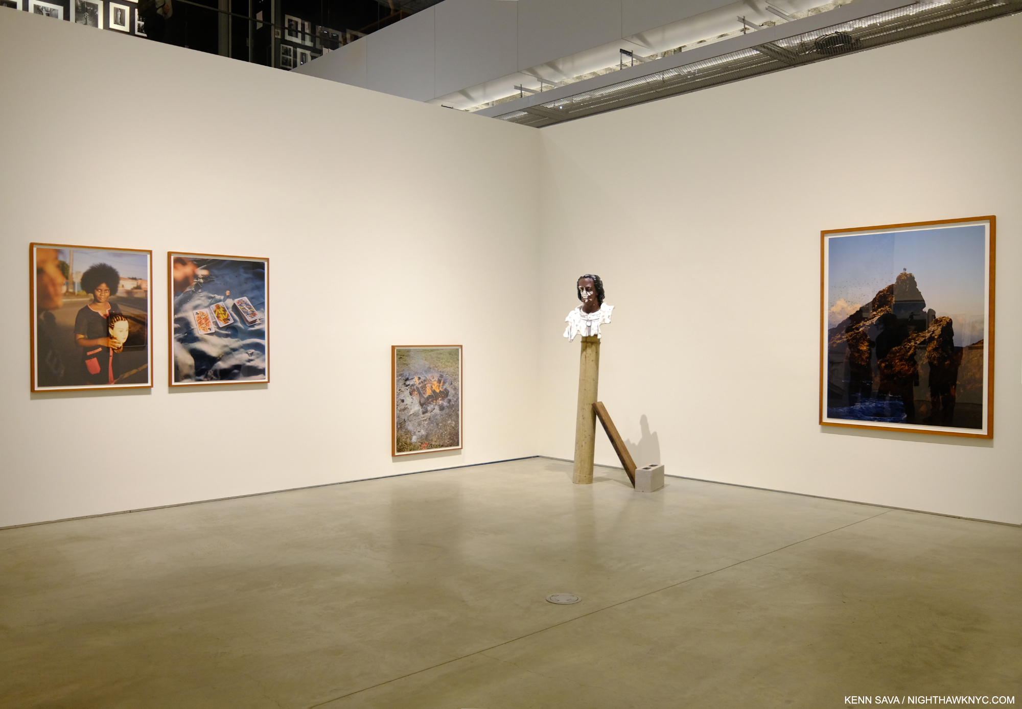
Christ Columb, 2023, Marble, cement, stainless steel, wood and cinderblock. An “exact replica of a bust of Christopher Columbus that currently stands in Guadeloupe,” per the wall card. “Exact” in that it even mirrors the vandalism to the real bust’s face.

It serves to define his terms. In these Photos, Mr. Halpen consciously avoided tourist trappings, saying in the book’s conversation with Stanley Wolukau-Wanambwa that after seeing how the tourists acted and treated the locals, he realized his burden as another white outsider with a camera would be even heavier, especially because he wasn’t fluent in either French or creole. He chose instead to focus on the stormy history, the place, the human, the animal, and the vernacular, in what are the five unofficial “chapters” of the book.

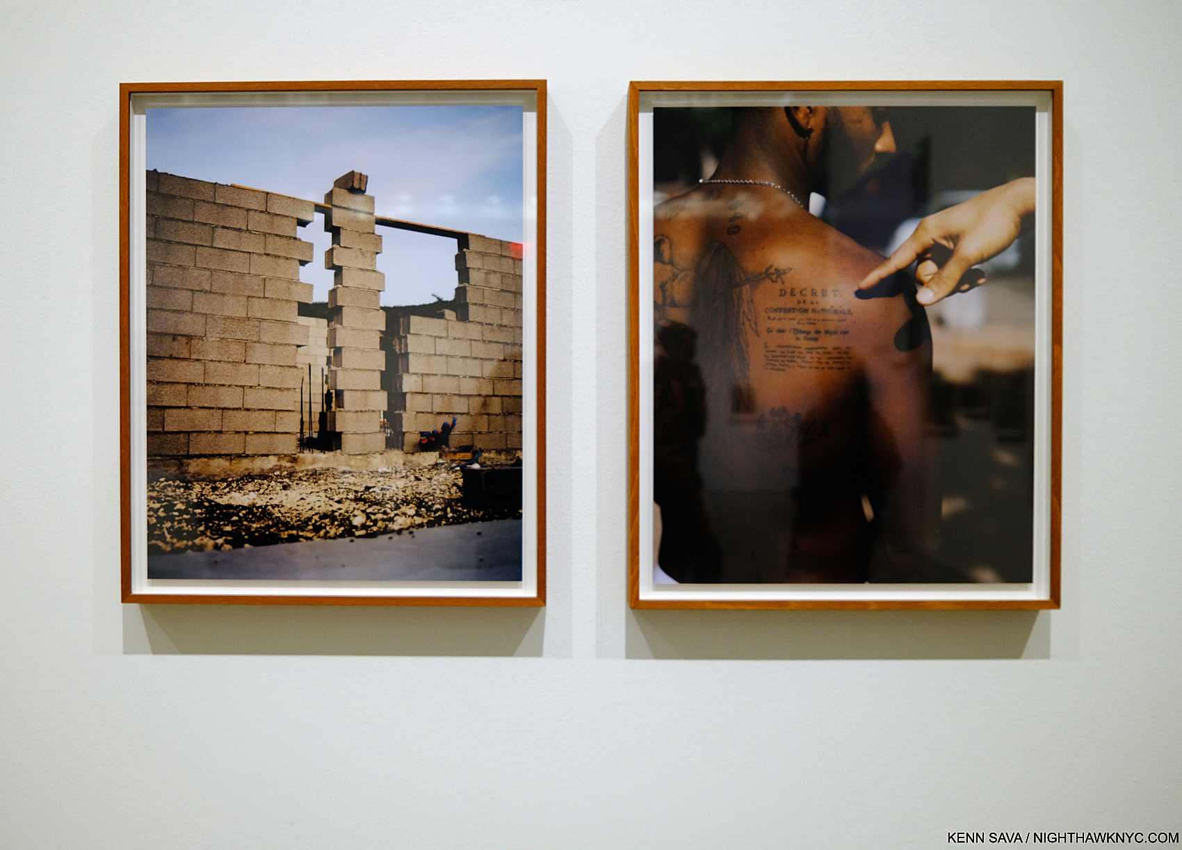
History/the place, the human…”The tattoo is a replica of the 1848 decree abolishing chattel slavery in Guadeloupe (the second, final abolition, after Napoleon reneged on his 1815 abolition,” from the wall card regarding the work on the right.

Surrealism runs throughout all of them, yet in Let the Sun it’s, perhaps, an overriding mood as much as it is actually on view. Possibly, this is due to the inherent surrealism Mr. Halpern said he was expecting to find, or perhaps it was also due to his reading material during his visits. The title “Let the Sun Beheaded be” comes from Soliel cou coupé (or Solar Throat Slashed) by Martinican poet Aimé Césaire, who was influenced by the concluding lines of “Zone,” the first poem in Guillaume Apolliinaire’s Alcools, 1913, “Adieu Adieu / Soliel cou coupé” (Farewell, farewell / Let the Sun beheaded be). Apolliinaire coined the term “surrealism” circa 1917. Césaire’s earlier work found its way into the hands of André Breton, one of the leading surrealist theorists, and the two became long-time friends. Speaking of Solar Throat Slashed curator Clément Chéroux points out in his essay the numerous connections between the guillotine, which was brought to Guadeloupe with the French after the French Revolution and put to extensive use in the colony, and Photography- down to the “guillotine shutter.” Thankfully, the guillotine shutter is the only use of the notorious device in the work, though death takes many forms.

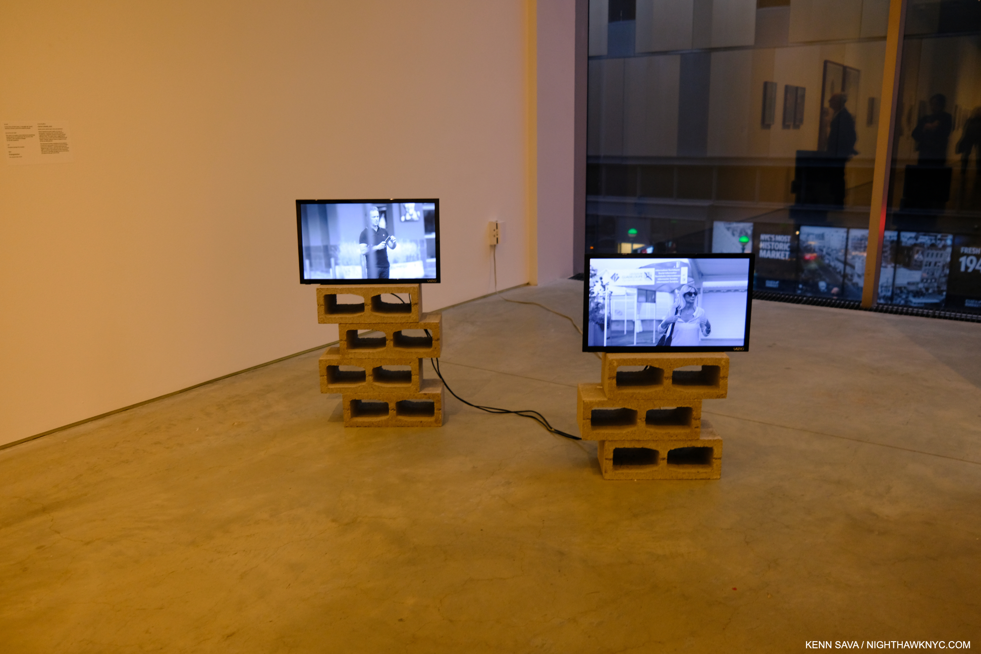
Stills from Triangulation, 2-channel video(!), duration 4:20.

Yet, after finishing his Photography, he subsequently returned to make a 2-channel Video titled Triangulation, which meditates on the coming and going of the cruise ships and their cargo. The Video, his first to be shown in public, startled me for having a different approach than his Photography does! Whereas he goes to great length to speak with his Photographic subjects, even collaborating with them to an extent in his Photo Portraits, in Triangulation, he’s an observer. Highlighting the risks of this, at one point, staged or not, a cruise ship employee with “Photographer” emblazoned on his shirt, ironically moves towards the camera making a “STOP” signal . The Video added a counterpoint to the show. At once showing that side of Guadeloupe most known to the outside world, but showing it not from the standpoint of the tourists, but almost from the viewpoint of the locals if and when they watch these foreigners arriving & disembarking on their island. 

Appropriately hung near the floor. Seeing it this size created a completely different impression than the image in the book.

Another thing that struck me seeing this work was size. Images have a tendency to live in our minds in the size they appear in in a book. Unlike a Painting or Drawing, we may tend to forget Photographs can be printed larger or smaller. I heard from readers when I named Mr. Halpern’s Omaha Sketchbook a NoteWorthy PhotoBook of 2019 who disagreed, saying they were unhappy with the size of all the images in it- each a reproduction of a Photo cut from a medium format contact sheet, done to remain true to his original mockup- a “sketchbook.” Let the Sun returned to full page images to stunning effect (I happened to love the daring in the design of Omaha and the sizes of the Photos therein). At ICP, the Prints ranged from slightly larger than page size to very large, probably 40 inches or larger. The added real estate enabling the images to begin to attain a “life-size” presence. 

“In Guadeloupe, slavery memorials are everywhere, so the weight of that history is much more perceptible than in the United States.” Gregory Halpern in the Conversation.

In my 2019 overview of his work, “Gregory Halpern’s America,” I wrote about his work’s hold on me. I still can’t think of any other living Photographer whose work speaks to me as much as his continues to. Given that his instant classic book ZZYZX is now in its 4th printing, and his three subsequent books have sold out, I’m apparently far from the only one it speaks to. I went in to Immersions believing that Let the Sun is somewhat underappreciated compared to his U.S. based books (i.e. all of his previous books). I came out feeling I may have underestimated it. Let the Sun is a book that could inspire change on a number of levels- from opening the eyes of people who’ve never been to Guadeloupe (like myself), to increased possibilities for the Photographic Portrait, to publishers who have neglected the Caribbean (& it’s Artists) to this point in Art & PhotoBooks, to the shame that the history of slavery in this country has been so ignored. For those reasons, it’s something of a landmark book in my view.

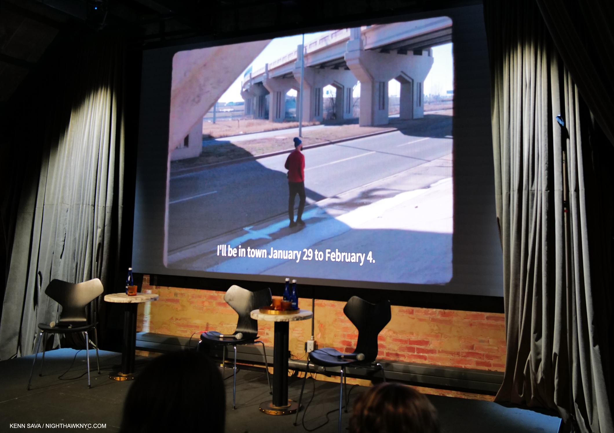
On the road, again. Gregory Halpern looking for subjects in Oklahoma City as he talks in the voice-over about his Instagram announcement seeking Portrait subjects. Still from a fascinating video short about his week in OKC at Fotografiska, July 20, 2023.

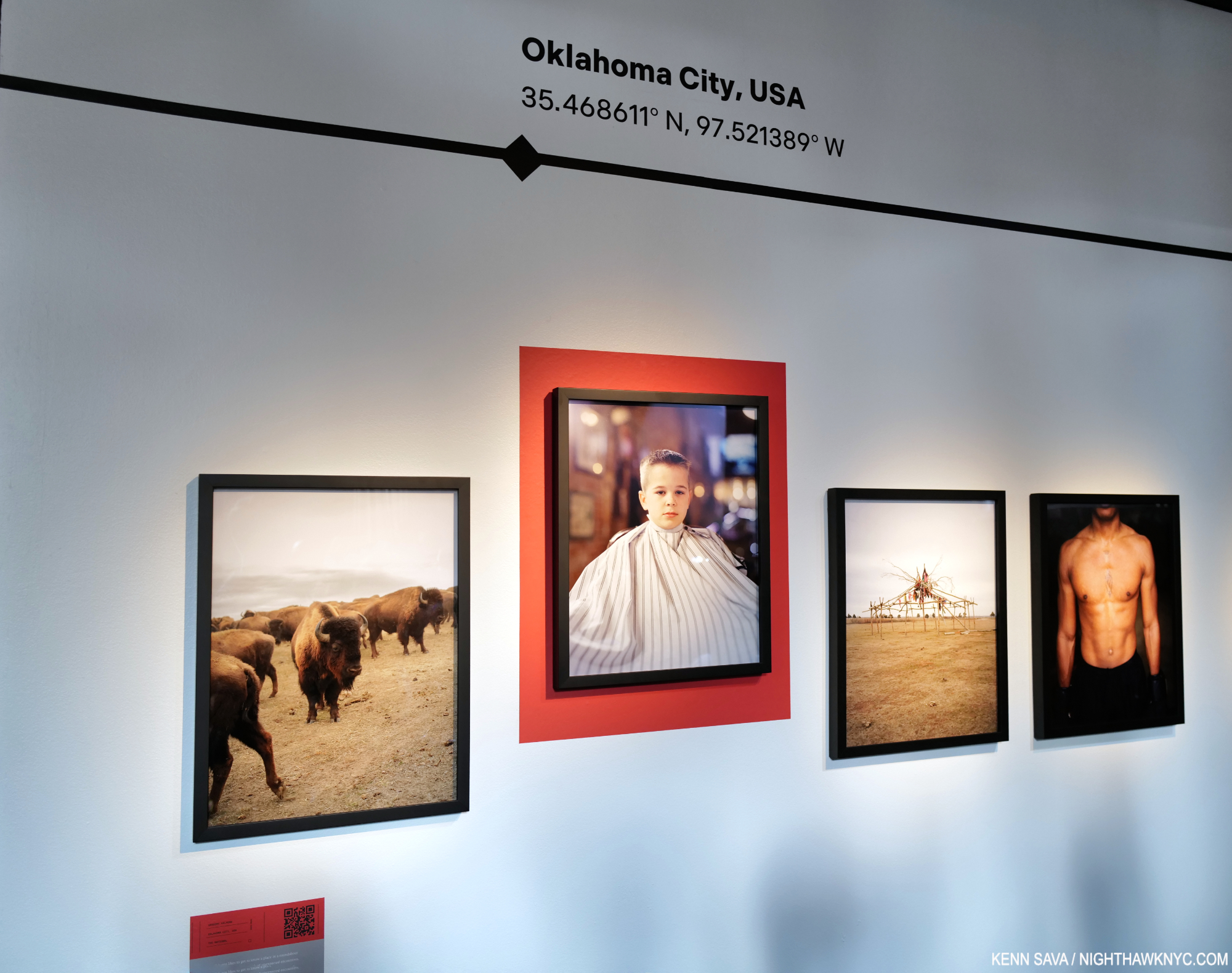
A few weeks earlier, at Fotografiska in the Flatiron on July 20th, Mr. Halpern was joined by 3 Magnum Photos Photographers, of which he is now also a full member, in a show sponsored by a hotel chain titled Impressions. The Photographers were ensconced in separate hotels around the world and asked to document what they experienced. Mr. Halpern went to Oklahoma City, and exhibited 4 Photos (as did each of the others- Cristina de Middel, Jonas Bendiksen, and Alessandra Sanguinetti) in what is the first new work I’ve seen of his since Let the Sun Beheaded Be, 2020.

Here is Mr. Halpern’s presentation-

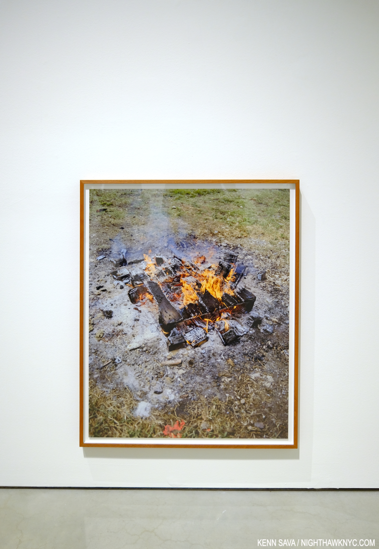
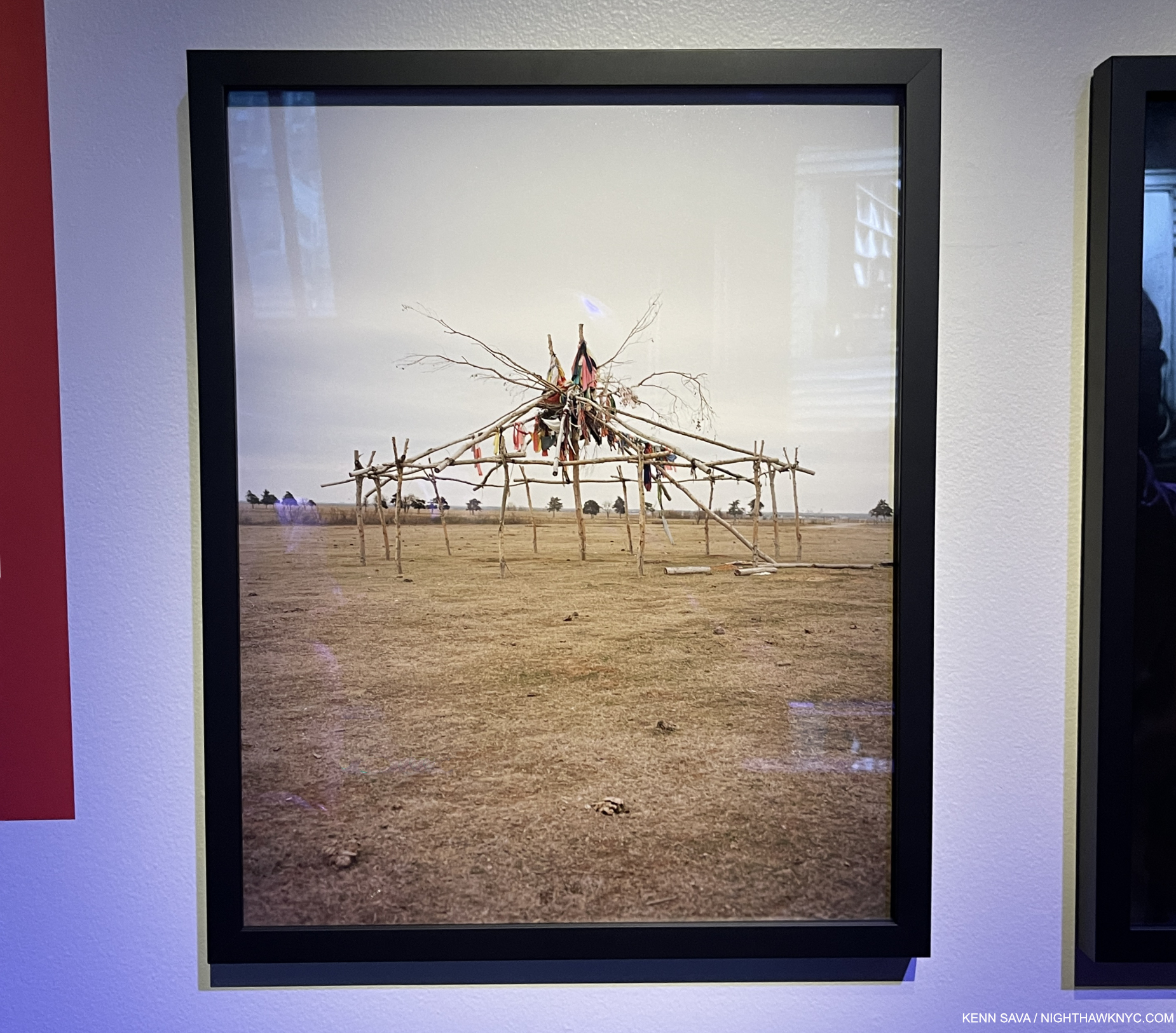
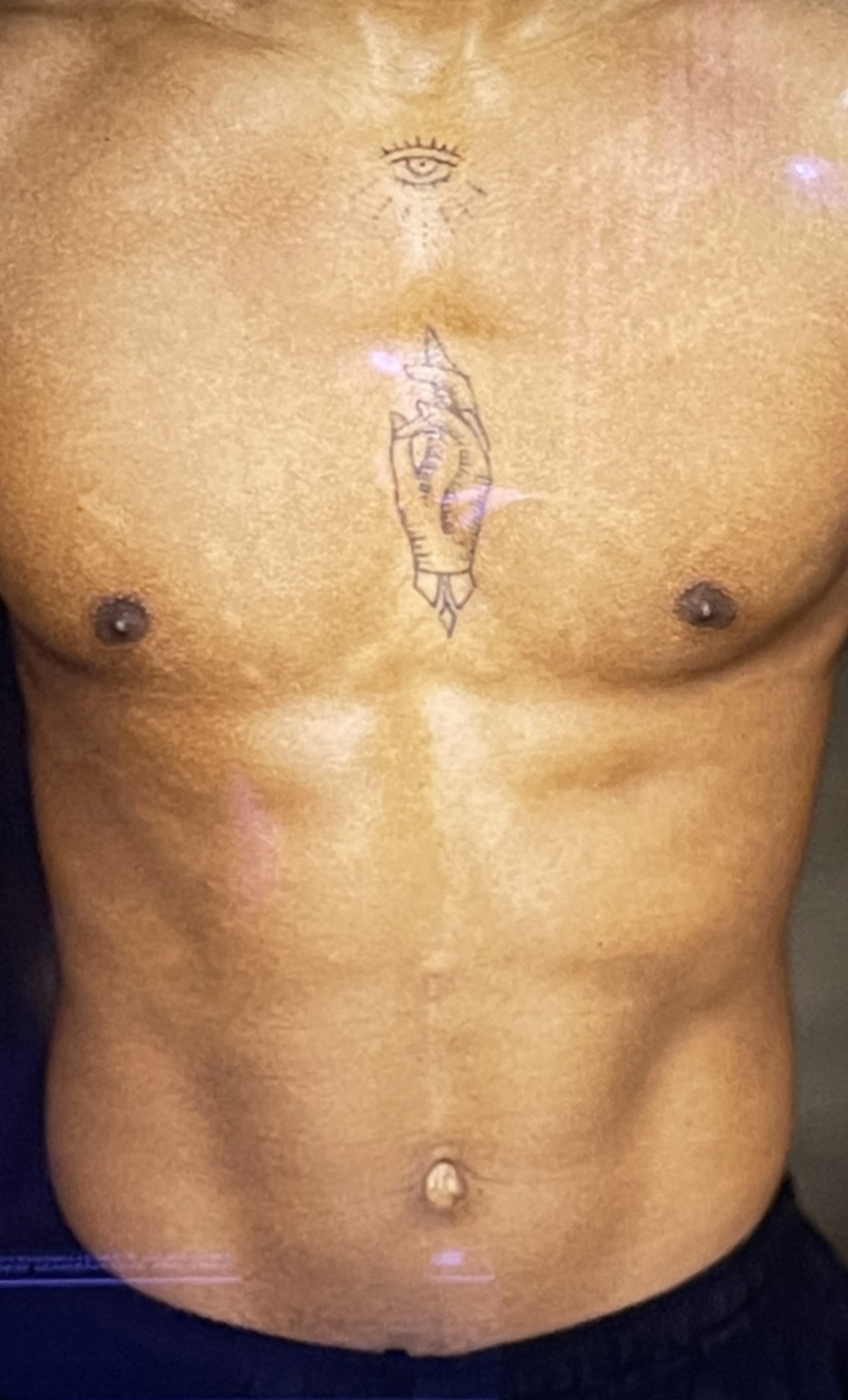
I find the arrangement particularly interesting. We see animals, a Portrait of a young man in a barber’s cloth, some sort of structure, and a torso bearing a tattoo. Looking at these, yes, Let the Sun came back to me. Each of the four images “represents” one of its unofficial themes- animals, a human, the evidence of the land/history, and another human. The surreal is also represented in all four (at least for me).

It would be easy to say they “harken back” to what we saw in Omaha Sketchbook. That book featured images of masculinity (along with images of animals, the land & history and other themes), like Douglas, Army Jurnior Reserve Officer Training Corps, Bellevue, 2005-18, to cite one example out of many; the young man getting a haircut harkens back to those societal expectations and traditions. Ostensibly, it’s a straight-ahead image of an event that parents are fond of documenting during childhood. Yet, there’s an air of mystery around it. The young man stares at the camera with a somewhat stoic look that gives away little. The barber cloth hiding anything the might tell us more about him. His haircut appears to be finished and he’s ready to face the world again. Yet, I’m reminded of Clément Chéroux’s essay in Let the Sun when he speaks about the guillotine, Guadeloupe, and the mechanics of Photography. He mentions Photographers refer to Portraits as “cutting heads.” Here we see just that twice- once with only the head (in a Print mounted on a red background), and once of a torso sans head. Notice how the Print of the young man is mounted higher than the others- at a height where the young man’s head just about “completes” the Portrait of the tattooed torso on the right.

Detail of the far right Photo, showing the tattoo. Speaking of recurring themes, t’s interesting to contrast this with the very first image in this piece from ZZYZX.

It reminds me of some of the games the Surrealists used were fond of playing, like the one Kerry James Marshall based his recent show on.

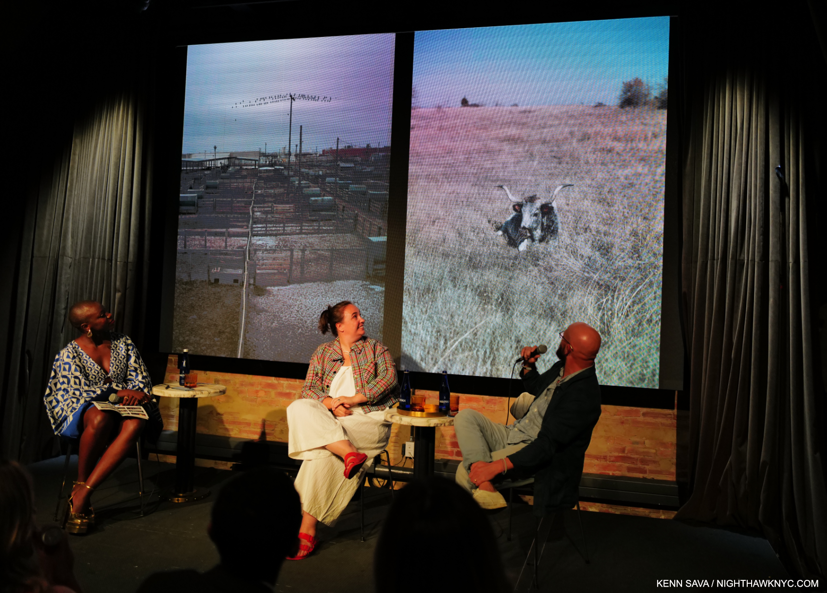
Mr. Halpern discussing two other images from his OKC series.

Of course, this is only my reading of it- your results may differ, as Mr. Halpern’s intentions may as well. In the end, I’m lucky I never have to leave NYC to find Surrealism. It finds its way here from all over the world.

*- Soundtrack for this piece is “Captains and Cruise Ships” by Owl City.

NighthawkNYC.com has been entirely self-funded & ad-free for over 8 years, during which 300 full-length pieces have been published! If you’ve found it worthwhile, PLEASE donate to allow me to continue below. Thank you, Kenn.

You can also support it by buying Art, Art & Photography books, and Music from my collection! Art & Books may be found here. Music here and here.

Written & photographed by Kenn Sava for nighthawknyc.com unless otherwise credited. To send comments, thoughts, feedback or propositions click here. Click the white box on the upper right for the archives or to search them. Subscribe to be notified of new Posts below. Your information will be used for no other purpose.

  1. As far as I know, there has not been a Gregory Halpern solo show in NYC since the auspicious Gregory Halpern: A at Clamp Gallery from January 5th to February 11th, 2012, as hard as that is to believe. If you know of one subsequently, please let me know.
  2. From 2019, per Clément Chéroux, “GH/971” in Let the Sun Beheaded Be.
  3. Which is not his first. He showed Sculpture for the first time earlier this year in Gregory Halpern: 19 Winters/7 Springs at Transformer Station, Cleveland.
  4. ibid