NoteWorthy Art Books, 2023

This site is Free & Ad-Free! If you find this piece worthwhile, please donate via PayPal to support it & independent Art writing. You can also support it by buying Art & books! Details at the end. Thank you.

Written & Photographed by Kenn Sava

Art books were one of my first passions. I was about 8 when I first fell under their spell. The chance to see an Artist’s whole body of work in one portable object enthralled me then as much as it still does. For the next decade they were the only way I could see and explore Art. When the pandemic hit they were, once again, the only way I could see and explore Art. Now, between researching for an upcoming piece, checking out new and older Art & PhotoBooks, and discovering Artists I previously didn’t know, I’m in bookstores on an almost daily basis. Suffice it to say I see a lot of Art & PhotoBooks…

This past year, which isn’t nearly over yet, four books stood out for me among all the Art Books I saw in 2023. Since I don’t believe the “best” exists in the Arts, I prefer to call them “NoteWorthy,” i.e. books I most highly recommend among all those I saw in 2023. These books would be on my list for 2023 whether the year was 9 months or 13 months long so I’ve decided to announce my list early.

My criteria are the importance of the work shown and how well the book has been executed. All four of the subject Artists are among the more note worthy in Contemporary Art. Two of the four books are the first in-depth look at their subject, hence their importance, and all four are likely to remain the “go-to” references on their subject for the foreseeable future. They are listed in no particular order.

NoteWorthy Art Books, 2023
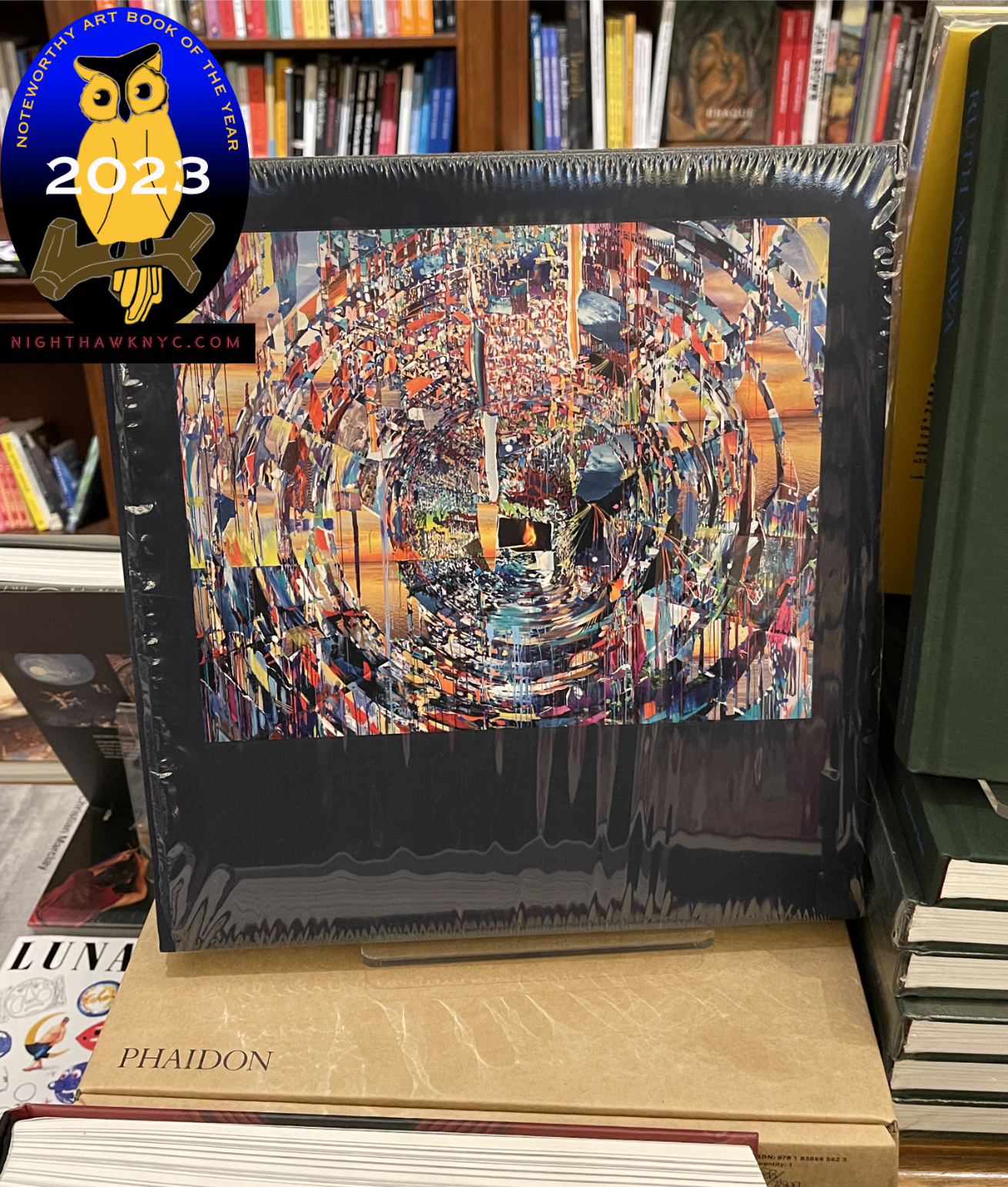
Sarah Sze: Paintings. A sealed copy of the hardcover sitting on top of its brown shipping box. Click any image for full size.

Sarah Sze: Paintings, Phaidon
I’d been going to Sarah Sze’s one-of-a-kind “Sculpture” (which is too small a word for what she creates) shows for a few decades when, in 2020, I was astonished to discover that not only is she also a Painter, but she started out as a Painter (and then was a Painting and Architecture student in school). When I first saw her Paintings in person, which I wrote about here, I was stunned. She sprang an accomplished, fully formed and revolutionary style on me. Whoa! Here she was already one of the foremost Artists of our time, now, she’s also one of our major Painters.
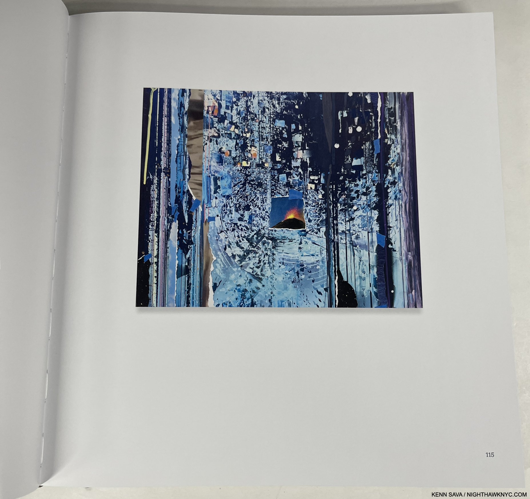
Ghost Print (Black Ripple), 2019, Oil, acrylic, acrylic polymers, ink, aluminum, archival paper, diabond and wood, 16 x 20 inches.

This year, Phaidon, the leading Contemporary Art book publisher among the major Art book publishers, immortalized her accomplishment in an absolutely gorgeous huge book, the best designed Art book I saw this year from the major Art book publishers. When I heard rumors of it coming, I wondered- Does she have enough Paintings to do a book of them? Seeing it in person left me dumbfounded. Inside the slipcase was a FOUR HUNDRED PAGE hardcover, the whole weighing 10 pounds! Paging through I was quickly lost. From the infinite, to the minute, is something that runs through Ms. Sze’s installations and now through her Painting.
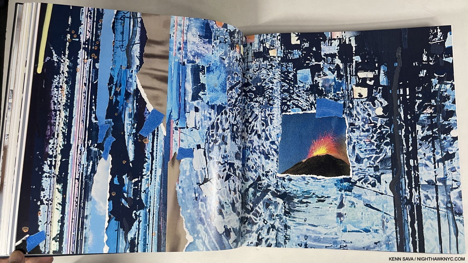
Gutters are one of the biggest problems with physical Art & PhotoBooks, one that an eBook should be able to solve. However, the vastly superior resolution of the printed page is still the only way to see Fine Art in print- decades after the invention of the eBook. Detail of Ghost Print (Black Ripple). Though I NEVER fully open a book and lay it flat, to preserve the binding. Even 3/4 open, as here, very little is lost to the gutter when compared with the Photo of the full piece, above.

Having Photographed her Paintings myself a number of times in two shows, even though the work is incredibly intricate, it’s hard to imagine the Photography of it in the book being improved on. It’s accompanied by a rock-solid binding, and top-notch attention to production detail throughout. Every copy is signed by the Artist & numbered. ALL of this I take as a sign of how closely Sarah Sze was involved in the making of this book. What more can anyone ask? Sarah Sze: Paintings is a state-of-the-Art Painting monograph.

Sarah Sze remains the only living Artist I’ve called a “genius” in the 8+ years of NighthawkNYC.  I did so in my look at her most recent NYC gallery show in 2020, here. My look at her mesmerizing Summer, 2023 Guggenheim Museum show, Timelapse, is in preparation. If I hadn’t called her a genius in 2020, I’d call her one now.

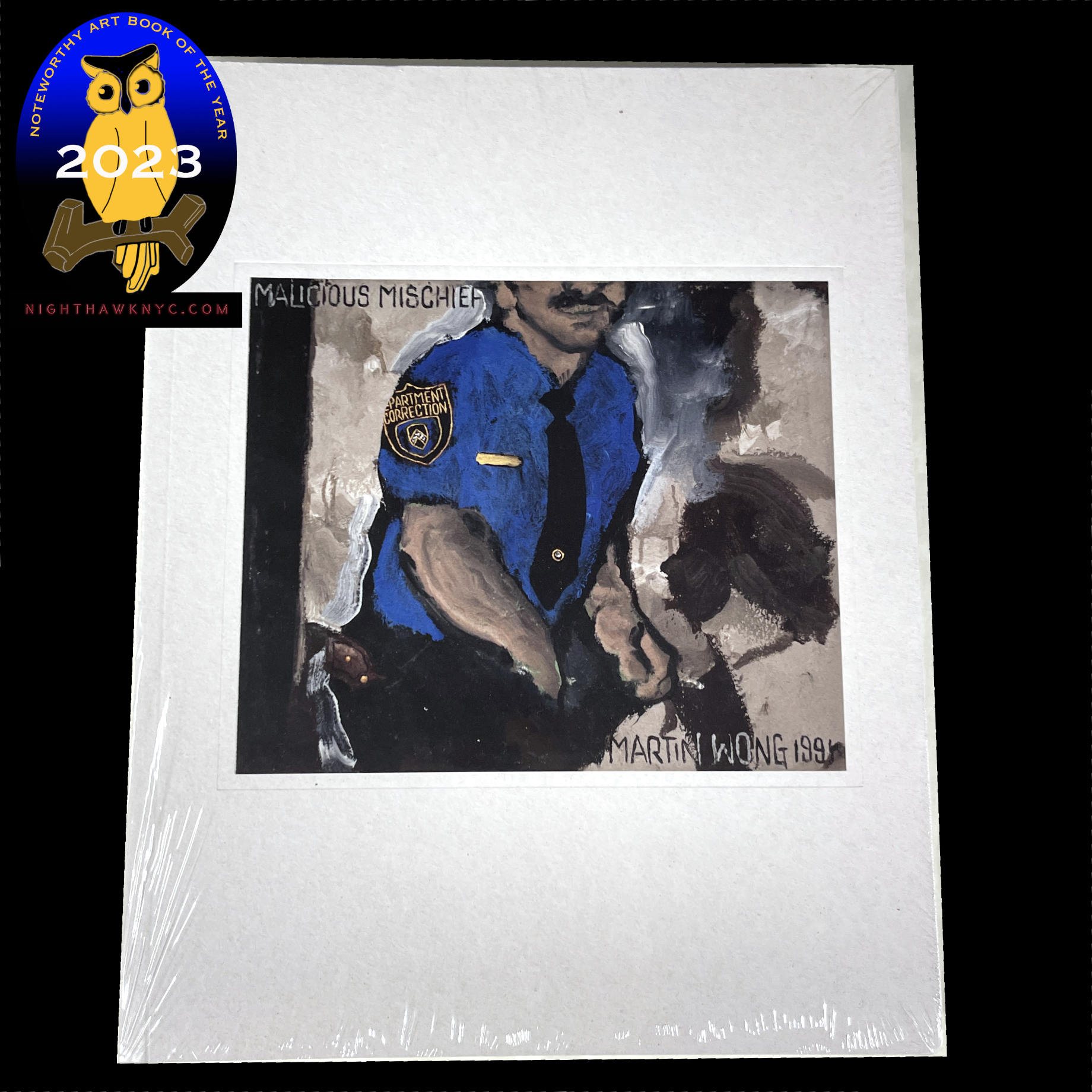
Martin Wong: Malicious Mischief, Walther Konig
Is Martin Wong (1946-99) the most overlooked Painter of the later 20th century? A very strong case could be made that he is. The museums are wising up. More and more of his work is showing up in their hallowed halls. Now, from 2022 through February, 2024, three European museums- The Camden Art Centre, London; Museo Centro de Arte Dos de Mayo (CA2M), Móstoles, Madrid, and the Stedelijk Museum Amsterdam are hosting a traveling exhibition, Martin Wong: Malicious Mischief, of over 100 works, the largest show of his work so far. The Met had the spectacular Martin Wong shown further below up in the Contemporary Wing where I saw it this past year, which I believe they have now lent to the show. As far as I know, he never saw a book published on his work during his lifetime.
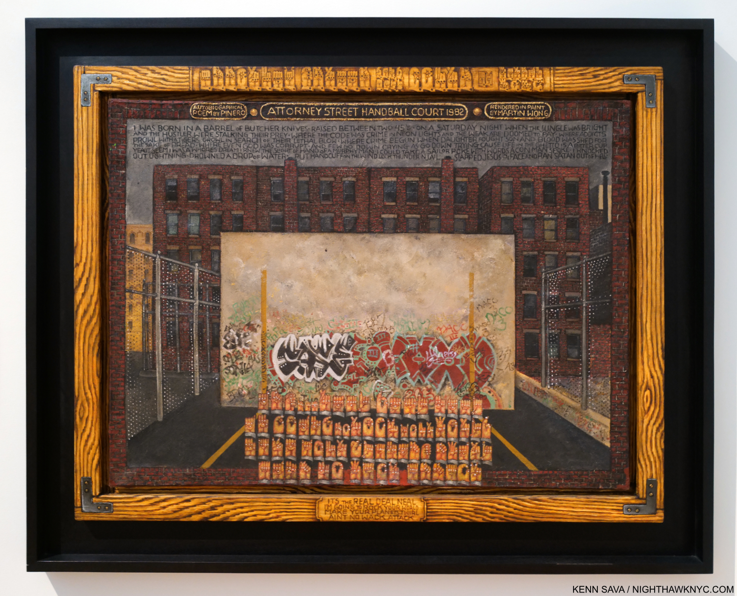
Martin Wong, Attorney Street (Handball Court with Autobiographical Poem by Piñero), 1982-4, Oil on canvas, 35 1/2 x 48 inches. Seen at The Met in June, 2022, Though he didn’t live to see a book on his work, he did live to see his work in The Met, who acquired Attorney Street in 1984, just after he finished it. Those hands along the top of the faux frame and near the bottom are speaking in American Sign Language.

Now, there have been two. Martin Wong: Malicious Mischief, the book, published to accompany the show, is the largest and most comprehensive book on his work so far. The only other one known to me, Martin Wong: Human Instamatic, published to accompany the show of the same name at the Bronx Museum in 2016, is long out of print, i.e. “expensive.” I have it, but I recommend Malicious Mischief. Here, his case has never been more completely and more beautifully made.

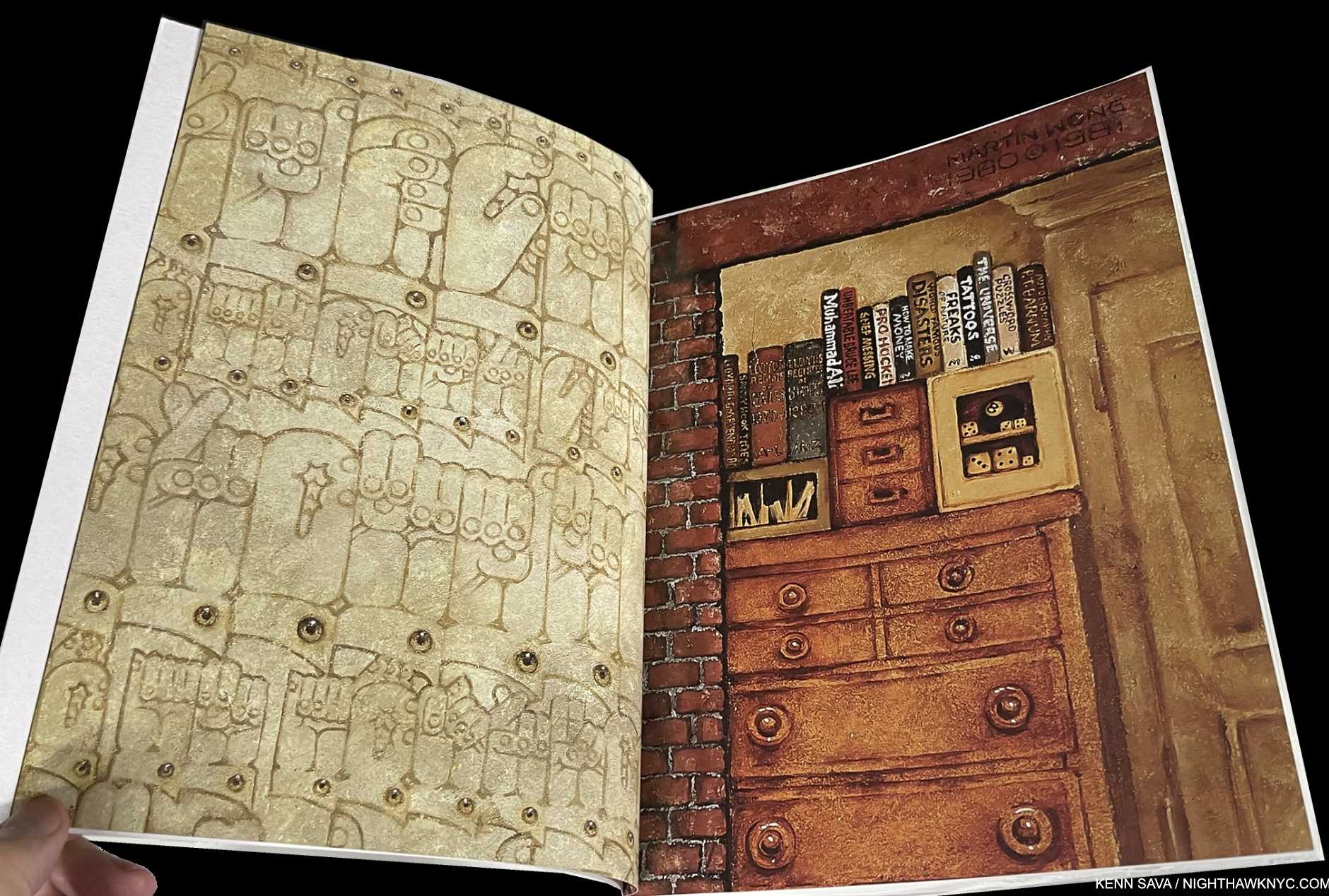
The second and third page of the book, showing details from his Paintings by way of introduction.

Martin Wong was something of the unofficial “Poet of the Lower East Side,” but never got the recognition or attention his contemporaries Jean-Michel Basquiat or Keith Haring did even though he outlived both. Still, twenty-four years after his passing, his work has continued to hold up and fascinate. It’s, also, every bit as timely, now, as it was when he Painted it. Blessed with being able to work in a wide range of styles, his work is characterized by its freedom from piece to piece. Throughout, his Draftsmanship forms a rock-solid base, which he carries through with an extremely high level of attention to detail.

It’s a paperback, unfortunately, a cardinal sin in my view for a book this important, and the cover is a bit on the malleable side; the paper stock could be thicker. Still, its importance outweighs these drawbacks. At 339 pages and over 3 pounds it’s a good-sized book with 8 1/2 by 11 inch pages which show the copious and fascinating detail in Mr. Wong’s work to advantage. Imported catalogs for shows, like this, have a habit of not staying available indefinitely. So act soon to “avoid disappointment and future regret” as the informercials say. Which reminds me- the next time I regret not buying something from an infomercial will be the first time.

Rod Penner: Paintings, 1987-2022, The Artist Book Foundation
What more/else can I say about Rod Penner: Paintings that I didn’t say in my in-depth review of it is here? Actually, I can say that it was on my original draft of my Desert Island Art Books, along with the Martin Wong, above. Pretty remarkable when you look at the publishing dates for the books on the final list. Realizing my draft list was too long, I made the hard choice of focusing on older books that have stood up for me for years, and left off the two that were less than one-year old. While I didn’t put them on that list, they deserve to be on this one.
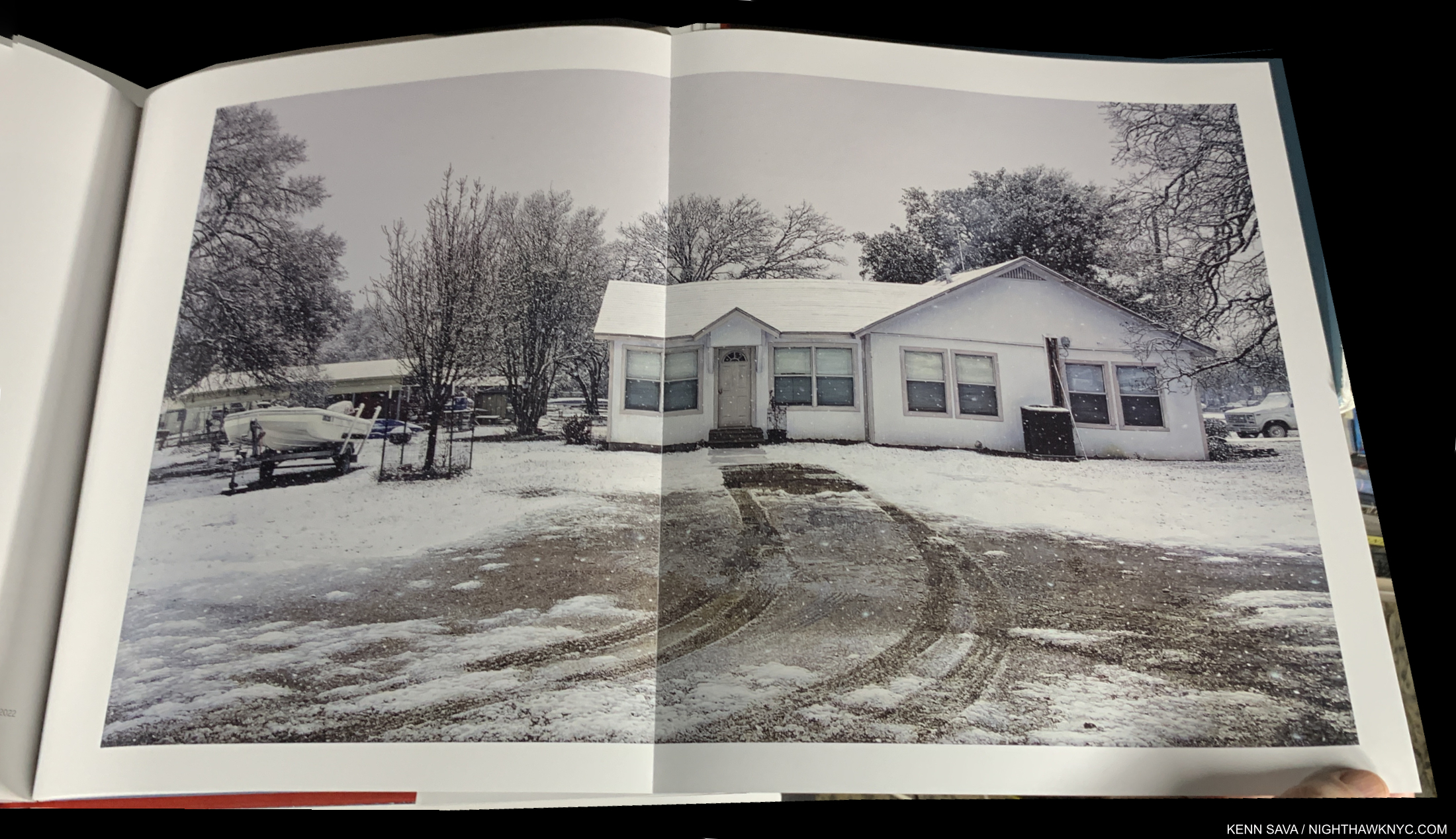
House with Skiff/Marble Falls,TX, 2022, Acrylic on canvas, 32 x 54 inches. The most recent work in the book shows that Rod Penner is still at the very top of his considerable game.

A full-length book on Rod Penner has been a long time coming. What we got is something unusual in my 50 years of Art book experience: a book that serves the dual purposes of being both a monographic overview of the Artist’s work these past 35 years, AND a Catalogue Raisonné containing everything the Artist has Painted through 2022. As such, it will serve those new to Rod Penner’s work, as well as collectors, curators and Art historians, well indefinitely.

My pieces on Rod Penner are here, including my recent look at his Spring, 2023 NYC show, where I said that Rod Penner is “the foremost Painter of small-town America working today.” I believe that after the distracting hype surrounding his remarkable technique dies down, and more people get down to looking at what he’s Painted, that that’s how this work will be thought of.

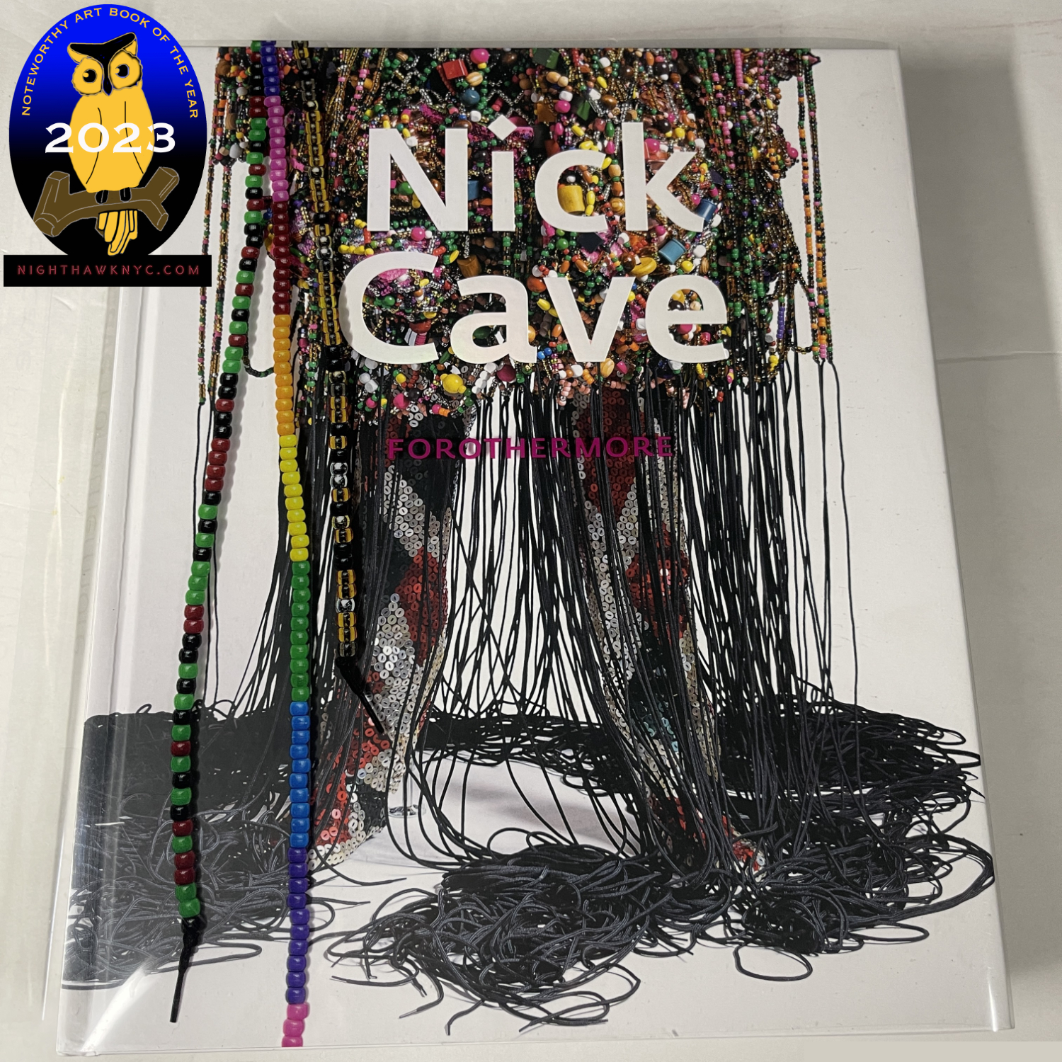
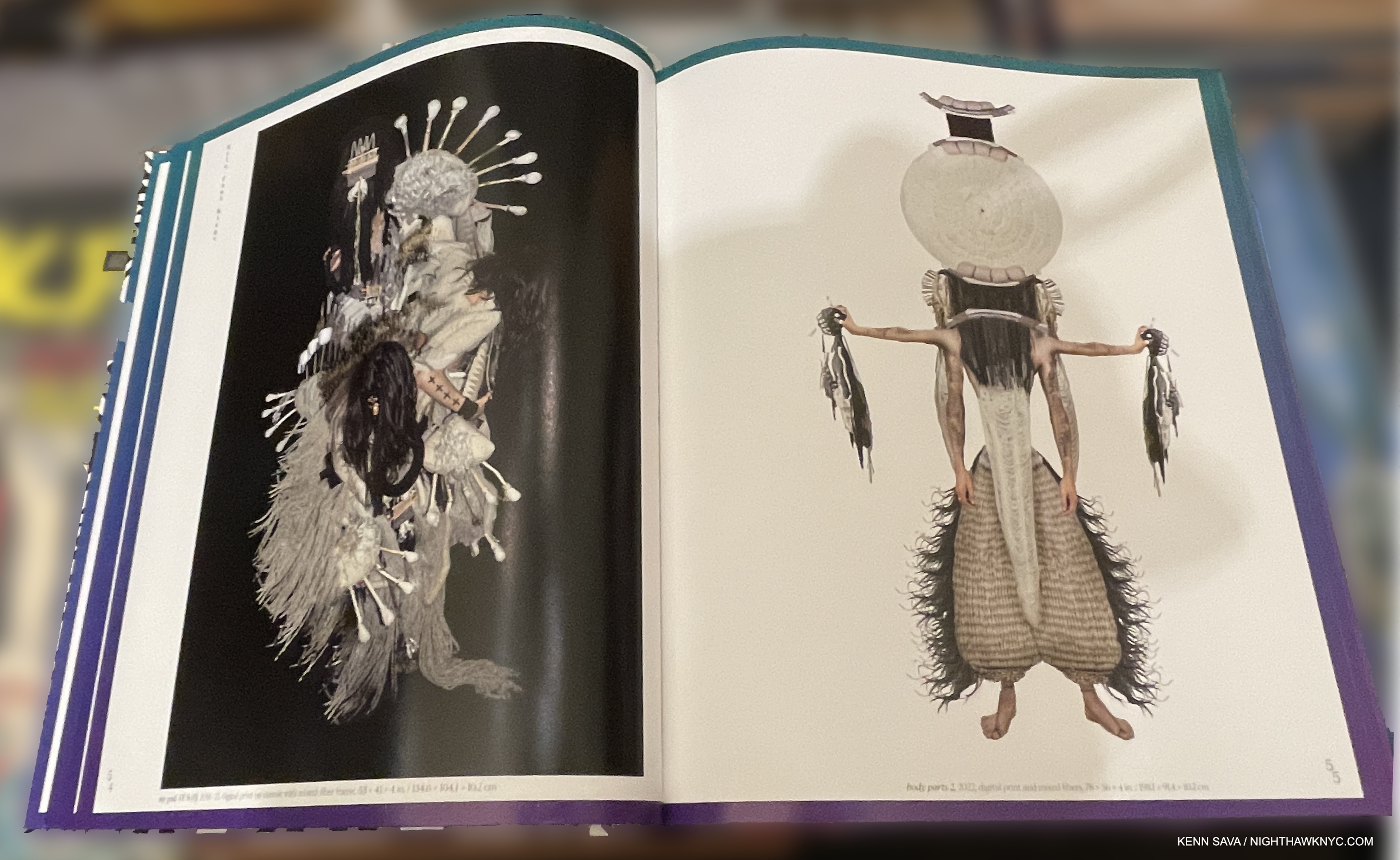
Nick Cave: Forothermore, Museum of Contemporary Art, Chicago/DelMonico
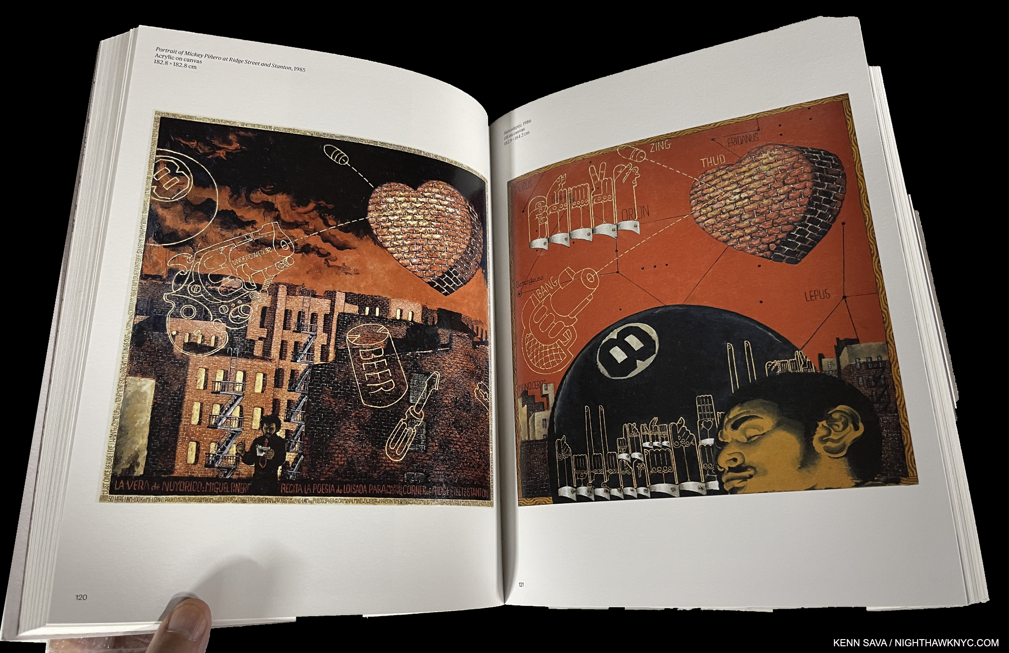
Nick Cave’s books are always gorgeous, and important. With only 10 published on his work so far (he says, though I’ve only seen 5), all are worthy of his extraordinary talent, and all worth seeking out. This is indicative of his involvement in them. Forothermore, the catalog accompanying his landmark mid-career retrospective at the Museum of Contemporary Art, Chicago, which traveled to the Guggenheim Museum earlier this year, is now my go-to choice among the 5 I’ve seen, a very hard choice to make. Of the show, I wrote, “I went in believing Mr. Cave is one of the more important Artists working today. I left speechless.”
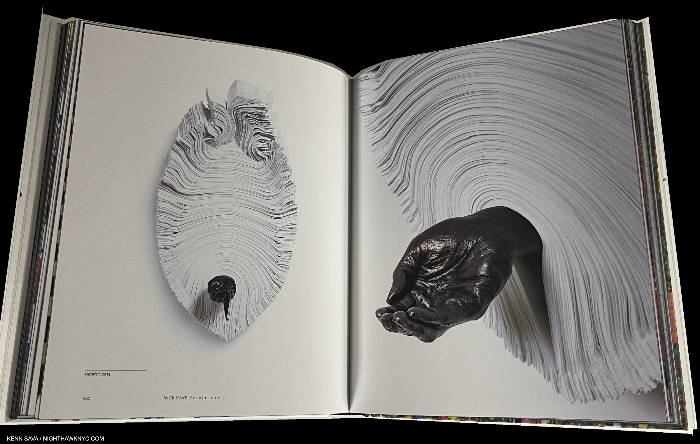
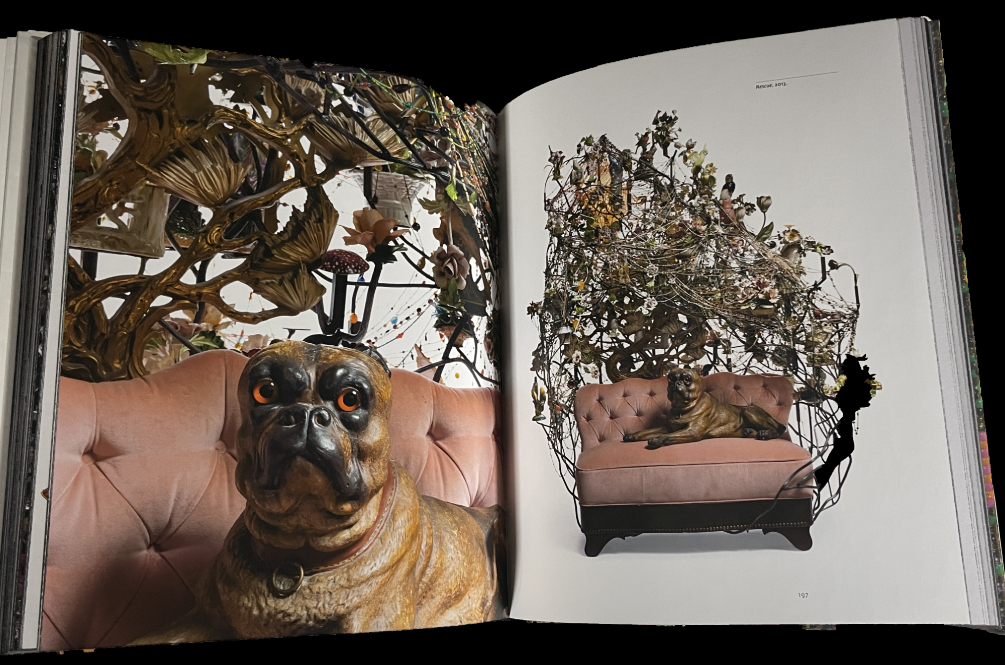
I wrote extensively about Nick Cave’s famous Soundsuits, in my piece on the show and they are featured throughout the book. Here is some of his other work, Untitled, 2014. As for the wonderful design, I love how he’ll often get around the problem of the gutter by putting the full work on one side, and a compelling detail on the other.

Luckily, exhibition catalogs live on indefinitely after their subject show, and some enhance their value to readers by serving more than one purpose. This is one example. It’s gorgeously & lovingly produced and features large Photos of Mr. Cave’s work throughout his career, which allows for closer study & appreciation of the incredible amount of detail and subtlety in his work (just look at the cover and remember that is all hand-made).

Rescue, 2013

All of this makes Forothermore doubly important as both the exhibition catalog for the show and the go-to book with beautiful reproductions of the most comprehensive collection of Nick Cave Art over all of his career, including his recent work, among his excellent books. Speaking of them, if you want one Nick Cave book, I’d choose Forothermore right now, but do at least take a look at Until (2017); Epitome (2014); Meet Me at the Center of the Earth (2010); and Greetings From Detroit, (2015) if you want to see just how hard the choice is!
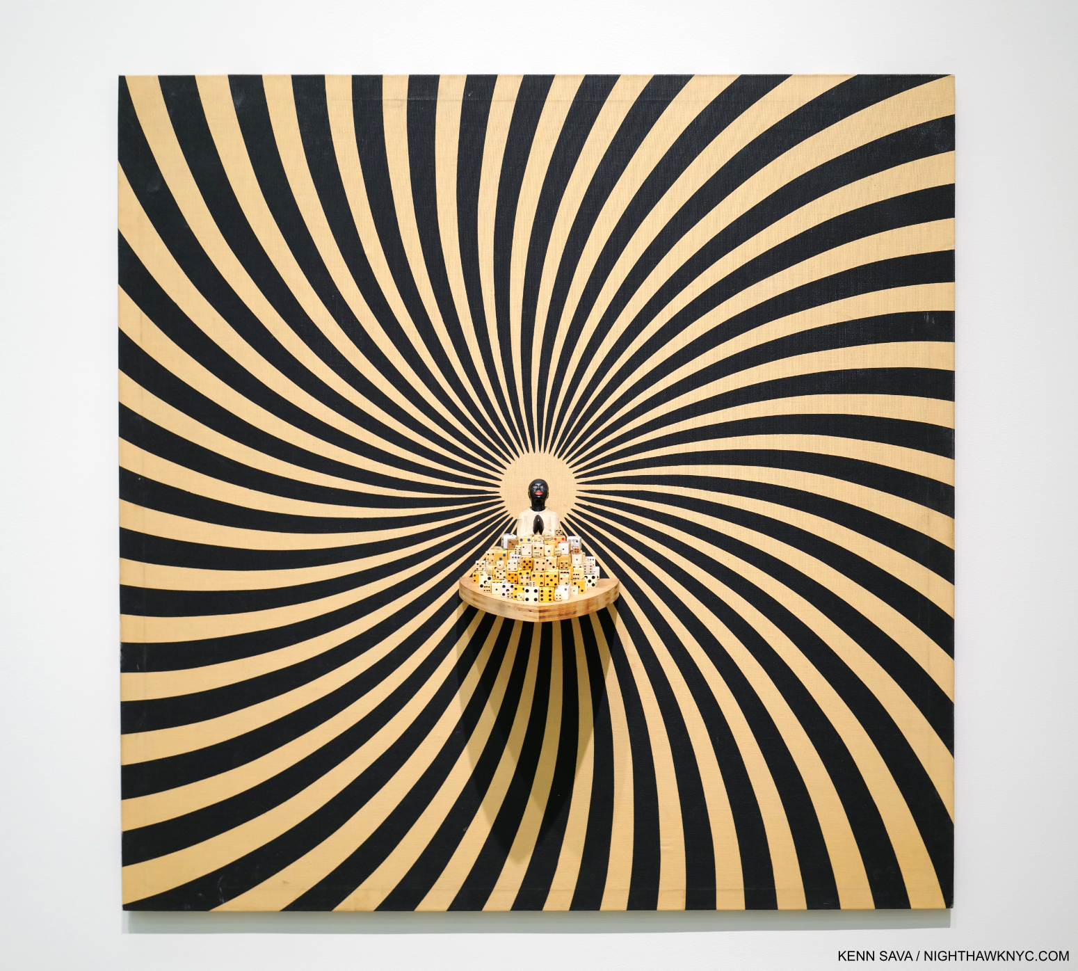
I Wouldn’t Bet Against It, 2007, Mixed media including vintage fabric, dice, and objects, 48 by 48 by 6 inches, as seen in the show, though it also appears on pages 154-5 of the Furthermore catalog.

Nick Cave is so unique, and so important, I can’t help thinking that we’re looking at someone who could very possibly become an Art “superstar.” Can you imagine his impact on the fashion world, if he chose to get involved in it? I also have the feeling that if and when “stardom” does happen for him, Mr. Cave would handle it with every bit as much class and purpose as he has everything else in his career.

My look at Forothermore, the show, is here. My look at Nick Cave’s just completed large NYC Subway Public Art Installation is here.

Also Recommended-

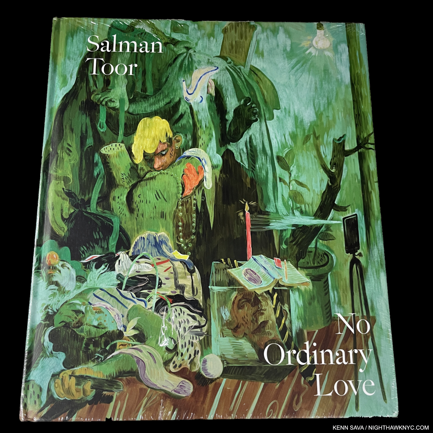
Salman Toor, No Ordinary Love, Baltimore Museum/Gregory Miller

I saw Salman Toor’s first solo museum show, How Will I Know, at the Whitney Museum in 2021, and put his name on my list. Still, I was not prepared for the depth and level of accomplishment his first book, No Ordinary Love, reveals. Published to accompany a show of the same name at the Baltimore Museum, both struck a nerve because the book evaporated (i.e. it’s already sold out). I’m really not surprised. His work is fresh, bold, sensual & beautiful with a unique sense of color, and in a style completely his own. His work echoes Paul Cadmus’s for me, but looks nothing like it. Stylistically, he seems closer to early and late Philip Guston and Lisa Yuskavage, but none of this is said in comparison. Salman Toor is, deservedly, the 2023 Art world phenomenon that previously touched Jordan Casteel and Jennifer Packer these past few years.
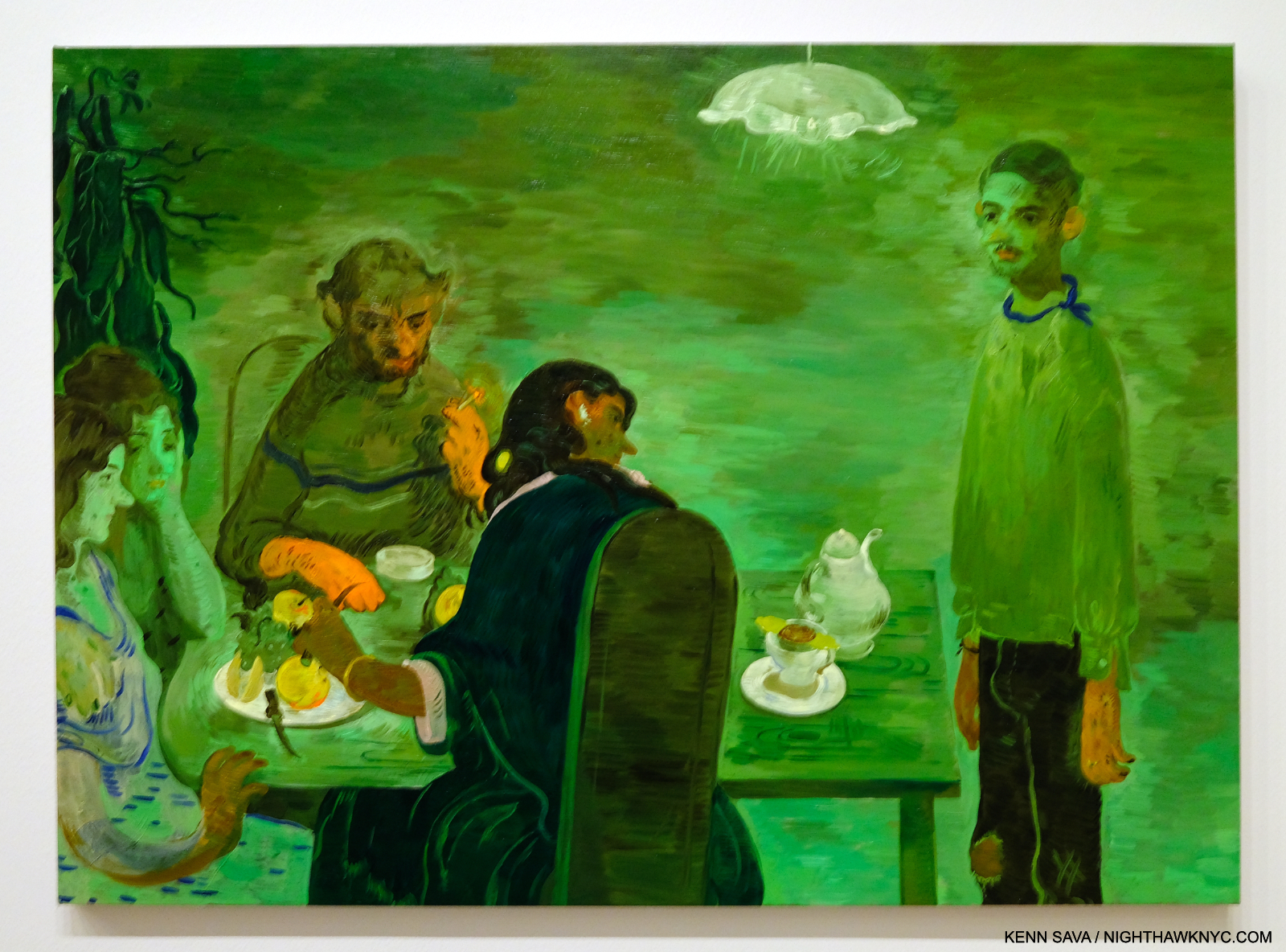
Tea, 2020, Oil on canvas. Seen at Salman Toor: How Will I Know, at the Whitney Museum on March 26, 2021.

Born in Lahore in 1983, and now American, Mr. Toor must have had (or will have) a terrific 40th Birthday after The Met bought one of his Paintings this year.

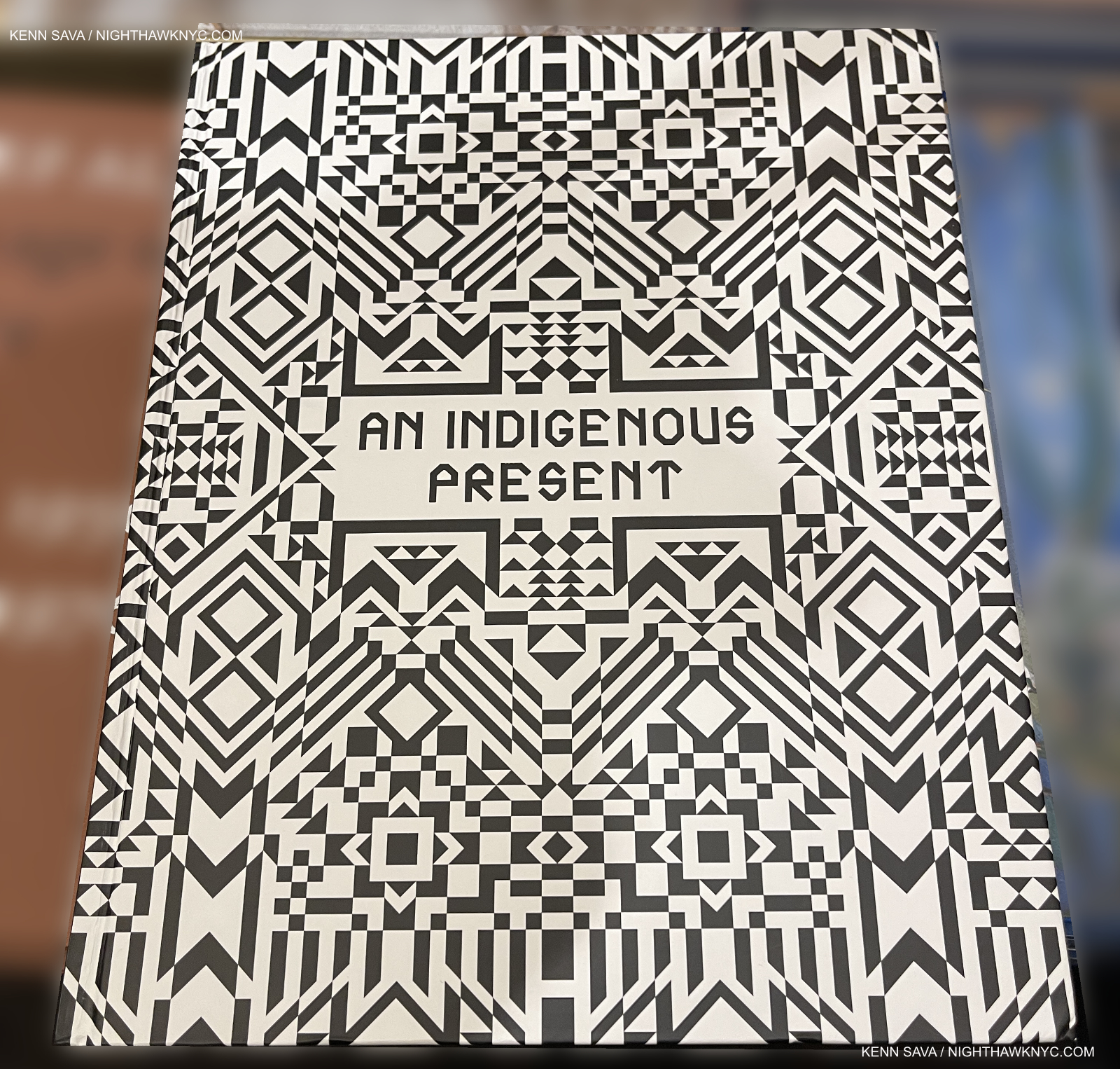
Jeffrey Gibson, et al, An Indigenous Present, DelMonico

Indigenous Artists have finally begun to get the attention they deserve.
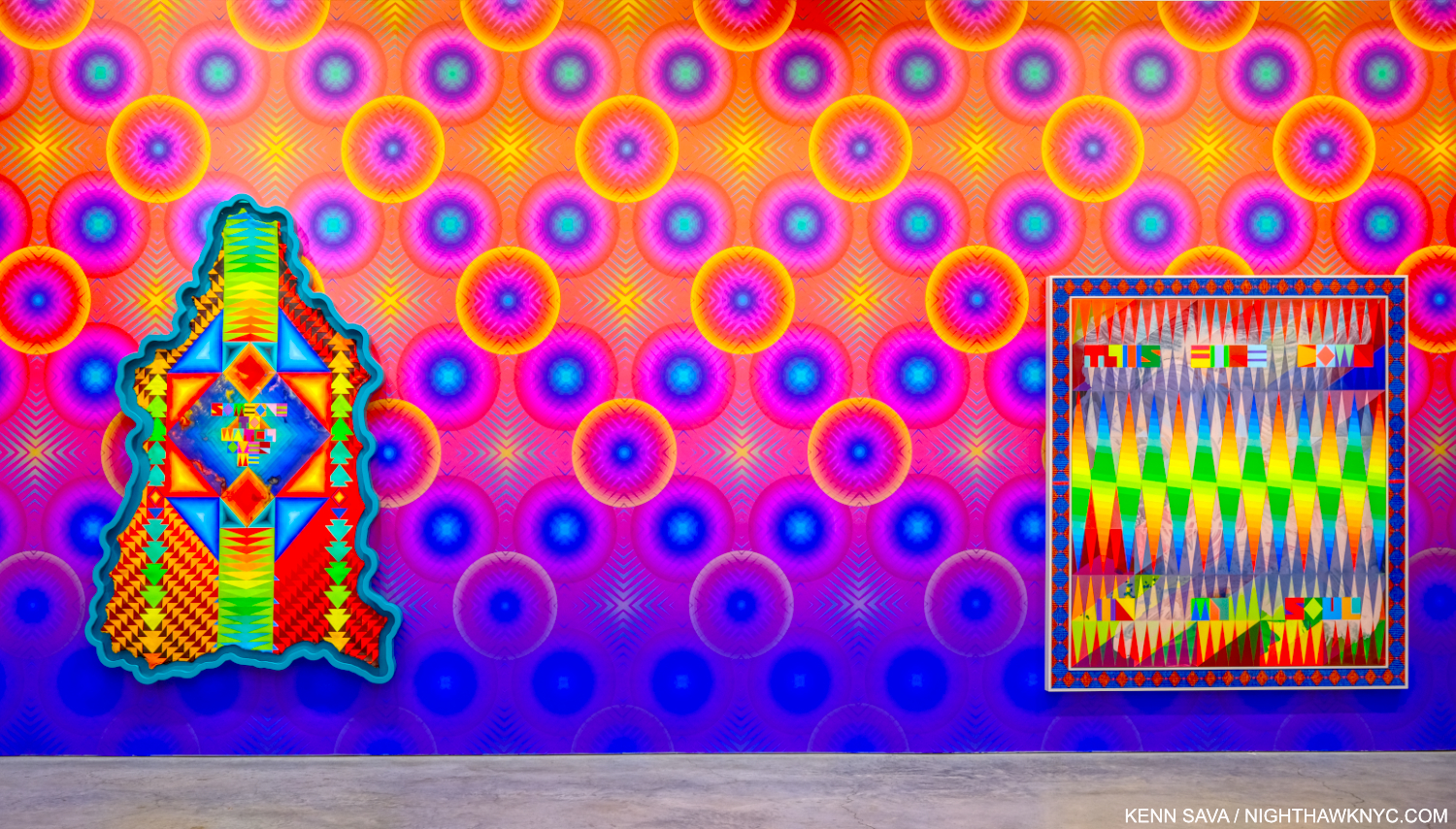
Have you ever seen a canvas shaped like this? Jeffrey Gibson, SOMEONE TO WATCH OVER ME, 2023, Acrylic paint on elk hide inset in custom wood frame, 103 x 69 x 5 inches, left, THIS FIRE DOWN IN MY SOUL, 2023, Acrylic on canvas, glass beads, artificial sinew, inset to custom wood frame, 88 x 80 inches, right. “Wallpaper” by the Artist. Seen in Jeffrey Gibson: ANCESTRAL SUPERBLOOM at Sikkema Jenkins, September 22, 2023.

Jeffrey Gibson, who has a beautiful show up as I write at Sikkema Jenkins, NYC, Jeffrey Gibson: ANCESTRAL SUPERBLOOM (which I wrote about here) conceived this collection/overview of 60 of his fellow Indigenous Contemporary Artists. What an eye-opener! What impresses me is the vast depth of Artists who are doing their own thing, seemingly working outside the traditional model of Western Art, and instead basing their work on their traditions, heritage and experiences. “Ancestral,” to quote Mr. Gibson’s show title, is the key, apparently.

I find it a gust of fresh air.

I recently wrote about one Artist included, Jaune Quick-to-See Smith’s Witney Museum retrospective, and another, Wendy Red Star, in passing after Kris Graves published her first book in his Lost II set. What An Indigenous Present tells me is that we’re going to see much more from many other Indigenous Artists soon.

My final Also Recommended NoteWorthy Art Book of 2023 is Hughie Lee-Smith, published by Karma. I wrote about it here.

*-Soundtrack for this piece is “Conquistador” by Procol Harum from their great live album Live: In Concert with the Edmonton Symphony Orchestra, one of the first (if not the first) live albums paring a rock band with an orchestra, from around the time I first fell under the spell of Art books.

Also see the companion piece- NoteWorthy PhotoBooks, 2023, which includes a book by an Artist.

My previous NoteWorthy Art Book lists-

NoteWorthy Art Books (and Bricks), 2021

NoteWorthy Art Books, 2020

THERE ARE NO AFFILIATE LINKS IN THIS PIECE!

NighthawkNYC.com has been entirely self-funded & ad-free for over 8 years, during which 300 full-length pieces have been published! If you’ve found it worthwhile, PLEASE donate to allow me to continue below. Thank you, Kenn.

You can also support it by buying Art, Art & Photography books, and Music from my collection! Art & Books may be found here. Music here and here.

Written & photographed by Kenn Sava for nighthawknyc.com unless otherwise credited. To send comments, thoughts, feedback or propositions click here. Click the white box on the upper right for the archives or to search them. Subscribe to be notified of new Posts below. Your information will be used for no other purpose.

NoteWorthy PhotoBooks, 2023- Two Masterpieces

This site is Free & Ad-Free! If you find this piece worthwhile, please donate via PayPal to support it & independent Art writing. You can also support it by buying Art & books! Details at the end. Thank you.

Written & Photographed by Kenn Sava

PhotoBooks completely took over my life for over 6 years from 2016 through 2022, during which time I immersed myself in Modern & Contemporary Photography (which for me is the period after the publication of Robert Frank’s The Americans in 1958-9). After not publishing a NoteWorthy PhotoBooks list for 2022, two books stood out for me among the PhotoBooks I saw this year. Since I don’t believe the “best” exists in the Arts, I prefer to call them “NoteWorthy,” i.e. books I most highly recommend among all those I saw in 2023. Both are among the most powerful books I’ve seen in years. In my opinion, both books are masterpieces. Other recommended books follow them.

Both NoteWorthy PhotoBooks have two people in common. One, Kris Graves is no stranger to this list. His A Bleak Reality was a NoteWorthy PhotoBook of 2021. His publishing company Kris Graves Projects/Monolith Editions was the NoteWorthy PhotoBook Publisher of 2020 when they somehow managed to publish EIGHTEEN books during the pandemic! This year, Mr. Graves is the Photographer/Artist/Author of one of the two, and he and his Monolith Editions is the publisher of both books (co-publisher with Hatje Cantz of one). As a result, Kris Graves Projects/Monolith Editions are the NoteWorthy PhotoBook Publisher, again, for 2023.

NoteWorthy PhotoBooks, 2023

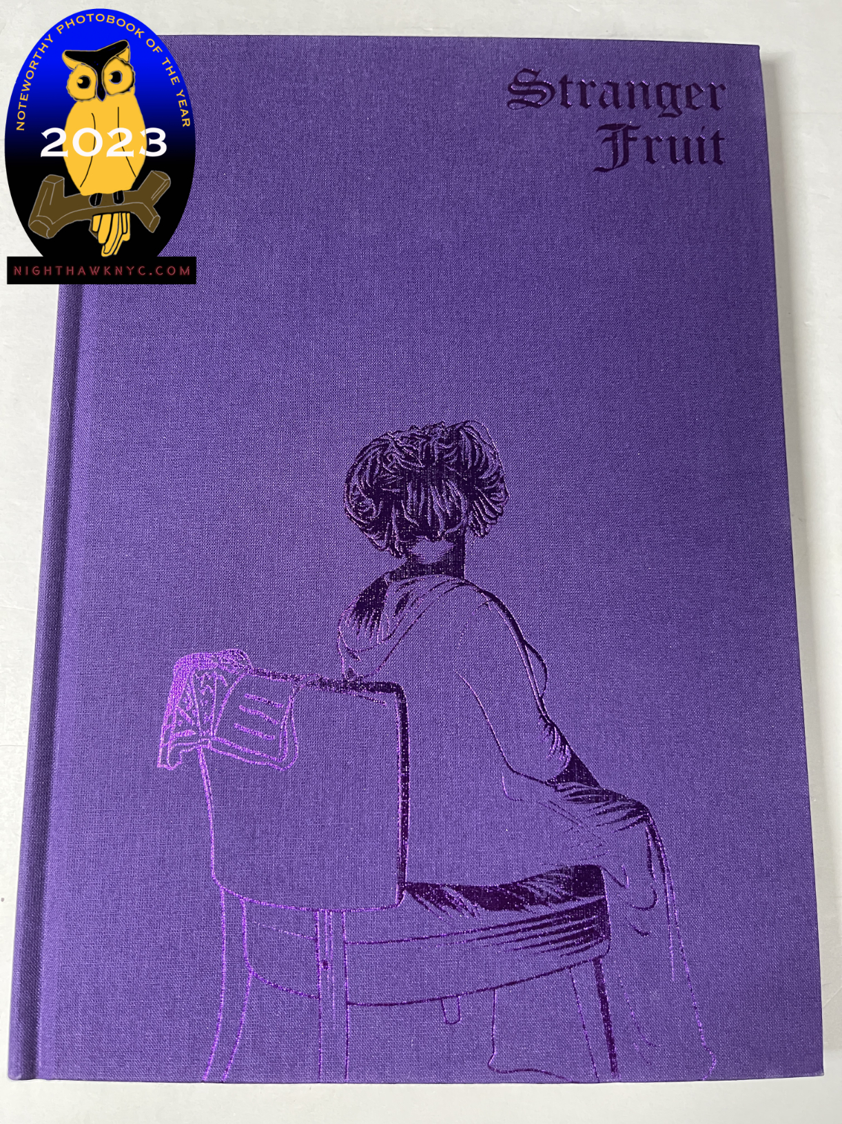
Jon Henry, Stranger Fruit, Monolith Editions

In a word: overwhelming.

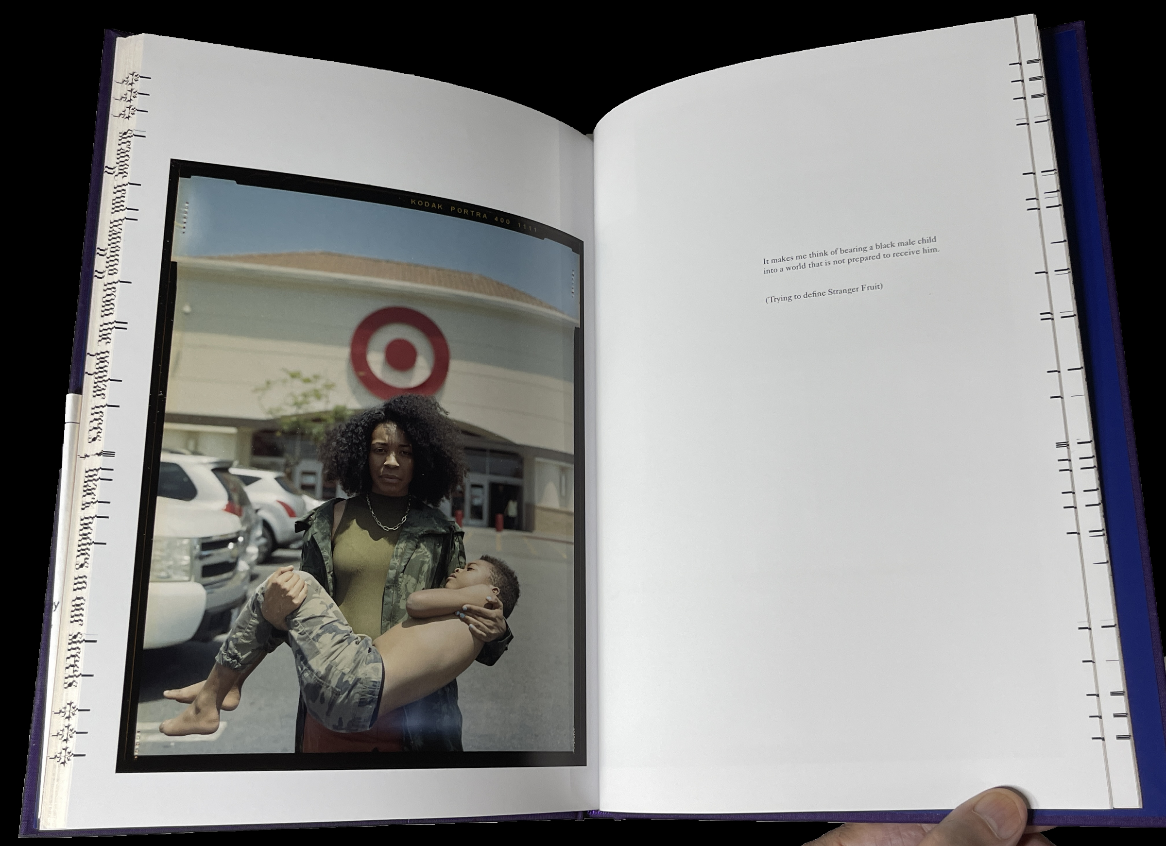
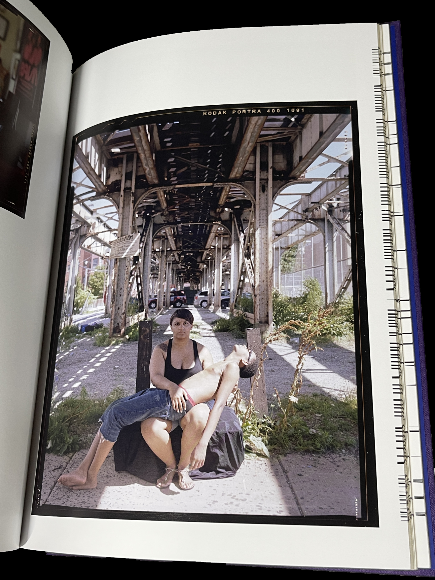
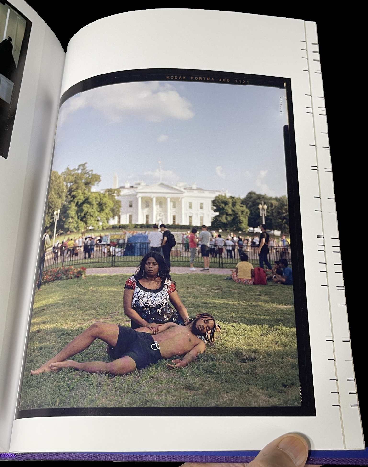
Stranger Fruit was created in response to the senseless murders of black men across the nation by police violence. Even with smart phones and dash cams recording the actions, more lives get cut short due to unnecessary and excessive violence. Who is next? Me? My brother? My friends?” Jon Henry

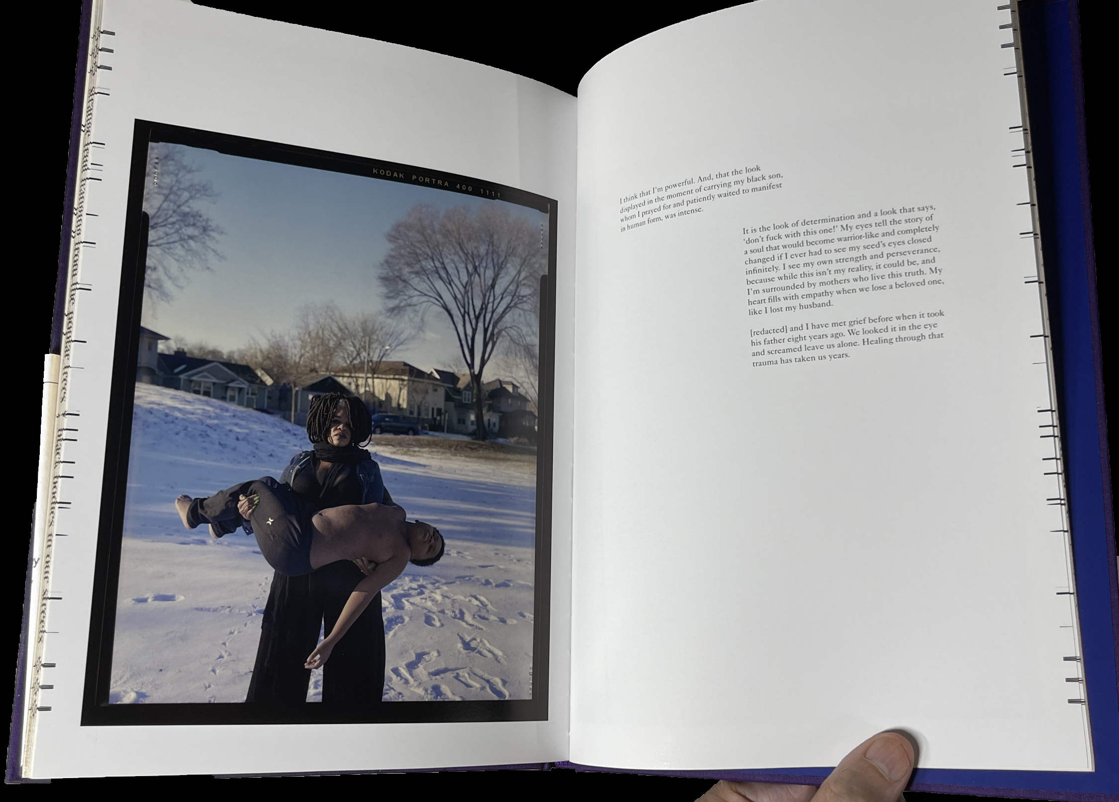
Mr Henry continues, “Lost in the furor of media coverage, lawsuits and protests is the plight of the mother. Who, regardless of the legal outcome, must carry on without her child. I set out to photograph mothers with their sons in their environment, reenacting what it must feel like to endure this pain. The mothers in the photographs have not lost their sons, but understand the reality, that this could happen to their family.”

The way Mr. Henry has chosen to depict these mothers and sons is in the form known in Painting and Sculpture as the “Pieta” (or pity). Traditionally, Jesus’s mother, Mary, holds her dead son on her lap after the Crucifixion. The “Pieta” has long been among the most powerful and poignant compositions in Western Art. To this point, and for the past 800 years, it’s been the exclusive realm of Painters and Sculptors (most famously Michelangelo).

Along comes Jon Henry, who shows that they can be every bit as powerful in Photography- even without a directly religious reference. He has chosen it to depict the unspeakable pain mothers of murdered Black sons must have experienced in the unique way of depicting mothers holding their living sons. I asked Mr. Henry how he came to use it in Stranger Fruit

 “I grew up studying painting and religious iconography by way of stained glass windows in the church I worked in, so I was very familiar with the motif.  There were more contemporary uses of the pieta, such as Dr David Driskell and Renee Cox, that really made me believe I could use this as the vehicle behind this project.
But everything really revolved around the mother.  I know that my work is not the first to speak about police brutality in the african american community but I felt the mothers were left out of the conversation.  Focusing on them through this mother/son relationship was why the pieta made so much sense for me.”

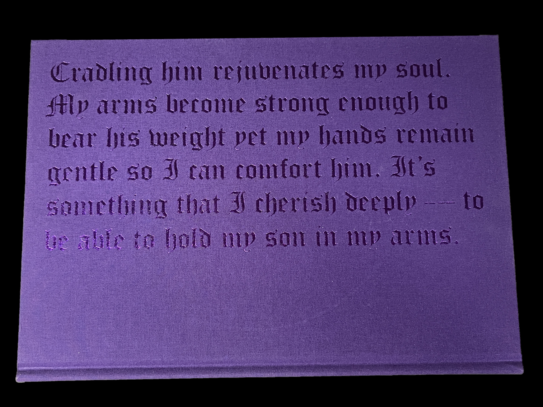
 In Stranger Fruit (which is named after the Abel Meeropol 1937 song, “Strange Fruit,” protesting the lynching of Black Americans, and immortalized by Billie Holiday) we also get to hear from them. Most of the images are accompanied by a text written by the mother.

I was stunned when I picked this book up for the first time. As far as I know, no one has done anything like this before. Yes, there are combat images from too many wars and conflicts already that are Pietas. Yet, I’ve never seen an entire book of them, and only them. I asked Kris Graves how he discovered Jon, this remarkable body of work, and came to publish Stranger Fruit. He said, “I met Jon some years before the pandemic and he was already hard at work on the project. I told him then that I’d love to publish the work when he felt it was complete. During covid, I founded Monolith and it was an even better fit for the ideals of Stranger Fruit. Soon after, we reconnected and started production.”

The 600 copies of the 1st printing of Stranger Fruit have sold out. I’m told the recently announced 2nd printing is selling quickly. I look forward to the time when it’s no longer vital as a document of immediate social import, to when it can just be appreciated as a work of Art.

Kris Graves, Privileged Mediocrity, Monolith Editions/Hatje Cantz

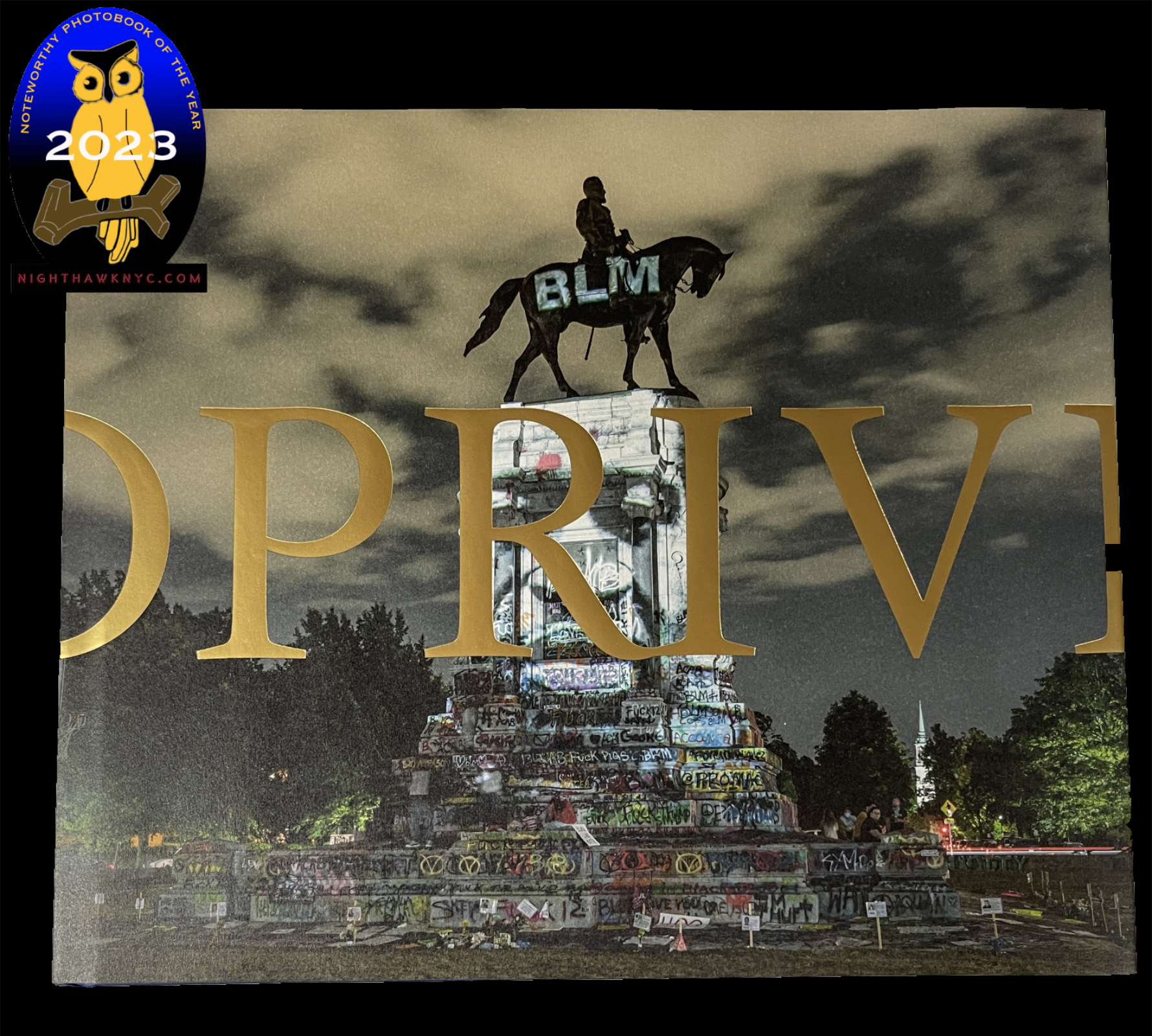
One of the most important PhotoBooks released this century, Privileged Mediocrity is Kris Graves’s masterpiece among his fine books thus far, in my opinion.

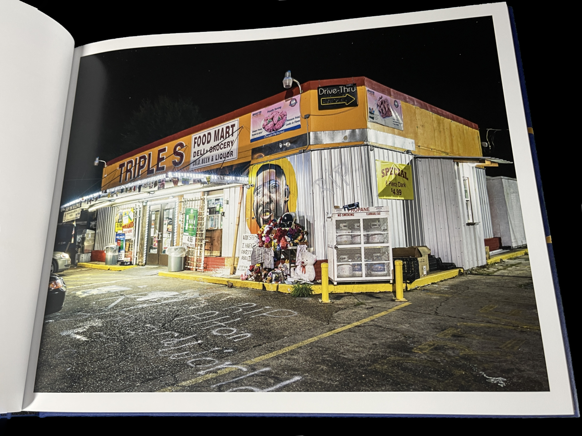
From Part I- The Murder of Alton Sterling, Baton Rouge

Years in the making, involving extensive stretches of travel during the height of the covid pandemic and the Black Lives Matter Protests, at what must have been considerable personal risk, in the days leading to the birth of his first child, it feels to me like this is the book his work has been building toward all along.

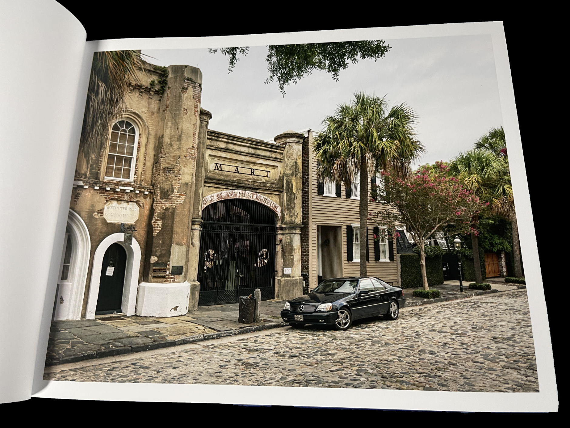
From Part I– Slave Market, Charleston

It’s divided into three sections: “Part I: Privileged Mediocrity & The Deceived Within,” “Part II: A Southern Horror, 2020,” and “Part III: A Latency, 2000-2022.” Though Part I sets the stage  with images from NYC, New York State and Boston as well as the South, the book is centered on the South in Parts II & III. Mr. Graves visited innumerable Confederate monuments throughout the South, and shows them before, during and after the protests.

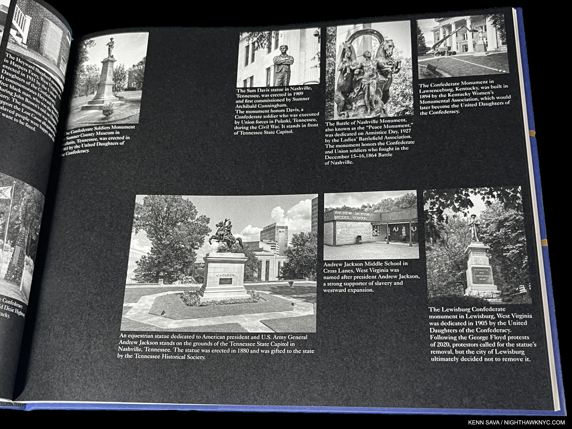
From Part II

“Part II: A Southern Horror, 2020,” is gravely presented with black & white Photos on black paper in which Mr. Graves inventories many of these problematic monuments by state and their connection to racism, which is downright chilling to see on page after page- 46 pages in all- many with up to 8 sites on a page! “Part III Latency 2000-22” shows many of these sites during and after the protests.

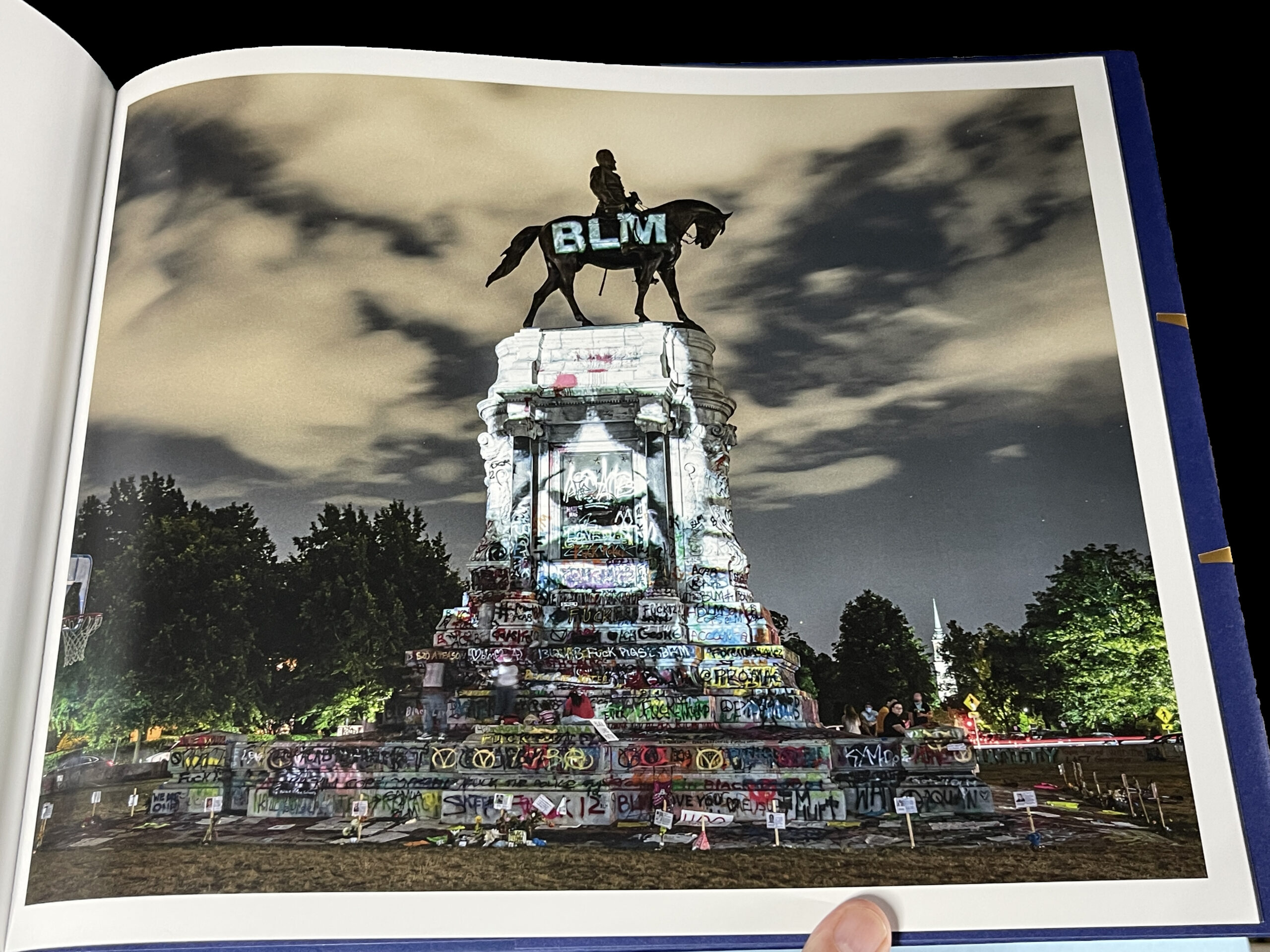
From Part III- George Floyd Projection, Richmond, Virginia. National Geographic Magazine put this image on the cover of its “Photos of the Year, 2020” issue. I asked Kris what he remembers about taking this classic and historic image. He said, “A few days into my Richmond trip, I was introduced to the projectionist, who was working at the protests. On a clear night, he set up at the Lee Monument and I headed out around midnight. It was lively out there, but peaceful. The projections of dozens that were killed by police were displayed for about one second at a time. I asked him to slow it down a bit then made pictures for a few hours. Got a good one.”

Progress has been too long in coming. Part 1 of Privileged Mediocrity speaks to that. When the damn of patience finally burst after yet more murders of unarmed Black men and women, Kris Graves documented a fleeting turning point in American history powerfully, and in his own way. He focuses on the evidence to be seen on the land: scenes of murders and monuments that are offensive to many and a real part of the ongoing problems. A number of them are seen feeling the brunt of the resulting frustration and anger.

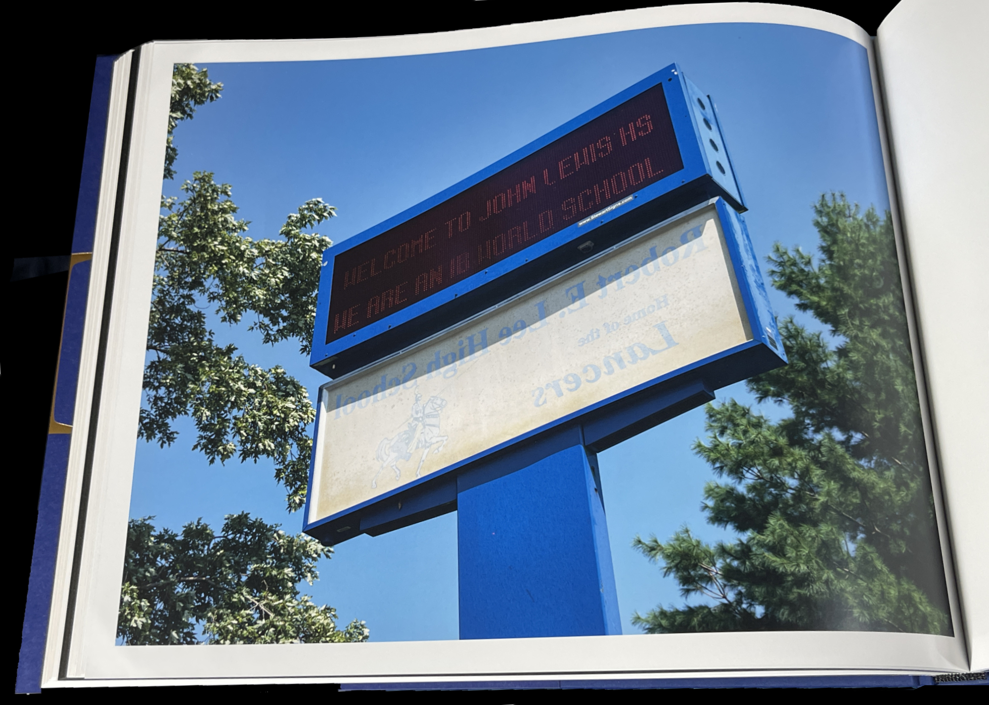
From Part III- John Lewis High School, Springfield, Virginia

After the protests, we see images of the raw beginnings of whatever it is we are in now. In John Lewis High School, Springfield, Virginia, the sign for the school’s former name, Robert E. Lee High School, has been flipped around under its new name. The question these image leave may be “Where to now?” For me, along with all the horror, they also represent moments of hope. The book is dedicated to his newborn son.

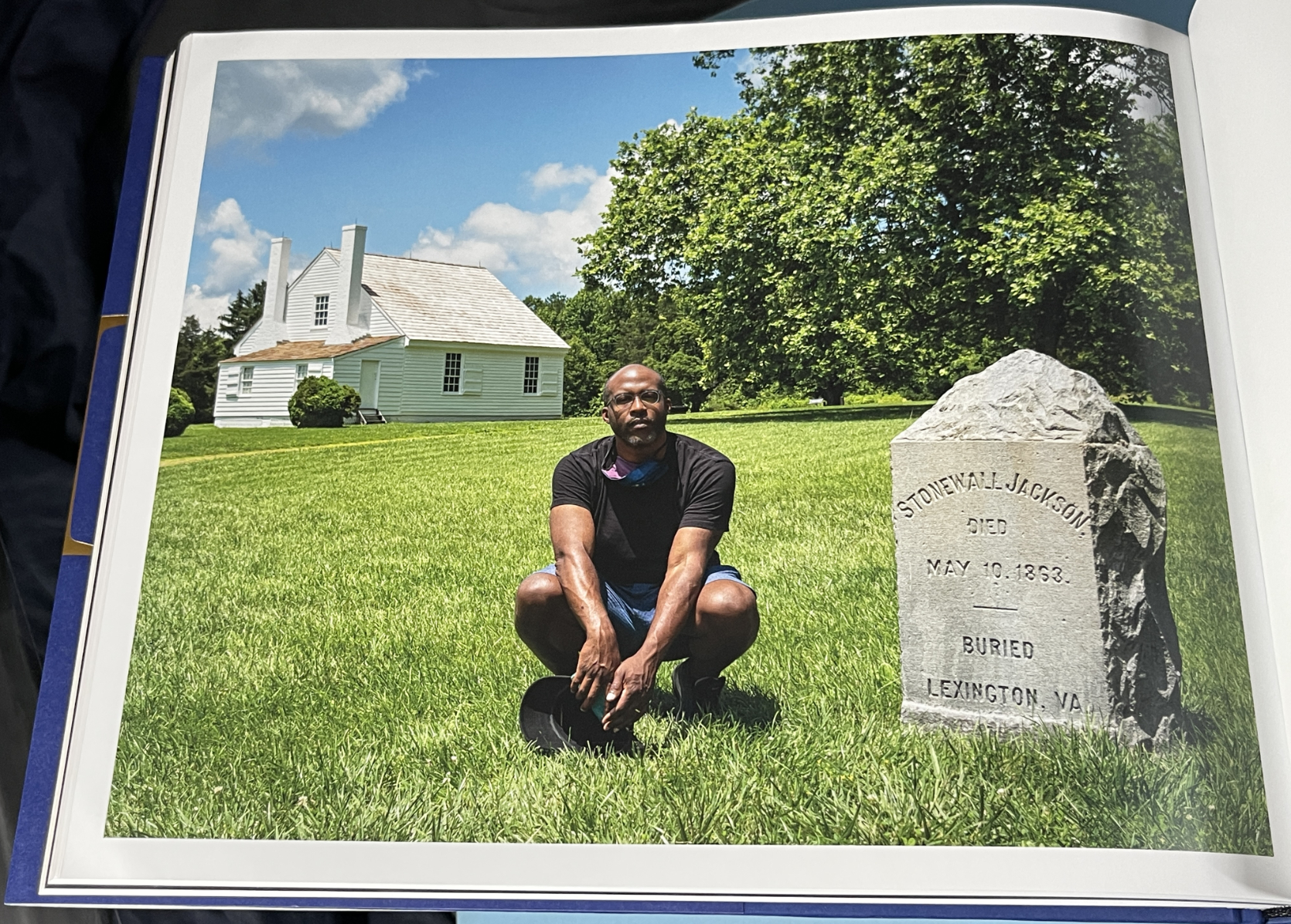
From Part III- Self-Portrait with Stonewall Jackson Shrine, Woodford, Virginia

The American edition of Privileged Mediocrity consists of just 300 copies. My piece on meeting Kris Graves in 2018 here.

I mentioned that both NoteWorthy PhotoBooks have two people in common. In addition to Kris Graves, they both feature the work of the same designer, the ever-creative Caleb Cain Marcus of Luminosity Labs. Mr. Marcus has outdone himself in both books, in my view. With the supreme taste & restraint he displays in Stranger Fruit, and in, what strikes me, as pulling out all the stops in Privileged Mediocrity, as he bends the style to match each section of the book, for which he even designed a font.

Also Recommended-

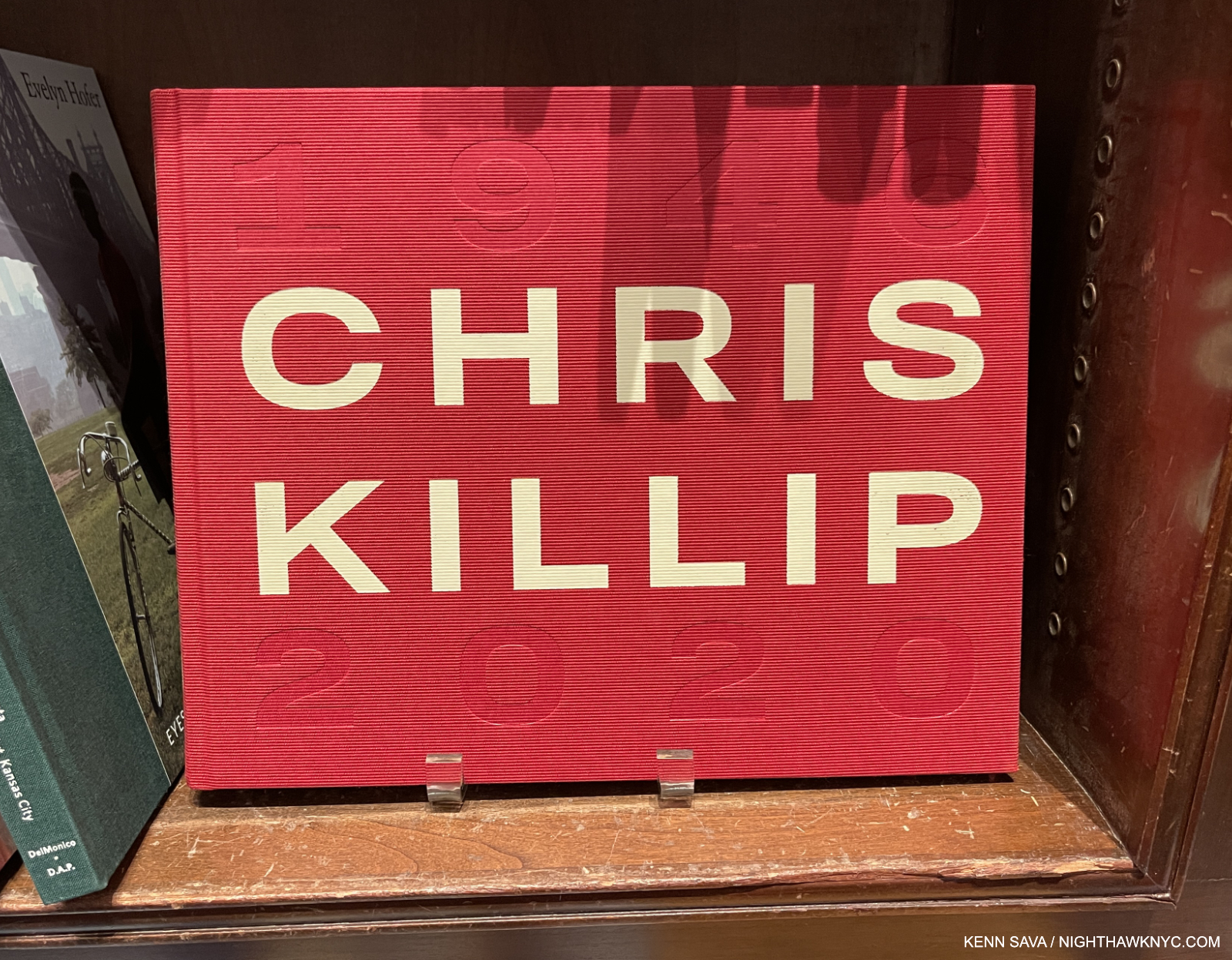
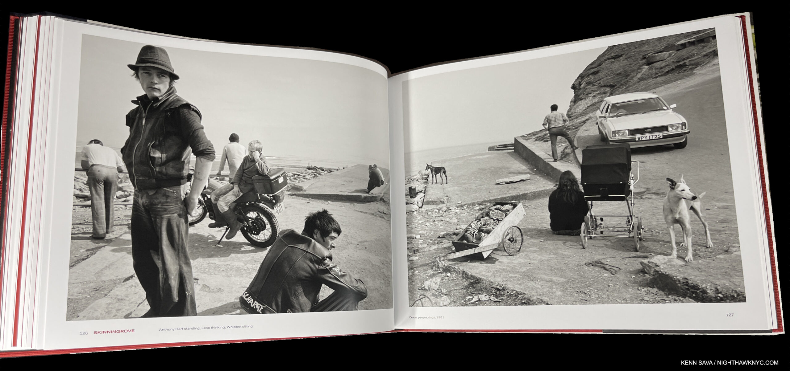
Chris Killip, Thames & Hudson

In 2018, Chris Killip’s former student, Gregory Halpern, turned me on to Mr. Killip’s work. Unfortunately, the book he most highly recommended, In Flagrante, from 1988, has long been out of print and expensive, so I only caught a glimpse of it when Mr. Halpern gave a tour of his book shelves. I managed to get In Flagrante Two, 2016. which is now also out of print.

New in print is this wonderful retrospective that Mr. Killip (who died in October, 2020) did not live to see published, unfortunately. It’s beautifully done. I particularly appreciate its size and design. It’s almost 12 1/2 by 10, big without being oversized. The design is both tasteful and fresh, with the use of red being a great contrast to the mostly (but not all) black & white images. Looking at his work, Mr. Killip’s Portraits and Landscapes often have qualities I find in Rembrandt, one of the highest compliments I can pay any Artist, which are enhanced by his use of “unconventional” poses only found in life. A model Photography retrospective, it fittingly includes an essay by Mr. Halpern.

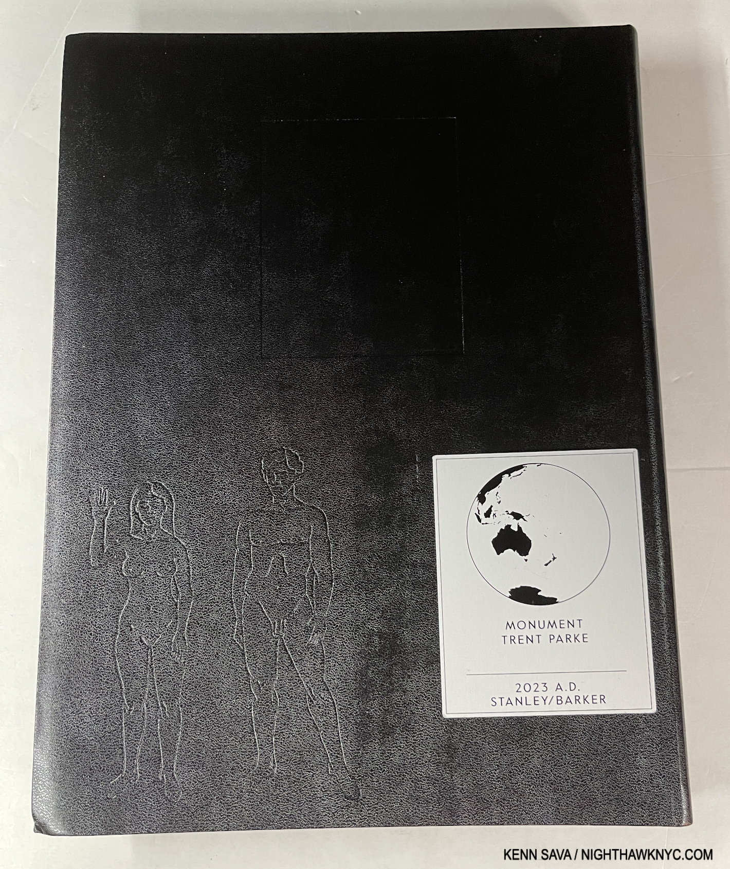
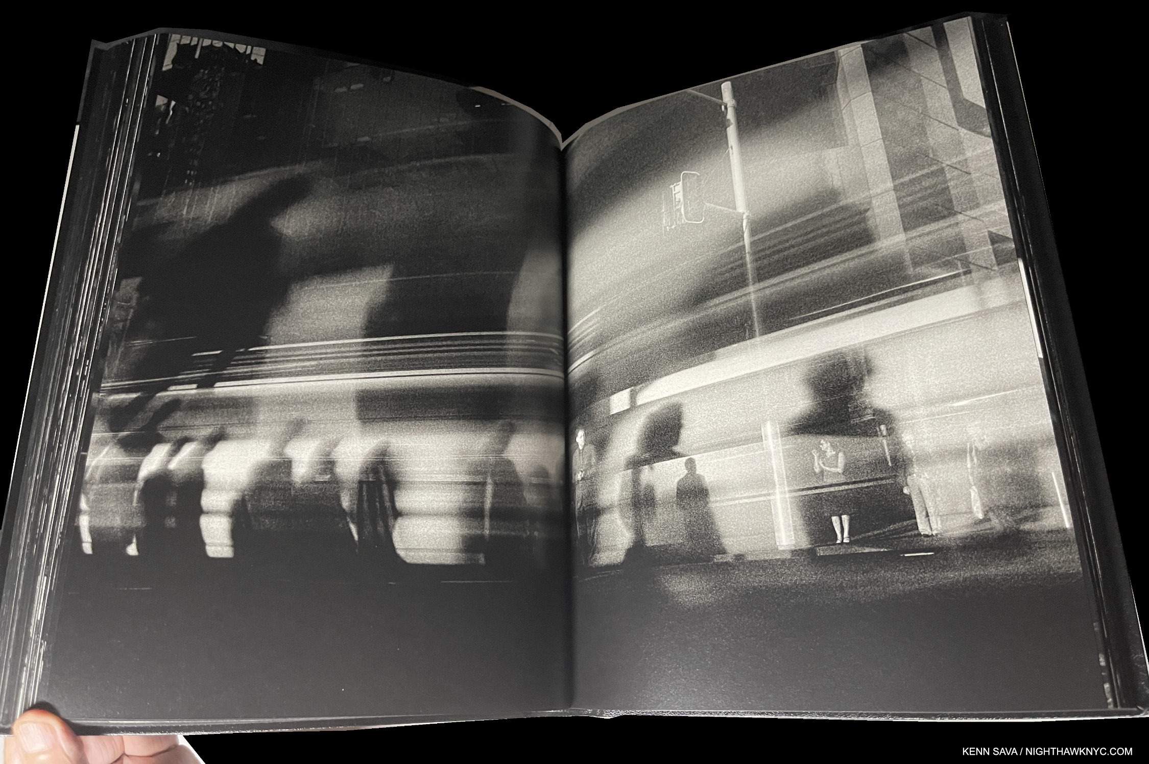
Trent Parke, Monument, Stanley/Barker

Being a city boy I have a real weakness for books depicting city life. But, I’ve seen too many that just leave me cold, and no, I’m not going to name which. Few and far between are those that really speak to me. Trent Parke’s Monument is one. Whereas most of the others are a string of Photos “connected” (if at all) by place, Monument is a look at the “alien world” Mr. Parke says he discovered when he moved to Sydney, Australia from a small country town. Mesmerized by the endless procession of workers to and fro day after day, he likened them to the countless moths that he saw at night, and includes, that were drawn by the bright lights of Sydney Harbour Bridge. Drawn to their death. Such is life in far too many places on Earth in 2023.

Entirely in black & white, with its minimal text only in Braille (which you’ll need to know to determine if your’s is a copy of the sold out 1st printing, or the upcoming 2nd printing), it’s a book that captures the fractured light of modern life going by in a blur as human moths go about chasing their own flame of a dream. Apparently, these Photos were taken before the pandemic as no one wears a mask. It’s beautifully designed & produced with Stanley/Barker in an embossed leather cover. Though it’s in black & white, Monument is one of the very few PhotoBooks I can think of that can bear up against Saul Leiter’s Early Color, perhaps the masterpiece of City photography of the books I’ve seen, which is one one of the most essential PhotoBooks of the 21st century in my view.

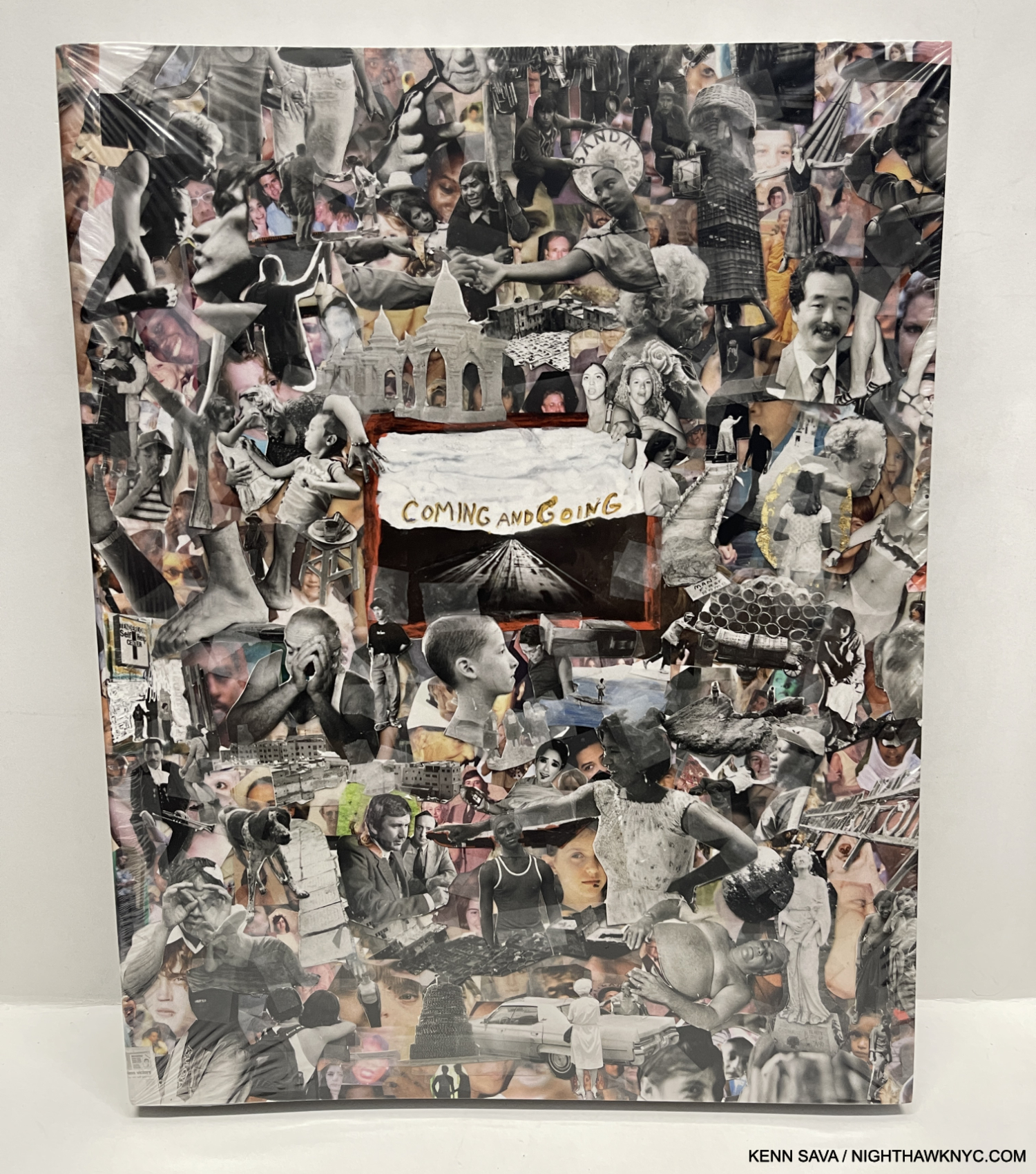
Jim Goldberg, Coming and Going, Mack Books

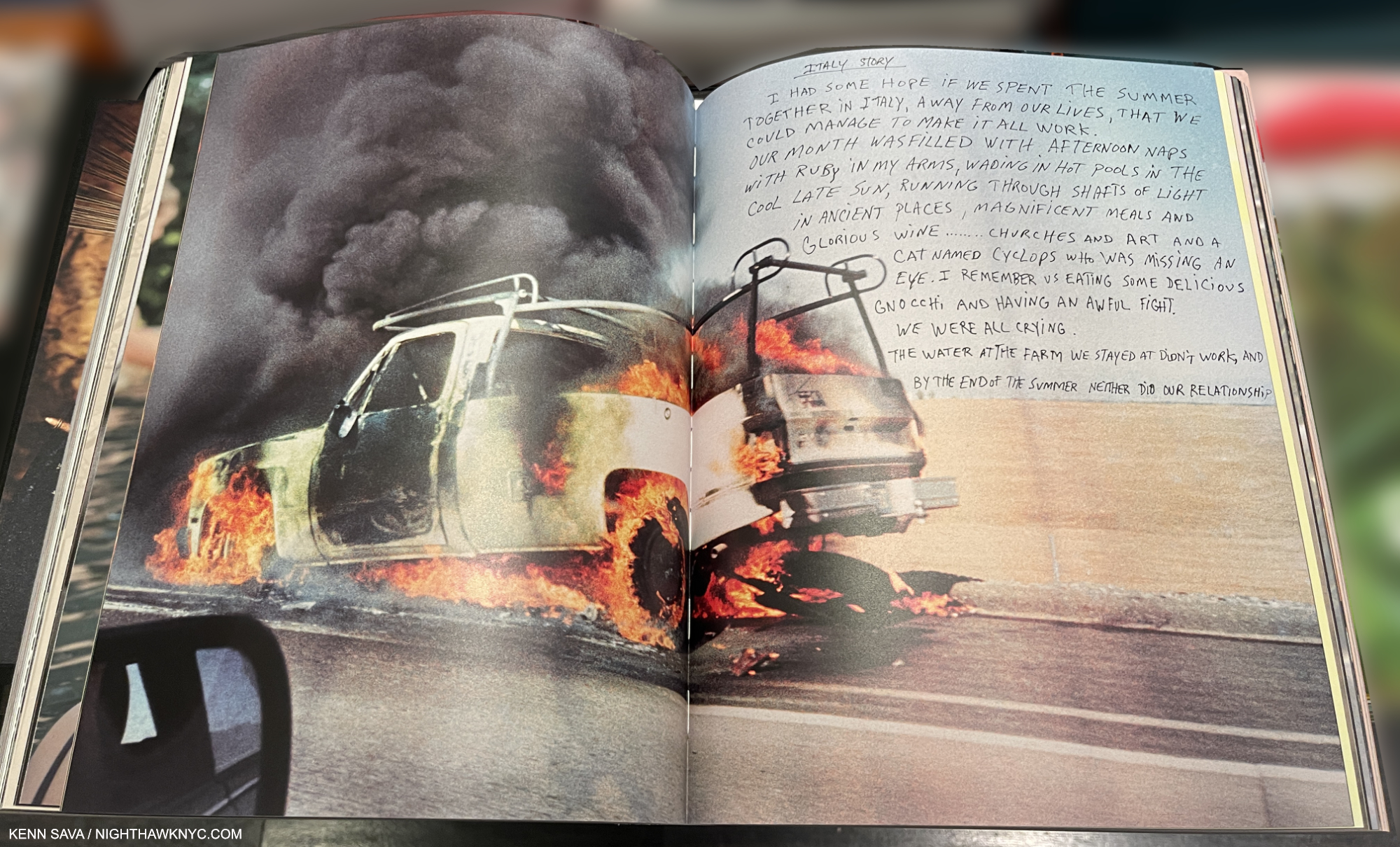
Jim Goldberg’s magnum opus (no pun intended) is a unique, visual autobiography, another tour de force of book design, as all of his books are. Coming and Going is autobiographical, though in classic Jim Goldberg style. Though there is no running text narrative, he feels free to write, draw or annotate on the images as he sees fit which helps guide the reader/viewer along. And who’s to argue with his choice? He’s forged a trademark style doing it that doesn’t age or look dated. Containing 360 13 by 11 inch pages, most of the material I have never seen before. There are stories, some featuring familiar characters from his prior books, though they are contained on 2-page spreads, which makes them look more like an Art work than a text. The story of his life moves forward on the power of his images, and that’s as it should be with such a one-of-a-kind Artist. A good number of them depict members of his family with love, understanding and poignancy, as they grow or age, even pass away.

Coming and Going is a LARGE book weighing in at 6 1/2 pounds, I wish it was a hardcover, instead of the stiff boards is covered with, because it’s a book that’s sure to see lots of handling and page-turning. Already at an $85. list, that probably would have added at least $5 to the cost. Then again, his classic Raised by Wolves was a softcover, too. Wolves remains THE classic Jim Goldberg book, but long-time fans will find much to get lost in in Coming and Going. 

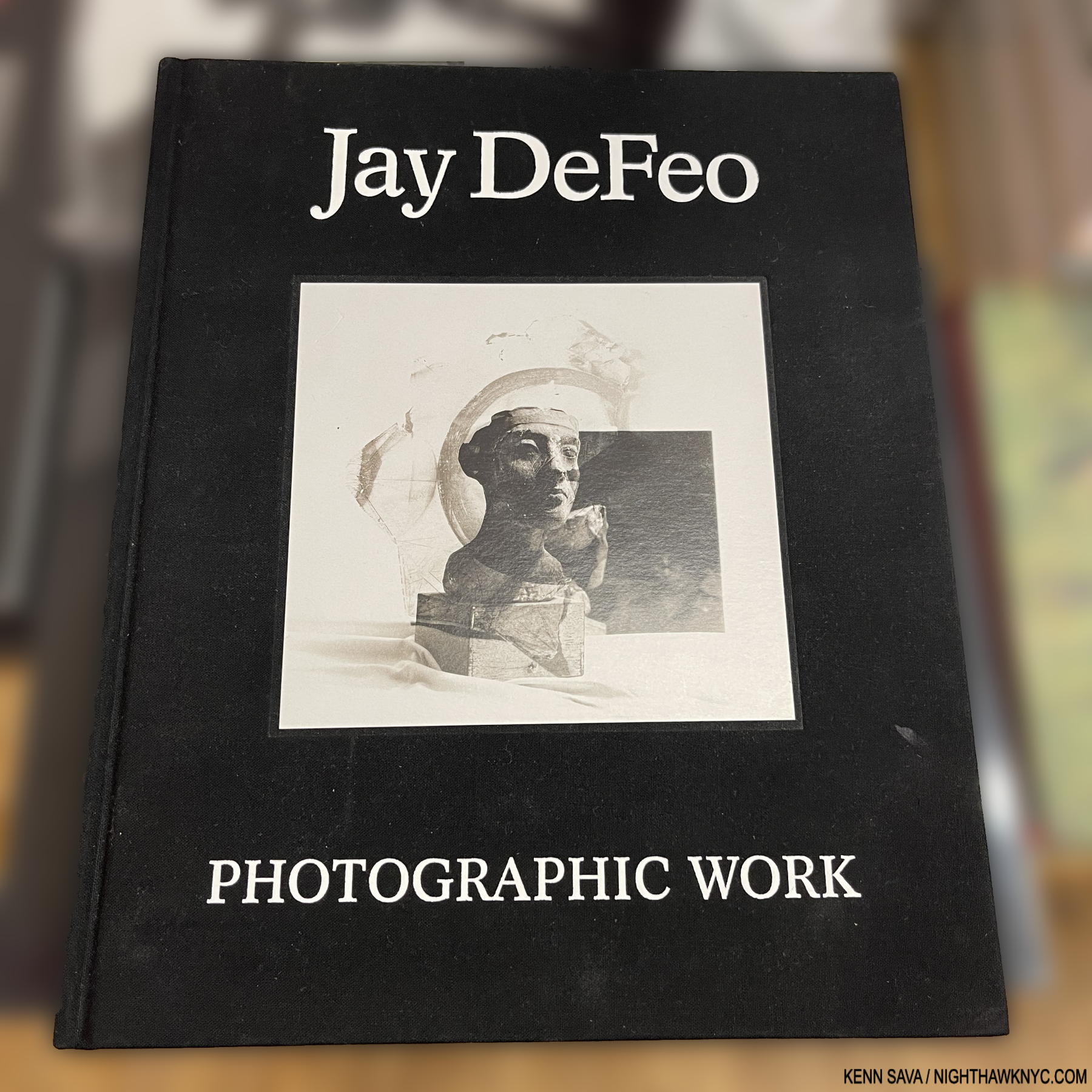
Jay DeFeo: Photographic Works, Jay DeFeo Foundation/ DelMonico

I could very well have listed this in NoteWorthy Art Books, 2023, but it’s here to make a point. Jay DeFeo (1929-89) is, perhaps, best known for her Painting, The Rose, 1969, and as a Painter. Though she passed at 60 from cancer in 1990, her star has continued to rise steadily since. Now comes the revelation that she was, also, a Photographic Artist, as this book, and the accompanying show at Paula Cooper Gallery, NYC, shows. Not only that, she was a formidable Photographic Artist.

The “point” I’m trying to make, yet again, is that Jay DeFeo is another on a list that gets longer all the time- a list of Painters who were also accomplished Photographers. To this point, they continue to remain overlooked by the larger Photography community, which continues to baffle me.

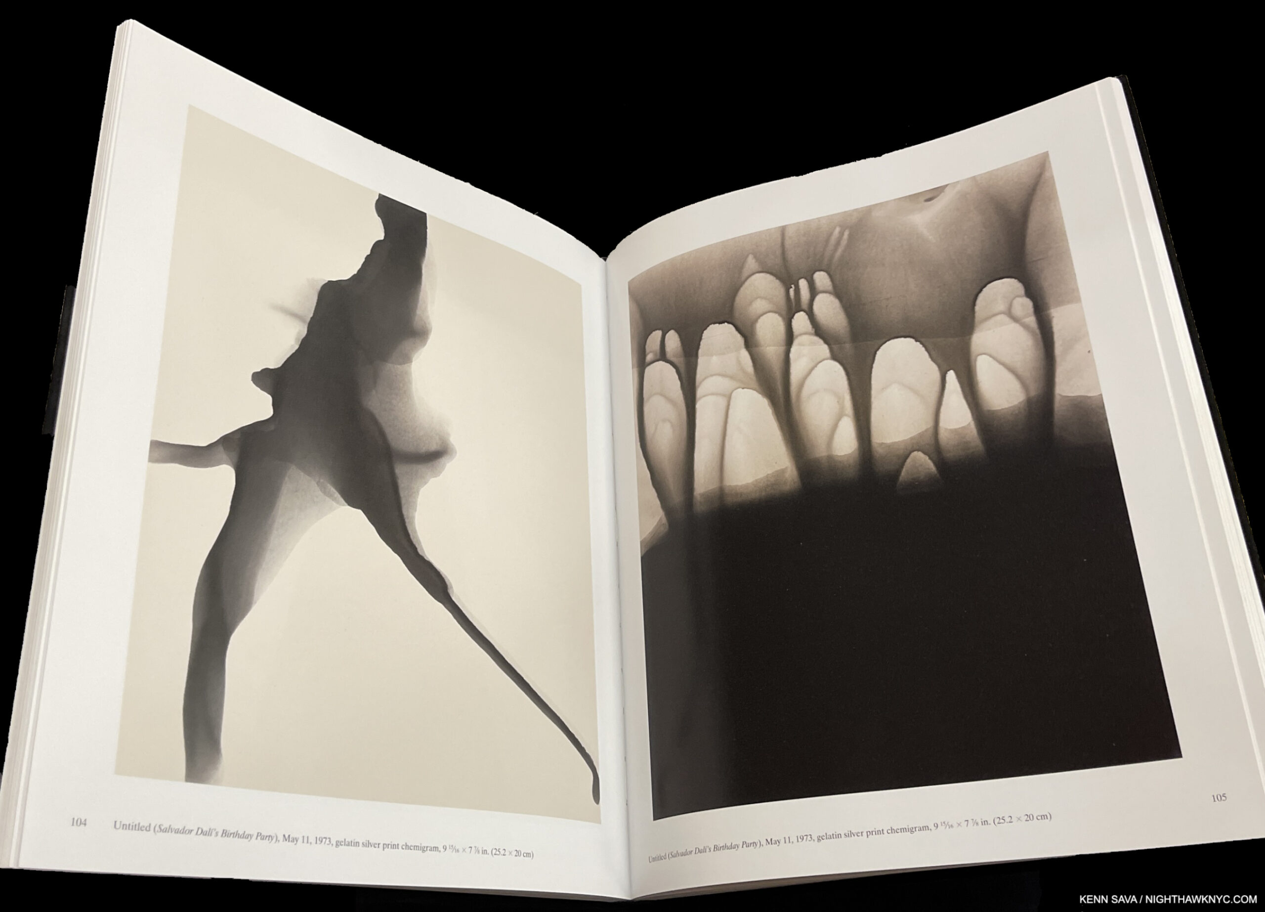
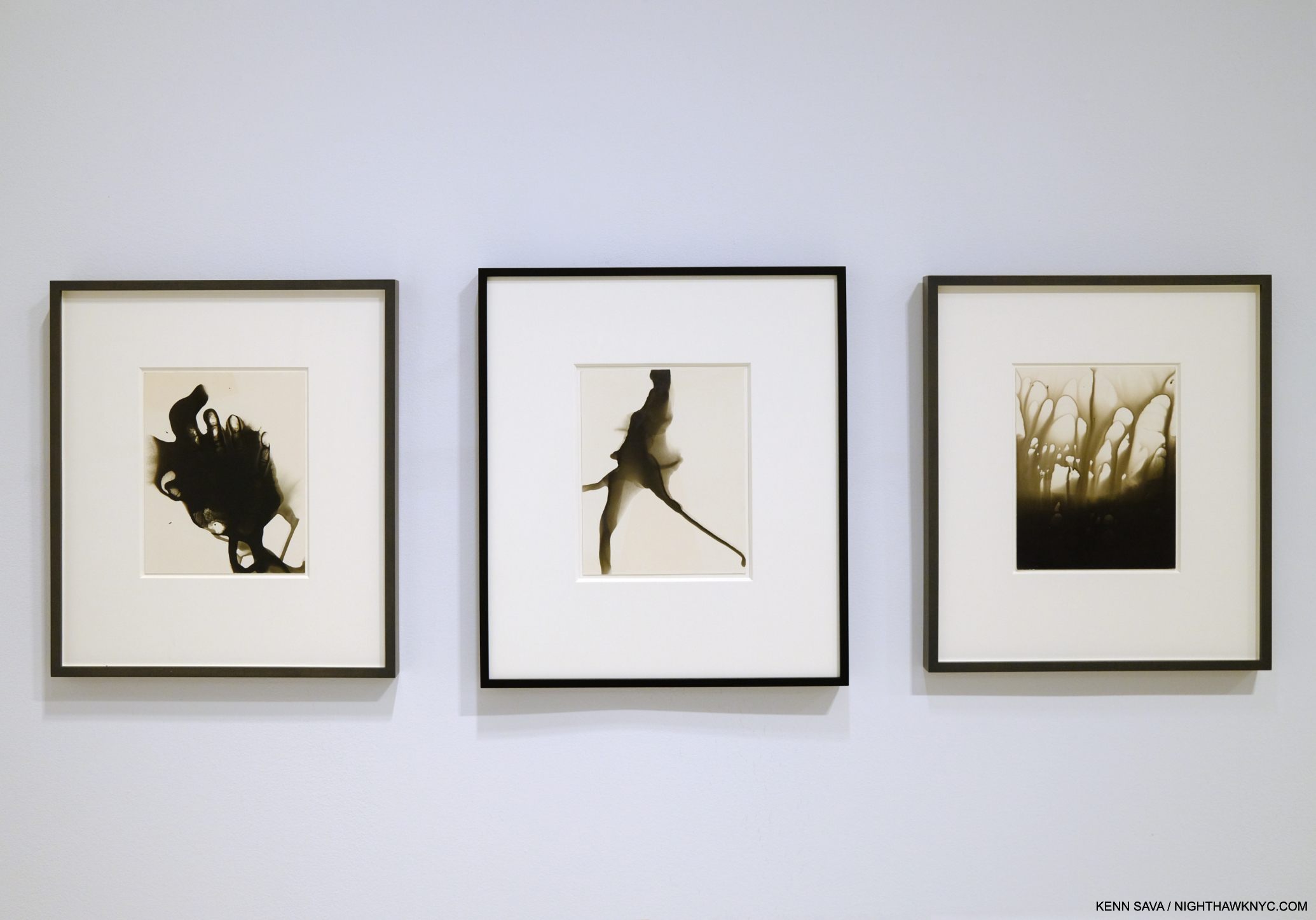
The two works shown above in the book as seen in the current show Inventing Objects: Jay DeFeo’s Photographic Work at Paula Cooper Gallery, September 22, 2023.

Right now at MoMA as I write, the great Ed Ruscha is the subject of a blockbuster retrospective, Now/Then. In 2016, Bruce Conner, Jay DeFeo’s close friend for many years, received one at MoMA, which I wrote about here. Yet, L.A. and San Francisco Artists who came to prominence in the 1960s and 1970s have been slow to receive the attention their East Coast counterparts have been enjoying for decades- particularly on the East Coast. Artists like Ed Kienholz quickly come to mind. Very near the top of the list, it’s way past time for the Jay DeFeo East Coast Retrospective.

Nan Goldin: This Will Not End Well, Steidl is my last Also Recommended NoteWorthy PhotoBook for 2023. I wrote about it here.

*- Soundtrack for this piece is “Strange Fruit,” by Billie Holiday.

Be sure to see the companion list to this one- NoteWorthy Art Books, 2023

My previous NoteWorthy PhotoBook lists-

NoteWorthy PhotoBooks, 2018

NoteWorthy PhotoBooks, 2019. And others

NoteWorthy PhotoBooks, 2020

NoteWorthy PhotoBooks, 2021


THERE ARE NO AFFILIATE LINKS IN THIS PIECE!

NighthawkNYC.com has been entirely self-funded & ad-free for over 8 years, during which 300 full-length pieces have been published! If you’ve found it worthwhile, PLEASE donate to allow me to continue below. Thank you, Kenn.

You can also support it by buying Art, Art & Photography books, and Music from my collection! Art & Books may be found here. Music here and here.

Written & photographed by Kenn Sava for nighthawknyc.com unless otherwise credited. To send comments, thoughts, feedback or propositions click here. Click the white box on the upper right for the archives or to search them. Subscribe to be notified of new Posts below. Your information will be used for no other purpose.
Nick Cave: Beauty Deeper Than Skin

This site is Free & Ad-Free! If you find this piece worthwhile, please donate via PayPal to support it & independent Art writing. You can also support it by buying Art & books! Details at the end. Thank you.

Written & Photographed by Kenn Sava

Show Seen- Nick Cave: Forothermore @ the Guggenheim Museum

No. Not THAT Nick Cave.

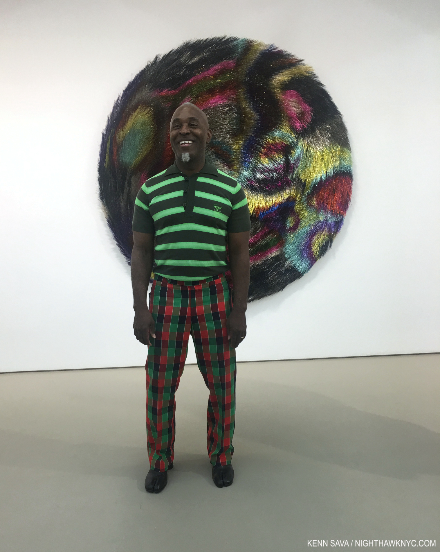
THIS Nick Cave. The Artist standing in front of Tondo, 2018, Mixed media including wire, bugle beads, sequined fabric and wood at the opening of Nick Cave: Weather or Not at Jack Shainman May 17, 2018 . Tondo was also on view in Fororthermore.

Nice Cave, the multi-dimensional Artist, that is, who deserves every bit as much notoriety as the other, rightly very well-known Nick Cave, whose work I also admire. This Nick was born in 1959 in Fulton, Missouri, and now lives & works in Chicago, where he has been creating beautiful heart-rending Art for over 30 years. Art, largely created as his response to the world around him marked by racism, profiling and the murders of unarmed Black men and women.

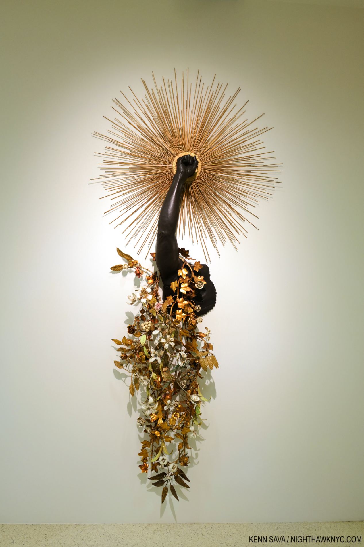
Arm Peace, 2018, Cast bronze, sunburst and vintage tole flowers 85 × 39 × 12 inches. (One of two pieces in the show named Arm Peace.) In my book, this deserves to be “iconic,” as do a number of other pieces in Forothermore.

Even though I had seen a number of his shows at Jack Shainman, his books, and I have been in his presence twice, I was completely unprepared for Nice Cave: Forothermore his mid-career Retrospective at the Guggenheim. I went in believing Mr. Cave is one of the more important Artists working today. I left speechless.

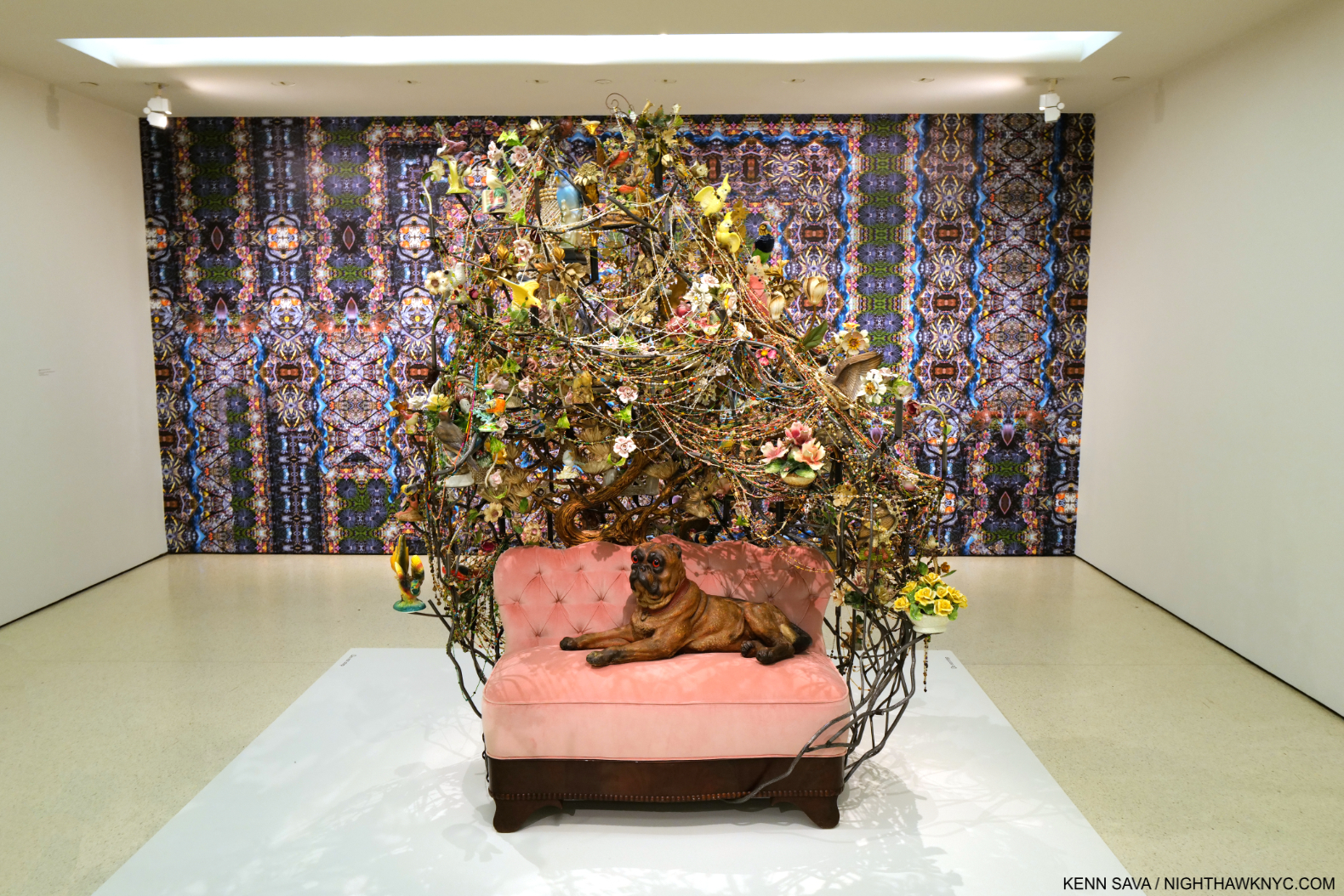
Rescue, 2013, Mixed media including ceramic birds, metal flowers, ceramic Pug, vintage settee, and light fixture 91 × 78 × 54 1/2 inches, front, Nick Cave in collaboration with Bob Faust Wallpaper Near Rescue Works (New Work), 2021, TBC, Dimensions variable, on the back wall.

As a result, I’ve decided to let Mr. Cave, who has a gift for expressing himself in words, to go with his extraordinary gifts for visual expression, do much of the talking in this piece. In Forothermore, a number of the pieces I’d seen over the years, and many others, came together as a startling whole of 49 pieces over three sections: What It Was, What It Is, and What It Shall Be, in 3 locations in the museum. I must admit that I am not a fan of the side galleries the Guggenheim added during their expansion of Frank Lloyd Wright’s masterpiece (which I fought at the time they announced them, and my argument was published in The New York Times, my first published writing). The newer galleries are oddly shaped, because Wright didn’t design these spaces to be galleries. In my view, they detract and distract from Wright’s original intention and design of Art in the Rotunda. That being said, Nick Cave: Forothermore was one of the more important shows in NYC so far this young decade, if not THE most important show I’ve seen. The Guggenheim deserves kudos for bringing it here.

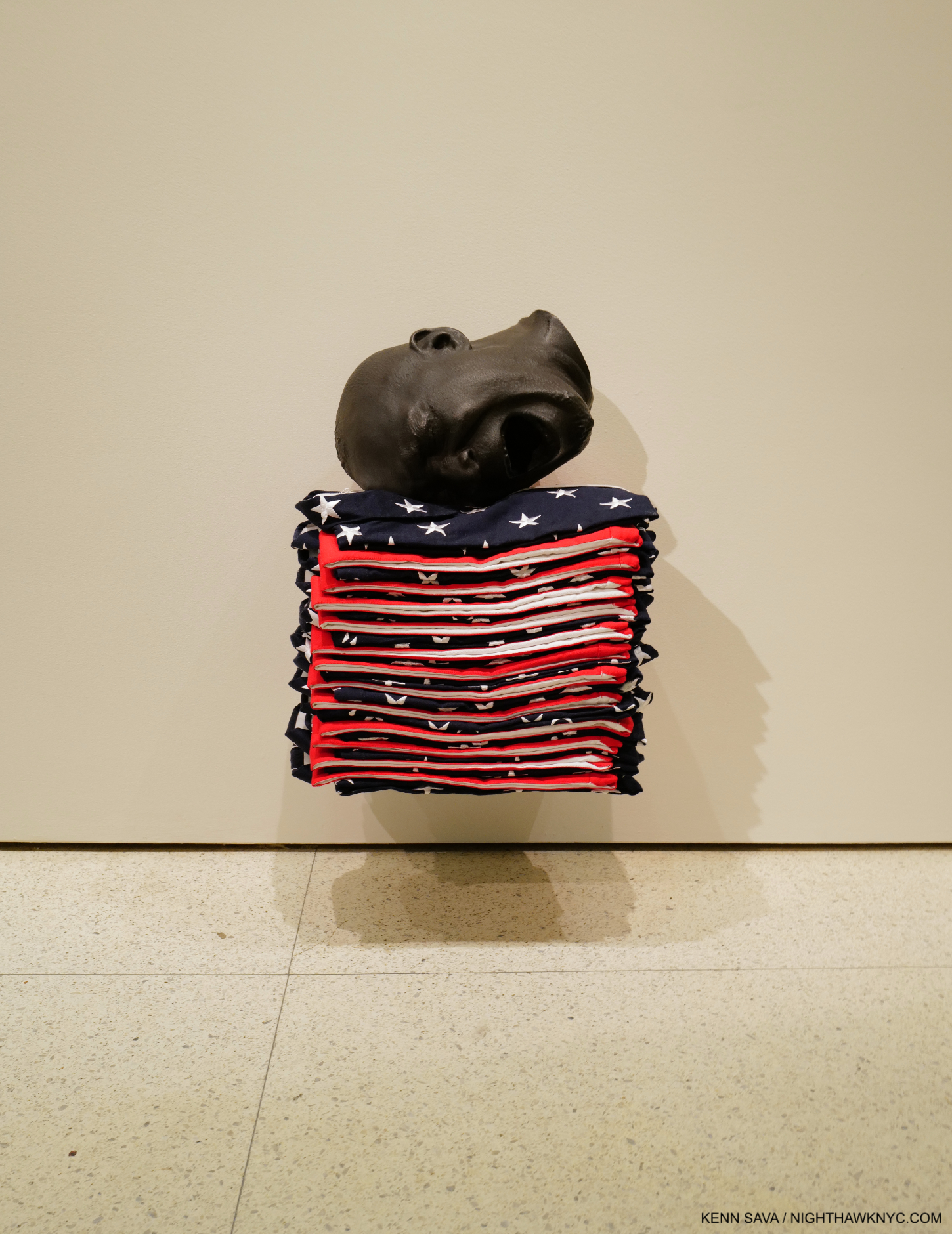
Untitled, 2018, Mixed media including a bronze head and 13 American flag shirts, 23 3/4 × 15 3/4 × 12 inches

At first glance, much of Nick Cave’s Art, particularly his famous Soundsuits, look otherworldly until a close look reveals virtually all of it consists of everyday or found items used in incredibly imaginative ways. Part Sculpture, part Music, part furniture, part Collage, part fashion, and partially created using textile production and jewelry-making techniques, there seems to be no limit to what Mr. Cave’s pieces are or fixed rules about how they’re made. Still, all of what we see now is part of his extraordinary response to the reality of his life and that of other Black men and women.

It started early…

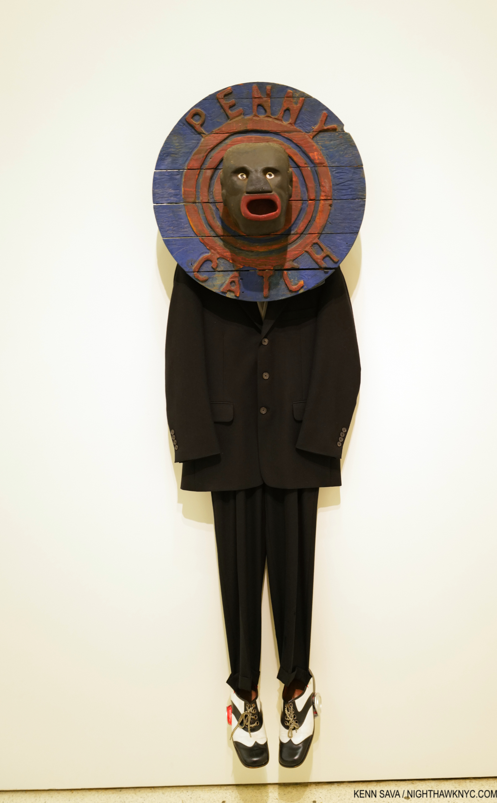
Penny Catcher, 2009, Mixed media including vintage coin toss, suit, and shoes 74 × 23 × 14 inches

“My mother told me when I was, like, eight years old, the complexity of what I would have to deal with. So knowing made me think, ‘I’ve got to build a thick skin. I’ve got to be able to operate in a world…that could work against me as opposed to for me. What do I do with that?'”1

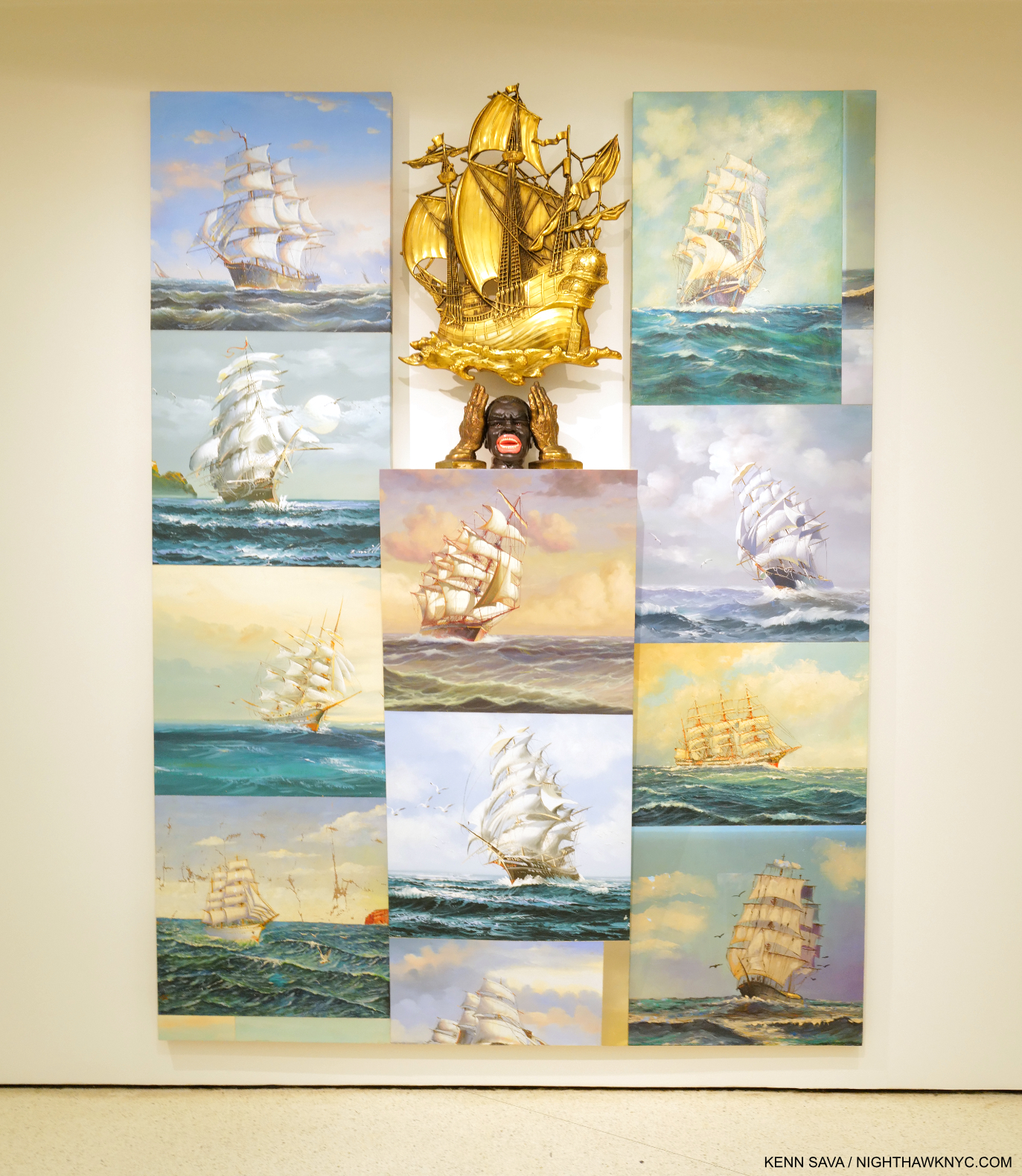
Sea Sick, 2014. Mixed media including oil paintings, ceramic container, cast hands, and plastic ship 96 × 72 × 10 1/2 inches. At 8 feet tall, with 11 Paintings of the kind of 17th century ships slavers used mounted salon-style, each shown in full sails, almost looking to be going back and forth, at angles to inspire sea sickness among those on board, with a striking head and hands in the center, as if screaming “ENOUGH!” The head was a tobacco holder that was later sold as a spittoon!

“I have been racially profiled. I’m walking home with my portfolio from teaching. I am pulled…surrounded by undercover cops saying, ‘Lie down on the floor’– because the convenience store was robbed down the street. That has been my reality. Get it together up here (points to his head). Psychologically, I have to really get it together. And I just have to get quiet–to put it in perspective and to not lash out into rage. And if I do, lashing out for me is creating this (a Soundsuit). All of that becomes the impulse to create.”2

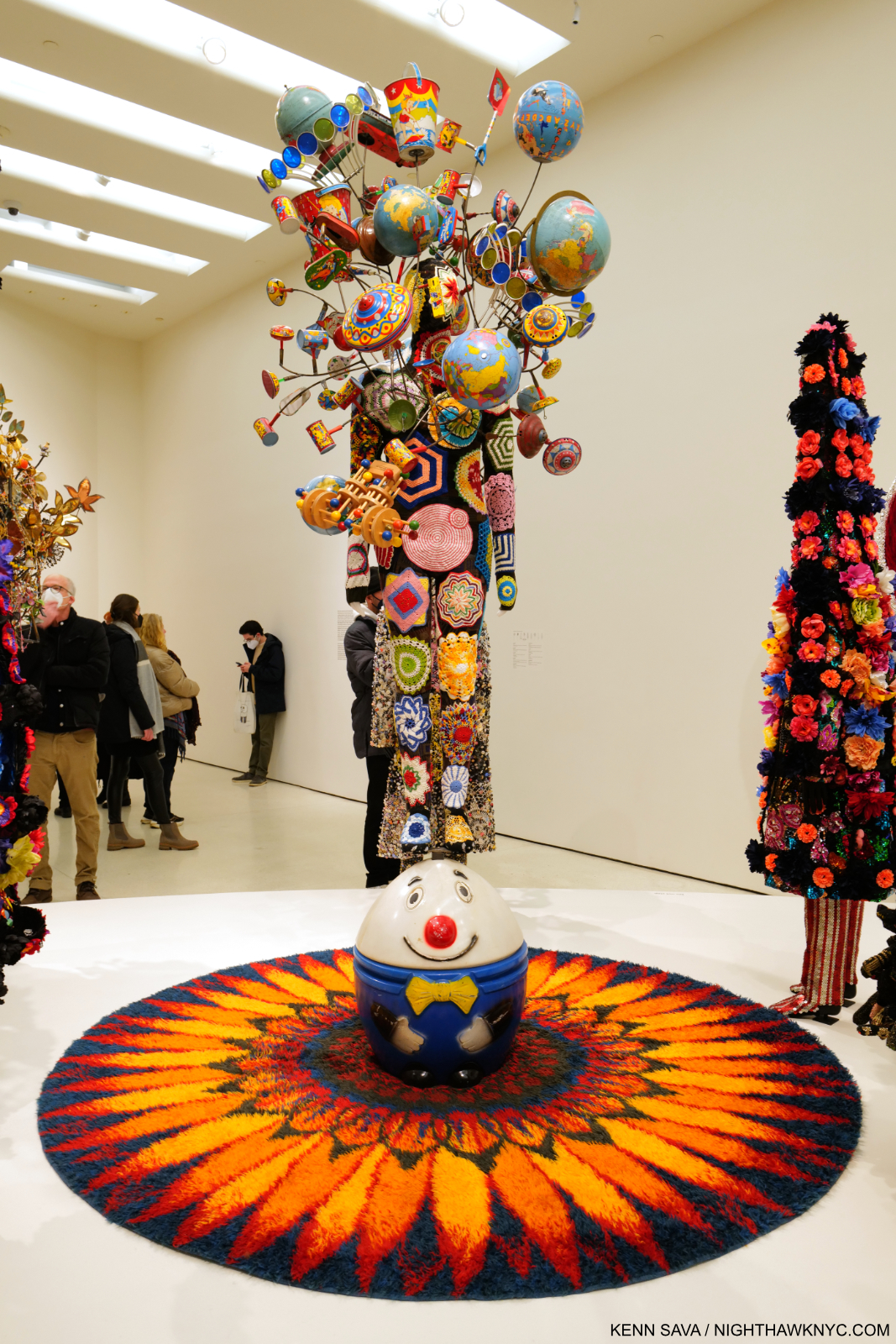
Soundsuit 2012 Mixed media including embroidery, fabric, vintage toys, rug, and mannequin Soundsuit: 127 × 98 × 93 inches

Best known to this point for his ongoing series of Soundsuits– works that combine all the processes listed earlier in an ultimate manifestation of that “thick skin” he referred to, that a performer then wears as one of many in  one of Mr. Cave’s joyous and bombastic performances. For display, the performer is replaced with a mannequin. The range of materials they have included over the years would fill a Sears Roebuck catalog. In spite of the long history of both fashion and theater, I have seen virtually nothing like them3. The Soundsuits brought him immediate fame. Their origin may be lesser known-

“The first Soundsuit was in ’92 in response to the Rodney King incident, the L.A. riots. I was sitting in the park one day  and just sort of thinking about, What does it feel like to be  discarded, dismissed, profiled?
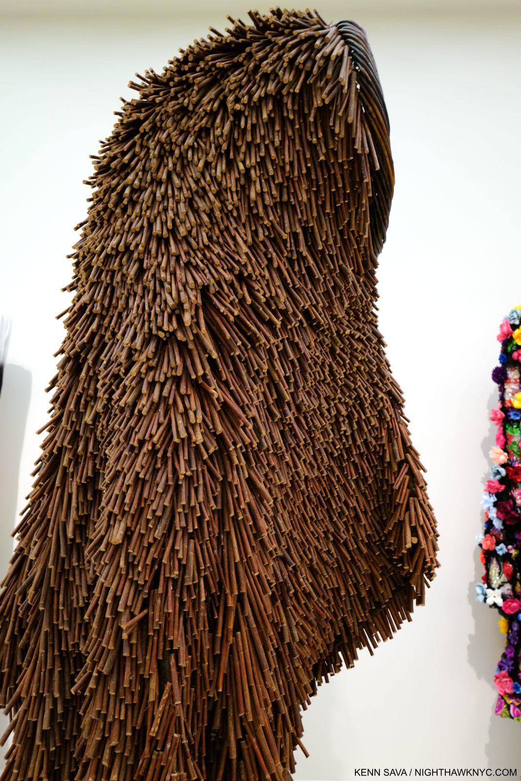
There was this twig on the ground. And I looked at that twig as something discarded. And then I proceeded to just start collecting the twigs in the park. And I brought them all back to the studio. And then I started to build this sculpture. I started to realize that the moment I started to move in it, it made sound. Then it just literally put everything in perspective. I was building this suit of armor, something that I could shield myself from the world and society. And so out of that came this sculpture-performative kind of work.”4

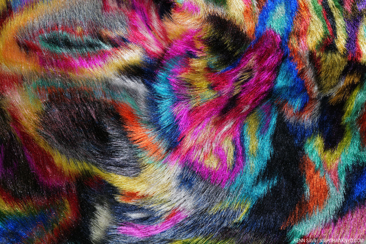
Detail of a Soundsuit made largely from twigs. Soundsuit, 2011, Twigs, wire, upholstery, basket, and metal armature, 83 × 27 × 40 inches. Seen in full from the side in the next picture.

That “discarded” and “forgotten” twig set a precedent for the materials he’s used in his Art since, a collection of objects and materials that seems encyclopedic, some of which speak to Mr. Cave of his childhood, when objects like figurines were cherished family possessions. This creates a duality whereby even though a number of the objects he incorporates are offensive, even disgusting (like the spittoon in Sea Sick), it’s very hard not to see “beauty” and “Art” in Nick Cave’s work, particularly in how masterfully he combines everything in ways that are reminiscent of Duchamp, Rauschenberg and Betye Saar, among others, though in entirely his own way. In so doing, he’s forged a style without having one style. Along with the beauty, there’s an undeniable joy in a good deal of his work, which reaches its zenith, perhaps, in his live performances with dancers performing in his Soundsuits in a communal celebration.

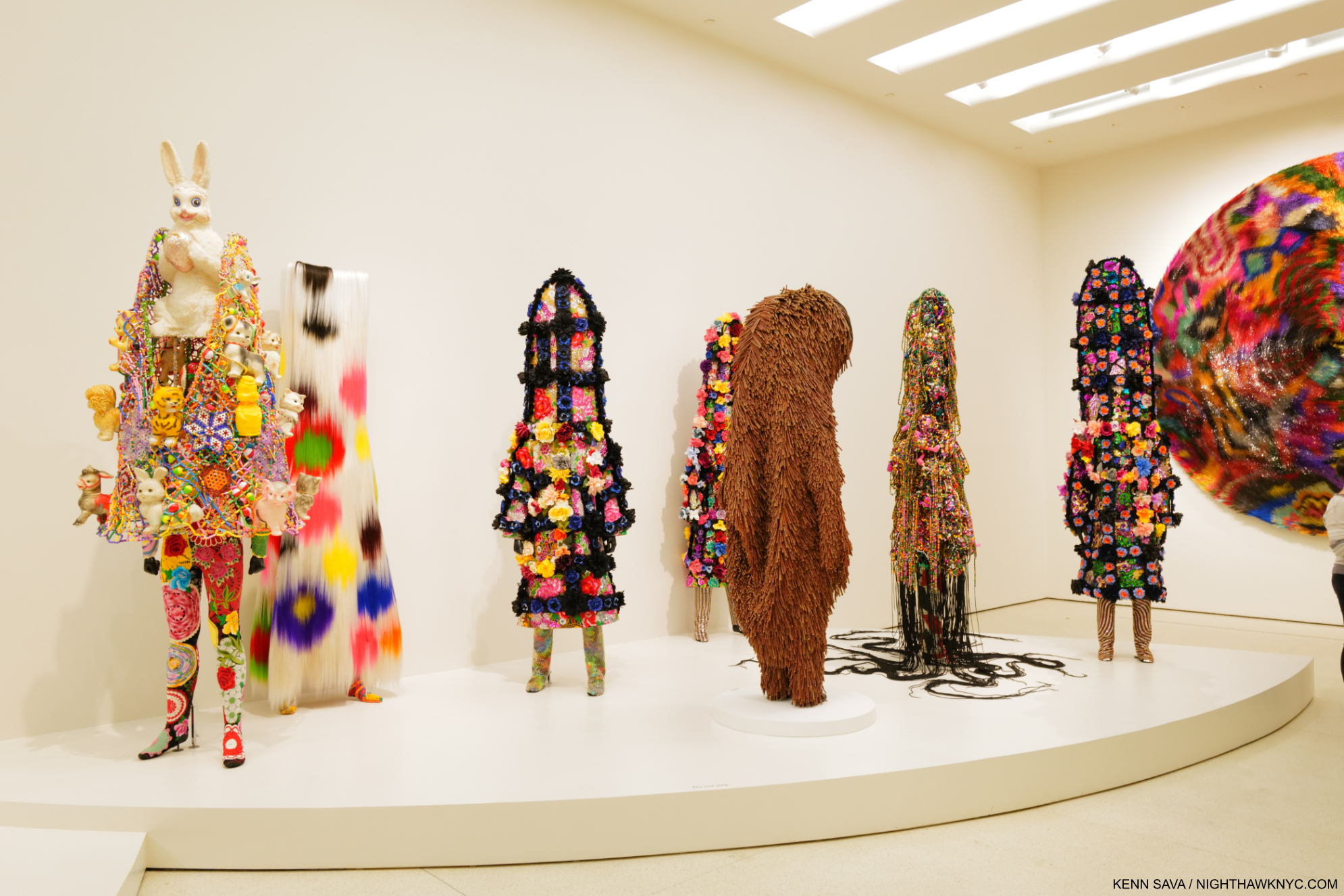
Soundsuits. From left, Soundsuit, 2022 with vintage bunny, Soundsuit, 2015 with synthetic hair, Soundsuit 9:29, 2021-2022, Soundsuit, 2011 shown in the prior picture, Nick Cave, Soundsuit 9:29, 2021, Soundsuit, 2019, and Soundsuit 8:46, 2021, far right.

Yet, in spite of their outward appearance, all is not joy with his Soundsuits. Mr. Cave reveals how he sees them-

“I don’t ever see the “Soundsuits” as fun. They really are coming from a very dark place. The “Soundsuits” hide gender, race, class. And they force you to look at the work without judgment. You know, we tend to want to categorize everything. We tend to want to find its place. How do we, sort of, be one on one with something that is unfamiliar?”5

“I think after the first Soundsuit, I had a different approach to art making. And I realized that I was an artist with a conscience. The moment I did was the moment that  my life literally turned upside-down. I think it’s just me kind of experimenting. It’s like, you know, a scientist  exploring alternative ideas.”6

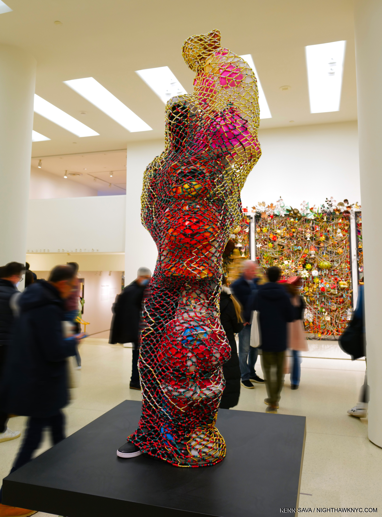
TM13, 2015. Mixed media including vintage blow molds, pony beads, pipe cleaners, mannequin, and garments, 89 × 48 × 49 inches. The Trayvon Martin Soundsuit.

Trayvon Martin is a new work  that was shown at Cranbrook. It’s made up of a Black mannequin dressed  in a hoodie and sneakers and jeans. And then surrounding its body  is these plastic blow molds. Which are, like sometimes at Halloween, there are these plastic forms  that are set out in yards. And so they are surrounding this  sort of figure almost as guardians. But then over top of the entire structure is  this web that’s constructed out of pony beads. So from a distance, it looks like this amazing sort of gold  sculptural form until you get up close and you realize that there  is someone trapped inside.” 7

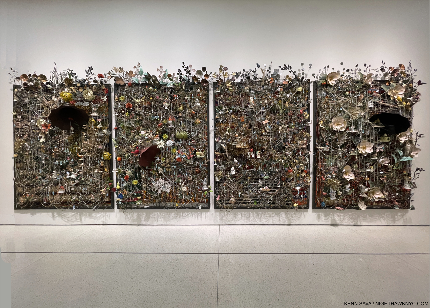
Wall Relief, 2013, Mixed media including ceramic birds, metal flowers, afghans, strung beads, crystals and antique gramophone
4 panels: 97 × 74 × 21 in., each. Perhaps the most complex work on view among many very complex pieces.

“The title (“Forothermore”) is a neologism, a new word that reflects the artist’s lifelong commitment to creating space for those who feel marginalized by dominant society and culture—especially working-class communities and queer people of color. The show both highlighted the development of Cave’s singular art practice and interrogated the promises, fulfilled or broken, that the late 20th and early 21st centuries offered to the ‘other,'” the Guggenheim said.

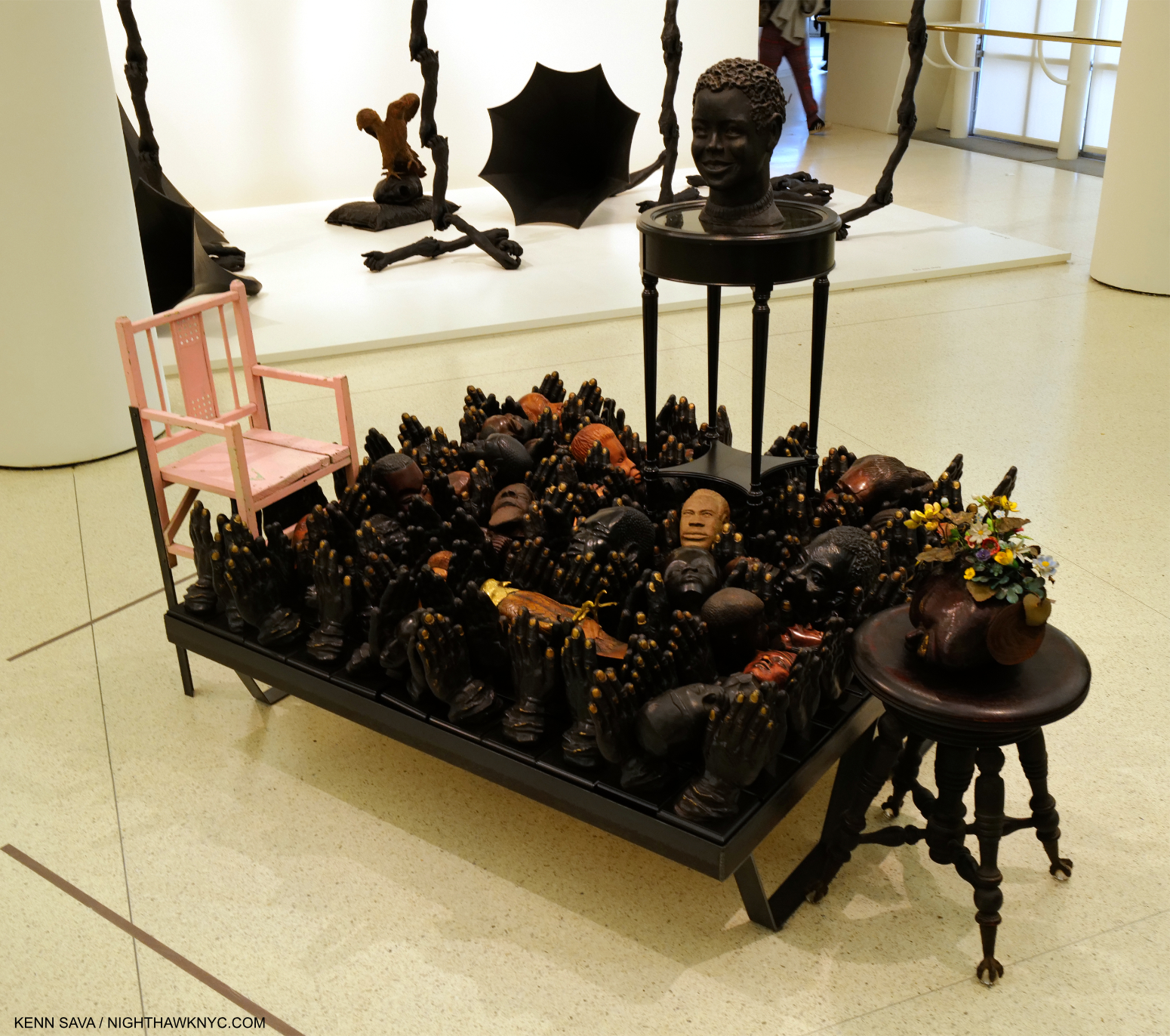
Untitled, 2018, Mixed media including round table, clay head, piano bench, carved head with vintage tole flowers, child pink chair, 19 carved heads, 1 carved eagle, cast polyurethane hands, 52 1/8 × 52 1/8 × 61 inches

“You know, I think at the end of the day,  it’s me giving back to the community  and being this sort of change agent. I want to change our way of  engaging with one another. I want to use art as a form of diplomacy. That’s why I’m in this state of urgency right now. And I don’t know. I just feel so unsettled. I’m doing what I’m doing, but I’m not sure if it’s happening fast enough.”8

Detail of Tondo, 2022, Metal mesh, hardware cloth, bugle beads, wire, sequin fabric and wood.

Nick Cave is rewriting the power of Art, to paraphrase Simon Schama. He’s doing it by channeling horror and pain- both experienced by others, and by himself, into “lashing out” by creating. And, he’s doing so in ways never before seen. I see a lot of Art, and I see a lot of shows. It’s not often that I am awestruck by an Artist’s creativity, but I am by Nick Cave’s. Still, it’s hard to really get a full sense of Mr. Cave’s extraordinary gifts. If Nick Cave can produce such beautiful and powerful work in a world like this, I can’t help but wonder what he’d create in a world without racism.

*- Soundtrack for this piece is “Peace,” by Gil Scott-Heron, a Bonus track from the 2014 reissue of his 1971 album Pieces of a Man.

Thank you, Maddie.

SPECIAL ADDENDUM- The NYC MTA recently completed the installation of Nick Cave’s monumental, 4,600 square feet, 3-part, permanent Public Art piece, Each One, Every One, Equal All, in the subway under Times Square, the latest in their absolutely stellar on-going series of Public Art projects for the NYC subway. It rivals Sarah Sze’s entire subway station installation (which I showed here) for the largest Art work in the NYC subway system. It took multiple trips to fully see the whole thing, and my look at it can be seen here.

NighthawkNYC.com has been entirely self-funded & ad-free for over 8 years, during which 300 full-length pieces have been published! If you’ve found it worthwhile, PLEASE donate to allow me to continue below. Thank you, Kenn.

You can also support it by buying Art, Art & Photography books, and Music from my collection! Art & Books may be found here. Music here and here.

Written & photographed by Kenn Sava for nighthawknyc.com unless otherwise credited. To send comments, thoughts, feedback or propositions click here. Click the white box on the upper right for the archives or to search them. Subscribe to be notified of new Posts below. Your information will be used for no other purpose.
Nick Cave Brings Joy & Beauty to the Subway

This site is Free & Ad-Free! If you find this piece worthwhile, please donate via PayPal to support it & independent Art writing. You can also support it by buying Art & books! Details at the end. Thank you.

Written & Photographed by Kenn Sava

This is an addendum to my look at Nick Cave: Forothermore @ the Guggenheim Museum, here

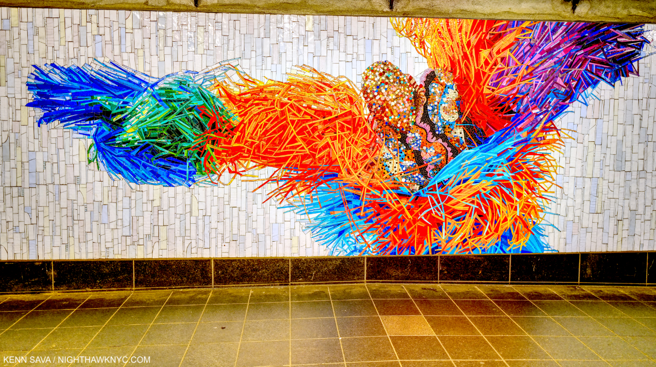
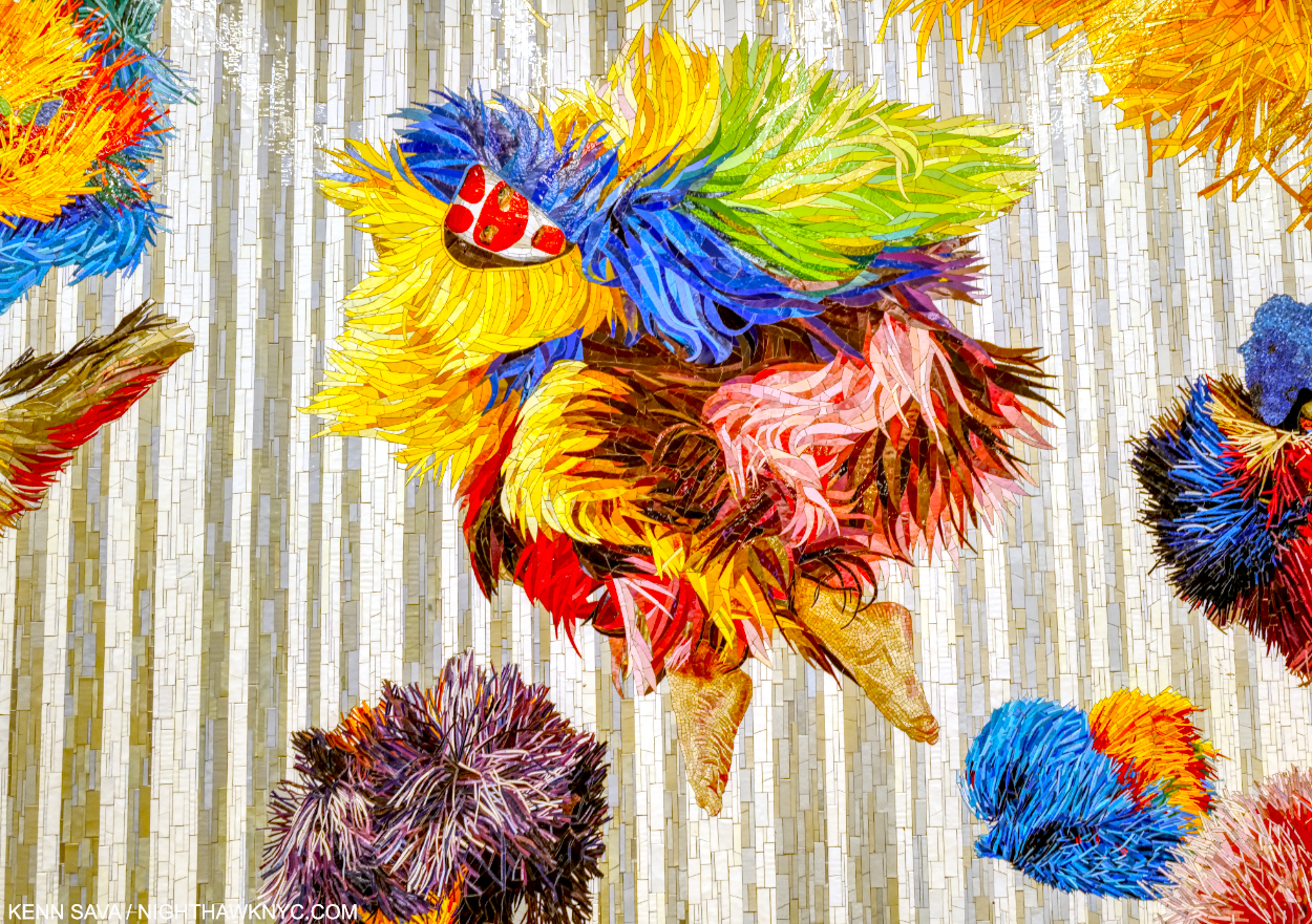
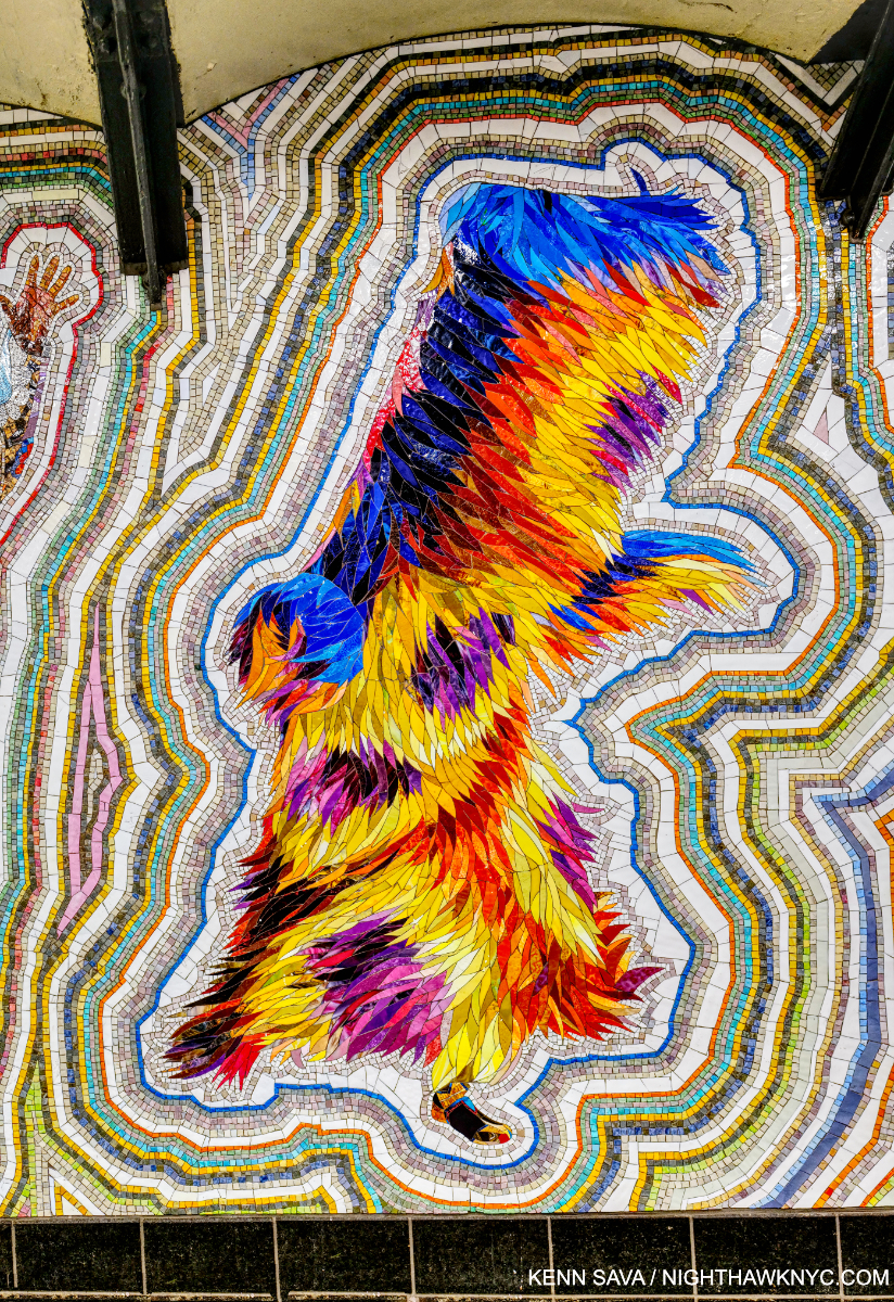
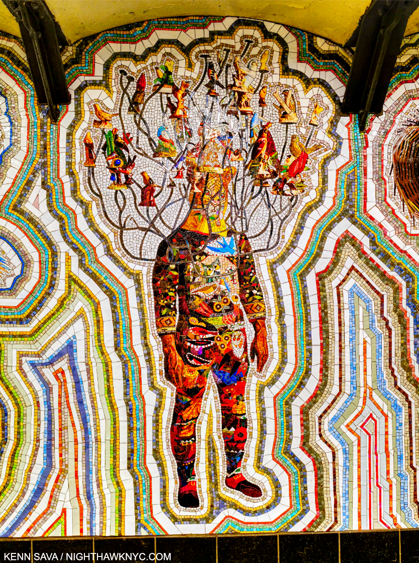
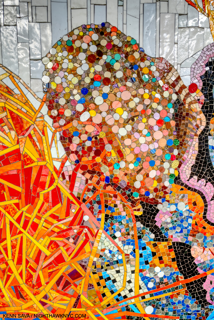
Who am I? Detail of one of the figures in the section titled Every One. All works shown are Glass mosaic tiles and dated 2022 unless stated. Click any photo for full size.

Some of the most spectacular Art in New York is free and available to see & experience 24 hours a day, 7 days a week, 365 days a year. All you need to do to see it is pay a subway fare. All around town, MTA Arts & Design has succeeded in bringing a world-class roster of Artists to the City’s subway riders that rivals that of any museum1. Created in 1985, MTA Arts & Design has been one of the most remarkable stories in NYC Public Art, if not Public Art anywhere.

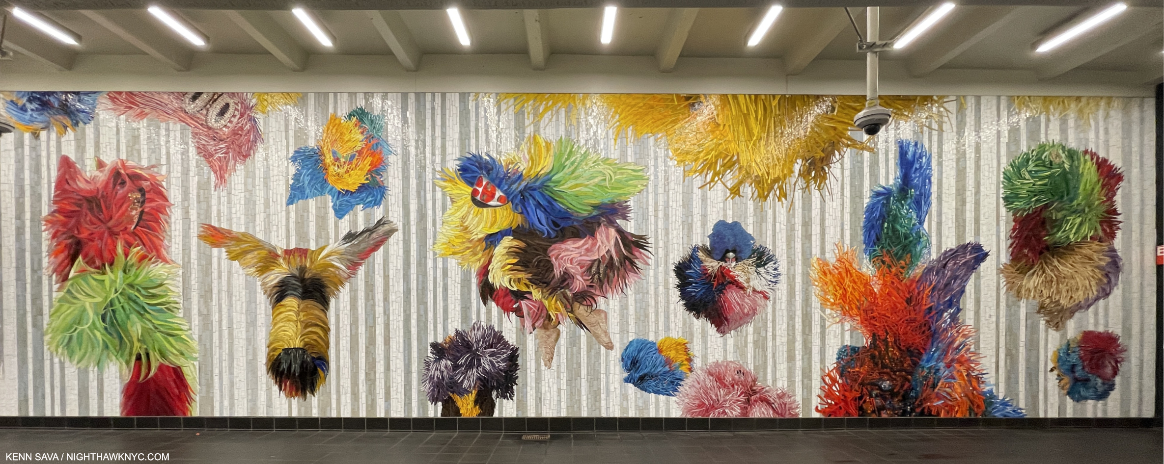
Installation view of the entire first section, Each One, installed just outside the turnstiles at the One Times Square Entrance.

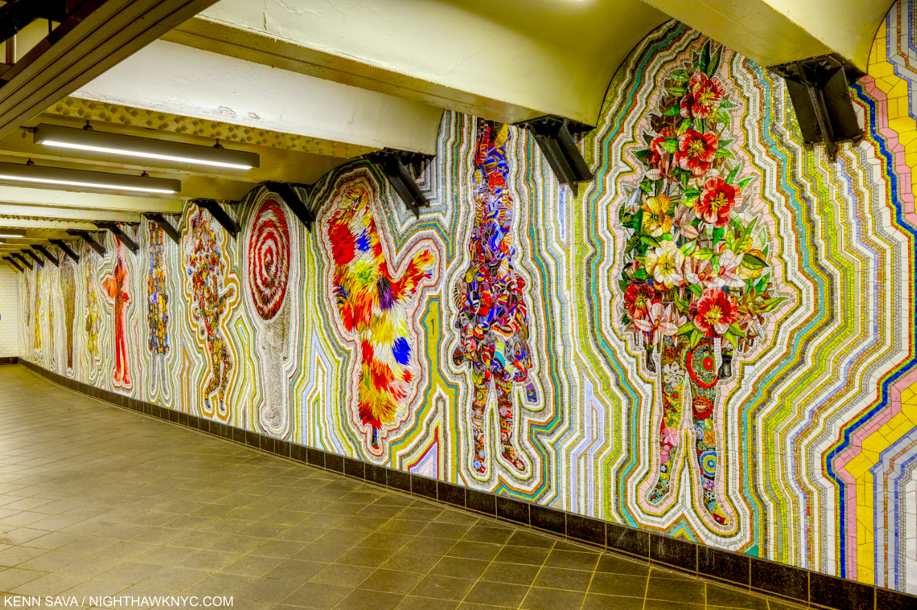
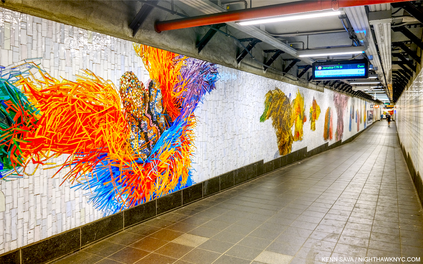
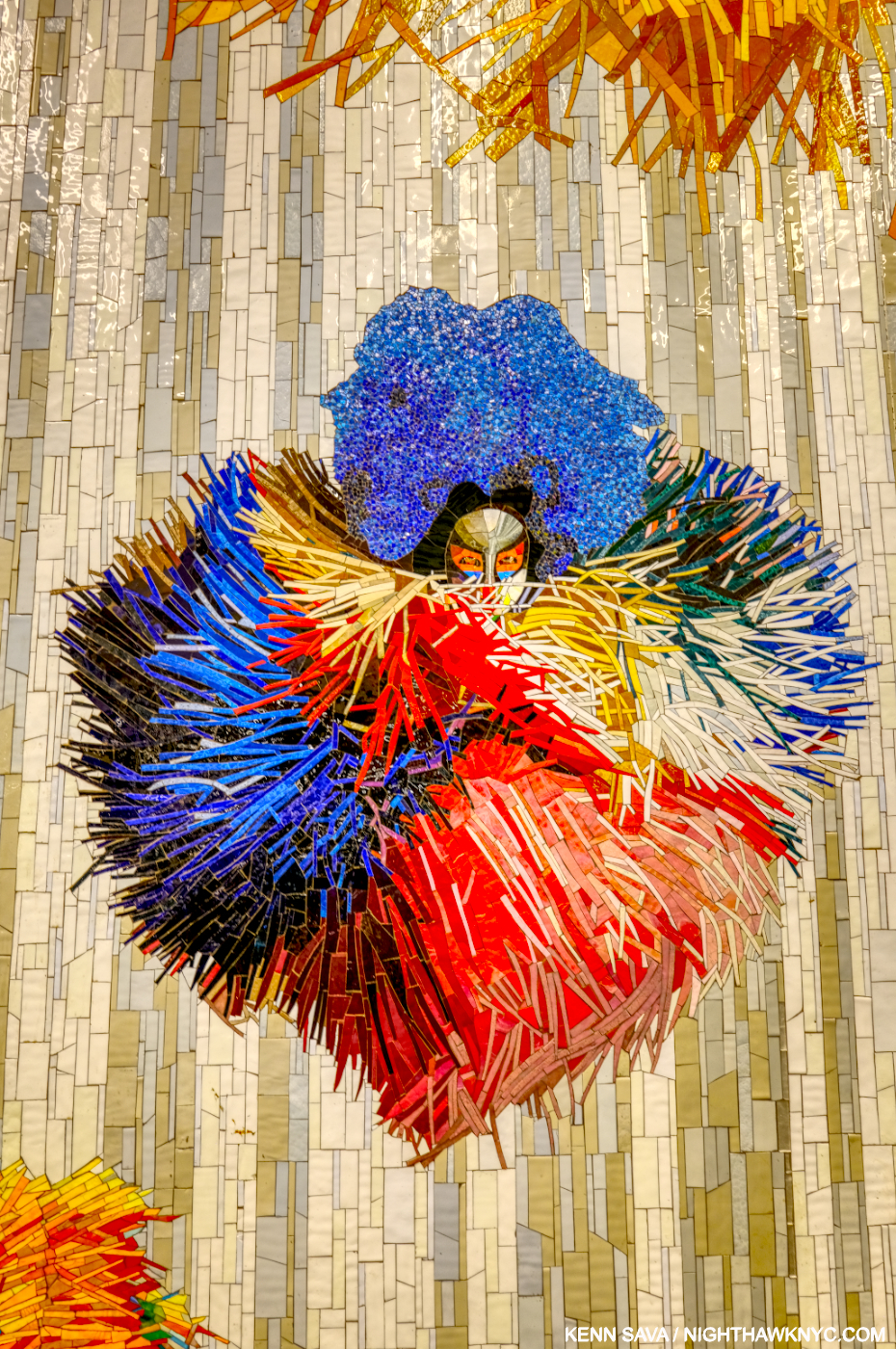
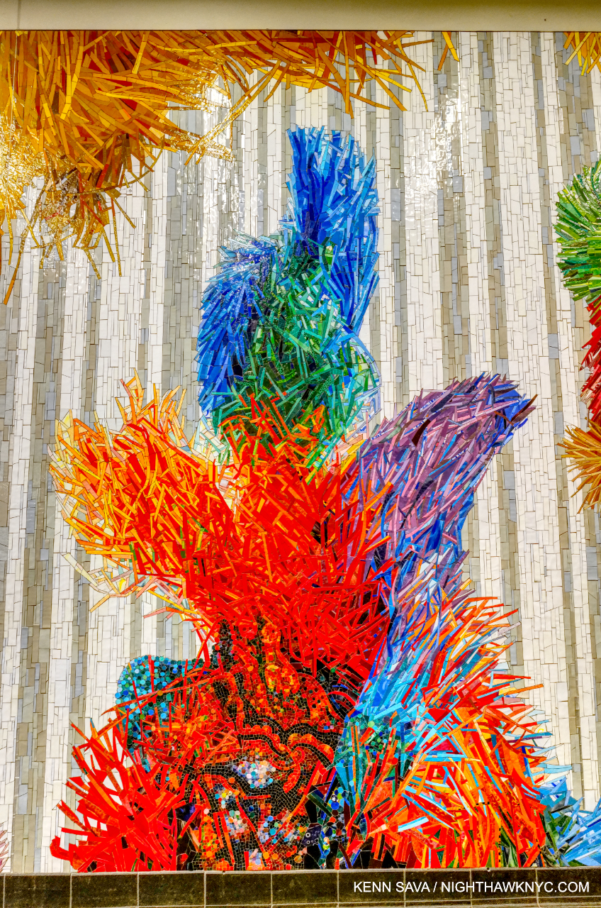
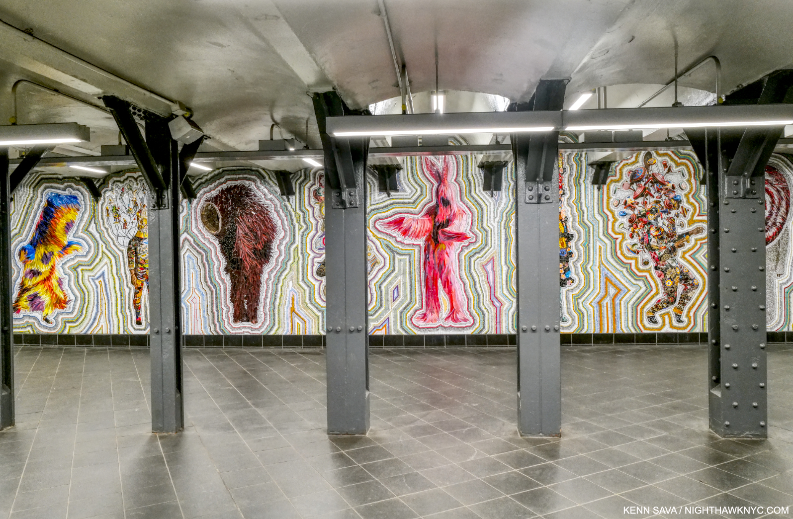
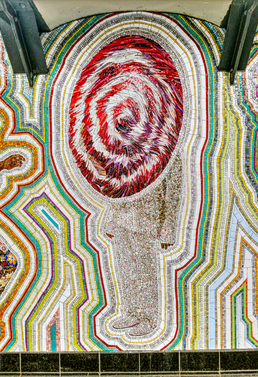
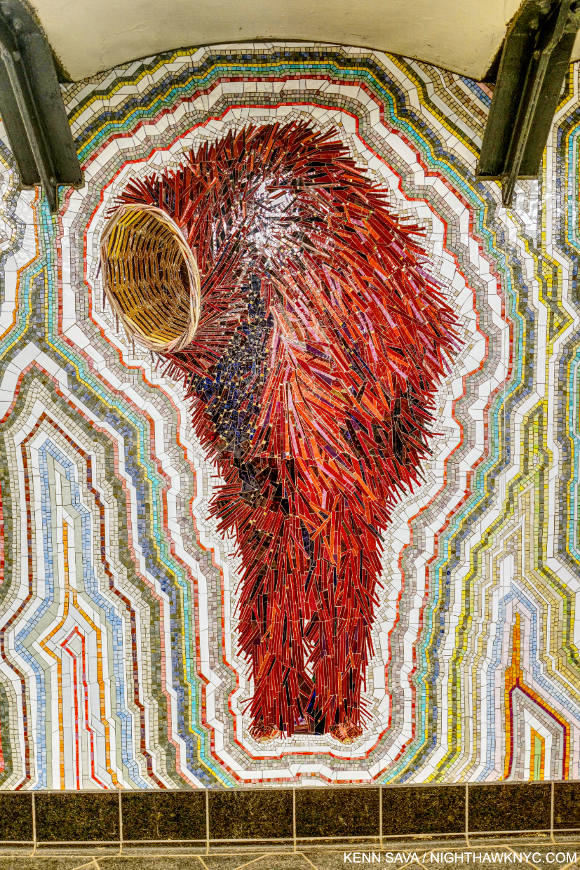
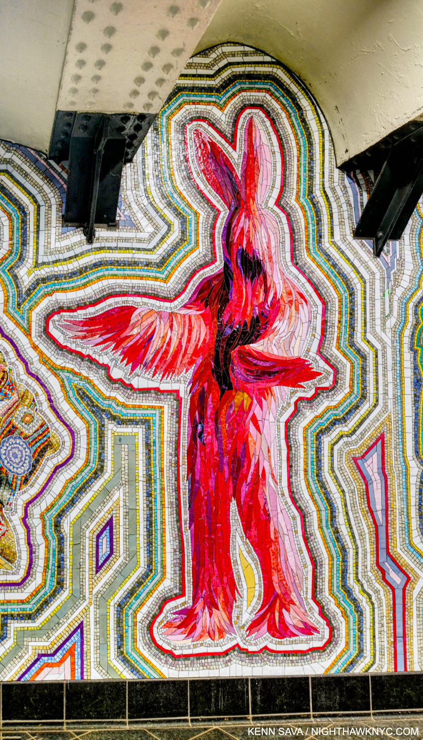
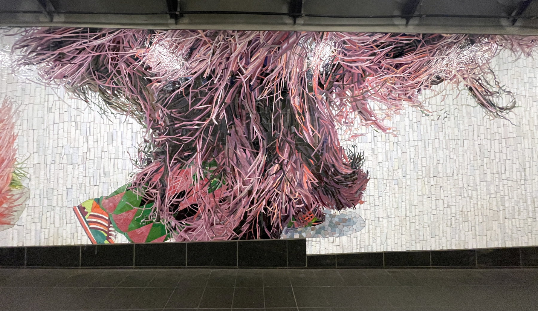
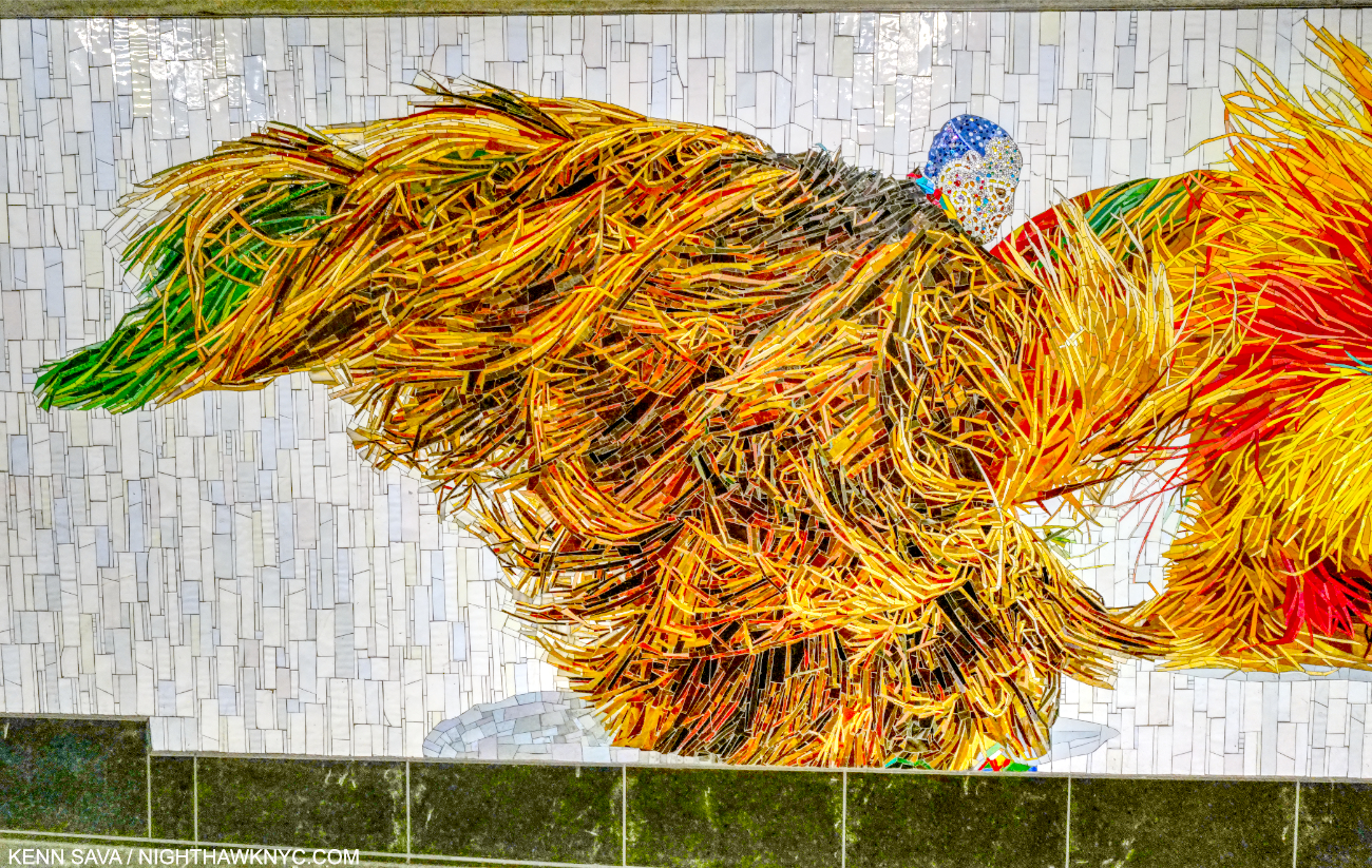
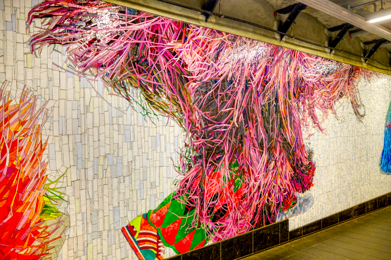
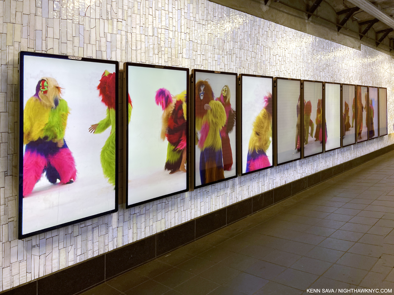
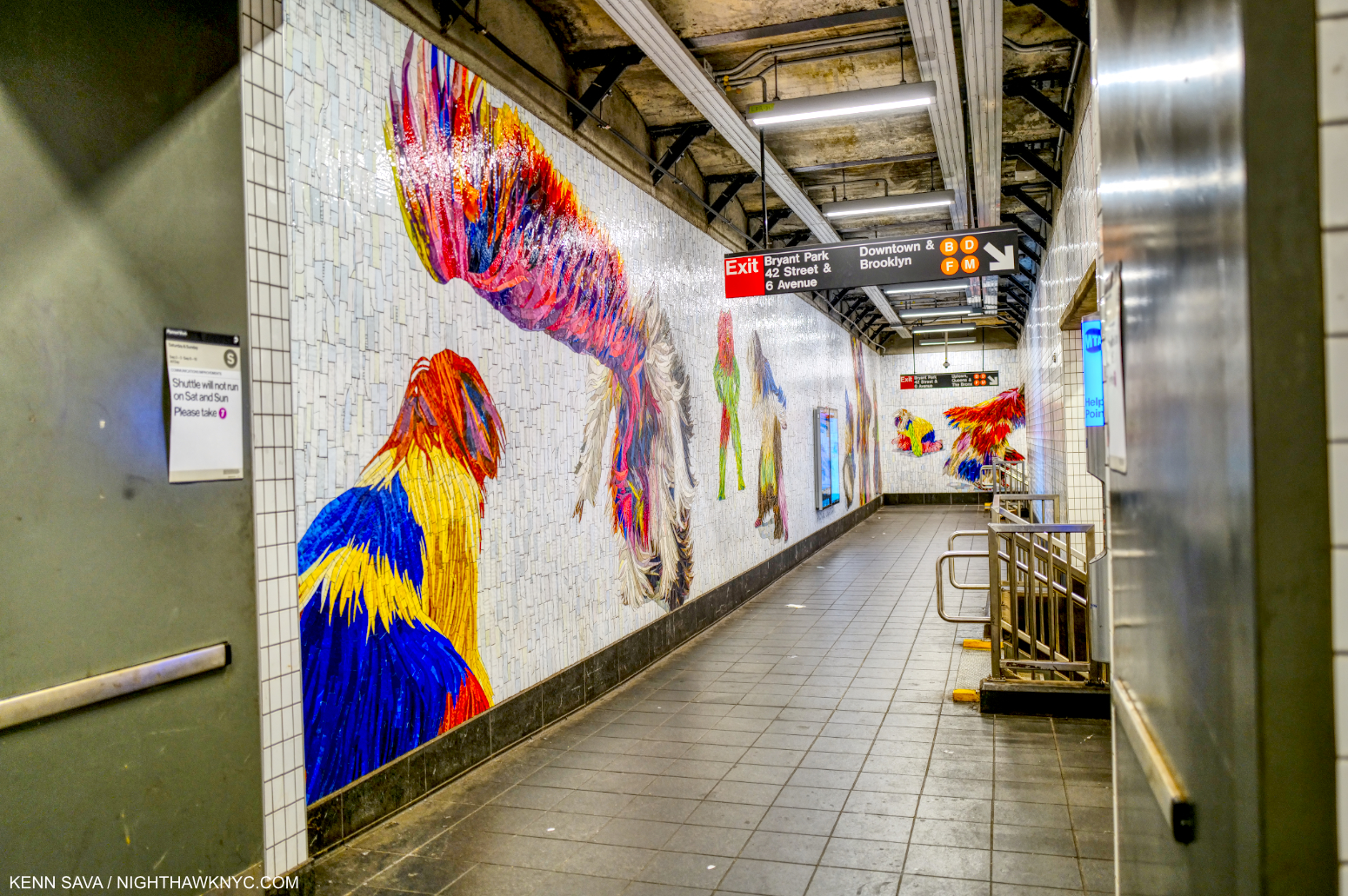
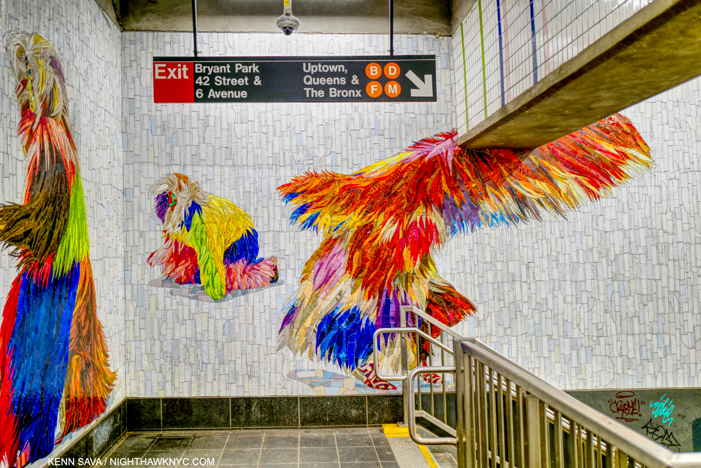
Recently, MTA Arts & Design completed the third and final section of Nick Cave’s monumental 3,200 square foot Permanent Public Art Work Under Times Square. Each One, Every One, Equal All, 2022 is installed in the 1,2,3,7,N,W & Shuttle station at 42nd Street & Times Square, perhaps the busiest station in the entire subway system. The project consists of a whopping FIFTY THREE figures2 wearing Mr. Cave’s famous Soundsuits, each made up of countless incredibly intricate and fabulously colored glass mosaic tiles. A number of the original Soundsuits they are based on were displayed in Nick Cave: Forothermore at the Guggenheim Museum last winter, and some appear in my look at the show. The mosaics were fabricated by world-renowned Mayer of Munich (aka Franz Mayer & Co., founded in 1870), and are augmented by a recorded performance displayed on 11 video monitors.

Equal All. Installation view of the entire second section installed at the 42nd Street Shuttle.

As stunningly beautiful as they are, beauty is not the beginning or the end of Nick Cave’s Soundsuits. “The first Soundsuit was in ’92 in response to the Rodney King incident, the L.A. riots,” Mr. Cave recalled. “I was sitting in the park one day  and just sort of thinking about, What does it feel like to be  discarded, dismissed, profiled? There was this twig on the ground. And I looked at that twig as something discarded. And then I proceeded to just start collecting the twigs in the park. And I brought them all back to the studio. And then I started to build this sculpture. I started to realize that the moment I started to move in it, it made sound. Then it just literally put everything in perspective. I was building this suit of armor, something that I could shield myself from the world and society. And so out of that came this sculpture-performative kind of work.”3

The Soundsuits “hide gender, race, class. And they force you to look at the work without judgment. You know, we tend to want to categorize everything,” the Artist said. “We tend to want to find its place. How do we, sort of, be one on one with something that is unfamiliar?”4

Every One. Installation view of most of the section installed in the 42nd Street Connector which continues all the way down the corridor then wraps around the far end of it.

Here are some highlights of each section beginning with Each One, shown in its entirety earlier, which is installed in the entrance before you reach the turnstiles-

As amazing as the individual figures are, the backgrounds are endlessly varied, and different in each of the three sections.

After paying your fare, the second section is installed to the left, “framed” behind pillars as you approach it just before you reach the Shuttle further to the right-

The background is noticeably different than that of the other two sections, and characterized by having more color and more of a pattern.

I believe the actual Soundsuit this is mosaic depicts is made of twigs, and it may have been on view in Nick Cave: Forothermore at the Guggenheim. It appears in two pictures in my piece on the show.

Some highlights of the third, and longest, section, Every One in stalled in the 42nd Street Connector past the Shuttle

Close-up of the head of the figure shown in the very first Photo in this piece.

This section includes 11 video monitors.

Screenshot of the Every One video featuring dancers wearing Soundsuits in a 3-minute video that is shown every 15 minutes, but you can see it in full below. Due to the fact it’s on 11 video monitors, the MTA had to compress the size of the video a bit-

Mosaics are one of the (if not the) most durable materials Art is made of. If you doubt that, visit The Met where you will see mosaics dating back to the 1st century BCE that retain every bit of their luster and beauty. The universe willing, the mosaics in the subway will outlive us all.

Installation view of the last section of Every One.

Displaying them in the subway, where the “melting pot” America is supposed to be all about, is on full display all the time- perhaps to a degree it is nowhere else in the country, is particularly poignant and powerful. It’s also very liberating to imagine oneself being one of these magical figures cavorting, dancing, leaping or flying all around us as we walk through them, anonymously.

The final figure of Every One, installed at the top of a staircase, looks like it’s about to take flight.

All of a sudden, a world where racism exists, doesn’t.

*-Soundtrack for this piece is “One Nation Under A Groove,” by George Clinton & Funkadelic from the 1978 album of the same name. Nick Cave has frequently mentioned George Clinton as an early influence.

NighthawkNYC.com has been entirely self-funded & ad-free for over 8 years, during which 300 full-length pieces have been published! If you’ve found it worthwhile, PLEASE donate to allow me to continue below. Thank you, Kenn.

You can also support it by buying Art, Art & Photography books, and Music from my collection! Art & Books may be found here. Music here and here.

Written & photographed by Kenn Sava for nighthawknyc.com unless otherwise credited. To send comments, thoughts, feedback or propositions click here. Click the white box on the upper right for the archives or to search them. Subscribe to be notified of new Posts below. Your information will be used for no other purpose.
  1. Think I’m kidding? Here’s a short list. Each of these Artists has created a PERMANENT installation. Listed by Artist’s name, with the subway line(s) @ which station-
    Chuck Close -Q@86th St
    Roy Lichtenstein -A,C,E,et al@42nd St & Times Sq
    Jacob Lawrence -1,2,3,7,N,R,W,S@42nd St & Times Sq
    Jane Dickson -1,2,3,7,N,R,W,S@42nd St & Times Sq
    Sol LeWitt -1,A,B,C,D@Columbus Circle
    Vik Muniz -Q@72nd St
    William Wegman -F,M@23rd St
    Yoko Ono -B,C@72nd St
    Elizabeth Murray -4.5.6,N,R,W@Lex & 59th St
    Faith Ringgold -2,3@125th St
    Alex Katz -F@57th St
    Leo Villareal -6,B.D,F,M@ Bleecker St./Broadway & Lafayette
    Jack Beal  -1,2,3,7,N,R,W,S@42nd St & Times Sq
    Al Held -E,M@Lex & 53rd St
    Eric Fischl -A,C.E@34th St & Penn Sta
    And, my personal favorite- Sarah Sze -Q@96th St. Sarah Sze’s Blueprint for a Landscape, 2017, was commissioned to design Art for the entire large subway station- 14,000 square feet! What makes this project even more unique is that, unlike most of the other stations in NYC, this was a station being built from scratch at the same time. I wrote about it here. As far as I know, it is the largest Public Art project in the subway. The MTA Arts & Design site lists them all, here.
  2. by my count
  3. “Nick Cave in Chicago,” Art21, 2016
  4. Nick Cave: Thick Skin” Art21