The “New” MoMA, And The Gorillas In The Room

Written & Photographed by Kenn Sava (except *)
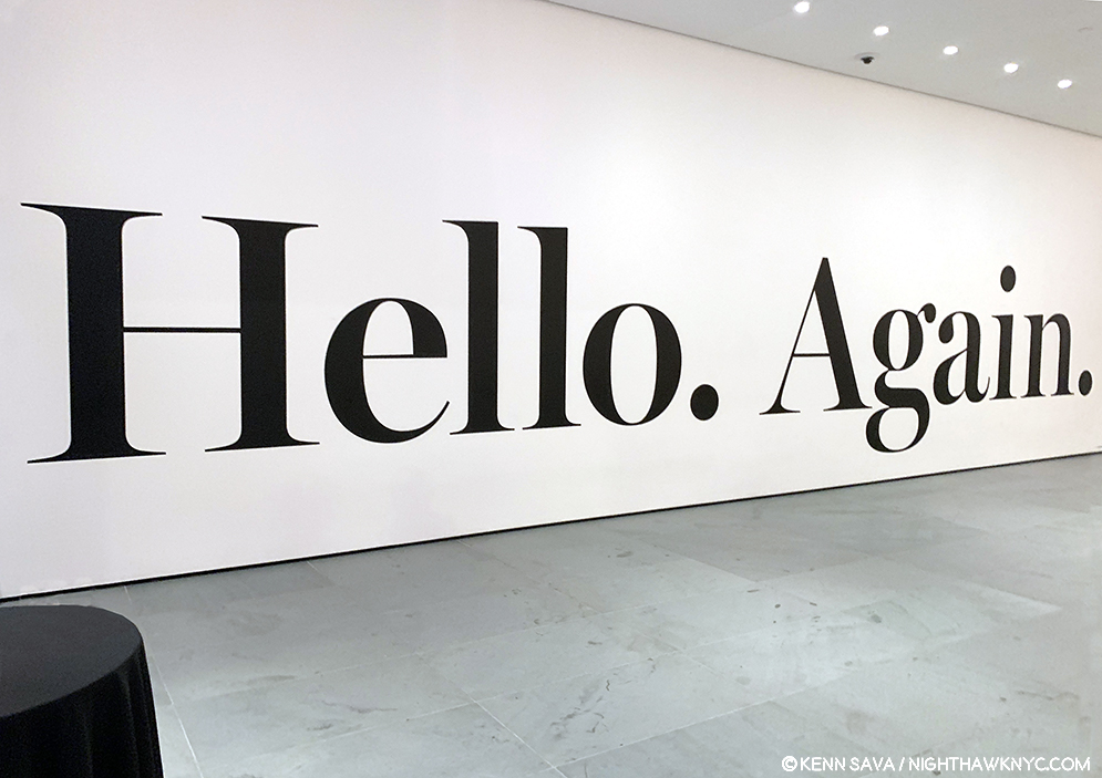
MoMA, 1st floor lobby sign, October 19, 2019. I’ve been through this before. The last time, it was a nightmare. How would this “new” MoMA be?

MoMA and I go a long way back. It’ll be 40 years next year. 
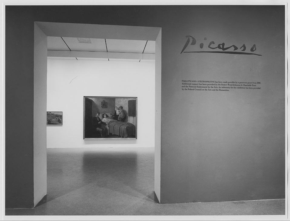
I can remember this like it was yesterday…The entrance to Pablo Picasso: A Retrospective at MoMA, 1980. My Art show attending career began when I walked through that entrance. *MoMA Photo.

I first went to The Museum of Modern Art in 1980 for their incomparable Pablo Picasso: A Retrospective that took over the whole museum. I was on the road with a band at the time and I flew back to NYC twice to see it. Though it was not my first trip to a museum to see Art, it began my career of seeing Art shows and is burned indelibly in my mind since. While I came away feeling the late works were underappreciated, the earliest works which were new to me, like Science and Charity, 1897, Painted at age 15, seen through the entrance, above, particularly astounded me, and it never let up from there. An almost impossibly high bar had been set. I wasn’t able to attend MoMA regularly until after the 1984 renovation, which I call MoMA, 1984. Looking back on that MoMA now, I have quite fond memories of the building. I’ll never forget being in the gallery the museum dedicated to Claude Monet’s Water Lilies, 1914-26, long a very important bridge between representational Art and abstraction for me. As I recall, it was a small room, with a bench along the window overlooking West 53rd Street. You entered the room where panel 1 met panel 2, at about 10 o’clock as you faced it. You sat there and the three huge panels surrounded  you, making you feel like you were inside it. It was one of the greatest feelings I’ve ever had looking at Art. I didn’t think MoMA, 1984 was anything special at the time, but given how lacking MoMA, 2006, the most recent MoMA was, which of course, is still with us in the partially new MoMA, 2019, I now feel quite nostalgic for a building that was “adequate” at best, overall.
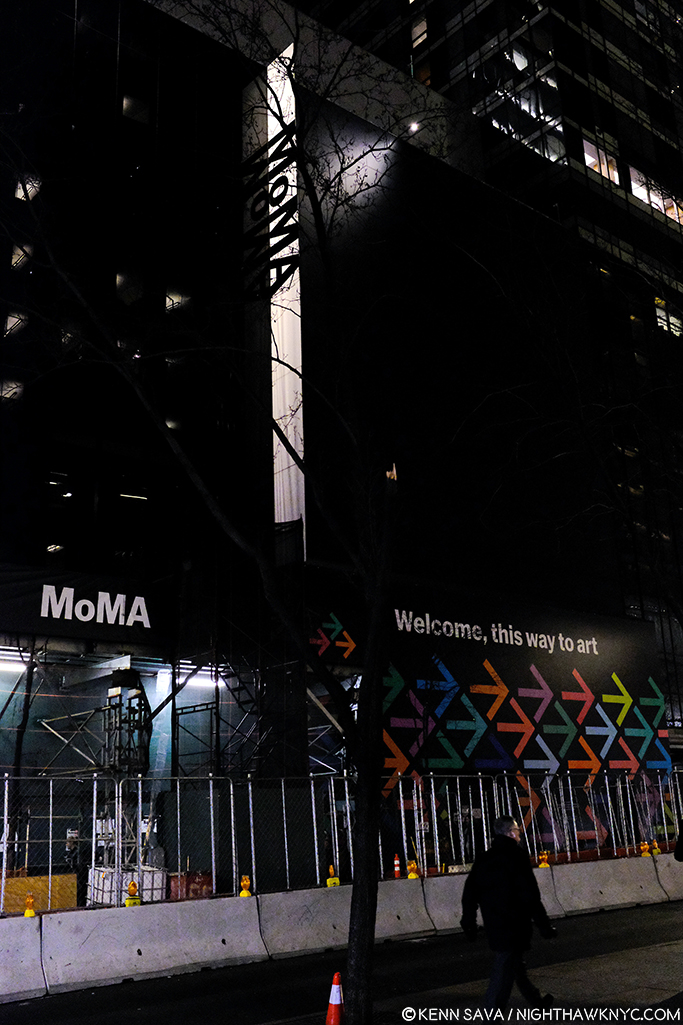
The heart of Art darkness. Construction for MoMA, 2019 in progress at the famous main entrance, behind the arrows pointing visitors to the temporary entrance, December 20, 2018.

I saw Matisse-Picasso at MoMA Qns in 2003, where MoMA was temporarily as MoMA, 1984 became MoMA, 2006, which I went to innumerable times (and have written about a number of its shows here on NYNYC), from it’s earliest days. MoMA, 2006, which opened that November, was terrible, in my opinion (I replaced a stronger negative). I remember standing in utter shock looking at Monet’s Water Lilies installed around the base of the huge, open space, they called the “atrium,” where they had no sense of their compositional continuity or unity. Barnett Newman’s Broken Obelisk, 1963-9, installed in the center of the space looked better there than anything I’ve seen there that came after it, which is not really saying anything all that positive.

The newly renovated main entrance. Opening day, October 21, 2019.

“The Shopping Mall of Modern Art,” I took to calling MoMA, 2006, the one we’ve been living with these past 13 years. I don’t live in the suburbs partially because I hate malls, yet, here we were given one. The Architect, Yoshio Taniguchi, said1 “The model for MoMA is Manhattan itself.“ He spoke about how Central Park is like MoMA’s Sculpture Garden in his concept. Apparently he felt the rest of Manhattan is one giant shopping mall, cause that’s the design we got- a department store, nothing more, nothing less, who’s floors/departments are connected by an escalator, as they always are. If MoMA had decided to move to an entirely new location instead of turning MoMA, 2006 into MoMA, 2019, whoever would have come into the building would have a virtual turnkey Macy’s II ready to go. “Contemporary on 2,” “This way to the Permanent Collection, and home fixtures…I mean Design”…

That brings me to the Gorillas in the room…Both of them.

“There’s a hole
In my life
There’s a hole
In my life”*

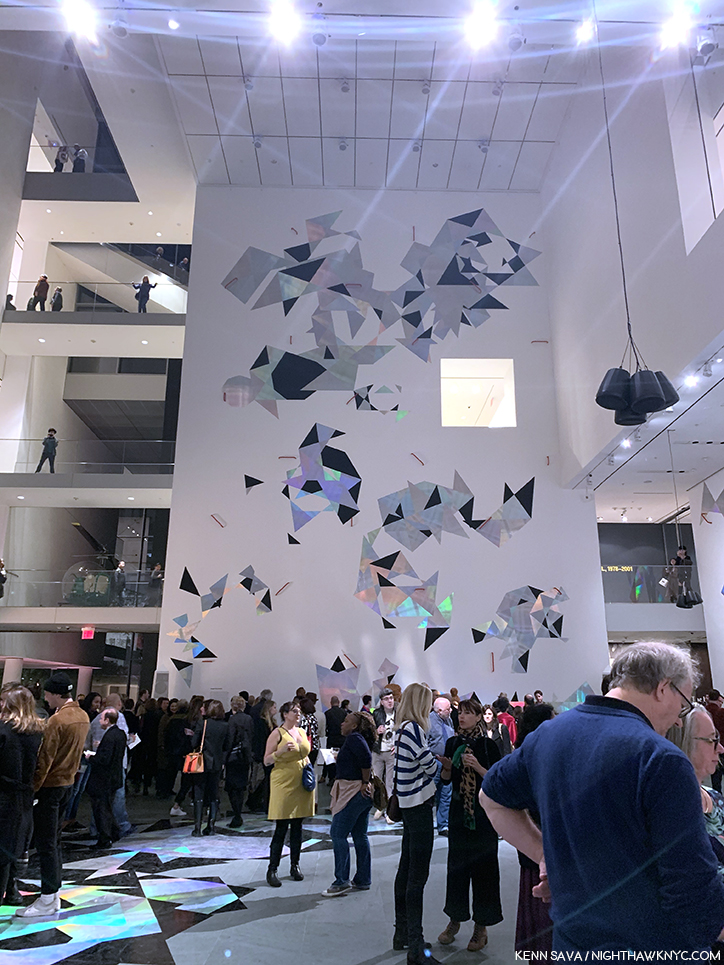
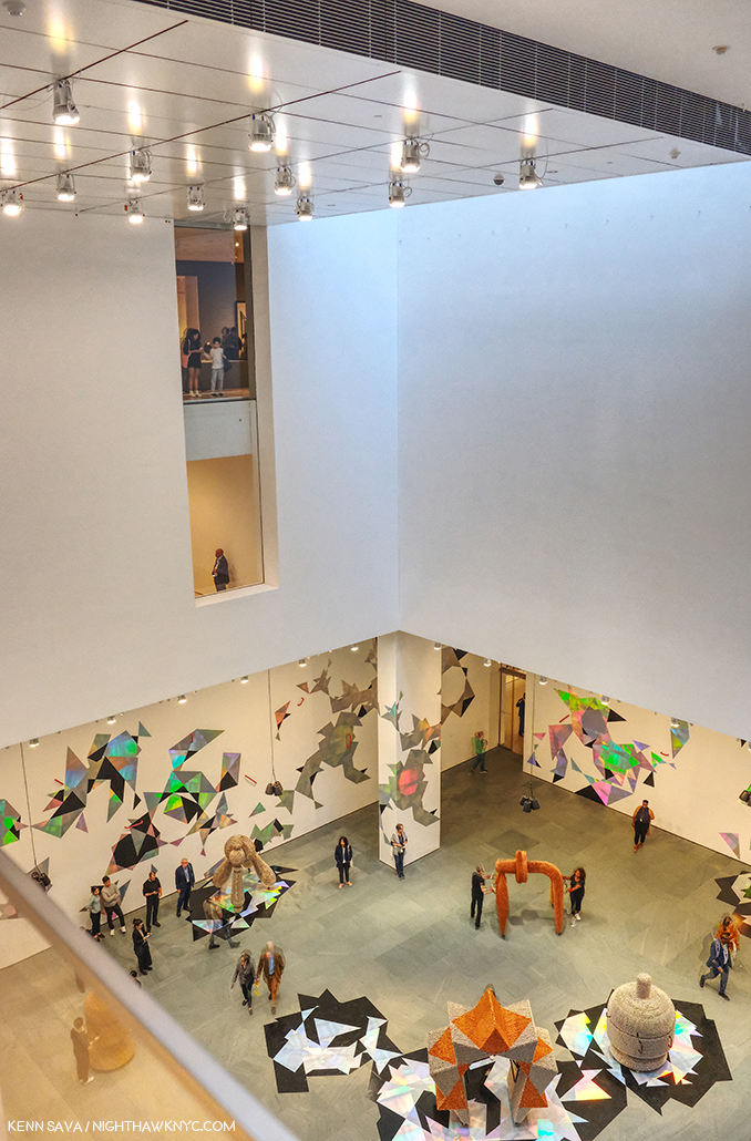
The “atrium,” Member’s Preview” for the “new” MoMA, October 19, 2019.

The first is that 110 foot tall gorilla in the building officially or unofficially called the “atrium.“ For some reason that I have not for the life of me been able to figure out over a few hundred visits these past 13 years, the Architect decided to drop a 110 foot tall atrium, (the “hole” I call it), smack dab in the middle of the building that, apparently, even some of the world’s great curators haven’t found a defining use for in almost one and a half decades2. I don’t blame them. I blame the Architect and whoever else thought this space was a good idea. I’ve never seen them use any more than the first 20 feet or so of its 110 until they mounted a decal-like iridescent work, seen above, on one of its walls for the opening of MoMA, 2019. And, I blame those who decided not to remove it in MoMA, 2019.  MoMA created MoMA, 2019, partially, because they “needed more space.” Well, guess what? You’ve got 7,700 square feet, or so, of completely useless space right smack dab in the middle of the building3, right in the middle of some of the most expensive real estate on earth. Instead of extending each of the floors as they should have been originally and filling that hole, they tore down an existing, good, museum, The American Folk Art Museum, formerly at 45 West 53rd Street next door!
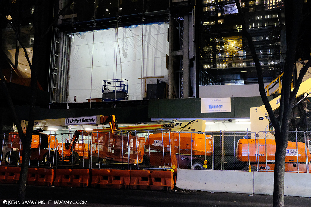
Construction of the new building for MoMA, 2019, where the American Folk Art Museum stood, seen on December 20, 2018.

“Shadow in my heart
Is tearing me apart
Or maybe it’s just something
In my stars”*

Frankly, all of this galls me.
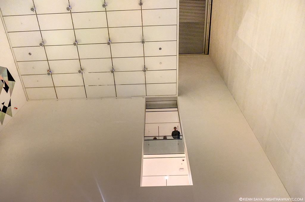
“Soaring…””Majestic…””One of NYC’s great interior spaces…” Oh, sorry. I was reading about the Guggenheim. I can’t find anyone saying that about this.

Because of the atrium, the flow of every floor in MoMA, 2006 is broken up, causing headaches for visitors and curators. This goes right to the heart of the museum’s purpose- showing Art. A good number of the galleries in MoMA, 2006 felt strangely shaped, small, or lost. In this case, small doesn’t add “intimacy.” Instead, it serves to actually minimize the effect of the Art being shown in them, in my experience. The Brancusi show mounted before the summer, 2019 closure, and the new Betye Saar show both suffer from this, in my opinion, both being mounted in the same 2nd floor gallery, tucked off to the south side of the hole, behind sliding glass doors (which I also think are an annoying idea and an energy drain), unchanged between Moma, 20o6 and MoMA, 2019.

Apparently, given it’s still here in MoMA, 2019, MoMA is in denial that the atrium is a problem. For me, visiting MoMA, 2006 gives me the unmistakable feeling that I’m continually walking around, and working my way around, the hole, instead of the whole experience just flowing.
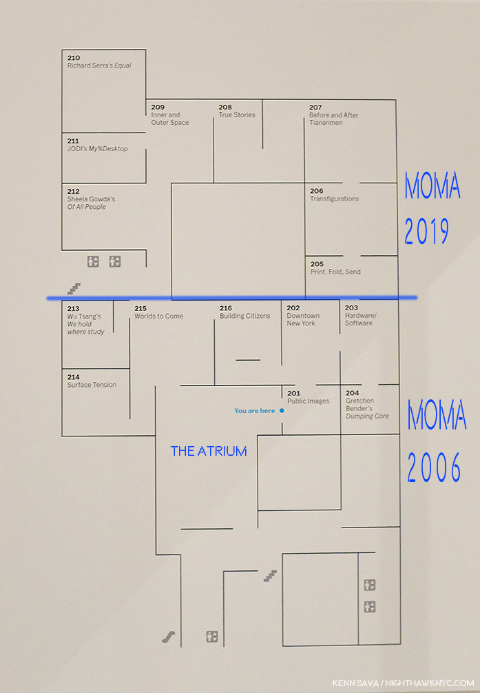
MoMA’s floor plan for part of the “new” 2nd floor. I’ve added notations in dark blue- a label for the atrium to point out where it is and how it needs to be navigated around. I’ve also labelled where MoMA, 2006 was (below the added blue line) and labelled where MoMA, 2019 is now (above the blue line) in the margin. Not shown- the other galleries on this floor, located in what MoMA now calls the “South” section (to the left and lower left.). All are effected by the “atrium.” Bear in mind- this is only ONE floor!

In fact, in MoMA, 2019, they’ve decided to double down. Keeping the hole, they’ve opted to extend the existing 2nd, 3rd, 4th and 5th floors the other way- to the west. I take this as an admission that the floors needed to be extended. We differ on how. You can see this in the 2nd floor floor plan, above. I’ve drawn a blue line to the left from gallery 205 and everything above that is the new building, what I call MoMA, 2019, below is what I call MoMA, 2006. It almost works. It does serve to minimize the “interference”/inconvenience of the hole, unless you’re in a section where you have to navigate around it. Alas, as soon as you are back in the “old” building, the MoMA, 2006 part, there it is, rearing its ugly head again, sending you to a floor plan trying to find your way. But, it also dramatically effects MoMA’s curators, and no doubt, every single show they mount in these spaces. WHY they just didn’t remove the atrium and extend the floors and make the 2nd, 3rd, 4th, and 5th floors full floors? (The 6th floor is a different matter, I believe due to the heights of the buildings. It already is a full, raw, space in the MoMA, 2006 building and a cafe has been installed on 6 on the MoMA, 2019 side (which I have not seen as yet. You can walk through from MoMA 2006 to MoMA 2019 on 2, 3, 4 and the 5th floor, but you can’t on 6. If you’re on 6 in MoMA 2006, you have to go down to 5, walk over to MoMA, 2019, and then go up to 6 on that side, or vice versa). That they didn’t remove the atrium is another, huge, mistake in my view. Alas, it’s too late for tears. And having been sad about MoMA’s building since MoMA, 2006 opened, I’m about cried out. Yes, MoMA, 2006 was so bad it actually kept me from going at times.
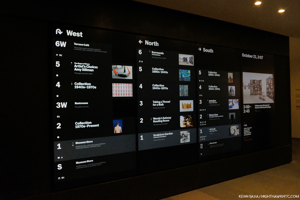
Where the heck am I going? Before going anywhere, it’s a good idea to check the “central scoreboard,” as I call it. West? North? South? What? Look quick! Those listings next to each floor change to show other things going on on that floor. Seen on the official opening day, October 21, 2019.

Another question for me is HOW do you redesign the building into MoMA, 2006, spending over 850 million dollars doing so, and not early on in the game ask, “WHERE are we going to put our most popular works?” Apparently, no one asked. Over the subsequent 13 years of the building, Monet’s Water Lilies and Van Gogh’s Starry Night, to name two, were continually moved, and never once looked to have found THE place for them. I lost count of how many places I saw the Water Lilies in MoMA, 2006, all the while with that indelible memory I recalled earlier in my mind.

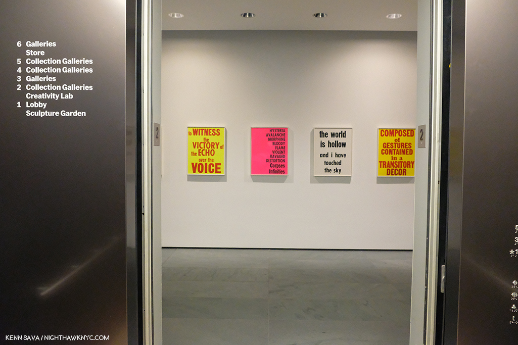
The brand new elevator doors open on my first visit to MoMA, 2019’s 2nd floor, October 19, 2019.

SURELY someone would ask that question when it came to designing MoMA, 2019! Two visits in? The answer is a decided…I’m not sure.
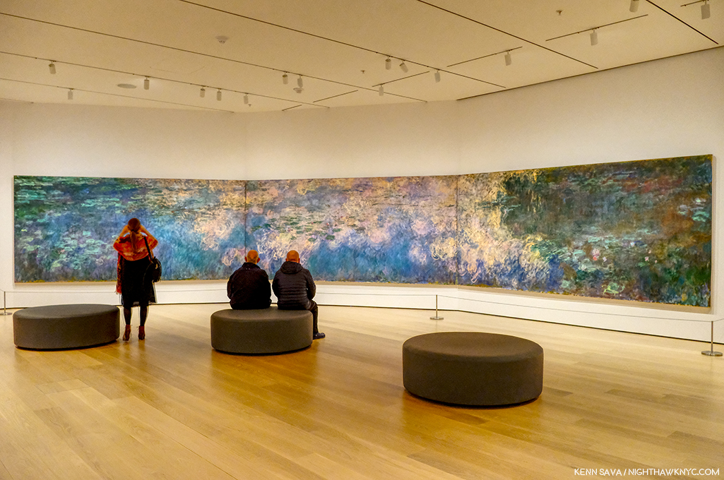
Home? At last? Monet’s Water Lilies, 1914-26, in a gallery devoted to his Water Lily Paintings (yes, they have others). We’ll see how long these stay here.

The Water Lilies seem to have been given some thought. They are decently situated in a gallery that contains only Monet Water Liliy works on an angled wall, similar to one of the installations they had in MoMA, 2006. You can scan the whole work continuously but it doesn’t give you a “wrap around” feeling. Starry Night fares far less well. It’s stuck in a corner(!?) at the end of a long gallery. I was shocked when I walked in and saw this. It’s just terrible.
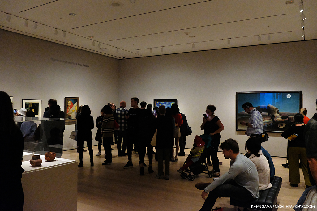
Cornered! Vincent van Gogh’s beloved Starry Night, 1889 can be barely seen (as usual), though it’s now stuck in a corner. Seen on the official opening day, October 21, 2019

In this large gallery one other Van Gogh is installed half way down the wall to the left. I didn’t get the feeling of connection with the other works shown near Starry Night. Munch, who I greatly admire, is seen on the left hand wall, and while many pair him with Vincent, he gives me a completely different feeling, though l’ve wondered if Vincent may have been an influence on the Artist who was a decade younger. MoMA may have felt that putting other Van Goghs next to Starry Night might have created too big a crowd. I can live with seeing Munch next to Van Gogh’s. As seen in this gallery, due to the new arrangement of the galleries, multiple works by the same Artist are spread out, often across galleries.

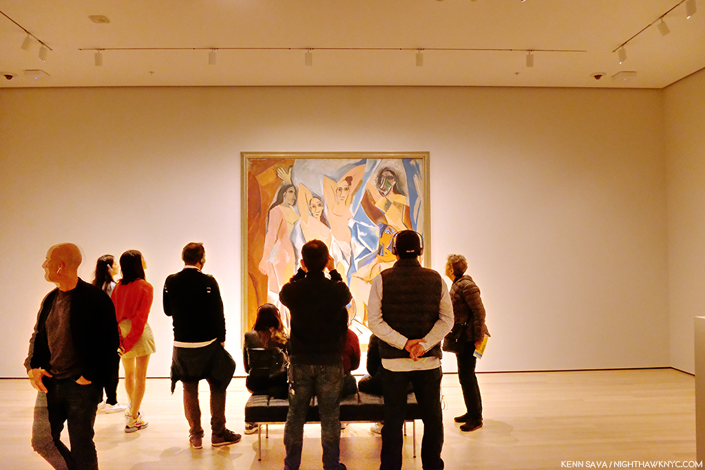
Picasso, Les Demoiselles d’Avignon, 1907.

That means that if you want to see, say, the Picassos, you have to plot a path to a number of rooms, where you might see one, or you might see 3 or 4. If you have multiple Artists on your hit list of pieces to see? You’re going to need a good chunk of time- just to plan your routes. Especially if they’re installed over multiple floors. I have mixed feelings so far about this arrangement, but I’ve been living with this collection for decades, and while I prefer seeing it chronologically so you can see how Art has evolved over time, mixing it up can be a nice change of pace and reveal new synergies. This “theme” strategy, which is more like that of a special exhibition, feels geared to people like me who have lived with the collection for a while and might welcome being surprised (if that’s what they feel). First time visitors, or those here with limited time, may feel differently.
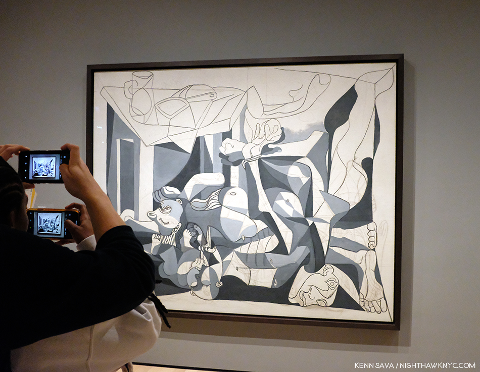
Picasso, The Charnel House, 1944-5. The iconic Guernica is a work Picasso Painted in 1937, in the early days of World War II. The Charnel House was Painted at the end of the War, bookending Guernica, though far less well-known. Guernica was part of MoMA’s collection until Picasso died. He stipulated in his will it be returned to Spain. So, including it in the 1980 Picasso Retrospective, where I was able to see both of them, was something of a farewell before Guernica went to Spain.

Picasso seems to fare better than Starry Night. At least three of his major works (Les Demoiselles d’Avignon, 1907, Three Musicians, 1921, and The Charnel House, 1944-5) get walls all to themselves- in different galleries.
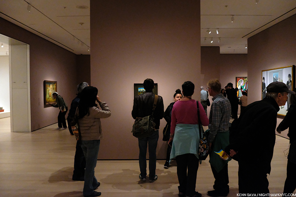
The upper left corner of Dali’s, The Persistence of Memory, 1931 (aka the “Soft Watches”). Picasso watch- Girl before a Mirror, 1932, is partially seen in the rear to the right.

As for other works on the most popular list, one was easier to find. Dali’s The Persistence of Memory, 1931 (aka the “Soft Watches”) gets a pillar to itself front and center in gallery 517. And on the opposite side of the same wall is Frida Kahlo’s Self-Portrait with Cropped Hair, 1940. That was easy. I only had to ask once to find it. (The Water Lilies? I asked 3 times. I saw another visitor seeking them ask twice.)

I found the galleries to be well lit, as readers well know, lighting is one of my long standing peeves in most spaces I see Art. One gallery of 2 Hopper Paintings accompanied by a good many Photographs was a bit dark, I presume this was intentional for conservation purposes. The consistency of the lighting across the museum that I’ve seen thus far is to be commended.

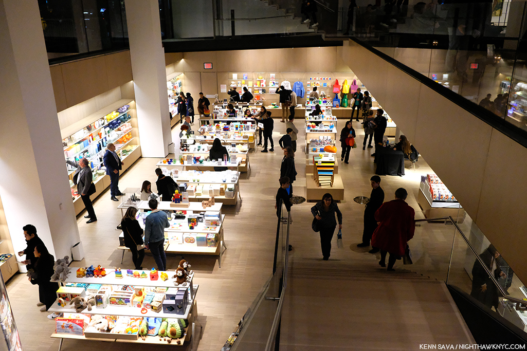
Lower level gift & book shop. One of at least 2 in the museum.

The first floor lobby felt like being in any of the faceless, large Times Square hotels nearby. It felt that a lot of money was spent here. Yet, I can never recall asking someone “How was your visit to such and such museum?” and getting the response, “Oh, the lobby was amazing!” I believe “sinking” the gift shop/book store is a mistake. Getting anywhere in MoMA, 2019 requires taking stairs and elevators. The last thing people may feel like doing is taking MORE stairs just to visit a shop. We shall see.
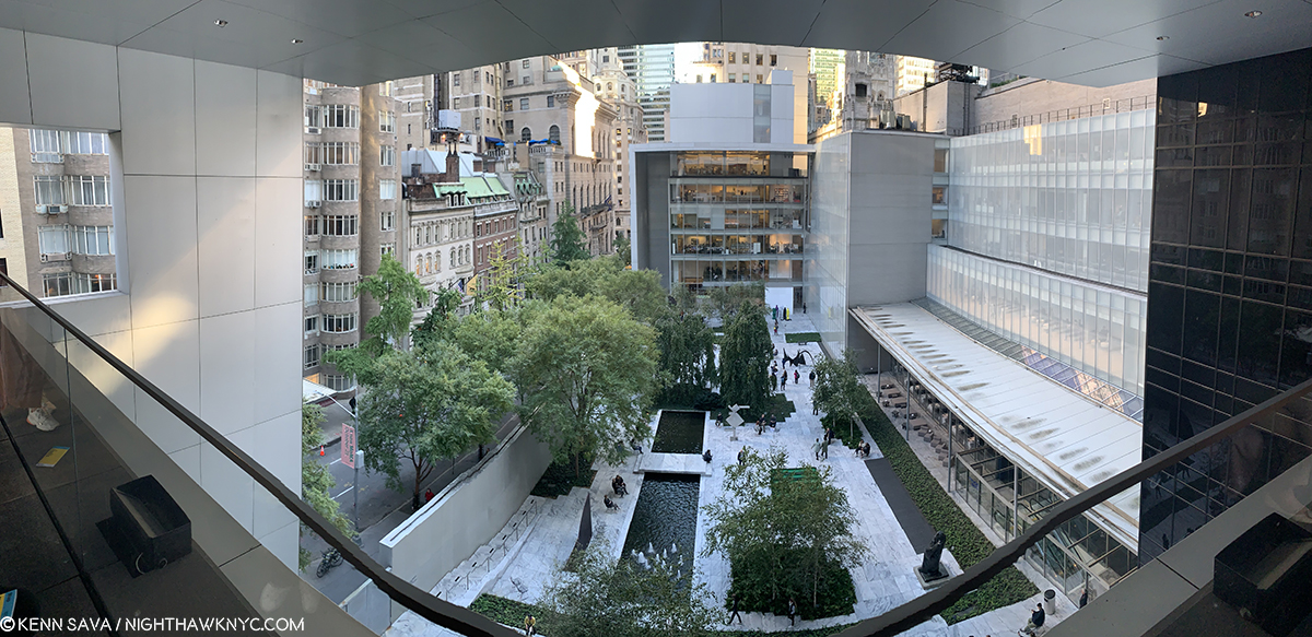
Not listed on the floor plan, the previous cafe has been replaced by a Brancusi gallery on 5 (gallery #500). Behind it, we now get free access to the outside patio overlooking the Sculpture Garden.

“There’s something missing from my life
Cuts me open like a knife
It leaves me vulnerable
I have this disease
I shake like an incurable
God help me please”*

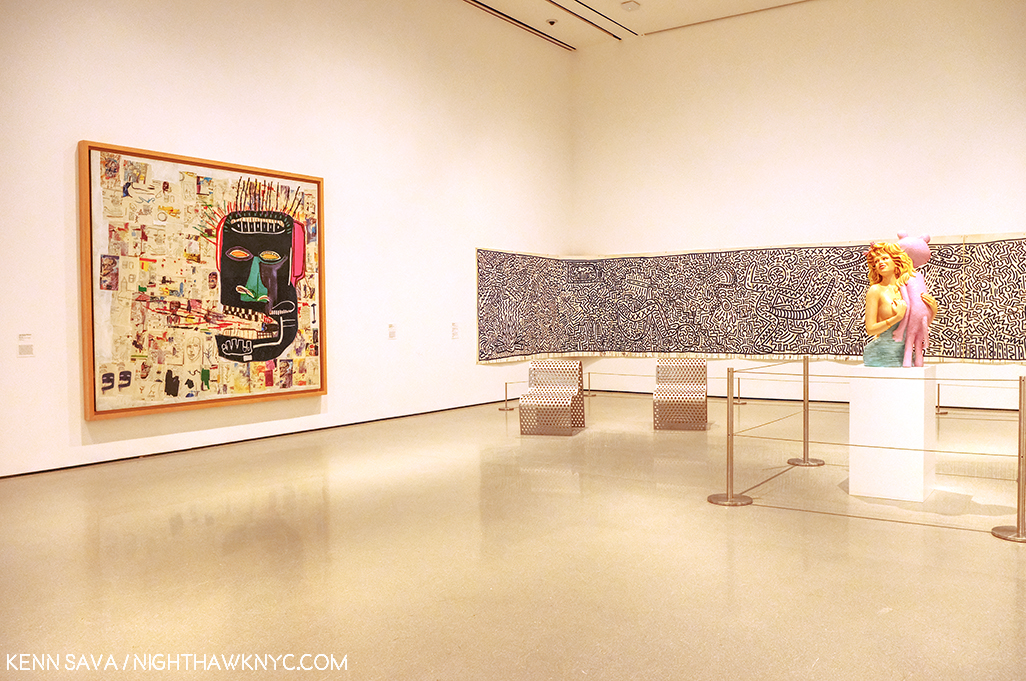
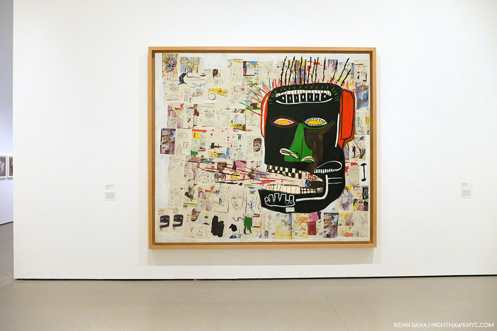
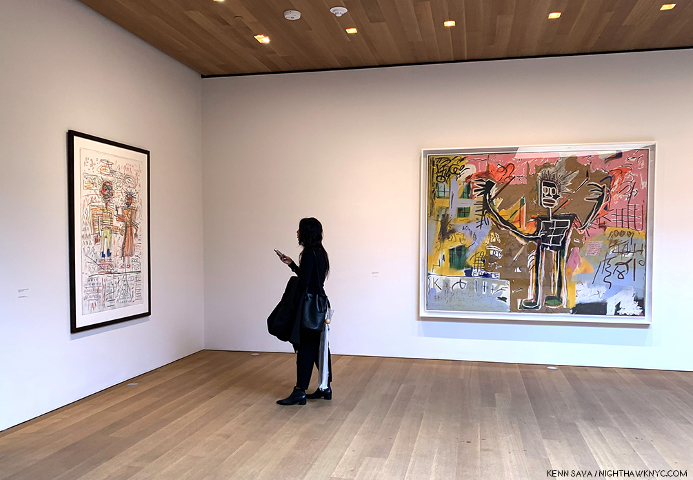
Jean-Michel Basquiat, Glenn, 1985, left, Keith Haring, Untitled, 1982, right.

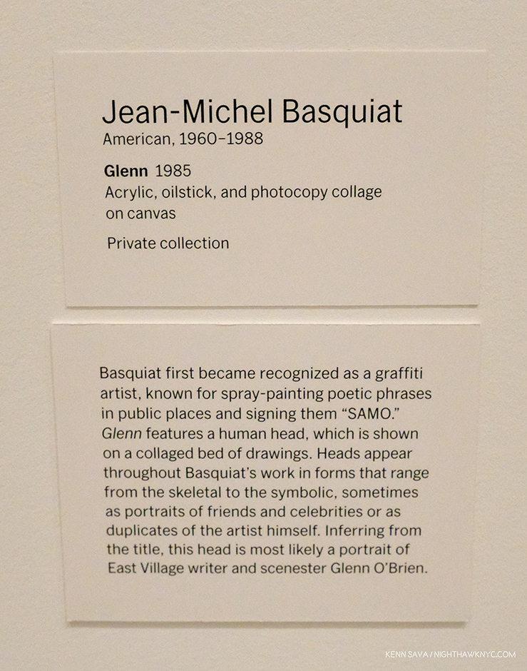
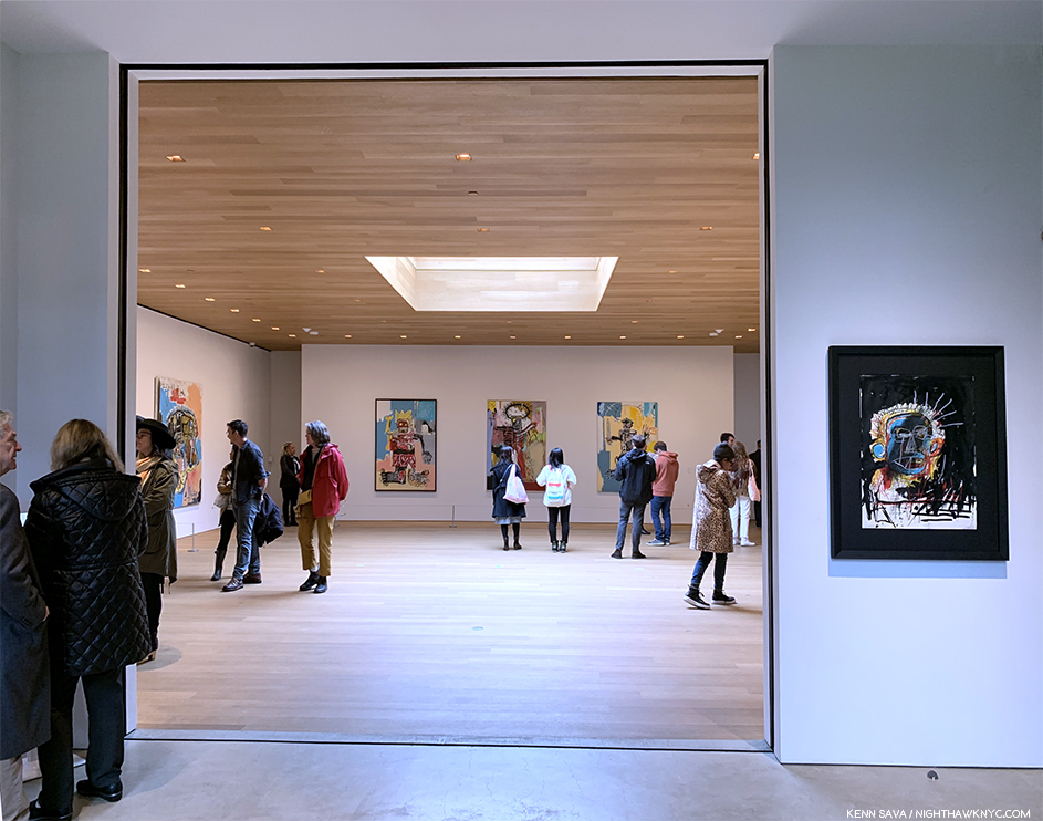
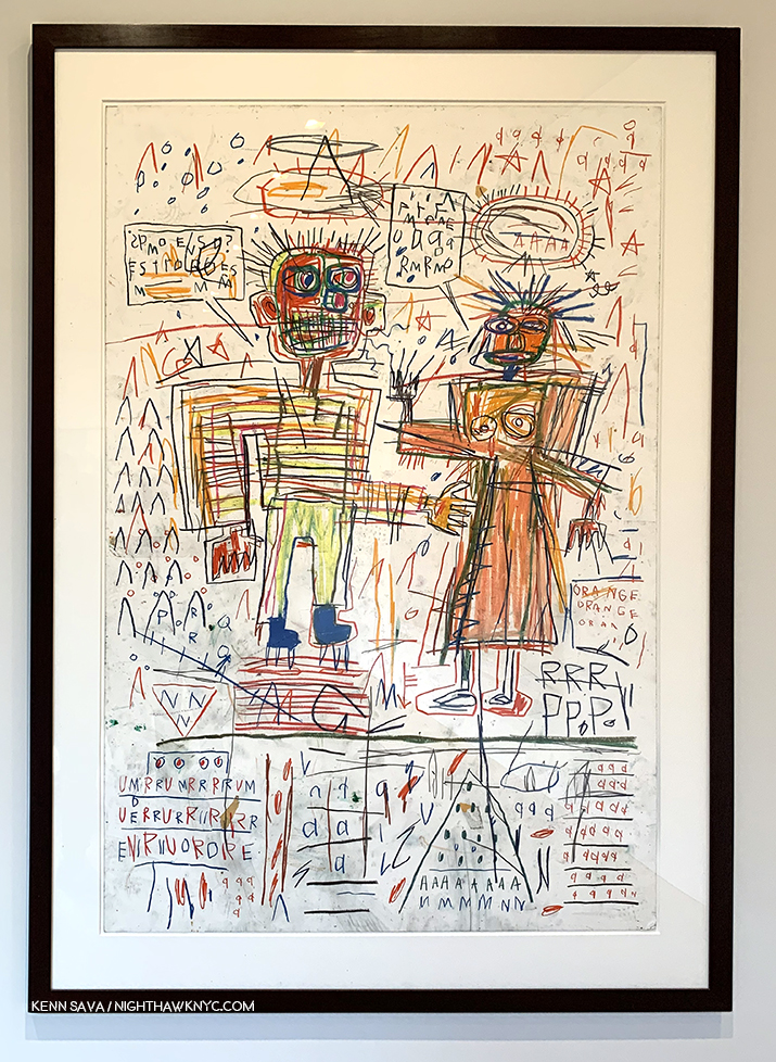
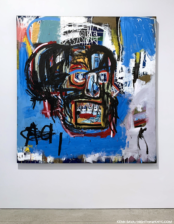
Then there’s the other gorilla in the room at the “new” MoMA, 2019. My feeling is that MoMA, The Museum of Modern Art, is dangerously close (if it hasn’t happened already) to remaining just that, indefinitely. It’s not THE Museum of Modern & Contemporary Art many think it is. Their collection of the most important Contemporary Art is nowhere to the level of it’s preeminent collection of Modern Art (the period I consider to be approximately from Edouard Manet’s Le Dejeuner sur l’herbe, 1862, through 1979), or the collections of important Contemporary Art in LA, SF or Chicago, in the US. MoMA (and all the NYC museums) have fallen hopelessly behind in collecting important Contemporary Art. Jean-Michel Basquiat (J-MB) is a classic case, but he’s not alone. As they admitted, they didn’t collect his work early on and now it’s too late. I recently recounted MoMA’s history (or lack thereof) with J-MB in my series on the J-MB shows going on in NYC this year. Revealingly, only one of the 5 shows in NYC was mounted in a museum- The Guggenheim. Then, when I walked into the member’s preview for MoMA, 2019 on October 19th, low and behold there was a Basquiat front and center in the second gallery, above. It turns out they borrowed it from a private collection. This seemed to me to be a classic case of “smoke and mirrors,” of trying to hide this large hole in their Contemporary Art collection- and, after all these years (40 next year), possibly an admission they were “wrong” about Jean-Michel Basquiat.
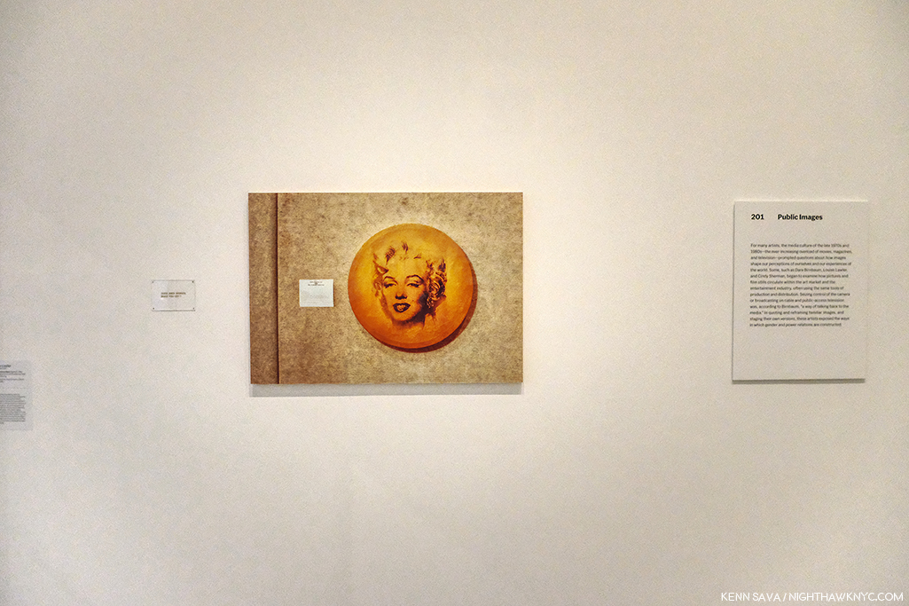
Louise Lawler’s Does Andy Warhol Make  Your Cry?, 1988, above, and a group of 24 Untitled Film Stills, by Cindy Sherman.

Elsewhere on the 2nd floor, the entire first gallery, titled “Public Images,” was made up of work by women Artists, as if to immediately counter the oft mentioned fact that a very small number of women Artists have been given retrospectives by MoMA. They have also installed a Betye Saar show, The Legends of Black Girl’s Window, across the atrium, centered around a recent acquisition by the museum of earlier work by Ms. Saar. It doesn’t include any of her more recent, powerful, work, some of which were presented in Washboards, 1997-2017, presented earlier this year at the New York Historical Society. While nothing will detract from her overdue appearance in a substantial show in another NYC museum, I was left wondering why they didn’t mount the long overdue full Betye Saar Retrospective, who is still going strong at 93, while she’s alive to enjoy it. Looking at MoMA’s permanent collection online, time and again, I found either a lack of any works by important Contemporary Artists (Ai Weiwei? Robert Frank’s Photographs? Leonardo Drew? Rod Penner? Gregory Halpern? Petra Collins?…None by any of them. The most recent work by Betye Saar, who was born in 1926, is from 1972- 47 years ago!), a lack of their important work, or a lack of depth of these works (2 works, each, by Henry Taylor, Francesca Woodman, 1 Painting and 10 Prints by Richard Estes, 2 Paintings, 2 Studies and 22 Drawings by Kerry James Marshall and Jean-Michel Basquiat– 0 Paintings, 2 Prints, 10 Drawings). A close look at what is installed in the Contemporary galleries on 2, which makes a point of being inclusive, strikes me as an attempt to rewrite MoMA’s perception in the face of criticism, and, some smoke and mirrors- how much will require more than 2 visits. In the meantime, go and make your own study.
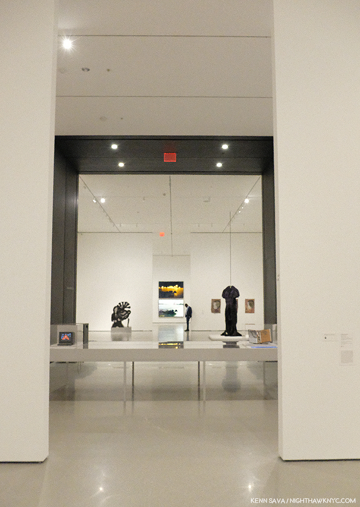
Before the crowds. Parts of 4 galleries, Contemporary Art, 2nd floor. Member’s preview, October 19, 2019.

Tourism is a big deal for MoMA, the other NYC museums, and NYC. If the Art going public begins to perceive the reality that NYC is not the place to go see important Contemporary Art, one of the most popular periods of Art there is at the moment, this would be a disaster, especially after having just spent over 450 million dollars on MoMA, 2019. Smoke and mirrors might buy them some time, but whether they can overcome the self-inflicted damage they’ve already done remains to be seen. MoMA was incalculably helped to become THE Museum of Modern Art by a visionary curator, Alfred Barr, during its formative years. More recently, those in charge didn’t believe in the work of these Contemporary Artists at the time, didn’t have the vision and foresight Mr. Barr did, and so they missed the boat.
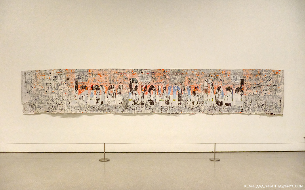
Mark Bradford, James Brown is Dead, 2007, Torn-and-pasted printed paper, 47 3/4 x 267 inches. I’ve made no secret of my admiration for Mr. Bradford, who I consider one of today’s most important Artists. In fairness, since I’ve mentioned some of the Artists omitted from their collection, MoMA owns 4 of Mr. Bradford’s larger works, 1 Sculpture, 1 Video and about 17 Multiples. So, I find it interesting they chose this work for display.

They, and their counterparts at the other NYC museums, may well have cost NYC it’s world leading status as THE Art capital of the world, we shall see. It’s too late now. Only mass, and massive, donations will help to close that gap now.

Though I am a paying member, I dreaded going to see the “new” MoMA, 2019. Such is the level of disdain I have for MoMA, 2006, which I consider to be the worst major museum building I’ve ever been in, it actually keeps me from going to see the Art! Maybe I’m just too used to MoMA, 2006 that MoMA, 2019 actually feels “not so bad.” Well Let’s see. MoMA, 2006 cost 858 million dollars according to The Times. I’ve seen 450 million as the cost of MoMA, 2019. That’s at least 1.3 BILLION dollars to make something I just said was “not so bad.”

Well, in 10 years, when MoMA decides that they “need more space,” which you know they will, I know where they can get 7,700 square feet of it, without tearing down anyone else’s building. Let’s say by then it will cost another 500 million to create MoMA, 2029. Then, they’ll have a chance at actually making the building “decent.”

Gee…Wait a minute. Between MoMA, 2006 and MoMa, 2019, they’ve spent 1.3 billion dollars? If they spent that on Art back when MoMA decided to build MoMA, 2006? You might actually have a collection of important Contemporary Art on the level with MoMA’s collection of Modern Art.

Instead? We got one of the biggest Architectural design mistake in NYC in my lifetime, right up there with not allowing the world’s greatest Architects, beginning with Frank Lloyd Wright, who’ve tried to build here a chance to build more than one building each. More? That the powers that be at MoMA thought putting a gigantic hole in the middle of the most expensive real estate on earth was a good idea, and then less than 10 years later tear down an actually good museum saying they “need more space” is plain hubris.

On second thought, maybe that hole does signify something about Manhattan after all. It signifies the hole in the collections of Contemporary Art at MoMA, and the other Big 4 NYC Museums. Smoke and mirrors aren’t going to be able to cloud that realization from many for very much longer.

“Be a happy man
I try the best I can
Or maybe I’m just looking for too much?”*

*-Soundtrack for this Post is “Hole In My Life” from Outlandos d’Amour by The Police, performed live in Paris in 1979, here-

NighthawkNYC.com has been entirely self-funded and ad-free for over 6 years, during which over 250 full length pieces have been published. If you’ve found it worthwhile, you can donate to keep it going & ad-free below. Thank you!

Written & photographed by Kenn Sava for nighthawknyc.com unless otherwise credited.
To send comments, thoughts, feedback or propositions click here.
Click the white box on the upper right for the archives or to search them.
For “short takes” and additional pictures, follow @nighthawk_nyc on Instagram.

Subscribe to be notified of new Posts below. Your information will be used for no other purpose.


  1. In the same New York Magazine piece, the author, Alexandra Lange, concluded that MoMA, 2006, “…is a question, sublimely unanswered.” 13 years later, I’ve still got a few questions, which I ask in this piece. Living with them has been painful, not “sublime.”
  2. Yes, the Tate Modern in London did something a little similar, but dissimilar enough to make the difference, and they’ve continually found good uses for it since it opened around the same time as MoMA, 2006.
  3. Where did I get 7,700 square feet from as the size of this space? I’ve been unable to find out the official square footage of the atrium (interesting, no?). It hasn’t been published anywhere and those I asked at the museum didn’t know or wouldn’t tell me. So? I took it upon myself to calculate it. 110 feet is the published (known) height. I stepped off 35 paces from wall to wall and each of my paces is 24 inches. That’s 70 feet, and 7,700 square feet in total by my guesstimation.

Jean-Michel Basquiat, At 59

Written & Photographed by Kenn Sava (except *)

Part 3 of a series…

In January, 1983, Henry Geldzahler asked Jean-Michel Basquiat- “Is there anger in your work now?
He replied, “It’s about 80% anger1.”

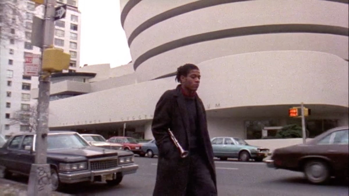
Jean-Michel Basquiat, at about age 20, walks with his clarinet at the intersection of East 88th Street and 5th Avenue across from the Guggenheim Museum, circa 1980-81 in a screenshot from the movie, Downtown ’81, directed by Edo Bertoglio and written by Glenn O’Brien. 39 years later the Guggenheim has mounted a show of work the Artist would create over the next few years. *

The Brant Foundation’s Jean-Michel Basquiat was the largest show of the five going on in NYC this year featuring the work of Jean-Michel Basquiat (J-MB, henceforth), or about him. Though it provided a rare opportunity to see a broad range of his Paintings through most of his career, there was no context to the show, beyond it being an exceptional, diverse, collection of his Paintings. My impression was the attention paid to presenting groups of work by theme consisted of a group of portraits in the rear gallery on the 4th floor, a room half full of Paintings of Boxers and a wall of Paintings with unusual stretchers, both on the second floor. The lack of a theme or themes is mitigated by the fact that in many of his works there are multiple themes present allowing viewers to piece together their own narratives in, and between, pieces. Yet, as time goes on, and the focus of J-MB studies turns away from the well-worn biography and more and more to the “less discovered land,” i.e. his work, some of the themes lying just beneath the surface are starting to finally get the attention they deserve.

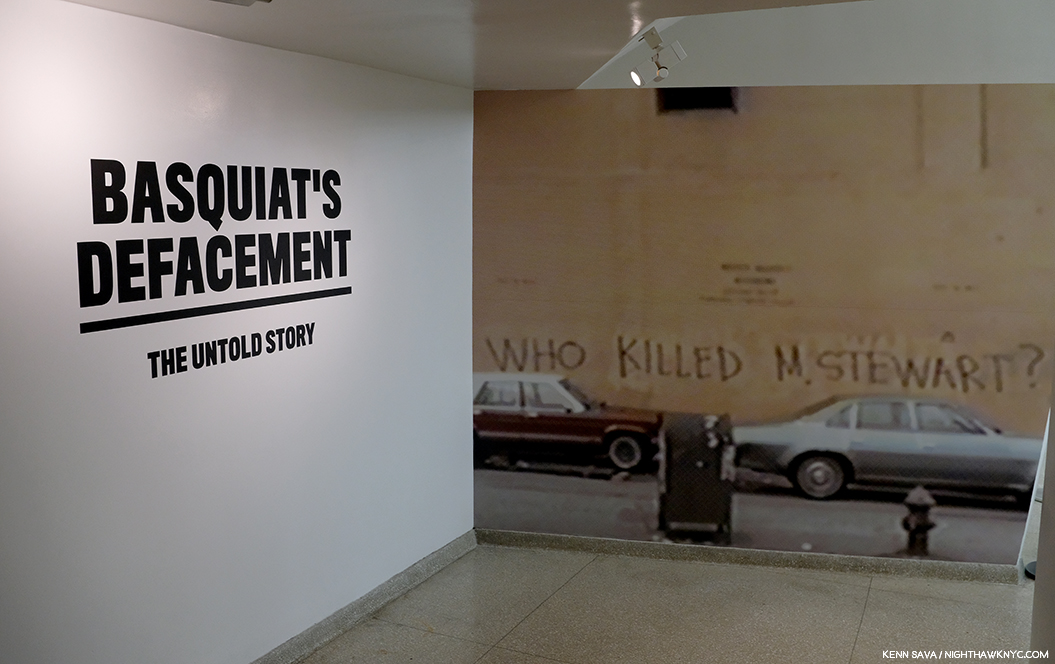
In that same interview with Henry Geldzahler, J-MB said that “royalty, heroism and the streets” were his favorite subjects. Over on the sixth floor of the Guggenheim Museum, in Basquiat’s Defacement: The Untold Story, the only museum show of the five J-MB and J-MB related shows going on in NYC this year, all three of those themes were featured, with “the streets” perhaps most front and center. The show’s overriding focus was the death of Michael Stewart, a 26 year old Artist who died of injuries he received “on the streets,” after being arrested by the Port Authority Police on September 25th, 1983, for allegedly drawing or writing in the 14th Street L subway station two weeks earlier on September 15th.

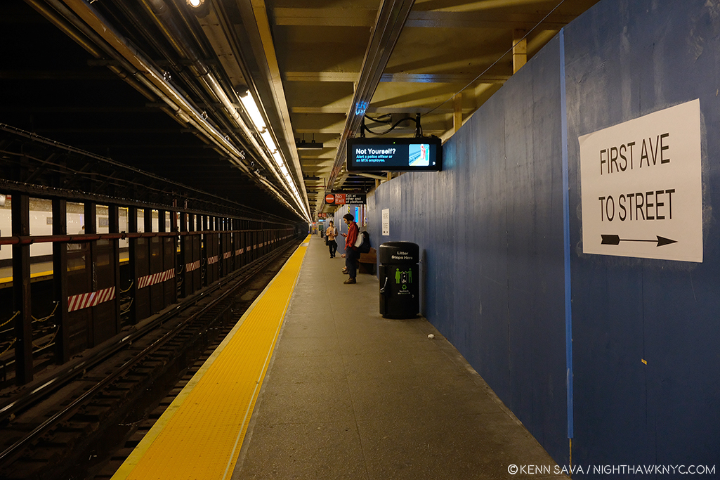
The scene of a crime. The 1st Avenue Brooklyn bound L Subway Station, currently under construction. It’s a narrow platform as subway platforms go with nothing obstructing the view from one end to the other. The only entrance/exit, the one Michael Stewart must have entered and been removed through, is just to my right rear. Seen in October, 2019.

A public outcry and numerous protests ensued. The effect was immediate, deep and lasting, as the show reminds us, bringing us right back to the moment. The downtown community of Artists that Michael Stewart, J-MB, Keith Haring, and many others, were a part of, also responded with their creativity. In his “Chronology” in the Whitney Retrospective catalog, Franklin Sirmans writes, “Basquiat always conscious of racial realities is deeply effected by the death of Michael Stewart on September 15th…Basquiat, perhaps in fear, practices a form of denial. He consciously distances himself from the situation. No matter what his art world status might have been, incidents such as this were a constant part of his life2.” He continues, quoting Keith Haring, “One thing that affected Jean-Michel greatly was the Michael Stewart story…He was completely freaked out. It was like it could have been him. It showed him how vulnerable he was.” He then quotes J-MB as saying, “It could have been me. It could have been me3.” Michael Stewart died 8 months or so after J-MB said his work is “about 80% anger.”

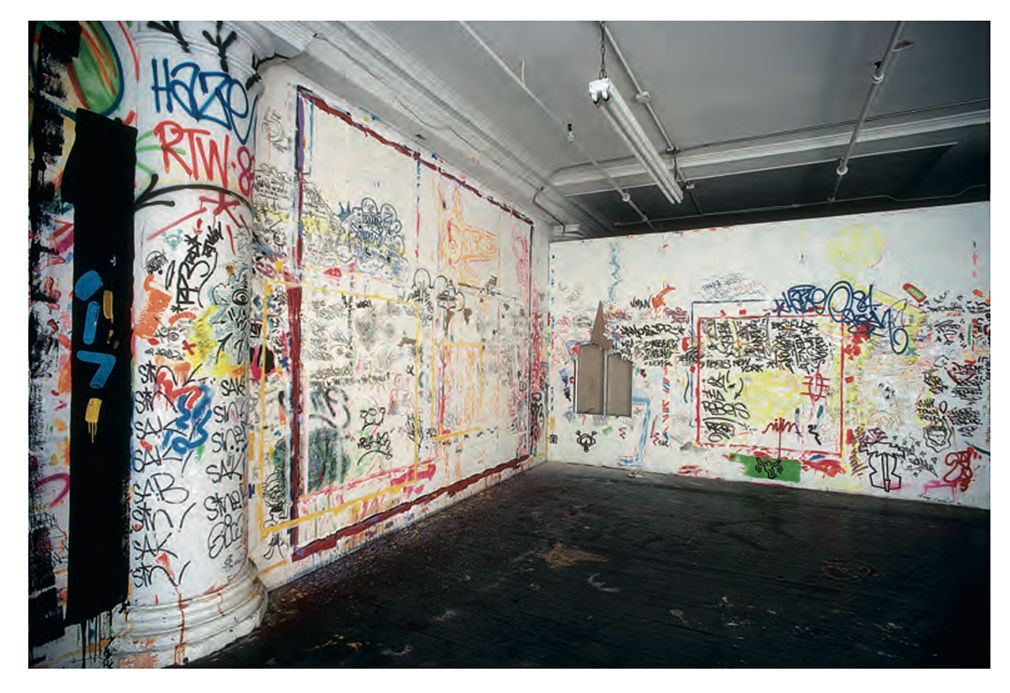
Keith Haring’s Cable Building studio after Defacement was cut from the wall to the right of center, where he created it, 1985. *Keith Haring Foundation Photograph.

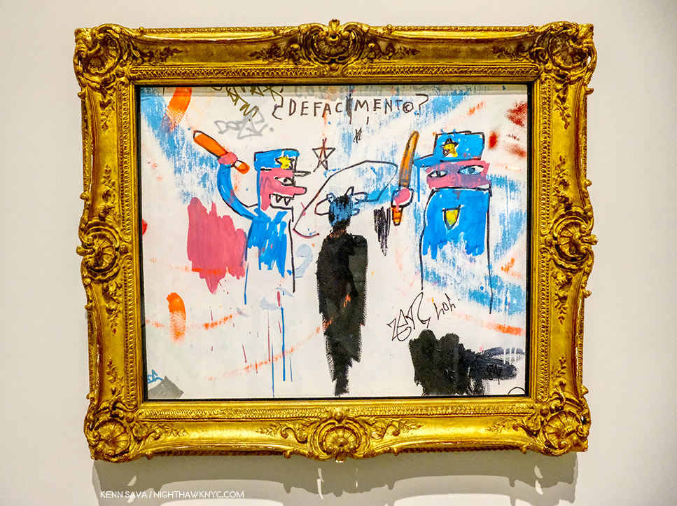
The show’s centerpiece is a work that has come to be called Defacement (The Death of Michael Stewart), 1983, that J-MB created on a wall of Keith Haring’s Cable Building studio at some point between September 29th and October 5th, 19834.

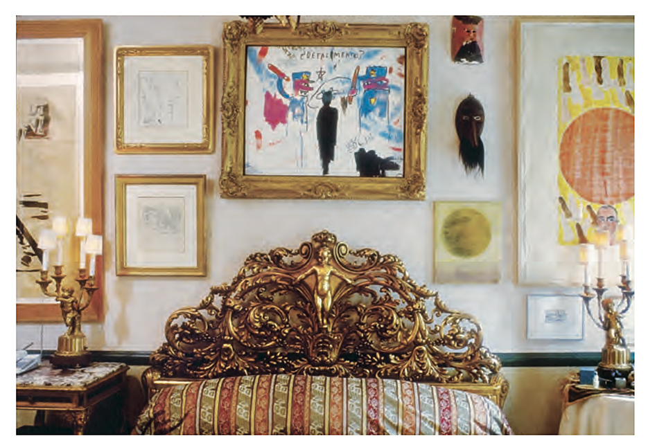
Keith Haring’s Bedroom, Greenwich Village, 1989. *Photograph by Nancy Elizabeth Hill, Keith Haring Foundation.

When he moved out of the Cable Building, Mr. Haring had it cut out of the wall and framed. In an indication of how he felt about the work, it hung over his bed, where it remained, apparently, until he died, in February, 1990, almost exactly a year and a half after J-MB.

Along with it, in the first gallery were 6 other Paintings and two limited edition prints by J-MB. In the second gallery, the rest of the show recounts the tragic story highlighted by vintage posters announcing protests, newspaper articles and ephemera, accompanied by Art by Keith Haring, David Hammons, George Condo, Lyle Ashton Harris and Andy Warhol. A moving highlight of the show is the inclusion of very rare examples of Michael Stewart’s work, which I have never seen before, from his family’s collection. At the time of his death, Mr. Stewart was planning his first show. Seeing these works now, the sense of lost possibilities remains undimmed 36 years later. Of him, Fred Brathwaite (aka Fab5Freddy) says- “Michael Stewart was a new artist making moves on the scene and one of the few people of color in the mix downtown at that time. He came from an intellectual educated family and wanted to find a place where he could express himself in a cool way around like-minded people….When he was killed and the police claimed he was writing his name on the wall in the subway-which was surprising and seemed unlikely to us- the media jumped all over the idea that he was a graffiti artist. …It was like a chill going through you, realizing that it could be me- it could be any of a number of people I knew. Even though we all knew that Michael Stewart was not the graffiti artist they were portraying him to be, it could clearly have been any person of color, particularly myself and the numerous others I knew who were making art and would occasionally tag a wall, or had that background. That was frightening5.”

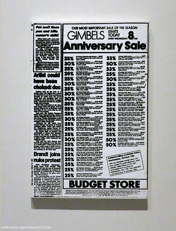
Andy Warhol, Daily News (Gimbels Anniversary Sale), ca. 1983, Synthetic polymer paint on canvas, 24 x 16 inches.

Mr. Brathwaite’s testimonial is excerpted from an interview he gave for the show’s exceptional catalog, which deserves special mention. Informative new essays by curators are followed by almost 60 pages of recollections by Artists, journalists, and other figures were were part of this period in NYC history, each based on new interviews conducted by curator Chaédria LaBouvier in 2018 and 2019 that were edited into concise statements for this publication- an amazing list that includes Mr. Brathwaite (Fab5Freddy), Dianne Brill, Michelle Shocked, Kenny Scharf, Eric Drooker, Lyle Ashton Harris, Jeffrey Deitch, Annina Nosei, George Condo, Tony Shafrazi, ABC-TV reporter Lou Young (who did over 60 pieces on the Michael Stewart story), Ronald Fields (a member of the first grand jury in 1983) and Carrie Stewart, mother of Michael Stewart. Their contributions bring the reader, as the show does, right back to the place and time in the kind of detailed recollections only those who lived it on the front lines could relate. When I’ve spoken in Parts 1 & 2 about the need for those who knew the Artist to step up and speak, this is a shining example of what those with first hand knowledge to bring to the table. Anyone interested in Jean-Michel Basquiat, Michael Stewart and/or his tragic end should find their way to the catalog before it goes out of print. Many exhibition catalogs have a notoriously short shelf life after shows end.

Defacement (The Death of Michael Stewart), 1983, Acrylic and marker on plasterboard, 25 x 30 1/2 inches.

In the first gallery, a long, rectangular space leading to Defacement (The Death of Michael Stewart), 1983, as the work is now known, due to the fact the Artist has written “¿Defacement©? ” in the upper center, are other works by J-MB that revolve around the themes of the police, royalty and the death of kings. Defacement feels like a dream, or nightmare, due to the presence of “clouds” of blue, pinkish and black paint. Painted on a white background, the blue figures, with pink/red skin, of the police frame and tower over the central black figure, apparently seen from the back. There are parts of what appears to be two circles in black around the head of the center figure, who’s hands and feet are not visible. Apparently, some of the marks on the work may have been added by others, like the letters on the right side that appear to be (“ZERLOL”), but it appears these circles are under the blue paint and so may have been done by J-MB. One of the policemen appear to be looking out at the viewer.

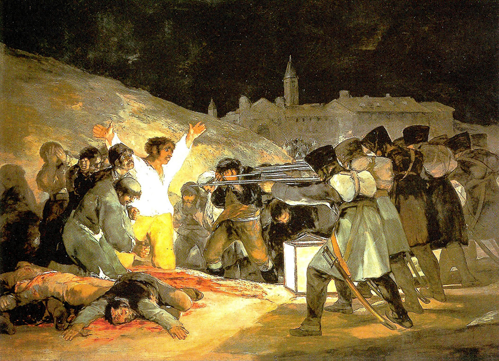
Francisco Goya, The Third of May, 1808, Oil on canvas, *Prado Museum.

One thing that stands out to me is the composition in context of Art History, particularly, in works of Goya and Picasso. In Goya’s legendary The Third of May, 1808, the soldiers stand decidedly to the right- the same side as the viewer.

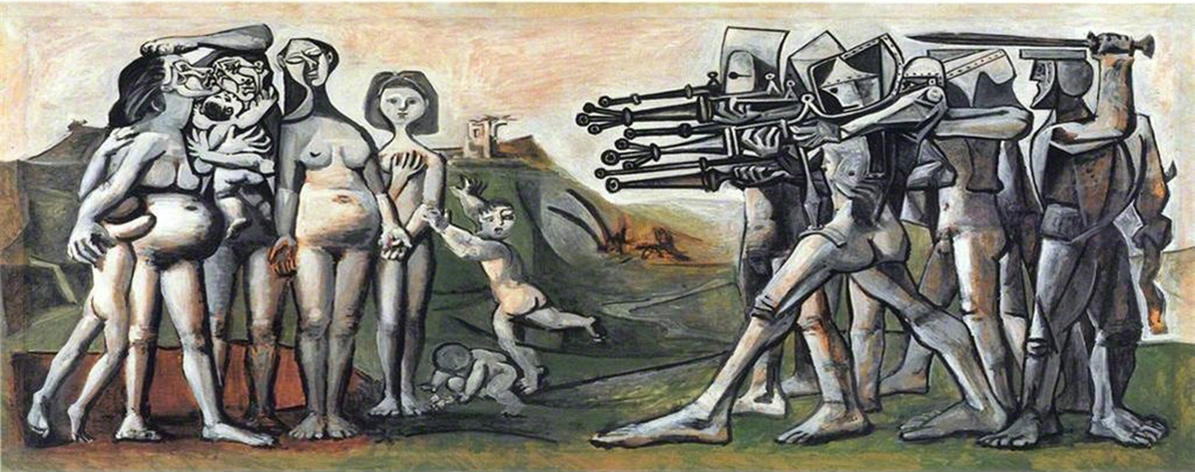
Picasso, Massacre in Korea, 1951, Oil on canvas, *Picasso Museum, Paris.

In Picasso’s Massacre in Korea, 1951, the viewer is placed right in the center, with the soldiers on the right, and the victims on the left, one or two of who look out at the viewer. In Defacement, J-MB has also placed the viewer in the center, between the policemen, and directly behind the black figure/Michael Stewart, who appears without hands or feet. The effect made me feel like being in line to run the gauntlet- like you’re next in line, in line with his reported feeling “It could have been me. It could have been me.” It’s hard not to take the Painted “¿Defacement©?” as a double entendre. Did Michael Stewart really deface the subway station? And, why are the police “defacing” him, removing his face from the world?

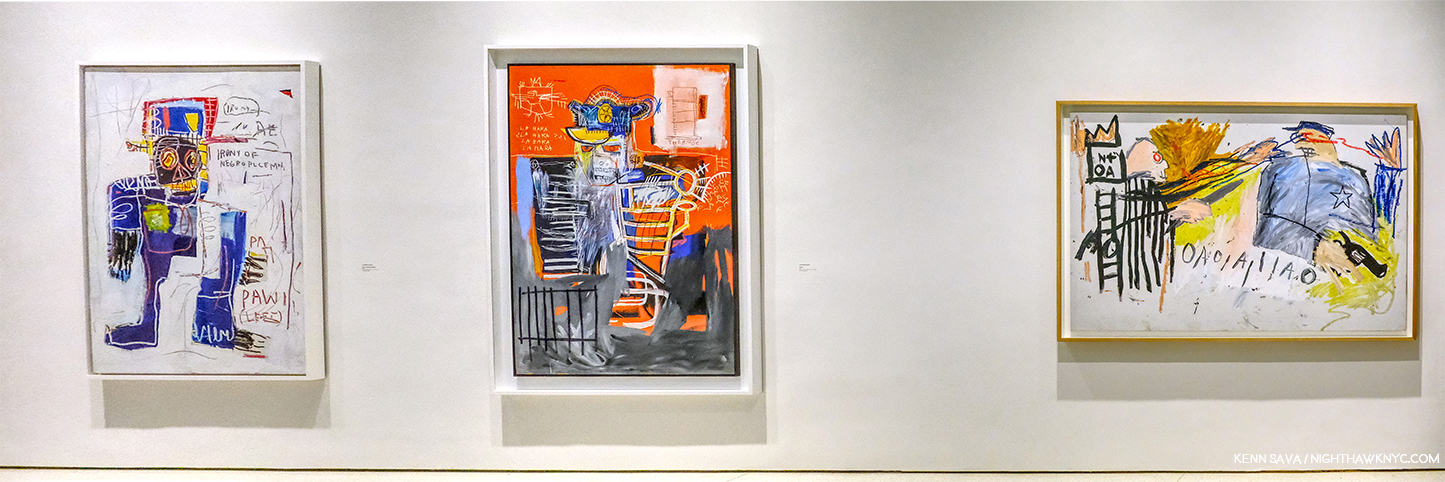
La Hara, 1981, Irony of a Negro Policeman, 1981, both Acrylic and oilstick on wood panel, both 72 x 48 inches, Untitled (Sheriff), 1981, Acrylic and oilstick on canvas, 51 1/2 x 74 inches, from left to right.

On the right hand wall are three Paintings featuring policemen. All three are different. One has a white officer, one a black officer, one a grey officer (the two in Defacement appear to be pink-ish red). Two have white backgrounds, one red. All three are extremely nebulous (at least to me), even in the nebulous work of J-MB. All three are terrifying, and so perfectly set the stage for, and compliment Defacement.

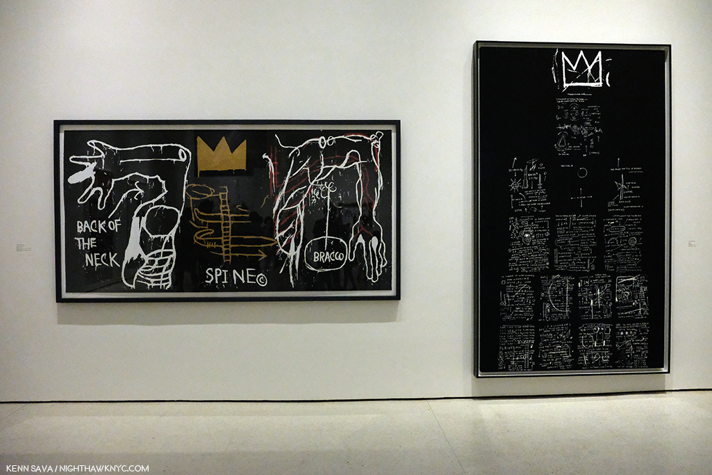
The prints Back of the Neck, 1983, 50 1/4 x 102 inches, which I saw 14 years ago at the Brooklyn Museum (See Part 1Part 1), who is is on loan from, and Tuxedo (1982-3), 102 1/4 x 60 inches, both prints are editions of 10.

On a wall facing it are the limited edition print, Back of the Neck, also from 1983, my old friend from the 2005 Brooklyn Museum Retrospective on loan from the museum, and another print, Tuxedo, 1982-3, a work that references kings. As others have pointed out, Back of the Neck could be a reference to the injuries sustained by Mr. Stewart.

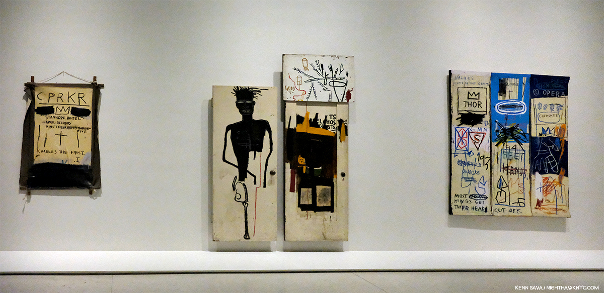
CPRKR, 1982, Acrylic, oil stick, and paper collage on canvas, mounted on tied-wood support, 60 x 40 inches, Self-Portrait, 1983, Oil, acrylic and oil stick on two wood doors and wood panel, with graphite and ink on paper, 96 3/4 x 63 3/4 inches, and Charles the First, 1982, Acrylic and oil stick on canvas, three panels, 78 x 65 inches, left to right.

On the 4th wall are a stunning trio centered around the Self-Portrait, 1983, and two works that pay homage to another of J-MB’s “Kings,” Charlie Parker. Both of those relate to (his) death, and the death of kings. To the left is, perhaps, the most poignant work the Artist did referencing Bird, CPRKR. In it, he memorializes his death, listing the place and date, under a crown, with the moniker, “Charles The First” written below. And so, it fits with Defacement. Right next to it is the Self-Portrait, 1983, which in this show is impossible to think about without considering the year it was Painted, particularly since on its right-hand panel, the words “To Repel Ghosts” are Painted. To the right of these is Charles the First, 1982, with it’s equally haunting words “Most Young Kings Get Their Heads Cut Off” written along the bottom. Of the “young kings” referenced in this room, Michael Stewart died at 26, J-MB at 27 and Bird at 34. Charlie Parker turns 100 on August 29, 2020. Michael Stewart would be 61 today. As I pointed out in Part 2, J-MB should be 59 years old RIGHT NOW, in mid-career as the museums call it. Both should be living, vibrant, forces. Not ghosts.

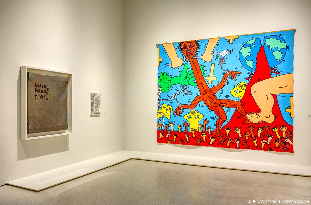
Jean-Michel Basquiat, Untitled, 1987, Andy Warhol, Daly News (Gimbels Anniversary Sale), 1983, Keith Haring, Michael Stewart- USA for Africa, 1985, left to right.

Not mentioned anywhere that I’ve seen, this is the only time Jean-Michel Basquiat, Andy Warhol and Keith Haring, the three figureheads of the Art of their time in NYC ever addressed the same event, (as far as I know). I’m not saying Untitled, 1987, shown in the group above, seen in the second gallery, is a reference to Michael Stewart- I don’t know, but Defacement is. Describing the amazing Keith Haring work, the defunct website basquiatdefacement.com said, “It depicts a black man being strangled while handcuffed to a skeleton holding a key. People from all nations drown in a river of blood below, while others shield their eyes from the scene, and the green hand of big money oversees the scene6.”

Michael Stewart poses for Dianne Brill Menswear, 1983, from the show’s catalog. “Michael was buried in a suit I designed,” Dianne Brill writes in her piece in the catalog (P.107).*

Basquiat’s Defacement: The Untold Story is one of the most powerful, smaller shows I’ve seen in years. Though it depicts events that took place 36 years ago, its relevance was, I’m sure, not lost on a good number of its viewers.

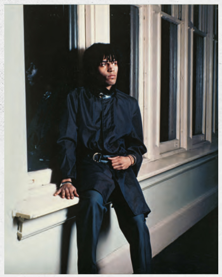
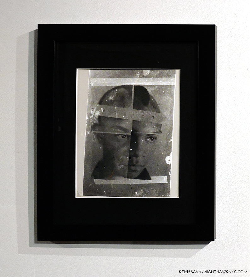
Alexis Adler, Jean-Michel Basquiat (the exact title is unknown to me).

Two other shows, the last two I saw in the group of five7, document little seen sides of J-MB. In The 12th Street Experiment: Photographs of Jean-Michel Basquiat, the Photographs in question are by embryologist and former J-MB girlfriend and roommate, Alexis Adler, who lived with the Artist from 1979-80.

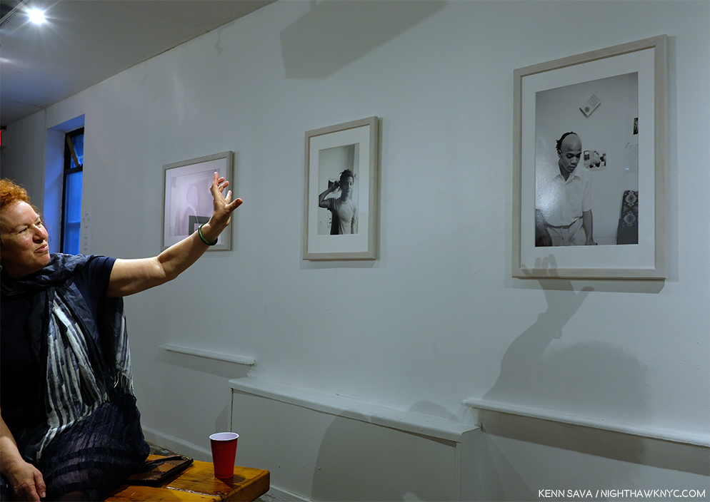
Alexis Adler speaks about Jean-Michel Basquiat and her Photographs of the Artist at The Bishop on Bedford Gallery, Brooklyn, May 18, 2019.

A veritable Portrait of the Artist as a Young Man, this was a show that, along with the items in Ms. Adler’s archive J-MB left behind in, and on, her apartment (on tour in museums shows elsewhere at the time, most recently at the Cranbrook Museum, The Museum of Contemporary Art, Denver and in Europe), form an important and unique collection. In my research, I’ve come to see that J-MB’s formative period after he left home for good has gone largely overlooked and understudied. Alexis Adler has stepped forward, sharing her experiences and her knowledge, in books, essays and traveling around the world speaking about her time with Jean-Michel Basquiat from 1979-80 and his Art, in addition to sharing her collection in the shows I mentioned. As she walked me through the show of her Photographs at The Bishop Gallery on Bedford, Brooklyn, I was amazed at both the J-MB work that Alexis has documented in Photographs and the range of experimentation the young Artist was undertaking- extending down to his continually evolving hairstyles! Lacking funds, he worked with whatever he found, whatever was at hand- including the doors, walls, and floor of the apartment, and whatever he found on the street, making him part of the line that includes Duchamp, Rauschenberg and Jasper Johns, among others.

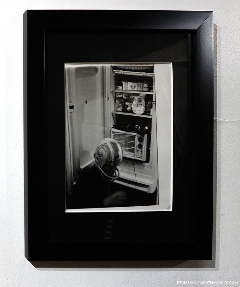
A Performance piece that involved installing a television set in a refrigerator. J-MB wears one of his hand Painted helmets here in one of a series of Photographs documenting the performance.

There is an element of performance in a number of these Photographs and in the work, which took place at the time he was performing with his band, Grey (and he is seen practicing his clarinet). Personally, I find this work fascinating and remarkable- on its own and for what it anticipates. A good deal of it might surprise many only familiar with his Paintings and Drawings.  This period seems to me to be more than only “early experimentation,” as it contains the roots and beginnings of much that came after, including his Painting. That he was Painting on everything he could find (out of a lack of funds for traditional Art materials, no doubt), presages his later Paintings executed on doors, like Self-Portrait, 1983 in the Guggenheim show, to fence slats, like Gold Griot, seen at The Brant in Part 2, among others.

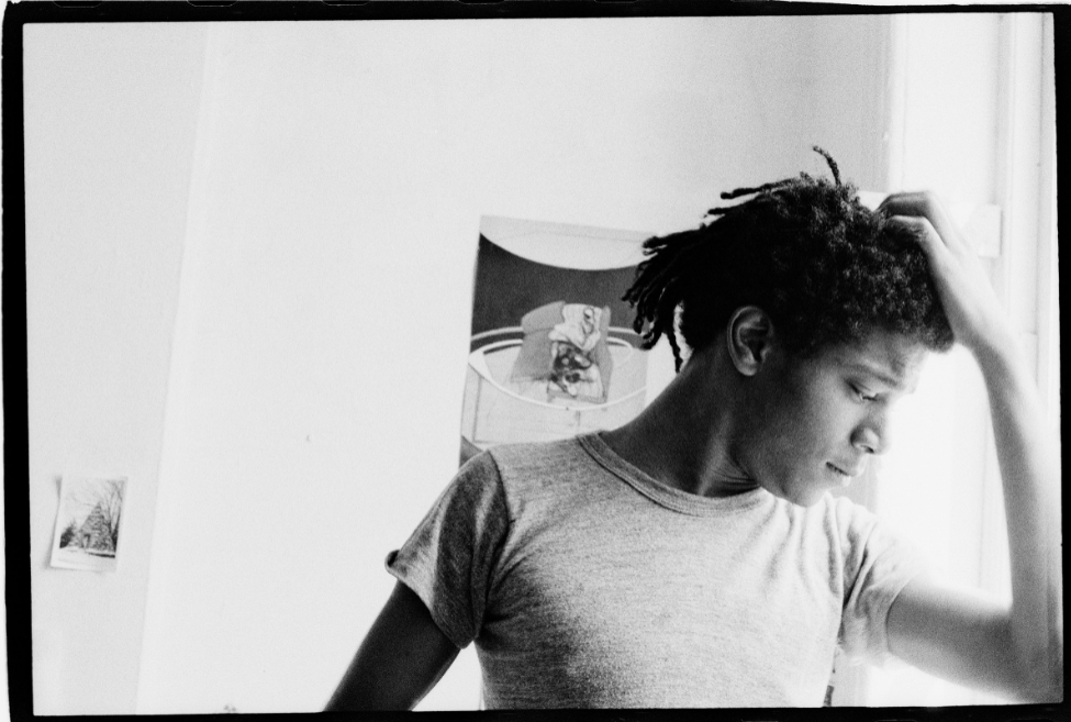
Alexis Adler, Basquiat in the apartment, 1981. Note the work by Bacon right behind his head. In another of Alexis Adler’s Photos, Burroughs’ Naked Lunch is seen attached to the wall. More evidence of J-MB’s Beat connection I mentioned in Part 1.

In addition, Ms. Adler said that J-MB studied her Art textbooks from the classes she was taking at the time. I found fascinating evidence of this in this Photo of hers, where a work by Francis Bacon is mounted on the wall. I wondered in Part 2 what Francis Bacon would think of J-MB’s Untitled, 1981. Here is the proof that J-MB knew of Francis Bacon’s work that very year.

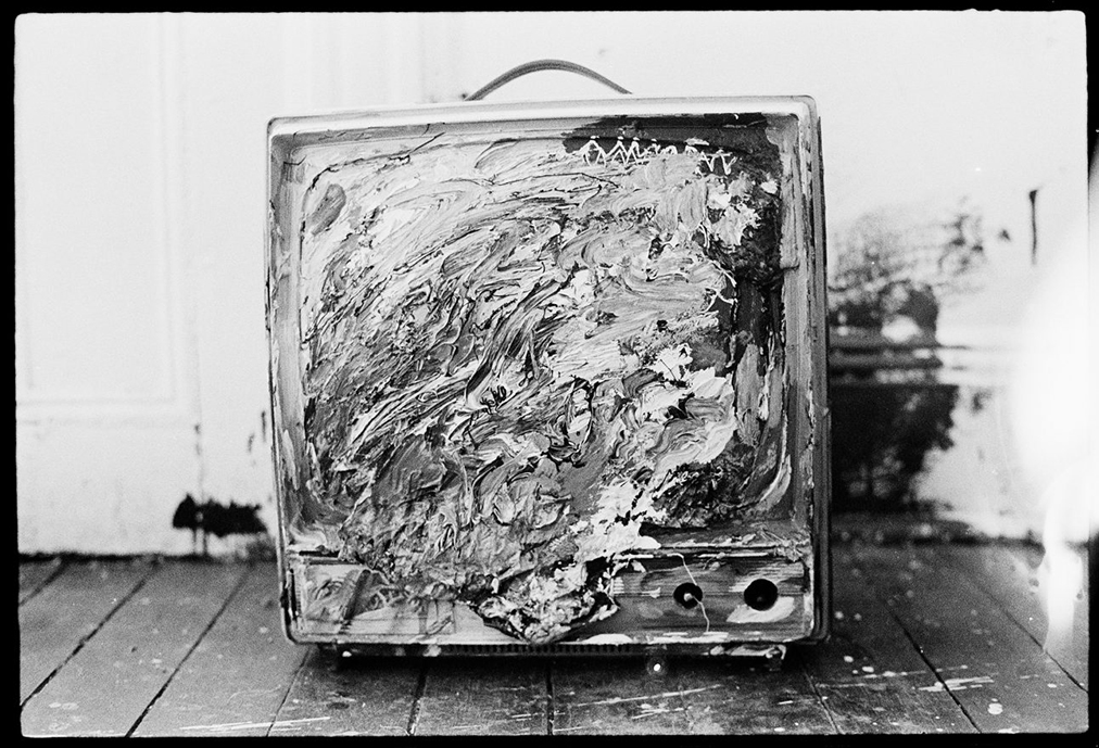
Alexis Adler, Painted television in the apartment, c.-1979–1980. It’s amazing this Photo of the work exists, but I would love to see it in color because there’s nothing else like this in his subsequent Paintings!

Ms. Adler, who spoke about having her ear to the ground and priding herself on being aware of what was coming next, said she “knew” J-MB was an important Artist almost immediately. “He said he would. I was definitely the first one to believe him. Everyone else was like, ‘Sure Jean.’ He was brilliant. I could tell. His spirit — everything about him. He was an amazing person, a very deep-thinking individual.” It’s only because she acted on that feeling and bought a camera that we have a record of these works which would otherwise be lost to history.

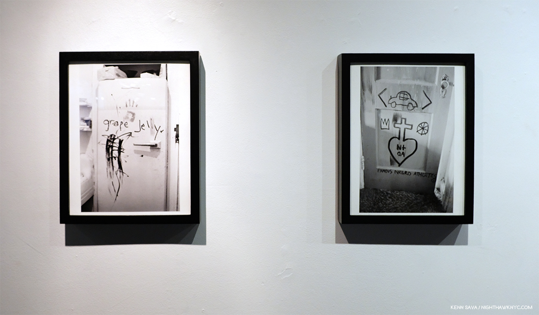
Alexis Adler, Refrigerator in the apartment, ca. 1979-80, Untitled (Famous Negro Athletes), 1980-81, left to right.

Seeing the show, I came to feel that this early period of J-MB should be appreciated as a “period” of his work every bit as much as his later work has been broken down into periods. It stands apart. While it’s formative and precocious and different from what he’s “famous” for, it’s a part of the whole. It has the same spirit of freedom, of experimentation, the unexpected, of seeing new possibilities that characterize all his work.

Lee Jaffe was a Musician at the time who had just recorded and performed with Bob Marley when he met J-MB. The two struck up a friendship and traveled extensively together. In the fifth and last show I saw, Lee Jaffe’s Photographs of J-MB at Eva Presenhuber Gallery, show him in relaxed settings, where the Artist is just being himself. He’s seen as just another tourist, mugging with other tourists, and looking extremely at ease.

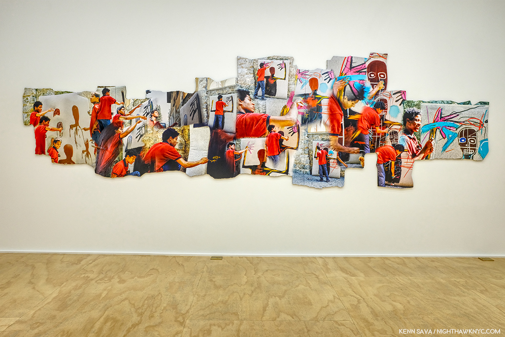
Lee Jaffe, Jean-Michel Painting in St. Moritz, 1983-2019, Dye sublimation on aluminum, 60 x 209 inches.

The highlight of Mr. Jaffe’s show for me was this fascinating montage showing J-MB creating a work in St. Moritz, virtually from start to finish, something I don’t recall seeing anywhere else.

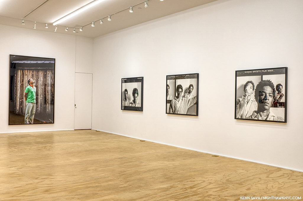
Four Untitled works, 1985, far left, with three black & white works from 1984-2019. J-MB, as a real person. About two hundred feet behind that wall on the right, Jean-Michel Basquiat lived from 1983, until he died, on August 12th, 1988.

Somehow, these images felt jarring to me after reading so much drama-soaked biography and anecdote. Compounding this “reality,” ironically, the show was installed at 39 Great Jones Street, just a few doors west of 57 Great Jones Street, where J-MB lived, and died, which I showed at the very beginning of Part 1 of this series, bringing this five-month journey full circle.

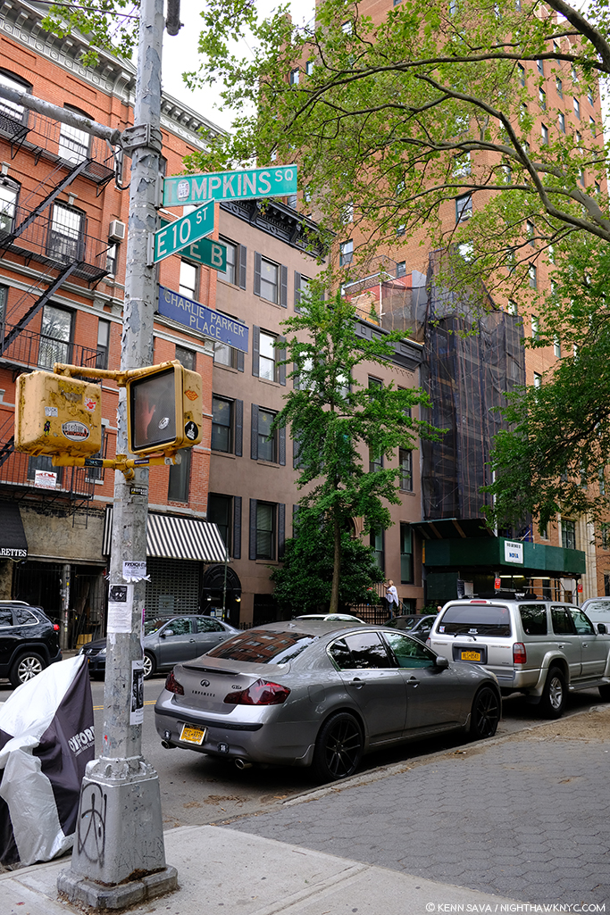
Coincidentally, right around the corner from The Brant, on B and East 10th Street, is Charlie Parker Place, where Bird lived from 1950 to 1954, in the building to the right with the woman in white on the stairs. May, 2019.

A few weeks after seeing The Brant show, I took a trip to “Charlie Parker Place,” on Avenue B where Bird lived from 1950 to 1954. Taking stock of everything I’d seen, I sat across the street in Tompkins Square Park and listened to Bird, trying to hear him through J-MB’s ears. The soaring, unexpected majesty, the spontaneous “flights” of imagination, the beauty (much of it created in the sordid world of 1940s nightclubs, rife with drugs, crime and of course alcohol), the daring, the guts to be different, to be yourself…to be free, inside yourself, and then outside. I was sitting a mere 4 blocks from The Brant Foundation, and around the corner from where J-MB lived with Alexis Adler. As such, ironically, I was at a sort of center of this whole journey I’d been on, right across the street from Bird’s former residence, a man who’s been a part of my evolution, too.

I kept thinking back to the fact that J-MB lost his spleen, his (blood) filter, when he was hit by a car at age 6. That’s what his work looks like. It includes everything, everything around him, at the time, or in his experience. So much is going on in modern life, how else can you really depict it? The only “filter” in the work of Jean-Michel Basquiat is that of his unique eye and sensibility.

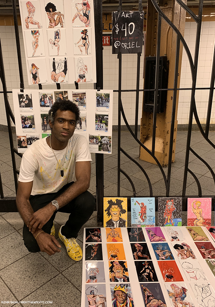
The Artist @OR1EL poses with his work which includes what appears to be a Portrait of Jean-Michel Basquiat next to his left knee. I note a J-MB Crown on his left shoe. Seen at the 8th Avenue L Station- 4 stations west of the L station Michael Stewart was arrested in, May 28, 2019.

Alas, Jean-Michel Basquiat isn’t 59 right now. He’s a ghost, a spirit. His Art is only 31 to 40 years old. It remains very much alive- speaking to, and moving, an extraordinary number of people. In the 31 years since his own tragic end his influence seems to still be increasing.

Charlie Parker Place, June 7, 2019.

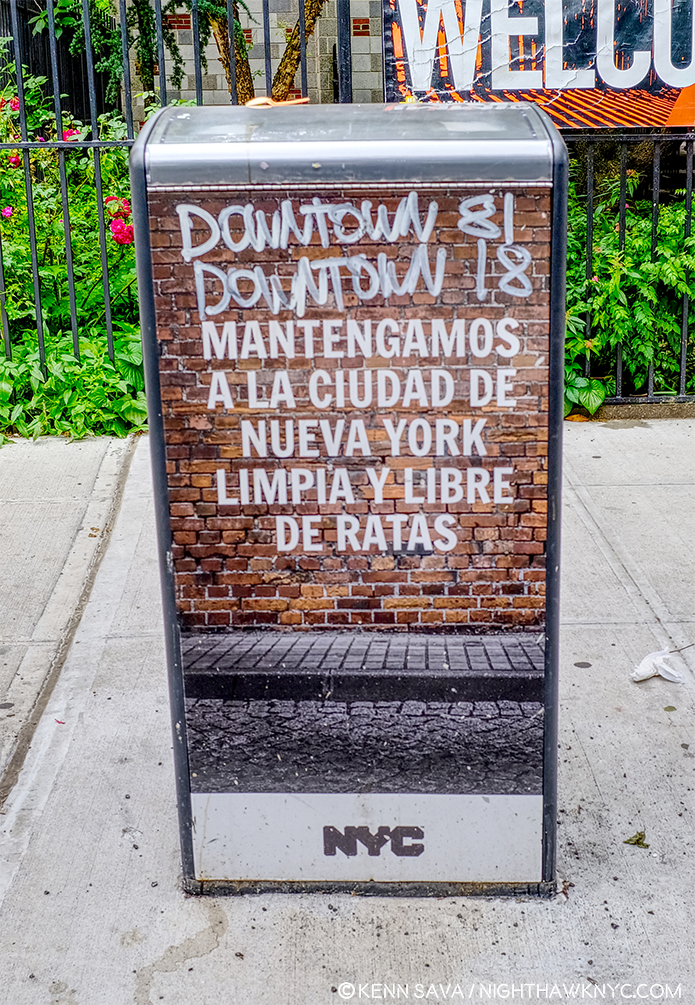
As I left Charlie Parker Place that June day, I was startled to see what someone had written on a newspaper box right on the corner. Downtown 81 is the film that J-MB starred in made in 1980-81, a still from which I showed at the beginning of this piece. In the same style as the Film’s logo, someone had appended “DOWNTOWN 18.” Jean-Michel Basquiat learned from those who came before him, and today others are learning from him.

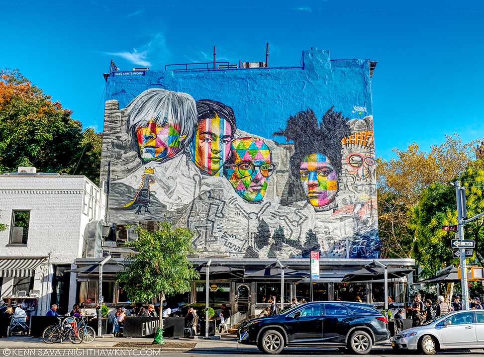
Portraits of Jean-Michel Basquiat and his associates Keith Haring and Andy Warhol flank Frida Kahlo at 22nd Street & 10th Avenue in Chelsea, looming over the Chelsea Art galleries behind me.

Art history is a continuum. Pass it on.

To answer that question I asked in Part 1– Over these past five months, five shows, all the books, and now three long pieces on his Art, I have come to side with the believers. I’ve come to believe that Jean-Michel Basquiat was, perhaps, the most important Painter known to me to emerge in the 1980s. His work is here to stay.

Postscript-
It turns out I’m not the only one who’s come around to the Art of Jean-Michel Basquiat. Tonight, I went the Preview for the “New MoMA.” And, lo and behold in one of the very first galleries on the 2nd floor, I saw this-

Well? They borrowed it from a “Private Collection.” But, that it’s here is a big statement, and possibly a reversal of their assessment I wrote about way back in Part 1. Now? It appears they feel it’s not only “worth the storage space,” his work is worth giving pride of place to, too. By the way? It’s clear that MoMA’s researchers need to take heed from J-MB’s own words that he was “not a graffiti artist,” which I quoted in Part 1. They also left out that Glenn O’Brien wrote the screenplay for Downtown ’81, which I showed a still from up top. He cast him in the Film after featuring J-MB regularly on his cable access show…which brings this piece full circle, too.

– Soundtrack for this Post is “Donna Lee’ by Charlie Parker as performed by the Charlie Parker All Stars featuring the legendary Bud Powell on piano and that other immortal of Music, Miles Davis, on trumpet. Miles was 21(!) when this recording was made, live, on August 5, 1947. In 1976, when I was coming up as a bassist, another genius, Jaco Pastorius, (to my mind, the “Jimi Hendrix of the bass), blew everyone’s minds by beginning his debut solo album with a performance of “Donna Lee” on his bass. Jaco, who I met and spoke with over the years, was tragically killed in September, 1987 at at 35, less than a year before J-MB’s death. Both performances are pillars of the Art of Music. Here’s Bird & Miles-

*My thanks to to Alexis Adler, May Yeung of the Guggenheim Museum, and to Lisa for pulling my coat to Alexis Adler’s talk.

This is Part 3 of my series on the five Jean-Michel Basquiat and related shows going on in NYC this year. Parts 1 & 2 are under this one, or here and here

NighthawkNYC.com has been entirely self-funded and ad-free for over 6 years, during which over 250 full length pieces have been published. If you’ve found it worthwhile, you can donate to keep it going & ad-free below. Thank you!

Written & photographed by Kenn Sava for nighthawknyc.com unless otherwise credited.
To send comments, thoughts, feedback or propositions click here.
Click the white box on the upper right for the archives or to search them.
For “short takes” and additional pictures, follow @nighthawk_nyc on Instagram.

Subscribe to be notified of new Posts below. Your information will be used for no other purpose.


  1. Henry Geldzahler was the former Curator for American Art at The Met, later Commissioner of Cultural Affairs for NYC. He interviewed J-MB in January 1983, for Andy Warhol’s Interview Magazine, as reprinted in Jean-Michel Basquiat, published by Charta, 1999, P.LIX,
  2. Whitney Retrospective Catalog, P.243
  3. from an interview with Suzanne Mallouk.
  4. Defacement Exhibition catalog, P.19
  5. Defacement Exhibition catalog, P.104
  6. Here, footnote 22.
  7. I wasn’t able to get to the sixth show, Basquiat x Warhol, which was 3 hours outside of NYC.

Jean-Michel Basquiat At The Brant Foundation

Written & Photographed by Kenn Sava

This is Part 2 of my series on the five Jean-Michel Basquiat related shows going on in NYC in 2019. Part 1 is below, or here.

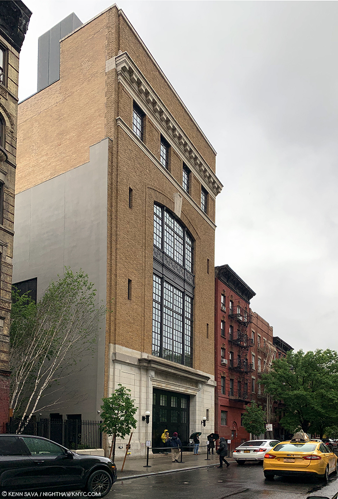
Outside looking in. The most important show in NYC known to me thus far this year was a show I would be extremely fortunate to see.

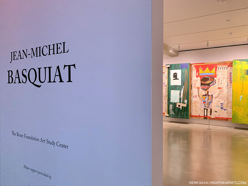
Jean-Michel Basquiat, the first exhibition at The Brant Foundation’s new East Village location is a NoteWorthy show because it is a major, museum-quality show mounted at a private institution of the work of a single major Artist with more Paintings on view than all the major NYC institutions, combined, could mount- multiplied twelve-fold. This led me to wonder- What other major Artist-Contemporary, Modern, or Old Master- has so much of their work, and so many of their major pieces in private hands?

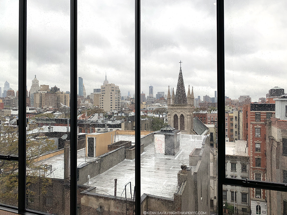
The East Village, NYC, May 13, 2019. Looking towards the Empire State Building (rear, left of center). Bad weather, no ticket for the show, no sleep, no umbrella. It was going to take more than that to keep me from seeing this show, AND something close to a miracle to allow me to do so.

It’s easy to have mixed feelings about this. I’ve read some complain that it’s another case of the 1% at its worst; that this show is a case of the very rich showing off. On the other hand, it seems to me that there is a stronger case to be made admiring the vision, and the guts, of the collectors who stepped up and bought much of the work of Jean-Michel Basquiat (J-MB henceforth) when he needed it most, not to mention go through the trouble of sharing it with the public, who, in the case of Jean-Michel Basquiat’s Art, are largely dependent on them doing so to be able to see it. Showing off? Yeah. I guess.

Almost every Artist in the early stages of their career needs the support of buyers and collectors to survive and to continue to create. Yet, it’s also easy to forget that most of these  collectors possibly also bought Art by Artists that have long since been forgotten, (which is one reason I strongly believe in only buying Art you love– if it becomes worth less- even substantially less- than you paid for it? You can always display it and enjoy it.) And? As I wrote in part 1 of this series, the NYC museums, except the Whitney, collectively passed on his work at the time- and continue to do so. The only way they’re likely to fix that now is by gift or donation. The affordability train has long ago left the station for anyone else besides that 1%. The Big 41 had their chance. In the case of some institutions- chanceS, as I outlined.

Unnamed on the exterior, in classic East Village cool, The Brant Foundation, 421 East 6th Street, 10am, Monday, May 13, 2019. If I’m up at 10am, and not STILL up, you know there’s a special reason why. That cab exiting stage right is leaving with my umbrella. See ya.

At The Brant Foundation, a show of 70 Paintings and 1 Sculpture was on view, making it the largest show of Basquiat’s Paintings in NYC since the Brooklyn Museum’s Basquiat Retrospective in 2005, which I saw. Combined with the Basquiat work in the other five 2019 shows, the total approximately equals how many were shown in Brooklyn in 2005. The Brant show largely includes work in the collections of Stephanie and Peter Brant, alongside pieces on loan from the Broad Museum, (a private museum of the collection of another early collector, Eli Broad, who own at least of 13 of J-MB’s Paintings), among other significant loans. Since so much of his work is in private hands who knows how long it will be before we see a bigger or similar number of J-MB’s work here again. So, the six Jean-Michel Basquiat related shows in NYC and vicinity this year (counting the Warhol x Basquiat show going on in Kinderhook, NY, which proved too far for me to get to) might be the best chance I’m going to get to reassess and reconsider his work that it’s barely been 40 years since he began creating it.

The first order of business was getting in to The Brant show and actually seeing it. After all my efforts to get a ticket failed, I resorted to drastic measures. I took the unprecedented step of getting up with 3 hours sleep at 9am and going down to The Brant on May 13th, the last day the show was open, or the day before it closed- I’m still not sure. As I got there at 10am, right as it opened and visitors for the the first timed slots were arriving, I quickly realized this was going to take an act of fate. Compounding things, it was raining and I’d left my umbrella in the cab. I decided to take a Zen approach and stand off to the side, where that tree is to the left, above, and see what happened.

About 30 minutes later, Jessie, the on-top of everything Brant staff person manning the entrance, who knew I was casting my lot to fate, called me over from the door. A lady had arrived and told him she had an extra ticket. Really? A real-life Angel of Providence had appeared when I SERIOUSLY needed one. I walked over and met Lisa, and yes, she had an extra ticket that she was willing to let me use. Miracles really do happen. The fact this piece exists is solely due to her generosity. Seeing it over the 3 and a half hours I spent in it allowed me to flesh out the portrait of Jean-Michel Basquiat’s accomplishment that began for me at Xerox, adding the best look at his most important work I’m likely to get. Any assessment of J-MB’s work and achievement begins with his Paintings. I’d seen 100 works in 2005 at the Brooklyn Retrospective, but I hadn’t prepared to see them. Now IS the time. Lisa’s generosity not only enabled me to create this piece, it also permits me to create the multi-part series on 5 of the 6 Basquiat-related shows I wanted to do, now that she made it possible for me to see the “centerpiece” show of the group. I’m also grateful to Jessie for thinking of me. Due to both of their kindness and consideration, I am thrilled to be able to share what I saw with you.

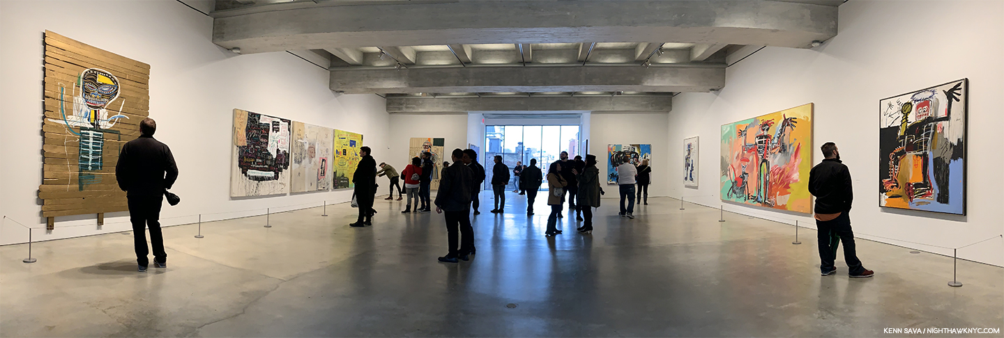
For a while, it looked like I wasn’t going to get to see this. Standing at the entrance to the show- the lobby of the 4th floor, just after exiting the elevator 90 degrees to the right.  You can see the variance in the lighting in the main gallery from here. Outside, to the right of center is Untitled (Self-Portrait), 1982.

The elevator took us to the 4th floor, where everyone starts and then walks down to the floors below, the show being installed on all 4 floors. It should be said that the group of new visitors getting off the elevator each time on 4 was surprisingly small. The galleries were pretty sparsely filled- incredibly so for a major show on either it’s last day or next to last day. Well, there was well over 1 billion dollars of Art on display, so they opted to keep the crowd manageable.

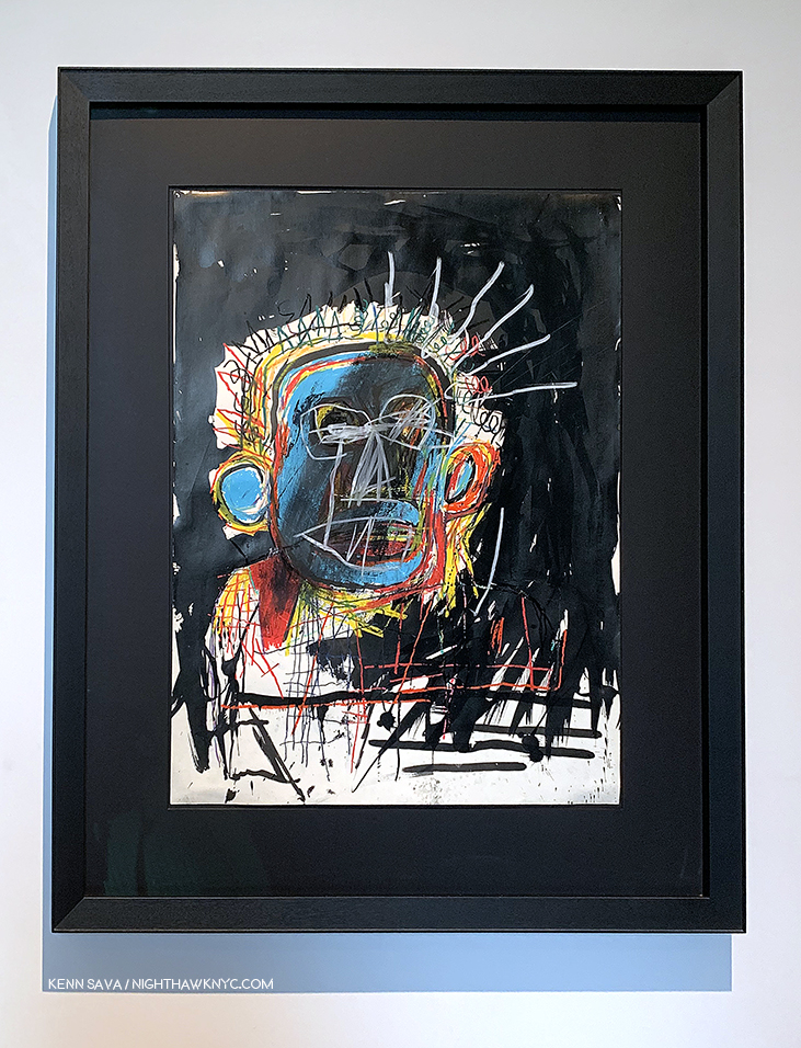
Untitled (Self-Portrait), 1982, Oilstick and ink on paper, 30 x 22 inches. The first work in the show.

Though the urge might have been to hurry into the large, main gallery shown above, I was stopped in my tracks by the work hanging to the right just outside. There was Untitled (Self-Portrait), 1982, one of the most unique Self Portraits I’ve ever seen. I wondered what Picasso would have thought of it. The colors, and then particularly the black background fascinates me as I ponder at what stage J-MB added it. And then I wondered what Clyfford Still would think of it. Like a number of J-MB’s “heads” from 1981-2, he flattens everything to the picture plane, something not seen all that often in Art. 4 floors of J-MB still to go. What an auspicious start!

A real-life Angel of Providence. Lisa studying Self-Portrait with Suzanne, 1982, in the main gallery on 4.

It turns out that Lisa is a school teacher and an Art lover with superb, wide-ranging, taste that runs from Brancusi through Morton Feldman as I found out as we chatted while going in.

Self-Portrait with Suzanne, 1982. The compelling work Lisa studies above shows the artist with Suzanne Mallouk, the subject of Widow Basquiat, in 2010. It’s the only work known to me created by J-MB showing the Artist with one of his lovers. Beyond this, it’s fascinating to study the way he’s rendered himself here compared with the other “heads” and Self-Portraits from 1981-2.

Before I get too far into the show, I’ll say the building looked brand new, the restoration of the former Con Ed Substation being first class from top to bottom. I have mixed feeling about it’s suitability for the display of Art, but honestly, I get some of those feelings almost everywhere I see Art. In my experience, the #1 problem in seeing art is lighting, combined with the scarcity of truly non-glare glass or acrylic. As my friend, Corinne, co-owner of NYC’s legendary City Frame, tells me- currently, it’s expensive. Then again, not all Painting is glazed. Increasingly, Artists, including Raymond Pettibon and Kara Walker, and Photographers, including Gregory Halpern, have shown their work without frames, often just tacking it to the walls at the corners. Still, glazed or not, lighting- artificial or natural, is a problem that rears its head in almost every show I see. The same was the case at The Brant.

I don’t care how rich I was, I don’t think I’d install a pool over irreplaceable Art.

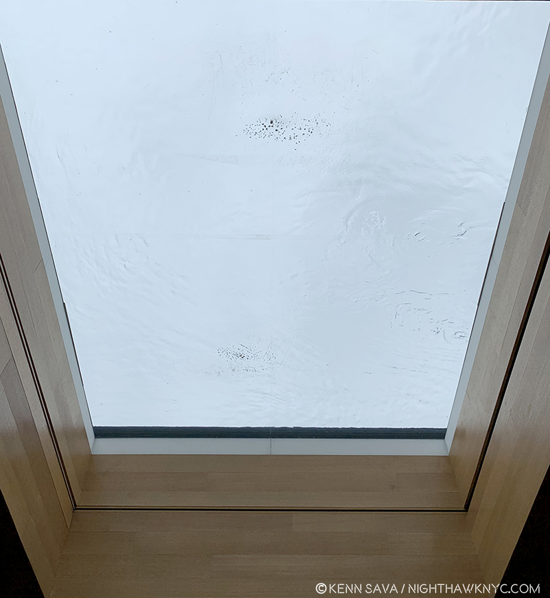
The fourth floor is the top floor and features a skylight, apparently, filled with water- unless this had collected from the rain? I don’t know. They must either have Lloyd’s of London insurance, 8 million tons of confidence in whoever installed it, or both, to hang a few hundred million dollars worth of one of a kind Art underneath it, including more than one of J-MB’s greatest works, in my opinion. But, beyond this, being a cloudy, rainy, day, the large skylight wasn’t letting in as much light as it might have at other times.

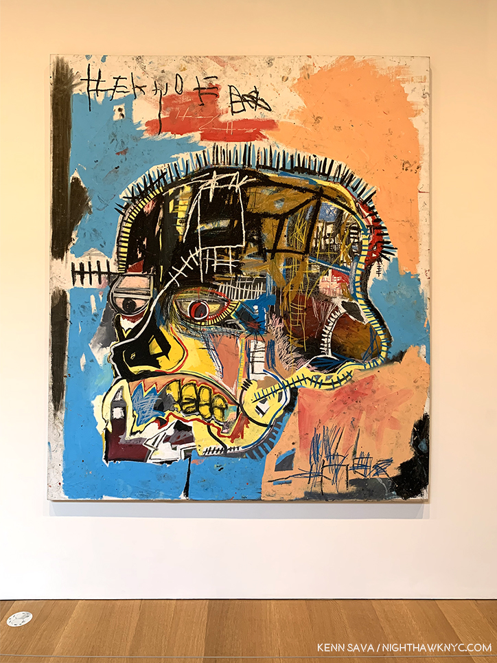
Hanging a few feet from the skylight/pool (as you can see in the installation view earlier) is Untitled, 1981, acrylic and oil stick on canvas, 81 x 69 1/4 inches, from The Broad, L.A., the upper half of which was in a shadow during my visit.

Typical of all the works on view in this room, the upper half of Untitled, 1981, on loan from The Broad in LA was in a shadow. Still, the power of seeing this work in person was staggering. I took all of it in from a distance when I first saw it, then walked over to see the other works in the room. Finally, I walked back over to look closely at it at length.

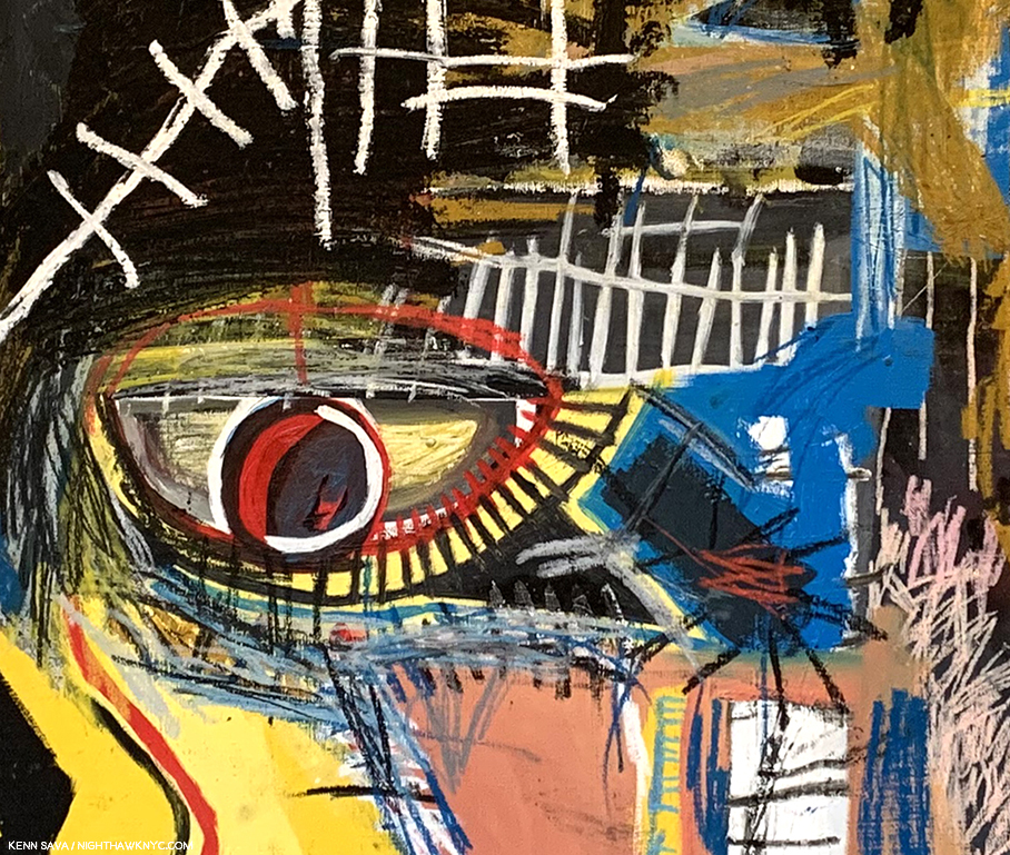
Detail of Untitled, 1981.

The difference in the experiences is remarkable, as you can see. But, no matter how closely I looked, minding the security rope you can see at the very bottom of the picture above, it was still drawing me closer. Like a Rembrandt, or Van Gogh, where I’d like to study each brushstroke for it’s content, here I was being drawn in to look at each detail. The feeling I got was that each small part of it was a world unto itself, yet irrevocably part of the whole. What, exactly, are we seeing? It’s not a skull because there are eyes and there is hair, at least part of a beard, and some teeth, though others are missing. And there are what appear to be stitches and possibly some letters over all of it- a cryptic message, like the figure, in a language no one had ever seen before. (Compare this to the work on view in Xerox that I looked at in the first Part! There, the details were, largely, words.) This is 1981- a year after the first show the work of J-MB appeared in. It’s a work from near the beginning of his post-SAMO© career as an Artist. And, it’s one of the most remarkable shots across the bow in Art history, possibly since Picasso’s Les Damoiselles or Duchamp’s Bride Stripped Bare. When I’ve seen it in books, I haven’t been able to stop looking at it. Seeing it in person it felt like I’d never really seen it. But, even saying that? There’s literally nothing like this in Western Art history to 1981. In his book, The Art of J-MB, Fred Hoffman makes a case for this being among J-MB’s “key” works. I don’t have a list, but I won’t argue with that. I just keep wondering if Francis Bacon, who outlived J-MB, passing away in 1992, saw it and what he thought, or would think, of it.

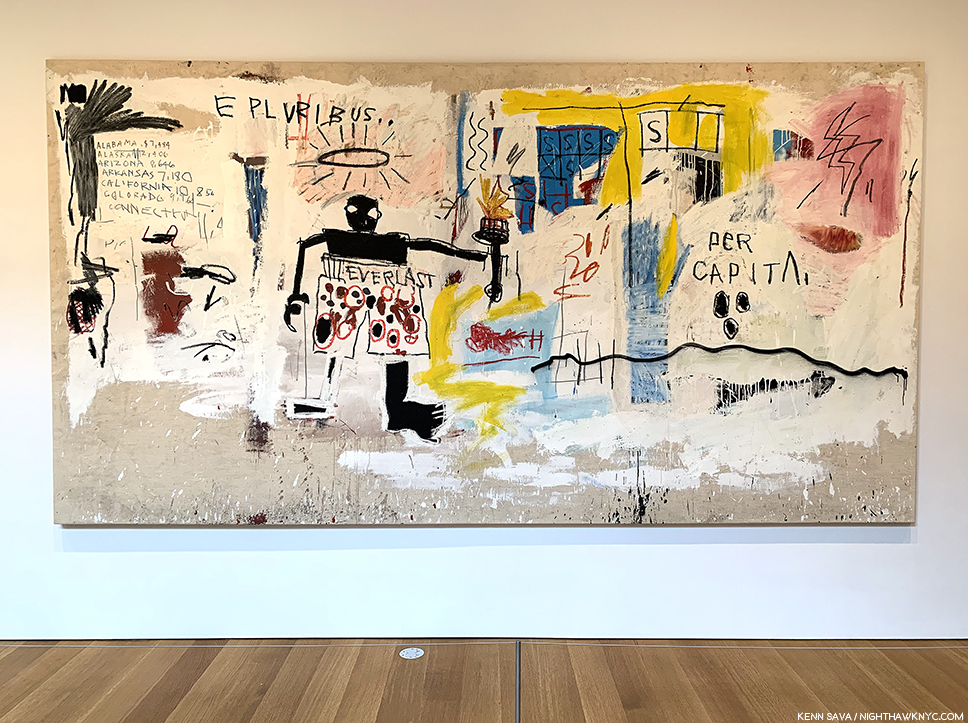
Per Capita, 1981

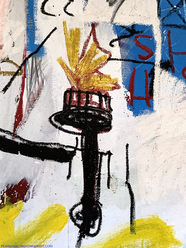
Across from Untitled was the incredible Per Capita, also from 1981, with it’s central figure in Everlast boxing trunks, a halo over his head and his outstretched left arm holding a torch that sure looks to me like that of the Statue of Liberty. Over the halo are the words, “E PLURIBUS…,” or, “out of many,” leaving out the equally famous, “UNUM,” or “one.” The title (which may or may not be the Artist’s title- I simply don’t know), “Per Capita,” means, “per unit of population; per person,” in one definition, per American Heritage Dictionary, and “equally to each individual,” in another. Along the left side appears to be the beginning of an alphabetical list of states with the per capita income of its citizen next to them. Even on a partial list, that manages to include states in 3 of the 4 corners of the country, the variance is striking. Fred Hoffman wrote at length about this piece in his essay in the catalog for the 2005 Brooklyn Museum Retrospective, where he also listed it among J-MB’s key works, where he says the central figure is Cassius Clay, as Muhammad Ali was known when he won the gold medal at the 1960 Olympics (The Art of J-MB, P.129.), which could also make that an Olympic torch.

As I looked at this fascinating work, I couldn’t help wonder if the “UNUM,” or “one” E PLURIBUS was seeking with its … was the solitary figure, as in “Out of many, THIS one.” J-MB’s love of boxers is well known and was to be seen in most of an entire gallery on the 2nd floor, as well as in his portrait (in which he wears Everlast boxing trunks) in the famous Warhol*Basquiat poster for their joint show a few years later in 1985 at Tony Shafrazi Gallery, which could also make this a Self-Portrait.

It’s hard to write about this show and not include every work in it- many are major, many others important for any one of a number of reasons, and they all deserve mention.

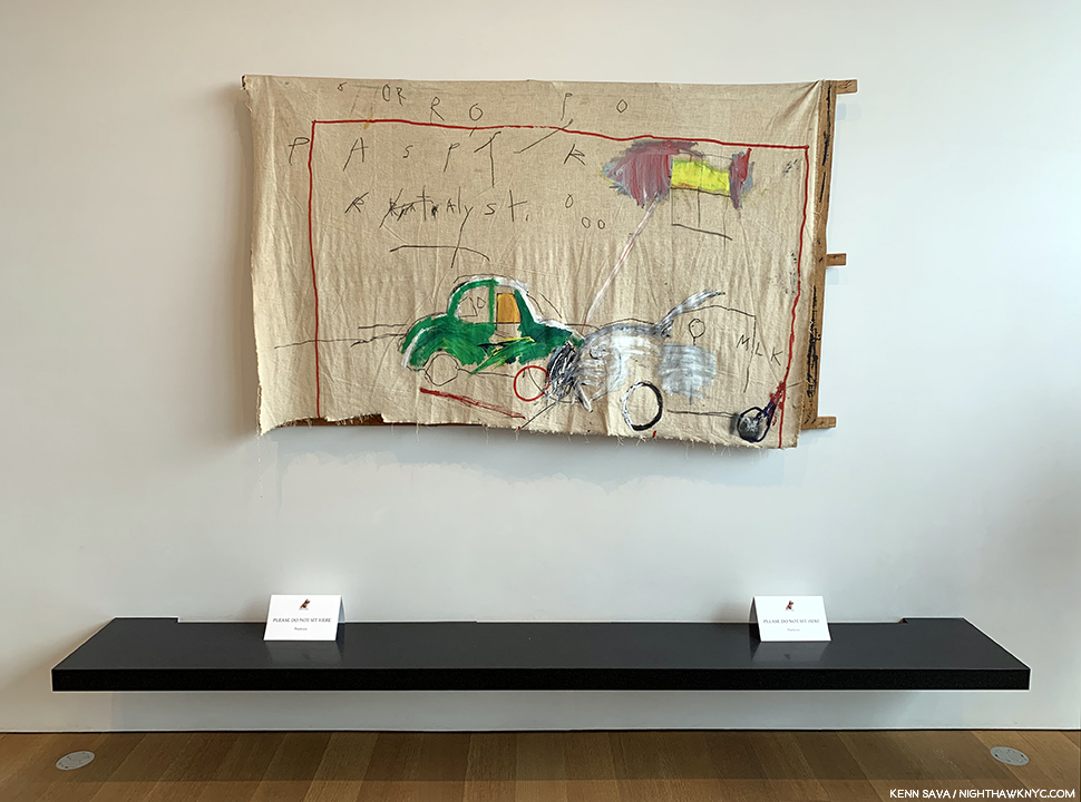
Untitled (Car Crash), 1980, Acrylic and lipstick on canvas with exposed wood supports. So much of J-MB’s story and his Painting begins in this work where he recreates the accident where he was hit by a car at age 6 that hospitalized him for a month and caused the loss of his spleen. Seen in the small rear gallery on 4.

On 4, there was also a small rear gallery along the rear of the building. Here, too, lighting was a question. The far wall was lined with a floor to ceiling window, which, you guessed it, let in a lot of light- even on this dreary day. I have no idea if they cover it/partially cover it in full sun.

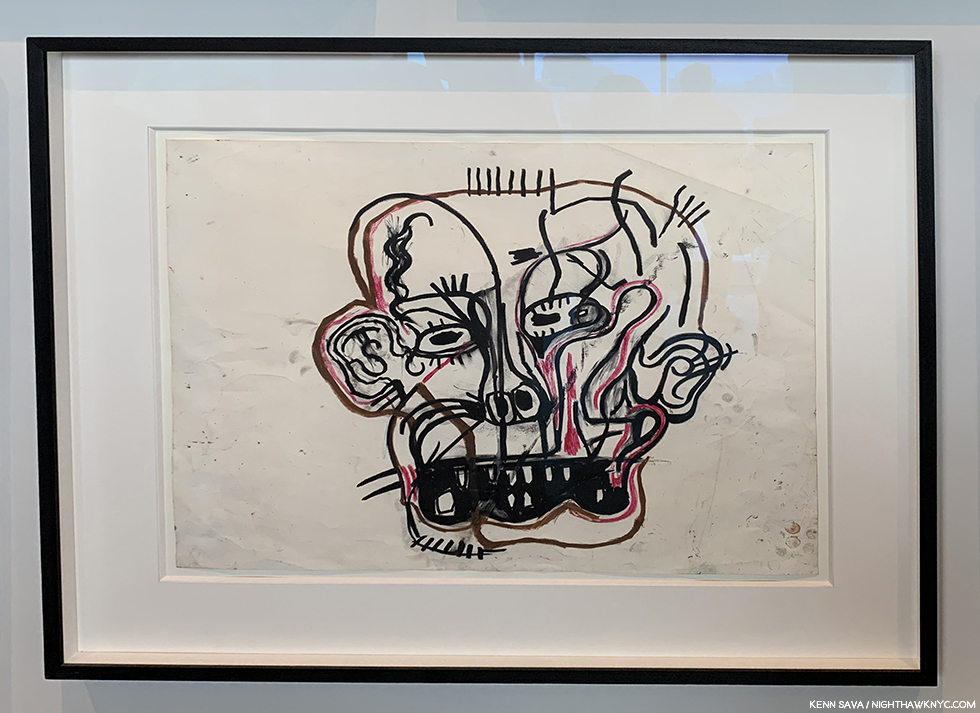
Untitled, 1981, Oilstick on paper. Seen in the small, gallery in the back of the 4th floor. There’s so much that’s revolutionary in this extraordinary work, and at the same time it gives us another take on the two Untitled (Head) Paintings in the show, this time the “head” is seen from the front and not from an angle and has been flattened, like the picture plane. The right side is almost Cubist.

Down on 3, the lighting was better.

3rd floor. Installation view.

The main source of natural light being another picture window, but this time it was at the end of a large rectangular space and didn’t interfere with the most of the large works on view, including this one-

Untitled, 1982, now in the collection of Yusaku Maezawa, while on loan to the Jean-Michel Basquiat exhibition at The Brant Foundation, May 13, 2019.

In May, 2017, this Painting, Untitled, 1982, by Jean-Michel Basquiat sold at Sotheby’s for 110.5 million dollars. As someone who prefers to consider Art for what it is without the shadow of dollars, as much as possible, this fact gives even me pause for thought. Here it was, on a corner wall of the third floor, appearing as another work in the show as opposed to something “special.” I applaud this decision.

Do I think it’s “worth” 110.5 million dollars? Anything is worth only what someone is willing to pay for it (And, there were multiple bidders for it). Given that the question of whether something is, or isn’t “Art” won’t be settled during any of our lifetimes, only hundreds of years hence if the work continues to speak to people, the question of commerce- supply and demand, is what is rearing its head in Contemporary Art auctions, in my view. Jean-Michel Basquiat’s public career as an Artist only lasted a few months over 8 years, from June, 1980 to his death on August 12, 1988. Though he was extraordinarily prolific during that time, creating 1,000 Paintings and 2,000 Drawings2, included in it are only so many major works (a number that I personally feel is larger than some others seem to think), and Untitled, 1982, happens to be one, in my view. Looking at the lists of the highest prices paid at auction for Art reveals that many, if not most, of them are the best works available as most of the major work by established Artists of, say, Picasso’s time or earlier (considering he passed away in 1973), are in museums which are not likely to part with them. The works auctioned are certainly not the most important works by any of the Artists on the list, as I’m sure most would agree (perhaps not the purchasers), though it’s subjective. The $110.5 million for Basquiat’s Untitled, 1982, is for a major Basquiat, in my opinion.

But, the more astonishing thing for me to realize (Hey? It’s not my money) is that at the time of the auction, in May, 2017, Jean-Michel Basquiat would have been 56 years old! Untitled, 1982, is a work he Painted when he was 21 or 22 years old. People talk about this sale marking the highest price ever paid for a work by an African-American Artist. Others mention the highest price ever paid for a work by any American Artist.

They never mention that this sale makes Jean-Michel Basquiat the YOUNGEST Artist in HISTORY to have a work sell for over 100 million dollars- either by age at the time of the sale (56), or age when he created the work(21-22)!

At 56 in 2017, he would be considered to be in “mid-career” as the museums call it. At 58, right now(!), he should still be every bit the vibrant, revolutionary force in Art he was for the 8 short years of his career. That he already feels like such a part of history is indicative of it being already thirty-one years, this August 12th, since his passing.

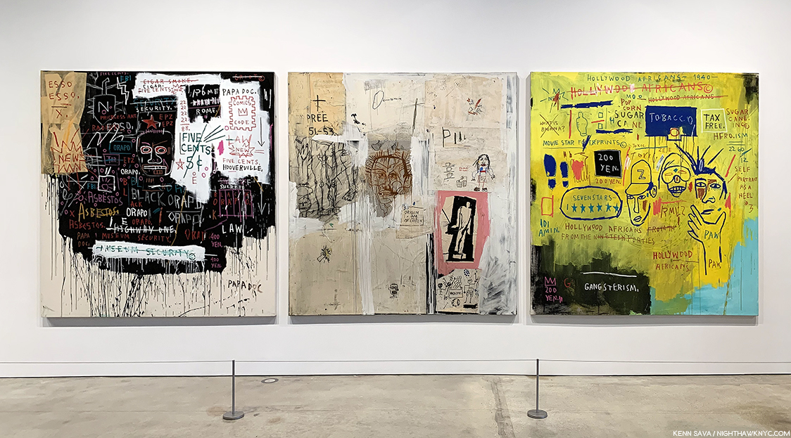
Museum Security (Broadway Meltdown), 1983, left, Big Shoes, 1983, Hollywood Africans, 1983, right, a work on loan from the Whitney Museum. The two to the left are in private collections. In 1983, after they were created, these three works hung on the same wall (with other works) at Larry Gagosian Gallery, LA, as is shown in the Whitney Retrospective catalog, P.251

Also on 3 was this striking group of three works, each from 1982, which included a work from an NYC museum!- Hollywood Africans, from the Whitney. These were fascinating contrasts to the collaged work on view at Xerox, Museum Security and Hollywood Africans both featuring words more than image, but were done exclusively in paint, as far as I could tell.

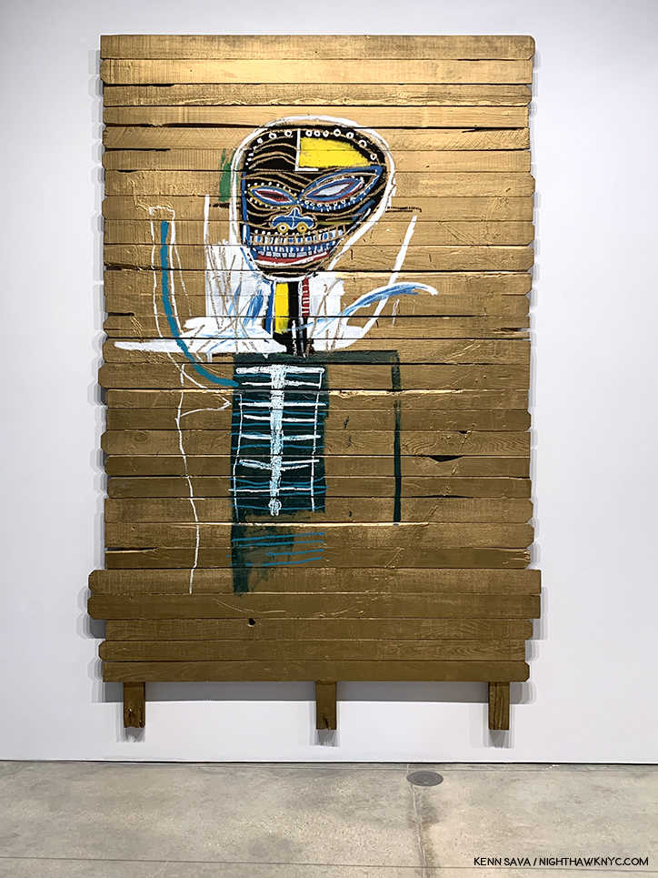
Gold Griot, 1984, Acrylic and oilstick on wood, 117 x 73 inches. You can get a sense of how big it is in the installation view, above.

The somewhat monumental Gold Griot is a very well known work and is memorably recalled in Fred Hoffman’s The Art of J-MB (P.63) as having originated from slat fencing (possibly that referred to in Phoebe Hoban’s book, P.140, that his assistant Matt Dike had acquired from a fence behind Larry Gagosian’s LA house). Mr. Hoffman’s book includes a picture of J-MB creating the work where we see the Painted head looks to be about 8 times larger than his own. Mr. Hoffman references Andy Warhol’s Gold Marilyn, 1962, in speaking of the work’s “pop” influence, with the figure isolated from the gold background, before saying, “The figure is as much a divine apparition as a living human being. With its ethereal gold background surface, the figure of Gold Griot pays homage to sculptural representations of the divine in various sub-Saharan African cultures.3.”

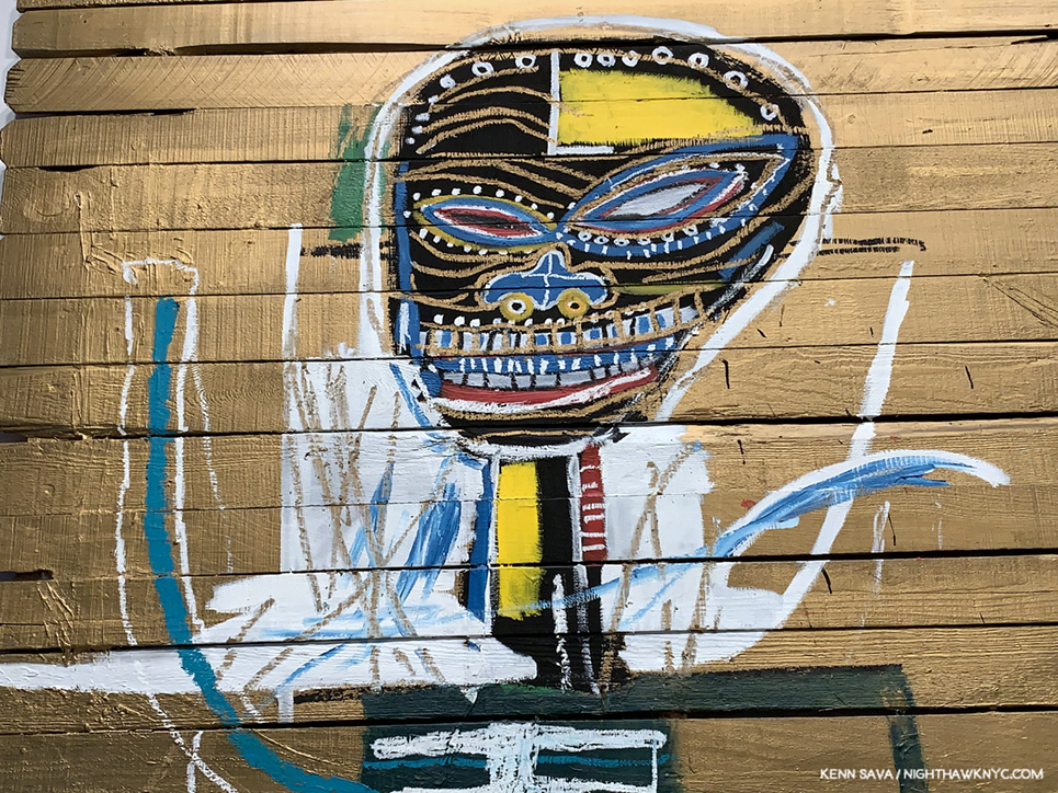
Detail of Gold Griot, 1984.

Looking closer, it’s fascinating to see how J-MB’s depiction of the head has evolved in 2 or 3 years. Gold Griot reminds me of the innovations of Robert Rauschenberg and Jasper Johns, when it comes to Painting surfaces, though it’s resolutely its own work.

2nd floor. Installation view. The work on the immediate left is See Plate 3, 1982, Sculpture in two parts, Acrylic and oilstick on wood, canvas, mounted on wood, the only Sculpture displayed in the show.

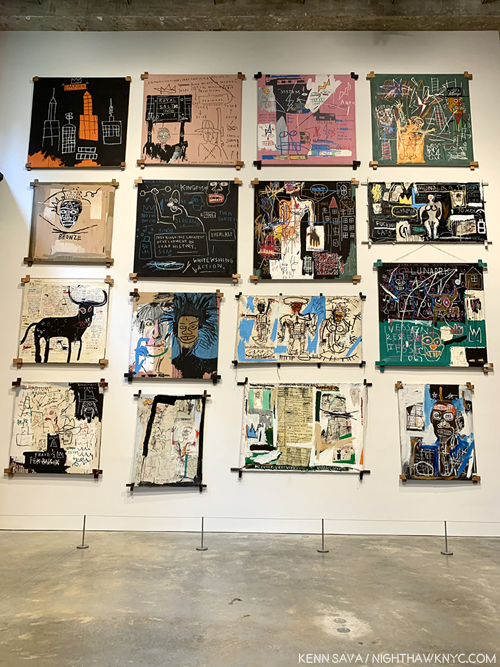
The second floor is a bit of a strange space for displaying Paintings. A very tall space, which at first it seems more conducive to the work of monumental Sculptures, like Richard Serra’s, and lined with brick walls. The curators made it work, choosing to install the Paintings in a single row on the two side walls, then salon style on the third wall. While this made seeing the works in the top two rows challenging, it did allow for the maximum number of Paintings to be shown. As a result, I learned to live with it. In hindsight, I’d say they made the best use of the available space throughout the building, though I feel the building was less than ideal for this show because of the uneven lighting and the very high walls on the 2nd floor.

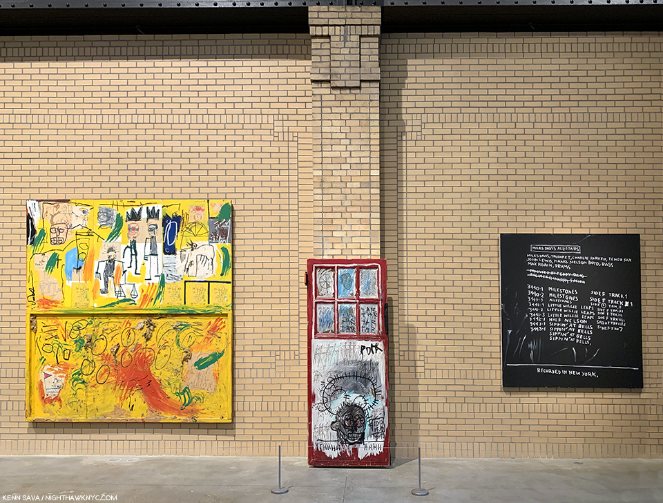
Untitled (Yellow Tar & Feathers), 1982, Pork, 1981, Discography II, 1983, left to right.

Along the sides, important works like Untitled (Yellow Tar & Feathers), 1982, were joined by others not as well known. Discography II contains a list of the details of a Miles Davis Allstars recording session which is historically noteworthy because Charlie Parker performed as a sideman for Miles for one of the only times in his career. To that point, Miles was exclusively a sideman for Bird.

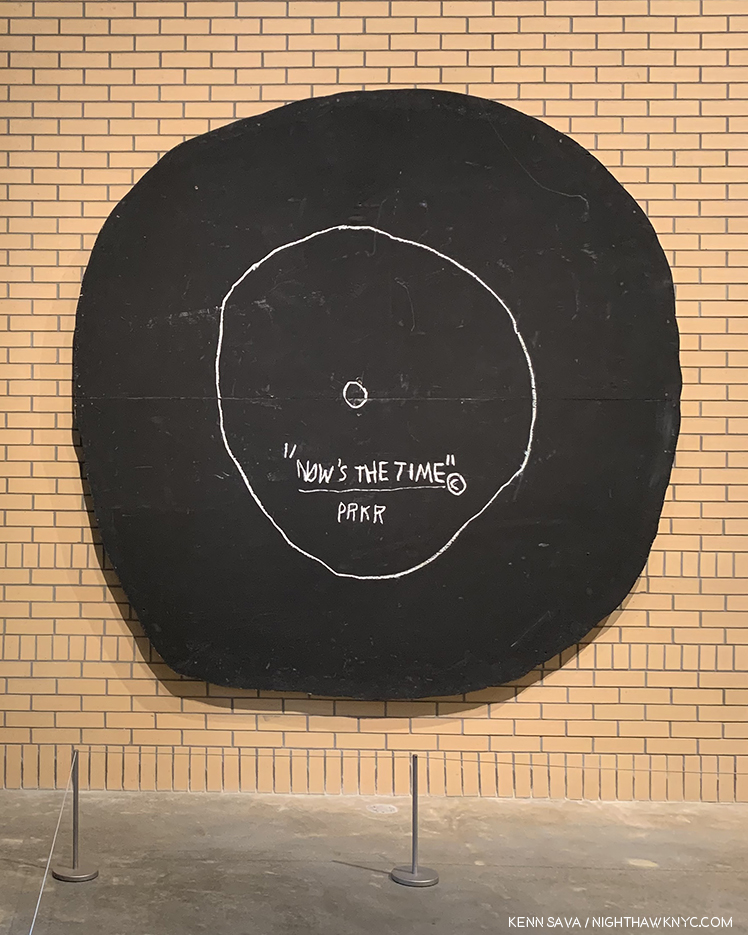
Now’s The Time, 1985, Oilstick and acrylic on plywood, 92 1/2 inches in diameter.

While on the opposite wall, the work referencing Jazz continued with the very cool Now’s The Time, 1985, an homage to the 1945 Charlie Parker record hangs. It also compliments the work on the large wall hung salon style, being they all have unique, experimental stretchers holding their canvases.

On the salon style wall, one thing each of its 16 works share are the unusual stretchers. One thing about J-MB’s Paintings that you don’t hear much about today are his unusual mounts. Constructed for J-MB by his assistants, including Stephen Torton and Matt Dike, there were other examples on the upper floors, and they are another thing that makes his work unique.

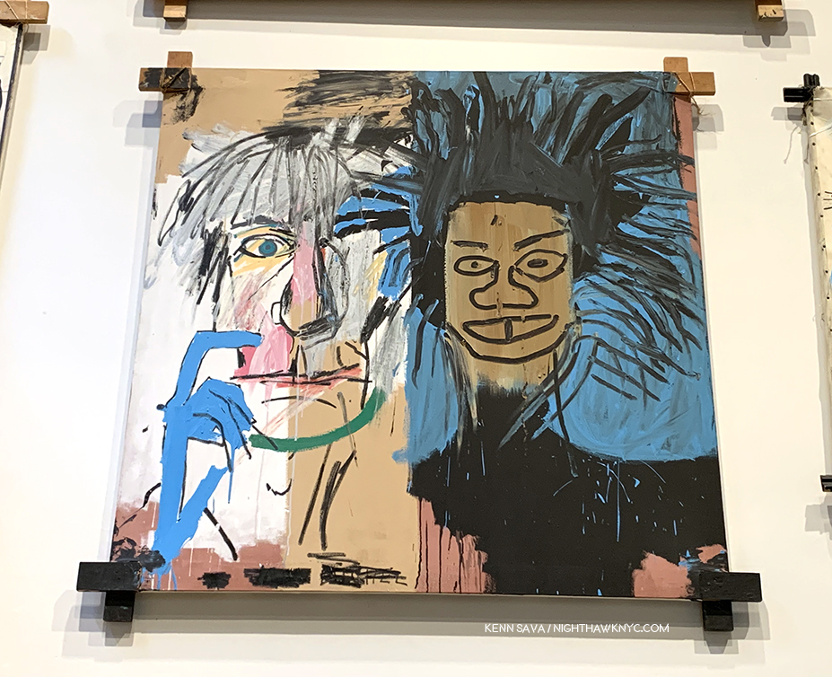
Jean-Michel Basquiat, Dos Cabezas, 1982, a portrait of Andy Warhol and a Self-Portrait that presaged the Warhol- Basquiat collaborations in 1985.

The 2nd floor also included a rear gallery, which featured 4 portraits of boxers and 3 other very power portraits.

Rear gallery on the 2nd floor installation view.

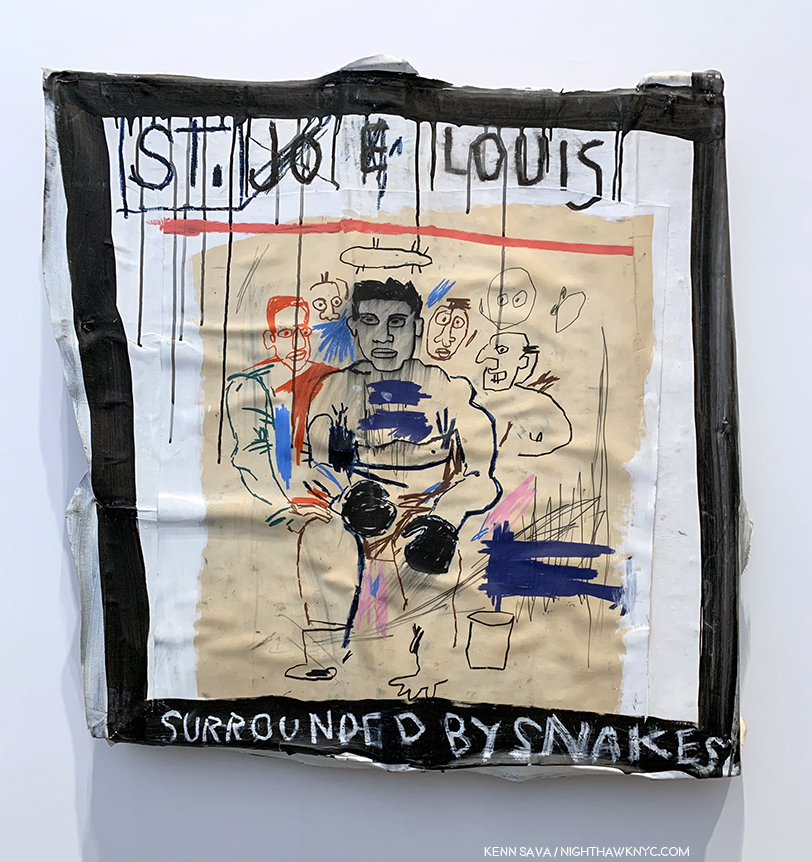
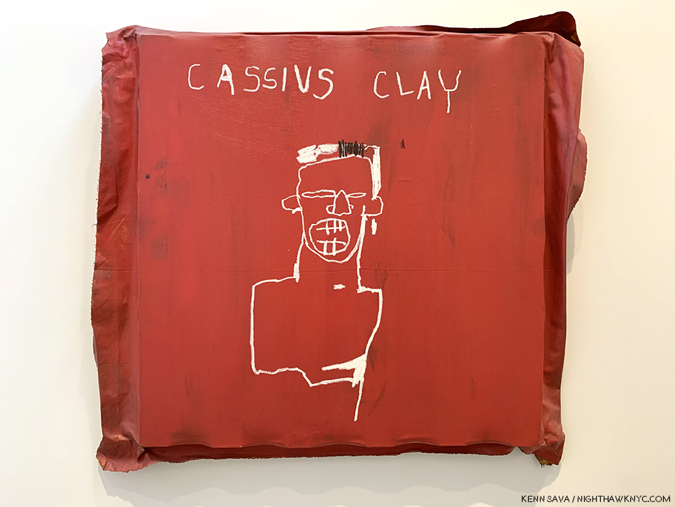
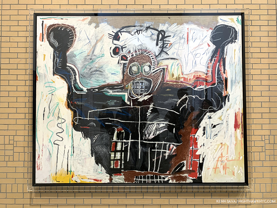
J-MB had a deep fascination with boxers, and they appear both as Self-Portraits and as homages. Sometimes both. Sometimes it’s hard to tell which.

St. Joe Louis Surrounded by Snakes showed the boxer, one of Basquiat’s heroes, encircled by sharkish white managers. ‘That was Jean-Michel,’ said Suzanne Mallouk.” Phoebe Hoban. Basquiat, P.113. Early on, Paul Simon attempted to buy it for $8,000., but was thwarted by Rene Ricard. According to the iPad next to it, seen in the installation view, which served in lieu of wall cards, it now belongs to the Brants. (ibid, P.114).

Muhammad Ali changed his name from Cassius Clay in 1964. As Cassius Clay, he won the gold medal at the 1960 Olympics, becoming a hero to many, including J-MB, who references it, here, by using his name at the time, in this work from 1982.

Untitled (Boxer), 1982, Acrylic and oilstick on canvas, 76 x 94 inches. Fred Hoffman calls this immensely powerful work, “… the expression of the black man’s physical and spiritual attributes.” (The Art of J-MB, P.133)

I almost missed the works installed on the first floor. Luckily, I spotted the small sign pointing to them right as I was beginning to look for the exit. Thank goodness I didn’t as it included some of his largest and at least one of his most important works.

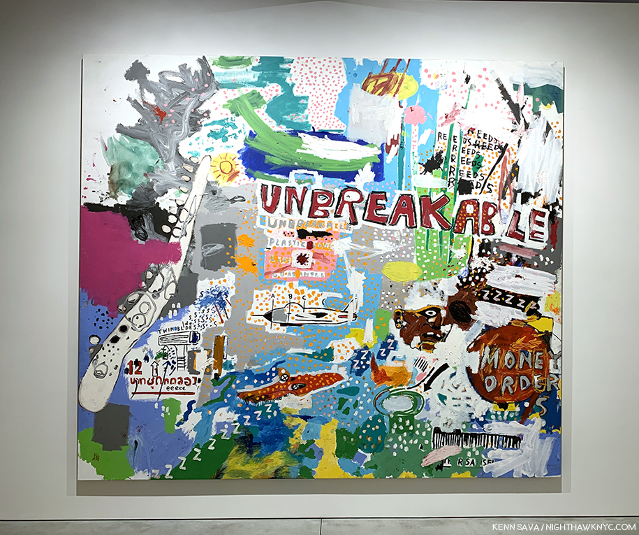
Unbreakable, 1987, Acrylic on canvas, 98 x 111 3/4 inches.

I’d never seen a J-MB work like Unbreakable prior to seeing it. Given it’s dated 1987, perhaps this is a glimpse into where his work was heading. In it, he synthesizes everything he’s been using- images, words, and color.

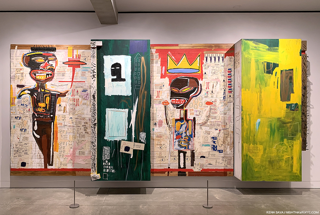
Grillo, 1984, Acrylic, oil, paper collage, oilstick and nails on wood, 96 x 211 1/2 inches- close to 20 feet by 8 feet!

What a powerful, stunning, incredible work Grillo is! It’s taken Robert Rauschenberg’s Combine Paintings in an entirely new direction. I love the juxtaposition of the two panels with figures (one left, one right of center) with the panels immediately to each of their right. I do wonder if this piece was meant to sit on the floor or be raised a foot as it is here.

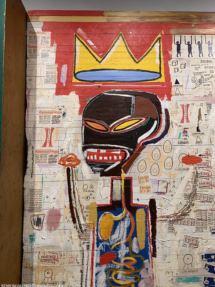
Detail of the right of center panel.

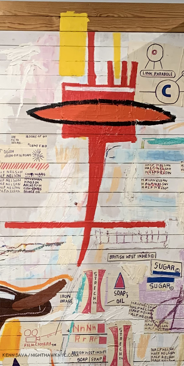
As I looked closer at Grillo, I noticed a good many color Xeroxes collaged on. Yet, the two figures hold the key to it, I think. On the left is a figure holding a torch. Over his head there’s a pice of wood with nails sticking out of it. That sure could be interpreted as a “crown of thorns.” Around him are various repeated words, including- “Soap,” “Oil,””Butter,” Carbon,” and “Stretch,” along with at least two Bebop song titles- “Well You Needn’t,” by Thelonious Monk and “Half-Nelson,” recorded by Bird. What this figure represents I don’t know, but there are elements of the martyr and the heroic included. The other figure, apparently a king, wears a large crown, accompanied by small attendants to its right, and has his hands raised, like the boxers seen upstairs. He appears to be looking towards the left side figure, and both figures have their internal organs shown, perhaps yet another reference to Gray’s Anatomy.

And, there’s this- The left hand figure, how has a board with nails over his/her head, possibly a crown of thorns?, holds a torch…

The work speaks volumes about how J-MB’s Art has evolved in 7 short years, and the unlimited potential the future held for it, and for him.

…which reminds me of the one seen 3 floors up in Per Capita, 1981.

A few days later, Lisa shared her thoughts on the show. “I thought the Basquiat show was quite spectacular. There were so many works that I had never seen before. In particular, I was struck by the great thick black oil slicks. There is something about this sheen, like shoe polish, that you can’t truly appreciate unless you see the paintings in person. They give the works a lot of dimension and texture. They also remind me of Franz Kline – totally dynamic and emotive in gesture. The oil slicks are bold and grimy, like New York. His compositions tend to mimic graffiti on the street – throw ups, wheatpaste posters, and tags on a wall/single canvas.”

There was a bit of the feel that the show was something of an afterthought to the just completed Louis Vuitton show. A “Hey, we’ve got all this work assembled, why don’t we just put it up in NYC?,” kind of thing. I quickly moved past it, the lighting and other questions with the space I’ve mentioned. Nothing dulled the effect of seeing so much work that STILL looks fresh, vital, and contemporary, in spite of countless imitators, commercial “appropriations” of his symbols and the passage of over 30 years since he left. What I saw at The Brant was the work that has defined the legacy of J-MB- in quite a few of his more well known Paintings, works characterized by his characters, in which his words take much more of a back seat than they did over at Xerox. Thinking about J-MB at The Brant four months later, the show has become more monumental in my eyes.

While Peter Brant may represent what many call “the 1%,” so does Jean-Michel Basquiat. For me, J-MB represents that extraordinary, and extraordinarily rare, group of people who are able to overcome unfathomable difficulties- racially, socially, financially, educationally and, apparently, familial, and some difficulties that appear on the outside to have been self-inflicted (though quite possibly resulting from the others- I’m not a doctor or a therapist), then somehow surmount ALL of that and go on to rewrite Art history in about a decade. How many people can this be said of?

How ever many you choose to include? I’m not sure it would even equal 1%.

This Post is dedicated to Lisa, with my undying thanks. My gratitude is due to Jessie for his consideration. Anyone reading this owes them their thanks as well.

*- Soundtrack for this Post is “Bold As Love,” by another brilliant Artist who died at just 27, Jimi Hendrix, which concludes the timeless Axis: Bold As Love.

“Anger he smiles towering in shiny metallic purple armor…
My red is so confident that he flashes
Trophies of war and ribbons of euphoria
Orange is young, full of daring
But very unsteady for the first go around
My yellow in this case is not so mellow
In fact I’m trying to say it’s frightened like me
And all these emotions of mine keep holding me from
Giving my life to a rainbow like you
[Chorus]
But they’re all bold as love
Yeah, they’re all bold as love”

In lieu of the immortal Hendrix original recording here’s a cover to inspire you to seek out the original-

This is Part 2 of my series on the five Jean-Michel Basquiat related shows going on in NYC in 2019. Part 1 is below, or here.
My prior pieces on Painting are here

NighthawkNYC.com has been entirely self-funded and ad-free for over 6 years, during which over 250 full length pieces have been published. If you’ve found it worthwhile, you can donate to keep it going & ad-free below. Thank you!

Written & photographed by Kenn Sava for nighthawknyc.com unless otherwise credited.
To send comments, thoughts, feedback or propositions click here.
Click the white box on the upper right for the archives or to search them.
For “short takes” and additional pictures, follow @nighthawk_nyc on Instagram.

Subscribe to be notified of new Posts below. Your information will be used for no other purpose.


  1. I’m speaking of Manhattan’s museums, only, here and leaving off The New Museum who have no permanent collection.
  2. according to the Brant Foundation.
  3. ibid P.65