AIPAD Focus: Michelle Dunn Marsh- Slinging Pictures With The Best of ‘Em

Written & Photographed by Kenn Sava (*unless otherwise credited)

If you love PhotoBooks, the name Michelle Dunn Marsh is either known to you or lurking somewhere in your home on the colophon of one, or more, of the books you own.

Click any picture for full size.

Michelle is one of the brightest lights in the world of Modern & Contemporary PhotoBooks, a curator of terrific, thought provoking and eye-opening Photo shows, and a self-described “picture slinger,” that is, one of the leading independent PhotoBook publishers in the world with the company she founded, Minor Matters. It’s a status she’s earned through relentless hard work over more than two decades. That’s the short list. For the bigger picture, here’s one summary of her career-

“Michelle Dunn Marsh has served in executive and creative roles for the last 25 years. As Executive Director at PCNW (Photographic Center Northwest) from 2013–2019, she also curated significant exhibitions including Terminal: On Mortality and Beauty, and Eugene Richards: ‘Enduring Freedom’, among others. She co-founded Minor Matters, a community publishing platform for contemporary art, and has published 14 books to date. Dunn Marsh spent fifteen years with Aperture Foundation in New York City, was senior editor of art+design at Chronicle Books in San Francisco; and was a tenured professor in graphic design at Seattle Central Community College among other professional endeavors. She has lectured nationally about visual literacy, publishing, and the history of photography. She holds a BFA from Bard College, where she serves on the Board of Governors, and an MS in Publishing from Pace University1.”

And on the day after tomorrow? She rested.
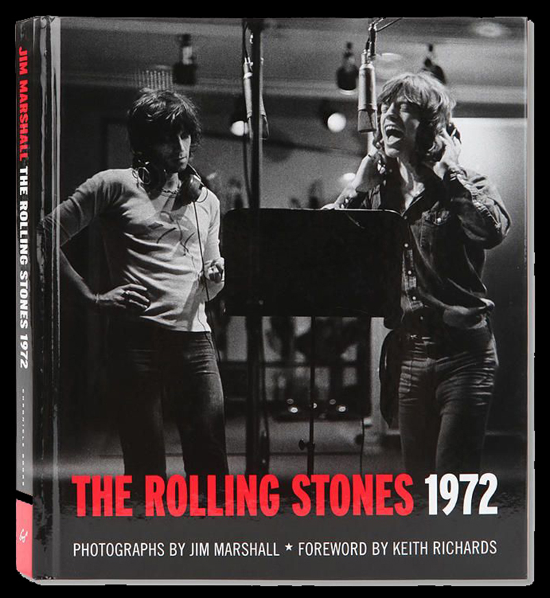
Chronicle Books published The Rolling Stones 1972, a 2012 best seller with a foreword by Keith Richards, and Photos by legendary Music Photographer Jim Marshall. It was edited and designed by Michelle Dunn Marsh, one of two test cases for her eventual launch of Minor Matters, she told me. *Chronicle Books Photo. 

When I first read about her, she struck me as someone who was a classic New Yorker: She works endlessly in more roles than you’d think one person could manage, let alone excel at, yet everything she touches is permanently marked by the passion she brings to it. It turns out I wasn’t far off. She splits her time between Seattle and NYC. Or, more likely? I think there may be two of her. But, I’ll leave that for future researchers to determine.

What I do know is that last year, she curated the special exhibition All Power: Visual Legacies of the Black Panther Party, honoring the 50th anniversary of the Seattle chapter’s founding, at The Photography Show/AIPAD 2018, where I discovered her. She was back this year behind Minor Matters’ table for all five days of the show, where, after having communicated by email, I finally had the pleasure of meeting her. There she was, proudly showing off some of the fruits of her, her team’s and her Artist’s labor. with a fine and typically diverse collection of PhotoBooks. The respect and esteem the world of Photography has for her was evidenced by the fact that she was continually joined by a steady stream of Photographers, and Photofolks every time I stopped by Minor Matters’ table, causing me to give up on getting a picture of her, alone!
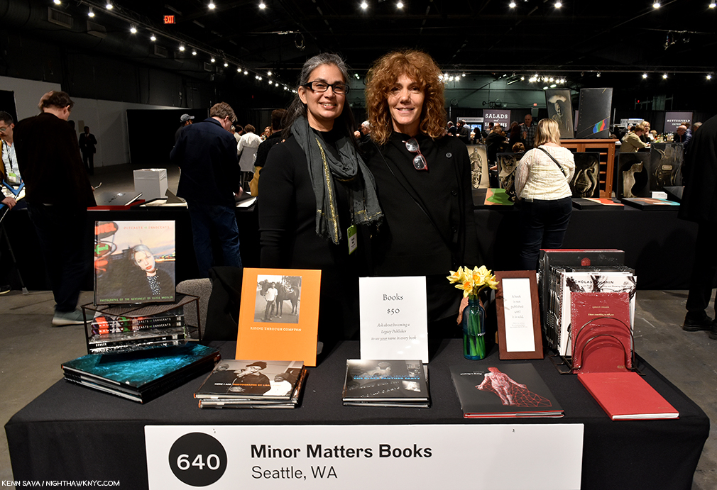
So, I opted for this photo-op. Michelle Dunn Marsh, left, with the multi-dimensional Artist, Marina Font, who’s unique talents are on full display in her auspicious first book, Anatomy is Destiny, seen in the front, second from the right, on April 6, 2019.

However, I’m thrilled to say Michelle somehow found time to answer some questions for me, providing a rare opportunity to get some insights from one of the true movers and shakers in the world of PhotoBooks, and to learn more about this unique lady and her impressive career to date. Without further ado, I am proud to present the subject of my 2019 AIPAD Focus, Michelle Dunn Marsh!

Kenn Sava (KS)- First, I think of you as one of the busiest people I can imagine, a lady who wears many hats. You told me at AIPAD you’re making an effort to cut back. So, could you tell us what roles you’ve decided to focus on these days?

Michelle Dunn Marsh (MDM)- Over the last 15 or so years I have been in many roles highlighting many people in my effort to serve the medium of photography. While I am proud of so much of that work, I reached a point last year where instead of wonder and awe I mostly felt relief at the completion of any given activity (exhibition, publication, lecture, panel) and resignation at what still awaited me on the to-do list. That is not how I want to show up for the work.

So I gave up a fair amount of authority, power, platform, and countless responsibilities in the role I had at PCNW as Executive Director & Curator to take on a new role, Chief Strategist. I am focusing on potential real estate development of our property to secure longterm financial stability, providing oversight to the staff managing our re-accreditation process that happens every 10 years, and implementing new visual literacy programs focused on our mission to teach people how to see.

My activities and responsibilities for Minor Matters haven’t really changed—I have freed up more time to dedicate to them, and to myself. The last few years under the current president have been traumatic; I need to keep myself strong to continue to publish books, lecture, and teach.
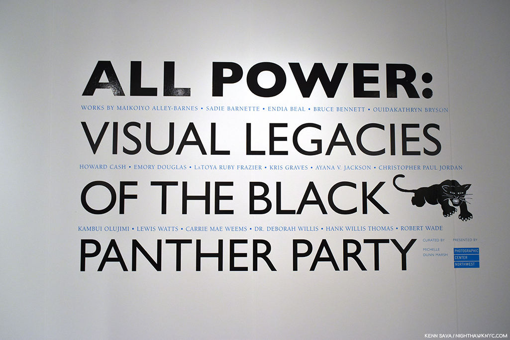
Flashback: AIPAD, April, 2018. Michelle curated the special exhibition- All Power: Visual Legacies of the Black Panther Party, which was my introduction to her. In this piece, I’m going to revisit her show in pictures as our Q&A progresses for those who missed it.

KS- Speaking of your Executive Director & Curator time at PCNW, I discovered you last year at AIPAD where the terrific show you curated, All Power: Visual Legacies of the Black Panther Party, honoring the 50th anniversary of the Seattle chapter’s founding, debuted (I believe) before moving to Seattle. That’s quite a feather in your cap, curating a show at AIPAD. How did the show come about, and what was the experience like for you?
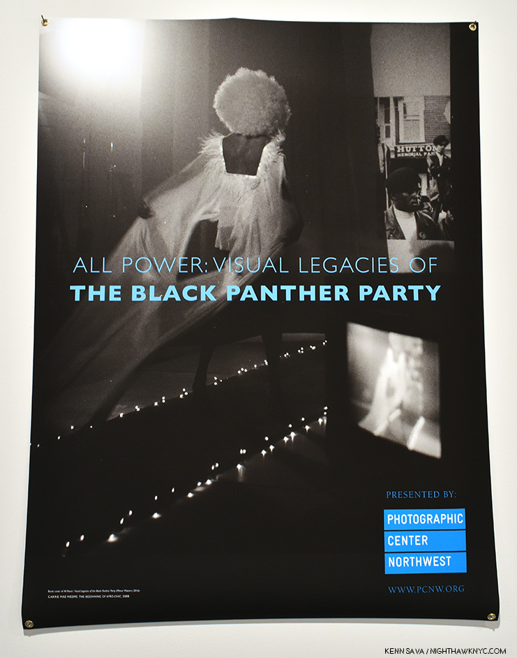
Carrie Mae Weems’s The Beginning of Afro-Chic, 2008 (Detail), appears on both the exhibition poster and the cover for the show’s Minor Matters catalog.

MDM- Minor Matters published the book in 2016 to coincide with the 50th anniversary of the founding of the Black Panther Party; the book served as a complement to the tremendous anniversary exhibit Rene deGuzman curated at the Oakland Museum of California. It was an emotional and exhausting and important project, given all else that was happening in the U.S the summer and fall of 2016. My friend and colleague Negarra A. Kudumu ended up co-editing the book with me, and I could not have completed it without her, and without the support of all the artists and contributors.
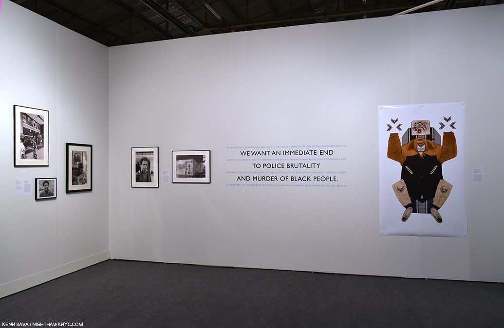
All Power Installation view. Work by Robert Wade, Gill Baker, Deborah Willis on the left wall, Unknown Photographer, Lewis Watts, and Maikoyo Alley-Barnes, right of quotes from the Black Panther Party Platform and Program.

I knew the Seattle chapter’s anniversary would be coming up in 2018, and that PCNW, located in what was once the Central District (the historically black neighborhood of Seattle) needed to engage in some way. I am very sensitive to conflicts of interest between my roles at PCNW, a 501 (c) 3 organization, and Minor Matters. So I went to the board and said that I could work with the nationally-oriented content I had already developed for the book, or we could develop a Seattle-specific exhibition or program for 2018, but that given the circumstances the decision should come from them so it could not be perceived that I was using my position at PCNW to promote Minor Matters. The board unanimously decided that I should develop an exhibition from the All Power book, which gave me an opportunity to add some artists I either didn’t know or wasn’t able to include in the book, including LaToya Ruby Frazier, Sadie Barnette, Ouida Bryson, Christopher Paul Jordan, Jasmine Brown, and someone you’ve gotten to know well, Kris Graves.
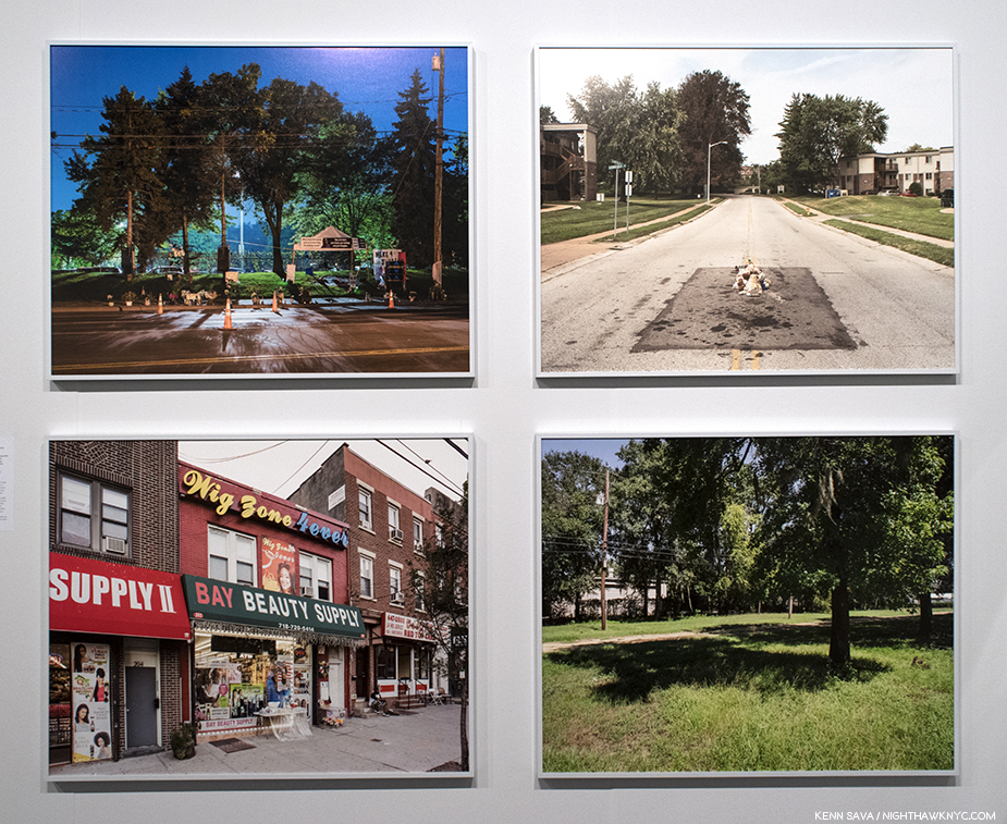
The “legacy” of All Power. I discovered Kris Graves, who I’ve written about since, when I saw these 4 pieces from his series, A Bleak Reality, 2016, revisiting the places where black men were murdered by police,  stopped me cold. The so-called “New Topographics” ends here. Installation view, April 7, 2018.

Simultaneous with the show’s development, I gave a copy of the book to my friend and colleague Steven Kasher (then of Kasher Gallery, now with David Zwirner). Steve has a wonderful history of exhibiting and publishing work related to the civil rights movement and other social justice issues, and I thought he would appreciate the book. He immediately said, “this needs to be seen in New York; would you want to show it at my gallery?” It was such an immediate and generous response. Many of the people in the book have representation through other New York galleries, so I wasn’t sure how that would work out, and said so. And then Steve thought of AIPAD, and asked that I send him the exhibit checklist. The special exhibitions had already been determined, but there was a possibility that one of them was not going to work out.

All Power Installation view of works seen elsewhere in this piece.

I sent him the information, and put the possibility out of my mind. And then in January 2018, I got an email from AIPAD saying they’d like to premiere the exhibition. We had just completed a very complex show in Seattle, Notions of Home, and were opening Jun Ahn: On The Verge. I’d told the exhibit coordinator that All Power would be a simple, straightforward undertaking. Instead in three months we were figuring out how to get the show to New York then back to Seattle with artists spread across the United States, what would be produced and framed where, how it could be crated, for the very small budget allocated. It was insane. And extraordinary.
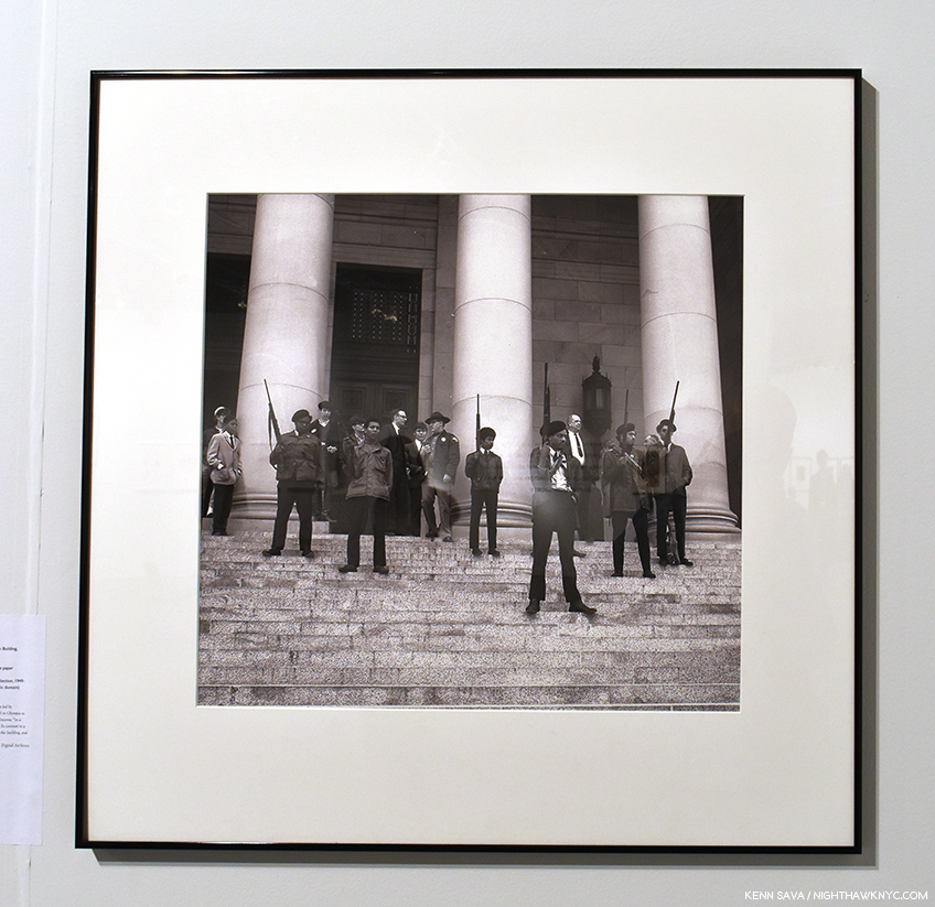
“Extraordinary” is a word I use to describe the results- the show- one of the more memorable, thought provoking, shows I saw anywhere in 2018, which was full of amazing work- like this, Photographer Unknown, Black Panthers on the steps of the Legislative Building, Olympia, WA, February 28, 1969/2018, printed by Steve Gilbert of PCNW.

Not one to miss a perfect opportunity for a segue, when one is offered, to get another perspective on the show, I asked one of the Artists included in All Power, Kris Graves, Photographer and head of Kris Graves Projects, what the experience of being in All Power was like for him. From Portland, Kris said, “I am honored to have been part of the All Power exhibition. It is an important show that traveled a bit but deserved more air time. The world is not kind to artists of color.” A fellow publisher, in a statement that would seem to speak to why so many well known Artists (like Carrie Mae Weems, Hank Willis Thomas, and LaToya Ruby Frazier) along with a number of historic and newer Artists deserving wider attention (like Emory Douglas and Maikoiyo Alley-Barnes) appear in All Power, Mr. Graves added, “I wish Michelle lived in New York but I’m glad she’s doing good work in Seattle. She is what the art world needs more of. Caring individuals that understand issues of agency in our society. She makes strong projects and I’m inspired by her. One of her new books is with Eirik Johnson and it comes with a vinyl record filled with new music from him and his friends. That shit is awesome. I hope Michelle and I collaborate sooner than later. I’d do whatever she asked.”

Emory Douglas, Free the G.I.’s, 1973, as seen in All Power. 

KS- Michelle, before all of this, as you mentioned, you’ve had many roles. I see you were involved with the Aperture Foundation, one of the most important Photography orgs in the world. What did you take from that experience?

MDM- I will spend much of my future continuing to explore what I gained from Bard College, and from Aperture. Both were incredibly formative institutions for me. When my tenure there ended perhaps my greatest fear was that that would be the conclusion of my life in photography; thankfully it was not.
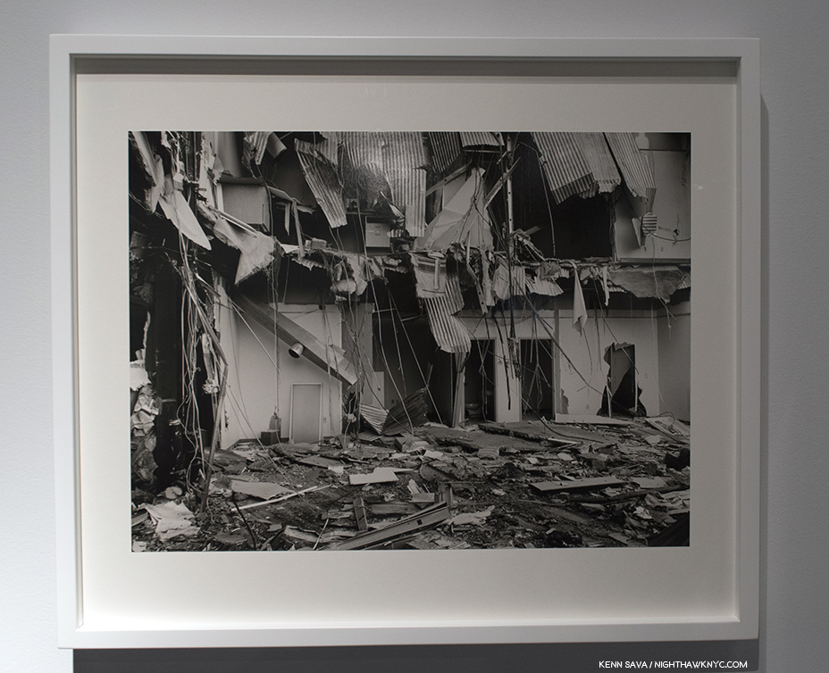
LaToya Ruby Frazier’s UPMC Professional Building Doctor’s Offices, 2011, from the series, “The Grey Area,” which documents the demolition of Braddock Hospital in her Pennsylvania home town, which she had been involved in trying to save, as seen in All Power. Ms. Frazier’s work in All Power were leant to the exhibition by Gavin Brown’s Enterprise.

I started working freelance for Aperture in the fall of 1996, and went on staff six months later, which began a 15-year pattern of full-time, part-time, and freelance employment as a designer, project manager, Co-Publisher of the magazine, Deputy Director of the foundation, and some titles I probably don’t even remember. I launched Aperture’s first website, in 1997, built with my graduate-school roommate Paula J. Freedman. I worked on its first in-house Macintosh computer to review files in the burgeoning transition to digital mechanicals and typesetting. I sequenced books on the floor of the Burden Gallery with exhibition prints that I later measured top and bottom, left and right, to calculate percentages for how the print needed to be squared and sized for reproduction. I learned from and argued with Michael E. Hoffman, Aperture’s impresario executive director, who once handed me a petal of a dahlia to convey what he wanted the jacket design of a book to feel like. I covered his office with an Amy Arbus photograph of a baby that I desperately wanted to be the cover of an issue of Aperture I was designing (he laughed, which was rare, but did not approve my cover).

I was most closely mentored by Stevan A. Baron, my thesis advisor in grad school and the head of production at Aperture. He took the reproduction of gelatin silver and platinum photographs as seriously as most great photographers took the photographs themselves. I learned about the past history of photography, and the history in the making through work we were publishing or exhibiting. I learned about, and felt, images that hurt to be seen and needed to be seen anyway. I learned the craft of fine bookmaking, from paper to binding to typography to physical size and how the photographs sit most comfortably on the pages. I learned that photography is a vehicle by which we explore the lives we live. Aperture’s mission and founders established strong ideals that still influence me, and my affiliation there opened many doors.

This will be an endless interview if I continue answering this question. I hope that the work I do today continues to illuminate what I gave to and gained from those years at Aperture.
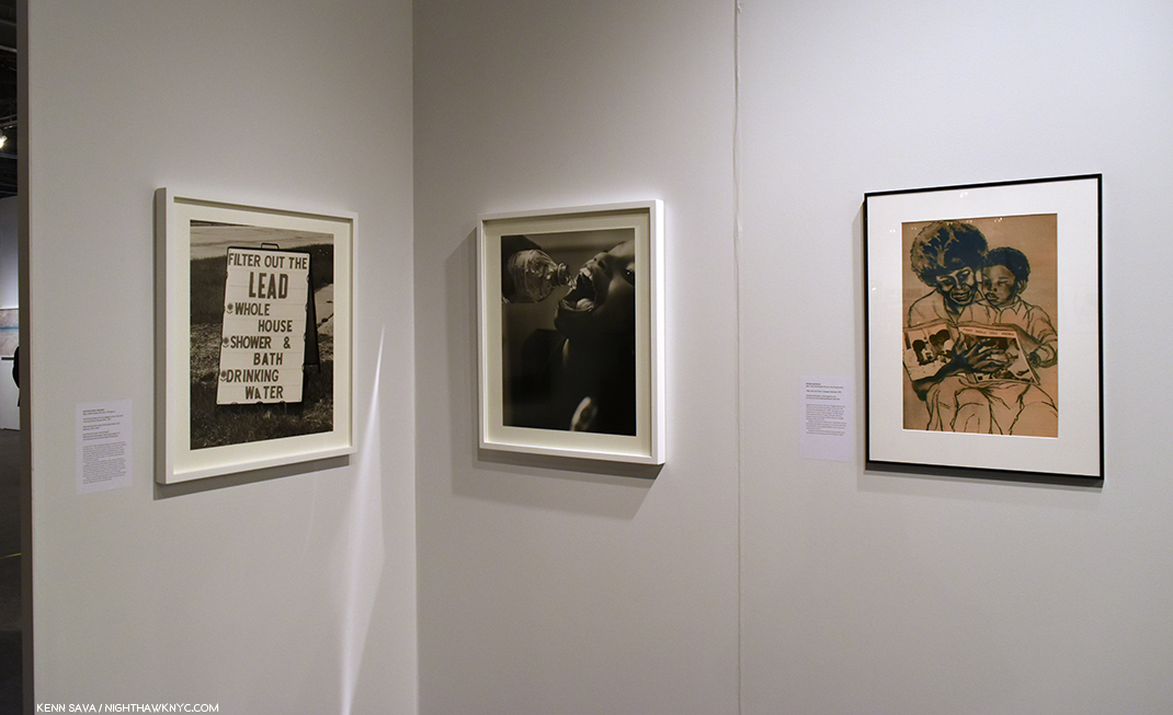
All Power Installation view. LaToya Ruby Frazier, left, and immediately right of the corner and Emory Douglas, right.

KS- How did you get into the world of PhotoBooks? Where did your love of them come from?

MDM- I was raised Catholic. “In the beginning was the Word, and the Word was with God, and the Word was God.” Book of John. Gorgeous notion, even thousands of years later through who-knows-how-many translations. The Word was God. So, my love was first for books, because as I saw it books were manifestations of the divine. In college I learned that in ancient Irish culture poets had great power; I felt connected to that lineage as well through my father’s people. I was also concerned from a young age with the relationship between photography and memory. Did I love the photograph of my third birthday because it reminded me of that amazing experience? Or was that birthday my favorite memory because I often looked at a photograph of it? I was skeptical of the seductive nature of photography, while also drawn to it.
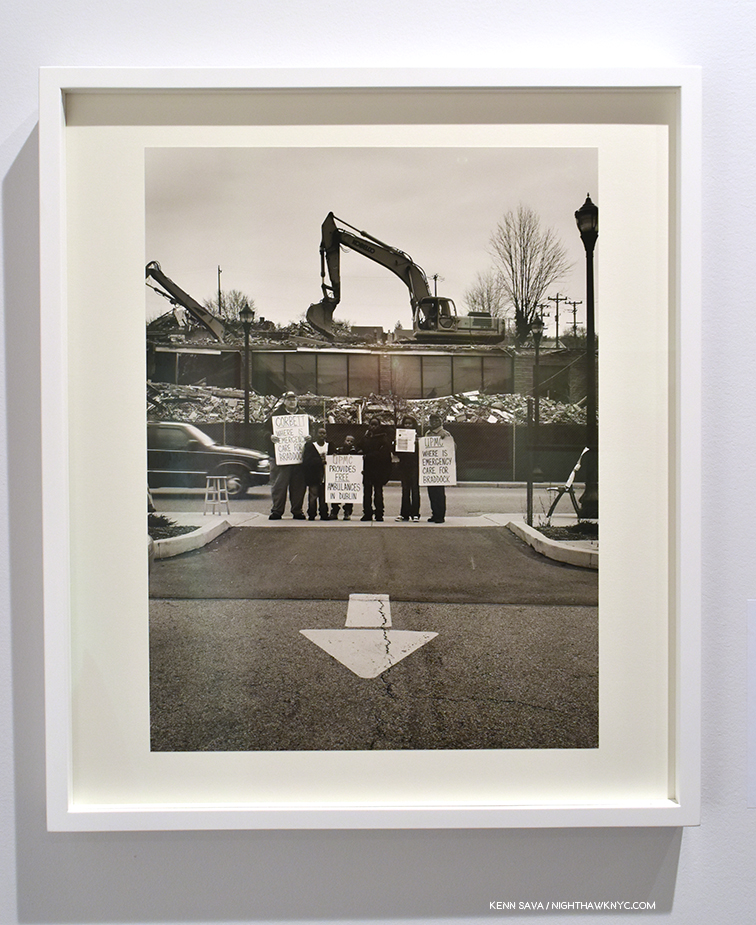
LaToya Ruby Frazier’s UPMC Global Corporation, 2011, from the series, “The Grey Area.” To get a sense of what it was like to live in Braddock, PA, at the time, check this out. As seen in All Power. 

I was introduced to significant photography through the Publications office at Bard, largely due to its director, Ginger Shore. She published portfolios by William Wegman, Thomas Struth, Cindy Sherman, not because they had any connection to Bard but because she wanted people to see their work. She used Wynn Bullock photographs to illustrate science articles. She had only two reactions to a proposed design for a poster or brochure or whatever else I was empowered to work on—”it looks great,” or “it looks like sh*t.” Elena Erber, the art director, slowly taught me about design, about letting a great photograph do the heavy lifting, about color theory and typography. Soon those women were advising me on what classes to take to further my knowledge—color theory, basic painting, history of photography, tutorials on the origins of modern type.

Andy Grundberg’s book Brodovitch triggered an awareness of design, printing, content—elements resulting in a whole greater than its parts. It is the only book I’ve ever contemplated stealing (I didn’t; it should still be in Bard’s library). And then Larry Fink’s Social Graces truly registered with me—the mysterious richness and tonality of the photographs, the warmth of the paper, the placement of the type. I was sitting on the floor of the college bookstore, and remember seeing “Design by Wendy Byrne” on the copyright page. The concept of “design” was still new to me, but I knew then that books could manifest from more than words alone, and whole new worlds opened.

KS- For a publisher making important and beautiful books, why the name Minor Matters?

MDM- There are two primary origin points to our name. The first is Minor White, and yes, I believe that Minor matters. He is a lesser-known figure in our pantheon, and that is unfortunate—his teaching, writing, editing, and photographs deserve greater attention in my opinion.
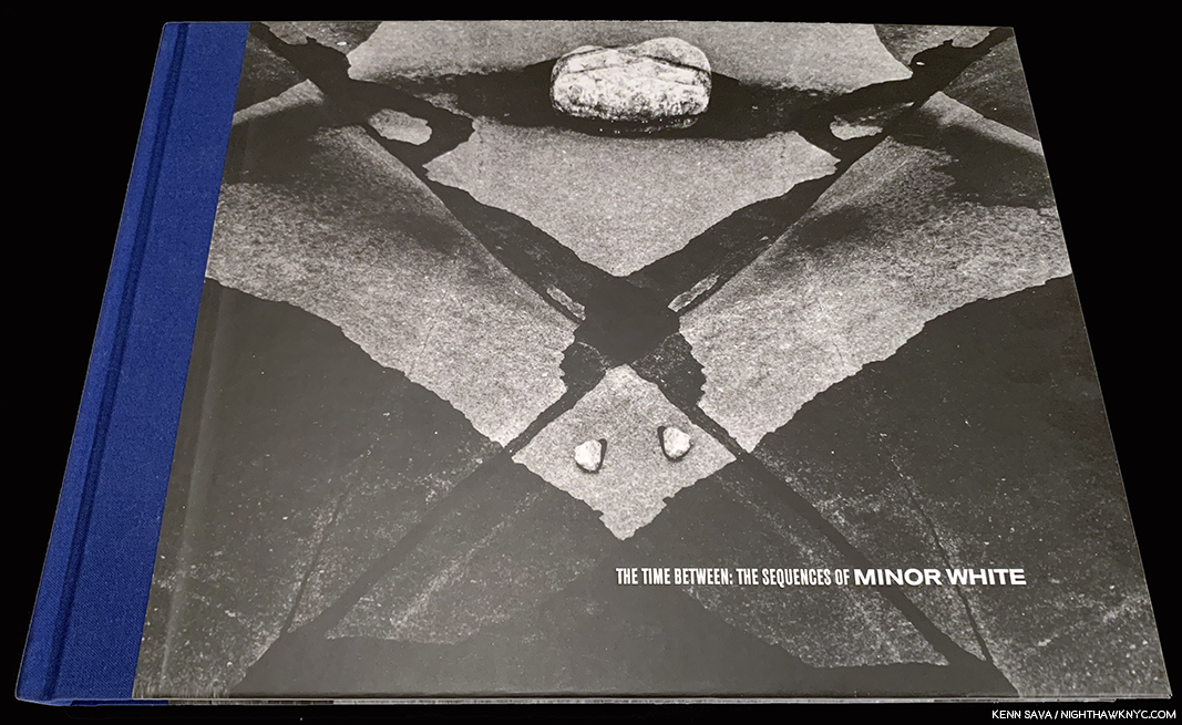
Given her history at Aperture, which Minor White was a cofounder of, I should have realized Minor Matters was a reference to Minor White. This gorgeously produced volume  is one of my favorite Minor White books, and I share her feeling that he is unduly overlooked today.

The second is that as a tri-cultural mixed race individual in America, I occupy an insider/outsider space, and from my privileged position I want to honor and lift up my and others’ fringe viewpoints.

I developed my expertise under the auspices of a very respected institution in the history of American photography, working with some of the most acclaimed practitioners. That has granted me great privilege. Yet within that space I have also been at various times a minority—because I am from the west coast; because I am a woman; because I am Caucasian; because I am brown; because I am confident; because I am smart; and mostly because I am polyvalent in a world that struggles to genuinely value multiplicity.
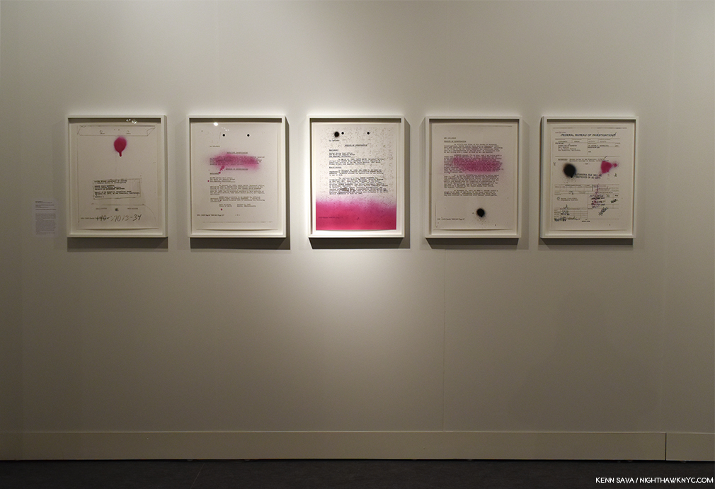
All Power Installation view of Sadie Barnette, Selections from My Father’s FBI File, Government Employees Installation, 2017

KS- Your pre-sale model of requiring 500 copies to sell at 50. plus 9.95 shipping before it goes into production would seem to serve a number of purposes. In this day of too many books and too much Art in the world, it helps to save our precious trees by making sure there’s a demand and desire for the work on the part of the public, while remunerating the Artist with 100 copies of a beautiful, well-produced book. What went into Minor Matters settling on this formula?

MDM- It evolved over 20 years in publishing—observing the joys and challenges at Aperture, at Chronicle, drawing from my graduate degree in the business side of the industry, talking to photographers, and honoring what Steve Baron taught me about manufacturing beautiful books for future generations to enjoy.

KS- The process retains a feel of a personal investment on the part of its audience. The first 500 get their names published in the book, and you consider them to be “co-publishers” of the book. That’s pretty cool! Once the book is finished, the “direct” feeling remains—you don’t sell on Amazon, preferring to “privilege and highlight the good taste of independent bookstores,” as it says on your site. I’m in bookstores almost every day and that’s where I discovered your books, after word of mouth told me to look out for them. Being able to physically hold and see a book is priceless, and the only way to fully appreciate all that’s gone into it, in my opinion. How have you managed to survive without depending on the biggest internet platform? What are the benefits you’ve discovered of doing it this way?
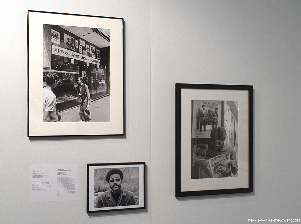
All Power Installation view. Robert Wade, upper left, Gill Baker, lower left and Deborah Willis, right.

MDM- When we launched in 2013 we kept getting asked what our “exit strategy” was. Steve comes from the start-up world, so he knew this was code for “when do you think you are successful enough to sell,” or “when do you think you have to pull the plug on your idea?” I had no idea why people kept asking us that. We knew we were not building something to sell! But we agreed that if we launched ten books and none of them made it into print, then maybe our concept wasn’t feasible. We published three of the first five titles we launched.

I am fortunate to have interacted with people like Leon Botstein, president of Bard College, Michael Hoffman at Aperture, Aaron Dixon captain of the Seattle chapter of the Black Panther Party, and so many incredible photographers, so my idealism does not feel isolated or out of keeping with the people around me I admire. I have also learned from all of them that you have to be willing to put in the time, and do the work.

Selling to bookstores it’s like any other sales situation. We have to establish relationships, keep in touch, follow through, be professional.  Thankfully our books do a lot of the work for us—people value them. And I have two decades of experience in publishing, which helps a lot. I know what terms I will offer, what is fair to the bookstores, what is mutually beneficial to them and to us.

Probably the greatest advantage to not being on Amazon is that our price stays the same wherever someone buys our books. That is important to me. We strive to over-deliver at our set $50 price point. I don’t want to see the book somewhere for $4.99 when we’ve collectively invested that many times over in resources of time, materials, and cash to create it. I think our audiences understand that, and likely appreciate that we take their purchase price seriously and don’t want to undercut it.
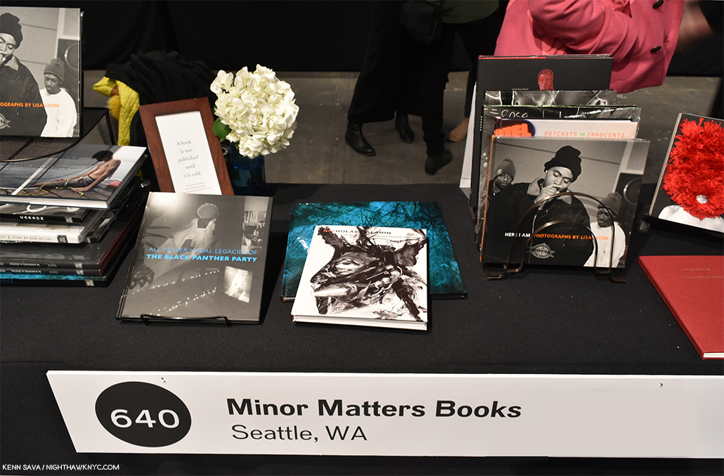
Taste, style, beauty, range and the unexpected…always. Those are qualities that define Michelle’s and Minor Matters books, for me. That steady stream of visitors continues in the background.

KS- You’ve seen and continue to see as many PhotoBooks in all stages of development for the last 2 decades as almost anyone else on earth. In that time, digital cameras, the increased use of computers and digital technology have brought about the biggest changes in the world of Photography. Has all of this led to better books in terms of a finished product in your view?

MDM- I respond to work that has clarity, a sense of craft of whatever the medium is being explored, and vision—the tools used rarely matter to me. There is a lot more work being produced in this digitized age, but I see a lot of work by people who are not necessarily curious about the history or future of the medium, and no, the photography, and the books resulting, are not necessarily better.

I think the advances in print-on-demand quality are extraordinary—anyone who wants to see their photographs in book form can do so. That’s such a gift to so many creative people! And yet I find that many people who could take great joy in utilizing these advancements are not satisfied by it. It’s too bad.

I am turning toward teaching the history of publishing as much as the history of photography, as my world embraces both, and publishing as an industry is still vague to many, or assumed to be “easy,” when it fact it long predates photography itself!

At this point, I reached out to the aforepictured multi-talented Artist, Marina Font, to learn more about what the experience of working with Michelle and Minor Matters was like for an Artist they published.

Marina Font, Anatomy is Dentiny, published by Minor Matters. *Marina Font Photo. 

KS- How did you come to know Michelle and how did your project get on her radar?

Marina Font (MF)- Michelle and my gallerist, Dina Mitrani, met in 2013 at the Photolucida portfolio review and became fast friends.  Because her involvement with Young Arts, Michelle would come often to Miami and was able to see my last two solo shows at the gallery.

We met for the first time in 2017 at AIPAD, and as the three of us sat over coffee, Michelle proposed the idea of collaborating on the publication of my first monograph. I could not believe it!  A year later the book went to print and I am very honored to share that Aperture selected Anatomy is Destiny to be on Aperture’s Photobook’s Spotlight at AIPAD.

KS- What was working with her making Anatomy is Destiny like for you?

MF- Working with Michelle on the realization of this book has been a dream. Her knowledge and professionalism are impeccable, as well as her openness and respect for the artist’s voice.
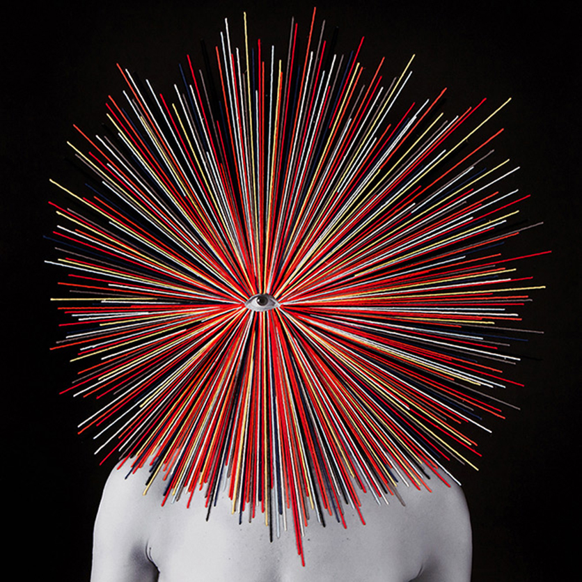
Marina Font, from Anatomy is Destiny. The Artist told me this about her background- “Back in Argentina (where she was born), I attended a Design School where I took multi-disciplinary classes, like sculpture, painting and design, and was introduced for the first time to photography. We started making photograms, and since that “magic moment” when I saw an image come to life in the developer tray, I fell in love with the medium. I later joined a local “Foto-Club” and continued to learn there. Once in Miami I completed my Master of Fine Arts in Photography at Barry University in 2009.” *Marina Font Photo. 

The realization of this book presented a couple of challenges: the works presented in the book are a selection of works from two consecutive series that challenge Freudian views of womanhood, and at the same time they challenge the notion of photography.  Here are a few reasons why:

– The entire book is made up of 75 works that depart from one single photograph. What makes each work unique is the manual intervention of each photograph with paint, thread and textiles.  We really wanted the “materiality” of the work to be properly reproduced in the book.
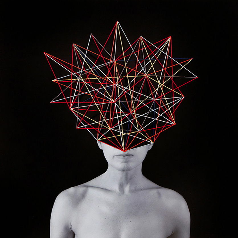
Marina Font, from Anatomy is Destiny. Marina told me this about her process- “In my latest series, I begin with a printed photograph, and then apply paint, textiles and embroidery to the surface of the image.” *Marina Font Photo. 

– The size of the works range from 8 x 6 inch pieces to works where the body is printed in real scale, so we wanted that to be easily read in the book as well.

Marina Font, from Anatomy is Destiny. *Marina Font Photo. 

-The title of the book needed to represent both series, “Dark Continents” and “Mental Maps” so we chose one of Freud’s quotes on gender, “Anatomy is Destiny” to open the conversation.

KS- Michelle, more people than ever before are taking pictures and, by extension, I’m sure that more people than ever before are dreaming of making a PhotoBook, as you touched on. What are the things you wished more people knew before they contacted Minor Matters in hopes of making a book with you?

MDM- I would suggest they take a look at who we’ve published (there are bios for the authors as part of each book description) and run their own resume or CV against one to three of our authors. Are you at a similar point in your career? Do you have multiple developed bodies of work? Is this your first book or the first in some time? Does your work reflect “the surface of life” today? How would you describe it in terms of that?

And why do you want to be published by us? That’s a good question to answer for any publisher you approach.

KS- What’s the percentage of books MM publishes versus the total number submitted to you? Has the number submitted been going up the past few years?

MDM- We read what is affectionately known as the “slush pile” monthly when I was at Chronicle; Aperture had two portfolio drop-off periods when I first started there, then one, and now it is a portfolio prize you apply for.

We actually don’t take submissions, though I am contemplating an annual opportunity to submit (and people send proposals anyway, but Steve fields most of that).

We do often get recommendations for projects through our authors, other photographers, or colleagues such as curators and gallerists.
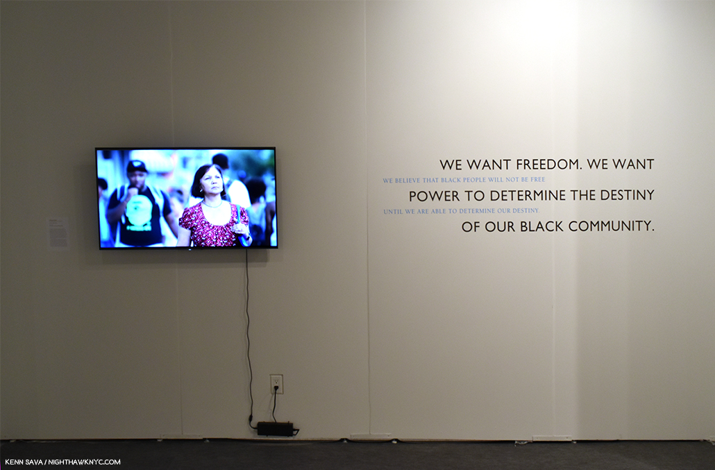
All Power Installation view with Carrie Mae Weems, People of a Darker Hue, video, left, quotes from the Black Panther Party Platform and Program, right.

KS- At the risk of asking you to choose among your children, which books that you’ve published are you particularly fond of, or wish more people knew about?

MDM- Oh, I love them all, so much! You knew I wouldn’t answer that. I’ve been very verbose elsewhere so it’s good to be silent here.

KS- Since you mentioned freeing up some time for yourself, what “else” do you enjoy?

MDM- That’s a work in progress—The Highline Heritage Museum, nearby where I live, has asked to do an exhibition about me through the photographs I live with, which is stirring up all sorts of challenges. How do I sum up the last 25 years in 10–15 photographs? The exhibit is scheduled to open in June so I won’t be struggling with that too much longer.

In New York, I like to walk, to see the light bounce off buildings, to eat at my favorite haunts, see my friends, and take in the energy. In Seattle, I am caretaker to two old cars (the 1950 is mine, the 1968 is my sister’s) that I drive as often as possible in the summertime. I am also trying to bring the next generation into contact with those old beasts so they can learn to love them, too.

I still read books with words instead of photographs, and would like to do some writing about my family’s histories, which I find fascinating (though I might be an audience of one). What else? Music, good food. If I write much longer I’ll be back to talking about books or photographs…..
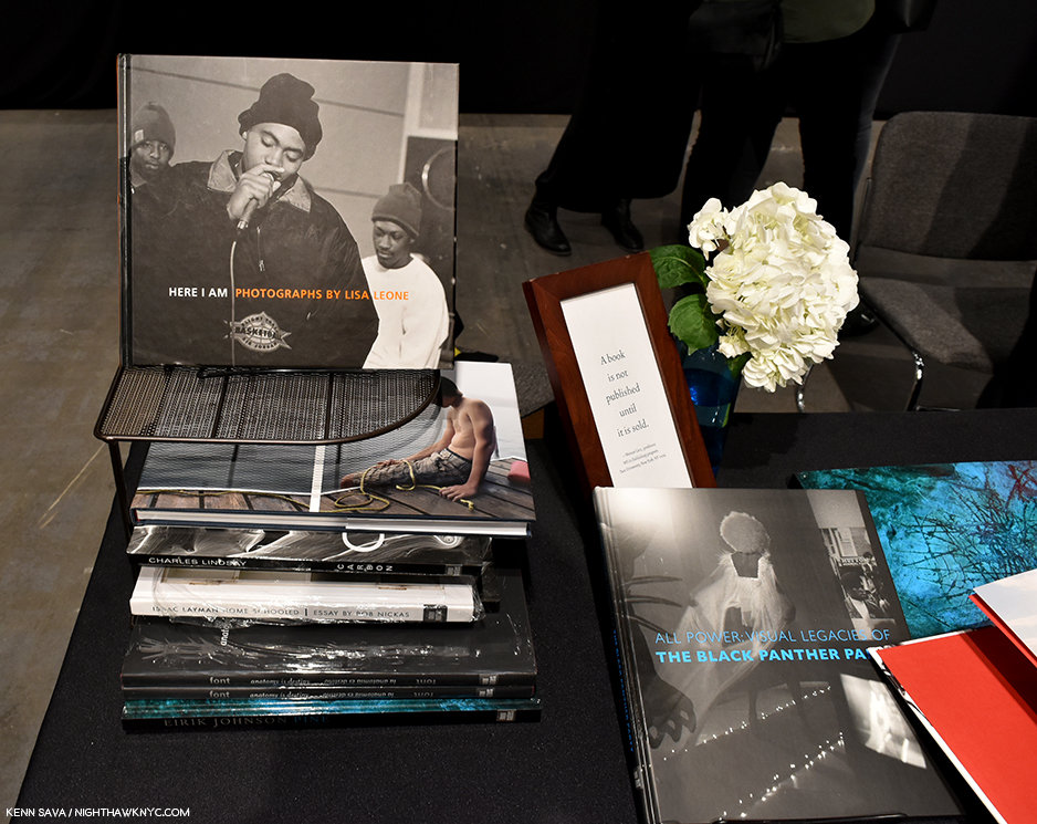
The sign reads “A book is not published until it is sold,” a quote from Professor Werner Linz of Pace University,

——–Q&A Ends——-

Minor Matters represents a breakthrough in a publishing business model that I think we will see more and more companies copying (as some have already in the six years since it she founded it). Emulating a business plan is one thing others can do, benefitting from the experience and hard-earned wisdom of PhotoBook veterans, like Michelle Dun Marsh, who have been doing it for multiple decades. But, to be successful, it seems to me, requires an element that cannot be copied- the taste, vision and eye of a leader who knows, who sees a project in its formative stages and has the experience, the skills, and the talent to see it through to becoming the best book it can be.

The companies consistently producing the best PhotoBooks each have one. Minor Matters has Michelle Dunn Marsh.
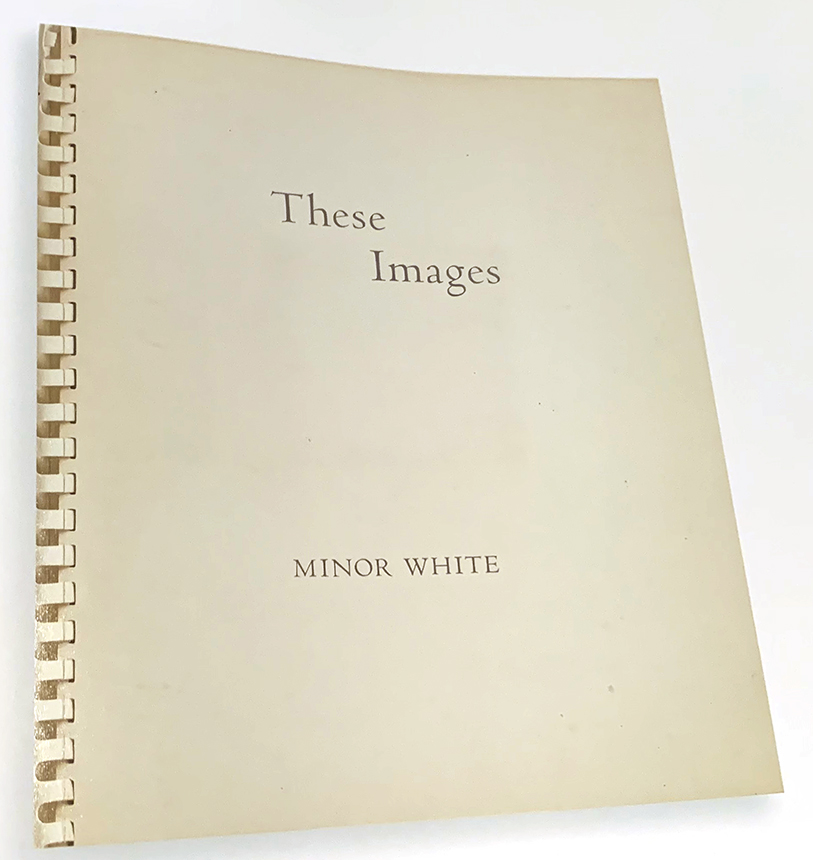
Influence casts an endless shadow. Minor White, These Images, 1950, from The Time Between: The Sequences of Minor White.

The next time Michelle and Minor Matters “sling pictures” your way, don’t duck- take them in. In the meantime, she’s building quite a legacy that’s becoming major, one that might make even Minor White, smile with pride.


BookMarks-

It’s hard to go wrong choosing among Minor Matters releases. Their catalog is full of quality, and the unexpected, showing a range that might make you wonder if one company published ALL of these books. Right there, in a nutshell, is why Minor Matters is a company to keep your eye on, pay attention to, and consider each one of their releases, like I do.

While you’re at it, why not become a co-publisher of one yourself?  In addition to getting a copy, if you pre-order your name will be printed as a co-publisher in the book! What better way is there of showing that your support matters? More information on doing just that is here.

A spread from Rolling Stones, 1972, *courtesy of Minor Matters.

*- Soundtrack for this Post is “How Can I Stop,” by the Rolling Stones. “How could I stop once I start.”

My thanks to Marina Font, Kris Graves, Margery Newman, and Michelle Dunn Marsh. 

NighthawkNYC.com has been entirely self-funded and ad-free for over 6 years, during which over 250 full length pieces have been published. If you’ve found it worthwhile, you can donate to keep it going & ad-free below. Thank you!

Written & photographed by Kenn Sava for nighthawknyc.com unless otherwise credited.
To send comments, thoughts, feedback or propositions click here.
Click the white box on the upper right for the archives or to search them.
For “short takes” and additional pictures, follow @nighthawk_nyc on Instagram.

Subscribe to be notified of new Posts below. Your information will be used for no other purpose.


  1. //pcnw.org/about-us/who-we-are/

At The Photography Show, 2019: The PhotoBook Publishers

Written & Photographed by Kenn Sava

PhotoBooks are a phenomenom.

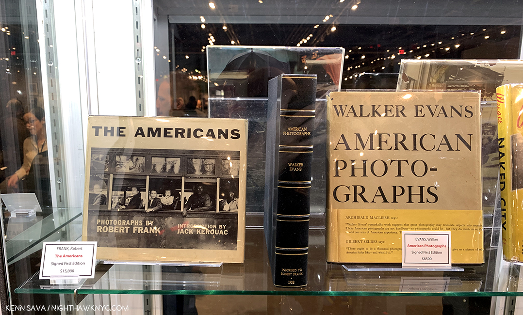
The twin “holy grails” of American PhotoBooks. Signed first edition copies of Walker Evans’s American Photographs and Robert Frank’s The Americans. I knelt in silent homage for a few moments to center myself before venturing into the rest of the PhotoBook area. Seen at Harper’s Books. Many editions later? Both books are still in print.

As documented by Gerry Badger’s and Martin Parr in their The PhotoBook: A History (three volumes), or Andrew Roth in his The Book of 101 Books, a truly great PhotoBook is akin to a great album (Lp or CD), a great Film, even a great Novel. It took Walker Evans’ American Photographs, 1938, and then Robert Frank’s The Americans (published in France in 1958, the USA in 1959) to realize and reveal to many, particularly to other Photographers,  the infinite possibilities of the PhotoBook at its finest1, to turn it into a medium of expression, an Artform in itself. Echoes of their work reverberated throughout the Publishers and Organizations area of AIPAD.

Since Mr. Frank’s The Americans,  the PhotoBook has seemed to increasingly strike a chord in Photographers, book buyers, lovers of Photography and even the general public, to the point that most big bookstores now have a Photography/PhotoBook section that may even rival their Art section. There are stores that carry nothing but PhotoBooks here and dotted all over the world (I have bought from many of them). In an age when digital media seems to be usurping and replacing everything that’s come before, not one major PhotoBook publisher has abandoned physical books (and only a few also release eBooks)!

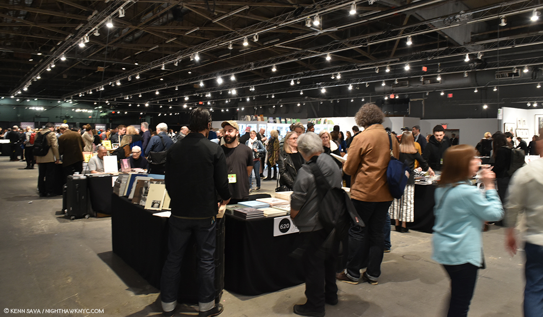
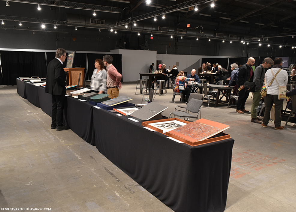
I love the smell of freshly printed PhotoBooks in the late afternoon. A view of the popular Publishers and Photo Organizations section of AIPAD, in its new location. Renowned indie TBW Books’ table is closest to my camera.

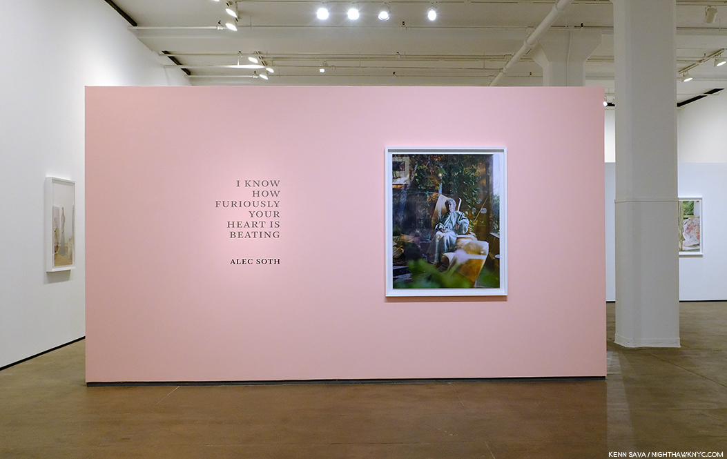
There’s some debate about whether Photographs are seen better on the walls of galleries and museums or in a PhotoBook. Interestingly, during his conversation at Sean Kelly on April 4th (while AIPAD was going on), Alec Soth referred to there being “book Photographers and wall Photographers.” He then said that he sees himself as a “book Photographer.”

“Book Photographer” Alec Soth’s show I know How Furiously Your Heart Is Beating of work from his new book of the same name seen up on the walls of Sean Kelly Galley. simultaneously with AIPAD, about 20 blocks south.

At AIPAD, you could walk through the galleries and then look through some PhotoBooks by many of the same Photographers to decide which you prefer for yourself. (By the way, Part 1 of my AIPAD coverage, focusing on the galleries, may be seen following this part, or here.) I see points on both sides and so I haven’t made up my mind. (Do I have to?) However, I will point out one thing that doesn’t help- as you can see in virtually every piece I’ve done on a Photography show, glare is a continual problem in both museums and galleries. What’s not debatable is that PhotoBooks provide countless Photographers a way to have their work seen- and for most of them, it’s the ONLY way their work will be seen. Getting gallery representation is a dream for many Photographers I’ve spoken to the past 2 years. It reminds me of my days in Music, when most Musicians I knew dreamt of getting a record deal. The few who did wound up in debt from having to pay back all monies spent on their behalf by the record company when their records failed to sell as many copies as they’d also dreamed. Be careful what you wish for might have been the takeaway from that experience. Later, as an independent record producer, I found myself in a position not unlike that of many of the PhotoBook publishers I meet and saw at AIPAD- independents who own and run businesses which require the laying out of sizable sums of money on their part to produce a book, who then work hard to sell it in hopes of breaking even and being able to make their next book. And yes, “breaking even” is the term I heard most often from those involved when the subject turned to the economics of publishing.

The Publishers were moved behind the galleries this year.

The big news this year for this group was their repositioning. Last year, they were in the front of the southern side of Pier 94. This year, they were in the back, directly behind the galleries and in front of a food section and seating. This meant you had to walk through the galleries to get to the book section.  It allowed for more space around each table, which made it easier for visitors to peruse the items on the tables. I asked a good number of the publishers how they felt about the change and the new location and the consensus was mixed.

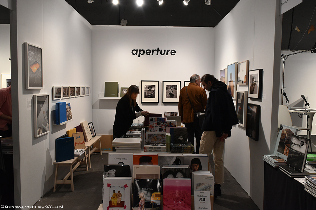
Aperture’s booth was run by Director of Sales and Marketing Kellie McLaughlin, left, who was on hand for the entire show, while her terrific show, Aperture Photographs, tracing 50 years of Aperture’s print program, was up in their 27th Street gallery, a mecca in NYC Photography.

Straddling the line, in more ways than one, between the galleries, the publishers, as well as Photographers, was the legendary Aperture Foundation, founded in 1952, one of the most important and respected Photography organizations in the world. They provide support to Photographers in all phases of their careers, which extends into their gallery careers. For these reasons, Aperture’s presence at AIPAD is essential, in my view. They were back and their booth was located between the gallery and publisher areas, featuring books, prints and special editions, with their Director of Sales and Marketing, Kellie McLaughlin on hand all five days. If you have any PhotoBooks in your space, the odds are high you have at least one Aperture book among them.

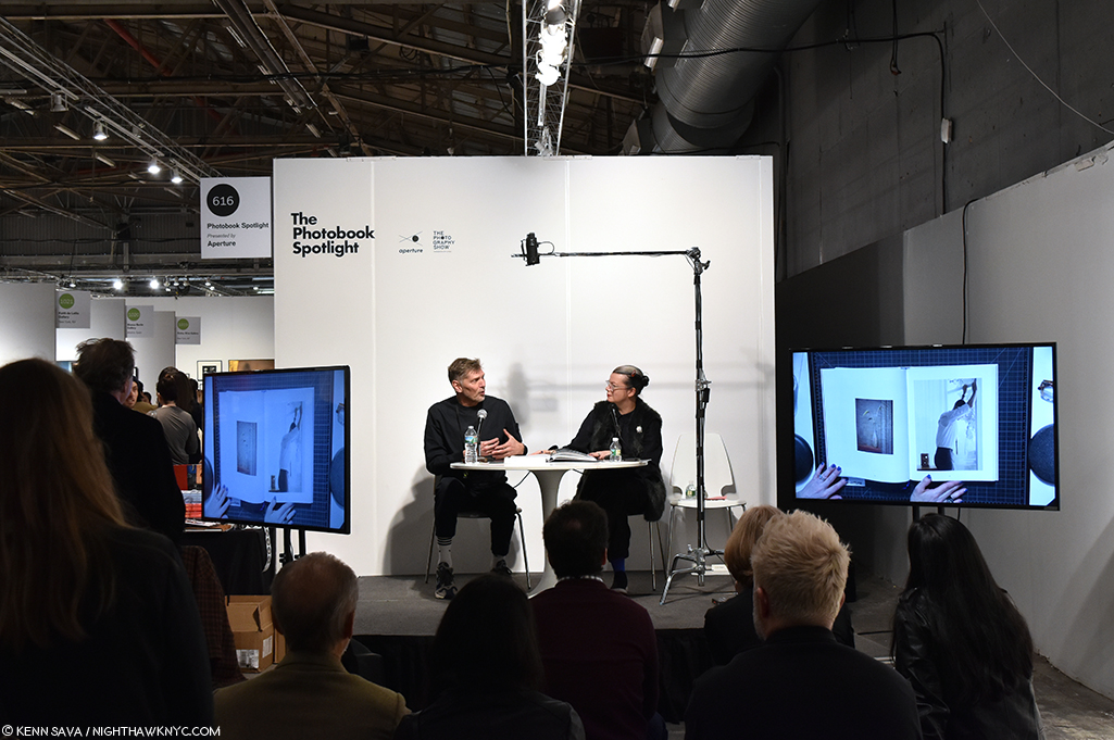
Lesley A. Martin, right, one of the most well-known editors in Photography hosts Aperture’s popular PhotoBook Spotlight.

Meanwhile, Aperture’s Lesley A. Martin, the well known editor and publisher of the PhotoBook Review, hosted the popular PhotoBook Spotlight in the adjoining space.

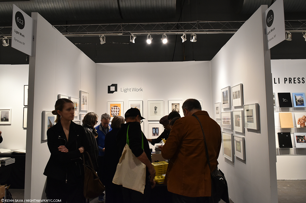
Light Work packs em in.

Near Aperture was Light Work, from Syracuse, NY, another important Photo organization who boasts a staggering list of the Photographers who have done residences at the non-profit since 1973 that includes Cindy Sherman, Magnum Photo’s Matt Black and Gregory Halpern, Anthony Hernandez, Deana Lawson, Christian Patterson, Lucas Foglia, Carrie Mae Weems, and the “star” of AIPAD, 2019, Dawoud Bey, among hundreds of others.

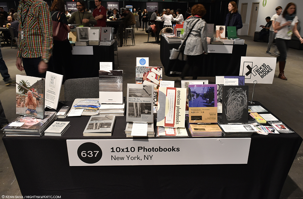
10×10 PhotoBooks is another non-profit dedicated to fostering engagement with and among the global PhotoBook community. They also publish fine books of their own, including 10×10 Japanese PhotoBooks, which I have my eye on.

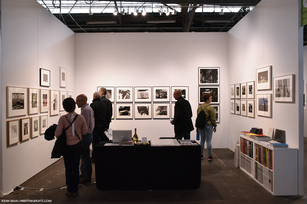
While non-profits Aperture and Light Work both featured books and prints, among the businesses, perhaps no presenter attending this year’s AIPAD straddled the line between gallery and publisher more evenly than Only-photography, of Berlin, Germany, run by Roland Angst.

Only-photography’s Roland Angst, to the right of center, in his firm’s booth surrounded by classic Photographs and state of the art books, right.

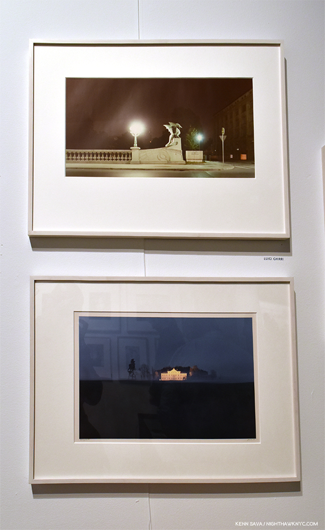
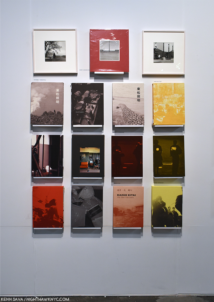
In the gallery section, where Only-photography was situated, Mr. Angst’s firm showed off a terrific range of first rate, even historic, PhotoBooks, AND a stunning selection of original prints by the likes of Luigi Ghirri(!), and rare, vintage portfolios by Daido Moriyama and Issei Suda, who, sadly, passed away barely a month earlier, on March 7th, 2019, one month short of his 80th birthday.

The real deal. These original, signed prints by Luigi Ghirri which stopped me in my tracks at Only-photography, were among the highlights of the entire show.

Only-photography is the only publisher known to me who have signed & numbered copies of books by Ray K. Metzker, who passed away in 2014, and Mr. Suda still available (Hurry!). At AIPAD, they debuted their newest book, the beautiful America Revisited, by the esteemed Swedish Photographer Gerry Johansson, in a signed & limited edition of 500 copies.

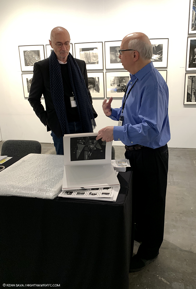
Roland Angst, left, shows Ray K. Metzker Unknown to legendary gallerist, Laurence Miller, Mr. Metzker’s friend, dealer for two decades, and one the leading authorities on the work of Ray K. Metzker.

Mr. Angst also proudly showed off his new Ray K. Metzker Unknown, released in 333 numbered copies containing images selected by Mr. Angst that appeared to be moving briskly. (My recent look at Ray K. Metzker at Howard Greenberg Gallery is here.)

A wall of Only-photography’s exceedingly collectible books includes titles that are already rising in price.

All the other publishers were in the Publishers and Photo Organizations section.

34 publishers or organizations were on hand this year, down slightly from last year, but that was impossible to tell without a head count as the new space around each table made the area, in total, feel very big. The main complaint I heard were from those with tables near the back of this space, feeling that they received less visitors than those closer to the front, though steady traffic headed to the back to the food area right behind.

The back row of the PhotoBook area.

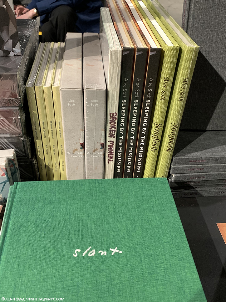
I witnessed the back tables being “less busy” repeatedly over the 5 days I was there. However, MACK Books was positioned near the back row and their space was continually busy. Then again? For my money, MACK’s recent offerings may be pushing the company to #1 in the world right now. (At least among those books that continually, actually, get released in the USA.) Apparently, a good many others agree, and made a point of stopping by their table. They were rewarded with surprises! Shockingly, among the recent releases on display were copies of Per Strada by Guido Guidi and The Castle by Richard Mosse, both sold out and currently commanding 200% markups on the aftermarket. Also tucked in the display were two out of print books by Alec Soth, including a SEALED COPY of the extremely rare Open Manual, the first time I’ve seen a copy in person. (MACK’s asking price? US$2,000.00. Their copy does not include the hollowed out old book),.

Look! It’s an extremely rare copy of Alec Soth’s classic Broken Manual hiding between copies of the also out of print Gathered Leaves, at MACK.

Right next to it were two copies of his wonderful compilation Gathered Leaves, which has been out of print a few years now. MACK super-staffer Morgan Crowcroft-Brown smiled when she replied to my shock saying they were from “MACK’s secret vault,” and smiled, again, when I asked if I could visit it. The two vintage Alec Soth titles were right next to signed copies of Mr. Soth’s brand new MACK release, I Know How Furiously Your Heart Is Beating, all of which had disappeared the very next time I looked.

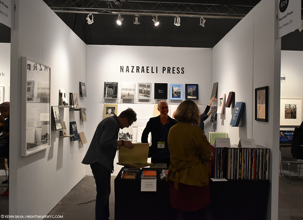
Chris Pichler, founder and publisher of the renowned Nazraeli Press, one of the leading independent publishers since 1989 was on hand to meet customers and answer enquiries.

Due to the finances involved, most PhotoBooks are printed in very small editions- 1,000 copies of any given book is a lot, and most books printed in editions of that size and larger are left to the bigger publishers, who have the best distribution, to produce. Smaller companies may make 300-500 copies of a book (often less), quickly sell out of it and immediately move on to their next project. You have to be quick if you want to get one of these, and AIPAD is part of a network of book fairs around the world during the year that provide a primary means of keeping up to date with the latest releases. For NYC, the Publishers and Photo Organizations section of AIPAD is the best opportunity all year long in the City to see the largest number of PhotoBook publishers and their wares in one place2

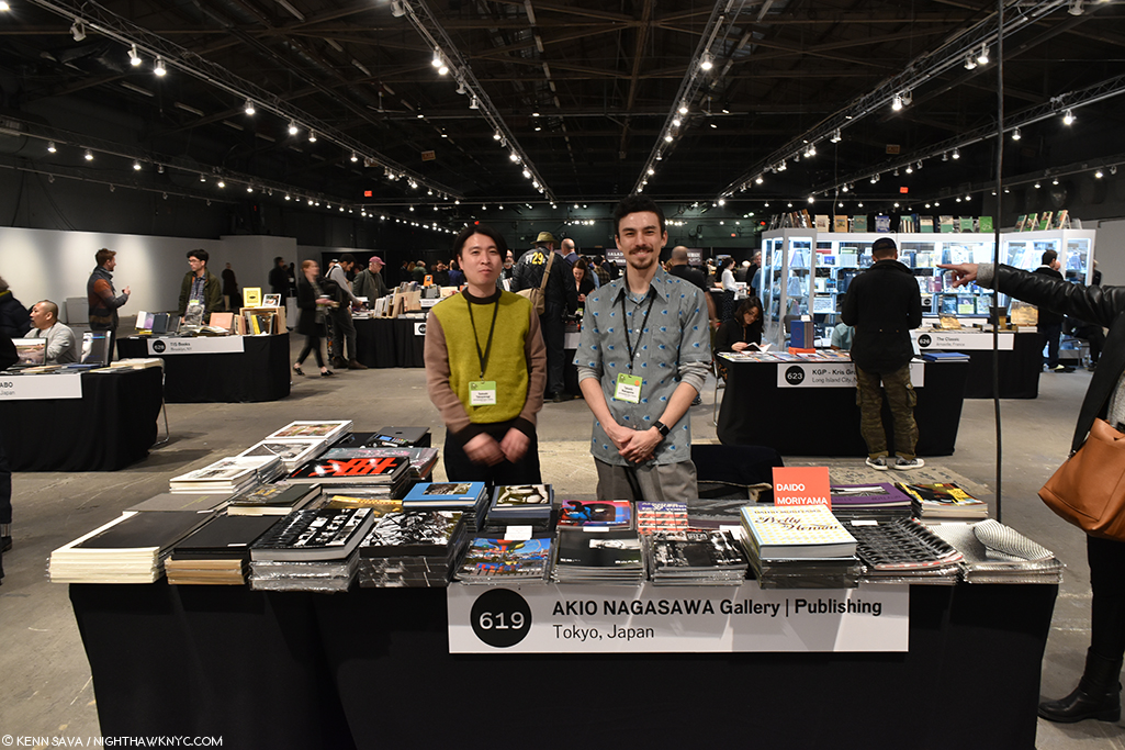
“These guys,” the gent belonging to the arm on the right was saying as I shot this picture of Satoshi, left, and Takashi, of Akio Nagasawa, one of the leading contemporary Japanese Photobook publishers who have a longstanding, close relationship with the legendary Daido Moriyama, among many others.

Many familiar faces from the first two years of the publisher participation in AIAPD returned in 2019, led by big names Germany’s legendary Steidl, D.A.P., and MACK Books, London,  along with Damiani, Nazraeli Press and TBW Books, among the leading independents, renowned Japanese publisher Akio Nagasawa, as well as TIS Books, Yoffy Press, Minor Matters, Kris Graves Projects, Converyor Editions and Japan’s Super Labo. There was so much to see in the Book Dealers, Publishers, and Photography-Related Organizations, I spent about half of my time over my 5 days here, resulting in their own piece in my coverage of AIPAD, 2019.

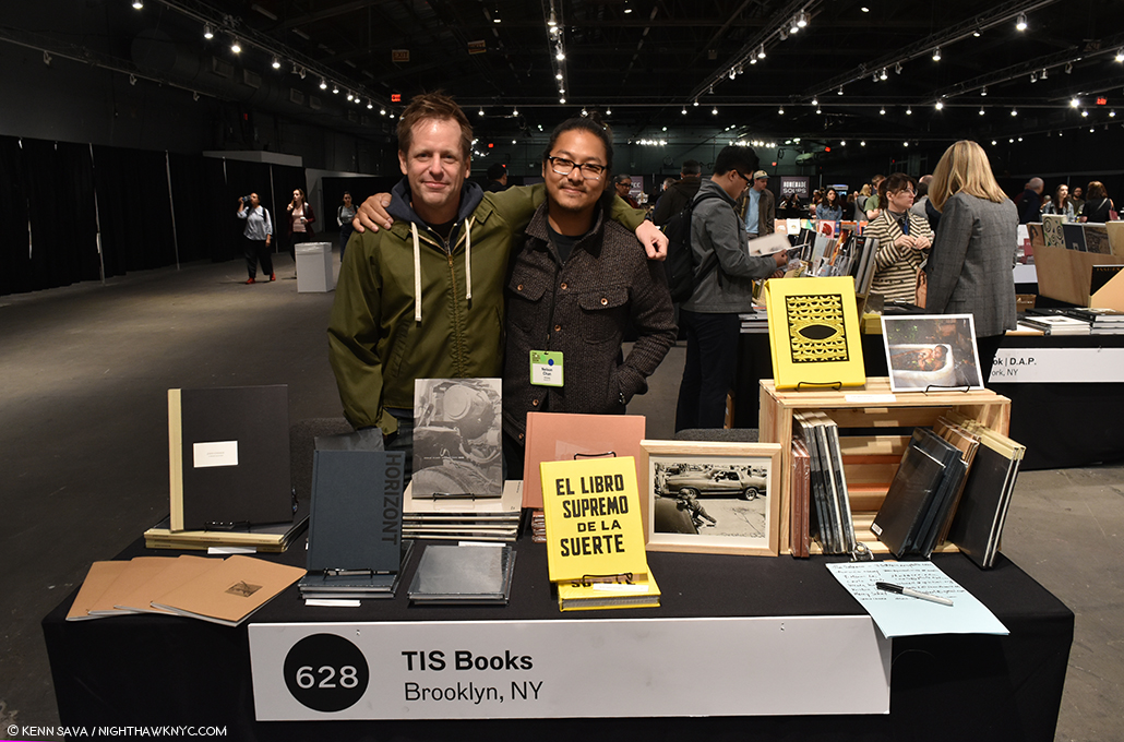
Keep your eye on TIS Books. Co-Publishers & fine Artists in their own rights, Tim Carpenter, left and Nelson Chan, have gotten off to a most auspicious start, which includes books of their work and Rose Marie Cromwell’s El Libro Supremo De La Suerte, a sensation which made my NoteWorthy PhotoBooks, 2018 list . Both Messers Carpenter & Chan also have wonderful books in the new LOST II, seen below.

Any number of Photographers made appearances, once again, at publisher tables supporting and signing their recent and brand new releases. Along with that, company principles were actually on hand during some or all of the run of the show! These included Michael Mack of MACK Books, Michelle Dunn Marsh founder of Minor Matters, Paul Schiek and Lester Rosso, heads of TBW Books, Monika Condrea, Head of Business Development and Communications of Steidl, Nelson Chan and Tim Carpenter of TIS Books and Kris Graves of Kris Graves Projects, providing a unique opportunity to “talk to the boss,” make a pitch, get firsthand backstories, or give product feedback.

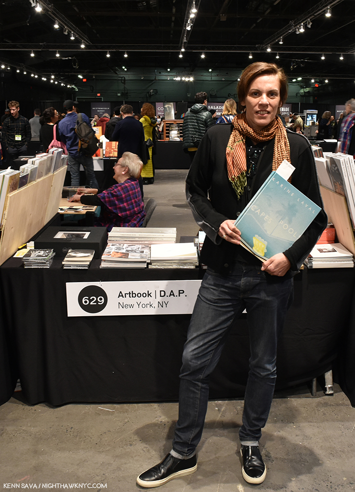
Karine Laval holds a freshly signed copy of her first PhotoBook, Poolscapes, which presents her decade long study of pools in the USA and Europe, revealing their abstract and representational possibilities in a uniquely difused, vibrant palette, and published by no less than Steidl on April 5th.

Among the Photographers I saw signing books in this area were Karine Laval, at Steidl, Marina Font at Minor Matters,  Louie Palu at Joffy Press, Jules Slutsky, Zun Lee, Nelson Chan, Tim Carpenter and Kris Graves signing their books from LOST II and Mikhail Mishin, signing Endless Bridge all at Kris Graves Projects. There were numerous signings at MACK and others at Steidl that I missed.

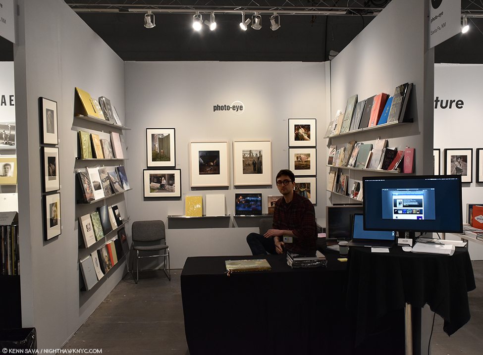
Carlo Brady of Photo-eye, Santa Fe, NM, who brought a very nice selection of both new and limited edition books, and also hosted book signings. They had a second booth where they showed prints by Reuben Wu.

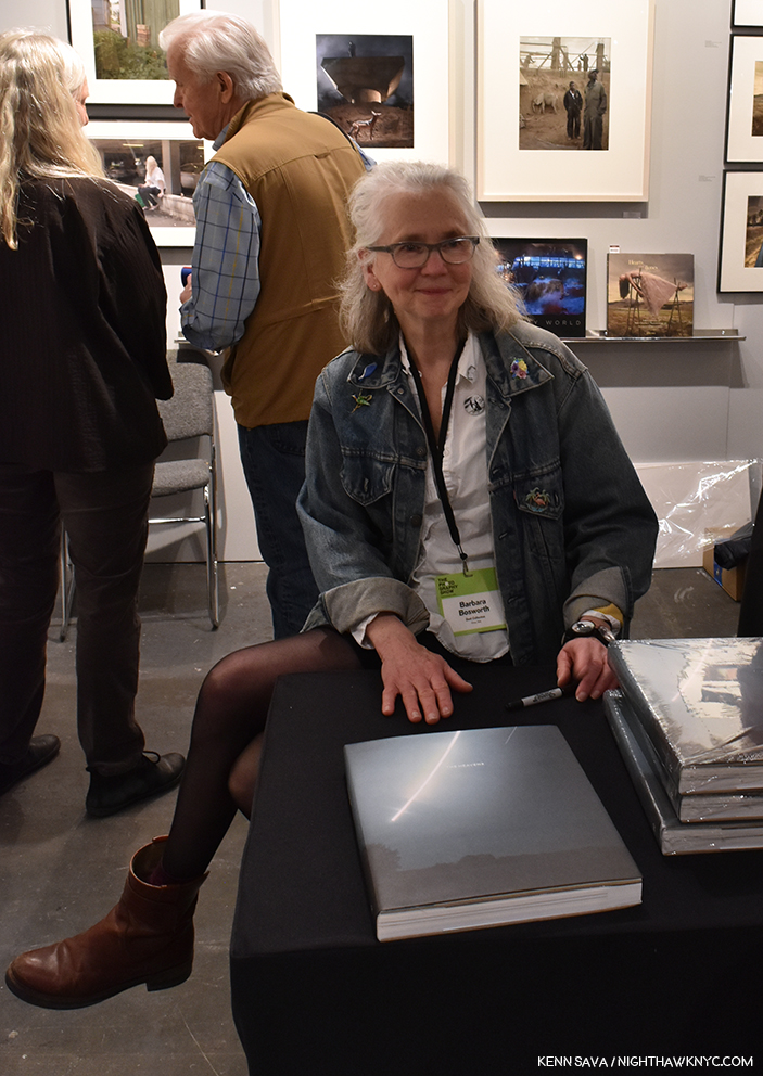
Barbara Bosworth proudly signs her majestic new PhotoBook The Heavens at Photo-eye on April 6th. I was lucky to pick up a copy of her wonderful Moonlight, for Rosemary, which also features her ethereal skyscapes.

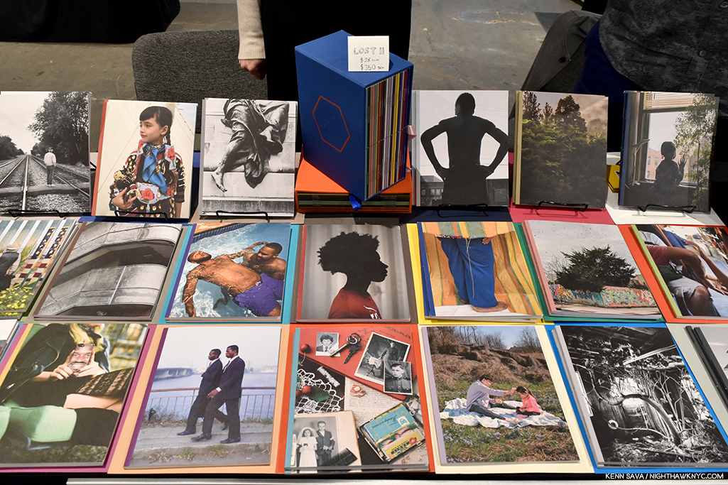
In a space with so many very good books to consider, a few new ones stood out to me. Among the especially NoteWorthy PhotoBooks I saw, the highlight for me was finally getting to see the actual, physical, 20 volumes of Kris Graves Projects LOST II, after having written about it at length while it was in production, the first time I’ve ever written about books I hadn’t actually seen.

THE highlight of the new PhotoBook releases at AIPAD, 2019 was the debut of LOST II, the 20 volume set(!) published by Kris Graves Projects, almost all of it is seen here, along with its spiffy slipcase.

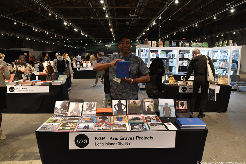
Having called the set “monumental,” I uttered an audible sigh of relief when the actual books impressed me every bit as much as the previews I’d seen. At this point? I strongly feel it’s a landmark set for KGP, and I believe it’s going to be the most highly sought after publication KGP has yet released, one that will be trading for multiples of the $350.00 issue price in no time, given only 60 complete sets are being released. Also, if you are interested in the individual volumes? Fewer than 100 copies of each will be available, and after the five days of AIPAD AND the three days of the LA Art Book Fair the week after? I doubt many remain.

Publisher & Photographer Kris Graves proudly holds a slipcased complete set of the 20 volumes of LOST II. Get a good look at it now because with only 60 sets published? You will rarely see it in the future.

Joffy Press got my attention with two new and recent books by documentary Photographer and Filmmaker Louie Palu, Front Towards Enemy and A Field Guide to Asbestos, two of the most intense and important new books I saw at AIPAD. Both books also stood out for their unique conceptions and production. Mr. Palu was on hand over parts of 2 days to talk about his book and sign copies, and he cordially agreed to answer some questions for me about them. So, I’m thrilled to say that Mr. Palu will be featured in my AIPAD Discovery piece for 2019, along with an AIPAD Focus feature piece on Michelle Dunn Marsh, founder of Minor Matters publishing company, and the woman who curated the All Power: Visual Legacies if the Black Panther Party special exhibition at AIPAD in 2018! Ms. Marsh is a lady who has worn many hats in Photography and PhotoBook publishing over her 20+ year career and is one of those I continually look to for what’s new in Photography. I’ve been wanting to write about her for over a years, so I’m thrilled to be able to bring her to NHNYC readers shortly!

Among other NoteWorthy new releases I saw, TBW Books, Oakland, debuted the new book, Arena, by Jeff Mermelstein, a large book that documents the first 350 events taking place at Brooklyn’s Barclays Center and Steidl previewed the new collaboration by Teju Cole and Fazal Sheikh titled Human Archipelago.

Books were included in some of the gallery spaces, as I touched on in my gallery piece. Danny Lyon signed at Etherton Gallery’s booth and Ryan Vizzions signed his new book, NO SPIRITUAL SURRENDER- A Dedication to the Standing Rock Movement at Monroe Gallery. While Mr. Lyon’s books are well known to PhotoBook lovers, I will mention, again, that Ryan Vizzions’ book is particularly NoteWorthy and one to be sought out while copies are available. In his book, Mr. Vizzions Photos are paired with texts written by 6 women of the Oceti Sakowin, who were the first organizers of the movement, adding a depth that no writer who wasn’t there could achieve.

Once again, the Publishers and Photo Organizations section of AIPAD proved to be a must-see section for all the reasons I’ve touched on. Beyond the extremely varied and essential work the Organizations do, PhotoBooks provide an essential compliment to and extension of the galleries, (some of who are involved in the publication of catalogues and monographs on the Photographers they represent and show), enhancing and adding to the images hanging on their walls. When you add in all the other Photographers who don’t currently have gallery representation that appear in PhotoBooks, they also serve to complete a picture of what’s going on in Modern & Contemporary Photography today.

Therefore, the gallery section and the Publishers and Photo Organizations sections of AIPAD work together in ways that, it seems to me, benefits both of them.

*- Soundtrack for this Post is “Photograph” by Ed Sheehan.

As I did in 2017 and 2018, I’m pleased to present extensive coverage of The Photography Show, 2019, aka AIPAD. This is part 2 of my coverage of the 2019 show. Part 1, which focuses on the galleries, is here. Two to three more parts are coming. Stay tuned!

My thanks to all the Photographers, publishers and galleries who appear in this Post, and to Monika Condrea and Margery Newman for their assistance. 

NighthawkNYC.com has been entirely self-funded and ad-free for over 6 years, during which over 250 full length pieces have been published. If you’ve found it worthwhile, you can donate to keep it going & ad-free below. Thank you!

Written & photographed by Kenn Sava for nighthawknyc.com unless otherwise credited.
To send comments, thoughts, feedback or propositions click here.
Click the white box on the upper right for the archives or to search them.
For “short takes” and additional pictures, follow @nighthawk_nyc on Instagram.

Subscribe to be notified of new Posts below. Your information will be used for no other purpose.


  1. Yes, as Messers Badger, Parr and Roth point out there are other Americans as well as Photographers in other countries who have made PhotoBooks of the highest quality and importance.
  2. Printed Matter’s MoMA PS1 NY Art Book Fair is bigger but it is exactly that- it includes Art Books of all kinds, of which PhotoBooks are a relatively small part.

At The Photography Show, 2019: The Galleries

Written & Photographed by Kenn Sava (*unless otherwise credited)

I love The Photography Show.

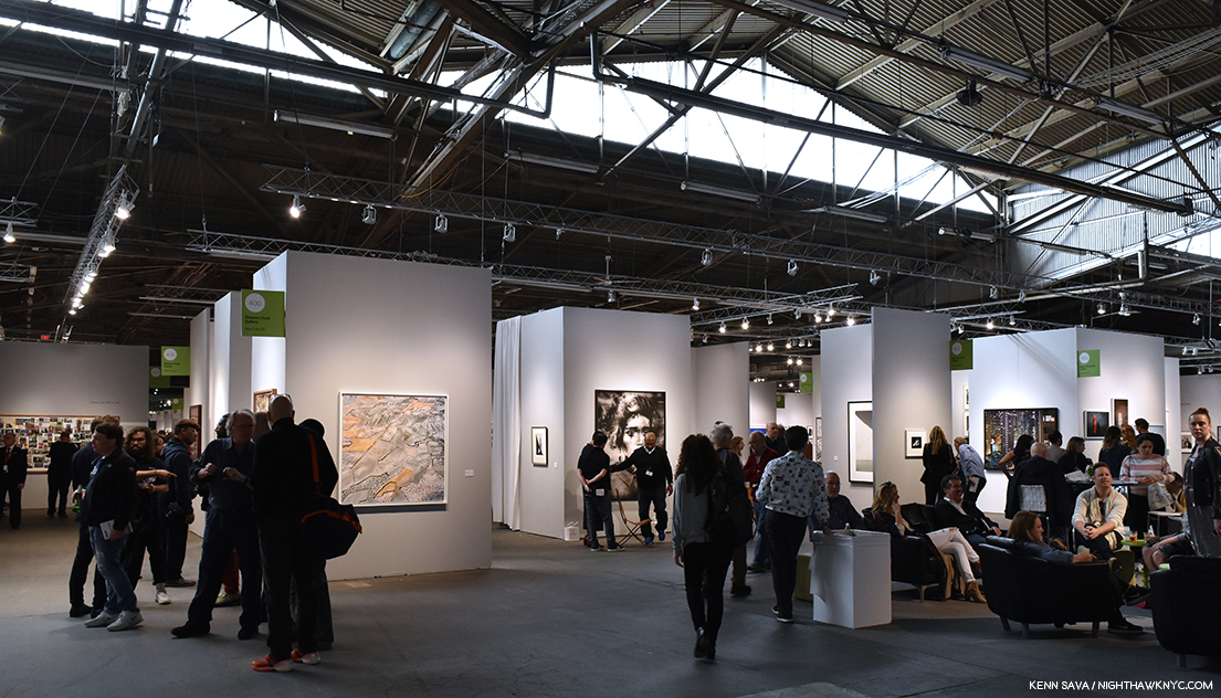
AIPAD, 2019, stretches as far as the eye can see- in all directions. There’s A LOT to see, and I’m here to see ALL of it. The view early Saturday afternoon, April 6, 2019. My thanks to DeShawn for his assistance with this shot. Click any picture for full size.

After all, the Association of International Photography Art Dealers, who present it, and I, have a core value in common- a passion for Fine Art Photography.

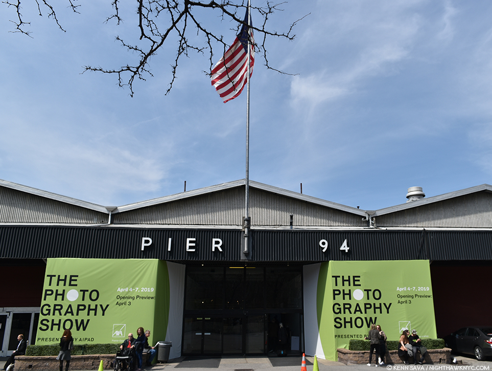
The Photography Show entrance at Pier 94 on the Hudson River, April 7, 2019.

More commonly referred to as AIPAD (as I will henceforth), the show is the only chance all year in NYC for a large segment of the Fine Art Photography world here, or able to get here, to get together. That alone makes it a must attend event for anyone involved in Photography, for anyone interested in seeing the widest range of Fine Art Photographs presented in one place at one time in town all year long, and for anyone looking for something to hang on their wall that they will want to keep looking at indefinitely.

And? AIPAD is so B I G, there really is something for every taste hanging inside Pier 94.

In 2019, the show was noticeably smaller, though, as you can see, it was still plenty large enough that it really required at least two visits to see all of it, and that’s not counting  the AIPAD Talks (which included Dawoud Bey, Sarah Greenough, Stephen Shore, and Harry Benson, separately, this year), Aperture’s Photobook Showcase, and various book signings and Photographer booth visits, which were ongoing over the weekend. If you wanted to take in some or all of those, too, attendance for the full five day run was the only way. Taking my own advice, over my five long days of attendance, I believe I saw all of it, though I was so busy with the gallery and PhotoBook areas I missed all the talks this year, much to my chagrin.

I love the smell of freshly hung Photographs in the morning.

For me, and I think for most other visitors, no matter how many Photographers you’re familiar with? You’re guaranteed to add a few new names to your list- and “new names” has nothing to do with their age.

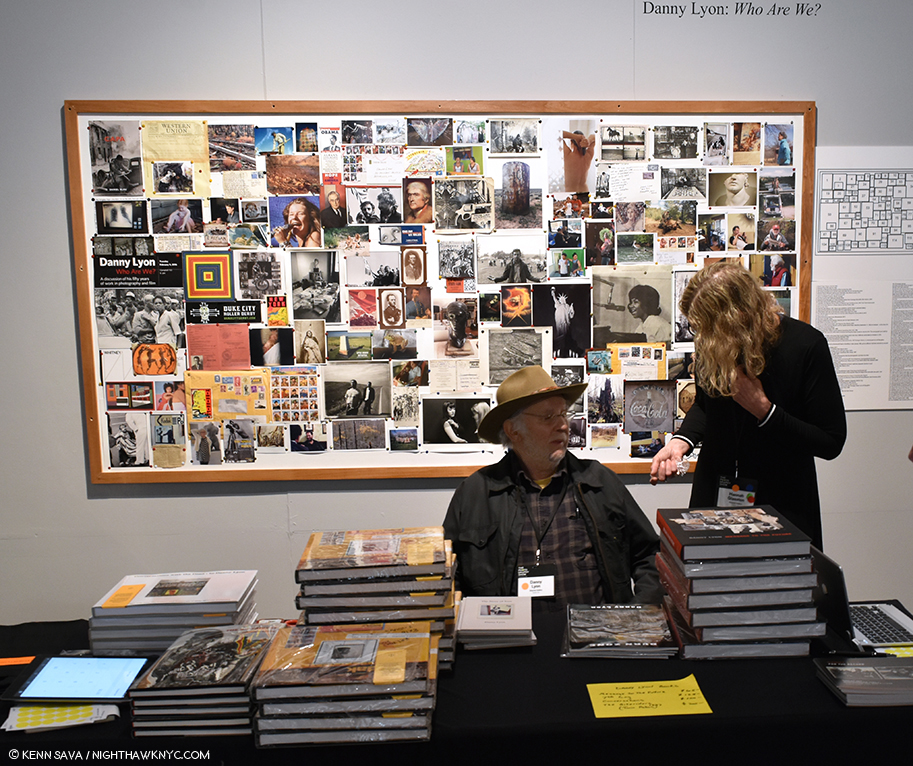
The legendary Danny Lyon, subject of a solo retrospective at The Whitney Museum in 2017, takes a break during his book signing on Saturday, April 6th at Etherton Gallery’s booth in front of a collage he created between 2016 and 2018.

Most of all? I love getting to see and meet Photographers. Maybe even get a book signed. After all? If it wasn’t for the Photographers? There’d be no show. 

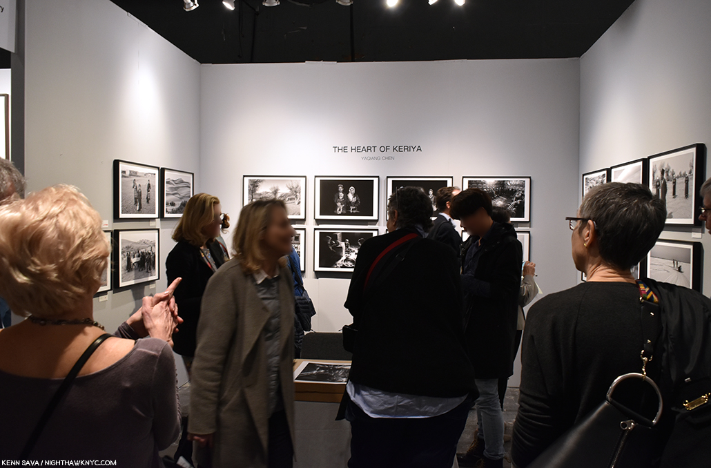
The closing day crowd at SoPhoto Gallery’s booth, who came all the way from Beijing, China, to show Yaqiang Chen.

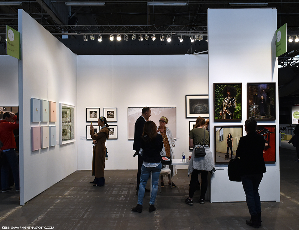
In the gallery booths, the range and variety of work on view was the best thing about the show. As I was in 2017 and 2018, I was most impressed by the displays of Photographers not as well known in NYC, or in the USA for that matter, as they are elsewhere shown by galleries who traveled long distances to attend, like SoPhoto and PeterFetterman Galleries.

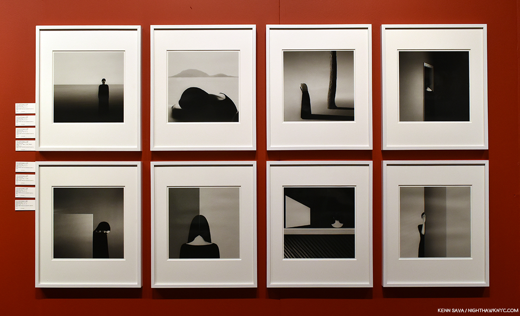
8 evocative Untitled works by Noell Oszvald, a Hungarian Photographer still in his 20’s, seen at Peter Fetterman Gallery, Santa Monica, CA.

Others paid homage to the host City with classic reminders of our Photographic past.

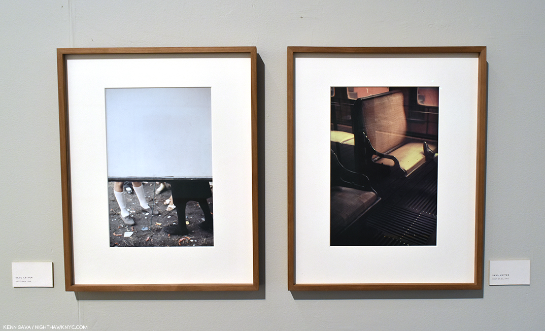
All the way from Munich, Germany, Galerie f5.6 brought beautiful and interesting work, as well as these two classic slices of vintage NYC from one of its favorite sons, Saul Leiter.

The NYC Galleries were also in the house, of course, and well represented by long standing big names like Laurence Miller Gallery-

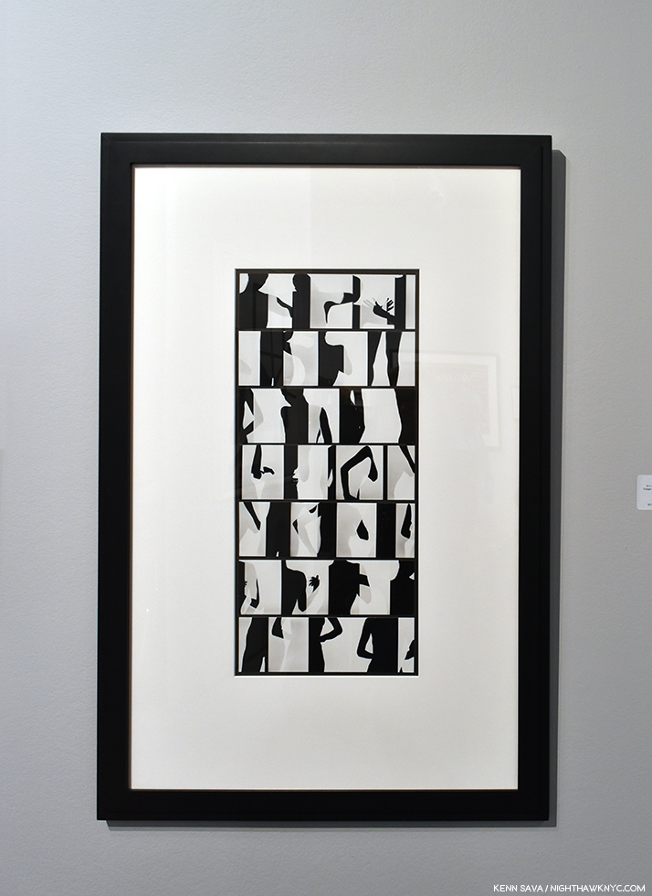
Ray K. Metzker’s extraordinary Nude, 1966-74, one of his legendary Composites highlighted his long time dealer, Laurence Miller Gallery’s, presentation.

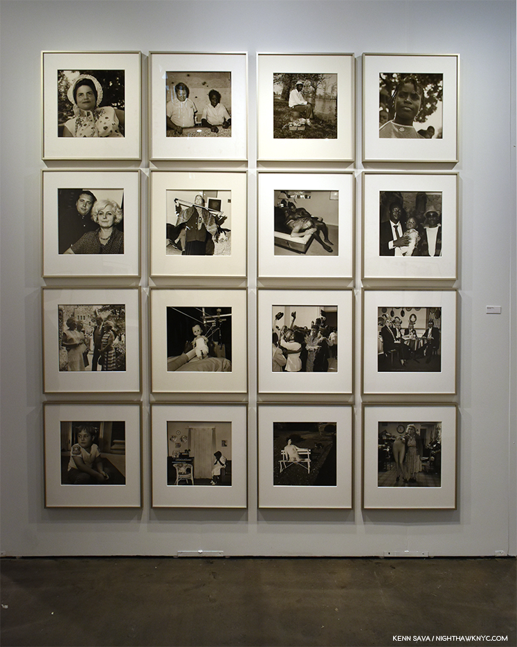
Howard Greenberg Gallery-

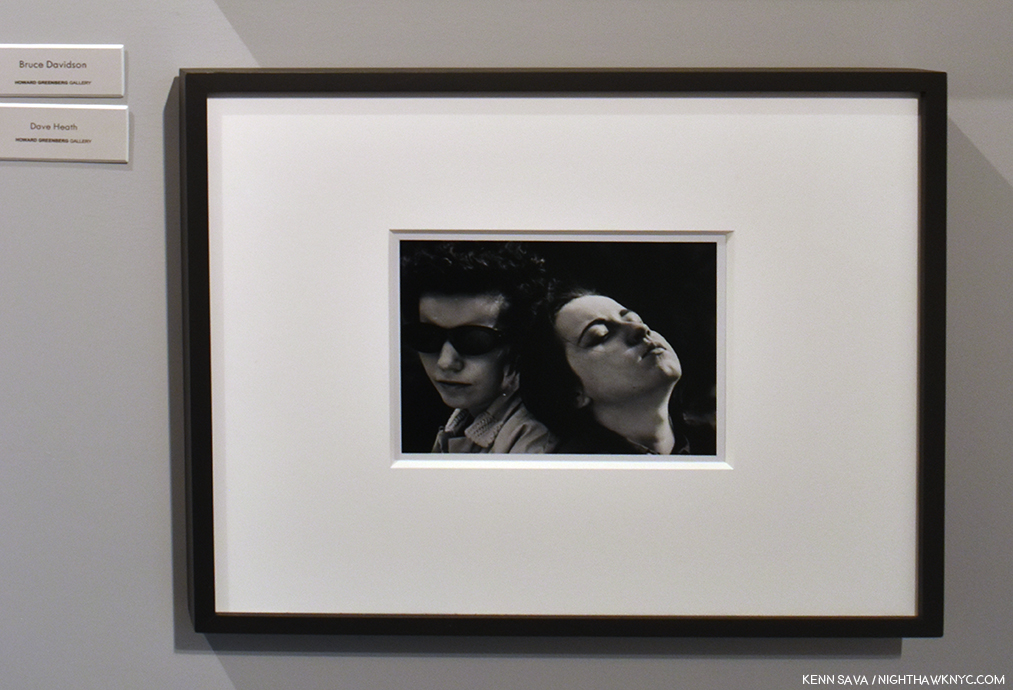
Dave Heath, a new discovery for me in 2019, who quickly became one of my favorites for his powerful, poingent portraits and his superb printing. Seen here at Howard Greenberg.

Edwynn Houk Gallery-

A gorgeous Sally Mann portrait, Virgina #42, 2004 flanked by The Trombone Player #6, 2018, by Paolo Ventura, left, and American Dream, Self-Portrait with Alex, 2018, by Erwin Olaf at NYC’s Edwynn Houk Gallery.

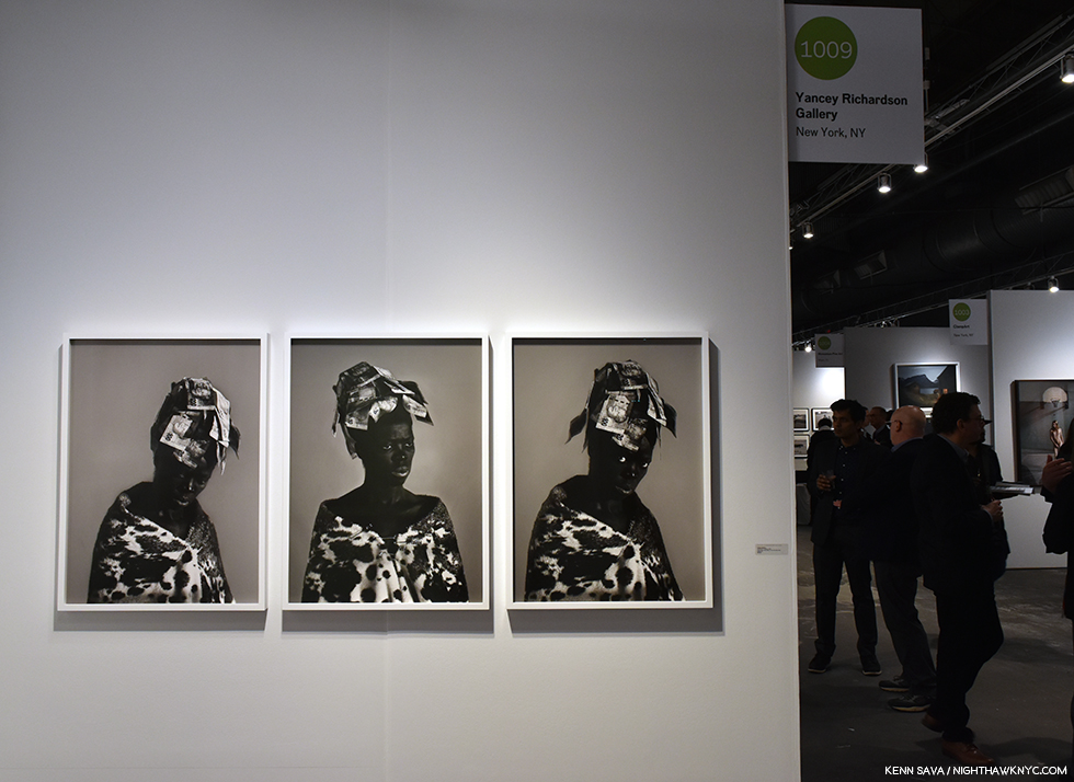
Yancey Richardson Gallery-

Zanele Muholi beautifully filled all of Yancey Richardson Gallery’s space.

Bruce Silverstein-

Rosalind Fox Solomon, Selected Photographs, 1975-2011, featuring a number of images from her recent MACK Book, Liberty Theater, which made my NoteWorthy PhotoBooks, 2018, list. Ms. Solomon and Dawoud Bey were announced as winners of the ICP 2019 Infinity Award in February. Seen at Bruce Silverstein.

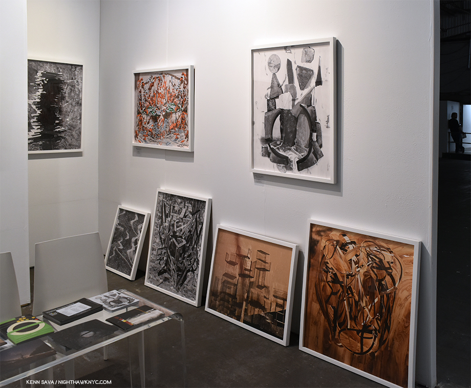
and newer names, including Elizabeth Houston Gallery-

Nico Krijno at Elizabeth Houson Gallery.

who displayed a fascinating group of pieces by the talented and versatile Nico Krijno.

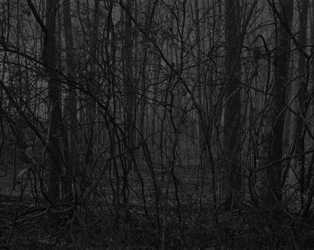
Dawoud Bey, Untitled #17 (Forest), from Night Coming Tenderly, Black, 2017, at, and *Photo courtesy of, Stephen Daiter Gallery

But, the consensus “hit” of the show, from all those I spoke with- Photographers, publishers, visitors and other gallerists, was undoubtedly the the work of Dawoud Bey shown by Stephen Daiter Gallery, Chicago. The group of new landscapes from his Night Coming Tenderly, Black, series based on an imagining of the flight of passage along the Underground Railroad, were singled out more than anything else on view by those I spoke with, and his group of four portraits dating from 1989-90 were almost as frequently mentioned. This continues the recent overdue attention given to this 40 year veteran Photographer’s work, along with the concurrent show at the Art Institute of Chicago of 25 works from Night Coming Tenderly, Black, and the February announcement of Mr. Bey as a recipient of the 2019 International Center of Photography Infinity Award.

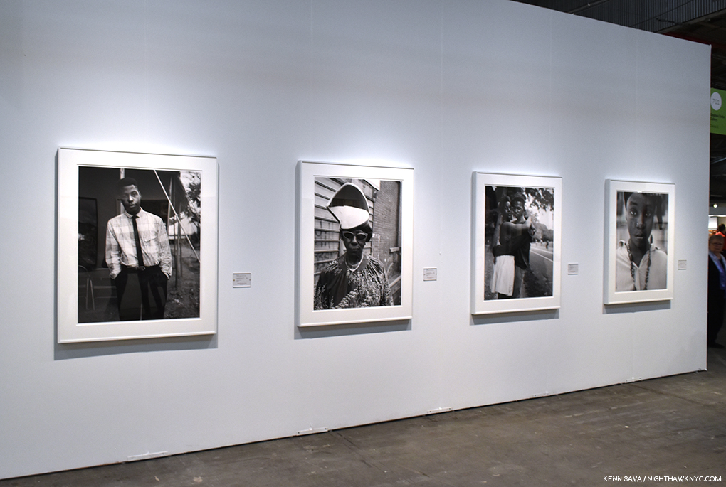
Portraits by Dawoud Bey, from left to right, Young Man at a Tent Revival, 1989, A Woman at Fulton Street and Washington Avenue, 1989, Couple in Prospect Park, 1990, and A Girl With A Kinfe Nosepin, 1990at Stephen Daiter Gallery

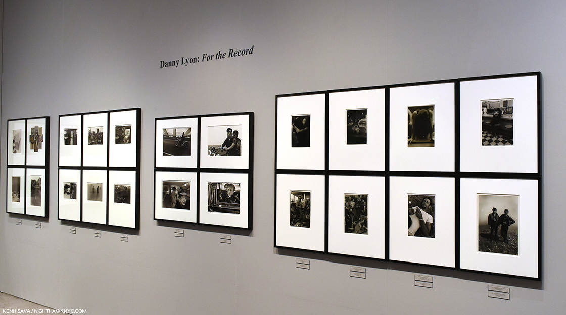
As mentioned earlier, Etherton Gallery devoted their main space to a mini-retrospective of the work of Danny Lyon, titled Danny Lyon: For the Record. 

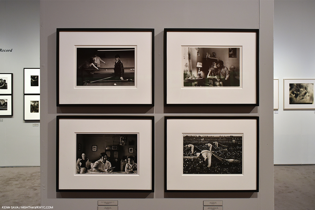
On view were works from all of his most well-known series, The Bikeriders and Conversations With the Dead, and The Destruction of Lower Manhattan.

Along side others not as well-known

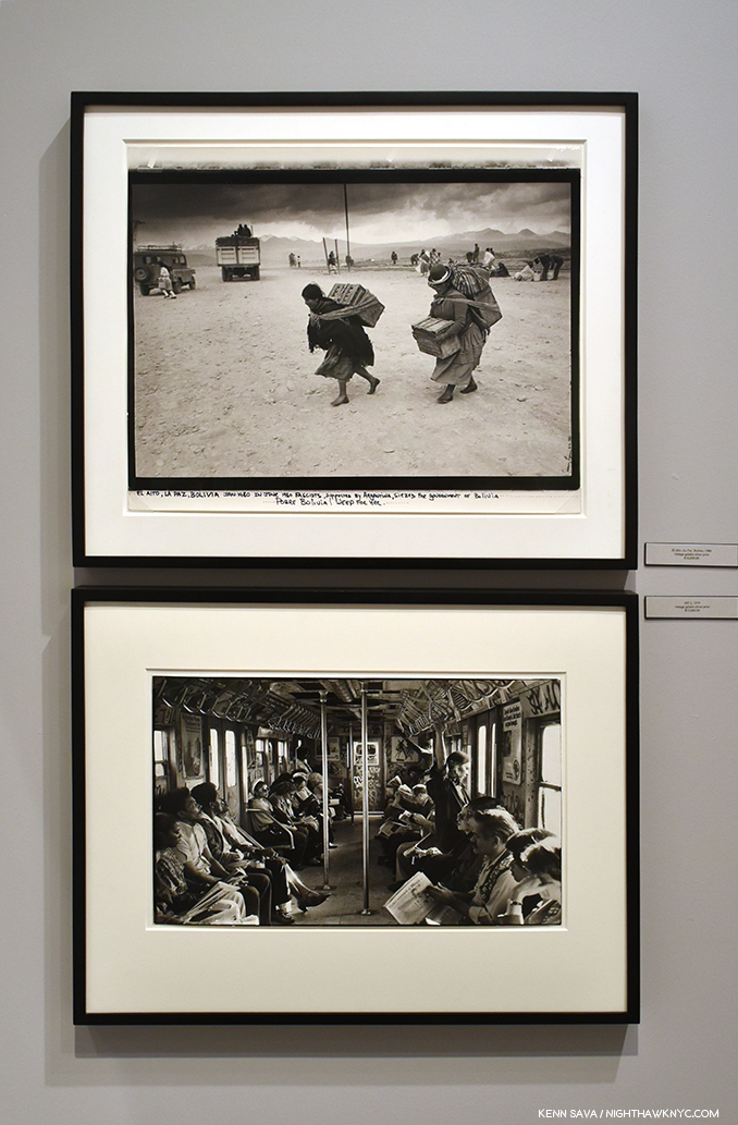
Two works that hint at the range of Danny Lyon over what has been a long and acclaimed career.

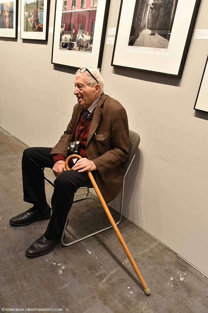
Monroe Gallery, returned to us from Sante Fe, New Mexico, showing the work of Tony Vaccaro, graced by the presence of the Dean of all Photographers once again, looking as spry as ever at NINETY-SEVEN! (Tony, WHAT’S your secret??)

97 years young, Tony Vaccaro sits in front of a wall of his historic work at Monroe Gallery on April 6th. Off frame, to the left, he and I are surrounded by a crowd filling the space to see & hear the legend, who I had the honor of speaking with last year.

As joyful as it always is to see Mr. Vaccaro, the discovery for me at Monroe Gallery was the work of independent Photojournalist Ryan Vizzions.

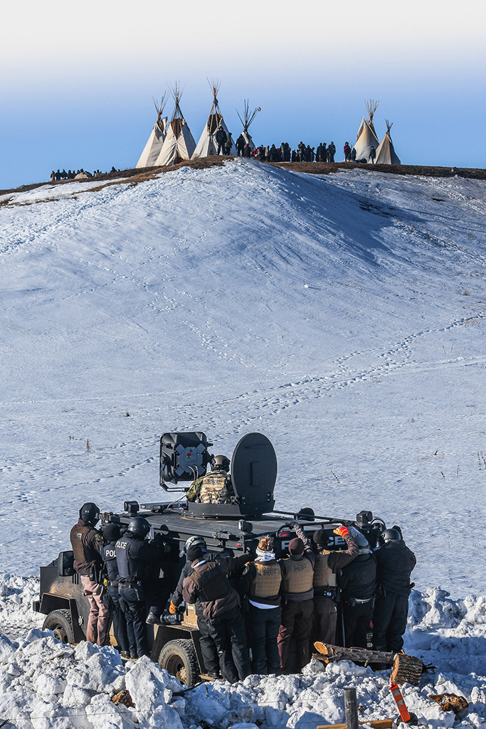
Ryan Vizzions, Protestors face off with police and the National Guard on February 1, 2017, near Cannon Ball, North Dakota, 2017. *Courtesy Ryan Vizzions.

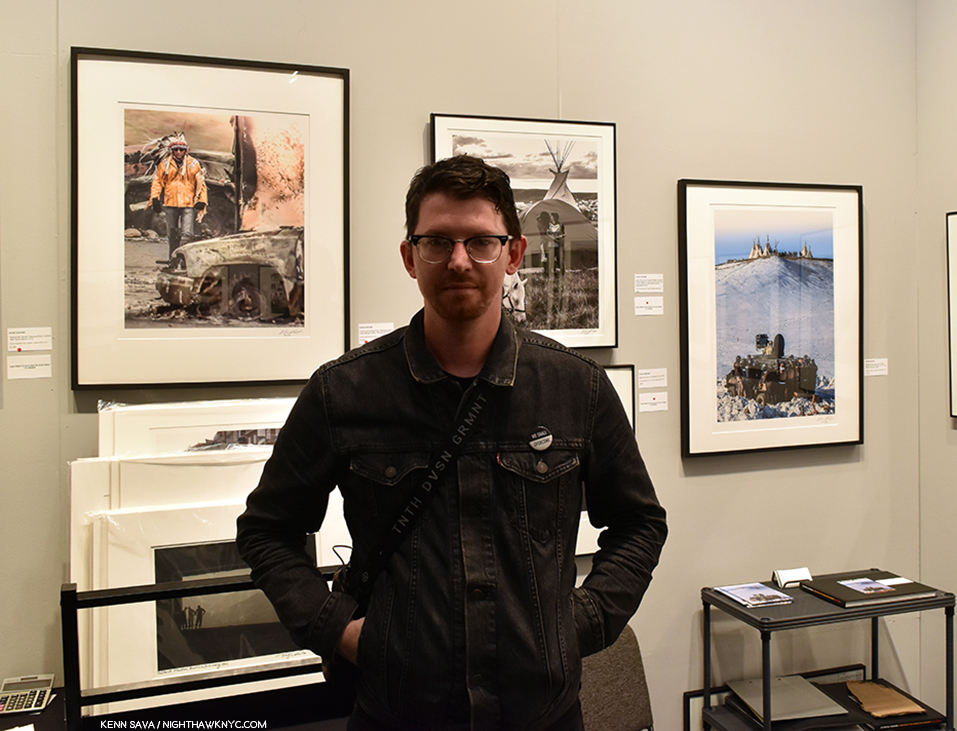
I happened to walk into Monroe Gallery’s booth when Mr. Vizzions was there signing his brand new PhotoBook, No Spiritual Surrender: A Dedication to the Standing Rock Movement and discussing both the work on view and his background, both of which held me rapt. Shortly after his father’s passing, he quit his job and armed with a Nikon D3300, he headed west to document the Standing Rock Protests, one of the largest in American History, taking place at Standing Rock Reservation in North Dakota from April, 2016 to March, 2017. After an initial 3 week visit to Oceti Sakowin camp, he was so taken with what he found that he went home, sold everything and headed back. He stayed from late October through the winter and came away with an amazing body of work that, in my opinion, follows right in the footstep of the finest tradition of PhotoJournalism.

Ryan Vizzions poses in front of a selection of his powerful work at Monroe Gallery’s booth at AIPAD on April 6, 2019.

I subsequently found that I’m far from the only one taken by this young man’s work. Ryan has already won multiple “Photo of the Year” Awards- in 2016 from People, Artsy.net, and Mic.com. In 2017, from the Guardian and ABC News. He’s also had his life threatened. Now, he’s represented by Monroe Gallery. More on Ryan and his story, here. Ryan’s book, No Spiritual Surrender: A Dedication to the Standing Rock Movement  is highly recommended.

Elsewhere around the show, here are some other highlights-

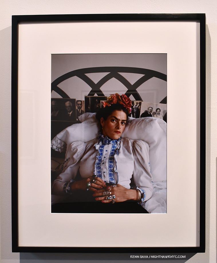
Mary McCartney, Tracey Emin as Frida Kahlo, London, 2000, seen at Staley Wise Gallery

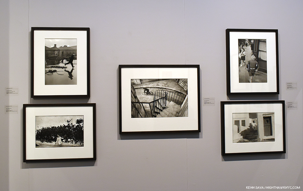
A selection of classic Henri Cariter-Bresson prints seen at Augusta Edwards Fine Art, London, UK.

Brian Clamp, the tall gentleman, center, seen at his ClampArt booth, showing cutting edge work, as usual.

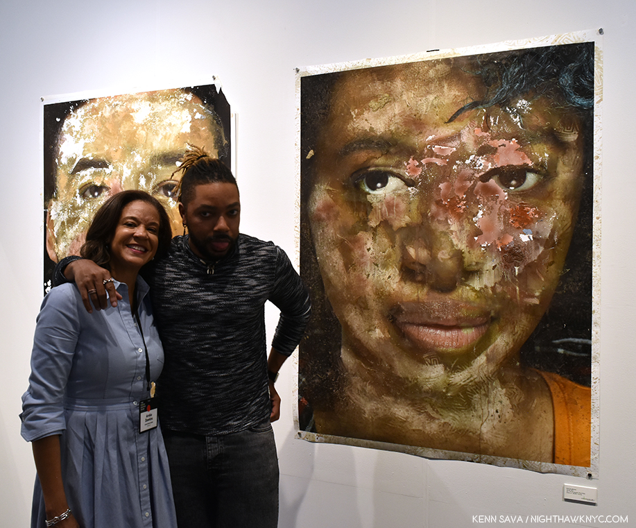
One of the leading Photography gallerists in the South, Atlanta’s Arnika Dawkins, left, of Arnika Dawkins Gallery Photographic Fine Art, presented one of her latest finds, Ervin A. Johnson’s mixed media portraits, and Jeanine Michna-Bales, who I featured in an AIPAD Discoveries piece last year.

Imogen Cunningham Agave Design 1, 1920. Seen at Edwynn Houk Gallery.

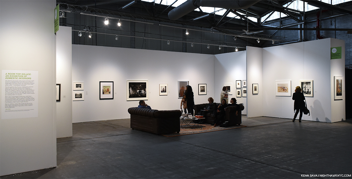
Installation view- A Room for Solace: An Exhibition of Domestic Interiors Curated by Alec Soth

A discussion of highlights has to include the exhibition curated by world renowned Magnum Photographer Alec Soth, fresh off the release of his newest book, I Know How Furiously Your Heart Is Beating, and the opening of his solo show of the same work at Sean Kelly Gallery.

This section consists of Wayne F. Miller, Rebecca Norris Webb (who’s married to Alex Webb) and Harry Callahan, left to right.

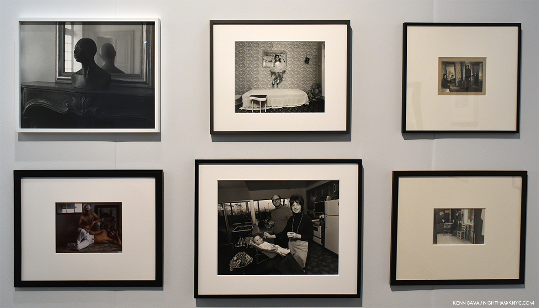
Mikael Levin, Onus, 2000, Sirkka Liisa Konttinen, Emma Dowds (Step by Step series), 1982, Unknown, Interior of an American Home, c.1900, Marie Cosindas, Sailors Key West, 1966, Bill Owens, We’re really happy, 1972, from Suburbia, Walker Evans Kitchen in Floyd Burrough’s Home, Hale County, Alabama, 1936

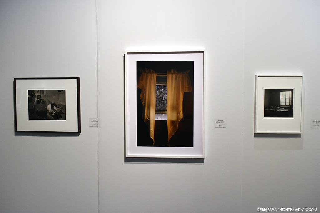
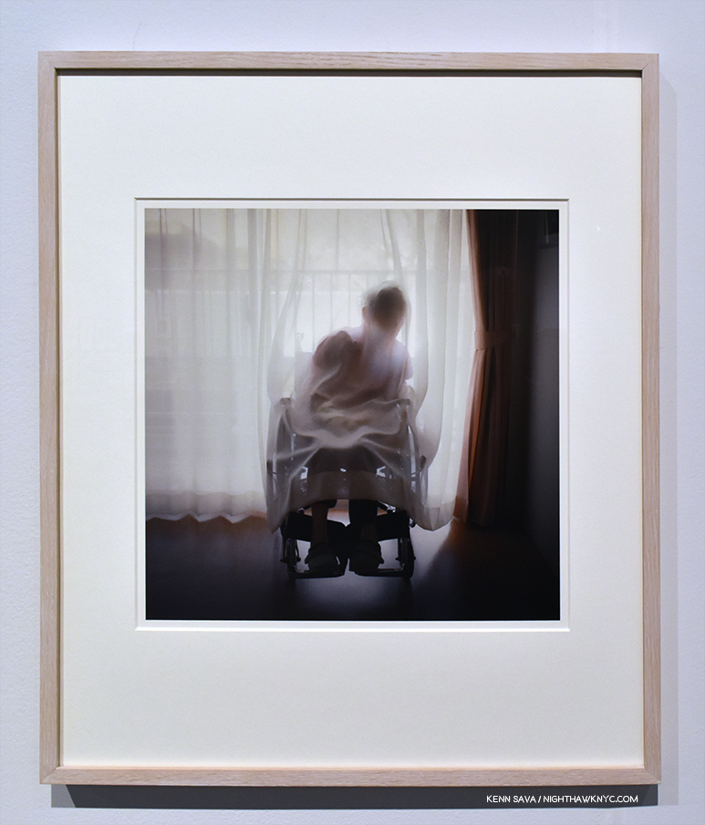
Osamu James Nakagawa, Curtain, Tokyo, Spring, 2003, From the series Kai

Mr. Soth selected a fascinating variety of Photographs around the theme, A Room for Solace: An Exhibition of Domestic Interiors. His selections  from the galleries attending the show was continually fresh and surprising, made all the more fascinating in his carefully considered hanging. Couches and tables in the space added a “homey” touch, but most of all, I was excited to see a Photographer have a chance to select and lay out at least one section of AIPAD, and Alec Soth did a terrific job, in my opinion.

Observations-

I really can’t say that over the five days in the gallery section, I heard any complaints. The only issue seemed to be with the carpeting in the booths, which was lumpy in places throughout the show, and seemed to be a bit tricky for those wearing certain types of shoes. I witnessed one stumble that could have been disastrous (for the visitor and the Art), except for a quick extended hand keeping a stumble from being a fall. Outside of that, the only question I heard more than once, and I heard it each day, was where “Where can I get coffee?” (The only spot I found was in the very back, behind the publishers.) Those minor issues aside, I think it’s safe to say that AIPAD was a well-run machine this year and that any issues from prior years were addressed for this year’s edition (this, the opinion of some returning booth holders I spoke with, and some I pointed out in the past). The staff was friendly, cordial yet focused, and professional throughout, regardless of the role they had. Security was exceedingly well handled, from a visitor’s perspective, both entering and leaving the show. I didn’t encounter anyone who had an issue with a staff member throughout the run of the show.

Of course, the biggest issue remains Pier 94, itself. It’s in one of the least convenient areas of mid-town Manhattan, barely serviced by mass transit, which makes it hard to get to, or leave, particularly in any kind of inclemency. Here’s one esteemed visitor’s experience getting there this year. My feeling is this must cut down on attendance dramatically. Perhaps 33 to 50%? Of course that needs to be weighed versus the added cost and size limitations of a different location, something I have no doubt has been considered long and hard. When I asked a variety of those I encountered about the location, all agreed about its inconvenience, but none were willing to sacrifice the size for convenience. I agree with them.

In conclusion-

Any piece such as this can only hope to show only a sample of the many thousands of Photographs on display. The work on view was only a portion of what the galleries actually brought to the show- a good number brought a fair amount of stock with them that wasn’t actually hanging on the walls as well. As I walked through the galleries each day, it seemed to me the attendance was steady and the galleries were busy. From the telling “red dots” I saw on name cards, and from the wrapped pieces I saw being carried out, my sense was that business was as good as it was last year. Prices seemed to have edged up, particularly for the “big names” in Modern & Contemporary Photography, but there was plenty of work I saw by Photographers who are well known today that were to be had at quite affordable prices, (and almost all of it was in signed & numbered editions this year, after seeing a number of open editions in prior years).

Alec Soth chose to end his show with Fred Herzog’s My Room, Harwood Street, 1958, a work that has special resonance for me. After seeing the display of his work at Equinox Gallery’s booth, I bought my Fred Herzog at AIPAD in 2017.

Considering the length of the history of Photography, the increasing international exposure for Photographers from all over the world by galleries, PhotoBooks, and the internet, the range and the quantity of Fine Art Photographs available for sale has never been greater. The Photography Show was a terrific opportunity to see a good deal of it in one place, to learn more about Photographers you’re interested in and discover new ones, to see how the work of different Photographers looks hanging side by side, to compare prices, and to walk away with something new to hang on your walls.

And I have.

For the third year in a row, I’m pleased to present extensive coverage of The Photography Show presented by AIPAD. As I did in 2017 and 2018, this will include a portfolio of pieces, each focused on a segment of the show. The next part looks at the PhotoBook Publishers, Book Dealers and Organizations area. Two subsequent pieces consist of an “AIPAD Focus” close up look at a leading light in Photography, and at least one (and I am hoping two) AIPAD Discovery piece(s), reprising a popular feature I inaugurated last year, that will focus on a particularly NoteWorthy Photographer previously not known to me. Hopefully, two. Stay tuned!

*- Soundtrack for this Post is “Take Me To The River” by Al Green.

My thanks to Margery Newman. 

NighthawkNYC.com has been entirely self-funded and ad-free for over 6 years, during which over 250 full length pieces have been published. If you’ve found it worthwhile, you can donate to keep it going & ad-free below. Thank you!

Written & photographed by Kenn Sava for nighthawknyc.com unless otherwise credited.
To send comments, thoughts, feedback or propositions click here.
Click the white box on the upper right for the archives or to search them.
For “short takes” and additional pictures, follow @nighthawk_nyc on Instagram.

Subscribe to be notified of new Posts below. Your information will be used for no other purpose.


Andy Warhol: Business Artist

Written & Photographed by Kenn Sava (*unless otherwise credited)

“So you should always have a product that’s not just ‘you.’ An actress should count up her plays and movies and a model should count up her photographs and a writer should count up his words and an artist should count up his pictures so you always know exactly what you’re worth, and you don’t get stuck thinking your product is you and your fame, and your aura.” Andy Warhol1.

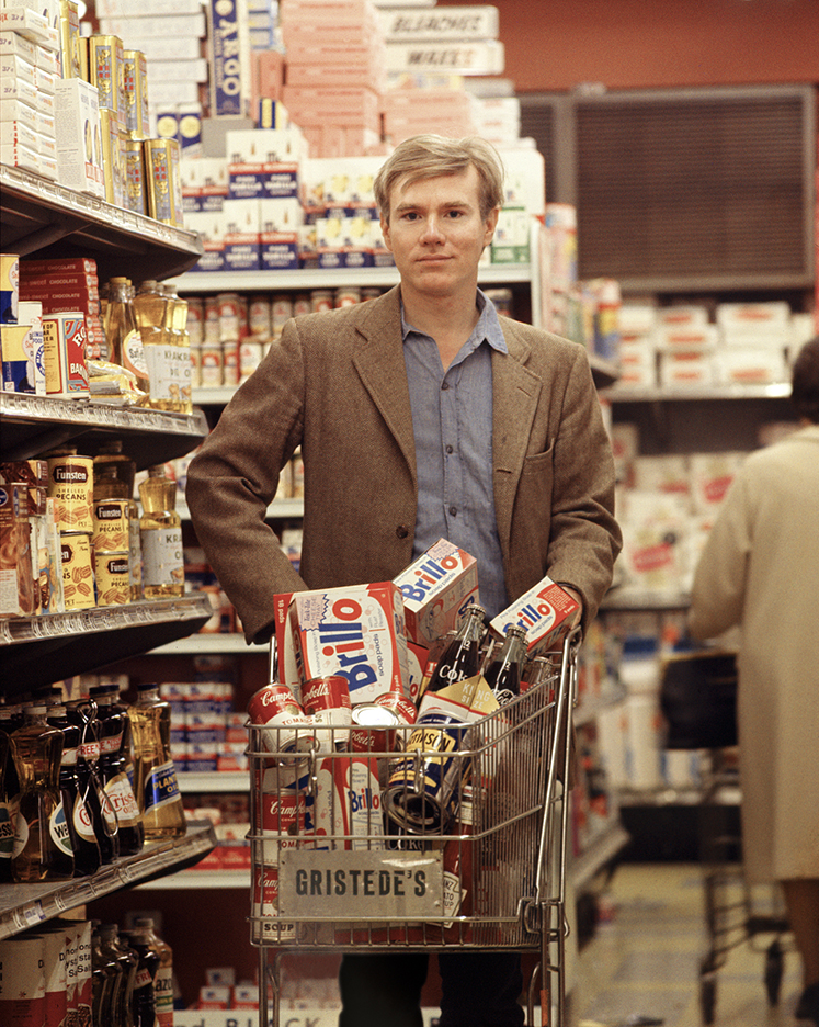
Andy shopping for products. *Bob Adelman, Andy Warhol at Gristede’s Market near 47th Street. New York City, 1965, near where he lived with his mother. Countless millions went shopping in American grocery stores in the 1960s. Very few made Art out of it before he did. Click any picture for full size. 

That being said, leaving the Whitney Museum’s Andy Warhol- From A to B and Back Again, the first Retrospective in NYC since MoMA’s in 1989, I was left believing Andy Warhol’s greatest creation was himself.

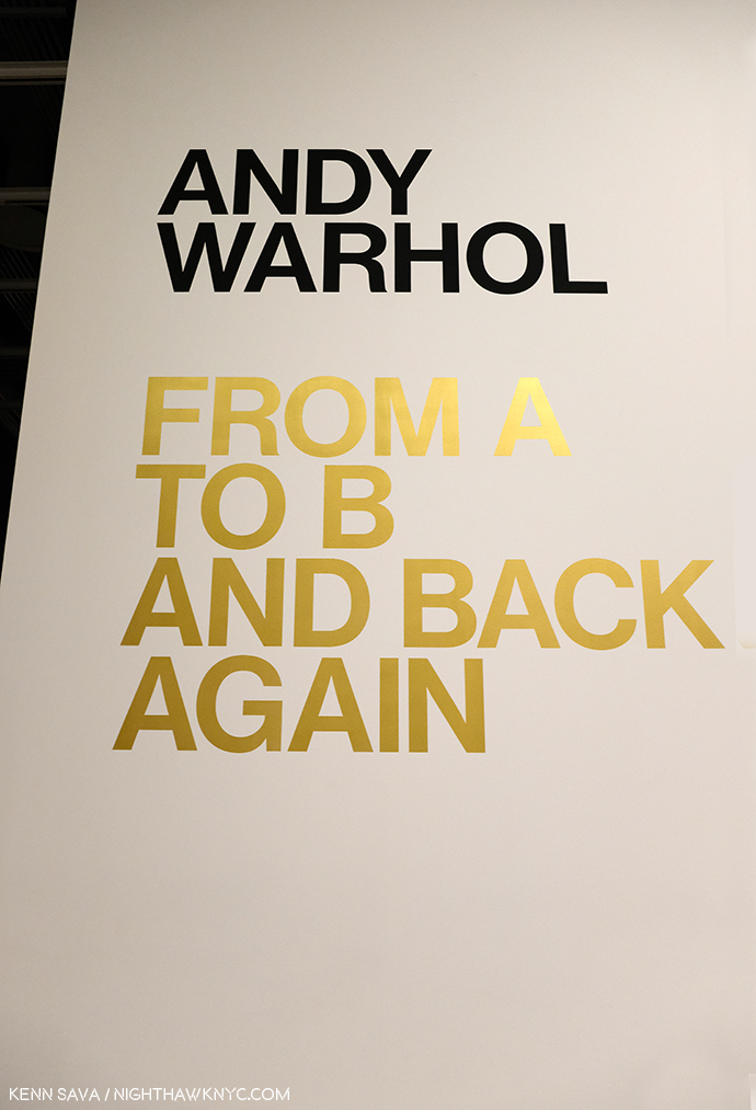
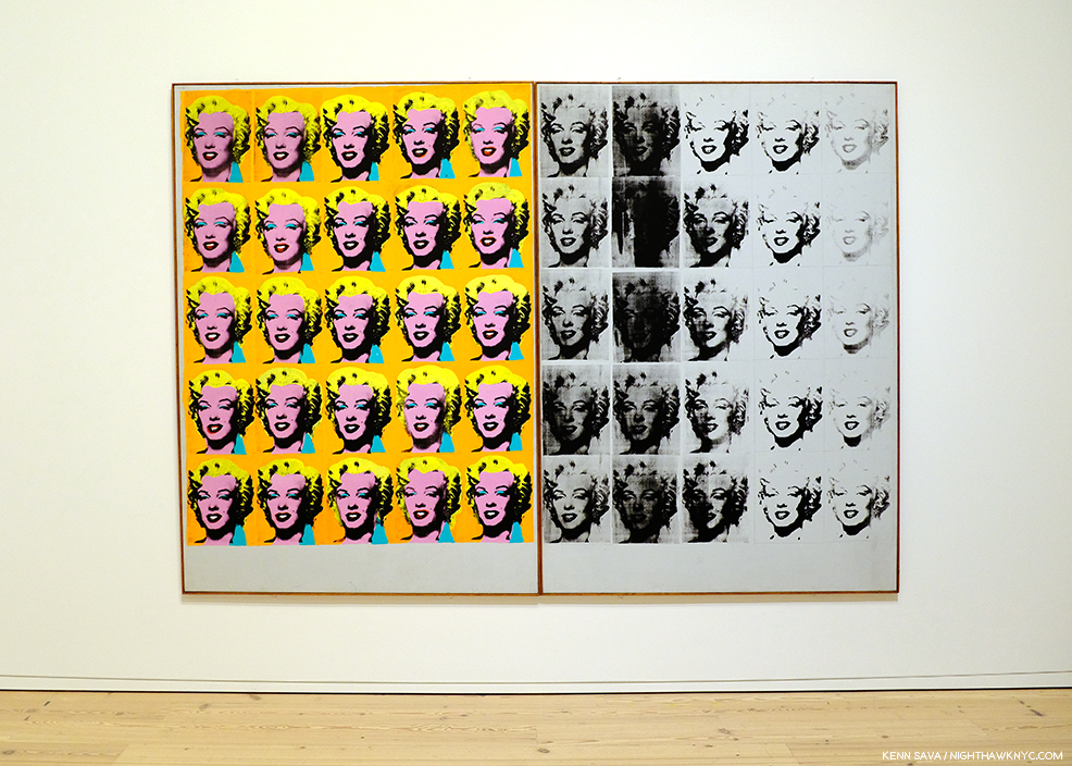
The use of gold here, and on the exhibition catalog’s cover, is interesting. It mimics Gold Marilyn, at MoMA, and also reminds of the background color of icons from the Eastern Orthodox and other churches. And? It’s a color often associated with money and “value,” so could it be a veiled reference to the high prices paid for his Art? Which of these is the intended meaning?

But, no matter how I feel about his Art, even I can’t deny that today, it can be said that we are living in his world to a greater extent than we realize. Look around you. His influence is everywhere. His innovations are now used by countless other Artists and businesses.

“A friend of mine named Ingrid from New Jersey came up with a new last name, just right for her new, loosely defined show-business career. She called herself ‘Ingrid Superstar.’ I’m positive Ingrid invented that word2.”

The everyday people he made into “superstars” presaged today’s television “reality stars.” His square portraits are now instantly recognizable as the Instagram standard. Andy Warhol came to define the Contemporary Artist working with a team of assistants at his Factory and his example is to be seen being followed by Artists all over the world today. How often do you see one of his color variated group of (4) portraits or flowers emulated by someone else? And on and on. These are only a few examples. Andy Warhol’s influence is incalculable. If it could be totaled, it might well rival that of Steve Jobs among THE most influential people of the past 75 years on our lives today.

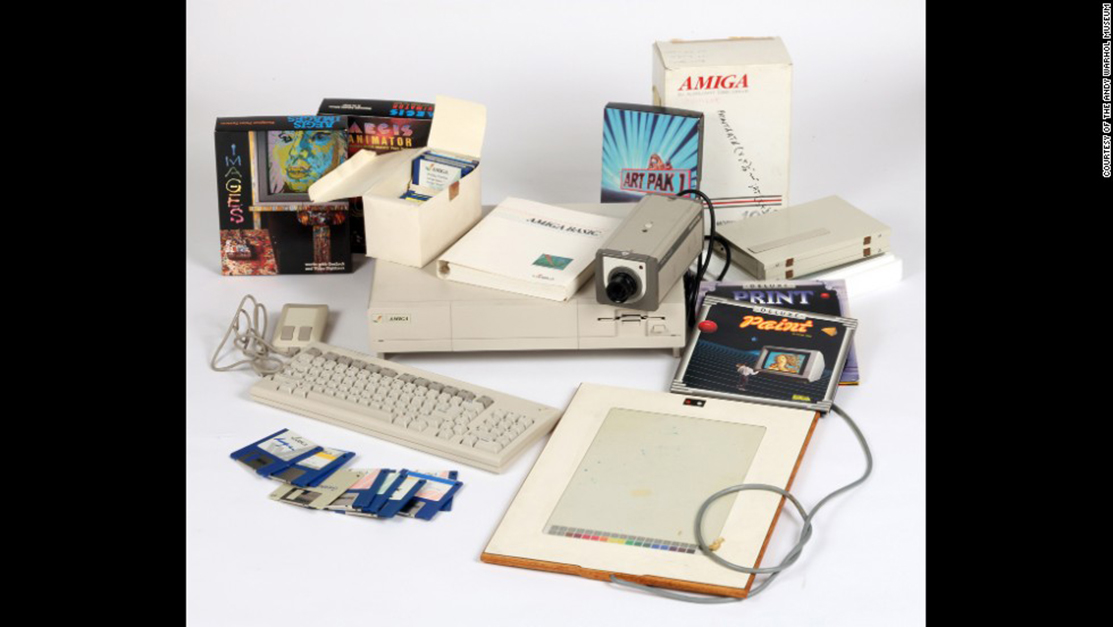
Commodore Amiga computer equipment used by Andy Warhol in 1985-86. Andy’s interesting computer Art was extracted from this machine by a team led by the Andy Warhol Museum in 2014! *Photo by The Andy Warhol Museum.

But, it was Andy Warhol, not Steve, who said,  “A computer would be a very qualified boss3 decades before the time when many people’s lives seem to be run by their devices. A-hem. Sometimes I wonder if the internet is nothing but a cyber projection of Andy Warhol’s brain.

Artistically, I respect him as an Artist who was continually innovative in so many mediums during his surprisingly short career. Yes, short. It feels like he was around forever, but he was just 58 when he passed away on February 22, 1987. This insatiable creativity now strikes me as a function of his innate ability to see the world in his own way, which led him, continually, in different directions, to try new things, and explore new ways of doing old things.

It seems to me, however, that THIS may be the peak moment of Andy Warhol’s influence- the influence of Warhol, the Artist and his Art.

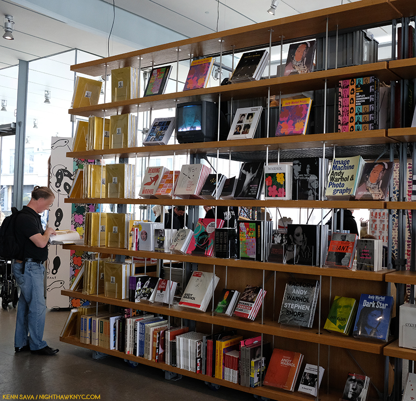
Warhol books, and ONLY Warhol books, seen in the Whitney Shop, March 27, 2019.

I wonder if the level of his fame may, in fact, work against its longevity from here. Virtually everything he did has been shown, written about, analyzed and assimilated. If you don’t think that’s true, take a look at this picture I took of part of the book shelves in the Whitney Museum’s Shop during the run on Andy Warhol- From A to B. I used a 28mm lens and even though I stood more than 20 feet away, backing into the middle of the admissions cue, I still wasn’t able to get ALL the Andy Warhol books on sale in the shot. There are books on his pre-Pop work, his newspaper-like work, his portraits, his posters, his prints, his record covers, his career as a publisher, his films, books on the Factory (including one of Photos taken by a teenaged Stephen Shore), a few about his Photography and polaroids, including a collection of Photos of him in drag, AND a multi-volume Catalogue Raisonne of his Paintings (on the far left of the bottom shelf). Oh, and Andy Warhol: Knives. ? This is not to mention all the books, by the Artist, and others, about his life, including the infamous, The Philosophy of Andy Warhol (From A to B and Back Again), published in 1977, which seems to have inspired the name of this show. My copy, bought from the display, is the 46th printing of the paperback. In all my many years of looking at Art books, I have to say the only other Artist who has as many books written about him and his Art is Picasso. 

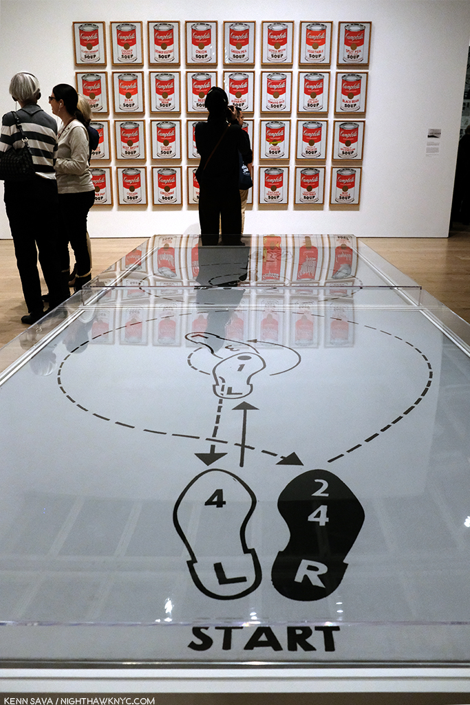
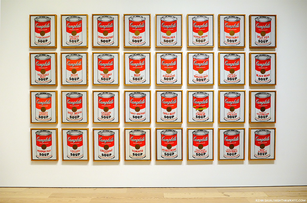
Start here. In the first gallery, which contains early Pop work, like Dance Steps, 1961, and a wall of Campbell’s Soup Cans in the back.

As I headed to the 5th floor for the main part of the show, I wondered- What’s left for the future to learn about Andy Warhol’s Art? Given his popularity, I’m sure people will find things for yet more books.

Andy’s mother fixed him Campbell’s Soup everyday for lunch, including after he became famous, until she passed. The family was poor. Beyond the comfort of the warmth of soup, having a lot of food around represents something of an ideal, a dream, even cheap food, like this soup was at the time, at 15 cents a can. Originally, these Paintings sold for $100 a piece at his first show at Ferus Gallery in LA, where Dennis Hopper bought one.

As I looked at his Art, it also raised questions. Questions that the passage of time has only intensified.

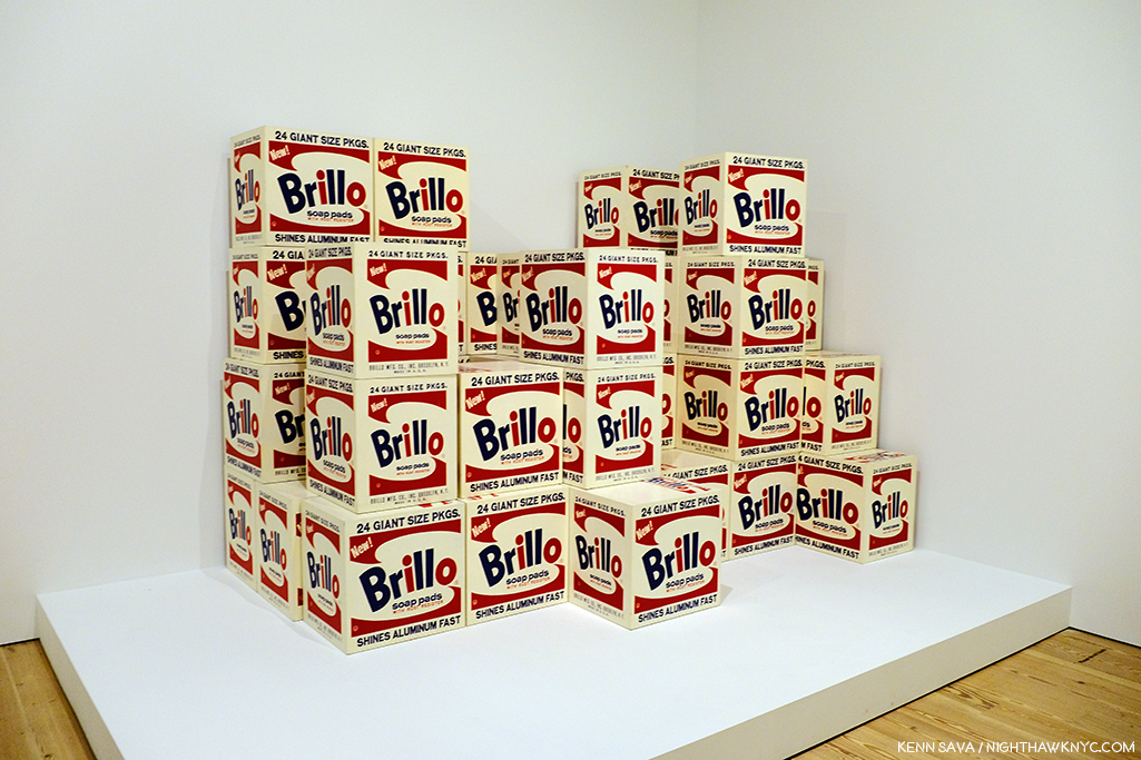
Brillo Boxes, 1969 (version of the 1964 original). Yes, a copy of a copy. The interesting thing about this work for me is that this “Art is everywhere around us” work of so-called “Pop Art,” which helped to mark the end of Abstract Art’s hold on the Art world, is based on the Brillo Box design of James Harvey, a moonlighting Abstract Expressionist Painter! Beyond that, and wondering if  Sol LeWitt was influenced by it, it’s lost on me.

First, and most importantly, Andy Warhol’s Art is accessible. This has been the most important factor in his achieving success and fame and it may be the most important factor in the longevity of both. Popularity doesn’t necessarily equate with quality. Since the future is unwritten, as Joe Strummer reminded us, it’s impossible to know what posterity will value, if anything. To this point quality has definitely been a factor. I wonder- Where does that leave Andy Warhol’s Art?

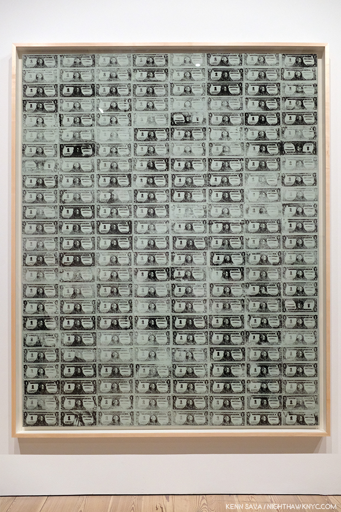
Arising at a time (the late 1950s) when the Art world had been fed a steady diet of extreme abstraction by the Abstract Expressionists, Andy Warhol’s Art burst on the world with images featuring things, yes, things, that everyone living in the country recognized. Brillo boxes, Campbell’sl soup cans, dollar bills. His work was instantly accessible in an Art world dominated by Art that was becoming more and more obtuse and remote. I’m not saying Andy Warhol’s work was “understandable,” or even “more understandable” than that of the Abstractionists, only relatable. Even in today’s world where fewer and fewer living beings remember S&H Green Stamps, walking through this show, this seems to still be the case.

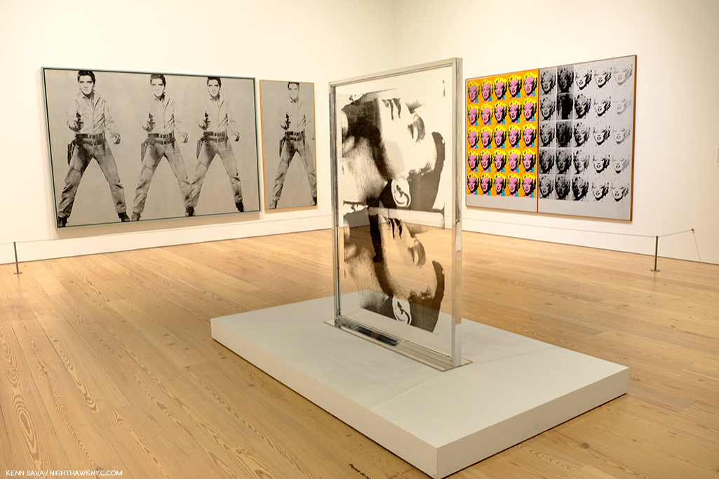
Marilyn & Elvis. Andy Warhol was always drawn to stars, and beautiful men. Personally, and in his Art.

But, the world has changed in the, now, 60 years since Andy Warhol’s career first took off. A lot of Artists have grown up with what he did and it’s become part of their work, even if it’s only unconsciously.

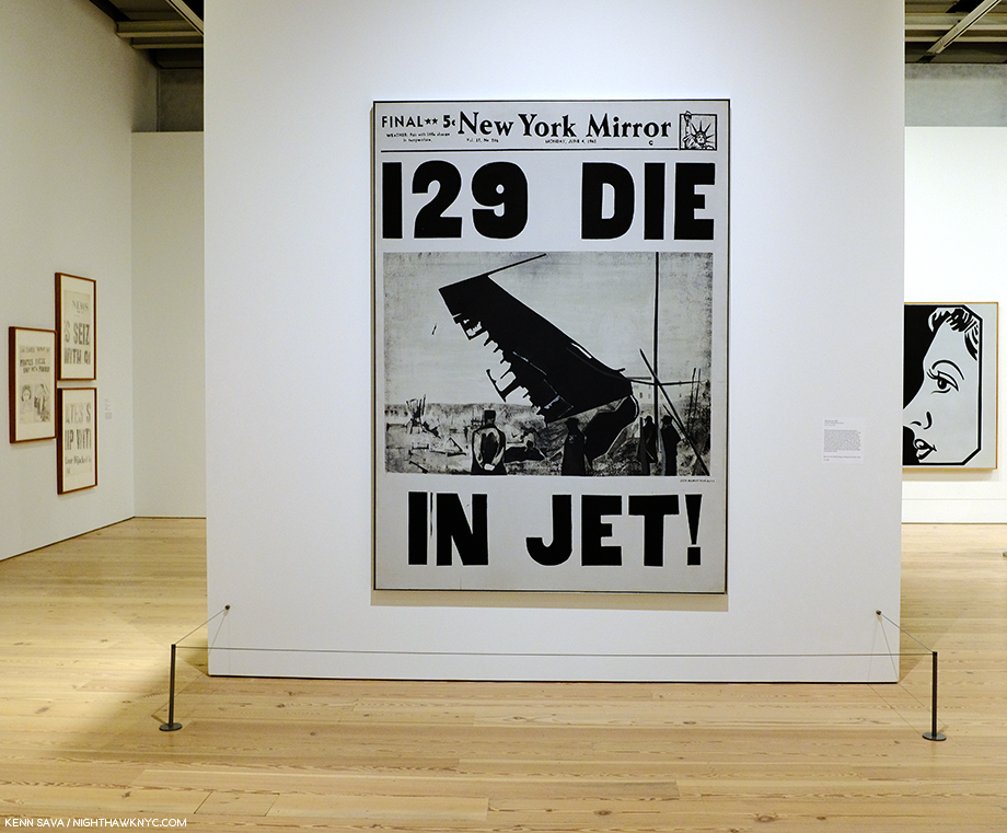
129 Dollar Bills, 1962, among the very first uses of silkscreening in Modern & Contemporary Art.

How many Artists have created with silkscreens since Andy Warhol introduced the possibilities of the ancient technique to the modern world in 1962? Even one of the other innovators and endlessly creative pillars of American Art in the late 1950s and 1960s (and after), Robert Rauschenberg, picked up the technique from Warhol. Since, silkscreening went from creating edgy Art to being used to create the large majority of the world’s T-Shirts, among countless other uses.

“I had by that time decided that ‘business’ was the best art. Business art is the step that comes after Art. I started as a commercial artist, and I want to finish as a business artist. After I did the thing called ‘art’ or whatever it’s called, I went into business art. I wanted to be an Art Businessman or a Business Artist. Being good in business is the most fascinating kind of art. During the hippie era people put down the idea of business—they’d say, ‘Money is bad,’ and ‘Working is bad,’ but making money is art and working is art and good business is the best art,” Andy Warhol. (Note- Not to be confused with my capitalization, caps and lowercase usage are Warhol’s own, reproduced exactly as the quote appears in TPoAW P.92.)

Ethel Scull 36 Times, 1963, jointly owned by The Whitney & The Met, was the first work commissioned from Andy Warhol. It’s a work that, in my view, has outlived its cachet as “Art,” and one that I don’t think posterity will look kindly upon.

Looking at the show, a takeaway for me was the distinct feeling I got was that there was his work, and then there is the work he did on commission (i.e. “Business Art,” a term he mentions in The Philosophy of, quoted above, but doesn’t define). After a while, I thought I could tell even before reading the card or researching the work, which was which- which were the work he did “for himself,” which were the works he did on commission, and I came away feeling there is a world of difference between the two. Wait! There’s a subject for a book I don’t think anyone’s written yet! For Andy Warhol, the business of Art was an Art in itself. Few before (maybe Rembrandt, Picasso and Dali in their ways) understood this and used it, but no one before him mastered it to the degree that Andy Warhol did. Its testament to how well he did it that a good many of his commissions, which detract from his other work when seen along side them as Ethel Scull 36 Times does in my opinion, hang in museums around the world, at least for now.

The American Man (Portrait of Watson Powell), 1964, a pseudo-companion piece to the Ethel Scull piece, above, and another commission, has aged better and still manages to speak to 2019 viewers.

To be fair, looking at some of his commissions now, we might well see in them a “commentary” by the Artist on matters beyond the mere representation of a given subject. The American Man, 1964, commissioned after seeing Warhol’s Ethel Scull piece, struck me that way. I’m still looking for that in a good many others, though.

After a couple visits, I was able to choose a few works in the great guessing game I like to play, and encourage everyone else to play- “Which works will be considered Art in the future- if any?” I came up with eight including the Campbell’s Soupcans and the 129 Dollar Bills already shown. 8 out of the 350 works the Museum says were on view. Personally, I don’t believe the passage of the centuries is going to be kind to most of Andy Warhol’s Art. Part of the reason for that is his pervasive influence. History doesn’t often look back favorably on who was first, particularly in Art. (Quick- Who “invented” oil painting? When I was growing up, I believed what Vasari wrote in The Lives of the Most Excellent Artists, 1550,  that it was the great van Eyck brothers, Jan and Hubert, who happened to be my first favorite Artists.) More recently there is no consensus and evidence of oil paint may have been found going back to 650AD.) Given the overheated state of his prices (still, in spite of a recent leveling off), his Art is definitely not where I’d put my money now. That ship has sailed. NOTHING goes up forever! Look elsewhere in 2019. (See my Post On Buying Art for additional considerations, all of which apply to the Art of Andy Warhol.)

Marilyn Diptych, 1962

Let’s look at numbers 3 to 7 on my list for the ages (in no particular order). Next, Marilyn Diptych, 1962 – The duality of this work painted shortly after Marilyn Monroe’s suicide is revolutionary. On the one hand, Warhol shows Marilyn the idealized, beautiful, glamorous movie star, repeated radiantly in a sea of gold not unlike that of the religious icons of the Eastern Orthodox and other churches. On the right hand, the work seems to reference the darker side of both Marilyn’s life and death. This work is striking when one also considers that Andy was someone who sought autographs of movie stars as a child. Here, all the illusions of the silver screen are gone.

Thirty Are Better Than One, 1963

Thirty Are Better Than One, 1963, The multiple Mona Lisa as a commentary on the original’s visit to the USA at the time present an interesting counterpoint to the da Vinci- even in black & white. This one barely made my list, but given the precedent of other Artist’s commenting on or reinterpreting the Mona Lisa, like Duchamp, I think it will be of interest indefinitely.

Nine Jackies, 1964

Nine Jackies, 1964. Something revolutionary in portraiture, the Artist captures the beauty of the Kennedy “Camelot,” and the horror and disbelief of what took place on November 22, 1963, as I remember it. A work that relies on the power of the Photograph, it’s one of the strongest uses of it in a medium outside of its own.

Mao, 1972

Mao, 1972- Created during the year of Nixon’s breakthrough visit to China, Andy Warhol’s image takes the portrait of Mao from the infamous Little Red Book of sayings and statements by the Chairman, which may have been the most reproduced image in the world at the time. Here, over 14 feet high, it symbolizes the Charman’s looming over all things in China, a different kind of manifestation of fame. Andy would make a brief trip, himself, to China in 1982, where he posed for a few pictures looking very stiff and uncomfortable.

Mustard Race Riot, 1963.

Mustard Race Riot, 1963- Without a doubt, the most powerful work in the show, in my opinion, it sold for only $15,127,500.00 in 2004. “Only,” when you consider the current record price for a Warhol is $100 million (Eight Elvises), and when you consider another Warhol Race Riot, one that had been owned by Sam Wagstaff and Robert Mapplethorpe, sold for almost $63 million in 2014. As Artist Hank Willis Thomas, and others, have pointed out, this work looks as prescient as almost anything else in the show. Standing in front of it (which means standing a ways distant since it’s  114 by 82 inches), pondering it over multiple visits, I came away feeling that it may be one of the most important works of the 1960s, and for 1963, certainly gave those putting Andy Warhol in the “Pop Art” box pause for thought,  pointing out yet again the pointlessness of such terms.

Then? Something occurred to me to sleep top me dead in my tracks. ALL FIVE of these works involve the use of appropriated Photographs taken by others. Did Andy Warhol pay the Photographers for using them?

Gene Kornman, Photograph (Marilyn Monroe ), 1953. *Publicity Photo of Marilyn Monroe for the Film, Niagara.

This subject was not brought up anywhere that I saw in the show. They did mention (and exhibit) the Gene Kornman Photo Andy Warhol used, perhaps more than any other, was originally a publicity shot of Marilyn from her classic 1953 Film, Niagara. Also exhibited were the source Photos he used in Nine Jackies, which I subsequently learned Andy Warhol was sued over his use of. Charles Moore’s 1963 Life Magazine Photos were the source for Warhol’s Race Riot works, including Mustard Race Riot. Frankly? For an Artist who was so endlessly creative? That he did this, and did it for so long and so often surprises me. It took lawsuits for Andy and Robert Rauschenberg, who was also doing it, to decide to exclusively use their own Photographs henceforth, which, I think, improved the results for both. Yes, at the time, this was new territory for Artists. Copyright infringement was not a term that was not as common in Art in the late 1950s and early 1960s, and he had made his name using copyrighted names and trademarks for Campbell’s Soup, Brillo, etc., without issue- the companies involved, no doubt, relished the free advertising and attention, so giving his restless creativity the benefit of the doubt might apply here, I think (easy for me to say, I’m not Gene Kornman, who’s Photo of Marilyn wound up in Art that’s, no doubt, worth hundreds of millions of dollars, if not more, today).

I still think these are powerful works, among the best Warhols I’ve seen, but this does tarnish them a bit. It’s hard to ignore today. But, let’s move on.

Self-Portrait, 1950s

I’m always interested to see any Artist’s Drawings, and I made a point of spending a considerable amount of time with the Drawings, mostly early, of Andy Warhol displayed here. It’s interesting that they reveal a wonderful sense of, and control of, line, which I’ve long thought to be the most technically difficult part of Drawing. So confident is the young Artist in his line that he dispenses with almost everything else- even parts of the composition! Shading is only hinted at once in a while. Throughout, it’s his line that carries the work. This style is reminiscent of one Picasso used in the early 1900s to create works like this. In addition, he shows an economy that makes it fascinating to consider what he’s left out, a uniqe way of using what Artists call “negative space.” This Drawing is markedly different from the “scratchy” drawings with halting lines seen in some of his commercial work of the period. He changed his style to fit the subject, and it always worked. He was a very successful illustrator and store window designer. But? Shoes and shoe design held a special place in his heart.

A wall of shoes. In each of the works in gold, Andy created a shoe as a caricature of a person.

It turns out that Andy Warhol had a shoe fetish. A real one, that surpasses the most shoe obsessed of my female friends, which John Giorno describes in graphic detail in the Documentary Andy Warhol: The Complete Picture! At 24:30, Mr. Giorno says, “There was Andy Warhol on his hands and knees kissing my shoes…”

Andy’s Truman Capote Shoe, with calligraphy by his mom, is seen over his The B.J. Shoe. Given his shoe obsession, it’s interesting that there are no works after this period that feature shoes, as far as I know. Also interesting is that Andy, himself, wore the same pair of paint splattered shoes for 25 years, which are also shown in The Complete Picture.

Even in the midst of his intensive period of Drawing for his commercial illustration clients, he was always looking for ways to create multiples of his Drawings. This led to his use of silkscreens. But yes, he Painted. This early Painting is the one work in included that would meet the definition of a Painting for most of Art History- prior to Warhol.

The charming Living Room, 1948.

From there, his Painting skills were used to modify and enhance works in other medium, like silkscreens, in works that were multi-media Paintings.

Self-Portrait, 1966, Acrylic, silkscreen ink, and graphite on linen.

It seemed to me walking through the show that Warhol’s Self-Portraits are stronger than just about any of his other portraits. Downstairs on the first floor, an entire gallery was devoted to his square portraits, which alternated between the famous and the already forgotten with a fascinating portrait of his mom almost hidden among them.

Julia Warhola, 1974, upper right, a year or so after she passed away in 1972. Interestingly, it’s in the collection of Roy Lichtenstein, and that’s Dorothy Lichtenstein, Roy’s wife, below her. To her left is Met Curator Henry Geldzhaler, who was also painted by David Hockney.

Along with fame, Andy Warhol’s other big theme was death. It’s a subject that makes an appearance early on in his Fine Art career, in works like 129 Die in Jet, 1962

129 Die in Jet, 1962

It carries on in his Electric Chair Paintings, and is an element in his Marilyn and Jackie pieces, both created shortly after deaths- Marilyn’s and JFK’s. The hold death has on visitors struck me on one visit while I was considering Mustard Race Riot. Given its large size, I had to stand a good distance away from it to take it all in.

I couldn’t help noticing a steady stream of visitors who entered the gallery and stood in front of me, facing to my left. They were looking at this-


Lavender Disaster, 1963.

I heard someone say, it takes away the power of the electric chair as an image of fear. I don’t get that. I, for one, don’t get the point of multiplying the electric chair. I prefer these, individually-

Both, Big Electric Chair, 1967-8, top, 1967, bottom.

And, of course, there were the car wrecks, also featuring repeated Photos, which led into the next gallery, where the equally death-soaked Nine Jackies awaited, facing a wall of Most Wanted Men, 1964, Andy Warhol’s works based on wanted posters that hung at the New York Pavillion at the 1964 World’s Fair, and works from Flash-November 22, 1963, also about the JFK Assassination. But, of all the works related to death in this show, the eighth and final work on my “Art” list is Self-Portrait with Skull, 1978, in which the Artist brings his obsession with death home.

Self-Portrait with Skull, 1978

On the left, the red is hard to miss as the color of blood, and therefore, of life, while the grey/black image on the right recalls those in the Marilyn Diptych, which speaks to her demise and death. This work is based on one of Warhol’s own Photographs.

Andy Warhol- From A to B and Back Again was a good, but not a landmark show, in my opinion. In NYC, MoMA’s Warhol: A Retrospective remains the benchmark Warhol show. Part of the reason it’s not better is possibly due to the popularity and value of his work making loans very hard to get. After the silkscreen gallery with Mustard Race Riot, I felt the rest of the show continually declined, with isolated examples of better work. In much of the rest of it, I felt lost, adrift in galleries of work that either hadn’t held up to the passage of time (if they ever did stand out) or that contained ideas manifested on a gigantic scale, like the “piss paintings,” that were probably either left in the studio or done on a smaller scale. At this late date in his life and career, to suddenly go fully abstract smacked of running out of ideas, which is something that seems impossible for Andy Warhol.

A camouflaged visitor scrutizies the left half of Camouflage Last Supper.

The culminating gallery with the also gigantic Camouflage Last Supper also struck me as a poor choice. Here, Warhol reprises the idea of the multiple Leonardo da Vinci’s, this time with 2 huge Last Supper reproductions side by side, which makes a point that escapes me, and then covers them with camouflage, perhaps to try and add some interest to his idea. Camouflage is, in keeping with Andy Warhol’s instantly recognizable images, a military artifact and symbol. What that has to do with the Last Supper is, also, lost on me.

Andy famously collaborated with Jean Michel Basquiat, as seen here in Third Eye, 1985.

And then there were two of his collaborations with Jean Michel Basquiat. Though extremely colorful, looking at them I have as yet to see them as more than each bringing what they do to the work. The feeling of a true collaboration bringing the work to someplace else escapes me…so far, but I know people who love them.

If these walls could talk. The site of Andy Warhol’s Factory when it was on Union Square, seen in Winter, 2018. Ironically, the scaffolding seems to be making an “A” for Andy.

Andy Warhol opened the doors to whole worlds of possibilities in the world of Art, and, indeed, the world. In doing so, he taught all of us how to see new possibilities in our work, and our lives. (And I am not speaking about his life or lifestyle in any of this.) There are very few Artists who even open one new door. For this, the world owes him a debt. A debt that might be best repaid by following his example of seeking new possibilities. He sought out, encouraged, and worked with, young, even beginning Artists, and so played a role in the creation of world renowned Artists including Stephen Shore, Robert Mapplethorpe, and  Jean Michel Basquiat, and treated them every bit the same as he did established Artists.

Regardless of what the world comes to think of his Art, these are the contributions of Andy Warhol I choose to remember and celebrate.


BookMarks-

As I showed earlier, a list of books written on and about Andy Warhol could fill a book itself. I have only seen a minuscule number of this vast library. Of those, a few stand out to me, particularly for those looking to keep from having a wall of Andy Warhol books that rivals that in the Whitney’s Shop!

The best overviews of his Art I’ve seen are these two-

Andy Warhol “Giant” Size: Gift Format has been issued in a few sizes over the years since it’s first release 10 years ago. Whatever size works for you, this “visual biography,”which includes over 2,000 images, remains the best one-volume survey of Andy Warhol’s Life & Work.

Andy Warhol: A Retrospective The catalog for MoMA’s 1989 Retrospective. Out of print, it’s reasonably priced in hard or softcover on the aftermarket. It remains the most comprehensive overview of his Art, and serves as the catalog for the most exhaustive show of his work yet mounted.

Factory: Andy Warhol by Stephen Shore is a fascinating book for Photography lovers. It preserves, both, the earliest body of work yet published by one of the most important American Photographers of his generation, and the most comprehensive look at Andy Warhol’s legendary Factory we have. Wasn’t it Andy who said, “It’s like an auto wreck you can’t take your eyes off of”? If not, he should have.

Finally, The Philosophy of Andy Warhol (From A to B and Back Again) is a must read, as much for its entertainment value as for its life experience advice, which is given on almost every page, though it’s light on Art and technique for Artists looking for a “how I did it.” Rumor has it a team “helped” Andy write it, but it’s hard to tell from the distant outside if that’s true or who did what. It’s something of a classic among pseudo-autobiographies, and plays a seminal role in the creation of Andy Warhol, as a work of Art in himself.

*- Soundtrack for this Post is, what else? “Andy Warhol” by David Bowie, who memorably played Andy in Julian Schnabel’s Film, Basquiat, looking for all the world like he was having a blast doing it.

Oh! PS- Andy? 4,627 words.

NighthawkNYC.com has been entirely self-funded and ad-free for over 6 years, during which over 250 full length pieces have been published. If you’ve found it worthwhile, you can donate to keep it going & ad-free below. Thank you!

Written & photographed by Kenn Sava for nighthawknyc.com unless otherwise credited.
To send comments, thoughts, feedback or propositions click here.
Click the white box on the upper right for the archives or to search them.
For “short takes” and additional pictures, follow @nighthawk_nyc on Instagram.

Subscribe to be notified of new Posts below. Your information will be used for no other purpose.


  1. The Philosophy of Andy Warhol, henceforth TPoAW, P.86
  2.  TPoAW, P.26
  3. TPoAW, P.96