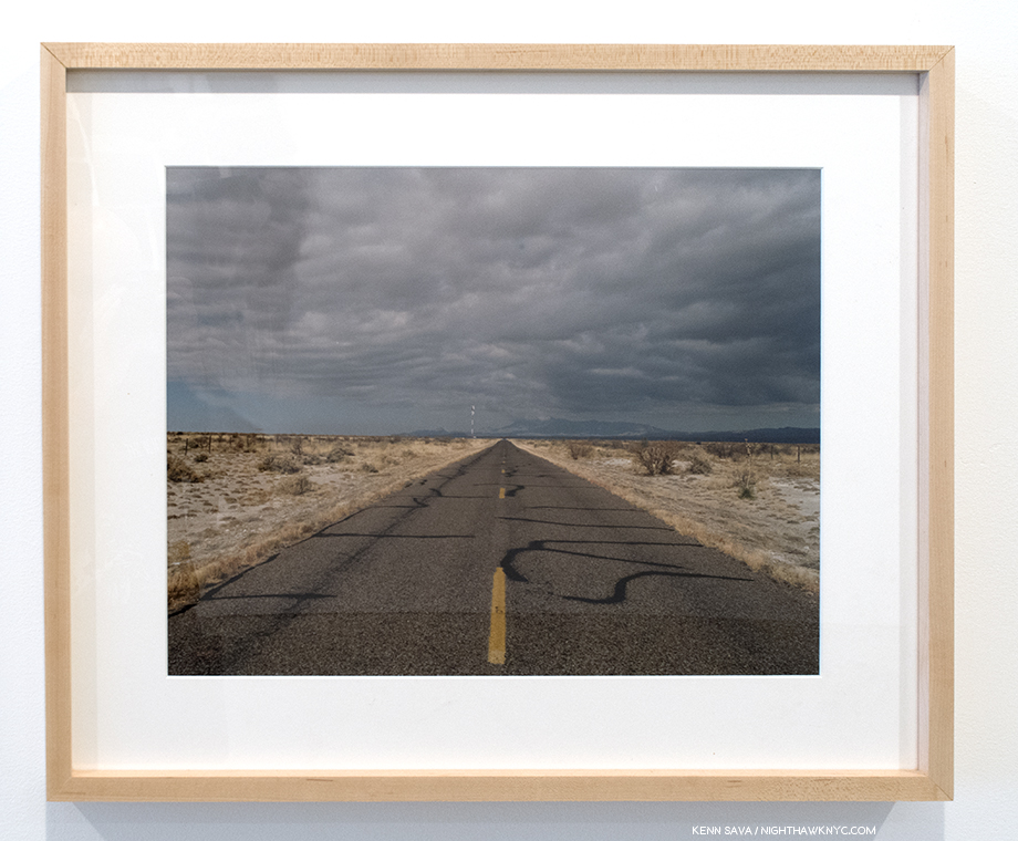
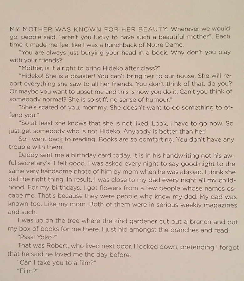
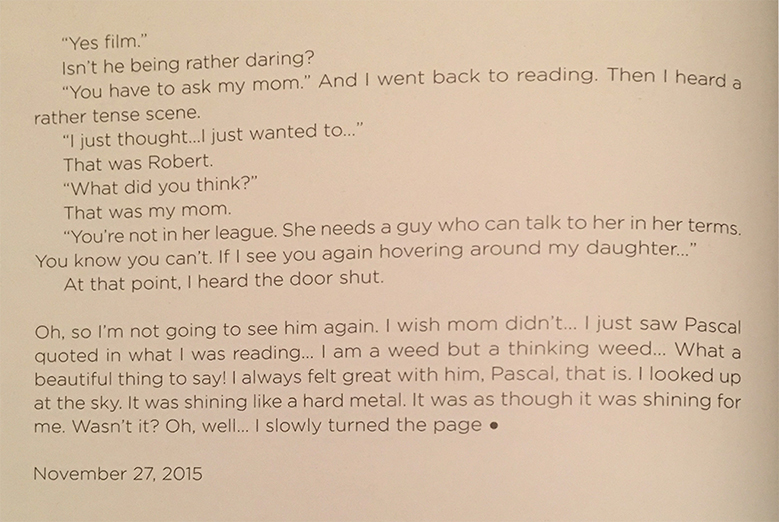
Written & Photographed by Kenn Sava (except El Paso Street, El Paso, Texas, July 5, 1975 )
Let’s play “Curriculum Vitae Roulette.”
First, make a list of ages going down the left side of the page. Next, write down some amazing feats, then slice them up individually, put them in a hat and mix them up.
No cheating! Blindfold, please. Begin!
Pull them out one at a time and lay them in a row going down, one next to each age. Repeat step 5 until the hat is empty. We’ll start with a given- the birth year. Let’s say…”Born 1947.” Ok. Let’s see what we have.
Born- 1947
Age 6- Gets a gift of a darkroom kit. Proceeds to develop and print his family photos.
Age 8- Gets a 35mm camera. “I started photographing seriously. Before that, my real interest was darkroom work,” he would later say.
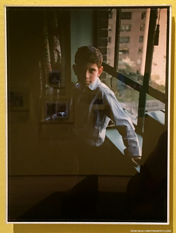
Age 10- Receives a copy of Walker Evans’ American Photographs, the catalog for Walker’s legendary 1938 MoMA show, perhaps, the first important American PhotoBook, which has a powerful and lasting impact on him. He would later call Evans “a kindred spirit.”

Our subject. Self Portrait, 1957. He was ten. TEN!! Click any Photo for full size. (See- “A Note About Glare In My Photos” in this footnote-.
Age 11- Has a Leica and a Nikon. Begins doing street photography.
Age 14- 1962- Legendary Photographer, then Director of Photography at MoMA, Edward Steichen, acquires 3 of his Photographs for MoMA. They ask him what his personal philosophy is. “None,” he replies. “I’m only 14.”
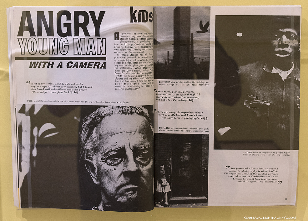
Age 15- First article about his Photography is published.

Angry Young Man With A Camera, U.S. Camera Magazine, 1963.
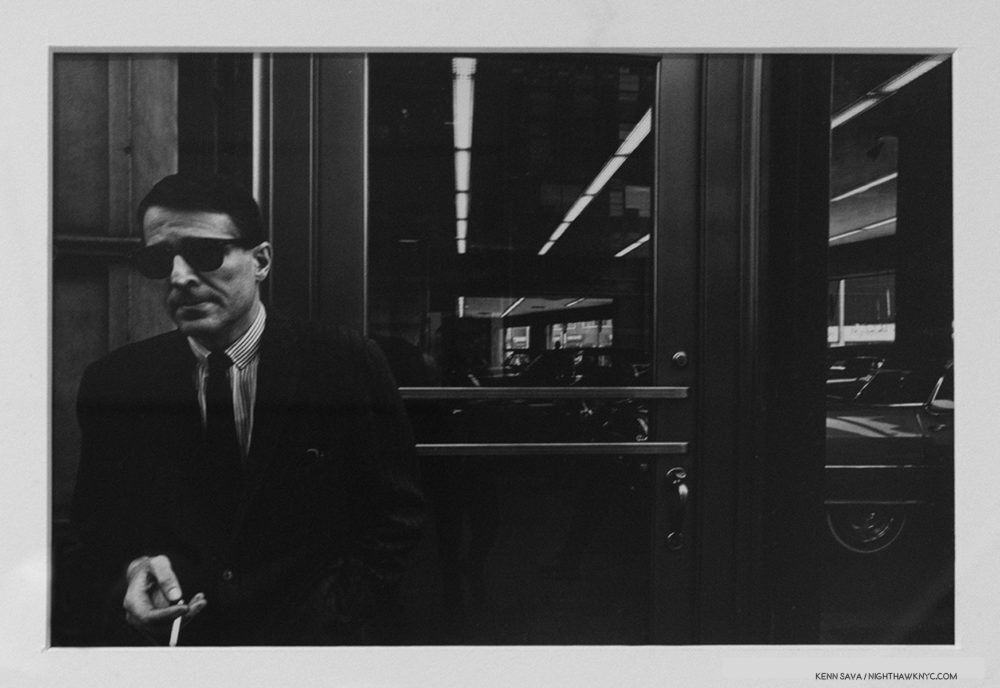
Age 16 & 17- Takes Photos like these-

Untitled, New York, 1964. A forerunner of similar images to come in the next decade, and beyond.

Untitled, 1965. I can’t look at this without thinking of Richard Estes’ now classic reflections from the 1970’s, like Central Savings.
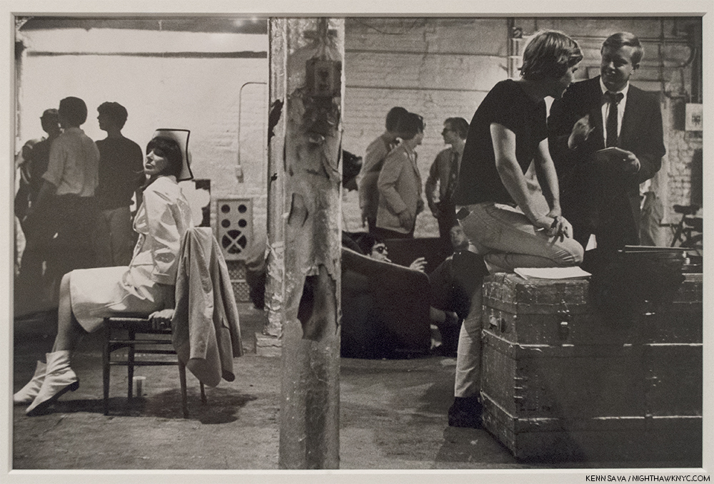
Age 17- Meets Andy Warhol and begins to frequent, and Photograph, Warhol’s Factory. Of how this came about, he later said- “I made a film Elevator, which is shown in this gallery (see below), and it was shown the same night that Andy Warhol showed a film called The Life of Juanita Castro, and I had the opportunity then to meet him. And I asked if I could come to the Factory and take pictures. He said, “yes.”

Ivy Nicholson, Chuck Wein, Peter Knoll, Danny Fields and Andy Warhol, the Factory, New York, 1965-67. I spent an evening hanging out with Ivy Nicholson, left in the white, in the early 2000’s. After a few drinks, she sold me one of her CD’s.
Age 24- 1971- First living photographer to have a one-man show at The Metropolitan Museum of Art.
Ok…I’m ROFLAICGU! (Rolling on the floor laughing, and I can’t get up!) Yeah…I know. Dumb exercise. NO ONE would believe that could actually happen, right?
But…Um? It did. It really did. ALL of it! To ONE person. That’s actually the short list of the early life and career of Master Photographer Stephen Shore. REALLY!
Once I got over the staggering accomplishments Stephen Shore achieved by age 24, which I’m not sure I still have (bearing in mind that William Eggleston didn’t start seriously taking Photographs until he was 18!), I could start actually beginning to assess what the man’s achieved, and is still achieving. The former was gloriously on display in MoMA’s retrospective. The latter was, also, gloriously on display at 303 Gallery on West 21st Street earlier this year, in two shows simply titled Stephen Shore. In between, and every day since, there’s his Instagram page which is a veritable one Artist iPhone Photo Museum, that’s amended daily. As he passes age 70, Stephen Shore is one of the most respected, and influential, Photographers of our time.
He got there the hard way- by continually forging his own way, even though those often lay outside of the “accepted mainstream,” like color Photography was in the world of “Fine Art Photography” in 1972 when he started using it, as he has relentlessly sought new ways to solve “Photographic problems.”

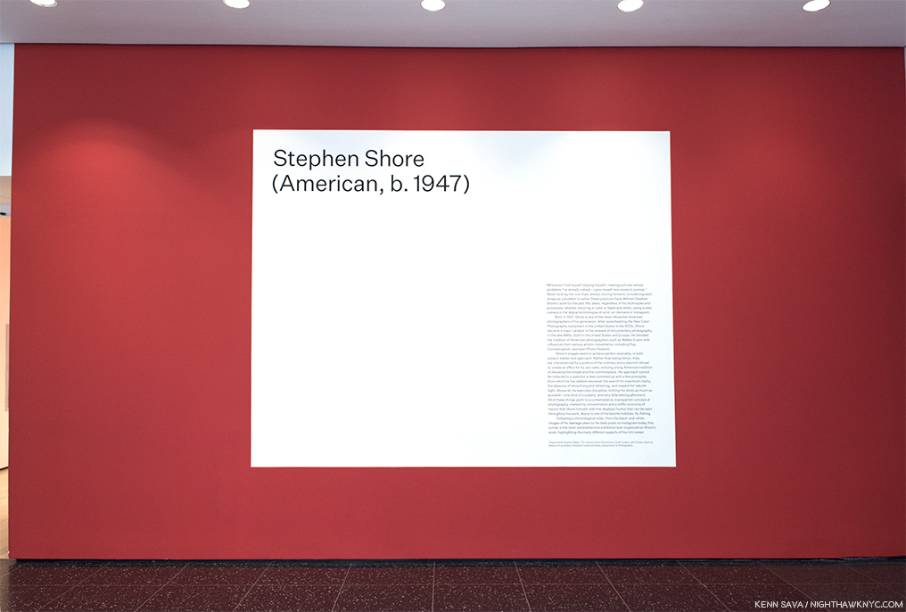
Stephen Shore at MoMA was a terrific chance to get the big picture. Taking full advantage of its very generous six month run, I learned more than I have from any Photography show since William Eggleston: The Democratic Forest at David Zwirner in late 2016 led to a deep dive into the world of contemporary Photography.
Many, even most, of those familiar with his work know American Surfaces” or Uncommon Places long considered his classics, (the resulting PhotoBooks of each were cited in Martin Parr and Gerry Badger’s The Photobook: A History, Volume II). They may not be familiar with his earlier, or later work. Over such a long career, it’s impossible to cover everything Mr. Shore has done, but MoMA has done an exemplary job of hitting a good many of the high notes along the way, including many of his most familiar Photographs surrounded by a good many that are not so well known. Along the way, it seemed to me, the show manages to tie his many and varied projects into a running thread. For an Artist who’s work has continued to evolve for going on 60 years, that’s an accomplishment, and for work that some may look at and not understand, it’s a valuable insight, and perhaps a “way in.”

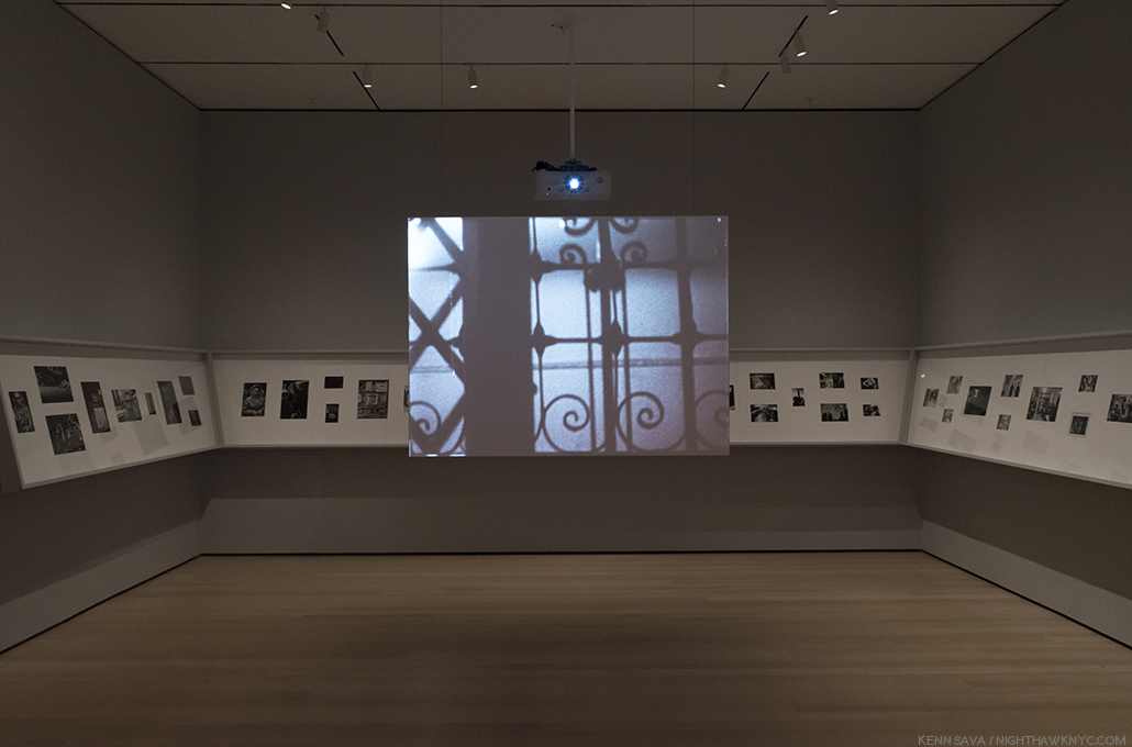
The first room features Stephen Shore’s earliest work, arranged counterclockwise. Which means that after you enter the gallery, to the right, you are presented with the latest works in the room, and you work your way to the earliest, on the left. Shouldn’t it have been the other way around? In the center of the room, Mr. Shore’s 16mm film, Elevator, 1964, the film Andy Warhol saw that led to him Photographing the Factory, is featured.
Fittingly, the first room begins with early work, and ends with his Photographs of Warhol’s Factory, while his short film, Elevator, 1964, plays in the middle of the gallery. It’s the film Warhol saw the led to Stephen Shore being invited to Photograph at the Factory. He would spend large parts of the next three years, from 1965-67 documenting it. It’s only recently that Stephen Shore has chosen to exhibit his Warhol/Factory work. “I rejected my Factory period for a long time. For so many of the others involved, it was the pinnacle of their lives. For me it just wasn’t. It was the beginning.”

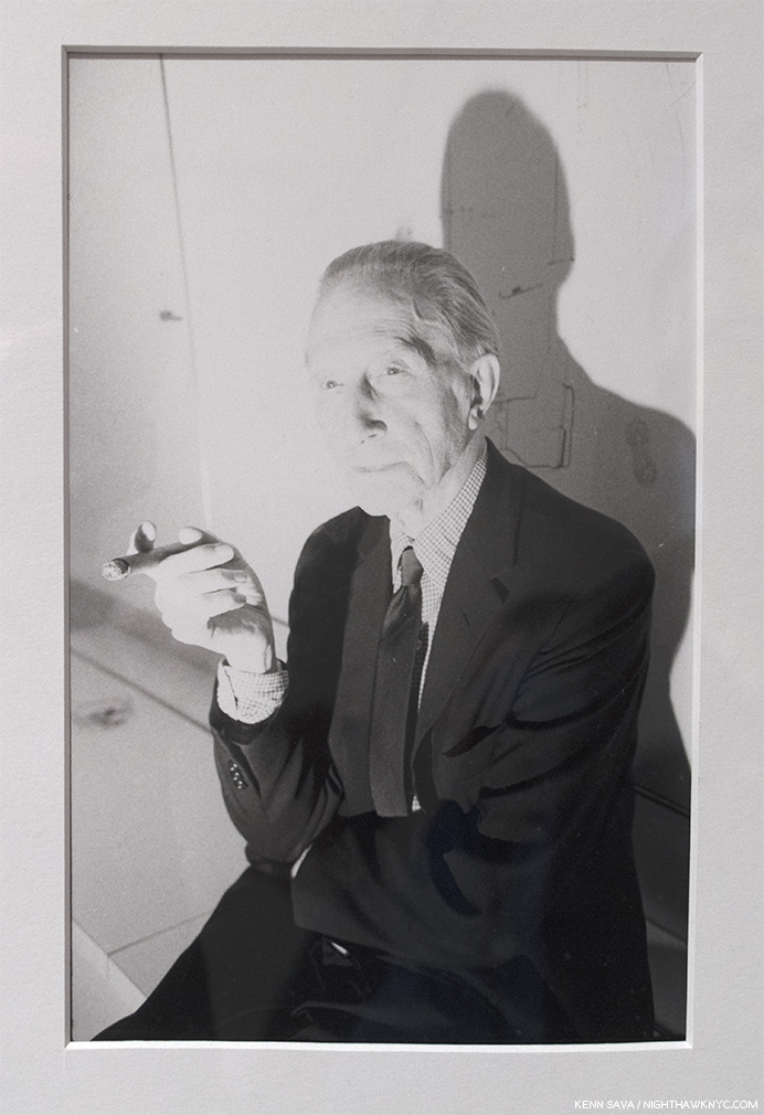
Marcel Duchamp, 1966, Photographed at Warhol’s Factory. With its evocative lighting, this unusual portrait was the final work displayed in the first gallery, though it’s actually the first Photograph viewers see after entering the show.
Lately, he’s seemed to come to terms with this work, as was seen in the 2016 Phaidon collection he was involved with, “Factory:Andy Warhol Stephen Shore.” Though different from all that came after that Stephen Shore has done, to my eyes, this is not only historically important work that documents the Factory as well as it has been. Each image brings unique elements- particularly the arrangement of the figures. Through it all, there is an intimacy on view that only a personal knowledge of the subjects can bring. It’s work that belies the youth of its creator and it more than holds its own as an historically important body of work that also holds up as Stephen Shore’s first “mature” body of work. At 17.

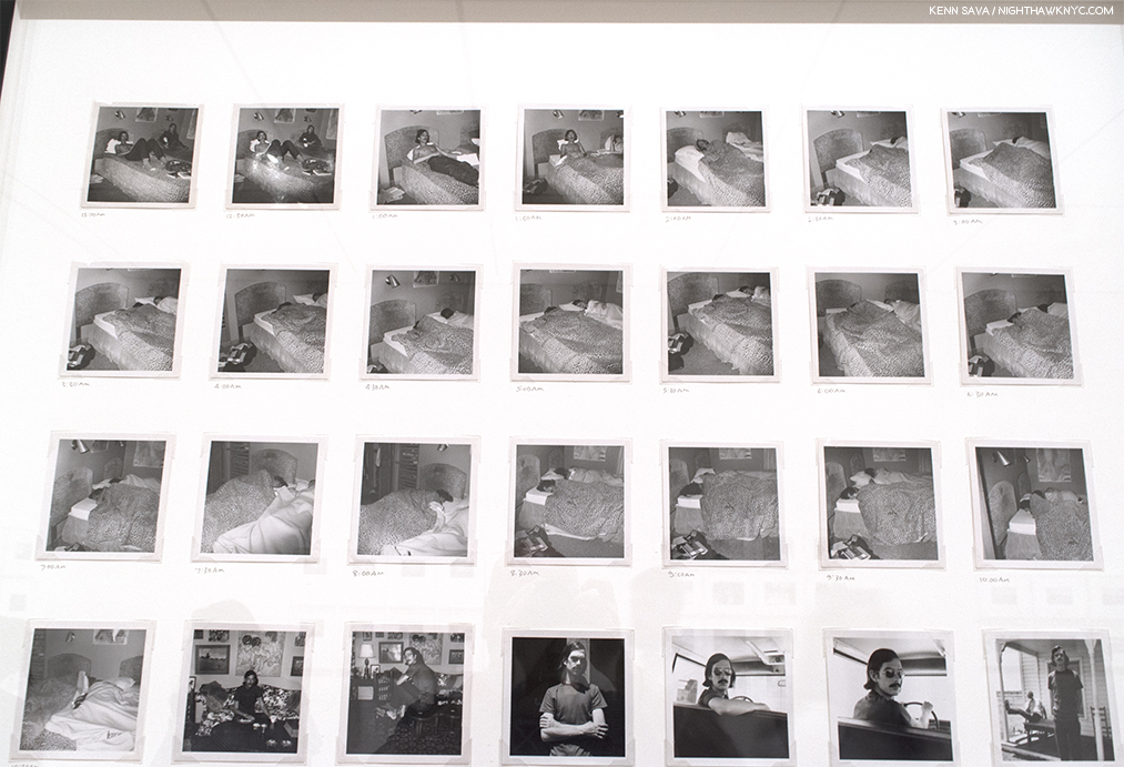
Detail of July 22-23, 1969, 1969. Stephen Shore Photographed a friend every 30 minutes for 24 hours. Even while his friend slept.
From there, Stephen Shore looked for new realms to explore, new problems to solve. He explored Conceptual and Serial Photography, which we see in the second gallery. The great Painter and Photographer, Ed Ruscha, had broken ground with his book Twentysix Gasoline Stations, 1963, a series of Photographs Mr. Ruscha took of gas stations from L.A. to Oklahoma City, which, influenced Stephen Shore deeply. As I walked through the rest of the show, I couldn’t escape the feeling that Conceptual and Serial Photography continues to influence his work- to this day. Ever since, most of the work he has done has been in series, whether in personal projects or commissions.

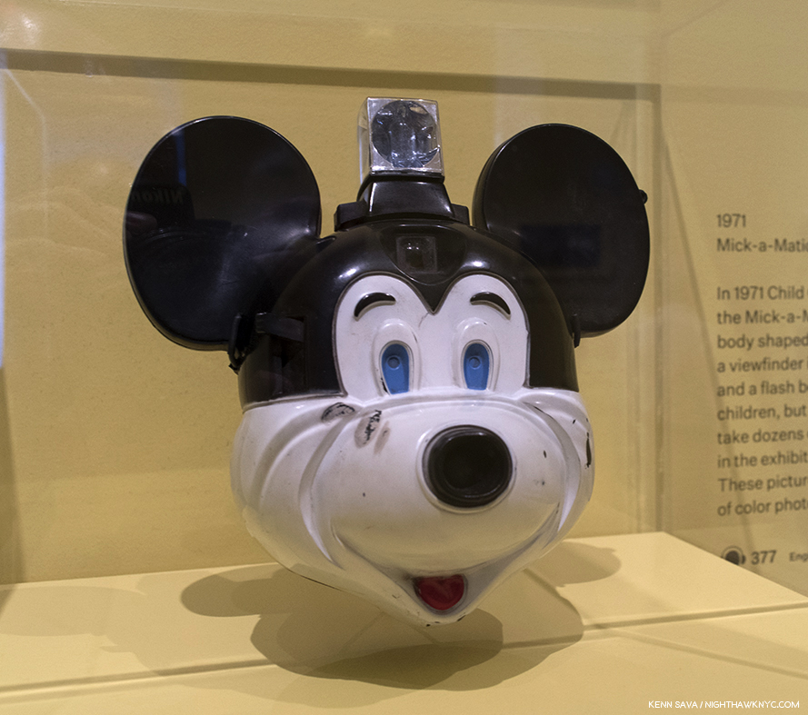
“Mick-a-Matic” Camera. Believe it or not, Stephen Shore used a Mick-a-Matic in 1971 to take his first color Photos, (some on view at MoMA, in the All The Meat You Can Eat section). He used it to get a “snapshot” feel, a pursuit he continued using a Rollei 35mm camera in his first landmark series, American Surfaces, in 1972-73.
In the 3rd gallery, we re-visit a show that Mr. Shore curated called All The Meat You Can Eat, 1971. On display were examples of the vernacular uses of Photography, with a few shots by Stephen Shore (apparently taken with the “Mick-a-Matic”), but most taken by others. About it, he said, “I was just fascinated by how photography was used. I was interested, also, in the meaning conveyed by how it was used—that we see a snapshot differently than we see an art photograph, that we see an advertisement differently than we see a postcard.” It was around this time that he became interested in color Photography. “Because postcards and snapshots, in 1971, were all in color, I had to begin examining color photography. In fact, most photography that an average person encountered at the time was color. While art photography, the photography that would be found in galleries, was almost always in black and white. That convention bothered me.” Regarding his interest in the snapshot, he spoke about a certain quality that some of them had- “…it’s very hard to find the quality of the unmediated image(3. As quoted here. I amended the quote to “unmediated” with the input of Mr. Shore.].” All of this combined to lead him further down the road of Conceptualism, though with a better camera (a Rollei 35mm), and take him, literally on the road.

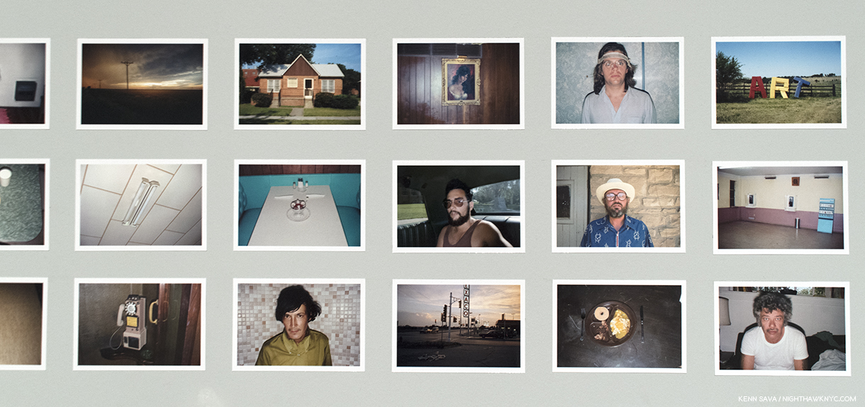
Installation view of 219 images from the over 300 that comprise American Surfaces as displayed in the 4th gallery at MoMA, recreating how they were first displayed.
He returned with American Surfaces, 1972-73. In keeping true to the snapshot model, he even sent his film to Kodak in New Jersey for processing, like every other snap shooter at the time was doing. “It began as a road trip. My idea was to keep a visual diary of meals I ate, people I met, televisions I watched, motel rooms I slept in, toilets I used, as well as the towns I would drive through, and, through this visual diary and series of repeated subjects, build a kind of cultural picture of the country at the time.” The resulting series of over 300 35mm prints are in the familiar 3 1/16 by 4 5/8 inch snapshot size, though it’s debatable how many of them have that “unmediated” feel. Looking at them now, is a fascinating example of the impact of the passing of time. While the series was met with less than stellar reviews, most notably from the legendary head of MoMA’s Photo Department, John Szarkowski, The Metropolitan Museum of Art bought the entire series. It’s already hard for us to see them as they looked in 1973, but it’s not hard to find the innumerable examples of influence of this series in the work of others since…like in countless people’s social media feeds of every meal they eat, every place they visit, etc, etc. 40-odd years later? Stephen Shore has said that he found Robert Frank’s The Americans “too pointed. That certainly cannot be said of American Surfaces, though the influence of Walker Evans, Ed Ruscha and Bernd and Hilla Becher, along with Andy Warhol, are to be found, if anything, it’s remarkably open.

Excerpts from American Surfaces, 1972-73, Stephen Shore’s now a classic groundbreaking first series, a visual diary of a road trip . Taken with a 35mm Rollei camera.
Mr. Szarkowski’s criticism of whether the semi-automatic Rollei had created the results, rather than Mr. Shore’s abilities, led the Artist to double down on his intentions. Realizing he couldn’t make 8 x 10 prints from the small negatives without too much grain, he decided to go on another road trip, with bigger cameras. He tried a 4 x 5 camera made famous by press Photographers like Weegee before settling on an 8 x 10 inch camera, which required a large tripod and for the Photographer to shoot under a black hood. The results were worth it. Uncommon Places retains every bit of its majesty and mystery. Though it reprises many of the themes familiar from American Surfaces- meals, motel rooms, architecture, and portraits, the results have a magic that have more than held up since Aperture first published them in 1982. They remain THE series people are referring to when they say something “looks like a Stephen Shore.”

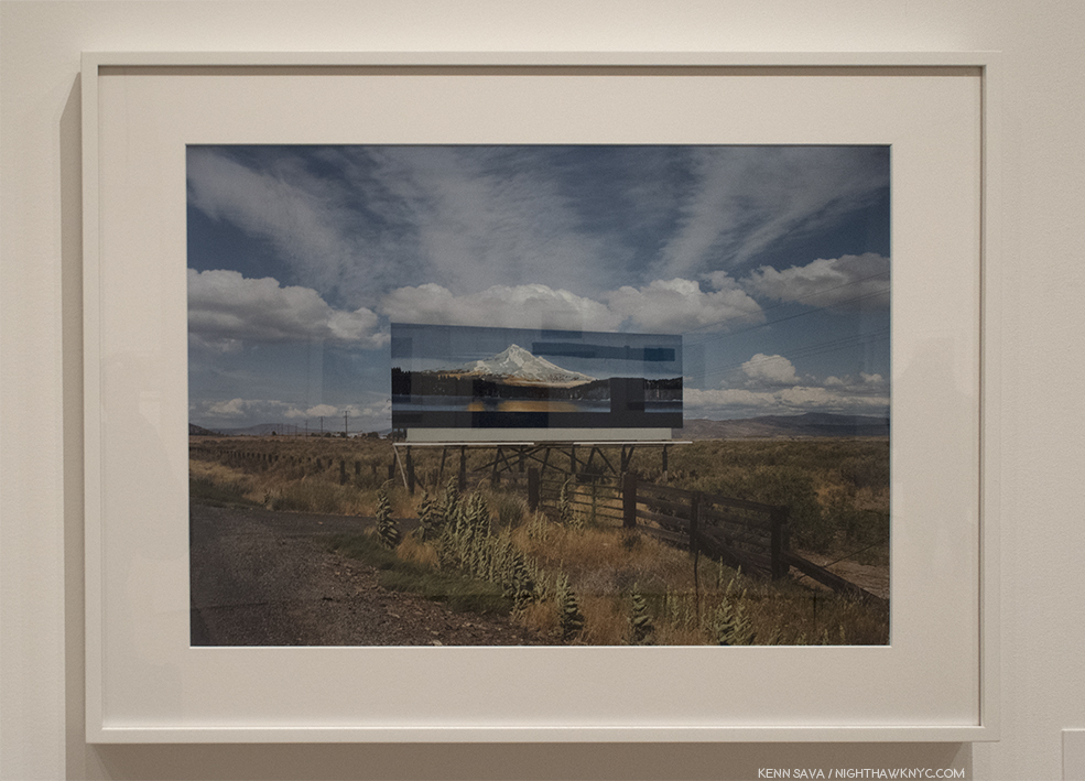
U.S. 97, South of Klamath Falls, Oregon, July 21, 1973. Ahh…the wide open spaces…that only an 8 x 10inch camera can provide.
Both American Surfaces and Uncommon Places are personal and impersonal at the same time. Personal because these are his trips. These are the meals he ate, the rooms he slept in, the people he met, the places he saw. Impersonal because the Artist himself is not seen, nor do we get any indication of what meaning any of these places, people or things have for him. In that sense, they are different from most tourist’s snapshots. The shots of places are like the Paris of Atget, or many of Walker Evans shots of America. The difference I see between American Surfaces and Uncommon Places is the former is marked by Photos that say “look at this,” whereas the latter creates “a little world that a viewer can move their attention through without (his) directing it.”

Lookout Hotel, Ogunquit, Maine, July 16, 1974, 1974.
It’s up to the viewer to piece them together- individually and as a group, like William Eggleston’s “Los Alamos,” 1965-74, which is also a travelogue of sorts, who’s period partially overlaps.

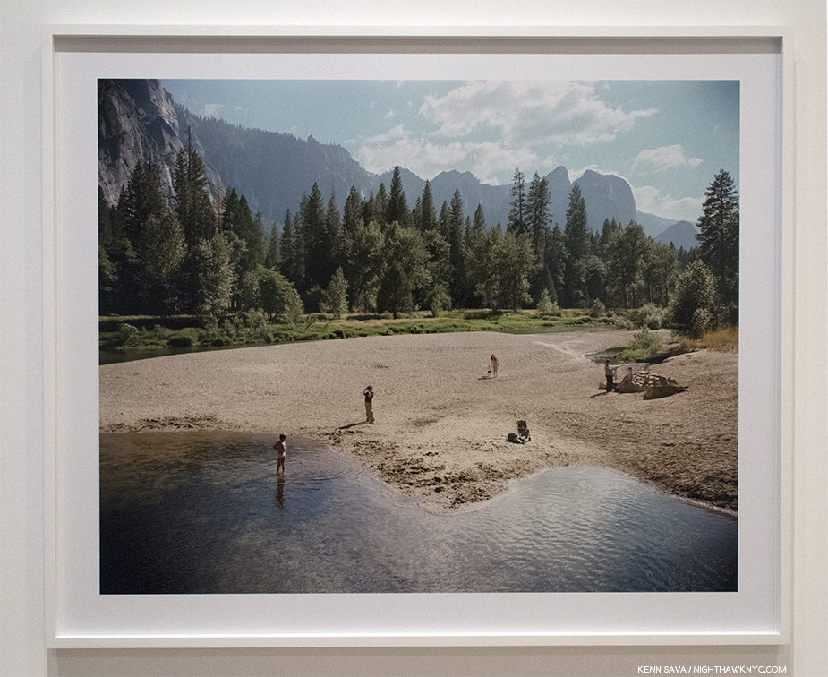
Merced River, Yosemite National Park, California, 8/13/79, 1979. The only work in the show to hang on a wall by itself would seem to lie at the heart of the show.
Merced River, Yosemite National Park, California, 8/13/79, 1979, strikes me as a bit of a rosetta stone when looking at much of Stephen Shore’s work. Intriguingly, it hangs on a wall by itself at something of the heart of the show. At first glance, it appears to be a fairly ordinary landscape view with some folks (perhaps a family) frolicking on the beach in the mid foreground. “…what I realized is that it renders the world in such detail that I don’t have to move into something close to make it clear in a picture. I can let it be a small part of a larger, more complex picture. And so, rather than the picture being, in a way, a view through my eyes, it becomes something else. It becomes a complex world where the viewer can move their attention.”

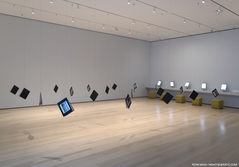
The gallery of Print on Demand books, with a row of iPads displaying Stephen Shore’s Instagram page, right.
He demonstrates this in the gallery to its left, in a room full of hanging books, print-on-demand titles he created in the early 2000’s. Of the 20 books hanging in this gallery, one is devoted to Merced River.

The complete contents of Merced River, Yosemite National Park, California, 8/13/79, 1979, one of the print on demand books seen above.
In it, the Artist presents the master image as a series of sectioned images, showing us that each one could be a stand alone Photograph. While each proves fascinating on its own, for me, most interesting is the bottom left Photograph, in which we see a side view of the scene Ansel Adams shows us in his famous Photographs, Monolith, Face of Half Dome, 1927, and Moon And Half Dome, 1960. Stephen Shore was one of the Artists included in the ground breaking 1975 exhibition titled New Topographics: Photographs of a Man-Altered Landscape, at the George Eastman House in Rochester. Mr Shore, along with Lewis Baltz, Robert Adams, Joe Deal and 4 other American Photographers were shown turning away from the classic landscapes of Ansel Adams and Edward Weston’s time and showing the American Landscape as it now existed- altered by man.

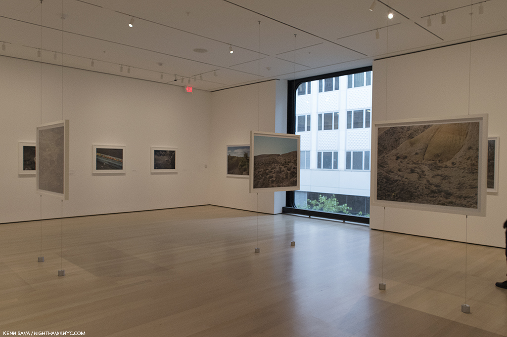
This gallery of landscapes taken in the Montana, Texas, Upstate New York and Scotland was something of a beautiful revelation. Complete with landscapes hanging in mid-air.
There’s a “calmness” that overrides almost everything I’ve seen by Stephen Shore. There’s very little “action.” Even in his commissioned Photographs of the New York Yankees in Spring Training, not much is going on. Players sit in a group, or stand at the plate, motionless. What we’re almost always given to look at is a “surface” of some kind. But, what strikes me about Stephen Shore’s work is that it almost always leaves me pondering what’s under that surface.

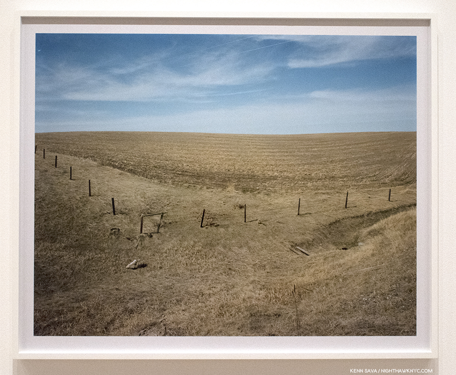
Gallatin County, Montana, April 18, 1981. The second time I met him, I asked Stephen Shore about Painters he liked. He replied, “Anselm Kiefer.” Then added, “I don’t think of Painters when I’m working.” That doesn’t stop me from thinking about them. Looking at this work, I’m reminded of Van Gogh’s immortal Wheatfield With Crows. Minus the crows.

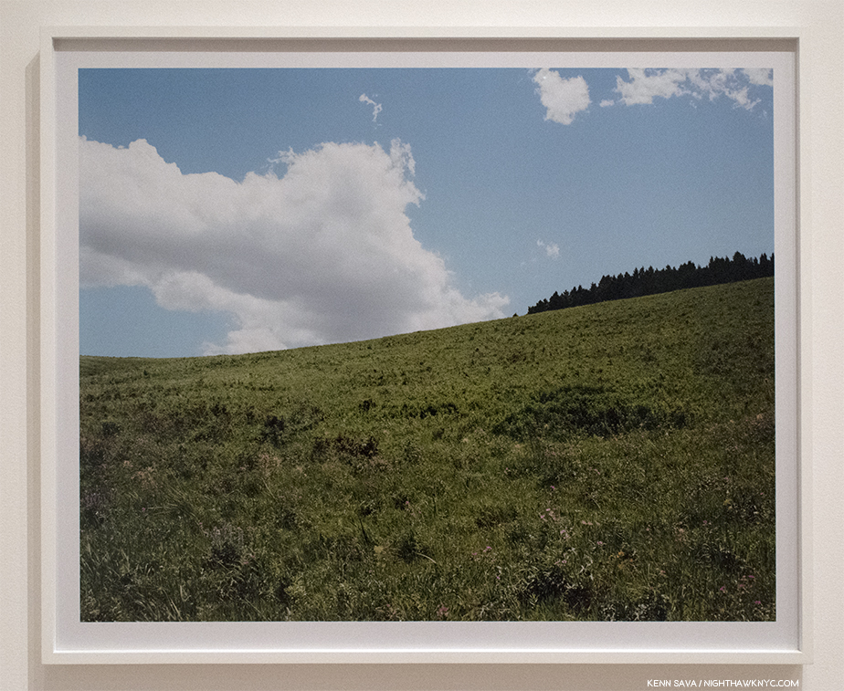
Gallatin County, Montana, August 2, 1983. Again in the gallery that I came to call “The Hall of Landscapes,” this one struck me as being a non-“New Topographic” landscape, and so is rare in his work. Here, there is no evidence of man altering the landscape. Instead, we see an image almost split in two between land and sky, though it’s hard to tell exactly how far off the crest of the hill is, and so it reminds me of Holden Street, North Adams, Massachusetts, July 13, 1974, from Uncommon Places, as a work in which distance and perspective are key elements. Along with the peaceful beauty.
I met Stephen Shore twice during the show’s very generous six and a half month run. I asked him how he felt about the show. “I’m thrilled,” he replied. Well, that might not sounds like an earth-shaking, newsworthy response. But, then I thought about Stephen Shore’s career, and how the initial reaction to his work was not always positive (see below). At MoMA, all these years later, with glories around every corner in every gallery, he’s been “proven right,” so to speak. The show is an unmitigated triumph.

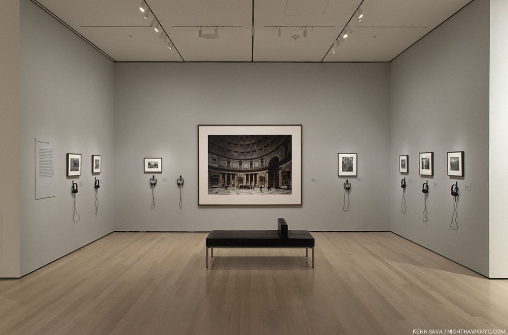
The central gallery devoted to his book, The Nature of Photographs, about looking at Photographic prints, features his work and the work of others he uses as examples in the book, like Thomas Struth, center.
Add to that, he’s been the Director of the Photography Program at Bard College since 1982, as well as the author of the highly respected primer on looking at Photographs, The Nature of Photographs, which was first published in 1998 (See the “BookMarks” section at the end for my recommended Stephen Shore books…though you really can’t go wrong.). His influence on other Photographers is everywhere and already incalculable, and seems likely to continue indefinitely. There’s certainly a lot in 2018 for Stephen Shore to be “thrilled” about.

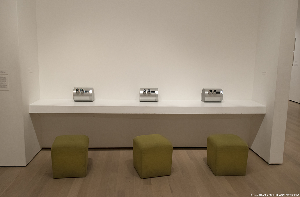
3 Stereoscopic viewers each containing 10 different Stereo Photographs Stephen Shore took in 1974 with a Studio-Realist 3-D camera.

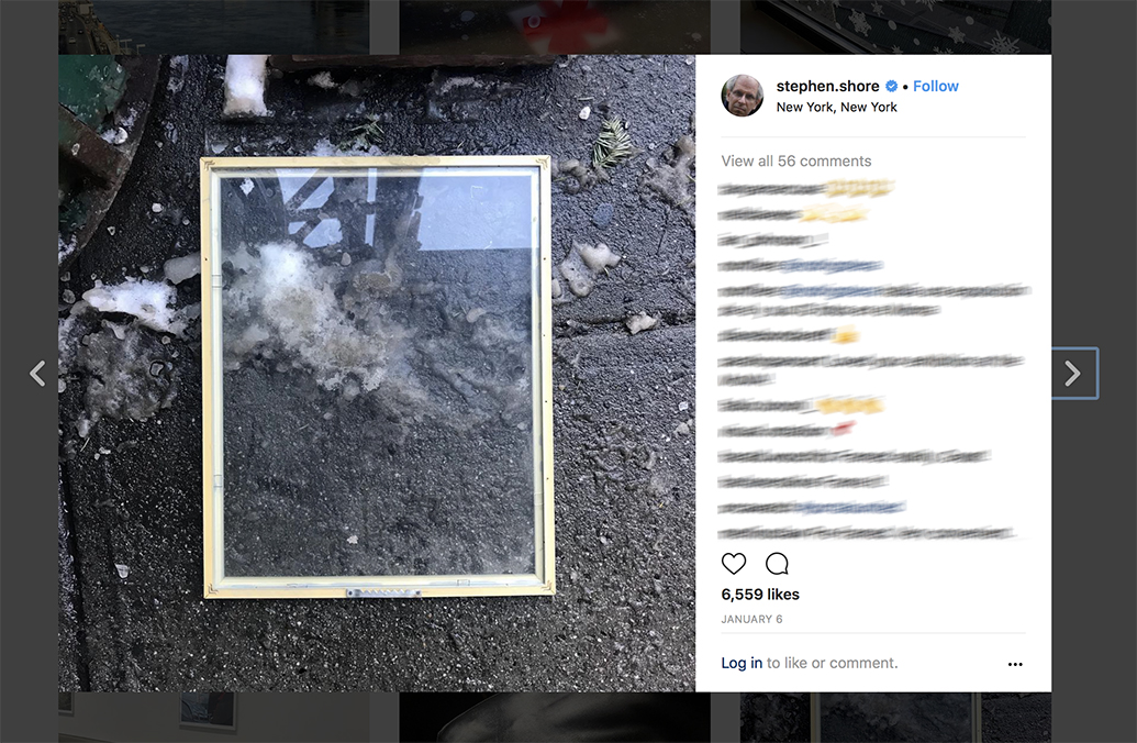
Stephen Shore’s Instagram page, January 6, 2018.
Stephen Shore has been posting virtually daily on Instagram since 2014. Of his approach, and some of the comments he’s received he wrote this on February 18, 2018-
- stephen.shore “Shore seems intent on proving that anyone can photograph as well as he can, and I must admit he’s building an airtight case. The specific concept behind this exhibit is not readily apparent to me, which would make me feel old-fogeyish as all get-out if I weren’t still young enough to not give a fuck.” This is from a review (in the Village Voice) of a show of mine in 1972. This is how some people viewed the very work of mine that you now respect and perhaps view as “iconic” at the time it was made. It sounds very much like the criticism I’m hearing today – except you all are more polite and respectful. Every now and then I write about my use of Instagram and this seems like an appropriate time. Some photographers refer to their feed as their “gallery”; they see it as a means to make public their best work. There are also well known photographers who have an assistant go into their archives and post one of their best known images each day. My own approach is to post almost every day a picture I made with my phone with Instagram in mind. I see the pictures as a kind of visual jotting – similar to the way Walker Evans used the Polaroid SX-70 camera when he was about the same age as I am now. I’m definitely not defining how Instagram should be used, just stating my intentions. I want to thank all of you for taking the time to express your views. You might find this article of interest: http://stephenshore.net/press/Photograph_Dec_17.pdf

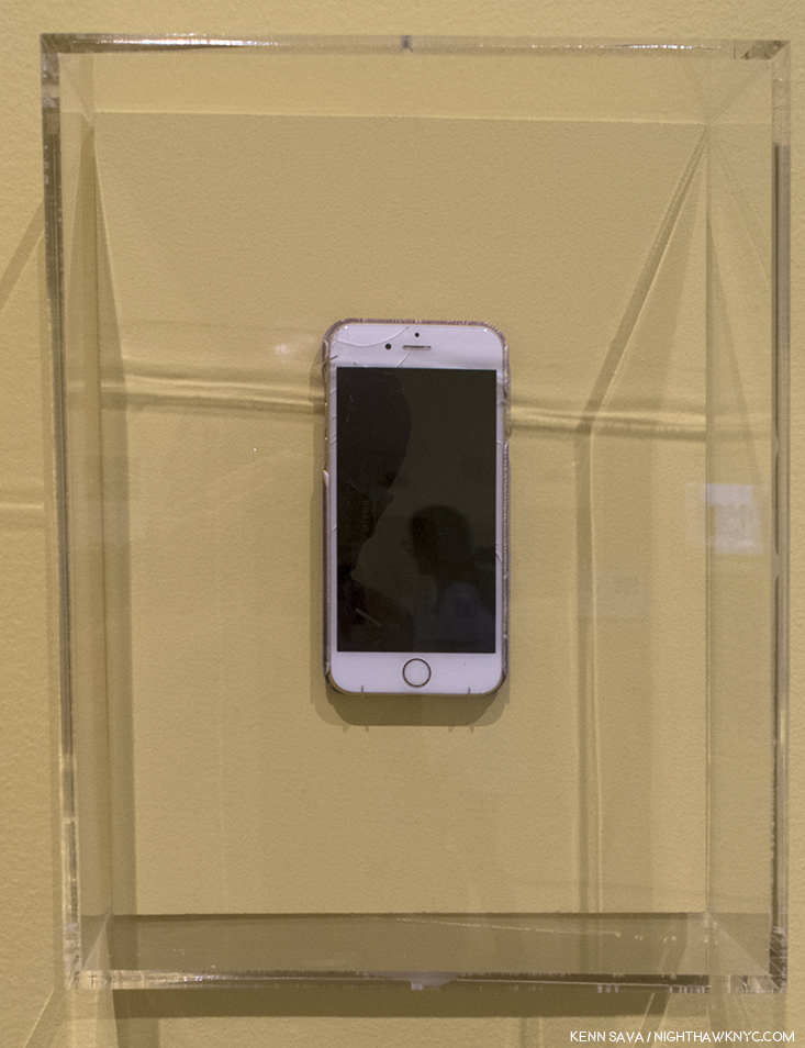
(One of) Stephen Shore’s iPhones. When I met him in January, as seen below,, he was holding a different one. Still, this one was most likely used for his Instagram page. Your results may differ.
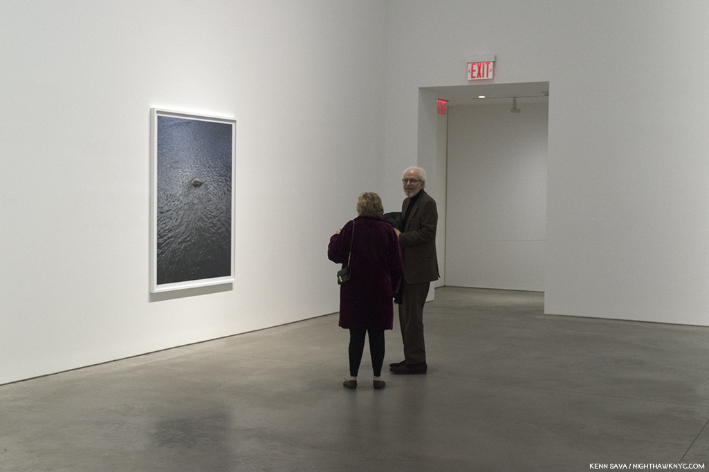
While countless social media feeds now look eerily similar to American Surfaces when he first showed them in the fall of 1972, the show was “totally baffling then to almost everyone who saw it.” Now, Stephen Shore uses Instagram in his own way, and after 4 years of doing so, with an iPhone, its influence can be seen in his other new work. In addition to the MoMA show, 2018 began with a show of new work by Stephen Shore at Cheslea’s 303 Gallery, his long time dealer. On view were recent Photographs taken with his new Hassleblad Digital X1D camera, which features a touchscreen, much like an iPhone.

Stephen Shore arrives at the opening of his show at 303 Gallery, January 11, 2018. Moments later, this room was packed.
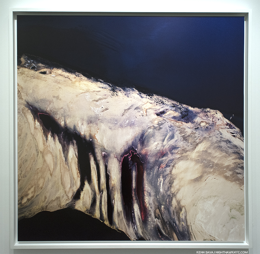
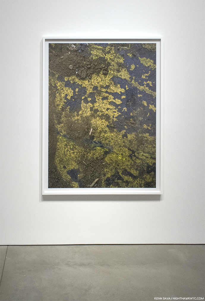
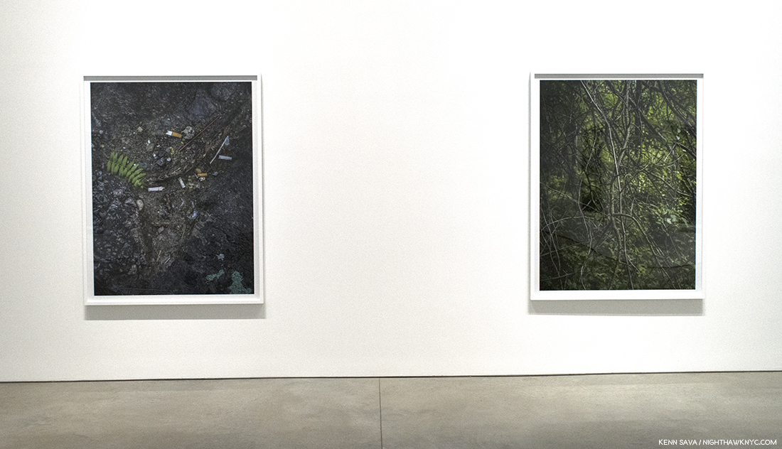
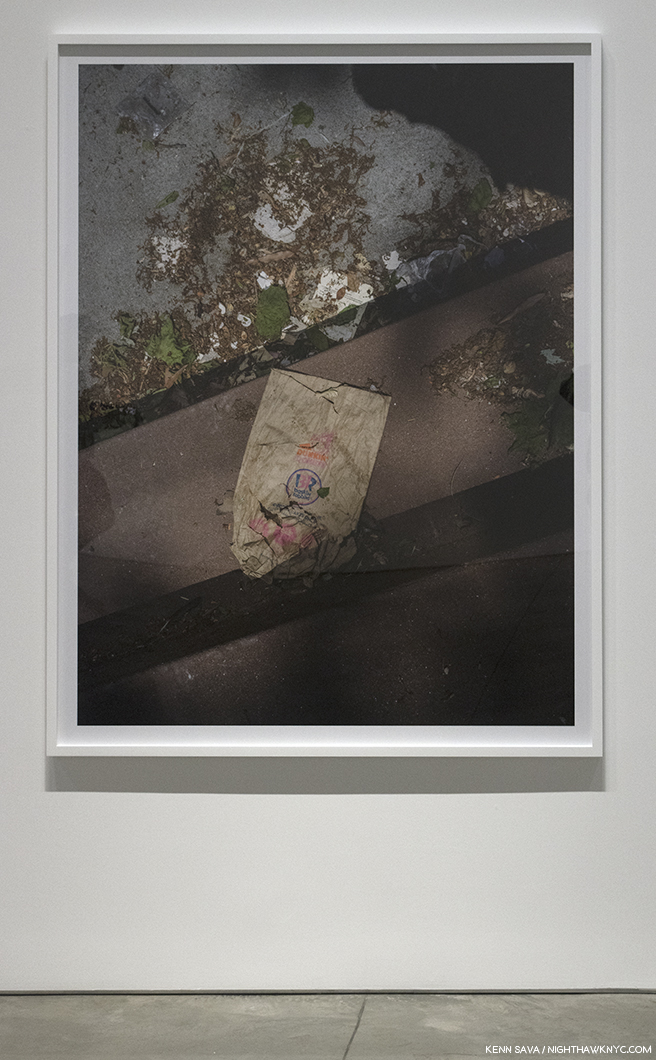
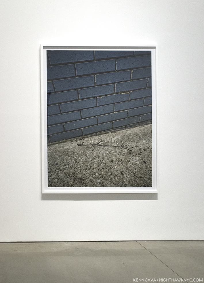
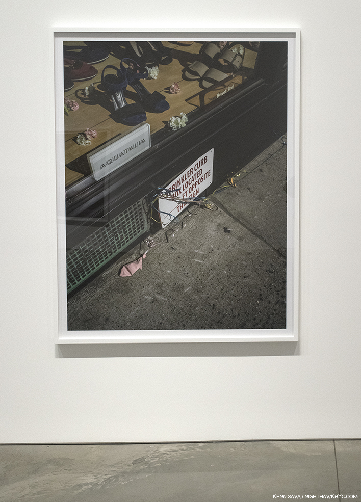
His recent work may look familar to anyone who’s seen his Instagram page. Mr. Shore explained that while he was out walking his dogs he did a lot of looking at the ground. He became interested in “details” he’d see of the ground or the street. More surfaces, yes, but looking through his past, pre-Instagram work, reveals the occasional image similar to these. Using the 50 megapixel Hasselblad X1D Medium Format Mirrorless Digital Camera, he’s able to take images that he can print at sizes of 5 feet, that are, he says, “more highly resolved than work from my 8 x 10 camera.”

New York, New York, May 19, 2017, seen at 303 Gallery, January, 2018.
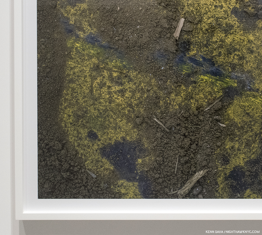
I find the results enthralling. Some of the 9 works on view at 303 reminded me of Aaron Siskind, but in the level of detail Mr. Shore brings to bear, they’re completely and entirely something else. Seeing details printed in such a scale presented a small world, where only an occasionally recognizable object, like a matchstick, would give a sense of scale.

New York, New York, May 19. 2017, left, and London, England, June 9, 2017, right, both seen at 303 Gallery, January, 2018.

New York, New York, May 19.2017, seen at 303 Gallery, January, 2018.

New York, New York, May 19.2017 seen at 303 Gallery, January, 2018.

New York, New York, May 20.2017, seen at 303 Gallery, January, 2018.
Without that familiar object, some almost look like a Photograph of the Earth, or some other planet, seen from space. In these works, he’s gotten closer to the surface than ever, about as close to it as possible.

Detail of New York, New York, May 19, 2017. Kinda, sorta looks like North America, no?
For most of his career he seemed to be striving to make big scenes big, possibly to have the impact of being there. These seems to be striving to also make small scenes big. In his latest work, he brings the viewer so close it’s almost as if he’s trying to see under the surface.
Back over at MoMA, there is a small room of works in which he has actually gone under the surface.

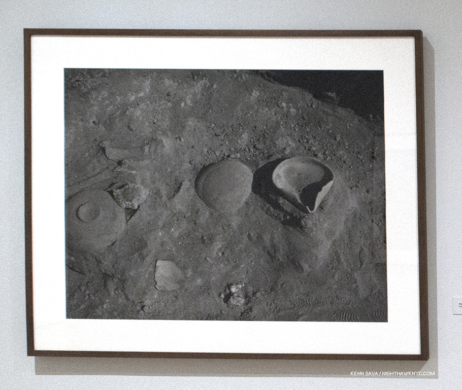
Ashkelon, Israel, 1996, at MoMA.
In 1990s Stephen Shore became fascinated by archeology. After reading extensively on the subject, he undertook projects at excavation sites, beginning with some ancient sites in Israel. Once again, as in a good deal of his earlier and later work, the images are without people. What he shows us here are ancient objects dug out from under the surface. In this case Stephen Shore shows us the surface and what literally lives under it. What we see are the remnants of human activity, life…their presence. In this case the remnants of a lost civilization.

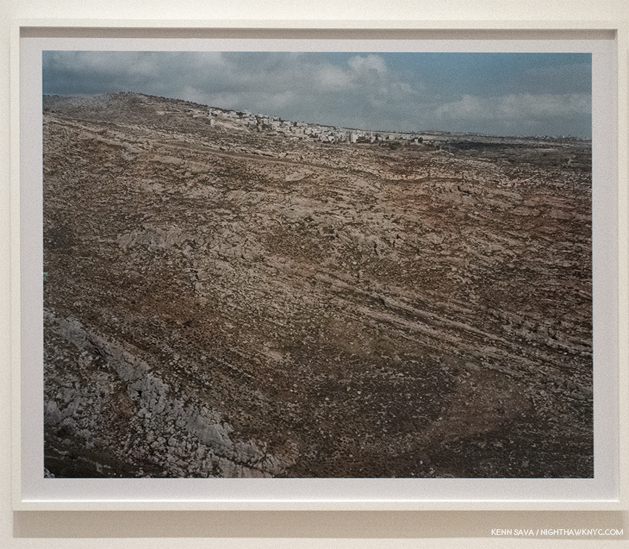
Beitin, West Bank, January 13, 2010, at MoMA. It almost looks like the side of a large hill, with eons of geological strata facing us, with the current civilization on top, though it’s most likely a flat road or open space leading to the town in the distance.
While thousands of years have past since humans created and used these objects and places, in Ashkelon, Israel, and the other sites he Photographed, are they really all that different from what he shows us in American Surfaces, from 46 years ago? I’m sure a good number of those places are gone now, too. The main difference is that American culture is still here. What lies on the surface eventually gets covered over or is lost to time. One day there may be archeological digs going on here. “American Surfaces” is an unintentional piece of our cultural past, as are any vintage Photographs. In its case, it’s an artfully done series of over 300 works that taken together gives us a bigger sense of our culture in 1972. Much of the same can be said for Uncommon Places, since it continues many of the same themes. The larger 8 x 10 format is, perhaps, shown to best effect in the landscapes. In these, we see the effect that humans have had on the land- constructing buildings of various kinds, or otherwise modifying the land- the very crux of what was meant by “New Topographics,” Photographs of the man-altered landscapes.
“Lately I’ve been paper thin
So, why can’t I fly?
Why can’t I move with the wind on a whim?”*
Photographs are two dimensional representations on the surface of Photographic paper, of course. There is no “going underneath” the surface of a Photograph. Stephen Shore has long been something of an Archeologist Photographer, showing us our world as he finds it, a world teaming with evidence and artifacts of human presence, and so the resulting Photographs are often packed with so much information the temptation arrises to ponder what it “means,” what lies “under” the surface.

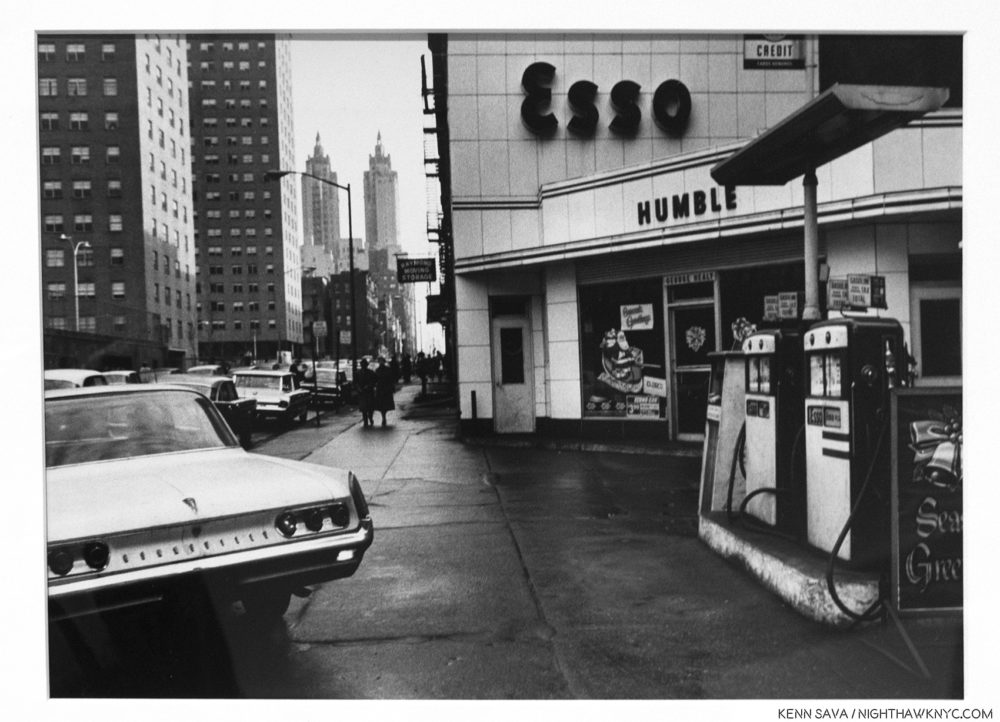
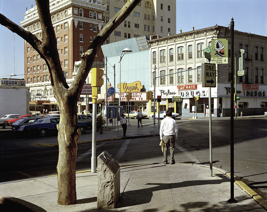
El Paso Street, El Paso, Texas, July 5, 1975 from Uncommon Places. This is one image I’ve literally spent hours looking at and thinking about. MoMA Photograph, and included in the Nature of Photographs section of the show.
Until, I came across this that he, himself, said. “…I was fascinated by what the world looks like when you pay attention to it, and I’m still interested in this act of attention. And so the pictures are reflective of the condition of a self, paying attention.”
Remember that game we played in the beginning? Stephen Shore’s real life C.V., now approaching book length, gets even more impressive every day. Exploring it serves to show me that one of the great lessons, and examples, of both shows is that over such a long and fruitful career, Stephen Shore has continually resisted repeating himself. There are other Photographers who have made a career out of attempting Uncommon Places-style work, but Mr. Shore has relentlessly moved forward, seeking new Photographic problems to solve and continuing to evolve as an Artist. Think about how few Artists have been able to do this. Among Musicians, The Beatles, weren’t able to last more than 10 years before they broke up, and even among individual Musicians or Artists there are very few who have a similar track record. When considering Stephen Shore’s ongoing accomplishment, I look over this already long piece and the first thing I think about is how much I’ve left out. But, the joy of delving deeply into any great Artist’s work is that of discovery. I don’t claim to have “discovered” all that there is to discover in Stephen Shore’s work in 6 months. Particularly because- He’s going to surprise me, again, tomorrow.
BookMarks- (A series that looks at books related to the subject of this Post.)-
PhotoBooks have been a big part of Stephen Shore’s career. If you want to explore Stephen Shore’s work, the excellent Aperture Foundation has 2 books available that are both essential, in my view. Uncommon Places: The Complete Works, updates the original 1982 Aperture classic, Uncommon Places, (now out of print with first edition/first printing copies selling for about $900.00 at the moment). I recommend the Aperture’s 2015 update, Uncommon Places: The Complete Works, which lists for $65.00, because Mr. Shore added 20 rediscovered images, in what is now, as Aperture says, the “definitive edition,” of this unique and endlessly influential series.
Second, last year, Aperture released Stephen Shore: Selected Works, 1973-1981 , which was one of my choices for the PhotoBook of the Year. Though a bit too large (note all the white space around the Photos), the concept of this book is brilliant. Aperture explains- “Over the past five years, Shore has scanned hundreds of negatives shot between 1973 and 1981. In this volume, Aperture has invited an international group of fifteen photographers, curators, authors, and cultural figures to select ten images apiece from this rarely seen cache of images. Each portfolio offers an idiosyncratic and revealing commentary on why this body of work continues to astound; how it has impacted the work of new generations of photography and the medium at large; and proposes new insight on Shore’s unique vision of America as transmuted in this totemic series.” Check out the list of the 15 contributors- Wes Anderson, Quentin Bajac, David Campany, Paul Graham, Guido Guidi, Takashi Homma, An-My Lê, Michael Lesy, Hans Ulrich Obrist, Francine Prose, Ed Ruscha, Britt Salvesen, Taryn Simon, Thomas Struth, Lynne Tillman.
American Surfaces , first released in 1999 with 77 Photographs, was reissued in an expanded, 300 Photograph edition, in 2005 by Phaidon, that came in a reproduction of a 1970’s Kodak film processing bag. it’s currently available (without the nifty bag) in a very good paperback edition that lists for 39.95, and is still essential for anyone interested contemporary Photography.
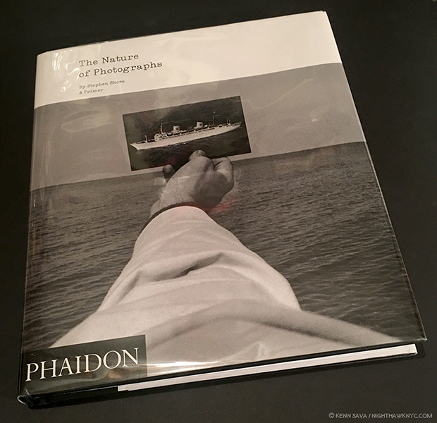
Stephen Shore has been Director of the Photography Program at Bard College, NY, since 1982, and The Nature of Photographs: A Primer , first published in 1998, and now republished by Phaidon, is as close as we have to his “textbook” on the subject. Not a “how to take great Photos” book, it’s more a study of looking at the end result- prints. Mr. Shore believes that aspiring Photographers should spend at least some time working with film, and that includes its end product- the print. As the world of Photography becomes more and more digital, and fewer Photographers have experience working with film and printing in a darkroom, this book becomes an ever-more valuable document from a master of the darkroom for over 64 years. In it, Mr. Shore talks about “the physical and formal attributes of a Photographic print that form the tools a Photographer uses to define and interpret…content,” such as flatness, frame, time and focus, each accompanied by classic images, the choice of which is fascinating on its own. Rembrandt never wrote a book about “The Art of the Print.” Ansel Adams did in the 1960s. Stephen Shore has for our time.
Finally, an under the radar book I recommend is Winslow Arizona: Stephen Shore (English and Japanese Edition) ,” 2014, published by Amana. It’s a collection of Photographs Mr. Shore took in one day in 2013 in the titular town he had first seen in 1972. The series was created for for a slideshow which was recreated at MoMA. I find it a beautiful collection of first rate later Stephen Shore images. Being that the entire collection was taken in one day may be intimidating for some who aspire to become Photographic Artists, it’s remarkable for the rest of us.
*- Soundtrack for this Post is “Surface” by Bonobo
*- Stephen Shore at MoMA is my NoteWorthy Show for May, 2018.
My thanks to Stephen Shore.
My previous Posts about Photography are here.
NighthawkNYC.com has been entirely self-funded and ad-free for over 6 years, during which over 250 full length pieces have been published. If you’ve found it worthwhile, you can donate to keep it going & ad-free below. Thank you!
Written & photographed by Kenn Sava for nighthawknyc.com unless otherwise credited.
To send comments, thoughts, feedback or propositions click here.
Click the white box on the upper right for the archives or to search them.
For “short takes” and additional pictures, follow @nighthawk_nyc on Instagram.
Subscribe to be notified of new Posts below. Your information will be used for no other purpose.
