My thanks to Monika Condrea and Steidl, the world’s #1 PhotoBook Publisher, for including my recent Post, “William Eggleston’s Secret Lab” on their facebook page on May 24th.

My thanks to Monika Condrea and Steidl, the world’s #1 PhotoBook Publisher, for including my recent Post, “William Eggleston’s Secret Lab” on their facebook page on May 24th.
Set the Way Back Machine to December, 2016, when William Eggleston: The Democratic Forest was at David Zwirner Gallery, 537 West 20th Street, where all the trouble began. I had one of those “Dubliners” moments, where James Joyce’s Stephen Dedalus has an epiphany and his life (and the story) is forever altered.
My life hasn’t been the same since.
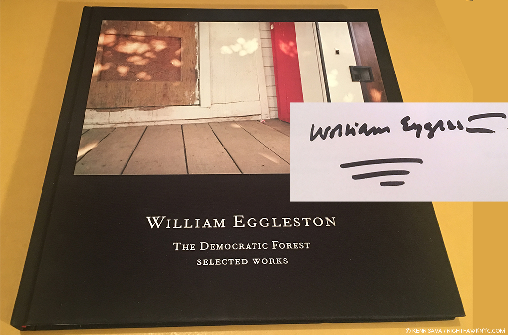
A signed copy of the catalog for the 2016 show, William Eggleston: The Democratic Forest: Selected Works, with William Eggleston’s characteristically vibrant signature, is all that remains to remind me…
As I walked through that show, revisiting the classic images on view (a total of 40, many in a larger size that I still haven’t gotten used to), I left with an overpowering realization that I needed to do a deep dive into the world of contemporary Photography, to catch up on it, Post-Robert Frank’s “The Americans,” 1958 (though Mr. Frank is still with us, of course, and still releasing great books with Steidl. Long may he wave!), and see what’s been going on. I also wanted to do this to gain some perspective on William Eggleston’s place in Photography and his accomplishment to date.
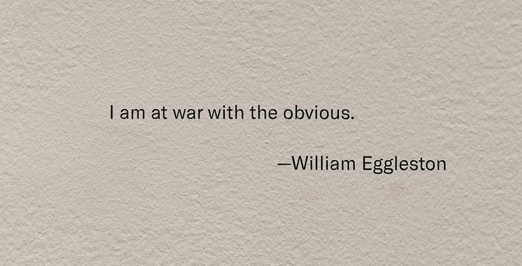
Henri Cartier-Bresson has his cryptic “decisive moment.” Robert Capa has “If your pictures aren’t good enough, you’re not close enough.” Eggleston has his own quote that will keep us guessing indefinitely.
Yes, I knew that famous quote, and William Eggleston’s work, but not in depth. Steidl’s 10 volume set of “William Eggleston: The Democratic Forest,” containing 1,010 images from this body of work, released concurrently with the show, was a sizable step towards addressing that. Never before (or since) had such a large body of color work been published in one set. Add to it the unrelenting quality of the images, and Mr. Eggleston’s extraordinary eye, and you’re face to face with a landmark body of work. From there, I went back to his prior Steidl sets, William Eggleston: Chromes
, 2011, and Los Alamos Revisited, 2012, both of which contain his earliest color work (the former his early slides, the latter his early prints). At this point, there was no denying William Eggleston’s exceptional importance in the world of Photography, being one of the few to bring a new way of seeing to the world.
The question became- “Who else is important?” I’ve explored some of the others I’ve discovered in these pages since Mr. Eggleston’s David Zwirner show, this past year and a half, including 4 article looks at The Photography Shows, AIPAD, in 2017 and 2018. How times have changed here at NHNYC. William Eggleston: The Democratic Forest didn’t even get a full article to itself! The spark that started a bonfire. The journey continues.
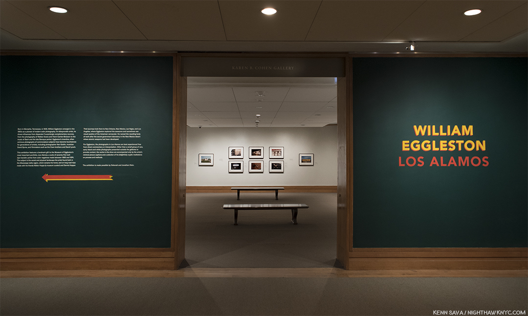
On the road, again. William Eggleston’s Los Alamos was shot on the road, over trips he took across the country between 1966 and 1974. When he, and his friend the curator Walter Hopps hit Los Alamos, NM, scene of the Atomic Bomb development in WW II, the Photographer commented about wanting “his own secret lab.” Click and photo for full size.
So, after literally hundreds of Photo shows seen, countless PhotoBooks perused and too many bought in the interim, here I was, once again, on the precipice of another William Eggleston show. This one at no less than The Metropolitan Museum of Art, featuring the recently promised gift of one of the seven Portfolios of “Los Alamos,” never previously seen as a set in NYC, containing the Artist’s earliest color print work. A sense of trepidation filled me- What new havoc would Mr. Eggleston wreck upon me now?
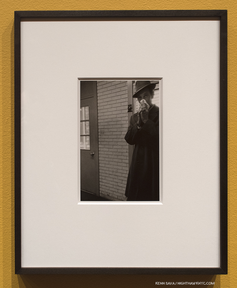
Untitled, 1967-74, Gelatin silver print. Perhaps a touch of the lingering influence of Henri Cartier-Bresson here?
I didn’t have to wait long to find out. As I approached the show’s entrance, I realized The Met had decided to give us more. This monumental show of one of the landmark bodies of color Photography begins with two walls of William Eggleston’s comparatively little known black & white work(!), flanking each side of the show’s entrance containing a total of 11 black & white Photographs created between 1959 and 1974 mounted on mustard walls! 11 Photographs might not sound like many but their subjects and styles are so varied they present a fascinating capsule look at where his work was before he turned to color film.
I’ve seen some of his black & white work in the two Steidl books centered on it1, to feel they are an overlooked realm of his work that deserves a closer look. But, such is the all-encompassing power of his color work that it has garnered only occasional attention.
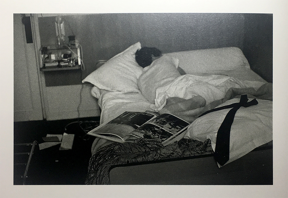
William Eggleston fell asleep reading Cartier-Bresson’s Les Europeans, Paris, 1964, shown here in this Photo by his wife, Rosa, as seen in William Eggleston: From Black and White to Color, P. 176. (Not in the exhibition. )
Early on, William Eggleston was captivated by the work of Henri Cartier-Bresson. He so worried about copying him that during a trip to Paris in 1964, where the French master lived and worked for many years, he didn’t take a single Photograph. Returning home, he realized that “foreign land” surrounded him right there in Memphis (including the new shopping malls and strip malls that were sprouting like weeds) and he set about Photographing it. That is what we see in these 11 black & white shots- a great Artist stepping beyond influences and beginning to trust his own vision. In the shots with human subjects, the influence of Cartier-Bresson’s infamous “Decisive Moment” would seem to be there, but he’s putting his own stamp on it. By the early 1970’s he was on his way.
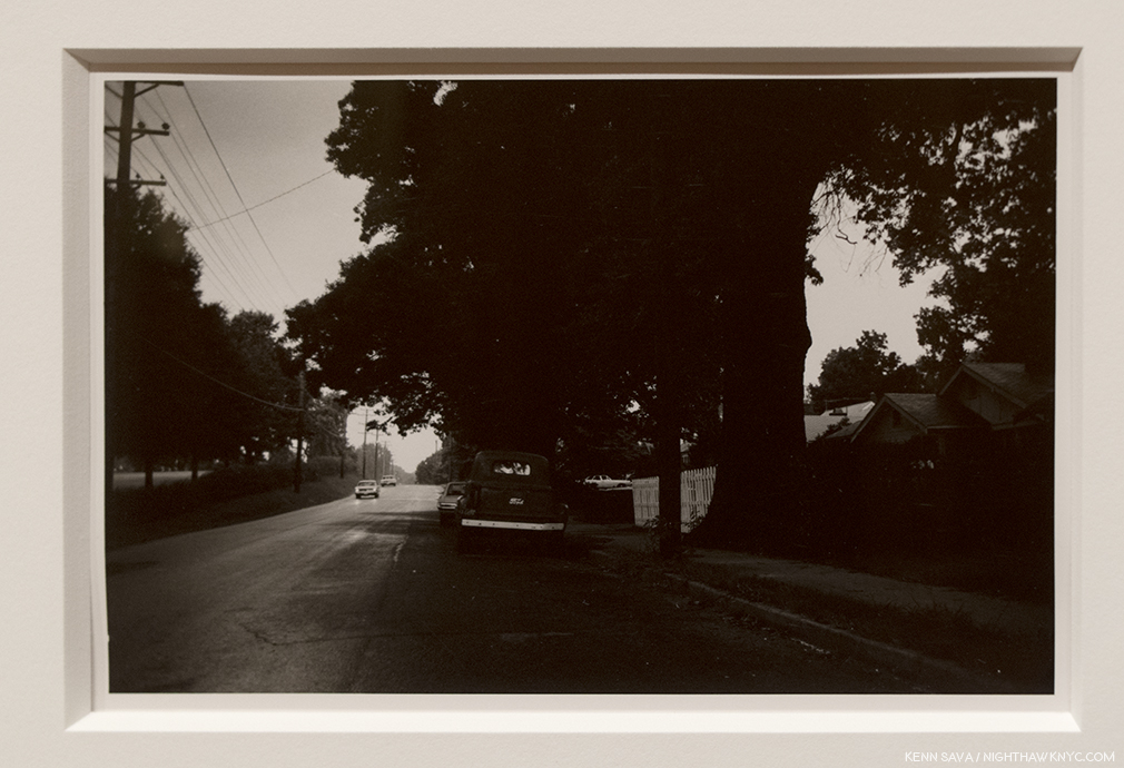
Untitled, 1967-74, Gelatin silver print. Light & dark…day & night…this is one of the most “different” images by William Eggleston I’ve seen.
Moving beyond the images with people, some others show a fascination with a wider view, courtesy of a wide-angle lens, in landscapes where it’s hard to discern details of the scene (above). In these people-less works, compositionally, they’re still fascinating and still “democratic,” the term he used recurringly connoting nothing being more important than anything else in the frame. But, overall, they lack the laser focus that permeates Los Alamos, and much of what has followed.
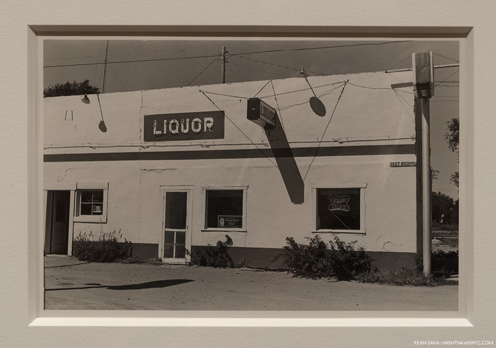
Untitled, 1967-74, Gelatin silver print. This begins to call to mind any number of William Eggleston’s later color Photos, like Los Alamos.
The revelation from these earlier black & white Photos, for me, is they emphasize the Artist’s gift for composition (including a penchant for Photographing from unusual angles). But this really shouldn’t be a surprise. Like Cartier-Bresson and that other great master of early color Photography, Saul Leiter, William Eggleston is also a Painter. Turning to color film, however, he would also have to find his way. “I’d assumed that I could do in color what I could do in black and white, and I got a swift harsh lesson. All bones bared. But it had to be,” he’s quoted on a wall. The stage having been set, the main event beckoned.
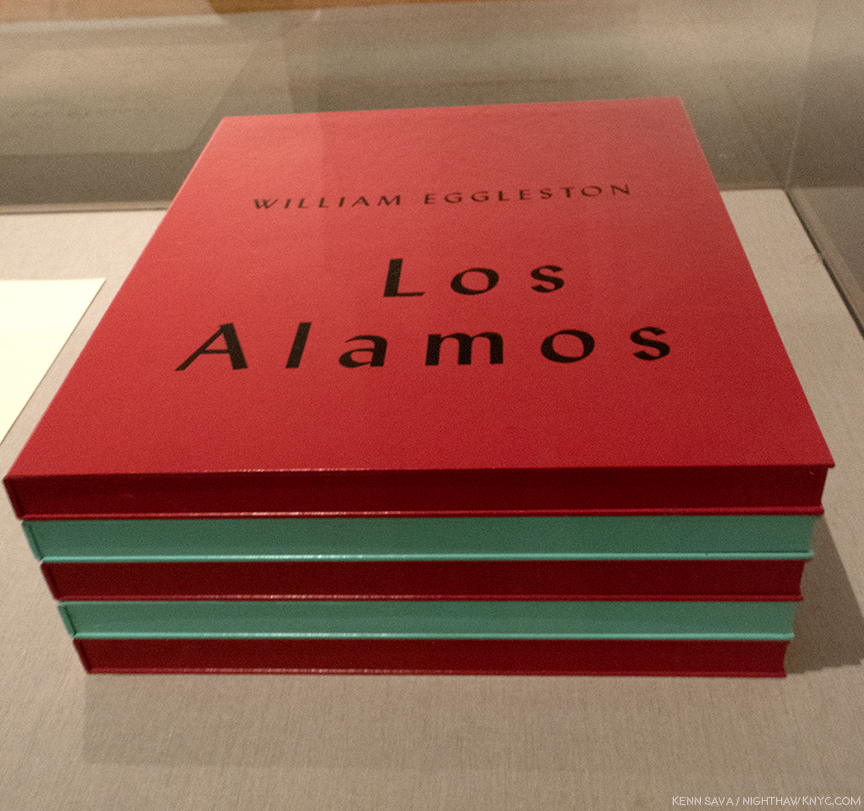
Only SEVEN sets of this large 5 volume set were released in 2002, along with 3 Artist’s Proofs. This extraordinarily rare complete set, in, apparently, pristine condition, is a promised gift to The Met, who is showing the 75 Dye-transfer prints it contains, (15 per box) complete, for the first time ever, in NYC, along with 13 others from the extended series.
The first selection was shown at Museum Ludwig, Cologne in 20022, when this Portfolio was released, along with a catalog for the show, also titled, Los Alamos. The Portfolio consists of 75 dye transfer prints, in 5 boxes of 15, perhaps the most revered type of color print, as they possess a larger color gamut and tonal scale than any other process. Since Kodak stopped making the materials for this process, they are rarely created today3 These images were known to me to now through Steidl’s three volume set, Los Alamos Revisited, where they are supplemented by other images from the series. In the “Editorial Note” at the end of Volume 3, Gerhard Steidl says “Los Alamos is presented in its entirety in this three volume set,” though there are far fewer than the 2,200 images Mr. Hopps says was created, above. As good as Steidl’s books are, no book can match seeing a dye transfer print in person.
Along the show’s first wall, the second print is the image Mr. Hopps refers to as being William Eggleston’s first color Photograph.
This man in this incredibly odd image, that would seem to be as far away from “Art” as one could imagine, is not pushing a shopping cart into a row of them. He’s pushing color Photography into the world of Fine Art Photography. Interestingly, 53 years later, for such a famous Photograph, seeing it in person in a dye-transfer print, it’s not a shot that screams with color, as so many others in Los Alamos do. It’s subtle relative to many of the others in the Portfolio. The colors emerge from shadows. Glimpses of light in a grey world. What strikes me are the subtle shades of silver in the carts- some of which are in the light, some are in shade. Then there’s the shadows. They echo the two figures we see, but the woman in the sunglasses isn’t one of them. They are the Photographer and the shopping cart man. The shadows are, almost, black and white images, something I’ve yet to see someone point out. As part of the “grey world” they wonderfully echo the black & white world he’s left behind in the “new world” of color Photography William Eggleston had embarked upon.
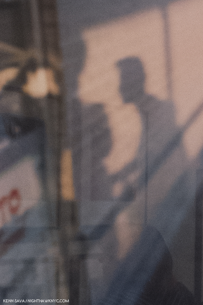
It almost looks like a black & white Photo. Detail of the left center showing William Eggleston, left shadow, taking the photo of the cart worker, on the right.
He would never go back.
William Eggleston began his career working in isolation “that was almost inconceivable.” “Photography wasn’t even born yet,” he said later. He even had no knowledge of the controversy the appearance of The Americans caused4. Going back before The Americans, it must be said that it seems to me that it’s hard to speak about ANY American Photographer of the 20th (or 21st) centuries without mentioning Walker Evans, though he did very little color work, and late in his career. It’s hard NOT to see the influence of Walker Evans everywhere in work created after his FSA works of the 1930’s. That includes the work of William Eggleston. I say that not to diminish his accomplishment by any means. I say it because almost every Artist in the western world has been influenced by someone who came before him or her. William Eggleston’s work has a rawness to it, akin to extremely proficient snapshots that I also see in some of Walker Evans’ work. William Eggleston knew the work of Walker Evans before he embarked on the work shown at The Met, but he proves himself over and over to be among the few who’s own vision is strong enough to overcome “echoes” of any influence. This was first seen in his controversial at the time, now landmark 1976 MoMA show Photographs by William Eggleston5,” and in much of what he’s shown us since.
Speaking of the continuum of influence, it’s hard to walk around this show and not see each image as a jumping off point for the work of so many others. Yet, the big mystery in them- “What do they mean?”- is only answered until you look at them again.
Part of their “charm” is how the cars, furniture, objects, and places look dated to us now. That’s inevitable with Photography as time goes on. Then, of course, there’s the power of his colors to seduce the eye like few others can.
While I’m eternally pondering the “What is he saying?” question myself, I always come back to studying, and admiring, his compositions. Their balance, or their off kilterness…in both cases, manage to retain interest.
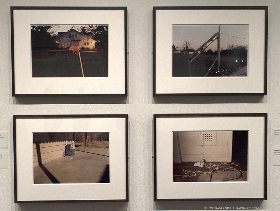
Greenwood, upper left, Memphis, upper right, both 1971-74, Untitled (Bottle on Cement Porch), lower left, and Untitled (White Phone and Vacuum Cleaner, lower right, both 1965-74.
Images like the group of four above spawn countless “I could do that” comments. While I don’t deny the possibility someone could, what’s overlooked is the time and the context. These were taken over 45 years ago, when no one was “doing that.” When seen in the context of the history of Photography, they were, therefore, unprecedented, particularly in color. And yes, today? Countless people, and Photographers, are trying to “do that,” though we’re still waiting for the “next William Eggleston” to reveal him or herself, and so am I.
What to make of this image, with its carefully considered composition, shot from a low angle? I don’t know and my efforts at gaining insights reached a dead end. Ostensibly it’s here because it’s part of the complete portfolio, and as such, it’s now in The Met’s Permanent Collection. Though taken over a generation ago, it remains disturbing and offensive, and puzzling. In a 2004 interview in The Guardian, Sean O’Hagan quoted William Eggleston saying, “A picture is what it is, and I’ve never noticed that it helps to talk about them, or answer specific questions about them, much less volunteer information in words. It wouldn’t make any sense to explain them. Kind of diminishes them. People always want to know when something was taken, where it was taken, and, God knows, why it was taken. I mean, they’re right there, whatever they are.” As a result, I can’t help but think it calls into question the whole sense of “detachment” that exists in all of these works. At this point, it seems these questions are going to remain indefinitely.
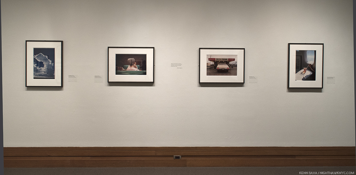
The last wall at The Met includes the image taken during the plane trip home, far right, as if to put a “bow” on the project.
My current feeling about Louisiana, 1971-74, and the series as a whole, is that these are glimpses of America, moments that passed in front of the Photographer and his camera, that may, or may not, be gone forever, but will remain frozen in time. Taken as a whole, it’s as compelling a portrait of America as Jack Kerouac’s On The Road, (perhaps an inspiration for Mr. Eggleston), is, in my view, albeit in a completely different way. While Jack Kerouac inspired a generation of “Beatniks,” and countless others, Mr. Eggleston has inspired two generations of Photographers, and counting. In Los Alamos we see the mundane, the beautiful, the ugly, and the never noticed before, all seen by a man possessing one of the most singular eyes in Contemporary Art. If not in Art. Period.
Yes, William Eggleston went to “war with the obvious.” And he imposed his will upon it.
————————————
BookMarks- (A new feature regarding Art and/or PhotoBooks related to this Post). If you want to begin to explore the work of William Eggleston, William Eggleston’s Guide, published by MoMA is the place to start. After that, you really can’t go wrong with any Eggleston book published by Steidl or Twin Palms Publishers, though I would recommend considering William Eggleston: Los Alamos Revisited
, next.
If you find yourself taken by Los Alamos, I highly recommend Steidl’s 3 volume box set.” Produced by William Eggleston, The Eggleston Artistic Trust and Gerhard Steidl, given the involvement of the Artist, it’s highly unlikely to be surpassed as a definitive document of this landmark series. The production is first rate in all respects. At Steidl’s booth at The Photography Show/AIPAD this year there was some question around how much longer copies of Los Alamos Revisited would be available. Released in 2012, I wouldn’t wait long to get one. Steidl’s previous William Eggleston Box set, Chromes, released the year before, is now out of print. The asking price for the cheapest USED copy known to me at the moment is $1,500.00.
*- Soundtrack for this Post are “Inventions & Sinfonias” by Johann Sebastian Bach as performed by Glenn Gould. Mr. Eggleston is, also, a Pianist, who recently released his first CD, William Eggleston: Musik (Vinyl). He lists J.S. Bach as his favorite composer. Something we agree on.
Update 5/22/18- Rewatching the fascinating documentary, The Colorful Mr. Eggleston, I saw what sure looks like one of the other sets of “Los Alamos.” At the 7 minute mark, Mr. Eggleston is speaking at what looks to be the Eggleston Artistic Trust, and behind him to the right, there are five similarly color boxes sitting on a shelf next to a “Coke” sign.
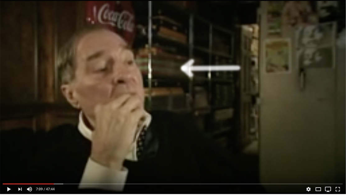
William Eggleston speaking in The Colorful Mr. Eggleston, with what looks to be a set of Los Alamos on the shelf behind him. Walker Evans, also, Photographed, and collected, Coke signs.
My thanks to Monika Condrea and Steidl for their assistance.
My previous Posts on Photography are here.
You can now follow @nighthawk_nyc on Instagram for news and additional Photos!
NighthawkNYC.com has been entirely self-funded & ad-free for over 7 years, during which over 275 full length pieces have been published!
I can no longer fund it myself. More on why here.
If you’ve found it worthwhile, PLEASE donate to keep it online & ad-free below.
Thank you, Kenn.
Written & photographed by Kenn Sava for nighthawknyc.com unless otherwise credited.
To send comments, thoughts, feedback or propositions click here.
Click the white box on the upper right for the archives or to search them.
Subscribe to be notified of new Posts below. Your information will be used for no other purpose.
“I would go out tonight
But I haven’t got a stitch to wear”*
Sorry. I care not one iota for “celebrities,” but I do care deeply about my second home, 1000 Fifth Avenue, NYC, aka The Metropolitan Museum of Art. So, while the rest of the world is ooohhhhinng and ahhhhhing over who’s wearing what (or not wearing what), I’m much more interested in what the building is “wearing” to tonite’s “Met Gala,” formally called the “Costume Institute Gala.” So? I thought I’d give you a look at it during the last moments the public was allowed in late Sunday, May 6th, as preparations for what is still widely called “the fashion event of the year” were winding up. The Met was closed today to allow for finishing touches…you know…nails and hair…
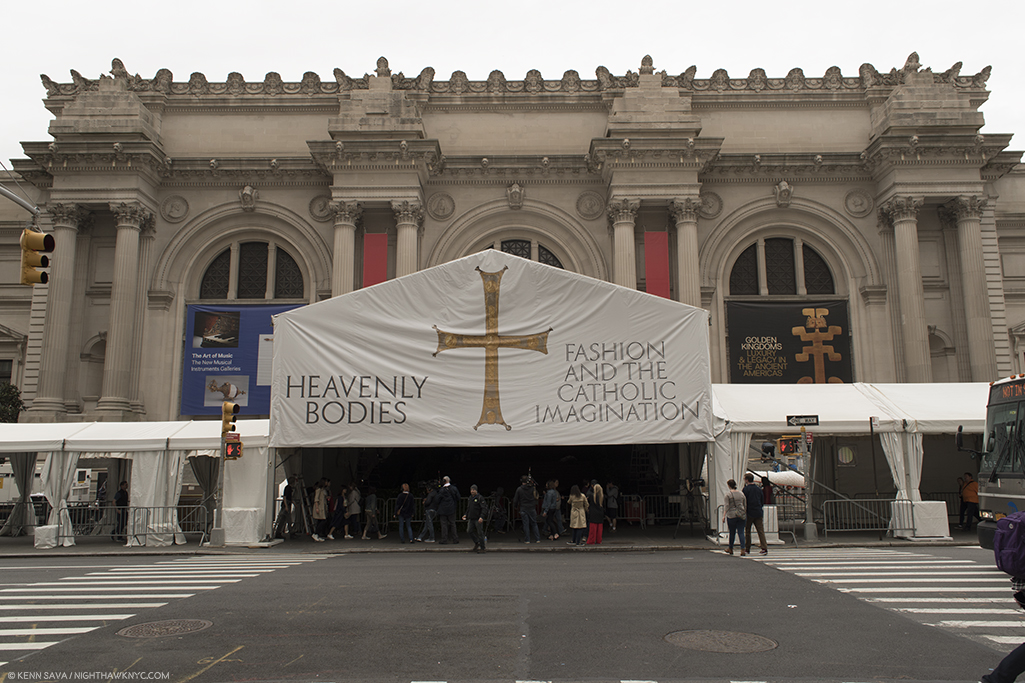
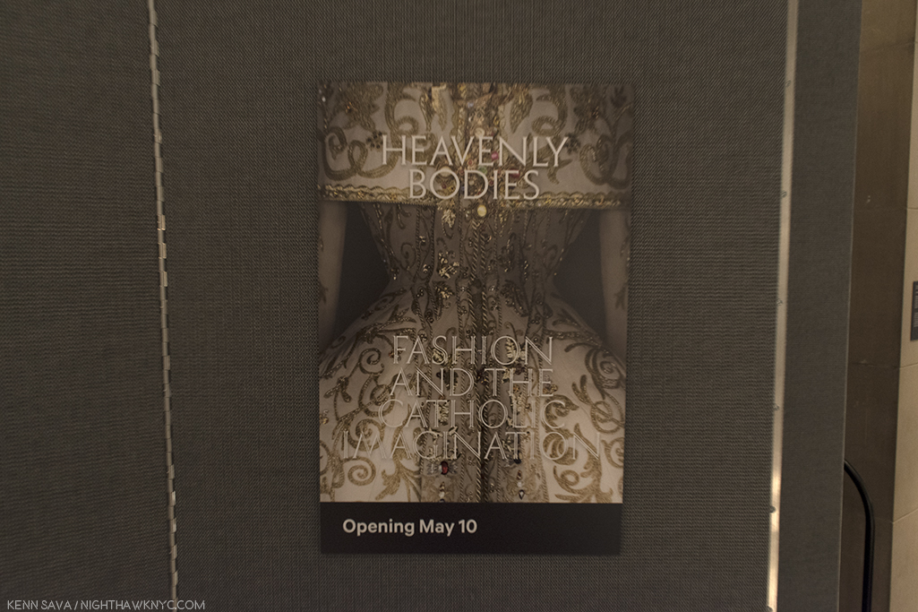
I don’t plan on covering this year’s Met Fashion Show, “Heavenly Bodies: Fashion and The Catholic Imagination.” I’ll leave that to my friend, the incomparable Magda. But, wow, the signage sure strikes me as being “loaded.” Click any Photo for full size.
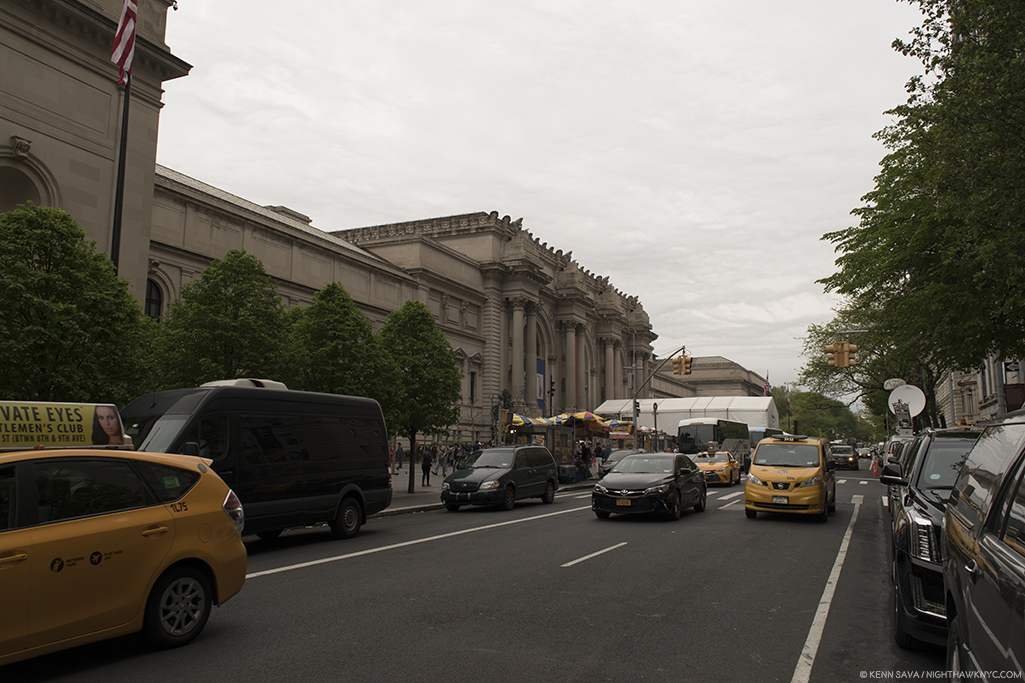
After 1,600 visits these past 15 years, I still get goose bumps when I turn the corner and see this in front of me. Oh, look! They finally built me an apartment out front! Yes, the satellite trucks were there 24 hours before “opening step off.”
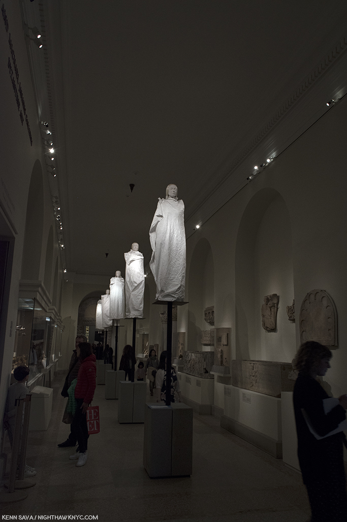
The view in Gallery 300, just south of the Grand Staircase, (aka Byzantium South). Yes, the “real” outfits are being hidden, but I do love how carefully so many of them are draped. Well? It’s The Met.
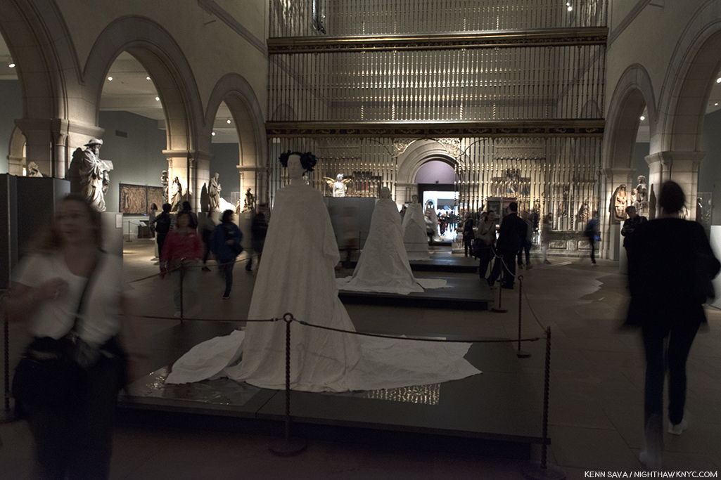
Gallery 305- Medieval Sculpture Hall. The Met’s famous Christmas Tree is installed right in front of the Spanish Choir Screen. The figures go all the way back, almost to the Robert Lehman Collection.
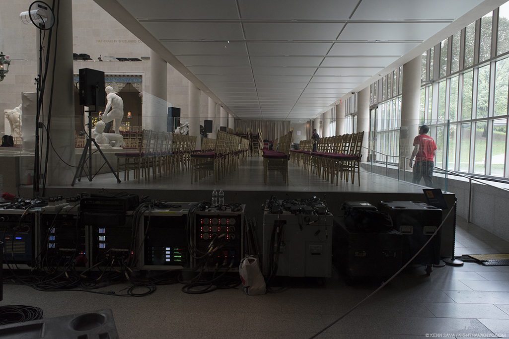
The riser with the chairs is over what is now the American Wing Courtyard Cafe. Before that, it used to be a Sculpture Court. I spent countless hours Drawing here in the ever-changing light, with Central Park to the immediate right, often spending Friday nights, Saturday and Sunday here. The Sculpture has been moved to the center of the Courtyard, or upstairs in the remodeled American Wing.
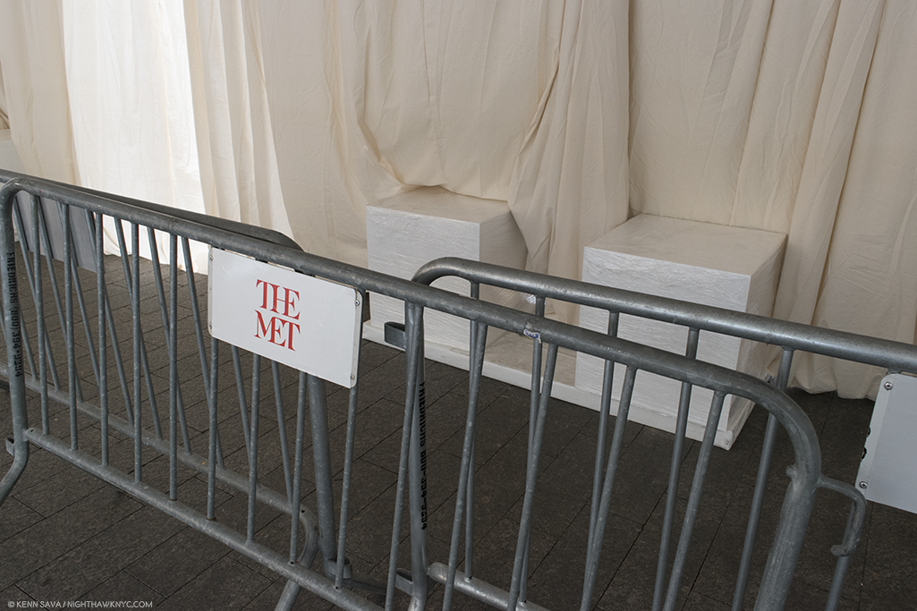
As always, watch out for the fashion police! Even the concrete blocks were protected with shrink-wrap.
 *- Soundtrack for this Post is “This Charming Man,” by Morrissey and Johnny Marr from “The Smiths,” 1984.
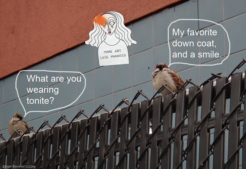
“On The Fence, #19 . The Met Gala Edition”
This Post is dedicated to MQD and NSS.
NighthawkNYC.com has been entirely self-funded & ad-free for over 7 years, during which over 275 full length pieces have been published!
I can no longer fund it myself. More on why here.
If you’ve found it worthwhile, PLEASE donate to keep it online & ad-free below.
Thank you, Kenn.
Written & photographed by Kenn Sava for nighthawknyc.com unless otherwise credited.
To send comments, thoughts, feedback or propositions click here.
Click the white box on the upper right for the archives or to search them.
Subscribe to be notified of new Posts below. Your information will be used for no other purpose.
“‘History,’ Stephen said, ‘is a nightmare from which I am trying to awake.’”
James Joyce, Ulysses, Episode 2.
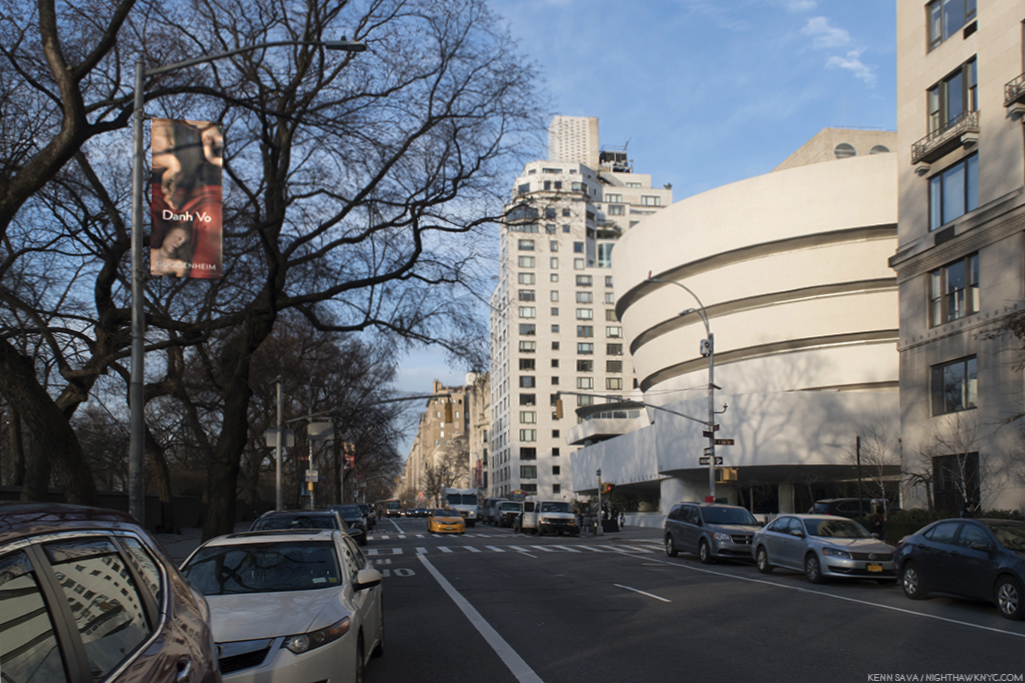
Museum Mile, late winter, 2018. Guggenheim Museum ahead on the right. Click any Photo for full size.
A typewriter sits almost alone on the floor of a gallery on the Guggenheim Museum’s 5th floor.
I stood opposite it for a few minutes over multiple visits, considering the installation of this gallery and watching other visitors pass by.
Only a few stopped to read the wall card, above it to the right. For those that didn’t, I couldn’t help wonder what they were thinking. “A typewriter? What? Why? Is this “Art?”
A few days later, about 50 blocks south, I saw another typewriter sitting alone on display.
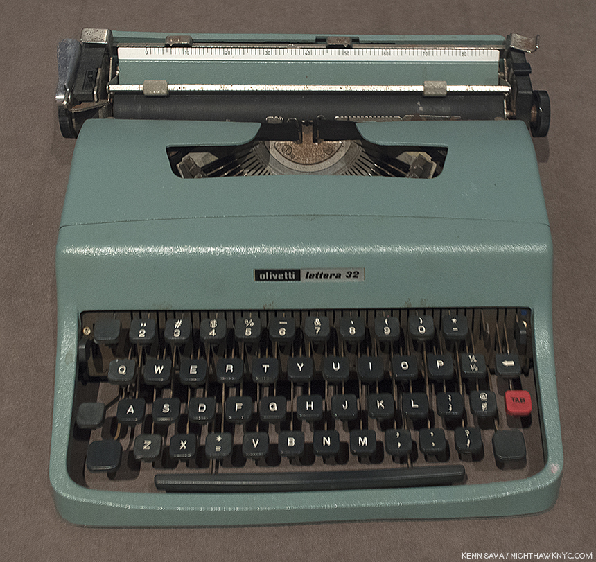
Tennessee Williams’ Olivetti Typewriter seen at Tennessee Williams: No Refuge but Writing, at The Morgan Library, April, 2018.
This one was one of the great Tennessee Willams’ two most cherished possessions, along with a copy of Hart Crane’s Poems. A typewriter can be a weapon of murder, of Art, and now in both cases, an “Art object,” with completely opposite impacts. At the Guggenheim, Danh Vo’s placing of the Unabomber’s typewriter, (with it’s keyboard turned towards the side, and so, not an invitation to the viewer to use it, but to look at it as an object), is rife with irony, and very subtle power. Seeing both machines reminded me that a typewriter is a typewriter is a typewriter- it’s the person using it that makes it a tool for timeless beauty, or for catastrophic destruction.
Therein lies the crux of Danh Vo: Take My Breath Away, which fills Frank Lloyd Wright’s iconic rotunda. Along with Art that he (or his calligrapher father) makes by hand, to a large extent Danh Vo’s Art relies on carefully selected actual historical items who’s significance fit the three primary threads that run through his Art- the history of Vietnam (dating back to it’s colonial past), American history, and his personal & family history. The Artist chooses objects for their ongoing power to speak to us through the history they witnessed or participated in. They are now mute witnesses, but like possessions in one’s home, their sum a portrait of where the Artist “lives,” so to speak. Combined, and seen over a large show, these three histories (Vietnamese, American and personal) interweave and dialogue with each other. The national and global becomes personal. For viewers, they are pieces of histories that speak to us still, like events that happened before our birth are “pieces” that have real and lasting effects on our lives many years after.
Then, I moved to the right, and saw what was installed along the intervening gallery wall in the next gallery.
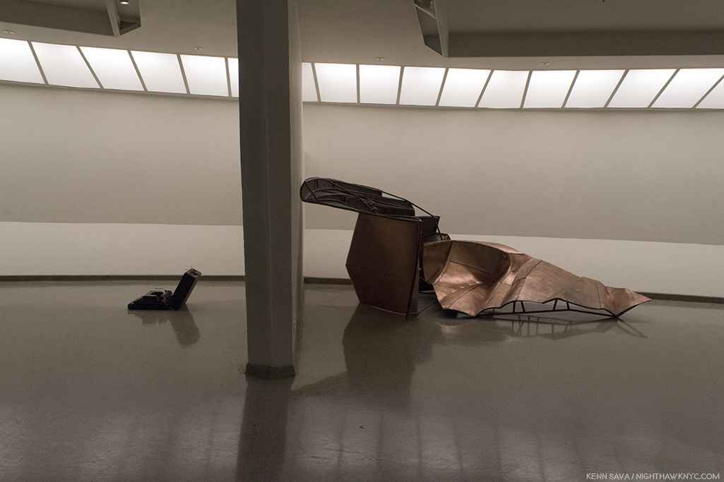
On the wall behind the Unablomber’s Typewriter, left, is part of We The People, 2011-16, Copper, right. Installed (ironically, or coincidentally) so they mirror each other.
It’s a work called We The People,. Well, it’s part of the work called We The People, which totals over 300 pieces in all, each one part of a full size replica of the Statue of Liberty!
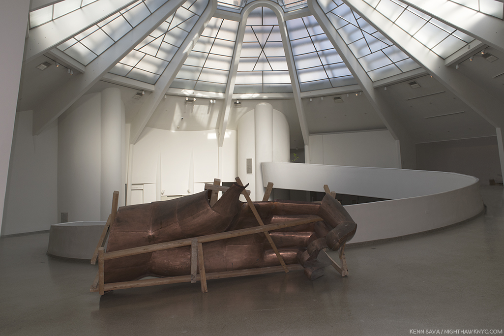
Every American “knows” the Statue of Liberty. How many would recognize one of her hands if seen by itself? The front of her left hand, minus her thumb (which is lying on the floor just behind me).
Vo’s parents idolized the U.S. as a land of political freedom and economic power, values their son couldn’t help but pick up, though later he suffered from disenchantment. Danh Vo was inspired after finally visiting the Statue in person to have it painstakingly replicated in copper. Press two pennies together between your fingers. That’s how thick the skin is on both sculptures! He and his team used the same techniques used to craft the original (though in China, instead of France), each of it’s 300 body fragment parts serving as both a reminder of the whole and an autonomous sculpture on it’s own. “In taking the Statue of Liberty as subject, Vo appropriated the definitive symbol of not just America but of the abstract notion of freedom itself. The metaphoric fracturing of the American body politic in the literal body of Liberty not only suggests the fragility of the philosophy she enshrines, it also enacts a profound violence on the fabric of the national consciousness1.” In the catalog for the show, curator Katherine Brinson speaks of the damage to the American psyche that would be done seeing the actual Statue in pieces, referring to nerve the 1986 campaign to restore the Statue struck in the American public. Showing a replica of it is brings none of that trauma and instead allows the viewer to see it anew.
“I thought it would be interesting to make something that people felt so familiar with, in all the different ways that people project on the sculpture, and try to destabilize your own thinking of it,” the Artist said in 2013.
From the start, Danh Vo never intended to assemble the pieces he made, but rather to distribute them around the world, so it’s effect would be international, allowing no single person or entity to own more than 8 pieces of it. While about 50 parts of We The People, were previously seen locally in a 2014 Public Art Fund show in Brooklyn Bridge Park and City Hall Park, having seen only 6 pieces of it I still found it utterly remarkable- A remarkable concept. Remarkable that someone could do it and do it so well. Remarkable that he or she would choose to recreate all of it and not assemble it. Remarkable that this Artist, Danh Vo, is not now and has never been, an American2.
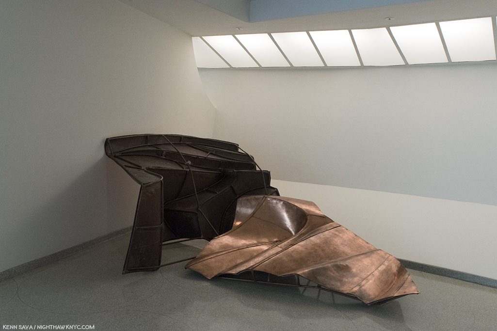
Two pieces from We The People,, another view of the works seen adjacent to the gallery with Kaczyinski’s Typewriter.
Danh Vo (pronounced yon voh) was born in Ba Rja, Vietnam, 4 months after the Vietnam War ended. Nonetheless, as it does with countless others in innumerable ways, the War casts it’s long shadow over Danh Vo’s life and Art, directly and indirectly. As seen in Danh Vo: Take My Breath Away, the War, which ended 43 years ago this April 30th, occupies the center, a defining event in his life though he wasn’t even alive during it. After he was born, his family was among 20,000 resettled to Phu Quoc in far southwest Vietnam, and then to Ho Chi Minh City, as part of a government “reeducation” program. In 1979, when Vo was 4, his family fled Vietnam in a homemade boat with 117 others, and were rescued at sea by a Danish freighter.
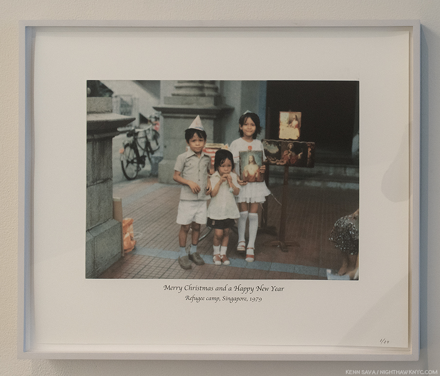
After escaping Vietnam in a homemade boat and being rescued at sea, Vo, age 4, left, and his family were taken to a refugee camp in Singapore. Having left everything behind, they were gifted the items seen in this Photo by Christian missionaries, which the Artist has turned into a “Christmas card” long after the fact. “Untitled,” 2007, Photogravure.
After a winter in a camp in Singapore, the family was eventually resettled in Denmark, where Vo was raised. Today he lives in Berlin and Mexico City. “I don’t really believe in my own story, not as a singular thing, anyway. It weaves in and out of other people’s private stories of local history and geopolitical history. I see myself, like any other person, as a container that has inherited these infinite traces of history without inheriting any direction. I try to compensate for this, I’m trying to make sense of it and give it a direction for myself,” the Artist has said3.
In 2012, he won the Hugo Boss Prize, which resulted in his first show at the Guggenheim Museum, the remarkable I.M.U.U.R.2, (I am you and you are too), which consisted of about 4,000 Artworks and items that belonged to the late Painter, Martin Wong. It says quite a bit that Danh Vo would take his first opportunity of a show in one of NYC’s “Big Five” Museums and devote it to the work of another Artist. Martin Wong is someone who’s work Danh Vo has championed, as he owns at least one his Paintings. In that sense, it’s part of the thread of his personal history that his work continues to explore. It was also a unique opportunity to walk around in the mind and life of the late Artist while it created an effect not unlike one of Martin Wong’s Paintings. It also served to expose visitors (including myself) to the work of a terrific Painter, who died in 1999 at age 53. (For further information, I recommend “Martin Wong: Human Instamatic,” which was produced for a 2016 Bronx Museum of Arts show.)
The exhibition catalog for Danh Vo: Take My Breath Away, surprisingly lacks any direct information about it. Instead, it provides excellent background and analysis of the individual Art works, with the bulk of the book consisting of an extensive, complete catalog of Danh Vo’s exhibition history prior to Take My Breath Away, with numerous, fascinating installation views of each show that allows the viewer to this show to consider most of the Art on view here in different combinations and in different installations. This served to heighten my respect for his gift of installation. At almost 350 pages, it’s the first full-length monograph on Danh Vo, and now stands as the go-to reference on the Artist and his work over the first part of his career.
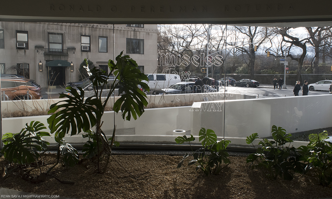
Untitled, 2018. Adds “Fabulous Muscles” to the show’s title, Take My Breath Away, yes, the theme from the 1980’s film “Top Gun,” was etched on the glass window in the Museum’s rotunda floor by the Artist’s father, Phung Vo. It was almost impossible to get a full shot of it. This was as close as I got over innumerable attempts.
As for Take My Breath Away, it’s rare (and wonderful, I find) to walk into a large show and almost all of it feels “different,” unlike almost anything I’ve seen before. A classic case of this was Matthew Barney’s The Cremaster Cycle, in 2003, also, at the Guggenheim, where almost every single object felt like it had been created by beings from another world. Danh Vo uses, mostly, recognizable objects, but he often deconstructs them or combines them in new and totally unexpected ways and then displays them brilliantly in ways that are Zen-like, daringly unexpected, and fresh.
In another gallery, a different “statue” is seen. “Oma Totem,” 2009, consists of items that belonged to the Artist’s grandmother. After deciding to emigrate to Germany in 1980, upon her arrival, she was gifted a washing machine, a television and a refrigerator, by an immigrant relief program, along with a crucifix, gifted by the Catholic Church. Vo has turned them into his work, “Oma Totem.” At the Guggenheim, it/they also sit virtually alone in a gallery, turned sideways. They’re a monument to being a refugee, of leaving one culture behind, while another now stands before you. As the wall card says, “…the sculpture reduces its subject’s harrowing experience of war and exile to the set of archetypes- refugee, convert, and consumer- that were assigned to Vo’s grandmother by her new society.”
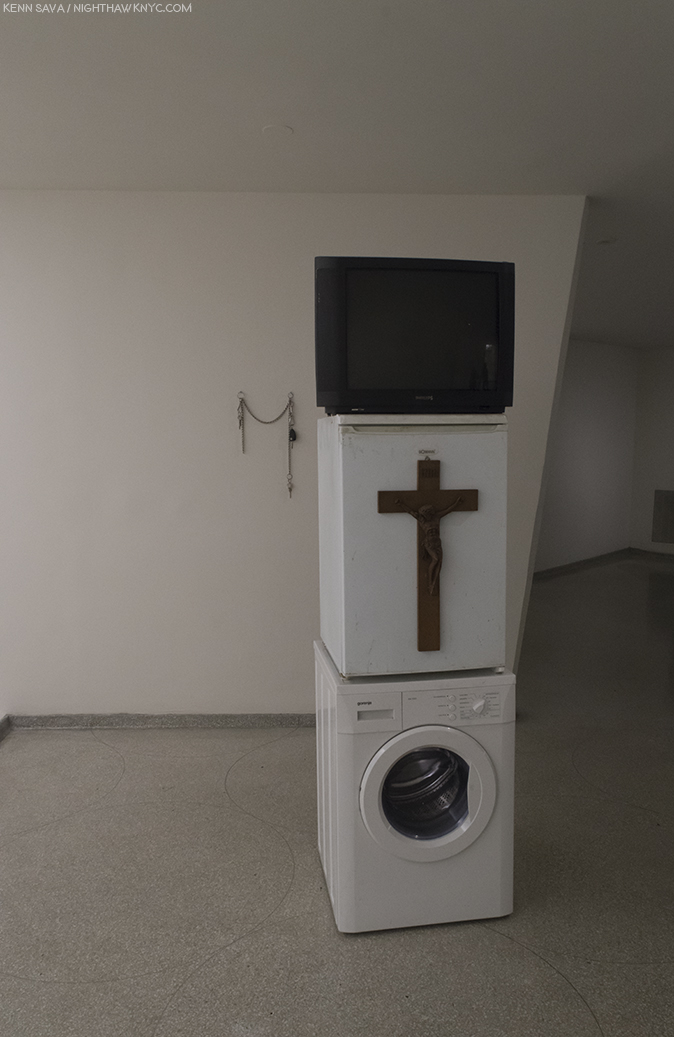
Oma Totem, 2009, Philips television set, Gorenje washing machine, Bomann refrigerator, wooden crucifix, and personal casino entrance card, with “Uro,” 2009, Keys on a chain, behind on the wall.
Partially hidden on the wall behind them, is Uro, 2009, which consists of keys left over from a past relationship. The chain that connects them is all that remains of the connection they once shared.
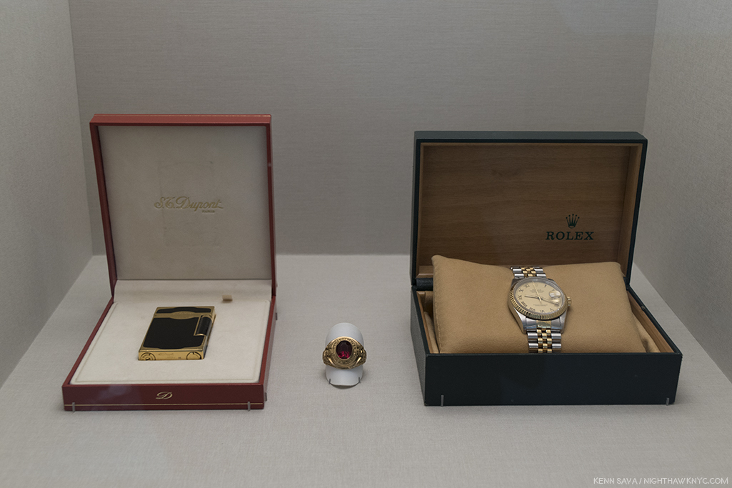
“If you were to climb the Himalayas tomorrow,” 2006, Rolex watch, Dupont lighter, American military class ring. Three items his father, Phung Vo, cherished as signs of his “success” in his new country. The Artist hd to negotiate with him to get him to give these to him for this work. Displayed in a lit vitrine behind glass, like they would be in a fine jewelry store, the work’s title was taken from a Rolex ad campagin.
Beyond the image of America his parents had while he was growing up, it’s interesting how much American history is in his work. As with the typewriter seen earlier, not all of it pertains to Vietnam.
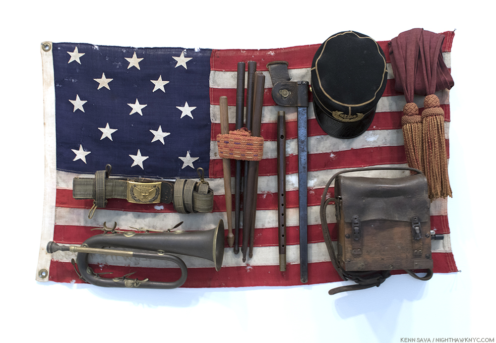
“She was more like a beauty queen from a movie scene,” 2009, Brass bugle, felt cap with velvet, bayonet sheath, field radio with wood and leather case, sashes, wooden drumsticks, fife, leather sword belt with gold and silver details, and 13-star American flag. The Artist purchased this at auction, exactly as it appears now, adding only the title. It was created to celebrate the 100th anniversary of the Declaration of Independence. It would seem to also stand for America in it’s ascendency to the country Vo’s parents idolized.
Taking his place in the now long line of Artists working with found objects, (primarily, though Danh Vo also makes Art by hand), with Marcel Duchamp appearing to be particularly inspiring for him, he brings new dimensions to this now 100 year old (at least) genre through the use of historic and personal items, his choice to disassemble them or leave them, and in the breathtaking way, in my opinion, that he installs them. .
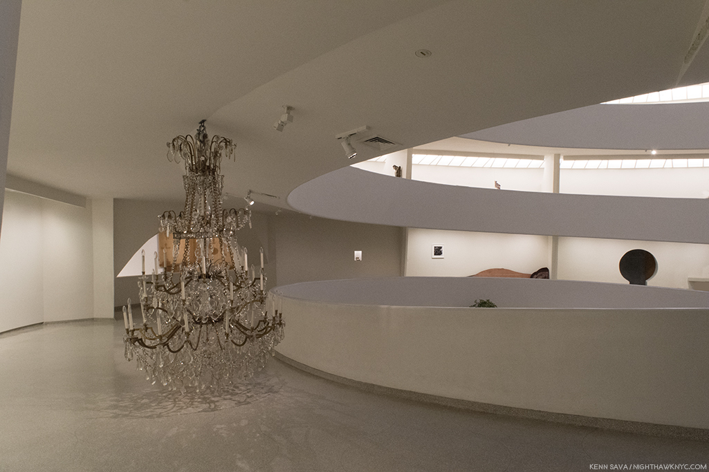
A chandelier from the Grand Ballroom of the Hotel Majestic, Paris, where the Paris Peace Accords were signed, ending the Vietnam War.
Even when these items are literally in pieces their parts are shown in surprising ways.
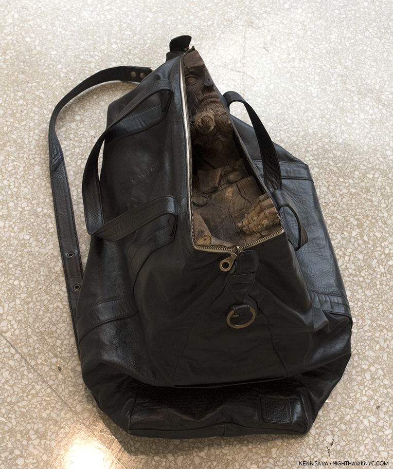
Untitled, 2009, Carry-on bag, fruitwood St. Joseph (Germany, late 16th century). Danh Vo acquired a wooden sculpture that was too big to transport by plane. So? He cut it into sections and put each into a bag so he could carry them on. At the Guggenheim, they were distributed, in their bags, with at least one also on a handcart.
At other times, the pieces are recombined in extraordinary new ways, as in these sculptures.
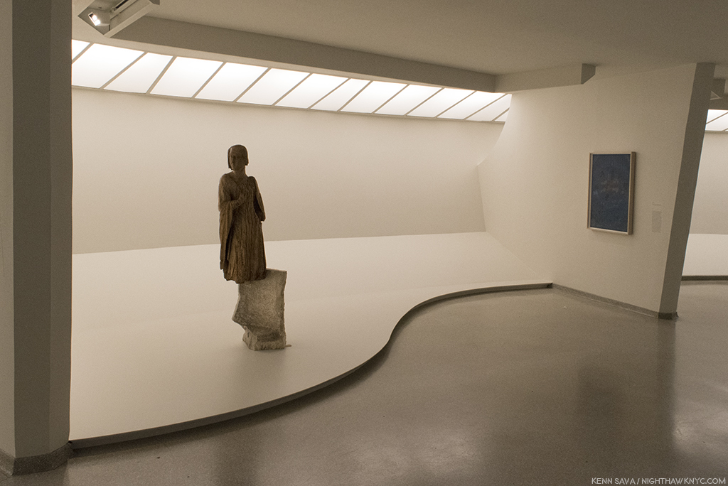
(Unpronounceable title uttered by the demon in The Exorcist), Poplar Virgin of the Annunciation, 2nd century, with Greek marble sarcophagus, ca 1350, left. Throughout the show, Vo displays sculpture that has either been broken up into parts (by the Artist or found that way), and displayed them either alone or with parts of a totally different sculpture, as seen here on the left, the lower half of which shows a lion devouring an antelope, “juxtaposing the sacred and the profane4,” though it’s also visually striking and unprecedented to my eyes, the effect only enhanced by it’s installation.
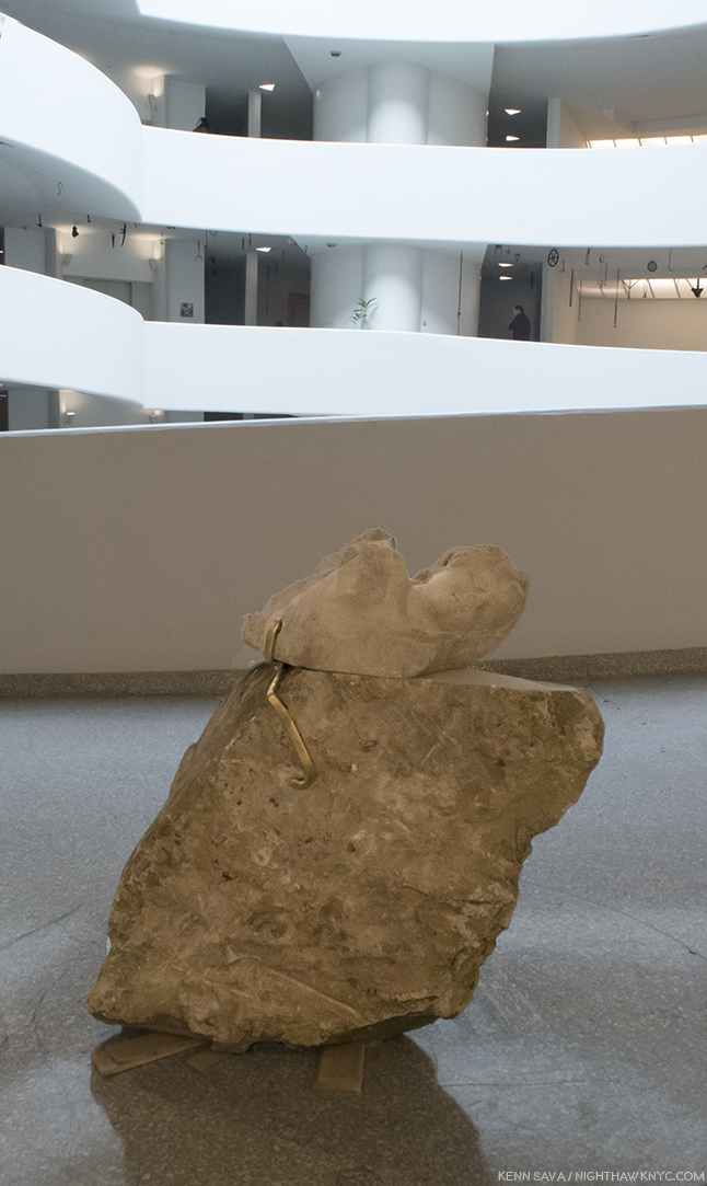
Untitled, 2018, Marble Eros (Western Europe, 2nd century CE) and sandstone eagle (Germany late 19th century). Notice the wooden shims left unpainted underneath it. Museum staff told me that the Artist stopped them from Painting them, something they would always do.
At the Guggenheim, the staff regaled me with stories of how the Artist laid out this show with almost Zen-like techniques. He left shims unpainted, chandeliers uncrated, and left other pieces where the handlers left them. I was told it was “unprecedented.”
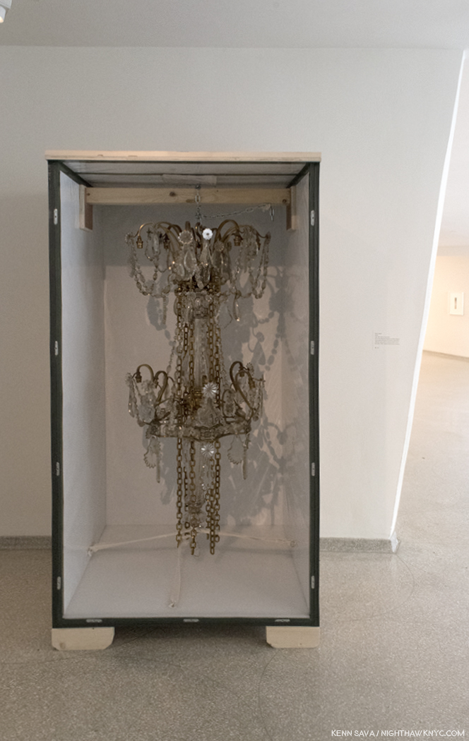
16:32, 26.05 Late 19th-century chandelier. “Leave it just like that,” the Artist must have said to the Art handlers. Because they did. Open shipping crate on unpainted blocks and all.
I found the installation completely captivating, a model of taste and restraint, a breath of fresh air. Looking through the catalog (where those responsible for the display of the work in prior shows are not credited), I see a similar brilliance in the design of each show. Whatever one thinks of Danh Vo’s Art, he has a mastery of display that borders on showmanship.
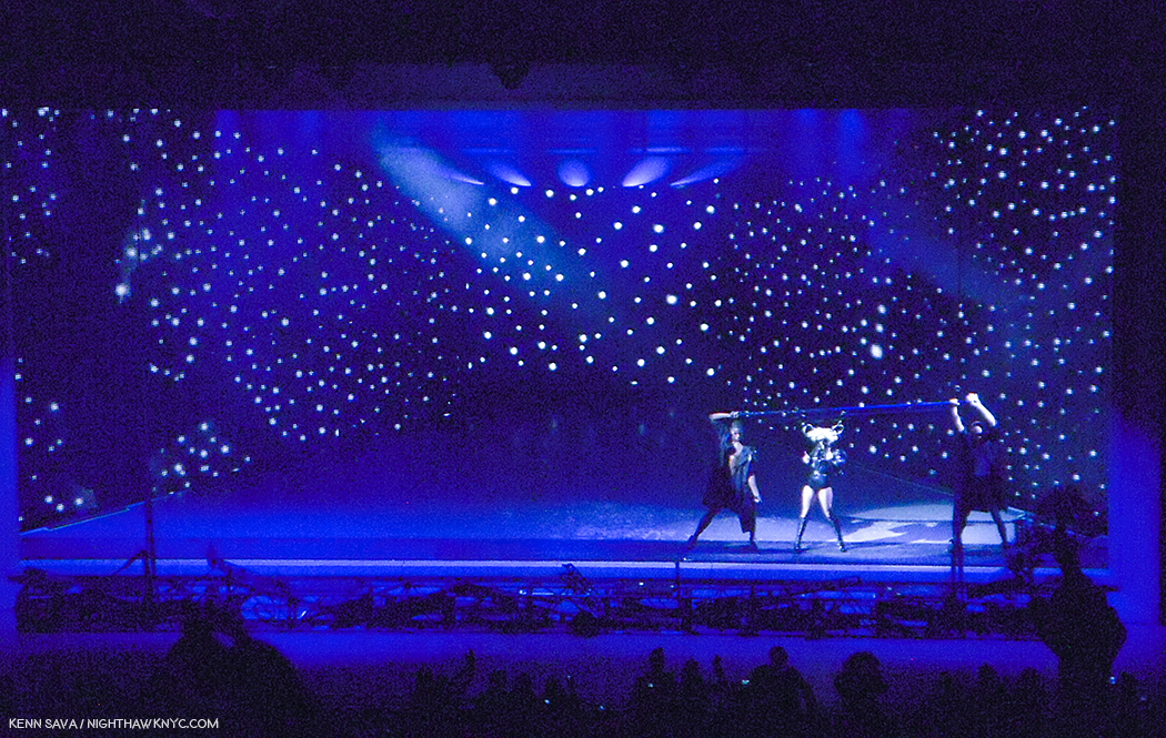
Lady Gaga, live at Radio City Music Hall, January 20, 2010, her first major NYC Concert, in a show designed by the brilliant stage designer, Es Devlin. The stage was set inside a “frame” that goes all the way around it, with a screen in front of it that was never removed. Many of the designs for songs reminded me of Art works. It became obvious to me that either Ms. Devlin, Lady G, or both, were channeling Art history. This one, with the singer’s hair fastened to rings threaded through the pole the dancers hold on each side of her, and then moved around the stage, reminded me of Joseph Cornell.
I said “showmanship,” meant with respect, because the only other instance I can think of where I saw such amazing, beautiful display was at Lady Gaga’s first “big” NYC concert at Radio City Music Hall in January, 2010, in a show designed by the brilliant stage designer, Es Devlin5. At the time, I was completely floored by what I saw, though I immediately knew that whoever was responsible for it had gone to school on Art history. There were elements of Dali, Magritte, and especially Joseph Cornell throughout. Danh Vo, is adding display to the accomplishments of Duchamp, and Rauschenberg, making it an inherent and critical part of his Art.
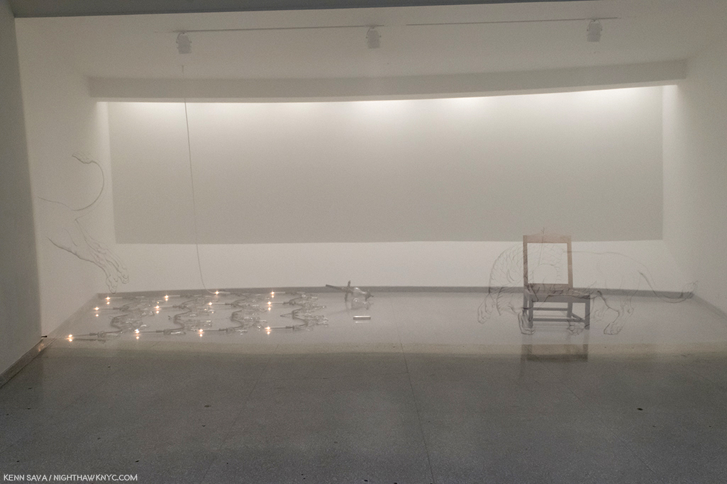
Lot 20, Two Kennedy Administration Cabinet Room Chairs, 2013, right, and 08:43, 26.05, 2009, Late-19th century chandelier, left, behind Painted screen. At the Guggenheim, Danh Vo turned the museum’s “bays” into stage sets of a sort, some, like this one, behind transparent screens. Vo acquired 2 chairs from John F. Kennedy’s Administration that he proceeded to dismantle. The parts, and the fabric, are shown on their own elsewhere in the show. Here the frame of one chair is juxtaposed with parts of a chandelier, from the room the Vietnam War Paris Peace Accords were signed in a beautiful, haunting display. Like a memory, it’s both there and not there. In front of both is a thin curtain on which a beast, possibly a lion, is shown with an arrow sticking out of his shoulder. A reference to Kennedy being short down in 1963?
Frank Lloyd Wright designed the Guggenheim Museum to be seen from the top, down. He intended for viewers to take the elevator to the top and walk down the gently sloping ramp, something I always do. Yet, I have never seen a show laid out this way. Instead, each one insists visitors walk up the 6 ramps. Well, it is a small elevator. So, this gallery, above and below, was among the first I saw in this show, and created a powerful effect.
Danh Vo is an Artist who’s also something of a cultural anthropologist, someone who’s attuned to the deeper significance of historic objects as part of history and histories. Like Ai Weiwei, he’s not bashful about deconstructing them to mine even deeper significance. It helps that he’s also blessed with a terrific sense of reconfiguring these objects and pieces of objects in stunning and fascinating installations that he varies greatly from show to show, creating unique experiences each time. Seen in pieces, they are often completely new experiences which cause the viewer to see them in new ways. From looking at the catalog’s compilation of these past shows, Danh Vo: Take My Breath Away is both a high watermark in the young Artist’s career and a “beacon” of a calling card that he is an Artist to watch. The Guggenheim took a chance with this show, and then took another chance in giving Danh Vo so much leeway in it’s installation. They, and he, have succeeded in creating a show that is rich in layers of meaning and relevance for the moment. The Guggenheim’s commitment to Danh Vo’s Art, going back to I.M.U.U.R.2, is something I believe NYC’s Big Museums should be doing, and doing more of.
At a time when the Vietnam War seems prime to slip from the consciousness of America and the world as it’s survivors age, pass on, and the world moves on, Danh Vo serves to show that the legacy of Vietnam is multi-generational in it’s effect and impact on the world. Something that is not news to anyone who was involved in it.
It also shows us that even Art can come from something so horrific. Art that has much to tell us now, lest we find our selves in another “nightmare of history” one day.
An unexpected Postscript-
It turns out that Danh Vo and I have someone in common. Or, we had.
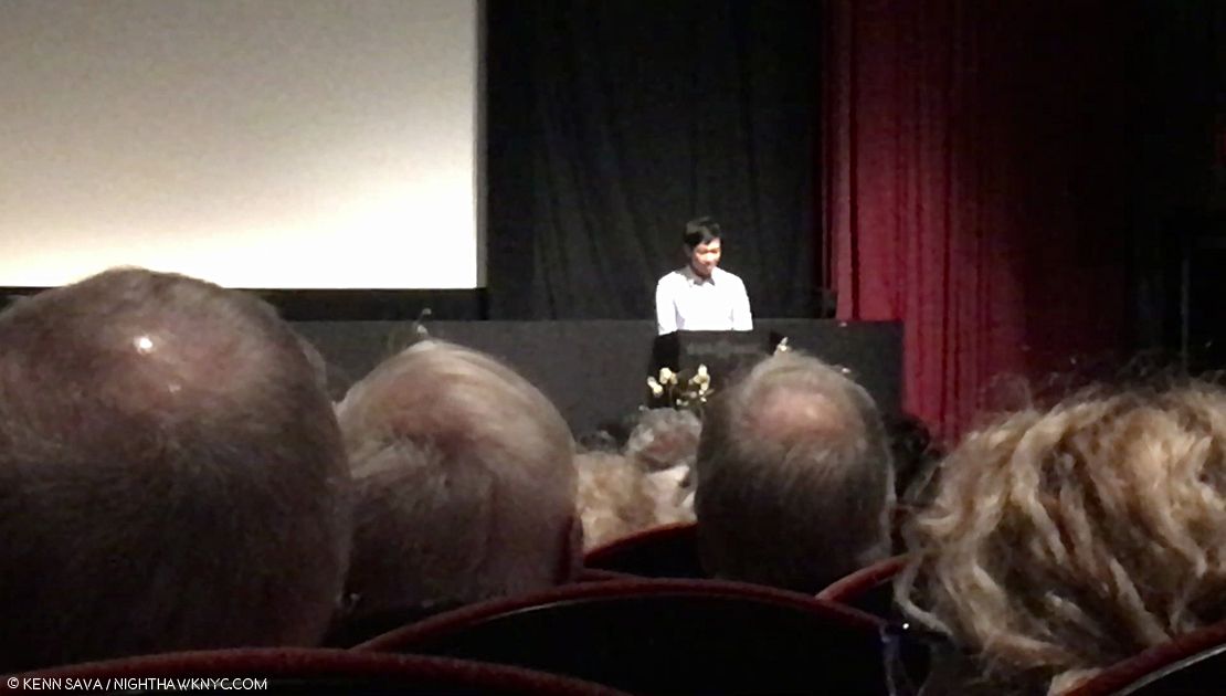
Danh Vo speaks about his experiences with Tim Rollins at the Tim Rollins Memorial Celebration, SVA Theater, NYC, April 30, 2018, which also happened to be the 43rd Anniversary of the end of the Vietnam War, on April 30, 1975.
On April 30th, I went to the Memorial Celebration at the SVA Theater on West 23rd Street for my late friend, the Artist and educator Tim Rollins. Much to my surprise, Danh Vo was there, and was one of a number of well-known Artists, and friends, who spoke about Tim Rollins during the service! He also generously donated the flowers. Sitting way in the back, in the jam packed auditorium, I was taken by a group of them to the left of the stage.
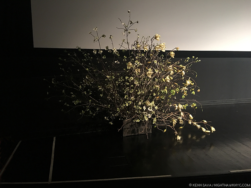
One group of flowers donated by Danh Vo at the Tim Rollins Memorial Celebration, April 30th, 2018, at the SVA Theater.
The way they were half in the light, and half in shadow perfectly summed up the experience of the evening for me. Was Danh Vo responsible for the lighting? I tend to doubt it because the lights were for what was going on onstage. Such is my respect for his installations, he had me wondering.
*- Soundtrack for this Post is “I Want To Come Home For Christmas,” by Marvin Gaye and Forest Hairston in 1972.
My thanks to Kristina Parker and May of the Guggenheim Museum.
NighthawkNYC.com has been entirely self-funded & ad-free for over 7 years, during which over 275 full length pieces have been published!
I can no longer fund it myself. More on why here.
If you’ve found it worthwhile, PLEASE donate to keep it online & ad-free below.
Thank you, Kenn.
Written & photographed by Kenn Sava for nighthawknyc.com unless otherwise credited.
To send comments, thoughts, feedback or propositions click here.
Click the white box on the upper right for the archives or to search them.
Subscribe to be notified of new Posts below. Your information will be used for no other purpose.