Grant Wood: The Wheat From The Chaff

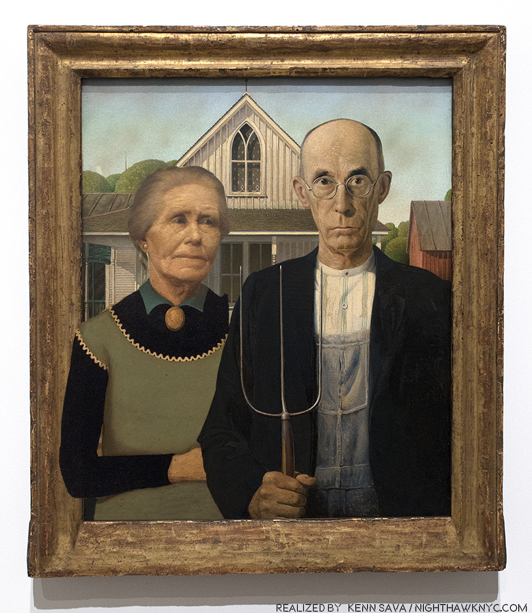
Wait. What? My rough realization of what Grant Wood may have REALLY wanted “American Gothic” to look like. I’ll explain shortly. Click any Photo for full size.

There is no denying Grant Wood’s contribution to what is now called “American Art.” He was one of the staunchest advocates for this country developing it’s own style of Art. He did as much as anyone else from the late 1920’s on, towards making it a reality. He spoke, taught, and formed Artist’s communities. and created Art that received wide acclaim as being American. Yet, seventy-five years after his death, the image we have of Grant Wood, the man, as well as the common perception of his work, is not the whole picture.
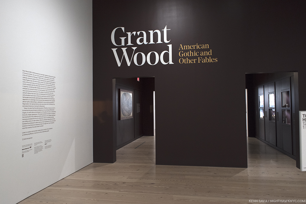
Behind the show’s entrance, the first gallery is ominously dark, ostensibly to show off the work in the next Photo. It did “set a tone,” at least for this viewer.

Like Michelangelo, he carefully monitored his public image, and like Il Divino, this was no easy task given the unprecedented level of popularity “American Gothic”, um…the real one… received, literally overnight, when it debuted at the Art Institute of Chicago’s Annual Exhibition of Painting & Sculpture in October, 1930. It  pretty much never waned the rest of his life. Along the way, he carefully monitored his public image to keep out any inkling of homosexuality, which was, apparently his preference, though he married, once. Critics, and the public, have looked long and hard at his Art for “telltale” signs of it. I find very few passages that are even “suggestive.” That doesn’t mean he wasn’t homosexual1. That only tells me he was careful. Looking at the work, I find far more that would belie his image as the “Painter of Middle American values.”

Grant Wood, yes. Grant Wood, “Corn Cob Chandelier,” 1925, Copper, iron, paint. I can just hear Frank Lloyd Wright and Louis Comfort Tiffany, the two geniuses of American Design and Ornamentation of the time saying, “Now WHY didn’t I think of that??”
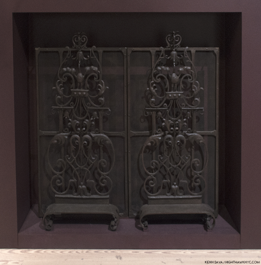
“Fire Screen Ornament,” 1929-30, Wrought iron. Grant Wood was accomplished at a wide range of things, including iron working, as here, jewelry making and he even designed and constructed a few houses. As seen here, he had his own style in these materials, that was different from the ornament created by Wright, Sullivan or the Europeans.

My initial walk through of the entire “Grant Wood: American Gothic & Other Fables’” 9 galleries over 3 visits to the Whitney Museum, left me with one overriding feeling. Though his mature period lasted barely 11 years, from 1930 to his death at age 50 in 1941, I found much of this work unsettling. Over my subsequent re-visits, I searched for why.
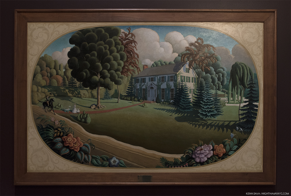
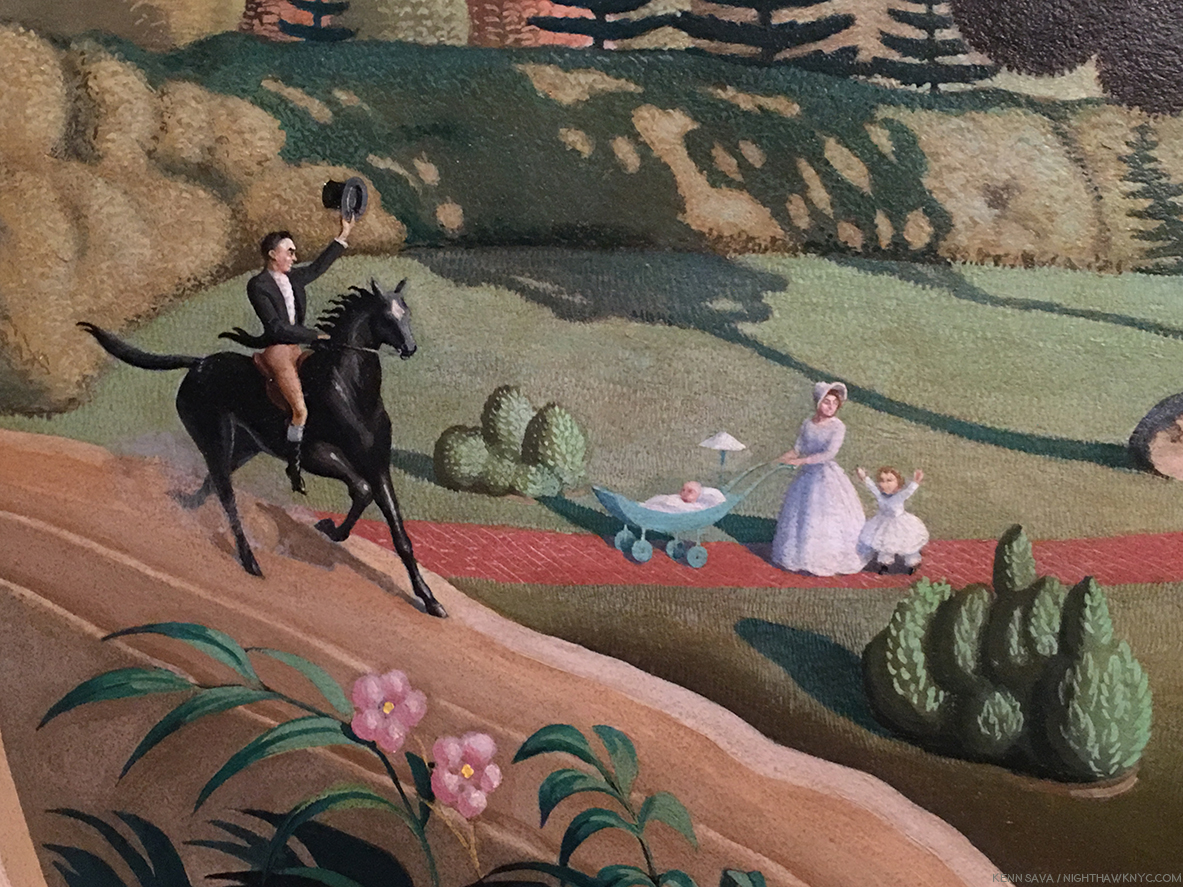
Overmantel Decoration,” 1930, Oil on composition board. Also displayed in the first, darkened gallery. Painted the same year as “American Gothic,” to go over the mantel of a couple’s new home, this “idyllic” scene bothers me to no end. Notice, half of the front lawn is covered by an ominous shadow (or a dying lawn2, the trees on the right look more like circular saws (not exactly welcoming), and the mother looks away from the man on horseback, who is going past her and what we assume are her children, given his horse’s leading hoof is already past the path they’re standing on. The tall tree to the right is brown- is it dead? In the background 2 dark clouds loom. The house is already being covered in vines. What, exactly, is going on here, and why are we “spying” on this scene from behind the plants across the road?

“Overmantel Decoration,” 1930, ostensibly fills it’s commission- Art to hang over the mantel of a family’s new home. Yet, I can’t help wonder if it’s “more.” The scene depicted, an almost ideal middle class life circa the late 1890’s, would be something almost impossible for an Arist to attain. Especially one in the mid-west, far away from where Art was trading hands for serious money at the time. Grant Wood well knew this. I can’t help but wonder if that’s why the scene is almost being evesdropped on. Most people would want to show their house from directly in front of it. Yet, we “spy” it from a 45 degree angle at a time when the front facade is in shadows. It’s as if the Artist is evesdropping on a life he’ll never know choosing to follow his creative star. Of course, any life is fraught with dangers, and maybe that’s why there’s so much of it, apparently, in this work, where one would expect the kind of bliss Currier & Ives made famous.

Detail. A strange “Welcome home” from the woman, IF this is her husband.

Grant Wood was born to a farmer and his wife in Anamosa, Iowa in February, 1891. His father was a very strict, my-way-or-the-highway kind of man, who wouldn’t hesitate to discipline if things weren’t done his way. He was a man’s man, and to his son Grant, more a God than a man, as he said in his autobiography. Plump and not blessed with physical strength, Grant (who was named after that paragon of manliness, U.S. Grant), was not cut out to follow in his father’s footsteps. His sense of inadequacy and his sense of striving to put forth a “manly” persona remained with him for the rest of his short life. (He died 2 hours short of turning 51 in 1941.) His father suddenly died when Grant was 10, forcing his mother to sell the family farm, and leaving Grant with issues that stayed with him the rest of his life, and I feel, are quite visible in his work. Yes, right there alongside the “wholesome,” American values so many see in his work.

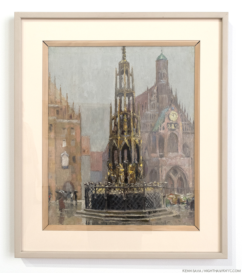
“Market Place, Nuremberg,” 1928, Oil on canvas.

In 1920, he sailed to Europe on the first of 4 visits. In 1940, he explained, “when I told my friends in Cedar Rapids, Iowa that I was going ‘there’ to Paint, I immediately became an outcast. It wasn’t considered manly to be an Artist. Then I read H.L. Mencken’s articles, and decided I must leave the Bible Belt at once and go to Paris for freedom3.” During his 4th trip, in 1928, Grant Wood suddenly had an “epiphany” as he called it during a visit to Munich, Germany’s Alte Pinakothek, when he came upon works by the Northern Renaissance masters, particularly Hans Memling and Albrecht Durer. Virtually instantaneously, he abandoned the “Impressionistic” style he had been using (as seen above) in his non-commissioned work, for most of the 1920’s.
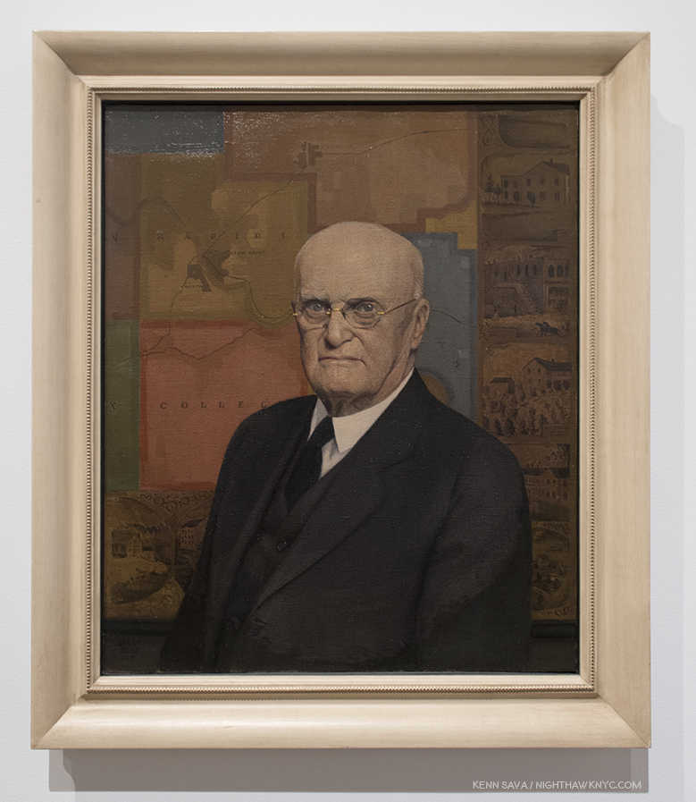
“Portrait of John B. Turner, Pioneer,” 1928/30, Oil on canvas. Almost on a dime, his work changed to this, sharply realistic style, that harkens back to Memling and Van Eyck, in a work that marks the beginning of his “mature” period. A number of portraits followed, this prize-winning work.

Returning home, almost immediately, his mature style debuted in the portrait of the father of the Artist’s patron, David Turner. Grant Wood was obsessed with the appearance of “manliness” throughout his life. David Garwood, who wrote the first biography of Grant Wood, said his father, Maryville (pronounced “Mervil”), “looked at Grant now and then and wondered how he happened to bring such a son into the world4.” For the rest of his life, Grant Wood would be so mindful of the impression he made he even adopted overalls when he worked and often when he was Photographed so as to not look like the stereotypical “Artist” of the day, which was associated with “unmanliness,” since Art making wasn’t considered “real work”. In “Portrait of John B. Turner, Pioneer,” the subject looks out at us as if to say, “I have secured my place in Iowa history. Can you measure up?” “The sitter appears to know” the answer, R. Tripp Evans, says. He also sees it as a “down payment on his debt to Maryville, whose death had freed him to become an Artist. Safely contained behind the mask of ‘Daddy’ Turner, as John Turner was familiarly known, Maryville sits before the map that will lead Wood back to his past- and to a new approach5.”

Continually using his family and friends as models, a series of portraits of them followed, Most notably this one-
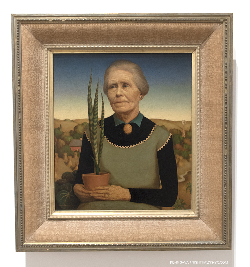
“Woman with Plants,” 1931, Oil on composition board. The Artist’s mother in what was Grant Wood’s favorite of his own works.

It’s a portrait of his mother, Hattie Deette Weaver Wood, who Grant Wood lived with for the rest of her life after Maryville’s death in 1900, until her own death in October, 1935, partially perhaps, to shield him from the scrutiny and gossip surrounding him being a “bachelor Artist.” In it he depicts her as he remembered her looking on the day of her husband’s death. She wears an apron over a black long sleeve top, possibly in reference to the Artist’s comment regarding his change of styles, ” I spent twenty years wander around the wold hunting ‘arty’ subjects to Paint. I came back to Cedar Rapids, my home town, and the first thing I noticed was the cross-stitched embroidery of my mother’s kitchen apron6.” His eyes opened to the potential subjects all around him, the change would last the rest of his life. After the fact, he tried to alter the dating of these two works to make it appear that “Woman with Plants” had come first, and before “Portrait of John B. Turner, Pioneer,” but it had not. Though he dearly loved it, Hattie insisted he sell it. Sorrowfully, he did, but intended to do another portrait to replace it. When the idea for “American Gothic” came to him, after seeing the now famous small house with the upstairs Gothic window in Eldon, Iowa, he had an idea. His sister Nan, who posed for the young lady in the Painting, said this in an interview soon after-

“As he put together his composition for the house and two people while he was at the breakfast table that morning in 1930, he said he had models in mind—a man and a woman who would be just perfect. However, he was afraid to ask the woman, fearing she would be angry at the idea of being made something less than beautiful … Grant never told me whose place I took as the model, but I’m sure it was a spinster who had hounded him7.”

So, finally, he arrived at this-
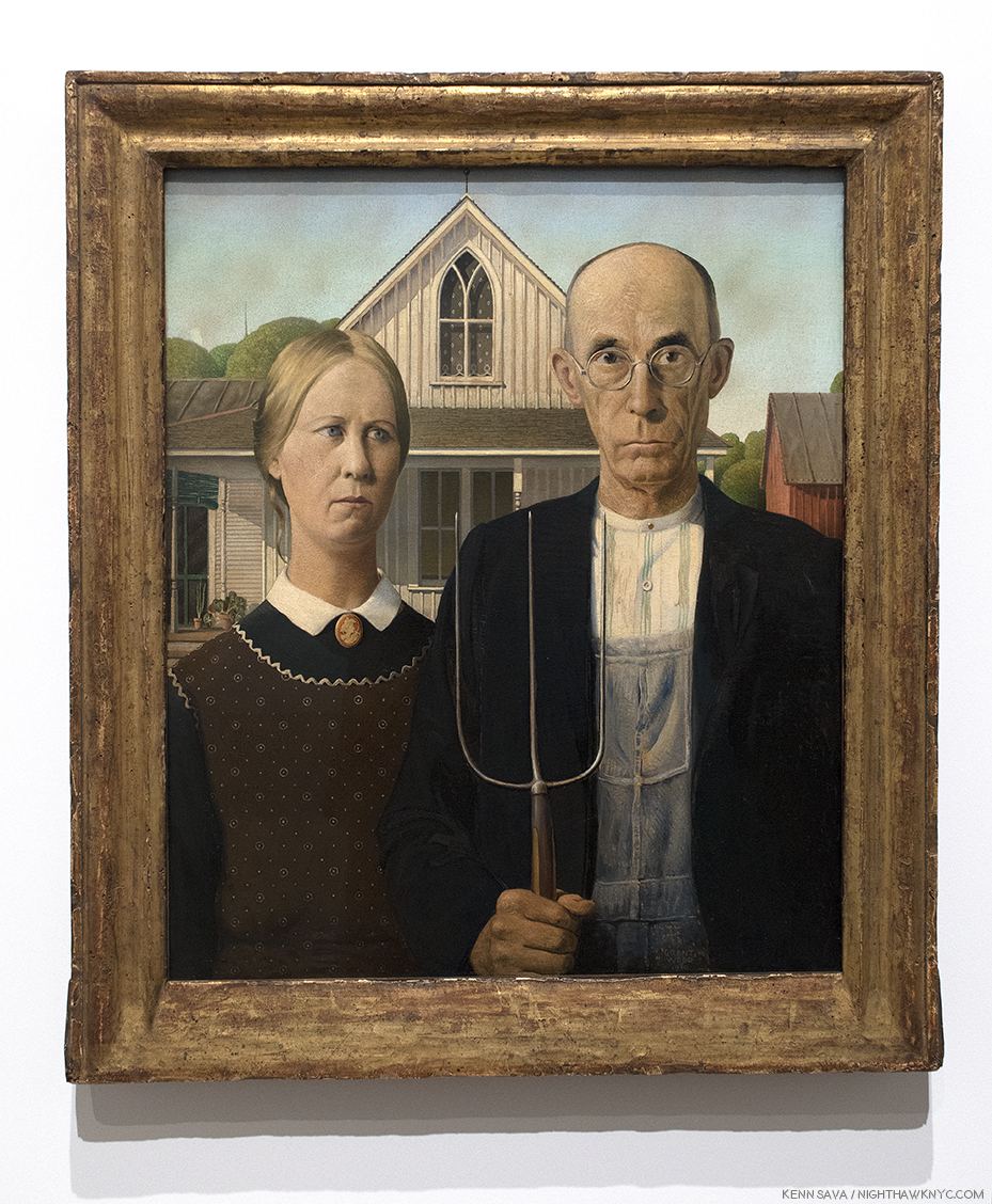
The “real” “American Gothic,” 1930, Oil on composition board. On loan from the Art Institute of Chicago, who bought it for the outrageous sum of…three HUNDRED dollars!

How can ANYone stand in front of this and not feel uneasy? I, for one, don’t like having the business end of a pitchfork pointed at my eyes.

The Artist happened to drive by the house one day and was taken by the gothic window on the second floor, which reminded him of the Cathedrals he’d recently seen in Europe. Dr. Byron McKeeby, Grant Wood’s dentist, 62, by accounts an affable man, posed as the farmer. His sister, Nan, 30 at the time, posed as the lady who has been identified as either the farmer’s wife, or his daughter (Grant Wood is quoted calling her either at least once, though, like Michelangelo, he appears not to be above saying things for his own reasons, on occasion). The uneasiness this work invokes, along with a “Mona Lisa”-like enduring mystery about it’s “meaning,” hasn’t stopped it from becoming one of the most famous works of American Art of the 20th Century. My reading of it is that it has to do with the Artist’s feelings of confronting his father about his being an Artist and not a farmer.  That it’s his devoted sister, Nan, standing besides the father figure, says to me that she wants him to show him some understanding. It also expresses the Artist’s sense of feeling like an outsider in his native state. Those feelings may have been sharpened into irony (if not outright scorn of his neighbors) by his reading of H.L. Mencken8.

No, Grant Wood wasn’t a farmer. The closest he got to it was tending a garden. He was, originally, a Decorative Artist. He studied and worked at making silver jewelry and coffee and tea sets, he worked in iron, as seen earlier, and he did stage design. None of these were considered “manly” and most weren’t considered actual “work” by his father and others at the time in Iowa. Right up until the 1930’s, years after he had settled on being a Painter, he was still supporting himself designing, building and furnishing homes. He spent his whole life striving to overcome what he perceived was a lack of manliness in the perception of him by others, ingrained on him by Maryville.

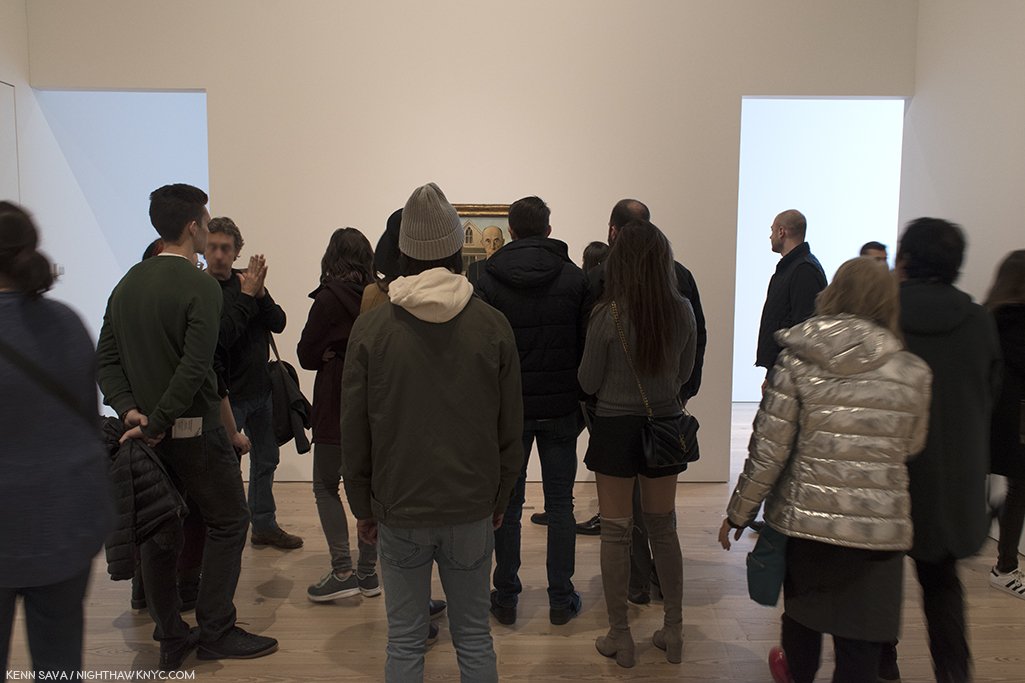
Over 6 visits I made a point of carving out a few minutes each time to stand alongside viewers looking at “American Gothic.” I stood to the side so I could watch their expressions. Yes, quite a few posed for selfies with it, and in those cases, I looked at their faces, too. No one smiled. It seemed to me that the mood of the work was imparting something beyond the hype the work has received for 80 years as being an icon of the American Mid-west and it’s core values. I detected uneasiness in my fellow viewers as well. The power of the work begins in the eyes. R. Tripp Evans says the farmer’s eyes don’t make eye contact with the viewer, they look just past him/her. They bored right through me.

So…? What’s up with the image I posted up top?

The same R. Tripp Evans makes a strong case that the “woman who would be just perfect” was the Artist’s mother, Hattie. But, asking her to pose alongside another stern farmer other than her late hubsand would have been too close to home for her, and too painful. She would never had agreed. So, he posed Nan in her stead. Somewhat revealingly, Nan wears the same cameo (of Persephone) that Hattie wears in “Woman with Plants,” She wears long black sleeves under her apron, like Hattie does, both with pointed fringe and collar poking out up top, and, both women wear their hair back. Also, the potted sansevieria, which Hattie grasps with both hands on her lap in “Woman with Plants,” now appears on the porch over Nan’s right shoulder. Grant Wood never reused items that had appeared in one of his works in any other work ever again. Where there’s smoke? There’s fire. There’s quite a bit of “Hattie smoke” in Nan’s portrait here.

Is this the farmer’s wife, or daughter? She’s both. She’s made to look like Hattie, but she’s Grant Wood’s devoted sister, Nan, here taking his side, as usual. Note the sansevieria plant on the porch.

His father having passed away, his mother not being ammenable to posing, he did the next best thing. He asked his sister, Nan, to pose, and asked his dentist, Dr. Byron McKeeby to pose as the farmer. In his unfinished autobiography, “Return from Bohemia,” Grant Wood describes Maryville as “Tall and gaunt,” with a “solemn, stern, angular face9.” The affable Dr. McKeeby was able to capture the grim look Grant Wood wanted, aided in no small part by the fact that he is wearing Maryville Wood’s eyeglasses! The only item belonging to his father that Grant Wood kept. He liked them so much, he had a duplicate pair made for himself. All these things point to the Artist’s original intention to depict his mother and father in “American Gothic.” The  Artist, himself, is represented, I believe, by the European Gothic window- quite out of place in 1930’s Iowa, like Grant Wood felt he was, fittingly, with it’s curtain down, hiding what’s inside.

So? I’ve created a very rough idea of what “American Gothic” might have looked like if he had asked Hattie to pose and she agreed.  Taking her portrait from “Woman with Plants,” my job was made easier because there are so many similarities with Nan’s appearance in “American Gothic,” and her mother’s in “Woman with Plants,” as I’ve listed. The main visual difference being the disparity of their ages.

What this exercise showed me is the difference in the effect in switching Nan for her mother would be major. Of course, we have no idea how Grant Wood would have rendered Hattie had she agreed, and enabled the Artist to follow through on his yearning to replace “Woman with Plants.” If this had happened, it is interesting to ponder if the public would have responded to it the way they have to the “American Gothic” we have. That circles the question back as to why they have.

It’s ironic that it was his mother, who’s protective presence shielded him from unwanted public scrutiny, who inadvertently led to more of it than either of them could have ever imagined. Perhaps, only the Artist would have preferred it with his intended “perfect models,” and if he had gotten them, would he have remained a strictly local favorite Artist- a while longer, or permanently, as so many others have?
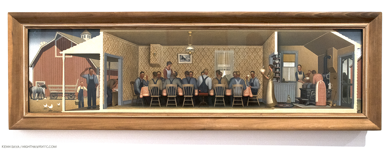
“Dinner for Threshers,” 1934, Oil on board, nearly 7 feet long. Ostensibly, a communal meal on “threshing day,” the day when the edible part of the grain was loosened from the husks and stalks (i.e.-the chaff). For Grant Wood, threshing day was “the big event of the year10.”

While most people who see “Dinner for Threshers” will take it at face value, as a meal after working in the fields, it harbors quite another level. Set in an open house, his childhood farmhouse near Anamosa, like a stage show, what we are seeing is nothing less than the Artist’s reimagining of his father’s last meal before he suddenly “dropped dead,” as the local newspaper headline read, in 1900 at the window in the center- the vanishing point of the work, in multiple ways, as Mr. Evans points out. It’s design is an apparent homage to Leonardo da Vinci’s “Last Supper,” complete with untanned foreheads instead of halos, 13 workers instead of 12 disciples, and features what might be the Artist, himself, three times on the far left, outside, and again at the table looking up at the woman, who may be Hattie, who appears as the other three women, to the right, according to Mr. Evans11. Since Wood said that “It includes my family…,” that leaves me wondering where Nan is. Maryville, appears in the center, taller than everyone else, with his back to the viewer, in the light shirt, in what would be the only time his son Painted him. So, what we are seeing here is nothing less than the end of one life, and the beginning of another- Grant Wood’s career as an Artist. In that sense, too, “wheat has been separated from the chaff.” Treshing day, indeed.

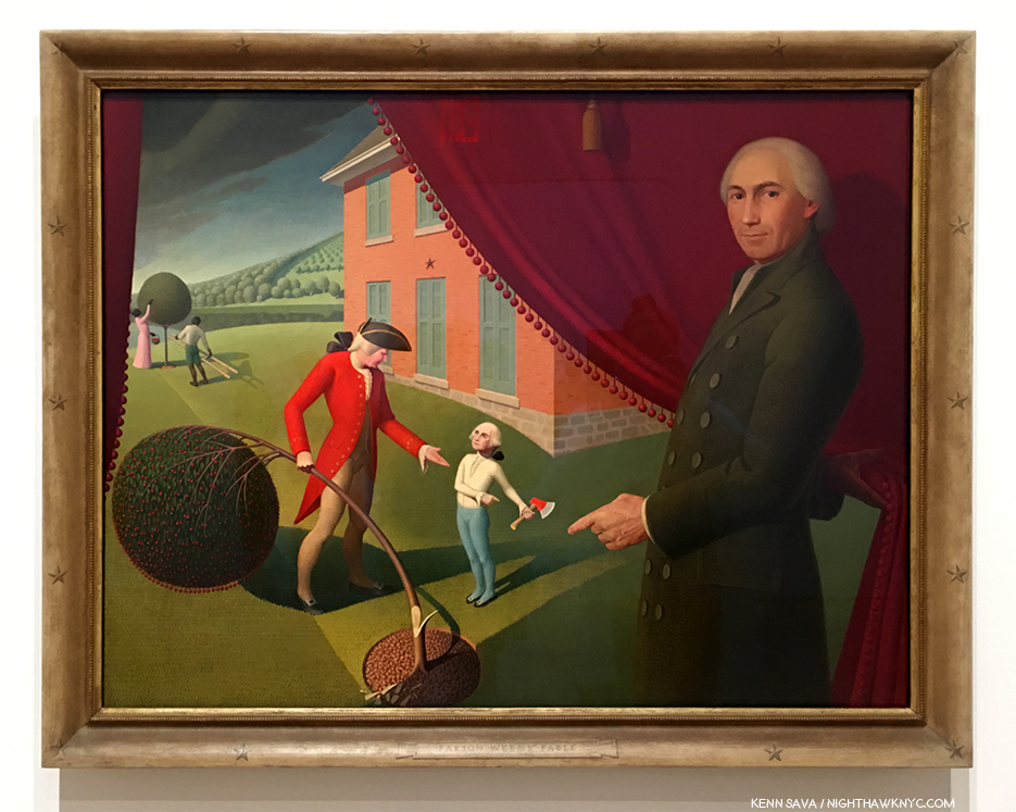
“Parson Weem’s Fable,” 1939, Oil on canvas.

In “Parson Weem’s Fable,” 1939, the fictitious fable about George Washington it depicts is not the only “fable” being told. Here, also, as late as 2 years before his death, Grant Wood is having it out with his father. By not wanting to become a farmer, he is ostensibly killing the cherry tree, i.e. his farm, which was sold after his sudden death in 1900. He refuses to return the axe, that is go back on his choice of an Artistic career. Grant Wood acknowledged that Washington’s attitude is his own[Ibid P.409]. The house in the back is his and his wife, Sara’s house, and the house where his mother would die. The red curtain the Parson opens is his mother’s curtain used in their prior Turner Alley sleeping quarters for a decade. Those would would classify Grant Wood’s work as Magic Realism, including Emily Braun in the show’s catalog (P.67), need to look no further, as what I believe they mean is seen in full effect here. No less than Gilbert Stuart’s portrait of the mature George Washington12, the one seen on the dollar bill, is morphed on to young George’s body, because, as he said, no portraits of the young Washington exist. Intriguingly, in the back of the scene a black woman and man tend to another cherry tree. Are they a couple? Mother and son? They do serve to remind us that both George Washington and Washington’s father owned slaves. They are the only African Americans to appear in Grant Wood’s work (as far as I know).

“Fall Plowing,” 1931, Oil on canvas

“Fall Plowing,” 1931, is an example of what others call “Magic Realism” (a term that Edward Hopper gets lumped into and I will never understand why), with it’s classic, surreal, Grant Wood  background. What strikes me is the unattended plow. While others (R. Trip Evans, “Grant Wood,” P. 204) see a sexual metaphor, there is no other way for me to “read” this work than to think it’s a very poignant homage to his father, Maryville and his sudden passing. He may well have left some farm implement right where he was working and using it. The plowed and planted fields rolling off into the distance speak of work accomplished, while the unplowed land in the immediate foreground speak of work to come and now left undone. I can picture the Artist coming across such a scene after his father died, so for me, this strikes closest to home among all of Grant Wood’s landscapes. It’s interesting how the only sign of other human life is way off in the distance, heightening the sense of isolation. In the most recent biography of Grant Woods, by R. Tripp Evans, which is full over very interesting biographical detail, the author goes to great length to sexualize this work, as he does too many times, in my opinion. Frankly, I just don’t get that at all standing in front of “Fall Plowing.” I also note that in the same year, he painted Portraits of his sister, Nan (“Portrait of Nan”), and his great-aunt, Matilda Peet, (“Victorian Survival”).,
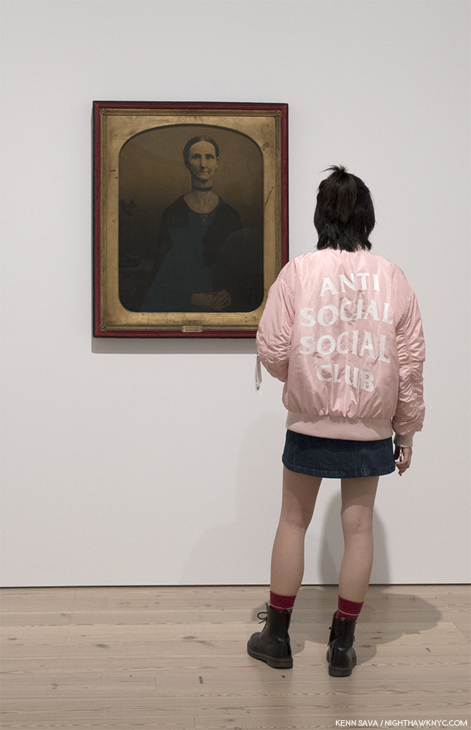
“Victorian Survival,” 1931, Oil on composition board. Grant Wood’s maternal great-aunt, Matilda Peet, rendered, in a different style, from a 19th century family tin-type…with the addition of a “modern” telephone on the left.

Here there is, also, the overriding distance that is seen in most of Grant Wood’s mature landscapes. The scenes are seen from far away, leaving the viewer isolated, as in “The Midnight Ride of Paul Revere,” 1931, for one example. The feeling is not all that different from that in the work of Edward Hopper at about the same time.

The loneliness seen throughout Grant Wood’s work may be rooted in the isolation he and his family lived during his first decade, isolated on a farm near Anamosa, a village of less than 2,000, “as if we had been on an island in the ocean,” he said. “If the unique circumstances of Wood’s childhood- it’s profoundly rural setting, his father’s strict expectations, and his own emotional makeup- established early self-doubts concerning his masculinity, then the cultural context of his youth only compounded the problem…the most compelling element of his mature work- his selective reorganization of past experience-was present in his art from an early age, and appears to have served a deeply cathartic function13.”
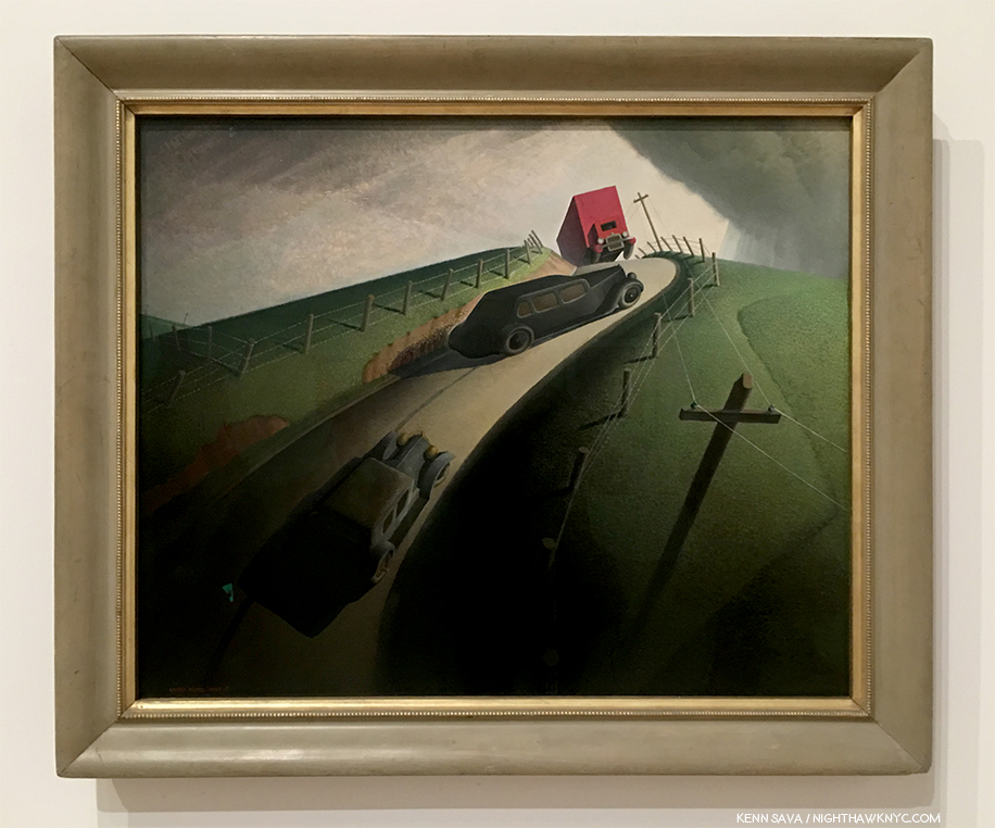
“Death on the Ridge Road,” 1935, Oil on composition board. The only appearance of multiple motorized vehicles in this show.

Death is, obviously, an undertone that accompanies many of Grant Wood’s works, and a theme in his life. Even beyond his father’s death, Grant Wood, appears to almost be obsessed with it. He took walks in graveyards, he worked for at least two funeral homes, including his first job as a night watchman. He took various roles at David Turner’s Funeral Home, including designing casket biers, and after being given a studio directly behind it, he used a coffin lid as it’s front door. In this work, “Death on the Ridge Road,” 1935, he Paints it. Inspired, Nan says, by a close call a friend had but survived, here, the long sedan has no way out. At this time, Grant Wood was facing the eminent demise of his “we three” family unit he had been nurtured by for the past 25 years. Nan moved to Albuquerque and his mother, Hattie, was starting to go. She would die in October. Startlingly, on March 2nd Grant Wood, 44, finally married. Of course, some surmised, at the time and since, that his marriage was a “cover,” necessitated by Hattie’s demise. I have no idea. It ended in divorce some 3 and a half years later.

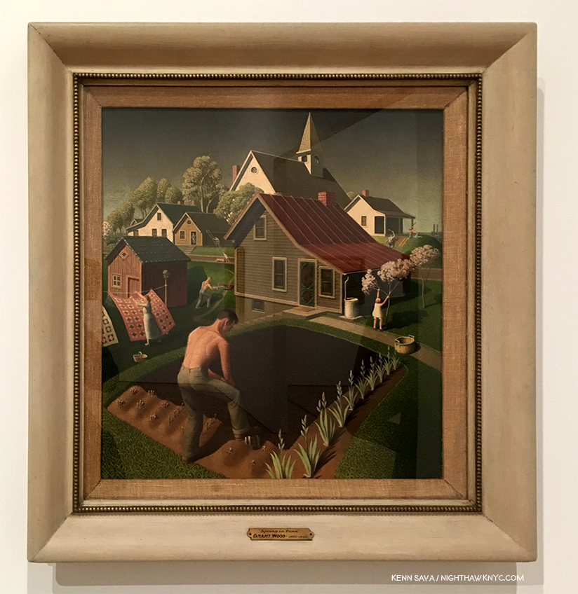
“Spring in Town,” 1941, Oil on Wood.

As the Nazis blitzkrieged across Europe, Grant Wood embarked on a series of works designed to show Americans what they stood to lose. “Spring in Town,” 1941, is one of the two he lived to finish before he died of pancreatic cancer on February 12, 1942. In the midst of the townspeople busy with their daily chores, I can’t help but notice the gent planting in the foreground. For me, this symbolizes much of Grant Wood’s Art. His work speaks for  him, and they do so on a number of levels, not all of them obvious. As this increasingly comes to light, the reassessment of Grant Wood is continuing. Just what is he really sowing in that ground, and in these Paintings? He had quite mixed feelings for Iowa, it’s citizens and their lifestyle, and some of his most famous works, including “American Gothic” were born out of his desire to poke fun at them in response to the way he felt he was treated as an Artist then and there. But more than that, seeing this many of his works together, it becomes obvious that Grant Wood was painting his childhood of the 1890’s, and not the mid-west of the 1930’s. He was painting what he lost, not what was disappearing as he grew older, and he was working out that most significant relationship of his life, that failed relationship with his father.

With 117 works on view by my count,  the show is larger than the Stuart Davis show. It does feel light on his early work (I saw one Painting from the decade of the 1910s, three dated 1920-25), which misses a chance to trace his development from nearer his beginnings. I doubt the overall impression would be much different. “Grant Wood: American Gothic & Other Fables” provides New York with a rare chance to see so many of the Artist’s works in one show (the last time, if I recall correctly, was also at the Whitney in 1983), given the overwhelming number of them permanently reside in Iowa, and most importantly, a rare chance to assess his work in light of all that has come after it, and to see what it has to offer to us today.
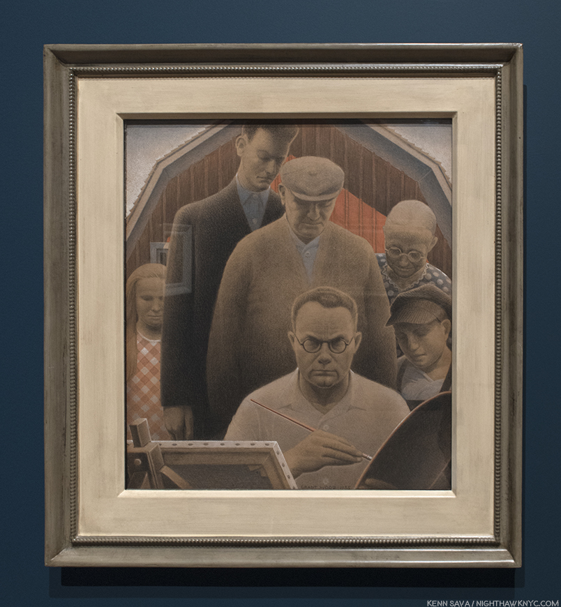
“The Return from Bohemia,” 1935, Pastel, gouache and pencil on paper. The cover for his unfinished autobiography shows the Artist surrounded by Nan, his early dealer, Ed Rowan, his patron, funeral home owner, David Turner, Hattie, and his younger self, left to right, looking over his shoulder. Mysteriously, each of their eyes are hidden from us.

When you begin to piece it all together, Grant Wood comes across as more of a “contemporary” American, who’s complex, had issues with his family and neighbors, and was a member of a sexual minority. He looked forward to, and did all he could to help establish, an American style of Art, while at the same time, his own Art seems fixed in time- the 1890s. In that sense he was “old-fashioned,” too. Having dealt with rejection from his childhood, by the time he achieved his breakthrough, Grant Wood was an expert at managing what he revealed to others. He edited his work relentlessly to make sure it presented the image he intended, and he destroyed what he thought didn’t. Therefore, it should be no surprise that looking for “proof” of his homosexuality (in things like the gent in “Spring in Town,” above, working without a shirt on, or in “Fall Plowing”) is a waste of time, in my opinion. He didn’t want it to be found because the results would have been disastrous, personally and professionally, and he knew his work better than anyone else ever will. Looking, instead, at his work for messages and intentions that lie beneath the surface may be a bit more fruitful, but, again, it seems to me that so much of what he did was known only to himself. We can find elements of it through a study of his biography, his interviews, the memoirs of his sister, Nan, and the unfinished autobiography he left. But, it seems to me, that the still un-tilled, “deeper” levels in Grant Wood’s work, (reminiscent of the planting going on in “Spring in Town”), which I believe are there, are purposely buried so deeply under it’s topsoil that only he knew where they are.

*- Soundtrack for this Post is “I Shall Be Released” by Bob Dylan, lyrics here, as performed with The Band and a cast of thousands in “The Last Waltz.”

References-

“Grant Wood: American Gothic & Other Fables,” by Barbara Haskell, Glenn Adamson, et al, Whitney Museum, 2018- Ms. Haskell and her team have done an excellent job with this 272 page catalog. The quality of the reproductions are excellent (180 color, 30 B&W), and include works not seen in the show, and different views of some that are, though some suffer loss of detail due to being across two pages. The essays are interesting, informative and even unusual, especially an entire essay about Grant Wood’s Homosexuality by Richard Meyer. Also included is a thorough Chronicle by Ms. Haskell, which includes a number of texts and additional Photos. Throughout rarely seen Photos add much to the book, which is now, the standard in Grant Wood monographs, admittedly a small field.

“My Brother, Grant Wood,” by Nan Wood Graham. I haven’t found an actual copy of this book, which is still in print, but the fact that she burned her brother’s letters after he passed would seem to indicate a protective slant. That being said, from the excerpts I’ve read of it, and interviews with her published elsewhere, I have no doubt it’s an essential resource.

“Grant Wood,” by R. Tripp Evans. Though marred by, what I consider to be, oversexualized interpretations of the Artist’s work, it is extremely well researched and adds countless key insights and details to his biography and background on his work.

My thanks to Danielle Bias and Veronica Brown of the Whitney Museum.
NighthawkNYC.com has been entirely self-funded & ad-free for over 7 years, during which over 275 full length pieces have been published! If you’ve found it worthwhile, PLEASE donate to allow me to continue below. Thank you, Kenn.

You can also support it by buying Art, Art & Photography books, and Music from my collection! Books may be found here. Music here and here.

Written & photographed by Kenn Sava for nighthawknyc.com unless otherwise credited. To send comments, thoughts, feedback or propositions click here. Click the white box on the upper right for the archives or to search them. Subscribe to be notified of new Posts below. Your information will be used for no other purpose.

  1. Writers, including R. Tripp Evans in the most recent biography of Grant Wood, provide details, and there is an entire chapter devoted to the subject, by Stanford Art History Professor, Richard Meyer, in the show’s catalog.
  2. Interestingly, “The Birthplace of Herbert Hoover, West Branch, Iowa,” 1931, also has a brown/dying lawn.
  3. R. Tripp Evans, “Grant Wood,” P.72
  4. Ibid P.33
  5. Ibid, P.103
  6. Ibid, P.122
  7. Ibid, P.144
  8. Ibid P.140
  9. Ibid P.146
  10. Ibid, P.249
  11. Ibid, P.255-6
  12. Throughout his work, Grant Wood, an astute student of Art History, quotes from the masters, often with humorous effect. See “Daughters of Revolution,” 1932
  13. Ibid, P.34

Gordon Parks: Re-Emerging Man

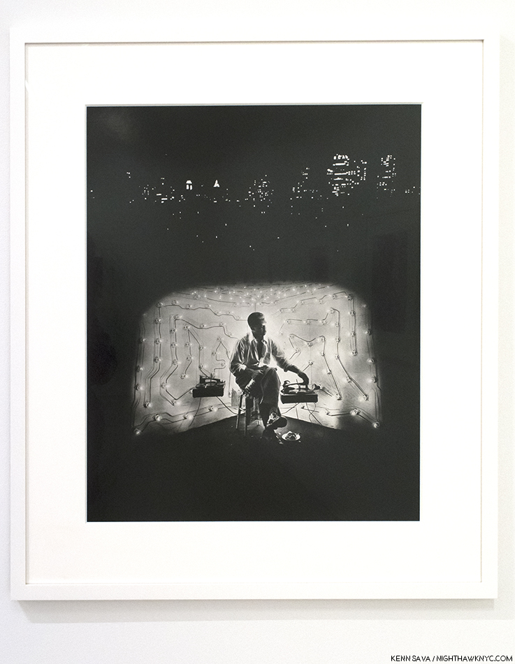
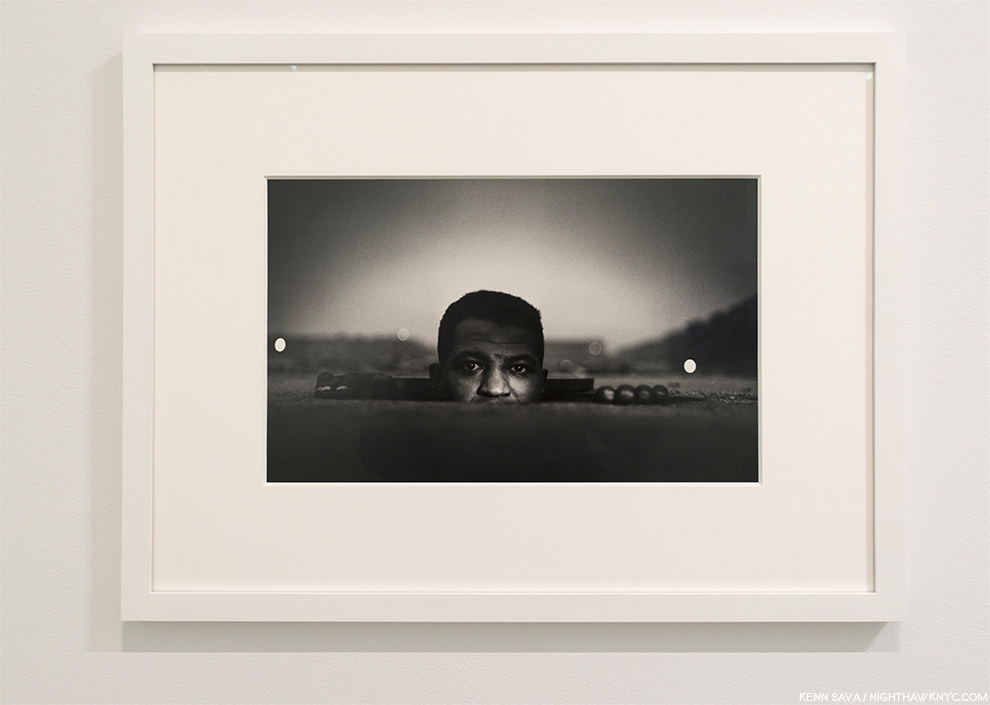
The Invisible Man, Harlem, New York, 1952. One of Gordon Parks’ most iconic Photographs, among many other great ones.

The renowned 20th Century Photographer/ Filmmaker/ Painter/ Writer/ Musician & Composer/ (I keep finding more talents, so I’ll leave this one open for the next one)… “Renaissance man,” Gordon Parks (1912-2006) was a self-taught Photographer who bought his first camera from a pawn shop at 25. He went on to create an extraordinary body of work over the next 60 years that was marked as much by its range as by its quality. Along the way, he became, perhaps, best known for two of his films that are legendary in different ways. The semi-autobiographical The Learning Tree, 1969, achieved and retains critical acclaim, and Shaft, 1971, a much bigger commercial success, remains an influential cult classic.

After getting that first camera, Gordon Parks promptly became good enough with it to gain employment with the Farm Security Administration (FSA) until it closed in 1943. His subsequent work as a freelancer led to acclaim and his becoming the first African American staff Photographer and Writer at Life Magazine, then the #1 Photojournalist publication in the world. After 2 decades at Life, he turned his own best-selling novel, The Learning Tree, into a 1969 movie that was one of the first 25 films selected for permanent preservation by the National Film Registry of the Library of Congress1. Two years later, he followed it up with the wildly popular film Shaft, made for $500,000, which was added to the Library of Congress’ Preservation List in 2000. That same year, Gordon Parks was named one of 26 “Living Legends” by the Library of Congress. All the while, he would continue to create Photographs and explore Photography until his death six years later.

Monumental. Gordon Parks Collected Works, 2012, published by Steidl and still in print. Photo by Steidl.

After his passing in March, 2006, the Gordon Parks Foundation has been carrying on promoting his work, with particular attention to his Photography. Though renowned during his lifetime, his body of Photographs has seemed to be somewhat overlooked in the plethora of Photographs coming before the world these days. To reverse this, in 2012, the Foundation and the world’s leading Publisher of Photography Books, Steidl, produced an exceptional five-volume set of Gordon Parks’ Photographs entitled Collected Works that can found at quite reasonable prices online. But, seeing the real thing in person, as with most Art, has a power all its own.

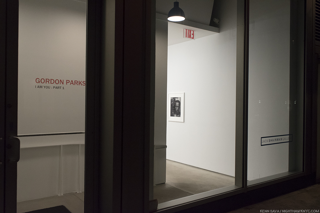
Keeping the light burning. It was still getting dark before 5pm as I stood outside Jack Shainman on West 24th Street when Part 1 opened in early January. And, when Part 2 opened on February 15th.

To this end, Jack Shainman Gallery mounted two shows, Gordon Parks: I Am You Part 1 & 2, between January 11th through March 24th, that provided a beautiful and succinct overview of some of Mr. Parks’ finest work, and included a number of surprises.

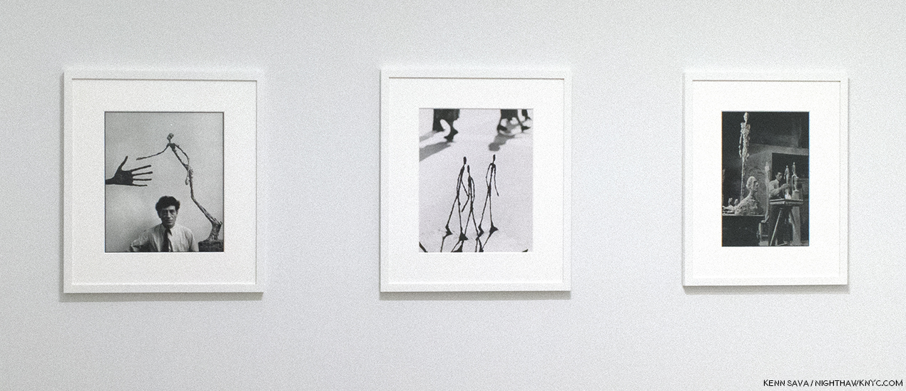
An unexpected dialogue. 3 Photographs of Alberto Giacometti and his work- Falling Man, Strollers, and Untitled left to right, Paris, 1951.

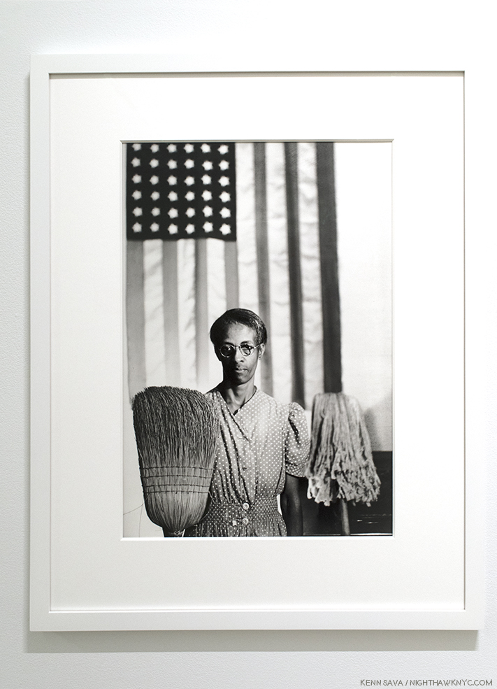
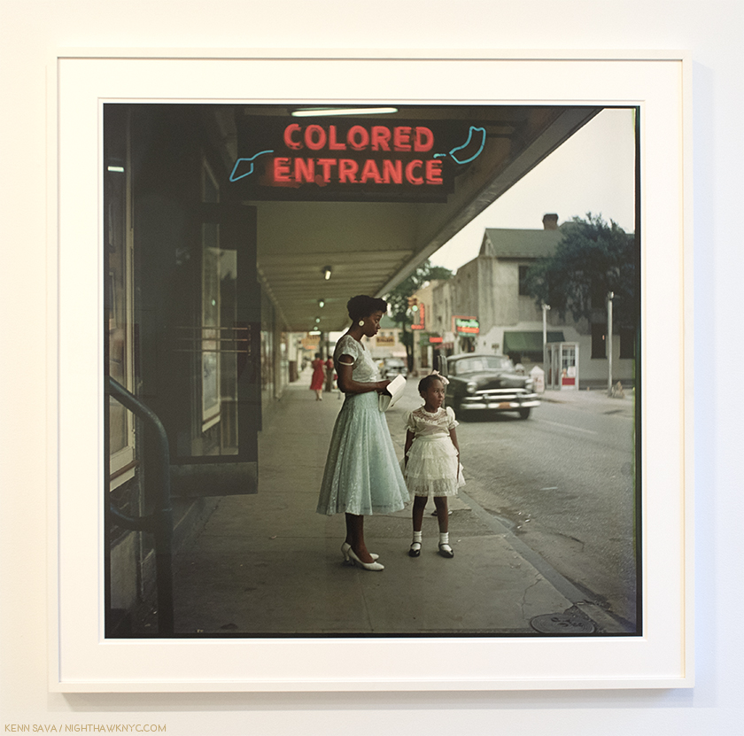
For those who know his early work for the Farm Security Administration (FSA)-

American Gothic, Washington, D.C., 1942, meanwhile, the “other” one, by Grant Wood, is on display at the Whitney right now, about 15 blocks south.

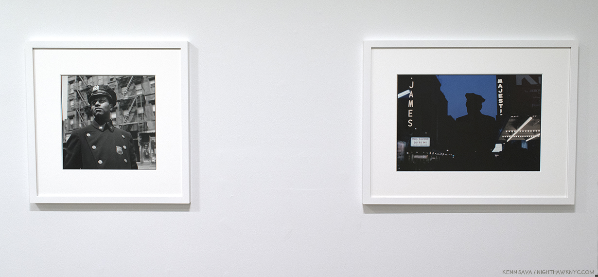
Or, as a PhotoJournalist-

Untitled, Harlem, New York, 1949, left, Untitled, New York, New York, 1952

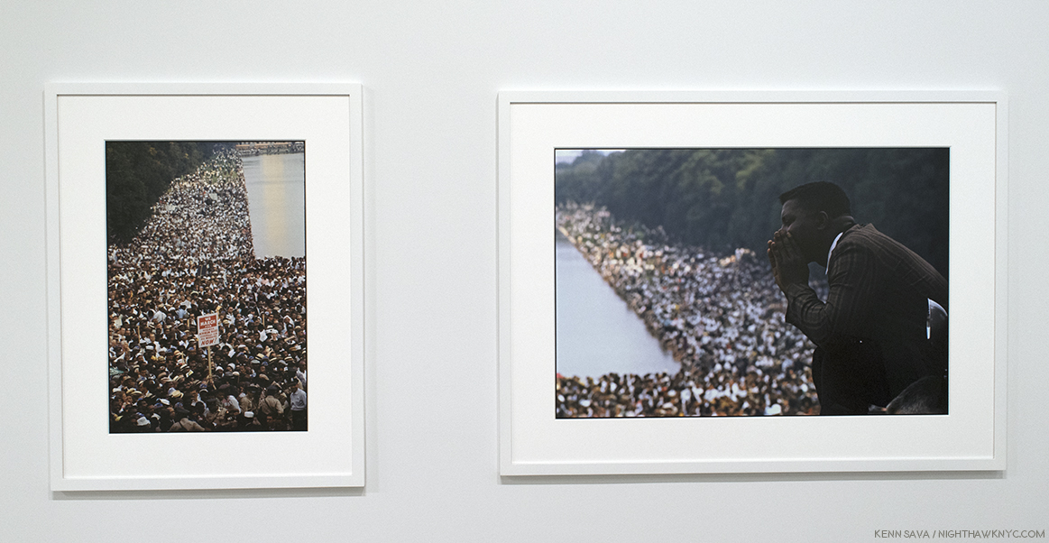
or his work documenting the Civil Rights movement-

Both, Untitled, Washington, D.C., 1963. The Civil Rights March on Washington

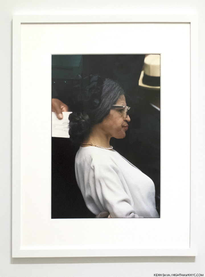
Untitled, Washington D.C. (Rosa Parks), 1963

Or, those that are hard to classify-

Invisible Man Retreat, Harlem, New York, 1952

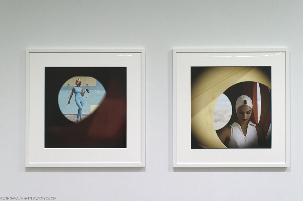
Gordon Park’s work as a Fashion Photographer

and his later, color, works that explored much more freely, may come as a surprise.

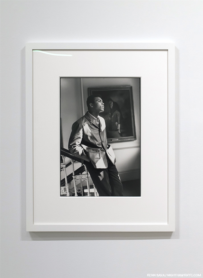
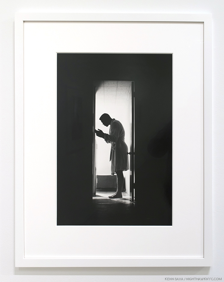
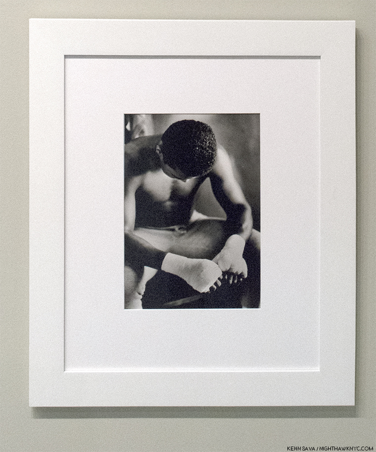
In an age where there are far too many Photos taken of celebrities, I continually find myself stopped by the images he took of Muhammad Ali. Many of his shots of the Champ are somewhat unorthodox, and almost all of them have an intimacy not seen elsewhere. So well done are they, so natural, it’s extremely hard to tell if Mr. Ali is posing or was captured in the moment.

Untitled, London, England, 1966

Untitled, Miami, Florida, 1966

And this, seen last year-

Muhammad Ali (Wrapped Hands), 1966, as seen at the Weinstein Gallery, Minneapolis, AIPAD Booth in March, 2017

Even over two shows, given the length of his career and the extraordinary wide range of his work, it’s possible to only get a taste of his accomplishment. Luckily, the Steidl set, (which is also available, minus the slipcase, in a “Study Edition”), is around to provide a complete look. Still, my takeaway after both shows is that it’s hard to find a genre of Photography at which Gordon Parks did not excel, one in which he did not create memorable works of lasting strength, significance and beauty.

Emerging Man, Harlem, New York, 1952. Along with American Gothic, two of his most well-known Photographs.

There are some interesting parallels, and divergences, in the Photographic careers of Walker Evans (1903-1975) and Gordon Parks2. Both worked for the FSA, both went on to work for magazines, though Evans was, of course, white, both Photographed African-Americans, and both explored color Photography as their careers went on. But, Evans found a champion at the Museum of Modern Art in Lincoln Kirstein, which resulted in his work being given a solo show in 1933 and a breakthrough show, the now legendary “Walker Evans: American Photographs,” in 1938, the catalog for which is still considered a benchmark for all subsequent PhotoBooks. Gordon Parks has never been given a solo show in a NYC Museum (as far as I know), and wasn’t included in a MoMA group show until 1965. MoMA shows 17 Photographs by Mr. Parks in their collection. The Met shows O N E, the Whitney shows 5. In contrast, MoMA shows 205 works by Walker Evans, who has been included in 66 of its exhibitions, and The Met now owns the Walker Evans Archive.

“In my youth, violence became my enemy…Photography, Writing, Music and Film are the weapons I use against it.”
Gordon Parks, quoted on the cover of the documentary Half Past Autumn.

Untitled, 1941.

Looking at his work, Gordon Parks’ Photographs look every bit as relevant, and as good, today as they ever have. I think it’s going to be a very long time before that changes.

*- Soundtrack for this Post is “Do Your Thing,” by Isaac Hayes from the Shaft Soundtrack. The late Mr. Hayes performs it here, at the Glastonbury Festival in 2002-

NighthawkNYC.com has been entirely self-funded & ad-free for over 7 years, during which over 275 full length pieces have been published! If you’ve found it worthwhile, PLEASE donate to allow me to continue below. Thank you, Kenn.

You can also support it by buying Art, Art & Photography books, and Music from my collection! Books may be found here. Music here and here

Written & photographed by Kenn Sava for nighthawknyc.com unless otherwise credited. To send comments, thoughts, feedback or propositions click here. Click the white box on the upper right for the archives or to search them. Subscribe to be notified of new Posts below. Your information will be used for no other purpose.

  1. http://www.tcm.com/tcmdb/person/147876|62854/Gordon-Parks/
  2. No qualitative comparison between them is intended.

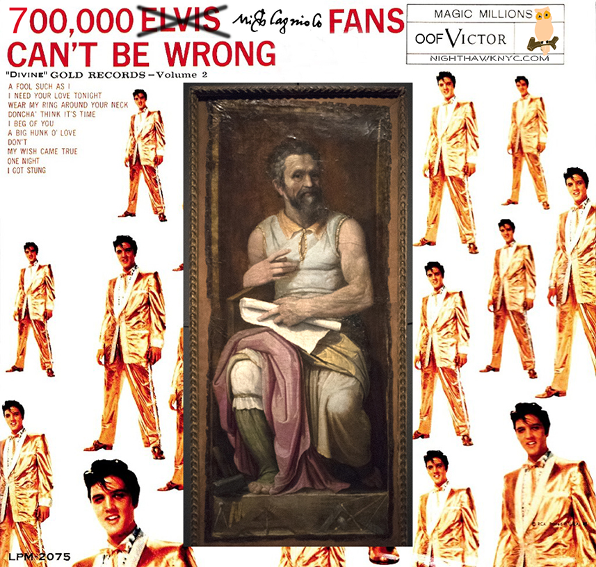
700,000 Michelangelo Fans Can’t Be Wrong

Take that, Elvis, who’s 1959 album title, and cover, I just borrowed. Michelangelo was the “King” of a different kind of rock. Old school rock.

Marble.

So “old school,” his work is proving to be timeless. Good luck outlasting him, Mr. Presley. No, they didn’t call him “The King.” Such were his skills as a Sculptor, Painter, Architect and Poet, they called him “Il Divino” during his lifetime. “The Divine One.”

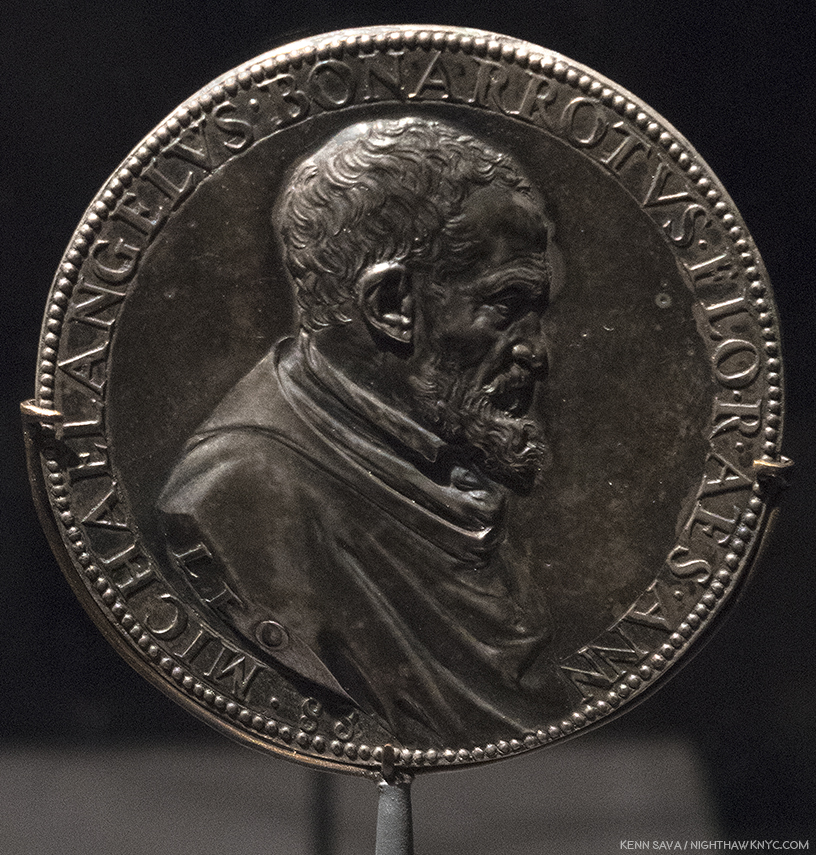
Met Curator Carmen C. Bambach deserves a medal. Nine years in the making, she now joins the ranks of The Museum’s “superstar” curators, like Andrew Bolton. After curating the Leonardo da Vinci, Master Draftsman Blockbuster, in 2003, Michelangelo: Divine Draftsman & Designer is her crowning masterpiece. In her superb catalog for this show she points out that Michelangelo, himself, was quite fond of this rendering of his profile in this Portrait Medal of Michelangelo, c.1561, one of which was given to him by its creator, Leone Leoni. Click any Photo for full size.

Since Art is my religion, “Il Divino” works in my book, too, these 542 years after his birth. For me, Michelangelo is not “Divine,” as in “more” or “other than human.” His talent is “Divine”- Merriam-Webster definition 2a “supremely good: superb.” It is in that sense I relate to him as “Il Divino.” While qualitatively comparing creative people or their work is meaningless, I will say that if there is a “greater” Artist than Michelangelo? I haven’t found him, or her. Michelangelo was Art’s first “reality” superstar. He was the first Artist to have a biography written about him during his lifetime. In fact, there were three 1. Such was his renown that people came from all over Europe hoping to simply see him, or in hopes of acquiring something from his hand (like a Drawing).

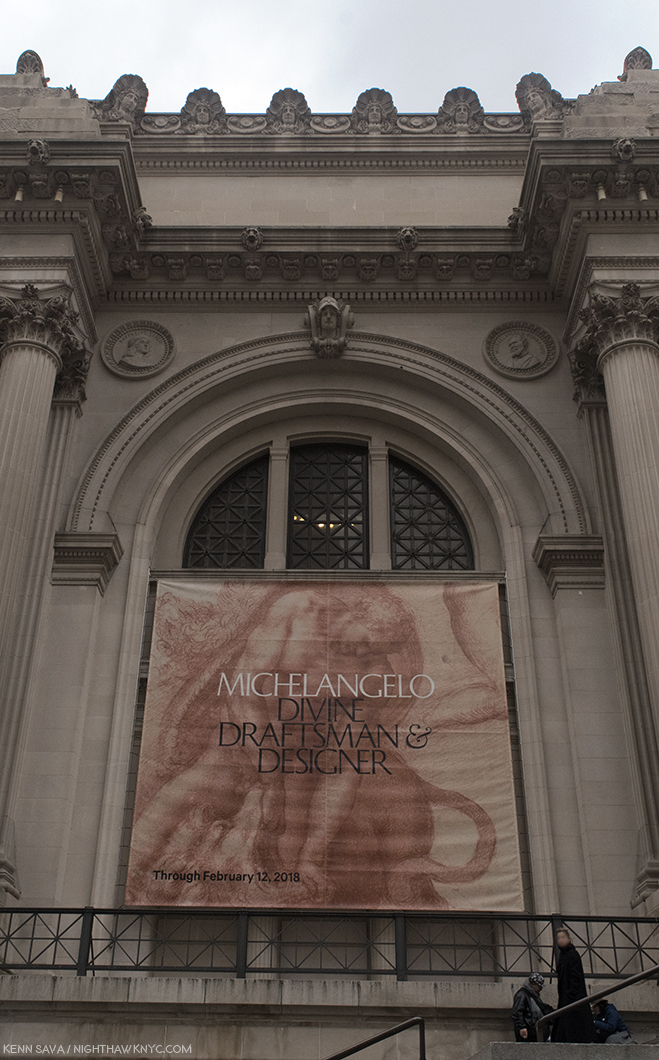
Met fun fact- If you look over the banner, one of the largest I’ve ever seen hung outside, into the corner alcove on the right, that’s Michelangelo’s circular portrait permanently part of the wall of The Museum. It’s a “Badge of Honor” now. Though, I don’t think he’d be thrilled at having to face his rival Raphael, left alcove, in perpetuity. By accounts Michelangelo wasn’t fond of the younger Artist because of his “borrowing” from/being influence by him, and then having to compete with him for work. But? He can smirk now. Raphael is still waiting for his Met blockbuster show.

Yet, a good deal of the “Il Divino” cult that has surrounded him ever since his passing in 1654, at 88, was his own doing in creating. The third of those biographies, A Life of Michelangelo, 1553, by Ascanio Condivi, has been seen by many/most Michelangelo scholars as being ghostwritten by Michelangelo as a means of giving the world his story the way he wants it to be seen and known. The recent birth of the printing press served to help make it “go viral.” Ok. Widely read by many more than had ever been possible. That theory also holds that it was created as a “response” to the story of his life as told in Giorgio Vasari’s 1550 edition of The Lives of the Artists. For instance, in Michelangelo’s view (per Condivi), he burst on the Art world fully formed- i.e. without having studied Art. If this had been true, it would have been highly unlikely Pope Julius II would have entrusted him with Painting the Sistine Chapel ceiling, the most important church in Christiandom, a surface that amounts to about 10,000 square feet, if he had not been trained in Painting2. Vasari’ “replied” with a revised version of his Life of Michelangelo in 1568, four years after Michelangelo’s passing3. The revised version includes documentary proof, that Michelangelo was, indeed, apprenticed to Domenico Ghirlandaio. Nonetheless, the legend took root, including fact and fiction, and thanks to popular novels and movies, has lived on.

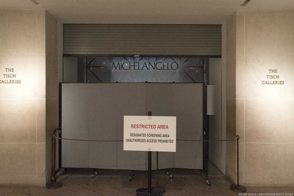
I’ll be seeing this in my dreams for the rest of my life. The show’s sign in Gallery 1 covers the faux scaffolding in the large Gallery 7 behind it devoted to the Sistine Chapel ceiling.

It doesn’t end with his life. There are all sorts of myths about Michelangelo’s works as well, and this show, along with recent scholarship, is slowly bringing the truth to light, even though it takes some darkened rooms to do so. Works by Michelangelo in the Western Hemisphere are about as rare as Leonardo da Vinci’s are. His Drawings (the only works in this part of the world besides one Sculpture and one Painting- both of which are included in this show) appear every once in a while, but given they are going on 500 years old and done in the days before acid-free or archival papers, their sensitivity to light means they’ll be shown briefly and in the darkened galleries, seen throughout this show. So, I’ve waited my whole life to see more than one or two Michelangelos in one place, let alone upwards of about ONE HUNDRED FORTY (I got chills typing that) by Il Divino among 250 items the catalog lists. The closest I’ve come to this point was when I last left Manhattan overnight, exactly six years ago in early February, 2012 to see the once in a lifetime Leonardo da Vinci: Painter at the Court of Milan, on its closing day, at London’s National Gallery, then stayed 3 more days solely to see the rest of the National Gallery, including their two, strange, Michelangelo Paintings (Photos were not allowed). So, to say I’ve been eagerly anticipating Michelangelo: Divine Draftsman & Designer since The Met announced it, is as big an understatement as I’ve yet made on this site.

When I finally turned the corner to see it, I was stopped in my tracks. I’ve said before in these pages that sometimes I don’t feel like I’m alive anymore. Here was one of those moments. How else to explain THIS?-

Art Heaven? No. It’s just one part of The Met’s 2nd floor. From far right to left- 1- Rodin In The Met, 2- Michelangelo, in the darkened room, 3- David Hockney, straight ahead, 4-  Joseph Cornell & Juan Gris seen in this 270 degree view. It’s so big, it’s seen better if you click to enlarge it.

Being The Met, the “once in a lifetime” (to quote their own press release) Michelangelo show, apparently, isn’t “enough.” Not only was that going on, right NEXT to it on one side, the David Hockney 80th Birthday Retrospective was going on in 8 large galleries, on the other side, “Rodin in The Met, was going on, AND down the hall, the Joseph Cornell/Juan Gris show, Birds of a Feather, had opened!  Just amazing. The run of the four shows overlapped for 8 days. I don’t know what’s on view now in Heaven’s Art Museum, and I’m not in a hurry to find out, but can it be any better? I hear they don’t allow Photos, either.

Welcome to New York. At the back of the line in the gallery now occupied by the Joseph Cornell/Juan Gris show, “4”, above, on December 29th, with a long way to go to get in.

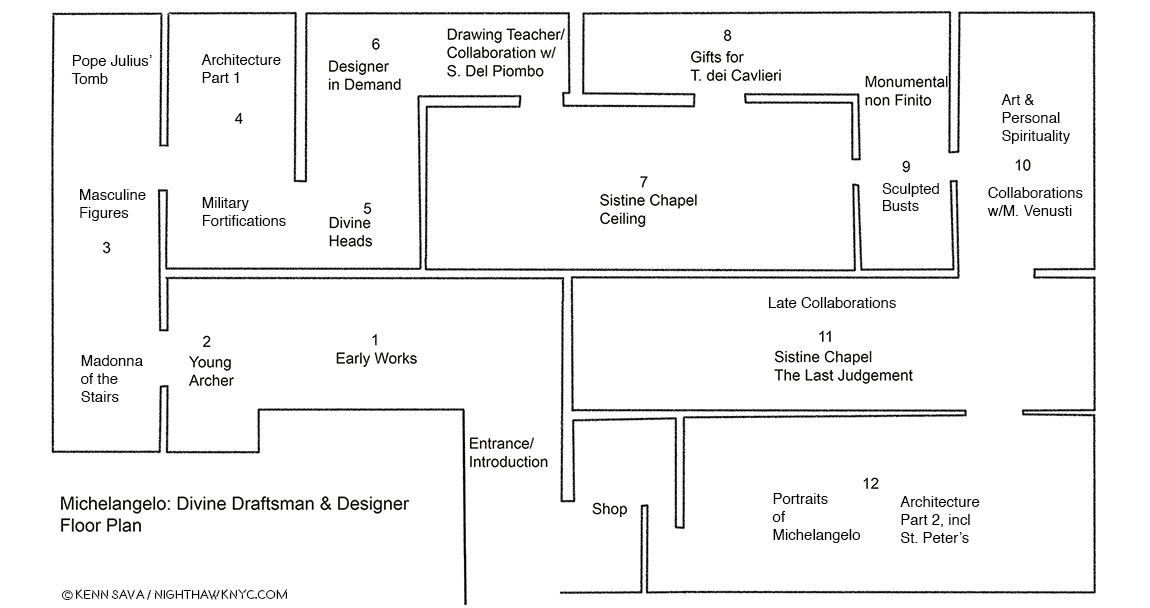
Over the holidays there was a waiting line that snaked all the way down that long hall, to the left in the panorama, around the corner and through the Modern Art galleries, including the one now occupied by the Joseph Cornell/Juan Gris show, Birds of a Feather, “4” in the panorama, above. Still, I managed 10 visits, and I was there when the show ended at 9pm on February 12th. The Met staying open that late on a Monday is unheard of in my experience. After its first month, it was continually crowded right to the end, amazing given the show’s huge size (see my floor plan further below). On February 13th, The Museum announced 702,506 other visitors attended (702,516 all told), making it the 10th most visited exhibition in Met history.

“It’s full of stars.” Stanley Kubrick was right. It really was. Before Michelangelo, the Sistine’s ceiling was a Painted blue sky with stars until a structural collapse in 1504 necessitated it be repainted after being repaired. Michelangelo’s rivals wanted the Pope to select him because they were sure he couldn’t possibly Paint as well as he could Sculpt. I would laugh out loud at them if I weren’t eternally in their debt.

Michelangelo: Divine Draftsman and Designer is a dream come true. Wandering the 20 sections in the 12 galleries, a number of them large, all of them densely lined with 250 pieces, including 133 Drawings by Michelangelo, 3 of his sculptures and one Painting, the largest Michelangelo show in this country during our lifetimes (regardless of when you were born), I was left to wonder if anything like this will ever be mounted on this side of the pond again. Only the 1980 Picasso Retrospective, which took over all of the old MoMA, is comparable among shows I’ve seen in NYC.

My Drawing of the show’s floor plan.

“It’s overwhelming…” was the comment I heard visitors say most often as they passed me. Most said it in the affirmative4. Yes, there is a lot to take in. The detail in the Drawings is staggering- on a number of levels. First, Michelangelo’s technical mastery of Drawing provides an endless amount to admire and study. Second, since many of the Drawings here are details of large compositions (like the Sistine Chapel’s ceiling and The Last Judgement), the show presents a rare chance to study how these details fit into his grand vision for both of those incomparable works, as well as to appreciate how much Artistry is packed into them. (A Note- Michelangelo’s immortal Vatican Pieta, and David are omitted here. In the show’s catalog, page 69, Carmen Bambach says no Drawings for the former survive. He, possibly, worked from a model, which may, or may not, have been found. I remain to be convinced by it. Michelangelo, famously, burned many of his Drawings right before he died, as Vasari theorized, so nothing remaining by him would appear to be less than perfect5.) Out of the 140 works by him on view, complete works (i.e. whole compositions) by Michelangelo are in the minority. Studies of details for huge compositions are what most of these Drawings are. They are, often, the Artist working out on paper exactly how to realize figures, body parts, faces, etc.. There are also Drawings for Architectural works, most of them details, as well. It’s hard not to come away thinking that his large Paintings for the Sistine Chapel were not conceived the way he conceived his Architectural plans. His work on Pope Julius’ Tomb, which occupied him for FORTY YEARS (Seriously!… Don’t get me started.), is something of a “bridge,” it seems to me, between these enormous Paintings and his Architectural works, since the Pope’s Tomb is equal parts Sculptured figures and Architecture. Especially in its early incarnations as a free standing monument, it combines these two of his three core Arts. Painting and Architecture are also, in a sense, combined in the Sistine Chapel, which includes Painted Architectural elements throughout the composition. But, before I get too far ahead, let’s start at the beginning…

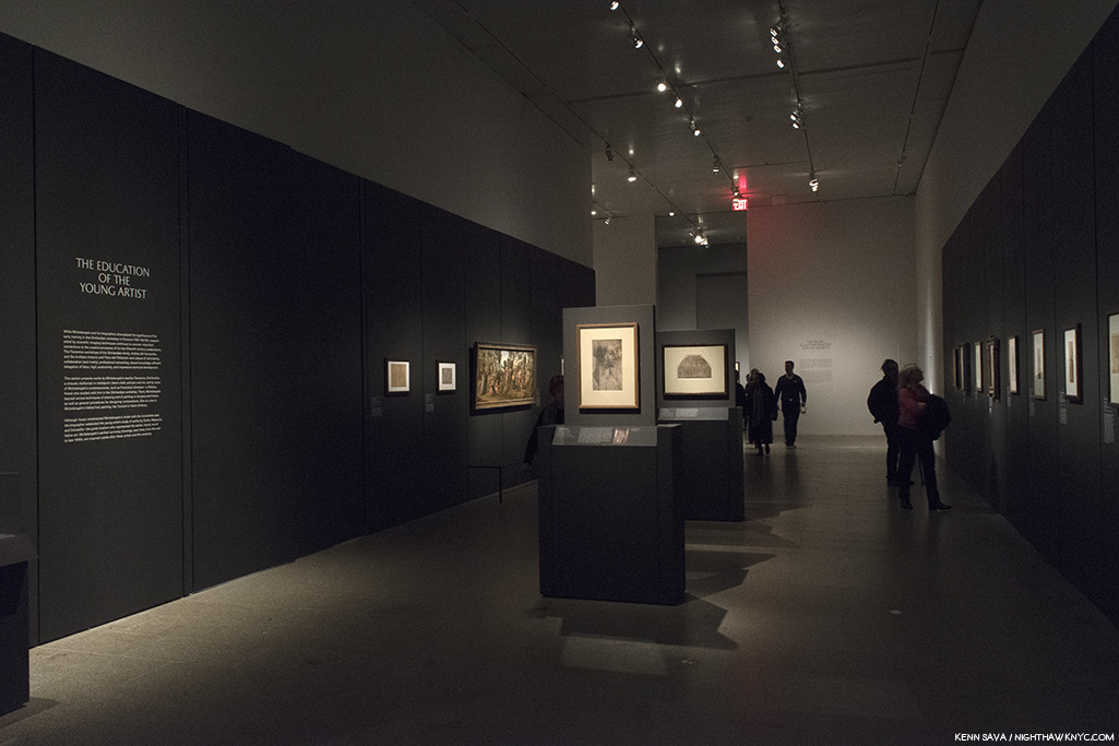
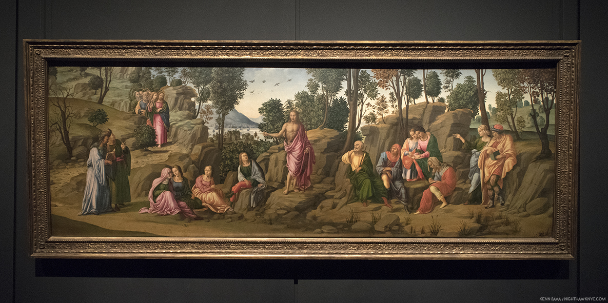
The first gallery contains his earliest surviving work, alongside brilliant examples by his teacher, Ghirlandaio (first two works, center), and his fellow student under him, Granacci (large Painting from The Met’s collection, left).

Based on the evidence here, Michelangelo demonstrated his genius for design early on. In the first gallery, we’re treated to masterpieces of Drawing by Ghirlandaio, who Michelangelo was apprenticed to, and a brilliantly executed Painting by Francesco Granacci, Michelangelo’s fellow student under Ghirlandaio, from The Met’s collection.

Saint John the Baptist Bearing Witness, 1506-7, by the “Workshop of Francesco Granacci.” In 2010, Everett Fahy, no less than the former head of European Paintings at The Met, announced that in his opinion, this was really by Michelangelo, not Granacci. Carmen Bambach disagrees, saying that some of the figures may be based on a Michelangelo Drawing6. Looking at it, the work lacks the overall compositional unity seen in, say, Michelangelo’s version of St. Anthony, below. Strangely, at least 6 of the foreground figures are not even paying attention to St. John. The top half of the figure of the Saint’s body doesn’t seem attached to the lower part. Finally, it’s so different stylistically, with none of Michelangelo’s “dash and daring,” combining to make it too hard for me to believe that Michelangelo could have Painted this a mere two years before Painting the Sistine Chapel ceiling, which he began in 1508.

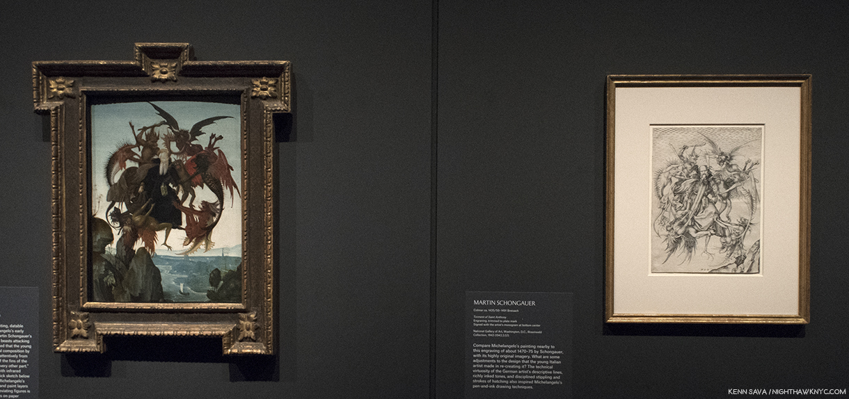
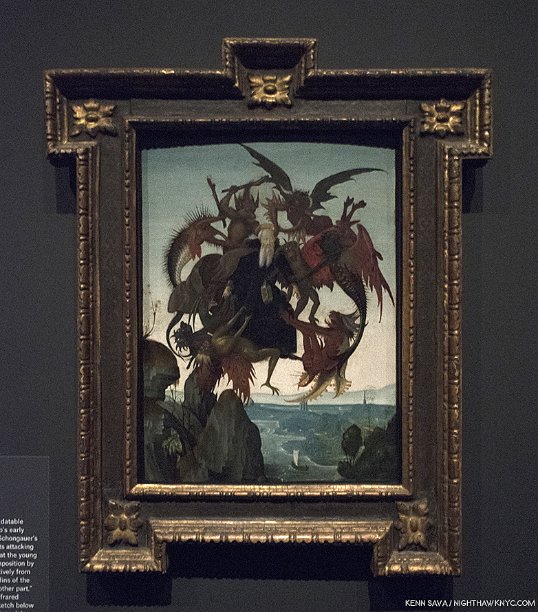
Granacci is an Artist who, nonetheless, deserves closer study, because of his involvement with Michelangelo as well as to fully study and recognize his style, particularly in the Sistine ceiling. About 6 years older, he introduced Michelangelo to Ghirlandaio, and later became the foreman of the assistant Painters for the Sistine Chapel’s ceiling. But, the star of this gallery is The Torment of Saint Anthony, 1487-88, which Met curators determined is Michelangelo’s long lost first painting, after restoring it, and presenting it as such in its own show in 2009, which I saw. Based on a print of the same name the brilliant Martin Schongauer created between 1470-75, shown to him by Granacci, so taken with it was Michelangelo that he decided to create his own version of it- in color! Legend has it he haunted fish stands to learn how to render their skin. Beyond Painting it, in color, which adds another element of realism to it entirely, he recast the composition. Whereas Schongauer’s imagines the scene from “The Golden Legend” by Jacobus de Voragine, 1260, of Saint Anthony beset by various savage beasts, as taking place in mid-air. Michelangelo, does him one-better. He fills out the composition, adding a landscape, with rocky cliffs in the foreground, and a river complete with sailing craft behind. It’s been said that even Ghirlandaio envied it. The Torment of Saint Anthony, 1487-88, is more than “just” astonishingly well-executed for a 13 or 14 year old. It reveals a young Artist of vision, someone able to conceive, and wonderfully execute, a complex, unified, composition. Michelangelo felt something was “lacking” in Schongauer’s original and set out to solve this “problem” for himself. My question is- The Met had the chance to buy it circa 2009. WHY didn’t they? Instead, led by their own brilliant head Conservator, Michael Gallagher, they  gorgeously restored it, and it now resides in the collection of the Art Museum in Fort Worth, Texas, where it remains the only Michelangelo Painting in the country.

A shot across the bow of Art History. Two versions of the The Torment of Saint Anthony. Martin Schongauer’s print, right, which inspired Michelangelo’s astonishing first Painting, left.

Looking at it, I realized his genius for design begins here (among the works that have survived to reach us), and I now see it as nothing less than a “Rosetta Stone” of sorts for much that came after. It’s hard not to remember that both of his most famous later Paintings- the Sistine Chapel’s ceiling and The Last Judgement take place, largely, in mid-air, though both have elements that “attach” them to the Earth. On the ceiling, he does this by including faux Architectural elements he Painted between and among the scenes, and in The Last Judgement, of course, by including Earth, Purgatory and Hell. In fact, there are quite a few interesting similarities between The Last Judgement (seen here, and further below), and The Torment of Saint Anthony, including the landscape, river and sailing craft, and of course, beings suspended in mid-air. As brilliant as the execution of the Painting is, it’s the mind at work in the background creating the overall composition, from Schongauer’s original, in light of its similarities with these later works that proves for me that this IS a Michelangelo.

Michelangelo, The Torment of Saint Anthony.

And so, even in Gallery 1, we see that underlying much of what he created is his mastery of Drawing and his genius for design and compositions. This will be made clearer in every following gallery. As a result, Carmen Bambach serves to rewrite our understanding of Michelangelo as not only a genius of Sculpture, Painting and Architecture, but one of the supreme masters of composition and design.

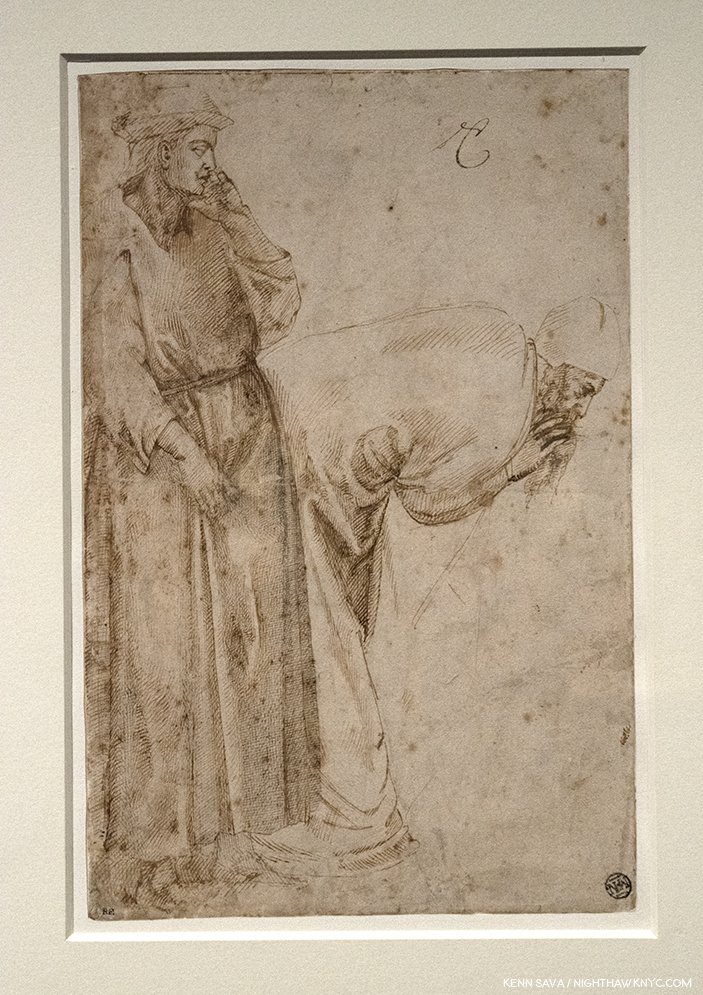
The first gallery is completed with our first taste of masterpieces of Michelangelo’s Drawings. Drapery studies have been a staple for Art students probably since the advent of Drawing. Having recently seen, and written about a masterpiece of Drapery Drawing by Leonardo da Vinci at MoMA, it’s utterly fascinating to compare it with those of his great rival, Michelangelo. Leonardo’s though “perfect” as it is, is focused solely on the thigh, knee and calf of the subject, leaving much of the rest undone/unfinished, particularly on the fabric that lies on the floor. In this Drawing, a study after Giotto, Michelangelo gives us an almost complete figure, and another in less detail, save for his face and hands. While it is fascinating to compare these two supreme masters of Drawing, some consider this to be Michelangelo’s earliest extant drawing, which might make it unfair to compare with the more mature Leonardo piece.

Michelangelo’s earliest surviving Drawing, Studies after Two Figures in the Ascension of Saint John the Evangelist by Giotto, c.1492. Michelangelo would have been 16 or 17. Notice the standing figure clutching at his robe- something that makes the folds so difficult to draw, you rarely see a student attempt it. Interesting, also, these are two male figures which are not “sculptural.” Rare in Michelangelo’s later figures.

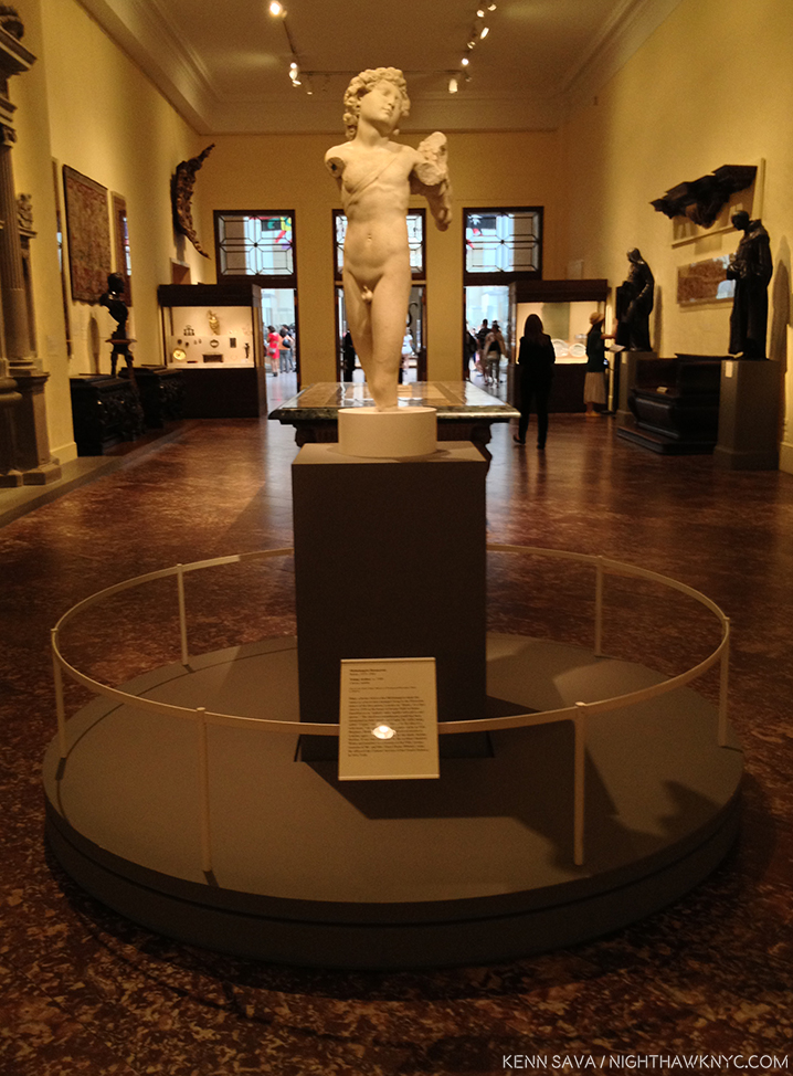
Few people may realize that Michelangelo started out as a Painter. It was only in 1490, when he was all of 15, that he began Sculpting. From Saint Anthony, the Young Archer greets us alongside a few possible influences and examples of other works that bear some similarity to lost early Sculptures by Michelangelo.

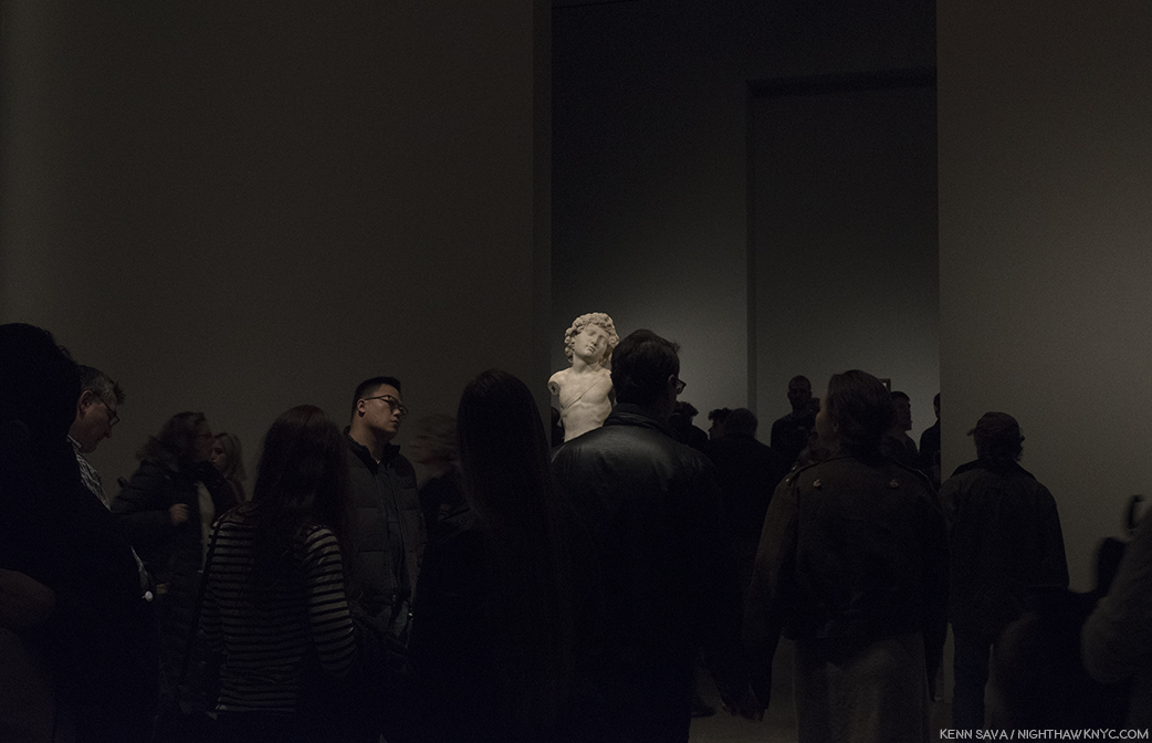
Young Archer, c. 1490, when Michelangelo would have been about 15, seen at The Met in 2015. Recognized as an early Michelangelo by Kathleen Weil-Garnis Brandt in 1996, it’s been the only work by the Master regularly on view in NYC since 2009, though, most visitors to The Museum, apparently, don’t realize it given this typical “crowd” I’ve encountered around it every time I’ve seen it- until now.

As if to make up for it’s questionable placement for much of the past decade, The Met placed it smack dab in the middle of the path to the next gallery so you can’t miss it. It’s certainly worth a long look wherever it winds up being displayed in The Museum now that the show has ended, to see if you think it’s the real thing, or…?

After 527 years? The Young Archer’s moment has arrived.

In The Room With Michelangelo.

“In the room the women come and go
Talking of Michelangelo”
T.S. Eliot, “The Love Song of J. Alfred Prufrock”

’Tis no different almost exactly 100 years after T.S. Eliot wrote those immortal words in 1920. At The Met I heard them. More than once. It was hard not to. Visitors were often shoulder to shoulder its last two months.

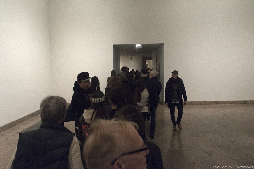
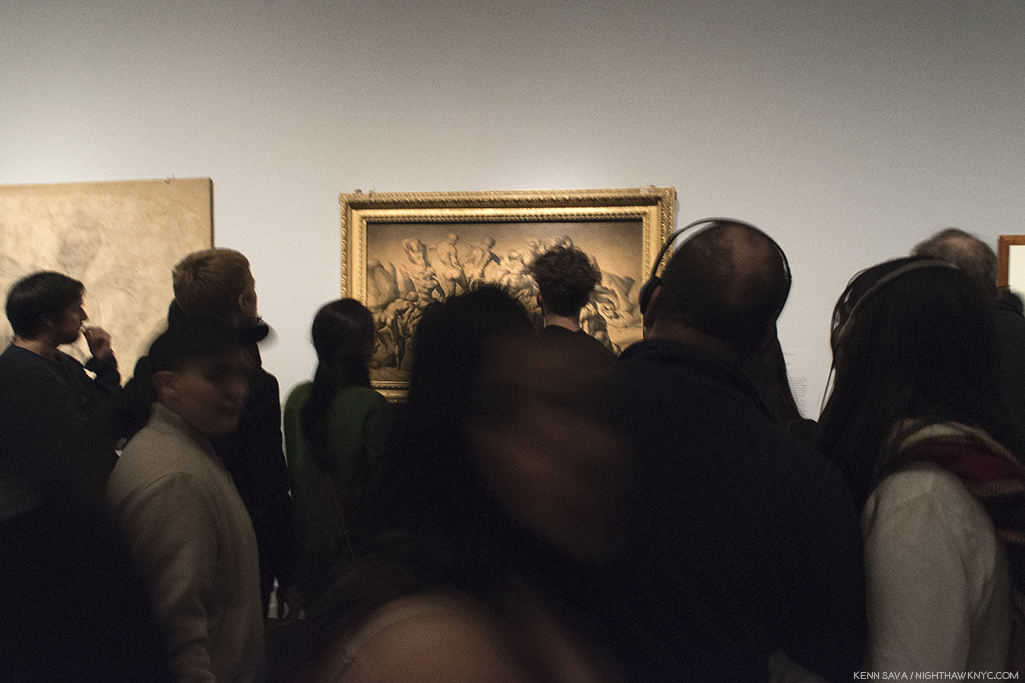
Rush hour on the A Train? Gallery 3 on February 11th, the day before it ended. I was thrilled to see so many people at this show. Not only that, they looked and they looked hard. That’s particularly amazing given that many of the works were studies of details of large compositions.

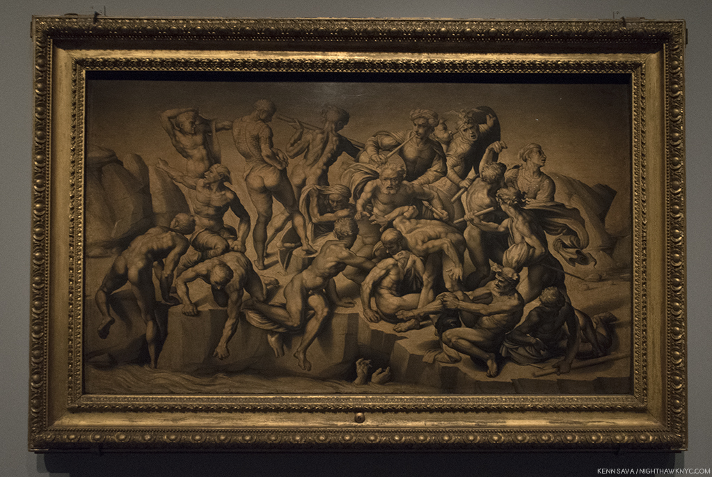
Seen without the crowd, Bastiano da Sangallo’s famous, Copy after the Central Episode of the Bathers in Michelangelo’s Battle of Cascina, The only surviving record of Michelangelo’s lost Battle of Cascina, which he was commissioned to do on a wall opposite the also lost Battle of Anghiari, commissioned from Leonardo da Vinci, of which a Drawing by Rubens is it’s only record. Still, so many Artists have been influenced by this work. I always wonder if Gericault’s masterpiece The Raft of the Medusa, is one.

I admit it. I did lean in to hear the details, and FINALLY know what Thomas Stearns Eliot was referring to. Most of the time? There were commenting on Michelangelo’s “unusual” female bodies. Their second most popular topic was his “choice of ‘friends.’” Oh well. Imagine my disappointment. Neither of these topics were news to me.

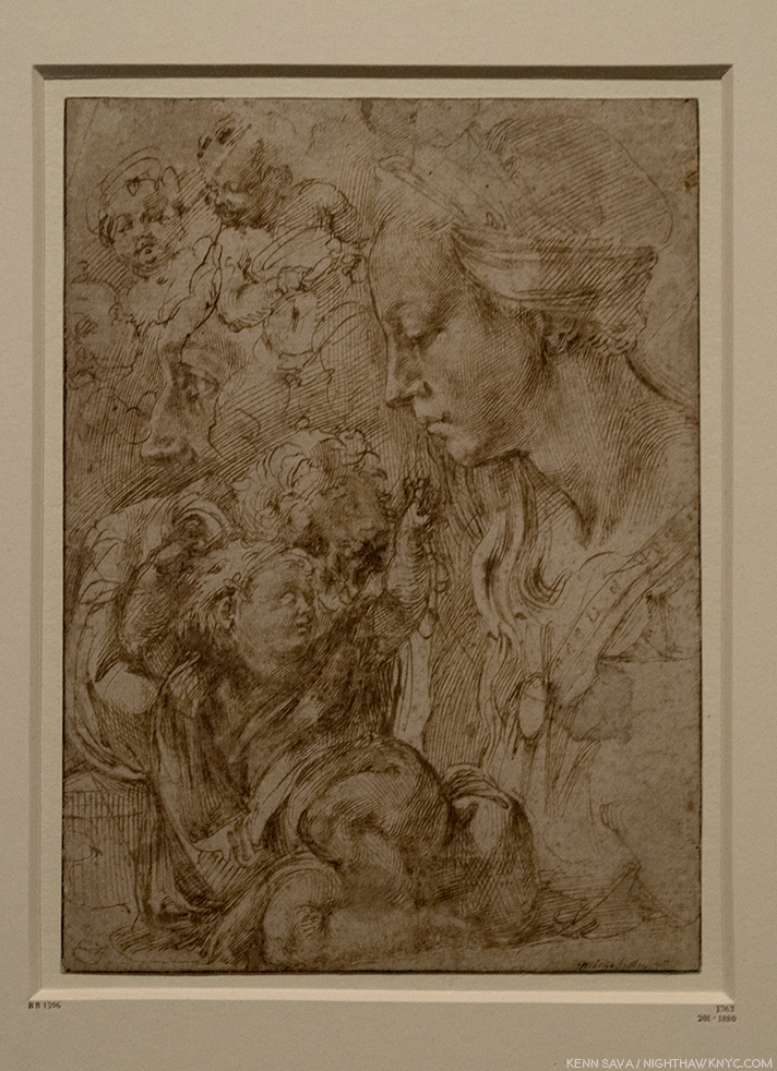
Sketches of the Virgin, the Christ Child Reclining on a Cushion, and Other Sketches of Infants. Early on, as seen here, and in the immortal Vatican Pieta, Michelangelo’s women seemed much more feminine to my eyes. This beautiful Drawing, which echoes his early Madonna of the Stairs, may have been a model for the Painting Virgin and Child with the Infant Saint John, possibly by Piero d’Argents, that was displayed next to it.

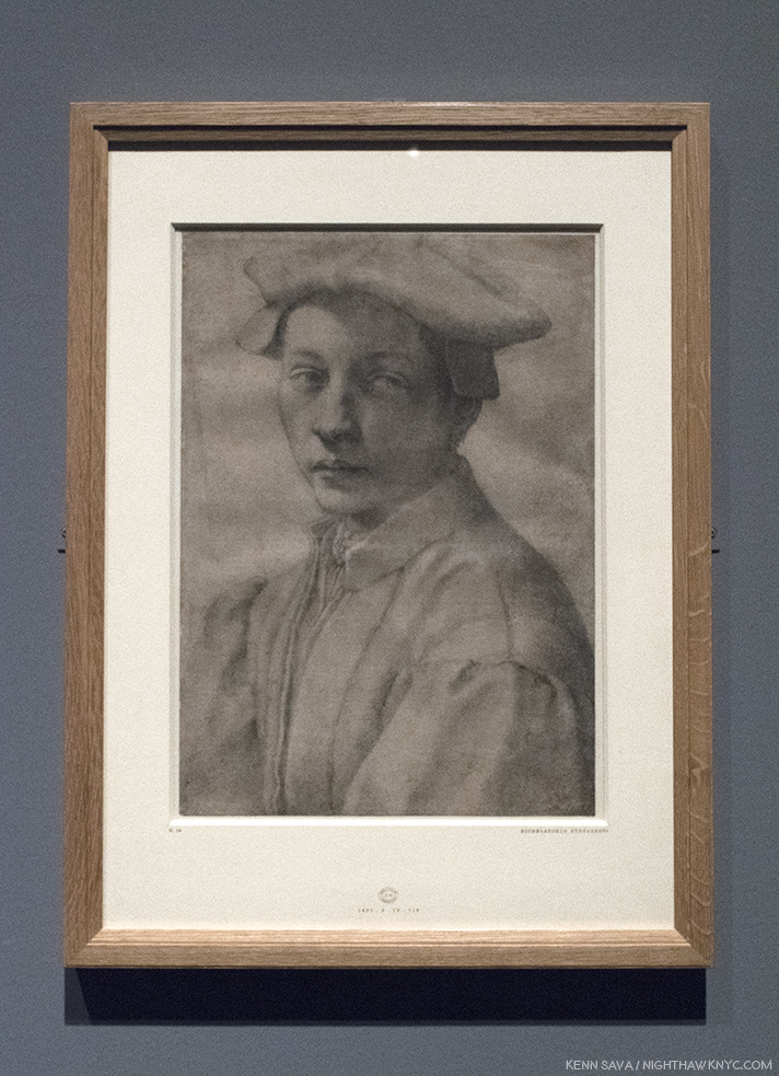
One of his “friends.” One Michelangelo portrait in the aptly titled, staggering, “Divine Heads,” section of Gallery 5, Portrait of Andrea Quaratesi, c. 1532.

A section on his early designs for Pope Julius II’s tomb leads us to a gallery of early Architectural projects, and then to a gallery full of “Divine Heads,” which includes the one above.

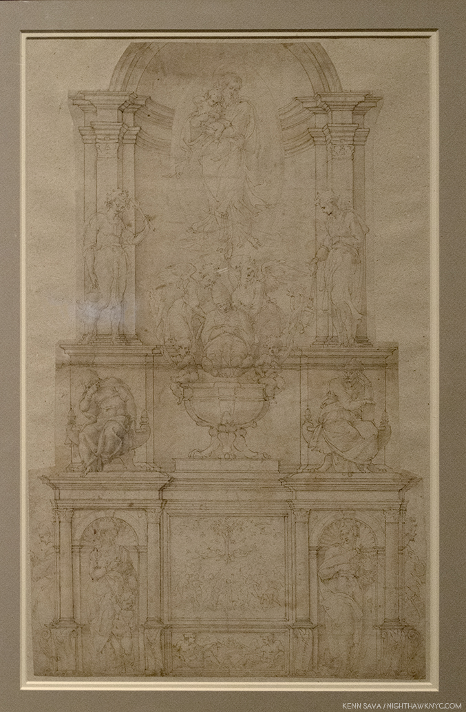
Demonstration Drawing for the 1505 Design of the Tomb of Pope Julius II. It’s interesting to me that once again, we see a compositions of multiple levels- like The Last Judgement. In this one, as well, salvation is to be found at the top. This was just one  of the countless incarnations of the design for Pope Julius’ Tomb, as it evolved from free standing monument to the wall tomb it is today, which was FINALLY finished in 1545. The haggling lasted so many years that of course the Pope died (in 1513!) before it was finished…32 years  before it was finished! Michelangelo’s Moses, one of his enduring, greatest, masterpieces, is its central Sculpture, in quite a different design, in the church of San Pietro in Vincoli.

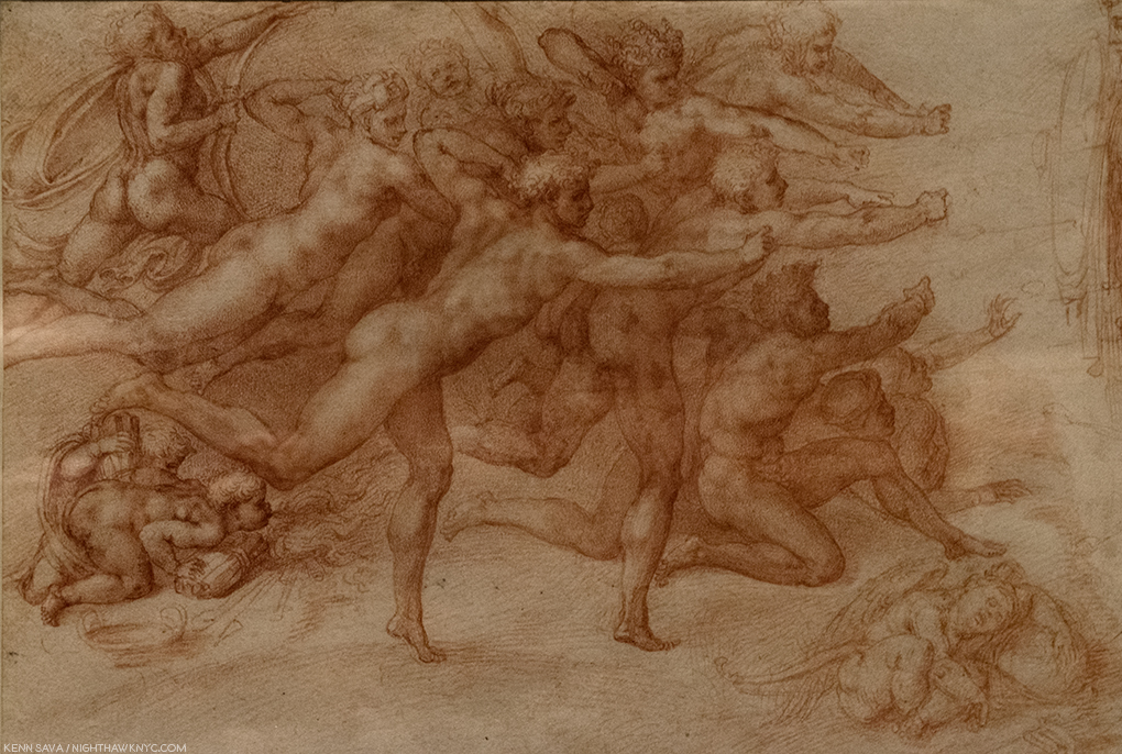
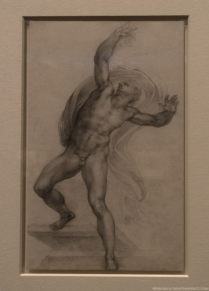
Moving back to figurative Drawings, in Galleries 5 & 6, one card described his style perfectly- “He drew like a Sculptor.” Meaning he drew with a heavy hand, the examples just above notwithstanding. Yes, his outlines are distinct, lyrical, and strong, and yes, his figures are often “Sculptural,” but even beyond all of this, his brilliant composition extends beyond the possibilities of Sculpture. Look at this, for example-

The Archers A work of sublime beauty equalled only by its mystery that starts with the fact that most of the the titular “archers” hold no bows.

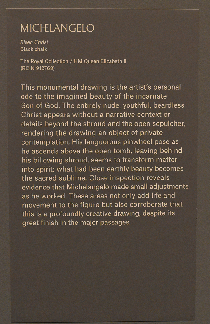
The Risen Christ. A fascinating, “simpler,” composition with only one figure that nonetheless reaches to the infinite.

Its wall card. I selected this one as a typically, enlightening, example of the commentary throughout.

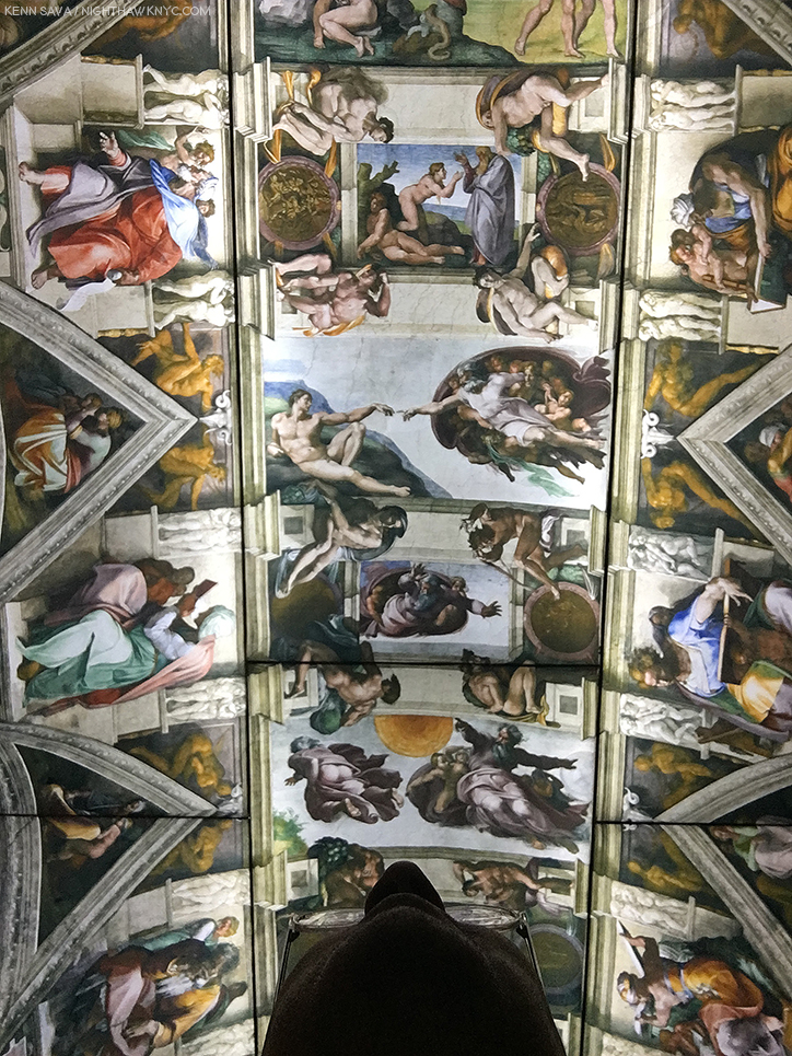
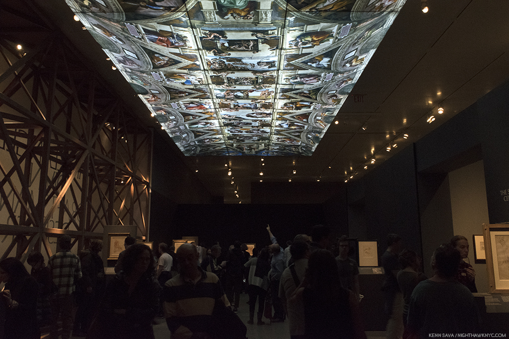
Michelangelo presented a design for the Pope’s tomb that included 40 Sculptures, a composition so incredibly ambitious it was impossible for any one man, even one with “divine” skills, to Sculpt during one lifetime. Though he considered himself a “Sculptor,” we can be thankful that he was compelled to Paint the Sistine Chapel ceiling (seen, fully, here). Painting, especially (and Drawing in lieu of a Painting), provided the best means of realizing many of his extraordinarily ambitious and involved compositions. Thankfully, he was able to finish this one- in four years. Sill clouded in drama, fiction and fantasy after 500 years of dirt was removed from it in the 1980s, the real story of the ceiling’s creation is every bit as dramatic as are the incomparable results, which many consider to be the greatest work of Art in the Western world.

“It’s not the real thing.” I heard one visitor comment in Gallery 7. ! No, but it’s 1/4 size of the original. You can take a 360 degree tour of this gallery, with The Met’s brilliant curator, Carmen Bambach, here. By the way, Michelangelo’s scaffolding ingeniously hovered over the floor and was moved as the work progressed. So brilliantly conceived, the 1980 restoration team reconstructed it, in lightweight metals, as STILL the best option to work on the ceiling.

In the heart of the show, Gallery 7 featured a range of studies for the Sistine Chapel ceiling that provide fascinating insights to the individual characters and the overall composition. Full of details who’s meanings have faded over the centuries (like what’s up with all the acorns?), one of the most fascinating and thought-provoking voices about it belongs to Art critic, writer and filmmaker, Waldemar Januszczak, who was one of those to receive permission to observe the restoration up close on the reconstruction of Michelangelo’s ingenious scaffolding in the 1980s. He used the opportunity to launch into a full fledged investigation of the ceiling’s history, and its “meaning.” His resulting book, Sayonara, Michelangelo: The Sistine Chapel Restored And Repackaged, 1990, and documentary, The Michelangelo Code: Lost Secrets of the Sistine Chapel, looks at the history of the Chapel and the “meaning” of both the ceiling and The Last Judgement. More on that in a bit.

Fact versus fiction. Michelangelo’s self-portrait Painting the Sistine Chapel ceiling.

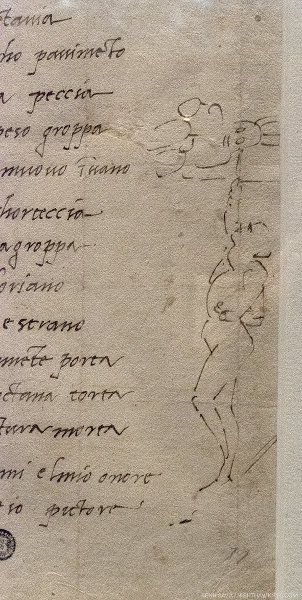
Regarding the infamous “he Painted it lying on his back” story, Mr. Januszczak says, “Its origins can be traced back to a mistranslation of Michelangelo’s first biography, 31 lines written in Latin by Paolo Giovio, Bishop of Nocera, sometime between 1523 and 1527, (which can be read here). Giovio describes Michelangelo’s posture while painting the Sistine ceiling as resupinus. This was assumed to mean ‘on his back’ by various Michelangelo commentators who spent 5 centuries enthusiastically emphasizing his agony at the expense of his ecstasy. A more accurate translation of resupinus would be ‘bent backward7.’” In the show, we see Michelangelo’s own Drawing of the way he worked, above, alongside a sonnet he wrote to a friend about it.

The Met’s caption for the Drawing, above.

Apparently, The Agony & The Ecstasy author Irving Stone, and the film’s director, Carol Reed, haven’t seen this. At The Met, old wives’ tales died hard in the dim light of the darkened galleries.

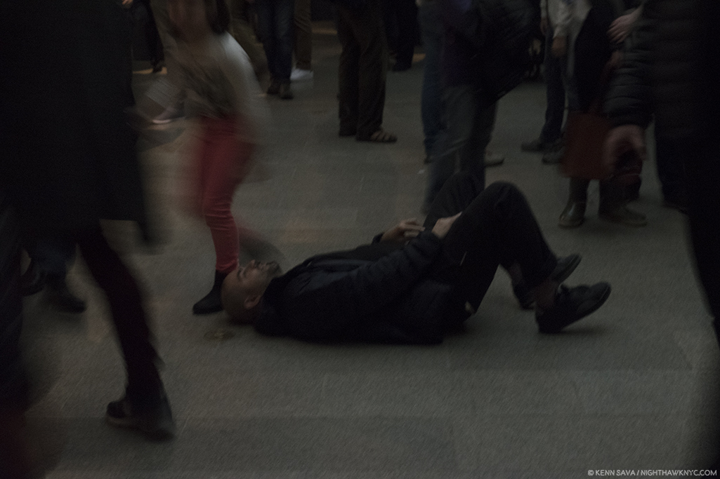
No. Michelangelo did not paint it lying  on his back. Given how crowded it was, and how many visitors were looking up, it’s a bit amazing he didn’t get stepped on, though the young lady on the left almost got him.

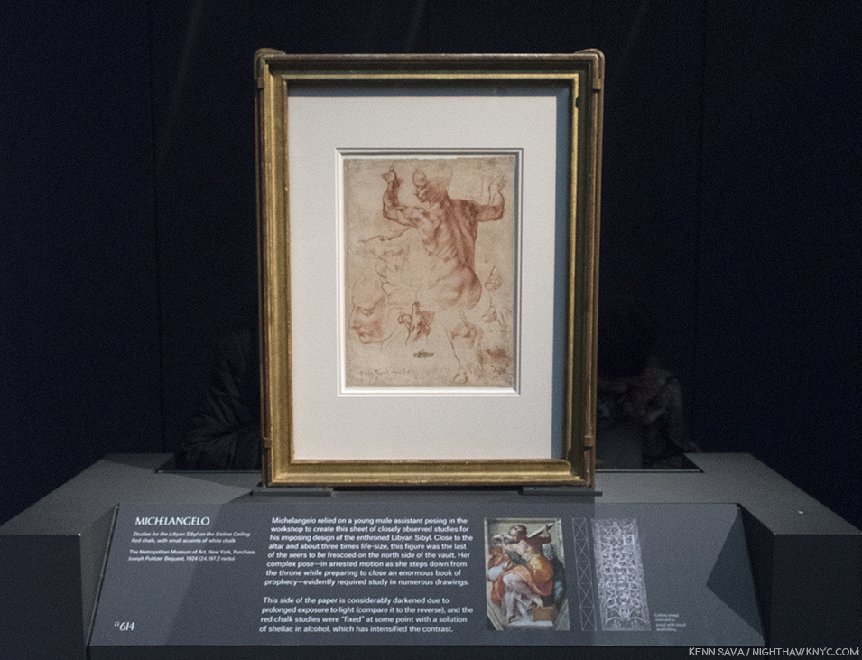
Studies for the Libyan Sibyl in the Sistine ceiling. One of the most amazing things for me in the ceiling, beyond the astounding overall composition, are the postures of the figures- almost all of them. Perhaps none is more extreme than the immortal Libyan Sibyl. In the finished work, this priestess is seen at once stepping down from her throne while apparently preparing to move or close the gigantic book she holds in both hands. So complex are these movements that Michelangelo made studies of this figure in sections so he could closely analyze them, like this well-known example, in which the left hand is slightly higher than the right- the opposite of how they are in the Painting. The Artist possibly realized this would have made the whole pose look extremely unbalanced, not to mention rob the figure of much of its timeless grace.

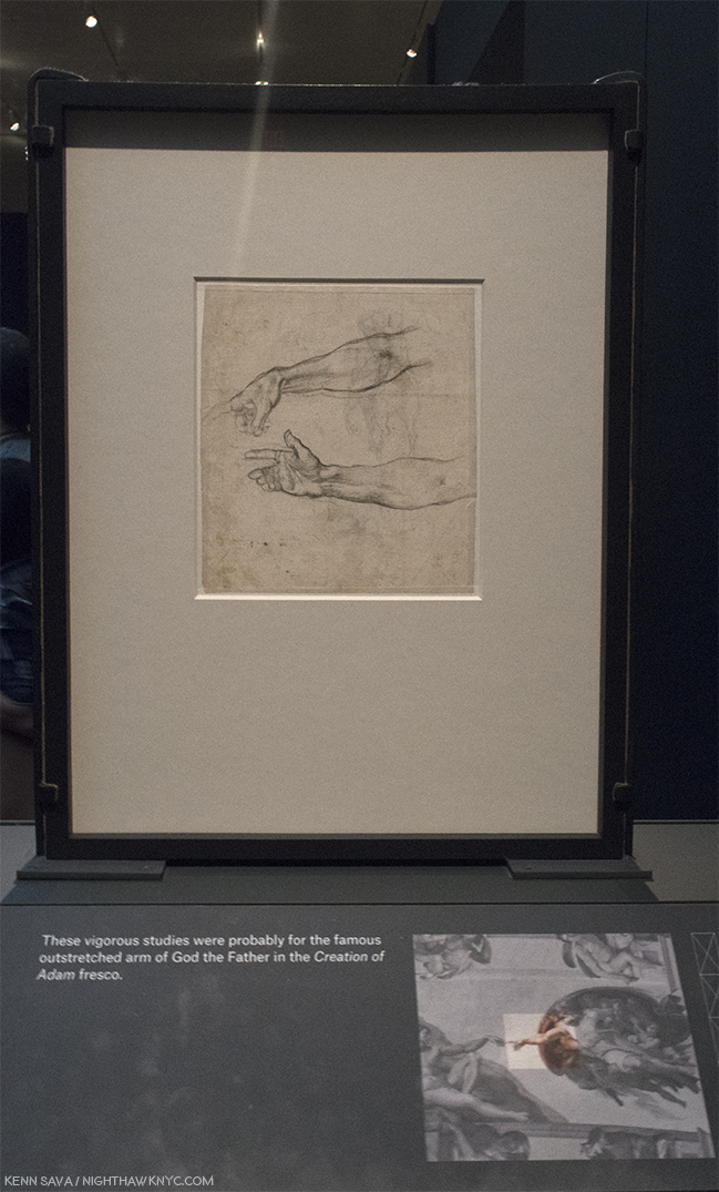
Jaw dropping. One of the most important Drawings in existence. Every time I went, I had to stop and ponder this. I never knew it existed. Two Studies for an Outstretched Right Arm, Very possibly for God the Father in the Creation of Adam section of the Sistine Chapel. According to Waldemar Januszczak, the celing’s fingers have been REPAINTED by restorers at least twice, including during the most recent restoration in the 1980s8! So? THIS is as close as we may ever get to what Michelangelo intended they look like, from his own hand. Just astounding.

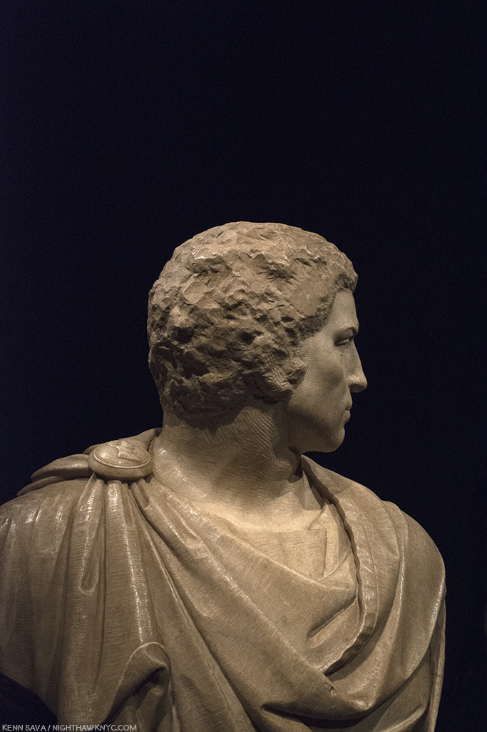
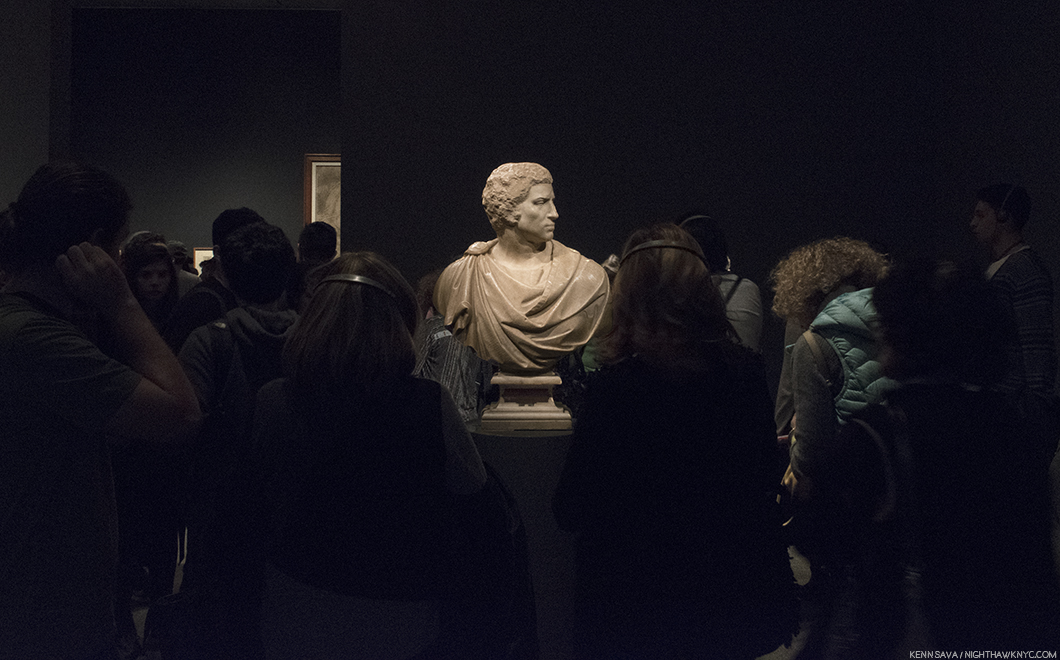
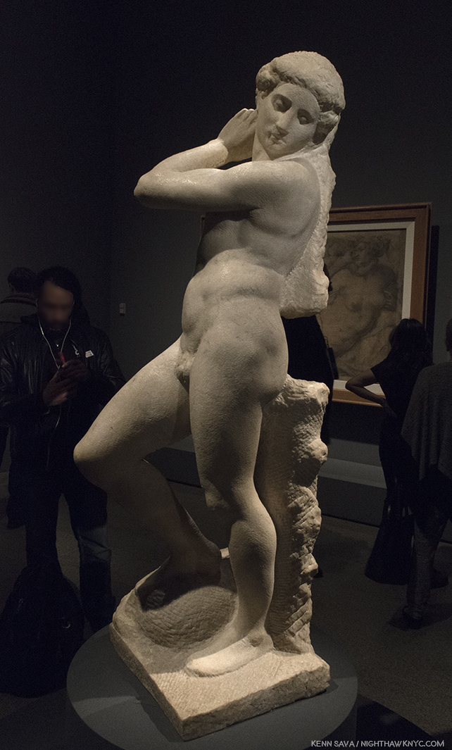
In Gallery 9, viewers were treated to the rarest of the rare- TWO sculptures by Michelangelo (with, or without, assistants), both unfinished. Both remarkable. When was the last time was that THREE sculptures (counting the Young Archer) by Michelangelo were shown in the U.S.A., at the same time? I don’t think it’s ever happened. If you know differently, please drop me a line.

Bust of Brutus, (with “some assistance” from Tiberio Calcagni), My recreation of an iPhone Photo the great Photographer, Stephen Shore, the subject of a terrific retrospective up right now at MoMA, took of it during his visit and posted on his Instagram page.

Last look. The crowd was still heavy around Michelangelo’s stunning, Bust of Brutus, in the final hour of the run of the show on February 12th.

Apollo-David, (Unfinished). Both it, and the Brutus, were on loan from the Museo Nazionale del Bargello, Florence, Italy. I can’t imagine how much the insurance was to ship these…round trip.

The Met’s glorious show goes a long way further to set the record straight about Michelangelo and his accomplishments, in my view. Michelangelo, the somehow “not human” myth, is dead. Long live Michelangelo, the all too human genius of Art & Design. It seems to me that the myth does him a disservice. If he wasn’t human, it would have been easier for him to accomplish Artistic perfection. But, he was very human, as his Poems and letters reveal, as does how hard he worked for a very long time (he died at 88, about 3 weeks short of his 89th Birthday- unheard of in the fifteenth & sixteenth century, when 35 was closer to the norm) to achieve the brilliant results he brought the world. Yes, human. He was continually worried about his finances (as we see in this show, where he uses every square inch of paper, on both sides, to economize), he continually worried about his family and their status, he worried about being paid, often by whichever Pope he was working for (He lived through the reigns of 12 popes and, extraordinarly, worked for 7 of them9.), and his temperament ran hot and cold. If you were out, he could be very hard on you. It seems to me he lived a largely loveless, isolated life. His loves, such as we see in his Drawings and Poems and in his relationships, remained largely unrequited.

Michelangelo, Fragment with a Study for the Virgin for a Crucifixion, left, and Fragment, with a Study for Saint John the Baptist for a Crucifixion, right.

Michelangelo: Divine Draftsman & Designer, serves to revise our perception of Il Divino. To this point, he, and Leonardo, are perceived as geniuses who finished little of what they started. While there are many projects that Michelangelo didn’t complete (as well as others he did finish that are now lost), the bigger picture is that he completed a remarkable number of compositions & designs- some of which were either intended for, or realized by, other Artists, or were completed after his death. During his lifetime, Michelangelo was the only Artist thought to have excelled the revered masters of ancient Greece and Rome (per Vasari), who inspired the Renaissance- perhaps the highest esteem a Renaissance Artist could achieve.

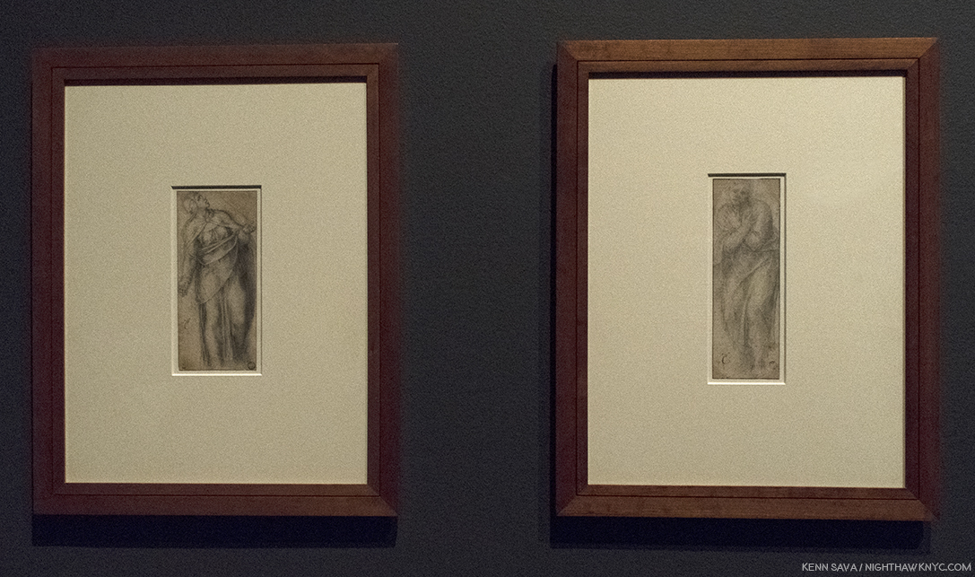
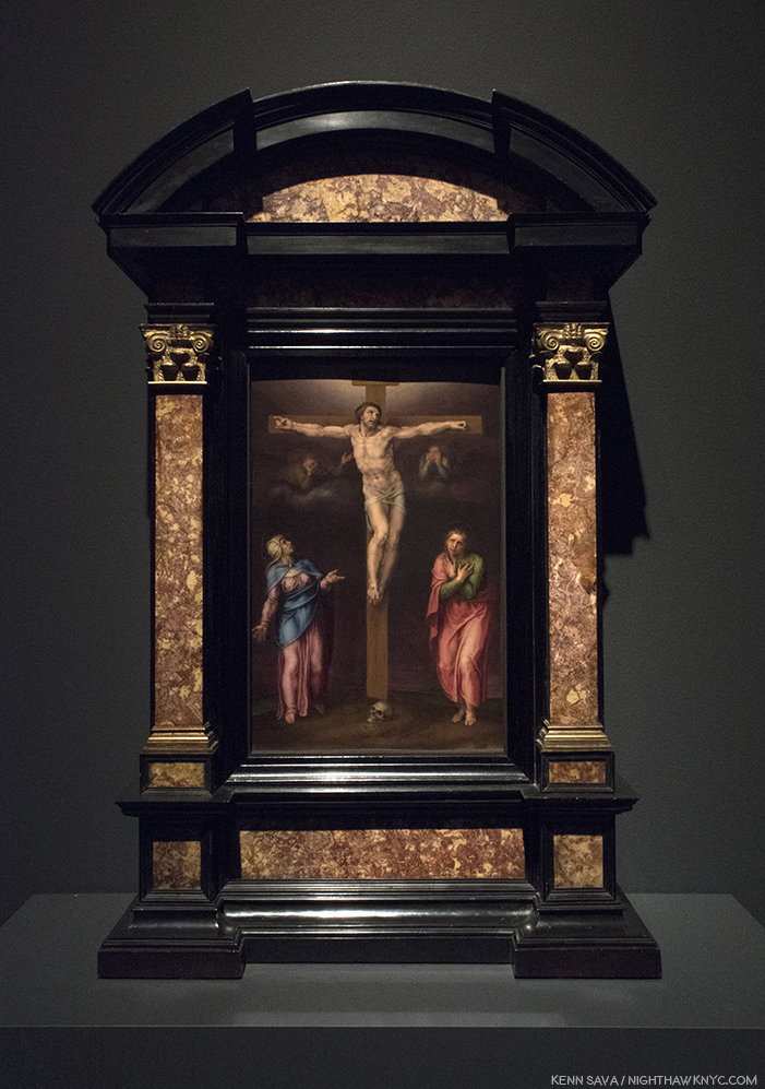
Marcello Venusti, The Crucifixion with the Virgin and Saint John the Evangelist, based on Drawings by Michelangelo, above, shown as one example among many of Michelangelo’s designs adapted by other Artists in this show. I selected Venusti’s because, well, it’s just gorgeous.

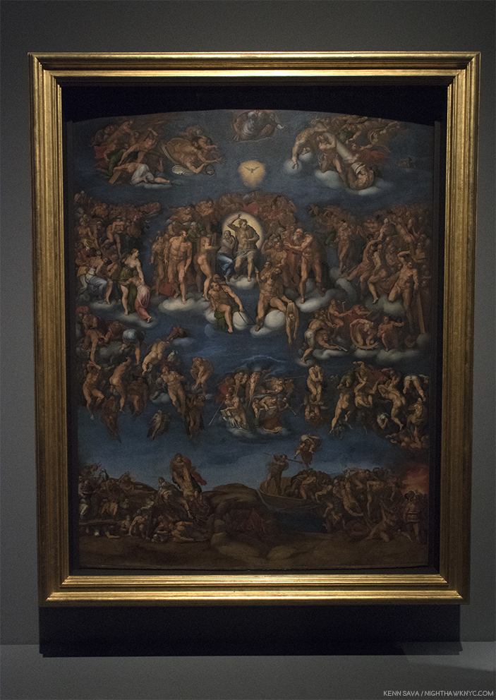
In one of the great mysteries in Art History, TWENTY FOUR YEARS after completing the ceiling, Michelangelo returned to the Sistine Chapel to Paint this. Well, almost this, The Last Judgement.

Marcello Vanusti’s copy of The Last Judgement, is a very valuable record of what the work looked like in the mid-sixteenth century, before the addition of the controversial loincloths. However, Venusti took a number of liberties elsewhere, himself, so this is not a verbatim record of what he saw, though important nontheless. Due to its popularity, this was, perhaps, the hardest work to get full frame in the entire show.

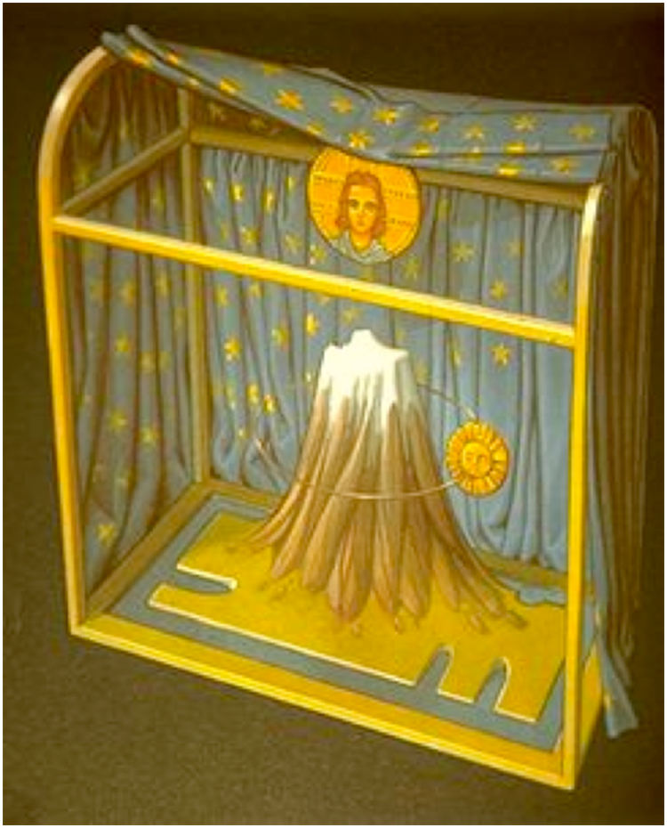
WHY? Never before had an Artist returned to the scene of one work to complete another after such a long period. Whereas the ceiling gives us Genesis, the beginning of the universe, and life, on the wall over the altar, Michelangelo now gives us the end of the world, in all of it’s shocking glory. A bit too shocking for the time as it turned out. The beginning, and the end, in one space. In the interest of keeping this piece shorter than it might be, I’m only going to briefly mention something I feel is important, though not addressed in this show- The possible “meaning” of the Sistine Chapel ceiling and The Last Judgement. There seem to be two main theories. First, Waldemar Januszczak believes the Chapel building, itself, is modeled on the plan of the universe laid out by the ancient Christian Cartographer, Cosmas, in his Christian Typography, 547 AD. In it, the universe is rectangular, with a dome, like the Sistine Chapel, and its proportions are the same as the Temple of Solomon’s, which also match the Sistine Chapel’s. The universe is bordered by curtains with heaven and a second earth lying beyond. This is where the Genesis story takes place. So, when we look at the ceiling, we see into the past, through the painted Architectural elements all over the ceiling, in a world that is flat with the Sun revolving around it.

Waldemar Januszczak mentions the long forgotten sixth century Christian Cartographer, Cosmas, as the creator of this model for the universe, which looks shockingly similar to the structure of the Sistine Chapel. Notice, the Sun revolves around the Earth, with God & Christ above. Interestingly, it shows a blue background sky, with stars, which is how the Sistine’s ceiling looked before the collapse led to Michelanglo repainting it.

The second theory is based on the coincidence that Nicolaus Copernicus happened to be in Rome espousing his theory the the Earth revolved around the Sun at the exact moment Michelangelo was painting the ceiling. It believes he, and the Pope, were privy to it, though it had not as yet been published, and they included it in the ceiling and The Last Judgement. In the latter work, Jesus’ left thigh is at the exact center of the composition. Dr. Valerie Shrimplin says, “The most probable source for this choice of a central point on Christ’s thigh, as the pivotal centre of the entire cosmological fresco, seems to be the Book of Revelation 19:16. In a description of the Christ of the Judgment, it reads: ‘And he hath on his vesture and on his thigh a name written, KING OF KINGS AND LORD OF LORDS.’ This text is immediately followed by a reference to the Sun-symbol: ‘And I saw an angel standing in the sun…’ (v. 17). In the Sistine Last Judgment, Christ is thus depicted (theologically, neoplatonically and scientifically) as Michelangelo viewed Him: as King of Kings and Lords of Lords, the Sun, the centre of the Universe.”

Given the lack of anything definitive in Michelangelo’s surviving documents (his Drawings or letters), to support either of these theories, I find Mr. Januszczak’s the more compelling case. Pope Julius was a theological scholar who became a Doctor of Theology before becoming Pope. It makes sense to me that he would have known about Cosmas, and given that his uncle built the Sistine Chapel in the exact same dimensions Cosmas espoused (the building is not mentioned in the other theory), means that TWO Popes were involved in the Sistine Chapel. Nicolaus Copernicus was 2 years old when the Sistine Chapel’s construction, in Cosmas’ proportions, began, which would seem to make it a moot point. These factors tips the balance to Mr. Januszczak’s theory, in my mind.

By the way, Pope Julius II and his uncle, Pope Sixtus IV, were members of the della Rovere family who’s coat of arms include acorns and oak trees, both of which are seen all over the ceiling, and indeed, all over Italy, by way of “marking their turf,” as it has been called.

From all I’ve read, one thing seems certain. Michelangelo was a deeply religious man. An Artist who included himself in his final Pieta, called The Deposition, as well as including his Self-Portrait on his flayed skin that St. Bartholomew holds in The Last Judgement. Some see a self portrait included in the depiction of the Archangel Michael (or “Michelangelo”) on the ceiling. I don’t think he would have done any of these things if he was not deeply religious. It also makes me think that he went back to the Sistine Chapel to Paint The Last Judgement years after Pope Julius’ death because, then in his 60’s, he may have been thinking of his own mortality. Regardless, 506 years after he completed the ceiling, and going on 500 years after he completed The Last Judgement, the discussion remains ongoing about trying to understand these two incomparable masterpieces.

The controversy doesn’t end there. Regarding those “ladies talking of Michelangelo”… Waldemar Januszczak says, “Michelangelo was thus never a fully accepted and fully committed homosexual of the modern kind. He belongs, rather, besides Donatello, Leonardo, Botticelli and the painter nicknamed Sodoma among those homogamous Renaissance artists about whom we have conflicting evidentce of a conflicting sexuality. That he was a homosexual in some form seems certain. that he was not homosexual, in the way we understand the word today, appears equally unarguable10.” And, on the question of his depictions of the female body, he continues, “Given Michelangelo’s obsession with human anatomy, it seems improbable that he never actually saw a naked woman in his life. But he cannot have seen very many. And he does not appear to have looked too closely11.”

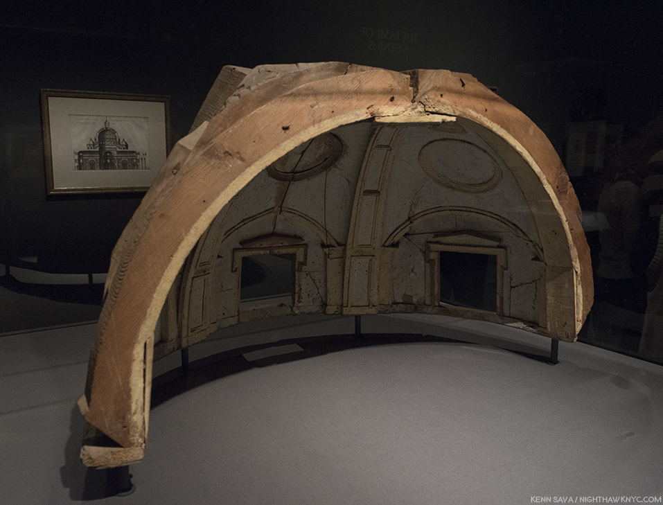
Nothing Less than Michelangelo’s model for the vault of the Chapel of the King of France, 1556-57, created under his direction by Fabbrica di San Pietro, Vaticano, Vatican City. The calotte of the dome of the south apse at a scale of 1:30. He would not live to see his designs for St. Peter’s, of which he was chief architect for 17 years,  completed, and those that were were, including its dome, were altered12.

Drawing, Draftsmanship & Design underlie all of his works. As such, they are the key to understanding his genius as a visual Artist. His brilliant Poetry lies on yet another plane of it, a tributary springing from the same font. Regarding his work as an Architect, Camen Bambach summed it up saying, “The physical beauty of the human body, which so deeply inspired Michelangelo’s Drawings, Sculptures and Paintings, also provided some meaningful analogies for his work as an Architect. His sheets with preparatory Drawings often combine ideas for figures and buildings…The human body offered an organizing principle in creating a unity of forms, whether the component parts were symmetrical or in freestyle13.”

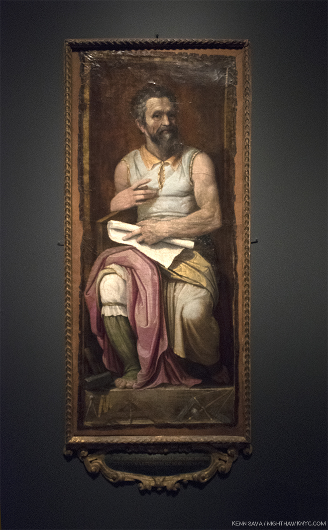
Frederico Zuccaro, Portrait of Michelangelo as Moses, showing “Il Divino” in a similar posture to that of his brilliant Sculpture for Pope Julius’ tomb. Michelangelo was not a tall man, and I imagine his arms must have looked not all that different to these after a life of carving stone. The tools of his trade lie on the pedestal beneath his feet. Carmen Bambach says of it, “Much as the prophet (Moses) led the Children of Israel out of Egypt, do did Michelangelo save the Artis, by indicating the true path through a command of disegno and visual judgment..” (Catalog, P.257)

While I continue to love and admire his Sculpture, Painting, Drawing, Poetry, and what I can understand of his Architecture (most of which was unbuilt), I now see him as a genius of design and composition, first and foremost, due to this show. That his Art continues to speak to so many of us 542 years after his birth is the supreme testament to his skill. It makes me wonder why he felt he needed to “pump himself up” to mythic proportions when his work, itself, has done so for him. His real story, as far as is known, makes him much more “human,” than “divine,” and I, for one, find that more compelling. It gives me hope that there may be another “supremely talented” Artist, or perhaps there already has been and he or she remains unknown to us. For the here and now, nearly three-quarters of one million people saw something they’ll never forget. One of the ultimate displays ever mounted of what human Creativity is capable of, and has achieved.

I am thankful I lived to see it.

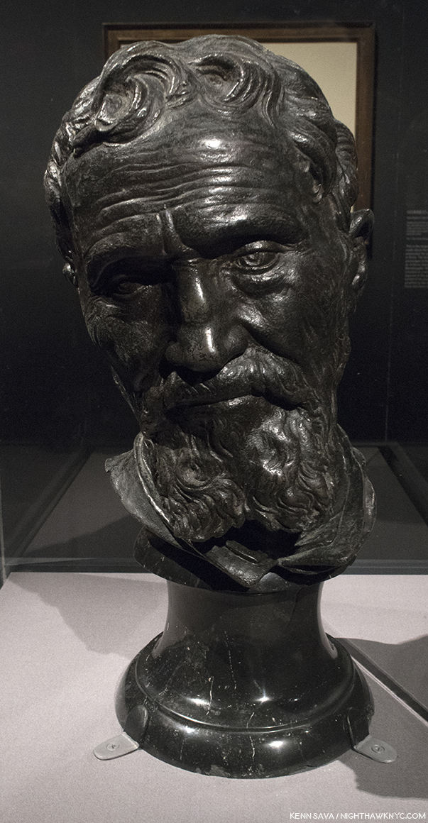
“Now, speak!,” Michelangelo said after finishing the monumental “Moses” for Pope Julius’ Tomb, according to legend. I muttered it silently when I stood in front of his friend and collaborator Daniele de Volterra”s lifelike bust of him, partially created from Michelangelo’s death mask, at the very end of the final Gallery #12.

“‘Immortality’
Here my fate wills that I should sleep
too early,
but I’m not really dead; though I’ve
changed homes,
I live on in you, who see and mourn
me now,
since one lover is transformed into
the other.
Here I am, believed dead; but I lived for
the comfort
of the world, with the souls of
thousand true lovers.
Although I have been deprived of my
own soul,
I still live on in the souls of all those
who loved and remember me.”*


* * * * * * * * * * * * *

(Happy 543rd Birthday, Michelangelo di Lodovico Buonarroti, born March 6, 1475 in Caprese near Arezzo, Tuscany, since renamed Caprese Michelangelo.)

Michelangelo: Divine Draftsman & Designer is a NoteWorthy show in my life, and for February, 2018.

*-Soundtrack for this Post is “Suite on Verses of Michelangelo Buonarroti,” Op. 145a, by Dmitri Shostakovich in 1974, the year before he died, which includes Michelangelo’s words quoted above in its final section, titled “Immortality.” Shostakovich, one of the great symphonists of the 20th Century, considered it to be his Sixteenth (and obviously, final,) Symphony, as he told his son.

Appendix- Recommended Resources-

-The Exhibition Catalog for Michelangelo: Divine Draftsman & Designer, by Carmen Bambach, is one of the best books on Michelangelo I’ve come across this past year, at least. It’s certainly the first stop for anyone who saw this show and wants to know more about it, and I highly recommend it to those who missed it as all the works displayed are wonderfully reproduced, along with a good many that were not here. Unlike many exhibition catalogs I see that are slapped together quickly, this one was NINE YEARS in the researching and writing (Catalog P.8). It shows on every page. Full of insights, stories and details, I haven’t seen anywhere else, it truly is the next best thing to having been there, and the best record of what it was. Though its focus is on the show and works included in it, Ms. Bambach never forgets to tie the works into the bigger picture, providing a remarkably thorough running biographical picture in the process, plainly sorting facts from fiction as she sees them in a wonderfully no-nonsense way, along with including priceless technical details and insights only a world class curator, who’s spent her life immersed in this work would have. Essential reading for Art History students, Michelangelo collectors (soft smile), and anyone with a passion for Art History, or Michelangelo.

-The best overall current Michelangelo book is Frank Zollner’s Michelangelo, The Complete Paintings, Sculptrues and Architecture, published by Taschen. I’m saying that while also saying there are better books for the Paintings. Better books for the Sculptures, but most are out of print and would require quite a bit of digging. But, if you want one book on Michelangelo, with as many good Photos of the full range of his accomplishment (yes, that means after restoration where they have been done, and I have no problem with any of them I’ve seen thus far), I’d recommend you look at it. Prior to the Taschen book, which originally came in the HUGE, 23 pound, XL size (which I, personally LOVE), look for “Michelangelo: The Compete Sculpture, Painting, Architecture,” by William E. Wallace, who teaches and lectures on the Artist, and has also written a good biography of him.

-The best books on the restored Sistine Chapel is the 2 Volume set, The Sistine Chapel, 1991, featuring the Photographs of Takashi Okamura, very probably the best ever taken of the ceiling and “The Last Judgment,” because he, and NHK TV had exclusive rights to Photograph it in return for NHK Japanese TV putting up 3 million dollars for their restorations. But? Being issued in limited editions, weighing 27 pounds, they’re very expensive now. The good news is there are other books with many of the same Photos, though smaller, and text by the restorers which are currently very cheap, including- “The Sistine Chapel: A Glorious Restoration,” “Michelangelo: The Last Judgement,” and Michelangelo: The Vatican Frescoes” which have all been on my shelf for years.

-As for his Sculpture- There are two ways to go- General overviews, or books that focus on one work. Which way you go depends on how closely you want to look at one particular work. A good number of the specialized books are out of print, but can be found at a decent price used, and of course, depending on age, feature black & white Photos, the older you get. I have the Hartt Frederick book published by Abrams, but it’s out of print, now and pricey. For current overviews, take a look at the Zollner and Wallace books cited earlier and see what you think of them.

-Writings- Michelangelo’s Poems are beautiful. They reveal the depth of his feelings in a way that is surprising at first, while they give a bit of insight to how his mind worked. For the true devotee of Michelangelo, they are essential. The problem is that there has yet to be a “definitive” translation of them into English. You can drive yourself crazy reading different translations of the same Poem. Find one that speaks to you, and don’t read any others…unless you’re THAT obsessed. I have the James M. Saslow paperback, which includes annotations, and more than 300 of his sonnets, madrigals and other poems.

-As for the biographies, Condivi’s or Vasari’s Biographies of Michelangelo both have the issues I outlined earlier. Condivi’s is a bit harder to find currently. Another way to go is to start by reading his letters. There’s a lot of them, and the 2 volume set edited by E.H. Ramsden (the one I have), gives a the largest number of them. They’re presented chronologically, and give you the feeling of his day to day life, which no biography does, and, in my opinion, you also get a sense of some of his values, and what’s important to him. Then, you can read the biographies and sort out for yourself what’s true and what’s “marketing.” Penguin has a paperback of selected poems and letters, which I have not looked at, so I can’t share any thoughts about it. Please, do not read Irving Stone’s books on Michelangelo (or Vincent Van Gogh) as “biography.” You’ll get much closer to the real Michelangelo’s biography reading Carmen Bambach’s catalog for this show, and it’s not, primarily, a “biography.”

-Finally, as I mention in the piece, I find Waldemar Januszczak’s book, Sayonara, Michelangelo: The Sistine Chapel Restored And Repackaged, 1990, and documentary on the Sistine Chapel, “The Michelangelo Code: Lost Secrets of the Sistine Chapel,” to be the most enlightening, and extremely well researched exploration of the ceiling’s history I have found. It also includes a fascinating presentation of a possible “meaning” Mr. Januszczak researched and developed over more than a decade. He may be right about it. Agree with him, or not, it’s well worth seeing for the tour it gives, which includes access to many off-limits areas, as well as for the history lesson. The 2-part film is out of print on DVD, but appears on Public Television’s “Secrets of the Dead” series every once in a while.

The former entrance as seen on February 23rd, thirteen days after it closed. “Sayonara, Michelangelo.”

NighthawkNYC.com has been entirely self-funded & ad-free for over 7 years, during which over 275 full length pieces have been published!
If you’ve found it worthwhile, PLEASE donate to allow me to continue below.
Thank you, Kenn.

Also- I’m pleased to announce I’m curating a selection of Art, ArtBooks & PhotoBooks for sale! All items are from my collection or selected by me in my travels through the Art world. The complete selection of over 370 items is here.

Written & photographed by Kenn Sava for nighthawknyc.com unless otherwise credited.
To send comments, thoughts, feedback or propositions click here.
Click the white box on the upper right for the archives or to search them.
Subscribe to be notified of new Posts below. Your information will be used for no other purpose.

  1. Paolo Giovio’s, brief Michaelis Angeli Vita, circa 1527, which was all of 32 lines, which can be read here, Giorgio Vasari’s “The Lives of the Artists,” 1550, which was revised in 1568, and Ascanio Condivi’s A Life of Michelangelo, 1553.
  2. as Waldemar Januszczak points out in Sayonara, Michelangelo: The Sistine Chapel Restored And Repackaged, 1990, P.22
  3. Varari also designed Michelangelo’s tomb in the Basilica di Santa Croce in Florence, Italy.
  4. One complained, “It’s overwhelming. So many small works, with so much detail…I get it. Let’s go see something big and colorful.” Yikes. The David Hockney Retrospective is right next door.
  5.  The Vatican Pieta, was shipped to NYC for the 1964 World’s Fair, where my parents saw it. Their only experience with Art, as far as I know.
  6. Exhibition Catalog P.37. Henceforth referred to as “Catalog.”
  7. Sayonara, Michelangelo, P.56
  8. Sayonara, Michelangelo P.39
  9. Sayonara P.53
  10. Sayonara, Michelangelo, P.135
  11. Sayonara, Michelangelo, P.139
  12. Catalog, P.237
  13. Catalog, P.237-8

About Banner #9…


Banner #9

My thanks to The Met for allowing me to install “Eddie’s Cafe” in the entrance to their monumental “Michelangelo: Divine Draftsman & Designer.” It made things a lot easier for me, having to just step outside to see the show.

Here’s how it looked before I moved in-

The show’s entrance sign covers the faux scaffolding in the large gallery devoted to the Sistine Chapel ceiling. I’ll be seeing this in my dreams for the rest of my life. The show’s sign covers the faux scaffolding in the large gallery behind it devoted to the Sistine Chapel ceiling. Click any Photo for full size.

My piece about this unforgettable show is above. I miss it already.

NighthawkNYC.com has been entirely self-funded & ad-free for over 7 years, during which over 275 full length pieces have been published! If you’ve found it worthwhile, PLEASE donate to allow me to continue below. Thank you, Kenn.

You can also support it by buying Art, Art & Photography books, and Music from my collection! Books may be found here. Music here and here.

Written & photographed by Kenn Sava for nighthawknyc.com unless otherwise credited. To send comments, thoughts, feedback or propositions click here. Click the white box on the upper right for the archives or to search them. Subscribe to be notified of new Posts below. Your information will be used for no other purpose.