“Hot town, summer in the city
Back of my neck getting dirty and gritty
Been down, isn’t it a pity
Doesn’t seem to be a shadow in the city.”*
Summer in the City brings temperatures in the 90’s and short schedules in the galleries. Still, this summer has brought with it a surprisingly high number of very good shows. While the blockbusters Robert Rauschenberg: Among Friends, and Frank Lloyd Wright at 150, both at MoMA, have captivated me, they haven’t kept me from seeing the rest. Here are some I found especially NoteWorthy.
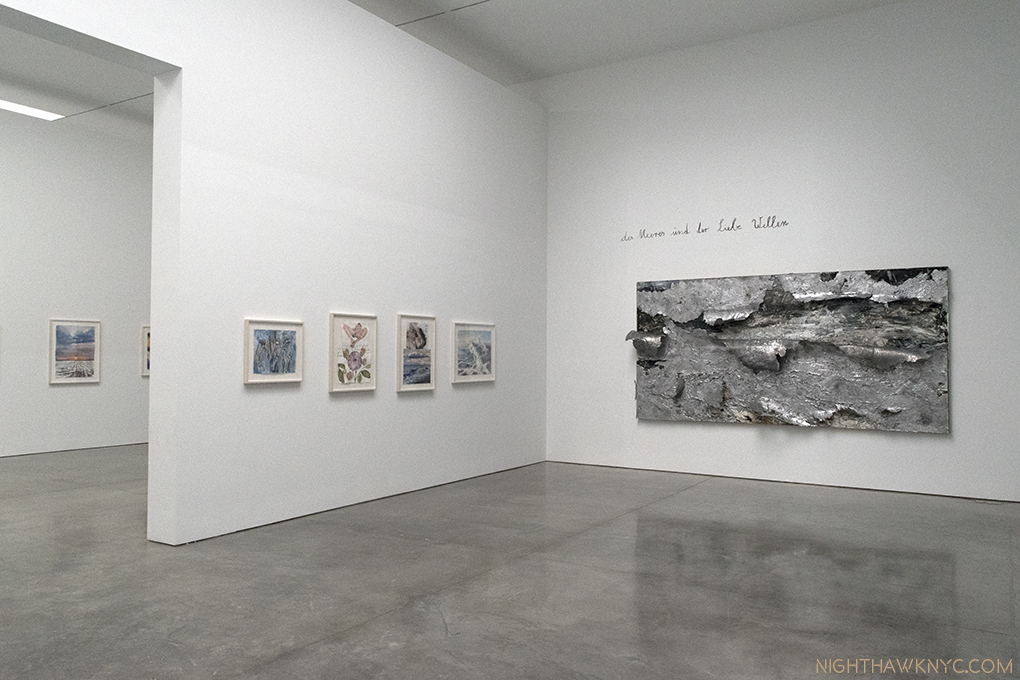
Installation View of Room 3, and part of 2, left. On the right, “The Waves of Sea and Love,” 2017, Oil, emulsion, acrylic and lead on canvas. The other works are watercolor on paper. Click any photo to enlarge.
Anselm Kiefer: Transition From Cool To Warm (at Gagosian, West 21st Street)- Hold the Apocalypse. Though there were moments recently where it seemed imminent some respite was to be found at Gagosian on West 21st Street this summer in a large show of lyrical works by renowned German Artist Anselm Kiefer. Yes, Anselm Kiefer- the same Artist who sees civilization as a shining moment between dark ages. It’s been getting harder to argue with him.
Maybe Mr. Kiefer’s crystal ball also told him there would be a need for a “brighter” moment this summer. Whatever the inspiration for it, it’s certainly a bit shocking that this ray of light would come from this Artist after the dark shows that he’s had recently, like this one in London this past winter. You’ll look long and hard (as I did) for signs of it at Gogosian, where female nudes, many, apparently, under the spell of Eros, lush waters and copious flora abound instead creating a plethora of beauty that lingers in the mind, while we await whatever is coming next. And I mean plethora. Over 100 pieces, probably upwards of 300 individual works. A “Transition from Cool to Warm,” a term used to describe color temperatures by watercolorists, in more ways than one.
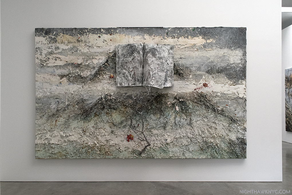
“For Segatini: The Bad Mothers,” 2011-12, Oil, emulsion, acrylic, shellac, wood, metal, lead and sediment of an electrolysis on canvas. The book in the top half, and the tree branch in the bottom half, are mounted on, and extend from, the canvas. It’s hard to capture how thickly the paint is applied. All the other books in this show contain watercolors.
It’s rare, in my experience, to see a show this large that is, primarily, watercolors. Interspersed with them are some large landscapes in oils that are spread on thick and heavy, some combined with elements that include tree branches, lead and sediment of an electrolysis, like “For Segatini: The Bad Mothers,” above, which served as an echo for me me of Robert Rauschenberg’s groundbreaking “Combines,” from 60 years earlier, on view 30 blocks north at MoMA.
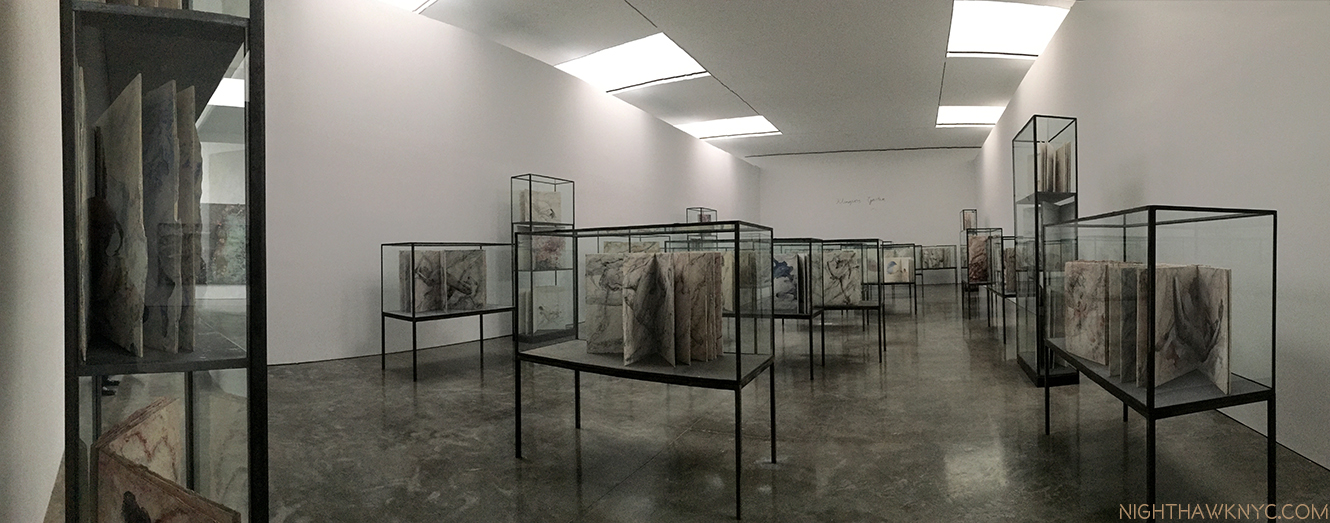
Installation view of the central gallery, “Klingsor’s Garden,” displaying 38 Artist’s Books, each one containing 8-12 watercolors.
Anyone who has tried watercolors quickly learns that this tricky medium tends to have a mind of its own. Kiefer long ago mastered them, as he demonstrated in 1977 in a book of them of the same name as this show. He’s been hard at work since creating a number of individual watercolors and about 48 unique Artists Books (the other 9 are in the final room) filled with them on view here. In this age of Artist’s Books, you’ll look long and hard to find even one that can match these (or their prices), each page of which contains a finished watercolor, many of the books containing 10.
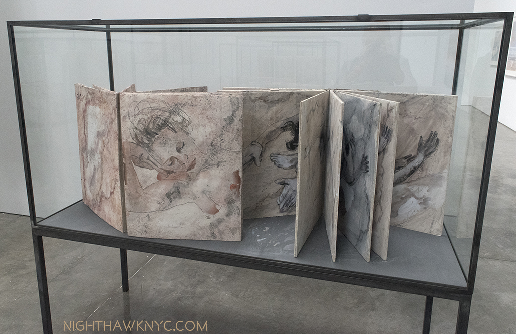
Two books of watercolors in a vitrine, each bearing the same title as room, “Klingsor’s Garden.” Watercolor and pencil on plaster on paper, executed in 2016-17.
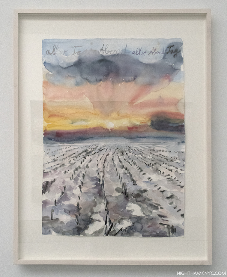
His watercolor nudes bear a passing similarity to Gustav Klimt’s and Rodin’s famous nude watercolors, but Mr. Kiefer (who says he didn’t know Rodin’s watercolors until after he had started doing his own) makes them seem as something of a jumping off point for his own striking poses, done from models, that seem to float on the gesso he uses to create an imitation marble “ground,” intertwined with snakes, or accompanied by other elements, typically water and flowers in the standalone work, which feature sunsets (as seen in the first photo), somewhat barren landscapes, with muddy roads, or seascapes.
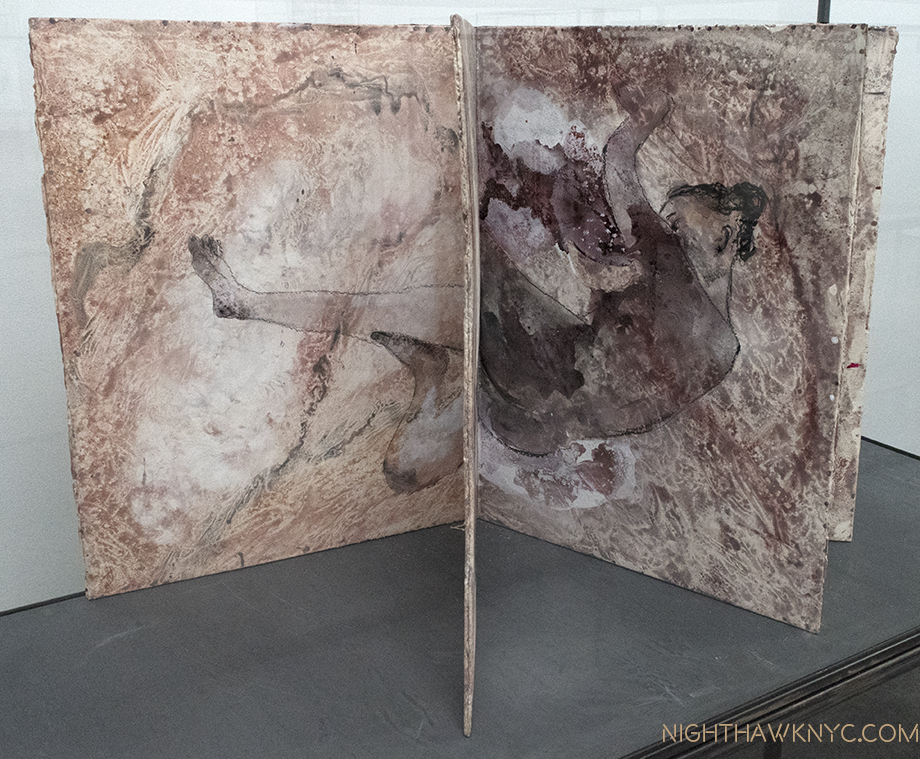
The partially opened books lead the mind to construct whole images out of halves of different pages, as seen here. Mr Kiefer says books “are more than half of what I make…the pictures come and go away, and then a new one comes. So it is always the picture between two pages. You turn the page, you still have the other one, but you already have the new one. I like this very much because it’s not a fixed picture, it’s a transition, it’s an action.” (Interview with Gagosian, 2017)
In many of them Keifer alludes to a wide range of literature, from the bible to poetry, a good many of them being fairly obscure, with handwritten notations on the works. The central room, containing most of the vitrines of Artist’s Books filled with (mostly) nudes, is named “Klingsor’s Garden,” seen above, which I take as a reference to Wagner’s “Parsifal” where the magician Klingsor has a garden full of beautiful flower-maidens under his power.
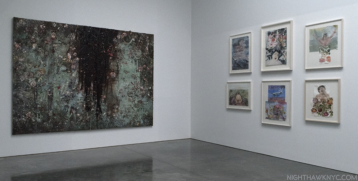
An element of darkness creeping in? “Aurora,” 2015-17, Oil, emulsion, acrylic, shellac, and sediment of an electrolysis on canvas, seen adjacent to 6 watercolors.
This is the first show I’ve seen of Mr. Kiefer’s, who has had a large work continuously on view in The Met’s 5th Avenue Modern & Contemporary galleries, in the same spot, for over 20 years. Having given up looking for a “darker message” in these works, I succumbed to the beauty and preferred to simply study the technique in the large oils, and enjoy the chance to see so many unique watercolors in one place. It will be interesting to see what his next show is like. While the world and universe will end one day- sooner or later (the jury being still out on civilization’s longevity), its the fleeting moments of beauty, and Art, that make this temporal experience special.
Ellsworth Kelly: Last Paintings, Ellsworth Kelly: Plant Drawings & Ray Johnson (all at Matthew Marks Gallery)- Each of these memorable shows deserves its own writeup. Both Ray Johnson and Ellsworth Kelly are Artists whose importance seems to be increasing as time goes by.
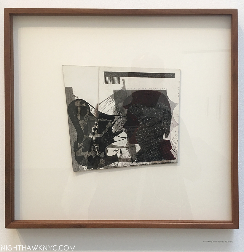
In Ray Johnson at Matthew Marks, West 24th Street, “Untitled (David Bowie),” 1979-94 is one of a group of “silhouettes” on display, perhaps the most complex. Ink and collage on board. The multiple dates of Mr. Johnson’s work reflect the fact that he often rethought a work many times.
In Ray Johnson’s case, substitute “being taken more seriously as time goes by.” It’s about time. Mr. Johnson studied at Black Mountain College with Artist, and legendary teacher, Josef Albers, and Robert Motherwell, while Rauschenberg, John Cage, and others, were there in the late 1940’s heyday of that legendary institution. After burning his early paintings, possibly to get out from under the cloud of his illustrious teachers, he became something of a “shadow figure” in the Art world, though he seemed to know almost everyone in it. He started the Mail Art movement, and the New York Correspondence (or “dance”) School, and worked, mostly secretly, on collages. After his tragic and mysterious death, a suicide (or “Rayocide,” as Mark Bloch called it, which many considered to be his final “performance,” in a life that had been full of performances, like his “Nothings” earlier on), a wonderful 2002 documentary, “How To Draw A Bunny,” seems to have begun a reassessment/fuller appreciation of Mr. Johnson’s work that is, finally, seeing it loom larger than his large, unique/endlessly quirky personality. This show consists of an excellent cross section of those collages, some doing double duty as Mail Art, and two other works that defy easy description, one seen below, the other further down.

Iinstallation View of the second gallery (with gallery #3 and 4 ahead), showing the “Candy Darling Cast,” 1970- of her face, complete with fabulous eyelashes, in its clear carry bag, center.
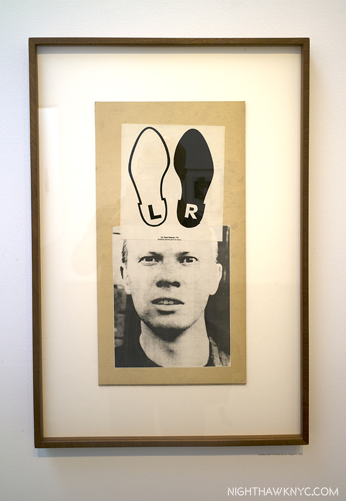
“Untitled (Self Portrait/Dance Diagram), 1992, Collage on board (double sided). The shoes are reminiscent of the ears on the Bunnies with long squishy noses that are Mr. Johnson’s “trademark.”
Ray Johnson was a unique Artist who was a Master of graphic design in my eyes, and still ahead of his time. He was a vital part of the NYC Artist community, until he opted to drop out of it, and NYC, moving to Long Island, and finally to Locust Valley, NY, where he lived as a recluse, like his friend, Joseph Cornell. He stopped showing, or selling, his work, other than continuing to mail some of it. Some see him as a precursor of “Pop art,” because of his use of celebrity portraits before Warhol (who he met in 1956), and benday dots before Roy Lichtenstein. He was also fond on including his own portrait in his work, and these are the works I find among his most engrossing given his reclusiveness. Every time I saw someone posing for a selfie in front of one of them, I couldn’t help wonder what Mr. Johnson would make of it. email and instant messages don’t have the charm of actual mail, or it’s creative possibilities. It’s a shame that it’s now unlikely another “Mail Artist” will come along to further what Ray Johnson started in this “medium.” It may have ended with him (or, “Post-Secret.”)
In this “Summer of Rauschenberg” in NYC, as I saw one writer aptly call it, Ray Johnson is not forgotten. In 1955, Rauschenberg was invited to participate in the Stable Gallery Annual. Artists had been allowed to propose new artists for the following years’ exhibition, but they changed the rule. To circumvent this, Rauschenberg asked Jasper Johns, his former wife/Artist Sue Weill and Johnson to each create a piece that he would install inside of his piece, thereby getting them in the show. Johnson’s contribution didn’t reach Rauschenberg in time to be included. “Short Circuit,” Rauschenberg’s resulting piece, and its circuitous story, are included in the MoMA Rauschenberg show. In Calvin Tomkins’ Rauschenberg biography, “Off The Wall,” Tomkins says that in 1955, he asked his friend Johnson to contribute to it in because he was “another young Artist who was unjustly neglected[P. 121].” 62 years later, the world is still catching up.
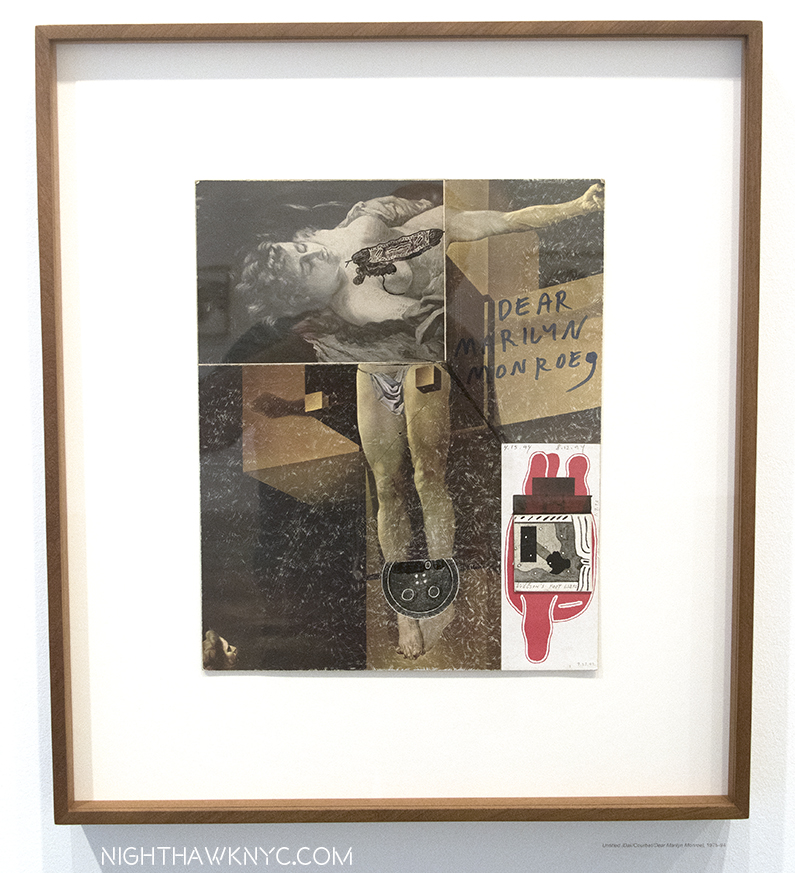
‘Untitled (Dali/Courbet/Dear Marilyn Monroe),” 1975-94, Ink and collage on board. One of a group of collages that are variations on Dali’s “Crucifixion.”
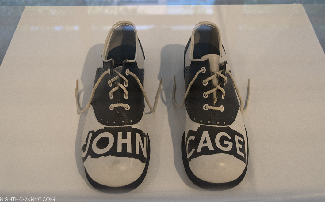
“A Shoe (John Cage Shoes),” 1977. Mixed media. Johnson met composer John Cage at Black Mountain College, and later lived in the same building with him in NYC. Both were parts of the Artist circle that included Jasper Johns, Cy Twombly, Morton Feldman, Merce Cunningham and Rauschenberg. What any of this has to do with these shoes? I have no idea.
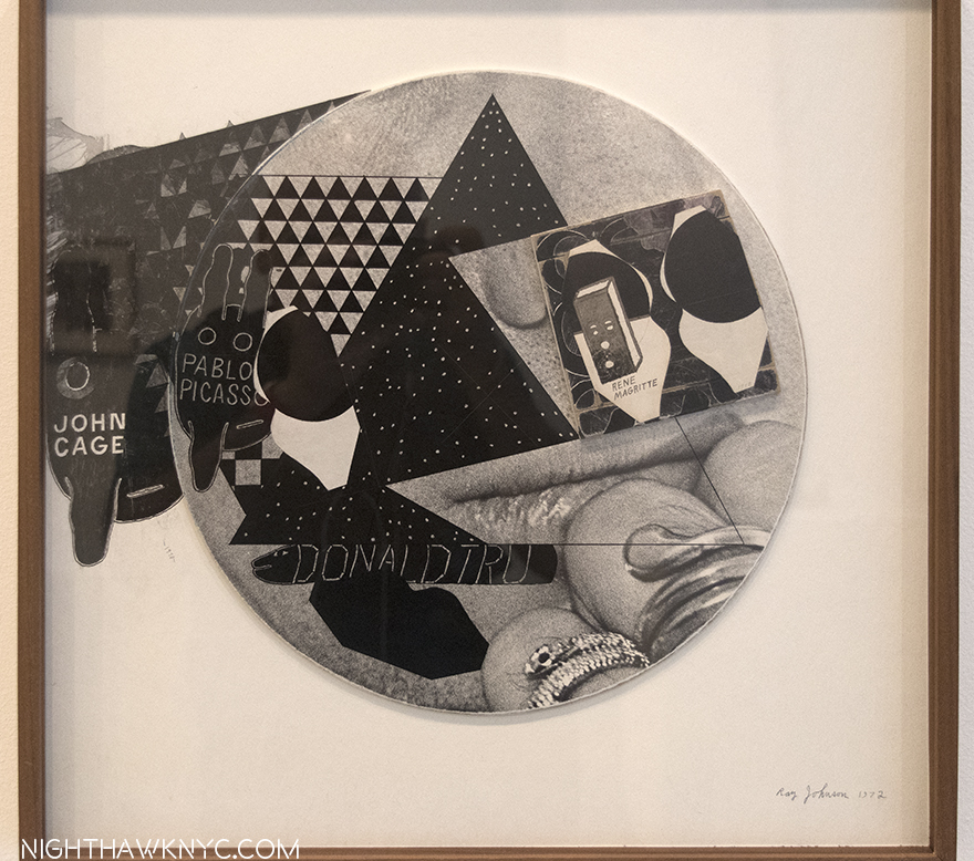
John Cage, appears again, next to Picasso, across from Rene Magritte on top of the bottom half of a Photo Photo Portrait of Ray Johnson and the inscription “DONALD TRU” under. Could this be another piece referencing Donald Trump from years ago (this one, 1972), like Raymond Pettibon’s piece seen earlier this year from _____? “Untitled (Cage, Picasso, Magritte, Donald Tru),” 1972-90, Ink and collage on board.
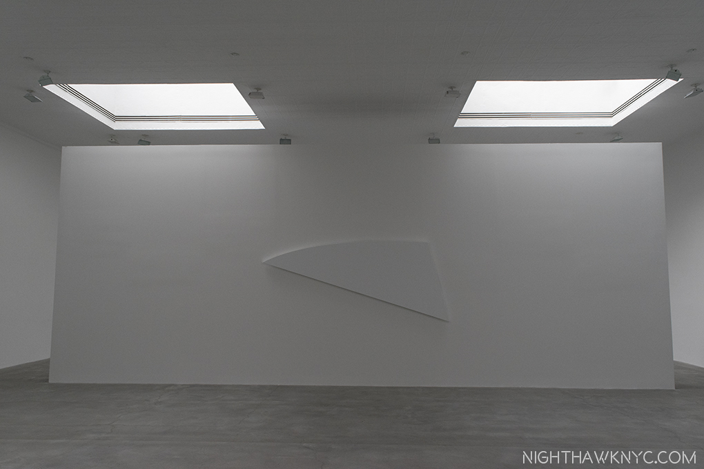
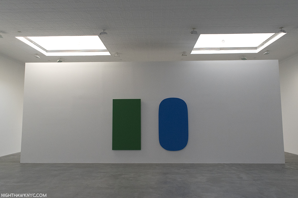
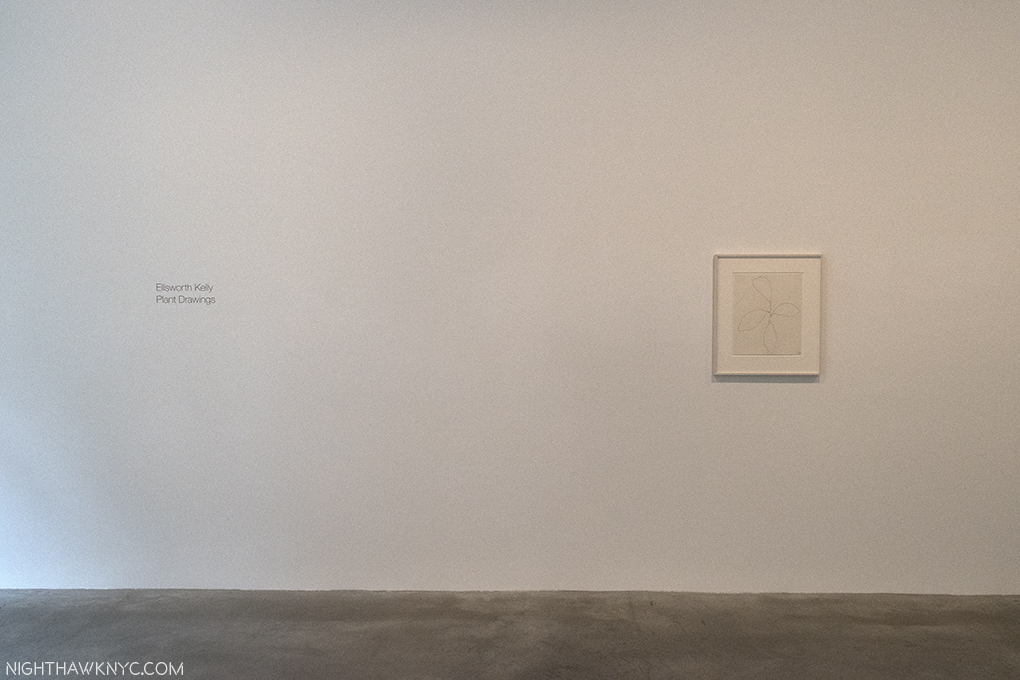
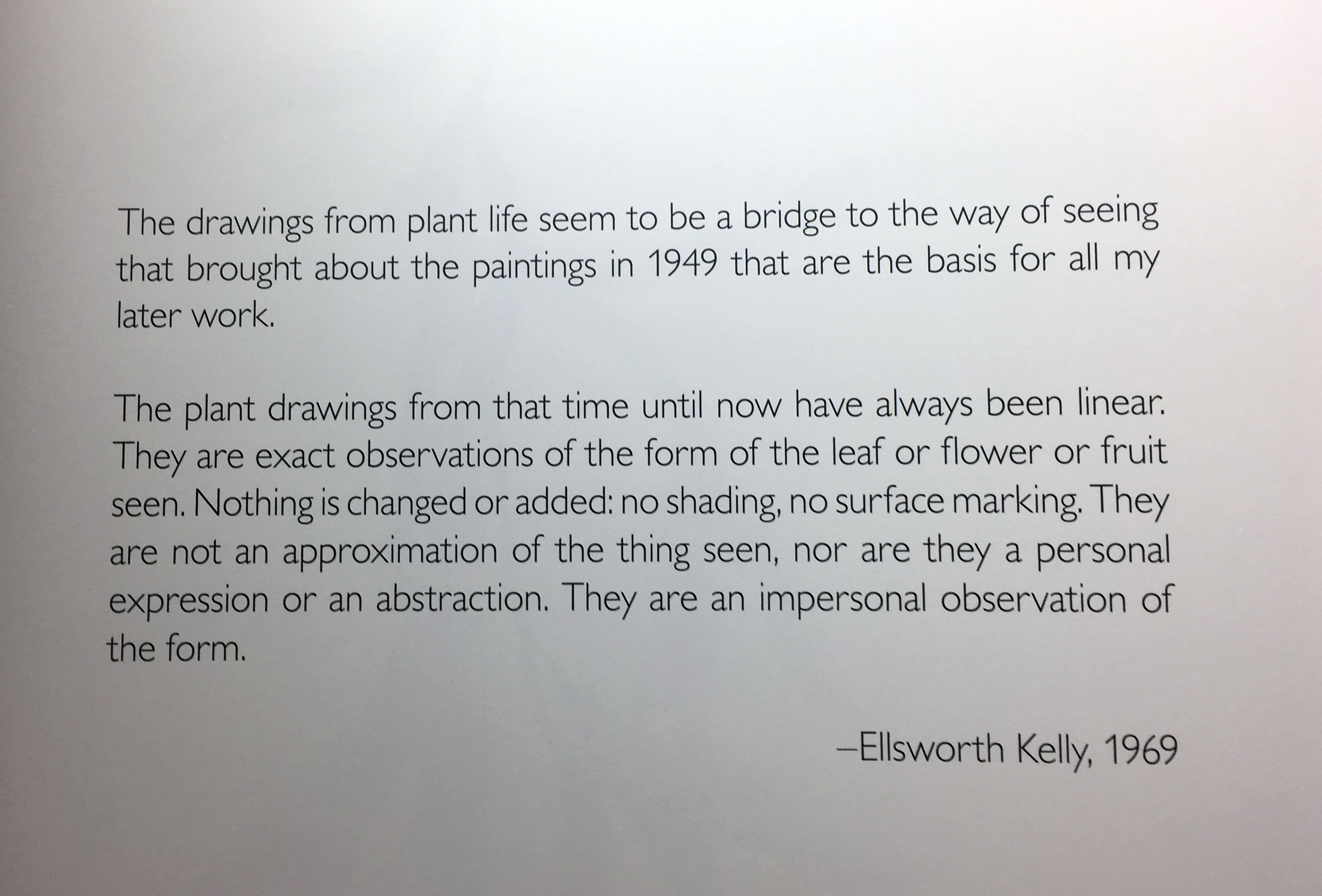
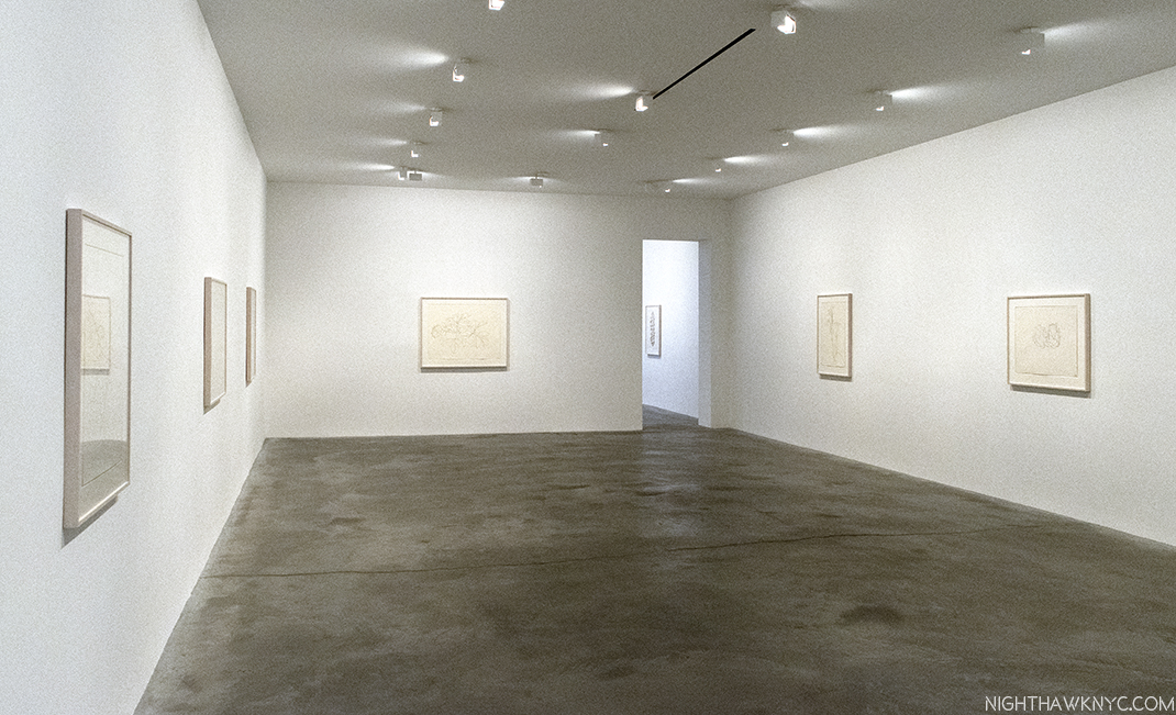
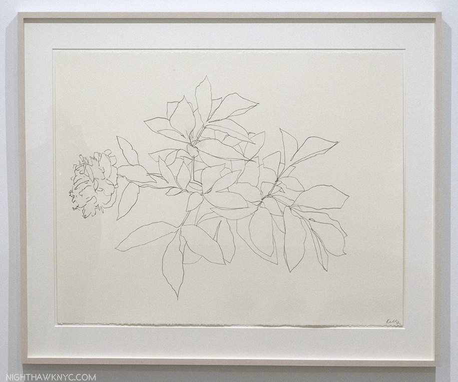
At Matthew Marks on West 22nd, Ellsworth Kelly’s 9 Last Paintings, and a selection of 16 of his beautiful Plant Drawings spanning almost 60 years, occupied adjacent galleries. Kelly, seemed to be on a lifelong mission to “free shape from its ground, and then to work the shape so that it has a definite relationship to the space around it, so that it has a clarity and measure within itself of its part (angles, curves, edges and mass), and so that, with color and tonality, the shape finds its own space and always demands its freedom and separateness.” as he said. Included in the seminal 1959MoMA show, “Sixteen Americans,” along with Jasper Johns, Louise Nevelson, Jay De Feo, Frank Stella, and Robert Rauschenberg, his career lasted a long time. As a result, it’s sometimes easy to overlook his work, and that would be our loss, especially in these wonderful last works.
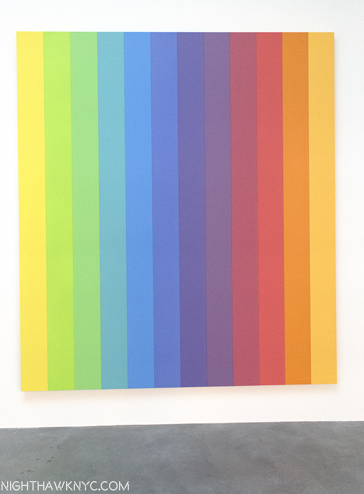
“Ellsworth Kelly: Last Paintings. This work is “Spectrum IX,” 2014, Acrylic on canvas, twelve joined panels, 107 x 96 inches
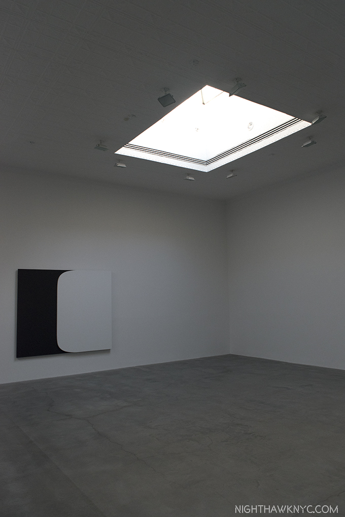
Installation view of “White Form Over Black,” 2015, Oil on canvas, two joined panels, 75 x 87 inches.
One look at his marvelous Flower Drawings, and I was transported back to my first encounter of them in a mesmerizing show at The Met in 2012. They still leave me wondering “Why hadn’t I seen anyone do this before?” And, I still haven’t. They are true to the statement quoted earlier, though they are more easily “seen” to be based on real objects, though real-life observations were at the heart of his abstractions, as well. As such, these two side-by-side shows provided a rare chance to compare two, seemingly quite different aspects of his work, and find the commonality. They share that zen-like essence, this time of line, rather than shape and color, like the last Paintings. Both, in relation to space.
Each shows is accompanied by its own wonderful catalog, adding to the line of excellent publications Matthew Marks Gallery has produced. The Last Works catalog includes photos by Jack Shear showing Mr. Kelly’s studio as he left it, complete with some of these very works. Touching and profound. Of course, seeing them in Matthew Marks beautiful, spacious Gallery is more akin to where these works will most likely be seen henceforth- on Museum walls.
“And babe, don’t you know it’s a pity
That the days can’t be like the nights
In the summer, in the city
In the summer, in the city”*
*- Soundtrack for this Post is “Summer In the City,” by Steve Boone, Mark & John Sebastian of the Lovin’ Spoonful, published by Sony/ATV Music Publishing LLC, Carlin America Inc, BMG Rights Management, US, LLC.
NighthawkNYC.com has been entirely self-funded & ad-free for over 8 1/2 years, during which 320 full-length pieces have been published! If you’ve found it worthwhile, PLEASE donate by PayPal to allow me to continue below. Thank you, Kenn.
You can also support it by buying Art, Art & Photography books, and Music from my collection! Art & Books may be found here. Music here and here.
Written & photographed by Kenn Sava for nighthawknyc.com unless otherwise credited. To send comments, thoughts, feedback or propositions click here. Click the white box on the upper right for the archives or to search them. Subscribe to be notified of new Posts below. Your information will be used for no other purpose.

