Robert Rauschenberg: Anagrams (A Pun)- But No Joke

This site is Free & Ad-Free! If you find this piece worthwhile, please donate via PayPal to support it & independent Art writing. You can also support it by buying Art & books! Details at the end. Thank you.

Written & Photographed by Kenn Sava

11 days after being here for the final day of the Chuck Close: Recent Works, I returned to Pace’s 534 West 25th Street Gallery to see Robert Rauschenberg: Anagrams, Arcadian Retreats, Anagrams (A Pun), on view until January 16, 2016. Up a few steps to the back office area where the show continues, a short video of Rauschenberg at work in on view. As the camera looks down from slightly above, I noticed that surrounding him all over his studio were numerous works consisting of seemingly chaotic collages of images. I couldn’t help wondering about the effect on a visitor’s brain of spending 8 hours in that studio, and what it would  feel like to then walk outside. I wondered what they said about the images playing inside of Rauschenberg’s mind all the time. Day in. Day out, for the 82 years he lived. It might be why there’s so much to see in even one of his works. This new show makes clear that it may be a long time yet until everything that brain, and he, created in his professional life from the 1950’s until he passed in 2008 is seen, fully appreciated and assimilated.

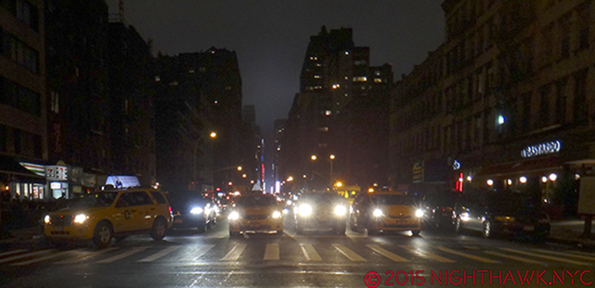
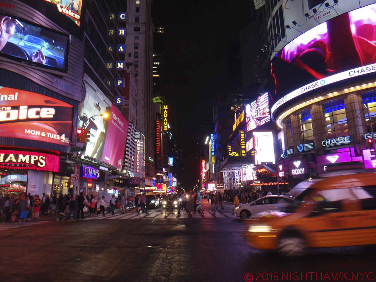
These works are dated 1996 and 97. Visually, his work presaged the visual chaos of the internet age, and the graphic print style of David Carson and others. Seen in 2015 it fits right in with the everyday chaos of NYC, both on the physical level, where pedestrians have to face a never ending life, death or injury battle with bikes, cars, buses, trucks and lord knows whatever else, simply to get from point A to point B, while being bombarded with every square inch plastered with ads, images or graffiti on the visual level.

The modern world makes me try to make sense out of its visual chaos- like Rauschenberg did so masterfully.

Visual chaos, 2015. Without the “Art.” By the way? Times Square was better before

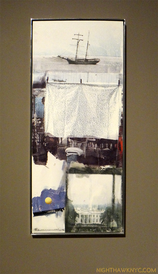
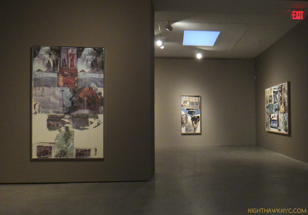
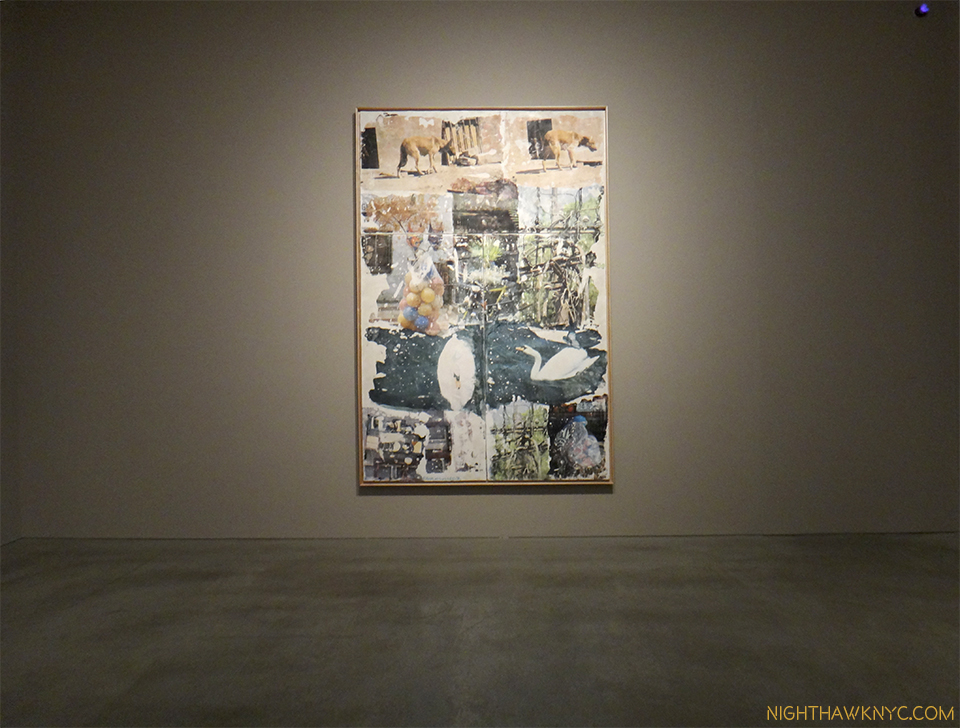
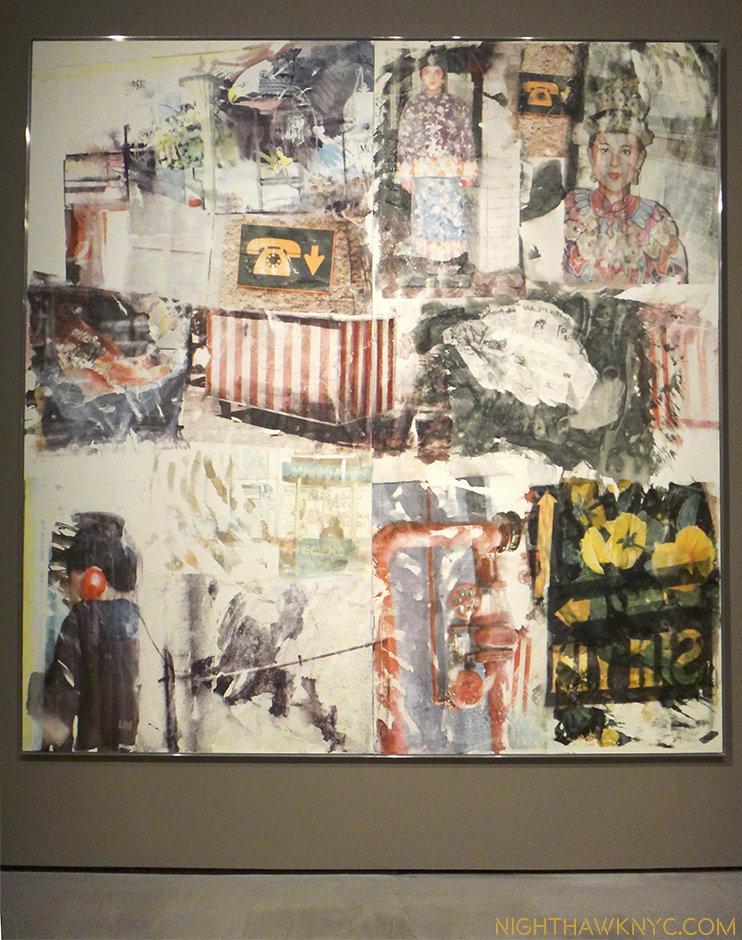
Anagrams, Arcadian Retreats, Anagrams (A Pun) is a bit different from any Rauschenberg show I’ve yet seen. It’s concise yet catholic, coherent and sharply focused on these three series of works, which share working methods, making it very hard to tell which work is from which series. As such, it’s a rare opportunity to see a selection of late works. Pace’s release states the images are from Rauschenberg’s own photos, which continues a trend in recent shows of artists using, or basing their work on their own photographs (Richard Estes, Chuck Close). Rauschenberg appears to have been at the forefront of image manipulation, made possible by software like Photoshop, while adding “painterly elements.” Regarding exactly what these pieces are and how they were made, Pace’s press release says- to create these works, “he developed and perfected a powerful new technique combing dye transfer with novel supports including plaster, large-scale paper and polylaminate panels…The process produced an aqueous and fluid appearance, blurring the crisp edges of his photographs…The inkjet dye process also liberated Rauschenberg from the mechanical production of printing screens, allowing him to produce sheets exclusively from his own photography on an in-studio printer. In addition to a more painterly effect, these works reflect a more nimble and freer approach to image-making than earlier works which were bound by the limitations of the mechanical process.”


It’s tempting to “read into” the resulting images, some of which are repeated verbatim in other works, and take them as a visual language, to be deciphered for “messages,” even hidden meanings. That will take a lot of looking to compile. Though “anagram” is a word about words, I don’t think I’ll be taking it that literally. I prefer to let the images speak, and this show is an orgy for the eye.

The works range from very large to large and a few of medium size. Two, including the largest, (one, I felt to be the most impactful piece in the show), are owned by the Whitney. Most of the others are not titled, detailed or described. Many feature images from different cultures around the world from the Sphinx and the Pyramids to traditional costumes, apparently from trips he had taken shortly before, which are juxtaposed with images from the western world, like construction equipment, firefighters, store fronts, junked cars, bicycles and soda bottles. Despite being combined, layered, even processed, the results don’t look like images produced in Photoshop. They look more like paintings, which I find somewhat remarkable, probably because I am so used to seeing Photoshopped Photographs. While he anticipated digital image processing and manipulation in works gong back to the late 1950’s, he continued doing things entirely his own way, and only selectively using technology when it suited his aims.

I previously saw some works from these series in the 1977 Guggenheim Rauschenberg Retrospective, but these were new to me. Seeing only works from these series brought home how wonderful they are. They’re different from what he had done earlier in his career, yet they have that undeniable “Rauschenberg” feel. In spite of being Photo based, they retain a “painterly” look, which I think is remarkable, and one of the things that sets his work apart from all those doing these types of works today. For me, Rauschenberg is kind of an American Picasso of the 2nd half of the 20th Century- his creativity and inventiveness knew no bounds. Like Picasso, he never stopped innovating and trying new things and techniques. Even 7 years after his passing, we continue to discover new facets of this work, which seems as fresh and contemporary as anything else around today. That will, no doubt, continue at the first full scale retrospective of his work since the Guggenheim’s 1997 blockbuster to be held next year at the Tate Modern, London.

These are wonderful works that reward repeated looks from a period of the Artist’s career that strikes me as being under appreciated. They seem so of the moment, it’s hard to think they’re going on 20 years old. In that sense, like their creator, they are ahead of their time, even now. I’m continuing to try and get the modern world to look like a Rauschenberg to me, to make that kind of sense, possibly even find the “Art” in it…that is when I’m not dodging bikes, cars, and the rest to actually feel safe enough in it to look around. That danger is what’s missing in these Rauschenbergs. Probably because he seems to be focused on the bigger picture, the dangers of the modern world to ancient cultures and ancient creatures. Including man.

On a bigger scale, like that bike I don’t see coming the wrong way on a one way street, the modern world is obliterating all that came before.

DSC02584PNH

*-Soundtrack for this post is “Crosstown Traffic,” by Jimi Hendrix.

NighthawkNYC.com has been entirely self-funded & ad-free for over 8 years, during which 300 full-length pieces have been published! If you’ve found it worthwhile, PLEASE donate to allow me to continue below. Thank you, Kenn.

You can also support it by buying Art, Art & Photography books, and Music from my collection! Art & Books may be found here. Music here and here.

Written & photographed by Kenn Sava for nighthawknyc.com unless otherwise credited. To send comments, thoughts, feedback or propositions click here. Click the white box on the upper right for the archives or to search them. Subscribe to be notified of new Posts below. Your information will be used for no other purpose.

Why I’m Not Going To See “Steve Jobs”

This site is Free & Ad-Free! If you find this piece worthwhile, please donate via PayPal to support it & independent Art writing. You can also support it by buying Art & books! Details at the end. Thank you.

Written & Photographed by Kenn Sava (*- unless otherwise credited)

Back cover of MacWorld UK for it’s Steve Jobs tribute after he passed in 2011. I’ve never been able to find out if it was a real Apple Ad or not.

One. Mrs. Steve Jobs calls it “fiction.”

Two. Walt Mossberg says the Jobs he knew “isn’t in the film.”

Three. As people who know me know, I’ve been an Apple guy since 1990, so I lived through much of this by watching the Apple Keynotes & Media events (which you can still watch free on iTunes), by following Apple, and yes, through the media. The real danger in the film “Steve Jobs” I fear, even as a hard core supporter of artistic license and free speech, is that people who don’t know anything about Steve Jobs will make their minds up solely on the basis of this, and other Jobs films, the way Oliver Stone’s “JFK” has influenced the minds of so many that Oswald didn’t act alone. (Sorry. I think he did.) I was hoping “Steve Jobs” would be a kind of outright fantasy like the wonderful “I’m Not There” is “about” Bob Dylan. It gives a sense of him without attempting the impossible and trying to recreate him. For me, that is the best course to take. Even the “documentaries” released on Jobs thus far strike me as being messes.

It’s a real shame. Jobs though, by his own admission, was not a perfect human being, is an important enough one to deserve much better. Society, especially the young who may become “the next Steve Jobs,” deserves much better. If you really want to read something that catches the real Steve better, read “Becoming Steve Jobs,” by Brent Schlender & Rick Tetzeli. No less than Apple guru John Gruber calls it “remarkable,” and says it is “the book about Steve Jobs the world deserves.”

When you start seeing really mild mannered people like Tim Cook, who offered Mr. Jobs his own liver, get his dander up, you know it’s taken a lot. I feel for him, Mrs. Jobs, and those who actually knew Steve Jobs. I can’t even imagine their frustration.

“Yes, she’s gone like the rainbow that shined yesterday
But now she’s home beside me and I’d like her here to stay
She’s a lone forsaken beauty and it’s don’t trust anyone
I wish I was beside her but I’m not there, I’m gone”*

Cast your vote with your wallet and STAY AWAY.

*Soundtrack for this post is “I’m Not There” by Bob Dylan, Steve Jobs favorite musician, which appears on the “Basement Tapes” (Bootleg Series, Vol  11), and was written by Bob Dylan and published by Dwarf Music.

NighthawkNYC.com has been entirely self-funded & ad-free for over 8 years, during which 300 full-length pieces have been published! If you’ve found it worthwhile, PLEASE donate to allow me to continue below. Thank you, Kenn.

You can also support it by buying Art, Art & Photography books, and Music from my collection! Art & Books may be found here. Music here and here.

Written & photographed by Kenn Sava for nighthawknyc.com unless otherwise credited. To send comments, thoughts, feedback or propositions click here. Click the white box on the upper right for the archives or to search them. Subscribe to be notified of new Posts below. Your information will be used for no other purpose.
Picasso Sculpts The Next Dimension

This site is Free & Ad-Free! If you find this piece worthwhile, please donate via PayPal to support it & independent Art writing. You can also support it by buying Art & books! Details at the end. Thank you.

Written & Photographed by Kenn Sava (*- unless otherwise credited)

In the summer of 1980 I made 2 trips to New York specifically to see the Picasso Retrospective at Moma. Consisting of over 350 works (including the masterpiece “Guernica” in its farewell before being returned to Spain as Picasso requested in his will), it filled the entire building. I remember walking around the show in a daze. After the first floor, my brain had glossed over the way it does during mind-blowing sex. I staggered back out into the sunlight utterly overwhelmed…

Here it ALL was. ALL of what “Modern Art” was, and is. What else did you need to see?

Being a working musician at the time, I didn’t give any thought to what it must have been like to have been an artist seeing it. It must have felt like I did the first time I heard Jaco Pastorius a few years before. As a bassist, I almost threw my Rickenbacker 4001 electric bass into Miami’s Biscayne Bay that night (for real)- there was almost nothing left to play on the bass. I sold my Rick and started playing the upright bass, double bass or bass violin as it’s variously known. Can you imagine being an artist and seeing this show? You must have left it feeling like I did after hearing Jaco-

“Now what? What’s left to do that he didn’t do?”

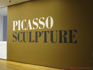
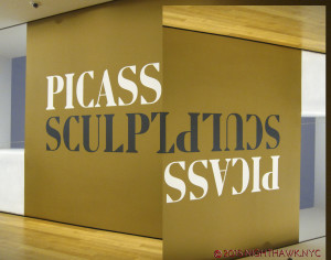
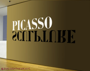
I was reminded of all of this while attending another Picasso blockbuster show at Moma today, 35 years after that one- Picasso Sculpture.

IMG_2666PNH

“Do not attempt to adjust the horizontal…the vertical…” or, your Absinthe Spoon.

Like many artists in all realms of the arts, and many “other” people (I’ll be there, too), Picasso may not be high on the list awaiting canonization as a saint. Yet, as an artist, his legacy is likely to astound and influence artists and art lovers alike for centuries to come. Had he “only” been a sculptor people would be talking about him being among the greatest, both in terms of his work and how many unique styles he invented or co-invented.

Hmmm…kinda like that Spanish painter. What’s his name? Oh yeah. Picasso.

It’s the name that stands like the gigantic monolith in “2001” in the middle of the road to the future of art, where everything that is or will be is built on the shoulders of what was.

IMG_2666P2NH

“Open the Pod Bay Doors, Pablo Ruiz.”

I feel for the artists of today, or tomorrow, who’s life and work lie along that road. What’s left? Indeed.

Even only viewing his work in one medium (if you can call it one)- sculpture, his achievement is almost beyond comparison. Amazingly, though his dad was an artist (a painter) AND an art teacher, Picasso had no training in sculpture. Perhaps this is why, after he found his footing in it, his work quickly achieved a freedom that had never been seen before. He had nothing to “unlearn.”

Then, he began his journey towards freeing his vision. That is what we see here.

Whether working in “traditional” materials (especially bronze- more on that in a moment), or using things that had never been used in sculpture before, what’s now called “found” materials, his endless creativity, often in this show in interpreting the human form, astounds. In spite of the fact that there may be more monographs on Picasso than any other artist of the 20th Century much of what’s on view was new to my eye. Unlike any art monograph yet published (Coco Rocha’s app “Study of Pose” possibly excepted), you can get a full 360 degree view by walking around almost all of the pieces on display on Moma’s 5th Floor. As much as anything else it is, sculpture is a 360 degree medium.

Scale makes no difference to the impact these works have, either. Some are a few inches tall, moquettes (models) for what became very large/monumental public sculptures, like the one in the Daley Center, Chicago. Thought startlingly tiny for those who have seen the monumental versions, they have a different effect, yet one that is every bit as compelling. They reminded me of the amazing show of Bernini’s original small clay models of many of his monumental masterpieces at TM a couple years ago. Like architects creating architectural models (and there happens to be an interesting show of them on the 2nd Floor in the drawings galleries), Picasso, also, proves to be a master of scale.

What would Michelangelo think?

The first thing Picasso changed was the definition of the word “sculpture.” Truth be told, a number of these pieces are not “sculpture,” in the traditional sense. Some are collages (an art form he co-invented), multi-media works, a few are constructions, plastic arts, and yes, some are traditional sculptures. But, as they are 3 dimensional works, they are being called sculpture under a broader than traditional definition.

IMG_2666PNH3

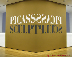
Click, to enter another dimension.

The second thing he changed was the materials that could be used (including every day things like gloves, sand, upholstery fringe, absinthe spoons, nails, tin plate, and wire – all by 1930).

Most compelling for me among the traditional materials were the bronzes Picasso made while living in Paris during the Nazi occupation. They constricted bronze to military use only, but Picasso brazenly managed to get enough of it to  continue to work in it during the occupation. He, and his collaborators, no doubt risked death making these works in, of course, a style of art the Nazis had already branded “degenerate.” For me, the examples displayed are among the highlights of the show. (Since my posts to this point have been about shows that have ended, or were about to, and this one recently opened and runs until February 7, 2016, I’m not posting pics of the work to allow you to see it for yourself, which you should. Photos are allowed, and I’ll probably post some later.)

But, of course, the changes Picasso made didn’t end there. His creativity knew no bounds, and no one “style” could hold him for long.

IMG_2666PNH4


Cubism, which he co-founded, the style of painting that plays with dimensional perception, in 2 dimensions, has to rely on different techniques as sculpture. This may be why this section of the show is more interesting than it is filled with his best work. In the case of the work on view, it’s more an appendage to the paintings.

As we move to the next chronological gallery, it seems that as Picasso moved ahead from Cubism, he moved past dimension to dismantling the human body in ways no one- not even the surrealists had considered. In these works, starting with his wire figures, a whole nother world suddenly opens.

It’s as if Picasso had finally achieved the goal he was after when he (Braque, Gris and Leger) started Cubism- to achieve an entirely new way of seeing that existed beyond the 3 dimensions he was “bending” with Cubism, one that existed only in the dimension of his imagination.

After this breakthrough, Picasso was finally free. He then proceeded to dip in and out of the styles he had created, or elements of them, as parts of the larger language he had compiled over all these years by the time of his oft misunderstood later works, and often in the service of depicting his current muse in ways that only he could see her.

And then? We could, too.

IMG_2666P5

Soundtrack for this post- “Kind Of Blue” by Miles Davis- the whole album, released in August, 1959. I’ve often called Miles “the Picasso of Jazz.” The similarities in their careers, personalities, bodies of work are fascinating and compelling.

NighthawkNYC.com has been entirely self-funded & ad-free for over 8 years, during which 300 full-length pieces have been published! If you’ve found it worthwhile, PLEASE donate to allow me to continue below. Thank you, Kenn.

You can also support it by buying Art, Art & Photography books, and Music from my collection! Art & Books may be found here. Music here and here.

Written & photographed by Kenn Sava for nighthawknyc.com unless otherwise credited. To send comments, thoughts, feedback or propositions click here. Click the white box on the upper right for the archives or to search them. Subscribe to be notified of new Posts below. Your information will be used for no other purpose.